Time sure flies fast, a week has passed and you definitely realized the previous post was filling last week’s spot.

So, ignore my imperfect blog maintenance.

cropped2

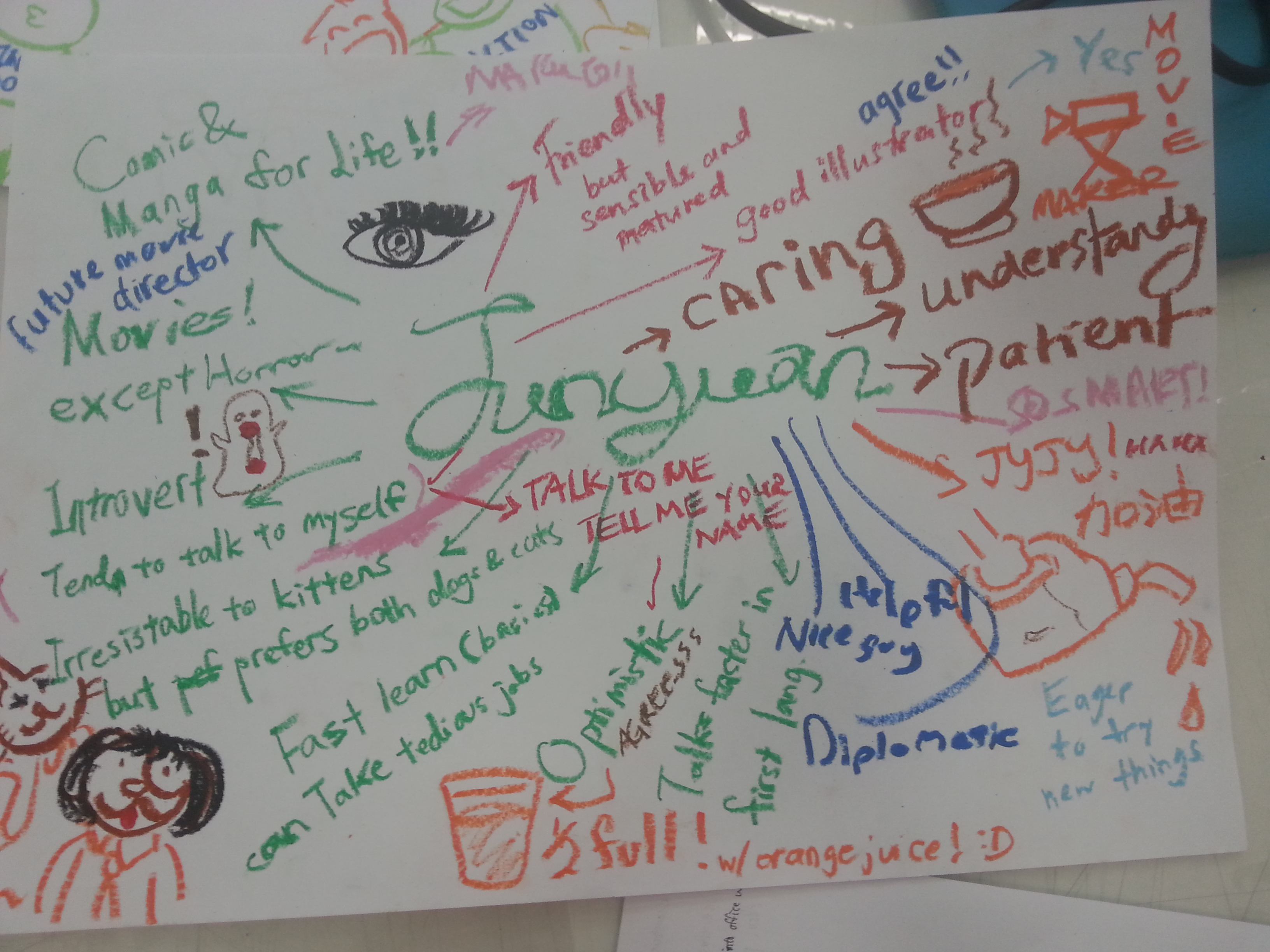
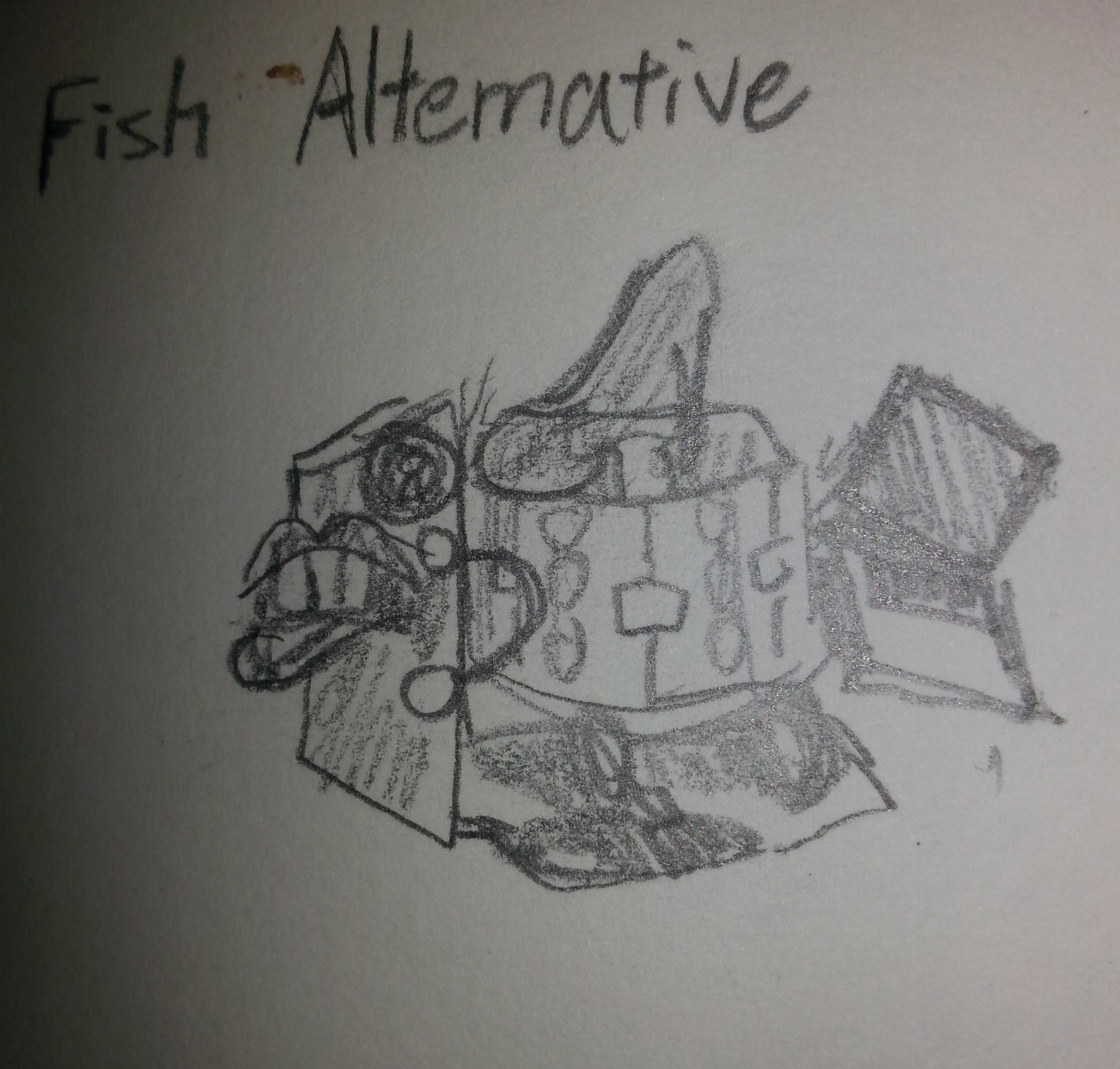
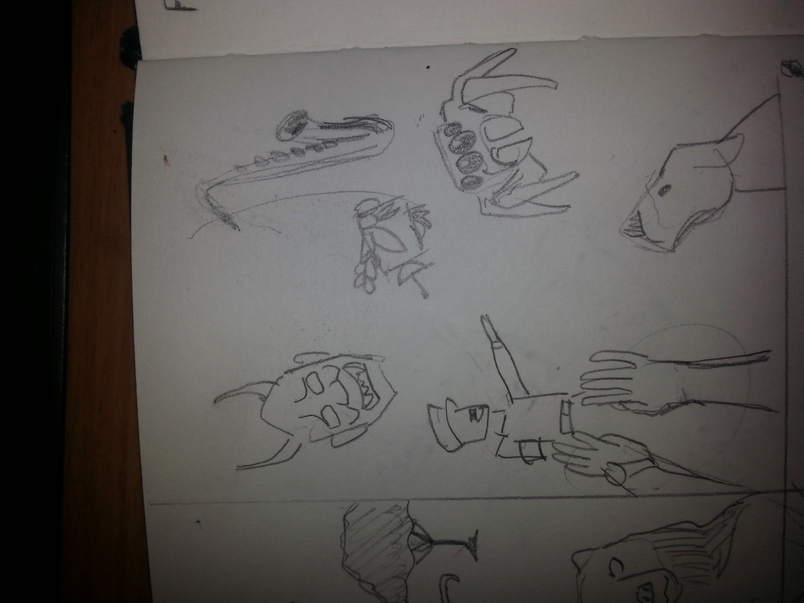
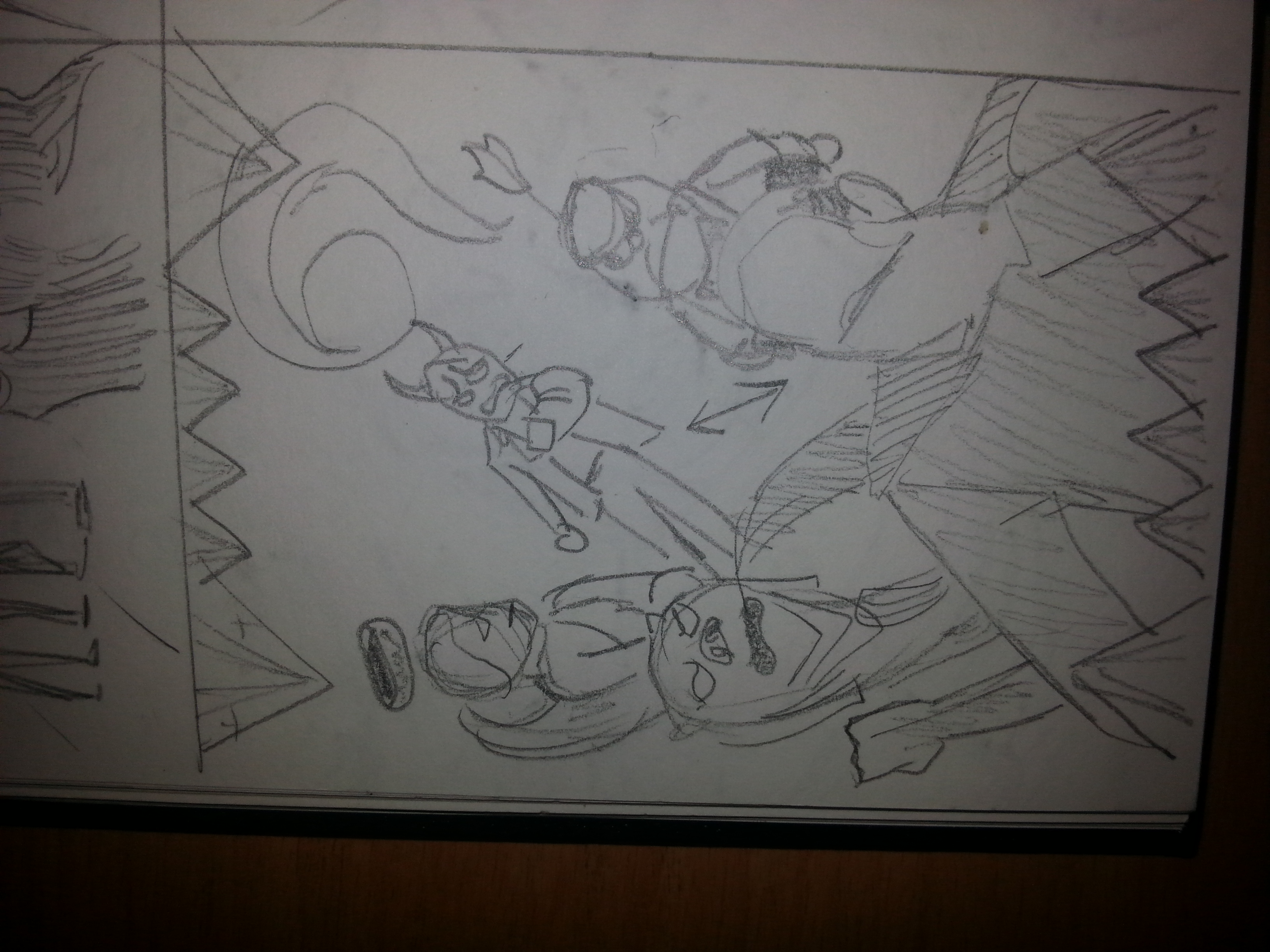
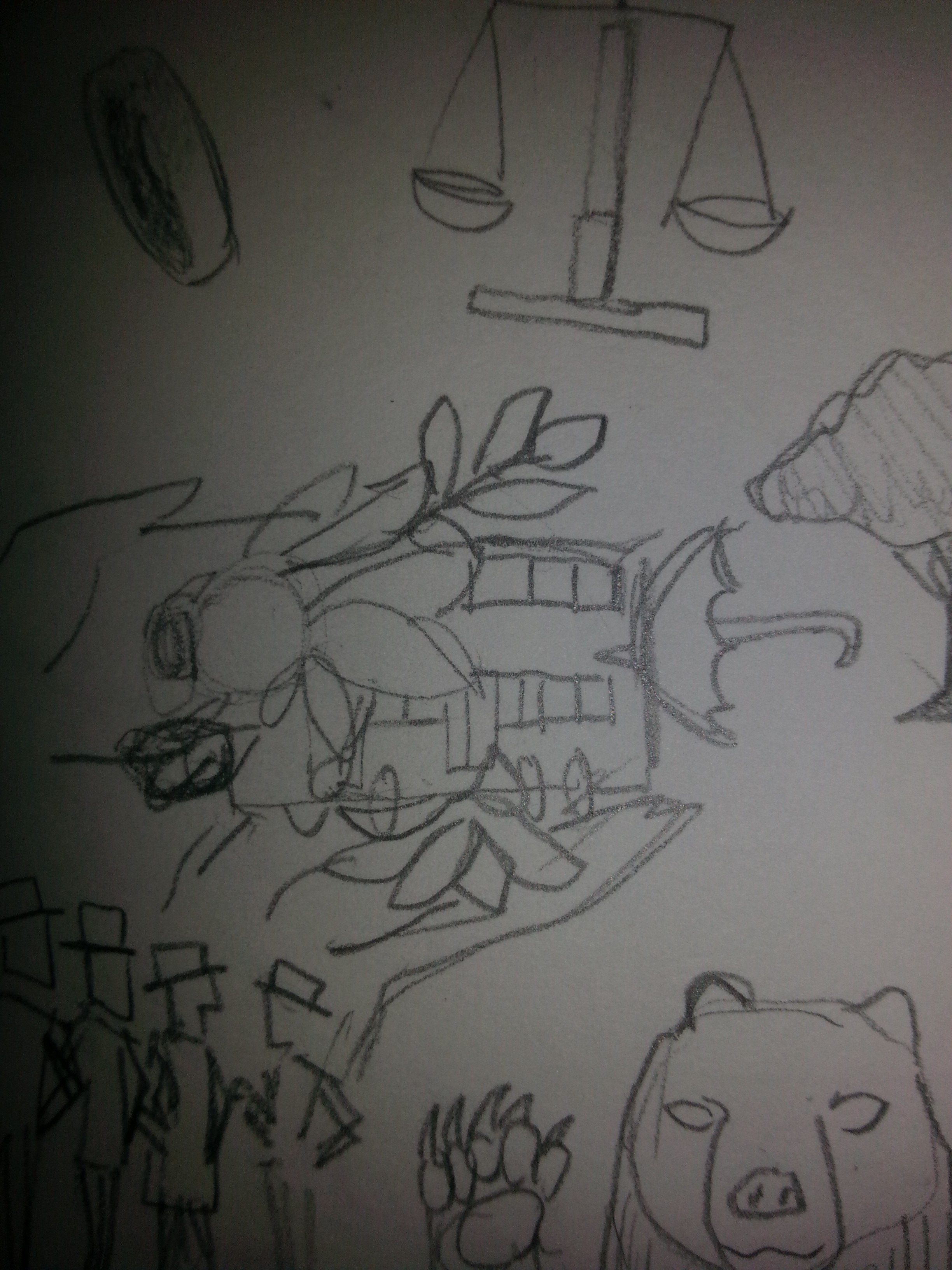
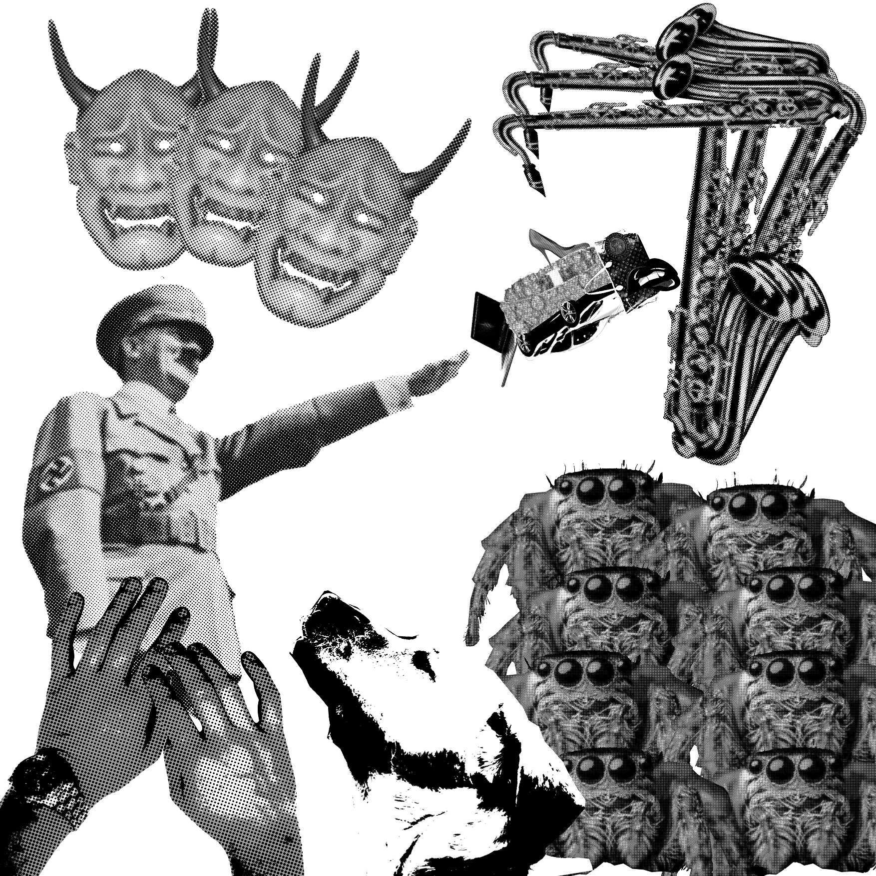
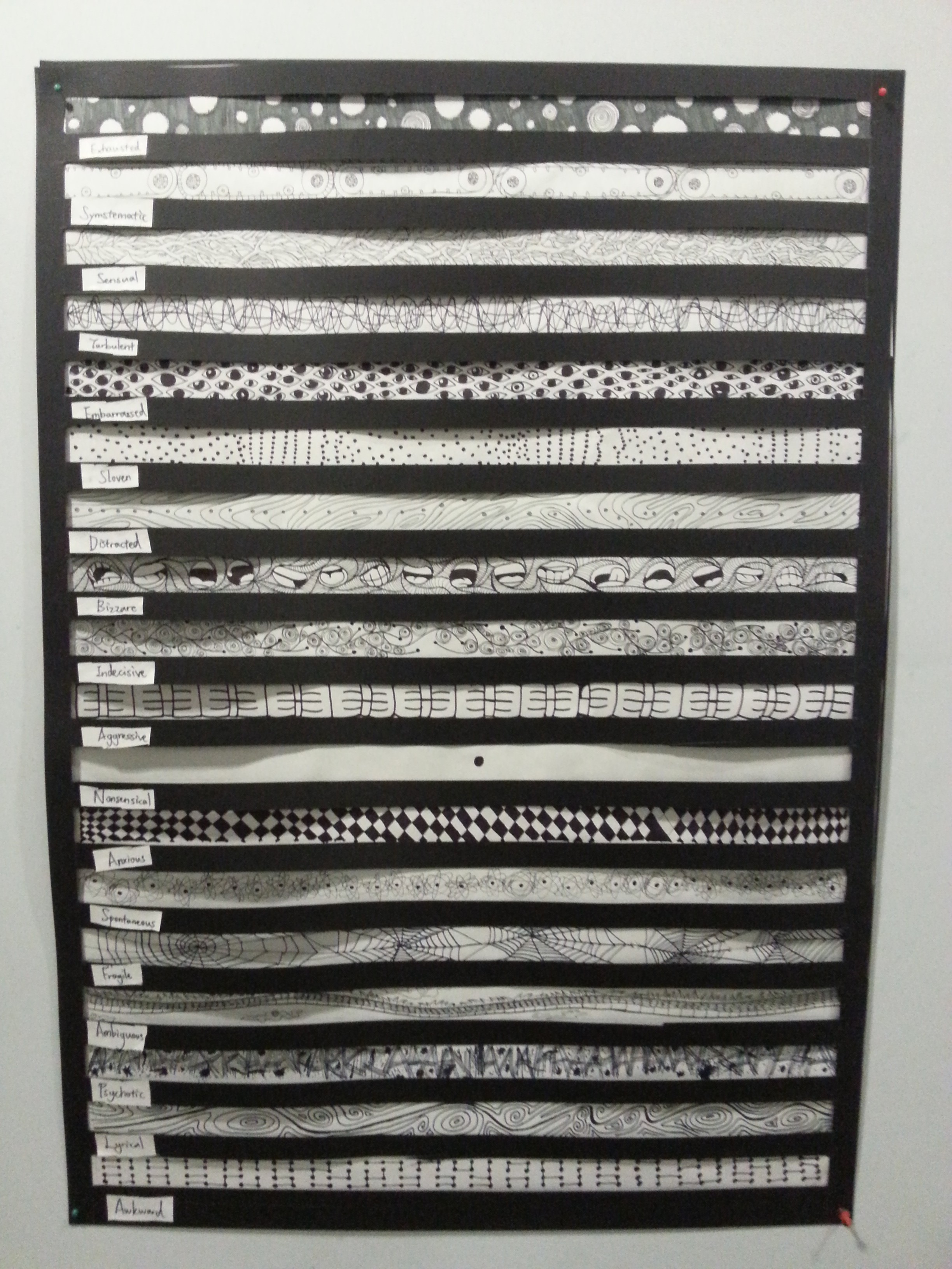
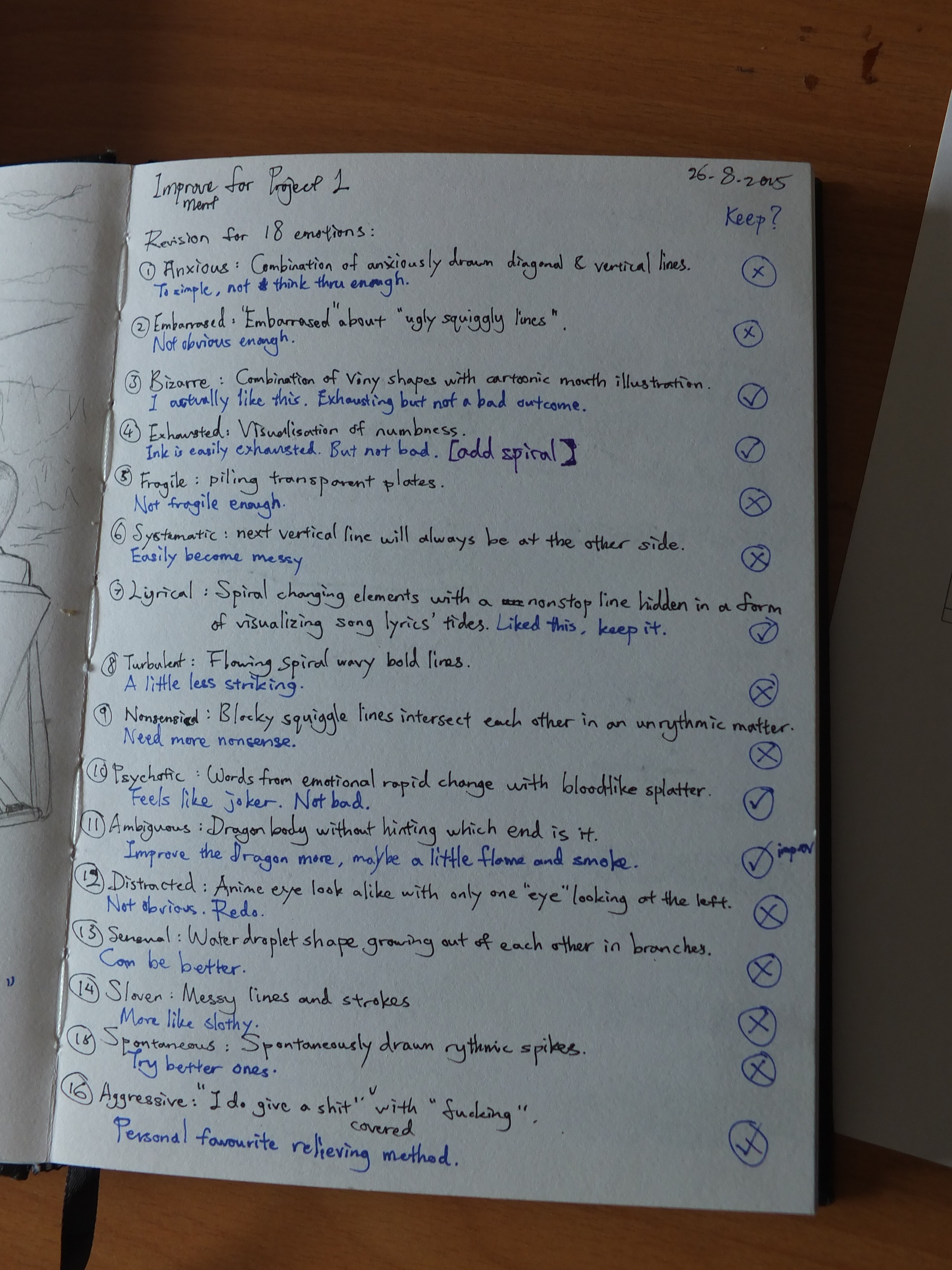
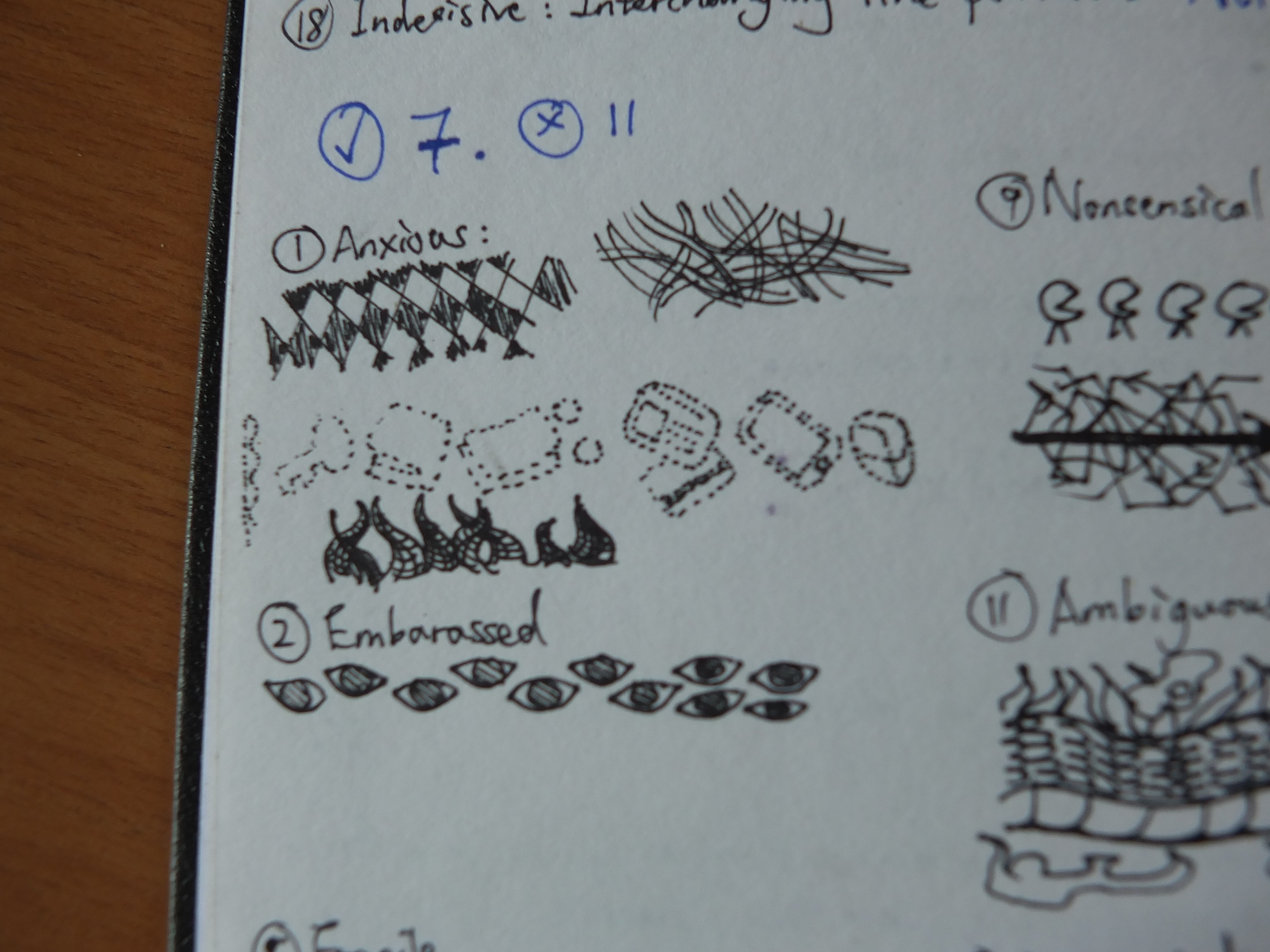
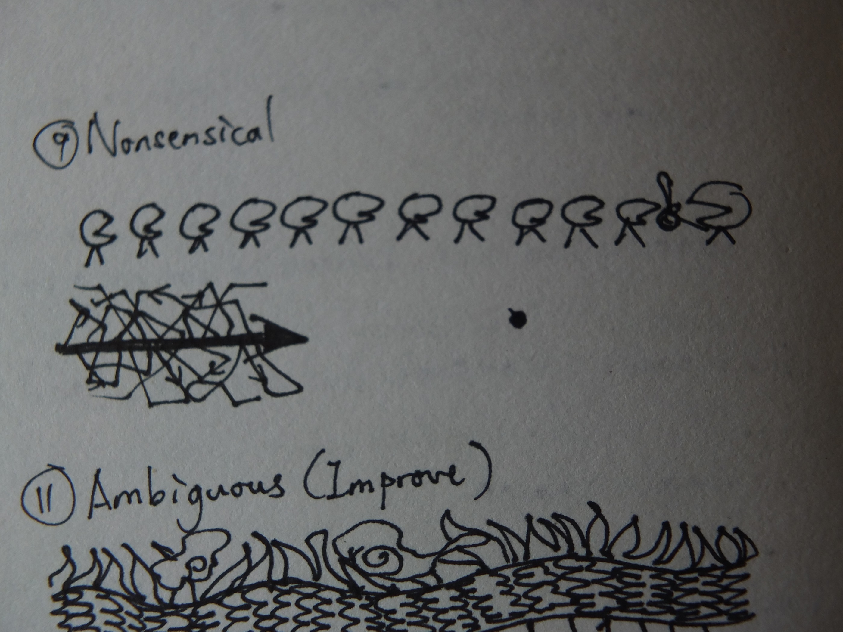
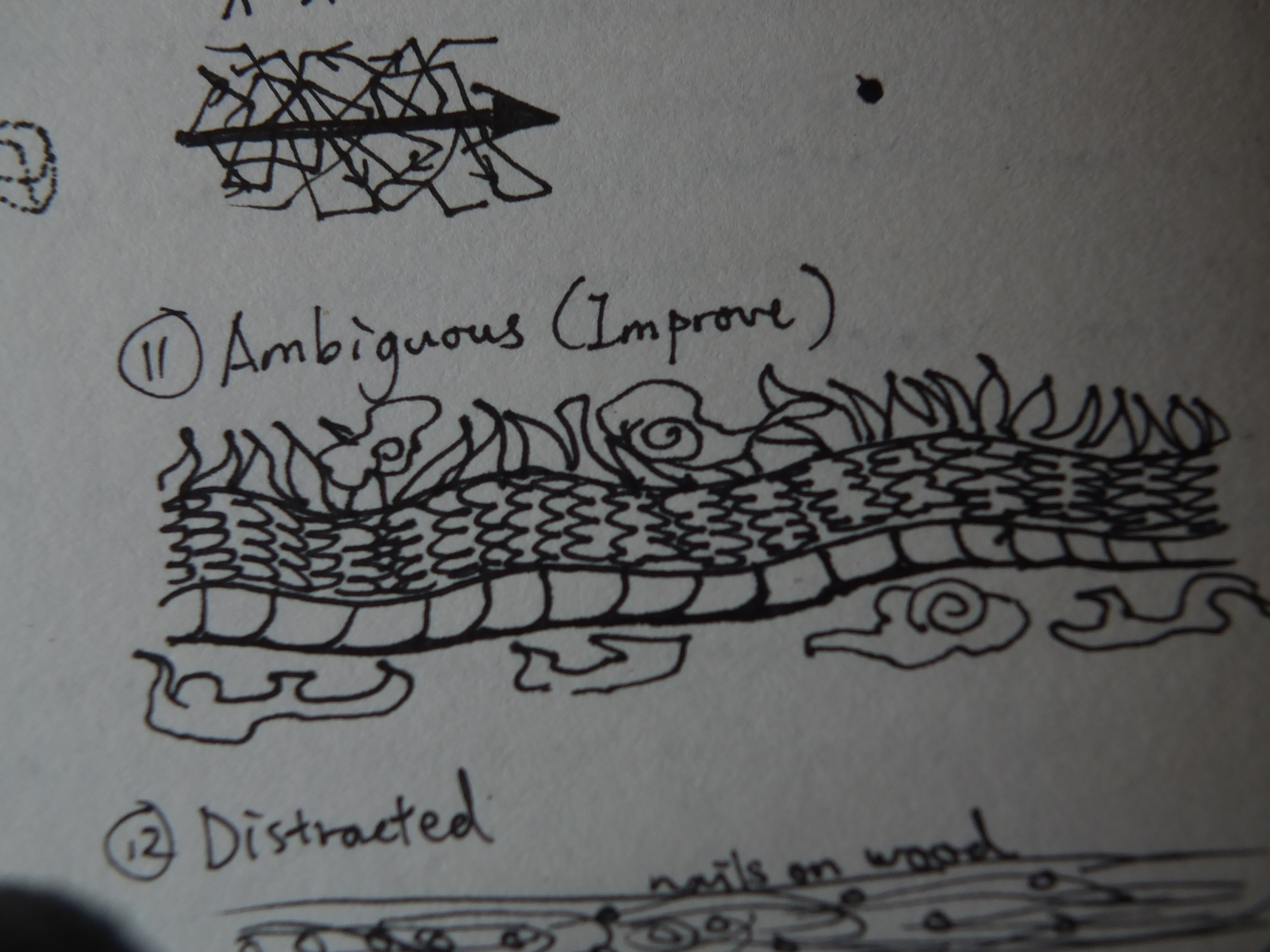
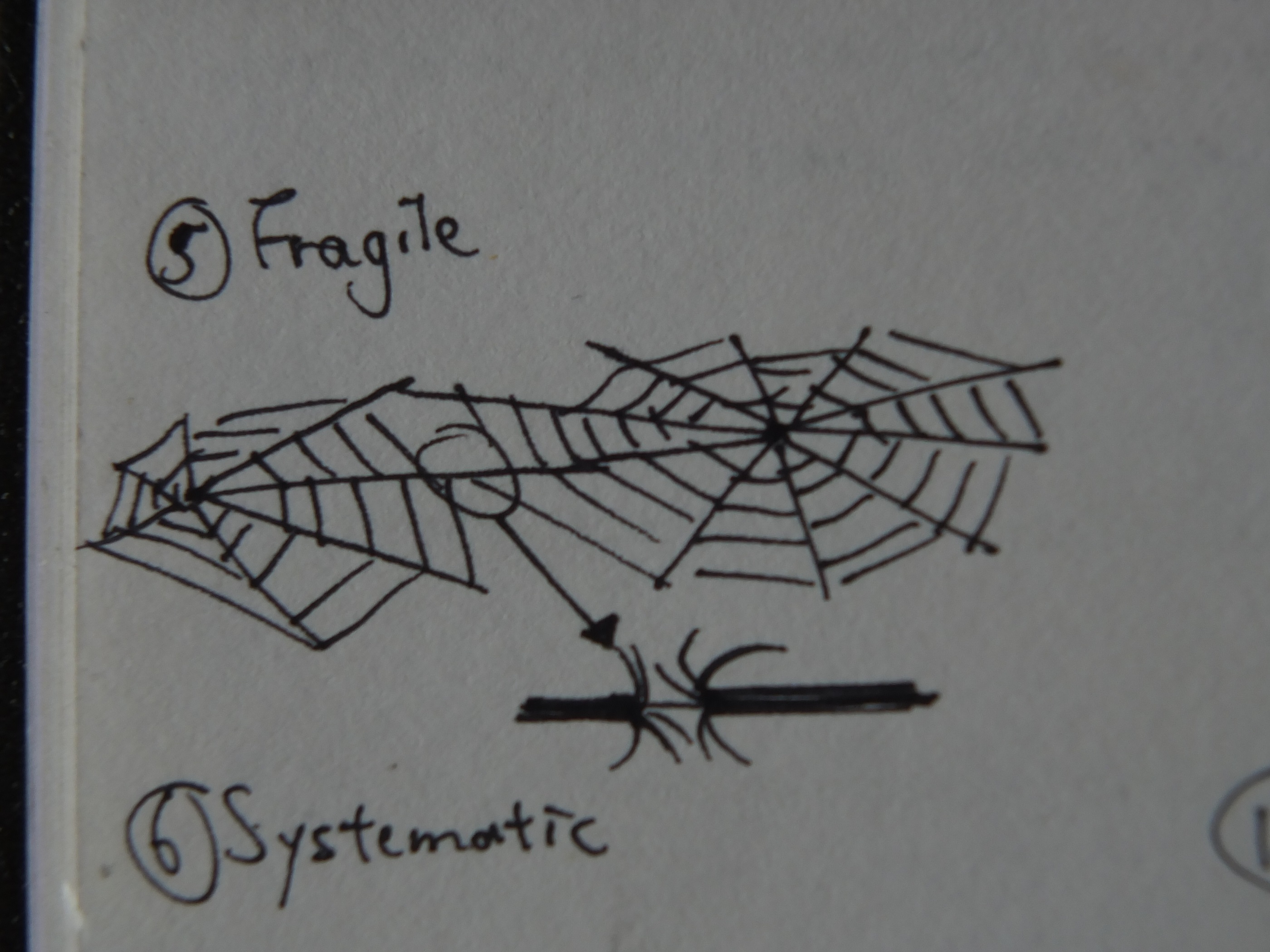
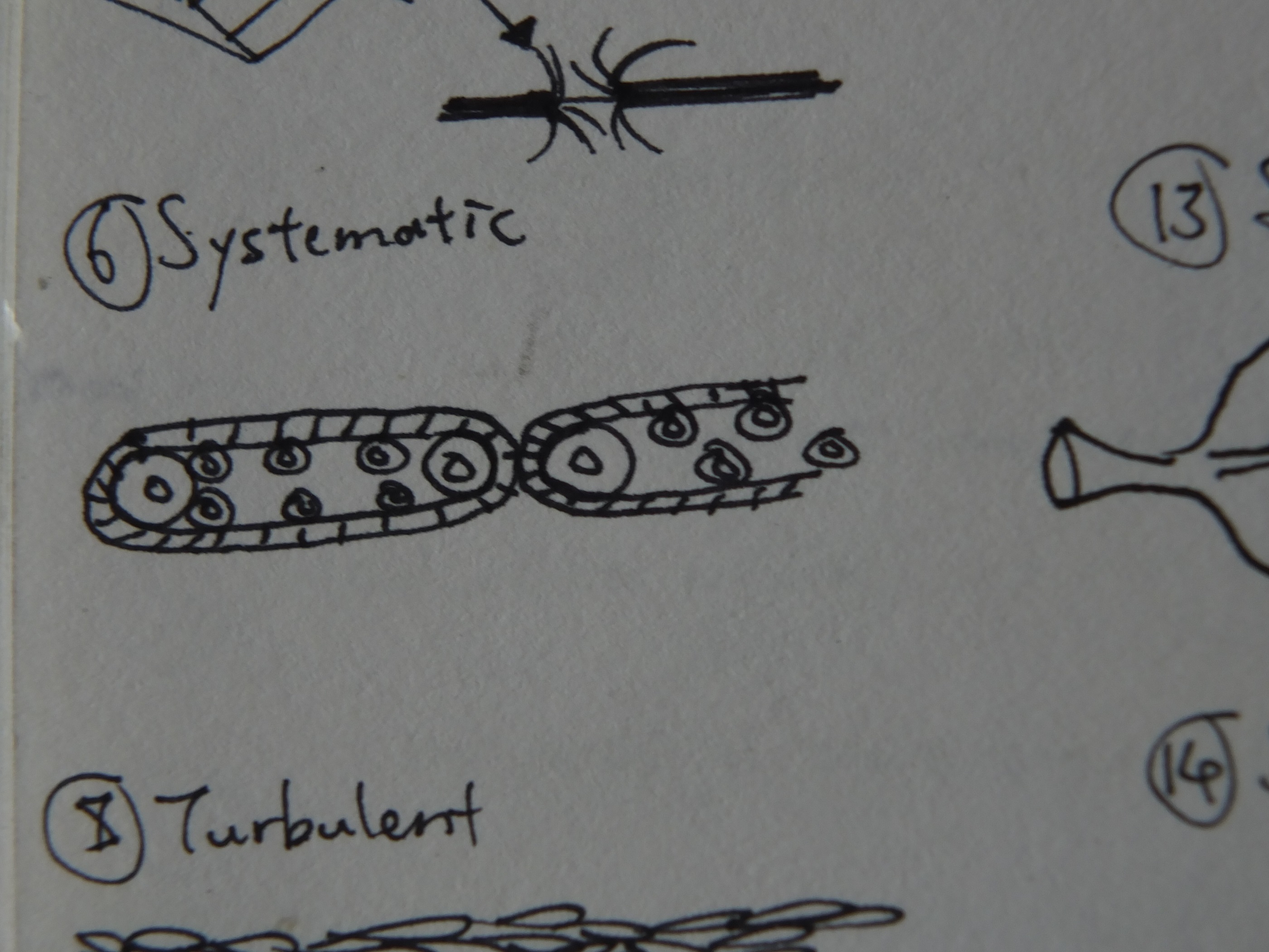
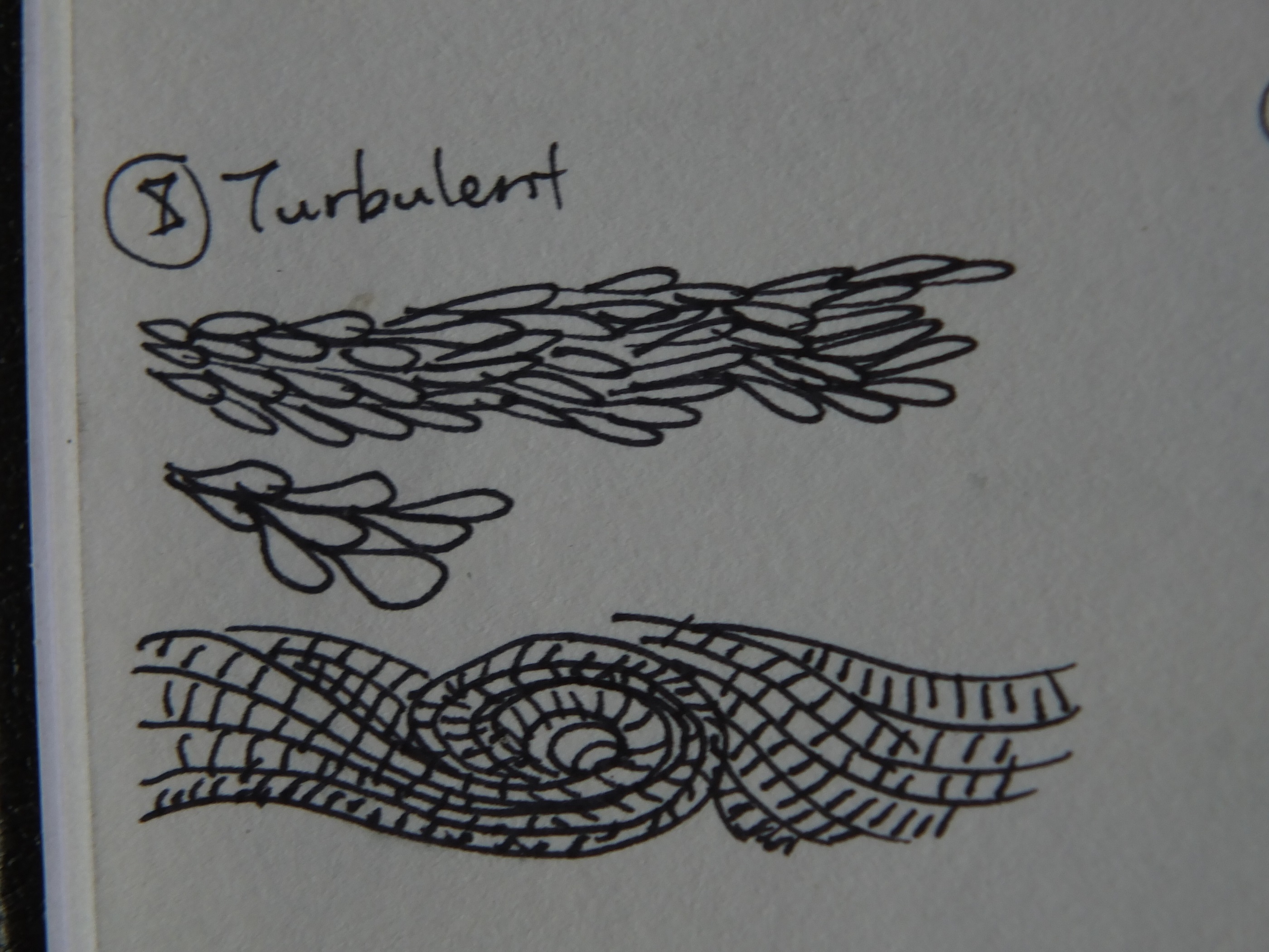
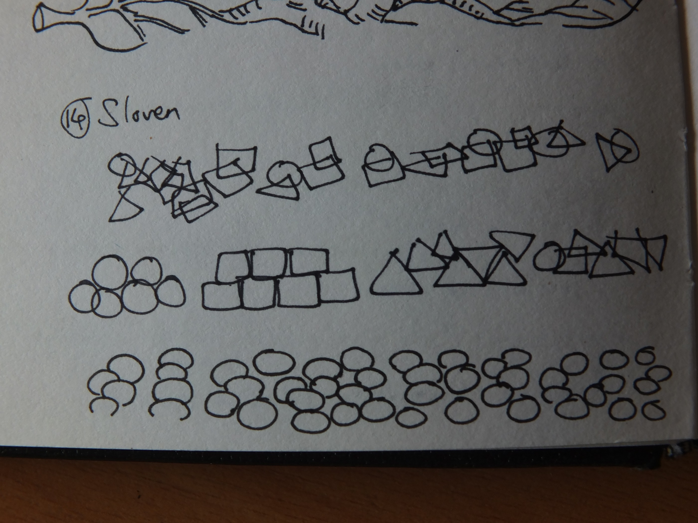
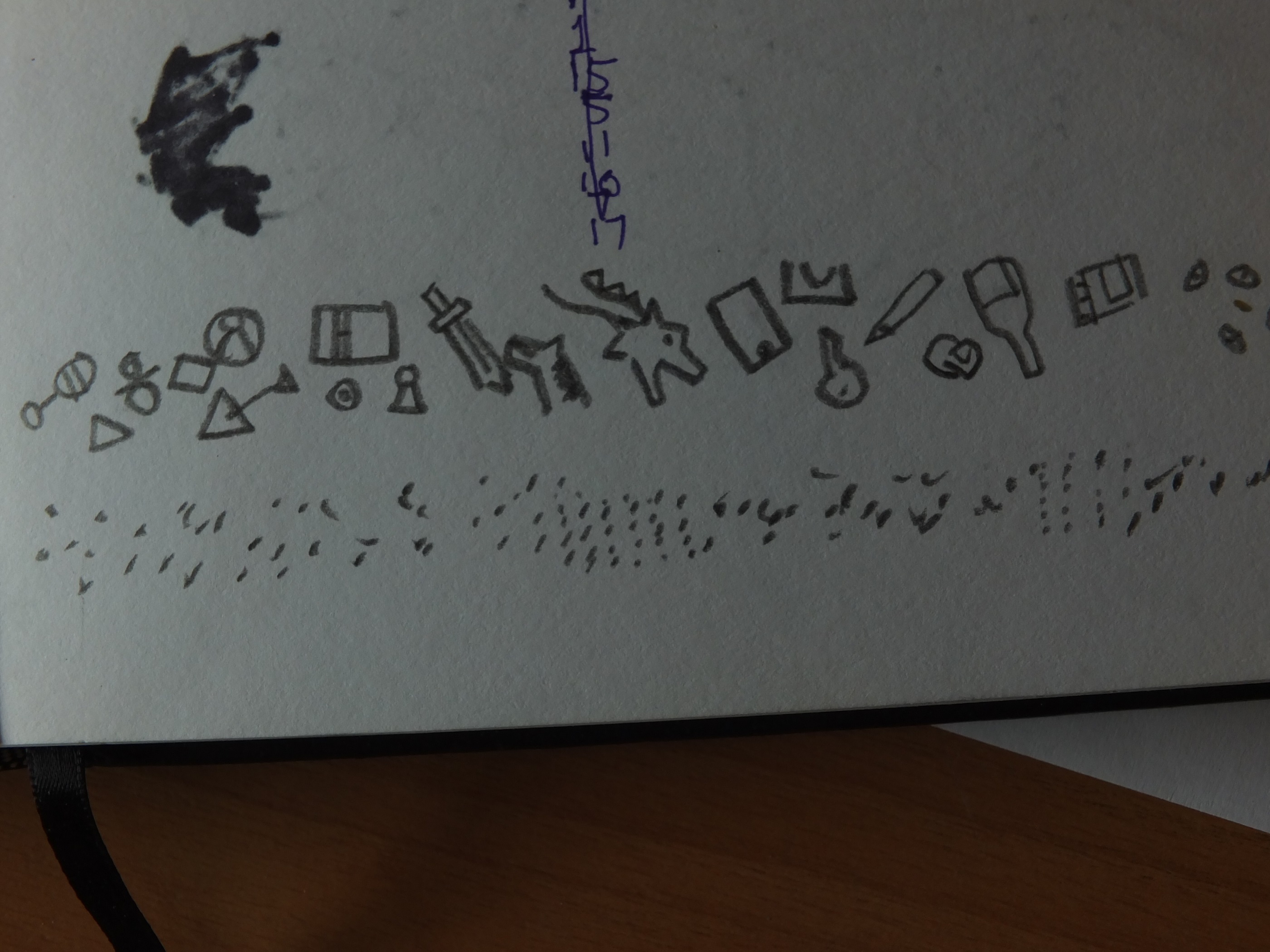
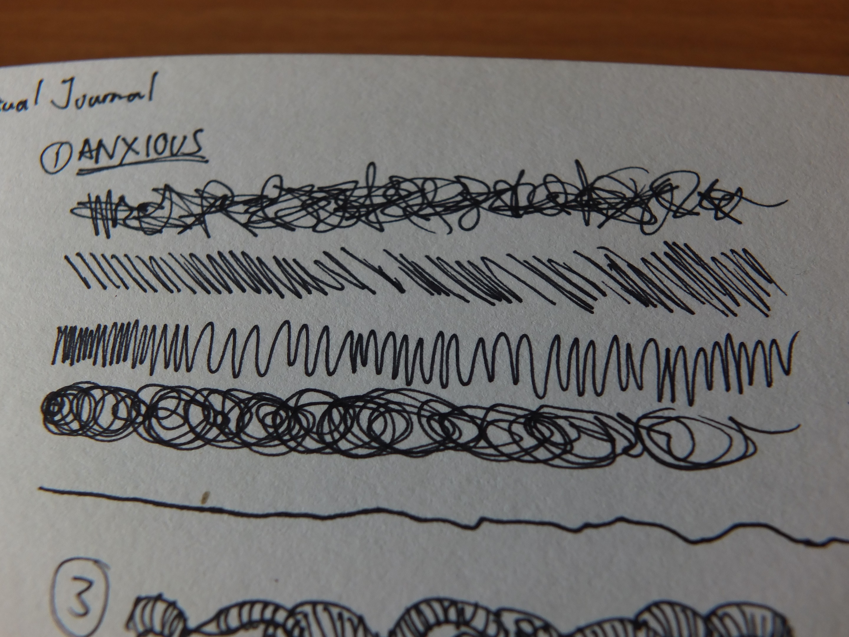
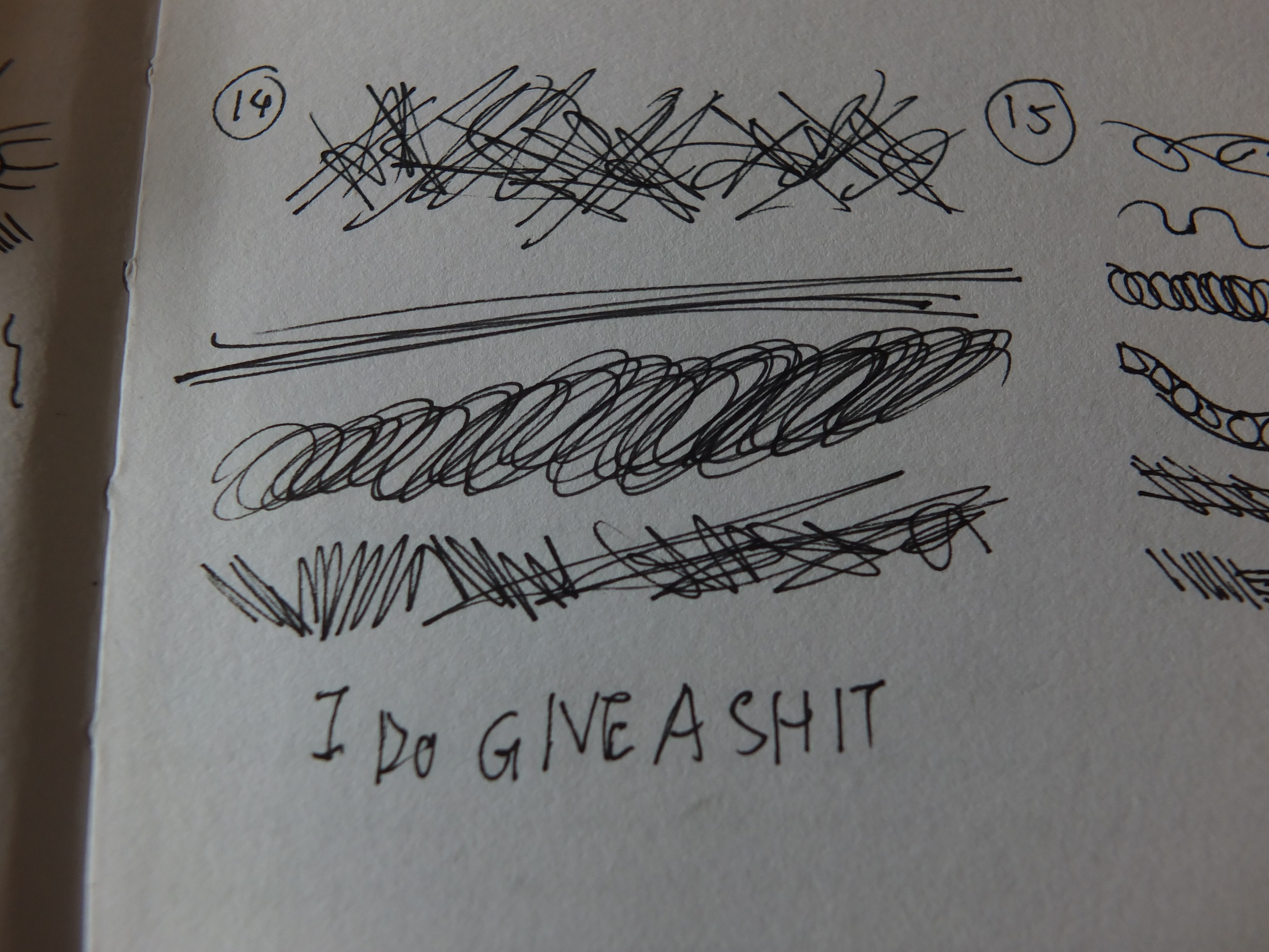
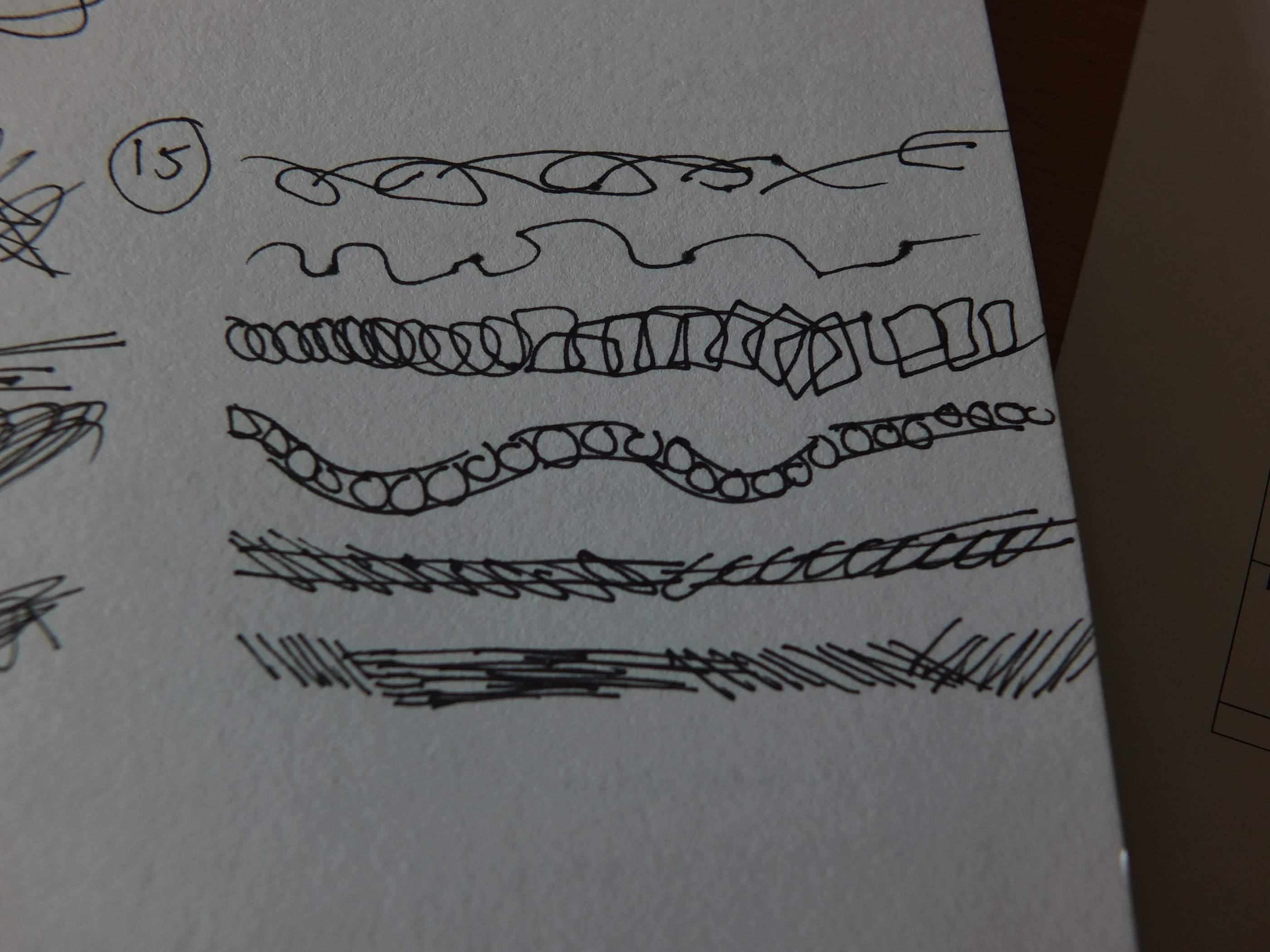
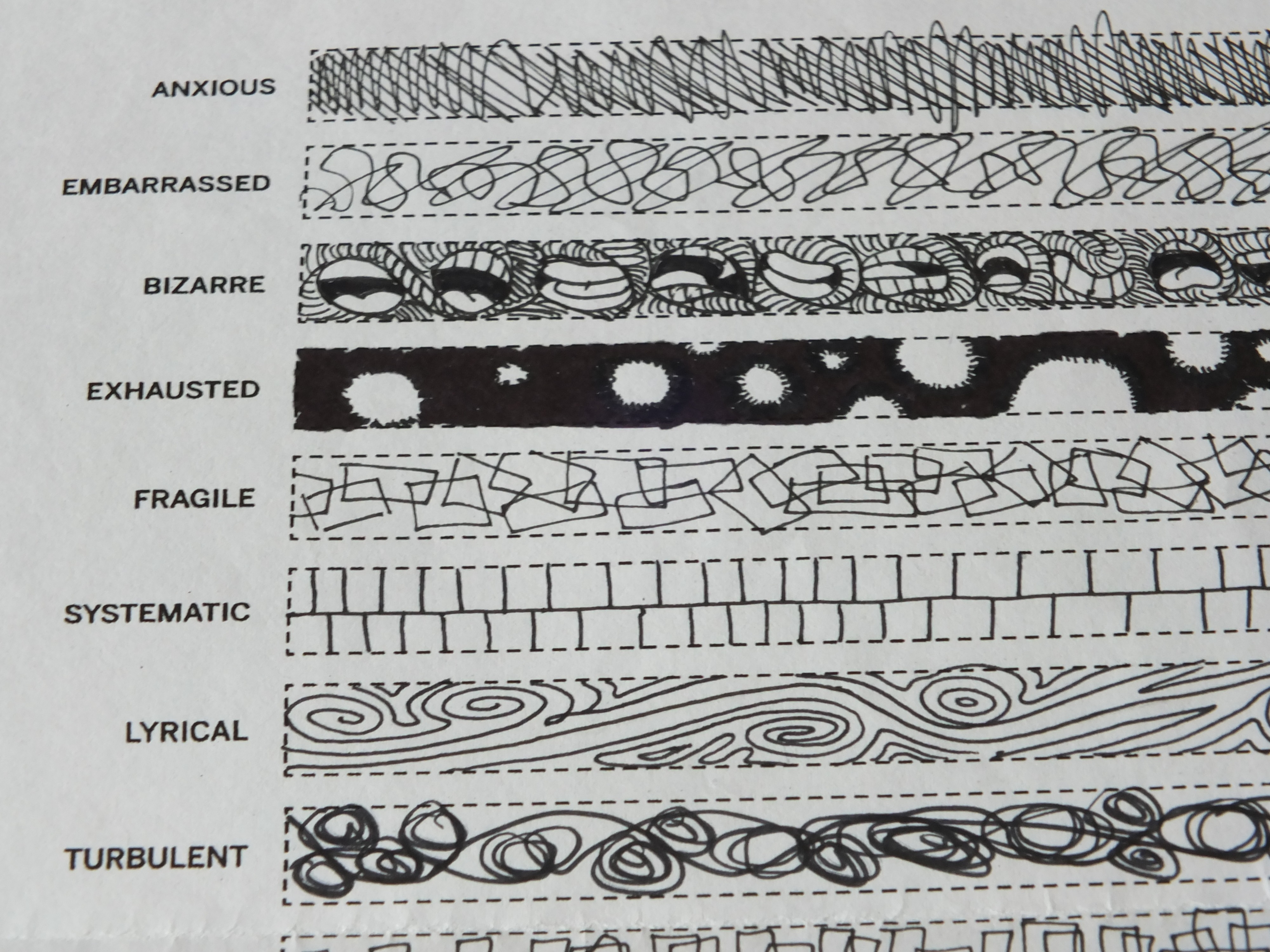
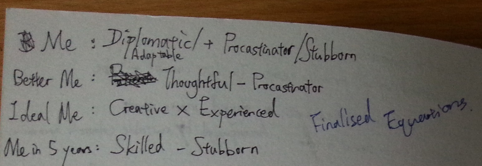
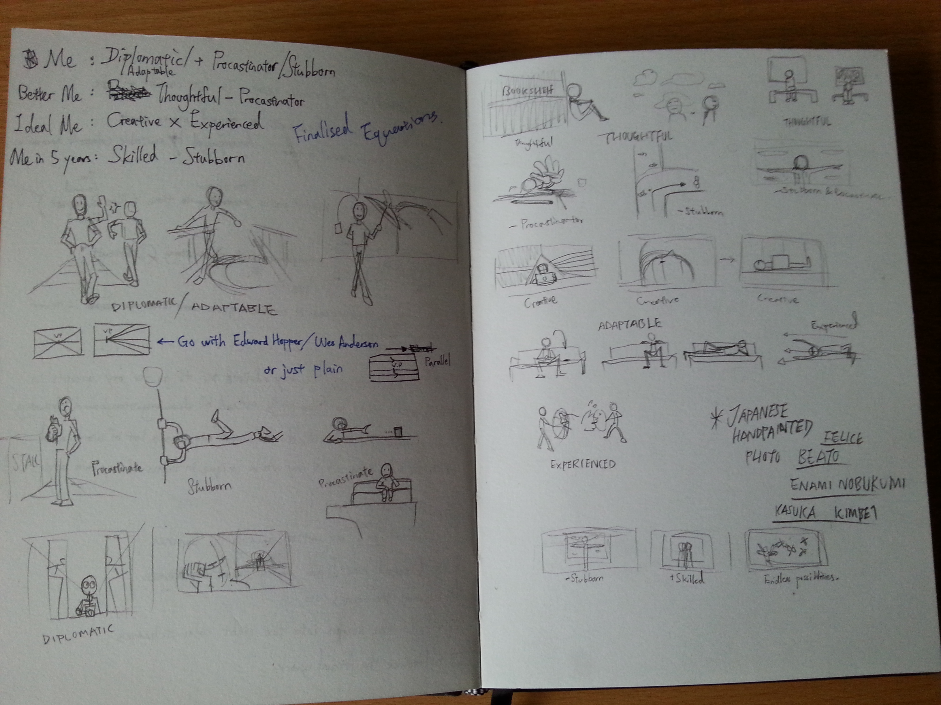
Excuse my handwriting. Side note: DIPLOMATIC was later changed to ADAPTABLE, I’ll explain later.

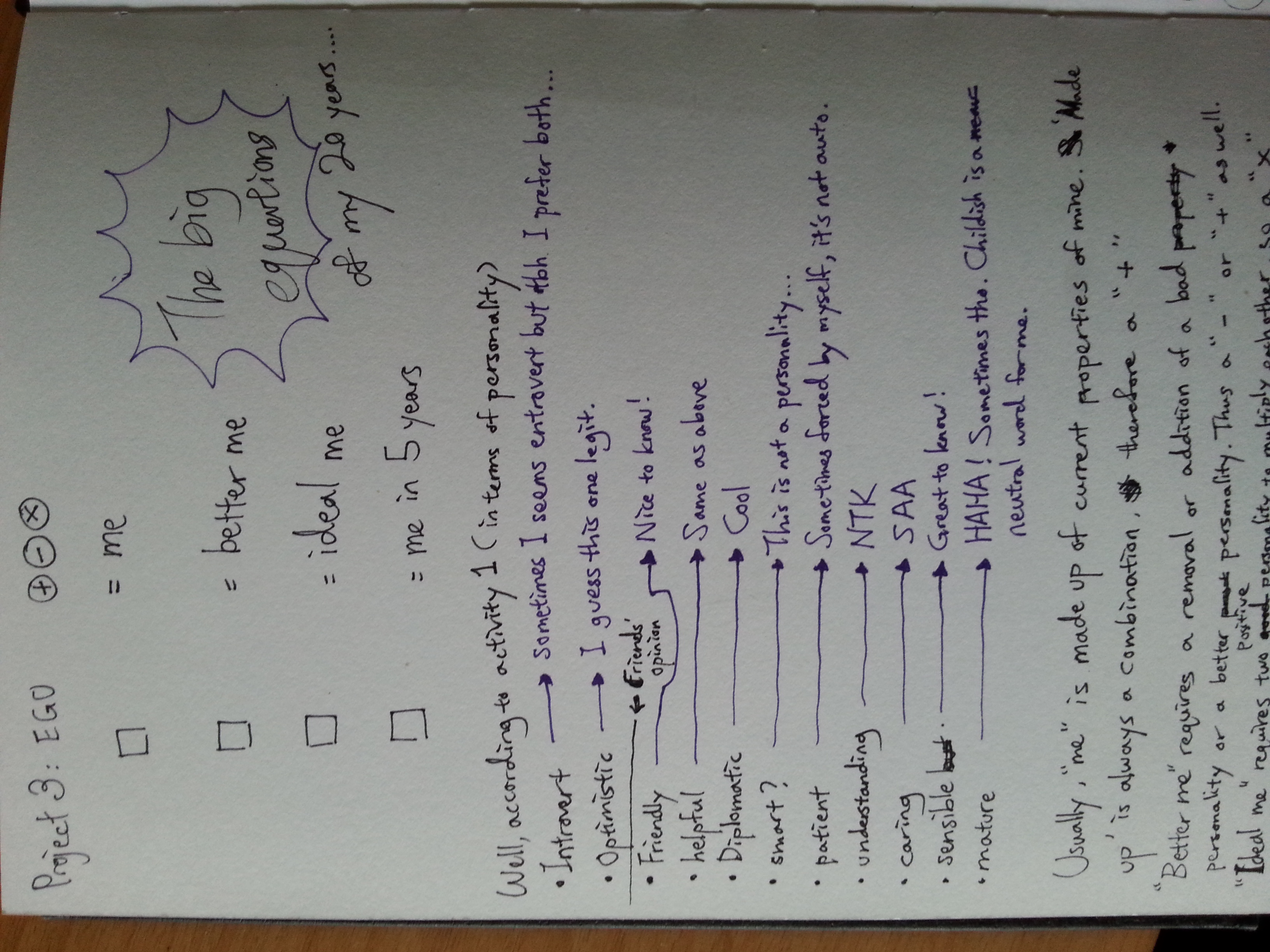
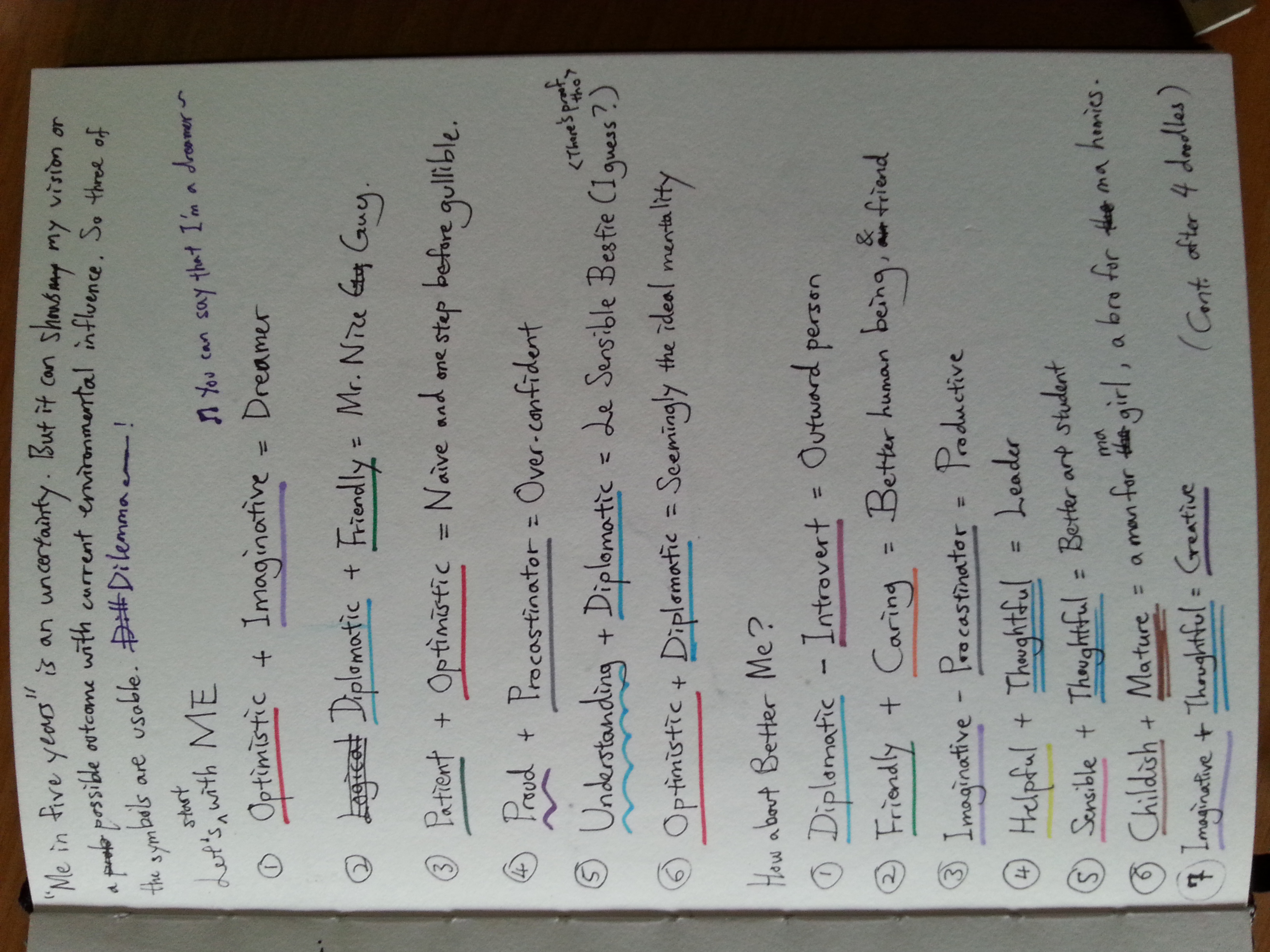
As you can see from above, these are my finalized equations for EGO. (Spoilers~)  I got to admit all these properties might seems hard to be hard expressed by my concept: Using aspect ratio 16:9 and frame photos like it was from a film shot, and present it accordingly like it has a story accompanied by linear perspectives. The photos are not shot in color but monochromatic, which will later colorized monotonously with Photoshop to present hand-painted photo effects.

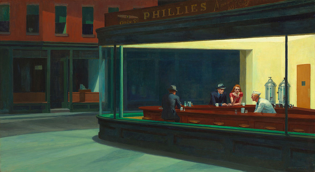
IT is a long concept name and I’ll explain how they were thought out. Firstly I wanted to show my interest in terms of future major in the project (as suggested by Ms. Joy.) and film’s usual ratio 16:9 is the obvious way to present what I planned to do in my future career. Soon, I came across a video that analyze Edward Hopper’s Nighthawks.

1024px-Nighthawks_by_Edward_Hopper_1942

I’ll focus on its visual rather than its message. That’s in another level.

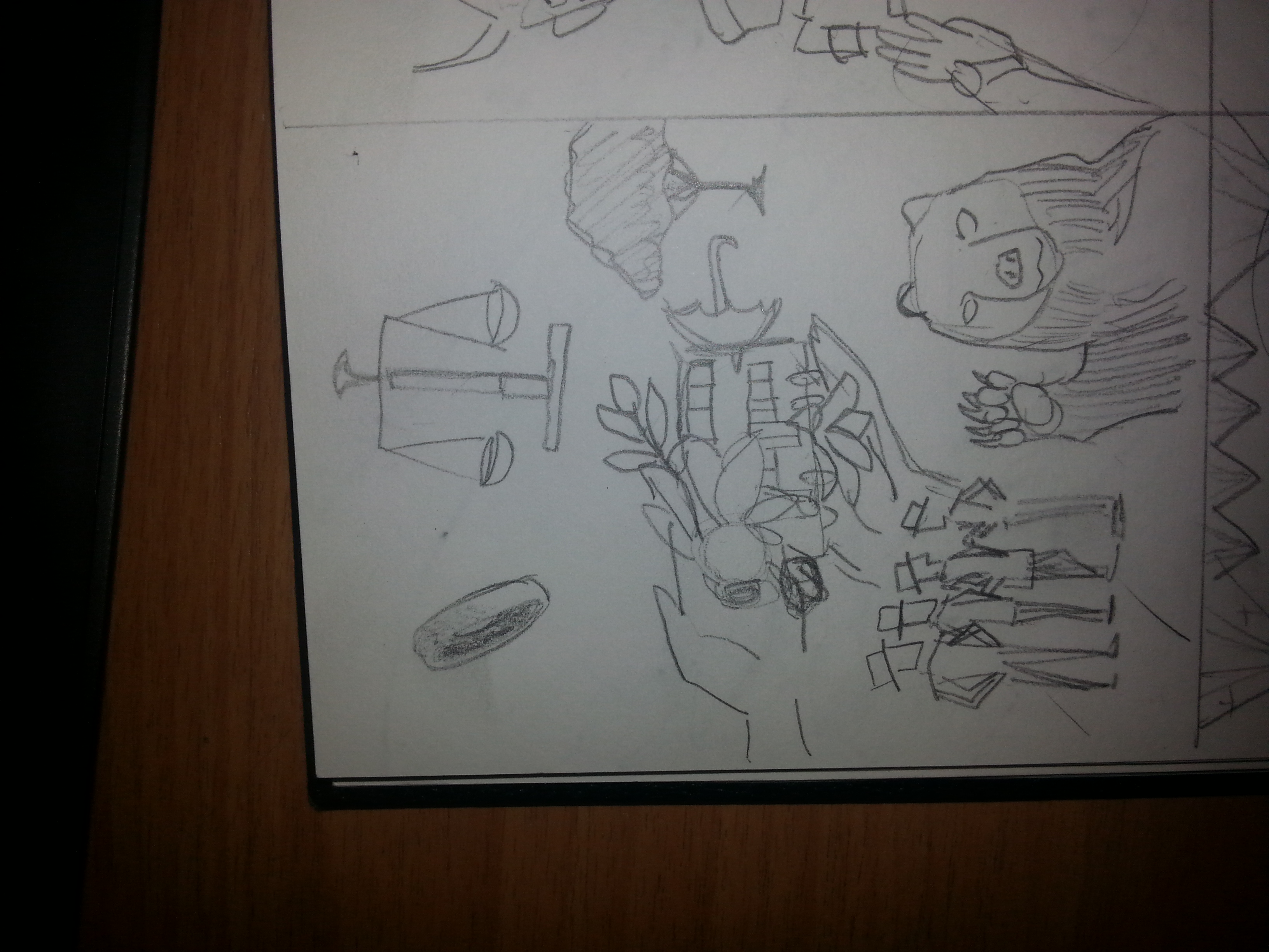
Edward Hopper’s usage of colors was simple yet striking and memorable. It shows a simple perspective planned picture that we might see in real life. I then wondered if I could achieve this effect as there’s always too much complicated background colors I can’t alternate, and I am not such skillful painter either. Either way, I have to come out with something. So, I sketched out my compositions first.

20151108_151206

Somewhere in the pages you can see Wes Anderson’s name, a director who utilized perspectives, symmetry and colors to produce stunning shots.

Soon after, I remembered there’s once a time when filmmakers painted the films frame by frame to produce color films. The part of colorizing black and whites sprung from my mind while I was composing the final frames.

rsz_scientists

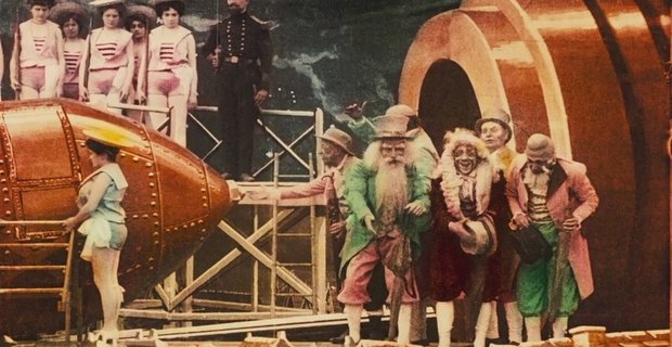
I must admit, it’s Scorsese’s Hugo that taught me about one of the pioneer of filmmaking, George Méliès

Ms. Joy suggested more artists who did the same to not film but photography during the consultation. She told me to study the following artist: Felice Beato, Enami Nobukumi, and Kasuka Kimbei. They are pioneers in color photography as well and try to understand how and why they choose their colors when they were given the ability to do so. I’ll present my research of them in my next post and now I have to move on to my equations first.

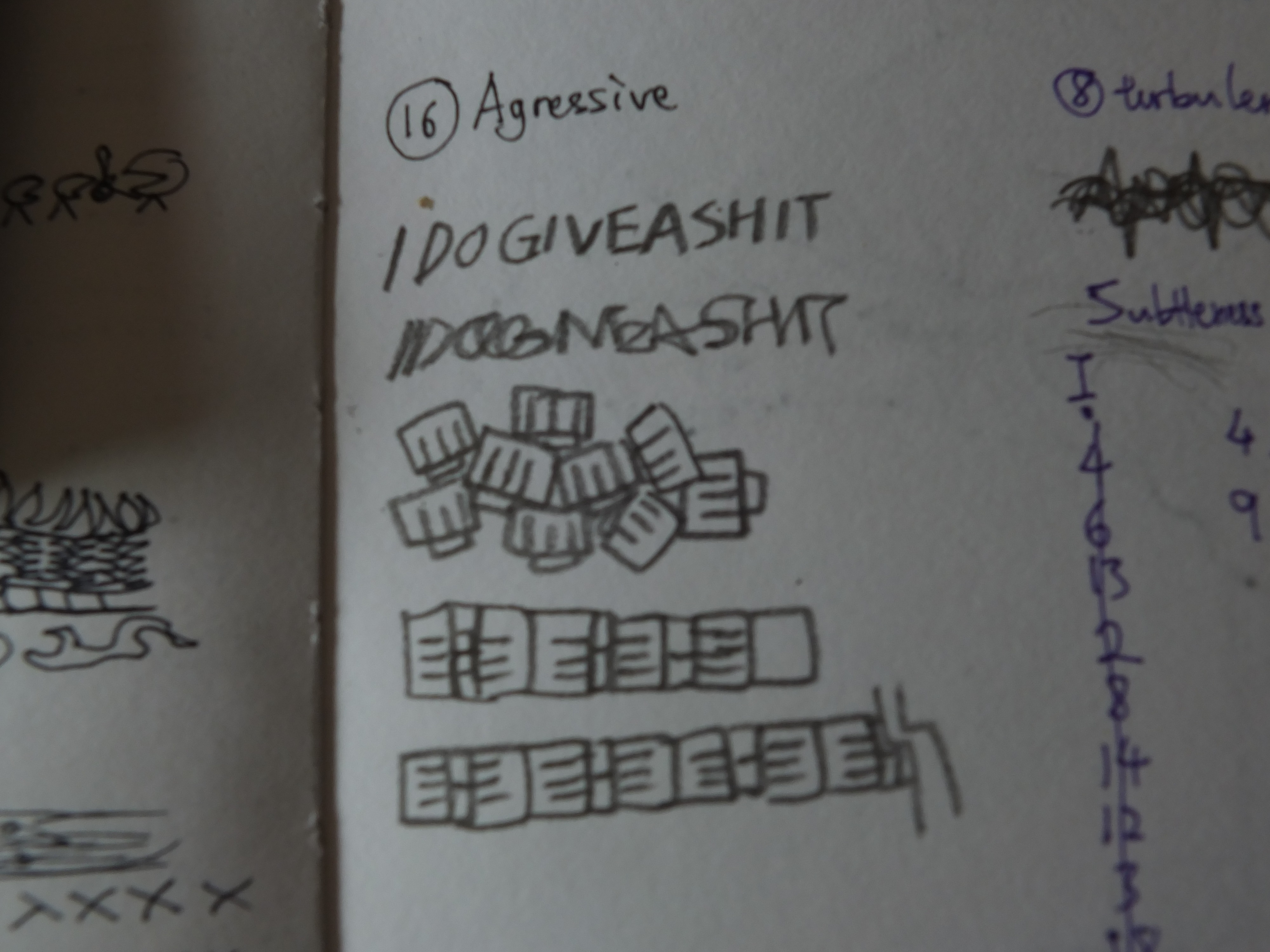
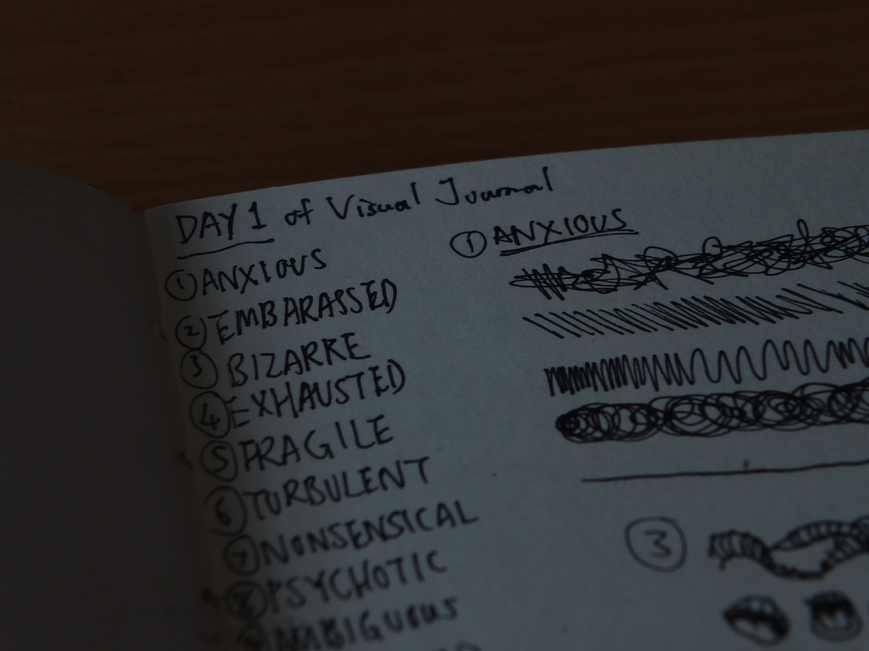
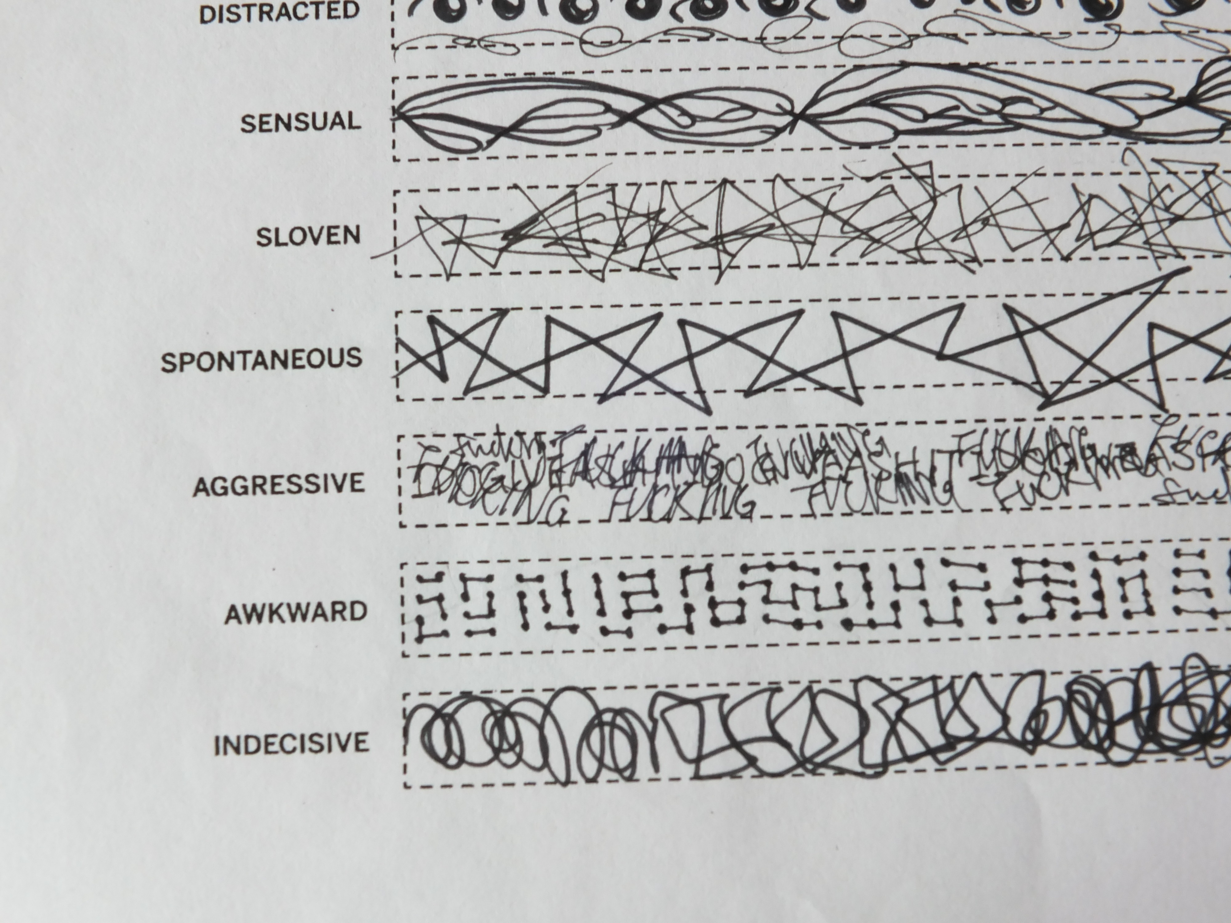
As I said, most of my properties given by my classmates are formed through experiences and mistakes, some only appeared to certain people. I’m not saying they’re not my sincere personalities, but there are some traits that portray me from the start to develop these latter traits. For instance DIPLOMATIC is a word I agreed initially, as I always performs as the middle man among friends and dislike unnecessary conflicts, basically try not to speak the wrong words. ADAPTABLE on the other hand isn’t born with me as well, but it does summarize my ability to cope various environments, which happens throughout my life. I’ve always considered my daily routine flexible wherever I go. The same statement goes with me among my friends as I am usually the one who compromise. It’s a good thing for trying new stuff, but too passive in a way that I usually follow along where life took me to.

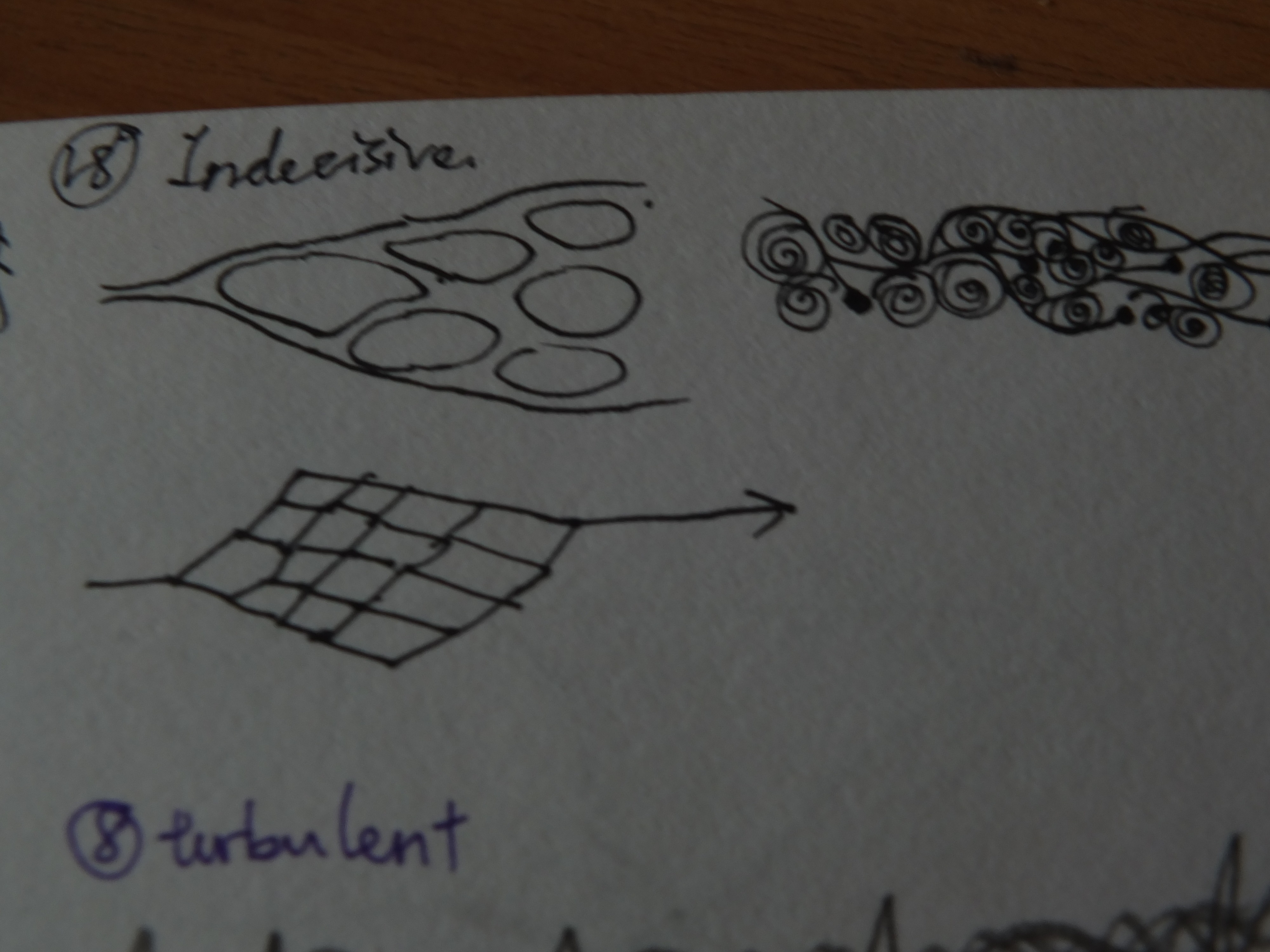
As for the rest of the properties, they’re subconscious flaws that sometimes stop me from advancing. Sometimes I was slowed down due to traits I lack, therefore these traits ended up in the BETTER/IDEAL zone.

I am eager to show you my finalized frames but I rather show them in my next post. It is because they’ll reveal too much and were incomplete as well. I obvious won’t hide merely 10% of it. So keep on anticipating!

(To be continued….)

Not the literal meaning though! So after two weeks of intense brainstorming. (Which basically for me is staring at my visual journal MOST OF THE TIME, am I being too honest?) Okay back to the point! Here’s my progress of conceptualizing my EGO.

So, what is me? what am I? Looks like we are never too early to experience existential dilemma. To sum up all my thoughts, I preferred to refer the conclusions of me from the previous activity.

20151022_153529

Yep, this one.

Here’s me summarizing all the properties of me that was shown to my classmates throughout the semester.20151108_151048

There’s a saying that bystanders see the game better, so I assume this is the almost accurate depiction of me. However, living with myself since birth, I (supposed to) know myself best. After a few hours of revisiting my memories of two decades, I concluded that some of these personalities shown cannot fully depict what I am YET. This is because they’re built up through my experiences and mistakes, and some are just specifically shown to certain persons, what really catalyze them may not be on the list. Then it hit me. These catalysts maybe are the one that formed what I am, and some of them is just not that good to admit.

20151108_151051

These little jottings really helps me to understand what I need. Sorta like talking to myself.

20151108_151056

It may looked you-don’t-say, but at least it clarifies me better than my cluttered brain.

To explore the catalyst that might hidden in my subconscious, I forced myself to write down at least 7 of the equations I can formed with the properties written in the previous page as nominees for the finalist. This seemingly effective self exploration exercise took hours to finish, but it certainly aid my understanding to myself.

20151108_151056

Hope it helps YOU to understand more about me as well.

20151108_151128

I used color markers to indicate repeated properties I used. Some of them are what I have, some are what I wish to have, some are what I wish to not have.

Gradually all the catalysts, properties I wish to have, and properties I hope to remove surfaced. Just as I was writing all these equations, a concept was formed in my head thanks to the video I shared in the previous post. It was at first sounded a bit troublesome, but in some way I knew it can represents myself. Right after I finished the tedious equation forming, I quickly jotted down the concept that was freshly unfolded.

20151108_151151

Hope you don’t mind its blurriness.

This concept is a freaking challenge for me. After conceptualizing it, I asked myself, can I really find a way to express it. Some part of me screamed, “YOU FREAKING MORON, HOW ARE YOU GONNA STAGE THESE SHOT INTO WHAT YOU WANT AND DO YOU THINK IT’LL BE CLARIFYING?”

One week later, I proved myself wrong.

(To be continued…..)

color-theory-infographic-paper-leaf

Bless the people who make info-graphics, they’ve saved and produced people with short attention span like me.

Secondly, I need to personally thank Ms. Joy for providing us the color wheel so I don’t have to switch on electronic devices just to get the colors right. I think it’ll be useful in many ways.

Thirdly, let’s take a moment and appreciate the efforts of the researchers that define some thing we take for granted intellectually. Imagine if there’s a whole aspect of the world out there and we are missing it because we don’t have the organ to perceive it? (—The internet) I’m glad we had eyes.

Let’s talk about colors from the things I love, films. My fellow classmates have been doing a lot of research on colors so I don’t think repetition will be the best choice.

So first stop, monochromatic. There are great films in the colored movie decades use monochrome like Schindler’s list or The Artist. Sadly I didn’t get time to watch this masterpiece. So I will be mentioning 500 days of Summer as my point. It uses monochrome in one of the scene where the lead characters were placed in foreign European movies, saying ambiguous dialogues. Monochromatic sets the mood of seriousness, every colors are either absent or fully combined. The lack of vibrancy leads the viewers to focus on the context rather than the pictures. It also focuses meaning from the scene so viewers won’t get another idea from the color.

Analogous are be often found in unified movie settings like Harry Potter franchise, and Zack Snyder films. I found they are usually chose to set the overall mood like how chaotic and dim the wizardry world has become after the resurrection of Voldemort in the fourth movie. After Nolan’s Dark Knight trilogy, superhero movies tend to go dark. Zack Snyder’s Man of Steel went to the extreme and was criticized for darkening the symbol of bright and pure justice.

Complementary can be found on every commercialized franchise movie poster. i.e. Bourne series, Mission Impossible series, James Cameron Avatar, and M.Night Shyamalan shameful Avatar. The dark blue and orange makes every component stands out of one another. The combo makes them a memorable poster, and a reason to add excitement in it like fire, explosion, and scotching L.A.

Split complementary, triads, and tetradics, schemes that used more than 2 colors are usually found in Marvel movies, animations, and light-hearted genres. The combinations create richness to the scenes and emphasized on their aesthetics. They don’t intentionally imply the mood, but try to achieve realism, so you can feel that you’re in the settings and related to the environment.

These just show how important is color grading/correcting.

(The research is based on generalized knowledge and personal analysis. You, who have a better knowledge of the aspect, might disagree with some.)

To be frank, I am not a colorful person at all. Emotionally, I don’t express much. Verbally, I can’t express much. Technically, colored media just isn’t my best tools. Since I was young, I felt that the god of color materials must have something against my pass-life and cursed my ability to use His creations. Just kidding, but I’d always screw up in coloring. I have the sense of color but my last art exams screwed up badly due to my color practice. (Yep there’s other reasons too.) That’s why I’ve always envious about how my sister who’s an artist too utilized her color so well in her works.

But thanks to our eyes, we’re able to appreciate color. So I am not going to repel it but to work with it. THIS is one of my challenge for this next project. To be honest, I never realized or understood how these theory exist. Maybe I’m oblivious about them even if I found some combinations of them in various media and thought, “this is nice.” So the discovery for the theories fascinates me and makes me wonder how will I apply them into my Project 3.

I’ve once read a book about color psychology. The author made her point well on how colors affect us. As people who uses color as tools, artist possesses great power to affect people. Why reject it just because I not good at it? And to start with painting myself is indeed a good way to learn to control the colors.

Whether to stand out like complementary, or harmonious like analogous, or as vibrant as triad, or less tension like split-complementary, the overall goal of my colors will have to be balanced and making sense, and more importantly, represent myself. Either way, it’s all going to be determined by my concept, my ego equations, which will be revealed in another post next time.

Thanks for reading!

POST-BLOG

The awkward feeling when everyone did an incredible job in conceptualizing their project in such amount of time, even though they’ve told you they’re just getting started. Damn productive guys….They just can’t stop making me think I didn’t write enough 😀

Finally after a week of considerations, my nursery rhyme was set to be ONE TWO THREE FOUR FIVE. I don’t need to explain that this IS a rhyme since almost everyone who was born before the millennium knows it. A progress is a progress, so I shall place the full rhyme below.

One, two, three, four, five,
Once I caught a fish alive,
Six, seven, eight, nine, ten,
Then I let it go again.
Why did you let it go?
Because it bit my finger so.
Which finger did it bite?
This little finger on the right.

I felt nostalgic when I saw this rhyme during my research as it was one of the English nursery rhymes I first encountered in the language. So I figured, it has a perfect flow of story and able to be visualized with real objects, suitable for my choice of nursery rhyme.

The first challenge I faced was the concept. Then I remembered that DADA artists uses things we can immediately recognize to convey their intentions in a unconventional way. In other words, try to be indirect with iconic symbols, in this case, dingbats. So my orientation will describe the words indirectly even for “one”. Thus the following visual journal sketches were created.

20151012_223013 20151012_223018 20151012_223024 20151012_223032The arrangements were made by copying the selected dingbats on my computer screen. I figured this way of planning can shorten my processing time. Also, I always have a clearer mind with it comes to hand-drawn sketches. After a few modifications, I am happy with my sketches and thus moved on to the software.


One of the main character of the rhyme is the fish. It got caught and bit its catcher for its own escape. I can’t just find a fish dingbat to fill this badass place. To be honest, I just can’t find any fishes in the dingbats collection considering it is a basic creature. Thus I thought of being ‘resourceful’ in my own way and built a fish from the remaining dingbats. As you can see, this fish was made out of a bee, a pair of woman lips, leaves, flower petals, SBS double decked bus, and an umbrella.

20151012_223047

I had fun composing the fish. Suddenly, I thought, why not substitute it with the luxurious items I found among the dingbats? The fish in the rhyme can be interpreted as the material needs that we occasionally obtain. Sometimes these needs cost a certain price, therefore “bit” us in the finger. We can’t keep what wasn’t ours.

20151012_223040
Therefore, a fish composed from a bracelet, an unknown branded handbag, a sport car, a high heels, a Mac, an ancient coin, and another set of lips just to make it lifelike.

12345 once i caught a fish alive - Copy

A bear holding up a high five. Four well dressed lads. Three Trees. A balance scale which require two sides like the justice it represents. The one ring to rule them all.

678910 then i let it go again2 - Copy

Ten fingers. A howling caNINE. Eight spiders. Seven saxophones (Saxophone is the closest thing I can get to shape like the number). 3 Satans’ mask, for the sake of satan’s phone number.

Why Hitler? Hitler was one of the victim of the needs — power. Also, his gesture looked like he was releasing a fish.

wdylig bibmfs wfdib - Copy

“Why did you let it go?” Captain Picard says to the strutting Leo as the questioned tweedle dum/dee looks at him. Leo might think he’s an angel in heart for releasing the fish who secretly celebrates its victory. But Leo reveals the truth with diamonds.

Diamonds may not shape like fish teeth, but they certainly have the shape to form a vicious set.

delittlefingeronmyright - Copy

The little finger on my right, represented with a can of pills, signifies it’s the one in pain at the time.

Thanks for reading my whole process. I really had great fun doing the pictures. It’d be a good experience if it wasn’t constantly interrupted by my laptop’s faulty back-light. Hope you find my exploration interesting. See you soon in my next project!

Due to the fact that it would be pretty much a blur after zoom for the photo. Here’s the video that goes through each and every lines in my final work! (Unframed.)

I’d say this project is a satisfied work for me. Yet there’s definitely some flaws in my final work, such as the aesthetic of the work. It’s a pity that I didn’t choose to try more methods of creating the patterns. Compared to my classmates works, my work lacks variety of materials and techniques. I believe some of the lines can be improved through different types of approach. This project has taught a lot to me and I hope that I can jump out of my own restrictions in my next project.

-END-

DSCF7409

The first thing I did was reviewing every lines I chose for the first inked draft. The review was performed with conversation between me and myself. Sounds depressing, but I found this quite useful in terms of concentrating. So I wrote out every verbal description of my lines. (The good thing about describable work is I can know what am I doing. haha.) Next, I commented on each of the description and determined whether they should leave or stay. Feels like the judges on any reality shows.

What’s next? Back to the thinking chair. In this case, the visual journal.

DSCF7410

Anxious: Missing stuff might cause anxiousness yet not serious and obvious enough. Embarrassed: Finalized.

DSCF7411

Nonsensical: First I thought of politicians but this concept is more of a picture than a line. The arrow with messy vectors signifies the messy side-plots in nonsense movie and yet again not in favor.

DSCF7412

Ambiguous: The dragon body was finalized with a room of improvement. The flames and clouds can be the hint of direction but it did not function like I expected.

DSCF7413

Fragile: It got its new inspiration from Exhausted’s spider web, with some little details added in the finalization.

DSCF7414

Systematic: The original line didn’t worked out as I hoped. So the line was revised and got a new symbolic answer.

DSCF7416

Turbulent: The new version is tricky to think because not much of fresh representation came into mind. These designs also lack subtleties.

DSCF7418

Distracted: What if someone got distracted when drawing crosses? Exaggerated and reluctant.

DSCF7420

Sensual: This is a finalized idea but it would only work if the branches are completed in full size.

DSCF7421

Sloven: The idea is tough as its definition can only be seen in a larger picture. Yet I don’t want it to be too simplified.

DSCF7422

Sloven: This was done by pencil sometimes later.

DSCF7424

Spontaneous: Finalized idea.

DSCF7425

Indecisive: I’m indecisive about this as well. The main inspiration comes from the theory of multi-verse and story plot possibilities.

DSCF7426

Aggressive: The emotion can be easily defined with lacking of depth. So the phrase was discontinued although it’s expressive for me.

DSCF7429

Turbulent: It was revised again at this point.

After listing out the ideas, I recalled one of the suggestion Ms.Joy gave. Since the depth of the lines are not equal, viewers might found it not interesting as it contains sudden drops of subtlety. Therefore, I can make a spectrum of subtleties to give out an ascending impressions of my work, hence the rearrangement in the last photo. This is also one of the reasons that I chose the A1 format. Moreover, the my concept doesn’t not consist of pairing and comparisons. I intended to show the whole picture in one so viewers can read the lines one by one.

[To be continued]

A visual journal to me is a compilation of my ideas, outcome of inspirations and observations. It can be a record of my creative progress for different assignments which can influence each and other. It can also be a room for conversation with myself, in terms of discovering what the heck I am thinking. There are a few challenges for my visual journal. One, whether or not I can keep up the habit. Two, I will possibly be limited by my own definition of image creating. Three, the uncertainty I have on the direction of my recording style. — Me in NTU Blackboard.

.It’s been a long journey from scratch till the presentation. In the beginning, I intend to let my hand do all the work, which is imagine myself into that certain emotions and let the pen creates the pattern instinctively.


DSCF7393

Anxious. Impatiently drawn with no consistency, including the straight lines.

DSCF7394

Bizarre. Trying to be as random as possible, but with regulations.

DSCF7395

Embarrassed. The line is drawn by a shy person. Constantly covers the line he drew.

DSCF7396

Fragile. Visualized with cracks, thin lines, glass panels, splitting string, muscle tissue, heartbeat, and loose sand.

DSCF7397

Exhausted. Visualizing the perception of exhaustion.

DSCF7399

Turbulent. My first thought was the flowing elements like liquids and air movement. But it could be projected as insecurity.

DSCF7400

Nonsensical. Do not make sense, do not need to. So I went without any rules.

DSCF7401

Psychotic. Can be portrayed by the results of splatting or the gooey feeling that needs to be released. OR, just use the words of sound made by a psychotic man who ran wild.

DSCF7402

Ambiguous. Supposedly drawn to avoid comprehension and conclusion of the shape. Like where do they face? what are they?

DSCF7403

Distracted. Intended to let the viewers to get distracted by something.

DSCF7404

Sensual. This one went on by instant flow of the pen.

DSCF7405

Sloven. Nothing is regulated by any sort. I attempted to produce something messy.

DSCF7406

Spontaneous. Inspired by fireworks, cell division, smoke and jumping dots.

DSCF7407

Aggressive. My pen was highly abused at this point. “I do give a shit” is the phrase I always shout in mind when I’m (and by the time WAS) angry.

DSCF7408

Indecisive. The regulations of the line keep on changing. They just can’t make up their minds.

All the premature lines are made in the moment, so their starting point are just as naive as I was. And so the end result of the first inked draft was presented with different intention.

DSCF7433 DSCF7435 DSCF7434

Our instructor, Ms. Joy found subtleties in some of the lines, especially those which ended up in the final work. She encouraged me to work on the new discovered strength of mine in the project. Therefore, a new orientation has appeared.

[To be continued]