
So the first thing I did was to make a mind map. Yikes.
MOODBOARD @ PINTEREST
EXAMPLES OF HEALTH COMM. POSTERS / INFOGRAPHICS


What that stood out to me:

It’s a health communication poster regarding the lack of sleep – however the overall layout really appealed to me. It is very objective, and the slogan/title is really in your face. “Sleep or die” literally makes you question mortality as a concept and think about what we have been doing. The use of bright colours over a black background really lets the information stand out. The information is also structured in a hierarchy that goes from RISKS -> PREVENTION METHODS, helping to emphasise the call to action to change sleeping habits. Use of clean cut graphics and sans-serifs helps to make it look modern and easy on the eyes too. Then again it’s not in an A2 format and thus has more space for information – but if it were to be in A2, there could be a main graphic to capture attention with information around it instead.
/// the use of red automatically draws the attention of the eye to the information, so that’s a really useful thing to remember I think.
INSPIRATIONS
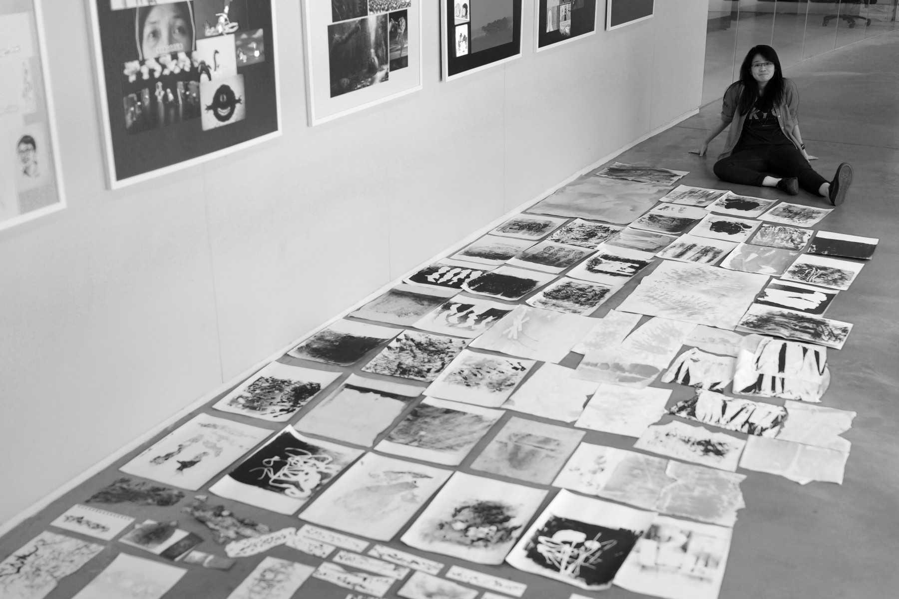
Would be easier to refer to my pinterest moodboard!
I might want to use photography for the graphics / or collage to create something visually appealing.
Emotions I want to evoke is either a sense of fear towards the issue – making it seem grave
AND/OR
keeping it light hearted with a character or something to guide people through prevention methods – a superhero of sorts.
I mean, a grave/serious image would be more impressionable, just like how this is iconic in singapore still
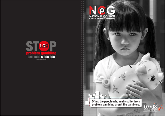
ZIKA NEVER SLEEPS – appeals to me more in a sense that it makes you think about how a moment of oversight can cause danger to families and friends. Showing a person/child sleeping with the idea of imminent danger would help to drive the idea. Might be too cliche though!
The second idea that appeals to me more would be the portrait series – familiar faces with red bars over their eyes to insinuate being infected with zika. It carries the idea that anyone you know may be next and we have to do something about it.
TARGET AUDIENCE ?
Families! Because prevention starts from homes, by targeting families its easier to disseminate the information about prevention. Usually to parents / adults.