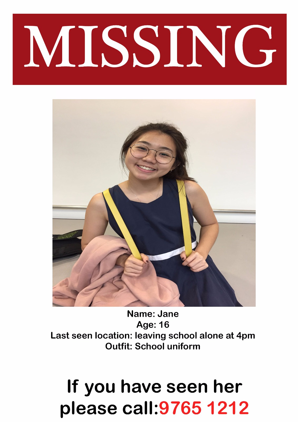
Along the corridor, missing posters of Jane are pasted to give the viewer some background information on the situation of Jane’s disappearance.
What you see
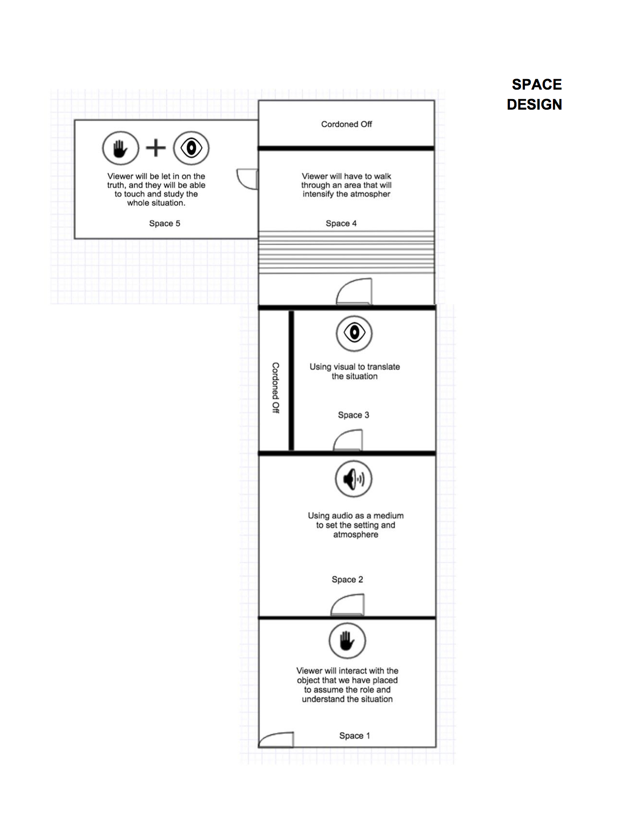
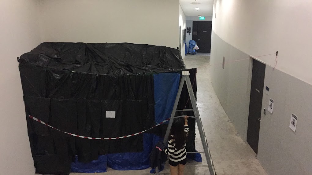
The viewer will be met with an enclosed black cube – scene of the incident
The viewer is given five minutes to explore the space.
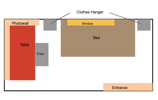
Overview of the room:
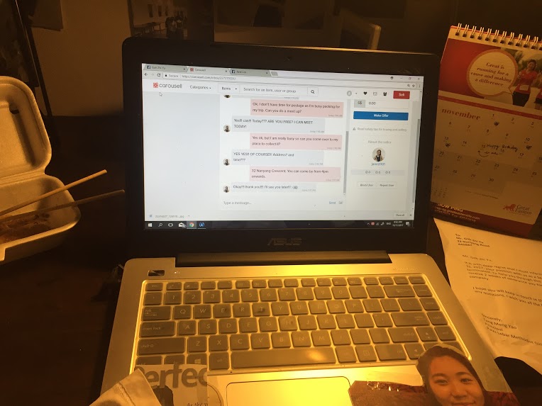
Interaction with the laptop (Jane’s facebook, Zhi Yu’s facebook and Carousell chat):
What you can touch
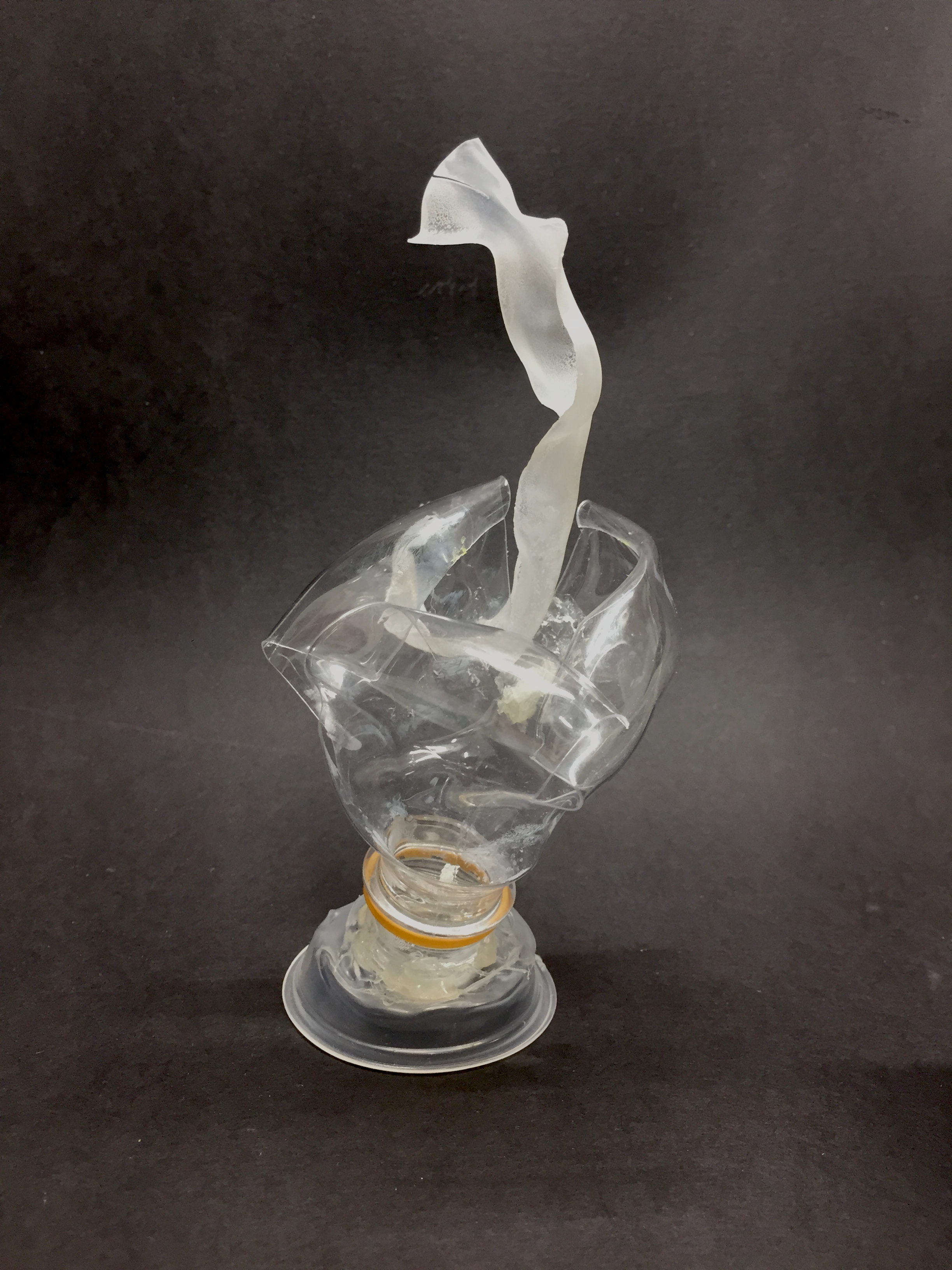
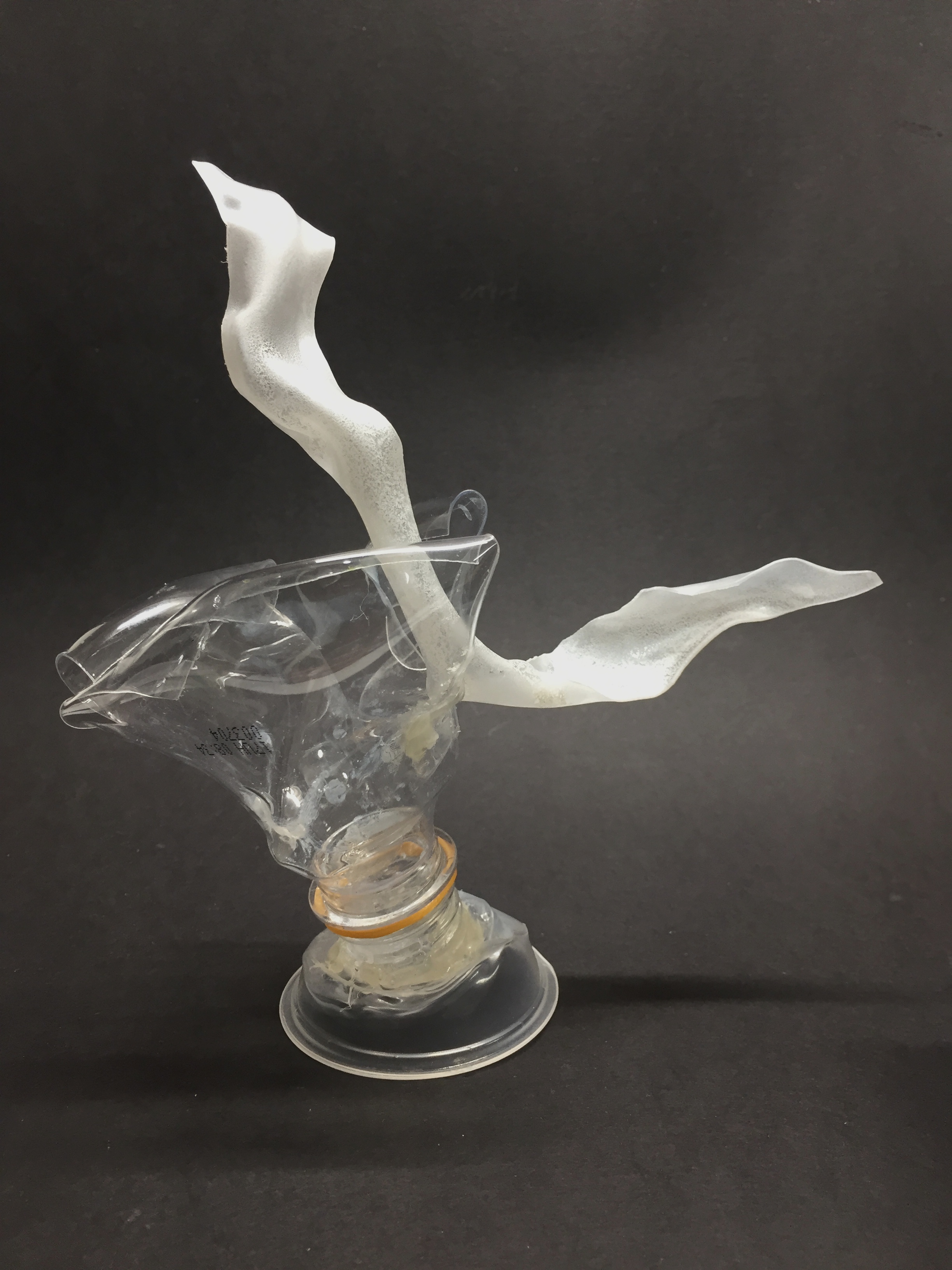
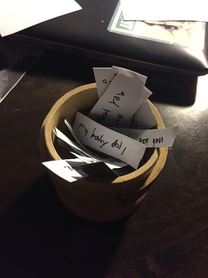
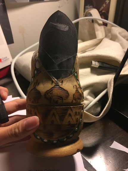
Russian Dolls with the stalker’s hidden desires and intention
Tabletop and floor: Find out more about the stalker (His age, unemployment, lifestyle, motif)
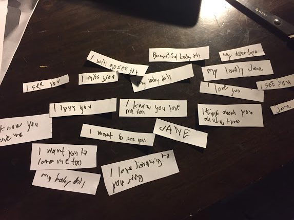
The stalkers obsession with Jane
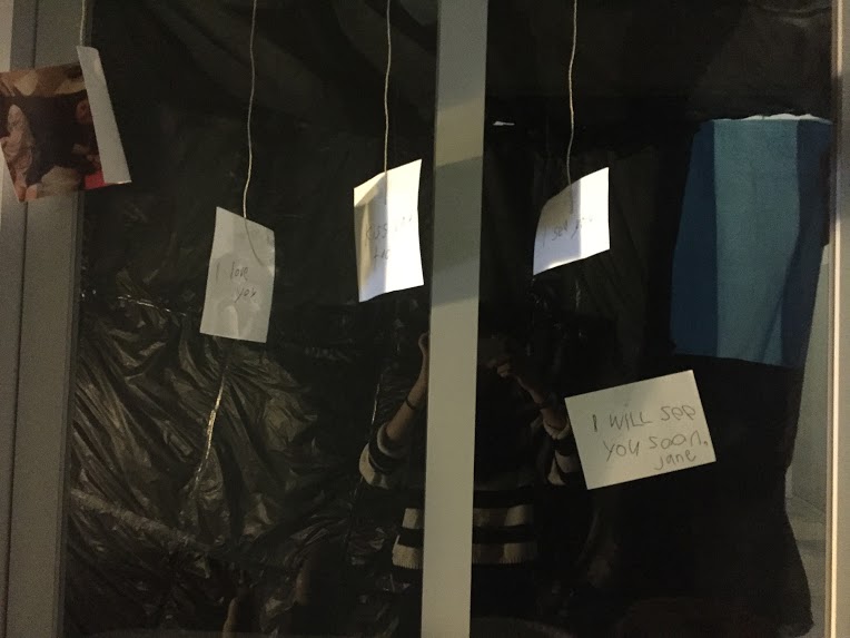
Writings on the photographs “beautiful baby doll” “I love you”
“I will see you soon, Jane”
Implied ending or demise of Jane
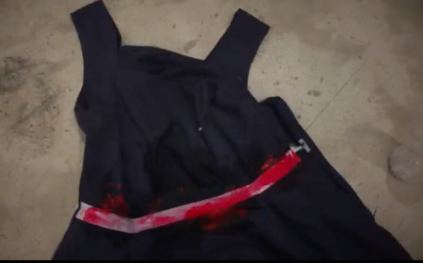
Jane’s uniform
What you find out
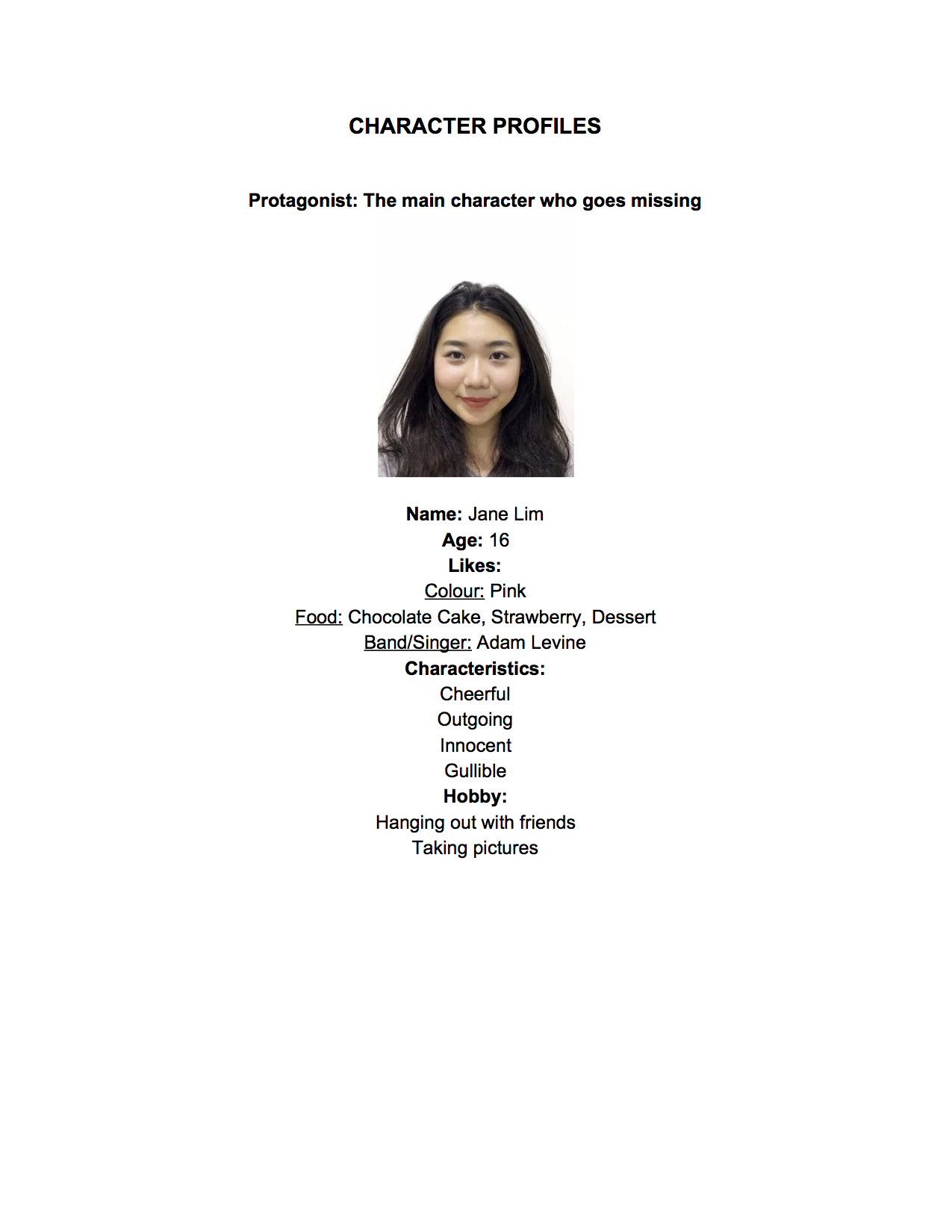
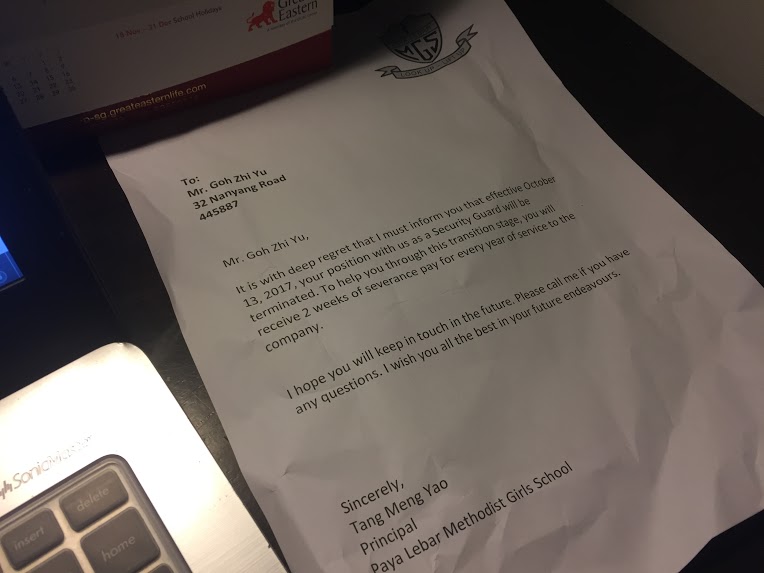
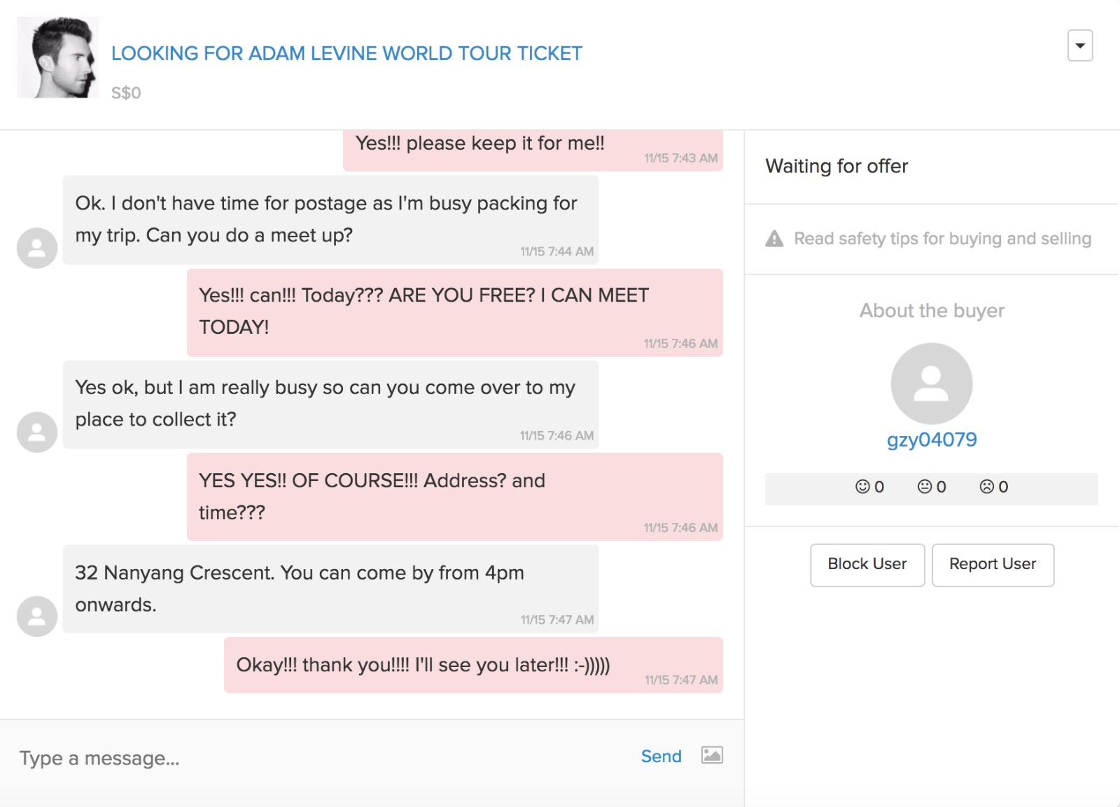
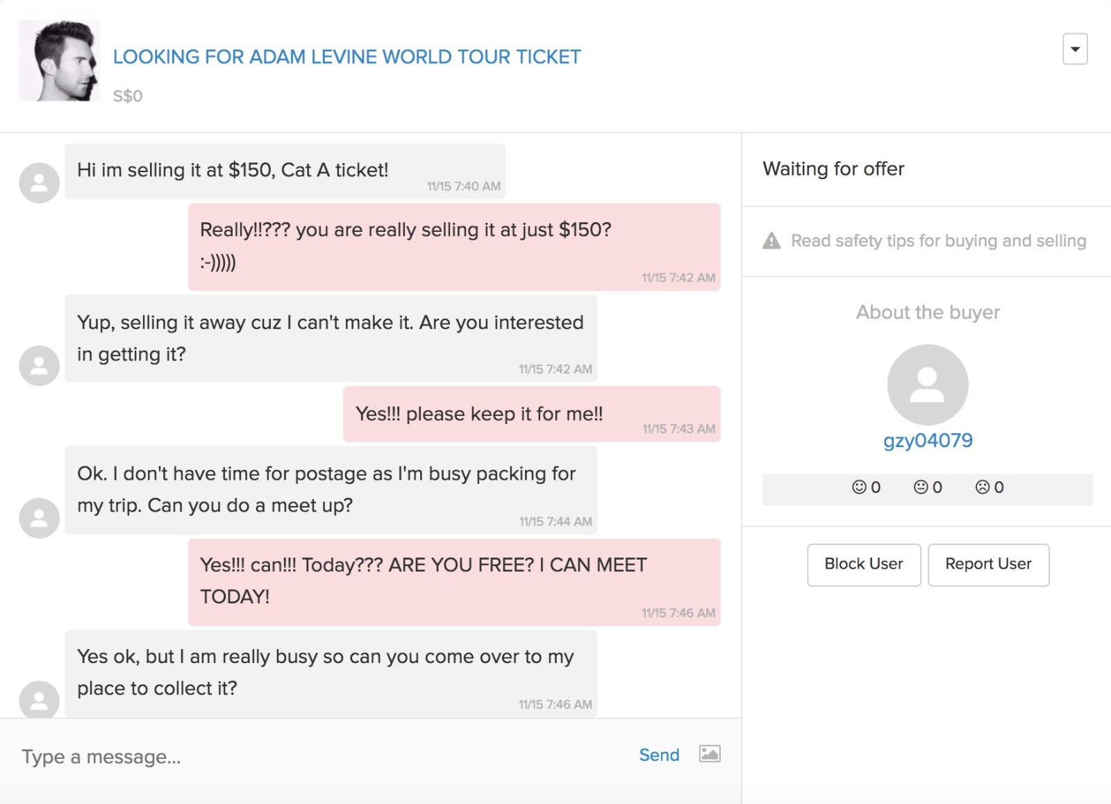
Jane (16) that disappeared on 15 November, was a victim of physical and cyber stalking by a middle-aged retrenched security guard, Koh Zhi Yu (33). Due to her careless use of the Internet, Zhi Yu have access to her photos, information, whereabouts and schedule that allowed him to carry out his obsession easily. On his birthday, Zhi Yu’s desire reached a breaking point and wanted his “baby doll” as his birthday present. Luring her with Adam Levine tickets on Carousell, he managed to get the gullible and over-trusting Jane to his little hideout and shrine where he got what he wanted.
Links between space and digital mediums:
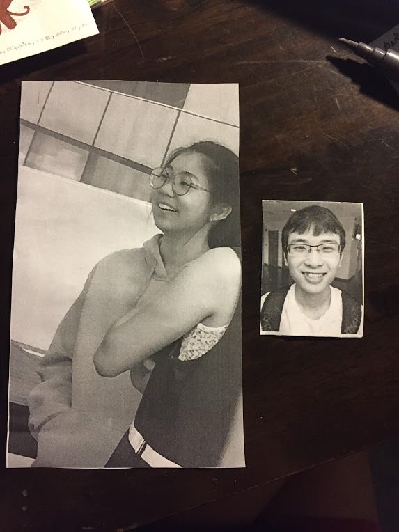
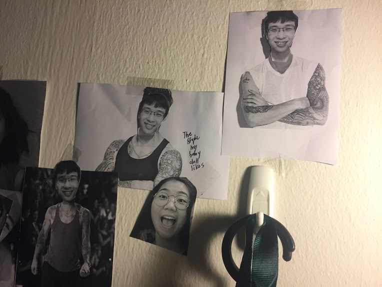
Photos with the stalker at the back of the photo
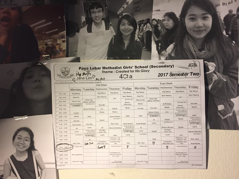
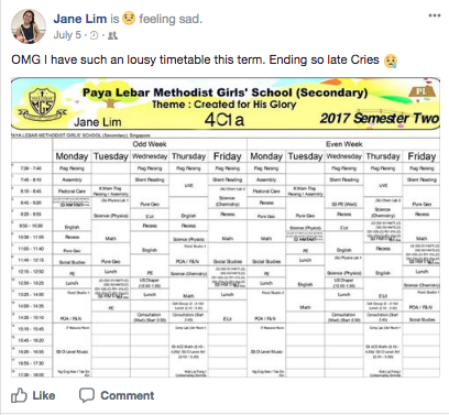
Jane’s post complaining about her timetable and the printed copy in the room
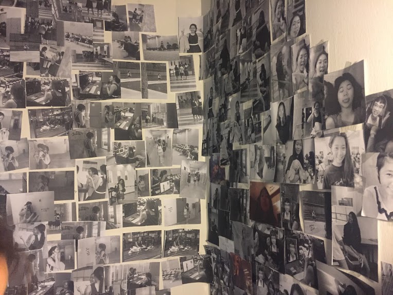
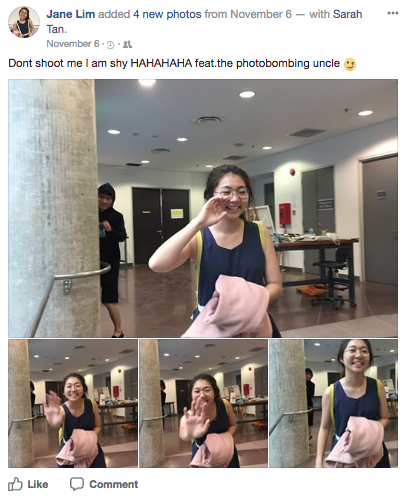
Childhood photos and pictures taken from Jane’s Facebook onto Zhi Yu’s photo wall
Jane’s desperate request for Adam Levine tickets and the Carousell deal
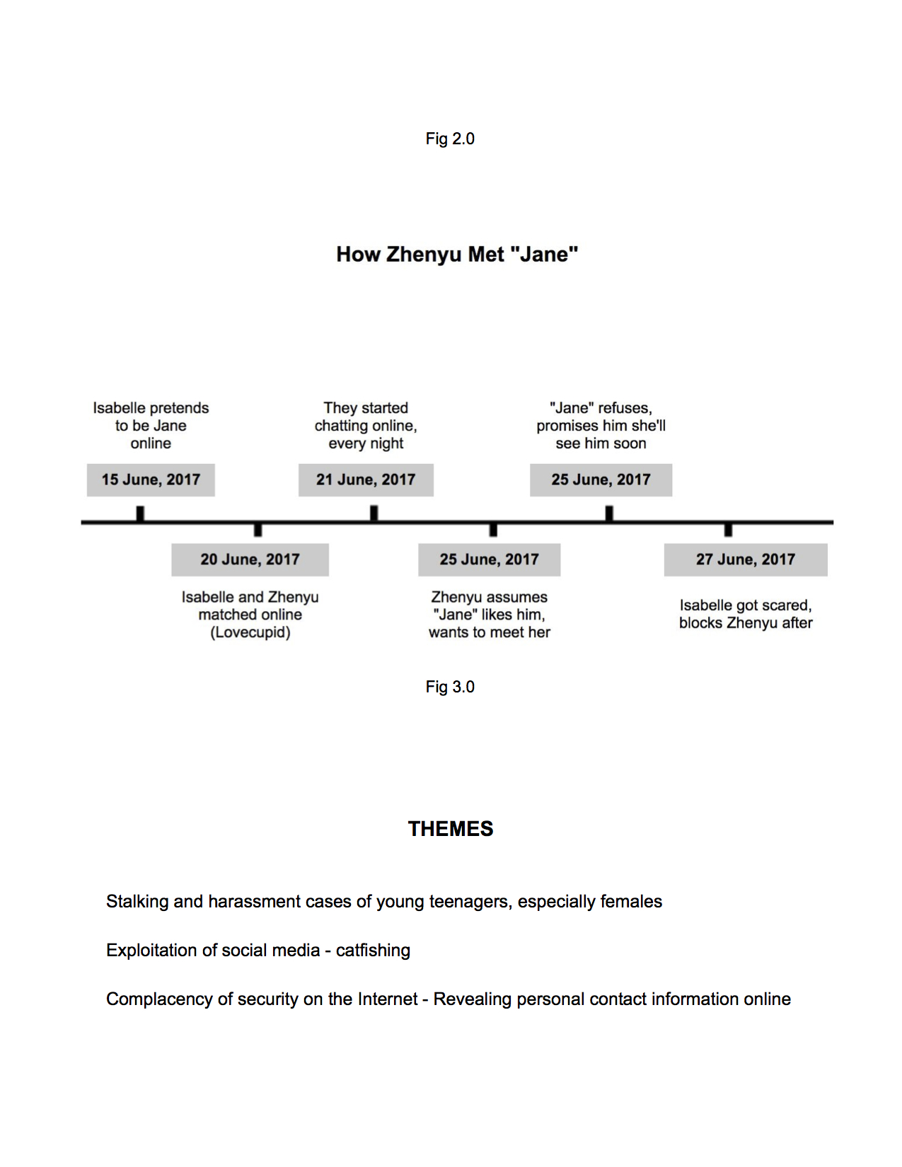
This installation warns teenagers to be wary of the dangers of the Internet by experiencing the warped mind of the obsessed. It teaches you to be aware and be careful of the twisted misuse and exploitation of information on social media platforms.
EXHIBITION DAY
Viewers’ Interactions and Reactions
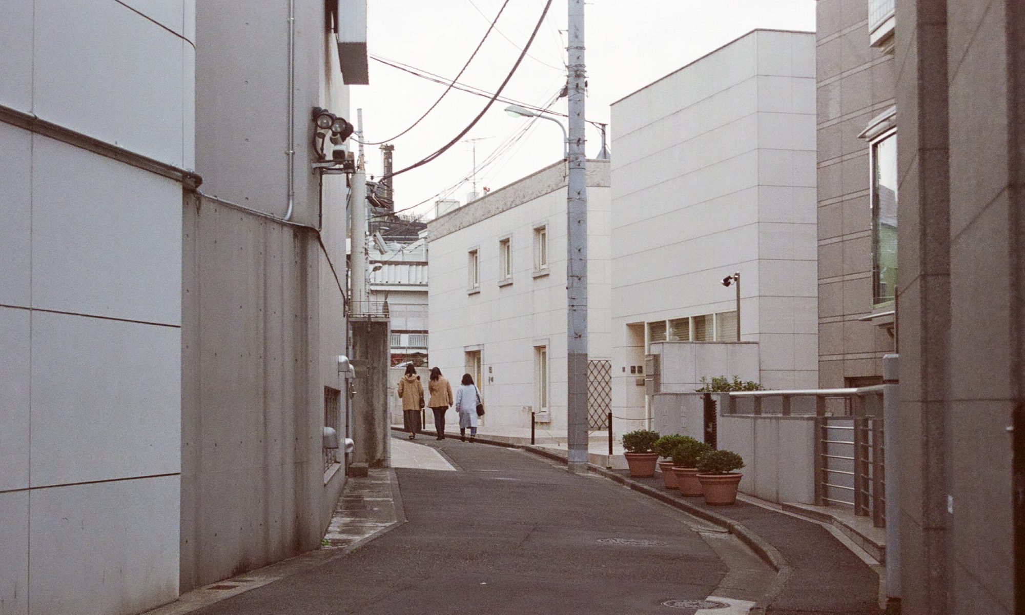
Jane, 16, an avid super fan of Adam Levine, studies at Paya Lebar Methodist Girl’s school. Unbeknownst to her, she has fallen prey to the stalking of a retrenched security guard in her school, who gets photos and information of her interests and whereabouts from her social media platforms. Jane went missing after going to collect a suspiciously good deal for tickets of an Adam Levine concert, leading us to the room where her fate was sealed.
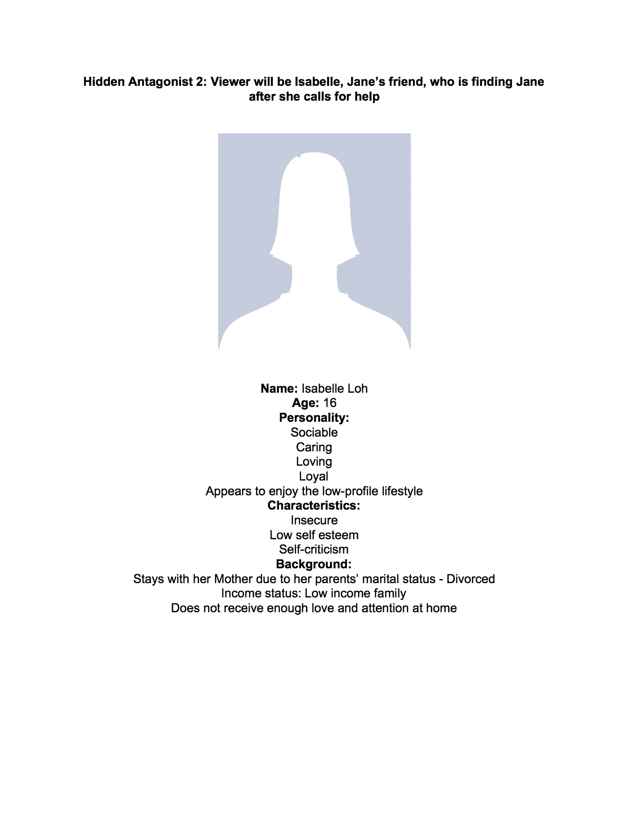
CHARACTER DEVELOPMENT
References (Storyline)
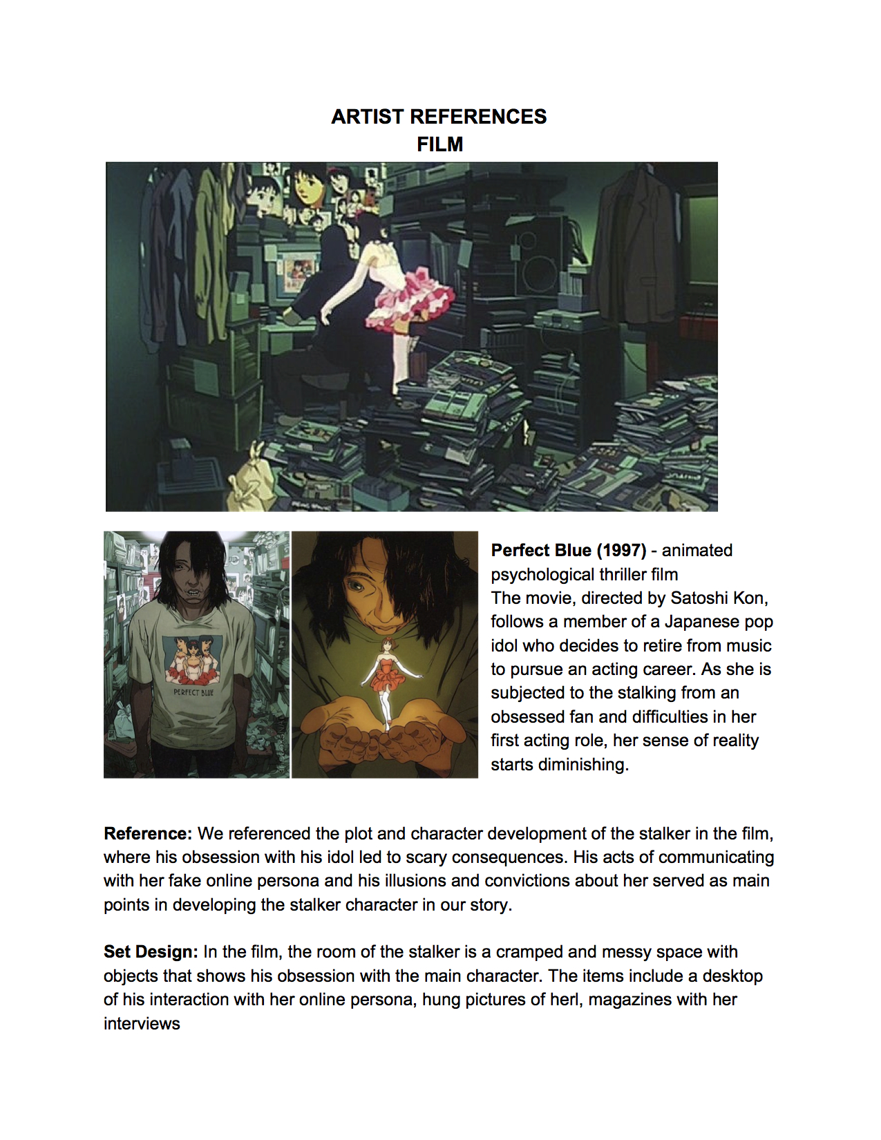
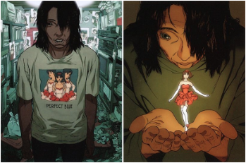
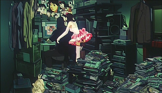
Perfect Blue (1997) – animated psychological thriller film The movie, directed by Satoshi Kon, follows a member of a Japanese pop idol who decides to retire from music to pursue an acting career. As she is subjected to the stalking from an obsessed fan and difficulties in her first acting role, her sense of reality starts diminishing.Reference: We referenced the plot and character development of the stalker in the film, where his obsession with his idol led to scary consequences. His acts of communicating with her fake online persona and his illusions and convictions about her served as main points in developing the stalker character in our story.
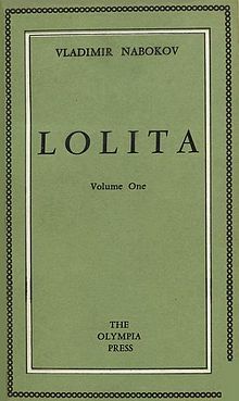
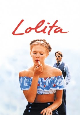
Lolita Novel (1955) & Film The classic novel, by Vladimir Nabokov, narrates a controversial story of a middle-aged literature professor called Humbert and his obsession with the 12-year-old Dolores Haze, whom mother he married to retain a relationship with his “step-daughter”. “Lolita” is his secret nickname for her.
Reference: In the story, Humbert starts a diary in which he records his obsessive and imaginative sexual wishes about Dolores. We referenced Humbert’s obsession with young girls between 9-14, whom he refers to as nymphets and his affection for his “Lolita”. We made Zhi Yu see Jane as his possession and present, where he calls her “baby doll” and uses a doll motif to represent her. We tried to represent his “innocent” and “pure” love for Jane in a warped and twisted manner.
SPACE DESIGN
Aim and Viewer’s interaction The installation aims to convey the creepiness and intensity of someone’s obsession with a taboo subject, in this case an adolescent girl. Our space mimics a room of a stalker that reveals his obsession with Jane and the eventual result of her careless use of social media and his psychotic nature.
Choice of space
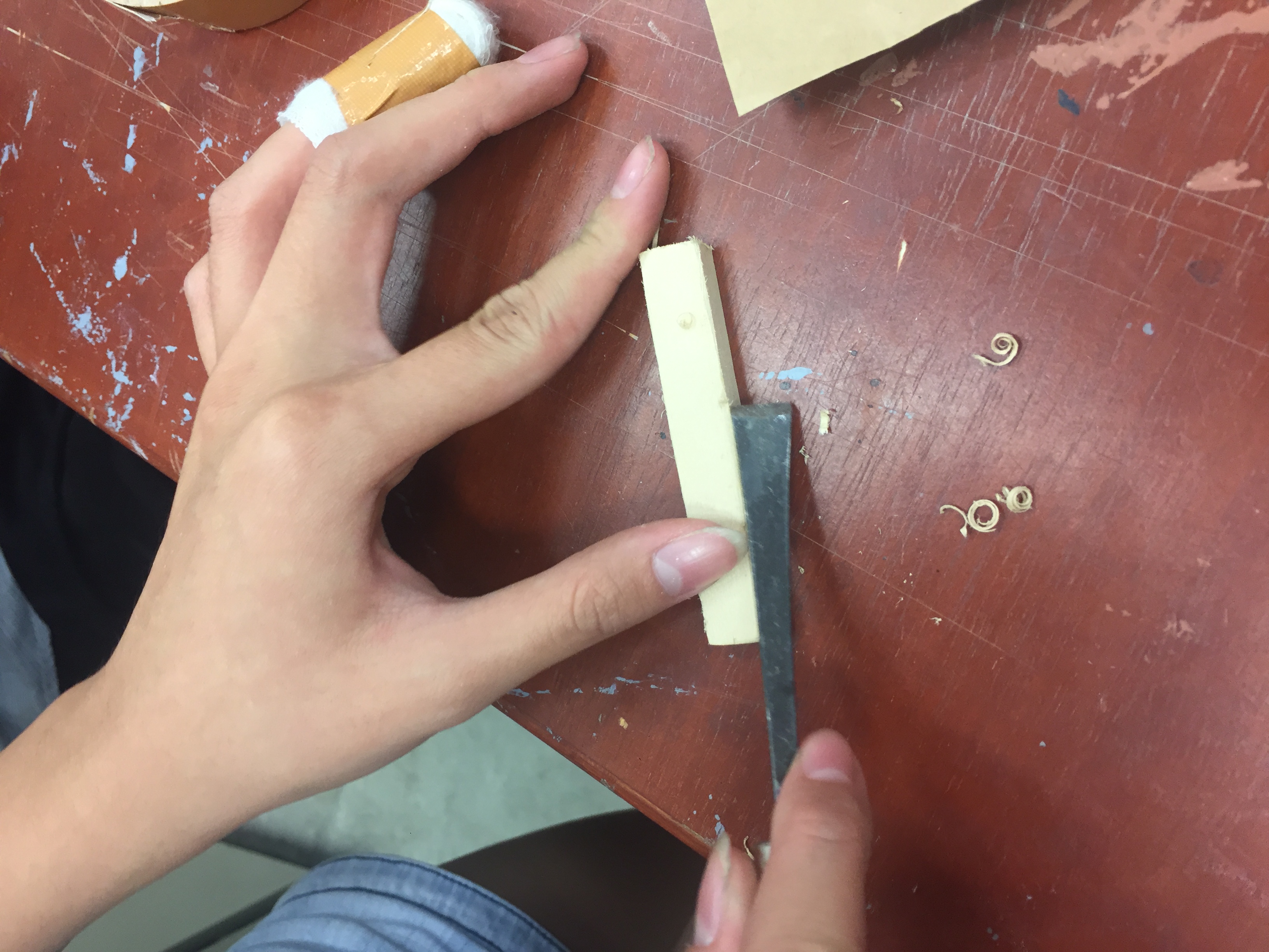
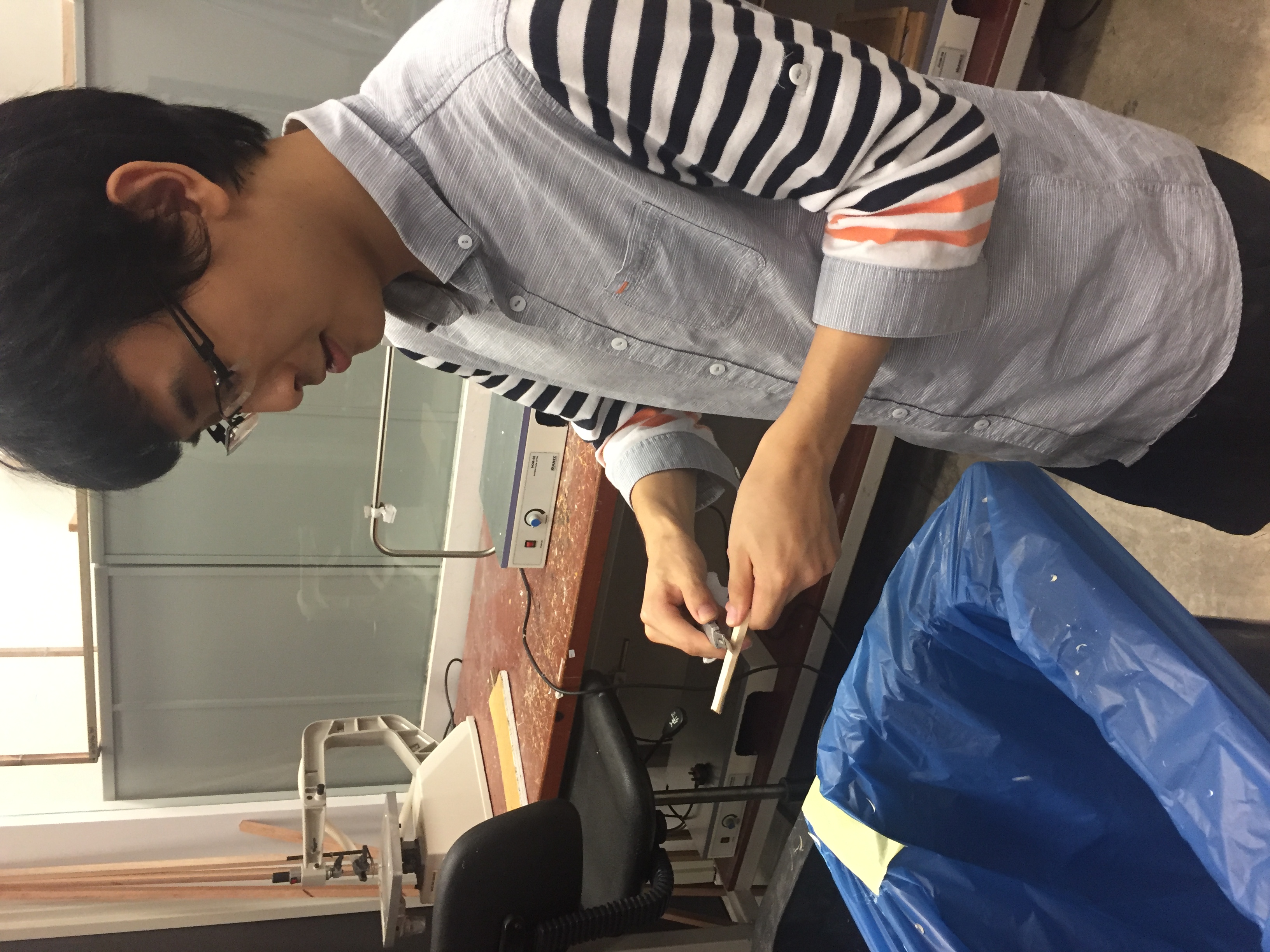
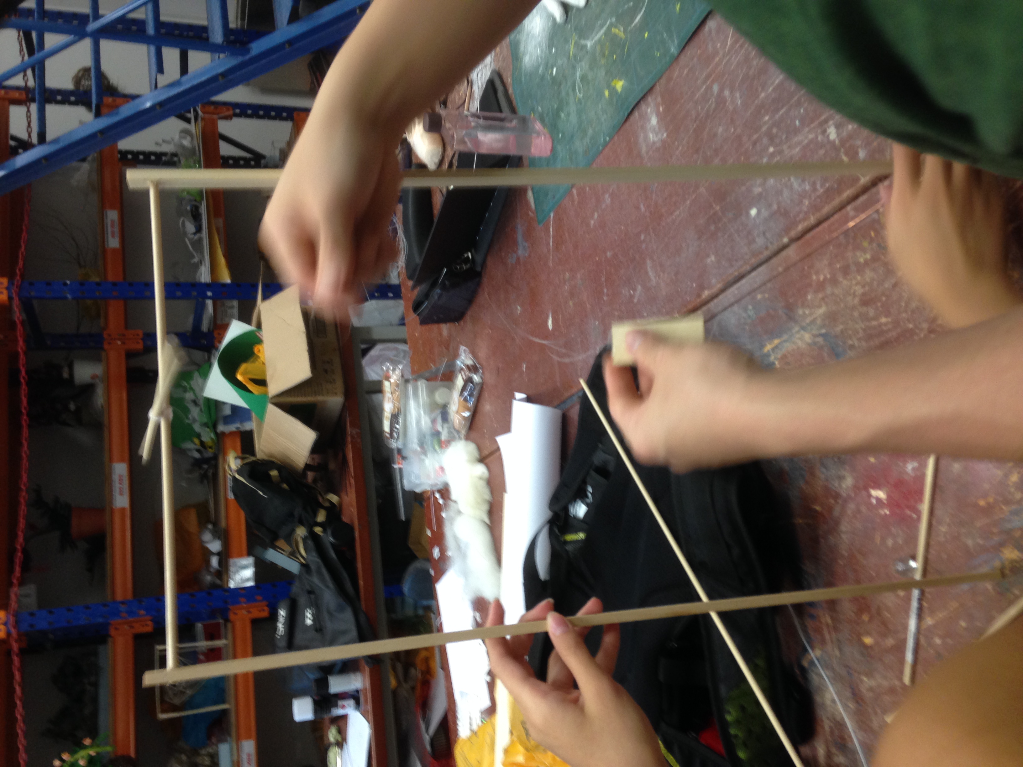
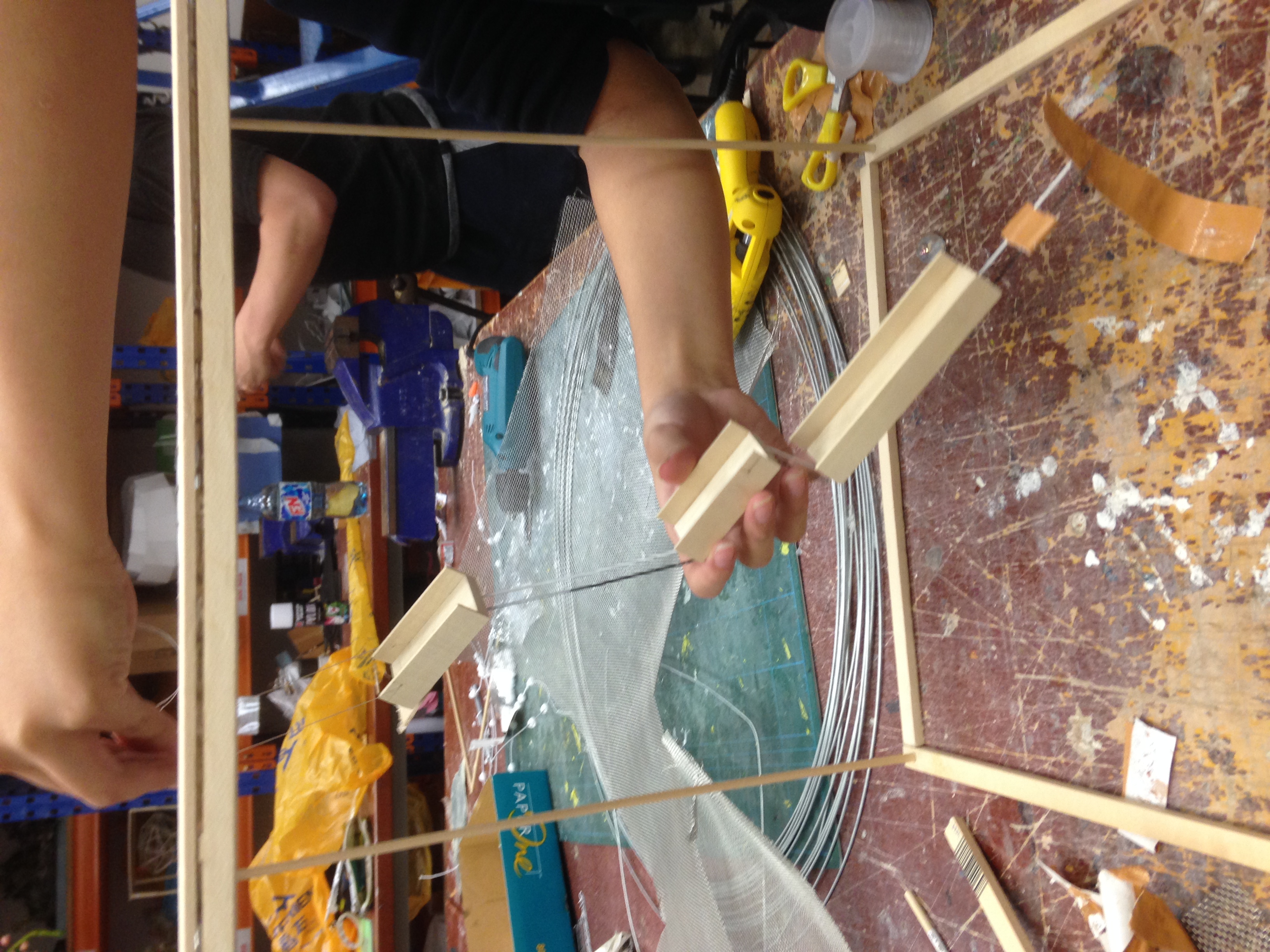
Initially, we wanted to use the staircase exit for a room but it was not approved due to it being an emergency exit. We found a convenient space with a window to construct the room. To establish a confined and dark space, we used string and garbage bags to create a boundary and roof.
Setting up our space
References (Space – Room of a stalker)
Perfect Blue – Scene of the stalker having a “conversation” with his idol in his room Reference: Cluttered, messy room with bare necessities. The room revolves around the table with the computer and the photo wall with pictures of his idol above it. We also incorporated the clutter in the room – newspapers, filled plastic bags, hung and strewn clothes.
Stalker Room by Eleanor Bull Reference art installation capturing someone’s excessive obsession
Reference: We referenced this work for our photo wall of images and cut-outs of women, use of photo frames, etc.
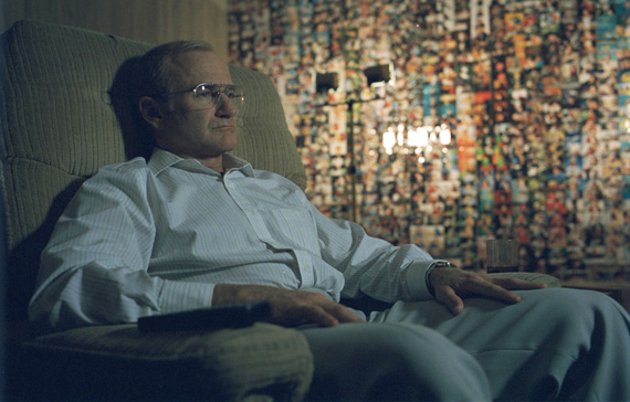
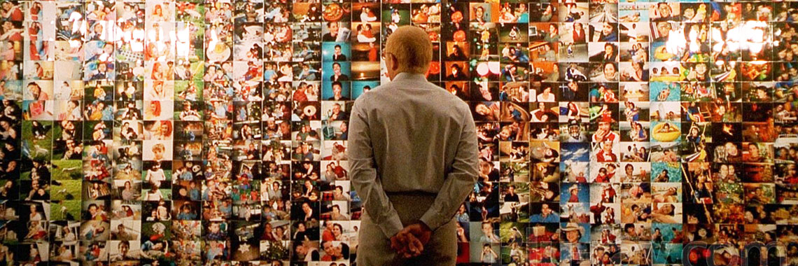
One Hour Photo (2002) – American psychological thriller film
The main character, Sy, is a photo technician working at a one- hour photo store. He lives a solitary existence and is shy and socially inept, and has grown obsessed with a family that are loyal customers of the store. His obsession grew to the extent of enshrining them in his home with their photos that he copies in secret. The movie demonstrates how traumatising and terrifying being monitored through the camera lens can be, inflicting psychological harm on its victims.
Reference: We wanted our space to reflect how scary and creepy someone’s obsession with an unrelated person can be through the bombardment of images. We referenced the photo wall shrine Sy made of the family for our room.
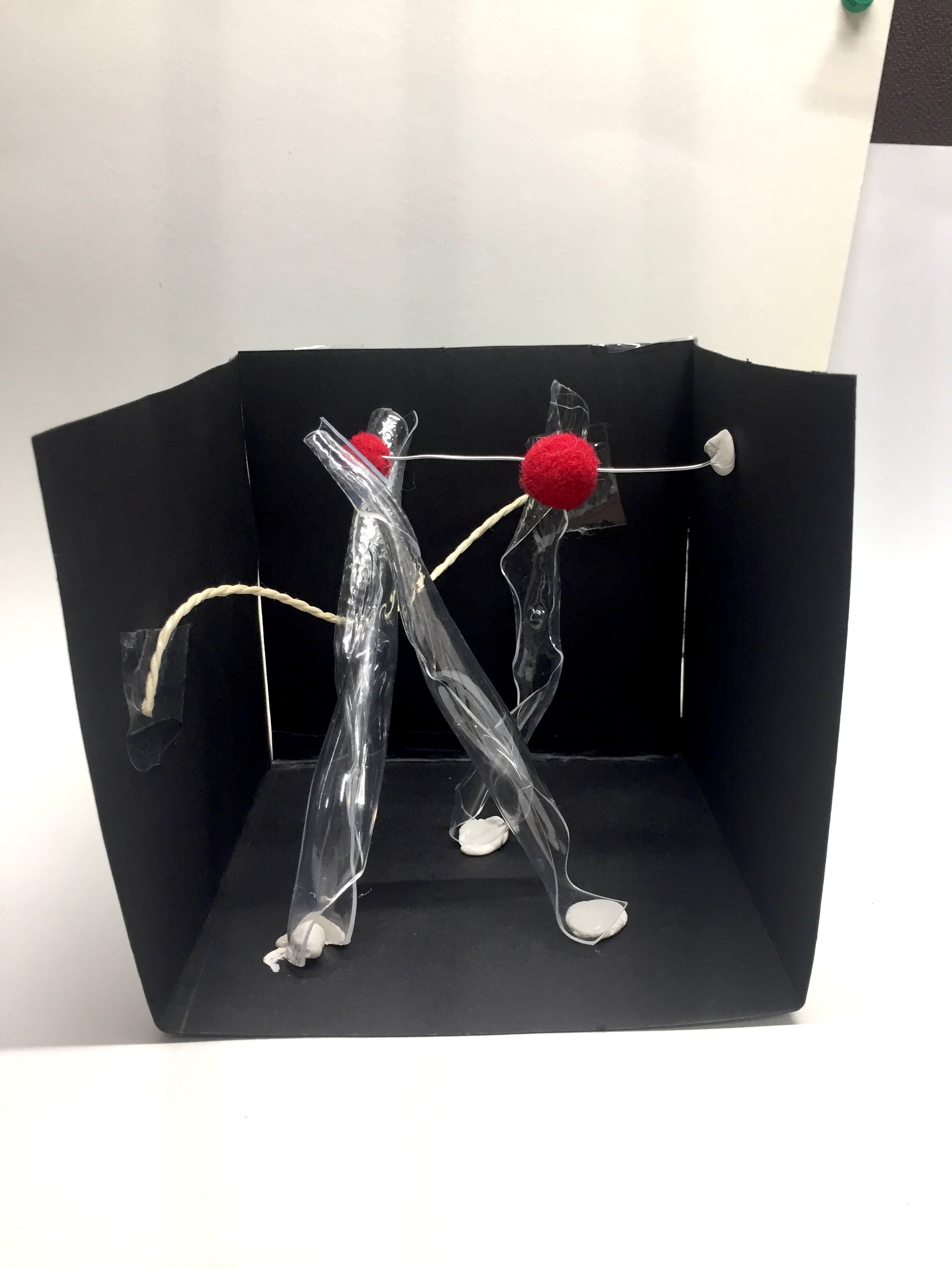
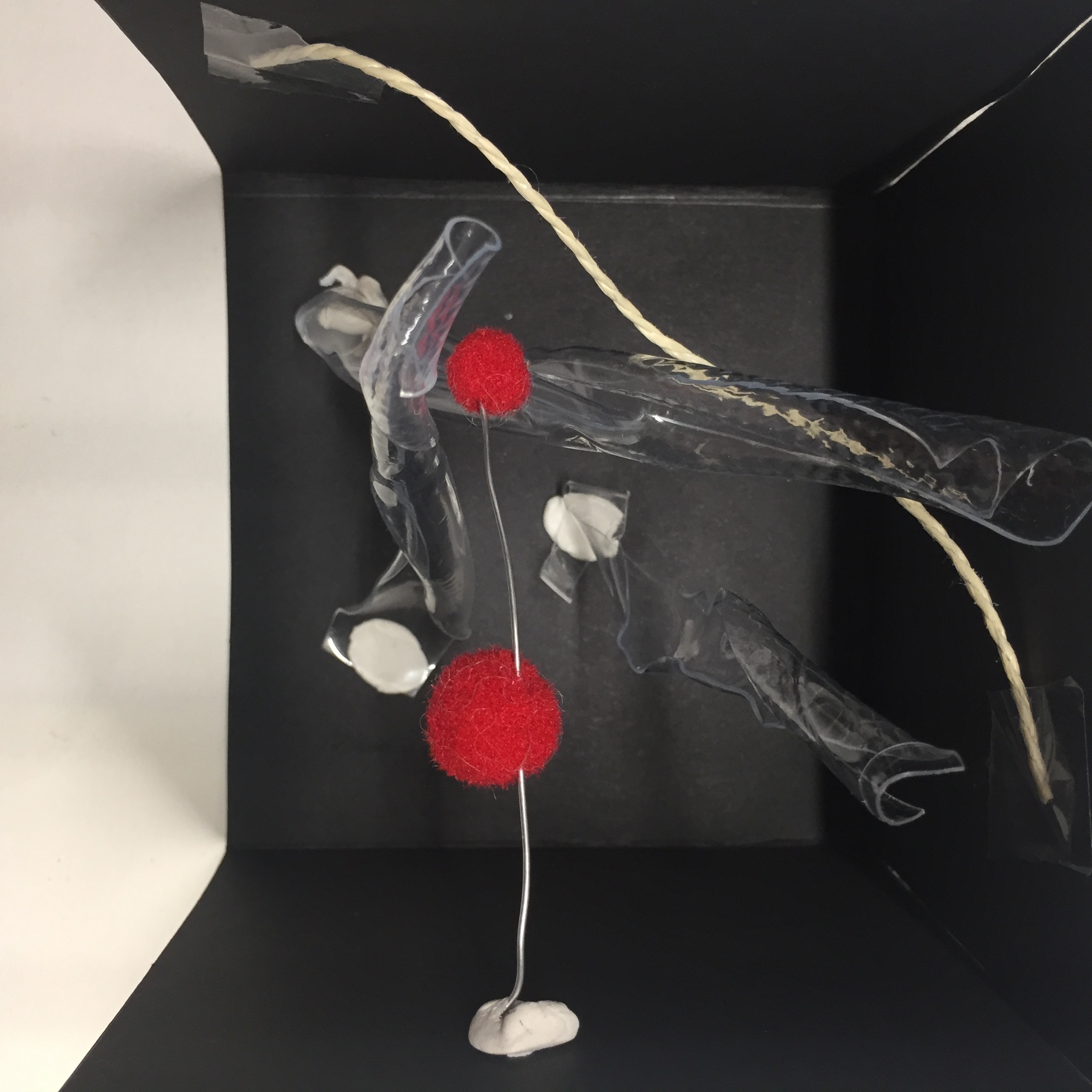
COMPONENTS OF THE ROOM
Layout of the room
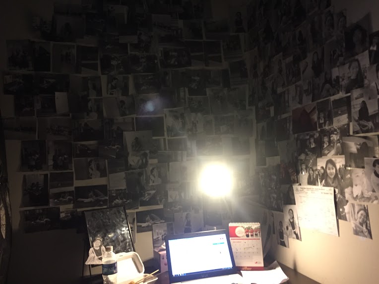
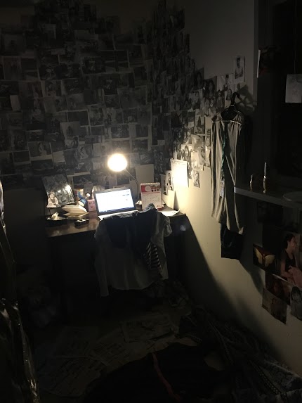
Photo-wall and Table
Images of Jane (Stalking photos, photos from social media)Photo wall above the table space
Components on table: Laptop, calendar, lamp (main light source), mirror, empty food containers, trash and cup noodles, papers and documents
Overall space layout of table
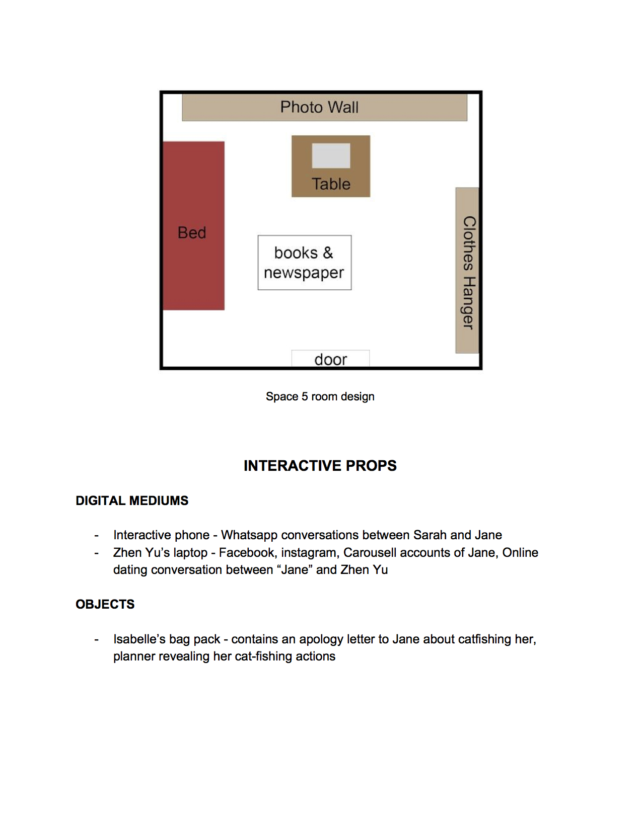
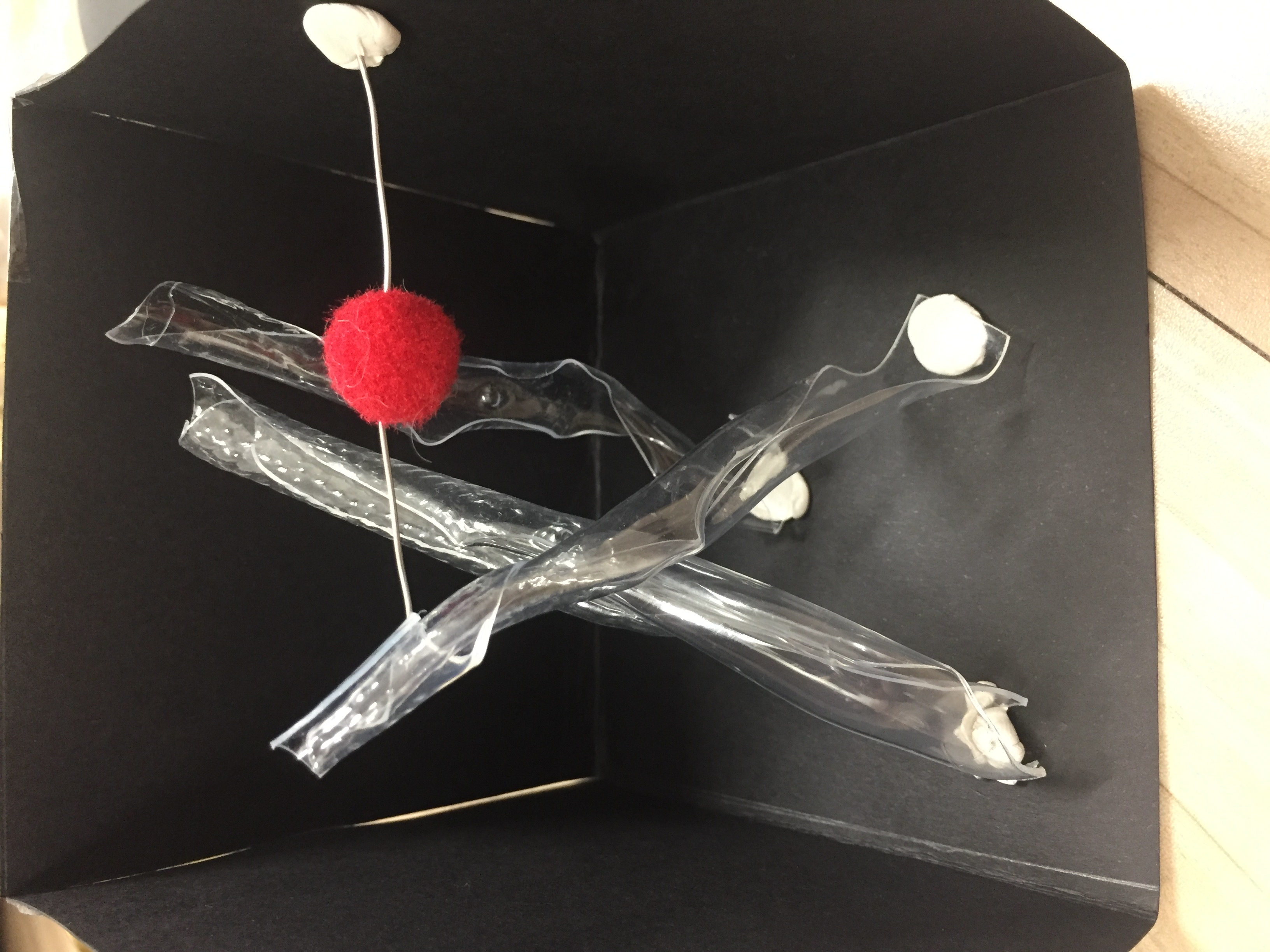
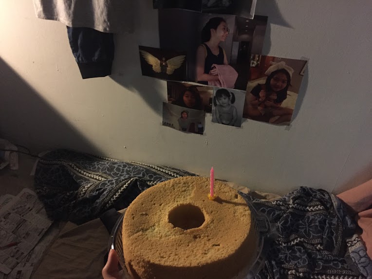
Bed and Window
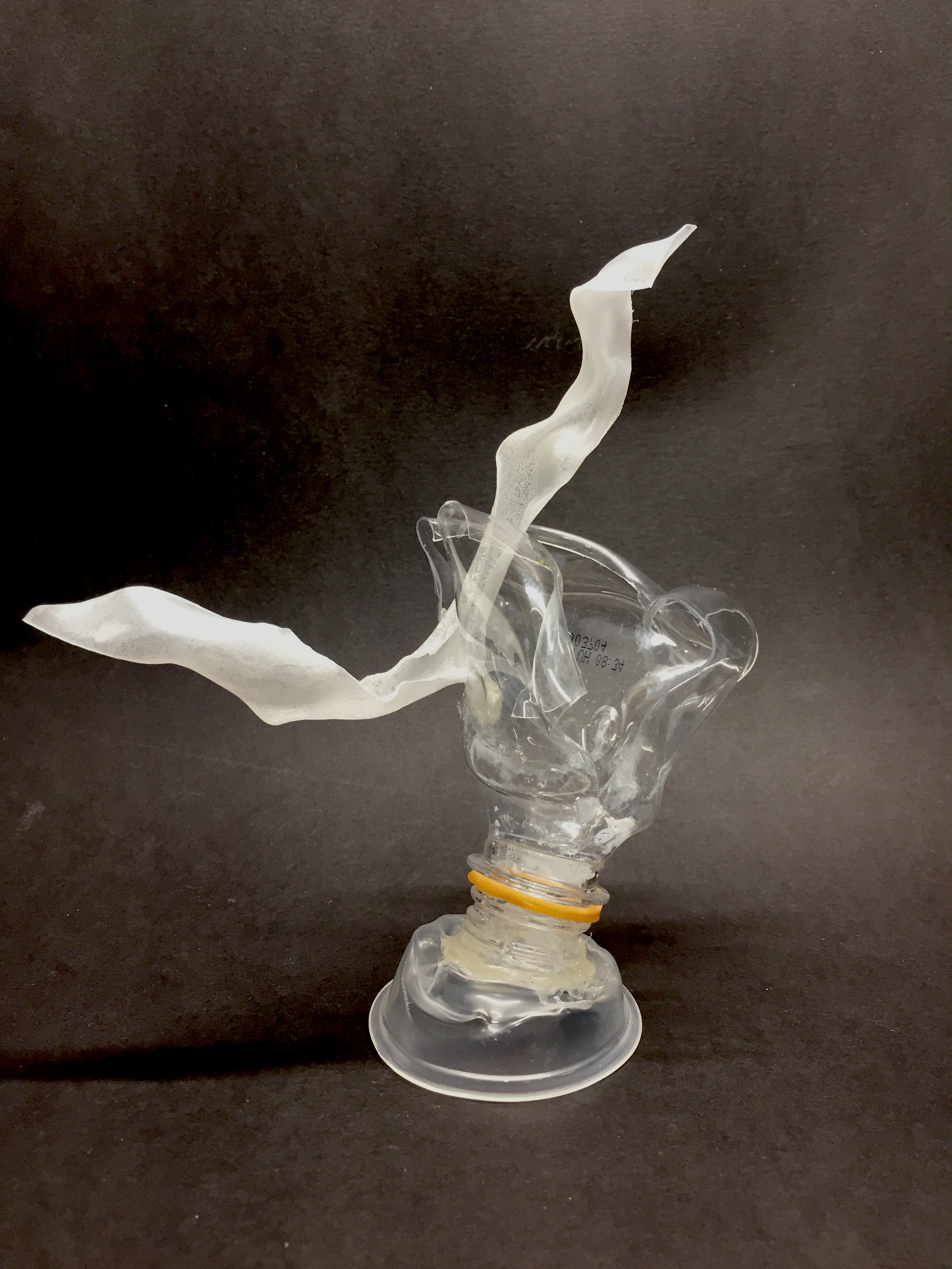
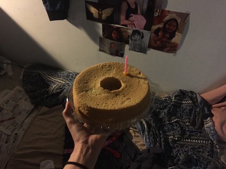
Bed and photo shrine below window. Birthday cake to celebrate his own birthday
Bed consists of a “doll” of Jane’s pink sweater wrapped over a pillow, Jane’s bloodied uniform, messy blanket, dirty clothes
Photos hung from window
DETAILS AND ELEMENTS
The stalker pasted his face over Jane’s celebrity crushPrinted copy of Jane’s timetable (found on Jane’s Facebook)Zhi Yu’s retrenchment letter – revealing that he used to work at Jane’s school as a security guard
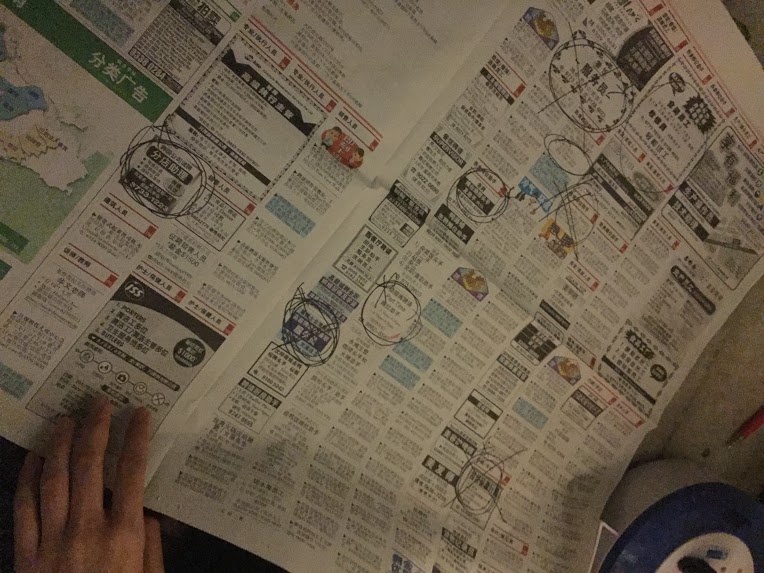
Chinese newspapers with jobs circled out – his unemployment
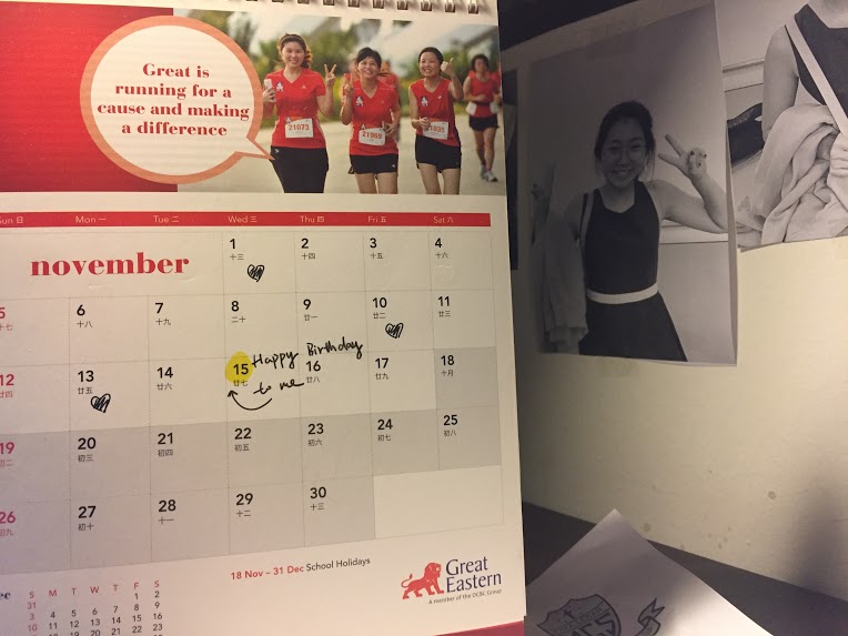
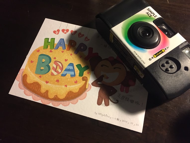
Calendar with heart symbols and his birthday marked out (15 November 2017 – Day of Jane’s disappearance)Birthday card to himself and camera used to stalk JaneRussian doll motif – with Jane’s face on it. Alludes to Zhi Yu calling Jane his “baby doll”
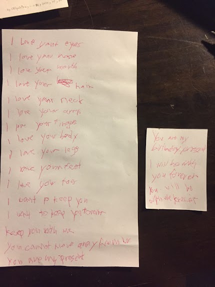
Notes of his desires towards Jane – mild level
Notes of his desires towards Jane – Higher intensity and level of danger
“You’re my birthday present”
“I will be with you forever”
“You will be with me forever”
> Implying what could have happened to Jane on Zhi Yu’s birthday, 15 November
DIGITAL MEDIUMS
Aim and Viewer’s interaction We wanted to create a link between the images in the room and the information the stalker has about Jane with Jane’s social media outlets.
Jane’s Facebook: Many posts ranging from different time periods about her interests, whereabouts, schedule, photos, conversations and wants.
Link: https://www.facebook.com/profile.php?id=100022800981270
Zhi Yu’s Facebook: Account of unknown background, Facebook friends with Jane (She accepted due to her ignorance)
Link: https://www.facebook.com/zhenyu.guo.104
Carousell exchange between Zhi Yu and Jane: Zhi Yu offers Jane tickets to Adam Levine concert that she is desperate for, ask for meet up at the house on 15 November, 2017 for collection
SOUND & LIGHTING
Lighting – Our main source of light comes from the table lamp as we wanted a tight and dark space.
Sound – The sound was a recording of the stalker singing a birthday song to himself over the sounds of a girl’s (Jane’s) muffled cry for help. We recorded it with an ambience noise. The sound clip was looped for the entire span of the installation.
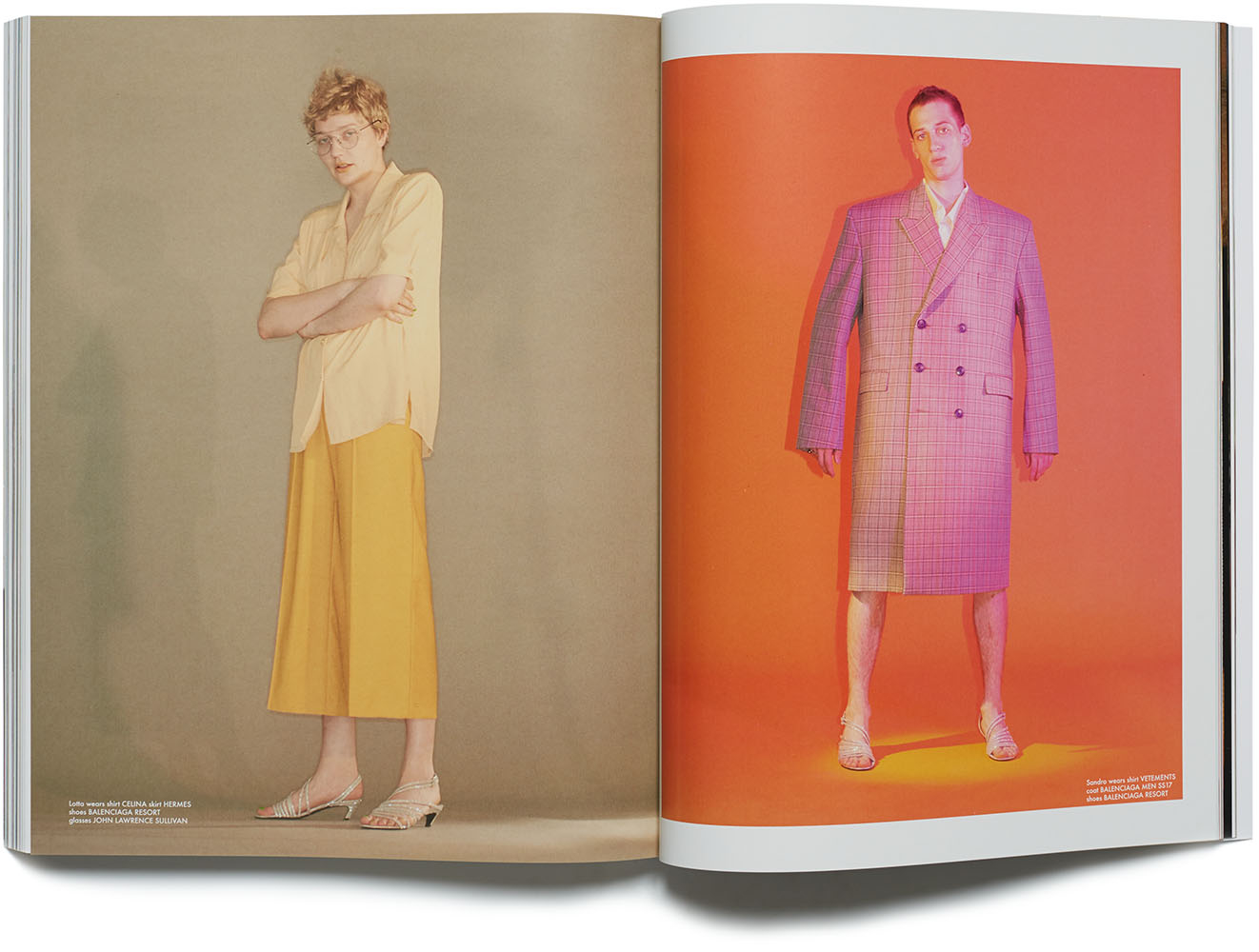
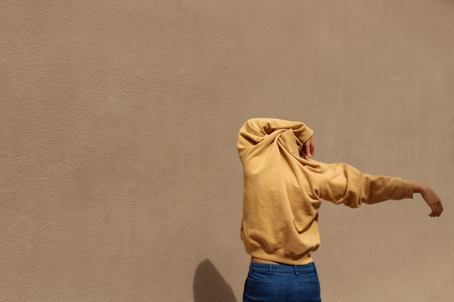
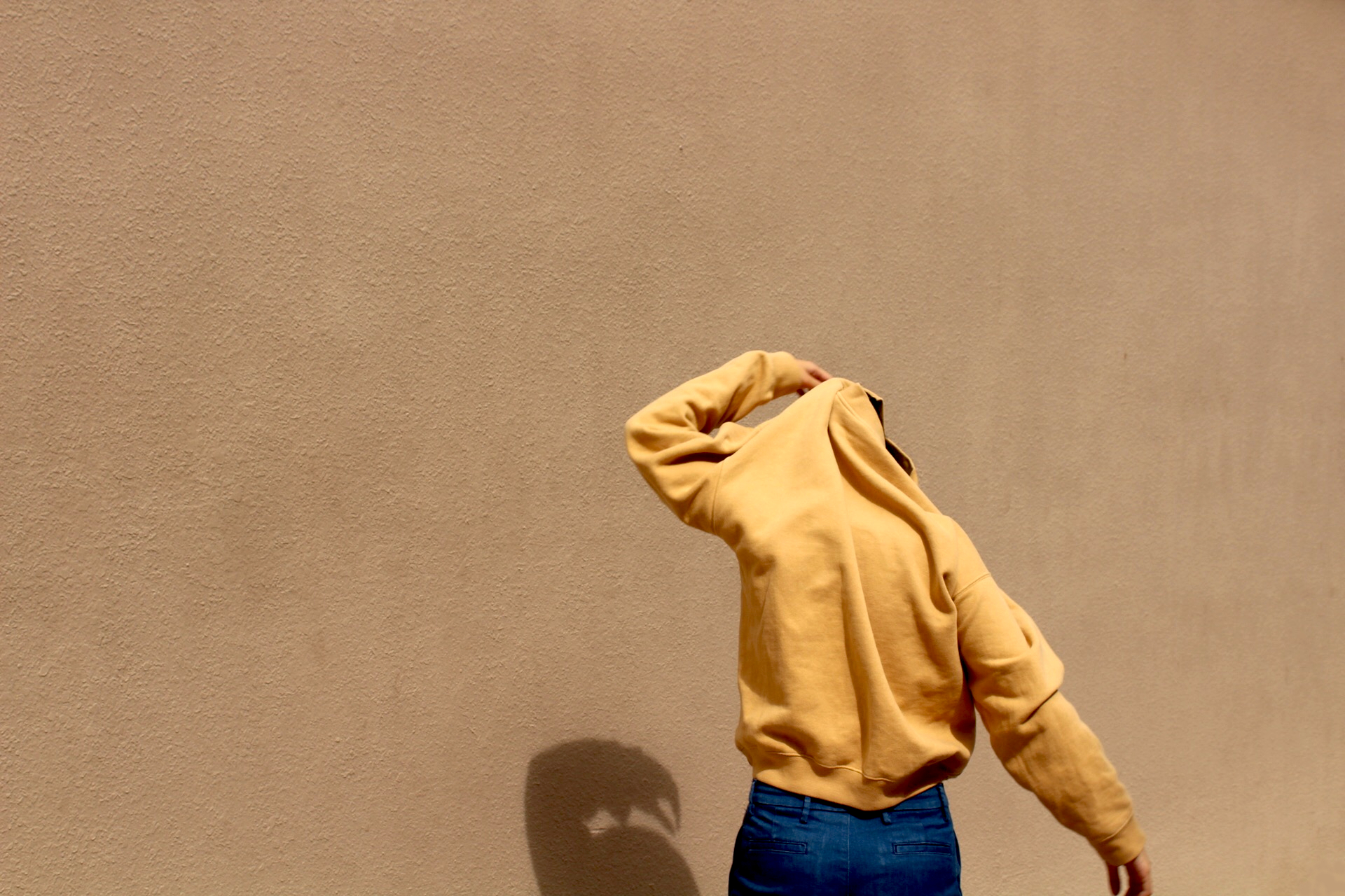
I wanted to work with fashion collage as it seemed like a versatile medium to work with colour and to express myself in. I found references on fashion collages and shoots and studied how they use colour to express certain emotions.
Johny Dufort
for Balenciaga
Use of blue, muted palette – reflect the weariness of the working class
For Re-Edition Magazine and AnOther AW2016
Use of analogous warm tones to express vibrancy
His use of muted colours brings about a softness to the strong colours he use, creating balance. I was intrigued the attractive and beautiful use of colours in his fashion photography.
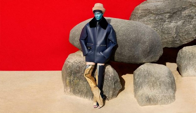
Acne Studios
Use of bright and vibrant colours – red and blue, muted yellow/ brown
Initial Idea 1 – Using fashion photography and collage to express the various emotions I have in various settings
Possible Equations: (Me+ setting = outcome/ reaction)
Passive me (Wearing colours like green or blue) + Conflict (red – contrasting colour) = Confrontational Me (orange)
Free spirit me + Stress = Runs away
Oppressed me + Given space to create = Freed me
Possible style for panel:
Photography assignment I did for 4D class
However, there were limitations in this medium as it was not definitive enough and there was not enough room to explore colour palettes due to the lack of sources or materials (in this case clothes) and compositions were insufficient in expressing deeper human emotions.
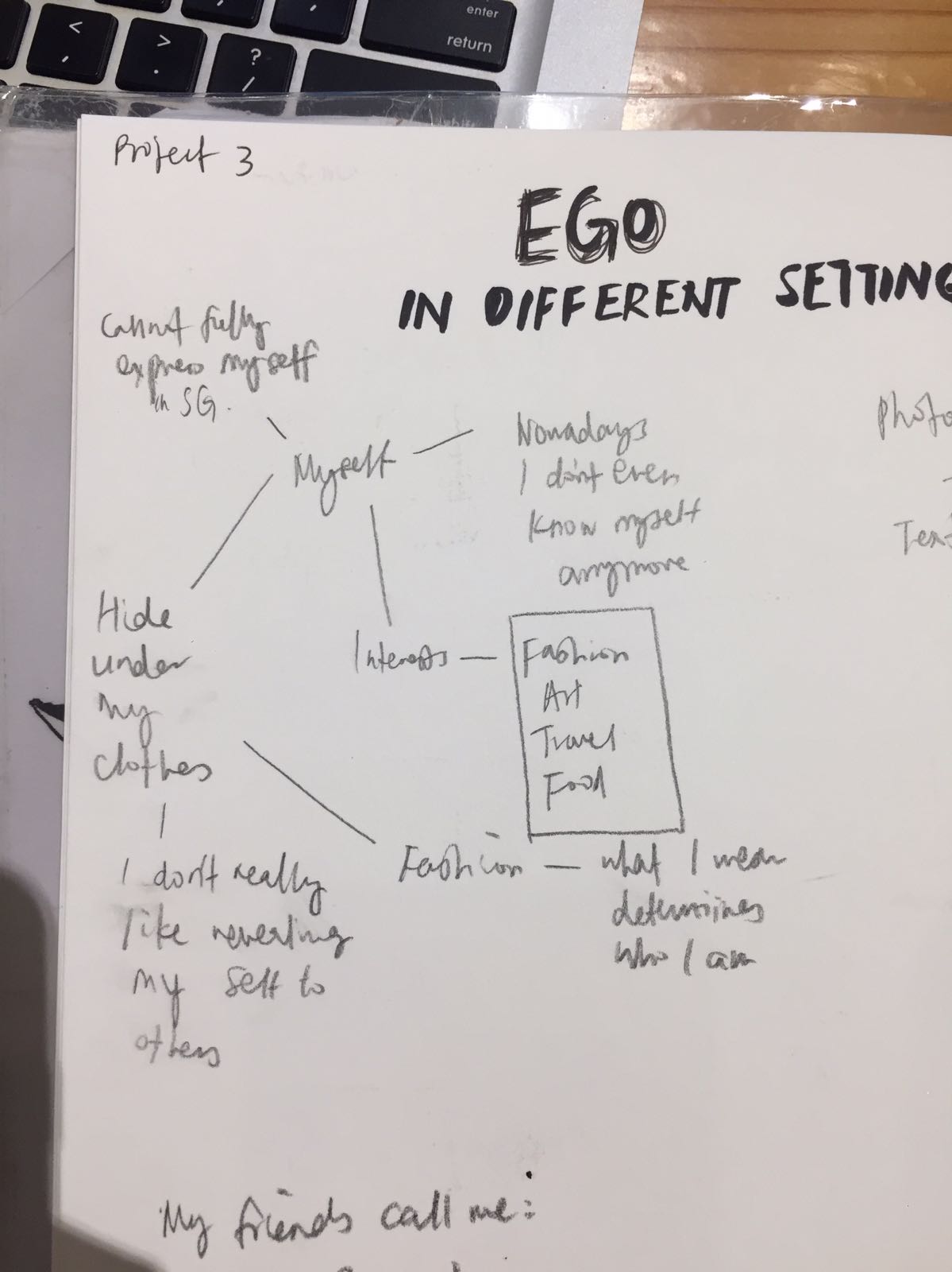
EGO – Forming Equations
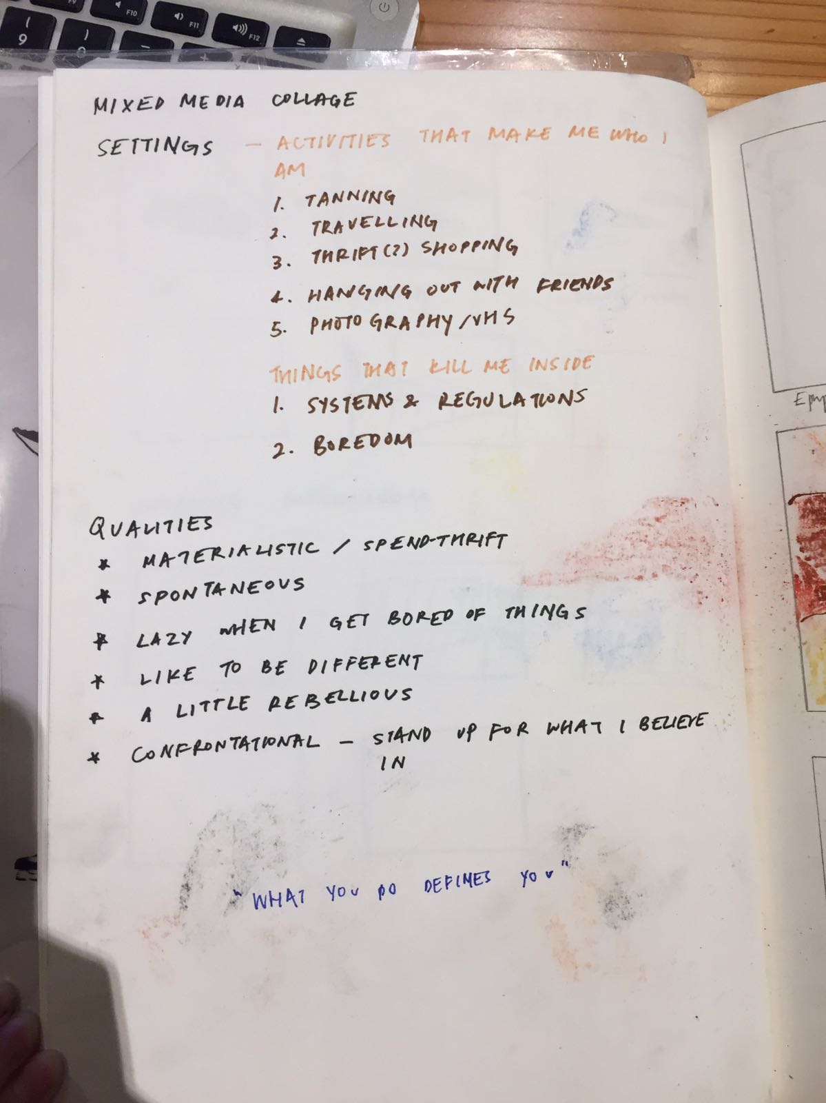
I decided to reconceptualising myself by focusing on the settings that I enjoy and do not, as well as qualities of myself to form my equations.
Initial Medium 2 – Marker and soft pastel illustration
I decided to stick to a traditional medium as I would like to explore the possibilities of non-digital mediums in expressing colours.
Charlotte Ager – illustrator Evocative drawings and paintings that are full of energy, movement and atmosphere through lines and colour.
I really like the gestural style and unharmonious and “messy” combination of colours she used, yet the choice of colours are purposeful, inspired by the works of post-impressionists, fauvists and cubists (Gauguin, Matisse and Picasso).
New equations (Me + activities I like/ dislike/ wish for = Reaction)
Medium – marker and soft pastels 1. Empty me + Tanning = Solidified Me
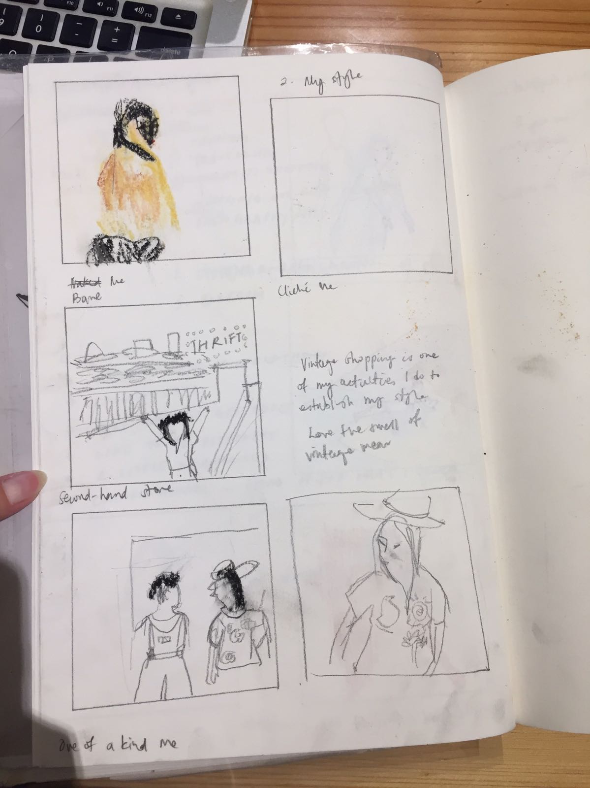
2. Bare/ Cliche Me + Second hand store = One of a kind Me
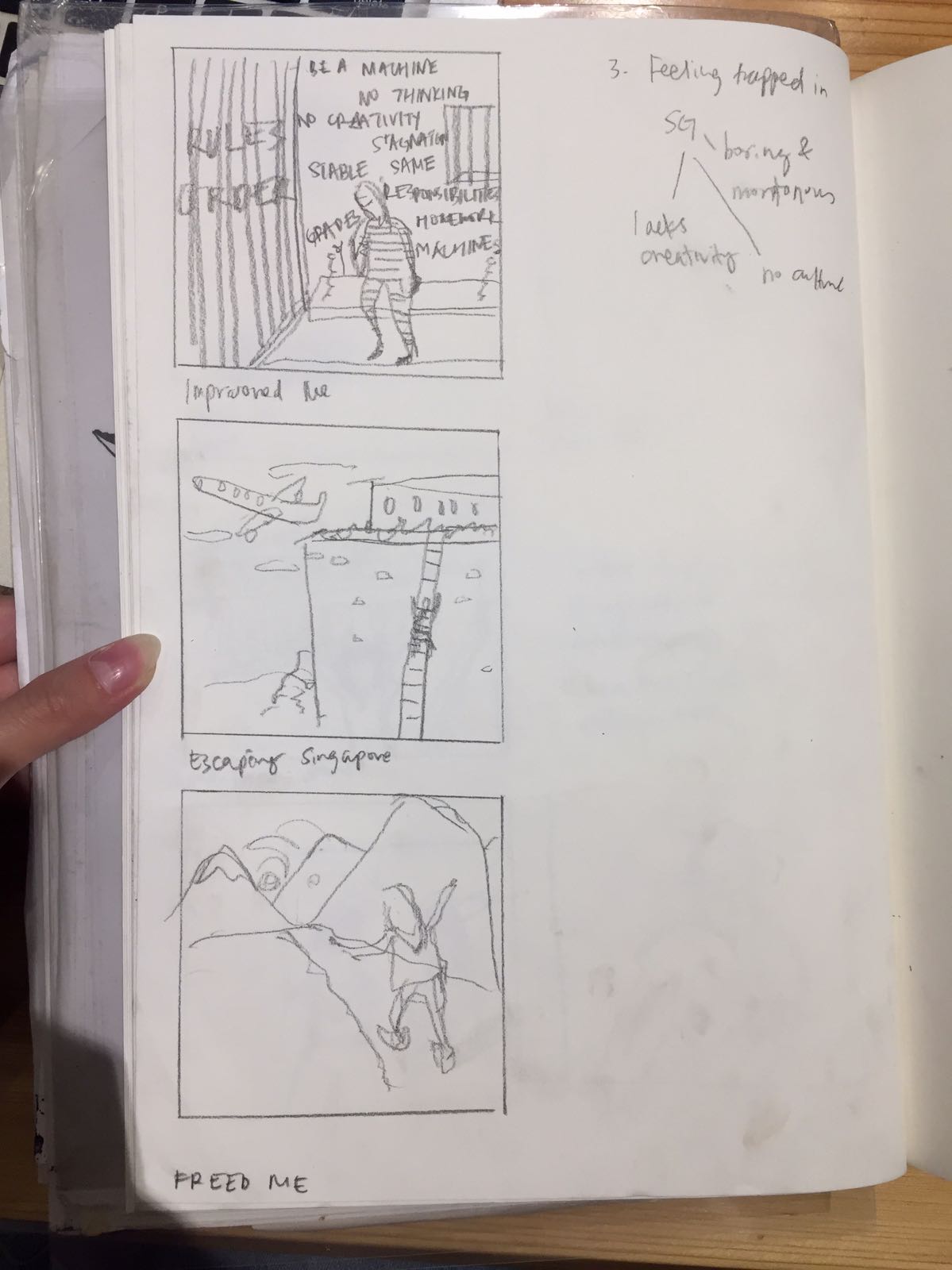
3. Imprisoned Me + Escaping Singapore = Freed Me
Comments from consultation:
– The gestural style can only be done well by those who have experience and confidence in the medium.
– Rendering of human figures are inadequate, should think of symbols that represent me
Final Idea – Fabric cut-outs and embroidery
So, I decided to work with a medium I am familiar with – Fabric.
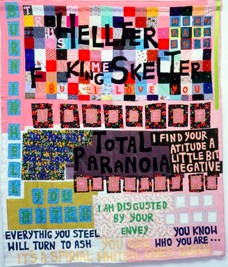
Artist references Tracey Emin – Using of fabric for her art works “Hellter Skelter”
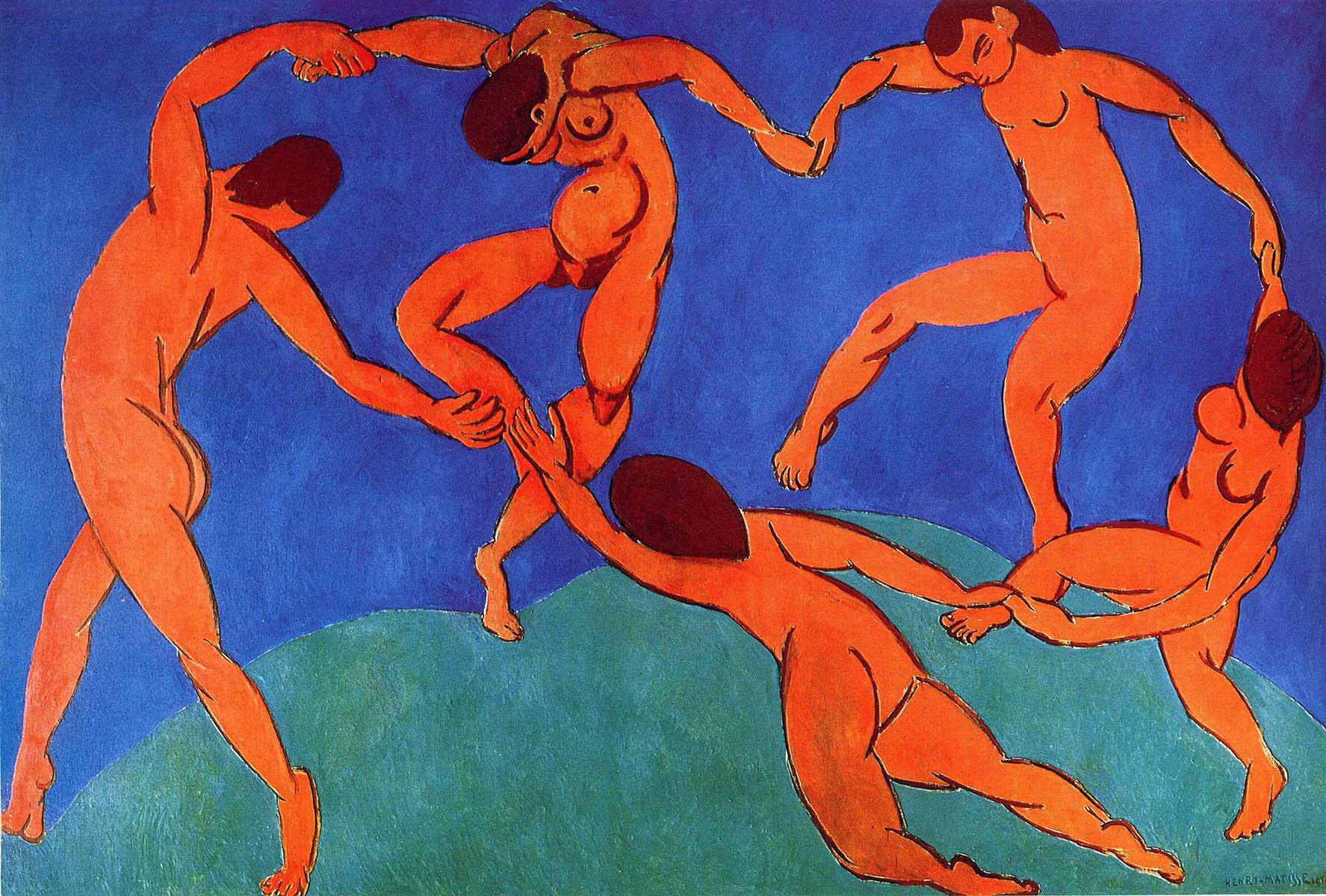
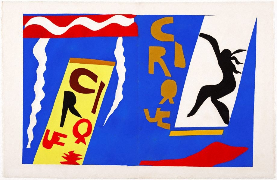
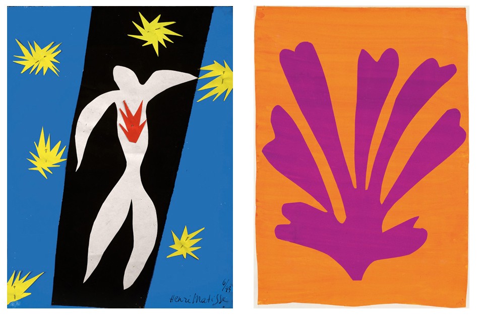
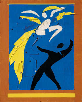
Fauvism – Henri Matisse’s fauvist paintings and paper cut-outs
“Dance” Use of fauvist palette – the intense warm colours against the cool blue-green background“The circus” Raw quality of cut-outs inspired my use of fabric cut-outsUse of vibrant colours to express emotional state
“The clown” “The fall of Icarus”
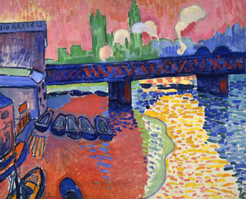
Fauvism – Andre Derain
Oil paintings of vibrant pure hues and unrealistic portrayal of colour and light to express emotive qualities.
Derain, Andre; Collioure; National Galleries of Scotland; http://www.artuk.org/artworks/collioure-211267
EQUATIONS – “What you do defines you”
From the qualities of myself , I thought of symbols that represented those qualities.
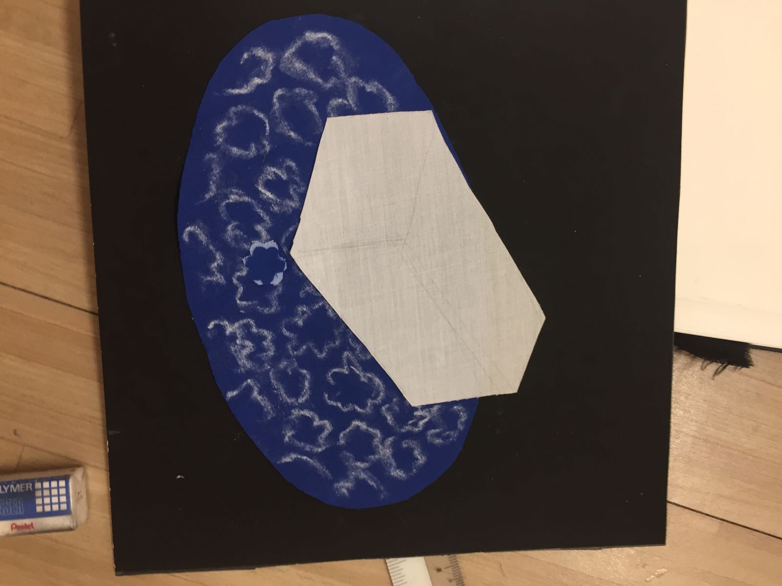
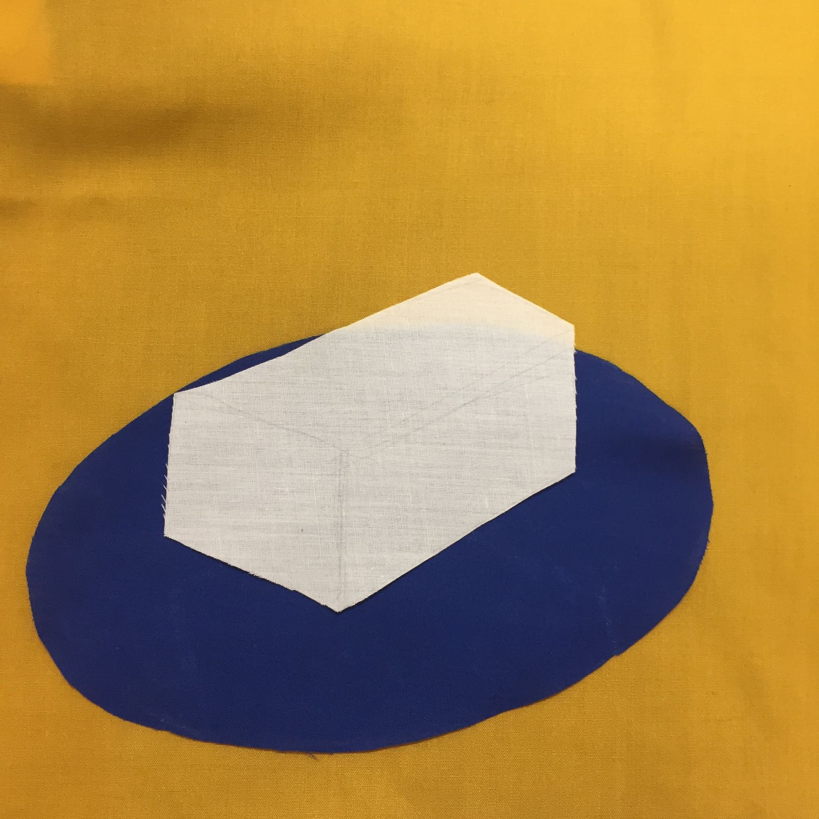
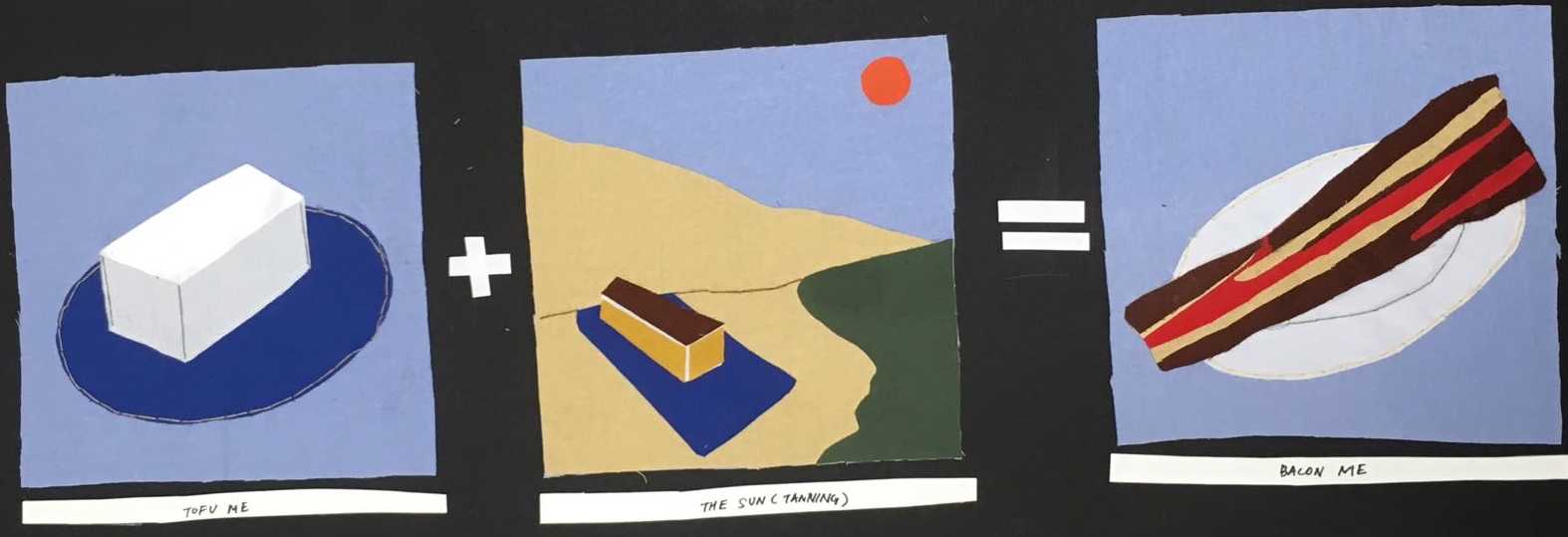
Fair skinned me – Tofu
Lazy me – lion
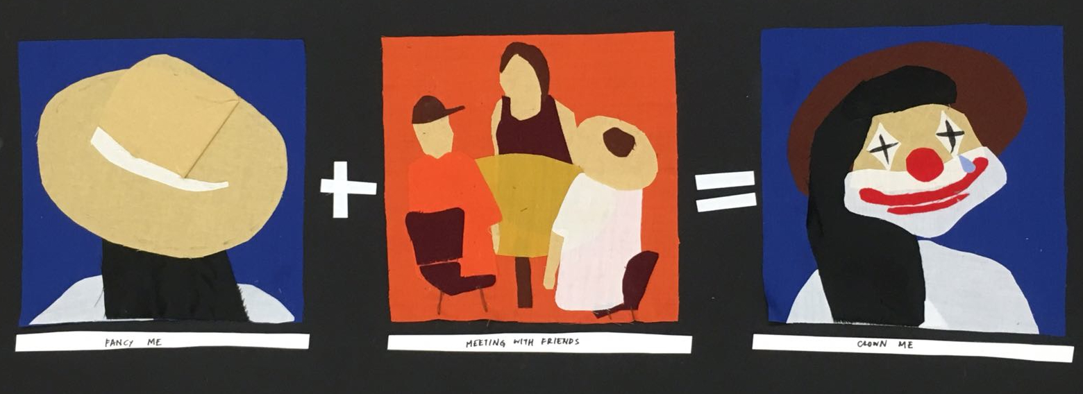
Fancy me – fancy hat
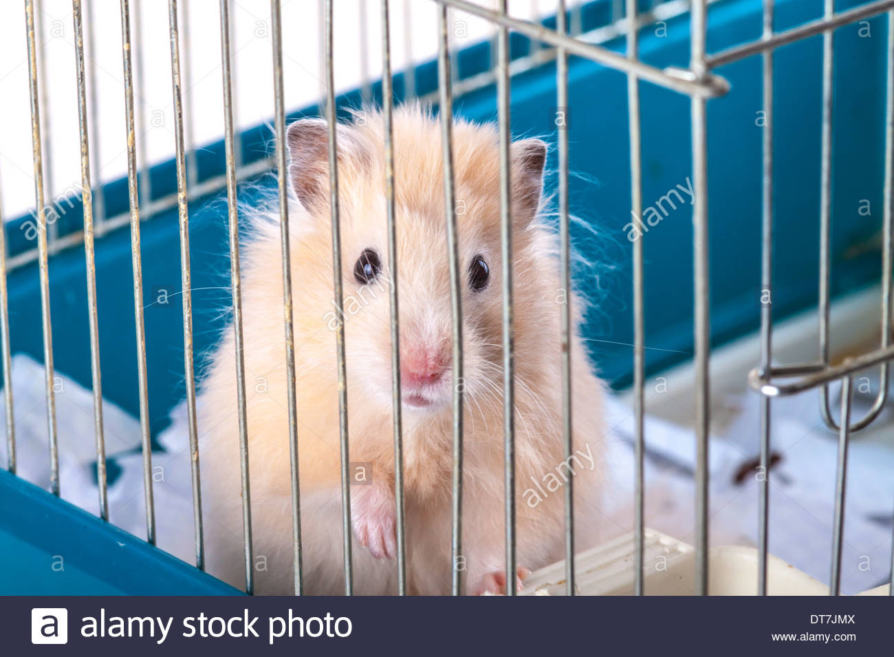
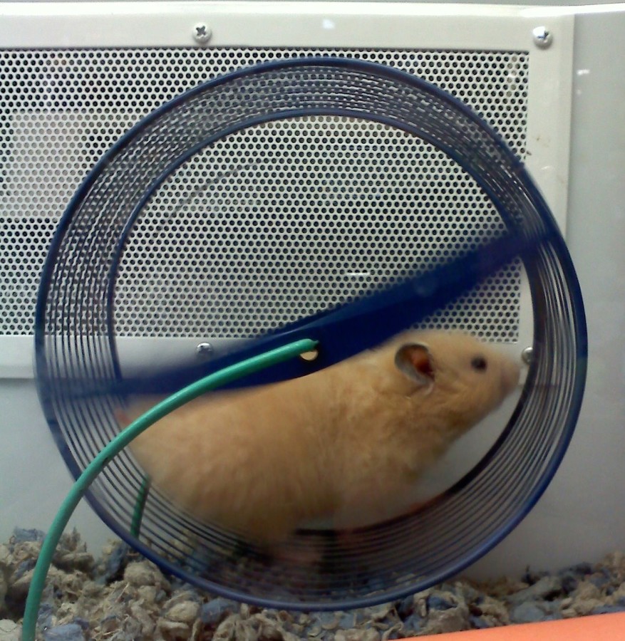
Trapped/ encaged me – hamster
Planning of compositions: I wanted to show the whimsical transition from one symbol to another after the setting, thus I chose different symbols to depict the result.
Final equations:
Tofu me + The sun (tanning) = Bacon me
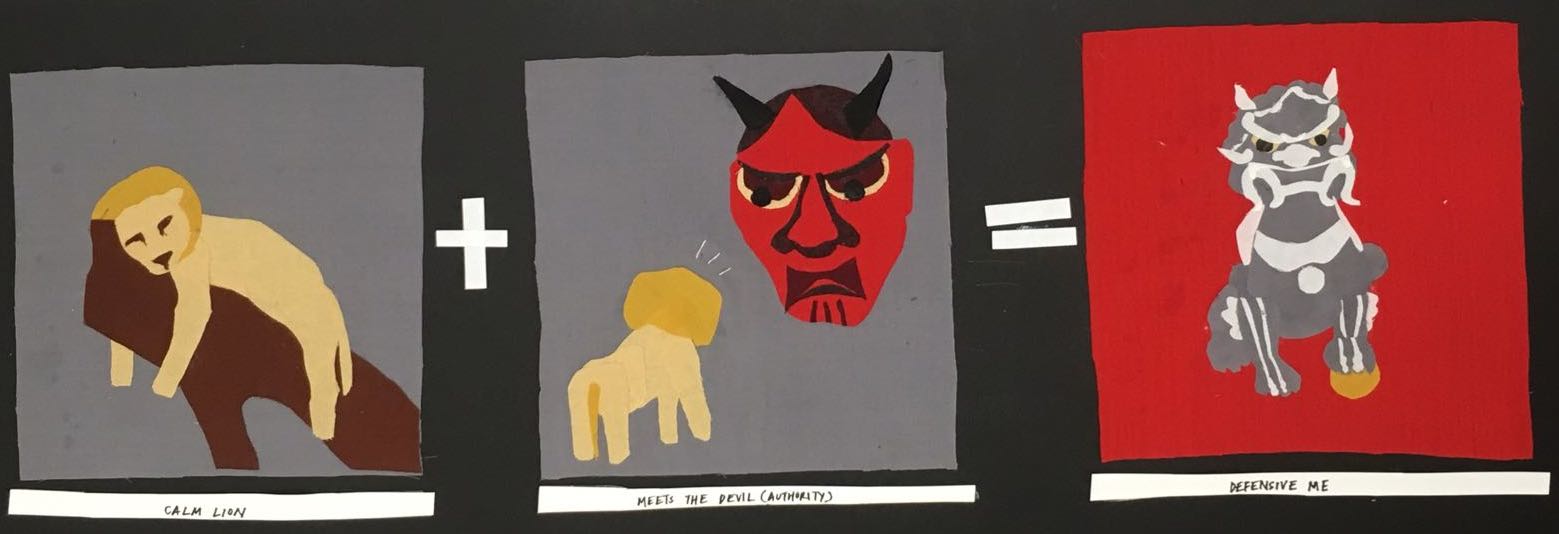
Lazing me + The devil (authority) = Stone Lion me (defensive and angry)
Fancy me + Meeting with friends = Fool/ clown me
Encaged me + Running the hamster wheel (system that gets you nowhere) = Escaping me
COLOUR SCHEME
Using fabric has limited me to working with pure colour and I am not able to change the value or chroma of the colour of fabric. Thus, I was inspired by the use of bright, pure and untainted colour in the Fauvist movement. Unnatural colours are radically used, separating colour from its usual representational and realistic role, giving new, emotional meaning to the colours. Colour could project a mood and establish a structure within the work of art without having to be true to the natural world.
PANEL 1 (Tofu + tanning = bacon)
Colour scheme – I wanted to use cool blue tones to contrast the white colour of the tofu (first) to the bright reds of the bacon (third).
Complementary colour scheme
Image references for composition
Fabrics usedTrying our design for plate – decided to omit this as it was too distracting
Light blue, yellow and grey background – Chose the cool blue tone in the end
Analogous colour scheme used for bacon
Final Panel:
PANEL 2 (lazy lion + meeting the devil = Stone lion)
Analogous colour scheme for the “lazy lion”Analogous colour scheme of red for “meeting the devil”
Image references
Final composition
PANEL 3 (Fancy me + Meeting friends = Clown me)
Complementary colour scheme of blue and yellow for “Fancy me”Analogous colour scheme for “meeting with friends”Final composition
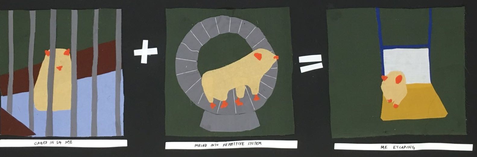
PANEL 4 (Encaged me + Forced into repetitive system = Escaping me)
With our organic and meditative quality of our sound, we would imagine our city to be a closed society of people living a life of reclusive and simple life. The concept of our city is for it to be unseen and hidden, only to be noticed when you stare hard enough.
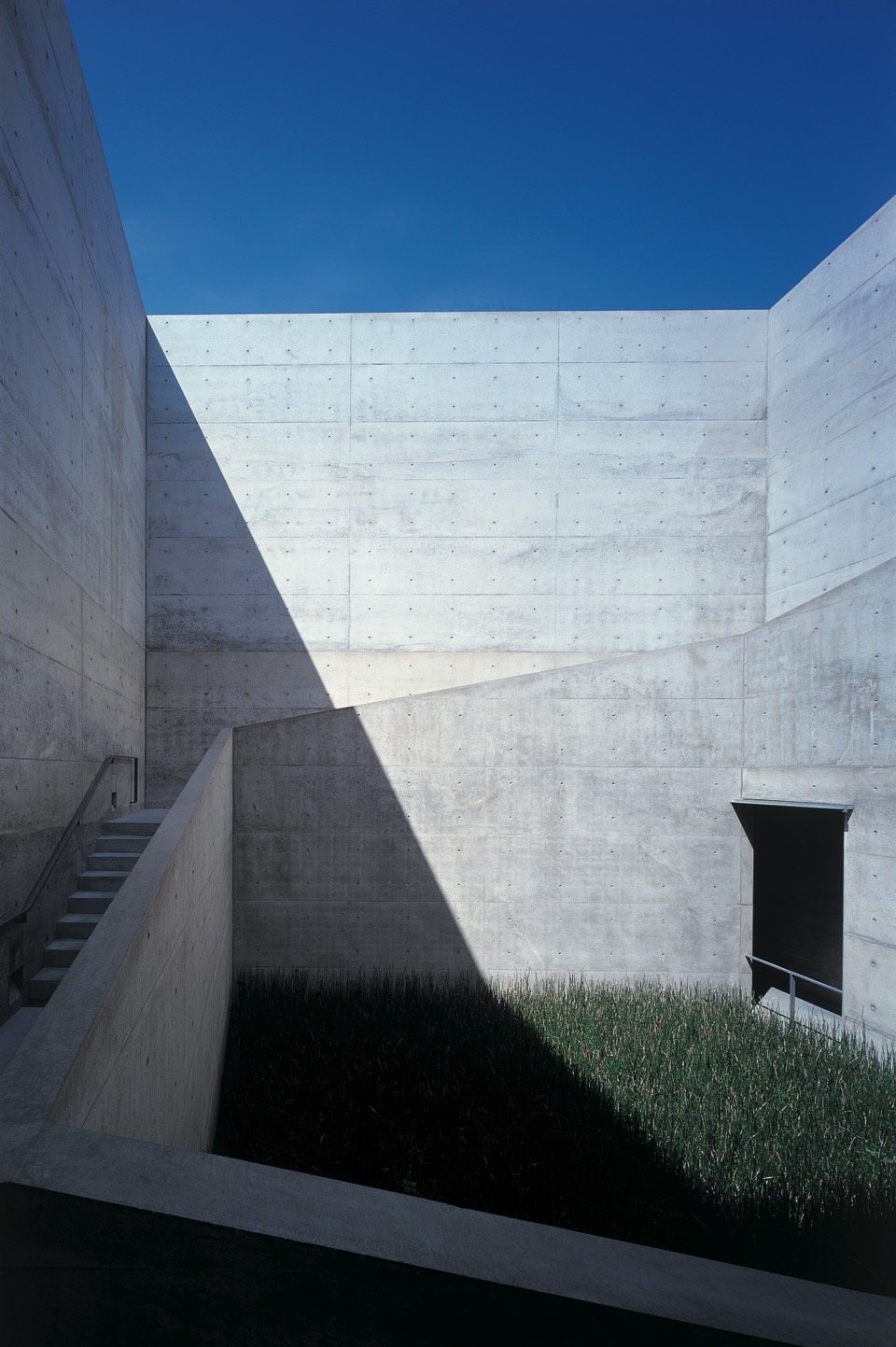
One of our inspirations was the Chichu Art Museum in Naoshima island, that features famous works of Monet and James Turrell. The architecture of the private art museum was designed and curated by Japanese architecture Tadao Ando, where the entire building was structured to be viewed and experienced like an art piece.
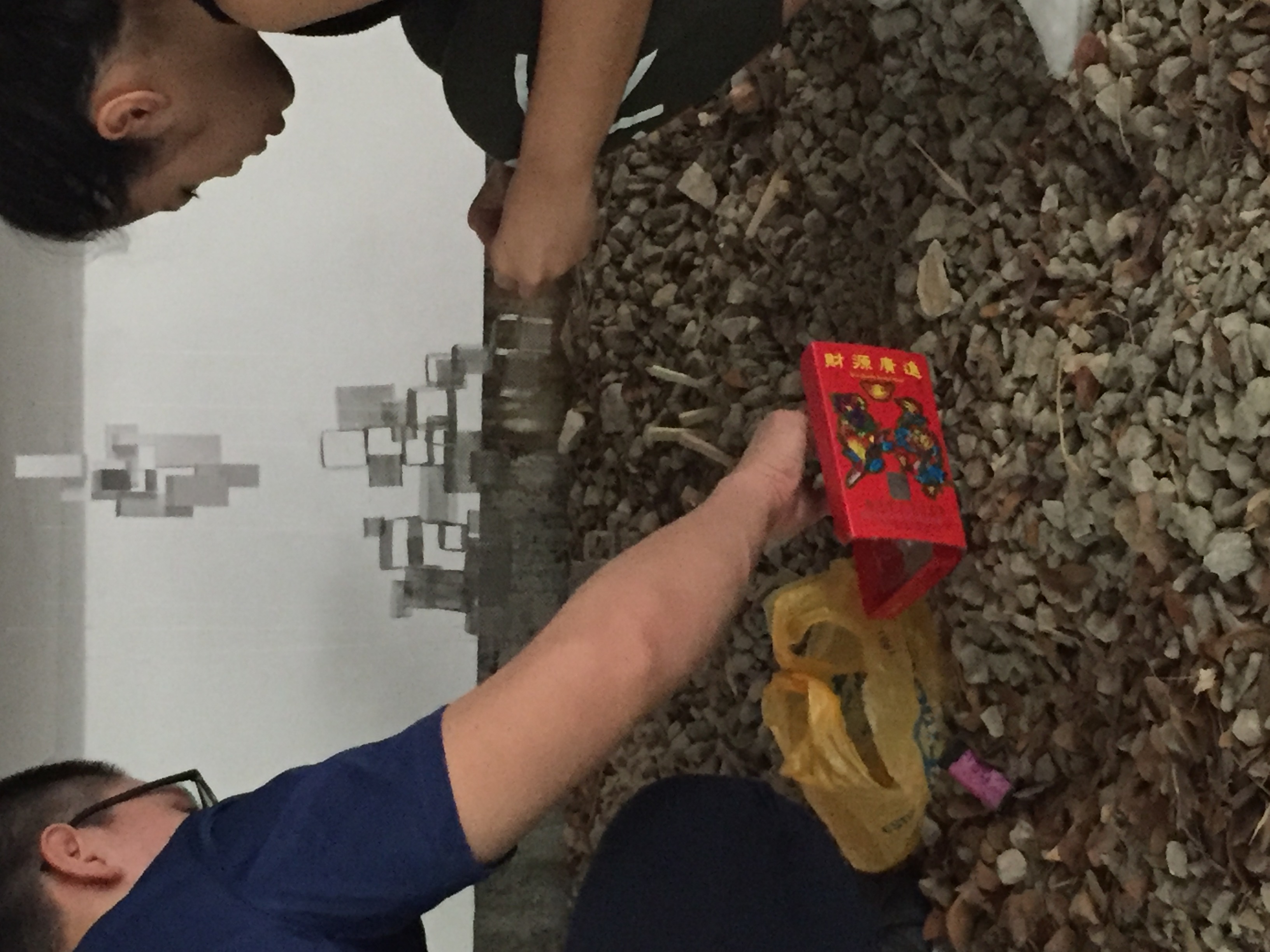
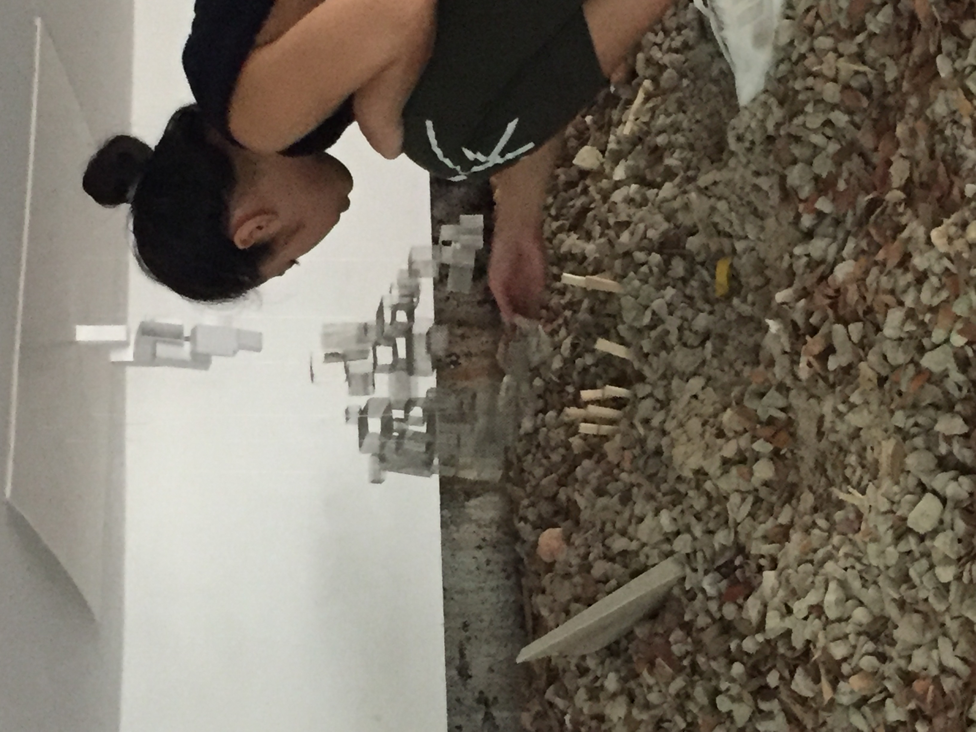
The art museum was incredibly beautiful, where the art works housed in an architectural piece of art created a whole new experience for me. No photos were allowed in the museum which made the experience more meaningful. http://benesse-artsite.jp/art/uploads/art/chichu/architecture.jpghttp://letstakethescenicroute.com/wp-content/uploads/2012/04/IMG_0797.jpgHorizontal cavity in ADM carpark
The museum made use of natural light and angular forms to create different appearances at different times of the day. Thus, we decided to use a deep, angular cavity in the car park, that receives natural light to house our city. The presence of rocky terrain and white, angled surfaces suited our concept of a quiet and calm city.
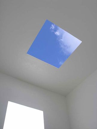
Initially, we wanted to create a hanging box constructed with white walls so that the viewer can “stick their heads in” to view the workings of the city. The white box could blend in with white wall surfaces and stay hidden. A square hole will be cut on the surface, inspired by James Turrell “Open sky”, where light can be reflected on the surfaces and move with the different times of day. However, we could not find any suitable place to hang our box and it did not fit the requirement of a plug in city.
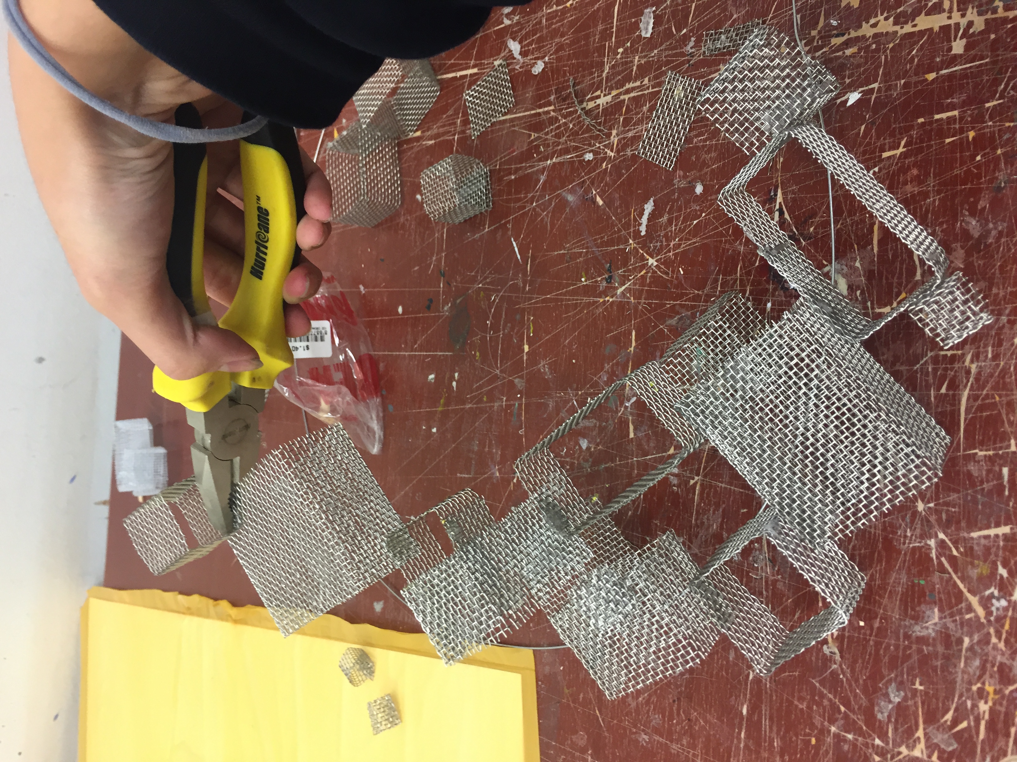
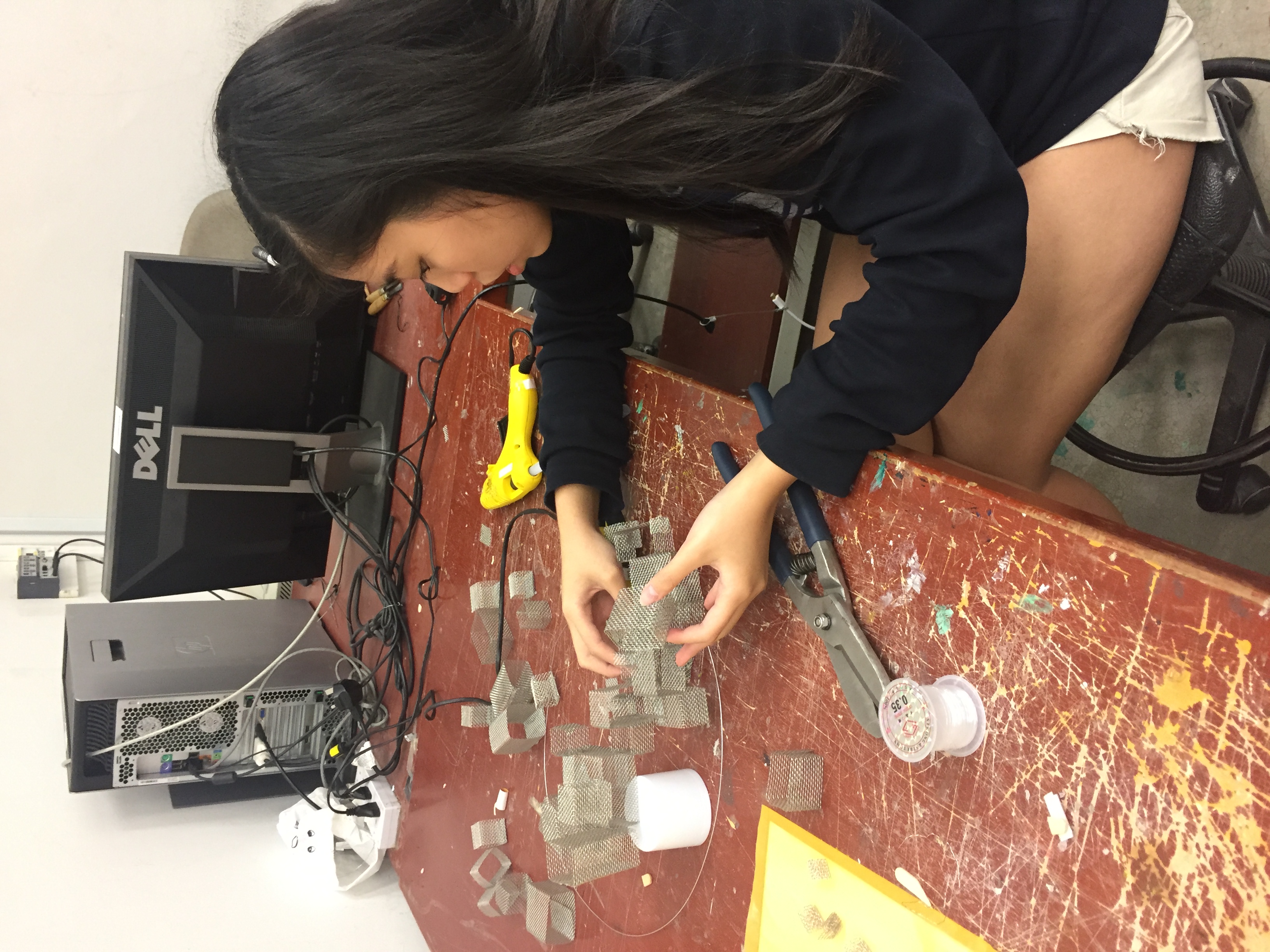
MODULAR UNITS
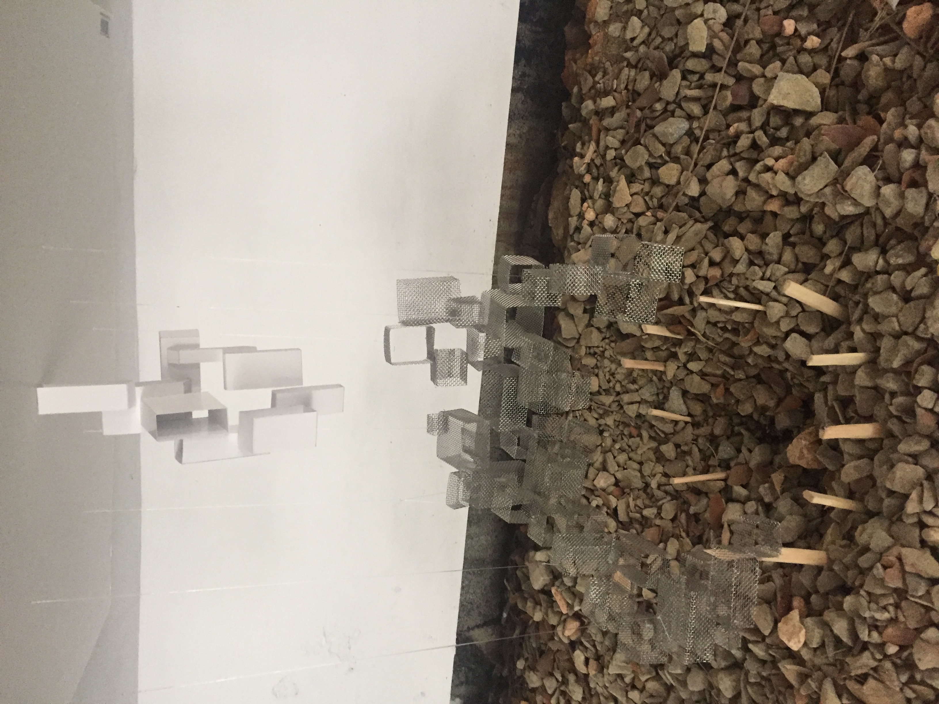
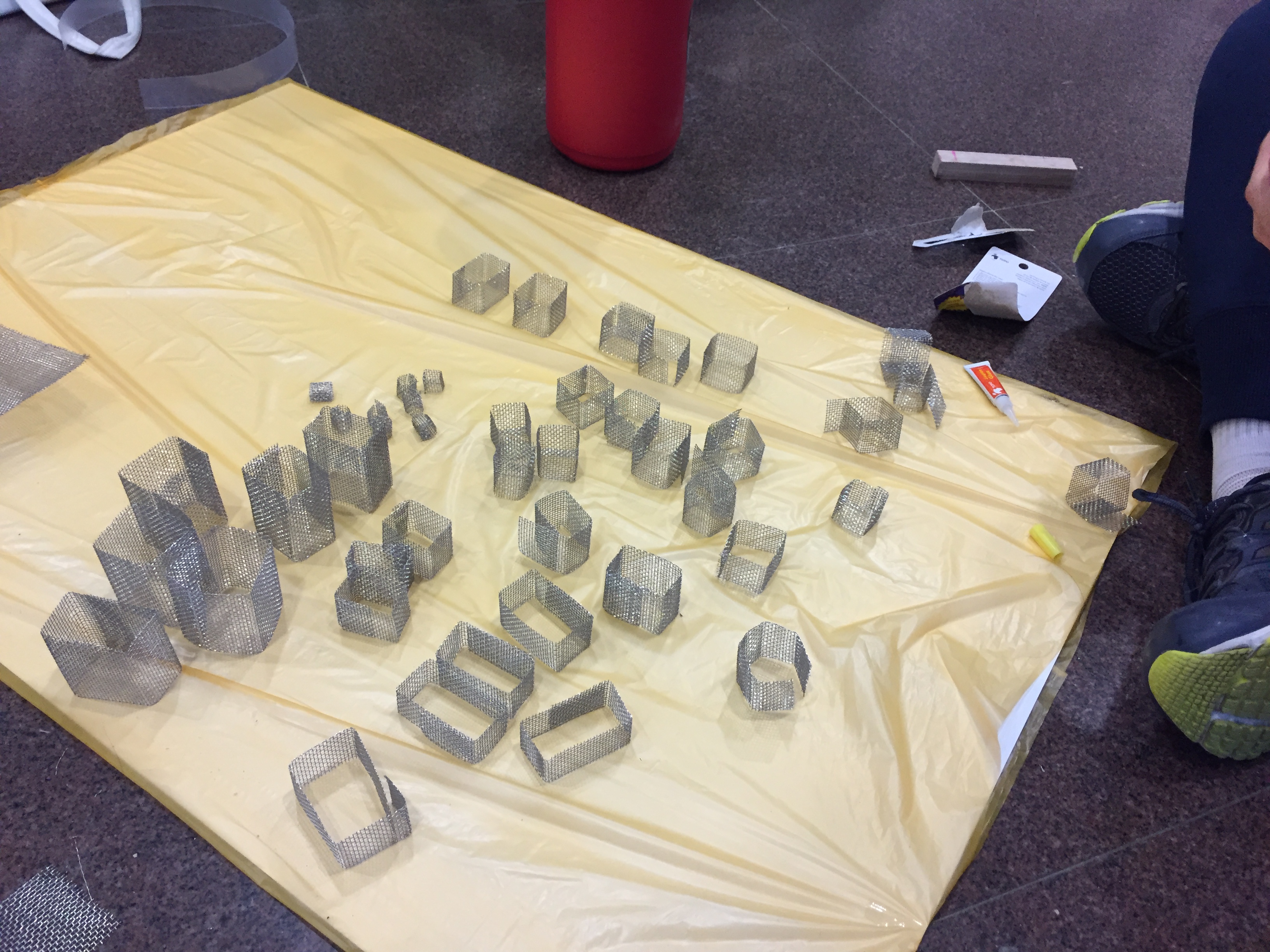
For our modular unit, we decided to create a cuboid voids of vary sizes. Each unit compose the overall structure of our city, where the inhabitants are bound by the implied space.
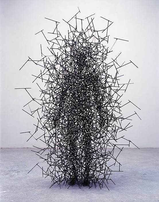
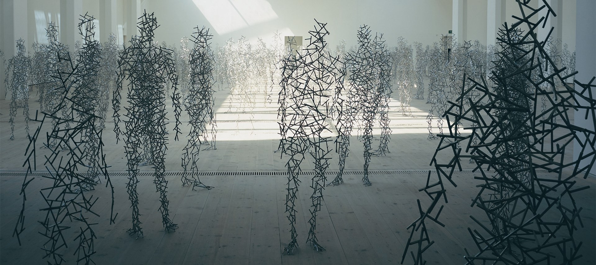
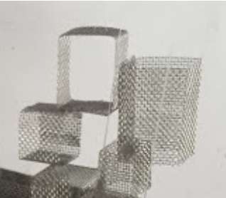
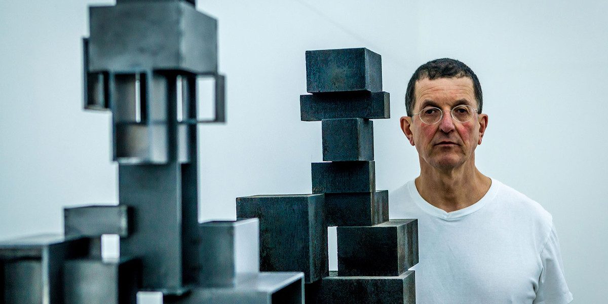
Antony Gormley’s human sculptures is composed of modular cuboid structures, using arrangement and various sizes to imply form and create voids in his playful assemblage. Inspired by his use of modular units, our city will be constructed using the voids bounded by four surface of materials, such that what is seen is different from different angles.
CONSTRUCTION PROCESS
Constructing modular units Prototype of arrangement
Hub
For our hub, we wanted to arranged the modular units to form an upward spiral, which will be hung in space. I was in charge of arranging the hub, varying the voids form between the units and creating the main void contained within the spiral.
Habitat
For the habitat, we used modular units of similar shape to create an inverted city, that was supposed to be growing out of the ceiling surface. Nicholas and Zhen Yu made modular units out of art card and Nicholas did the arrangement.
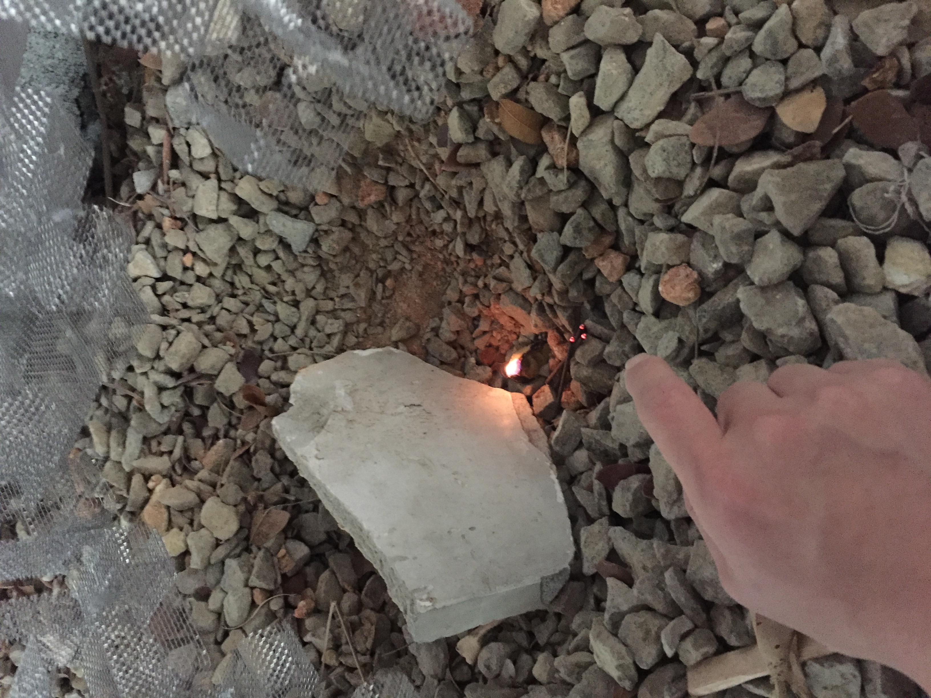
Highway
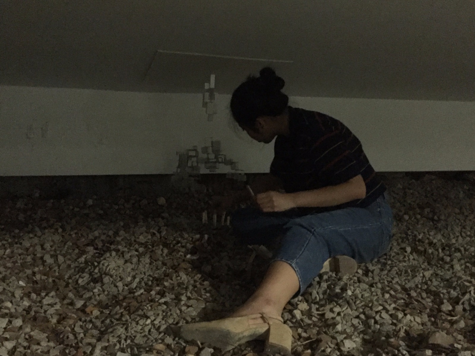
Our highway of our structure is the smoke from incense, stemming from a “prayer circle” where inhabitants meditate on the gravel ground. We used wooden sticks to create a circle on the ground, surrounding an amphitheatre like hole. Zhen Yu made the wooden sticks for our fence. To add a sensory experience, we used jinkoh incense to create a meditative smell.
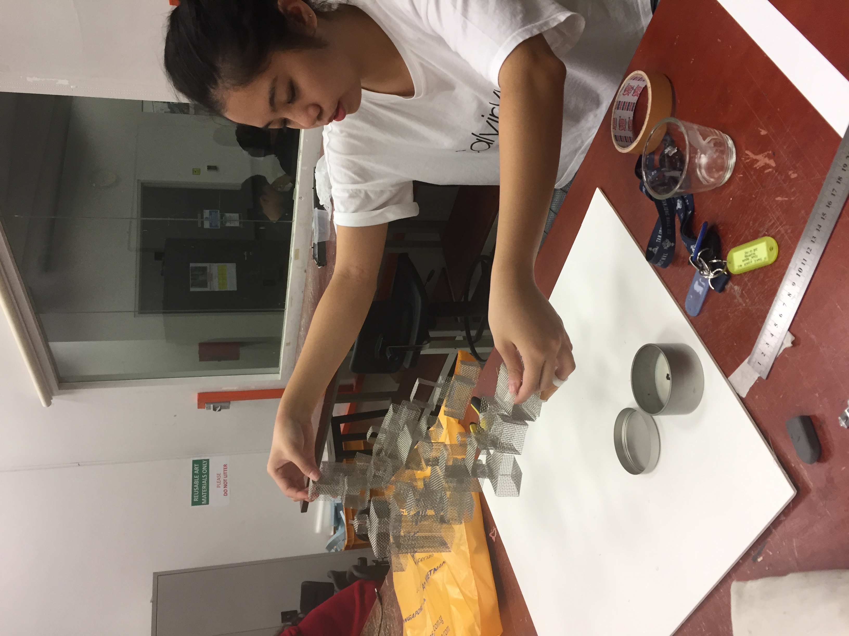
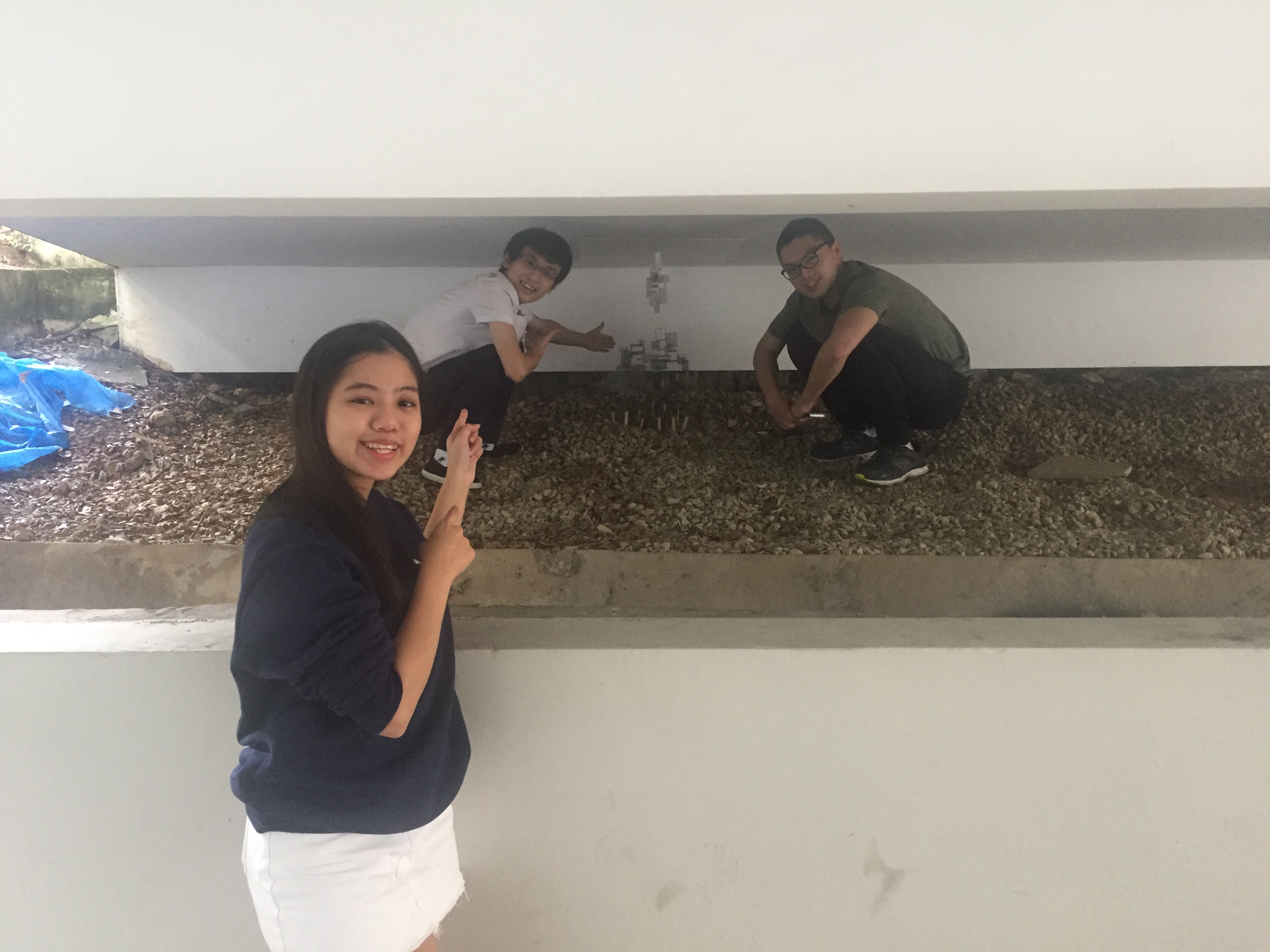
HANGING AND INSTALLING
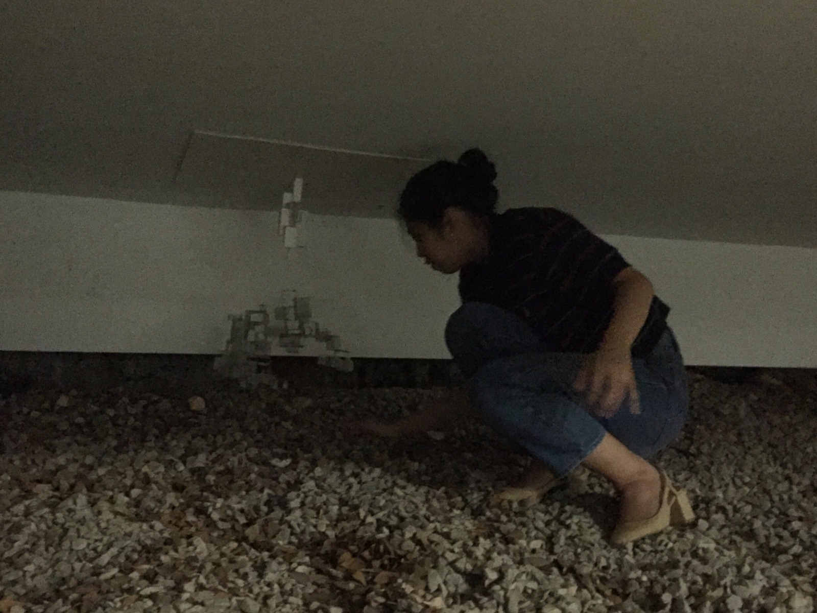
We decided to hang our city using a white foam board to blend in with the white wall.
Adjusting the angle of hanging elements due to angled ceilingI used a raised height to angle the elementsUsing of duct tape to attach the cityInstalling the cityBad day to wear heels
FINAL – “魂市“
Smoke spirits inhabit the city, hidden away for civilisation. You can’t see them in the day but at night they come out to play.
For our final mood box, we decided to go with sound A. The quality of the sound is organic and meditative, inspiring our theme of serenity for our final mood box.
INSPIRATIONS
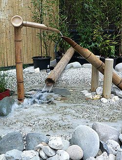
While listening to our sound, the sound of the wooden sticks reminded me of a bamboo water feature, especially those found in traditional Japanese gardens. Known as shishi-odoshi (“deer-scarer”), the bamboo mechanism uses the weight of falling water to create a “tak” sound to scare animals away.
The sound of the falling beads of the rain stick resembles the sound of shifting pebbles as people walk upon them. Thus, we adapted two features of the Japanese garden, the water bamboo feature and the rock gravel ground.
INITIAL IDEAS
To represent the components of our sound visually:
Wood sticks – water bamboo mechanism
Falling beads of rain stick – water/ rain or sound of rocks
Triangle – sphere or spiral
Various ideas:
Sub-ordinate
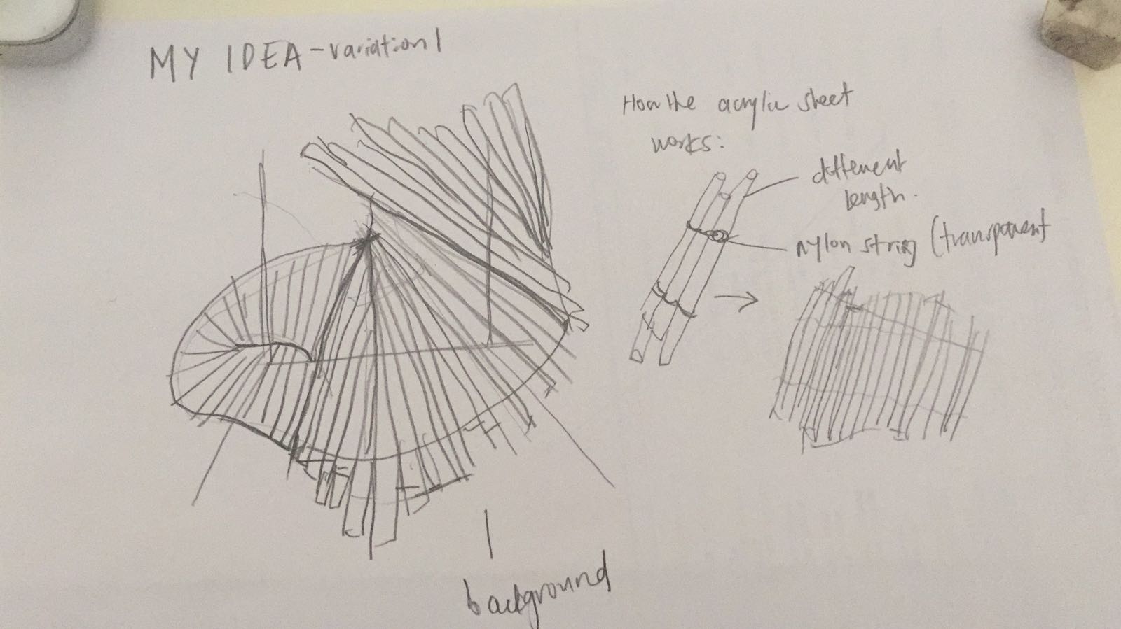
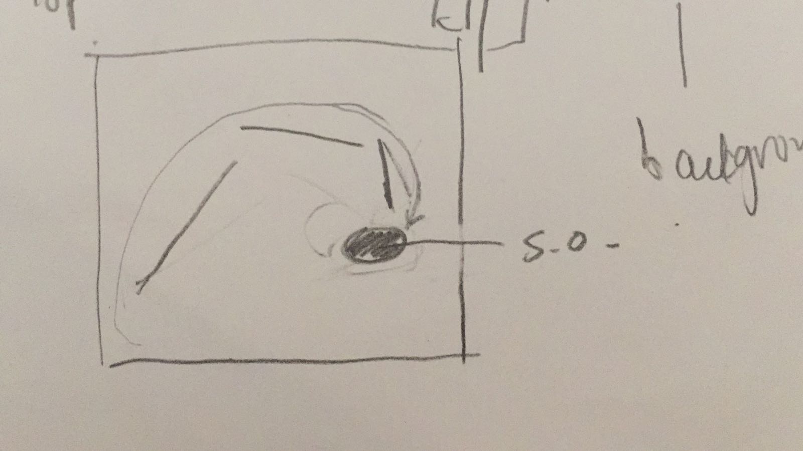
Proposed Idea 1:
A possible idea I proposed – creating a twisted plane of acrylic sticks to resemble the water sound of the rain stickHow the water bamboo mechanism will be incorporatedTop view
Taking the twisted plane of wool felt from my mood box, a possible idea was to create a twisted plane of clear acrylic sticks for the sub-ordinate. We decided against this as we wanted the sub-ordinate to be more subtle to highlight the dominant structure.
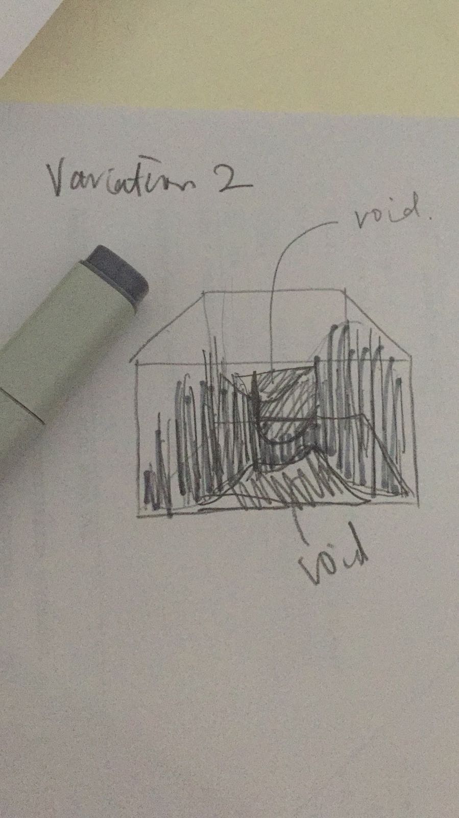
Idea 2: Assemblage of materials to form voids
I found some references for inspiration on representing the water or rock interpretation of the sound of the rain stick.
Hanging rocks installation by Jaehyo Lee http://static.neatorama.com/images/2012-05/jaehyo-lee-rocks.jpg
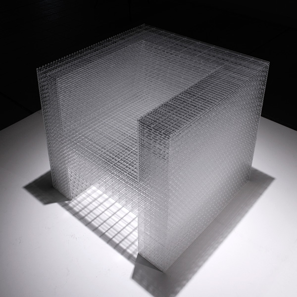
Chair made out of acrylic sticks by Junpei Tamaki
http://www.evolo.us/wp-content/uploads/2012/02/2450-Chair-2.jpg
> Using acrylic sticks vertically to create form of water and voids
We voted against this idea as it was too messy as we wanted to keep it minimal.
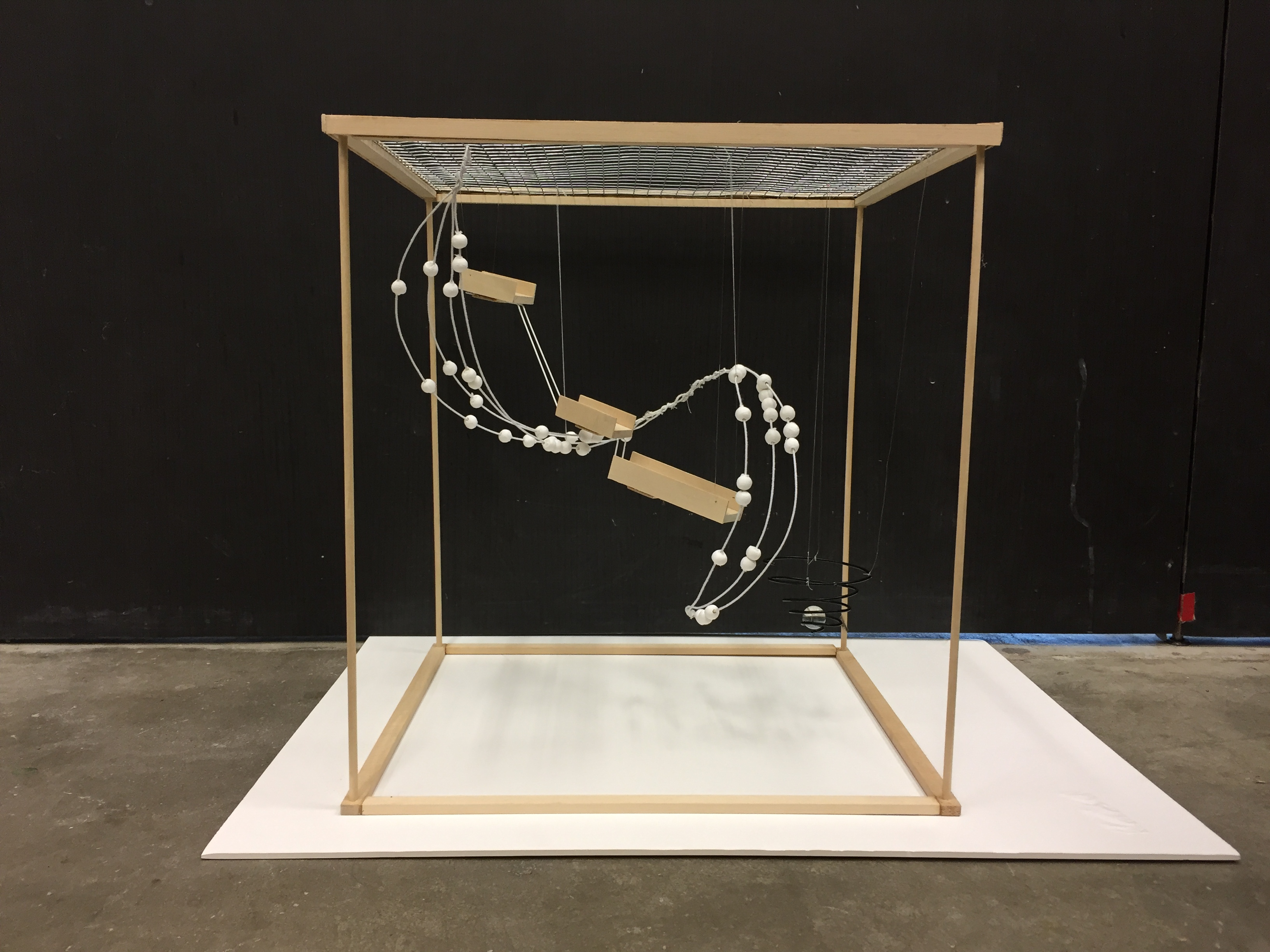
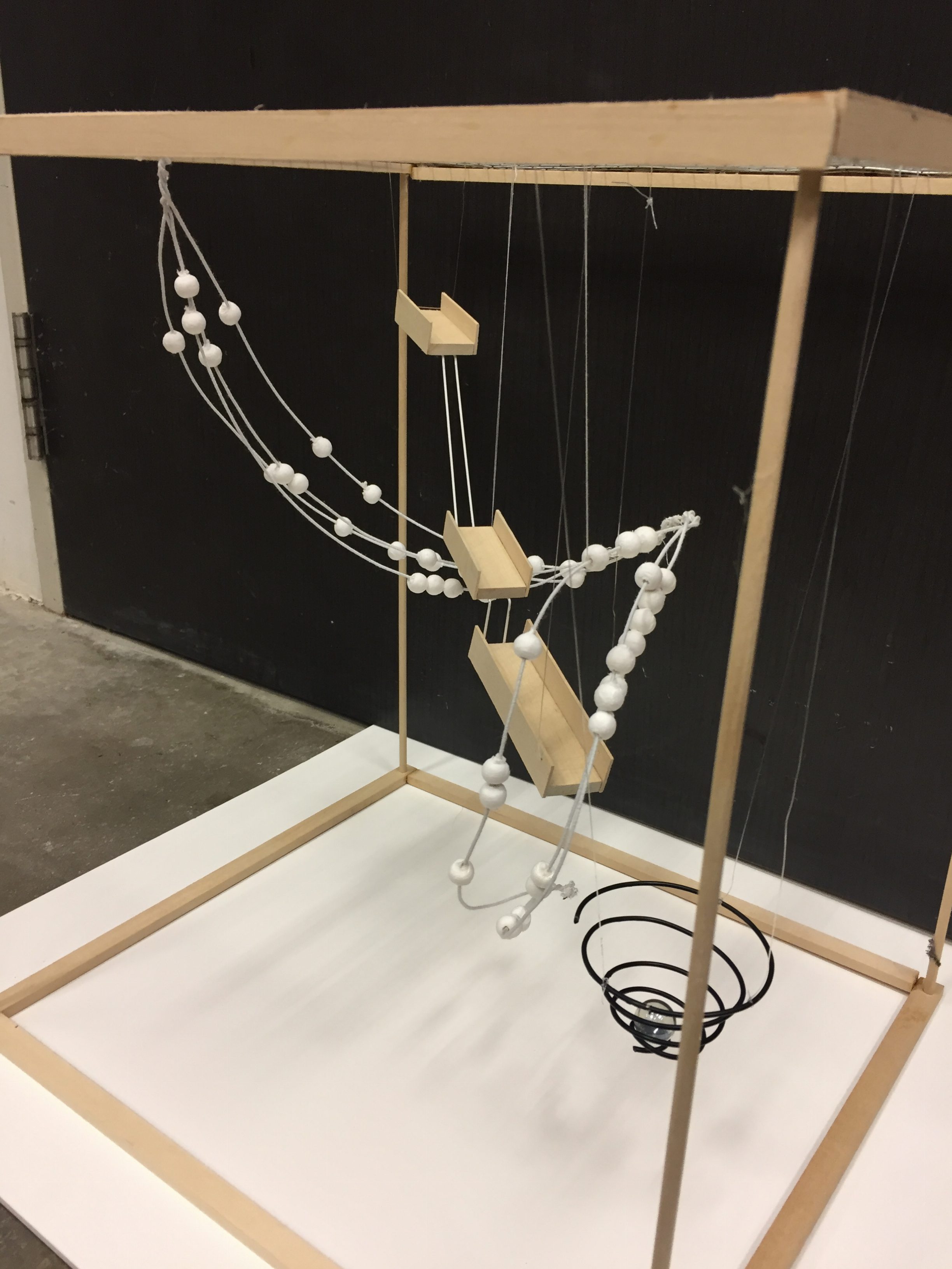
FINAL COMPONENTS
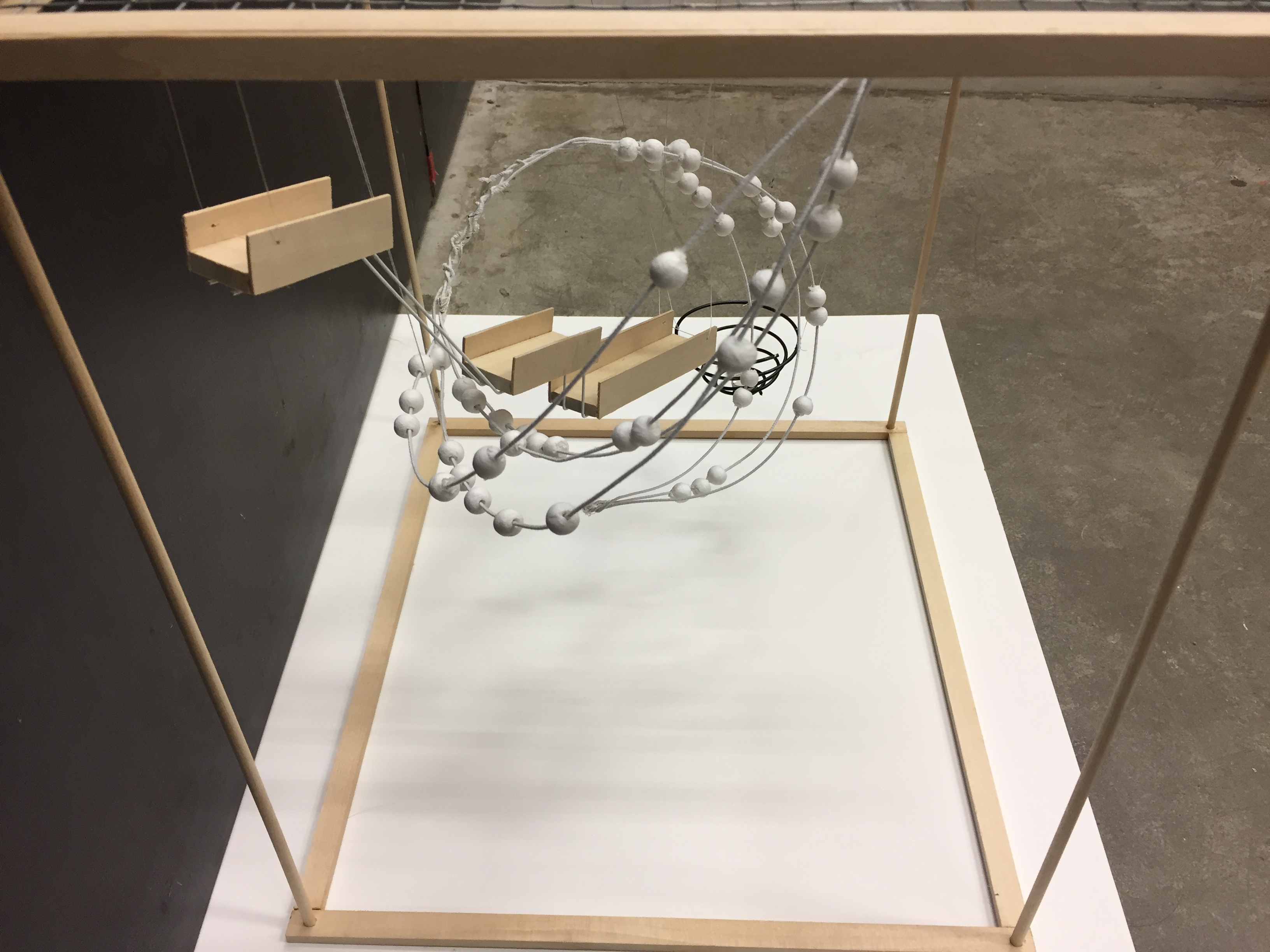
Materials and colours – We wanted to use a organic colour scheme for our final mood box, thus deciding on using white and mainly wood. Black was added as a contrast.
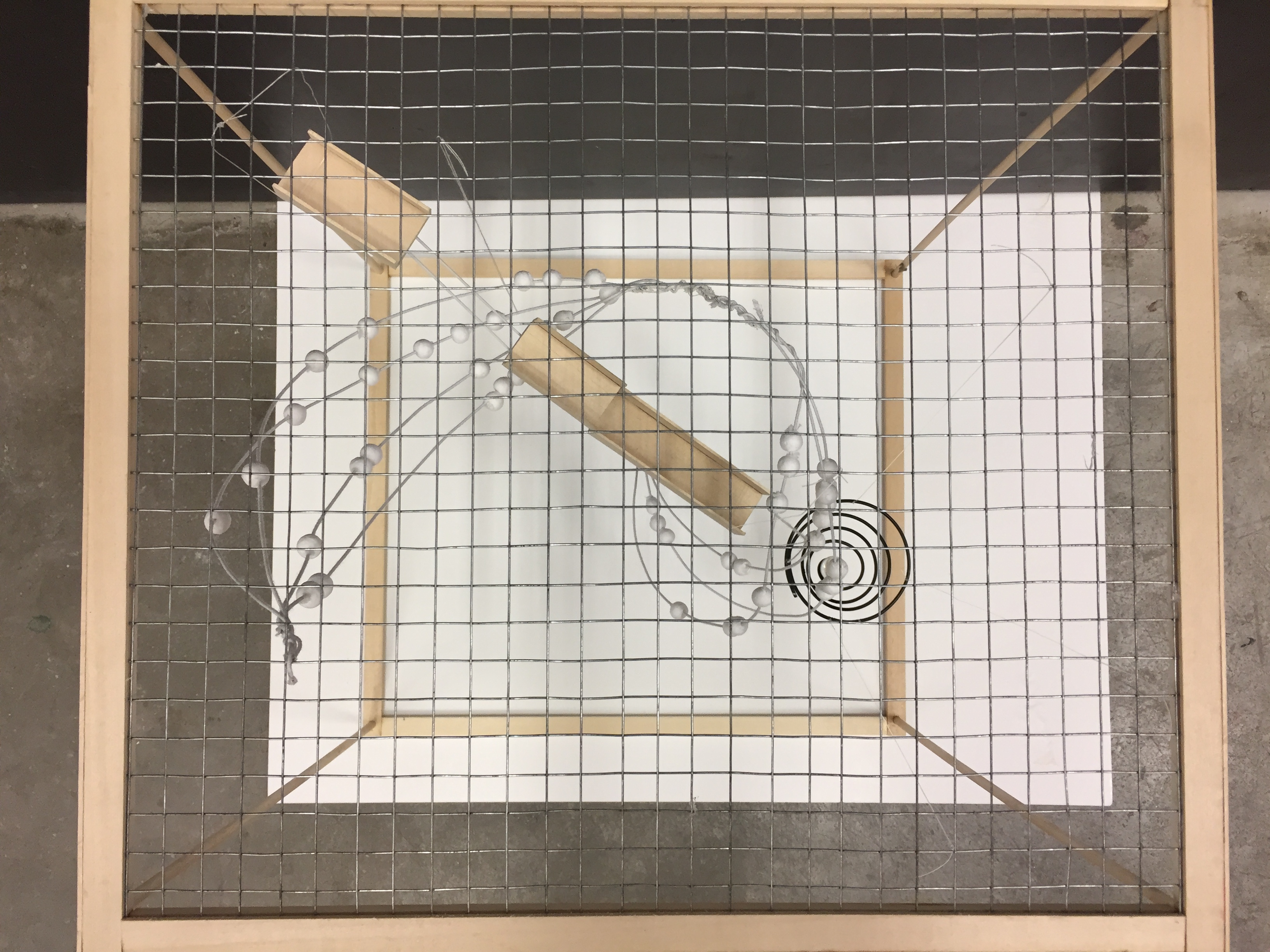
Frame – We decided to adapt the the use of wooden frame from Nicholas’ mood box as we are suspending our elements to suggest how sound occupies an empty vacuum.
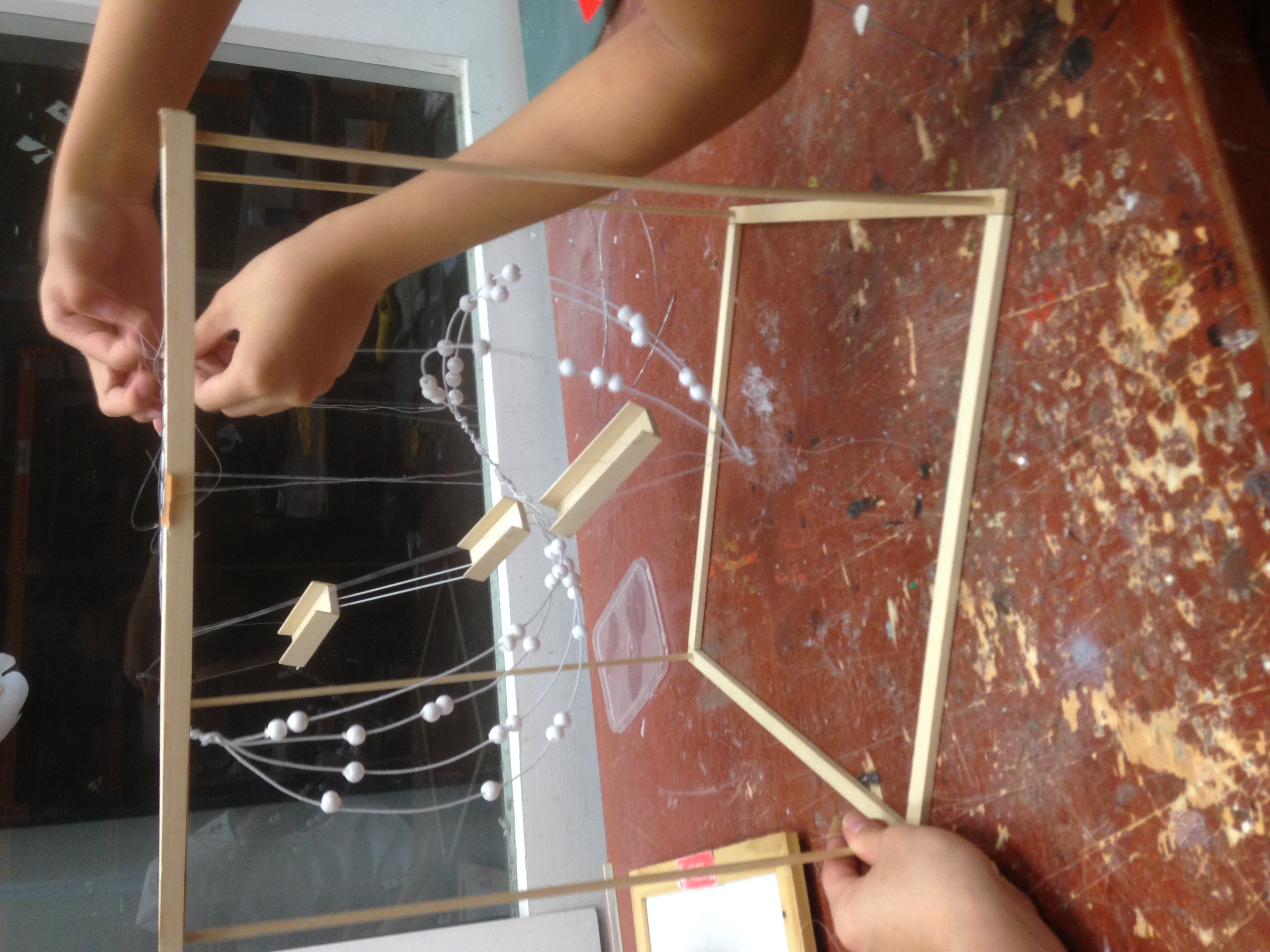
Dominant – A pathway of three wooden carriages to represent the three beats of the wooden sticks
Sub-dominant – A twisted plane of white beads surrounding the dominant feature
Sub-ordinate – An upward spiral
Auditory and experiential component – Falling marble
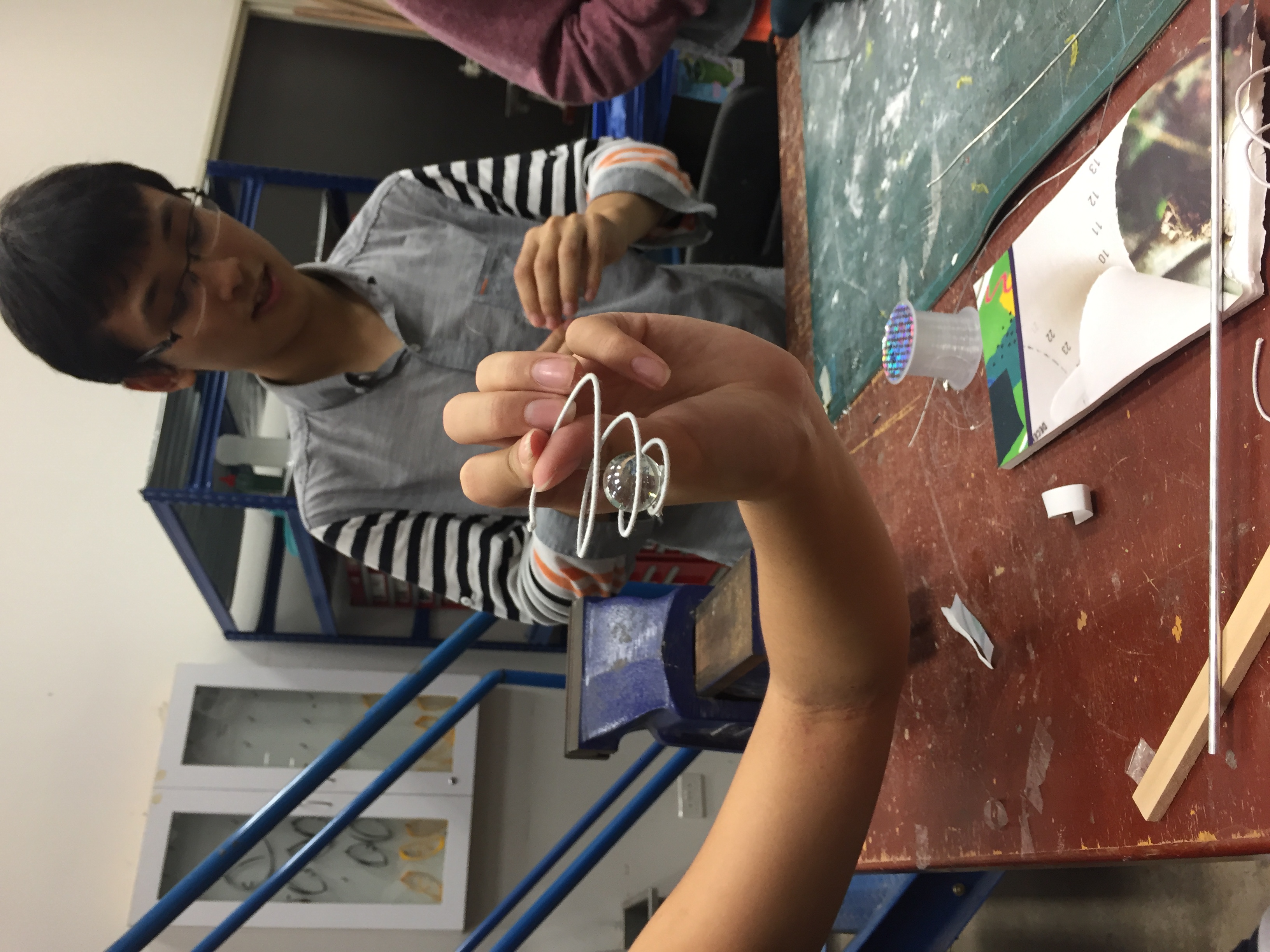
We designed the dominant and sub-ordinate feature to interact with a falling marble to recreate our sound (tak-tak-tak-ding).
CONSTRUCTION
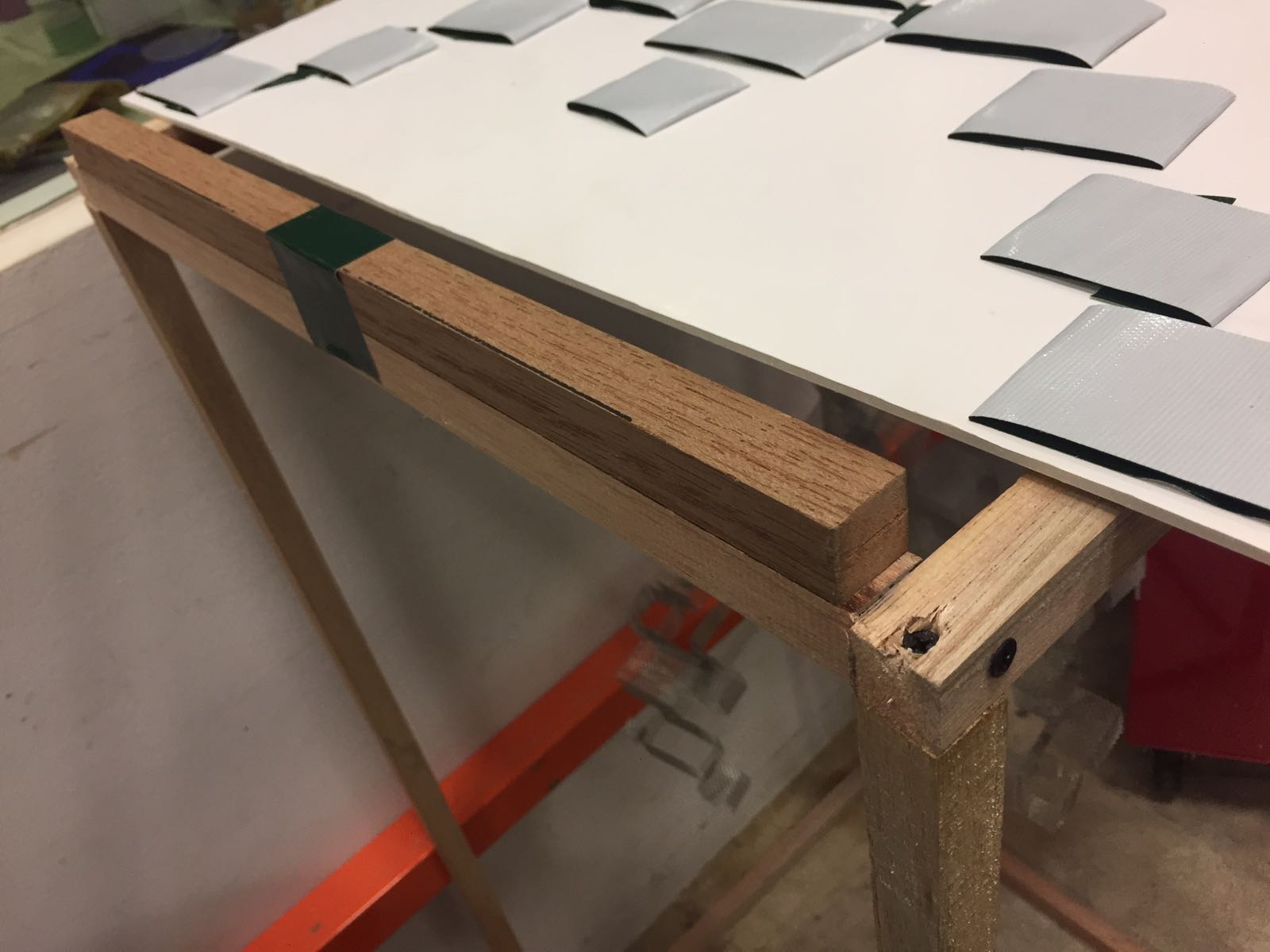
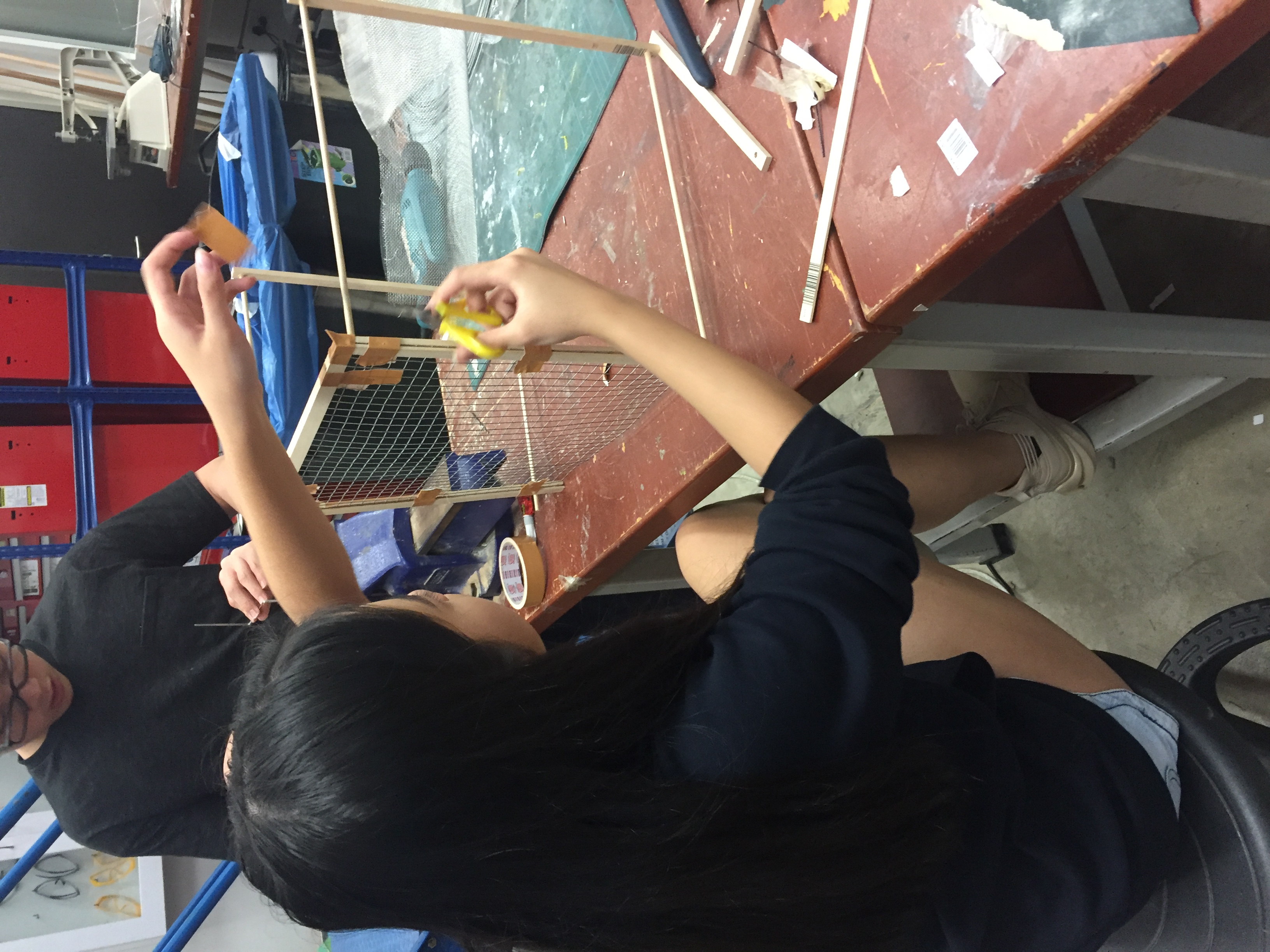
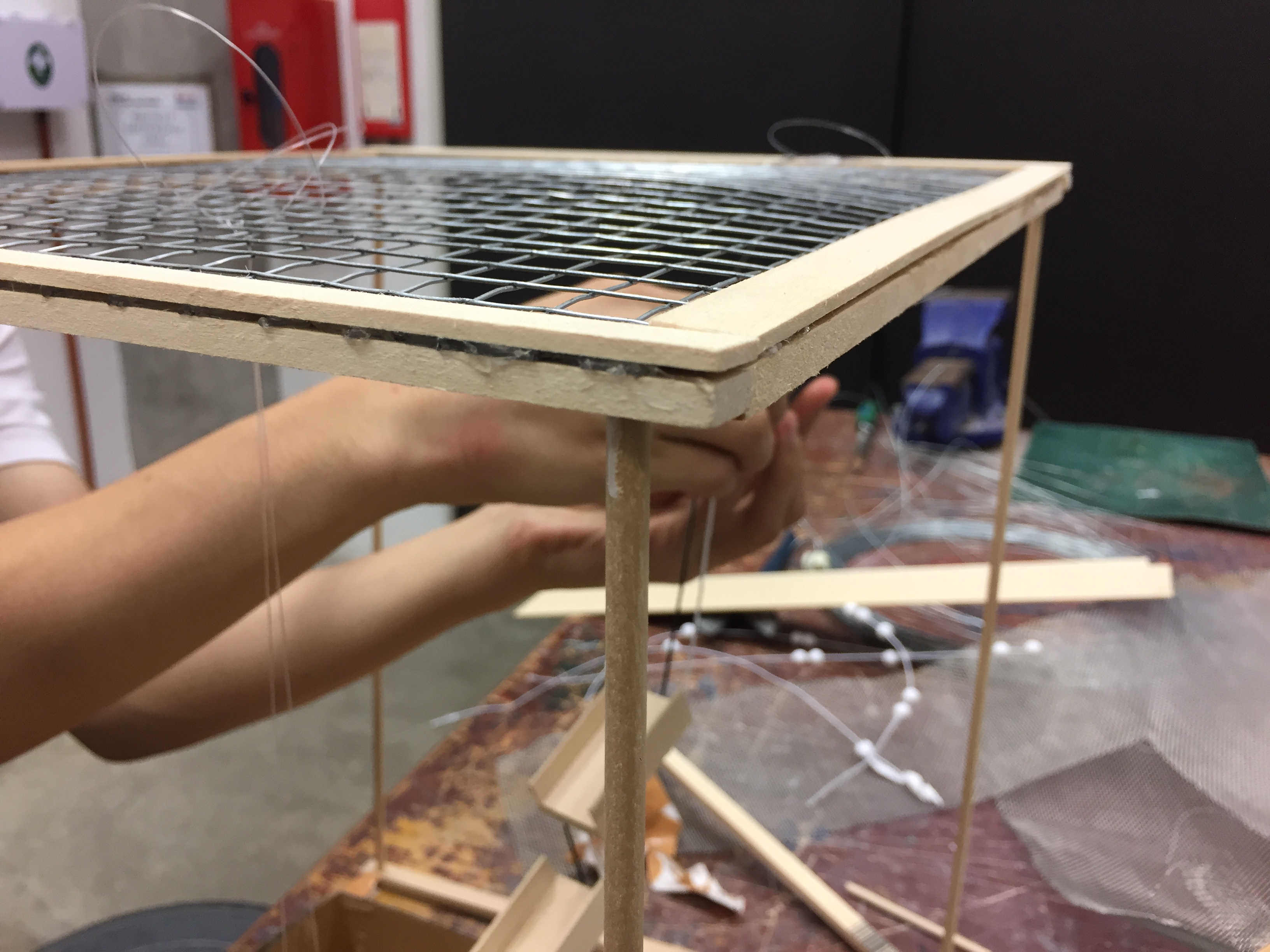
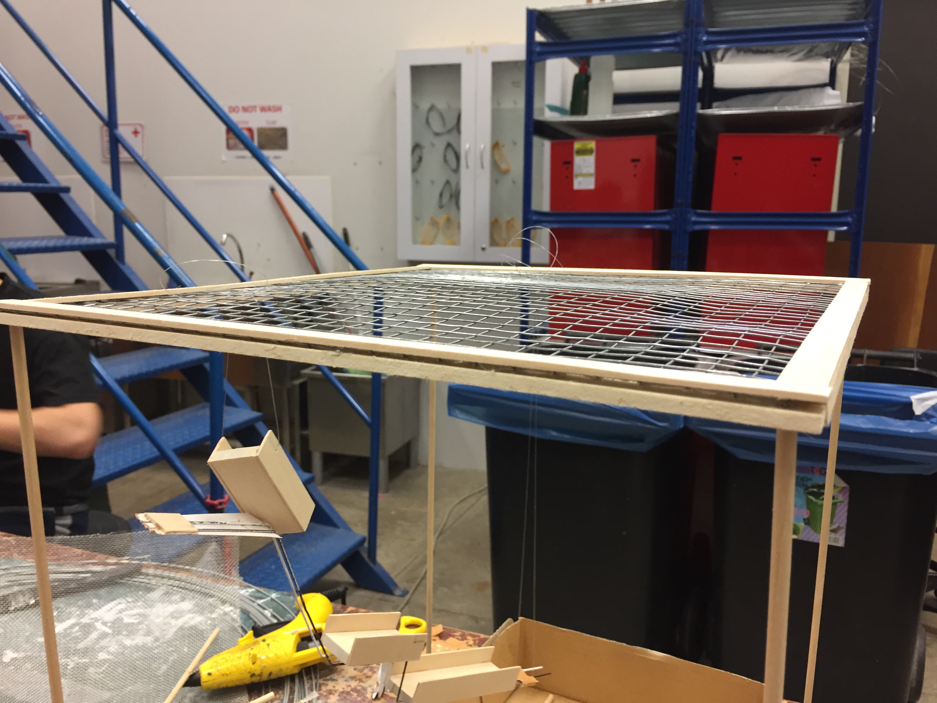
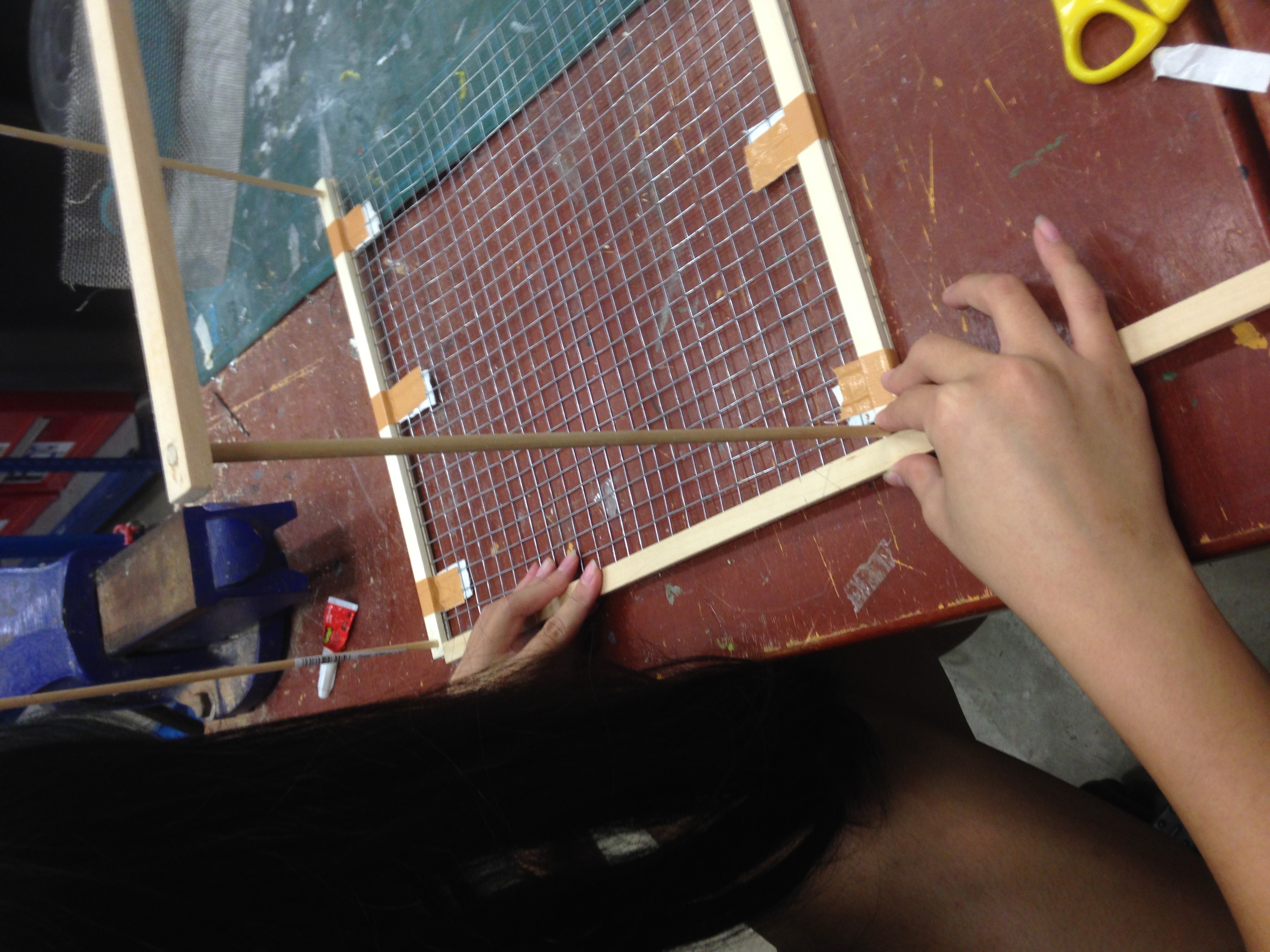
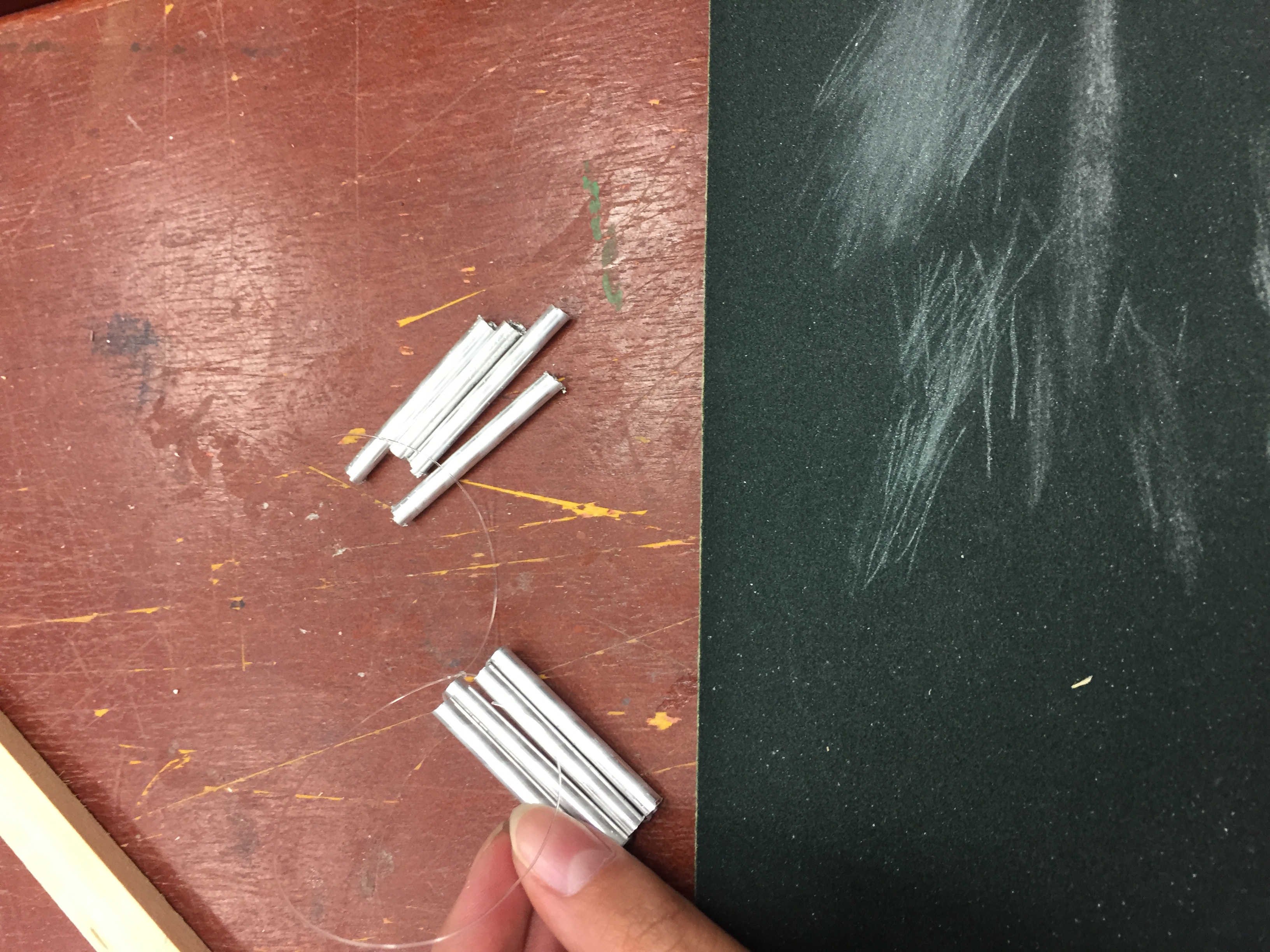
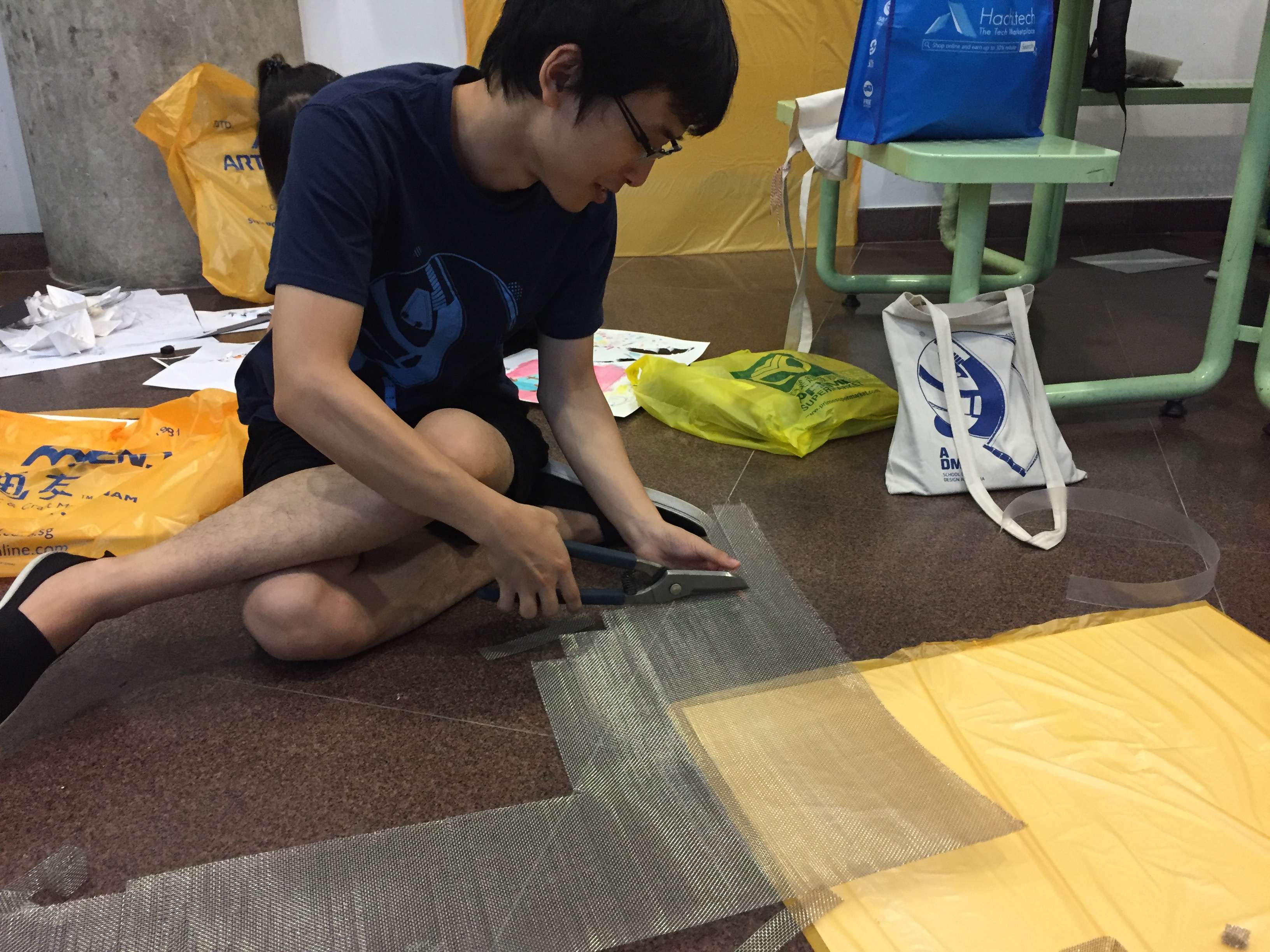
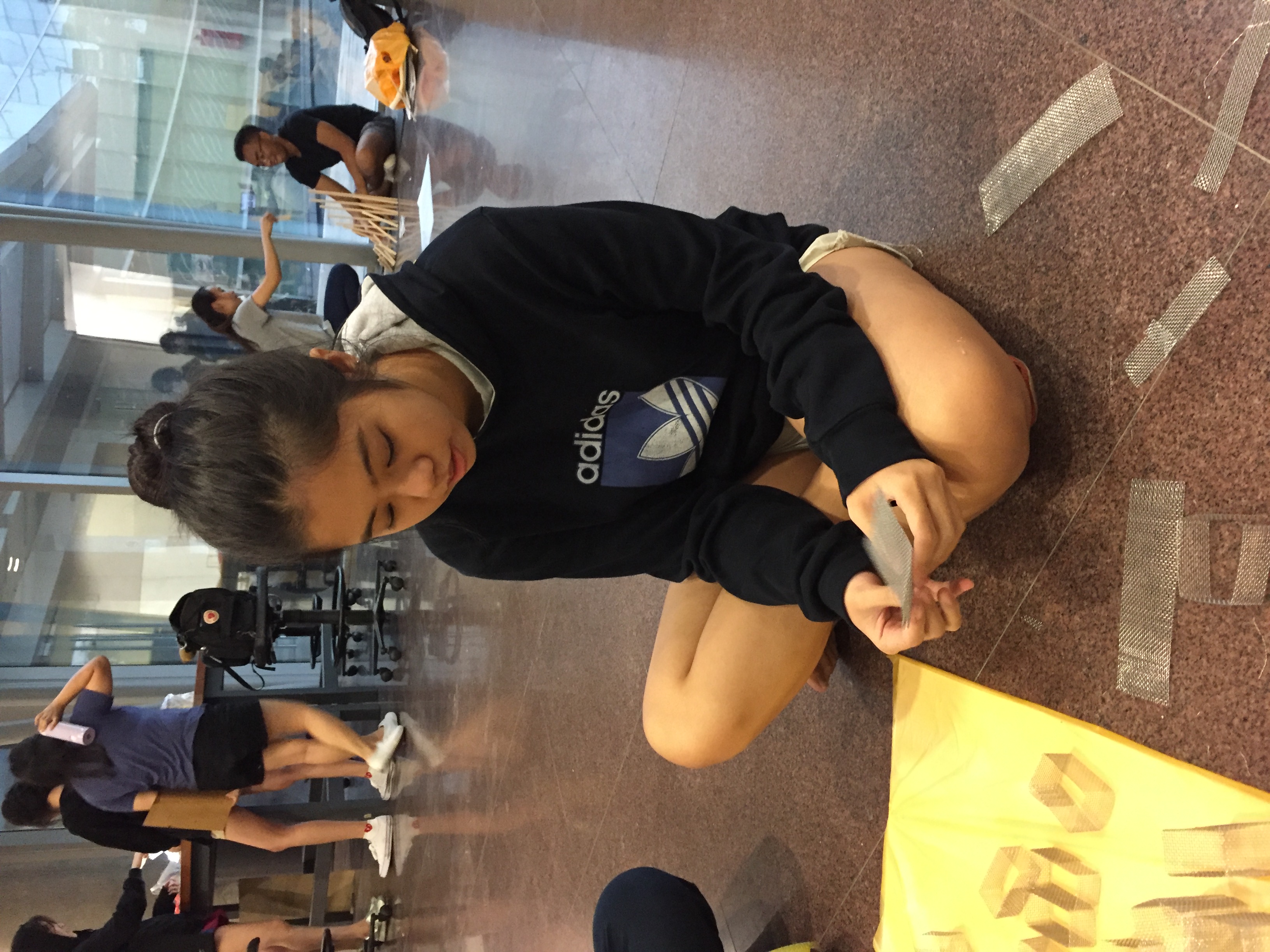
Frame Initially, we were going to hang our elements with a cross made up of two wooden sticks but it did not give us much space to hang our elements. We decided to use a wire mesh to hang our elements, so I came up with a design of sandwiching the edges of the wire mesh with two wood sticks to hold the mesh. Glue gun was used to fill the space between the wooden sticks.
Initial design for the frame; Securing the wire mesh
Zhen Yu cutting wood for the frame – Wood cutting expert!
Nicholas drilled holes through the wood
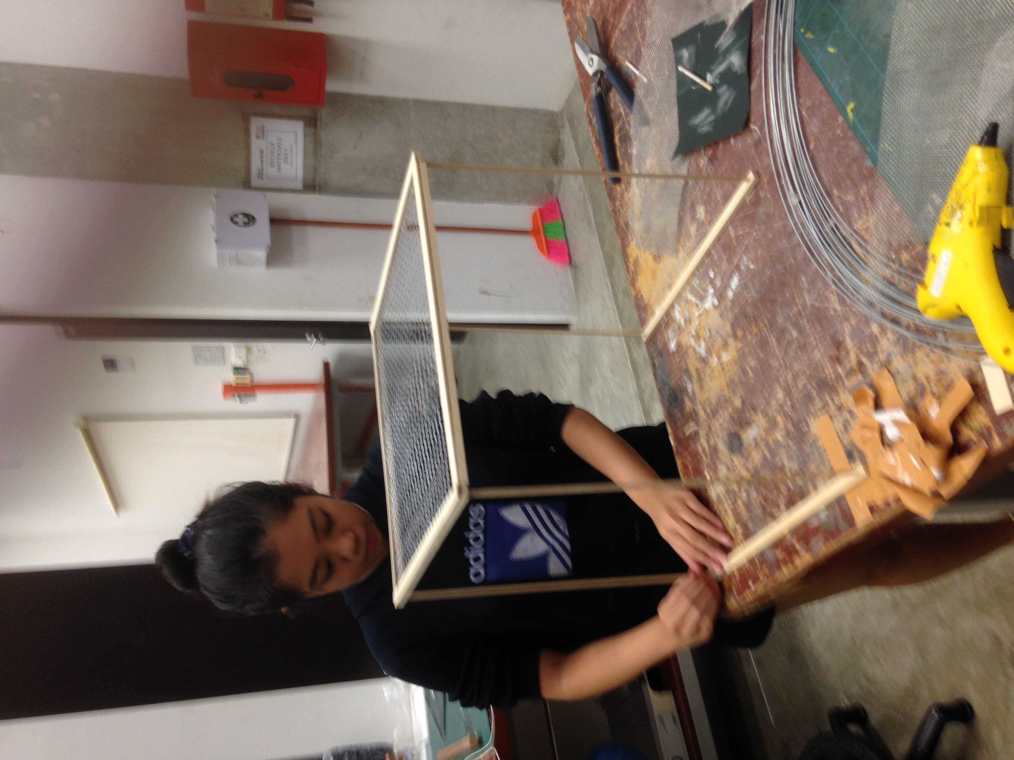
Constructing the wooden frame for wire mesh
Fixing the cylindrical wood sticks into the drilled holes
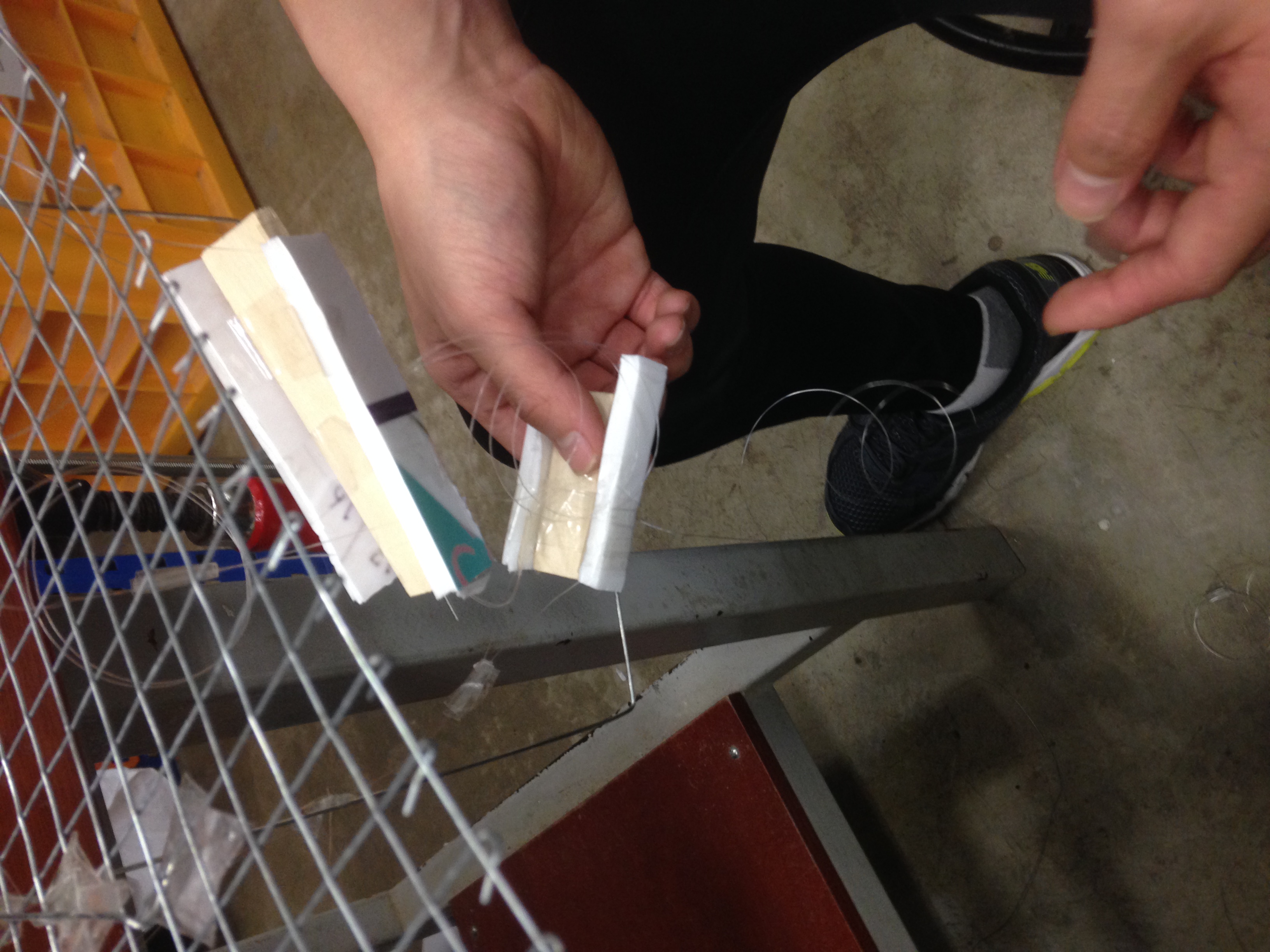
Dominant We decided on a diagonally linear pathway of wooden carriages, made by Zhen Yu and Nicholas, for the marble to fall upon. Initially, we wanted to hang the wooden carriages individually, but the pivotal swinging made it hard for the marble to fall on it. Thus, Nicholas made a wire structure to hold the wooden parts together.
Nicholas testing the trajectory with prototypes; Zhen Yu constructing a wooden carriage
Nicholas and his wire mechanism; testing the space within the frame
Sub-dominant
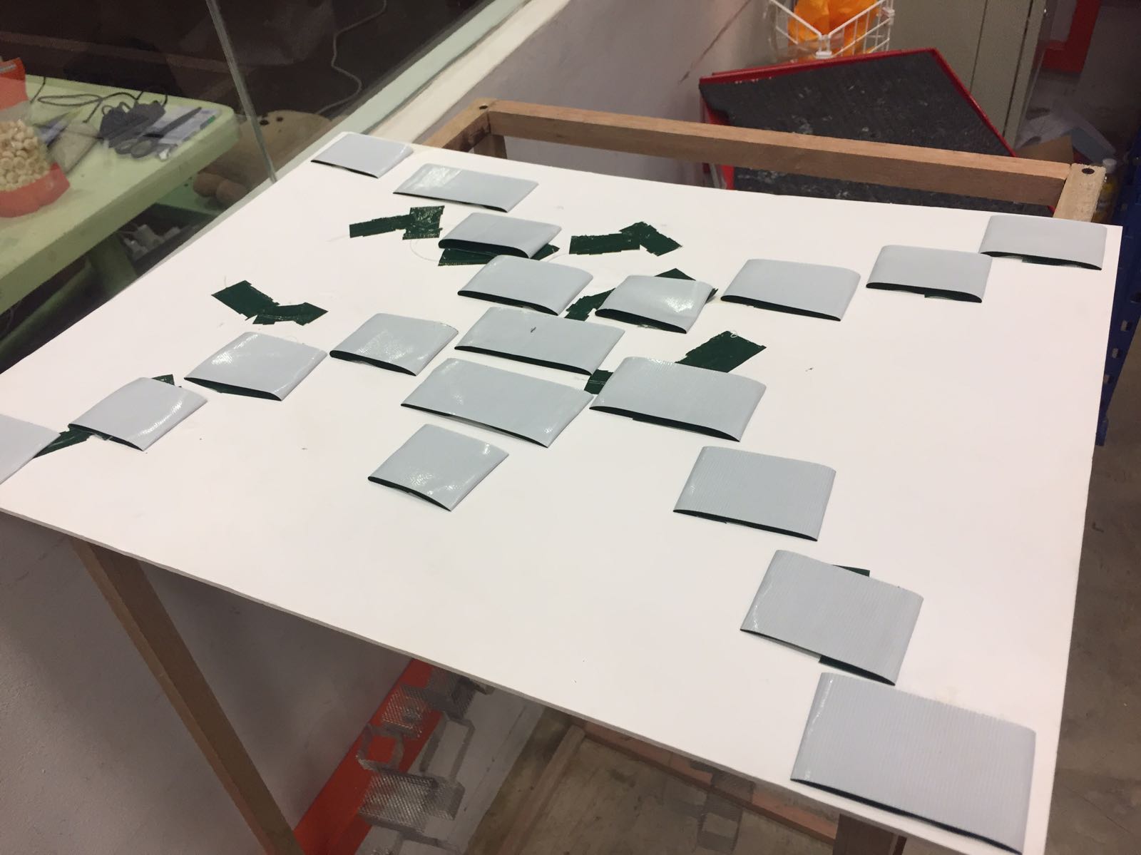
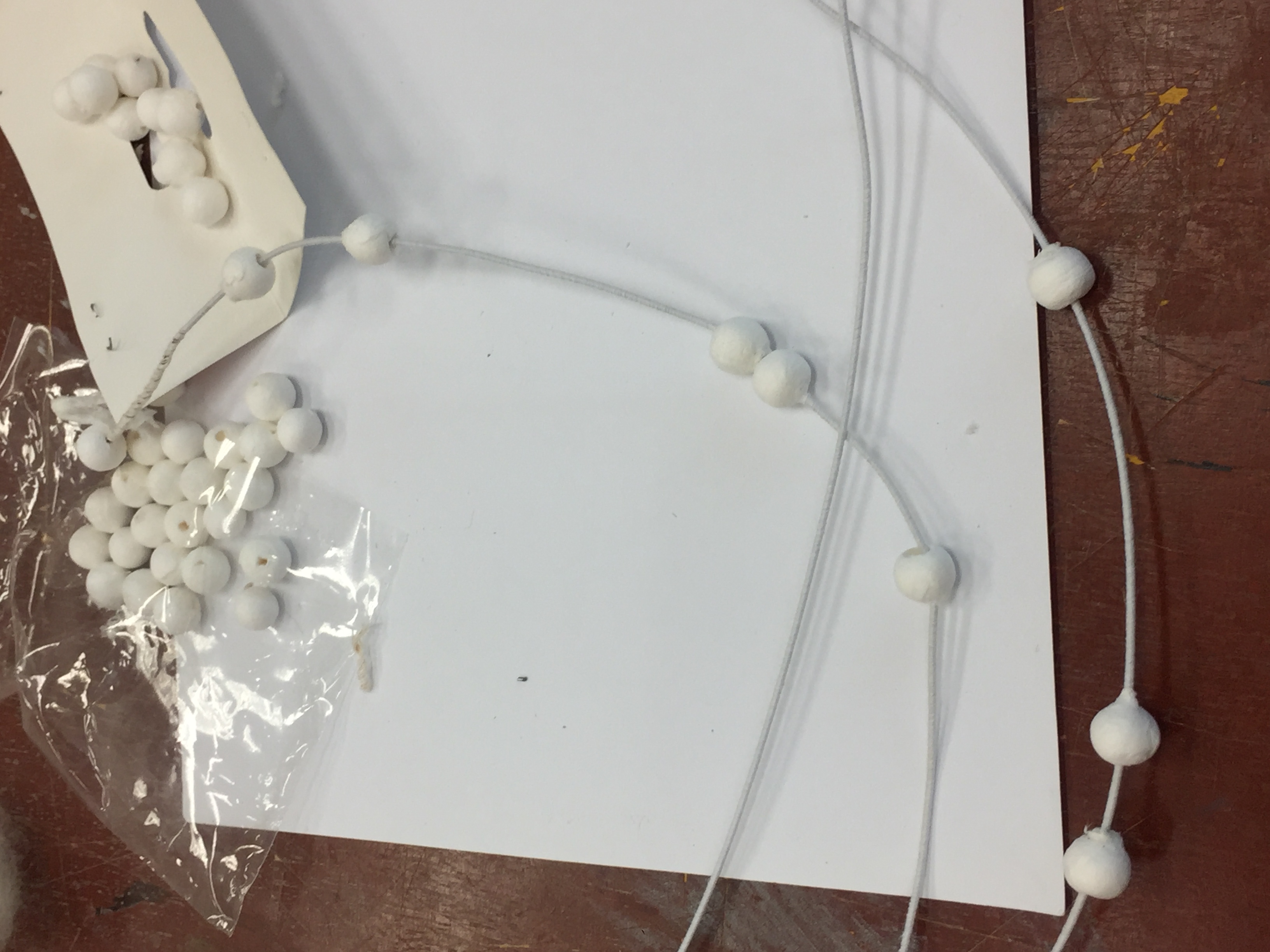
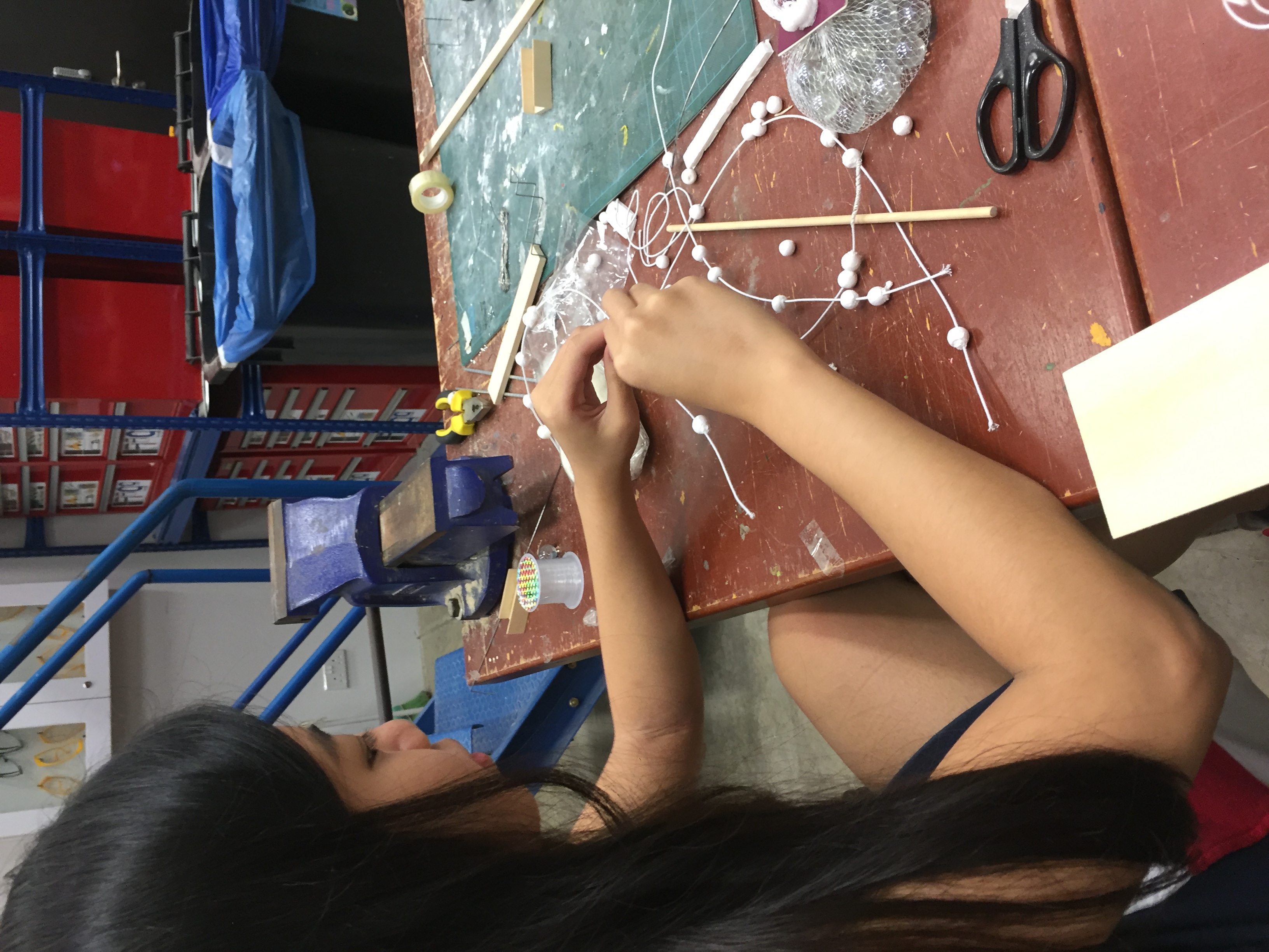
We decided on using white cloth beads and white wires to create a twisted plane that represented the sound of falling beads and should not take the focus off the dominant component. I beaded and constructed a spiral to be intertwined around the dominant feature.
Stringing the beads; Twisting the wire to create a spiral
Sub-ordinate
For the sub-ordinate, we wanted to create a flat surface made out of metallic tubes but the sound created was too insignificant. Thus, Zhen Yu and I decided to made a upward spiral of hard wire to create a louder sound and catch the marble at the same time. The spiral was spray-painted black to contrast with the lighter colours of our mood box.
Initial sub-ordinate; Prototype design to catch marble
ASSEMBLING THE FINAL
We suspended the elements using nylon string from the wire mesh frame.
FINAL MOODBOX ‘Serenity’
Our final mood box represents our organic sound through visual and auditory means, where the key component of our sound is recreated with the dropping of the marble. The colours, materials and minimal design used suit the overall calmness and serenity of falling water we tried to convey.
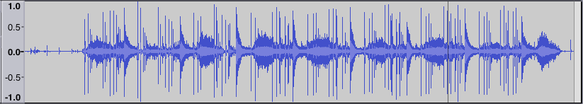
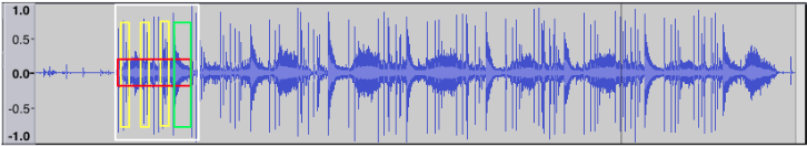
SOUND ANALYSIS Instruments: Wood sticks, Rain stick and Triangle
Quality of sounds
Wood sticks – short and loud
Rain stick – sounds of falling water, length of sound depends on action and speed
Triangle – long and resounding
The rhythm of four and a half beats is constructed with a background sound of the falling water sounds of the rain stick. One cycle includes three beats of the rain stick loosely hitting each other follow by one and a half beats of the triangle.
White – one cycle
Yellow – Dominant
Red – Sub-dominant
Green – Sub-ordinate
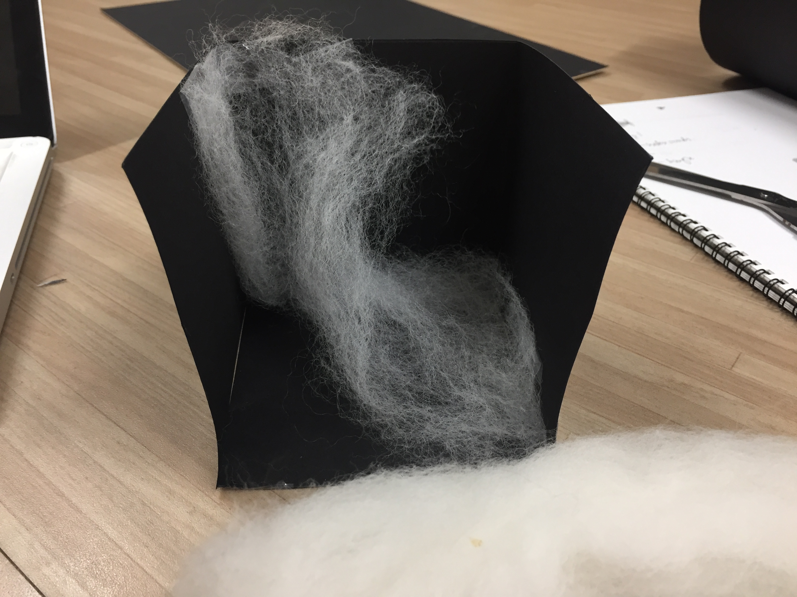
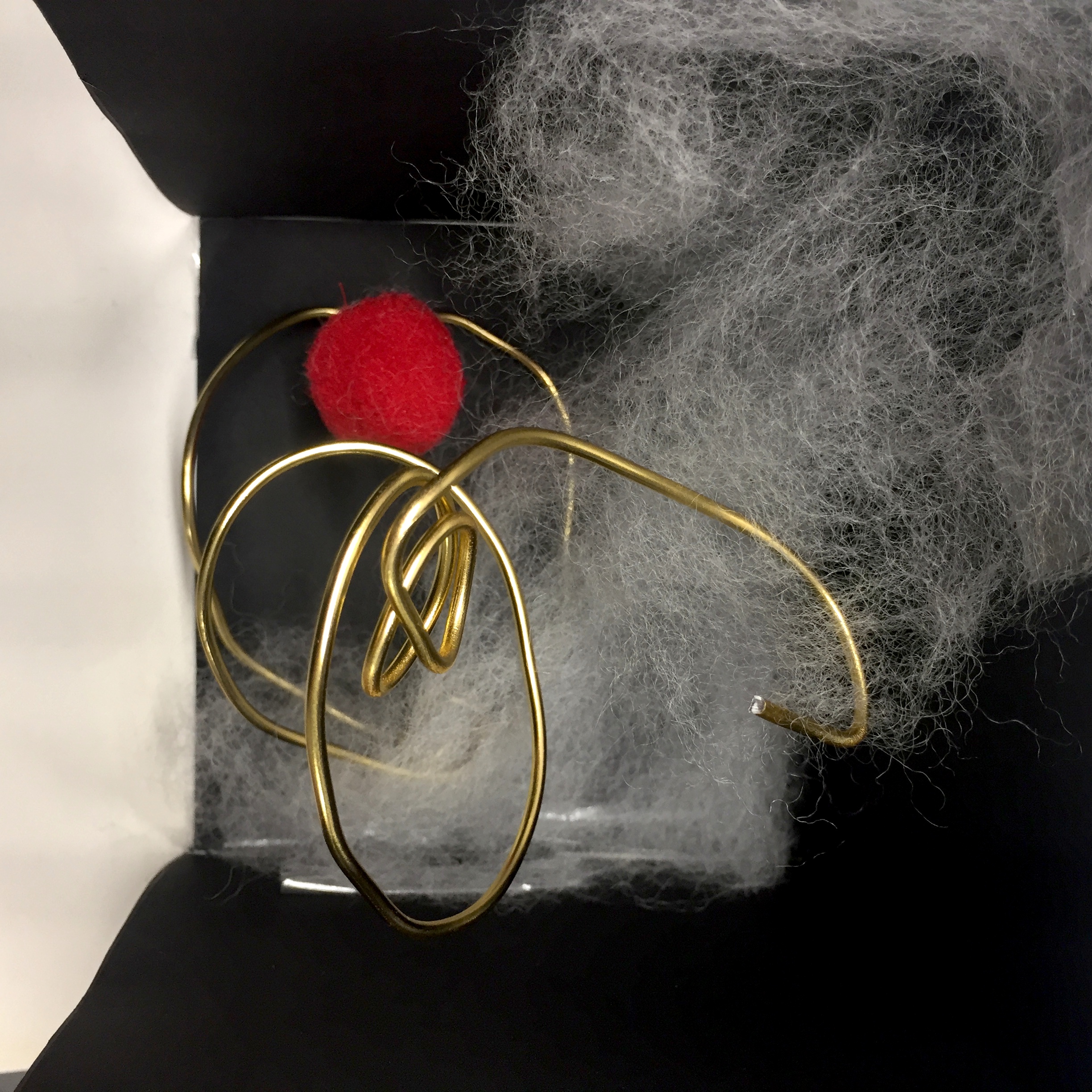
MODEL 1
Materials:
Wood stick (dominant) – Gold wire > to stand out
Rain sound (sub-dominant)- White wool felt > subtle in the background
Triangle (sub-ordinate) – Red felt ball > Circular to capture resonance
I twisted the sheet of wool felt to create voids in space.
Final Model
top view
Comments (class):
The sub-ordinate is a resounding sound, the sphere is too solid and small.
Edit: could replace the sphere ball with a material, perhaps wire or thread, of a large volume.
One cycle is eight beat, with the rain stick being used like a shaker as the dominant beat of “dom chak chak”. The triangle is played after the three beats and at the end of the eighth beat, the sound of wood stick scrapped across table follows the triangle sound immediately.
White – one cycle
Red – Dominant
Yellow – Sub-dominant
Green – Sub-ordinate
MODEL 2
As the composition involves individual beats with only slight overlap at the end of the cycle, I decided to create a space composing of individual, thin units.
Materials:
Rain shaker (dominant) – Thin strips of hard plastic
Triangle (sub-dominant)- Red felt ball
Wood stick (sub-ordinate) – String
I placed the thin strips diagonally, seemingly to interact.
The sub-dominant is elevated from the side. I used string to capture the rough sound from the wood stick scrapping the table top.
Final
Comments (class):
– The dominant units are too literal, liken the rain sticks.
Edit: Replace with wire or overarching metal sheet with curves following the rhythm.
‘Modular’ means employing or involving a module or modules as the basis of design or construction.
Modular design, or “modularity in design”, is a design approach that subdivides a system into smaller parts called modules or skids, that can be independently created and then used in different systems.
The modules can be added, are interchangeable and removable, are used to create compositions, like lego blocks.
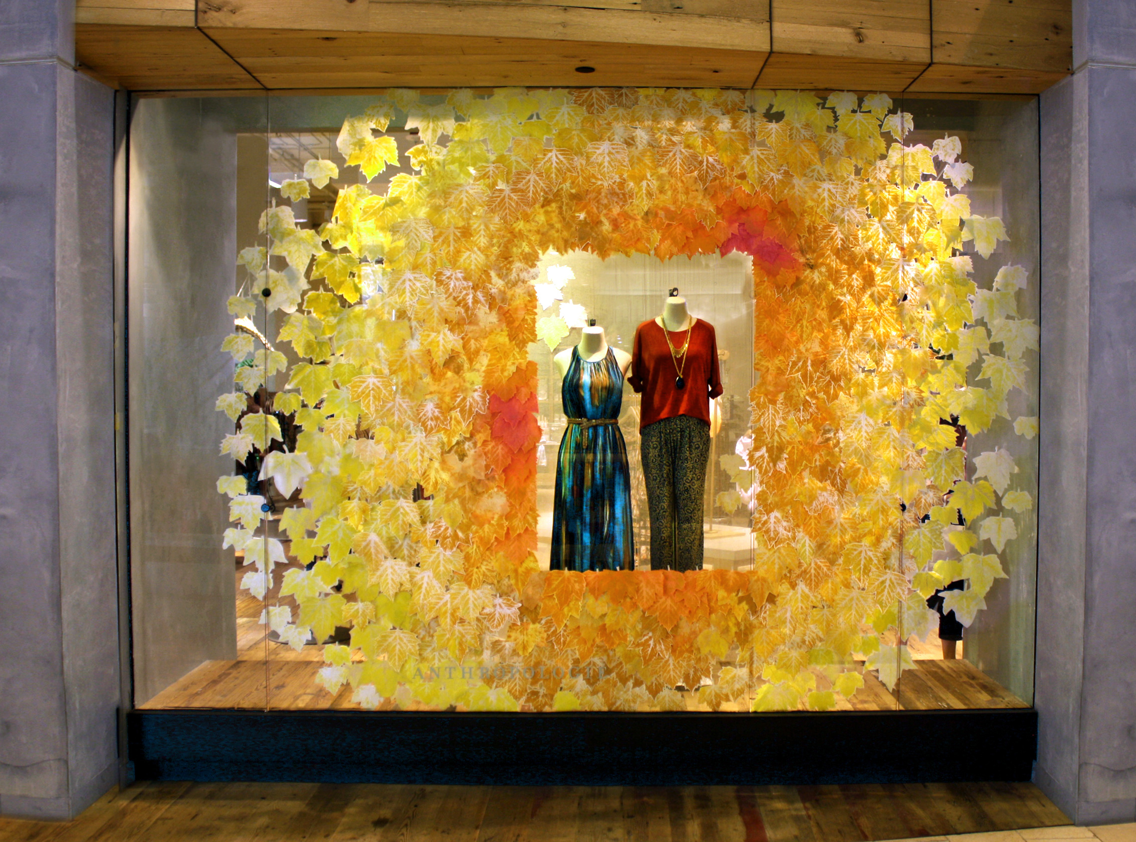
Anthropologie is a fashion brand whose window displays are filled with huge compositions of different materials, mainly paper and recyclable materials.
Antony Gormley is a fine artist who create human sculptures of various sizes and installations. His human figures are composed of various units of a certain material, using metal blocks or strips. His installations studies the relationship between space and human figures through voids.
https://d2jv9003bew7ag.cloudfront.net/uploads/Antony-Gormley-photo-by-Duncan-Stingemore.jpghttp://www.undermatic.com/wp-content/uploads/2012/02/antony-gormley.pngQuantum Cloud http://www.antonygormley.com/uploads/images/0416_quantumcloud_xv_2000_001.jpgSleeping field, 1993 http://www.antonygormley.com/uploads/images/595cf41a2040c.jpgDomain Field http://balticplus.uk/images/22260/1920x854_s1_f1_cffffff_m0_q90/antony-gormley-domain-field/?_=XhEMH
IN ARCHITECTURE
The design of any system composed of separate components that can be connected together. In modular architecture, you can replace or add any one component (module) without affecting the rest of the system.
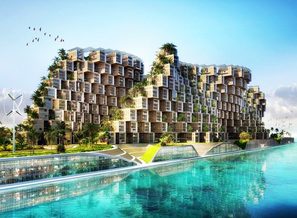
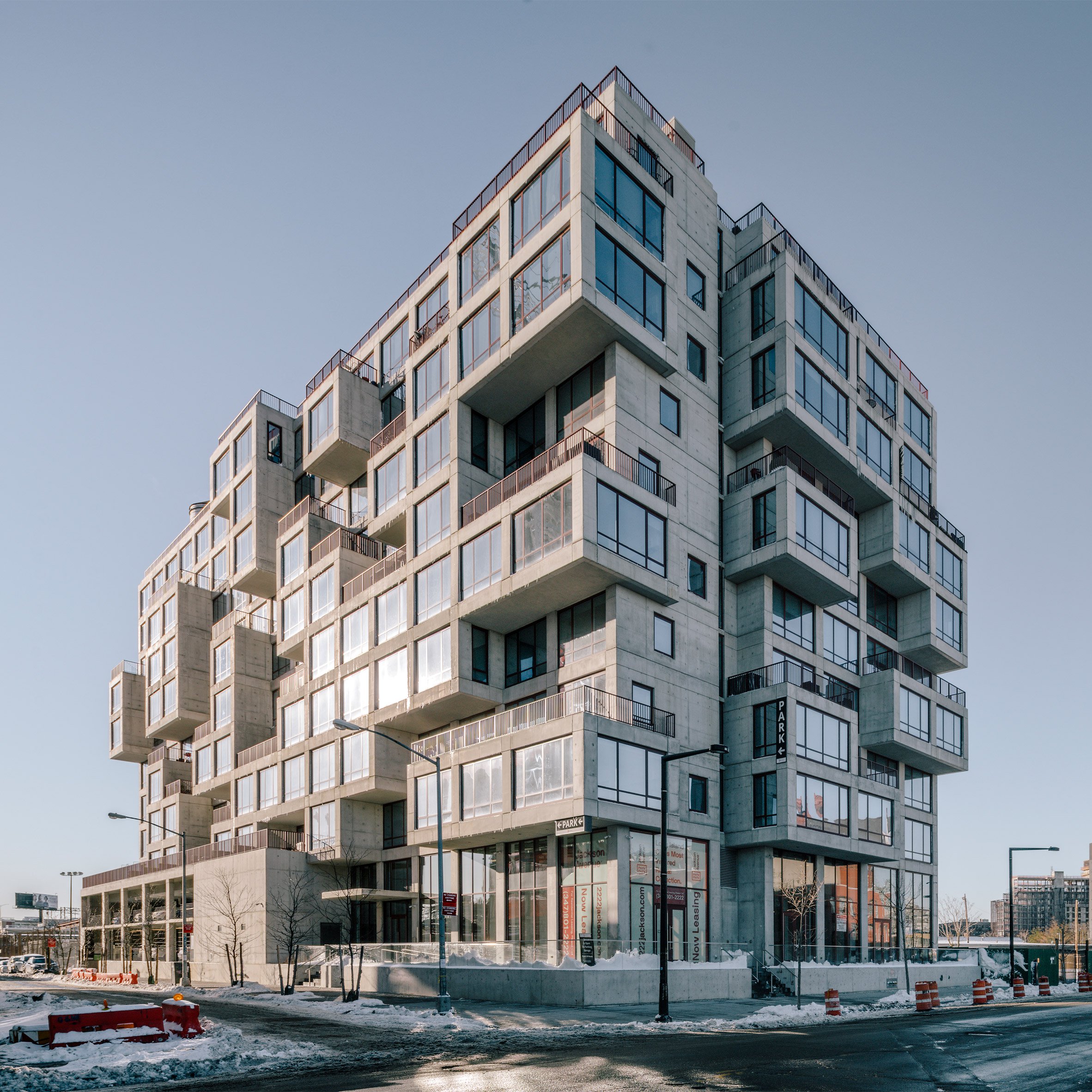
Vincent Callebaut Designs Modular Plug-and-Play Housing For Haiti https://inhabitat.com/wp-content/blogs.dir/1/files/2011/02/callebautcoral-ed01.jpgItaly coastal towns https://media.cntraveler.com/photos/571f939aa1d0c8fd663d2e50/master/w_775,c_limit/cefalu-sicily-GettyImages-538342835.jpg“pixelated” luxury condo building in Queens https://static.dezeen.com/uploads/2017/04/2222-jackson-avenue-oda-architects-long-island-city-modular-residential-luxury-condo-new-york_dezeen_sq.jpg
TYPE OF PLANES 2D planes: Straight axis, bent axis, curve axis, complex axis
3D planes: Curve plane, folded plane, twisted plane
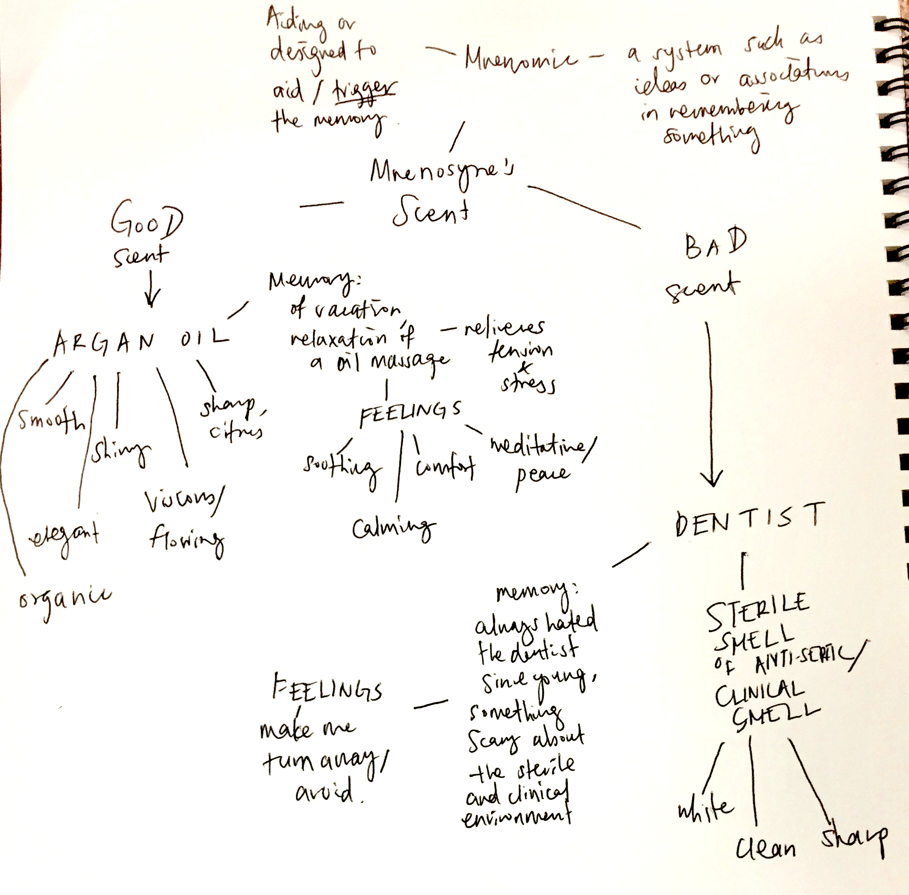
MNENOSYNE’S SCENT
Mnenomic: a system such as a pattern of letters, ideas
or associations which assists in remembering something
Good scent – Argan Oil
Bad scent – The smell of the dentist
Mindmap
Memories of:
– Argan Oil: Reminds me of body oil massage, a moment of relaxation during my trip to Bangkok. Bought a bottle to use weekly.
– Dentist: Connection to pain and fear. Memory of me avoiding the dentist.
Similarities in experience:
– I am lying down in both the body massage and at the dentist, a position of comfort, but experience a difference in emotions due to the smell.
– I would like to capture the similarity of the comfort of lying down in the sculpture and the contrast between smells and feelings.
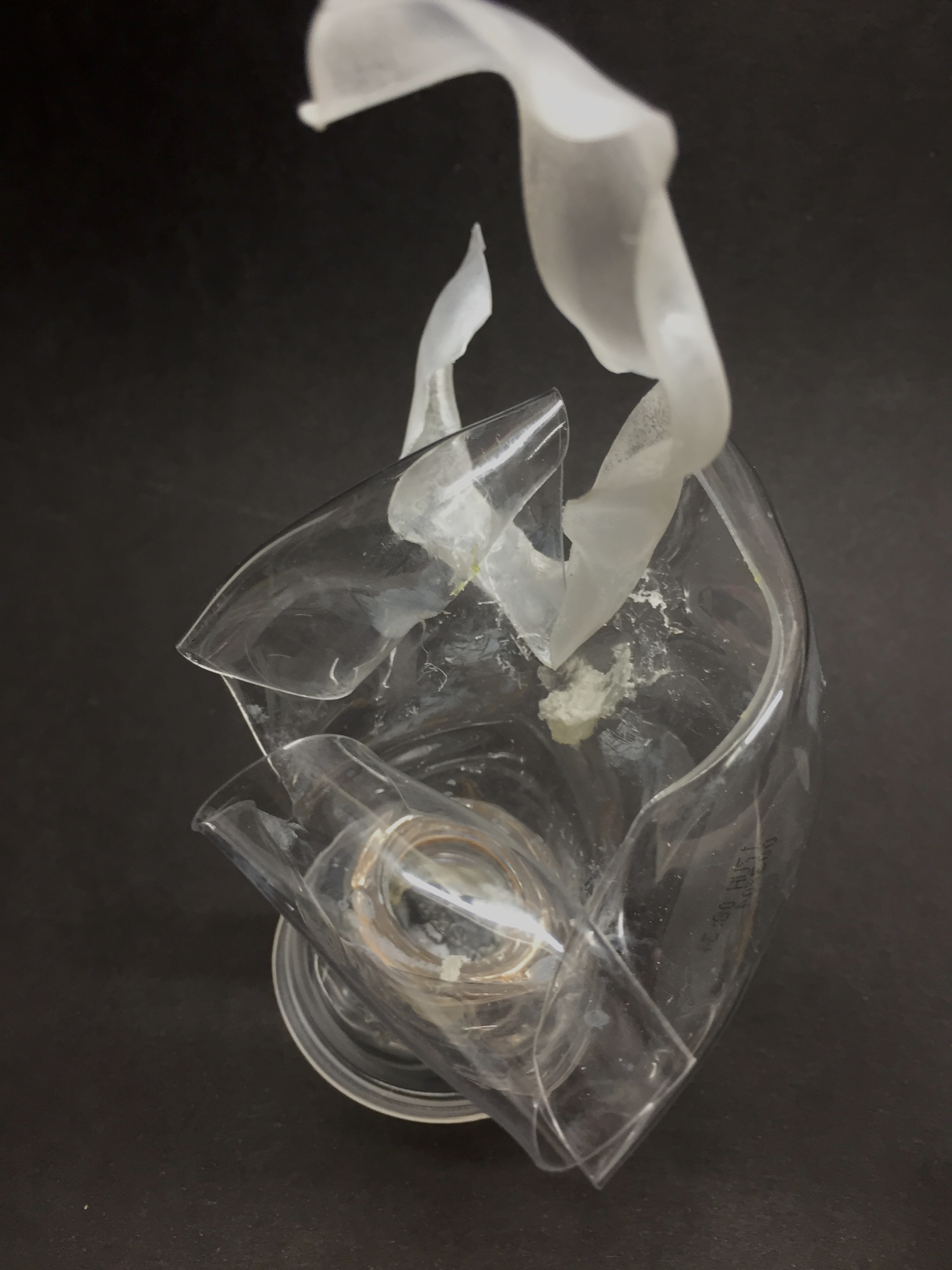
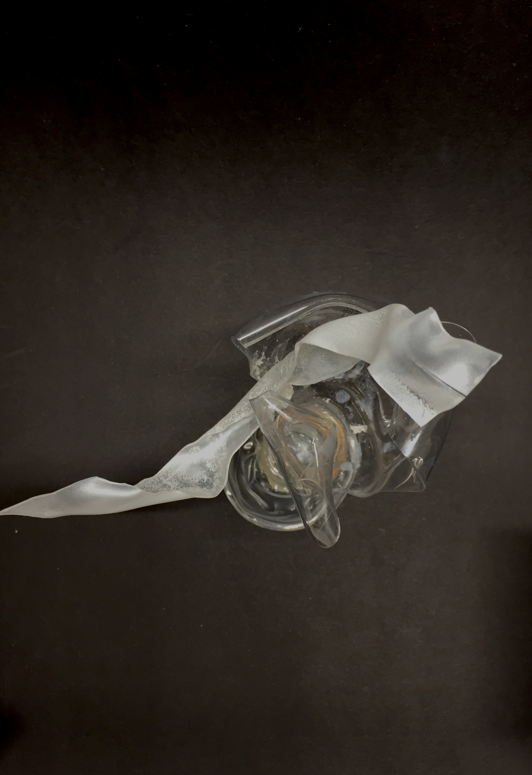
Chihuly-inspired Faux Glass sculpture – permanent markers to draw on clear plastic cups
abstract metal sculpture
FINAL MODEL
Initial model – I used light blue plastic and a clear plastic base, but i changed it to a white plastic strip.
Final Model
White component – represents the clean smell of the dentist
Clear plastic and gold rim – Represents the smoothness of Argan oil
Contrast: Colour – White vs. Clear and gold Texture – the white component has a more textured and twisted surface while the clear part has a smooth and flowing surface. The bumpy surface of the white component represents the squirmy feeling I get while I am in a dentist’s chair, while the smoothness of the clear part represents the calmness of the argan oil scent Structure – The white part curves outward while the planes of the clear plastic component curves inward.
I chose my movie quotes to portray the irony of being classy in a trashy way, in particular the retorts given after being challenged. The main focus is parody, to capture the visual narrative in a humorous way through the use of imagery and symbols.
ARTIST REFERENCES
Pop-Art – Roy Lichtenstein
Lichtenstein’s paintings and precise compositions of comic images and pop images documented while they parodied, often in a tongue-in-cheek manner.
Drowning Girl, 1963
Pop-Art: Andy Warhol’s silkscreen print
Using pop icons and celebrities as symbols of pop culture, the silk screen prints reflects the mass-production and proliferation of such symbols in society.
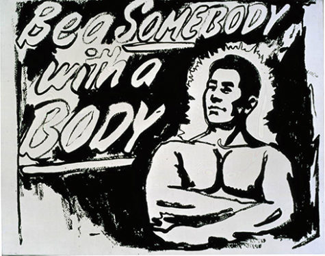
Eight Elvises, 1963Be a Somebody with a Body, 1985–86
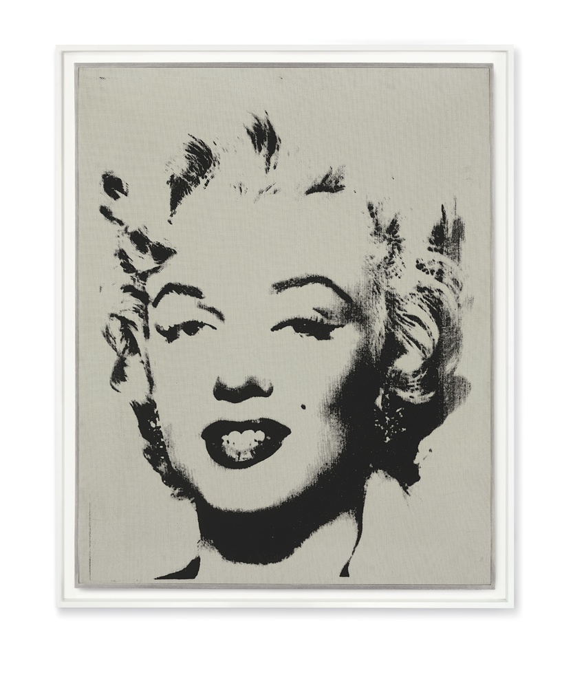
Marilyn Monroe
I wanted to portray the irony of my quotes in a whimsical manner, thus the style is influenced by pop art’s use of symbols and iconic imagery.
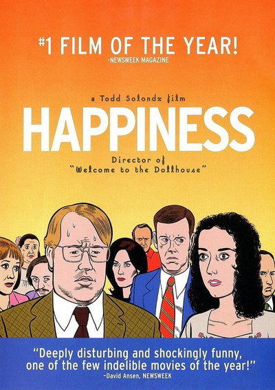
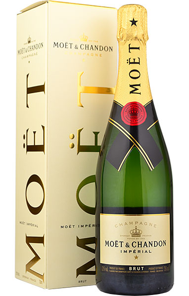
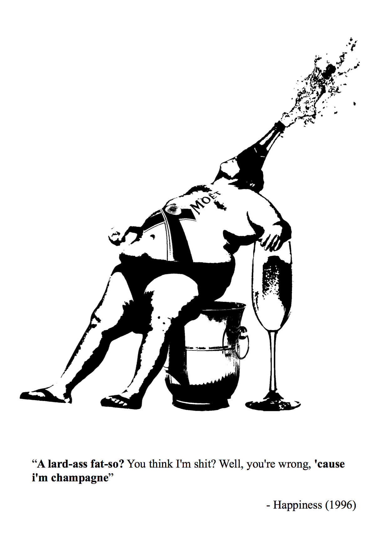
Movie 1 – Happiness (1996)
Quote: ” A lard-ass fat-so? You think I’m shit? Well, you’re wrong, ’cause i’m champagne.”
I chose a quote with obvious visual imagery, with contrasting subject matter to put a play between the images.
Subject matter: USE OF BRANDS AS SYMBOLS
Influenced by pop-art, I wanted to incorporate the symbol and imagery of brands, as they are instantly recognisable and well-spread in society.
‘Moet’ champagne – known for its brand
I combined the champagne with the image of a “fat-so”, with the brand logo inscribed on his body and champagne popping out of his mouth.
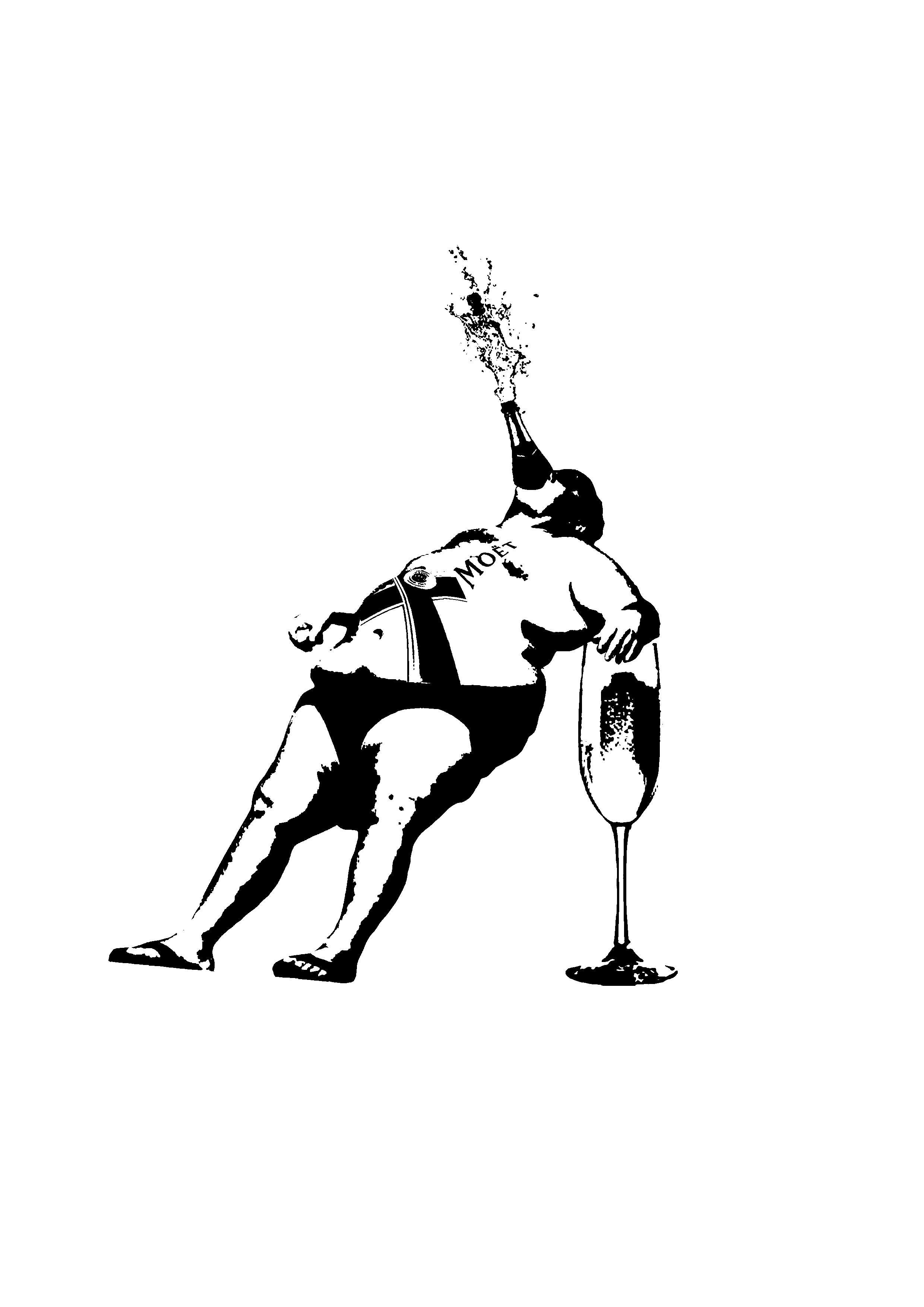
Initial design 2
I realised the body has a bottle shape, thus to visualise “I am champagne”, I connected the bottle neck to his top of the head.
Initial composition
Comments: The man is not balanced, has an awkward position, should have him leaning his weight against something.
Edits: Place a ” chair” of a ice bucket, used to hold champagne.
The man has a relaxed pose, as if acting cocky and proud, and is fused as a moet champagne bottle using humour in the visual imagery.
Final Design 1
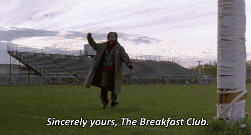
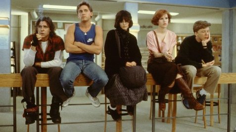
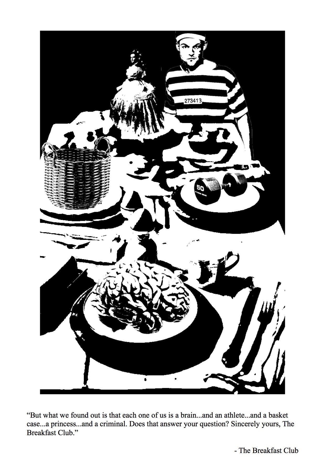
Movie 2 – The Breakfast Club (1985)
Five high school students meet in Saturday detention and discover how they have a lot more in common than they thought.
Quote: ” But what we found out is that each one of us is a brain…and an athlete…and a basket case…a princess…and a criminal. Does that answer your question? Sincerely yours, The Breakfast Club.”
I wanted to portray a breakfast table, with each stereotype on a place to capture how society is out to “eat” them up.
I place the criminal as a human figure to show how society incriminate the young teens with stereotypes by locking them up.
Final Design 2
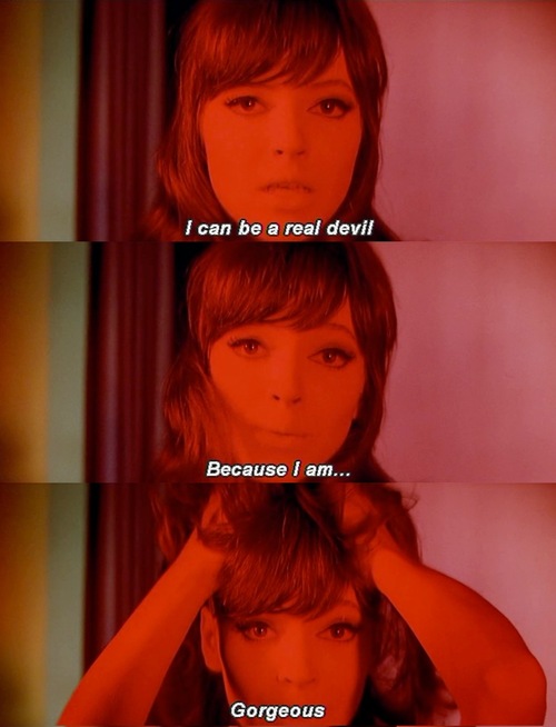
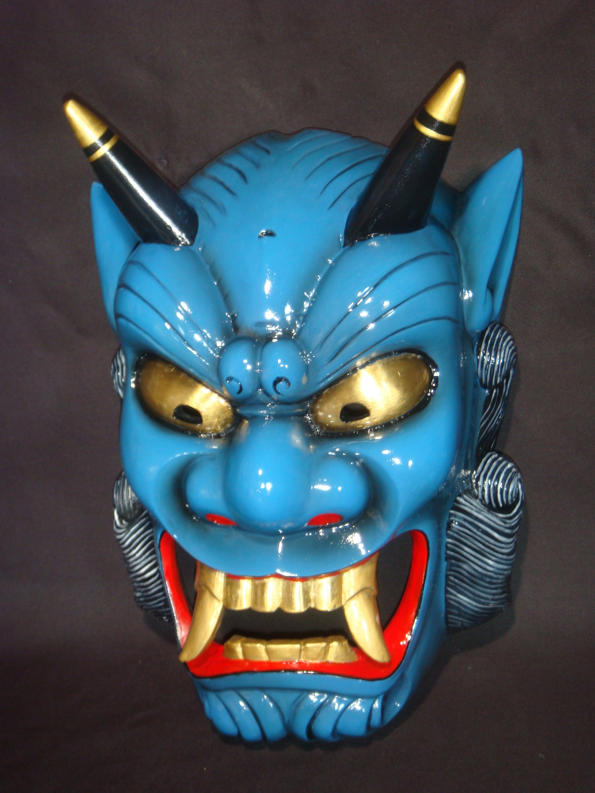
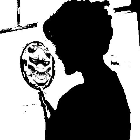
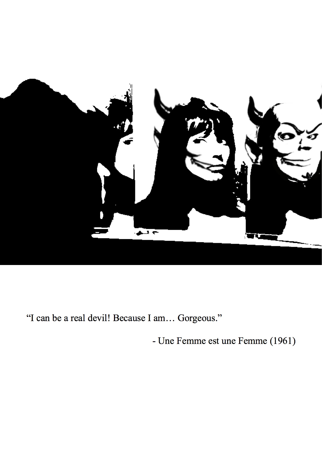
Movie 2- Une Femme est une femme (1961)
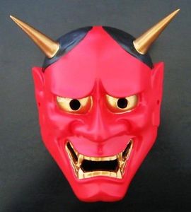
Quote: “I can be a real devil because I am… Gorgeous”
Imagery of devil – Japanese Oni
Initial Design
I did not like the silhouette so I changed the composition into overlap faces in mirrors. It shows the gradual change of the girl turning into a devil in the mirror, the symbol of vanity and beauty.
Final Design 3
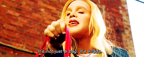
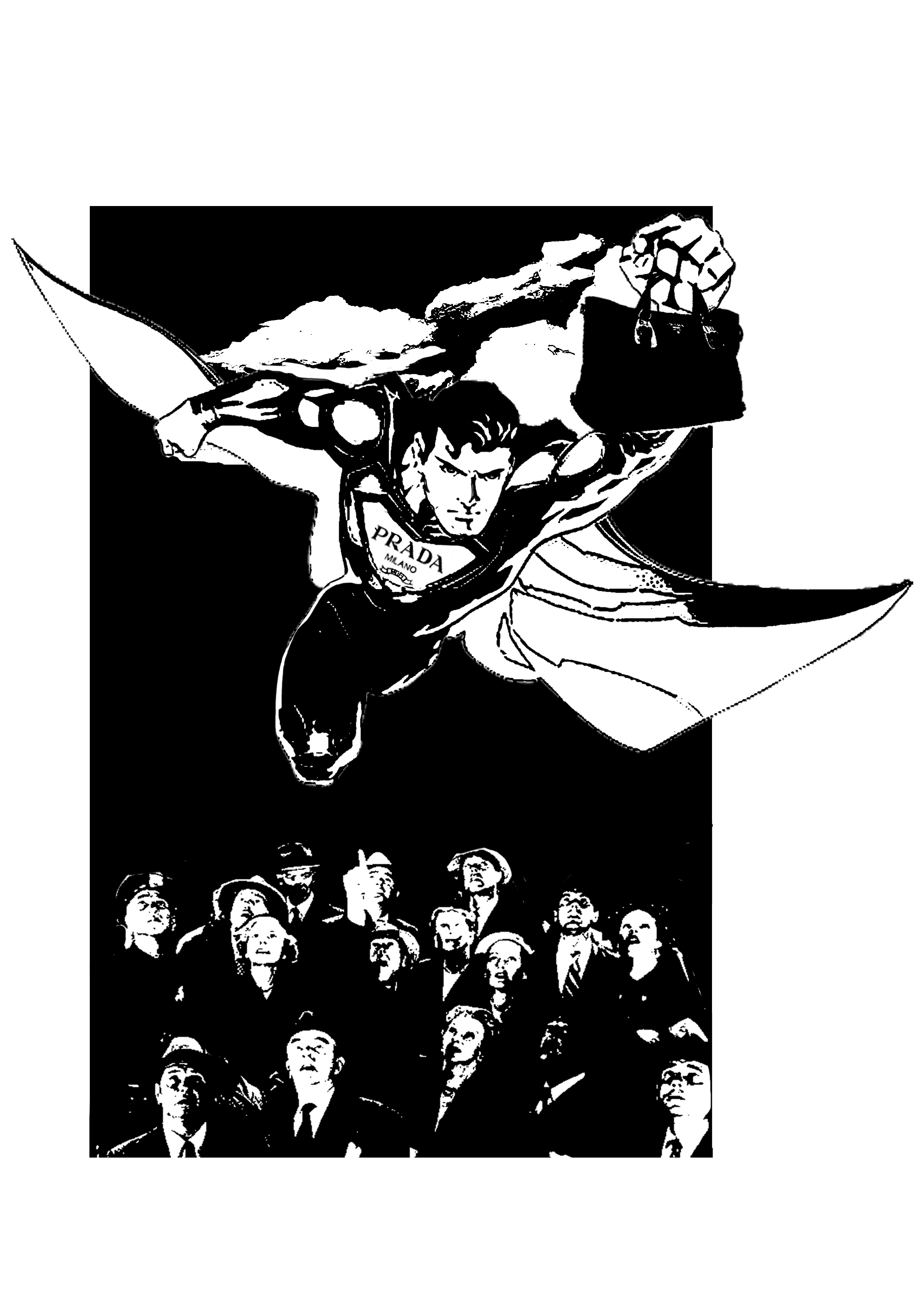
Movie 4: White Chicks (2004)
Quote: It’s not just a bag. It’s Prada.
Initially, I interpreted this quote like a 60s vintage adverts as the quote sounds like a advertising tagline.
References:
However, I felt that it was too literal. I brought the focus to “It’s not just a bag”, thus, wanting to play with the idea of the prada bag achieving more or has superpowers.
Symbol of superman: Superpower
I wanted to present the contrast between Superman, known for his masculinity, and the prada bag, a symbol of the feminine.
Use of BRANDS: the Prada logo
I wanted to combine both recognisable logos for parody.
Initial design
The people looking up is a play on the “It’s a bird, It’s a plane… It’s Superman” and the quote “It’s Prada”.
Comments: The faces and details are washed out. The expression on Superman should be more detailed.
Edit: I added in the details and the expression of Superman.
Final Design 4
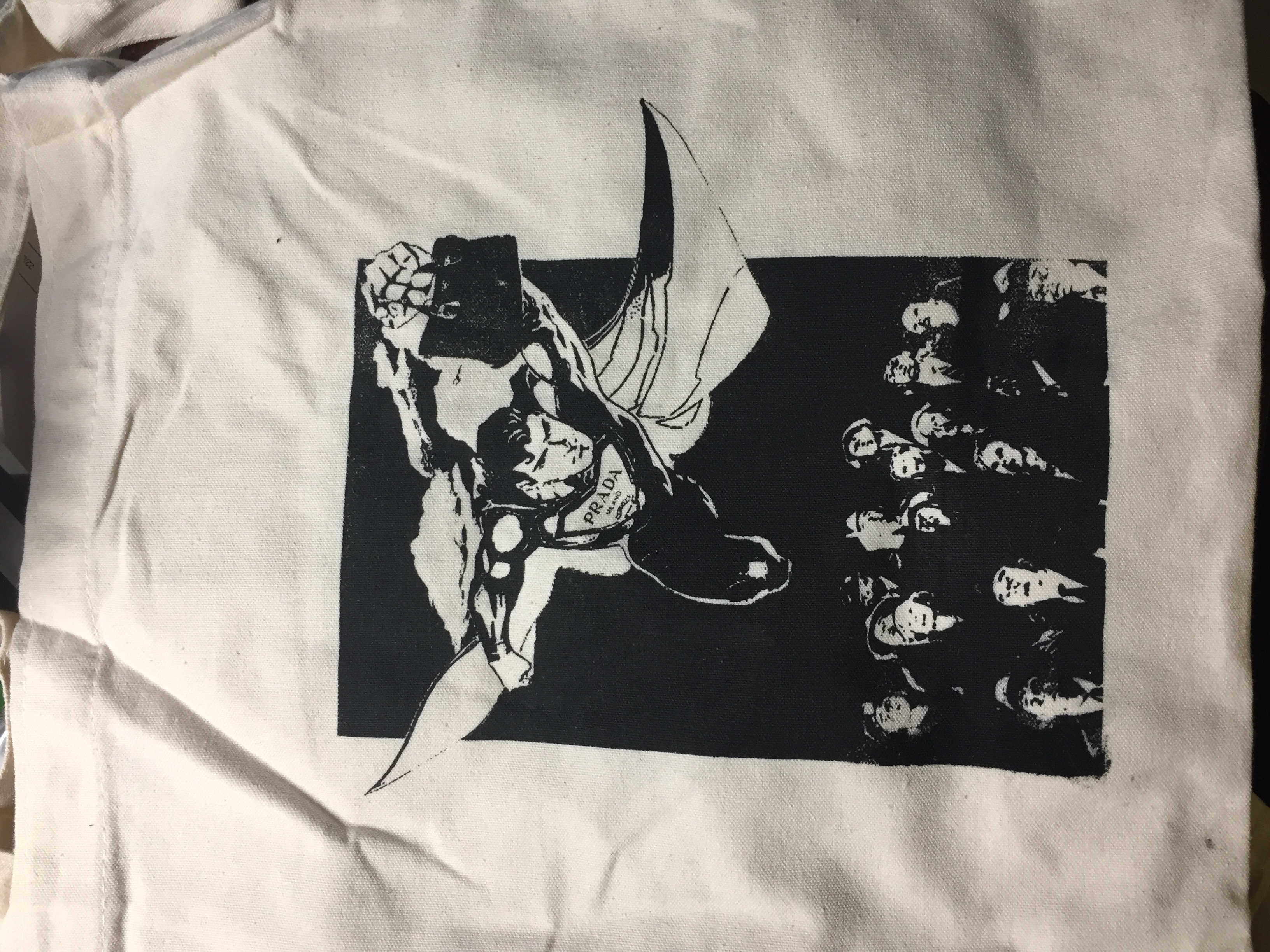
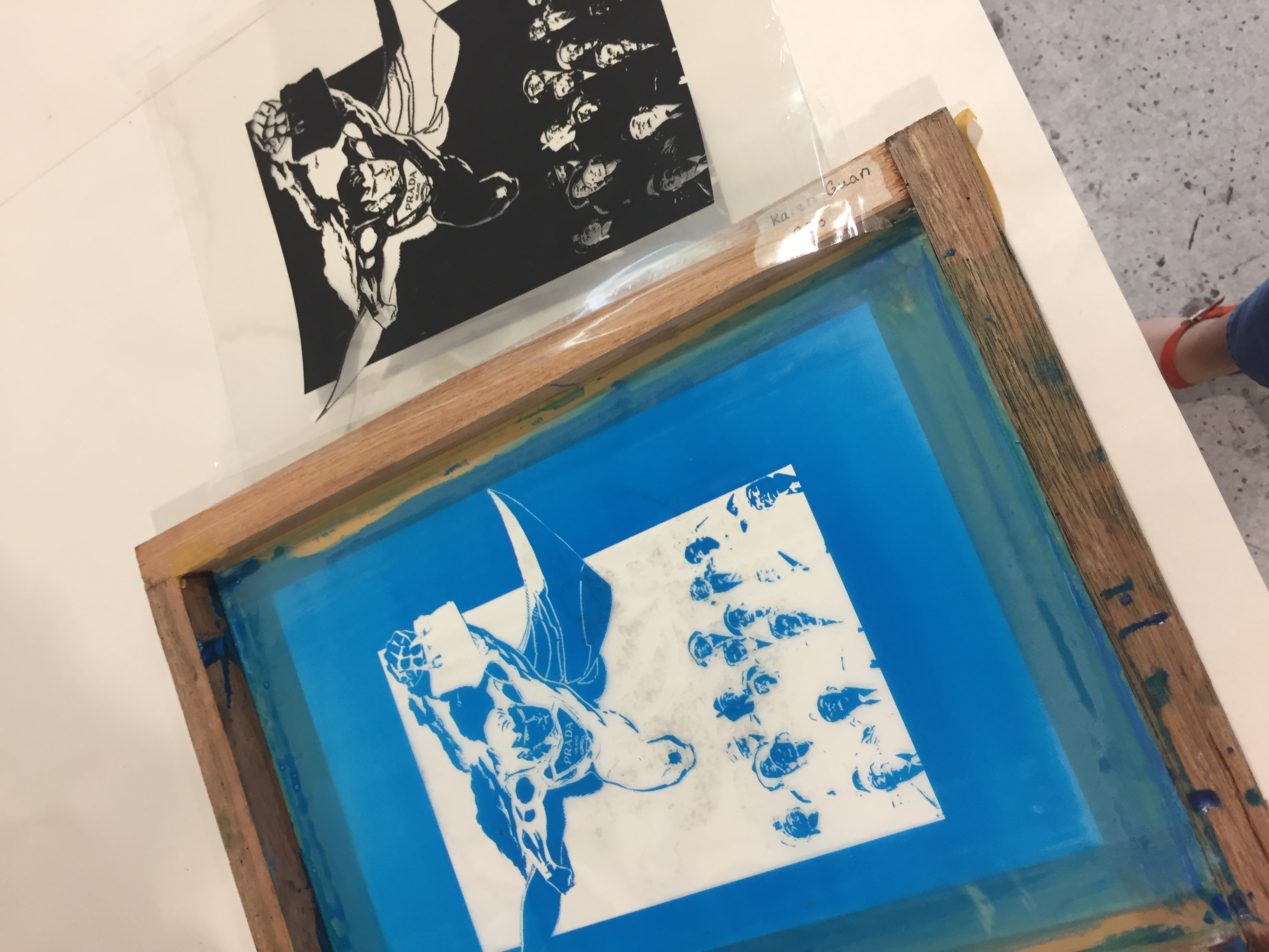
SILKSCREEN BAG
I used design 4 for my silkscreen print on the tote bag, as I feel the rectangular composition will look nice.


 Prototype of arrangement