
I document my designing and silk screening process here!
Compositions
-
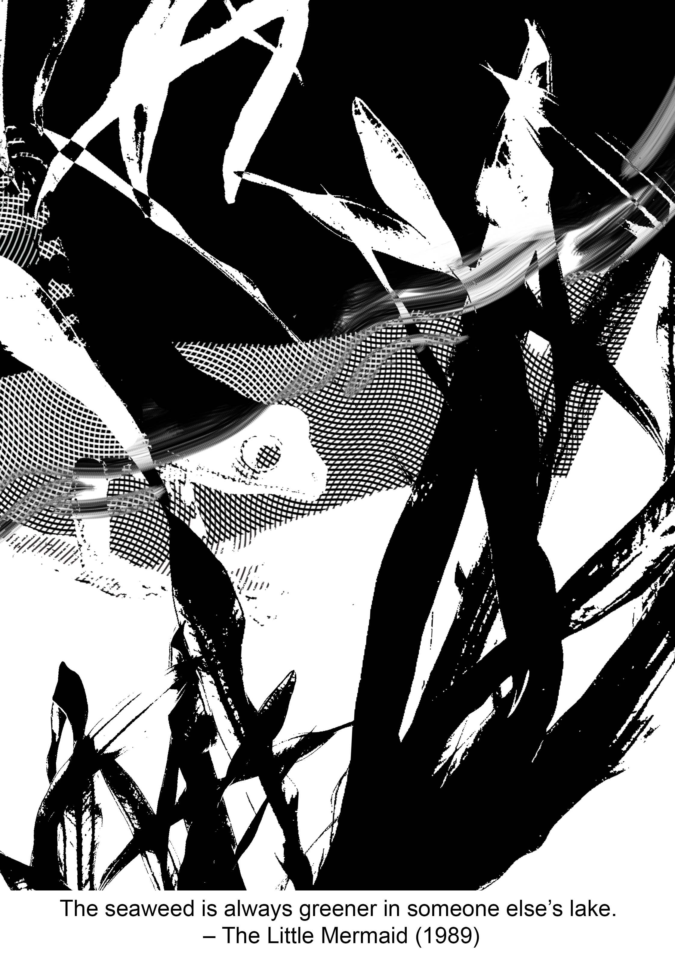
The seaweed is always greener, in somebody else’s lake. – The Little Mermaid (1989)
As explained in the previous post, I wanted to show contrast in the image to convey the idea of “somebody else’s”. However, I made the mistake of starting off with a pretty literal choice of image which is the water / lake. The line going across the page made the composition very static. I chose a frog as my subject since it is known to be a territorial creature. After combining the two elements I could not think of other images to include. Hence I ditched this composition totally.
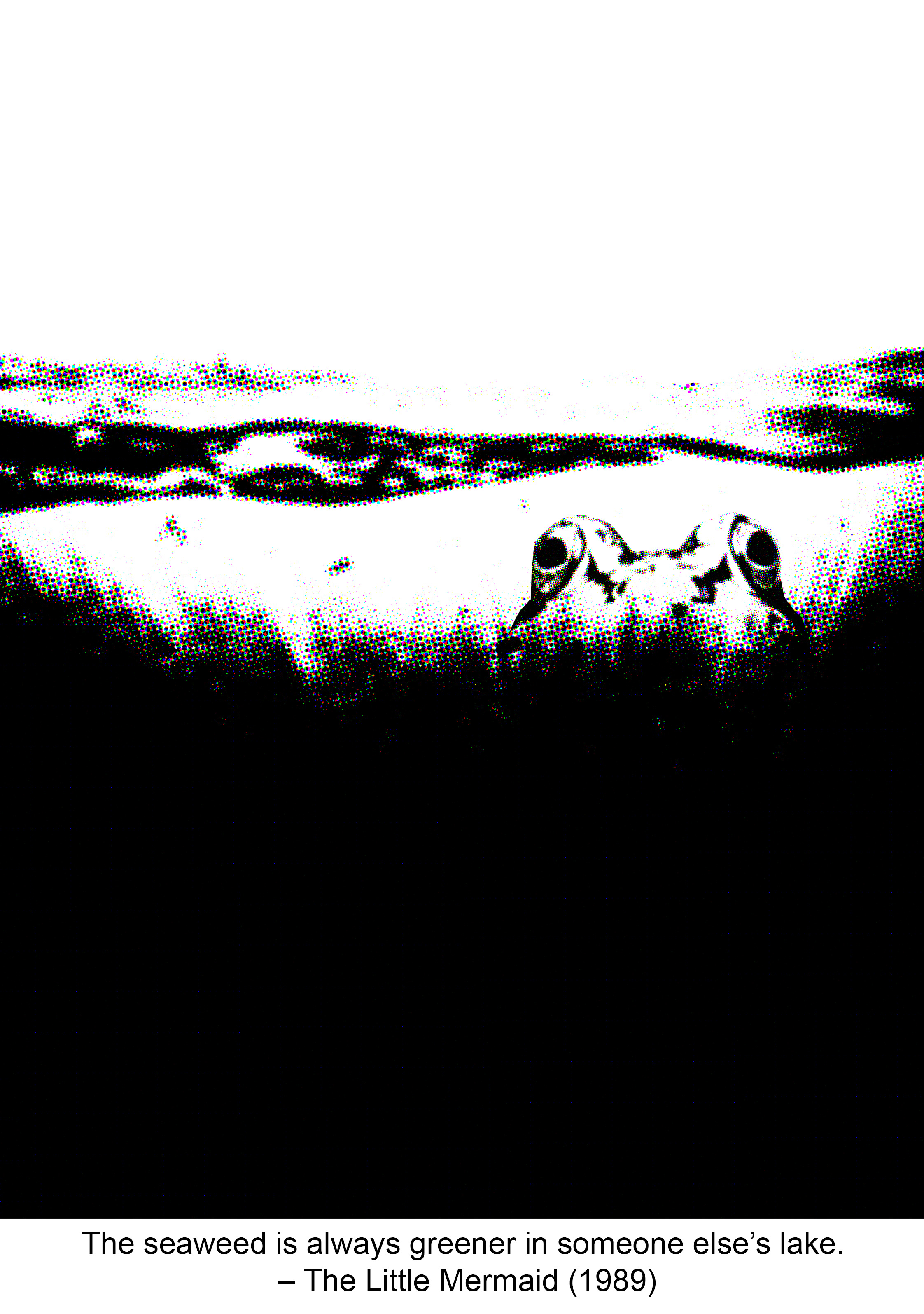
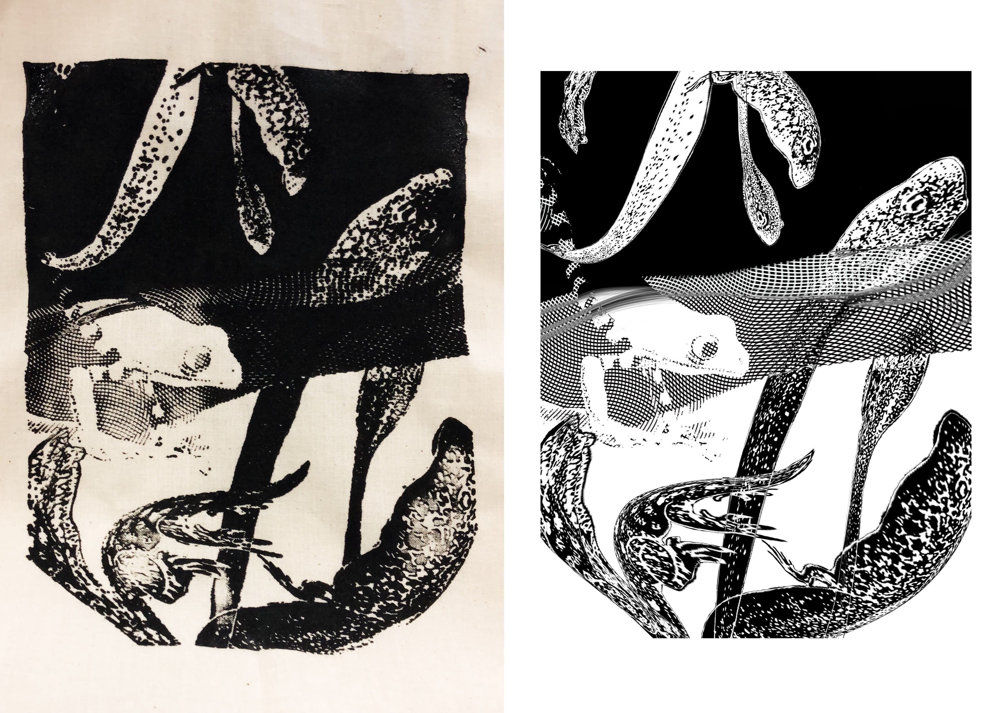
While looking for a suitable frog image to use in this composition, I came across a good photo so I imported it into photoshop and edited it to become an engraving. It was a happy accident that the background become a nice engraved pattern. So I thought of using it to suggest the idea of water, instead of literally using images of ponds and lakes. I erased some parts so that it’d look more graphic. The engraved pattern provided good separation between the black and white areas, so I decided to keep that in the composition. I inverted the colours of the seaweed so that it’d stand out against their respective backgrounds. But admittedly it was too literal. During consultation, Shirley suggested using something else to represent the seaweed, like tadpoles maybe. Below is the design that I worked on before the final.
-
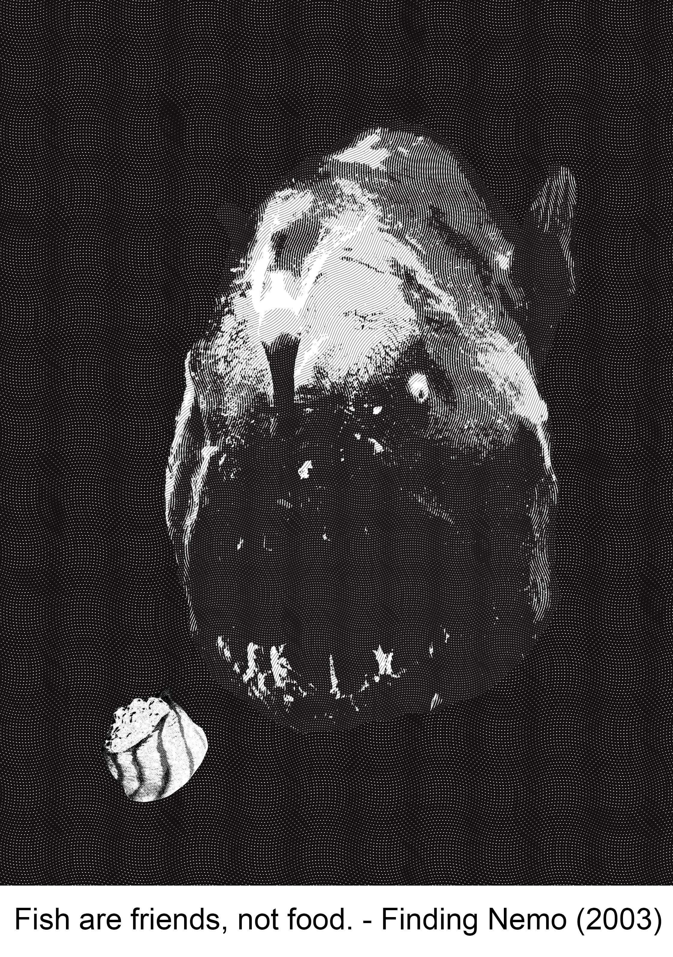
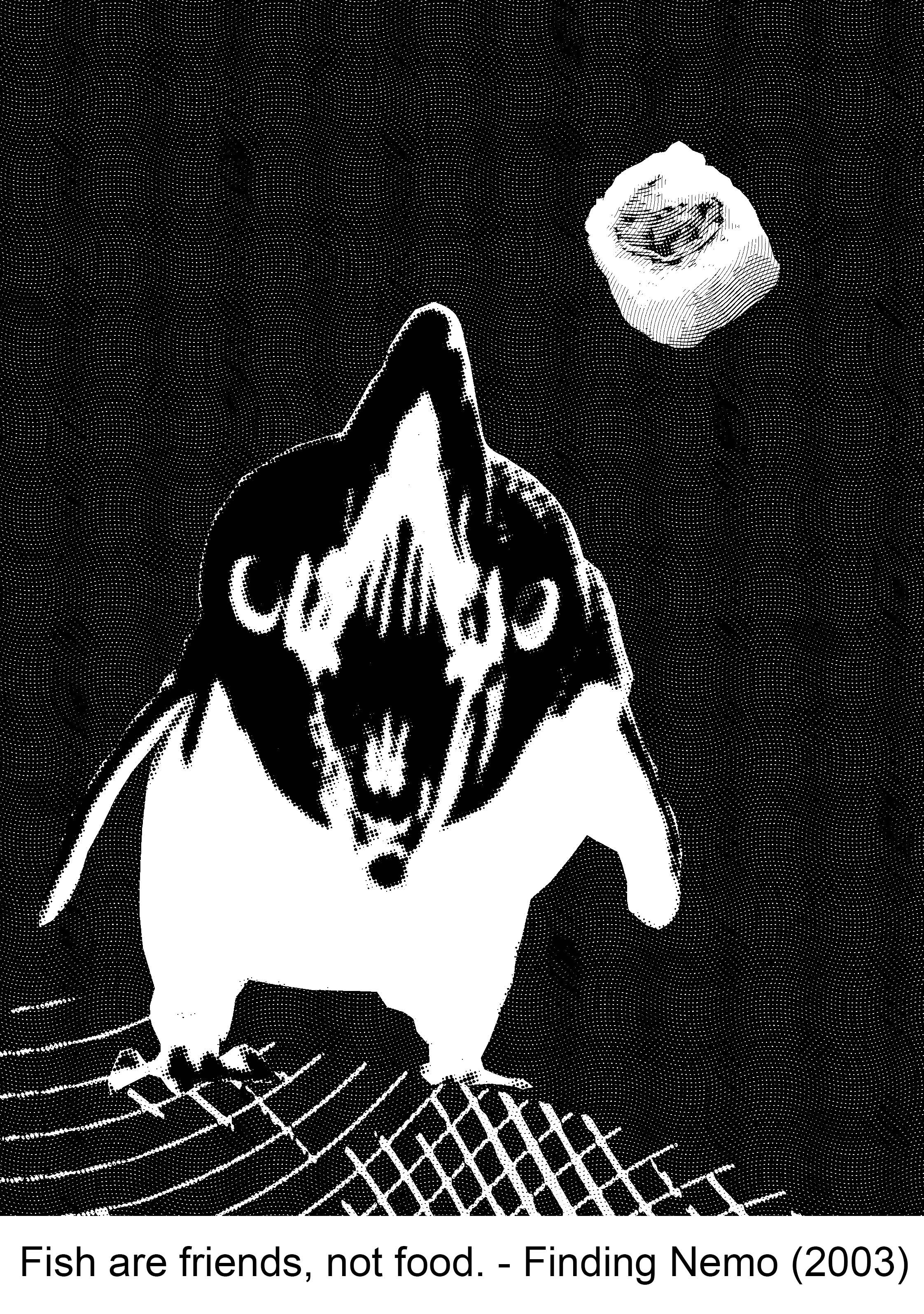
Fish are friends, not food. – Finding Nemo (2003)
My initial design was a bit too literal again since it is a fish, that seems to be a problem for me. I liked the irony of a fish eating another fish though. Composition wise, I like its simplicity. But I think this design would not have printed well so, rejected!
Since I liked the simple composition, I tried going for a similar concept. I tried replacing the fish with something else. I looked up animals that feed on fish. A lot of them were birds and bears. I didn’t want to work with a bear because I already have a panda in my other quote. I opted for a penguin and came up with the composition below. But I didn’t like the final outcome. Something about the penguin puts me off. So rejected.
-
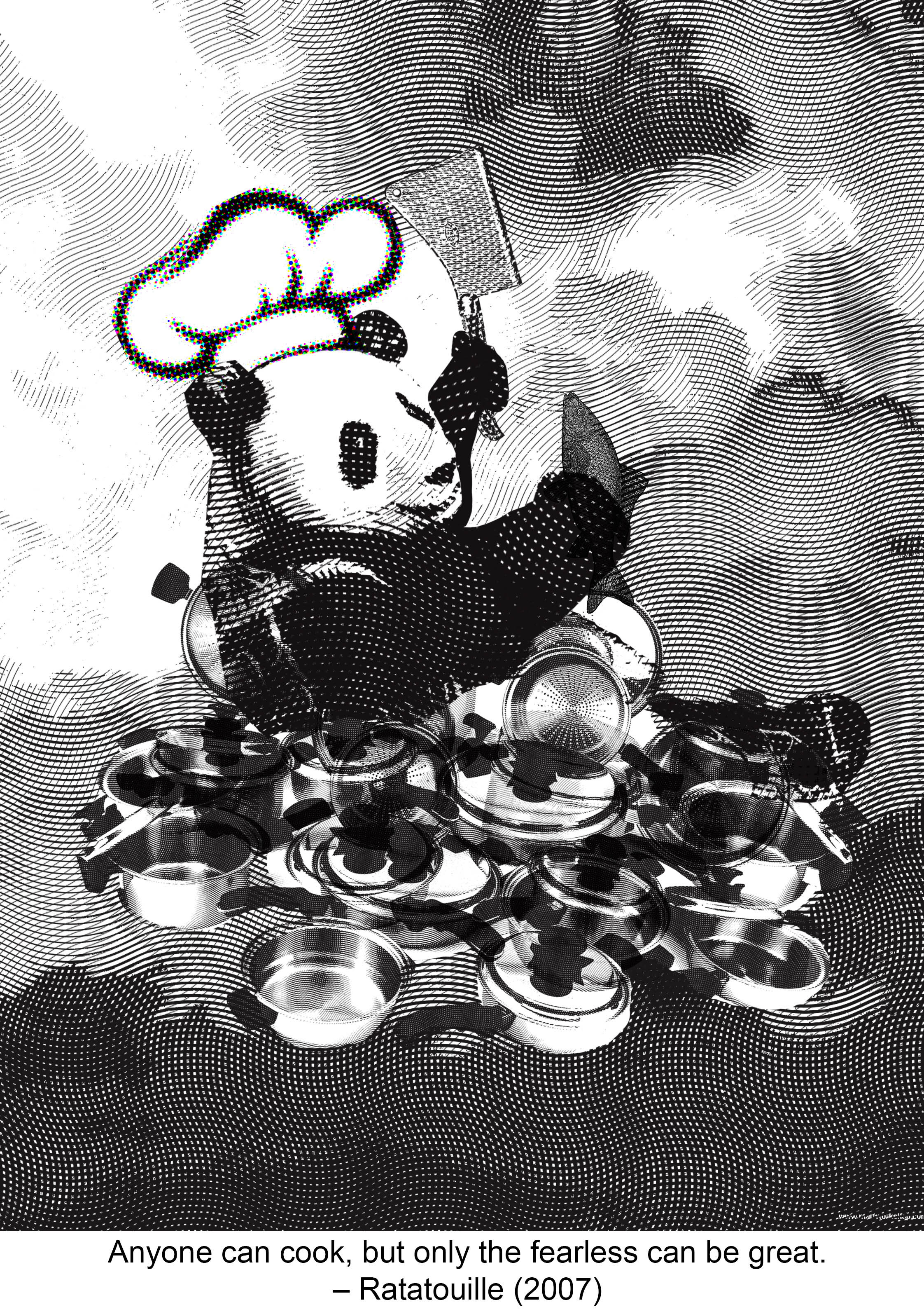
Anyone can cook but only the fearless can be great. – Ratatouille (2007)
Photoshop messed up my file for this composition! I pressed SAVE but it corrupted the file. The irony. So I redid my work, and thankfully, it actually turned out better than what I had originally.
THE CORRUPTED FILE. Sigh.
This is the new and improved design of what I had originally. I think the image is quite reflective of the quote. I didn’t chose this because it doesn’t convey the “can be great” part very well.
-
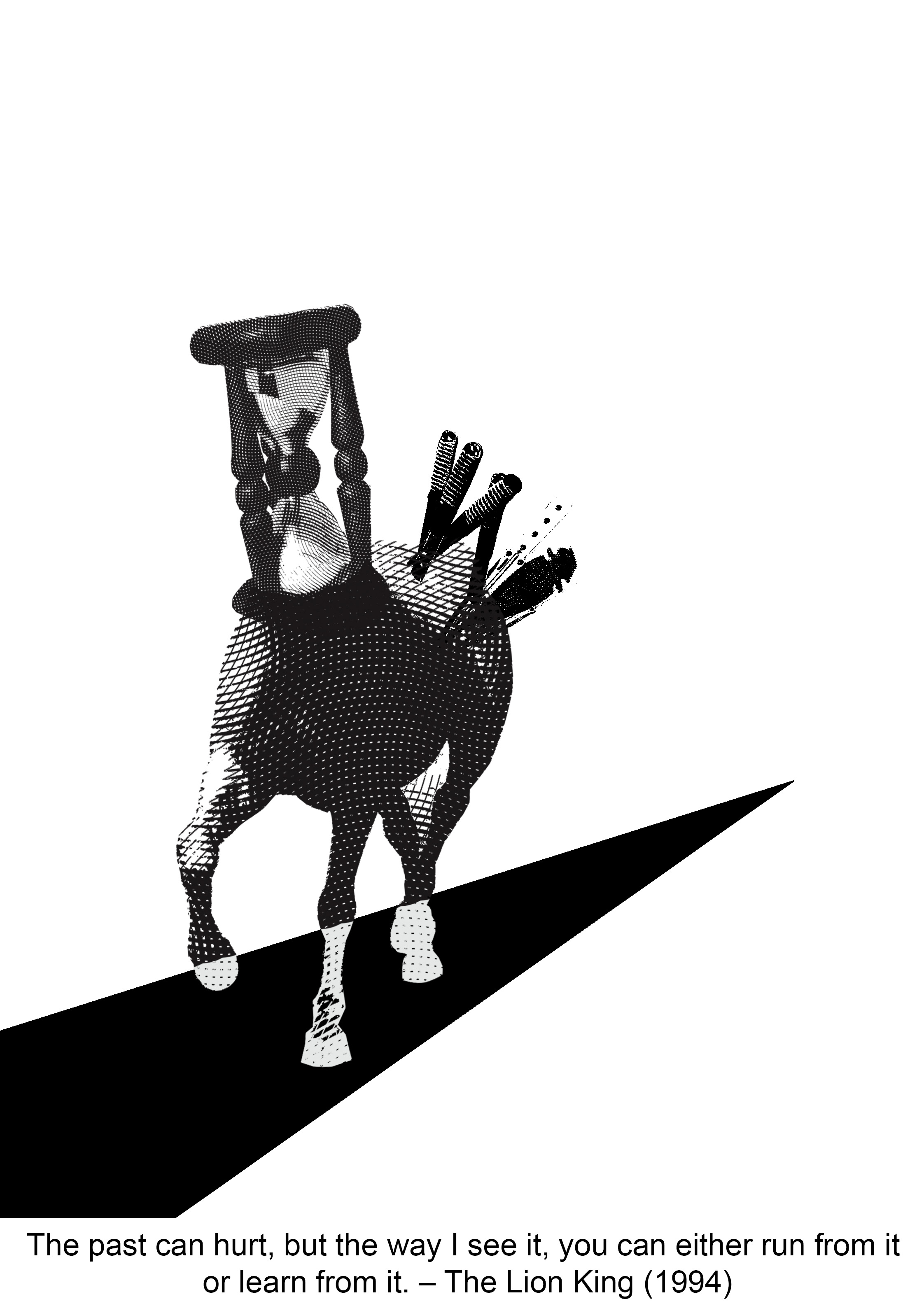
The past can hurt, but the way I see it, you can either run from it or learn from it. – The Lion King (1994)
I used a horse to substitute the word “run”. The difficult part about this composition was finding suitable images. I couldn’t find an angle that I like initially so I warped the horse image but that was a bad choice. It looked amateurish and bad overall. So I decided to ditch this.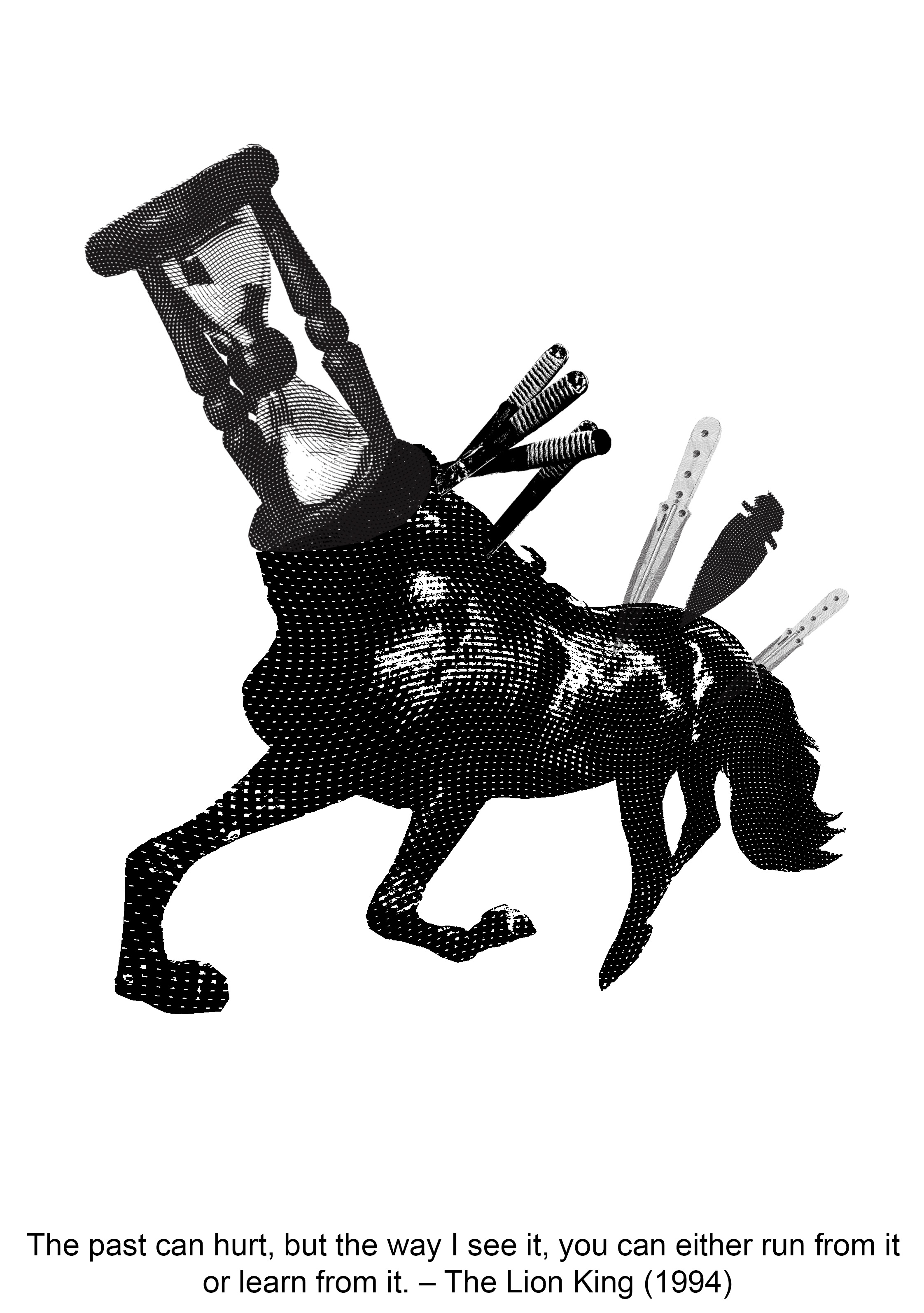
After I found a suitable image and combined the elements of time and hurt, I worked on the “learn from it” part. I chose to create a pathway with knives because paths represent journeys and journeys are our learning processes! The next step was to think about the background. It was hard thinking about what elements to introduce into the compositions. The branches are supposed to show the passing of time too but it turned out to be very awkward in this composition.
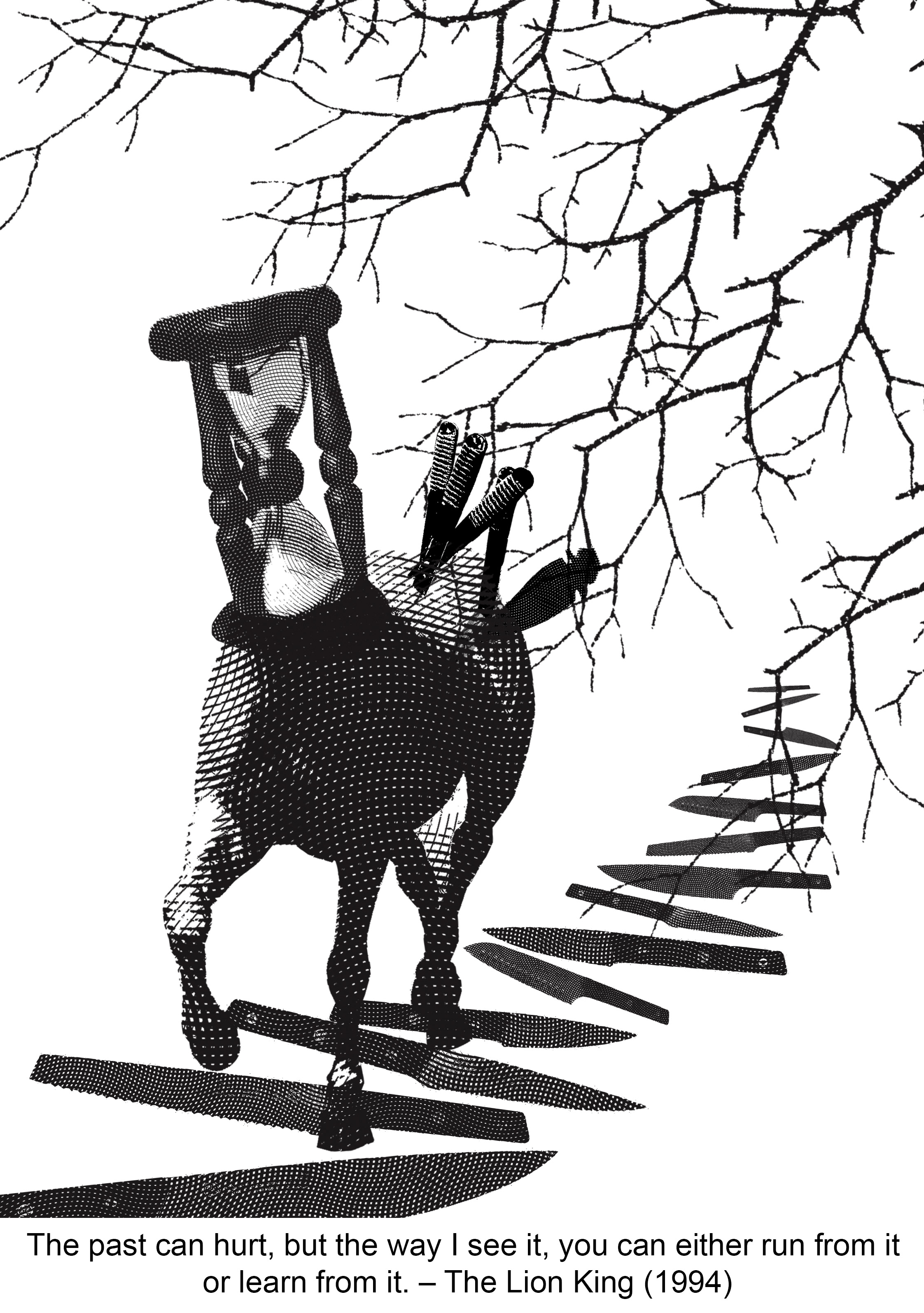
I tried going for a simple approach too, by using a solid black path. But I’m not sure about all the abundance of white. I think it’s more interesting to have an actual background. So I rejected this too.
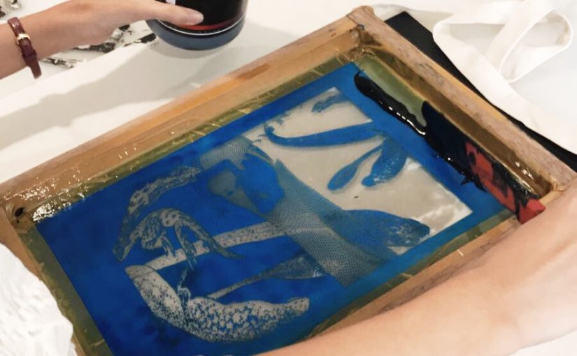
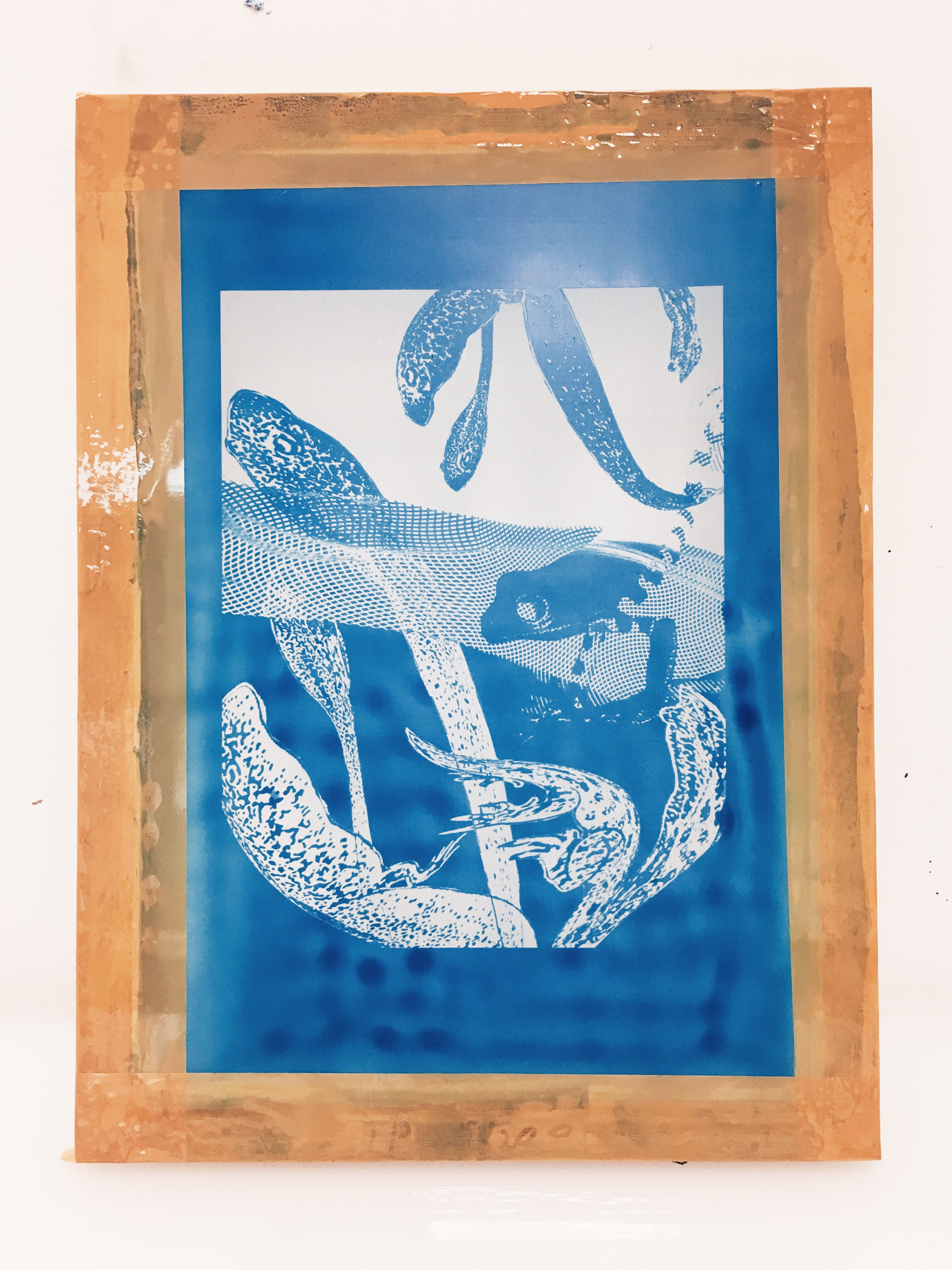
Silk screening process
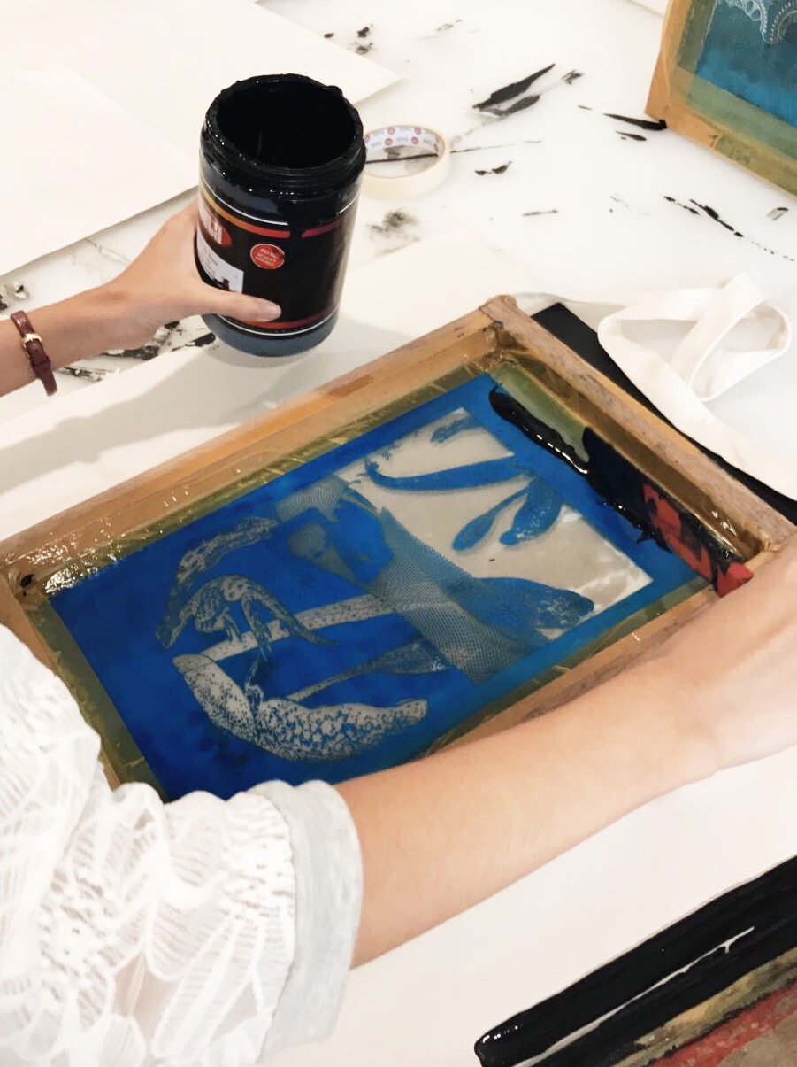
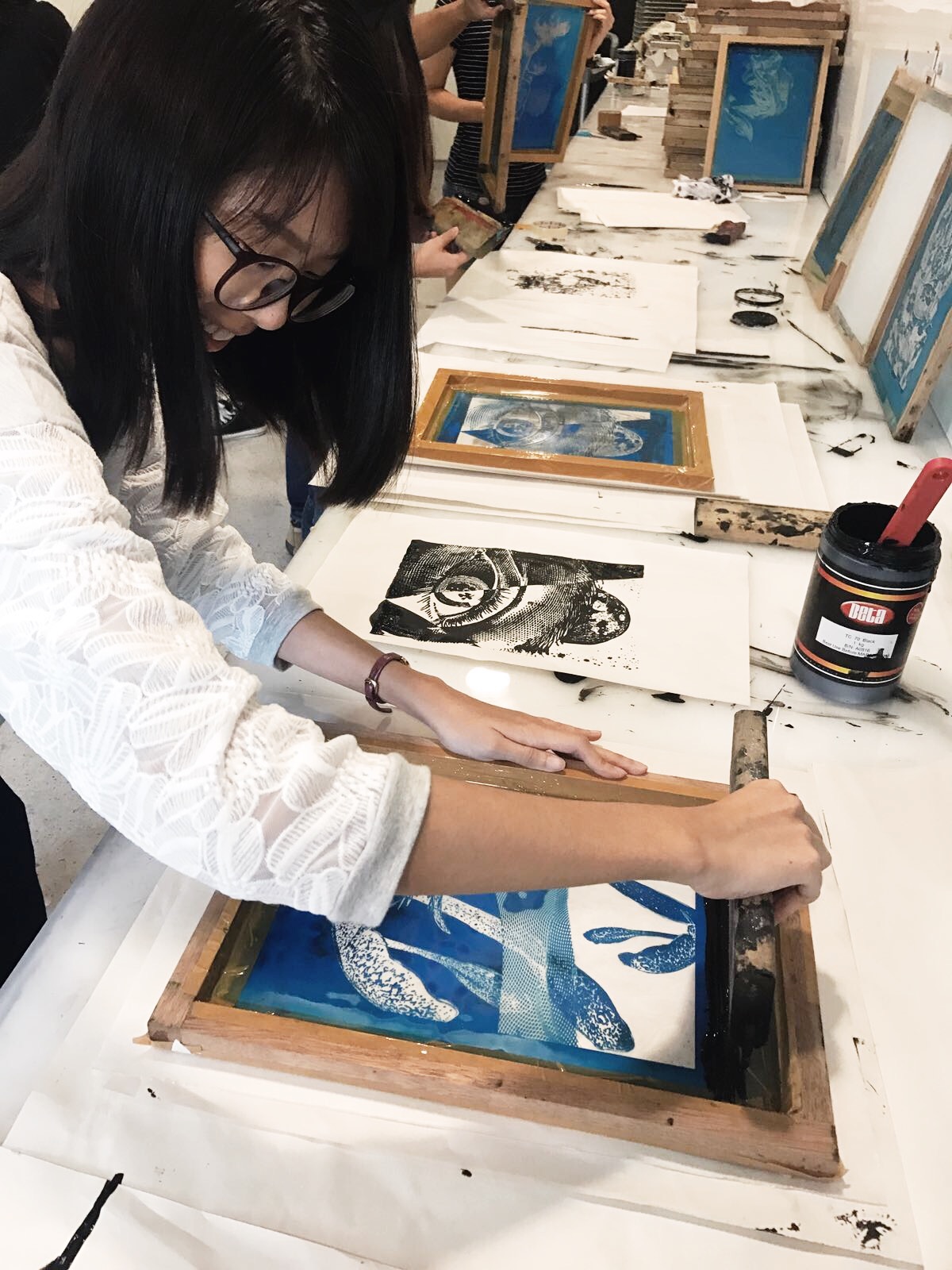
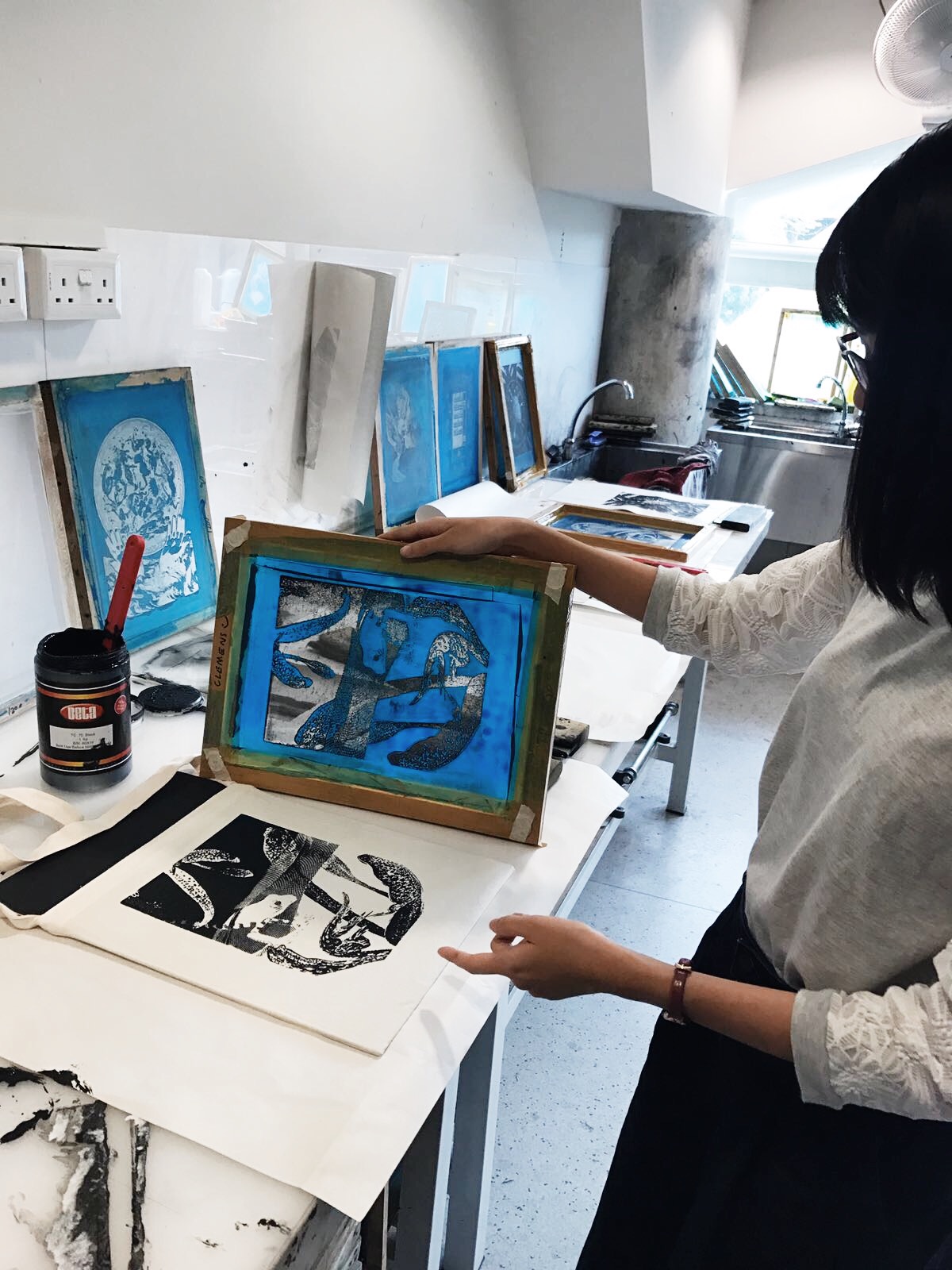
The fun part! First, we had to print our design onto transparency. After we have coated our silkscreen with the blue emulsion, we let it dry. We then place our transparency with the design on it and expose it to light.
After scrubbing off the unexposed parts, this is what I got:
Pleased that it turned out fine. I proceeded to do some test prints on paper. At first I thought “Wow, so simple”…
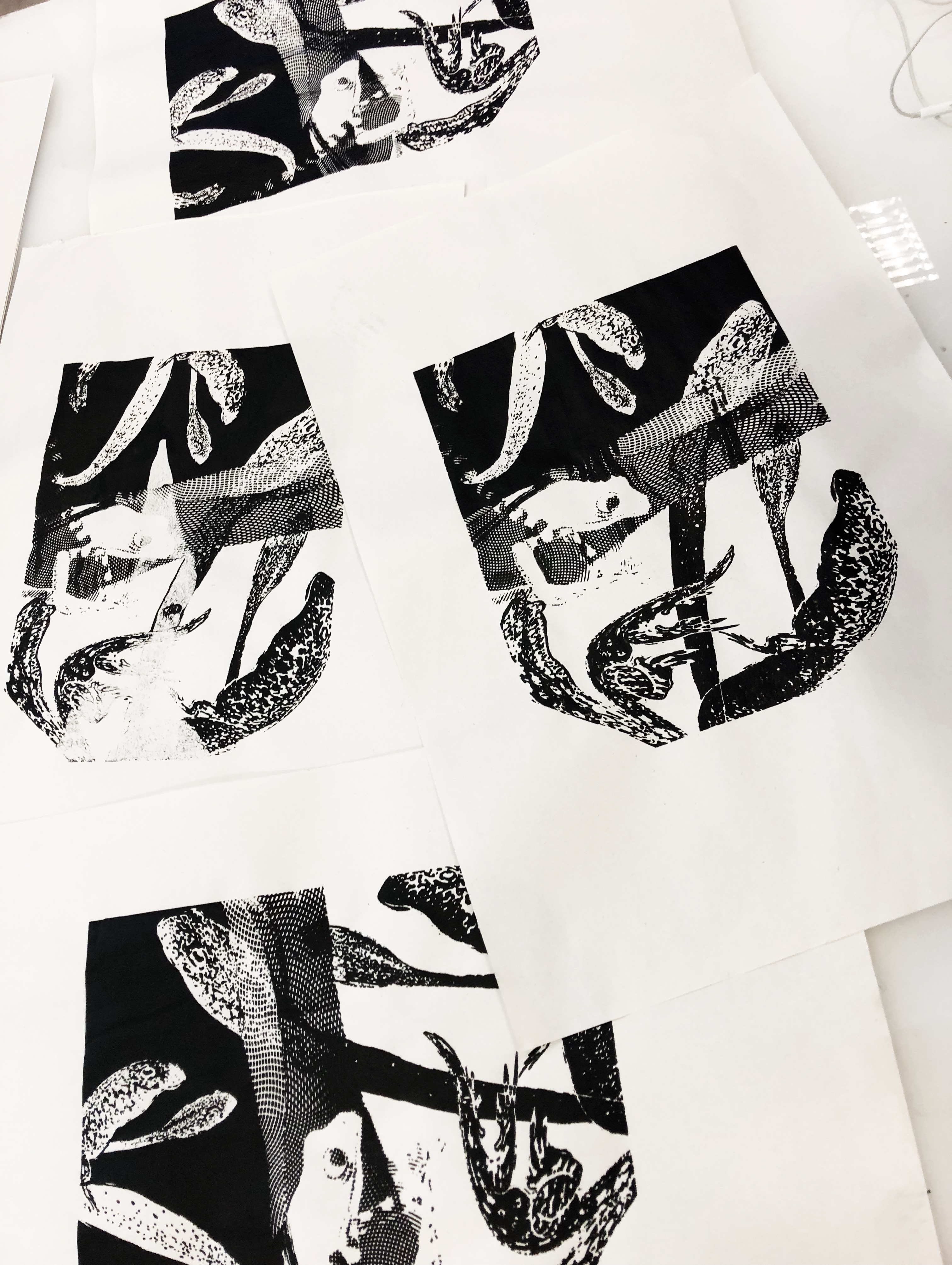
I WAS WRONG. I attempted a print on my personal tote bag but it failed. I went over my design too many times because the ink wouldn’t distribute well. If we compare it with my final design, we can see that some of the tadpole in the black background and the engraved pattern didn’t show up. The bottom part of the design is faded. The white details against black backgrounds didn’t show up well. I guess the trick is to have the right amount of paint, and the right “feeling” as you drag the swipey thing down once.
Final designs and final print to be revealed in final submission post!