


Month: February 2018
Movie Campaign // Cold Sweat
Task: Create an original movie campaign for a brand new film.
Ideation
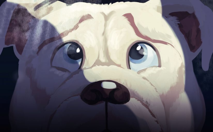
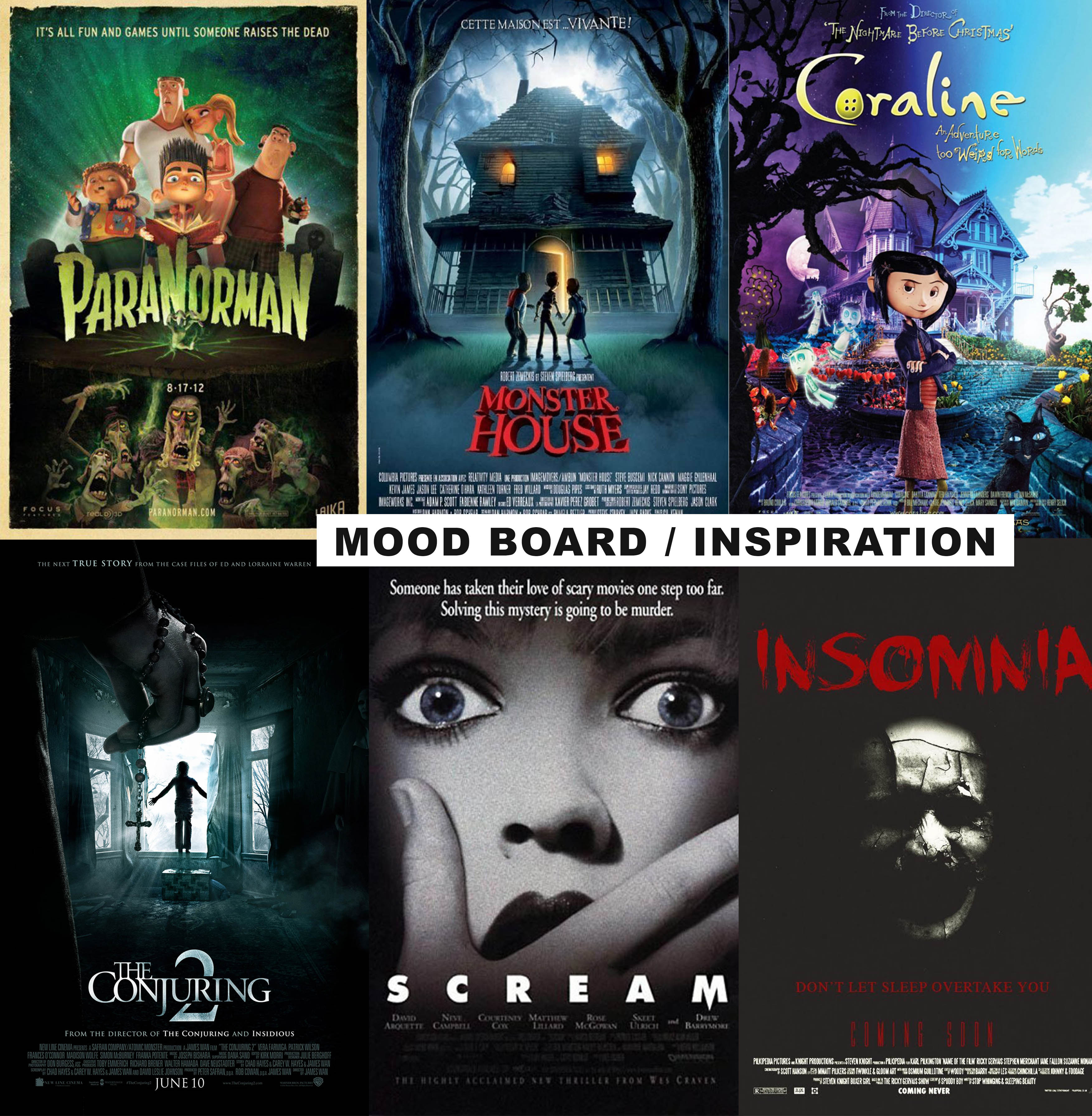
In the beginning, I was stuck on what kind of movie poster I should do. I thought of working based off the fear panel from the previous assignment, which was a dog being afraid of baths, and create a movie poster for an animated film. I wanted the poster to “troll” people in a sense. So I looked into both animated and horror film movie posters. I intended to combine elements from both genres and find a balance that suits the theme that I was going for.
Process
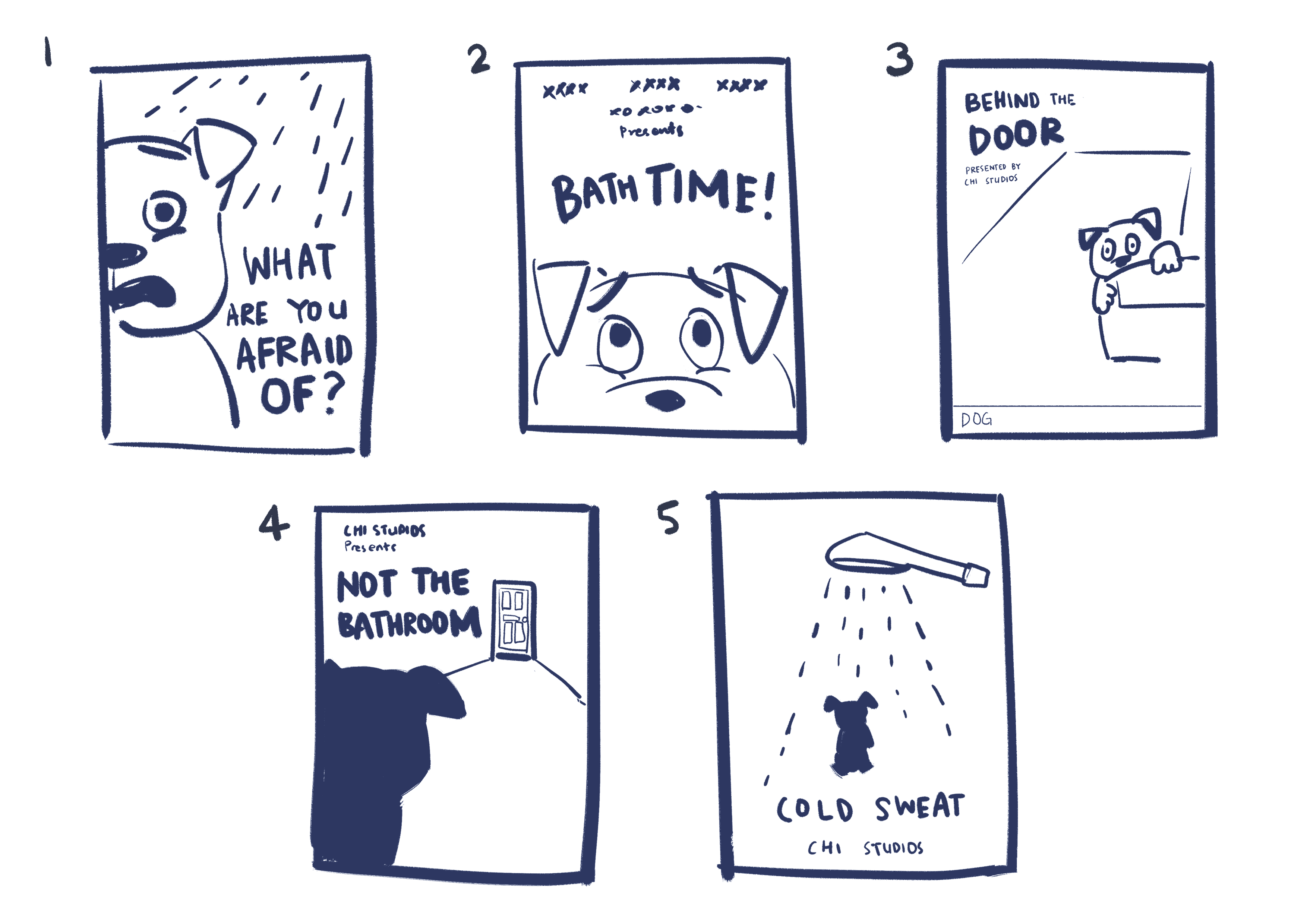
After researching on movie posters, I drew some thumbnail sketches to decide on the composition. I tried to apply design principles such as symmetry, asymmetry, leading lines, framing etc in the arrangement of elements.
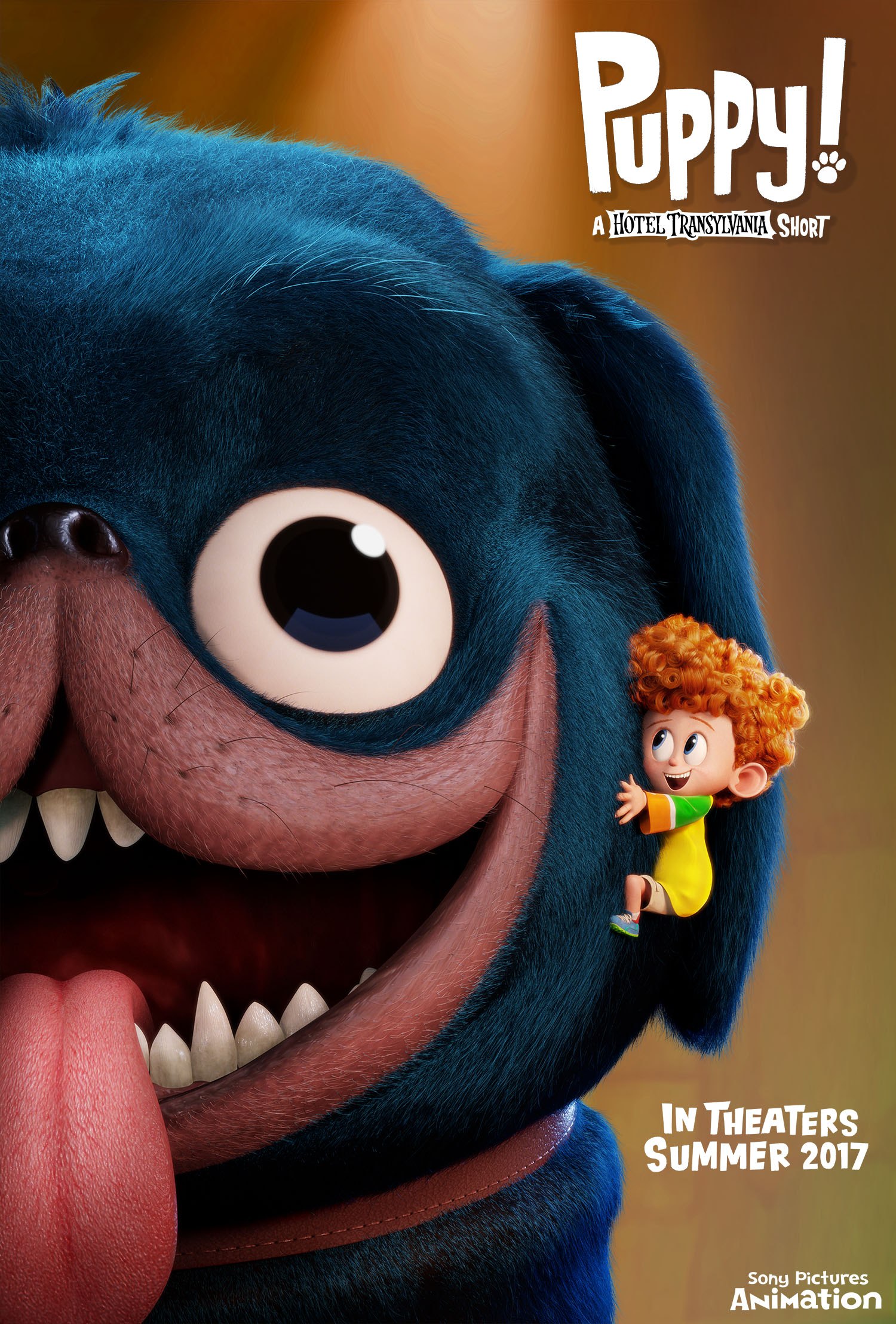
My criteria for selecting the final composition was that it had to be simple and yet stand out. I asked around for other people’s opinions too — some agreed that 2 stood out the most so I picked that one. I also liked 3 because of its asymmetry but I felt that it wouldn’t make a statement as compared to 1 or 2. I did not pick 1 because it was inspired from/similar to an existing film (Puppy! A Hotel Transylvania Short by Sony Pictures Animation) so I didn’t want to be too influenced by their film.
From the chosen thumbnail, I roughly figured out what sort of colour I want my poster to be. Following the horror theme, I knew it needed to be dark and not as saturated. I also decided to add a beam of light (supposedly coming from a bathroom door) to help with the composition in terms of values. 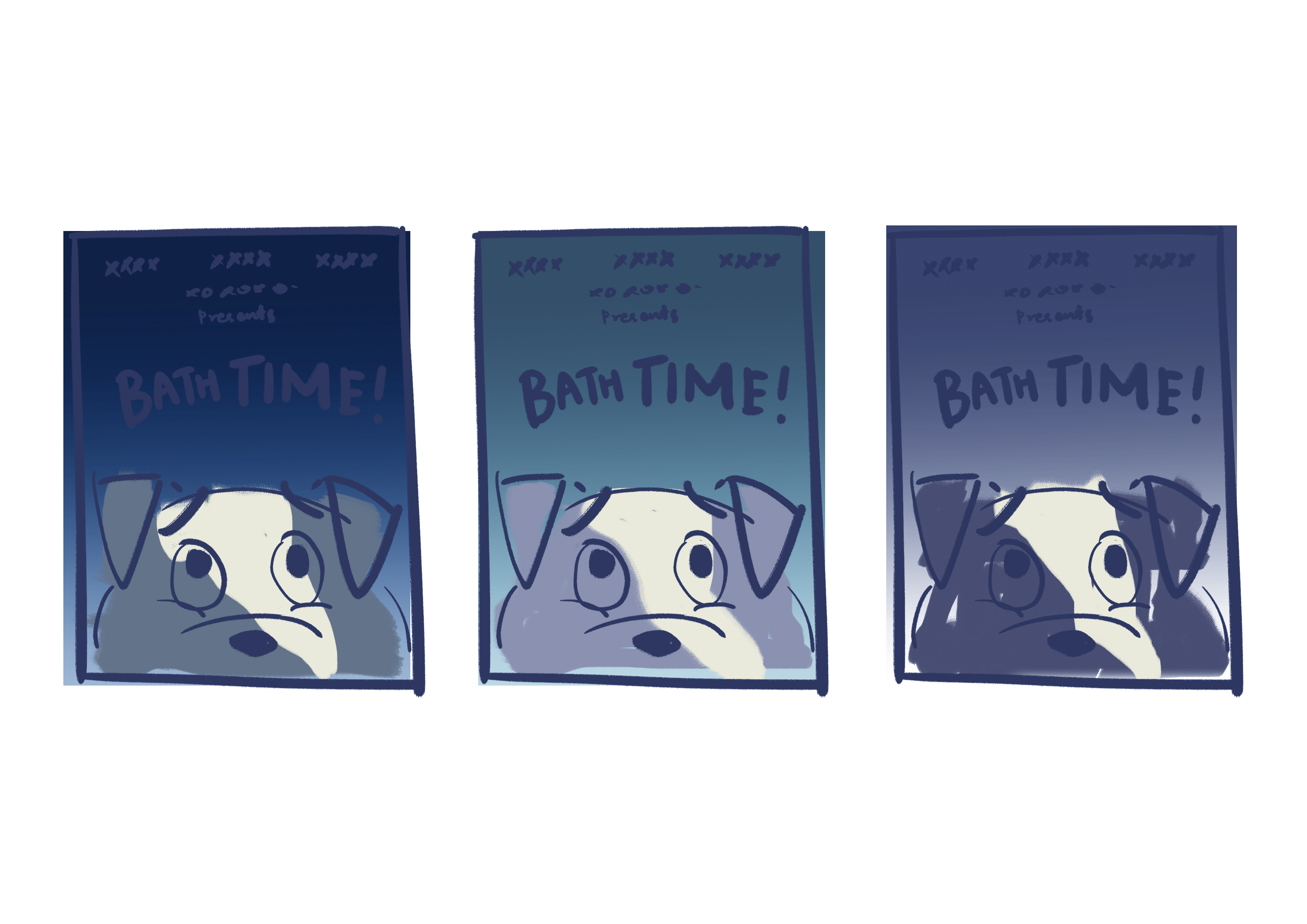
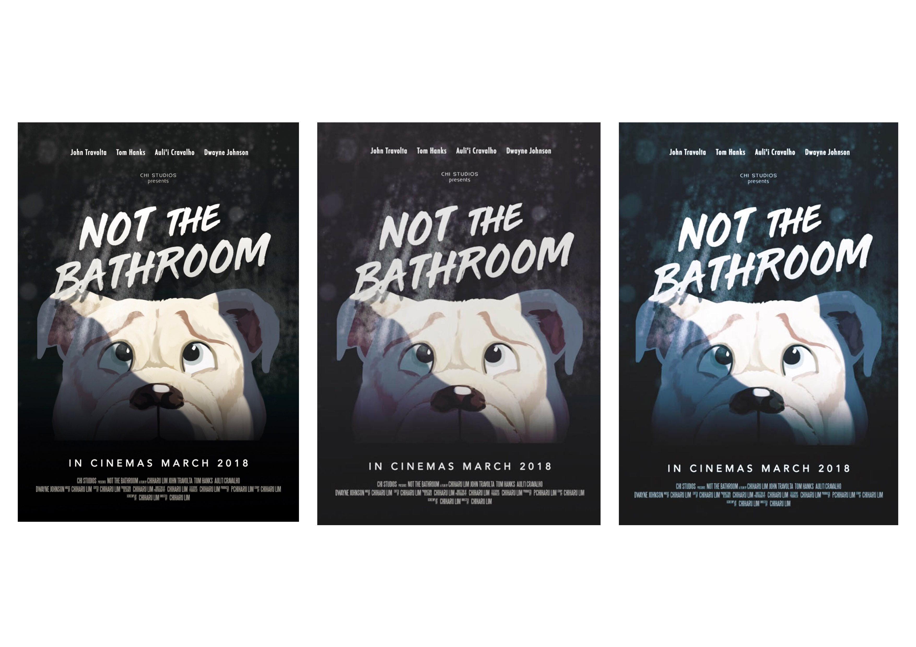
I use these thumbnails as a rough guide, because the colours of the my final work are usually adjusted again based on my preferences after completing the painting then. Below are some of the edits that I considered using.
Left: The least colourful of the three — it works, but I preferred something with a bit more colour. Especially since it is an animated film.
Middle: Need more colour.
Right: The blue/green tones make the dog look cold instead of scared in my opinion.
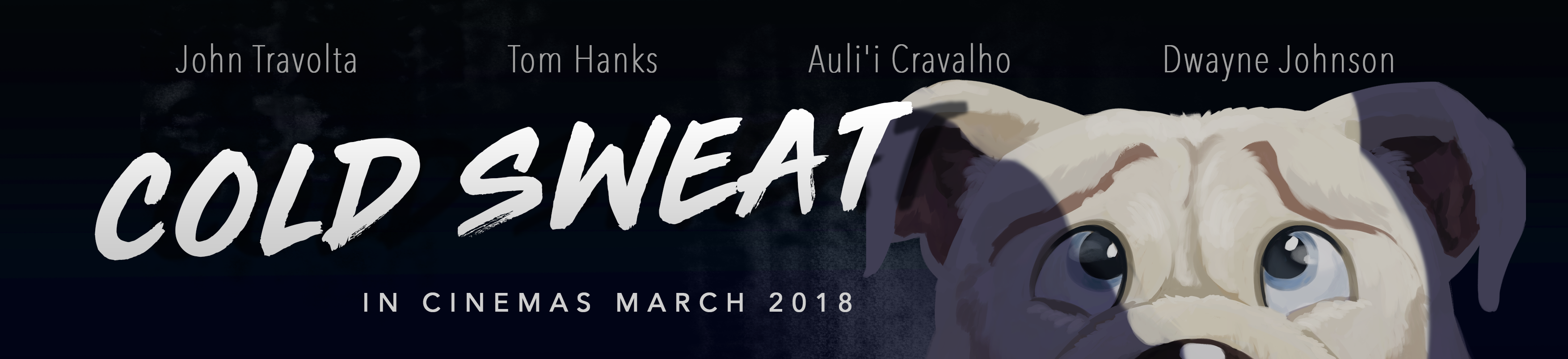
Final work
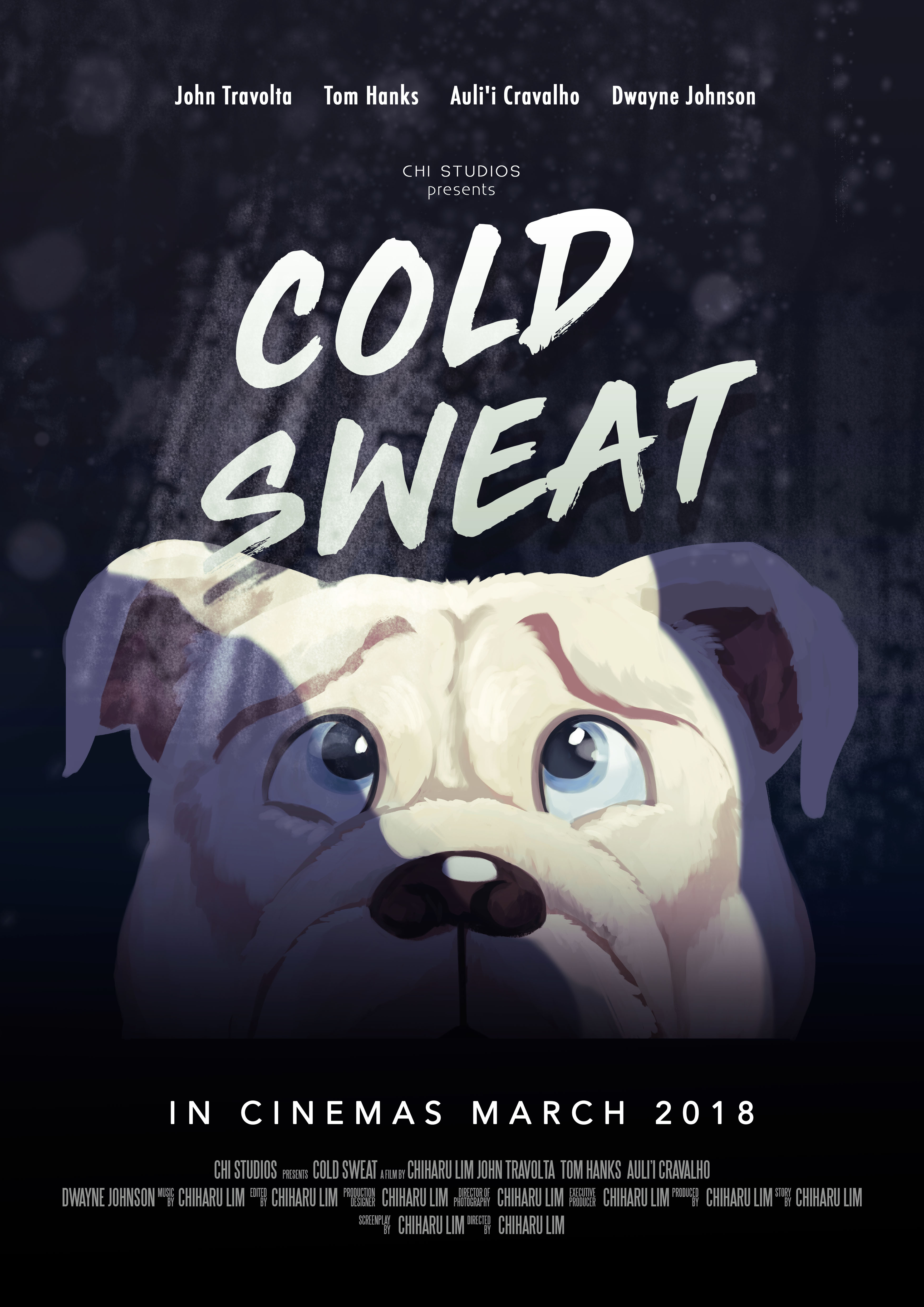
I opted for a subtle purple tint in the end. Composition wise, every element is centralised, and I use the beam of light (coming from a bathroom door) to offset the balance a little. The font of the title is not following the horror theme — I did not want the poster to look like a full fledged horror film. From the references that I have, animation film posters had dynamic fonts so I picked a font that is spontaneous looking and not scary. I added water droplet and dirty mirror stains to keep to the bathroom element.
cold sweatnoun
- a state of sweating induced by fear, anxiety, or illness
Movie Campaign Shots
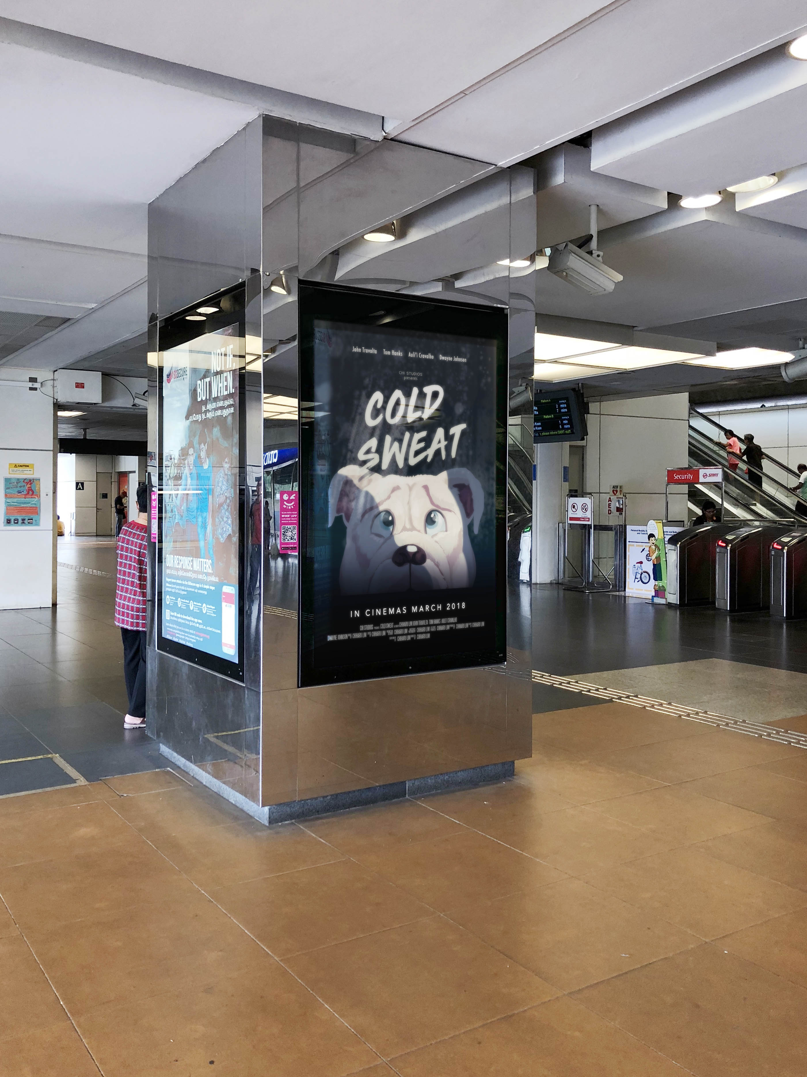
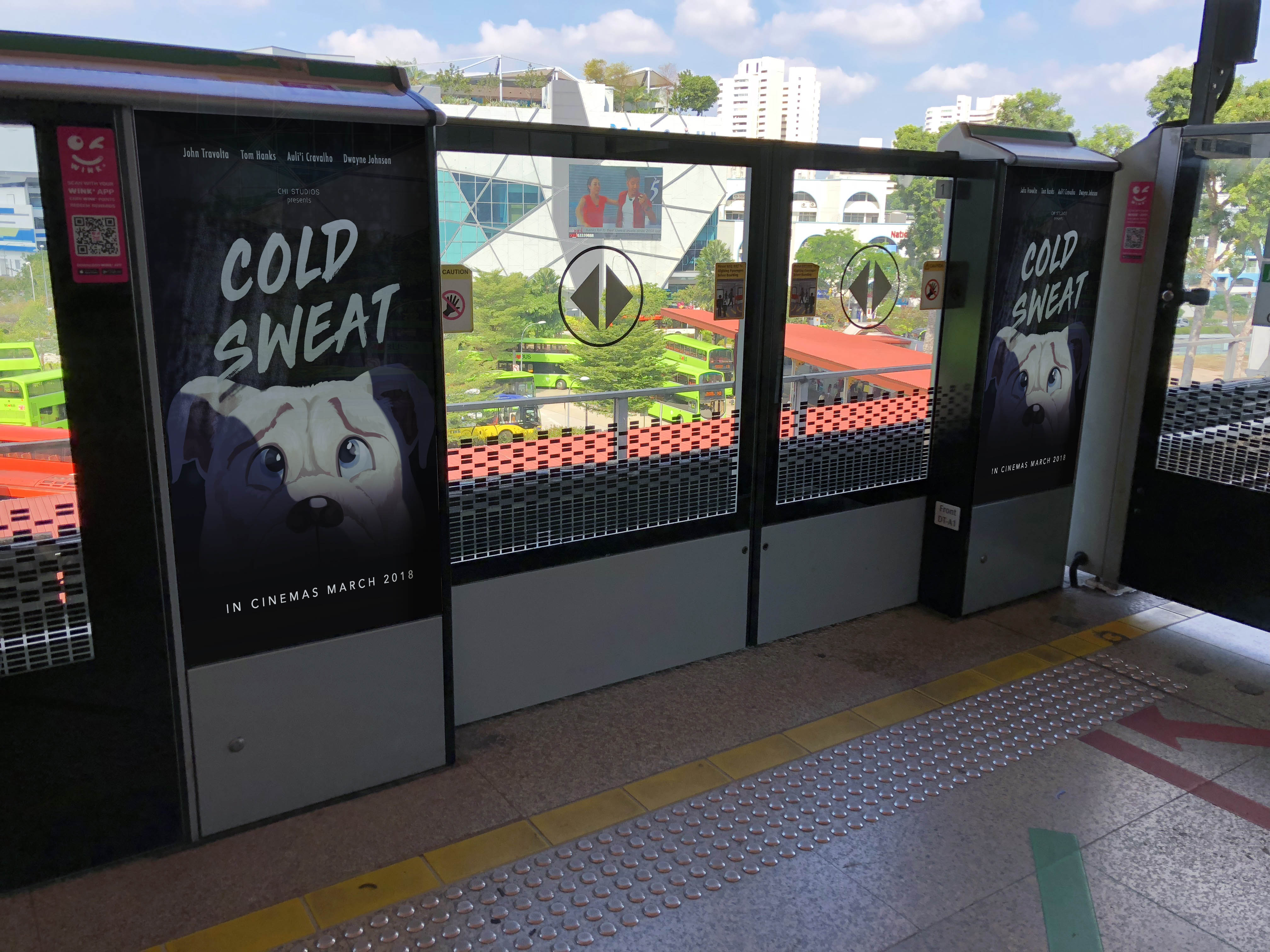
Most movie campaigns can be seen around MRT stations in Singapore, so I composited the poster into some of these boards.
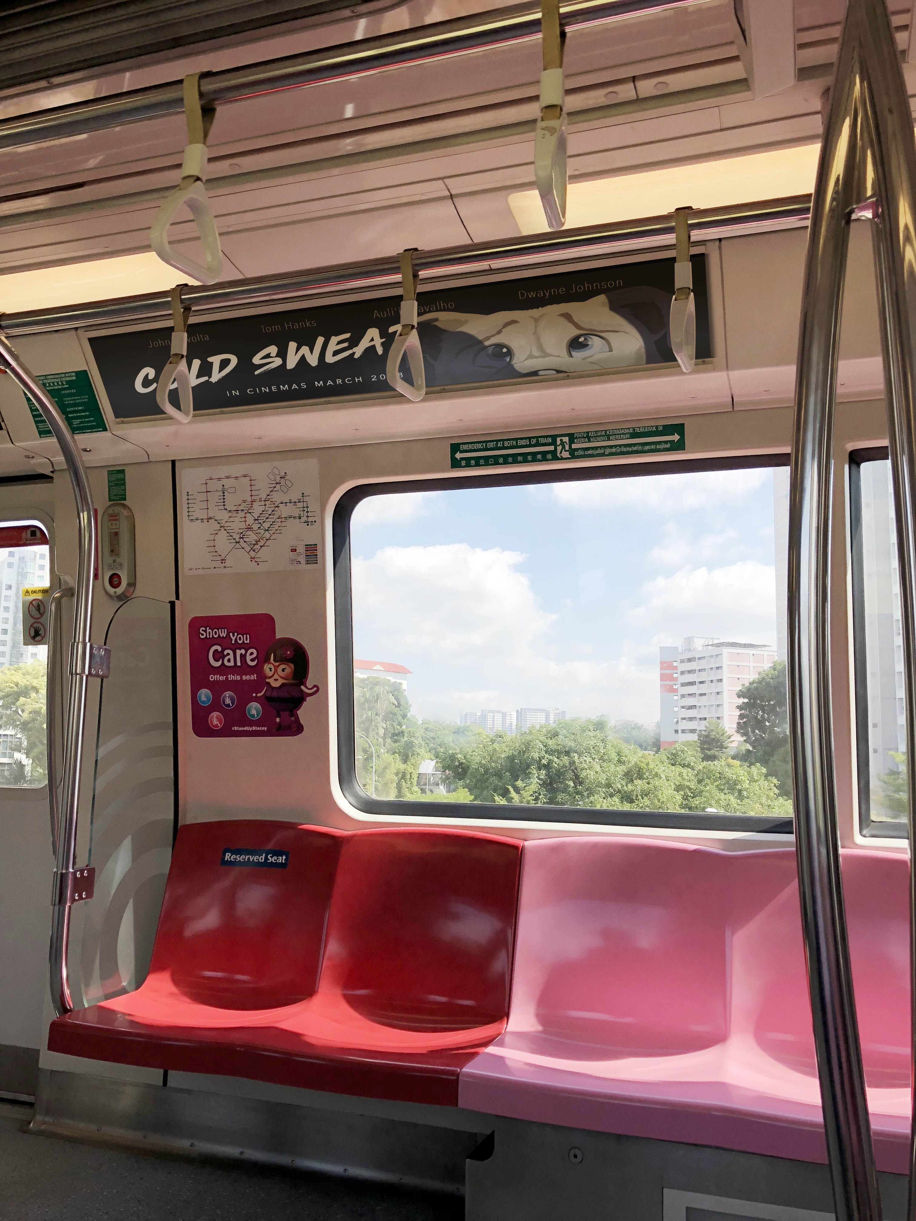
I also modified the poster into a banner type so that it could be placed in MRT cabins.
Assignment 2B: Little Red Riding Hood (Draft)


Assignment 2A: Couple Break Up
Character coming to terms with the break up.

Project 1B: Twisted Fables
THE BOY WHO CRIED WOLF
IDEA
In the first image, I initially intended to portray a wise Wolf who knows of the lying shepherd-boy and decides to teach the Shepherd a lesson by attacking the sheep. But some people misinterpreted it as an arrogant looking into having some fun by purposefully attacking the sheep.
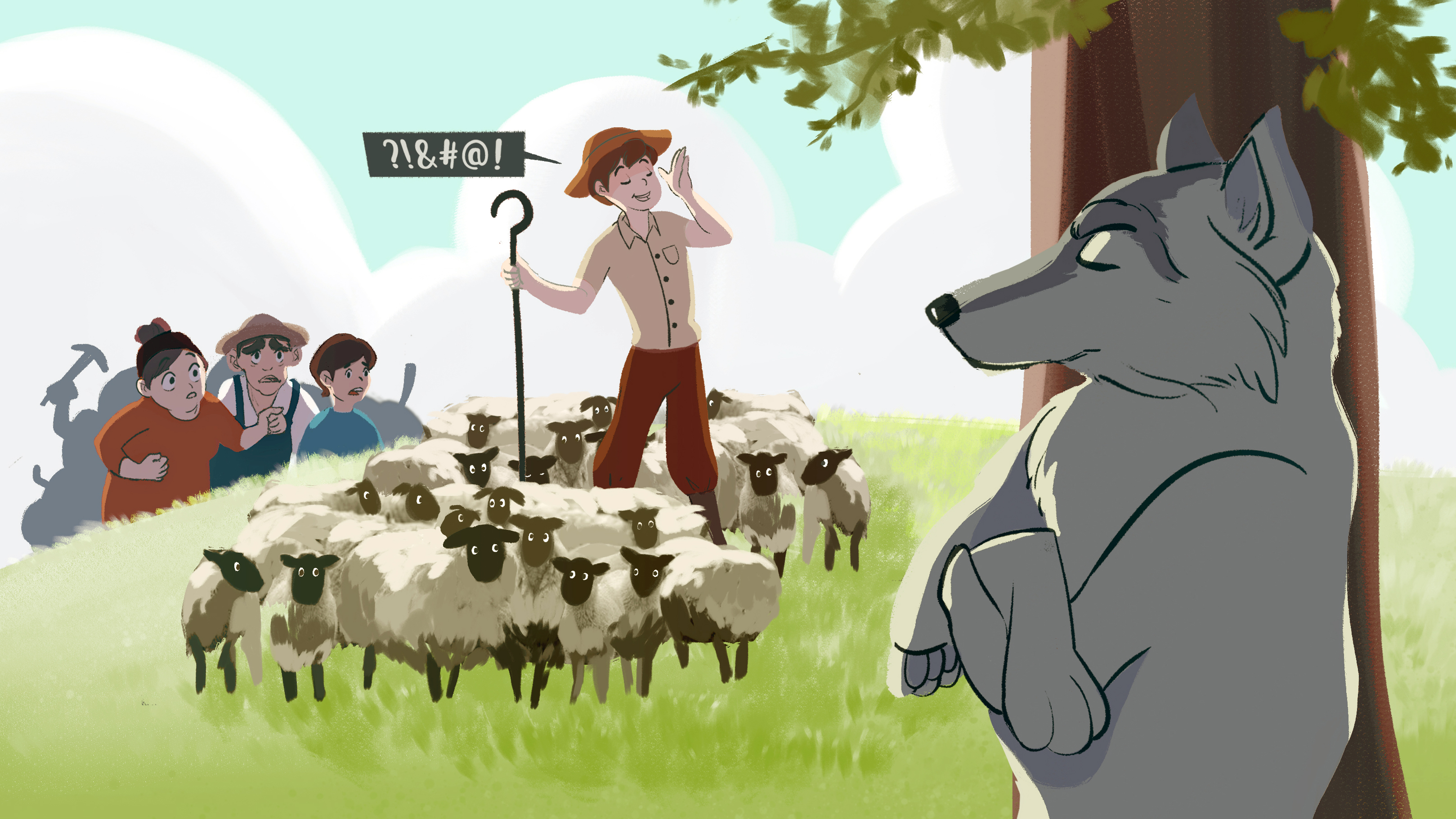
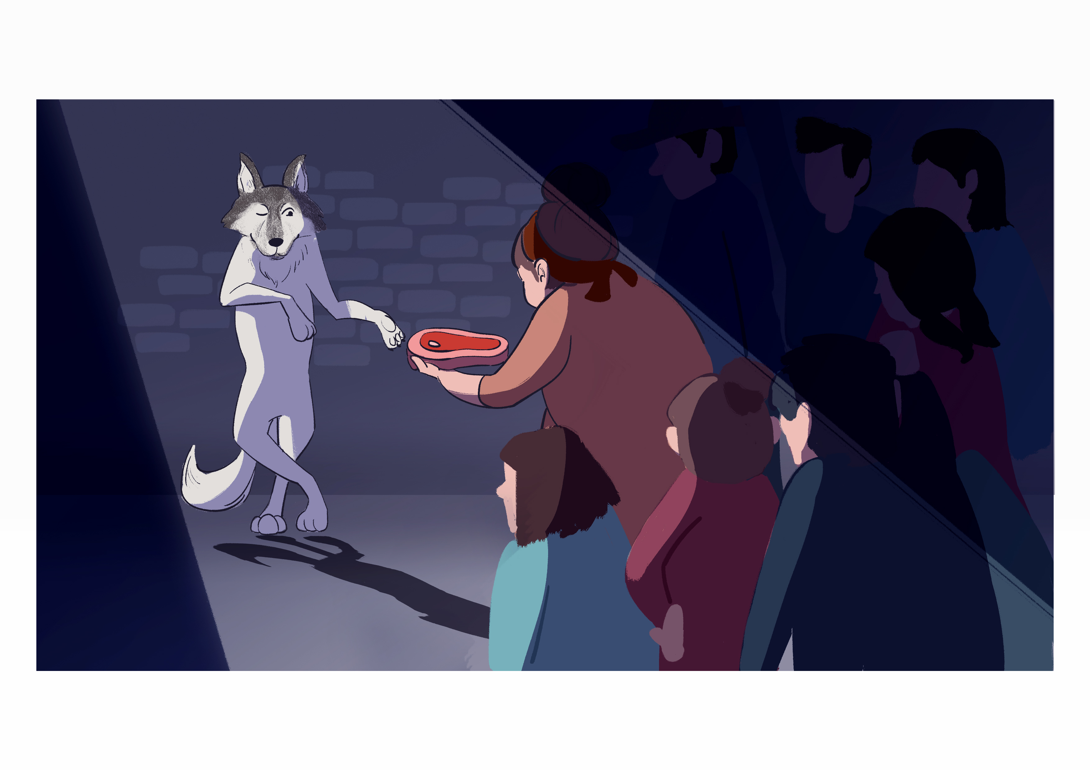
In the second image, I wanted to show the villagers offering the wolf some meat — as if to suggest that the whole story was an “inside job”. The first image would then suggest that the Wolf is actually smarter than he seem. I went along with the interpretation that the wolf might be trying to have some fun by purposefully attacking the sheep in the story.
The first image accompanied by the second image would reveal the fact that the villagers are the ones plotting against the Shepherd. They bribe the Wolf with meat to attack the sheep. This would give the Wolf the motivation to attack the Shepherd’s sheep.
Choices
I used a darker colour scheme for the second image to hint that something shady is going on and to give contrast with the first image. The single spotlight is to bring viewer’s attention to the action of the characters.
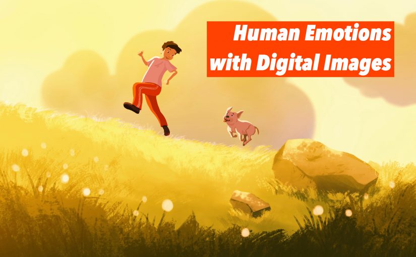
Human Emotions with Digital Images.
Task: Conceptualize and present ideas with digital photography or digital painting.
Ideation
Initially, I wanted to do illustrations inspired by songs. However the idea wasn’t very concrete, and the visuals would be all over the place. So I thought about including a narrative. In the end, I decided to do an illustration series depicting snapshots of a dog’s life/emotion, which is inspired by my friend’s pet that recently died. I wanted to portray moments of an animal’s life and its emotions felt in different situations.
The emotions that I picked are happiness, saddness, fear and surprise.
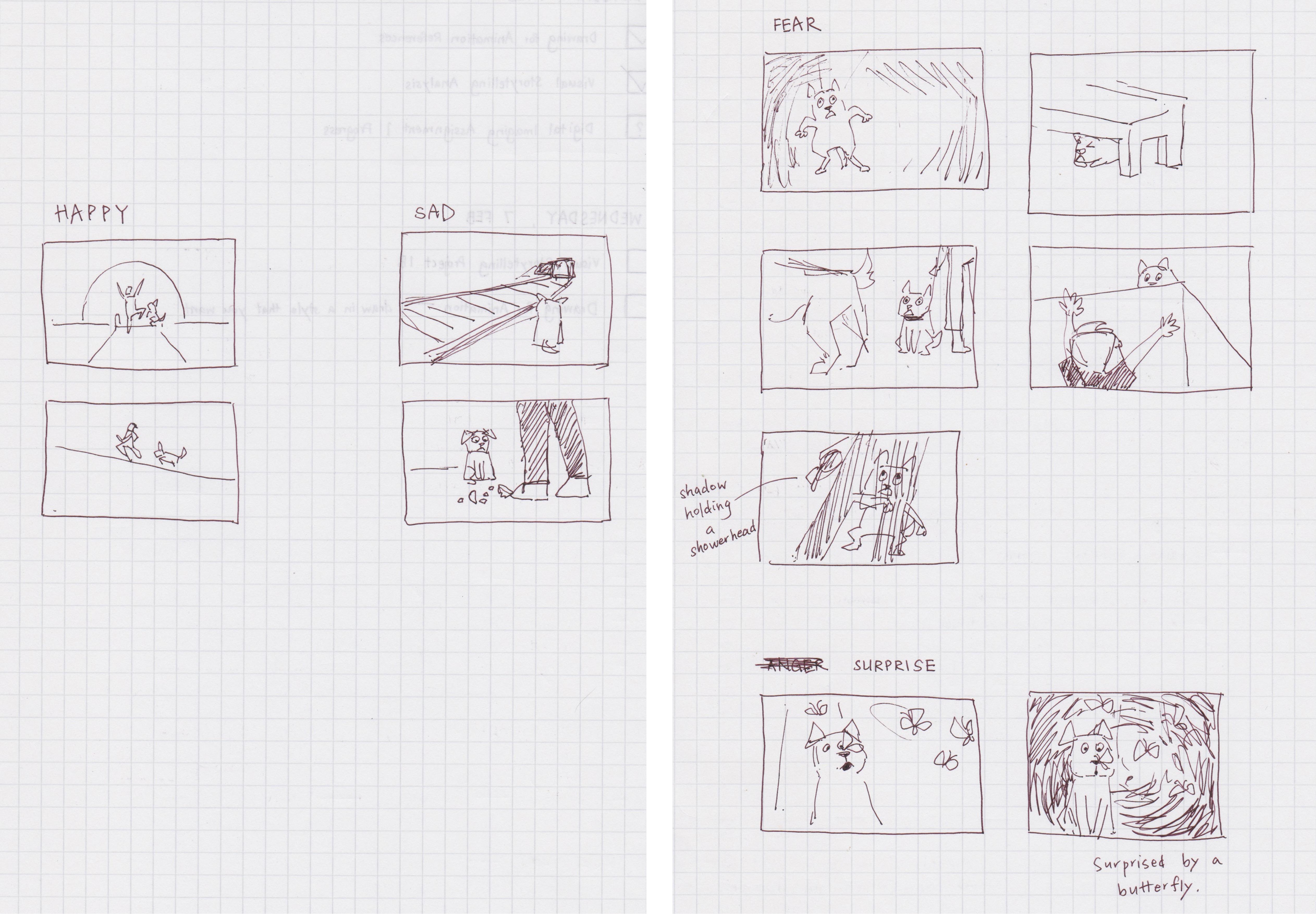
I started off by doing sketches of whatever imagery that came to mind relating to the 4 emotions.
Mood boards / references
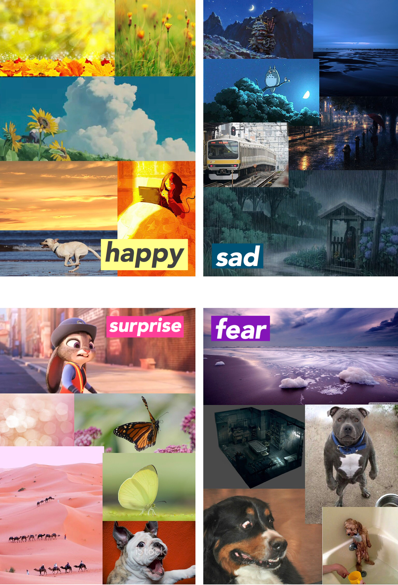
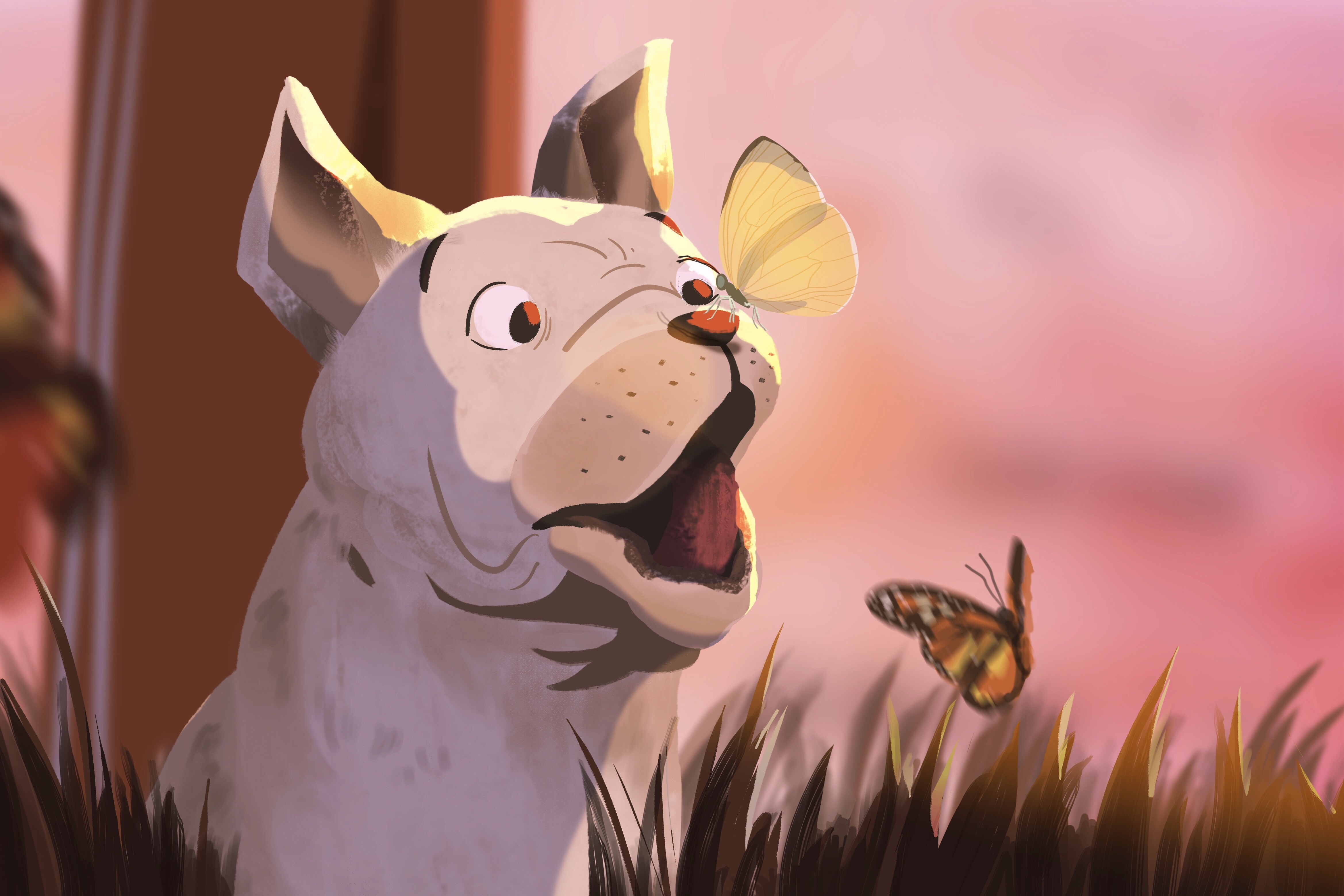
I researched into the relation between colours and emotions, then created mood boards to guide my illustrations. Surprise was the most difficult emotion to give a specific colour. I decided to use pink in the end, because I interpret it as a positive child-like emotion.
Yellow — Associated with happiness, energy and warmth.
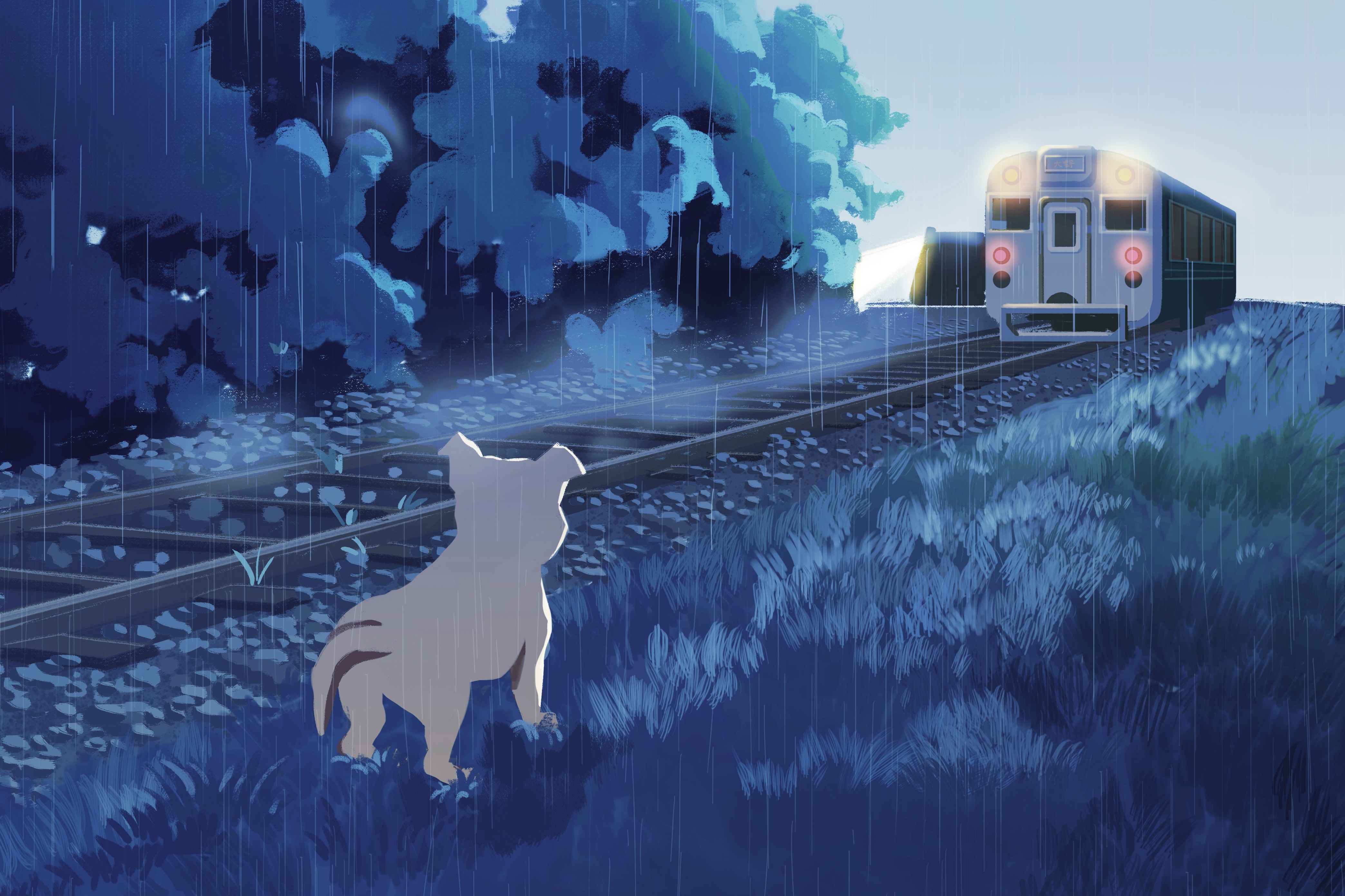
Blue — Coldness, sadness.
Pink — Cheery, surprise.
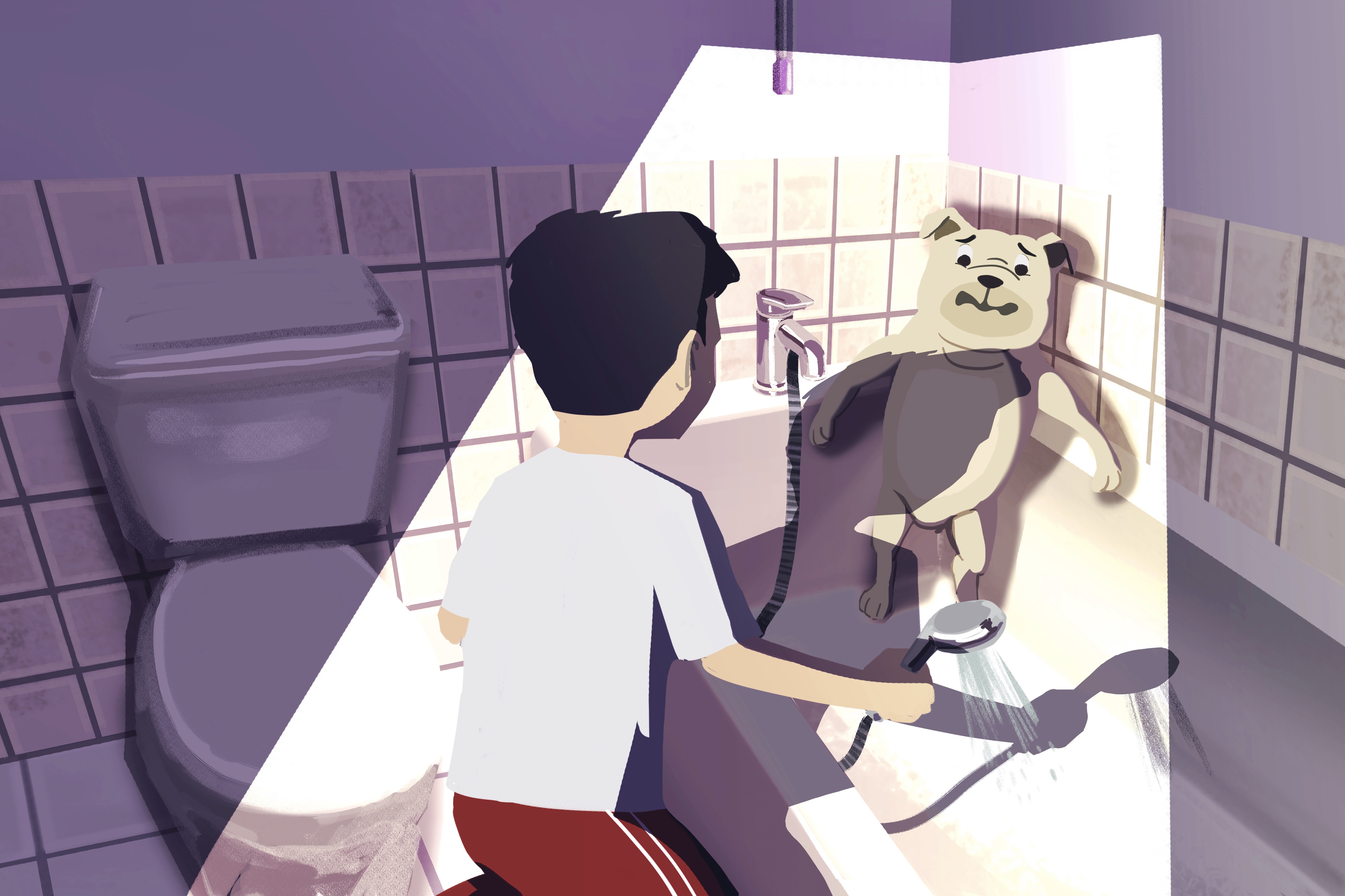
Purple — Fear, mystery.
Final work
The illustrations express human emotions portrayed by a non-human character— a dog. Other than colour choice, I took composition, facial expressions and gestures into consideration.
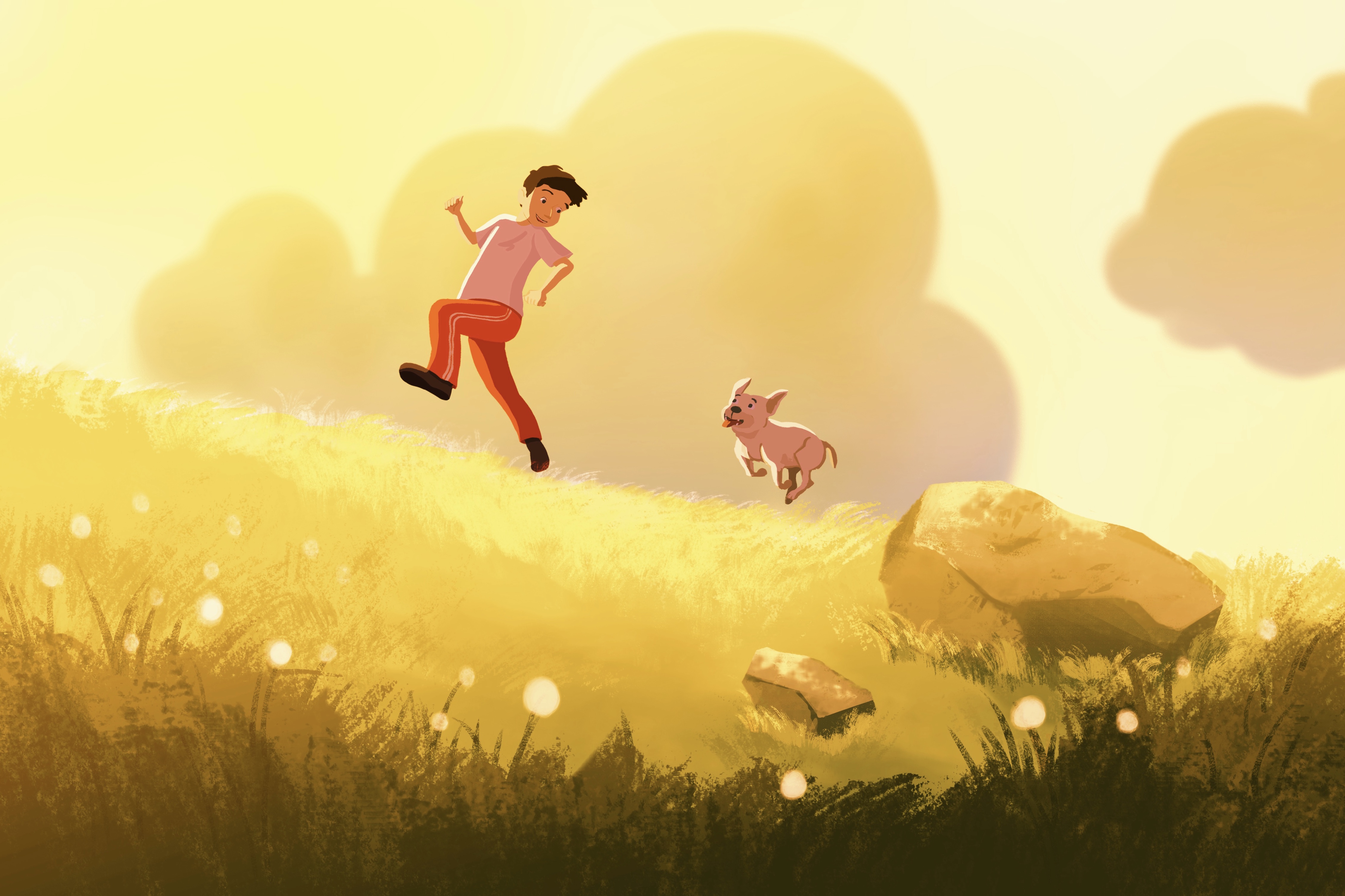
For happiness, I opted for a low angle camera view slanting upwards to give the impression of energy and cheerfulness. I made sure that the gestures convey the emotion even without the aid of facial expression as it is a long shot.
My interpretation of surprise in this illustration resembles a child-like surprise. I portray the energy of the emotion through the motion blur of the butterflies.
Fear is a very overwelming emotion, which is why I included harsh lighting in the illustration. The light creates a drama — a reflection of the dog’s emotions — and at the same time frames the characters.
Here, I wanted to suggest that the dog was either abandoned, or lost. I use a train going away into the distance as a visual representation of abandonment. Rain is another visual cue for sadness. I attempted to convey sadness without showing the facial expression of the dog.

PULP FICTION: semiotics & mise en scène
PULP FICTION by Quentin Tarantino

Mise en scène is used in this scene to warn the audience of upcoming events and inform them about hidden character traits to create suspense when Vincent goes to visit Mia in her house. Mia is the wife of Marsellus Walace.
Setting
The colour scheme of the house is mainly white — very clean and crisp. White is usually a symbol of innocence and purity. However in this case is ironic because Mia and Mr. Wallace the complete opposite (drug addict and mob boss). The juxtaposition of colour scheme and personality is interesting. Every furniture is neatly placed, the setting seems uncomfortable to be in.
Lighting
High key front lighting accentuates stark white colour scheme, which makes the character stand out.
Props
We see technological devices around their home — intercoms, video cameras — which suggest that characters in living in the house (Mia and Marsellus Wallace) are wealthy. It gives viewers a hint of their personalities and lifestyle. It can also suggest that characters have something to hide — a sign of insecurity.
Costume
Vincent is in a black suit which makes him stand out in the white environment. It suggests that he does not belong in the environment and foreshadows the fact that something bad might happen if he stays in the environment for long.
Space
Director makes use of deep space. Vincent appears very small in the large room, as if entering a lion’s den.
Staging and Acting
Vincent’s pose conveys a sense of inferiority. He is cautious and keeping to himself.

Project 1A: Twisted Fables
The Boy Who Cried Wolf
For this assignment, we were to create a single image that changes the meaning of a famous fable or folktale.

ideaTION
The story that I picked was The Boy Who Cried Wolf. In the original story, the shepherd-boy alarms the villagers three or four times by crying out “Wolf!”, and laughs at them for believing him. The Wolf really did come in the end.
For this image I wanted to change the moral of the story by making the Wolf be more involved in this narrative. At first, I wanted to portray an evil Wolf who knows of the lying shepherd-boy and decides to have some fun by purposefully attacking the sheep. I personally find this a reflection of our society, whereby sometimes people in the sidelines might take advantage of the situation to cause you misfortune.
Final
In my final piece, I wanted to show a wise Wolf, who decides to attack the sheep in order to teach the boy a lesson. The message that I was trying to bring across was that in life “a bad guy” might appear to cause you “misfortune” at that point in time, but in reality wants to help you become a greater person.
In order for the Wolf to do this, he has to know that this shepherd boy is doing such an awful thing. Which is why I placed the Wolf behind a tree, listening. The Wolf is in a arms-crossed pose to convey its wise/cool aura.
Evaluation
The pose of the wolf was not effective in what I wanted to convey. A lot of people misinterpreted it as being arrogant. The Wolf also did not have good character motivation for his actions.
A different situation might have worked better in this case.