In my last post, I made a presentation based off the first time I went to Dakota. Since then I have revisited the area a few times and have done more exploration/research. As needed, i’ll post the additional pics of my discoveries in this post instead. After exploring Dakota,I realised that there were many types of patterns,being repeated throughout the place I was inspired by the patterns and tessellations, to create my own collection of patterns and prints. I thought of making a catalogue, whereby each page is a pattern is dedicated to a particular observation and each catalogue, to a different location in Singapore.
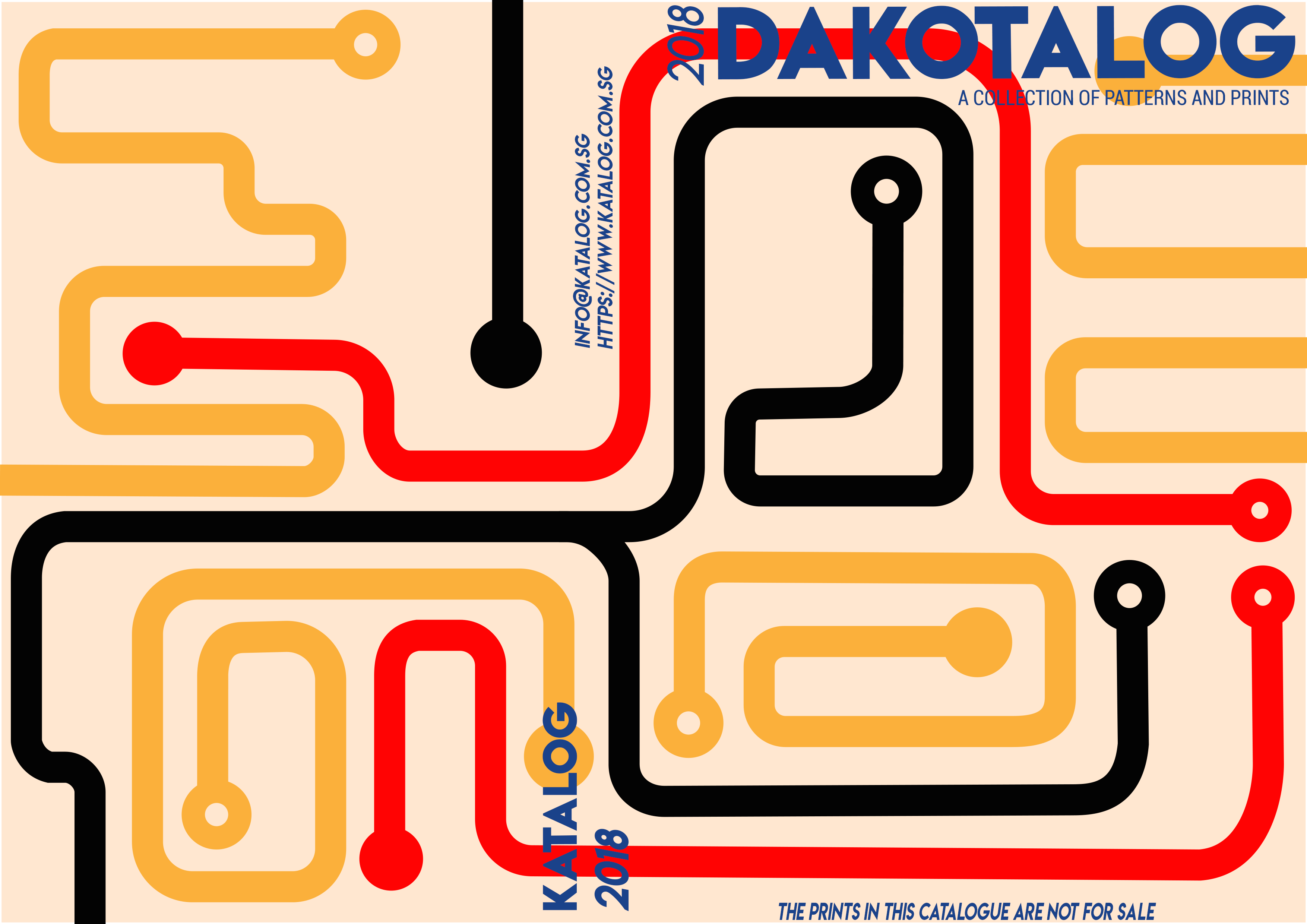
Cover page and Back page – Map
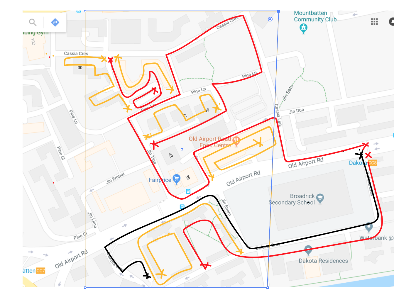
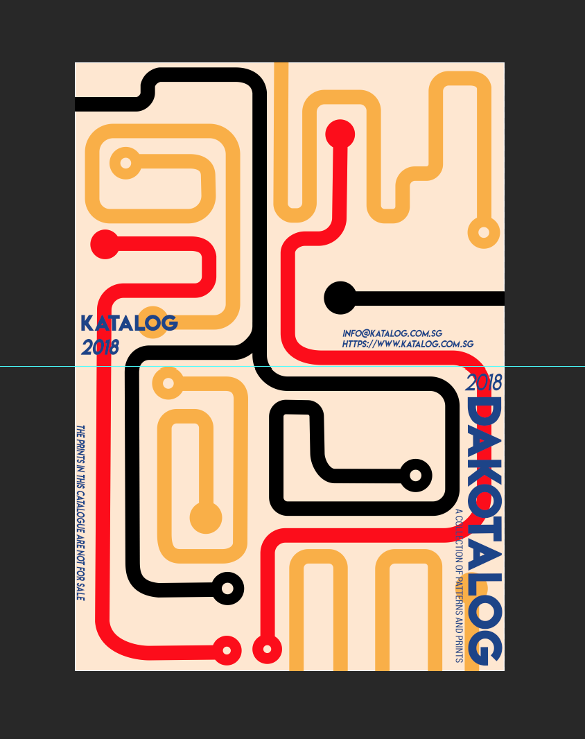
My cover and back page will be my 2 page spread, which I chose to use to represent the map of Dakota.I thought since my entire zine is encompassing my observations of Dakota as an area, it would be quite apt to use the map print to “Encompass” the content inside my zine as well. I got a screenshot from google maps of Dakota and marked out the route I took on both the days i visited the place.Black would represent the first day,and red the second. While the yellow would be the areas i covered within the clusters of blocks aside from the streets that are visible on the google map.Then i sectioned out the area i would be using to based my design off of.
I decided to use the lines from the path i marked to create this pattern.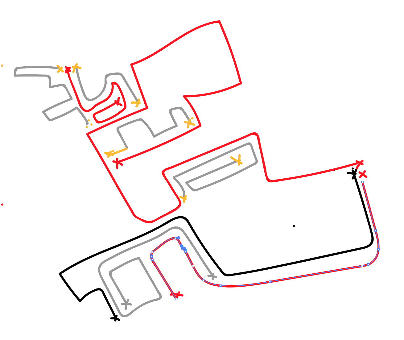
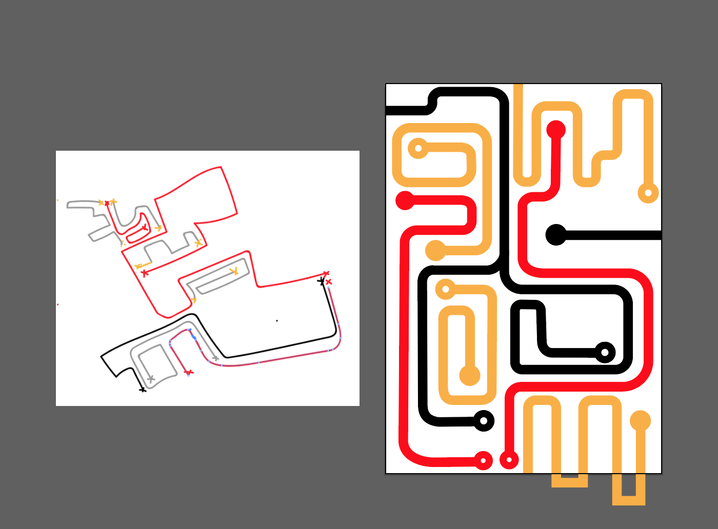
After creating the original design (no pic), I realised the lines were too thin and the corners of the turns were too sharp , at 90 degree angles. I felt that because of the thin lines there was too much negative space which made the pattern look imbalanced and the corners made my design look to rigid/tense. I opted for thicker lines and more rounded curves, in the picture above,to make it seem more cohesive as a pattern. I also opted for a beige background, to give that vintage/nostalgic vibe that Dakota has. The circle at the ends of each line represent the start and end points respectively.I used triadic colours,red,yellow and blue to make the coverage more vibrant .The font and placing was inspired by a few ikea catalogues I referenced,whereby the year would be placed vertically next to the bold yet minimalistic text. After consulting mimi, She suggested using a sub header, which would give viewers more insight into what the zine is about.I placed the text ‘Katalog 2018’ at the bottom right of the back page , so if it were on the shelf the viewer can see which book they’re reaching for. Also some fine print at the bottom of the cover page to mimic the ikea catalogue.
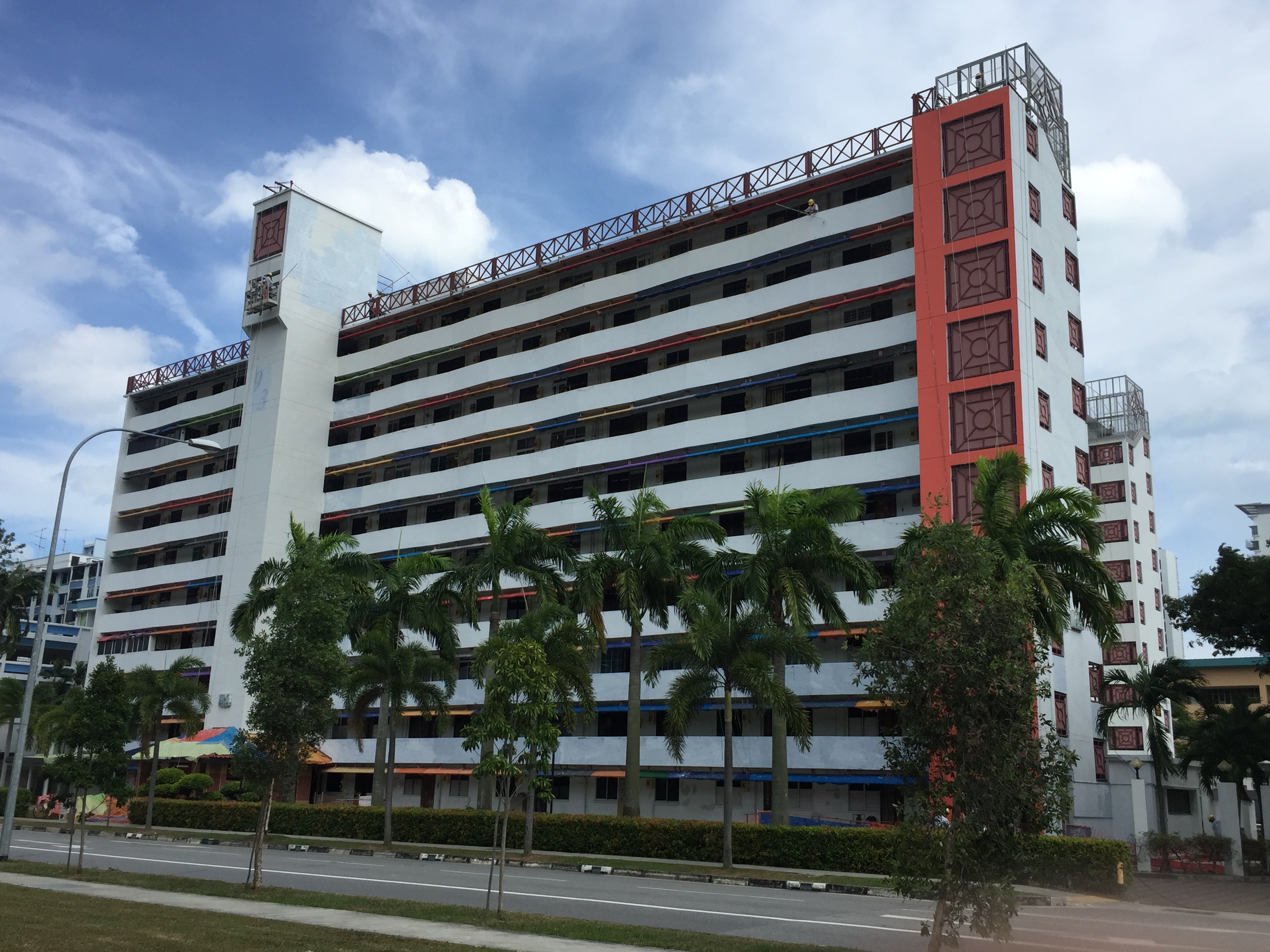
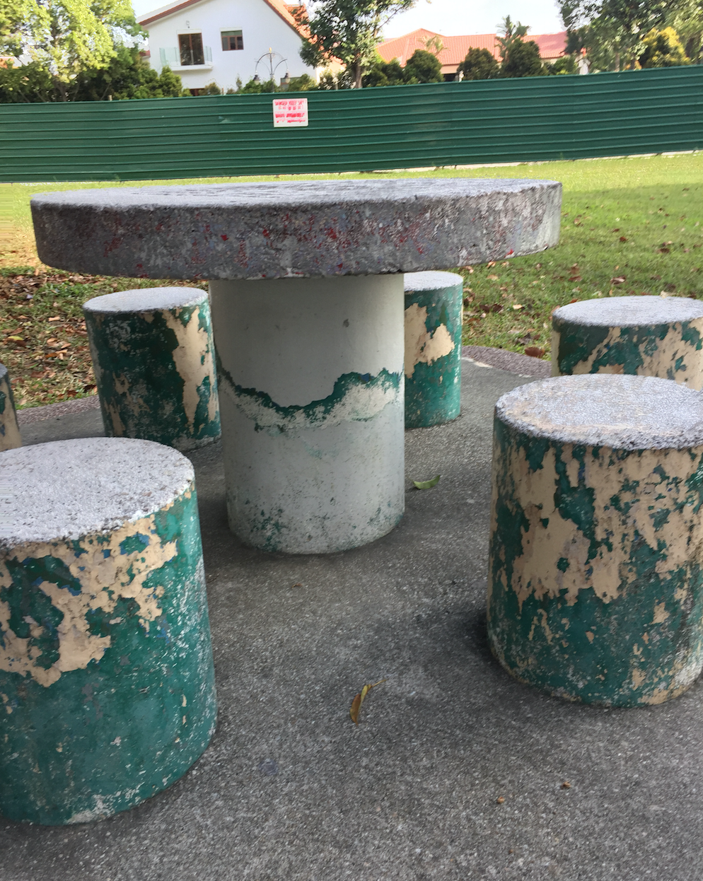
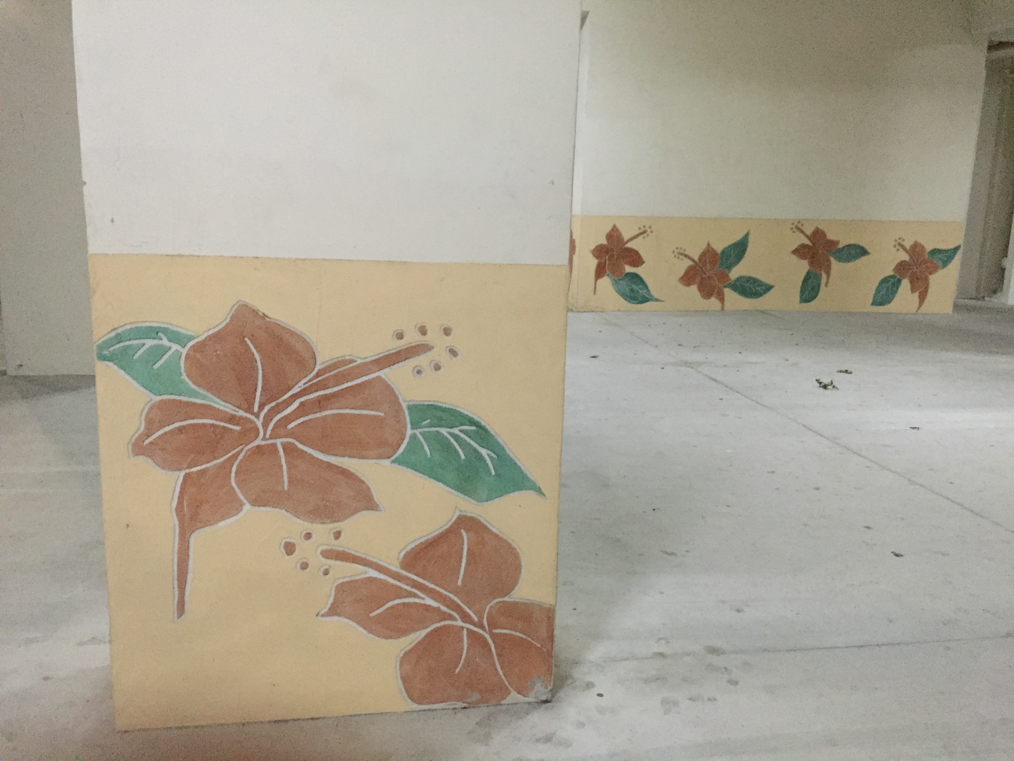
Page 2 – Metalwork/Dakota crescent
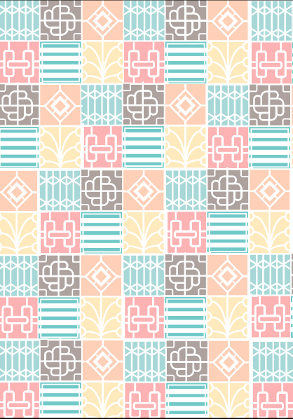
This page is represents the area Dakota crescent.I began by drawing out the shapes of the 6 types of designs I saw on the metal grills of the housing at Dakota Crescent as shown below. I chose the shade of orange as it was one of the most recurring shade of orange I saw in Dakota as a whole.Later I opted for a more muted shade of orange as I felt like the orange did not represent Dakota crescent as an area itself.It was not as lively and the colour scheme in that area was more subdued in nature.
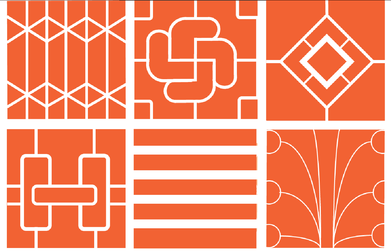
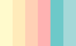
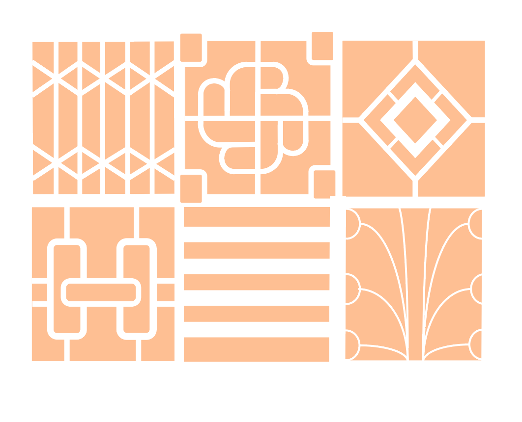 After consulting Mimi,she suggested using a wider variety of colours. I used the colour of the metal itself as a background for each individual design out of the 6. The metals they used were mainly pastel pink and blue,the rest either brown or white.I generated a pastel colour scheme and used it instead.I decided to use this set of 6 as a repeated cluster throughout this page and proceeded to copy and paste them next to each other.I realised that the pattern lacked a sense of rhythm so it ended up looking messy.Hence, i aligned them in a fashion where the prints running diagonally alternate in colour.
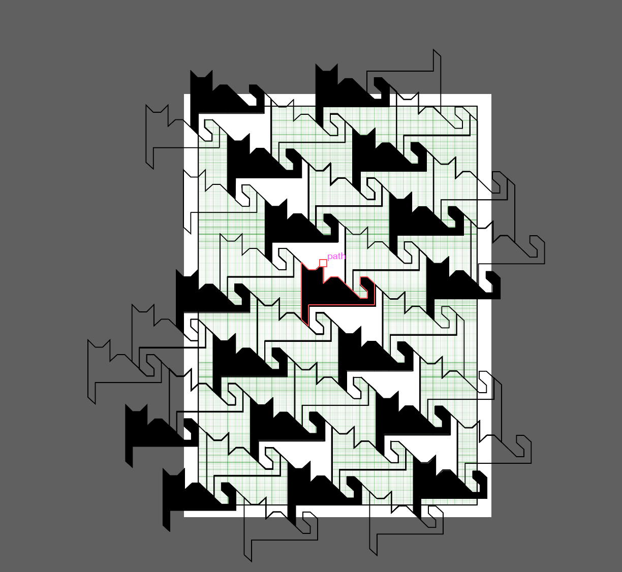
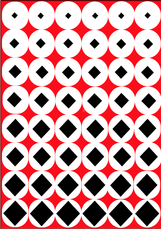
Page 3 – Cats and tessellation
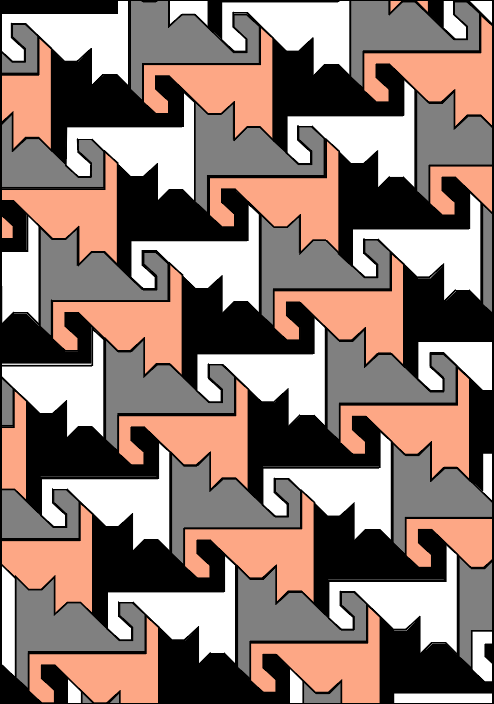
This page is also dedicated to Dakota Crescent.As the area is abandoned, many cats have occupied the area .Tessellations were also prominent in the area, the tiles on the floor, the patterns along side the buildings and within the decorative design of the neighbourhood itself. I combined these two observations together and came with a cat tessellation.I began sketching out a rough shape based of a cat I saw resting above an abandoned childcare and used this as my main unit in my design. I plotted the shape on graph paper to achieve more accurate/proportionate results.If one of the units were out of shape, it would not form a proper tessellation.Then I filled in the colours of the units based on the colours of the cats that I encountered,to achieve the final design.
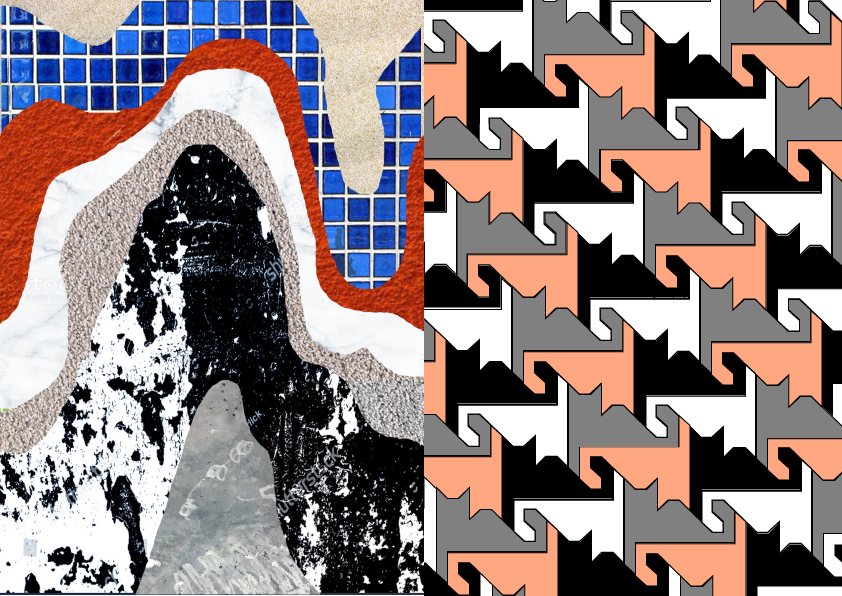
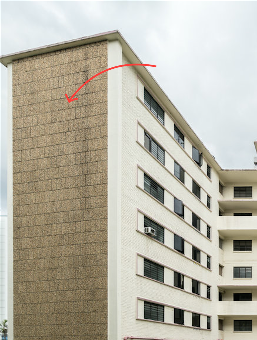
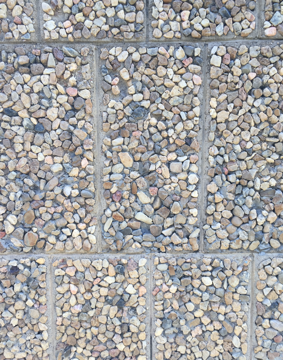
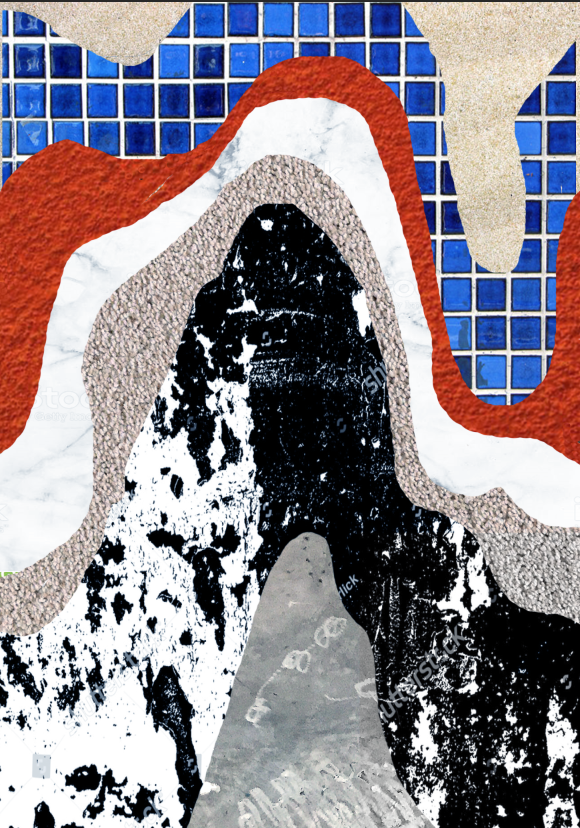
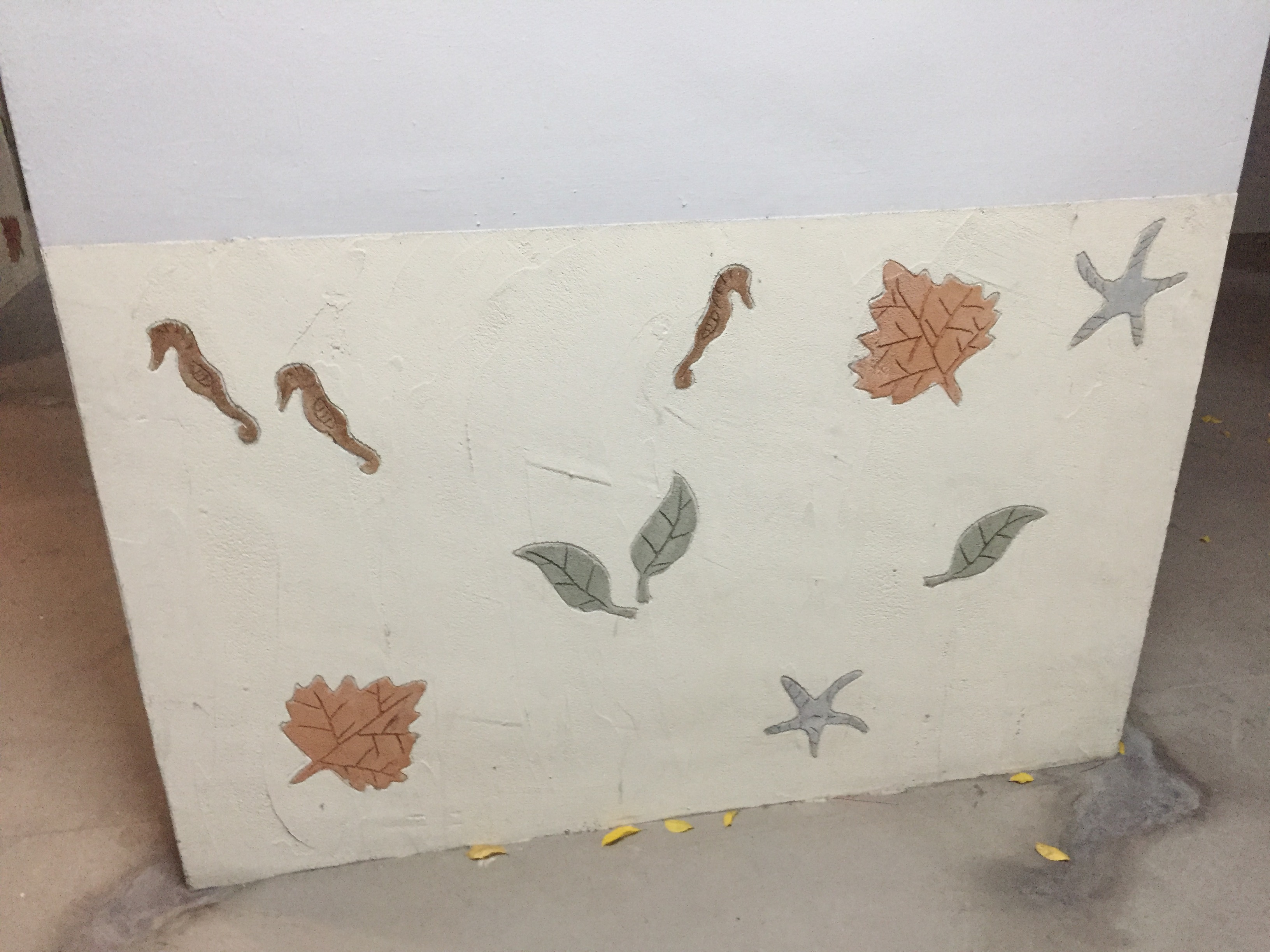
Page 4 -Texture
There were many interesting and different textures all around Dakota, some of the few I decided to include in this pattern are listed below.
From top to bottom
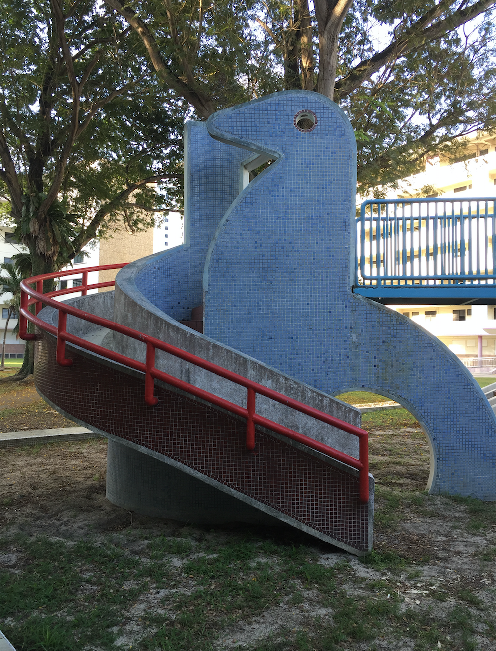
- Sand – seen at the dove playground , one of the few sand pit playgrounds left in Singapore (in dove pic below)
- Blue mosaic tiles — these tiles covered the body of the dove at the playground
- Paint on wall – HDB blocks were mainly white with hints of burnt orange paint
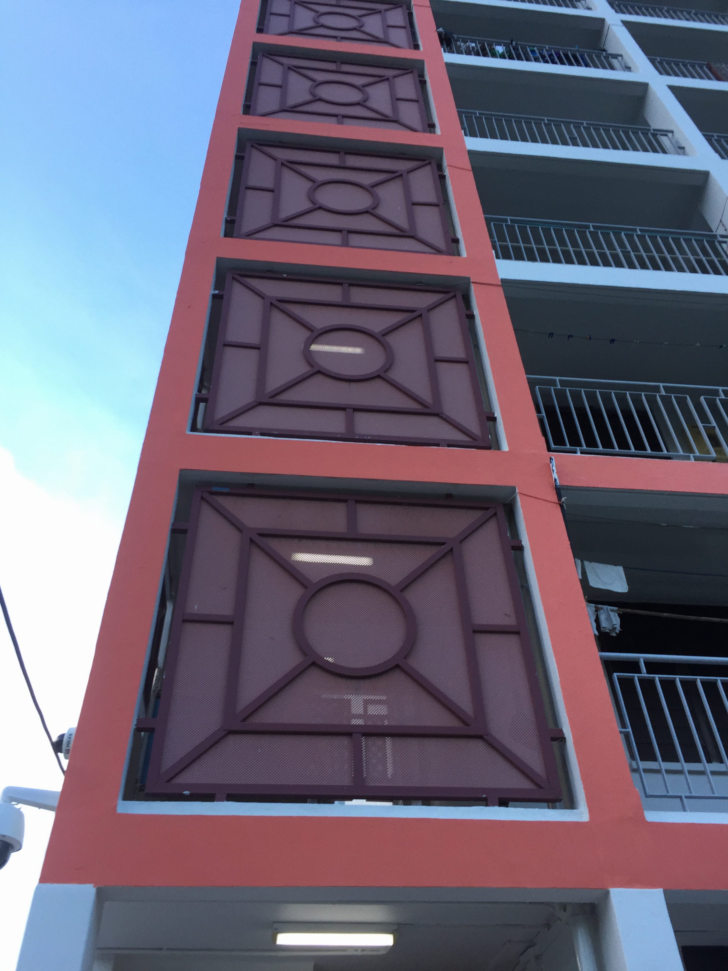
- Marble – Tiles on the walls of these blocks were white with a smokey grey and partially mimicked the look and feel of real marble.
- Gravel/pebbles -Tiles alongside the blocks
- Weathered paint-Prominent in the abandoned Dakota crescent area
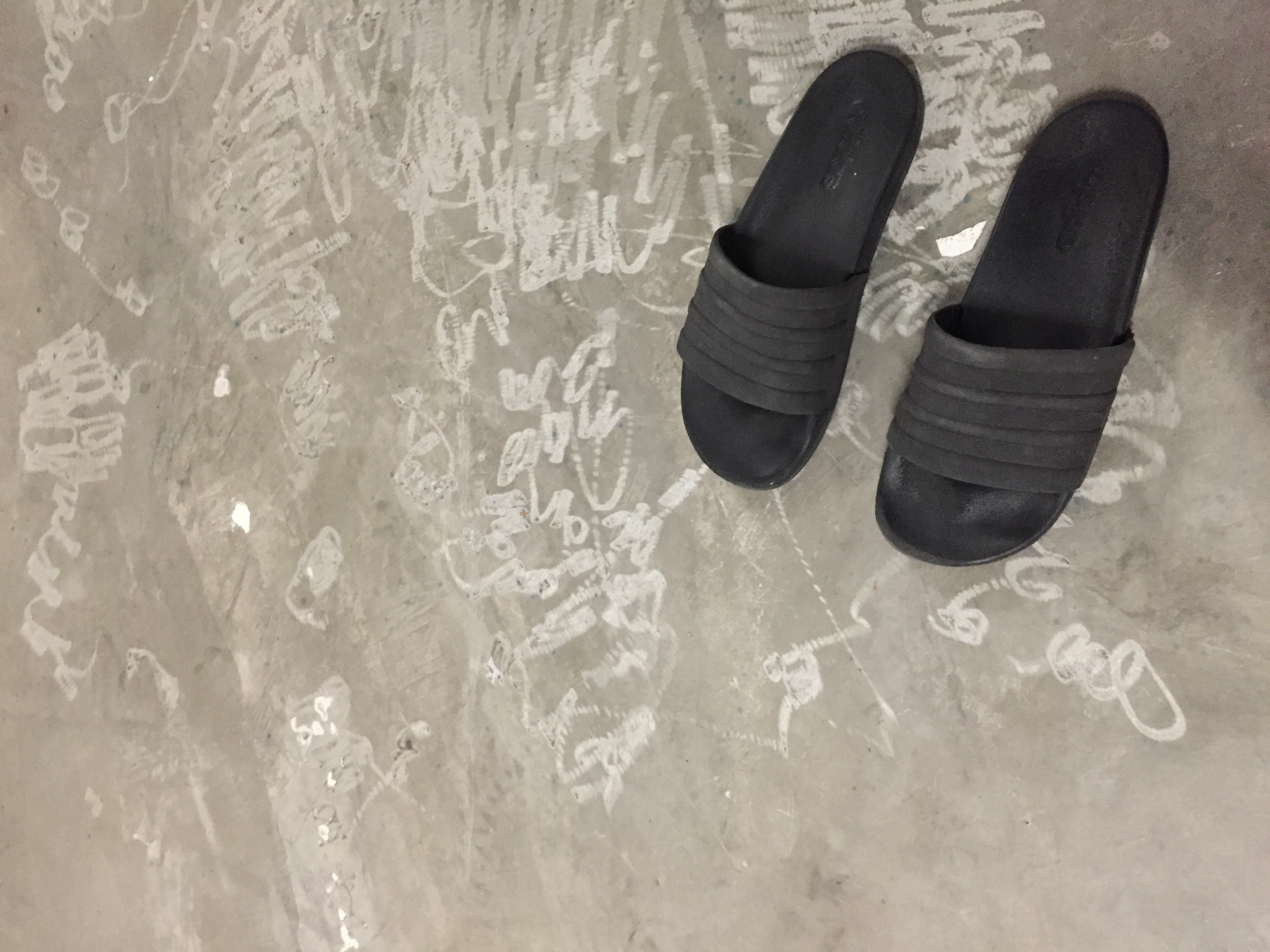
- Vandalism – Some seen on the floor of HDB blocks
I wanted to compile these textures into a single pattern but was afraid that they wouldn’t look unified and maybe bit jarring as each texture has a lot of details. I layered the different textures together and used wavy distorted lines to represent the uneasy feeling i felt entering the location as well as to give some consistency to the pattern.Also the scale of each texture is based on the proportion of it i have seen at Dakota.
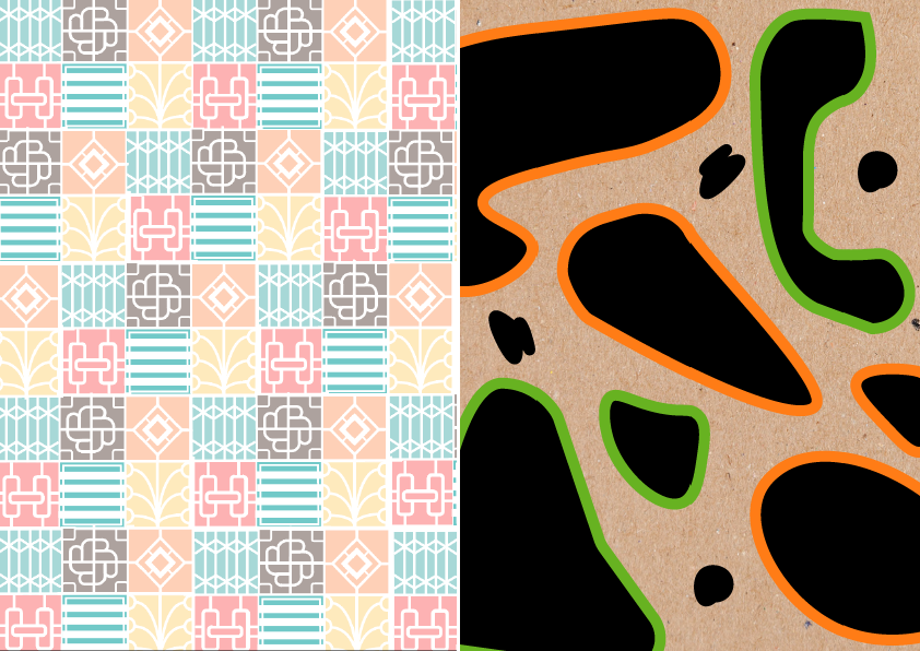
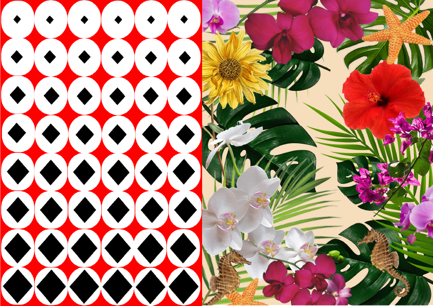
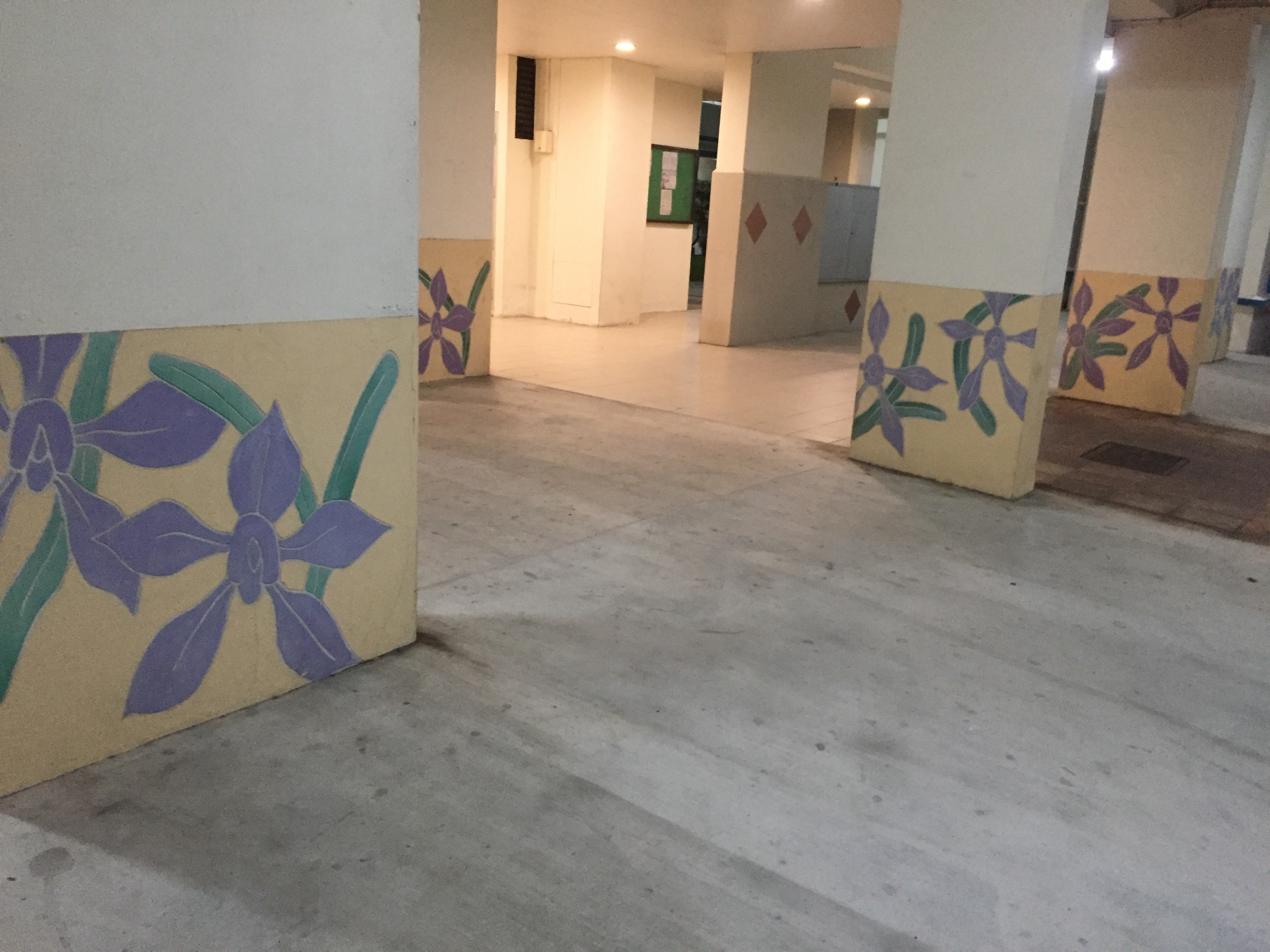
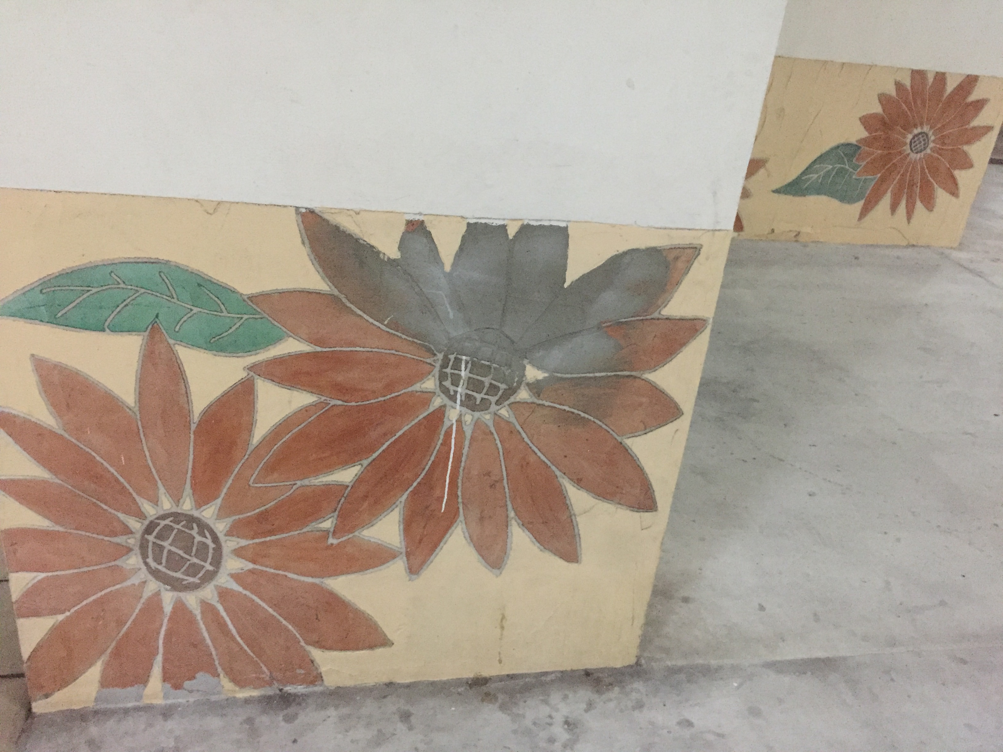
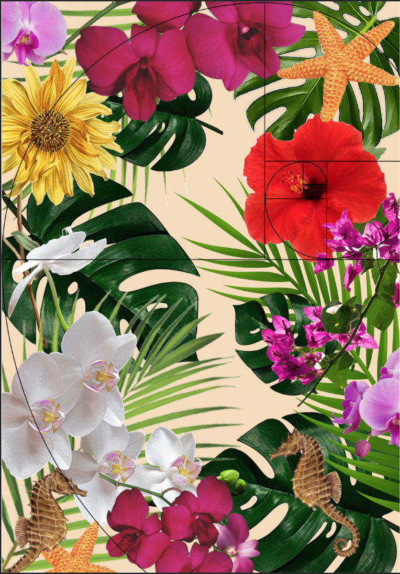
Page 5 – Cassia crescent
Exploring a little outside Dakota Crescent, I came across this area called Cassia crescent. What I thought was unique about this place is that the pillars of the each of the HDB block had its own unique design,mostly paintings of flowers. I wanted to stick with a floral theme for the next pattern, so I began to find images of the flowers I saw with transparent backgrounds and compiled them together.I arranged them in chronological order of them being seen following the golden ratio.
Page 6 – Crowd
When I went to Dakota during the night time, I realised it was much more happening and there was more human activity as compared to the day time.Inspired by the geometric shapes around Dakota,I used a circle paired with a square in the middle to represent a person.As the pattern progresses from the bottom to the top, the squares get smaller but the circles remain the same.This is to create a gradient effect similar to how the crowd in Dakota thins out from night to day.
Page 7 – Openness/Spaciousness
Since old Kallang airport used to be at Dakota, the blocks were built to be low rise to accommodate for the jets to fly by. As the area is also undergoing redevelopment,there are lots of open patches of land for future construction. The openness of the sky and the amount of space there was around me inspired the design for the next print.
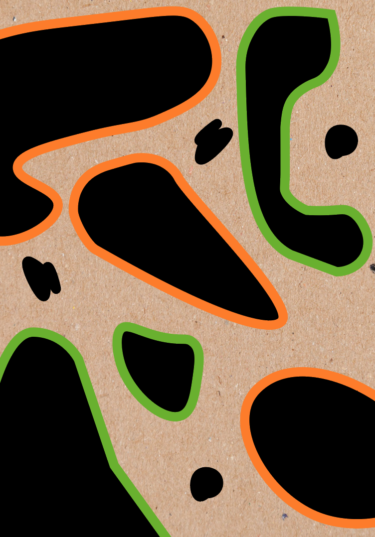
I selected a brown-toned recycled paper background for this print as it gave off that natural earthy vibe that was present in the grass around me.I took a picture of the landscape from a high point and drew free form shapes of the land. I outlined them in orange to represent the land undergoing construction as the soil had a orange hue and the grass was destroyed,whereas the shapes in green had its grass intact. I added the smaller shapes to represent the trees and also to create more balance with the negative and positive space within the design.
FEEDBACK
- Improve on paper quality/Craftsmanship
Paper quality was too thin and flimsy, thicker paper similar to paint catalogues could have been used .
- Not site specific
I feel that my zine is mainly abstract images , So my perception of Dakota is based on my explanation of it. Although, the floral print could have been further improved as they were pretty literal as compared to my other prints. Maybe instead of using the flowers themselves, play with their colour or shapes instead.


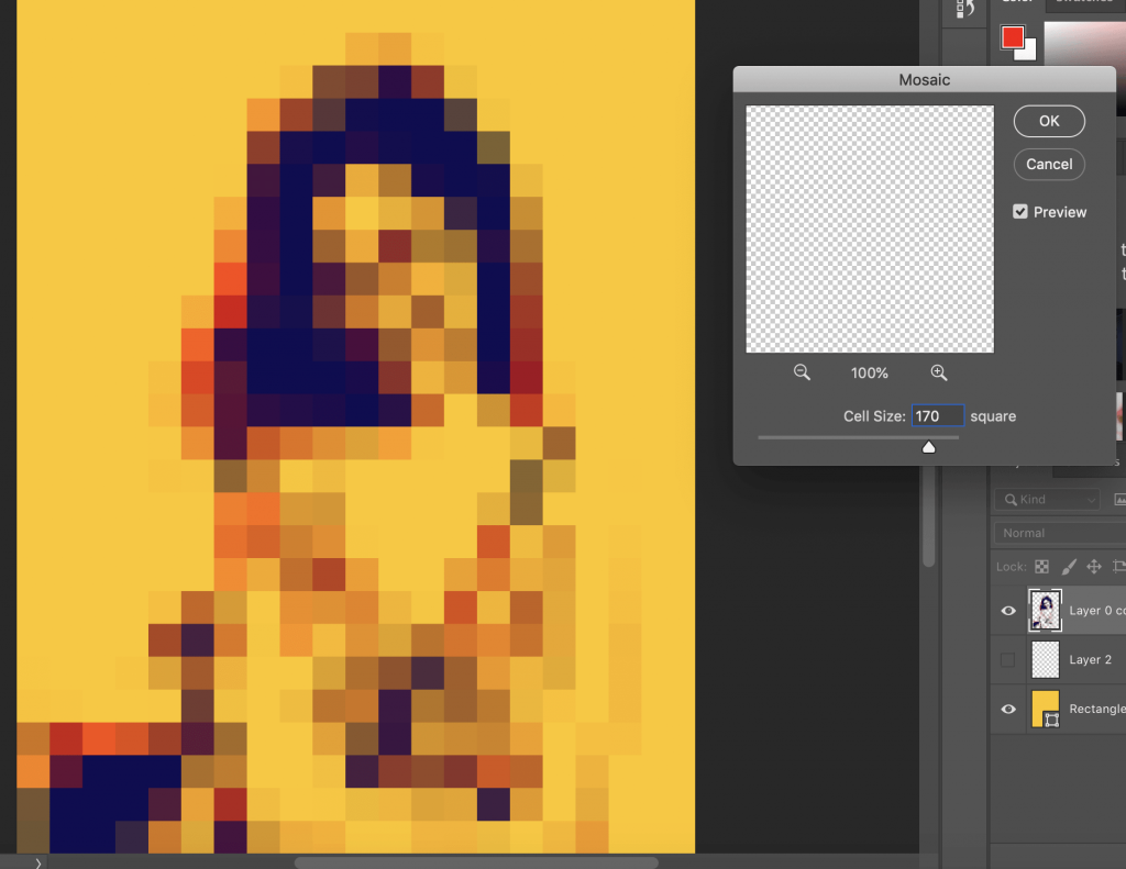 Cell size :170
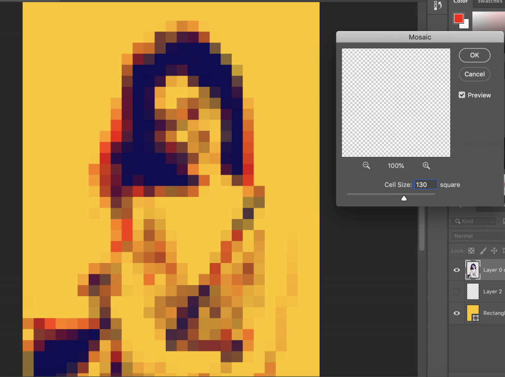 Cell size:130
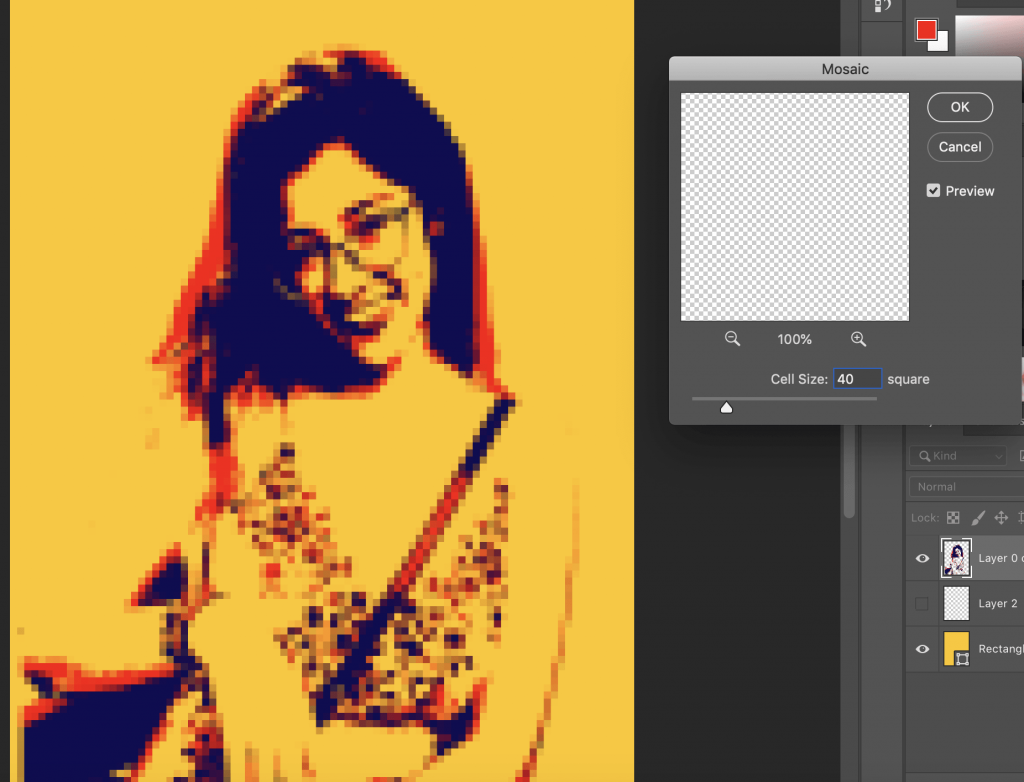 Cell size:40
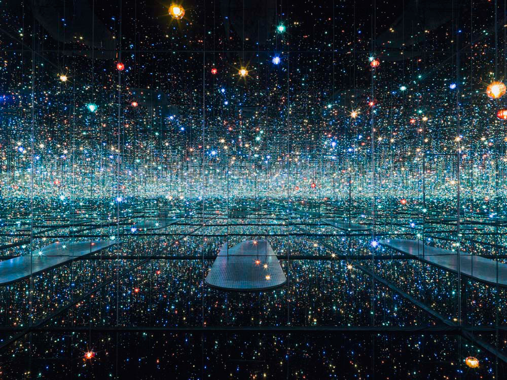
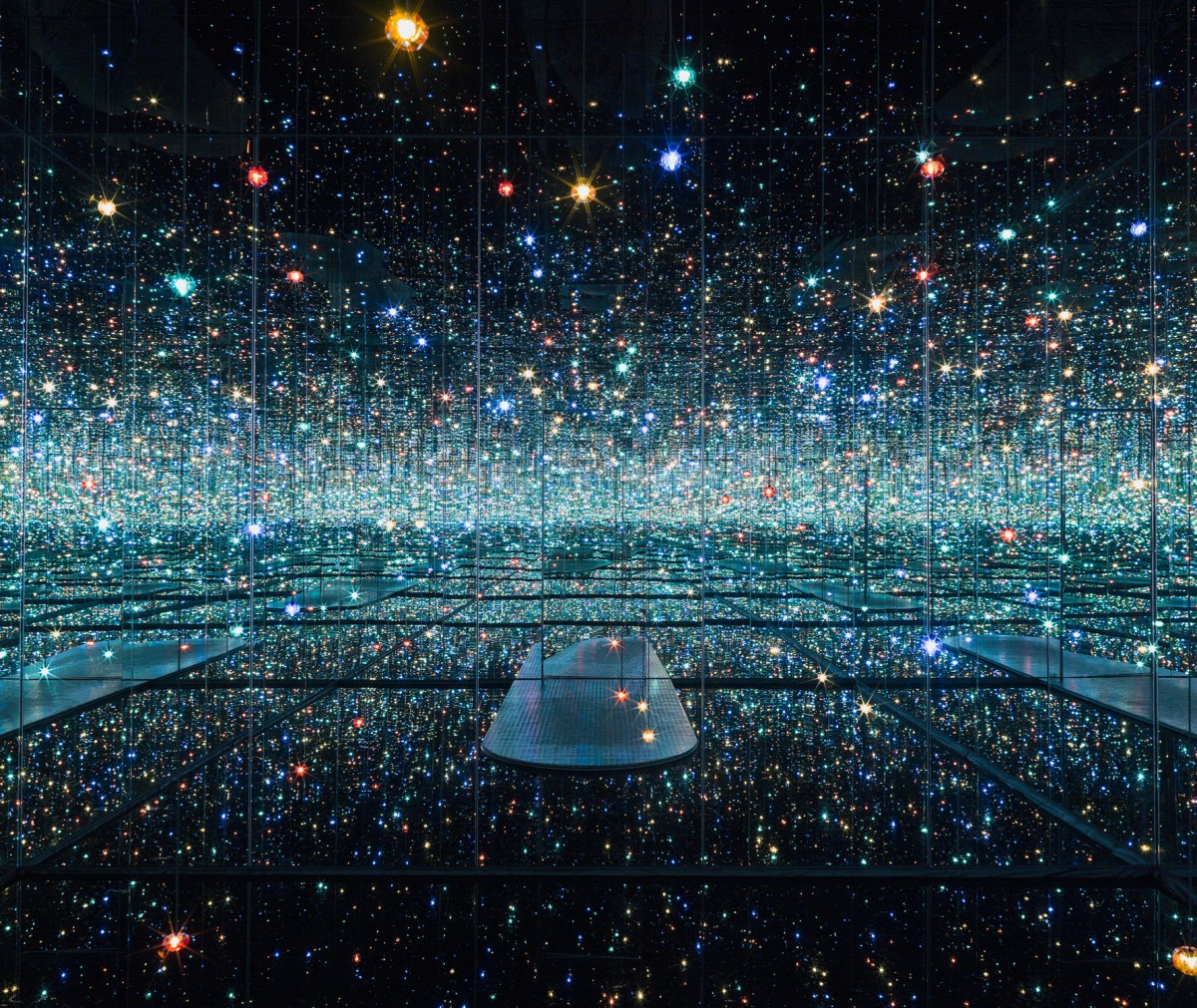 Image from: https://www.thebroad.org/art/yayoi-kusama/infinity-mirrored-room-souls-millions-light-years-away
/https://public-media.smithsonianmag.com/filer/20130318034045flight-crop.jpg)


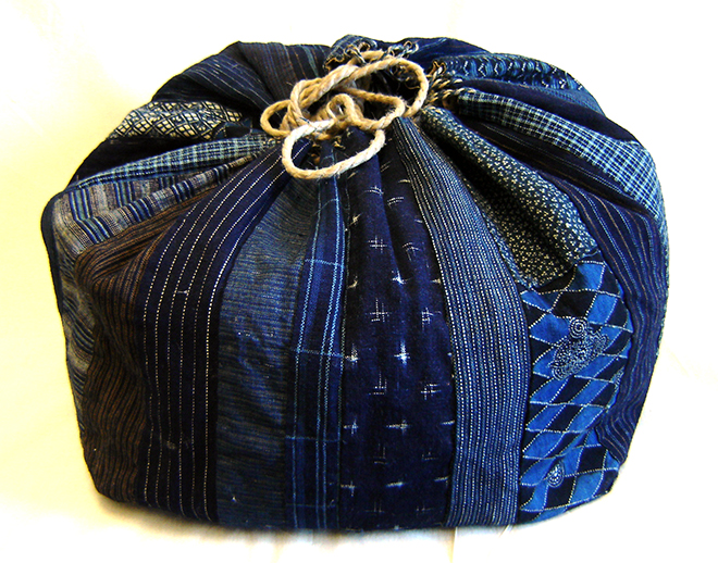
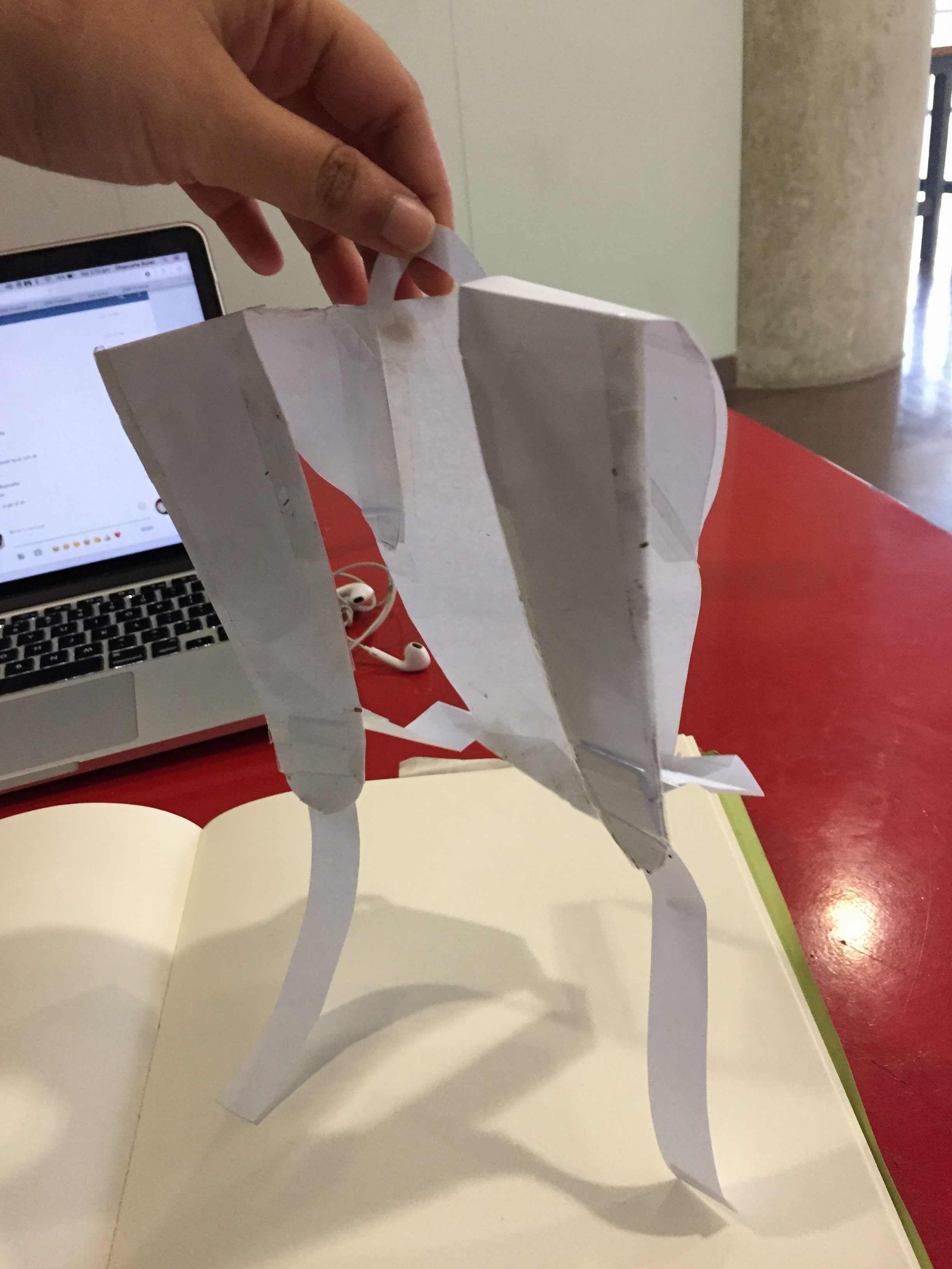
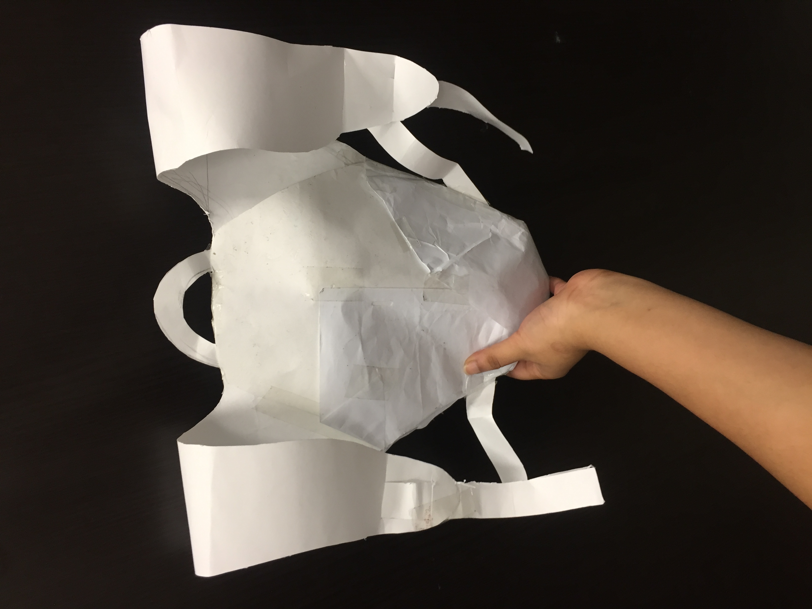
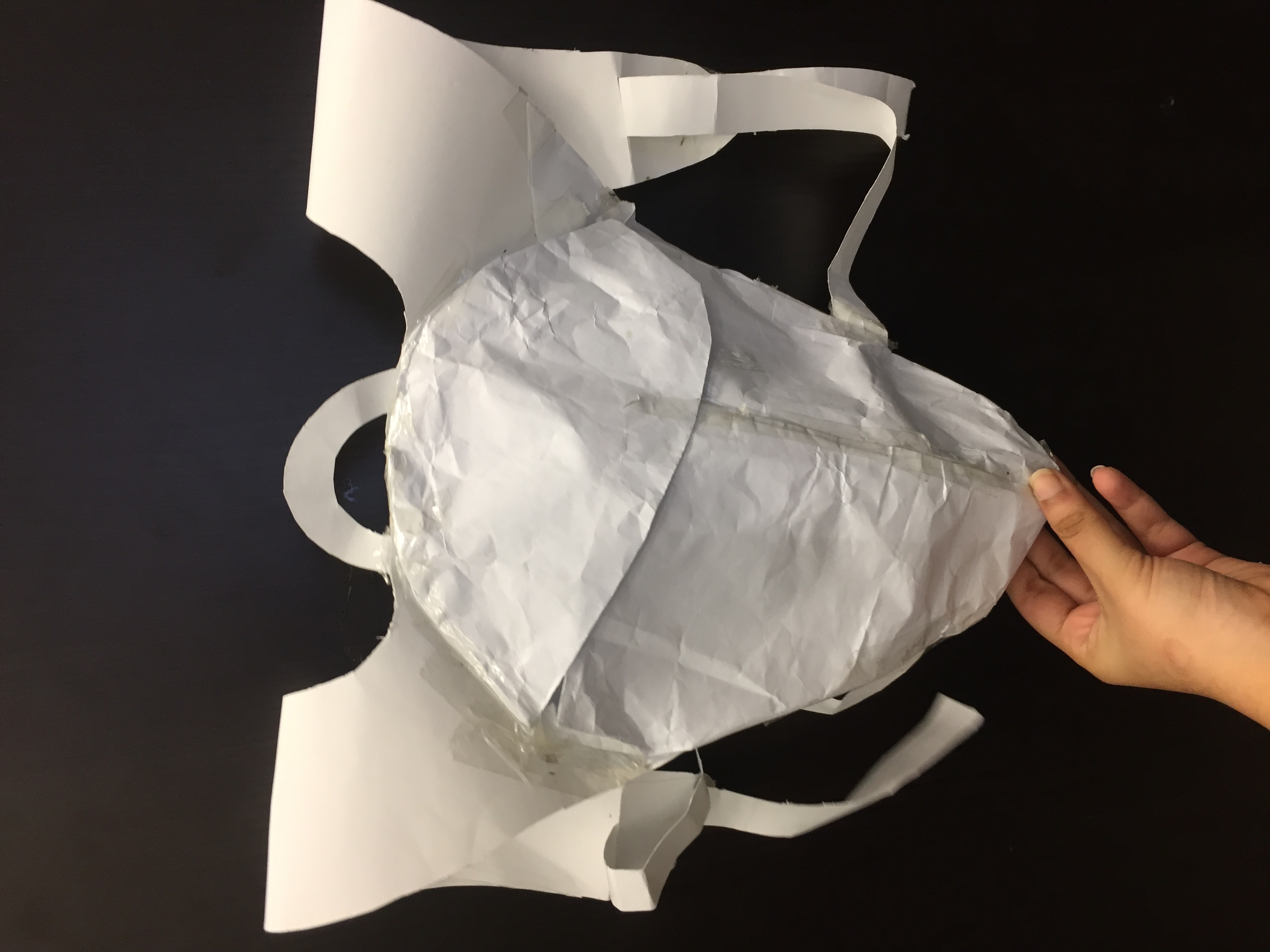
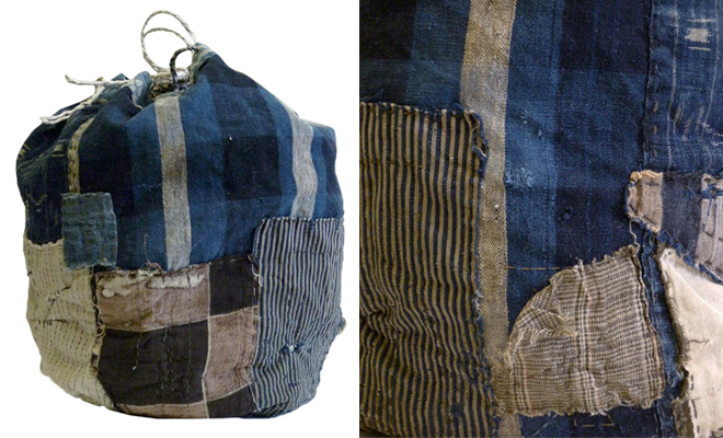 Komebukuro bag
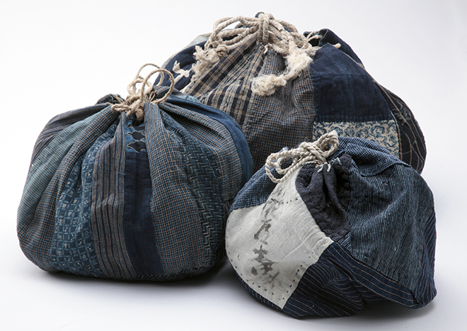


 Most of my sketches ended up being inspired by a rabbit and I also noticed they were pretty spherical in structure.I already worked with spheres last semester so I decided to work with more rectangular ones instead.I thought of combining the idea of propping up the phone with the two rabbits (topmost pic) with a boombox speaker inspired design. I proceeded to sketch out more designs for the boombox base and picked out the one I liked the best.
 The base would contain the iPhone dock and speaker and the two rabbits would light up according to the music.I had some difficulty visualising my design in 3D in terms of scale and from the side view of the product and I felt that drawing on the foam with the iPhone measurements helped a lot.From here I decided to improvise my design along the way.
 The base was relatively easy to make.I cut the foam into a rectangular block, based off the measurements of the iPhone.Then I Cut a well in the middle of the base to act as the iPhone dock.The iPhone would be plugged into here and it would rest on the ears of the two bunnies.To make the bunnies,i started off with a rectangular block, and marked out where i want the ears to be and how tall i wanted the body to be.From there I cut off the excess with a foam cutter and sanded the rest to the desired shape.


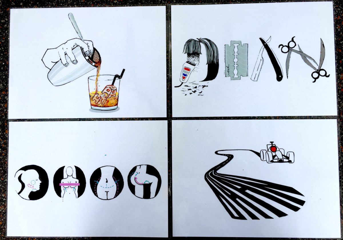

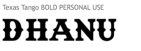
 In Project 1, we were tasked to express 4 jobs via typography. Since the project gives us a lot of freedom in the jobs we could explore, I narrowed it into these jobs: Plastic surgeon,Barber,Race car driver and Bartender.For each job I proceeded to create a mood box and select a few colour schemes, to give me a starting point in my research and also for some inspiration.
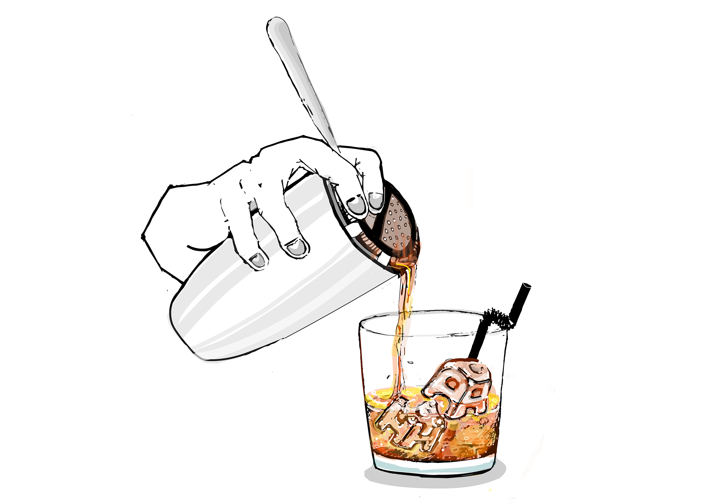
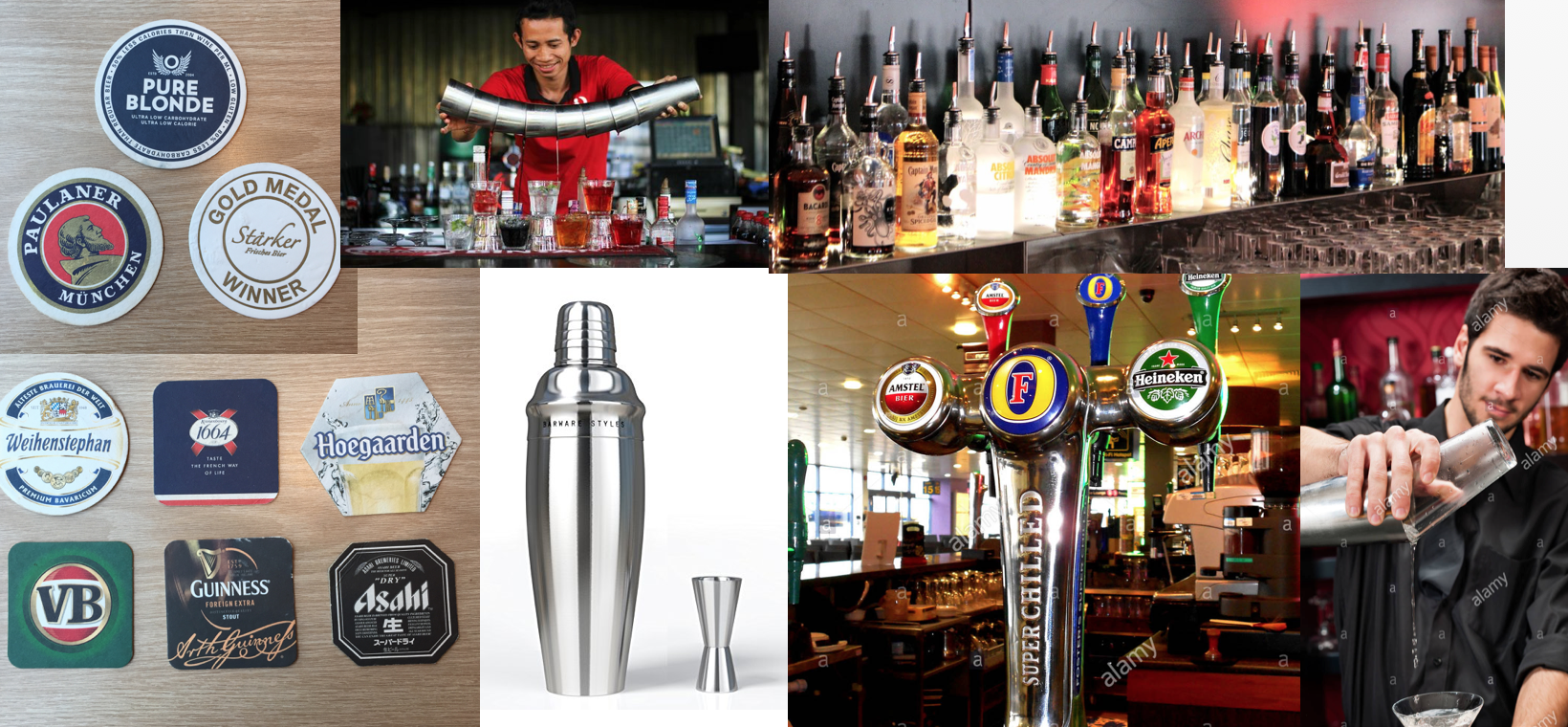 For this composition,I was inspired by how bartenders perform tricks and mix different types of alcohol using their cocktail shakers. Also the alcohol bottles comes in a variety of colours and forms which provide me more material to see patterns .Font wise,i decided to use some of the coasters I've collected from bars to give me an idea of what font to base my design off. I notice from the coasters that font varies from Thick and bold, cursive and elegant and thin.The colour scheme I've selected for this design is based off the colour of whiskey,which comprises of mainly orange,red,and yellow.
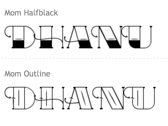
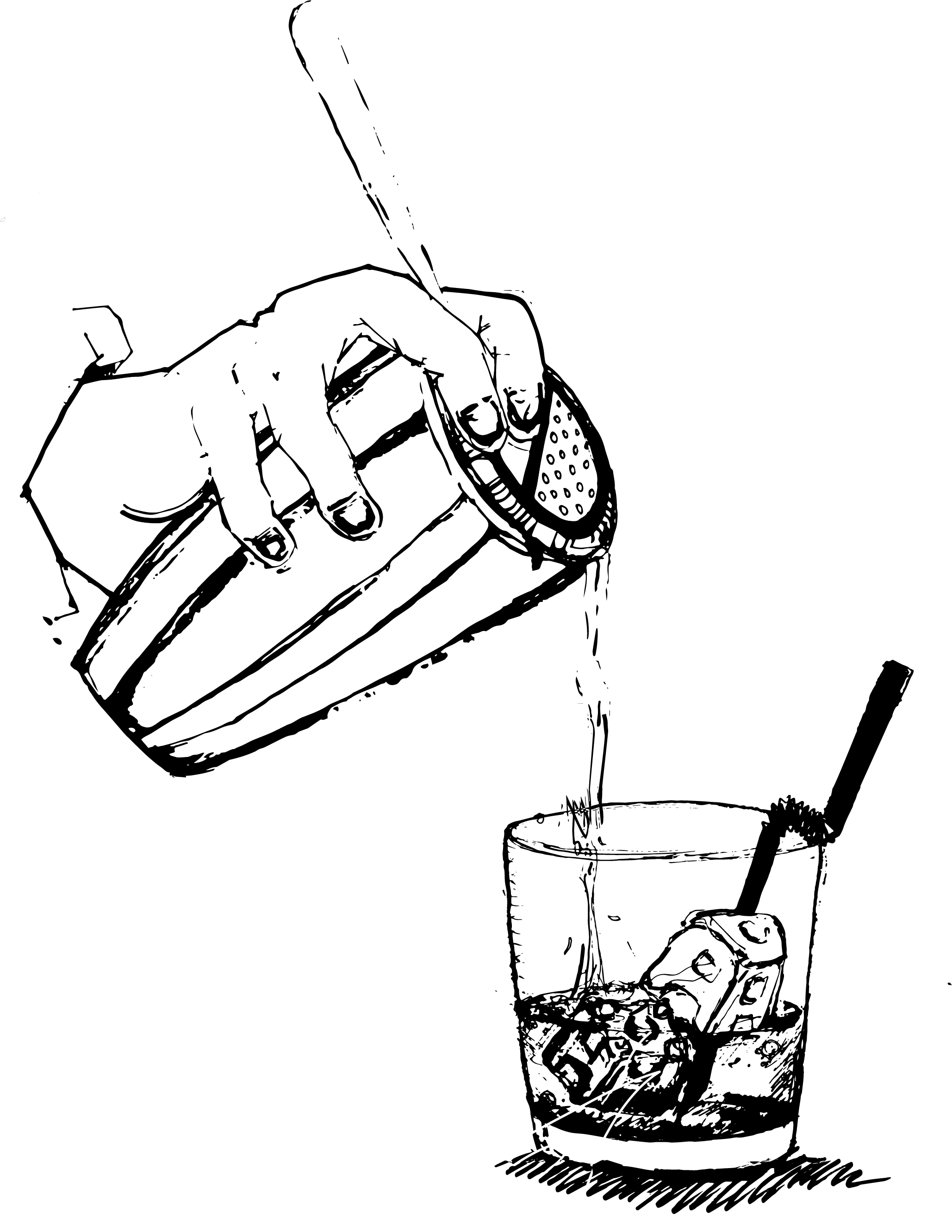 There was too much details on the cocktail shaker drawing attention away from my lettering,thus the letter D was drowned out.I decided to thicken the line quality for the D H and A, and removed the unnecessary details from the ice cubes and shaker making my name more prominent in my design.Orange is an energetic colour and pops compared to grey which is dull and recedes into the background.I coloured the lettering in orange to bring it out more.
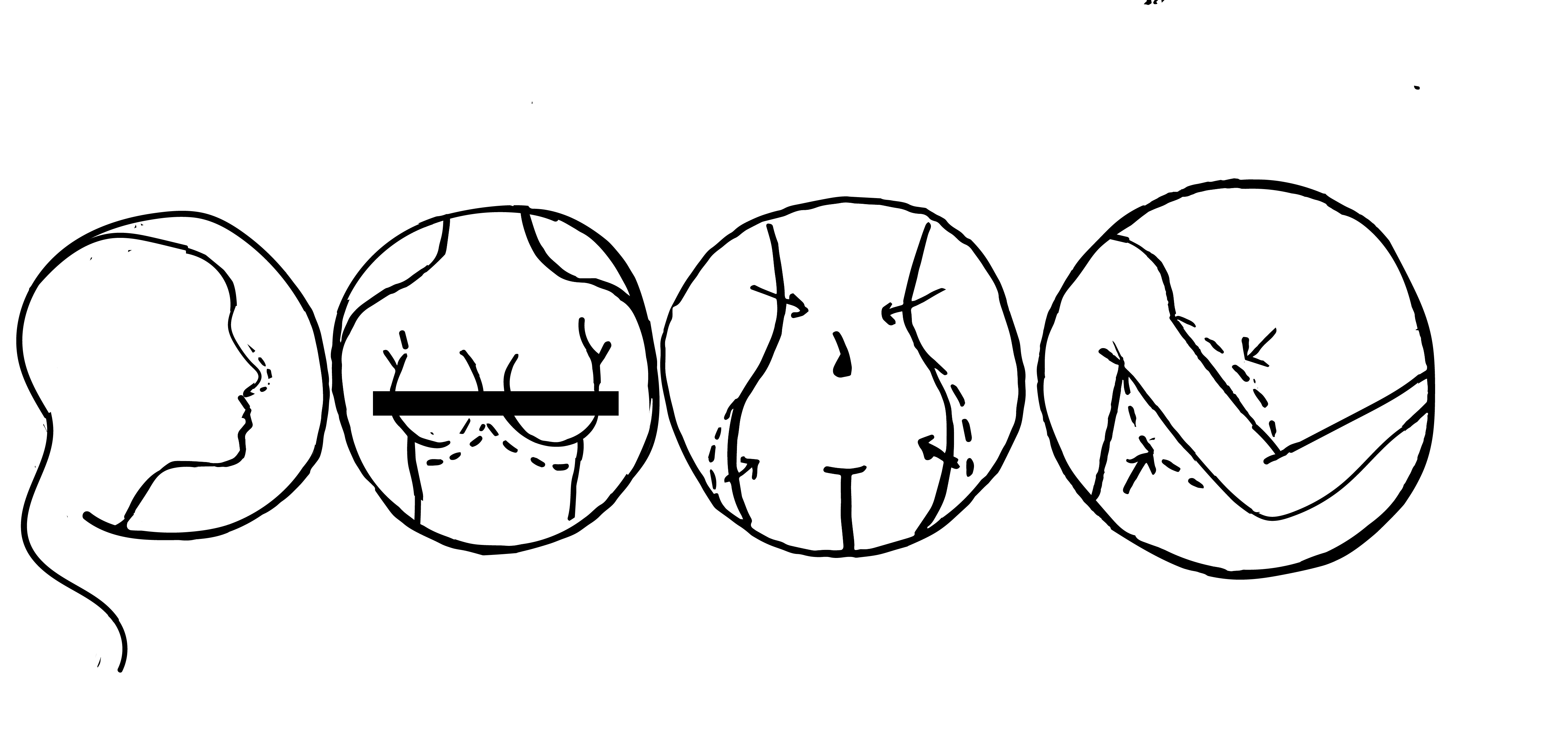
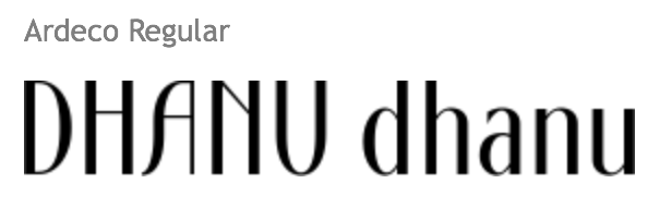
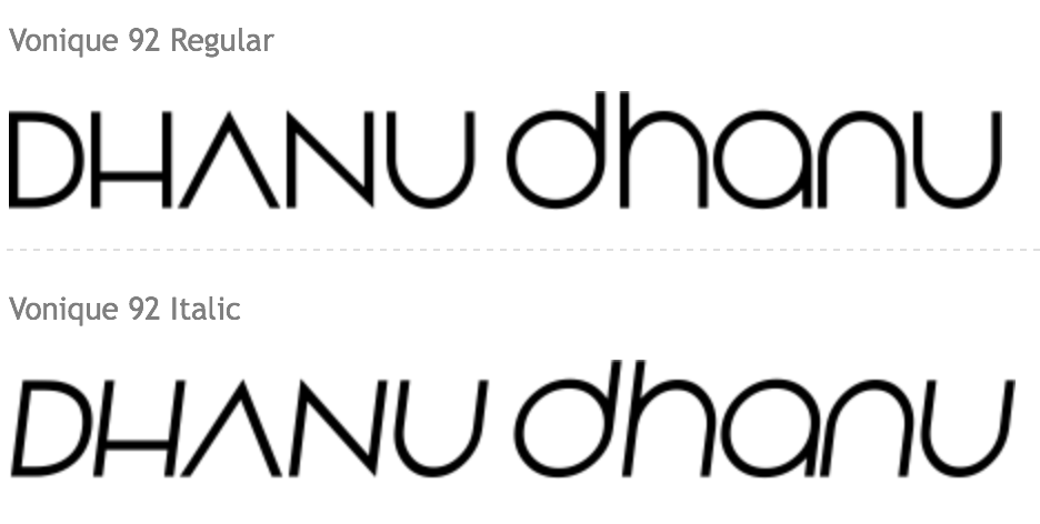
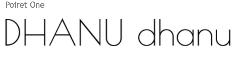
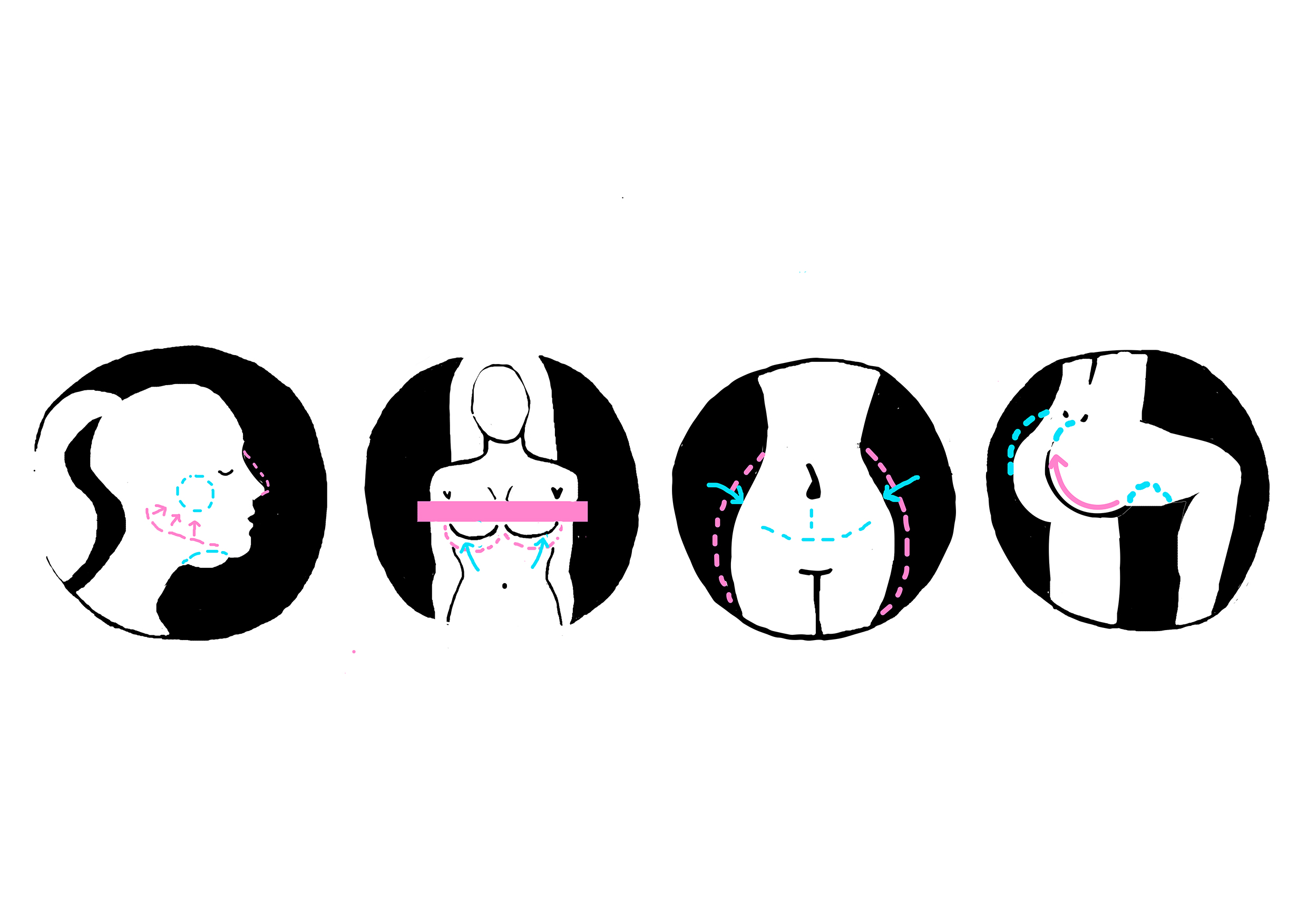
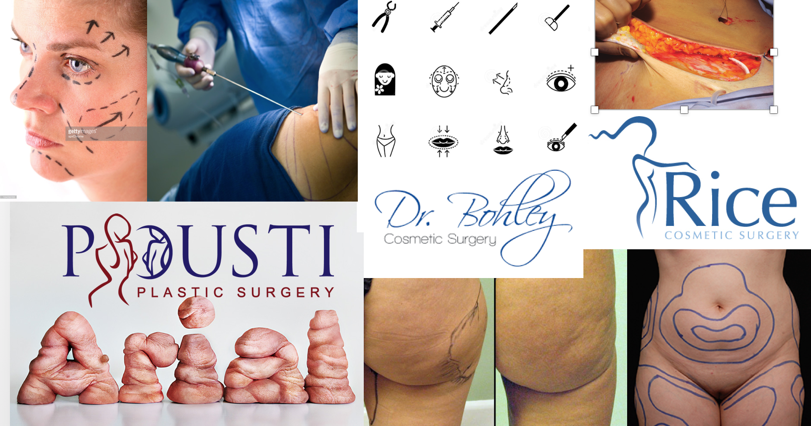 When I think of plastic surgery,liposuction,lip fillers, botox and breast augmentation surgery are the few procedures that come to mind.I decided to create lettering based off of these surgeries.Cosmetic surgery focuses on "before and after" effect.The font tends to be more aesthetic,whereby the fonts are more elegant,clean and minimalistic with more 'curves'.Pink is sometimes used in the logos as it is a feminine colour,while teal gives off the normal clinic/medical vibe.
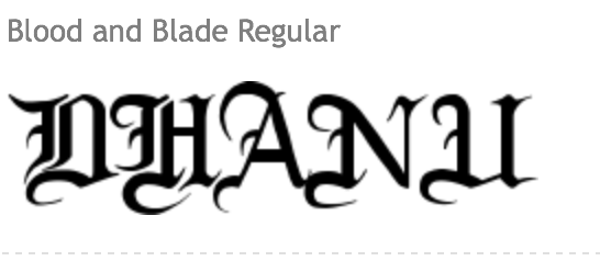
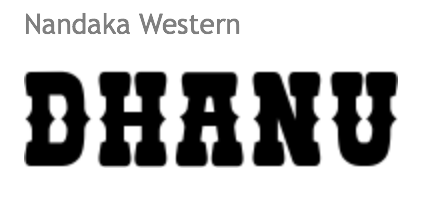
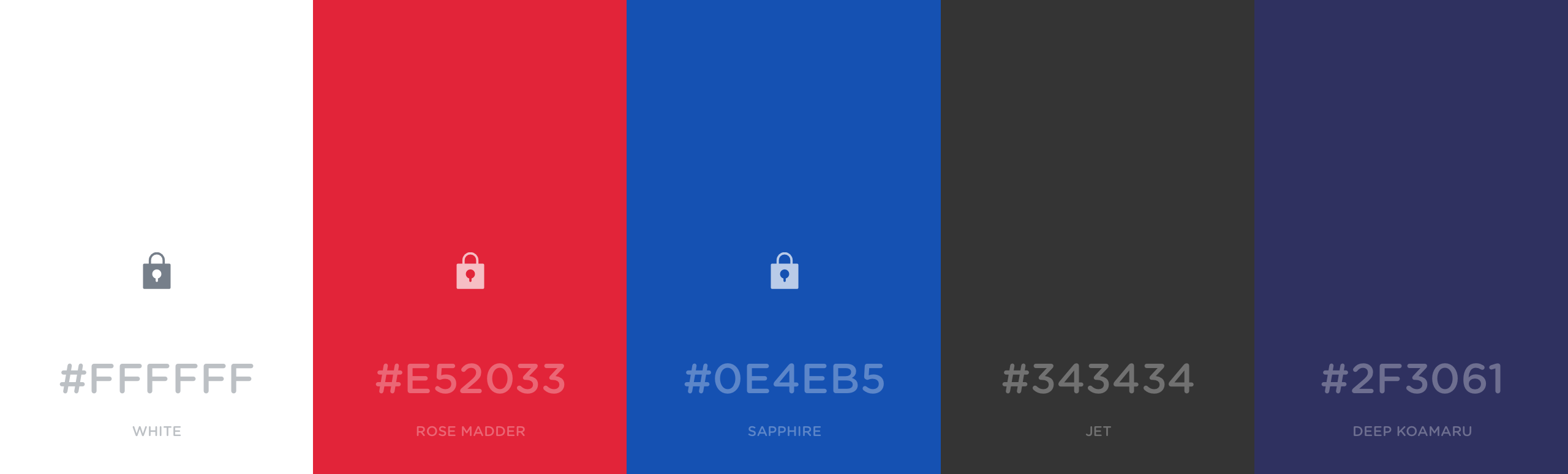
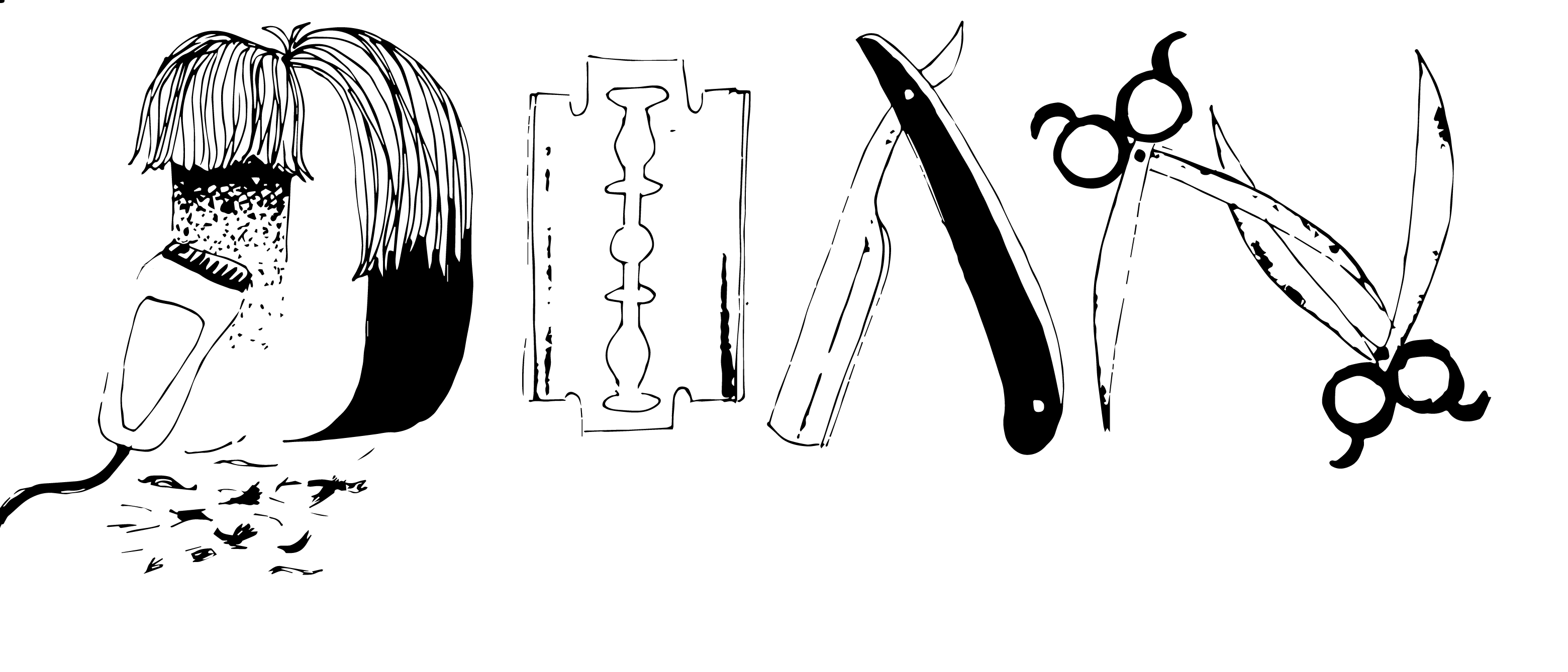
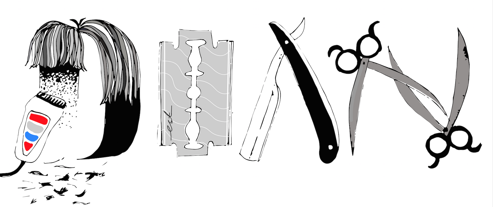
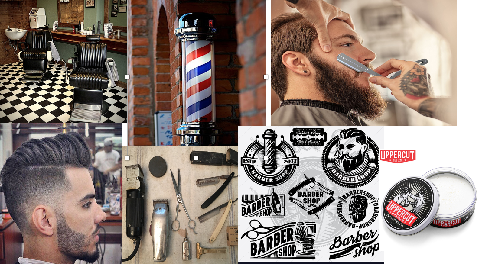 Emblematic logos seem to be a running theme when I looked into barber shop logo designs. An emblem logo consists of font inside a symbol or an icon; think badges, seals and crests,which means that within the emblem itself,there are repeating motifs:scissors,combs,razors..etc. The font tends to be capitalised and bolded with minimal spacing between the letters.For this composition I decided to create my initials using the repeating motifs. Apart from the blue and red colour scheme normally associated with barber shops because of the barber pole,black,white and green is used.
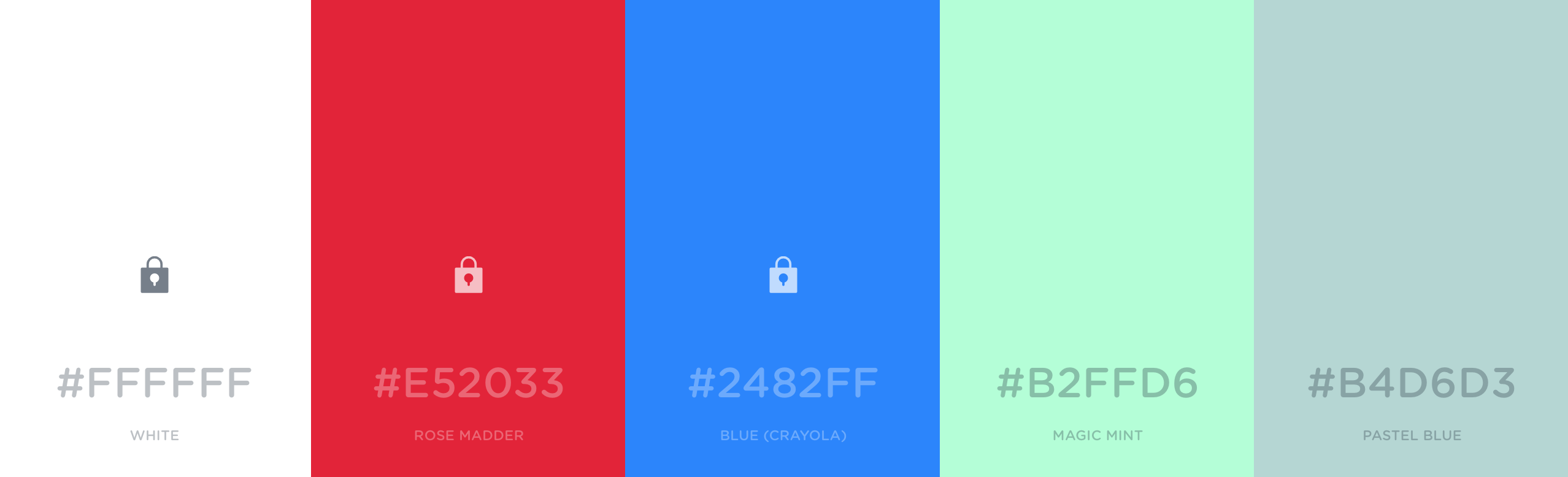
 5
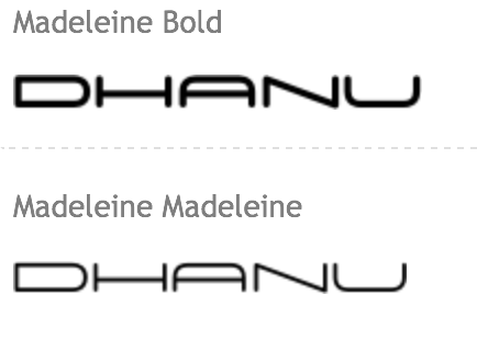
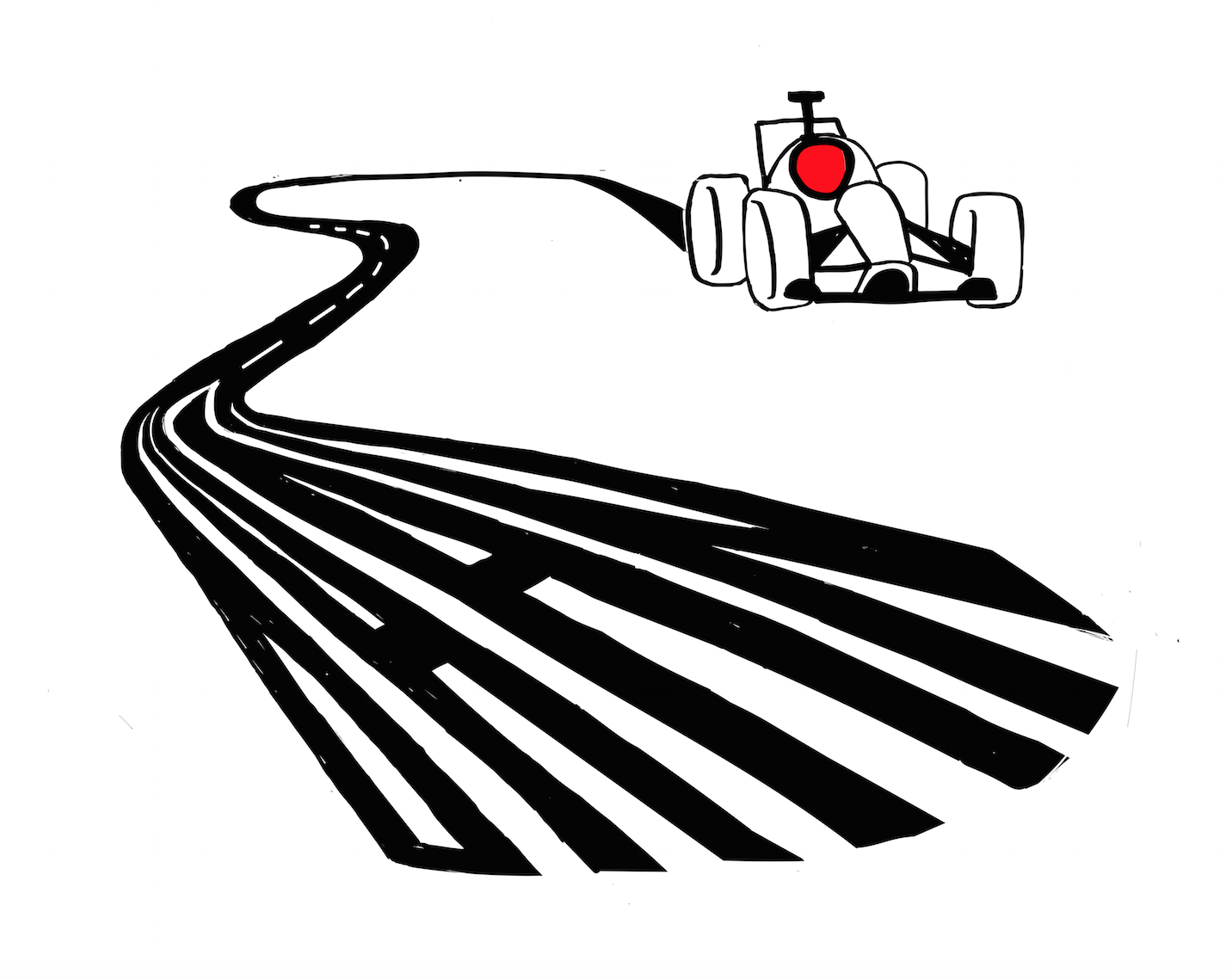
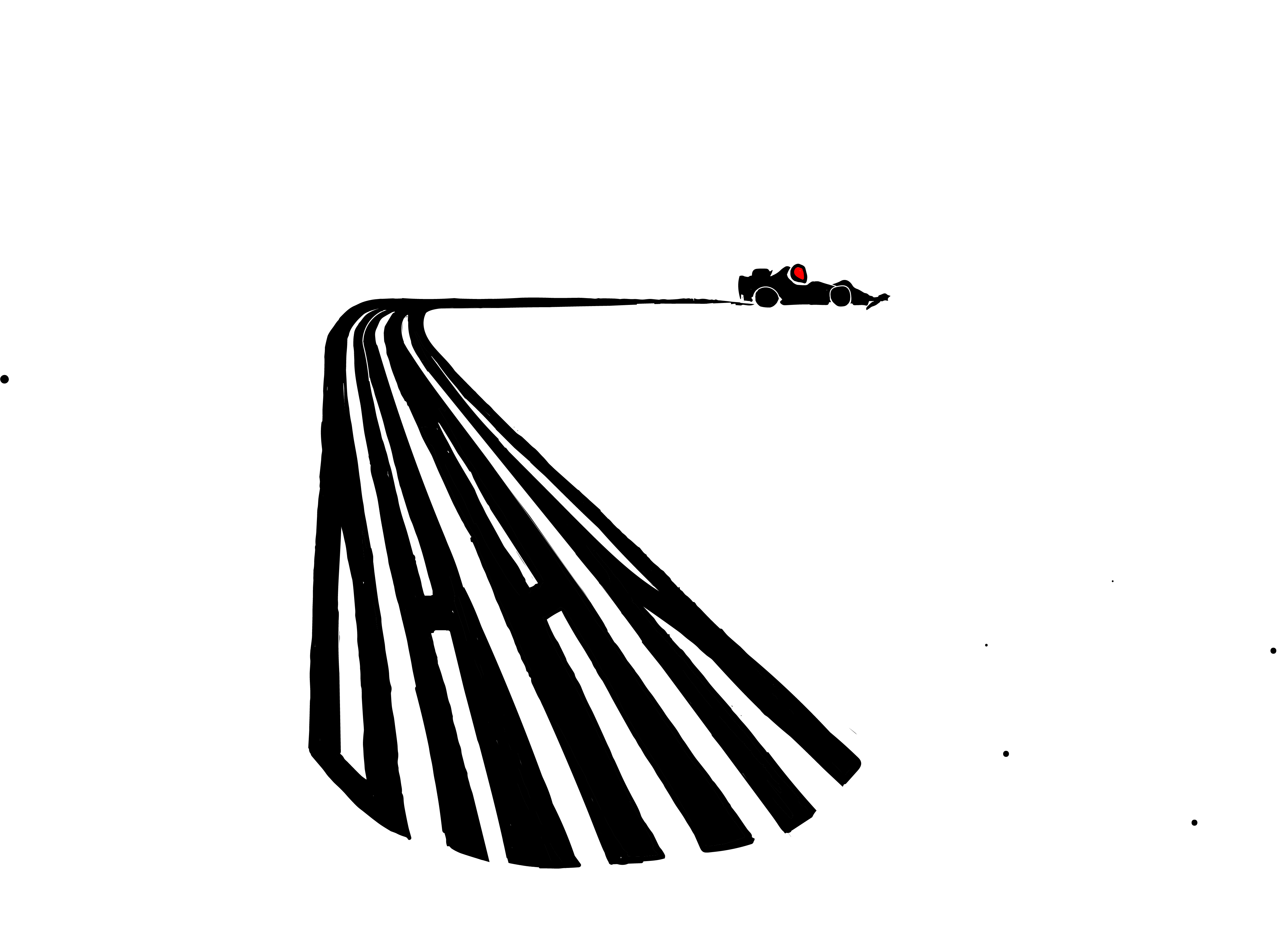
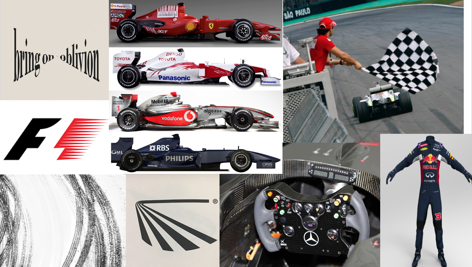
Inspired by the negative space used in the F1 logo I decided to do racer for the final composition.The F1 cars have many brand sponsors that can be seen on the drivers' suit cars itself,ranging from cigarette brands,electronic brands and even telcos.These companies' logos have fonts that tend to be minimalistic but bold,focusing on the lettering themselves.Since most of these logos are rather flat and just text,i wanted to incorporate some perspective to make the design more convincing.The colours seem to be mainly red,black and white with hints of yellow.
5
Inspired by the negative space used in the F1 logo I decided to do racer for the final composition.The F1 cars have many brand sponsors that can be seen on the drivers' suit cars itself,ranging from cigarette brands,electronic brands and even telcos.These companies' logos have fonts that tend to be minimalistic but bold,focusing on the lettering themselves.Since most of these logos are rather flat and just text,i wanted to incorporate some perspective to make the design more convincing.The colours seem to be mainly red,black and white with hints of yellow.