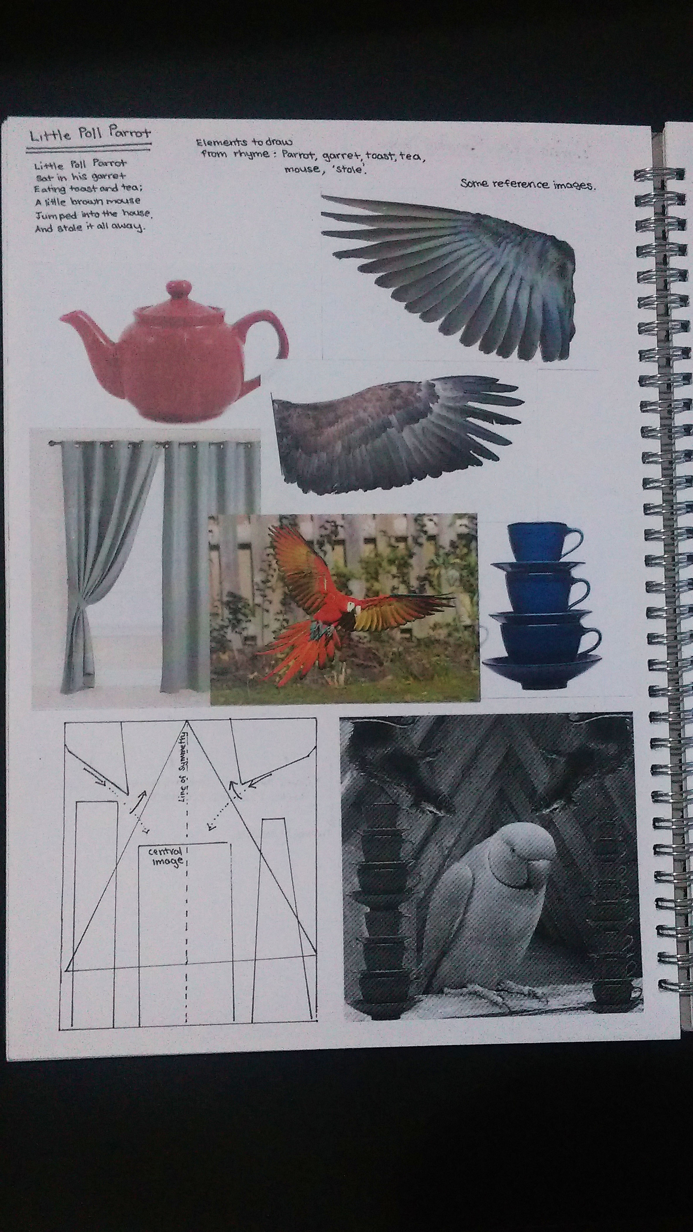
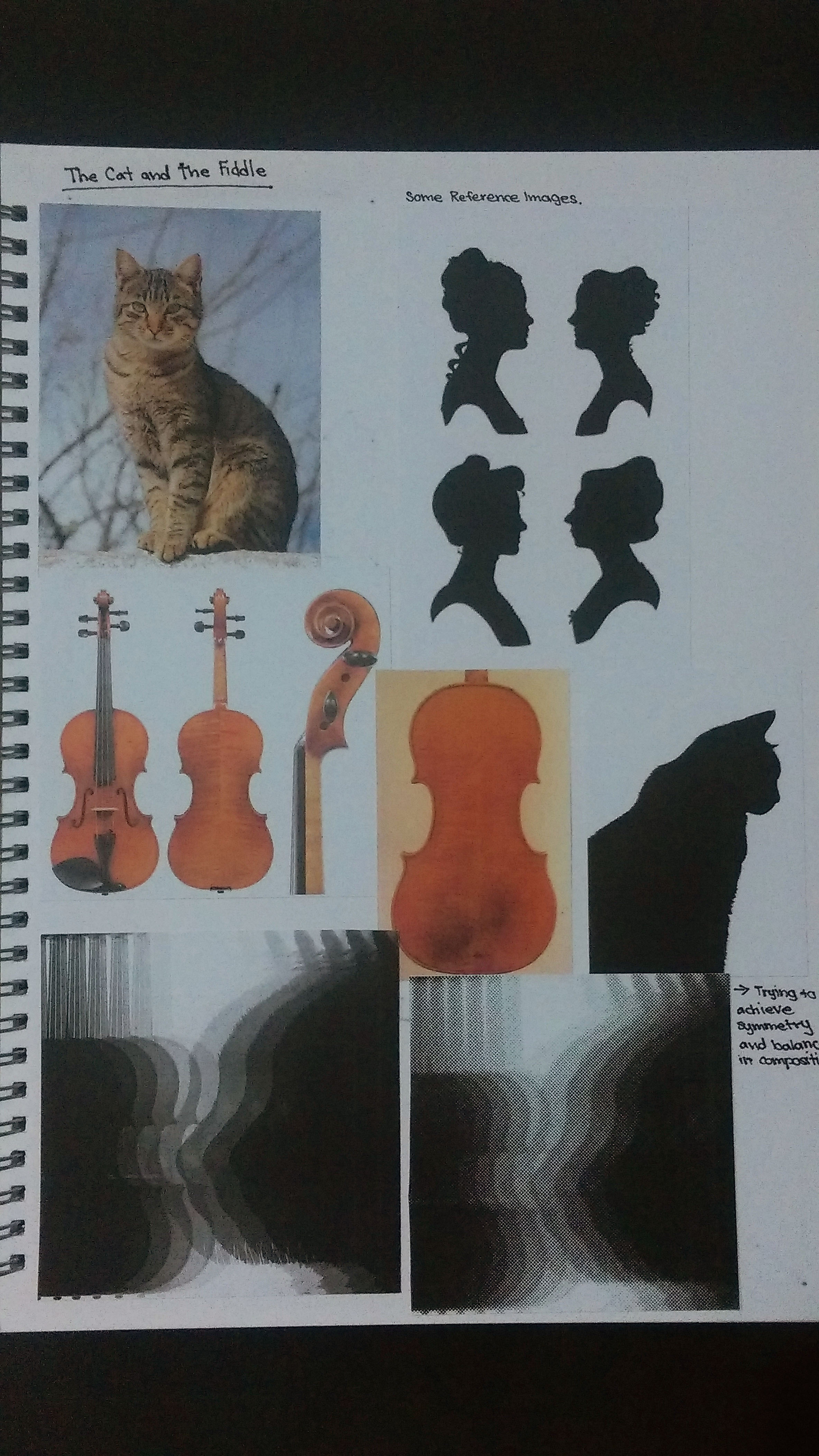
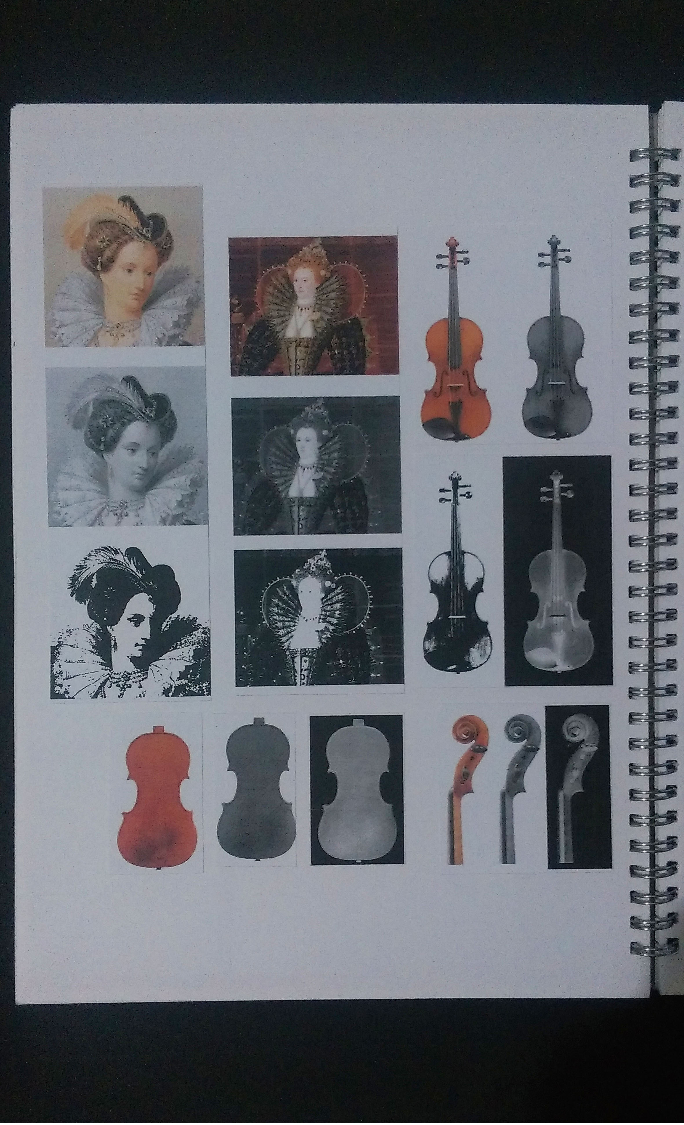
‘be strong as a rock’-Strongman
Images of my final work

Get well soon card done using Illustrator.
Size of card (pulled open): 28.2 cm x 11.15 cm
Printed on 260gsm card

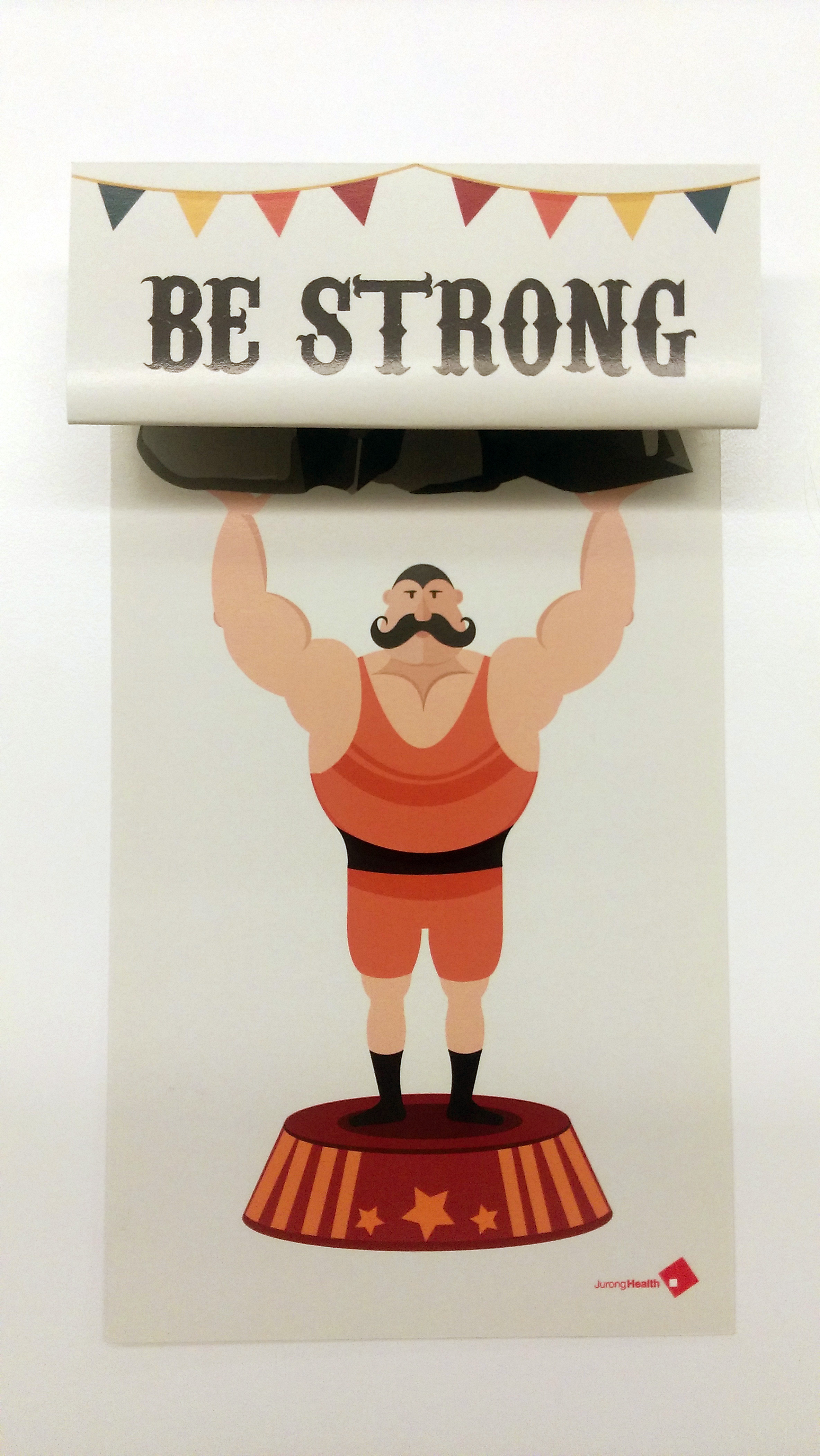


Further Comments by class: To make card stand, like a standee.
Just another Open Source Studio site
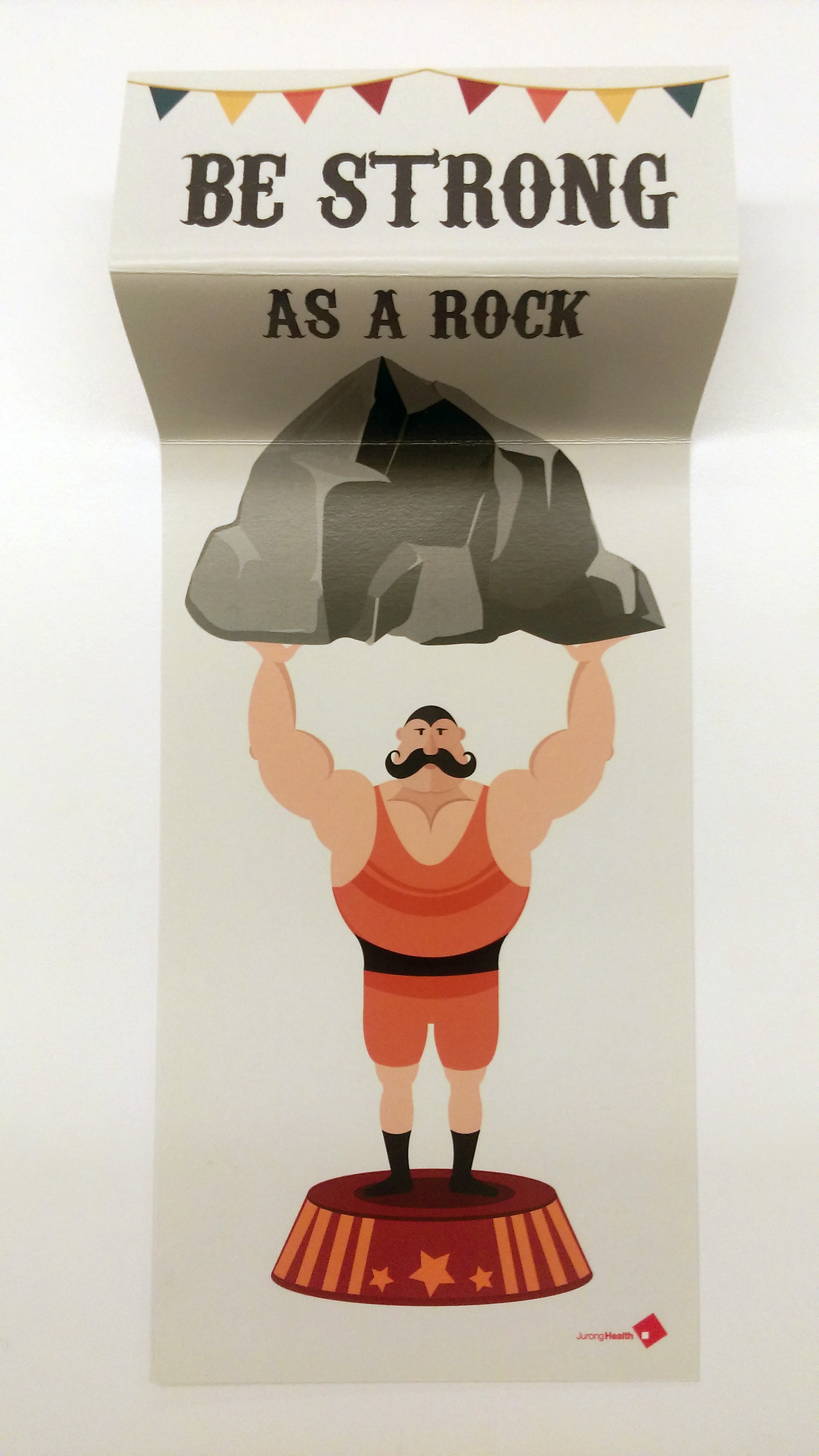
Images of my final work
Get well soon card done using Illustrator.
Size of card (pulled open): 28.2 cm x 11.15 cm
Printed on 260gsm card
Further Comments by class: To make card stand, like a standee.
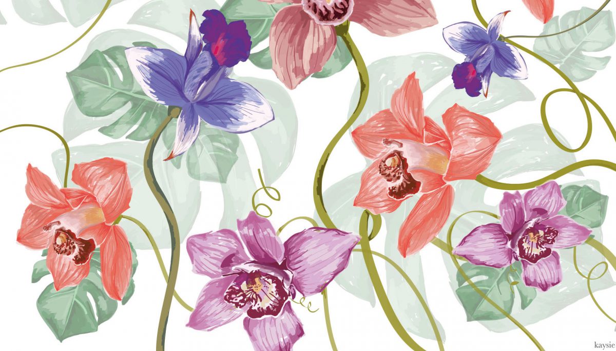
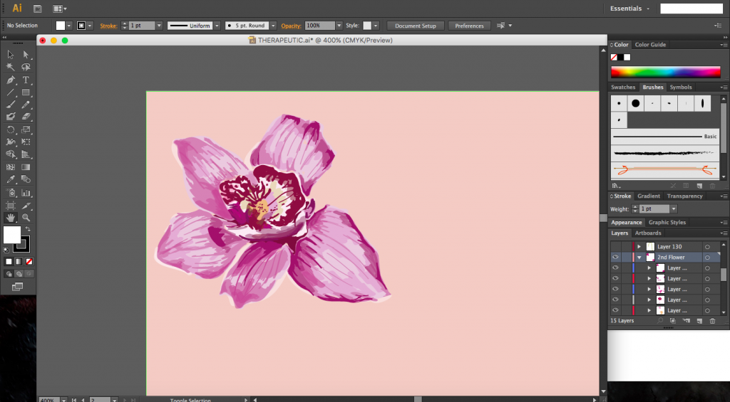
My concept surrounds the theme of nature, which has been proven to be very therapeutic. I chose our national flower, the orchid, which people would recognize, as my main element. I wanted to bring a sense of familiarity into the space though something that people could interpret easily regardless of age or background. The sense of familiarity would hopefully bring comfort in a foreign (for some) environment especially for the elderly who were my main target audience.
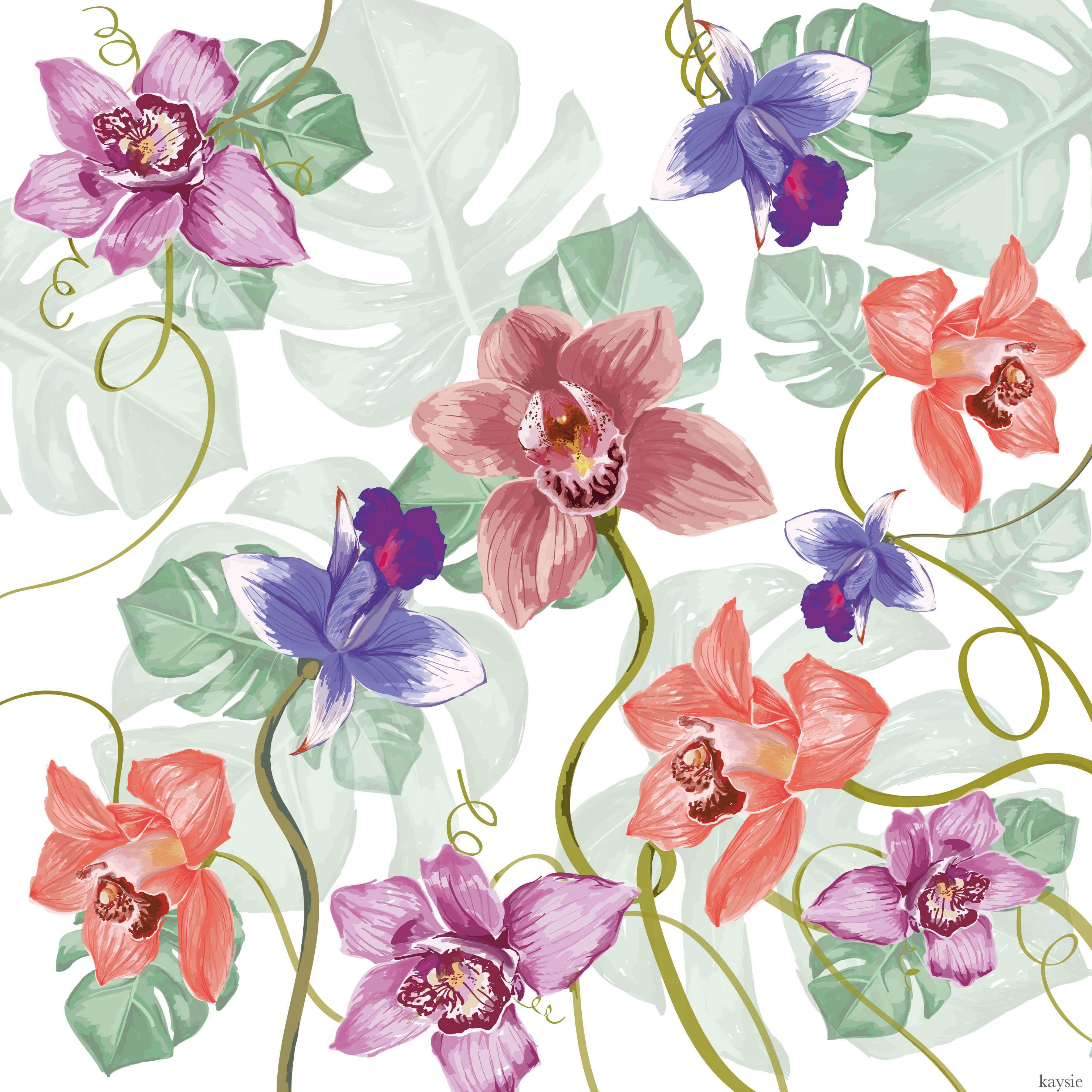
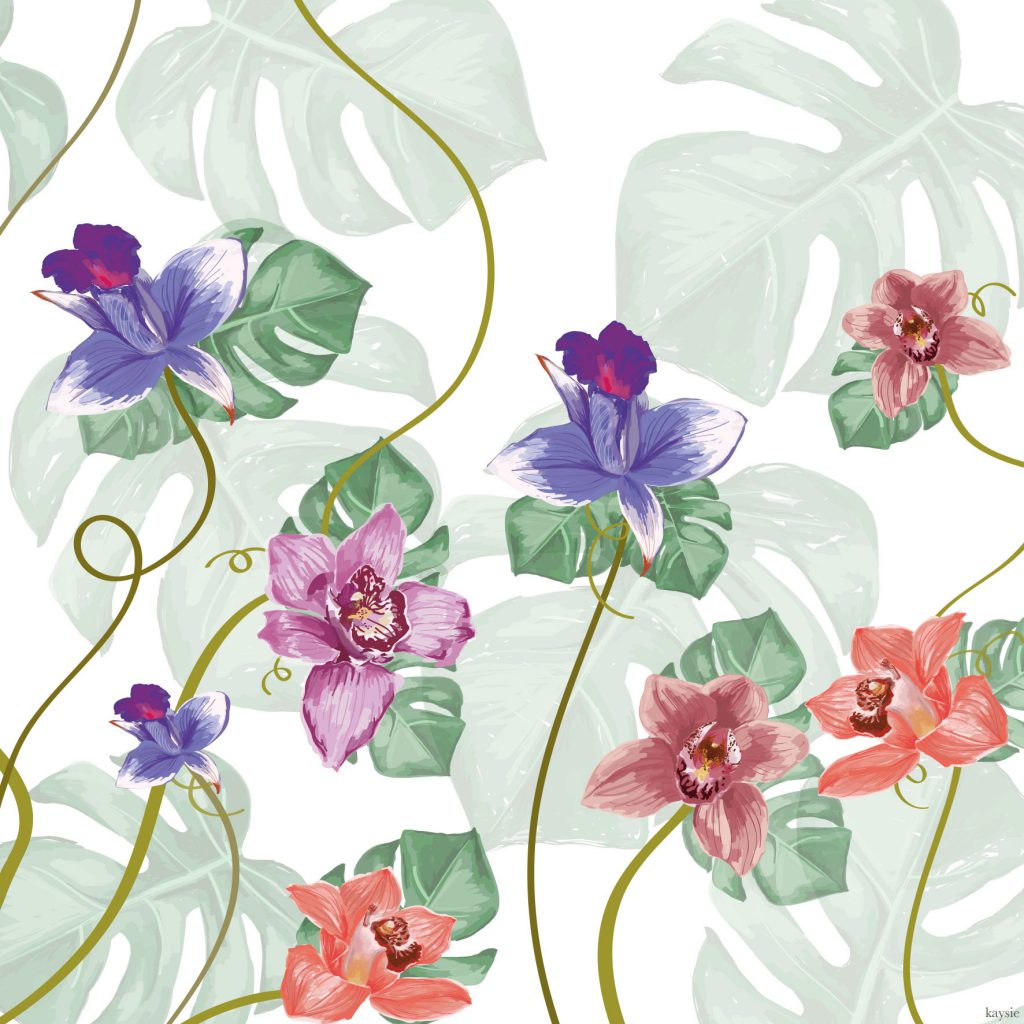
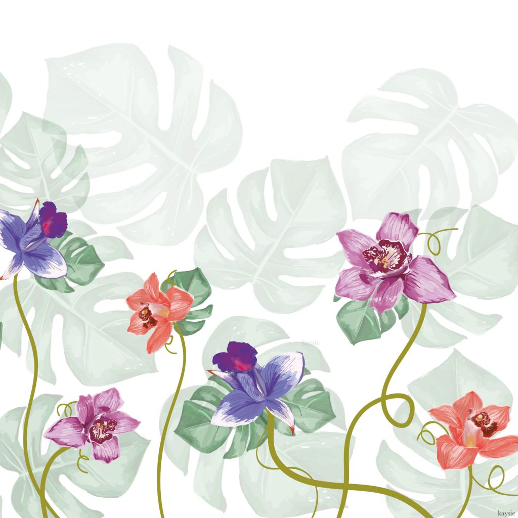

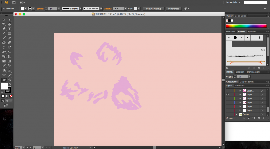
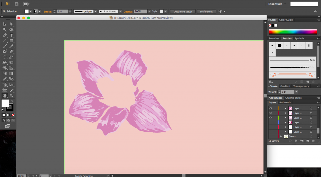
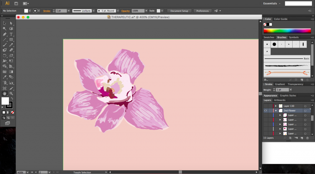
I decided to create my work digitally, painting using only Illustrator and a Wacom tablet. By slowly layering the colours from the medium shade to the lightest and then adding in the darkest shade, and changing the opacity of the shades, I was able to create a subtler look and depth. To create the full composition, I replicated the elements and varying their scale and orientation, as well as playing with the opacity.
This post will include all the usual components of my previous posts (everything will be condensed into this single post).
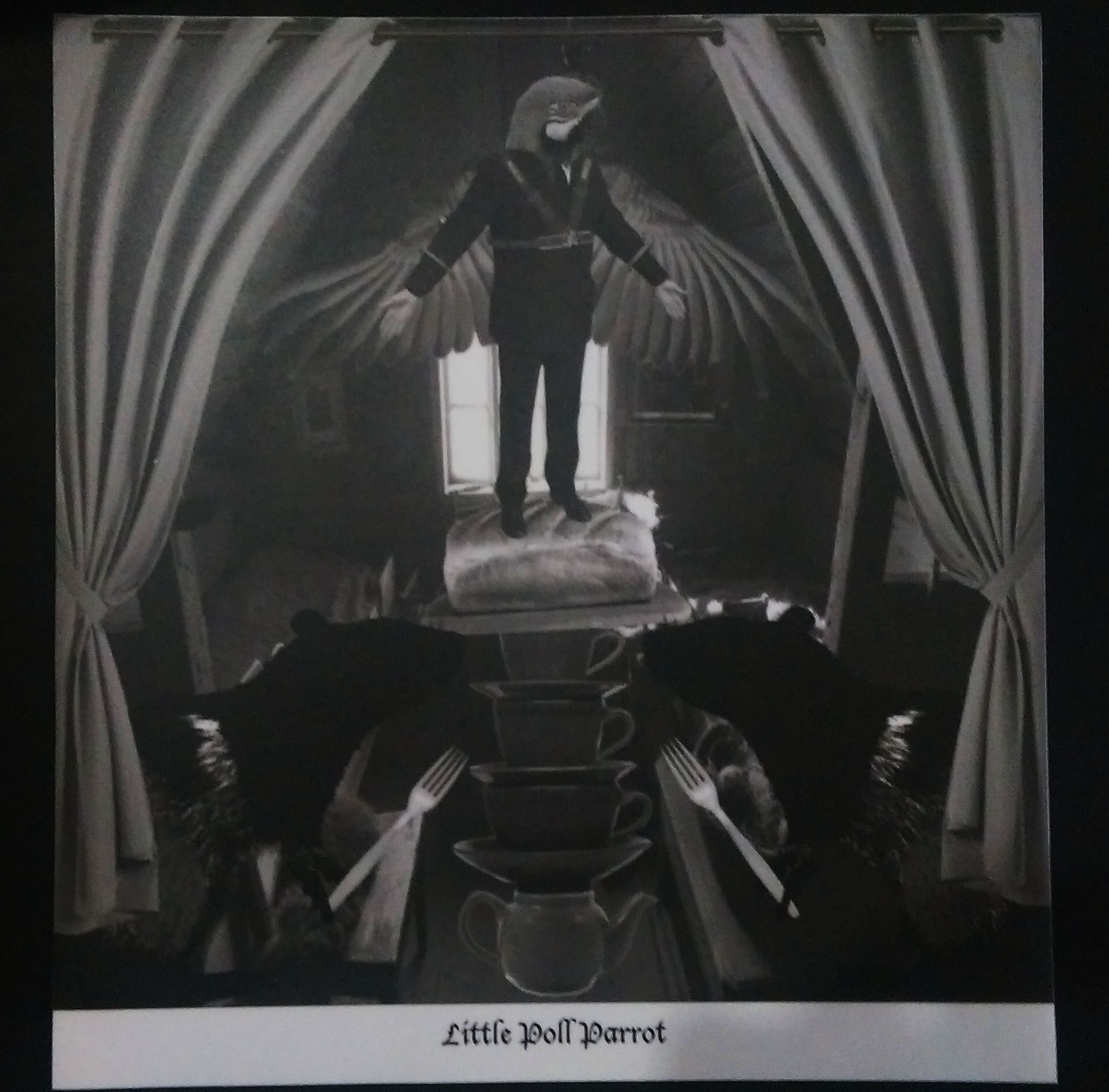
With Project 2 completed, I was fairly certain that I had fallen in love with collages, so with this new project, I decided to take the same direction and showcase my collages in my zine. However, I didn’t want to just have the images in the zine and leave it as that, I also wanted the user to experience the joy and essence of collage. What is collage? How is it done? I wanted to portray these in my zine without words.
Collage is all about layering of images to create a scene, depending on how the layering is done, a completely different image could be created, one with a different story. When I was working on the previous project, I was often faced with the dilemma of which images to layer and whether or not I should even use the layer, I guess I wanted the user to experience this as well, for them to put themselves in my shoes and try it out, though admittedly it’s not fully possible for the full experience.
I’ll just show some examples that I found while researching for zines which stood out to me.

[Image Above] Two facing pages that interact with each other.

[Image Above] Page on the left. I would consider that somewhat collage as well, I like the use of minimal colour, emphasis is placed on the coloured images.
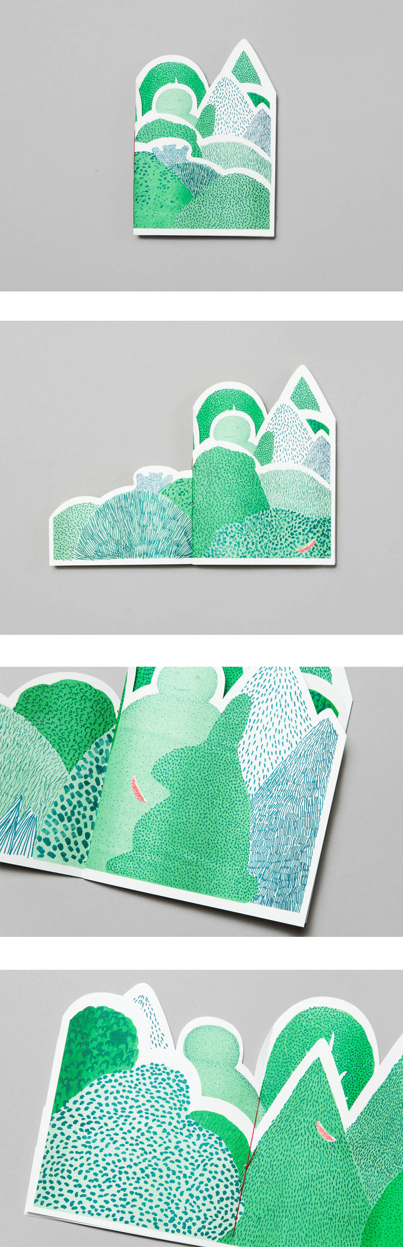
[Image Above] I believe finding this little booklet inspired me throughout this project. Each page layers on to the next page, just like how a collage works. I knew immediately that I wanted my zine to have an element like that.
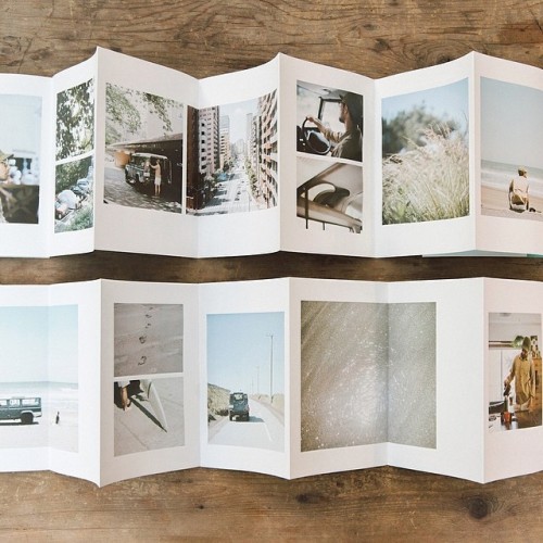
[Image Above] I just like the clean look of this, no text, just images, each with a white border.

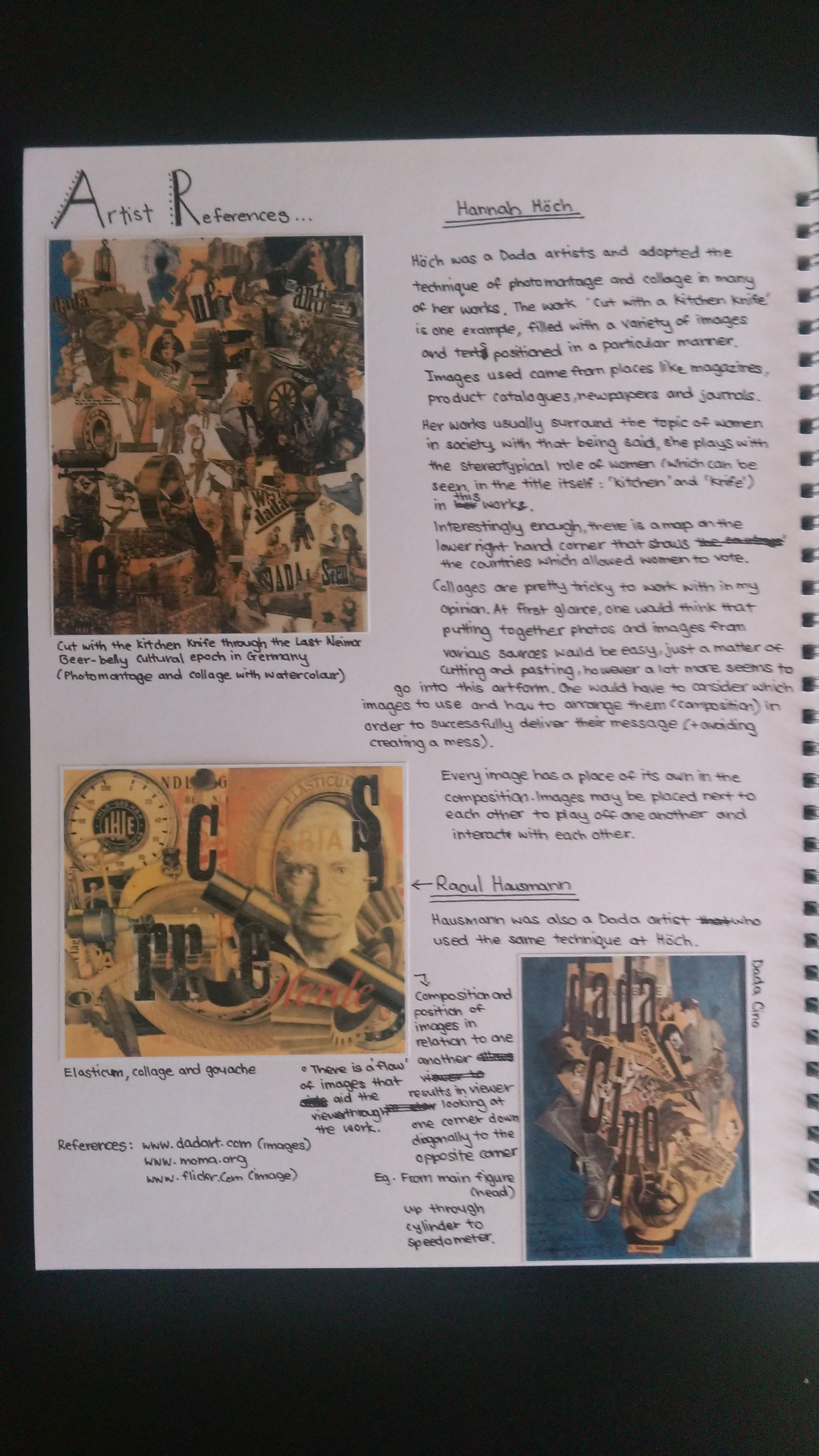
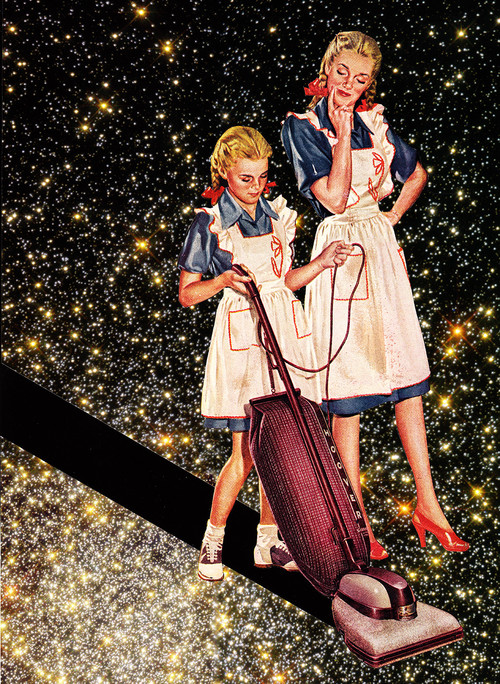
My artist reference for my collages remained the same as project 2, Eugenia Loli. I’ve added a few more of her works below because I just love looking at her work, they are absolutely brilliant.


I did find another reference whose works also really intrigued me but his works didn’t shout out to me as much as Loli’s works did. His name is Joe Webb. Here’s a link to his website. http://www.joewebbart.com/
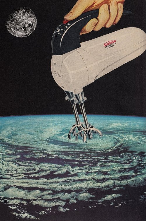
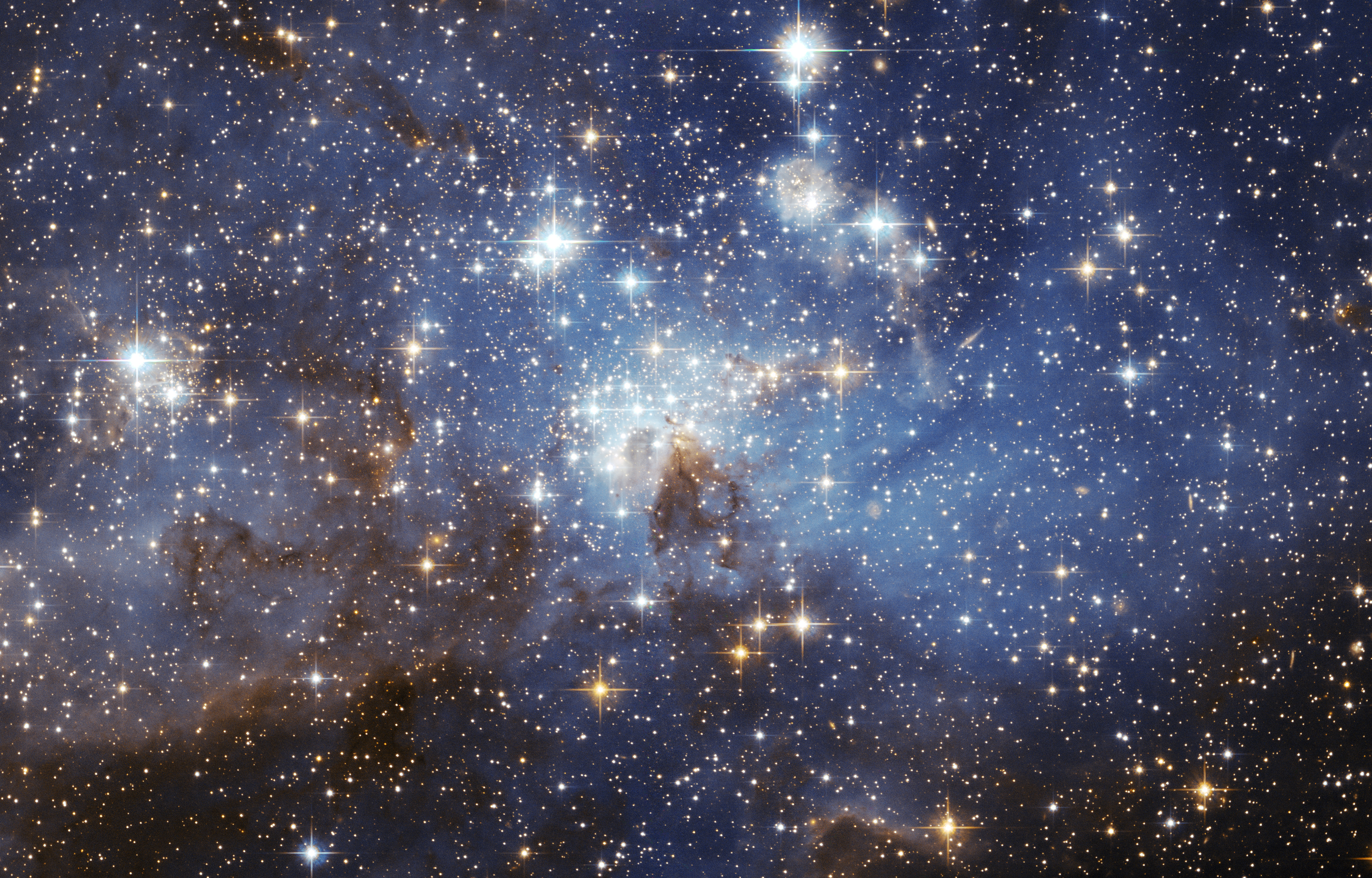
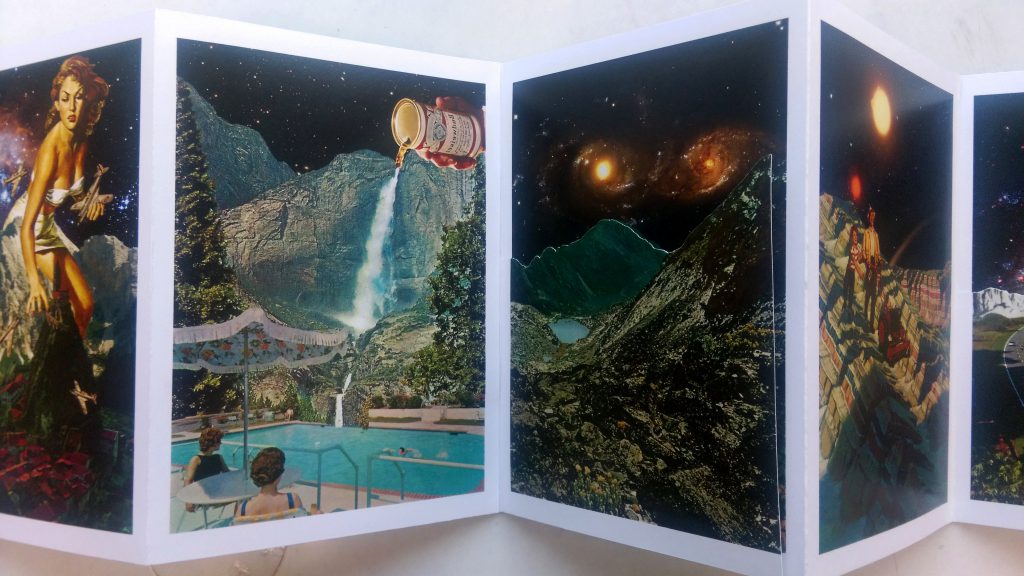
I really enjoy looking at collages which have a space/galaxy theme. I decided to carry this theme forward in this project. Since collages allow me to tell a story of some sort, I decided my zine should be quite similar to a picture storybook.
I didn’t want to add in any text as I felt it would distract the reader. The beautiful thing about collages is that you get to interpret the scene and image on your own, there are no restrictions. Depending on whether or not a title has been given, you can pretty much come up with your own story and make it as absurd and farfetched as possible.
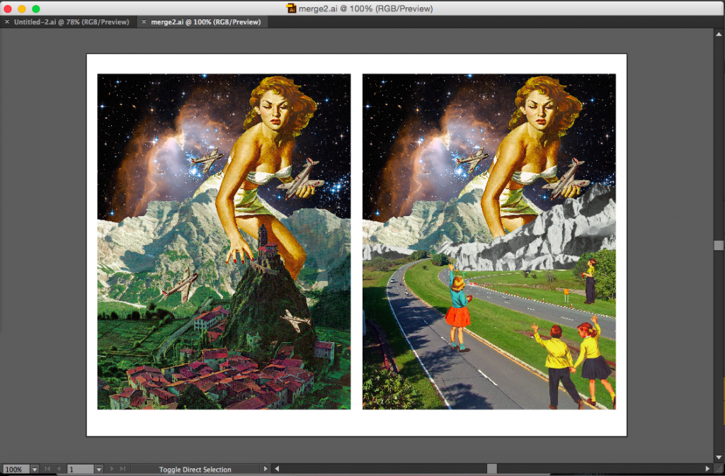
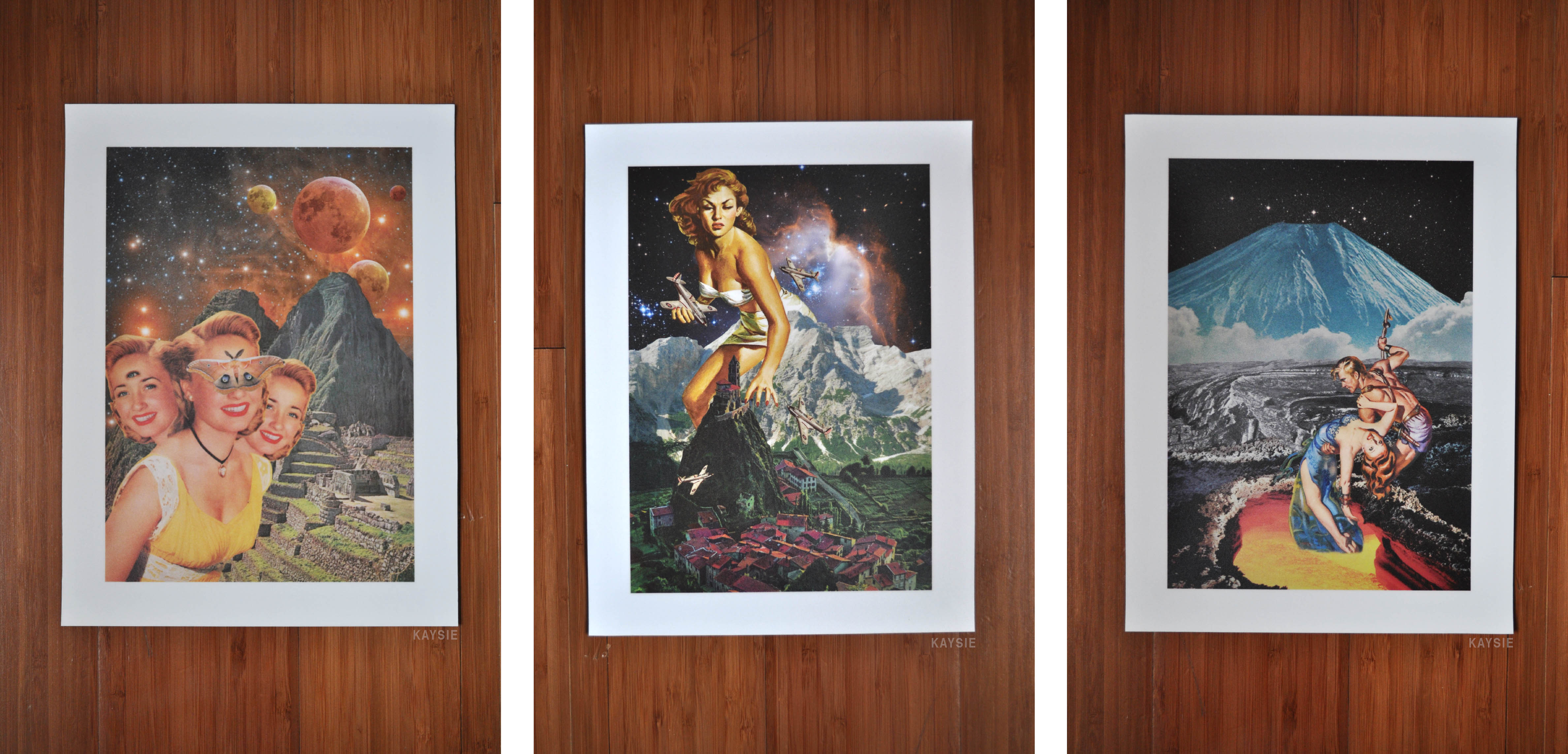
I decided to use my works from project 2 for the zine because some of them did have the space theme. I didn’t use all 6 compositions as some of them had different perspectives and wouldn’t fit in.
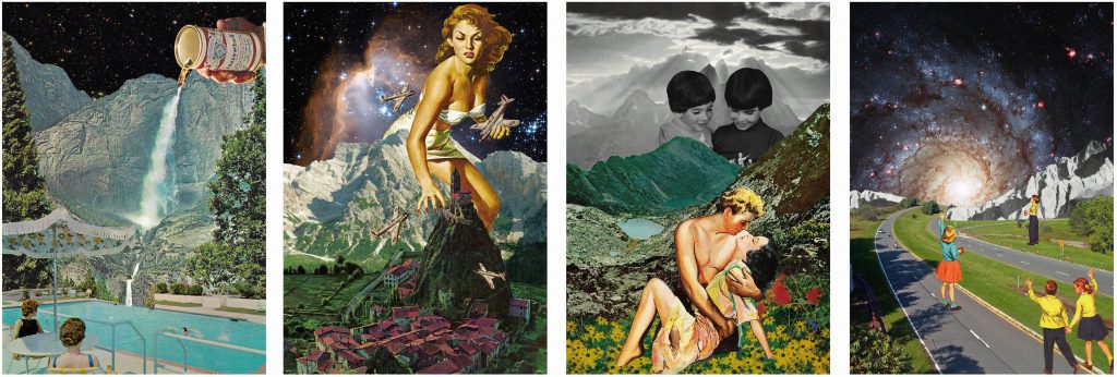
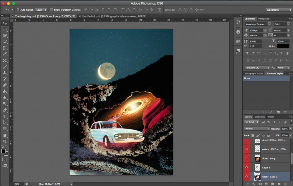
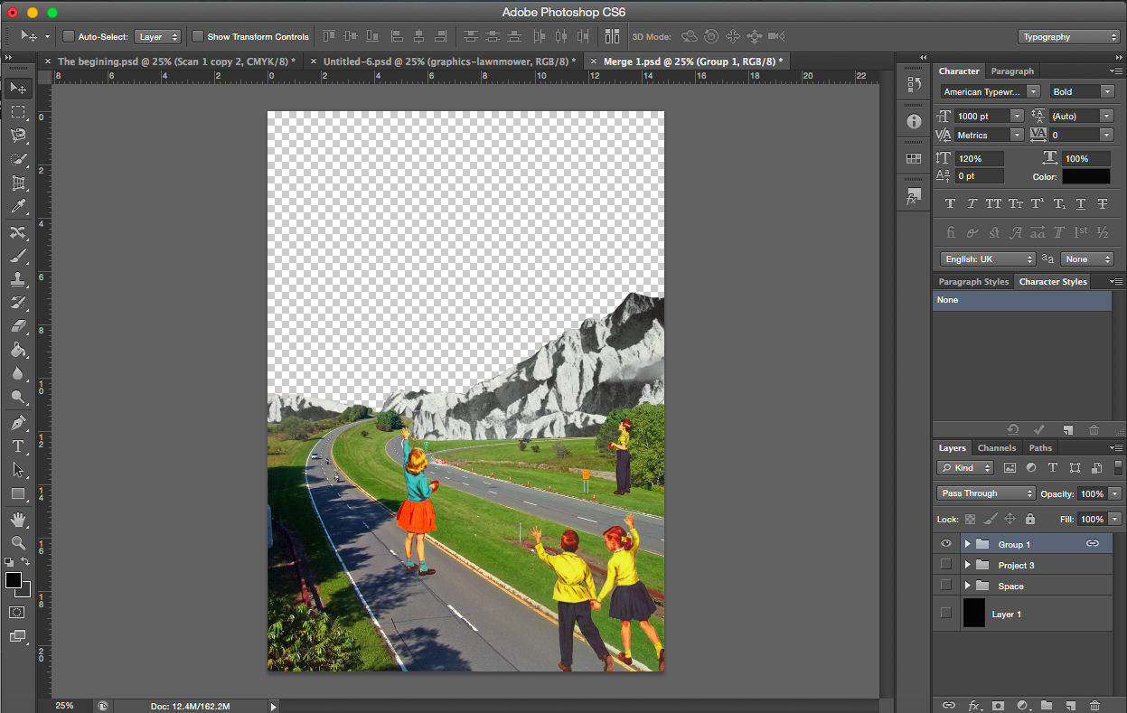
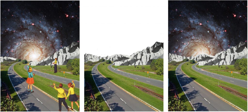
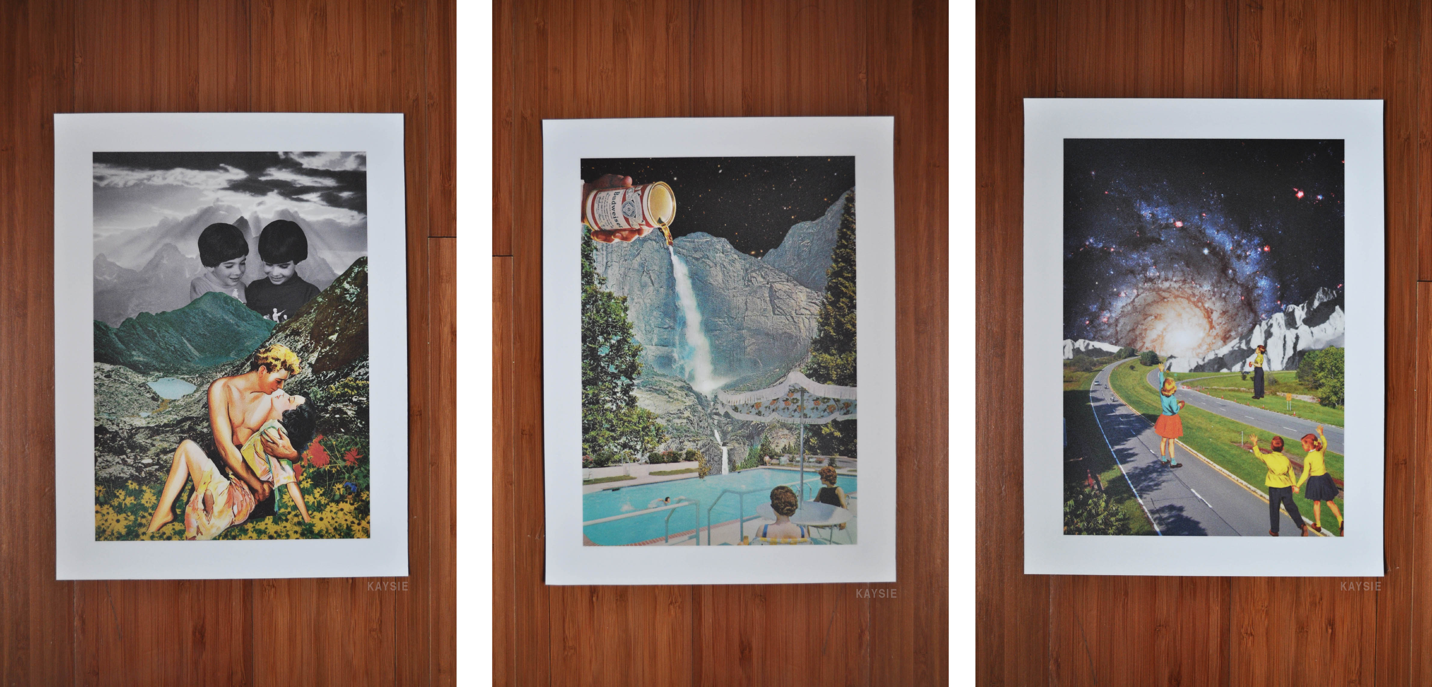
[Images Above] These are the four compositions that I brought over from project 2. The third from the right does not have a space theme so I had to change the background, making sure it still was relevant to the characters in the foreground.
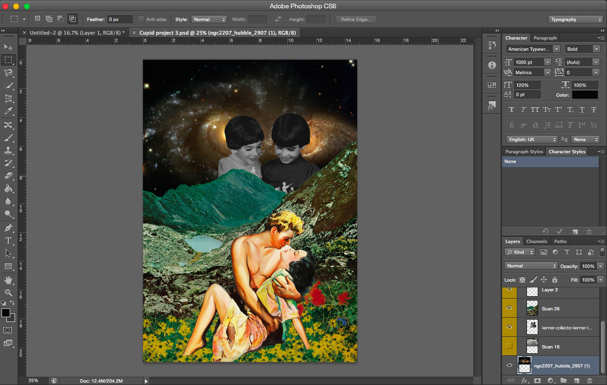
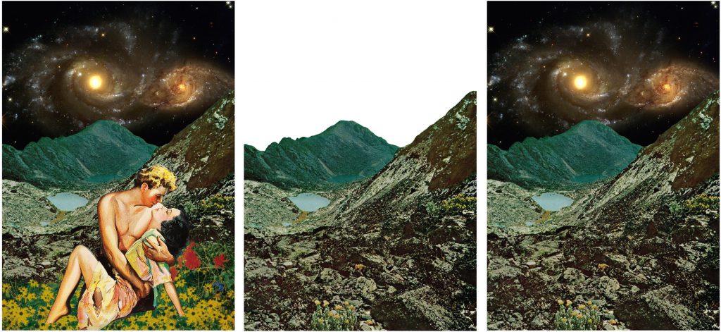
[Image Above] The two cupids in the background didn’t fit into the composition anymore because of the story I had in mind. It is also a black and white image which no longer stands out with the black galactic background, in fact they looked rather dull.
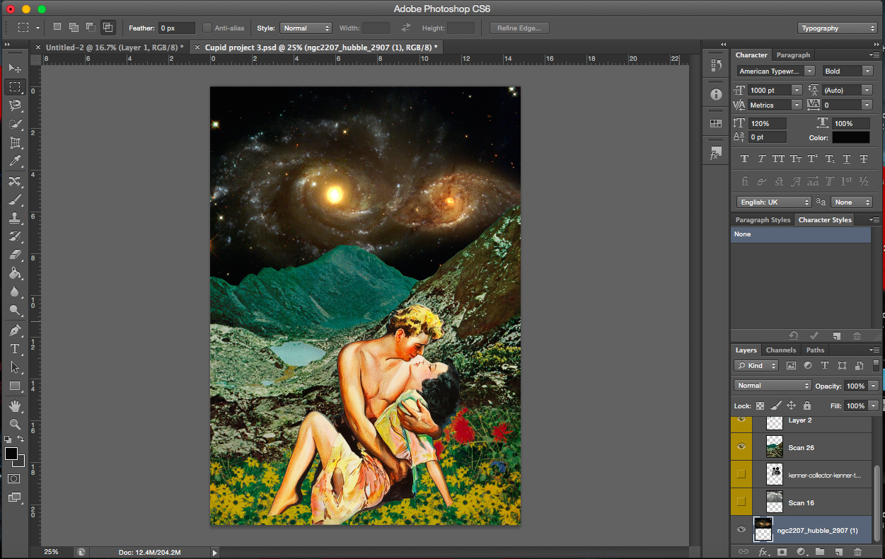
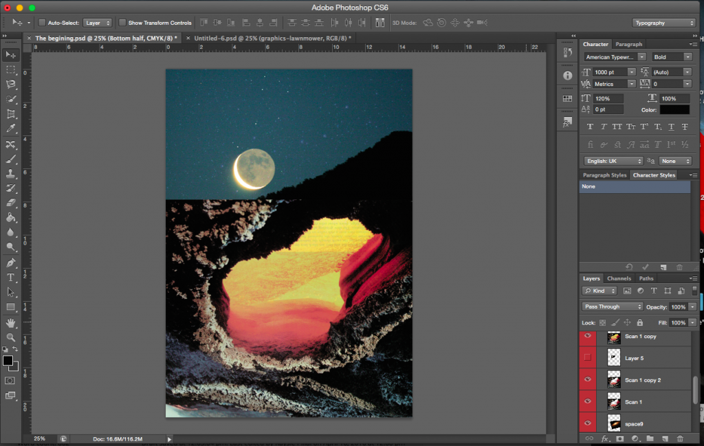
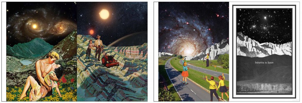
[Image Below] The space image I decided to go with has two galaxies which mimics the lovers in the foreground.
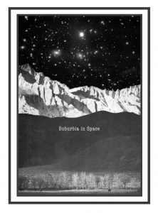
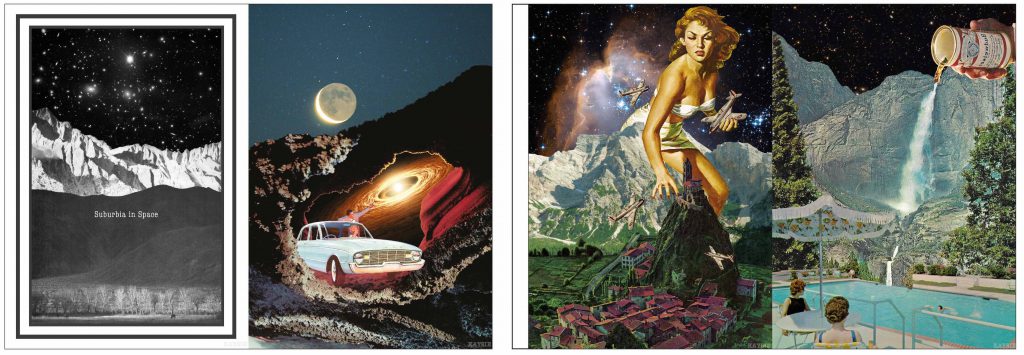
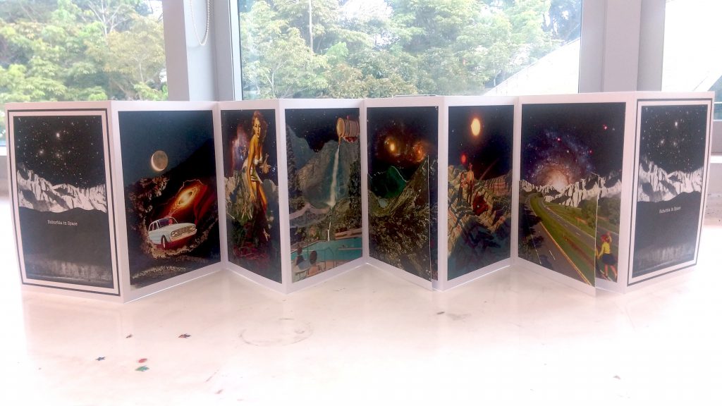
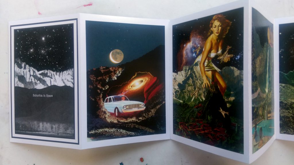
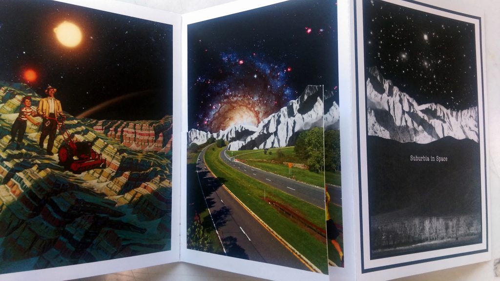
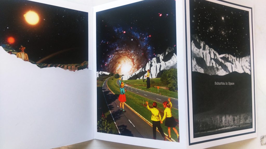
The concept of my story surrounds the idea of life in space. What if the human race took over another planet? What would they do? I wanted my zine to portray the main aspects of their journey and life in outer space. Hence, I gave my zine the title ‘Suburbia in Space’. With just the title, I hope the audience would get some idea about the story, that it’s about society living in space and subsequently form their own interpretations of the compositions with the title in mind.
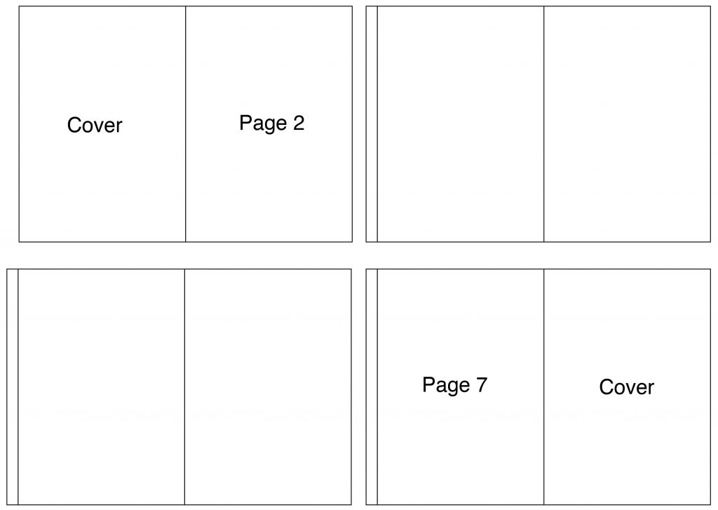
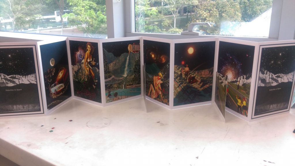
I used accordion bind for this zine, I feel like it makes viewing the images a lot easier and the viewer gets to see the story in its entirety when the zine is opened up. Planning: With 8 pages to work with and two of them being the cover pages, I was felt with 6 pages for my story.
An extra tab has to left on the left page for attachment to the previous page. After trying out many different tab widths, the tabs I finally used were 1cm in width which is large enough to hold securely but small enough so it doesn’t spoil the aesthetics of the zine. Each page is A5 in size, two pages together (297 x 210mm) with 1cm tab meant that I had to print them on A3 sheets to ensure ample space.
The video below shows how to do a very basic accordion bind which I referred to. There are more comprehensive videos that I found as well. I’ll just leave them here too.
Below: A more detailed, comprehensive way to make an accordion bind.
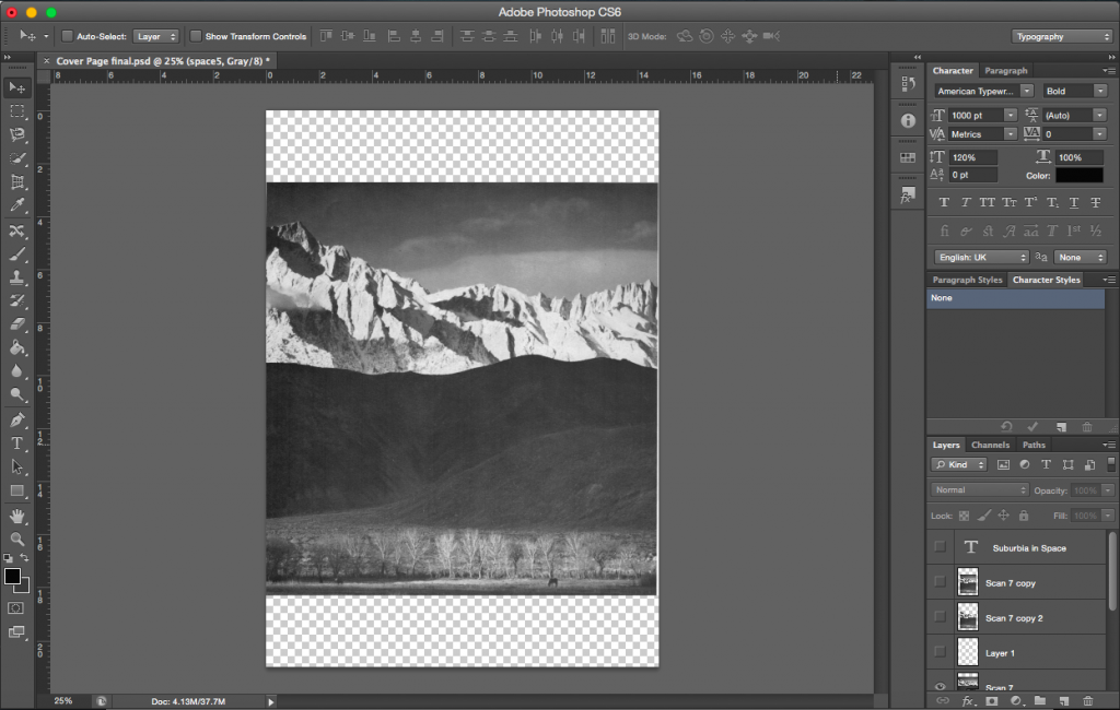
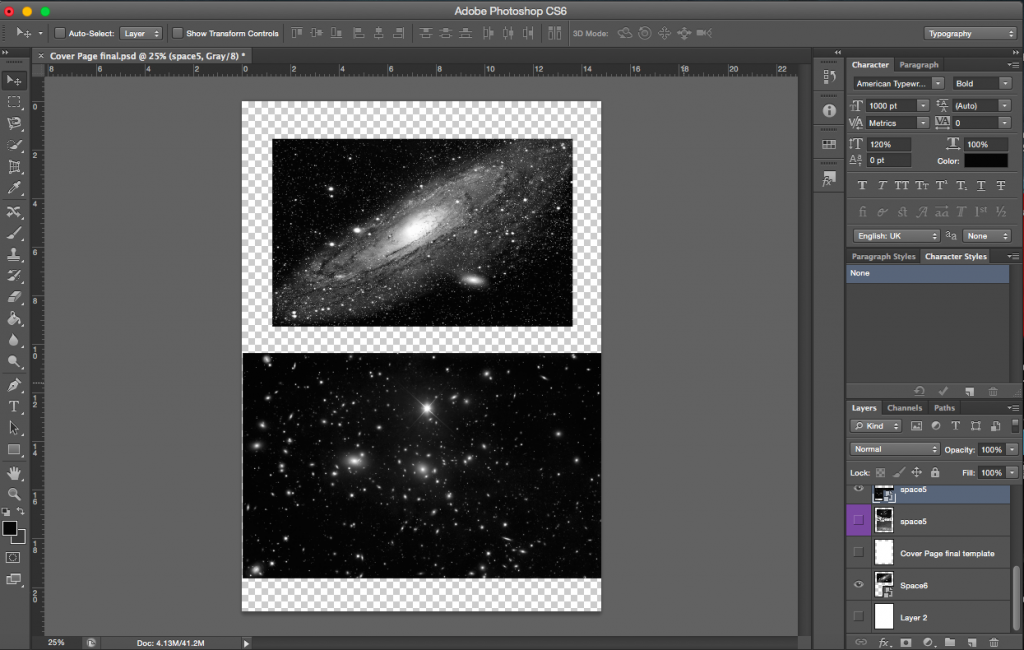
For this zine, I needed two extra compositions and a cover page.
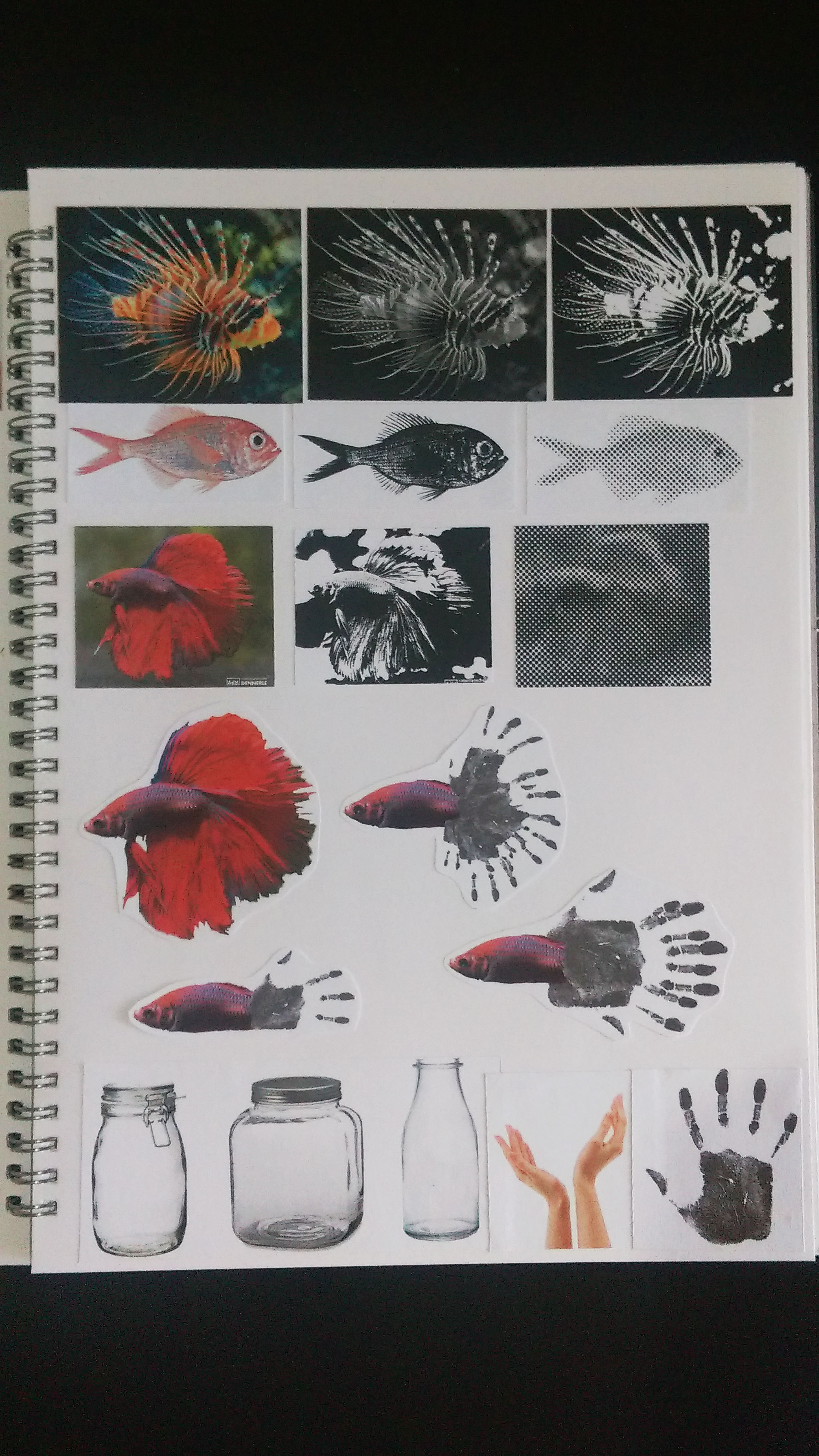
Below are some images of my working process.

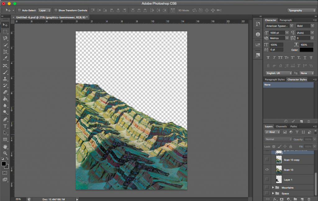
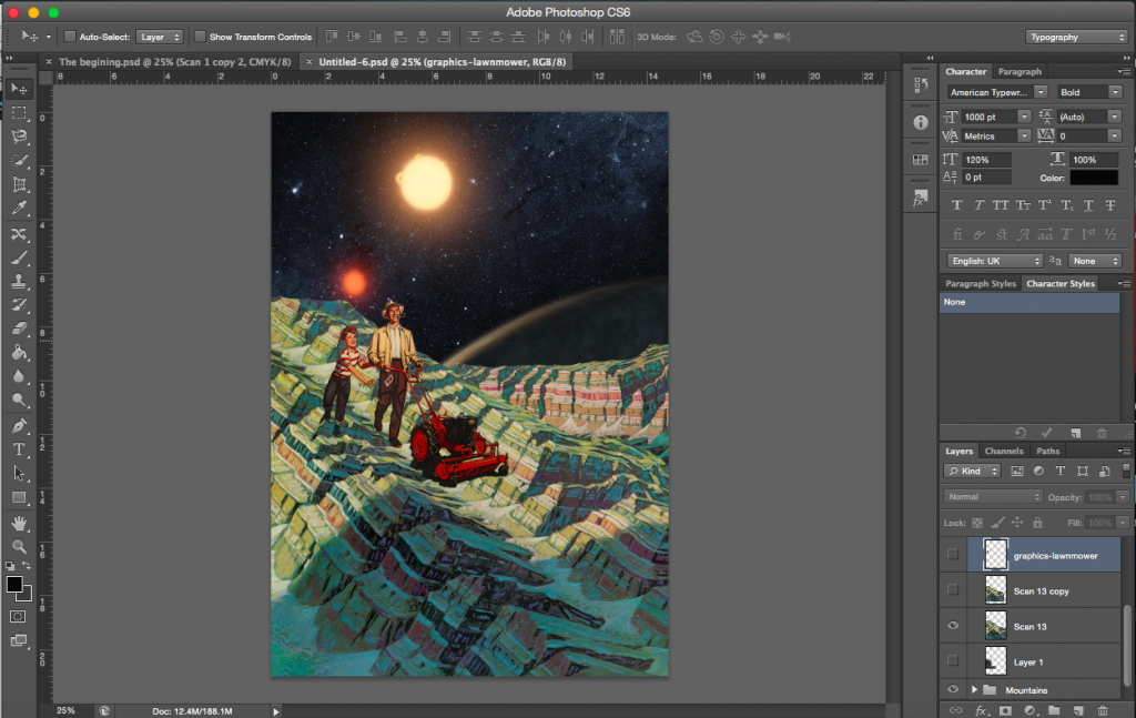
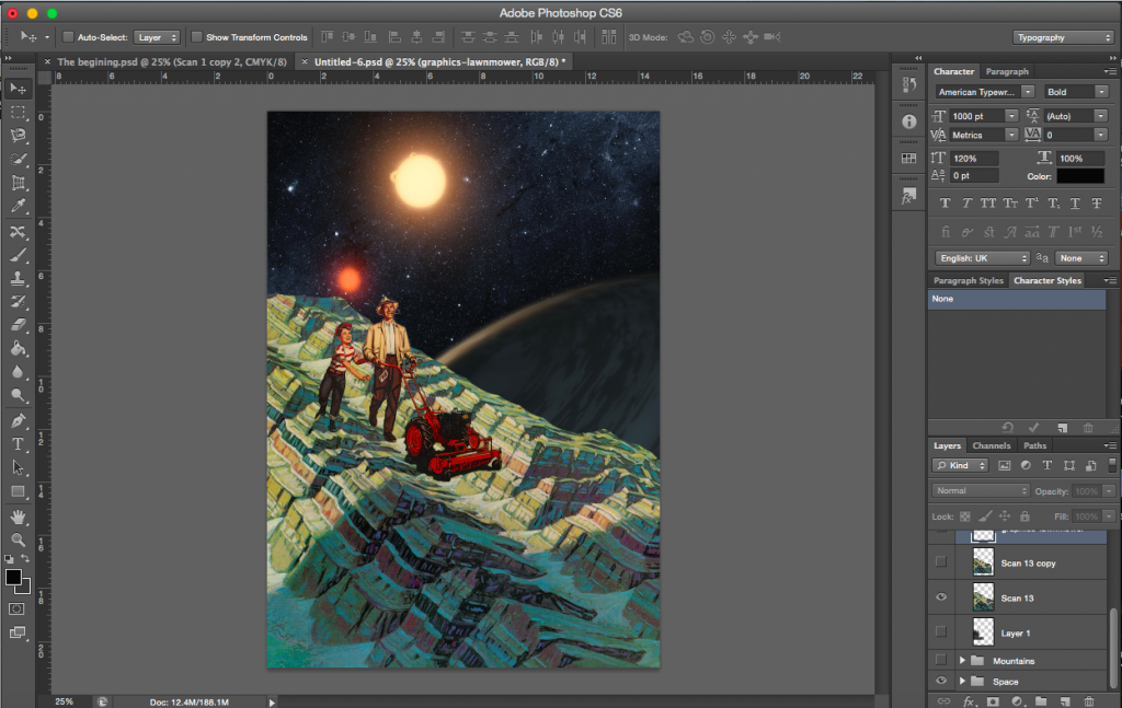
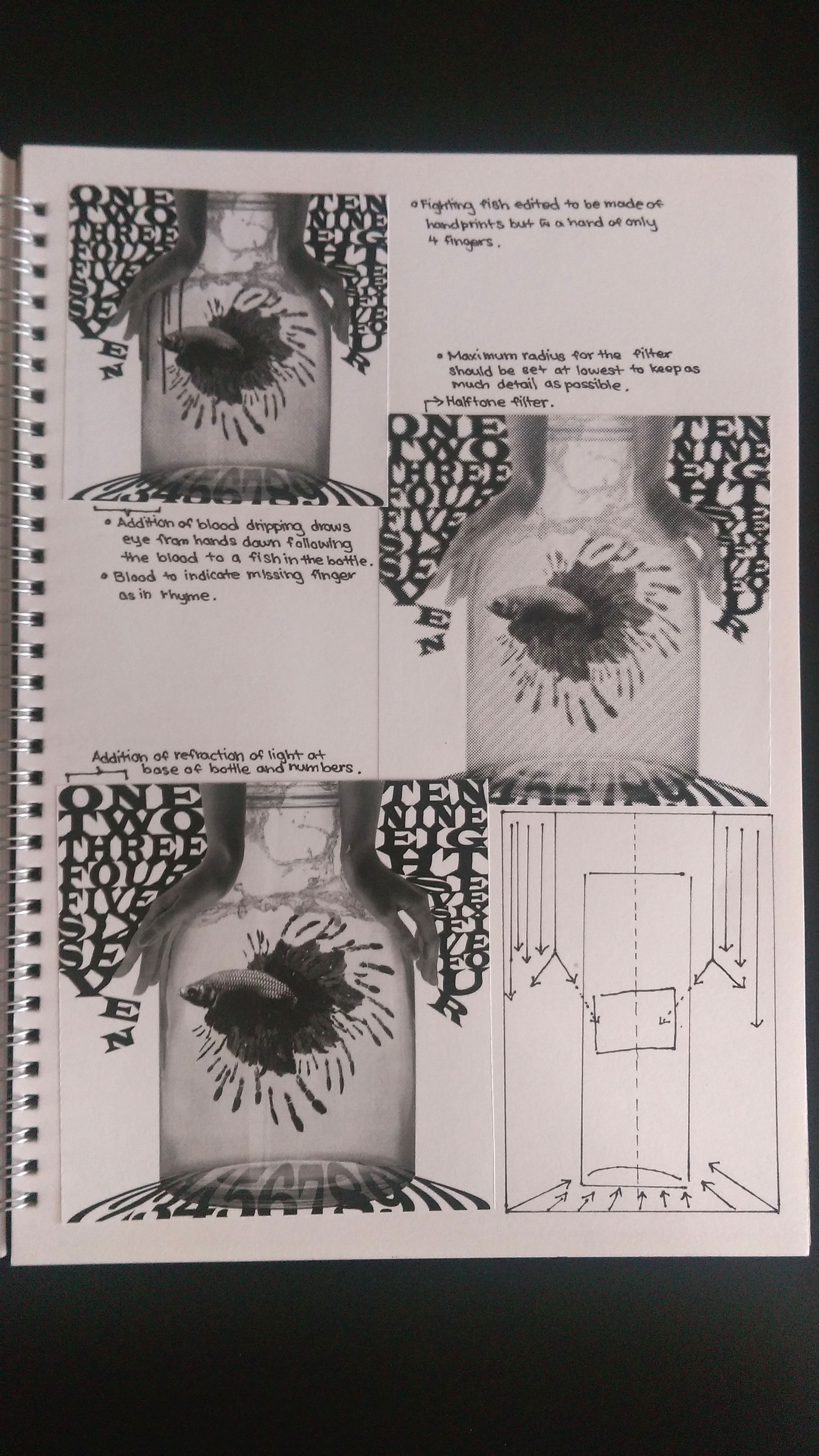
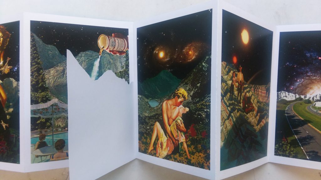
This was an initial idea. I took apart an old composition and layered it over another. The image on the left is the base image, the one on the right is the final image with the overlap of another page.
[Image Above] This image was supposed to be printed on another page, cut to the edges and overlapped on to the base image. The audience then gets to decide if they want to keep this page down over the base image or open this page and reveal the actual base image.
The meaning of the image changes depending on whether or not the top page is there or not. Without the extra page, the base image is on its own and it shows a giant attacking a city. However, with the overlap of the other page, the story changes. The giant is now attacking children.
I decided that the above layering made the image too complicated, so I went with something more simple. Below are the two compositions with physical layering. A common factor with these two is the presence and absence of the human element. With the added page and layering, the human element is gone. In relation to the story, it represents the environment before and after the invasion of humans on the planet.
[Image Above] From the left: Base/main page, overlapping page, final image with overlapping page.
[Image Above] From the left: Base/main page, overlapping page, final image with overlapping page.
The story I had in mind while making this was based around humans taking over another planet. Starting from the images above, from the left.
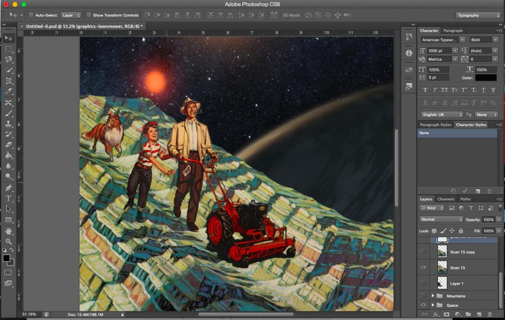
Page 1: Cover page. Page 2: Looking for a new planet. Page 3: Taking over the planet by force. Page 4: Changing the environment to suit their needs
Page 5: Finding love. Page 6: Starting a family. Page 7: The whole cycle repeats with the new generation finding a new planet and galaxy. Page 8: Cover page
This is just my interpretation of the images, the viewer is of course free to make up their own story especially if they decide to view it from right to left.
I was made aware during on of my consults that the direction in which the viewer reads an accordion bind is beyond my control. The viewer could decide to read it from left to right or the reverse (unless you specifically say so and force the viewer to read it in one direction). I didn’t want to restrict the viewer, I want to keep the story open. The story thus also flows both ways especially since there are no words to govern the direction or order they are to be looked at.
Pages bound in an accordion bind are attached by an extra tab. Depending on the thickness of the paper, some adjustments had to be made when attaching the extra page so that the images aligned when the zine is opened. The extra page had to be shifted out for perfect alignment.
The paper I printed on was above 170gsm, it was about 220, so scoring took quite a while. The thing about accordion bind is that every page has to be scored and that requires some time. Even with the scoring, the thickness of the paper proved to be a challenge to work with as folds did not come out as clean as I would have liked. The whole reason I chose paper of such thickness was so that the zine would hold its form and stand, which it did.
I am extremely glad that I decided to go with collages in Project 2, it not only paved the way for project 3 but also made me realise that I enjoy everything about making collages, I’ve fallen in love with it. I am pretty certain I’ll be creating more collages from here onwards.

In terms of presentation, I decided to go with a white border for each of the 6 pieces of work. I could not use black in this case as it would probably merge into the space backgrounds and you would not be able to distinguish them as easily. I felt that the white border helped to bring out the colours of the image and stand out. It brought emphasis to the image. It also helped to give a more finished look to the works.
[Images Above from the left]
[Images Above from the left]
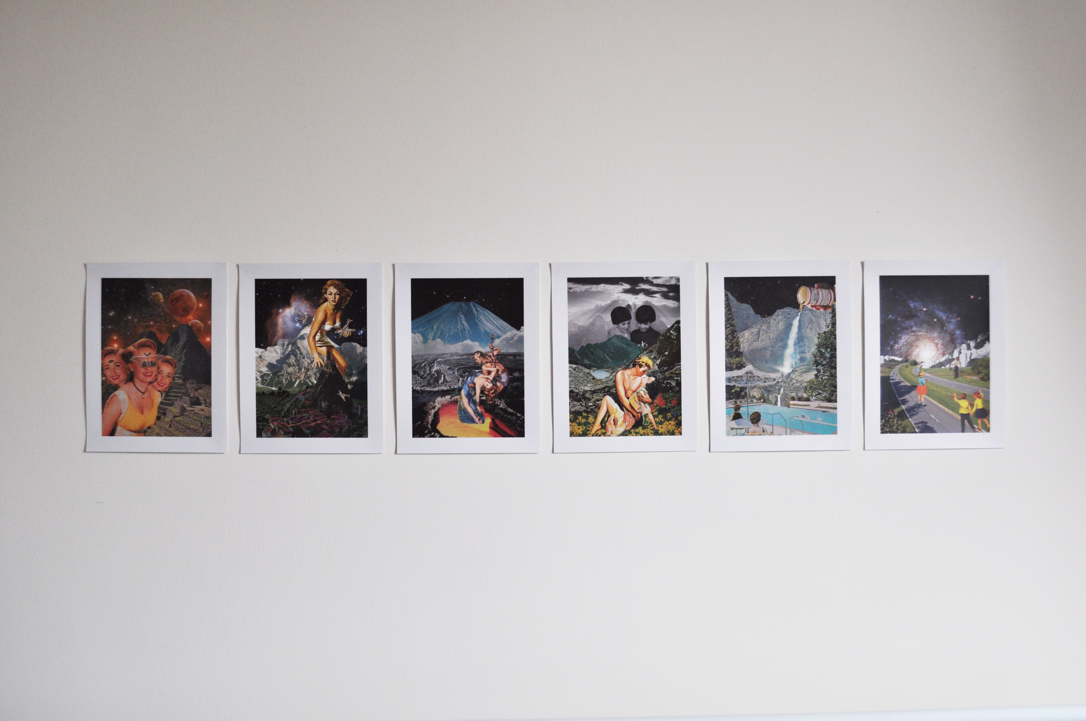
I arranged the works according to the perspective held in each work. In the first piece, the main figure is rather close to the viewer. The distance between the characters and the viewer gets progressively longer. The compositions also increase in depth (the background extends further in into distance).


The largest challenge that I faced during this project was looking for appropriate images. I mentioned a couple of difficulties in the last few posts about finding good images but with low resolutions or appropriate, high resolution images that are cut off at certain areas. I had to improvise throughout the collaging process, change my original plan to fit with the images that I had. I realised I could not have a fixed idea or plan or I would have a problem if I could not find the pictures In needed (it would have left me stuck and unable to proceed). I guess what I’m trying to say is that the project of collaging has taught me to be a lot more flexible and to improvise when necessary.
These challenges have enabled me to think of more creative solutions for the images that I have found and think about how to best use them. After doing the three compositions, the process of generating ideas became easier. I found it easier to think of ideas. Looking at an image could get me thinking about many ways I could use that image, I was no longer restricting myself to just the original plans I had in my head at the start. It made me a lot more spontaneous.
Other minor challenges would be the type of vintage images. They are not all of the same quality (depends on how old they are). The way they look also depends on which source they were from. An image from a comic cover is different from an image from a postcard (e.g. their colours are rendered differently) So I had to make sure these differences do not cause my compositions to look odd or messy. I found that I had to analyse each image and just try out different images together to see what worked. Colours needed to be adjusted here and there to fit with the other images, so that nothing stood out too much.
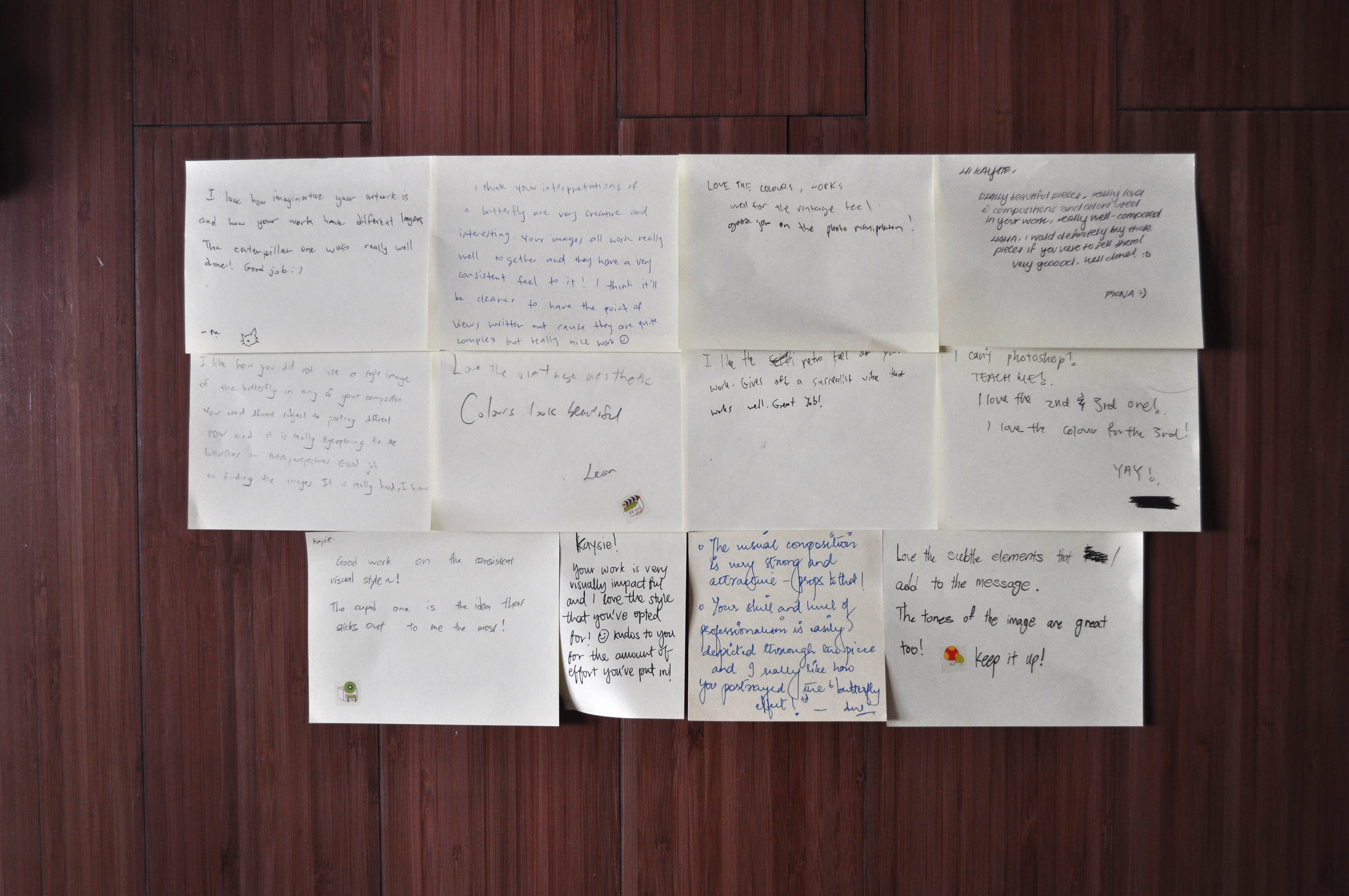
It’s always really nice to receive feedback on your work. The comments were very encouraging as usual. Many liked the colours and it was interesting and wonderful to see that everyone had their own favourite composition out of the six. To me that meant that there wasn’t one particular piece that stood out and stole any attention, each piece had its uniqueness and was special.
I have really enjoyed doing collages. I have to admit it was really fun. It allowed me to come up with surreal and interesting/ varied compositions. Looking for images was a tough process but through the process of looking, I found many weird and interesting ones that were really quite funny. The sense of satisfaction gained when I do find an image that I can use is indescribable (I get so thrilled at the number of ways I could use the image in my compositions). I am really happy at the way my works came out and I would definitely continue to do collages for future projects.