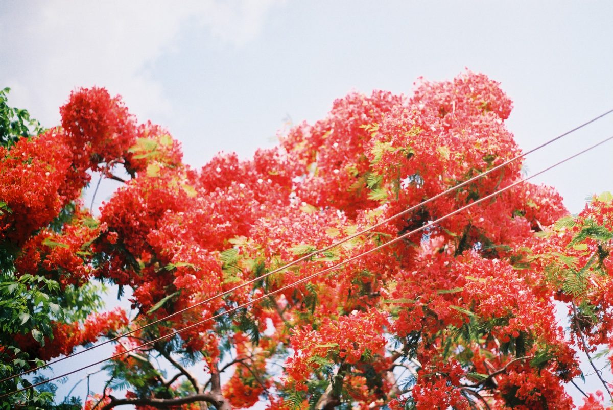
Escape is a series of photographs explores the darkness and the mystery of dream. Most of my nightmares are being chased by some unknown figures, stemming from feelings of anxiety in my waking life.
Technical Decisions:
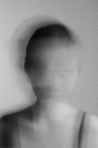
Some of the techniques that I use are defocus to create depth and mystery, absurd angles, blurry figures and slow shutter speed to achieve the motion blurs. For post editing, to keep a consistent treatment on the images, I applied motion blur, uniform grain and gaussian blur for all my images.
Dreams have been described as dress rehearsals for real life, opportunities to gratify wishes, and a form of nocturnal therapy. A new theory aims to make sense of it all. These images were inspired by the idea of consciousness and unconsciousness, we recall only a fraction of what we dream about, unless written down the moment we woke up, it tend to be evanescent, the details quickly fading as we made our way through the day.
I shot these the photography in a studio setting, to evoke the transience of beauty and the fragility of dreams, delicate, ethereal style, I use a slow shutter speed 1.00s to capture the motion blur into the image. To create the dreamy/haze effect, I stretch some plastic wrap over the front of your lens, and rub a small amount of vaseline onto the plastic.
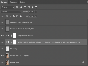
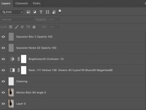
Here are the before and after of my images, and their layers:
Paul Rousteau, a France photographer, often overexposed or out of focus, his photographs are series of playful experiments. By pushing the camera to its limits, the artist creates new forms of perception. The result made of vivid colors and enigmatic figures has something of a daydream with a touch of kaleidoscopic hallucinations. His works are mainly navigating between figuration and abstraction, painting and digital art.
Eurythmie 2016NudesEden, Visions of Joy
Each of them bathed in warm Californian colors therefore, often a bit blurred, like watercolors, somewhat fleeting, like a dream right after waking. Abstraction is never far off, his photographs are pure impressions.
I used the photo that I took for exercise 1 with a landscape background. I took a photography of my friend at Jurong lake gardens and decided to capture the etherial, airier quality photograph. When it came to editing the photo, I wanted to create the dreamy, soft visuals photos in which the tone of the photography is slightly purple/pink.
For this class’s first exercise, I took a portrait of my friend at Jurong lake gardens. I decided to capture the etherial, airier quality photograph, the mildly hilly area is covered in a sea of lalang and tall grass tufts, making the perfect dreamy backdrop for a portrait. The sunny afternoon sun shining directly onto the subject, the silhouette cast a distinct, hard shadow on the subject’s face.
Before
After
Camera Setting – ISO 200, f/5.6 1/640s
Screenshot of Layers:
Post Processes – I removed some of the hair strands covering on her face and removed all the pimples and blemishes. The most challenging part of the this exercise is to even out the skin tone and texture in order to achieve the natural skin looks. I did some minor adjustment to remove the harsh shadow and brighten up her face to even out the skin tone.
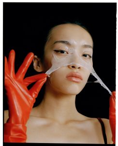
My chosen artist for Photographer Research I is Jin Jia Ji , a fashion photographer working in China and London.Jin has an introspective approach to fashion image making. Characterised by unexpressive faces, achromatic backdrops, and soft hues, his shots go beyond his models’ exterior, reaching a more intimate, private dimension.
For my own works I would like experiment with unexpected angle, color schemes, an interaction between people and objects to generates a narrative in my photos.
Surprisingly, I really enjoyed History of Graphic Design as compares to History of Art I and II. In the beginning, I was overwhelmed by the fast paced lectures with heavy content. Most of time in class, I was busy matching the words on the list and the slides. If the order of words on the list match the slides that will be really helpful. Progressively, I found my way to survive in the class and the 30 mins breaks was really helpful. I have a love hate relationship with the quizzes, the memorising part is just painful, however its helps me to reinforced my knowledge and I will actually do more research while I was revising for the test.
I guess the biggest take away for me is i got to know more graphic designers even though my knowledge of each artist is limited, however, its gives me a direction when I wanna do research during certain period of time, who are the graphic designers I can study about.
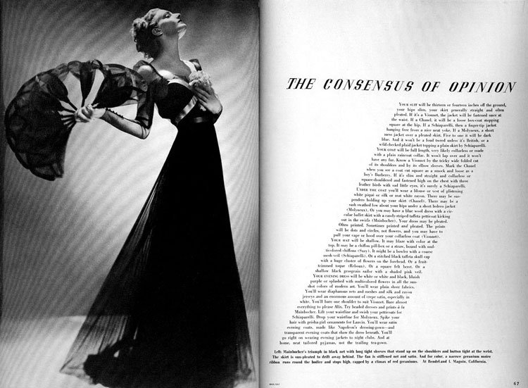
Continue from last week’s reflection on revolution of the Magazine cover of Harper’s Bazaar during Art Nouveau period. For this week’s lecture, I am gonna share about Editoral deisgn of Harper’s Bazaar during Art Deco period.
Alexey Brodovitch is known foremost for his work on the american fashion-magazine Harper’s bazaar.His style of combining elegantly set typography with new and experimental trends in photography became widely popular in the 1940s and 50s and helped to keep the magazine at the forefront of its field in a swiftly changing world.
The typeface he preferred was Bodoni, but when needed he switched to Stencil, Typewriter or a script. He matched the typeface with the feeling or with the need for an appropiate effect. His layouts are easily recognized by his generous use of white space. Colleagues at other magazines saw his sparse designs as truly elegant, but a waste of valuable space.
Brodovitch’s signature is his obsessive cropping brought to layout, often off-center, brought them to the edge of the page, integrated them in the whole. He used his images as a frozen moment in time and often worked with succeeding pages to create a nice flow trough the entire magazine. This brought a new dynamism in fashion layouts.
Overall, I really enjoy Alexey Brodovitch’s way using white space and cropped his photographs often off-center, brought them to the edge of the page, integrated them in the whole to create new dynamism in fashion layouts and he gives me a lot of inspiration for my typography projects.
“If you know yourself, you are doomed.” – Alexey Brodovitch
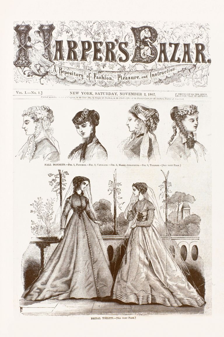
What interested me the most from last week’s lecture was the revolution of the Magazine cover of Harper’s Bazaar. We can see that the distinctive style of graphic design at different period of time, such as during Victorian era, when the first issue of Bazar appeared, the use the decorative borders, ornate typefaces, and the use of Symmetry was also used heavily in layout and design.
The cover of the first issue. To be truly fashionable, Bazar intimated, was to be immersed in the culture and ideas of the moment.Harper’s Bazaar 1890
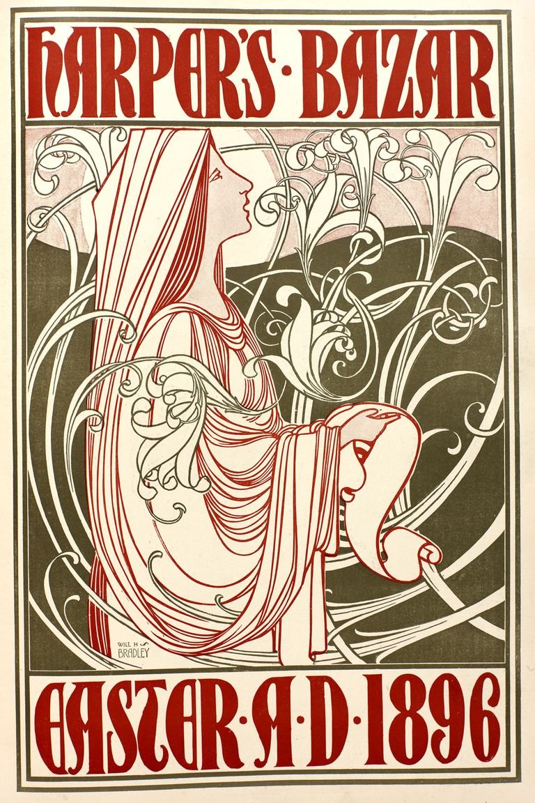
During art novae, the use of a long, sinuous, organic, swirling lines and the undulating asymmetrical line was employed.
The cover of the March 28, 1896, issue, illustrated by William H. Bradley.
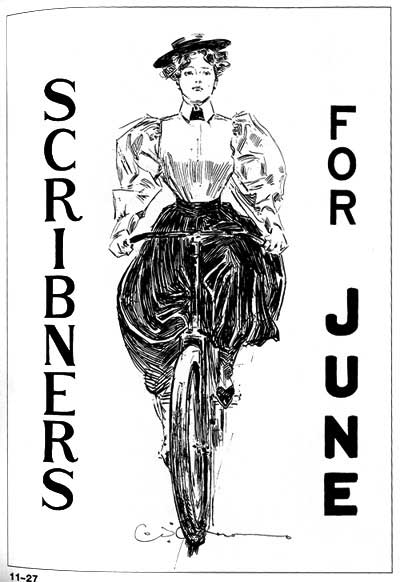
Graphic design is heavenly influence by the social political economic changes at that point of time. For example, during the Art and Craftes movement,a time of strong moral and religious beliefs, proper social conventions, and optimism. The illustrators helped promote the idea of the athletic girl as fashionable and socially acceptable.
Poster for Scribner’s (1895) Charles Dana Gibson
Here is the link to check out more info about Harper’s Bazaar over here Click Here