Surprisingly, I really enjoyed History of Graphic Design as compares to History of Art I and II. In the beginning, I was overwhelmed by the fast paced lectures with heavy content. Most of time in class, I was busy matching the words on the list and the slides. If the order of words on the list match the slides that will be really helpful. Progressively, I found my way to survive in the class and the 30 mins breaks was really helpful. I have a love hate relationship with the quizzes, the memorising part is just painful, however its helps me to reinforced my knowledge and I will actually do more research while I was revising for the test.
I guess the biggest take away for me is i got to know more graphic designers even though my knowledge of each artist is limited, however, its gives me a direction when I wanna do research during certain period of time, who are the graphic designers I can study about.
Continue from last week’s reflection on revolution of the Magazine cover of Harper’s Bazaar during Art Nouveau period. For this week’s lecture, I am gonna share about Editoral deisgn of Harper’s Bazaar during Art Deco period.
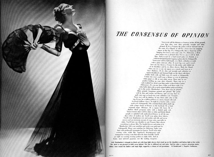
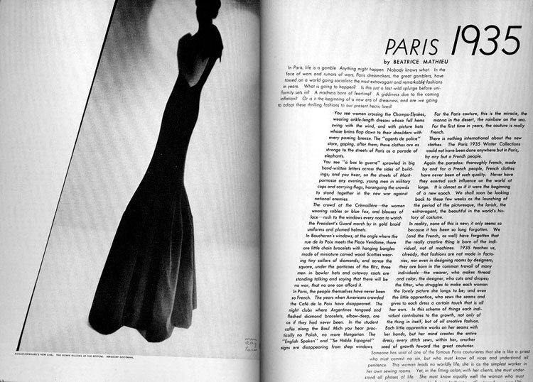
Alexey Brodovitch is known foremost for his work on the american fashion-magazine Harper’s bazaar.His style of combining elegantly set typography with new and experimental trends in photography became widely popular in the 1940s and 50s and helped to keep the magazine at the forefront of its field in a swiftly changing world.
The typeface he preferred was Bodoni, but when needed he switched to Stencil, Typewriter or a script. He matched the typeface with the feeling or with the need for an appropiate effect. His layouts are easily recognized by his generous use of white space. Colleagues at other magazines saw his sparse designs as truly elegant, but a waste of valuable space.
Brodovitch’s signature is his obsessive cropping brought to layout, often off-center, brought them to the edge of the page, integrated them in the whole. He used his images as a frozen moment in time and often worked with succeeding pages to create a nice flow trough the entire magazine. This brought a new dynamism in fashion layouts.
Overall, I really enjoy Alexey Brodovitch’s way using white space and cropped his photographs often off-center, brought them to the edge of the page, integrated them in the whole to create new dynamism in fashion layouts and he gives me a lot of inspiration for my typography projects.
“If you know yourself, you are doomed.” – Alexey Brodovitch
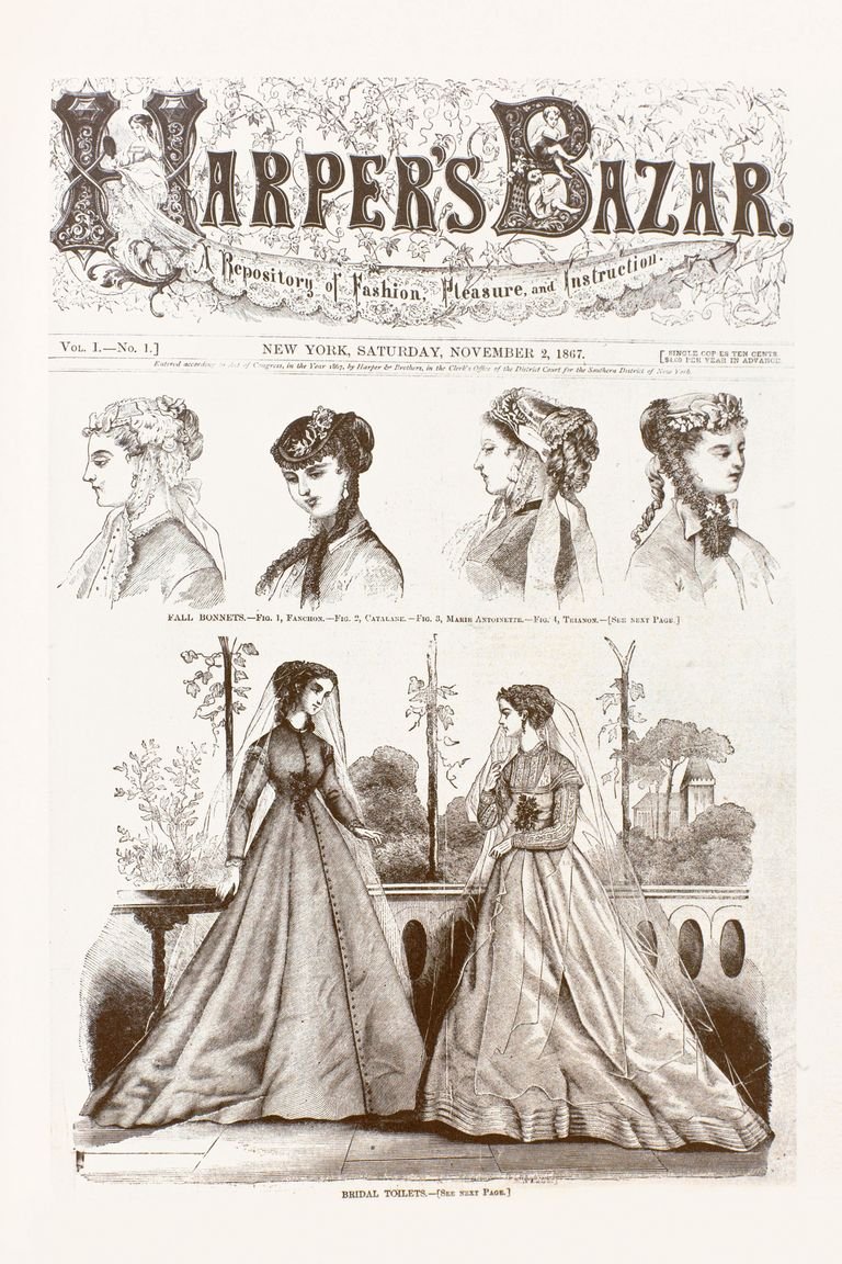
What interested me the most from last week’s lecture was the revolution of the Magazine cover of Harper’s Bazaar. We can see that the distinctive style of graphic design at different period of time, such as during Victorian era, when the first issue of Bazar appeared, the use the decorative borders, ornate typefaces, and the use of Symmetry was also used heavily in layout and design.
The cover of the first issue. To be truly fashionable, Bazar intimated, was to be immersed in the culture and ideas of the moment.Harper’s Bazaar 1890
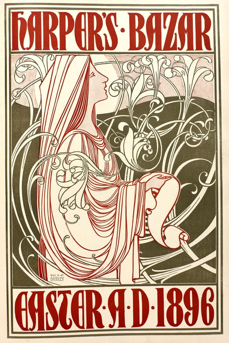
During art novae, the use of a long, sinuous, organic, swirling lines and the undulating asymmetrical line was employed.
The cover of the March 28, 1896, issue, illustrated by William H. Bradley.
Graphic design is heavenly influence by the social political economic changes at that point of time. For example, during the Art and Craftes movement,a time of strong moral and religious beliefs, proper social conventions, and optimism. The illustrators helped promote the idea of the athletic girl as fashionable and socially acceptable.
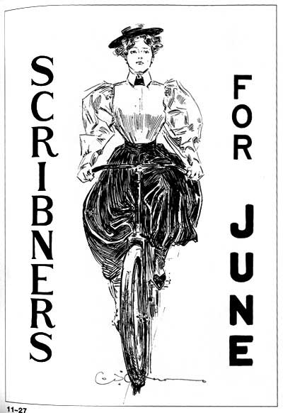
Poster for Scribner’s (1895) Charles Dana Gibson
Here is the link to check out more info about Harper’s Bazaar over here Click Here