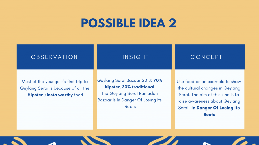
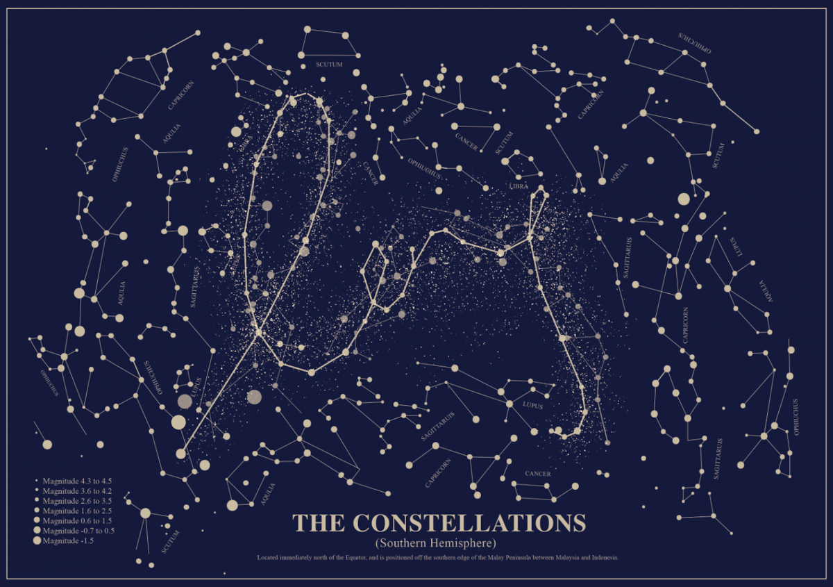
I actually started with a bunch of different ideas in terms of childhood dream jobs. The Jobs that I have chosen are Astrologer, Hypnotist, Urban Planner and Model.
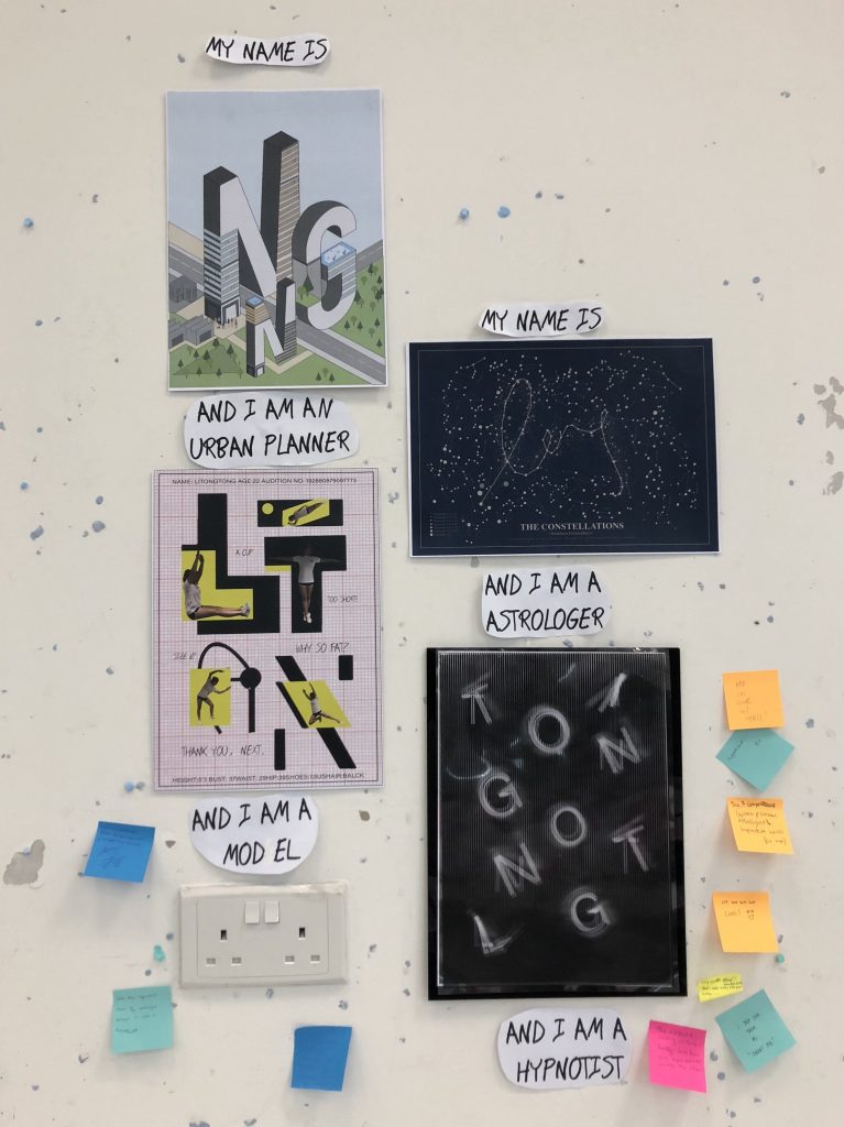
Astrologer
I am a horoscope enthusiast, the first thing when I wake up in the morning is to check my horoscope. Astrology is the study of the movements and relative positions of celestial objects as a means of divining information about human affairs and terrestrial events.
Keywords-# Mystery#Constellation#Passion
Medium– illustration
References Works
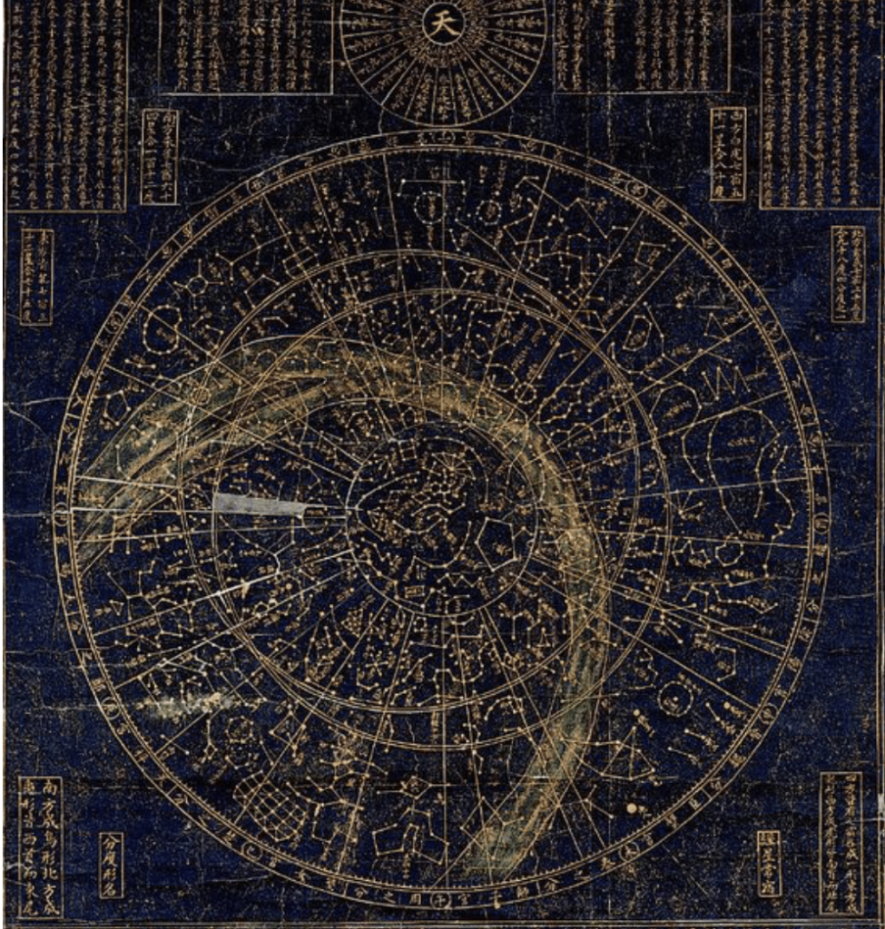
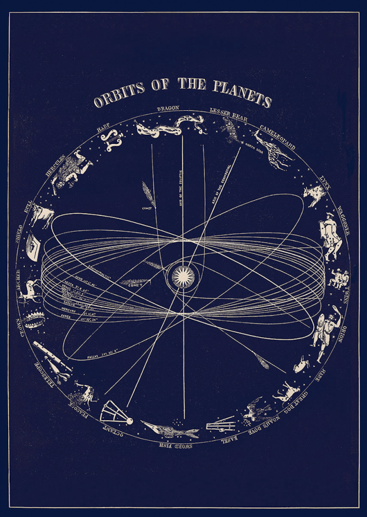
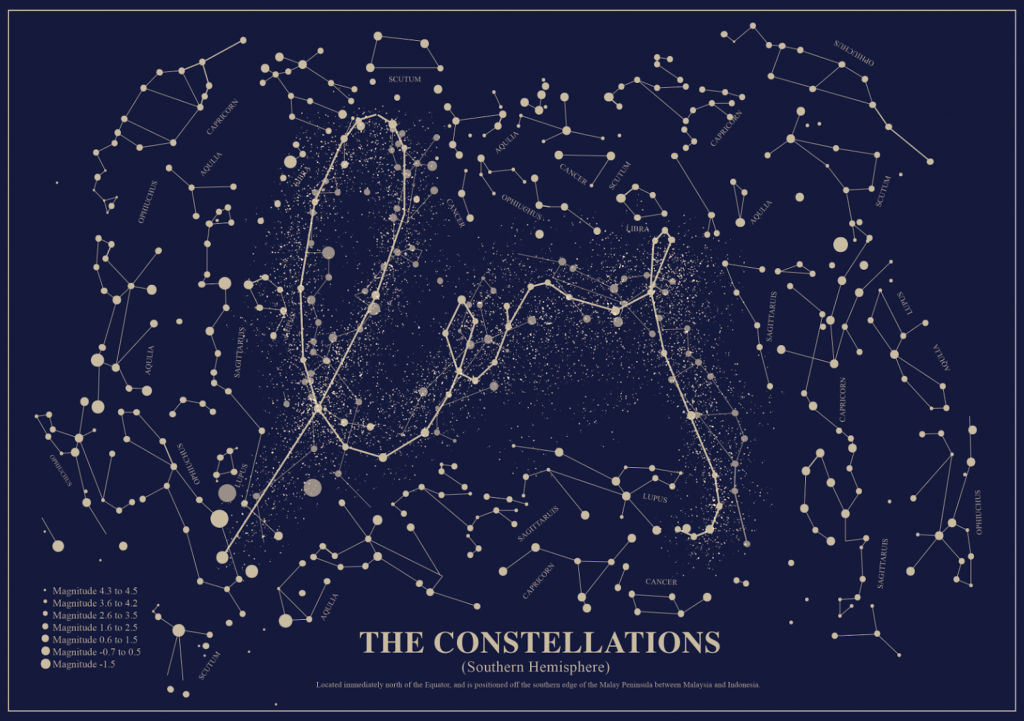
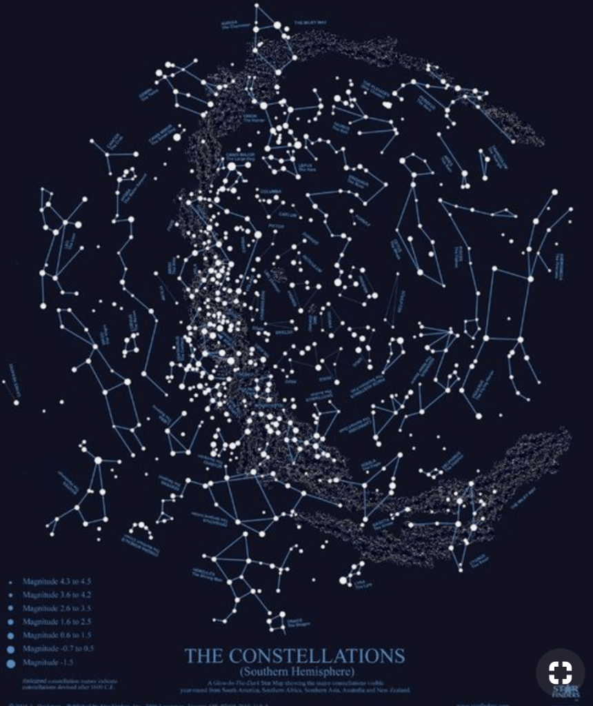
I took inspiration of the constellation, which is a group of stars that forms an imaginary outline or pattern on the celestial sphere, typically representing an animal, mythological person or creature, a god, or an inanimate object.
Creation Process
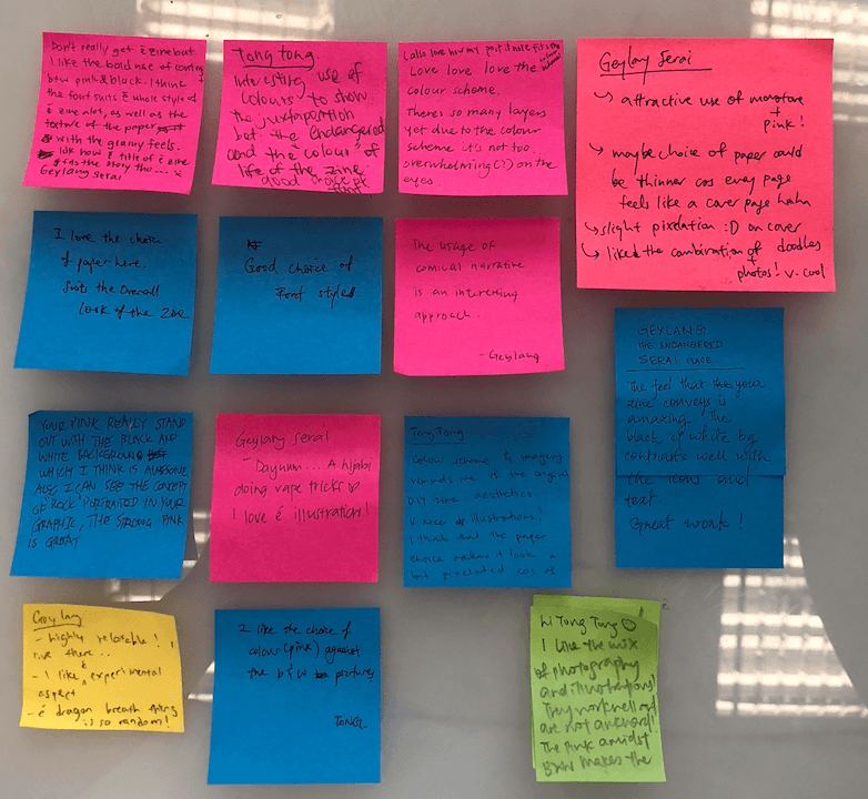
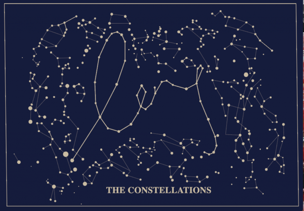 After the share and tell session, my group mates felt that there is lack of texture, and need to highlight the letters more.
For the second draft, I added words description of the of the constellations, and also I hight the letters by adding more layers and hight with confetti.
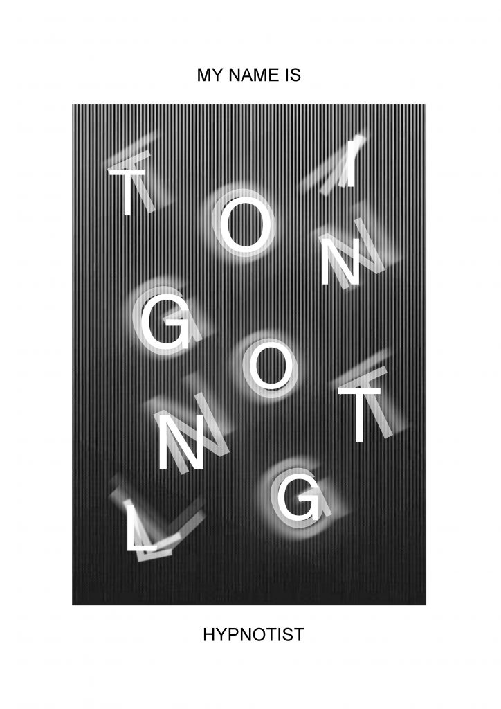
Hypnotist
Hypnosis is most often induced by a hypnotherapist’s verbal guidance, and tools such as a swinging pocket watch to creates a hyper-attentive and hyper-responsive mental state, in which the subject’s subconscious mind is highly open to suggestion.
Keywords-# state of mind #damn cool # swinging pocket watch
Medium– Mix Medium, overlaying technique of illustration and tracing paper.
References Works

I was inspired by the motion of the swinging pocket watch, it create this overlaying effect.
Creation Process
I created a GIF to show my creation process, basically I choose a Hypnosis line image as the background, and deconstruct my name LI TONG TONG in a random position and add different diffused, blurred layers to create the hypnosis effect.

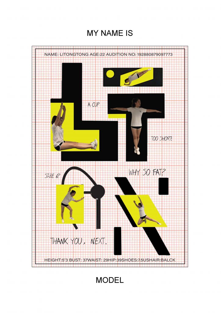
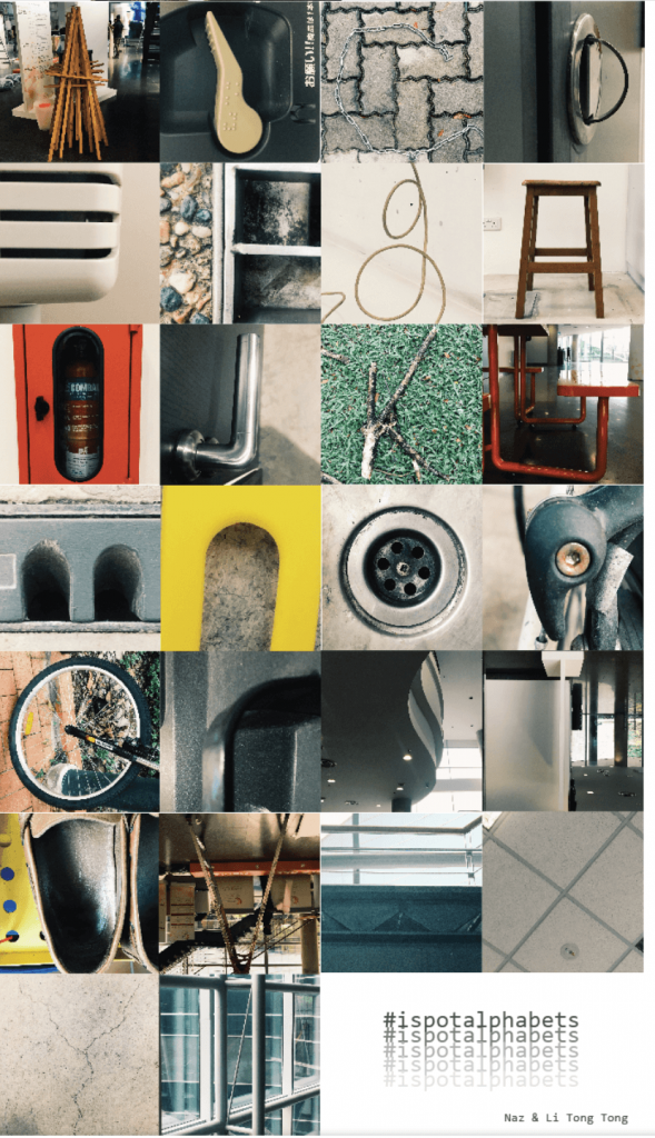
Urban Planner
I’ve always wanted to with a job that involved with research and plaining as a child, thus I choose landscape design and horticulture back to poly. Urban Planning is just like building a lego to me, you have plan and strategist first before execute it.
Keywords-# planning #logical # plants #once upon a time
Medium– Illustration
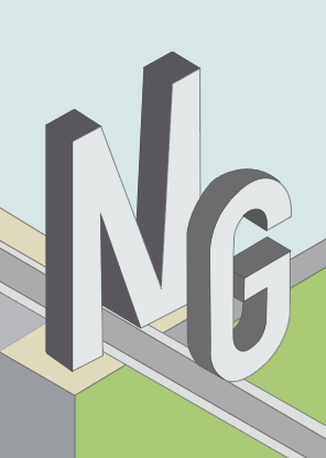
References Works

Its very challenging for me as I am not very familiar with digital art, in fact its the first time that I use illustrator to do such a complicate work, so I deiced to take baby steps for this piece.
Creation Process
First, I trace the outline of the letter blocks, and the layout of the composition.
Secondly, add in the details and architectural element inside into the composition. 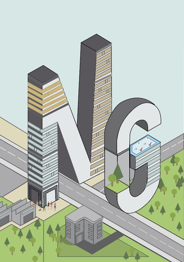 The reason I choose NG is not because my surname is NG, but the dream to become an urban planner is in the past, I tried to find a job for one year but I could not find one due to limited job scopes and my diploma certification ( not 100% relevant to urban planning)
NG – Next Game (gaming)
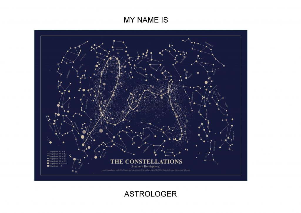
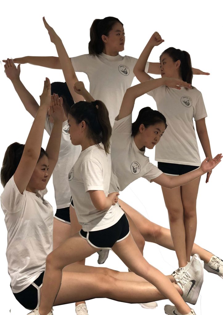
Model
I’ve always wanted to be a Model when I was young, probably I was really enjoy the attention that was given by the audience(my parents) when I was posing for a photo. When I was growing up, start to explore the ugly side of the modelling industry, job as a model does not interest me more, so for this piece I want to hight the ugly side of the modelling industry.
Keywords-# attention#ugly # self-esteem #weight
Medium– Photo-typogrpahy
References Works
Creation Process
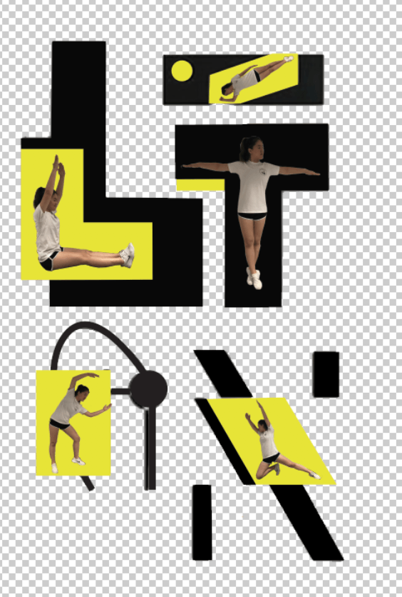
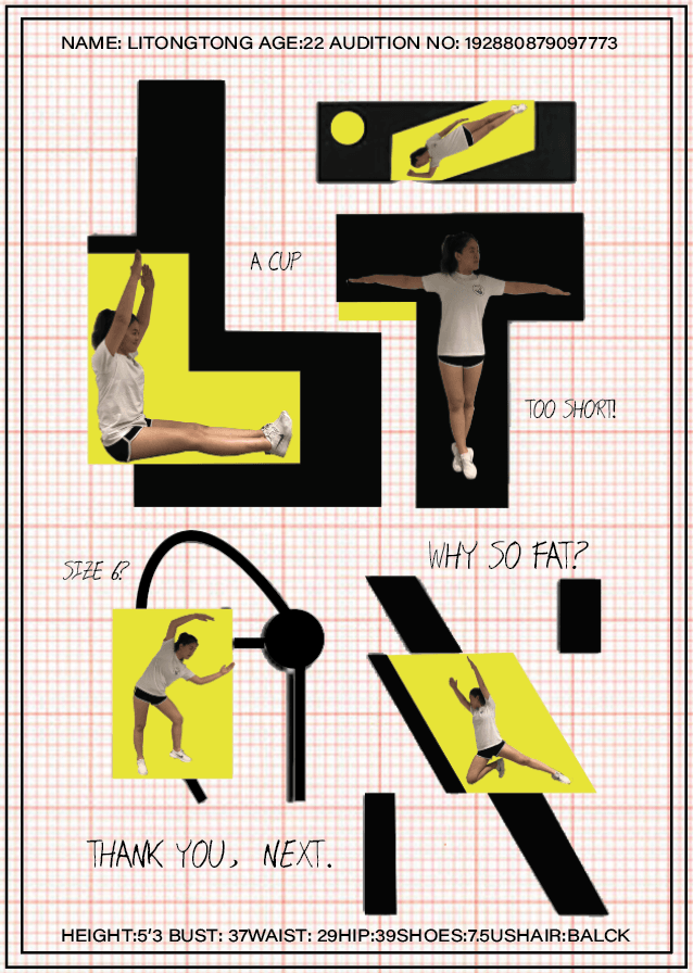
Important features I had to adopt were the clean cut lines, grids, and labelling . The Grid background reflected the truth of modelling industry – incredibly boring, rules and regulations, restricted. The text on the top and bottom are using the “formal” font and for the labelling are using the hand written fonts, I thought the different type of fonts added to the realism of the composition.
CLICK HERE FOR FINAL OUTCOME