
Event Poster


Front of event flyer Back of event flyer

Lanyard

Mockup of staff ID lanyard
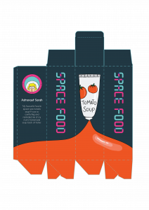
Dieline for space food packaging

Mockup for event flyer
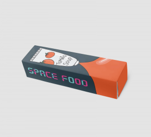
Mockup of packaging
Event Poster
Front of event flyer Back of event flyer
Lanyard
Mockup of staff ID lanyard
Dieline for space food packaging
Mockup for event flyer
Mockup of packaging


What do you find inspiring?
Using illustrations of mythical creatures like unicorns and Bigfoot, it appeals to children, their target audience. They also put the focus on the individual illustrated creatures on their packaging rather than the ingredients or photos of the product itself as it would not be as appealing to children.
What type of information is on the label/bag/box?
On the box packaging, it highlights that the snack is school safe and includes fruits and veggies, keeping the information minimal and direct.
Who do you think is the target audience?
This product is targeted as kids.


What do you find inspiring?
I like that this company not only designed the actual packaging of their soda cans, but also shipping box packaging. The boxes are designed as boomboxes and record players and relates to their tagline of “soda with soul”. Their illustrative style is casual and friendly and reflects their visual identity and branding.
What type of information is on the label/bag/box?
Since this is a shipping box, it does not contain much information about the product itself. It does include their tagline, “soda with soul” and their logo for their customers to immediately identify their brand. It also includes information about their product which would likely most appeal to their target audience like how the soda contains real fruit.
Who do you think is the target audience?
From the casual illustrative style, I think they are targeting people who keep up with trends, who have laid-back and free attitudes.

What do you find inspiring?
This chocolate packaging features a beautiful hand-drawn illustrative style. For each flavour, the illustration and colour palette is tied to the flavour of the chocolate. For instance, the pumpkin spice flavour uses orange and earthy colours to reflect the fall season, when pumpkins are in season.
What type of information is on the label/bag/box?
The brand name, the name of the flavour and the description of the flavour.
Who do you think is the target audience?
The hand-drawn illustrative style appeals to people who appreciate packaging and details, most likely females.


What do you find inspiring?
Each illustration is linked to the flavour of popcorn. By pairing a black and white line illustration with a bright pop of colour in the background, it gives a nice contrast.
What type of information is on the label/bag/box?
The brand name, the flavour, as well as the calorie count.
Who do you think is the target audience?
As the packaging brings out the calorie count, I think the target audience is one who is more health-conscious but still wants to have a little snack.

What do you find inspiring?
I like the abstract patterns on the packaging that still ties together through the colour palette and consistent layout and mix of patterns.
What type of information is on the label/bag/box?
The brand name, the type of coffee, and the various information about the coffee
Who do you think is the target audience?
Coffee drinkers who are not loyal to any brand and appreciate good coffee.
MOODBOARD AND USER PERSONA
For my event, I chose to do a space food exhibition targeted at children, where they can learn about space food and how they package and rehydrate it. I took inspiration from children’s book illustrations that went for a simple line illustration.

SKETCHES


