THE FINAL OUTCOME

First Row:

img_6226

Drained Me + Nature = Therapeutic

Whenever I feel drained or overloaded with work, I tend to go to my balcony and look at the sky and the trees outside my house. Looking at the blue skies not masked by clouds, or changing colours during sunset; the birds sitting on the trees chirping or flying back to feed their babies, it refreshes me and gives me energy to face my workload again.

Drained Me:

I decided to use a dark blue background for all the panels in the first column. But for this panel, it represents the tiredness in me. I also added strips of dark blue washi tape to mimic prison bars to show that I am trapped in my own mind and drained by the workload.

Nature:

This one is pretty self-explanatory, I added some foam adhesive to the trees and layered them to give them more depth and dimension.

Therapeutic:

I chose a yellow background for the third column as it represents energy. I made my face green to show that I have been “healed” by nature and refreshed. Then, since it didn’t convey the feeling of therapeutic enough, I added my eyes, closed to show that I am resting.

Second Row:

img_6226

Youngest Me + Around family = Princess

Being the youngest in the family, my parents and even my brother tend to give me a lot of love (which I am very thankful for) and pamper me.

Youngest Me:

I used a pacifier to portray “youngest” and used my glasses to represent me.

Around family:

My parents are holding to my hands on each side. Pretty self-explanatory

Princess:

I gave myself Princess Bubblegum’s crown from Adventure Time. Her age changes according to how much gum she has in her. I used this to portray myself as I feel that around my family, I am suddenly reverted back to a 13 year old, or maybe even younger.

Third Row:

img_6226

Me + Studying = Distracted

Whenever I am studying and reading my notes, I find myself unable to focus on the large chunk of words in front of me and end up turning to Youtube or Instagram.

Me: 

Once again, I portrayed myself using my glasses and added words in the lenses to convey the idea that I am trying to study

Studying:

This is to represent those days when we still had textbooks and all they had were whole chunks of words in them. Pretty self-explanatory too

Distracted:

I used various icons of some things that often succeed in distracting me. I placed these icons above me to show that it has won over me and the words are below to show that i have forgotten about or given up on studying.

Fourth Row:

img_6226

Quiet Me + Around large groups of people = Almost invisible

Since I am naturally already a very quiet person, around large groups of people, I rarely, if not never, speak. Hence making me almost invisible. This is especially the case when I am with a large group of people that I have just met. In fact, there have been times where they have went ahead without me, completely forgetting that I was with them.

Quiet Me:

Lips taped over. Pretty self-explanatory, to show that my personality has pulled me back from speaking

Around large groups of people:

I used speech bubbles to represent the many conversations happening when large groups of people gather together.

Almost invisible:

I tried something a little different here and used the same colour in the whole panel. I then cut out a silhouette with diagonal strips of washi tape to disrupt the pattern from the background so that it is still visible to the viewer, not completely invisible. I also added some foam tape to the silhouette to enhance that effect a bit more with the shadow casted on the background.


Here’s the full display of my final panels!

img_6226

REFLECTIONS

I really enjoyed using washi tape for this project as it is what I would usually do anyway. I really underestimated the amount of time needed to make this as I had to cut out each individual element and make them look identical, since I wanted some elements to remain the same throughout my panels (such as my glasses, which were the toughest to keep it identical and the toughest to cut out in my opinion). While it is sad that I had wasted so much tape on this project, I don’t really mind since I really like the final pieces that I produced.

For this project, I was initially quite confused with the brief. We were supposed to come up with 4 rows of:

ME + SETTING = ME/MY REACTION TO THE SETTING

I did not know what kind of settings to use since the examples shown were from the previous year and their brief was slightly different.


THE MEDIUM

But I decided to settle on the medium I wanted to use first. I decided to use washi tape for all my panels because I have a ton of washi tape, in all sorts of colours. I feel that washi tape represents me since I love to craft and decorate my journals and planners. I also felt that the vibrant colours and patterns would add more detail and interest to my otherwise plain and simple designs.

Here’s my collection:

img_6225 img_6224


THE COLOUR SCHEME

I first did some research on what different colours meant and I found this website that had a very detailed description about each colour.

After looking at all the colours described, I felt that blue was the most applicable to me. People often describe me as a calm person and personally I find myself to be quite loyal (hopefully, my friends agree).


Here’s the description for BLUE:

¨      Blue is the color of the sky and sea.

¨      It is often associated with depth and stability.

¨      It symbolizes trust, loyalty, wisdom, confidence, intelligence, faith, truth, and heaven.

¨      Blue is considered beneficial to the mind and body. It slows human metabolism and produces a calming effect.

¨      Blue is strongly associated with tranquility and calmness.

¨      In heraldry, blue is used to symbolize piety and sincerity.

¨      You can use blue to promote products and services related to cleanliness (water purification filters, cleaning liquids), air and sky (airlines, airports, air conditioners), water and sea (sea voyages, mineral water).

¨      Blue is linked to consciousness and intellect.

¨      Blue is a masculine color; according to studies, it is highly accepted among males.

¨      Dark blue is associated with depth, expertise, and stability; it is a preferred color for corporate America.

¨      Avoid using blue when promoting food and cooking, because blue suppresses appetite.

¨      When used together with warm colors like yellow or red, blue can create high-impact, vibrant designs; for example, blue-yellow-red is a perfect color scheme for a superhero.


Green was also another applicable colour to me as I like harmony and tend to avoid confrontation as best as I can. The website also suggests that green sometimes denotes a lack of experience which I used in my designs to show my lack of experience in design prior to coming to ADM.


Here’s the description for GREEN:

¨      Green is the color of nature. It symbolizes growth, harmony, freshness, and fertility.

¨      Green has strong emotional correspondence with safety.

¨      Dark green is also commonly associated with money.

¨      Green has great healing power. It is the most restful color for human eyes; it can improve vision.

¨      Green suggests stability and endurance.

¨      Sometimes green denotes lack of experience; for example, a ‘greenhorn’ is a novice.

¨      In heraldry, green indicates growth and hope.

¨      Green, as opposed to red, means safety; it is the color of free passage in road traffic.

¨      Use green to indicate safety when advertising drugs and medical products.

¨      Green is directly related to nature, so you can use it to promote ‘green’ products.

¨      Dull, darker green is commonly associated with money, financial world, banking, and Wall Street.


Thus, I decided to use these two colours and go with an analogous colour scheme. However, because an analogous colour scheme is often seen as boring and dull, I decided to add another colour to the mix, YELLOW, which is the complementary colour of blue. I felt that this worked out nicely as yellow is also used to represent cheerfulness and lightheartedness, or a ‘kiddish’ feeling. Which I tried to portray in a few of my panels.


ARTIST REFERENCES

Way back, I was really interested in using duct tape to make wallets and other items and found this artist who used duct tape to make portraits of people. Although the style is very different, he was the inspiration for using washi tape as my medium. That was when I first saw that tape could be used to create art as well.

Here are some of his instagram photos (@tuffduckwallets)

screen-shot-2016-11-19-at-2-25-30-pm

screen-shot-2016-11-19-at-2-38-31-pm screen-shot-2016-11-19-at-2-37-17-pm

screen-shot-2016-11-19-at-2-24-41-pm screen-shot-2016-11-19-at-2-24-09-pm


NASA FUNAHARA

I came across this artist as I searched for washi tape art. She uses washi tape to recreate famous paintings.

Here are some of her creations:

566269e1620761ab7572cd867c90063f washi-tape-mona-lisa

washi-tape-last-supper

I was really impressed by her works but knew that it would require washi tapes of varying shades of one colour to obtain a realistic look, as seen in her recreation of the Mona Lisa. However, the thing I noticed from her works is the use of colours which gives the pieces a vibrant and lively look, unlike the original paintings.

I also searched on Google and saw that washi tape art was often very cheerful and vibrant. Hence, I decided to stick to a simplistic and cheerful style in my panels to convey that feeling.


THE PROCESS

For all my panels, I chose a few washi tapes that had similar colours and made a background.

img_6214

Then I also laid out strips of washi tape and cut out the different shapes from them.

img_6213

Here’s me making the book for one of my panels. 

Next up, what my panels mean and a look at the final outcomes!


First Quote:

vanessa_ang-beautyandthebeast

Second Quote:

vanessa_ang-theincredibles

Third Quote:

vanessa_ang-theshawshankredemption

Fourth Quote:

vanessa_ang-limitless


Final outcome on tote bag!

img_6039


Final Reflections:

I was excited to receive this project brief as I love movies and the quotes in movies often inspire me in many ways. However, it was difficult for me to select the quotes as there were too many and I felt that many of them were not suitable for visual interpretation. I eventually ended up with these four quotes. The designing process was rather exciting for me as I got to explore with various Photoshop techniques I had just learnt in class. It was also fun experimenting with different placements of objects or using a more suitable image of that object. The silkscreen process, although troublesome, was also rather fun. Before this, I did not know how silkscreen printing worked and to try it out for myself was very exciting. Even though the process was troublesome (I had troubles with the emulsion coating), the satisfaction that came from the silkscreen printing was very great!


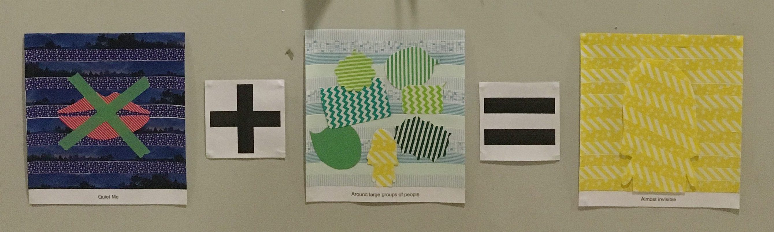
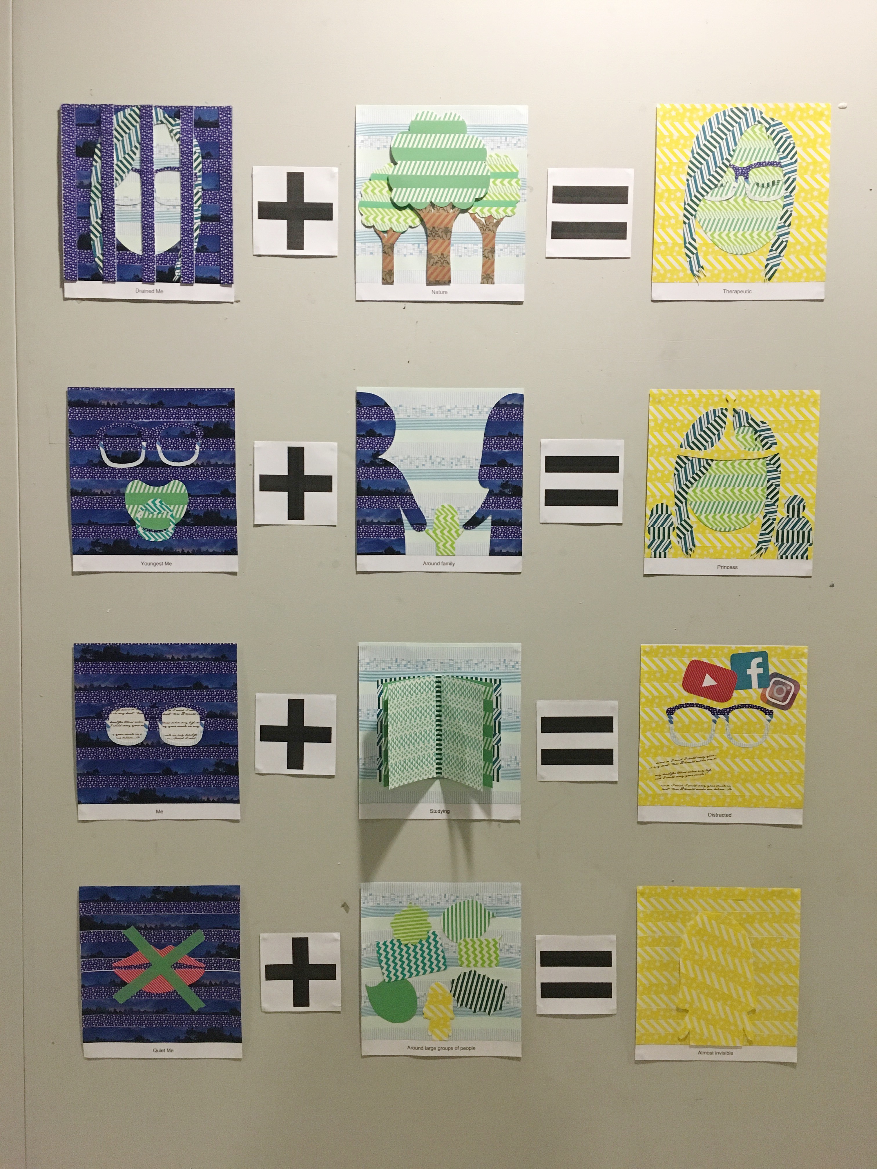
For project 2, we had to find movie quotes and represent them in a visual form. For my quotes, I picked two animations and two real-life movies:

Beauty and the Beast

tumblr_nfia462af01tsw7qdo1_500

Synopsis: An arrogant young prince and his castle’s servants fall under the spell of a wicked enchantress, who turns him into the hideous Beast until he learns to love and be loved in return. The spirited, headstrong village girl Belle enters the Beast’s castle after he imprisons her father Maurice. With the help of his enchanted servants, Belle begins to draw the cold-hearted Beast out of his isolation and bringing out his beauty that was hidden within.

Full quote: Repulsed by her haggard appearance, the prince sneered at the gift and turned the old woman away but she warned him not to be deceived by appearances, for beauty is found within.

I chose to shorten the quote to “Beauty is found within” as I feel that it sums up the main gist of the entire movie. The enchantress had forced the prince to learn that true beauty comes from within; it’s about being kind to others and not only thinking about yourself.

I felt that the two main areas to focus on in this quote is “beauty” and “within”.

Hence, I started my research by searching for symbolisms of beauty:

  • flowers – mainly roses, lotus, orchids
  • swan
  • butterfly (also symbolises delicacy and a wish to not be trapped anymore, to break free)

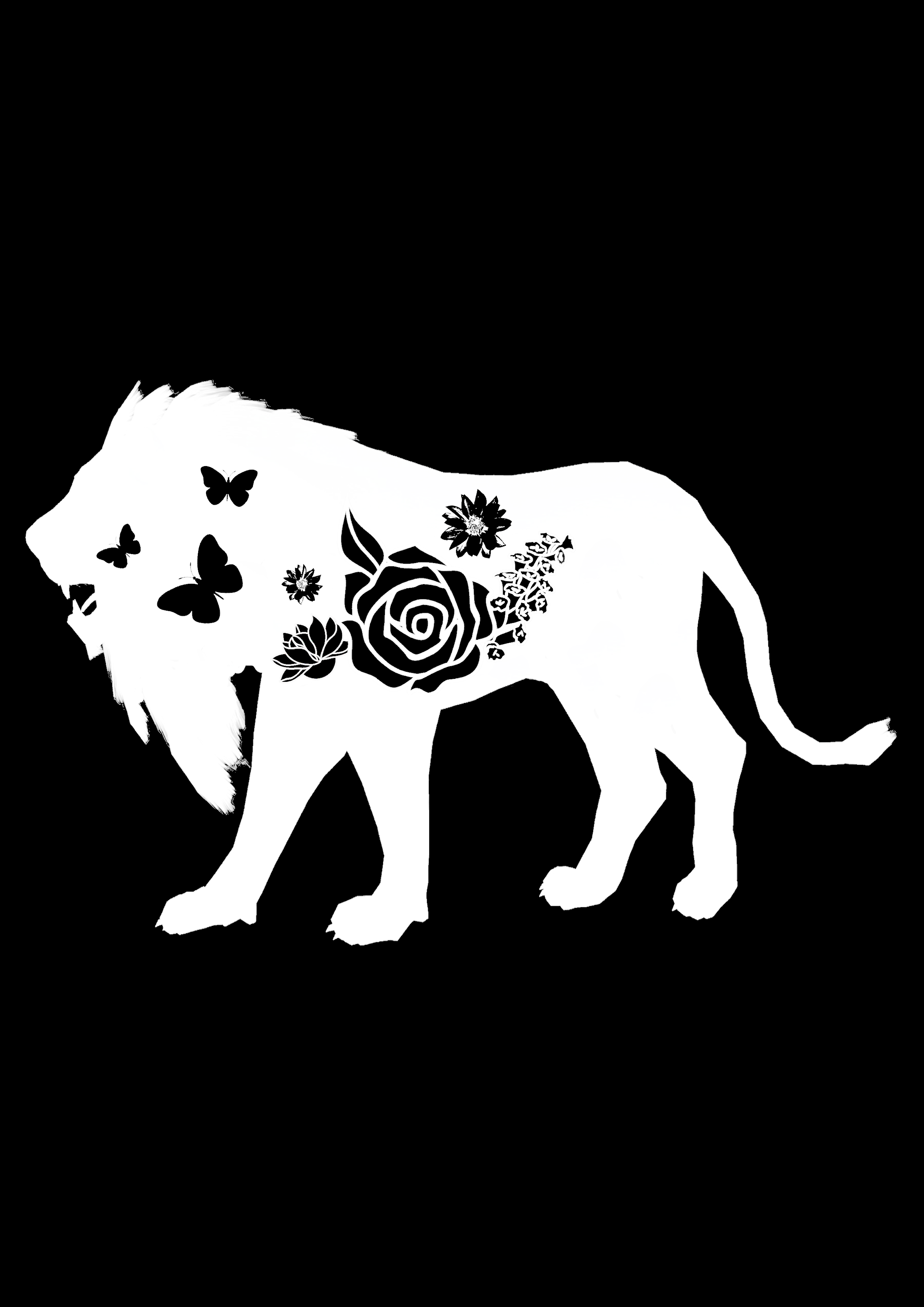
I then decided to use roses as a symbolism for beauty in my first development since the rose is also an iconic part in the movie. It represented the time that the beast has left to find someone who loves him: when the last petal of the rose falls before his 21st birthday, he will remain a beast forever.

beauty-is-found-within

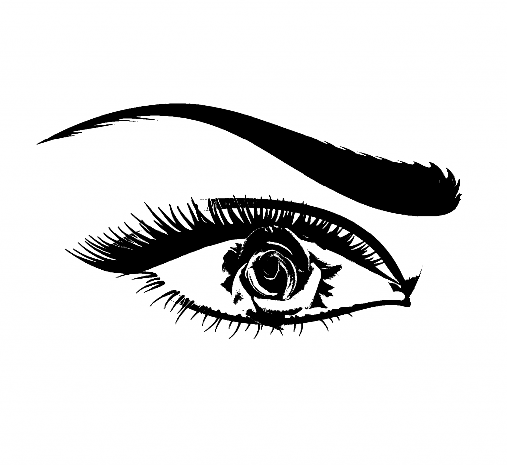
I wanted to use a rose as the pupil of an eye to show that beauty is beyond what you can see. However, Mimi said that the idea of it being “within” is not really shown. Therefore, I tried another way of showing “within” using a silhouette of a lion, which I felt represents Beast. Here are the rest of my development for this quote:


beauty-and-the-beast-quote

beauty-is-within-final-invert

beauty-is-within-final-invert-2

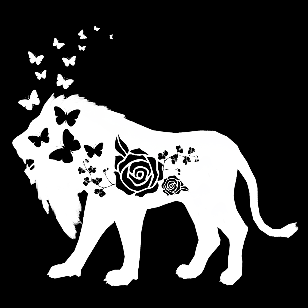
I added more butterflies coming out from the lion to symbolise Beast wanting to break free from his curse.
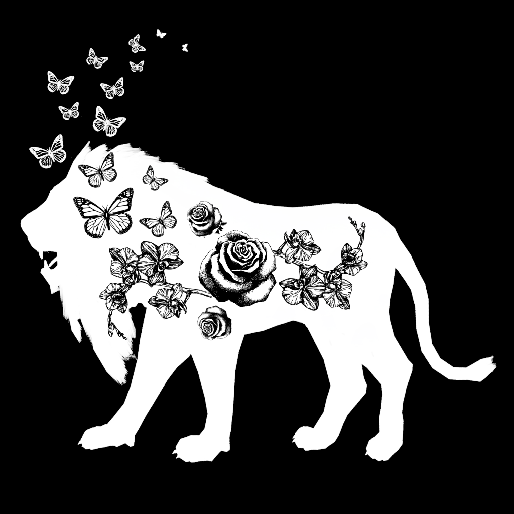
beauty-is-found-within7


Final design:

beauty-is-within-final-square


The Incredibles

tumblr_mzt1fpd3ra1rexoi3o8_250 tumblr_inline_nkay73gmus1szyvnd

Context: Edna Mode is a costume designer for The Incredibles, she expresses her dislike for Mr Incredible’s costume when he approaches her to fix the tear in it. When Mr incredible points out that she was the one who made the costume fifteen years ago, she says the quote. She then says that he needs a new suit and proceeds to design a new one for him.

Full quote: 

Edna: This is a hobo suit, darling. You can’t be seen in this. I won’t allow it. Fifteen years ago, maybe, but now? Feh!

Bob: Wait, what do you mean? You designed it.

Edna: I never look back, darling! It distracts from the now.

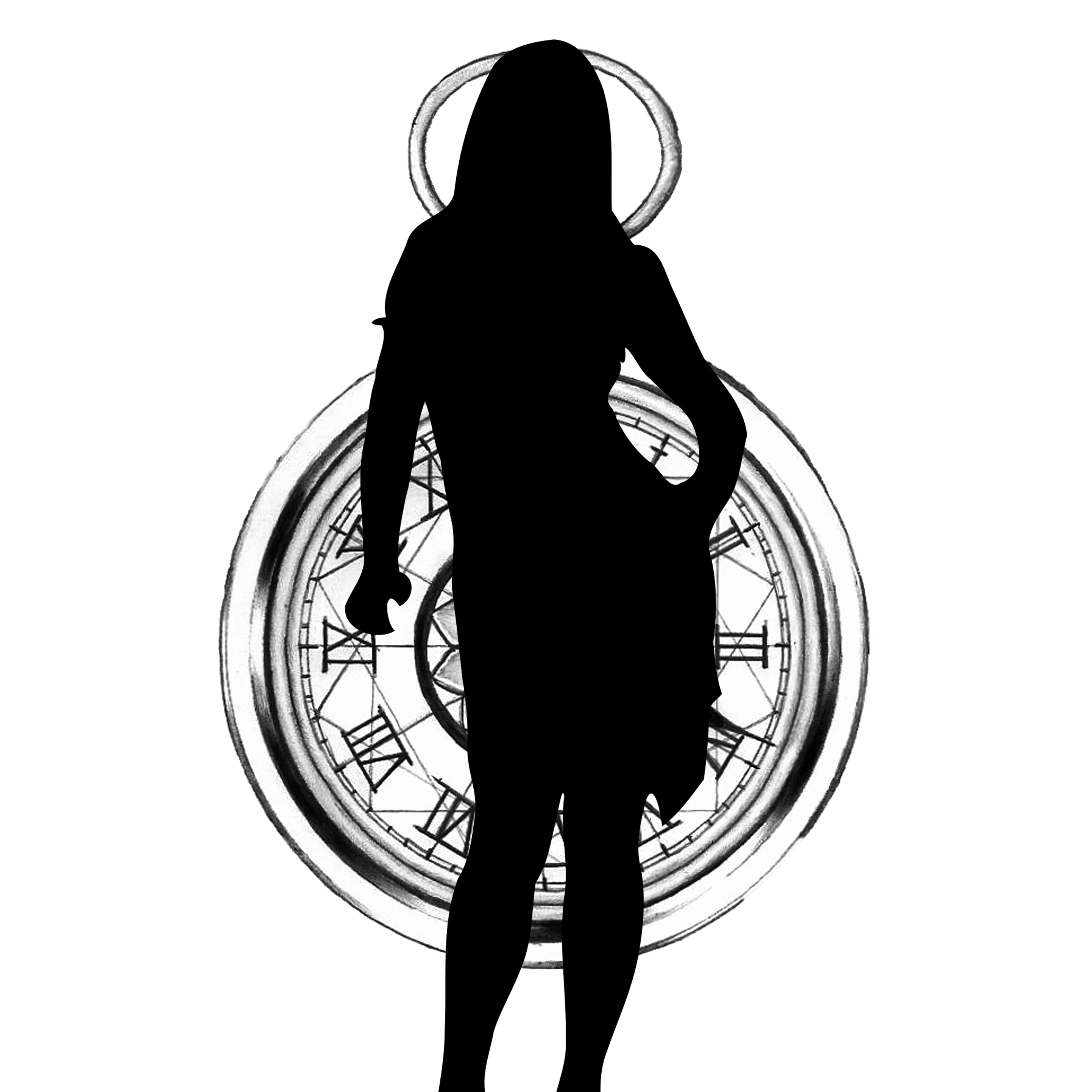
To symbolise “looking back”, I wanted to use an image of an eye, with a clock(to symbolise the past) behind it. I wanted to show that Edna has seen beyond the past and is looking to the future.

edna-mode-v-2

Obviously, I couldn’t use an image of Edna herself.. So I replaced it with another lady in a sassy pose, which I think suited Edna.

edna-mode-v4

However, this covered the clock. So I simplified it down to an eye.

edna-mode-v2

edna-mode-v1

After that, I wanted to add a tear, to signify the tear in Mr Incredible’s costume. I also feel that it brings across the meaning of “distracts from the now” as the tear is on the old costume and Mr Incredible’s continuous focus on it distracts Edna from creating a new costume. I also did not like the style of the clock as it blended too much into the background.


Final design:

edna-mode-final


The Shawshank Redemption

tafua

tumblr_mgxr4aowm21r7a0wxo1_500

Context: Andy Dufresne is wrongly accused of murdering his wife and her lover out of jealousy and anger. He is sentenced to 2 life sentences in Shawshank prison. After 20 years, he finds out the real murderer and tries to get an appeal for the case. However, the corrupt prison warren wants him to stay and continue doing his dirty work, saying that the appeal would not work. The warren then puts him in a solidarity cell for 2 months as punishment for not listening to him. After Andy comes out of solidarity, he decides that he could not stay any longer and decides that it was time to escape after a talk with his pal, Red. He crawls out of a tunnel in his cell which he has been picking out for 20 years. While talking to Red, he said that it comes down to one choice: get busy living, or get busy dying. He refers to the decision to escape out of prison and decides to live; to escape prison.

Full quote:

You’re right. It’s down there, and I’m in here. I guess it comes down to a simple choice, really. Get busy living, or get busy dying.

From the quote, I focused on the words: “living”, “dying” and “busy”.

To symbolise living, or life:

  • nature – tree (tree of life), butterflies, birds, flowers
  • lotus flowers (survive even in muddy waters)
  • circle of life
  • sun

To symbolise dying, or death:

  • crow
  • bats
  • skull
  • grim reaper
  • noose
  • tombstones
  • black


shawshank1

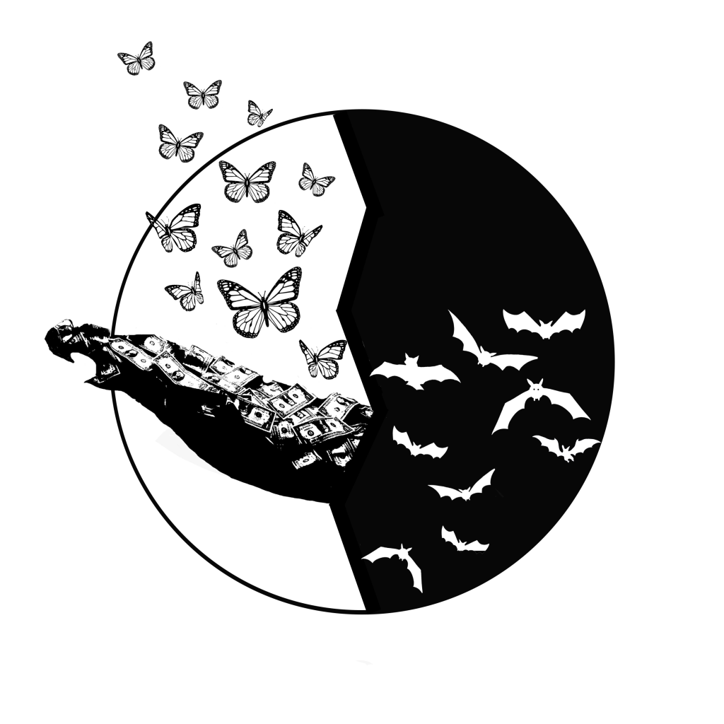
For my first design, I guess I got too excited and simply put everything that symbolised life and death into the image. I also found an image of a pile of money which I used to symbolise Andy, who was a banker. Mimi said that it was too messy and there was no focus point. She also suggested that I take inspiration from the yin yang symbol.

shawshank2

I realised that the pile of money resembled an arm, reaching out. I was very excited when I realised that I had accidentally made the pile of money reach out towards life. Which was what Andy decided to do: live by escaping prison.

shawshank4


Final design:

shawshank3-3


Limitless


output_ahymuc

Synopsis: Struggling author Eddie Morra suffers from persistent writer’s block, but his life changes abruptly when an old friend introduces him to NZT, a revolutionary new pharmaceutical which will allow him to fully utilise his brain’s abilities. With this enhanced mental acuity, Eddie soon realises the possibilities of what he can accomplish are unbounded.

Full quote:

Why is it that the moment your life exceeds your wildest dreams, a knife appears at your back?

The quote is said at the beginning of the movie, as an opening line and introduction to the story. Because of the pill, Eddie Morra wants to keep moving forward and striving for greater things that he once couldn’t do without the pill. But yet, because of the pill, troubles come looking for him as well.


To symbolise dreams:

  • clouds
  • stars
  • sky
  • birds (freedom to dream)
  • wings (fly higher to achieve your dreams)
  • flowers, vines


limitless4

For my first design, I used clouds to symbolise dreams. I also used a dagger stabbing into a pill to show that along with the pill, troubles come along as well. However, it felt too plain and did not convey the idea well.

limitless5

I then added wings to show how Eddie wants to strive even higher every time he takes the pill. I also used a scythe instead of a knife in this design. However, I felt that the wings were too messy.

limitless1

I decided to take a more static approach to the design and changed the style of the wings. I also added flowers at the back as I often relate flowers to good dreams. I took away the pill even though it was crucial in the movie as I felt that someone who did not watch the movie would not understand the inclusion of a pill, as it is not mentioned in the quote.


Final design:

limitless-final

For my final design, I used the flowers and wrapped it around the dagger to convey the idea that by striving too high and beyond your limits, it is bound to bring troubles and problems. I wanted to show the connection between Eddie’s wildest dreams and being unable to avoid getting into trouble because of it.


Artist Inspiration


Ben Giles:

tumblr_mgzsy9lhlj1rikxajo1_500

c8aa45dd4d66085aea9dff5fc1f94995

In a lot of his collage works, Ben Giles likes to use flowers. He also makes use of bright and vibrant images to contrast black and white images. Although this would not be applicable for my project which is purely black and white.

1935d7117ce0ad9aebd6dcdff4f1cf51

e5e5912d1369da41ab5cb491b45b6514

bb67e9083e9363a91061f33f8f35b924

He also takes an ordinary image, adds an element to it, and changes the message of it completely, by playing with scale. His style is quirky and has a hint of humour in it, although his style is mostly not applicable, it was very enjoyable to look at his work and get some inspiration.


Eugenia Loli:

New Cydonia: Rise of the Ancients

loli-9

179389-296a59d8538d4d6cbdbec5196f528040


Sammy Slabbinck:

4-collage-art-illustrations-by-sammy-slabbinck-yatzer

13-collage-art-illustrations-by-sammy-slabbinck-yatzer

sammy-slabbinck-vintage-photograph-collage-02

Another two artists that have a similar style are Eugenia Loli and Sammy Slabbinck.


Henn Kim:

cbdd4cb90fc91a303698f1a3bd66babe

ba4a7fe86124be6f09c566c92a820264

102ff8ce66078e268b536d0f53a63b7a

I really like Henn Kim’s work and I know that a lot of people have also listed her as an inspiration. I like how her illustrations are very minimalist and yet conveys a very strong message with a bold aesthetic style.

Next up, my final outcomes for the project!

After an arduous journey to discover what my emotions look like on paper, I finally completed my first 2D project!

For this project, I used a couple of different techniques and was quite happy with my pieces. However, if I were to do it again, I would have liked to try out more and be more experimental. Looking at other people’s works, I really enjoy seeing how different people think differently and produce entirely different outcomes from me even though we had the same emotion. Overall, I felt a great sense of satisfaction looking at all my pieces placed together but it was definitely emotionally draining and a tedious process.


img_5869 img_5870 img_5871 img_5872

In Week 2, we had to bring our own mark making tools and experiment with them, creating cool-looking marks and designs. It was hard at first to come up with different designs for the same tools, I thought too hard about it and ended up being too careful with my work, which was supposed to be experimental and instinctive. But after a while, I simply let my hand do all the work instead of overthinking it. The result of that? Designs that got people saying “Cool!”


It was fun allowing my instincts to take over and not think about what I’m creating. To end up with marks that I would never have made before this class! Here are my works!

IMG_5610

After getting used to the roller and playing around with it for a bit, I started making use of some mark making tools. Over here, I used a silicone pot mat with a waffle pattern, some string on a toilet roll, a net of some sort and a tiny fake rose. I also used a fork and the palette knife to create designs on the roller before rolling it out onto the newsprint. While this created some nice designs, I was told that it looked too careful, so i moved on to my second piece:

IMG_5609

My favourite pattern on this is the third one from the left. I like the different weights of the pattern, which was a result of me dabbing the spring onto the paper using varying degrees of pressure.


IMG_5611

We then had to crave our own lino. I didn’t have a specific idea in mind while I was carving, and was simply seeing where it takes me. As i carved the first part of it, it started to resemble angel wings so I decided to make a stream of wings. But when i turned it sideways, it started looking like fishes. So i started carving wavy lines to create waves and mountains. For my first print, it turned out quite nice: the ink was spread out really evenly and it came out really black, although the ink seeped through some parts. I then decided to try it out again and used a fork to create more lines on the lino. My second attempt came out really well and I thought the lines I created using a fork resembled the wind. My third attempt was done right after the second attempt, without re-inking the lino, creating a more faded effect.


Overall, I had a lot of fun in this class as I got to experiment with everyday objects that I never thought of using as mark making tools. It was interesting to see how these objects created such unique textures and patterns.