Research Assignment Proposal

The essay topic I have selected is on Chinese Tomb Art. I would like to address the various types of Chinese Tomb Art and compare an armored and an unarmored terracotta figure from the Qin dynasty, applying both visual and contextual analysis to my findings.

The article I will start with is a thought invoking article by Martin Joseph’s book:

Bibliography reference

  • Powers, Martin J., and Katherine R. Tsiang. 2016. A Companion To Chinese Art. Blackwell Publishing.

The book discusses on the rich belief of the afterlife among traditional Chinese that dates back to the Shang dynasty and how it employs different forms of funerary art used to reaffirm important cultural values such as filial piety.

The author also addresses a question for thought, whether funerary art can be considered “fine art” as there were no evidences of people regarding the tomb as a form of art in early China although tomb décor or individual artifacts might be admired for their artistry. He provides further evidence that mundane objects such as ceramics were not created as fine art but is now considered a work of collectible art during modern times.

These objects are mentioned by the author to serve their main purpose of honoring people of high-rank or to serve in ceremonial settings. Moving to the next level, author also questions whether “tomb art” actually does exists.

A possible outline for my essay is the following (sections and section headings subject to change):

Introduction

  • Address how the Chinese have a strong belief in the afterlife and a spirit path to it that needed facilitating, hence the importance of tomb art.
  • What is tomb art and the various types of it (Chamber paintings, tomb pottery, ritual bronzes and guardian sculptures)
  • State that the focus of my essay on tomb art is on Terracotta figures and narrowed down to comparing and the similarities and differences between an armored infantryman and an unarmored infantryman.
  • State my claim of how the figures are carefully crafted individually and high level of intricate detail that allows it to be called a piece of fine art

Body

  • Compares the similarity of Terracotta figures in terms of material, facial features and expression
  • Followed by comparing the differences in terms of pit placement, posture and the usage of weapons


OR

  • Examines the unarmored Terracotta figure in terms of material, facial features, expression, pit placement, posture and the usage of weapons and provide contextual knowledge
  • Followed by examining the armored Terracotta figure in the same aspects as the previous one, also providing contextual referencing


Conclusion

  • How these details are crafted on the terracotta figures went through several levels of thought process and planning which translate it into a piece of fine art
  • The fact that it is an ‘eigth-wonder of the world’ tells a lot about the workmanship and the number of craftsmen that crafted this work of art


Project 1: F I N A L

Well hello there!


Great seeing everyone’s works the other day and congrats getting the first project down errrrrrrbardi!

Here’re my final 4!

But before that, HERE’S AN ATTENTION MESSAGE :

SAVE A LIFE. BACK UP ALL YOUR WORKS. 

My hard drive got wiped out and I had to redo my works and died like a Kenny. But oh hello i’m still alive but barely breathing after this whole episode :—-)

okay cut to the chase

My name is Val and I am a….

M U S I C E N T H U S I A S T

FINAL

While coming up with several versions of this, I was so vexed as I just didn’t know how to compose this image with so many elements to place?!

How some of my compositions turned out

1

Eh this isn’t “I am a qian shou guanyin” trait right…

2

The three images of me with this positioning reminds me of Fu Lu Shou man3

The use of space isn’t quite right, feels empty in the middle! (and my hands make me look like i’m drowning. But yes, save me)

4

Visual map doesn’t guide the eye the way I intend to!

The next thing I know, I was jamming hard on my drumkit and my guitar when inspiration started to hit me. Oh hell yeah!

The idea of using of design synectics came in and I started rearranging the elements according to those principles which include scale, isolation, superimposing and repetition. 

Feels rewarding to apply what we’ve learnt in semester 1 for projects that followed! Thanks Mimi! @mimishamsuddin75kfollowersoninstagram

Also, Russian Constructivism was a brilliant way of playing with this concept of music enthusiasm with the coincidences of the letter R (ROCK & REVOLUTION) and the FIST

Reference – Posters

Initially, I only had the idea of using a single image to portray this trait – the fist holding drumsticks. However, it seemed to be lacking of my personality and a sense of dynamism in my work. Putting several details together like a poster seemed to do the job well hence, a grunge-looking russian constructivism poster!

I’M  A  H U G E F A N  O F  T H E 1 9 7 5

1975

While thinking of how to best portray this trait that I really love this band, I was actually in morose because I missed their concert here just last month /starts sobbing all over again

This explains the dark tone used in this particular work

Funny how their song actually still sets a spark in me whenever i’m down, even when I was right there missing the chance to see them perform live.

Issit I feel like crying while typing this OSS post….

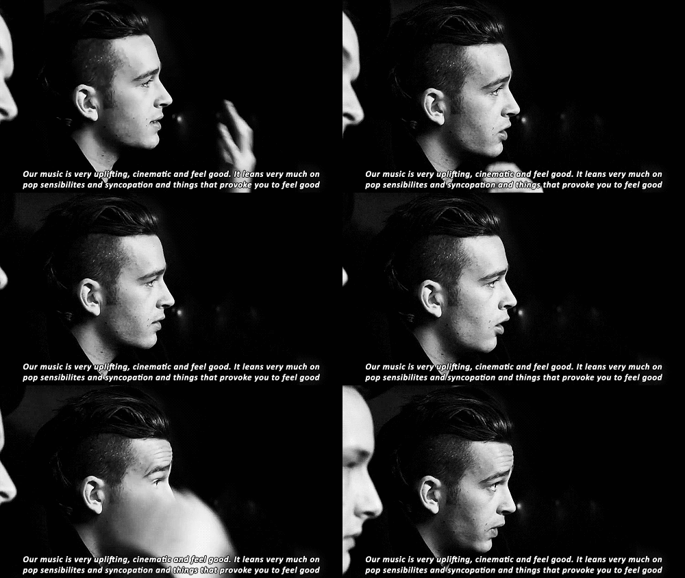
Oh oh, Matty from the 1975 has something to say:


Wah feeling so cheesy saying it but the lyrics of their songs illuminates the passageway to my soul, therefore the tunnel in the backdrop to accentuate this point

Basically I’m using neon signs against a dark pathway as a metaphor for these feelings

Accompanied by a neon sign that spells my name, it creates a vintage look that hints an idea of a band

Majoring in interactive media, this gave me some inspiration of turning it into an installation on its own, accompanied by their hitsong. Sounds like an idea?


Best way of presenting this work: 

A 1975 song playing in the background

Project this piece of work on the screen with lights dimmed out

An invisible me commentating whatever i’ve mentioned above through the speakers


It’s all about the feels for this one


Moving to the matured and more serious side of me, my works are presented in black and white for the following traits

I  W A N T  T O  B E  A N  E N T R E P R E N E U R


Creator of my own brand

The Chinese words reads “Qun Dian”

Qunen is my chinese name and dian translates to shop!

The words are designed in bold intentionally. It actually means that i’m making a bold statement to telling others of my aspirations of making it as a boss of my own business someday!

I wanted it to be monochrome to enhance the professional image of a brand name and at the same time have an artsy x vintage feel to it

Here are other parody versions I came up with!

Jack Daniels


Creator of my own brand - BURGER Creator of my own brand - beer Creator of my own brand - beer 2
Creator of my own brand - sports

Last but not least

I like seeing things in more than one perspective

Perspective with border

“Everything is about perspective.” Val, 2016. Perspective is involved from judging an OSS post to scanning an instagram picture before you hit the double tap to positioning the angle you take your selfie from.

How we appreciate something could be a totally different case from your friends, neighbours or dog.

Therefore to portray this idea of perspective, try flipping the picture upside down. It spells my name yet again.

Perspective

Initially it didn’t have borders and I was bothered at how plain it was on its own. Therefore to enhance the hint of vintage feel for each piece of work, I added in the borders extracted from Jack Daniel’s packaging, borrowing its vintage typeface elements.

Oh, and so happens theres this term called “perspectival” too, LOL

Perhaps I could work on an ambigram that spells perspectival when you flip it over.

Why is it that ideas start to flow more when the project is over? Oh well, the process never ends for learning!

Cheers guys! See you all back in school!

You can have a look at my research here!

2D Foundation II: Project 1 Research I

2D Foundation II: Project 1 Research II

2D Foundation II: Project 1 Research II


Hey everyone! It’s val!

Typography portrait problem was a problem as I had a problem striking a balance between aesthetics and concept. Common thing among designers eh? Yeah, that’s the problem.

Well, we’re sure to face clients in the future that wouldn’t give a heck about concept but just demanding a pretty design. However, I personally do not want to lose touch of holding a meaning behind my piece of work. To me, style should come with substance.

To solve that problem, I took a step back and gave a thought about giving a theme/concept to my work as a whole.

And this is what I came up with:

I separated my traits into two categories

  1. Things that people will be able to tell
  • I’m a HUGE FAN of the 1975
  • I make music

2. Things I don’t show ( unless you get to know me better )

  • My greatest phobia is blood
  • I want to be inked

Update: I might change these two traits because I almost fainted while editing bloodied half done tattoos (no joke)


1) // I  L O V E  T H E 1 9 7 5 //

*・☪·̩͙ ·˖✶үσυ αяε мү gεт αωαү, үσυ αяε мү ғαvσяιтε ρℓαcε *・☪·̩͙·˖✶:

This is a band I’m really into. I love their music, style, and vibes I get from listening to this band. They recently came up with a new album that had a whole new look – they went neon, pink and a little bit of vintage. They were all black and white and nothing flashy before that.

It’s a really fresh look that I’m lovin’ it.

Check out their typography  i went back to 16k because i deleted one of my boards i don't pin to anymore. oh my god:

 :


The 1975 - Neons (Set 2) - Samuel Burgess-Johnson:

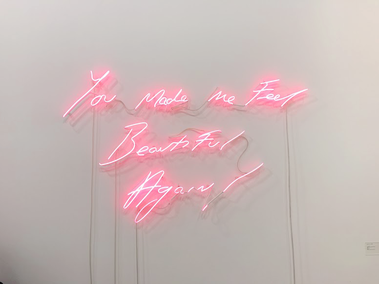
Also, here’s a piece of work with an uncanny resemblance to the 1975 font, spotted at Art Stage 2016 at MBS expo hall just recently!

neon

I thought I’d share it as this neon light signs are really getting into my head and as if screaming at me to use this for my typography project


Photo editing

NEON 1

NEON 2

Handmade typography

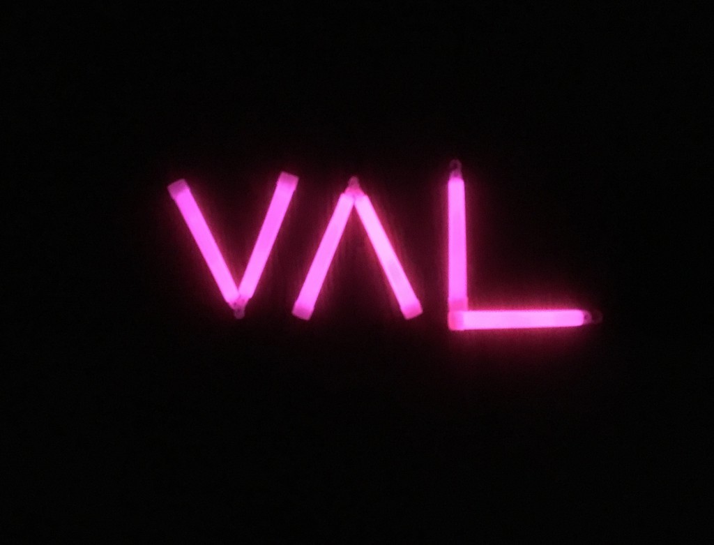
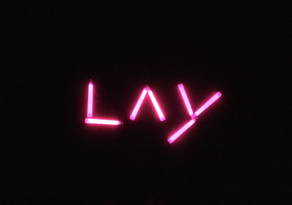
Unable to afford neon signs but some glow sticks!

IMG_0841

IMG_0846


2) Music Enthusiast

Methods

  • Decorative typeface
  • Russian Constructivism
  • Bang logo parody

Decorative typeface

I’ve been into music since I was a little toddler because of the influence of my elder siblings – where I was singing to Nirvana (thanks to my brother) and Britney Spears(thanks to my sister) at the age of 5.

I went on to pick up instruments on my own that include the guitar, bass drums and was also on the vocals..and listened to Franz Ferdinand a lot!

The grunge-like style can be apparent in my rough drafts here

Screen Shot 2016-02-07 at 3.46.28 PM

Using guitars to form the first letter in my name

Screen Shot 2016-02-07 at 3.46.45 PM

Legibility test: My niece came into my room as I was doing my work and went: V…A…..L!

Whew. At least a 6 year old can tell I’m trying to form my name here. Then again, as we’ve discussed during consultations: does it really matter if it could be read or not?


Then I went on to explore with Russian Constructivism 
Screen Shot 2016-02-07 at 3.46.58 PM

Amp head. Subtly hinting that I could be quite loud at times.


After coming up with that design, it hit me that there are some band posters that has this particular style.

Muse

Asking Alexandra, AA

The Libertines

And er.. well..

Version 2

Well, what’s a Russian Constructivism poster without THE FIST. I began playing with the idea of rockers holding drumsticks.

Screen Shot 2016-02-07 at 3.46.13 PM


** SAVE A LIFE, BACK UP YOUR WORK PEOPLE! **

Sad to say the several other versions got wiped out 🙁 Ugh!

Band Logo 

Felt it would be a waste if I didnt create a band logo and incorporating my name!

RUNDMC

No prizes for guessing which band’s logo i’m imitating.

.

.


3) I prefer seeing things in another perspective

Everything is about perspective. From how we view each others work, to how we think which Instagram photo deserves a double tap, to your opinions about this statement I make.

A few methods I came up with to play around with the idea of ‘perspective’

  • 3D hologram
  • Ambigram
  • Typography optical illusion

3D hologram

Majoring in interactive media, I used this chance to experiment with projection for the hologram and art installation with the optical illusion typography.

Processed with VSCOcam with a5 preset


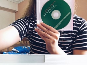
All you need is your not so favourite disc

Processed with VSCOcam with a5 preset

And cut its casing into four trapeziums

(And I’m sure someone has something to say about my long nails  FYI Chinese new year cannot cut)

Processed with VSCOcam with a5 preset

And here’s the result

Consulted Joy and overwhelmed by her response! Let’s see if i’ll use it in my final..

  • Ambigram

Work In Progress

  • Typography optical illusion

The idea is to take a step back and getting to see things in another viewpoint, almost literally


4) I want to be inked

Typeface

Concept behind this:

One hand is inked and the other clearly isn’t. What i’d like to bring across here is that despite my desire to have ink on me, half of me is still holding on to my beliefs that perhaps I shouldn’t.

Colours used: The background’s yellow was used in contrast with the tattoo’s red. This intentional dissimilarity of the two aims to accentuate the contrasting thoughts I have about getting a tattoo.


Version 2

V2

V2.1

5) I want to be an entrepreneur / create my own brand

  • Brand logo parody

I understand we only need 4 compositions but I experimented with a couple more with several brand logos of different industries

Jack Daniels

Vintage font – Jack Daniels whisky


Creator of my own brand - beer

Heneiken – with a local twist in the lingo

Creator of my own brand - beer 2

After all that angmoh alcohol, perhaps I could set up an Asian beer company?


Creator of my own brand - BURGER

Or even a fast food chain


Creator of my own brand - sports

Or a sports brand


Overall final works: 90% done, to be revealed soon!

Favourite temple in Singapore

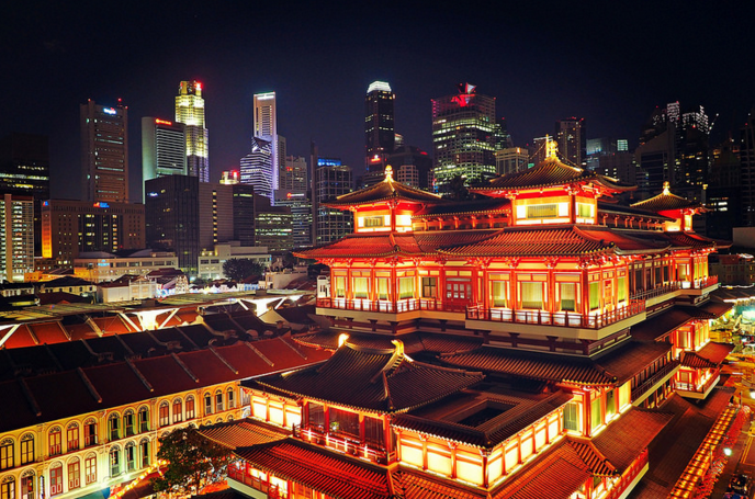
Every time as I’m on the topic of temples in Singapore with friends, this particular temple will never fail to pop up in the conversation – you guessed it, it’s this one you see here

Screen Shot 2016-02-05 at 1.43.51 PM

Buddha Tooth Relic Temple and Museum

It’s impressive architecture has made it a hit with tourists as well as educational heritage trails amongst schools

Screen Shot 2016-02-05 at 1.44.36 PMTang-dynasty style architecture and intricate details never cease to amuse me

I’ve been there a couple of times for field trips and I never knew that this temple costs S$75 million to set up.

It’s based on the elements of the Tang Dynasty and the Buddhist Mandala, which is a representation of the Buddhist universe.

What makes this temple my favourite is also the fact that it’s not just a pretty look on its own but it also holds relics (bone and tongue of Buddha), as its name suggest, which further brings value to this temple. Furthermore, it’s both a temple and a museum! So much history and value in one place itself!

Screen Shot 2016-02-05 at 1.44.15 PM

The main Buddha Tooth Relic Temple is on the ground floor while the Buddhist museum is on the third floor.

Thousands of artwork (paintings, statues, tapestry, etc) related to Buddha and Buddhism are featured in this temple. Perhaps its really a place to visit for asian art history to come alive.
Stupa

What’s really amazing about this temple is the giant stupa it houses that is made from 320kg of gold, of which 234kg were donated by devotees.

We’ve learnt about temple devotees in lecture that they make these donations in order to earn themselves good karma and merit to live a prosperous life and many lives ahead.

Dedication

Each temple is dedicated to a certain deity/ god and as for The Buddha Tooth Relic Temple, its dedicated to the Maitreya Buddha (Compassionate One, also known as The Future Buddha).

Screen Shot 2016-02-05 at 1.44.57 PM

Not just a temple and museum

I also recalled that this is is not only a temple and a museum, there is also a rooftop garden, a library, a vegetarian restaurant in the basement and a bookstore.

Perhaps its accessible location in Chinatown has generated an influx our visitors and especially tourists, commercializing the scene quite a bit here.

Being a shutterbug now, I’d like to back here soon to try out some long exposure shots!

Anyone wants to come along? 🙂