Introduction
For our very first project, we were tasked to create typographic portraits of occupations we wished to have in future. These portraits had to comprise mainly of letters found in our names.
Final Product

In this project, I wanted to experiment with the idea of contrast, both in concept and medium. Drawing inspiration and personal experiences from past jobs, I wanted to create portraits that consist of these jobs I’ve had and their ‘dream’ counterparts. The four I decided to go with are Server VS. Five-Star Chef, Art Student VS. Graffiti Artist, Manic Fan VS. Music Legend, and Artist Liaison Officer VS. Award-Winning Actress. To further emphasise the contrast, the medium used was a combination of photomontage and illustrations.
Portrait 1

The first portrait is my job as a waitress contrasted with my dream of being a five-star chef, focusing on the contrast between a chef having more control and creating more dazzling meals, and a waitress having much less authority and whose job mainly revolves around serving food. The composition consists of a pair of chef hands at the top garnishing a lobster dish. The dishes, from top to bottom, show a lobster dish, hamburger, and cup noodles. At the bottom is a waiter holding a tray about to serve the dishes. To reinforce the idea of the difference in control between the two jobs, the dishes pictured decrease in quality as it reaches the waiter (a lobster dish, typically considered a high-end dish, followed by fast food, then ready-made food). They also become increasingly disorganised.

Since the contrast is conveyed through the dishes, the letters, V, E, and W, are spelled out using the food items. Taking into consideration the special qualities of each letter, I adjusted the presentation of the food items accordingly:
V: Has straight, rigid lines
Shown through the composition of the chef’s hands and lobster dish; the dish being connected through flakes from the garnish. As the letter is much neater and rigid, it seems fitting to have it at the top, with the chef’s hands.
E: Three extensions
Shown through the presentation of the hamburger, where the ingredients are separated to better depict the letter’s extension, and the sauce showing the vertical line; the letter having three separate extensions seem fitting for a hamburger, as the layering of ingredients could emulate the shape.
W: Zig-zag pattern
Shown through the presentation of the noodles; the zig-zag pattern was simple to depict with the curvy nature of noodles. By extending the noodles across the pair of chopsticks, it helped in keeping the composition balanced, and makes the ‘W’ shape less jarring.
The entire composition, on the other hand, is also coincidentally in the shape of a ‘V’, allowing it to better to convey the intended message.
Portrait 2

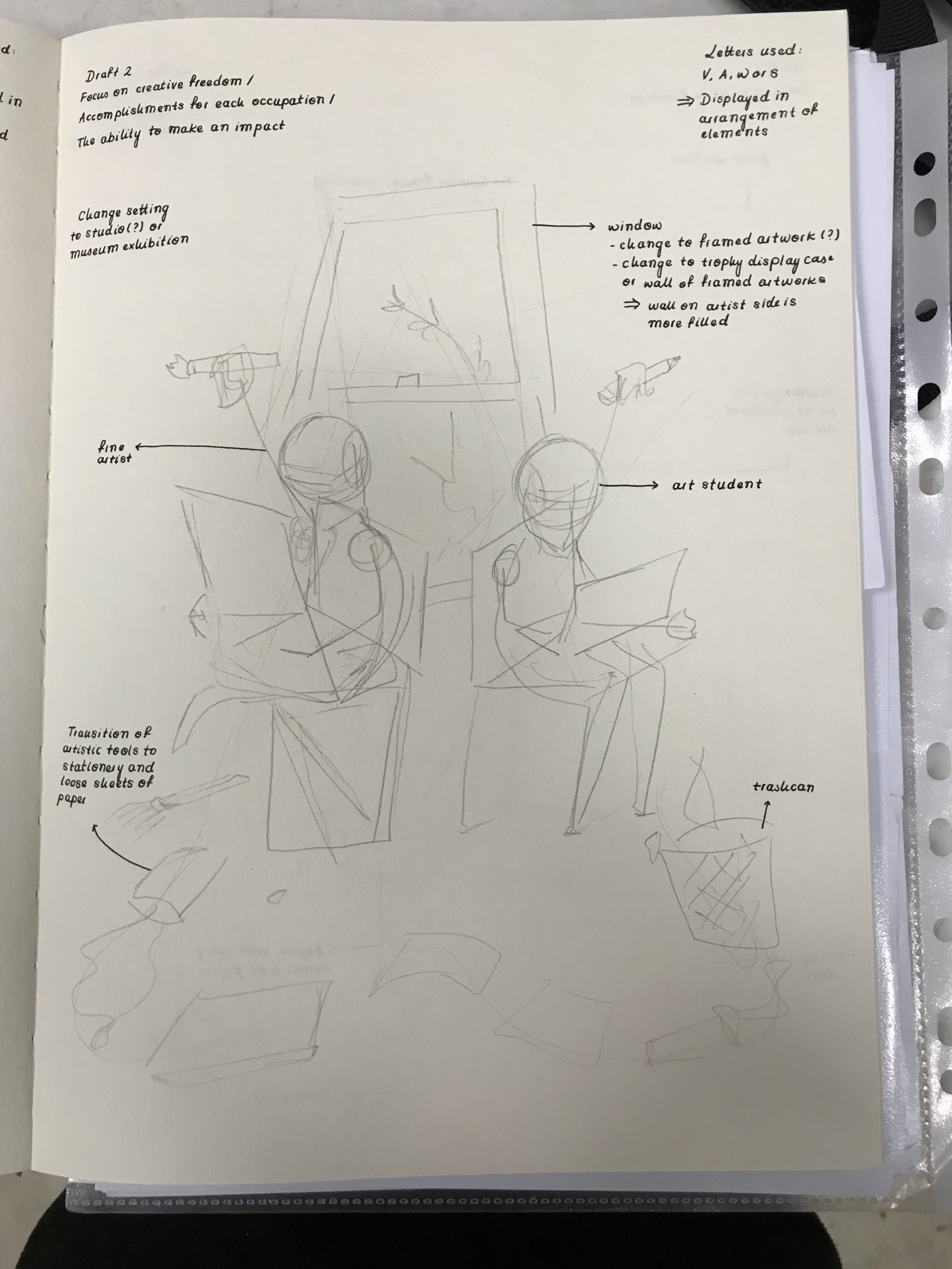
The second portrait is my job as an art student contrasted with my dream of being a graffiti artist. The main contrast between the two jobs I wanted the portrait to focus on was how graffiti artists and art students had different canvases to work on; graffiti artists had walls and buildings but art students had to confine to the limits of a canvas. The composition, therefore, consists of a student studying at a desk, and across the road, as shown through a window, is a group of painters adding streaks of pink paint onto the row of houses across.

V, N, Z: Made up of straight lines, rigid
The letters, V, N, and Z, in this case, are portrayed through the ropes holding the painters’ platforms. Since the ropes here have a very rigid and geometric nature, I chose letters of my name that had the same characteristics. Furthermore, the letters, as compared to other letters in my name, are the easier ones to form out of straight lines.

I: Straight line and dot above
The I in this composition is formed by the pose of the painters. The painters themselves mimicking the straight line while the paintbrush representing the dot. The hair of the paintbrush is coloured black to further emphasise its representation of a dot.
Portrait 3

The third portrait is my job as a manic fan contrasted with my dream of being a music legend. The main contrast between the two jobs that struck me the most was the level of impact that famous musicians could make where they were able to leave legacies behind, whereas fans would not be able to do the same. To convey this idea, the composition involves a tour group of visitors marvelling at the artefacts and portraits on display, which are of and belong to famous musicians. The difference in scale (the exhibit being much bigger than the visitors) also helps to further reinforce this idea.
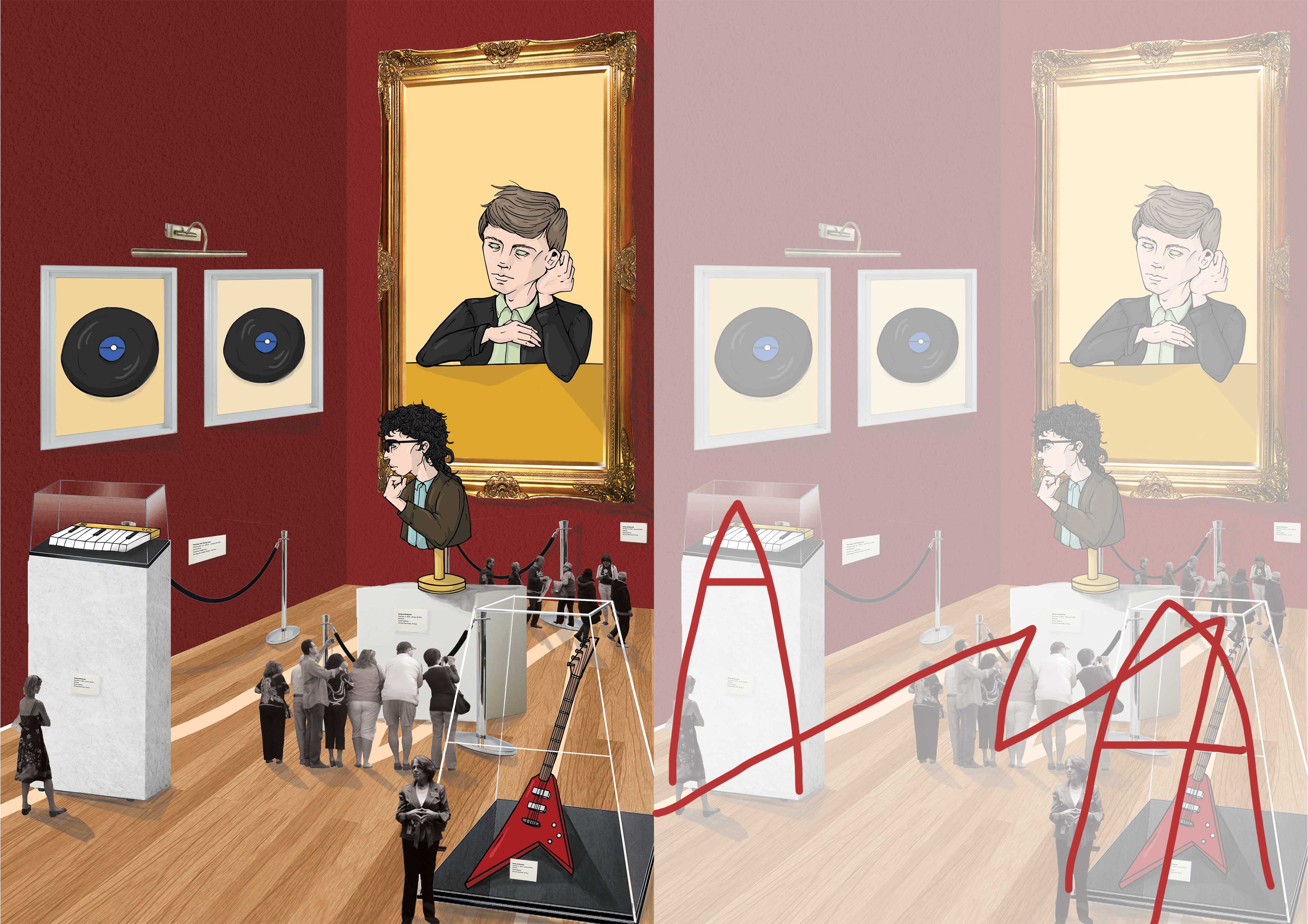
Since the intended message lies in the interactions between the visitors and exhibition, the letters are formed through the artefacts themselves, as well as in the layout of the exhibition.

O: Distinctive because of its circular structure
The O was used to form the vinyls as they both share the same circular structure.
A & E: Letters A & E consist of straight lines that are angled in more dynamic ways, mimics the physical structures of more recognisable musical instruments
The letter ‘A’ was used to form the guitar on the right, and the display cases on the left and right. Since the uppercase ‘A’ is made up of two converging straight lines, forming a gap at the top, it could form a display case expanding on the gap.
The letter ‘E’, on the other hand, was used to form the keyboard on the left. The three extensions was emphasised by the black keys, while the top of the keyboard formed the straight vertical line.
H & G: The lowercase ‘h’ and ‘g’ letters have more curves when compared to their uppercase counterparts
The lowercase ‘h’ was used to structure the pose of the musician in the painting. Gaining inspiration from a series of photographs of David Bowie, the letter ‘h’ could be seen in some of the poses he used, so I tried to emulate it but it a more obvious fashion.
The lowercase ‘g’ was used to form the pose of the bust. Following the same idea as the lowercase ‘h’, I took inspiration from the Thinker sculpture. As its pose mimics the curves of a lowercase ‘g’, I changed the pose of the bust to form a more obvious ‘g’.
W: Has a zig-zag pattern, allowing for interesting compositions
As ‘W’ has a zig-zag pattern made out of straight lines converging, it seemed fitting to structure the layout of the exhibition in a similar manner.
Portrait 4

The fourth portrait shows my job as an artist liaison officer contrasted with my dream of being an award-winning actress. In this composition, I wanted to focus on the main contrast of stress levels and activity between the two jobs; artist liaison officers, when managing their clients, face stress in ensuring that their clients stick promptly to the assigned schedule as well as turning up for events and press junkets. Therefore, I wanted to emphasise on the contrast by having the portrait set at a red carpet event, where the artist liaison officer (while carrying a bag of camera equipment and makeup), is pushing a trolley with the actress standing on top of it. The actress is waving to a crowd of reporters.

The message, in this case, is conveyed through the interactions between the artist liaison officer and the actress. Therefore, the letters can be found mainly in the layout of the two.
Y: Lines converging to form another straight, vertical line
The ‘Y’ here is formed through the pose of the artist liaison officer on the right. Positioning her body to lean towards the left, while having the bag of camera equipment and makeup leaning towards the right, forms the ‘Y’ shape. The pose also helps to reinforce the heaviness of the trolley.
F: Two extensions
‘F’, on the other hand, is formed through the handle of the trolley and placement of the artist liaison officer’s hands. The hands, in contrast to the image of the trolley, help to make the extensions of the ‘F’ a bit more distinctive as well.
Z & I: Zig-zag pattern, and straight vertical line with a dot above
‘Z’ is formed through the placement of the actress’ shawl. Since the fabric, when tied across the shoulders and arms of the actress had a zig-zag like pattern, it seemed fitting to have it in the shape of a ‘z’.
‘I’ is formed through the pose of the actress. Similar to the idea of the painter in the second portrait, I wanted to adjust the pose so that it would recreate the shape of the letter I (the vertical line with a dot above).
W: Up and down pattern
‘W’ is formed through the structure of the rope barriers. The pattern of lines that form the letter could be recreated through the ‘u’ shape of the rope barriers. By duplicating the rope barriers twice, it formed a ‘w’, but in a curved way.
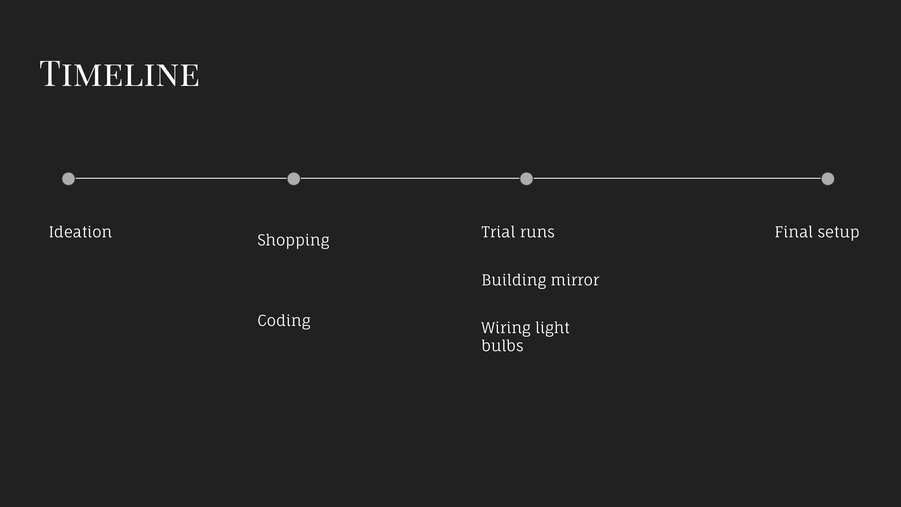
Process
Research & Conceptualising
I. Research
For a more detailed post on research, please refer to: https://oss.adm.ntu.edu.sg/vwong005/research-project-1-image-through-type/
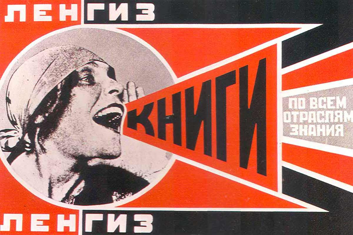
After finding more about incorporating texts and letters into artwork in the Dadaist and Constructivist movements, I was inspired to experiment different ways in adjusting objects to mimic the unique traits of different letters, as well as creating compositions and layouts based on contrasts and unconventional elements that are still able to bring forth the intended message.
II. Artist References
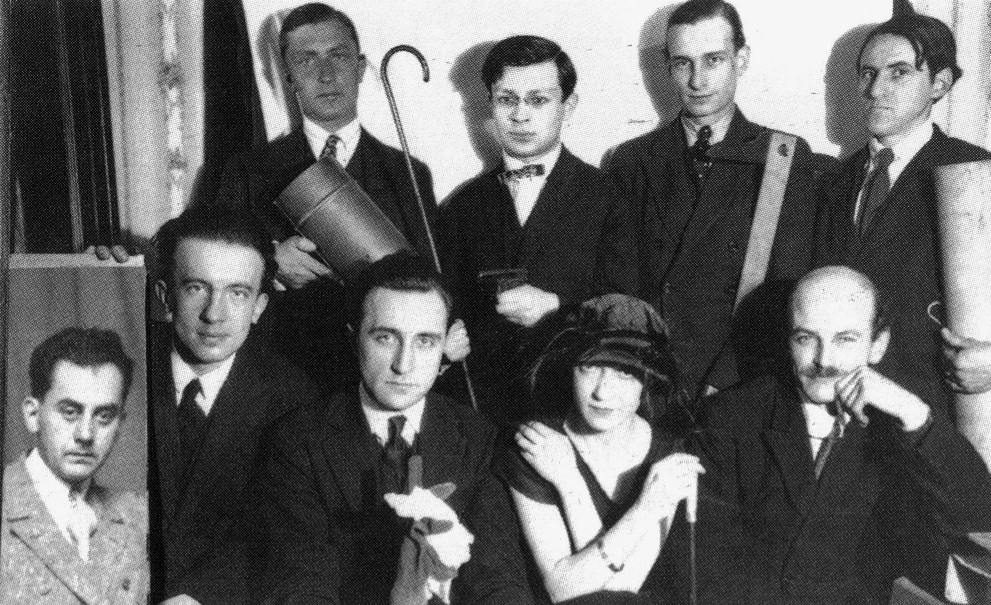
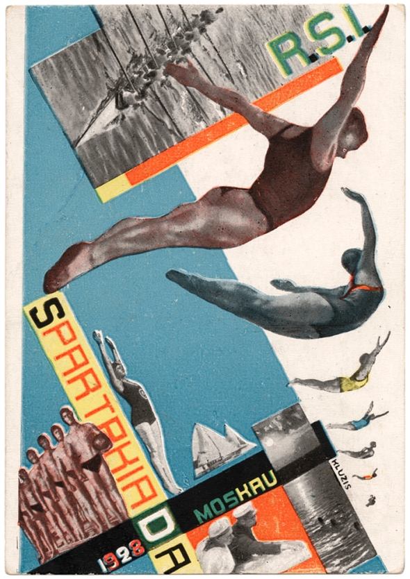
Hannah Hoch

For a more extensive background on Hannah Hoch, please refer to: https://oss.adm.ntu.edu.sg/vwong005/research-project-1-image-through-type/
Reference for:
- Idea of photomontage
- Layouts of visuals to convey a narrative
Moon Patrol
Moon Patrol is a collage artist whose works are heavily influenced by 80s cartoons, Atari 2600, horror movies, folklore, and western and detective pulps, while drawing from his love of comic books from the late 80s and early 90s.

Reference for:
- Style of photomontage
- Blend of different graphics
- Method of colouring
Hattie Stewart
Hattie Stewart is a London-based artist and illustrator. Most known for ‘doodlebombing’ over influential magazines, she also creates ‘tongue-in-cheek’ artwork that ‘moves fluidly between many creative fields including Fashion, Music, and Contemporary Art’.
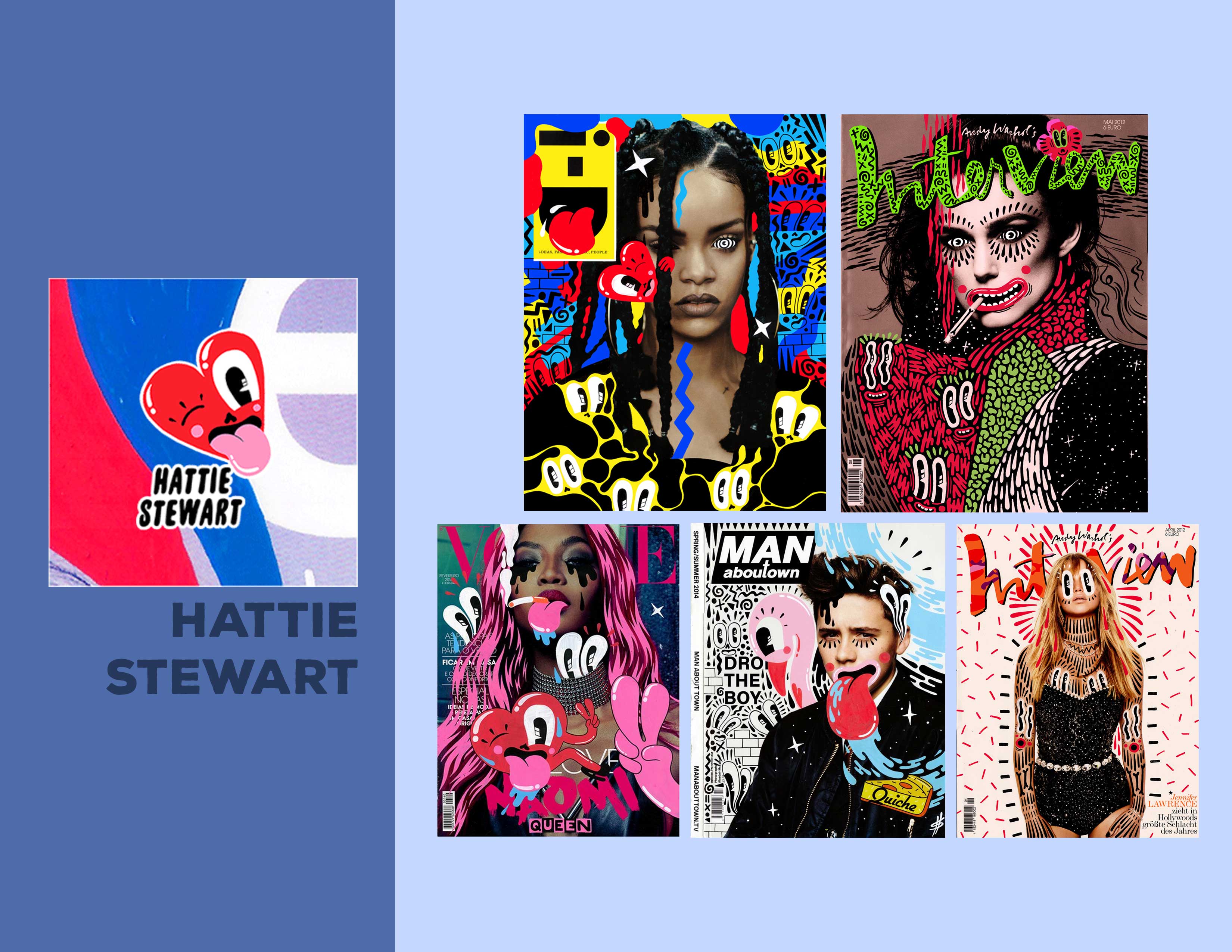
Reference for:
- Blend of illustration and photomontage
- Colour palette
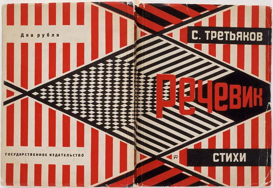
Others
III. Conceptualising
The process started with conceptualising.


I initially wanted to work more on expanding the contrasts between different jobs, so I planned out the different ways I could explore this idea and the techniques I could try. I really wanted to step out of my comfort zone and try new methods of creating visuals, instead of sticking to just illustrations!
After coming to a decision on the overall concept and approach, I narrowed down the four jobs and their counterparts I wanted to portray, then started to think of different layouts to use, while incorporating the letters into them.
IV. Planning & Drafts
Keeping in mind the contrasts and messages I wanted to focus on for each portrait, I planned out, with the help of artist references, different compositions and layouts I could use to make it more interesting.


Challenges
Some of the challenges I faced during this project were:
- As typography wasn’t something I was confident in, finding new and interesting ways to incorporate letters into the composition wasn’t very easy.
- Putting the visuals together in a layout that had to be organised but at the same time, vibrant and interesting enough (to make the contrast between the two mediums, photomontage and illustrations), was challenging.
- Trying to alter the illustrations of real-life objects to mimic the shapes of letters was challenging as they came out either quite boring or undistinguishable as letters.
Feedback & Improvement

- Working with the two different mediums was more successful than I thought in conveying the contrast between the two portrayed jobs
- Having a dream counterpart allowed the series to have a continuous flow, making it more interesting
- The blend between the two visuals was not too jarring and complemented each other well
- The typeface was not distinguishable in some portraits, where the objects intending to be the typeface looked more like the actual object instead of a letter. To make it more distinguishable, I could have took a step further and altered the physical structure of the objects (even beyond recognition) to make it recognisable as a letter.
- Some of the compositions came out relatively boring, especially for the last portrait. To make for a more interesting composition, I could have added in more visuals or make the interaction between the two jobs more exaggerated.
- In incorporating typefaces, I don’t think I did much experimenting and exploring, and resulted in sticking to two main approaches (adjusting objects to mimic the letters’ shapes, and creating a layout based on the letter). Maybe it would have been more interesting to create textures out of the letters themselves.