[Final] Project 2: Forrest Gump

Overview

After a long, treacherous journey of cropping images and freezing in the dark room, we finally get to present our compositions and silkscreen products! The following post will be detailing the concepts and techniques behind my four compositions as well as the feedback received during critique. 

Final Product

Final product
Left: Printed compositions
Right: Totebag
Concept

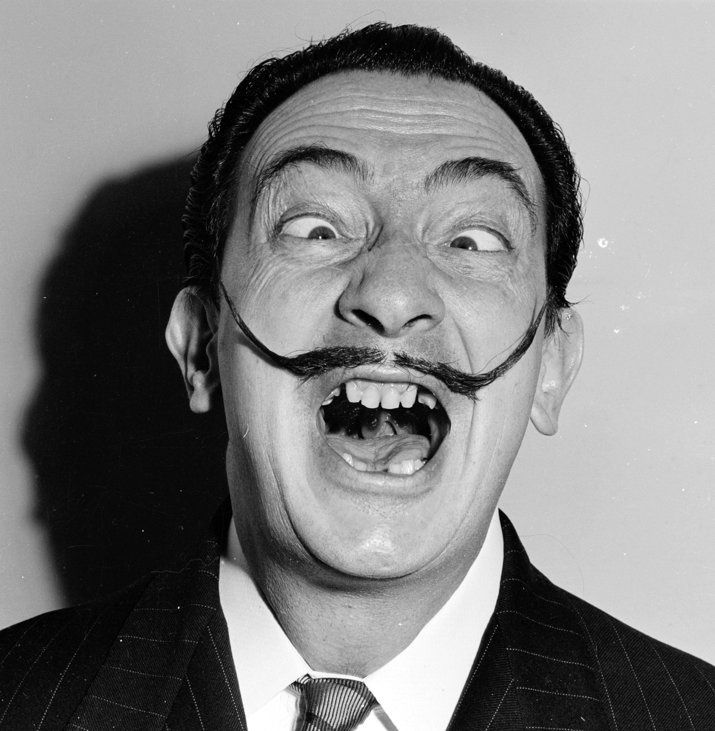
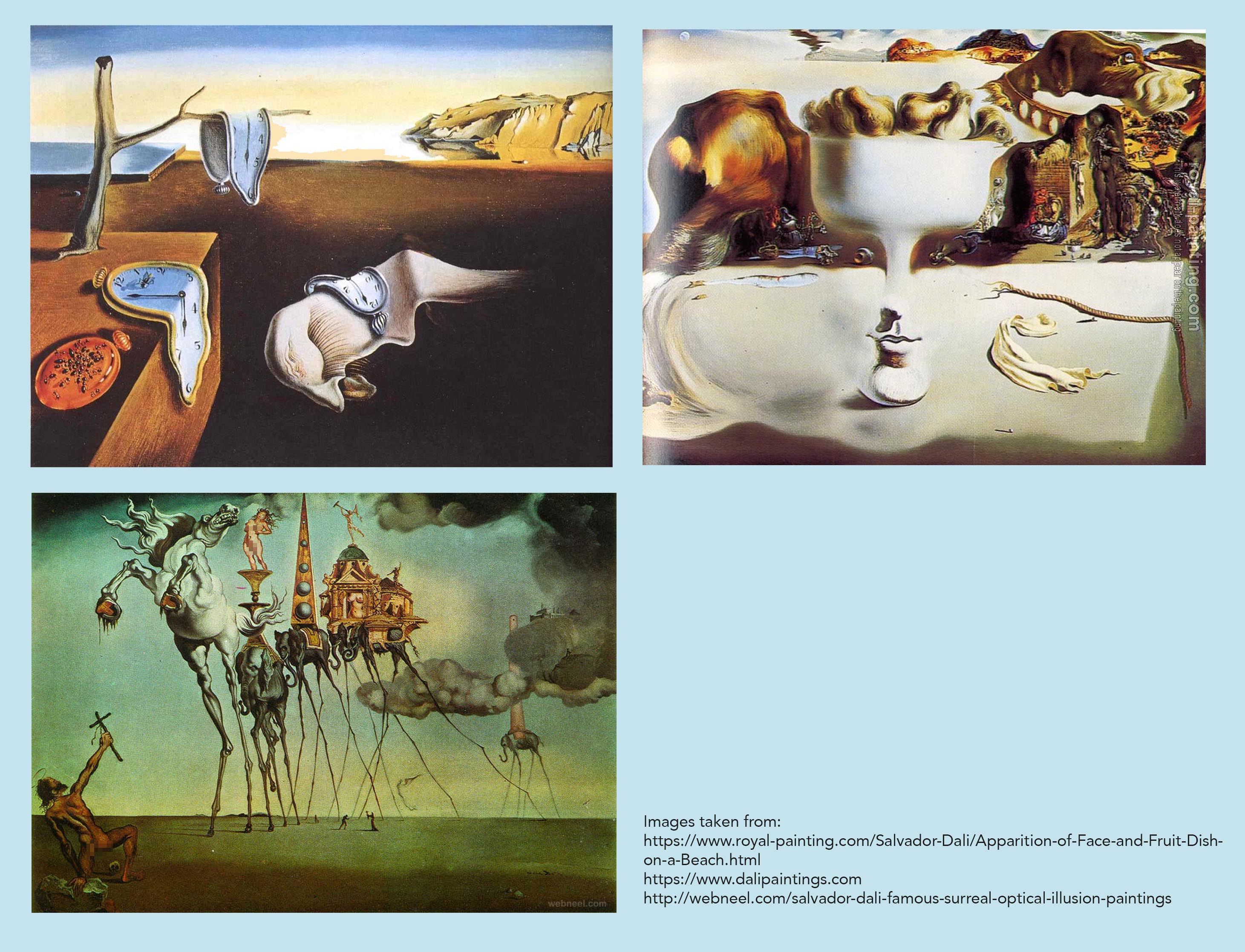
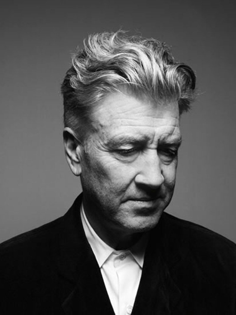
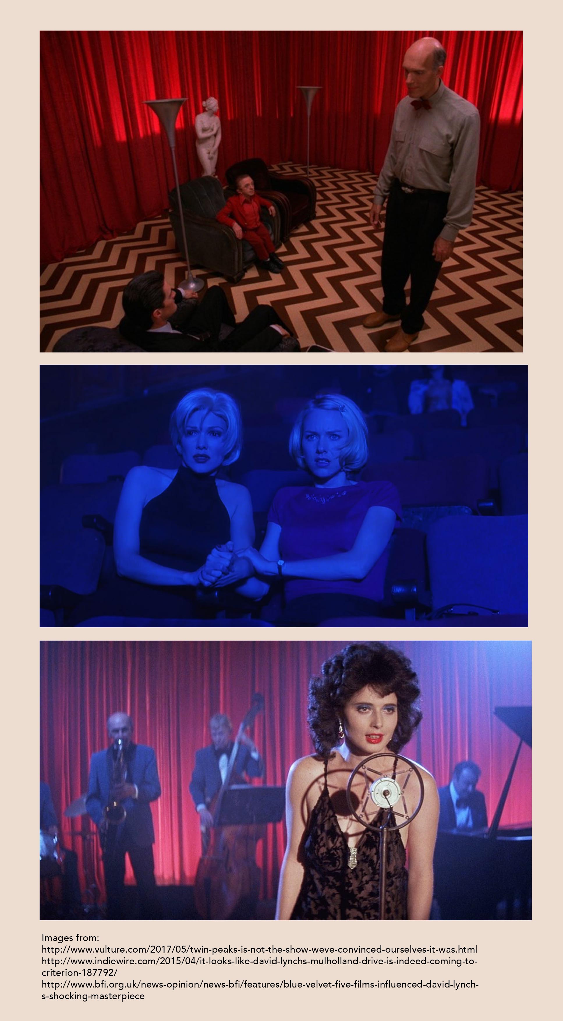
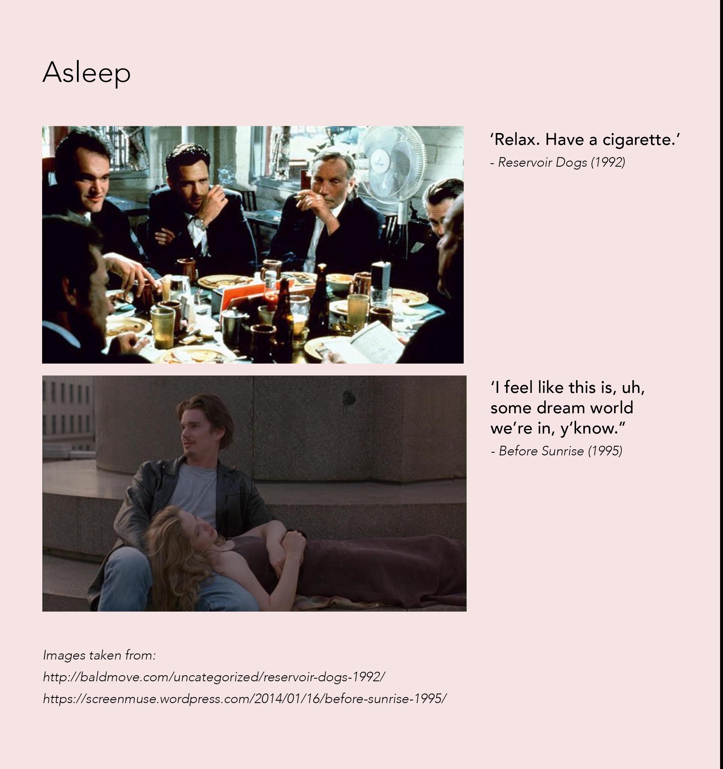
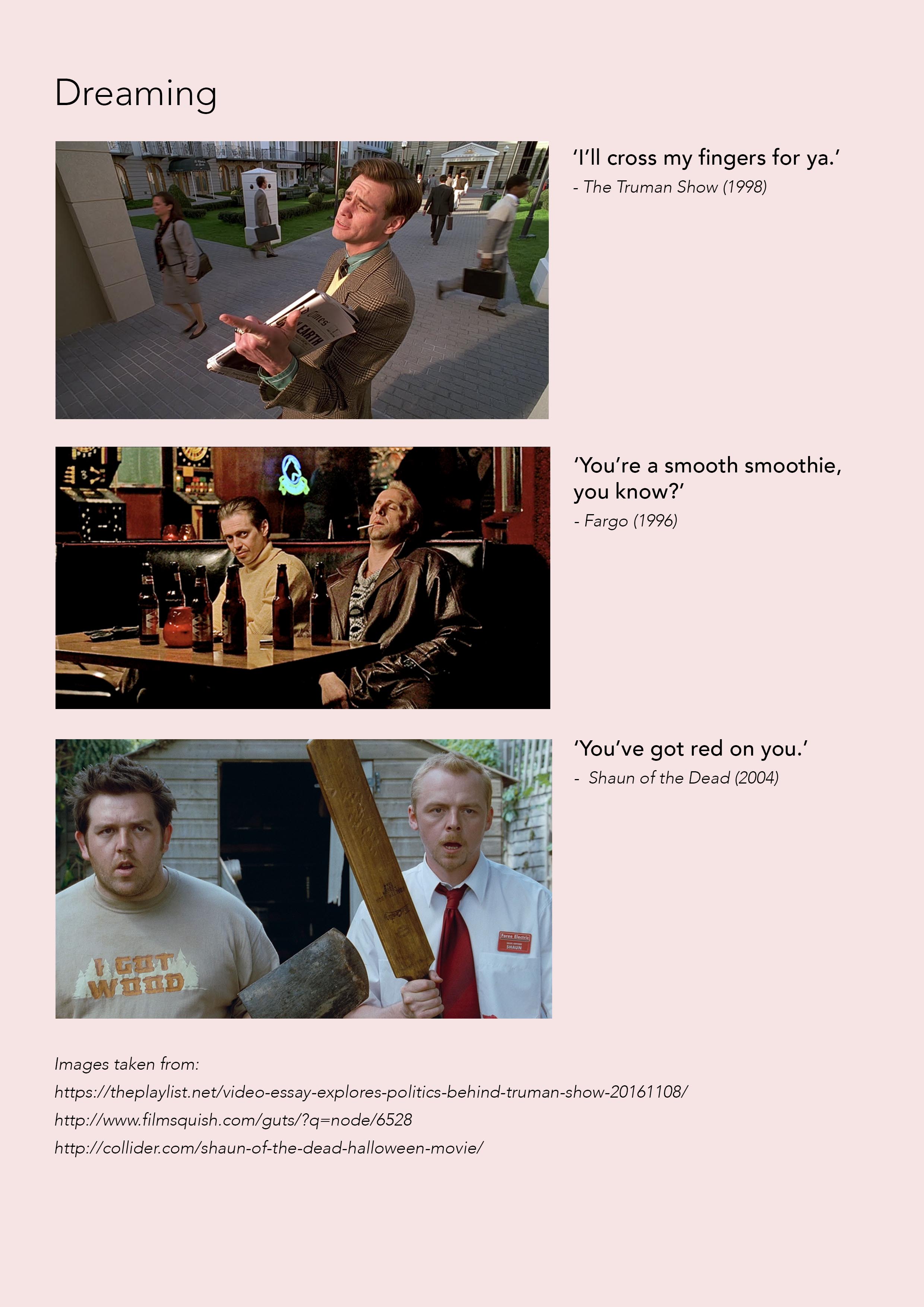
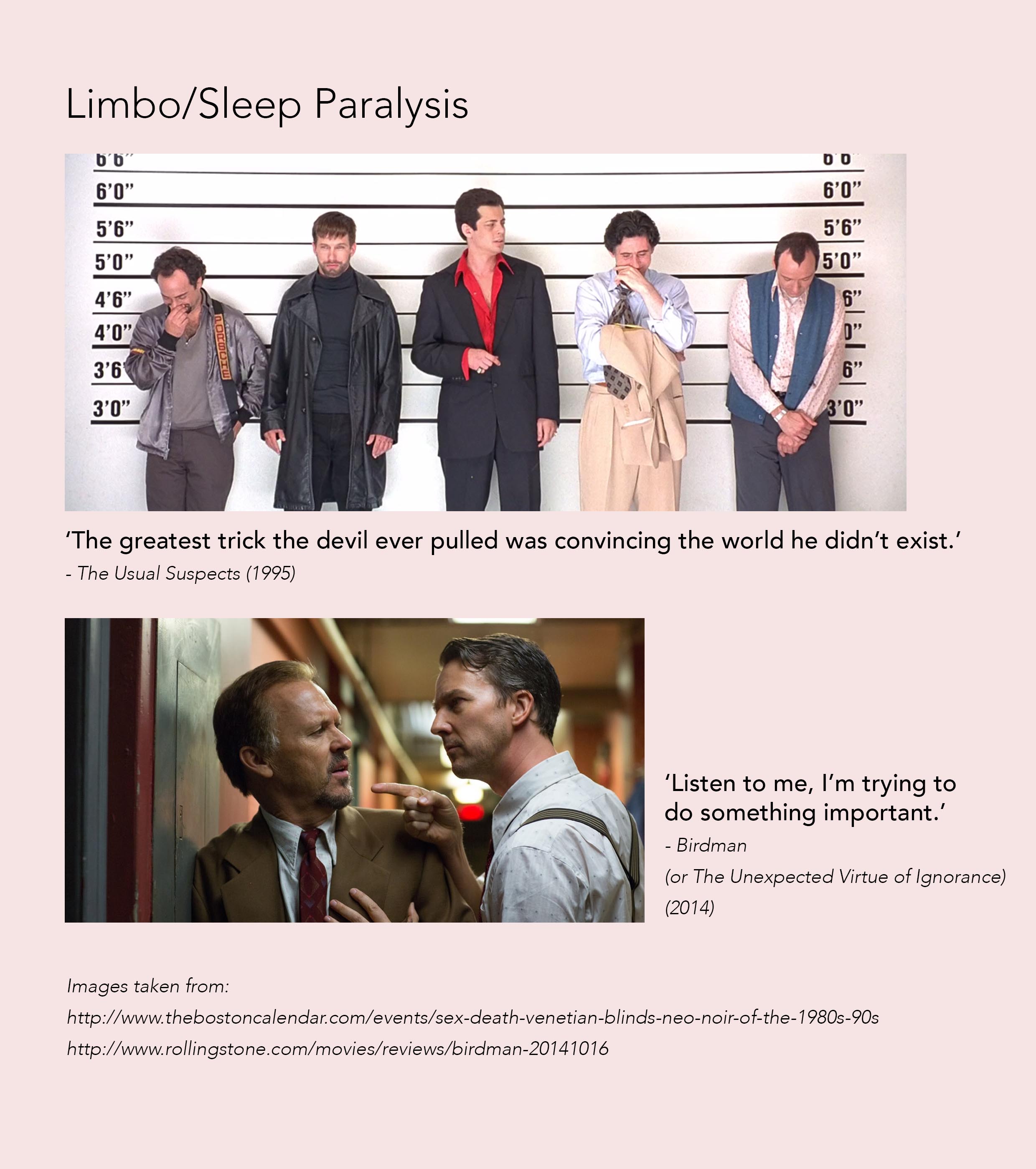
Intrigued by the surrealist art movement, I intended to create compositions based on the methods of storytelling adopted by surrealist artists. The compositions were a result of attempting to emulate the approach in creating films by renowned filmmaker, David Lynch. Inspired by his methods of addressing the ‘various layers of reality’, namely waking, sleeping, and dreaming, I wanted to create compositions that depict narratives related to those areas. The stage of limbo/sleep paralysis is added as a personal choice.

The documentary (around 06:22 – 06:54) discusses his film’s trademarks and recurring motifs used, as well as how his works focus on different layers of reality. 

Keeping the different states of reality in mind, the movie quotes chosen are to serve as textual representative of the states, as well as to give a context to the related composition. 
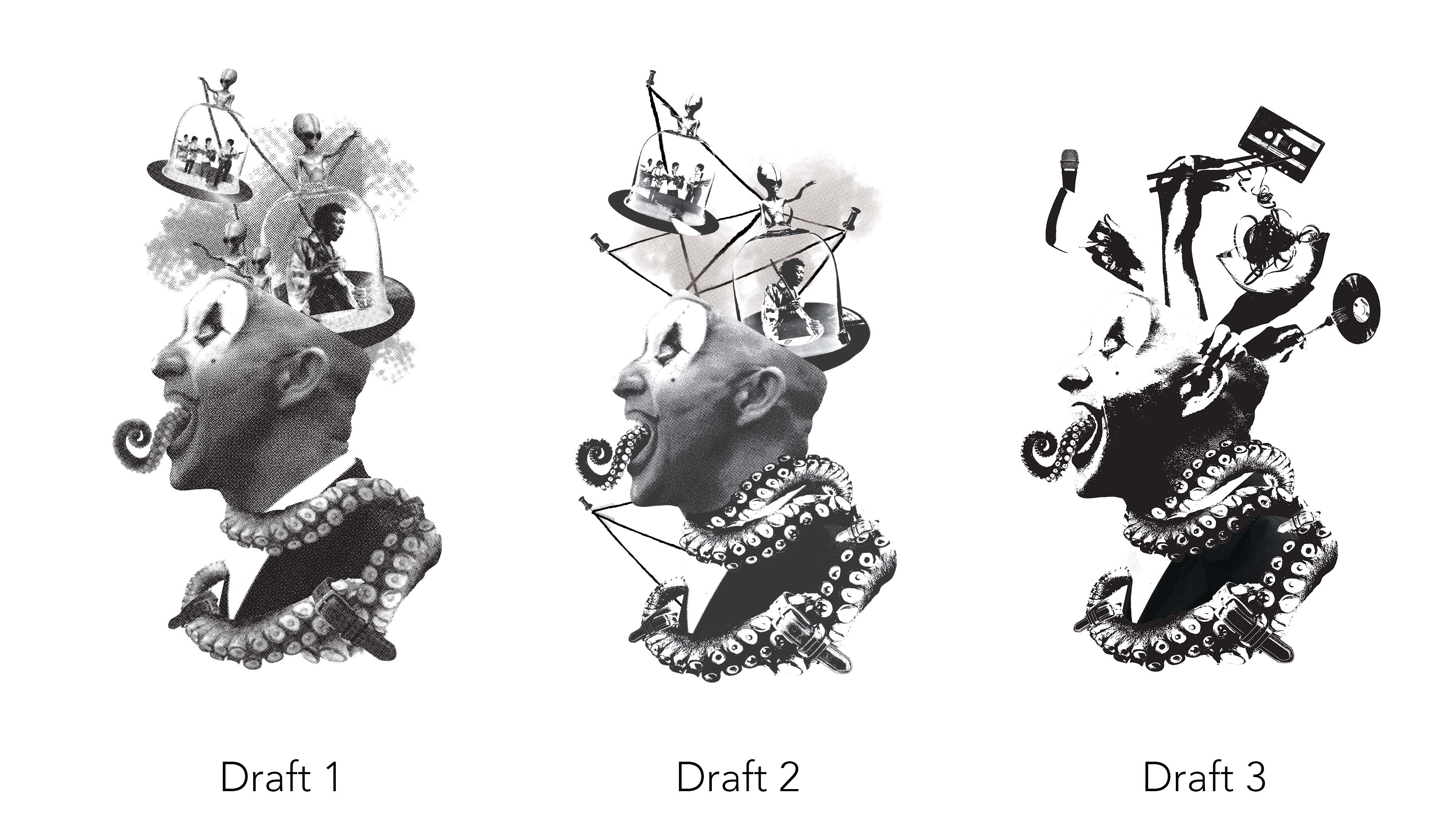
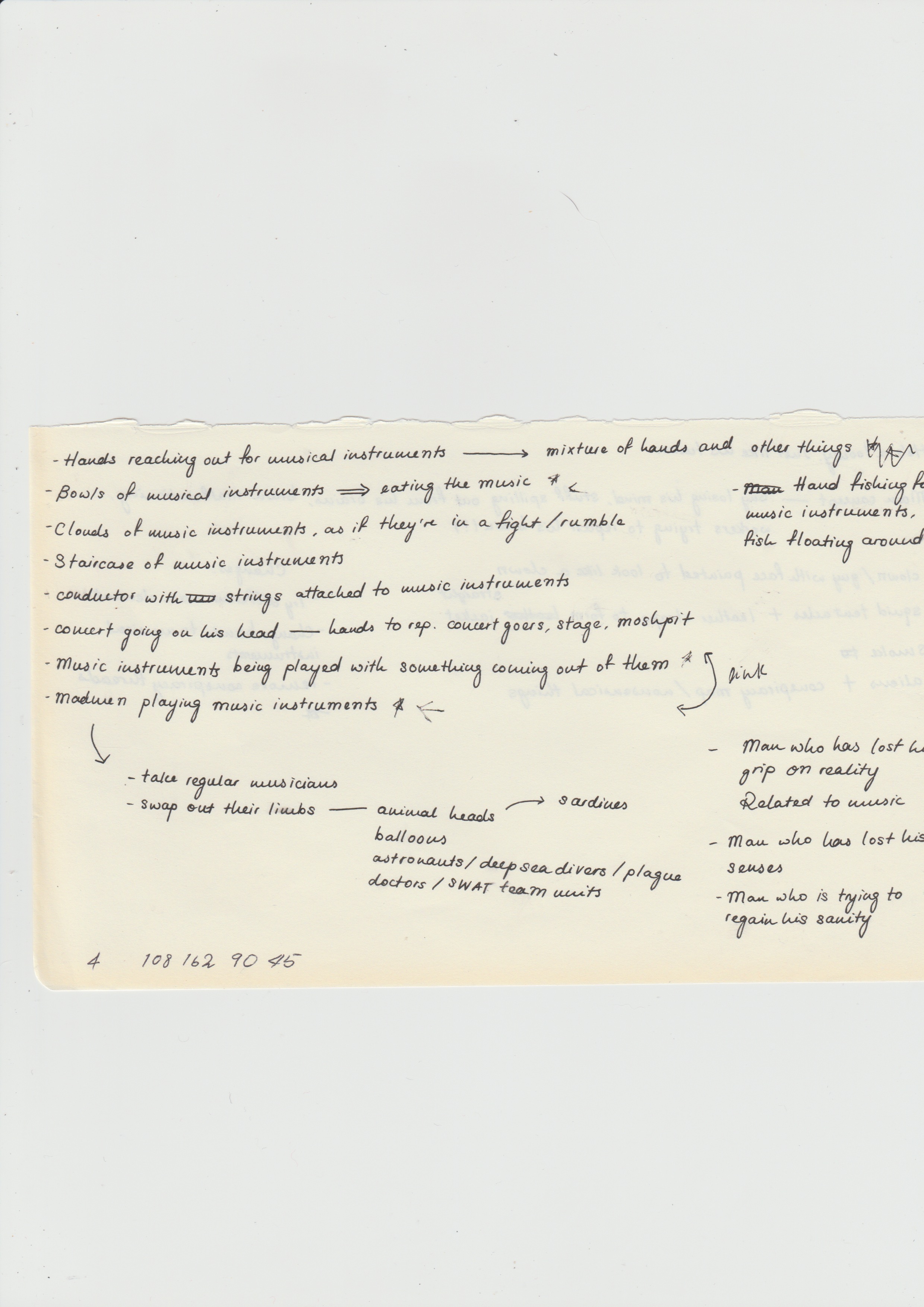
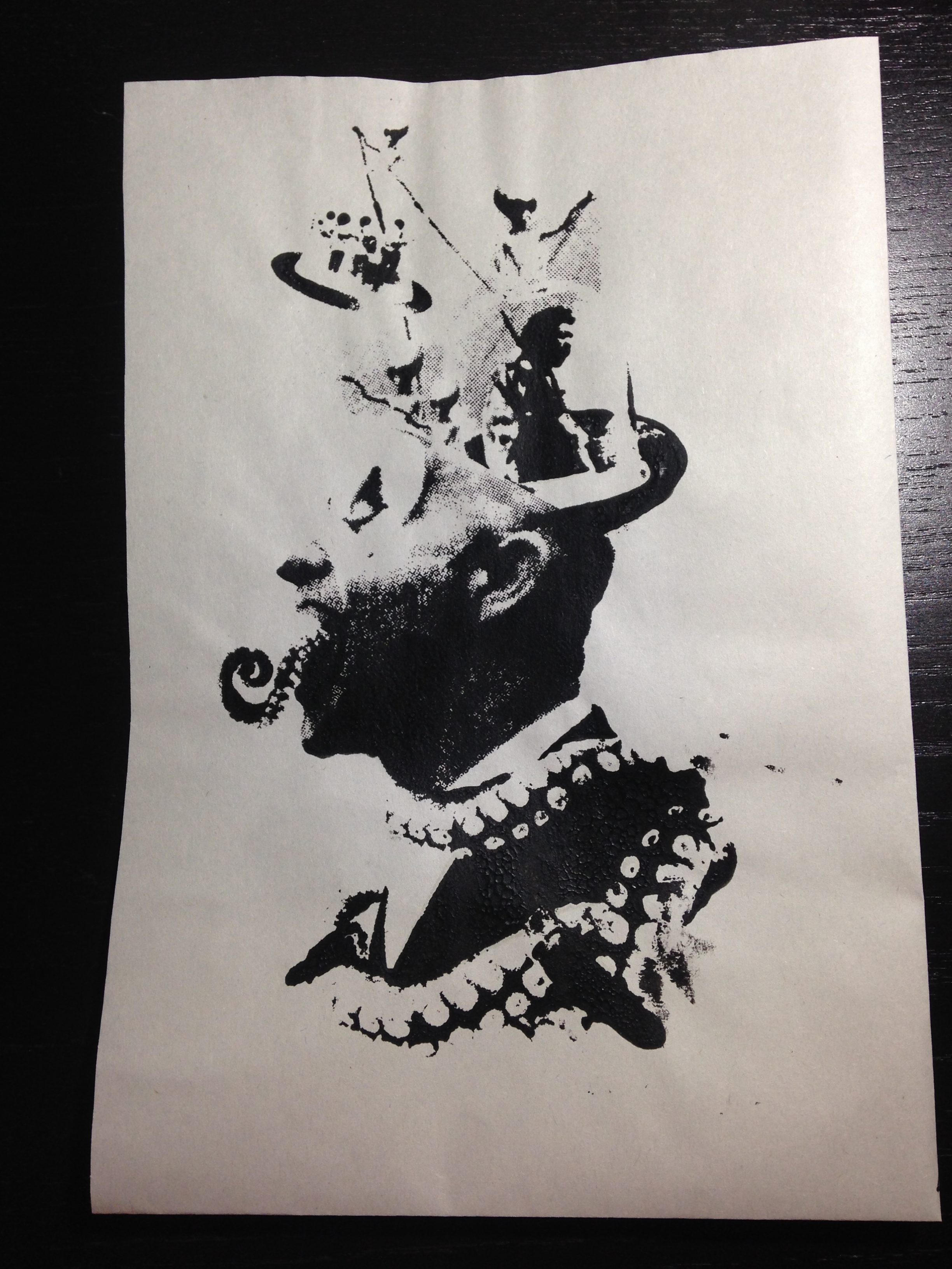
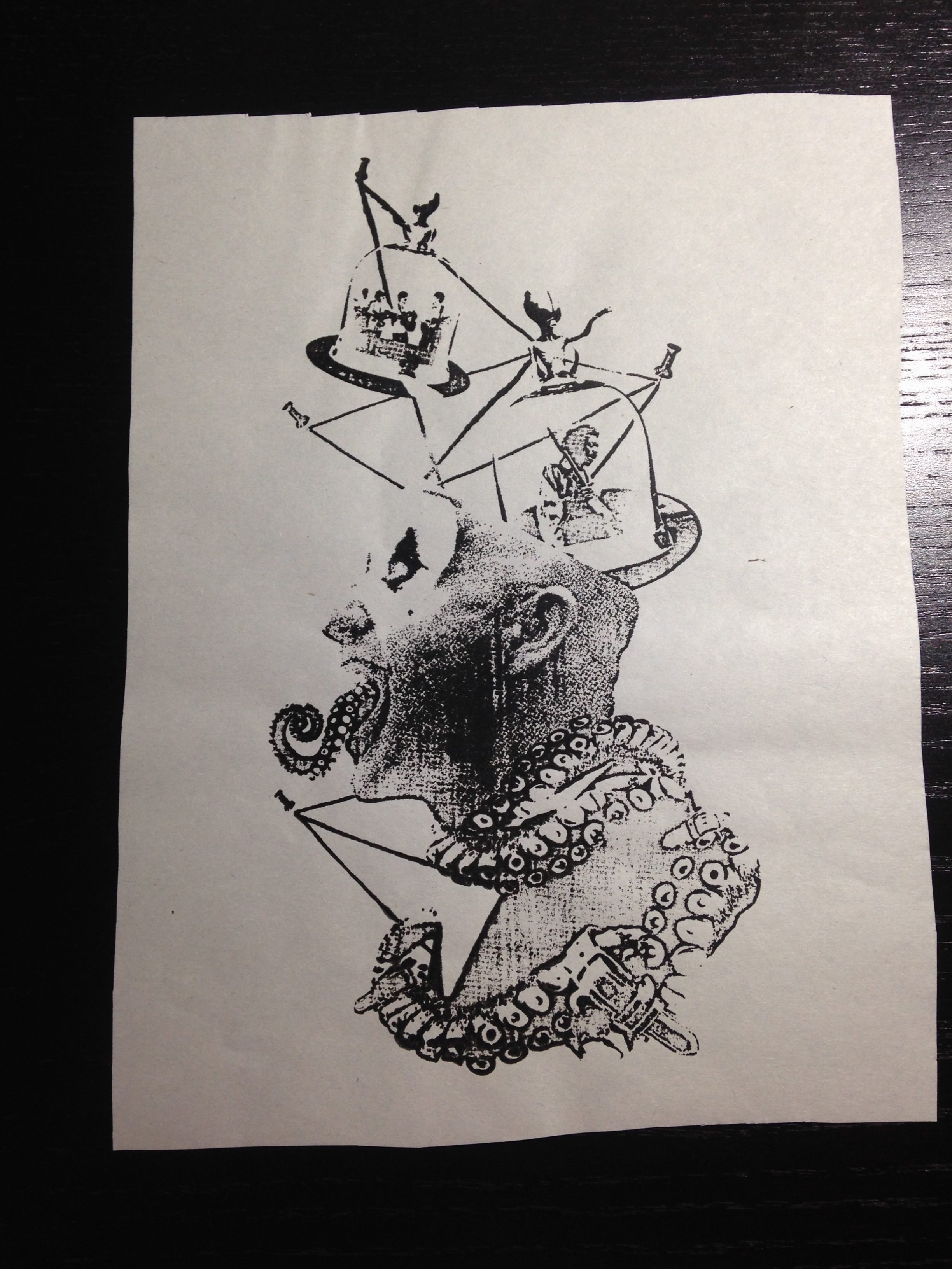
Composition 1
Composition 1: ‘He’s a looney. Just like his tunes.’ – Baby Driver (2017)
I. Concept & Approach

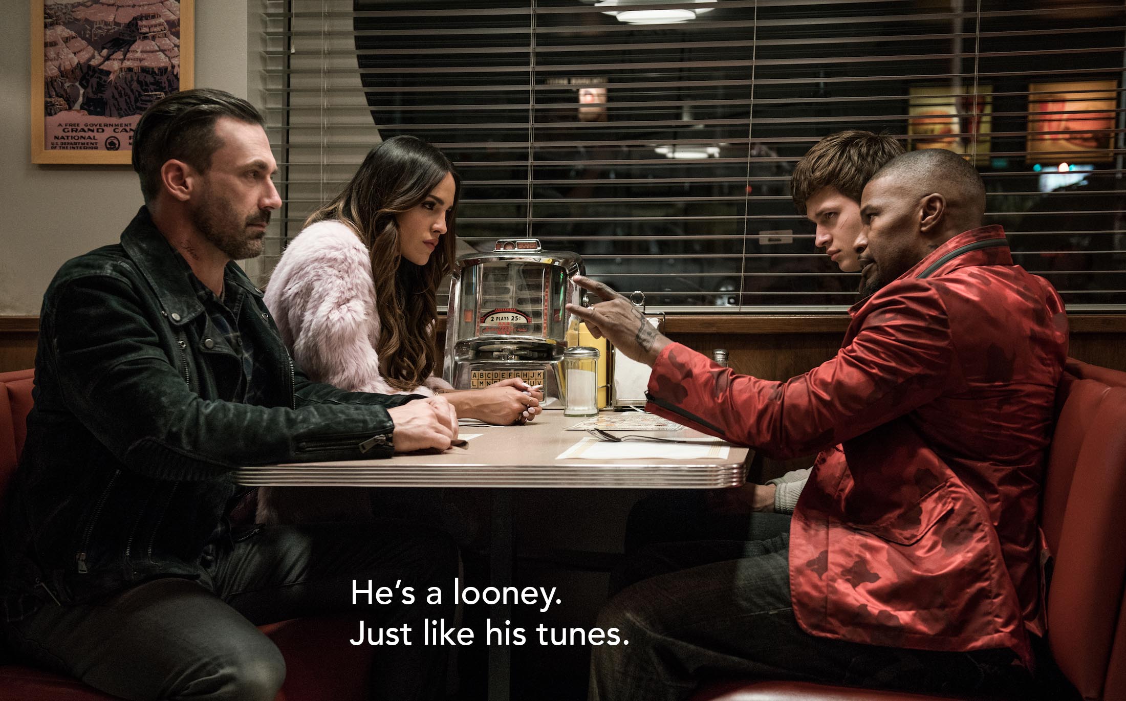
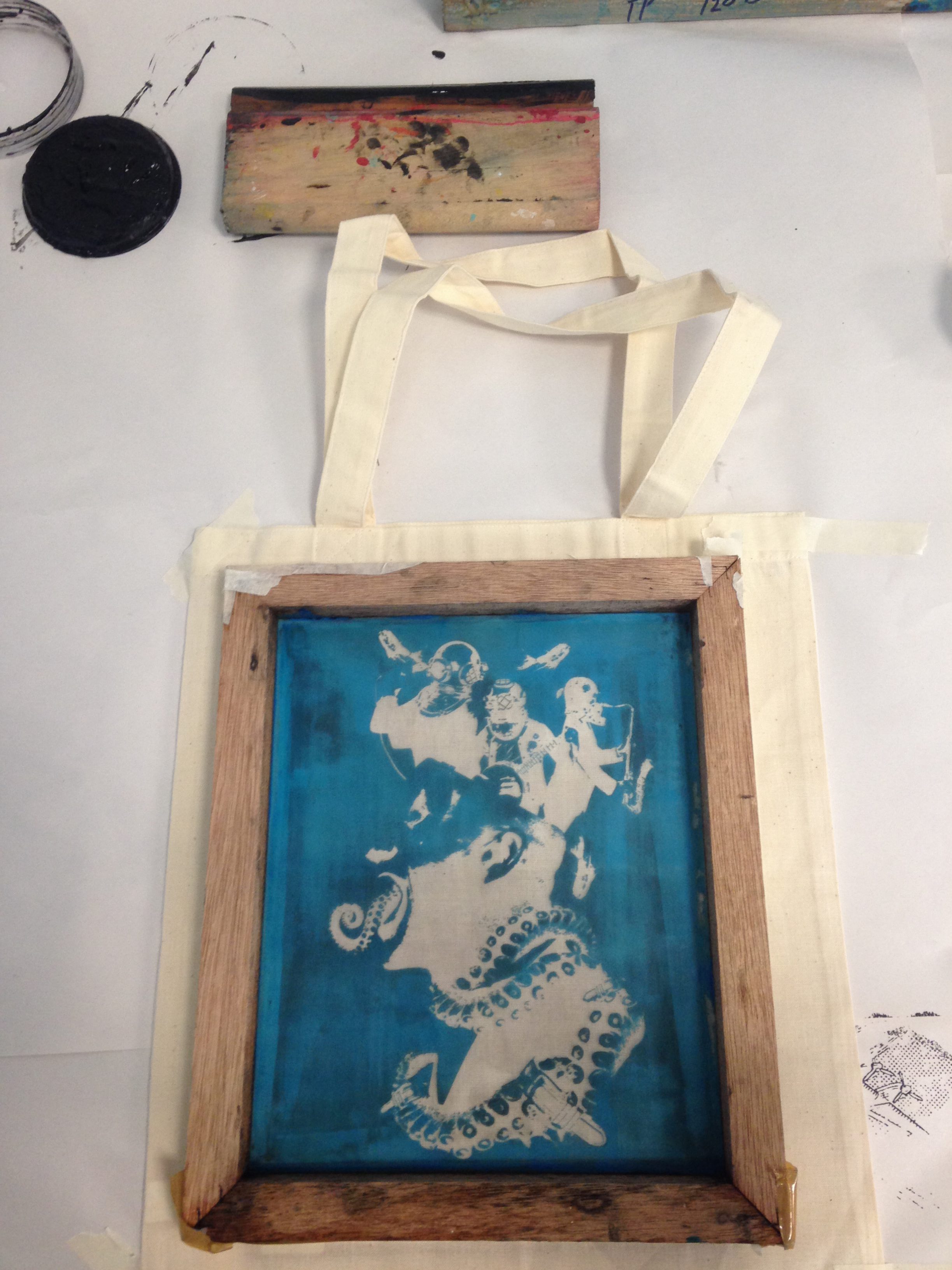
Composition 1 is a pictorial representation of the movie quote ‘He’s a looney. Just like his tunes.’ from 2017’s Baby Driver. Aiming to depict the state of dreaming, I wanted to establish a surreal setting by having things emerging from a man’s head, and using an under-the-sea theme (as shown by the deepsea diver helmets, squid tentacles, and goldfish) to show the nonsensical nature of dreams. To further reinforce a dream-like state, the elements pictured are a result of putting non-related objects together; this includes the straightjacket made up of tentacles and leather straps and a band of deepsea divers. 

The elements used are also representative of the words ‘looney’ and ‘tunes’. For ‘looney’, I chose to use a clown with a crazy facial expression and tentacles and leather straps forming a straightjacket. For ‘tunes’, I chose performing musicians (a singer, banjo player, and saxophonist in this case). 

Composition 1: Silkscreen on tote bag

II. Techniques Applied

Using a combination of storytelling methods, I tried to construct an accompanying narrative for this composition. The composition was a result of expanding on caricature and anthropomorphism, which is evident in the clown’s striking features being exaggerated (swapping his long tongue for a squid tentacle), as well as using tentacles to resemble a straightjacket. 

Some of the principles of design I experimented with included: 

Balance and unity
The Gestalt Principle (proximity)
Scale and size
Textures and values

Following a star-like layout, I wanted to establish a sense of balance by aligning the main elements with one another; the structure of the main elements – the clown and deepsea diver musicians – are parallel to one another, and from the vertical centre, the elements and breathing space on the left and right sides are somewhat similar (e.g. the goldfish on the right balances with the squid tentacle tongue, and the musicians on the far left and far right balance with the leather straps on the bottom of the tentacles). 

I also tried to experiment with a proximity in the composition; having images of musicians with completely non-related instruments and attire, I wanted to try using proximity to establish them as a whole, and therefore, placed deepsea diver helmets on their heads to reinforce them as a group of related elements, and at the same time, contrast them against the clown and goldfish. 

The elements are also a result of varying scales and sizes. In terms of sizes, I wanted to reinforce the idea of dream-like states and surrealism through enlarging typically small objects and downsizing life-size objects; enlarging goldfish and downsizing humans. As for scales, similar to the idea behind the goldfish and humans, the composition is made up of life-sized goldfish and squid tentacles, different from their realistic counterparts. Additionally, having two contrasting scales of human figures (i.e. the clown and musicians), helps to establish a more surreal mood. 

With regards to value, I wanted to create contrast by varying the levels of threshold; this is shown in the black and white spaces in the clothing of the clown and musicians, and the textures given off by the tentacles and deepsea diver helmets. The textures of the tentacles, different types of clothing, and shine in the helmets and goldfish skin, also helped in creating contrast. Threshold was also useful in creating a silkscreen print as it helped formed the figures. 
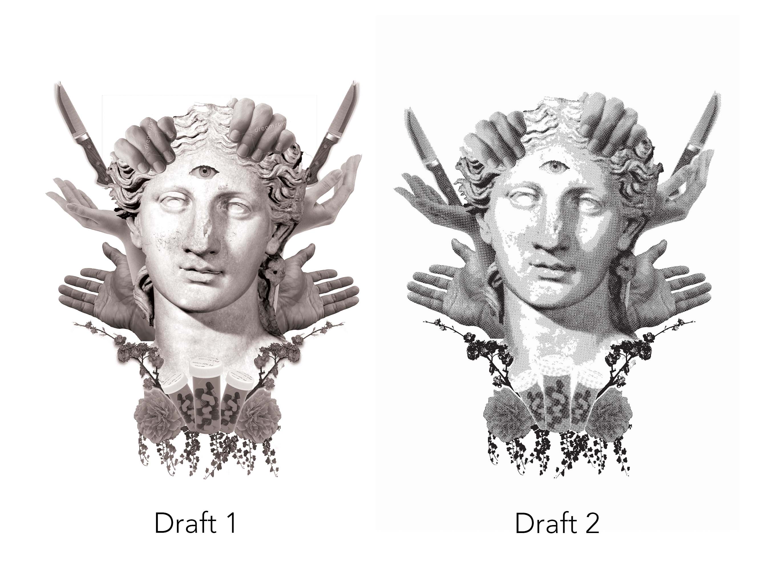
Composition 2
Composition 2: ‘Sometimes I think I have felt everything I’m ever gonna feel.’ – Her (2013)
I. Concept & Approach

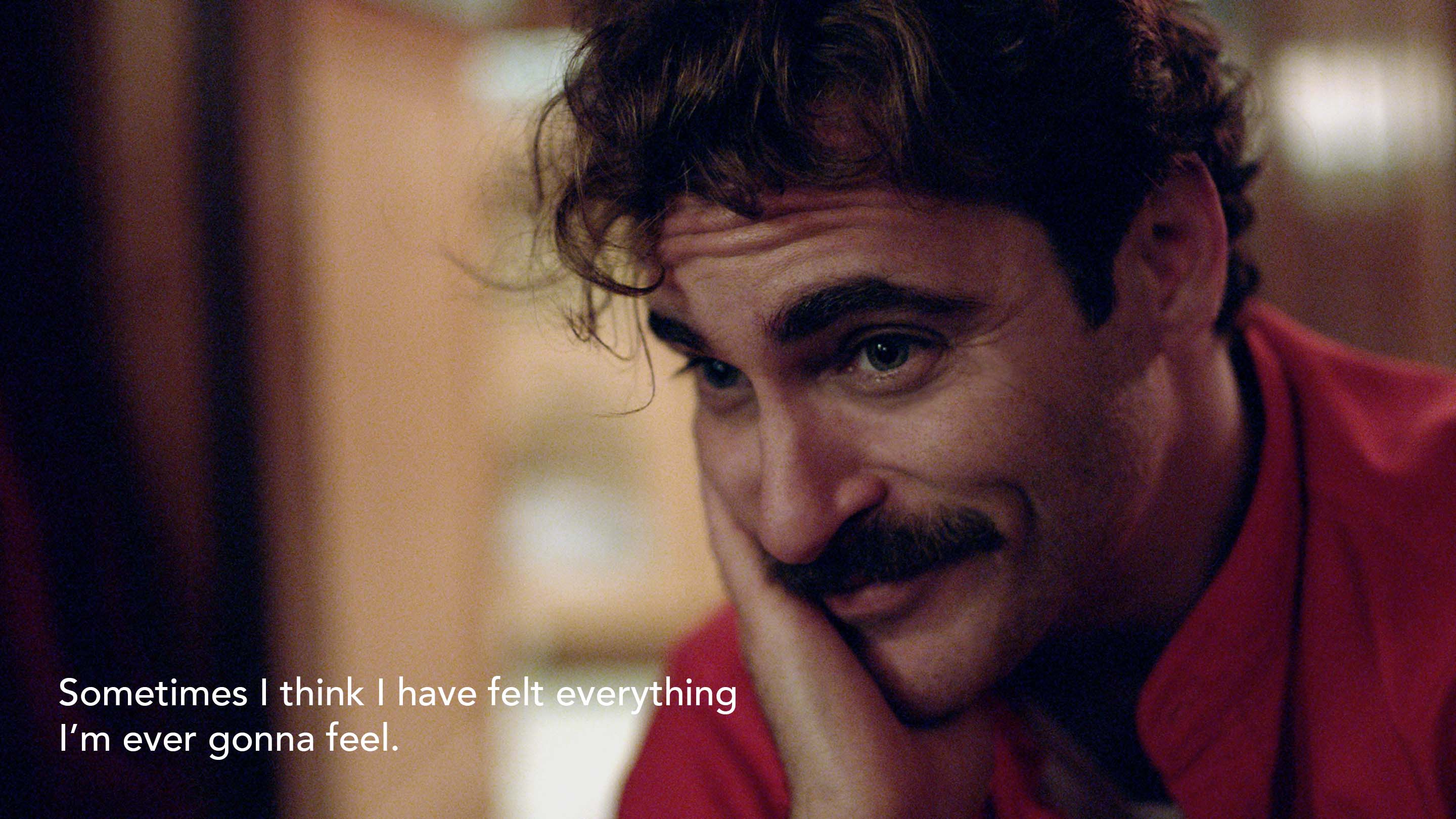
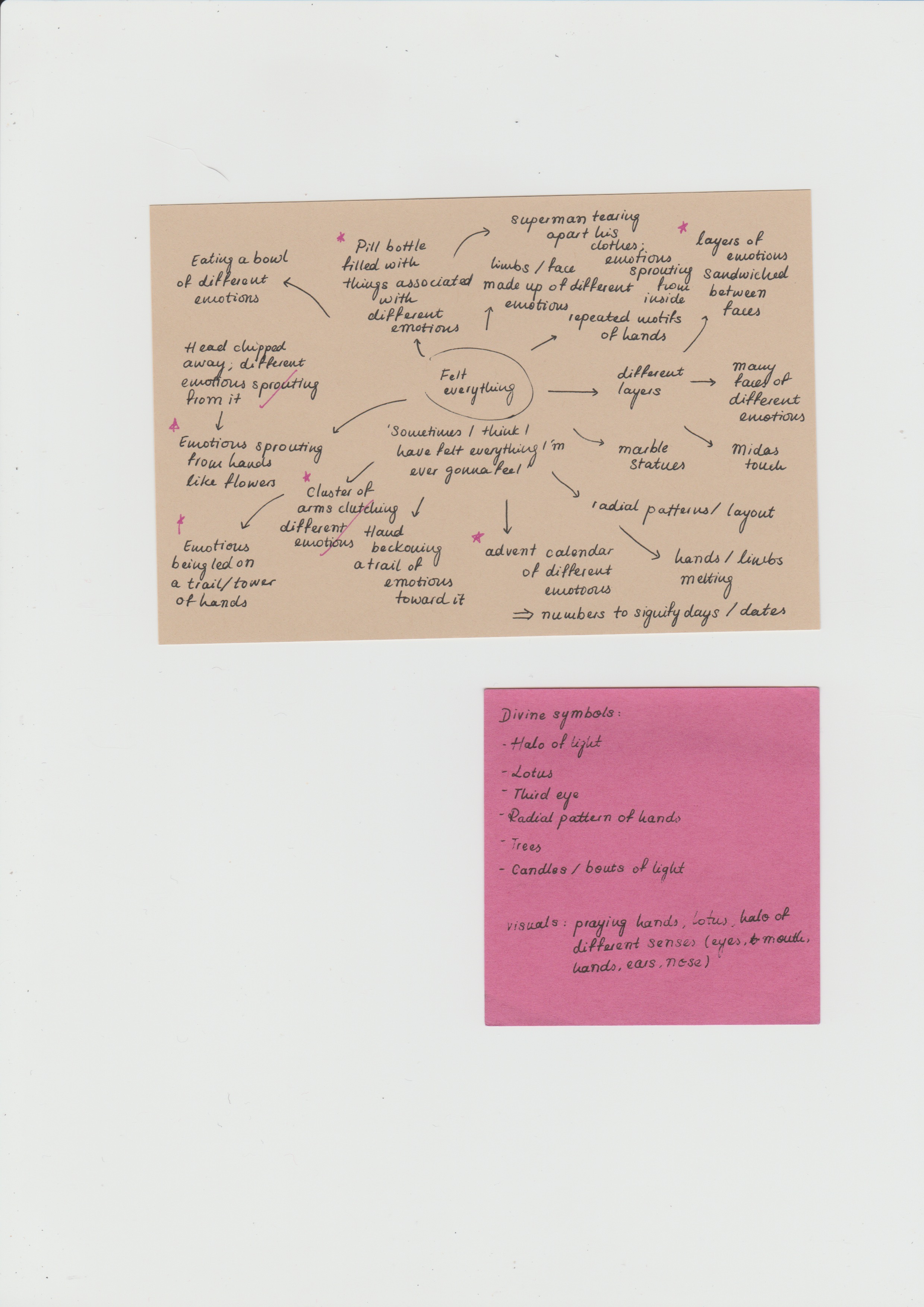
Composition 2 is a representation of the quote ‘Sometimes I think I have felt everything I’m ever gonna feel’ from 2013’s Her. Following the concept of David Lynch’s various stages of reality, this composition explores the state of being awake, depicting a divine entity who has reached the pinnacle of feeling all. 

Focusing on the words ‘felt everything’ and the idea of the divine, I wanted to use a combination of recognisable religious symbols; lotuses and lit candles to represent Buddhism, a halo to represent Christianity, and the repeated motifs of hands to represent Hinduism. To further emphasise the idea of the ‘all-seeing’ and the worshipped, I chose to have a realistic third eye sat atop a Greek sculpture bust. 

II. Techniques Applied

Similar to Composition 1, I used literary devices to help construct a narrative for Composition 2; hyperbole and imagery were mainly used. Hyperbole is evident in taking the sensation of feeling everything and exaggerating it by featuring a being that has reached the utmost point of feeling all there is to feel. Imagery, on the other hand, is shown through the motifs of hands and eyes to represent the sensation of touch, reinforcing having ‘felt everything’.

Balance and emphasis
Scale and size
Pattern
Textures and values

Keeping the theme of divinity in mind, I wanted Composition 2 to echo that of psychedelic patterns, thereby following a radial layout, with the hands, lotus, and halo forming a circle, encompassing the bust in the centre as the main element. Its radial layout allowed for balance, with the elements on the left repeated and aligned on the right. Emphasis is also achieved by placing a contrasting element (i.e. the Greek bust) in the centre, breaking the repeated motifs of hands and lotuses. On the contrary, the repeated motifs of hands and lotuses in a radial format also help to create a pattern. 

Composition 2 also expands on the idea of scale. Having trouble finding a suitable image of a halo, I decided to enlarge a picture of a gold ring. In terms of scale, the enlargement of the gold ring into a halo helps to reinforce the composition’s surrealist style. Originally a small object, especially in contrast to hands, lotuses and sculptural busts, the gold ring is now enlarged to the point that it becomes the largest and most prominent element in the composition, further reinforced by its black and white value achieved by threshold. 

With regards to value, I chose to use halftones for the majority of the elements. Because of the nature of the original images, halftones had to be used to clearly depict the elements. However, the halftones displayed in the bust were able to create an interesting texture and contrast, showing signs of light and shadows, thereby giving it a more realistic depiction. As mentioned previously, the halo was created using threshold as a means to show contrast to the other elements, as well as to create a variance in texture. 
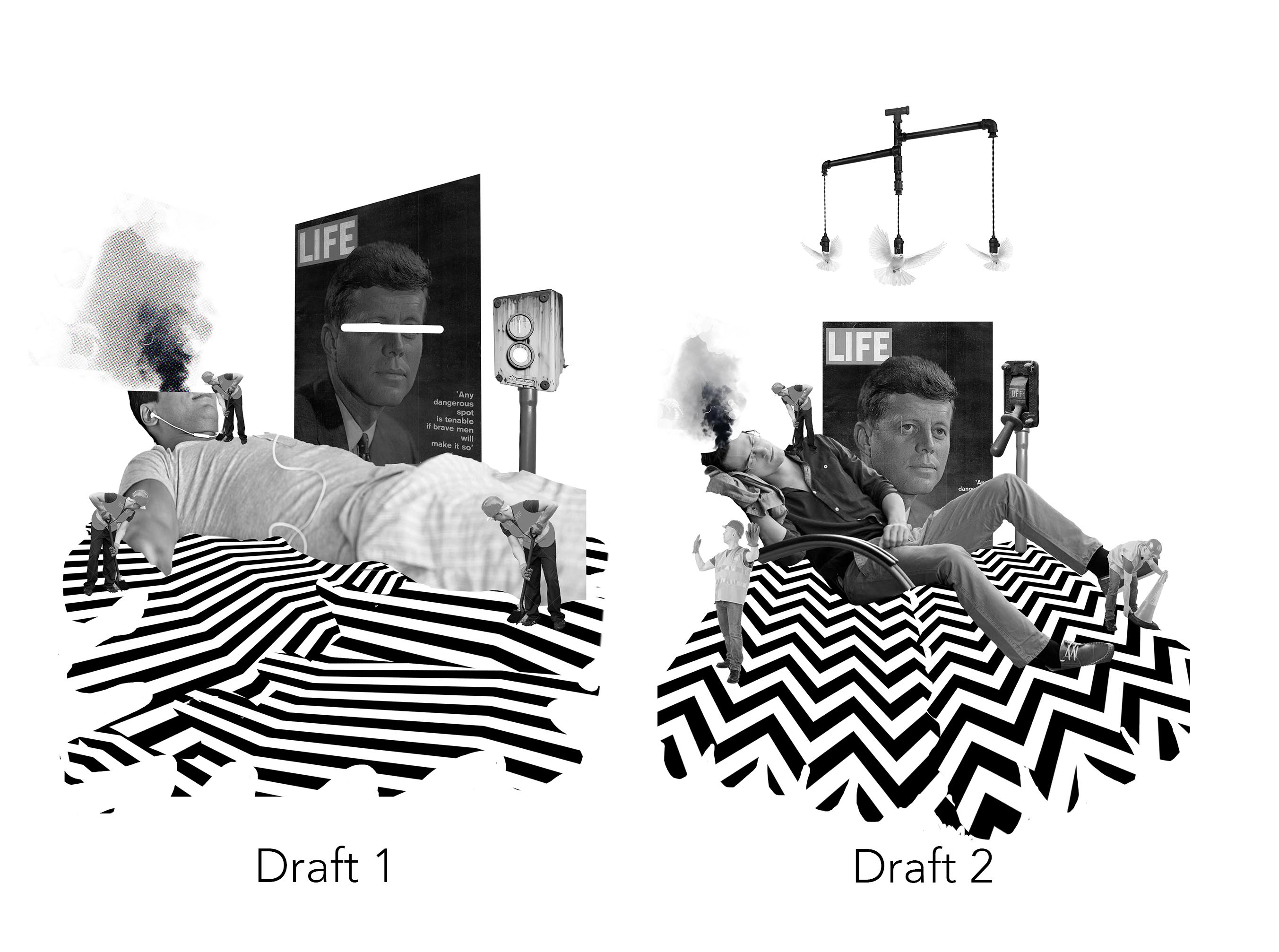
Composition 3
Composition 3: ‘I chose not to choose life. I chose something else’ – Trainspotting (1996)
I. Concept & Approach

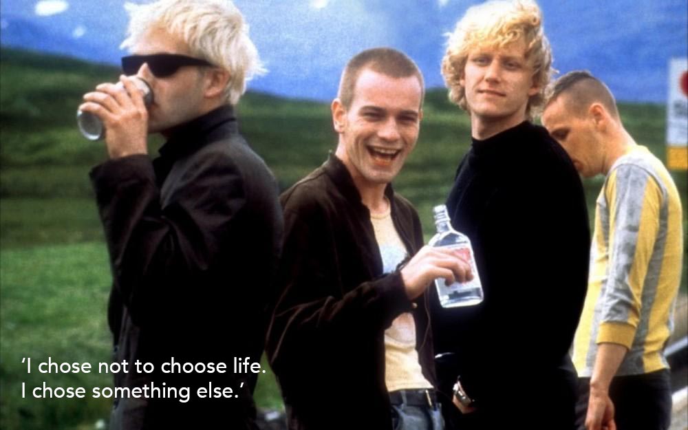
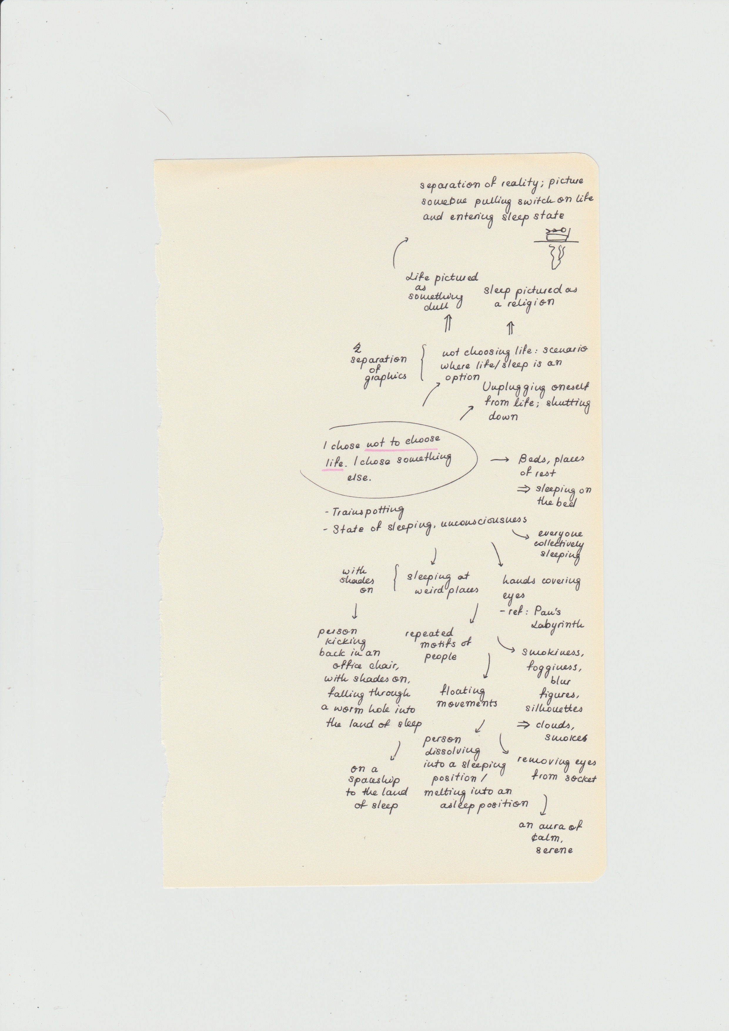
Composition 3 follows the quote ‘I chose not to choose life. I chose something else’ uttered in 1996’s Trainspotting. Representing the state of sleeping, according to David Lynch’s dissection of reality, this composition is a representation of what happens to one’s body when he/she decides not to deal with matters in life and goes into hibernation mode; construction workers performing maintenance work on the body to prepare it for another day of work. 

Echoing the idea of sleep, the elements, namely the man sleeping with smoke coming out from his head and mobile (an ‘adult-style’ mobile made up of doves instead of toys, to symbolise peace as a mechanism to fall sleep) above, are representative of the state. I also chose to draw focus to the words ‘choose’ and ‘life’, where to reiterate the idea of ‘life’, the symbols chosen were the Life magazine and a man sleeping, while the industrial switch on off-mode symbolises the notion behind making a choice. 

II. Techniques Applied

When analysing the quote, I used hyperbole and parody to help reconstruct a narrative completely different from its original context in the film. Originally based on choosing to take heroin in the film, I wanted to completely deviate and exaggerate the idea of choosing between facing life and going to sleep, also creating a parody of what happens to one’s body when he/she goes to sleep. 

Emphasis
Scale and size
Pattern
The Gestalt Principle
Textures and values

Similar to Composition 1, Composition 3 follows a star-like layout, with the main element (i.e. the man sleeping and Life magazine) placed in the centre, and accompanying elements extending from them, with the exception of the mobile placed on top. This helps in drawing the viewers’ attention to viewing the supposed main elements, followed by its accompanying minor elements, establishing emphasis.

Composition 3 is also a demonstration of variance in scale. To reinforce surrealism, some of the human figures in the composition are shrunk; by contrasting them against a regular, life-size human, it reiterates the surreal mood of the composition. Size was also shown in showing the gradual decrease  in the sizes of the construction worker in accordance to the perspective of the composition; the worker in the front is the biggest and the one in the back is the smallest, helping to establish a sense of foreground, middle ground, and background. 

To make a more interesting and visually appealing composition, I used geometric patterns to establish a base. The patterns helped in establishing a sense of direction for the composition’s layout; the arrow-like shapes help to draw the viewers’ attention to the main elements (i.e. the man sleeping and Life magazine). They also create a contrast in texture and value; made up of solid black and white values, they contrast against the halftone value of the main elements and the threshold textures of the construction workers and industrial switch. 

I also wanted to expand further on using proximity in the Gestalt Principle. Since the construction workers were a minor element, I wanted to group them together to establish a better sense of clarity; this was done through downsizing them to roughly the same size as well as using the same values of threshold to unify them. The same technique was done for the mobile, where the metal frame and repeated motifs of doves were used to show that they belong to the same group. 

Composition 4


Composition 4: ‘I’m nothing. I’m not even here’ – Birdman (or The Unexpected Virtue of Ignorance) (2014)
I. Concept & Approach

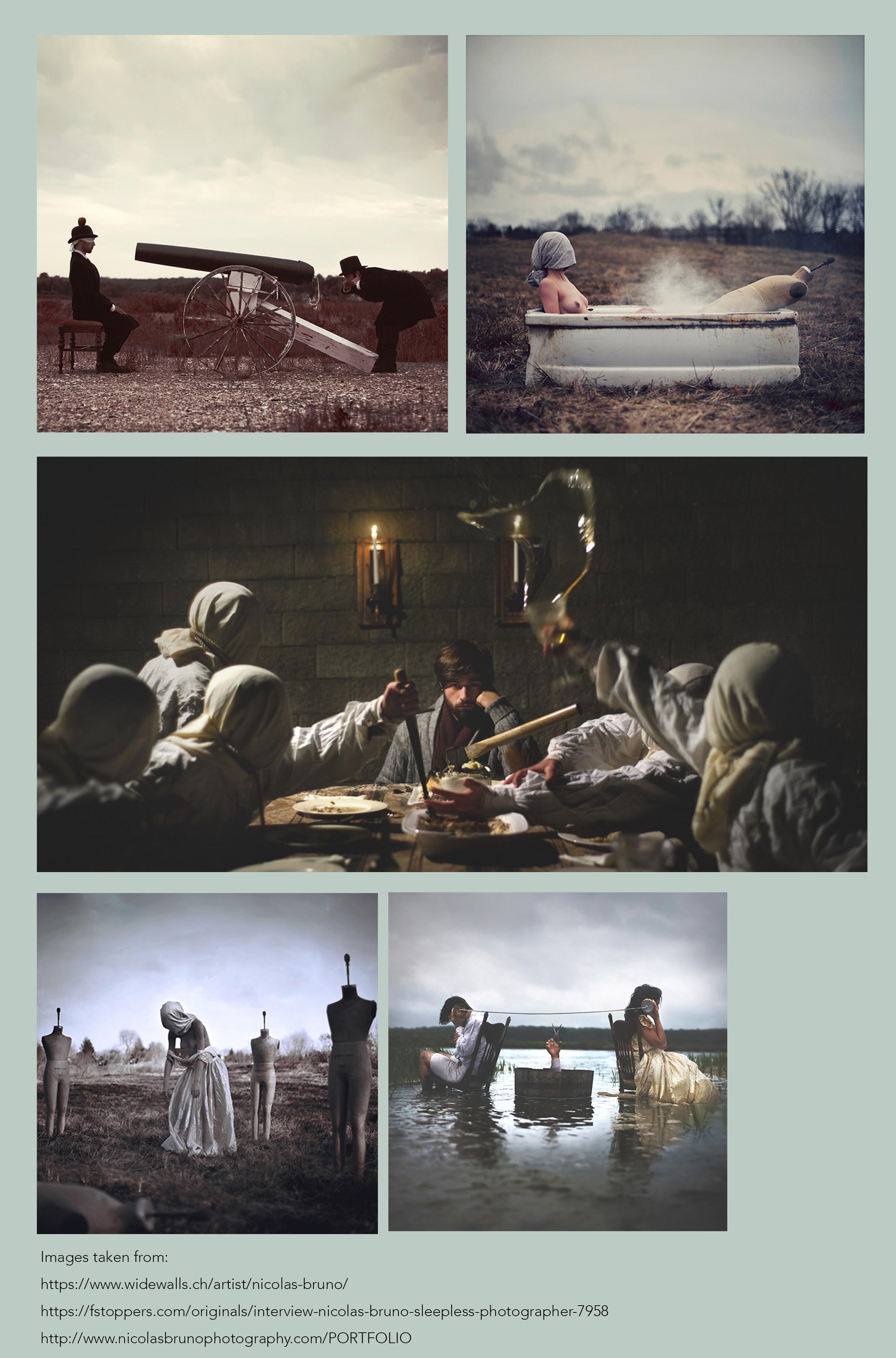
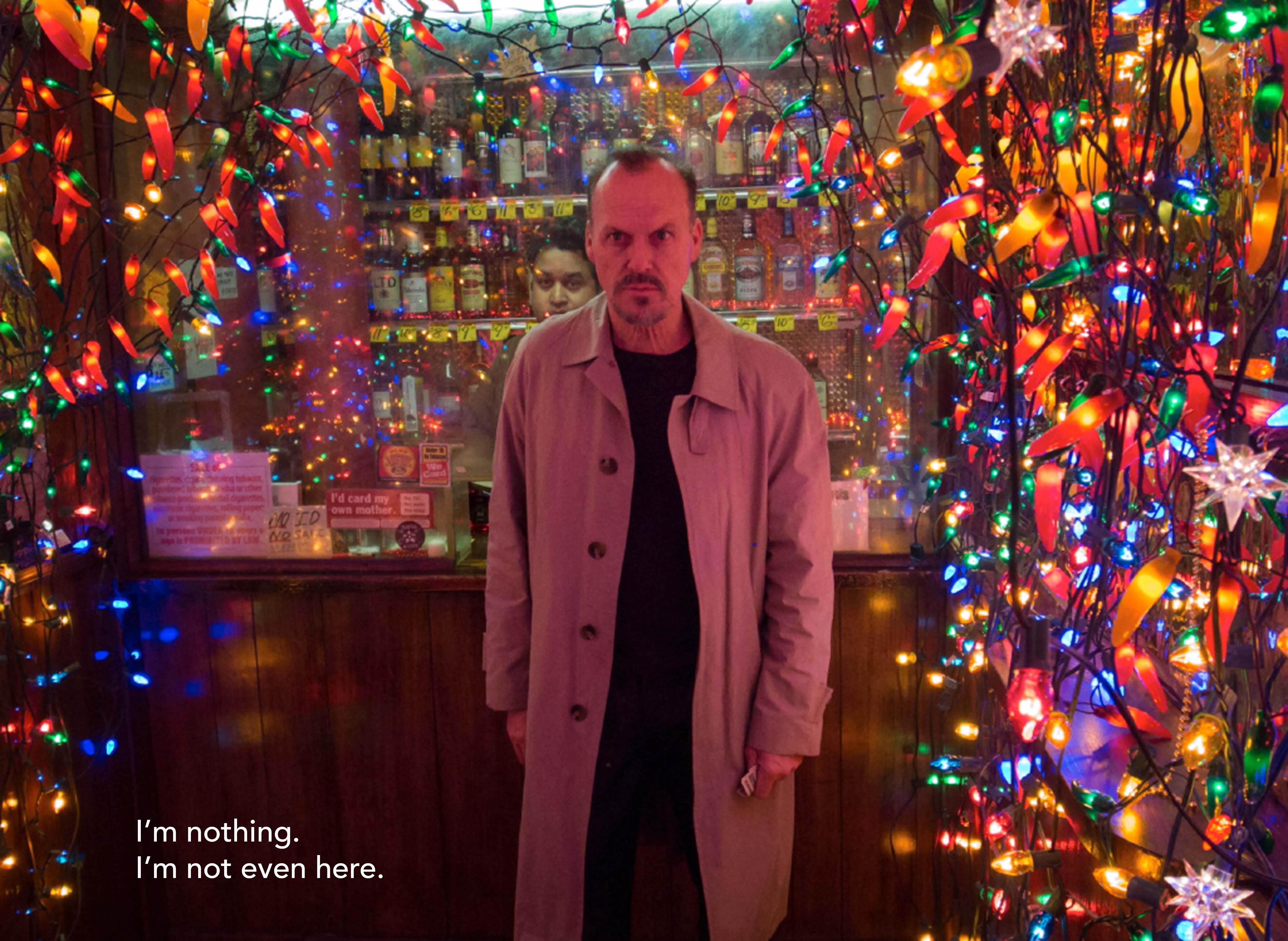
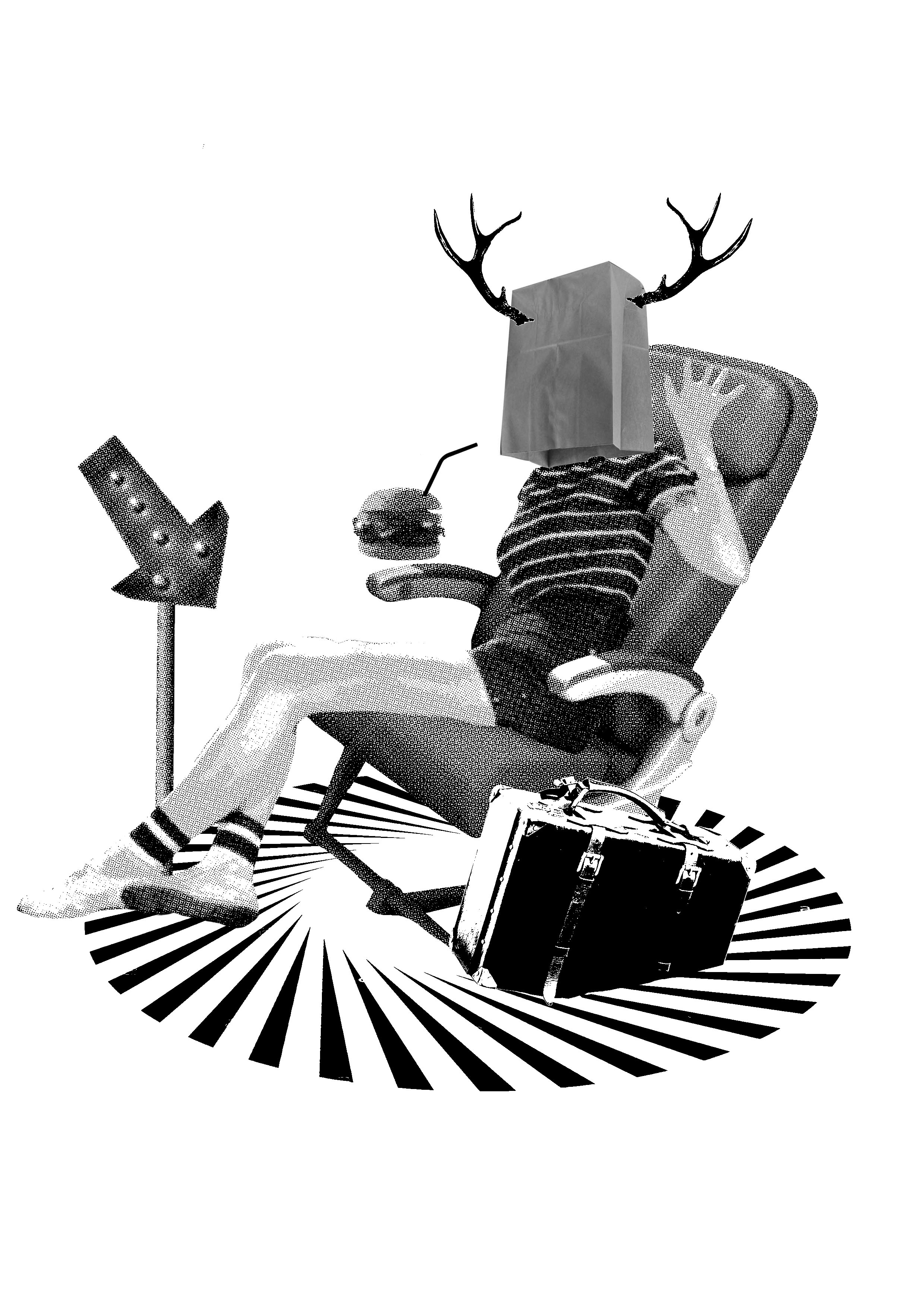
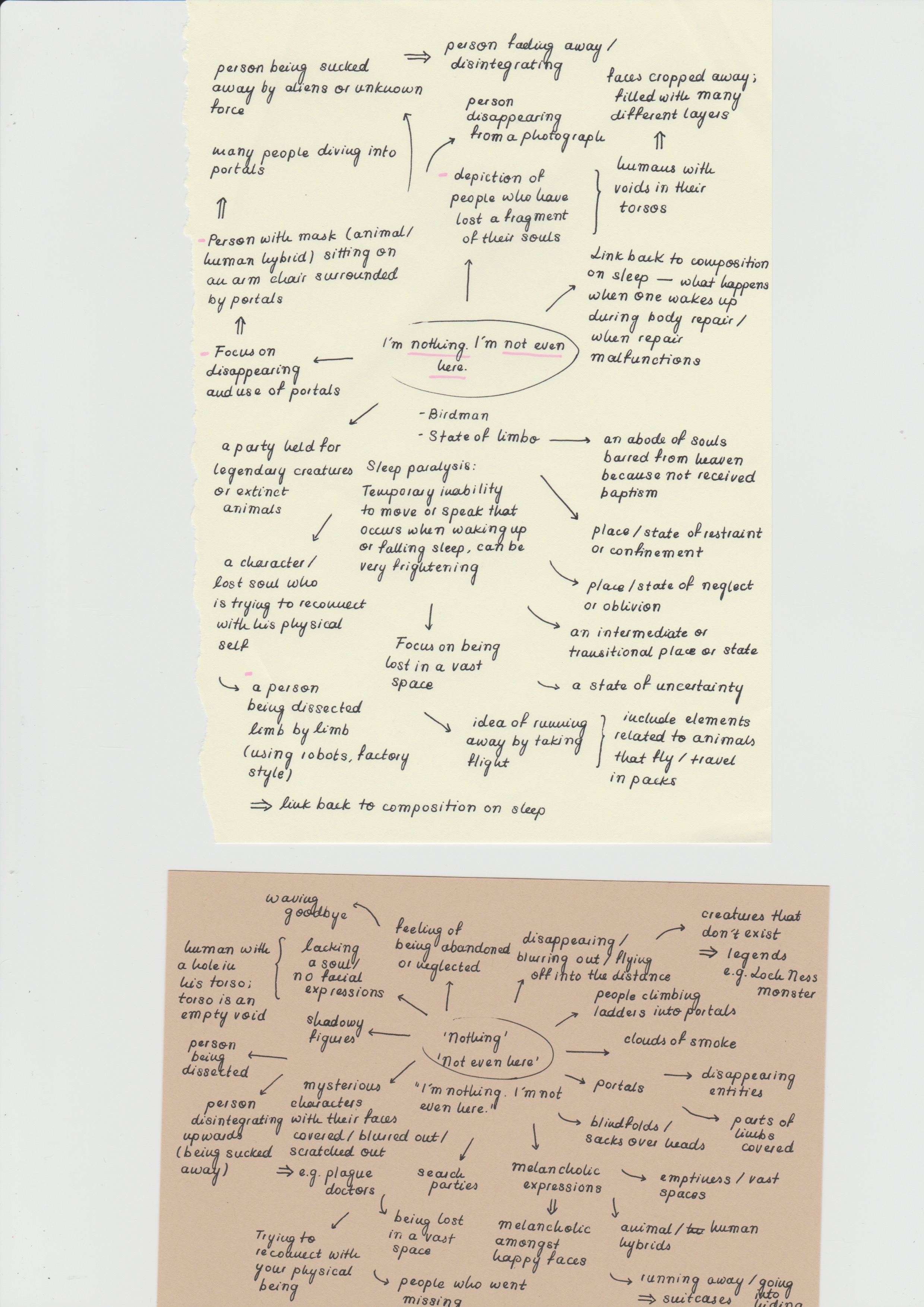
Composition 4 is a reconstruction of the quote ‘I’m nothing, I’m not even here’ from 2014’s Birdman (or The Unexpected Virtue of Ignorance). Meant to depict the state of sleep paralysis or limbo, the composition tells the story of an unknown figure disappearing through a portal in the ground. Inspired by photographer Nicolas Bruno, whose works revolve around capturing moments he witnesses while experiencing sleep paralysis, I wanted to create a composition that mirrors the terrifying nature of his photographs and the accounts of people who suffer from this state. To do so, I blurred out the identity of the human figure in the composition by placing a sack and deer antlers over her head. 

Deconstructing the words ‘nothing’ and ‘not even here’, the elements chosen are supposed to revolve around the idea of travelling and disappearing without a trace. This is shown through depicting a suitcase, airplane seat, direction arrow, and the figure waving goodbye, as well as the portal underneath. 

II. Techniques Applied

In constructing the narrative of this composition, I tried using hyperbole and anthropomorphism. Exaggerating on the words ‘nothing’ and ‘not even here’, I wanted to give the composition a surreal feeling by using a non-realistic way of disappearing (i.e. a portal), as well as using hints of anthropomorphism (assigning deer antlers to a human figure). 

Pattern
Emphasis
Textures and values

Similar to Composition 3, Composition 4 follows a simple layout of having the main focus (i.e. the human figure) in the centre of the composition with accompanying elements branching out from it. This helps in directing viewers’ gaze to the main focus followed by the minor elements, also paving the way for emphasis by drawing attention to the centred main element. The elements also attempt to achieve a sense of balance by aligning with one another; the slanted planes of the arrow, airplane seat, and suitcase are parallel to one another. The placement of the hamburger with a straw in the centre also establishes a more balanced look between the upper and lower sections, thereby helping to create a neater and more visually-appealing layout. 

Additionally, reinforcing the concept of the figure disappearing into the portal below, I tilted the elements in the composition, and cropped out the bottom of the suitcase. 

Composition 4 also uses patterns, as seen in the circular portal at the bottom. Similar to earlier uses, the solid black and white value of the pattern helps to create contrast in texture and shadows against the halftones of other elements, as well as create variance in structure with its repetitive geometric shapes as opposed to the organic shapes of other elements. 

Feedback & Improvements
Feedback left behind by fellow classmates
Feedback by fellow classmates
Positive Improvements
Composition 1 High contrast helps to make it seem more vivid and its wild nature

Simple composition with minimal elements

Unequal sense of balance; the elements on top outweigh the bottom, making it seem more heavy

The under-the-sea theme could have been swapped out with something more related to the quote

Composition 2 Good use of symmetry and balance  Reduce the use of halftones to create more variety and contrast
Composition 3 Use of lines helps to draw viewers’ gaze to the main focal point The use of threshold for the construction workers and doves could be improved upon; their features are not clearly distinguishable
Composition 4 The elements used as symbols are straightforward  The pattern used could have been swapped out for a more radial pattern to make it more obvious as a portal and to make the composition more visually-appealing

Challenges

Unpredictability of images

The main challenge I faced in this project is the unpredictability of the images used in the compositions. Keeping the requirement of using only found images and black and white tones, it was challenging and tedious to find suitable images and altering their brightness, contrast, and saturation values to compliment one another. Furthermore, having minimal experience with halftone and threshold, it was difficult in adjusting the black and white values of the images to clearly show the details and at times, they would just appear as blobs of black and white, or grey circles (if using half tones). However, with tutorials, I was able to get a better idea of how to use halftones, and using trial-and-error methods with a bunch of different images helped in this process.

Link to research and process:
https://oss.adm.ntu.edu.sg/vwong005/research-process…t-2-forrest-gump/

References

http://www.imdb.com/title/tt0109830/mediaviewer/rm2864190720

Composition 1:

https://depositphotos.com/23602849/stock-photo-saxophonist.html

https://www.dreamstime.com/stock-image-goldfish-image16533151

https://www.shutterstock.com/image-photo/tentacles-octopus-isolated-on-white-background-404070004

https://www.shutterstock.com/image-photo/tentacles-octopus-isolated-on-white-background-404069971

https://hu.pinterest.com/phil_sidey/

http://mainestategrange.org/?tag=music

https://www.theguardian.com/artanddesign/gallery/2015/oct/30/funny-peculiar-extreme-clown-portraits-by-perou-coulrophobia-in-pictures

Composition 2:

http://www.britishmuseum.org/research/collection_online/collection_object_details.aspx?assetId=870901&objectId=1341986&partId=1

https://www.definicionabc.com/salud/muneca.php

https://www.dreamstime.com/stock-illustration-cross-religious-symbol-crucifix-logo-design-icon-image54056213

Lotus

http://chek.lv/index.php?route=product/product&product_id=121

https://www.123rf.com/photo_1415056_small-white-candle-on-a-white-background.html

https://www.catbirdnyc.com/classic-hammered-ring-yellow-gold.html

Composition 3:

http://time.com/4763638/jfk-covers-life/

https://science.idntimes.com/discovery/bayu/ini-15-fakta-ilmiah-unik-soal-tidur-yang-jarang-orang-tahu

http://www.fansshare.com/community/uploads42/7369/pvc_pipe_fittings/

https://www.pinterest.com/freecycleusa/recycled-lighting/?lp=true

https://browniesincinema.bandcamp.com/track/never-going-back

https://www.123rf.com/photo_42784196_vertical-view-of-construction-workers-working-outdoors.html

http://www.fotosearch.com/CSP992/k12824999/

http://www.freeimages.com/premium/worker-putting-out-safety-cones-966568

https://www.pinterest.com/rocketlandphoto/retro-cool/?lp=true

cropped-blue-sky-white-dove-flying-new-desktop-wallpaper-in-hd-free-download-birds-images.jpg

Composition 4:

http://www.alamy.com/stock-photo/legs-in-the-air.html?blackwhite=1

https://www.turbosquid.com/Search/3D-Models/seat

https://www.amazon.co.uk/slp/swag-bag/5kx6sbpthakw7cn

https://depositphotos.com/stock-photos/cheeseburger.html

https://www.houzz.com/product/40854476-distressed-red-finish-lighted-led-arrow-wall-hanging-industrial-novelty-signs

https://www.picquery.com/c/antlers_pdvUD3b8SDZv4j0qvyVAu9*ZGJNNaDFTK8QiZVDe43Q/


[Research & Process] Project 2: Forrest Gump

Research

Art Movements

Dadaism
Dada artists

The aim of Dada Art was an aid to stop the war as well as an outlet to ‘vent frustration with the nationalist and bourgeois conventions that had led to it’. ‘Their anti-authoritarian stance made for a protean movement as they opposed any form of group leadership or guiding ideology’. 

Dada artists are usually agitated by politics and sought to ‘incite a similar fury in Dada audiences’. Dada artworks involve presenting ‘intriguing overlaps and paradoxes’, where ‘they seek to demystify artwork in the populist sense but’ ‘remain cryptic enough to allow [viewers] to interpret works in a variety of ways’. For example, some artists portrayed people and scenes ‘representationally’ ‘in order to analyse form and movement’. Some perceive that in order to understand these works, one must be able to ‘reconcile the seemingly silly, slapdash styles with the profound antibourgeois message’.

Crucial components:

  • Irreverence: A lack of respect for bourgeois convention, government authorities, conventional production methods, or the artistic canon.
  • Readymades and assemblage: Often chosen and assembled by chance or accident to challenge bourgeois notions about art and artistic creativity, bizarre
  • Chance: Used to embrace the random and accidental as a way to release creativity from rational control
  • Wit and humour: Interest in humour, typically in the form of irony; an awareness that nothing has intrinsic value; also gave artists flexibility and expressed their embrace of the craziness of the world, thus preventing them from taking their work too seriously
I. Hannah Hoch
Portrait of Hannah Hoch

Hannah Hoch, the ‘It Girl’ of Berlin Dadaists, was considered the pioneer of the Dada ‘cut-and-paste’ style. Hiding in a tiny suburban cottage away from Nazi scrutiny, due to her bisexuality and anarchic art, Hoch was branded a ‘degenerate’ by Nazis and being constantly being edged out Dadaists. She, however remained a notable figure in the Dada movement, with her distinguishable use of photomontage, the original ‘art of protest’, and the ‘aesthetic of liberation, revolution, and protest’. 

Works of Hannah Hoch
From left to right: Flucht (Flight) (1931)
Ohne Titel (1930)
Untitled

Satirising Weimar politics, Hoch’s works are said to be ‘so balletic’, as if her ‘snipped images and dismembered figures dance on the page like leaves in the air’; her work is perceived as ‘tough and punchy, yet always delicate’. Often possessing a ‘narrative undercut’, one can distinguish Hoch’s works through the enlargement of a single feature and deviations from being ‘doctrinaire or narrowly-focused’, where many of her works ‘make men into women and vice-versa’. In contrast to her male counterparts in the movement, Hoch ‘never seems to have lost her characteristic sense of wonder’, possessing a ‘desire to ‘show the world today as an ant sees it and tomorrow as the moon sees it”. 

Surrealism
Surrealist artists

Growing out of the Dada movement, Surrealism was also considered a ‘rebellion against middle-class complacency’, however with artistic influences coming from different sources.

Sharing the same ‘anti-rationalism’ as Dada, Surrealist artists used art as a ‘reprieve from violent political situations and to address the unease they felt about the world’s uncertainties’. This was done through using ‘fantasy and dream imagery’ to create works in a variety of media that ‘exposed their inner minds in eccentric, symbolic ways’, ‘uncovering anxieties and treating them analytically through visual means’.

Mediums include:

  • Surrealist paintings
  • Surrealist objects and sculptures
  • Surrealist photography
  • Surrealist film

Some distinguishable Surrealist factors, methods, and techniques include:

  • Hyper-realistic style (objects depicted in crisp detail and three-dimensionality, emphasising their dream-like quality)
  • Saturated colour schemes
  • Reliance on automatism or automatic writing as a way to tap into the unconscious mind
  • Unlikely and outlandish imagery including collage, doodling, frontage, decalcomania, grattage
  • The ‘prosaic photograph removed from its mundane context’
  • Vernacular snapshots, police photographs, movie stills, documentary photographs posted in Surrealist journals, disconnected from their original purposes
I. Salvador Dali
Portrait of Salvador Dali

‘Epitomising the idea that life is the greatest form of art’, Salvador Dali, one of the most prolific artists of the 20th century is the most famous Surrealist artist. In addition to the fame credited for his works and collaborations with other notable figures, Dali was also renowned for his ‘flamboyant personality and role of mischievous provocateur as much as for his undeniable technical virtuosity’.

His works embody ‘obsessive themes of eroticism, death, and decay’, reflecting his ‘familiarity with and synthesis of the psychoanalytical theories of his time’, his work is embedded with ‘ready-interpreted symbolism, ranging from fetishes and animal imagery to religious symbols’.

Works of Salvador Dali
From left to right:
Persistence of Memory (1931)
Apparition of Face and Fruit Dish on a Beach (1938)
The Temptation of Saint Anthony (1946)

His body of work also ‘evolved the concepts of Surrealism and psychoanalysis on a worldwide visual platform’, as well as ‘modelled permission for people to embrace their selves in all our human glory’.

  • Shows visual representation of dreams
  • Exquisite draftsmanship and master painting techniques
  • Paved the way for artists to inject the personal, mysterious, and emotional into works
  • Showed that there was no separation between man and work
  • Used avant-garde filmmaking, provocative public performance, and random, strategic interaction, bringing his work to life in ways differing from paintings
  • Spearheaded the idea that art, artist, and artistic ability could cross many mediums and become a viable commodity

Techniques

Storytelling Methods
Hyperbole Exaggerated statements or claims not to be taken literally.
Metaphor A comparison between two objects with the intent of giving clearer meaning to one of them.
Caricature A picture, description, or imitation of a person in which certain striking characteristics are exaggerated in order to create a comic or grotesque effect.
Parody An imitation of the style of a particular writer, artist, or genre with deliberate exaggeration for comic effect.
Anthropomorphism The attribution of human characteristics or behaviour to a god, animal, or object.
Juxtaposition The fact of two things being seen or placed close together with contrasting effect.
Imagery Words or phrases that appeal to any sense or any combination of senses.
Personification A figure of speech which endows animals, ideas, or inanimate objects with human traits or abilities
Reference Artists
I. David Lynch
Portrait of David Lynch

David Lynch is a director and screenwriter most well-known for his ‘dark, offbeat’ films and TV series, the more recognisable ones including Eraserhead, Blue Velvet, Mulholland Drive, and Twin Peaks

Works of David Lynch
From top to bottom: Twin Peaks (1990)
Mulholland Drive (2001)
Blue Velvet (1986)

Branded with his own style, the ‘Lynchian Style’. Lynch’s films are known to be ‘bizarre’, with ‘dark worldview[s], disturbing subject matter, and a surreal tone’.  In his approach to films, he uses repeated motifs, emphasises on setting, and expands on the idea of ‘superreality’ and the subconscious

II. Joe Webb
Portrait of Joe Webb

Joe Webb is an artist recognised for his ‘collages with a message’. Reimagining found imagery through simple editing, he addresses issues that range from ‘climate change’ to ‘war and inequality’, ‘challenges of living in today’s modern world’.

Works of Joe Webb
From left to right: The Cloud Eaters
Citizens of Earth
Antares and Love
Stirring Up A Storm

“Joe navigates a rich landscape with grace and humor, making nice with many recognizable visual pastimes. He plays them against each other in a way that puts different eras in dialogue, allowing characters to travel far from their 50’s Home Gardening Magazine roots to the far cosmos. He flirts with the themes of nostalgia and loss but ultimately composes lighthearted images that are in dialogue with today’s sampling culture, collapsing and hacking together sources from across the universe in fun and rudely jacked up color schemes.” – Wangechi Mutu

III. Eugenia Loli
Works of Loli

Collage artist Eugenia Loli is most known for her style of works where she uses ‘photography scanned from vintage magazines and Science publications’ to ‘create bizarre visual narratives’ that have hints of ‘pop art, dada, and traditional surrealism’.

IV. Nicolas Bruno
Works of Nicolas Bruno

Nicolas Bruno is an established photographer who suffers from sleep paralysis, a condition in which ‘keeps him in a halfway state between being asleep and being awake’. Through his haunting, yet incredible images, he recreates the experiences from his dreamscape. He starts with experimenting with dream recollections, ‘creat[ing] a concentration of work’ where he ‘[warps] his anxiety into a positive product and expresses his vision to the world’.

Learning Points
  • Distinguishable factors of Dadaist works
  • Distinguishable factors of Surrealist works 
  • Varying methods of using found imagery in forming new compositions 
  • Different, modern approaches in Surrealist art

 Process

The processes in this project is made up of two main stages: preparing the compositions and silkscreening. 

Preparing Compositions

In preparation for composing our prints, we were first required to have an understanding of the two major art movements we would be drawing inspiration from; Surrealism and Dadaism. This was followed by selecting our movie quotes. 

QUote Picking

When selecting appropriate movie quotes, I began with narrowing down some of my favourite films and directors, keeping films with excellent dialogue and writing in mind. I then filtered through these films by bringing in the direction I was going for; using David Lynch’s method of dissecting reality into three states – being awake, sleeping, dreaming (and limbo, added as a personal choice). The quotes were then categorised into the respective states. 

Quotes Category: Awake
Quotes Category: Asleep
Quotes Category: Dreaming
Quotes Category: Limbo

The quotes were then narrowed down further after considering their literal context and if taken out of context, their ability to reconstruct a completely different and surreal narrative. Some of the words that stood out in the quotes were also taken into consideration. After deliberating and brainstorming some ideas, I decided to go with the following quotes:

Dreaming: Baby Driver (2017)
Awake: Her (2013)
Asleep: Trainspotting (1996)
Limbo/Sleep Paralysis: Birdman (or The Unexpected Virtue of Ignorance) (2014)
Composition Arranging

After finalising the quotes and having a clear direction in mind, I was ready to layout the compositions. Since this was based on Surrealism, I decided to take the quotes completely out of their contexts and focus only on selected words and ideas.

I. Composition 1

‘He’s a looney. Just like his tunes.’

Keeping in-line with depicting the state of dreaming, I wanted to create a composition based on the nonsensical nature of dreams. The following images show different compositions and ideas. 

Composition 1: Drafts

Drafts 1 and 2 reflect the same concept; portraying the madness associated with conspiracy theories through the use of symbols such as aliens, red thread and thumbtacks, and spaceships made up of musicians, vinyls, and bell jars. Draft 3, on the other hand, depicts a man who has ‘lost his senses’, and as a result, has his sense of hearing and taste jumbled up, resulting in him wanting to eat music. However, given the nature of the images in threshold and halftone value, they were not able to fully form on the silkscreen. 

Composition 1: Breaking down ‘looney’ and ‘tunes’
II. Composition 2

‘Sometimes I think I have felt everything I’m ever gonna feel.’

Exploring the state of being awake, Composition 2 was originally meant to represent the sense of feeling and touch.

Composition 2: Drafts

With regards to feeling, I wanted the composition to show various levels of emotions; the use of knives to represent anger, pill bottles to represent sadness, and flowers to represent happiness. The repeated motif of hands and the third eye were meant to embody the sense of touch. However, after consulting, the message being conveyed was not as clear, and I decided to try another concept of divinity and depicting an entity who has reached the pinnacle of feeling all there is to feel. 

Composition 2: Breaking down ‘felt everything’
III. Composition 3

‘I chose not to choose life. I chose something else.’

Expanding on the state of sleeping, I wanted the composition to convey a narrative of what happens to one’s body when one chooses to sleep instead of facing life.

Composition 3: Drafts

Satisfied with the elements used, I chose to try out different layouts as the layout was pretty messy; the main focal point is difficult to pinpoint. This was adjusted by changing the directions of the geometric patterns, as well as altering the Life Magazine direction and adding more elements representative of the situation. 

Composition 3: Breaking down ‘not to choose life’
IV. Composition 4

‘I’m nothing. I’m not even here.’

Based on the state of limbo or sleep paralysis, I looked to photographer Nicolas Bruno for inspiration. Known for his works where he captures moments and figures he witnesses during his encounters with sleep paralysis, his works echo Surrealist elements and reinforces the terrifying nature of sleep paralysis. 

Composition 4: Drafts

Generally satisfied with the layout of the composition, I just experimented further with changing some of the elements to make it more visually appealing. In this case, I swapped out the paper bag for a potato sack to make the figure seem more terrifying and draw a better sense of unity amongst the elements.

Composition 4: Breaking down ‘nothing’ and ‘not even here’

 Silkscreening

This project also had a silkscreen component which allowed us to learn more about preparing for and exposing our own silkscreens, followed by printing our own tote bags. 

Experience
Silkscreen process

The silkscreen process, although tedious, was eye-opening. We were taught the process of preparing silkscreens, the technical aspects of each procedure, and the functions of various materials. 

Personally, I faced quite a number of challenges in exposing my own screens. After preparing my first composition, I was quite satisfied with the layout and the elements I used; the positive feedback received made me all the more confident with how the print turned out. However, given the nature of the original images, they did not turn out very well when imposed with halftones and threshold and as a result, the silkscreen print did not turn out as expected. 

Silkscreen: Trial 1
Silkscreen: Trial 2

Given the time constraints left in preparing other compositions and the limited time left in exposing our screens, I was not able to experiment with varying levels of threshold and halftone, and had to change the top half of my composition completely. 

Challenges
  • Using threshold and halftone values 
  • Adjusting compositions to fit the layout of found images, therefore working in reverse
  • Silkscreen issues and pinpointing exactly where the problem rose from

Link to final:

[Final] Project 2: Forrest Gump

References

https://quizlet.com/4073015/list-of-poetic-devices-flash-cards/

https://www.vice.com/en_uk/article/mvbne3/an-oral-history-of-the-movie-trainspotting

https://www.vox.com/culture/2017/6/27/15874888/baby-driver-review

A Romance for HER (and him)

https://www.indyweek.com/arts/archives/2014/10/31/movie-review-birdman-soars-despite-some-turbulence

10 Famous Surrealist Artists You Must Know

Dada

http://www.thecallalilydialogues.com/the-dialogues/2016/10/24/hannah-hoch-a-pioneer-of-photomontage-a-pivotal-figure-in-dada

http://time.com/4318151/salvador-dali/

193 Portrait of David Lynch

MAGRITTE: COME VIVERE LA VITA CON IRONIA

https://hanguppictures.com/artists/joe-webb

https://www.biography.com/people/david-lynch-9389739

http://www.artnet.com/artists/david-lynch/biography

http://www.joewebbart.com/about/

Surreal Collages by Eugenia Loli

https://fstoppers.com/originals/interview-nicolas-bruno-sleepless-photographer-7958

http://www.theartstory.org/movement-surrealism.htm

http://www.theartstory.org/artist-dali-salvador.htm

http://www.telegraph.co.uk/culture/art/10545071/Hannah-Hoch-The-woman-that-art-history-forgot.html

http://www.theartstory.org/artist-hoch-hannah.htm

[Planar & Plastic] Project 3: Mnemosyne’s Scent

Overview

This segment of this project explores two areas; planar and plastic models. Constructing planar models is an outlet for us to experiment with planes while the plastic models are a lead-up to our final product involving the pleasant and unpleasant memories associated with certain scents.

Final Products

Final: Planar model (front view)
Final: Planar model (side view)
Final: Plastic model
Concept & Approach
I. Planar Model

The planar model pictured above is a result of experimenting with the idea of contrast. Strips of different lengths and widths were used, focusing on altering their physical structures to create swirls and rigidness, and varying heights from its horizontal base.

II. Plastic Model

The plastic model pictured above is a sculptural representation of both a pleasant and unpleasant scent that evokes an accompanying memory. 

Structuring the sculpture based on height – where the main elements are found on the top and bottom – is representative of the idea of achievement VS failure. 

The top half of the sculpture represents the pleasant memory (i.e. Daler Rowney acrylic paint), whose accompanying memory gives me a sense of achievement and familiarity. In addition to elevating it to represent a ‘high point’ in my life, I also used swirls of plastic to surround a ball in the centre to represent the sense of familiarity and comfort the scent evokes. The transparency of the plastic also reinforces it as a ‘refreshing’ scent, something paint is typically associated with.

The bottom half of the sculpture, on the other hand, represents the unpleasant memory (i.e. coffee beans). It is based on the notion where despite it being my favourite blend of coffee, it still evokes unpleasant memories; this was done through creating a flower-like structure encompassing a smaller structure punctured with holes. The smoky, lingering smell of the beans is shown through the upwards-flow of the flower-like elements, translucency of the plastic, and strips of plastic bags stuffed into the centre, masking the punctured plastic within. 

Techniques Applied
Sketch Analysis: Planar model
Planar Model Principal axis, broken planes, use of voids

Hierarchy

Contrast

Rule of thirds

Dynamic compositions (wedging)

Plastic Model Contrast

Melting and soldering

I. Planar Techniques

The planar model has a vertical principal axis, with the use of broken planes as demonstrated by swirls from the SD plane, where it does not fit in a box when elevated. The structure of the planes also managed to create symmetrical circular voids. 

II. Hierarchy

The planar model also uses hierarchy, evident in the use of Dominant (D), Subdominant (SD), and Subordinate (SO) planes. The D plane is reinforced through its thick width, the SD plane shown by its thinner width, and the SO plane portrayed by its short length and width. 

III. Contrast 

Contrast is demonstrated in the planar model in its physical structure; the planes vary in rigidness (displayed in the SO plane) and swirls (displayed in the D and SD planes). 

Similarly, the plastic model uses contrast in its varying segments; straight and upright elements (the connecting straw and circular plate), and swirls created by the flower-like structure and the bottom and the wrapping strips of plastic at the top. Contrast is also emphasised through varying opacities where transparent plastics were used at the top, along with translucent plastics at the bottom (strips of plastic bags and sanded plastics).

IV. Rule of Thirds

The planar model also makes use of the Rule of Thirds. This is evident in grouping the majority of the model (D, some of the SD, and SO planes) at 1/3 of the base, with the remaining 2/3 of the SD plane extending outwards. The Rule of Thirds is also shown in the SO plane where 1/3 of its length is wedged.

V. Application Techniques

The planar model is structured using wedging as opposed to pasting. In addition to creating more visually-appealing models, it also helps in creating dynamic compositions where the planes use various angles of dependent balance to hold one another up.

The plastic model’s structure is created using methods such as heating and soldering. Heating melted and moulded the plastic (shown in the flower-like structure), while soldering formed patterns (shown in the punctured structure). 

Research & Process

Scents

The scent I chose that reminds me of a pleasant memory is a particular brand of acrylic paint, namely Daler Rowney paint. Coming from the exact same tube of paint, the scent takes me back to my first wall mural art project that I took part in with some friends a year ago, which gives me a sense of familiarity and achievement as well as the fun memories that went along with it (e.g. climbing an extremely tall, rickety ladder when we were all terrified). The scent that evokes an unpleasant memory, on the other hand, is a particular brand of coffee beans that my workplace serves. Even though it remains as my favourite coffee, the smell emitted reminds me of busy days, rude customers, messed up orders, and the trouble I’d get into for not doing a good job with making coffee.

Mindmap: Pleasant and unpleasant scents
Plastic & Design
Veronika Richterova’s Recycled PET Bottles

Based in Czech Republic, Veronica Richterova is a designer/artist most notable for her works involving recycled PET bottles. 

Works of Veronika Richterova

Considered a guru in ‘up cycling plastic bottles to create nature-inspired and cartoonish sculptures’, the artist has gained recognition for ‘cutting, heating, twisting, melting’ and ‘transforming plastic materials’ in a number of ways. Her fascination with plastic bottle extends further when she writes extensively about the usage of plastic bottles and its history of mass-production.

Learning Points
  • Methods of melting plastic
  • Interesting structures to sculpt plastic
Process
Planar: Sketch Model 1
Planar: Sketch Model 2
Positive Improvements
Model 1 Interesting composition Refrain from pasting

Extend length of SD

Move composition to 1/3 of the base

Reduce length of SO


Link to Fashion Accessory final product and process:
https://oss.adm.ntu.edu.sg/vwong005/fashion-accessor…mnemosynes-scent/

References

http://www.designindaba.com/articles/creative-work/plastic-bottle-artworks-veronika-richterová

[Fashion Accessory] Project 3: Mnemosyne’s Scent

Overview

The final segment of Project 3 involved taking inspiration from the high fashion world, as well as elements from our plastic prototypes and planar models to create a fashion accessory that embodies the pleasant and/or unpleasant scents we discussed earlier in a composition that demonstrates planar techniques. 

Final Product

Final product
Final product (lit up)
Concept & Approach

Inspired by the interesting compositions seen in avant-garde fashion, we wanted to create a fashion accessory that echoed the works of Alexander McQueen. Finding versatility in body jewellery, we decided to make an arm band using a combination of planar structures, incorporating elements that represented the memories evoked by our pleasant scents. Our product was also structured in such a way that it has the ability to stand out in a dimly-lit environment.

Techniques Applied
Sketch Analysis: Arm band
Hierarchy
Contrast
Wedging
Dynamic compositions
I. Hierarchy

Hierarchy is represented through the use of Dominant (D), Subdominant (SD), and Subordinate (SO) elements. The D element is reinforced by its length and bright white colour, the SD element is reinforced by its combination of transparent body and black colour, as well as its smaller size in comparison, while the SO element is reinforced by its contrasting gold-rose colour and scale being the smallest of all the elements. 

II. Contrast

The product was also meant to create contrast through its varying colours and textures. The variety in colours is demonstrated by the black SD, the white D, the metallic colours in the second SD, and the incorporation of light. Texture, on the other hand, is varied through the use of different materials; acrylic for the SD’s body, textured paper for the D, and metal wires for the second SD. 

Contrast is also used in the model’s layout, where the structures are aligned in such a way that they contrast against one another. This is seen in the second SD (i.e. the metal wires) going in the opposite direction of the D (i.e. white structure) plane, and the SD (i.e. black base) standing upright, contrasting against the angled positions of the previous two elements. 

III. Wedging

Wedging was used in joining the D plane to the SD structure.

IV. Dynamic Compositions

Wedging the structures together helped to create dynamic compositions, where the D plane uses Dependant Balance against the SD metal wires to hold itself up. 

Research & Process

Alexander Mcqueen
Works of Alexander McQueen

Alexander McQueen was once the head designer of the Louis Vuitton-owned Givenchy fashion line, and launched his own menswear line in 2004. Earning the title of British Fashion Council’s British Designer of the Year four times, as well as being named Commander of the Order of the British Empire, McQueen was most notable for his signature dramatic style of clothing, ‘pushing the limits of what people expected from fashion’. 

learning Points
  • Varying ways of experimenting with planes in fashion accessories
  • The use of different materials in making the planes seem more visually-appealing
  • Variance in texture and opacity
  • Structuring planes
Process

The accessory involved fusing together two of our planar models, since they were quite similar in structure and composition. 

Final planar model
Dhanu’s planar model

Link to planar and plastic models:
https://oss.adm.ntu.edu.sg/vwong005/planar-plastic-p…mnemosynes-scent/

References

https://www.biography.com/people/alexander-mcqueen-541384

4D: Clock Time

Keeping the idea of clock time in mind, I wanted to experiment with plot time and tried depicting an event happening in a linear manner, something progressing over time, but in a span of 30 seconds.

Here is a video of Jiayi eating a bag of chips from the point she opened it to the point she threw it away!


[Final] Project 2: Gaia’s Ikebana

Gaia’s Ikebana

After a couple of weeks of conceptualising, going grocery shopping for ingredients, and scouting for branches and leaves around the campus, it was finally time to present our models.

Final Model

Experimenting with dynamic compositions through the mediums of food and Ikebana, my final model was meant to portray the season of Summer.

Final (front view)
Final (top view)
Final (closeup)
I. Concept

I wanted the model to show a dish being formed in a more abstract manner. This was attempted through dissecting the food items; the ice-cream cone was turned on its head with the bottom (or apex) facing upwards and yoghurt placed outside instead of within. The sphere (macadamia nut) was also placed alongside the ice-cream cone with a drizzle of yoghurt to represent it flowing downwards into the granola mixture and joining the rest of the ingredients.

When I came across the word “Summer”, pictures of Summer-based recreational activities immediately flash through my mind. These activities are usually held outdoors under the hot sun; they include, but are not limited to, state fairs or fun fairs, beaches, and picnics.

After conducting some research and assembling mood boards and reference images, I felt quite drawn portraying a typical Summer picnic. I wanted to experiment with the idea of packaged and compact high-end ingredients (usually easy to transport), and platters that are usually brought to picnics. The addition of props and greenery to the foods could also help in establishing a varied and interesting colour palette of both earthy tones with splashes of vibrant colours, conveying a mood of calmness in a time of celebration and being carefree.


II. Principles of Design
Sketch analysis of final model

Some of the design principles applied in the model include:

Design Principle Evident In
Dynamic Composition Angles at which volumes are balanced against
Rule of Thirds Sizes of volumes
Hierarchy Sizes, colours, and materials of volumes and props
Harmony Composition of model and visuals of volumes
Contrast Materials, textures, and colours of volumes and props
II.I. Dynamic Composition

The volumes (cone, sphere, and cylinder) used in the model are structured to reflect different kinds of balances. The cylinder, in relation to the base, uses Independent Balance, where the angle of balance is less than 45°. It is independently related to the vertical and horizontal axis in such a way that it is able to balance itself regardless of whether it is physically supported by other structures.

The cone, in relation to the cylinder, uses Dependent Balance, where its axis is propped up against the axis of the cylinder, depending on it for physical visual structure and balance.

The sphere, on the other hand, uses Precarious Balance, where its angle of balance is more than 45°, seeming as though it is holding its own balance and can fall apart once its support is removed.

II.II. Rule of Thirds

Rule of thirds is applied in the sizes of the volumes where the height of the cylinder is approximately 1/3 of the cone, the diameter of the sphere approximately 1/3 of the diameter of the cylinder, and the sphere placed 1/3 alongside the axis of the cone.

II.III. Hierarchy

Hierarchy is applied in the volumes and props used in the model.

Dominant Cone, Branches Cone: Emphasised through size and colour (brown as a base colour due to its subtleness)

Branches: Emphasised through their sizes and physical structure

Subdominant Cylinder Emphasised through its size and transparency; transparency to take its attention away from the Dominant cone in case both volumes are too similar in size
Subordinate Sphere, Flowers, Yoghurt Sphere: Emphasised through its size

Flowers: Emphasised through its vibrant splash of colour against a palette of earthy tones

Yoghurt: Emphasised through its physical structure and colour as a “finishing touch”

II.IV. Harmony

Harmony is displayed through the model’s composition where the volumes and props are placed within close proximity; the branches and flowers are grouped together while the food items form another group. Harmony is also shown in repetition of certain elements; the same yoghurt used in the cylinder is drizzled on the cone, and the granola used in the cylinder is also scattered around the base. The idea of unity is also reinforced through the colour palette where earthly, more muted tones are used (displayed in the base, the shades of green and brown in the branches, and the colours of the cone and sphere), complemented with a splash of colour (in the cylinder and flowers).

II.V. Contrast

Contrast is reinforced through the use of a variety of shapes, materials, textures, and colours displayed in the volumes and props.

Cone Made up of grainy, geometric patterns with brown colour (earthy tone), which contrasts against the cylinder.
Cylinder Layering within the cylinder helps create an earthy colour palette (granola and yoghurt) with splashes of bright colours (mango, honey, blueberries), and contrasts against the cone.
Sphere The deep brown colour of the sphere contrasts against the brown tone of the cone and is also contrasted against the white yoghurt drizzle.
Branches The physical structure of the branch, as well as its size, contrasts against the rigid nature of the shapes.
Accents The accents (flowers, scattering of granola, fruits, yoghurt) are vibrantly-coloured, serving as a contrast against the muted colours of the other elements, and is also meant to capture the vibrancy of Summer in a more subtle context.

The contrasts between different elements help to clearly identify the Dominant, Subdominant, and Subordinate elements as well.

III. Research Applied
III.I. Food & Taste

The research on food and taste came in handy when sculpting my model; deconstructing flavour profiles, and techniques in layering and plating. Some of the methods I applied includes:

Flavour profiles Expanding more on the idea of low, mid, and high notes in flavour profiles, I wanted to enhance the Dominant, Subdominant, and Subordinate aspects of the volumes.

The cone (Dominant) being a plain ice-cream cone establishes the base flavour. The cylinder (Subdominant) comprising of granola giving it a subtle flavour. The sphere (Subordinate) along with the fruits being a representation of bursts of flavour.

Liquids Use of honey as a liquid to create difference in texture.
Dairy The yoghurt helped to add a layer of white space within the cylinder.
Choosing plate colours Choosing a transparent cylinder to help bring out the vibrancy of the ingredients within.
Variety Difference in textures and colours of the ingredients used helped to establish a sense of contrast. The blues and yellows used within the granola complemented one another as well as contrasted against the earthy tones of other elements on display.
Garnishes Garnishes through the scattering of oats were used sparingly.
III.II. Ikebana
Branches, leaves and flowers used in Ikebana

My model was meant to embody some of the aspects of the Moribana style of Ikebana. Inspired by the Water-Reflecting Style, I placed a layer of honey at the top of the layered granola, with the cylinder serving as a container, and bent the branches towards the cylinder, in the hopes of it being reflected on the reflective surface of the honey.

I also wanted to experiment with the technique of Landscape Moribana, where it represents the beauty of natural scenery. In addition to using real plants and branches, I tried to mimic the ‘Near View’ used in Landscape Moribana, where scenes are portrayed as if it is happening before one’s eyes; zooming into the leaves and flowers used.

The principles of Ikebana are also represented; asymmetry in the branches being on one side of the model, materiality in the use of branches, leaves, and clusters of flowers, and harmony through the colour palette used (deep tones of brown and green accompanied with a splash of bright pink).

IV. Feedback and Improvements
Closeup of subordinate
IV.I. Changes to Subordinate

I would change the Subordinate (macadamia nut) to a blueberry instead. Using a blueberry would give a better consistency to the concept of ingredients rolling down the cone forming the granola dish, as well as establish better harmony in repeated elements. It would also serve as a better contrast to the colour of the cone, making it have a better sense of a “finishing touch”.

IV.II. Cutting Back on Clutter
Previous attempt at making cone seem more dominant

I would also cut back on the amount of materials used in the Ikebana aspect. Keeping in mind the minimalistic nature of Ikebana, I would remove the flowers and some of the leaves, keeping behind the physical structure of the branch with a few leaves.

Process

I. Drafts 1
Drafts 1
Left: Model 1
Right: Model 2
Sketch analysis for drafts 1
Top: Model 1
Bottom: Model 2
Positive Aspects Changes to Make
Model 1  Dynamic composition used

Volumes can be seen at different angles

Change cone to Dominant

Change location of sphere

Change sizes of volumes to clearly establish Dominant, Subdominant, Subordinate

Model 2  Dynamic composition used

Volumes can be seen at different angles

Change cone to Subdominant

Change cylinder to Dominant

II. Drafts 2
Drafts 2
Left: Model 1
Right: Model 2
Sketch analysis for Drafts 2
Top: Model 1
Bottom: Model 2
Positive Aspects Changes to Make
Model 1 Dynamic composition used

More obvious display of Dominant, Subdominant, Subordinate

Apply rule of thirds to size and placement of volumes
Model 2 Dynamic composition used

More obvious display of Dominant, Subdominant, Subordinate


Link to research:

[Research] Project 2: Gaia’s Ikebana

[Final] Project 2: The Subverted Object

Overview

Final presentation

For our next project, we had to adopt the mindsets of surrealist artists and philosophers and give new meaning to an average, everyday object through the medium of photographs. Experimenting with the idea of semiotics, we were tasked to capture an object in its literal form followed by completely subverting its literal form and purpose.

The object (or model) I will be working with is a safety pin.

Research & Reference

To kickstart this project, I looked to surrealist artists and photographers for inspiration.

Rene Magritte
Works of Rene Magritte

An iconic figure in the surrealist art movement, Rene Magritte is an artist most notable for his “witty and thought provoking images”, which feature “simple graphics and everyday imagery”. Magritte was once a practitioner of Impressionism, but chancing upon the imagery featured in Giorgio de Chiro’s The Song of Love impacted him so greatly that it became a significant factor in changing his style, for which he became famous for.

Giorgio de Chiro’s The Song of Love

Magritte’s works conveyed “themes of mystery and madness to challenge assumptions of human perception, often “forcing viewers to look outside of the norm and focus on the distinctive features which were not originally present”. He believed that “what is concealed is more important than what is open to view”, which translated to his works that often have an aura of mystery.

"Everything we see hides another thing, we always want to see what is hidden by what we see." - Rene Magritte

It is relatively simple for one to distinguish Magritte’s works; this is mainly due to  his distinctive style which encompasses the portrayal of objects – usually familiar and mundane objects – as symbols and placing them in “unusual contexts and juxtapositions”. These objects are placed in “dreamlike surroundings”, which are usually similar to one another and juxtaposes against the objects. With his playful and provocative sense of humour, Magritte conveys his fascination with a “paradoxical world” by presenting objects in bizarre flights of fancy blended with horror, peril, comedy and mystery.

I hope to adopt Magritte’s approach of using juxtaposition as a tool to create a sense of mystery. This can be done through pairing contrasting objects or placing mundane objects in unusual settings.

Tommy Ingberg
Works of Tommy Ingberg

Tommy Ingberg is a modern surrealist photographer who “creates minimalistic and self-reflecting surreal photo montages”. He plays with the idea of “human nature”, using his own “inner life, thoughts and feelings” as the main basis in his pictures. His works comprise of “simple, scaled back compositions with few elements, where every part adds to the story”, but with “gaps for the viewer to fill”. 

"For me, surrealism is about trying to explain something 
abstract like a feeling or a thought, expressing the 
subconscious with a picture." - Tommy Ingberg

Inspired by the subject matter portrayed in his photographs, namely the idea of combining the physical attributes of humans and objects together, I intend to experiment more with the idea of pairing the physical aspects and functions of the object with human personalities, emotions, or physicality.

Kyle Thompson
Works of Kyle Thompson

Kyle Thompson is a modern surrealist photographer whose images mainly comprise of self portraits taken against landscapes that feature empty forests and abandoned homes.

Thompson describes his works as an outlet of “encapsulat[ing] the ephemeral narrative, a non-existent storyline that exists only for a split moment”, which “lives on in a constant unchanging state”.  He aims to show the “collapse of narrative” as there is “no defined storyline with a beginning and end”, creating a “loop”. The human figures in his images often have covered limbs or are hidden behind calm and melancholic demeanours (evident in their facial expressions or gestures); “by diverting the view of the face, the images become more ambiguous”, making the viewer “no longer able to tie a defined storyline to the image”. Thompson’s works therefore “evade narrative and easy answers”.

"I do a lot of images about self-destruction, often translating it a bit literally and imagining my body as something delicate and breakable like glass that is shattering." - Kyle Thompson
Void by Kyle Thompson

Thompson’s images are usually centred on the idea of loneliness – the backdrop and subject matter featured help to convey this emotion. Location-wise, his images are usually set in “lonely dreamscapes”, places that are commonly empty (forests and abandoned homes). Reinforcing the idea of loneliness, his images have a minimalistic look which is achieved through simplifying everything in each shot, “remov[ing] certain details so that the images are easy to relate to, but difficult to define”.

I was inspired by Thompson’s technique of using subject matter to convey loneliness and emotion. Limiting the set-up, in my opinion, not only draws focus to the subject featured, but also helps in giving the object an emotional aura. I therefore intend to adopt his idea of limiting subject matter, and at the same time, focusing on “elegant compositions, rich colours, and powerful juxtapositions” (acclaimed factor of his images), to convey the intended message and creating emotion.

Task 1: Denotation

For the first task, we were required to portray the object in its literal form, both in physicality and functionality.

Task 1 Image 1
Task 1 Image 2
Task 1 Image 3
Concept

This task required us to capture two main aspects of the assigned object – its physical attributes and functionality. Since this series is to convey a straightforward message to viewers, I wanted to make use of different principles along with the pin’s environment to emphasise its physical attributes and functionality.

The first image shows where one can typically find a safety pin; in a sewing box. It also shows the safety pin as something that exists in abundance – one would usually purchase a handful of safety pins as oppose to just one pin. The second image focuses on the main function of the safety pin; to fasten clothing. The last image focuses on the physical attributes of the pin, the most prominent being its sharp point.

Principles Applied
I. Varied Angles
Image 1 Top-down angle
Image 2 Eye-level
Image 3 Eye-level

I wanted to photograph the pin using different angles to highlight certain elements. In the first image, I used a top-down angle to show the pin in its usual environment; doing so helped me to clearly establish the physicality of the entire pin as well as the environment. In the second image, I used an eye-level angle to show its main function. Having the pin situated at an eye-level also helps to clearly establish the subjects in the shot and how they relate to one another. In the third image, I used an eye-level shot to show the pin’s sharp point. Doing so again, helps to clearly highlight one of the more prominent physical attributes of the pin.

II. Varied Shot Scales
Image 1 Wide-shot
Image 2 Wide-shot
Image 3 Extreme close-up

I also experimented with different shot scales. In the first image, I used a wide-shot – in my opinion, I consider this a wide shot due to the smaller sizes of the objects portrayed – to establish the pin’s usual environment. Using a wide-shot helps in clearly portraying the environment, as well as forming a more interesting establishing shot. For the second image, I also chose to use a wide-shot to show its main function – similar to the idea behind the first image, it helped to clearly portray the subjects in the shot and their relations to one another. As for the last image, I used an extreme close-up to draw focus to the pin’s sharp point.

III. Cropping

Cropping was another principle applied. In the first image, I cropped out the rest of the sewing box as a means to draw focus to the pile of safety pins but at the same time, keeping certain elements in the background to convey the setting to viewers. Similarly, in the second and third image, I chose to zoom into the safety pin as opposed to having the subjects in their entirety; this was meant to highlight certain aspects of the pin and draw focus to its literal functionality, clearly conveying the message to viewers.

IV. Symmetry

The shots were also captured with the intent of keeping everything symmetrical. This was to emphasise on the safety pin’s rigid nature, as well as reduce clutter from the other elements in the shot, keeping the focus to the safety pin.

V. Colours & Textures

Since the shots in this task were meant to clearly convey the pin’s physical form and functionality, I used colours and textures to emphasise its structure and at the same time, make the shots more visually appealing. In the first image, I tried to capture the patterned background of the sewing box along with the colourful spools of thread; they were also able to serve as a contrast to the pin’s metallic colour. The wooden frame of the sewing box also served as a contrast to the pin’s metallic material. As for the second image, using a blue and white striped fabric complementing the pale blue background and skin colour helped to make the shot more visually-appealing. For the third image, I chose to have the pin situated against a plain, subtle background to emphasise the pin’s sharp point.

Research & Process
Task 1 test shots

To prepare for this task, I dissected the safety pin’s physical structure and functionality and chose certain attributes to highlight. These attributes included its sharp point and clasp, its rigid nature and metallic body, its typical existence in abundance, and its function of fastening fabrics. With that, I proceeded to think of structuring shots in such a way where I can highlight these features.

To highlight the pin’s metallic and rigid structure, I tried to contrast it against softer textures; this was done by placing it against materials such as cloth and felt. I also experimented with different textures of fabrics when fastening the safety pin to them – this was done to see which gave better visual appeal and at the same time, keeping the focus drawn to the pin.


Task 2: Connotation

The second task then required us to subvert the object’s meaning, capturing its cultural relevance and meaning, as well as celebrating, changing, or critiquing its meaning.

Task 2 Image 1
Task 2 Image 2
Task 2 Image 3
Concept

The safety pin, as small as its structure is and direct as its functions are, has a long history. Hence, I wanted to take the attributes and functions displayed in the previous task and completely subvert their meanings. The images are related as follows:

  • Task 1 Image 1 = Task 2 Image 1
  • Task 1 Image 2 = Task 2 Image 2
  • Task 1 Image 3 = Task 2 Image 3

The first image of this task was meant to convey an alternative scenario where a safety pin was regarded as a rare object of high-end culture and something only the wealthy can afford. Contrasting against its relating image in Task 1 (which displays the safety pin as a basic tool in sewing and the tendency for one to easily find and purchase them), I wanted the image to show the safety pin as something associated with royalty. With a make-shift display, I tried to recreate an auction display or art exhibition with satin cloth and fairy lights to give the safety pin a “high-society” aura.

The second image, on the other hand, was meant to represent two things – a contrast against its main function, and a homage to its role as a fashion accessory in the punk rock movement and haute couture. Relating back to its literal function displayed in Task 1 Image 2, it contrasts against this by showing the utilitarian nature of safety pins can be subverted and they can be shown as something useless, being used merely as an accessory; instead of having a useful feature in fastening fabric together, the safety pin can also be used to further enhance one’s appearance. 

As for the third image, it shows the pin as a “utilitarian superhero”. This is meant to pay homage to its role in European culture, where a safety pin is worn as it seen as something that wards off evil, as well as relating to Task 1 Image 3, where it highlights the pin’s sharp point. The image is meant to convey the safety pin as a superhero through mimicking the well-known moment where superheroes sense trouble and immediately go into a costume-change moment.

Principles Applied
I. Varied Angles
Image 1 Eye-level
Image 2 Eye-level
Image 3 Low angle

Similar to earlier shots, I wanted to experiment with different angles. For Images 1 and 2, I used an eye-level shot. Using an eye-level shot in Image 1 reinforces its intended concept and setting; since the image was meant to convey the idea of a safety pin, an object of royalty, housed in an exhibit, having it at eye-level helps viewers to experience the scenario better. Using an eye-level for Image 2, on the other hand, helps to position the subjects better, showing a clearer shot.

As for Image 3, I used a low angle. Since the main subject in the image was supposed to represent a superhero, I thought it would be fitting to use a low angle so as to paint the subject in a more “heroic” manner, and something that people tend to look up to and highly regard.

II. Varied Shot Scales
Image 1 Mid-shot
Image 2 Mid-shot
Image 3 Wide-shot

I also used varied shot scales to better relay the intended messages. Since the images were meant to portray the objects as something of importance – an object of royalty and a superhero – I used mid-shots and wide-shots to show the entirety of the object. Using a mid-shot also helped in conveying the subverted function of the pin more clearly (in Image 2).

III. Cropping

Cropping was also used in the photographs, especially evident in Image 2, to draw focus to the safety pin but at the same time, keeping aspects of other elements in the shot to clearly establish the setting, thereby better relaying the image’s intended message to viewers.

IV. Rule of Thirds

Rule of thirds was considered when placing subjects within the shot; this is mostly displayed in Images 2 and 3 where the subject of focus (i.e. the safety pin) is placed 2/3 in the frame.

V. Colour & Texture

Colour and textures of different elements were also taken into consideration when composing the shots. In Image 1, I used a white satin cloth to form the backdrop; this was meant to highlight the safety pin as an object associated with wealth. The addition of white fairy lights in the background also helped in creating a layer of depth and added more visual appeal. As for Image 2, I chose to have a muted-coloured background to create a neutral background for the bright skin colour and scattering of safety pins. In Image 3, I chose to have complementary colours (yellow and blue) for the clothing as well as a mixture of cotton and denim to provide a layer of depth through different textures. This helped in making the shot more visually appealing.

V. Signs, Symbols & Icons

I wanted to experiment with safety pins as symbols and therefore, portrayed them in situations that convey their cultural contexts. However, viewers are required to have prior knowledge on the safety pin’s history before understanding the images’ concepts.

Research & Process

To prepare for this task, I conducted some research on safety pins and turns out they have quite a prominent history. I then created a mind map to note down the safety pins’ literal functions and their subverted versions.

Mindmap for safety pin subversion

In a cultural context, they were a symbol for the punk rock movement where they were conceived as a fashion accessory amongst followers. They then became a fashion symbol in haute couture amongst high-end brands that range from Versace to Marc Jacobs.

Mood board for punk movement

Safety pins also hold a significant role in European culture where they are seen as a symbol of good luck, typically worn on clothes as a means to ward off evil spirits.


Mood board for superhero, superstition, object of royalty

After conducting some research, I decided to pick out a few contexts I could carry forward with. I chose to experiment with the ideas of safety pins as icons of the punk rock movement, a defender against evil spirits, and subverting its physicality as an affordable and insignificant tool.


Task 2 test shots

I experimented with different ways to convey the cultural contexts of the safety pin. I tried object association where I paired the safety pins with objects related to its cultural background – to portray the punk rock movement, I used items commonly associated with the movement (this included splatters of black paint, graffiti art, music instruments, and black clothing and fish nets. Additionally, showing it as a defender against evil spirits, I tried using different representations of evil spirits (having a print of a monster and painting my hand black). However, I felt these shots, although quite straightforward, were not as visual appealing or captivating.

Task 3: Text and Image

Task 3 Poster

For the final task, I wanted to expand on the idea of a safety pin being a superhero. In its physical structure, the safety pin consists of a clasp in which it holds its sharp end, protecting users from pricking themselves; this is symbolic of superheroes, where their main role is to confine evil and protect others. Their heroic nature is further reinforced through their main function, fastening clothing. It is once again, reinforced through its cultural meaning where they are perceived as symbols of good luck and objects capable of warding off evil spirits. Therefore, to show it as a superhero, I mimicked a pop culture reference of Superman in his call to justice.

I used the tagline “The Insignificant Superhero” to reiterate the idea of the safety pin, an object so insignificant due to its cheap production value, small size, and tendency to be forgotten until needed, having a capacity to carry out tasks beyond its appearance. The tagline used is a relay where viewers have to have prior knowledge to understand the context behind the poster. However, in a literal context, the text can serve as anchorage, where viewers who know the main function of a safety pin (fastening fabrics), will be able to realise the usefulness of the pin.

Feedback & Improvements

Some of the feedback I received was that there were other portrayals I could have used to better convey the subverted versions of the safety pin. For example, with regards to it being a superhero, I could have portrayed a scenario where the safety pin is responding to person in need of desperate help but the situation in this case is the person accidentally tearing his/her clothes before an important job interview.

In future projects, I hope to work more on my conceptualising stages and deliver images that are able to clearly convey the intended message.

References

I. Rene Magritte

https://www.biography.com/people/rené-magritte-9395363

https://www.britannica.com/biography/Rene-Magritte

https://www.renemagritte.org

II. Tommy Ingberg

http://ingberg.com/default.aspx?Page=about&PID=56

https://thenextweb.com/events/2017/09/21/heres-making-tnw-new-york-invite/#.tnw_tSvoVF12

III. Kyle Thompson

Kyle Thompson

Kyle Thompson Surreal Photography


What Is Punk? 25 Definitions From People Who Should Know

A completely unnecessary history of the safety pin

https://www.theguardian.com/world/shortcuts/2016/jun/29/the-safety-pins-puncturing-post-brexit-racism