
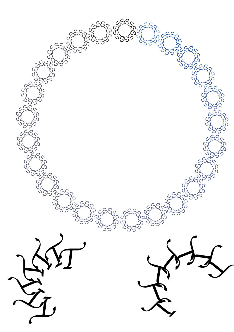
The pattern is made up of the letters T and S.
The pattern is made up of the letters T and S.
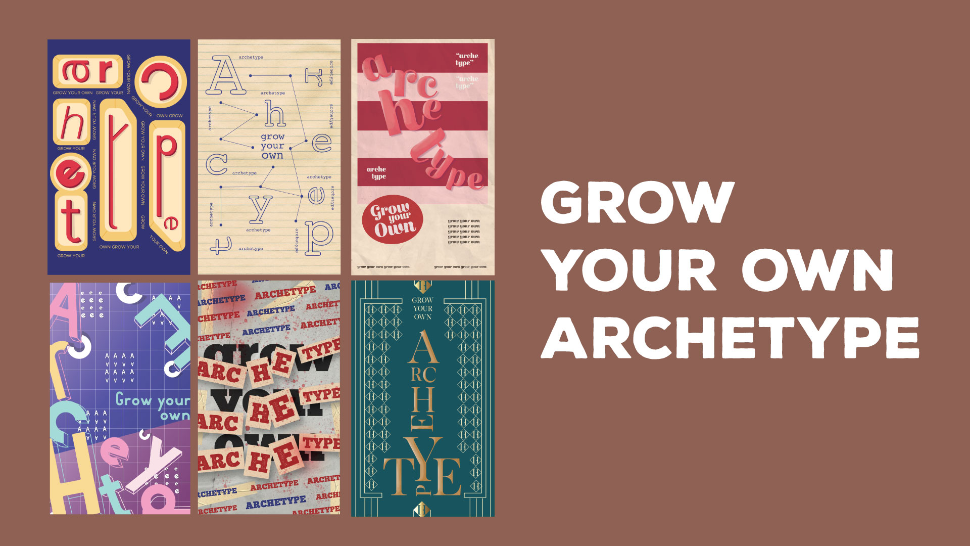
For our final Typography project, we were given the liberty to experiment with typographical layouts through grids on any medium, digital or traditional. Experimentations through grids was conducted within the context of personality archetypes.
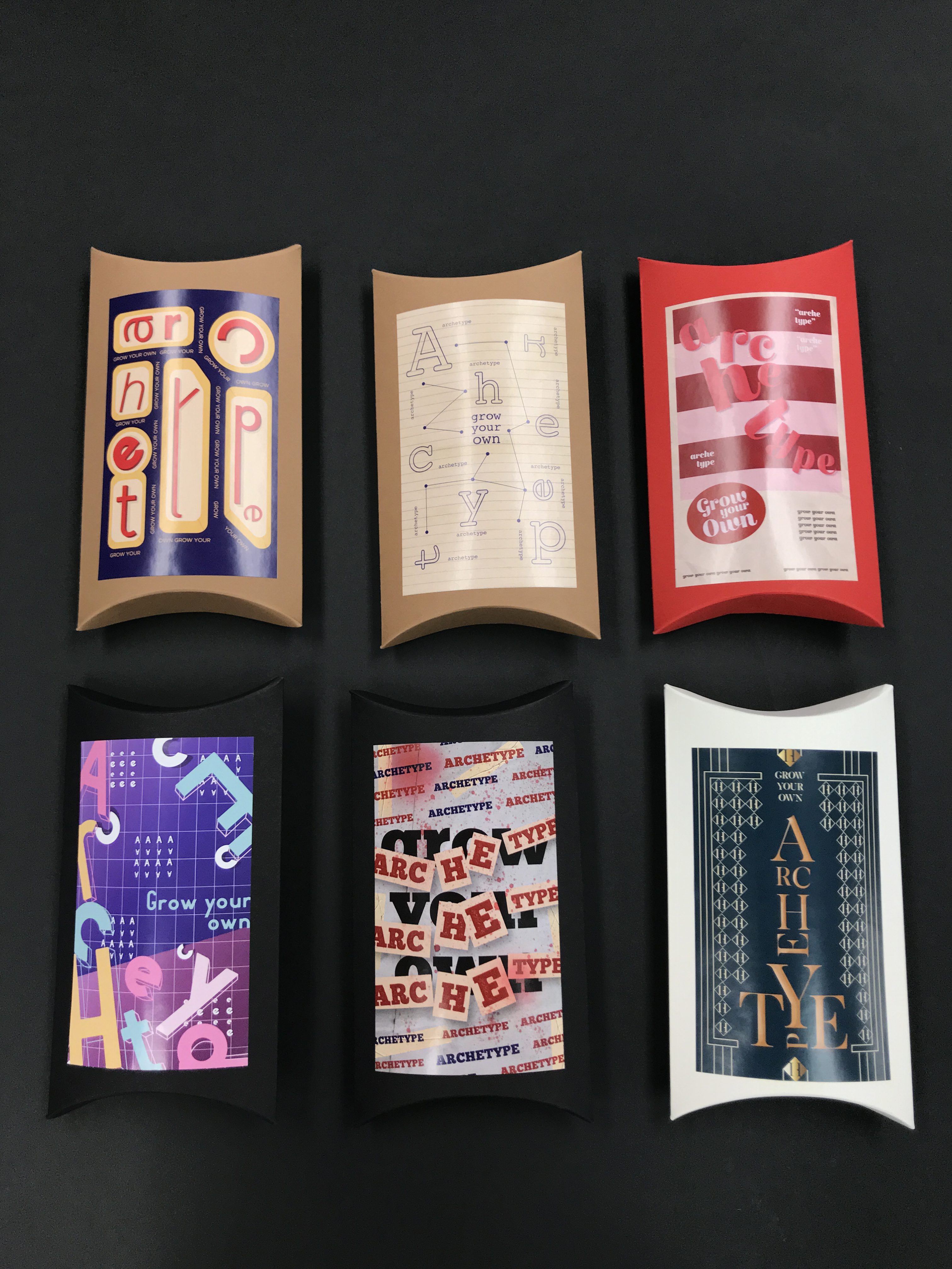
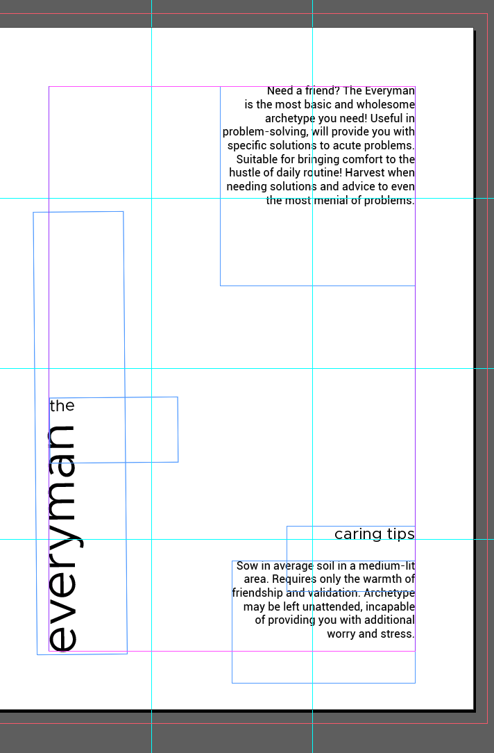
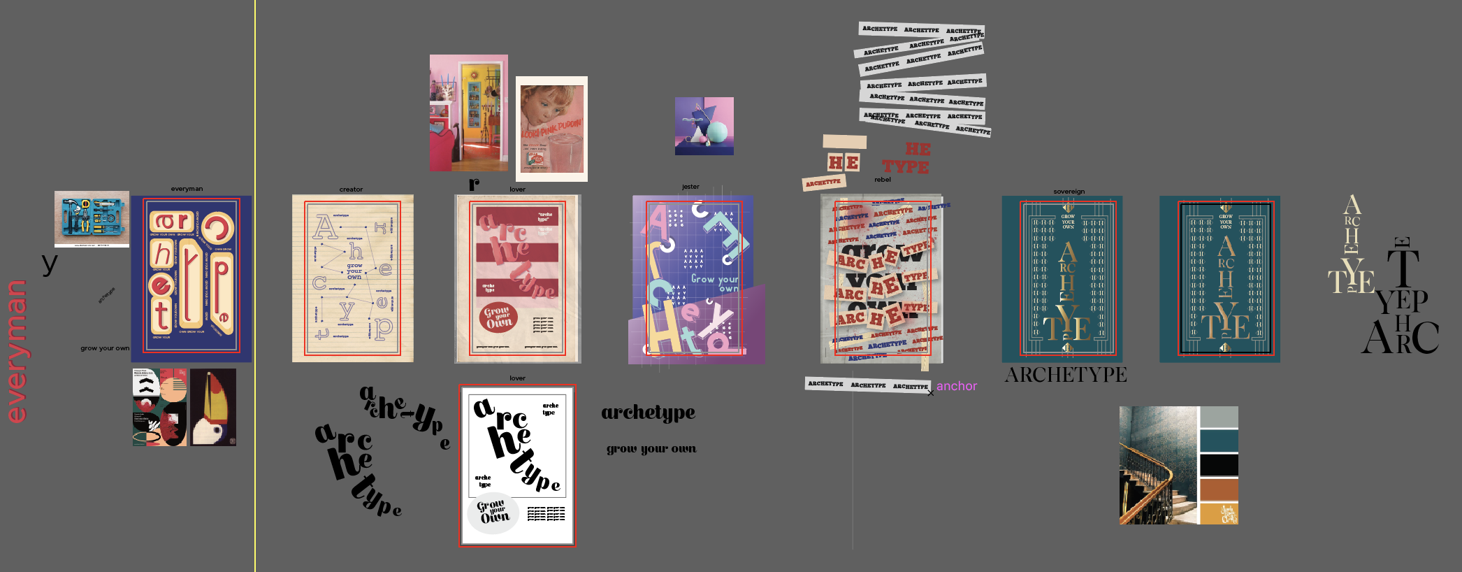
For my final product, I thought it would be interesting to play with the idea of representing archetypes as products. Therefore, with the help of Prof. Lisa, I used seed packets (or boxes in this case) to represent the characteristics of each archetype. Each packet comprises of a front cover, which features the words ‘Grow Your Own Archetype’ in different styles and techniques, as well as a back cover, which shows the name of that particular archetype, a short description, and caring tips (elaborating on the description of the archetype but in a more light-hearted approach). The designs were then printed and stuck onto kraft boxes of different colours.
Without the use of imagery, the different front covers of the packets comprise of a particular font (the font changes with each archetype to better portray characteristics of that particular archetype). The letters of ‘Grow Your Own Archetype’ then undergo changes through distortion, scaling, and other adjustments to emphasise the aspects of the archetype. As a means to convey the represented archetype in a more obvious manner, as well as having a more straightforward direction for the addition of colours, each seed packet/archetype represents a well-known art style that would be most appropriate to embody the assigned archetype – the colours, basic shapes, and textures therefore reflect the distinctive characteristics that derive from each style.
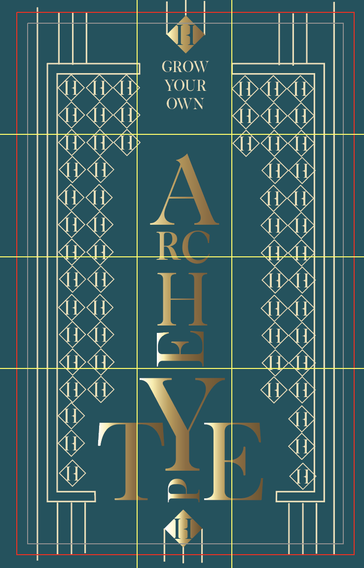
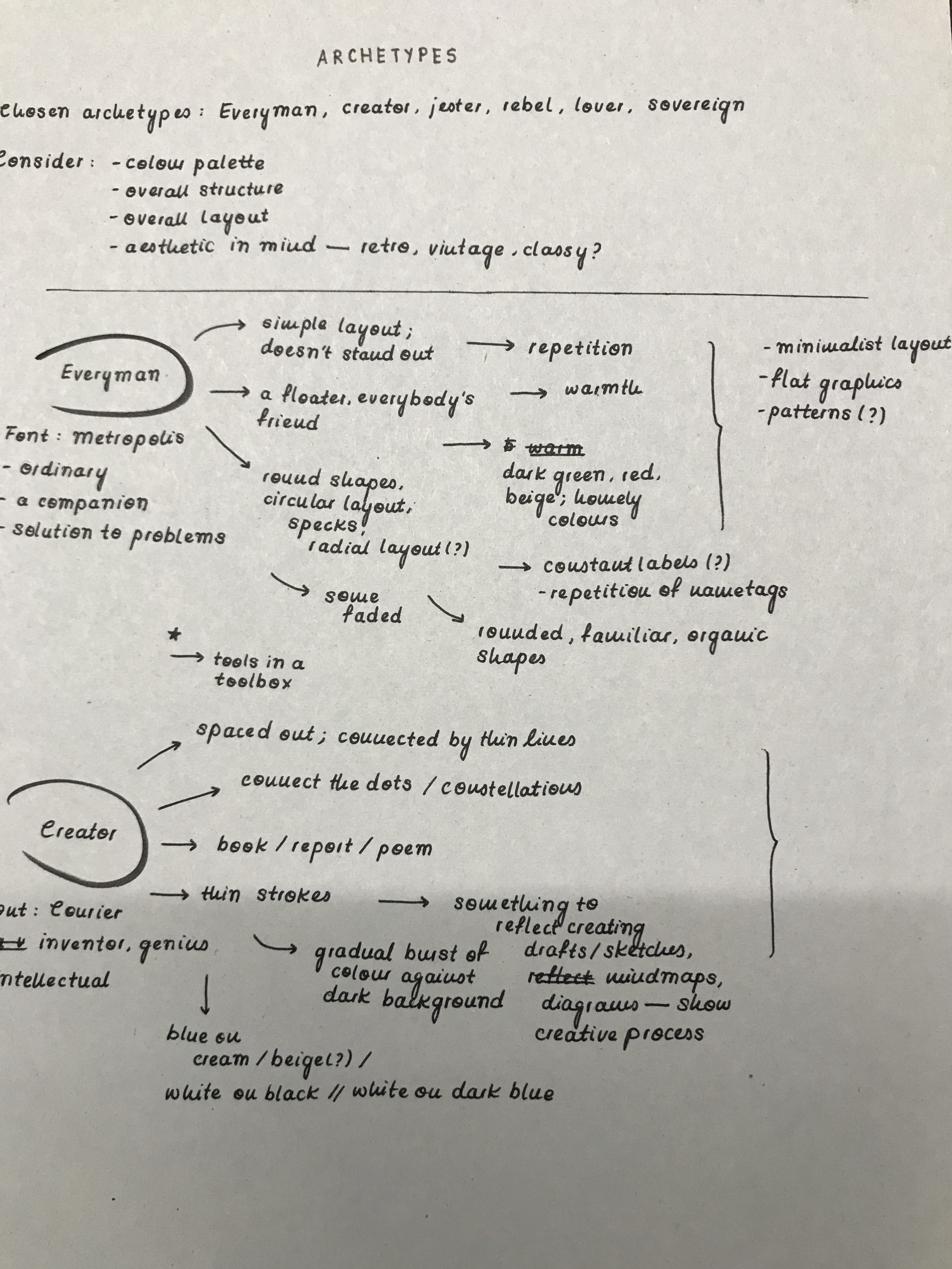
Font chosen: Metropolis
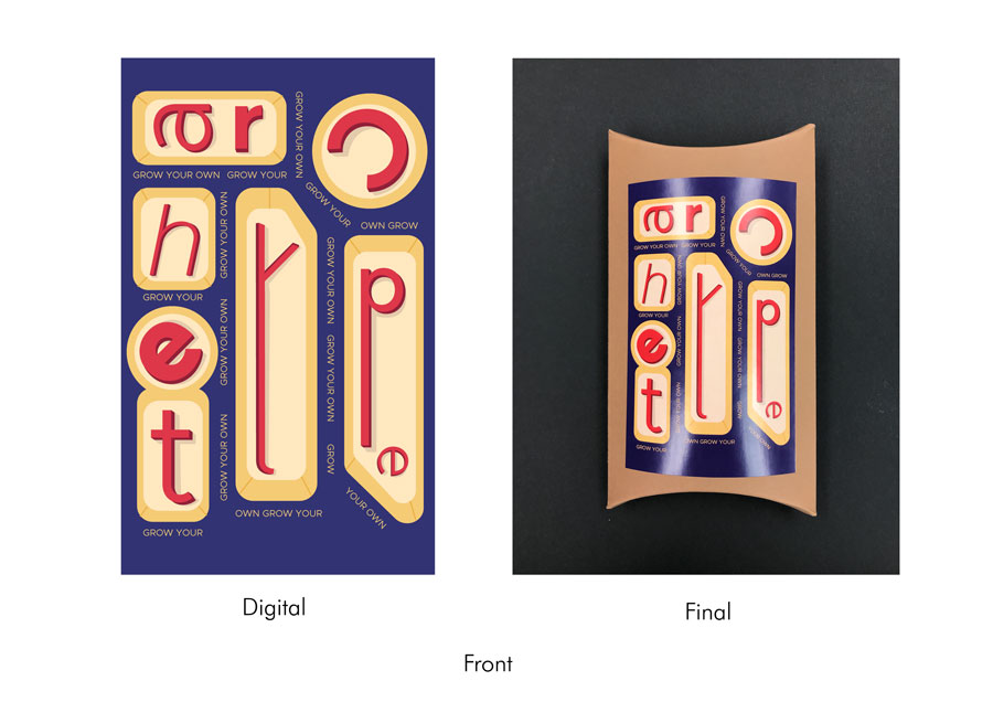
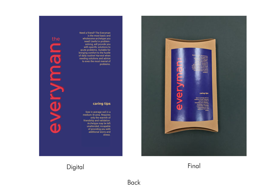
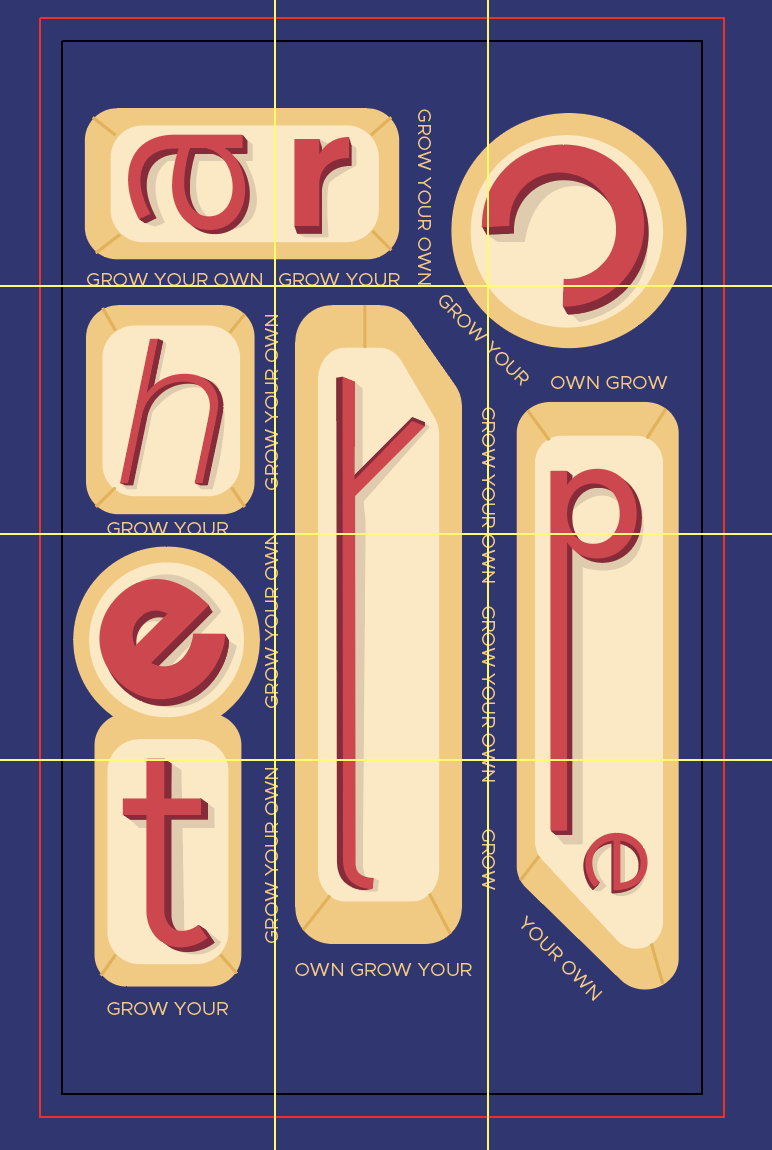
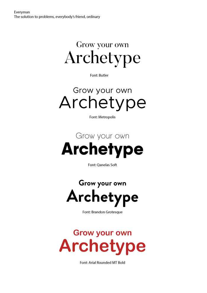
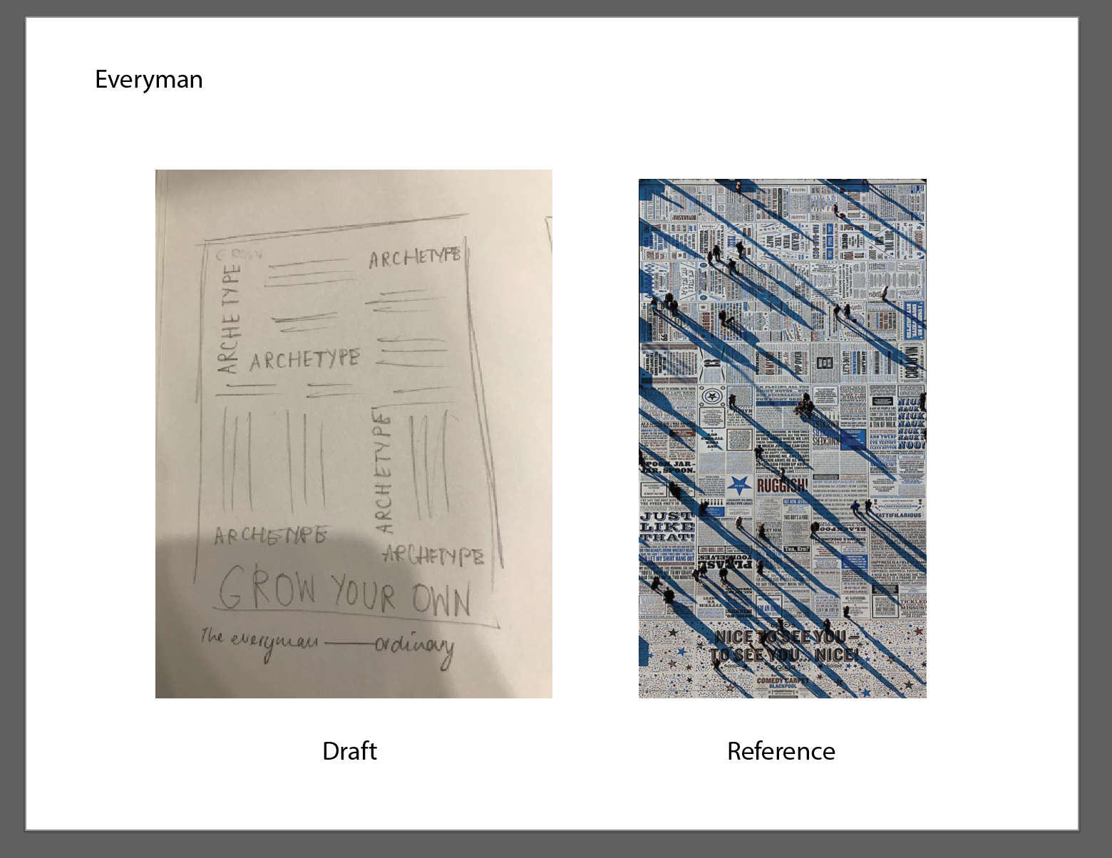
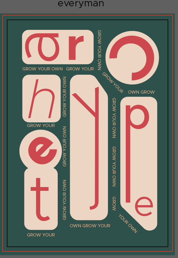
The first seed packet represents the Everyman. Drawing on the archetype’s distinctive characteristic as ordinary and a friend to everyone, as well as a go-to solution to all problems, the front cover uses the letters from ‘Archetype’ to emulate tools in a toolbox (emphasising the idea of tools as solutions to problems and something ordinary and often looked-over). The style on the other hand, tries to adopt elements from the Bauhaus movement. Seeing the Bauhaus movement as rather ordinary, simple, and functional, I thought it seemed appropriate to use it as a reference; the design uses Bauhaus colours of yellow, red, and blue (with variations in tones to create shadows) with letters arranged geometrically. The words ‘Grow Your Own’, on the other hand, use a thinner variation of the font and are kept in all capital letters to line the outline of the shapes, reflecting the dents in a toolbox.
As for the font chosen, based on Prof. Lisa’s advice, I went with the font Metropolis as it was a sans serif font that had a simple and basic structure. It also has different variations in weight and structure (regular, italicised, bold).
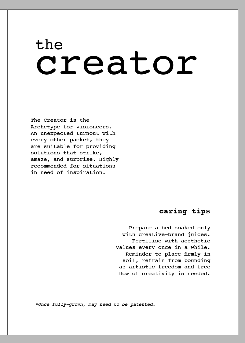
Font chosen: Courier
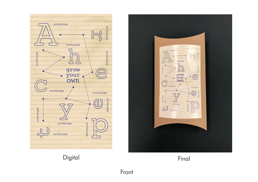
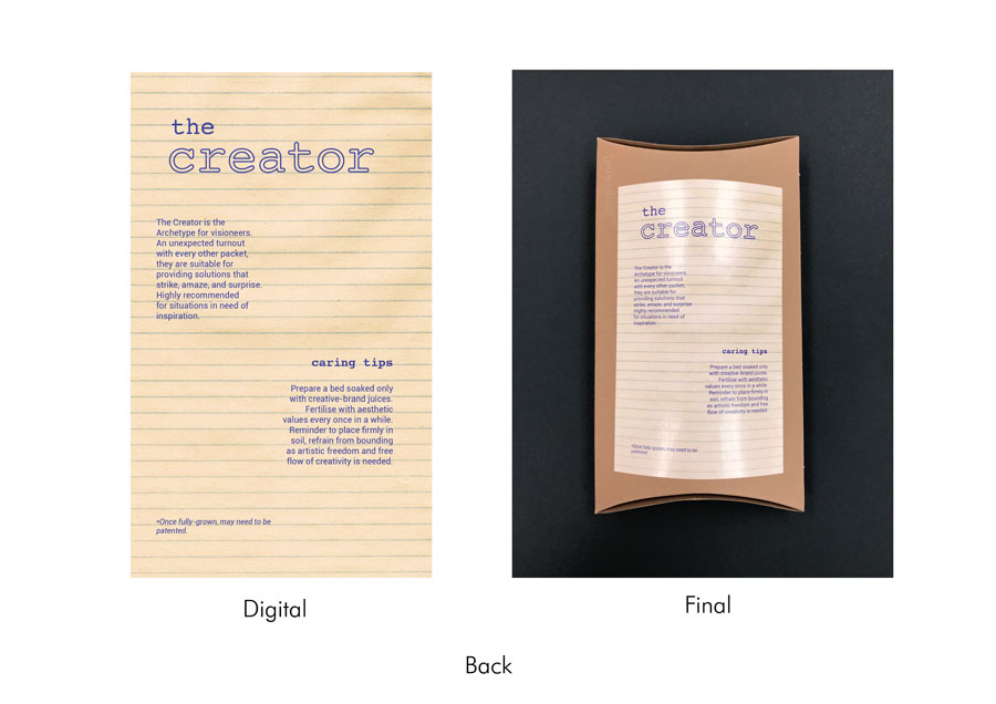
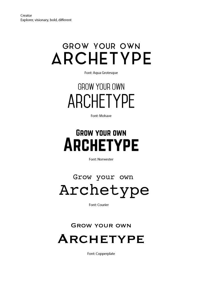
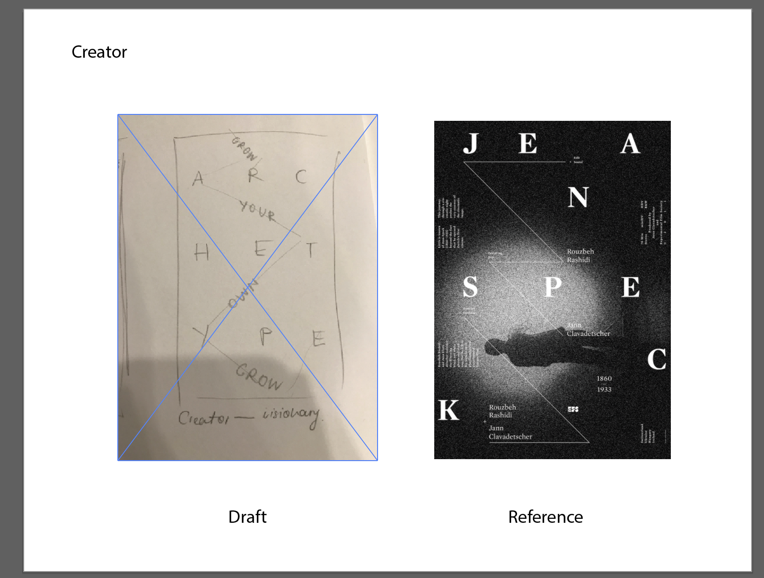
The second seed packet represents the Creator. The design is meant to embody the visionary, creative, and intellectual aspect of the archetype; the letters from ‘archetype’ are spaced out in a scattered format, with a thin line connecting them forming a constellation-like pattern. Smaller forms of the word ‘archetype’ also serve as an addition to the constellation. Laid out against a lined paper background (notebook paper), the design was meant to convey the idea of sketches, equations, or some notes – some sort of indication of creating something new. The design style was meant to reflect minimalist aesthetics typically found in modern designs – using a single colour scheme, coupled with straight thin lines (both in the line graphics and outlined versions of the letters).
The font Courier reflected the idea of Creator as the serif structure made it seem like a typewriter font. Its sleek and simple physicality also added to the overall minimalist aesthetic the design was initially trying to achieve.
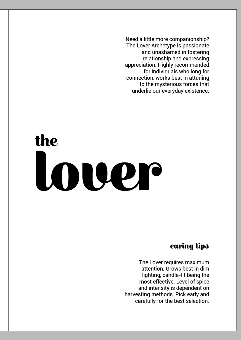
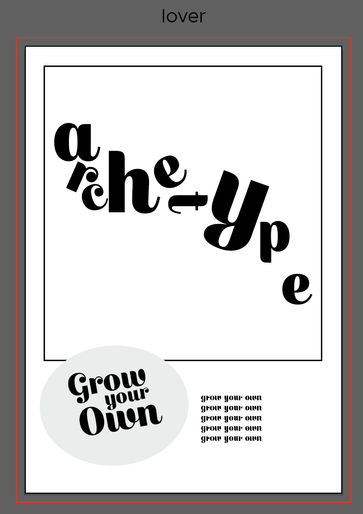
Font chosen: Escafina
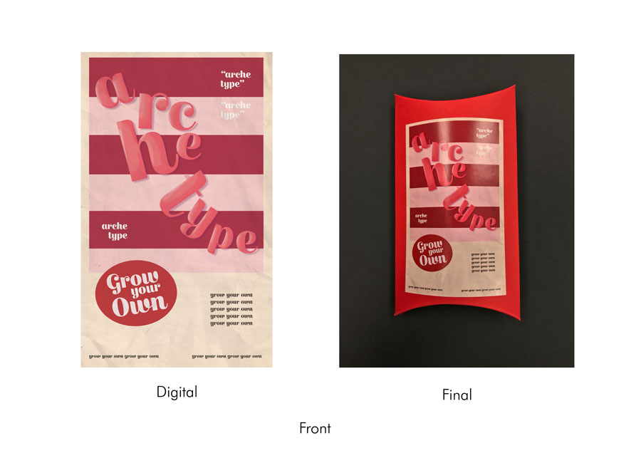
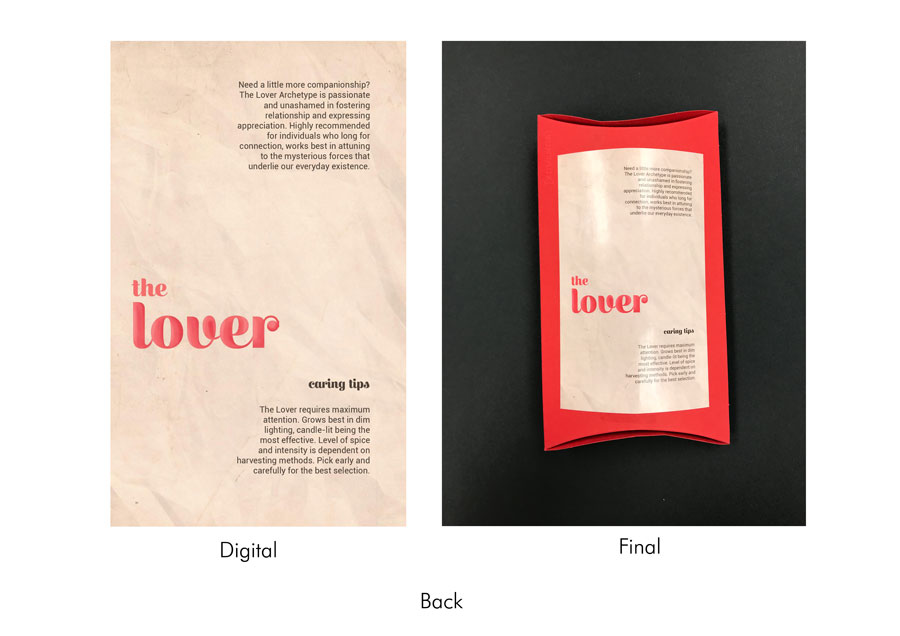
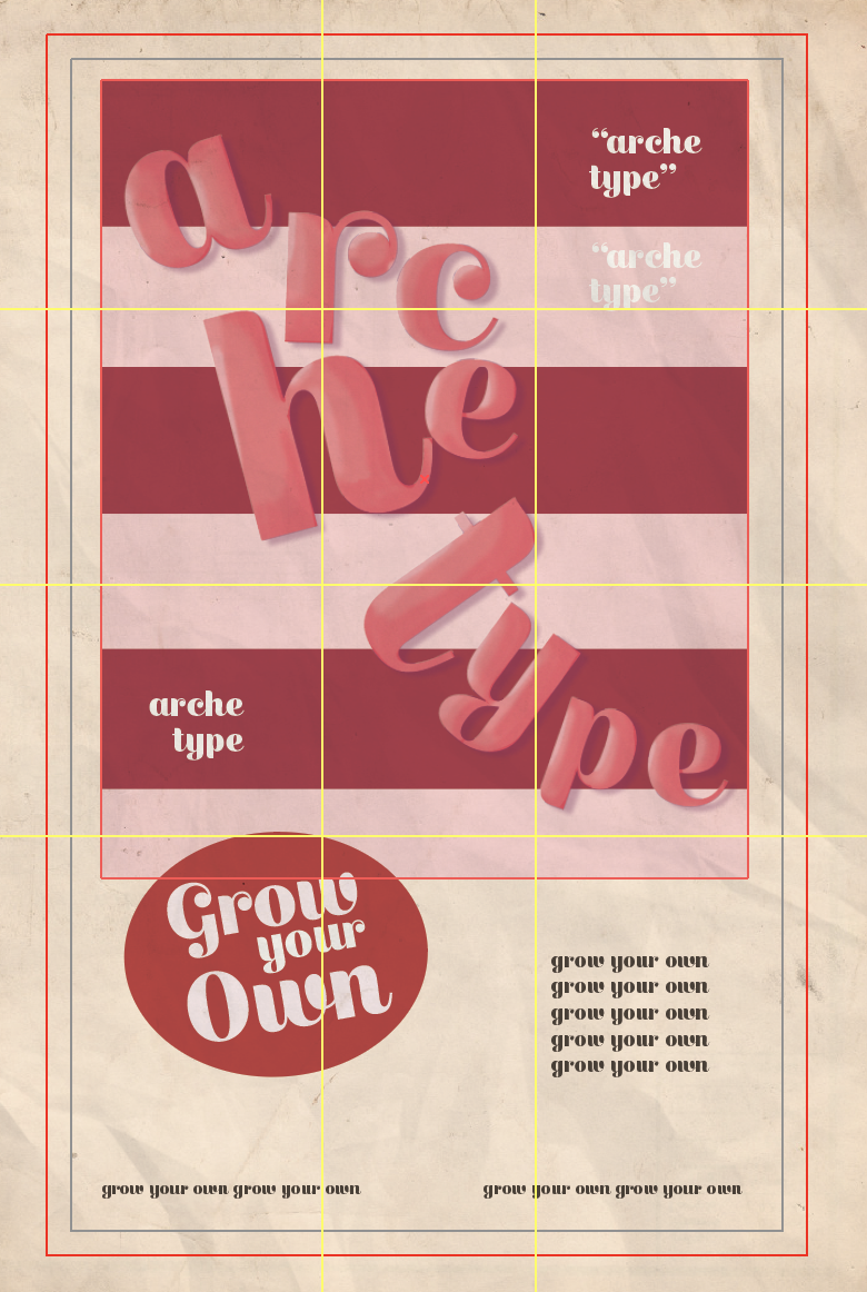
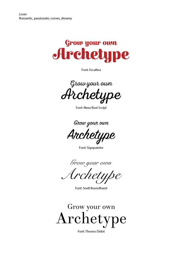
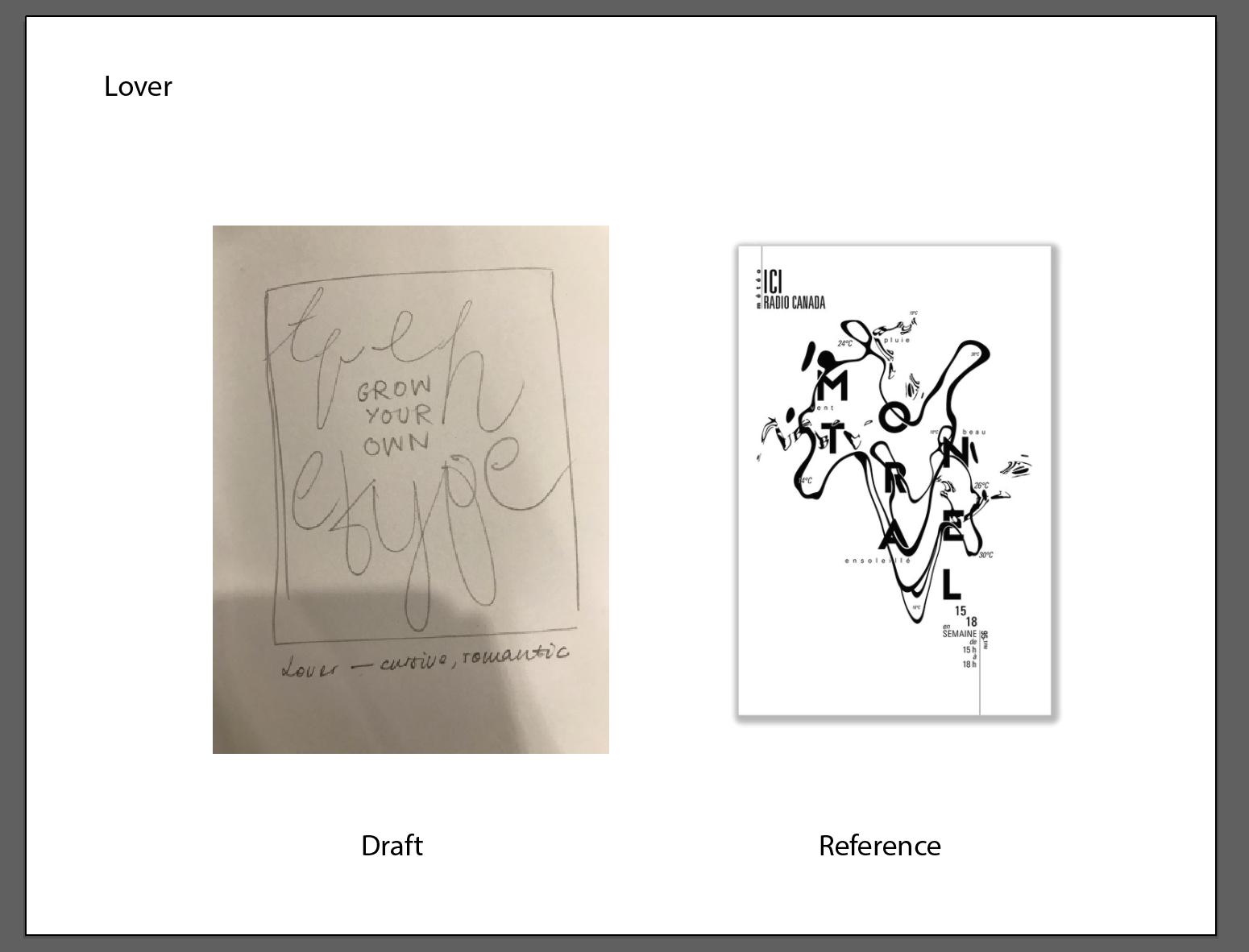
The third seed packet represents the Lover. The design in this case was meant to embody the romantic, sweet, and passionate aspects of the archetype. Keeping in mind the cursive nature of the font, the letters that form the word ‘archetype’ were constructed in a way that formed a faint human silhouette. As the font is reminiscent of 1950s American Kitsch, the layout was done in the style of a retro advertisement – with a graphic bounded by a box at the top, quotes, and a realistic but stylised look of graphics. This would all be on top of a beige-coloured background. In addition to the vintage texture in the background, the word ‘archetype’ is airbrushed to create the same stylised look in retro advertisement graphics. The words ‘Grow Your Own’ are featured on a red sticker to entice the viewer to buy the product, and blurbs (also typically found in retro advertisements) are also part of the layout. The colours were also meant to reflect the sweetness of the archetype, as well as colours typically associated with love (pink and red).
As the Lover archetype is often associated with passion and love, something I perceive to be more organic as opposed to rigid or geometric. Therefore, using Escafina as the font allowed me to convey the archetype effectively because of its extremely cursive nature and accentuated curves and strokes. It also gave an overall more feminine look (which is typically portrayed in brands that adopt the Lover archetype). The font also helped me in experimenting with different art styles that use less geometric fonts.
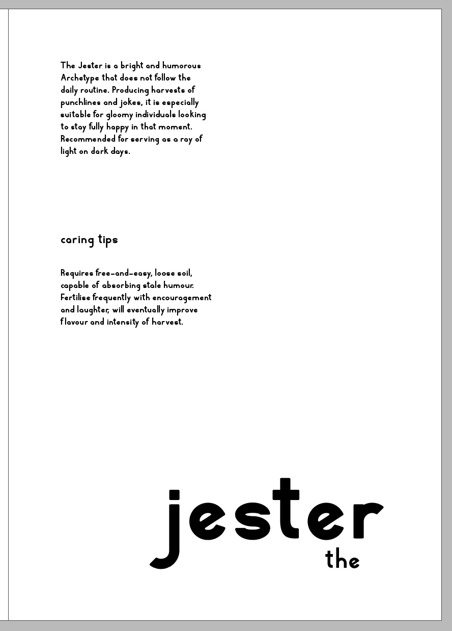
Font chosen: Rhyder
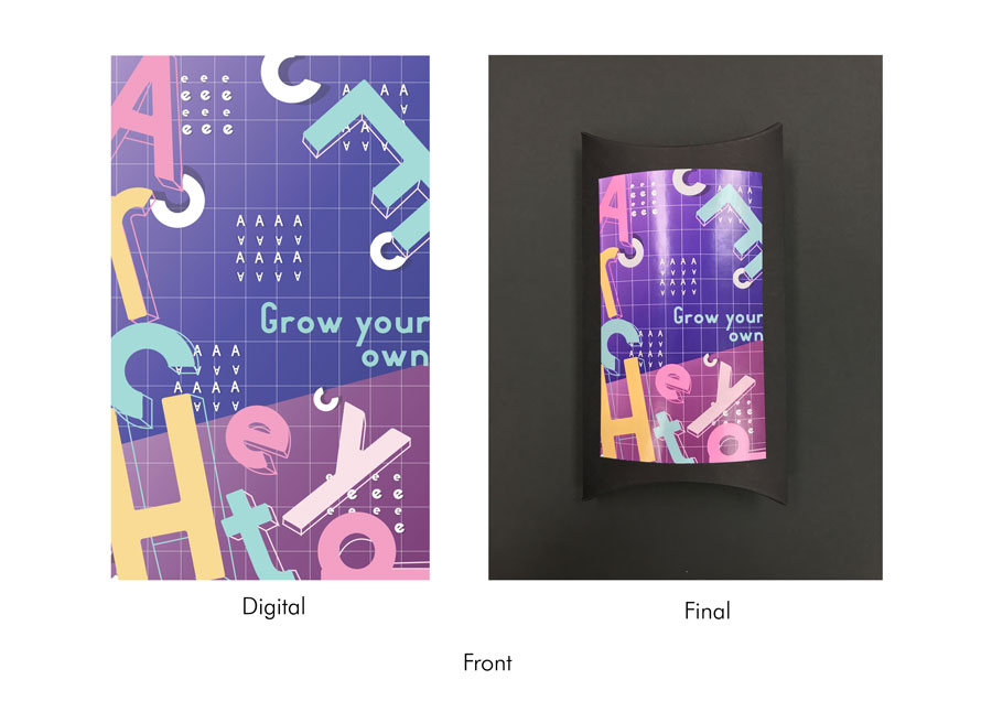
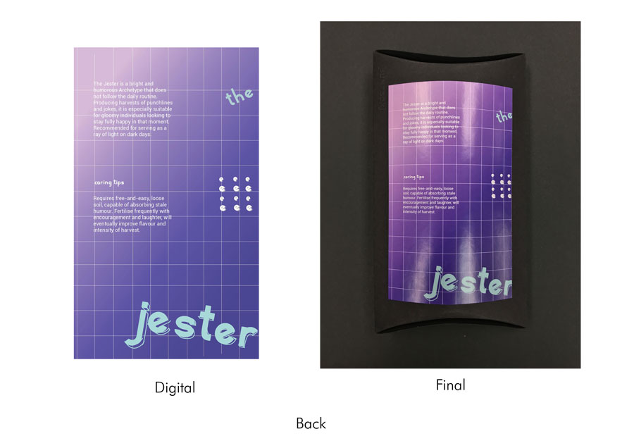
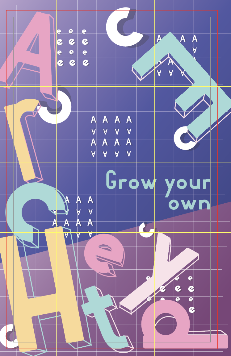
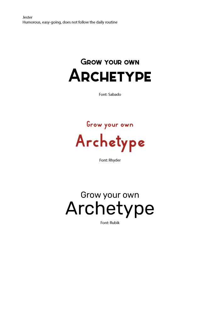
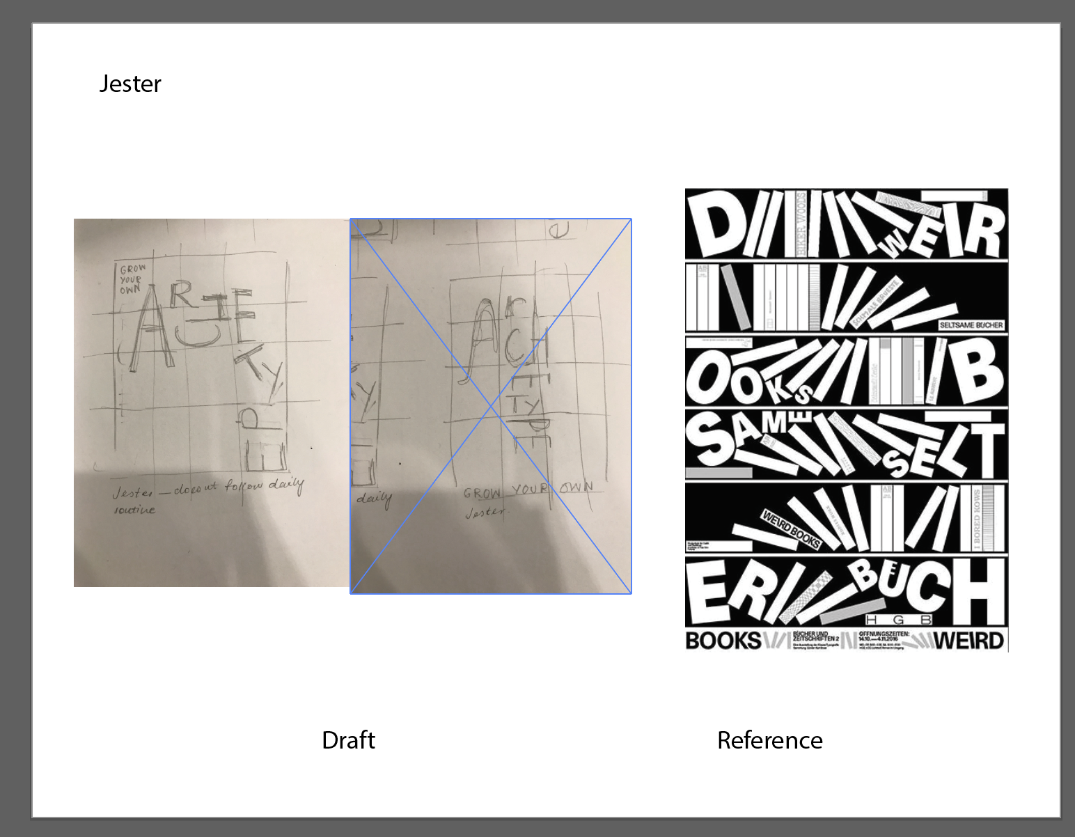
The fourth seed packet represents the Jester. The design here builds on the archetype’s distinctive qualities as humorous, fun, and often not following the daily routine; it features letters of the word ‘archetype’ laid out in an inconsistent manner, with some letters rotated or elongated, or even lying on its sides. The letter ‘E’ reinforces the idea of not following the daily routine by situating it at the top right-hand corner, away from the rest of the letters. The style that the design was meant to convey is Memphis – since Memphis draws on random patterns and integrates humour and fun patterns, it seemed appropriate to have the Jester embody that movement. To do so, the design uses a grid (sometimes seen in Memphis designs), against a bright purple, with the letters themselves painted with pale, bright colours. The ‘random patterns and shapes’, on the other hand, are formed using different letters laid out in a grid and integrated into the grid structure in the background.
The font used is Rhyder and embodies the idea of the Jester quite effectively. Its playful yet simple structure as seen in the big differences in height and the forms of some of the characters themselves, allow for the idea of the Jester being humorous but at the same time, remains simple enough to adjust aspects of the letter.
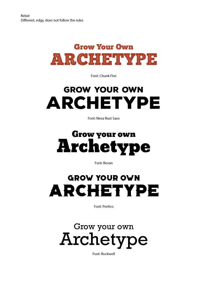
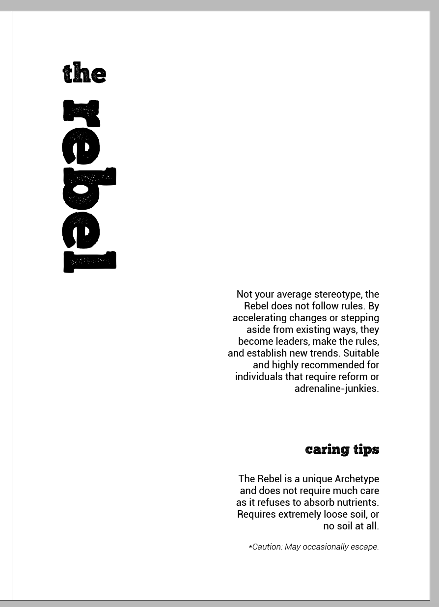
Font chosen: Chunk Five
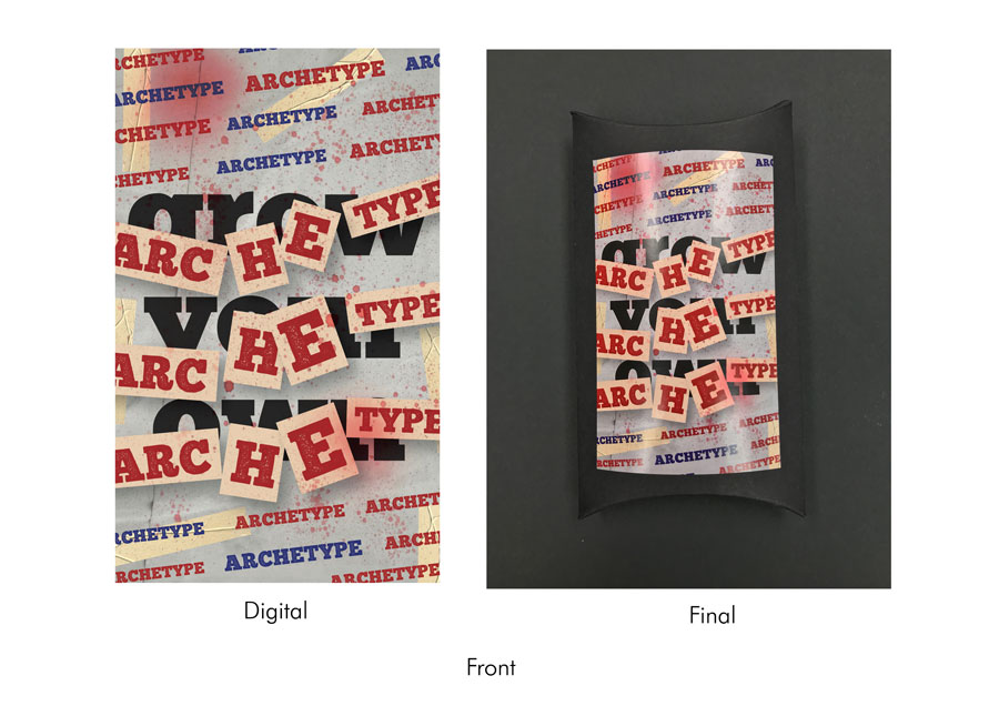
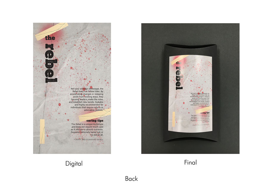
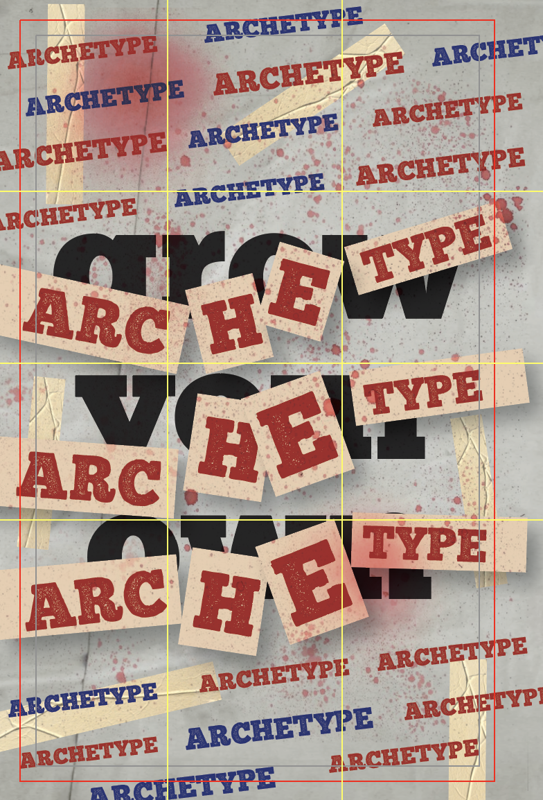
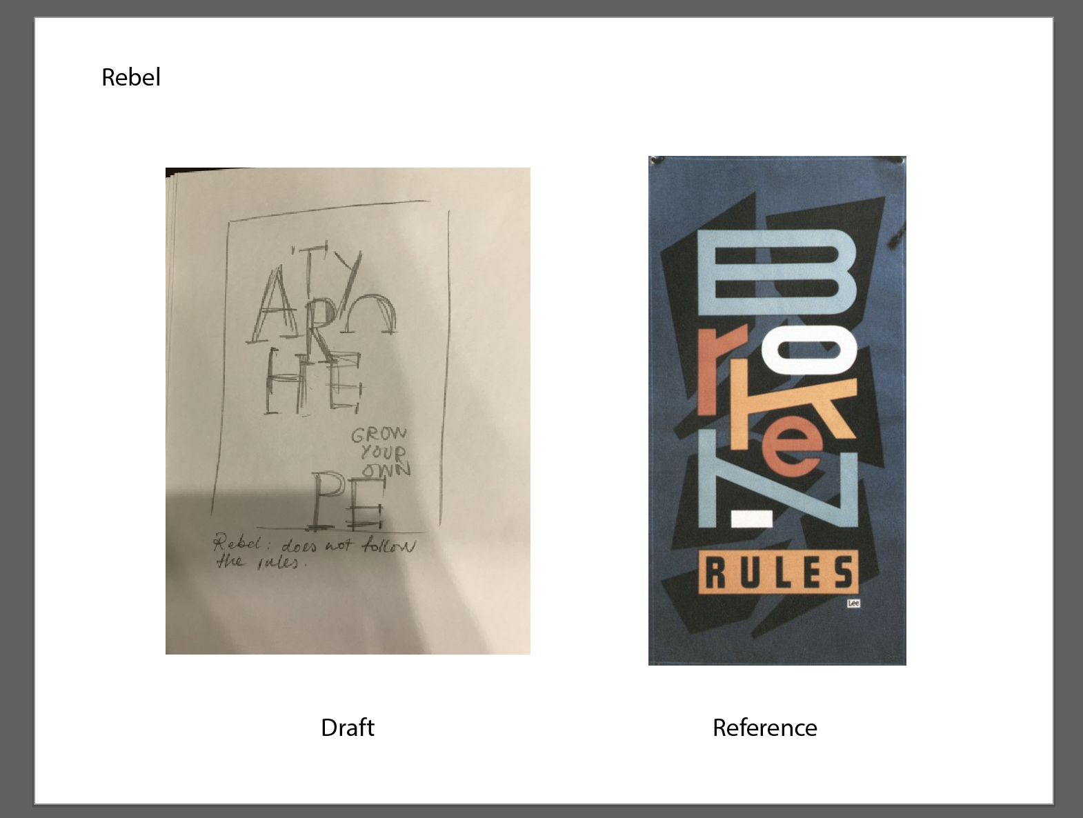
The fifth seed packet represents the Rebel. The design draws inspiration from the archetype’s need to go against authority, refusal to follow the rules and establish changes. Therefore, to convey the idea of rebelling and need to break the rules, I wanted the overall layout to show traces of vandalism. Using two variations of the font (one with a solid colour and the other with a rust-like texture), the words ‘Grow Your Own’ are laid out in the background, and the words ‘Archetype’ are plastered all over in a two formats – in a diagonal line above and below, and on pieces of paper taped over ‘Grow Your Own’. To reinforce this idea of rebellion further, the design takes after the 70s-80s grunge aesthetic; using torn paper textures, spray paint splatters, and the collage technique through plastering letters all over. The colours used (namely red and blue) were used to represent the idea of rebellion.
The font chosen is Chunk Five and a variation of it, Chunk Five Print. I felt that the boldness of the form, in its weight and structure, as well as the geometric edges, brought forth the idea of rigidity and strength, making it seem edgy and daring.
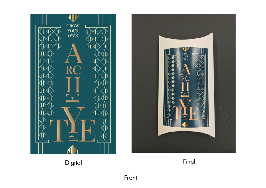
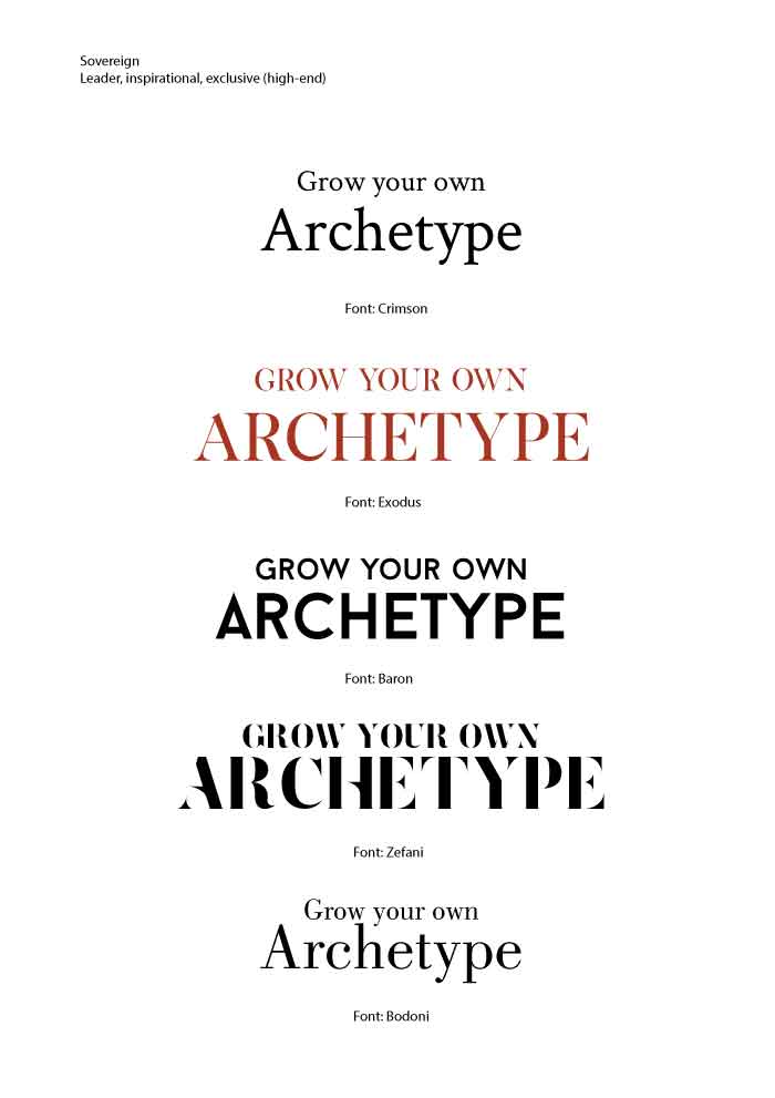
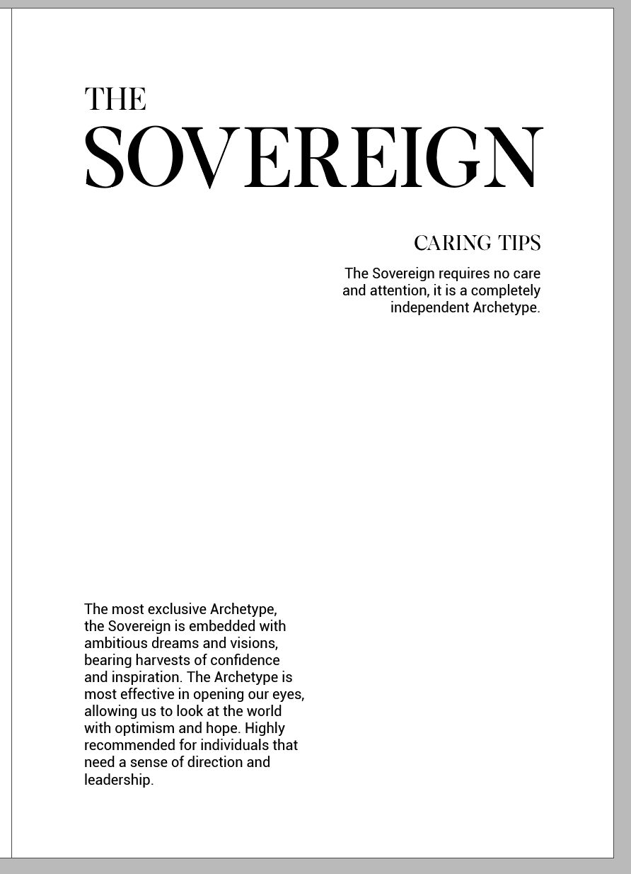
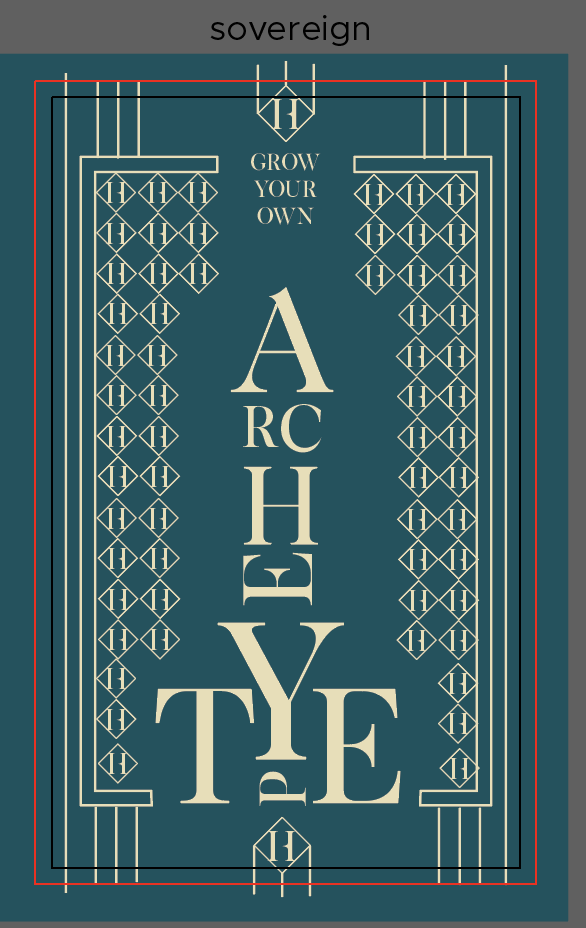
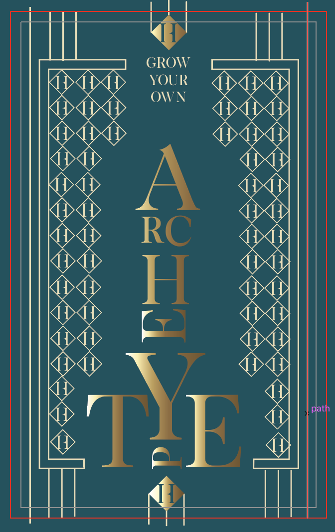
Font chosen: Exodus
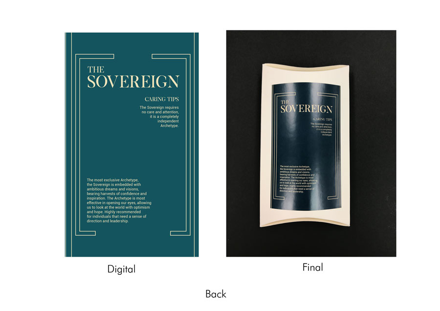
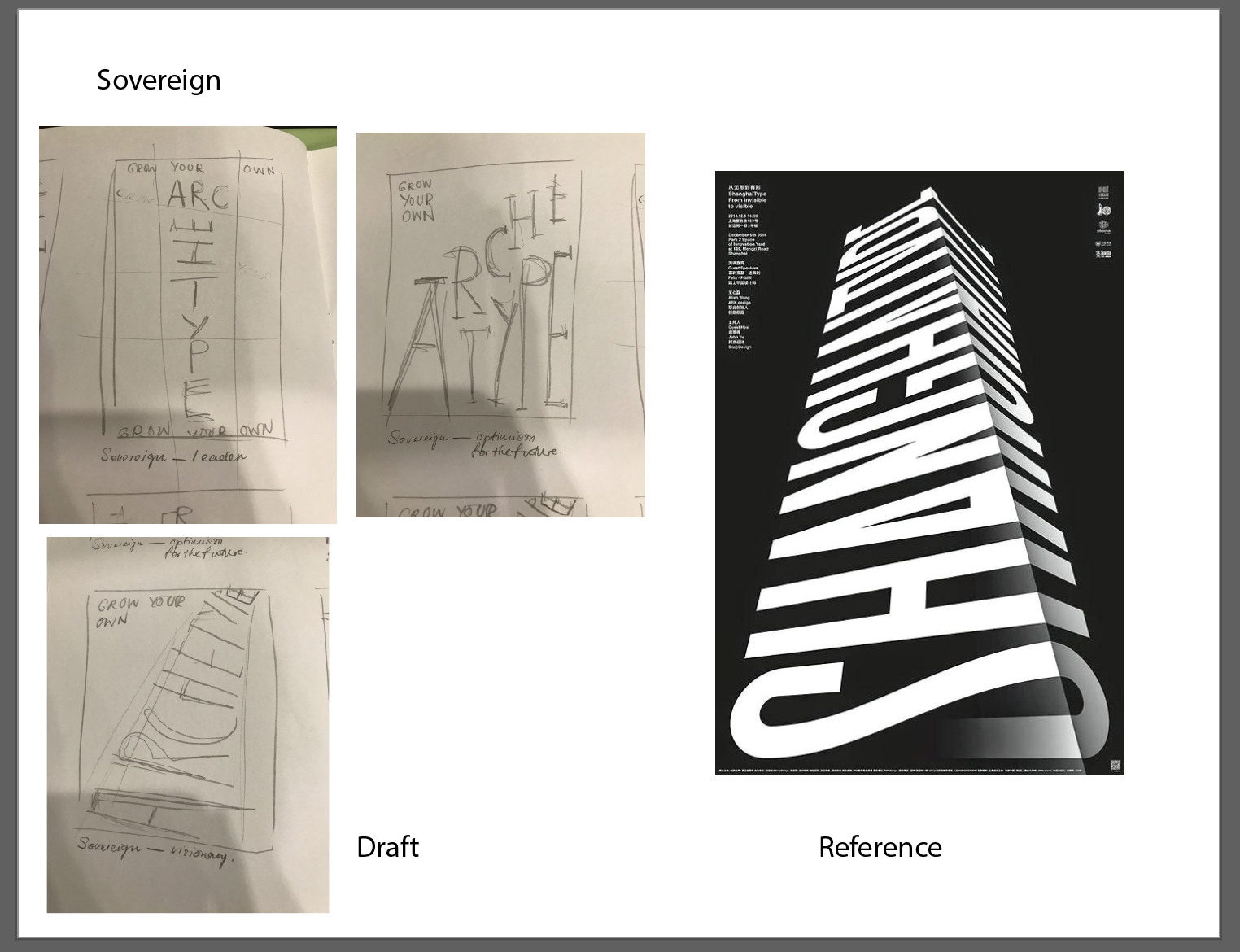
The last seed packet represents the Sovereign. Keeping in mind the Sovereign’s distinctive qualities as being a leader and forward-looking, as well as brands that are often perceived as exclusive and prestigious, I thought it would be fitting to have the letters from ‘Archetype’ form some sort of tower. So playing with the scale of the letters, I constructed a tower, with the uppercase ‘A’ at the top to reinforce it further as a tower. Design-wise, the idea of exclusivity and prestigiousness seemed to take after the characteristics of the Art Deco movement. The letters are coloured in gold and airbrushed to have the glow reminiscent of Art Deco patterns, and thin lines were added to the background to mimic the geometric patterns. The patterns also comprise of the letter H with a diamond shape around it; repeating the motif and placing them in a similar layout as the word ‘Archetype’ seemed to represent the Art Deco idea quite effectively.
The font chosen is Exodus. The idea of exclusivity and prestigiousness can be seen in the font because of its serif, the thinner body against a longer serif, and its sleek geometric structure. The font, to me, is reminiscent of high-end fashion brands and magazine publications that use the same type of font (e.g. Vogue, Harper’s Bazaar and Calvin Klein).
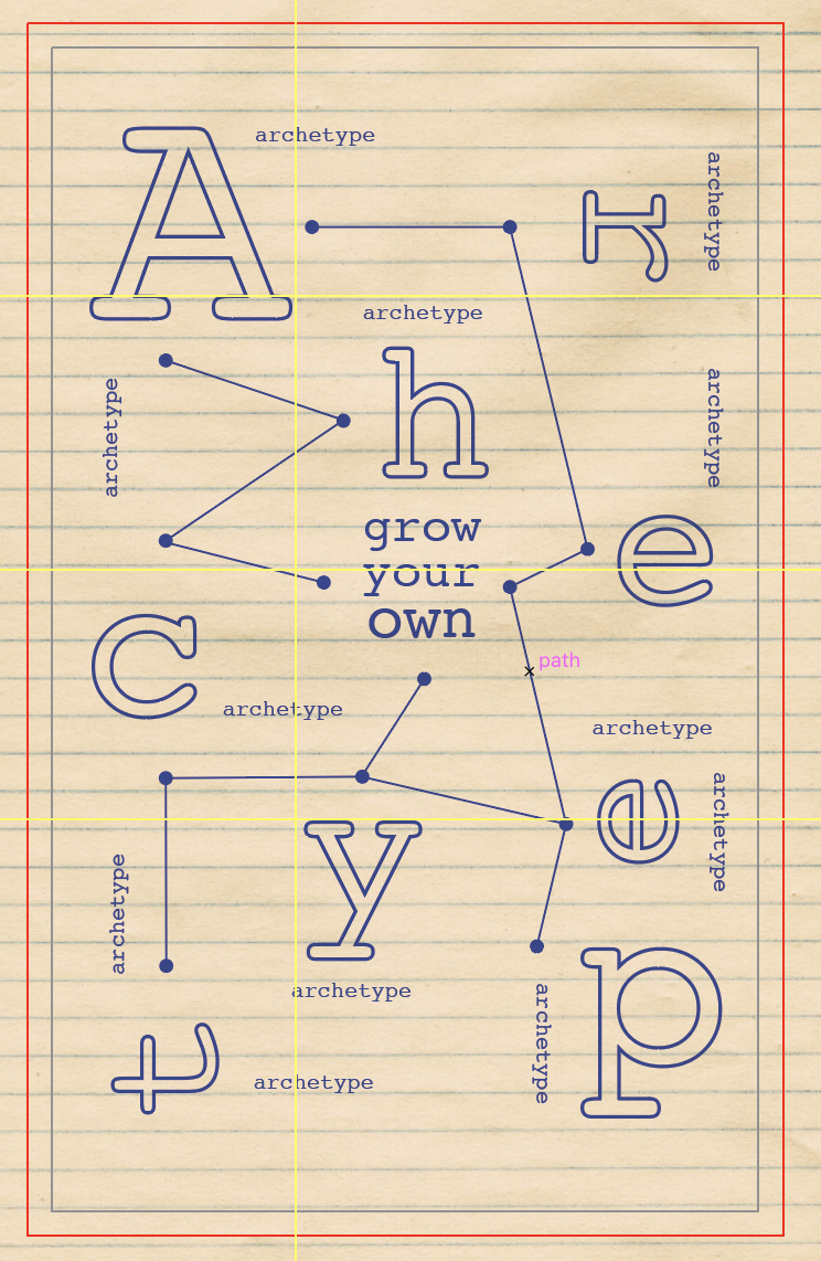
The front covers of the seed packets were based on a modular grid (6 X 6) while the back covers were based on a 2 and 3-column grid. However, based on the layout of certain covers, the grid was broken at times.
I wanted to establish a visually-appealing front and back design through experimenting with methods of contrast. Contrast also helped in establishing visual hierarchy. Contrast is first seen in the use of scaling, where certain letters and words were bigger or smaller than the rest – it helped me in forming interesting structures (e.g. the tower in Sovereign), and added a layer of depth (e.g. the letters in Jester). Contrast can also be seen in the difference in colours, as well as in the layout of a more scattered and unpredictable format against the simple back covers which hold longer chunks of text.
As we were required to restrict our use of graphics with the sole use of letters, I felt that the addition of textures, colours, and basic shapes would help immensely in effectively conveying the concept. Therefore, the design of each archetype is accompanied by colours, textures, and shapes (basic shapes or shapes formed by the letters themselves) to reflect the art movement or style it was intended to mimic – the use of red, blue and yellow in Everyman, thin lines and strokes with notebook paper in Creator, airbrush effect in Lover, patterns and grids in Jester, the paint splatter and torn paper effect in Rebel, and golden glow in Sovereign.
Before starting on our designs, we had to conduct some research on archetypes. After looking more into the various designs, I decided to go with those that would be most appropriate for seed packets.
For a more detailed write-up on archetypes, please refer to: https://oss.adm.ntu.edu.sg/vwong005/research-archetypes/
As mentioned previously, the design of each archetype was modelled after a specific art movement or style. Using information we learned from the History of Design module, I tried to couple each art movement with each archetype, keeping in mind certain characteristics that would allow me to reinforce the idea of each archetype. I paired each archetype and art style accordingly:
As we were given the freedom to choose any medium to showcase our final product on, conceptualising first began with coming up with creative and interesting ways to have the final layout on. As I was not as confident in digital platforms, I decided to stick with print media.
Seeing the archetypes as personalities, I thought it would be fun to project these personalities onto objects instead. With Prof. Lisa’s help, I decided to go with having seed packets representing each archetype, with every packet coming with its own description and caring tips.
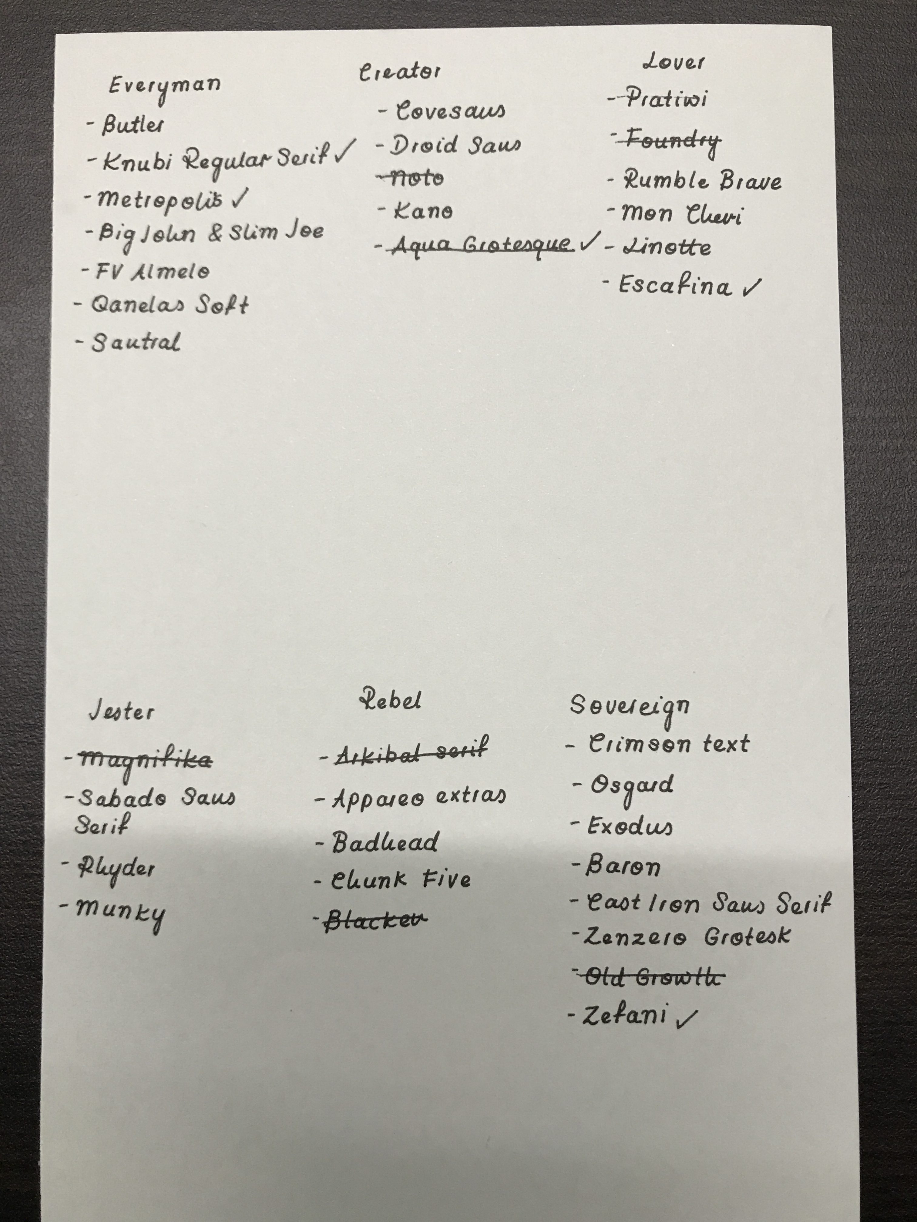
After settling the medium and researching more into archetypes, it was time to select fonts. Keeping a list of characteristics I thought the chosen font should feature in its corresponding archetype, I went online to look for and narrowed down a list of fonts to use for each type. The list was narrowed down further with the help of Prof. Lisa and opinions from friends. Ultimately, the end goal was to have the font effectively convey the archetype just by its structure.

Next was to come up with content for the back cover. As the archetypes were going to be reflected in the form of seed packets, it was only right to have their descriptions written in the style of caring tips. The text was as a result, a mash of the archetype descriptions and some gardening tips.
Then it was time to formulate layouts for the front and back covers. As I struggle a lot with the manipulation of type or arranging them in appealing formats, I thought it would be best to first see how I can rearrange the letters into patterns or objects that would reflect the corresponding archetype.
This was then taken a step further, after experimenting with different layouts, I brainstormed further and saw how I could integrate the font choice into the layout, and saw how else I could use other graphics to play around with the layout.
With advice from Prof. Lisa and friends, I then adjusted the layouts digitally and from there, continued to move things around or edit them until I was content.
Next, I brainstormed further and saw how else I could add another layer of familiarity to the design of each archetype. The elements I considered adding when pairing each archetype with an art movement or style involved scale, the weight of strokes, colours, textures, and shapes.
The final step was to put everything together. After compiling the designs to print on sticker paper, I got foldable boxes of various colours. The different colours were also meant to further emphasise each archetype (e.g. black for rebel, red for lover, and white for sovereign). The designs (both front and back labels) were then trimmed and stuck onto the boxes. For the presentation, I added a little biscuit inside so that it would make a sound when shaken, similar to an actual seed packet.
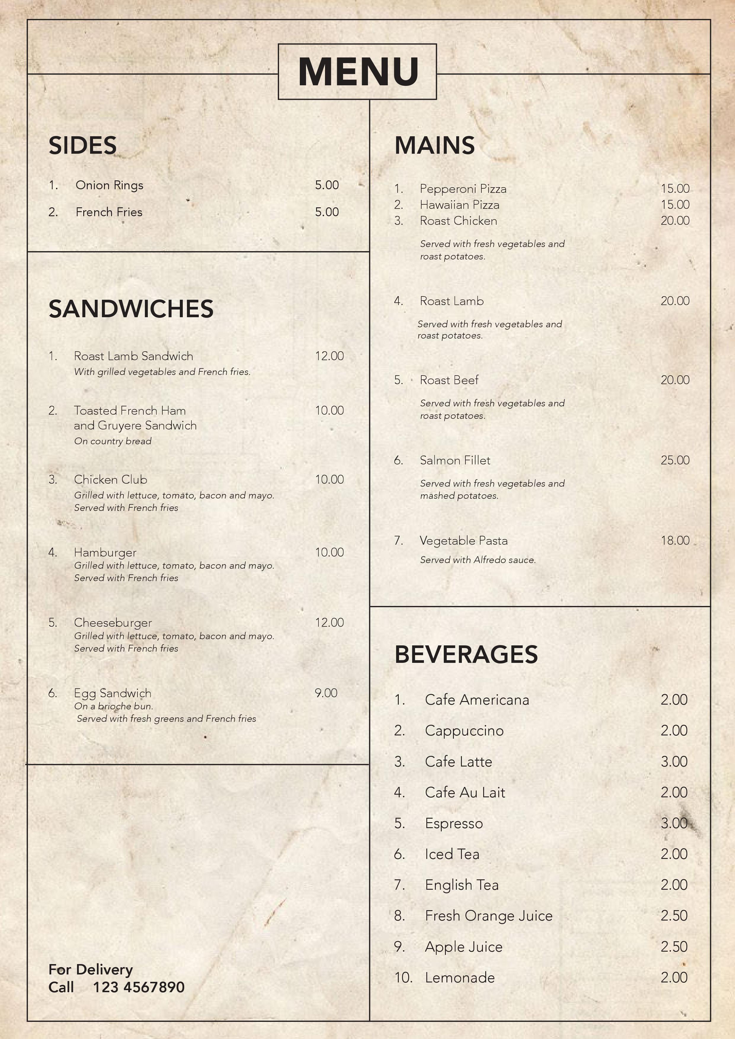
We were recently tasked, using InDesign as a platform, to explore grid systems. I thought it would be interesting to have a vintage-style menu to compliment the food items.
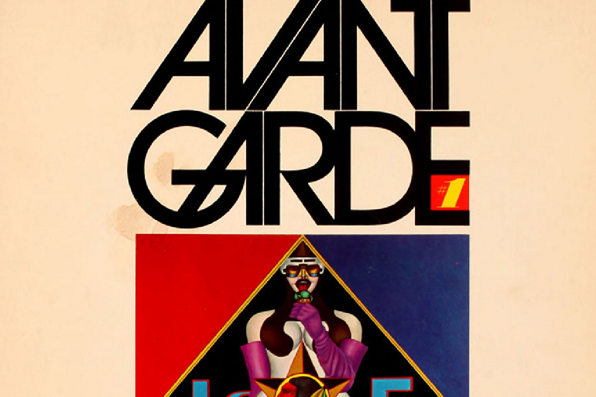

Herb Lubalin was an American graphic designer. Sometimes referred to as the ‘king of typography’, he was most known for his collaborations with Ralph Ginzburg on three of Ginzburg’s magazines: Eros, Fact, and Avant Garde, as well as the typeface Avant Garde. He also founded the International Typeface Corporation (ITC).
Considered one of the most ‘successful art directors of the 20th century’, Lubalin was on a constant search for ‘something new’, with ‘a passion for inventiveness’. ‘Constantly working and achieving much success throughout his career, at the age of 59, he proclaimed ‘I have just completed my internship”.
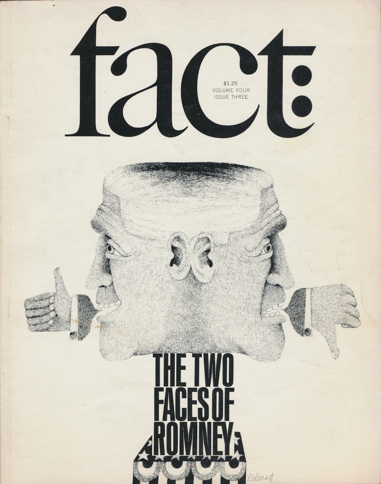
First launching Eros, which was dedicated to ‘beauty and emerging sense of sexuality in the burgeoning counterculture’, followed by Fact (it being spiced up issues instead of sugar-coated pieces like in Reader’s Digest), Lubalin’s editorial design for the magazine is considered ‘one of the brilliant of its kind’. Eros featured ‘a large format’ with ‘no advertisement’, while Fact had an ‘elegant design’ with ‘minimalist palette, based on dynamic serifed typography and exquisite illustrations’.
The magazines were also said to have showcased his artistic skills as he ‘brought out the creative visual beauty of these publications’.

Following the release of the Avant Garde magazine, Lubalin created the ITC Avant Garde typeface to meet the demand for a complete typesetting of the logo. However, it was widely misunderstood and misused in poorly thought-out solutions, eventually becoming a stereotypical ‘1970s’ font, said to have a ‘flawed Futura-esque face’. Despite this, Lubalin’s original magazine logo was and remains highly influential in typographic design.

http://www.designishistory.com/1960/herb-lubalin/
http://www.famousgraphicdesigners.org/herb-lubalin
http://www.historygraphicdesign.com/the-age-of-information/the-new-york-school/681-herb-lubalin
In Jessica Hische’s article, Uping Your Type Game, she gives an in-depth discussion on type designers, and provides steps and pointers in creating better design pieces with suitable typefaces. She also suggests having a broader perspective on typeface design by looking more into fonts by type designers (e.g. not having a favourite font, but rather a favourite type designer), working with fonts of super-families, and experimenting.
Reading the article did give me better insight into the elements to consider when choosing the appropriate typeface or when pairing fonts together. Taking into consideration characteristics such as the weights, x-heights, and the type in its true italic form, helps to determine the typeface’s ability to bring the final design further. In addition to discussing the elements to consider when choosing appropriate typefaces, Hische also provides suggestions on websites to visit when looking into different fonts.
In general, I feel that the article provided a good perspective on what determines good and suitable typefaces we should integrate into our designs. However, with regards to the points she raised on using fonts that belong to super-families and fonts with larger x-heights, it may be a bit rigid in just sticking to using more established fonts. The article seems like it is geared towards using more minimal fonts as opposed to fanciful or decorative fonts. Therefore, it may not be the best to stick to these rules when experimenting as it disregards more fanciful fonts or even less well-known fonts that do not belong to any super-families. When experimenting, or even considering the final outcome of the design piece, I feel that it is more important in utilising a range of fonts, including more decorative ones, then just sticking to the more established few.
The TEDTalk, Why Fonts Matter, conducted by Sarah Hyndman discusses the importance of typography in areas such as design and advertising. As a professional graphic designer herself, she shares her opinions on why typography has the ability to alter aspects of everyday life.

One of the points that she brought up that I agreed with was typography’s ability to influence opinions and establish moods and emotions. An example she used to reinforce this point was the labels of candy bars, where fonts with rounded edges and brighter colours seem to make the candy more appetising, or have an overall sweeter taste. I agree with her stance on this, where certain elements of a typeface can alter the overall emotion and mood of the design piece. In my opinion, because of these “elements” that we identify with, we would typically associate them with certain moods (examples being jagged, straight lines with something angry and serious, or curved lines being more gentle or sorrowful). Therefore, fonts matter in this case as designers are able to use typography as a medium to convey a certain mood to the intended viewers.

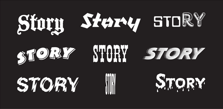
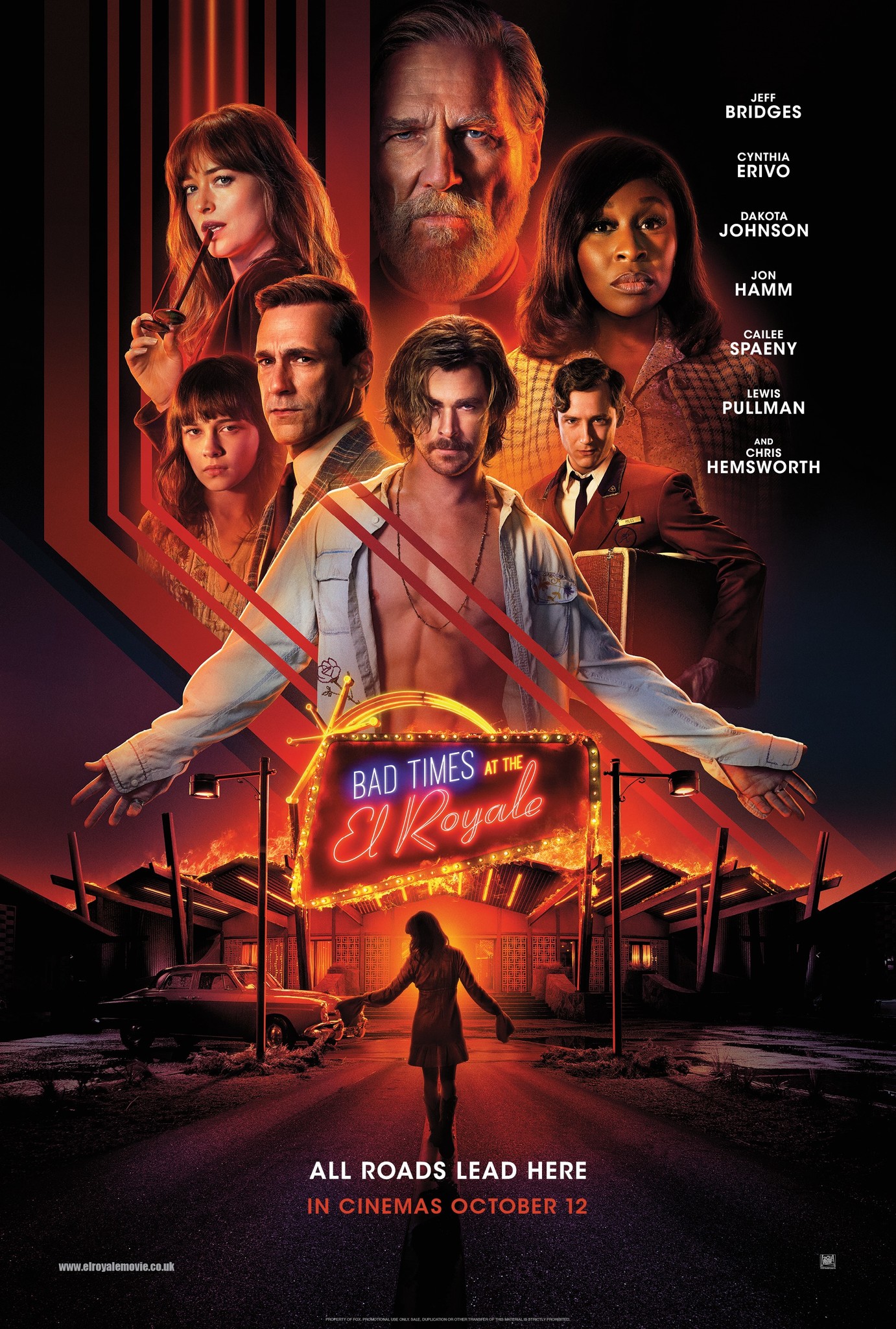
Another point that she brought up was typography’s purpose in telling a story. She further reiterates this point by bringing in examples of well-known brands, and fonts used in movie posters. Similar to the earlier points she mentioned about fonts’ abilities to convey certain moods and emotions, the type of fonts used in design such as logos or title fonts have the ability to encompass a very brief overview. For example, she talked about Coca Cola and how it’s ribbon-like font conveys the overall aesthetic of America in the 50s, with its hot summers and Grease-like lifestyle.


In my opinion, the ability that typography has in conveying a story is important; it shapes a brand and conveys a certain mood or aesthetic without the use of images. Typography, therefore, is important as it is capable of pushing a brand forward, maybe even allowing it to be widely-recognised just by its font alone.
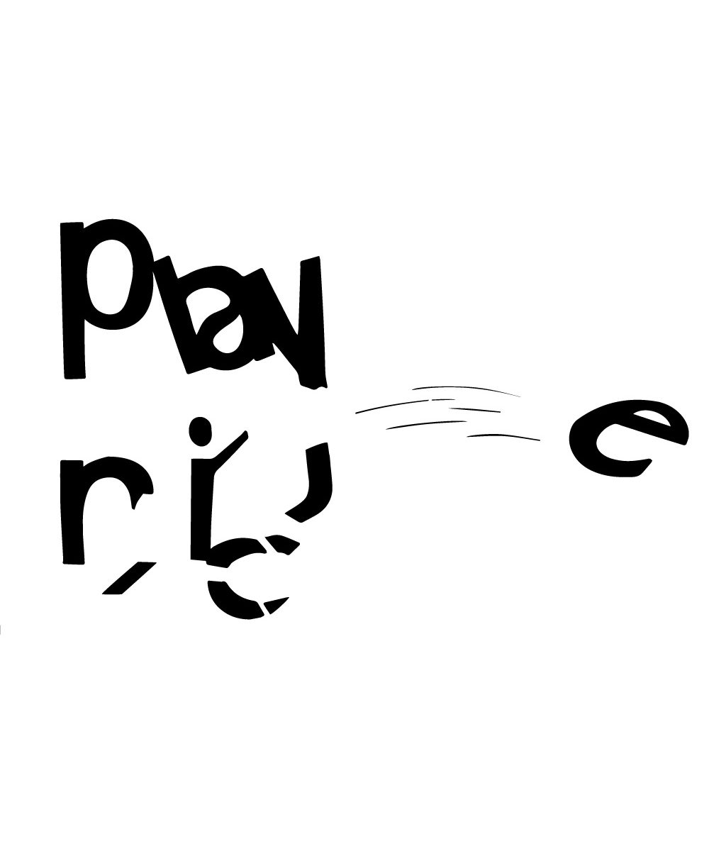

I thought it would be fun to turn the idea of playing nice and have a kid breaking parts of the letters.
The points brought up in this segment of the reading allowed me to have a better sense of the elements that determine the basics of good typography. Some of the points brought up in the reading that I intend to follow in future practices of type design include:
Keeping in mind the points discussed in the reading, I hope to consider the following aspects when designing a piece of collateral in future:
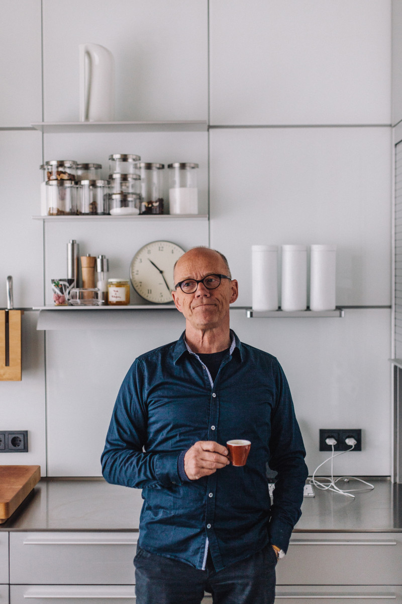
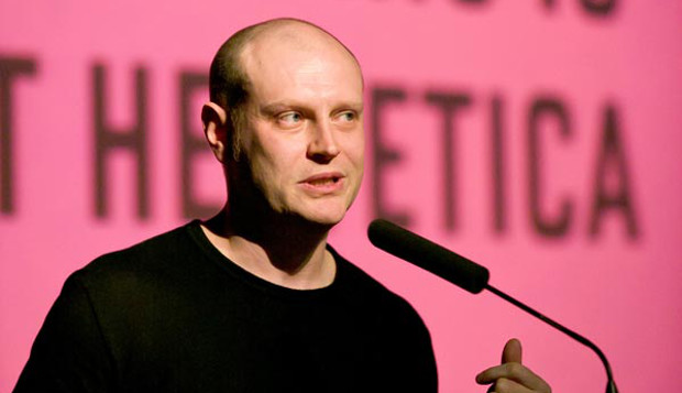
Erik Spiekermann is a renowned typographer, type designer, and author. He is most known for co-founding MetaDesign in 1979, FontShop in 1989, as well as Edenspiekermann in 2002. In addition to having offices all around the world (there’s one in Singapore too!), he has designed an array of different typefaces including FF Meta, ITC Officina, FF Unit, and even customised fonts for The Economist, Deutsche Bahn, Cisco, Bosch, Mozilla, and Autodesk.

Spiekermann had a hand in designing many commercial typefaces and those as part of corporate design programmes. In addition to heading corporate design programmes for big names such as Audi, Skoda, Volkswagen, Lexus, Heidelberg, and way finding projects like Berlin Transit and Dusseldorf Airport, he has also designed typefaces for companies such as The Economist magazine and the font family for Nokia.

With regards to designing typefaces, Spiekermann sees himself as “more of a problem solver than an artist”. He approaches design by identifying a problem then finding typefaces that almost work but could be improved, he says “study them, note the approaches and failings, sleep on it, then start sketching without looking at anything else”.

https://www.fontshop.com/designers/erik-spiekermann
https://typekit.com/designers/erik-spiekermann
https://www.fonts.com/browse/designers/erik-spiekermann
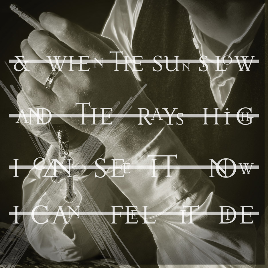
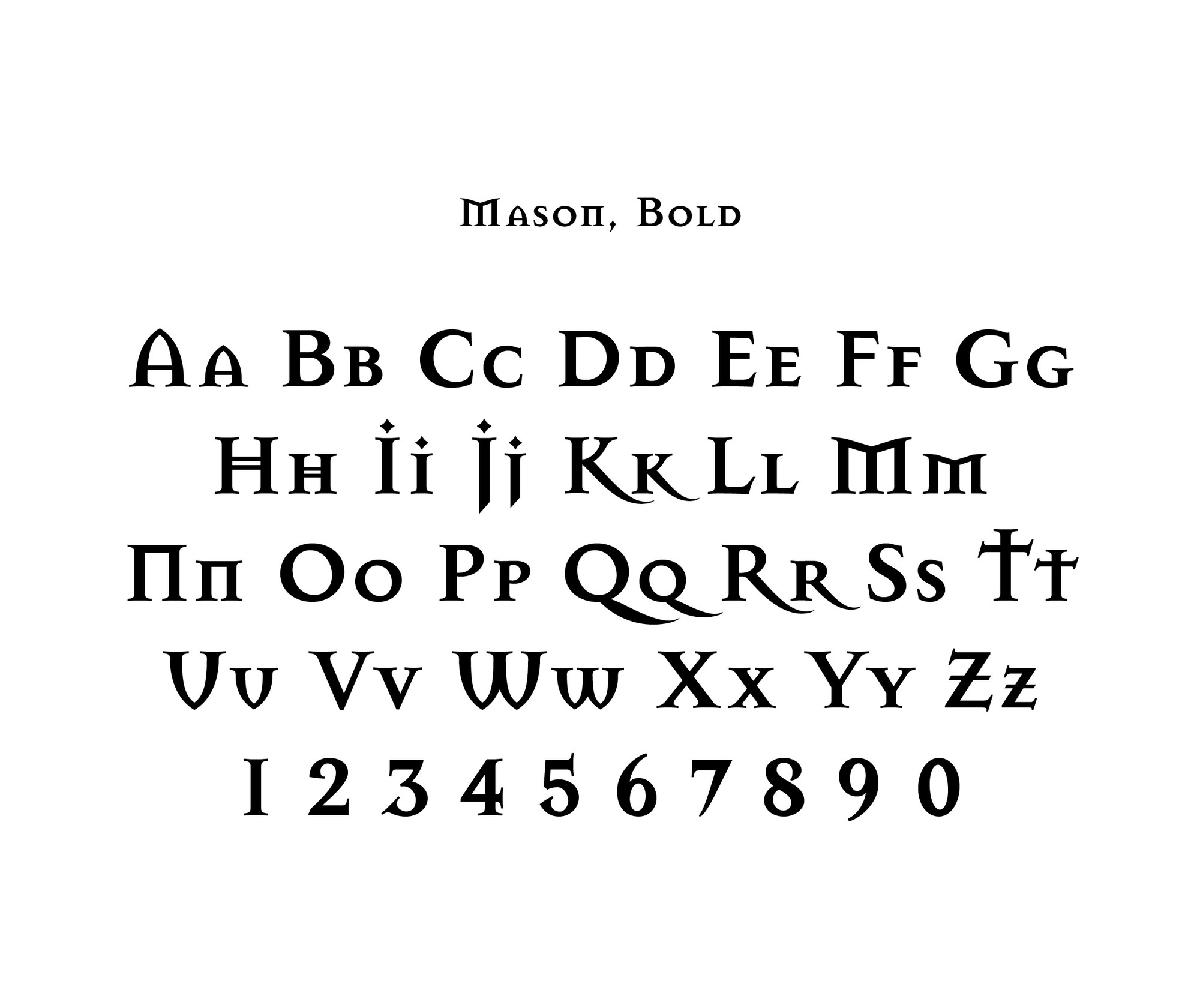
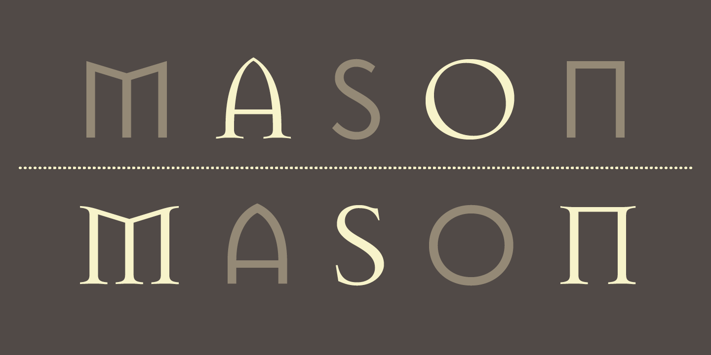
Jonathan Barnbrook is a recognised contemporary graphic designer, typographer, and filmmaker. Deemed as one of the UK’s most active designers, Barnbrook is most known for his work in typography, where he created the famous “Mason”, and the “Priori” typeface which was used in the iconic 2002 David Bowie album, Heathen, which he designed as well.
His works are said to combine “originality, wit, political savvy and bitter irony in equal measures”. He is also considered a pioneer of “graphic design with a social conscience”, where he “makes strong statements” about issues such as “corporate culture, consumerism, war and international politics”.
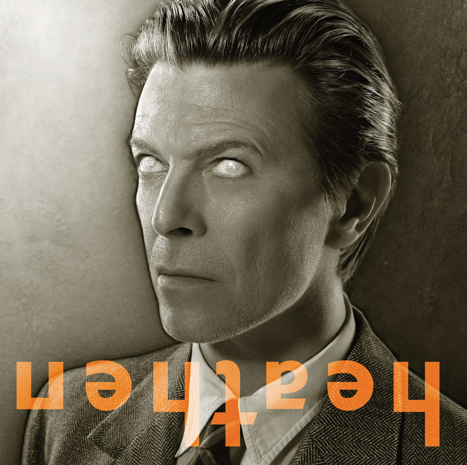
In 2002, Barnbrook produced the album cover for Heathen by David Bowie. In this particular cover, he incorporated his “Priori” typeface, during which was his first time using the font for commercial purposes. Bowie then requested Barnbrook to design cover art for other albums including Reality and The Next Day (both of which hold “rather controversial reputation”).

Barnbrook was also known for his range of fonts including False Idol, Exocet, Newspeak, Awe, Infidel, Sarcastic, Shock, and Moron. These fonts have “emotive and controversial titles”. Furthermore, he has collaborated with artist Damien Hirst on the book “I want to spend the rest of my life everywhere with everyone, one to one always, forever now”, in addition to “Typography Now Two” and various advertising campaigns.
https://designmuseum.org/designers/jonathan-barnbrook
https://www.fontshop.com/designers/jonathan-barnbrook
http://www.famousgraphicdesigners.org/jonathan-barnbrook