Reflections | The Crystal Goblet, or Printing Should Be Invisible

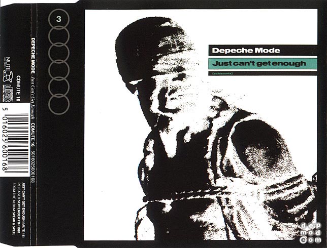
The essay, summarised, discusses the opinions of Beatrice Warde regarding the processes of print and typography. Using a detailed analogy of wine vessels, Warde clarifies between the two areas by bringing to light her perspectives on what makes good typography and on the elements of the printed word.

Looking more into the essay, Warde brought up some interesting points on her view on good typography; in the beginning she stated that “there are a thousand mannerisms in typography that are as impudent and arbitrary as putting port in tumblers of red or green glass”. Returning to the analogy of wine vessels, she uses the idea of the base of a goblet where, if it looks “too small for security”, “it does not matter how cleverly it is weighted; you feel nervous lest it should tip over” – to a certain extent, I agree with what she is trying to imply. Readability in typography, in my opinion, is the number one thing we should consider in creating typographical artworks. Not only do we need to be wary of conveying the right information, but the ways in which the reader perceives it, or in Warde’s words, “ways of setting lines of type which may work well enough… reading three words as one, and so forth”.

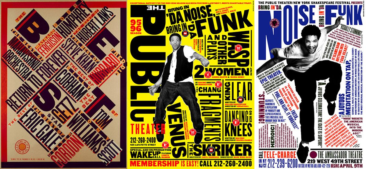
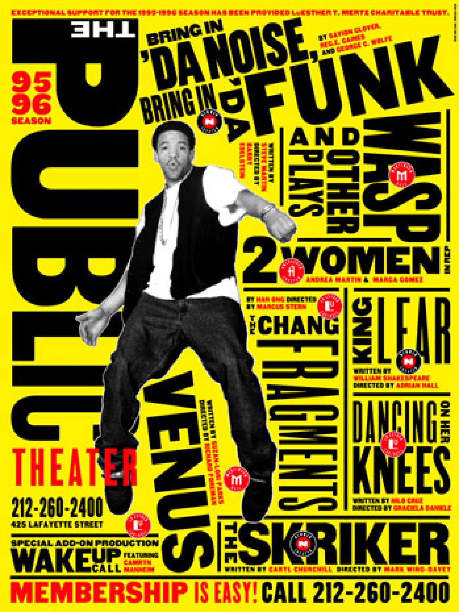
Towards the end of the essay, Warde also talks about legibility and layout; she quotes, “if the reader had not been practically forced to read – if he had not seen those words suddenly imbued with glamour and significance – then the layout would have been a failure”, but at the same time, she feels that the “mental eye focuses through type and not upon it”, where the “arbitrary warping of design or excess of ‘colour'” can “get in the way of the mental picture to be conveyed”, making it a “bad type”. Again, to a certain extent, I do agree with the points she is trying to make, that if the artwork ends up looking too fanciful or gaudy, with too many designs and colours, readers would just ultimately miss the main point of the artwork (i.e. to convey information through text). However, I feel like this may not be the case in some scenarios; going back to the group presentations on typefaces, I remember the group presenting on Comic Sans brought up an interesting fact about the font, that it is so unstructured and difficult to read that it is more effective in retaining information (so it is more commonly found in children’s textbooks and worksheets). Therefore, I do agree that jarring kinds of visuals can interfere with conveying information to the reader, affecting its readability, but maybe it can help it making that piece of artwork memorable?

In conclusion, the essay helped me in understanding the little nuances that distinguishes between good and bad typography, as well as the factors to consider when reviewing a piece of typographical artwork. On a side note, I thought the analogy of comparing wine vessels to typography was quite interesting as well, and helps in illustrating her points better.

Typographer of the Week | Paula Scher

About the Typographer

Image result for paula scher
Image of Paula Scher

Hailed as one of the most prominent key figures in the design industry, Paula Scher is known for her versatility in creating polished logos and “loudly expressive” posters. This “all-embracing sensibility” of Scher has made her a “reigning titan in a heavily male-dominated industry”. She has had a hand in identity and branding systems, promotional materials, environmental graphics, packaging and publication designs, receiving hundreds of industry honours and awards.

Scher is also referred to as the “master conjurer of the instantly familiar”, “[straddling] the line between pop culture and fine art in her work”.

Her Works

I. Branding and identity systems

Mentioned previously, Paula Scher was notable for her contributions to some of the world’s most recognisable brands and organisations. One of which would be her works for CBS Records, where the records she designed were associated with four Grammy nominations. She is also credited with reviving historical typefaces and design styles.

Paula Scher

Image result for citibank logo paula scher

Image of CitiBank logoScher was also known for designing the CitiBank logo.

Related image
Image of promotional graphics system for The Public Theatre

She was also known for her works for The Public Theatre in 1994. Tasked with the challenge of raising public awareness and attendance, along with trying to appeal to a more diverse crowd, Scher managed to create a programme that was said to have become the “turning point of identity in designs that influence much of the graphic design created for theatrical promotion and for cultural institutions in general”. She did so by creating a graphic language that “reflected street typography” and “graffiti-like juxtaposition”.

Learning Points

  • A takeaway I got from briefly looking at Paula Scher’s works was her use of contrast. I found the idea of how she took aesthetics commonly associated with the subject and completely going the opposite direction with the final product especially bold and interesting (especially what she did with her collateral for The Public Theatre). What resulted was something that was considered both groundbreaking and a reincarnation of old design principles.
  • I also found her use of bold colours and unconventional layout of text very eye-catching and intriguing (especially in her works for Atlantic Records). The placement of the text helps create movement, and just adds an overall energetic and vibrant feel to the artwork.
  • I think Paula Scher’s versatility as a designer is also very inspiring; it’s interesting to see how she’s able to cater to a vast range of different clients from prim and proper big names to more underground and “street” brands – she is able to create slick and clean-cut designs, as well as grungy and energetic-looking typeface layouts.

Singapore Design Week | Preliminary Design

Poster 1: Stages of Design in Singapore

Image of Moodboard
  • Central focus: Main, graphic to draw in attention
  • Vibrant colours
  • Integration of humour

Poster 2: Designing With A Purpose

Image of Moodboard
poster
Poster inspiration
  • Clean layout
  • Play with geometric shapes and straight lines
  • Simple and pale colour palette

Poster 3: Celebrating Creativity in Singapore’s Design

Image of Moodboard
poster52cmX76cm.jpg
Poster inspiration

「2018GMA金曲獎頒獎典禮暨國際音樂節」主視覺出爐,以「複誦」(Repeti

  • Use of collage and layering
  • Muted colour palette with burst of colour

Reflections | Thinking With Type

Letter – Thinking With Type

After having an in-depth look into the anatomy of type, I have a better idea of what to look out for when analysing a certain font, and the criteria to set when selecting fonts for a piece of design. Additionally, the reading helped to clear some of the doubts I had about typography terms. For some reason, I kept thinking typefaces and fonts were the same thing, but now I have a clearer idea of the two and I most likely would be able to tell them apart in future! Most likely.

  • Typeface: The design of the letterforms / (Digital) The visual design
  • Font: Delivery mechanism / (Digital) The software that allows you to install, access, and output the design

Overall, as a beginner in typography, and it being one of my weaker elements of design, the reading allowed me to have a clearer view on how to integrate typefaces into the design pieces (and at the same time, making them visually appealing and complementary to the other visual elements). It also helped me in familiarising important terms, as well as what to refrain from doing in future!

Typographer of the Week | Neville Brody

About the Typographer

Image result for neville brody
Image of Neville Brody

Neville Brody is an English graphic designer, typographer, and art director. He is most recognised for his rejection for commercialisation in his graphic styles, with his unique designs becoming the ‘much-imitated models for magazines, advertising and consumer-oriented graphics of the eighties’, as well as his highly innovative ideas on incorporating and combining typefaces into design.

Often referred to as a ‘star typographer’, Brody has designed a number of very well-known typefaces.

His Works

In addition to being an alumnus of the London College of Printing and Hornsey College of Art, Brody is most known for his work on The Face magazine, Arena magazine, and designing record covers for artists such as Cabaret Voltaire and Depeche Mode. His ‘pioneering spirit in the area of typography’ can be seen in FUSE, and starting studios such as The Studio and Research Studios.

Record Covers & Magazines
Image result for neville brody the face
Covers of The Face and Arena magazines

Brody’s more prominent works include his contributions to the British music scene, and his experimentations with a new visual language in magazines, comprising mainly of a mixture of visual and architectural elements. This has led him to firmly establish his reputation as one of the world’s leading graphic designers.

Image result for neville brody records
Record artwork for Cabaret Voltaire
Image result for neville brody depeche mode
Record artwork for Depeche Mode
Image result for neville brody music radiohead
Typographical Portrait featuring Thom Yorke
Typefaces

Brody was one of the founding members of FontShop, designing a number of typefaces for them. He was also responsible for instigating the FUSE project (an influential fusion between magazine, and graphics and typeface design), and the founder of the FontFont typeface library.

Image of typefaces by Neville Brody

He has also designed a range of his own typefaces, the most recognisable being the Blur font.

Learning Points

After researching more into Neville Brody’s works, I was inspired by the amount of contributions he gave to the graphic design field, as well as his “pioneering spirit” in changing how popular culture was perceived in the 80s.

  • The use of more decorative title fonts for the magazine covers was able to capture the energy of the magazine but at the same time, was not too jarring or gawdy.
  • The combination of typefaces and simple geometric shapes was interesting and added a layer of depth to a photograph.
  • Drawing inspiration from the punk scene was noticeable in some of his works; it created an interesting approach in forming portraits.
  • His ability to create typefaces that were simple but at the same time, possessed features that made them distinguishable and less boring.

References

http://jonnymg.blogspot.com/2013/03/neville-brody.html

https://www.fontshop.com/designers/neville-brody

http://www.historygraphicdesign.com/the-age-of-information/postmodern-design/531-neville-brody

https://inkbotdesign.com/neville-brody/

Reflections | Type Speaks (1948)

Type Speaks provides an in-depth look into the process of making type. ‘It follows the entire process of type making from original design… to pattern making, punch cutting, matrix making, and the use of the Benton engraving machine’.

After watching and learning more about the very, very painstaking process of letterpress, especially in the amount of meticulousness and effort that goes into making every single block, making sure the structure of each alphabet is as accurate as possible, I have a newfound appreciation for the craft. It was eye-opening and inspiring to see the elaborate process of printing publications in the past, and the passion practitioners had for it. On the other hand, I am really glad to be born into the age of computers where forming and printing are much less painstaking – I honestly don’t think I have the patience for the amount of intricate detail that goes into crafting each letter by hand.

In a nutshell, I appreciate the letterpress process and the amount of effort and passion that goes into keeping the craft alive, but I think sticking to the method of digitally-altering alphabets is the way to go (at least for me)!

Typographer of the Week | Massimo Vignelli

Image result for massimo vignelli

About the Typographer

An influential figure in the field of typography, Massimo Vignelli has been practising design in New York for nearly 50 years. Steadfastly maintaining a ‘Modernist’ approach to design problems, he has made a significant impact on all forms of design, from graphic design to furniture and clothing. In addition to heading Unimark International, one of the world’s largest design studios, Vignelli also designed identities for major corporations such as American Airlines, Bloomingdales, and Knoll. Today, his work can be seen all over the world, with collections in museums such as the Museum of Modern Art, the Metropolitan Museum of Art, and the Cooper-Hewitt Museum.

His Works

New York city subway map
Image result for massimo vignelli new york subway
New York Subway Map (1972)

One of Vignelli’s most iconic and proudest works involves the design of the New York City Subway map, and on the walls of subway stations; it is said to be a ‘landmark in Modernist information design’.

Image result for massimo vignelli new york subway
Details of the New York City Subway Map
Image result for massimo vignelli new york subway
Wayfinding signs depicting Vignelli’s works

Before Vignelli stepped in, the subway station had a ‘conglomeration of assorted visual styles’, resulting in a ‘flawed user experience’. And with the rising popularity of graphic design standards, corporate identity, and a growing public awareness of good design, it was time the subway needed a new visual identity and effective navigational system.

1965 NYC Subway Signs
New York City Subway stations (1965)

Assigned to Unimark, Vignelli and his team conducted in-depth research into the user experience from The New York City Transit Authority Graphics Standards Manual (1970), with the intention of implementing a system that was ‘seamless, intelligent, and reproducible while withstanding human error’.

What followed was an iconic piece of work in the history of graphic design with a mixed reception: ‘adoration from the design community, and kickback from native New Yorkers, who were expecting a geographically correct map rather than a modernist schematic layout’.

Learning Points

After learning more about Massimo Vignelli’s works, I gained more insight into the graphic design field on a global stage. I was really inspired about his iconic contributions and how his legacy continues to live on after his passing. When researching more about his reinvention of the New York City Subway visual identity, I realised that his approach to user experience and awareness was important and applicable, especially when creating graphics for clients.

Vignelli also had a ‘Modernist’ approach to his designs, and personally, I found them visually appealing. Having a ‘Modernist’ identity in works, in my opinion, allows for easy readability and understanding. Minimalist graphics are also versatile, and can easily be applied to different cases. However, with modern style graphics becoming increasingly popular and widely used, they can come across quite boring and simple! I think it will be interesting to see a bridge between modern style graphics and decorative fonts in future.


Typographer of the Week | Jan Tschichold

Jan Tschichold

Related image

Image of Jan Tschichold

About The Artist

Jan Tschihold is a highly-influential typographer, playing an important role in the development of graphic design in the 20th century; he was most known for ‘strongly advocating the beauty of sans serif fonts’, cleaning and organising design ahead of its time by ‘developing and promoting principles of typographic modernism’, and designing Penguin books, turning them into ‘something special’.

Works
I. Sabon

Inspired by Jakob Sabon’s and Conrad Berner’s Garamond, Tschichold created Sabon, a variation of the aforementioned Garamond typeface.

Image result for sabon font
Example of Sabon

Designed to be used in available printing techniques of that time, Sabon was a result of Tschichold’s efforts of taking Garamond and standardising its construction by removing historic typefaces anomalies, making it more ‘economical’ and ‘narrower’.  As a result, Sabon eventually became one of the ‘handsomest contemporary interpretations’ of Garamond.

II. Page Canons

Tschichold also developed a system of page harmony that is still relevant today. Establishing the 2:3 ratio rule, where he expresses that ‘the key to this positioning of the type area is the division into nine pans of both the width and height of the page’.

A diagram of the 2:3 page ratio

This ratio can be applied to a variety of layouts including magazine spreads, annual reports, and illustrated title pages.

Learning Points & opinions

As I’m not very well-versed in Typography, it often slips my mind that fonts are typically products of designers’ painstaking efforts, rather than something easily generated by computers. Therefore, after reading more about Jan Tschichold, I was quite blown away by his works and the influences he created in the design world that still hold up till this day.

Some of my learning points include:

  • The Sabon font and how it came to be
  • Technical formulae in creating visually-pleasing page layouts
  • A brief insight into the development of graphic design in the 20th century, especially its more important milestones (i.e. the development of typographic modernism)

When familiarising with his works, I was quite intrigued by the structure of the Sabon typeface. In addition to it being regarded as one of the more ‘beautiful’ and ‘handsome’ variations of the Garamond font, I feel that, with its clean structure with serif strokes shows a blend of vintage and modern, making it versatile in many areas of design (but maybe towards a more high-end brand), and timeless. The page canons, on the other hand, are an interesting insight into page layout; I never knew that the placement of text and images required math and ratios. The ratios seem to be very ahead of their time and although they seem rather rigid at first, they are versatile in their ability to be applied to a variety of layouts including magazine spreads and reports, even to this day.

Image result for cereal magazine
Cover of Cereal Magazine
Image result for cereal magazine
Cereal Magazine spread

In conclusion, it’s really inspiring to learn more about how prominent figures, like Jan Tschichold, continue to influence graphic design by establishing principles and elements that hold a highly-regarded position after many, many decades!

Type in the Wild | Big Fish Small Fish

Type in the Wild

A small area of the container park

A place I recently visited for the first time was the container park at Punggol, near the Punggol Waterway Park. It is a small area with brightly-coloured shipping container-like shops that house a variety of dining and bar options. Since it just rained, the weather was windy and cool so I didn’t mind having my lunch at 5pm.

Type At Big Fish Small Fish
Image result for punggol east container park
Exterior of Big Fish Small Fish

One of the eateries that caught my eye was Big Fish Small Fish, mainly because of its bright blue and yellow colour scheme, but also their use of many different fonts. As it seemed like a trendy restaurant catered to a younger demographic (since they primarily sell fried food items), it made sense to use bright colours and blends of fanciful and handwritten-like fonts.

Examples of type can be found throughout the establishment – on menus, promotional posters, signboards, wrappers, and labels. Interestingly, every other piece of collateral had different combinations of typefaces.

Big Fish Small Fish logo
Disposable placemats
Holder for food

Each packaging item has a different typeface, and they vary quite a bit – the name of the place is displayed using serif fonts (slab serif) while slogans are typically italicised or cursive. The placement of the words also varies with each packaging – the most notable being the placemats, where the two typefaces are centralised and accompanied by illustrations, compared to the holder, where the typeface encompasses most of the surface space.

Positive

  • The use of slab serif fonts is eye-catching and seems to suit the trendy and hip atmosphere of the place. It also seems more youthful and light-hearted, which suits their target demographic.
  • The use of cursive fonts adds an overall casual and laid-back feel to the slogan and seems appropriate for what the slogan is saying.

Negative 

  • The use of different typefaces all at once is a little jarring, especially when coupled with a bright colour scheme.
Menus, daily specials, and way finding signs

Similar to the food packaging, the eatery’s signboards and posters also use combinations of different typefaces. Instead of decorative slogans, the content displayed here is informative and more extensive – for this, sans serif fonts were primarily used (accompanied by cursive title fonts and one or two lines of serif fonts). Additionally, the sans serif fonts still hold hints of humanist structures.

Positive

  • The use of sans serif fonts is suitable for menus as it allows for easy readability, as well as being visually appealing, especially in its case where blocks of information have to be conveyed to viewers.
  • The use of cursive fonts as titles accompanied with sans serif fonts is eye-catching and at the same time, not too gaudy.

Negative

  • The extensive use of a narrow, handwritten font (as labels for different fishes in the Today’s Catch poster) is not very visually appealing. It seems to work better for short sentences as opposed to labels in a smaller space.

References

What to Eat at the Punggol Container Eateries

Big Fish Small Fish Review: Fish And Chips With A Variety Of Sauces At $6.90 Nett At Punggol