
About the Typographer

Neville Brody is an English graphic designer, typographer, and art director. He is most recognised for his rejection for commercialisation in his graphic styles, with his unique designs becoming the ‘much-imitated models for magazines, advertising and consumer-oriented graphics of the eighties’, as well as his highly innovative ideas on incorporating and combining typefaces into design.
Often referred to as a ‘star typographer’, Brody has designed a number of very well-known typefaces.
His Works
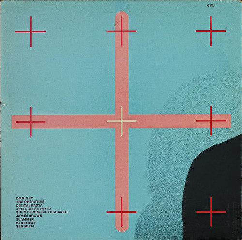
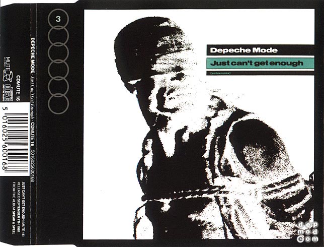
In addition to being an alumnus of the London College of Printing and Hornsey College of Art, Brody is most known for his work on The Face magazine, Arena magazine, and designing record covers for artists such as Cabaret Voltaire and Depeche Mode. His ‘pioneering spirit in the area of typography’ can be seen in FUSE, and starting studios such as The Studio and Research Studios.
Record Covers & Magazines

Brody’s more prominent works include his contributions to the British music scene, and his experimentations with a new visual language in magazines, comprising mainly of a mixture of visual and architectural elements. This has led him to firmly establish his reputation as one of the world’s leading graphic designers.

Typefaces
Brody was one of the founding members of FontShop, designing a number of typefaces for them. He was also responsible for instigating the FUSE project (an influential fusion between magazine, and graphics and typeface design), and the founder of the FontFont typeface library.
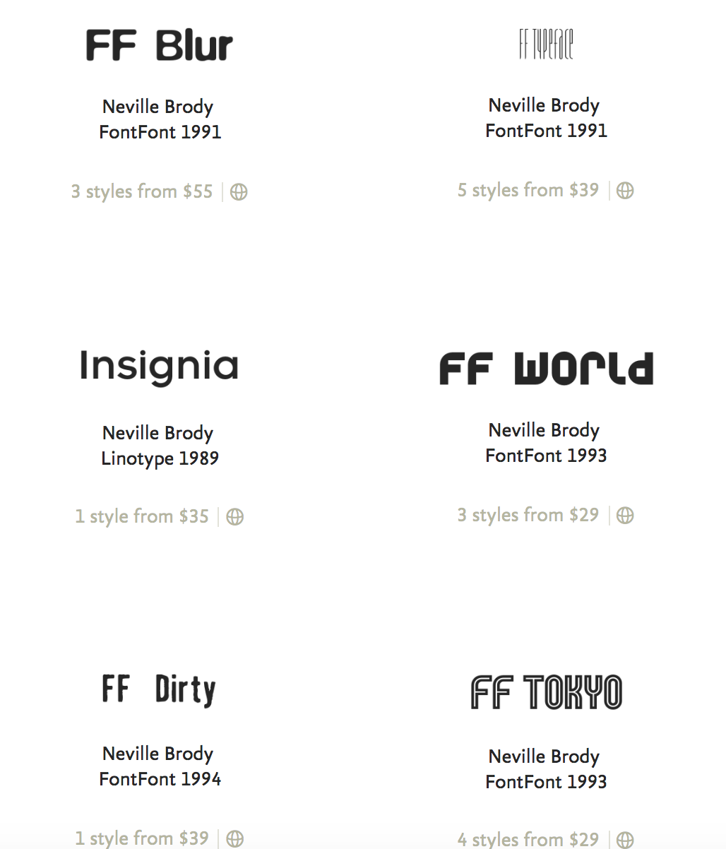
He has also designed a range of his own typefaces, the most recognisable being the Blur font.
Learning Points
After researching more into Neville Brody’s works, I was inspired by the amount of contributions he gave to the graphic design field, as well as his “pioneering spirit” in changing how popular culture was perceived in the 80s.
- The use of more decorative title fonts for the magazine covers was able to capture the energy of the magazine but at the same time, was not too jarring or gawdy.
- The combination of typefaces and simple geometric shapes was interesting and added a layer of depth to a photograph.
- Drawing inspiration from the punk scene was noticeable in some of his works; it created an interesting approach in forming portraits.
- His ability to create typefaces that were simple but at the same time, possessed features that made them distinguishable and less boring.
References
http://jonnymg.blogspot.com/2013/03/neville-brody.html
https://www.fontshop.com/designers/neville-brody
http://www.historygraphicdesign.com/the-age-of-information/postmodern-design/531-neville-brody
https://inkbotdesign.com/neville-brody/