
This project is basically a self-exploration project where we put ourselves in 4 settings and what is the out. I went with the idea of putting myself into 4 situations I always faced.
Before I go on to explain my final work, I will explain a bit about my mind mapping and thought process:
Conceptulisation
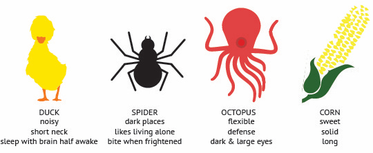
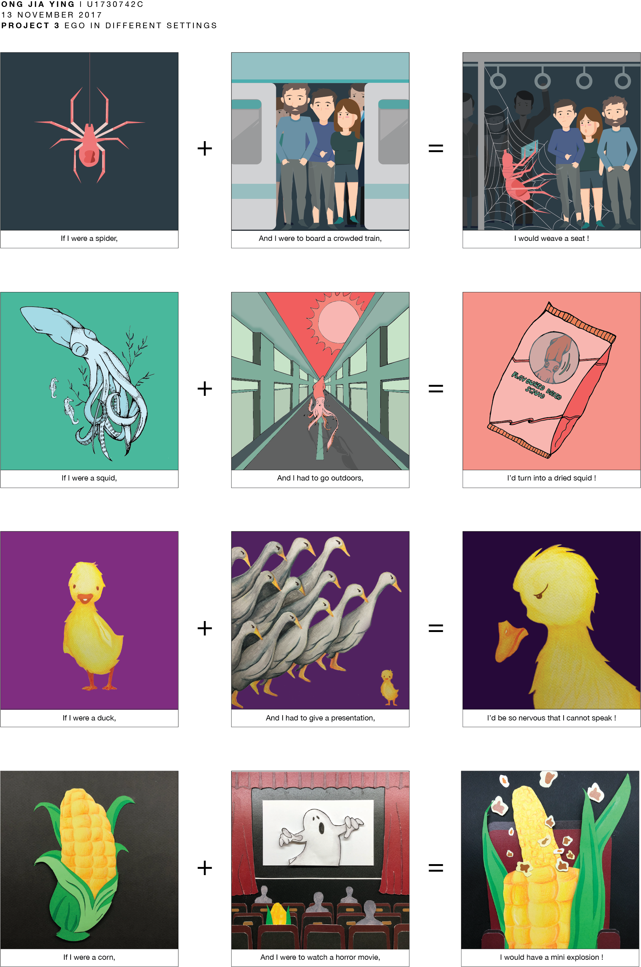
After doing my research and mind map. I come up with 4 objects to represent myself in different situations.
Me
1. Duck – I chose a duck to represent me being chatty and noise.
2. Spider – The many legs of a spider represents my ‘ Kan chiongness’. Me being a kan chiong spider.
3. Octopus – Whenever I go on a shopping spree. My hands will be filled shopping bags.
4. Corn – It is my favourite vegetable and my friends always laugh at me when bite on the cob.
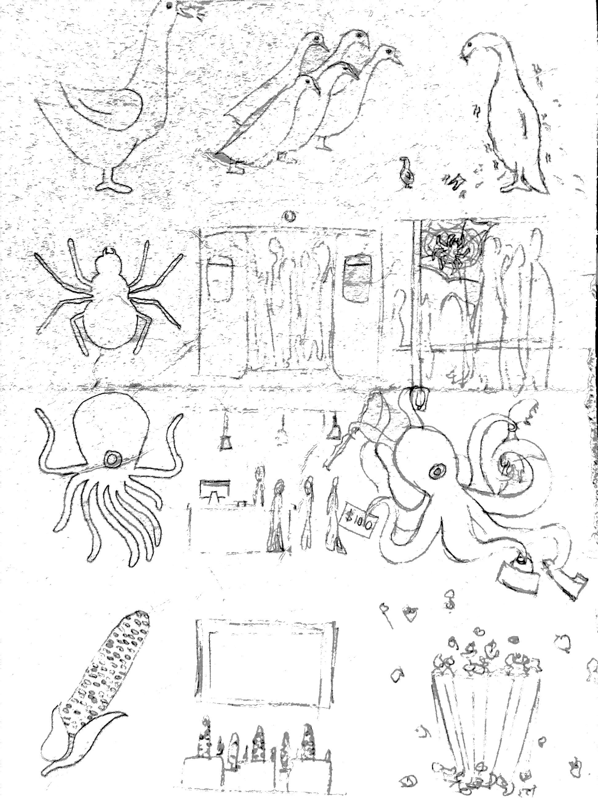
Sketches
So from the concept above, I finalised my idea into the bottom sketches. I felt that by sketching out the rough idea helps me to visualise things better. However, some of my ideas were change and improve later on.
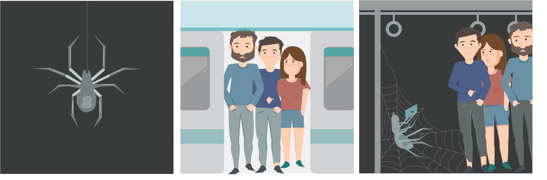
The Kan Chiong Spider
1.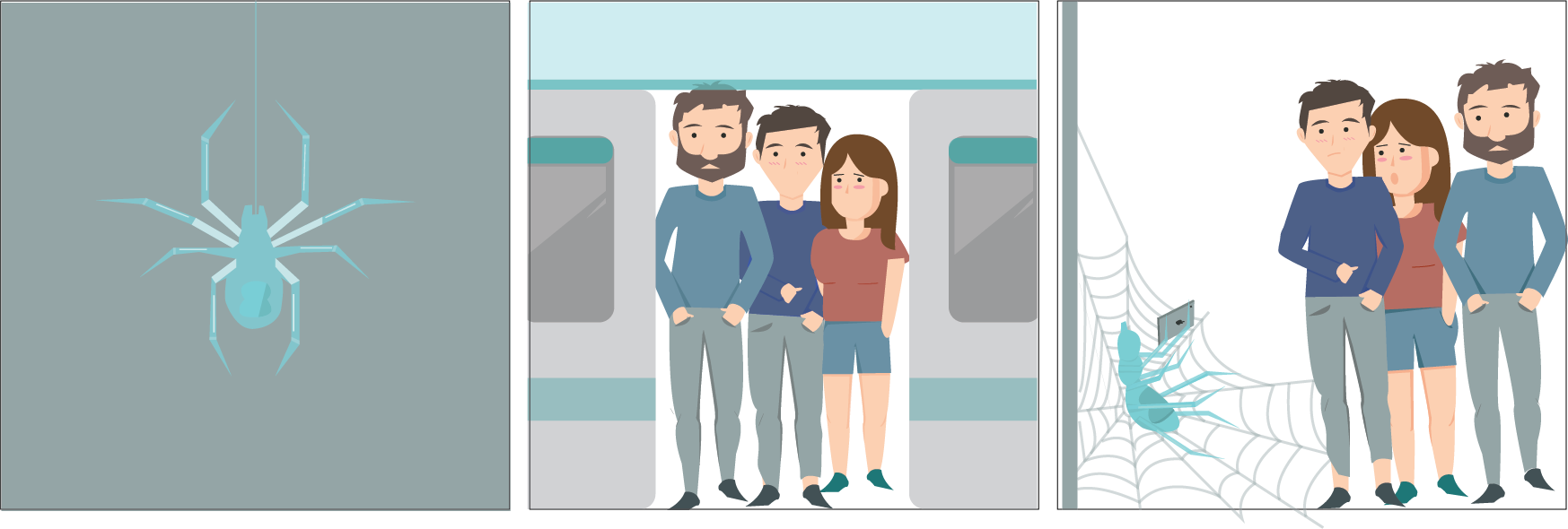
For my first layout, spider is not the main focus, which is not what I wanted. And after consultation, I realised that there is a lack of details. And that panel 3 do not look like a train cabin.
2.
After I make all the changes, I find that the spider do have a significant object to represent me. Therefore for the final layout, I change the colour of the spider and also added more humans to show that it is a very packed train. And since the spider is the focus, I enlarge the spider and reduce the size of the humans.
Final
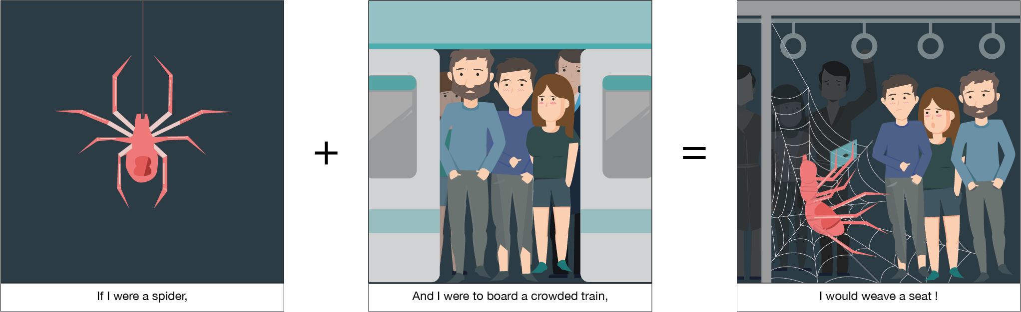
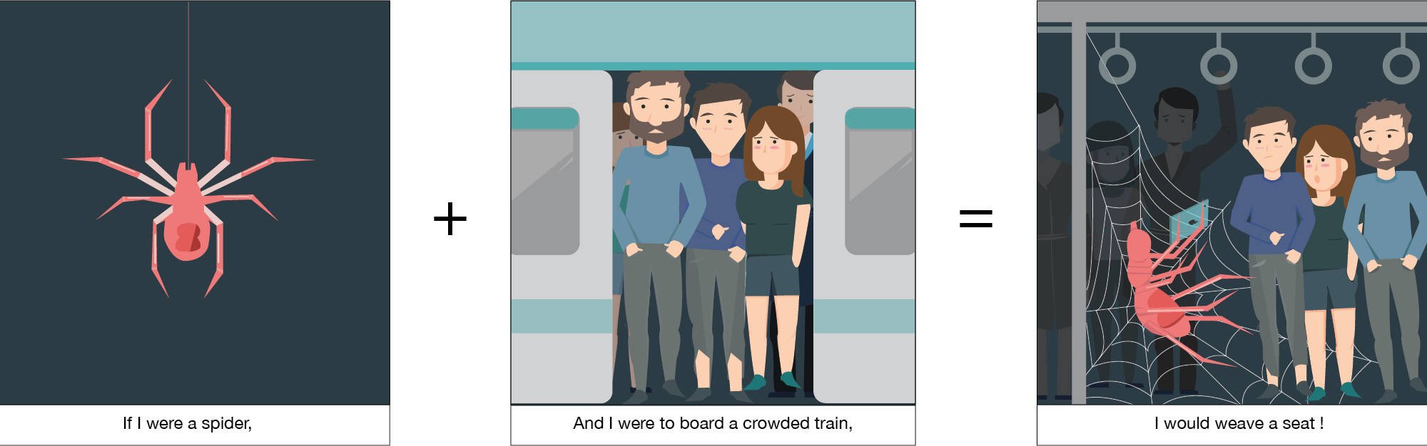
I started the equation with me as a spider. Since we all have this saying ‘Kan chiong spider’. Everytime when I had to take a train from school all the way back home. I always hope there will be seats, if not I have to stand for an hour. Therefore I always try to rush in.
The situation that I picked out is me sqeezing in a packed train. The humans in the train is very uncomfortable as it is very packed. I will squeeze in and weave a seat for myself and I will start using my phones. Which is very similar to me, if I managed to find a seat, I will be very happy and I would take out my phone and start using it all the way till I reached my stop. Since the spider is my focus, I enlarge the spider and reduce the size of the humans.
For this layout, I used illustrator to pen out everything and I added in colours. I watched youtube videos to learn how to draw humans. I am pretty satisfied with the outcome.

For the colours, I used three monochromatic schemes that are different from each other. I wanted my spider to be the focus. Since pink and red is my favourite colour. I use it to represent me. To show the uneasiness of the train and people in the train, I used a blue and grey to represent the uncomfortableness.
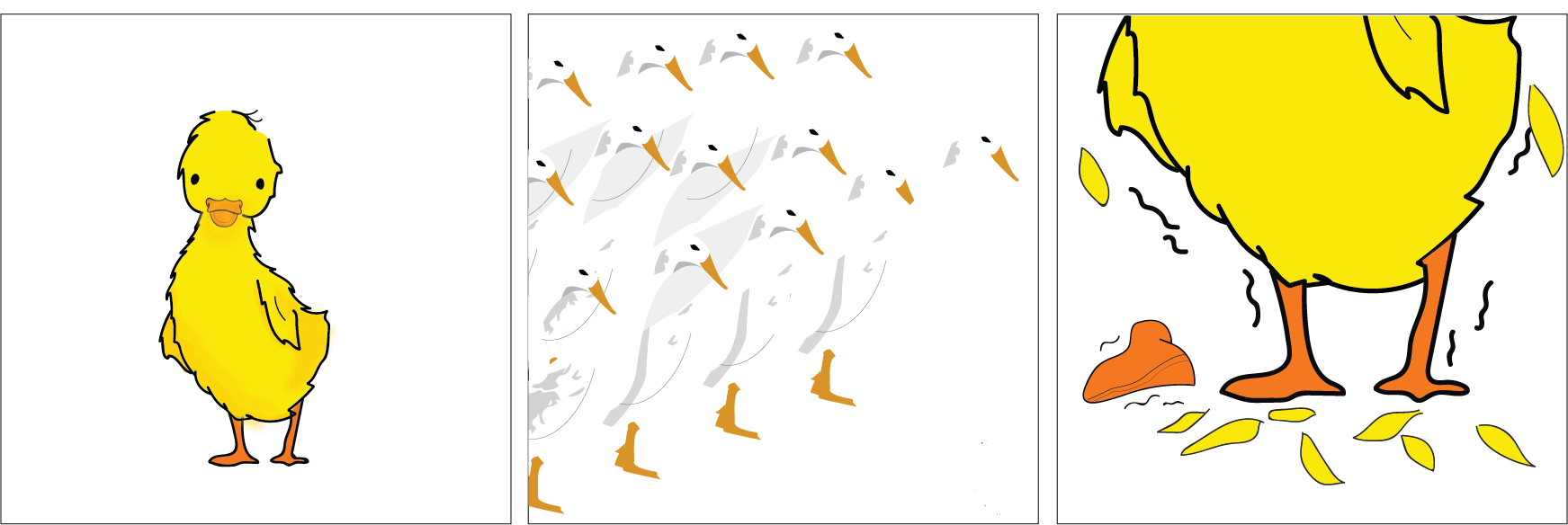
The Chatty Duck
1. 
I drew my idea out on illustrator and I add colours to it. So that I can better visualise my idea. I thought I could add some colours to the background, so that the duck could stand out.
Watercolour
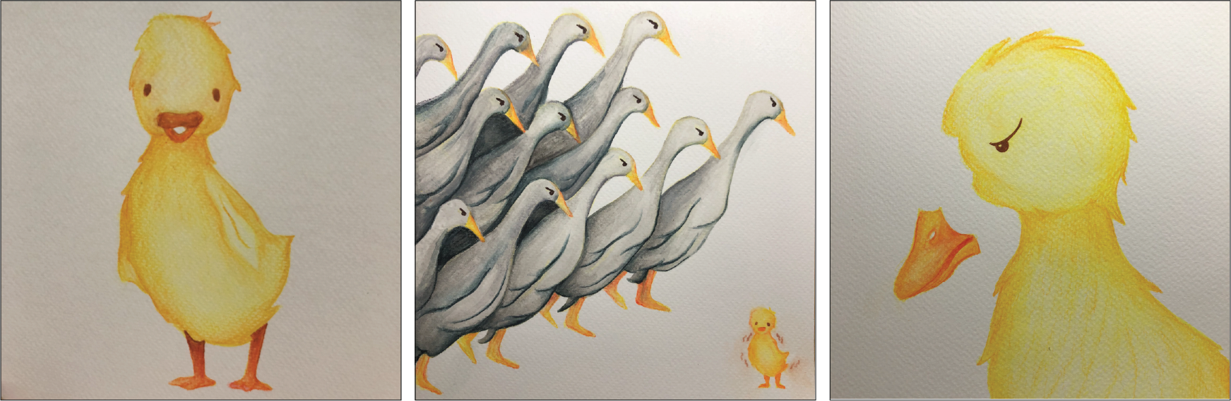
Images of my watercolour drawing.
Final
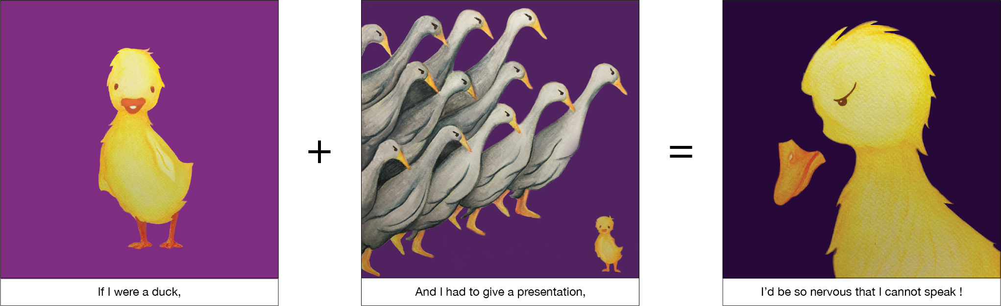
I am a very cheerful and chatty person. Therefore the first animal that came into my mind was a duck. My family and friends alway say I am noisy. However, when I have to stand infront a large group of people. I will be so nervous and I not be able to speak. It always happen to me when I had to present in front of my class.
The situation that I picked out for the duck was to give a presentation infront of the class. All the eyes are on me. I seem so small and helpless. I will forget everything I had to say, therefore I represent it with me dropping of my beak.
For the layout, I used watercolour and watercolour pens to draw out my ducks, then I scan it into photoshop to add in the background colours. I am alittle disappointed with the outcome. Since I am not very familiar with photoshop. I find it hard to adjust the colours to make it seems more natural. And I realised that the scan images have a grey tone in it.

As I want the duck to be the focus , I used complementary colours. Yellow duck because yellow represents my cheerfulness. I used 3 different shades of purple, to convey the 3 different mood. The first panel is a more vibrant purple as it is supposed to be a happy mood. The second panel is a darker shade of purple to show me being afraid and the last panel is a dull purple.
The Dried Squid
1.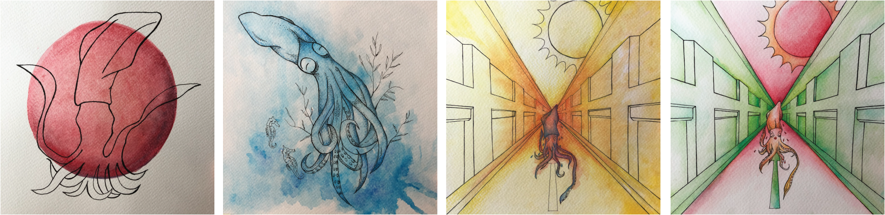
I drew out my idea using pens. I wanted to create a watercolour background effect. However, I tried many many times. But I fail. So I decide to change the drawing style.
2.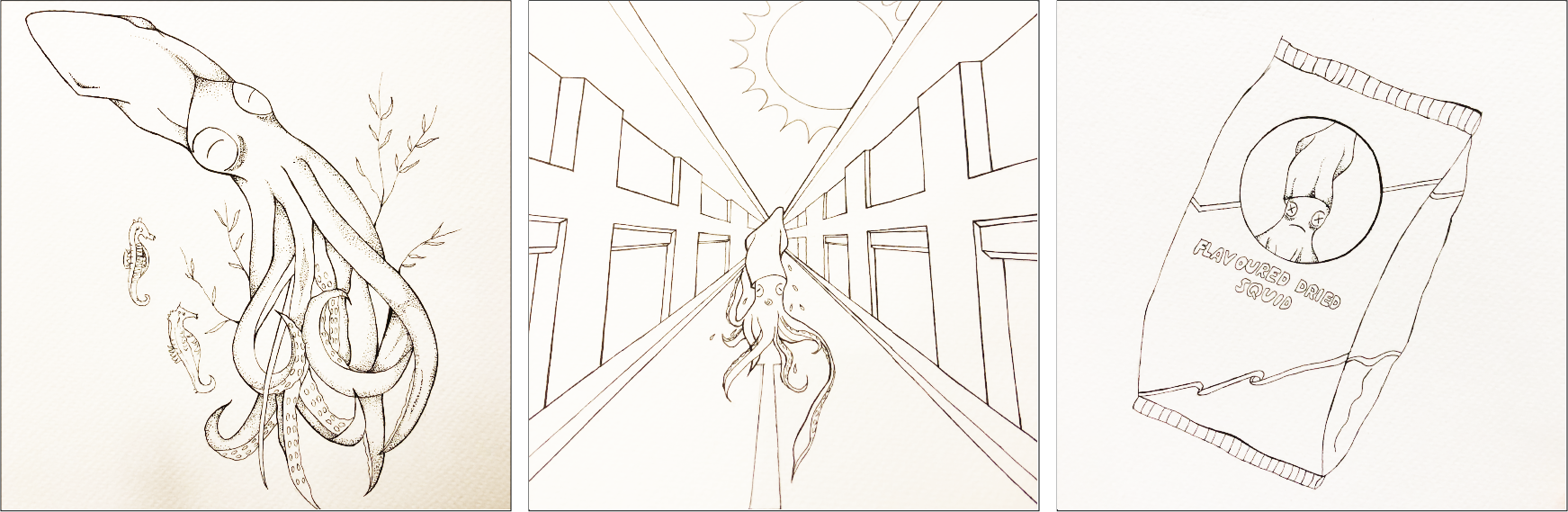
Images of my pen drawings.
Final
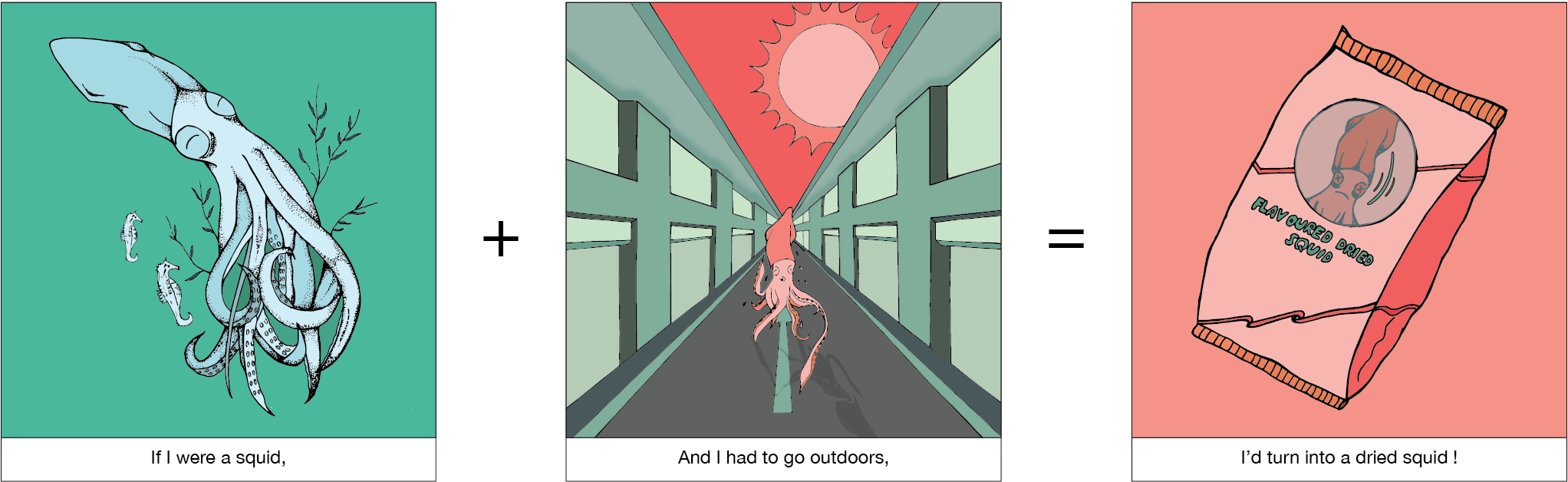
I used a squid to represent myself because I always find them adorable and since they were pretty suitable for the situation that I was going to put myself it, I decide to use it. I add dark eye circle for my squid because I have very obvious eye bags.
The situation that I picked up was me dislike the sun. Especially for Singapore’s weather, when the sun shines on me, my skin will feel painful. In the 3 panels my concept is having to go outdoor with the bright sun shining. I ran away from the sun, however before I could run off. I became a dried squid.
For the layout, I used pen ink then I used illustrator, image trace to trace out my drawing the I add colours to it.

For the first panel, I wanted to show the squid being paceful and comfortable, therefore I used monochromatic colours to show that I blend in with the environment. The next panel. I used complementary colours to show my uneasiness and uncomfort when the sun it out. And for the third panel, I used red monochromic colours to show me being annoyed but helpless.
The Popping Corn
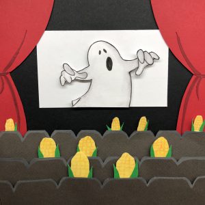
After consultation, I realised that I should just put one corn to represent me. And that I should change all the other corns into human heads.
Final
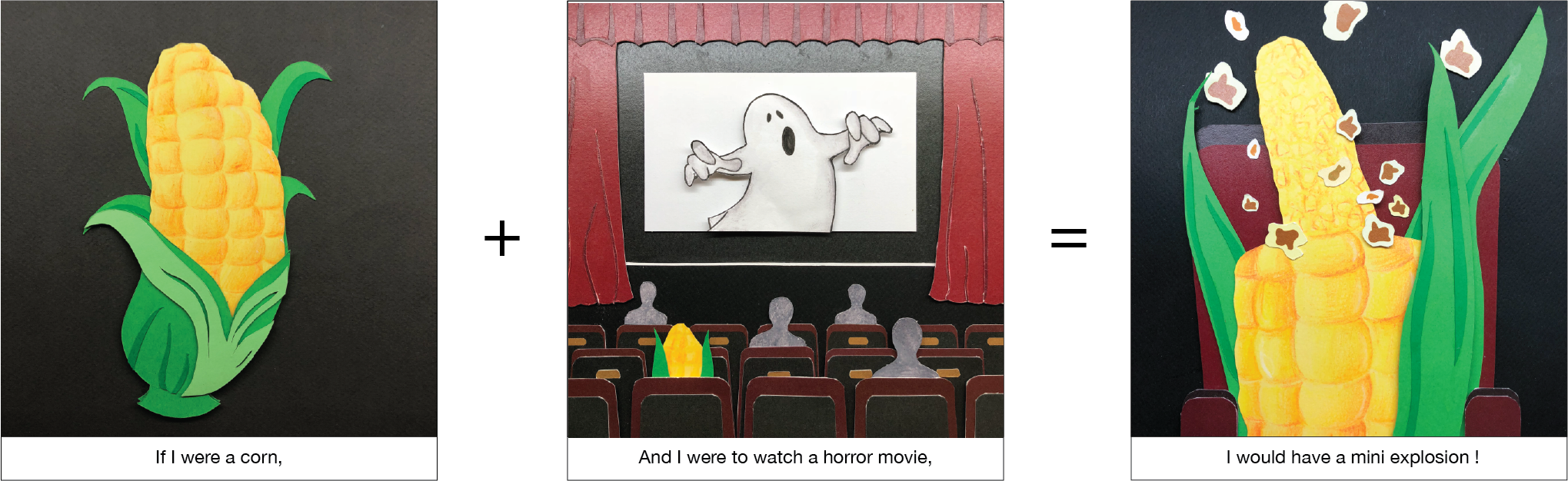
I love watching horror movies, but I always have a mini heart attack when I am watching.
The situation I picked out was me watching a horror movie. The first panel shows me being a happy corn entering into the cinema. When the ghost appear, I got a shocked. From a corn, I started popping into a popcorn.
For this layout, I used paper cutting. I feel that this is the hardest. It is not as easy as what I thought will be. I need lots pf patience and craftsmanship for this equation. And I also had to measure the dimensions correctly.

The colours used in the layout was towards the dark side, it is to bring out the mood and setting. The main colours used in this scheme was green and yellow and to make my corn stand out, I used red and black to contrast with it.
Final
Difficulties
The difficulties I faced was choosing the choice of colours. Colours are very important, they help to add a strong message to the work. I had to try out different colours and figure out which colours best convey the mood. And since most of my equations are hand drawn and coloured. Once I apply the wrong colour, I had to redo. 🙁
Takeaway
Overall I am pretty pleased with the outcome, as this is the first time I am trying all these styles. I felt that this assignment really help me to think out of the box and be more creative.
I also learn some new styles and techniques along the way! Consultations are really helpful. I was pretty lost at first, however the group consultation really helped me a lot. I get feedbacks from my friends and teacher. It is better to seek help rather than keeping quiet. It also also better to get other people opinions, sometimes maybe I will feel that my drawing is good enough, however, it might not be in other people’s view.
Overall, I feel that this assignment have helped me experiment with different illustration styles. Through this assignment, I found out which style I like best. I hope to apply these skills in future.


 He is an artist that I followed on Instagram. I love how he works with simple illustration and clever layering to bring his imaginative paper figures to life. His work is full of interesting characters with endearing human qualities.
 Another artist that I follow, she creates an illustration brand that delivers heartwarming animal character illustrations. She uses mainly use watercolour in all her works. Her work is really unique because she uses cute animals to represent humans. I felt that her works bring warmth and the colours she use is very comforting.


