Ego- Process and Final

This project is basically a self-exploration project where we put ourselves in 4 settings and what is the out. I went with the idea of putting myself into 4 situations I always faced.

Before I go on to explain my final work, I will explain a bit about my mind mapping and thought process:

Conceptulisation

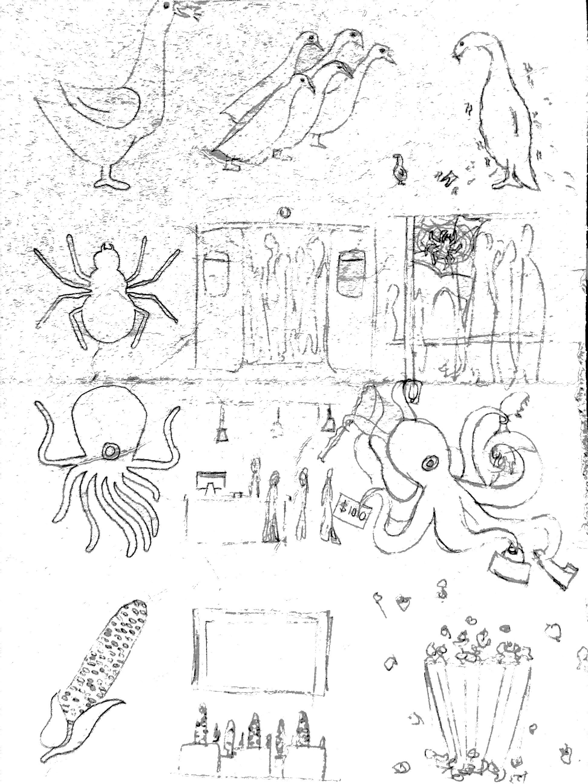
After doing my research and mind map. I come up with 4 objects to represent myself in different situations.

Me

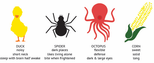
1. Duck – I chose a duck to represent me being chatty and noise.

2. Spider – The many legs of a spider represents my ‘ Kan chiongness’. Me being a kan chiong spider.

3. Octopus – Whenever I go on a shopping spree. My hands will be filled shopping bags.

4. Corn – It is my favourite vegetable and my friends always laugh at me when bite on the cob.

Sketches

So from the concept above, I finalised my idea into the bottom sketches. I felt that by sketching out the rough idea helps me to visualise things better. However, some of my ideas were change and improve later on.

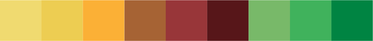
The Kan Chiong Spider

1.

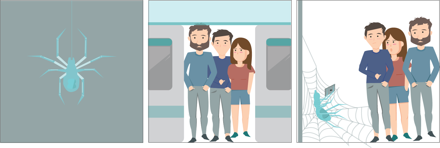
For my first layout, spider is not the main focus, which is not what I wanted. And after consultation, I realised that there is a lack of details. And that panel 3 do not look like a train cabin.

2.

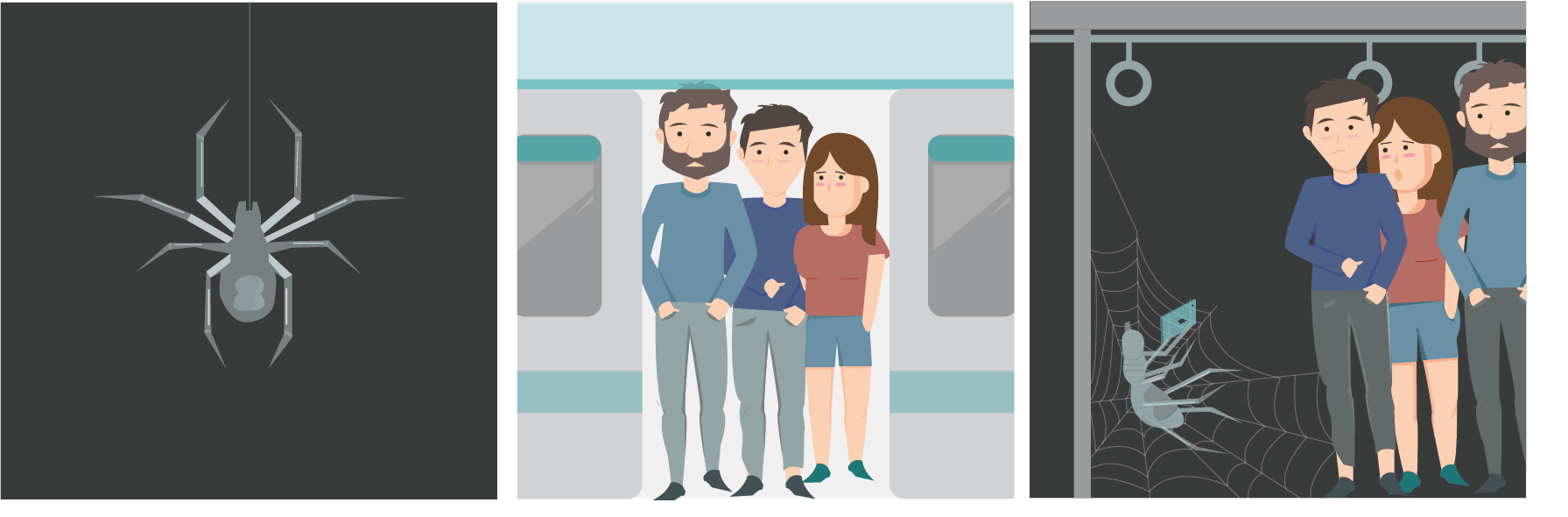
After I make all the changes, I find that the spider do have a significant object to represent me. Therefore for the final layout, I change the colour of the spider and  also added more humans to show that it is a very packed train. And since the spider is the focus, I enlarge the spider and reduce the size of the humans.

Final

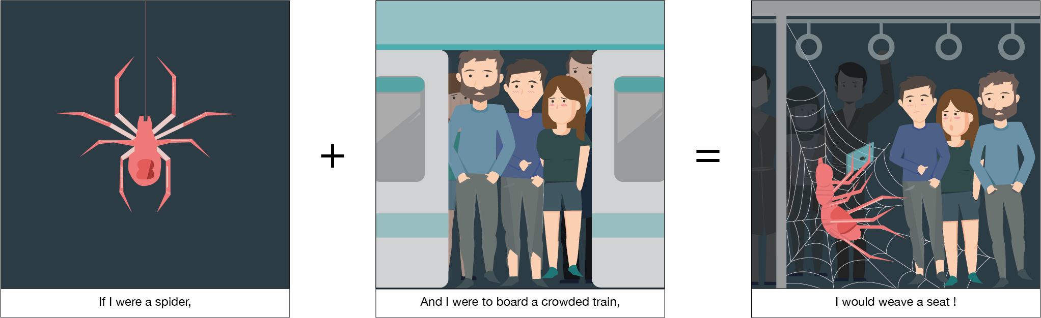
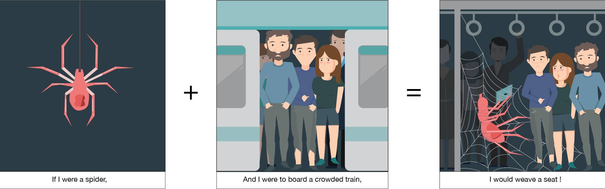
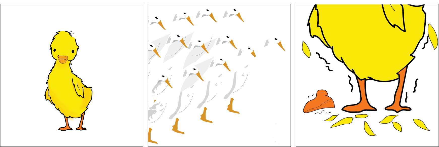
I started the equation with me as a spider. Since we all have this saying ‘Kan chiong spider’. Everytime when I had to take a train from school all the way back home. I always hope there will be seats, if not I have to stand for an hour. Therefore I always try to rush in.

The situation that I picked out is me sqeezing in a packed train. The humans in the train is very uncomfortable as it is very packed. I will squeeze in and weave a seat for myself and I will start using my phones. Which is very similar to me, if I managed to find a seat, I will be very happy and I would take out my phone and start using it all the way till I reached my stop. Since the spider is my focus, I enlarge the spider and reduce the size of the humans.

For this layout, I used illustrator to pen out everything and I added in colours. I watched youtube videos to learn how to draw humans. I am pretty satisfied with the outcome.

For the colours, I used three monochromatic schemes that are different from each other. I wanted my spider to be the focus. Since pink and red is my favourite colour. I use it to represent me. To show the uneasiness of the train and people in the train, I used a blue and grey to represent the uncomfortableness.

The Chatty Duck

1. 

I drew my idea out on illustrator and I add colours to it. So that I can better visualise my idea. I thought I could add some colours to the background, so that the duck could stand out.

Watercolour 

Images of my watercolour drawing.

Final

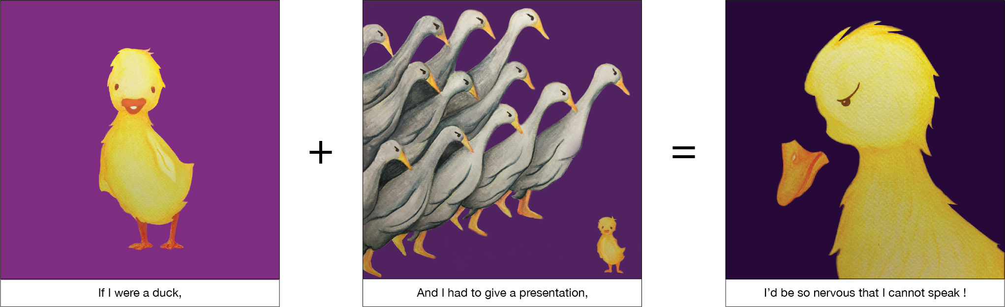
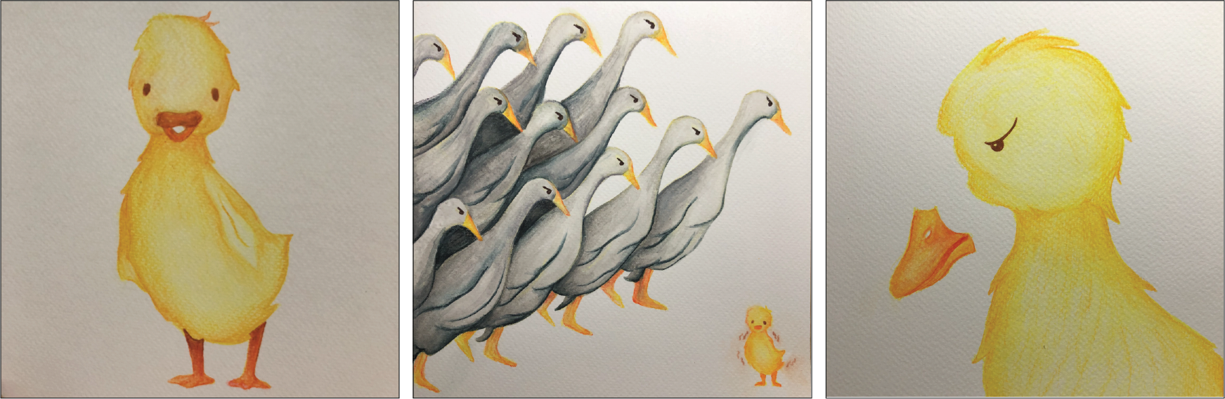
I am a very cheerful and chatty person. Therefore the first animal that came into my mind was a duck. My family and friends alway say I am noisy. However, when I have to stand infront a large group of people. I will be so nervous and I not be able to speak. It always happen to me when I had to present in front of my class.

The situation that I picked out for the duck was to give a presentation infront of the class. All the eyes are on me. I seem so small and helpless. I will forget everything I had to say, therefore I represent it with me dropping of my beak.

For the layout, I used watercolour and watercolour pens to draw out my ducks, then I scan it into photoshop to add in the background colours. I am alittle disappointed with the outcome. Since I am not very familiar with photoshop. I find it hard to adjust the colours to make it seems more natural. And I realised that the scan images have a grey tone in it.

As I want the duck to be the focus , I used complementary colours. Yellow duck because yellow represents my cheerfulness. I used 3 different shades of purple, to convey the 3 different mood. The first panel is a more vibrant purple as it is supposed to be a happy mood. The second panel is a darker shade of purple to show me being afraid and the last panel is a dull purple.

The Dried Squid

1.

I drew out my idea using pens. I wanted to create a watercolour background effect. However, I tried many many times. But I fail. So I decide to change the drawing style.

2.

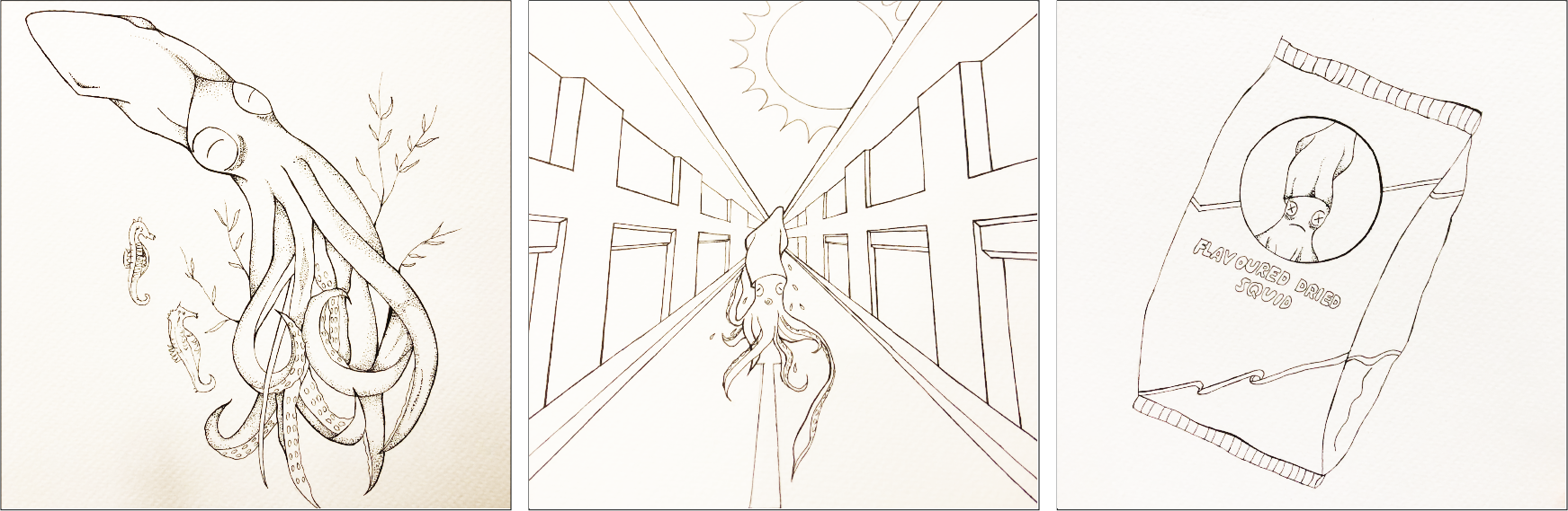
Images of my pen drawings.

Final

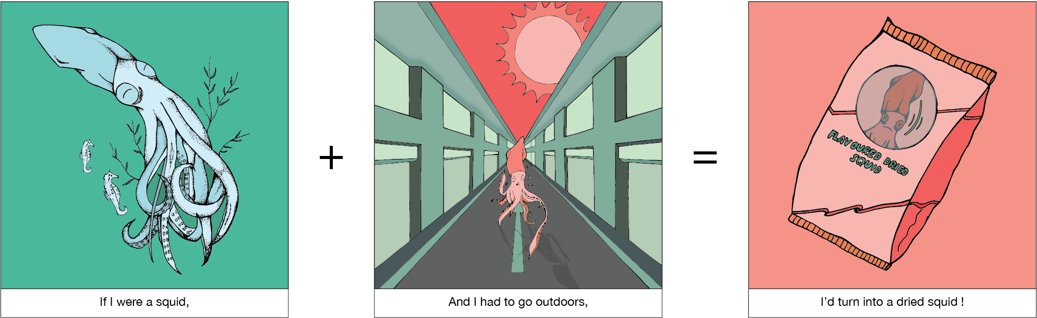
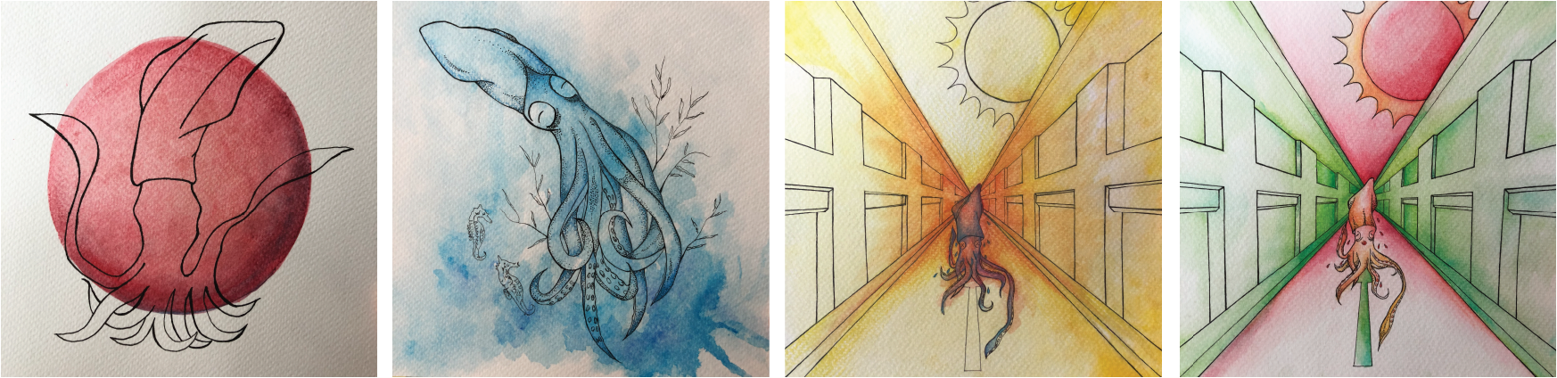
I used a squid to represent myself because I always find them adorable and since they were pretty suitable for the situation that I was going to put myself it, I decide to use it. I add dark eye circle for my squid because I have very obvious eye bags.

The situation that I picked up was me dislike the sun. Especially for Singapore’s weather, when the sun shines on me, my skin will feel painful. In the 3 panels my concept is having to go outdoor with the bright sun shining. I ran away from the sun, however before I could run off. I became a dried squid.

For the layout, I used pen ink then I used illustrator, image trace to trace out my drawing the I add colours to it.

For the first panel, I wanted to show the squid being paceful and comfortable, therefore I used monochromatic colours to show that I blend in with the environment. The next panel. I used complementary colours to show my uneasiness and uncomfort when the sun it out. And for the third panel, I used red monochromic colours to show me being annoyed but helpless.

The Popping Corn

After consultation, I realised that I should just put one corn to represent me. And that I should change all the other corns into human heads.

Final

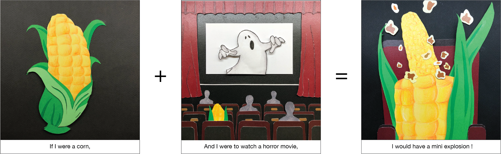
I love watching horror movies, but I always have a mini heart attack when I am watching.

The situation I picked out was me watching a horror movie. The first panel shows me being a happy corn entering into the cinema. When the ghost appear, I got a shocked. From a corn, I started popping into a popcorn.

For this layout, I used paper cutting. I feel that this is the hardest. It is not as easy as what I thought will be. I need lots pf patience and craftsmanship for this equation. And I also had to measure the dimensions correctly.

The colours used in the layout was towards the dark side, it is to bring out the mood and setting. The main colours used in this scheme was green and yellow and to make my corn stand out, I used red and black to contrast with it.

Final


Difficulties

The difficulties I faced was choosing the choice of colours. Colours are very important, they help to add a strong message to the work. I had to try out different colours and figure out which colours best convey the mood.  And since most of my equations are hand drawn and coloured. Once I apply the wrong colour, I had to redo.  🙁

Takeaway

Overall I am pretty pleased with the outcome, as this is the first time I am trying all these styles. I felt that this assignment really help me to think out of the box and be more creative.

I also learn some new styles and techniques along the way! Consultations are really helpful. I was pretty lost at first,  however the group consultation really helped me a lot. I get feedbacks from my friends and teacher. It is better to seek help rather than keeping quiet. It also also better to get other people opinions, sometimes maybe I will feel that my drawing is good enough, however, it might not be in other people’s view.

Overall, I  feel that this assignment have helped me experiment with different illustration styles. Through this assignment, I found out which style I like best. I hope to apply these skills in future.


EGO- research

Before the semester comes to an end, there’s one last assignment! Project 3 Ego! This assignment, we were to create a 12 images compositions (four rows of three squares) based on self portrait in 4 different settings. We are then required to apply colours to represent each compositions.

ME + SITUATION/PLACE  = OUTCOME

Personally, I feel that coming up with a good idea requires lots of planning and research. That is why I took my research very seriously. I research on the style, colours and mindmap before I start on my layout.

Mindmap


Artist Research

This assignment, I would like to explore and try out different mediums. I want to step out of my comfort zone and try new techniques and styles. I will use 4 different techniques in the 4 compositions so that in future I will know what kind of mediums suits the design best.

These are my inspirations for project Ego. I’ve always been very interested in simplified illustrations. I like how they uses clean lines, shapes and colours to tell their story. These are the few artists whose work I really love and have decided to incorporate their styles into my work.

1. Juan Carlos

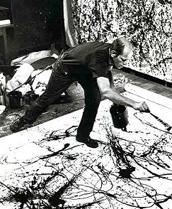
He is an artist that I followed on Instagram. I love how he works with simple illustration and clever layering to bring his imaginative paper figures to life. His work is full of interesting characters with endearing human qualities.

He works with different kind of mediums but it’s his charming paper-crafts that attract my attention. The small details and subtle expression create his distinctive style of illustration, whilst well-executed interweaving of paper layers creates an almost animated quality to his charming characters.


2. Sarah Ameeyo

Another artist that I follow, she creates an illustration brand that delivers heartwarming animal character illustrations. She uses mainly use watercolour in all her works. Her work is really unique because she uses cute animals to represent humans. I felt that her works bring warmth and the colours she use is very comforting.


3. DKNG by Dan Kuhlken and Nathan Goldman

I came across this online store, they uses digital for all their works. I really like their flat illustrations and the choice of colours. I like how they uses different shades to show the light and dark in the work and also how they make the subject stand out from the background.


4. TheInkyDeer

She made use of watercolour and pens in her drawings. The properties of these mediums compliment each other nicely. The softness of the watercolor contrasts the hard lines that can be produced by pen ink. The two mediums are truly a match made in heaven.


Colour Research

Robert Plutchik’s wheel of emotions

Robert Plutchik’s emotion wheel helps us look at literacy through a broader lens. So enhancing emotional literacy means not only having words for emotions, but understanding how different emotions are related to one another and how the tend to change over time. He created a wheel of emotions to portray how he see each colours.

1. Monochromatic 

Monochromatic colour schemes are derived from a single base hue and extended using its shades, tones and tints. Tints are achieved by adding white and shades and tones are achieved by adding a darker color, grey or black. However, they can be boring due to their lack of contrast. But they are also peaceful and harmonious to the eye.

2. Analogus

Analogous colours appear side-by-side on the color wheel. This type of colour palette creates unity since the colours are similar to each other. It can create a warm or cool feeling depending on the colours used. Since they are next to each other on the wheel they lack contrast which decreases visibility and vibrancy. They are harmonious and easy on the eye.

3. Complementary

Complementary colours have opposite hues. When mixed together equally they create a neutral colour (gray, black or white). They are best used for creating contrast which adds vibrancy, energy and visibility to a design. Too much can be overwhelming and high-contrasting colours should not be used in large quantities of text.

4. Traidic

Triadic colours use three colours evenly spaced around the colour wheel. Like complementary colours, they are vibrant and can be overwhelming if not subdued. Use one colour dominantly and the other two as accents.

Forrest Gump-Final

These are my final compositions! 

Key words: King and World

My interpretation: I emphasis on technologies, mainly mobile phone that is taking over our world. It has become a very important devices in our daily lifes. Since the main subject is the phone, the phone takes up most spaces in the composition and world takes up the least space. I duplicate a a few other phones to show that it is taking over the world. The use of phone call symbol acts as technology spreading out from the world.

Principle of Design: Repetition and Negative spaces

Key words: Human, World and Mess

My interpretation: What I want to show is the ‘Mess’ taking over the human world. Like they are controlling the humans. I chose to use octopus to represent the mess in this layout. I duplicate the design and I wanted the centre octopus to be the main subject, therefore I enlarge the size of it. I made use of the positive spaces as my background so that the main subject will stand out. I rotated the image 180 degree because I want to show the mess. When we first see this layout, our eyes will not visualise the octopus as an octopus because it was rotated. But after our brain processes then we will see it as an octopus.

Principle of Design: Symmetry, Contrast, Visual hierarchy

Key words: Tea and Time

My interpretation: I use teapot, tea and clock for my composition. Therefore I use several clocks and teapot from different directions to show no matter when and where there would be tea.

Principle of Design: Repetition and Golden Ratio

Key words: Reflection, Inside

My interpretation: I want to show the inner self of Mulan, being a girl but disgust herself as a man. From the quote, it seems like she wants to reveal her real identity yet she cannot. I use heart and eyes to represent her inner self. Roses were also used to represent her as a female. With a closer look, you could see a rose reflected in her eyes. The wire burb acts as a barrier that refrain her revealing her inner self.

The emotions that I get from the quote is sadness and pain. Therefore I added splash of blood at the background to add some texture to convey that emotion.

Principle of Design: Asymmetry, Contrast, Texture

Reflection

I felt that creating the layouts were the most challenging part of the assignment. I have trouble interpreting the key words, my layout and ideas are always too literal. However, I felt that the last few compositions, I started to be more imaginative and think out of the box.

I explore and tried out the different principle of design in the layouts. I tried creating a symmetry, asymmetry and positive and negative background for my designs. As I want to explore different design principle and see which suits the best for each design.

I learnt photoshop when I was in poly, however I though 1 gap year and I forgot some of the skills. This project helps to refresh those skills and allows me to apply the design principle. For my future assignments, I hope to be more creative and see things from different perspectives.

Overall, it is a good learning experience!

Forrest Gump- Process

I documented my design process and silkscreen process.

My final compositons will be documented in another post!

Compositions

1. I am the king of the World - Titanic

The keywords that I extracted out is King and World.


For the first 2 compositions. I was being too literally the word king and world keep getting stuck in my head.

Then I came across this image. The mother is using her phone and the baby is placed on the floor. I thought it is ridiculous as technology is taking over the world.

Then  thought about it and I felt that it is true that technology is taking over our lives. Everyone owns a phone. In the past, people communicate by sending letters or talking face to face. But in the current society, we no longer need to do that.

Even for myself, I feel weird not bringing my phone out when me. Therefore, for my third and final layout I want to show technology, mainly phones taking over the world.

This is the composition I worked on before my final.I use hand, phone, world and the dialling symbol. Since the technology is taking over the world, the main subject is the phone, hence it is the biggest and the world is the smallest.


2. The human world is a mess - Little Mermaid


The keywords that I extracted out is human, world and mess.

I use octopus to represent the mess. Like the human world is being taken over by animals. I want the focus to be on the octopus. After doing my first composition, I felt the design do not have a main subject. Everything seems too overpowering. Therefore, I tried to enlarge the size of the octopus and reduce the size of the human world. However, I still feel that the design is a bit too messy.

For my the third layout, I tried to duplicate the subjects. And I create a focus by enlarging the centre octopus. Showing octopus taking over the human world. I like this layout, but I felt that it do not show the mess as there are too much negative space.


3. It's always tea time - Alice in the Wonderland

The keywords that I extracted out is tea and time.

This is one of the quotes that I struggled with. I felt that my design is too literal and simple.

I use teapot and clock to represent the 2 keywords. I felt that there is too much postive spaces. What I could do, is try to duplicate the subjects and add in more textures.


4. When will my reflection show who I am inside - Mulan


The keywords that I extracted out is reflection and inside.


This is my favourite quote. Mulan is a girl but she have to disgust herself as a man. When I thought of the I thought of using roses to represent female. For my first layout, I place the rose outside of the heart and I felt that it does not show the inner self.

Therefore my second composition, I tried placing the roses in the heart it self and I use wire burb to warp around the heart. It is to show the inner self begin trap and she could not reveal her real identity as a female. And the rose in her eyes shows how much she wish to reveal her identity.

I really like this layout, but I feel that the design was too symmetrical and that I could as some texture and emotion to the background.

Silkscreen

I am very excited because the last time I did it was in poly. And I really enjoy it. However, what we did back then was slightly different.

After I have finalised with my final composition. The fun begins!

First, we had to print our design on 2 pieces of transparency. We each collected a silkscreen frame and a tote bag.

Then, we had to wash the frame to remove dusts. Next we have to coat our silkscreen with blue emulsion and put in the dryer until it drys.

Then we had to wash to off the unexposed part, I was so disappointed as my design got wash off and I had to redo another screen. I thought my design had many details and 18secs of exposing it not enough, so for my next screen I exposed it for 20secs. This time round everything got washed off. I was really worried as most of my classmates already had there screen exposed and I do not have time to redo another screen that day. I had to wait for the next week 🙁

I know I was behind time and I am also worried if the design got washed off again, I had to redo.  So the next lesson, I came to class prepared and I quickly went to coat the screen with emulsion.

After many tries, I finally got what I wanted. I am glad the details did not got washed off.

This is what my screen looks like after washing off the unexposed parts.

Now we move on the even scarier part, the test prints. I am very afraid the details will not be seen.

For my first trial, I applied too much ink and pressure. By the third print, I got the hang of it. Im glad it turned out better than what I expected.

And now I am ready to print on my tote bag!

The prints came out slightly lighter than on paper. I think it is because the bag absorbs more ink. However it still turn out good!

Yeah! It was a success! Thank you to my lovely classmates that helped my out in the silkscreen! 😀

I showed my family the tote bag and my sister wanted one too. So then the next lesson, I bought a extra tote bag and I printed it for her the next lesson. I felt that this tote bag turn out better and the ink was dark. However, the proportion is bit off as the bag is too big and the design seems smaller.


Time to say goodbye to my screen!

Forrest Gump-Research

When we first receive this assignment, I was excited. Since young, I enjoy watching movie. I am a big fan of disney movies.

First, I research on different movie that I like and I select quotes from those movies. I had a hard time choosing the movies quotes, as I cannot decide which to pick. At last, I managed to reduce it to 6 movie quotes.

Titanic

“Im the king of the world”

Beauty and the Beast

 “Beauty is found within”

Alice in the wonderland

“It’s always tea time”

Mulan

“When will my reflection show who I am inside”

Finding Nemo

“Fish are friends, not food”

Little Mermaid

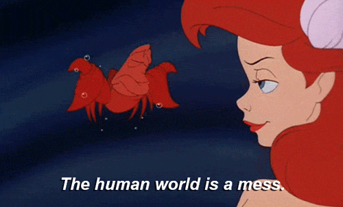
“The human world is a mess”

Next i research on artist’s works to give me inspiration, mainly Surrealism and Dadaism.

Dadaism:

Dadais, was an artistic and literary movement that arose a reaction to World World I and the nationalism that many thought had led to the war. Dadaists believed was an oppressive intellectual rigidity in both art and everyday society; its works were characterized by a deliberate irrationality and the rejection of the prevailing standards of art. It influenced later movements including Surrealism.

Hannah Hoch

Hannah Hoch was a German Dada artist. She is best known for her work of the Weimar period, when she was one of the originators of photomontage. She replaces facial feature and she exaggerates it. Which makes it more interesting and audience will spend more time looking at it.

Surrealism:

Surrealism is a cultural movement and artistic style that was founded in 1924 by Andre Breton. Surrealism style uses visual imagery from the subconscious mind to create art without the intention of logical comprehensibility.

Surrealism works feature the element of surprise, unexpected juxtapositions and non sequitur. I feel that surrealism is very interesting as it involves many things that I wouldn’t thought you could combine them together to form a surreal picture.

Andre Breton

I really love the unnerving effort of Surrealism. The dreamlike/ surprise works is a very powerful too to attract people’s attention and I think is very important in design.

For example, unlike the traditional way of work, that shows human eating food. The artwork shows a headless lady eating her on head. It makes me very curious and wonder why she will do that.

Dan Hillier

One artist that I really like is Dan Hillier. He has an unique style, combining Victorian sensibilities with a fascination for animal attributes. I like how his work is characterized by depictions of fantastical human/animal hybrids, spliced together with late-1800s imagery. Most of his works are symmetrical, however he is still able to create interesting and unique style.

I also like how Dan Hillter uses the positive and negative space to create focus on the subject. By using the white spaces, it helps to draw attention to the main subject.

Vania Zouravliov

Vania Zouravlio was inspired from an early age by influences as diverse. His elaborate illustrations are a mix of innocence, brutality, beauty and decadence, mixed with the colors and styles of communism in Eastern Europe.

Vania Zouravlio uses black and white in all his work. He uses the white spaces to draw attention to the subject.

Vincent Van Gogh

Another artist that I research on was Vincent Van Gogh, he uses swirls at the background to create texture and bring life to the work. By adding these textures, is really help to add more emotions and feelings to the work.

2D Project- My Line is Emo

FINAL WORK FOR PROJECT 1- LINES

For each emotion, I think of times when I am feeling that way. And I tried to relate and express my emotions into the work.

Love (Material Used : Cotton Wool)

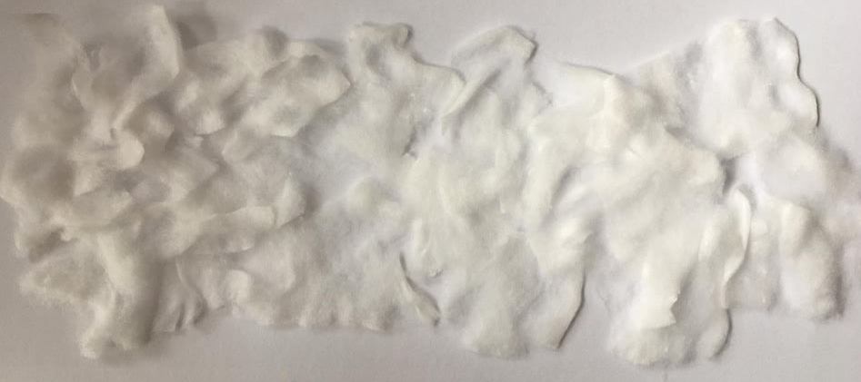
First emotion is love. Love is a feeling of strong and constant affection for a person. I define love as a soft and never ending. Reason why I use cotton pad is because it has a soft and fluffy texture. It has no hard edges.

The black reflects his imperfections in other peoples eyes. While the white reflects on how perfect he is in my eyes; how flawless and wonderful he is. Love has its ups and down but ultimately, it will go back the same. I work beyond the boundary as love has no ending, there is a start, but there will no have a end.

Eagerness (Material Used : Soap, Chinese Ink and Straw)

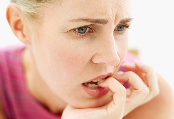
The next emotion is eagerness. I remember the first time I watched a soccer match. The eager and tensed feelings. The eager emotion just build up as the time goes by. Every time the player gets closer to the goalpost, my heart just beats fast. And whenever they miss the goal, my heart just burst.

The bursting bubbles represent the emotions I’m feeling during the match.

Surprise (Material Used : Straw and Chinese Ink)

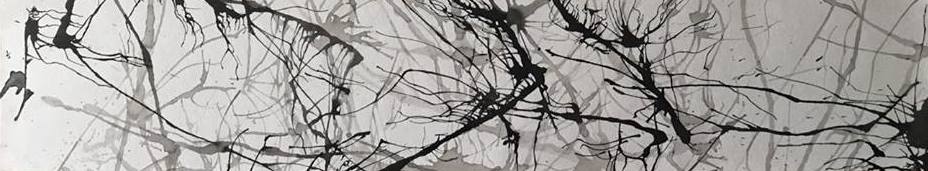
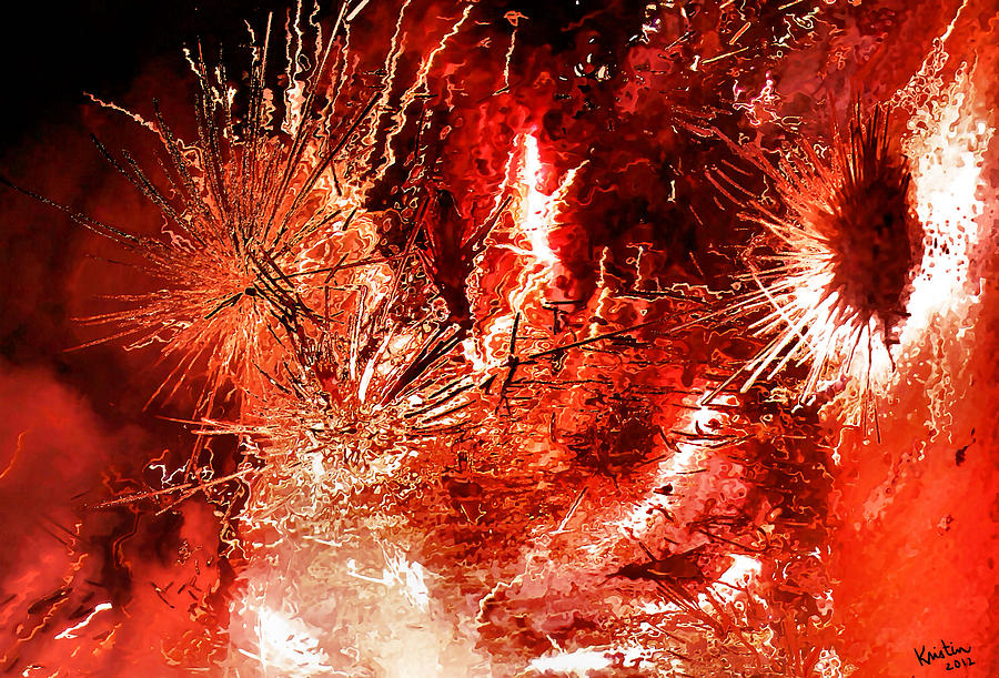
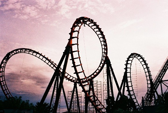
Surprise is something that happen very sudden, be it good or bad surprise.  The emotions cannot be controlled. During my 21st birthday last year,  my family held a surprise birthday party for me. When I first stepped into the house, I was shocked that my relatives are all here to celebrate with me. Throughout the whole party, there are many little surprises, such as birthday wishes and gifts. And halfway through the party, I heard a group of people singing the birthday song, I turned and to my surprise, my group of secondary school classmates came. I was really  surprise and happy.

The lines here represents the surprise I get. From small surprise to big surprises.

Anger (Material Used : Ink and Marker)

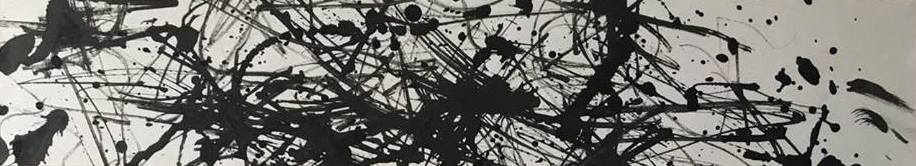
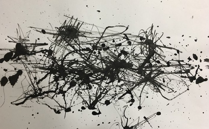
Feeling angry made me use hard pressure on the paper.  I held my marker in my fist to create more harsh lines. I also created some concentrated patches to represent the outburst of anger.


Hurt (Paper)

Forgiving some one is easy, but there will always be a scar left behind. I translate this emotion into my work. If you look perfectly straight, you can barely see the black areas but after a closer look, you could see the ‘scars’ that are left behind.

Fear (Material Used : Brush and Chinese Ink)

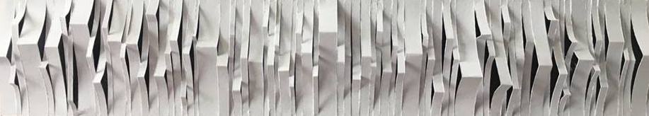
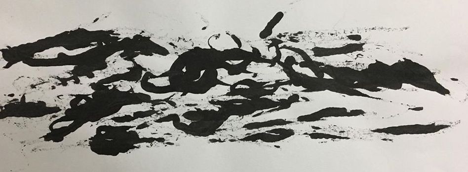
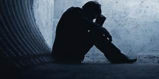
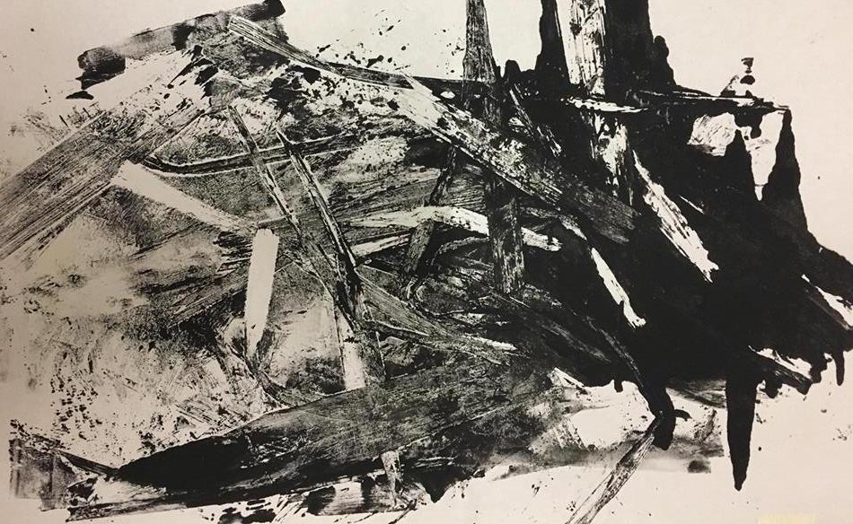
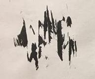
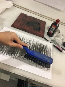
Fear is an unpleasant emotion when you feel like you are in danger. I used chinese ink and the hard bristles of a brush. I dilute some part of the work with water, so that when it smudges it create a very soft and helpless feeling.


What I learn from this project, is not be afraid to ask for help. When you are lost, go on google or pinterest or even ask friends for help. I am sure they will give their honest opinions. Next, is try and experiment, the more you try out, we get more ideas and a better understanding of what we are supposed to do. Do not be afraid to step out of your comfort zone.

I started out being lost, but i managed to complete this project successful!

Mark Making (Experiment)

Second week of class, I experiment with the different techniques for mark making. Since we are free to bring/do whatever we want to create to express emotions.

Part 1 :

Here are some of the items I brought to class.

The first lesson of mark making, I do not really understand how line creates emotions. So I thought to myself, its ok, I’ll just do and see how thing goes along the way.

However, I am surprise things turn out pretty well.

Strings

The first tool I tried! I tear the strings into many smaller parts. After i apply a layer of ink over, I used the pressed machine and roll it over.

TADA! The end result!

The harsh and uncontrollable strokes reminds me of anger. I like the contrast in colours. It makes the work look more interesting.

I borrowed a thin string from my classmates. I dipped the string into ink and drag it in a up and down motion it begin to create some really fine lines on paper. I  am amazed by how it is able to create thin and thick lines and the same time. It kind of express anxiety or nervousness.

Bottle Caps

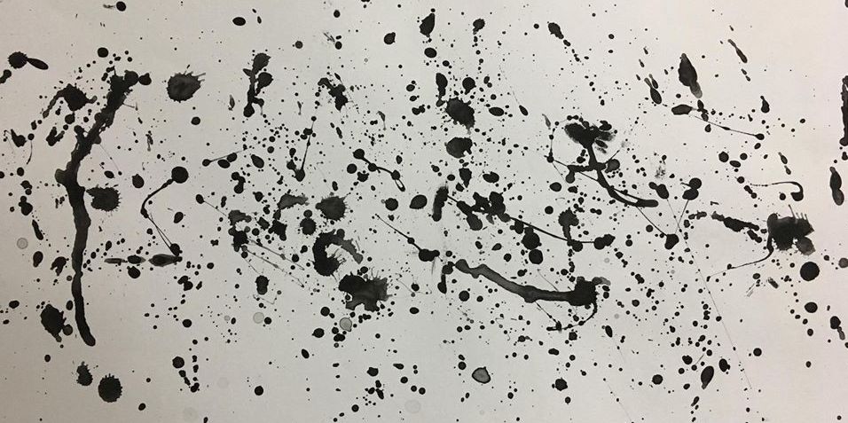
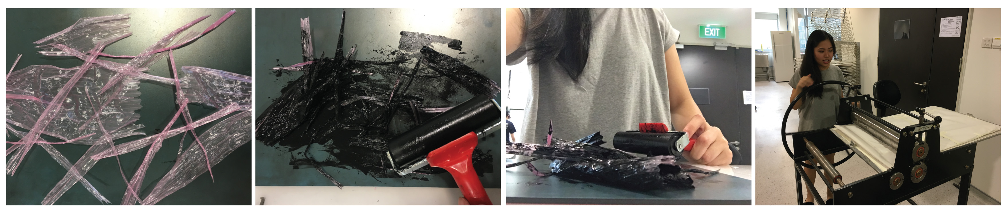
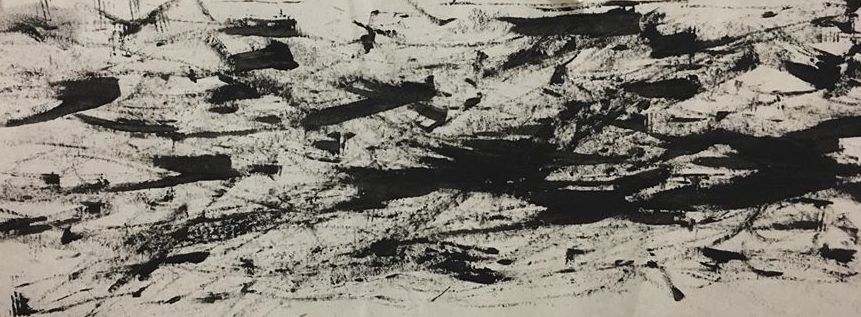
Made use of the side of a bottle cap to create the harsh strokes. It reminds me of anger too. The strokes are of different directions, which shows anger.

Next is the Leaves

There is a story behind how I got the leaves. Went to my aunt’s house for family gathering, their neighbours called the LTA to summon 3 of our cars. Thats a total of $210. So I went to pluck some leaves from the neighbours. I was lucky i wasn’t caught!

I dabbed the leaves into chinese ink and i pat in on the paper. I like how it creates the fine and thick lines on paper.

Cotton Pads

Wanted to show love in this print. I thought cotton pad would create a very soft effect. I pulled the cotton pads, to make it even more fragile and soft. After that i apply chinese ink on certain parts of the cotton pads and placed a another piece of paper over.

The end result! Seems like a very complicated love.

Bobby Pins

Used a bobby pin to create this effect. I thought it expressed fear/nervousness. The lines are wavy, which somehow express the uncontrollable emotion.

Lino Cut

I tried out lino cut. I craving out areas that i want it be in white. After that I apply a layer or paint over, and i placed it under the pressed machine. I like how I am able to archieve harsh and more define strokes.

This is what I experimented for the lesson, we continue the remaining process below!

Part 2:

After the first mark making experience, I have a clearer understanding of what I am supposed to do/archieve. I went home to research and define how each emotions feel to me. And I also tried using different kinds of medium to express different emotions.

Cotton Wool 

I saw some cotton wool lying on my desk. And I thought I could use it as a material since it has a very soft and fluffy texture.

I tried tearing the cotton wool to smaller pieces and pasting them in random postions,

When I see the end result, it reminds me of cotton candy! I really like the soft and fluffy texture. I guess I can improve on it by adding more dimension to it.

Straws

Painting without a brush. The Blow painting!

First i dilute the chinese ink with water, then i drop one end of the straw into the paint. Next, I tap the straw on the paper, leaving deposits of paint on the paint.

Once I have some paint on the paper, I started blowing through the straws in different directions. I really like this effect. I create different shades of black, to show contrast. Although it is a technique that we all know since young, it still creates very interesting and fun work!

I thought this work convey thrill or surprise to me.

Charcoal

Charcoal has a unique look and texture when applied to paper. The use of charcoal helps to bring out the moody and dull effect without looking to harsh.

I am a very cheerful and happy person. My life is always filled with colours and joy. I thought this work represents depression, as it is the total opposite of me. Life being very dull and empty.

Markers

I used little pressure on the paper to create the flow and smooth lines. Using the same lineweight so that lines will not be to outstanding and more helps to create a more soothing look.


The end result! There is no start or end to the work. I use a single line to complete this work.

After trying soothing lines. I thought why not i try using more pressure to create harsh lines. Using a sharpie marker without much ink left and some chinese ink for this work. I used hard pressure on the paper.  I held my marker in my fist to create more harsh lines. I also created some concentrated patches. 

Glues

I wanted to create texture in my work. I added wood glue and dye together. Then i used a paint brush to create harsh strokes. After it dry, I applied UHU glue on certain area where i want more texture.

I like how grainy/ rough texture when it dries. It adds more emotion to the work.

Bubbles & Straws

I saw some works on Pinterest and i really the effect of mixing ink with soap to create bubbles. So i created one of my own!

First, I used dyes mixed with soap and i blew bubbles into the mixture, I stop when the bubbles reached the edge of the palette.  I gently place a piece of paper on top of the bubbles. As the bubbles pop, they will leave marks on the paper.

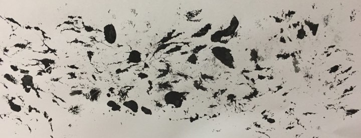
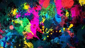
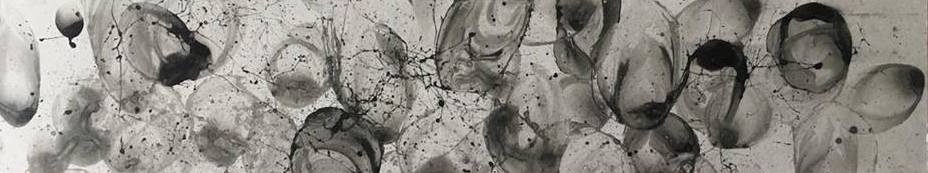
After the first experiment, I tried to improve it, by blowing the bubbles on the paper itself. For the previous experiment, I used dye. The colour came out not as vibrant as I like it to be. So for this work, I tried mixing chinese ink with soap and dilute it with water. I then blew the individual bubbles on the paper itself. As the bubble pop, it creates the bursting effect.

Brush

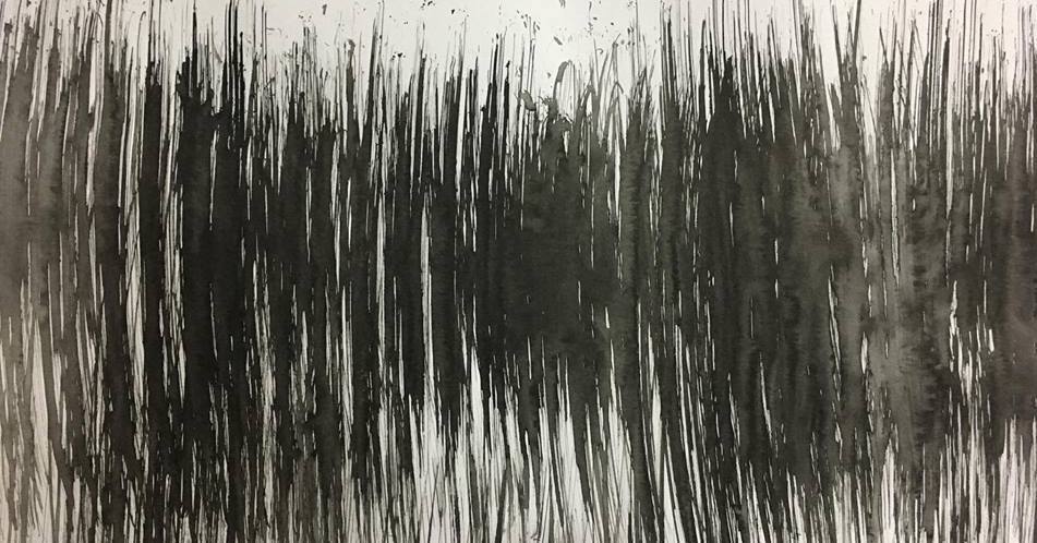
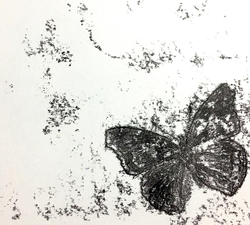
I found a brush in to classroom, I took it. First i wet the brush and dipped it into the chinese ink. Then using a little strength to brush it in a up and down motion. I like how the wet brush smudge some area of the work.


I did wash it, and placed it back at the original position!


Paint Brush

I used paint brush that is soaked in ink and i splashed the ink onto the paper. Is kind of express surprise to me. Surprise is something that happen very sudden, be it good or bad surprise. However, I think i overdo the splashing of paints, that there is too many splashes of paint, that it is not a surprise anymore. I think I could improve it by adding a bigger splash of paint, to make it stand out from the rest.

Small Hand Held Massager

I used a small hand held massager to create the uneasiness emotion. I applied ink on the piece of paper and i switch on the massager, it vibrates and create the uneven lines.

It reminds me of uneasiness, like how I feel uneasy whenever I am with a group of people that I am not closed to. I do not feel comfortable with them. Like I am stuck in a awkward position.


I am pleasantly surprised that some of the mark making techniques turn out really well. I guess I will be using some of these works as my final emotions.

Overall, it was a fun experience!

Mark Making

Mark Making is a term used to describe any form of texture, patterns and marks created on an art. It is not limited to paint on canvas or pen marks on papers, it applies to any form of art materials on all kinds of surfaces.

I research on the different techniques of mark making. Some examples are

  • Frottage Techniques
  • Vertical/Horizontal Lines
  • Dots
  • Hatching
  • Monoprint
  • Linoprint
http://www.lateliercanson.com/astuce-dessin-creer-des-effets-de-frottage


FROTTAGE TECHNIQUES

I believe everyone is familiar with this technique. When I was younger, my mother taught me this technique, where I place any uneven objects under a piece of paper and use a pencil to rub against it.


LINES AND DOTS 

Even simple lines is considered mark making. I created these marks using marker. A series of marks (lines and dots) could add emotions and expression to the work. The strength and fluidity of strokes used could add on to the emotion the work is trying to convey. 


MONOPRINT

Monoprints are created manually adding and removing  ink from a plate which is then printed using a printing press. Many effects can be achieved in monotypes that are not possible with any other technique.


 LINOPRINT

I created this linoprint by using an acetate sheet to carve out areas that will remain white. Being able to archive the lines and strokes you want.  Printing can be done by hand or with a printing press.


ARTIST RESEARCH

http://www.theartstory.org/artist-pollock-jackson.htm

One good example would be Jackson Pollock, an Action Painter. He avoid illustrating emotions literally or anything that is representational in his artworks.

There will be people that do not understand Jackson Pollock’s work and would make comments like “Anyone would can do better than this, even my three years old kid!” However, it is not as easy as what they think. The strokes and fluidity he created on the canvas convey his emotions very clearly.


https://www.jackson-pollock.org/autumn-rhythm.jsp#prettyPhoto

Jackson Pollock’s work, Autumn Rhythm (Number 30) is one of his biggest achievements. This painting consists of muted colours such as black, brown and white. Skeins of paint in certain parts of the painting. Lines that are straight, curved, lines of different thickness and directions, which produce the contrary visual rhythms and sensations.

As the title suggests, Autumn Rhythm is evocative of nature. Not only in its title but also in its colours and sense of ground and space.

After all the research, I started questioning the techniques and tools that i could used for my mark making project and how it would be able to connect with emotions.

The 6 emotions that I have picked out are

  • Anger
  • Thrill
  • Depression
  • Uneasiness
  • Eagerness
  • Surprise

I went on to define the meaning of each emotions that i picked out. I also wrote down how i feel about each emotions.


https://fineartamerica.com/featured/anger-kristin-elmquist.html

Anger ( being annoyed, displeasure, fury, air rage )

Anger reminds me of violence. Therefore using hard pressure on the material. And with patches of pressure to represent the frustration. Feelings that cannot be control.


http://gadling.com/wp-content/uploads/2010/04/top-thrill-rides-2010-roller-coaster.jpg

Thrill ( tremble, excite, tingle, rush )

Thrill reminds me of roller coaster. The nervous yet excited feelings I get whenever I’m on a roller coaster. The feelings cannot be control.


http://www.bkreader.com/wp-content/uploads/2015/10/depression.jpg

Depression ( unhappiness, low spirits, moody, hopelessness)

Black and dull colours to represent depression. More tone of black to express negative emotions.


http://healthdefine.com/wp-content/uploads/2011/08/anxious-woman.jpg

Uneasiness ( uncomfortable, awkward, unsure in manner)

Up and down, uneven lines to show uncomfort. Using of different line weights.


http://static.weltsport.net/picmon/7b/9vX_967sZ_l.jpg

Eagerness ( intense desire, impatient, interest )

Eagerness to me is like watching a soccer match. The building up of eager feeling while waiting for the player to score a goal.


https://wallpapercave.com/wp/dOnnA0v.jpg

Surprise ( Unexpected, pleasant, amaze)

Something very sudden and unexpected.