Second week of class, I experiment with the different techniques for mark making. Since we are free to bring/do whatever we want to create to express emotions.
Part 1 :

Here are some of the items I brought to class.
The first lesson of mark making, I do not really understand how line creates emotions. So I thought to myself, its ok, I’ll just do and see how thing goes along the way.
However, I am surprise things turn out pretty well.
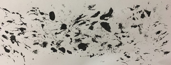
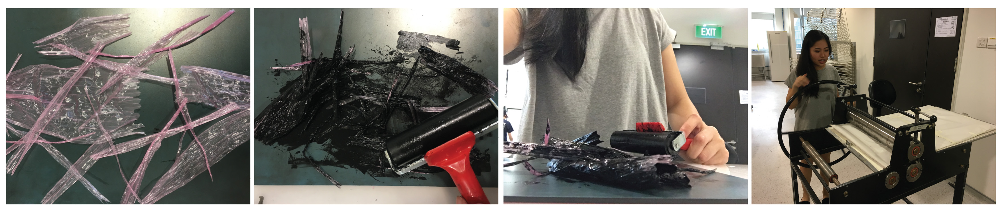
Strings
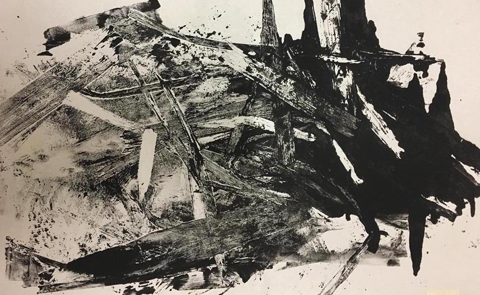

The first tool I tried! I tear the strings into many smaller parts. After i apply a layer of ink over, I used the pressed machine and roll it over.
TADA! The end result!
The harsh and uncontrollable strokes reminds me of anger. I like the contrast in colours. It makes the work look more interesting.
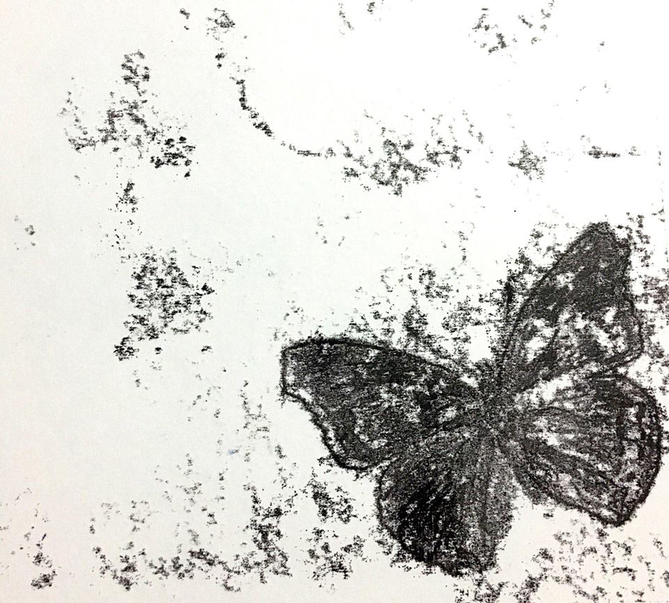
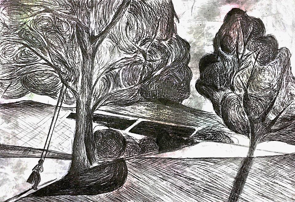
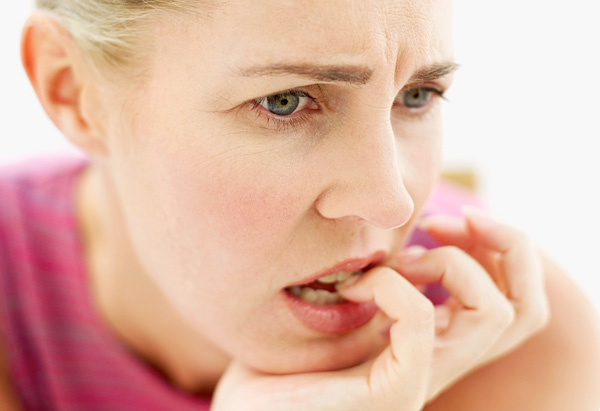
 I borrowed a thin string from my classmates. I dipped the string into ink and drag it in a up and down motion it begin to create some really fine lines on paper. I am amazed by how it is able to create thin and thick lines and the same time. It kind of express anxiety or nervousness.
Bottle Caps
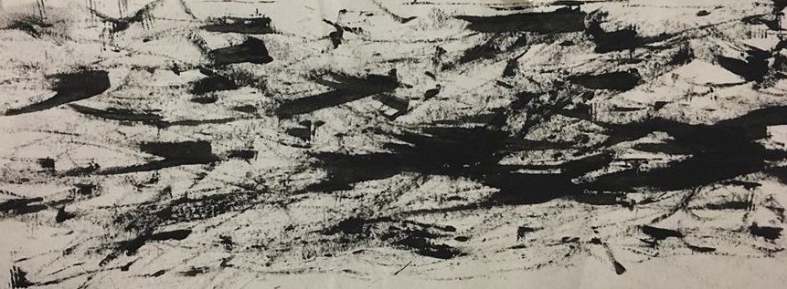
 Made use of the side of a bottle cap to create the harsh strokes. It reminds me of anger too. The strokes are of different directions, which shows anger.
Next is the Leaves
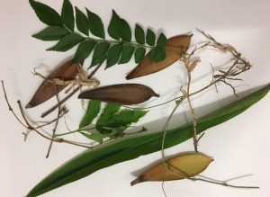 There is a story behind how I got the leaves. Went to my aunt’s house for family gathering, their neighbours called the LTA to summon 3 of our cars. Thats a total of $210. So I went to pluck some leaves from the neighbours. I was lucky i wasn’t caught!

I dabbed the leaves into chinese ink and i pat in on the paper. I like how it creates the fine and thick lines on paper.
Cotton Pads
Wanted to show love in this print. I thought cotton pad would create a very soft effect. I pulled the cotton pads, to make it even more fragile and soft. After that i apply chinese ink on certain parts of the cotton pads and placed a another piece of paper over.

 The end result! Seems like a very complicated love.
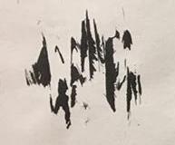
Bobby Pins

Used a bobby pin to create this effect. I thought it expressed fear/nervousness. The lines are wavy, which somehow express the uncontrollable emotion.
Lino Cut


I tried out lino cut. I craving out areas that i want it be in white. After that I apply a layer or paint over, and i placed it under the pressed machine. I like how I am able to archieve harsh and more define strokes.
This is what I experimented for the lesson, we continue the remaining process below!
Part 2:
After the first mark making experience, I have a clearer understanding of what I am supposed to do/archieve. I went home to research and define how each emotions feel to me. And I also tried using different kinds of medium to express different emotions.
Cotton Wool
I saw some cotton wool lying on my desk. And I thought I could use it as a material since it has a very soft and fluffy texture.
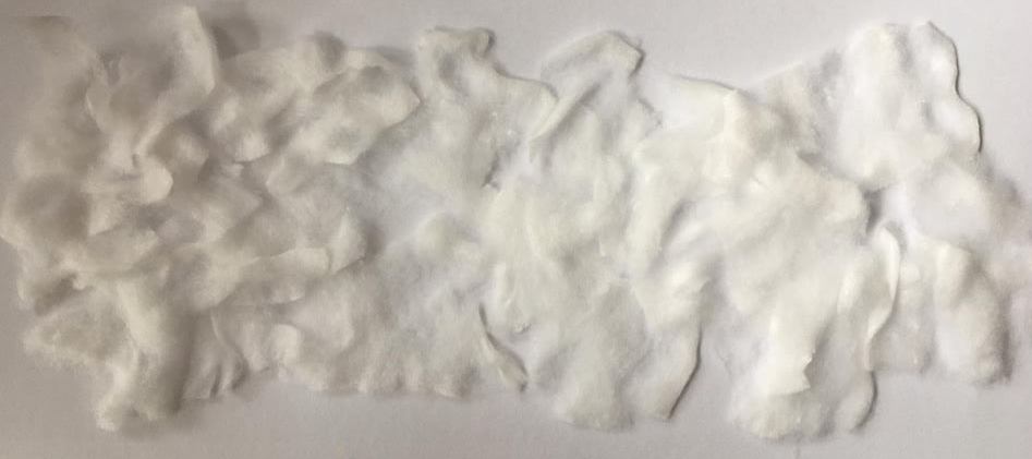
I tried tearing the cotton wool to smaller pieces and pasting them in random postions,
When I see the end result, it reminds me of cotton candy! I really like the soft and fluffy texture. I guess I can improve on it by adding more dimension to it.
Straws
Painting without a brush. The Blow painting!


First i dilute the chinese ink with water, then i drop one end of the straw into the paint. Next, I tap the straw on the paper, leaving deposits of paint on the paint.
Once I have some paint on the paper, I started blowing through the straws in different directions. I really like this effect. I create different shades of black, to show contrast. Although it is a technique that we all know since young, it still creates very interesting and fun work!
I thought this work convey thrill or surprise to me.
Charcoal
Charcoal has a unique look and texture when applied to paper. The use of charcoal helps to bring out the moody and dull effect without looking to harsh.

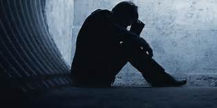
I am a very cheerful and happy person. My life is always filled with colours and joy. I thought this work represents depression, as it is the total opposite of me. Life being very dull and empty.
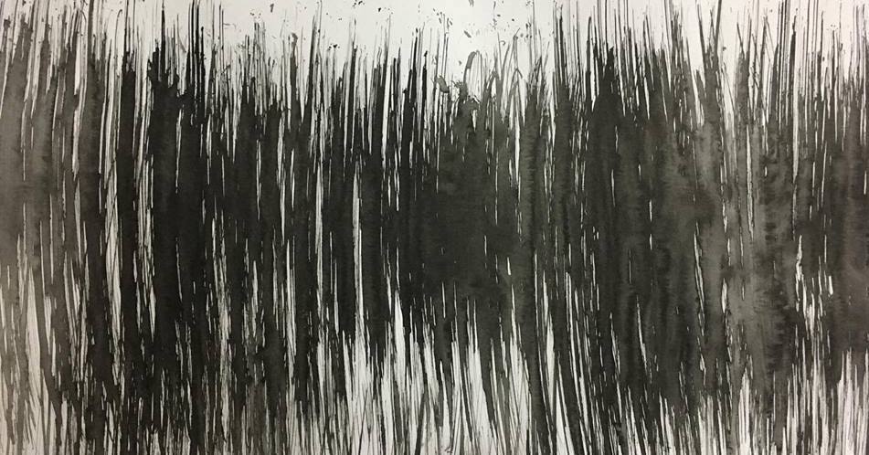
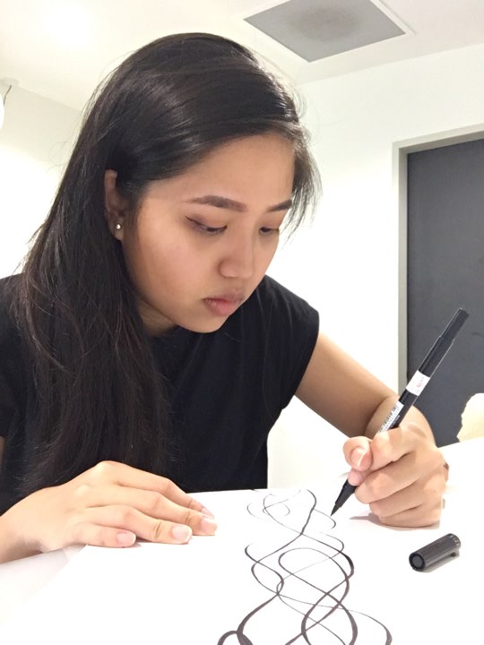
Markers
 I used little pressure on the paper to create the flow and smooth lines. Using the same lineweight so that lines will not be to outstanding and more helps to create a more soothing look.

The end result! There is no start or end to the work. I use a single line to complete this work.
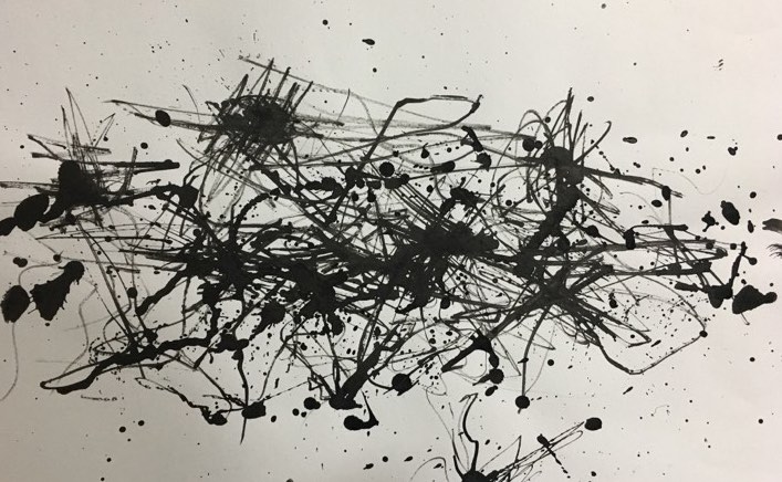
After trying soothing lines. I thought why not i try using more pressure to create harsh lines. Using a sharpie marker without much ink left and some chinese ink for this work. I used hard pressure on the paper. I held my marker in my fist to create more harsh lines. I also created some concentrated patches.
Glues


I wanted to create texture in my work. I added wood glue and dye together. Then i used a paint brush to create harsh strokes. After it dry, I applied UHU glue on certain area where i want more texture.
I like how grainy/ rough texture when it dries. It adds more emotion to the work.
Bubbles & Straws
I saw some works on Pinterest and i really the effect of mixing ink with soap to create bubbles. So i created one of my own!


First, I used dyes mixed with soap and i blew bubbles into the mixture, I stop when the bubbles reached the edge of the palette. I gently place a piece of paper on top of the bubbles. As the bubbles pop, they will leave marks on the paper.

 After the first experiment, I tried to improve it, by blowing the bubbles on the paper itself. For the previous experiment, I used dye. The colour came out not as vibrant as I like it to be. So for this work, I tried mixing chinese ink with soap and dilute it with water. I then blew the individual bubbles on the paper itself. As the bubble pop, it creates the bursting effect.
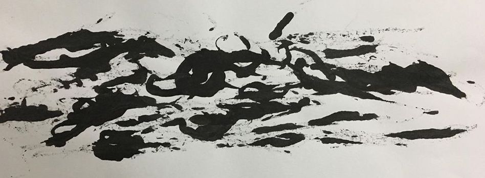
Brush
 I found a brush in to classroom, I took it. First i wet the brush and dipped it into the chinese ink. Then using a little strength to brush it in a up and down motion. I like how the wet brush smudge some area of the work.
I did wash it, and placed it back at the original position!
Paint Brush
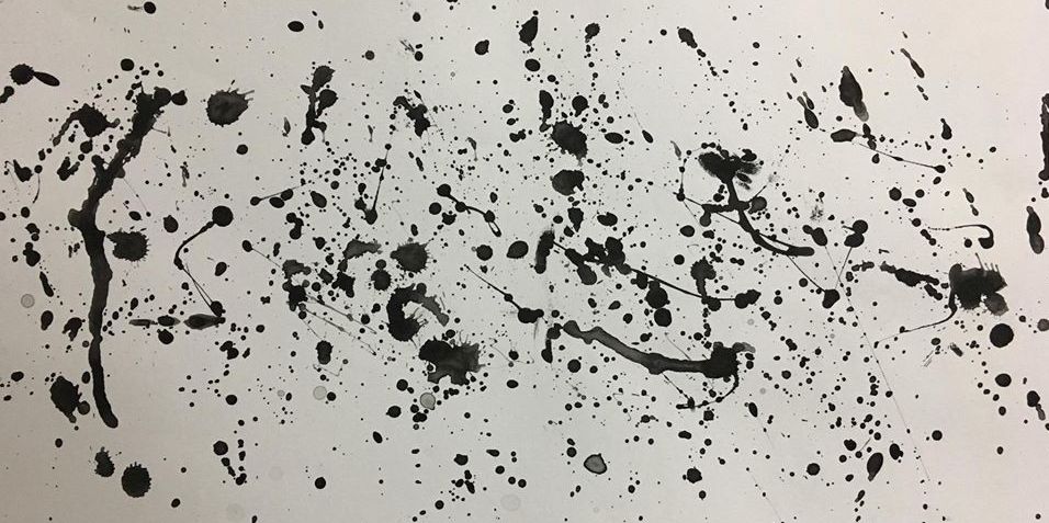

I used paint brush that is soaked in ink and i splashed the ink onto the paper. Is kind of express surprise to me. Surprise is something that happen very sudden, be it good or bad surprise. However, I think i overdo the splashing of paints, that there is too many splashes of paint, that it is not a surprise anymore. I think I could improve it by adding a bigger splash of paint, to make it stand out from the rest.
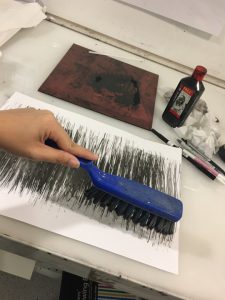
Small Hand Held Massager
I used a small hand held massager to create the uneasiness emotion. I applied ink on the piece of paper and i switch on the massager, it vibrates and create the uneven lines.

It reminds me of uneasiness, like how I feel uneasy whenever I am with a group of people that I am not closed to. I do not feel comfortable with them. Like I am stuck in a awkward position.
I am pleasantly surprised that some of the mark making techniques turn out really well. I guess I will be using some of these works as my final emotions.
Overall, it was a fun experience!


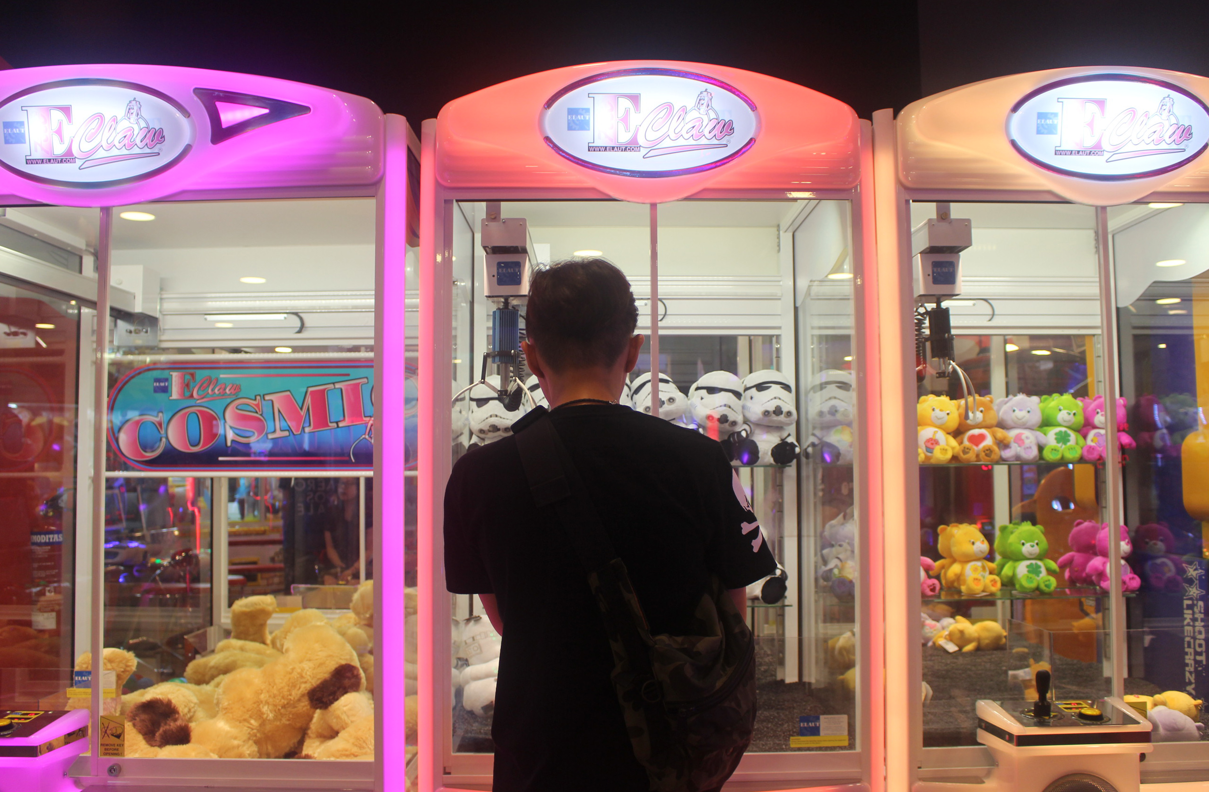
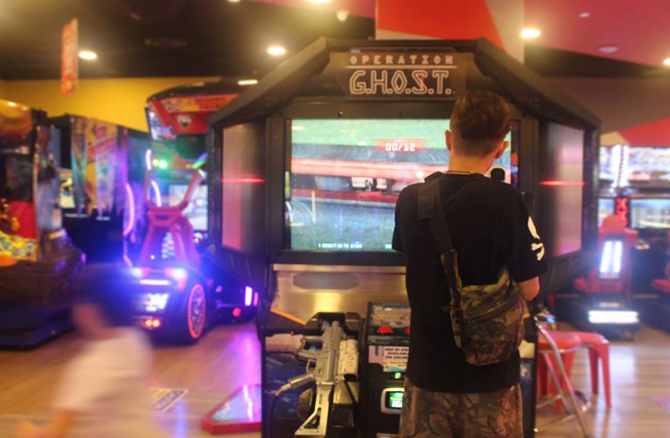
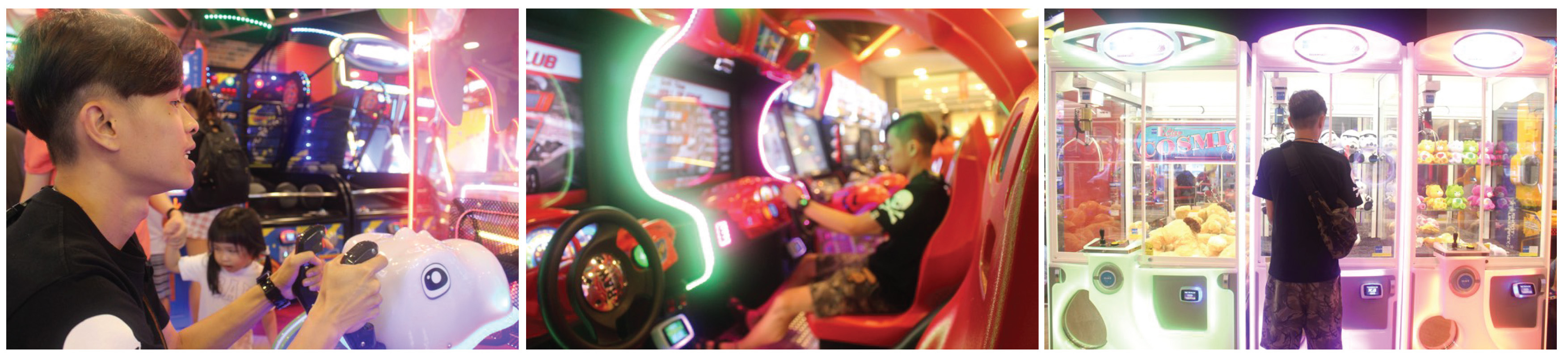
 Arcade is filled with colours and noises. In this panorama photo, I would like to show how people interact with each other in an arcade. And the liveliness of the place. It is a good place to bond with friends and family.
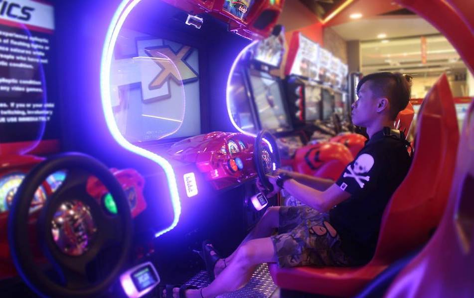


