What is Ikebana?
Ikebana is the Japanese art of flower arrangement. The name comes from the Japanese ike, meaning ‘alive’ or ‘arrange’ and bana meaning ‘flower.’
" Ikebana is not just about sticking a flower into a vase: It is about the love and need of the artist to create beautiful forms … Ikebana is not just about flowers, it is about the person who arranges them. "

Sofu Teshigahara, Founder of Sogetsu School

Ikebana is more than simply putting flowers in a container. Ikebana is an art, in the same sense that painting and sculpture are art. It has a recorded history; it is backed up by articulate theories; and it is concerned with creativity. In Japan, flower arrangements are used as decorations on a level with paintings and other art objects. It is a disciplined art form in which the arrangement is a living thing in which nature and humanity are brought together. It is steeped in the philosophy of developing closeness with nature.
As is true of all other arts, ikebana is creative expression within certain rules of construction.
Principles of Ikebana

Ikebana has become an artform that is associated with a meditative quality. Creating an arrangement is supposed to be done in silence to allow the designer to observe and meditate on the beauty of nature and gain inner peace. Ikebana is meant to be viewed in all angles, the importance of space, which is not meant to be filled, but created and preserved through the arrangements. Each view should shows a different ‘story’. This ties into other principles of Ikebana including minimalism, shape and line, form, humanity, aesthetics, and balance.
Different kinds of Ikebana
Heika

Heika is a basic style of ikebana arrangement that uses a tall vase and highlights vertical lines. The biggest feature is the emphasis on bringing out the flowers’ natural charms and arranging them in a tasteful and elegant manner.
Moribana

Moribana uses a shallow container and a kenzan, a holder with many sharp points into which flowers are inserted. The big feature of moribana is the broad expanse of natural-looking shapes and a mound of beautiful flowers.
Taste Food Research

Five tastebuds operate together to give us a full picture.
5. Umami Japanese for “delicious taste,” umami is produced by certain amino acids. It’s best described as “savory”—a taste rich in flavor released by cooking, curing or aging. Examples: Seared and Cured meats, Fish sauce, Green Tea, Soy Sauce
Other than these 5 different senses, food also needs to be presented in a way that is appetizing to the eye as well as to the palate.
So in fact, eating that piece of chocolate which sends a positive signal to your brain’s receptors and lets you know you’re enjoying it actually comes from a mixture of sight, touch, smell and the effect on your tastebuds.
The way we see food affect its taste!
Smell

Smell is important as it can affect our sense of taste. Researchers say 80 percent of the flavors we taste come from what we smell, which is why foods can become flavorless when you have a blocked nose.
If the smell is not appealing to us, we will not likely try it.
Smell is the only sense that affects the memory and emotion part of the brain. If we feel good when we buy a product then we are likely to continue buying it. However, if the smell is not appealing to you, you will not buy it again. This is also why many companies add fragrance to their products such as soap and washing powder. Smell has become increasing important to us and as a result the industry has responded to these demands.
Summer
We were ask to pick a season from the pandora box, the season I received was summer.
Summer is the hottest and most fun season. People often take advantage of the warmer temperatures by spending more time outdoors during the summer. Activities such as traveling to the beach and picnics occur during summer months.
Personally, I feel that summer is a fun season. summer. It is full of vibrant hues that can spark liveliness and bring energy to any space.
Season Mindmap

Summer Moodboard
This is the moodboard that I have done. Summer being colourful and vibrant. Since summer is the hottest season, icecream and desserts is a must have!
3D Analysis
We are allowed to be as creative as possible. However there are some key points that we have to that note of.
Models must consist of a cone, sphere and a cylinder. The Dominant(D), Subdominant(SD) and Subordinate(SO) should stay consistent on at least 4/6 views. We were to create a balance be is Dependent, Precarious, or Independent of directional forces in our compositions. And lastly no right angles are allowed in this assignment.
Model 1


- Dominant (D) RED
- Subdominant (SD) BLUE
- Subordinate (SO) YELLOW
- Things to improve on GREEN
All 3 elements could be seen on all views. However D, SD and SO is not consistent. D and SD have very similar length. While SO seems larger than SD too.
Model 2


All 3 elements could be seen from all angles and D, SD and SO stayed consistent on most angles. I also tried placing the cylinder on 1/3 of the cone.
What I can improve on?
 I can increase the diameter of the cylinder. So that the SD and SO would not be so similar in terms of the diameter. Next, the side view has a right angle. What I could do is to tilt the cone.
Model 3


All 3 elements could be seen from all sides. SD and SO are too similar. Everything is symmetrical fro the side view, which makes the composition looks boring. However, I do like the front view, it shows different degree of angles.
What I can improve on?

I could increase the size of SD and reduce the size of SO, so that SD and SO will be more obvious. I feeling that the composition do not look as interesting as compared to the front view.
Final Model


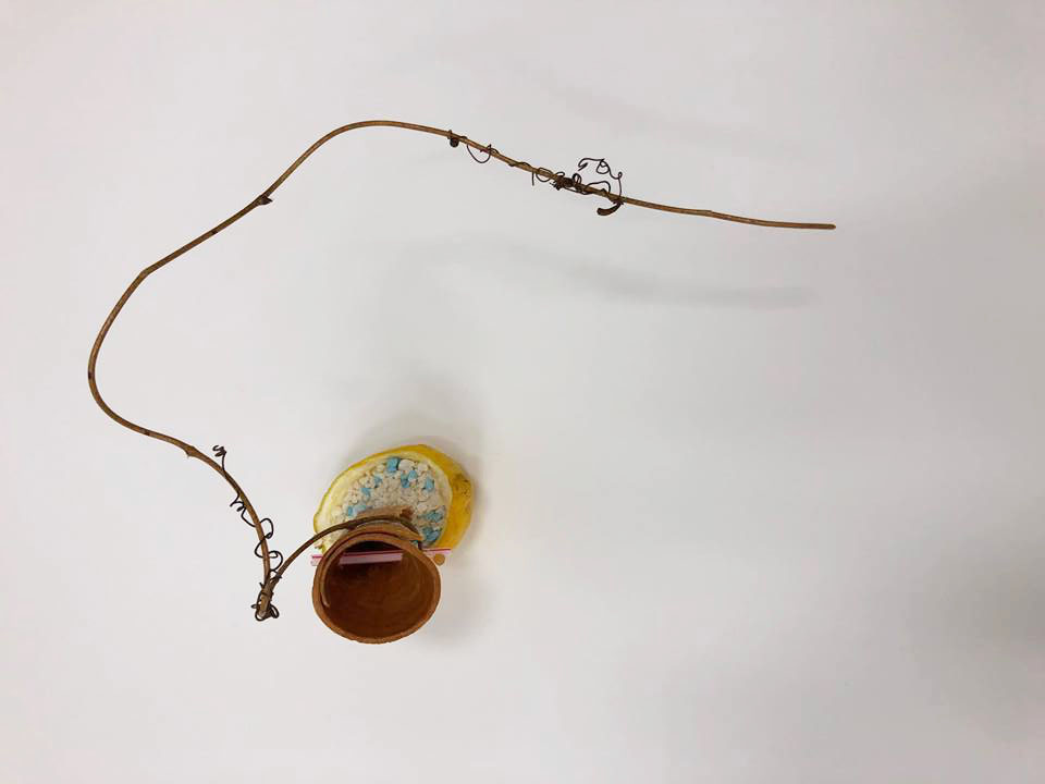
My theme was Summer. I wanted to create a more playful and youthful composition. I tried to swirl the branch around my cone, to create the liveness. Summer is also filled with colours and brightness. Therefore, I use colours to create a fun and joyful composition.
Summer is the hottest season of the year, desserts are the must have, therefore i used cold and refreshing desserts/ fruits to represent summer.
The dominant in my composition is the cone and branch. While the Sub dominant is the straw and blue pebbles to represent the sea, lastly bubble tea pearl is subordinate.
I also tired to play with the scent, I used lemon as it has a refreshing smell. Which represents summer.
Since ikebana is made to be able to be viewed in all angles, I tired to make all angles different and interesting. I made used of asymmetry and voids to create the composition. My favourite view is the front view. As the branch frames up the subject in the composition.


 “Im the king of the world”
 “It’s always tea time”
 “When will my reflection show who I am inside”
 “Fish are friends, not food”
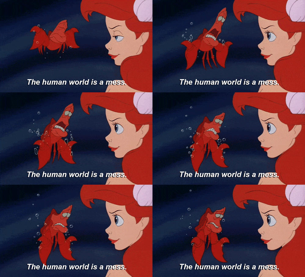 “The human world is a mess”


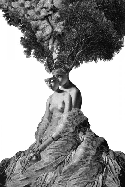


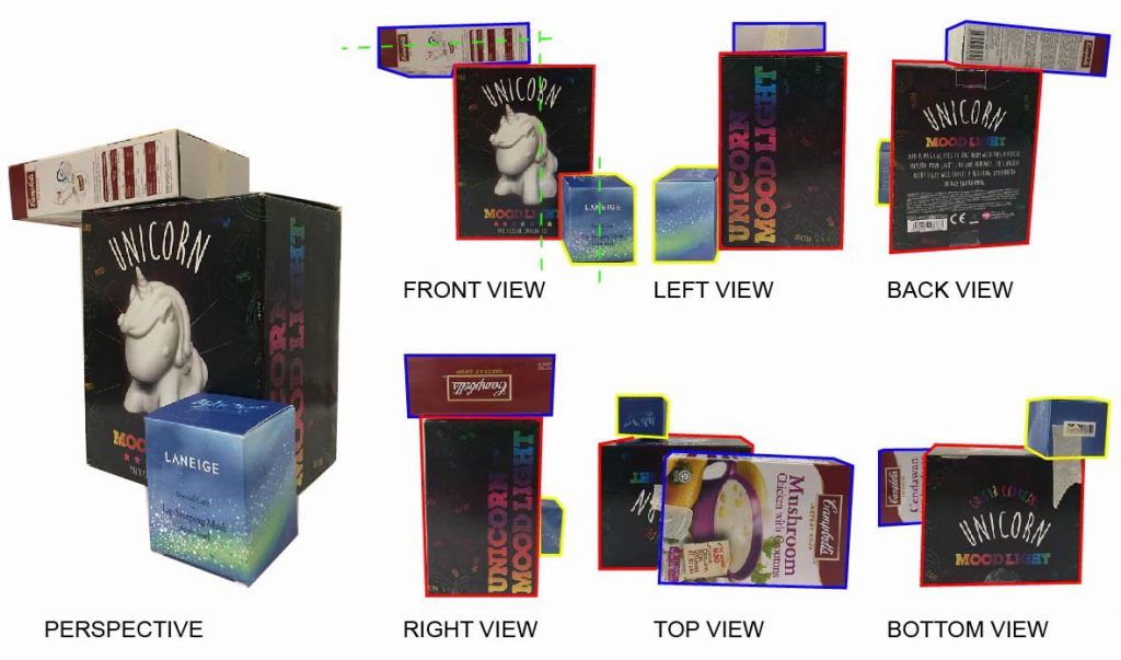


 First emotion is love. Love is a feeling of strong and constant affection for a person. I define love as a soft and never ending. Reason why I use cotton pad is because it has a soft and fluffy texture. It has no hard edges.
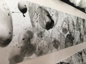 The next emotion is eagerness. I remember the first time I watched a soccer match. The eager and tensed feelings. The eager emotion just build up as the time goes by. Every time the player gets closer to the goalpost, my heart just beats fast. And whenever they miss the goal, my heart just burst.
 Surprise is something that happen very sudden, be it good or bad surprise. The emotions cannot be controlled. During my 21st birthday last year, my family held a surprise birthday party for me. When I first stepped into the house, I was shocked that my relatives are all here to celebrate with me. Throughout the whole party, there are many little surprises, such as birthday wishes and gifts. And halfway through the party, I heard a group of people singing the birthday song, I turned and to my surprise, my group of secondary school classmates came. I was really surprise and happy.
 Feeling angry made me use hard pressure on the paper. I held my marker in my fist to create more harsh lines. I also created some concentrated patches to represent the outburst of anger.


 Fear is an unpleasant emotion when you feel like you are in danger. I used chinese ink and the hard bristles of a brush. I dilute some part of the work with water, so that when it smudges it create a very soft and helpless feeling.