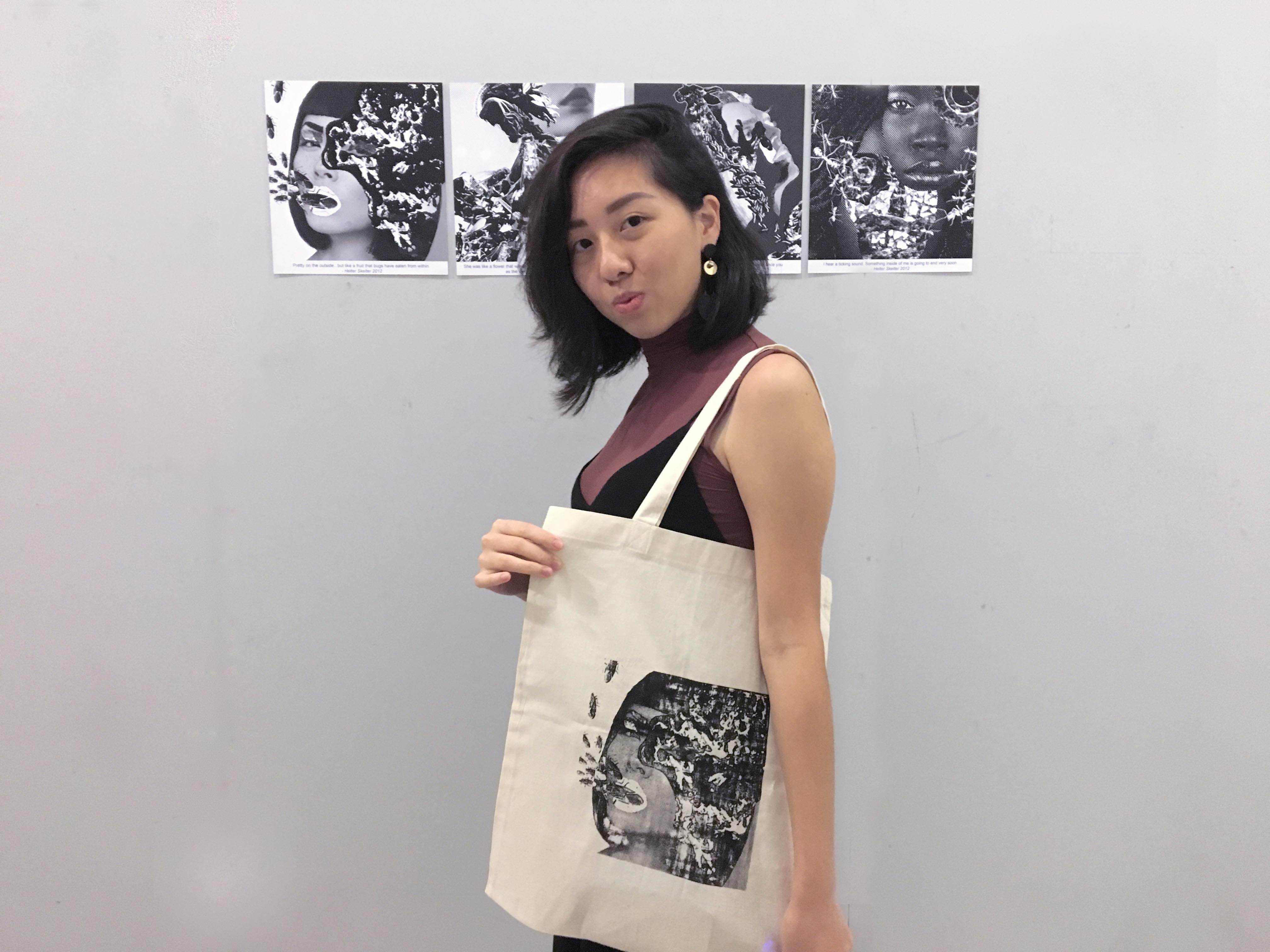
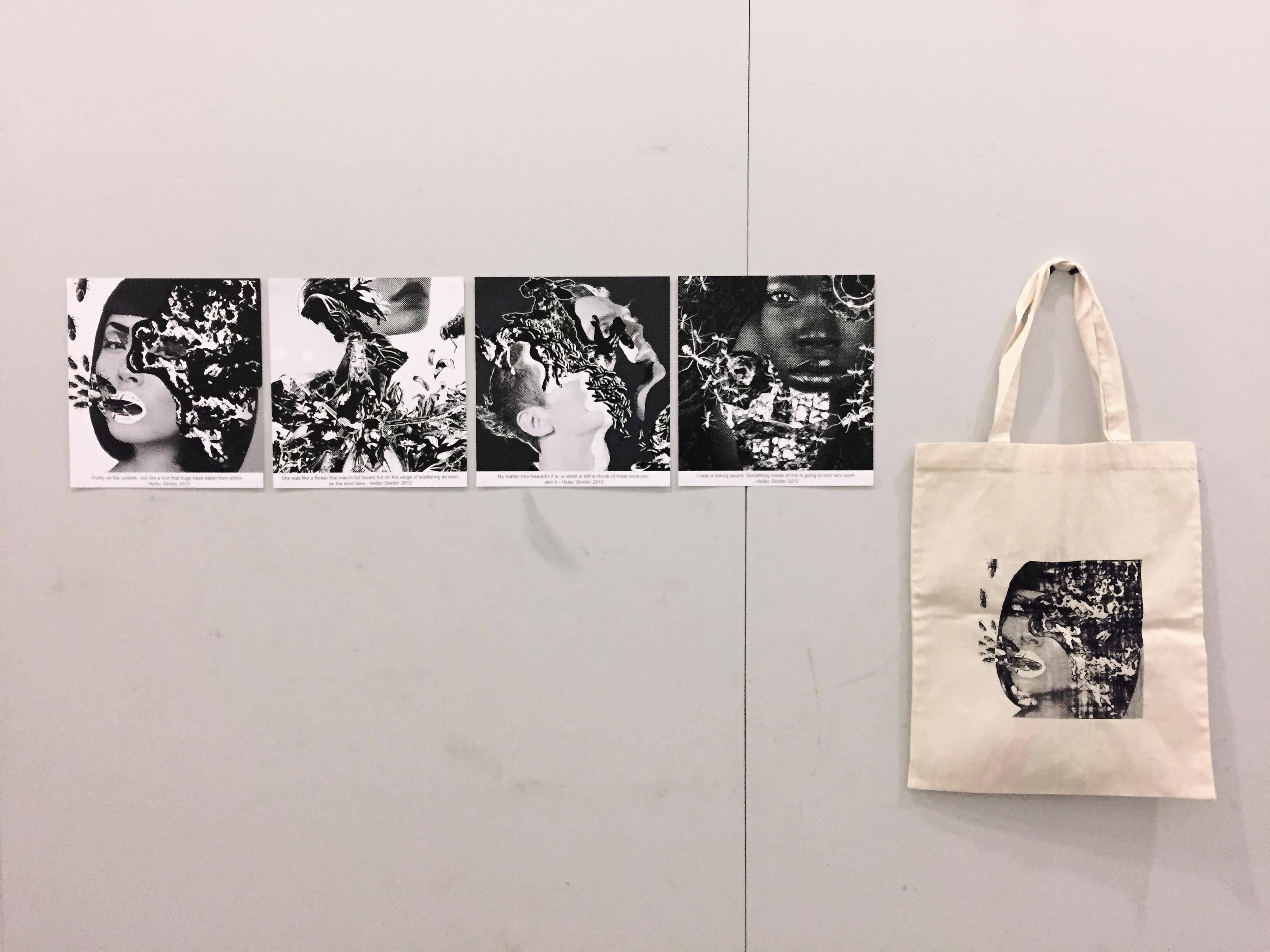
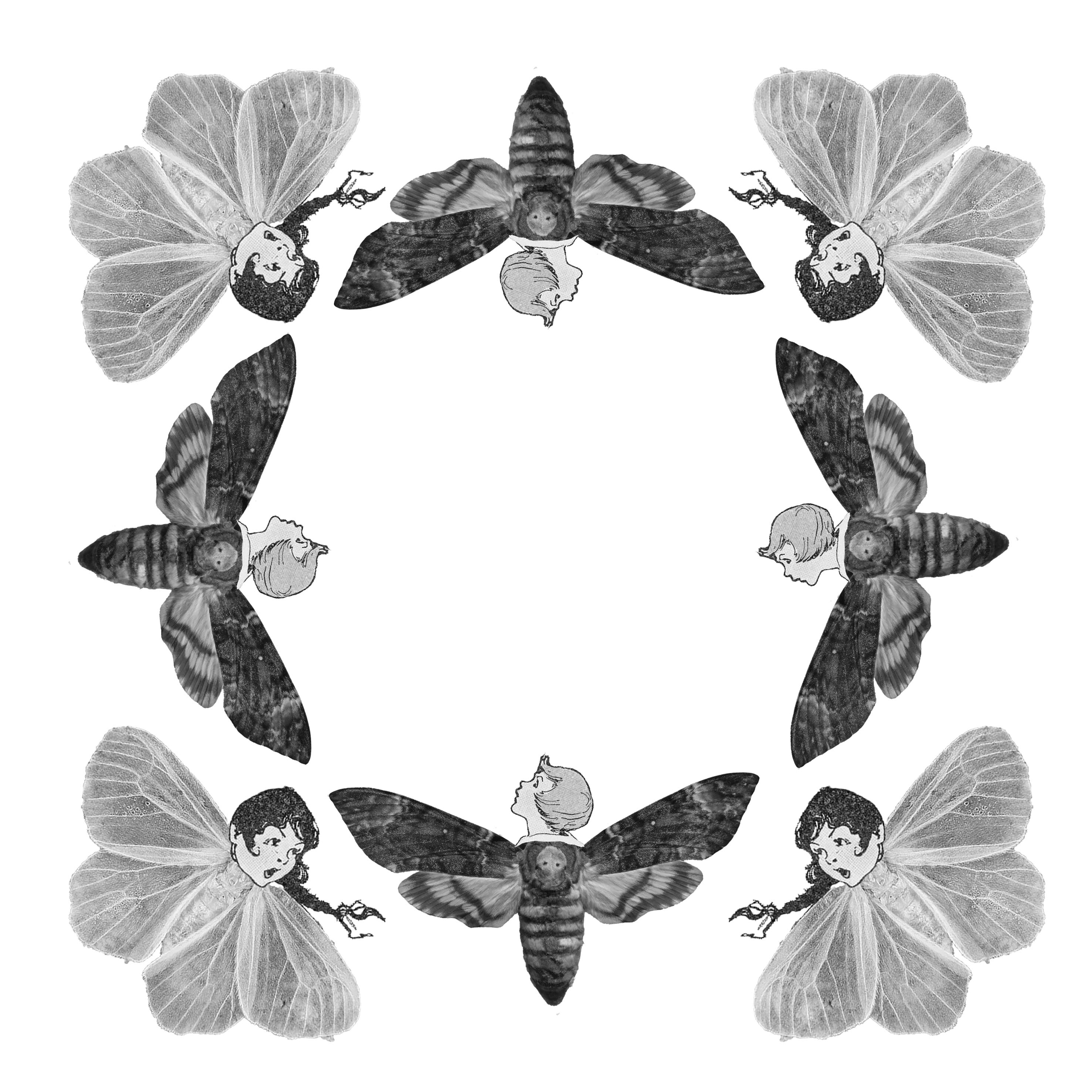
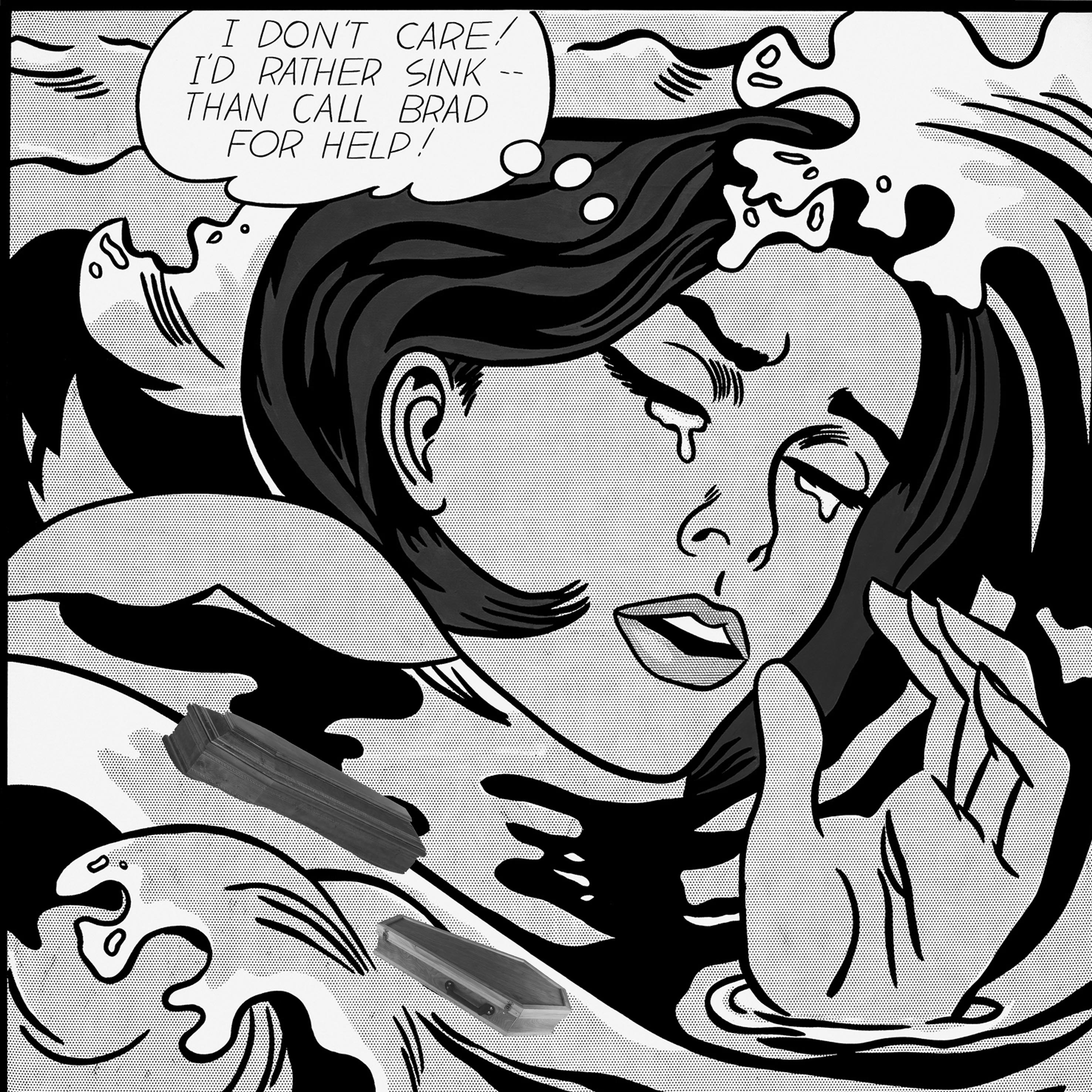
This is my final four compositions and the layout of the presentation. The main theme of this series of designs is beauty of the grotesque. I took all four quotes from the movie Helter Skelter, in which the director explored one’s extreme pursuit of beauty and the unfortunate consequences of doing so.
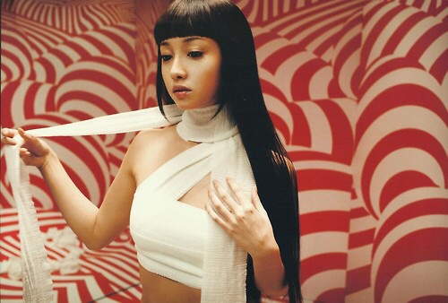
The method in which I carried out my compositions was in repeating motifs throughout the four compositions. The background of all compositions were that of fashion editorial portraits. This was because i felt the thing that best represented the notion of beauty was fashion. While I ensured that portraits of a variety of races and gender were chosen as I felt theme was a universal one, and I should not restrict my subjects to a particular demographic.
Furthermore, each of my composition has common motifs of decay and grotesque imagery in the form of bugs, all tailored to their relevant quote.
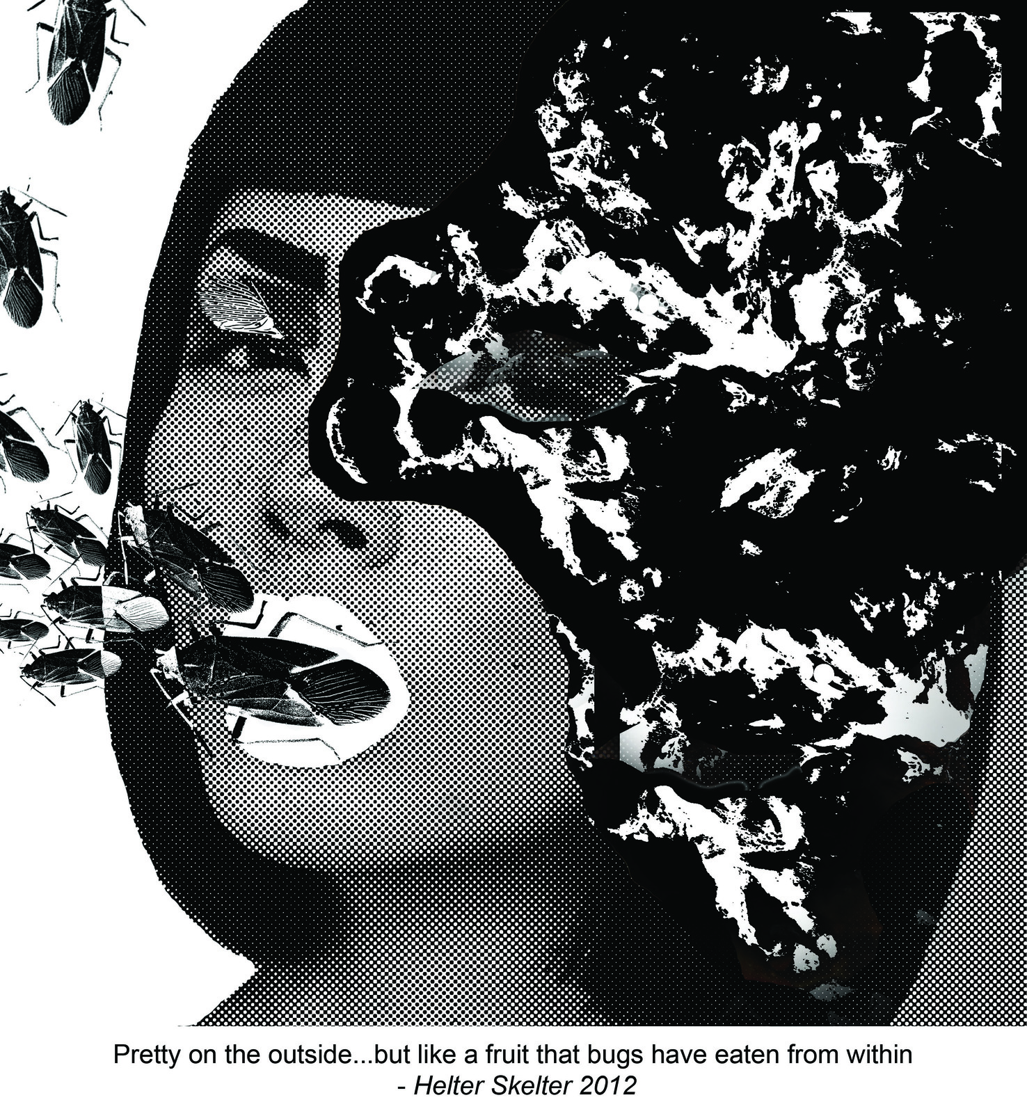
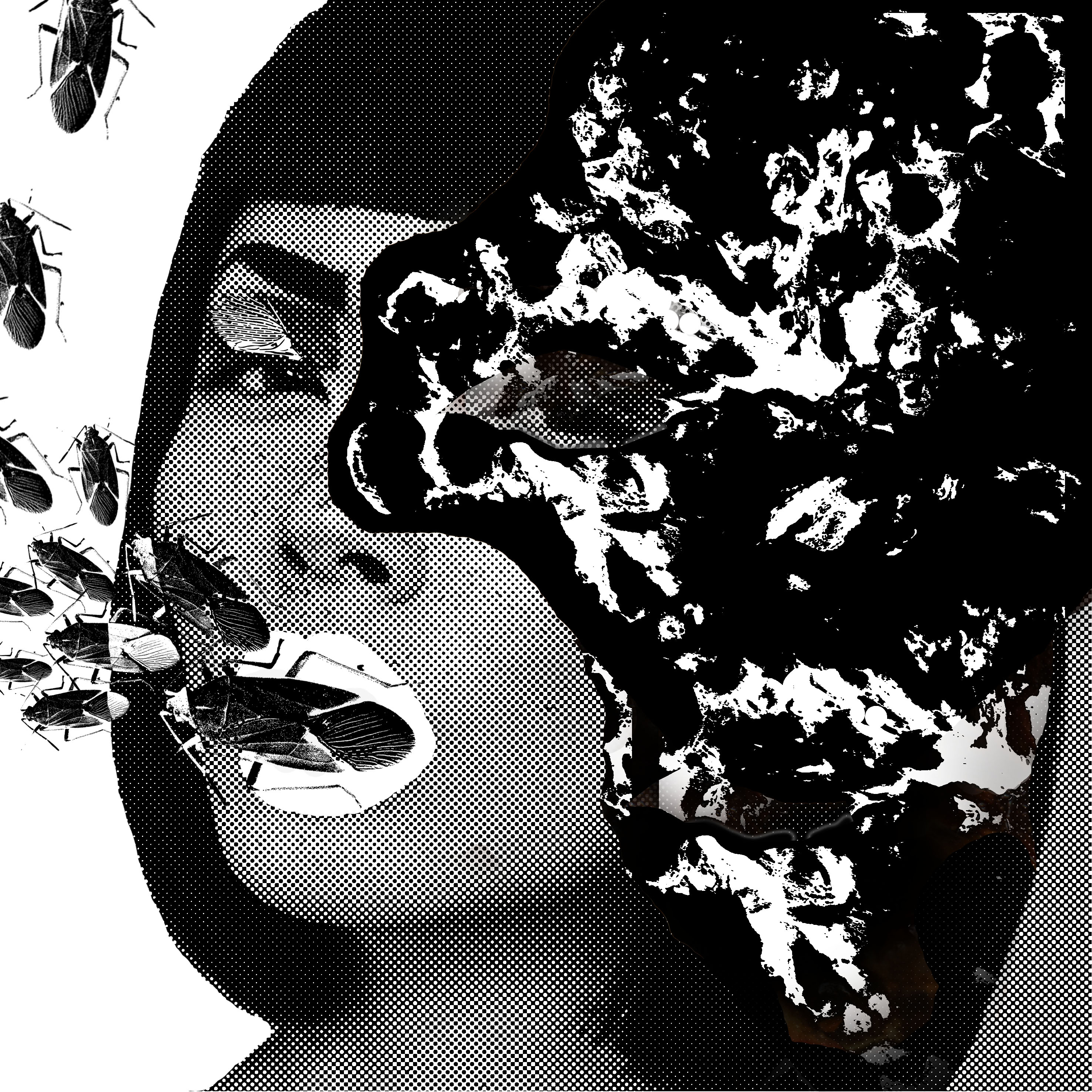
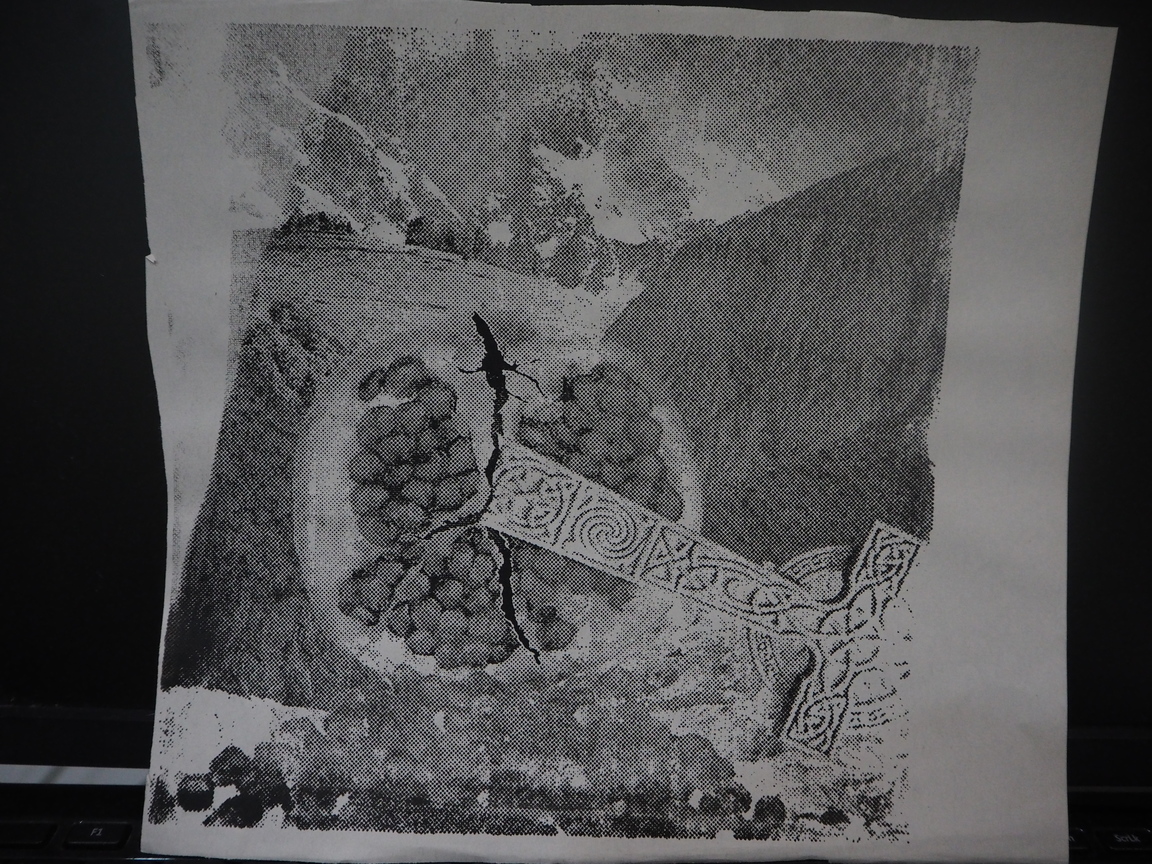
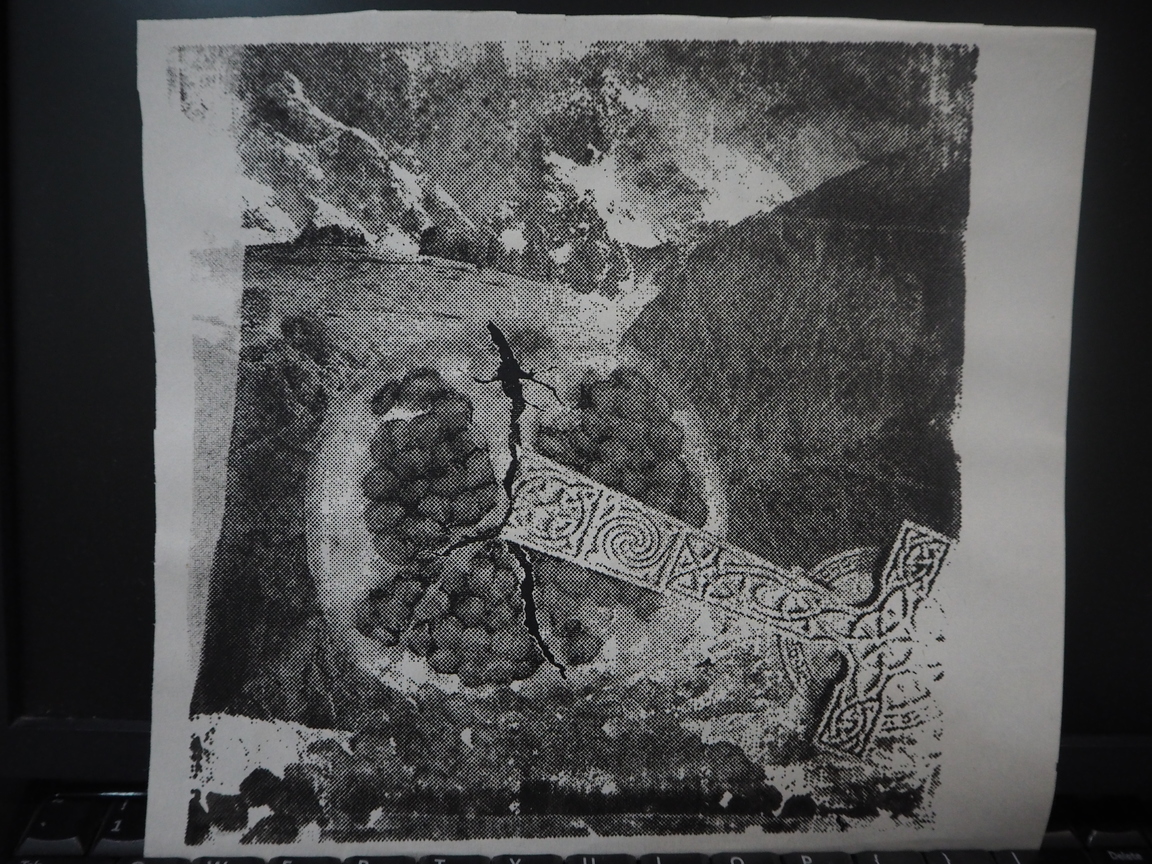
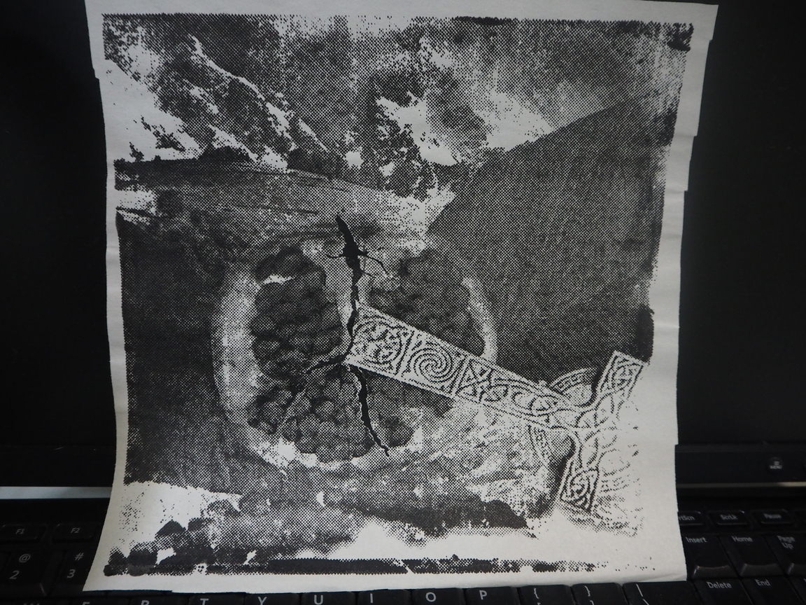
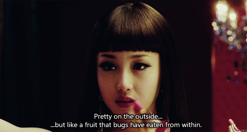
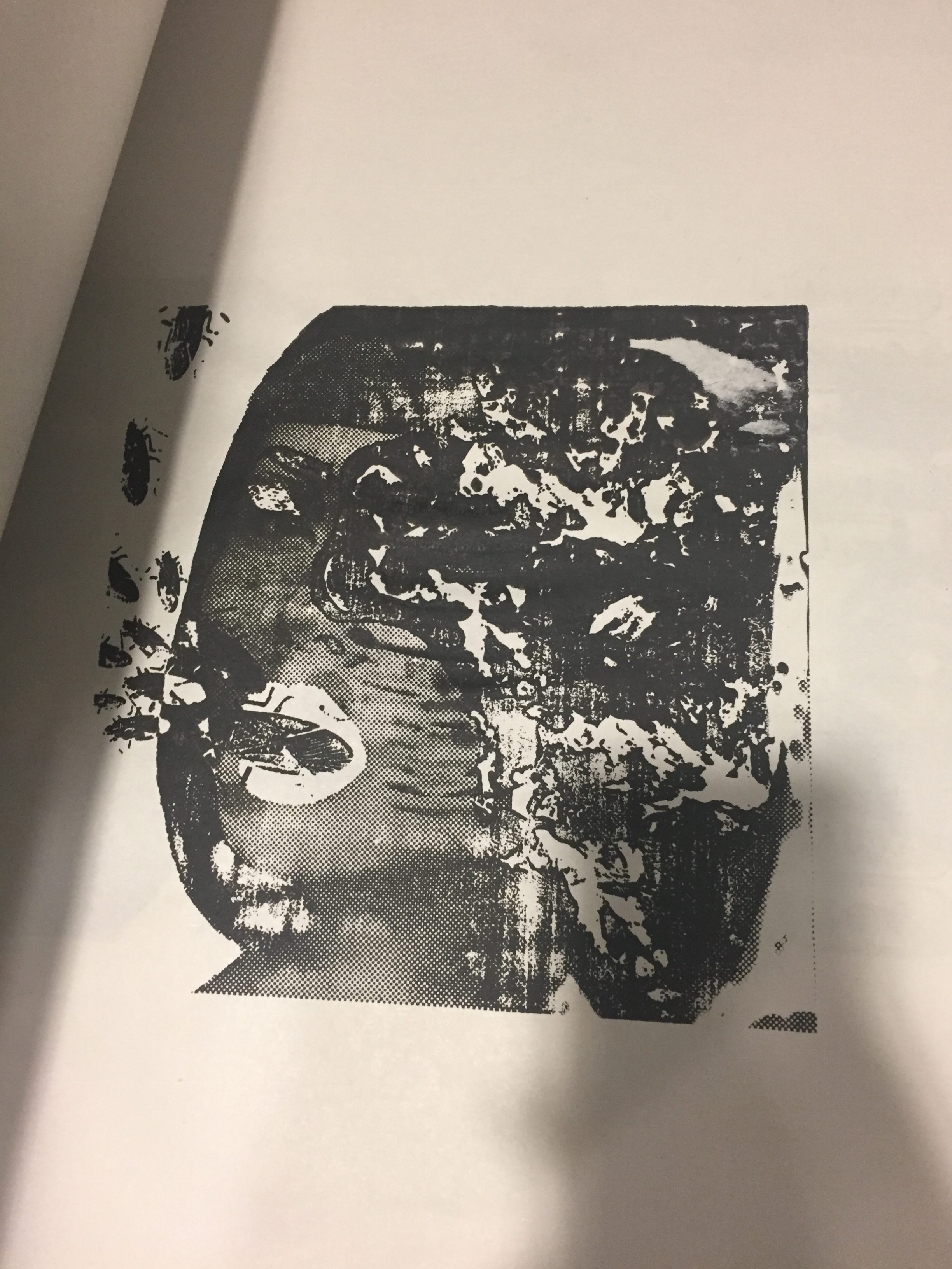
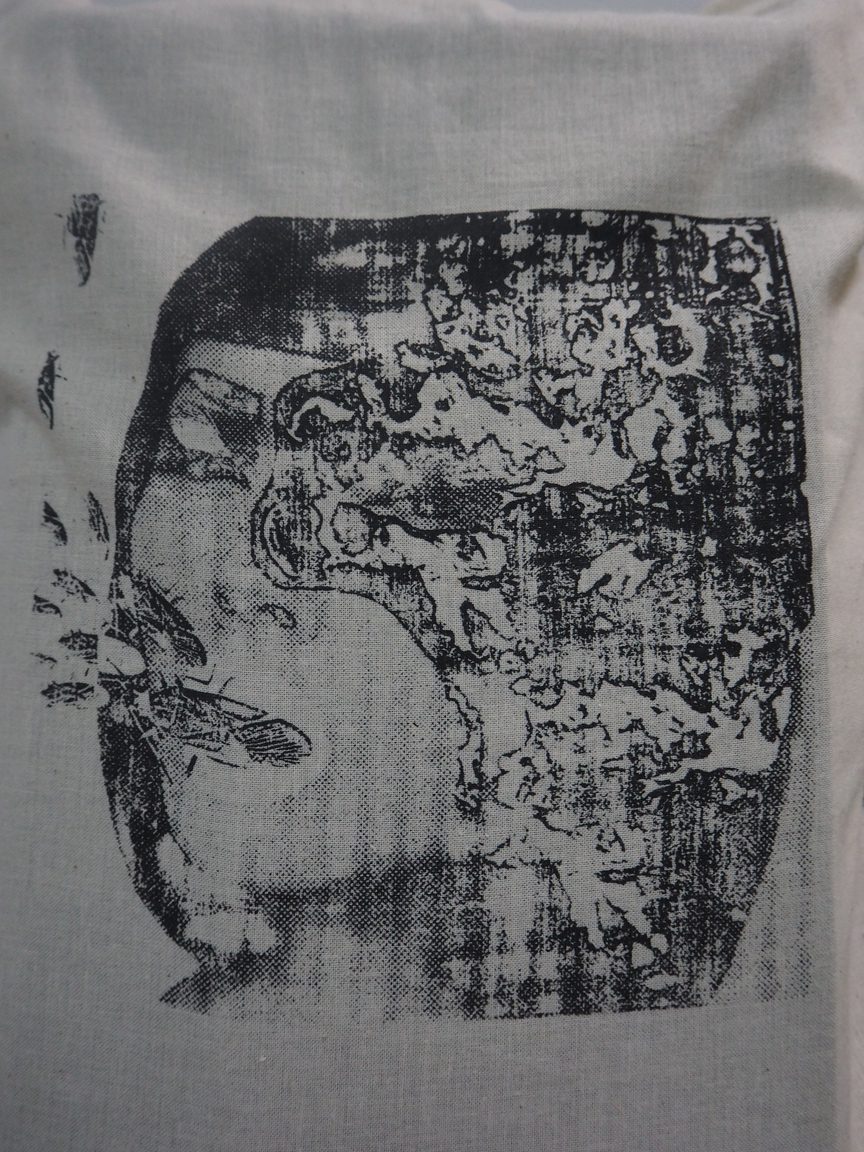
The quote for this was “Pretty on the outside…but like a fruit that bugs have eaten from within”. The decay here is portrayed through the texture of rotting fruit on the subject’s hair. While, cockroaches crawling out of her mouth suggested her rotten insides.
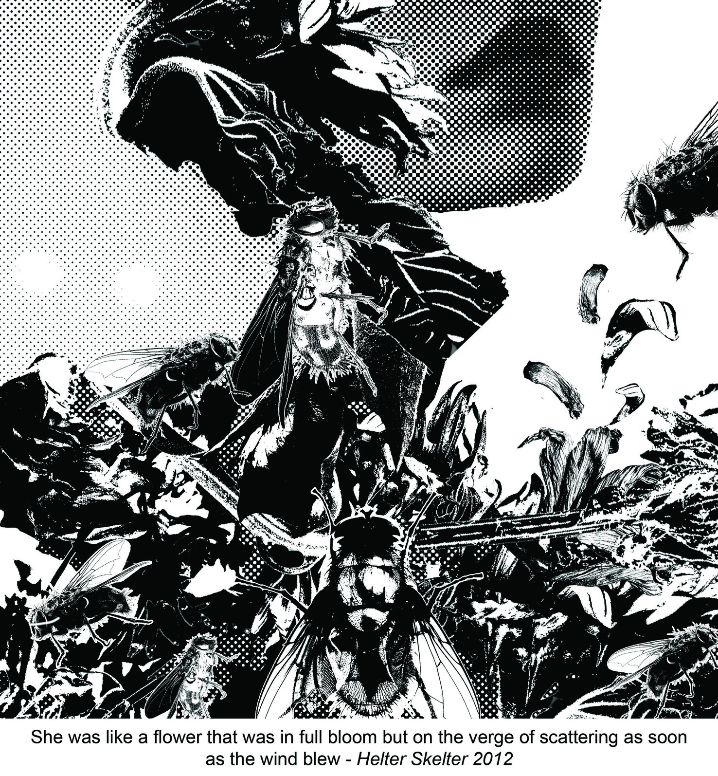
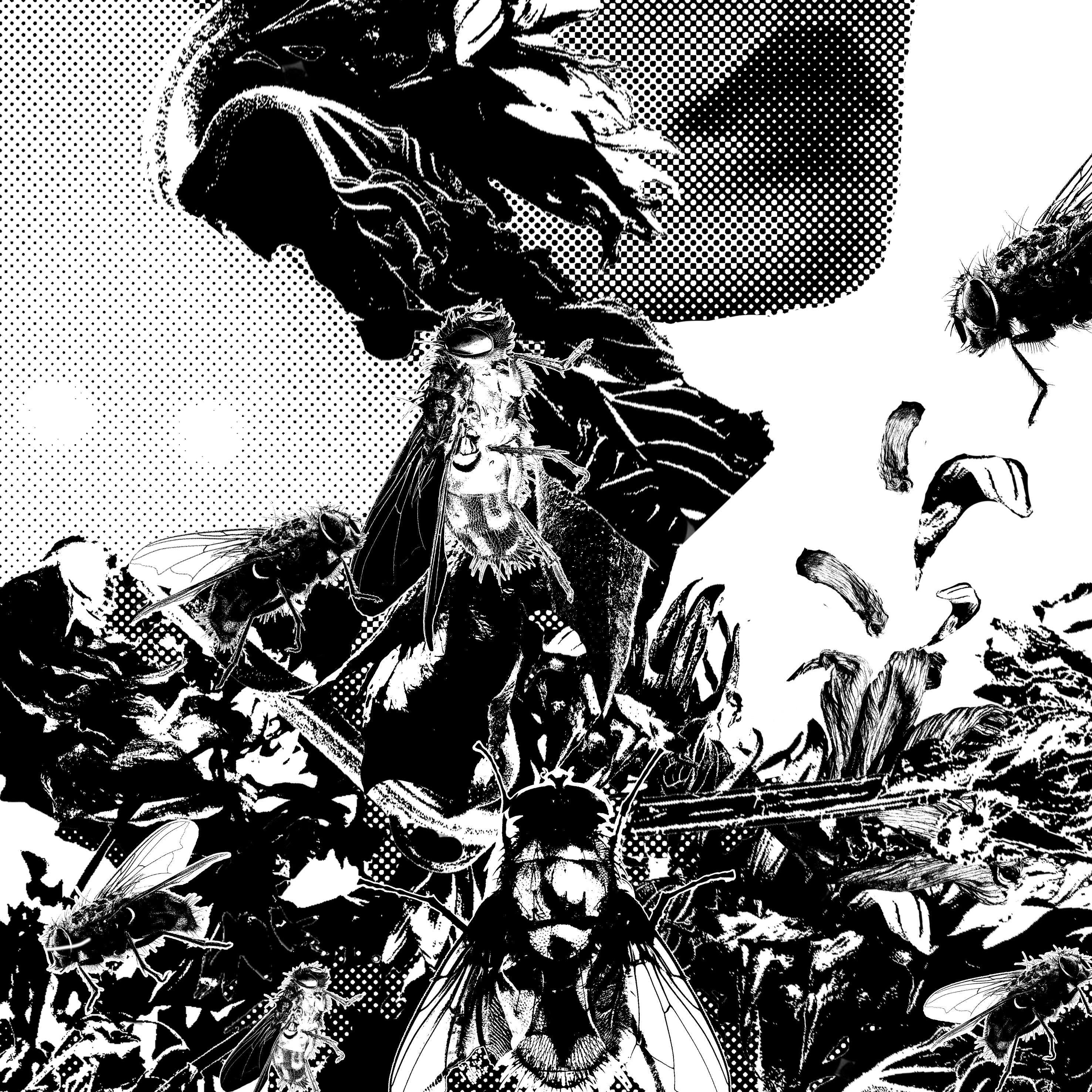
The quote for this was “She was like a flower that was in full bloom but on the verge of scattering as soon as the wind blew”. Here, wilted flowers make up the subject’s body and soul, and it is infested with flies.
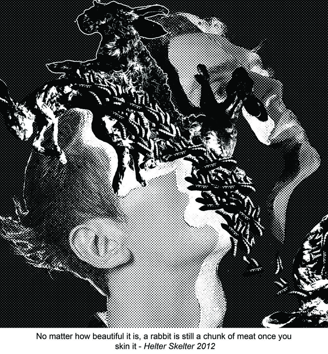
The quote here is “No matter how beautiful it is, a rabbit is still a chunk of meat once you skin it”. Here the decay was within the motif of skinned rabbits crawling out of the model’s head, and the bugs were the entire sea of maggots held within the head.
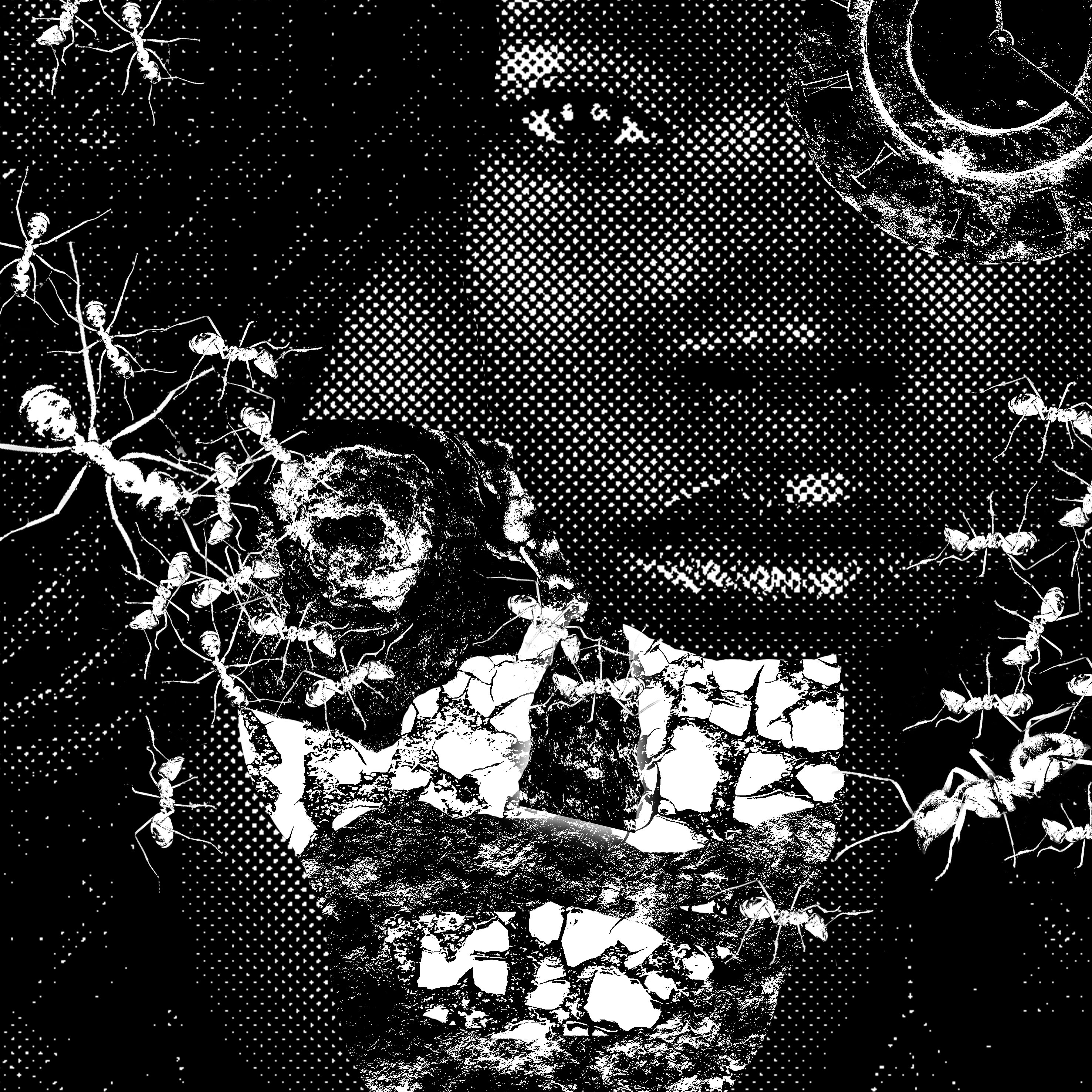
The quote here was “I hear a ticking sound. Something inside of me is going to end very soon”. Here, the decay is in the rust behind a face, and the decay is filled with crazy ants.
The decay is portrayed in rather abstracted forms with high threshold as I was trying to focus on their patterns to make the grotesque truly beautiful. I also kept to bitmapping the fashion editorials, and increasing the threshold for the motifs of decay, to maintain a consistent style.
Some things I could have improved on in this project were the composition arrangement and contrast of motifs in my design, as well as the fact that I could have done more documentation. Unfortunately, I did not manage to capture some test screens and prints as the silkscreen printing process was rather messy and hectic in the studio. Lastly, I wished that I would slowly learn to become more experimental and a little less result-orientated.
With this, I have completed my project 2 of 2D. I really learnt a lot both in skills and myself through this project. Thank you to Joy for being so encouraging throughout the entire process, I am really happy I managed to find my own visual vocabulary. Thank you to Xiu Meng too for staying back to help us with our screens and being so patient. I look forward to improving my exploring style in the final project!
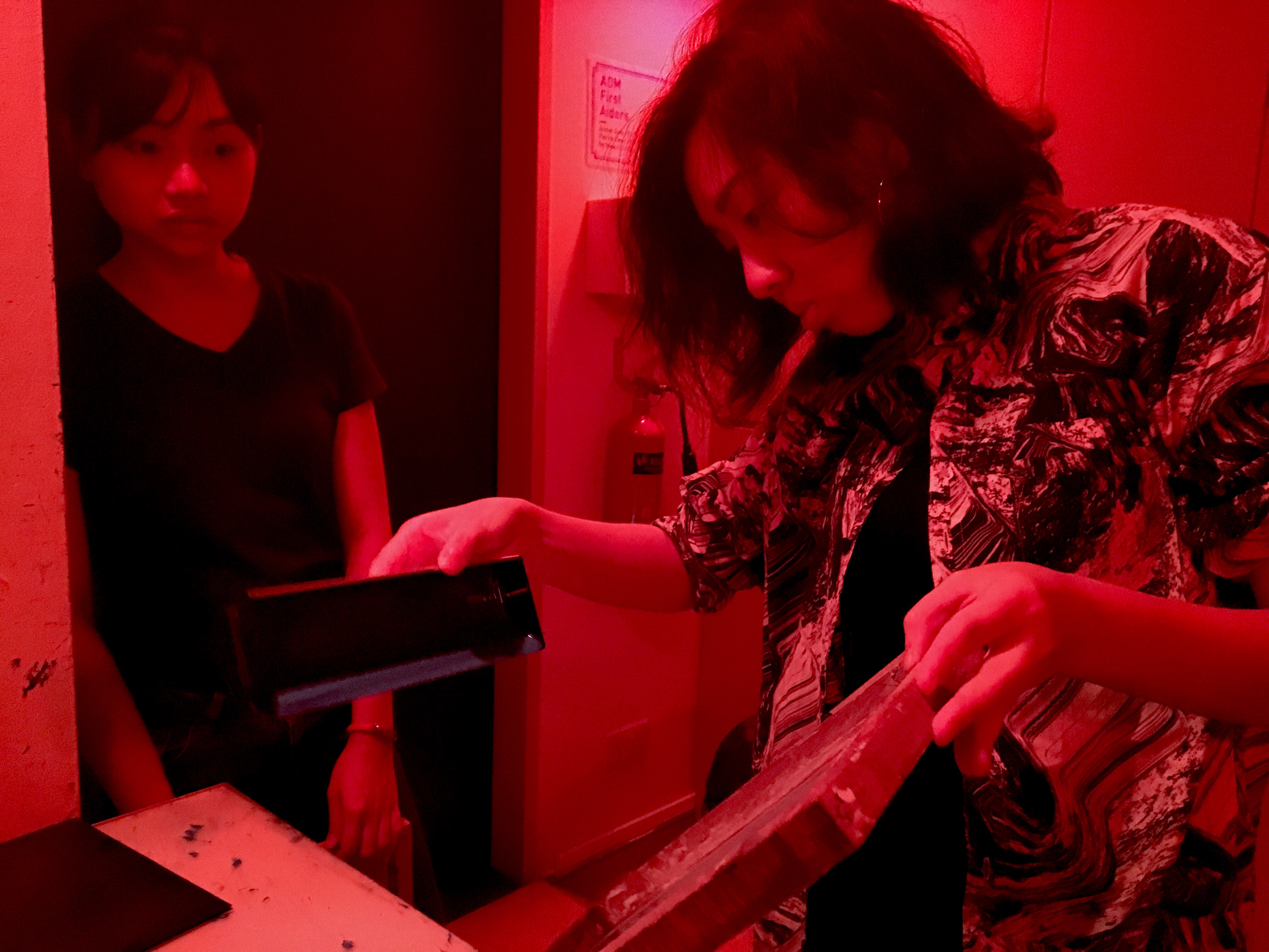
We had our first silkscreen printing lesson. I was not a stranger to silkscreen printing, as I had experimented with it before. However, I had always worked with vector image with lots of line work, and not with realistic image bitmapped designs.
Nor had I worked with such high-tech equipment before. In the past it was using a light-box, not a machine to expose, and a hair dryer instead of a large heater.
Thanks to Xiu Meng, we successfully produced our designs on our screens. I met with some difficulty during the printing itself. That was because I had never worked with such a complex design before. I placed the bitmap as 50, thus, the design was extremely complex.
Here are some of my prints:
This print came out too light. As I was afraid that if I added too much ink for such a complex design, the print would turn out too dark.
This print turned out not bad. However, it was unevenly inked as when i was dragging the squeegee I accidentally slid the squeegee out of place.
This was one of my last prints, and one of the better ones, as it was both evenly inked and had the most details intact.
Through this class, I decided that for my future works, I would put lesser dots for bitmapping as the effect will turn out better.
Actually, before I came to class, I was only a half satisfied with my designs. It was not the aesthetic I had in mind. During the silkscreen printing workshop was group consultations. After feedback from my group, and an extra consultation with Joy, I decided that it truly was not the aesthetic I was comfortable for my work to be in, I was going to start from scratch. I did not want to submit a piece of work I am not happy with.
STAGE 3
I remembered there a movie I really liked a while back, Helter Skelter. I loved this movie as I have a preoccupation with beauty and aesthetics and this movie explored and challenged notions of beauty. It was quite hard for me to find quotes from the movie as it is a Japanese movie, translated into English. Thankfully, I managed to find film stills with accompanying quotes.
I was inspired by its aesthetics of excessive luxury and beauty turning into something rather grotesque.
She was so beautiful.
But the negative consequences of the pursuit of beauty turned her mad.
She looks like she could belong to a horror film.
Thus, from the idea of excessive beauty turning grotesque, I got inspired and thought to make something truly grotesque look beautiful instead. The movie’s cinematographer and art directors sure managed to do so.
I also went onto pinterest and weheartit to search for inspiration, looking through fashion editorials (which was a direction I had been interested in for a long time, especially in 4D class, but I never thought to bring it over to 2D ).
From there I developed my final compositions and did my tote bag. I will not talk much about my compositions as I’ll go into more detail in my final. However, I would like to talk a bit about the process of printing my tote bag.
Thank you XF for this candid photo of me coating the screen.
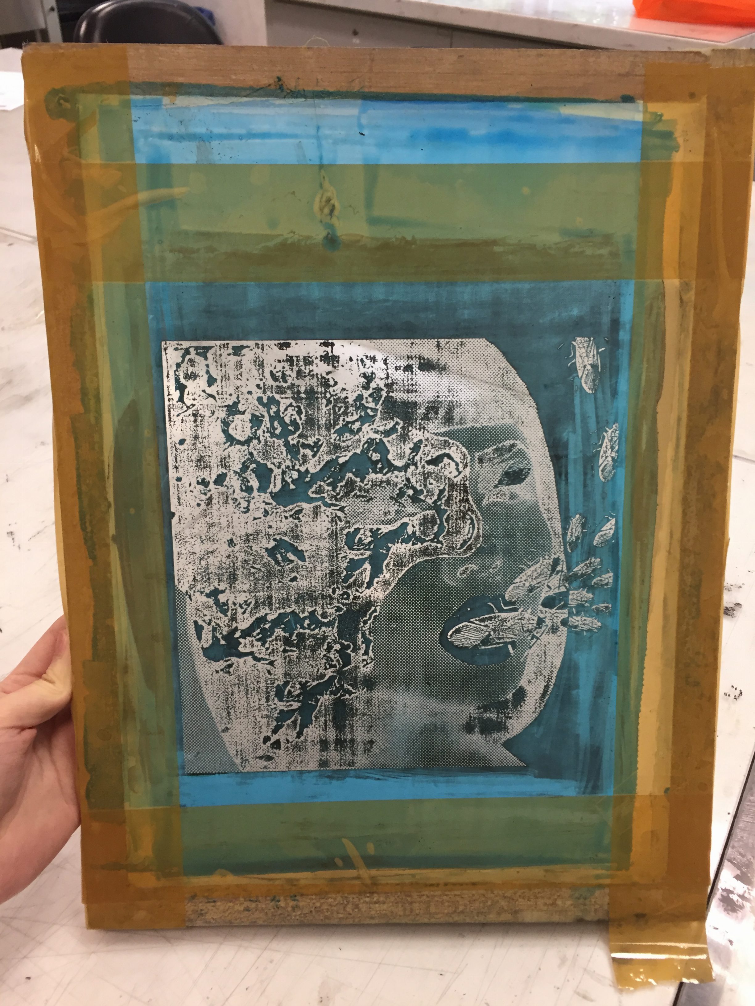
I made sure to decrease the number of dots in bitmap so that it was easier to print. However, it was rather challenging and I printed quite a number of test prints on newsprint paper before doing it on several tote bags.
This is my screen. The chemical did not fully wash off, so I tried my best in printing.
This was one of the dark versions on newsprint.
This is a lighter version on a failed tote bag. I decided that I quite like the hair being left with gaps of white as it brought out the texture of grotesqueness more.
With this I’ll end my process post and head on to the final post where I’ll explain my final compositions. See you there!
Initially, I was really clueless as to how to approach this project. I was a methodologically result-oriented person, so this project was a huge challenge to me, as we were limited to finding images on the web. That posed as a huge hurdle for me, as I couldn’t recreate the exact imagery I had in mind.
Furthermore, I could not settle on a quote as I did not want to limit myself to selected quotes in case the end-result compositions turned out badly.
But due to the project timeline, I had to march on ahead and come out with compositions. So my initial approach was to list out quotes from my favourites movies, choose a few, and try to make compositions out of them.
Here are the results:
“I’ve mastered three!” – Hugo, 2011
“In his blue gardens men and girls came and went like moths among the whisperings and the champagne and the stars.” – The Great Gatsby, 2013
“Dear Diary: My teen angst bullshit now has a body count.” – Heathers, 1988
However, after consultation with Joy, I realised I had been approaching the project wrongly. I misunderstood and thought that I could not use literal imagery to illustrate the quotes. That resulted in an artist block, as the quotes I had chosen were very poetic, and thus, when thinking of the end composition, it was unavoidable to have some sort of literal imagery.
Therefore, to avoid literal imagery, all my compositions turned out disjointed from one another, and were just a mish-mash of images put together, not properly integrated into a design.
In reality, all this project aimed for was to have an overall theme in all our compositions. This was to help us build a style and visual vocabulary that was unique and identifiable as ours. It was like having our visual filter placed over our chosen quotes.
Thus, with that takeaway, I proceed into the second stage of my explorations into trying to create a filter to see things through.
STAGE 2
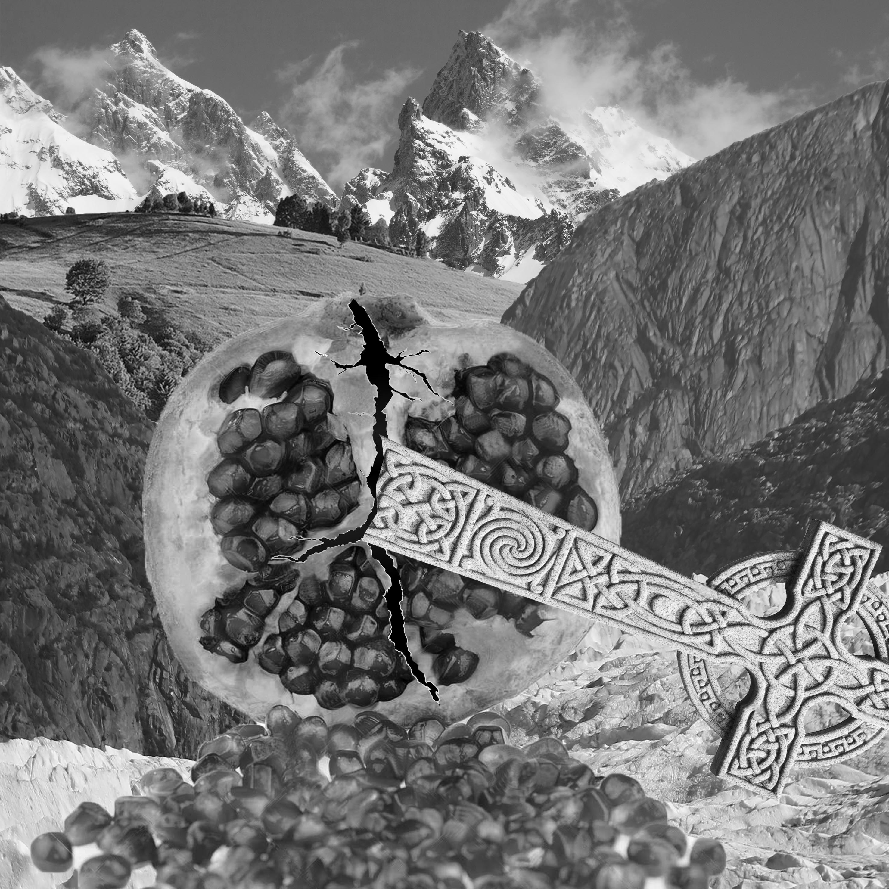
After reviewing the list of quotes I had, I realised there was a primary theme of sex and death. So I decided to make my designs based on sexual imagery with a tinge of morbidity, to highlight the sexualization and romanticisation of death.
“Fuck me gently with a chainsaw. Do I look like Mother Teresa?” – Heathers, 1988
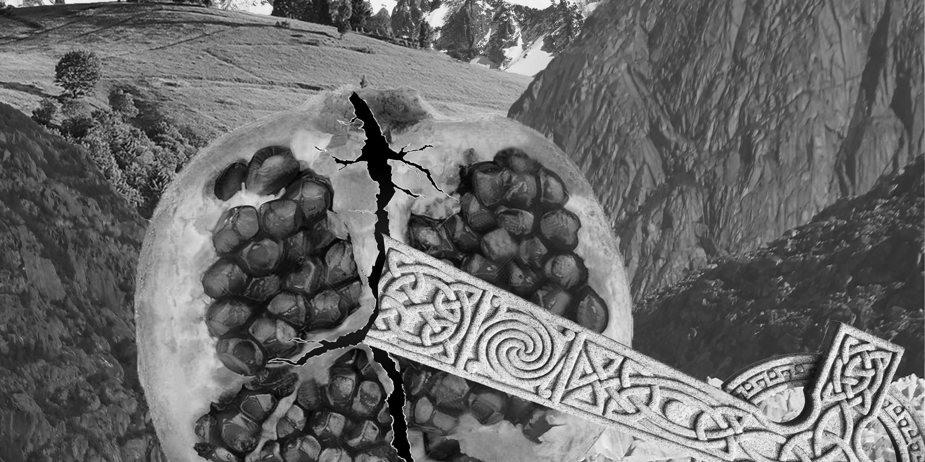
The first composition I attempted, I use the pomegranate as a symbol of the vagina, and the background landscape to form the female anatomy. This resulted in a rather subtly graphic and vulgar design of a female impaled on a cross. (The perspective is one from the bottom of the female body)
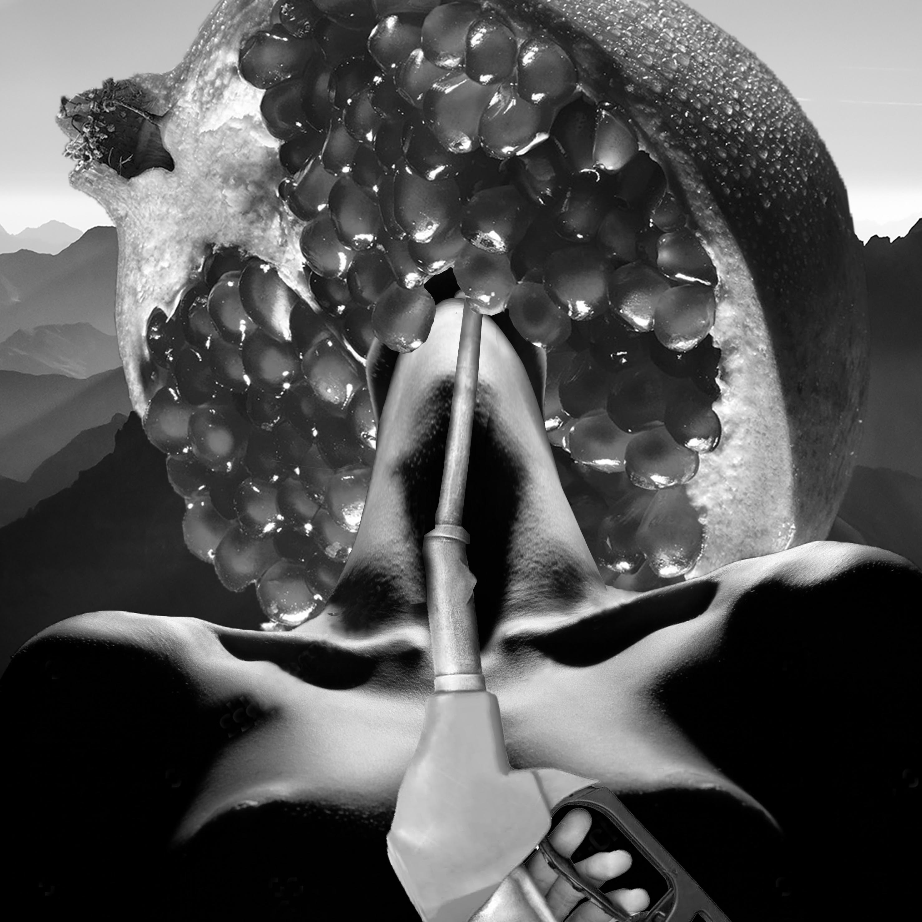
“We’ll be forgotten. We’re machines for the processing of desires.” – Helter Skelter, 2012
While in this second composition, I increased the contrast of the female anatomy to make it look more abstract and blend in with the rest of the landscape in the background. I lengthen the neck and jaw of the female so it became a phallic imagery impaling a pomegranate, that the “female subject” seemingly wears like a halo. While, the gas pump was to represent the machinery image, and at the same time emphasise the sexual connotation of the image.
With these two compositions in hand, I headed to the second consultation, and silk-printing workshop, which I will be covering in a second process post. Head there to read up more on my collage-printmaking journey!
The overarching themes in these series of photos are States of Being, Social Conformism and Anti-social Freedom, and Illusion and Reality.
The narrative presented in the sequential images can be simply summarised into the main character experiencing three dreams, each dream representing a state of being.
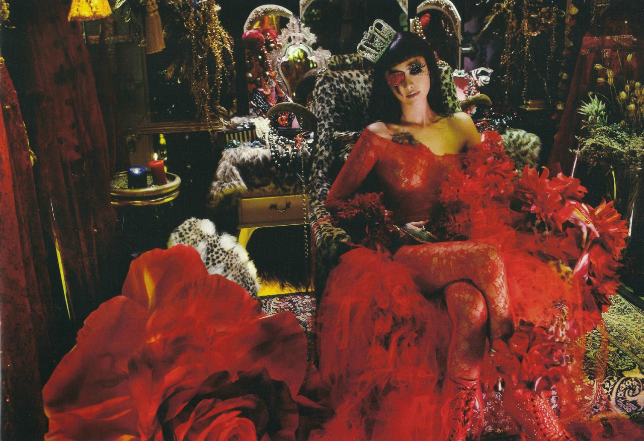
I have always been rather interested in fashion editorial style photography, so the entire photo shoot followed the style loosely.
It starts with the neutral series of images. These mainly monochrome with red lip series of images act as transitioning photos to tie the entire narrative together.
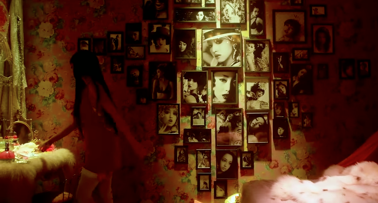
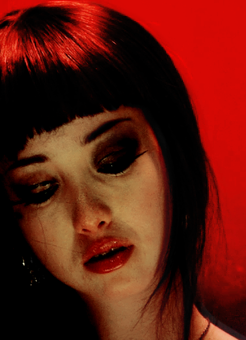
The first state is presented in form of the main character being objectified as art, where her face is treated as a canvas. I used this concept as art is something hung up in pretty glass buildings and stared at by thesociety. Society tries to judge and interpret art but they can never truly understand it.
I feel like the sense of entrapment and judgement the main character feels by mirroring it to what art receives from the public eye. Therefore, I make the main character feel the societal judgement by making her the art they judge in her first dream.
Other than the metaphorical meaning of the narrative, this was a play on geometric make-up designs, as part of exploring the fashion editorial style.
The art on her face starts off with different colours and shapes but the last set turns rather ghastly and ugly from the judgement.
The state of being she is in in the first dream is that of a fully functioning member of society, a social animal – one of full consciousness of the control of societal forces and thus feels oppressed by her fate.
References and Inspiration:
I was largely inspired by the concept of judgement of art in society. I was also inspired by the lyrics of the song “All The Rowboats” by Regina Spektor. It highlights how art “masterpieces serving maximum sentences” in the galleries, and its their “own fault for being timeless”, fully conveying the sense of imprisonment. Their cry for escaping judgement in “All the rowboats, in the paintings/ they keep trying to row away”.
The monochrome series once again acts as transition. The sleeping position is arranged so that the character has her hands on her chest, body language of fear and worry. And the second position that of covering her eyes, symbolising her need to hide away from society and escape.
The second state is one of withdrawal from society. The main character is depicted in her dream to be a recluse. Lost, loneliness, and alienated from her society, she tries to find answers in nature.
I aimed to portray the isolation and confusion by interspersing images of crouched figures and sequential images of the main character walking through the woods.
My dressing for the shoot is an earthy colour scheme with sienna top and orche culottes. I chose clothes with a simple silhouette to contribute and maintain the overall organic mood. Above is a close up shot, specially to capture the makeup I did for the shoot. The dramatic reddish brown eyeshadow, and white lashes were supposed to make the main character look odd and dystopian.
In the second dream, the state of being the character is in is that of in transition between being a social being to an anti-social being. Therefore, the character carries a great confusion and loneliness within.
Reference and Inspiration:
This series of photos were largely inspired by Umberto Giacommeti’s “States of Mind III: Those Who Stay”. The painting uses the main composition of vertical lines to “convey the weight of sadness carried by those who are left behind”.
Thus, similarly I chose to do my photo shoot at Coney Island, where the trees were of a specific kind that gave an overall vertically to all the backgrounds of my shots.
This is the shot that is directly inspired by the painting.
These two transition shots show her change from a vulnerable curled up position, opening up into a position with her arms open leaving her entire body exposed.
Lastly the third state is one where the character has overcome and disregards all societal restrictions. I chose to represent the state by making the character turn animalistic. This is portrayed through the character’s gradual movement of putting on the mask.
The mask is a Venetian mask usually worn by the character of Scaramouche. I actually chose this mask for its shape. These two close up shots were especially included for the details on the mask. The animal I am trying to depict is a crow, so the pointed beak-like tip of the mask really brings it across. I spray painted the mask black and added feathers to the top of the mask for a more dramatic effect.
Other than the mask, I constructed a large part of the outfit. The sleeves were constructed fully using a wire mesh, masking tape and feathers taped layer and layer over each other, then safety pinned to the turtle neck sleeveless top I was wearing.
While the skirt was a tank top with its straps cut off and pieces of fur double-sided taped onto the tank top. This was all for the overall effect of a crow, yet maintaining a certain sense of fashion aesthetics, like a fur-inspired collection.
The quick sequential images of the character running up the stairs is supposed to portray a kind of intensity and ascend, both creating a sense of flight. Flight has a very strong relation to freedom and that was what I was trying to convey.
The motions of freely dancing and prancing about also creates a sense of intoxication and thus, a lack of inhibitions, representing freedom.
I especially like these four shots as I was actually a little embarrassed at having to prance around in a public space. However, after sorting through my photos, I realise I was actually subconsciously smiling in my images. Which might suggest that at that point of time I really entered my character.
I chose the rooftop as the large expanse of higher ground space further enhances the sense of flight. Moreover, I wanted to highlight how the character has returned to a civilised social environment, but with a very different mindset, and thus she no longer belongs there.
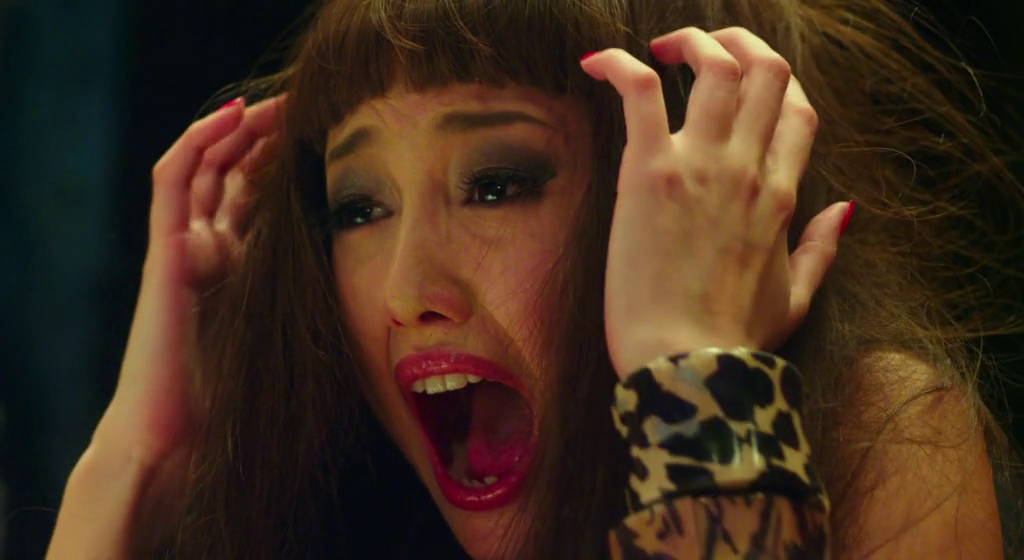
In the above photo, the crow character is seen to be screaming. The suggestion of the scream is meant to evoke the sound within the viewer. Screaming have been a recurring obsession of mine, and here it is meant to represent a complicated mixture of feelings.
In this particular shot, I framed it from a bottom up angle, also to enhance a sense of height, creating the illusion of the character sitting with her legs hanging of the building. One of the key shots I had in my head.
Lastly, this series ended of with a shot from the character’s perspective. The sudden change of perspective draws attention to this shot. I really like this shot as the expanse of sky could really evoke the feeling of calm peacefulness and true freedom.
This is the state where the character is truly no longer restricted by the dictates of society.
Reference and inspiration:
I was largely inspired by Florence and the Machine’s “Bird Song”. It was the song that led me to chose the crow character. The lyrics of the song had extremely strong imagery of the character transforming into a animalistic figure. Also an extremely dark version of the struggle of achieving freedom portrayed in the song inspired me a lot.
Progressing into the last part of the sequence, the character awakens.
While she looks into the mirror in front of her bed, this photo suggests she sees the death of her reflection. However, since the image she sees originates from her mind, she in a sense “killed” herself.
This concept was inspired by Queen’s “Bohemian Rhapsody” where Freddie Mecury sings “Mama, I killed a Man”. The symbolism of one killing one’s self, represents the death of her old self and embracing her new self.
While, the shadow technique here was inspired by Alfred Hitchcock. He often uses suggestions of killing through cleverly placed and angled shadows, or reflections. I was trying to achieve such an effect in this shot.
The sequence ends in a full loop when the character is once again in deep slumber. This successfully depicts the theme of reality and illusion, as the viewers has an ambiguous understanding as to whether the previous scene is real or not.
To conclude, I had a lot of fun doing this project. I would like to clarify a point mentioned during the Q and A session. Even though I was trying to portray different mood in each series, I did not play with the tone and colour of the photos as I wanted all the photos to take on the fashion editorial style.
I really learnt a lot throughout this project, and now really experienced the difficulty of putting together a fashion editorial shoot. Now that Project 2 is done, I look forward to working on the next project!