2D II Project 2: Research on Chinese Garden

So that day I made a trip down to Chinese Garden to do some primary research. I used to go there a lot as a kid during mid-autumn festival where they would have light decorations. I was too young to remember clearly though.

History of Chinese Garden Singapore

Chinese Garden was founded in 1975 by the JTC Corporation. It is designed by Prof. Yuen-chen Yu, an architect from Taiwan meant to showcase traditional Chinese imperial gardening landscaping.

So I went there and visited the different parts of the garden.

Firstly was the Pagoda.

p2160302jpg

p2160336jpg

p2160376jpg

p2160403jpg

p2160404jpg

p2160463jpg

p2160476jpgp2160398jpg

I found the entire architecture really interesting. The geometry and shapes of the windows were extremely beautiful.

Second, the Garden of Abundance.

p2160304jpg

p2160319jpg

p2160320jpg

p2160322jpg

p2160325jpg

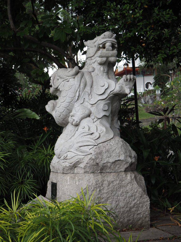
The garden has statues of the twelve zodiac animals as well as small bridges here and there.

Next was the Stone boat and Tea Garden.

p2160421jpg

p2160444jpg

p2160449jpg

p2160460jpg

Then the Main House which was next to the main entrance. But I did not enter from that entrance as the MRT was located at the other entrance instead.

p2160492jpg

p2160497jpg

The ticketing counter suggests that this was once a profitable attraction that require entry fees.

p2160521jpg

p2160541jpg

p2160544jpg

Then the Bonsai Garden.

p2160548jpg

p2160603jpg

p2160632jpg

p2160660jpg

p2160665jpg

p2160673jpg

p2160675jpg

p2160695jpg

p2160757jpg

During my trip there, the things I found myself drawn to where the geometric patterns of the architecture and the organic patterns of the nature. The two contrast upon one another created an extremely interesting visual language. Especially, how the architecture was built to make full sure of the windows to frame the surrounding nature.

This research I’ve done is primary research in form of site research.

I haven’t exactly confirmed that I would be doing purely on Chinese garden or include a bit of the neighbourhood. So my next steps from here would be to conduct more in depth secondary research online, and maybe more quantitative research data as I observed that Chinese garden no longer attracts crowds as they did in the past.

As for ethnography, the study of culture, since Chinese garden, the garden itself is not really a living area, I think it might be a bit hard for me to colect such data. Therefore, I’m thinking of expanding my research base.

Time to do some more research!

Ethnography: The systematic analysis and study of people and cultures, and the presentation of empirical data of society after usually participant-observation records.

Primary and Secondary Data: 

Primary data is collected through first-hands sources like collecting surveys, first-hand observation, interviews, focus groups and case studies. While secondary data are second-hand sources, information collected by others in form of books, internet, newspaper, statistics, just to list a few.

Quantitative and Qualitative Data:

Qualitative data is something that cannot be measured in numbers. Such data are like diary entries, interviews, questionnaires, observations. While Quantitative data is data that can be put into ranking or categories used to construct statistics and graphs.

Infographics: 

A form of content marketing and presentation that appeals to the viewer through images. Usually they turn complicated and mundane information into visually captivating and simplified, easy to view information.

18347787-infographic-elements-06-stock-vector-infographics

An example of an infographic, the most basic form.

Resources:
– https://www.discoveranthropology.org.uk/about-anthropology/fieldwork/ethnography.html
– https://www.reference.com/science/methods-primary-data-collection-86c5f86a12ed1d7
– https://www.reference.com/science/methods-primary-data-collection-86c5f86a12ed1d7
– https://www.customermagnetism.com/infographics/what-is-an-infographic/

2D II Project 1: The Process of Getting a Job

The process to which I started off this project was rather methodological. Since Joy said it was okay to have jobs that did not exist in real life, I let my imagination go wild and just wrote down everything I thought of. Here are some examples:
Painter
Mermaid
Train-Watcher
Sea Spirit
Grim Reaper
Ice Cream Seller
Cloud surfer
However, I realised there was no real theme surrounding these jobs. So me being my results-orientated self, I thought about some mediums I was interested in exploring. One main thing was embroidery. Inspired by this image I saw on Instagram by @whitemag_

photo_2017-02-11_19-07-12

Somehow the floral motif gave me inspiration, and I was thinking about Scarlet Letter by Nathaniel Hawthorne. Simultaneously, I did up different variations of my name and decided that I liked the format of my initials “ACH” the best. So bringing these two ideas together I got the idea of using the red A in Scarlet Letter for my name, done in embroidery to represent sexuality. From there I decided the first concept of sexuality using the job of the main character Hester Prynne, as seamstress.

Next, I decided to use the topic of of taboo in society as the overarching theme to tie my entire project together. I quickly listed out several taboos in society, some of which I could tie in with some jobs I thought of earlier.

Death to tie in with the job of a grim reaper, which I later changed to time keeper but the concept remains the same. Feminism to tie in with the job of the crow woman, a persona I created that I felt could identify as a strong female character. Lastly, the unknown to tie in with the job of a wanderer.

After deciding the four jobs, I wanted the overall arrangement to look coherent. So I went about settling the colour schemes first.

colour-scheme

After deciding the colour I went about thinking about the compositions for each taboo.

For the sexuality + seamtress one, I decided to use the floral motif of white lilies, as an irony as white lilies are meant to symbolise purity and innocence.  I thought it would make the red A stand out more in contrast.

Here is the mock up composition I did on my computer.

for-reference-01

And some thread colour testing.

img_2268

Here is the process of embroidering.

img_2274

It was my first time doing embroidering, I just plunged head first into it without any experience. The main challenge I faced, was due to the inexperience, I could not complete the amount I aimed to achieve at the start of the project. So one week before submission, I decided to change the concept into completing half a composition and to suggest the process of sewing instead.

Next, moving onto the composition of the crow woman. I was inspired by searching photos of black feathers on Pinterest certain photos look extremely metallic.

rsz_boss-fight-free-high-quality-stock-images-photos-photography-feathers-black

Thus, I got inspired to using metal sheets to create feathers. This would bring out my message clearly as just as how society expects women to be meek and obedient but in actual fact women are strong and commanding in their own right, feathers are normally regarded as soft and fluffy, but in this case made of strong and hard metal.

img_2267

These are some mock-ups of metallic feather I did.

blue-02

Digital composition mock-up.

There wasn’t much challenges faced in creating these feathers as they were relatively easily to manipulate.

While for the composition of Wanderer, I was extremely inspired by this art work I saw at ArtStage 2017.

img_1672

rsz_img_1676

I loved the texture and effect I saw, and decided for the composition of the wanderer I wanted to do an abstract background like this one.

img_2108

img_2110

img_2111

How I achieved the effect was through the use of crinkled foil as a base. Then one layer of black acrylic paint, dried with a hot gun. Next, I proceeded to layer slabs of blue, white, slight purples, greys and metallic black acrylic paints onto the foil. After waiting for it to dry, I sprinkled silver and pearl blue embossing powder on several areas and using the hot gun, managed to create warped and uneven texture across the entire piece of foil.

There was quite of a challenges faced in creating this as I was never strong in creating abstract work, my first tries turned out dull and not eye-catching enough (these pieces would be stuck within the visual journal) and not textured enough. However, through my tries, I learnt to keep clean colours only strategically blending certain areas.

Lastly, the final composition. I knew I wanted to pursue a steampunk feel to the composition. However, I was struggling on how to bring out both the steampunk idea to go in line with the time keeper, and the idea of death. Initially I wanted to use the motif of Lycoris Radiata, done in metallic print within the “A”. This is because this flower is known as the flower of the other side (of living).

b071381356b094d597a14991673bcecd

However, during one of the consultation sessions, Joy suggested that if I used a floral motif for this composition, my overall four compositions might look too feminine as a whole. So in the end, I went online to these sites:
https://www.death-clock.org/
http://deathdate.info/s/death
http://deathtimer.com/
http://www.findyourfate.com/deathmeter/deathmtr.html

After calculating my death timings, I listed these numbers out and added them into my composition within the lettering.a-numerals-01

However, the process of executing this one was extremely tedious and challenging as I had no experience working with foil. It was both fragile yet extremely tough. I spent about five hours cutting out the entire number sheet.

img_2181

Next, I embossed a letter A onto black paper.

img_2191

img_2192

This was rather challenging as it was a large surface area to emboss and thus it ended up not being very neat. I solved the problem by pasting another black piece of paper over.

This is the process I went through in achieving my final compositions. I met with several challenges but I really had a lot of fun exploring different mediums. See you in the next post where I talk about my final product!