
STAGE 2 (Cont.)
We had our first silkscreen printing lesson. I was not a stranger to silkscreen printing, as I had experimented with it before. However, I had always worked with vector image with lots of line work, and not with realistic image bitmapped designs.
Nor had I worked with such high-tech equipment before. In the past it was using a light-box, not a machine to expose, and a hair dryer instead of a large heater.
Thanks to Xiu Meng, we successfully produced our designs on our screens. I met with some difficulty during the printing itself. That was because I had never worked with such a complex design before. I placed the bitmap as 50, thus, the design was extremely complex.
Here are some of my prints:
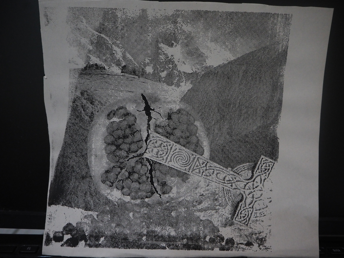
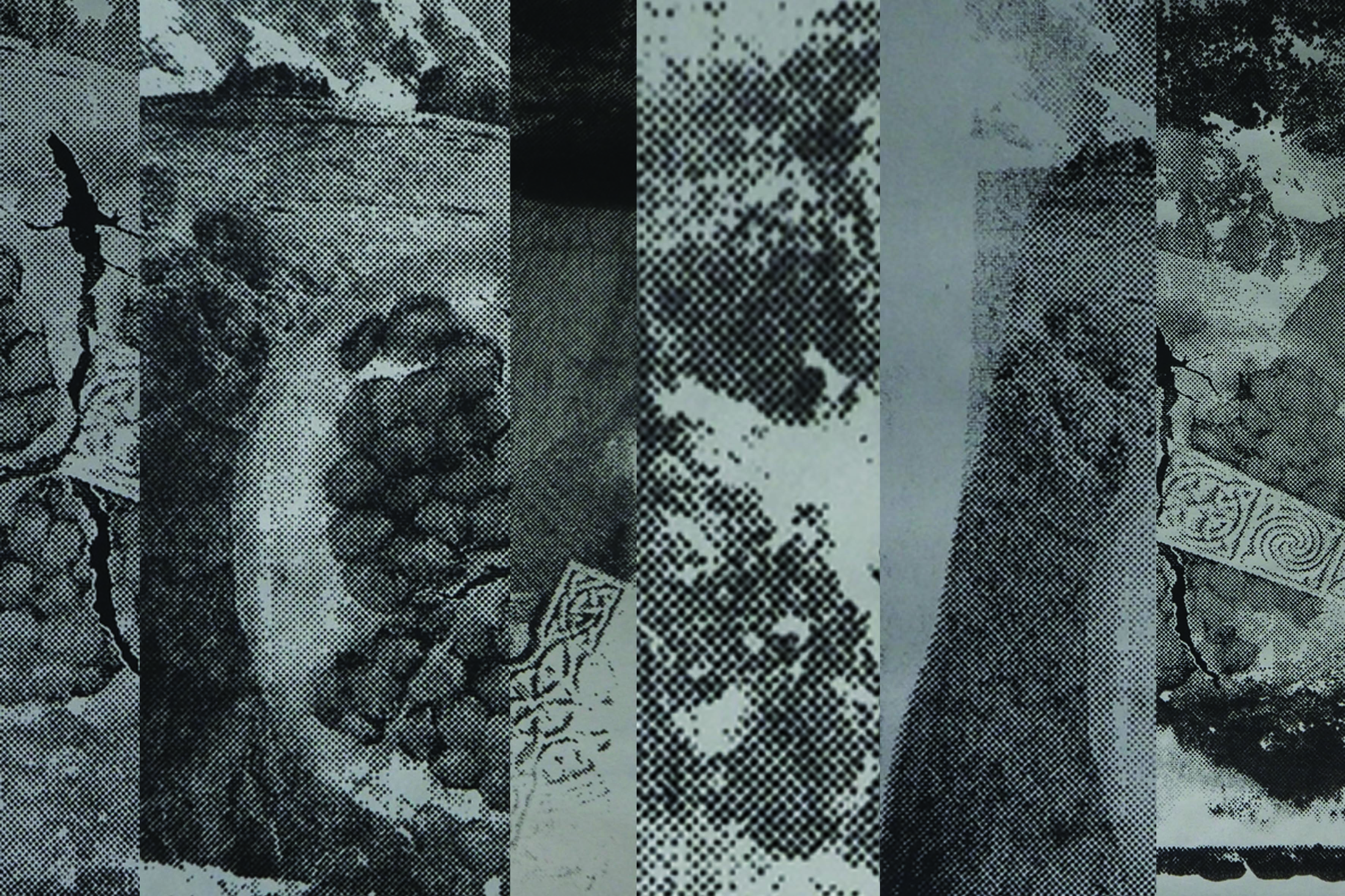
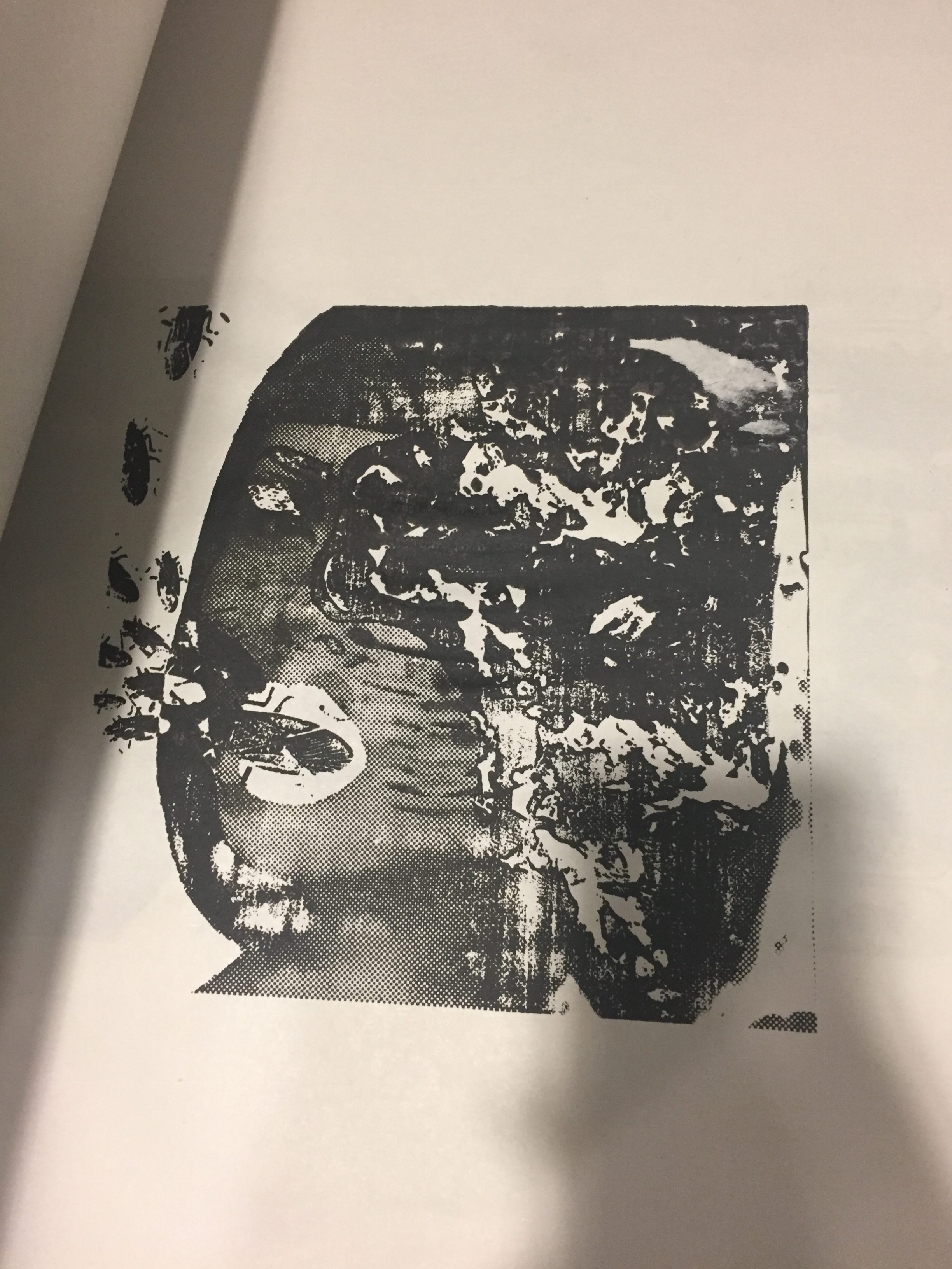
This print came out too light. As I was afraid that if I added too much ink for such a complex design, the print would turn out too dark.
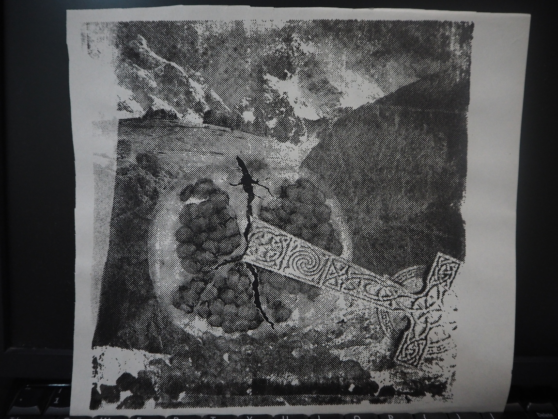
This print turned out not bad. However, it was unevenly inked as when i was dragging the squeegee I accidentally slid the squeegee out of place.
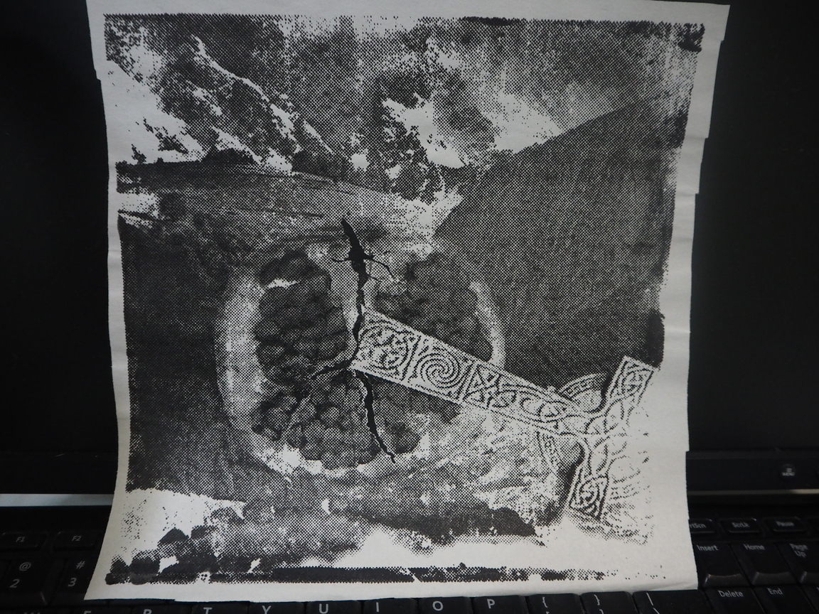
This was one of my last prints, and one of the better ones, as it was both evenly inked and had the most details intact.
Through this class, I decided that for my future works, I would put lesser dots for bitmapping as the effect will turn out better.
Actually, before I came to class, I was only a half satisfied with my designs. It was not the aesthetic I had in mind. During the silkscreen printing workshop was group consultations. After feedback from my group, and an extra consultation with Joy, I decided that it truly was not the aesthetic I was comfortable for my work to be in, I was going to start from scratch. I did not want to submit a piece of work I am not happy with.
STAGE 3
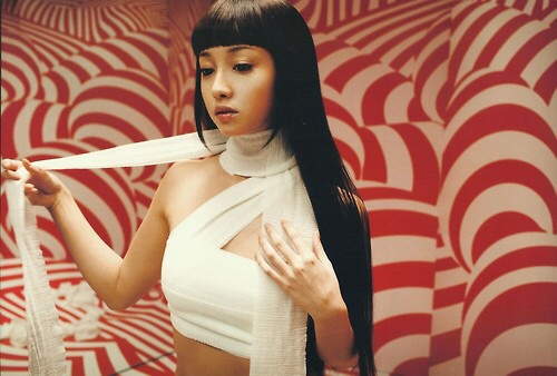
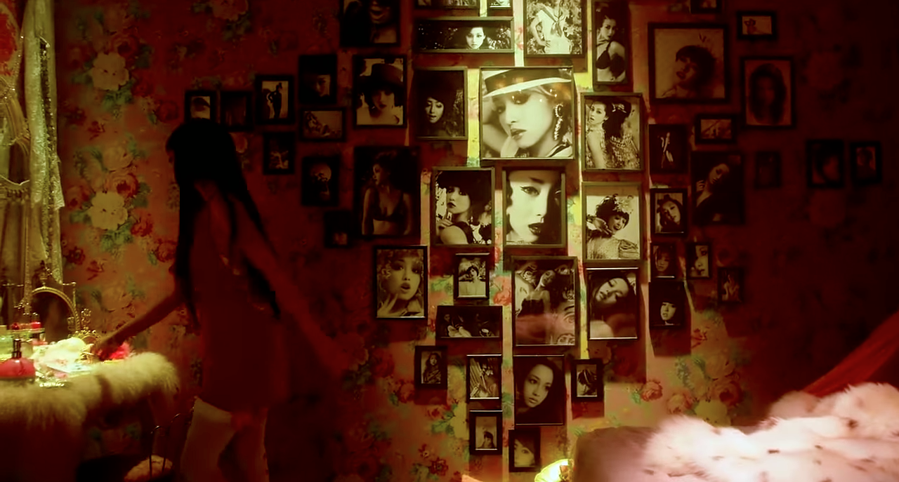
I remembered there a movie I really liked a while back, Helter Skelter. I loved this movie as I have a preoccupation with beauty and aesthetics and this movie explored and challenged notions of beauty. It was quite hard for me to find quotes from the movie as it is a Japanese movie, translated into English. Thankfully, I managed to find film stills with accompanying quotes.
I was inspired by its aesthetics of excessive luxury and beauty turning into something rather grotesque.
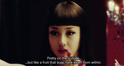
She was so beautiful.
But the negative consequences of the pursuit of beauty turned her mad.
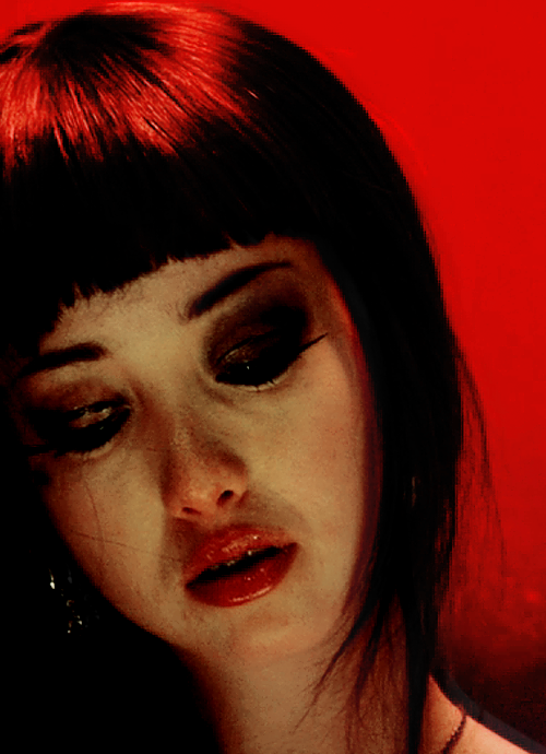
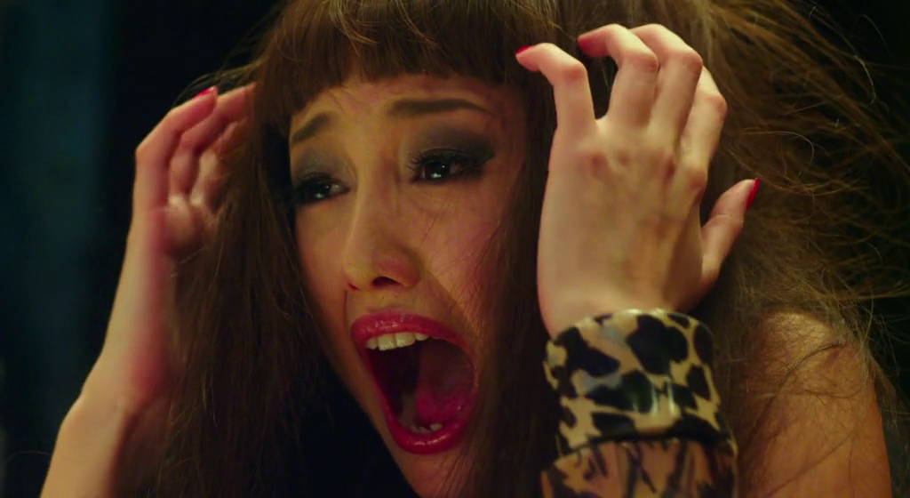
She looks like she could belong to a horror film.
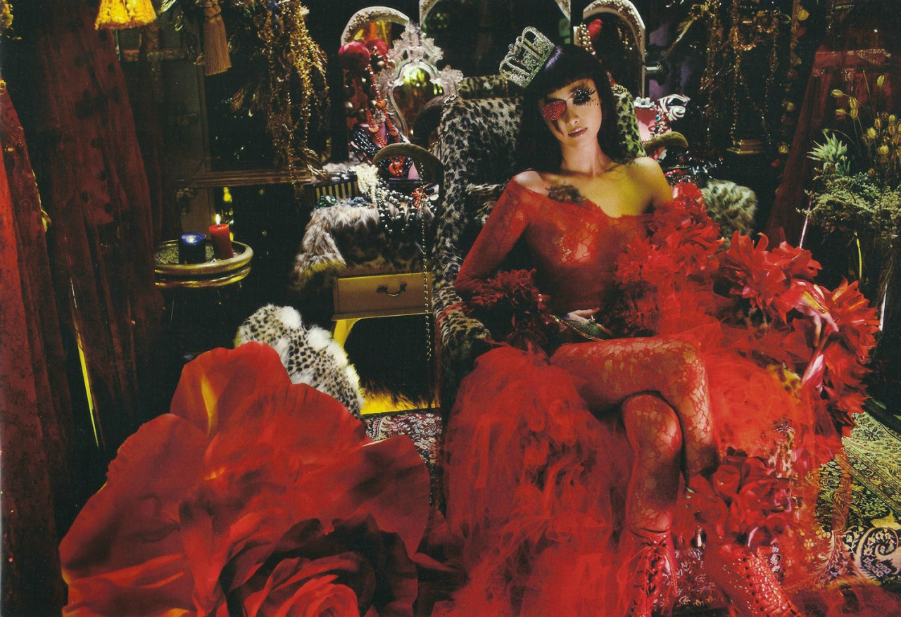
Thus, from the idea of excessive beauty turning grotesque, I got inspired and thought to make something truly grotesque look beautiful instead. The movie’s cinematographer and art directors sure managed to do so.
I also went onto pinterest and weheartit to search for inspiration, looking through fashion editorials (which was a direction I had been interested in for a long time, especially in 4D class, but I never thought to bring it over to 2D ).
From there I developed my final compositions and did my tote bag. I will not talk much about my compositions as I’ll go into more detail in my final. However, I would like to talk a bit about the process of printing my tote bag.
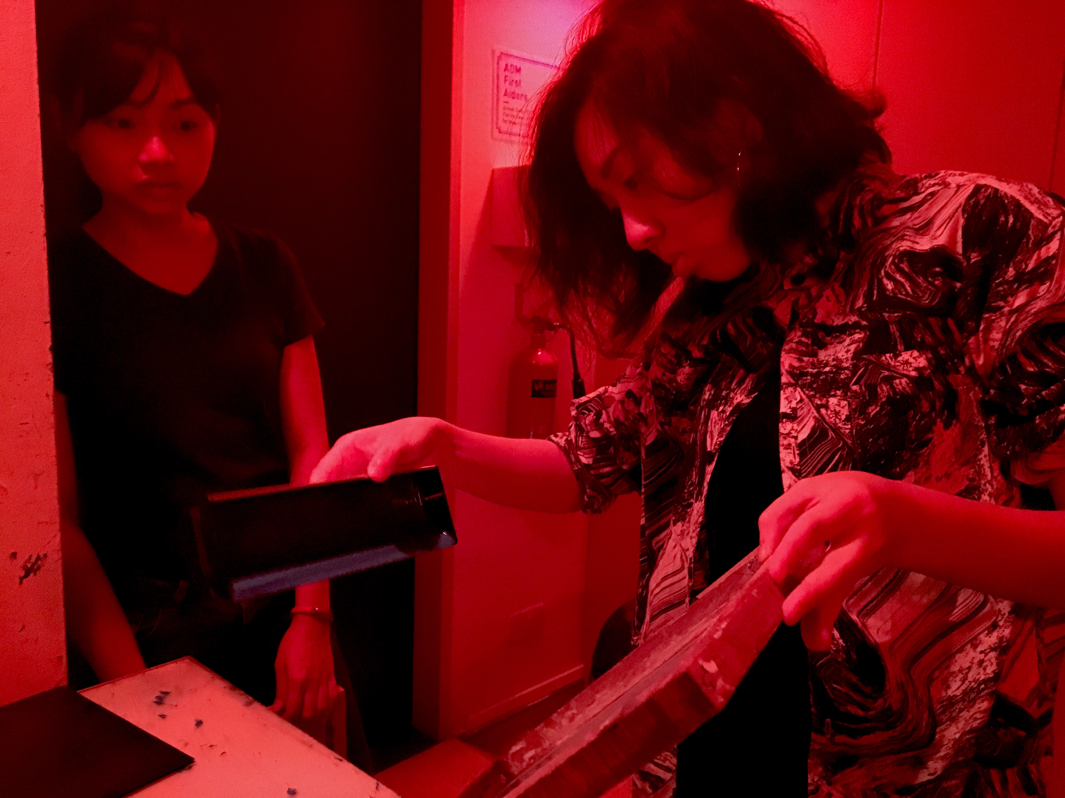
Thank you XF for this candid photo of me coating the screen.
I made sure to decrease the number of dots in bitmap so that it was easier to print. However, it was rather challenging and I printed quite a number of test prints on newsprint paper before doing it on several tote bags.
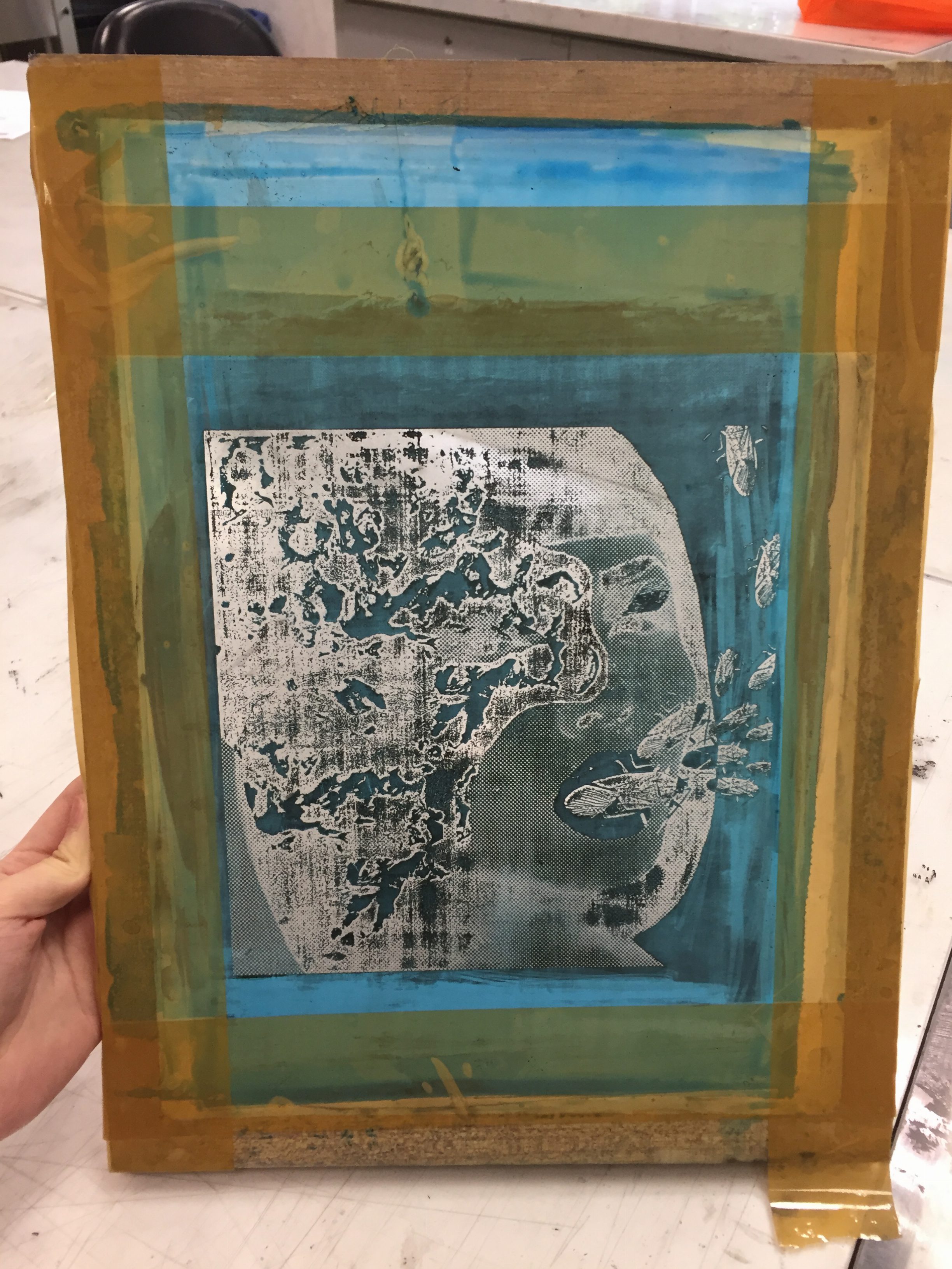
This is my screen. The chemical did not fully wash off, so I tried my best in printing.
This was one of the dark versions on newsprint.
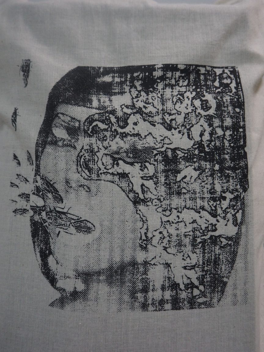
This is a lighter version on a failed tote bag. I decided that I quite like the hair being left with gaps of white as it brought out the texture of grotesqueness more.
With this I’ll end my process post and head on to the final post where I’ll explain my final compositions. See you there!