The way I approached this project was really straightforward. As I am very result oriented, I did not experiment much composition-wise, but more so thought it through and planned it out in my mind.
I listed the character traits which I thought affected the way I interact with people and narrowed it down to the four main traits of being unorthodox, being a social chameleon, being cynical, and being emotionally empty.
Then to complete each equation I thought circumstances or people that might result in me showing my character trait. Some examples are
For UNORTHODOX
– When meeting new people, will become normal
– When meeting with societal judgement, will conform
– When meeting people who are not used to the peculiarity of art students
For SOCIAL CHAMELEON
– When meeting new people, will try to figure out what kind of person they are
– When meeting similar kind of person, will go crazy
For CYNICAL
– When meeting people who have idealised outlook, will destroy their ideals
– When meeting new people, will be distrustful of their intentions
For LACKING EMOTIONAL CAPACITY
– When meeting emotional people, will sympathise but cannot empathise
For each equation I selected the situations that make the most coherent sense as one of the four equations.
Thus I resulted in the following equations:
| Character | Situation | Resulting Reactions |
| UNORTHODOX | Meet New People | Will try to be normal (Hide unorthodox-ness) |
| SOCIAL CHAMELEON | Meet Similar People | Go crazy (In a positive manner) |
| CYNICAL | Meet People Who Have an Idealised Outlook | Destroy their ideals |
| LACKING EMOTIONAL CAPACITY | Meet Emotional People | Cannot mix well with them |
With these equations settled, I thought about how to apply colour theory to the different equations. I know that I wanted a coherent overall look for the twelve squares so it was a matter of deciding the overall colour scheme, then manipulating the value and tone of the colours to portray the meaning of my work.
Initially I wanted to use this colour scheme, like split complementary colours grouped together.
However, after some research, I decided I was interested in the “pastel grunge” aesthetics. The colour scheme that suits such a style would be the rather dreamy pastel analogous colour scheme of blue, purple, and pink.
Thus, I did up a list of different tonal value of these three colours as a main colour chart guide for my illustrations.
Lastly, illustration-wise, I wanted the entire piece to look like a coherent decorative series. Thus, I decided that the elements in the composition would not really represent the meaning of the equation, but more of the colours in the composition.
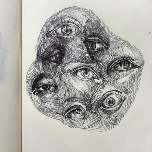
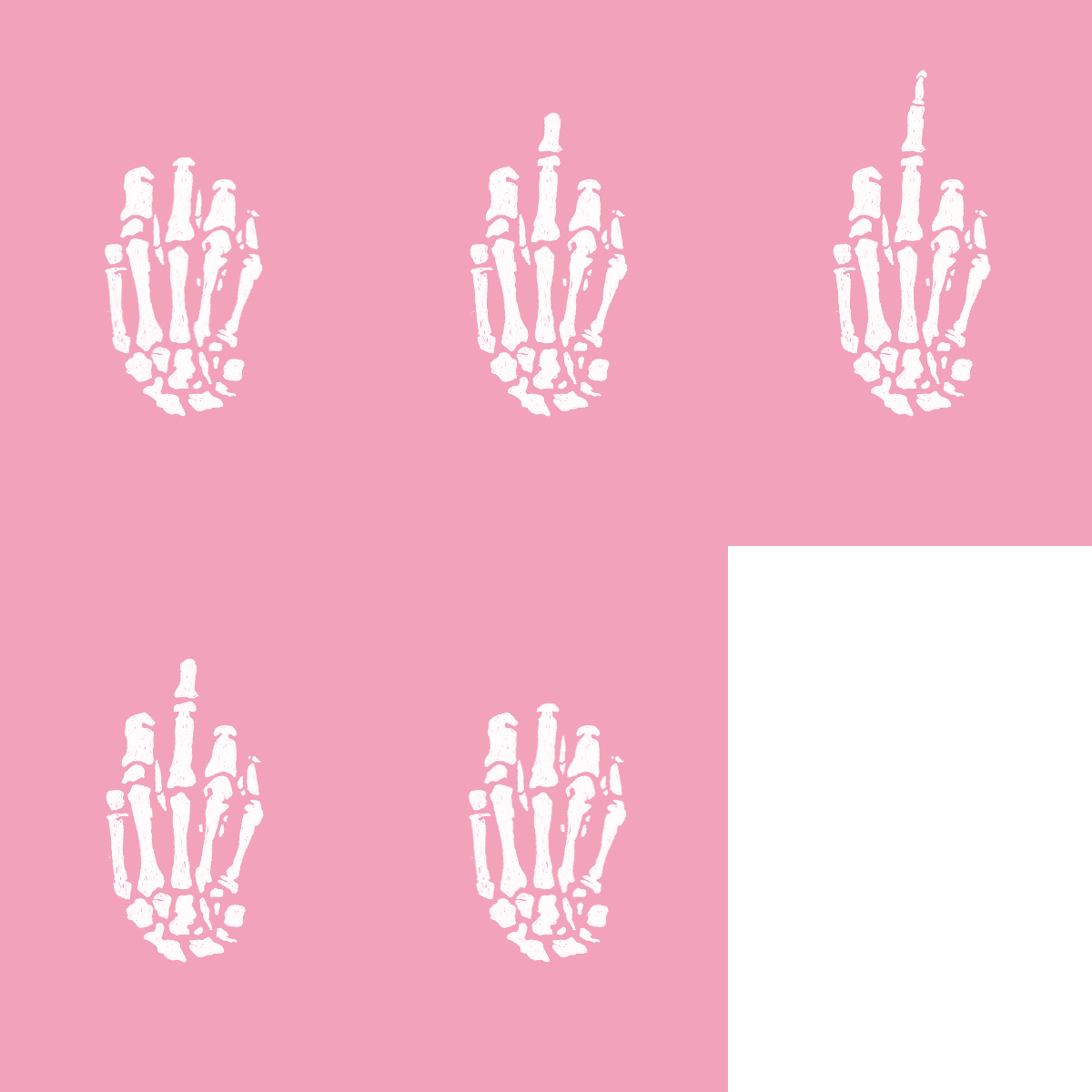
Here are some research photos I found online on pastel grunge that the aesthetic of my illustrations were inspired/based on:
Basically a rather stylised, pastel, illustrated, teenage-angst aesthetics.
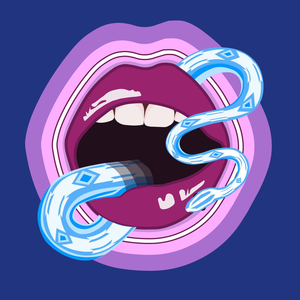
The only experimentation I did composition-wise was that of the mouth motif, as I decided to repeat it for every equation.
I thought that adding a neon ring of light might make the composition more visually attractive. However, I realised that this move strayed too far from my general aesthetics, thus, I decided to stick to just the illustration of the mouth.
Trial Sketch:
With this, I conclude my rather direct thought and planning process of this project. See you in the final project post! 🙂


