This is my final layout during the presentation. The layout is carefully balanced in terms of type, illustrations with symmetry, pattern, and mouth motifs. Now let me explain the equations row by row.
FIRST EQUATION
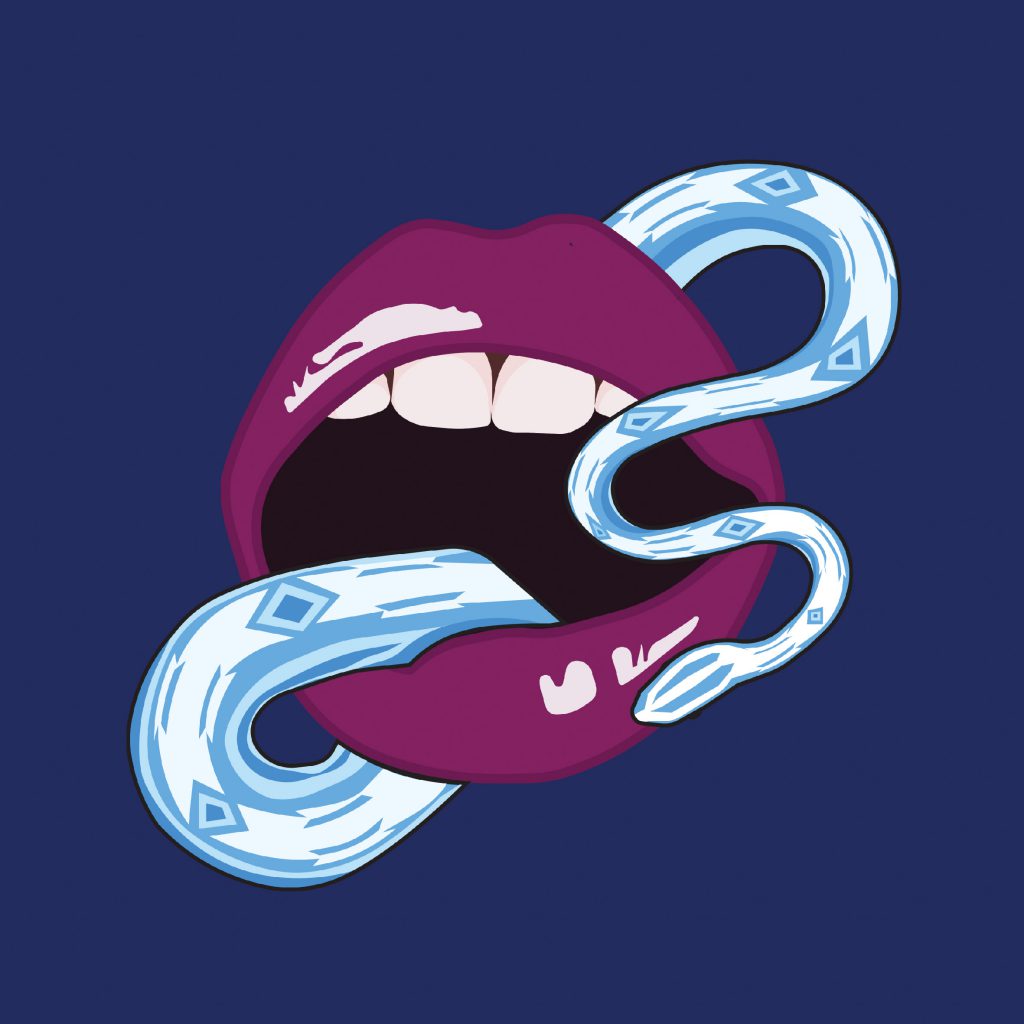
UNORTHODOX
The unorthodox is represented by the colour blue of the lips. The background of pink is supposed to symbolise the normal environment in which the unorthodox blue tries to exist in.
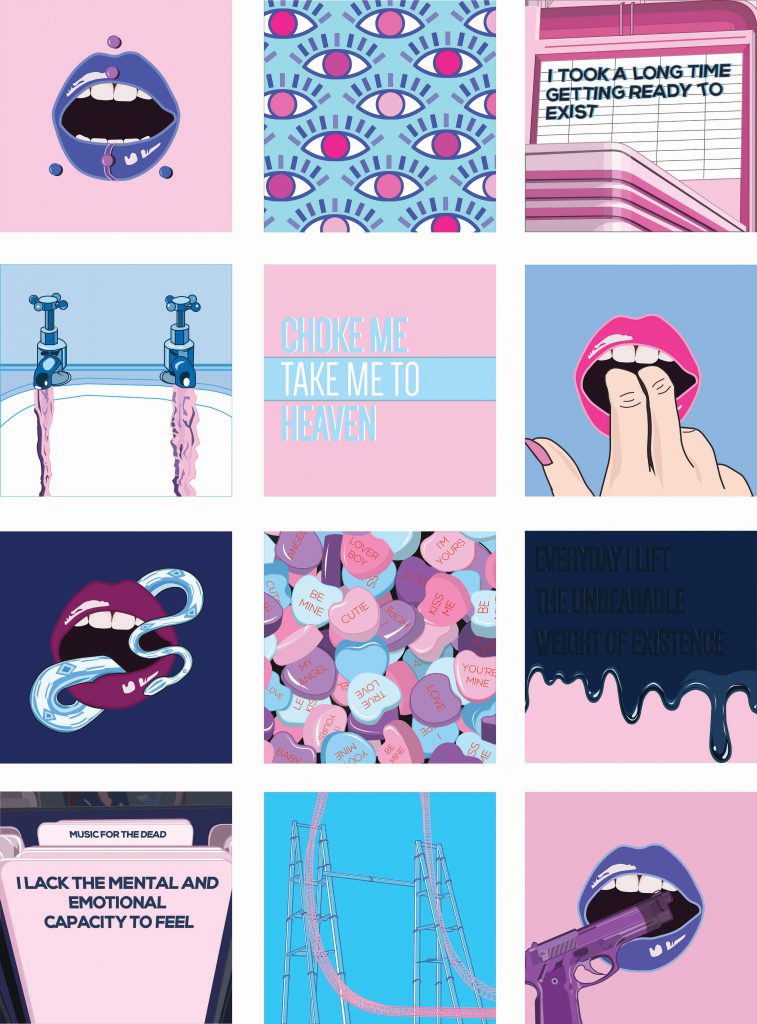
MEET NEW PEOPLE
The pink colour irises symbolises the judging eyes of new normal people.

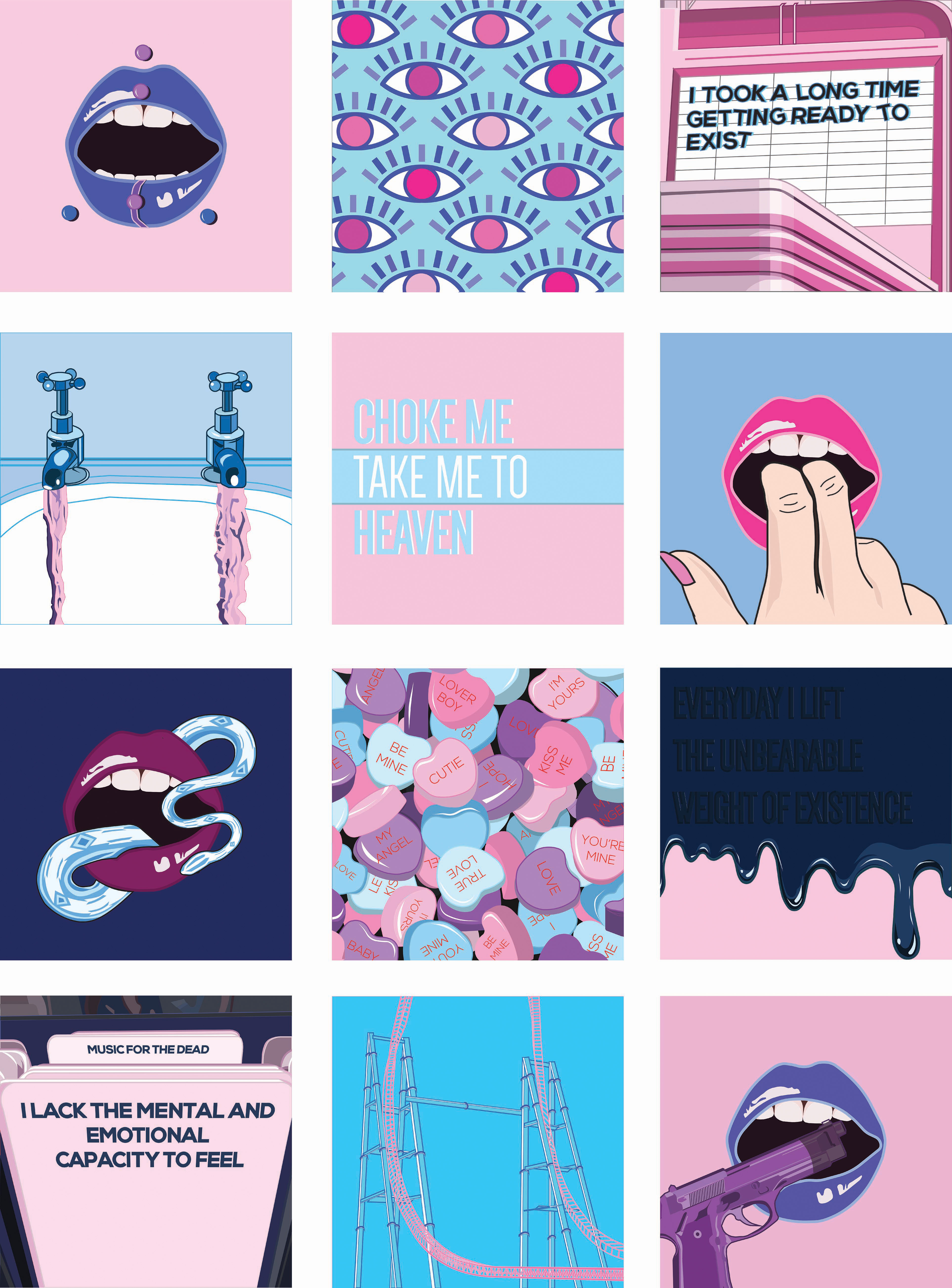
TRYING TO STAY NORMAL
The pink judging eyes of normal people results in the ego acting completely normal, represented by the entirely pink composition, in the public eye. However the ego can never truly hide its unorthodox-ness, as hinted by the hidden blue shadow of the type.
SECOND EQUATION
SOCIAL CHAMELEON
This is represent by the two colours pink and blue co-existing harmoniously. It shows how the ego is able to be both colours as any time of interaction.

MEET SIMILAR PEOPLE
This is shown by the two colours, similar to the piece above representing the ego.
GO CRAZY
This is shown by how in the above two compositions a muted pink and blue is used with duller tone to represent the ego and people similar to the ego. But when they come together, they become vibrant and more saturated in the last composition.
THIRD EQUATION
CYNICAL
This is represented by the extremely dark hue of the pink and blue used.

MEET PEOPLE WHO HAVE AN IDEALISE OUTLOOK
This is represented by the very bright, sweet, and saturated tone of pink, blue and purple used.
DESTROYS OTHERS’ IDEALS
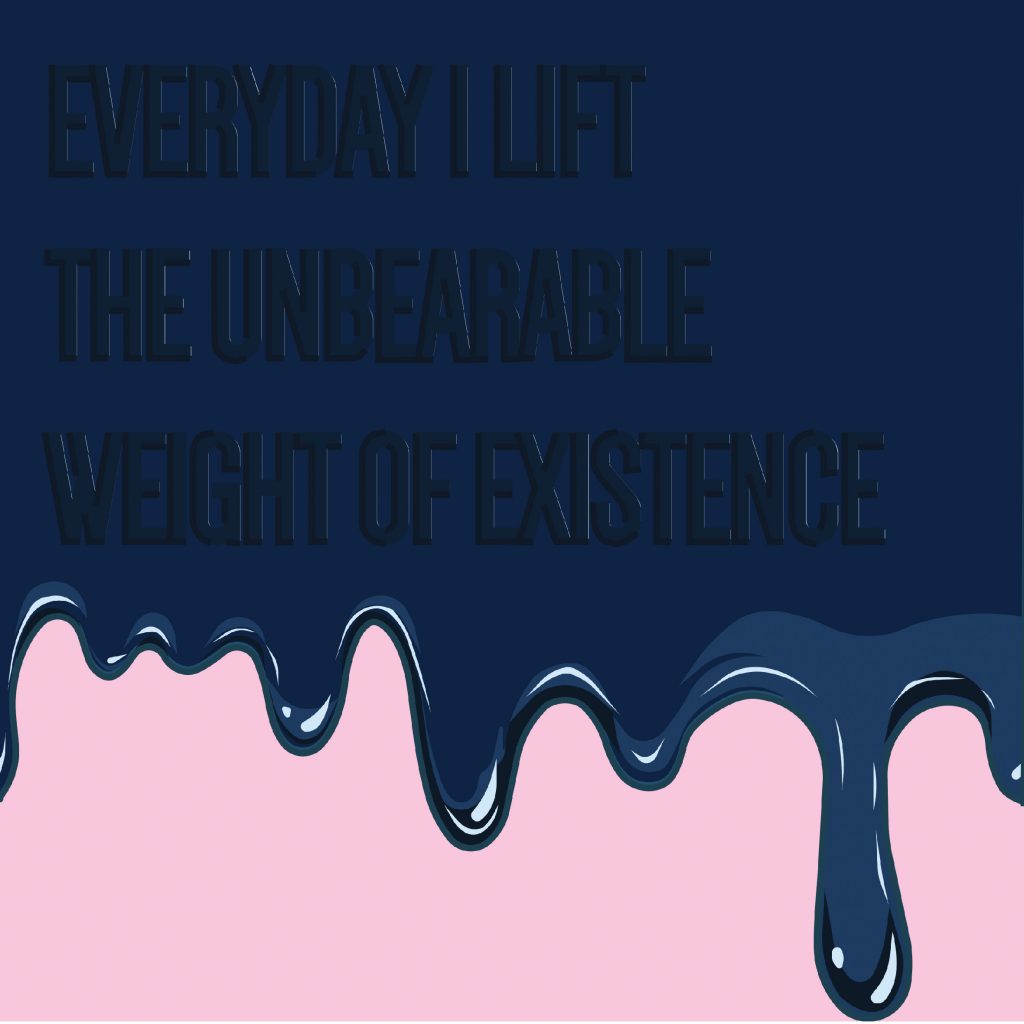
This is represented but how the darker hues (cynicism of the ego) literally seep and cover the pastel pink background (the ideals).
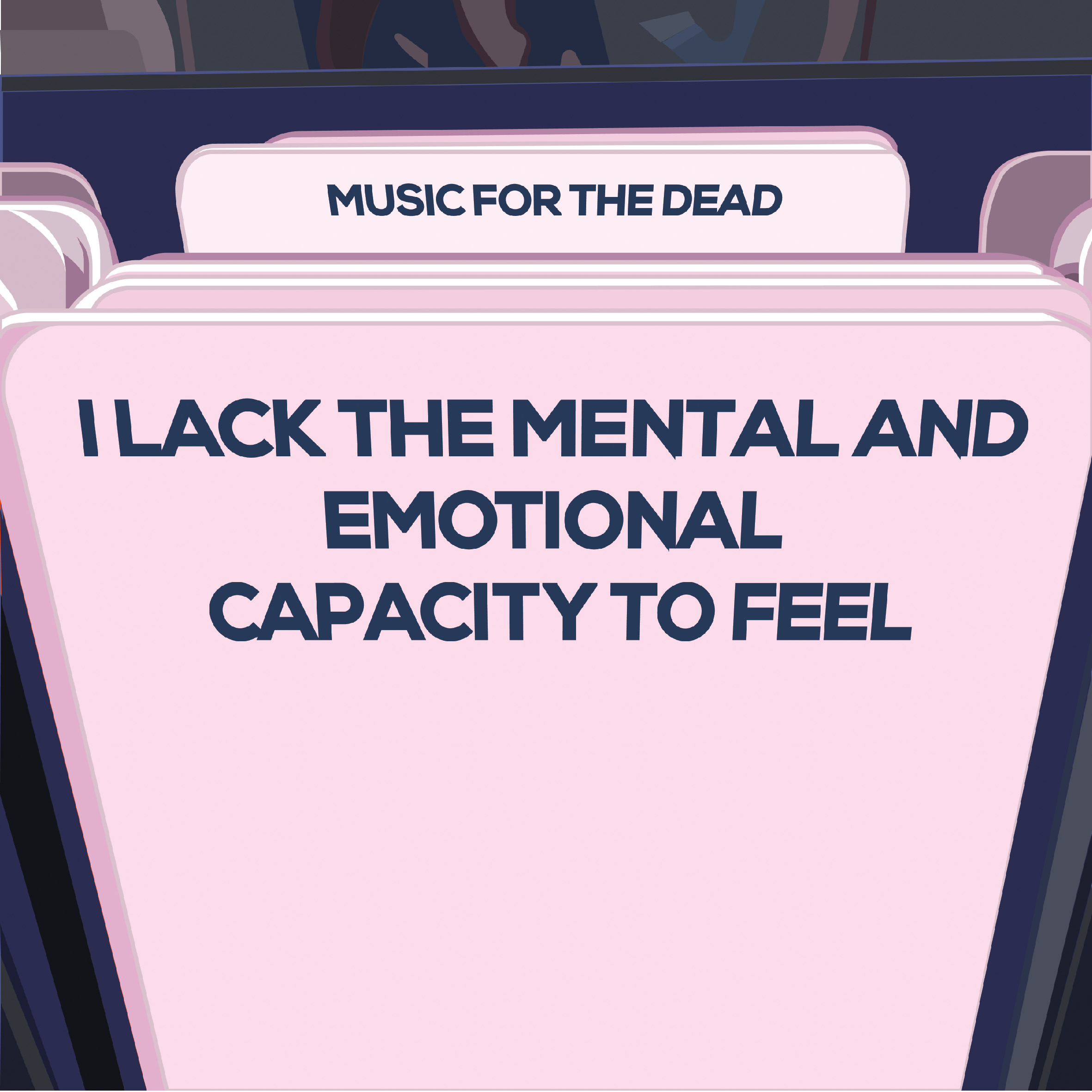
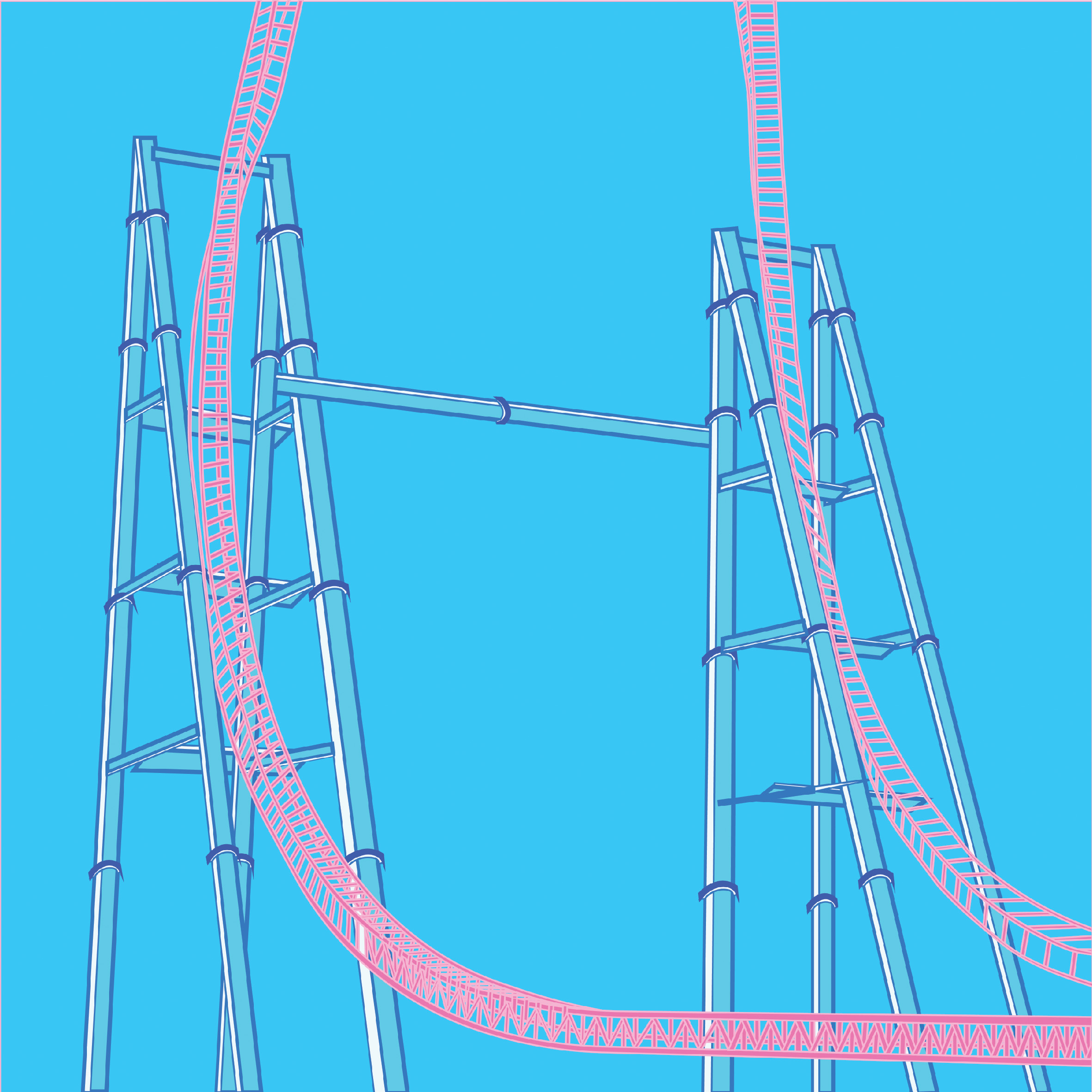
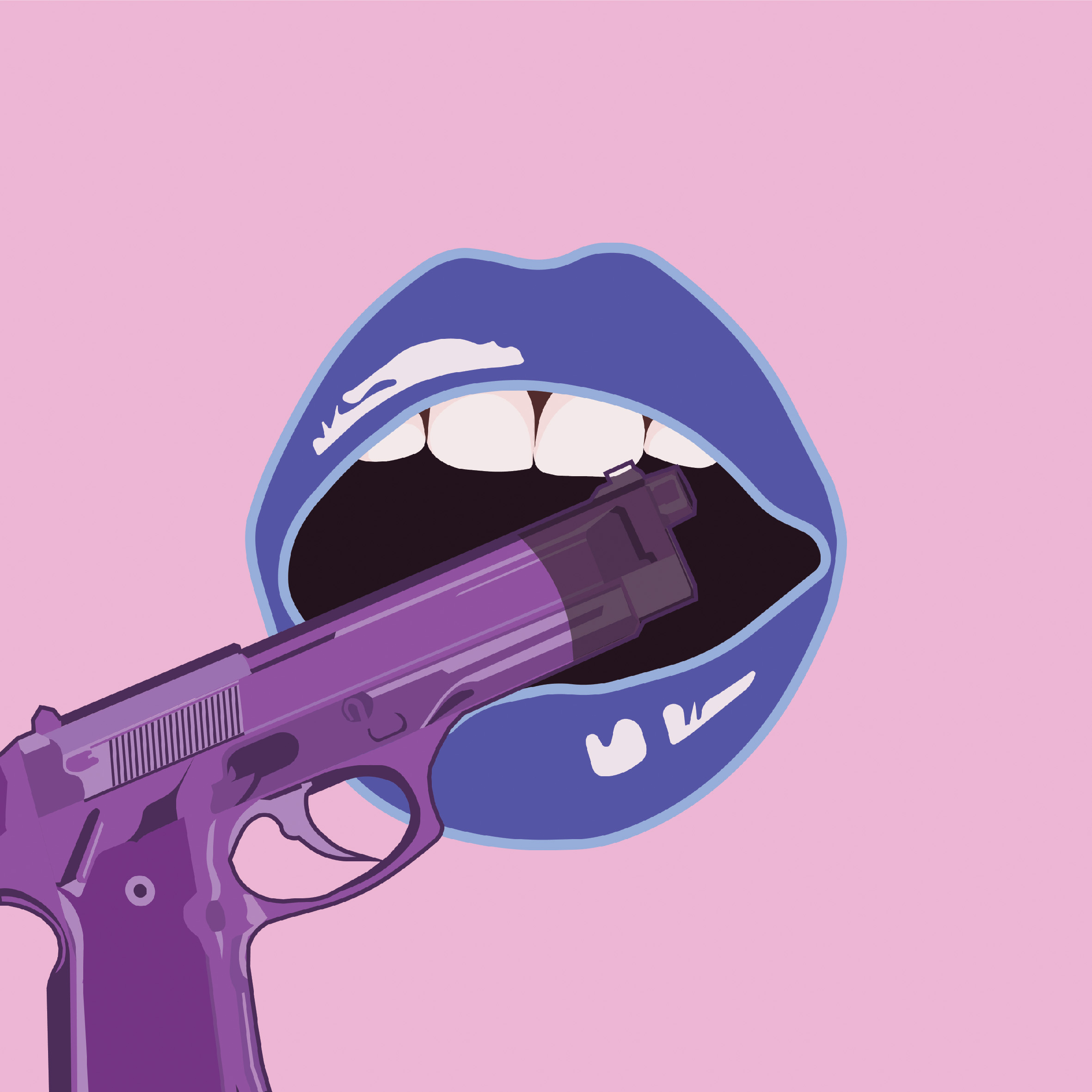
FOURTH EQUATION

LOW EMOTIONAL CAPACITY
This is represented by the de-saturated pink, blue and purple.

MEET EMOTIONAL PEOPLE
The emotional people is represented by the vibrant and saturated blue and pink, as well as the “emotional roller-coaster”.

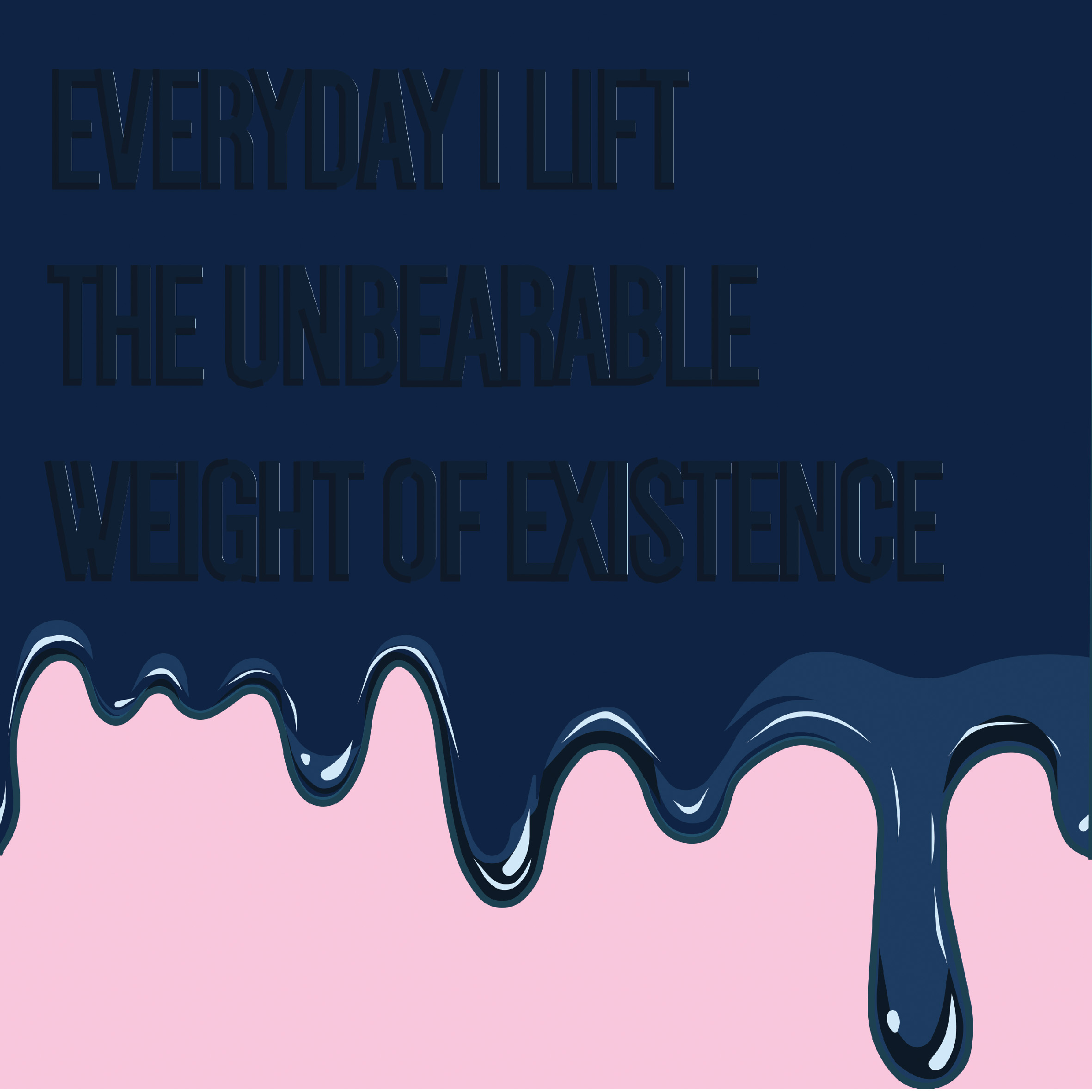
CANNOT MIX WITH EMOTIONAL PEOPLE
The ego is represented by the pistol which has unsaturated colours and the emotional people by the vibrant lips and background.
To conclude, I really enjoyed this project and felt that I am on my way to developing a visual style that I am proud to call my own. Some challenges I faced was time limitations to clean up certain details of the illustrations. However, on the whole, I am glad that I managed to come up with a coherent series. Also, a large thank you to Joy for being so patient and giving me so much guidance and confidence throughout my entire 2D journey.
Hope to continue working on such projects in future!
(Disclaimer: There was a problem with the colour of the high quality images of the illustrations after uploading them onto OSS, thus, after multiple trials and methods, I only finally managed to upload these with accurate colour. Please pardon the lower-quality images)