(Click to enlarge all images)
Overall idea:
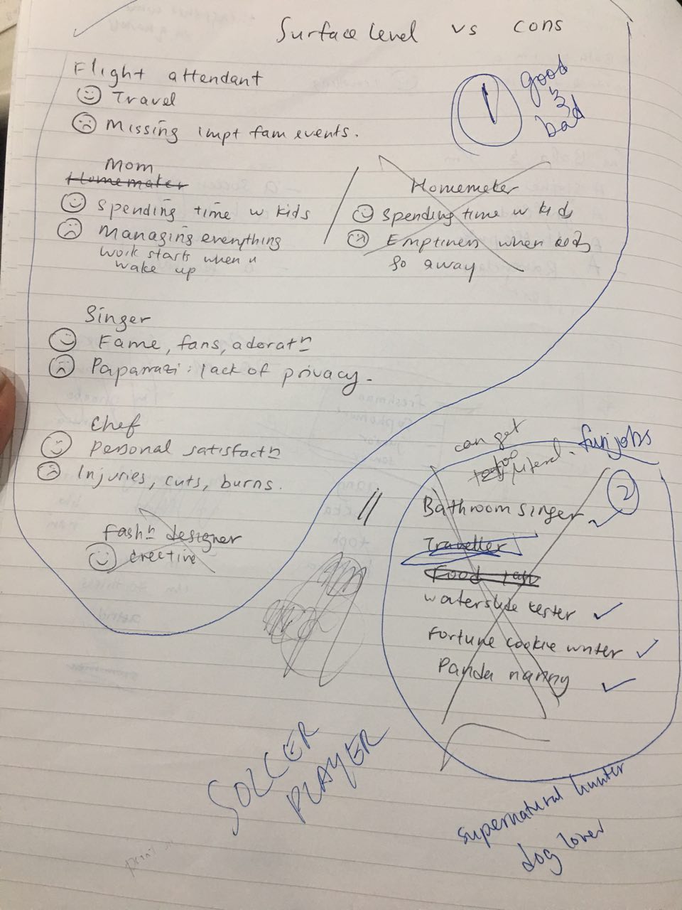
I wanted to show both the good and bad sides of a job – even though jobs may look fun on the surface, they often come with their own difficulties. When I was brainstorming for my four jobs at first, I looked at jobs I actually want to do after graduation. So in a sense, this project was my own weighing of the jobs against each other for myself.
I do this through a layered experience – with each of my four jobs, separate sections reveal the additional layer of meaning. This mirrors the whole surface level/deeper level concept I’ve got going on.
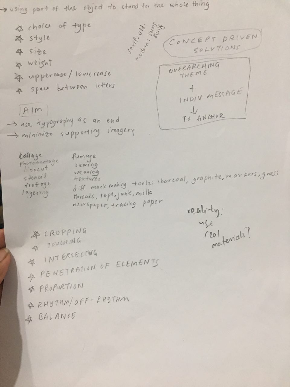
Art direction
I had a lot of trouble coordinating the colors across all four compositions, so I decided to adopt the color scheme of Oliver Jeffers. in particular, this work.
I extracted the colors and textures out from that piece, and made my color moodboard.

I really enjoy the contrasting textures – I think it makes the work interesting to look at and was something I wanted to emulate. I used a variety of mediums, with watercolor, acrylic, color pencil and even printing out textures (for the flight attendant piece).
Here are some previous color schemes I did digitally, before I thought of using a unifying color scheme.

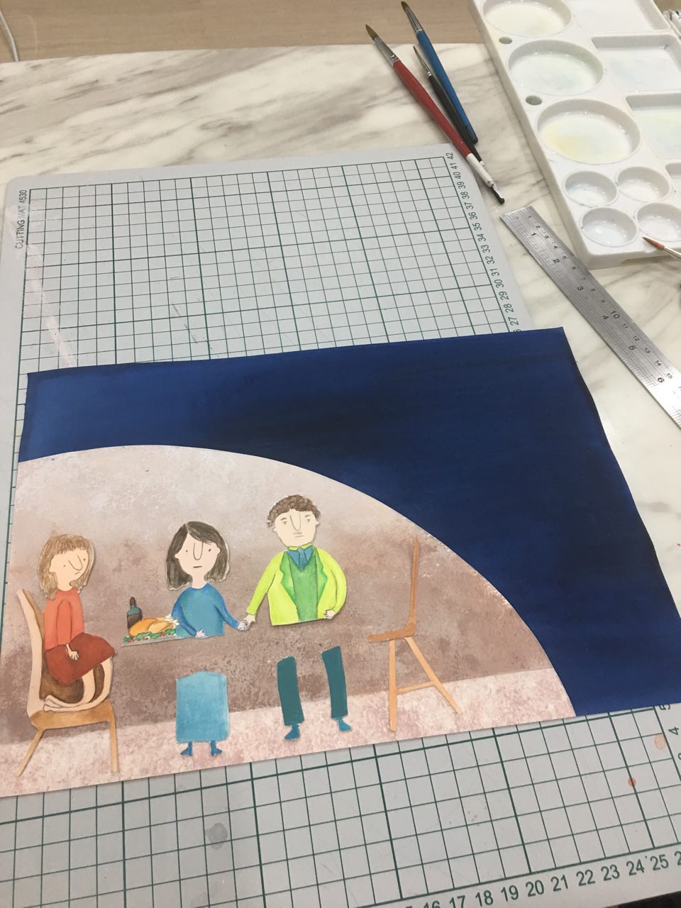
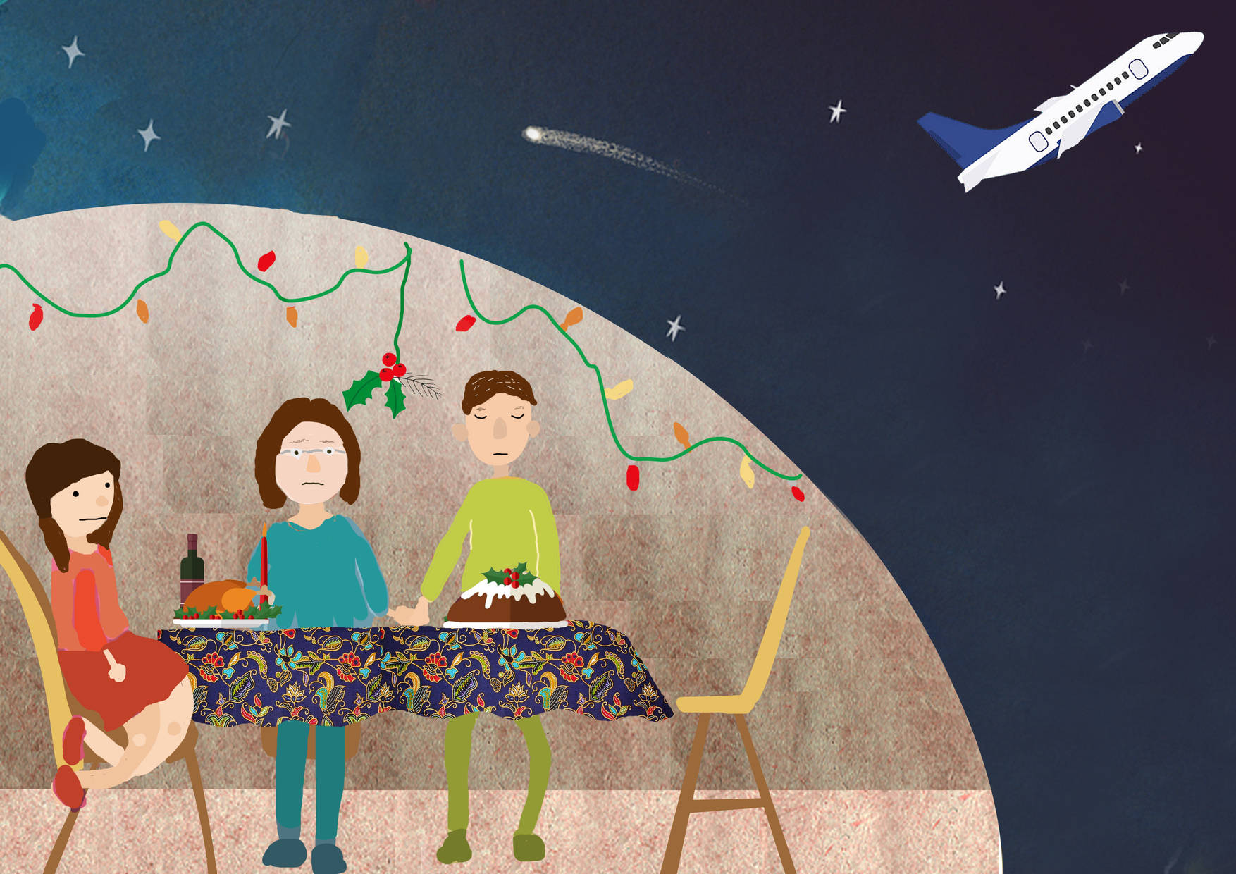
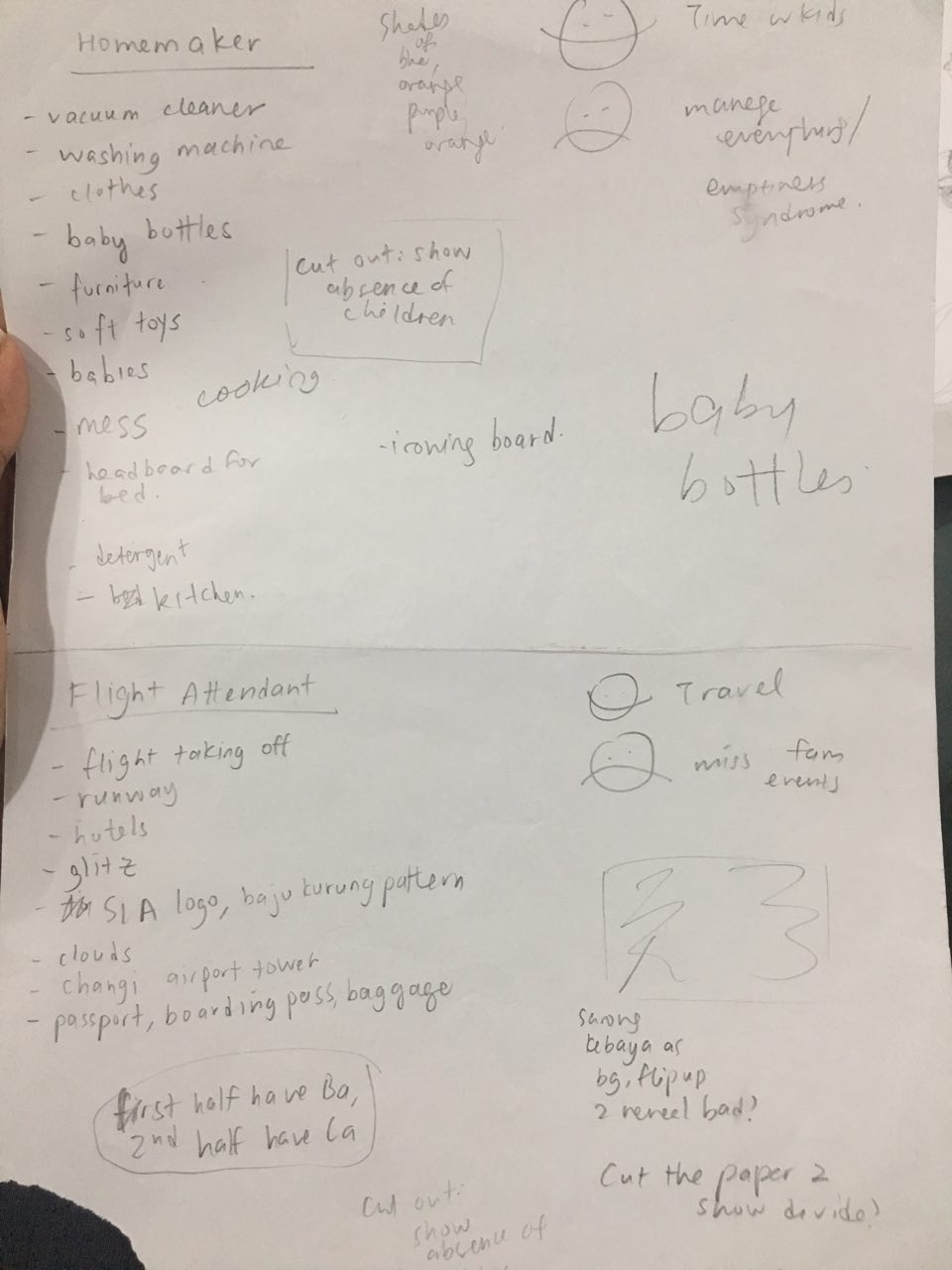
Job 1: SIA Flight attendant
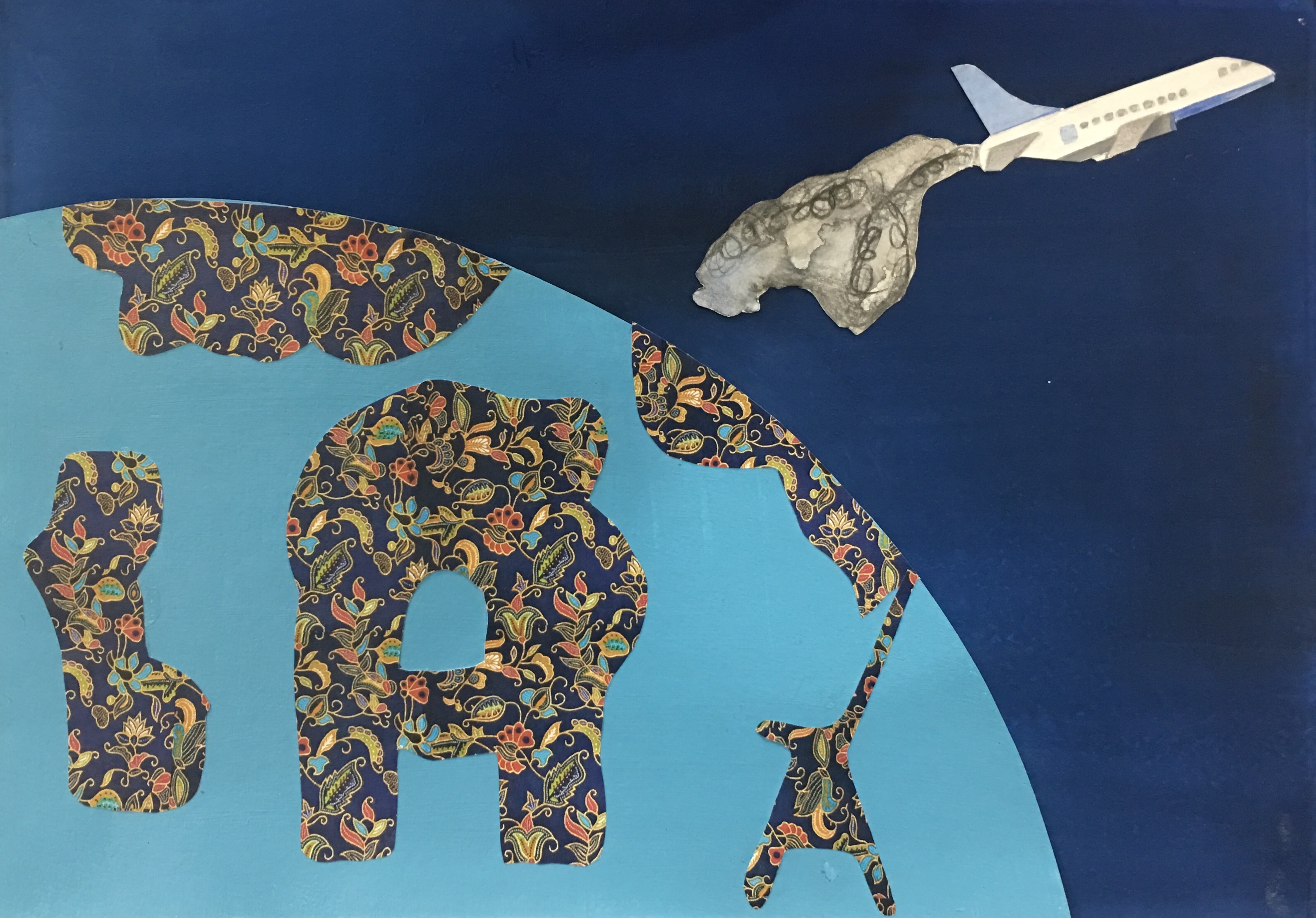
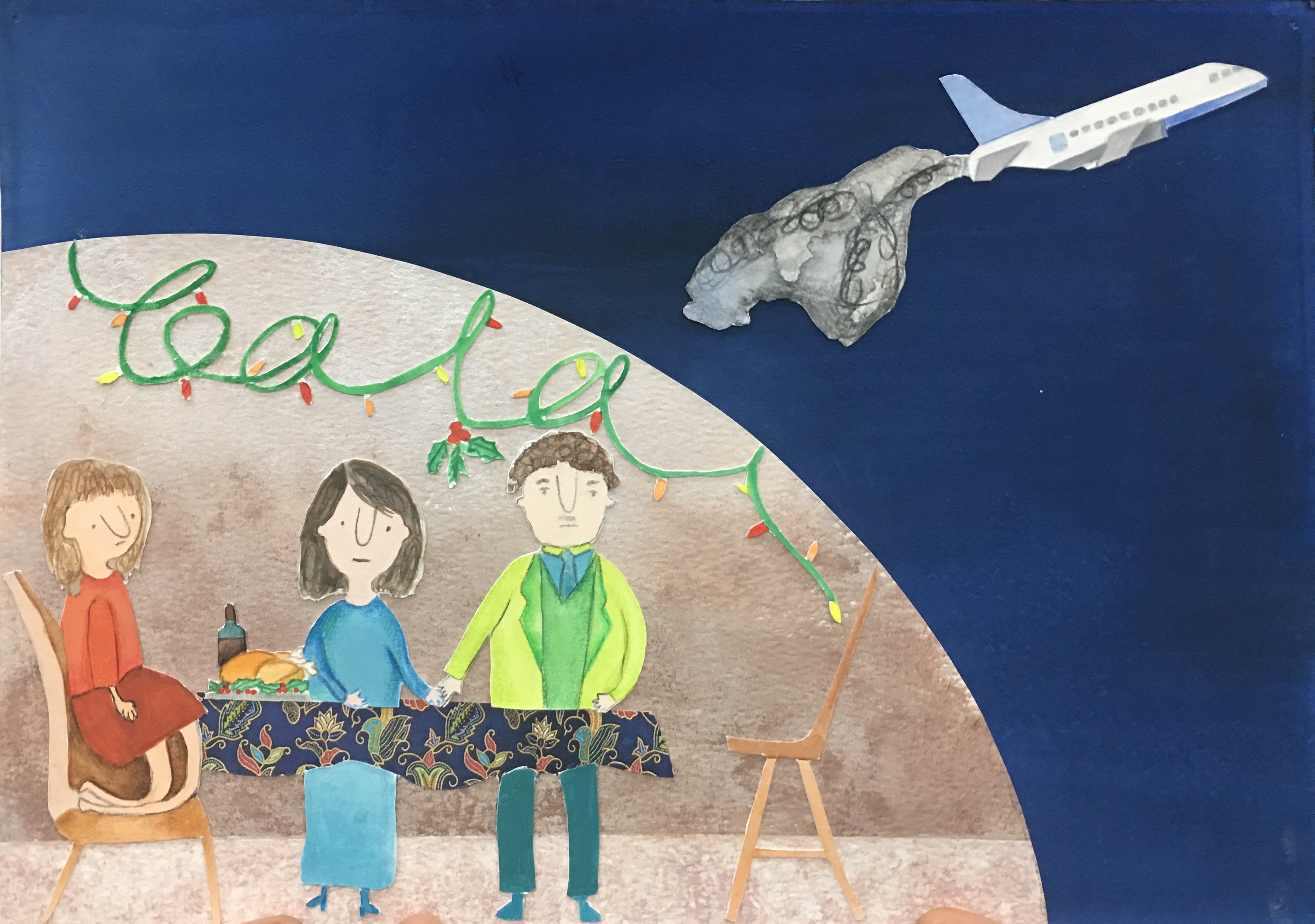
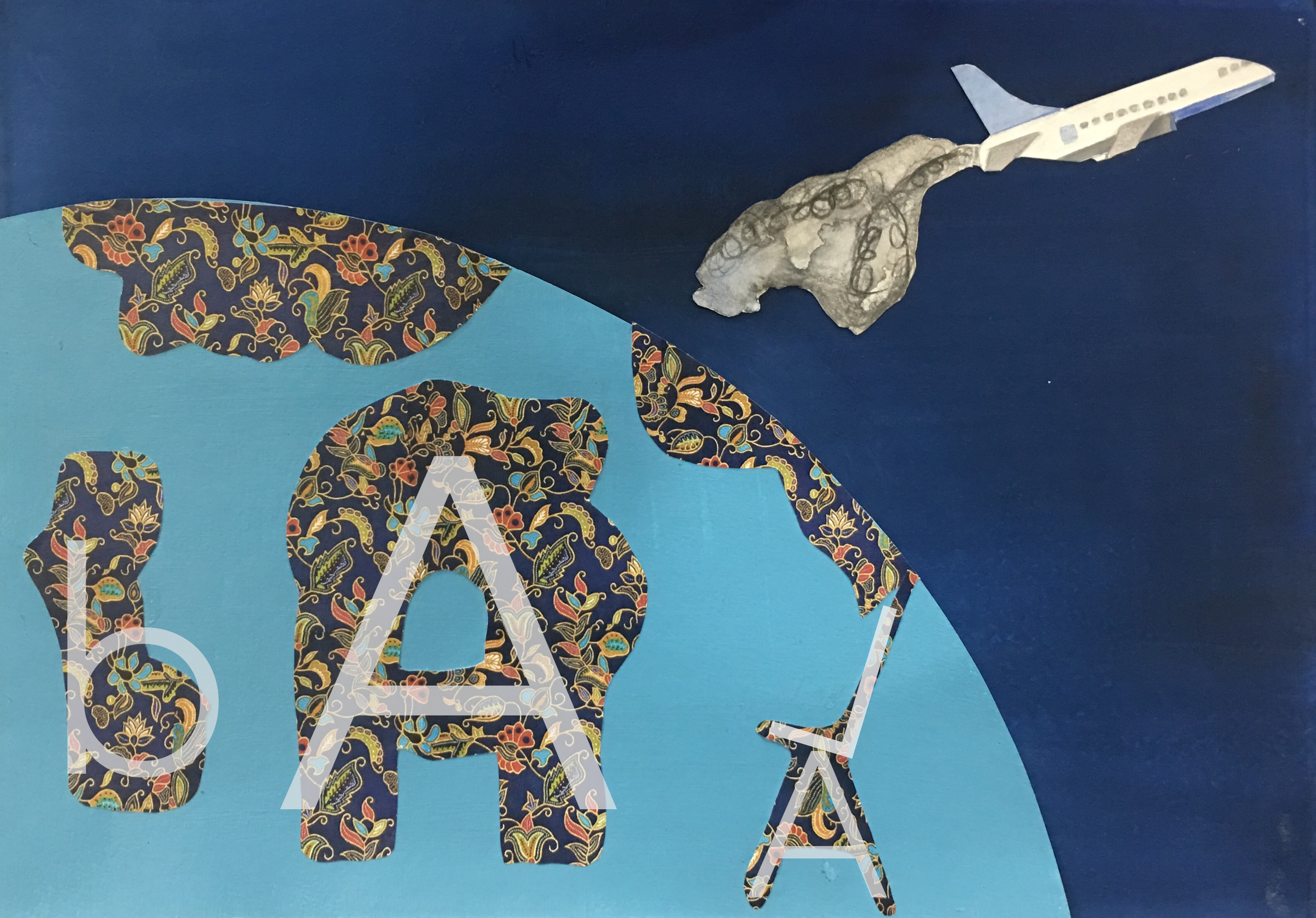
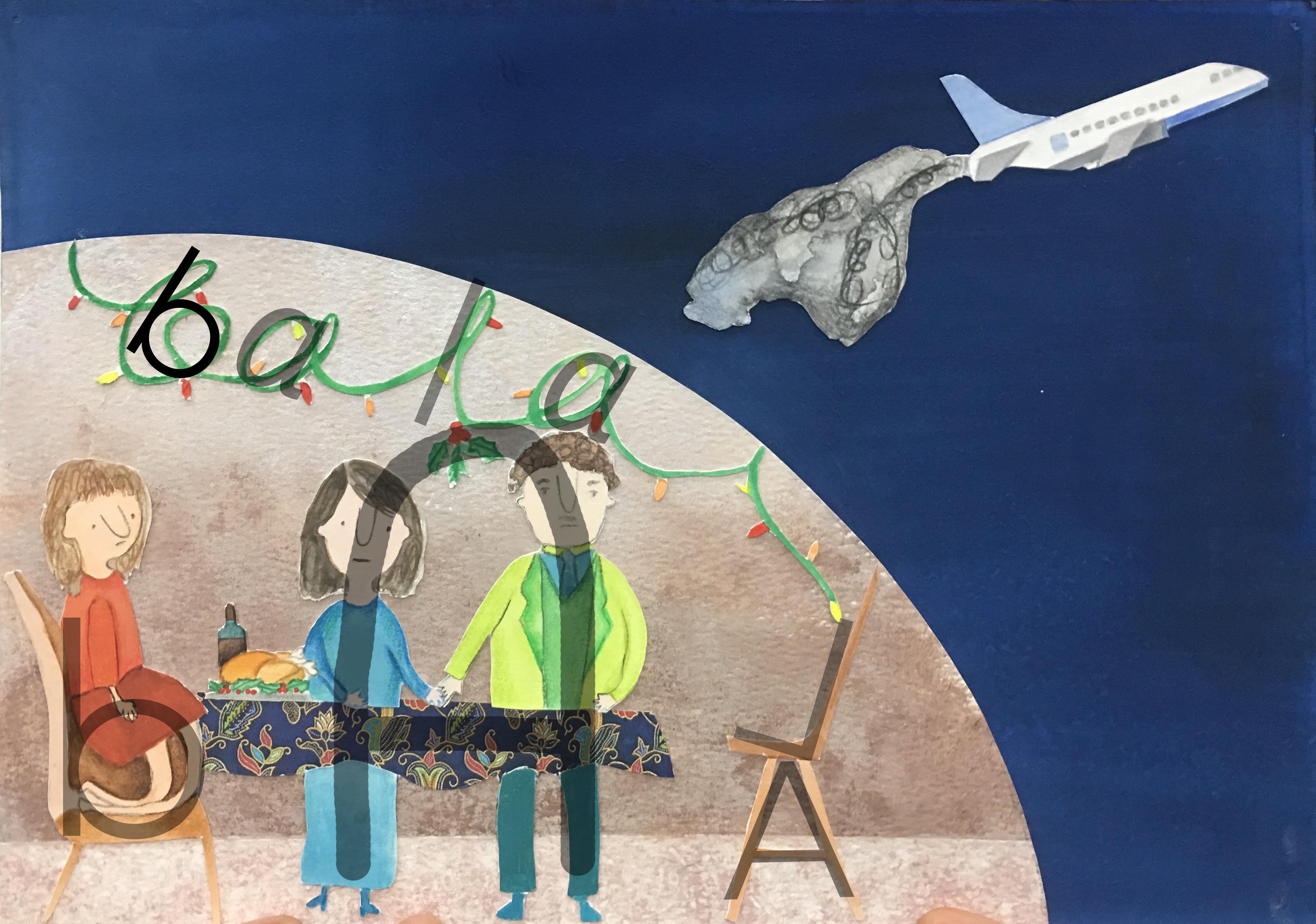
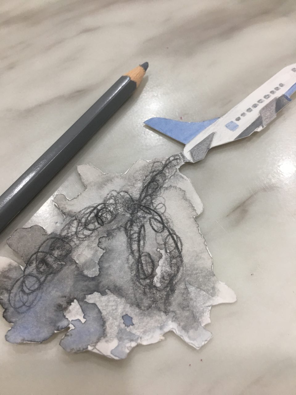
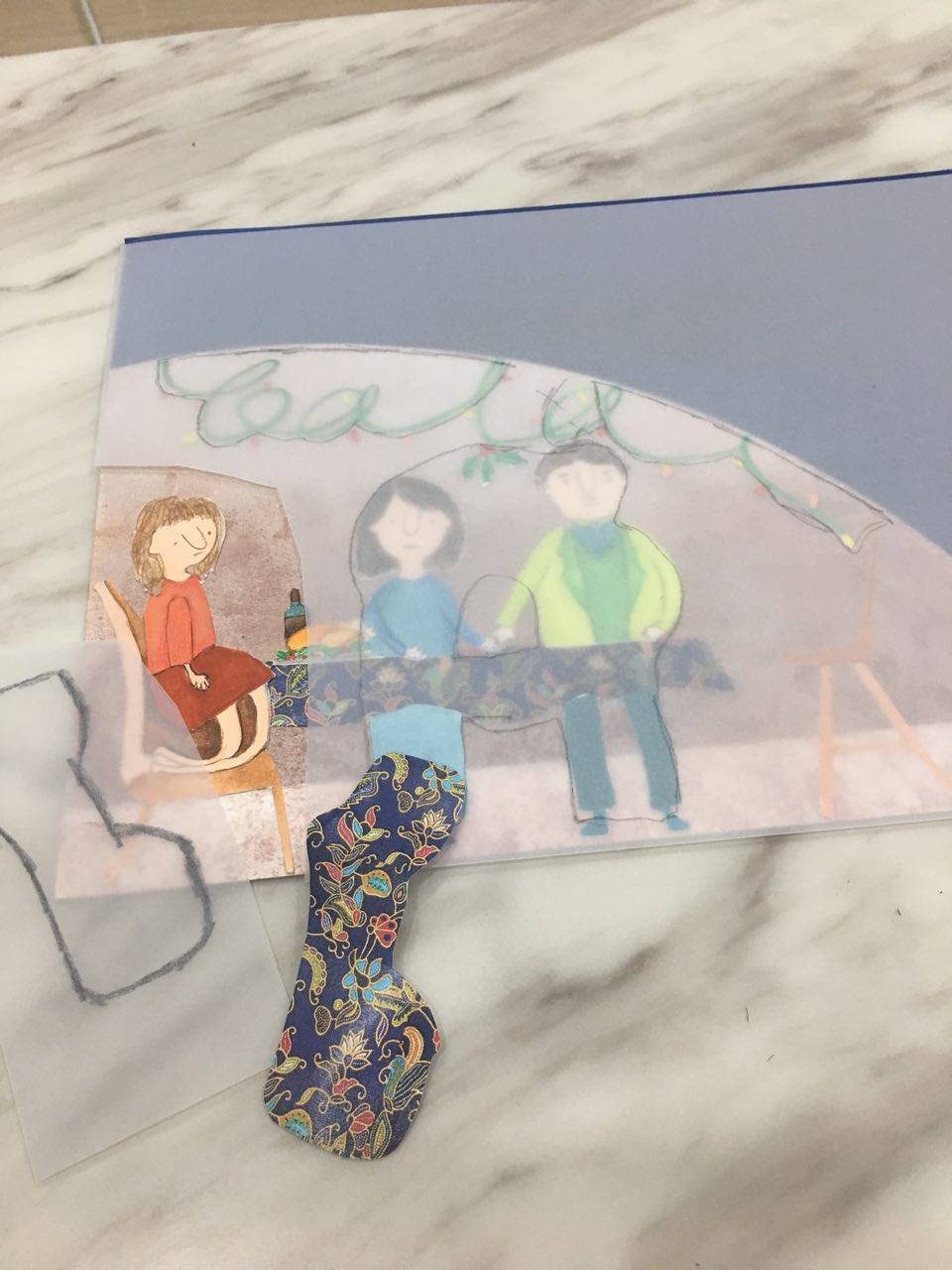
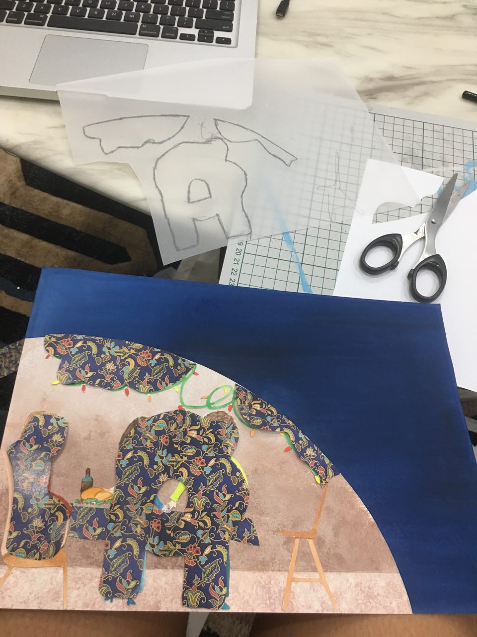
For this work, the good side of being a flight attendant is that you get to travel. I tried to show that in the first composition with the airplane jetting off. However, with this jetting off, you come to miss family occasions as well. I decided to depict this drawback after reading accounts by former SIA hostesses: https://mothership.sg/2015/05/27-hard-truths-about-the-life-of-an-air-stewardess-according-to-a-former-spore-girl/ (Number 6 talks about missing important occasions because you are overseas.) The two compositions are unified by the use of the kebaya pattern on SIA stewardesses’ uniforms, as well as the airplane.
Use of letterforms:
- I used the rounded letterform of the lowercase b to my advantage to manipulate the sister (in orange) into a b shape.
- An uppercase A is implied with the mom and dad. The empty chair contains letters L and A.
- Hence, in this composition, I treated the uppercase A as both a curvy shape for the parents, as well as a sharp, angular form for the chair.
- The tinsel (to indicate an occasion, possibly Christmas) spell out bala in cursive. Here, I treat the lowercase letters as round forms.
- I matched the land in the earth shape to shape with the underneath letterforms with tracing paper. The layers, hence, reflect each other.
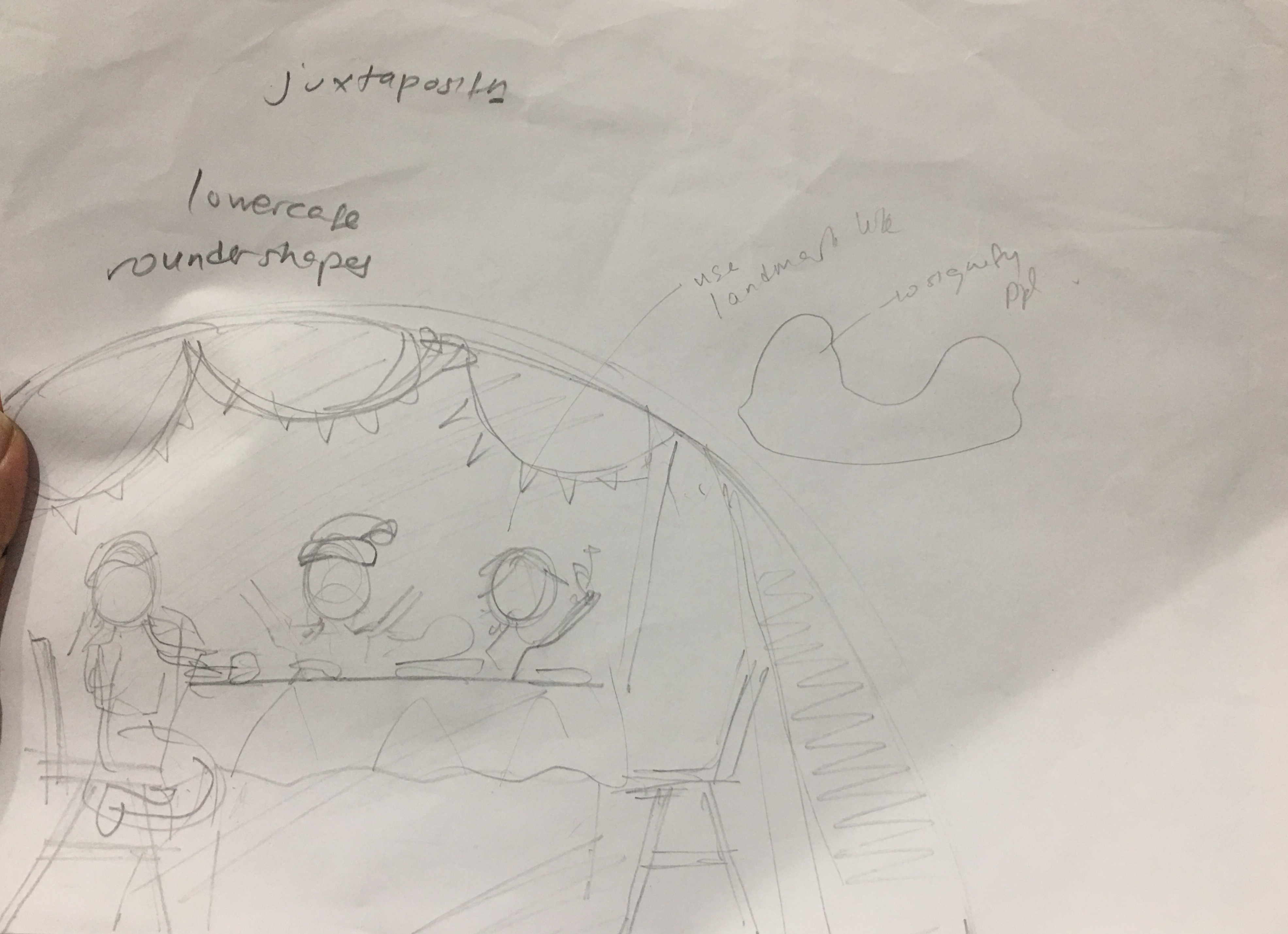
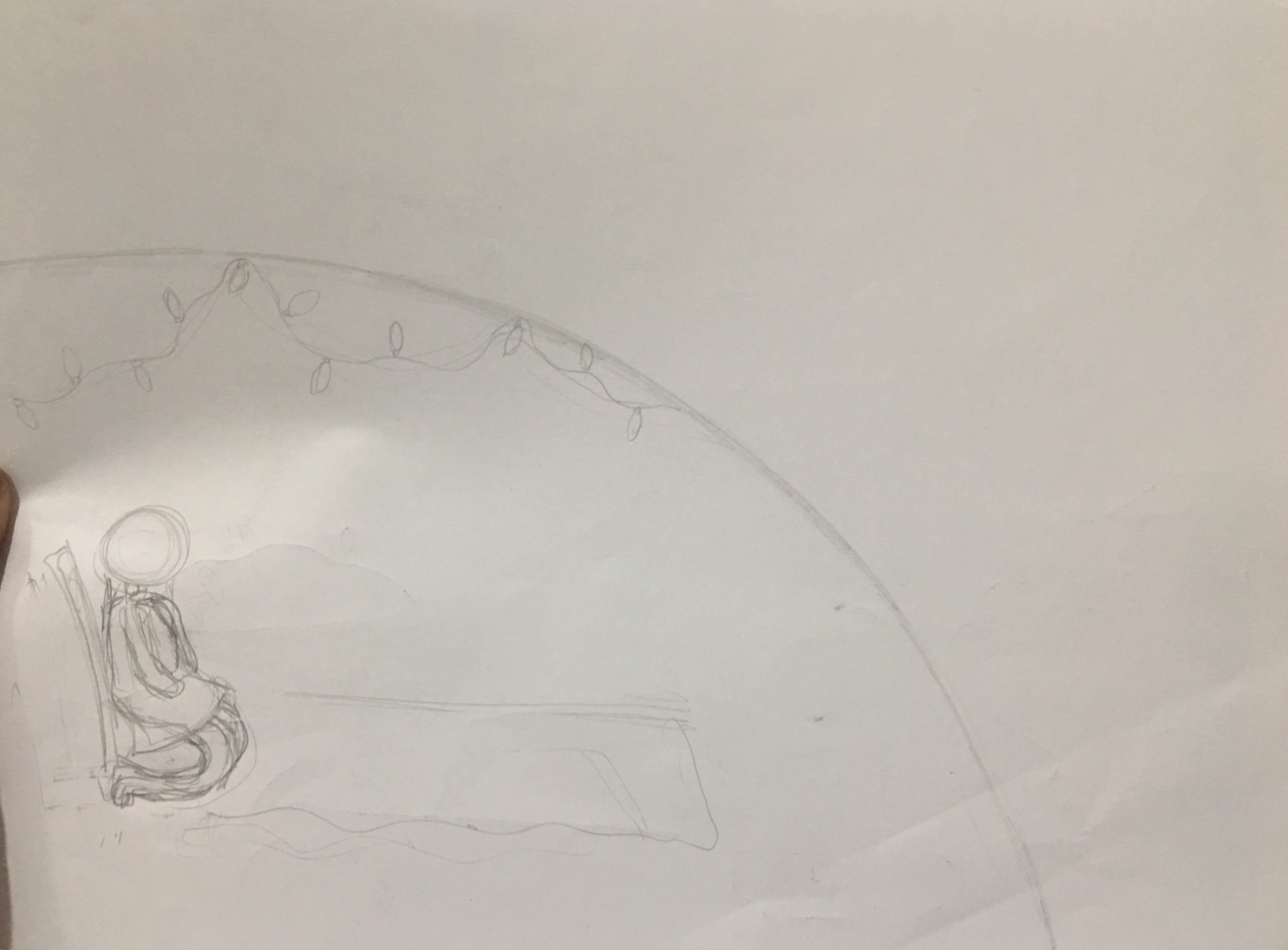
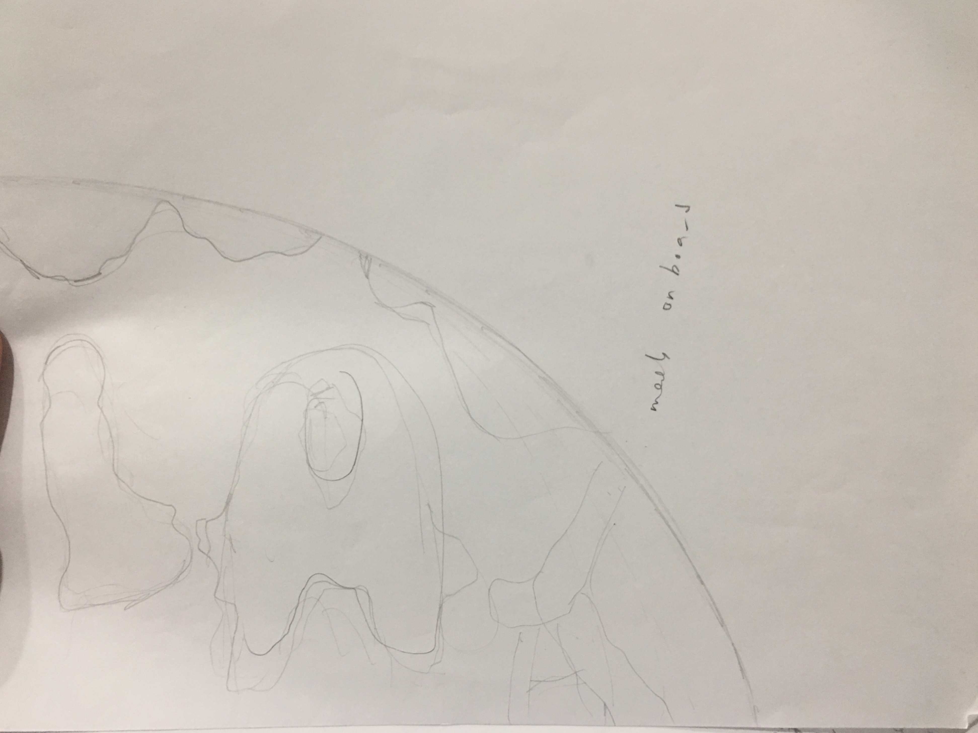
Process:
Initially, I did not think of using the tinsel to form letters, but Joy alerted me to this possibility. Also, I did not think of manipulating the girl to form a lowercase b, but that possibility also came up during consultations. Here are my sketches!


I also did a digital mockup:
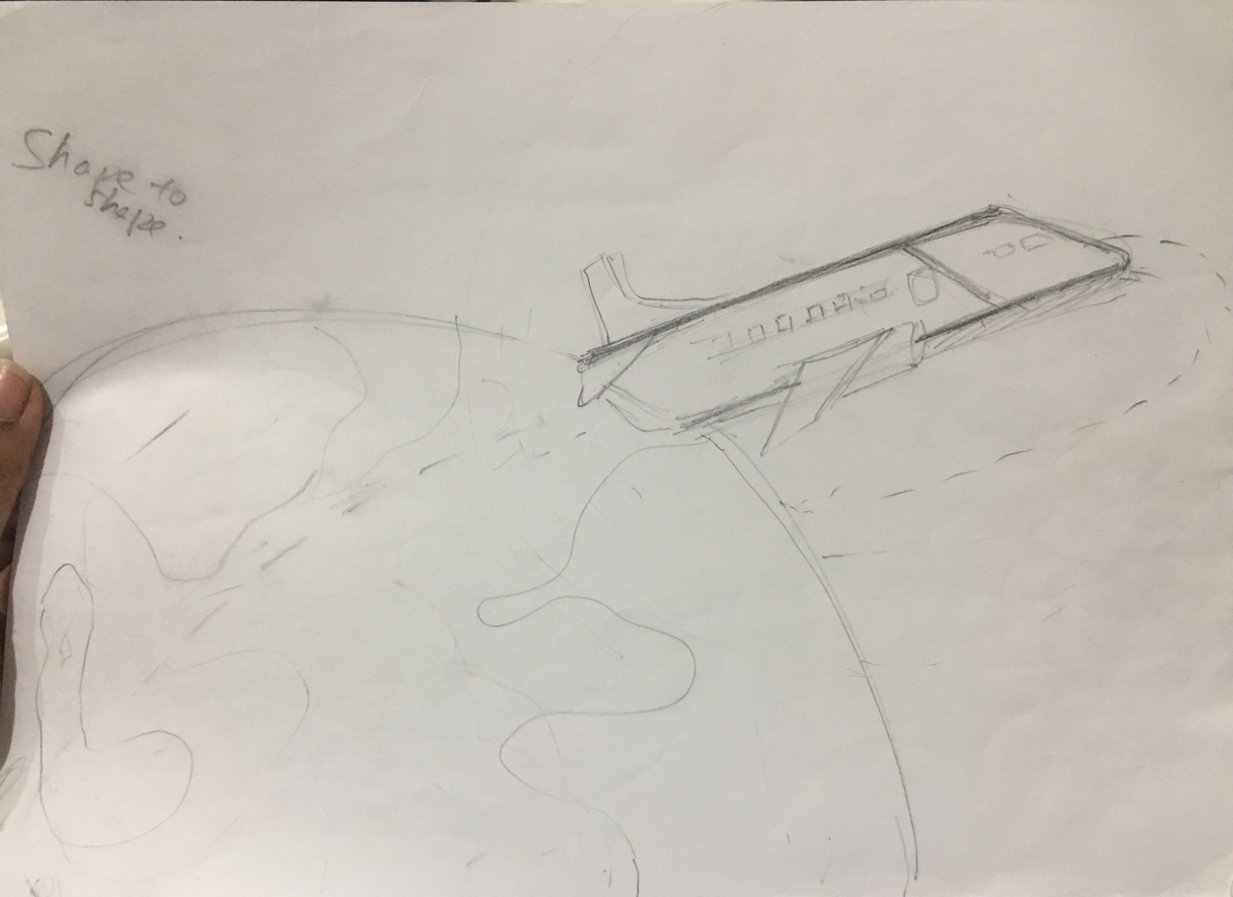
Improvements after critique:
- More could have been done with the airplane and the smoke!
- The smoke could have formed a more obvious lowercase L. Right now, it forms a cursive lowercase L upside down, but it is not very clear.
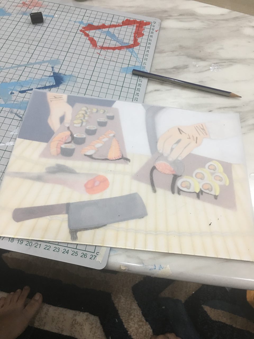
Job 2: Sushi chef
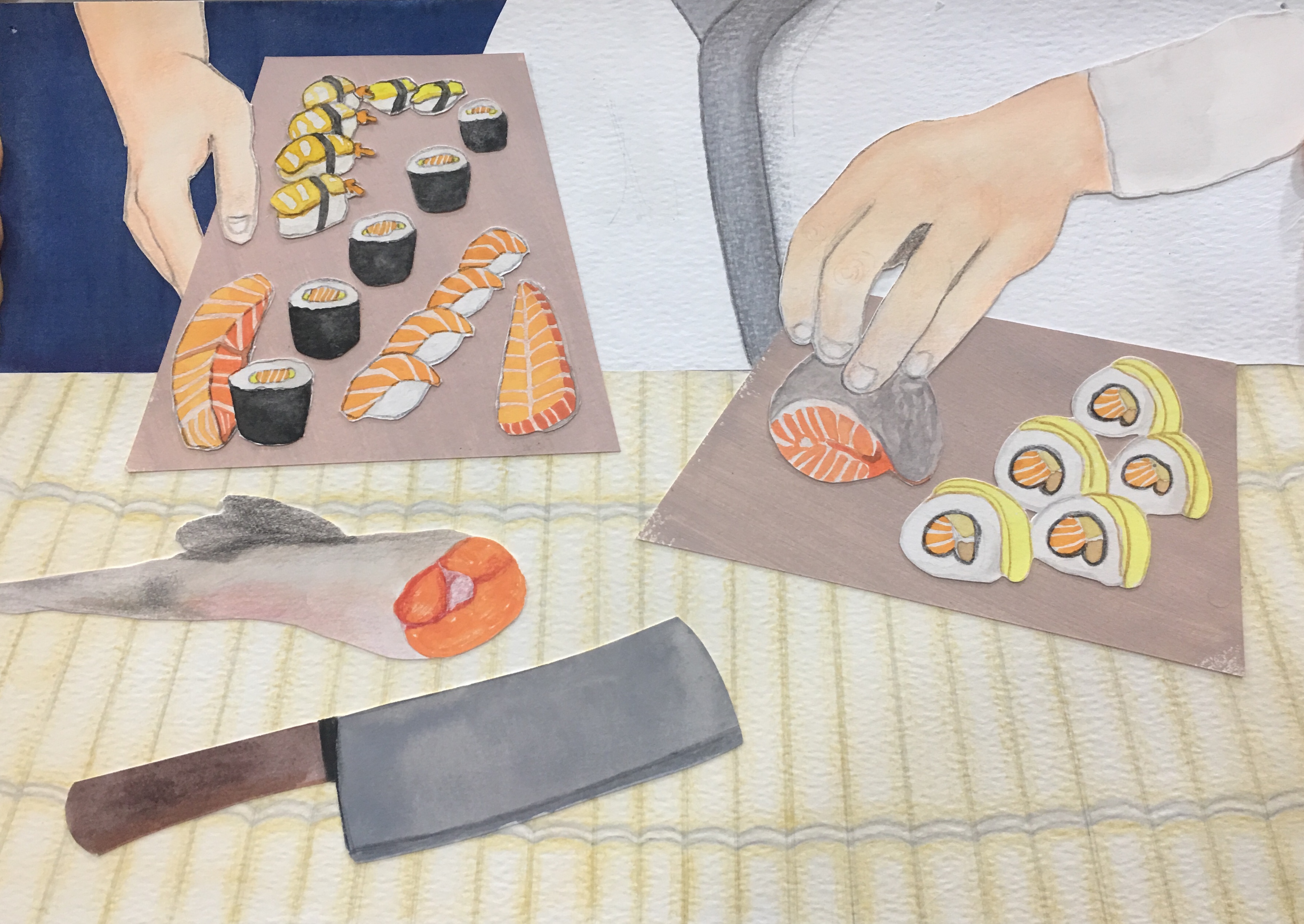
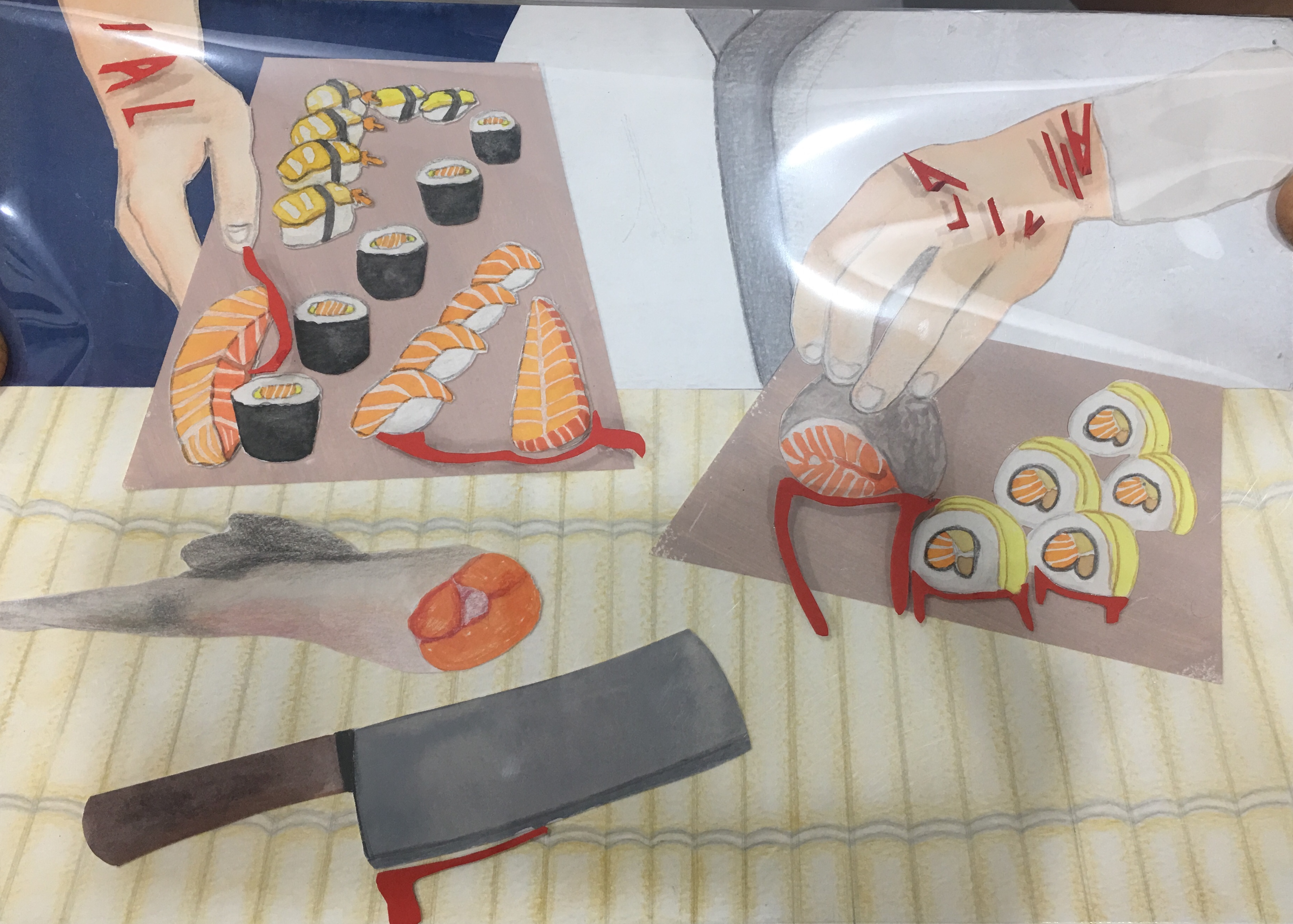
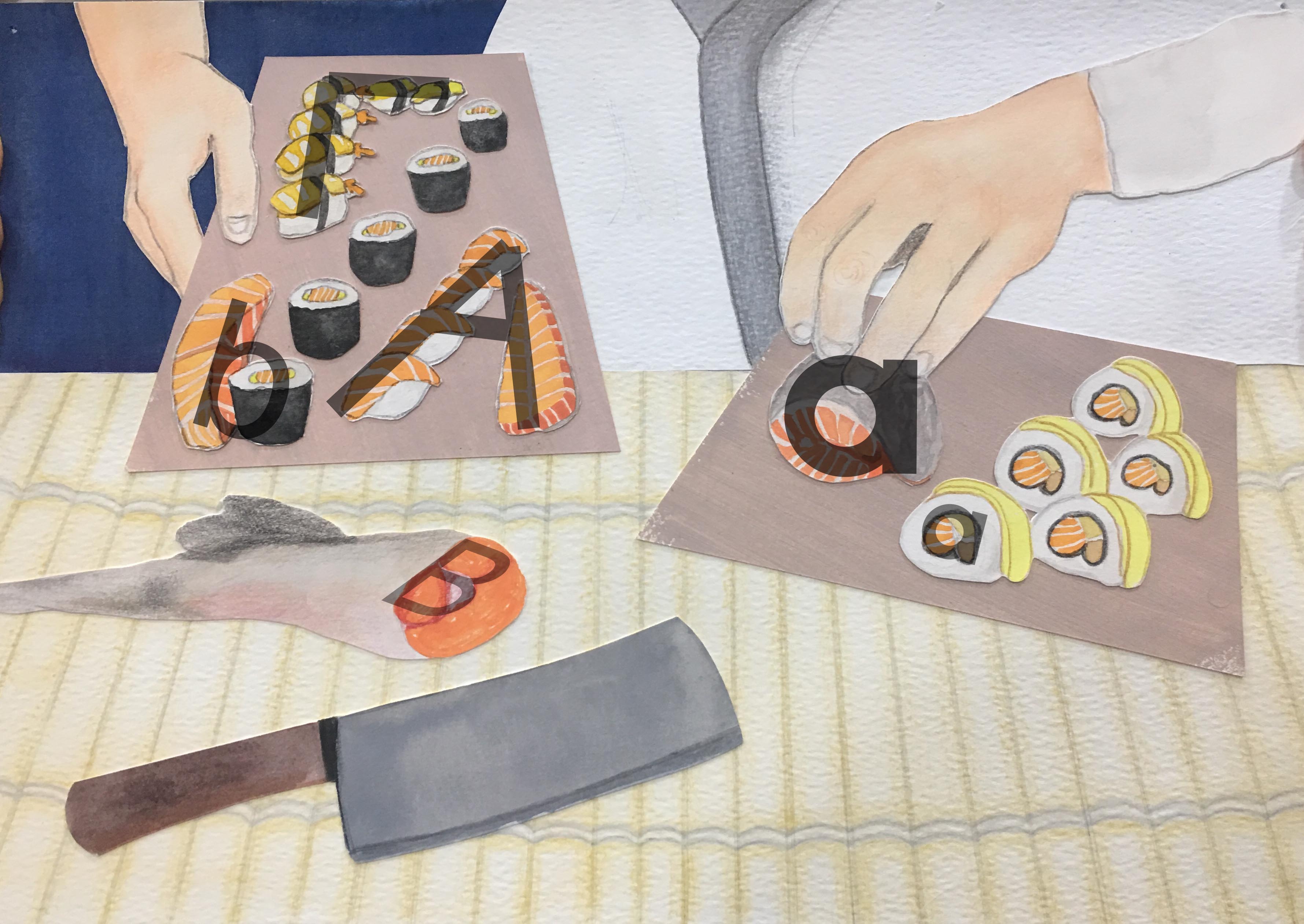
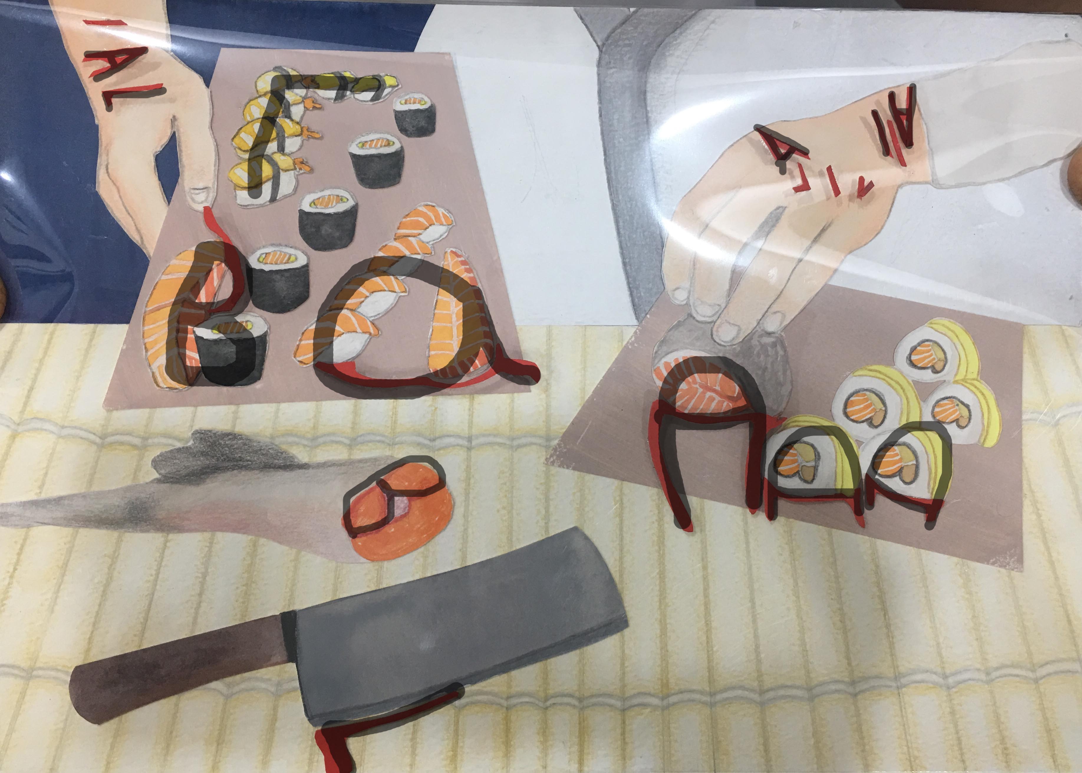
For this work, I wanted to show how although being a sushi chef might be glamorous with very aesthetically pleasing sushis (I tried to make the sushi as “good-looking” as I could), being a chef is actually very hard because you have to power through your fatigue, which could result in cuts and accidents. I got this con from https://www.apnaahangout.com/pros-cons-chef/, specifically con number three. It’s also reflected in Masterchef episodes where the chefs do injure themselves quite often. I thought that this could happen with sushi chefs because sushi knives are so big and sharp.
Use of letterforms:
- A lot of this work plays with the transition from uppercase to lowercase, and vice versa. For this, I looked closely at the letterforms as shapes.
- In the “good” composition, there is an A in the sushi plate on the top right. This sushi then becomes a lowercase ‘a’ with the blood in the second composition.
- In the same platter, a lowercase ‘b’ becomes an uppercase ‘B’ with the addition of blood, again. Here, we see a transition from lowercase to uppercase, compared to previously where there was a transition from uppercase to lowercase.
- In the sushi platter to the right, the lowercase to uppercase pattern is repeated with the smallercase ‘a’ becoming an uppercase ‘A’ with the addition of blood.
- I capitalized on the angular nature of the ‘A’ and ‘L’ letterforms by manipulating them into cuts onto the chef’s wrists.
- I capitalized on the rounded nature of the ‘B’ letterform with the cross-section of a salmon fish.
- An uppercase ‘L’ is formed in the sushi plate to the left.
- I used the edge of a sushi knife to make an angular uppercase ‘L’ with blood in the ‘con’ composition.
Process:
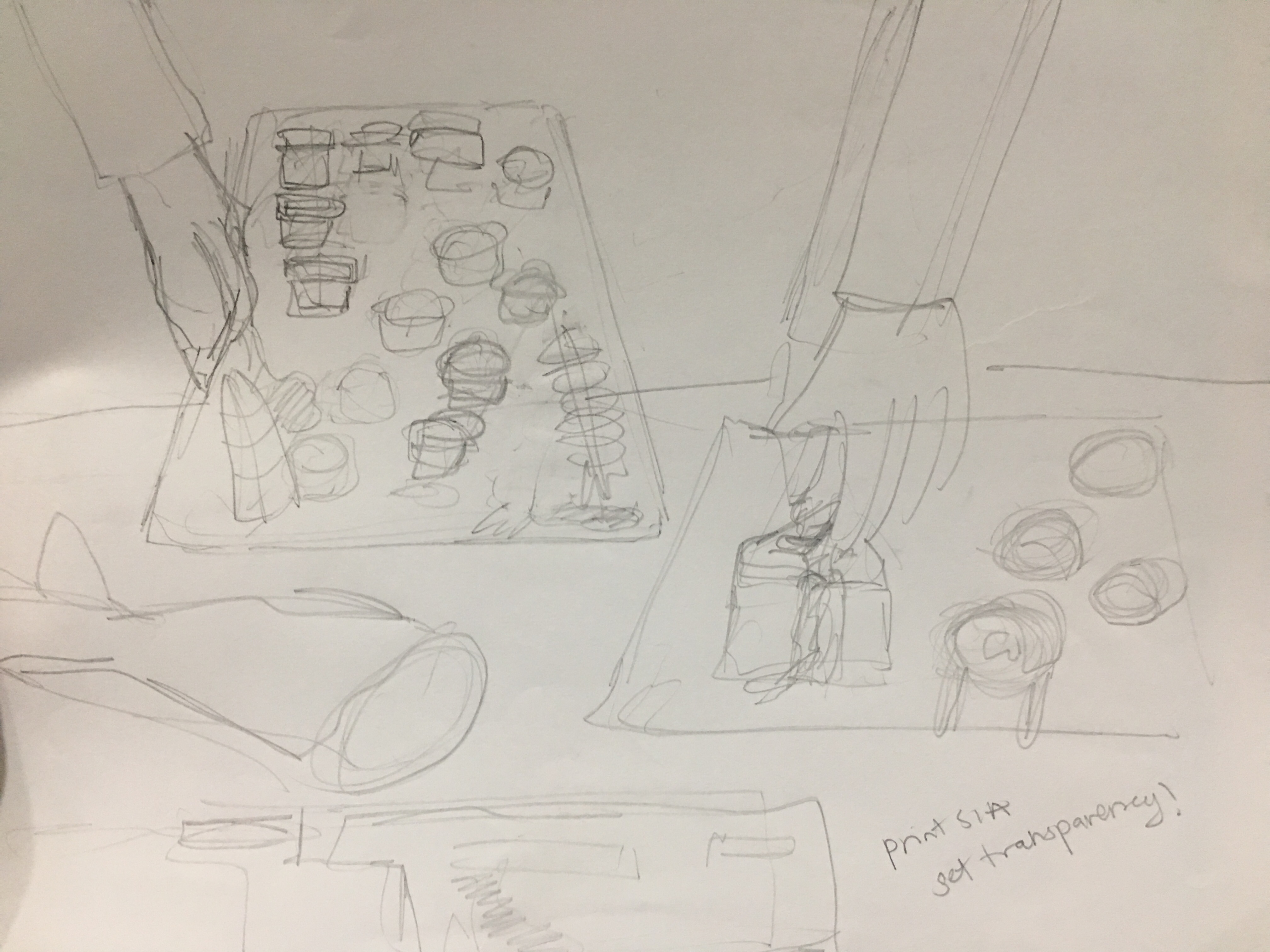
A lot of my sketches dealt with the placement of the sushis, how to manipulate the sushis, and getting the perspective correct.


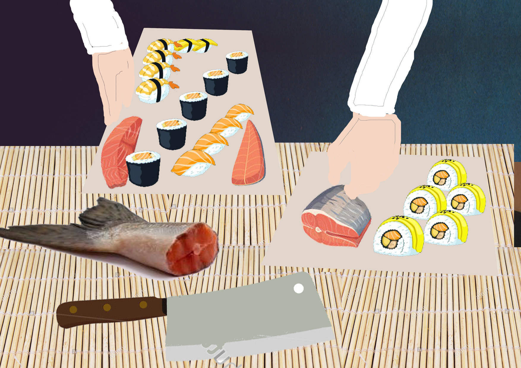
I did a digital mockup for this as well:
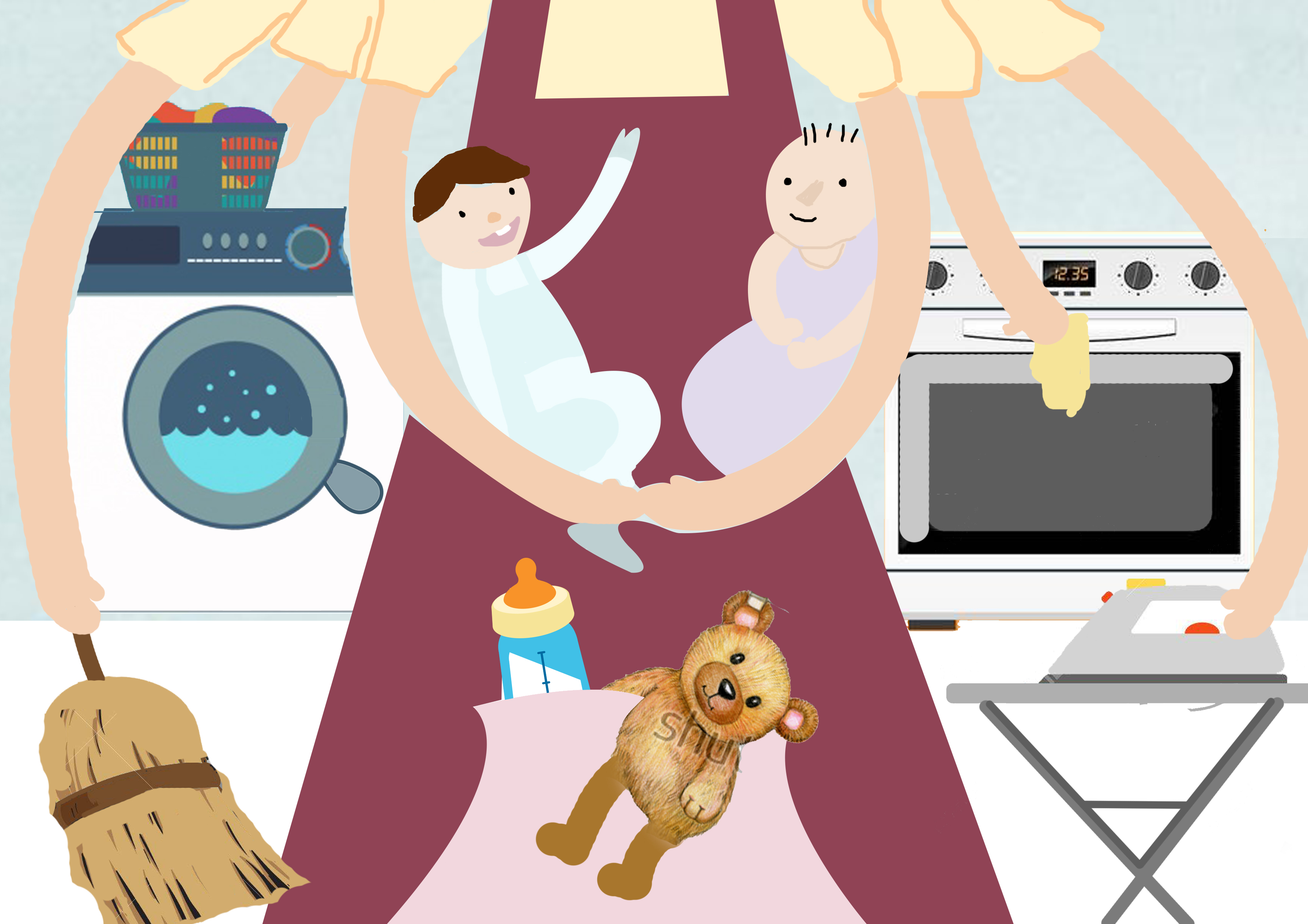
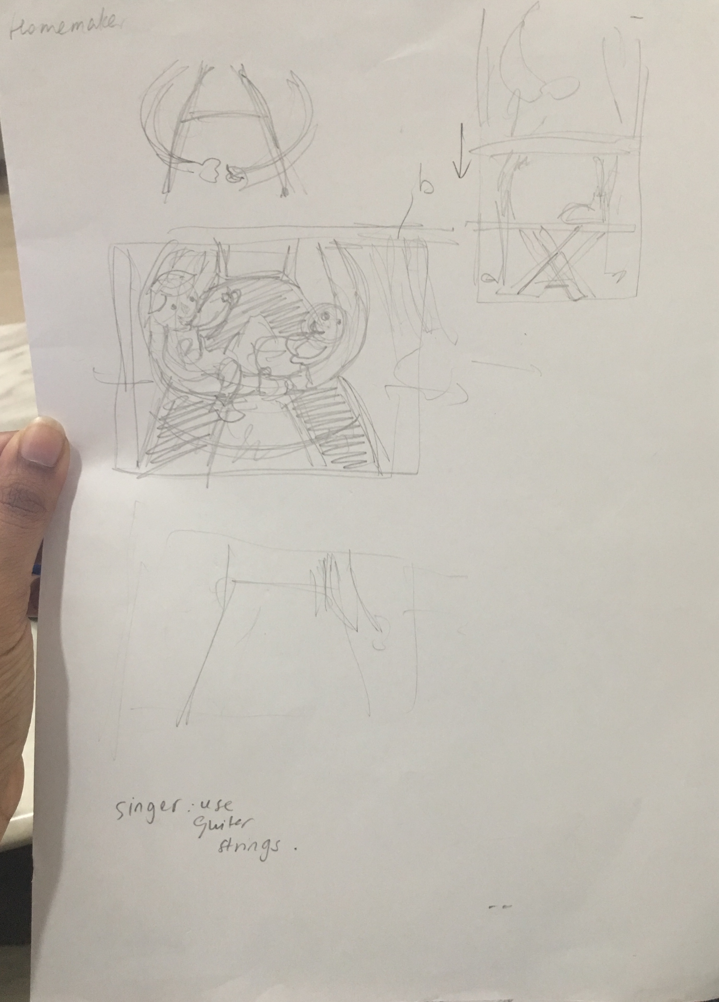
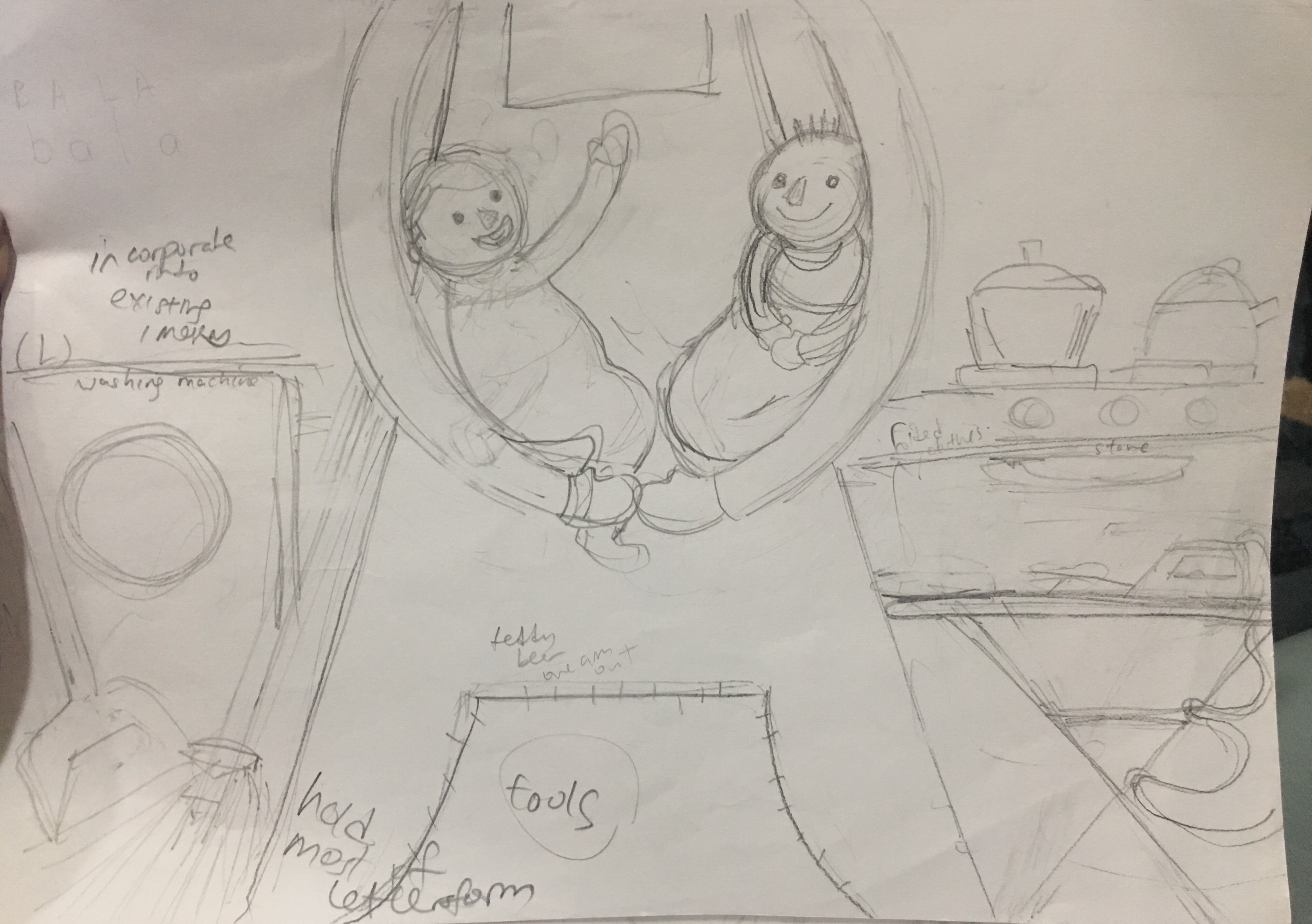
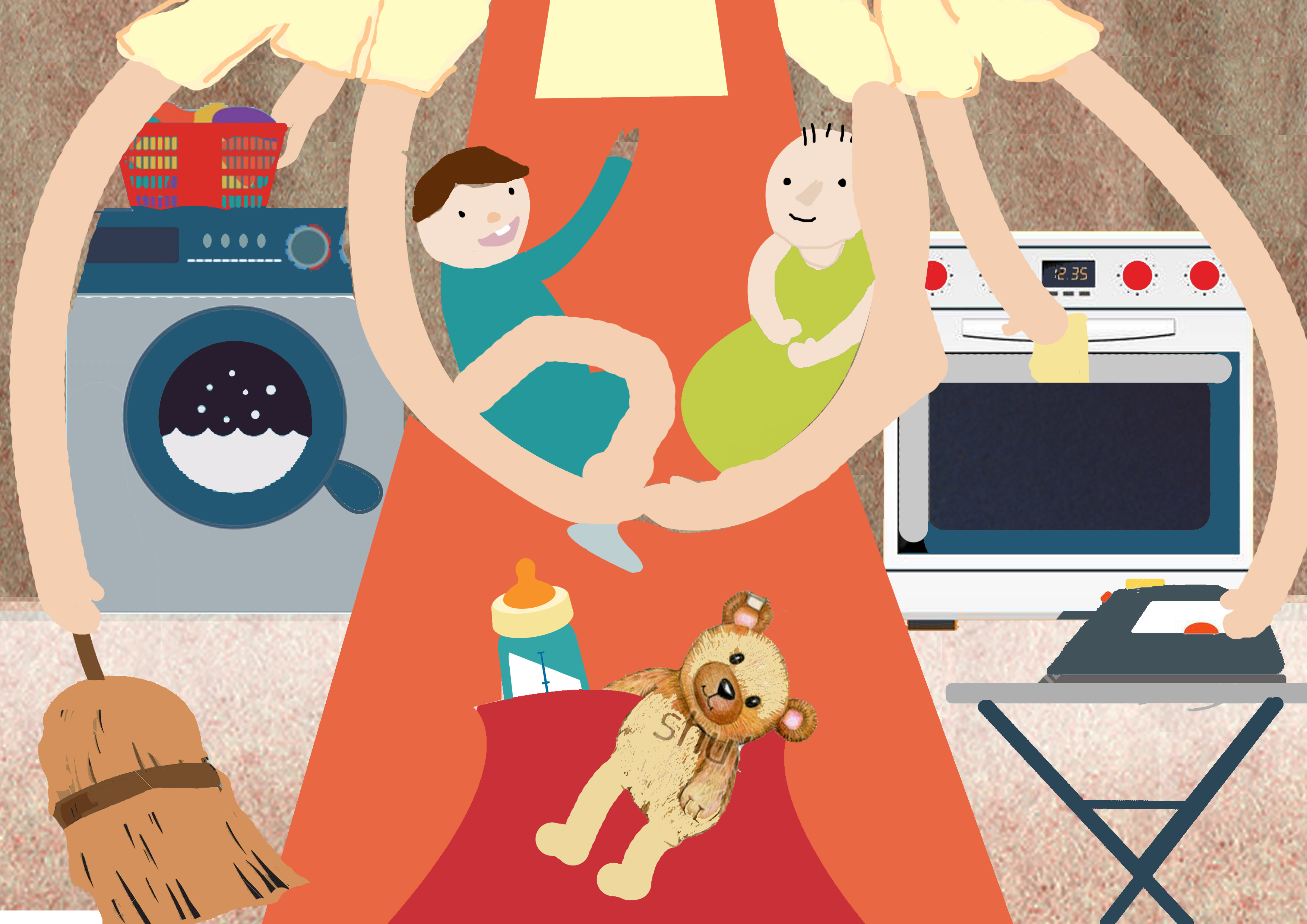
Job 3: Homemaker
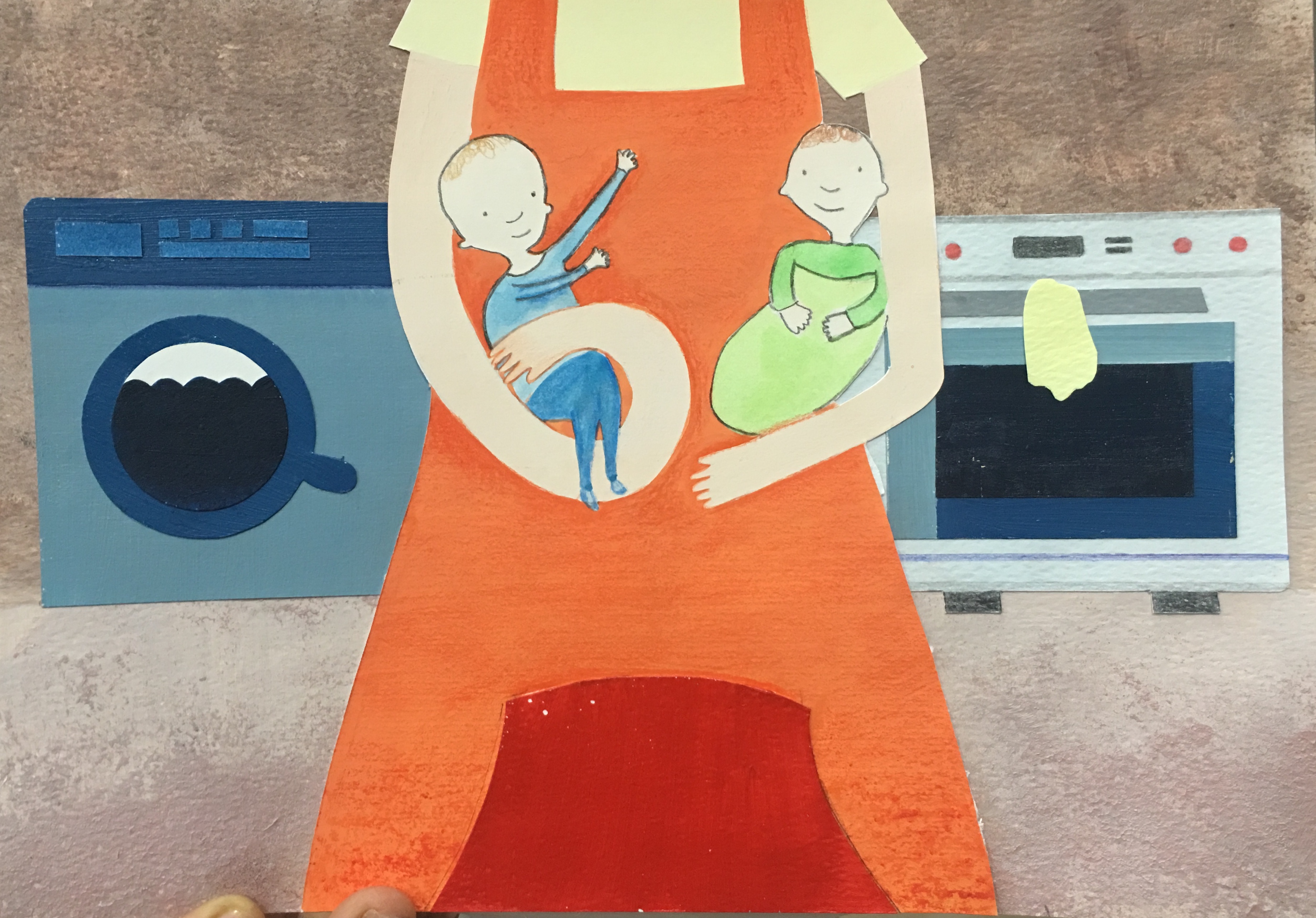
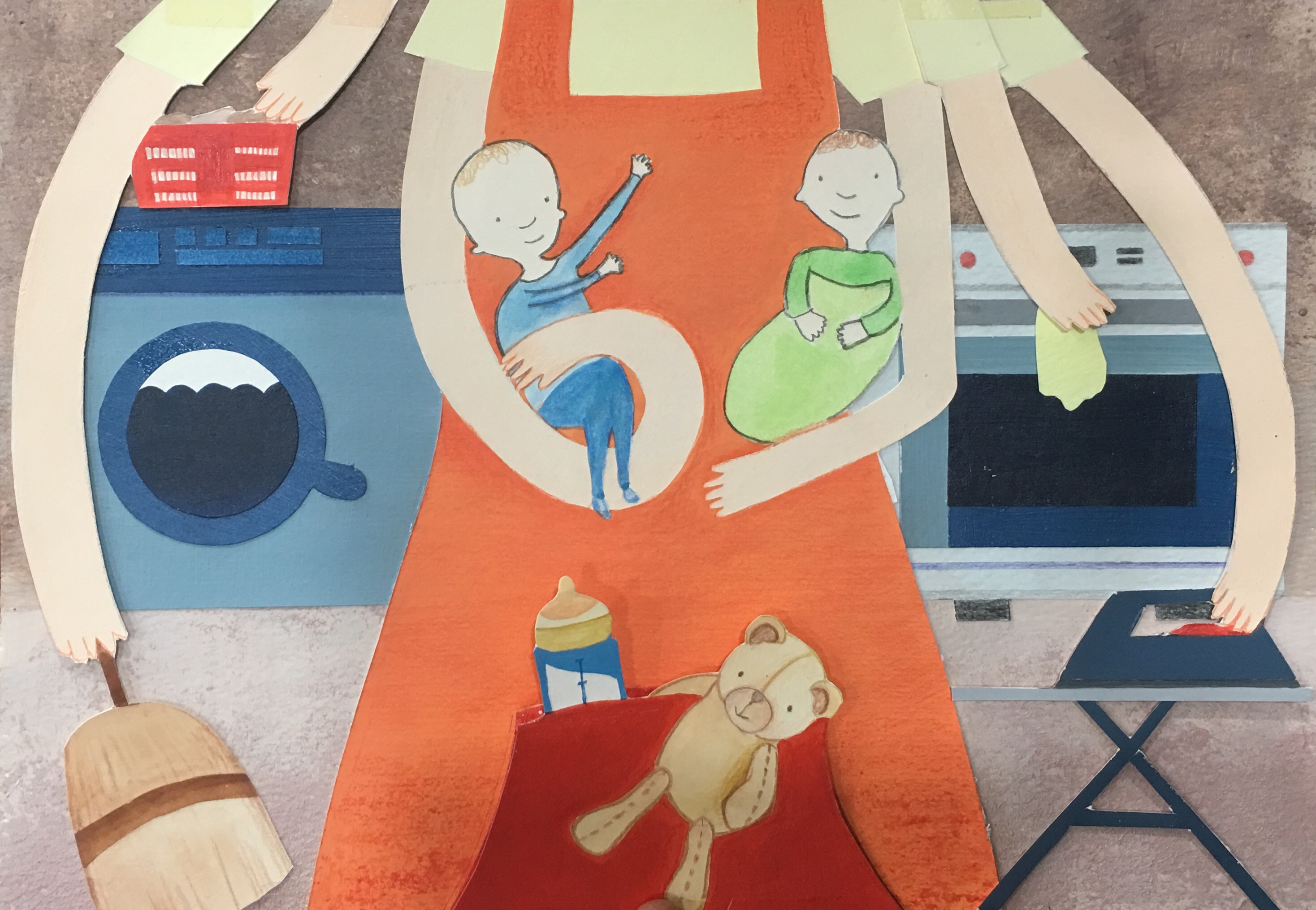
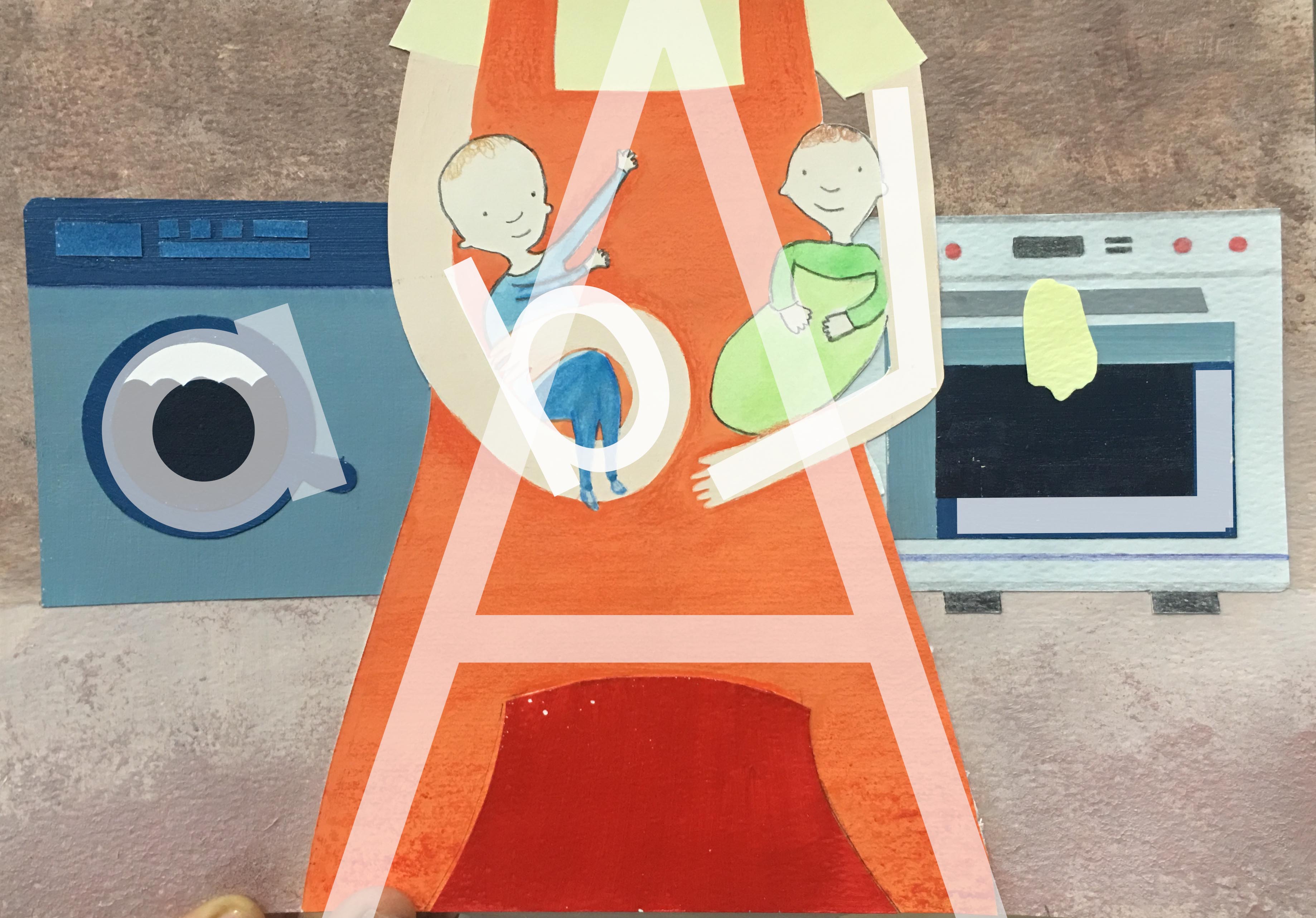
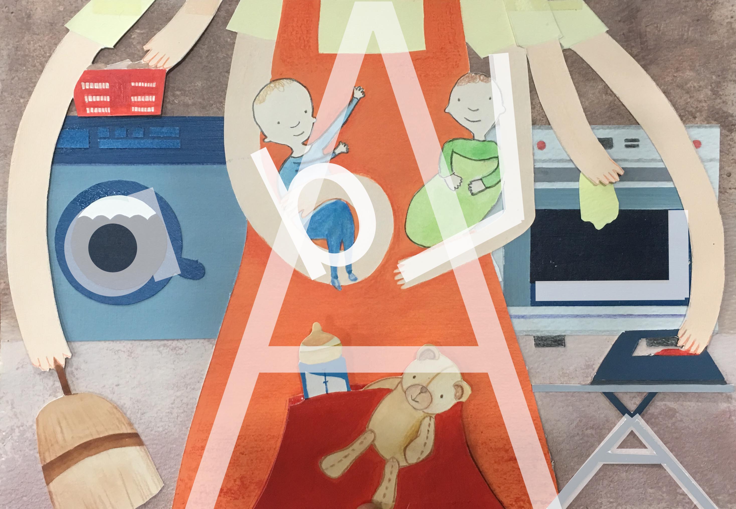
For this piece, I wanted to show how being a homemaker might seem like a cushioney job, just taking care of the kids and cleaning the house. However, when my mom was a homemaker, she had to handle a lot of stuff; cleaning isn’t as easy as it looks!
Use of letterforms
- Lowercase ‘a’ in washing machine handle
- I looked at ‘A’ as being very imposing and grounded with the wider base, and used it as the central mom figure to give a strong centre of focus to the piece.
- I manipulated the arms of the mom to cradle the babies with a lowercase ‘b’ and an uppercase ‘L’.
- An angular uppercase ‘L’ is formed with the right angles of the stove.
- An uppercase ‘A’ is formed with the ironing board stand, capitalizing on its angular nature.
Process
An important insight I gained from consult was that I could manipulate the arms to form the lowercase ‘b’ and uppercase ‘L’, whilst previously I hadn’t in my earlier sketches. I used a lot of tracing paper for this work because I had to make sure the appliances in the background for the ‘con’ composition fit exactly with the existing composition underneath.


Digital mockup:
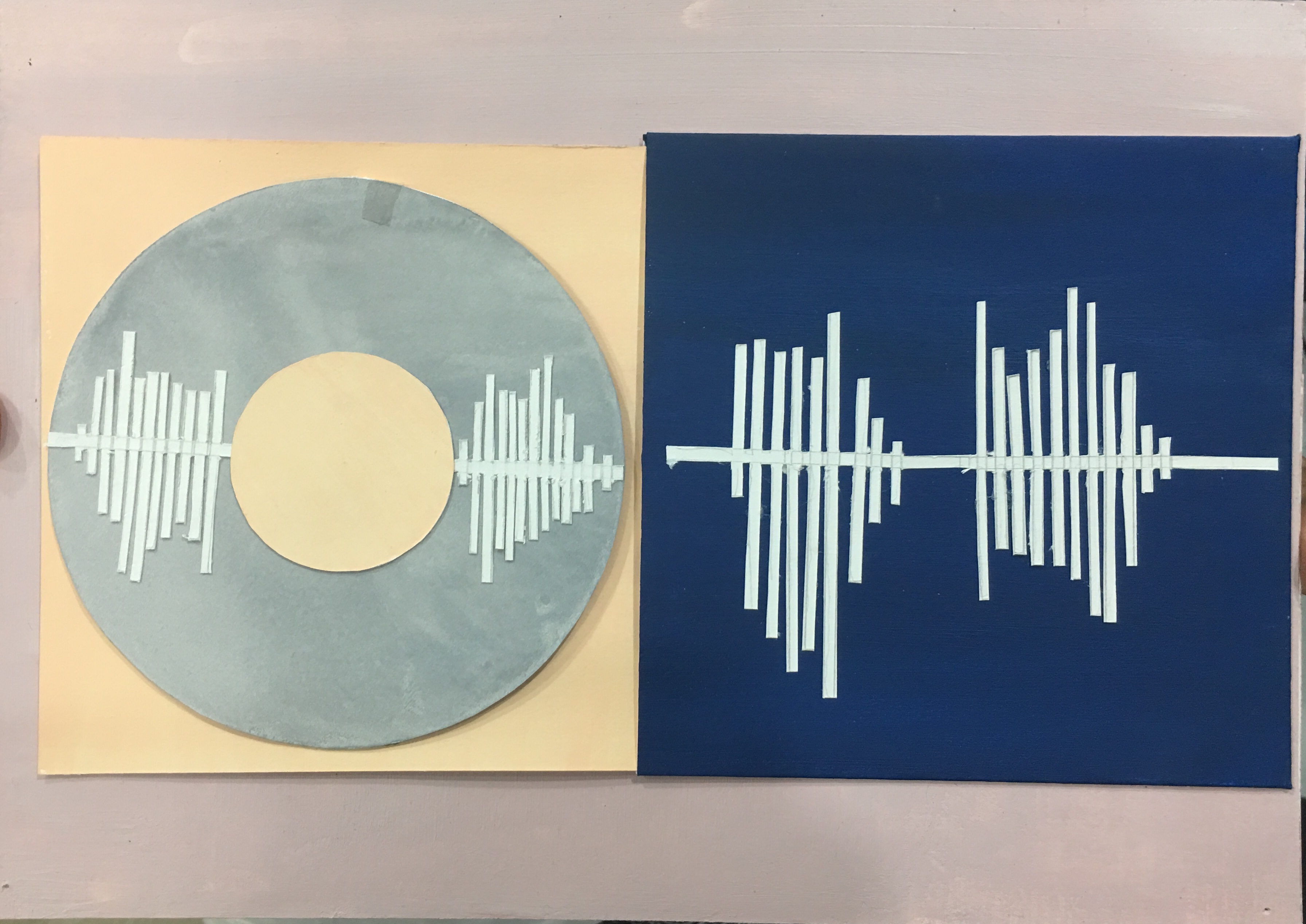
Job 4: Singer

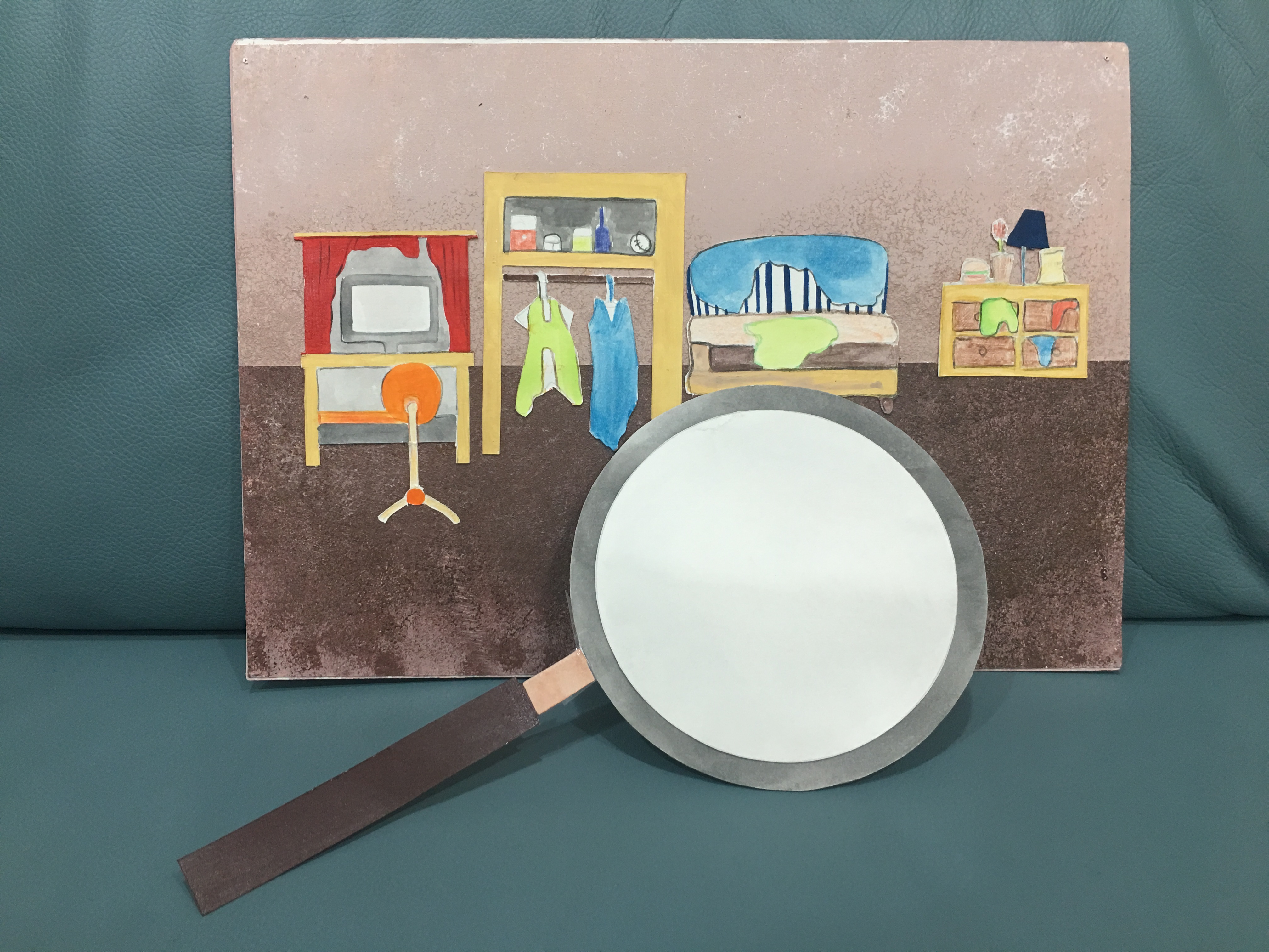
For this piece, I thought about how the privacy of singers is constantly invaded. Paparrazzi invade their private spaces and experiences and scrutinize them for the world to see. Personally, I wouldn’t be able to handle all of that, and wanted to bring light to this issue.
The interactive element works like this: The CD (containing B and A in the soundwave alphabet) would be slotted out of the album cover (containing L and A), forming BALA when extended. The CD can then be detached, and the flap behind turned over, to form a magnifying glass which then would be passed over the back of the same A4 piece of paper.
First, I looked at the word associations from earlier, and decided to incorporate the sound alphabet in my work. However, the soundwave alphabets I found were too complicated and unclear, so I simplified it and made my own, referencing the ones I found online.

Soundwave alphabet Source: https://i.pinimg.com/originals/e3/f5/67/e3f5673e4f4d735de2e1f57fc9a623a1.jpg


My own reinterpretation of soundwave alphabet
I then traced the outline of this silhouette, to fit the items of a household around.
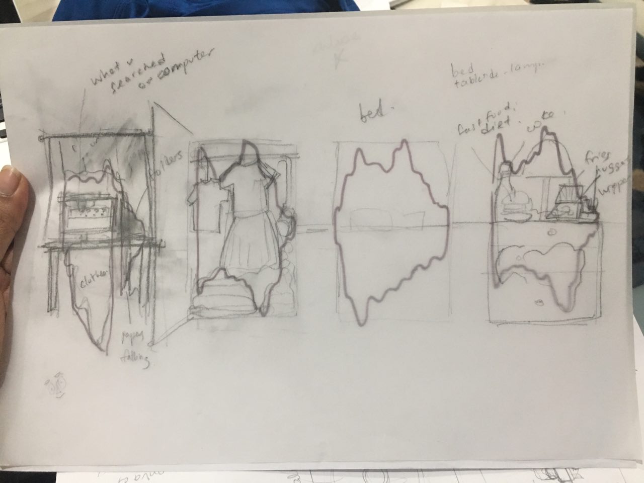
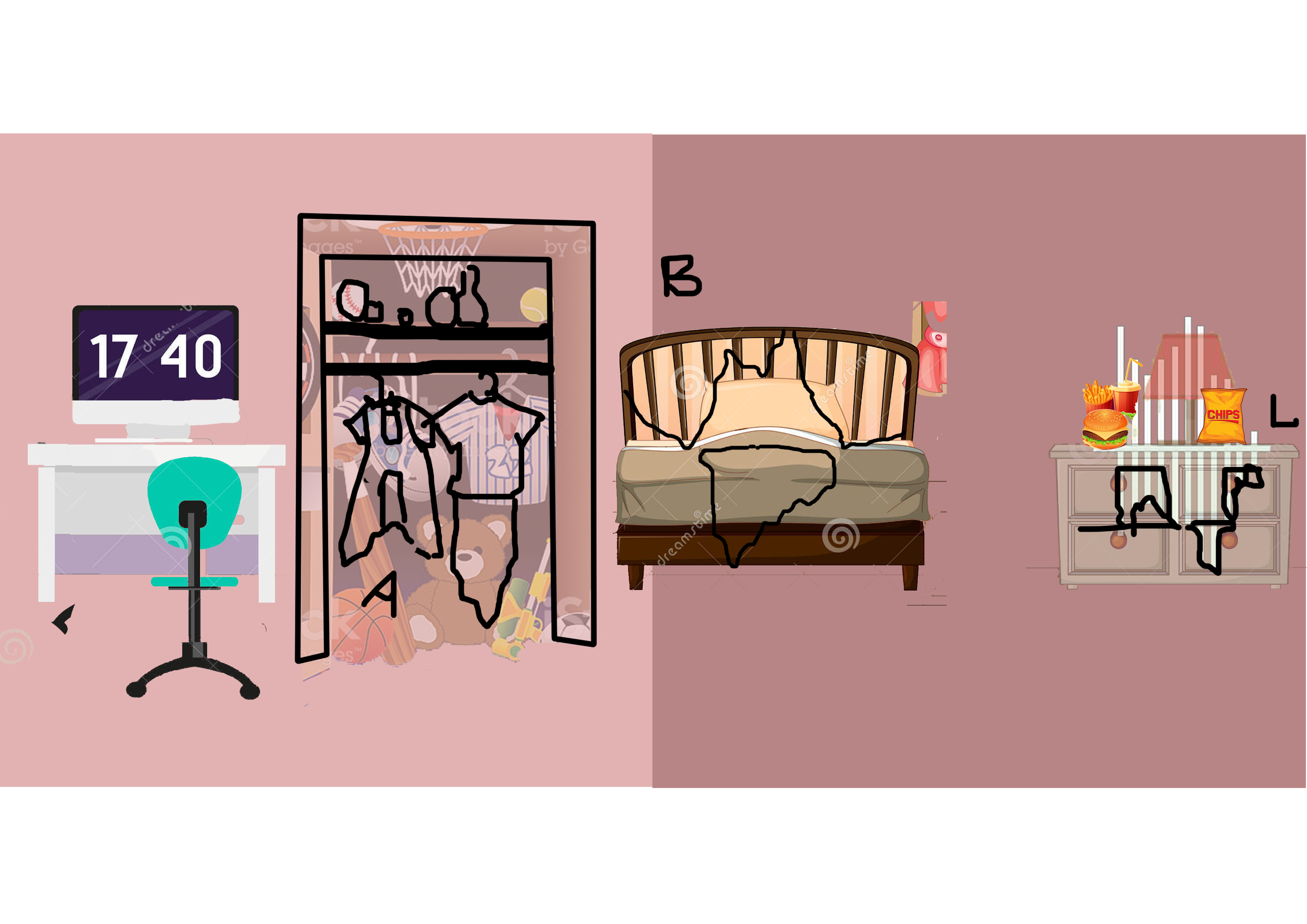
Letterforms can be seen within these household items themselves. I was having a lot of trouble fitting them around the silhouette, but Joy gave me the idea to use clothes and other little messes to round the forms out, because that essentially mirrors what the media does to singers – pick at all their flaws, even how clean they keep their houses.
Word associations for brainstorming, and other initial ideas


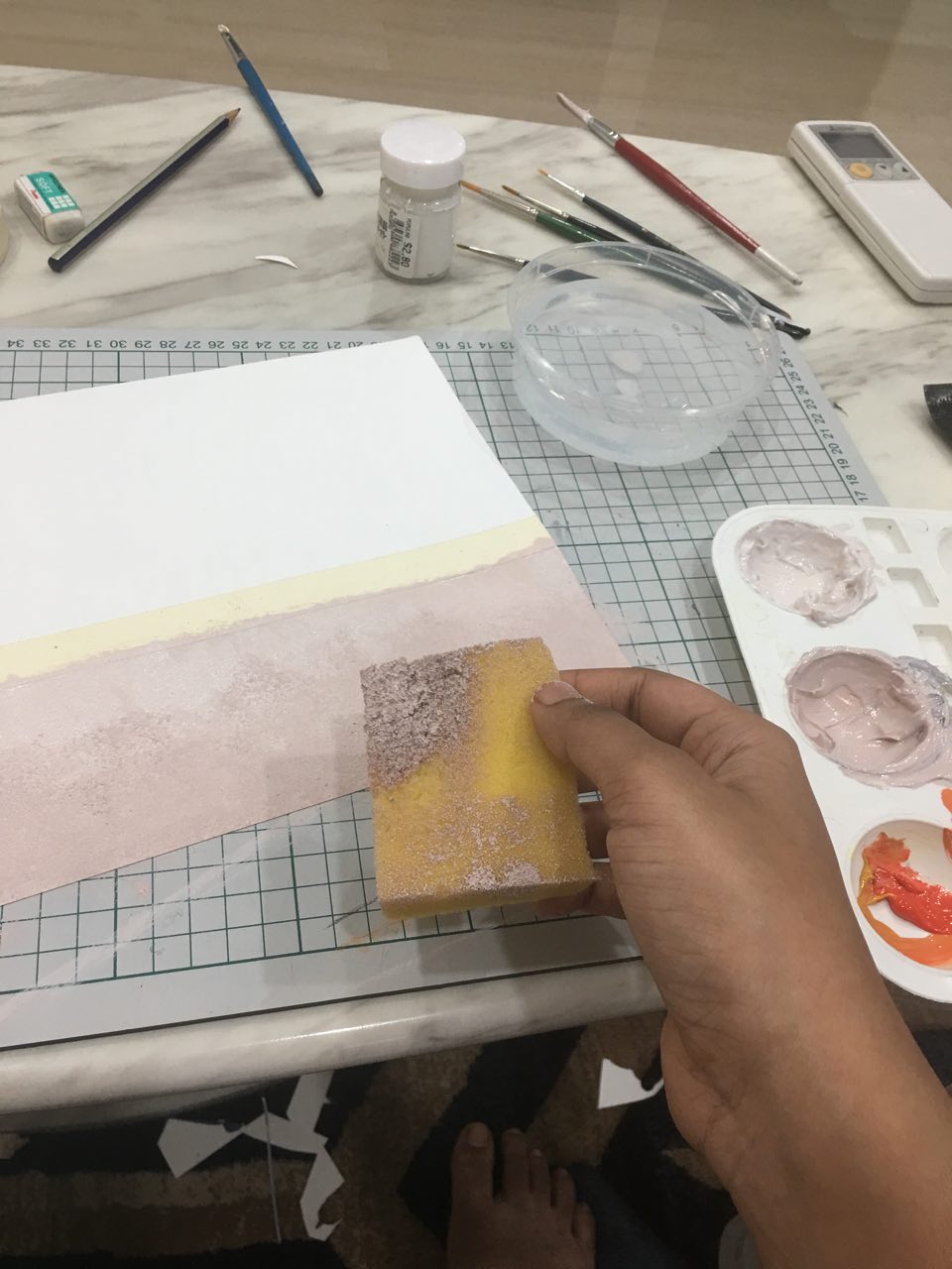
Behind the scenes photos!