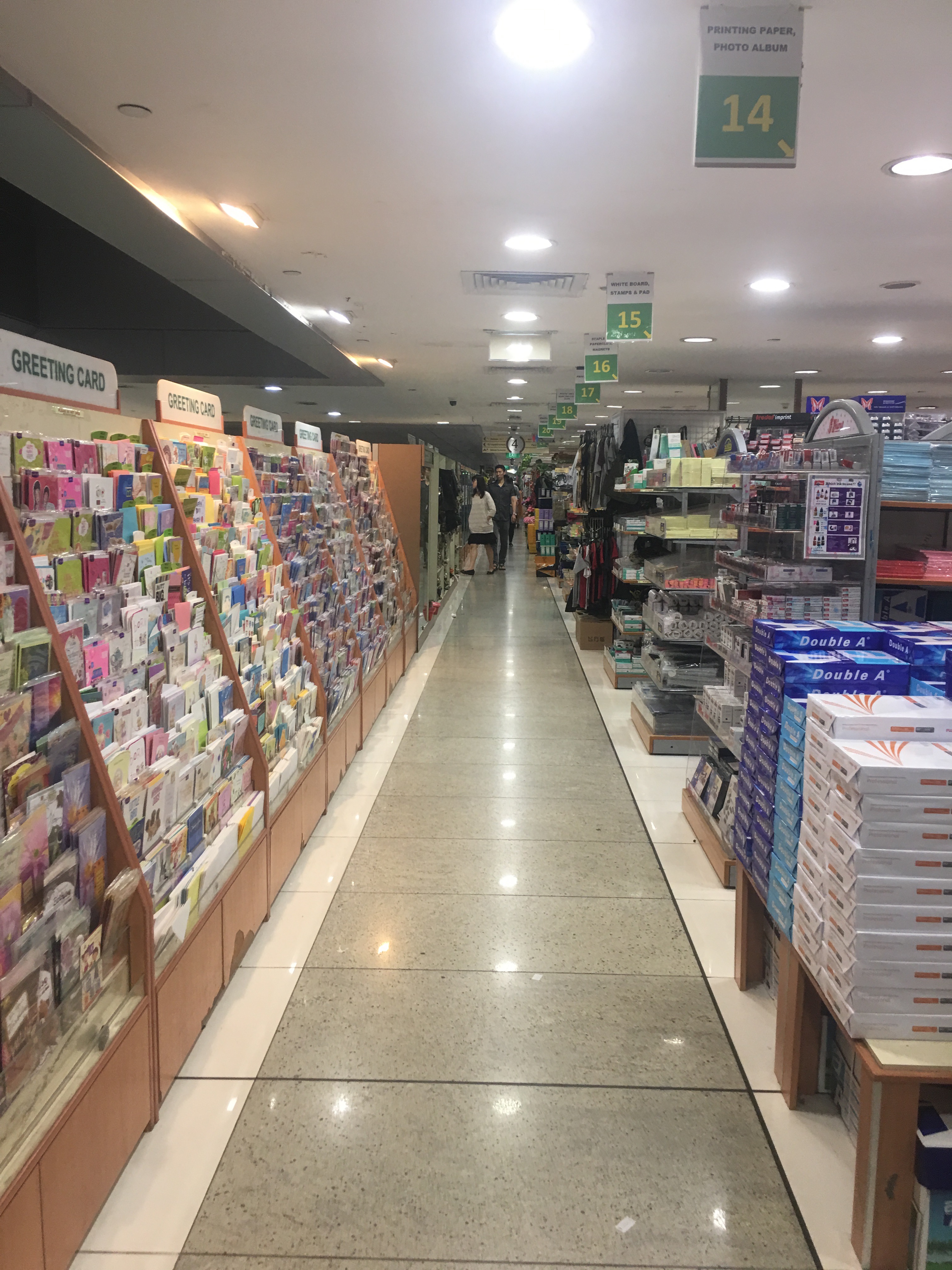
Hey guys! Do click on the images to get to the post with that project 🙂


Hey guys! Do click on the images to get to the post with that project 🙂

(Click to enlarge all images)
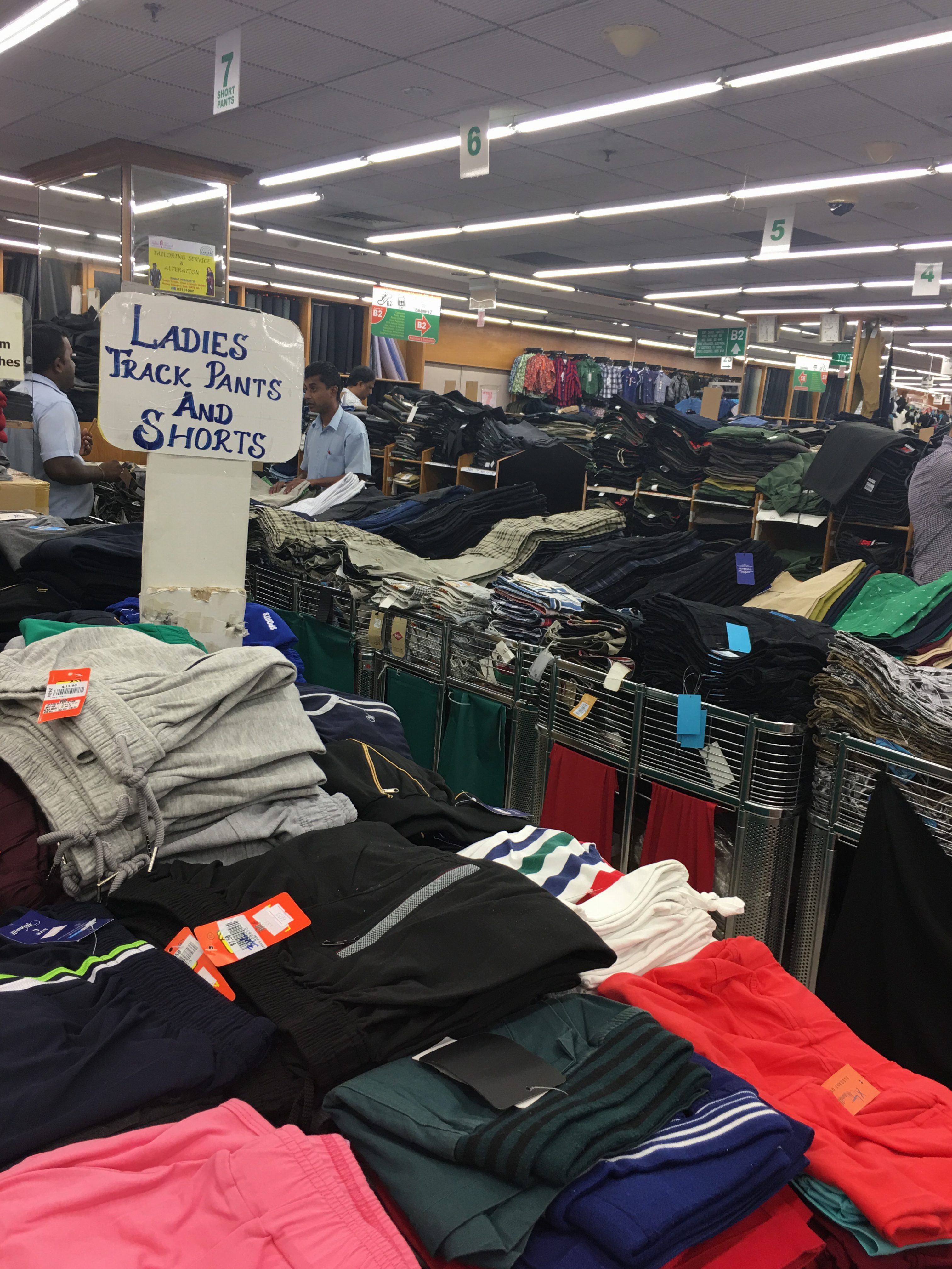
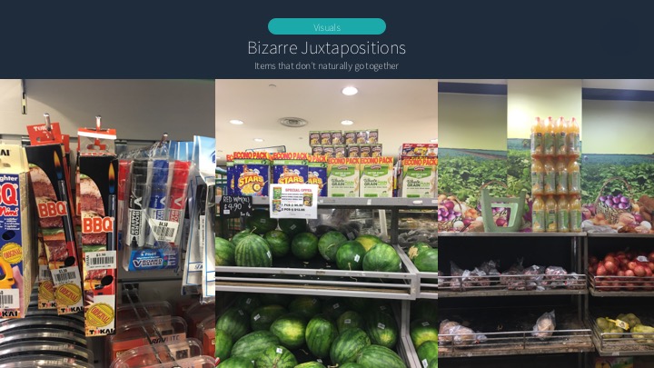
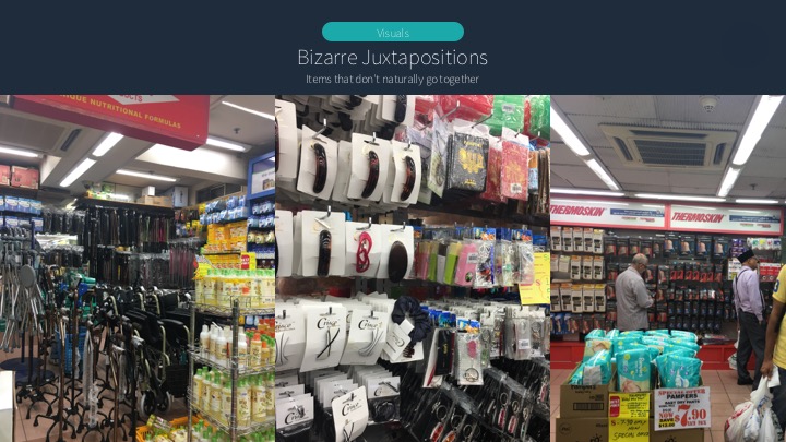
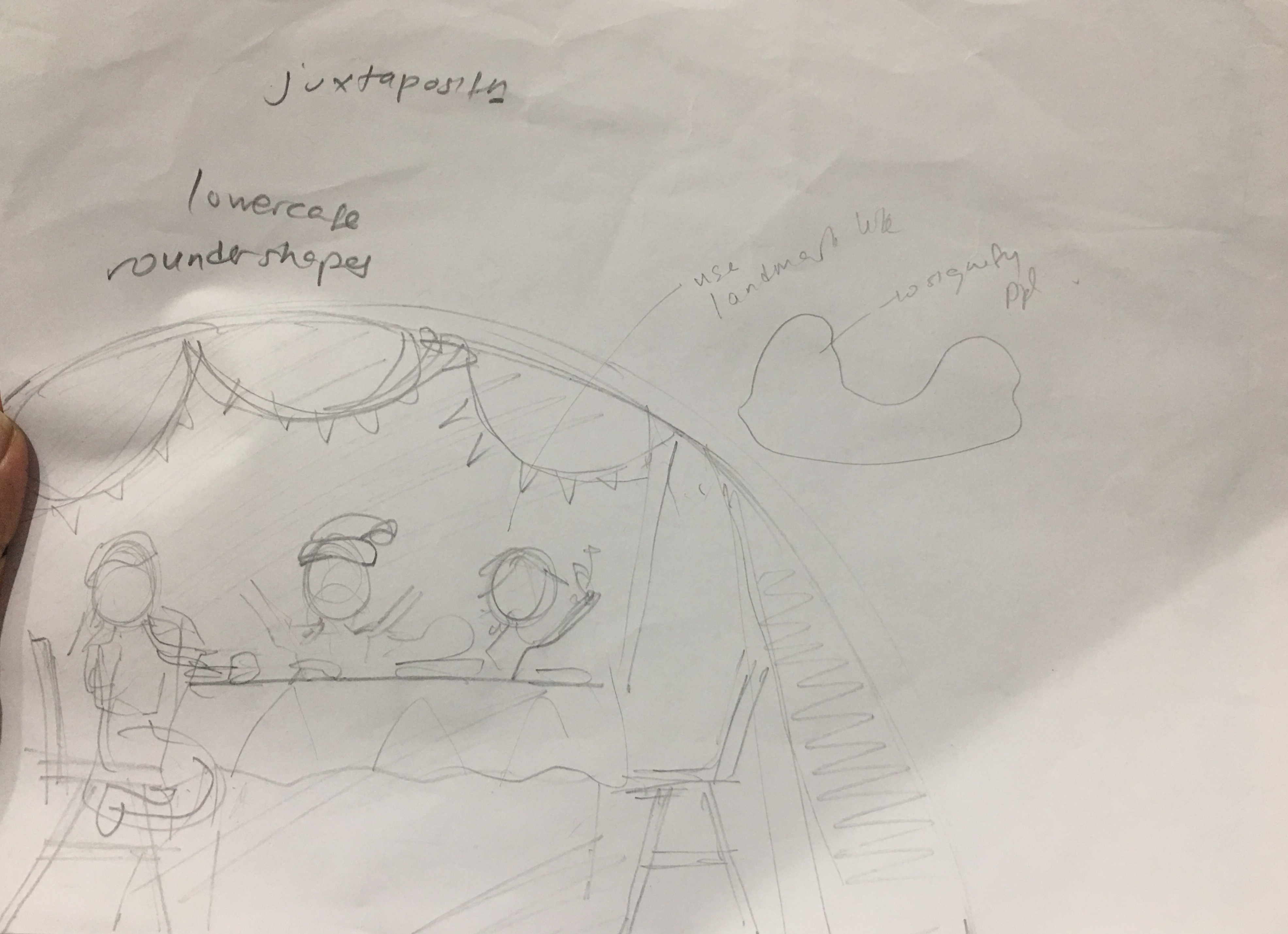
For my zine, I decided to focus on an aspect of my site I mentioned in my presentation – the bizarre juxtapositions that I could find upon closer inspection of the organization in Mustafa. Although there is an overarching organization to the items, some items don’t “go” together, making for an organized mess. My response to this, was then to create my own categories for these organized messes.
I started by looking at some of the weird juxtapositions.


(In order)
From these, I tried to brainstorm how they could go together. Initially I went with a family theme (Mustafa for the Family) for my spread:
I was initially thinking of having each A5 page be a representation of each of the family members above. After consulting with Joy, I realized that this was too ambitious and just too much visually, and Joy advised me to try going for three A4 spreads instead. This was actually a really pivotal moment because it allowed me to narrow in on the concepts I liked best and could explore deeply.
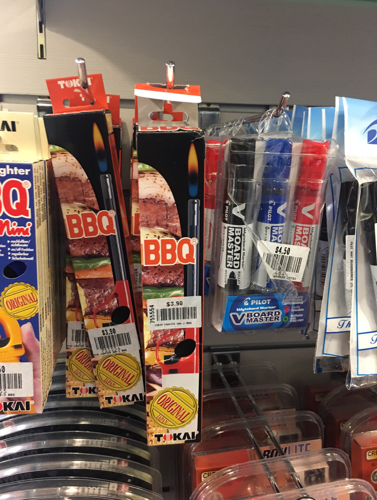
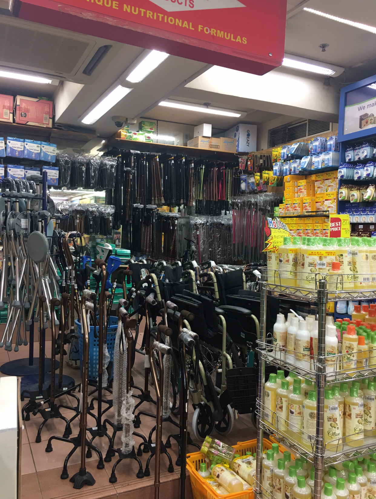
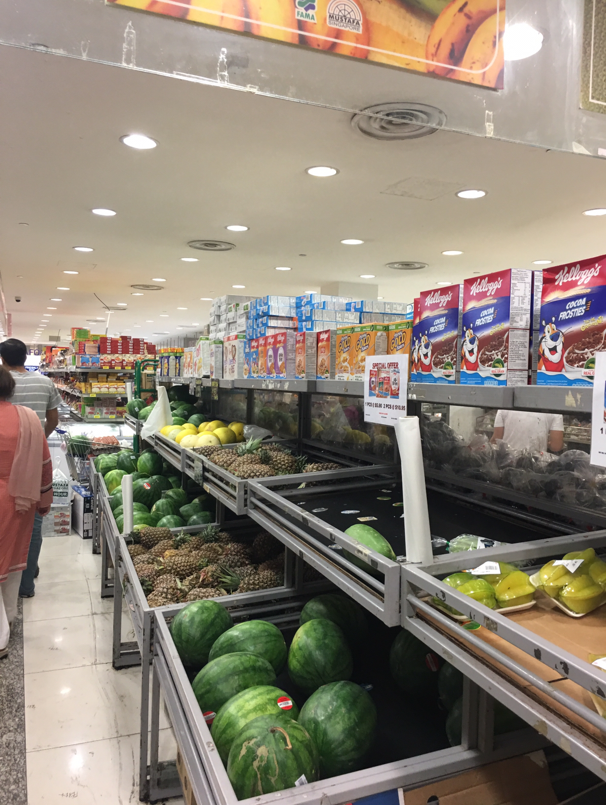
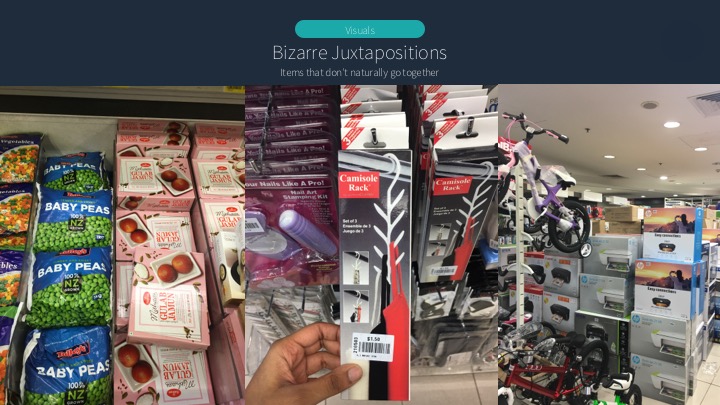
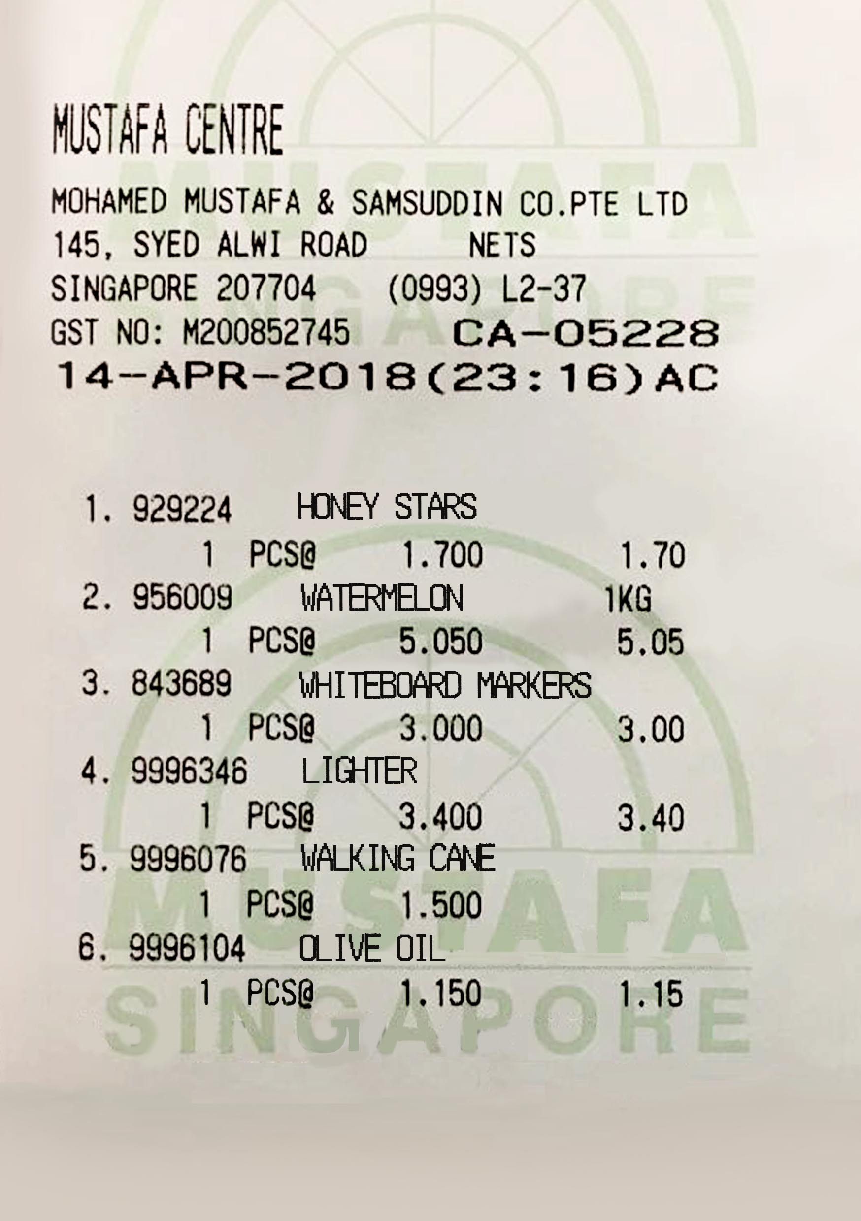
I zeroed in on the cereals above 1) fresh fruit (honey stars over watermelon, specifically), 2) lighters next to whiteboard markers, and 3) olive oil next to walking canes. My categories for them were 1) Dessert or Breakfast? A fun meal with minimal cutlery needed 2) Study on your birthday and 3) Make walking fun.
I went back to Mustafa and collected more reference images to manipulate.


The journey of each spread:
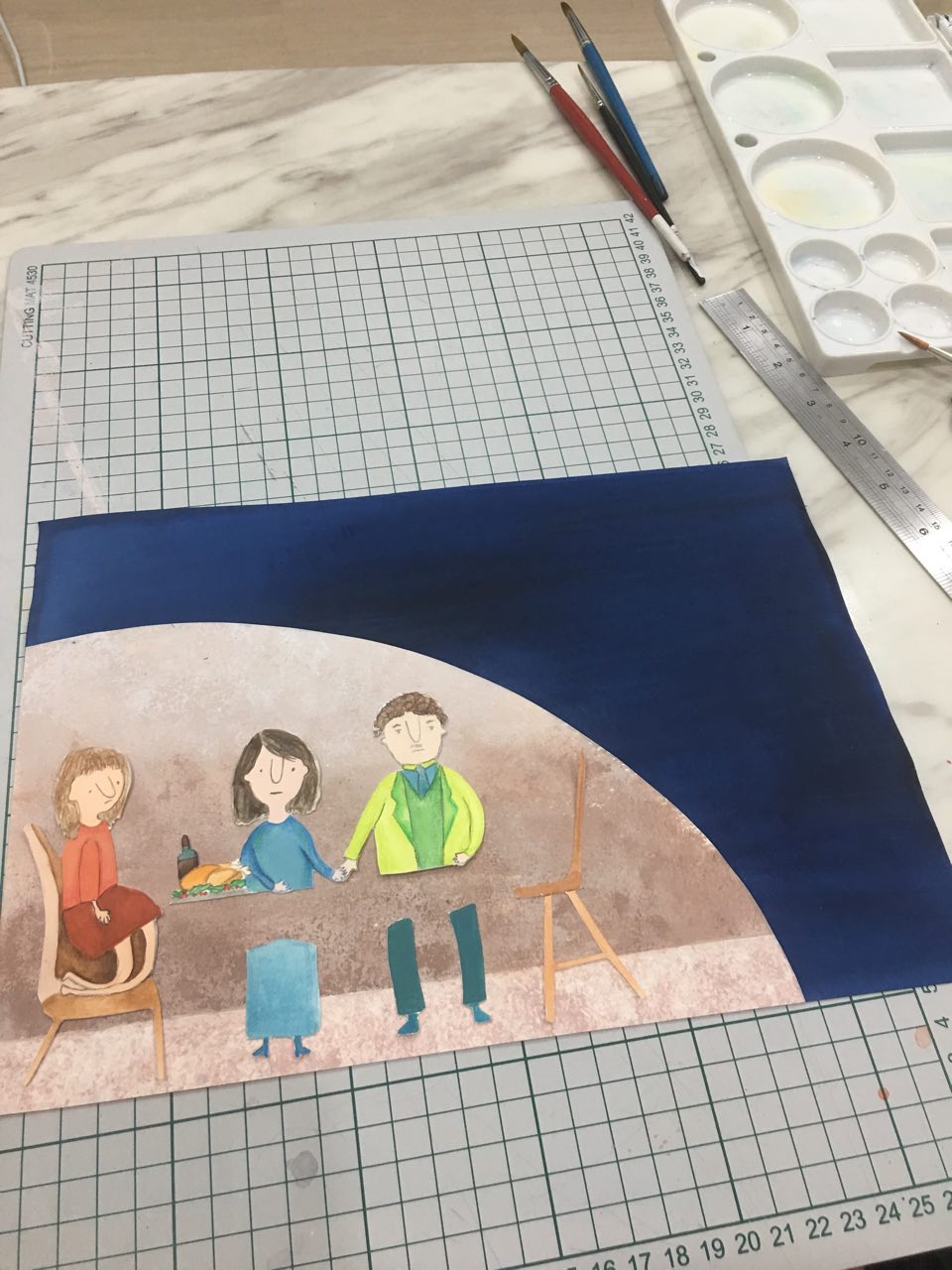
Spread 1: A nutritious breakfast
First version:

I referenced the Honey Stars packaging for the cereal and splashes of milk, as well as the below photograph of a watermelon’s inside. I used my own photographs for the watermelon itself, as well as the background (Mustafa’s floor at that section).


Feedback from consultation:
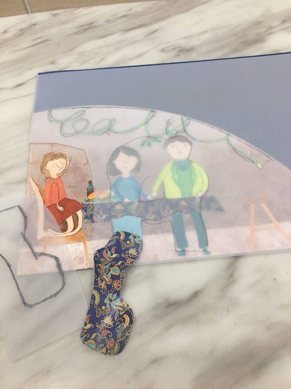
Version 2

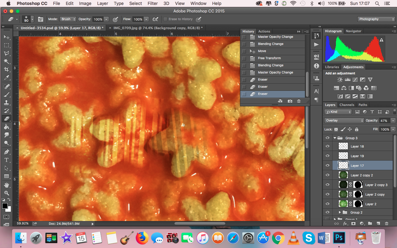
Process: I decided to not quite literally put honey stars in a watermelon, but imply it with a bowl that looks like a watermelon. I felt like this would go with the whole Surrealistic feel of the zine, because then it wouldn’t be so immediately obvious what I was doing. Also, it would solve the issues I had with perspective.


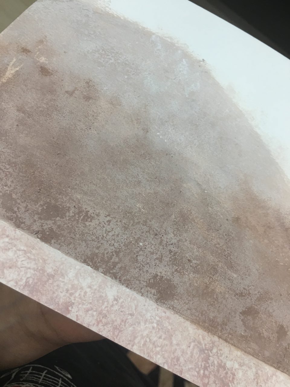
For the background, I decided to use the barcode on the watermelon instead of the floor because it might not be clear to viewers’ that I was using Mustafa’s floor – it just looked like any other floor in the previous composition.
I also overlaid the bowl with the watermelon textures from the photographs I took.
Feedback from consultation:
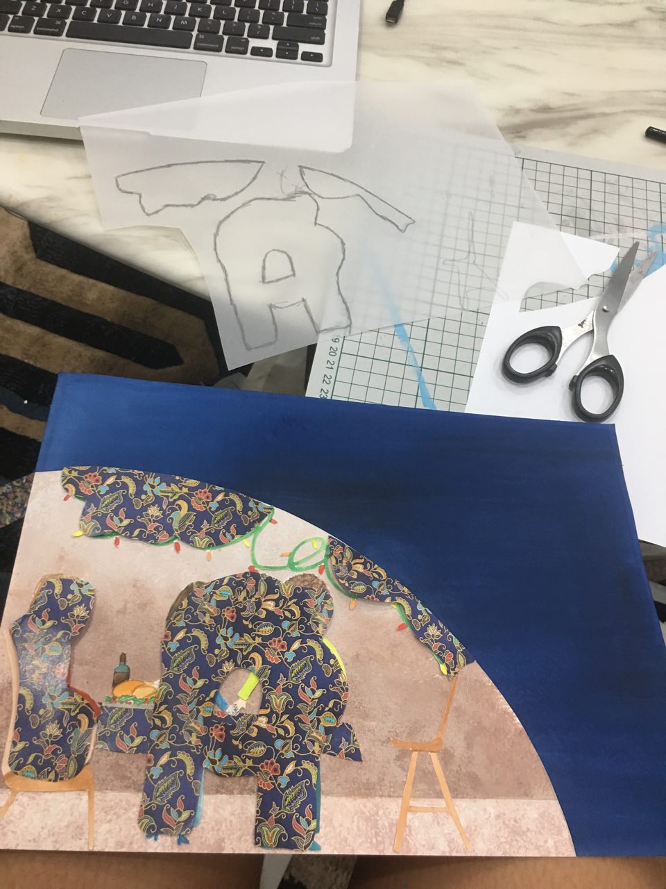
I agreed that the barcode could be incorporated in other ways, because the bowl looked like it was floating in mid air. Joy raised the question of what was so special about the barcode sticker, and I mentioned that the sticker had the Mustafa logo on it. She then suggested using the Mustafa logo for my candle spread, and I really liked that idea of using the Mustafa logo. Therefore, I considered the background more carefully for my final spread and used the logo as part of the tablecloth.
Final spread:

Process:


I took a closer look at the Mustafa logo and tessellated it. I then manipulated a lace tablecloth to look like the tessellated Mustafa logo.
Furthermore, as I wanted the barcodes to be a unifying factor throughout my zine, I incorporated it into my honey stars as well. I felt like this added an additional layer of meaning because with the Mustafa barcode, they would now be uniquely Mustafa honey stars, instead of cereal bought at any other store, giving the work more context.
I also made sure to add the shadows I missed out for the previous versions of the spread.
Spread 2: Study hard on your birthday!
Version 1:

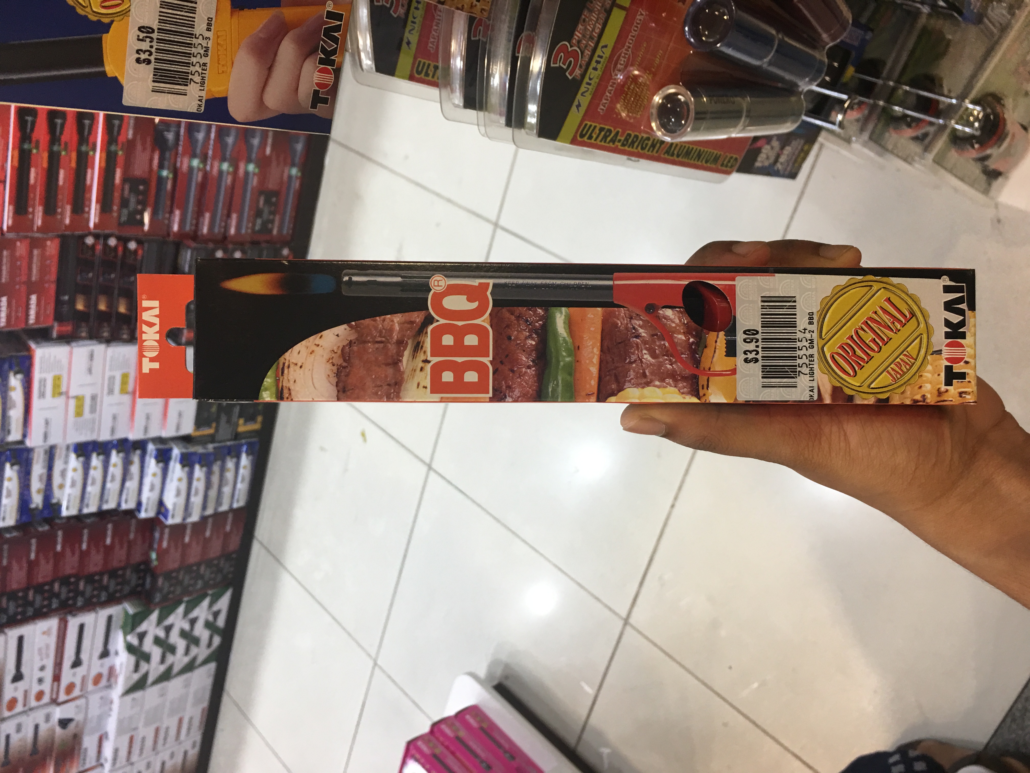
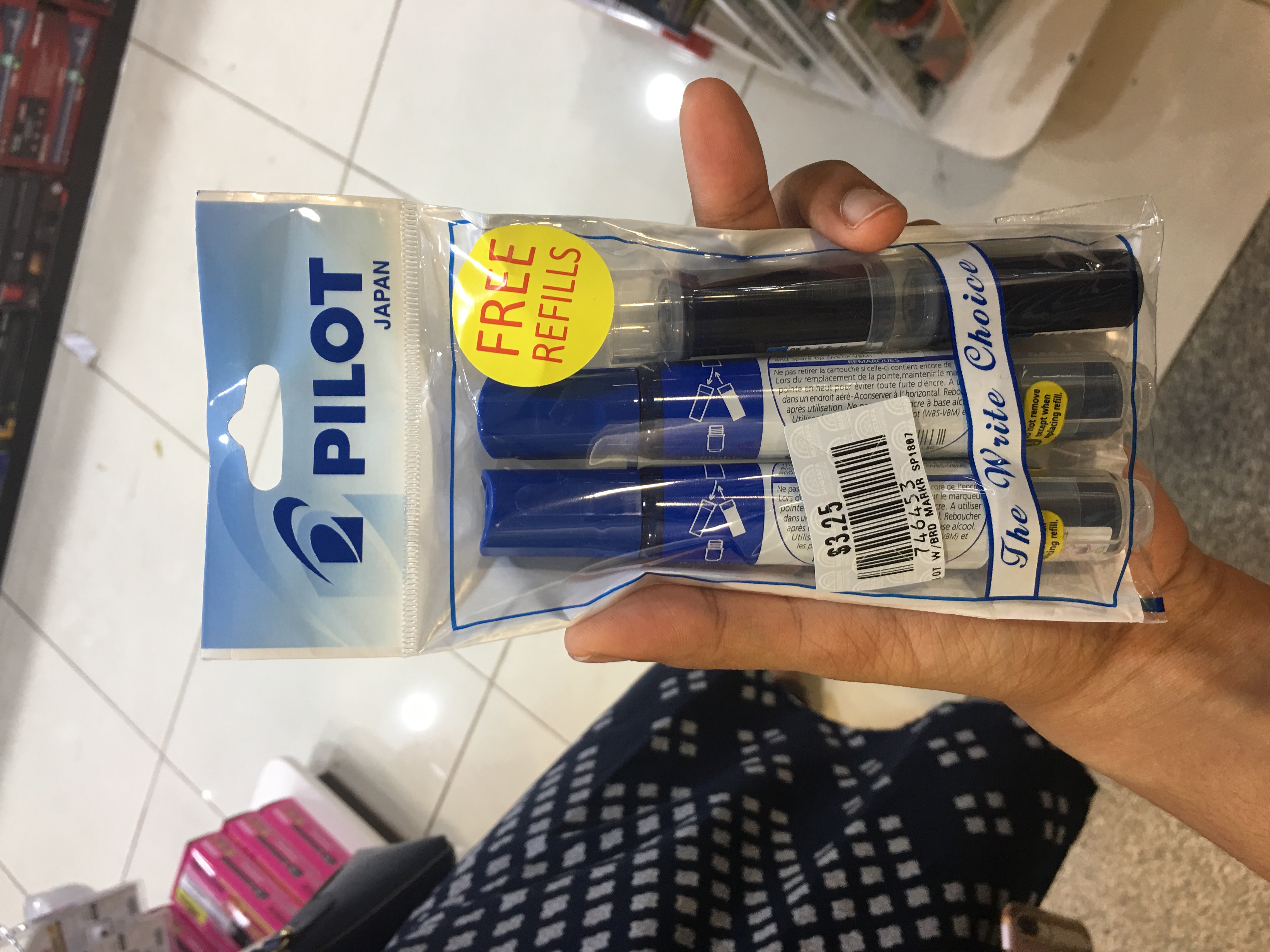
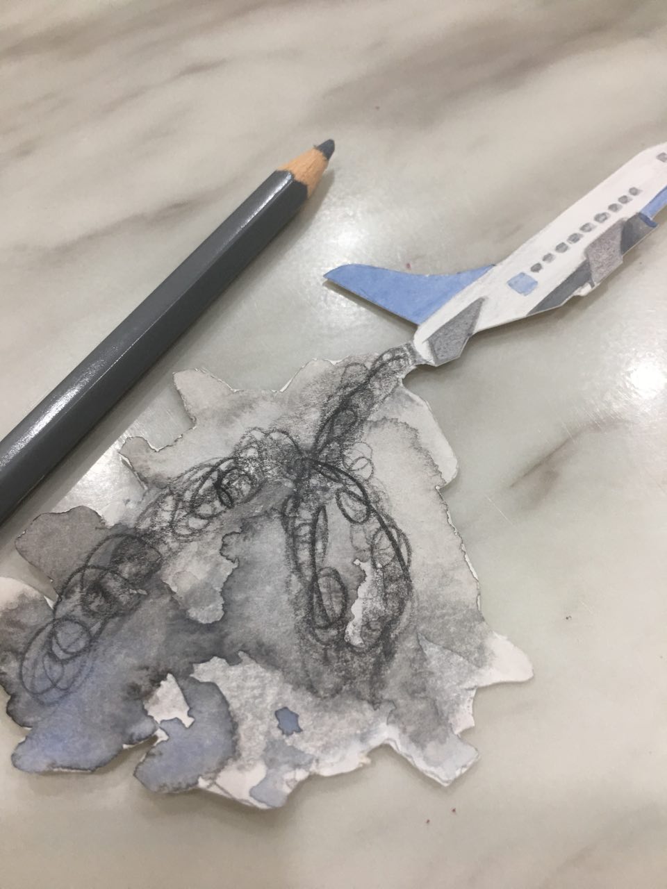
Process: I used the below stock image from Pexels for the base cake, and used the Mustafa markers as candles as well. The flames on the candle were from another Mustafa product (also below) – I used that because I thought that if markers burned, they would probably burn with a weird colored flame because of all the chemicals inside.
I thought about how it could be like if the candles burned, and came up with my own version of the smoke, consisting of the Japanese letters from the back of the lighter packaging because Japanese letters have a very abstract quality.

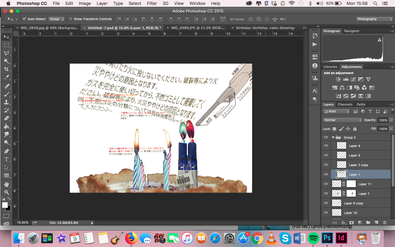
The background was a blowup of the barcode on the markers, with the opacity lowered.
Feedback:
Final spread:

I completely agreed with the feedback on the use of the cake image. Therefore, I went back to Mustafa and took photographs of the cakes at Mustafa’s bakery, that I used for my final spread.


Moreover, the feedback on balance got me to come up with the idea of having the zine be progressively messier with more and more off-balanced spreads. This would tie in to my own experience – Mustafa seemed to get more chaotic the longer I stayed there, not only because I was noticing the messiness in the order, but also because of the external stimuli (the feeling of overwhelmingness). This is why my final zine, from the front cover to the back cover, get messier by the spread.
Finally, I made the cake topper with Mustafa’s logo, using the below stock photo as reference for the stick.

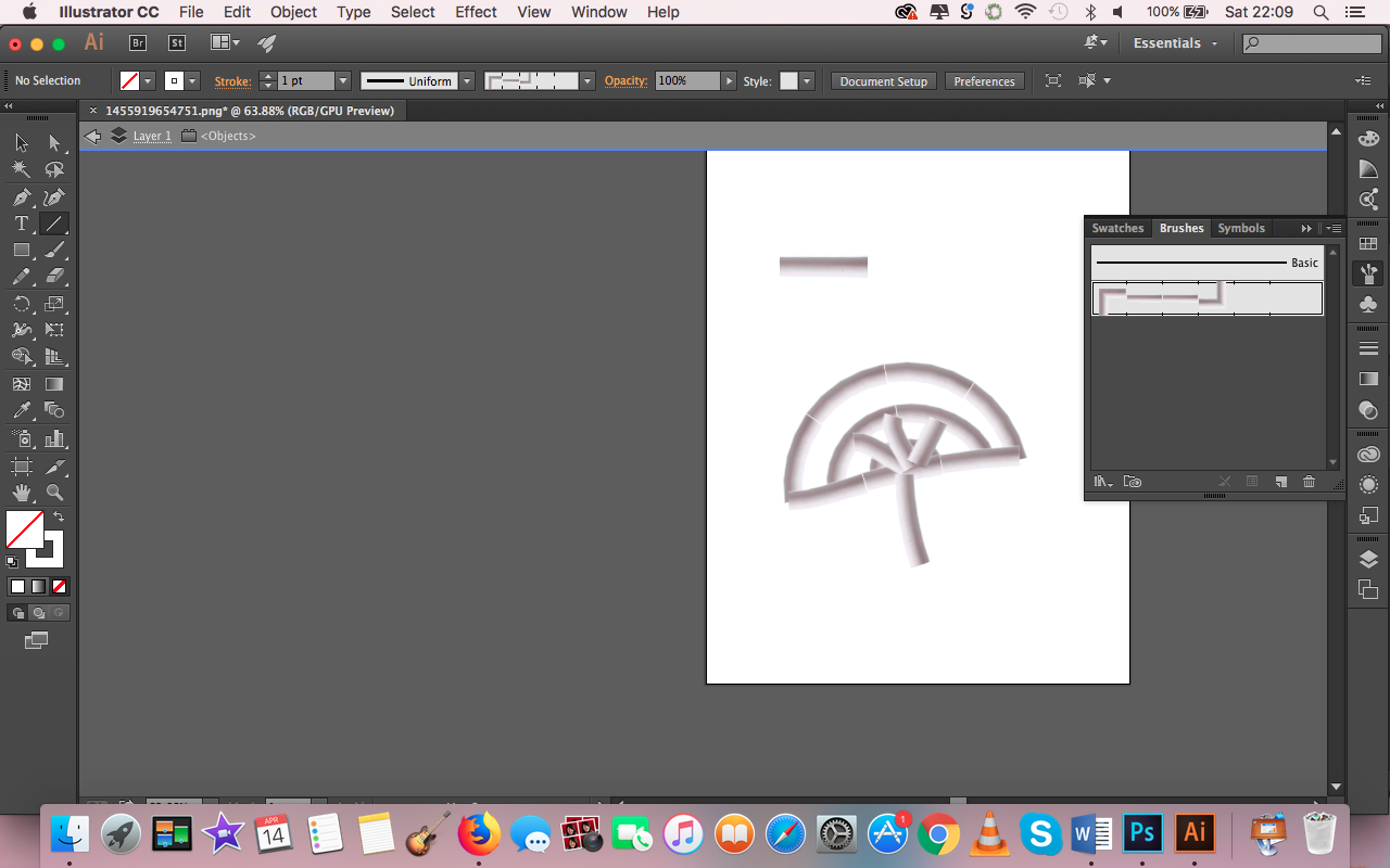
I initially faced some difficulty using the image as a brush on Illustrator, but I eventually figured it out! 🙂
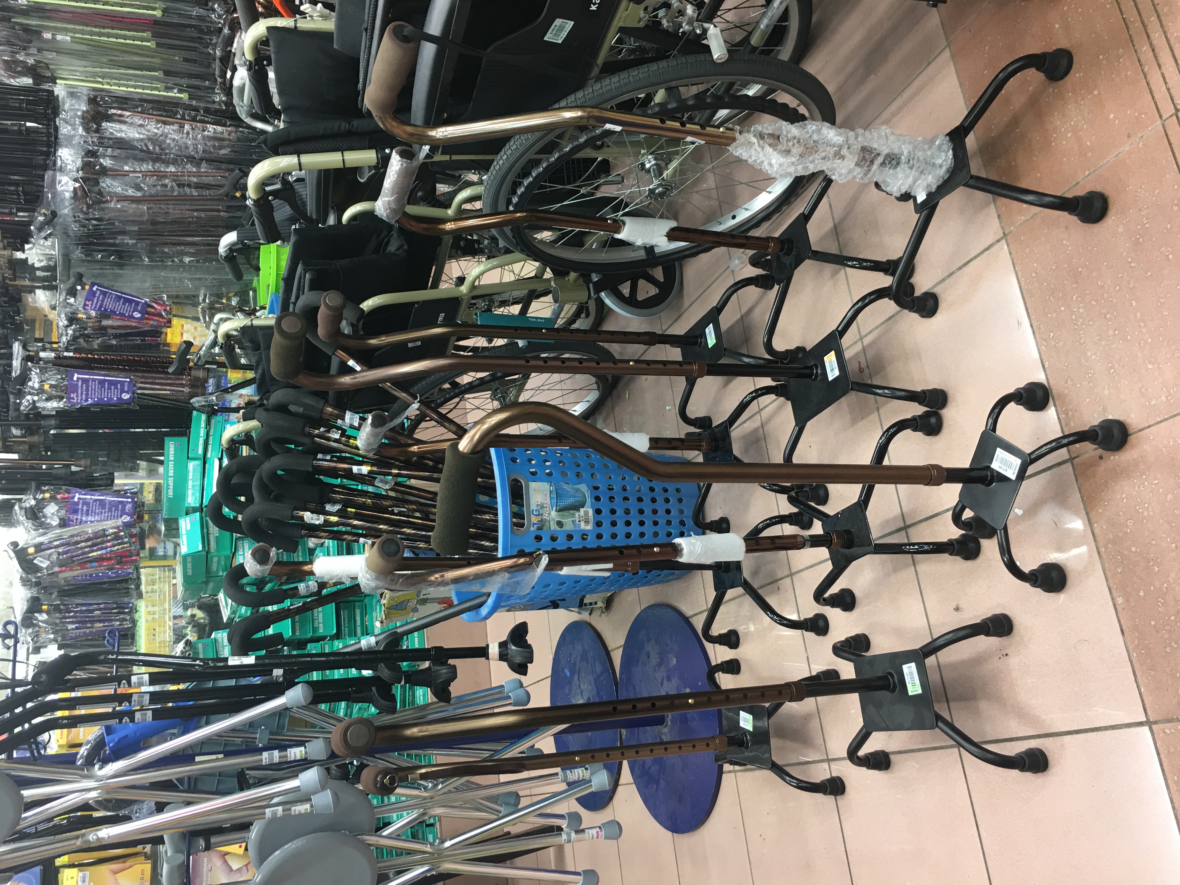
Spread 3: Make walking fun
Two variations of my first spread:

Process:

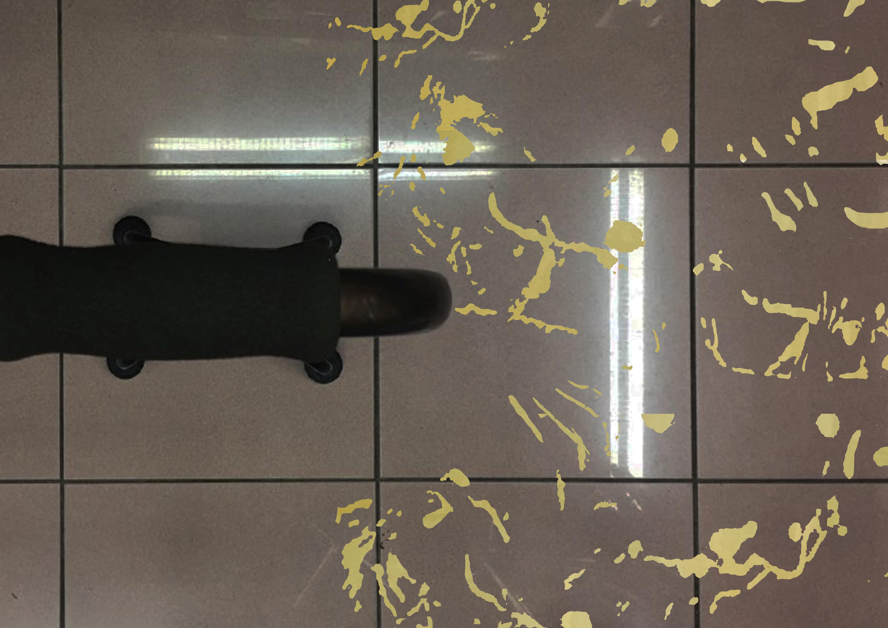
I noticed that the highlights on the photographs I took of the olive oil bottles looked really organic. I decided to manipulate them into the oil stains on the floor (hence “taking” from the site more, because the reflections would be those cast upon the bottle by Mustafa’s lighting).

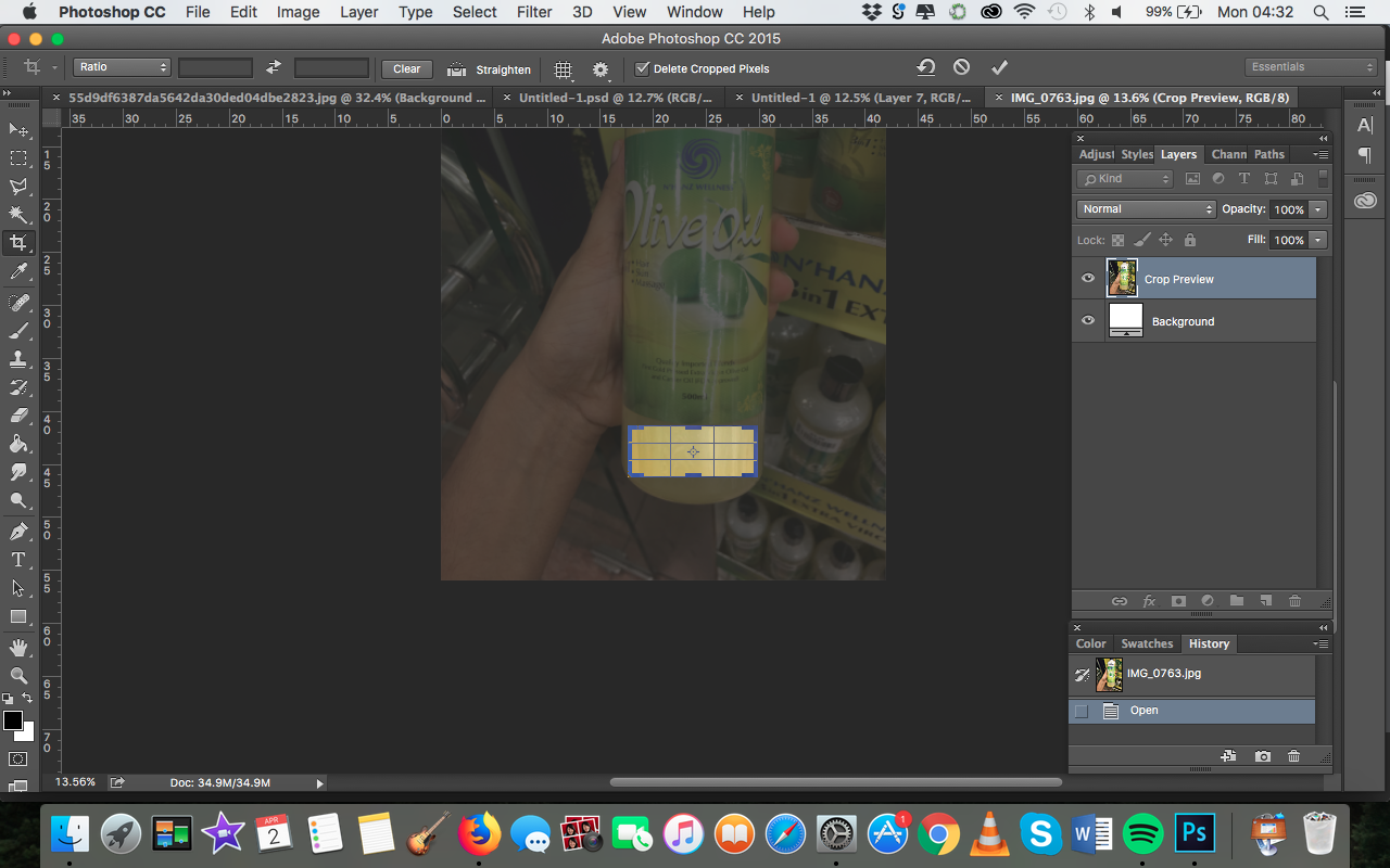
I masked around the highlights, and clone stamped over them with an olive oil section cropped from another photo. The floor the olive oil is photoshopped onto is Mustafa’s floor at that section!
Feedback from consultation:
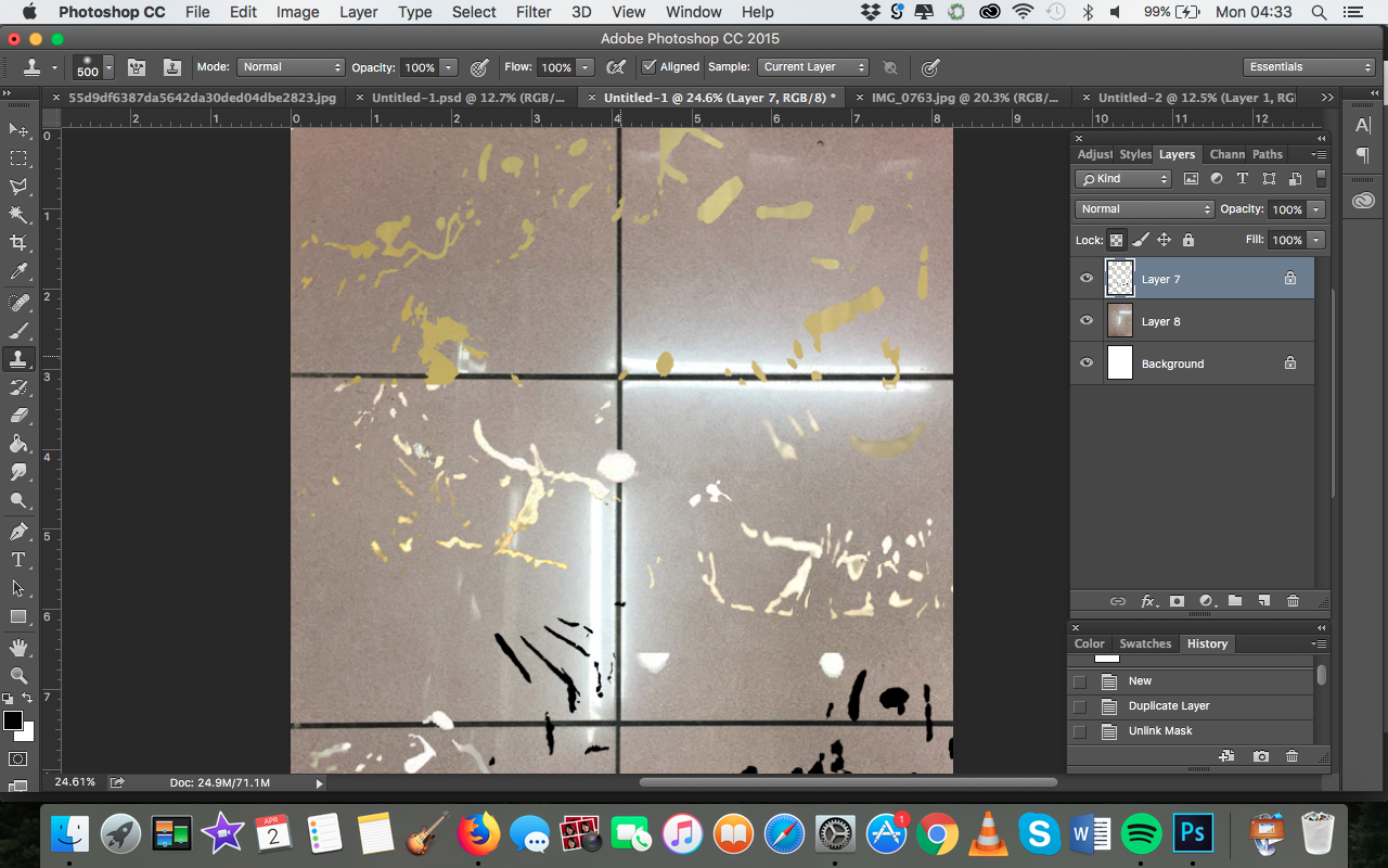
Final spread:
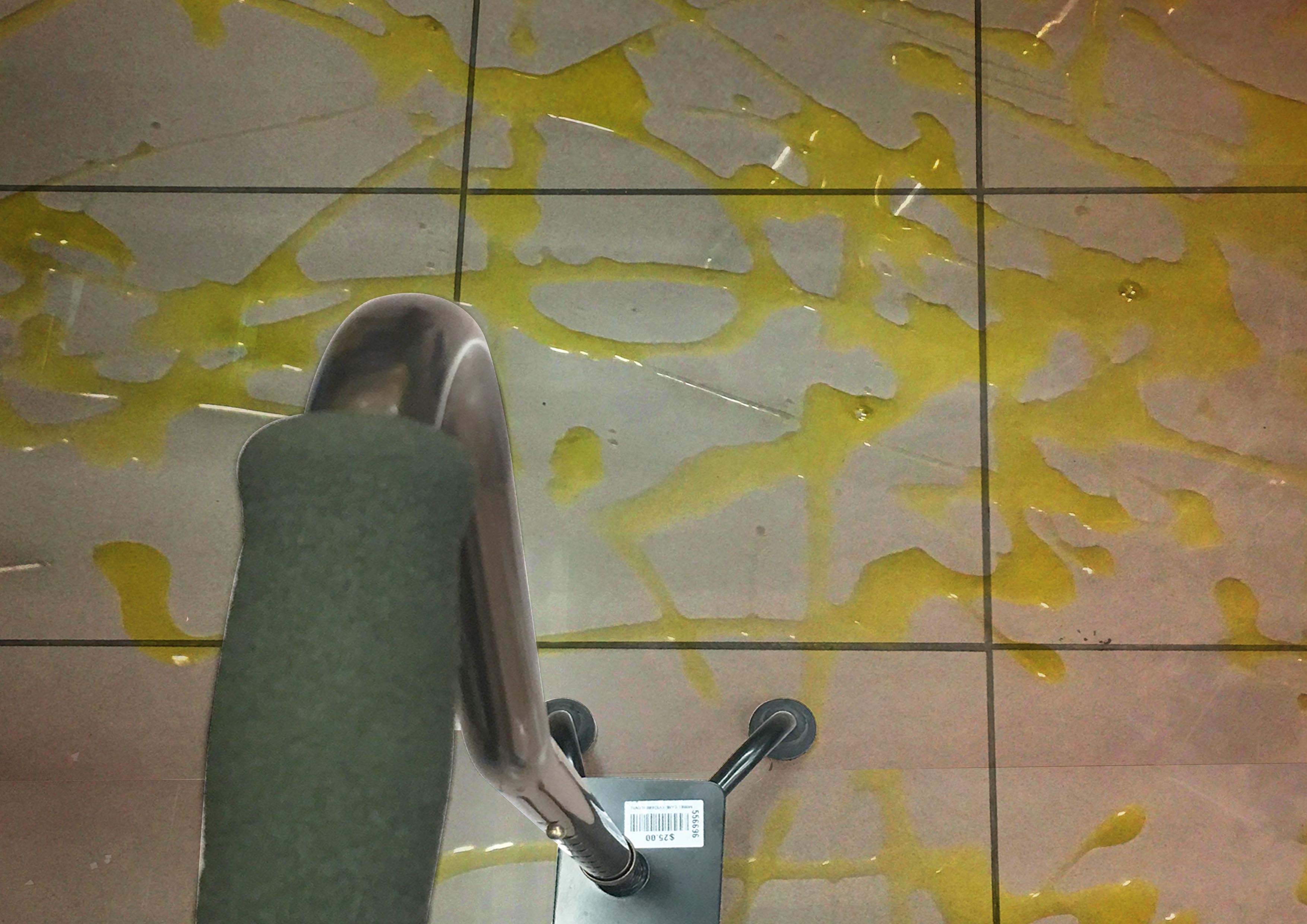
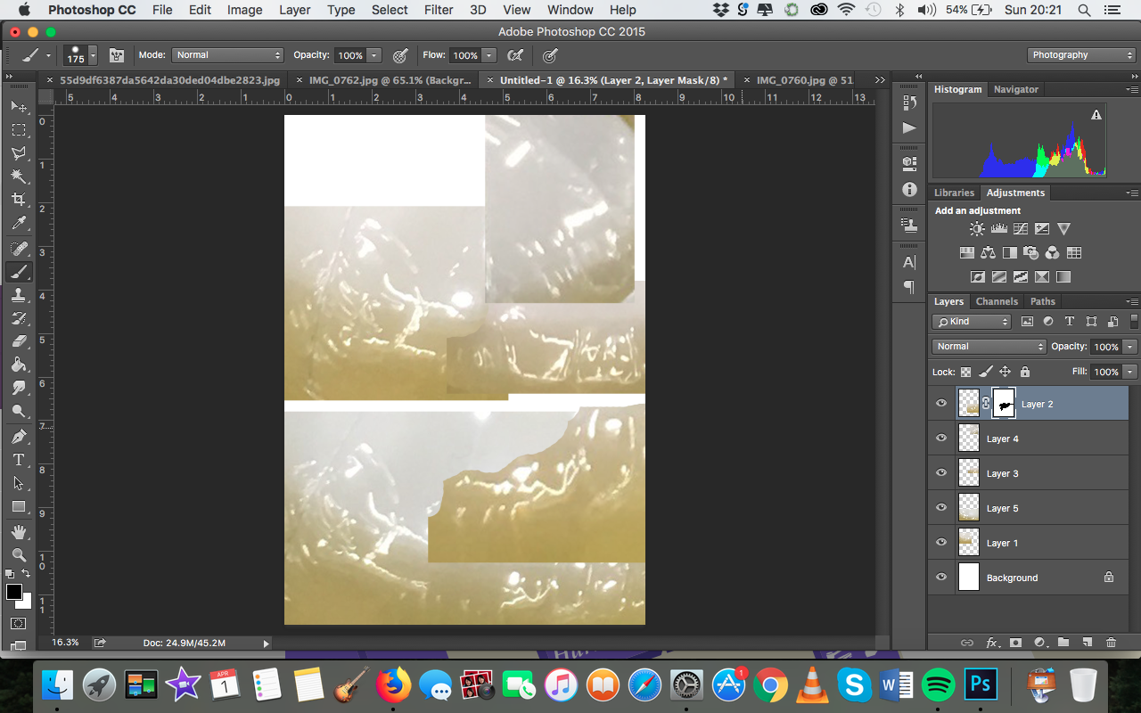
Process: Because I got markedly better results by staging my own set-up with my watermelon spread, I decided to do the same for this one. I splashed olive oil over a white tile and overlaid it over a composition that showed the cane more clearly and had better lighting than the previous version.


I was inspired by Jackson Pollock by this piece, and tried to have my oil splatters resemble his drip paintings as much as possible by using quick, vigorous strokes.
Feedback from critique: This was the weakest spread – more could have been done to bring out the quirkiness. In all honesty, I agree, I would’ve liked to spend more time on this spread and formed images with the splatters as well. I think I spent too much time trying to make the splats look realistic instead of doing something more with them.
Spread 3: Front and Back cover
I used actual Mustafa receipts for the front and back cover.


The back cover is more glitched up than the back cover to go with how my spreads get messier and messier, ultimately ending in the messiest back cover.
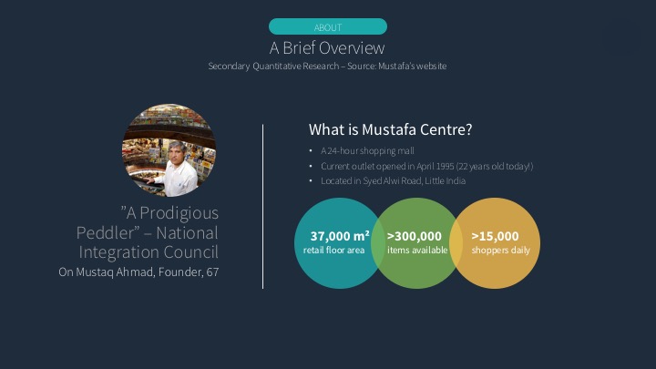
Mustafa Visits: In the search for the Unique Selling Point
Before visiting the site, I conducted some secondary research on Mustafa:
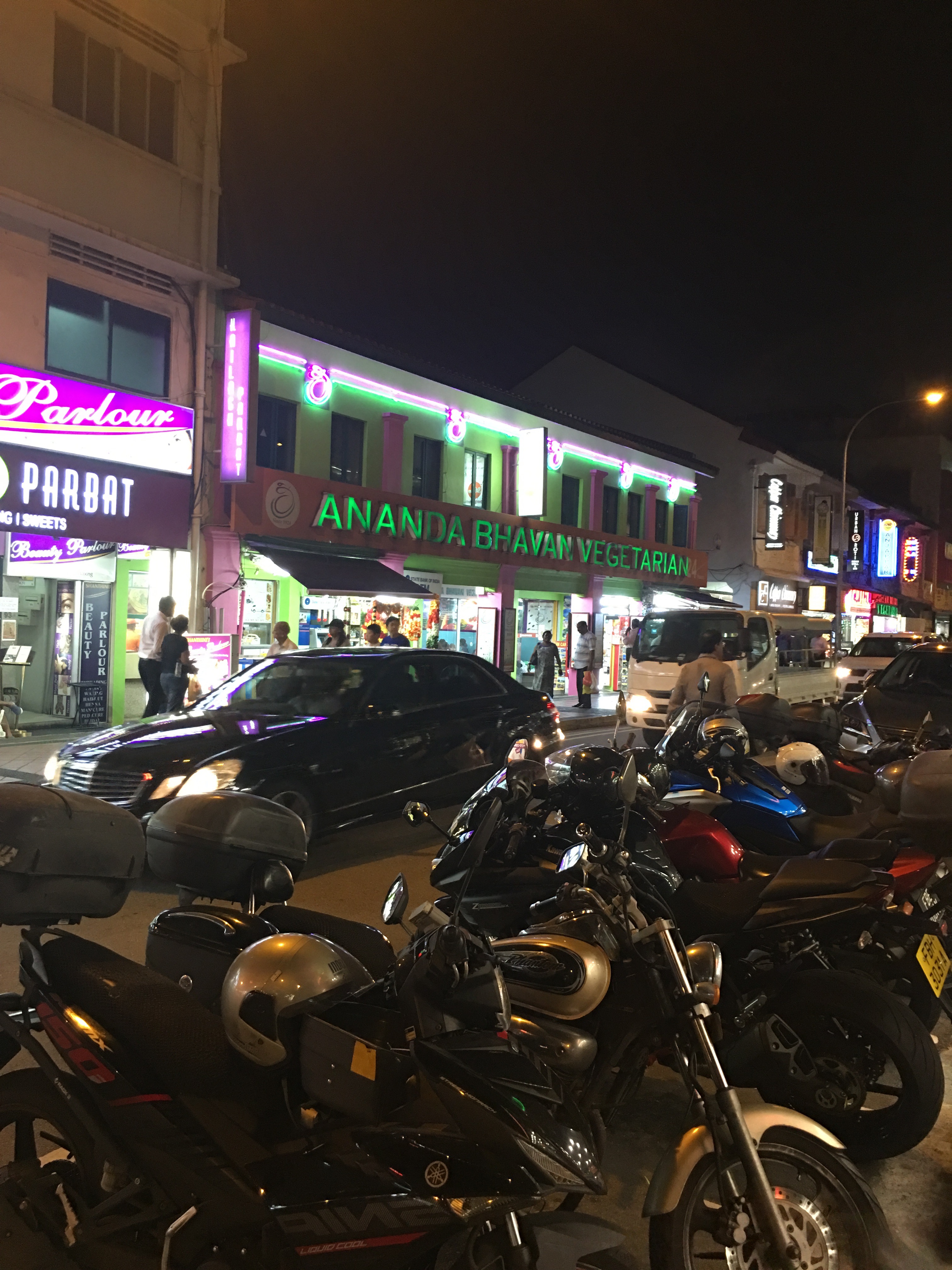
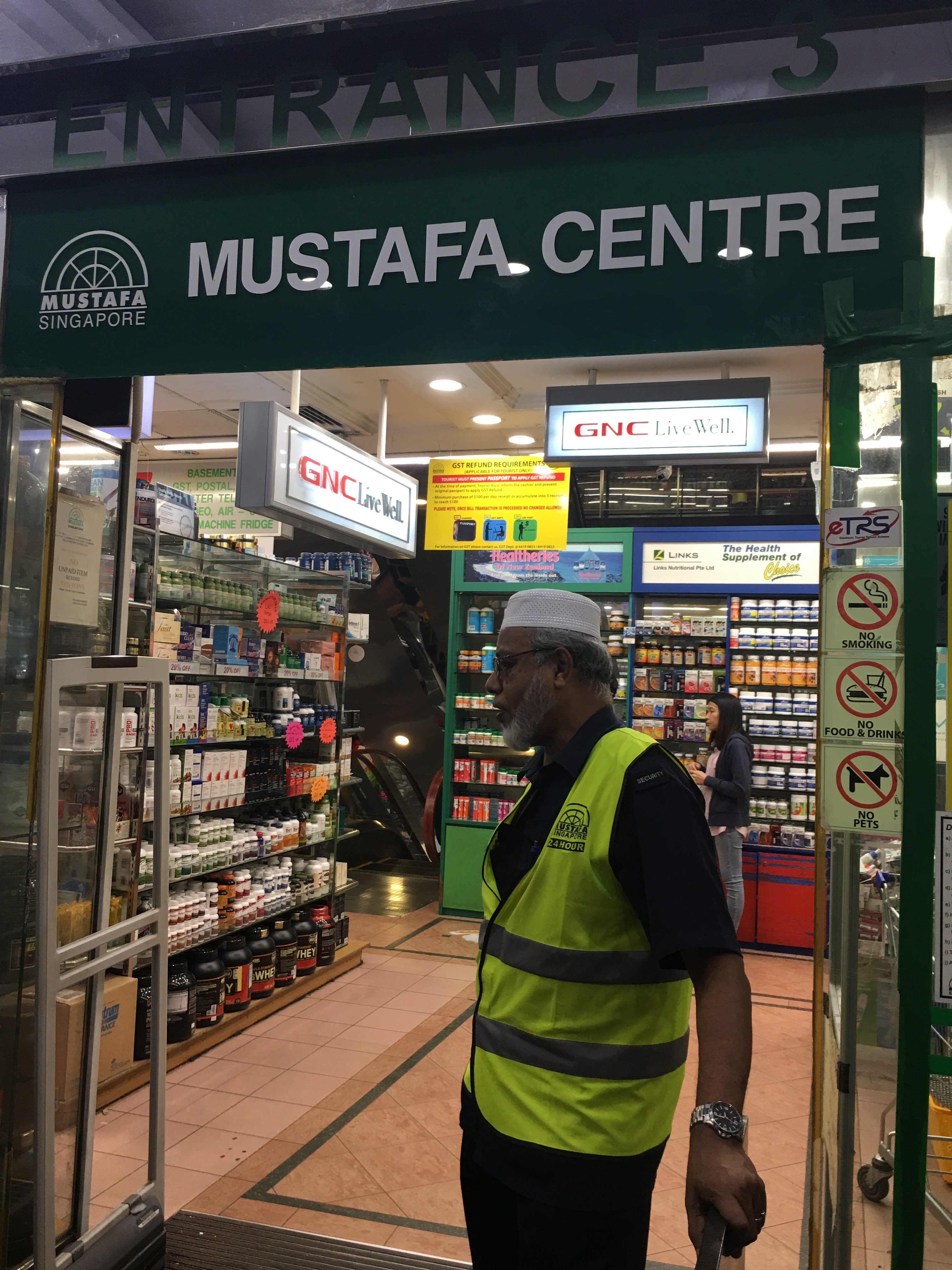
On the 2nd of March, I walked to Mustafa from Farrer Park MRT, entering via Entrance 3. One thing I immediately noticed was how crowded the streets and mall were. This was probably because it was Friday evening, one of the peak timings, as I would later come to find out.
The mall is surrounded by Indian restaurants, which makes sense because the mall is located in Little India.
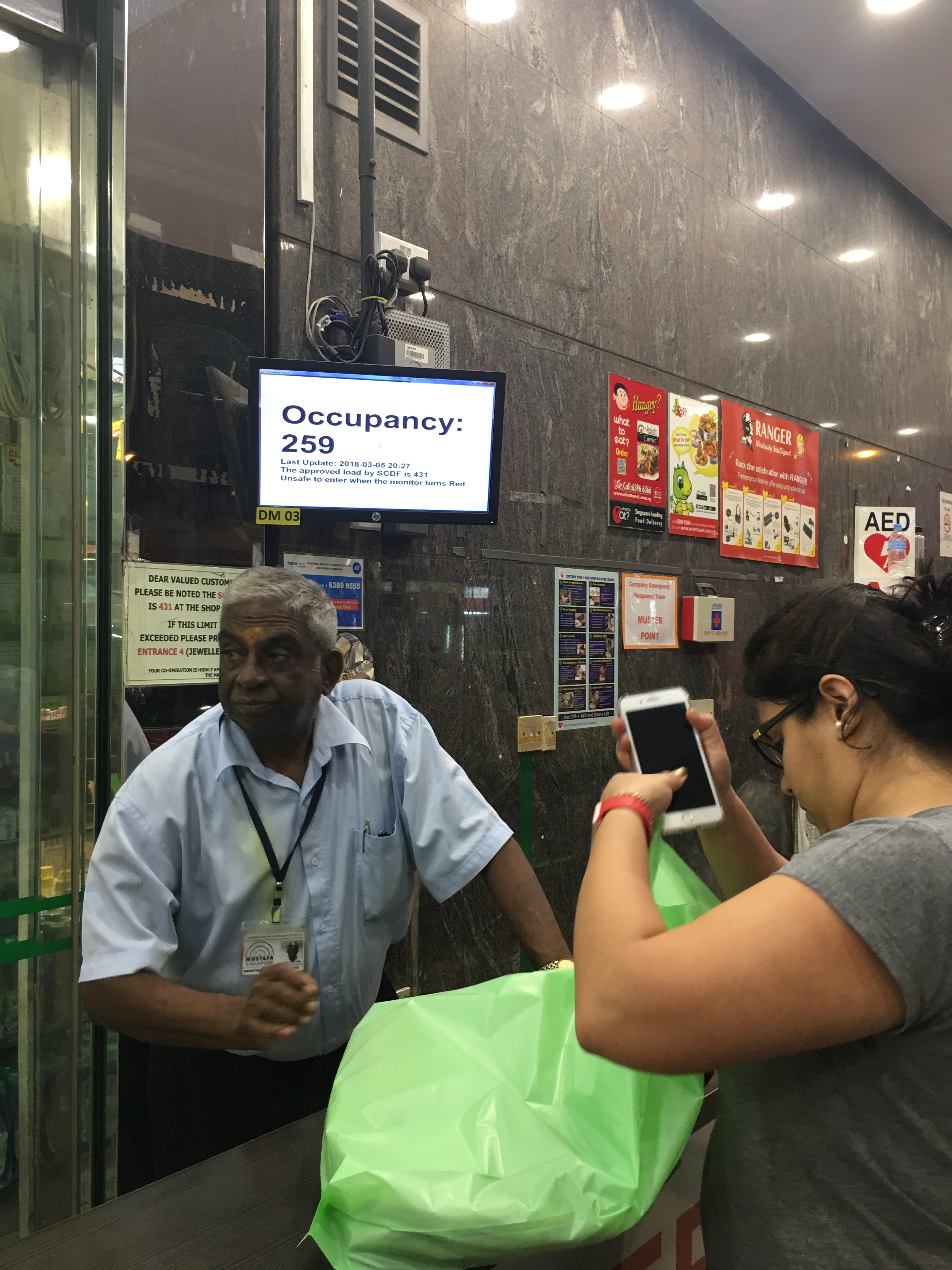
 At the entrance, there was a small monitor showing the occupancy to warn shoppers when it’s unsafe to enter. At that time, the occupancy (probably an average, for a certain amount of space) was 259, with the maximum load being 431.
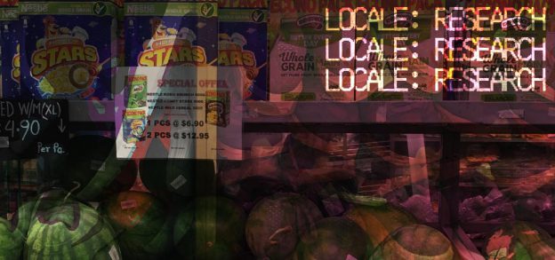
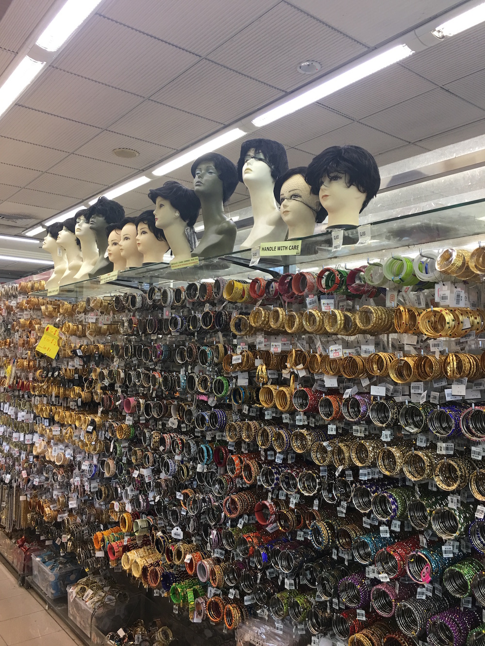
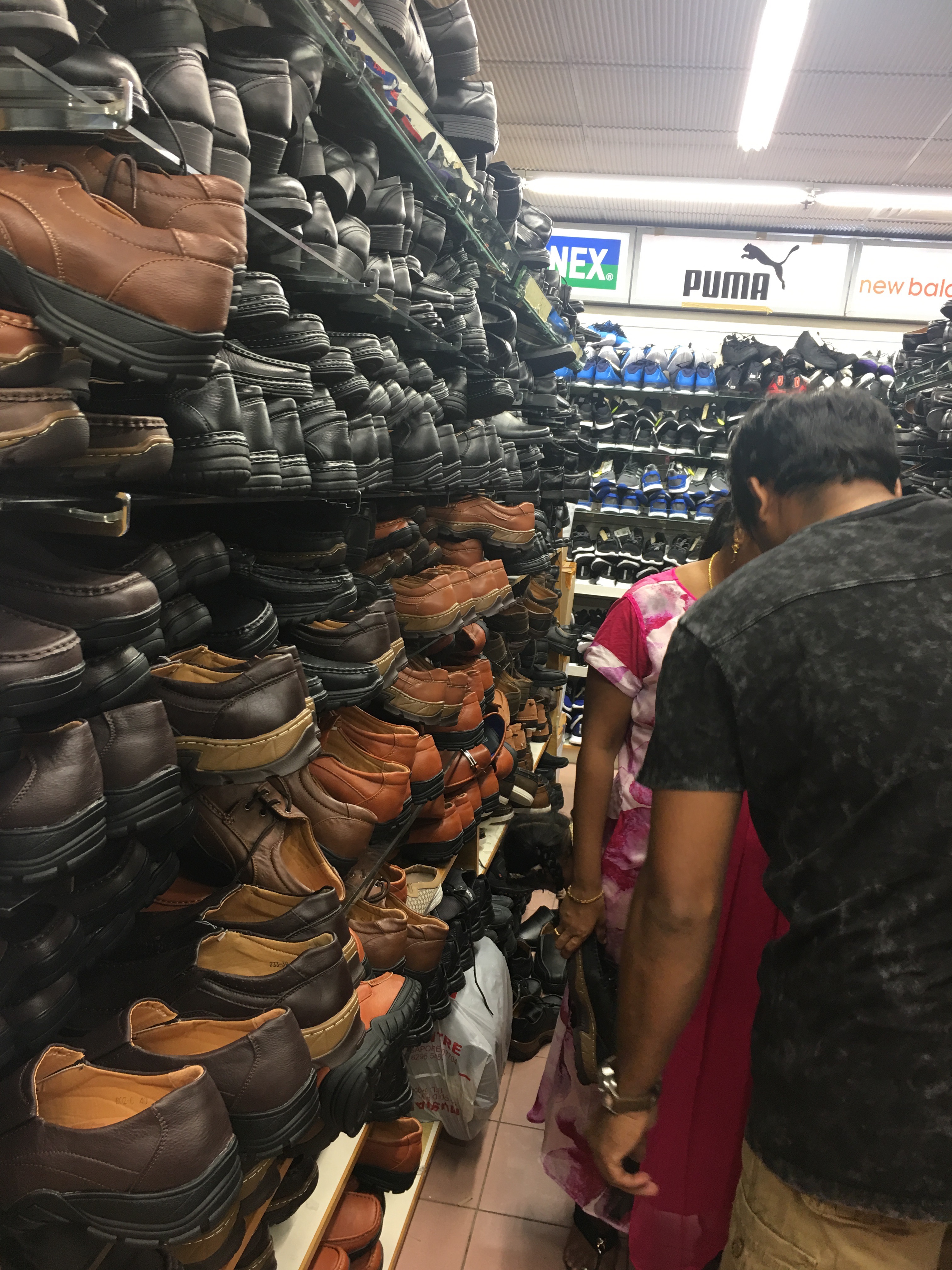
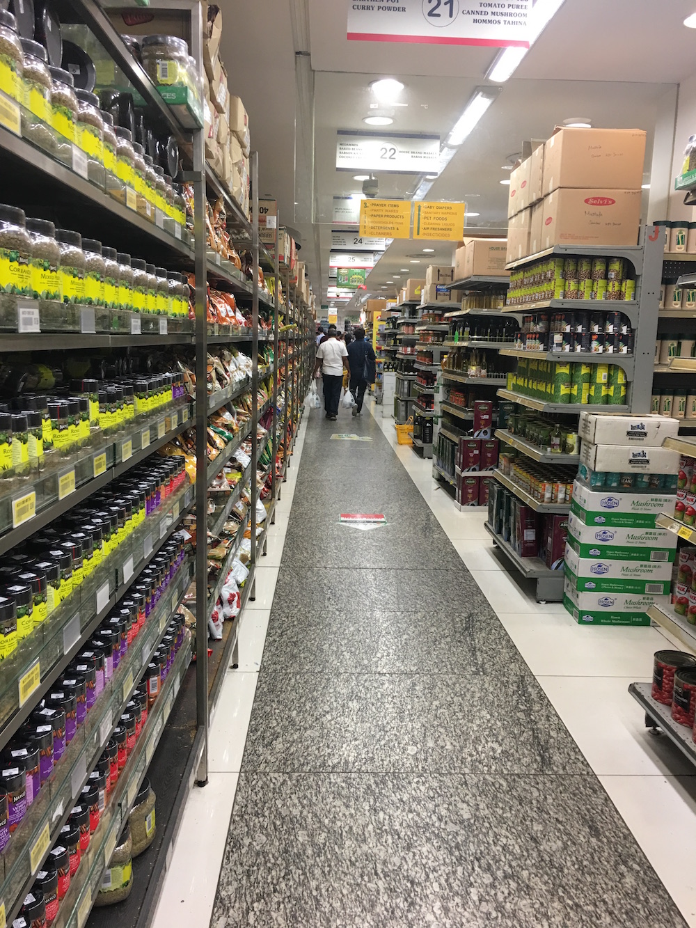
 Upon entering, I saw the pharmacy section. Upon seeing all the overwhelmingly numerous different types of medicines sold, I decided to note down the broader categories of products sold instead of being more specific, like noting down pharmacy instead of cough medicine, ointments etc.
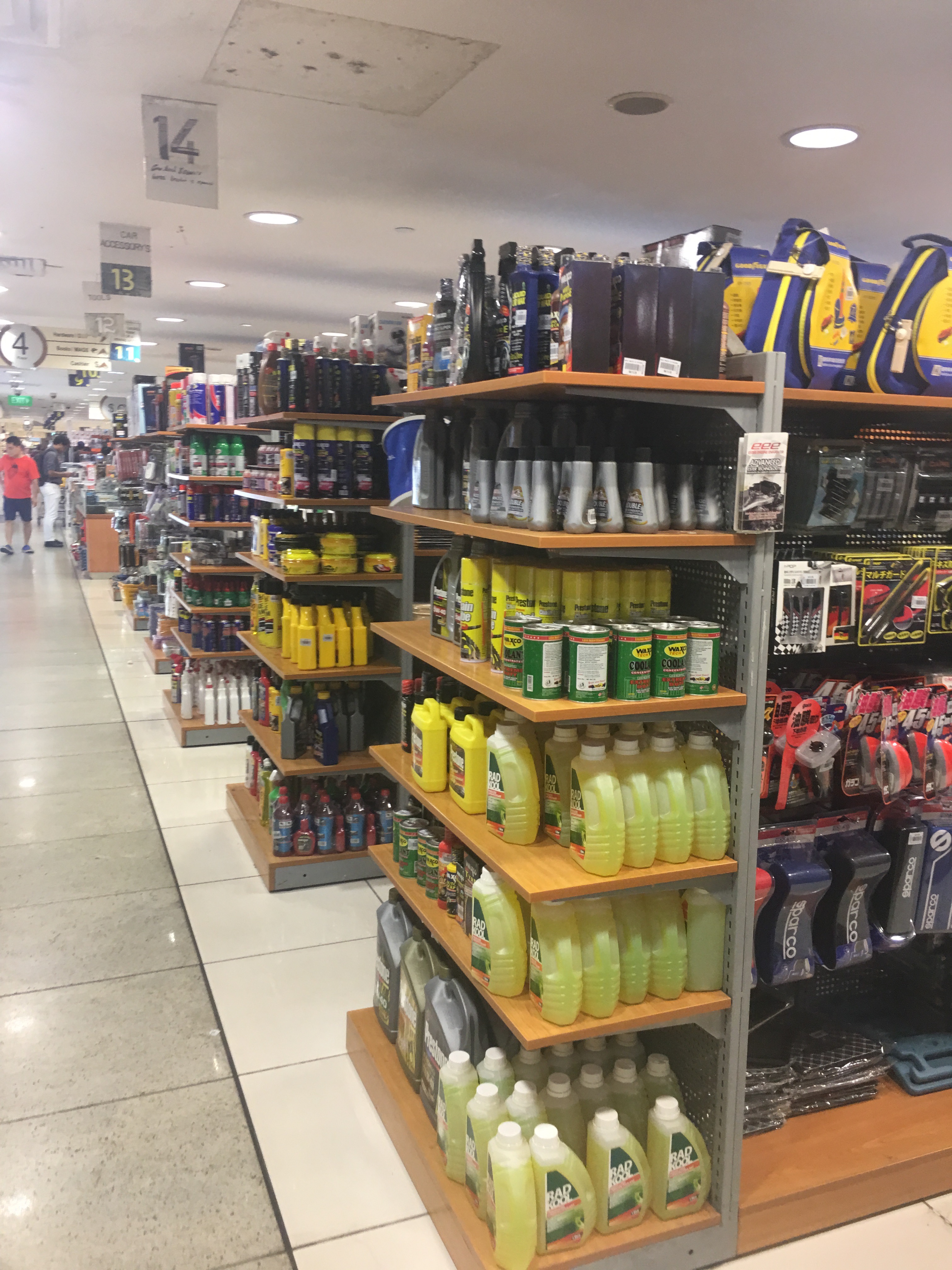
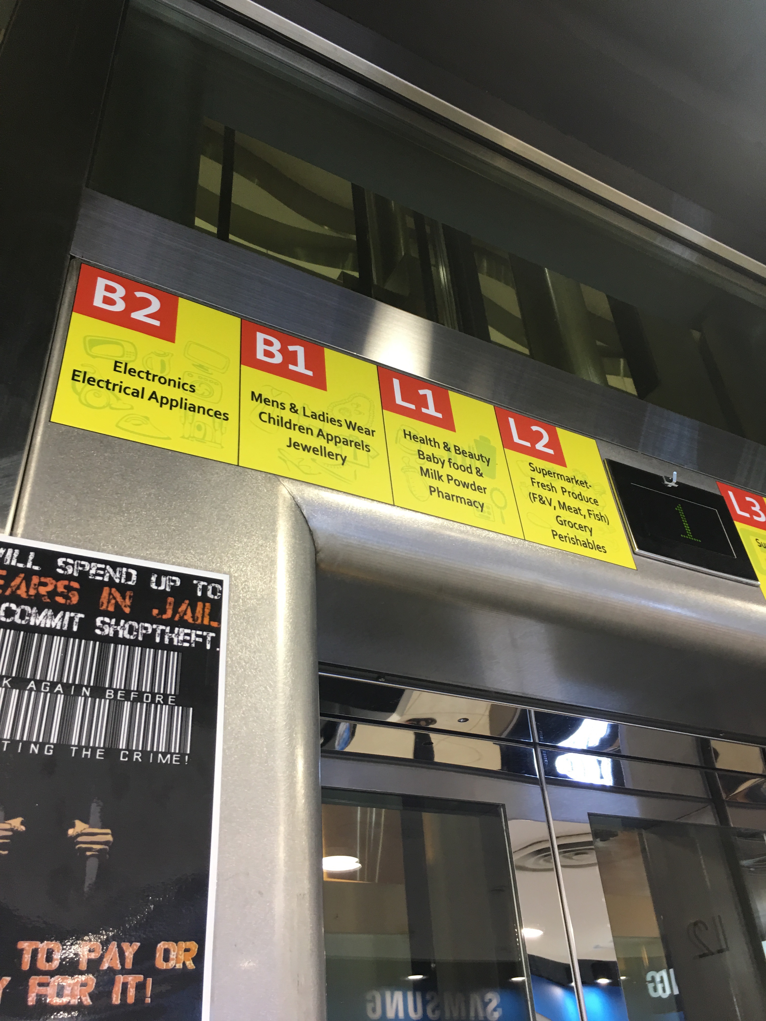
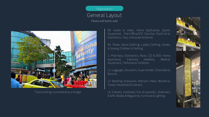
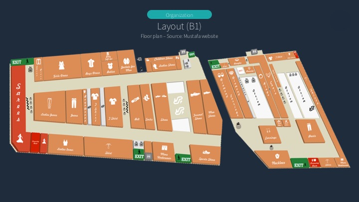
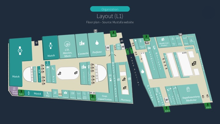
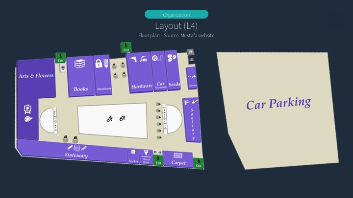
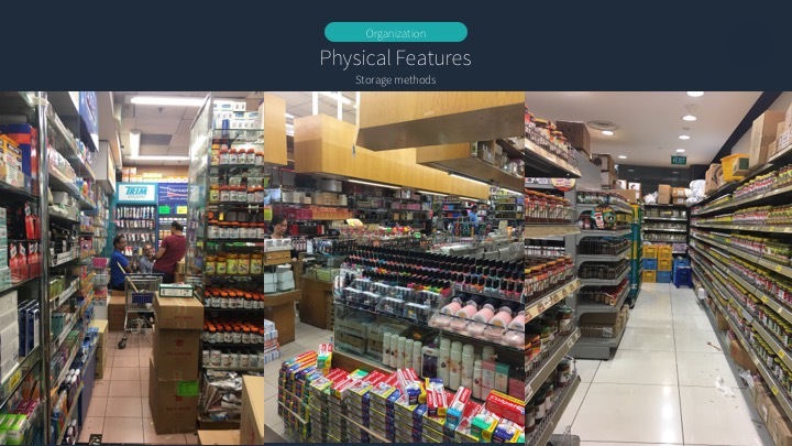
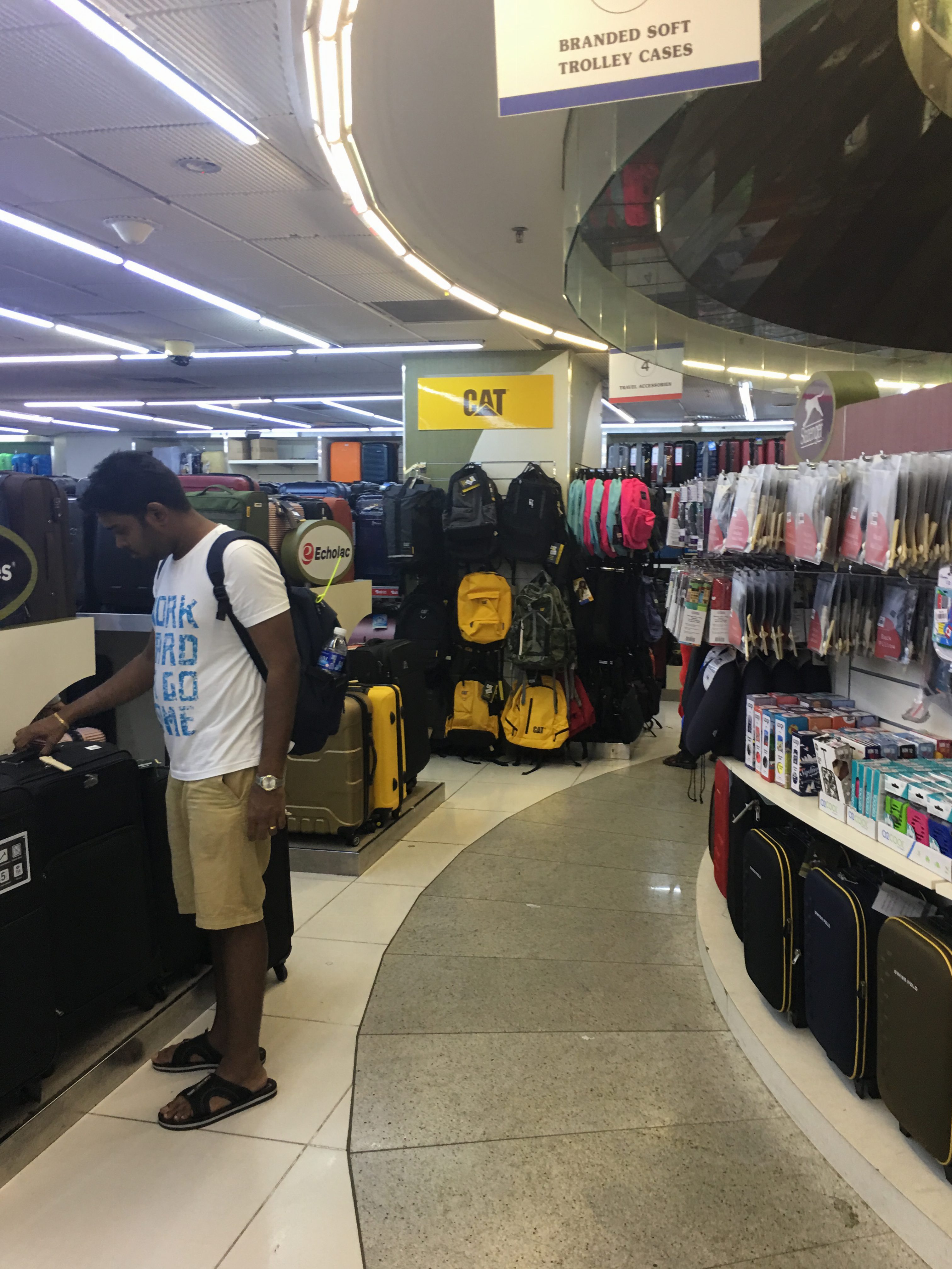
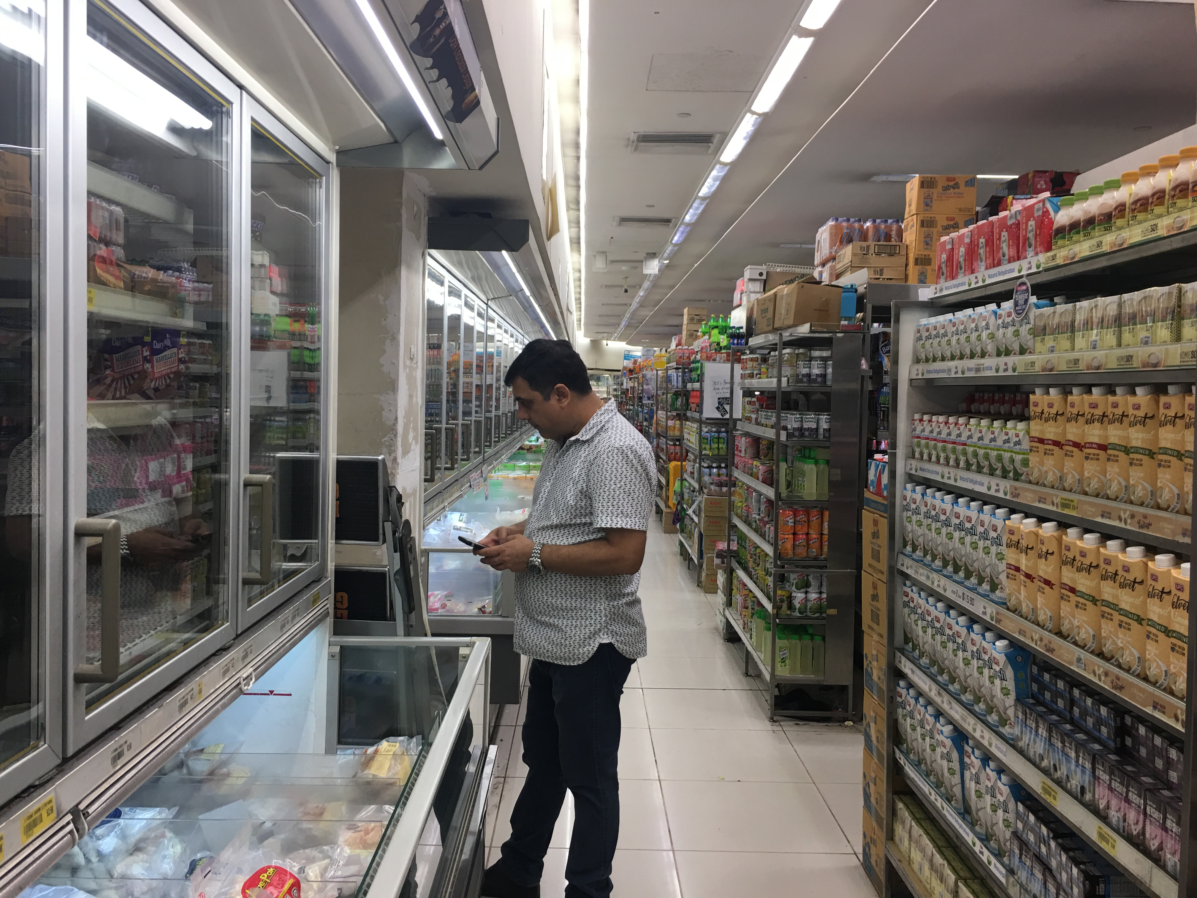
Brief overview of items sold on each floor
B2: Electronics, Electrical Appliances


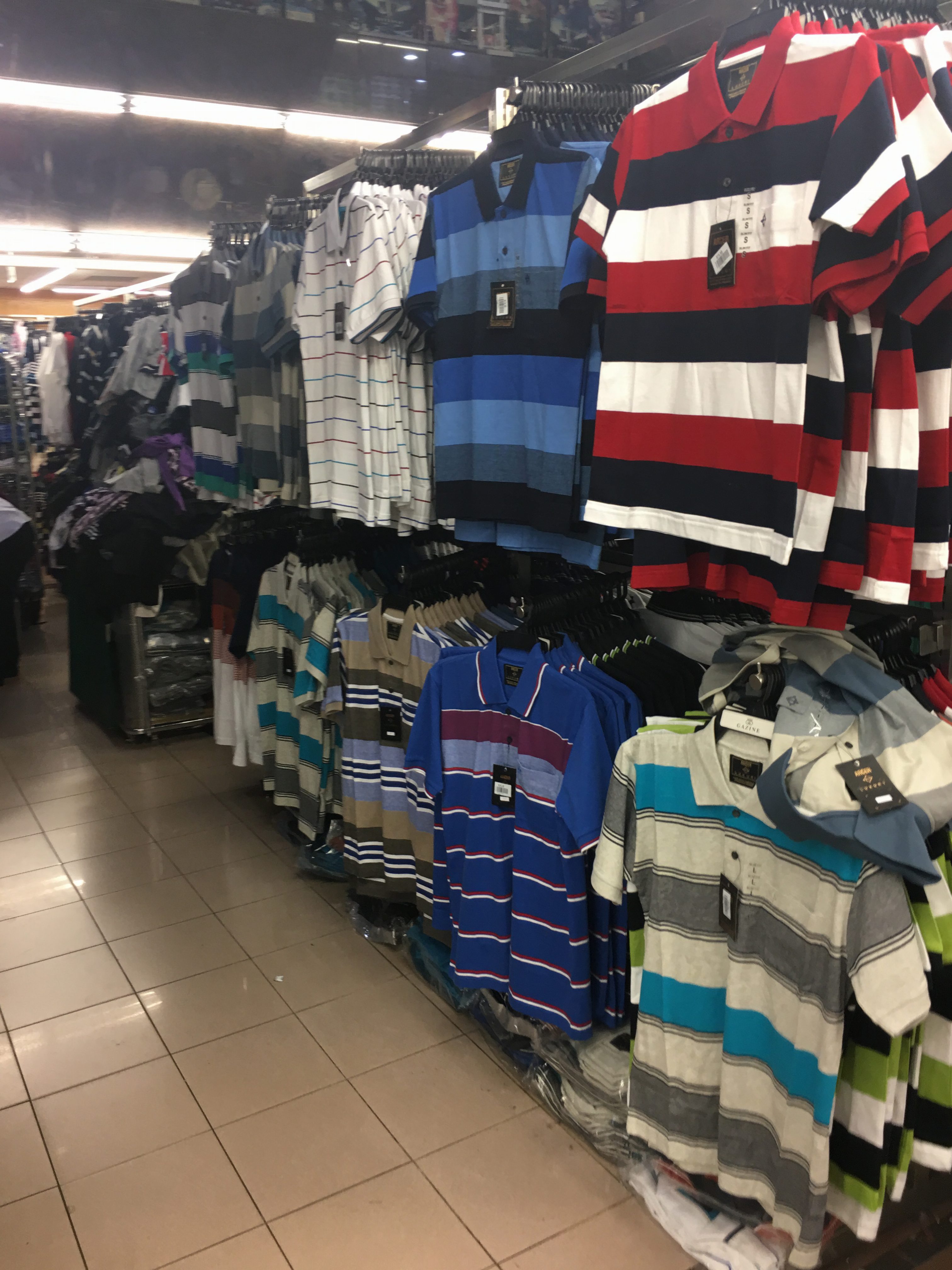
B1: Menswear, Womenswear, Children’s Apparel, Jewellery
L1: Health & Beauty, Baby food & Milk Powder, Pharmacy


L2: Supermarket, Fresh Produce (F&V, Meat, Fish), Grocery, Perishables (most crowded)


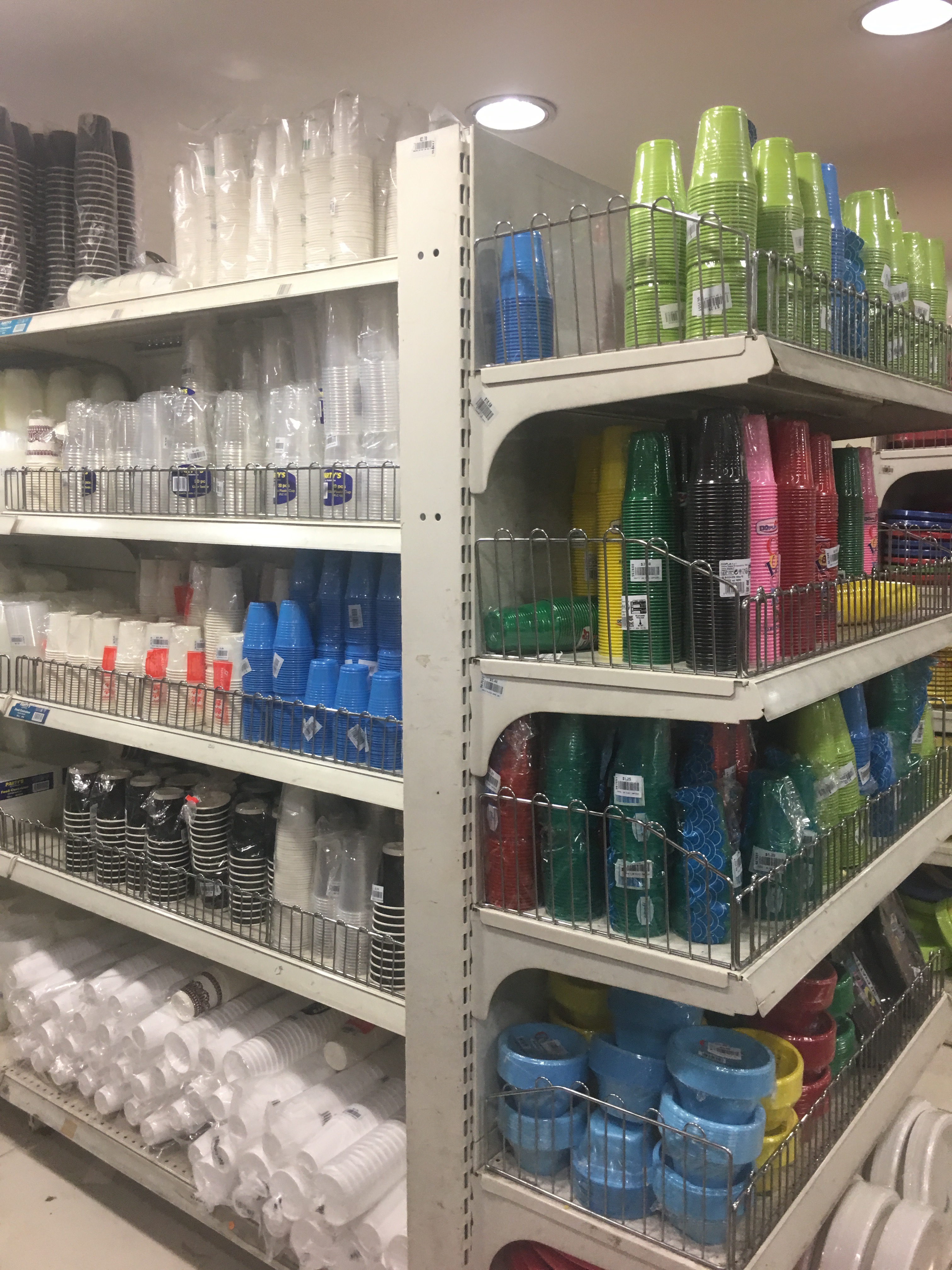
L3: Supermarket, Household Products, Car Park
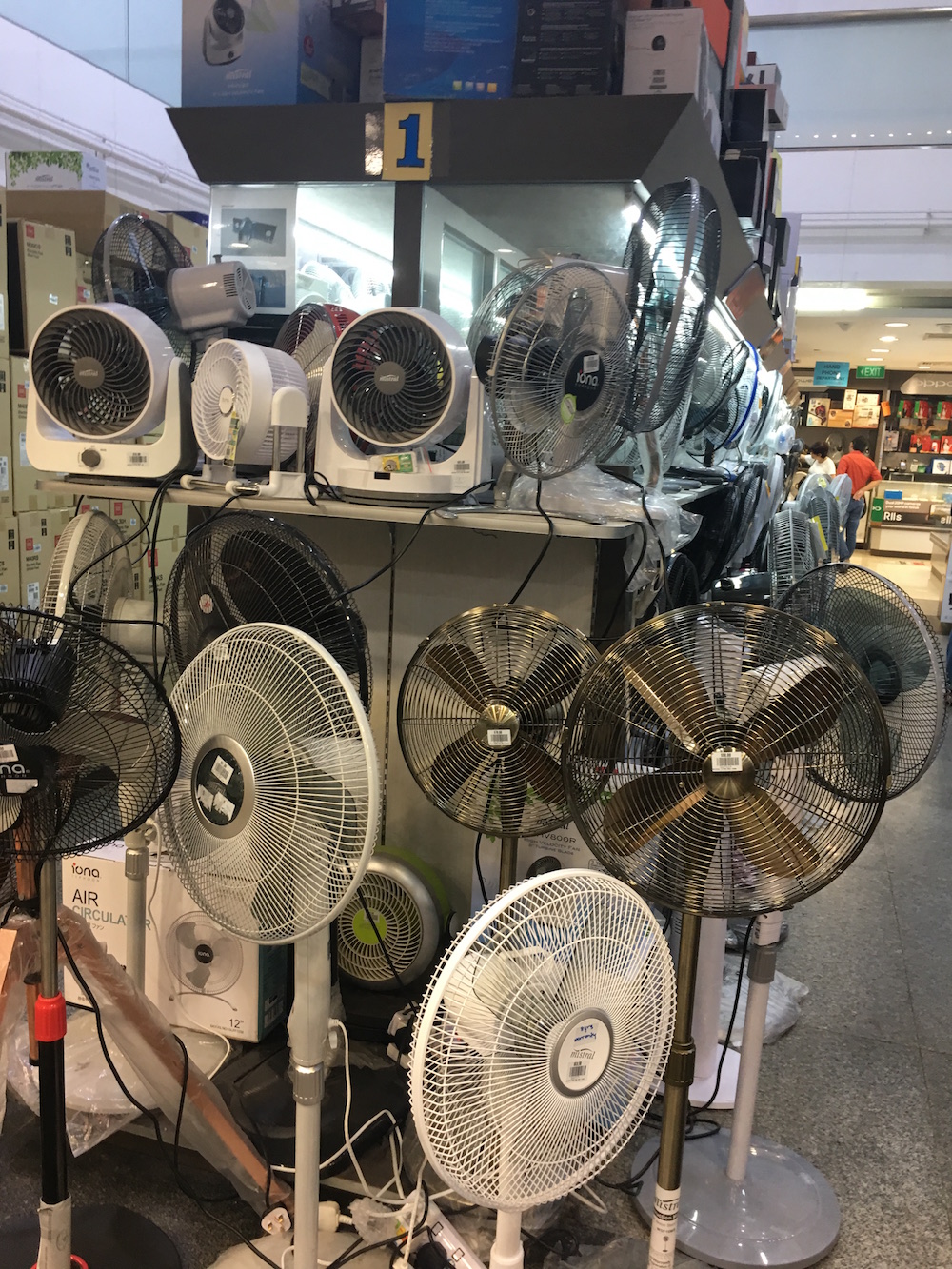
L4: Stationery, Hardware, Household items (least crowded)
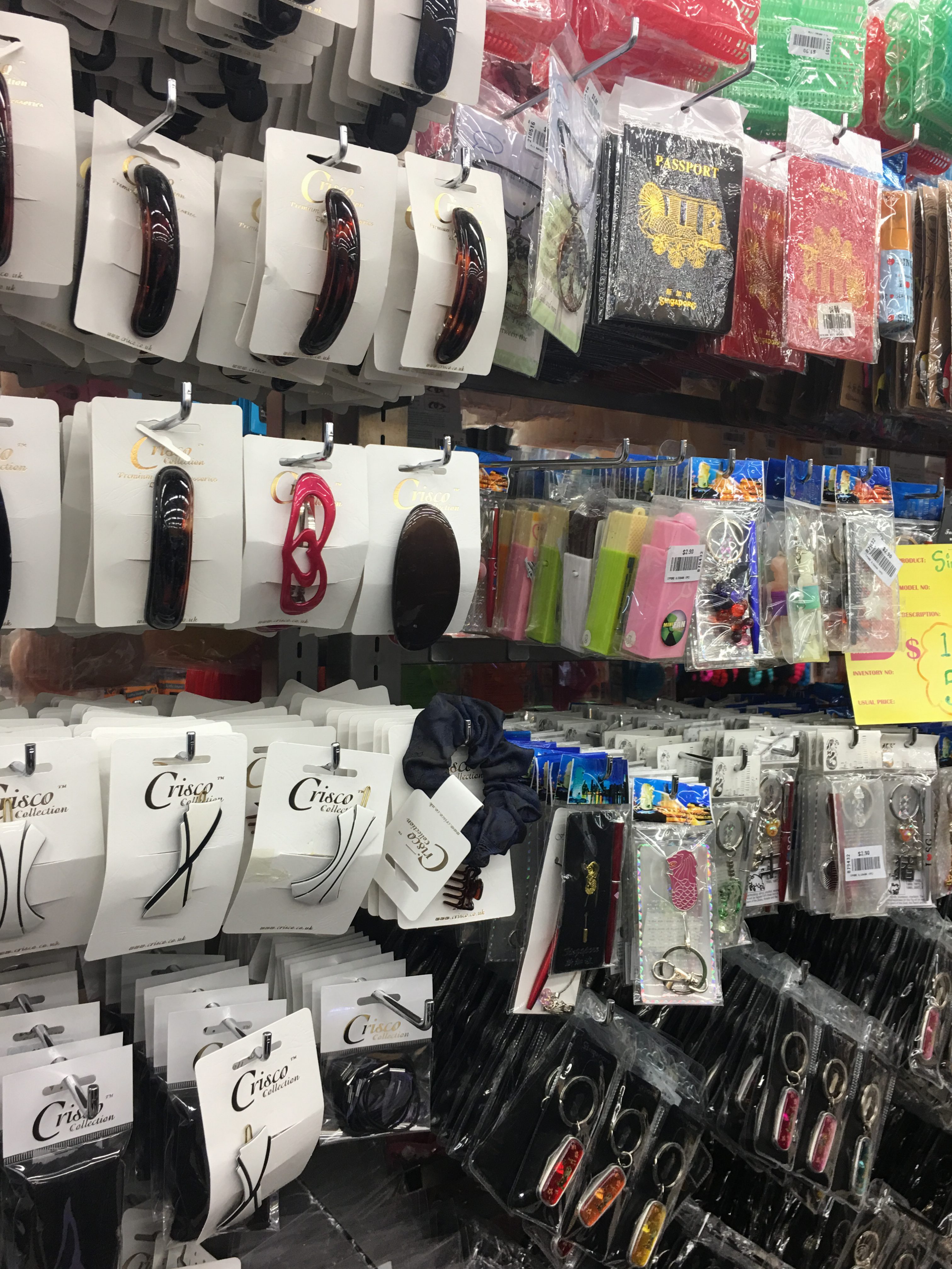
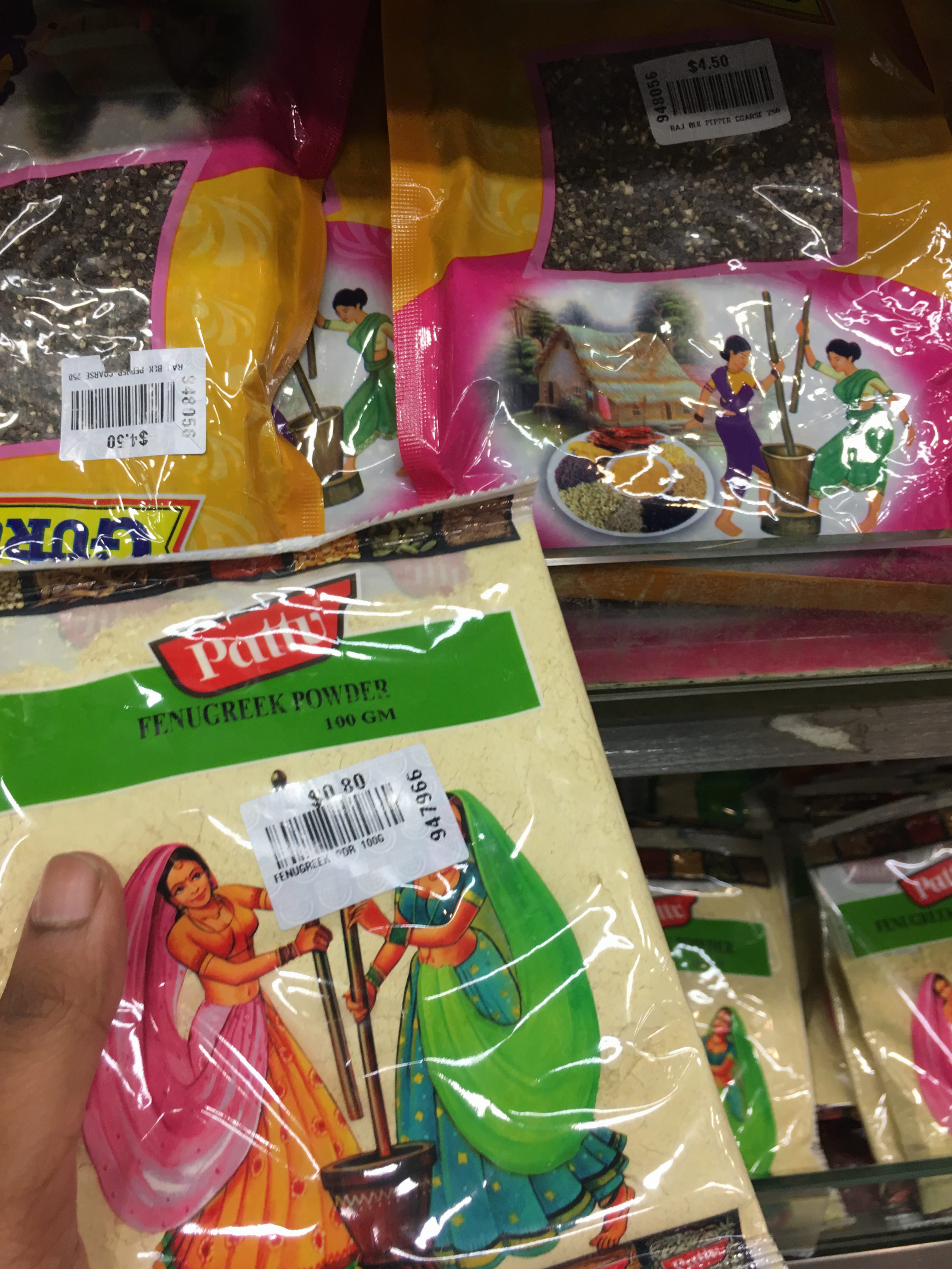
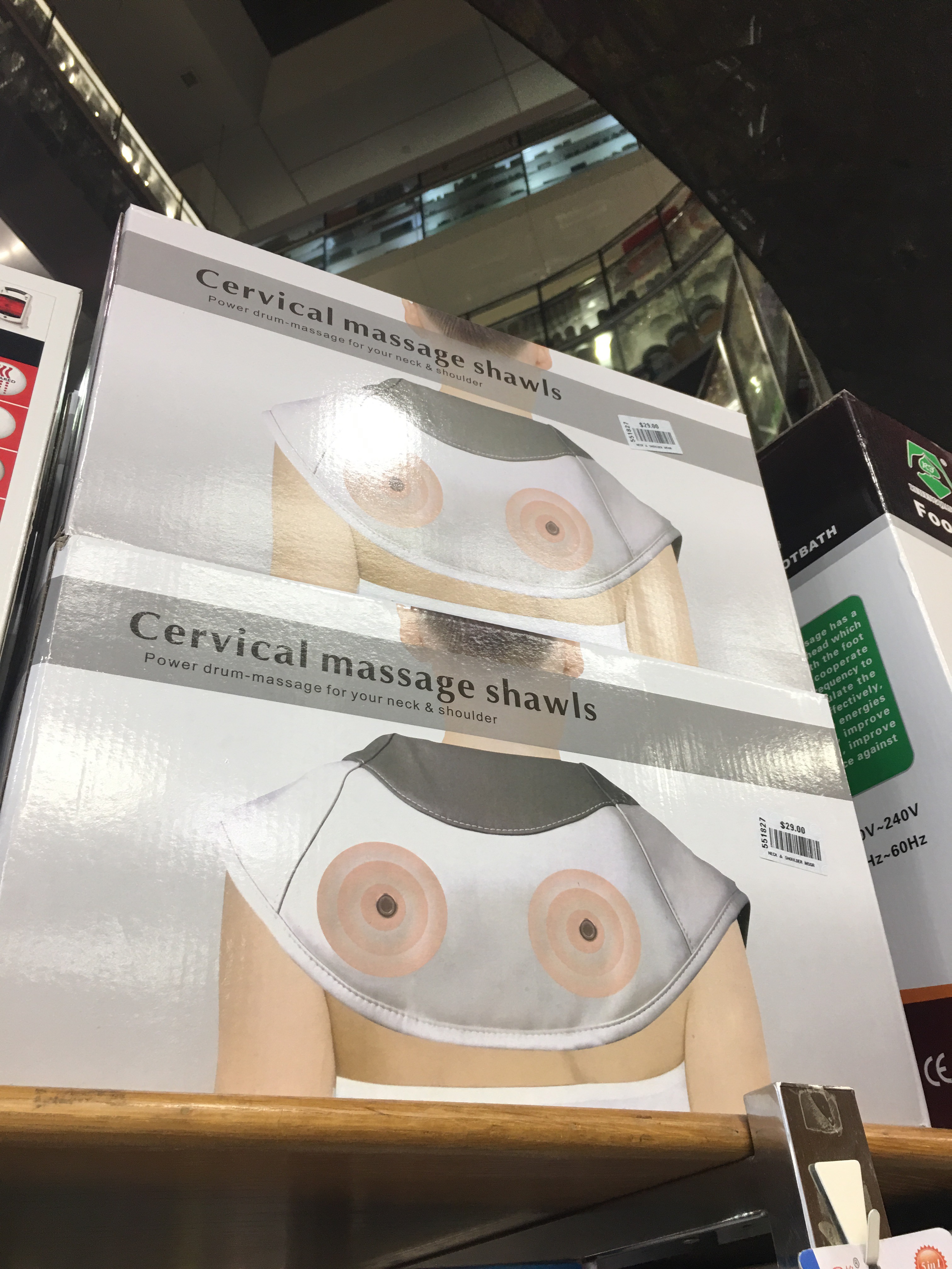
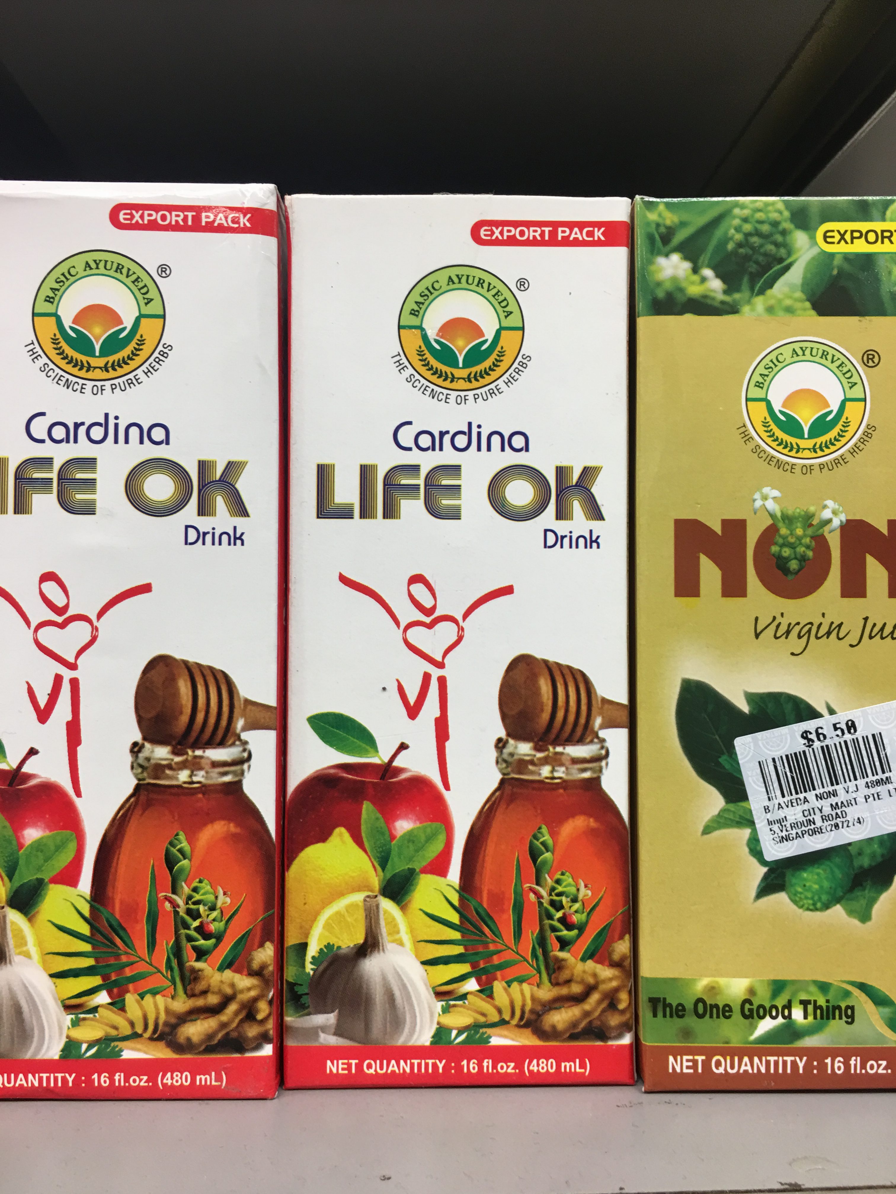
Unusual products?
In my quest to note down the different products sold, I noticed some rather unusual products being sold, most of them being of the food variety.


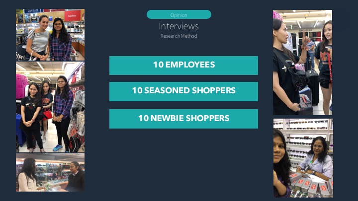
Interviews
I conducted interviews with two employees. First, I interviewed Jasbee Kaur from the sunglasses section.
As I did not have a unique selling point yet, I just asked some general questions.
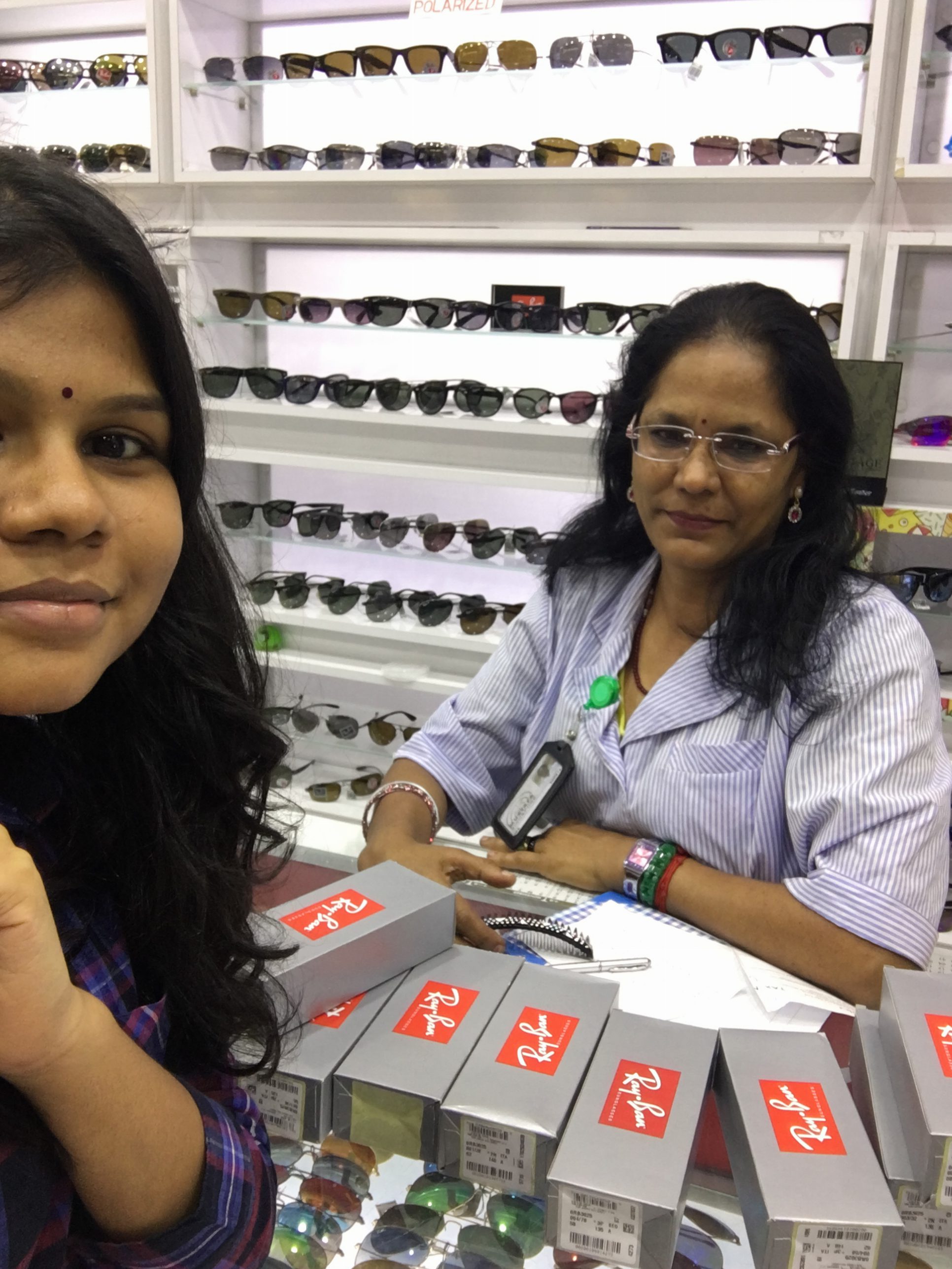 Q: How long have you been working here?
A: From 2000 till now.
Q: How familiar are you with the place?
A: I know all the places, so I’d say pretty familiar.
Q: How’s it like working at Mustafa?
A: I like it! The boss is nice. There is no target I need to fulfill, no nothing. For every 100 customers, 95% are okay. Most of them are tourists from India and Bangladesh.
Q: What are some pros and cons, or pet peeves?
A: A pro is that all items can be found. But there are no seating places and baby fitting places. Some new staff might point customers the wrong way.
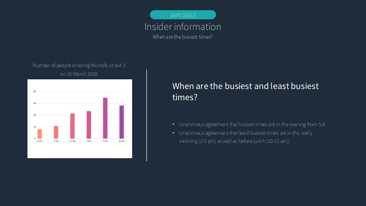
Q: When are the busiest times?
A: Friday, Saturday and Sunday, from about 11.30 am to 7 or 8 pm. On public holidays it goes up to about 10 pm.
Here’s my second interview!
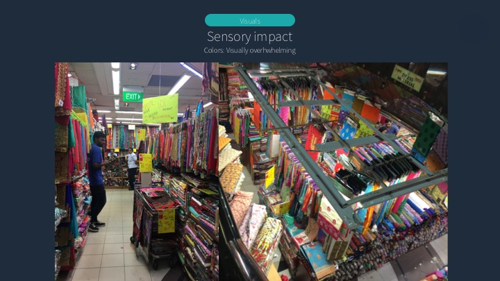
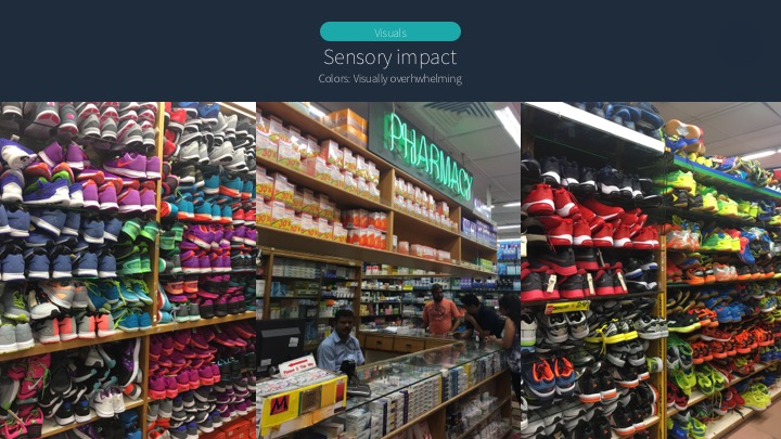
Continuing on, I realized that I started to get more and more overwhelmed. Mustafa is very visually tiring on the eyes after a while, with really tall shelves and bright, saturated colors. My eyes started getting really fatigued from the repeated patterns in the shelving. Even though it was organized in a way, there was a lot of cramming into spaces that didn’t really seem big enough.


I also started getting very, very lost. Thankfully, the signs pointed me to different sections.

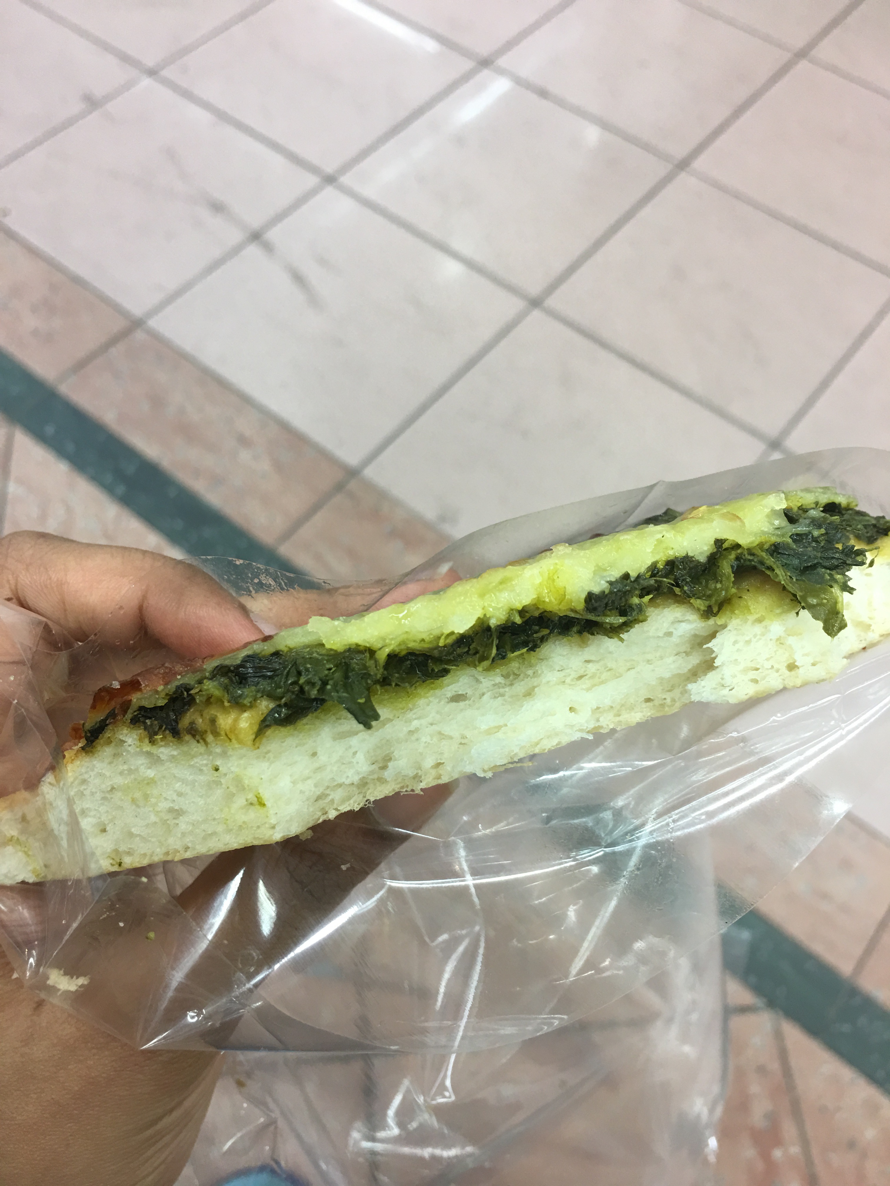
Inside the mall, there was also a bakery. Here, I sampled the spinach pizza. It was pretty salty and I didn’t particularly enjoy it (probably because it was cold and slightly hard), but it was definitely not terrible. I could see someone really craving pizza coming here for pizza at 2 or 3 am.
Visuals
Architecture
Very geometric shapes, with both strong straight lines (for example, rows of items) and curved lines (from circular “hole” in the middle surrounding which floors are arranged – see below).
Colors


Really bright and saturated! They are also repeated in recurring patterns.
Leaving the mall, I tracked the number of people passing through different entrances per minute, as well as the racial profile, as I noticed that there seemed to be more Indians in the mall than other races.
|
Entrance |
Chinese |
Indian |
Malay |
Others |
|
1 |
6 |
22 |
8 |
11 |
|
2 |
9 |
19 |
5 |
6 |
|
3 |
10 |
17 |
8 |
5 |
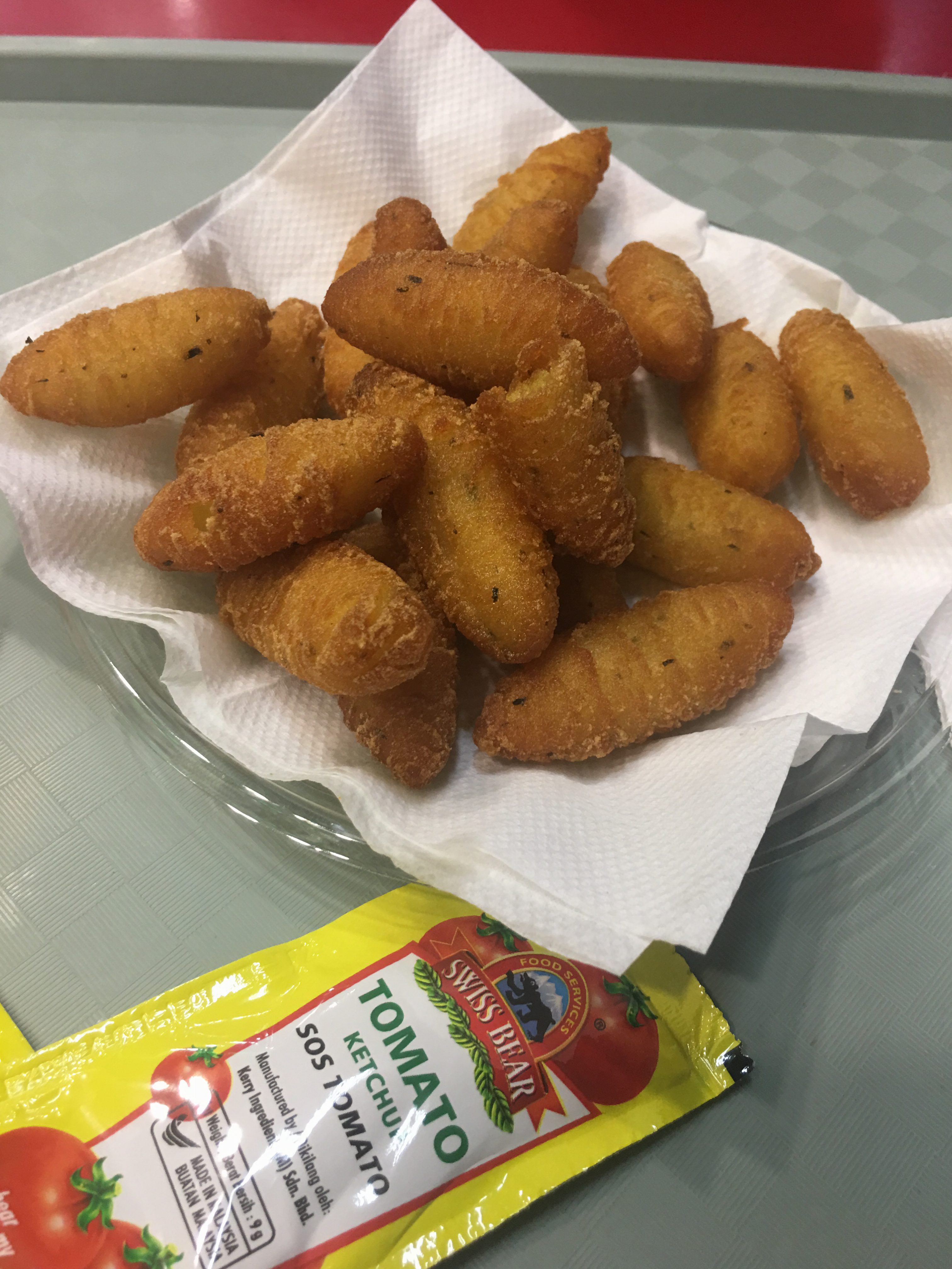 Walking along the other side of Mustafa, I also noticed how there was in-house restaurant. Here, I sampled the tater tots. Again, it was pretty salty. However, it was still an improvement over the pizza from earlier because it was hot.
After the visit, I found some unique qualities about Mustafa.
1) It sells some really weird and unique items, that you wouldn’t think would be sold under one roof, or could even be found in Singapore. Most of them are of the food variety. I considered analyzing the weirdest food items I’ve seen there and maybe do a review of them as well.
2) How it is a one-stop place for literally anything you could need at any random time of the day. I thought that this could be translated into an infographic with a clock, and showing what you might need at different times of the day can be found where specifically at Mustafa.
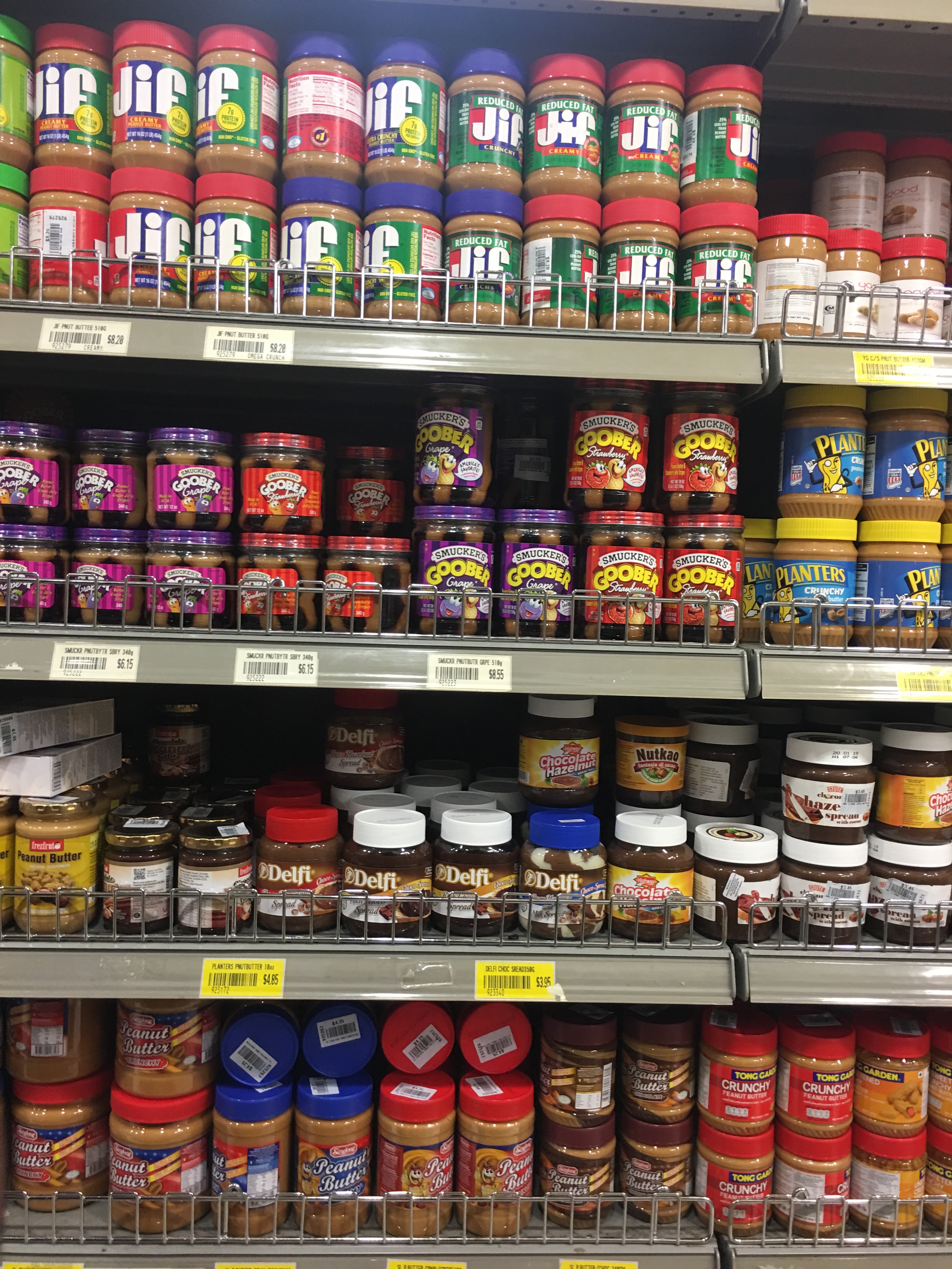
3) It sells a huge variety (brand-wise) of certain items, like rice and spices (see below for rice varieties).


4) It’s method of organization seems to make sense, but also can be really bizarre. The items are arranged in a sort of nonsensical way, like for example there’ll be cereals over fresh fruit.
Consult
After the discussion with Joy, I narrowed down my Unique Selling Point to Mustafa being an organized mess. My task would then be to find out how people react to this mess, shoppers and staff alike.
Visit Two: Unique Selling Point identified. On to further research! How do people react to the organized mess?
Going into Mustafa this time, I had a much clearer idea of what I was looking for. I came up with a set of questions beforehand.
Questions for staff:
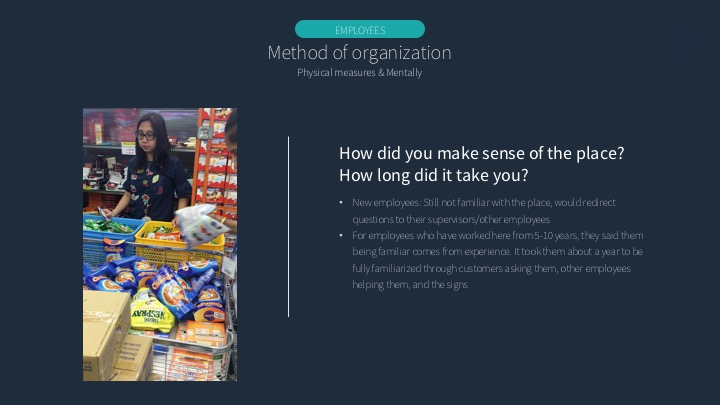
1. How did you make sense of the place?
2. How long did it take you to make sense of the place?
3. How organized/messy do you find Mustafa on a scale of 1-10?
4. What are the most busy times? When are the least busy times?
Questions for seasoned shoppers:
1. Profile: Age, gender, how long have you been shopping at Mustafa?
2. What do you come to Mustafa to buy?
3. How do you navigate? (Stairs, escalators, lifts?) (Start from bottom floors upward? Which sections do you visit first?)
4. How long does it take you to navigate? Do you spend more time navigating or shopping?
5. How did you make sense of the place? How long did it take you?
6. How long do you spend here? How much do you spend usually?
7. How organized/messy do you find Mustafa on a scale of 1-10?
8. What would be the best strategy for a new shopper?
Questions for newbie shoppers:
1. Profile: Age, gender, how long have you been shopping at Mustafa?
2. What do you come to Mustafa to buy?
3. How do you navigate? (Stairs, escalators, lifts?) (Start from bottom floors upward? Which sections do you visit first?)
4. How long does it take you to navigate? Do you spend more time navigating or shopping?
5. How long have you been here?
6. How organized/messy do you find Mustafa on a scale of 1-10?
Below is an interview I managed to record with the help of a friend.
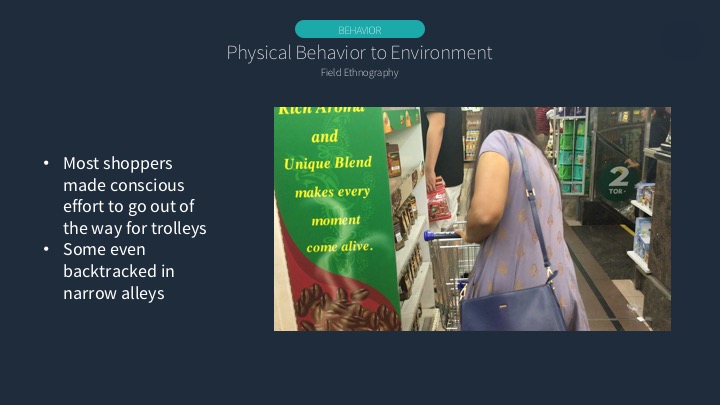
Field Ethnography
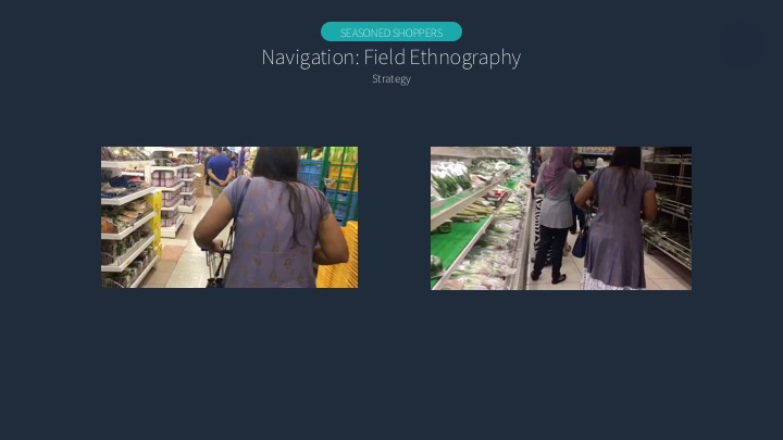
I also did field ethnography in that I shadowed my mom as she shopped. I wanted to play this video during my presentation but technical difficulties arose, sadly! I initially tried shadowing a random shopper on one of my earlier trips, but they noticed me and told me to stop following them so I decided to just accompany my mom on one of her shopping trips. She is a seasoned shopper. I’d previously accompanied her for short trips, but never had really analyzed how she navigated through Mustafa. This below video does that.
Staff behavior to mess
I also walked around trying to observe the staff’s behavior towards mess and captured this video of a staff conscientiously picking misplaced items out of a pile during the peak hours.
The above videos illustrate some research I didn’t manage to cover during my presentation. My presentation can be found below (it also covers some other research methods I did not talk about in this post, cause it’s already on the slides)! I organized my slides according to the unique selling point, the organized mess, hence splitting the presentation into two parts: the “organized” and the “messy” aspects. I also summarized the results of my interviews with 10 employees, 10 newbie shoppers and 10 seasoned shoppers, and explored other sensory and physical impacts.


(Click to enlarge all images)
Overall idea:
I wanted to show both the good and bad sides of a job – even though jobs may look fun on the surface, they often come with their own difficulties. When I was brainstorming for my four jobs at first, I looked at jobs I actually want to do after graduation. So in a sense, this project was my own weighing of the jobs against each other for myself.
I do this through a layered experience – with each of my four jobs, separate sections reveal the additional layer of meaning. This mirrors the whole surface level/deeper level concept I’ve got going on.
Art direction
I had a lot of trouble coordinating the colors across all four compositions, so I decided to adopt the color scheme of Oliver Jeffers. in particular, this work.
I extracted the colors and textures out from that piece, and made my color moodboard.

I really enjoy the contrasting textures – I think it makes the work interesting to look at and was something I wanted to emulate. I used a variety of mediums, with watercolor, acrylic, color pencil and even printing out textures (for the flight attendant piece).
Here are some previous color schemes I did digitally, before I thought of using a unifying color scheme.


Job 1: SIA Flight attendant
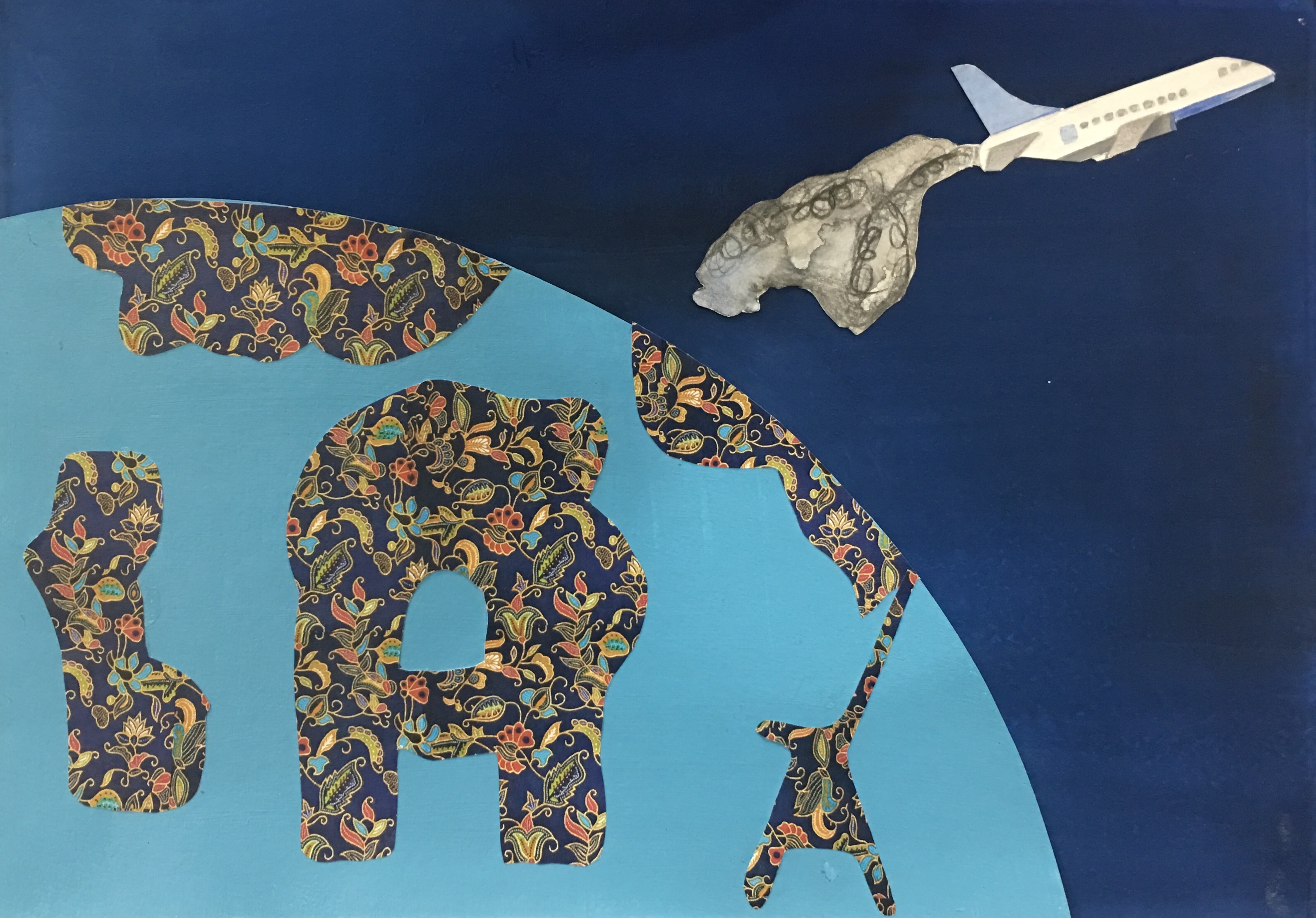
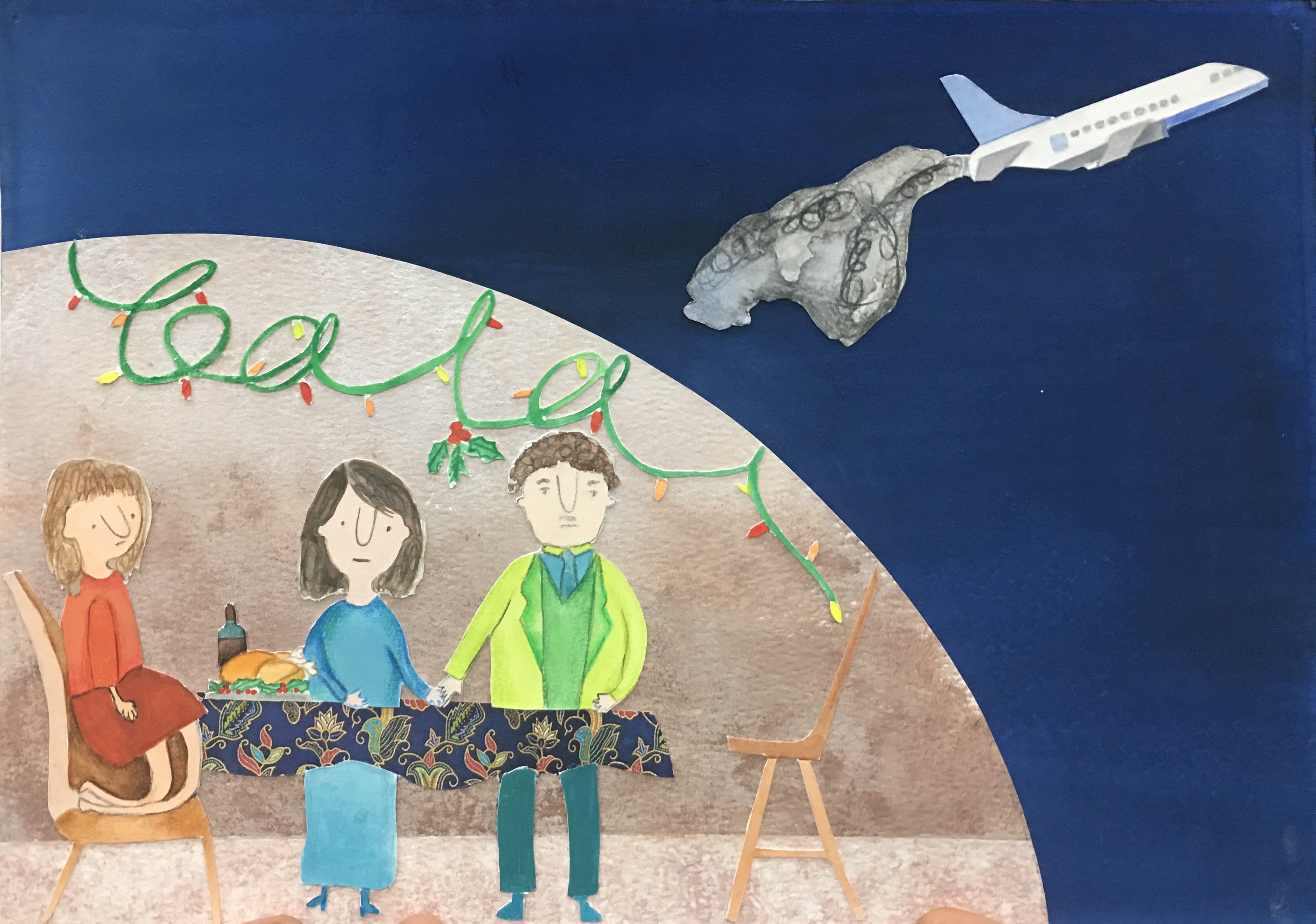
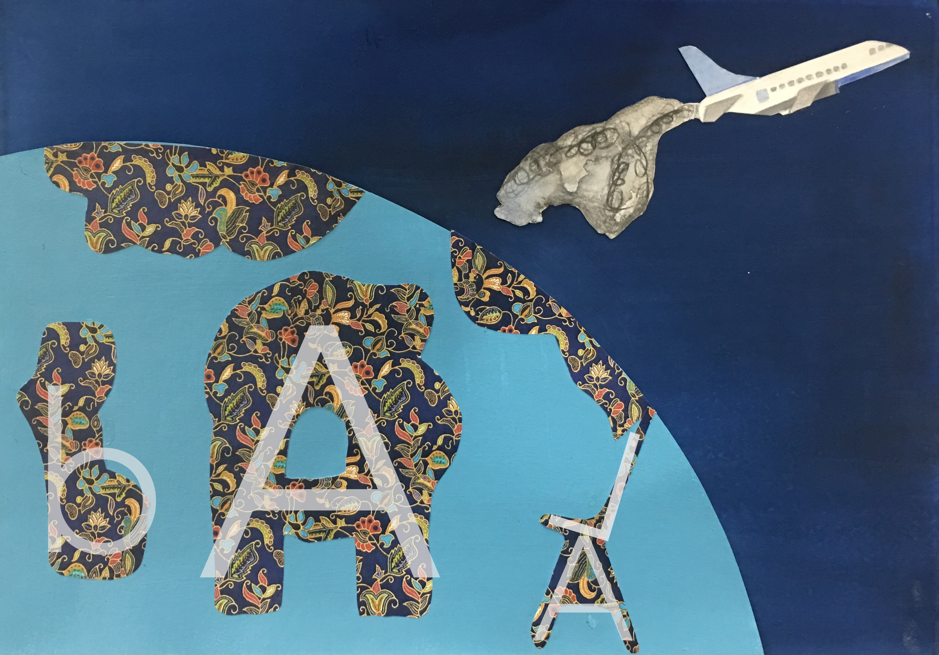
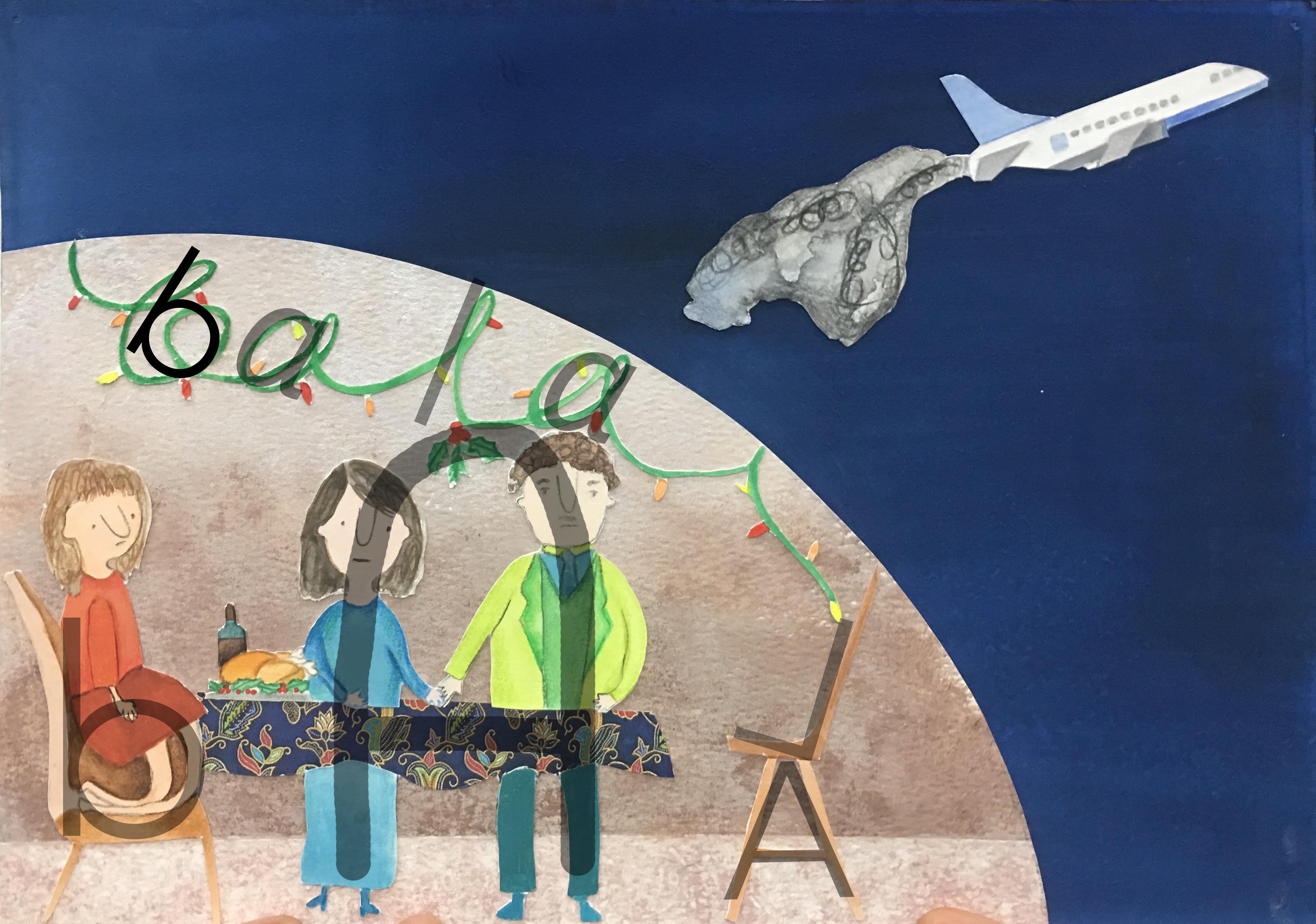
For this work, the good side of being a flight attendant is that you get to travel. I tried to show that in the first composition with the airplane jetting off. However, with this jetting off, you come to miss family occasions as well. I decided to depict this drawback after reading accounts by former SIA hostesses: https://mothership.sg/2015/05/27-hard-truths-about-the-life-of-an-air-stewardess-according-to-a-former-spore-girl/ (Number 6 talks about missing important occasions because you are overseas.) The two compositions are unified by the use of the kebaya pattern on SIA stewardesses’ uniforms, as well as the airplane.
Use of letterforms:
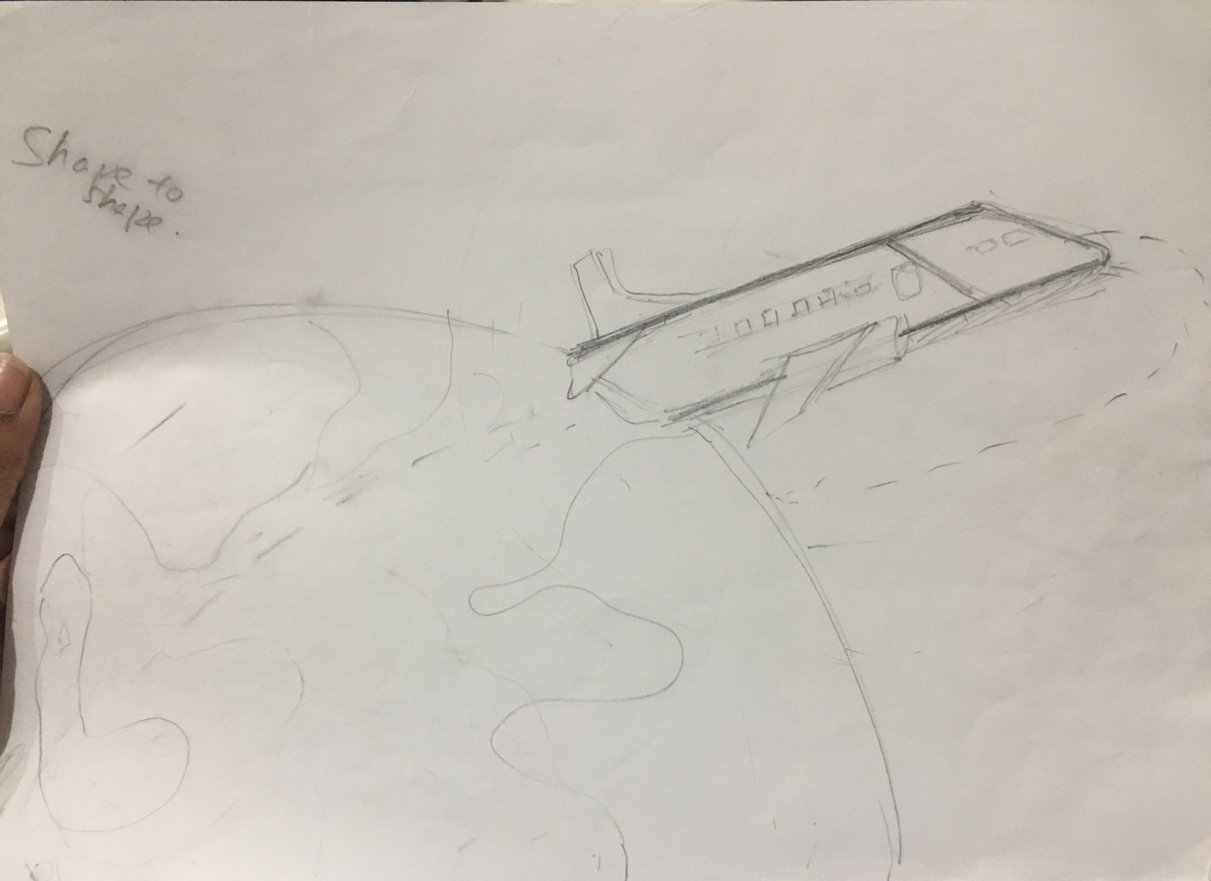
Process:
Initially, I did not think of using the tinsel to form letters, but Joy alerted me to this possibility. Also, I did not think of manipulating the girl to form a lowercase b, but that possibility also came up during consultations. Here are my sketches!


I also did a digital mockup:

Improvements after critique:
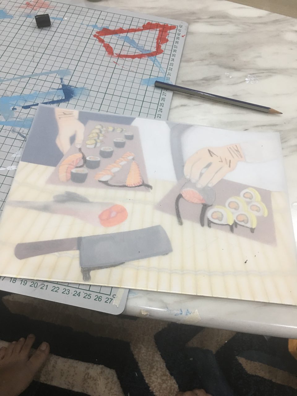
Job 2: Sushi chef
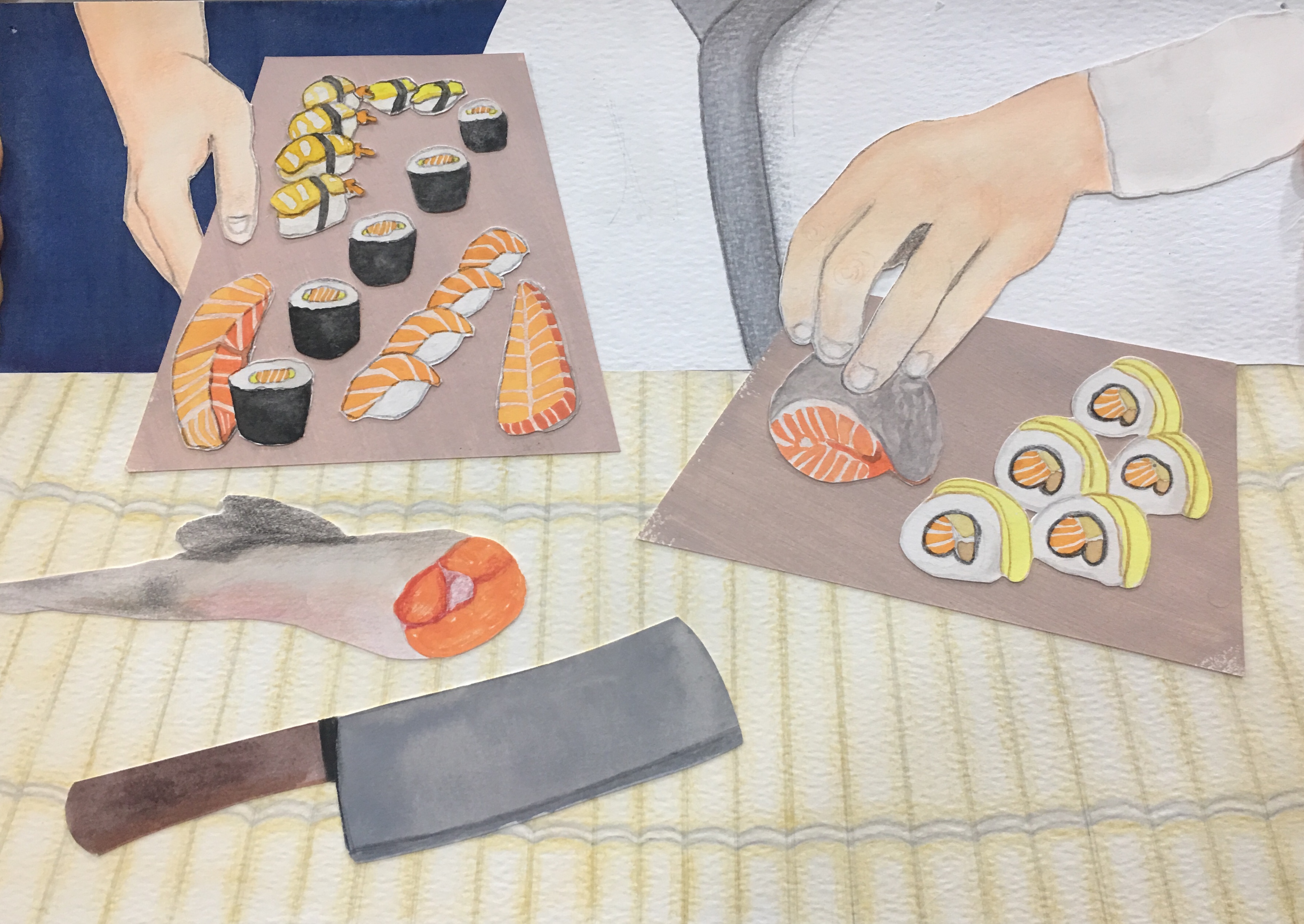
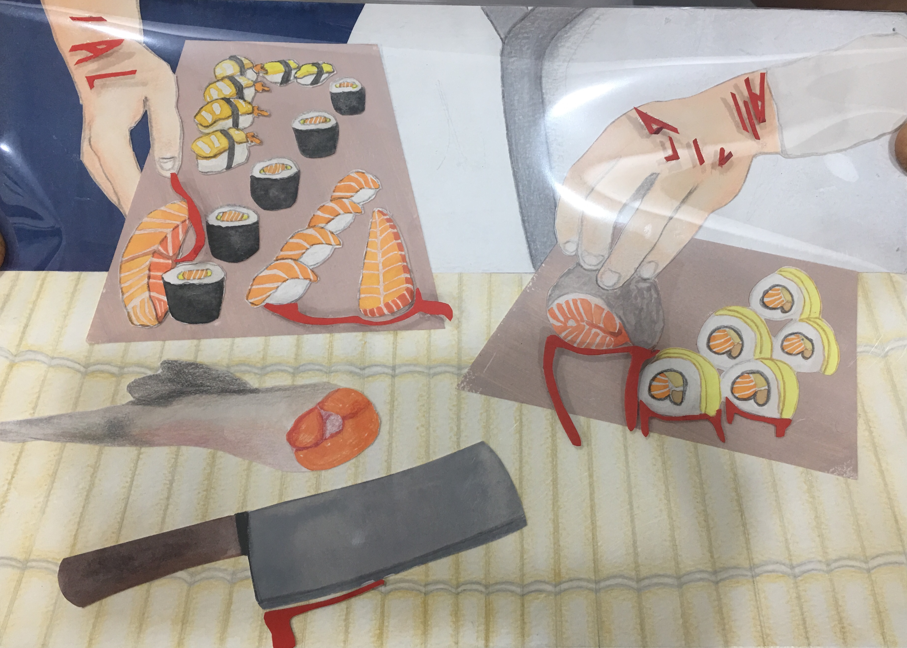
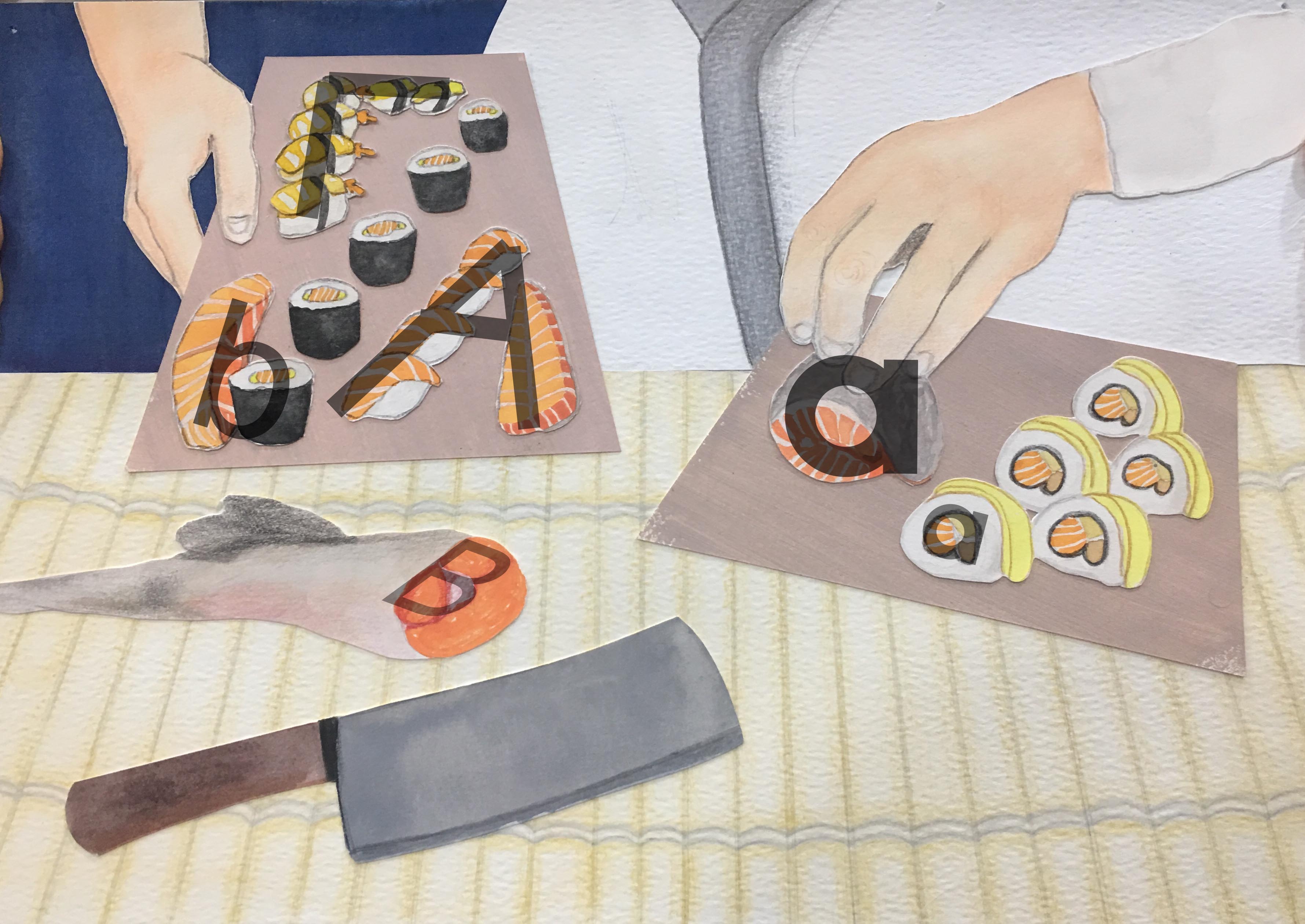
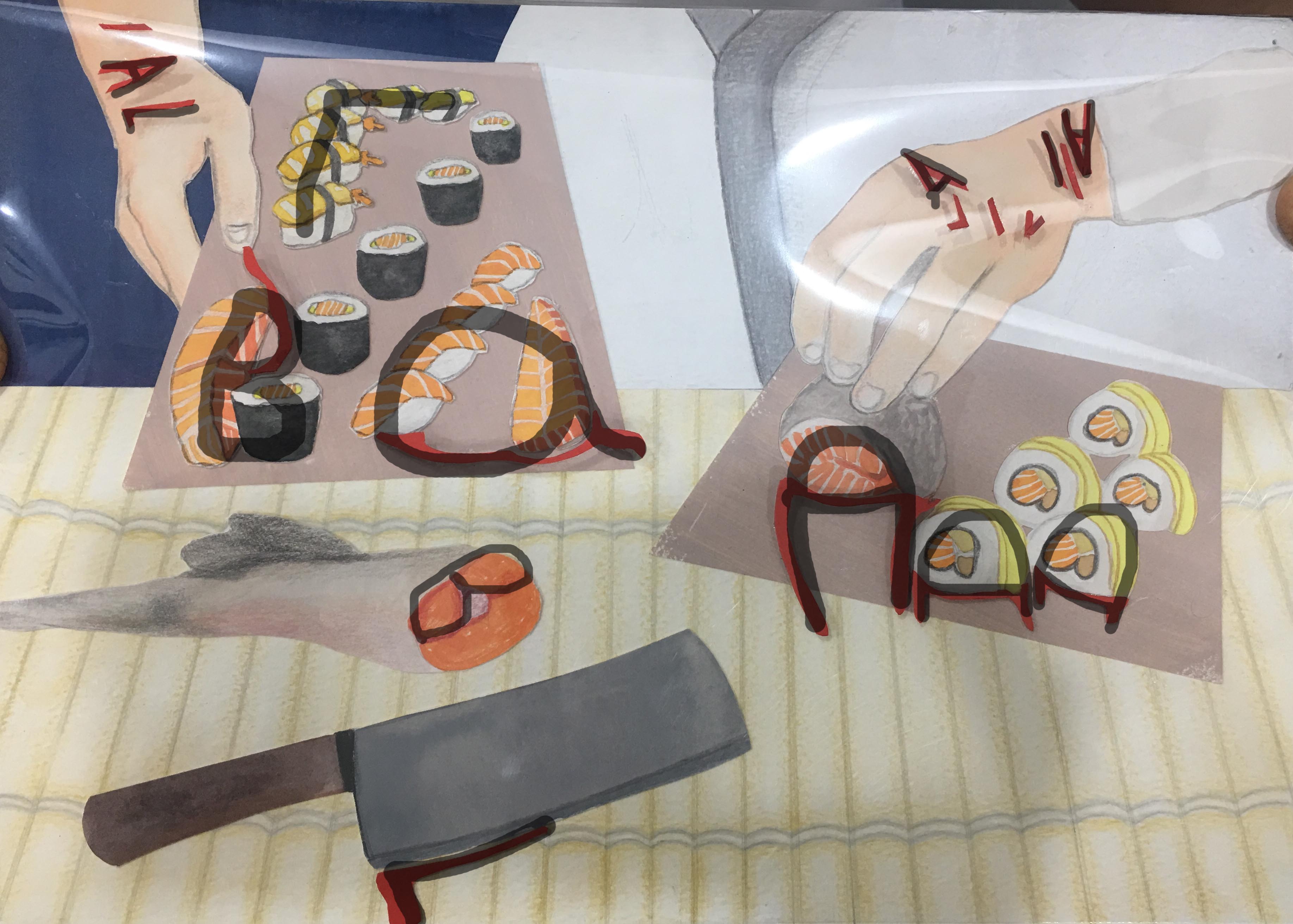
For this work, I wanted to show how although being a sushi chef might be glamorous with very aesthetically pleasing sushis (I tried to make the sushi as “good-looking” as I could), being a chef is actually very hard because you have to power through your fatigue, which could result in cuts and accidents. I got this con from https://www.apnaahangout.com/pros-cons-chef/, specifically con number three. It’s also reflected in Masterchef episodes where the chefs do injure themselves quite often. I thought that this could happen with sushi chefs because sushi knives are so big and sharp.
Use of letterforms:
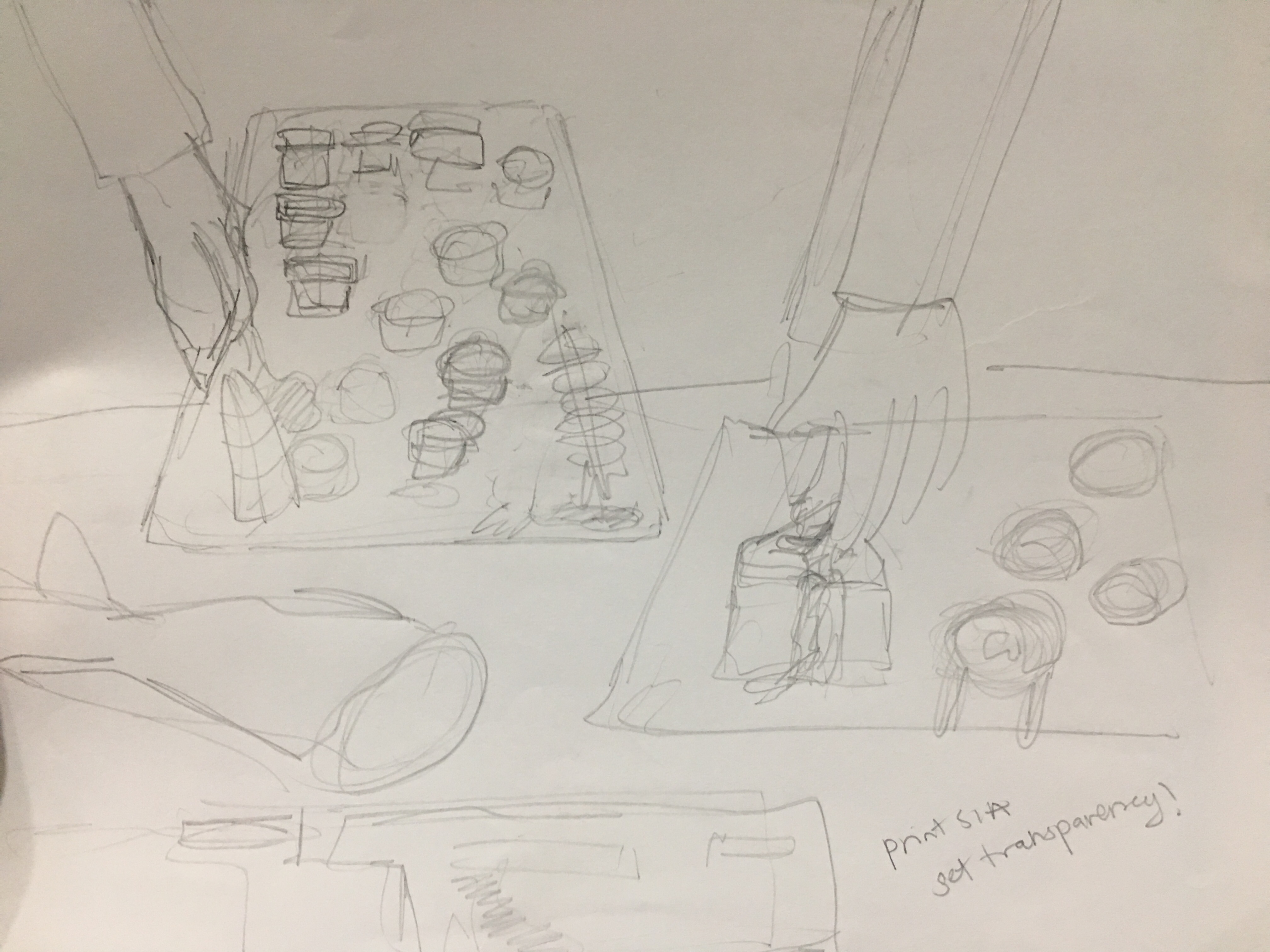
Process:
A lot of my sketches dealt with the placement of the sushis, how to manipulate the sushis, and getting the perspective correct.


I did a digital mockup for this as well:

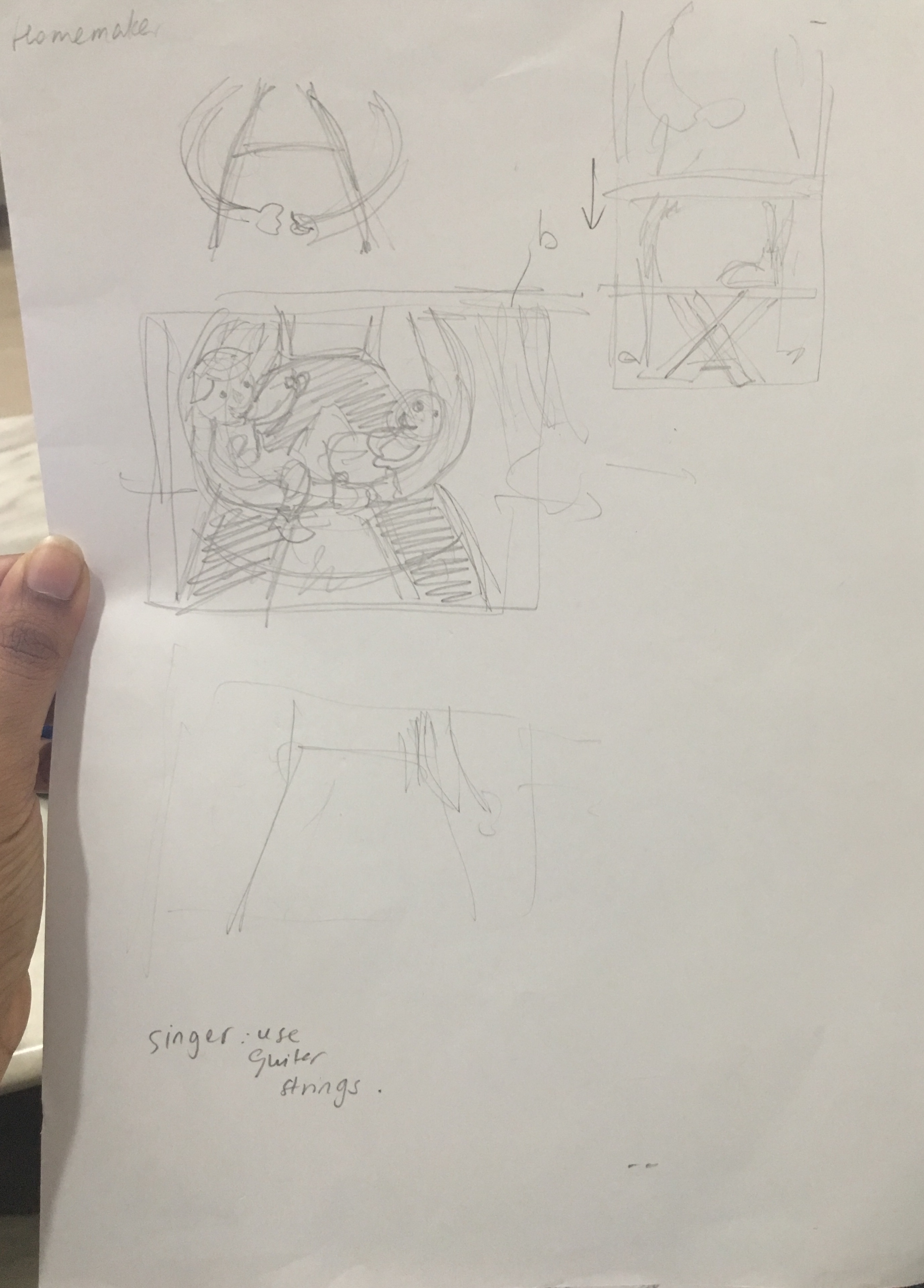
Job 3: Homemaker
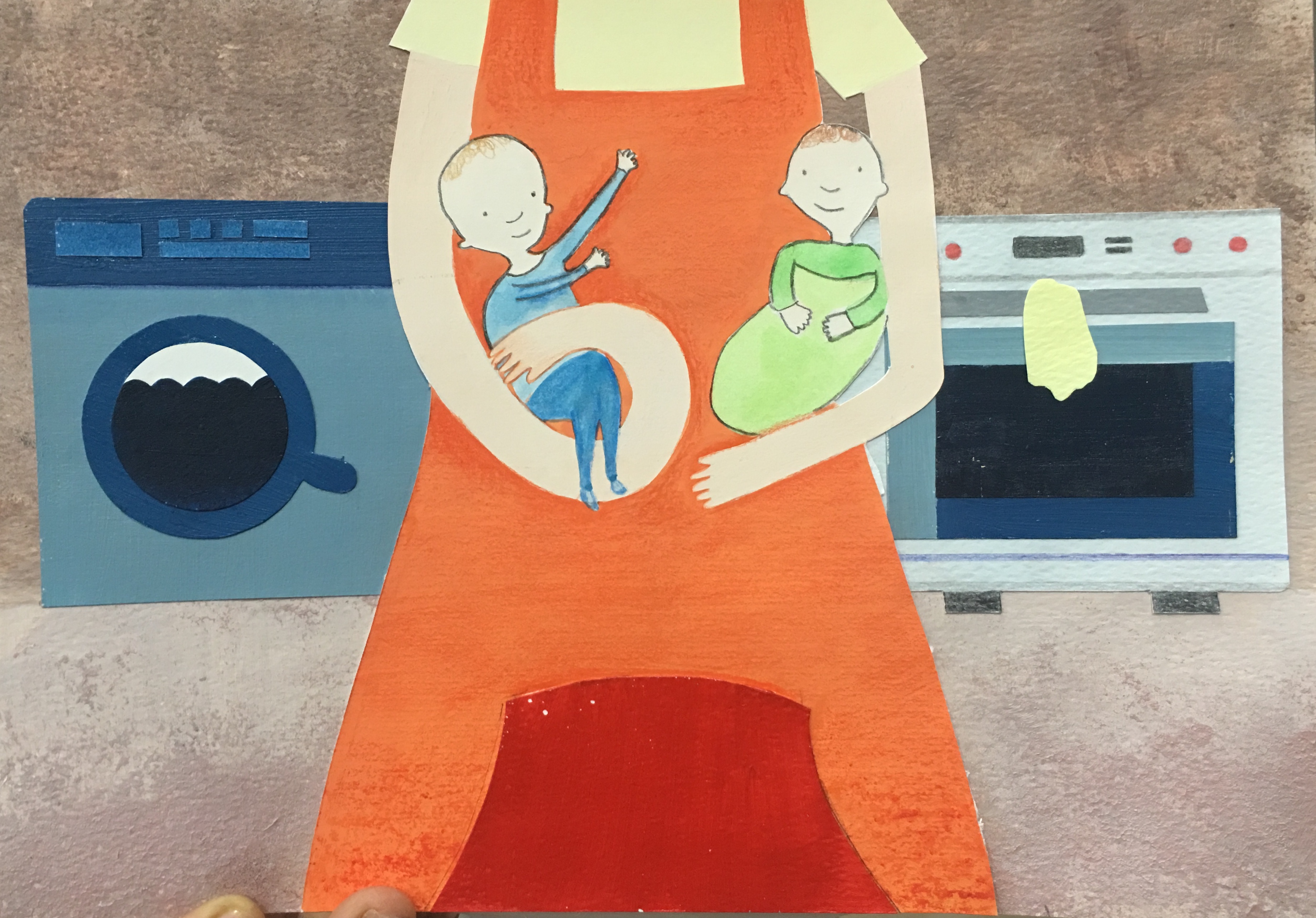
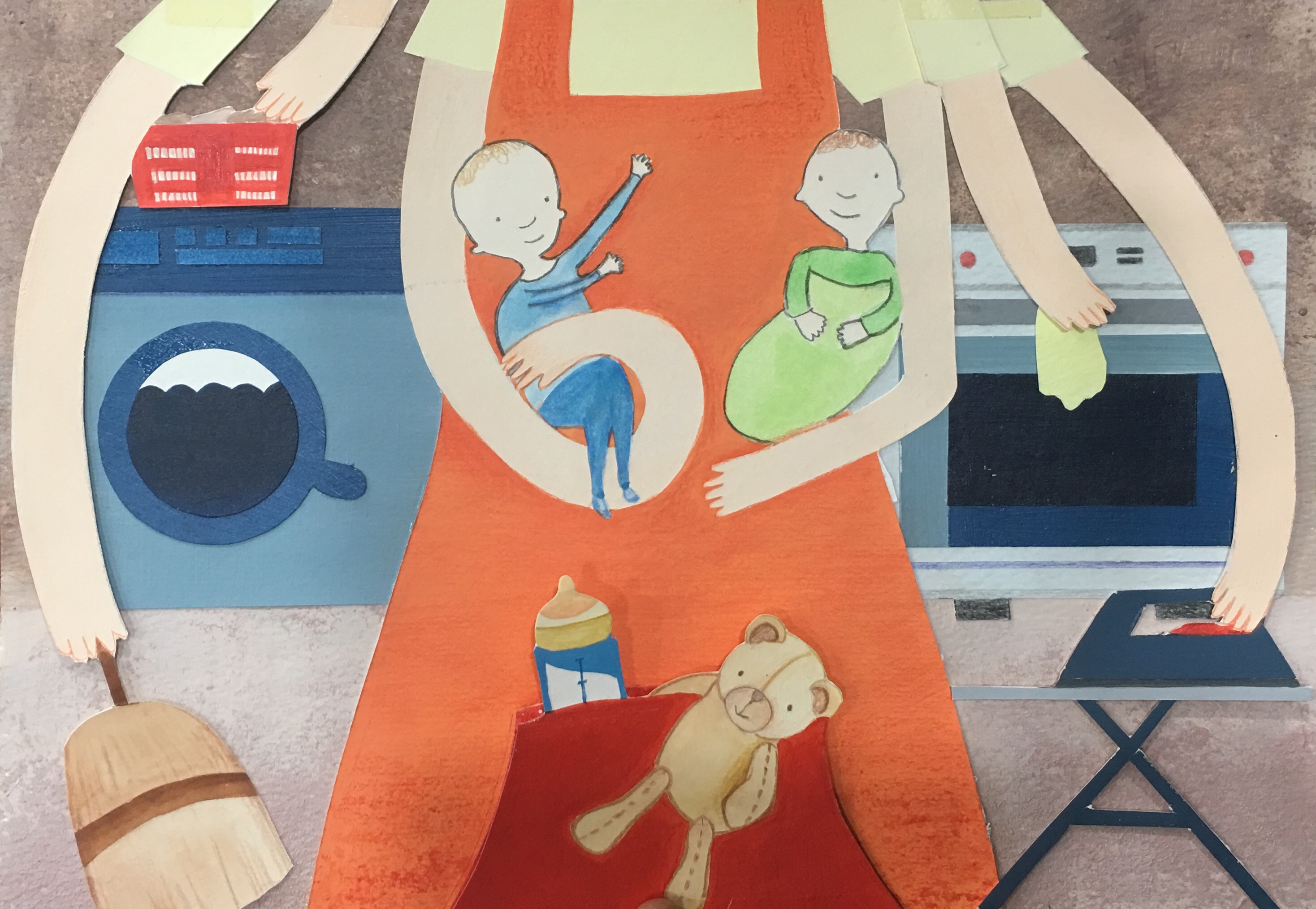
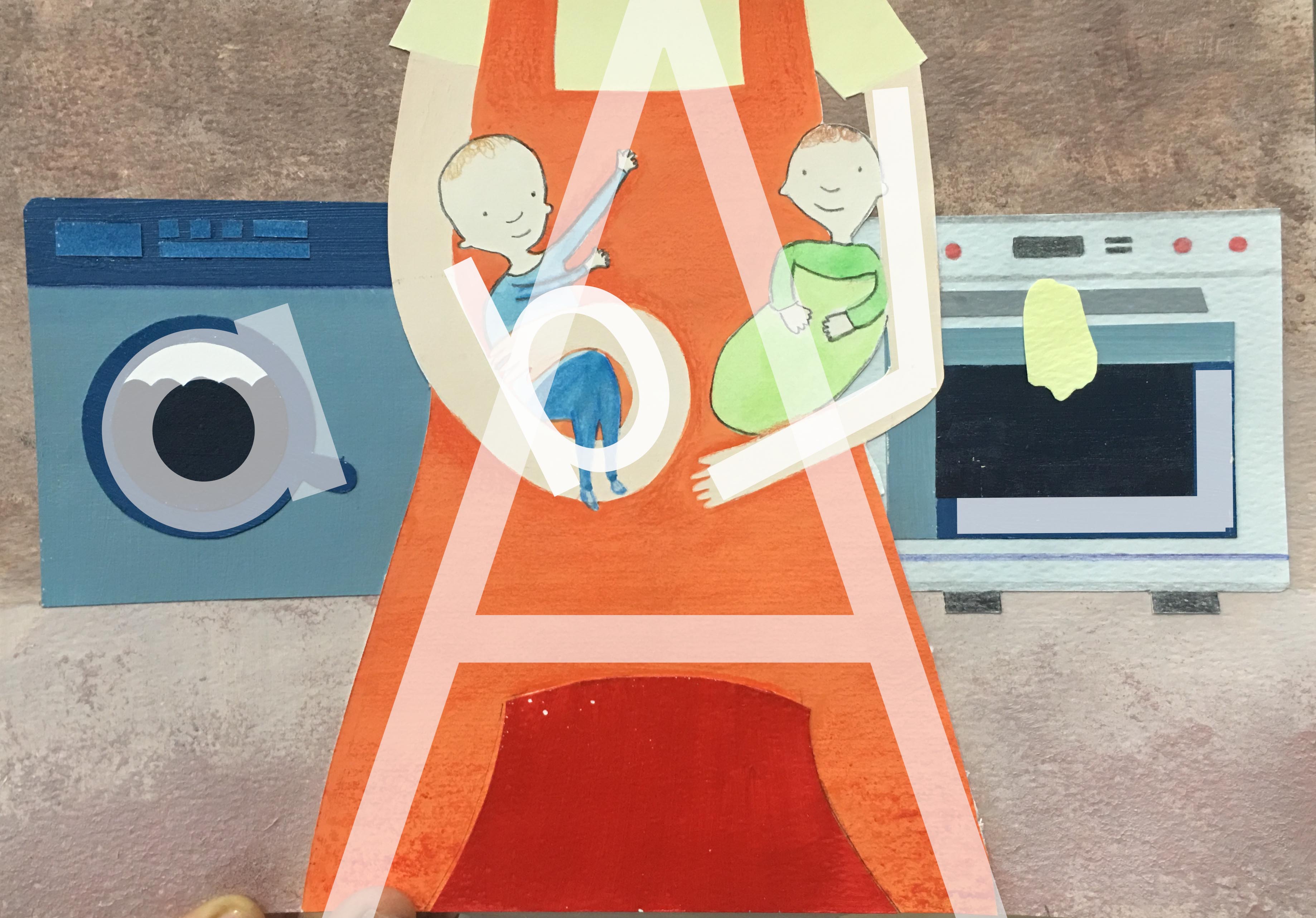

For this piece, I wanted to show how being a homemaker might seem like a cushioney job, just taking care of the kids and cleaning the house. However, when my mom was a homemaker, she had to handle a lot of stuff; cleaning isn’t as easy as it looks!
Use of letterforms
Process
An important insight I gained from consult was that I could manipulate the arms to form the lowercase ‘b’ and uppercase ‘L’, whilst previously I hadn’t in my earlier sketches. I used a lot of tracing paper for this work because I had to make sure the appliances in the background for the ‘con’ composition fit exactly with the existing composition underneath.


Digital mockup:

Job 4: Singer

For this piece, I thought about how the privacy of singers is constantly invaded. Paparrazzi invade their private spaces and experiences and scrutinize them for the world to see. Personally, I wouldn’t be able to handle all of that, and wanted to bring light to this issue.
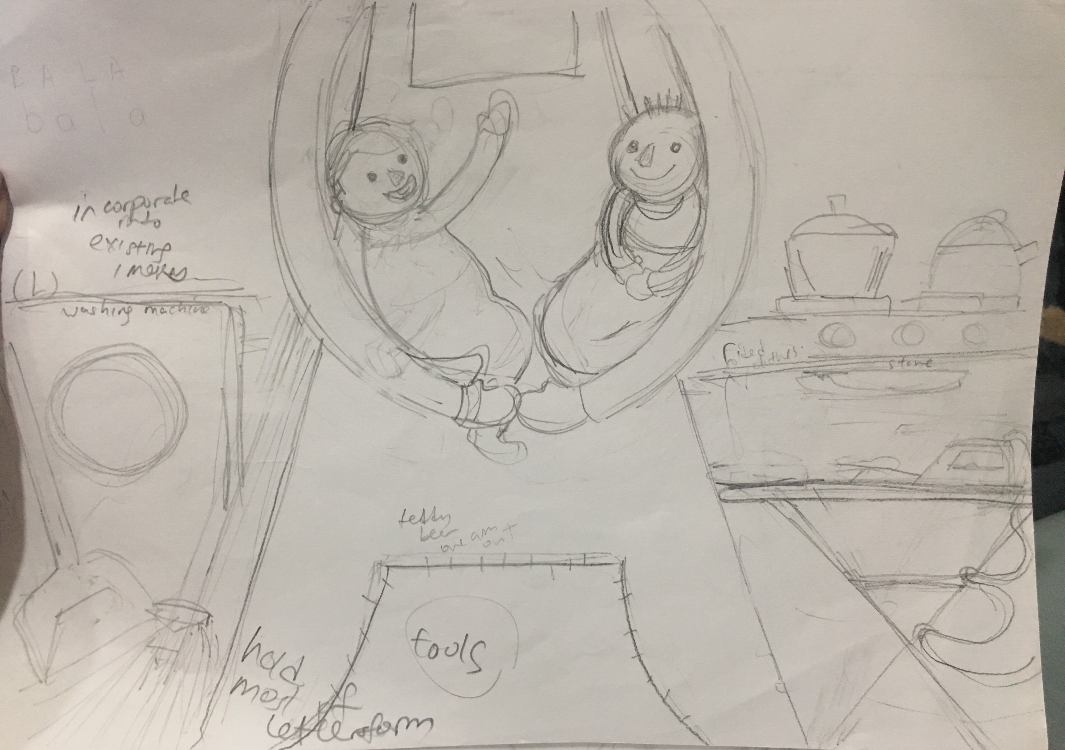
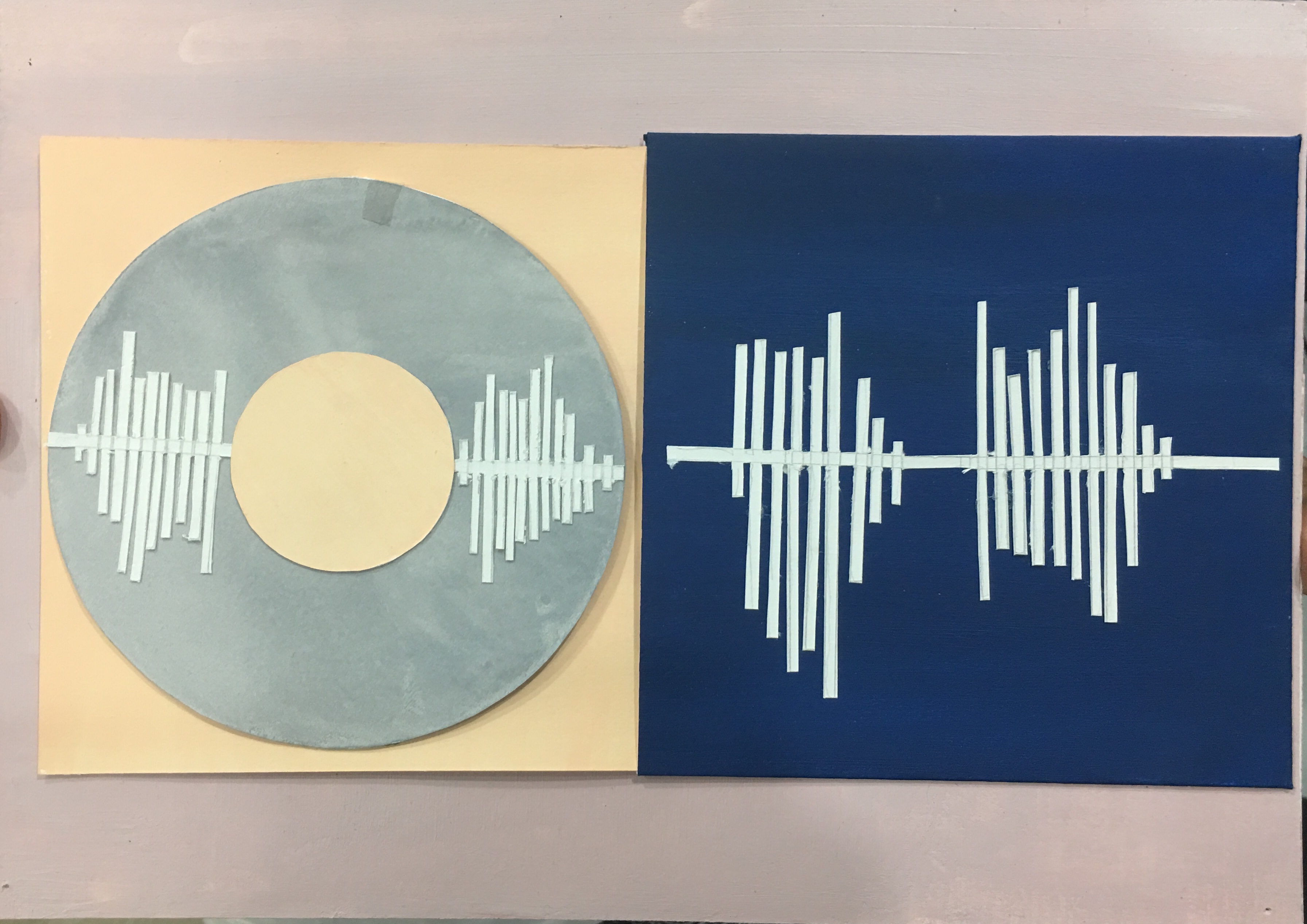
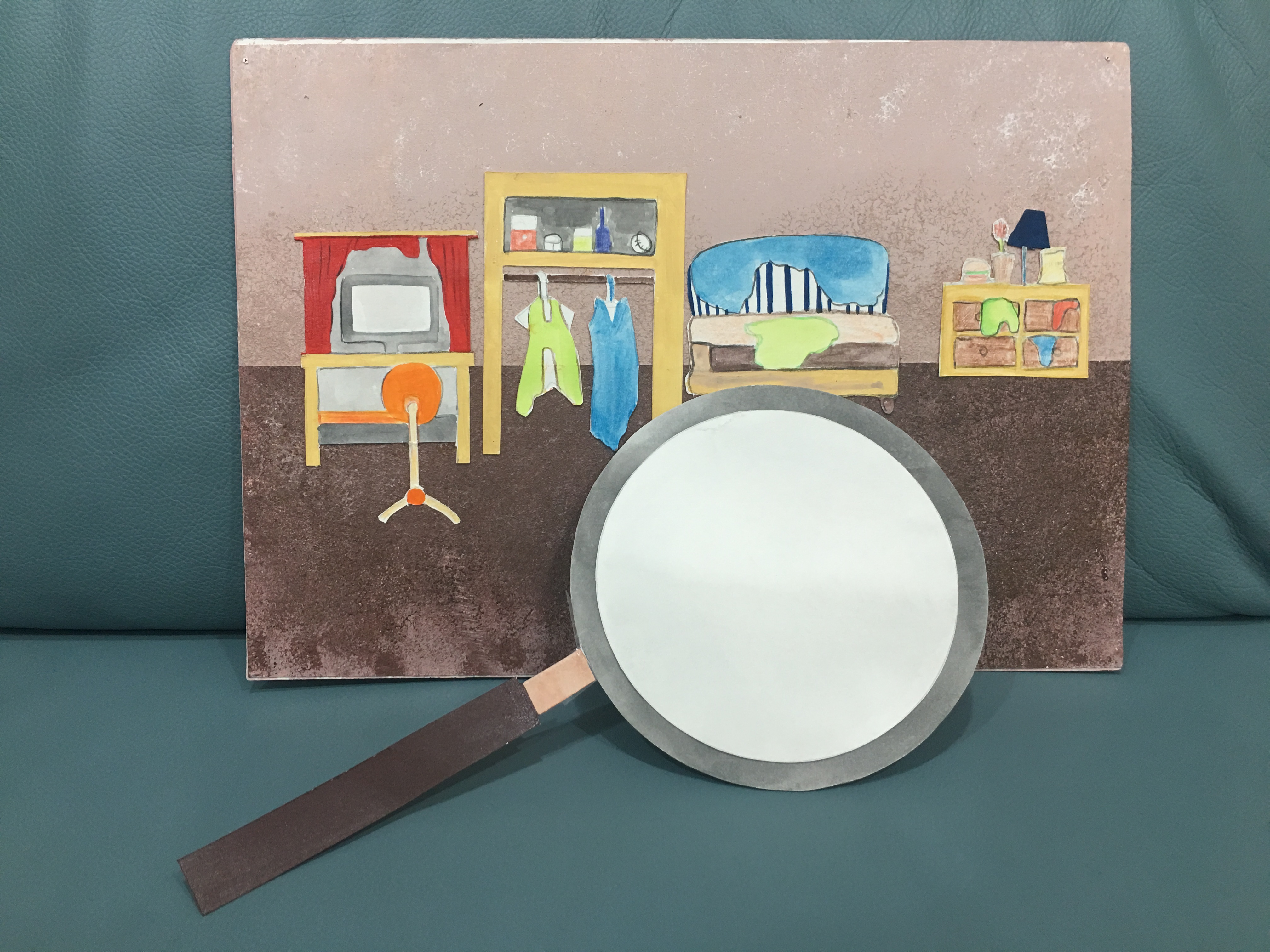
The interactive element works like this: The CD (containing B and A in the soundwave alphabet) would be slotted out of the album cover (containing L and A), forming BALA when extended. The CD can then be detached, and the flap behind turned over, to form a magnifying glass which then would be passed over the back of the same A4 piece of paper.
First, I looked at the word associations from earlier, and decided to incorporate the sound alphabet in my work. However, the soundwave alphabets I found were too complicated and unclear, so I simplified it and made my own, referencing the ones I found online.

Soundwave alphabet Source: https://i.pinimg.com/originals/e3/f5/67/e3f5673e4f4d735de2e1f57fc9a623a1.jpg


My own reinterpretation of soundwave alphabet
I then traced the outline of this silhouette, to fit the items of a household around.
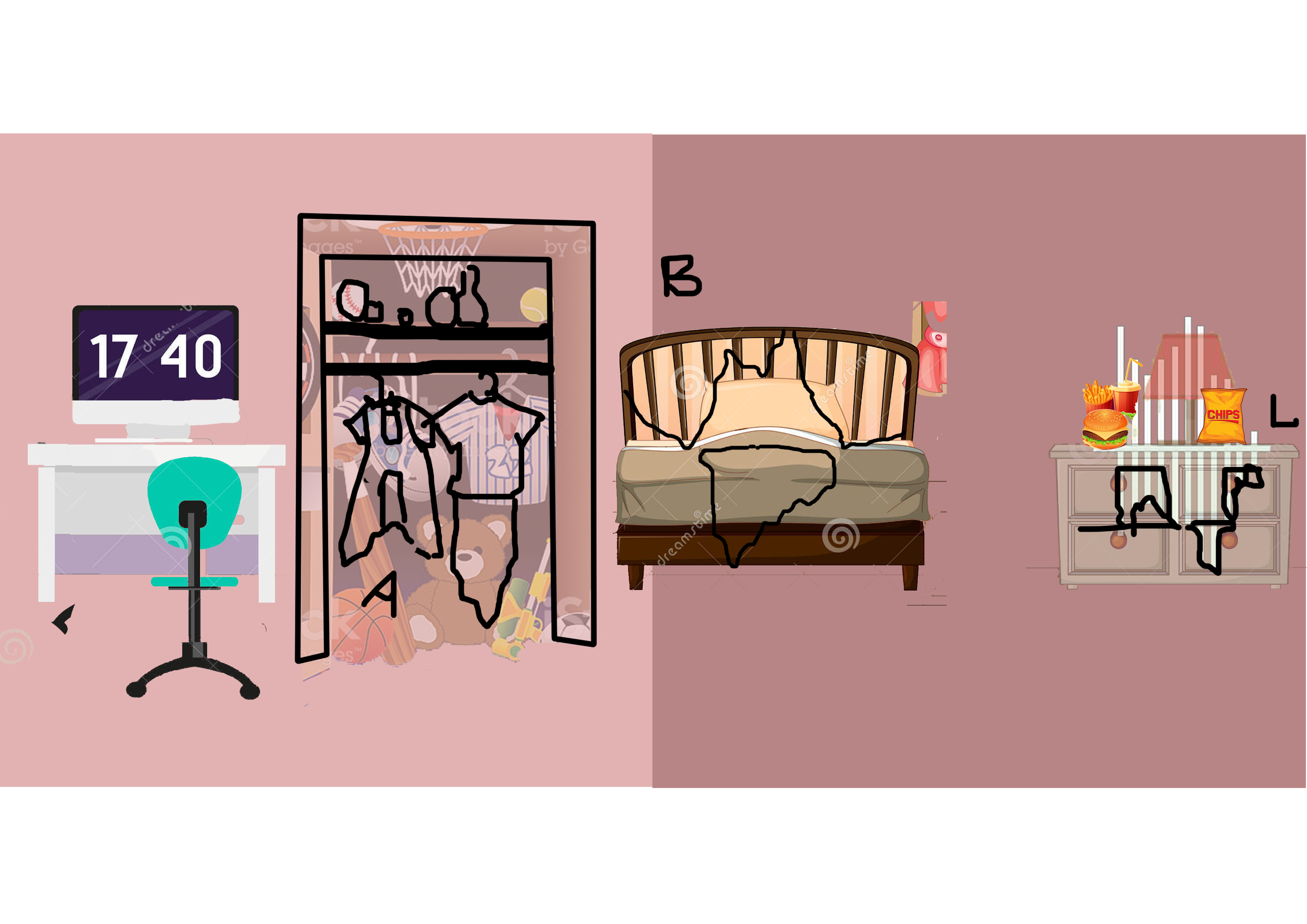
Letterforms can be seen within these household items themselves. I was having a lot of trouble fitting them around the silhouette, but Joy gave me the idea to use clothes and other little messes to round the forms out, because that essentially mirrors what the media does to singers – pick at all their flaws, even how clean they keep their houses.
Word associations for brainstorming, and other initial ideas


Behind the scenes photos!


The main gist of the project is as follows:
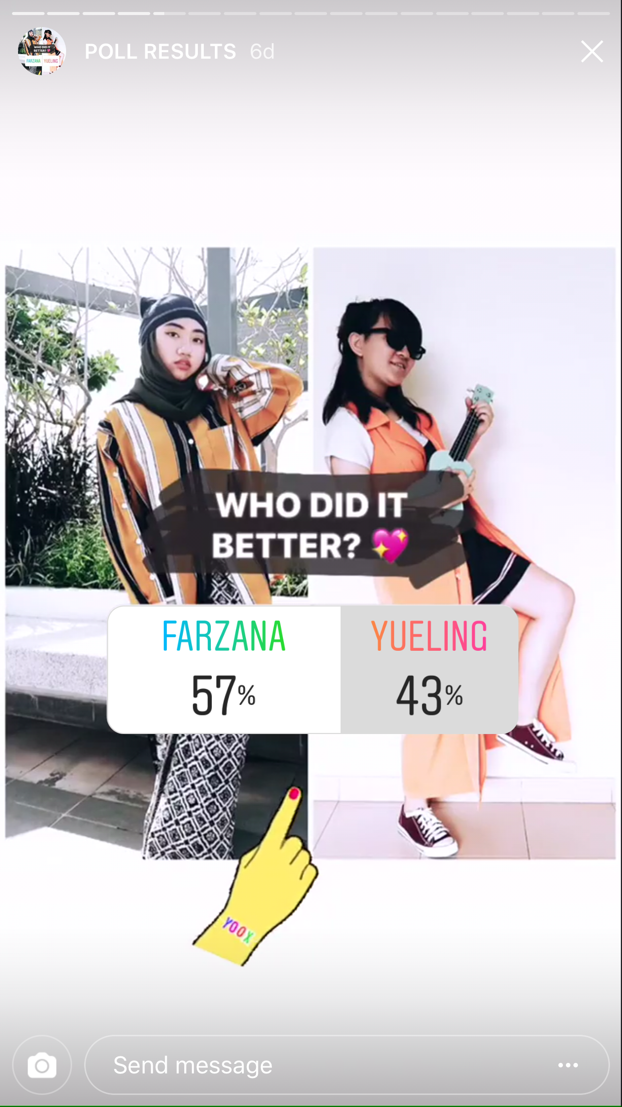
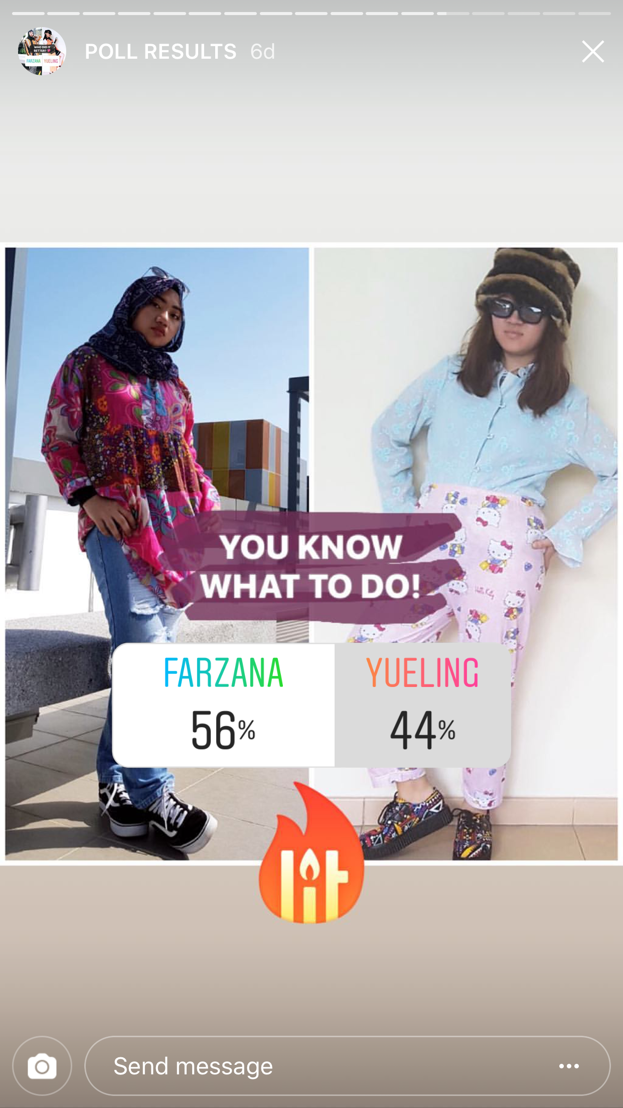
As an interviewer, we agreed on interviewing at least two people from two different districts. I ended up interviewing 6 people – three from Sim Lim Square, and three from Bugis street. The locations were deliberately chosen for their different demographics. Somehow, they all ended up being in the central location, making it a battle of the locations in Central Singapore. To extend on this project, we could have gone to locations in the east, west, north and south of Singapore – that could have been a fun battle as well. Apart from mirroring the unpredictable nature of online shopping, our project also reveals differences in culture and identity. We interviewed people from different locations, as well as age, ethnicity, and gender. There were older, ‘geekier’ people at Sim Lim Square where I interviewed, and Felicia interviewed younger, more ‘trendy’ people at LASALLE and SMU. All of this variety made our end results totally unexpected.
Initially, we wanted to have the model put on the outfit at the other end so that the stranger would be able to see the mystery outfit they had created and rate it (like how an online shopper might leave a review). However, Yueling and I decided this wasn’t going to work out, because there was really long awkward silence with the first man I interviewed when she was changing at the back, and decided to scrap this idea. This was an example of an unexpected element that arose during the on-site performance.
Another unexpected element that arose was that people were really taking it seriously to put together a stylish outfit. We thought that with the vague keywords that we gave them (akin to online shopping, where clothes are often described with vague keywords and end up not really looking like how we expect them to be in the photos), that they would just take it as a fun experiment and put together very wacky combinations, but they actually kept asking for so many more details! I explained to them that the descriptors were supposed to be vague, but they still tried to curate a more put-together outfit instead of the whackier outcome we expected.
Apart from paralleling online shopping, this project was also influenced by Blast Theory’s principles of integrating the virtual and the real world together, through specifically using Facebook Live and Instagram. Perhaps Felicia and I were the interviewers as we had done precisely this, interviewing people on the street, for our previous Tele-Stroll project. On top of engaging a physical audience, we engaged the virtual audience through our Instagram polls on our instagram page where they voted for their favorite outfits, ultimately resulting in Farz being the winner. In doing so, we empowered the people on the street to be designers, and gave power to the virtual audience in deciding the ultimate, most fashionable outfit as well. Both audiences were a sizeable number, perhaps the virtual audience more so (at over a hundred followers!) because they could vote at their convenience, as opposed to the people on the street who could have been in a rush and might not have been as willing to participate.

We also drew inspiration from collaborative works such as Yoko Ono’s Cut Piece, where the audience is given full control of the outcome. Therefore, our project was innately social in that we could not have gotten the outcome without the participation of the people on the street. In fact, we were more of the bystanders in this project – every aspect was decided by the audience, except for small details such as the locations the models shot their outfits in (to be posted on Instagram) in, and the aesthetic of the Instagram curated by Felicia.
To conclude, our outcome revealed interesting differences between demographics (the older demographic preferred brighter colors, whilst our younger demographic preferred monochrome, more “chic” colors). We designed an interactive experience through the use of Facebook Live where our audience and model could see each other, along with a mediator in the interviewer. Lastly, we involved our audience both in real life (interviewing them on the street) as well as online, with the voting.
Link to our video!: https://www.dropbox.com/s/dscw9ljl2ncnhpk/main_FINAL.mp4?dl=0
Here’s the link to my presentation!: https://docs.google.com/presentation/d/1edSm1qGE8wo3aXE8376PPfKS8RyZhAsk8E9VgvYYiJA/edit?usp=sharing
Thank you!

“Social Broadcasting: An Unfinished Communications Revolution” – this is what the symposium is themed around. Having attended all three days of the symposium, I have come to understand that although it is a relatively short sentence, it is one that is chock full of meaning. Immediately, three key phrases stand out to us: 1) Social Broadcasting 2) Unfinished and 3) Revolution. My essay will address key aspects of these three phrases in two overarching sections.
Section 1: Analysis of Symposium itself as a third space environment in relation to being an “alternative social world”
The Symposium was conducted via Adobe Connect, a platform which we are no strangers to – we have created beautiful mosaics with the “Telematic Embrace” project, listened to lectures on the platform, and just last week, the class and I had the pleasure of participating in a workshop with Annie Abrahams on it, too.
In Day One of the Symposium, we were given the opportunity to witness “Entanglement Training – Ensemble”, a live online performance by Annie Abrahams with Antye Greie (DE/FI), Helen Varley Jamieson (NZ/DE), Soyung Lee (KR), Huong Ngô (HK/USA), Daniel Pinheiro (VE/PT), Igor Štromajer (SI/DE). I felt that the workshop with Annie Abrahams gave us a level of insight that other viewers may not have had the opportunity to get, as we had hands-on experience with the understanding of Annie Abraham’s protocols.
From this analysis by Daniel Pinheiro, a greater insight can be sought into the thought processes behind the work. Preparation for the piece began a good two months before its debut during the Symposium, back in late January, whilst training was conducted on March 22nd. Prior to the performance, participants were to “start collecting interesting phrases and think of simple objects (they) could use during a part of the final performance where they will “converse” using these objects, the collected phrases and our voices”.
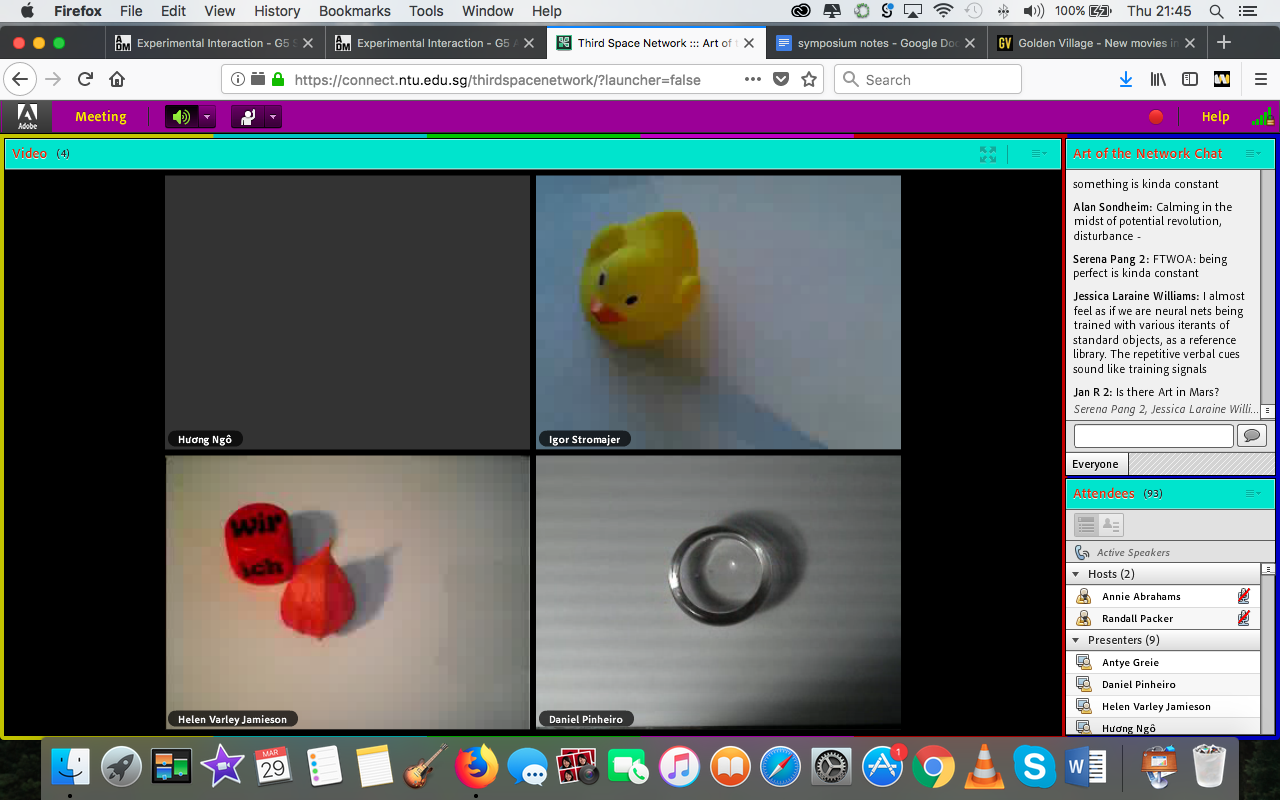
Screenshotted live from Day 1 of the Symposium
This individual contributing to a collective process “sees it’s result through the combination of the inputs from the different participants”. Understanding two different moments then becomes crucial to resolving the tension in the process of mediation between all the individuals and remote locations involved.
“The disruptive conversational environment that is created creates a combinatory visual and soundscape that deals with electronic disruptions – analogously to the disruptions on any kind of conversation; interaction (equates to the) mediation process between individuals.”
Together, the whole space – or rather, the Third Space – becomes one through the sum of the relationships between objects, sounds and phrases.
Technical difficulties
The above relationship was not cultivated easily. Before the performance and the keynote preceding it, we carried out a soundcheck and had to troubleshoot for Maria Chatzichristodolou as well – there were multiple times during her keynote when she had to pause and ask us if we could hear her. Even during the Entanglement Training – Ensemble performance itself, there was a moment in which a screen went totally black, during which I was wondering if it was a glitch or part of the performance. It turned out that it was both, for Annie Abrahams and her collaborators took the technical difficulties one of them were experienced it and weaved it into their narrative with more screens turning black – Annie Abrahams is of course, famous for her embracing of the glitch.

Screenshot: when one screen glitches black. Here, the use of objects in place of actual faces or bodies may build the anticipation for the actual reveal.

Screenshot: the participants take this in stride, with more screens turning black
Of course, I say this not as a criticism, but as an observation – technology can only get better with time and experience. This was exemplified during the Symposium itself – technical difficulties were much fewer with Day Two and Three, save for the videos that Matt Adams wanted to show lagging during the second day and some minor audio issues during the Global Roundtable Discussion for Day Three. It’s incredible to think that we’ve come such a long way since the days of Hole in Space (1980) by Kit Adams and Sherrie Rabinowitz. Maria Chatzichristodolou mentioned in her keynote that the project was funded by NASA, using technologies few people could access (and afford). Moreover, they had to apply to gain access to them. Similarly, Satellite Arts Project (1977), took an entire year to develop with NASA. Just comparing how far we’ve come from in terms of affordability and accessibility in the roughly forty years since then is far too awe-inducing for me to harp on any lags experienced during the Symposium.
Furthermore, there is value in experiencing these glitches live, as opposed to viewing a recording of the symposium. When viewing a recording, we may be tempted to skip forward when glitches occur – I probably would have, had I not attended all three days of the symposium live. However, when I was experiencing the glitches live, I felt all the more tied and connected to work, for the experience the works in their entirety would be to experience their faults as well. In doing so, I felt like I was really an active participant in the symposium, especially when I typed in the chat box whenever Maria Chatzichristodolou asked if she could be heard. It was altogether more immersive and I felt like I could contribute to the symposium. This agency I held felt like a privilege and only made me appreciate the performances and keynotes all the more.
In fact, these lags and glitches taken to be a quality of communicating in the Third Space – closer to our everyday lives, how often do we experience technical difficulties with Skype or Facebook Live? Personally, I experience them pretty often, but I’ve come to accept them – they even make finally overcoming them all the more sweeter. Taking this further, we could even come to embrace this quality, which would require more effort from the everyday person. We can’t all be Annie Abrahams – we can strive to be, yes, but we can definitely appreciate how she uses this quality to her advantage in her work, in fact, she makes this the whole subject of her work.
In Entanglement Training – Ensemble, the performers read out the latency in their connections, highlighting how all of them were never really in the exact same moment in the Third Space. Possibly, in the future, technology could lead us to this ideal, but Annie Abrahams in the present explores the beauty in this flaw with an almost hypnotic, rhythmic, choreographed performance piece.
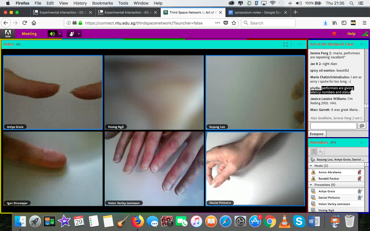
Screenshot: Entanglement Training – Ensemble’s hypnotizes with rhythmic hand movements
More recently, following technological and practical advances, researchers tend to no longer consider digital space as disconnected from an ostensibly “non-digital” space. More specifically, digital space is the space of our society in the digital age, it is the space we inhabit and in which we live. Based on this definition, we propose the following: Digital space, as the sum of the relationships between objects, is the organization of our entire reality through writing. – Marcello Vitali Rosati
A parallel can be drawn between these glitches and our everyday lives, even. Humans are flawed in real life – we get nervous, we stutter, we say the wrong things. And to accept the snags that come with Third Space technology can be related to how we ourselves are not perfect, for to expect it to be perfect would then, in turn, demand perfection of ourselves in real life, for our interactions in Third Space can be seen as an extension of our daily lives. This statement I’m making might seem a bit far-fetched, but I make it after reading the above quote. It characterizes the third space as one that is a hybrid of the digital and non-digital that “computerized infrastructures participate in constructing and organizing”, from which I draw my point in this paragraph. This can also be linked to similarities between the offline and the “alternative social world” of the Symposium – these glitches are not inherently exclusively designated to the Third Space, for we glitch in real life too. It was heartening to see that all the participants in the Symposium seemed unfazed by these technical difficulties.
Trade-off due to Multiplicity
Randall Packer notes during the global roundtable discussion during Day Three that the local audience have a more visceral relationship with the performers. For example, with the igaies performance, the audience is able – in fact encouraged – to walk up closer to Roberto Sifuentes and be in closer physical proximity to the leeches placed on him ‘cleansing his body’. The remote audience is distanced, looking at the performance through the webcam instead.
Being an online participant, however, has its own set of benefits. For one, we were able to look at multiple viewpoints of the performance due to multiple webcams being set up, for example during the performance by XXtraPrincess.
 Here, we got to see an additional view of another camera broadcasting them together, showing both performers with their backs to each other. In real life, the audience would be limited to one viewpoint (the front), but with the Third Space, we are able to curate various views and gain a more varied viewpoint of the performance.
 Moreover, this multiplicity could also be observed across platforms, with the performance by XxtraPrincess, again. The duo heavily employed Snapchat, using Snapchat filters to depict themselves as a range of animals, from rabbits to deer and Snapchat Avatars (Bitmoji) as a way to create an embodiment of who they wanted to represent (or as we’ve come to learn, digital identity). During the global roundtable discussion, one of the participants questioned the need for broadcasting against multiple platforms – it may seem unnecessary to do so when the concept and visuals are the same. XxtraPrincess defended this by saying how this could draw more people to watch it live instead of having to watch a recording should not they have access to that platform.
Furthermore, the online audience had a very active relationship with one another – more than I expected, especially because most of them were strangers to one another. Perhaps especially because they had this barrier and were physically separate and/or not involved in the performances, rapid discussion took place throughout all the keynotes and performances. The question of whether this was acceptable behavior arose near the end of Day 1, when a participant felt that it was rude that the online participants were conversing as the performance went on.
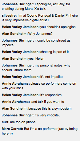
Screenshotted from chat space from Adobe Connect
Some thought it wasn’t, as the online chat is silent, as opposed to speaking out loud in real life – this could be a benefit to being an online participant, for you are more able to discuss your thoughts with others without disrupting the actual performance. The local audience would not be able to participate as actively (or at all) in the discussion going on online. The online audience, hence, could be seen as more conversational than the offline audience. Moreover, I felt that this constant chattering away kept the energy level of the symposium up.

An online participant compares the online chat to “whispering amongst ourselves during a performance”
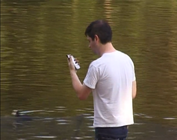
The result of this could vary in significance to different participants. Relating this back to my own experience, I had the opportunity to attend the Symposium in real life during Day Two, at LASALLE. I did not bring a laptop to the event, like most of the other attendees, because I really wanted to be there in that space and focus on the speech and answers given by Matt Adams. As a result, I could not participate in the online discussion – but even then, I did not really feel like I was missing out, because the keynote was so fulfilling and satisfying to me. Below is a video I took from my view!
Ultimately, as Randall Packer puts it, this symposium was trying to achieve a “totalized interconnected space” that attempts to “blend real and virtual connections”. The very act of “trying to break down barriers and see whether we can all be connected” signals that this social revolution – this utopia we are trying to achieve, with everyone achieving a similar experience – is one that is unfinished, which is the theme of the symposium.
Section 2: Social Broadcasting – the Revolution
To address the ‘revolution’ part of the theme of the symposium, “Social Broadcasting: An Unfinished Communications Revolution”, we need to understand the journey broadcasting has taken from live broadcasting to social broadcasting.
This can be best understood with Maria Chatzichristodolou’s definition of “liveness”. She considers liveness ‘to be infinitely open to interaction, transformation and connection’. She considers interactivity and liveness to be interlinked when “interactivity is corporeal, when it takes place in real time, or both of the conditions apply”. As she puts it, live performance in itself carries a promise of interactivity as potentiality, even when this potentiality is not materialized. This pivotal concept has reshaped the broadcast into one that is much more interactive and communal. In other words, communication then becomes between, than to, people – therein lies the shift from traditional broadcasting to social broadcasting.
Internationalism and social justice/respite
Why is this important? This can be explained with the work by Station House Opera: At Home at Gaza and London (2016).

Source: http://www.stationhouseopera.com/project/6246/
This work, “using live performance and digital invention” through the technique of ‘dissolving’ to impose two images together. A mutual performance space is created in which performers could occupy each others’ real-life spaces such as homes and streets. Focusing on the situation of people in Gaza, it highlights their political situation – Maria X mentions how Gaza is isolated and “shut away from the world”. Herein lies the power of internationalism – its ability to bring together people separated by great political, economic and physical divides gives voice and respite to those who might not otherwise have the opportunity to be heard.
However, Annie Abrahams had this question directed to her during the global roundtable discussion: How can we use it (social broadcasting) specifically? How can we use telematic art to question geopolitical barriers?
The answer given by her was that we simply can’t. In the words of Annie Abrahams, “We hardly meet anyone we don’t know. What we can do, is train with people you don’t know yet”. She did this with Entanglement Training – Ensemble. She trained with the co-performers to “get with unknown connection latencies, unknown technology, unknown people”.
“Disembodied online existence arose as an attendant potential aspiration or threat of the network in its relation to user identity. Feminist scholars in particular saw the networked digital culture as a respite or a release from the gendered (and racialized) social conditions of physical reality. “If I have no body [online], what is my gender?” Mindy McAdams asked in 1996. “Is there a need for, or even an explanation for, gender in a place where our bodies are not?”” – Stephen Monteiro – MIT The Fabric of Interface
This is a unique quality of the Third Space – that is, by having no body online, as mentioned in the quote above, this may liberate the oppressed or marginalized, for they are no longer attached to the characteristics and stereotypes attached with their own bodies – they are free to reveal as much as they deem preferable online. Matt Adams echoed this during Day 2 – he mentioned that it’s almost unfashionable to reflect a version of yourself resembling reality online – to quote, “not hip if you go under the same name” – when talking about the Blast Theory work, Uncle Roy All Around You, during the symposium. This expectation – to not be totally and completely yourself – that comes with cultivating a digital identity could be incredibly beneficial to some, for it could provide an escape from reality.
There’s something transformative happening between the individual and the collective, and it seems a mistake to interpret this as an act of individual erasure. In such movements, the mask becomes a collective catalyst that provides the consistency to make a particular political demand about transforming the world. – Zach Blas (interviewed by Pedro Marum) – We hide our faces so that we can be seen
When control is given to the collective, a possible criticism that could arise is that the collective could erase the voice of an individual. In my opinion, this criticism is one that is very surface-level, for there is no innate characteristic of the collective that demands that the individual becomes any less important. In fact, the individual in the audience becomes as important as ever, as exemplified in the Blast Theory work I’d Hide You.
“In I’d Hide You, see the world through the runners eyes as they stream video: ducking and diving, chatting to passersby, taking you down the back alleys to their secret hiding places. And play against your friends online at the same time. Use your wits to choose which runner to ride with. Get a snap of another runner onscreen without getting snapped and you score a point. Get snapped by someone else and you lose a life.”
Here, not only is the audience playing for themselves, they are playing as part of a collective team, with three teams having three players each, so that the audience can choose one of nine players to run with. Each player runs for an hour. Matt Adams mentions in the keynote that there is no thematic focus – the focus here is on “having the audience we trigger that uncanny thrill that you feel when you see a webcam for the first time and experience a portal into another part of the world that seems – at that moment – to be yours and yours alone”. Each population is playing against their own cohort, whilst there are also various dependencies between the two populations.
Therefore, even though you are part of a collective, your individual experience becomes important as well, for you gain and lose points through your own actions and stay in the game with them. The audience’s agency becomes all the more important as they now have the ability to sabotage players as well. Matt Adams also mentioned that the game was made with “young people in mind” – youth that knew their city and their streets well, such that the audience can have a more intimate relationship with a runner they can relate to and habits and popular hangouts they may be familiar with, such as popular clubs.
The possibility for live interaction that affects others also raises questions surrounding ethics. In the words of Maria Chatzichristodolou, ethics informs openness to face of others and responsibility for others. She quotes Levinas in saying that since the other looks at me, his responsibility is incumbent on me. To paraphrase, as we are viewing and interacting with performers, a degree of responsibility for their well-being and actions also falls on us; this cannot be ignored.
Maria Chatzichristodolou discusses ethics with the example of Paul Sermon’s Telematic Dreaming. Even though I have previously done a research critique on this, I hadn’t come across the instance where a woman was telematically abused, and was awakened to this. She talked about the ethics of being able to touch someone who can’t touch you back – even though it is not physical abuse, it is still very real and still harmful, for our virtual bodies are still our own.
We can also discuss this aspect of ethics with the Blast Theory work, Kidnap (1998).
The work was inspired by lottery culture, and how your life could be changed in an instant. Participants pay £10 to enter a lottery to be one of the 10 people put under surveillance; like errant politicians, they will only realise this is happening when they receive photographs of themselves in the post. From these entrants, “two (un)lucky winners will be selected to be snatched off the street, taken prisoner for 48 hours in a safe house, and filmed interacting with each other in a locked room for live broadcast on the Internet“.
During his keynote, Matt Adams mentions that the Spanner Case served as inspiration for the piece, in which masochists were arrested and prosecuted for their VHS tapes. He notes the rampant homophobia during that era, and how the gay sex ring automatically equated to pedophilia in society’s minds. Four of them were sent to prison – one of them for four years. This raised further questions of the legality of willing body modifications, such as tattoos and piercings. Then, the power in the very personal act goes to the state – this case exemplified how it could interfere.
Kidnap also transfers a level of agency to the audience. A candid experience is created for viewers, with the same level of authenticity experienced as the kidnapped.
“We were fascinated to try and foreground the ways in which we experience power and play with power. Sadomasochism being a prime example in and of itself, since it is fascinating in performative terms.” – Matt Adams
This leads to the a discussion on power relationships – how power flows between the audience and performer. With the masochists’ take on power relationships, as Matt Adams puts it during his keynote, “the line between pretense and reality (becomes) hard to untangle”.
Matt Adams exemplifies this with a commentary on presidency, in which to some extent, candidates perform roles in one way or another. We’ve seen this before, with Media Burn, where a performer pretended to be the president. When these lines are so blurred and complex, the focus then shifts to making people consciously aware of the level of control that is taken away from them or given to them.
Closer to home, an interesting spin on this would be how we ourselves, unknowingly, could give up control of our own information when we use social media. When we use Facebook, for example, we give away information on our relations with a simple click through your friend list. When we use Instagram, we give away information on our whereabouts with the scenic photos from the holidays we go on. And we do this on the daily, easily. It was hence really refreshing during the symposium to consciously note the level of control we’re being given – more on that below.
Tying this back to the symposium, it is interesting to note the contrast between Kidnap and the chat space. it was clear to see that the audience was incredibly active in the chat space at all times. It can even be said that the chat could be a separate, parallel work alongside the works performed, created and performed by the online audience! This is what the symposium aimed to do, I believe – to transfer power from the one-to-many, hierarchical nature of traditional broadcasting into more social forms that bring the power to the viewer as well. How do I say this? In this “chat space performance” that takes place in the Third Space theater, the audience is released from the control that is imposed upon them – to remain silent, for example – in a traditional theater.
However, this is also a point that can be contended with. The extent of participation of the audience is still limited to the chat box and did not affect the outcome of Annie Abraham’s work, nor the works performed during Day 3. This would be the singular criticism I had, for while power is awarded to the audience, this power seems merely placeholder-like. More consequential power could have been given to the audience, and then the work could be have become more participatory if the audience could have somehow decided where and when the leeches could have been placed on Roberto Sifuentes’s #exsanguination performance, for example.
Nevertheless, the keynote by Matt Adams did awaken me to other works where this hierarchical relationship was more effectively overturned, in my opinion. Matt Adams discussed four other works, namely Uncle Roy All Around You, I’d Hide You, My Neck of the Woods, and My One Demand.
In My One Demand, for example, the film’s trajectory changes and adjusts according to what the audience send in. But first, an overview of the interactive film. In Toronto, seven actors meet and interact with one another in a singular, continuous film shot. It starts with a baby leaving a hospital and ends with an elderly woman, with the actors getting successively older. A narrator voices over, telling us about them. The seven actors explore the city, and the audience was able to witness it live via the Internet. Viewers can respond to the narration about unrequited love, and these responses are then inserted into the narrative itself, giving the audience a very direct connection to and agency in the piece as their own input directly changes the story of the film.
Another work in which we observe a power transfer is My Neck of the Woods (2013). In this work, the audience is able to choose who, out of three teenagers, they “follow” through a walk around their neighbourhoods in Manchester. The youth film themselves as they walk and have a conversation with you. The conversation is two-way – they can ask you questions, as you can likewise. As a result, every conversation is unique. What they say depends on what you ask, what you ask depends on what they might propose. Or you can enjoy listening to their conversations with other members of the public online and watching their film. Here, as Matt Adams put it, there is “the intimacy of one and the breathe of multiplayer”. Even though there seems to be three authority figures here, the authorial voice is “relaxed enough that they can inhabit on the same terms”. I feel that this can be linked back to Annie Abrahams work in the sense that although there are authority figures in the performers, we still do not feel too daunted or overwhelmed to pose questions during the global roundtable discussion (although again, we do not actually hold agency when they are performing the work).
Source: https://vimeo.com/79491719
Matt Adams mentions in the keynote that the audience participation in this work gave rise to unexpectedly beautiful, raw interactions, such as when a teenaged boy was questioned about his second kiss after talking about his first during a game of Spin the Bottle, and was hesitant and unsure – for many, adorably so. These authentic encounters would not have been possible with a script beforehand, and the agency the audience had lent an unexpectedly beautiful edge to the piece. This work then proves that these authentic moments are able to survive electronic mediation.
In order to understand this work better, I posed a question to Matt Adams during the symposium, asking to what extent the work comments or relies on the voyeuristic tendencies of us as humans, especially with the rise of Instagram, Snapchat stories or just social media in general, where we take an intimate peek into others’ lives. Matt Adams in turn answered saying that My Neck of the Woods was definitely tied to voyeurism, as was a number of other Blast Theory works. In the words of Matt Adams, we’re all subject to voyeuristic tendencies. He notes how it even goes all the way back to just wanting to read another’s diary – he gives the example of Anne Frank. Voyeurism, here, then becomes a good thing, for our curiosity about these strangers is what spurs us as the audience to even want to watch them, and then contribute our own voices and opinions, which in turn, affect the work so beautifully.
Another work discussed that gave the audience a lot of power was Uncle Roy All Around You (2009). In this work, “players explore a mixed reality city and collaborate to find Uncle Roy’s office before being invited to make a year long commitment to a total stranger.”
The city is an arena where the unfamiliar flourishes, where the disjointed and the disrupted are constantly threatening to overwhelm us. It is also a zone of possibility; new encounters.
The city gives rise to the possibility of new encounters and relationships to be formed, much like the Third Space environment during the symposium. During the symposium, for example, there were very positive relationships being formed between Karina, a viewer from Brazil, and other viewers.
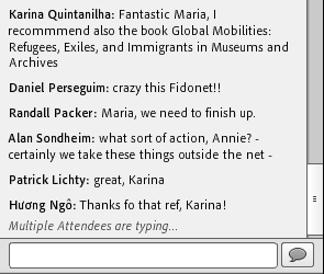
Screenshotted from chat space of Adobe Connect
To elaborate more on Uncle Roy All Around You, Matt Adams mentioned in his keynote that it was “very indeterminate as to what (the work) actually was. (They) did not declare whether it was art, a Happening, or for profit.” So while it is hard to categorize the work, the work can be understood as a game, the aim of which is to meet Uncle Roy.
Online players are shown a virtual model of the left end of London. Matt Adams mentioned that because this work was conceived before the GPS was cheap enough for use, the map was moved by the player themselves, meaning they are responsible for their location. These online players aim to meet Uncle Roy, like street players. Street players buy tickets and are shown where to register, following which they abandon all their possessions and are given a 60 minute time limit to find Uncle Roy with the help of a handheld computer device.
Source: https://vimeo.com/7182676
When the Street Player first declares their position (by clicking “I’m here” on the handheld computer) their avatar appears in the virtual world at that location. Their card becomes visible to Online Players: it shows their name, their photo and a brief description of their clothes.

Source: https://vimeo.com/7182676
Selecting a Street Player’s card allows the Online Player to send private messages to the Street Player. Online Players can assist Street Players by matching photos and Uncle Roy’s comments and then passing relevant information to the Street Player.
“Somewhere in the game there is a stranger who is also answering these questions. Are you willing to make a commitment to that person that you will be available for them if they have a crisis? The commitment will last for 12 months and, in return, they will commit to you for the same period.”
After entering an office, the Street Player is asked the above series of questions. Online players are invited to view this via live webcam. After choosing whether or not to make a commitment, they are dropped off in a car at the ICA building. For Steve Dixon, he mentions in his paper on Cybernetic-Existentialism that his experience of the work was highly existential, “including getting lost and fearing being mugged, and nearly (really) being hit by a car when hurrying across a street in the race against time.”
Matt Adams mentioned in his keynote that the work was concerned with the popular notion of “community” in the 1990s. In a community, you are bound by social contracts, and are “not just a bunch of people in the same place”. For Steve Dixon, this is “an unusually forceful commitment to being-for-others to emerge from an artwork“. In relation to this, according to Matt Adams, the game was an experiment about whether people would embrace that contract without any monitoring as they are given the opportunity to play with relationships in the mixed-reality space.
A parallel can be drawn with the symposium itself, for the audience and the performers are in a contract of sorts – there is an implicit understanding that no intentional disruptions would occur on the part of the audience, whilst the performers are expected to hold up their end of the stick. It was really great to see the commitment the audience and the performers and speakers had to the cause and to one another with the smoothness that the Symposium ran with. All in all, it was a delightful experience that opened my eyes to cutting edge telematic art.


