Category Archives: Creative Response – VC

The Industrial Revolution [Reading Response]

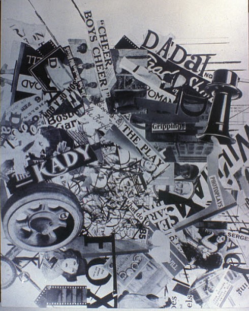
“While guns rumbled in the distance, we sang, painted, made collages and wrote poems with all our might” – Hans Arp

When I first learnt about Dada when I was thirteen and just starting my study of visual art, I didn’t really know what was going on, and found the works perplexing in their blatant disregard for what I’d always thought Art should be – beautiful. I suppose that that’s what people in that time thought too. Seven years on, Dada has become my favorite movement. As Dada is particularly hard to define (its members themselves wanted to “evade the definition of a unified art movement”), and so with it, common visual characteristics are hard to pinpoint, my love for Dada comes from its ideology, not aesthetic qualities. I find it really inspiring that the artists devoted themselves to Dadaist art with such passion without losing hope after the atrocities of war, even with imminent threats.

One of the Dada artists that stir me is Hannah Hoch. She was already rare as a widely-known female artist in that time, and was aware of this and consciously “promoted the idea of women working creatively more generally in society”. She featured issues of gender and politics prominently in her work, one of which I will discuss below.

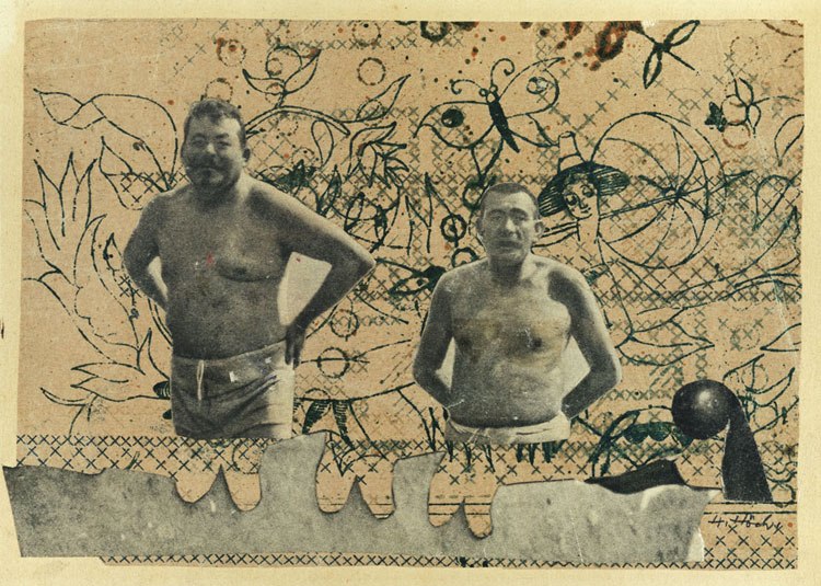
Heads of State (1918-20)

Here, Hoch uses photomontage to juxtapose newspaper photographs of primary German politicians (President Friedrich Ebert and Minister of Defense, Gustav Noske) against a floral background. Photomontage as a technique holds great meaning in this piece. “Intensely ideological”, it gave her power to cut, deform and place anywhere she wanted, these two powerful politicians who had ruthlessly put down the Spartacist Rebellion. They are juxtaposed into a kiddish, whimsical dreamscape where they stand unawares of the common German people’s hardships in their swimsuits.

Upon closer introspection, the floral background alludes to embroidery, which was the main source of income and primary occupation for the German women of that time. Brought together with substantial masculine figures (whom we are reminded aren’t altogether powerful in their more vulnerable, pot-bellied half-nakedness), the backdrop contrasts the position of women in society and questions the difference in value put upon traditionally feminine and masculine endeavours.

Sources:
https://theculturetrip.com/europe/switzerland/articles/deconstructing-dada-why-anti-art-will-always-matter/
https://www.theguardian.com/artanddesign/2014/jan/13/hannah-hoch-whitechapel-review


The Modernist Era [Reading Response]

The first essay starts off with the idea that Modernism doesn’t propagate a single “truth”, but rather a set of conventions that the audience can engage with. I agree with his idea that taking action is easier with a set of conventions to agree or disagree with, akin to a debating, which I do as a co-curricular activity – motions such as “This house would only display feminist art in galleries” could be taken to be the convention, and debaters could then take action for or against the motion. In this sense, modernist artists, to me, are like cogs that set gears into motion.

Milton Glaser then writes about how he does not believe that one principle, such as “simplicity or reductiveness”, can be universally applied to every problem – that people are too complicated. I somewhat agree with this view – I think there are fashions of every time period – maybe in the 21st century, it could be minimalism and elegance, and designers could make more profit if they subscribed to these norms. But then again, breaking these norms can also work to artists’ benefit, for uniqueness can gain you notoriety and fame (like Damien Hirst and his preserved animal sculptures). I think everyday artists today subscribe to some base ideals that could gain them profit, but also try to inject their own personal flair so that they can capitalise on their “signature look”.

Glaser is also evidently against the Modernist idea of not representing forms from real life, citing reasons such as that he feels that they take away from the eroticism and passion of life. He then goes on to tie this apparent lack of passion to why corporations favour Modernist ideas in mass production, noting that its ubiquity signals that Modernist ideas will not die anytime soon. In my opinion, it makes sense that brands such as Apple subscribe to such ideals in order to appeal to the largest consumer base, unhindered by personal touches that could potentially alienate some markets – after all, every human is vastly different in their wealth of experiences.


The second essay takes on a more positive view of Modernism, noting the backlash against it in the Postmodern movement, then the author’s own tendencies towards Modernist paintings in his youth and later, and the changing face of Modern design. I was especially struck by his example of Grapus, a collective that “goes to great lengths to make their work appear immediate”. Researching more about them, even though it looks rushed, takes great effort to portray a “Hot-off-the-press” vibe, which is another Modern thought. In his analysis, I came to understand Modernism more as a set of changing philosophies rather than a set of rules that dictate how minimalist things should be, which seems to be the main criticism hurled at the movement.


In the last essay, Rudolph deHarak suggests another essence of Modernism – to create and evolve forms that communicate content richly. He notes that the Swiss Style and Bauhaus, which was critiqued rather harshly in the first essay, were “essential developments and strong reflections of their time”

He also talks about how his understanding of Modernism has changed throughout the years, most noticeably, how he is more interested in the idea of problem-solving now. He champions Modernism for suggesting a movement ahead of its time, for organic change, and for creativity and problem-solving. I feel that this is a much more balanced view than the first essay, for I do agree with him that design is very much problem-solving oriented now (in the graphic design industries – for example branding, for it is definitely difficult to form a cohesive, lasting brand for a company), and that concept has come about through the gradual, organic evolving of Modernism itself.

The Age of Information [Reading Response]

Reputations: Massimo Vignelli

Massimo Vignelli considers himself an “information architect”, one whose designs are positioned in the centre between progressiveness and conservatism. 

“What we do is really structural in presenting information in a way that’s more understandable than any other form. Graphic designers today are changing because of the computer. They all work with a digital technology so they are really switching more and more towards information architecture. If you still want to call it graphic design, that is fine with me.”

I agree that graphic design today has really changed because of the computer and technology. Because graphic design software is so readily available, good graphic designers today seem to be the one who can fulfil the briefs with clarity and beauty. It’s something I aim to do in the future and that I feel can only be cultivated with experience. As I become more accustomed to softwares, I can only imagine my process will get faster; with the fulfilling of more briefs, I hope to achieve the clarity of thought and identity Vignelli so obviously possesses.


The Rise of Corporate Identity

The second article discusses the rising importance of corporate identity. Good design lasts, as shown by how recognisable the brands are in the article.

Undeniably, corporate identity can make or break a brand – having worked in a startup previously, I realised that new companies are often concerned with having an eye-catching logo and slogan. Indeed, in today’s climate where almost every company has that sleek, modern, unified brand identity, it becomes very easy to identify older brands that have not gone through revamps. Even NTU had its own logo revamped, with a more modern sans serif font replacing the older serif font. I think websites such as https://www.designcrowd.com.sg reinforce this idea, with the sheer number of open jobs, and the sheer number of responses that come in for each job.

In this sense, I feel rather stressed about about my future as a graphic designer, because I’d really have to come up with great ideas for brands to adopt them as their identity with the seemingly saturated market today. Nevertheless, I am hopeful!

Bauhaus Creative Response

For our final creative response, we were tasked with creating a piece inspired by the Bauhaus, exploring the relationship between shapes and colours. Wassily Kadinsky believed that circles should be blue, squares should be red and that triangles should be yellow. From the survey in class, many of my classmates agreed with this; I did not at first instinctively (I thought triangles would be red), but after the discussion and explanation of Kadinsky’s thoughts, I agreed with his logic.

Thought Process

In between the week from when we were given the task and the week it was due, I was in Vietnam for the Asian British Parliamentary Debating Championships. Being in another country enabled me to get a new perspective on Singaporean culture. 

One feature that struck me was how little people used their phones in Vietnam. In fact, I barely looked at my phone for the whole of the trip, only using my laptop during the small pockets of time I got at night to do my assignments. More than that, I felt like I didn’t miss using this technology – in Singapore, I would take frequent phone breaks – on the walk between classes, to classes, from classes back to my room in student housing. I felt that it was a Singaporean thing to use our gadgets so much on our commutes and look like you’re texting someone, or watching something, or listening to something, because I had the comparative of hardly ever seeing people using their phones on commutes/out in public in Vietnam.

It might be because of Singapore’s nature as a first world country and the constant need to be be contactable and be on top of work assignments and group assignments, but I really felt that the Vietnamese did not function that way in developing Vietnam. I saw way more non-smartphones (phones with actual buttons to press for numbers, not touchscreens) in Vietnam than I thought I would, and realised how rarely we see that in Singapore – it’s the norm to have a smartphone, and to use it all day long. In this way, I feel that Singaporeans are really tied to their electronic devices.

I made a mindmap to have some elements to focus on (above). I eventually decided to focus on circuitry and circuit boards as they were immediately representative of electronics and technology.

Final work


This piece explores the concept of Singaporeans being very tied to their technology. I used this circuit board as inspiration, making “lines” out of smaller squares. I felt that they give the piece a tribal feel, which I enjoy for its oxymoronic quality as technology is such a new invention. I feel that the work is kept contemporary with its minimalistic outlook, though – much of the green background (to mimic the circuit board background) can be seen, and the geometric elements do not overpower it. 


Cover image from https://visual.ly/blog/six-lessons-from-the-bauhaus-masters-of-the-persuasive-graphic/ 


Lobang Galore

Prompt B: Create an A3 poster comprised of typography and image using a collage technique; consider using an element of chance. Consider how this could be related to Singaporean culture.


“Lobang”: a Singlish term originating from Malay, meaning a good deal/discount/opportunity/promotion. Singaporeans love many things: the most important (arguably) of which are 1) lobangs, 2) queuing, and 3) queuing for lobangs.

We have a treasure trove of lobangs in all the Facebook groups, threads, and telegram chats that I’m not ashamed to say I’ve joined. Lobangs, galore!

We even have an NTU Free Food lobang group! In this house, we love free food lobangs the most.

Having witnessed and partaken in this lobang culture all my life here in Singapore, it was natural for me to center my piece around this theme.

 Process 

I started by gathering lobangs (in coupon form) from the newspapers, magazines, and brochures I found around the house over the course of a few days.

I then proceeded to cut individual bits up: sometimes tearing by hand, but mostly using a pair of scissors. Apart from the obviously lobang coupons, I also cut up some phrases like “sale”, “discount”, “20% off” as they alluded to lobangs as well.

The mess left behind!

I then gathered my pieces into a giant bowl, to pick randomly out of later.

Next, I had to arrange them onto the A3 paper. To do this, I threw a string onto the paper and traced where the string had landed, to arrange the pieces along the traced line.

Traced line:

Then, I mixed up the bowl and picked pieces from it with my eyes closed, to arrange along the traced line.

The result after “tracing over” the line with my randomly picked pieces!:

It looked too bare to me, so I dumped out all the pieces on the floor and filled in the background with lobang pieces I thought would fit, trying to fit them in to the best of my ability.

These were some of my favourite lobang coupons, but I didn’t manage to fit them in due to the lack of space, sadly. They’re still so pretty, though!

 The finished product! 

 Rationale: 

The lobang culture is strong in this one. In Singapore, we love good deals, discounts, promotions and free things, all of which fall under the category, “Lobangs”. My Dada poster is an ode to lobangs, with coupons and phrases relating to Lobangs that I’ve collected for myself and my family. The elements of chance came into play in two instances in my process:

  1. When I threw a piece of string down onto the paper to trace and use as a guide to arrange my initial pieces over
  2. The picking of lobangs from my giant bowl with my eyes closed, randomly

I was inspired by Dada collage artists such as John Heartfield:

Dadafox, 1919 collage by John Heartfield and George Grosz

I feel that the chaotic arrangement echoes all the lobangs around me on a daily basis – I get notifications from Facebook, Telegram, and I always scour the newspaper for them, too (I’ve gotten numerous samples from beauty counters this way). I’m pretty happy with the variety of fonts and types of lobangs (food, electronics, clothes etc) reflected here. It was a fun piece to think about and do! 


Rebus

I made a few rebuses. The above’s my favourite one because it integrates both pictograms used  into a unified landscape, but I like the ones below too (I tried naming some of them, haha) Please expand this post in a new tab!

To chop off your hair

How to deflate a ball

#justgirlythings

Congratulations, you’ve given birth 

Sources:

Barn by lastspark from the Noun Project. (2018). The Noun Project. [online] Available at: https://thenounproject.com/search/?q=barn&i=1105541 [Accessed 24 Aug. 2018].

Barn by lastspark from the Noun Project. (2018). The Noun Project. [online] Available at: https://thenounproject.com/term/barn/1153269/ [Accessed 24 Aug. 2018].

Uidownload.com. (2018). Sheep Icon Free Vector | free icon packs | UI Download. [online] Available at: http://www.uidownload.com/free-icons/sheep-icon-free-vector-426417 [Accessed 24 Aug. 2018].

baldness by corpus delicti from the Noun Project. (2018). The Noun Project. [online] Available at: https://thenounproject.com/term/baldness/832796/ [Accessed 24 Aug. 2018].

Axe by ProSymbols from the Noun Project. (2018). The Noun Project. [online] Available at: https://thenounproject.com/search/?q=axe&i=565121 [Accessed 24 Aug. 2018].

Ball by Alena Artemova from the Noun Project (2018). The Noun Project. [online] Available at: https://thenounproject.com/term/ball/1739622/ [Accessed 25 Aug. 2018].

claw by HAYUNNA from the Noun Project  (2018). The Noun Project. [online] Available at: https://thenounproject.com/search/?q=claw&i=1849553 [Accessed 25 Aug. 2018].

bag by Focus from the Noun Project  (2018). The Noun Project. [online] Available at: https://thenounproject.com/term/bag/943843/  [Accessed 25 Aug. 2018].

VectorStock. (2018). Lace vector image on VectorStock. [online] Available at: https://www.vectorstock.com/royalty-free-vector/lace-vector-927270 [Accessed 25 Aug. 2018].

Baby by David from the Noun Project  (2018). The Noun Project. [online] Available at: https://thenounproject.com/term/baby/479948/ [Accessed 25 Aug. 2018].

clap by Rena from the Noun Project  (2018). The Noun Project. [online] Available at: https://thenounproject.com/term/clap/1085294/ [Accessed 25 Aug. 2018].