Category Archives: Foundation 4D 1 – G6

[4D] Interactive Narrative

Link to our proposal: https://oss.adm.ntu.edu.sg/nura0069/interactive-storytelling-proposal/

We got feedback from Ruyi on our proposal that there were too many things going on – the strict parents, the lesbian relationship, Sarah going missing (and eventually dying), and Denise having to find out.

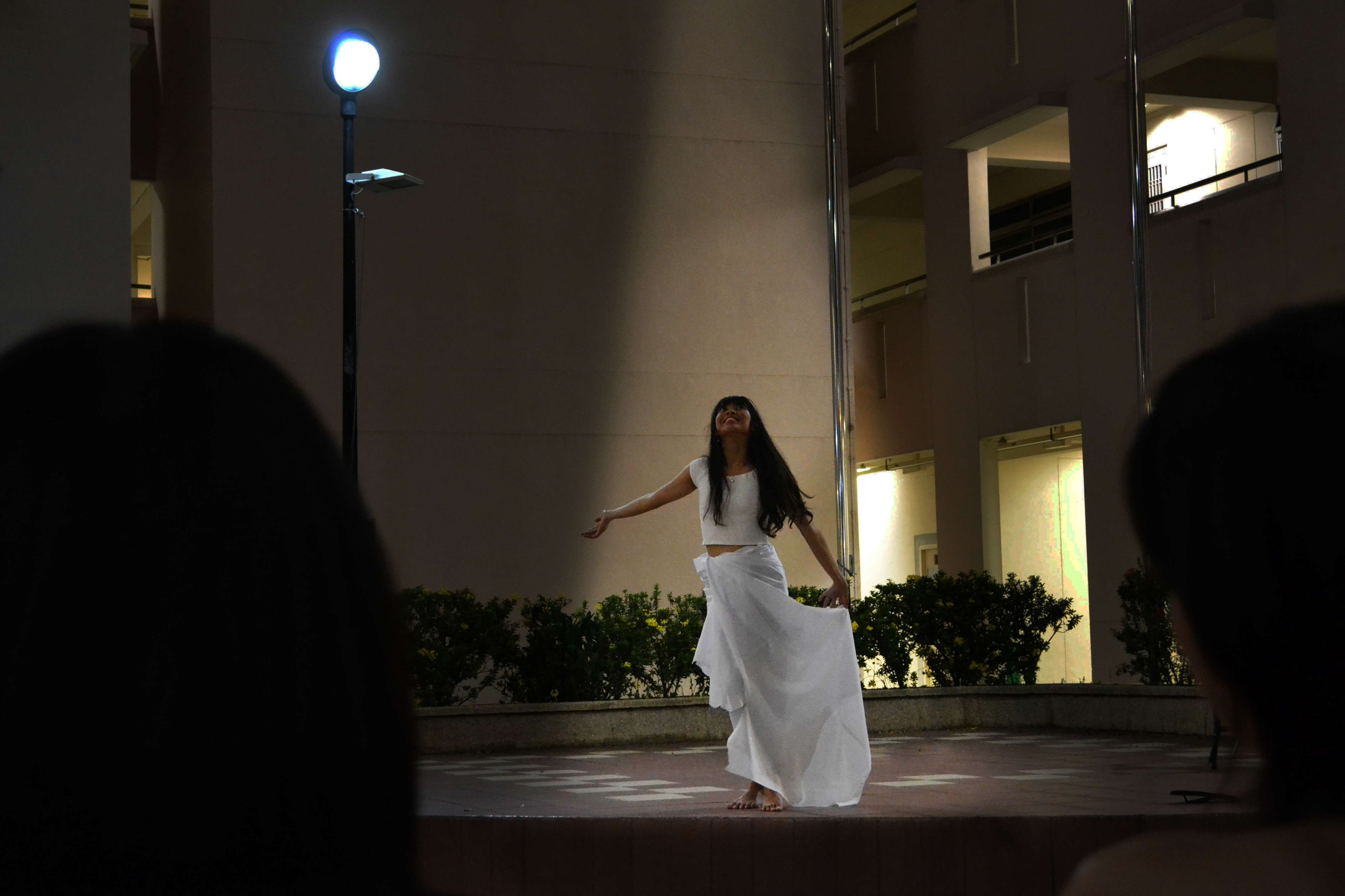
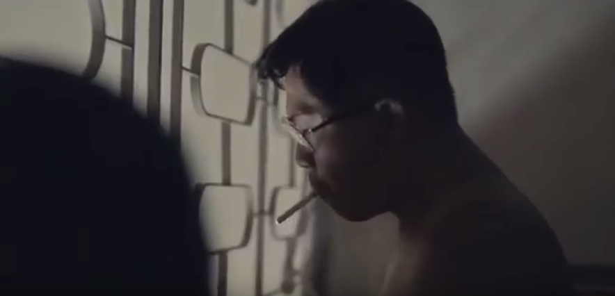
We also did not really portray the romantic aspect of the relationship, with Ruyi commenting that it looked more like a friendship, which we definitely agreed with. We tried to make it more romantic in our final video with an implied kiss scene: https://www.youtube.com/watch?v=7aKxPyMCPgs

We also got feedback that the two characters could be different in terms of personalities, Ruyi suggesting “Blue Is The Warmest Colour” as a reference. Hence, we redeveloped the story, paying more attention to the two characters’ distinct personalities.

Blue is The Warmest Colour explores the relationship between Adele and Emma – Emma is the more free-spirited, “Artist” type. Apart from using it for the cinematic reference, we also referenced the “I Knew You Were Trouble” music video for its portrayal of Taylor’s love interest as one who is crazy and wild, whilst Taylor is the ‘good girl’ who later becomes more wild as her relationship with her love interest progresses. As we had run into problems giving Sarah and Denise more character, I referenced this video to give both of the characters more distinct personalities.

Link for revised storyline: https://docs.google.com/document/d/1p4tYlgWwel4eKrRgUK1LGwqIhEXutZfBoXm8eNuxb0A/edit?usp=sharing

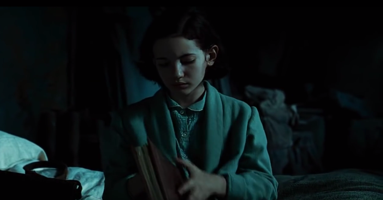
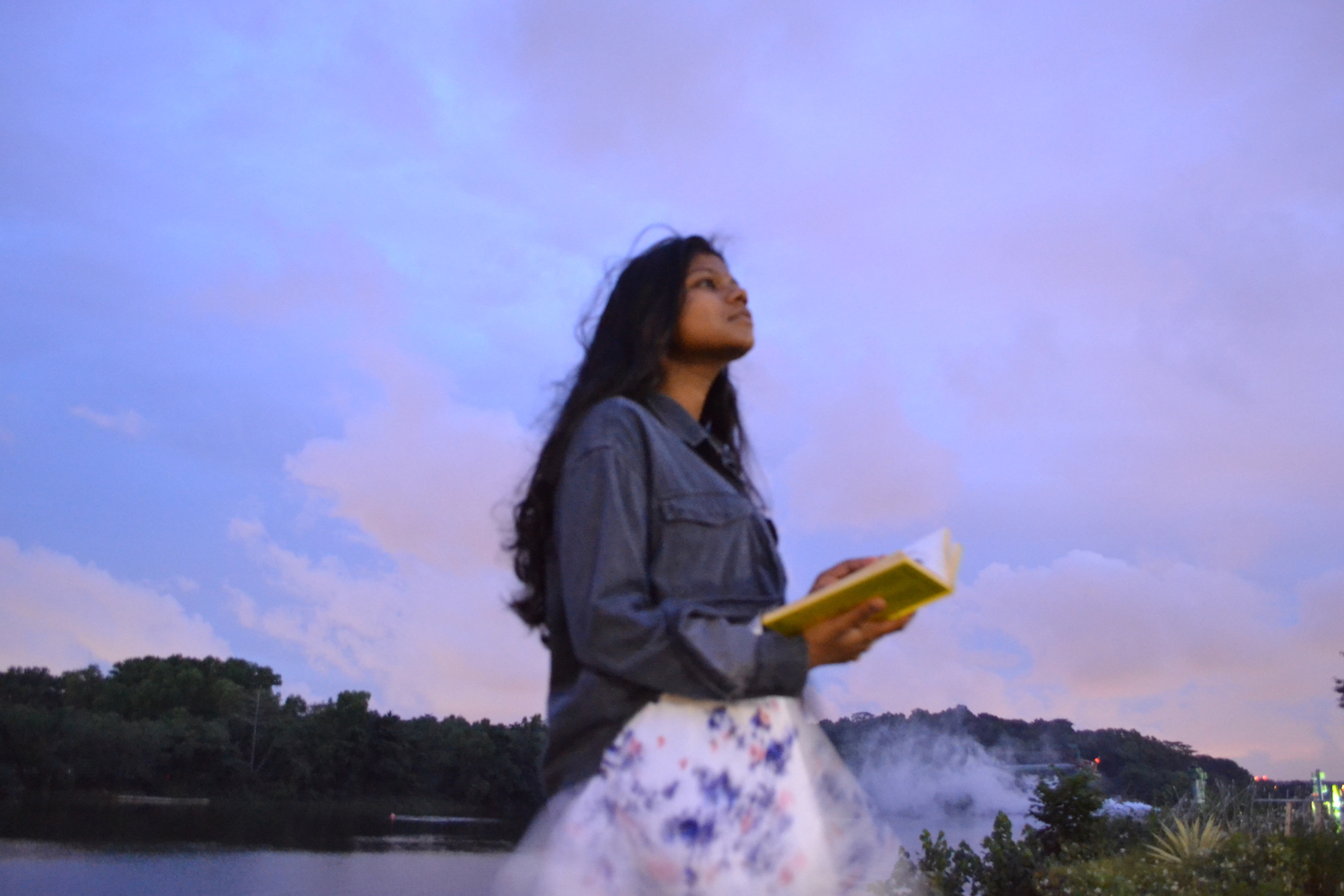
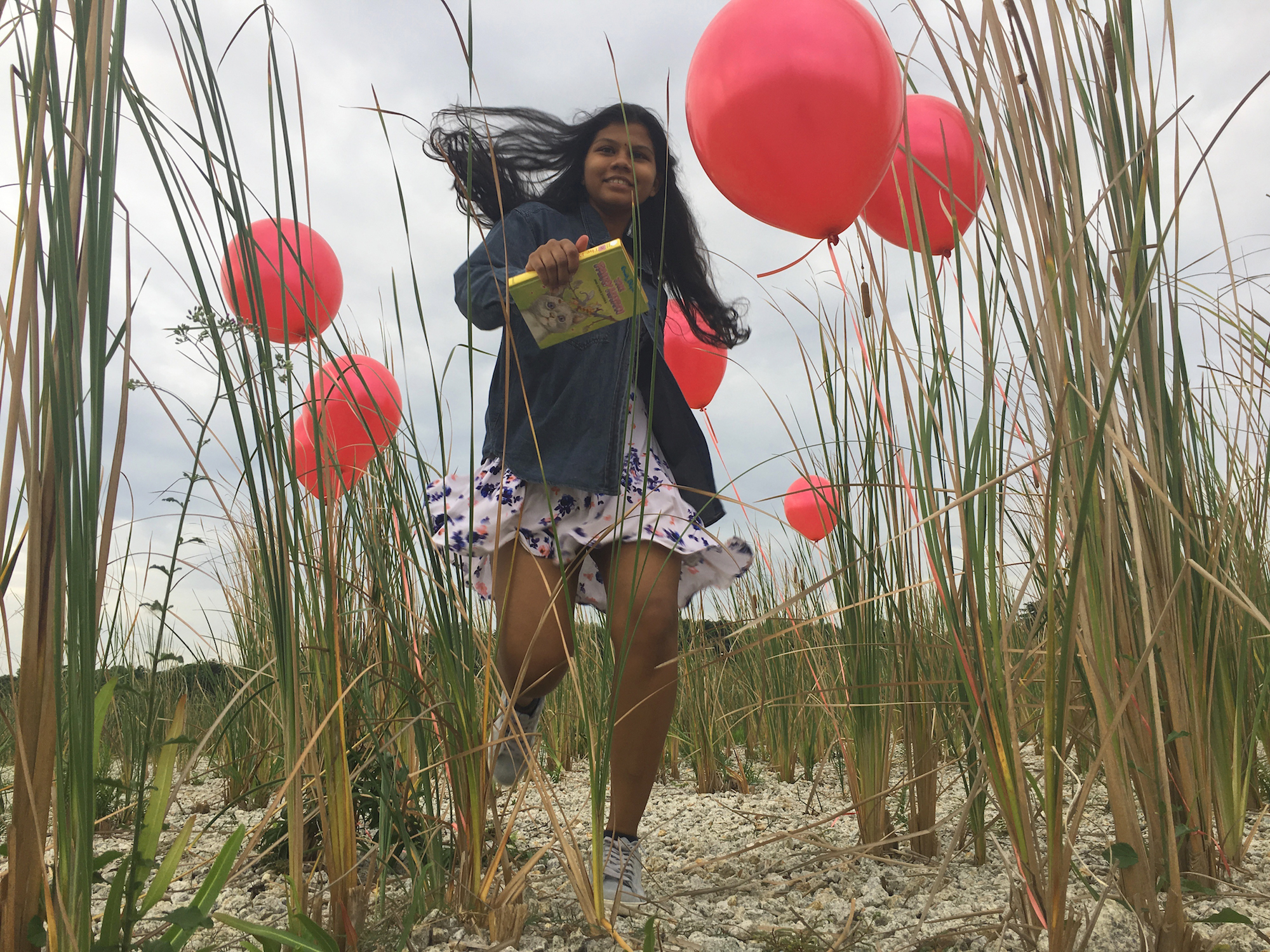
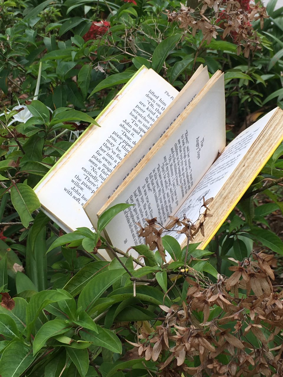
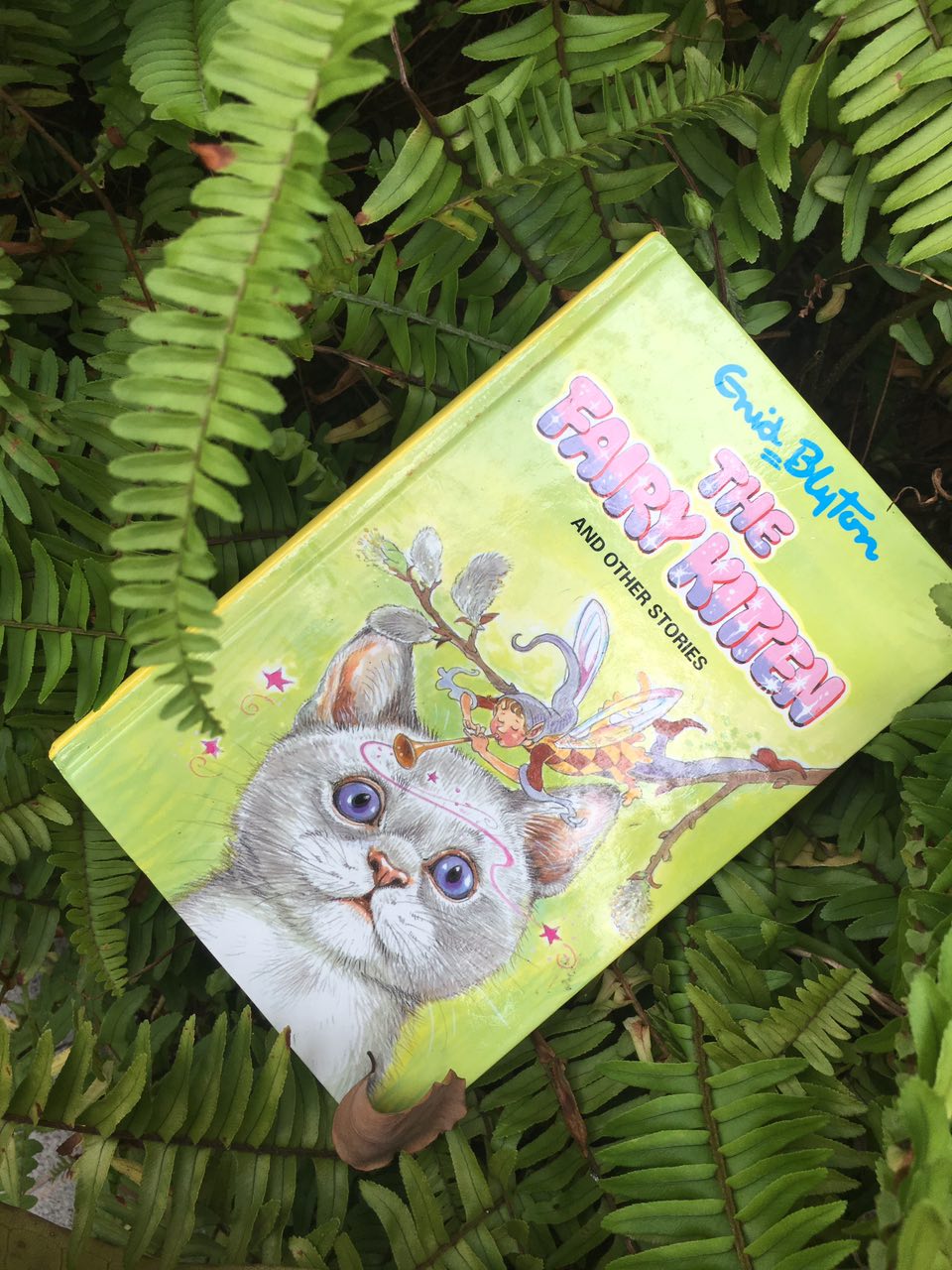
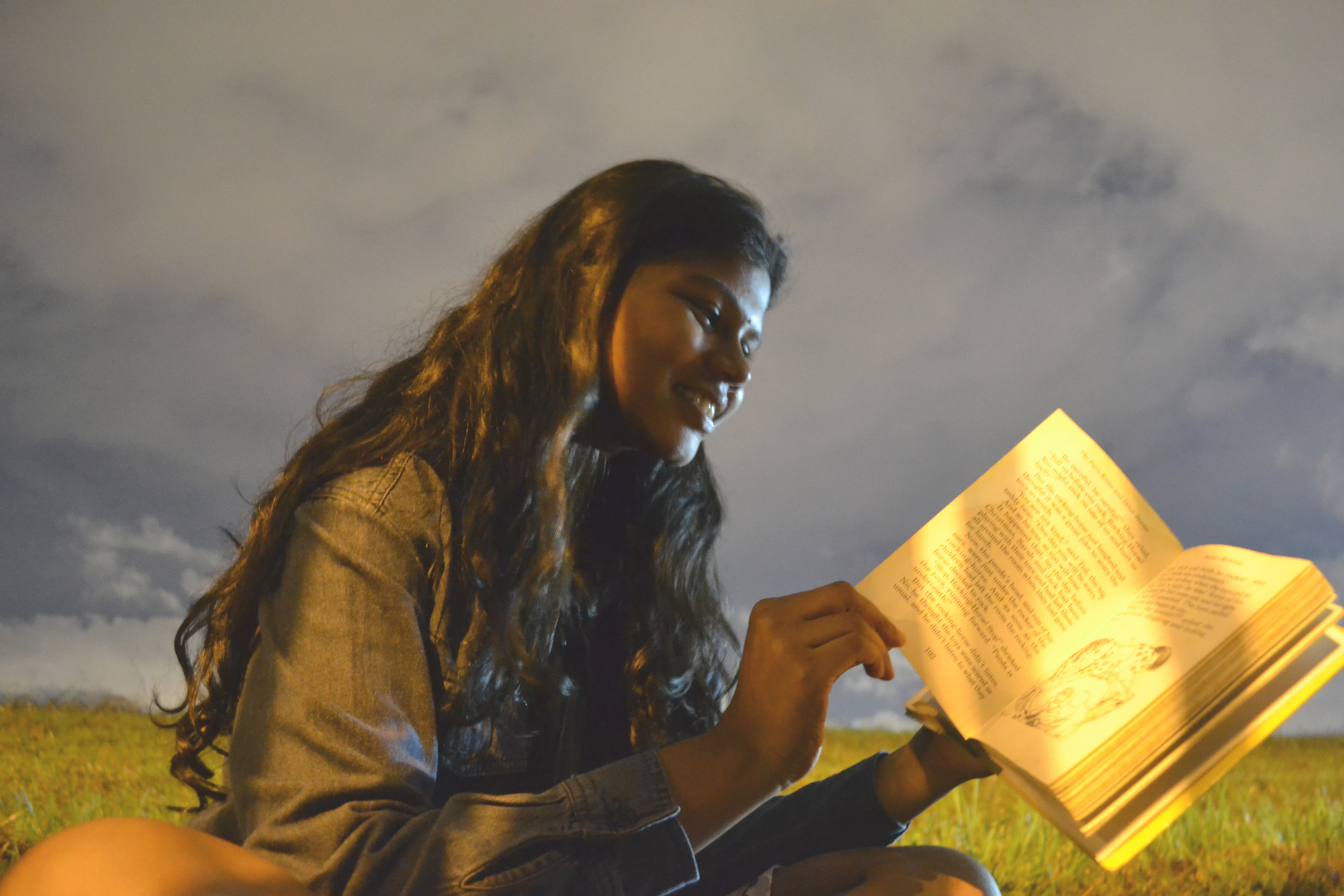
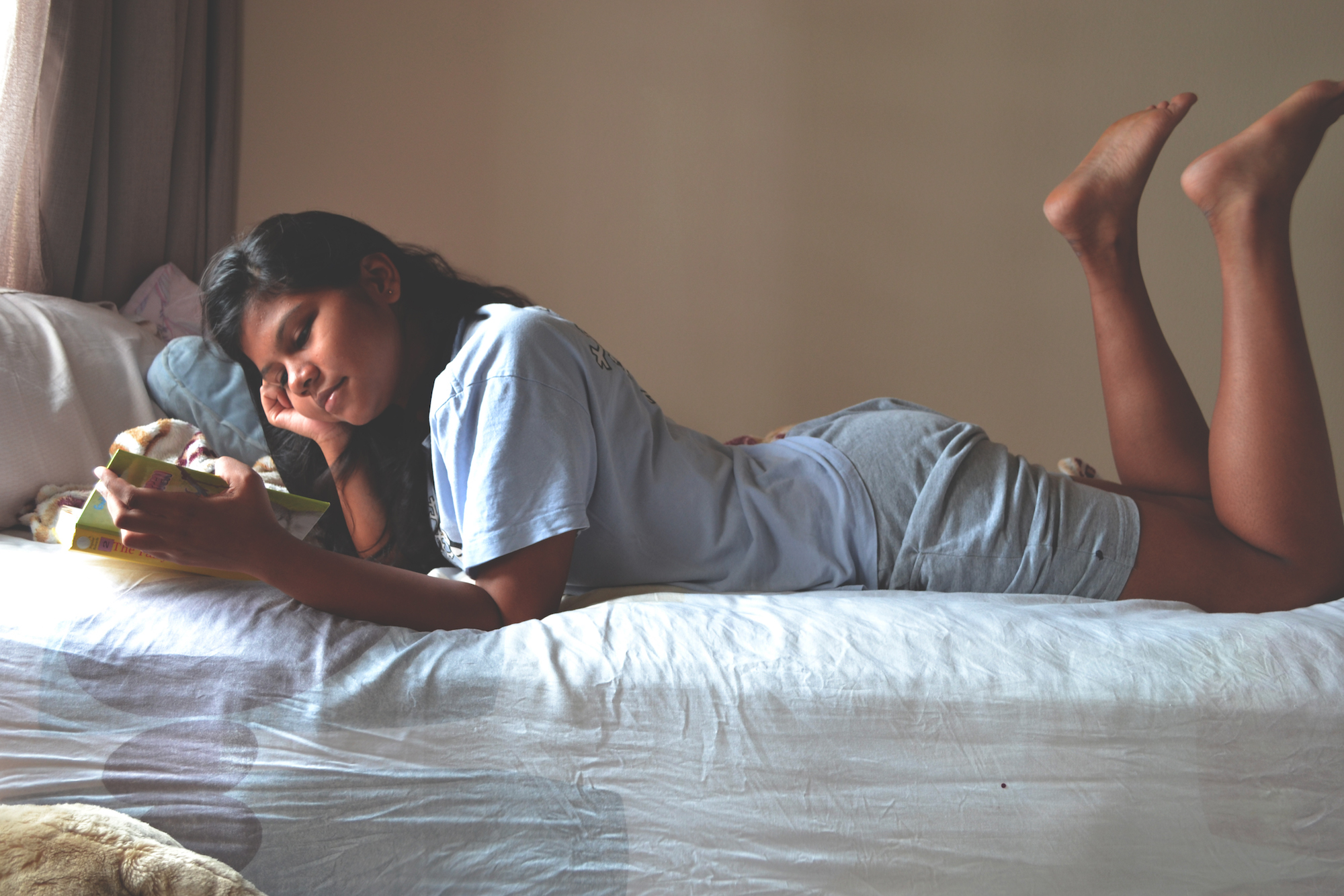
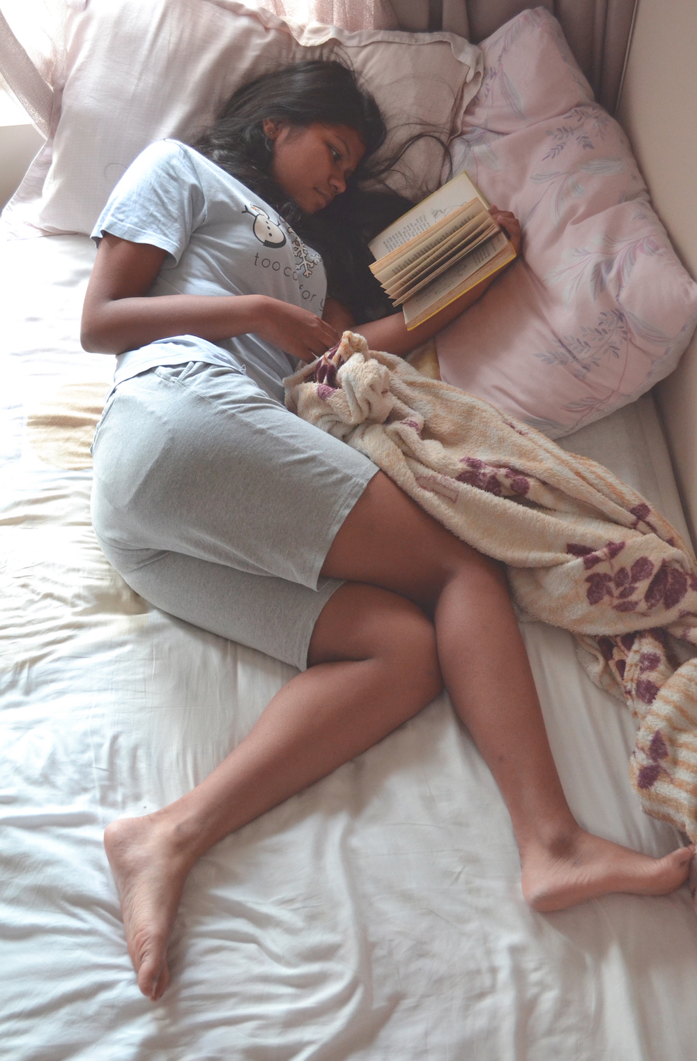
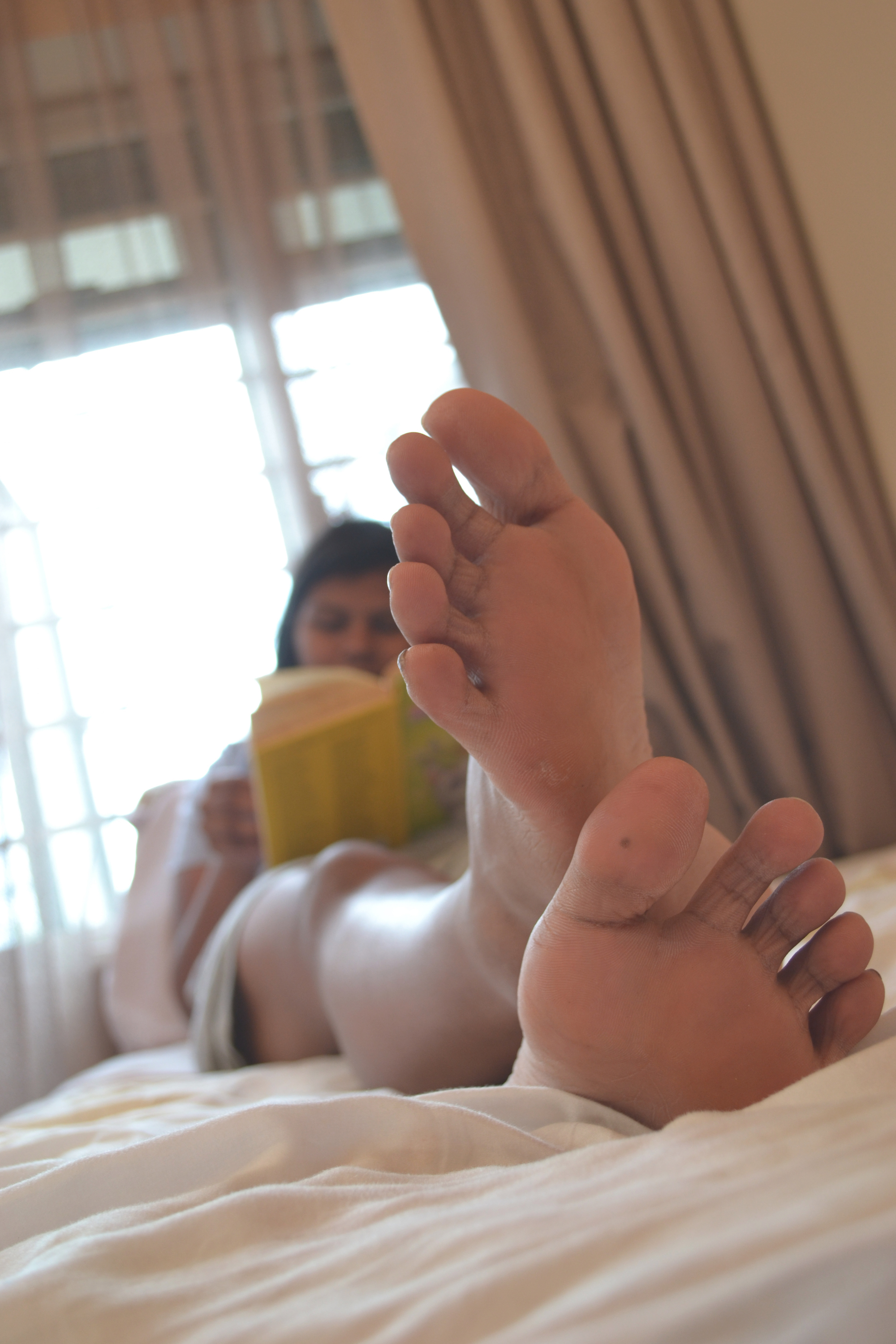
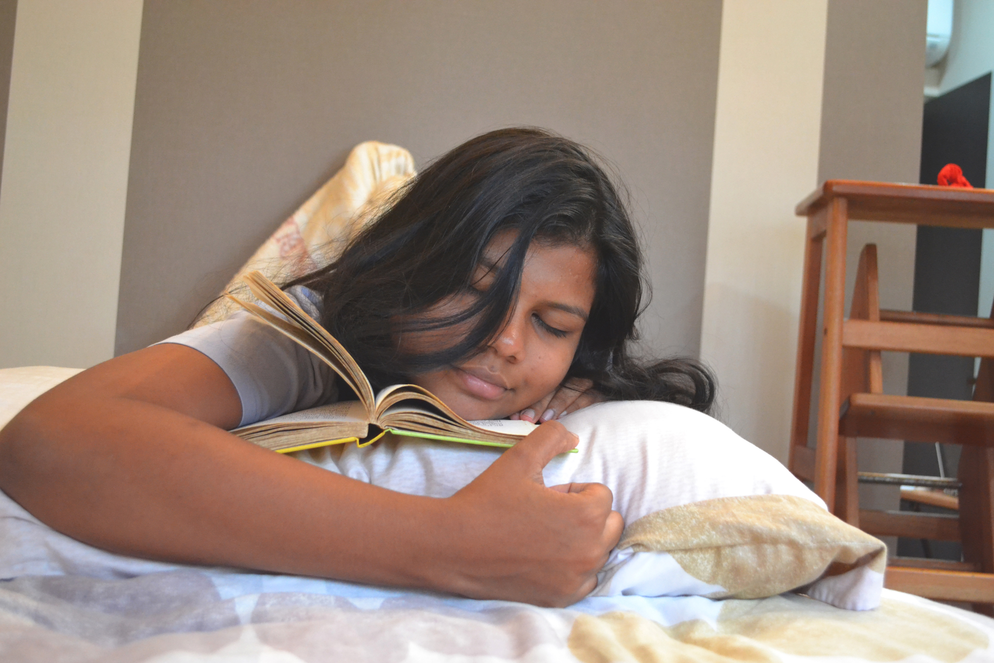
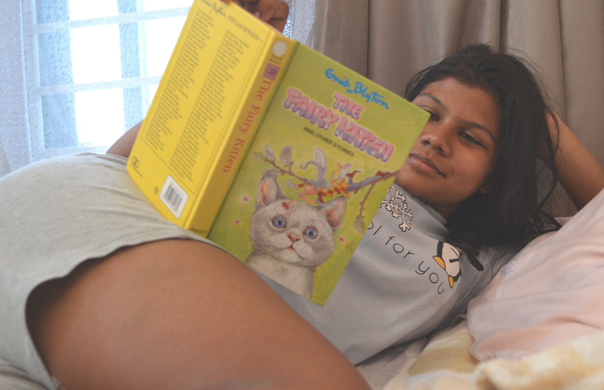
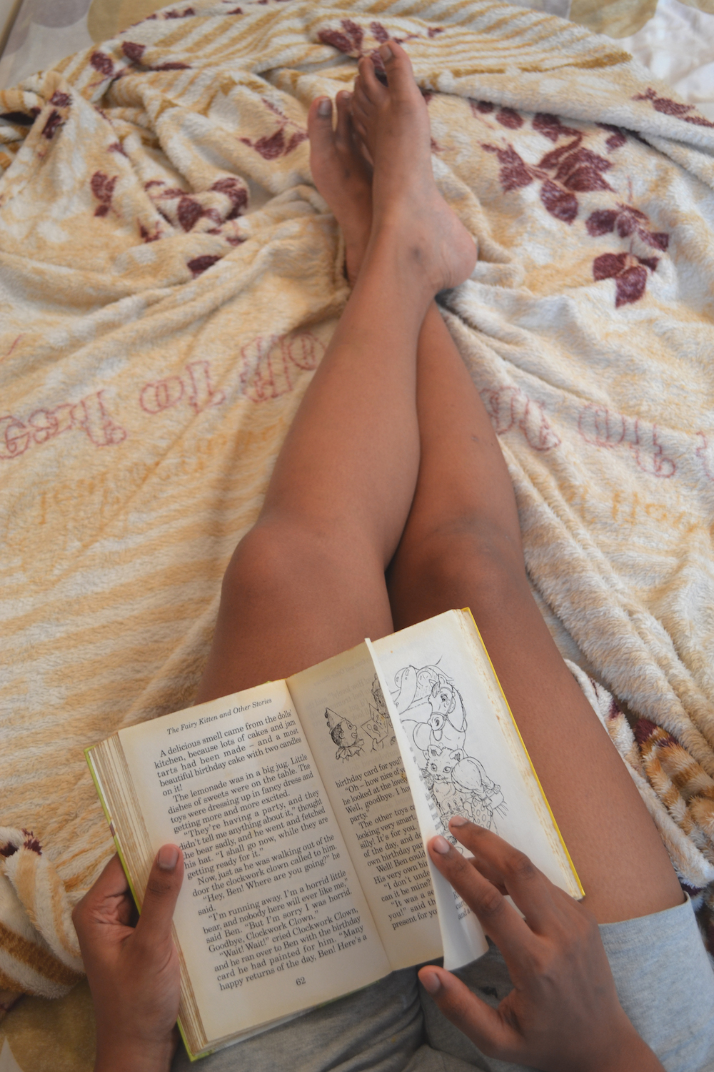
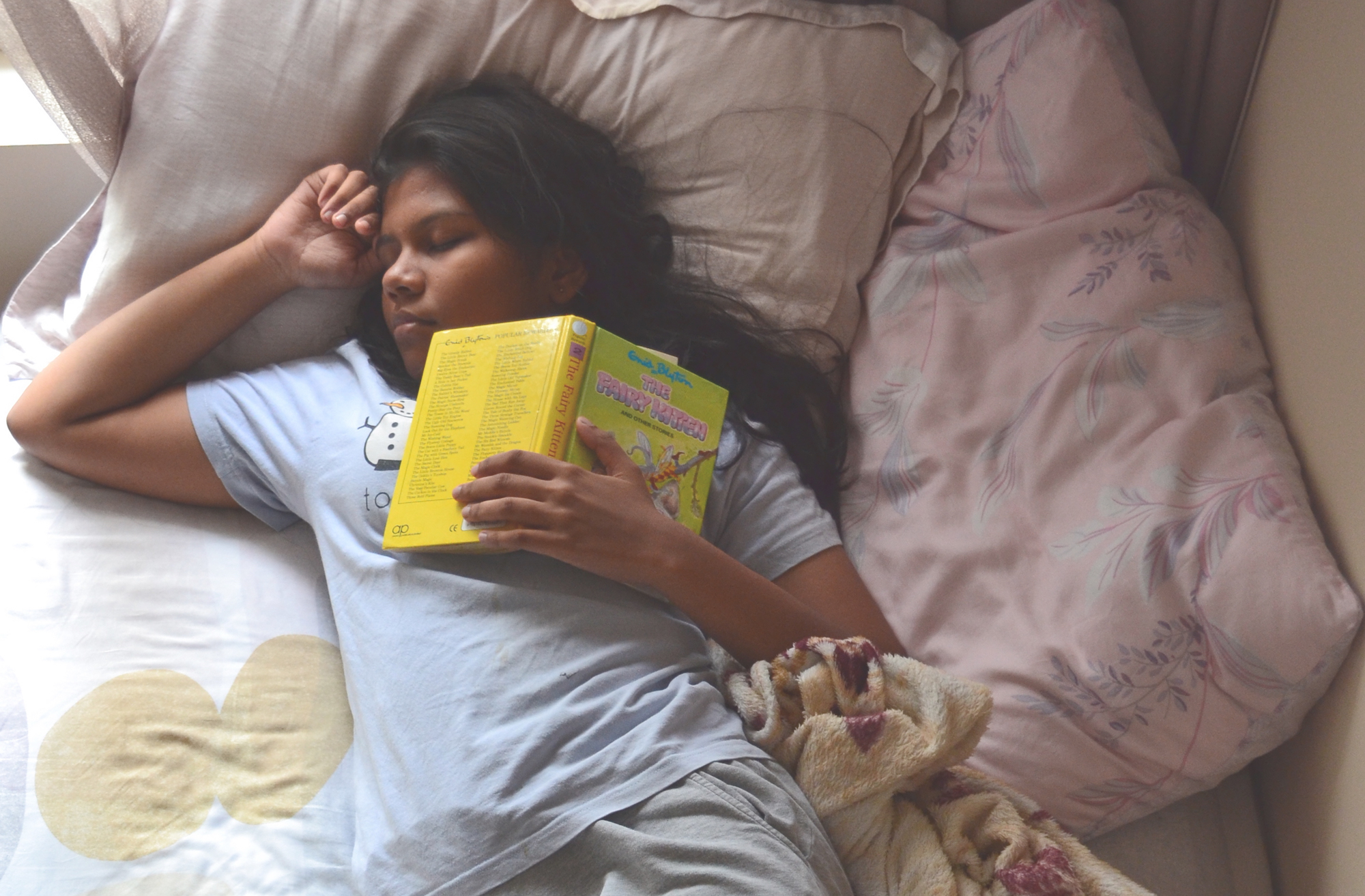
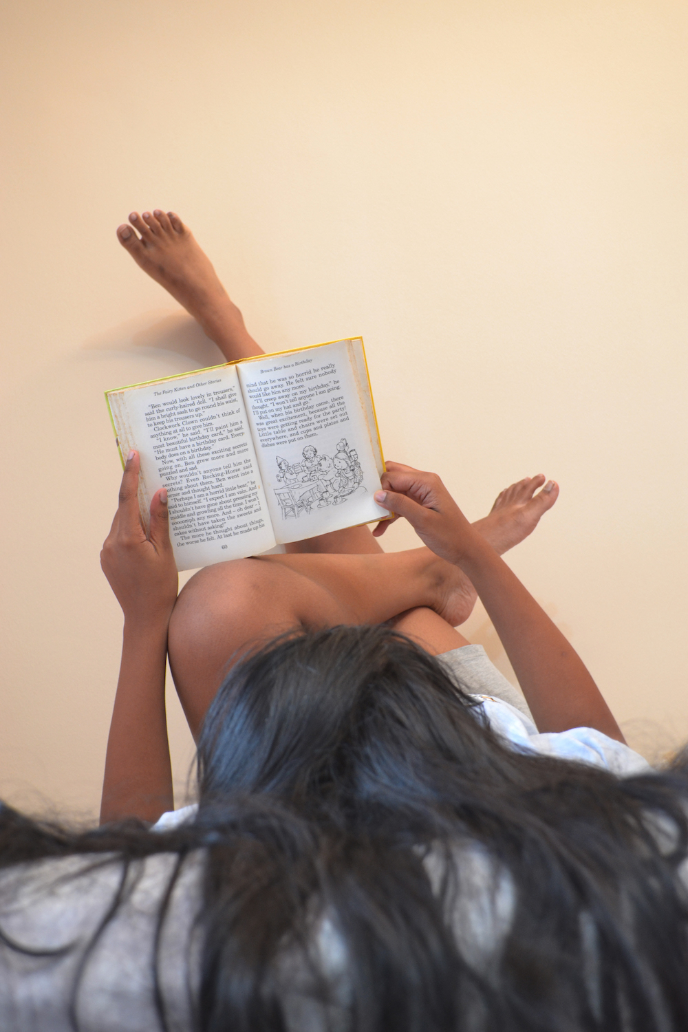
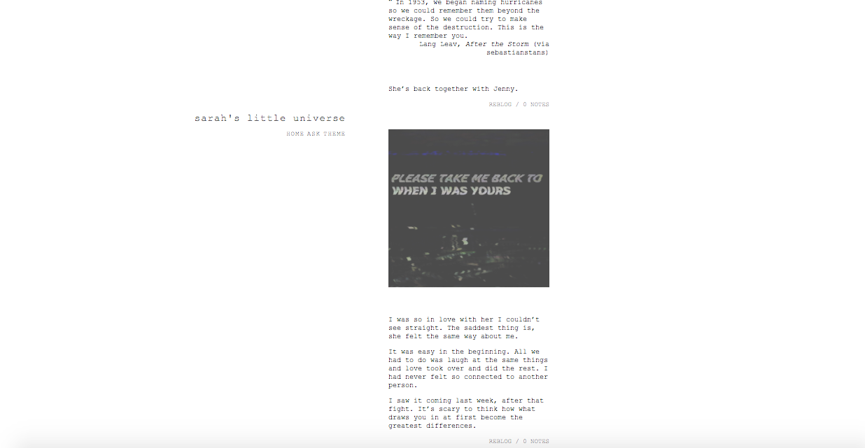
I did a lot of the writing, including the quotes for the jar, blog and the development of Sarah’s and Denise’s personalities. I also did up the scenes for the storyboard. I took a lot of inspiration from poetry, specifically Lang Leav’s works. The storyboarding was also pretty fun because I rewatched some Korean dramas for some ideas.

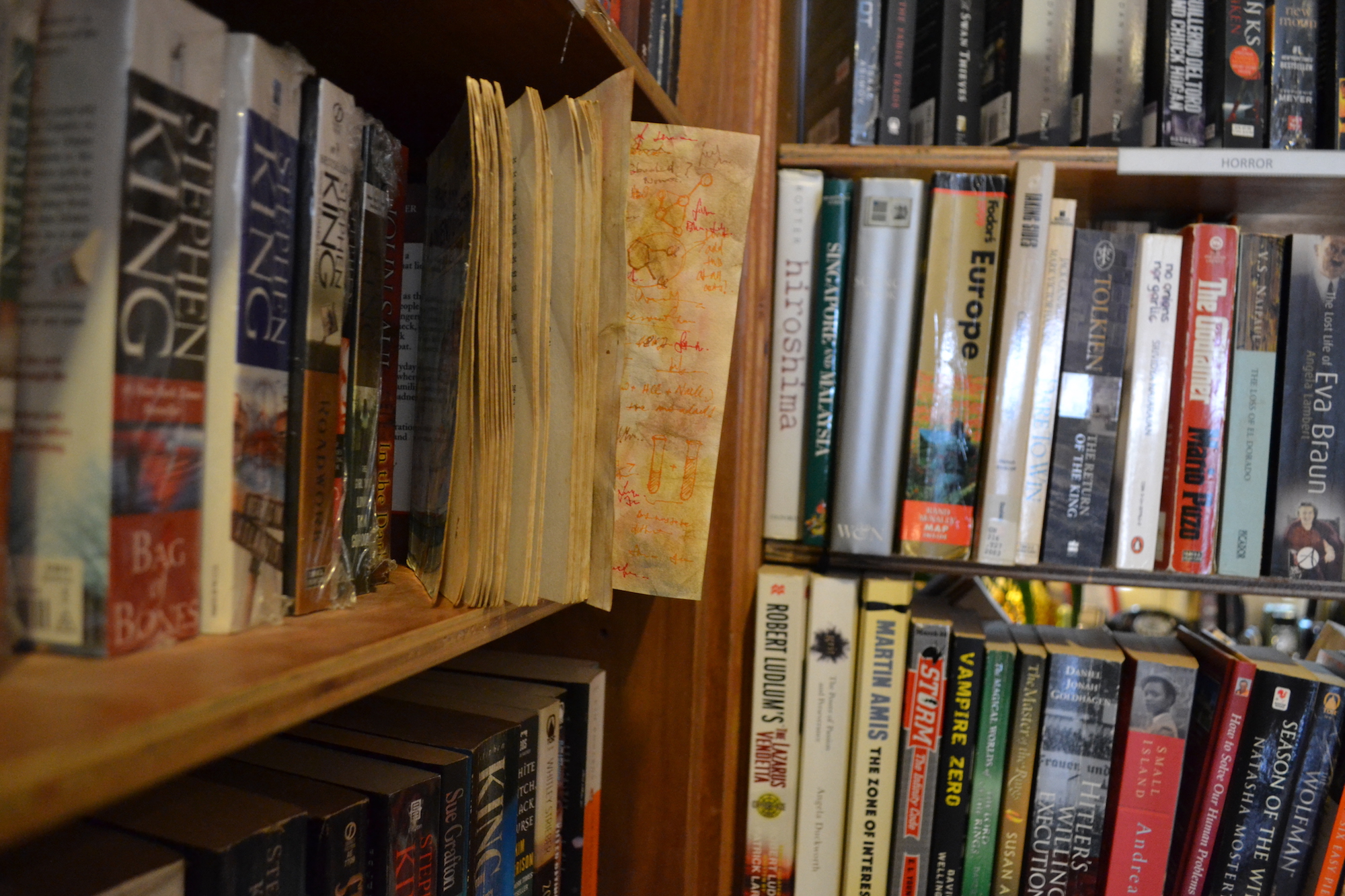
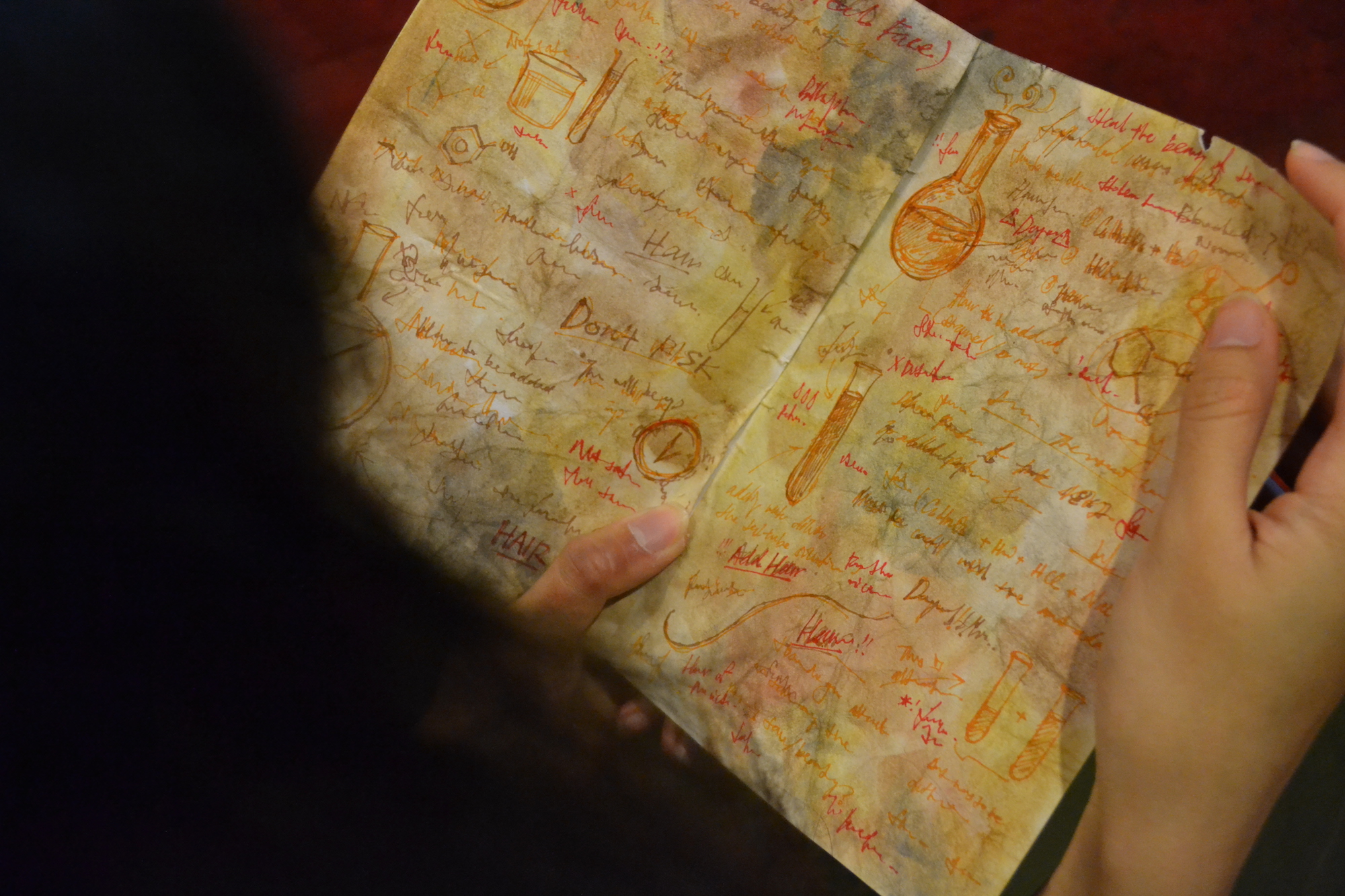
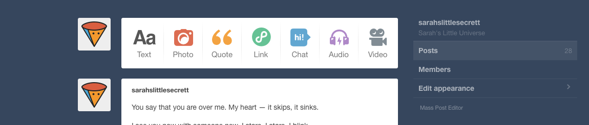
Blog link: sarahslittlesecrett.tumblr.com Password: 123

I ran into some difficulties while making the blog. I had to find a theme which did not show the post date because I was posting all of these posts on the same day, which did not make sense for the story. This was a lot harder than I thought it would be, especially because I needed the blog to look like a teenage girl’s blog. Here are some other blog themes I tried out:

1) https://valdemartheme.tumblr.com/

2) https://yeolithm-34.tumblr.com/

3) http://shinrikizuki.tumblr.com/th/14a

4) http://iceteo.tumblr.com/sehun

I tried to have a mix of word posts, poetry and picture posts to simulate a tumblr blog, as well. I also tried to have a relatively large number of posts – 28, to be exact – to make the blog seem believable, as if she had been writing in it for a long time.

Reflection:

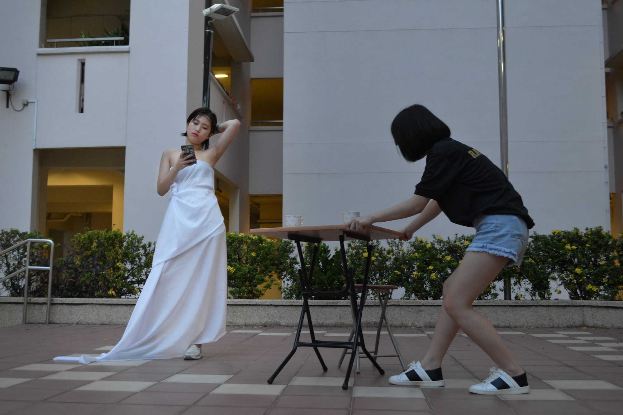
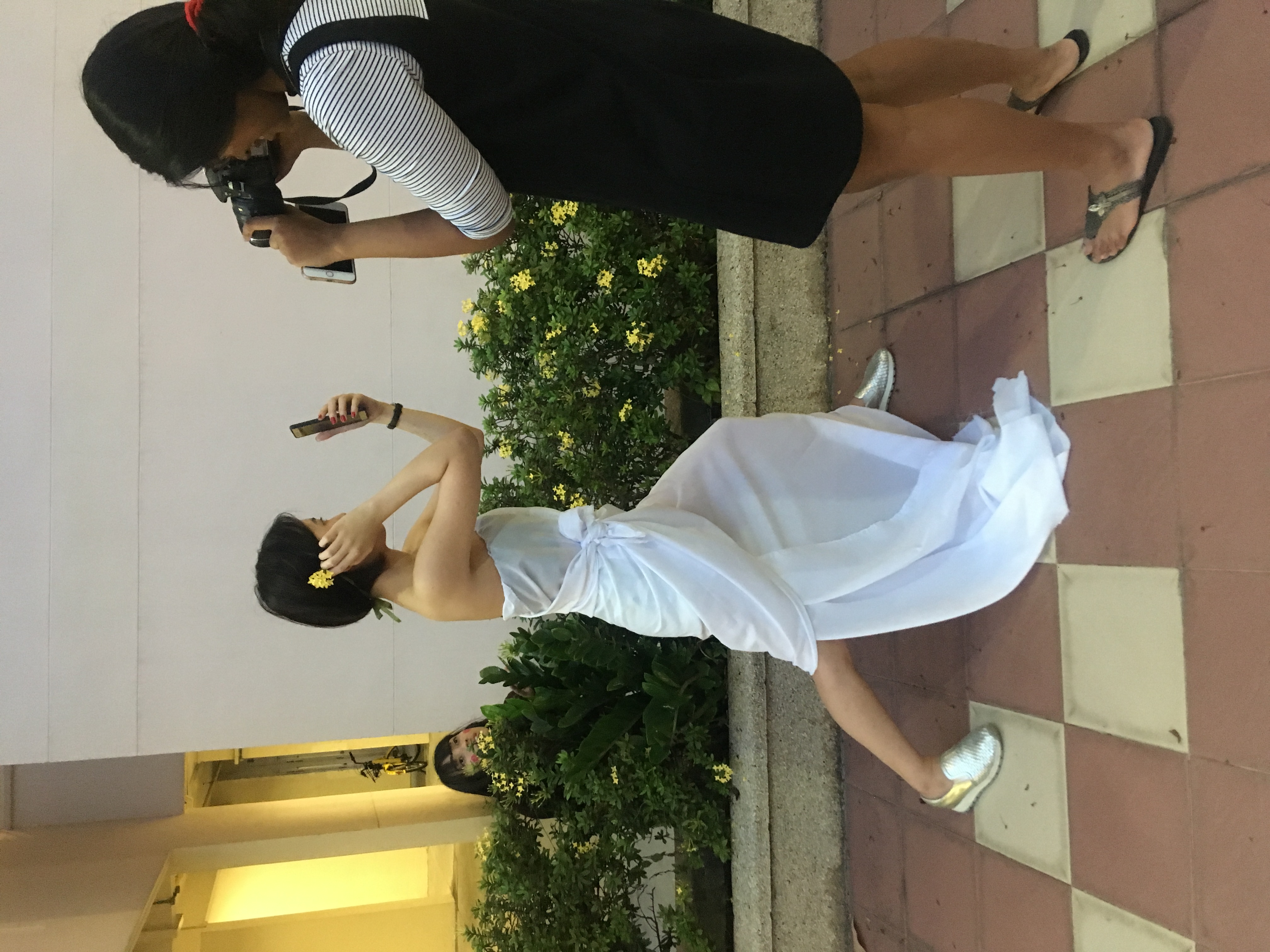
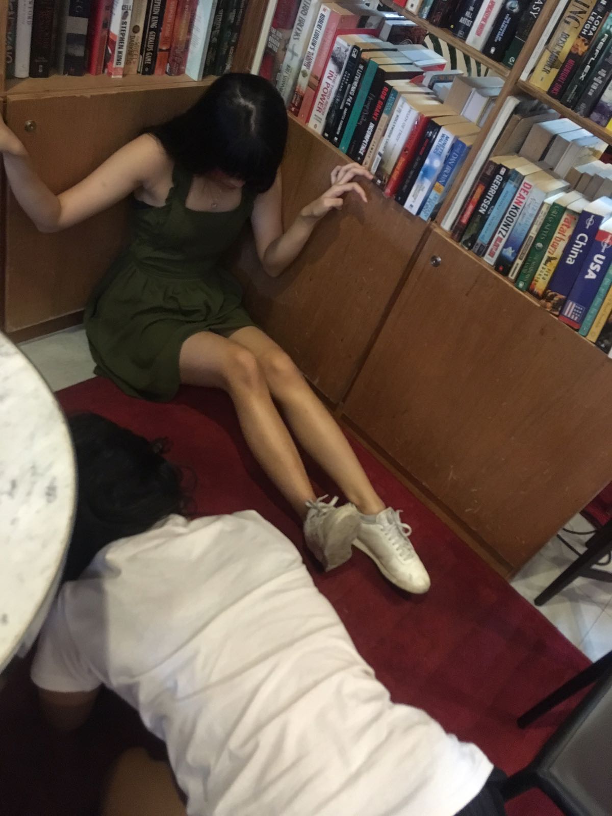
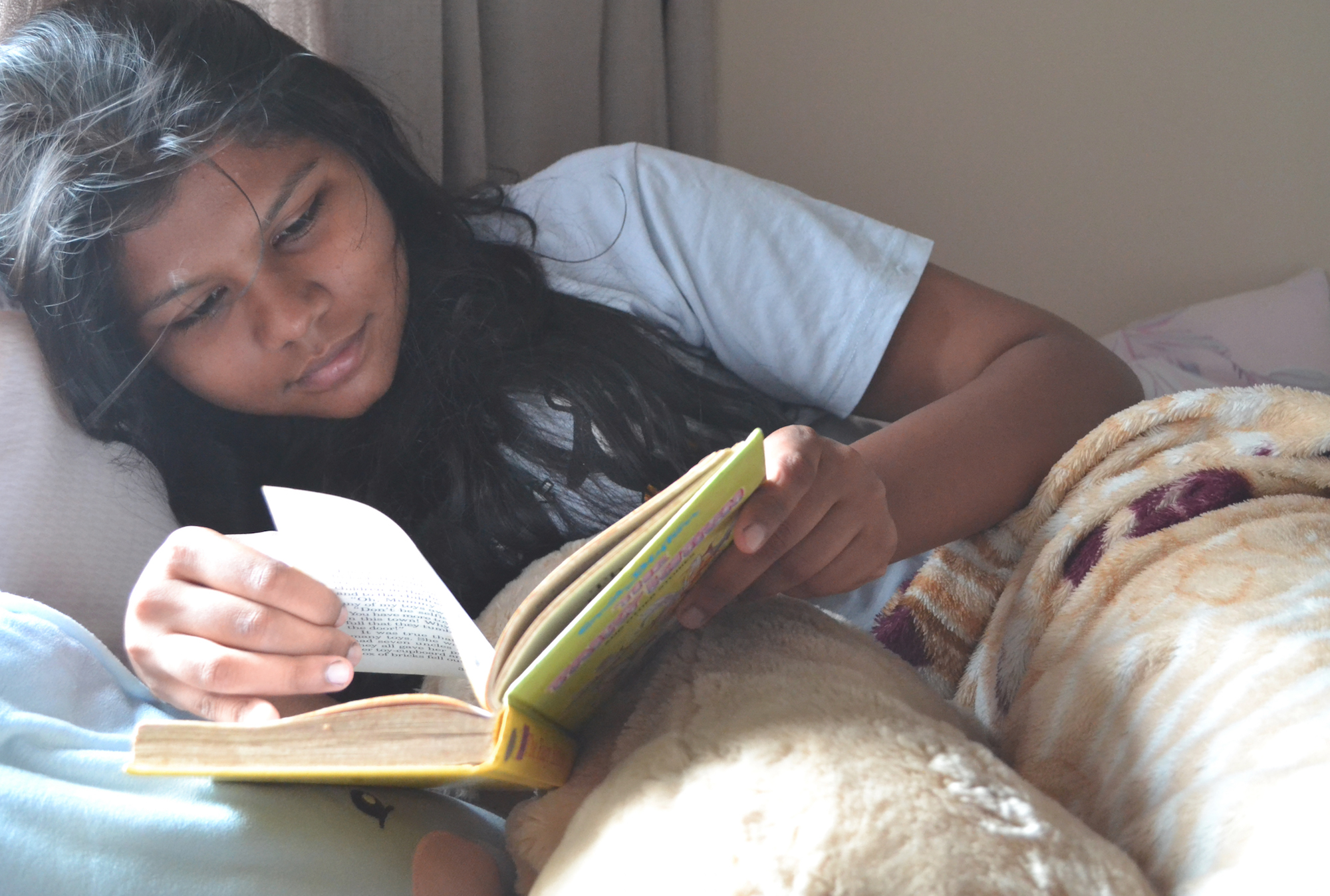
Acting as Denise was actually pretty hard for me because I could not stop laughing. While I had acted for theater plays previously, I found it super awkward being filmed, especially for the “intimate scenes”. Ying Hui made it a lot easier on me though, because we both found kindred spirits in each other’s awkwardness.

I also learnt a lot about character development, as I came to develop the characters more after the feedback on the proposal. The character profile really helped with that, especially with research into Character Archetypes.

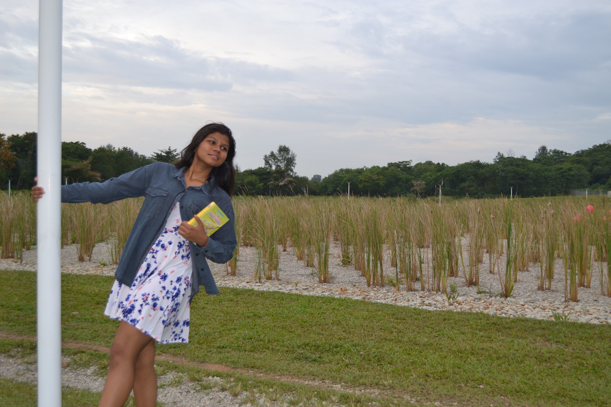
In hindsight, we could’ve paid more attention to details – one common feedback was that it was confusing why my name was Denise when I’m so obviously Indian. Honestly, we had initially named our characters D and SO based off what we learnt in 3D class about Dominant (D), Subdominant (SD) and Subordinate (SO), and Denise was D because she’s the more dominant one and Sarah was SO because she’s the “subordinate”.

Azizah’s post on setting up and props: https://oss.adm.ntu.edu.sg/nura0069/interactive-storytelling-l1-201/

Ying Hui’s posts:


[4D] Assignment 2: Sequencing Images Part 2

Inspiration – Editing of Photographs

Pan’s Labyrinth, for the high contrast


Alice in Wonderland, for the high contrast


I increased the contrast by a lot, in part so that I could add a spotlight with masking as well.


Alice in Wonderland, again for the blue & green tones


The tones here are more of a purple, but I felt that that was more suited for evening time.

Lord of the Rings 3

I really like the greenish tones here. Even though the picture is warm overall, the murky green tones lend it a feel of uneasiness that I aimed to convey with the editing for the frame below.

Thought process

I layered a lot of the sounds from Ms Ruyi’s archive of sounds over one another, and made the scissors sound and book dropping sound myself.

a) Other ambient noises I considered for the first scene on stage:

Crowd noise 1

Crowd noise 2

b) Heavy breathing vs build up to crescendo

I thought about having the sound of heavy breathing for the above frame, that I recorded myself.

c) Fairy wand sound?

I also thought about having a fairy wand sound for the frame that Qis opens, the book, but decided against it because I thought it was too cliche.

d) Crying sound vs thunderstorm music

I thought about having an actual crying sound for the scene where Qis is crying, but again, I thought it was too cliche. I felt that having thunderstorm music would be more cinematic and appropriate for the fantasy theme, too.

e) Low, buzzing sound

The low, buzzing sound when Karen is sick is also inspired from the sound 3:05, which gives me a very unsettling, nauseous feeling.


Rejected photos

Felt that low angle is more dramatic, also gives feeling of the book going to fall.


Thought of maybe using this for the frame where she gets startled and hits the bookcase, but it’s too static.


Lower angle to make it more dramatic and static, but decided to use two hands for the bigger action created.


I also thought of using this shot, but I figured that we already established that Qis was reading the book. I thought the more central shot emphasized the importance and large presence the book is going to have later on.


Link to video: https://www.youtube.com/watch?v=wsPuXCUDcqY

Reflection

A huge part of this project for me is learning how to use Premiere Pro CC. I was initially just going to use iMovie, but realized I was very limited in terms of what I could do with sound.

Premiere Pro was very initimidating at first because I always saw it as a software that professionals use, and I’ve only ever made 1 video in my life, and that with iMovie. However, with the help of YouTube tutorials, I learnt how to use it! The basics, at least. It was very challenging at first, then I’m really proud of myself that I got over my fear of using Premiere Pro – I’m a lot more confident with video editing now.

[4D] Assignment 2: Sequencing Images Part 1

Ideation

My initial idea was about a really smart friend in primary school who was also super tall and pretty, and everyone would say that she should become a model. I then came up with the story that she did in fact become a famous model, and then became disillusioned with the lifestyle and decided to hit the books again.

Qis’s idea was about a friend of hers who was on a downhill spiral but became reformed in NS, while Hui En’s idea was about her friends from boarding school. We sat down and thought of doing something along the lines of plastic surgery as we liked the idea of beauty being important, spun off my model idea, and eventually decided on a story about how being conventionally unattractive affects our main character, an “ugly” girl. We decided we’d want to do something in the fantasy genre, and decided to involve elements of a spell book and face swapping (later changed to complete erasure of a face), as well as magic potions.

Our story is about a girl (Qistina) who loves acting, and wants to be an actress. However, she’s overshadowed by a conventional beauty (Karen). One day, when she’s crying alone, a magical beetle scuttles across the carpet, triggering Qis to knock over a magical book with spells inside on how to absorb the beauty of another. When our conventional beauty, Karen, falls sick, Qis uses the opportunity to “take” her face and become beautiful, and fulfill her dream of playing the lead role.

This is followed by a narrative where the spell wears off, and Qis becomes ugly again. We took the pictures for this, but I personally decided to omit this part as I felt that the story tied up well with Qis finally getting to live her dream, albeit at the expense of another. I also liked the suspense this created with the question of what happened to the now faceless Karen.  Furthermore, I felt that it suited the entire storyline more when I didn’t add in a frivolous detail about the technicalities of the spell, which felt too Cinderella-ish for me, personally, when I was editing and decided to omit this last bit.

Storyboard: https://docs.google.com/document/d/103CYNrfswoT7oI9VMAh6ZuhILPAk2S1_-TE_VqGWPNk/edit

We based the idea of the face swapping off Kasane, a manga with a similar theme of beauty, where a magical lipstick would enable the main character to take on the face of the person she kisses. We liked this idea of face-swapping, but later modified it to face-erasure as we didn’t have enough people such that faces could be swapped without Karen reappearing later as an audience member and it being potentially confusing.

Behind the scenes


Challenges faced

1. Location

We couldn’t find a good place to shoot the theater scene – I tried emailing my junior college and secondary school asking if they’d let me use the school stage for the scene but they denied my request due to safety reasons. Hence, we settled on a outdoor stage instead – one beneath my HDB block, more specifically.

2. Costuming, clothes

Realized the bright pink of Hui En’s shirt wasn’t very stagehand-like, so we ran back up and she borrowed my school shirt to wear.


[4D] Week 2 notes + Class Exercise

4D Visual Characters

  • Sound: Music, sound effects
  • Story: Plot, character dialogue
  • Visuals: Line, shape, tone, color, proportion, focus

Film clips watched

  • Jaws – Sound: builds tension, mood
  • Gravity – Sound layering creates chaos, can replace actual sound of objects (we can’t hear metal debris)
  • Pan’s labyrinth – Sound: creates sense of foreboding as well as escalation
  • Schindler’s list – Question asked in class: why did it go from color to B&W?

Visual Elements

  • Perspective
  • Depth

  • Tone: creates impact, draws attention e.g. Manhattan // can be controlled by props e.g. The Godfather (deep tonal value) // e.g. Equals, Moonlight; can’t use tone in Equals for Moonlight // e.g. chiaroscuro vs flat lighting e.g. The Maltese Falcon, Regression // lighting reveals emotions e.g. Ilo Ilo
  • Spatiality: Depth – foreground, middle ground, background // To reverse depth cues, put everything in the same plane // Warm colors flatten, cool colors retreat // Tonal separation, color separation, textual diffusion, size difference

Class Exercise Week 2

One-point perspective Two-point perspective Three-point perspective

What are the different effects moving from 1 to 3 point perspective?

  • 1 point perspective is direct, straightforward; high level of attention to point of focus e.g. Yarui yatsu hodo yoku nemuru. It also heightens the effect of the unknown.
  • From  two-point perspective to three-point perspective, the image gets deeper. Two-point perspective focuses the attention to the subject in the front or back, while three-point perspective creates dramatic effect and could be suitable for a large exterior scene.
  • More than 3 point: audience gets disoriented e.g. Within You in Labyrinth (1986)


[4D] Week 1 Notes + Class Exercise

Class exercise: To put an object that represents you into an envelope

I chose a polaroid photo of my friends and me, because:

  • I’m always taking photos
  • I’m very sentimental (keep a lot of things, like receipts)
  • My friends are very important to me
  • I like hard copies (like letters over texts, polaroids over digital photos)

Reflection
Although most of my classmates managed to guess which object was another person’s purely by chance or by elimination, some managed to guess as some objects were very characteristic of their owners/had the “attitude” of their owners.

1) Looking at an image

  • Visual Literacy – knowing how to make your images meaningful

Red background: Communicate danger/get our attention


Sally Mann: Photographer


  • Style is very distinctive
  • Subject: Family in suburban landscape
  • Medium: Large-format photography
  • Process: Platinum printing process


2) On making images

  • What makes an image successful?
  • Components of an image: Subject // Story // Visuals // Sound // Medium (e.g. film, interactive media)
  • We should make our images stand out on its own; semiotics w/o relying on captions and titles
Edvard Munch’s The Scream (1893-1910)  Seth Boyden’s Hoof It (2014)  Yoko Ono’s Voice Piece for Soprano at MoMA (1961)  Screaming Girls – Jo-Anne Balcaen (2005)
– During war: anxiety
– Scream: not a literal scream, but a scream of existential angst at a time of war
– Very explicit scream of fear in comparison to Munch’s – Performance piece
– Scream is very differently presented
– Protest: for women & women artists as a whole
– How pop culture can cause hysteria of teenage girls
– Lack of sound: focus on something else, not that she neglected the sound

Class discussion

My research: Bill Viola – Silent mountain (2001)

  • Video artist
  • Based of the 15th century painting The Anunciation (Virgin turning away from Archangel)
  • At first they look provoked & anxious, then feelings become more obvious
  • Like watching a painting move


My groupmates mentioned artists like Bring Me The Horizon and Francis Bacon.

3) Study of Semiotics

Rene Magritte’s The Treachery of Images // This is not a pipe, but it is an image of a pipe


Icon Index Symbol

Why is it important for us to learn semiotics?

Cultural context:

In Roman times, if audience voted this, it means gladiator should die  In Russia, this sign means to offer a drink  Used for the press = middle finger = disaster!

Semiotics: Cultural Codes

  • Rich: How? Posture, Chihuahua
  • Blonde: Dumb? She’s very smart actually, the movie plays on stereotypes
  • Know your audience


Visual Semiotics in Films

Grease (1978) Eyes Wide Shut (1999) American Beauty (2002)
We understand images through stereotypes (which we get from their appearance and costumes) Couple is detached; something is wrong with their relationship (Husband asks for babysitter’s name, Roz, even though the wife mentioned it already) Wife is the alpha (Sign: Family portrait) // teenage girl is detached from her parents (angry teenager vs typical only child who is well-loved and cheerful) // Façade of warm intimate family (rose in the middle of table signals absence of love in the family)


Ferninand de Sassure – Signifier and The Signified

  • Johnie Walker Black Label Scotch: The road to success is paved with rocks (ice). Let us smooth them for you (with scotch).
  • Twice the power, won’t let you down –  Innuendo. We know what is is, but it is implicit.
  • Keira Knightly and Chanel perfume ad: Signifier: linking notion // Qualities: beauty, elegance
  • Betty Crocker: Housewife to corporate looking modern woman // Age: aligned with target audience // Style: becomes more trendy // Race: White to more mixed, brown


[4D] Process & Final: Task 2 – My World

I set out to shoot people and things candidly. I didn’t want to interact with the people there, but rather to capture the motion and activity that was going on incognito, like a fly on the wall.

I knew I wanted to shoot photos organically and without setting props up. I had a clear concept in mind, compared to a plan on what to set up in order to finalize on a narrative (like I did in Task 1). I wanted to take authentic, true-to-life photographs, to show the viewer how vibrant Little India could be through my eyes.

I realized later on that I probably should have had some sort of game plan before going in to shoot for the whole afternoon, because I ended up with around 500 photos. Below are some of the photos I narrowed down in on and edited before picking the final five.

Close ups:

Long shots

Mid range shots

Not involving people

Including people

Criteria for final selection

  • Not to look too messy and overwhelming – I want to create a sense of vibrancy, not chaos like the vibes some of these photos are giving me
  • A central focus? So that again, the viewer doesn’t feel overwhelmed
  • Variety of angles and framing techniques – wanted to mirror the diversity of objects and things you can find in Little India
  • Variety of activities and objects that can be found – food, jewelry, flowers

Final photos decided upon

Description

Although I’m Singaporean, my extended family lives in India. I visit India every year for 1 to 2 weeks. I love these two weeks because I’m constantly surrounded by flowers, fruits, and color – street carts are plentiful in India.

Every time I visit Little India, I’m reminded of those two weeks in June when I usually visit, with all the hustle and bustle that goes on. The colors, the sights, the sounds – all of them are extremely vibrant. The streets hum with energy – of people shopping for vegetables and fruits, of people buying flowers. I hope to express this vibrancy through my photographs.

I post processed the images with Color Balance in Photoshop, adding more reds and yellows. I also used Curves to increase the contrasts of the images to make the colors pop a bit more such as to reflect the vibrancy of Little India.

[4D] Ideation: Task 2 – My World

Again, I made a little table to compare some initial ideas I had about my choice of space.

Location Pros Considerations
Home Convenient Just got renovated fully so not really the home I’m familiar with
Little India Variety of things to shoot
Raffles Institution ? Not really the same without my friends – they were a huge part of why the school is so special to me

I chose Little India in the end. I felt that my home and Raffles Institution could not be captured without my old furniture and friends, respectively. Also, I hadn’t visited Little India for almost a month, so I was pretty eager to go back to shoot and refamiliarize myself with the area.

[4D] Final: Task 1 – Which narrative?

Earlier on, I wrote that reading “The Fairy Kitten” made me feel two ways: comfortable and yet also transported into a magical world. Hence, I explored both narratives by doing two shoots. However, the time came for me to decide between the two, and I made a rubric for myself to finalize on the narrative I wanted to submit.

These are my three chosen pictures from both the narratives.

“Comfort” narrative:

“Magic” narrative:

Criteria:

Criteria “Comfort” (1-10) “Magic” (1-10)
Cohesiveness 7 5
Aesthetic qualities 7 6
Successful in expressing narrative 7 6
Visually exciting framing/angles 6 7

Upon closer analysis, I found that going with the “Comfort” narrative was a better choice. Even though the “Magic” narrative took more effort with the props and took a longer time, I felt that I relied on the background too much for the narrative, compared to the “Comfort” narrative where I could express the meaning with clarity although it didn’t have as many props.

 Final images chosen + write up

Something that is always cozy and I’ve been doing the longest time is reading.

I love reading. I love curling up in my bed with “The Fairy Kitten” by Enid Blyton, especially – as the first Enid Blyton book I bought, it gives me a lot of warm fuzzy feelings. The day I got it at a book fair, even though I came back from school exhausted, I didn’t take my usual afternoon nap because I couldn’t wait to start.  I remember falling asleep on it because I could not stop reading. I still fall asleep whenever I take it out and read it – it’s almost become a habit, the way my body tells me that “Hey, this is familiar, and easy, and it’s okay to fall sleep if you don’t want to stop”.

That’s the sense of comfort I aim to portray with this series. I hope that the framing pulls the viewer into the image, like you’re there with me – I feel that the angles are really unoffending and friendly, almost. I chose these three photographs as I felt that they told the story of what I feel and do when I read “The Fairy Kitten” – the story draws me in at first, then I get comfortable reading it, then (I get too comfortable) and fall asleep reading it.

I used subtle compositional techniques, such as the pyramid in the first image, the leading lines (with the placement of the blankets) leading to the subject in the second image, and the rule of thirds in the third image.

I used warm, pinkish tones overall to convey a sense of nostalgia as well, hoping that the viewer will also be taken back to times when they felt happy and serene with a good book in hand. Thank you for coming on this journey with me for this task!

[4D] Process: Task 1 – Object & Representation of Self

Shoot 1.2: “Whimsy, Magical” narrative

I went to Punggol Park near my house for the lush green backdrop. I love that it has a wide variety of backdrops for me to shoot against – lakes, bridges, small clearings, a lalang field – I spent a full day shooting there, and it was super fun.

Close up shots


Close up shots of myself with object

Artist Reference
(Stylistic) AR5: Alex Benetel

His use of pastel colors contrasted with dark greens, blues and purples gives off a whimsical vibe that I enjoy a lot. I shot against the lampposts around 8pm to capture similar lighting.


However, I felt that this photograph was edging on more dramatic than whimsical due to the low angle and strong contrast in the lighting.


Full figure shots

Artist Reference
(Stylistic) AR6: Alex Currie

The greens here are cooler-toned, which gives off a mysterious, alone-in-the-woods feeling, much like the one I experience when reading Enid Blyton books. The vast fields also convey a sense of magic, and I tried a wide angle shot with my book inspired by this.

(Stylistic) AR7: Kyle Thompson

The red balloons give off a sense of whimsy and really pop against the green and yellow background. I got some red balloons, tied them to the lalang stalks for a makeshift Kyle Thompson background and shot against it.


(Stylistic) AR7: Mikael Aldo


A large proportion of the photographs is dark, lending them a mysterious quality. I shot the photographs below at night, with flash to see how a predominantly dark background could affect the mood of the narrative.


Other full figure shots that explored angle and framing:

Mid range shots

Artist Reference
(Stylistic) AR6: Olivia Bee

The stronger blues clearly signal that it’s evening time – I enjoy the moody atmosphere created. Hence, I shot some mid range shots around 7pm, when the sky was a darker blue. Coincidentally, there was some mosquito fogging going on, which gave a mystical vibe.

Other mid range shots

I tried to explore some more extreme angles, as well as more poses.


Other things I tried but didn’t really work out

(Photos from left to right are labeled 1 to 4)

  1. Tried tying all the balloons to one lalang stalk but it drew too much attention. Hence, I decided with spacing the balloons out, like the photos from earlier.
  2. Tried shooting here but the lampposts in the background interfered with the forest-ey atmosphere 🙁
  3. Tried focusing on the lalang stalks instead of myself and the book, but felt that again, too little attention was on the main subject.
  4. Tried posing with the lamppost, but I realized only natural things, like trees, and grass, go with the narrative.

[4D] Process: Task 1 – Object & Representation of Self

  Shoot 1.1: “Comfort” narrative  

I took all of the photographs for this narrative at home, in my room. I used natural lighting to give the photos more of a “soft” look, and post-processed them with Color Balance, adding more red and yellow to increase the sense of warmth.

  Artist References 
(Stylistic) AR 1: Wolfgang Tillmans

His still life photography shows the beauty in the banal. He makes everyday objects look almost luscious – I wanted to bring out that same quality in my photographs of just the book.


(Stylistic) AR 2: Jeffrey Larson

I really enjoy the analogous colors he uses to unite the elements in the photograph – it’s very harmonious and makes looking at the image comfortable and easy, which is also another technique I wanted to try.


  Close up shots

I tried taking the photos from a variety of angles with a fluffy rug and back lighting from the steps on my platform bed. The fluffy rug looks soft and inviting, which goes in line with the theme I had in mind. I also used the rug because it’s white and is harmonious with the grey steps, in line with Jeffrey Larson’s aesthetic.

  Close up shots of myself with object

Artist Reference
(Angles) AR 3: Oliver Charles

I particularly enjoy this photograph by Oliver Charles. It is very warm, enveloping me in its world. Here, the darkened edges heighten the sense of coziness more – I tried to do that with some of my photographs below as well.


I tried framing and different poses, but I felt that the top row didn’t convey as much of the comfort I wanted to bring across. I prefer the second row for the emotional connection, but ultimately the last picture was my favorite (happy, warm), compared to the other one which looked a bit confrontational with the hand coming towards the camera.

  Mid-range and Full figure shots

Artist Reference
(Angles) AR 4: Martin Parr

I realized a lot of the test shots I was taking looked the same, so I looked to Martin Parr for some ideas on how I could frame my shots. He photographs people from really uncommon angles, and I feel that it reveals something very honest about them. I wanted to try to emulate this honesty in my work as well, as I’m trying to relate to the viewer about the comfort I feel when I read.

Full figure Shots

I tried including some props like my stuffed toy dog and a blanket to give a more cozy feel. I asked for some friends’ opinions and they said they thought the toy dog was real, which was amusing. I wasn’t really feeling the dog, though, to be honest – I felt like it distracted from the main subject. I like the last image best because I composed it such that the blankets’ line would lead to me, so there was a greater focus on the subject.

Mid range shots

These were my favorite to take because I felt that I could explore the most with angles and lighting.

  Final Shots Chosen

I chose these three photographs as I felt that they told the story of what I feel and do when I read “The Fairy Kitten” – the story draws me in at first, then I get comfortable reading it, then (I get too comfortable) and fall asleep reading it.