Category Archives: History of Design – G1

Karen: A Hyperessay

This essay will first give an overview of the artist and artwork and move on to discuss interactivity in Karen in relation to the readings and works discussed during the module. The first two sections, ‘On Blast Theory’,  ‘On Karen’ and ‘What is Karen exactly?’ are focused more on my own research, whilst the latter section is more focused on interactivity specifically.

I will be colour-coding references to signal engagement with Norbert Weiner’s “Cybernetics in History” in blue and references to Roy Ascott’s “Behavioural Art and Cybernetics Vision” in purple.


On the artist: Blast Theory

Led by Matt Adams, Ju Row Farr and Nick Tandavanitj, Blast Theory, a UK based collective, has embraced cutting edge technology for the past 25 years, much like how Nam June Paik embraced the television. Blast Theory differs from Paik in that they work across a range of technological mediums, unified by the core practice of exploring these mobile and pervasive technologies and locative media with the aim of studying the ‘impact of mobile culture on performance work’.

At the turn of the millennium, the collective was producing location based interactive experiences, like Can You See Me Now?, a chase game that played out on the streets using GPS devices. In the last few years, they’ve transitioned to working with mobile devices.

“It’s important to say that I am not interested in art that is inherently technological, in and of itself. That on its own doesn’t intrigue me. We’re not looking to make technological work. What we’re looking to do is to think about the new reality in which we’re all operating.” – Matt Adams

This is similar to Roy Ascott’s views, in that he believes that it is important to understand that it is not just a matter of using cybernetic systems in art, but of creating art that is relevant in the context of a cybernated society, to be understand how we as humans fit in and can understand/embrace the systems that increasingly govern our lives. It’s very interesting Matt Adam’s and Roy Ascott’s views mirror each other! For some, today’s new reality is willingly entered into, and for others, it’s a frightening thing to be avoided. For Blast Theory, there is a fascination with the way technology shapes our lives, but also a heightened awareness of how it is being used. “Digital art”, of the kind that they make, is not new either, though, and Adams points out that the lineage goes back a long way:

“Digital art goes back to the 1960s, and it has a long history across a range of different sectors. It’s important not to assume that this work originates with the internet or in the last ten years. For us, there is a social and political dimension to making interactive work, which is that it is in some way an anti-modernist project to suggest that all art and artists are context-specific. It only has meaning within a certain framework to a certain audience.” – Matt Adams

To Adams, this means that there is no inherently great piece of art – for example, there is an idea that Picasso’s work is great wherever it goes, but to Adams, the artwork is very much based on culture and context. Blast Theory then makes work that has meaning for a “very particular audience in a very particular context.”


On Karen

Karen is an app by Blast Theory available (purportedly for all perpetuity; you can download it too!) for free, on iTunes and Google Play. The project was developed in collaboration with National Theatre Wales, starting in 2013.

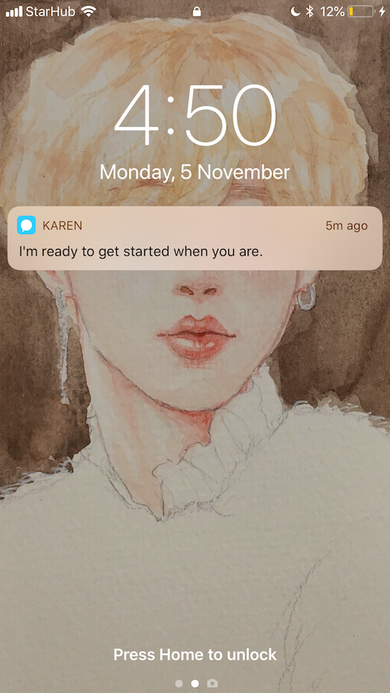
The main character that you interact with in the app is – you guessed it! – Karen, a life coach (played by actress Claire Cage). The experience is episodic, consisting of short interactions (usually 3-5 minutes in length) in which Karen asks a few questions, you provides answers, and the app then directs you to return a number of hours later.  It should be noted that Karen’s performance is not live, but rather is pre-recorded. The experience is a type of choose-your-own-adventure video with a twist – The app doesn’t just tailor your experience to you, but performs a psychological analysis on you as well (more on this later). To understand this via the lens of Norbert Weiner, the sense-organs Karen possesses would be the internal programming it contains on the next sequence of filmic sequences to be shown based on your responses, and is “conditioned by it/her relation to the external world”, here, the external world being you and you only, for Karen exists only on your phone, operated by you.

Much like deep contact, where adventures develop depending upon which part of the body is touched, and showing 57 segments into the deep parts of the disk, Karen is a choose-your-own-adventure type experience.

At first, Karen talks to you with convincing authority on how to set your life on the right track, and asks you some questions drawn from psychological profiling questionnaires. Over the next week (or about two weeks, in my case), you have ‘life-coaching’ sessions with her, although it soon becomes apparent that she may need some life-coaching herself, and that you, as a supposed client, are probably more stable than she is.

Karen out on the balcony, smoking. She asks me whether she should make a move on her roommate in this scene. Source: my own screenshot

As as she works from her home as a freelancer, you get glimpses into her personal life, and increasingly so. Karen starts calling you from her bedroom, as opposed to her work table, late at night, and asks you for advice on what to wear for her dates, whether she should make a move on her roommate. Karen overshares, and expects you to return that same enthusiasm, getting hurt if you don’t call her. As the experience unfolds, she gets more and more overly-friendly and overtly curious.

The dynamic that unfolds is vaguely reminiscent of “Her,” Spike Jonez’s 2013 film where the human lead falls in love with an operating system. With Karen, the situation is reversed – it’s not the user, but the app that starts exhibiting inappropriate behavior. “She develops a kind of friend crush,” Mr. Adams said. “And over the next 10 days or so, she feeds back to you things she’s learning about you — including some things you’re not quite sure how she knows or why.”

As your sessions with her come to a close, you are offered a data report based on your responses for about £2.99. Your report shows how you behaved and how the decisions you made affected Karen. You get to compare yourself with other players and to see how the science of psychological profiling underpins the story.

According to Blast Theory, Karen was borne out of a fascination with big data. Big data refers to personal data stored by companies, such as the cloud services we use everyday such as like Google Drive, Dropbox, and Microsoft Azure. With big data becoming a regular part of business processes, we tend to forget that these enterprises often have to deal with security issues such as loss of control over sensitive data. Blast Theory was particularly concerned with how governments and large companies such as Facebook are collecting data on us secretly and using it without our consent

Likewise, Karen also uses data about your behaviour – whether freely given or obtained by monitoring (even location monitoring)  – to give you a personalized, ever-adapting experience. Blast Theory makes these ideas explicit at the end of the experience, when each player is offered a personalized data report that details how the player behaved and how decisions affected Karen. Players can also compare their reports to other players’. Unlike data you may unknowingly give to data-driven companies such as Google or Facebook, the data created in Karen can be withdrawn anytime.

The app was intentionally designed to be as “anti-sci-fi” as possible, Adams says. “We wanted something that could have been created by Karen herself,” he says. “The intention is for it to be so friendly and everyday that no one has a clue as to the sinister processes going on in the background.”  In order to figure out how to make users comfortable interacting with Karen, Blast Theory consulted with psychological specialists, and even hired a researcher who uncovered the methods by which the British military evaluated and recruited potential undercover operatives.

So while Karen was created for us to realize how we overshare personal information, it works best if you let yourself do that (overshare) and pretend it’s real. It’s easy to do this, because Karen as a character is so earnest, so friendly, that I wanted to be her friend. So even while I knew Karen was an actress, I started to actually care and worry about her. How the app does this will be explored later in the section on interactivity. Every time I engaged with Karen, I was aware that the responses I had given to Karen were being logged, analyzed and used to tailor the experience going forward.

Karen asks if sex with a stranger is more exciting. Source: my own screenshot

At one point, Karen asks me sexual questions (“Sex with a stranger is more exciting, right?”) I was instantly uncomfortable, but in order to move forward, I had to answer. I could have lied, but doing so would render my truthful answers thus far useless (I felt like I was betraying my friendship with Karen, too). So I was left with questions of whether I should lie. Would you? Or would you answer these questions truthfully, knowing this data was being collected? I ended up being truthful, which shows to prove just how seductive technology can be when presented with a human face, which is what Blast Theory intended to do. The work presents an interesting conflict of knowing Karen wasn’t a real person, engaging with her as though she is (and subsequently developing an attachment), and the consequences of doing so.

“We’re interested in the intimacy of mobile phones,” Mr. Adams said in this New York Times article. “How they might be thought of as a cultural space. Karen was an opportunity to take this strategy further — how you might engage with a fictional character who is software-driven.”

“We’re starting to have experiences – a service like Netflix is a good example – when they understand to an incredible degree what you like. Netflix knows which films you watch, which ones you quit, which ones you look at as you browse through to choose, which trailers you watch. We’re not looking to say if that’s a good thing, we’re looking to pose critical questions about it.”

Indeed, devices and software personalizing themselves to us is increasingly familiar to us nowadays; almost every social media platform that we use has become tailored to us based on our interests (examples include YouTube’s video recommendations, and Facebook, Twitter and Instagram shifting from a chronological feed to an algorithm-based timeline that prioritizes ‘more relevant’ posts).  “We know we’re making a satanic bargain” when we rely on personalized devices, Mr. Adams says, “but it’s a rich, murky space, and we’re not entirely sure what we think.”


What is Karen exactly?

It is hard to define what genre Karen belongs to, as it can be both a theatre production, game, or film about the virtual relationships we create through over-sharing private information in virtual spaces. Nevertheless, I will attempt to define Karen through these genres.

How is Karen an film? A simple answer would be that the filmic sequences were pre-shot, and the piece does play out rather like an interactive movie.

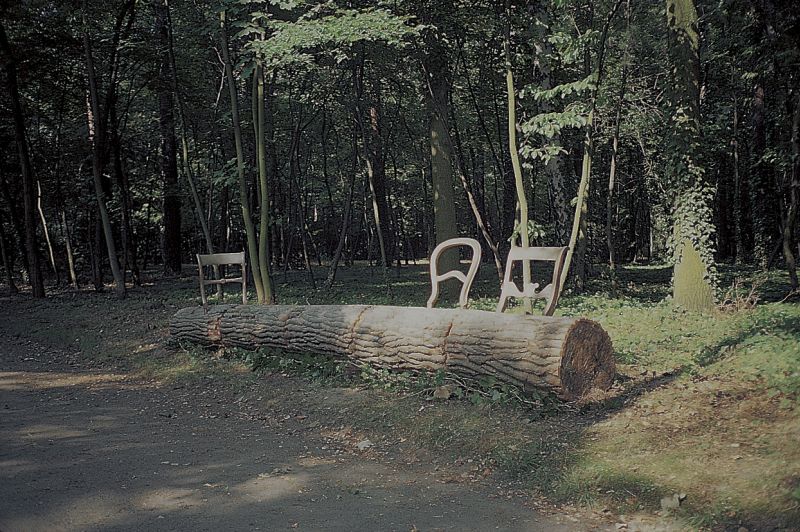
Variations V, John Cage (1965)

Like how Variations V demonstrates the idea of indeterminacy by creating unpredictable, indeterminate relationships between music, dance, and image, our relationship with Karen is unpredictable and indeterminate too, and this is exactly what drives our curiosity. So while Karen has no narrative plot in a traditional film (this is commonly observed in Blast Theory’s other interactive films, such as “My One Demand” and “My Neck of the Woods”), the piece is propelled forward by our own ever-changing relationship with Karen. To put it through the lens of Norbert Weiner in “Cybernetics in History”, predictability creates stability, whereas indeterminacy or unpredictability creates entropy, and we as the audience attempt to reduce entropy by coming back to the app.

While it is easy to see how Karen can be a mobile phone game, or film, why it can be a theatre production is more unclear.

The notion that Brook set out in The Empty Space—of the basic interaction in theatre being between performer and audience and space—is much more muddled and fragmented [in this historical moment] than Brook could have imagined when he wrote that book. We have tried to create artistic strategies to bring the vigor of live performance into electronic spaces. […] These things interpenetrate, they are confused, there are frayed edges around all these domains, and those frayed edges are very interesting spaces that we do not yet fully understand. So we’re always looking to try and explore those spaces. – Matt Adams  

Nevertheless, from the above quote about Karen, we can understand that Blast Theory did intend Karen to expand on the possibilities of the theatre genre – to be an ‘app-drama’, a new theatrical genre that exists in the liminal space between live performance and electronic pre-recording. Therefore, Karen will be discussed as a theatrical performance in the following section on interactivity.


On interactivity

This contemporary app-drama genre Karen exists in is ground-breaking in its interactivity for many reasons, each of which will be discussed in every separate paragraph below.

The spectator (or performer) is no longer passive, but is a protagonist who can help determine or shape the outcome of a work. This is a radical paradigm shift from earlier art forms, such as painting, sculpture, drawing, in which the viewer receives, but does not reciprocate.” – Roy Ascott

Roy Ascott’s thesis in “Behavioral Art and Cybernetic Vision” proposed that artworks should be responsive to the viewer rather than fixed and static. From the lens of Roy AscottKaren is a work that embodies behavioral tendency. Below is a video by Matt Adams that explains the internal workings of the app that make it a feedback loop.

It allows viewers to participate and respond to Karen (the character), and extends the viewer’s experience with interaction.  In turn, Karen responds to the viewer immediately, creating a dialogue. I would like to add on to Roy Ascott’s framework in this point. On the surface level, Karen might be the subject of the work, and I would then be the client who becomes an advice-dispensing friend. It might seem like Karen is limited in its interactivity; my answers to Karen’s questions determine the tone of the piece, but do not change the events that occur. The scene where Karen is angry at me for snooping through her drawers is an integral, unchangeable part of the storyline. However, what Karen truly does is show me how I respond to, react to, and behave in certain circumstances. I’m not just the audience for Karen’s escapades – Karen is my audience for my self-investigation. The app, as it gathers data about me, becomes the audience and spy. As my actions have become the subject of the work, Karen switches up traditional theatrical roles and relationships.

Karen also departs from the Deterministic Vision of Classical Art discussed in Roy Ascott’s “Behavioral Art and Cybernetic Vision”.  Karen is definitely not longer fitted into a canvas, but onto a mobile screen. As a part of everyday life, Blast Theory harnessed mobile technology and put it towards a different use. The Straits Times reported that people spend over 12 hours every day on their gadgets – accounting for the most time spent on a gadget in a day on average is the mobile phone, at 3h 12min.  Phones have become as much of a cultural space as a coffee shop, and because of this Karen successfully extends theatre using fairly simple technology that’s already in our pocket. Blast Theory builds on this constant societal mechanism: mobile phone usage has incredibly commonplace. Even when we go out to dinner, we observe the people around us checking their phones to various degrees. We use our phones for fitness tracking, entertainment, a quick Google search, as a planner – our devices are woven into our everyday lives. The space Karen plays with allows people to naturally slip into this world of theatre, unlike traditional theater where you would have to deviate from your everyday routine. The result of this is that interactivity in the piece is incredibly natural, convenient, and comes very, very easily to the user; Karen integrates into my life using the space ad terminology that I am used to, and that is a personalized experience in itself.

Roy Ascott also proposes that in Cybernetic Art shifts from exclusive elites to the public. The artist moves away from the canvas and take risks by adapting new forms of medium to express their art and ideas. This is directly related to another way in which Karen encourages interactivity, and that is by making the artwork accessible. It is free, and it can be interacted with in the comfort of your own room, making it more inclusive towards say, someone who couldn’t afford tickets for a production, or would not be comfortable in a relatively crowded space such as a theatre. The way technology is expanded in this piece introduces us to a new way to interact with performance.

Karen is durational – it took me two weeks to complete, but it can range from anywhere between a week to even months. My sessions with Karen are also intermittent (once or twice a day). These interactions are timed so that they intermix with my daily activities – I often ended up watching episodes on the route to and from classes in school. Karen is flexible in this sense – while I had to wait for the next episode to be released, I could do the session anytime after it was released. Like any other regular person, I would let a few of them slide, and Karen would then start sending me reminders. Therefore, on top of offering a new location on which theatre can occur (your phone), Karen also offers a new time-frame, in the sense ‘the play’ can take just a week to complete, but is also available everywhere, at all times, for an indefinite period of time (ostensibly for all eternity) on the App Store/Google Play store.

The intermittent nature of Karen also meant that I could interact with it whenever it was convenient for me, even though the app did keep sending me reminders if a new episode was up (below).

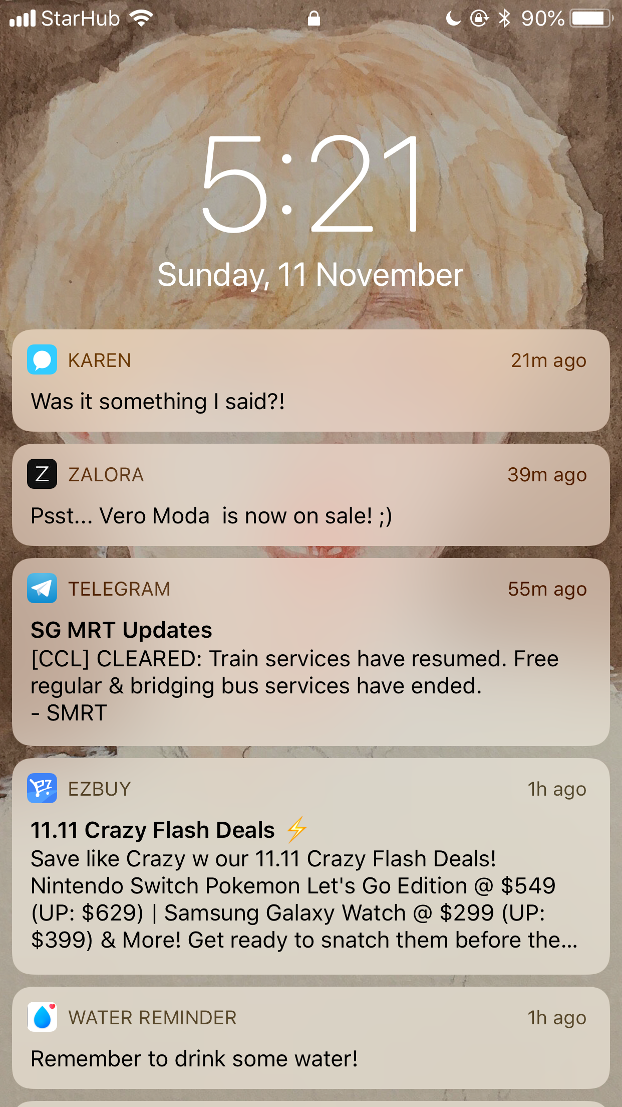
I have to admit that this was annoying sometimes. However, I was kept coming back for more, even though I was not obligated to (it would have been very simple for me to delete the app with the touch of a finger, much simpler than say, going to a physical space and then having to leave it). My curiosity, then, kept me engaged with the piece: both curiosity about Karen, and curiosity about my own responses, like Buzzfeed quizzes that tell you about your personality (those “Which dessert are you?” “What kind of friend are you?” quizzes are addicting in you finding out more about yourself when you answer the questions, even before the quiz actually gives you a result). Our awareness of the reasons we interact with Karen adds another layer to the work —an internal commentary on our personalities, parallel to the overt analysis provided by Karen in the report.

Karen also departs from earlier interactive works in that it reverses the location of private and public: a private experience that goes public (via the data mined) rather than a public or communal experience that feels private and internal (an example of the latter would be Magnet TV by Nam June Paik, a publicly displayed work that feels personal to the viewer that interacts with it.) Indeed, Matt Adams notes that “A lot of the works we make in Blast Theory sit on the boundary between the very private and the very public”.

“There are a number of reasons for that; we find that a very interesting place to be creatively. But it’s also driven by the internet as a driving force in our lives, and as a platform for the work that we make, very often. Most of our online presence exists on that boundary. When you make a post on Facebook, you kind of know who’s reading it and who it’s for, but you are also aware that there is almost certainly an audience that you have no idea is there, or you never intended them to read it. We all make our status updates alone, even though they’re an entirely social and collaborative thing. You sit and look at that sentence, and decide, before you hit return, “that’s it, that’s right” and then you broadcast. [….] So there is this curious merged social space of private and public. And alongside that, you have the Edward Snowden revelations, in which even the most private of all private isn’t private. So you have all that sense in which the public and the private is horribly conflated and confused.” – Matt Adams

We explore through Karen the ways we personally negotiate the public and the private. The questions about trust that exist in any relationship are amplified in Karen because we have to decide whether we trust Blast Theory, its makers, Karen the character and whether we trust the app itself. Originally, Karen was supposed to ‘culminate in a live party at an Indian restaurant in Cardiff, Wales, but it had to be cancelled for legal reasons.

“What we hoped to do was create a performance in which we knew a tremendous amount about everyone there. The idea was that we had a cast of five, and when you arrived at the train station, the MC was there to greet you, and to stick a little sticker on your chest that said “Hi, I’m Erin.” In fact, that sticker would be carefully configured to reveal 8–10 different pieces of information about you, in terms of the font that was chosen, the color of the lettering, the shape of the sticker, and so on. So then we were in a position where anyone could come up to you at any point and interact with you knowing how you had interacted with Karen in the app. […] The structure of the whole evening was based on the question: Can you make a piece of theatre in which you know a lot of data about each audience member?” –  Matt Adams

Karen would have then become even more personalized, further blurring the boundaries between reality and fiction, and the private and the public. It could have meant that Karen could’ve become less of an experience in itself, to become more of a means of gathering data for the ‘actual’ performance, which I feel illustrates Blast Theory’s concerns with big data once again.  

“For any machine subject to a varied external environment to act effectively it is necessary that feedback be integrated into its system as part of the information on which it must continue to act.” – Norbert Weiner

In Karen, the personal data that participants disclose through their interaction with the work is logged and processed, resulting in a profiling report that is sold back to participants who wish to own it. The event self-generates numerous traces in the form of private data disclosed by the participants or intercepted by the app, and the processing of this data for the report, is an integral aspect of the piece. Though participants can opt for their data to be destroyed at the end of their interaction with the work, the traces of their interactions with the system are still analysed by the artists on a meta-level, through a set of quantitative reports. Once you have encountered Karen through the digital, your trace remains present in the work. Karen remembers you, even when you’re gone. And because of this, I believe Karen is an efficient Cybernetic artwork by Norbert Weiner’s criteria.

This mode of interactivity is not without its naysayers. In the first chapter of Fair Play, Jen Harvie presents captivating opinions on labour in participatory art. She proposes that that viewers of participatory art may be thought of as performing labour. Rather than occupying the role of art consumer, she notes that the performance of labour shifts viewers to the role of art prosumer. By offering their participation in the work viewers take on the role of producer as well. Viewers, or audiences, thus become hybrid producer-consumers: prosumers.

Prosumerism presents three main dangers for Harvie:

  1. It may erode the work of precarious labourers – Prosumers voluntarily take labour upon themselves for greater personal convenience, disposing with the need for paid labour.
  2. It may transform leisure time into work time – While it may offer greater convenience, prosumerism encourages work to encroach upon non-work time (e.g., a customer may do his or her banking online any time, or receive work e-mails while spending time with friends and family)
  3. It may offer an illusion of individualized experience rather than the real thing – Harvie provides the example of designing one’s own shoes via an online application. While there are choices to make, there are clear limits in available options, and others may recreate the exact same design.

Thinking about the audience as prosumer is a clear challenge to utopian claims of democratic interactivity in performance. The dangers identified above appear to varying degrees in Karen.

Karen’s state as a pre-recorded performance does eliminate the performers’ work that would have been present in each separate performance had it been performed live. However, I feel that this is most efficient; live performance would prove virtually impossible with the mass-dissemination of Karen through app stores.. I’m not sure the project could be realized without a huge amount of mass labour and resources – for example, many different actors to play Karen. Therefore, the first danger of erosion of labour may not be of particular concern here.

However, Harvie’s second concern about work time encroaching upon leisure time is a valid concern. Whilst I was in class once, she texted me four times in a row. I was distracted from the lesson at hand, and came to the realization that my my participation in the work was not limited to the times I spent watching Karen’s videos, but was ongoing – a blend of the fictional world and of my real life. As such, Karen also illustrates how the viewer’s time can be ‘eroded’ when participating in a performance as a prosumer.

As for the third concern, I must admit I’m unsure to what extent Karen offers an individualized experience. A surface reading surfaces that because my participation in Karen changes how the work is performed for me, the work must be tailored for me. However, if I were to engage with Harvie’s take, it isn’t clear to me exactly how Karen could differ if I chose a different option when asked a question (typically there are 3 or 4 different options).

Karen asks me which top. she should wear. I dislike both.

Moreover, sometimes I don’t want to pick any of the three options (for example, when Karen asked for my help in picking a top for her date outfit, truthfully, I liked neither of the two options presented to me). As the options limit how I can respond to Karen in order to tailor my experience, it could also be said Karen is not highly specific to me as an individual.


Conclusion

In conclusion, this essay has discussed Blast Theory, Karen and the genres it could be classified into, discussed interactivity with Karen being a theatrical performance, and even discussed some potential shortcomings. It has outlined the innovative ways Karen approaches interactivity and has highlighted how Karen relates to the ideas of Norbert Weiner and Roy Ascott. Hope you had a good read! 


Sources

  1. Barques Design. (2018). Meet Karen, your new life coach | Barques Design. [online] Available at: https://www.barques.co.uk/meet-karen-your-new-life-coach/
  2. BBC. (2018). BBC Arts – App close and personal: Meet Karen, she wants your data – BBC Arts. [online] Available at: http://www.bbc.co.uk/programmes/articles/22HfmykfTdVfn2KZvFh7SBh/app-close-and-personal-meet-karen-she-wants-your-data
  3. Bennett, S. (2014). Fair Play: Art, Performance and Neoliberalism by Jen Harvie. Theatre Journal, 66(3).
  4. Broadhurst, S. and Price, S. (2017). Digital Bodies. London: Palgrave Macmillan UK.
  5. Doucette, L. (2018). App Review: Karen, an All-Too-Personal Life Coach. [online] TheUnlockr. Available at: https://theunlockr.com/2015/07/30/app-review-karen-an-all-too-personal-life-coach/
  6. e-flux, h. (2018). Karen: A life coach, a friend, a data mine, an app. [online] e-flux conversations. Available at: https://conversations.e-flux.com/t/karen-a-life-coach-a-friend-a-data-mine-an-app/1923
  7. Fast Company. (2018). Can This Dysfunctional Life Coach Make You Care About Privacy Rights?. [online] Available at: https://www.fastcompany.com/3044818/can-this-dysfunctional-life-coach-make-you-care-about-privacy-rights
  8. Mee, E. (2016). The Audience Is the Message: Blast Theory’s App-Drama Karen. TDR/The Drama Review, 60(3), pp.165-171.
  9. NYU Local. (2018). Karen, The App That Wants To Get To Know You – NYU Local. [online] Available at: https://nyulocal.com/karen-the-app-that-wants-to-get-to-know-you-800180617af9 .
  10. Nytimes.com. (2018). Karen, an App That Knows You All Too Well. [online] Available at: https://www.nytimes.com/2015/04/05/arts/karen-an-app-that-knows-you-all-too-well.html
  11. Rhizome. (2018). Managing Boundaries with your Intelligent Personal Agent. [online] Available at: http://rhizome.org/editorial/2015/apr/07/boundary-management/
  12. Shaul, B. and Shaul, B. (2018). Blast Theory’s Karen: Does This Life Coach App Get Too Personal?. [online] Adweek.com. Available at: https://www.adweek.com/digital/karen-by-blast-theory-a-life-coaching-app-thats-so-much-more/ [Accessed 18 Nov. 2018].
  13. The Guardian. (2018). How we made experiential life-coaching app, Karen. [online] Available at: https://www.theguardian.com/culture-professionals-network/2015/aug/14/how-we-made-life-coaching-app-karen-blast-theory

Manifesto: No One Gets Left Behind

Throughout history, artists, through their manifestos, have reflected upon and called for the upheaval of existing social conditions. For example, the Dadaists repudiated existing bourgeois culture and notions of art and reason, whilst the Futurists were fascinated with the potential of new technology, wanting to move on to a new future. Contemporary design echoes this sentiment, with immersive, inter-disciplinary, experimental works that explore the possibilities of new technologies. Brand design wise, things have moved toward the conceptual as well, with designers striving for memorable design. Visually, design as a whole is highly varied, with some favoring simplicity, and some cycling back to fashions of the past.

As our understanding and usage of various mediums (and possible mediums) grow, I believe it’s time for us to come back to the present. The problem I have with the Futurists, and much of today’s design, is that the state of art-making has become about the future, about the ‘next big thing’.

Us millennials are called the me-me-me generation: entitled and overly concerned with our own dreams. Let us prove them wrong. With all our plans for the future, let us acknowledge the ones left behind in the present. If art is indeed about the culture of the time, then we should recognize that as much as technology propels us ahead, it distracts us from current problems of today. That is the true cultural context of today, and ignorance is what we must combat.

I call for the young artists of today – specifically the first-world millennials all over the world who might enjoy socioeconomic privilege, race privilege, gender privilege, heterosexual privilege, access to higher education, being able-bodied, and other privileges to make not just eco-friendly art, but people-friendly art. I visualize a world where morally conscious art is the norm – art that raises awareness of issues that the general middle-class population pays no heed to; issues like poverty, wars in far-off countries and corruption. Rebel against all the injustices of the world; may these be fuel for your art. There is no particular design style for this, for no design style is superior than another in serving this purpose (to demand a particular visual style so would be foolish as well, especially with the diversity we observe and enjoy today).

Of course, I cannot dictate that you make art exclusively about social causes. In the likely scenario that you would not want to, I ask you to carefully examine the people and brands you might work with and/or for. Champion ethical companies and people, and be aware of the impact you have on others by validating the practices of whoever you support.


Process

My manifesto hinges on my background as a debater. With all the reading of current affairs that comes along with preparing for debate tournaments, and actually debating about issues we face today, I’ve come to feel very strongly about raising awareness for the people we have left behind in our race towards the future.

The making of my physical manifesto started with combing through the past 2 weeks worth of The Straits Times newspapers to find articles on problematic current issues and striking headlines I could collage together. I decided on the medium of collage as I felt that it showcased the number and diversity of issues in the world today.

After cutting out the articles and titles I felt were relevant, I tried to collage them together in different layouts. Coincidentally, a newspaper article headline I found was the perfect title for my manifesto.

I realised having the pieces line up diagonally became too messy – especially because there was so much content, I still wanted to maintain some semblance of orderliness for legibility. One stylistic choice I made that I particularly like was using the newspaper header showing the date as the time period in which I wrote this manifesto; I feel like some years in the future I can look back at this and revisit the state of mind I was in here and now, in Year 2 Semester 1.


I was heaving trouble fitting in the headline “Hard to find time to fix weakness in system” without covering more important issues (I figured that headline was not really talking about issues, but more the difficulties tackling the issue), so I decided it was not as relevant and removed it.

I did this collaging concurrently with my layout on inDesign. I tried different typewriter and serif fonts, ultimately deciding on Times as I felt adding a new typewriter font would be too messy.

I also tried printing the text with a red background and on tracing paper. It didn’t look great.

I also realised laying out my manifesto on a grid on inDesign was pretty useless as I had to fit the text around my collaged paper pieces. The pictures below show some reprinting I did so the section wouldn’t cover my “Moving Ahead as ‘One Big Family'” section.

I also tried printing on tracing paper to have the words from the article peep through, but it interfered with legibility.

Finally, I highlighted the parts from the newspaper articles that particularly stood out to me. I used different colours to signal the different articles.

My Final Manifesto


Key Work Selection: Karen by Blast Theory

Blast Theory’s piece Karen (2015) is seemingly a life-coaching app: Karen, a middle-aged woman starts the experience as the user’s personal life coach. But the user’s frequent one-to-one sessions (the total span of which can range from 7 days to a few months, depending on how often you use the app) take an unexpected turn, as Karen appears to be psychologically volatile, confused, and increasingly invasive. A hybrid between game and drama, the piece raises questions about privacy and control at a time when technologies increasingly permeate every aspect of our lives. Karen prompts the user to question how they use media, what information they leak through this usage, and what is at stake in doing so.

Artist Choice(s): Blast Theory (or George Legrady)

Blast Theory is a pioneering artist group creating interactive art to explore social and political questions, placing audience members at the centre of their work.

“Since the mid 1990s, the group followed the trajectory of the development of the media, with their acute and in-depth psychological analyses. I would call them the most contemporary media-poet of this age.” – Soh Yeong Roh, head of the Selection Committee for the 2016 Nam June Paik Art Center Award

Since 1991, they have been using interactive media to create groundbreaking new forms of performance and interactive art that mixes audiences across the internet, live performance and digital broadcasting. Led by artists Matt Adams, Ju Row Farr and Nick Tandavanitj, they create interactive art that puts the audience at the centre of the work. Drawing on popular culture, technology and games, the work often blurs the boundaries between the real and the fictional.

In virtual and physical spaces from pubs, canals and abandoned warehouses to libraries, museums and apps – Blast Theory goes to unexpected places to make their work accessible to everyone.

Works that I really like by them include My One Demand, Can You See Me Now?, Karen, and Day Of The Figurines.


George Legrady: Database Art

Multimedia artist George Legrady creates installations, photography, and data visualizations that manipulate technologies in order to examine our relationship with images and technology.

Refraction (2010–11) consists of eight composite photographs, printed using an antiquated method known as the lenticular process; three images are superimposed and become visible according to the spectator’s angle of view. In Slice (2011), a software-generated animation that blurs the line between representation and abstraction, an image is sliced into smaller and smaller fragments until it manifests an illegible abstraction. Legrady’s earlier works include his Algorithmic Visualizations, abstract, algorithmically generated images. “One of my goals in working with computers and computer programming was to introduce works that would somehow test the boundary between the believable and the simulated,” he has said.

My favourite of his works are his database themed projects. In the succinct words of Legrady: “We are data”.  On the technological level, Legrady’s project investigates the rule-based algorithmic processes and parsing techniques of data-processing technology for the aesthetic display of selected data on the screen. For this goal, the artist uses a wide range of artistic techniques known in information visualization, such as color-coding, spatial plotting, animation, visual metaphors and the organization of data through a balanced composition.

Droog Essay [History of Design]

Droog is an art collective consisting of a loose group of designers that initially came together in April 1993, when Renny Ramakers and Gijs Bakker presented a collection of products at the Milan Furniture Fair. Named after the Dutch word for “dry”, signifying the dry wit of the collection, Droog has continued to grow into a company with several outlets in Amsterdam. Notable figures include Renny Ramakers, Gijs Bakker, Marcel Wanders, Tejo Remy and Jurgen Bey.

Droog responds to the Dutch condition in which most of the country is artificial land gleaned from rivers and seas (even one third lies below sea level). Because land is so precious, the Dutch value both preservation of existing conditions as well as experimentation that will allow more profitable uses of that reality. Droog reflects and maps this process, producing art that displays its own process and disappears into the recombination of what already exists.

Droog draws its attitude and methodology from Postmodernism. Postmodernism questioned the modern narrative that all progress – especially technological – is positive, especially since it encouraged a culture of consumption. As a critical reaction to the consumerist mindset and wasteful overconsumption, Droog, similarly, is concerned with sustainability. Furthermore, Postmodernist products unite in their ironical and playful treatment of a subject, similar to Droog.

The influence of Minimalism can also be seen on Droog. Minimalism and Droog share similarities in the attention given to the materiality of the works. This materiality manifests in the visceral experience created for the user through the utilization of sensory aspects such as touch and smell.

“You Can’t Lay Down Your Memory” Chest of Drawers, Tejo Remy, 1991

This viscerality can be observed in Tejo Remy’s Chest of Drawers, comprised of an assortment of found drawers from discarded old furniture, each encased in new timber cases and tied together with a strap. The sustainable approach of Droog can be clearly observed in Remy’s reusing of discarded drawers. However, Remy’s approach to recycling does not merely stop at the re-use of materials – the work also recycles conceptual values, re-using the ideas, memories and archetypes of the drawers to give the work a sense of longevity. Indeed, Remy called the object “You can’t lay down your memories” and spoke of the individual character and memories encapsulated in individual drawers. As we open the drawers, the scent of the old drawers, along with their unique scratches and other marks, are visceral phenomena that awaken our memories. Why this approach of tapping onto our memories? Droog realized that longevity is achieved through emotional or symbolic appeal. Imbuing objects with expressive values so that we want to keep them for longer then becomes a mechanism for short-circuiting rapid obsolescence, which ties in with Droog’s sustainable ideals.

As such, the core belief of Droog is that design was not a question of making more objects, using more materials, or even inventing new ideas or solutions to the problems we encounter in our daily lives, but one of finding more ways to experience, explore and expand the possibilities of existing objects, images, spaces and ideas.

“Treetrunk Bench”, Jurgen Bey, 1998

This idea is brought home with Treetrunk Bench. Seasonal winds and unexpected storms give way to thousands of fallen trees across the country each year. Rather than sending those trunks down the wood chipper, Bey fixed bronze chair backs into the trunk to create seating. The original work was part of the “Couleur Locale” installation. Aimed at revitalizing the area around the former estate of a Dutch princess, the presentation consisted of other works such as orange lollipops moulded around orange seeds so that you could plant them to grow new trees, a machine that would spit out a bench-shaped compression of old leaves raked off the ground. Through the mechanism of gathering and re-shaping, they created the ability to enjoy the park’s rebirth in the spring.

The primary source used for this essay is “Simply Droog: 10 + 3 years of creating innovation and discussion”, published by Droog itself. Ten themes were identified: Use-it-again, Familiar-not so familiar, Open design, Inevitable ornament, Simplicity, Irony, Tactility, Endless Contamination (Hybridization), Experience and Form follows process. Use-it-again has been discussed, so we shall move on to the other themes, categorized under separate sub-headings for easier readability.

Familiar-not so familiar
Many of the objects in the Droog design collection play an interesting game with memory. Droog realizes that the role played by everyday use-objects is quite limited – they are mainly meant to be instrumental and reliable.  Trivial use-objects can awaken memories, but these functional objects can also tell a story of their own. Droog awakens the narrative power of these objects.

“Knitted Maria coffeepot”, Gjis Bakker, 1997

For example, the knitting around the archetypal coffee pot tells a story that the pot itself does not tell because we have seen it so often. We see a world of domestic comfort appearing before our mind’s eye, we see generations sitting at the table. Maybe we even see a coffee pot fallen to pieces and held together by neat knitting. The imagination is challenged.

Open Design
The distinction between closed and open specificity is the degree to which the perception of products are predetermined. In open specificity, the experience that the concept may trigger is not hinted at, even though it is present. The impact of the object does not become clear until it reaches the receiving end. Droog Design prefers the open end, leaving room for the user to customize their own experience. The common denominator across their remarkable projects is Droog’s ability to combine mass production and individual identity.

Do Break”, Frank Tjepkema, Peter van de Jagt, 2000

For “Do Break”, the porcelain vase is covered inside with a layer of silicone rubber. After you have bought it, you can smash it. The silicone holds the shards in place, and the owner then has a unique vase.

Inevitable ornament
Since the 1920s it was believed that the Bauhaus formula of ‘form follows function’ required a sober, minimalist language of forms. Nor was this austerity completely abandoned when at the end of the 20th century, the slogan for many designers became “form follows concept”. Dutch designers working in a conceptual allowed themselves more liberties such as humor that extended beyond the function, but their visual language was still kept simple as it had to be justified, not by form but concept.

“85 lamps”, Rody Grauman, 1993

Droog design stresses that conceptual design and ornament are very compatible, as long as the underlying idea gives rise to it. In 85 lamps, the function even merges with ornament. The bundle of ordinary light bulbs and the knot of chandelier connections on top are at the same time technical necessities as well as decorative accents. Also, although it may seem to us that the chandelier is not ecologically friendly – 85 light bulbs would consume a large amount of energy and produce lots of heat – it made sense in the European context as the chandelier was also used as a heater in cold weather.

Simplicity
Droog sought simplicity in using materials in a direct and unidealized way. This can again be seen in 85 lamps, for the chandelier does not magically transform into something more grandiose. The lamps hide nothing, asserting their normalcy without apology.

Tactility
As humans, we always want to reach out and touch things.  With Droog, products are no longer just objects that look good but can now be described as ‘soft’ or ‘cold’ ,which creates personality for the objects.

“Bathroom Mat”, Hella Jongerius, 1993. A mat made to look and feel like bubbles so that its soft when the user steps on it, yet creates texture so that slipping is prevented.

Hybridization
Droog is also concerned with the combination of functions, forms or concepts. This saves space, but more importantly, reduces the need for another product, which reduces waste.

Function tiles, Arnout Visser, Erik Jan Kwakkel, Peter van der Jagt, 1997

For example, these tiles function both as bathroom tiles as well as hangers for towels or other clothes/products.

Experience
Droog engages with the user’s experience, with its products facilitating interaction that makes a product more memorable and creates an emotional connection, again, as a measure against rapid obsolescence.

Bench ‘Come a little bit closer’, Nina Farkache, 2001

Here, interaction is encouraged between users as they can sit on rolling plates (on marbles) and slide along the bench to talk to one another.

Form follows process
Droog believes the process of making an object to be just as, if not more, important than the final product. The designer has lesser control, which creates outcomes that are unexpectedly, accidentally beautiful. This can be related to William Morris’ ideology that the designer should enjoy and revel in the beauty of his work.

Droog’s innovative products set new standards within the industry and helped shape contemporary design practices. Today, Droog remains dedicated to forward-thinking design and has branched into socially conscious urban research.


Bibliography
Droog Design(2006) Simply Droog: 10 + 3 Years of Creating Innovation and Discussion, 2nd edn. The Netherlands: Uitgeverij 010 Publishers.

Droog.com (2018) (online) Available at : https://www.droog.com (Accessed: 20 Oct 2018)

Studio International (2017) Simply Artful, Simply Functional, Simply Droog (Online) Available at: https://www.studiointernational.com/index.php/simply-artful–simply-functional–simply-droog (Accessed: 20 Oct 2018)

The New York Times (2018) Is It Design? Art? Or Just a Dutch Joke? (Online) Available at: https://www.nytimes.com/2006/12/30/arts/design/30droo.html (Accessed: 20 Oct 2018)

Urbis magazine(2018) In focus:Marcel Wanders(Online) Available at: https://urbismagazine.com/articles/in-focus-marcel-wanders (Accessed: 20 Oct 2018)

Tjep.com. (2018). Do break. [online] Available at: http://www.tjep.com/projects/works/15-icons/do-break (Accessed 14 Oct. 2018)

Studiomakkinkbey.nl. (2018). Products – Studio Makkink & Bey. (Online) Available at: http://www.studiomakkinkbey.nl/list/products/4014_tree_trunk_bench (Accessed 20 Oct. 2018)

The Industrial Revolution [Reading Response]

“While guns rumbled in the distance, we sang, painted, made collages and wrote poems with all our might” – Hans Arp

When I first learnt about Dada when I was thirteen and just starting my study of visual art, I didn’t really know what was going on, and found the works perplexing in their blatant disregard for what I’d always thought Art should be – beautiful. I suppose that that’s what people in that time thought too. Seven years on, Dada has become my favorite movement. As Dada is particularly hard to define (its members themselves wanted to “evade the definition of a unified art movement”), and so with it, common visual characteristics are hard to pinpoint, my love for Dada comes from its ideology, not aesthetic qualities. I find it really inspiring that the artists devoted themselves to Dadaist art with such passion without losing hope after the atrocities of war, even with imminent threats.

One of the Dada artists that stir me is Hannah Hoch. She was already rare as a widely-known female artist in that time, and was aware of this and consciously “promoted the idea of women working creatively more generally in society”. She featured issues of gender and politics prominently in her work, one of which I will discuss below.

Heads of State (1918-20)

Here, Hoch uses photomontage to juxtapose newspaper photographs of primary German politicians (President Friedrich Ebert and Minister of Defense, Gustav Noske) against a floral background. Photomontage as a technique holds great meaning in this piece. “Intensely ideological”, it gave her power to cut, deform and place anywhere she wanted, these two powerful politicians who had ruthlessly put down the Spartacist Rebellion. They are juxtaposed into a kiddish, whimsical dreamscape where they stand unawares of the common German people’s hardships in their swimsuits.

Upon closer introspection, the floral background alludes to embroidery, which was the main source of income and primary occupation for the German women of that time. Brought together with substantial masculine figures (whom we are reminded aren’t altogether powerful in their more vulnerable, pot-bellied half-nakedness), the backdrop contrasts the position of women in society and questions the difference in value put upon traditionally feminine and masculine endeavours.

Sources:
https://theculturetrip.com/europe/switzerland/articles/deconstructing-dada-why-anti-art-will-always-matter/
https://www.theguardian.com/artanddesign/2014/jan/13/hannah-hoch-whitechapel-review


The Modernist Era [Reading Response]

The first essay starts off with the idea that Modernism doesn’t propagate a single “truth”, but rather a set of conventions that the audience can engage with. I agree with his idea that taking action is easier with a set of conventions to agree or disagree with, akin to a debating, which I do as a co-curricular activity – motions such as “This house would only display feminist art in galleries” could be taken to be the convention, and debaters could then take action for or against the motion. In this sense, modernist artists, to me, are like cogs that set gears into motion.

Milton Glaser then writes about how he does not believe that one principle, such as “simplicity or reductiveness”, can be universally applied to every problem – that people are too complicated. I somewhat agree with this view – I think there are fashions of every time period – maybe in the 21st century, it could be minimalism and elegance, and designers could make more profit if they subscribed to these norms. But then again, breaking these norms can also work to artists’ benefit, for uniqueness can gain you notoriety and fame (like Damien Hirst and his preserved animal sculptures). I think everyday artists today subscribe to some base ideals that could gain them profit, but also try to inject their own personal flair so that they can capitalise on their “signature look”.

Glaser is also evidently against the Modernist idea of not representing forms from real life, citing reasons such as that he feels that they take away from the eroticism and passion of life. He then goes on to tie this apparent lack of passion to why corporations favour Modernist ideas in mass production, noting that its ubiquity signals that Modernist ideas will not die anytime soon. In my opinion, it makes sense that brands such as Apple subscribe to such ideals in order to appeal to the largest consumer base, unhindered by personal touches that could potentially alienate some markets – after all, every human is vastly different in their wealth of experiences.


The second essay takes on a more positive view of Modernism, noting the backlash against it in the Postmodern movement, then the author’s own tendencies towards Modernist paintings in his youth and later, and the changing face of Modern design. I was especially struck by his example of Grapus, a collective that “goes to great lengths to make their work appear immediate”. Researching more about them, even though it looks rushed, takes great effort to portray a “Hot-off-the-press” vibe, which is another Modern thought. In his analysis, I came to understand Modernism more as a set of changing philosophies rather than a set of rules that dictate how minimalist things should be, which seems to be the main criticism hurled at the movement.


In the last essay, Rudolph deHarak suggests another essence of Modernism – to create and evolve forms that communicate content richly. He notes that the Swiss Style and Bauhaus, which was critiqued rather harshly in the first essay, were “essential developments and strong reflections of their time”

He also talks about how his understanding of Modernism has changed throughout the years, most noticeably, how he is more interested in the idea of problem-solving now. He champions Modernism for suggesting a movement ahead of its time, for organic change, and for creativity and problem-solving. I feel that this is a much more balanced view than the first essay, for I do agree with him that design is very much problem-solving oriented now (in the graphic design industries – for example branding, for it is definitely difficult to form a cohesive, lasting brand for a company), and that concept has come about through the gradual, organic evolving of Modernism itself.

The Age of Information [Reading Response]

Reputations: Massimo Vignelli

Massimo Vignelli considers himself an “information architect”, one whose designs are positioned in the centre between progressiveness and conservatism. 

“What we do is really structural in presenting information in a way that’s more understandable than any other form. Graphic designers today are changing because of the computer. They all work with a digital technology so they are really switching more and more towards information architecture. If you still want to call it graphic design, that is fine with me.”

I agree that graphic design today has really changed because of the computer and technology. Because graphic design software is so readily available, good graphic designers today seem to be the one who can fulfil the briefs with clarity and beauty. It’s something I aim to do in the future and that I feel can only be cultivated with experience. As I become more accustomed to softwares, I can only imagine my process will get faster; with the fulfilling of more briefs, I hope to achieve the clarity of thought and identity Vignelli so obviously possesses.


The Rise of Corporate Identity

The second article discusses the rising importance of corporate identity. Good design lasts, as shown by how recognisable the brands are in the article.

Undeniably, corporate identity can make or break a brand – having worked in a startup previously, I realised that new companies are often concerned with having an eye-catching logo and slogan. Indeed, in today’s climate where almost every company has that sleek, modern, unified brand identity, it becomes very easy to identify older brands that have not gone through revamps. Even NTU had its own logo revamped, with a more modern sans serif font replacing the older serif font. I think websites such as https://www.designcrowd.com.sg reinforce this idea, with the sheer number of open jobs, and the sheer number of responses that come in for each job.

In this sense, I feel rather stressed about about my future as a graphic designer, because I’d really have to come up with great ideas for brands to adopt them as their identity with the seemingly saturated market today. Nevertheless, I am hopeful!

Bauhaus Creative Response

For our final creative response, we were tasked with creating a piece inspired by the Bauhaus, exploring the relationship between shapes and colours. Wassily Kadinsky believed that circles should be blue, squares should be red and that triangles should be yellow. From the survey in class, many of my classmates agreed with this; I did not at first instinctively (I thought triangles would be red), but after the discussion and explanation of Kadinsky’s thoughts, I agreed with his logic.

Thought Process

In between the week from when we were given the task and the week it was due, I was in Vietnam for the Asian British Parliamentary Debating Championships. Being in another country enabled me to get a new perspective on Singaporean culture. 

One feature that struck me was how little people used their phones in Vietnam. In fact, I barely looked at my phone for the whole of the trip, only using my laptop during the small pockets of time I got at night to do my assignments. More than that, I felt like I didn’t miss using this technology – in Singapore, I would take frequent phone breaks – on the walk between classes, to classes, from classes back to my room in student housing. I felt that it was a Singaporean thing to use our gadgets so much on our commutes and look like you’re texting someone, or watching something, or listening to something, because I had the comparative of hardly ever seeing people using their phones on commutes/out in public in Vietnam.

It might be because of Singapore’s nature as a first world country and the constant need to be be contactable and be on top of work assignments and group assignments, but I really felt that the Vietnamese did not function that way in developing Vietnam. I saw way more non-smartphones (phones with actual buttons to press for numbers, not touchscreens) in Vietnam than I thought I would, and realised how rarely we see that in Singapore – it’s the norm to have a smartphone, and to use it all day long. In this way, I feel that Singaporeans are really tied to their electronic devices.

I made a mindmap to have some elements to focus on (above). I eventually decided to focus on circuitry and circuit boards as they were immediately representative of electronics and technology.

Final work


This piece explores the concept of Singaporeans being very tied to their technology. I used this circuit board as inspiration, making “lines” out of smaller squares. I felt that they give the piece a tribal feel, which I enjoy for its oxymoronic quality as technology is such a new invention. I feel that the work is kept contemporary with its minimalistic outlook, though – much of the green background (to mimic the circuit board background) can be seen, and the geometric elements do not overpower it. 


Cover image from https://visual.ly/blog/six-lessons-from-the-bauhaus-masters-of-the-persuasive-graphic/ 


Lobang Galore

Prompt B: Create an A3 poster comprised of typography and image using a collage technique; consider using an element of chance. Consider how this could be related to Singaporean culture.


“Lobang”: a Singlish term originating from Malay, meaning a good deal/discount/opportunity/promotion. Singaporeans love many things: the most important (arguably) of which are 1) lobangs, 2) queuing, and 3) queuing for lobangs.

We have a treasure trove of lobangs in all the Facebook groups, threads, and telegram chats that I’m not ashamed to say I’ve joined. Lobangs, galore!

We even have an NTU Free Food lobang group! In this house, we love free food lobangs the most.

Having witnessed and partaken in this lobang culture all my life here in Singapore, it was natural for me to center my piece around this theme.

 Process 

I started by gathering lobangs (in coupon form) from the newspapers, magazines, and brochures I found around the house over the course of a few days.

I then proceeded to cut individual bits up: sometimes tearing by hand, but mostly using a pair of scissors. Apart from the obviously lobang coupons, I also cut up some phrases like “sale”, “discount”, “20% off” as they alluded to lobangs as well.

The mess left behind!

I then gathered my pieces into a giant bowl, to pick randomly out of later.

Next, I had to arrange them onto the A3 paper. To do this, I threw a string onto the paper and traced where the string had landed, to arrange the pieces along the traced line.

Traced line:

Then, I mixed up the bowl and picked pieces from it with my eyes closed, to arrange along the traced line.

The result after “tracing over” the line with my randomly picked pieces!:

It looked too bare to me, so I dumped out all the pieces on the floor and filled in the background with lobang pieces I thought would fit, trying to fit them in to the best of my ability.

These were some of my favourite lobang coupons, but I didn’t manage to fit them in due to the lack of space, sadly. They’re still so pretty, though!

 The finished product! 

 Rationale: 

The lobang culture is strong in this one. In Singapore, we love good deals, discounts, promotions and free things, all of which fall under the category, “Lobangs”. My Dada poster is an ode to lobangs, with coupons and phrases relating to Lobangs that I’ve collected for myself and my family. The elements of chance came into play in two instances in my process:

  1. When I threw a piece of string down onto the paper to trace and use as a guide to arrange my initial pieces over
  2. The picking of lobangs from my giant bowl with my eyes closed, randomly

I was inspired by Dada collage artists such as John Heartfield:

Dadafox, 1919 collage by John Heartfield and George Grosz

I feel that the chaotic arrangement echoes all the lobangs around me on a daily basis – I get notifications from Facebook, Telegram, and I always scour the newspaper for them, too (I’ve gotten numerous samples from beauty counters this way). I’m pretty happy with the variety of fonts and types of lobangs (food, electronics, clothes etc) reflected here. It was a fun piece to think about and do!