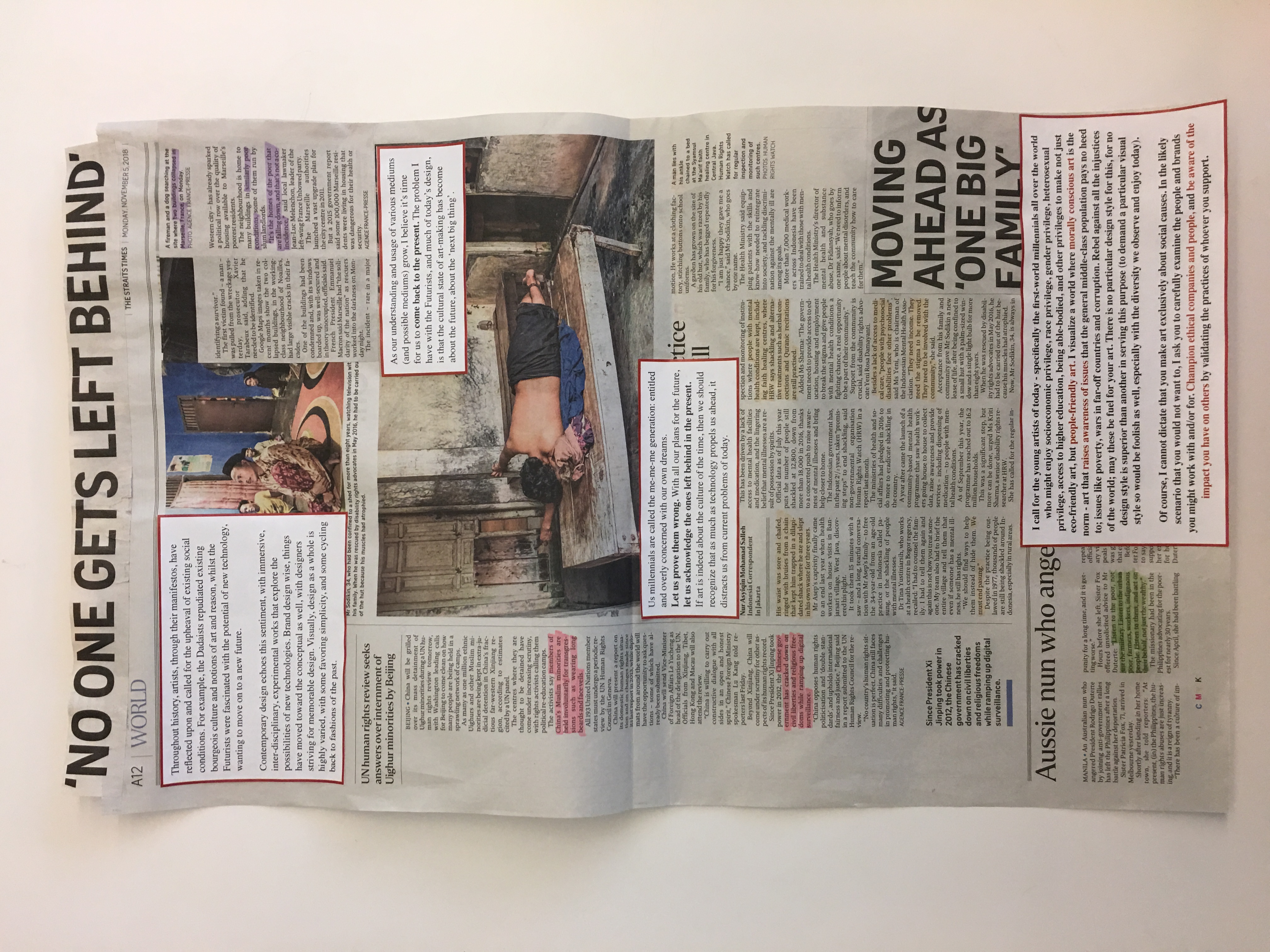
Throughout history, artists, through their manifestos, have reflected upon and called for the upheaval of existing social conditions. For example, the Dadaists repudiated existing bourgeois culture and notions of art and reason, whilst the Futurists were fascinated with the potential of new technology, wanting to move on to a new future. Contemporary design echoes this sentiment, with immersive, inter-disciplinary, experimental works that explore the possibilities of new technologies. Brand design wise, things have moved toward the conceptual as well, with designers striving for memorable design. Visually, design as a whole is highly varied, with some favoring simplicity, and some cycling back to fashions of the past.
As our understanding and usage of various mediums (and possible mediums) grow, I believe it’s time for us to come back to the present. The problem I have with the Futurists, and much of today’s design, is that the state of art-making has become about the future, about the ‘next big thing’.
Us millennials are called the me-me-me generation: entitled and overly concerned with our own dreams. Let us prove them wrong. With all our plans for the future, let us acknowledge the ones left behind in the present. If art is indeed about the culture of the time, then we should recognize that as much as technology propels us ahead, it distracts us from current problems of today. That is the true cultural context of today, and ignorance is what we must combat.
I call for the young artists of today – specifically the first-world millennials all over the world who might enjoy socioeconomic privilege, race privilege, gender privilege, heterosexual privilege, access to higher education, being able-bodied, and other privileges to make not just eco-friendly art, but people-friendly art. I visualize a world where morally conscious art is the norm – art that raises awareness of issues that the general middle-class population pays no heed to; issues like poverty, wars in far-off countries and corruption. Rebel against all the injustices of the world; may these be fuel for your art. There is no particular design style for this, for no design style is superior than another in serving this purpose (to demand a particular visual style so would be foolish as well, especially with the diversity we observe and enjoy today).
Of course, I cannot dictate that you make art exclusively about social causes. In the likely scenario that you would not want to, I ask you to carefully examine the people and brands you might work with and/or for. Champion ethical companies and people, and be aware of the impact you have on others by validating the practices of whoever you support.
Process
My manifesto hinges on my background as a debater. With all the reading of current affairs that comes along with preparing for debate tournaments, and actually debating about issues we face today, I’ve come to feel very strongly about raising awareness for the people we have left behind in our race towards the future.
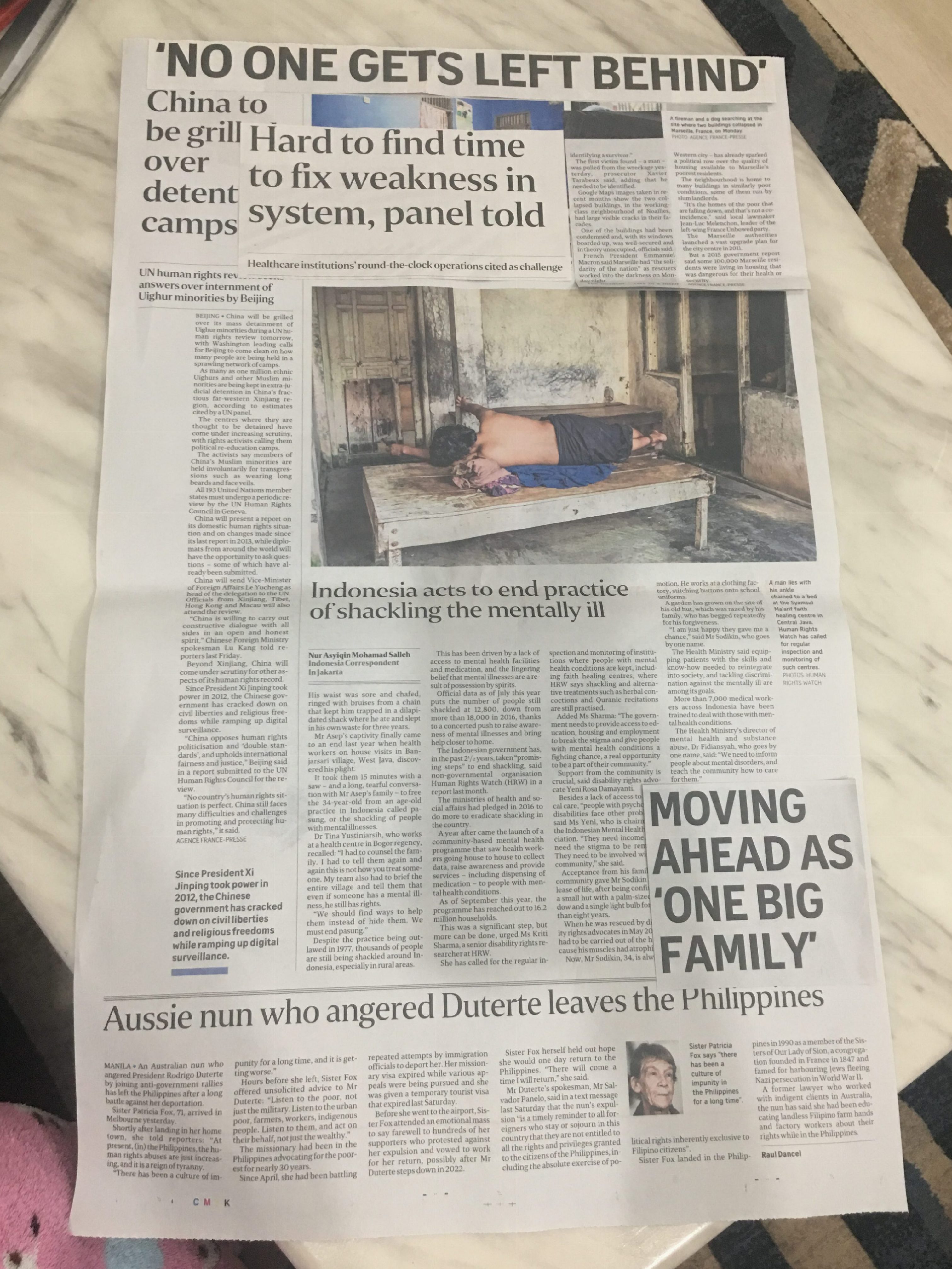
The making of my physical manifesto started with combing through the past 2 weeks worth of The Straits Times newspapers to find articles on problematic current issues and striking headlines I could collage together. I decided on the medium of collage as I felt that it showcased the number and diversity of issues in the world today.
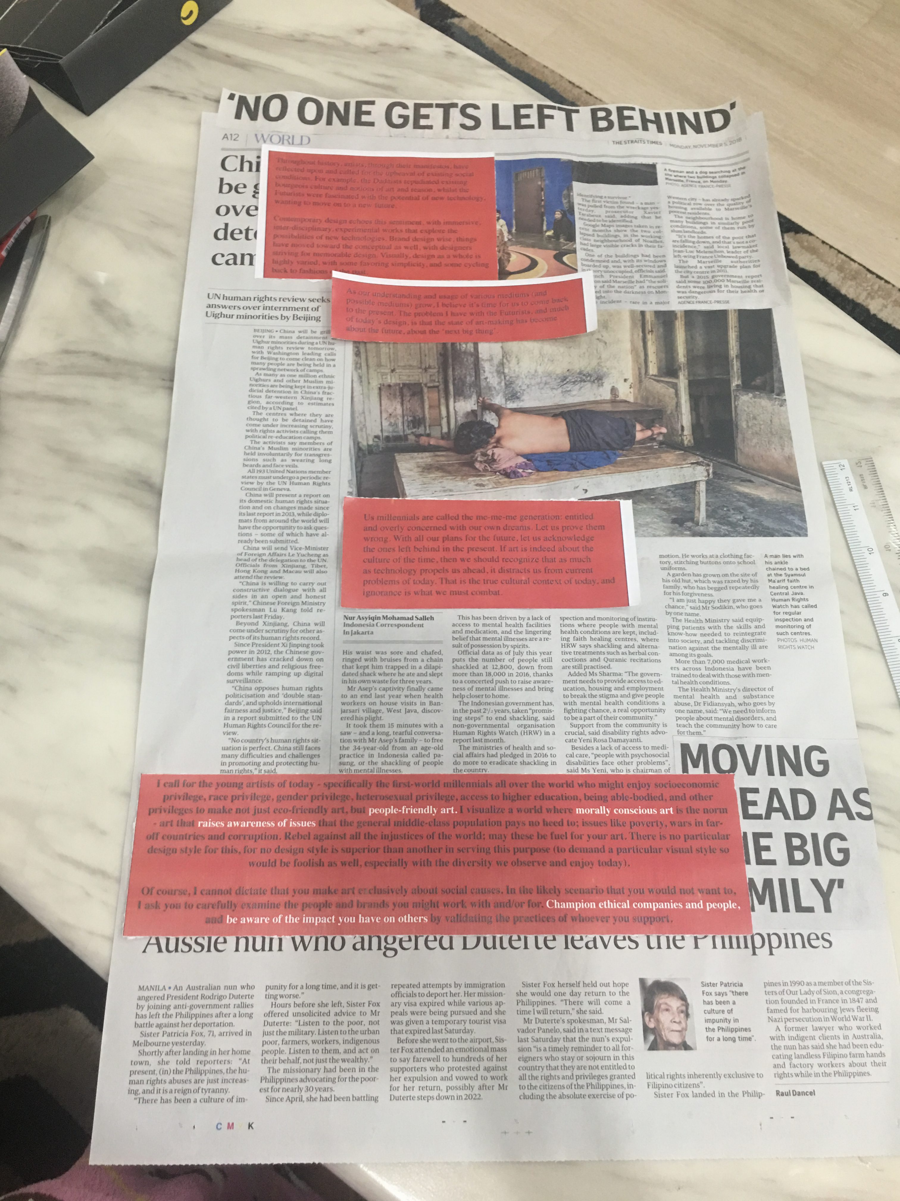
After cutting out the articles and titles I felt were relevant, I tried to collage them together in different layouts. Coincidentally, a newspaper article headline I found was the perfect title for my manifesto.
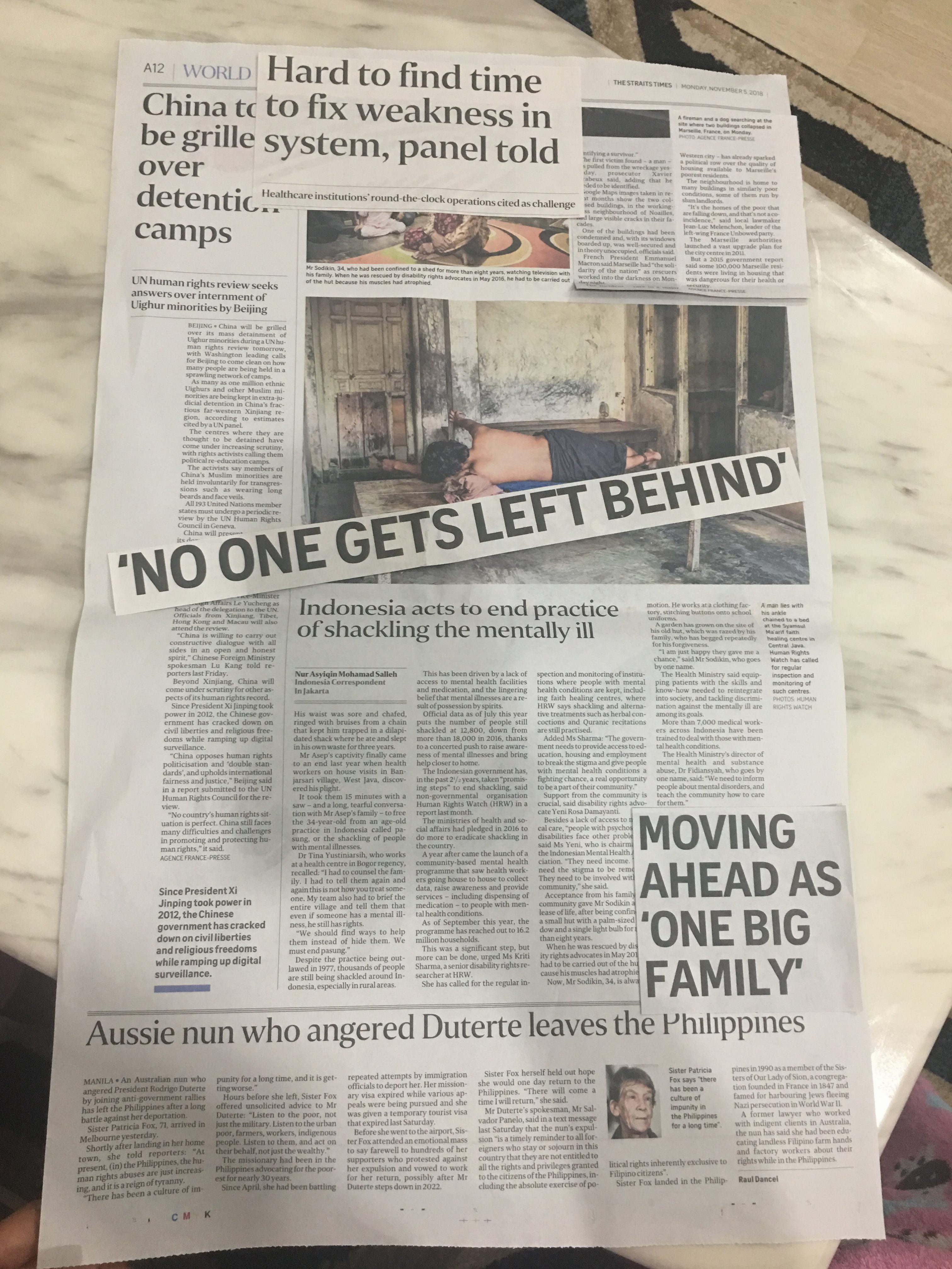
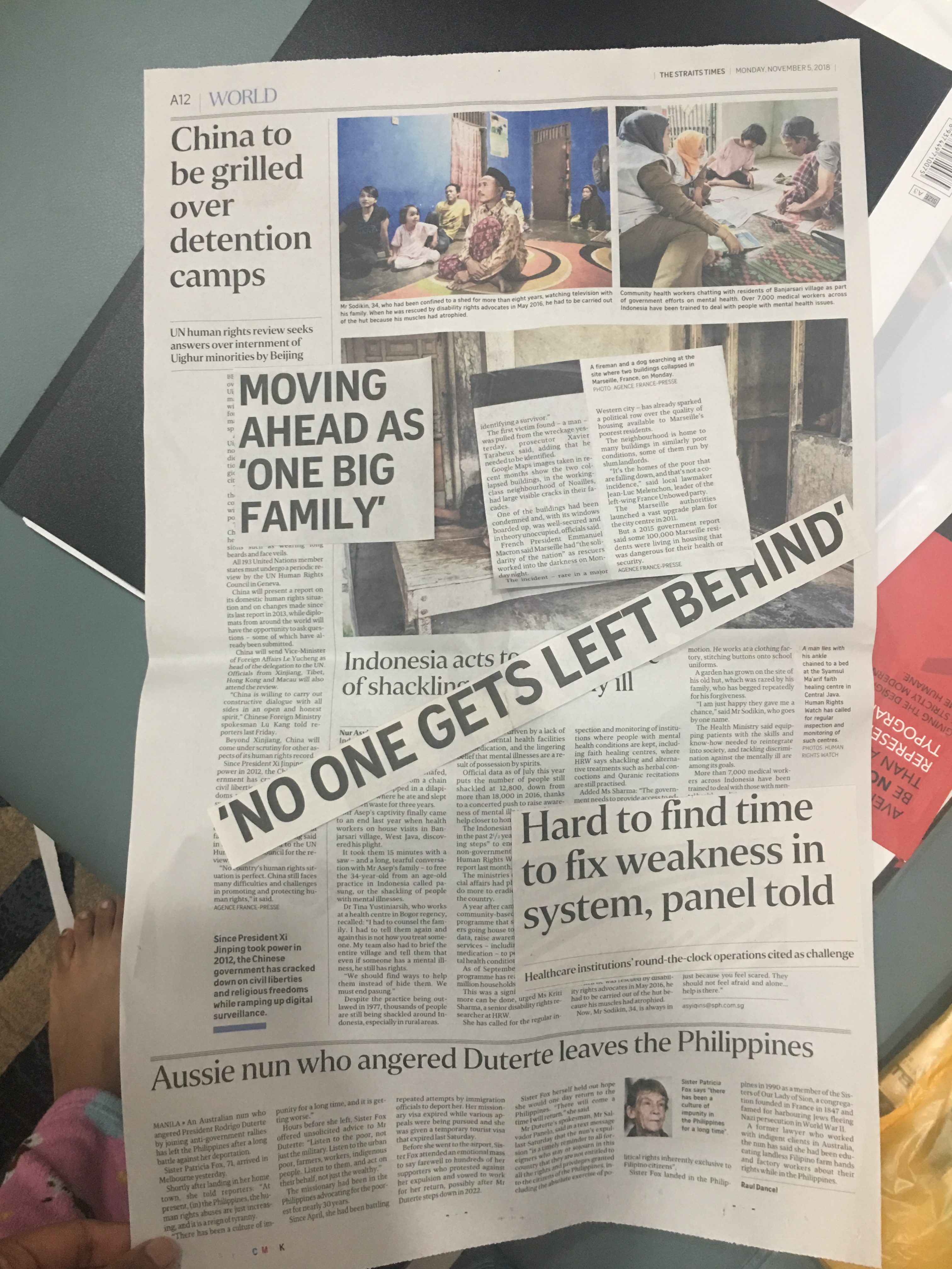
I realised having the pieces line up diagonally became too messy – especially because there was so much content, I still wanted to maintain some semblance of orderliness for legibility. One stylistic choice I made that I particularly like was using the newspaper header showing the date as the time period in which I wrote this manifesto; I feel like some years in the future I can look back at this and revisit the state of mind I was in here and now, in Year 2 Semester 1.
I was heaving trouble fitting in the headline “Hard to find time to fix weakness in system” without covering more important issues (I figured that headline was not really talking about issues, but more the difficulties tackling the issue), so I decided it was not as relevant and removed it.

I did this collaging concurrently with my layout on inDesign. I tried different typewriter and serif fonts, ultimately deciding on Times as I felt adding a new typewriter font would be too messy.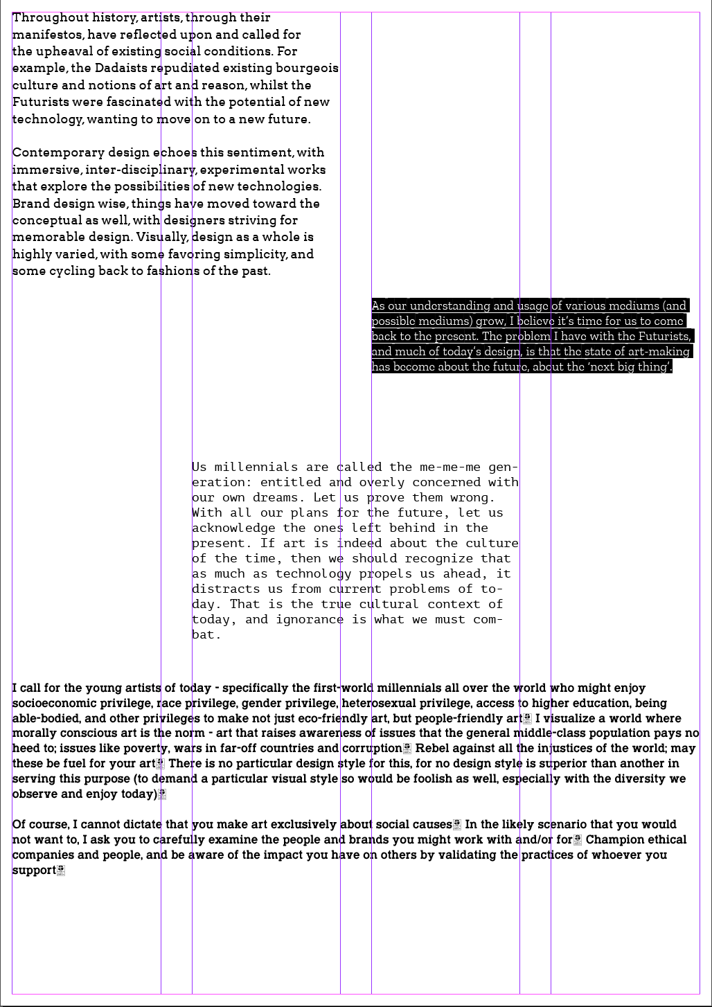

I also tried printing the text with a red background and on tracing paper. It didn’t look great.
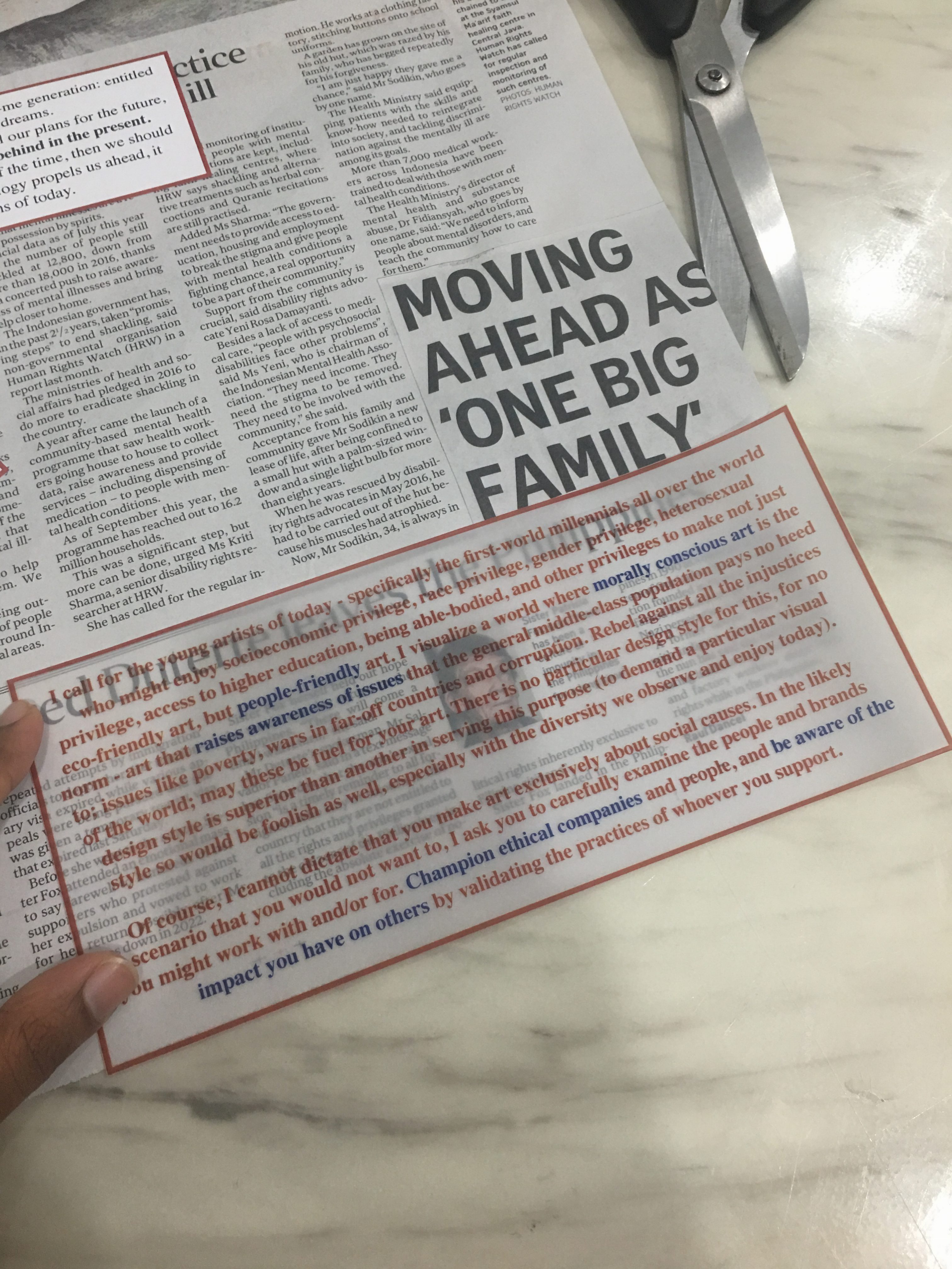
I also realised laying out my manifesto on a grid on inDesign was pretty useless as I had to fit the text around my collaged paper pieces. The pictures below show some reprinting I did so the section wouldn’t cover my “Moving Ahead as ‘One Big Family'” section.


I also tried printing on tracing paper to have the words from the article peep through, but it interfered with legibility.
Finally, I highlighted the parts from the newspaper articles that particularly stood out to me. I used different colours to signal the different articles.
My Final Manifesto