Monthly Archives: September 2017

[2D] Final: My Line is Emo

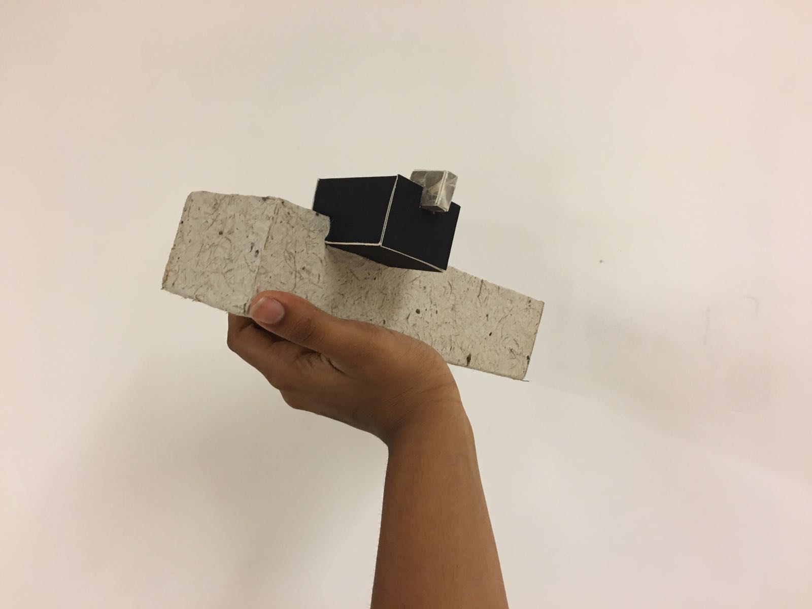
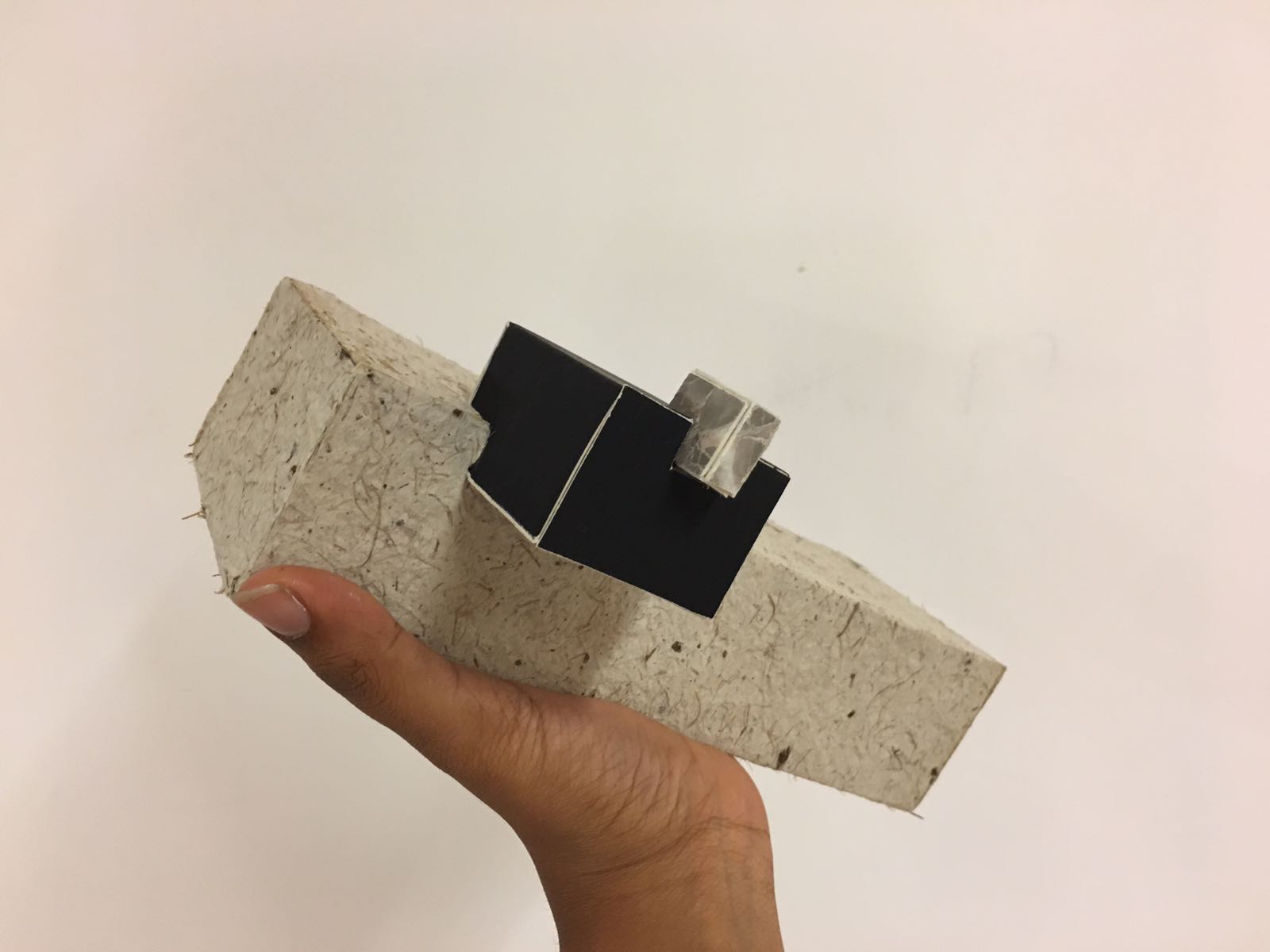
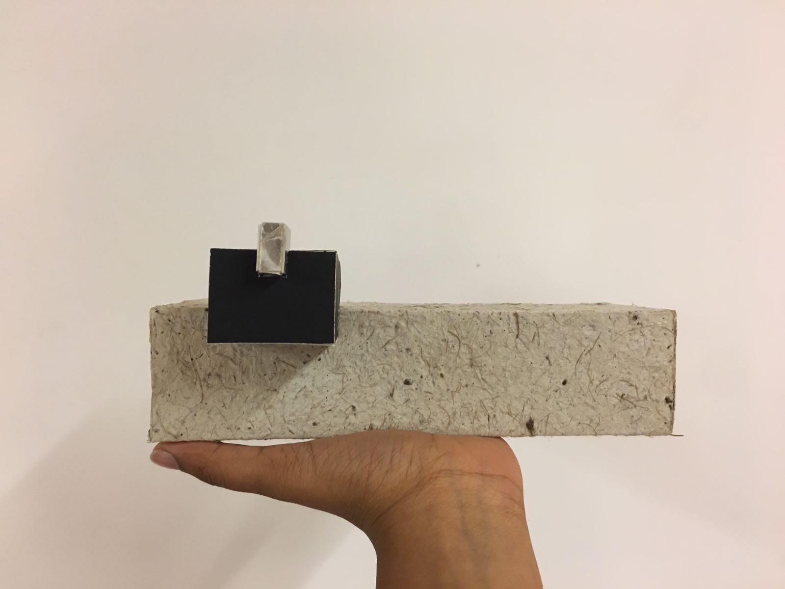
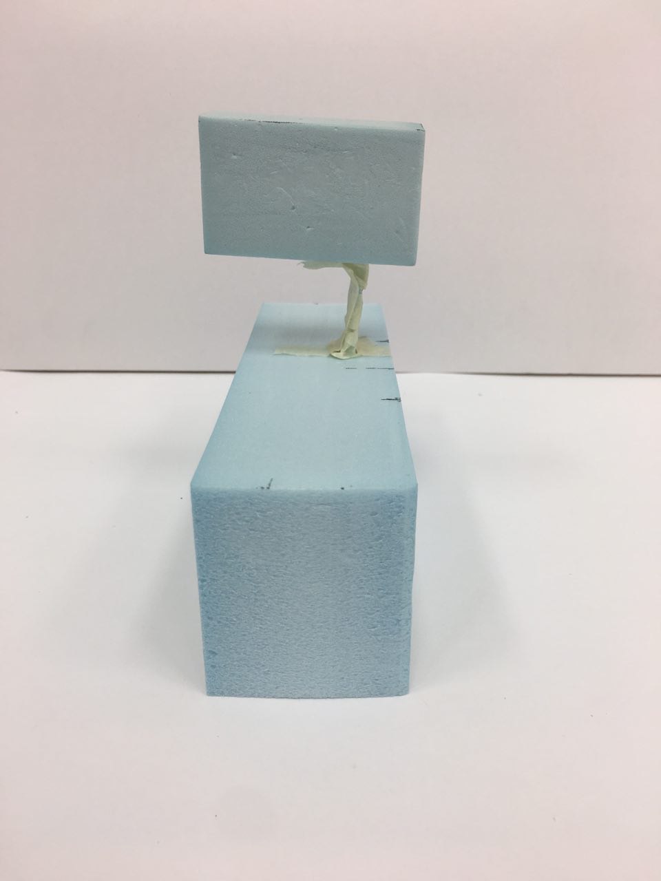
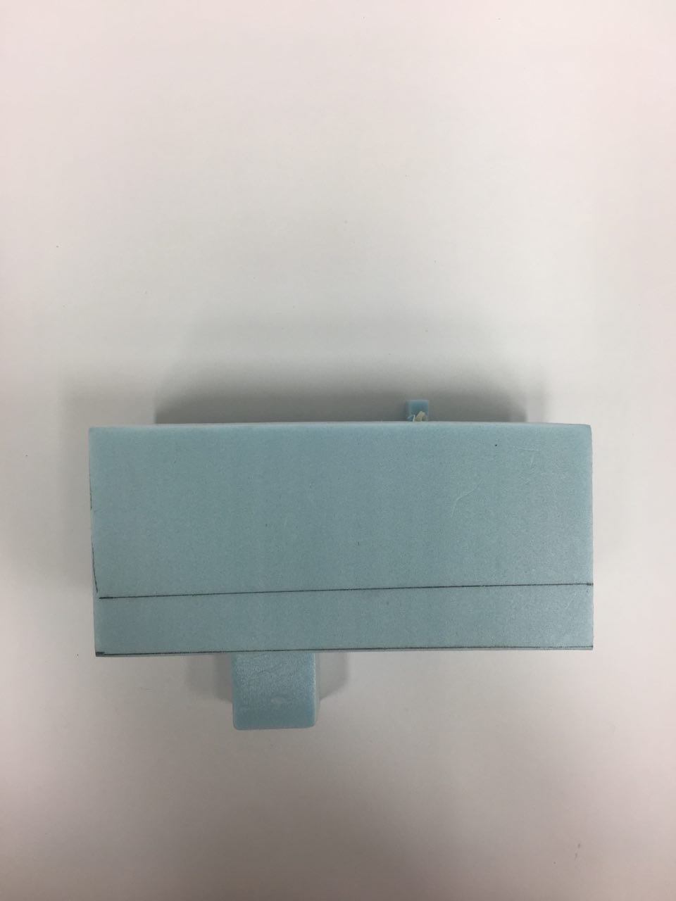
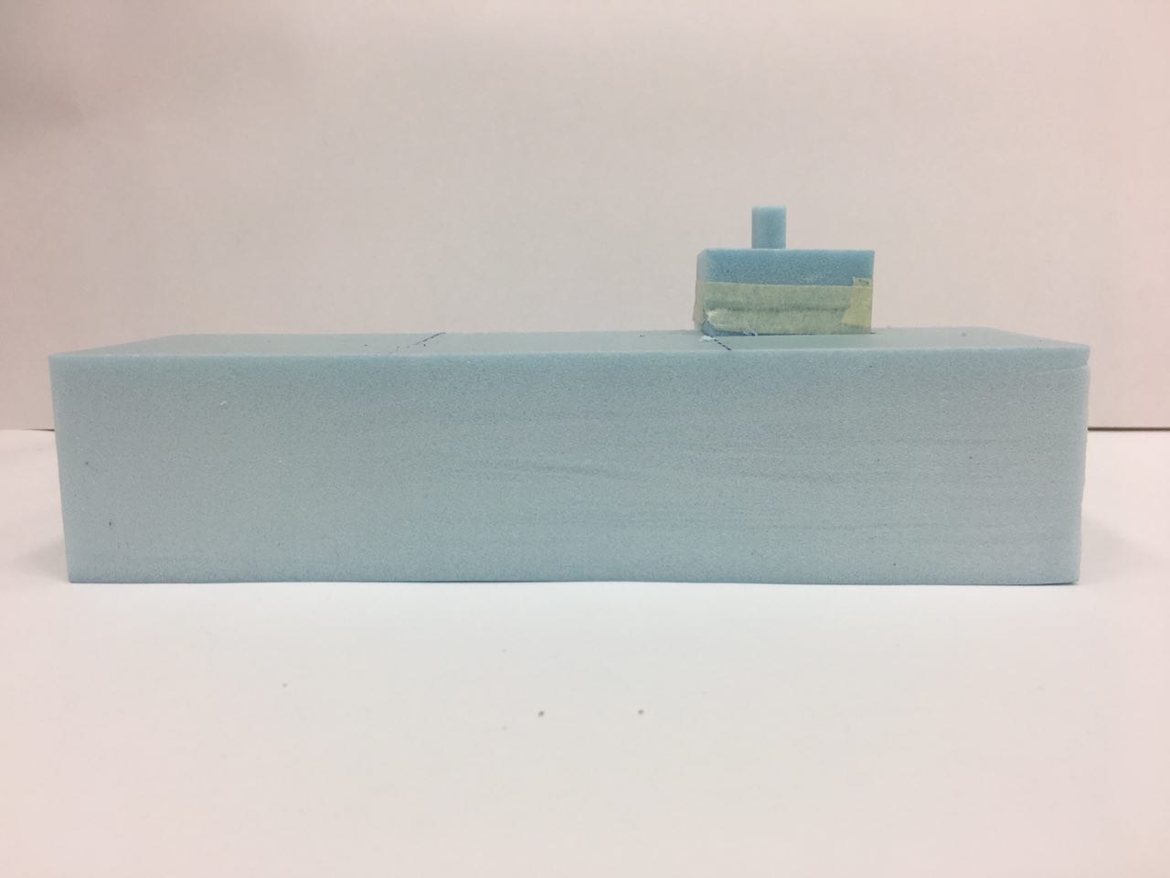
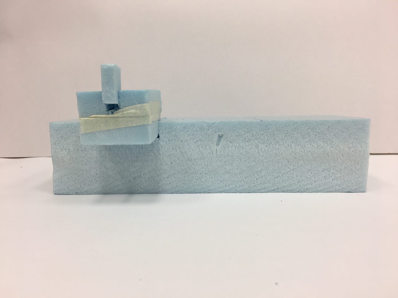
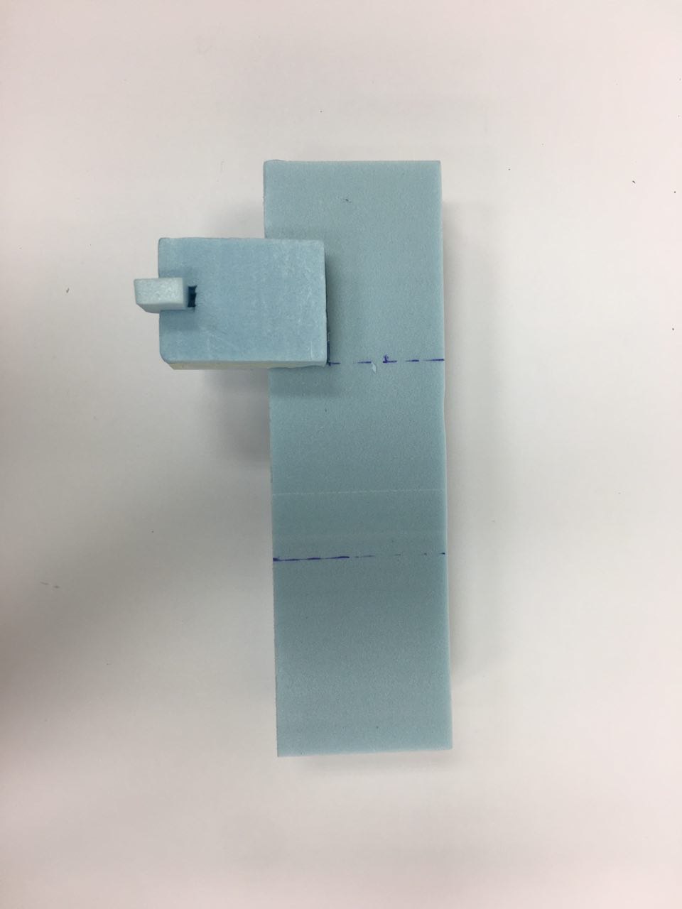
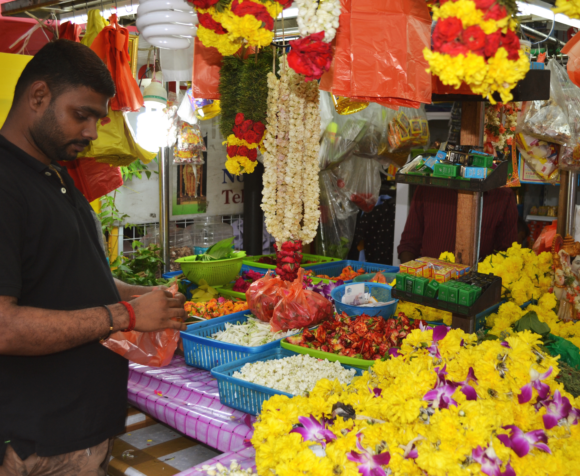
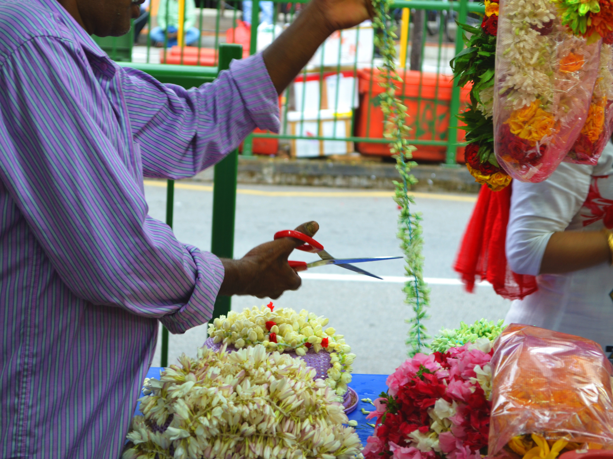
2015 to 2017 // My story

These 6 emotions represent the most significant events in my life from 2015 to 2017, chronologically.

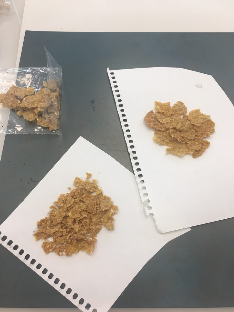
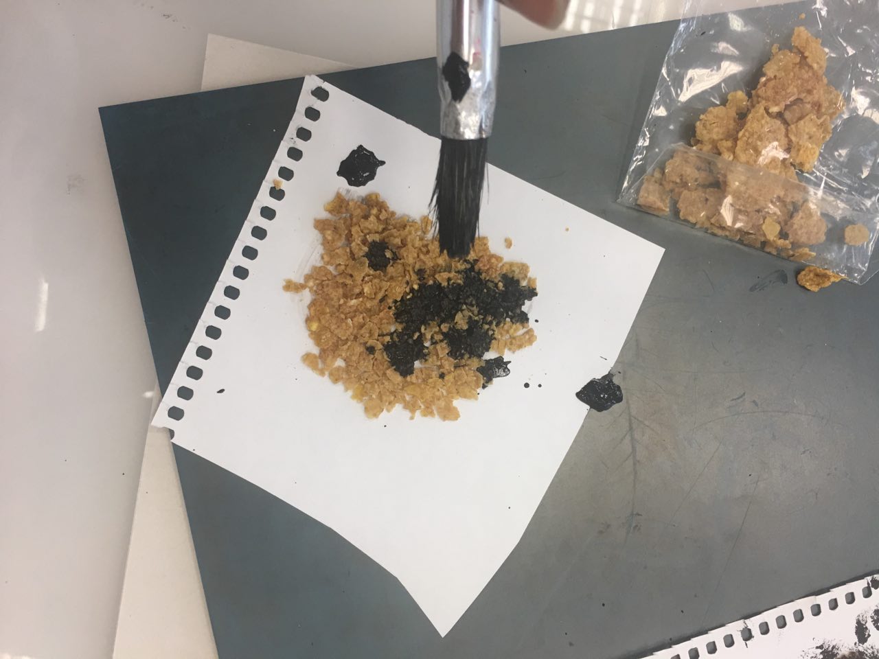
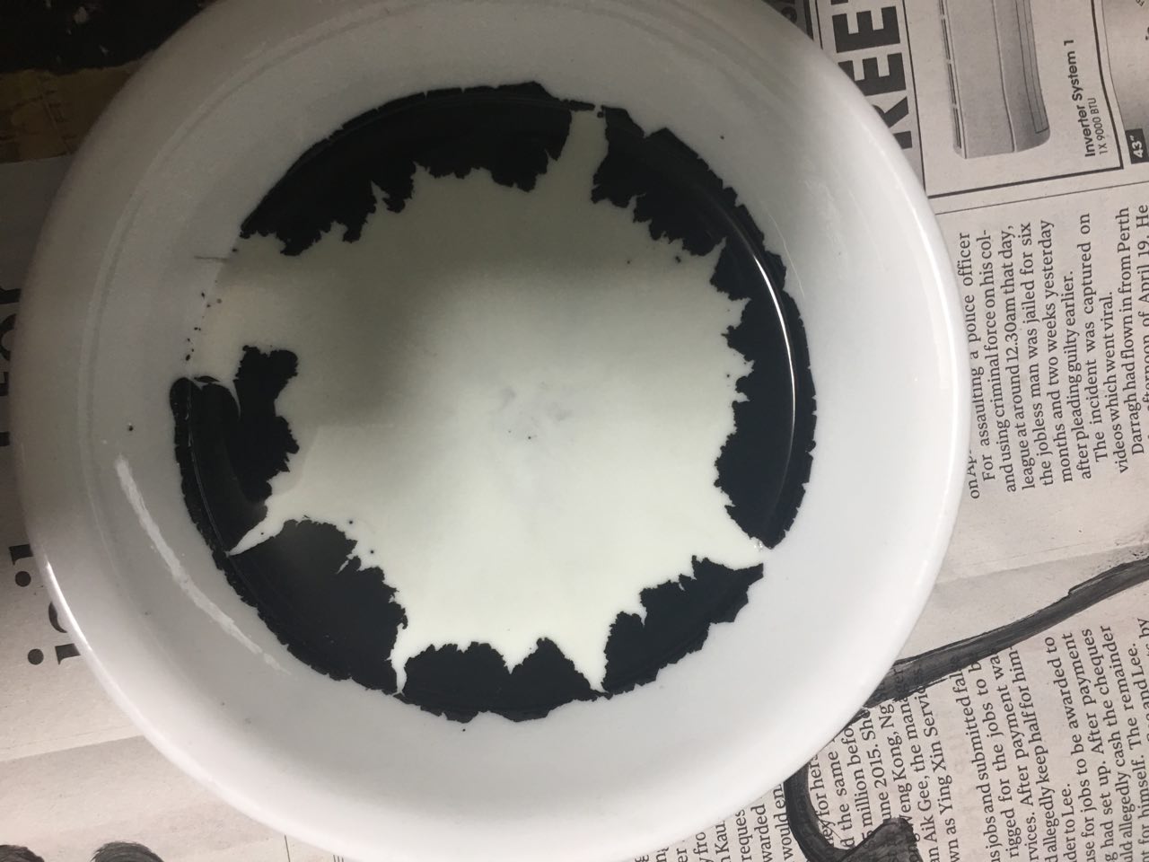
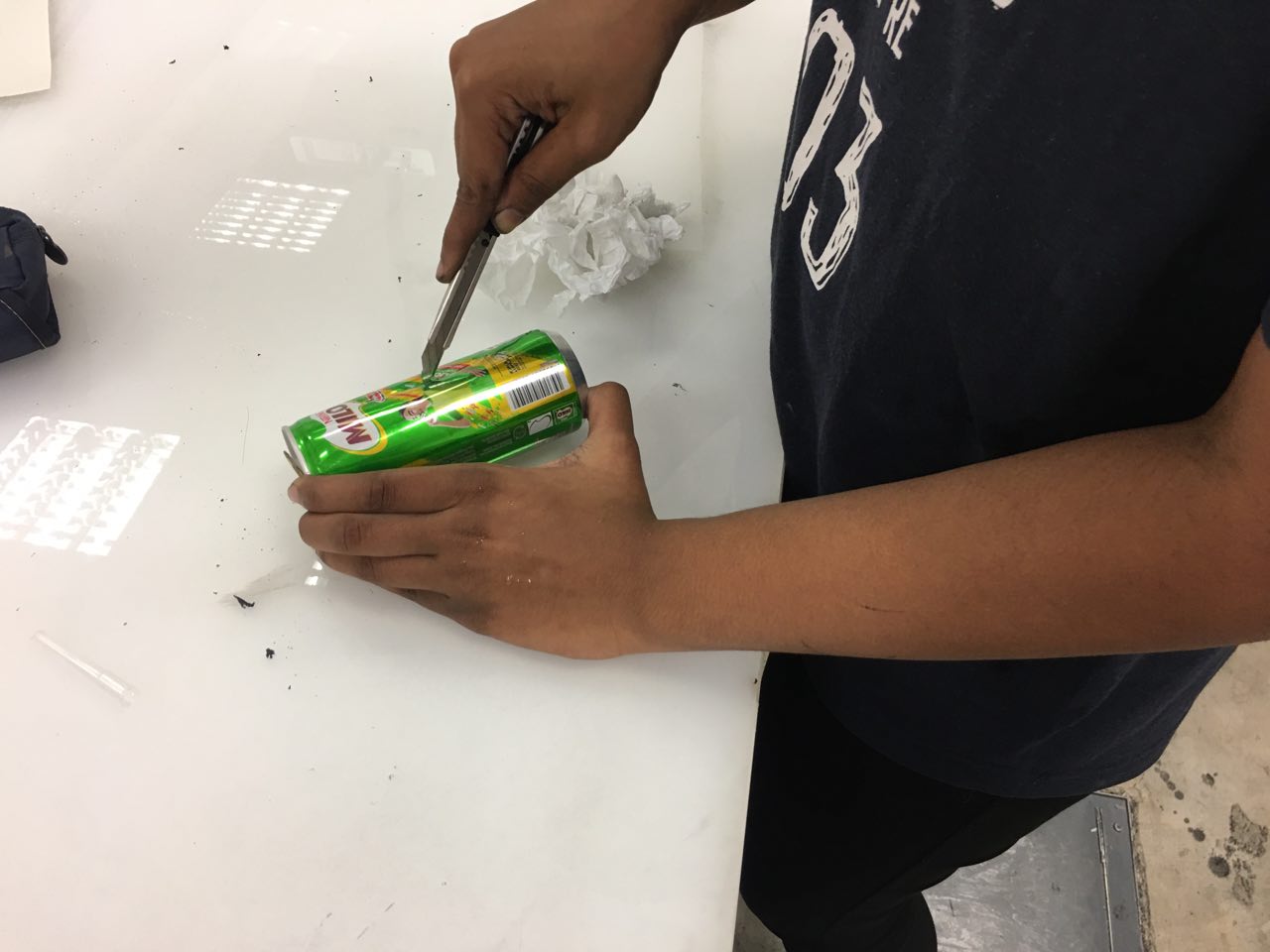
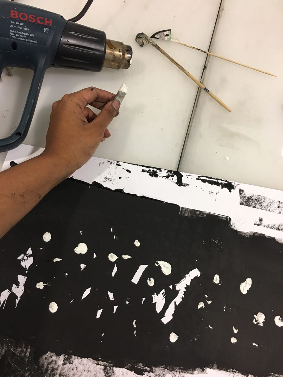
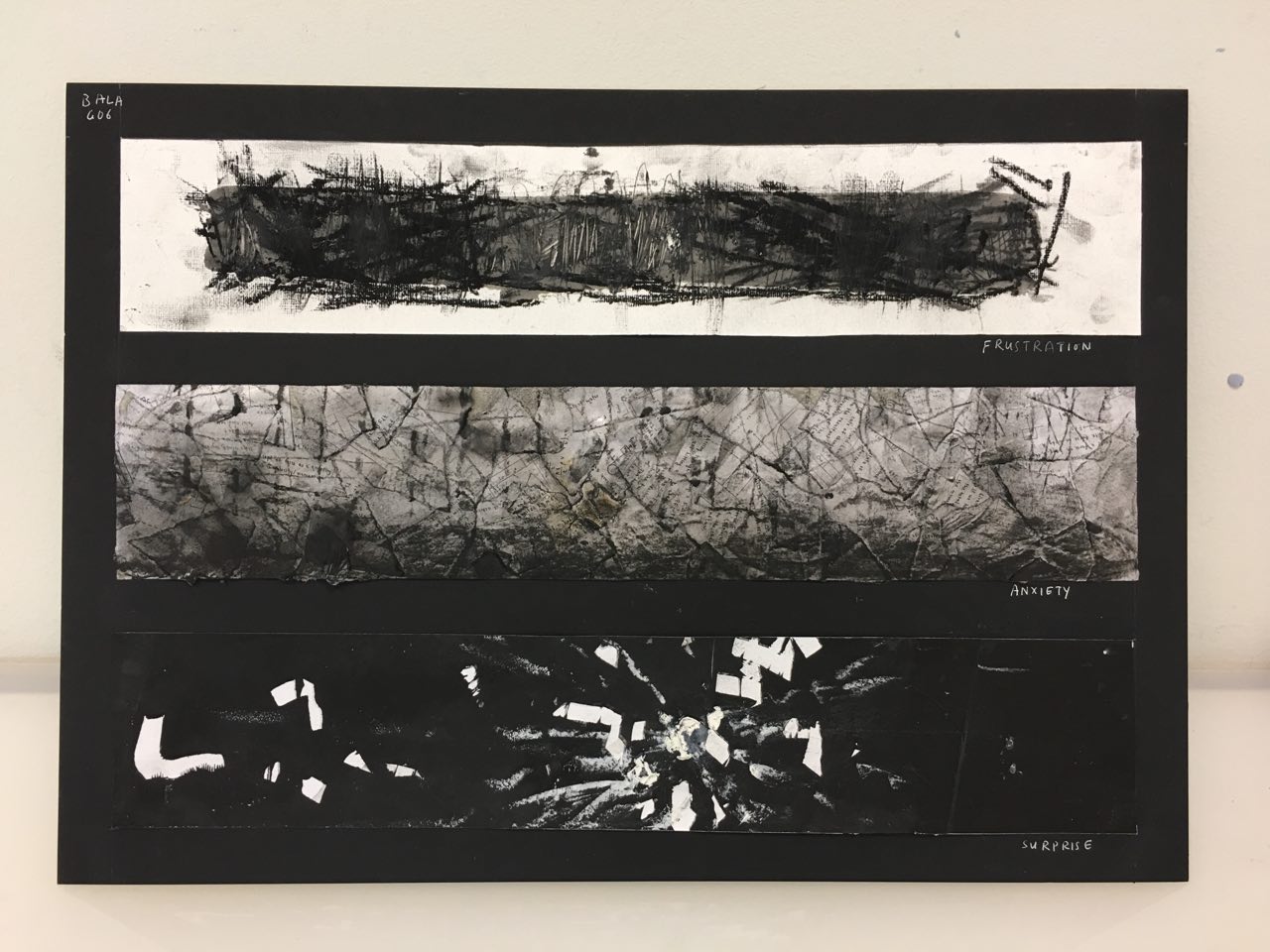
1.Frustration – August 2015

The story starts in August 2015, right before my promotional examinations in J1. My mom is very spiritual and religious, so she went to see a fortune teller about how I would do for the exams.The fortune teller told her that God would grace me with good luck should I cultivate the habit of praying everyday. And so, before I went to school, my mom would make me pray in the morning.

This made me feel very frustrated because I’m not particularly religious, but I kept it contained inside and tried not to express my frustration as I knew she thought she was doing it for good.

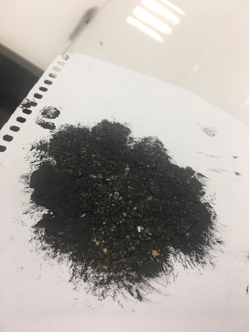
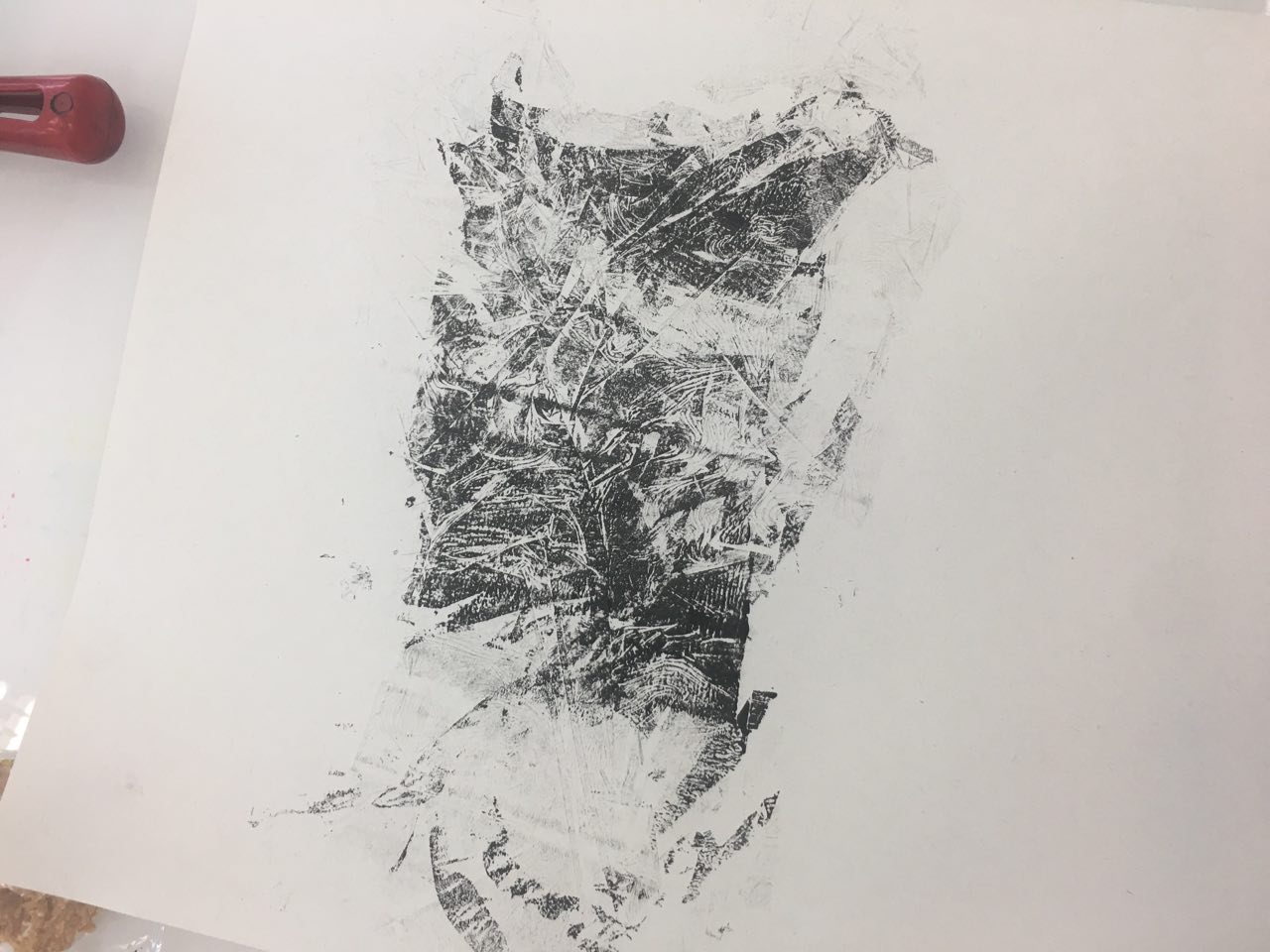
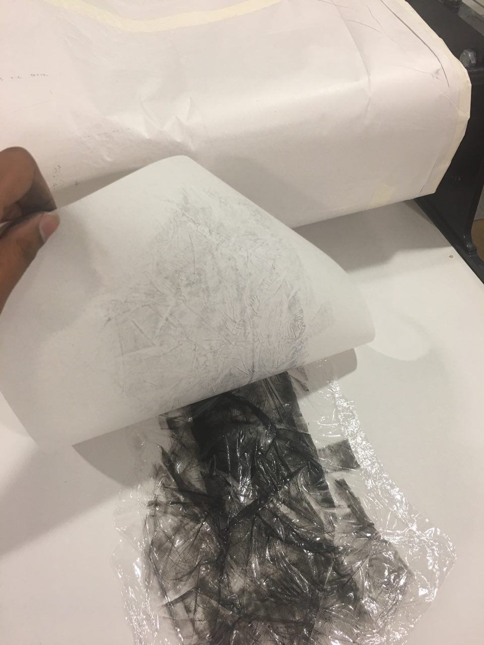
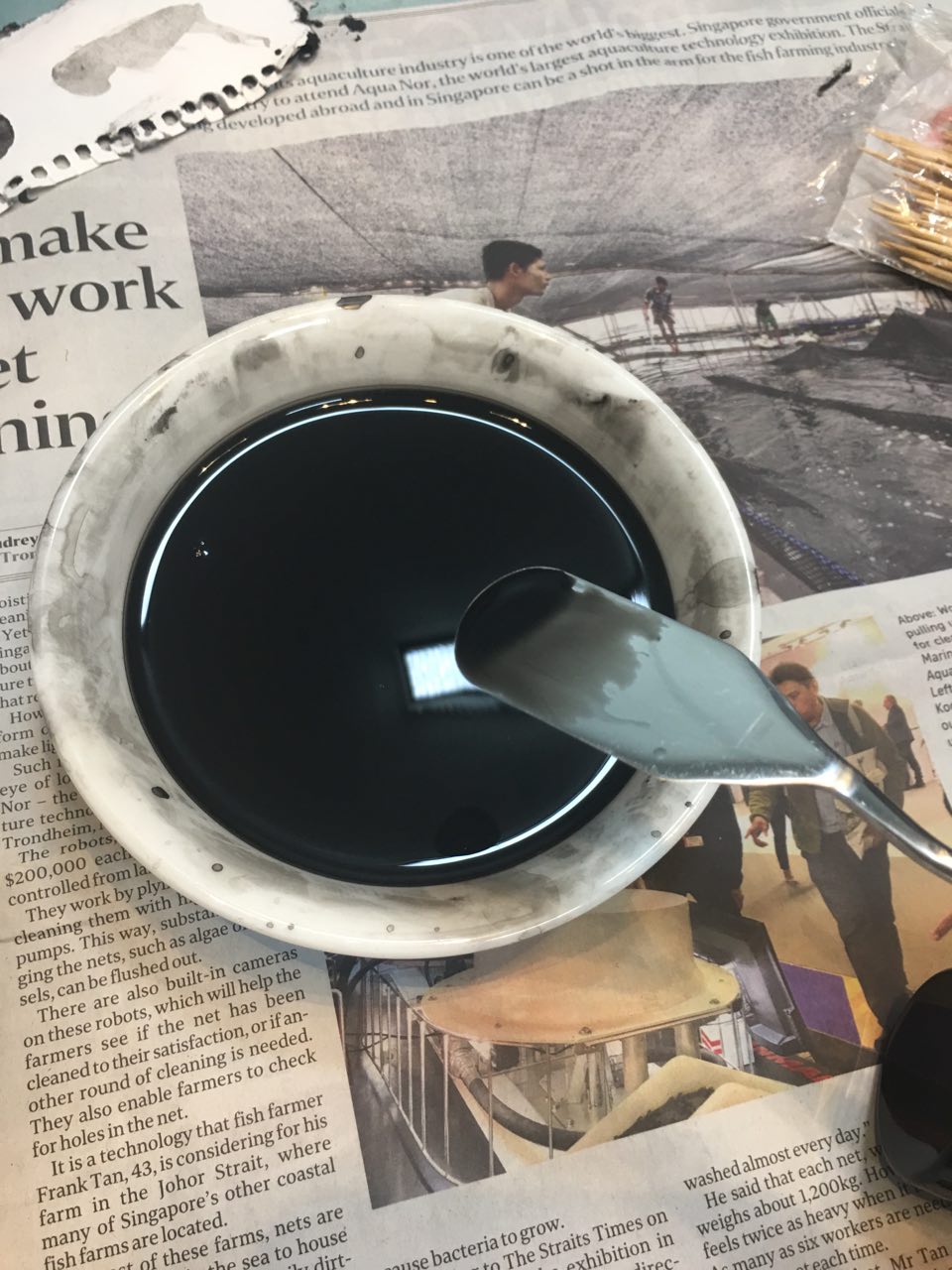
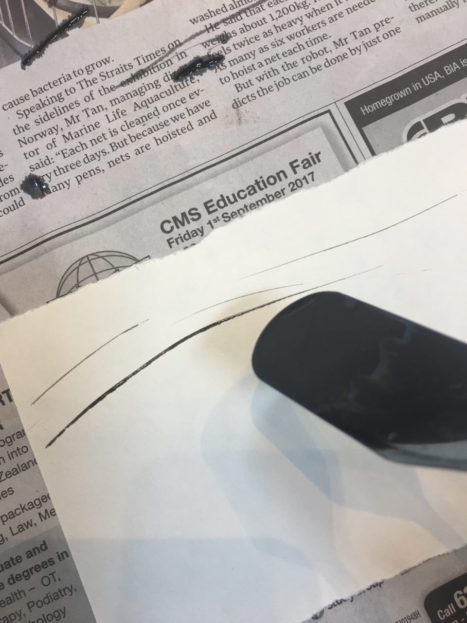
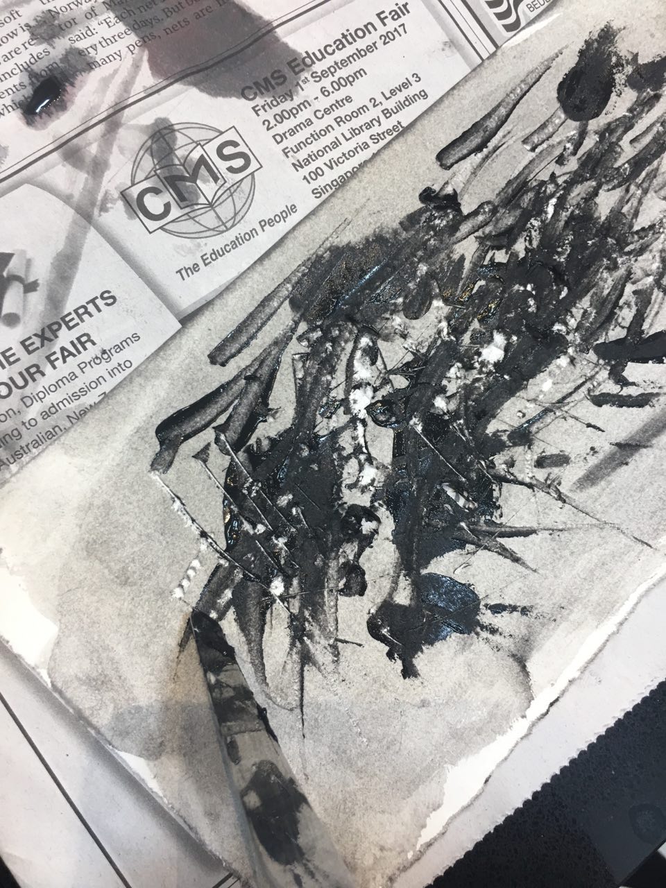
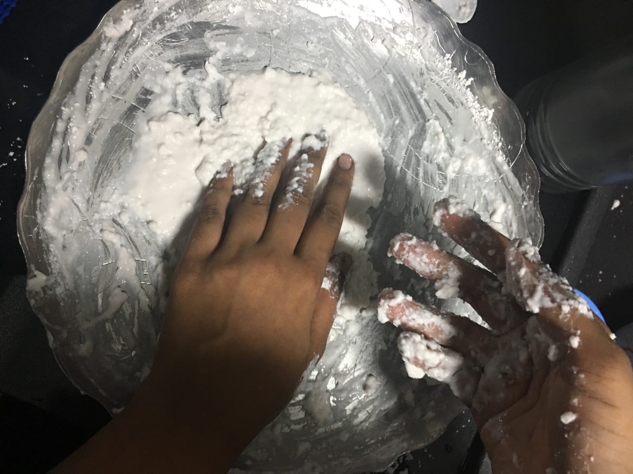
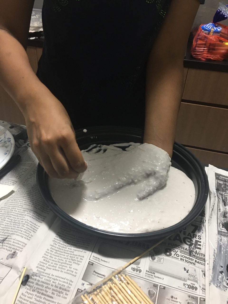
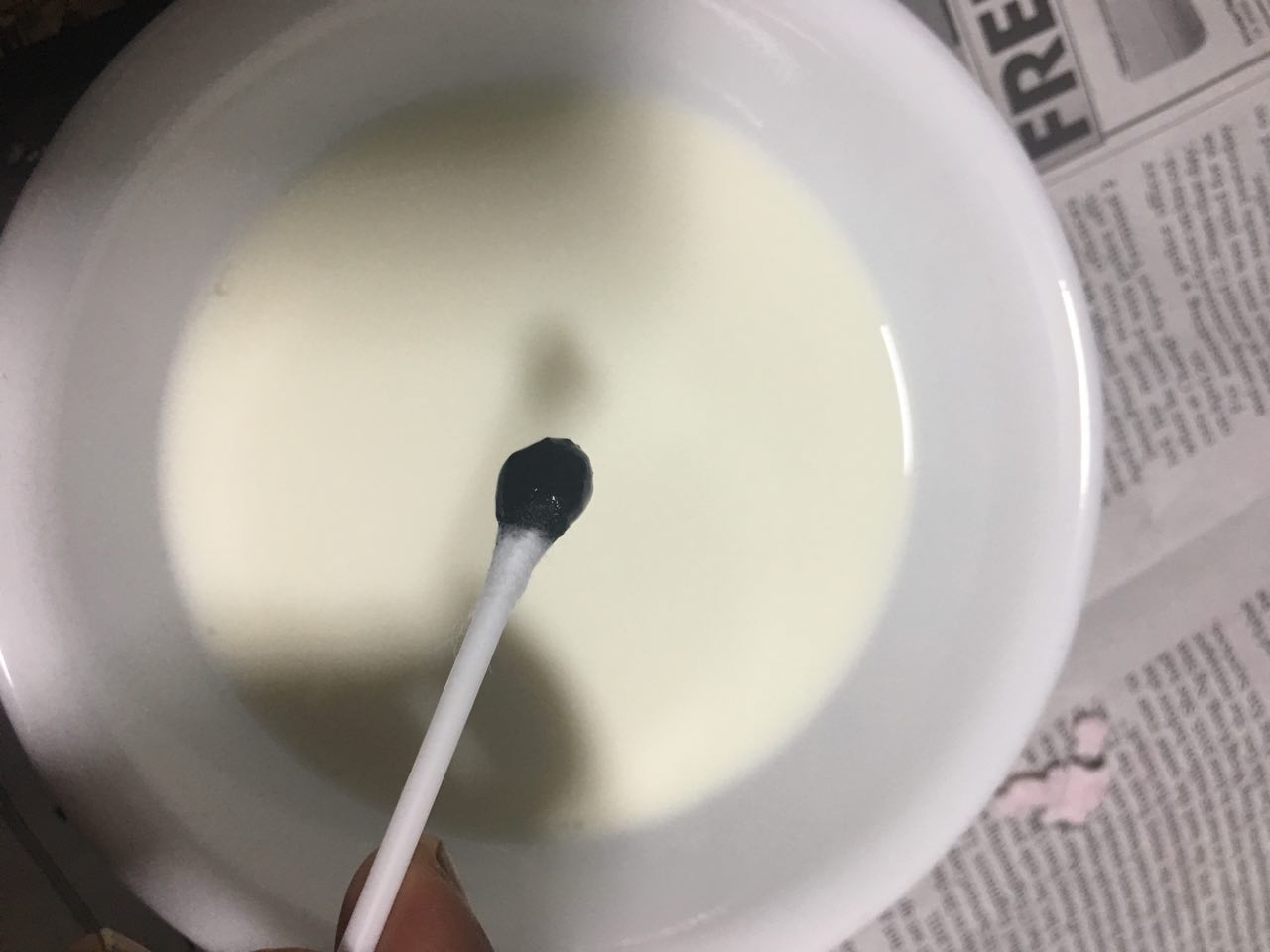
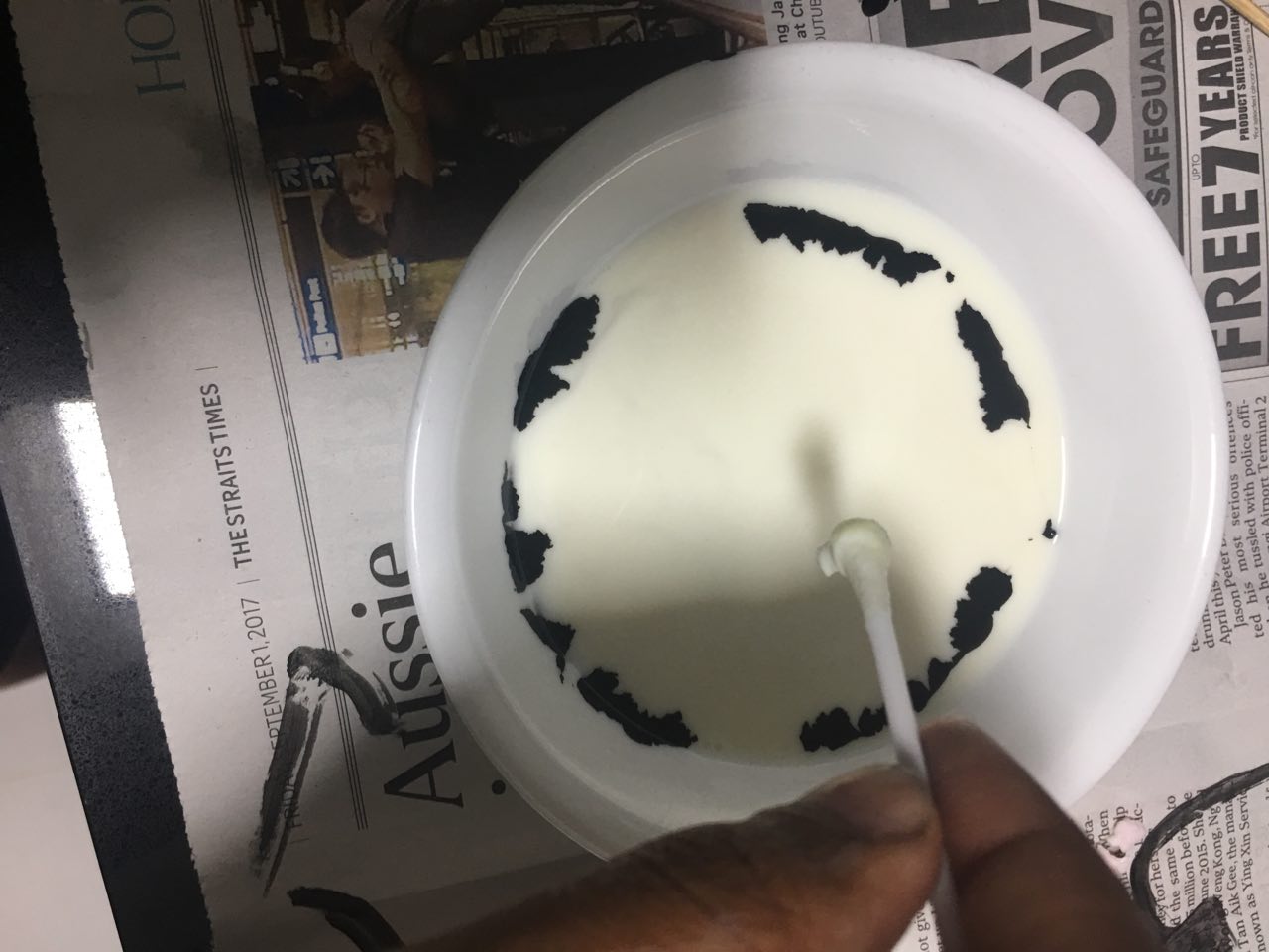
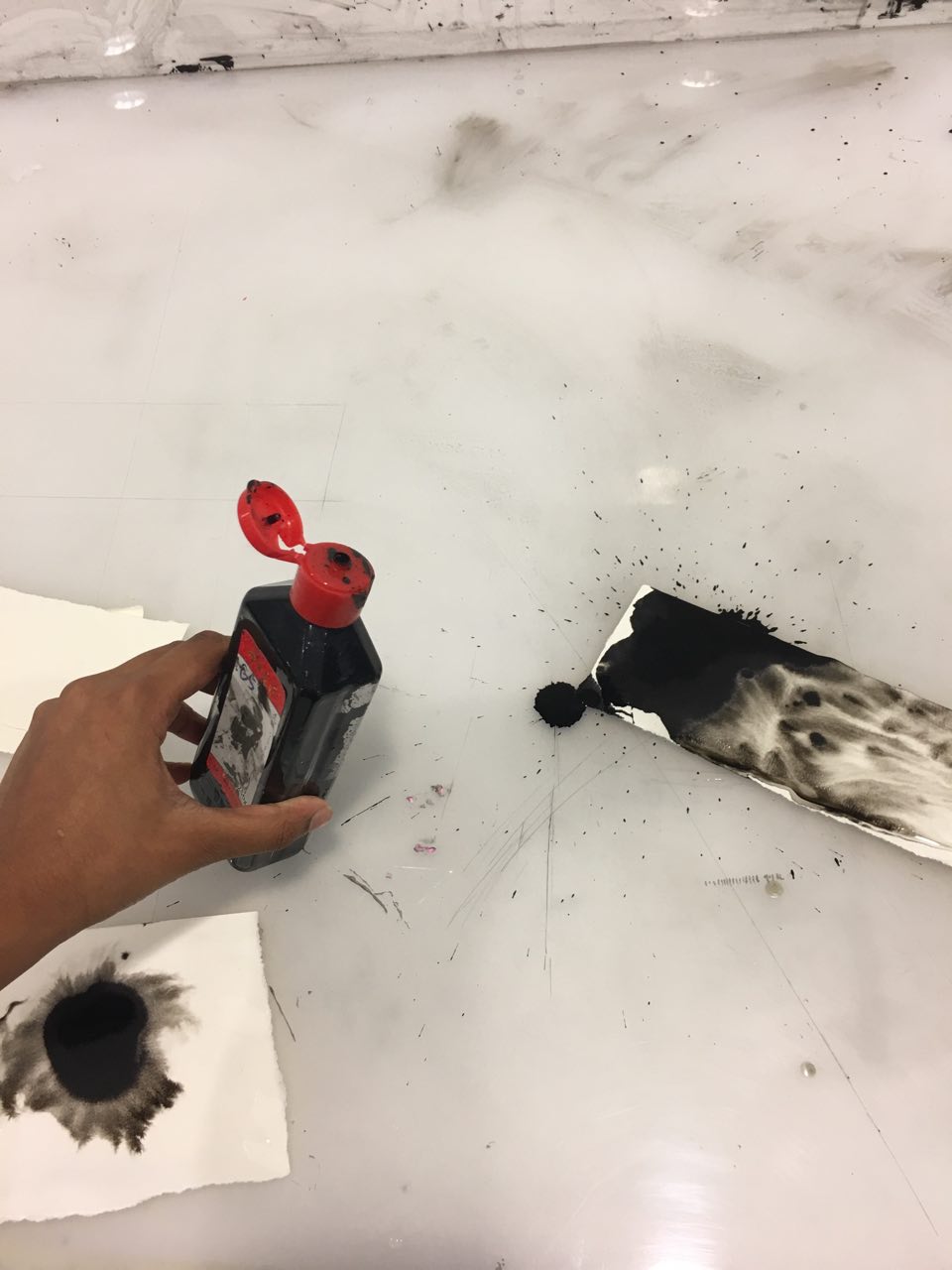
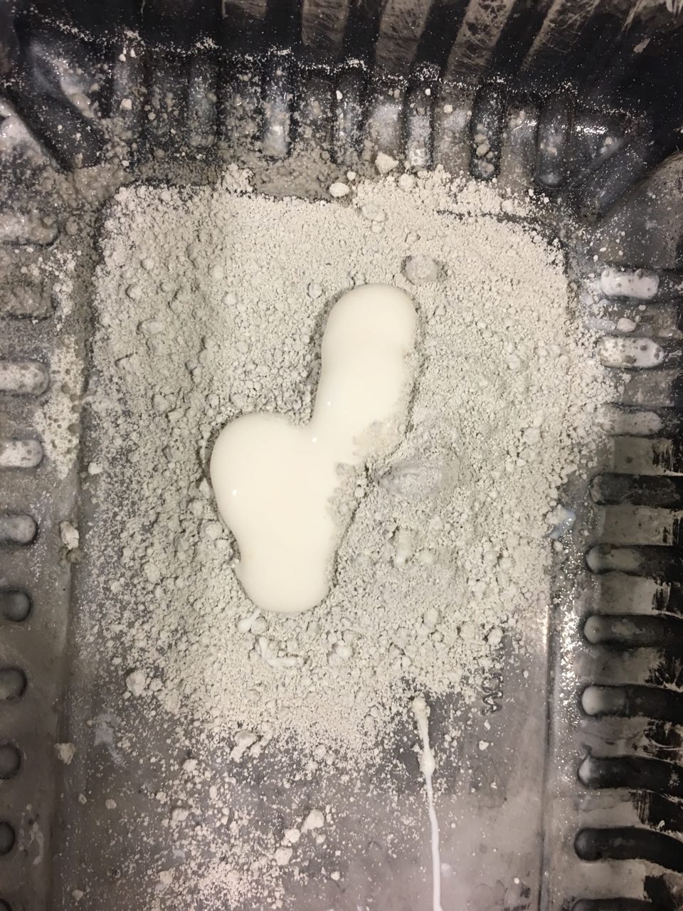
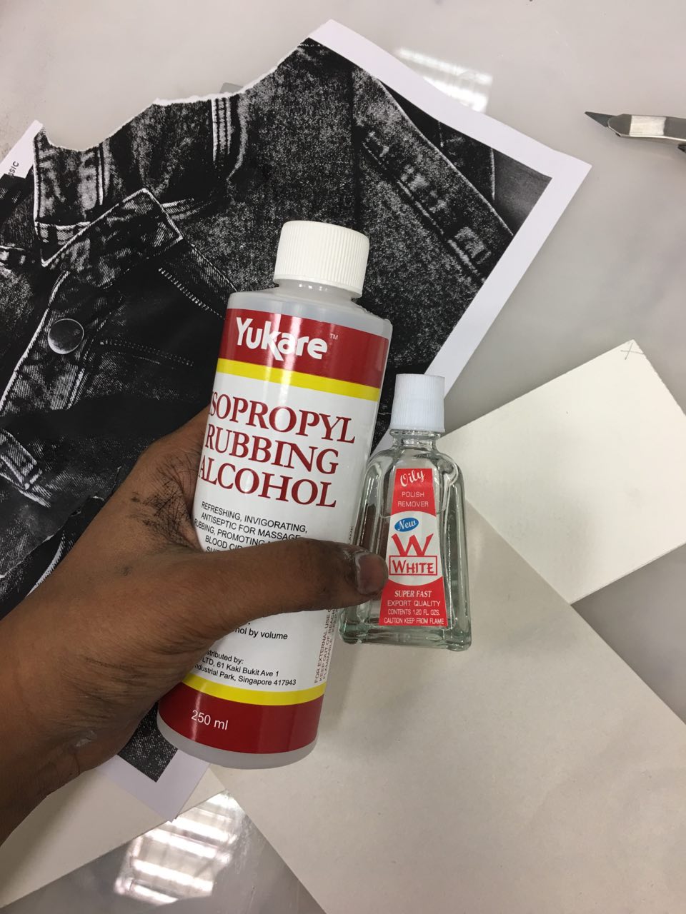
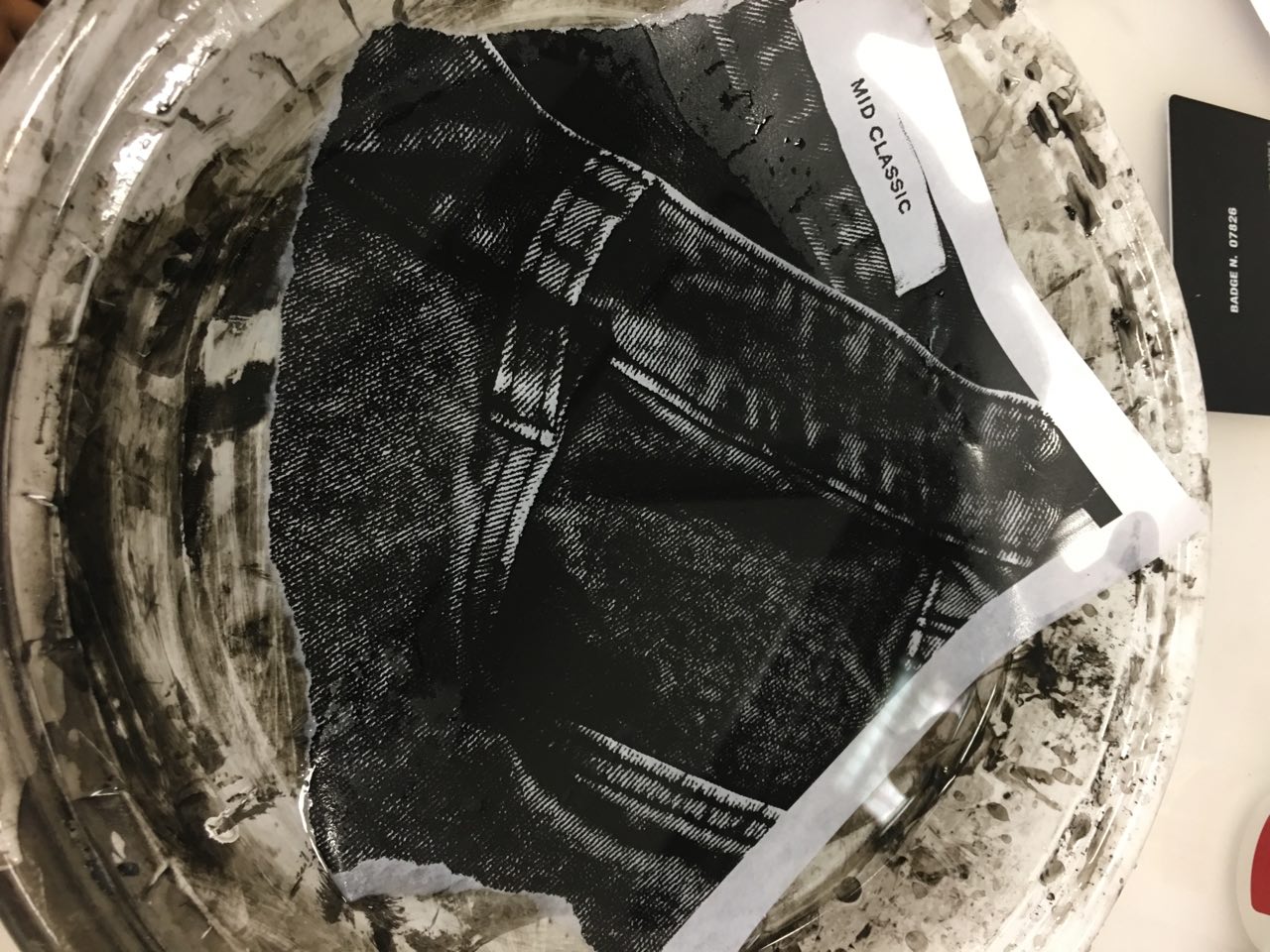
Hence, I used thunoor, the powder that she would have my put on my forehead after I prayed in the morning, to make the base paint. I mixed thunnoor and glue together; the mixture has the distinctive scent of the powder. I then made angry marks over the base thunnoor paint with charcoal, to express the frustration I had towards being made to pray and put the thunnoor on my forehead.

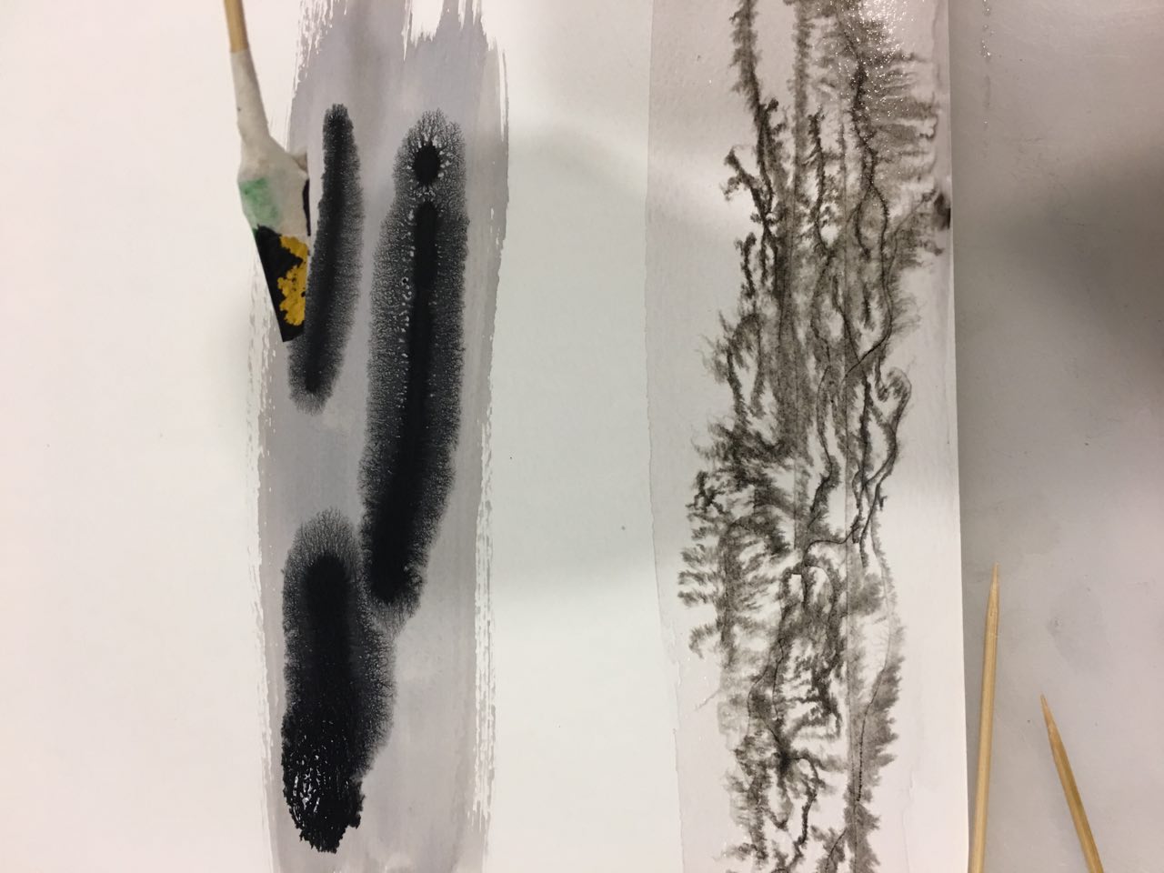
2. Anxiety: September 2015

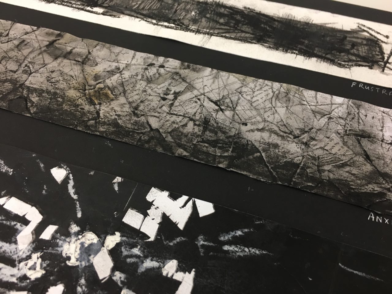
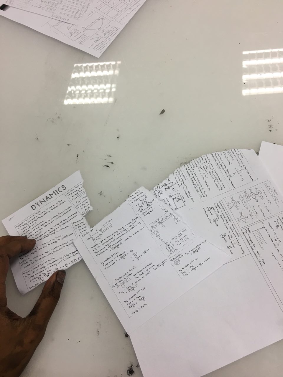
It was time for my promotional exams. I was super anxious about physics, my weakest science subject – I would obsessively write and rewrite my notes over and over again to try and lessen the amount of anxiety I would feel looking at physics formulas.


I used my own physics notes instead of the lecture notes as I felt the strip would better reflect anxiety should it portray my reaction to anxiety on top of giving me anxiety, as well. I felt that it personalized the strip, with my handwriting and hand-drawn physics diagrams.

The strip is darker at the bottom to signify the heavy, sick feeling I get at the bottom of my stomach when I’m anxious.

In my sketchbook, I initially used the physics notes photocopied in the same size, but realized it gave a more anxious feeling when the words were smaller, like ants crawling up your skin. I hence photocopied my notes at 50% (reduced the size) and used this to make the paper mache.

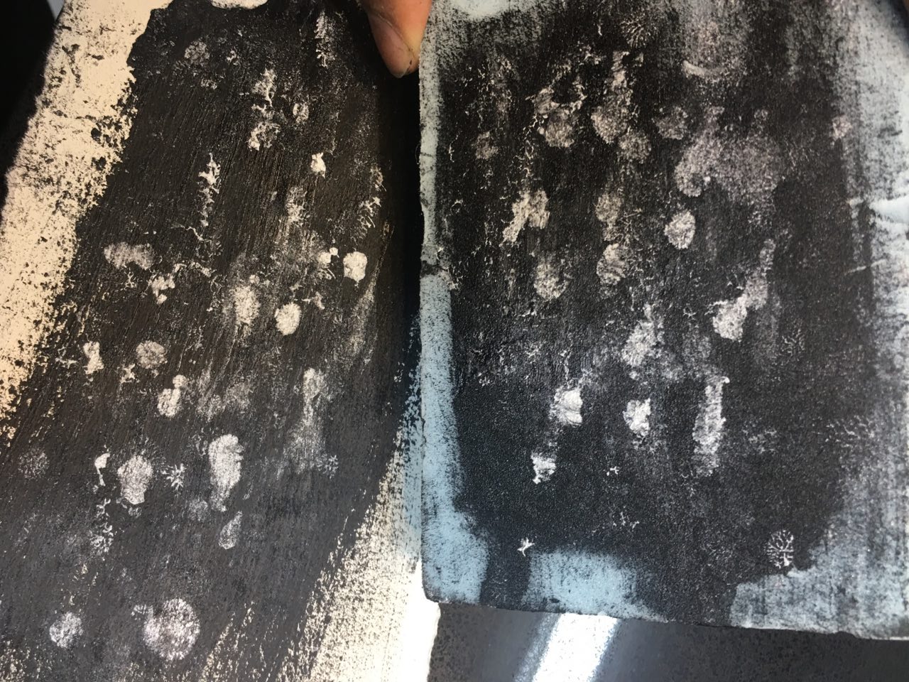
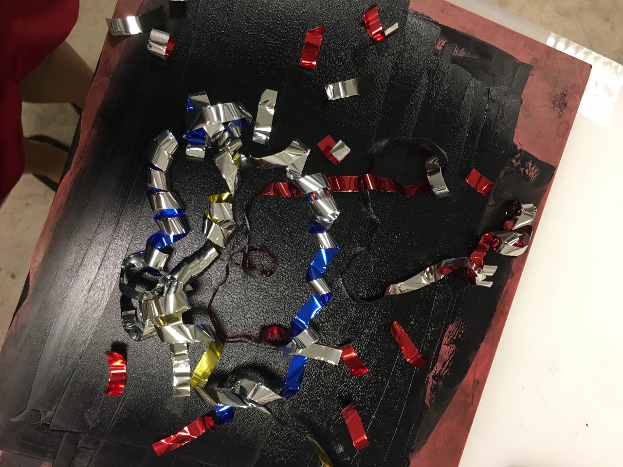
3. Surprise – November 2015


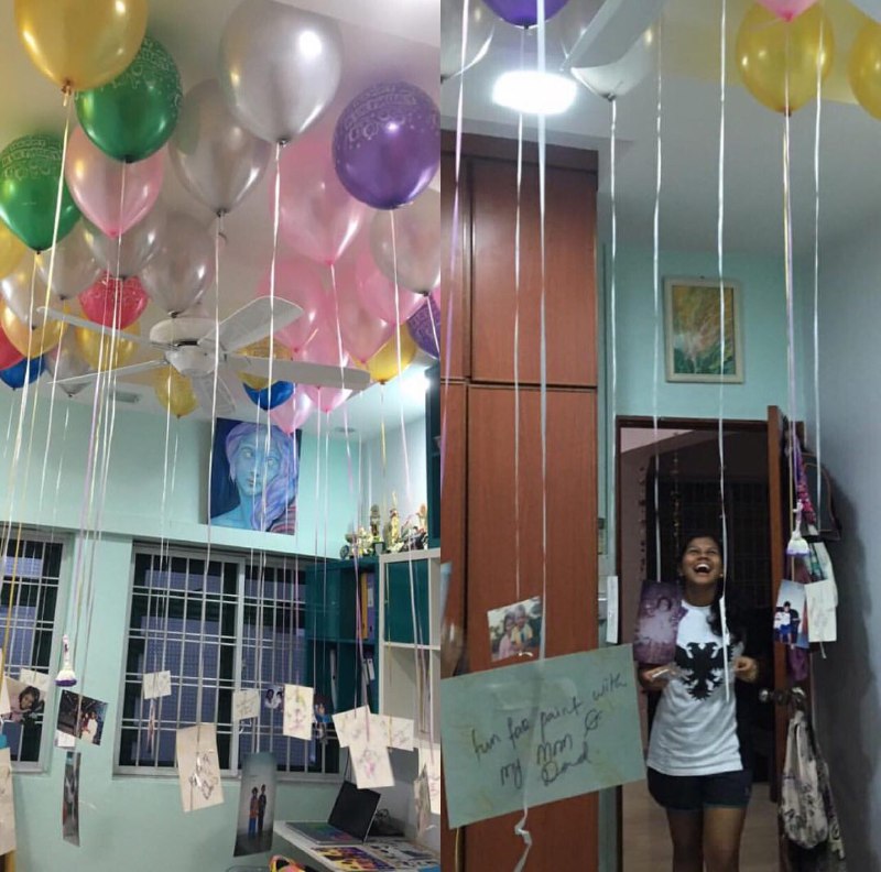
My friends and family threw me a surprise birthday party for my 17th, with streamers and balloons hung up in my room with baby photos of me tied to the string. The feeling I experienced when I walked through the door and they popped streamers was pure surprise – the good kind.


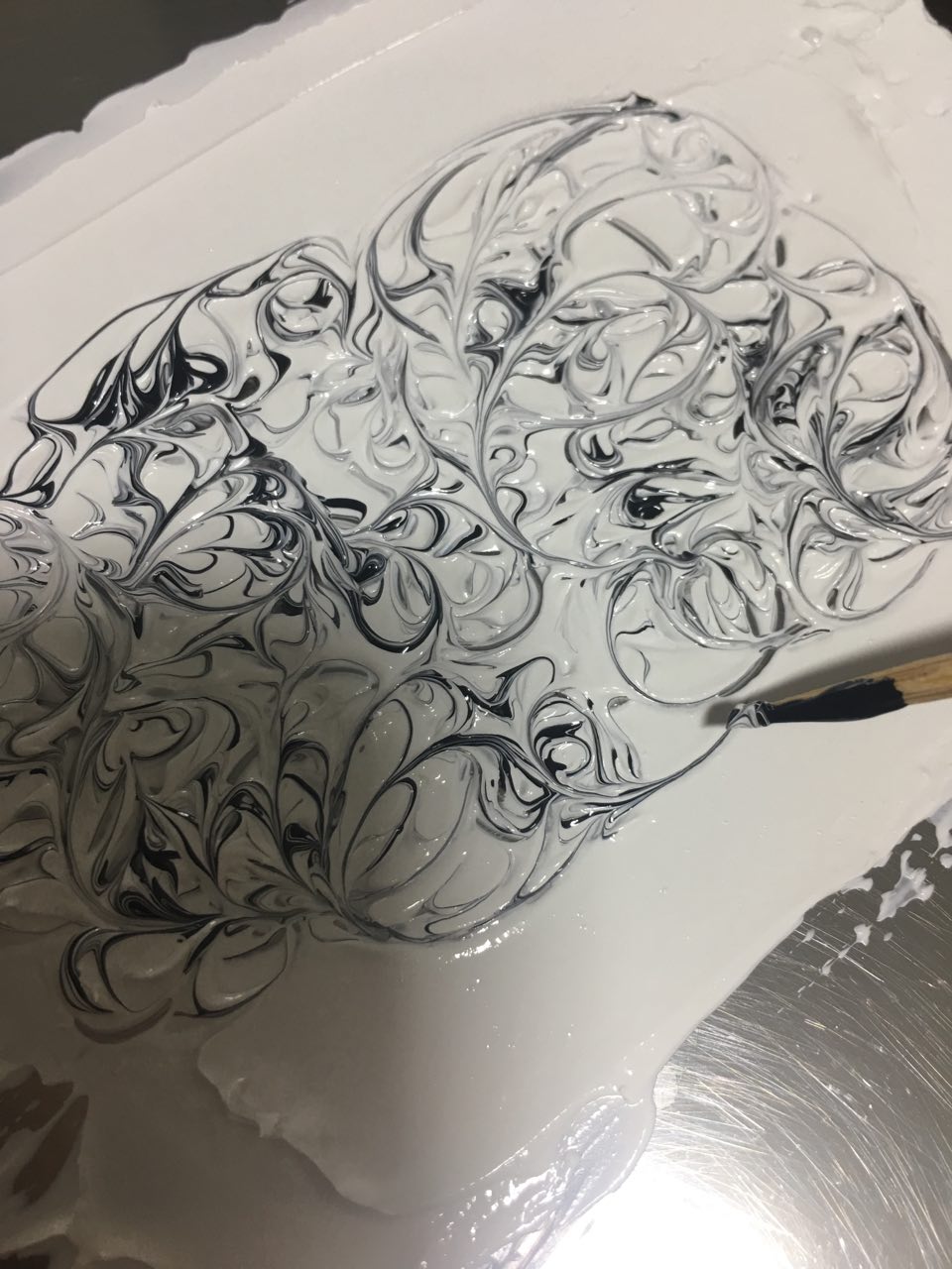
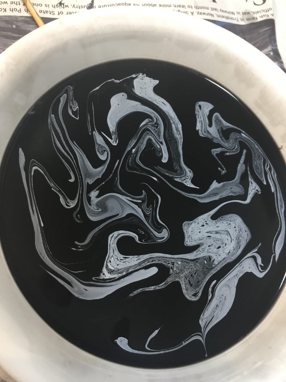
I hadn’t had a surprise party since I was 12, and the baby photos tied onto the balloons further brought me back to my childhood. I aimed to convey this nostalgia that came along with the surprise by the use of the printing press with streamers, and the melting of oil pastel and the usage of drawing block as I used to scribble in the drawing block I had all the time with me with oil pastel.

I found the high contrast  with black and white to be most applicable after a range of experiments earlier, which you can read about in my sketchbook.

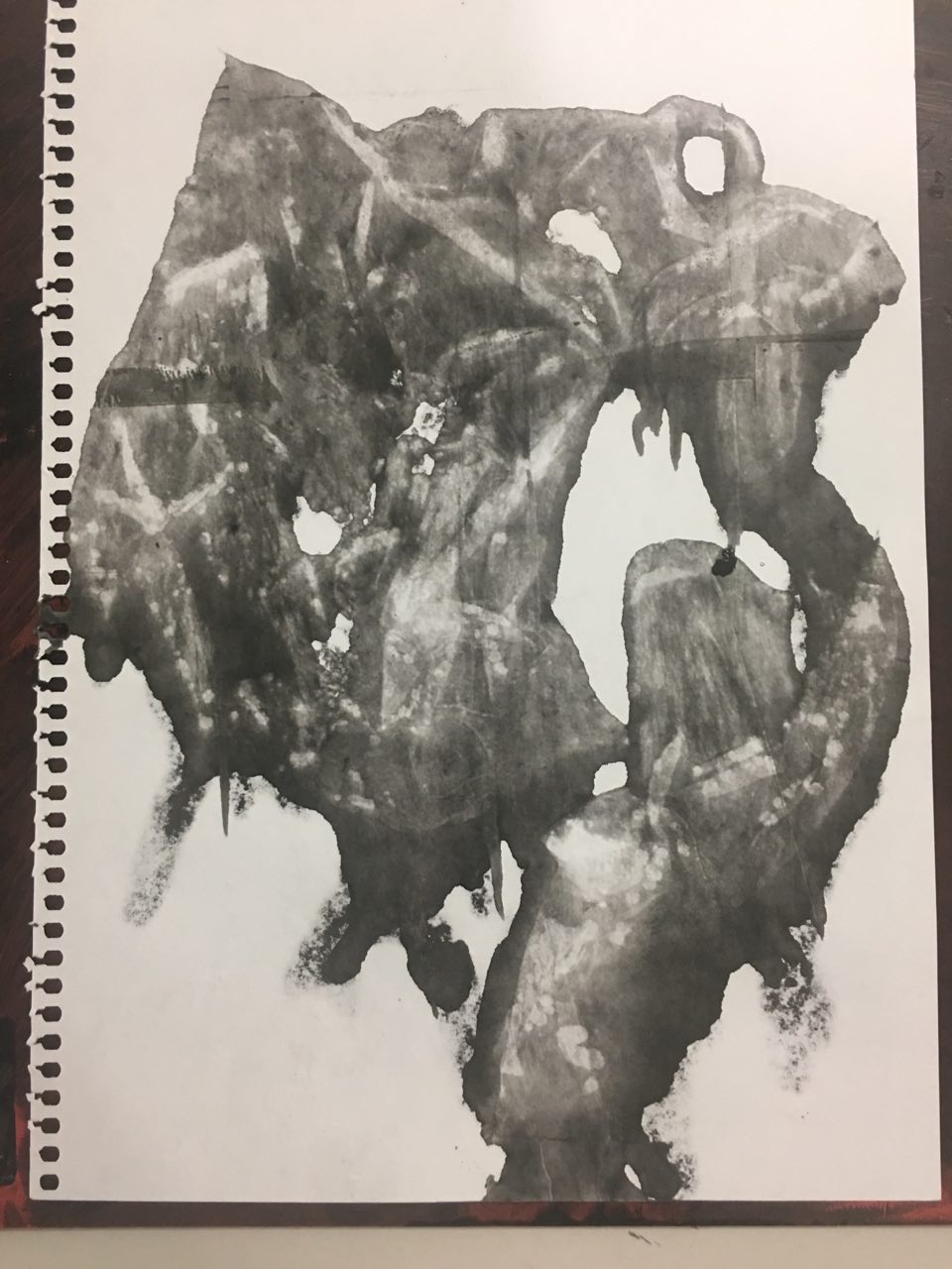
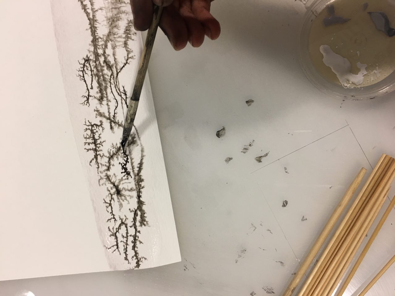
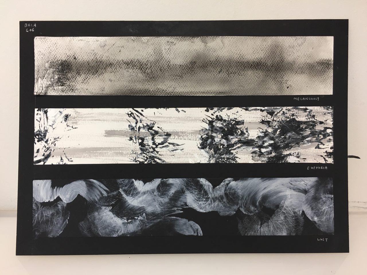
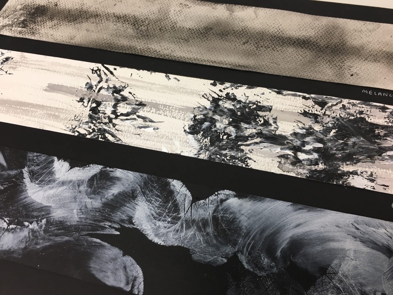
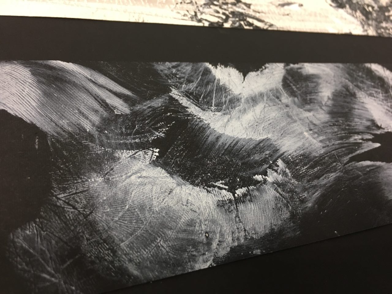
4. Melancholy – April 2016

I hit my lowest point in April 2016, when I broke up with my boyfriend of two years. I remember being in a state of sadness so encompassing that I felt very numb. I’d start crying in class for no reason, out of nowhere, just because the sadness would hit me. I felt empty, and the worst bit was not knowing when I was going to get better. It felt like the sadness was going to go on forever.

I expressed this sense of the sadness going on and on through the composition – the single line running through the strip. I used watercolor paper to my advantage, the texture representing the static I felt in my head.

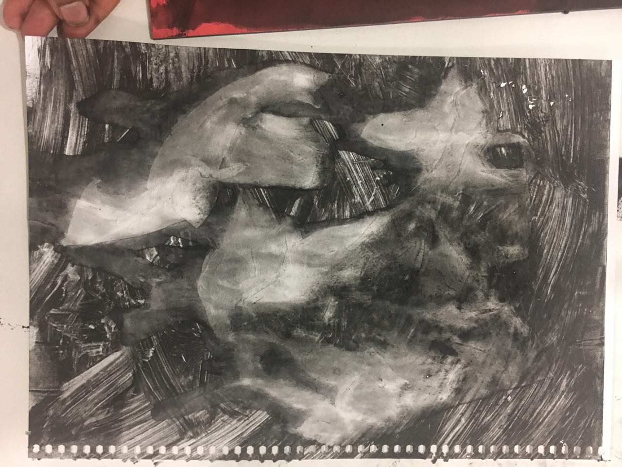
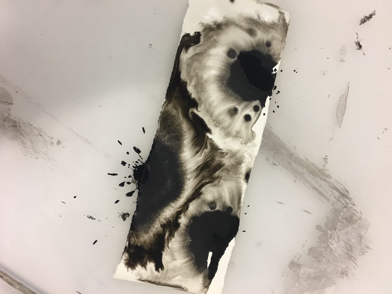
5. Euphoria – May 2016


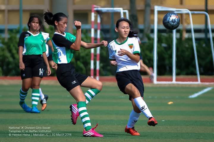
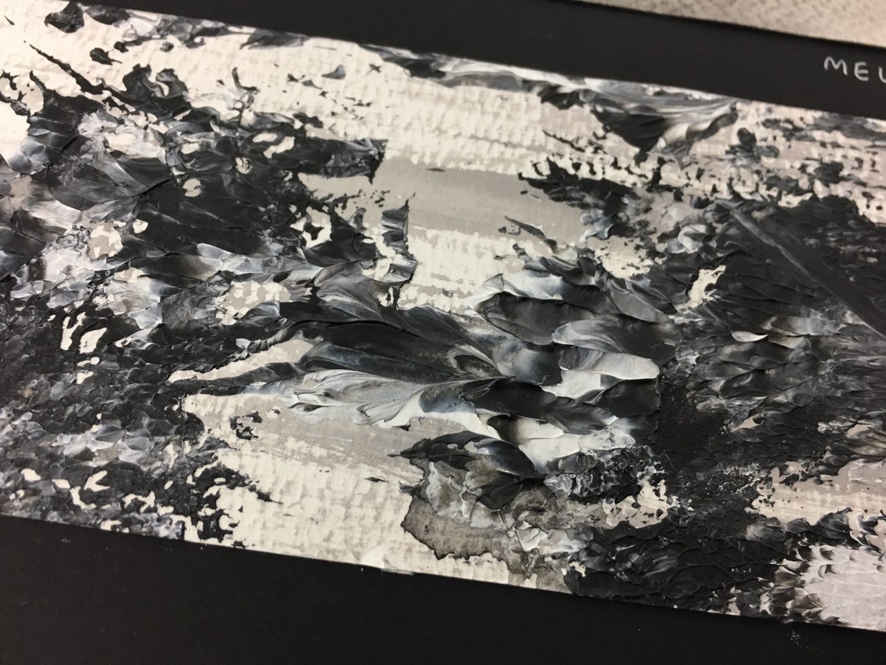
One of the best moments in JC followed shortly after my lowest point. In our soccer semi-final against Tampines JC, we were tied 0-0 until the last few three seconds where our striker made a shot, and it went in.

The whole game up till that point was generally fast-paced, and we were all so, so tired, with the hot sun blazing in our faces. The moment when the ball went in was the singular most euphoric moment I have experienced recently.

I aimed to convey the movement in the soccer game with the short, choppy strokes in the background, overlaid with textured patches of paint to convey the burst of emotion.
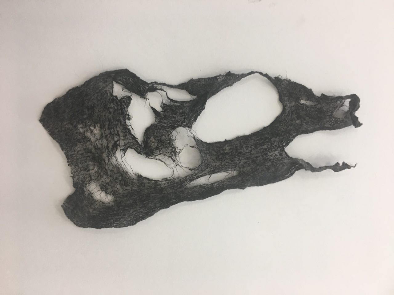
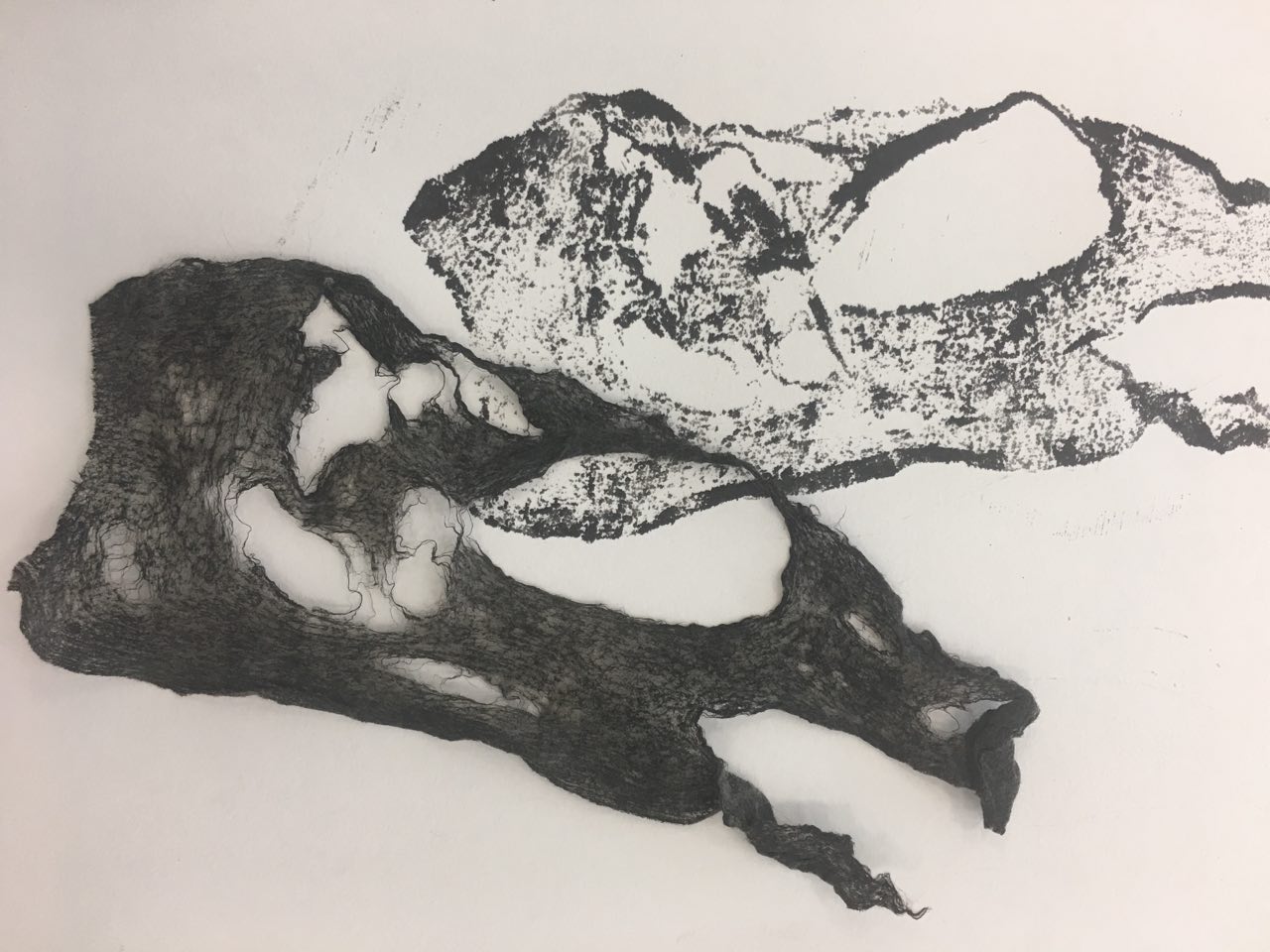
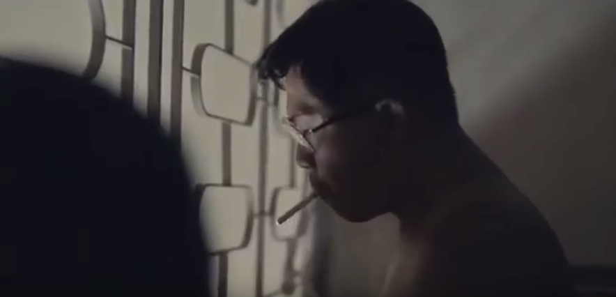
6. Lust – July 2017

I finally felt ready enough to start dating again in July 2017, when I went overseas for three months. This strip is the expression of the lust I felt when I dated then.


[2D] Process: My Line is Emo

 Mark-making Session 1 

For the first session, I scavenged around my hall and brought some items with interesting textures to experiment with.

  Mark making with cereal

Whenever I’d eat my Banana Nut Crunch cereal in the morning, I’d find the texture of the cereal really cool. I’d take a piece and run it between my thumb and index finger, feeling all the tiny bumps.

Hence, it was natural that I’d bring it along for our first mark making session.

I tried rolling over the ink with a roller, but very little of the ink ‘stuck’. Hence, I resorted to spreading chinese ink over the cereal.

I manipulated the cereal by using it whole, as well as crushed into tinier bits.

 Experiments in cling wrap

For ‘frustration’, I tried to get a “glass shard’ effect using cling wrap, block ink and the printing press. The first time I tried it, the print came out too light. I tried again using more ink, and the print came out a lot more distinct. I wasn’t too pleased with the overall effect, though, and vowed to retry using cling wrap should I deem the glass shard effect the final effect I was aiming for.

 Experiments in foam 

I tried using foam to create some marks for “surprise”.  I experimented with a variety of spacings – spacing the foam close together and wider apart to create a range of “explosions”.

I also ripped the foam apart into big and small chunks, hence experimenting with the “weight” of the explosions I was trying to create.

Experiments in wet tissue – printing press

Experiments in wet tissue – manual hand pressing

I also tried soaking the wet tissue in chinese ink and manually pressing over it to see if I could get another type of print from it. It was questionably successful – it did look like cloth, but not to the detail I wanted. I think its texture would be better expressed by using the printing press.

Mark making session 2

Marbling experiments

I tried spreading some white paint on a plate, swirled some black paint over it, and used a palette knife to make the mixing more chaotic in certain areas, like a burst of emotion for euphoria.

I then placed the drawing block over and lifted it off, creating very intricate patterns. I really enjoyed the intricacy and dynamism of this (refer to sketchbook), and decided I wanted to incorporate this in some way atleast.

I tried marbling with the paper from my sketchbook, drawing block, watercolor paper, and newsprint, with chinese ink and diluted black acrylic paint. I got the best results from newsprint, which seemed to take up the intricacies of the swirls the most.

I also experimented with the amount of ink used i.e. how “dark” the marble was, which affected the intensity of it. I felt that for lust, the darker marbles would be more suitable for the headier, sexual nature of the emotion.

 Experiments with Salt


I thought about I felt very weak, and dehydrated, when I was feeling melancholic. Hence, I thought about which materials soak up paint, as a metaphor for energy, and it immediately hit me – salt. It dehydrates, sucks the energy out of you (the paint) – I sprinkled some salt on paper and had it form patterns.


 Gauze

As the previous manual pressing with wet tissue was hardly satisfactory, I tried again with gauze, which has a more distinct cloth-like pattern than wet tissue. Again, it did not imprint well enough, leaving me to finally decide against this method.


 Experiments with palette knife

Having had used palette knives for some of the earlier exploration with white paint and swirling, I decided to try using the palette knife for making marks itself. It created fluid, stable lines, which wasn’t suitable for any of my emotions which were unstable in one way or another.


For frustration, I tried scratching the splotches of paint with the paletten knife to create straight, even scratches. I prefer the more “raw”, not straight scratches as I feel that they convey the instability you feel when you’re frustrated.


 Experiments with glue

I wanted to convey the feeling of emptiness you feel when you’re melancholic with an empty background, literally, as white glue dries clear. Acrylic paint broke up into tiny pieces when mixed in with white glue, giving the effect of the fuzziness and buzzing you feel in your head when you’re sad. I really enjoyed this effect, and made a bigger strip to compare against other “Melancholy” composition strips to make a final decision.


 Alginate experiment (failed)

To get the skin texture, I tried covering my hand and pouring alginate over it. Initially, I inserted my hand into a small plastic container, but it turned out to be too small. I then used a bigger pan and completely covered my hand with alginate, to be used as a mould later.

I initially wanted to fill mould with terracotta clay but it dried up, even though the pack was unopened. I then filled the mould with glue, but for some reason, it didn’t dry even after 3 days. I didn’t try again because on consultation, I realized that the cast would cross over into the 3D realm.

Detergent & milk experiments

I’d read about how detergent causes ink drops to travel outwards in a swirl in milk, due to the detergent breaking down the fat in the milk. I tried it with diluted black acrylic paint, but it gave a completely different reaction – instead of swirls, the paint “broke” into smaller bits and travelled outwards. I feel that this would be more appropriate for surprise.

Foam block experiments

I’d also bought a small foam block as I thought that the surface texture could be interesting. First, I spread black acrylic paint on the block, then did a usual pressing down of the block on paper. I enjoyed the print it gave – there was something really rough and raw about it, which might make it a good texture to incorporate into parts of “frustration” or “melancholy”.

Then, I spread some white paint on it into small ovals as I hadn’t done that yet so far for “surprise” – I had made marks that looked like explosions, but nothing that looked like small spots of surprise. The resulting was very interesting, especially with the foam’s texture overlaid on the white spots.

Lastly, I spread some glue on the foam, knowing it would melt it. Indeed, it did, and when I pressed down the foam block on white paper, the resulting print had a bumpy, 3D texture as well. It looked like splatters, but as predictable as the splatters I was used to seeing – the lines were stretched in more random directions, came in clumps – it was a visual treat on the eyes.

Mark making session 3

I went back to the Foundation 2D studio for about 3 hours to experiment more with different materials, as well as try a new range of gestures.

Frustration: punching and scratching

I thought about the actions I associate with frustration: violent ones, such as punching and scratching. I either want to punch someone or scratch my skin out (two different levels of inflicting hurt: either hurting others or hurting myself) so I hence spread some block ink on my knuckles and punched a paper – various times, as different intensities and ways of punching produced different results.

My scratching attempt was wholly unsuccessful and did not look as frustrated as I wanted to be as I had short nails, and hence most of the paint went on my fingers themselves, so I figured it would be better to scratch onto a surface which is already painted.

For frustration, overall, I figured that scratching would be better as personally, when I’m frustrated, I try to contain the emotion and hurt myself by trying to contain it rather than releasing my frustration and hurting others.

 Making my own mark making tools

Washed some milo cans I’d drunk out of and made my own “pens” with satay sticks, masking tape, and aluminium from the milo cans to make more innovative marks.

I felt like I needed marks that were more staggered, unsure, uneasy – for this purpose, I chose to make my own mark making tools. I cut up two milo cans and made five “pens”, some of which are pictured above.

 Other process photos

Gauze Fan brush Potpourri
Chinese ink Melancholy (1)

Process for folded paper

Melancholy (2)

Marbling of Tissue paper

Mark making session 4

Streamer prints

Melting oil pastel with heat gun Making of Thunnoor paste Anxiety – making of paper mache

Image transfer experiments (failed)

The image transfer didn’t work with hand sanitizer, rubbing alcohol, or aerosol spray – in hindsight, I should have used xylene ( ; ω ; )

[3D] Pandora’s Box Part 4: Final and Applications

iiThe final models  。゚( ゚^∀^゚)゚。ii

I loved both of my final models a lot, so I decided to make them both.

iiModel 1: Made using foam, paper and marble sampleii

(Large application) Signifies a rock climbing wall, where the course gets increasingly difficult – textured and relatively easier to grip at first, the course gets smoother and harder to climb up as the climber progresses – how would he grip onto marble? I’d call this The Killer Rock Climbing Wall.

iiModel 1: Other applicationsii

(Small application)

A minimalist showerhead, made of aluminium, stone, and ceramic, inspired by the work of Kazuyo Sejima.


The Kazuyo Sejima works I was inspired by for the showerhead:

I really enjoy her simplicity and the clearness of concept that can be seen in her work. I aimed to emulate the subtly reflective surface of the Sumida Hokusai museum with the aluminium, and was inspired to include stone after viewing her house in Samaya.

iiModel 2, made of foam, paper, acrylic, leather sampleii

(Small application #1) It’s supposed to be a goat rocking hair for children, with the paper with a fabric texture being inviting and comfortable to sit on, acrylic adding visual interest, and the leather SO being the handlebars for the child to grip on to as leather has very tactile quality.

iiModel 2: Other applicationsii


(Small application #2) A minimalist swing, made of steel, acrylic and marble. I feel that people go on swings to relax, and the minimalist aesthetic would help with that.


(Large application) A building to zipline from, made of wood! I was inspired by Kengo Kuma, who uses wood in his buildings. I thought that this building where you could do the flying fox from could be housed in a forest, and hence the wood that it is made of could help it look harmonious with the environment.


The Kengo Kuma works I was inspired by:

The Darling Exchange looks unified with the greenery surrounding it, even with the more industrial buildings around it, with its use of wood. I really like how even with its unusual form, it retains an organic quality with the its choice of material – I tried to emulate this unity with the environment with the usage of wood for my large application, the zipline.


I love the Kengo Kuma Wooden Bridge Museum for again, the use of wood. I think it’s very comforting and homely, and could reassure someone trying to zipline off a significant height. I think it’s more appropriate then, say, steel or something more “cold” for such a scary thing to do for most people. I think the wood would make them feel more at ease.


iiReflectionii

I’m pretty pleased with how my models turned out – especially model 1 for the clean edges. I learnt a lot about materials – I learned how to work with foam, for a start, and found that textured paper – more specifically the one I used for the dominant of the first model – is a lot harder to get not to fray than it looks.

I learnt the most about the constant process of revision. The 2D sketch analyses were hard to do at first – simplifying is harder than complicating – but I learnt a lot about proportion and balance from the whole journey. Thank you for coming along on it with me *:.。.o(≧▽≦)o.。.:*


[3D] Pandora’s Box Part 3: The Technicalities

  The technical side of things 

With our class presenting our sketch models to one another, one word I heard a lot was “same”. To avoid this sameness in my model, I did pretty laborious technical drawings where I measured every side and adjusted ratios to reflect good proportion.

I also needed to know exactly where I would need to cut my blocks such that I could wedge the SD and SO in. And so I made another technical drawing, with the accuracy down to 0.05cm.

These gave me a great peace of mind – knowing I wasn’t just roughly estimating a third or a half. It also helped me to visualize the sculpture as a whole, and made me more comfortable with 2D sketches of 3D models.

Behind the scenes


Here’s me pasting some textured paper on a foam block on zen mode, and some satisfyingly crisp edges.

[3D] Pandora’s Box Part 2: Foam models

llCardboard to Foamll

As the cardboard boxes were really big and hard to work with physically (I couldn’t hold them up to see the proportions of the boxes relative to each other), I decided to make the necessary revisions in foam.

  Sketch Model 4ll

  Sketch Model 2 Version 2ll

  Final Model 1ll

  Final Model 2ll

 The story of how I got to this final outcome can be found here: Process Part 2  

[3D] Pandora’s Box Part 1: Cardboard models

  Sketch models and masking tape ヽ(・∀・)ノ  

For our first lesson, I worked with the cardboard boxes.


I found it pretty therapeutic, being able to use that much masking tape at one go. I felt like the world’s most proficient tape-tearer at the end of the lesson.


Anyway, I ended up creating three preliminary models with my assortment of cereal boxes, contact lens boxes, and milk carton boxes scavenged from the supermarket near my hall.

  The Task   

I also got my word – XYZ-Axis. Honestly, I was super stuck on where to start (っ˘̩╭╮˘̩)っ I told myself to keep calm and work through the word, though.

The first thing that popped into my head, was maths – more specifically, vectors, a topic I had to do in Junior College. The XYZ-Axis, to me, are very stable: they help me place points on a plane and understand what a vector looks like. They are always reliable when you start doing a vectors question.

  My approach  

Even though the task required us only to have the D, SD and SO be clear from 4 out of 6 angles, I thought about how the axises don’t change no matter what, no matter how u could rotate a model (or how you do a vectors question), and decided to take it as a personal challenge to have my D, SD and SO be clear from all of the 6 views – like the XYZ-Axis: constant and never changing.

  Initial investigation and 2D sketch models: Process Part 1


[3D] My interesting earring

  Laying Down The Fundamentals (ノ´ヮ`)ノ*: ・゚  

In our first class, we learnt about the Dominant (D), Subdominant (SD), and the Subordinate (SO). We are asked to bring along an interesting 3D object, and we discussed some of them in class.

Here’s my object, one of my favorite earrings. (Excuse the fingernails, I was painting beforehand).

 My 2D sketch analysis:ll

We also learnt about some design principles, such as proportion, symmetry, and texture, as well as finishes, opacity, mass and voids, and how all these affect the viewer’s visual experience.

It’s gold in color throughout, hence the identification of the dominant, subdominant and subordinate was wholly dependent on the sizes of the parts relative to one another. The rule of thirds is also reflected in the lengths of the dominant and subdominant.

We also learned about the Gestalt principle in the second lesson, where my earring was used as an example to show how the individual rectilinear volumes in the dominant make up the overall shape.

It was a fun start to the module! ٩(◕‿◕。)۶

[4D] Week 2 notes + Class Exercise

4D Visual Characters

  • Sound: Music, sound effects
  • Story: Plot, character dialogue
  • Visuals: Line, shape, tone, color, proportion, focus

Film clips watched

  • Jaws – Sound: builds tension, mood
  • Gravity – Sound layering creates chaos, can replace actual sound of objects (we can’t hear metal debris)
  • Pan’s labyrinth – Sound: creates sense of foreboding as well as escalation
  • Schindler’s list – Question asked in class: why did it go from color to B&W?

Visual Elements

  • Perspective
  • Depth

  • Tone: creates impact, draws attention e.g. Manhattan // can be controlled by props e.g. The Godfather (deep tonal value) // e.g. Equals, Moonlight; can’t use tone in Equals for Moonlight // e.g. chiaroscuro vs flat lighting e.g. The Maltese Falcon, Regression // lighting reveals emotions e.g. Ilo Ilo
  • Spatiality: Depth – foreground, middle ground, background // To reverse depth cues, put everything in the same plane // Warm colors flatten, cool colors retreat // Tonal separation, color separation, textual diffusion, size difference

Class Exercise Week 2

One-point perspective Two-point perspective Three-point perspective

What are the different effects moving from 1 to 3 point perspective?

  • 1 point perspective is direct, straightforward; high level of attention to point of focus e.g. Yarui yatsu hodo yoku nemuru. It also heightens the effect of the unknown.
  • From  two-point perspective to three-point perspective, the image gets deeper. Two-point perspective focuses the attention to the subject in the front or back, while three-point perspective creates dramatic effect and could be suitable for a large exterior scene.
  • More than 3 point: audience gets disoriented e.g. Within You in Labyrinth (1986)


[4D] Week 1 Notes + Class Exercise

Class exercise: To put an object that represents you into an envelope

I chose a polaroid photo of my friends and me, because:

  • I’m always taking photos
  • I’m very sentimental (keep a lot of things, like receipts)
  • My friends are very important to me
  • I like hard copies (like letters over texts, polaroids over digital photos)

Reflection
Although most of my classmates managed to guess which object was another person’s purely by chance or by elimination, some managed to guess as some objects were very characteristic of their owners/had the “attitude” of their owners.

1) Looking at an image

  • Visual Literacy – knowing how to make your images meaningful

Red background: Communicate danger/get our attention


Sally Mann: Photographer


  • Style is very distinctive
  • Subject: Family in suburban landscape
  • Medium: Large-format photography
  • Process: Platinum printing process


2) On making images

  • What makes an image successful?
  • Components of an image: Subject // Story // Visuals // Sound // Medium (e.g. film, interactive media)
  • We should make our images stand out on its own; semiotics w/o relying on captions and titles
Edvard Munch’s The Scream (1893-1910)  Seth Boyden’s Hoof It (2014)  Yoko Ono’s Voice Piece for Soprano at MoMA (1961)  Screaming Girls – Jo-Anne Balcaen (2005)
– During war: anxiety
– Scream: not a literal scream, but a scream of existential angst at a time of war
– Very explicit scream of fear in comparison to Munch’s – Performance piece
– Scream is very differently presented
– Protest: for women & women artists as a whole
– How pop culture can cause hysteria of teenage girls
– Lack of sound: focus on something else, not that she neglected the sound

Class discussion

My research: Bill Viola – Silent mountain (2001)

  • Video artist
  • Based of the 15th century painting The Anunciation (Virgin turning away from Archangel)
  • At first they look provoked & anxious, then feelings become more obvious
  • Like watching a painting move


My groupmates mentioned artists like Bring Me The Horizon and Francis Bacon.

3) Study of Semiotics

Rene Magritte’s The Treachery of Images // This is not a pipe, but it is an image of a pipe


Icon Index Symbol

Why is it important for us to learn semiotics?

Cultural context:

In Roman times, if audience voted this, it means gladiator should die  In Russia, this sign means to offer a drink  Used for the press = middle finger = disaster!

Semiotics: Cultural Codes

  • Rich: How? Posture, Chihuahua
  • Blonde: Dumb? She’s very smart actually, the movie plays on stereotypes
  • Know your audience


Visual Semiotics in Films

Grease (1978) Eyes Wide Shut (1999) American Beauty (2002)
We understand images through stereotypes (which we get from their appearance and costumes) Couple is detached; something is wrong with their relationship (Husband asks for babysitter’s name, Roz, even though the wife mentioned it already) Wife is the alpha (Sign: Family portrait) // teenage girl is detached from her parents (angry teenager vs typical only child who is well-loved and cheerful) // Façade of warm intimate family (rose in the middle of table signals absence of love in the family)


Ferninand de Sassure – Signifier and The Signified

  • Johnie Walker Black Label Scotch: The road to success is paved with rocks (ice). Let us smooth them for you (with scotch).
  • Twice the power, won’t let you down –  Innuendo. We know what is is, but it is implicit.
  • Keira Knightly and Chanel perfume ad: Signifier: linking notion // Qualities: beauty, elegance
  • Betty Crocker: Housewife to corporate looking modern woman // Age: aligned with target audience // Style: becomes more trendy // Race: White to more mixed, brown


[4D] Process & Final: Task 2 – My World

I set out to shoot people and things candidly. I didn’t want to interact with the people there, but rather to capture the motion and activity that was going on incognito, like a fly on the wall.

I knew I wanted to shoot photos organically and without setting props up. I had a clear concept in mind, compared to a plan on what to set up in order to finalize on a narrative (like I did in Task 1). I wanted to take authentic, true-to-life photographs, to show the viewer how vibrant Little India could be through my eyes.

I realized later on that I probably should have had some sort of game plan before going in to shoot for the whole afternoon, because I ended up with around 500 photos. Below are some of the photos I narrowed down in on and edited before picking the final five.

Close ups:

Long shots

Mid range shots

Not involving people

Including people

Criteria for final selection

  • Not to look too messy and overwhelming – I want to create a sense of vibrancy, not chaos like the vibes some of these photos are giving me
  • A central focus? So that again, the viewer doesn’t feel overwhelmed
  • Variety of angles and framing techniques – wanted to mirror the diversity of objects and things you can find in Little India
  • Variety of activities and objects that can be found – food, jewelry, flowers

Final photos decided upon

Description

Although I’m Singaporean, my extended family lives in India. I visit India every year for 1 to 2 weeks. I love these two weeks because I’m constantly surrounded by flowers, fruits, and color – street carts are plentiful in India.

Every time I visit Little India, I’m reminded of those two weeks in June when I usually visit, with all the hustle and bustle that goes on. The colors, the sights, the sounds – all of them are extremely vibrant. The streets hum with energy – of people shopping for vegetables and fruits, of people buying flowers. I hope to express this vibrancy through my photographs.

I post processed the images with Color Balance in Photoshop, adding more reds and yellows. I also used Curves to increase the contrasts of the images to make the colors pop a bit more such as to reflect the vibrancy of Little India.