Monthly Archives: October 2017

[2D] Forrest Gump: Quote 4 – Process and Final

“Remember, inside every girl, there’s a boy.” – She’s the Man (2006)

Brief overview
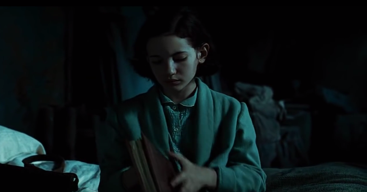
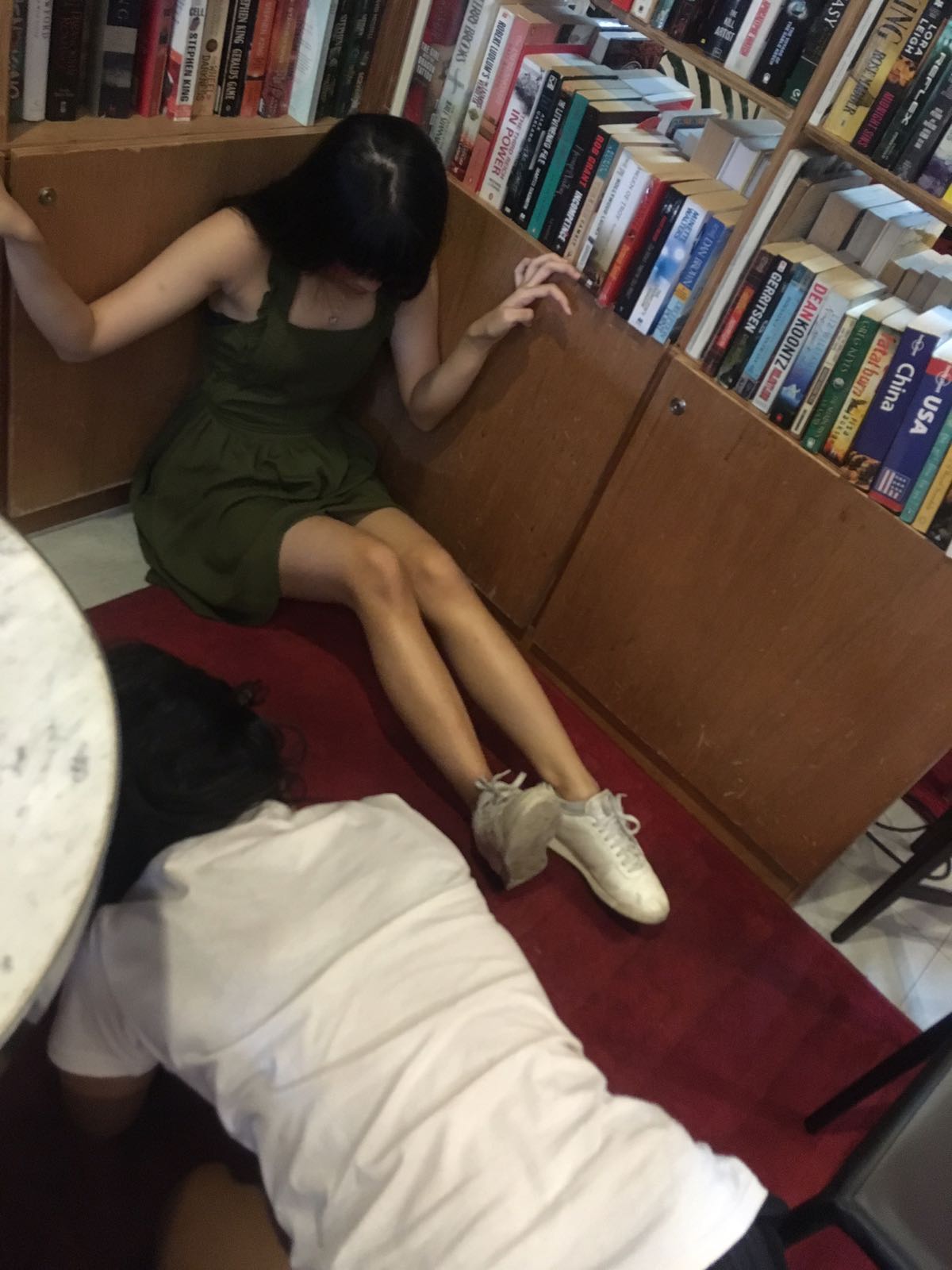
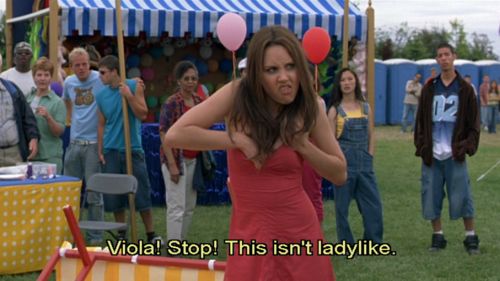
The romantic comedy centers on teenager Viola Hastings who enters her brother’s school in his place, pretending to be a boy, in order to play with the boys’ soccer team after her team gets cut.

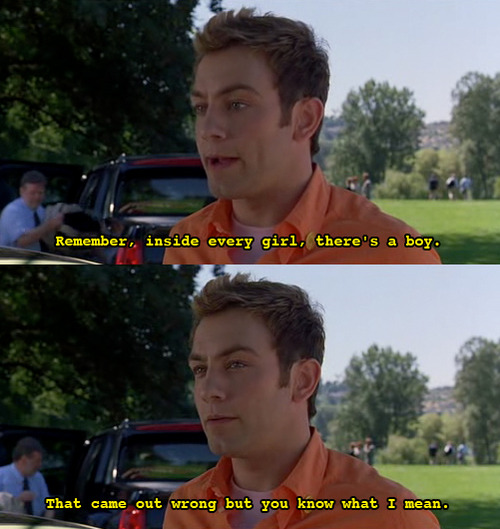
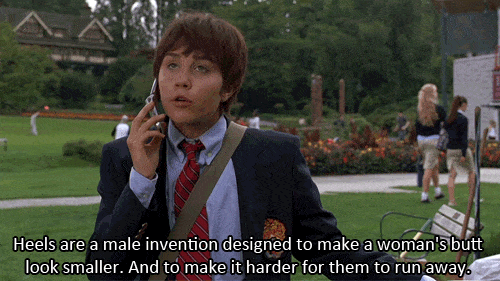
The quote is said by Paul, her friend, when giving her a makeover to look more like a boy. He says this to encourage her in being more confident and sure of herself – that she can embody these more masculine qualities.


Indeed, I interpreted this to mean that a girl can be both masculine and feminine, and need not be constrained by what society expects of her (in the movie, it’s Viola’s mom placing these expectations on her).

Approach
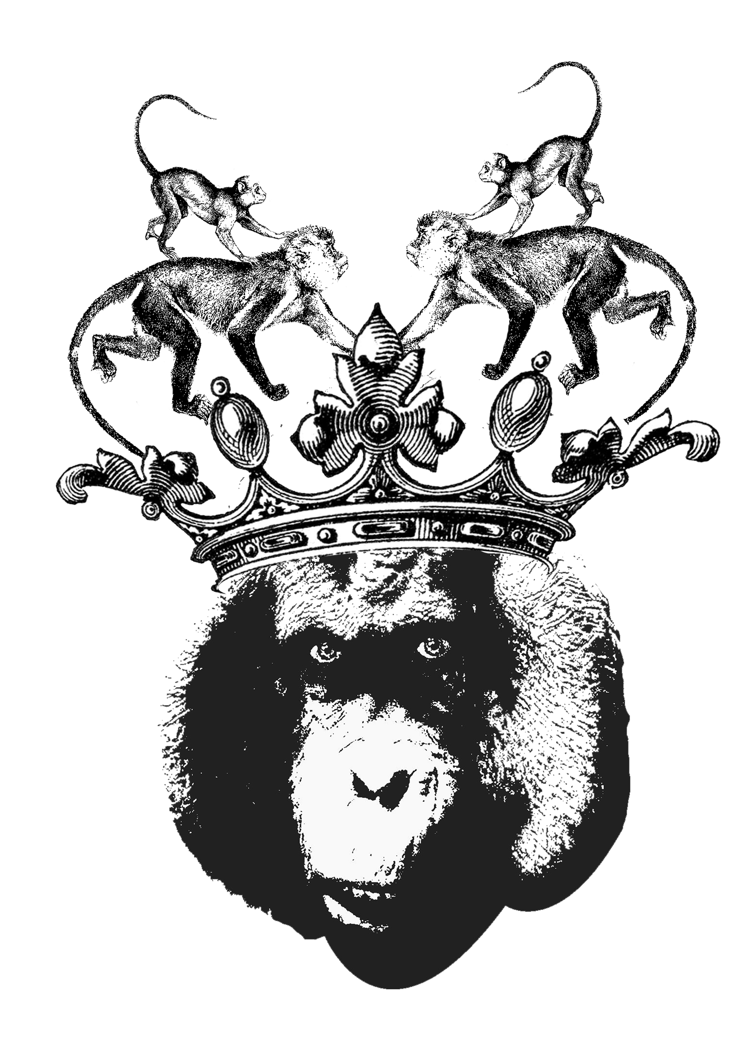
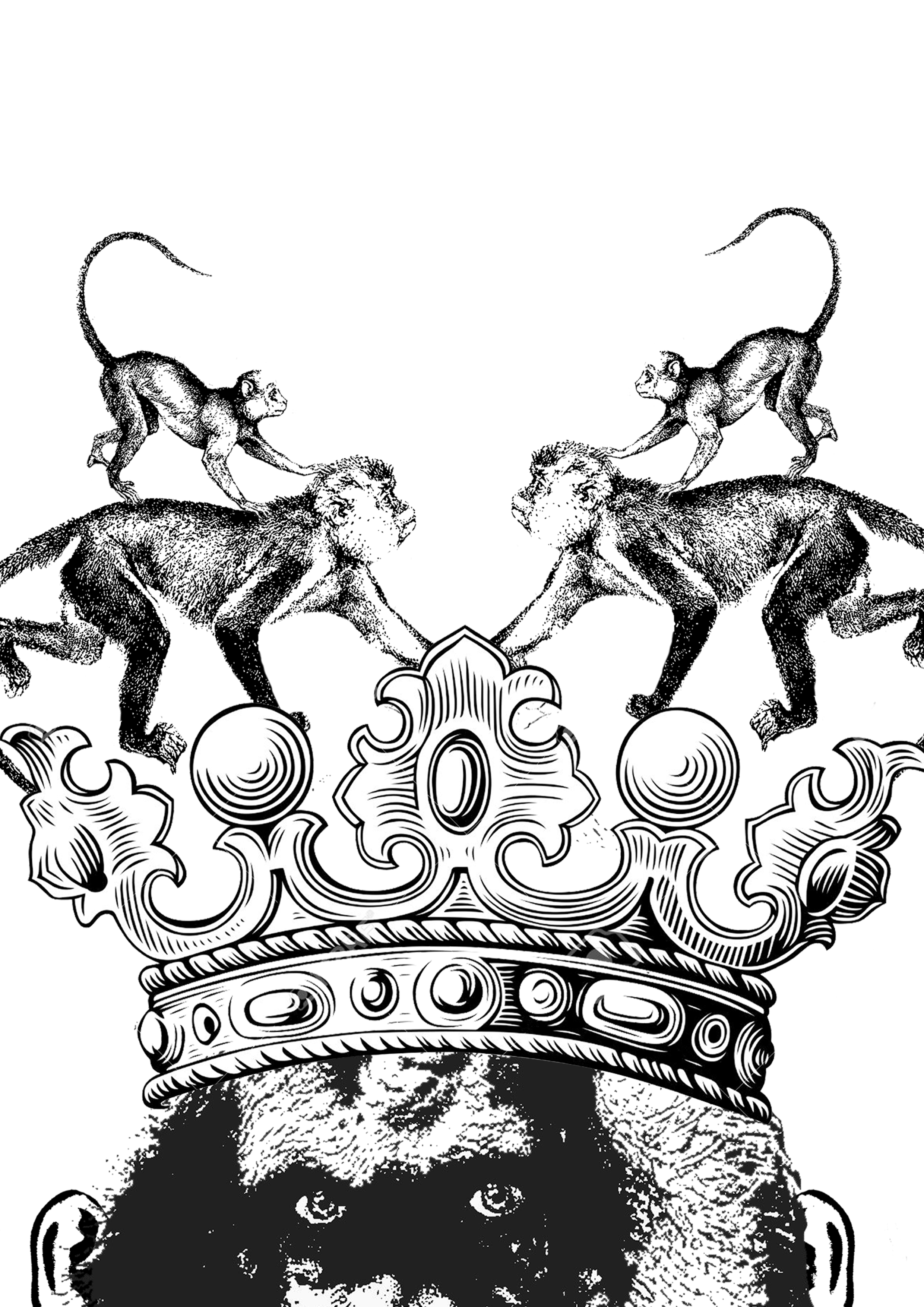
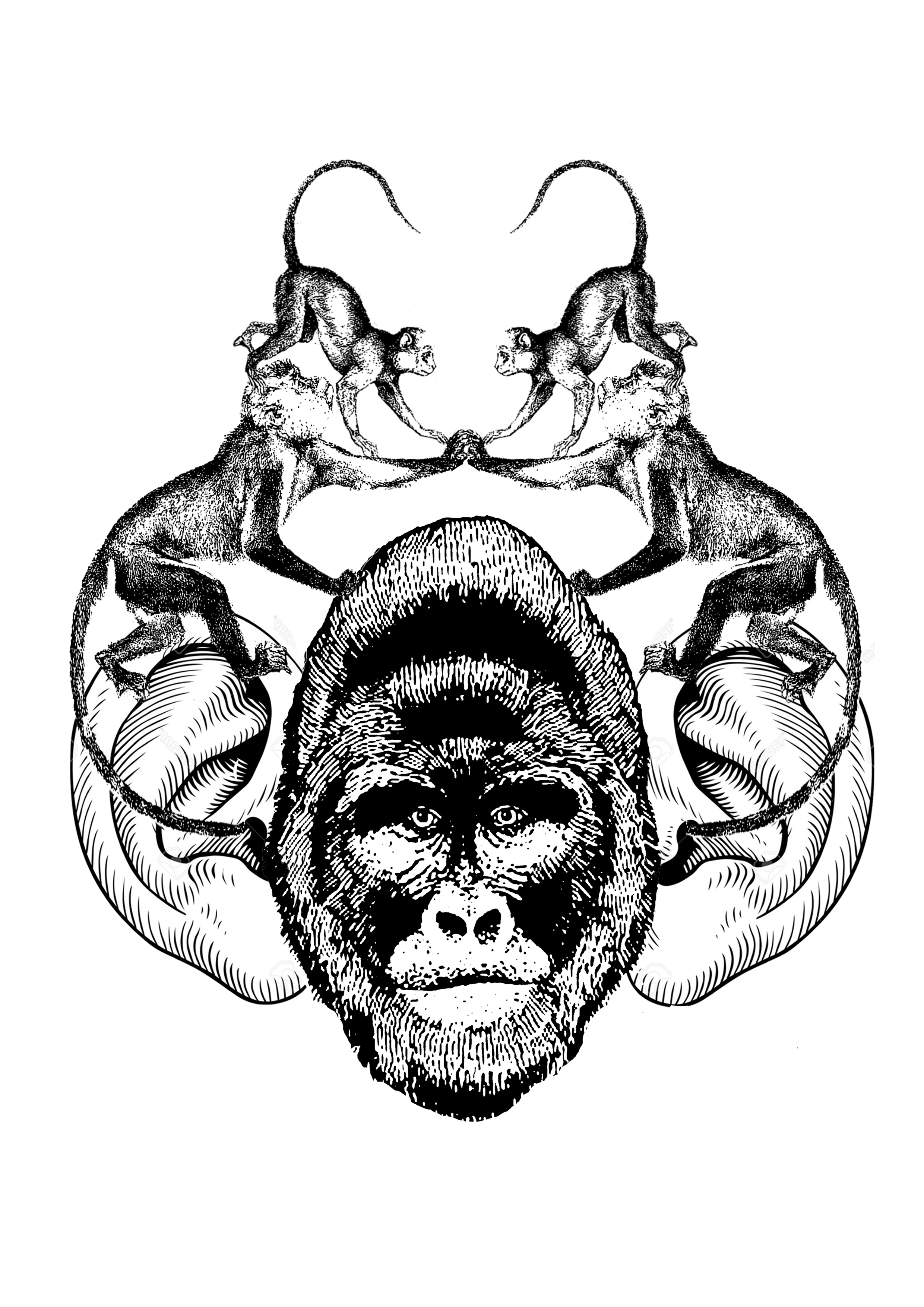
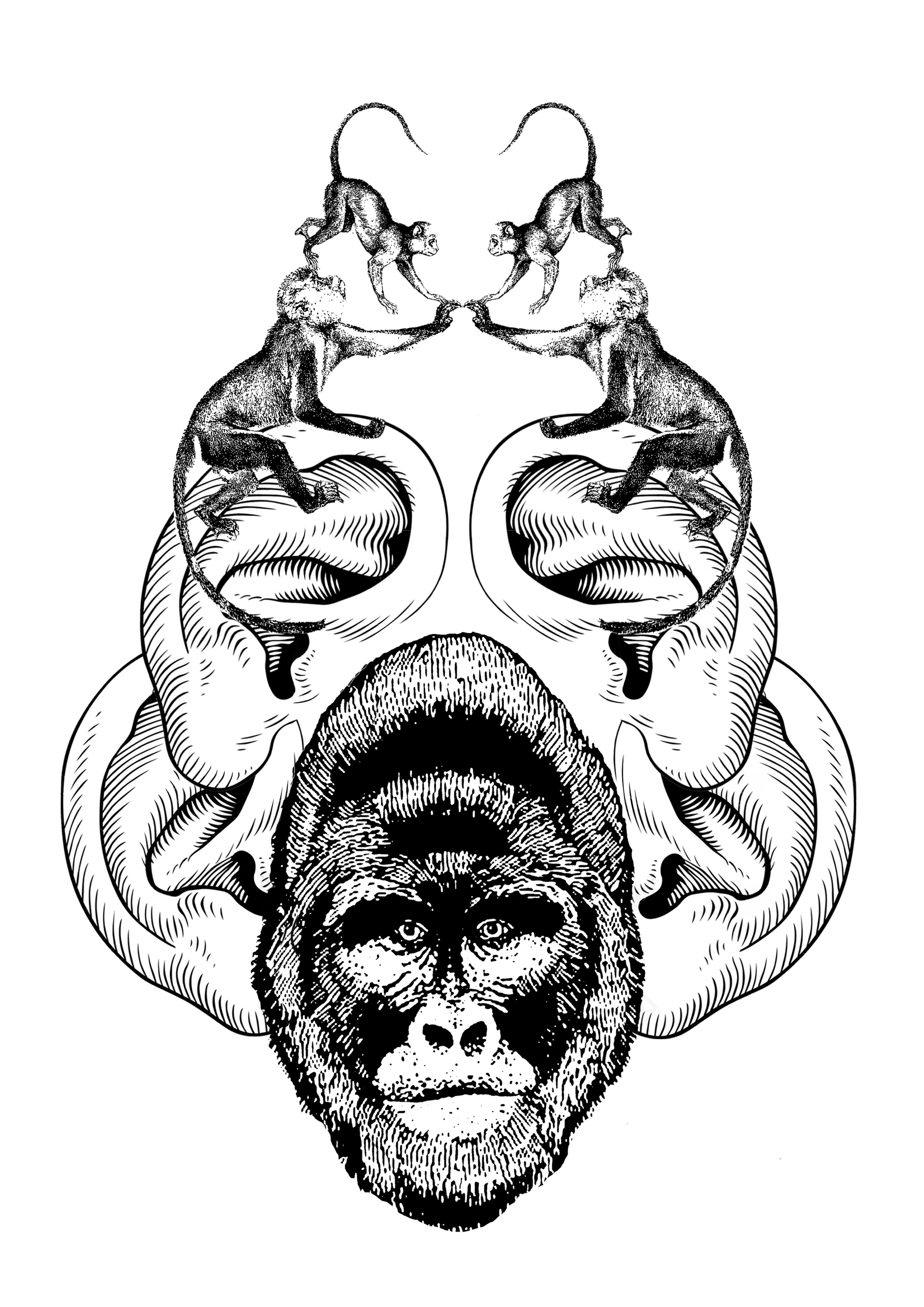
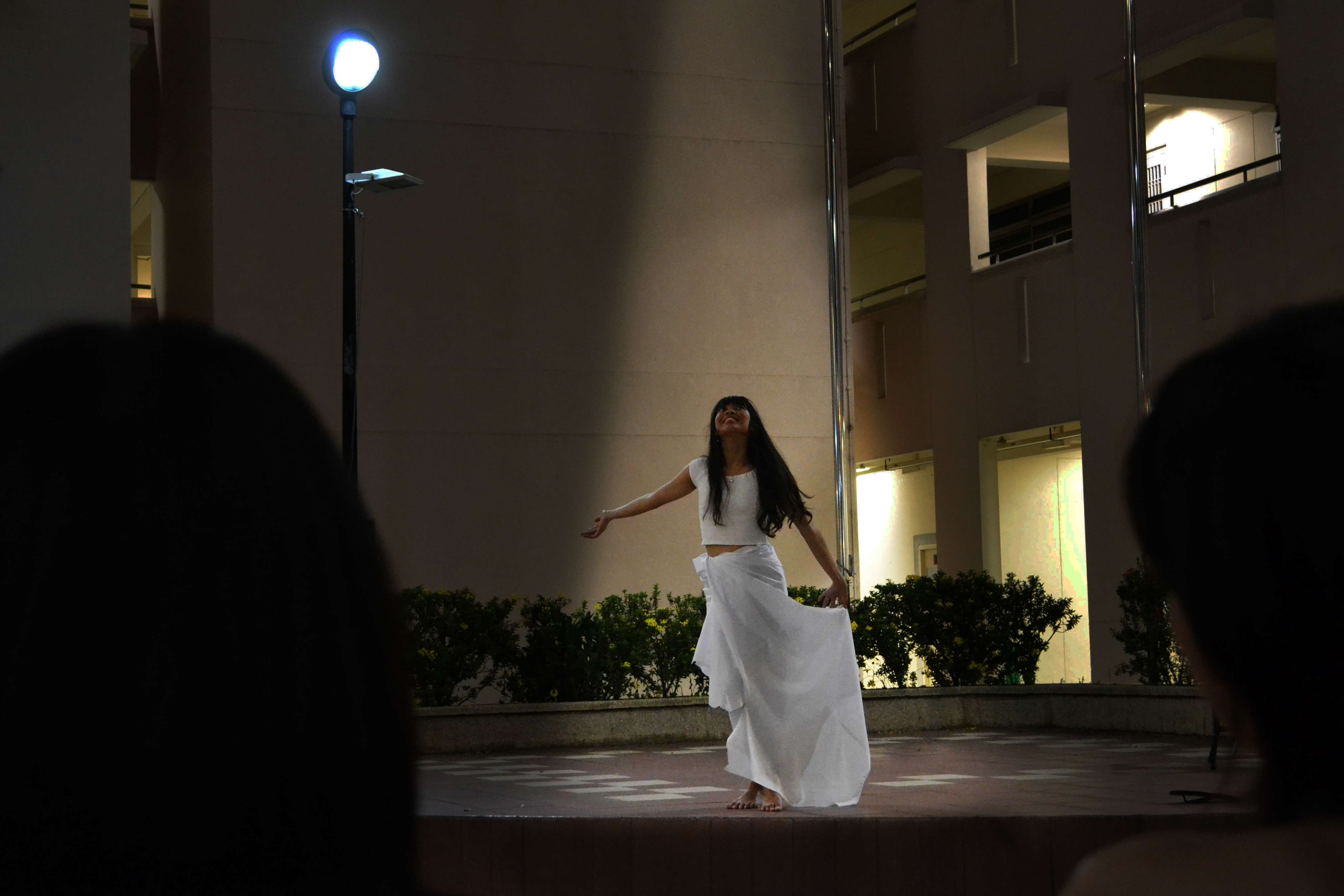
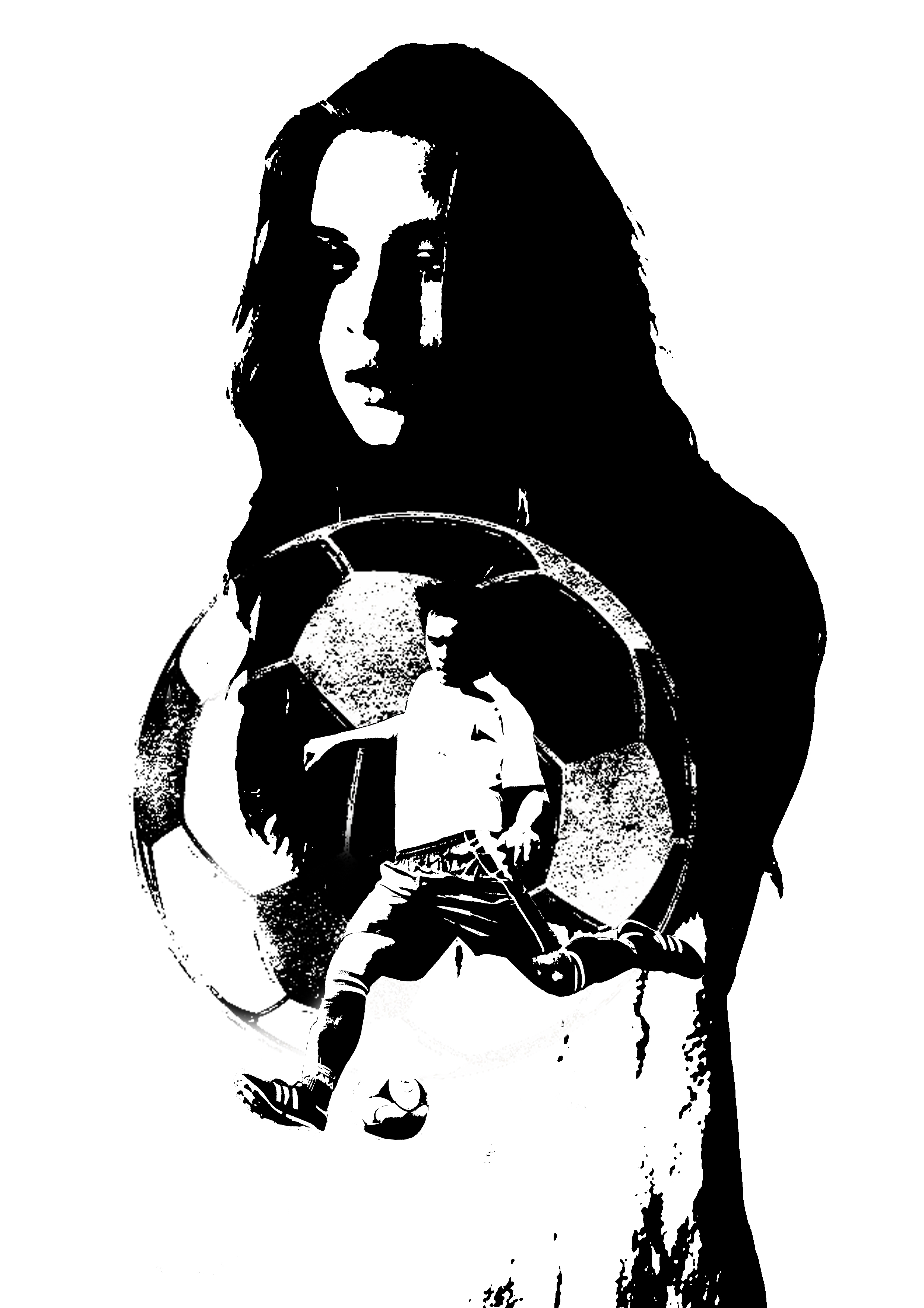
At first, I did very literal compositions where a boy is physically inhabiting the space inside a girl’s body. I chose the boy to be a soccer player as Viola is pretending to be a male soccer player in the movie.

In the first composition below, a male soccer player is coming out of a girl’s torso, as if he is breaking free. This is similar to how Viola is truly a soccer player but is constrained by her gender in the movie, but manages to overcome her physical differences and emerge victorious.


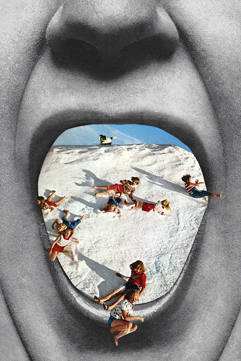
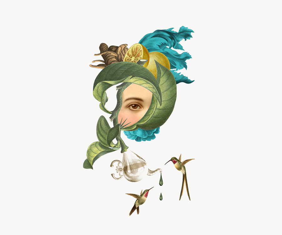
I was inspired by this work by Eugenia Loli, where she uses the mouth as a framing device. I thought it was very appropriate to the “inside” bit of my quote.


I tried to emulate this, using the ball as a framing device in the first composition, but realized I didn’t need two soccer balls as the soccer player is already kicking one.


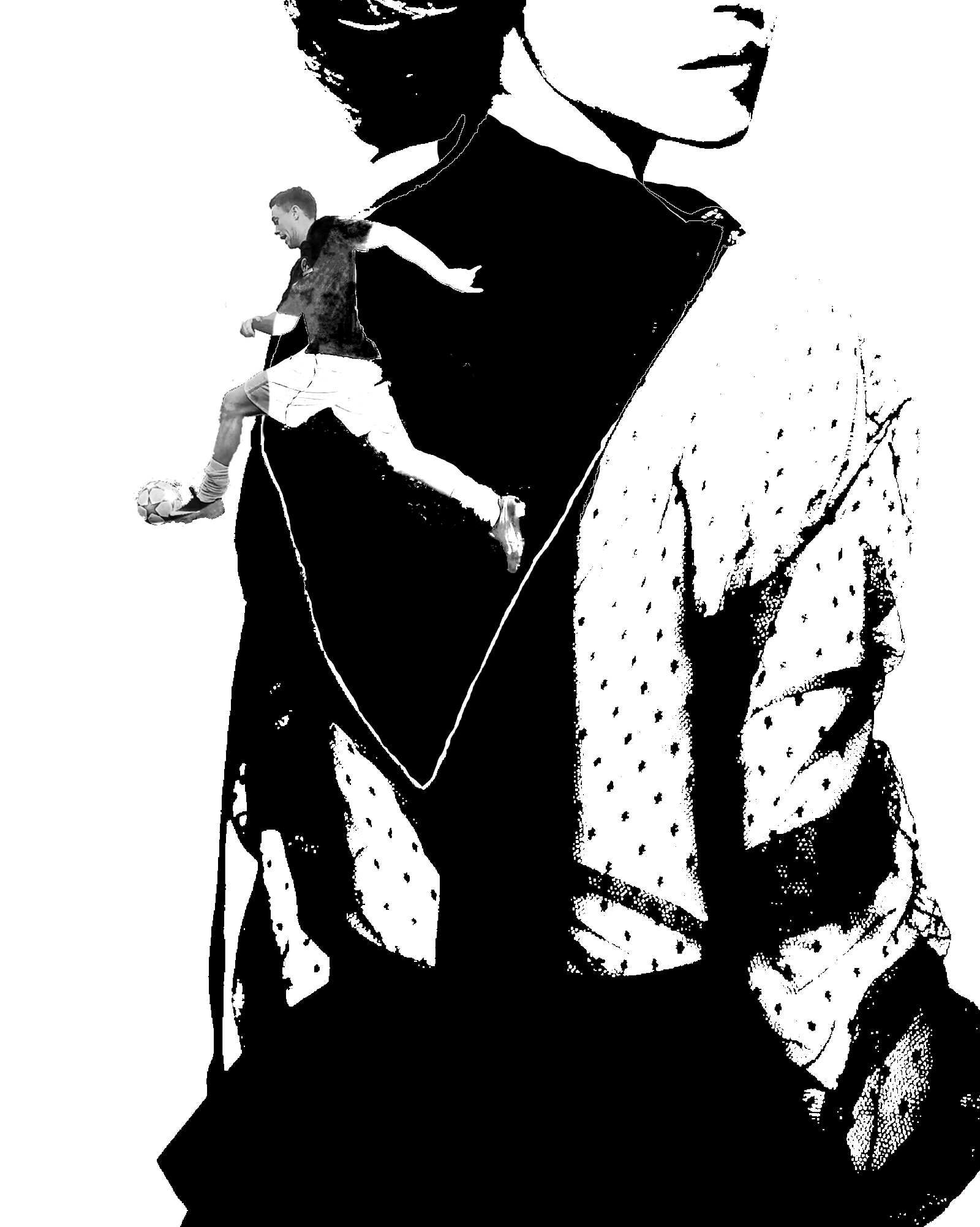
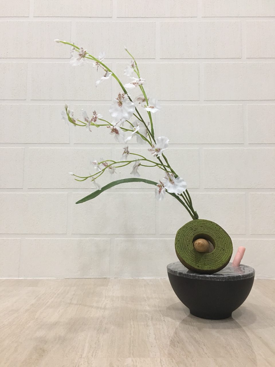
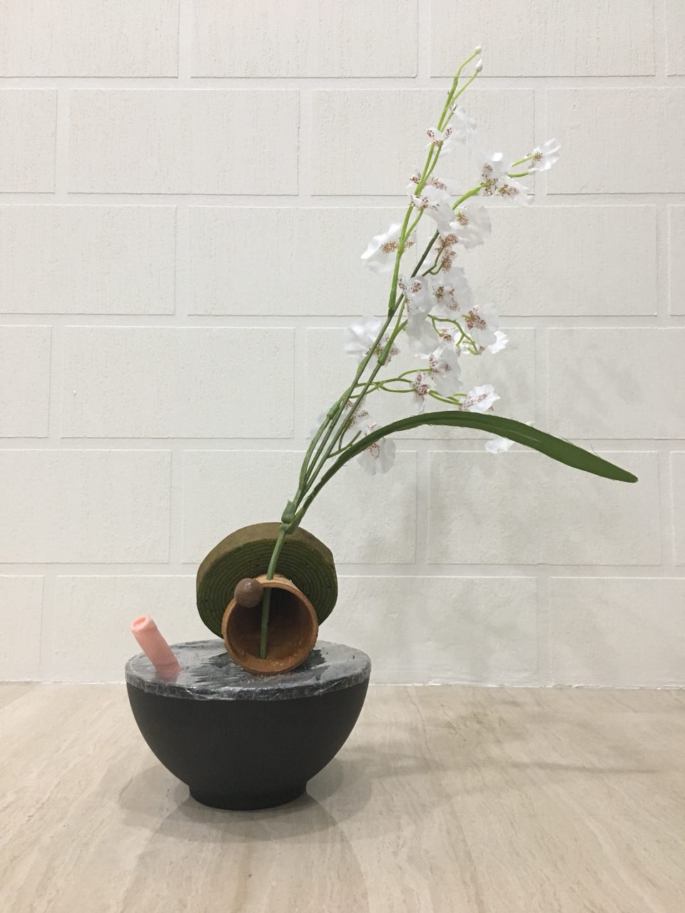
Hence, I used the back of a dress to frame the void from which he emerges in the second composition here.


This is a really terrible draft mash up I did of Lionel Messi and a female head. I felt that it didn’t express the “inside” bit of the quote, so I scrapped the idea.


I had the idea to use symbols of masculinity and femininity at the same time I started using symbols for the other quotes as well. I wanted the viewer to not immediately associate the final image with a girl simply because there was a girl inside, but to have to think a little more.


Hence, I came up with a mindmap to brainstorm some possible symbols of masculinity and femininity.


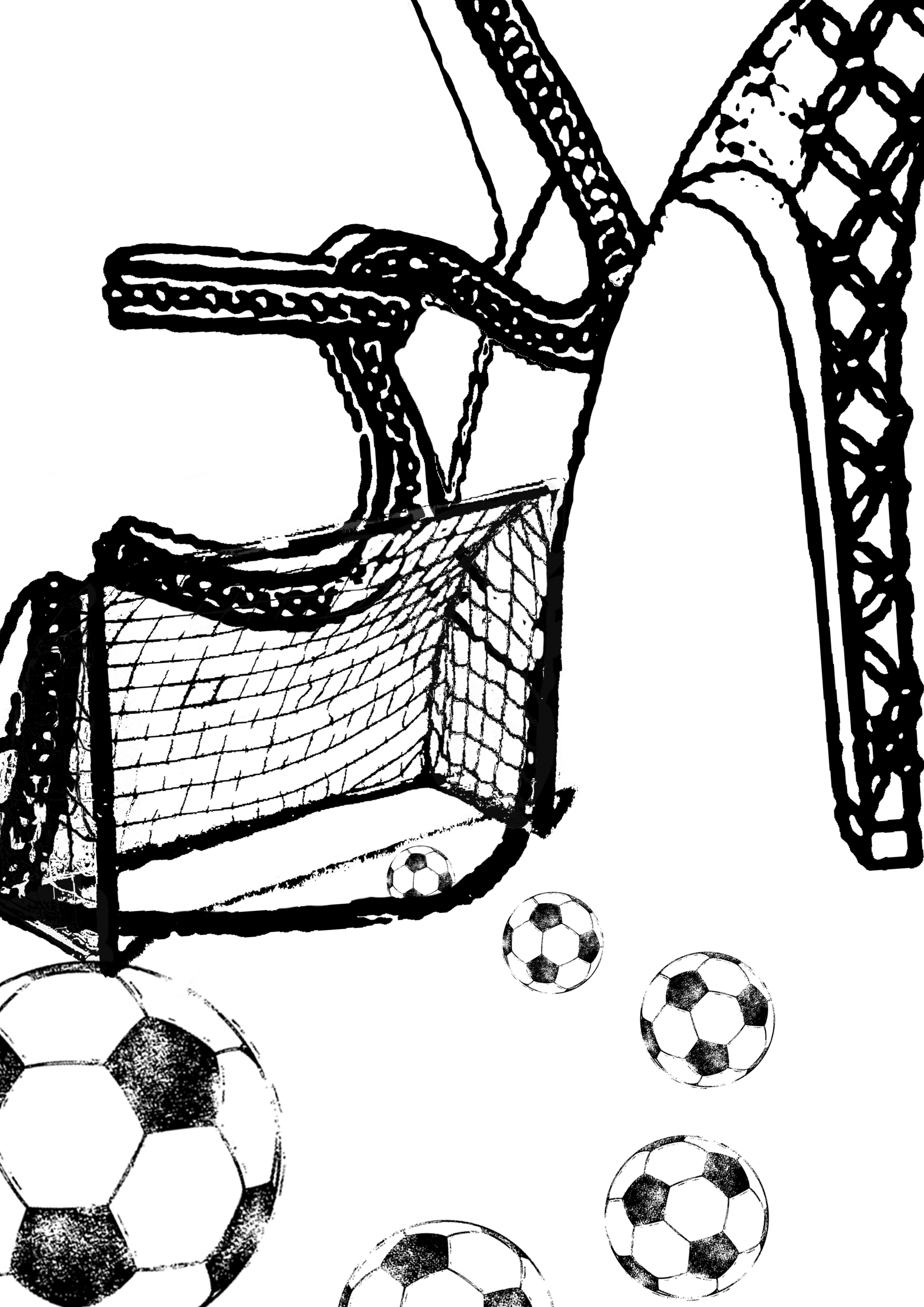
A few compositions I did with shoes and football nets, playing with voids and spaces in the shoes themselves.


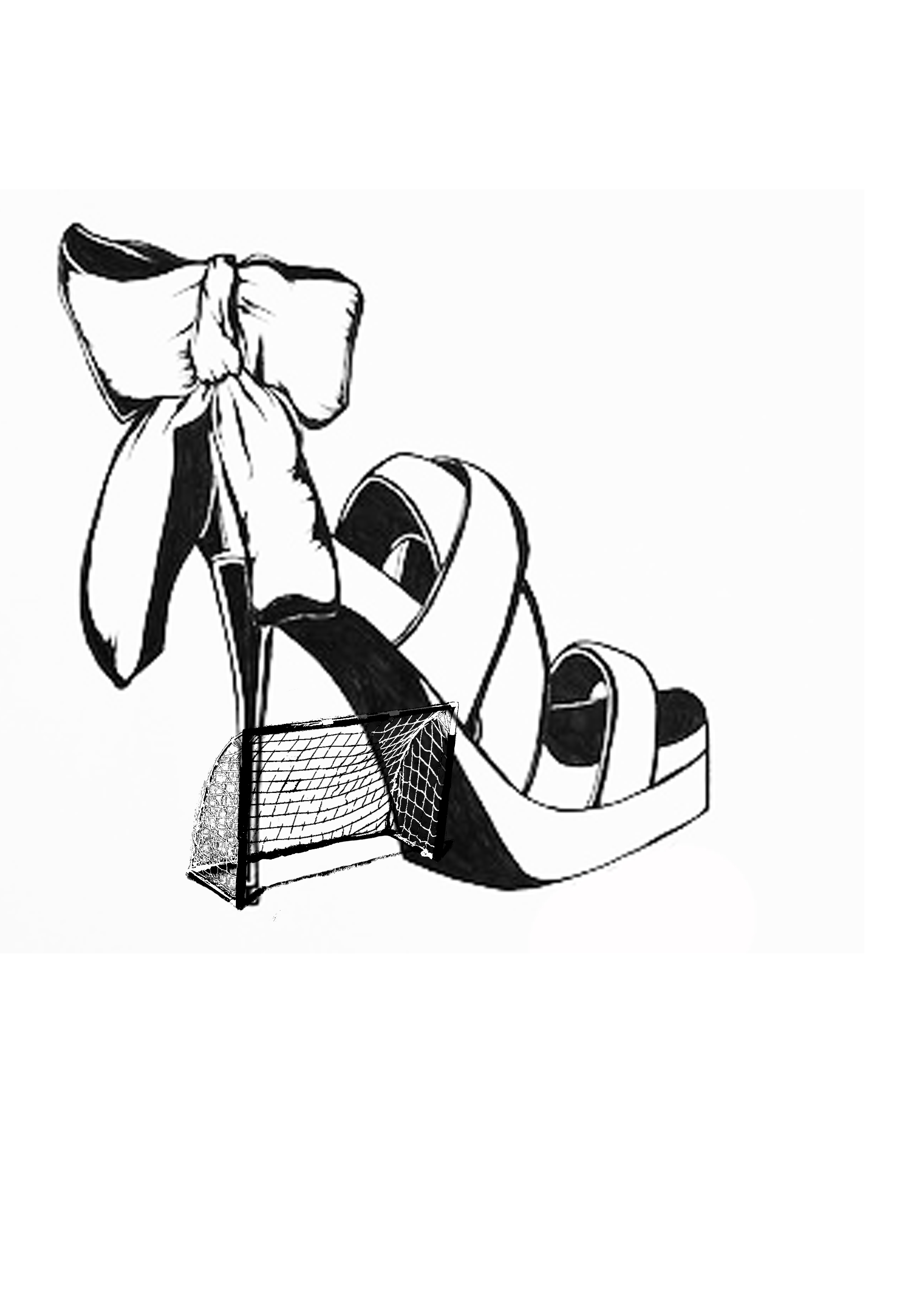
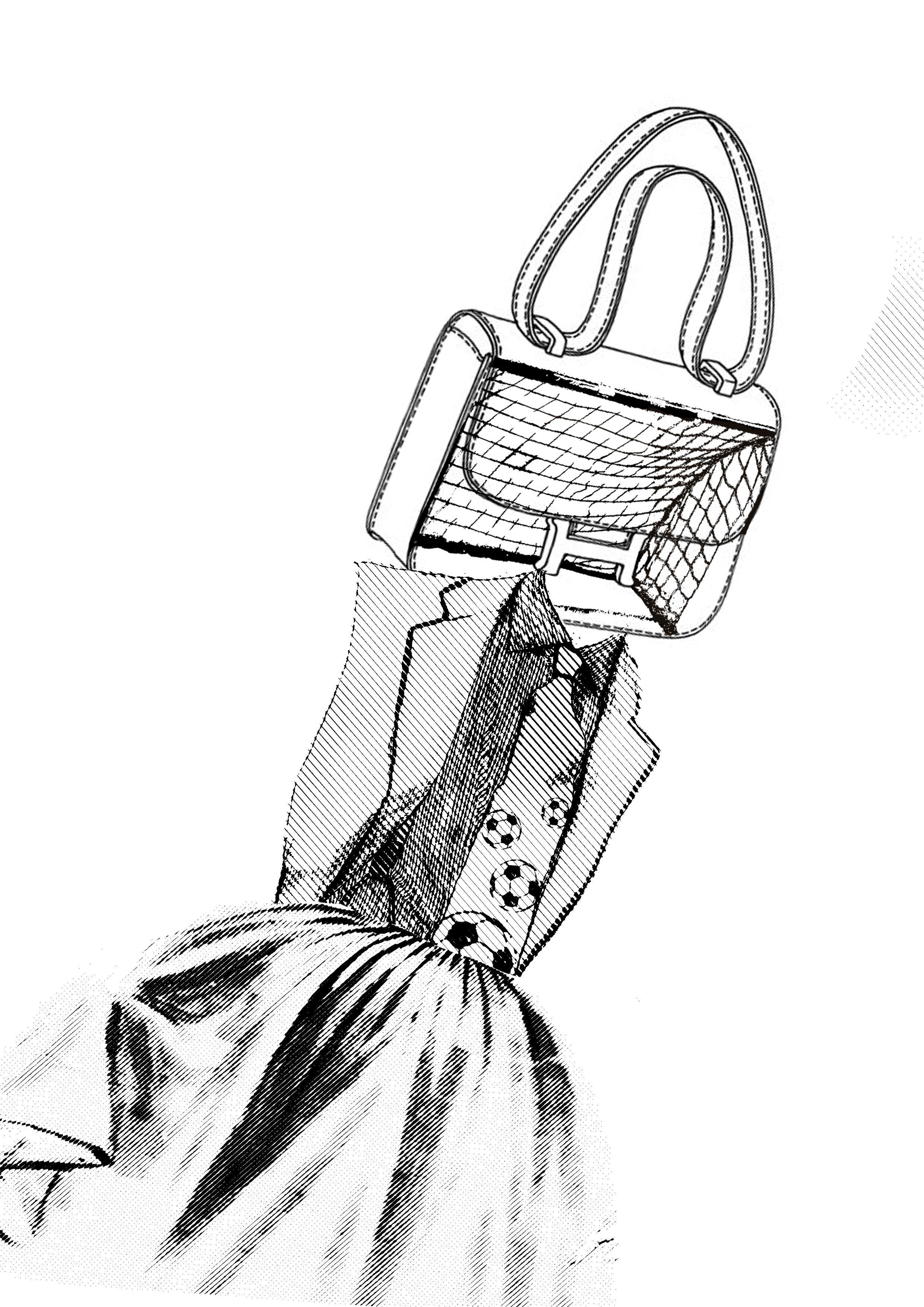
A composition I did again, with nets, because it lined up better with a handbag.


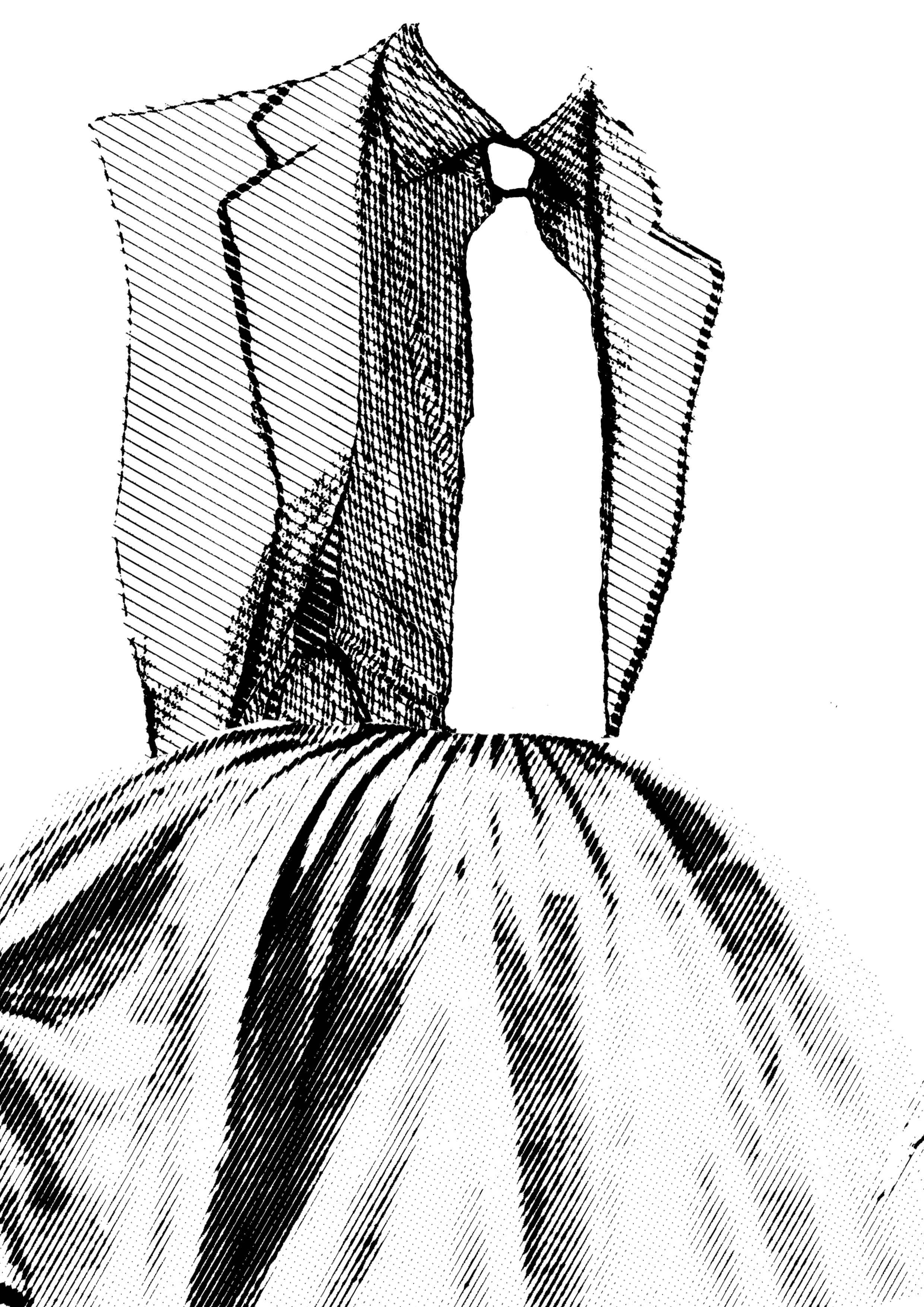
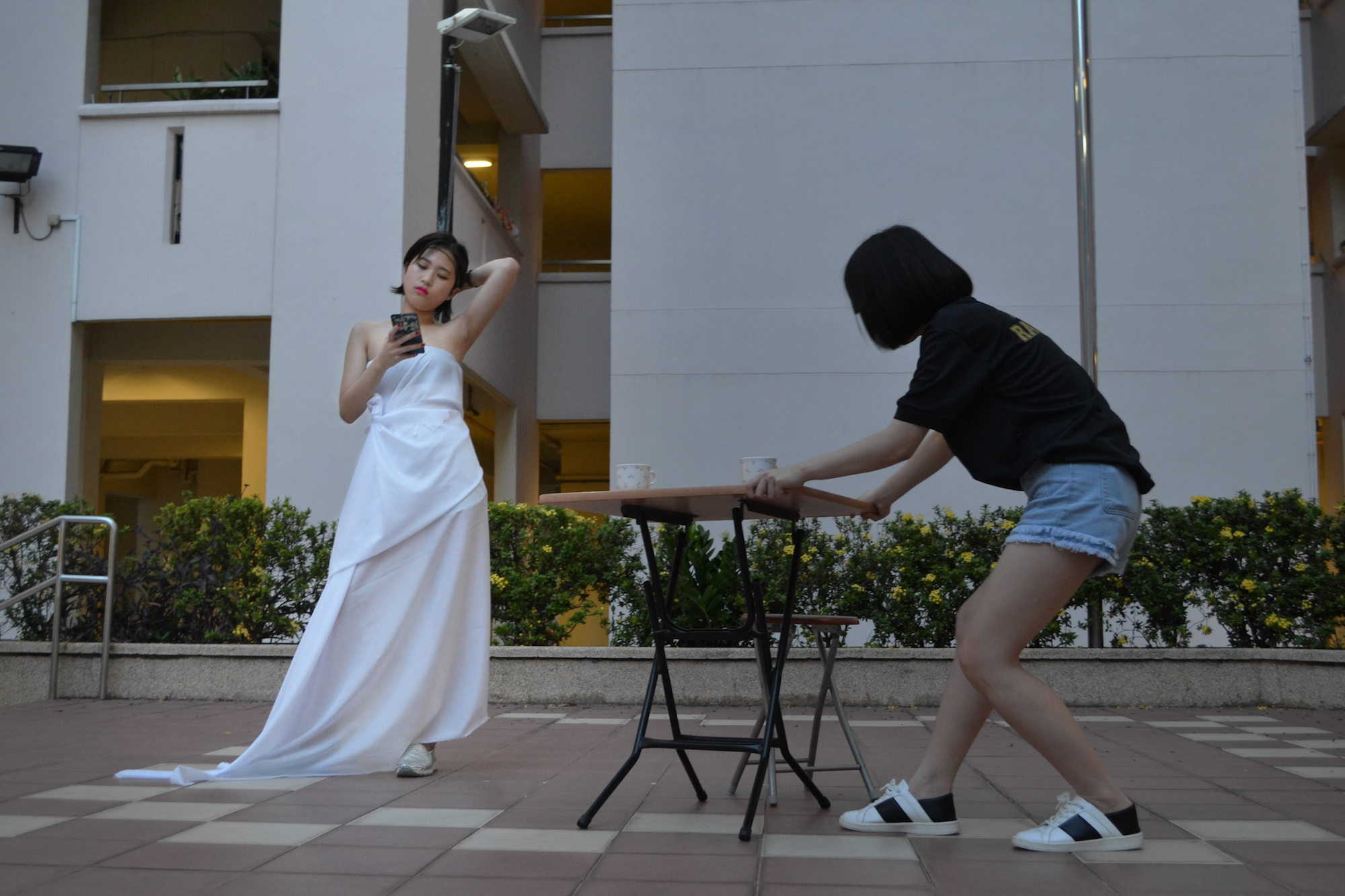
Mixing a tuxedo top and a dress together: Viola is both masculine and feminine in the movie.


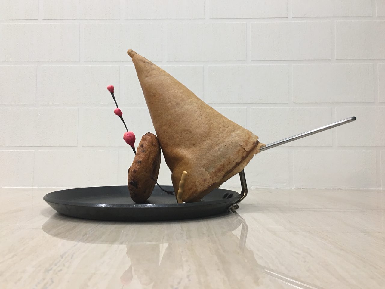
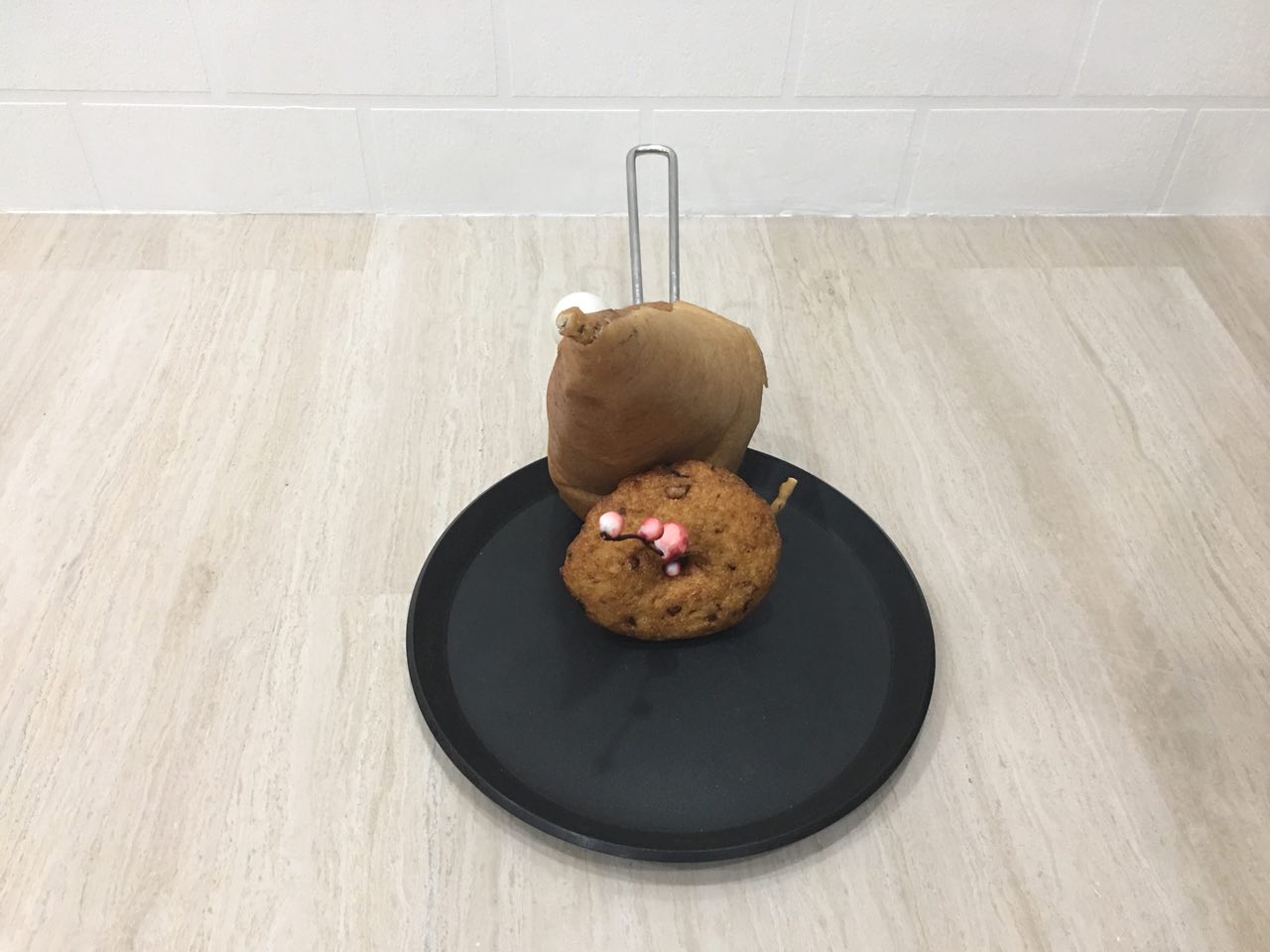
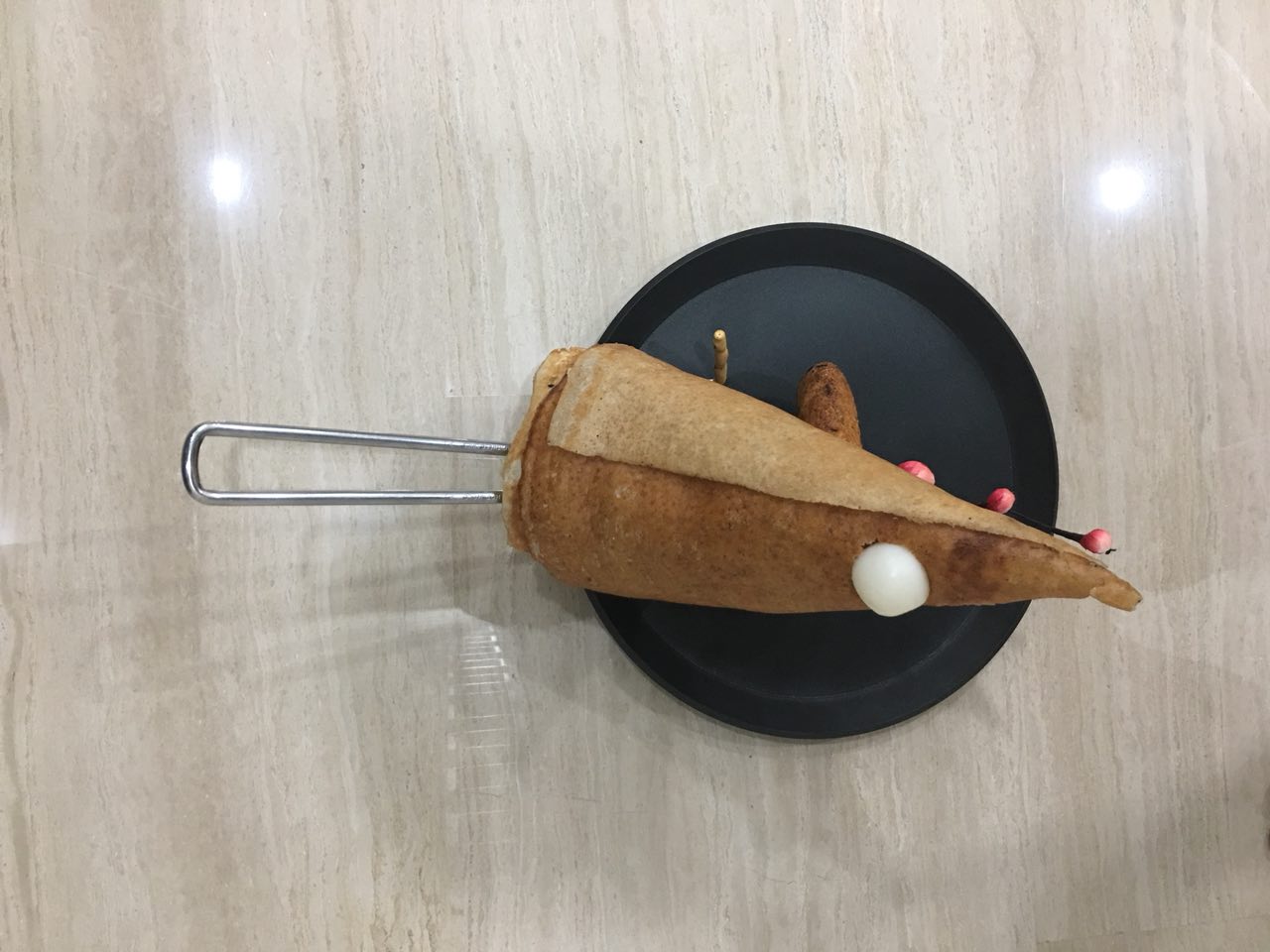
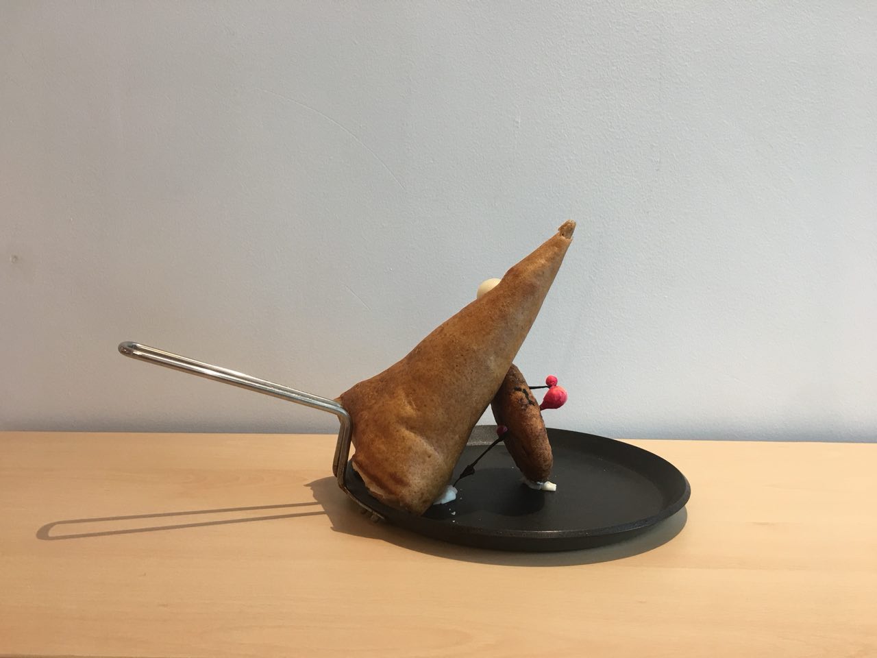
I realized that I could probably do this forever – mixing feminine and masculine items together to show duality. I needed to focus; I needed a solid plan; I went back to the quote, where Paul says that “that came out wrong.” Hence, I decided to inject more personality into my design by arranging the above elements in a phallic shape, as a cheeky reference to the sexual undertones of the quote.


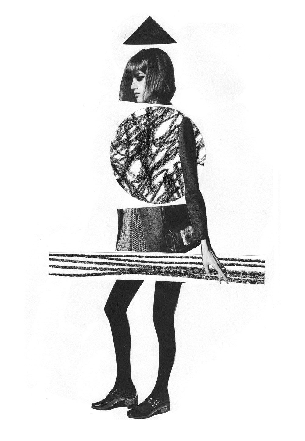
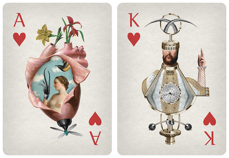
I was inspired by this work by Ciara Phelan where she uses different elements to form a body – it was pivotal in my making of the final composition.


Final composition + Reflection

In hindsight, I could’ve also used other feminine symbols such as a perfume bottle that Hui En suggested – I think I missed that out because I was using symbols from the movie itself – Viola’s mother would force her to wear dresses and heels and there was a catfight scene with handbags. I also got feedback that the elements look pretty random and don’t look very cohesive, which I can definitely understand. 

[2D] Forrest Gump: Quote 3 – Process & Final

“The CIA would love it if you could take him out.” – The Interview (2014)

I approached this quote with wordplay in mind. The actual scene in the movie picks up on this too, a brief explanation of which is below:

Dave Skylark and his producer Aaron Rapoport run the celebrity tabloid show “Skylark Tonight”. When they land an interview with a surprise fan, North Korean dictator Kim Jong-un, they are recruited by the CIA to turn their trip to Pyongyang into an assassination mission.

The quote starts from 1:27 onwards – the scene is absolutely hilarious.

Initial compositions

I have this mental image of the CIA as being scary men in suits, so my first composition were three men in suits standing imposingly behind a dinner table, dinner being a literal expression of taking someone out.


I was inspired by this work by Natsko Seki in terms of layout.


However, while clear, I found the concept of the first composition I made incredibly boring.


I hence tried to use the CIA symbol instead of men in suits, making a few compositions where I manipulated elements of the CIA symbol.


I used the circular outline as a compositional element here, and. However, when I showed this composition to a hall mate, she didn’t recognize the symbol, probably because we aren’t American citizens. Truth be told, I didn’t know how the CIA logo looked like before googling it, too.


With the identification of this problem, I worked with the full logo with the “Central Intelligence Agency” words. I noticed that dinner plates have the same circular form as the logo, so I played with that in the following compositions.

However, I couldn’t bring myself to like the words – I found the font off-putting and I felt like the aesthetic of the logo and the illustration/photo I was using didn’t go together. This spurred me to take a different approach.

I merged symbols of a nice dining experience (a table chandelier and flowers you present on a date) with guns, to express the duality of the quote. It is a reference back to the movie where the scriptwriters have fun with wordplay – Dave and Aaron are both confused by what the CIA agent says when she mentions that she wants them to take Kim Jong Un out, and then understand that she wants them to assassinate him.


I thought, why not combine both the compositions above? Why not add in wine glasses, too?


Trying different halftone screens: Dots (left) / Crosses (right)


Final composition: Found the space between the wine glass and handle of gun awkward, so I added a wine bottle to link up the elements.


Reflection

Ms Mimi commented that it wasn’t clear what the form coming out of the hand was – I definitely agree, and in hindsight, I could’ve made it more clear that it was a gun.


[2D] Forrest Gump: Quote 2 – Process & Final

“Sometimes the monster is the man.” Victor Frankenstein (2015)

Brief overview
The movie is based on contemporary adaptations of Mary Shelley’s 1818 novel Frankenstein. Told from Igor, a former circus freak’s perspective, it shows his  friendship with the young medical student, Victor Frankenstein. Through Igor’s eyes, the audience witnesses the emergence of Frankenstein as the man from the legend we know today.

Victor is expelled from college for his ungodly creations, but is approached by his wealthy, arrogant classmate, Finnegan, who wants him to create an artificial humanoid creature. Finnegan provides Igor and Victor with the necessary funds to build it in his family’s estate in Scotland. When Igor refuses to go, Finnegan kidnaps and binds him, revealing his plans to kill Victor once he finishes his creation, and weaponize it.

The quote is from the first lines of the movie. Igor starts the movie by voicing over with:

“You know this story. The crack if lightning. A mad genius. An unholy creation. The world, of course, remembers the monster, not the man. But sometimes, when you look closely, there’s more to a tale. Sometimes the monster is the man.”

I felt that this quote could be interpreted in two ways:

  1. Victor Frankenstein is actually the monster, not his monstrous creation, as he had bent the laws of religion and science to make the dead, alive.
  2. Men can be monstrous in their betrayal, too. To me, the real monster in the movie was Finnegan, for pretending to be invested in Victor’s creations purely for the sake of friendship and science, while he had ultimate motives and planned to kill him.

I decided to focus on the second interpretation as in the movie, Victor had some redemptive qualities, such as rescuing Igor from the circus, and straightening out his back such that Igor was no longer a hunchback. As mentioned above, the real monster in the movie was Finnegan.

Approach

The film is set in Victorian England, where the men wore bowler hats, walked with walking sticks, and the like. With Victor’s biomechanical humanoid creatures resembling steampunk, I also thought of imbuing a steampunk aesthetic.

Initial compositions

At first, I tried compositions in which duality were explored.


In the first composition, a monstrous being’s shadow is a man, with the shadow showing the true self. I felt that this was a very cliche and seen too many times.


In the second composition, I made a three-headed monster of my own, with a traditional Frankenstein, and a bionic monster like the ones Victor was making in the movie. It didn’t look like a monster as much as the central figure having two different alter egos, which wasn’t really the case.


In the third composition, I overlaid a figure head with the same traditional Frankenstein such that the eyes were overlapping – I was trying to incorporate the Gestalt law of invariance. However, again, I felt that this composition could be slightly confusing as again, it seemed to have to do with alter egos rather than the innate nature of man.


I then thought about why we would even need an actual man to represent man – it is, after all, a very in-your-face way to show a man. Hence, I started working with symbols of man: a bowler hat and a suit sleeve.

I was inspired by Dan Hillier’s merging of animal and human characteristics.


The monster need not be a traditional monster; the monstrous effect could possibly be achieved through entrails to evoke revulsion in viewer. While I liked the idea of not having a literal monster, it seems too much like random juxtaposition.


I tried different styles of bowler hats but didn’t like the aesthetic of it. Instead of entrails, I used robot monster-like parts to make the bowler hat into a monstrous creation itself. However, this attempt looked more sci-fi than monstrous – while the movie is science fiction, I realized I have a tendency to get carried away in representing the movie rather than the quote, and felt that I needed to bring back the focus to showing a monster.


Final drafts

I realized I could relate it back to the movie through a deeper meaning, hence I revisited the second interpretation of the quote: that the real monster was Finnegan for his betrayal of Victor. I felt uncomfortable with the earlier compositions where it was implied that Victor was the monster, even though it is easy for us to think of Victor that way. However, I think that those who have seen the movie would agree with me that Finnegan was the monster in this situation.

I was inspired by this work by Santiago Carruso where the head is replaced by a hand – I then tried replacing part of the hand with monstrous elements.


I aimed to convey the idea of betrayal with one of the hands in a handshake having some sort of monstrous element, to imply that one of the parties involved was the monster.

I was inspired by these two works by Redmek Hoestra and Mr Bingo respectively.


I was also inspired by how Diego Max uses sci-fi elements in his compositions.

I also liked how Randy Mora made such weirdly beautiful compositions, with sci-fi elements, again.

From left: 1) Thumb morphed into a monster 2)  Wrist morphed with monstrous animatronic form 3) Final composition: Wrist morped with a more aesthetically cohesive animatronic piece


[2D] Forrest Gump: Quote 1 – Process & Final

“Kid, I got ears. My ears got ears.” – The Jungle Book (2016)

Brief overview
After a threat from the tiger forces him to flee the jungle, Mowgli, a young boy, embarks on a journey of self discovery with the help of a panther, Bagheera, and a free spirited bear, Baloo.

After being spied on, Mowgli is kidnapped by monkeys who present him to their leader, a giant ape named King Louie.

Monkeys spying on Mowgli (King Louie’s “ears”)

Above: Mowgli in King Louie’s chamber surrounded by his minions, intimidating Mowgli

Assuming that all humans can make fire, King Louie refuses to release Mowgli unless he makes some for the monkeys. When Mowgli insists that he does not know how to make fire, King Louie asserts that he does not buy into what Mowgli is saying by intimidating him with the quote “Kid, I got ears. My ears got ears.”.

The ears King Louie is referring to aren’t actual ears, but rather, his minion monkeys who spied on Mowgli and kidnapped him.

Approach

I knew I wanted to have a central ape figure, as I felt that that would make it most applicable to the movie.

I was inspired by Strangelove’s package designs with the central composition, as well as the idea of hanging off and flowing down from which I tried to emulate in my first composition. I reference  the central composition of the first work later.


Initially, I tried having a smaller minion monkey hang from the ear of a giant ape, but it I felt that it did not express the plurality of ears in the quote. This was a pivotal composition, though, as it made me realize how important repetition was for this quote.


I went on to try and vary the facial expressions of the central ape (King Louie), but the left composition seemed too aggressive. I liked the right ape’s facial expression more because it’s quietly threatening, much like how King Louie was in the actual scene.


While I liked these composition-wise, only by working with only ears did I realize the absence of the smaller monkeys. I felt that the smaller monkeys really embodied the spirit of the quote, because King Louie was essentially the king of all these small ears.

Moreover,  I felt like working with just ears would be a very literal interpretation of the quote. Hence, I reverted back to using monkeys – not just one type, but the two types of monkey minions (the bigger Bandar-log monkeys and the smaller long tailed macaques) we see in the movie.

As I did not emphasize so much on the ears in the following compositions, and added a crown to alert the audience to the fact that the central ape was King Louie (literally, the king). I experimented with different types of crowns, and cropping in terms of composition.

During consultation with Ms Mimi, she pointed out that these compositions did not actually reflect the quote, and there needs to be more emphasis on actual ears in order to relate it back to the quote. Furthermore, I realized another reason why we don’t need the crown is because the size makes it obvious that he’s dominant.

Final drafts

Therefore, I came up with the final drafts that did away with the unnecessary crown, as well as reflected the quote better. I incorporated both normal ears and the implied ears (minion monkeys) in the composition, as I felt that the minion monkeys were important to give a deeper layer of meaning to the composition – they are the real ears, after all. The normal ears add a touch of humor.

Mimi commented that the ears should have ears, and then I could still have the monkeys coming out of it. That way, the ears would still have ears, while I could also express the minion idea. I really liked the central composition because its reminiscent of religious imagery, and the quote itself sounds sort of godly, with the whole “My ears got ears”, bit.


[4D] Assignment 2: Sequencing Images Part 2

Inspiration – Editing of Photographs

Pan’s Labyrinth, for the high contrast


Alice in Wonderland, for the high contrast


I increased the contrast by a lot, in part so that I could add a spotlight with masking as well.


Alice in Wonderland, again for the blue & green tones


The tones here are more of a purple, but I felt that that was more suited for evening time.

Lord of the Rings 3

I really like the greenish tones here. Even though the picture is warm overall, the murky green tones lend it a feel of uneasiness that I aimed to convey with the editing for the frame below.

Thought process

I layered a lot of the sounds from Ms Ruyi’s archive of sounds over one another, and made the scissors sound and book dropping sound myself.

a) Other ambient noises I considered for the first scene on stage:

Crowd noise 1

Crowd noise 2

b) Heavy breathing vs build up to crescendo

I thought about having the sound of heavy breathing for the above frame, that I recorded myself.

c) Fairy wand sound?

I also thought about having a fairy wand sound for the frame that Qis opens, the book, but decided against it because I thought it was too cliche.

d) Crying sound vs thunderstorm music

I thought about having an actual crying sound for the scene where Qis is crying, but again, I thought it was too cliche. I felt that having thunderstorm music would be more cinematic and appropriate for the fantasy theme, too.

e) Low, buzzing sound

The low, buzzing sound when Karen is sick is also inspired from the sound 3:05, which gives me a very unsettling, nauseous feeling.


Rejected photos

Felt that low angle is more dramatic, also gives feeling of the book going to fall.


Thought of maybe using this for the frame where she gets startled and hits the bookcase, but it’s too static.


Lower angle to make it more dramatic and static, but decided to use two hands for the bigger action created.


I also thought of using this shot, but I figured that we already established that Qis was reading the book. I thought the more central shot emphasized the importance and large presence the book is going to have later on.


Link to video: https://www.youtube.com/watch?v=wsPuXCUDcqY

Reflection

A huge part of this project for me is learning how to use Premiere Pro CC. I was initially just going to use iMovie, but realized I was very limited in terms of what I could do with sound.

Premiere Pro was very initimidating at first because I always saw it as a software that professionals use, and I’ve only ever made 1 video in my life, and that with iMovie. However, with the help of YouTube tutorials, I learnt how to use it! The basics, at least. It was very challenging at first, then I’m really proud of myself that I got over my fear of using Premiere Pro – I’m a lot more confident with video editing now.

[4D] Assignment 2: Sequencing Images Part 1

Ideation

My initial idea was about a really smart friend in primary school who was also super tall and pretty, and everyone would say that she should become a model. I then came up with the story that she did in fact become a famous model, and then became disillusioned with the lifestyle and decided to hit the books again.

Qis’s idea was about a friend of hers who was on a downhill spiral but became reformed in NS, while Hui En’s idea was about her friends from boarding school. We sat down and thought of doing something along the lines of plastic surgery as we liked the idea of beauty being important, spun off my model idea, and eventually decided on a story about how being conventionally unattractive affects our main character, an “ugly” girl. We decided we’d want to do something in the fantasy genre, and decided to involve elements of a spell book and face swapping (later changed to complete erasure of a face), as well as magic potions.

Our story is about a girl (Qistina) who loves acting, and wants to be an actress. However, she’s overshadowed by a conventional beauty (Karen). One day, when she’s crying alone, a magical beetle scuttles across the carpet, triggering Qis to knock over a magical book with spells inside on how to absorb the beauty of another. When our conventional beauty, Karen, falls sick, Qis uses the opportunity to “take” her face and become beautiful, and fulfill her dream of playing the lead role.

This is followed by a narrative where the spell wears off, and Qis becomes ugly again. We took the pictures for this, but I personally decided to omit this part as I felt that the story tied up well with Qis finally getting to live her dream, albeit at the expense of another. I also liked the suspense this created with the question of what happened to the now faceless Karen.  Furthermore, I felt that it suited the entire storyline more when I didn’t add in a frivolous detail about the technicalities of the spell, which felt too Cinderella-ish for me, personally, when I was editing and decided to omit this last bit.

Storyboard: https://docs.google.com/document/d/103CYNrfswoT7oI9VMAh6ZuhILPAk2S1_-TE_VqGWPNk/edit

We based the idea of the face swapping off Kasane, a manga with a similar theme of beauty, where a magical lipstick would enable the main character to take on the face of the person she kisses. We liked this idea of face-swapping, but later modified it to face-erasure as we didn’t have enough people such that faces could be swapped without Karen reappearing later as an audience member and it being potentially confusing.

Behind the scenes


Challenges faced

1. Location

We couldn’t find a good place to shoot the theater scene – I tried emailing my junior college and secondary school asking if they’d let me use the school stage for the scene but they denied my request due to safety reasons. Hence, we settled on a outdoor stage instead – one beneath my HDB block, more specifically.

2. Costuming, clothes

Realized the bright pink of Hui En’s shirt wasn’t very stagehand-like, so we ran back up and she borrowed my school shirt to wear.


[3D] Gaia’s Ikebana III: Final models, critique and revisions

Spring sculpture 1:

D: Orchid branch // SDs: Ice cream cone and matcha ring cake // SOs: Pink wafer cone and Hershey’s chocolate ball

Techniques used:

  • Piercing (of Dominant orchid branch through cone) and Wedging (of Hershey’s chocolate ball to cone)
  • Voids between SDs and the horizontal
  • Triangular composition of 2 SDs and SO from the top view, like in the actual Moribana Ikebana arrangement
  • Rule of thirds in length of SD to D (elaborated on on 2D sketch analysis in previous post)
  • Follows 30 degree, 45 degree rules of dominant and subdominant like in actual Moribana Ikebana arrangement
  • Length of dominant follows relative proportion to base container advised for actual Moribana Ikebana arrangement

Critique in class:

  • The dominant branch is too overly ornamented with orchid flowers, and also has an element of artificiality due to the fact that it is plastic
  • Cheryl suggested that I try finding a different branch, so I did. Here is the revised model!

Spring sculpture 1: Revised edition


Next, we have spring sculpture 2, made of Indian food! I meant to have the saucepan as the base to be indicative of the tools that was used to make the dominant. Furthermore, the handle was vital to having the dominant cone be able to balance at the 30 degree angle.

Spring sculpture 2:

D: Cone dosai // SD: Cylindrical vadai and branch passing through cylindrical vadai // SOs: Spherical kozhukattai and indian biscuit

Techniques used:

  • Wedging (of Kozhukattai SO to dominant cone dosai) and Piercing (of SO branch through SD vadai)
  • Void between dominant dosai and SD vadai
  • Follows 30 degree, 45 degree rules of dominant and subdominant like in actual Moribana Ikebana arrangement
  • Length of SD is half of length of dominant
  • Rule of thirds followed in wedging of 1/3 of kozhukattai SO into dominant cone dosai

Critique:

  • The class mentioned that the composition seems very linear. I do agree, and it actually became that way because I could not get the cylindrical vadai SD to balance against the dominant dosai any other way as the dominant dosai was very heavy. In my sketch model, it was not such a linear model and actually followed the Rikka Ikebana arrangement. In hindsight, I could’ve made the batter for the cone dosai in such a way that the pancake was not so dense and heavy, hence letting the SD be balanced against it in the same orientation that I had meant it to be in my sketch model.
  • The handle created some confusion between the SDs and Ds. I had not meant it to be part of the composition, but on hindsight, I realized that the handle was in fact very prominent.
  • Cheryl tweaked the SO branch that passed through the vadai such that it went down rather than up, and it looked a lot better. I also removed the standalone biscuit so as to include the handle as part of the 5 D, SD, SO elements. Here’s the sculpture below after that revision, thank you for making my sculpture look a lot better, Cheryl! (๑˃ᴗ˂)

Spring sculpture 2: Revised edition

Reflection

At first, I was scared about the project brief mentioning that none of the axises could be parallel or perpendicular to the horizontal ground. However, I learned a lot about counterbalance from this challenge and how to get shapes that weren’t as easy to balance as rectilinear forms to stay in the place where I wanted them to be (っ˘ω˘ς )

I really enjoyed learning about the art of Ikebana and using those principles in my own sculptures. I felt like I explored a lot of new territory with having the branches at specific angles, and enjoyed the visual effect it created as well.

I also learned to truly look at the whole sculpture, from the learning experience with the Indian food sculpture’s base handle being significant in the overall composition as well. Regardless of whether I had meant for the pan’s handle to be part of the 5 D, SD and SO elements, I realized that intention doesn’t really hold up to visual qualities, and learned to tweak the composition such that it could then be included upon this realization.

Lastly, I really felt like a cook after making all the Indian food, and it was even more fun to play with it to make my sculpture. I hope the smell of it didn’t make anyone too hungry in the morning (*≧ω≦*)

[3D] Gaia’s Ikebana II: The Making

The theme I got was… spring! (o˘◡˘o)

I was super happy when I found out I was getting this season because I love spring and all that it symbolizes. I made a mindmap to work out the nuances in the season, and to set a direction for my final models.


The scene I was particularly inspired by for my color palette were these scenes from Bambi, like I have mentioned in my mindmap.


In my mindmap, I thought about what spring meant to me – renewal and rebirth. But in order to make the sculptures personal to me, I thought about when I feel renewed when I eat food: in the morning, when I start my day with Indian food, and desserts at night when I’m rushing assignments. I further broke desserts down into 3 main categories: cake, ice cream and chocolate. This was the point in time when I decided to make two sculptures to represent both of these ideas.

Next, I had to decide on which Indian foods and desserts to use, and how to make some of them.

Some preliminary research on Indian food:

(From left to right)

Photo 1: Dosai (Cone) – Pan fried pancake made from rice and black gram

Photo 2: Idly (Cylinder) – Steamed cake made from black lentils and rice

Photo 3: Vadai (Cylinder) – Deep fried doughnuts made from lentils, curry leaves, onions, chillis

Photo 4 & 5: Kozhukattai (Sphere) – Steamed dumpling made from rice flour, with a filling of grated coconut and jaggery

Choice between Idly and Vadai: as I had already decided firmly on the Kozhukattai SO being white in color to reflect the purity and rebirth of spring, I felt that Vadai would be a better choice in terms of the color scheme, so that both the SD and SO would not be the same color.

Furthermore, I’d like the three items to reflect the three ways Indian food is cooked: 1) steamed (SO; kozhukattai), 2) pan-fried (D; dosai) 3) deep fried (SD; vadai).

Here are some process shots of me making the food; photos 1 shows me making the dosai cone, photos 2 to 6 show the process of me making the kozhukattai sphere (required the most steps and work) and photo 7 shows me frying the vadai cylinder. It was challenging making three different Indian dishes, but I’m super happy I managed to do it and make them really look like those shapes too.


For my second sculpture, I wanted to incorporate all three of my favorite types of desserts – namely, cake, chocolate and ice cream, as written in my mindmap. They truly make me feel anew at 3 am in the morning when I’m finishing an assignment. I picked an ice cream cone to represent ice cream – actual ice cream wouldn’t have been a very viable material to use – a matcha ring cake from Chateraise to represent cake, and a Hershey’s chocolate ball to represent chocolate. Since we had to have 2 SOs and 2 SDs, I added an extra SO in form of a wafer.


In order for my dominant branch to be able to stand, it needed a solid base to be stuck into. Hence, I got the foam used for flower arranging and pressed it into my base container. Then, I covered  the edges with double sided tape and stuck cling wrap over so that the foam bits would not fly around and get messy, and interfere with the food.

I had some problems initially with poking a neat hole through the wafer cone so that the dominant branch could be inserted, but I managed to figure it out by using a very sturdy piece of wire to pierce through. I also had some problems with the positioning of the holes so that the cone would balance at the 30 degree angle, so I tried piercing holes in different areas in order to find the right one, pictured in the second photo.


I had two types of wafers I could have used: the cappuccino one or the strawberry one. Even though the cappuccino wafer color’s were more harmonious with the color scheme of the sculpture, I felt that the pink of the strawberry was very in tune with the happy, light nature of spring. Furthermore, the color made it stand out as an SO.

[3D] Gaia’s Ikebana I: Research and Sketch Models

When we first got this brief, I had no idea what an ikebana was. I’m happy to say that is no longer the case – in fact, I’d say I’ve gotten a pretty good idea what an ikebana is, because of the research I’ve done on three main types – summarized below for your reading pleasure ٩(◕‿◕。)۶

Types of Ikebana

1) Moribana

Characteristics of vase

  • Shallow
  • Wide mouthed

Features

  • Broad expanse of natural-looking shapes
  • Exudes a feeling of stability and gravity

Specifics

  • Three Yakueda (stems), called Shin (primary stem), Soe (secondary stem) and Tai (ornamental stem)
  • Shin is about as long as the diameter and depth of the container combined
  • Soe is around two-thirds of the Shin
  • Tai about half the length of the Shin

There are three sub-styles of Moribana, determined by the angle of the Shin:

Chokutai (upright) Shatai (slanting) Suitai (cascading)
                        

2) Rikka

Characteristics of vase

  • Cylindrical
  • Often tall
  • Has a narrow mouth

Specifics

  • Also composed of three main branches, Shin, Soe and Tai
  • Shin’s height is usually one and a half of the height of the vase plus the width of the vase
  • Soe’s height is about two-thirds to three-quarters of the Shin
  • Tai’s height is about one-third to half of the height of the Shin


3) Shoka

Characteristics of vase

  • More than just a container – it represents the source of life
  • Vase will generally be symmetrical and open at the top

Specifics

  • Expresses the feeling of life, growing energy and the natural beauty of the materials
  • Distinguishing characteristics are brightness and sharpness
  • Shin is two to three times the height of the vase
  • Soe is about two-thirds the height of the Shin
  • Tai is about one-third the height of Shin


2D Sketch Models and Analysis

Initial Sketches

I sketched out some ideas where the cylindrical form, spherical form and conical form were the dominants, and how they changed the feel of the sculpture. I decided to focus more on the conical and cylindrical forms as dominants as I felt they added a strong axis to the composition, compared to a sphere which is pretty static to me, and also for which the principal axis could be unclear.


Sketch Model 1 – First version

I immediately realized the problem with this model – the subdominant cone’s axis was perpendicular to the horizontal ground. I hence revised this model to the actual first sketch model I will be analyzing below.

Sketch Model 1 – Revised version

I had to use a masking tape roll solely so that the subdominant cone could lift off the ground – it will hence not be drawn in the 2D sketch analysis as I will find a way to get the cone to lift off the ground in the actual final model.

Sketch model 2


I really liked the idea of having a hollow cylindrical form as I like the “double void” it creates at the bottom of the composition. I thought of some ways to improve this, such as wedging the SO into the D so as to incorporate what we had learned in our first lesson.

Specifics of Moribana and Rikka Ikebana that were used in making sketch models respectively:

Link to 2D Sketch Analysis: Gaia 2D Sketch Analysis