Tag Archives: 2D

[2D] Ego – Final

Ideation

This whole collection was based off a birthday present my friends gave me for my 17th birthday. It was one of those educational posters you get for young children, but they Bala-fied it and basically pasted unflattering photos of me onto the different animals and made terrible puns with them.

It’s the most memorable gift I’ve gotten to date, and I knew I’d definitely want to have one of the panels be about my friends. Hence, I decided to have each of the panels be different animal alter egos of myself.

Overall aesthetic

I went with a childrens book illustration sort of aesthetic, as I’m really a kid at heart. It’s hard for me to take myself seriously, and I like to surround myself with cute and happy things all the time – Artbox stationery being a prime example.

Cold is not my thing.

I’m really sensitive to cold – as a very tropical person, I get cold even when the aircon is turned on. I always, always have a spare jacket in my locker in case I forget mine in a rush. It’s so bad that I’d say I have roughly 20 different hoodies and jackets, cause it’s the item of clothing I can’t live without. Hence, these panels aim to express my sensitivity to cold, with me as a hippo because they’re very tropical animals, like myself.

I’m really, really escapist.

I’m really perfectionist, so I tend to do things really slowly, and like to take my time with them. Here in ADM though, there are a lot of deadlines one right after another, which barely gives me enough time to work with them for as long as I’d like to. The result? I give in to my escapist tendencies a lot more, because I’d rather procrastinate then face reality. I find myself watching shows and reading books, my guilty pleasures, a lot more than I used to – the more I get stressed, the more I want to skateboard away from Earth. I used a tortoise here to symbolize me being slow.

I’m a totally different person around my friends.

It might be hard to believe, but I’m actually a very introverted person. My idea of a perfect afternoon would be me sleeping, reading, or watching Netflix on my bed. However, my friends being my friends, would probably crash my house and get me to go outside, and the afternoon would morph into another type of perfect afternoon. They get my hard exterior to come off, and loosen up and enjoy life.

The three animal friends represent my three best friends. The Dinosaur would be Cynthia, a beautiful soul I’ve known since Sec 1. She’s a dinosaur cause she gets really angry on my behalf when I’m mad about things. She almost called up my ex and lectured him, haha.

The dog is Yilin, cause she’s the most loyal person I know. She’s helped me out with so many things that I’ve lost count.

The rabbit is Ashish, a friend I made fairly recently in Year 5 in Junior College, but has become one of the most important people in my life. He’s a rabbit because he’s super jumpy and excitable. He’s just overall a really lively person.

Watermelon and sleep – they’re like my right and left eye.

I wish I could express my love for watermelon without sounding like a psycho. I really, really like watermelon. I can eat a whole watermelon at one go. Sleeping on a stomach full of watermelon would literally put me on cloud 9, especially because I haven’t done either in a pretty long time, with the really busy term.

[2D] Ego – Process

Mindmap

I did some 10 cm x 10 cm drafts of all my panels, and tried different styles for the animals, too.

Layout for panda composition

Panda sketches

References for panda pose

Turtle layouts

References for turtle

Layout & colors for hippo composition

References for hippo:

References for iceberg:

Layout for hedgehog

I tried imitating Eric Carle’s style for the hedgehog’s spikes.

Hedgehog sketches

Hedgehog references


[2D] Ego Research

Liz Climo


I really like her outlined style and simple forms! She serves as my primary inspiration.

Alessandro Gottardo

I think his compositions are really unique in how they combine big and small elements. His use of color is also really bold.

Jon Klassen

I really like the clean background and use of watercolor and “speckles” – I could possibly imitate it with salt.

Amy Schimler

Geometric and organic forms – playing with transparencies

Brigette Barager

Her textured background is lovely, as well as the bright, happy colors.

Sam Falconer

Very strong color contrasts, which are frankly, a bit intimidating, but I will attempt it in some of my panels.

Sara Fanelli

I love her use of analogous colors and how they unify the whole composition. I also really like the use of different textures that I want to imitate.

Richard Smythe

Wet on dry technique on white background gives a really crisp feel. I really like the textures produced by the watercolor too – it was the main reason why I predominantly used watercolor for my panels.

Oliver Jeffers

I really like his use of mixed media, combining color pencils over watercolors. I will have to try that as a technique.


[2D] Forrest Gump: Quote 4 – Process and Final

“Remember, inside every girl, there’s a boy.” – She’s the Man (2006)

Brief overview
The romantic comedy centers on teenager Viola Hastings who enters her brother’s school in his place, pretending to be a boy, in order to play with the boys’ soccer team after her team gets cut.

The quote is said by Paul, her friend, when giving her a makeover to look more like a boy. He says this to encourage her in being more confident and sure of herself – that she can embody these more masculine qualities.


Indeed, I interpreted this to mean that a girl can be both masculine and feminine, and need not be constrained by what society expects of her (in the movie, it’s Viola’s mom placing these expectations on her).

Approach
At first, I did very literal compositions where a boy is physically inhabiting the space inside a girl’s body. I chose the boy to be a soccer player as Viola is pretending to be a male soccer player in the movie.

In the first composition below, a male soccer player is coming out of a girl’s torso, as if he is breaking free. This is similar to how Viola is truly a soccer player but is constrained by her gender in the movie, but manages to overcome her physical differences and emerge victorious.


I was inspired by this work by Eugenia Loli, where she uses the mouth as a framing device. I thought it was very appropriate to the “inside” bit of my quote.


I tried to emulate this, using the ball as a framing device in the first composition, but realized I didn’t need two soccer balls as the soccer player is already kicking one.


Hence, I used the back of a dress to frame the void from which he emerges in the second composition here.


This is a really terrible draft mash up I did of Lionel Messi and a female head. I felt that it didn’t express the “inside” bit of the quote, so I scrapped the idea.


I had the idea to use symbols of masculinity and femininity at the same time I started using symbols for the other quotes as well. I wanted the viewer to not immediately associate the final image with a girl simply because there was a girl inside, but to have to think a little more.


Hence, I came up with a mindmap to brainstorm some possible symbols of masculinity and femininity.


A few compositions I did with shoes and football nets, playing with voids and spaces in the shoes themselves.


A composition I did again, with nets, because it lined up better with a handbag.


Mixing a tuxedo top and a dress together: Viola is both masculine and feminine in the movie.


I realized that I could probably do this forever – mixing feminine and masculine items together to show duality. I needed to focus; I needed a solid plan; I went back to the quote, where Paul says that “that came out wrong.” Hence, I decided to inject more personality into my design by arranging the above elements in a phallic shape, as a cheeky reference to the sexual undertones of the quote.


I was inspired by this work by Ciara Phelan where she uses different elements to form a body – it was pivotal in my making of the final composition.


Final composition + Reflection

In hindsight, I could’ve also used other feminine symbols such as a perfume bottle that Hui En suggested – I think I missed that out because I was using symbols from the movie itself – Viola’s mother would force her to wear dresses and heels and there was a catfight scene with handbags. I also got feedback that the elements look pretty random and don’t look very cohesive, which I can definitely understand. 

[2D] Forrest Gump: Quote 3 – Process & Final

“The CIA would love it if you could take him out.” – The Interview (2014)

I approached this quote with wordplay in mind. The actual scene in the movie picks up on this too, a brief explanation of which is below:

Dave Skylark and his producer Aaron Rapoport run the celebrity tabloid show “Skylark Tonight”. When they land an interview with a surprise fan, North Korean dictator Kim Jong-un, they are recruited by the CIA to turn their trip to Pyongyang into an assassination mission.

The quote starts from 1:27 onwards – the scene is absolutely hilarious.

Initial compositions

I have this mental image of the CIA as being scary men in suits, so my first composition were three men in suits standing imposingly behind a dinner table, dinner being a literal expression of taking someone out.


I was inspired by this work by Natsko Seki in terms of layout.


However, while clear, I found the concept of the first composition I made incredibly boring.


I hence tried to use the CIA symbol instead of men in suits, making a few compositions where I manipulated elements of the CIA symbol.


I used the circular outline as a compositional element here, and. However, when I showed this composition to a hall mate, she didn’t recognize the symbol, probably because we aren’t American citizens. Truth be told, I didn’t know how the CIA logo looked like before googling it, too.


With the identification of this problem, I worked with the full logo with the “Central Intelligence Agency” words. I noticed that dinner plates have the same circular form as the logo, so I played with that in the following compositions.

However, I couldn’t bring myself to like the words – I found the font off-putting and I felt like the aesthetic of the logo and the illustration/photo I was using didn’t go together. This spurred me to take a different approach.

I merged symbols of a nice dining experience (a table chandelier and flowers you present on a date) with guns, to express the duality of the quote. It is a reference back to the movie where the scriptwriters have fun with wordplay – Dave and Aaron are both confused by what the CIA agent says when she mentions that she wants them to take Kim Jong Un out, and then understand that she wants them to assassinate him.


I thought, why not combine both the compositions above? Why not add in wine glasses, too?


Trying different halftone screens: Dots (left) / Crosses (right)


Final composition: Found the space between the wine glass and handle of gun awkward, so I added a wine bottle to link up the elements.


Reflection

Ms Mimi commented that it wasn’t clear what the form coming out of the hand was – I definitely agree, and in hindsight, I could’ve made it more clear that it was a gun.


[2D] Forrest Gump: Quote 2 – Process & Final

“Sometimes the monster is the man.” Victor Frankenstein (2015)

Brief overview
The movie is based on contemporary adaptations of Mary Shelley’s 1818 novel Frankenstein. Told from Igor, a former circus freak’s perspective, it shows his  friendship with the young medical student, Victor Frankenstein. Through Igor’s eyes, the audience witnesses the emergence of Frankenstein as the man from the legend we know today.

Victor is expelled from college for his ungodly creations, but is approached by his wealthy, arrogant classmate, Finnegan, who wants him to create an artificial humanoid creature. Finnegan provides Igor and Victor with the necessary funds to build it in his family’s estate in Scotland. When Igor refuses to go, Finnegan kidnaps and binds him, revealing his plans to kill Victor once he finishes his creation, and weaponize it.

The quote is from the first lines of the movie. Igor starts the movie by voicing over with:

“You know this story. The crack if lightning. A mad genius. An unholy creation. The world, of course, remembers the monster, not the man. But sometimes, when you look closely, there’s more to a tale. Sometimes the monster is the man.”

I felt that this quote could be interpreted in two ways:

  1. Victor Frankenstein is actually the monster, not his monstrous creation, as he had bent the laws of religion and science to make the dead, alive.
  2. Men can be monstrous in their betrayal, too. To me, the real monster in the movie was Finnegan, for pretending to be invested in Victor’s creations purely for the sake of friendship and science, while he had ultimate motives and planned to kill him.

I decided to focus on the second interpretation as in the movie, Victor had some redemptive qualities, such as rescuing Igor from the circus, and straightening out his back such that Igor was no longer a hunchback. As mentioned above, the real monster in the movie was Finnegan.

Approach

The film is set in Victorian England, where the men wore bowler hats, walked with walking sticks, and the like. With Victor’s biomechanical humanoid creatures resembling steampunk, I also thought of imbuing a steampunk aesthetic.

Initial compositions

At first, I tried compositions in which duality were explored.


In the first composition, a monstrous being’s shadow is a man, with the shadow showing the true self. I felt that this was a very cliche and seen too many times.


In the second composition, I made a three-headed monster of my own, with a traditional Frankenstein, and a bionic monster like the ones Victor was making in the movie. It didn’t look like a monster as much as the central figure having two different alter egos, which wasn’t really the case.


In the third composition, I overlaid a figure head with the same traditional Frankenstein such that the eyes were overlapping – I was trying to incorporate the Gestalt law of invariance. However, again, I felt that this composition could be slightly confusing as again, it seemed to have to do with alter egos rather than the innate nature of man.


I then thought about why we would even need an actual man to represent man – it is, after all, a very in-your-face way to show a man. Hence, I started working with symbols of man: a bowler hat and a suit sleeve.

I was inspired by Dan Hillier’s merging of animal and human characteristics.


The monster need not be a traditional monster; the monstrous effect could possibly be achieved through entrails to evoke revulsion in viewer. While I liked the idea of not having a literal monster, it seems too much like random juxtaposition.


I tried different styles of bowler hats but didn’t like the aesthetic of it. Instead of entrails, I used robot monster-like parts to make the bowler hat into a monstrous creation itself. However, this attempt looked more sci-fi than monstrous – while the movie is science fiction, I realized I have a tendency to get carried away in representing the movie rather than the quote, and felt that I needed to bring back the focus to showing a monster.


Final drafts

I realized I could relate it back to the movie through a deeper meaning, hence I revisited the second interpretation of the quote: that the real monster was Finnegan for his betrayal of Victor. I felt uncomfortable with the earlier compositions where it was implied that Victor was the monster, even though it is easy for us to think of Victor that way. However, I think that those who have seen the movie would agree with me that Finnegan was the monster in this situation.

I was inspired by this work by Santiago Carruso where the head is replaced by a hand – I then tried replacing part of the hand with monstrous elements.


I aimed to convey the idea of betrayal with one of the hands in a handshake having some sort of monstrous element, to imply that one of the parties involved was the monster.

I was inspired by these two works by Redmek Hoestra and Mr Bingo respectively.


I was also inspired by how Diego Max uses sci-fi elements in his compositions.

I also liked how Randy Mora made such weirdly beautiful compositions, with sci-fi elements, again.

From left: 1) Thumb morphed into a monster 2)  Wrist morphed with monstrous animatronic form 3) Final composition: Wrist morped with a more aesthetically cohesive animatronic piece


[2D] Forrest Gump: Quote 1 – Process & Final

“Kid, I got ears. My ears got ears.” – The Jungle Book (2016)

Brief overview
After a threat from the tiger forces him to flee the jungle, Mowgli, a young boy, embarks on a journey of self discovery with the help of a panther, Bagheera, and a free spirited bear, Baloo.

After being spied on, Mowgli is kidnapped by monkeys who present him to their leader, a giant ape named King Louie.

Monkeys spying on Mowgli (King Louie’s “ears”)

Above: Mowgli in King Louie’s chamber surrounded by his minions, intimidating Mowgli

Assuming that all humans can make fire, King Louie refuses to release Mowgli unless he makes some for the monkeys. When Mowgli insists that he does not know how to make fire, King Louie asserts that he does not buy into what Mowgli is saying by intimidating him with the quote “Kid, I got ears. My ears got ears.”.

The ears King Louie is referring to aren’t actual ears, but rather, his minion monkeys who spied on Mowgli and kidnapped him.

Approach

I knew I wanted to have a central ape figure, as I felt that that would make it most applicable to the movie.

I was inspired by Strangelove’s package designs with the central composition, as well as the idea of hanging off and flowing down from which I tried to emulate in my first composition. I reference  the central composition of the first work later.


Initially, I tried having a smaller minion monkey hang from the ear of a giant ape, but it I felt that it did not express the plurality of ears in the quote. This was a pivotal composition, though, as it made me realize how important repetition was for this quote.


I went on to try and vary the facial expressions of the central ape (King Louie), but the left composition seemed too aggressive. I liked the right ape’s facial expression more because it’s quietly threatening, much like how King Louie was in the actual scene.


While I liked these composition-wise, only by working with only ears did I realize the absence of the smaller monkeys. I felt that the smaller monkeys really embodied the spirit of the quote, because King Louie was essentially the king of all these small ears.

Moreover,  I felt like working with just ears would be a very literal interpretation of the quote. Hence, I reverted back to using monkeys – not just one type, but the two types of monkey minions (the bigger Bandar-log monkeys and the smaller long tailed macaques) we see in the movie.

As I did not emphasize so much on the ears in the following compositions, and added a crown to alert the audience to the fact that the central ape was King Louie (literally, the king). I experimented with different types of crowns, and cropping in terms of composition.

During consultation with Ms Mimi, she pointed out that these compositions did not actually reflect the quote, and there needs to be more emphasis on actual ears in order to relate it back to the quote. Furthermore, I realized another reason why we don’t need the crown is because the size makes it obvious that he’s dominant.

Final drafts

Therefore, I came up with the final drafts that did away with the unnecessary crown, as well as reflected the quote better. I incorporated both normal ears and the implied ears (minion monkeys) in the composition, as I felt that the minion monkeys were important to give a deeper layer of meaning to the composition – they are the real ears, after all. The normal ears add a touch of humor.

Mimi commented that the ears should have ears, and then I could still have the monkeys coming out of it. That way, the ears would still have ears, while I could also express the minion idea. I really liked the central composition because its reminiscent of religious imagery, and the quote itself sounds sort of godly, with the whole “My ears got ears”, bit.


[2D] Final: My Line is Emo

2015 to 2017 // My story

These 6 emotions represent the most significant events in my life from 2015 to 2017, chronologically.

1.Frustration – August 2015

The story starts in August 2015, right before my promotional examinations in J1. My mom is very spiritual and religious, so she went to see a fortune teller about how I would do for the exams.The fortune teller told her that God would grace me with good luck should I cultivate the habit of praying everyday. And so, before I went to school, my mom would make me pray in the morning.

This made me feel very frustrated because I’m not particularly religious, but I kept it contained inside and tried not to express my frustration as I knew she thought she was doing it for good.

Hence, I used thunoor, the powder that she would have my put on my forehead after I prayed in the morning, to make the base paint. I mixed thunnoor and glue together; the mixture has the distinctive scent of the powder. I then made angry marks over the base thunnoor paint with charcoal, to express the frustration I had towards being made to pray and put the thunnoor on my forehead.

2. Anxiety: September 2015

It was time for my promotional exams. I was super anxious about physics, my weakest science subject – I would obsessively write and rewrite my notes over and over again to try and lessen the amount of anxiety I would feel looking at physics formulas.


I used my own physics notes instead of the lecture notes as I felt the strip would better reflect anxiety should it portray my reaction to anxiety on top of giving me anxiety, as well. I felt that it personalized the strip, with my handwriting and hand-drawn physics diagrams.

The strip is darker at the bottom to signify the heavy, sick feeling I get at the bottom of my stomach when I’m anxious.

In my sketchbook, I initially used the physics notes photocopied in the same size, but realized it gave a more anxious feeling when the words were smaller, like ants crawling up your skin. I hence photocopied my notes at 50% (reduced the size) and used this to make the paper mache.

3. Surprise – November 2015


My friends and family threw me a surprise birthday party for my 17th, with streamers and balloons hung up in my room with baby photos of me tied to the string. The feeling I experienced when I walked through the door and they popped streamers was pure surprise – the good kind.


I hadn’t had a surprise party since I was 12, and the baby photos tied onto the balloons further brought me back to my childhood. I aimed to convey this nostalgia that came along with the surprise by the use of the printing press with streamers, and the melting of oil pastel and the usage of drawing block as I used to scribble in the drawing block I had all the time with me with oil pastel.

I found the high contrast  with black and white to be most applicable after a range of experiments earlier, which you can read about in my sketchbook.

4. Melancholy – April 2016

I hit my lowest point in April 2016, when I broke up with my boyfriend of two years. I remember being in a state of sadness so encompassing that I felt very numb. I’d start crying in class for no reason, out of nowhere, just because the sadness would hit me. I felt empty, and the worst bit was not knowing when I was going to get better. It felt like the sadness was going to go on forever.

I expressed this sense of the sadness going on and on through the composition – the single line running through the strip. I used watercolor paper to my advantage, the texture representing the static I felt in my head.

5. Euphoria – May 2016


One of the best moments in JC followed shortly after my lowest point. In our soccer semi-final against Tampines JC, we were tied 0-0 until the last few three seconds where our striker made a shot, and it went in.

The whole game up till that point was generally fast-paced, and we were all so, so tired, with the hot sun blazing in our faces. The moment when the ball went in was the singular most euphoric moment I have experienced recently.

I aimed to convey the movement in the soccer game with the short, choppy strokes in the background, overlaid with textured patches of paint to convey the burst of emotion.

6. Lust – July 2017

I finally felt ready enough to start dating again in July 2017, when I went overseas for three months. This strip is the expression of the lust I felt when I dated then.


[2D] Process: My Line is Emo

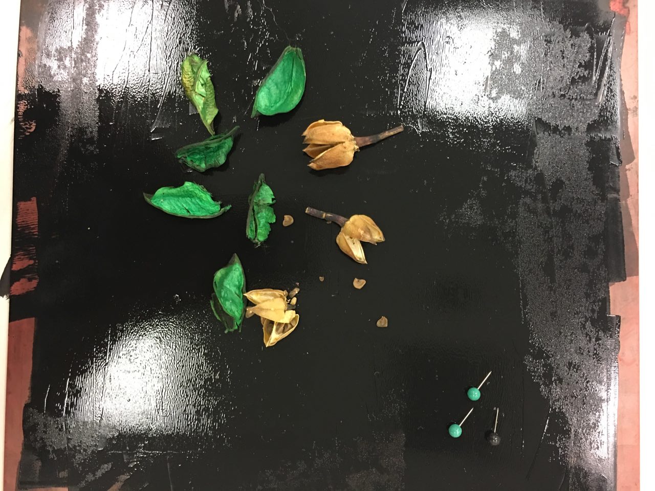
 Mark-making Session 1 

For the first session, I scavenged around my hall and brought some items with interesting textures to experiment with.

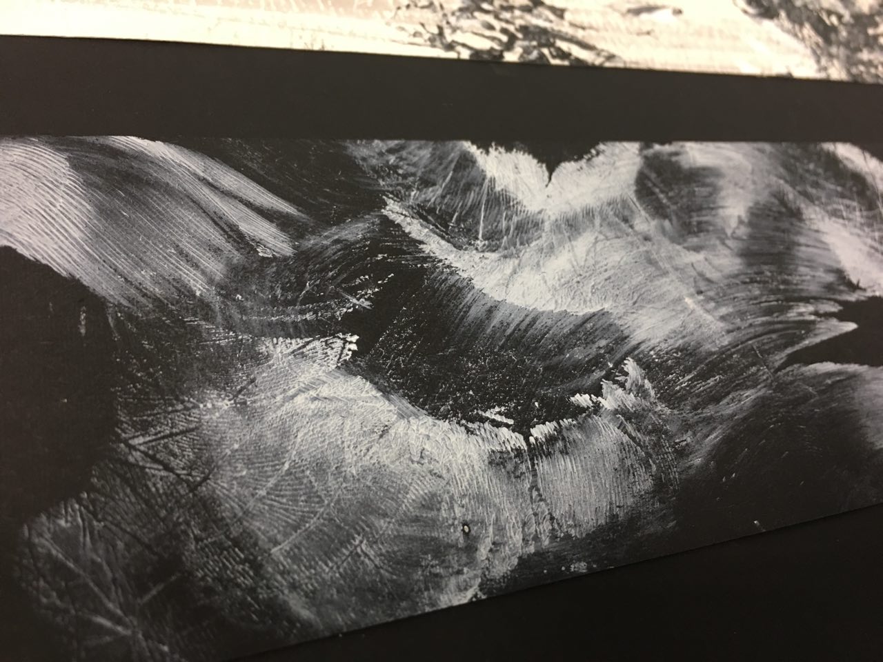
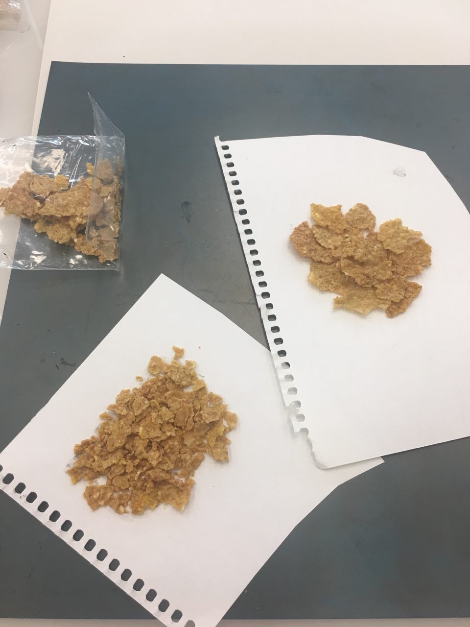
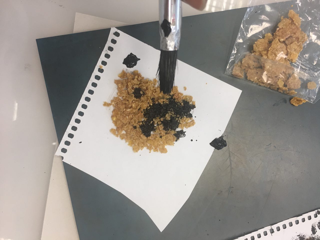
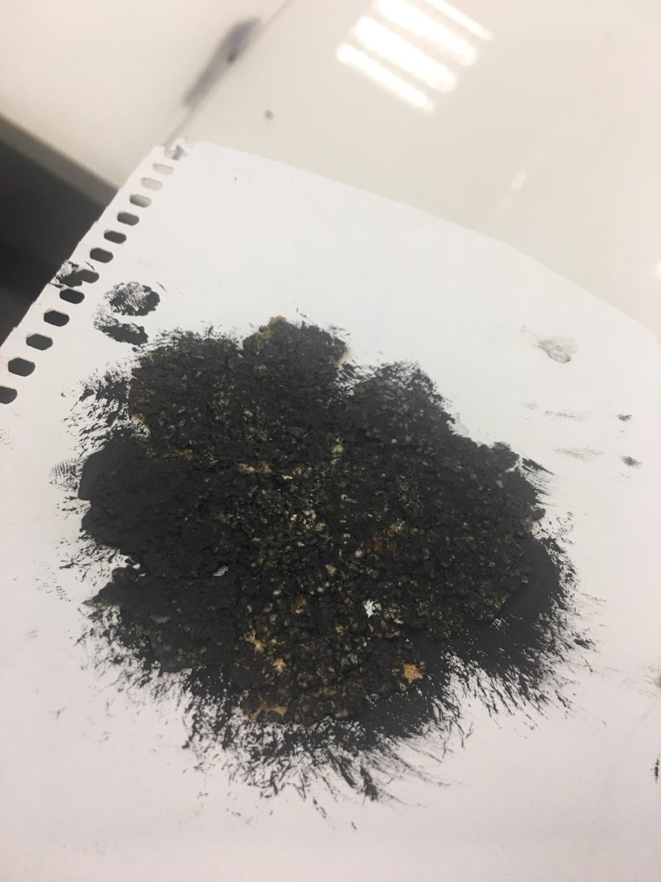
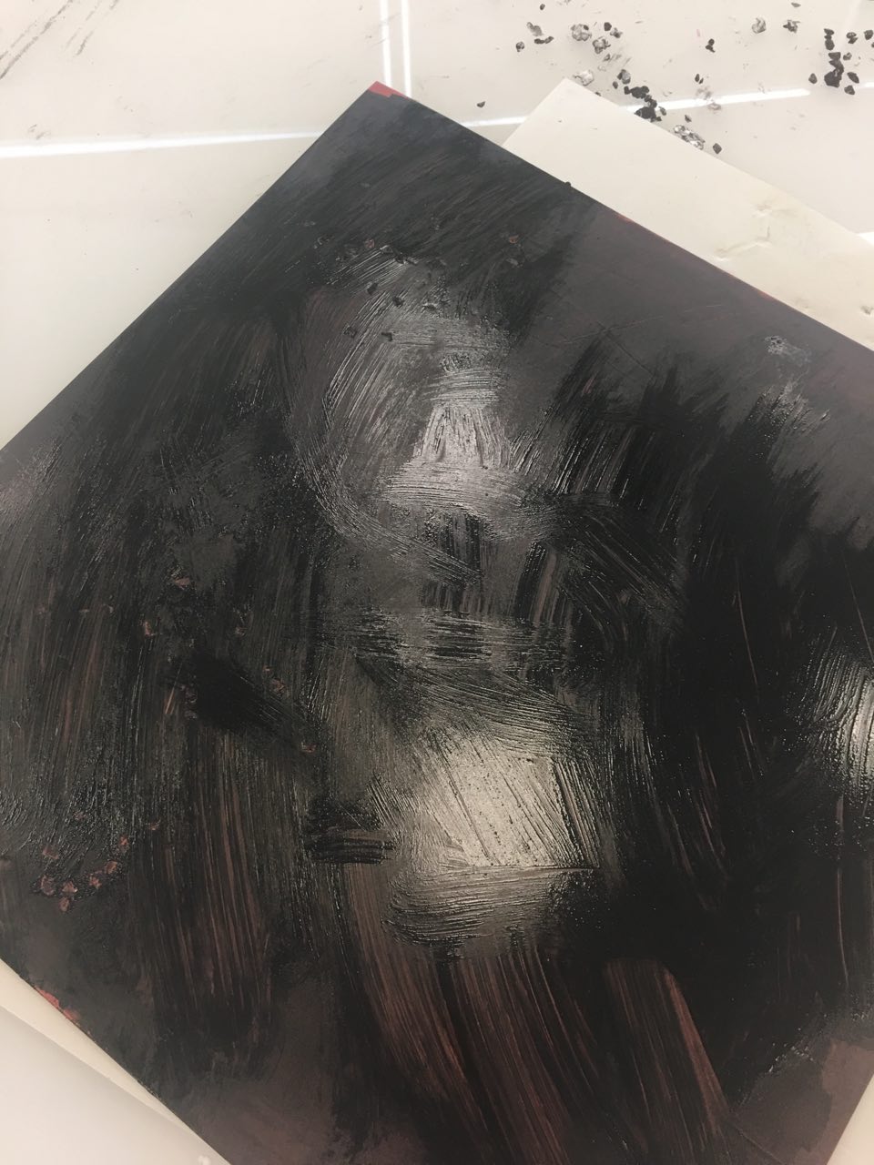
  Mark making with cereal

Whenever I’d eat my Banana Nut Crunch cereal in the morning, I’d find the texture of the cereal really cool. I’d take a piece and run it between my thumb and index finger, feeling all the tiny bumps.

Hence, it was natural that I’d bring it along for our first mark making session.

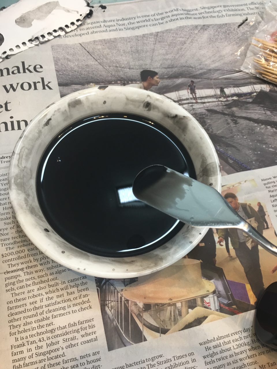
I tried rolling over the ink with a roller, but very little of the ink ‘stuck’. Hence, I resorted to spreading chinese ink over the cereal.

I manipulated the cereal by using it whole, as well as crushed into tinier bits.

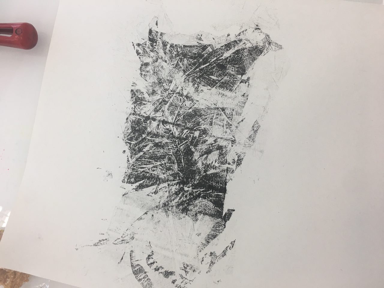
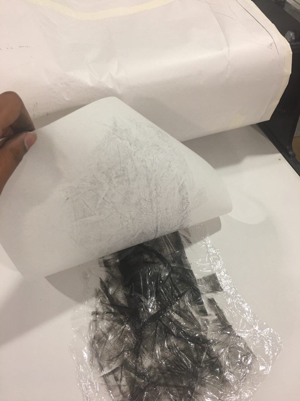
 Experiments in cling wrap

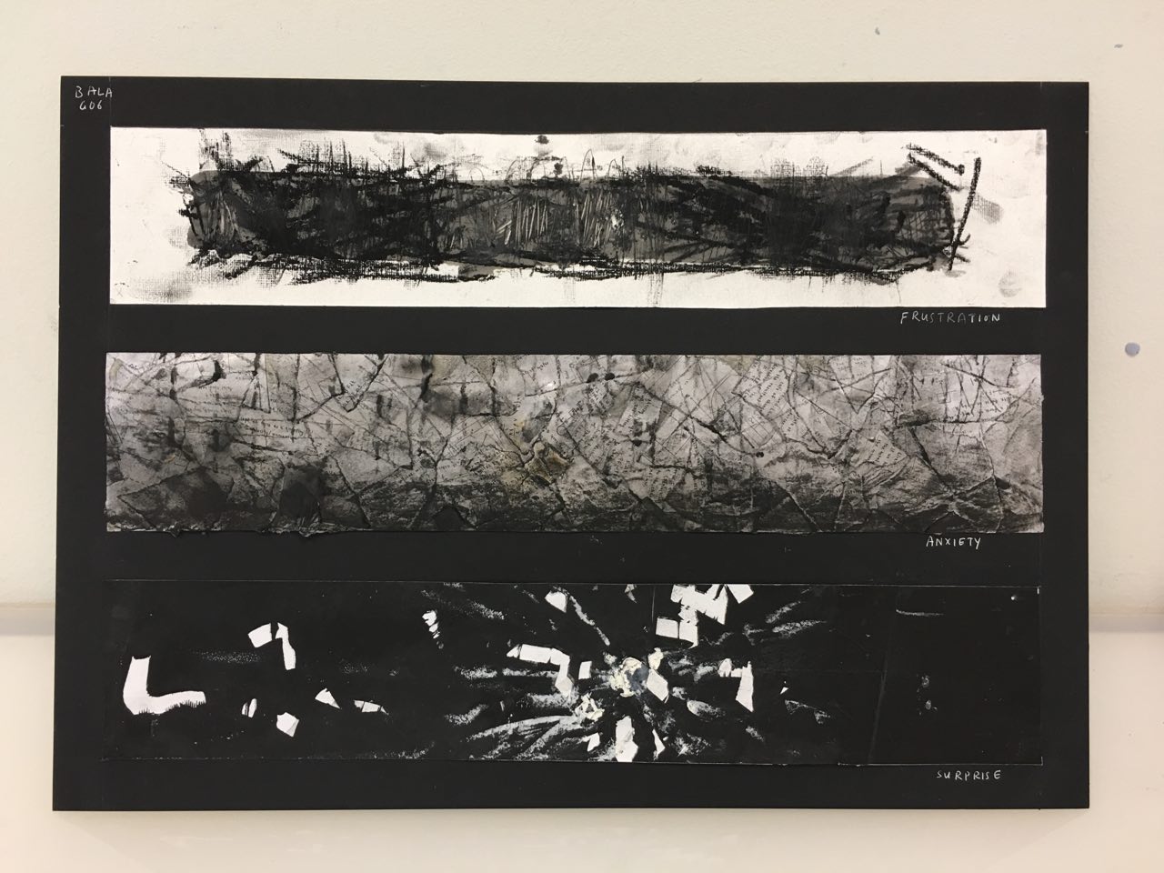
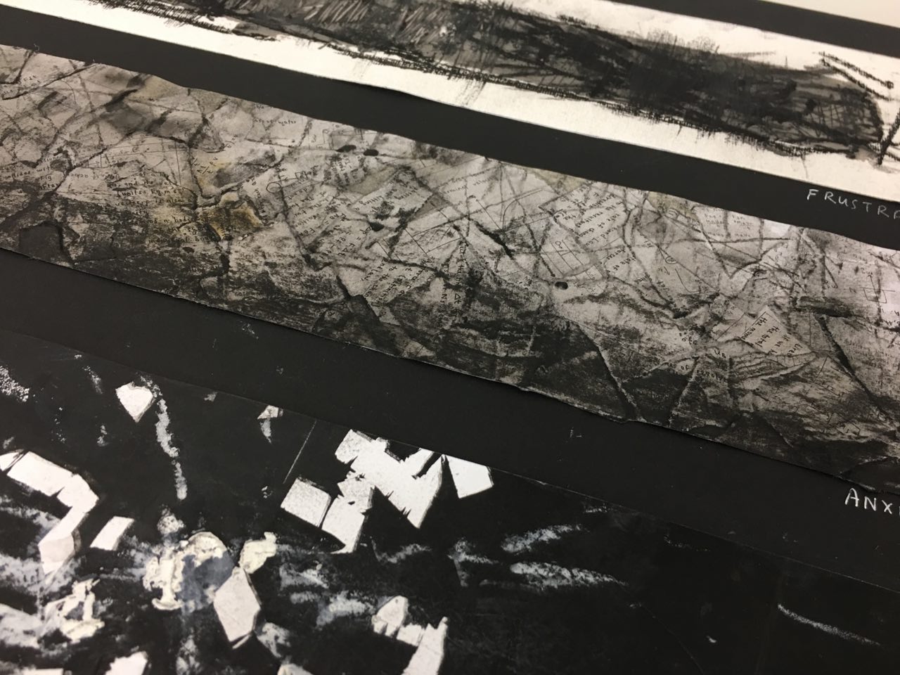
For ‘frustration’, I tried to get a “glass shard’ effect using cling wrap, block ink and the printing press. The first time I tried it, the print came out too light. I tried again using more ink, and the print came out a lot more distinct. I wasn’t too pleased with the overall effect, though, and vowed to retry using cling wrap should I deem the glass shard effect the final effect I was aiming for.
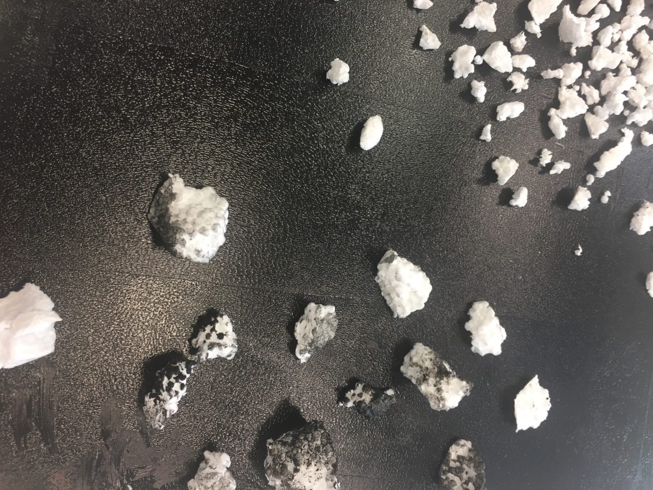
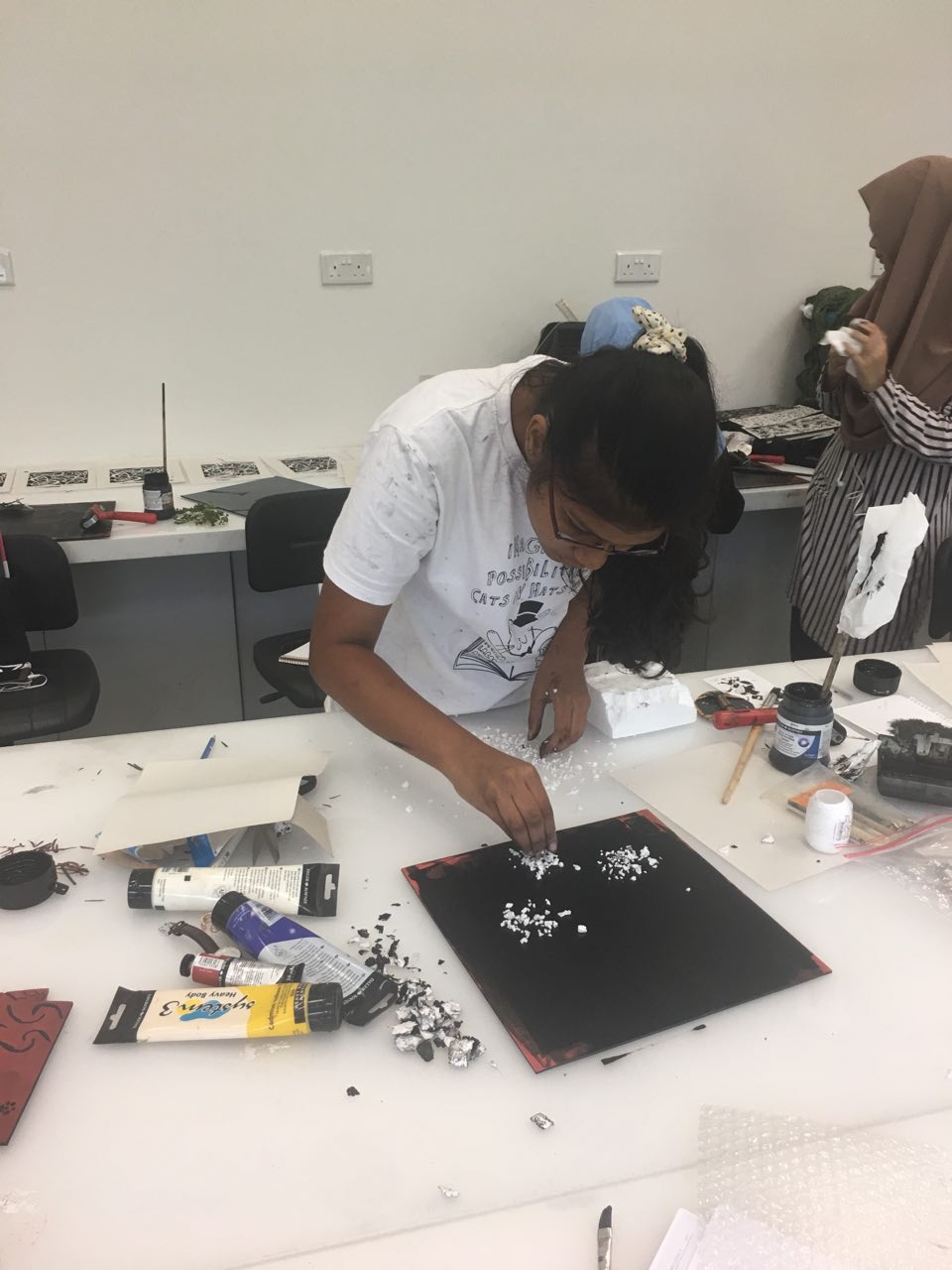
 Experiments in foam 

I tried using foam to create some marks for “surprise”.  I experimented with a variety of spacings – spacing the foam close together and wider apart to create a range of “explosions”.

I also ripped the foam apart into big and small chunks, hence experimenting with the “weight” of the explosions I was trying to create.

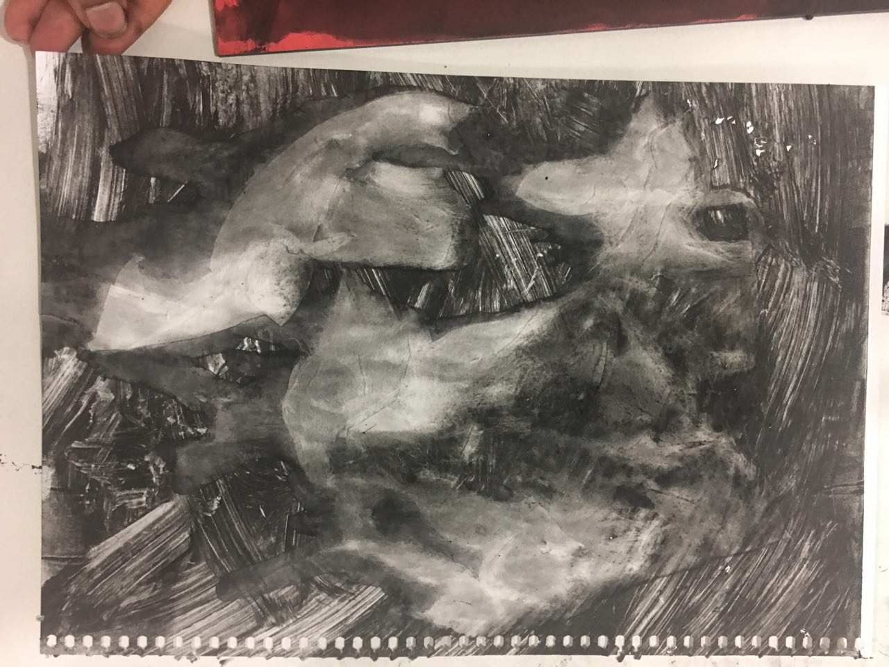
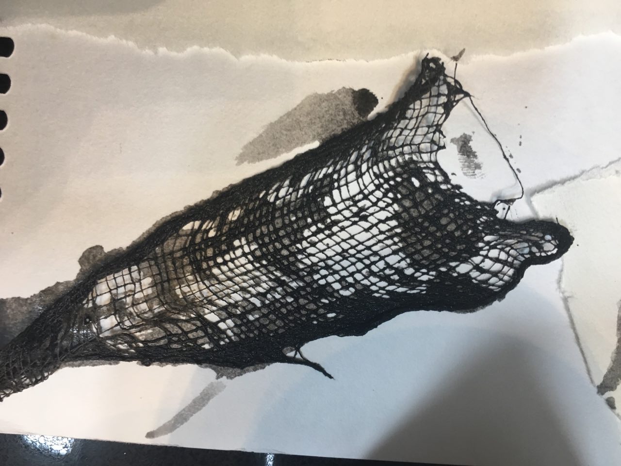
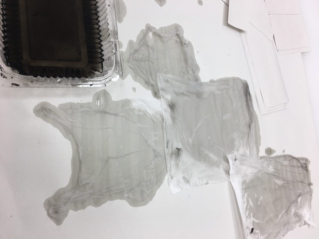
Experiments in wet tissue – printing press

Experiments in wet tissue – manual hand pressing

I also tried soaking the wet tissue in chinese ink and manually pressing over it to see if I could get another type of print from it. It was questionably successful – it did look like cloth, but not to the detail I wanted. I think its texture would be better expressed by using the printing press.

Mark making session 2

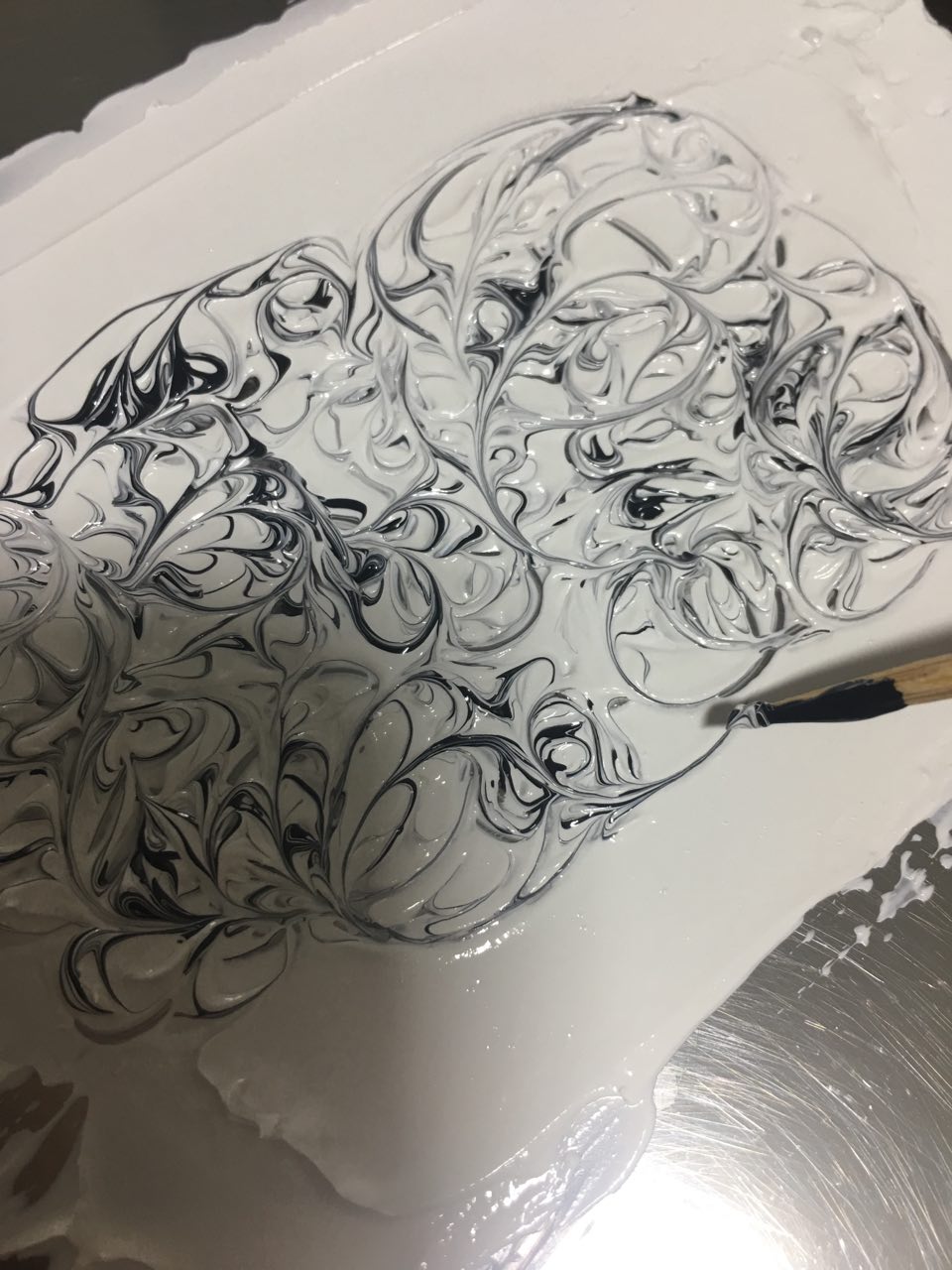
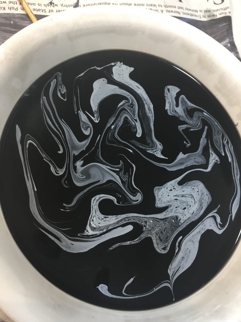
Marbling experiments

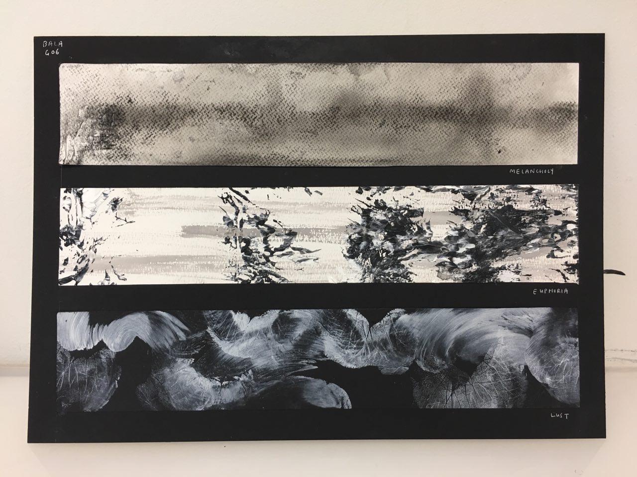
I tried spreading some white paint on a plate, swirled some black paint over it, and used a palette knife to make the mixing more chaotic in certain areas, like a burst of emotion for euphoria.

I then placed the drawing block over and lifted it off, creating very intricate patterns. I really enjoyed the intricacy and dynamism of this (refer to sketchbook), and decided I wanted to incorporate this in some way atleast.

I tried marbling with the paper from my sketchbook, drawing block, watercolor paper, and newsprint, with chinese ink and diluted black acrylic paint. I got the best results from newsprint, which seemed to take up the intricacies of the swirls the most.

I also experimented with the amount of ink used i.e. how “dark” the marble was, which affected the intensity of it. I felt that for lust, the darker marbles would be more suitable for the headier, sexual nature of the emotion.

 Experiments with Salt


I thought about I felt very weak, and dehydrated, when I was feeling melancholic. Hence, I thought about which materials soak up paint, as a metaphor for energy, and it immediately hit me – salt. It dehydrates, sucks the energy out of you (the paint) – I sprinkled some salt on paper and had it form patterns.
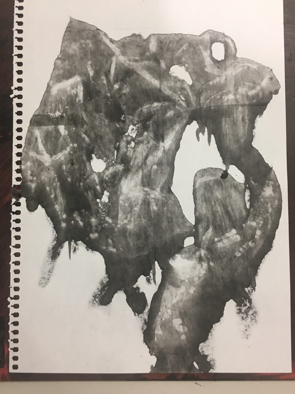
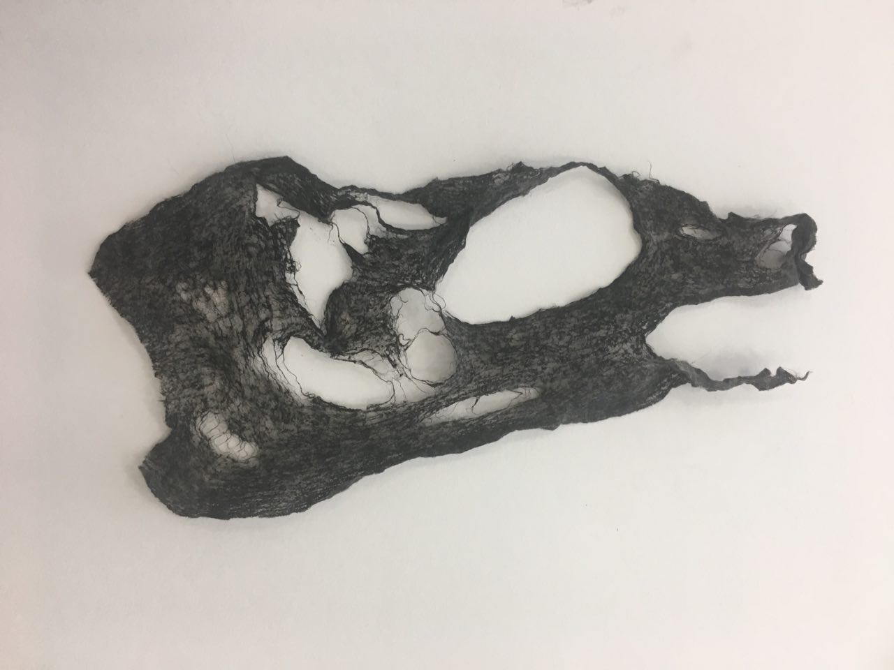
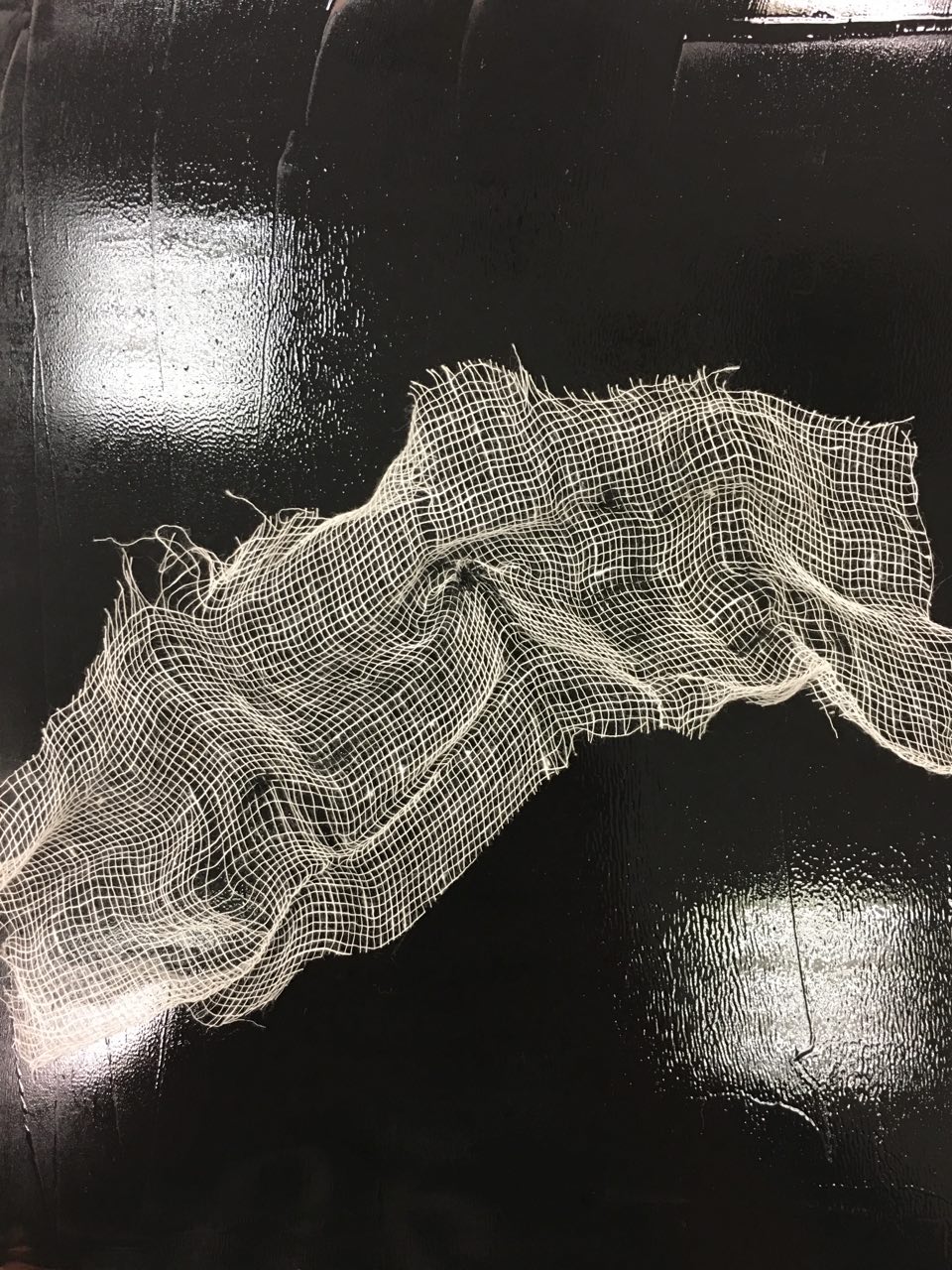


 Gauze

As the previous manual pressing with wet tissue was hardly satisfactory, I tried again with gauze, which has a more distinct cloth-like pattern than wet tissue. Again, it did not imprint well enough, leaving me to finally decide against this method.


 Experiments with palette knife

Having had used palette knives for some of the earlier exploration with white paint and swirling, I decided to try using the palette knife for making marks itself. It created fluid, stable lines, which wasn’t suitable for any of my emotions which were unstable in one way or another.


For frustration, I tried scratching the splotches of paint with the paletten knife to create straight, even scratches. I prefer the more “raw”, not straight scratches as I feel that they convey the instability you feel when you’re frustrated.


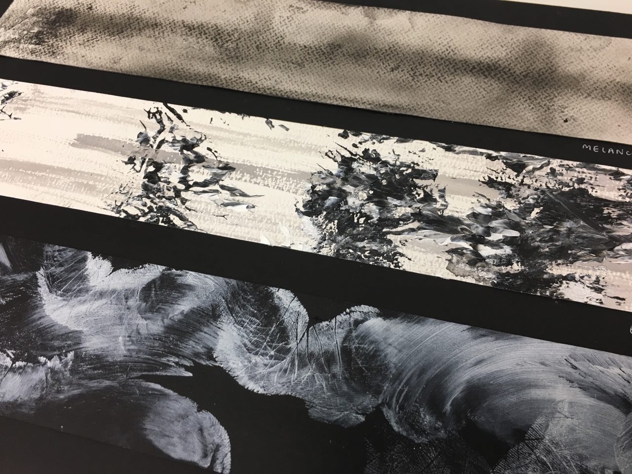
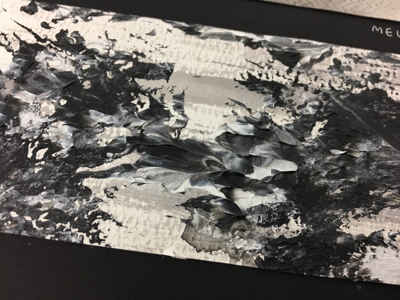
 Experiments with glue

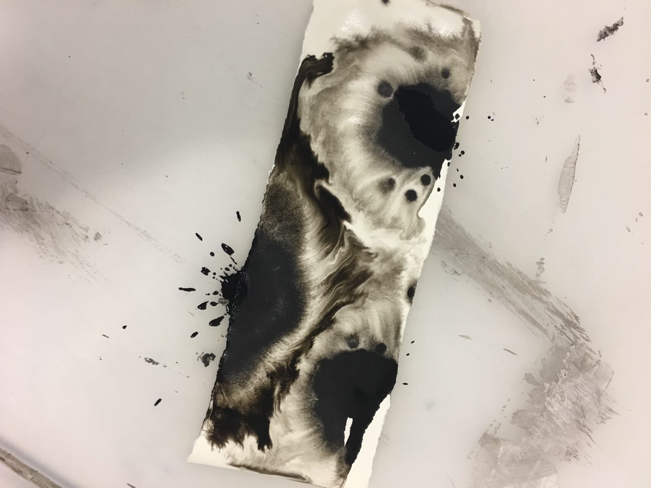
I wanted to convey the feeling of emptiness you feel when you’re melancholic with an empty background, literally, as white glue dries clear. Acrylic paint broke up into tiny pieces when mixed in with white glue, giving the effect of the fuzziness and buzzing you feel in your head when you’re sad. I really enjoyed this effect, and made a bigger strip to compare against other “Melancholy” composition strips to make a final decision.


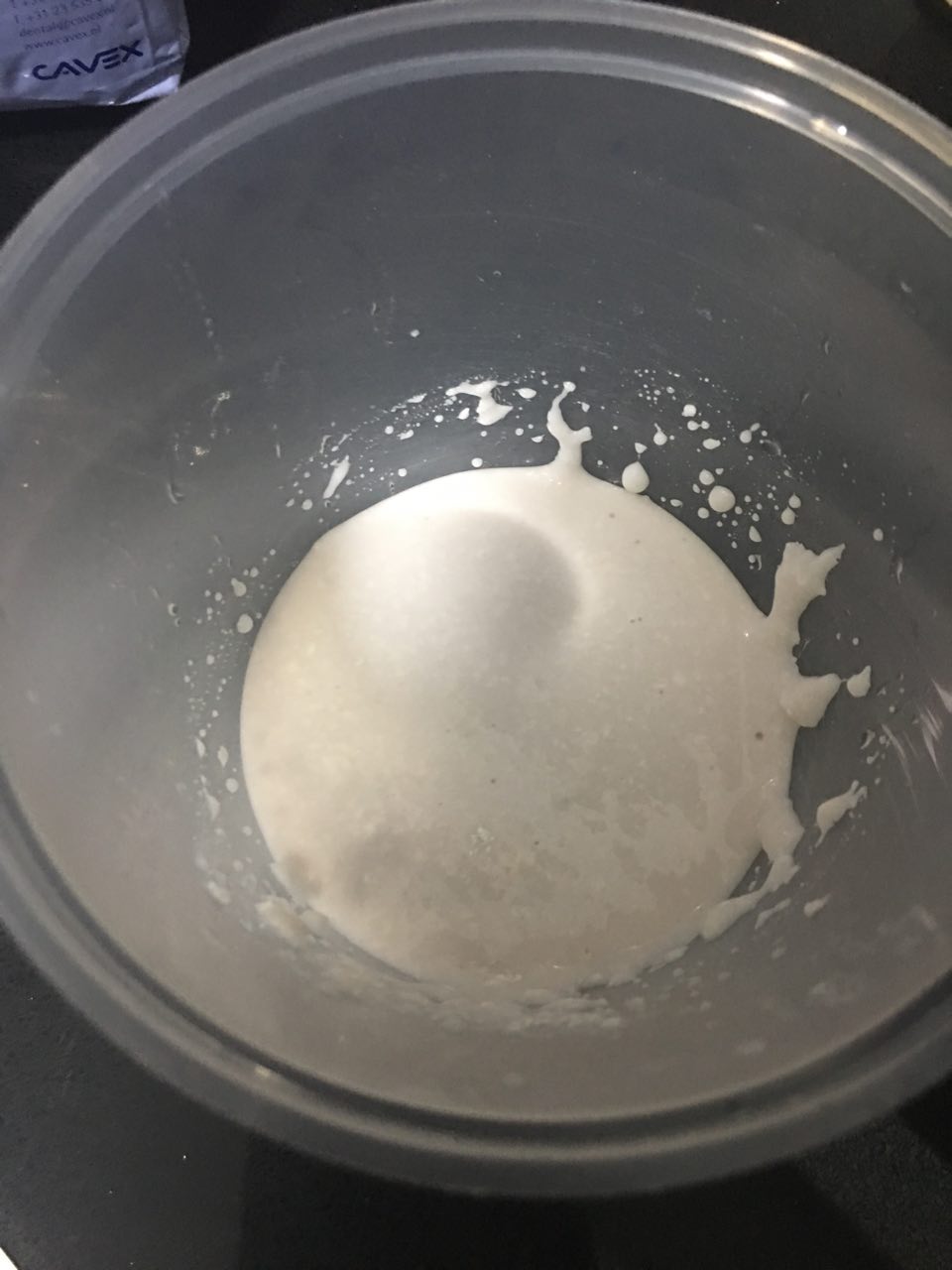
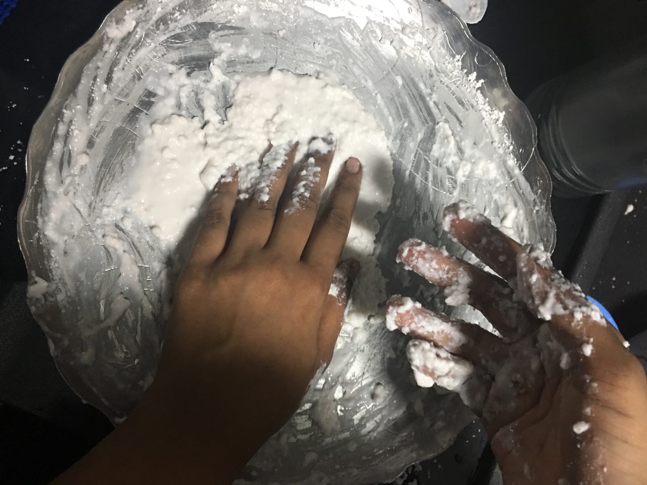
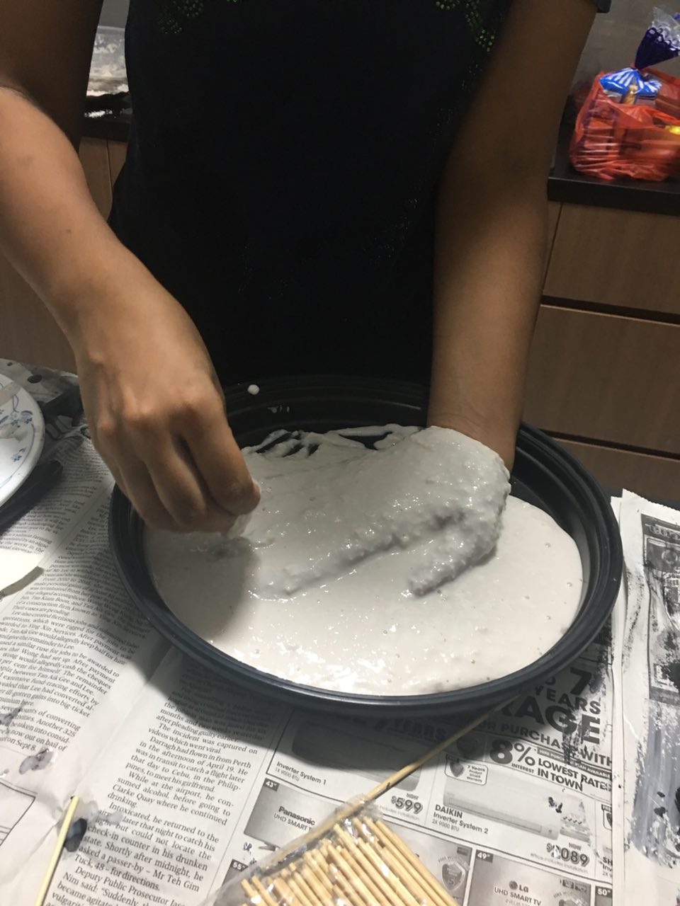
 Alginate experiment (failed)

To get the skin texture, I tried covering my hand and pouring alginate over it. Initially, I inserted my hand into a small plastic container, but it turned out to be too small. I then used a bigger pan and completely covered my hand with alginate, to be used as a mould later.

I initially wanted to fill mould with terracotta clay but it dried up, even though the pack was unopened. I then filled the mould with glue, but for some reason, it didn’t dry even after 3 days. I didn’t try again because on consultation, I realized that the cast would cross over into the 3D realm.

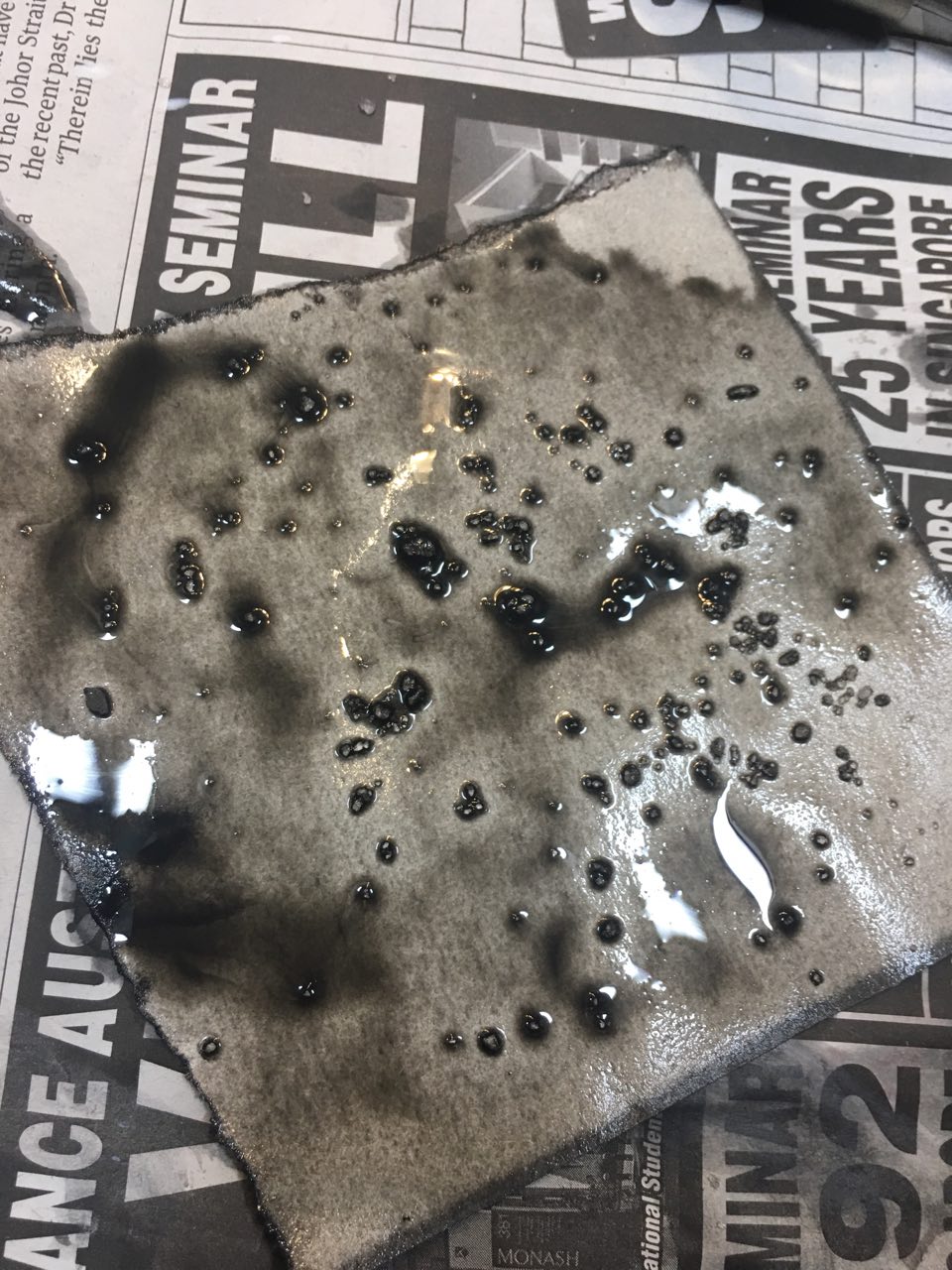
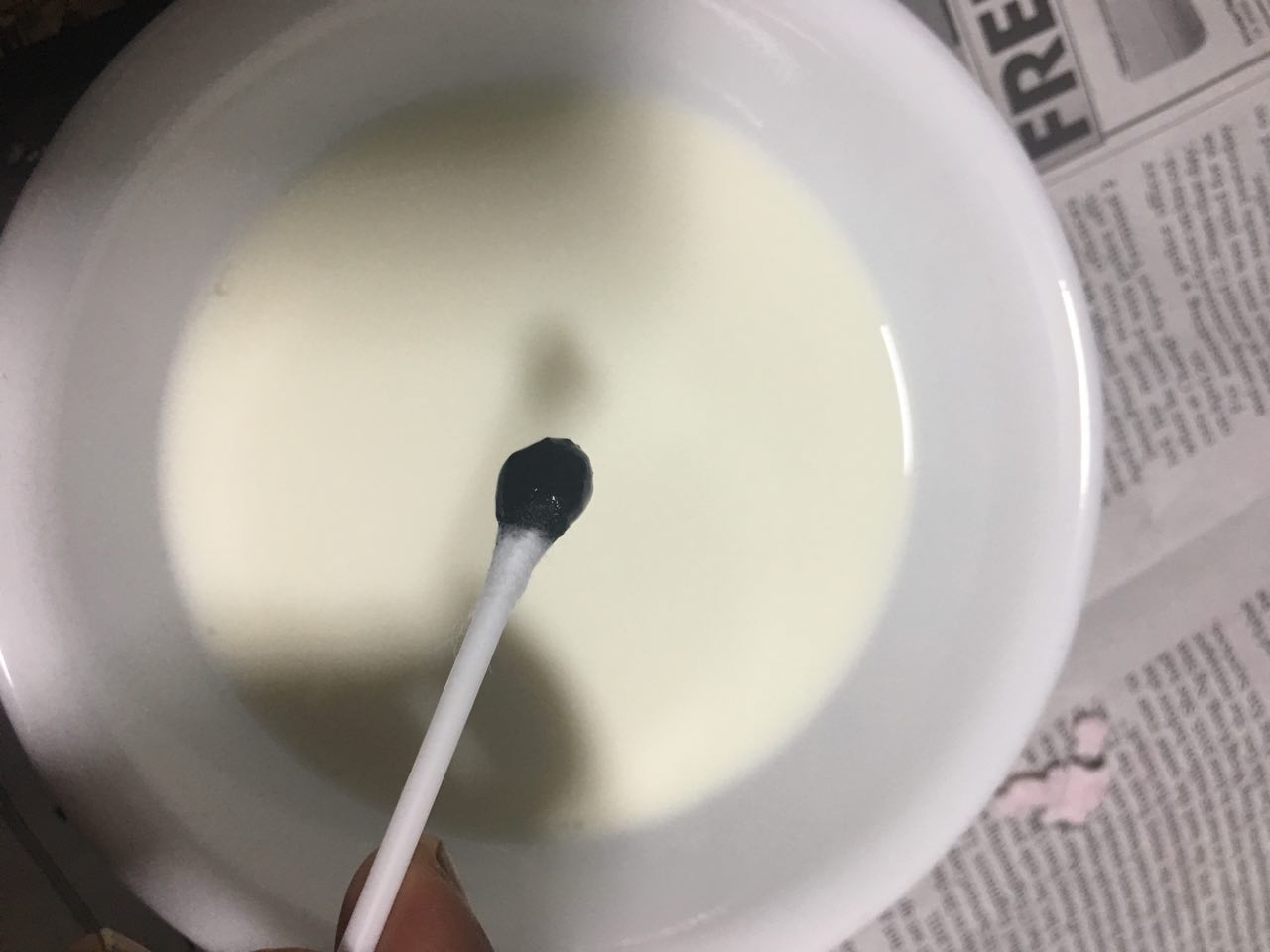
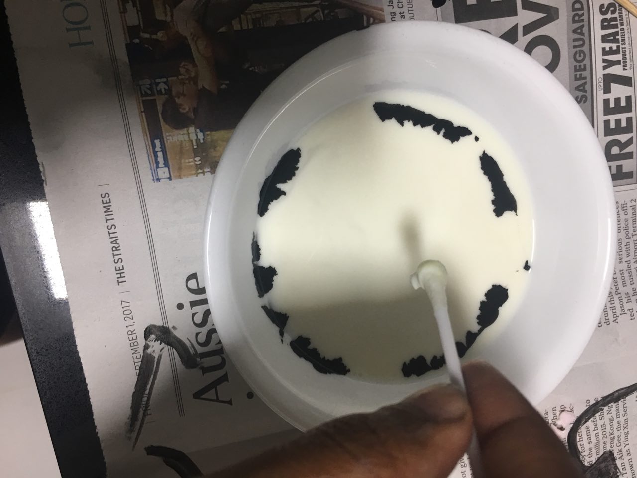
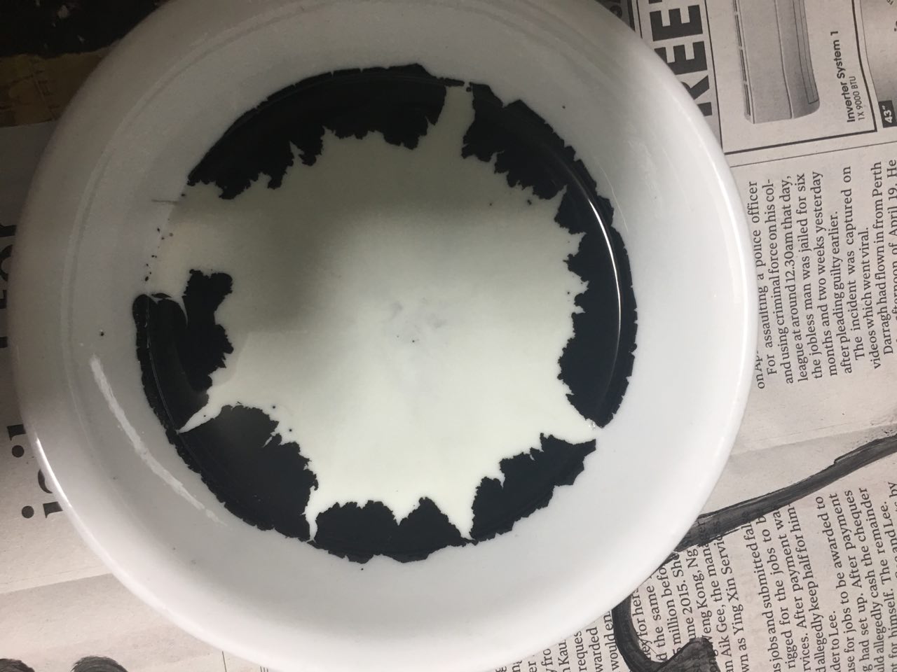
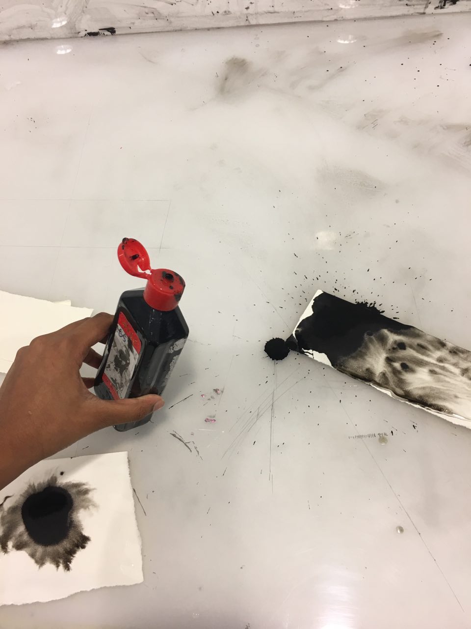
Detergent & milk experiments

I’d read about how detergent causes ink drops to travel outwards in a swirl in milk, due to the detergent breaking down the fat in the milk. I tried it with diluted black acrylic paint, but it gave a completely different reaction – instead of swirls, the paint “broke” into smaller bits and travelled outwards. I feel that this would be more appropriate for surprise.

Foam block experiments

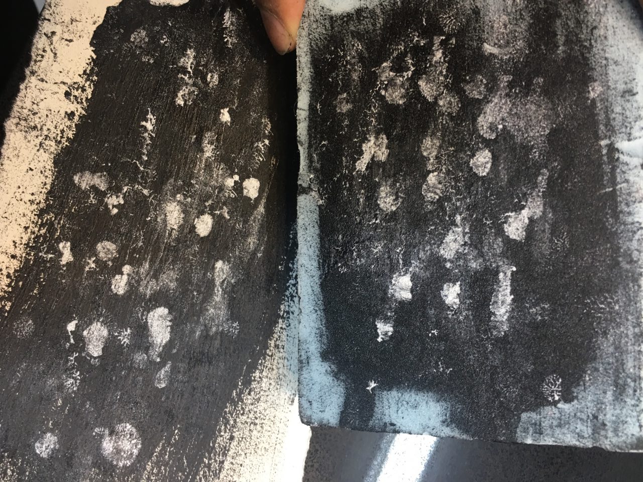
I’d also bought a small foam block as I thought that the surface texture could be interesting. First, I spread black acrylic paint on the block, then did a usual pressing down of the block on paper. I enjoyed the print it gave – there was something really rough and raw about it, which might make it a good texture to incorporate into parts of “frustration” or “melancholy”.

Then, I spread some white paint on it into small ovals as I hadn’t done that yet so far for “surprise” – I had made marks that looked like explosions, but nothing that looked like small spots of surprise. The resulting was very interesting, especially with the foam’s texture overlaid on the white spots.

Lastly, I spread some glue on the foam, knowing it would melt it. Indeed, it did, and when I pressed down the foam block on white paper, the resulting print had a bumpy, 3D texture as well. It looked like splatters, but as predictable as the splatters I was used to seeing – the lines were stretched in more random directions, came in clumps – it was a visual treat on the eyes.

Mark making session 3

I went back to the Foundation 2D studio for about 3 hours to experiment more with different materials, as well as try a new range of gestures.

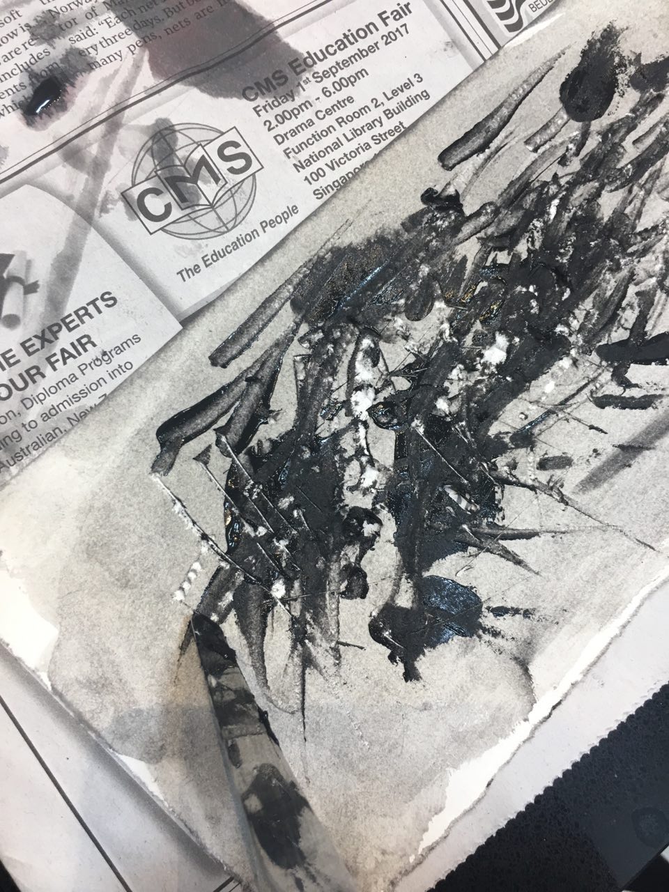
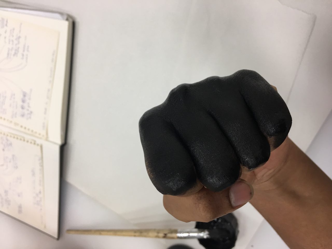
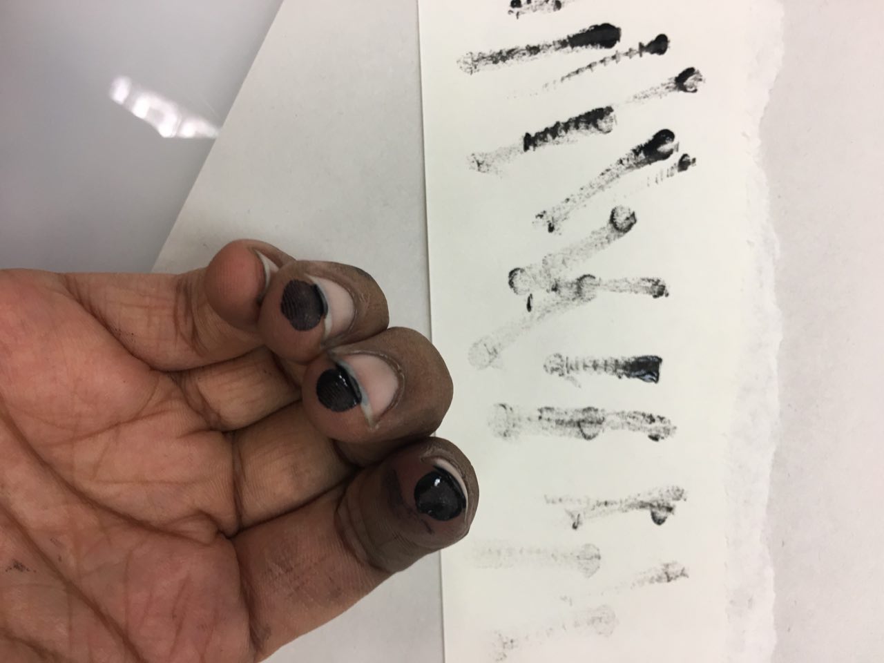
Frustration: punching and scratching

I thought about the actions I associate with frustration: violent ones, such as punching and scratching. I either want to punch someone or scratch my skin out (two different levels of inflicting hurt: either hurting others or hurting myself) so I hence spread some block ink on my knuckles and punched a paper – various times, as different intensities and ways of punching produced different results.

My scratching attempt was wholly unsuccessful and did not look as frustrated as I wanted to be as I had short nails, and hence most of the paint went on my fingers themselves, so I figured it would be better to scratch onto a surface which is already painted.

For frustration, overall, I figured that scratching would be better as personally, when I’m frustrated, I try to contain the emotion and hurt myself by trying to contain it rather than releasing my frustration and hurting others.

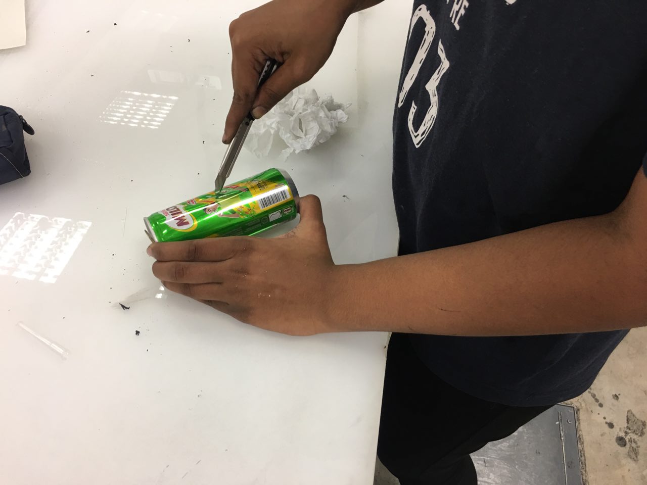
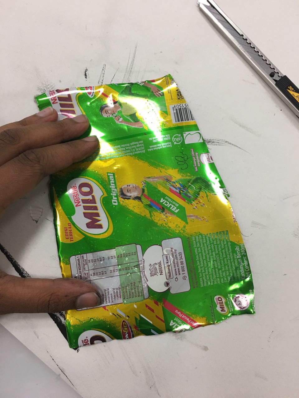
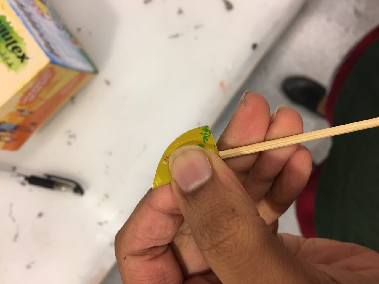
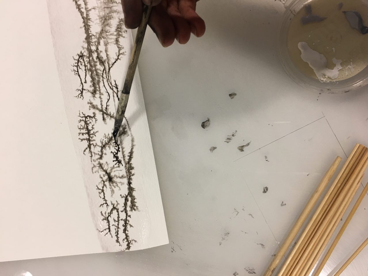
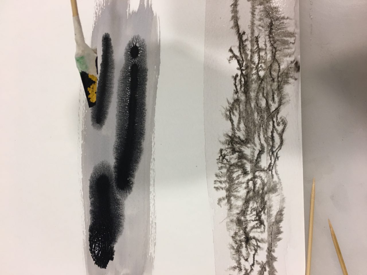
 Making my own mark making tools

Washed some milo cans I’d drunk out of and made my own “pens” with satay sticks, masking tape, and aluminium from the milo cans to make more innovative marks.

I felt like I needed marks that were more staggered, unsure, uneasy – for this purpose, I chose to make my own mark making tools. I cut up two milo cans and made five “pens”, some of which are pictured above.

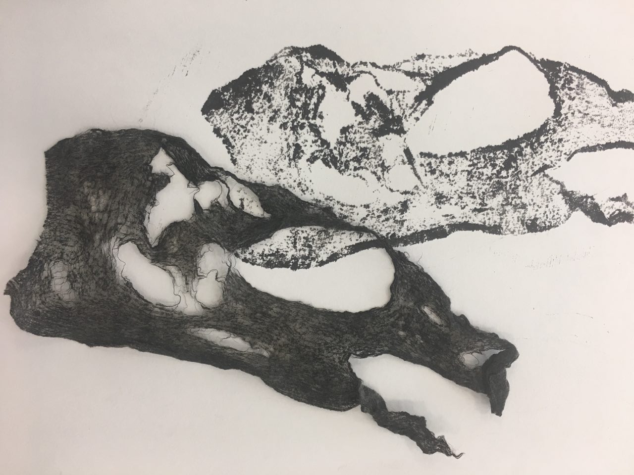
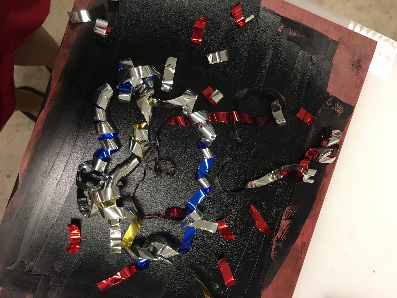
 Other process photos

Gauze Fan brush Potpourri
Chinese ink Melancholy (1)

Process for folded paper

Melancholy (2)

Marbling of Tissue paper

Mark making session 4

Streamer prints

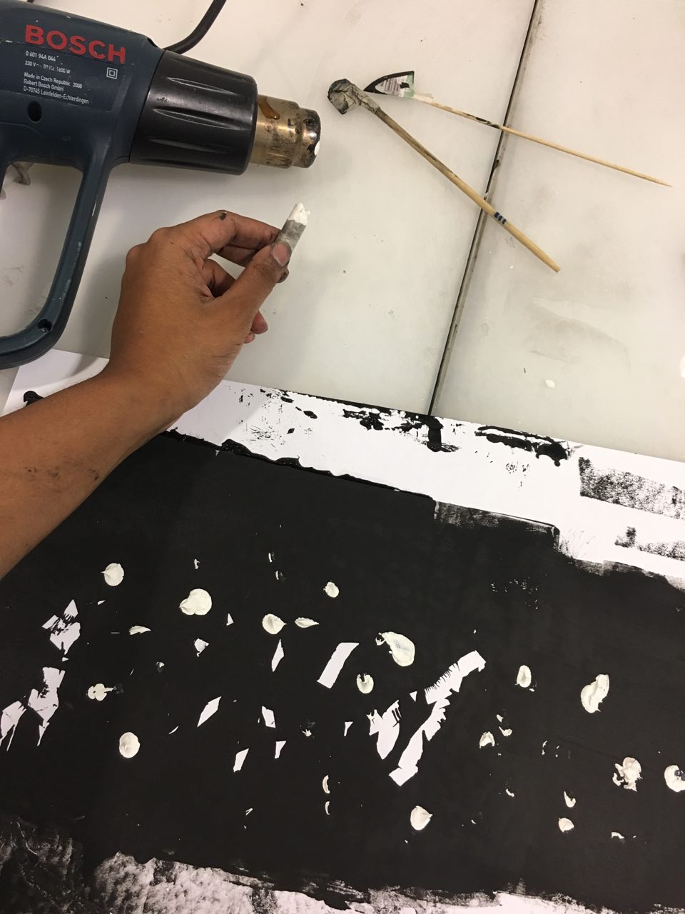
Melting oil pastel with heat gun 
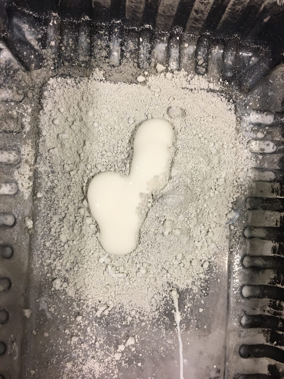
Making of Thunnoor paste Anxiety – making of paper mache

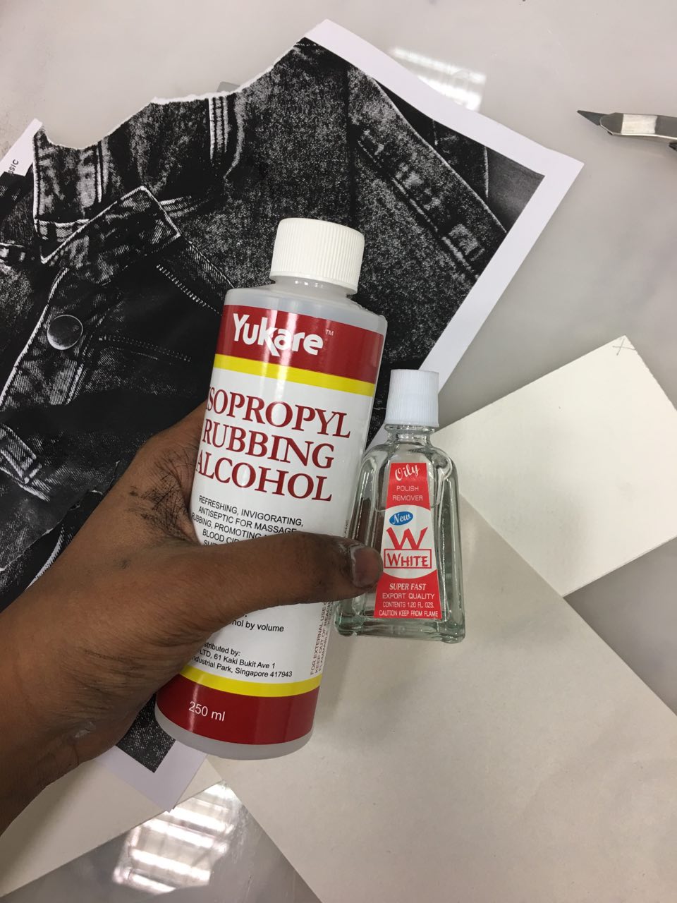
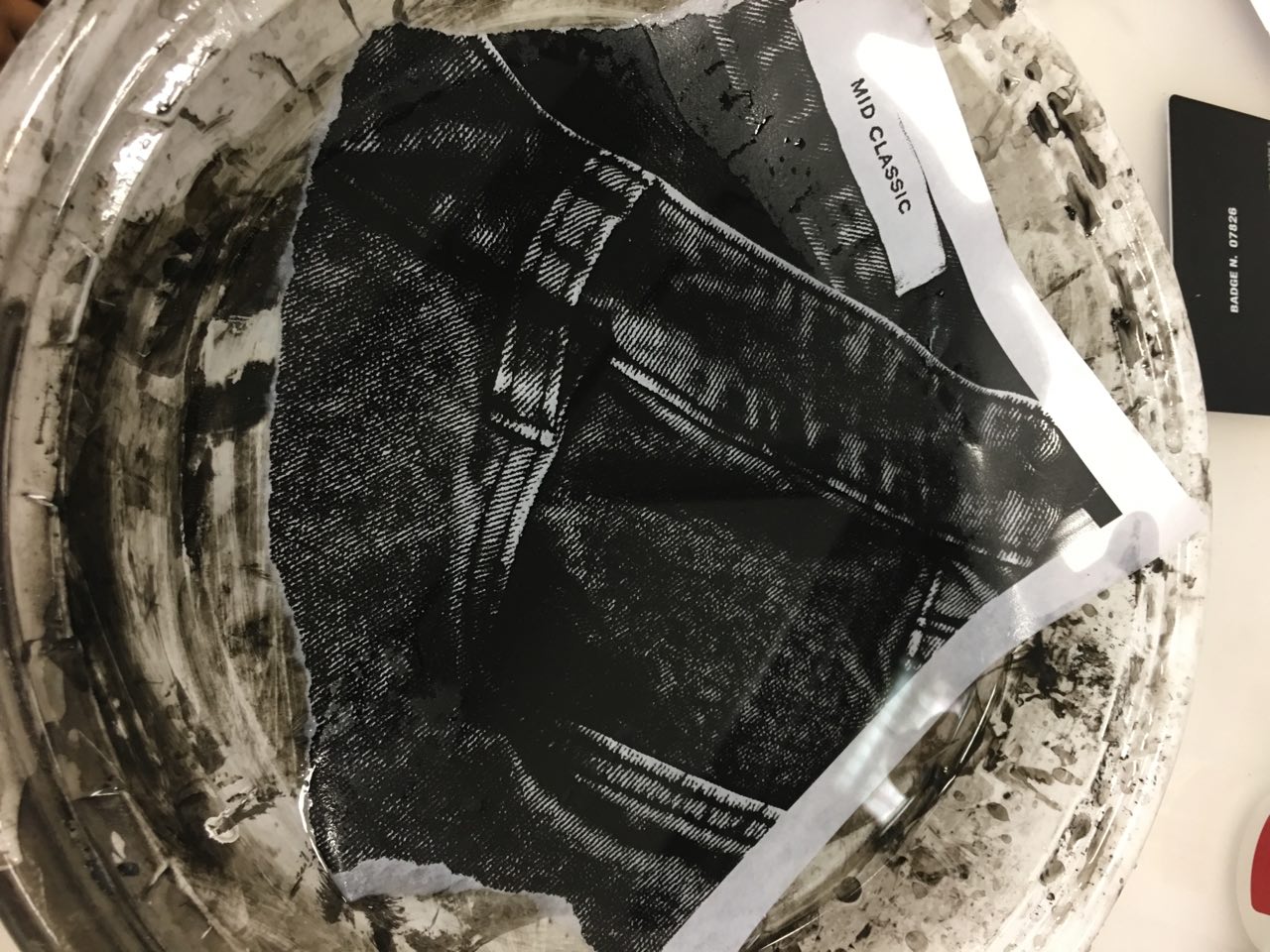
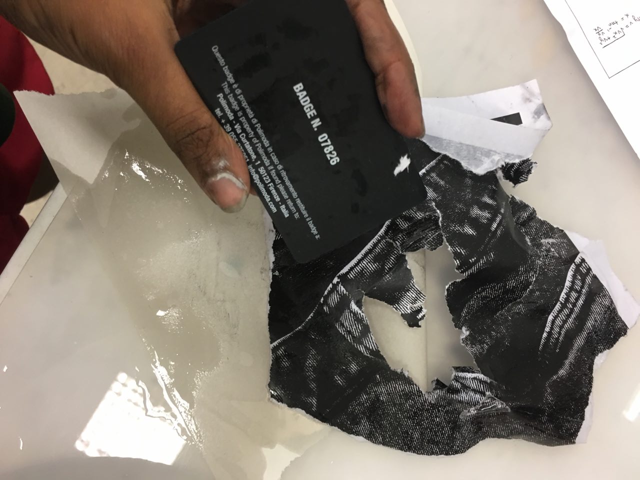
Image transfer experiments (failed)

The image transfer didn’t work with hand sanitizer, rubbing alcohol, or aerosol spray – in hindsight, I should have used xylene ( ; ω ; )
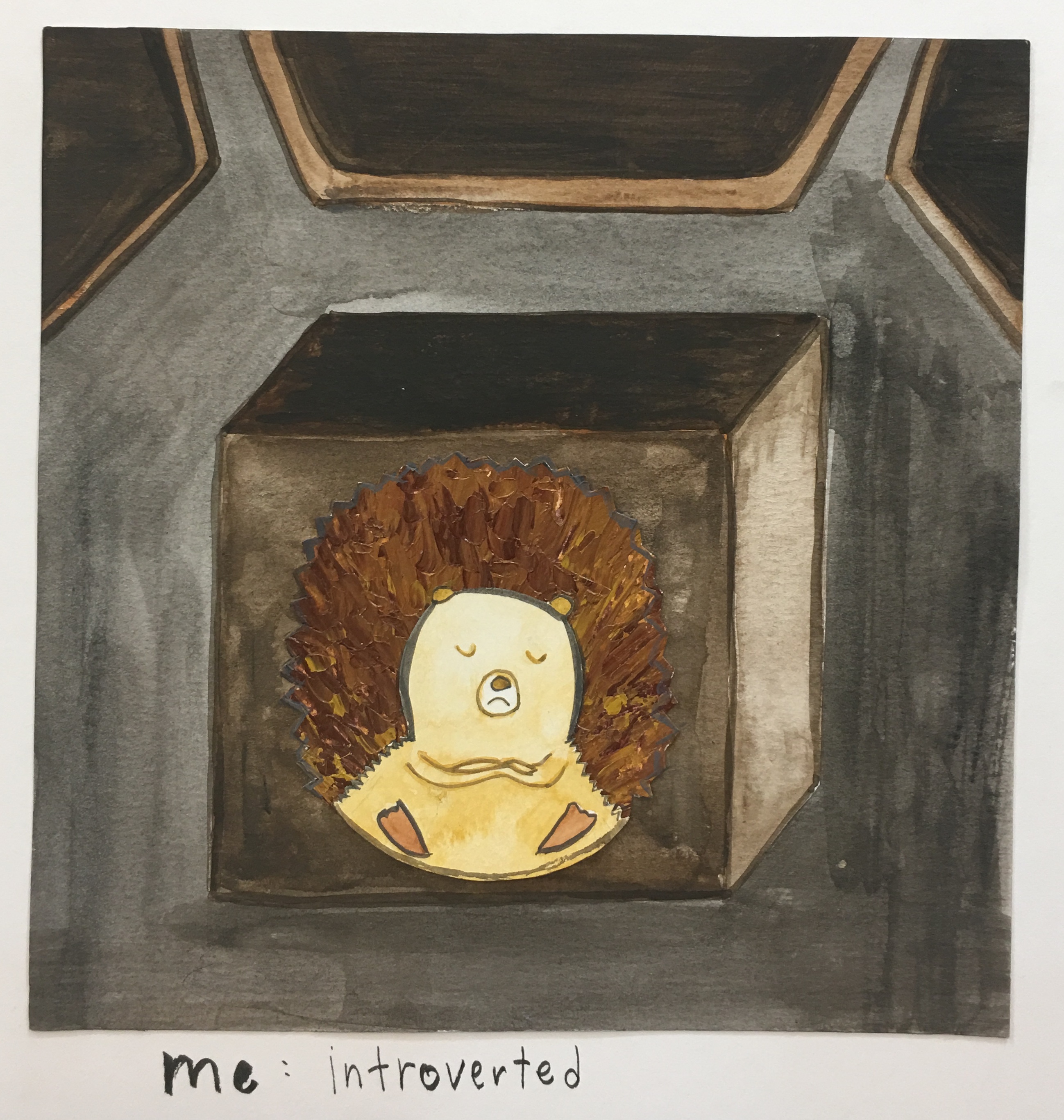
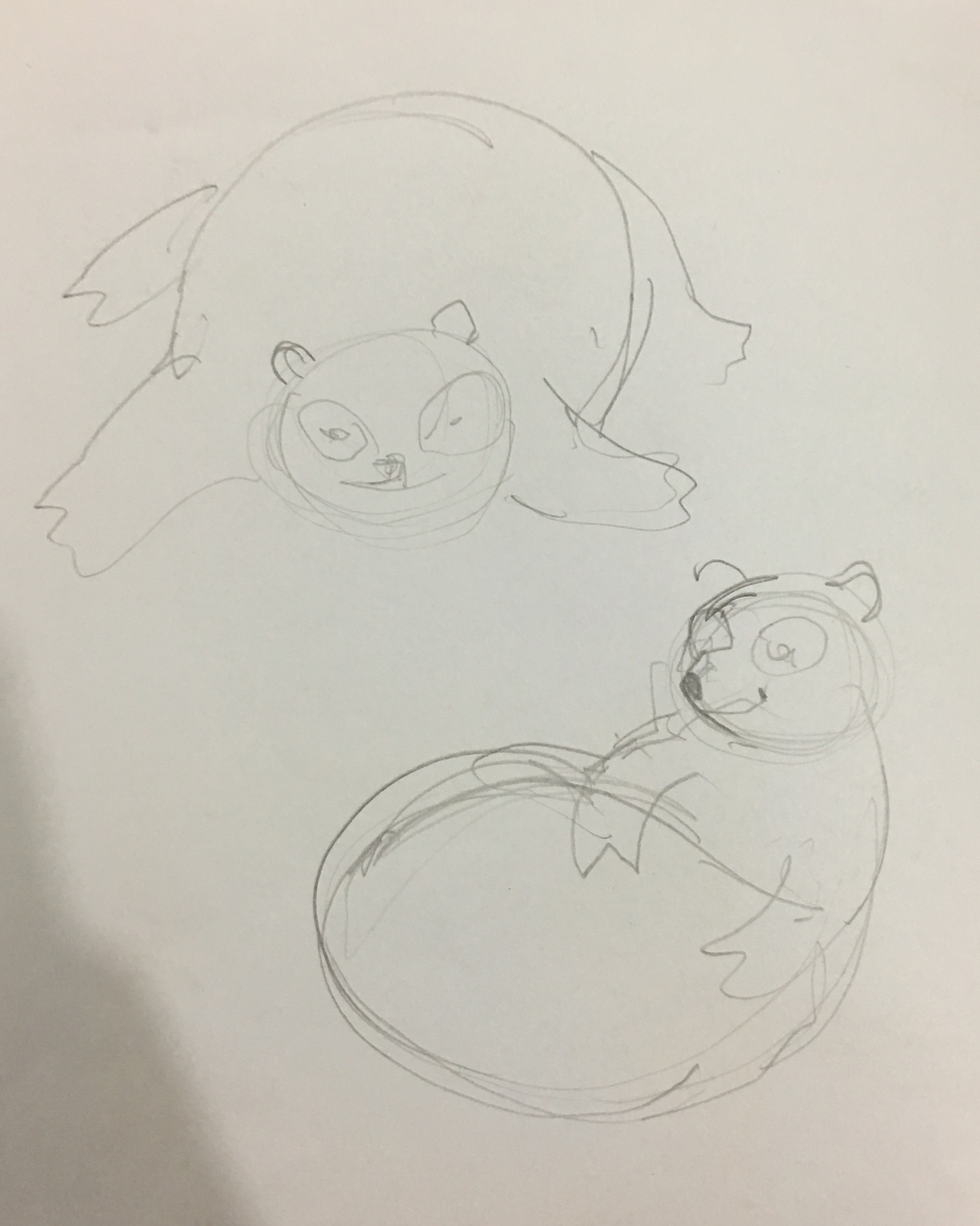
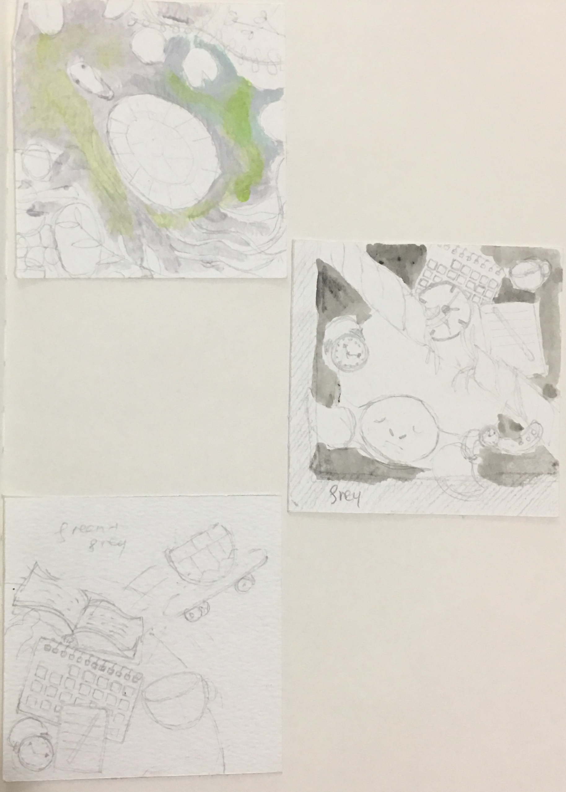
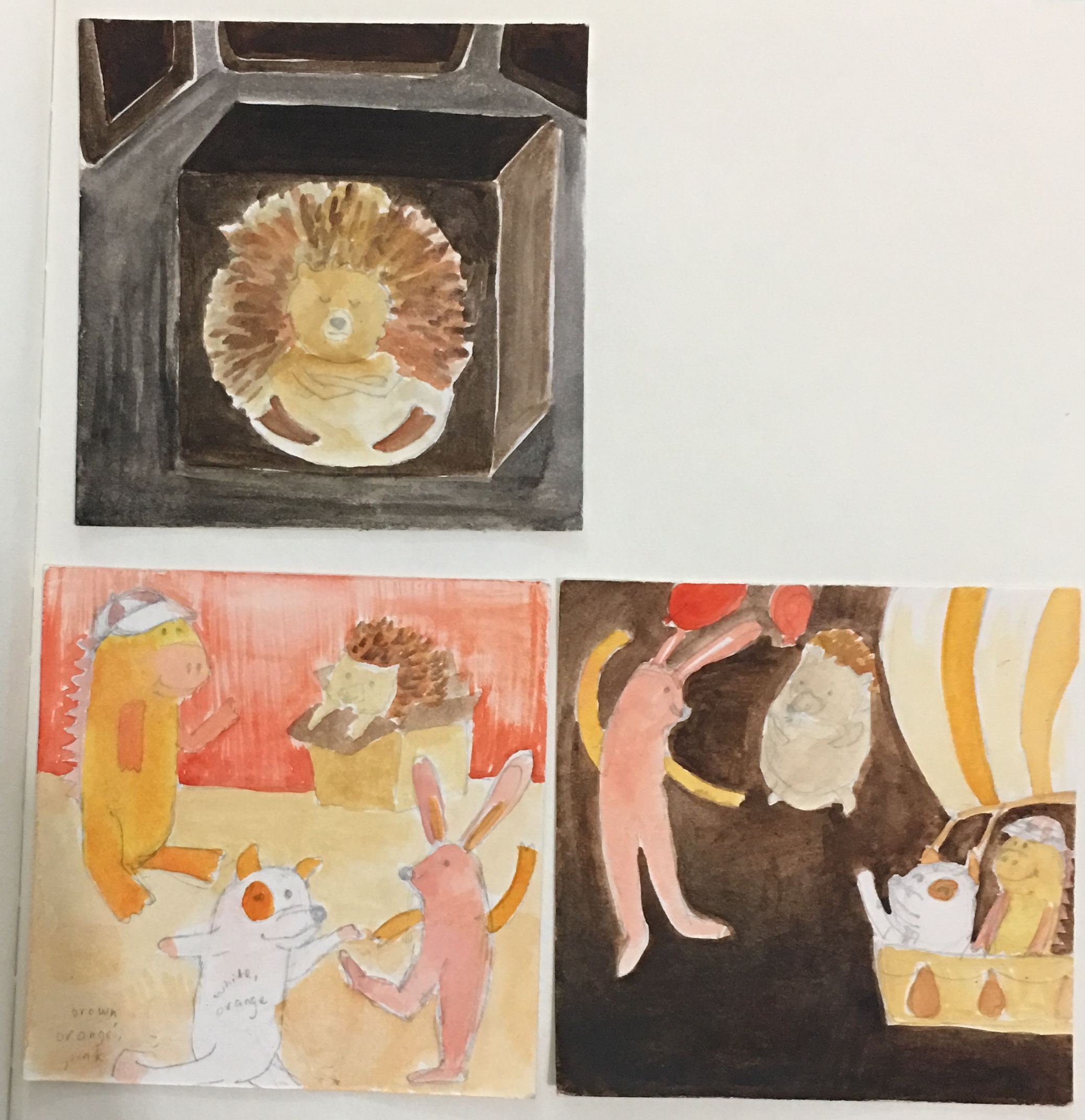
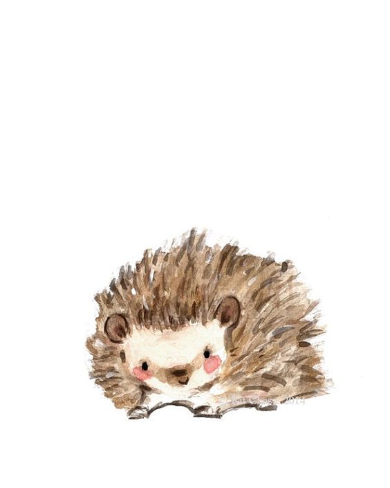
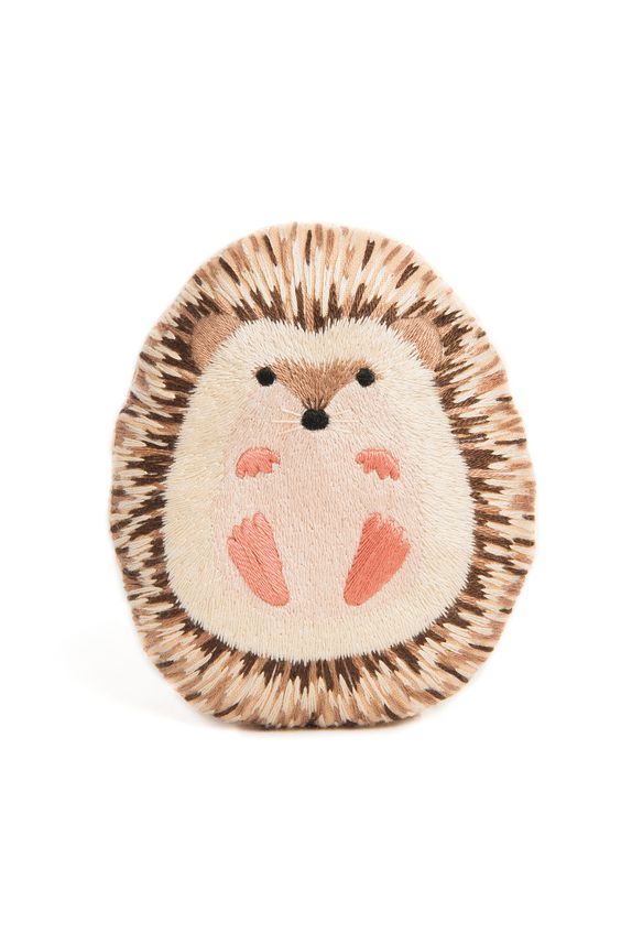
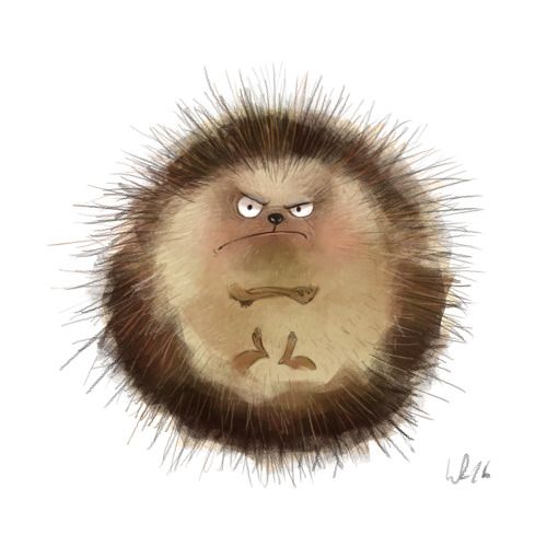
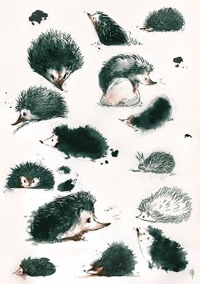
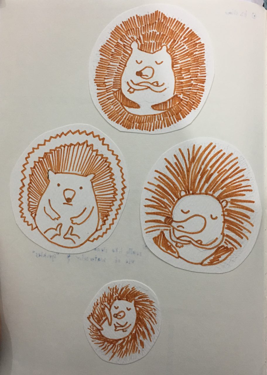