
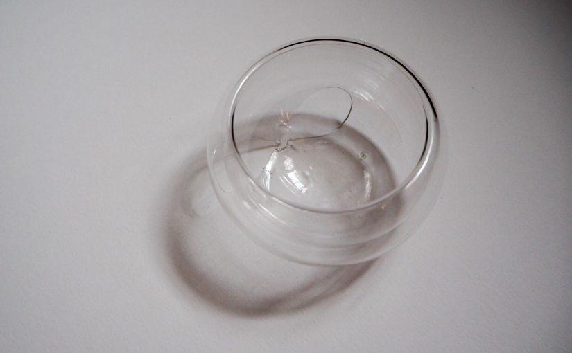
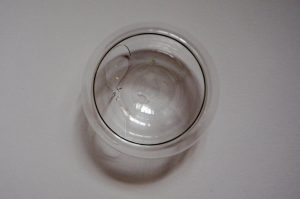
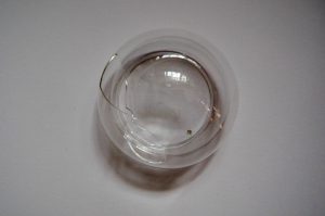
The bowl that I brought to class for analysis broke before I could photograph it, so the analysis below will ignore the holes in the bowl, since it’s an unintentional part of the design now.
Initial observations:
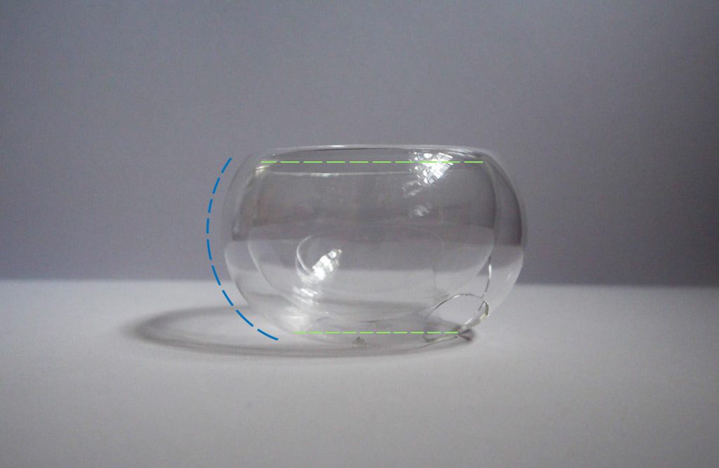
The bowl is made out of smooth, transparent thin glass. The glass is double layered, with gives it an interesting cross-section. It has no sharp or angular edge, as the double layer does not have any fusion point. It is a continuous piece of glass cleverly moulded into its shape.
Edit: The two layers create a void in-between, and the transparent glass showcases that. It can be categorised as a cluster of similar volumes, as the size difference of the two layers isn’t very significant.
The bowl is symmetrical on all views.
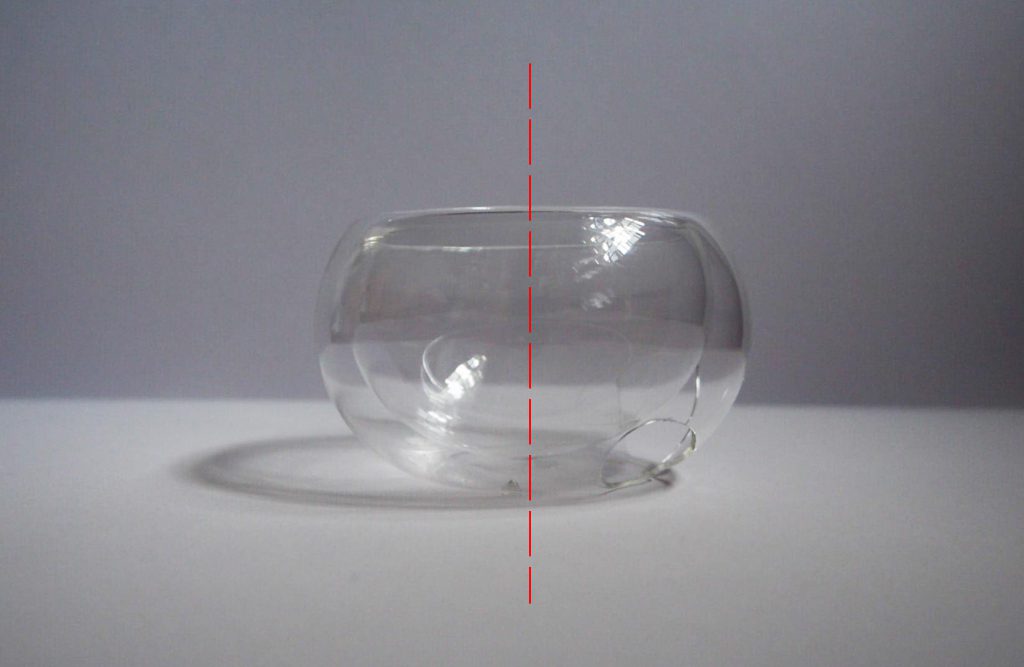
There is balance in the design as the side of the bowl has a single beautiful curve that does not give it any “bumps” or neck. The proportions of the base and opening however is not equal. The diameter of the base is slightly smaller.
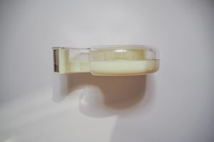
Since there is limited things to comment on for the bowl, I decided to analyse another object to see if I understand the other terms we’ve learnt. I chose to analyse a tape dispenser.
The most prominent feature that I noticed was that the diameter of the hole was one-third of the height of the dispenser, following the rule of thirds.
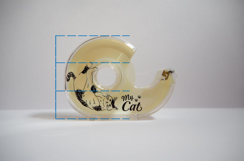
There is a significant difference in its proportions of the mass and void – mainly due to its function of containing the tape. However there is still a good balance of design as the proportions in volume are roughly 2:1. The white/transparent plastic makes up the dominant volume, the printed cat design on it to me acts as a subdominant feature, and the silvery metal cutter is the subordinate.

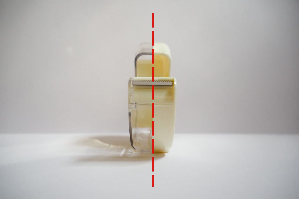
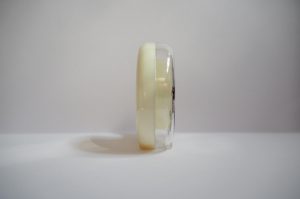
From the front, back, bottom and top views, it is clearly symmetrical. The side view would be asymmetrical.
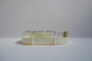
Edit: From the bottom view, we see that the little stands split the base into roughly three sections as well.
Oh! I’m sorry that your bowl broke… In fact, you could have compared the 2 layers of voids found within the bowl. The receptacle portion & the void between the 2 layers of glass which gives the illusion of “levitation”. The transparency displays a subtle play of mass & voids, convexity & concavity. Quite a clever design indeed.
Interesting observation & analysis of the tape dispenser 🙂 Good job with the photography, layout & legibility of the grid lines.
Chiharu please shift this post to the correct ” PANDORA” category thanks.
Ok, it has been shifted!