
The theme that I got for my box compositions was Rule of Thirds.
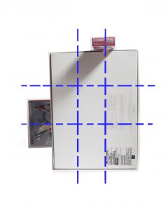
Rule of Thirds is generally aligning your subject along the guidelines or intersections. It is a useful composition technique in many forms of art such as in design, photography and film.
Since week 1, we were told to experiment with different compositions using boxes of three different sizes, while keeping our theme in mind. However I am not used to this and found it difficult to come up with effective compositions. After week 2’s lesson, I am more aware of what to look out for in my compositions. For instance:
- All three boxes should be able to be seen on all views.
- The dominant volume, subdominant and subordinate should stay constant throughout most if not all views.
- Avoid flushing.
- Try to avoid similar shapes, instead have a variety of sizes with varying height and width.
_____________________________________________________________________________
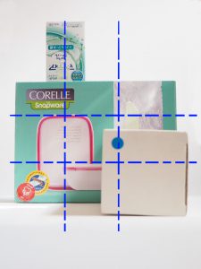
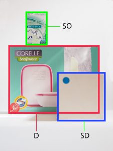
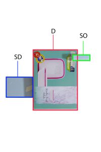
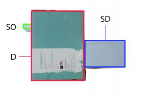
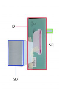
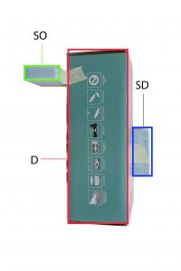
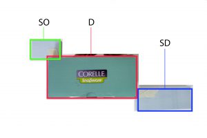
Legend:
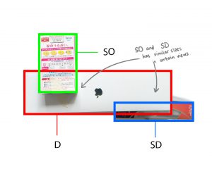
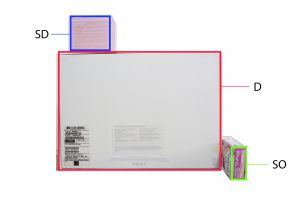
Red box – Dominant (D)
Blue box – Subdominant (SD)
Green box – Subordinate (SO)
_____________________________________________________________________________
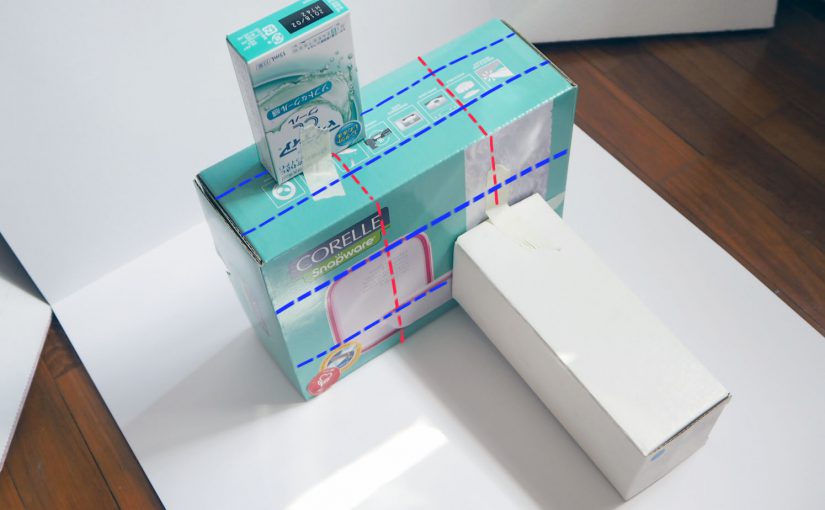
These are the compositions that I arrived at after week 1 class. I made minor improvements than those that I showed in class, However these compositions still do not work and for learning purposes I thought I’d analyse and record why they don’t work.
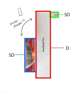
Composition 1


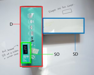
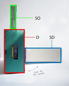
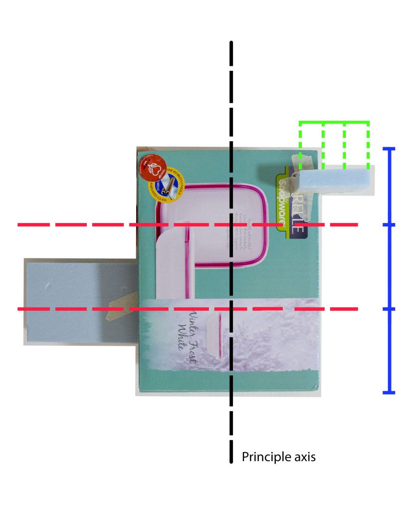
For composition 1, I tried to centralise my SD and SO’s centre line on the intersecting points of D, following rule of thirds. Although it fulfils the rule, did it not work for various reasons which have been noted in the captions. The main problem was that the shape and size of the boxes were too similar, which made boring compositions.
_____________________________________________________________________________
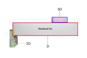
Composition 2


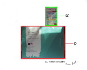
For composition 2, the main problem was that I had missing boxes in various views which is something that is discouraged. Placement of SD and SB isn’t that great either. The SB is within the confines of one of the boundaries of rule of thirds.
_____________________________________________________________________________
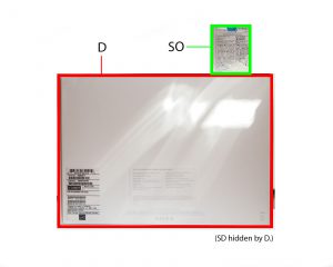
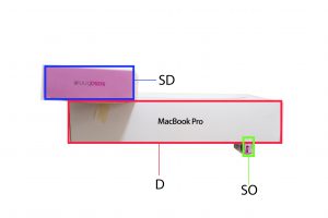
Composition 3

Composition 3 is meant to be an improved version of composition 2 which I did before week 2 class. There is sliiiiight improvement in the consistency of the D, SD, and SO shapes on all views (Top view didn’t work) but not satisfactory because only half the views work. No box is hidden in any view for this composition. However the shape of the D and SD in the side view is rather unappealing so I need to replace that box with something else.
_____________________________________________________________________________
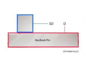
Composition 4

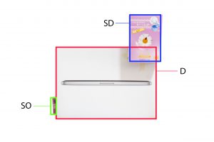
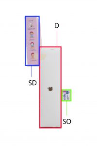
Composition 4 follows the rule of thirds and has 4/6 views with consistent D, SD and SO! This one has potential. I think I can continue developing this model by slightly varying the placement of the SD and SO to include another theme and make it more interesting?
_____________________________________________________________________________
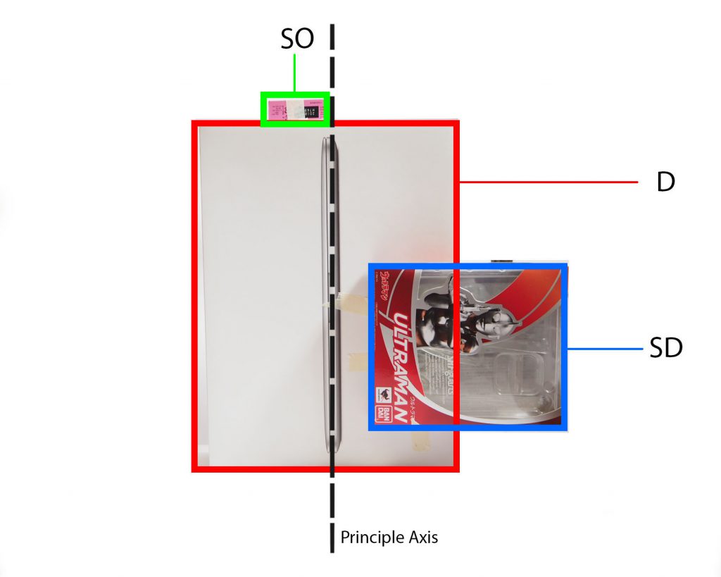
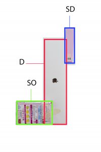
Composition 5
Composition 5 has 4/5 consistent D, SD and SO views! It also incorporates a bit of the theme counter balance. However through compiling these images, I noticed that it may be a bit unstable. I would need to adjust the SD’s position. In fact, I think by wedging both the SD and SO I think it could work. I will develop on this for the final sketch model. I think material wise, if the SD was a transparent box, it could be “lighter” and balance out the entire sketch model visually.
I am pleased with my progress so far, as I have been able to keep the D, SD and SO relatively consistent. There are no more missing volumes compared to previous weeks. I just need to refine my models and adjust the placements to make the models look more interesting. I think using foam boards helped me in making my sketch models as I can easily create a piece that I need compared to finding a pre-made box that matches my requirements.
_____________________________________________________________________________
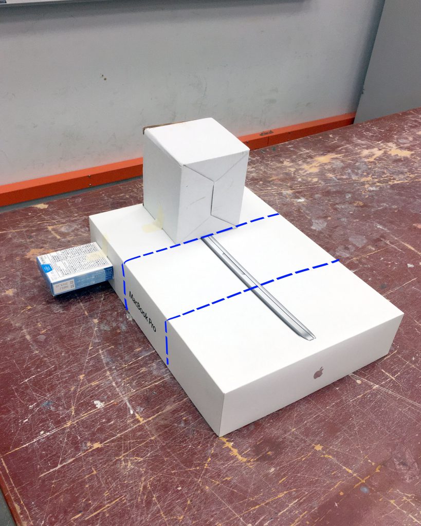
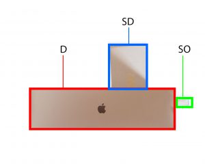
Wedging – Using Composition 4 and 5
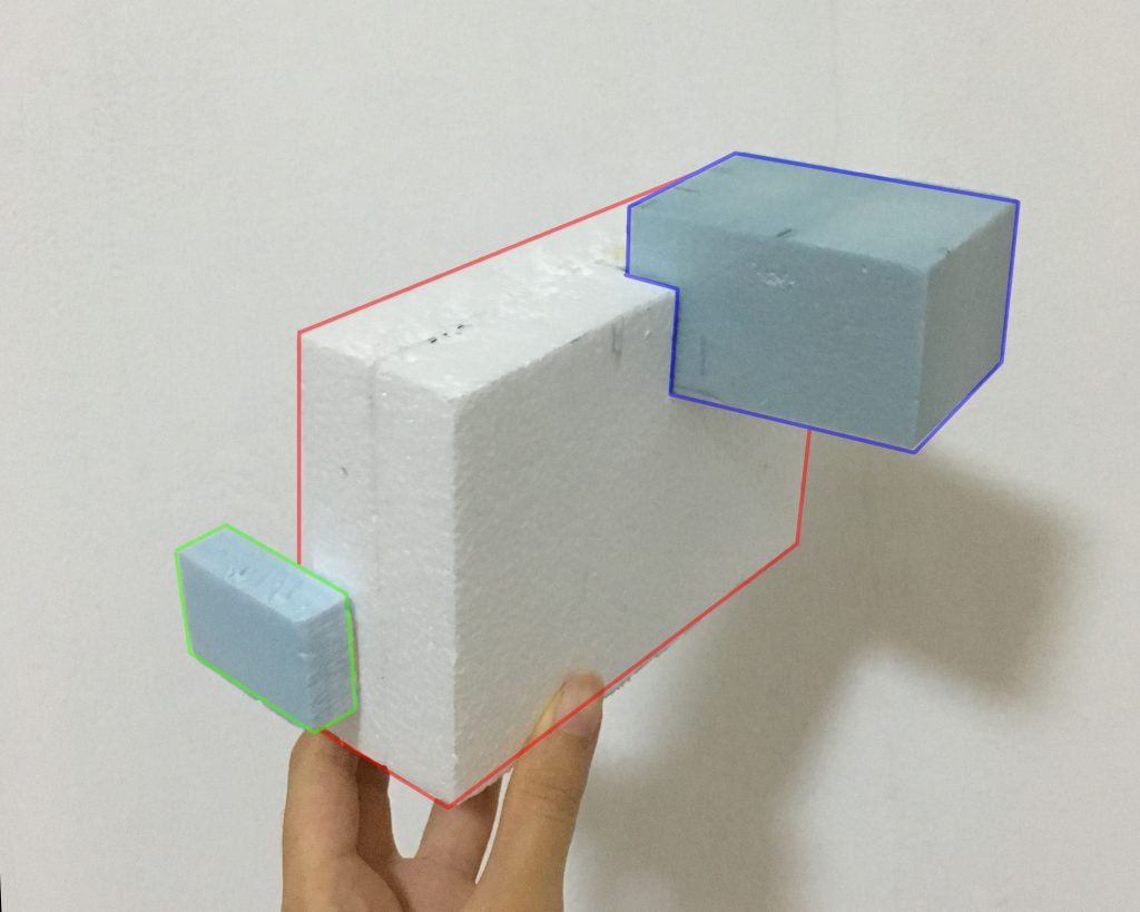
This is a improvement of Composition 4. I used foam blocks because I wanted try out wedging. I changed the SD to give the shape more variation. After lesson, I realised that this does not work because when we wedge long blocks, 1/3 of it has to be wedged into the base, or else it will produce a rotational force on the entire composition. The widths of the blocks turned out to be very similar too, something that I didn’t take note until it was pointed out. So I’d have to adjust those.
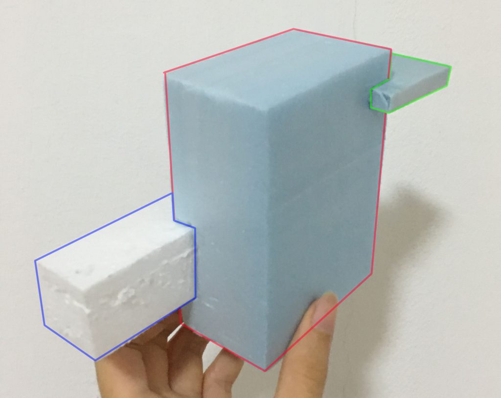
This is a improvement of Composition 5. I used wedging to attach the SD and SO to the D. I modified the SD’s shape from Composition 5 so that there is more variety in shape. However again, I realised the lengths and widths are pretty similar so I need to figure out the measurements to the boxes.
Both models have consistent D, SD and SO for at least 4/5 of the views, following Composition 4 and 5, so my final sketch models would have similar configurations to them, with adjusted lengths and widths.