PROJECT 2: THE SUBVERTED OBJECT

PROJECT BRIEF

TASK1: Convey the assigned object as a literal sign in 3 images.

TASK2: Subvert the object’s meaning and convey it as a symbolic sign in 3 images.

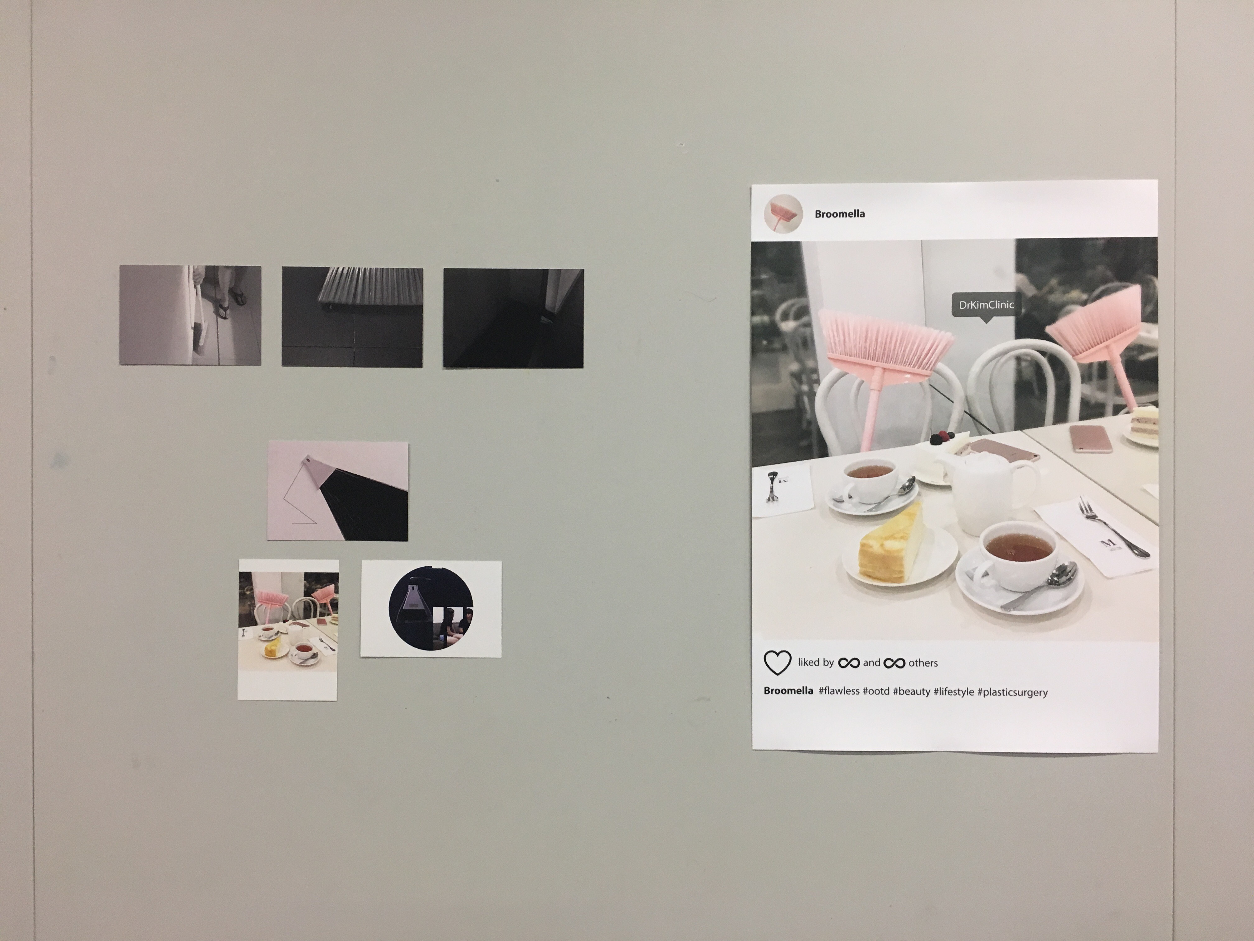
TASK3: Select 1 image from task 1 or 2, and create an A2 poster with this image.


TASK1: DENOTATION

TASK 1 FINAL SHOOT 1
TASK 1 FINAL SHOOT 2
TASK 1 FINAL SHOOT 3

The object I was assigned to is broom. As we all know, broom is a cleaning tool. It is simply formed with the broomstick, the head, and fiber. There are various types of broom, such as soft broom, hard broom, angle broom, desk broom and etc. In this project, I used two types of common brooms, which are soft broom and desk broom.

SUPER NORMAL
https://i.pinimg.com/originals/2e/f8/69/2ef8692371e13941262845f10d88ccb8.jpg

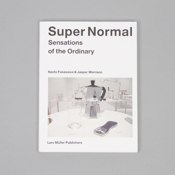
Firstly, convey the literal meaning of broom in an eye-catching way is difficult, as this object is too normal to be appreciated to a certain extent. This reminded me a book that I browsed through years ago, called “Super Normal”. The designers Jasper Morrison and Naoto Fukasawa have compiled 204 everyday objects in search of super normal design. They believe that the normal objects exist in the here and now, it is easy to appreciate those as we just need to open our eyes. Similar concept applied to the broom. We just need to open our eyes to observe the life of broom.

TASK 1 TEST SHOOTS

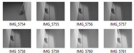
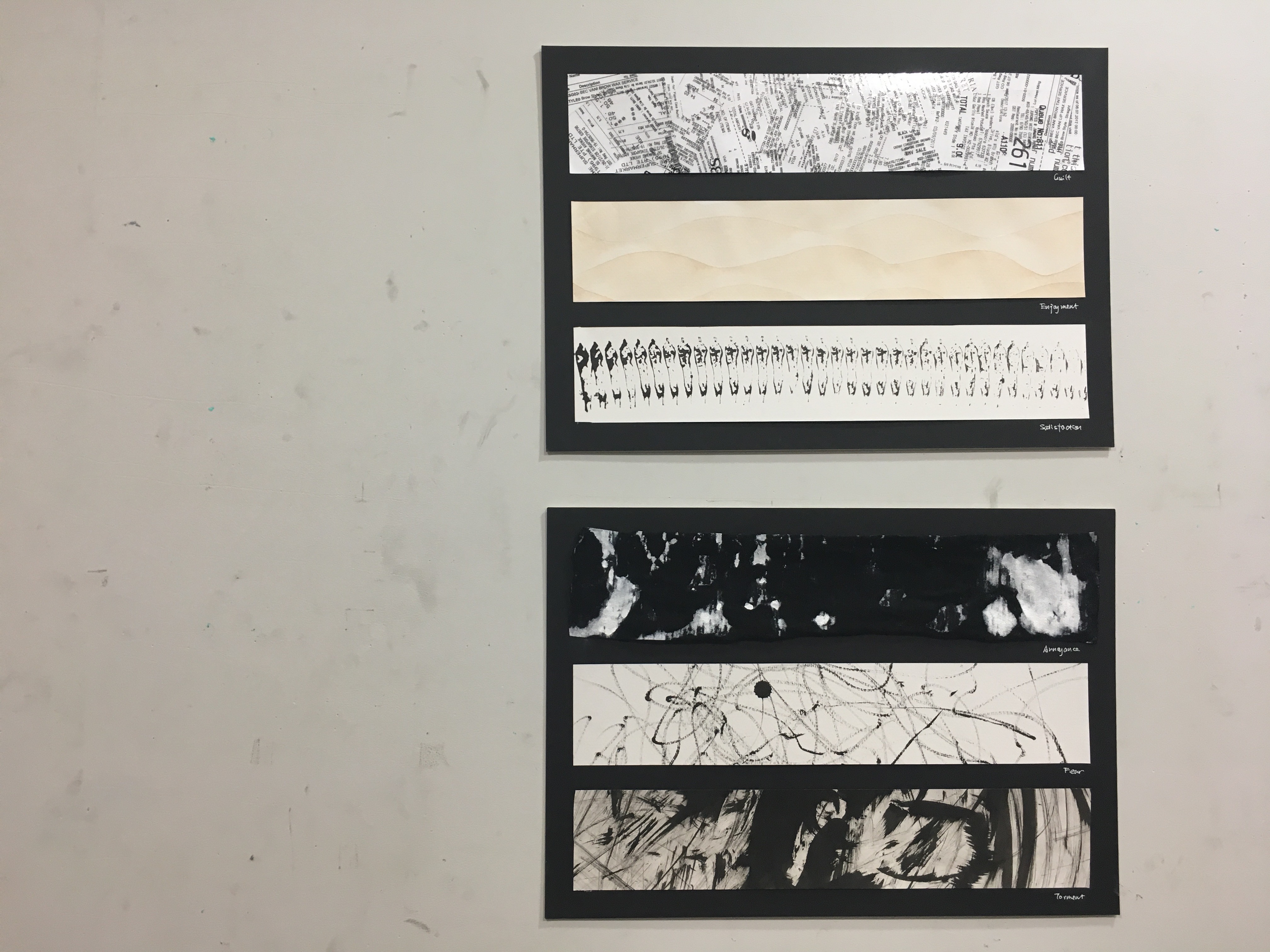
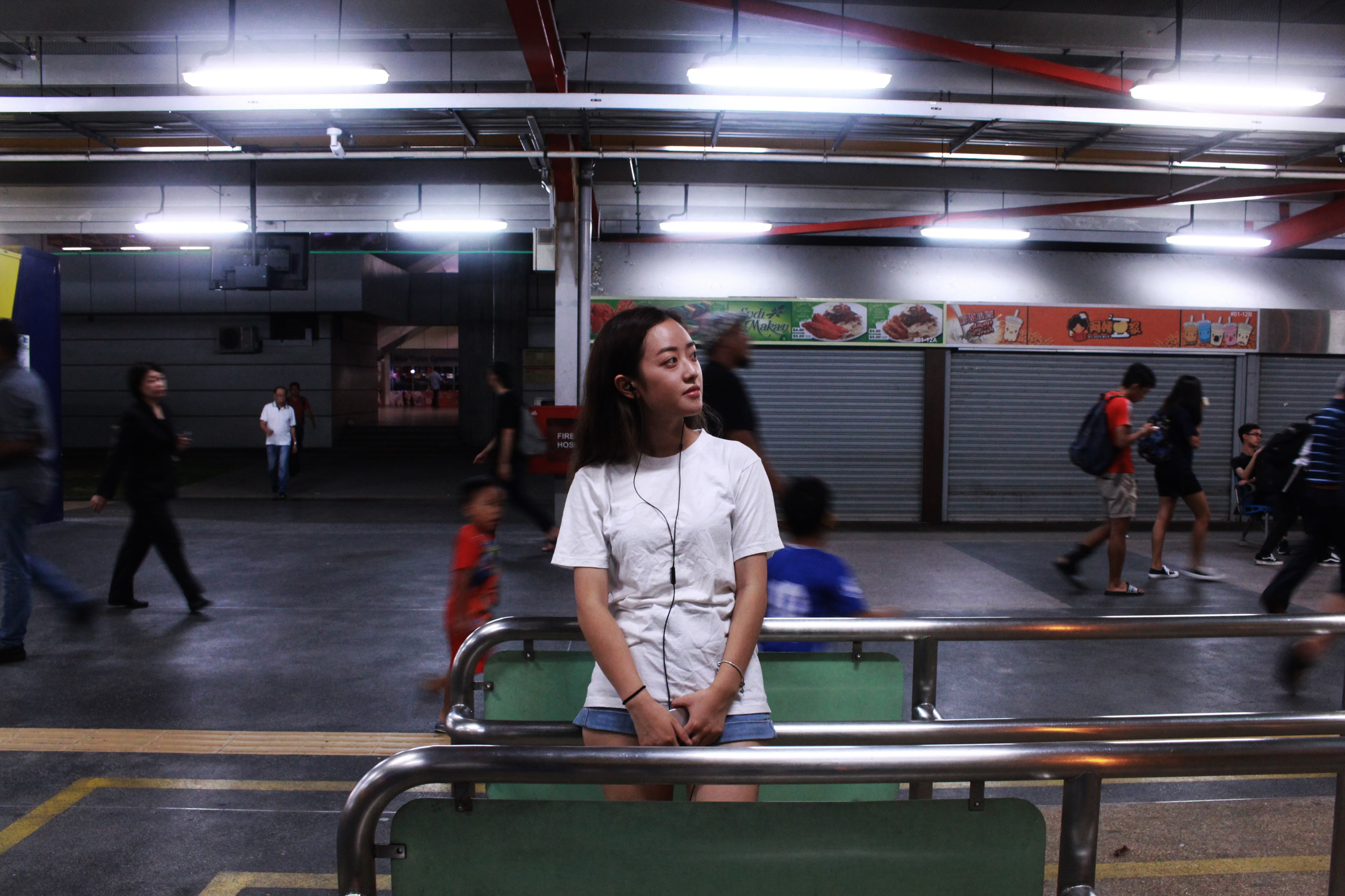
Task 1 is a series of images that tells the daily life of a broom. It started from the morning to the night. The broom was waited to be used in the morning when the light shined on it. Then it got dirty with dust and hair. At night, it stayed in the corner and is nearly invisible in the dark. This scenario is commonly seen daily, and nearly no one pays attention to it. This series is to bring our attention to the super normal object around us and make it beauty visible.

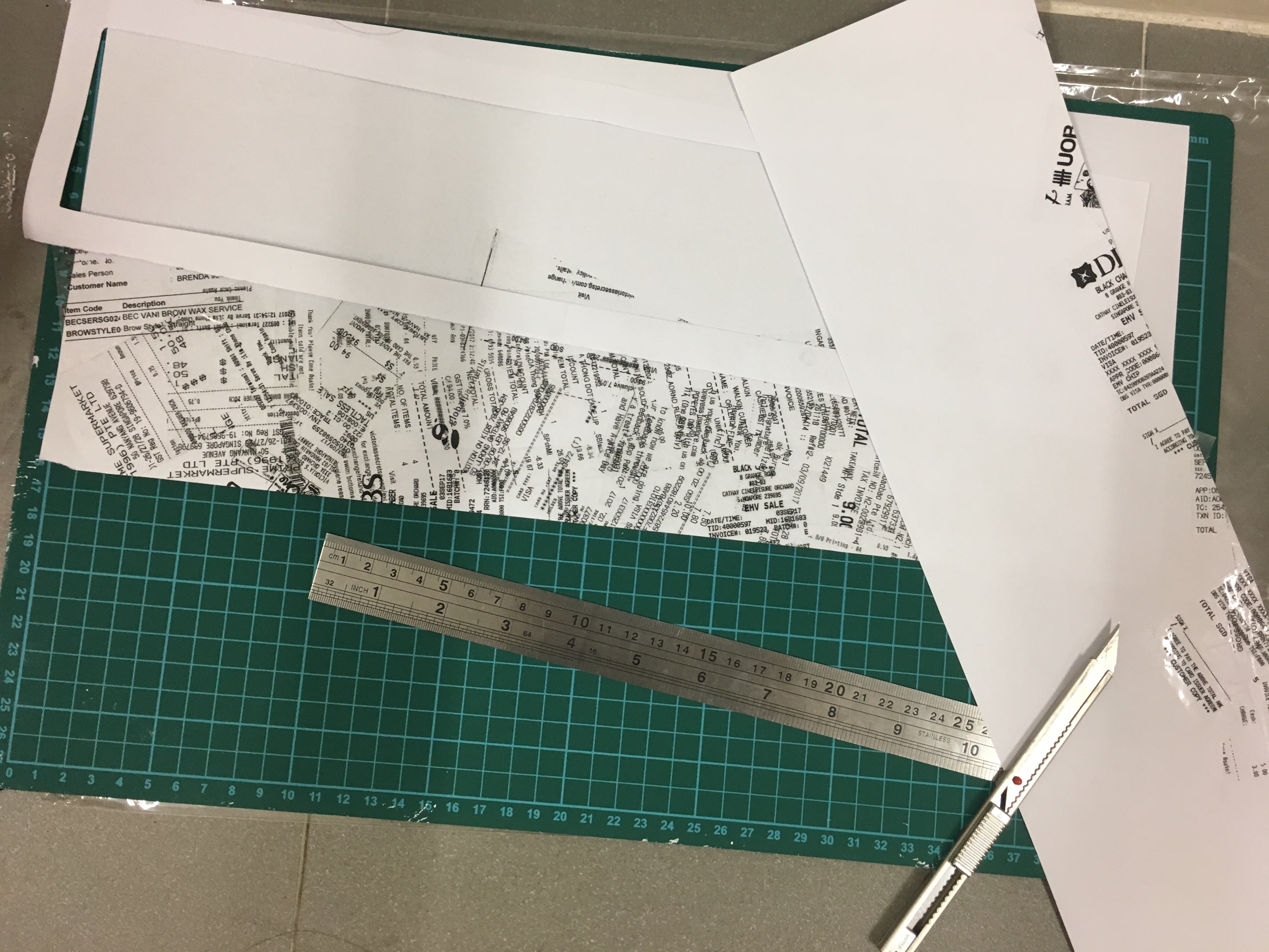
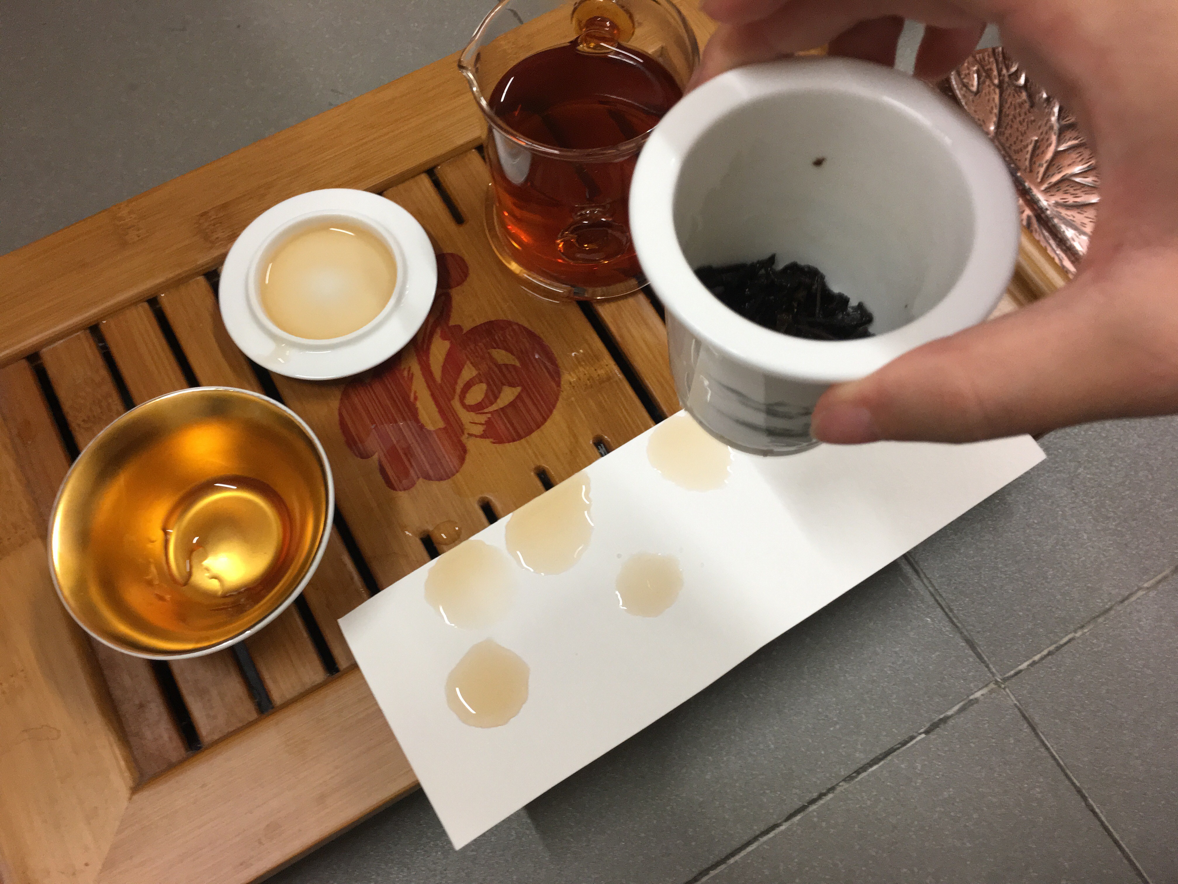
I purposely kept the elements in the composition simple. Only what is needed is used. For instance, in the first photo, there r only the hand and foot of the user which is enough to show the interaction. Showing the body and face of the user might be distracting since our focus should be more on the object. Further, the second photo is a close up to the fiber and dust on the broom with a vertical and horizontal tile lines to represent the floor. Lastly, grey scale is chosen for this serious to minimise the elements. Only value is used to form images. Minimise the elements help the viewers to focus more on the main character, broom here.


TASK2: CONNOTATION

TASK 2 FINAL SHOOT 1


TASK 2 FINAL SHOOT 2
TASK 2 FINAL SHOOT 3

The three final images were done in different approaches, which I will further explain in the following paragraphs.

IN-CLASS EXERCISE 1
IN-CLASS EXERCISE 2

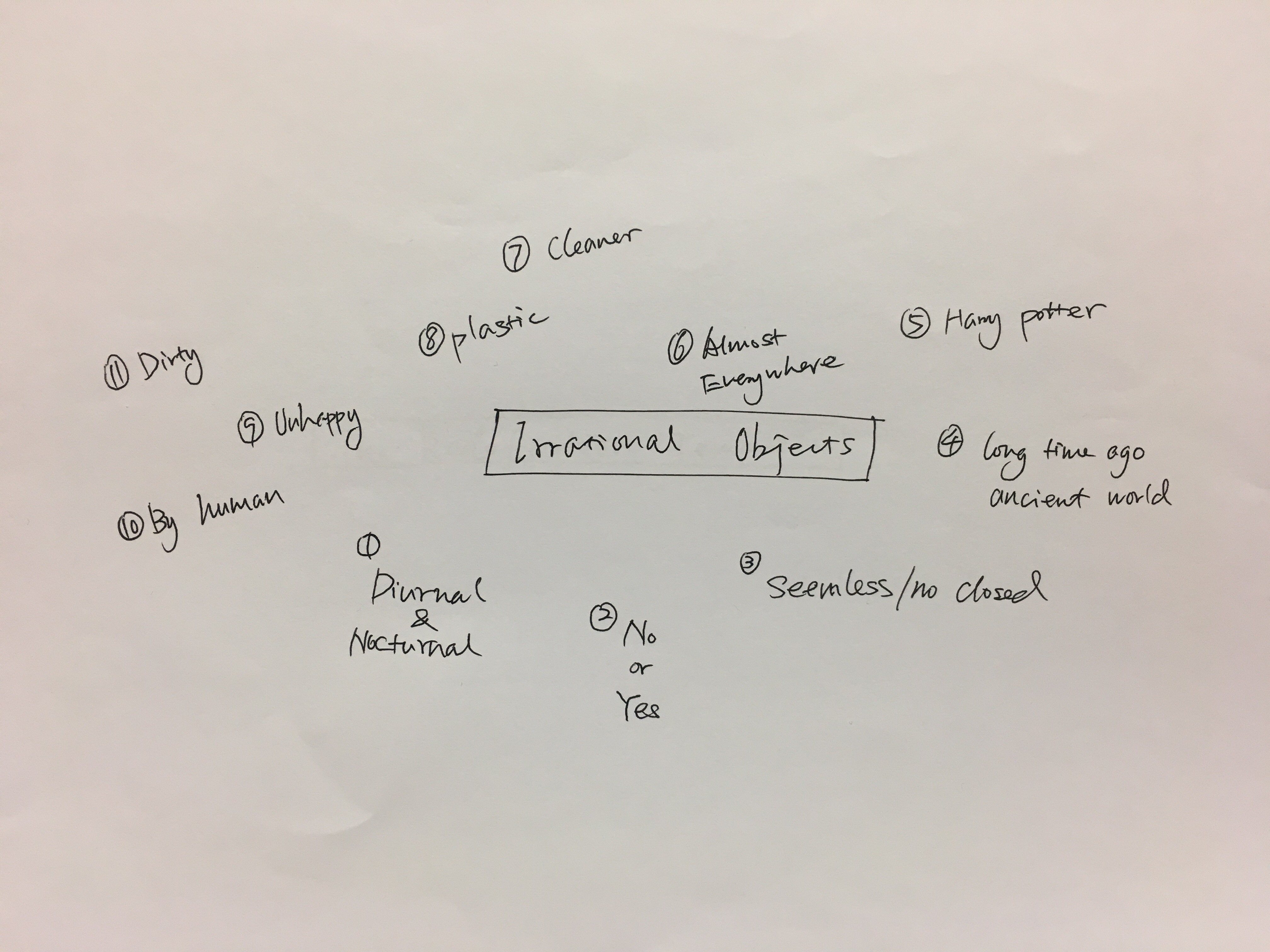
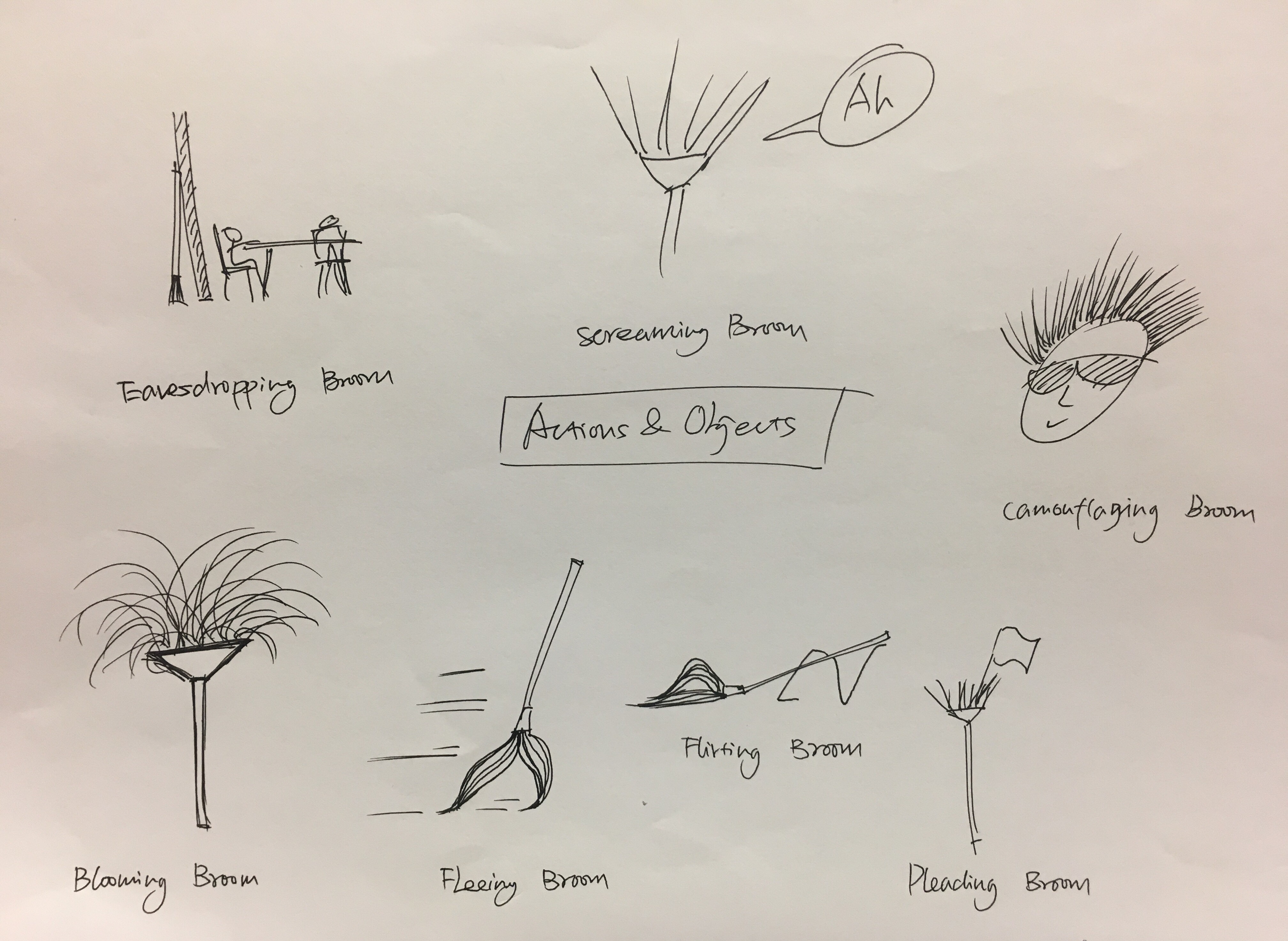
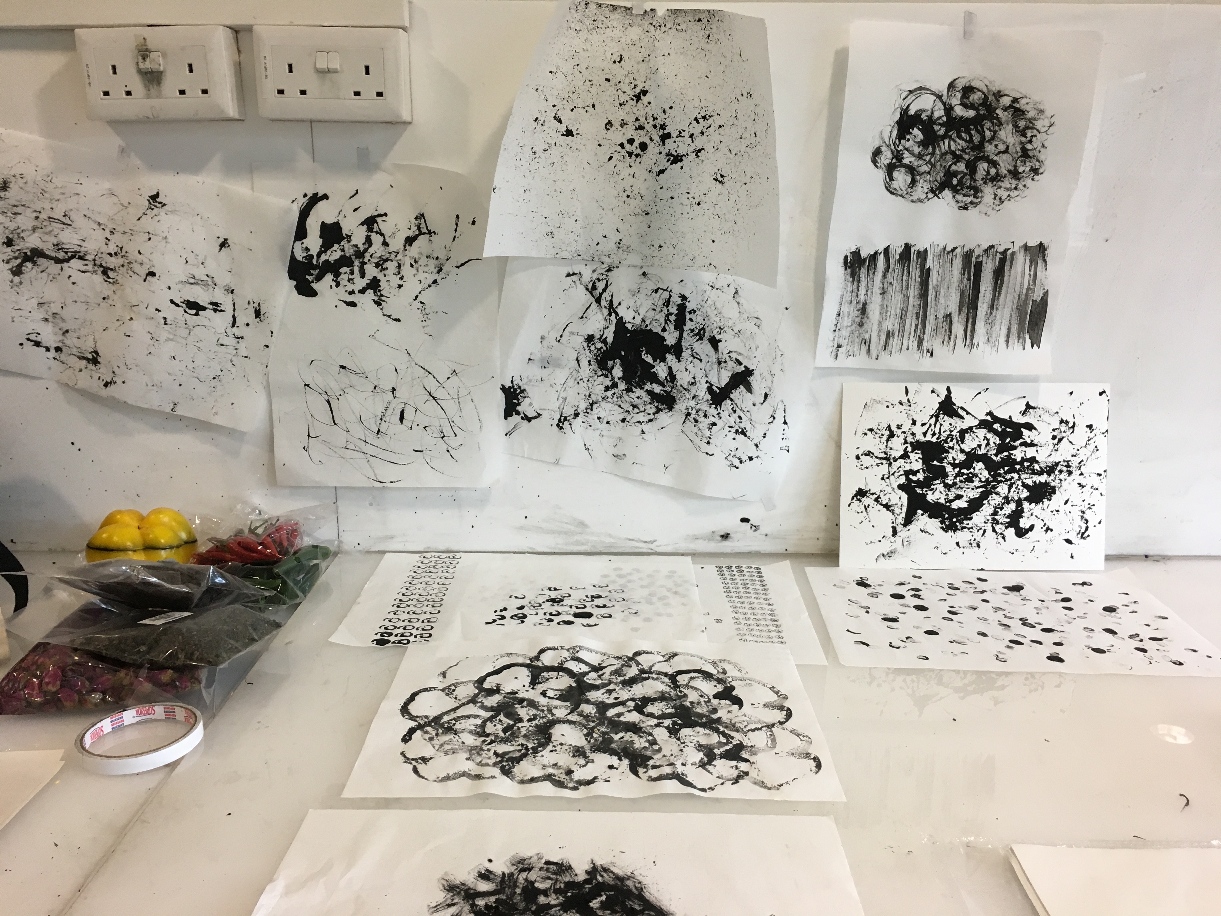
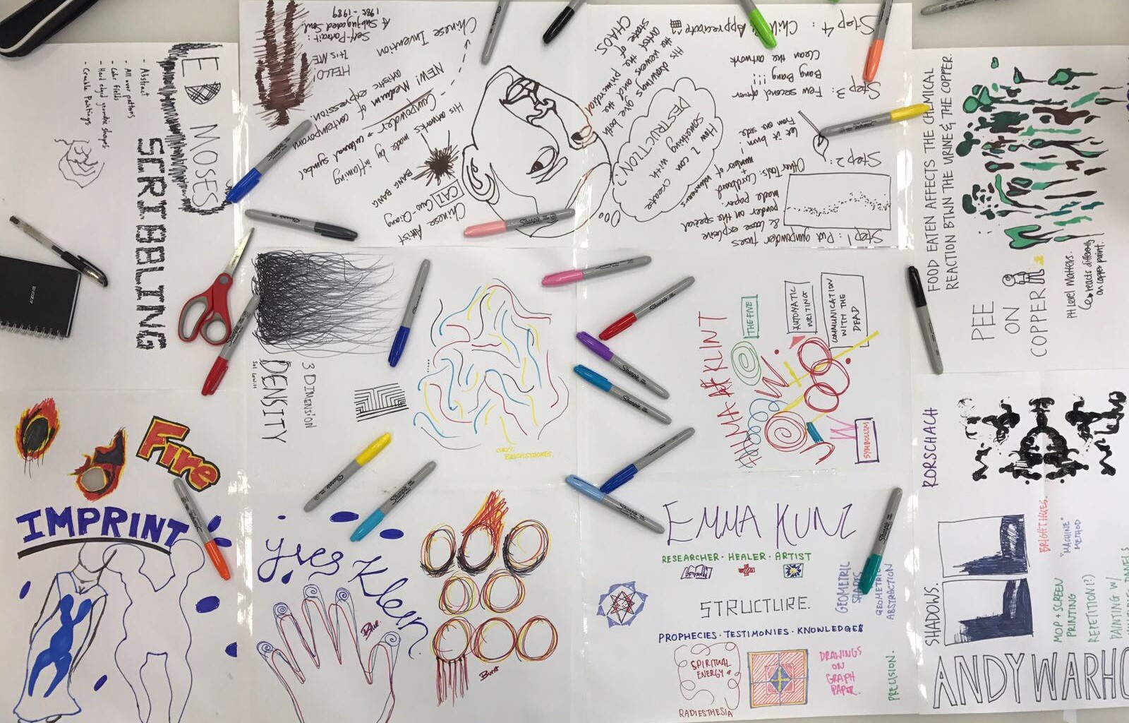
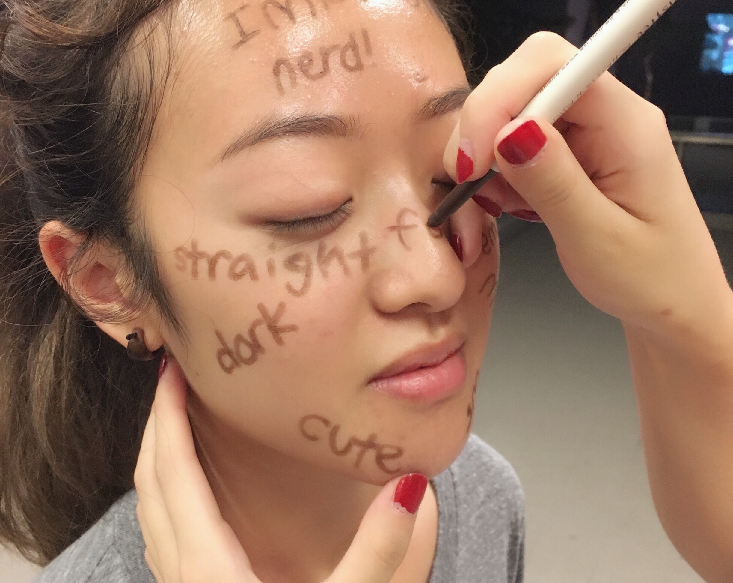
Task 2 was started with some in-class exercise to brainstorm the ‘new characters’ for the broom, as shown in the photos above.

RELATED WORDS

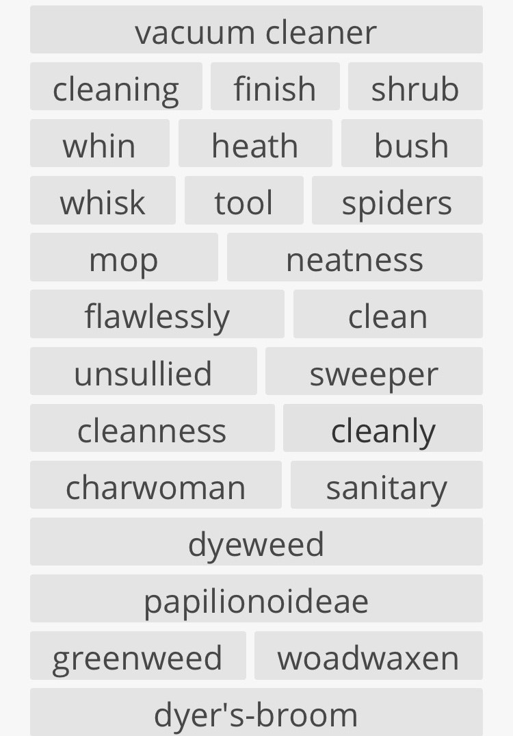
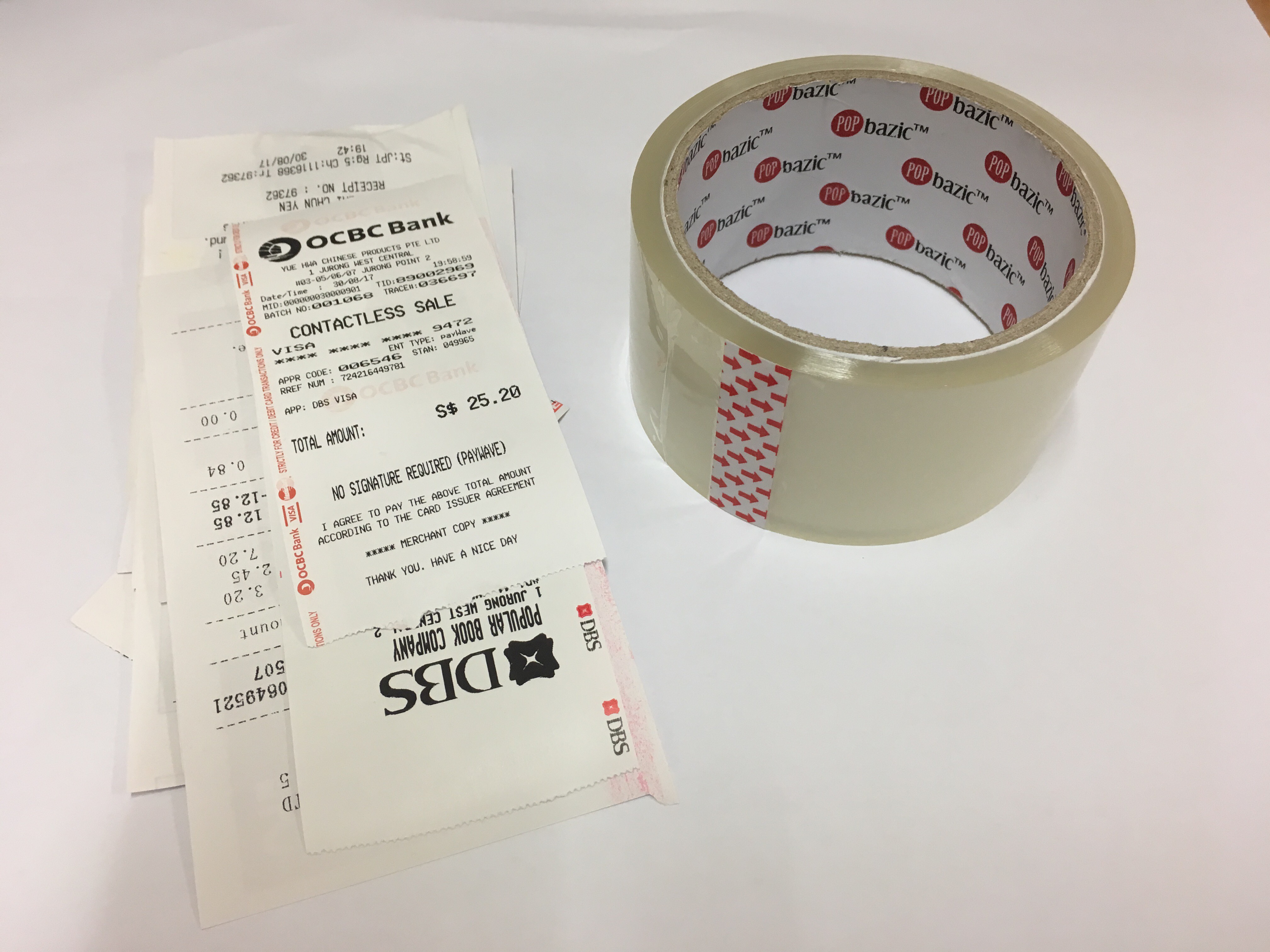
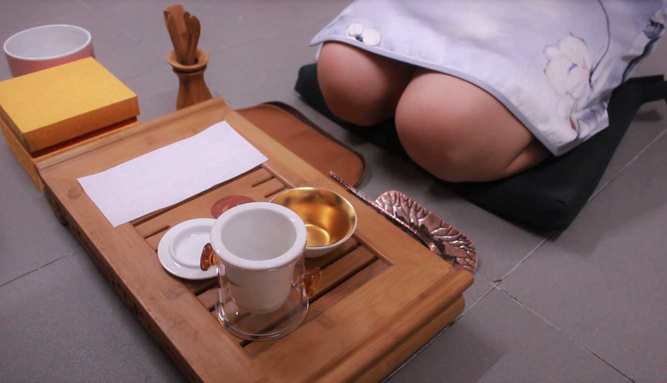
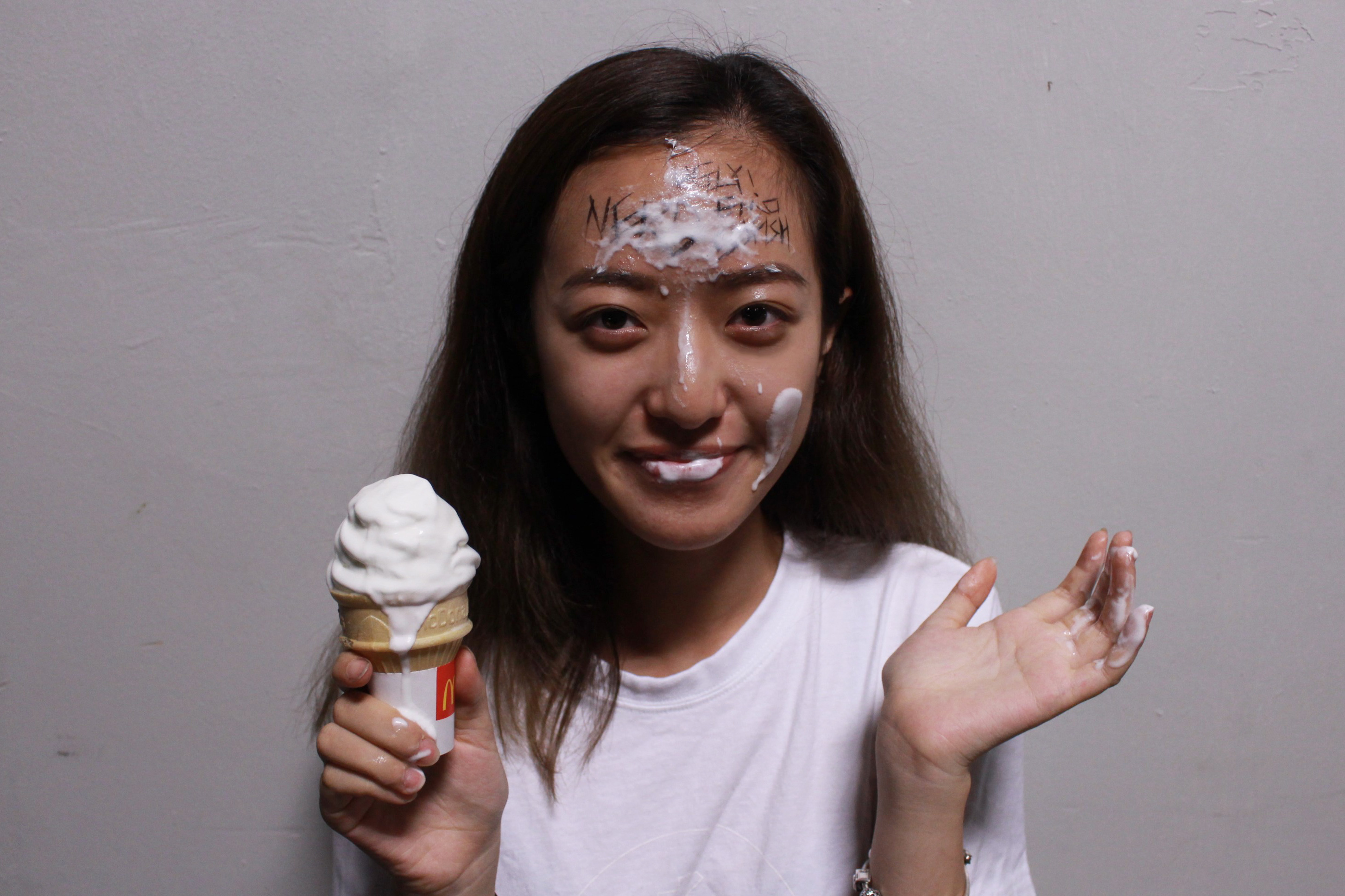
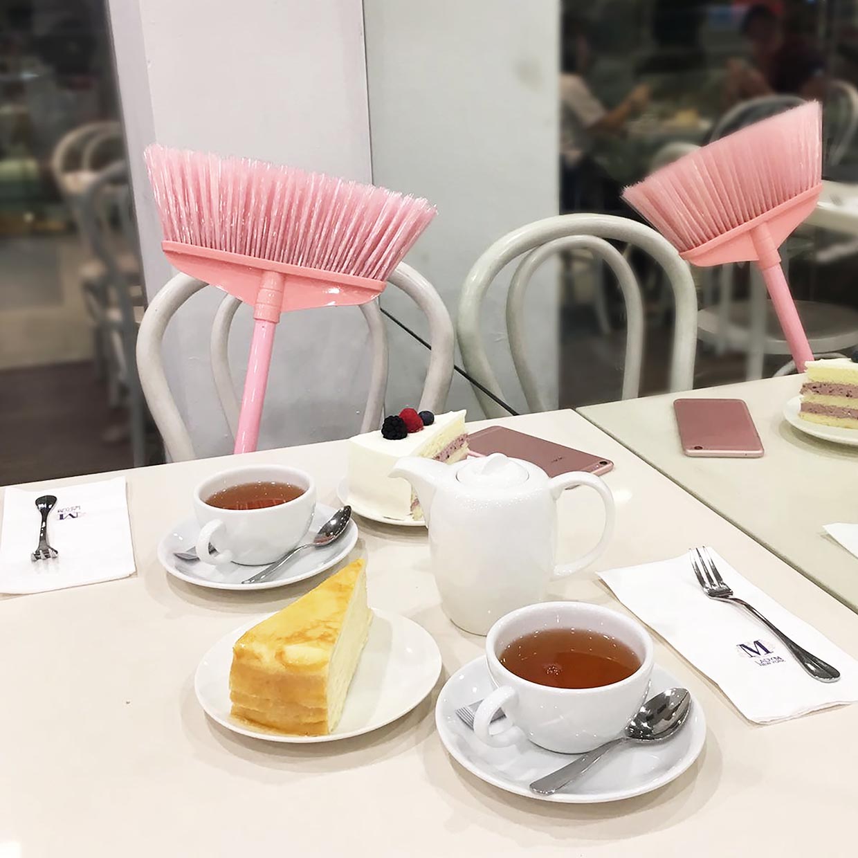
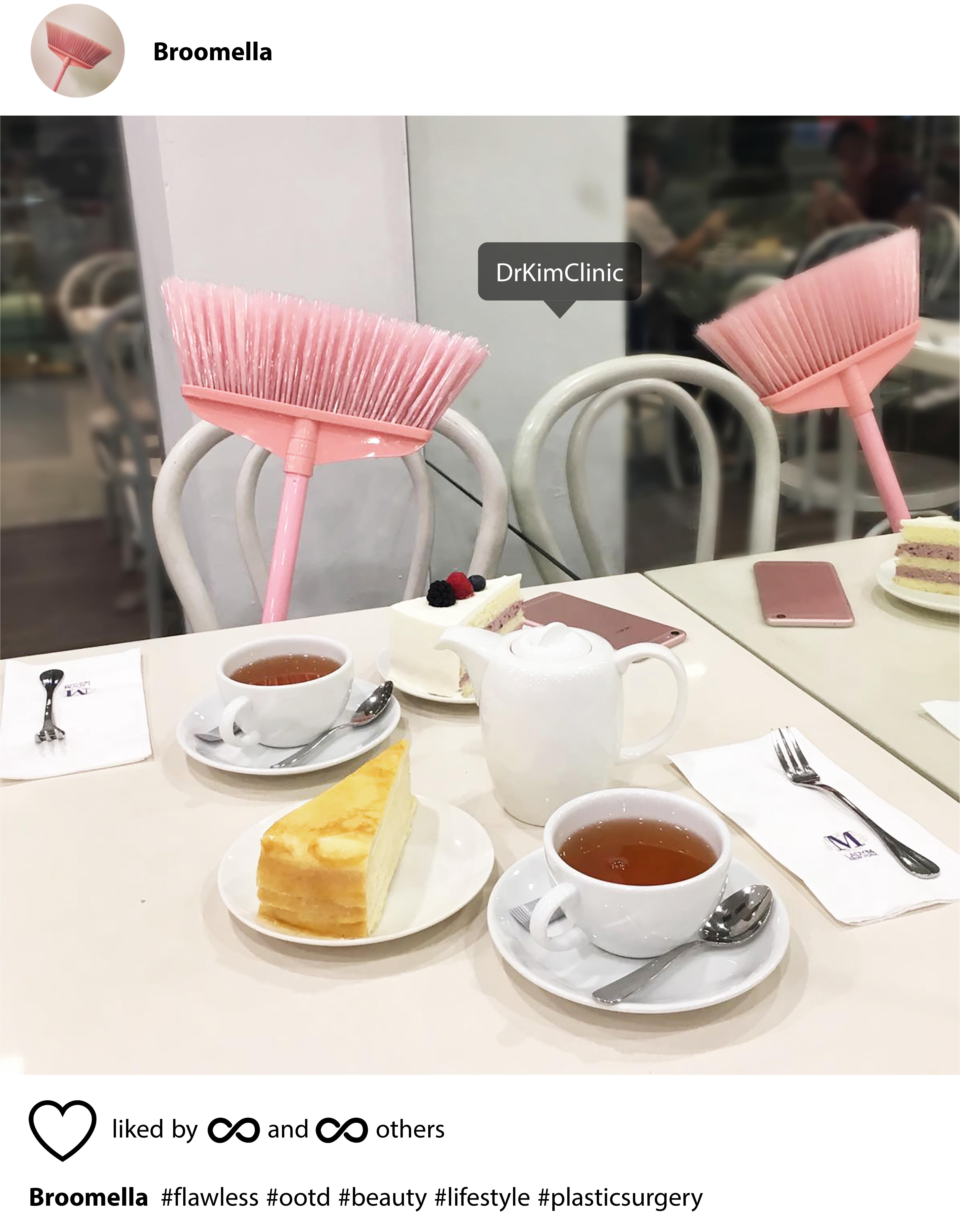
In order to further explore, I used a website, http://relatedwords.org/ to find out the related words for more inspiration. The word “flawlessly” caught my attention. An Instagram scene flashed in my mind that a fancy broom was having high tea and taking photos to post on her/his Instagram. According to research, 68% adults touch up their photos before sharing them. It seems like people only wanna show the flawless side on their social media. This became the first concept in Task 2.

TASK 2 TEST SHOOTS

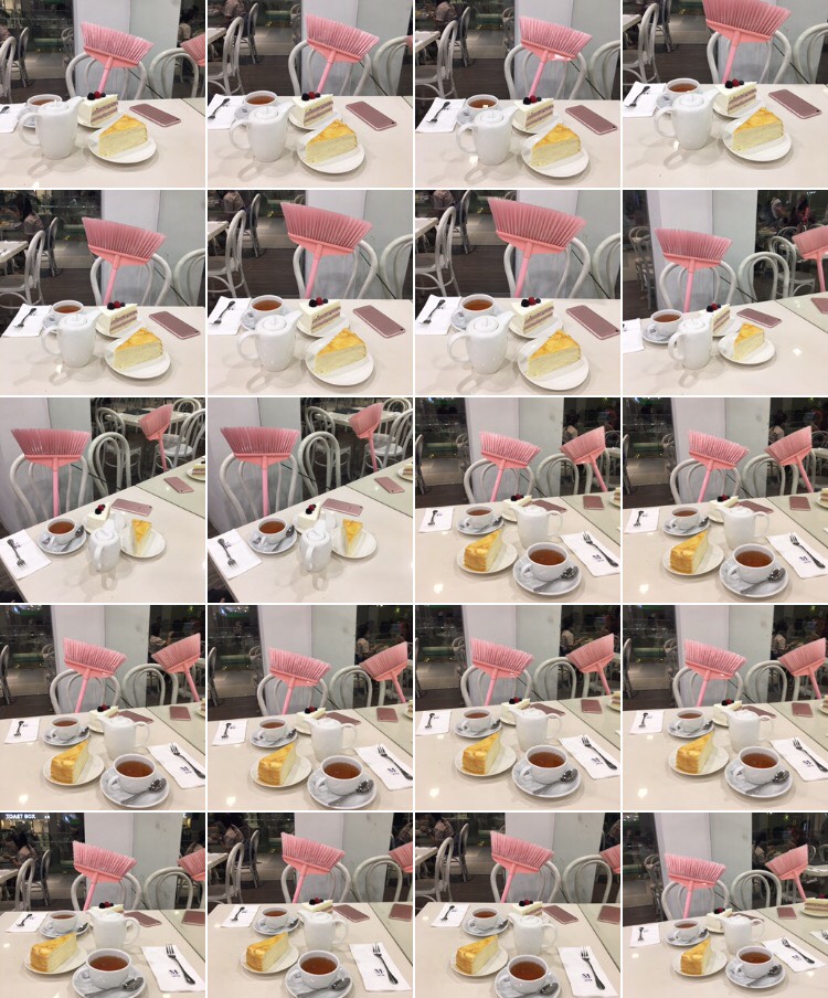
Numerous photo was taken at Lady M to achieve the best angle that meets the “Instagram standard”. The table was set for two, which is like two friends are having afternoon tea. Editing was done to blur the background, and remove the flaws.

TASK 2 TEST SHOOTS

For concept 2, I research on the meaning of broom in Chinese culture as it relates to me the most. There are many meanings of broom in Chinese culture. One is that broom is used to cleanse the body of bad luck. Hence, the desk broom is a metaphor for the lock that keeps the bad luck outside of the residence. In addition, the photo is in a circular frame because circle means harmony and perfect in Chinese culture.

By Chema Madoz http://www.museoreinasofia.es/sites/default/files/obras/AD01531_0.jpg

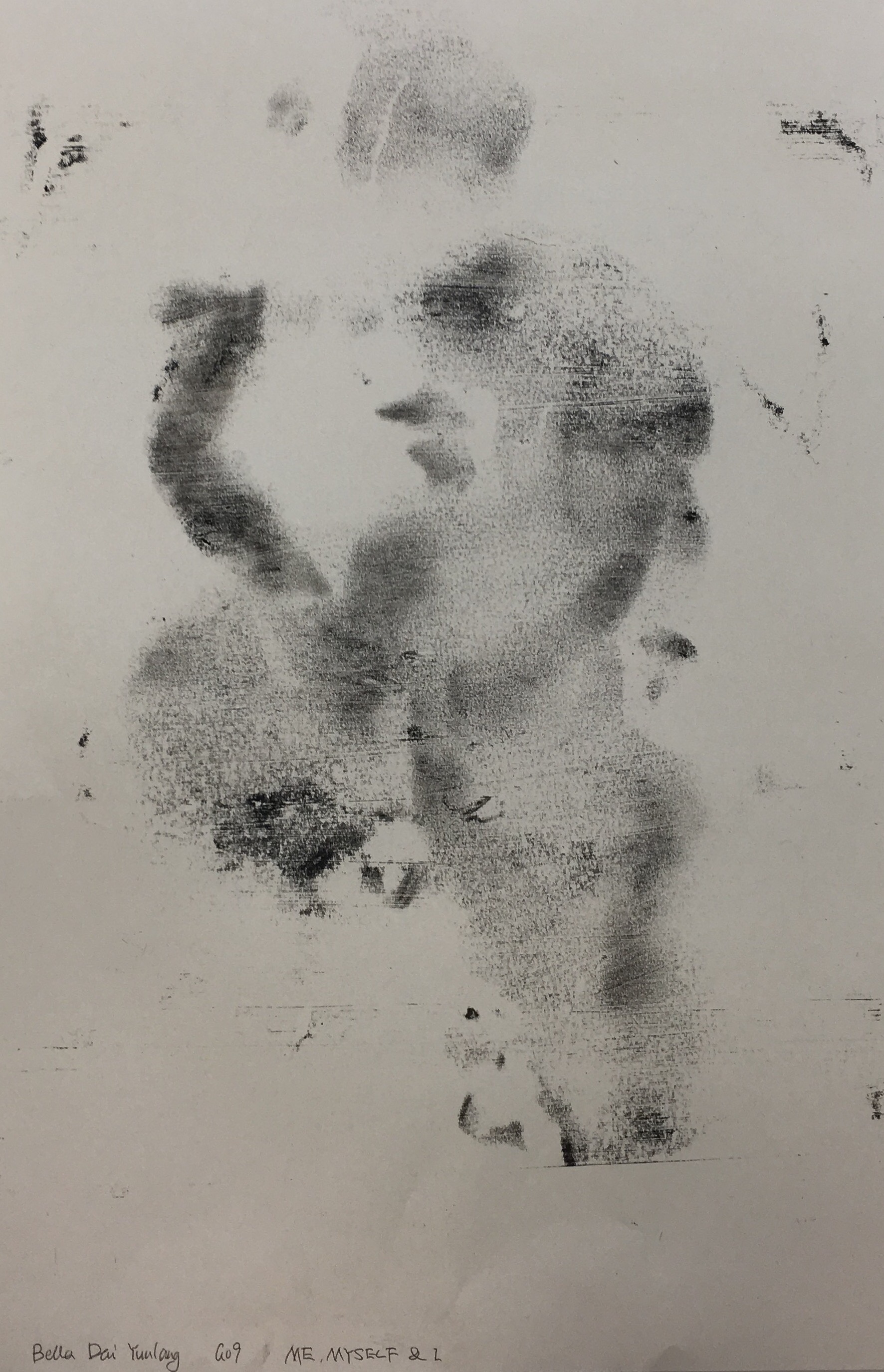
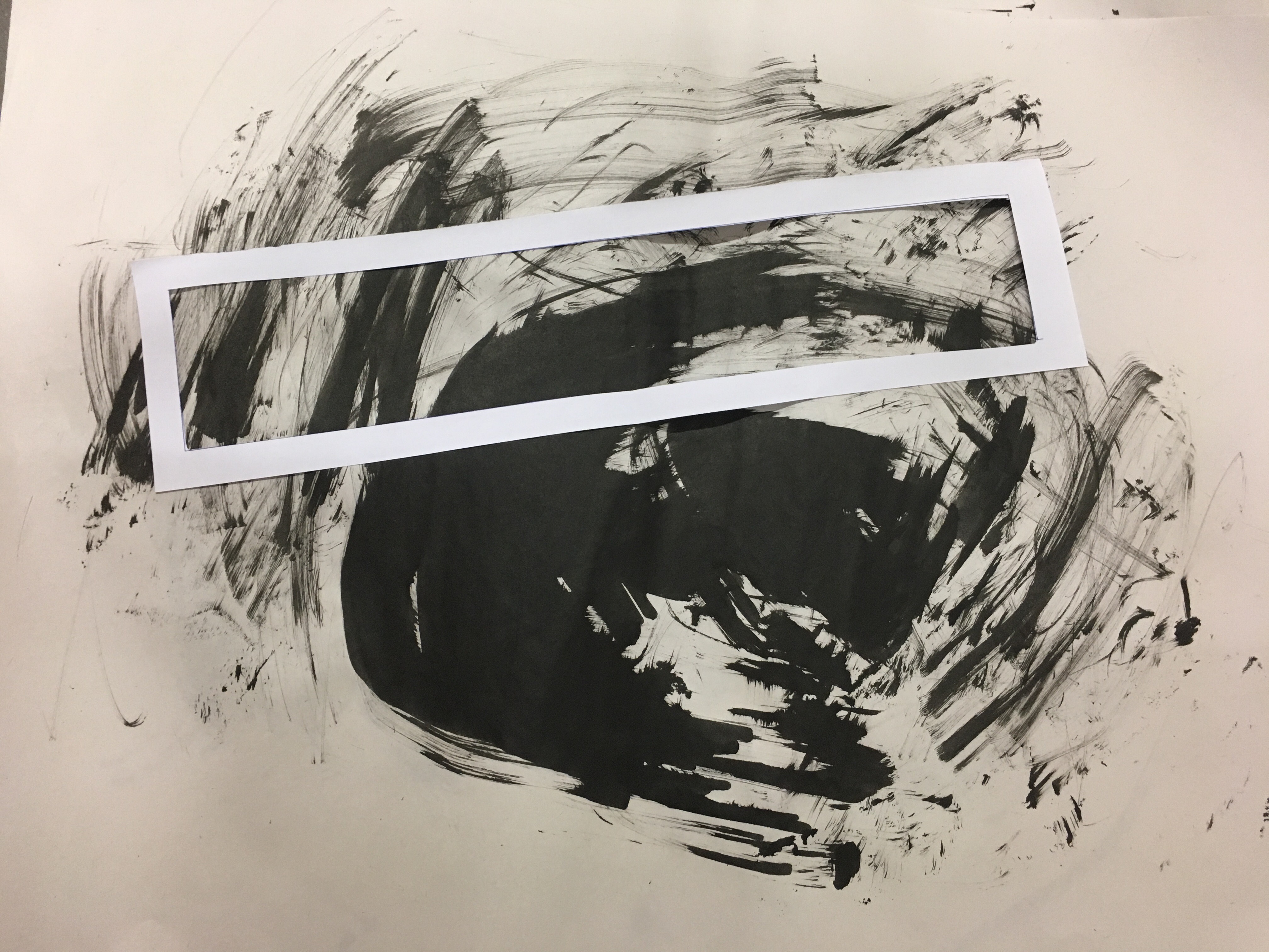
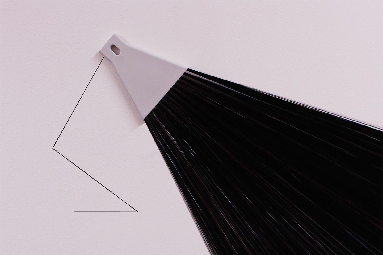
The last concept was inspired by photographer Chema Madoz. He creates composition only for the purpose of photography. It requires viewer’s participation in order for the photo to be complete. His photos lead the view to think. 

TASK 2 TEST SHOOT

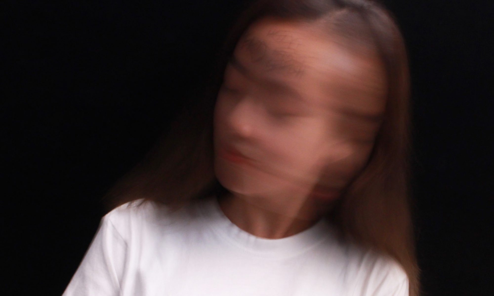
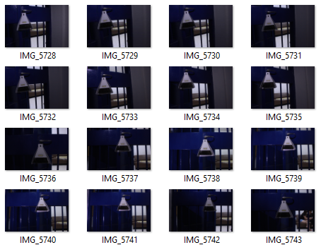
In the last image, I used the desk broom. My intention is to create a lamp of darkness. The hair of the broom is stretched. The broom here seems like the lamp with dark light which is unconventional. It gives the viewer room for imagination. My personal interpretation is that I always stay up and do my work at night to rush for deadlines. It is like turn on the darkness when I turn on my lamp to do my work.


TASK3: TEXT & IMAGE

The first photo from task 2 was chosen for the A2 poster. Several texts were added in the poster to clarify and emphasize the purpose of the poster.

Firstly, the Instagram look alike layout is a signifier which signified that the poster is an Instagram post. It requires the pre-knowledge of the viewers to understand. The account owner Broomella is an influencer that has infinity likes for this post. We learned the meaning of infinity symbol to understand it represents infinity likes here. Moreover, the hashtag here denotes that this post is about plastic surgery, while the text “DrKimClinic” connotes Korean.

ALL IN ALL 

DISPLAY ON THE WALL

This project is challenging as it is the first time I am subverting the meaning of an object. Some of the photos require photo editing skills, while some photos need to be done off campus. Further, some photos can be improved, for instance, there are too many things need to be unpacked for the Chinese culture broom image. It required too many pre-knowledge from the viewers. Hence, I will take more considerations of the viewers in the future projects.

REFERENCES

Related Words, “broom” accessed September 14, 2017, http://relatedwords.org/relatedto/broom

Fstoppers, “68 Percent of Adults Edit Their Selfies Before Sharing Them With Anyone.” October 30, 2015 https://fstoppers.com/mobile/68-percent-adults-edit-their-selfies-sharing-them-anyone-95417

Xing Fu, “CHINESE BELIEFS ABOUT BROOMS” accessed September 14, 2017, http://shuangxingfu.blogspot.sg/2008/04/chinese-beliefs-about-brooms.html

Famous Photographers, “Chema Madoz” accessed September 16, 2017, http://www.famousphotographers.net/chema-madoz

PROJECT 1 “MY LINE IS EMO”

MY EMO LINES

Guilt – Overspend

Enjoyment – Chinese Tea Culture

Satisfaction – Chilli

Annoyance – Dream

Fear – My Constraint

Torment – I Hate Laundry


GUILT – OVERSPEND

Final Artwork

According to the dictionary, overspend means spend more than the expected amount. Overspending is one of the issues that I am trying to solve. Receipts are the evidence. I feel extremely guilty when I look at the whole stack of receipts in my wallet. Thus, I amplified my guilt by making it as one of the mark making to remind myself and others not to have unnecessary expenses.

Material: Receipts, Clear Tape & Water

This is an interesting technique that I knew years ago. This is the first time I am using it in the school project. Simply paste the clear tape on the side of the receipt that has words. Tap water on the receipt then removes the wet paper. The words will be transferred to the clear tape, and overlapped tape achieved the ideal effect.

I had done experiments with the original receipts. The value of the words transferred on the clear tape is low, which could not achieve the ideal effect. Hence, I scanned and printed the receipts, and repeated the same method. 

High density is achieved by adding more elements in the space. The high value of the words forms a contrast with the white background, which emphasize the emotion.


ENJOYMENT – CHINESE TEA CULTURE

Final Artwork

I was inspired by a Chinese artist Cai Guo-Qiang, who is deeply influenced by his cultural background. I started to pay attention to my cultural background after knowing more about Cai. I was born in China and spent my childhood there before I moved to Singapore. Chinese tea always plays an important part in my family, for example, family gathering. Everyone sits together, having the warm tea and share the joy.

Material: Chinese tea & Watercolour Paper

I started the experiment with different type of Chinese tea. I used the tea and tea leaves to draw in different motion on different kinds of paper, and watercolour showed the best result. As the paper would not warp too much when it meets water.


I cropped the part that had the cleanest lines. In the final artwork, repetition is used to create rhythm, a sense of uniform movement, which is like the process of making Chinese tea. In addition, when elements symmetrical, the design feels harmonious formal. The low-value colour of the artwork is the original Chinese black tea. It is visually subtle that create a calm feeling. The design principles used here represent the function of tea, that ties family members together, and shows the sign of respect.


SATISFACTION – CHILLI

Final Artwork

Chilli is my all time favourite food. It goes well with all kind of ingredients. I always feel satisfied when eating or cooking spicy food.

Material: Chilli, Chinese ink & Watercolour Paper

I had tried several methods to do mark making with chilli. I prepared a aluminium tray and ‘fried’ chilli in different shapes, as the process of frying chilli is satisfying. Moreover, I tried to dip different shapes of chilli in the ink and stamp them on different types of paper.

In the final artwork, repetition is used to create a feeling of organized movement. The gradual change of value leads the viewer’s eyes to move back and forth. The consistent movements bring a feeling of intense excitement and happiness.


ANNOYANCE – DREAM

Final Artwork

Dream reminds mysterious since the start of human history. It is a succession of emotions, images, ideas, and sensations. I always mix what happened in my dream up with the reality. It is annoying that I try to remember my dream but the memories fade so fast.

Material: Black Cloth (t-shirt), Poster Colour & Cutting Mat 

At first, I was trying to use my face to do mark making, and I found out this illusionary effect I got because of different amount of pressure. It reminded me of the feeling of dreaming. Therefore, I decided to use the similar method for the final artwork.

This mark making was done while sleeping. I applied white poster colour on the cutting mat, covered with a black t-shirt and plastic bag. Then placed it on my pillow. The shapes and the value of colour were determined by the movement of my head on the pillow.

The marks on the black clothes were irregular. those shapes represent nothing other than what we see like we are always confused by the meaning of the dream. The cropped part is where my head mainly moved around, like the track of my dream. Further, the composition is not symmetrical, which creates feels of informality.


FEAR – MY CONSTRAINT

Final Artwork

In the past few years, I always restrict myself with rules that set by the other’s opinions and forgot to listen to my heart. My deepest fear is losing freedom physically and mentally. I am eager to see the world with my own vision and follow the direction of my true feeling.

Material: String, Brush Pen & Watercolour Paper

The artwork was done unconsciously, that I blindfolded myself, tied my hands together, and hung the brush pen with the string. My vision was taken away as well as my freedom. I had down a few times and the cropped part has a dot. It was caused by accident, which represents the uncertainty of life.

The expressive curvy and ununiform lines tend to lead the viewer’s’ eyes wandering around the space to nowhere, which creates a sense of chaos like my fear towards the constraint.


TORMENT – I HATE LAUNDRY

Final Artwork

I lived by myself since 15 years old, thus I have to do my own laundry. It is the housework that I hate the most. By right, I should do laundry at least once a week. However, I often postpone it until I have almost no clothes to wear.

Material: Clothes, Black Chinese Ink & Newsprint

I threw and rub the clothes with black Chinese ink on the newsprint.

I had done several prints. The chosen area content dark patch, sharp shapes, curvy and straight lines. The composition is not symmetrical, also not in any regular order. The mix of different elements forms no unity, which is chaotic.


ALL IN ALL 

In Class Group Exercise

I enjoyed having this project as I experimented with different mediums to express emotions, not just the conventional ways with paper and pen. Also, I was inspired by great artists through research and the in class group exercise. Abstract art was a challenge for me, as I am more familiar with realistic drawing. Through this project, I have a better understanding of using design elements and principles to express thoughts.


RESEARCH ON ARTISTS

Cai Guo-Qiang https://oss.adm.ntu.edu.sg/daiy0010/research-on-artist/

Hilma af Klint https://oss.adm.ntu.edu.sg/daiy0010/research-on-artist-2/


REFERENCES

Kavanau, J.L. (2000). “Sleep, memory maintenance, and mental disorders”. Journal of Neuropsychiatry and Clinical Neurosciences. 12 (2)

http://nwrain.net/~tersiisky/design/value.html


RESEARCH ON ARTIST

Taking a deep look into the mentality of a great artist  

Hilma af Klint: A Pioneer of Abstraction?

Hilma af Klint
(October 26, 1862 – October 21, 1944)
Swedish artist and mystic whose paintings were amongst the first abstract art.
https://en.wikipedia.org/wiki/Hilma_af_Klint

Overview

Hilma af Klint, child of a Swedish naval commander. Hilma spent summers with her family at their manor where she started to get in touch with nature in her earlier life. It deeply inspired her in the later life. Hilma’s interest for mathematics and botany were influenced by her family. She also showed her interest in visual art, She studied at the Academy of Fine Arts of Stockholm, which is controversial for a female to have higher studies in the beginning of the 20 century. In 1887, she graduated with honors from Royal Academy of Fine Arts. From graduating to 1908, she was mainly drawing portrait and landscape painting as a source of financial income, yet she kept her spiritual work as a separate practice.

Hilma’s artworks are mainly spiritual, which can be traced back to her sister Hermina’s death in 1880. The interest for abstraction and symbolism is from her involvement in spiritism, which is pretty popular at the end of the 19th and beginning of 20th century. She also showed her interest in theosophy and philosophy.

Hilma knew Anna cassei, one of the four other women in “The Five”  who shared her ideas. The five artists practice spiritistic séances regularly, and created the experimental automatic drawing in 1896. Messages from higher spirits, the High Masters form a new system of mystical thoughts, as recorded in a book. Hilma claimed that she was assigned to create the painting for the “temple” by the High Masters, and her hands were lead by a force. From her notebook:

“The pictures were painted directly through me, without any preliminary drawings, and with great force. I had no idea what the paintings were supposed to depict; nevertheless I worked swiftly and surely, without changing a single brush stroke.” 

There are 193 paintings in the collection for the Temple, which describes the different phases in life.

Hilma af Klint past away in the car accident in 1944, at the age of 82 years old. She left with over 1200 paintings, and 150 notebooks of her studies and thoughts.  

Artworks

Hilma af Klint, Hilma af Klint From A Work on Flowers, Mosses and Lichen, July 2 1919 © Stiftelsen Hilma af Klints Verk/Photo: Moderna Museet, Albin Dahlström http://www.modernamuseet.se/stockholm/en/exhibitions/hilma-af-klint-2/symbols/

Hilma’s work is all about symbol which represents the messages she received. Each symbol represents different meanings. For instance, the snail means development or evolution according to her notebook.

Installation view from Hilma af Klint – A Pioneer of Abstraction, 2013 © Photo: Åsa Lundén/ Moderna Museet.http://www.kunstkritikk.no/kritikk/hilma-af-klint-diagram-artist/
Hilma af Klint, Altarpiece, No. 1, Group X, Altarpieces, 1907 © Stiftelsen Hilma af Klints Verk. Photo: Albin Dahlström/ Moderna Museet. http://www.kunstkritikk.no/kritikk/hilma-af-klint-diagram-artist/


Criticism

Iris Müller-Westermann, the curator of international art at the Moderna https://i.ytimg.com/vi/fhevEqHaYFc/maxresdefault.jpg

“It’s pretty extraordinary to imagine this rather small woman, 157 centimeters tall or so, doing these huge paintings,”

“Hilma af Klint: A Pioneer of Abstraction,”  

“She was doing something that was not on the retina of people at her time, in terms of size, color, composition and, of course, the abstraction — she was very much a pioneer.”

“Is she in the same box as Kandinsky and all the abstract pioneers, or maybe it’s easier to say it’s not art at all, just some woman who did something crazy? The category does not interest me so much, to be honest; what intrigues me is simply to consider what is there. What did she see, what do we see?”

Julia Voss, an art historian and art critic for the German daily Frankfurter Allgemeine Zeitung. https://upload.wikimedia.org/wikipedia/commons/thumb/6/65/Julia_Voss.jpg/220px-Julia_Voss.jpg

“Kandinsky was actively campaigning for himself as being the first abstract artist, constantly writing his gallery and saying, ‘Hey, you know, I was the first! I painted the first abstract painting in 1911!’. He was obviously successful, as he’s widely considered the father of 20th-century abstraction. But all the while, af Klint, much more privately, had already been creating these striking, abstract visuals for years.”

Kenneth D. Tuchman, American businessman and founder of global outsourcing company TeleTech. https://media.licdn.com/mpr/mpr/shrinknp_200_200/AAEAAQAAAAAAAAJPAAAAJDBmNWM3OGVlLTQ2NDktNDg4Mi1hMjc0LWUwMWMyYjQyMmU5Mw.jpg

“To a large degree, modern art history is made by the marketplace. Af Klint hasn’t been out there to be seen and traded. She hasn’t been purchased by important collectors and more importantly, major museums,”

(Critics from http://www.nytimes.com/2013/04/30/arts/artsspecial/Giving-a-Swedish-Pioneer-of-Abstract-Art-Her-Due.html?mcubz=1)


My Inspiration

To me, art is an expression, like a language. Hilma used her language to tell the story and convey the message. Her language is inspired by her surrounding and herself. She paid attention to shapes, lines and etc. from nature. I will pay more attention to my surrounding and hopefully, I can get some inspirations.

PROJECT 1: PICTURE STORY – CURATING SELF

PROJECT BRIEF

Accomplish the three tasks with various manipulation techniques in photography.

TASK1: ME

FINAL SHOT: ME 1
FINAL SHOT: ME 2
FINAL SHOT: ME 3

I used to be concerned very much about the judgments from others. It is like a tattoo that is indelible on my skin. I tried so hard to get it away. Eventually, I realized that the problems were not from anywhere else but myself. Happiness is my choice, which has nothing to do with others’ opinions. Why not just KEEP CALM AND EAT ICE CREAM!

EXPERIMENT

In the test shots, I did experiment using a brow colour eyeliner that has a soft texture. After the consultation, I realized that the words written on my face were not harsh enough to express the emotion.

REFINEMENT 1
REFINEMENT 2

Thus, I changed the media to a black waterproof liquid eyeliner, and it looks more like tattoos. The font I used in the final shots is sharp, straight and messy. It creates an uneasy and unfriendly feeling as compared to the test shots. Further, I explored the different composition, and facial expression to achieve the best results. For instance, the first photo in this series was chosen because of its negative space that creates the focal point on my facial expression as well as its cropping below my eyes, which draws more attention to the emotion.

Inspiration from CHANEL’s Gabrielle bag campaign https://www.youtube.com/watch?v=l4YzMQGkgM8

Additionally, the framing and arrangement of this series are inspired by CHANEL’s Gabrielle bag campaign. The first photo in this series was taken as portrait and rotated into a landscape photo. Its composition might seems wrong as we see the human in an upright manner normally. The ‘problem’ here hints the problem that I was facing. My figure gradually turns back to upright, which shows I am back to the right track.

TASK2: Object and Representation of Self

“We think with the objects we love: we love the object we think with.”

– THE THINGS THAT MATTER

FINAL SHOT: OBJECT 1
FINAL SHOT: OBJECT 2
FINAL SHOT: OBJECT 3
FINAL SHOT: OBJECT 4
FINAL SHOT: OBJECT 5

According to the dictionary, an object is a material thing that can be seen and touched. For me, it is not just something that I can use but a companion to my emotional life. The object that I attach to the most is my earpiece. I bring it along with me not just because of the good sound quality. It companied me during the long boring rides when I was eating alone, and even helped me to get away with some awkward situation.


TEST SHOT: OBJECT 1
TEST SHOT: OBJECT 2

The test shots were taken to try out the framing and emotion. Several feedbacks were gathered during the consultation, which I had improved in the final shots.

REFINEMENT 1
REFINEMENT 2
REFINEMENT 3

The photos in this series are in different scale which tells the different story about the object and me. The long and medium shots here is to capture the environment, and how I react to the environment when I am interacting with the object. While the close-up shots capture the emotion with some environment. Moreover, many photos were taken to test the body gesture, facial expression and etc. Some are cropped from original shots to achieve a better effect. A few scenes in the background were captured accidentally, which I think is the interesting part of this Project.

TASK3: My World

FINAL SHOT: MY WORLD 1
FINAL SHOT: MY WORLD 2
FINAL SHOT: MY WORLD 3

I moved to Singapore years ago by myself. Sometimes, I am confused that where I actually belong to. There is one place here that when thought the ups and downs with me, which is Chinatown. It is like my wonderland, where I can escape from the reality.

TEST SHOT: MY WORLD 1
TEST SHOT: MY WORLD 2

At first, I was quite stuck at this task. I went to Chinatown for several times but have no idea what to focus on. Everything seems equal and it is difficult to spot the high light until my professor pointed out some of the test shots. 

Night scene in Spirited Away written and directed by Hayao Miyazaki http://www.misucell.com/group/spirited-away-wallpapers/

People visit Chinatown mainly for the food. All the sign board lighted up with different designs. Some are hung horizontally, while some are vertical. A few restaurants even have more than one sign board. It seems like a competition that everyone wants to stand out. It reminds me of the movie that I watched for hundreds time since young, Spirited Away written and directed by Hayao Miyazaki. There are some scenes when night falls, and night life starts. The background is so dim, yet the street seems so alive with the lights. That was how I feel when I walked around Chinatown like walking in the movie scene. 


ALL IN ALL

Photos Display

This project is challenging as I need to convey the message as accurate as possible through a few photos. I was stuck at some point but able to find a solution with the suggestions from professor, classmates, and friends. Through this project, I started to pay more attention to details, the meaning behind as well as the mentality of the curator and how it can inspire me. Lastly, the techniques that I learned in class helped me to execute the tasks more accurate and efficient as I know the purposes of different scales and framing.