Final Equations
With 3D relief
References
Surrealism
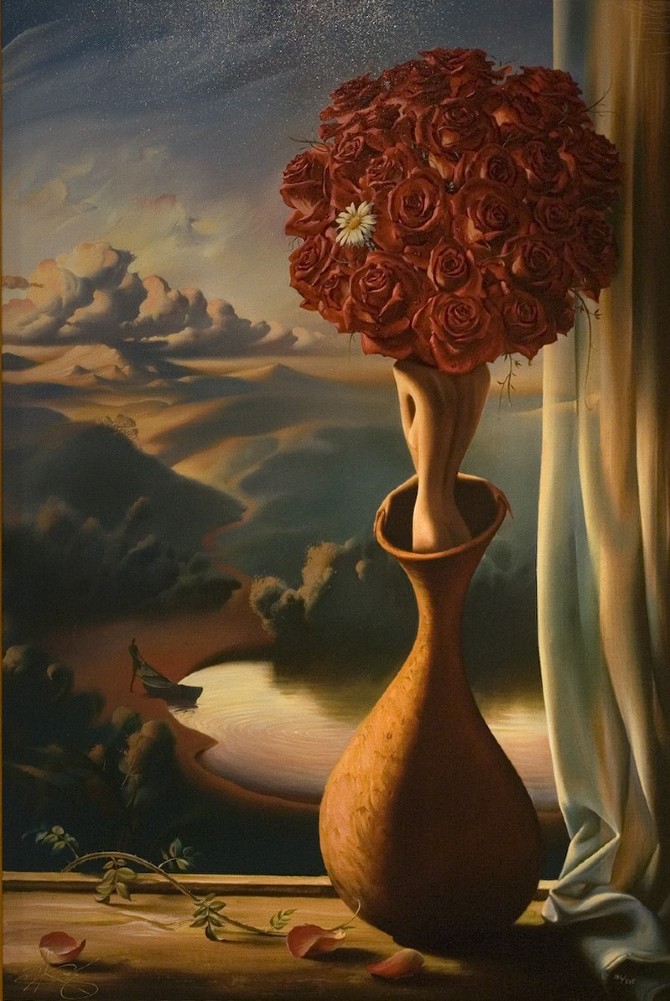
I looked mainly into surrealism and also some artists for their works. The surrealism artists I looked at were mainly Vladimir Kush and Rene Magritte. I also looked at surrealist photographers like Christian Hopkins. I liked how they juxtaposed things, make the expected unexpected.

Art
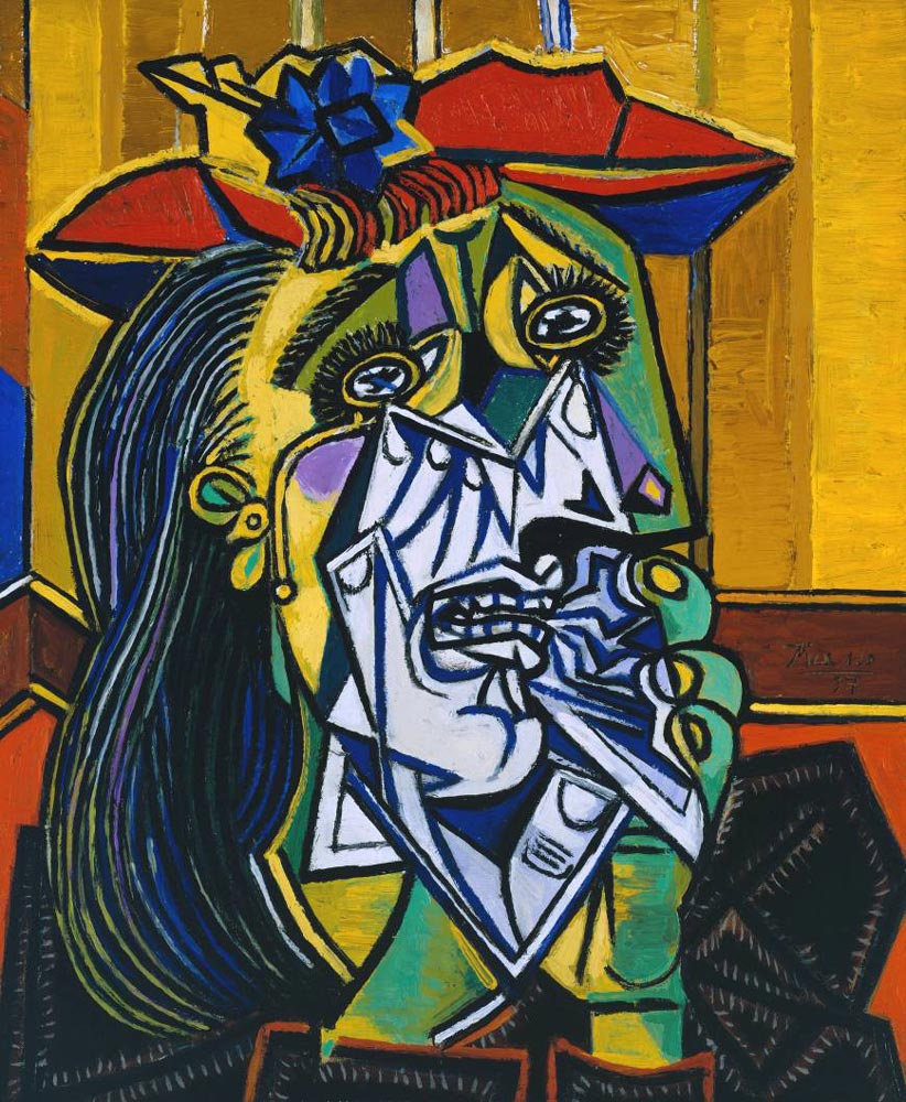
I also looked at contemporary art like Francis Bacon, and cubism from Picasso.
Illustration
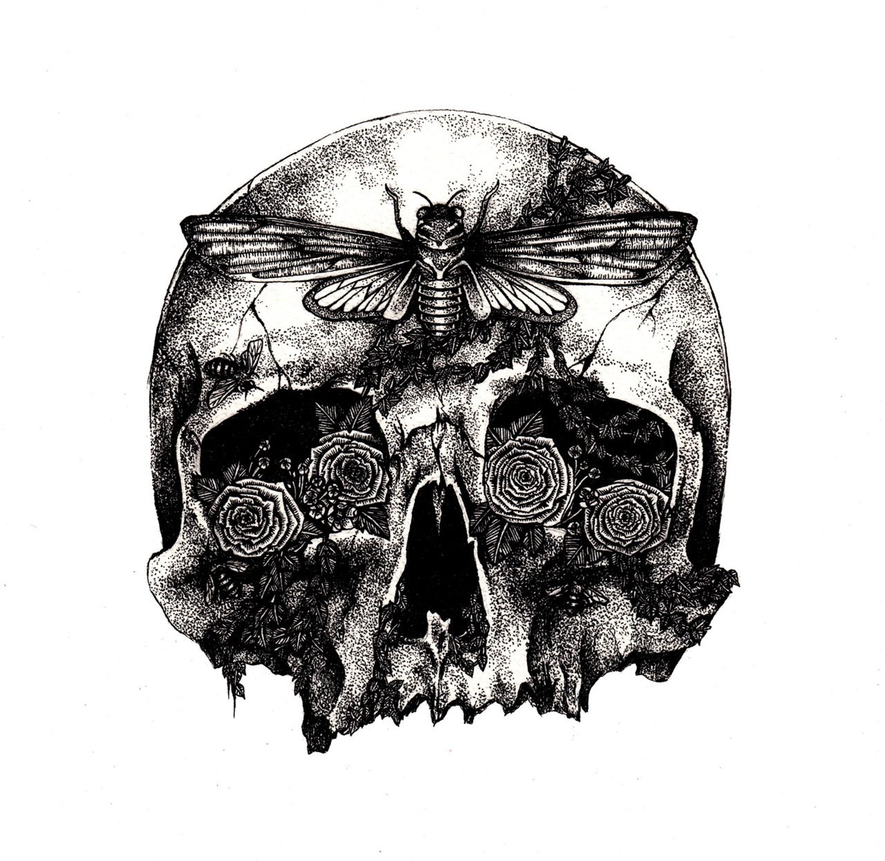
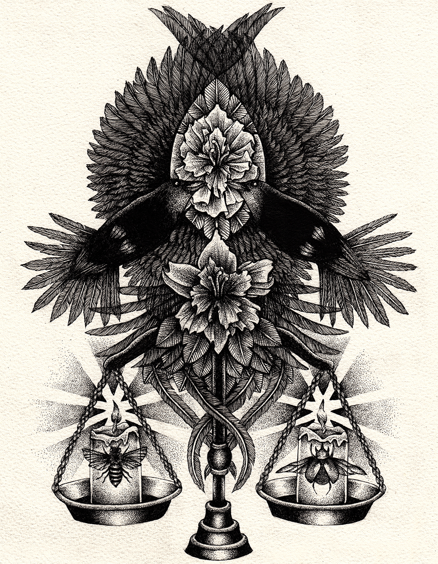
Anita Maslov was my main inspiration for illustration. I was very intrigued by her dark style and intricate drawings.

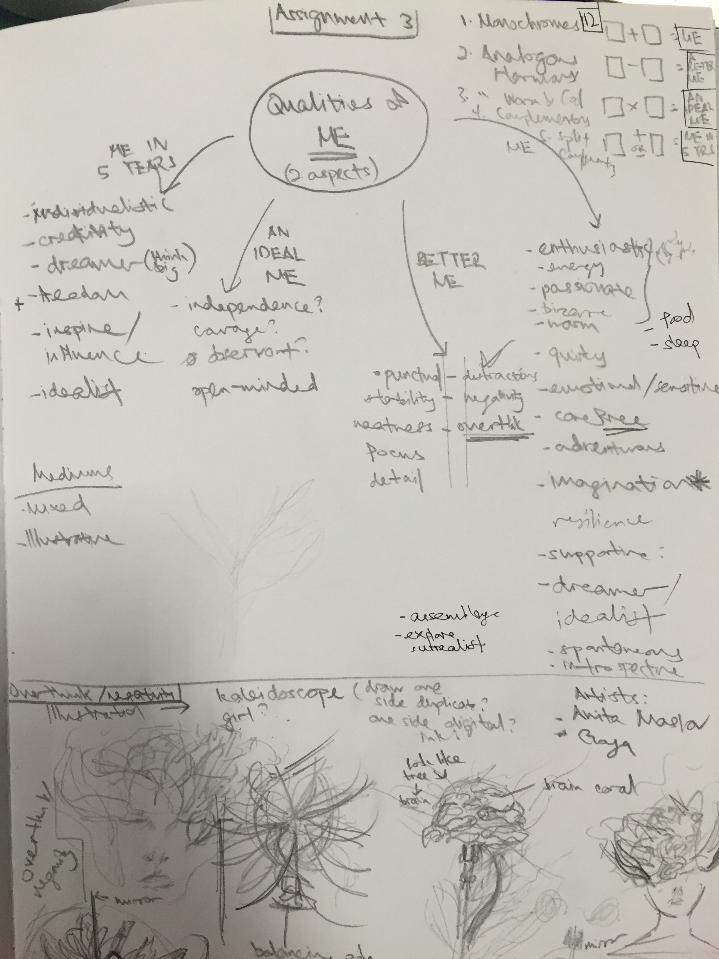
Process
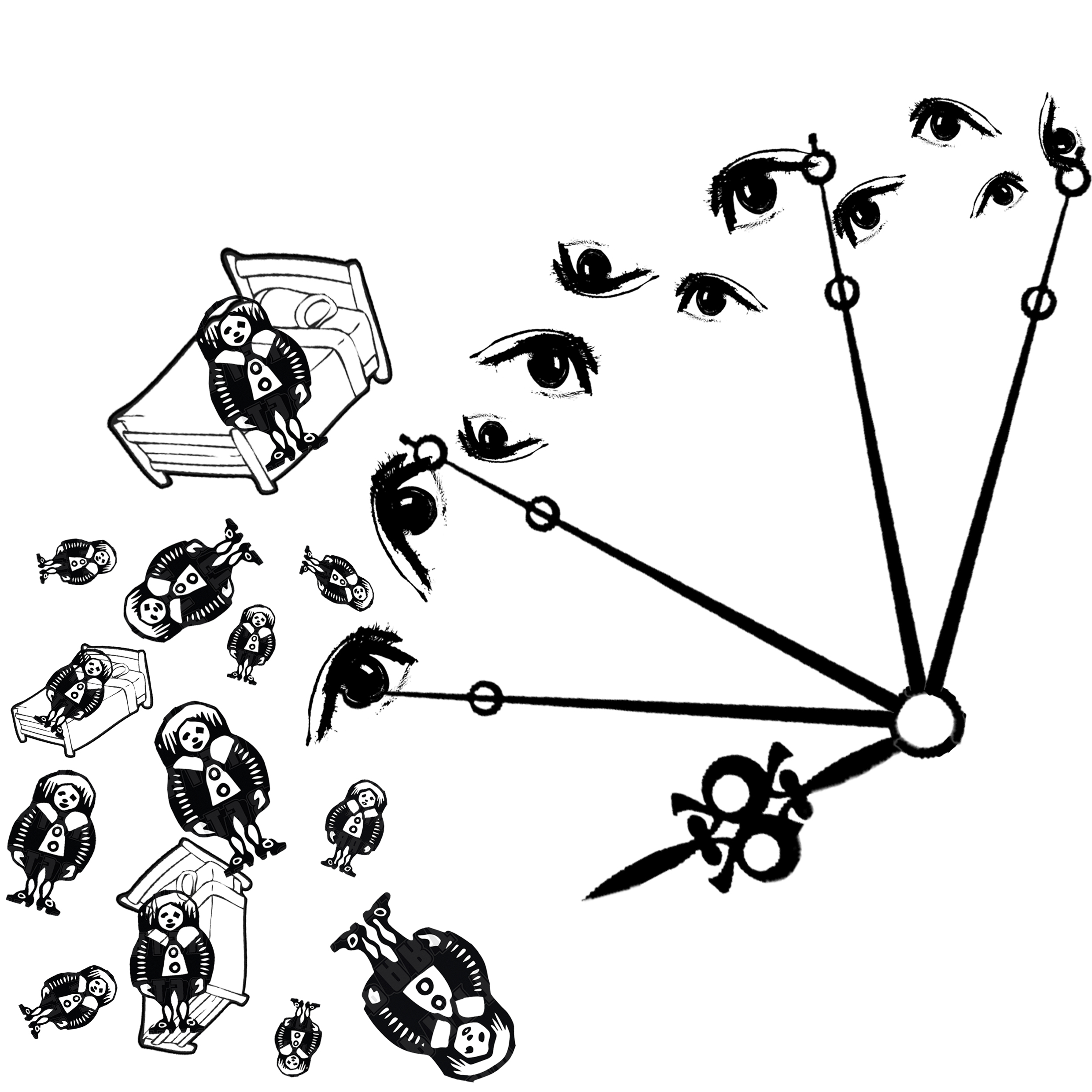
Mind map of the idea generation, finding out what qualities were unique to me.
Example of process – Overthinking
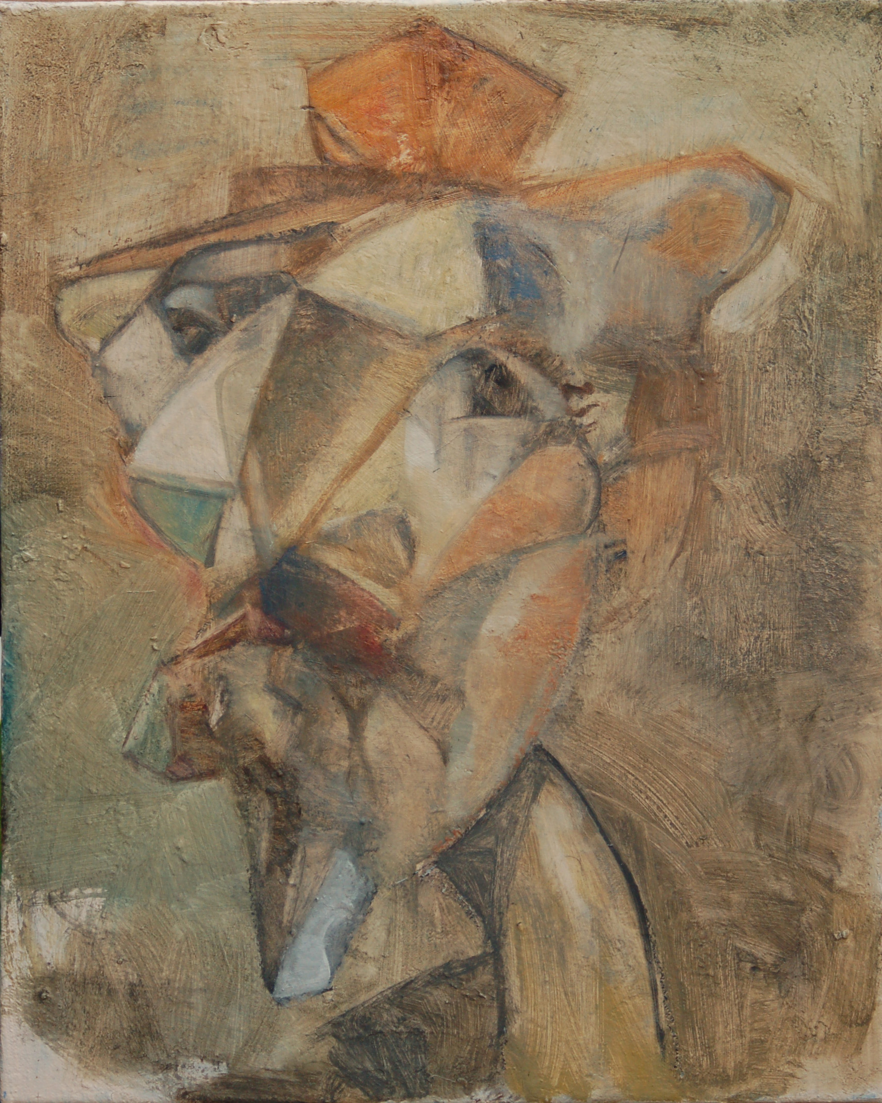
Cubism – Test of fragmentation, composition and color
Final Works
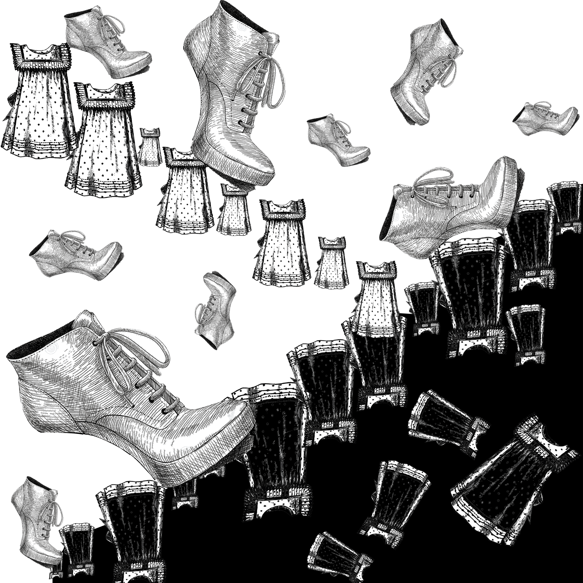
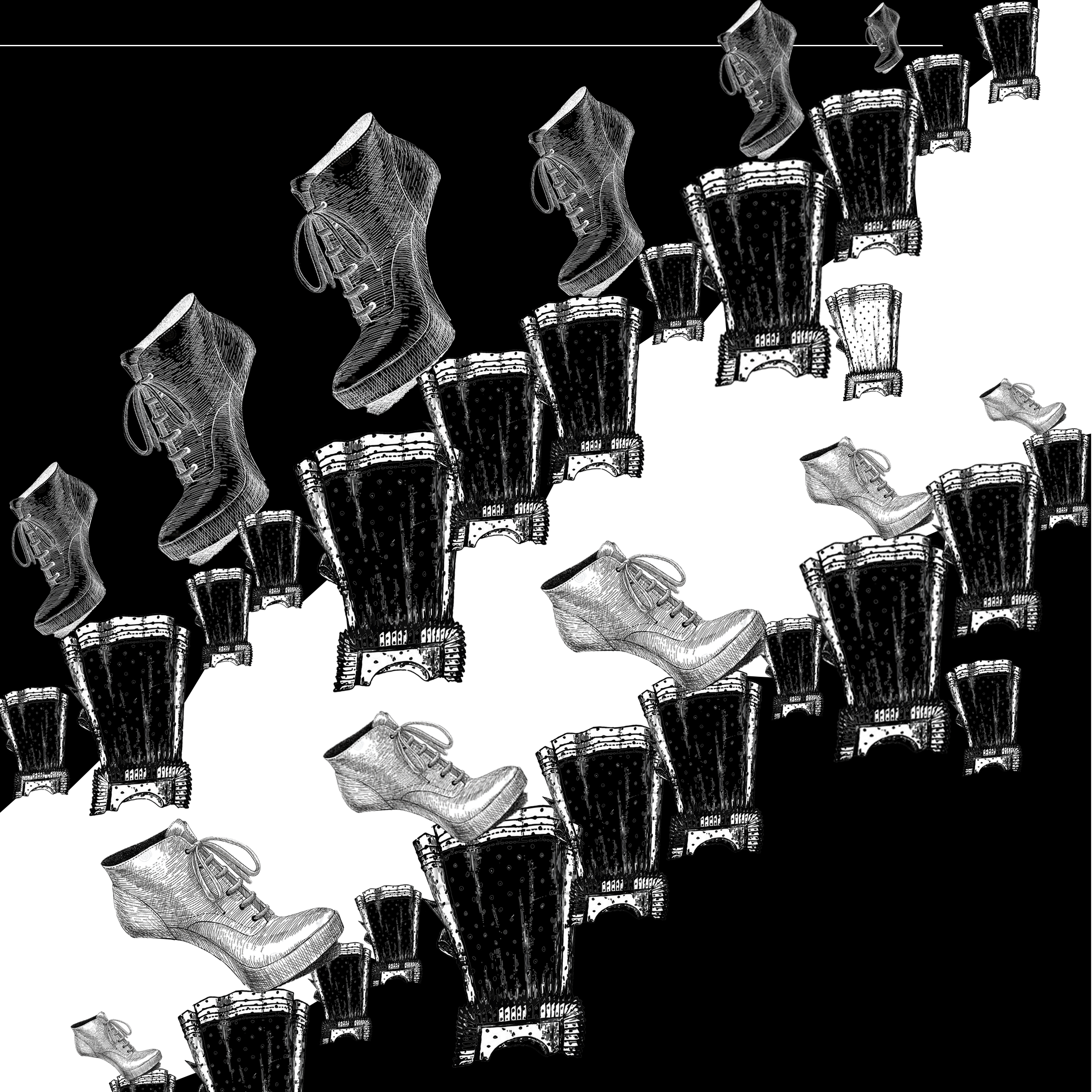
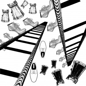
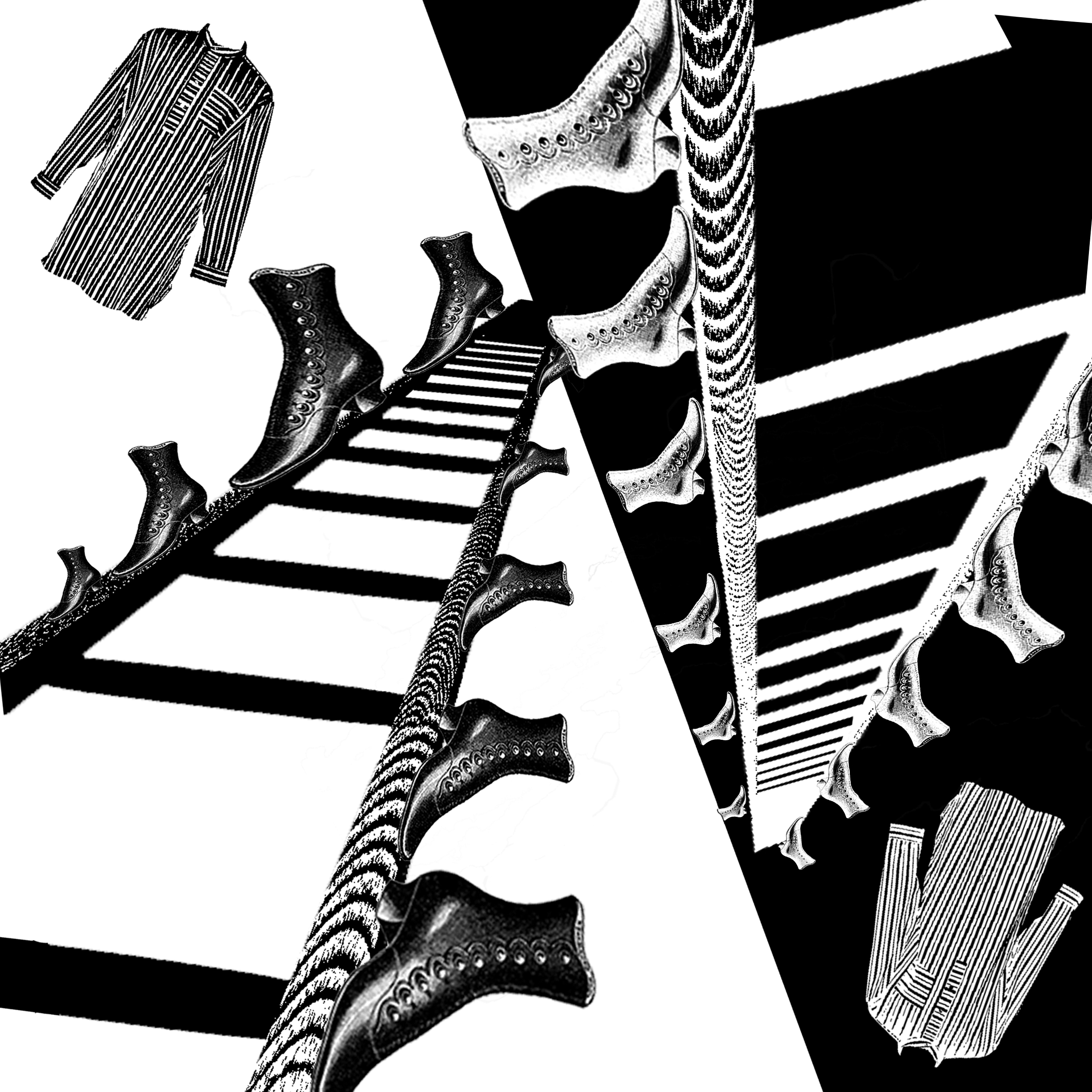
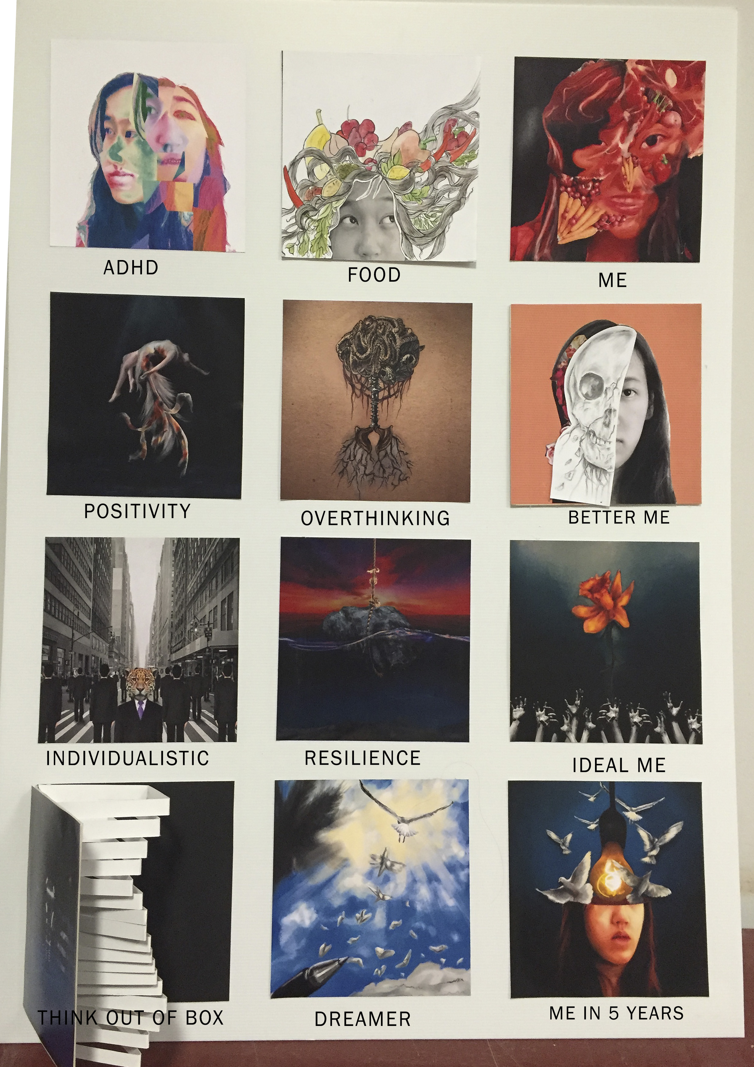
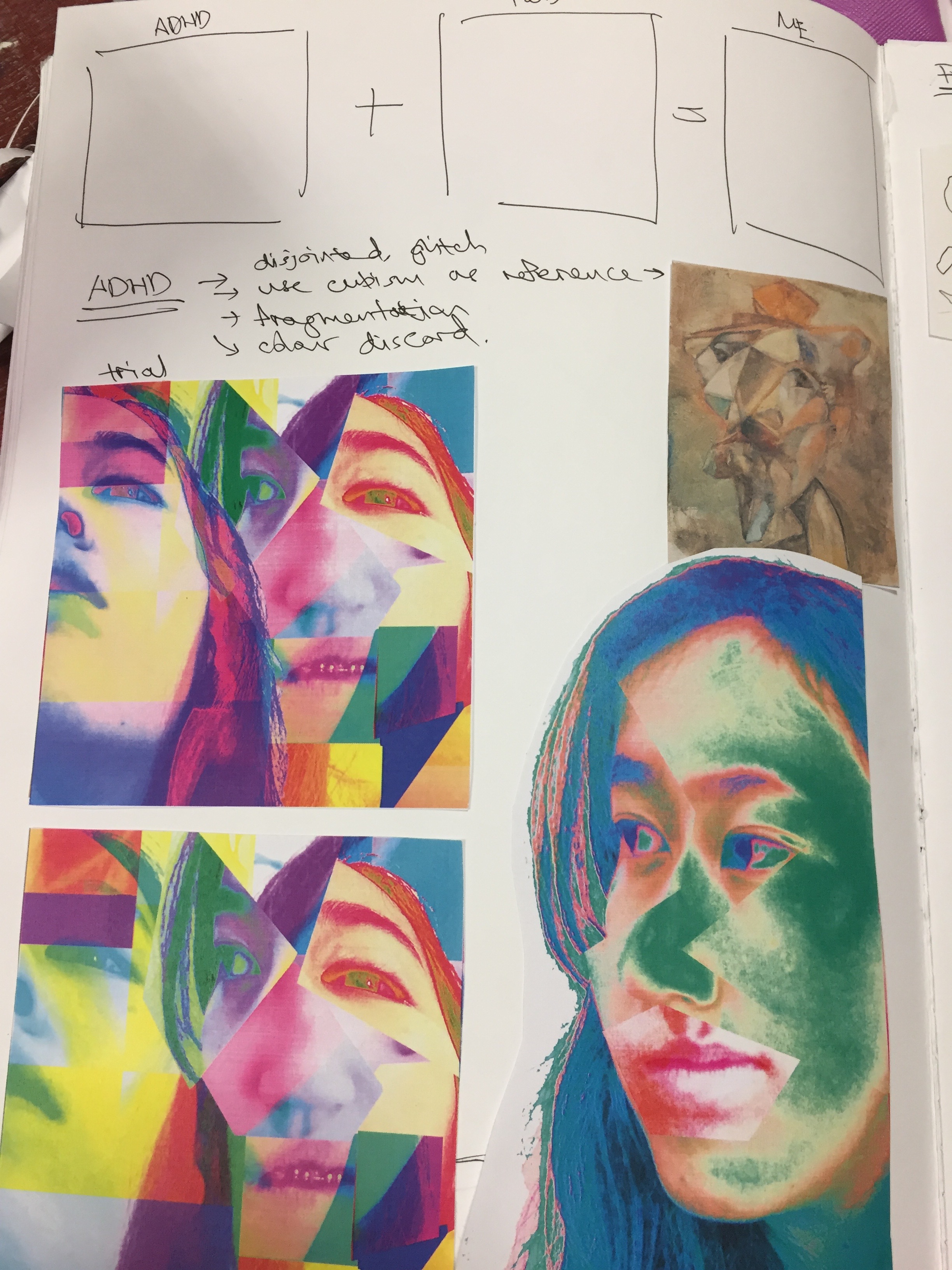
ADHD
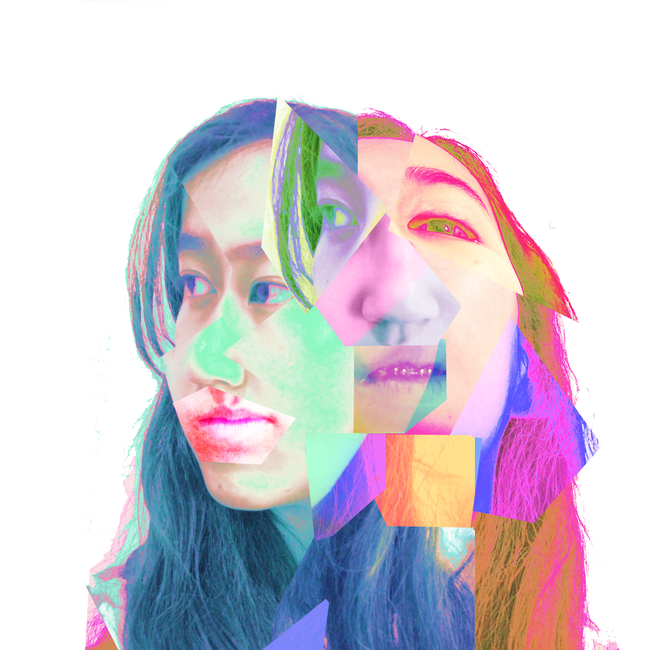
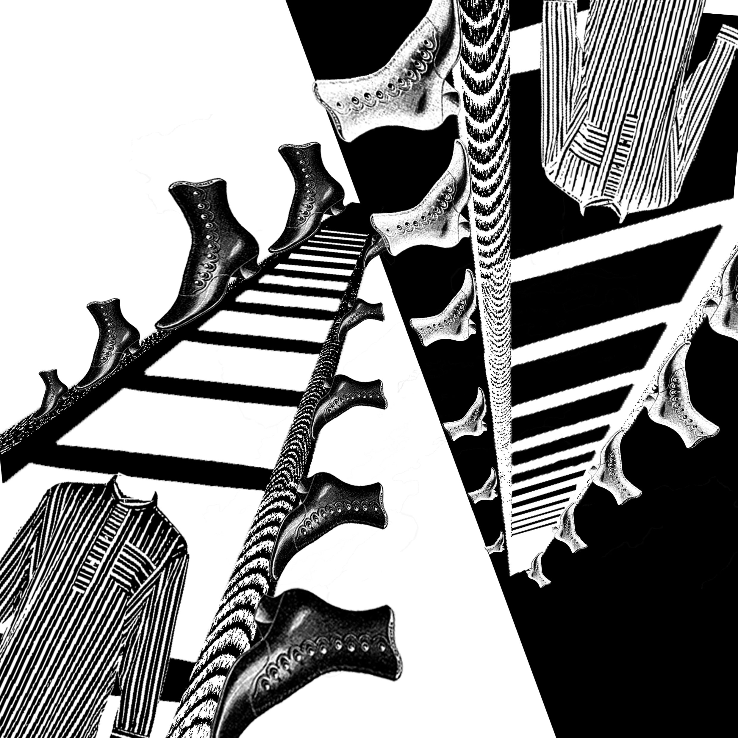
Always known as the hyperactive one, and often said to have Attention Deficit Hyperactivity Disorder (ADHD).
Used Cubism art and fragmentation to give the emphasis on the lack of concentration, and disruption. Colour discord was intentionally used to give a clashing feel.
Reference – Cubism art, Picasso
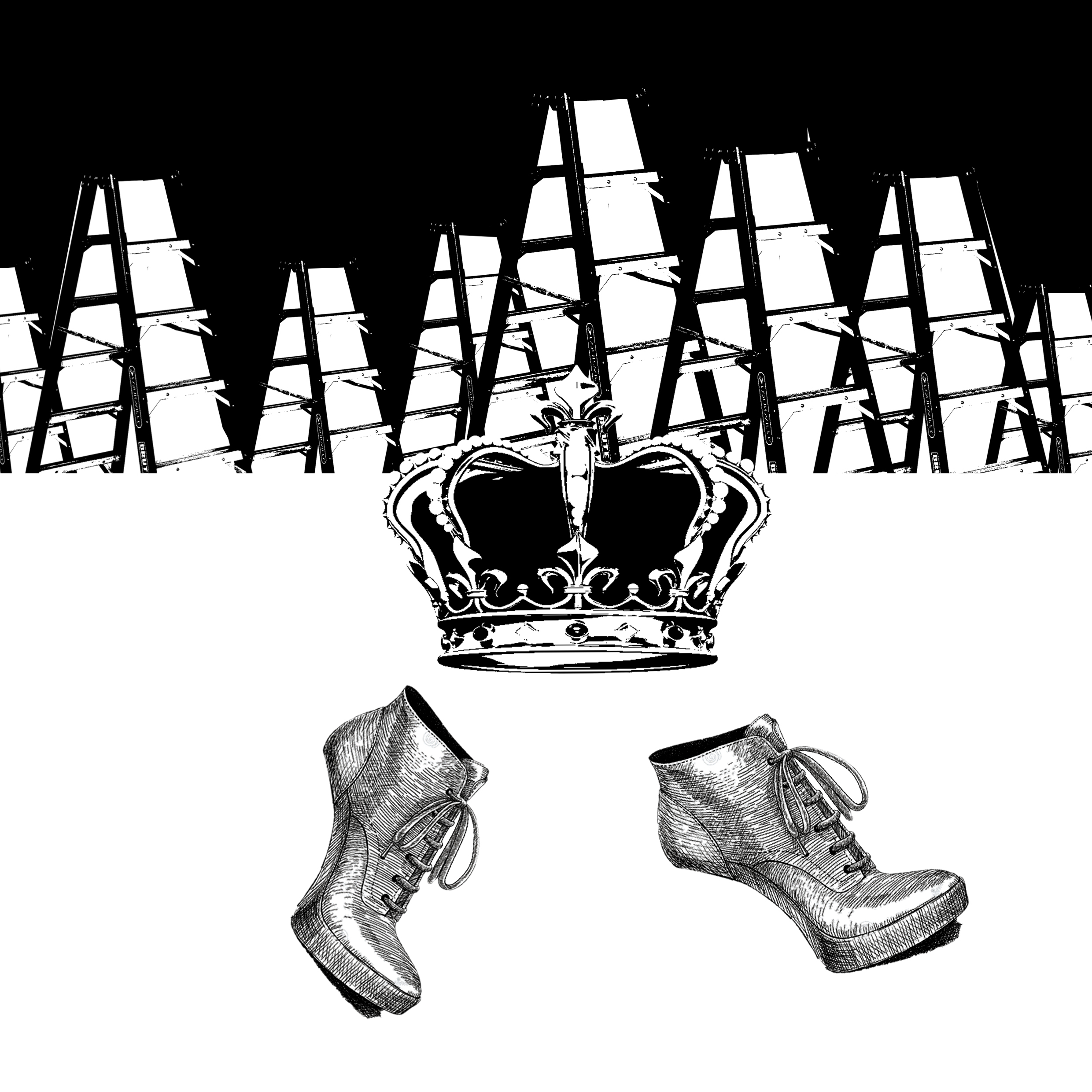
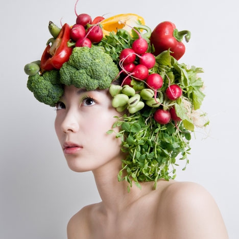
Food
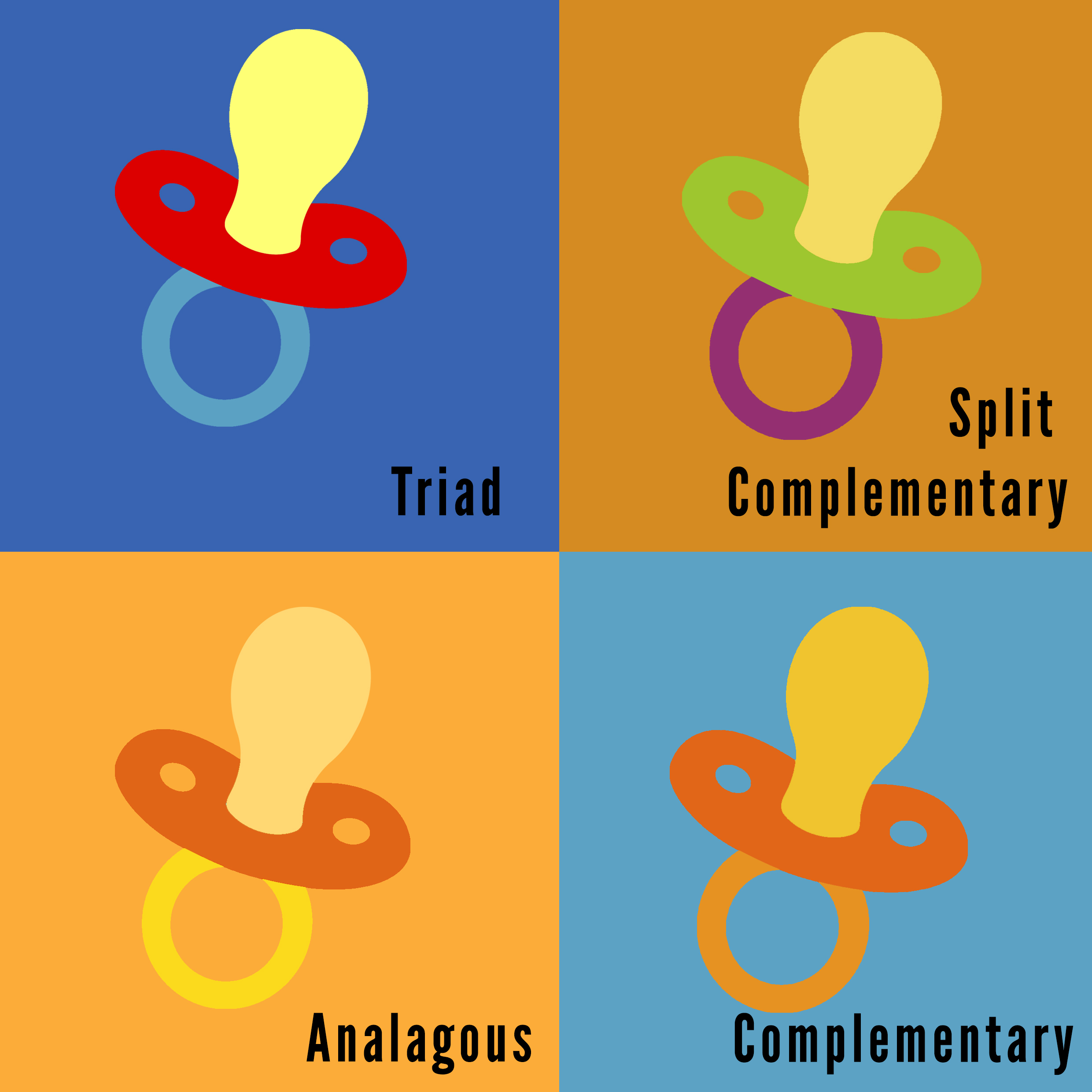
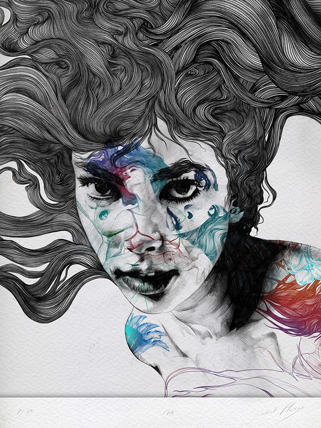
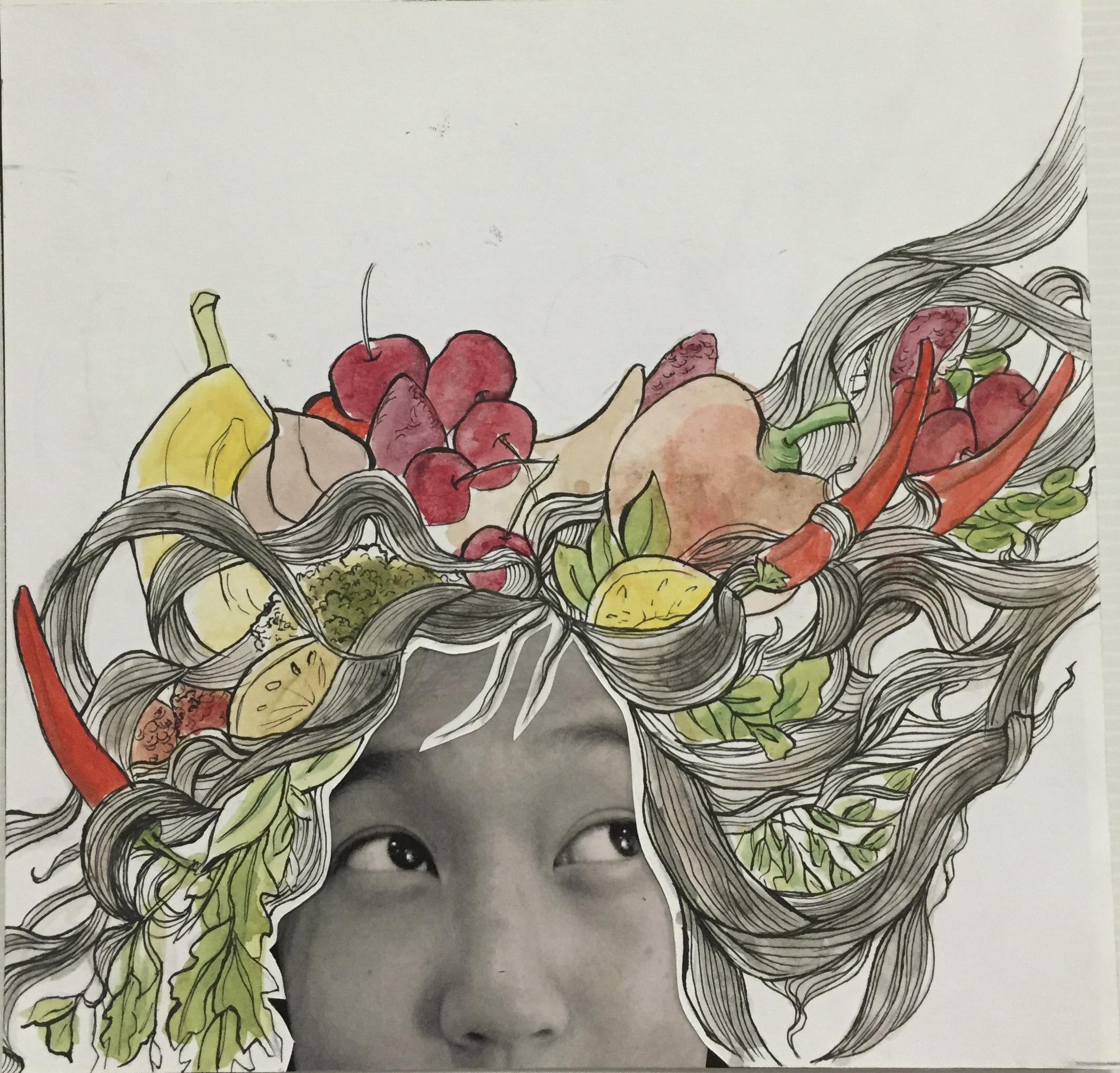 Food is integral to my life, I am one who constantly thinks of food. Thus, I used this picture with the pondering look in my eyes and made the hair illustration elevating upwards to give the feel of thought. My idea around this was to make my hair made out of food. I referenced the mixed media style, photo collage with watercolour illustration. Colour theory used was split complementary.
Reference
Me
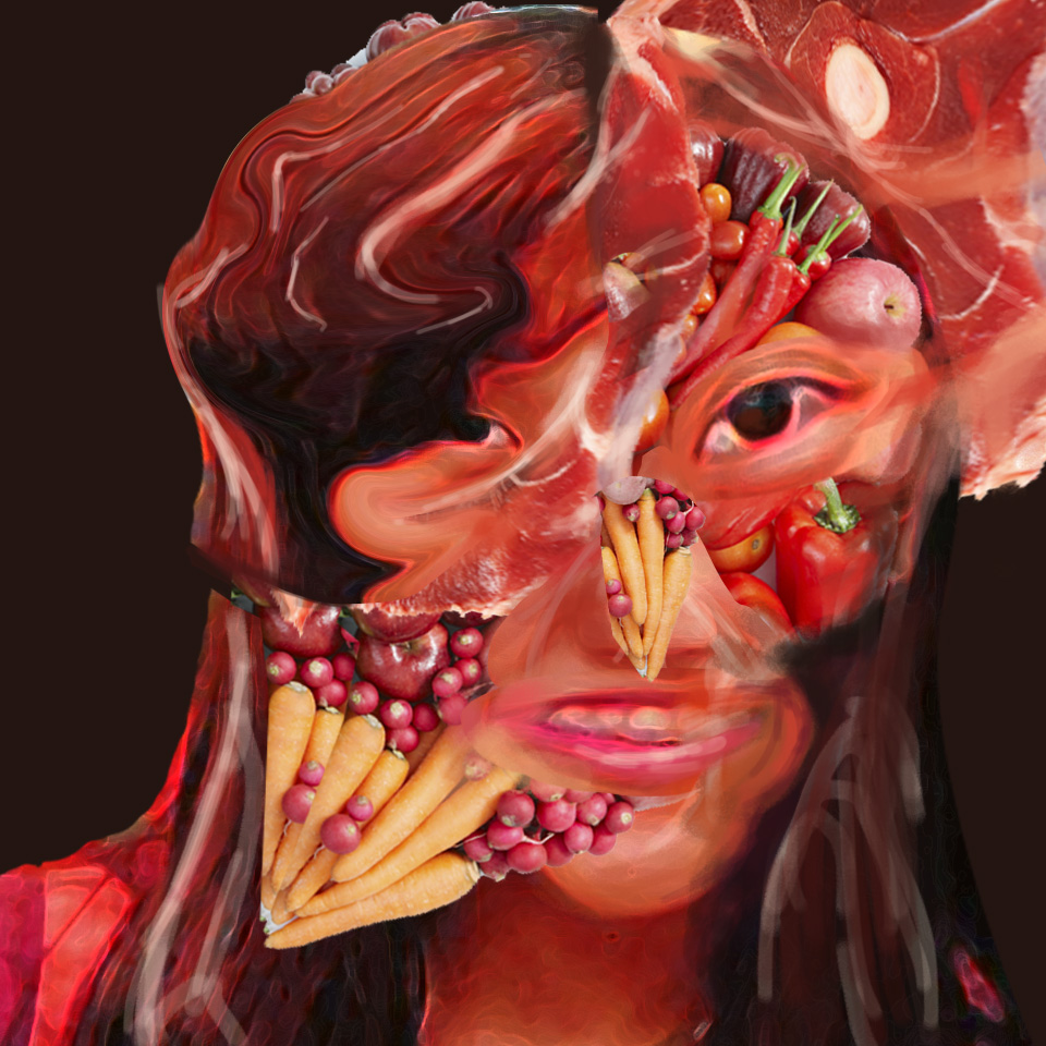
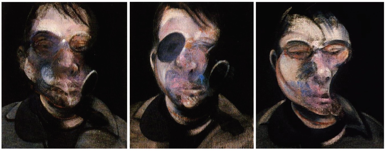
Morphing both the ideas of Food and ADHD, I decided to incorporate food in the portrait (after all, we are made of meat!) and warp the picture to infuse the fragmentation/distortion idea. I was very interested as to how Francis Bacon painted his portraits, warped and almost disfiguring. Colour theory used here was analogous.
Reference – Francis Bacon
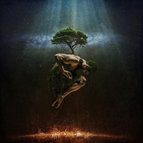
Positivity
I focused on surrealism and symbolism in this work. I looked into an oriental symbol of positivity, prosperity and good fortune – Koi fish. I morphed the koi fish together with the girl and her dress. I referenced Christian Hopkins surrealism photography, to capture the spiritual essence, an ethereal quality to the work.
References – Christian Hopkins
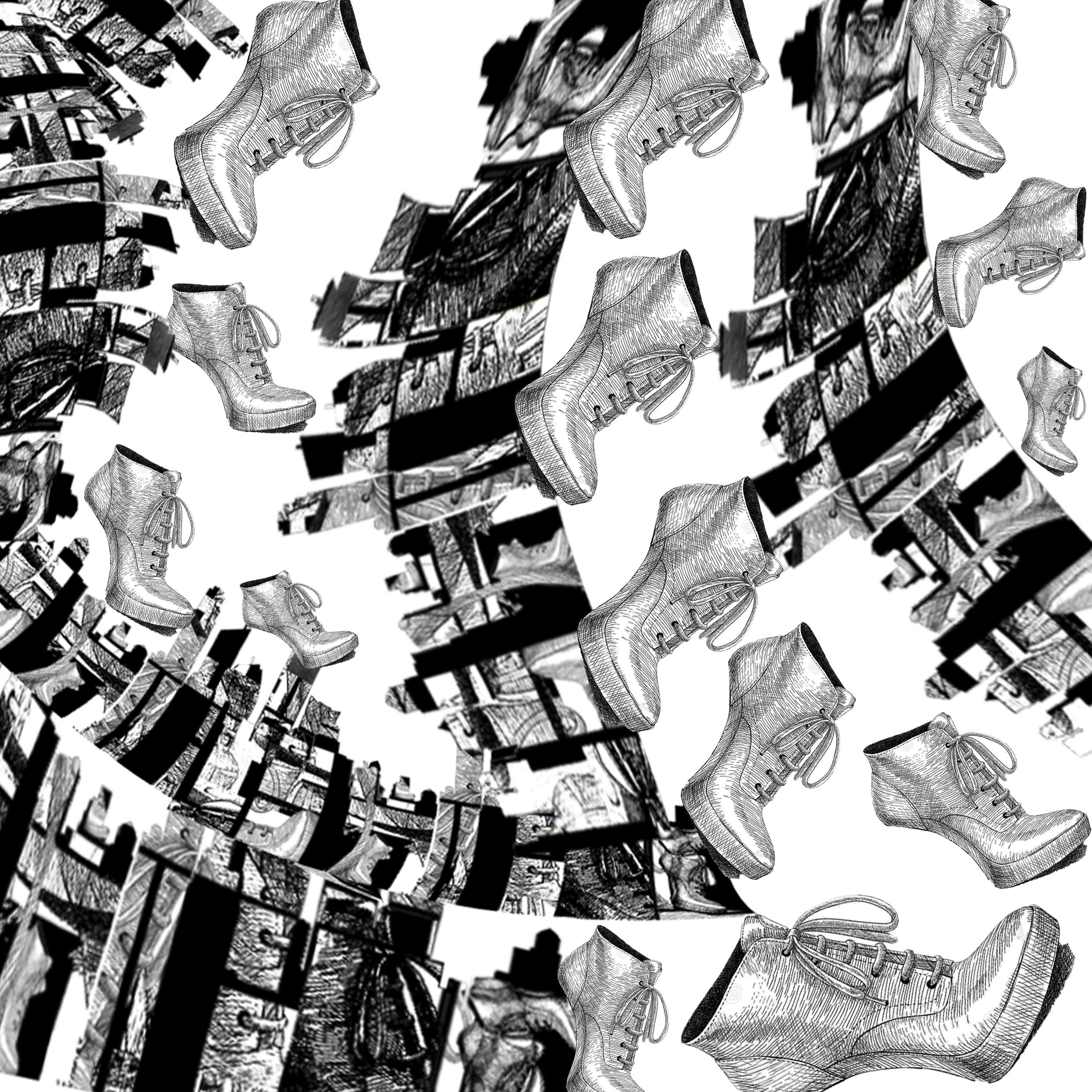
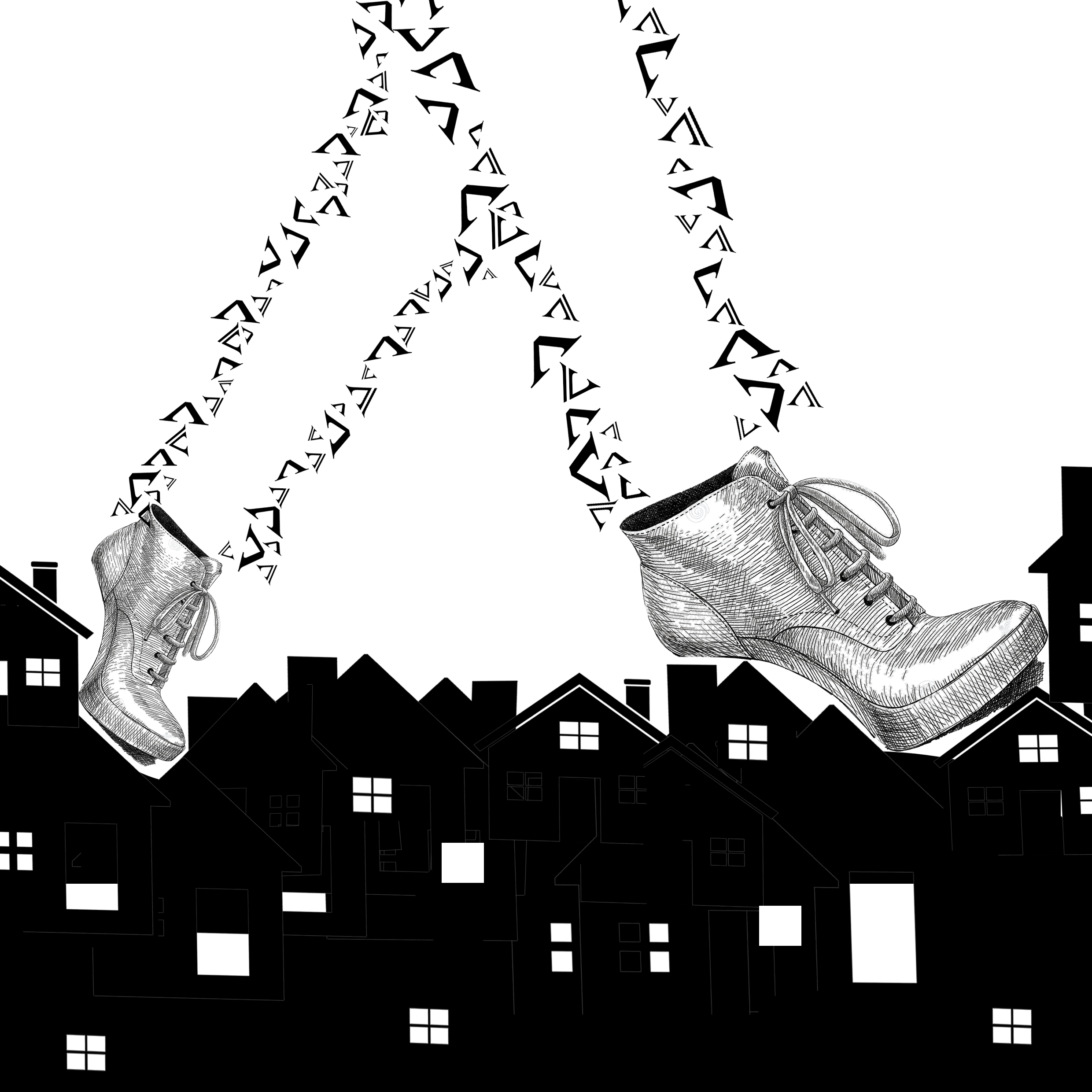
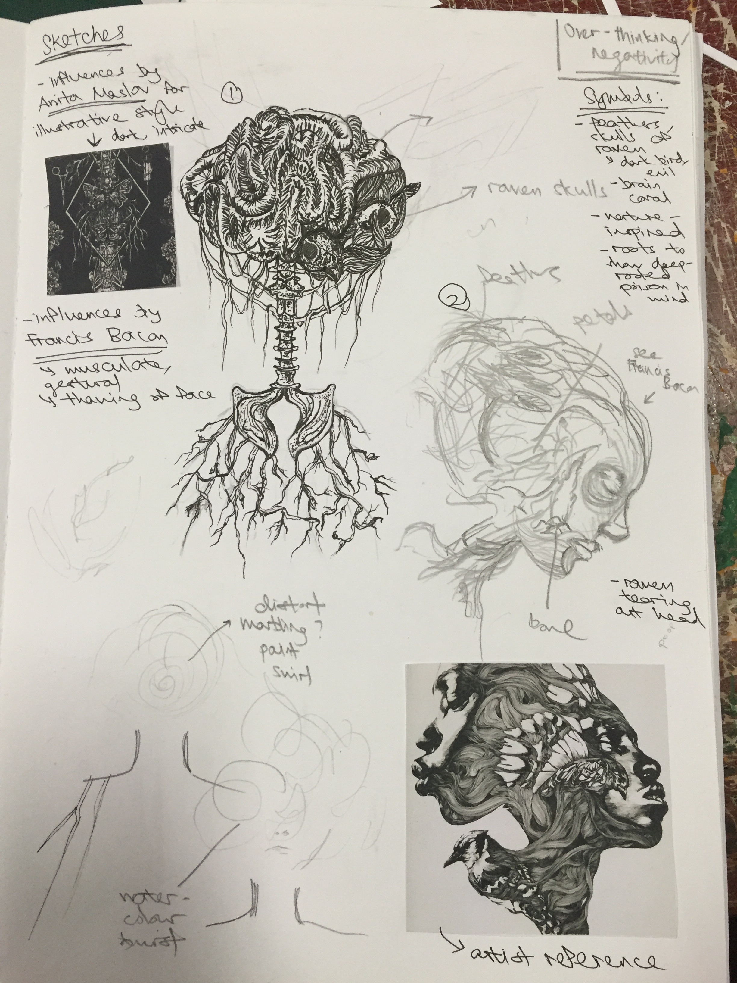
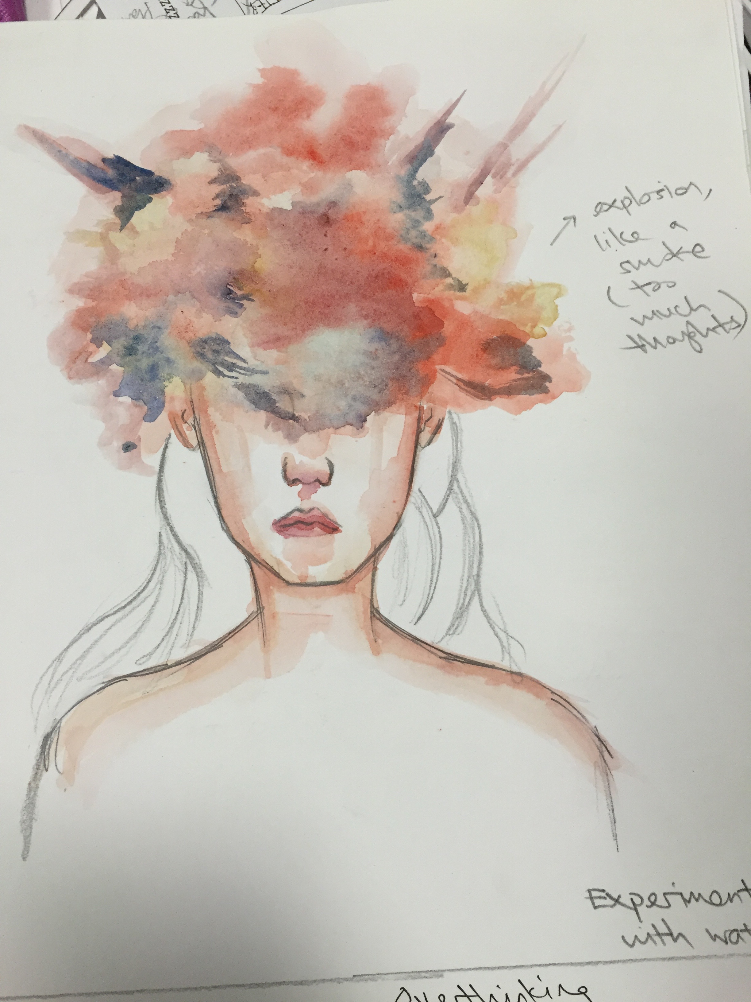
Overthinking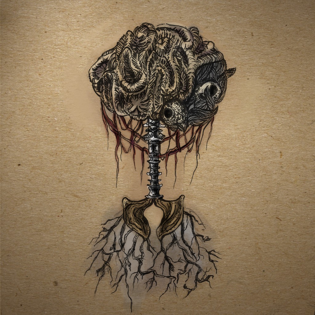
I was inspired by the dark, detailed illustrative style. I drew this out in marker, scanned it and painted colour over. I used motifs that could best represent such negativity – skulls of raven (birds that are not associated with good fortune), dried brain coral, black feathers, bones. Roots were used to show how negativity has already latched onto me, deeply rooted.
References – Anita Maslov
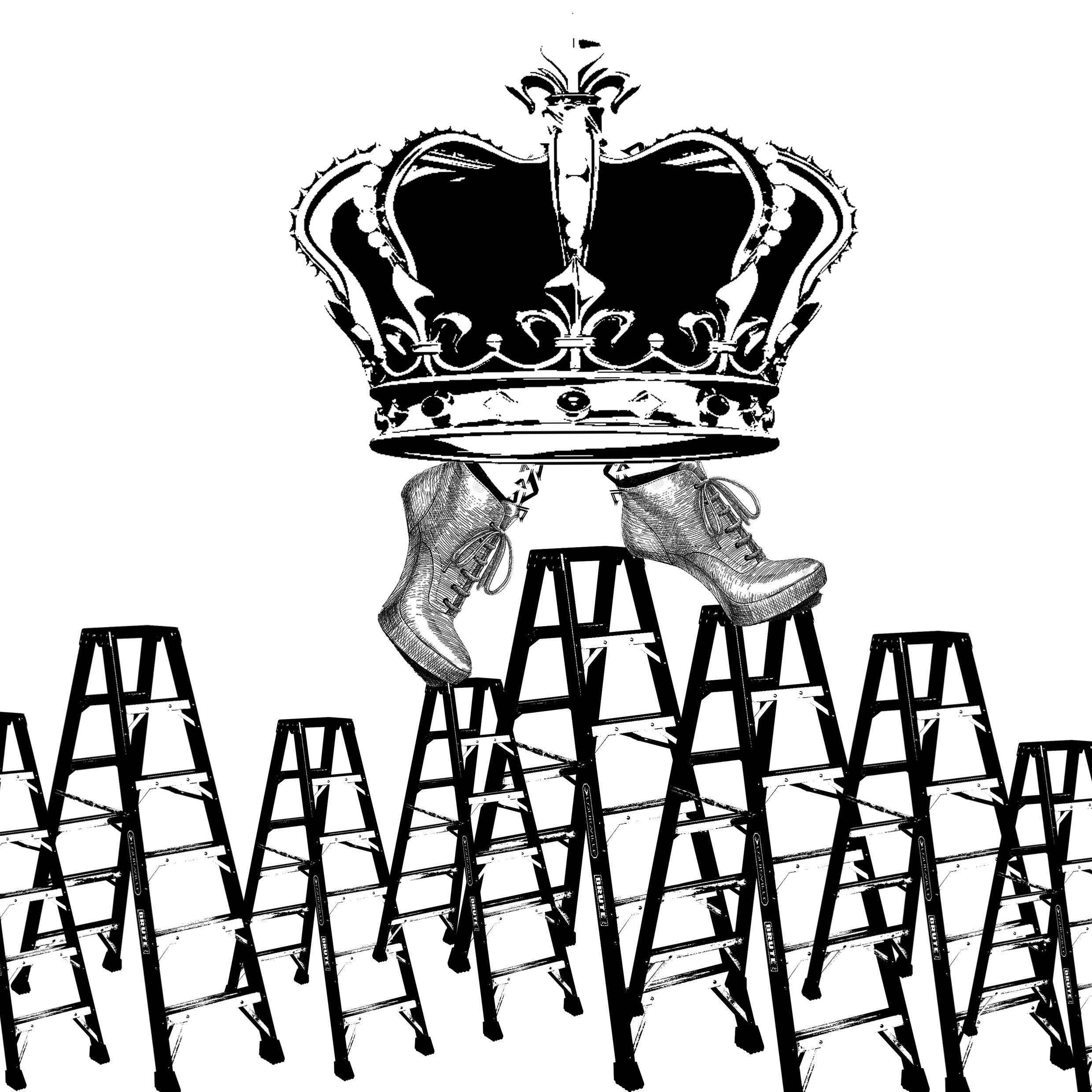
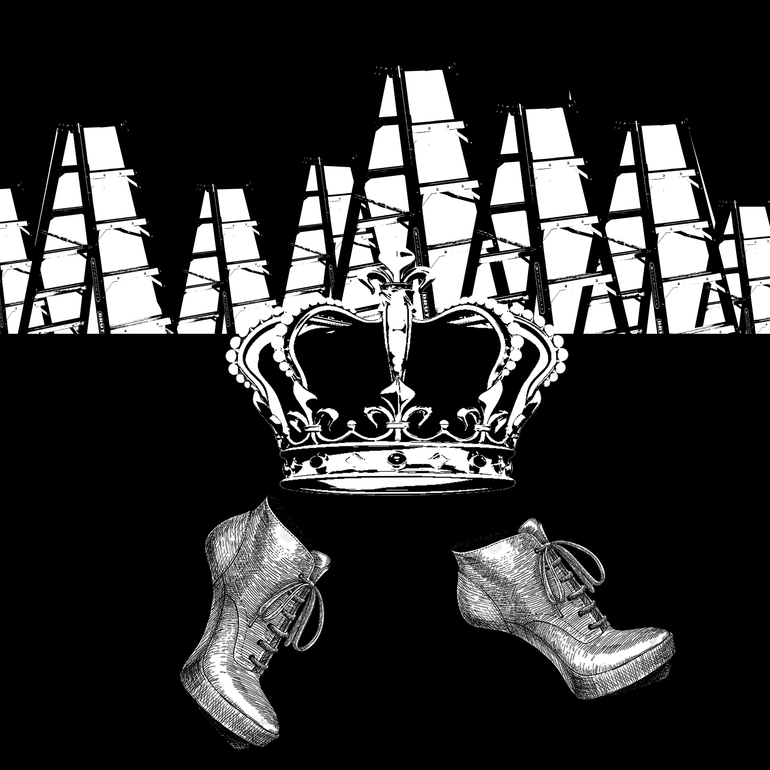
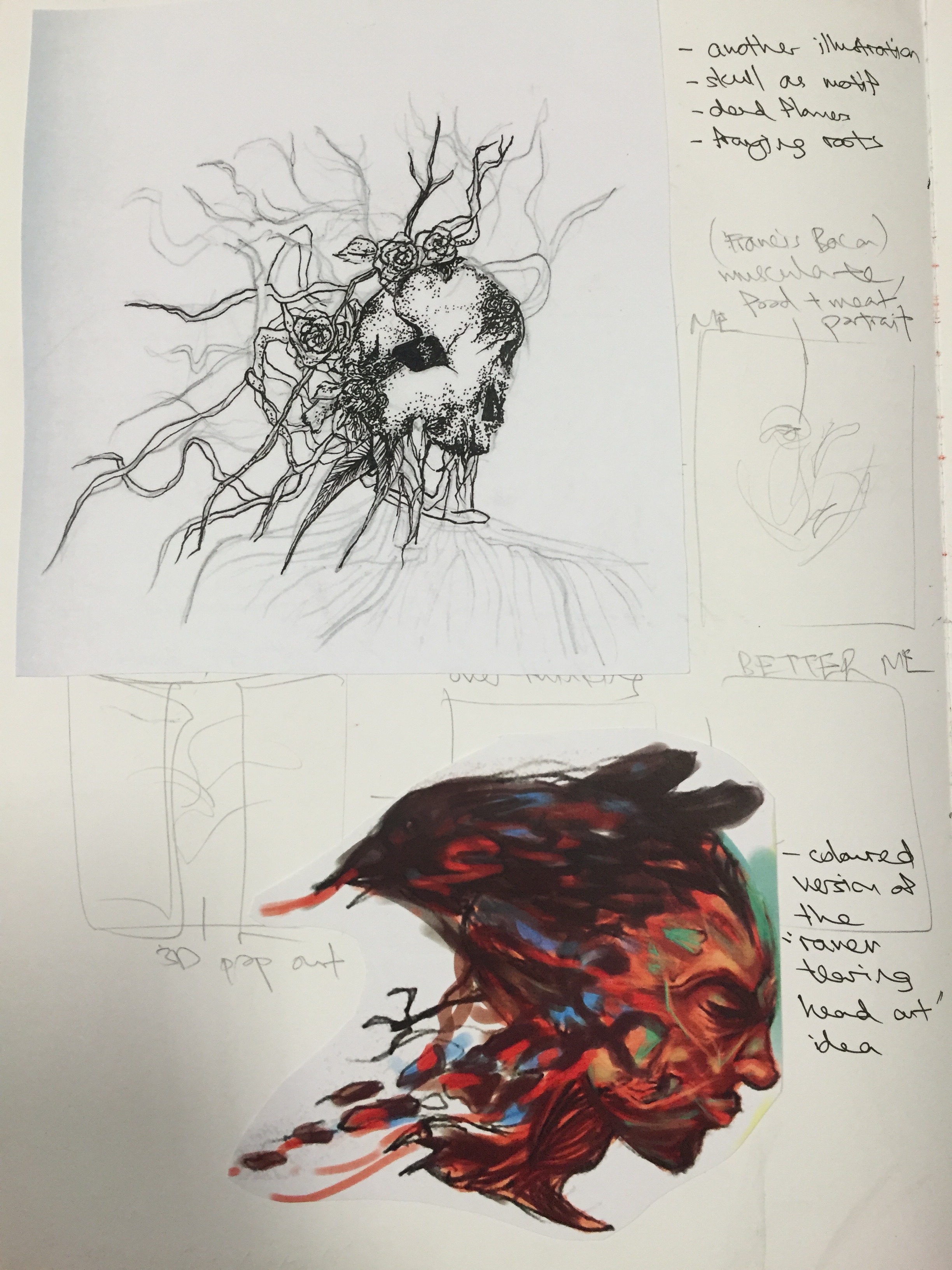
Better Me 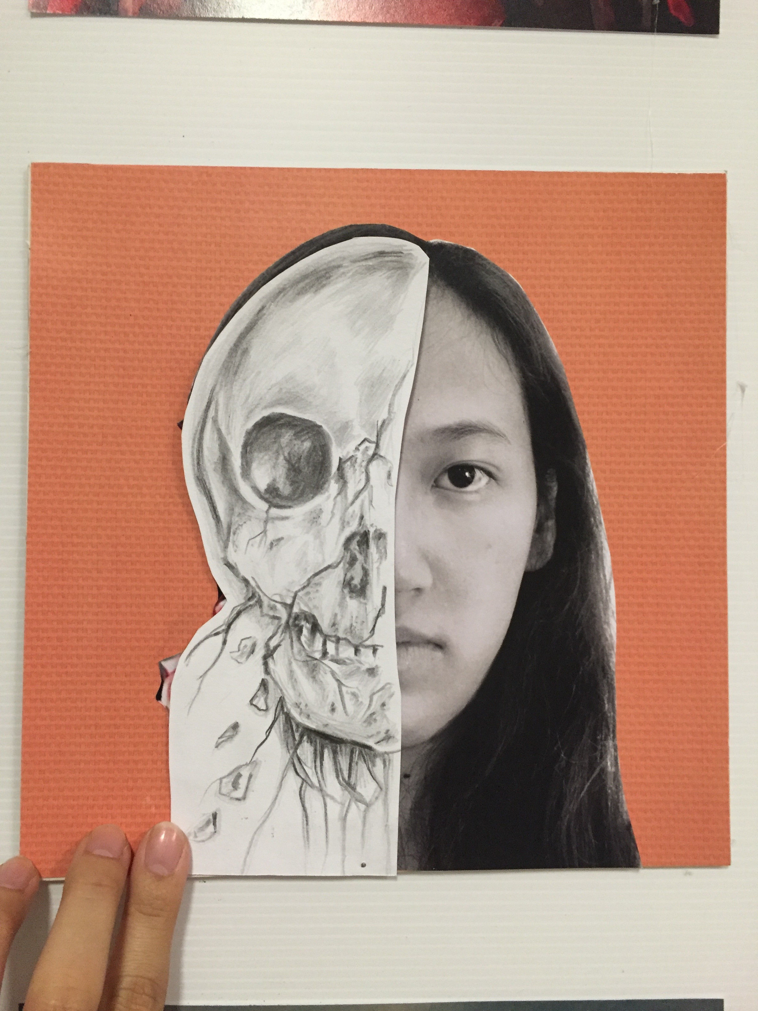
I drew a withering skull, to suggest it fading away. The skull represents all negativity and death, but once removed it reveals brightness and colour. This shows that once the negativity is removed (also using a pivot for interactive purposes), it reveals the positivity.
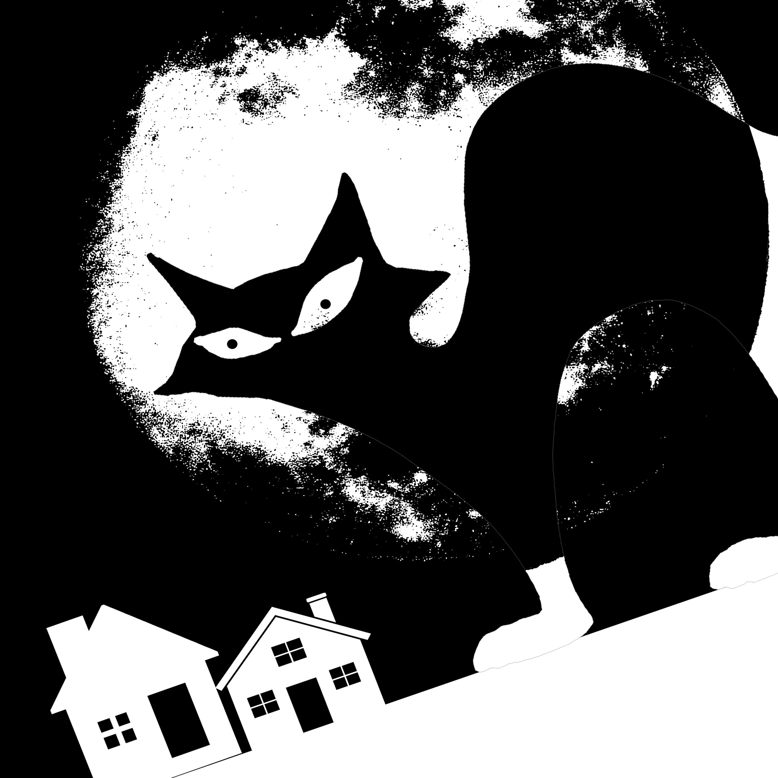
Individualistic

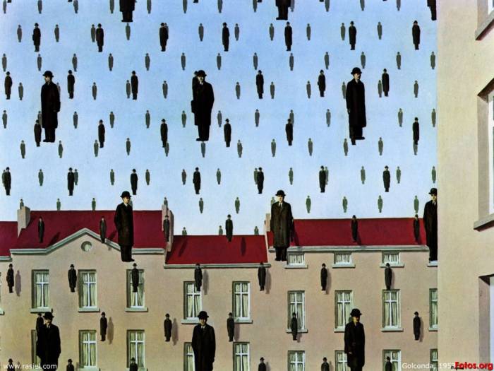
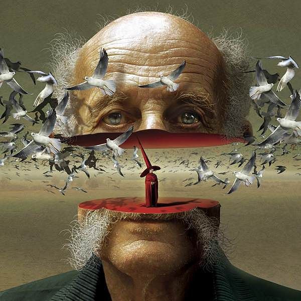
The cat family has always been known for their lone, individualistic behaviour. Thus, I decided to use the feline family as a representation. I referenced heavily to Golconda for this work, the emphasis on common man with the lack of identity. I juxtaposed with the cat individual, someone different and apart from the common man. Complementary color was used here.
References – Rene Magritte’s ‘Golconda’
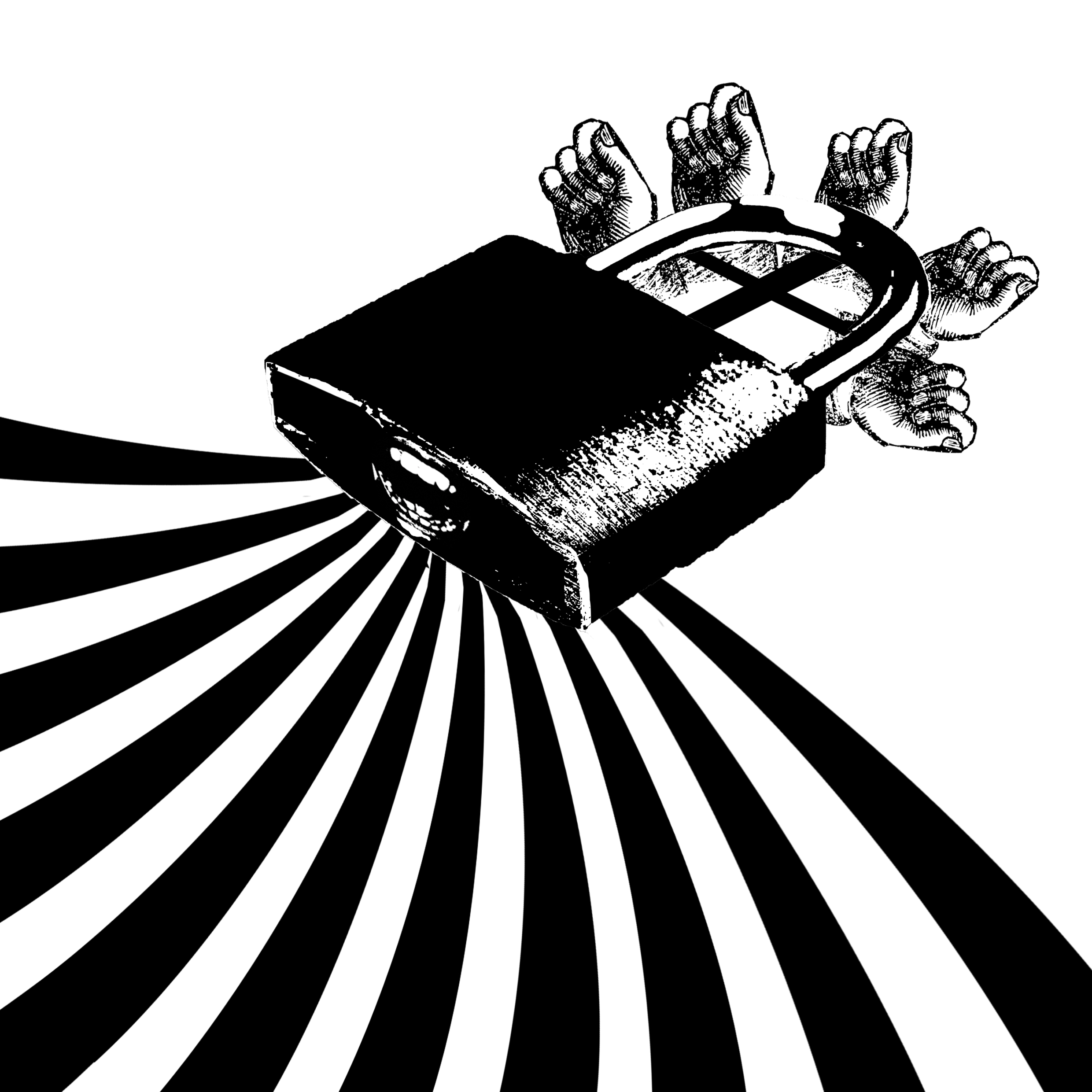
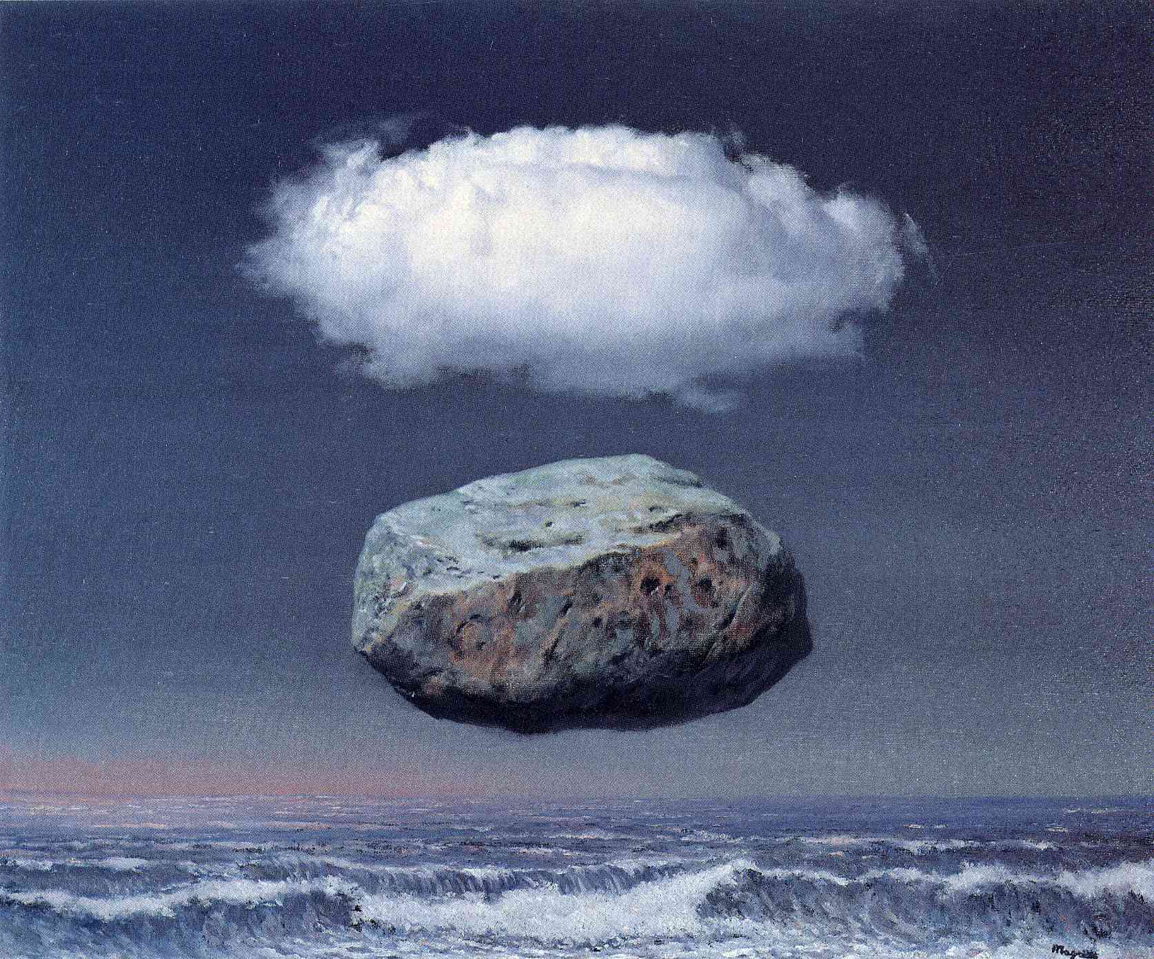
Resilience
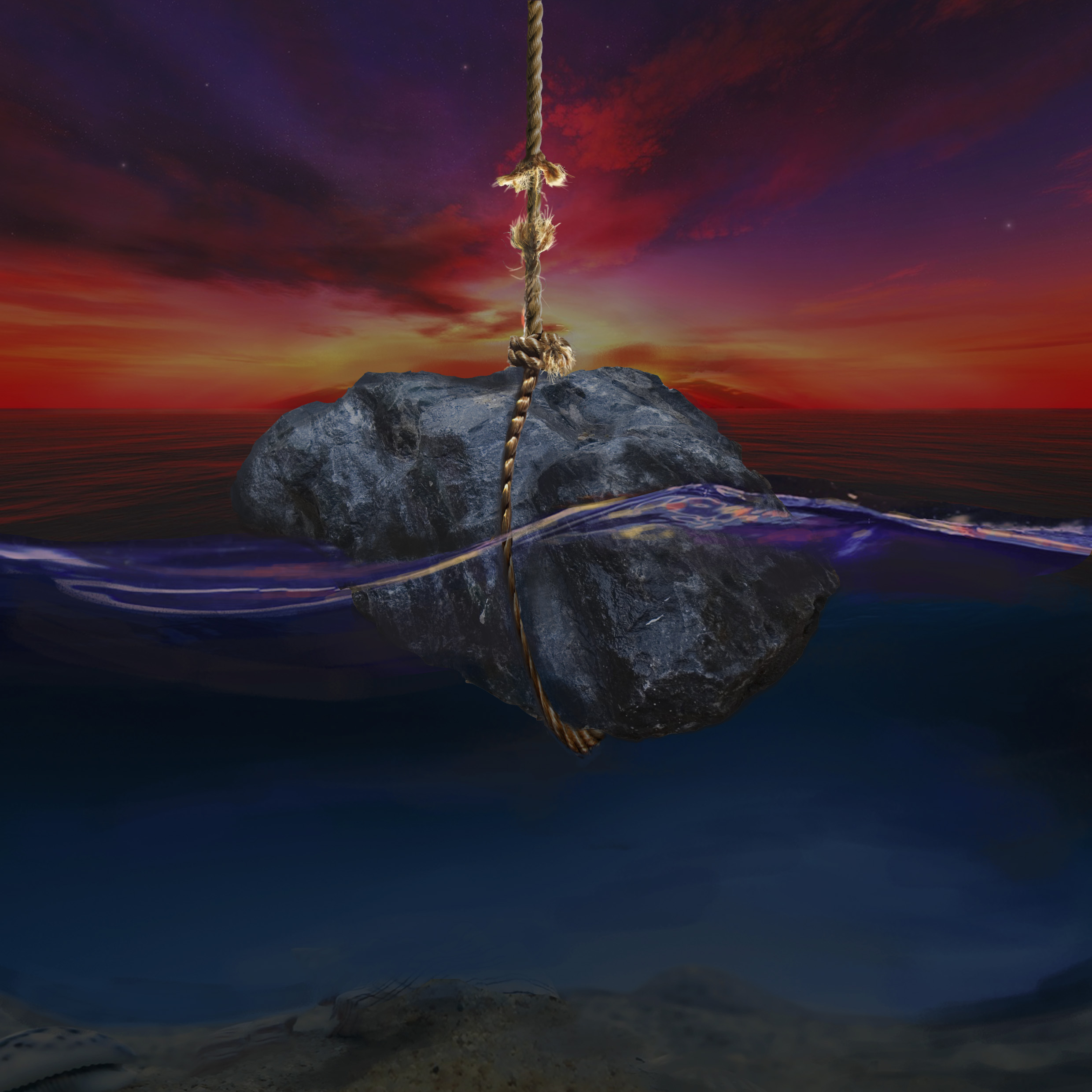
The concept behind this work was that no matter how heavy the rock and how its weight increases with water, the taut rope will not break despite struggling (evident from the fraying). Thus this represents resilience. Once again, surrealism was the main inspiration.
References – Rene Magritte’s ‘Clear Ideas’
Ideal me
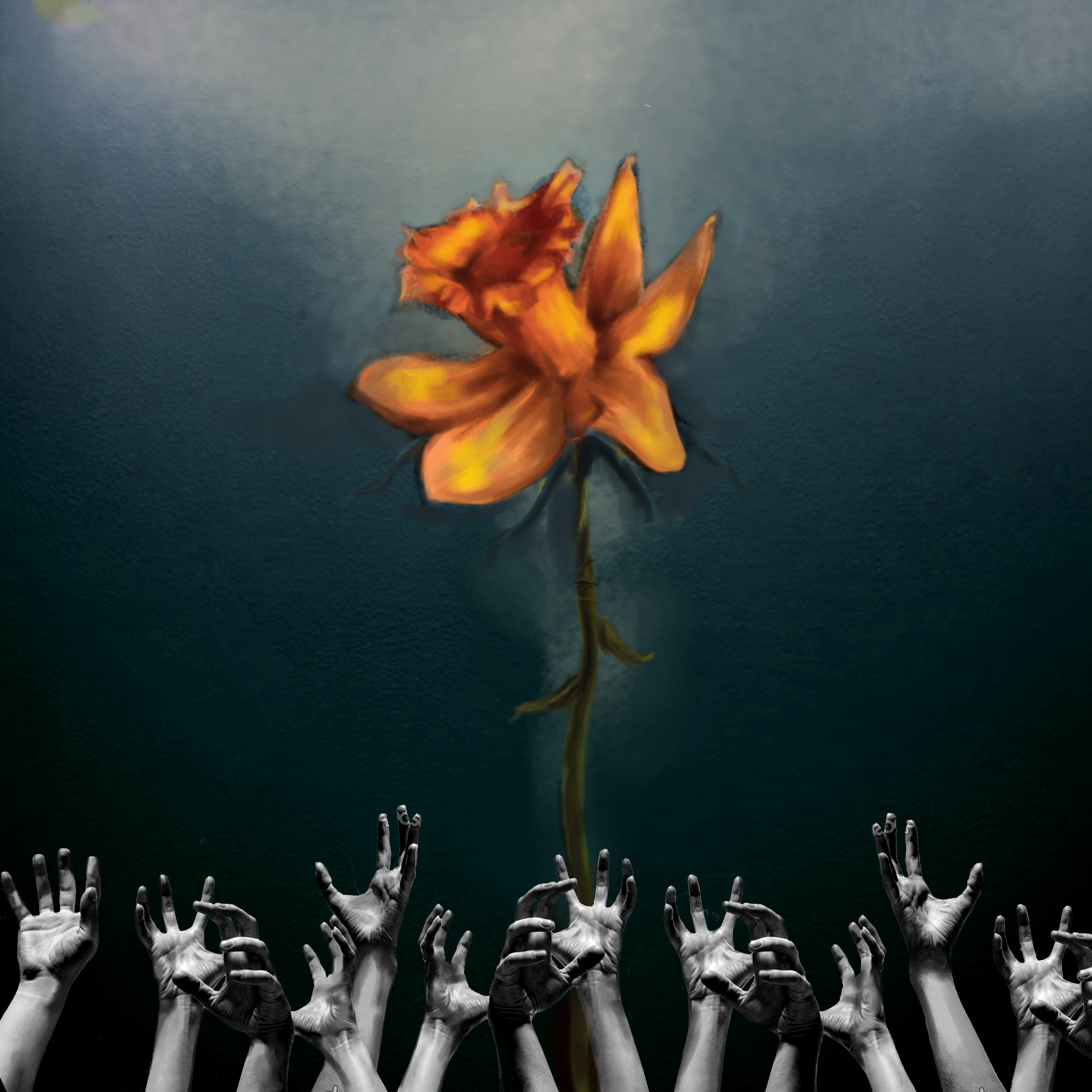
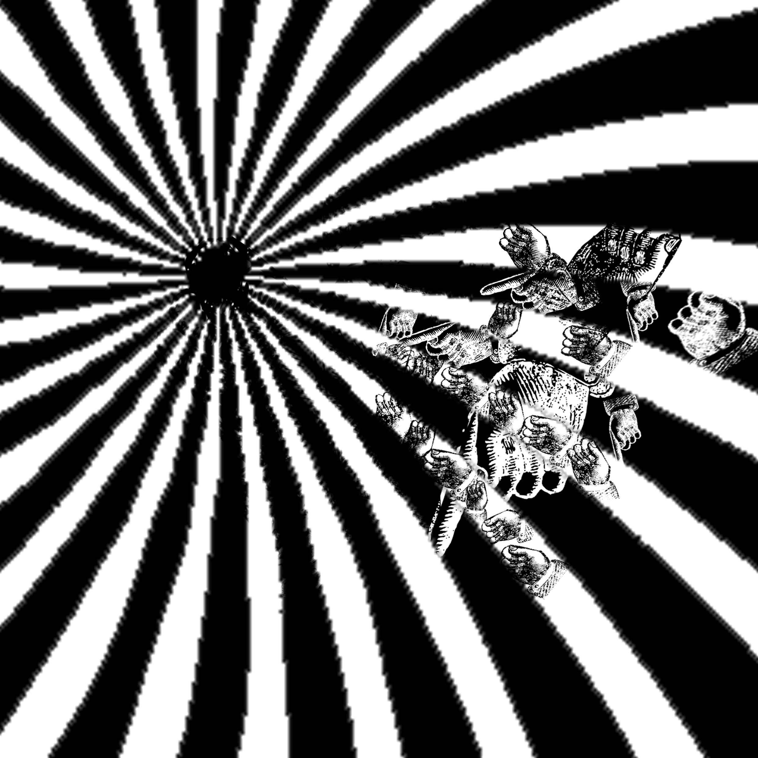
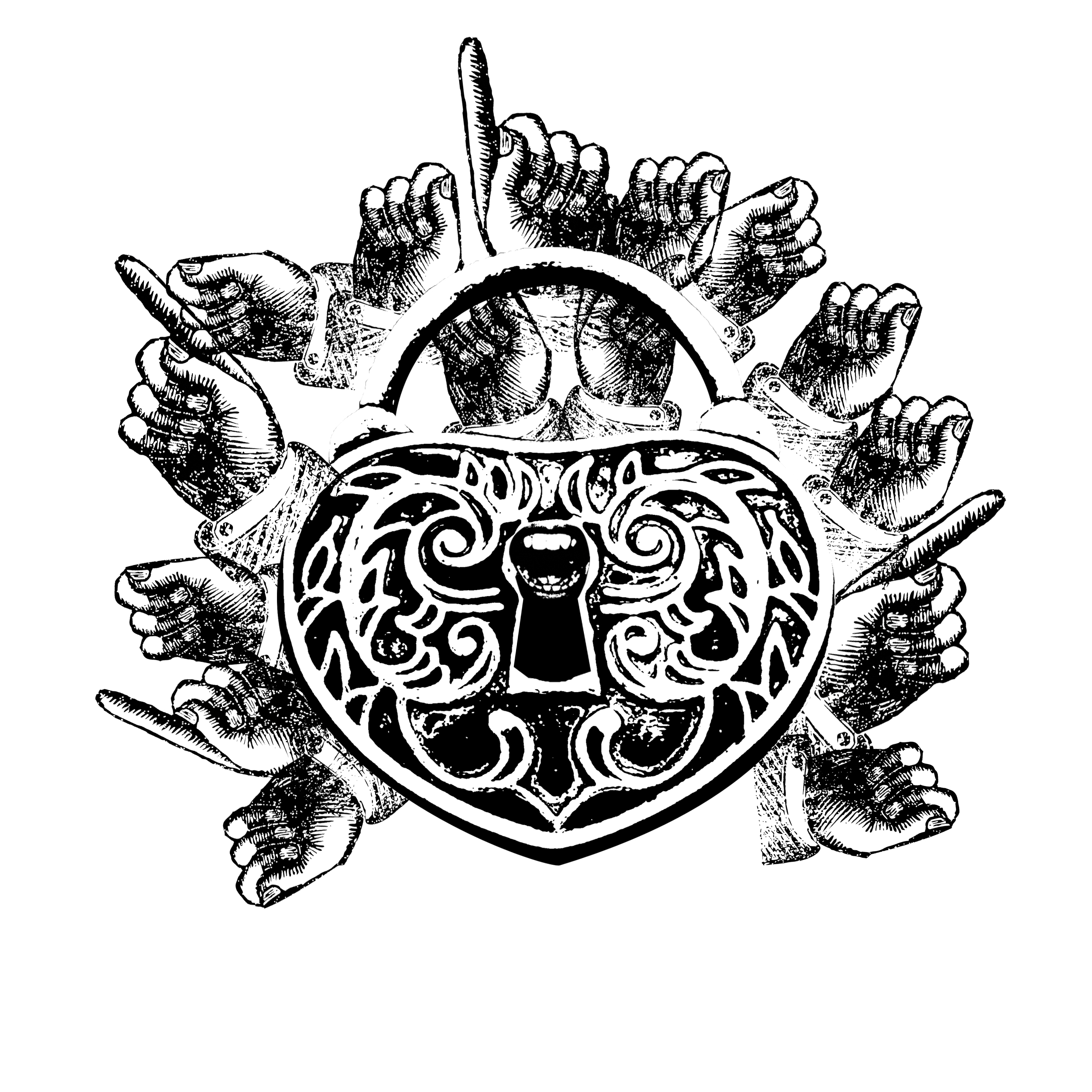
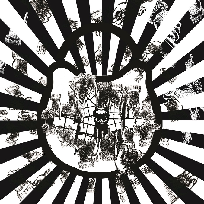
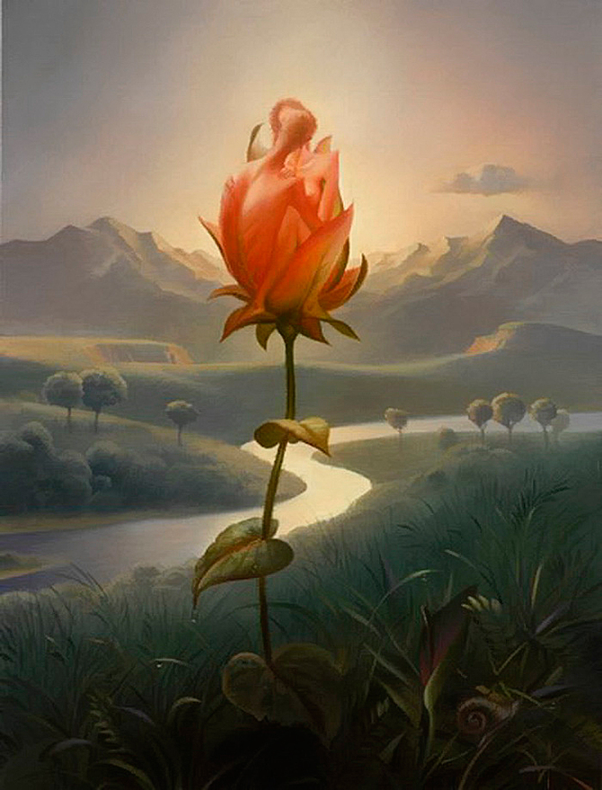
The blooming, luminous flower that cannot be reached by the dark hands. The hands represent negative influences, trying to drag the flower down but are failing. The ideal state is where the flower cannot be touched like the picture. Surrealism artist Vladimir Kush was referenced, regarding the use of the flower in his art and the scale.
References – Vladimir Kush
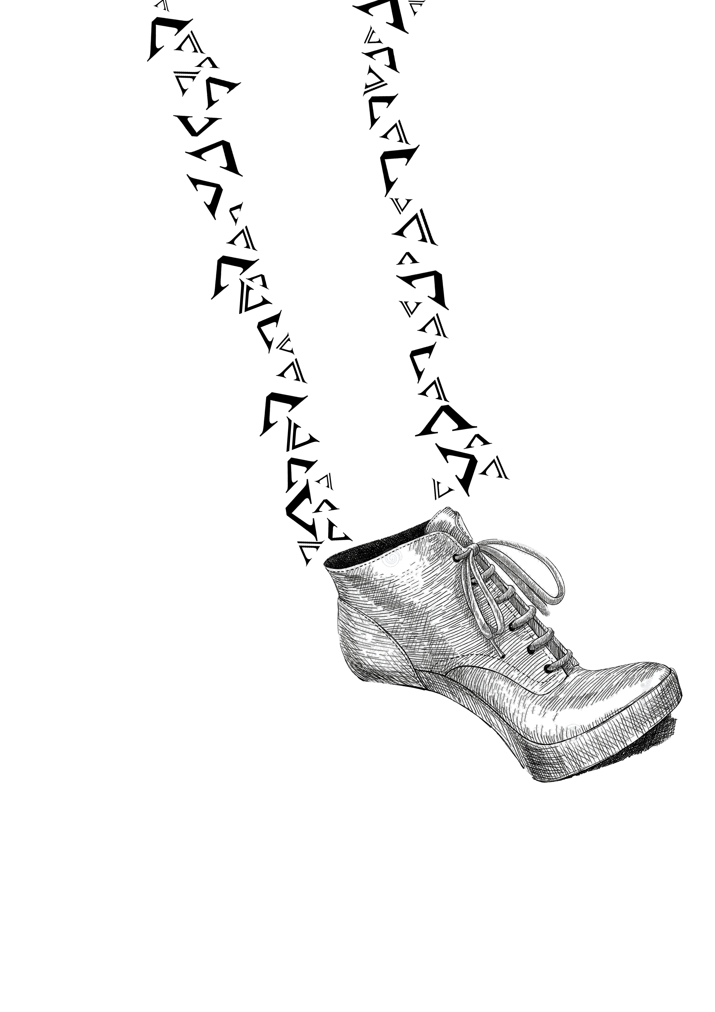
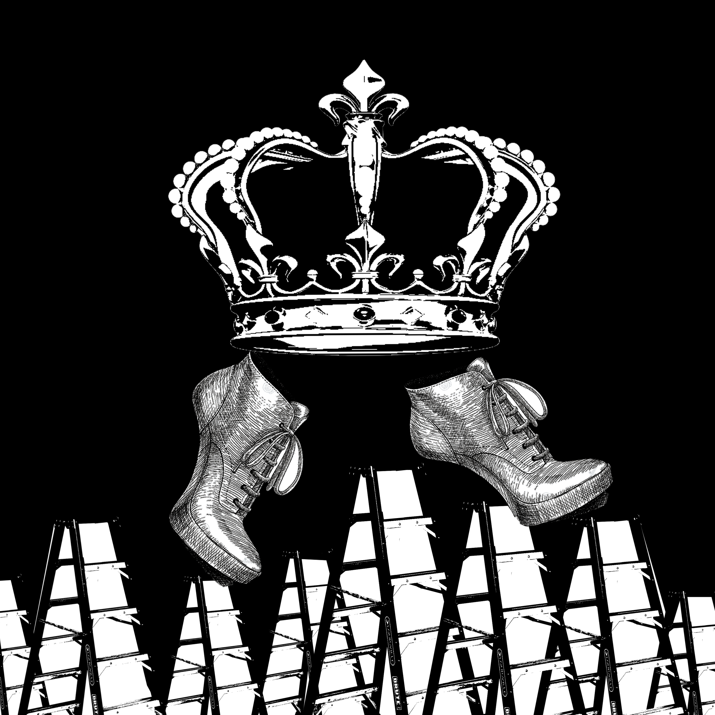
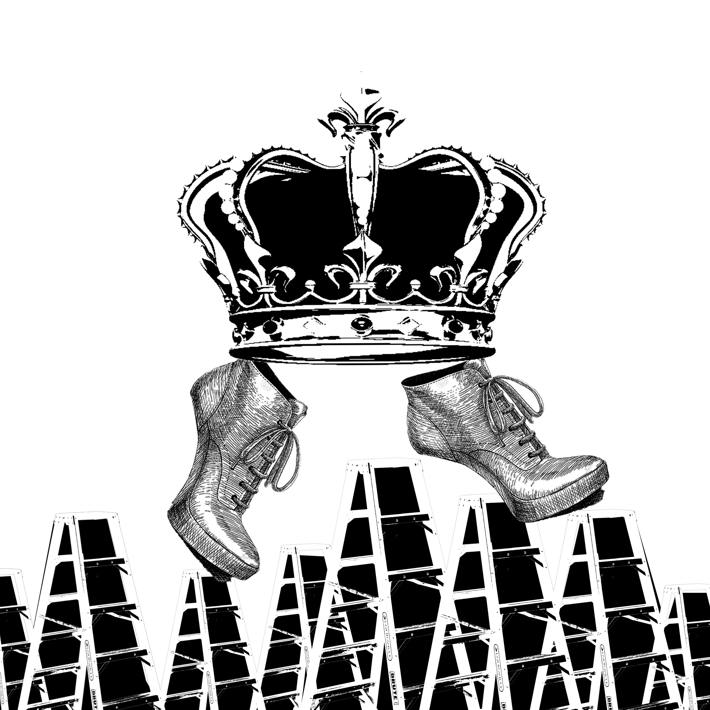
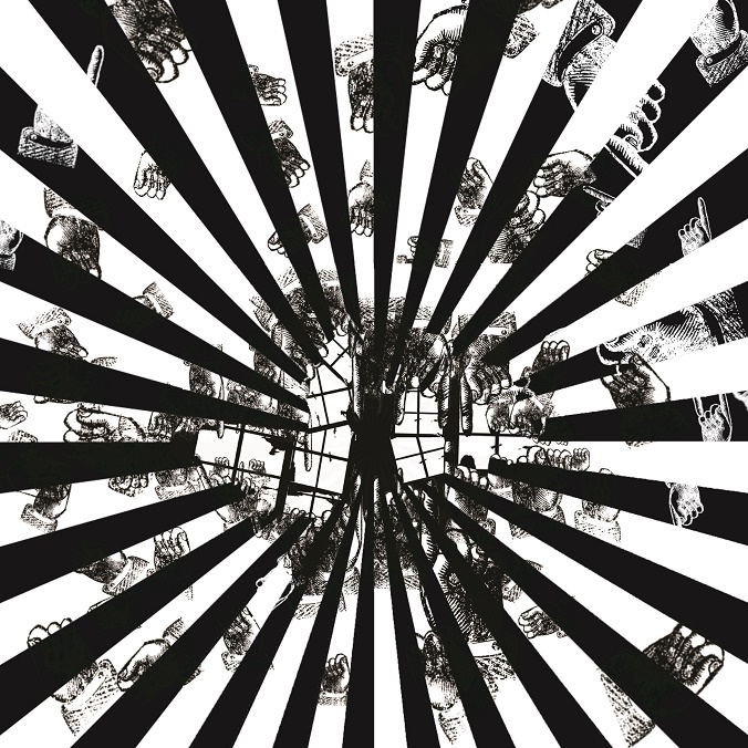
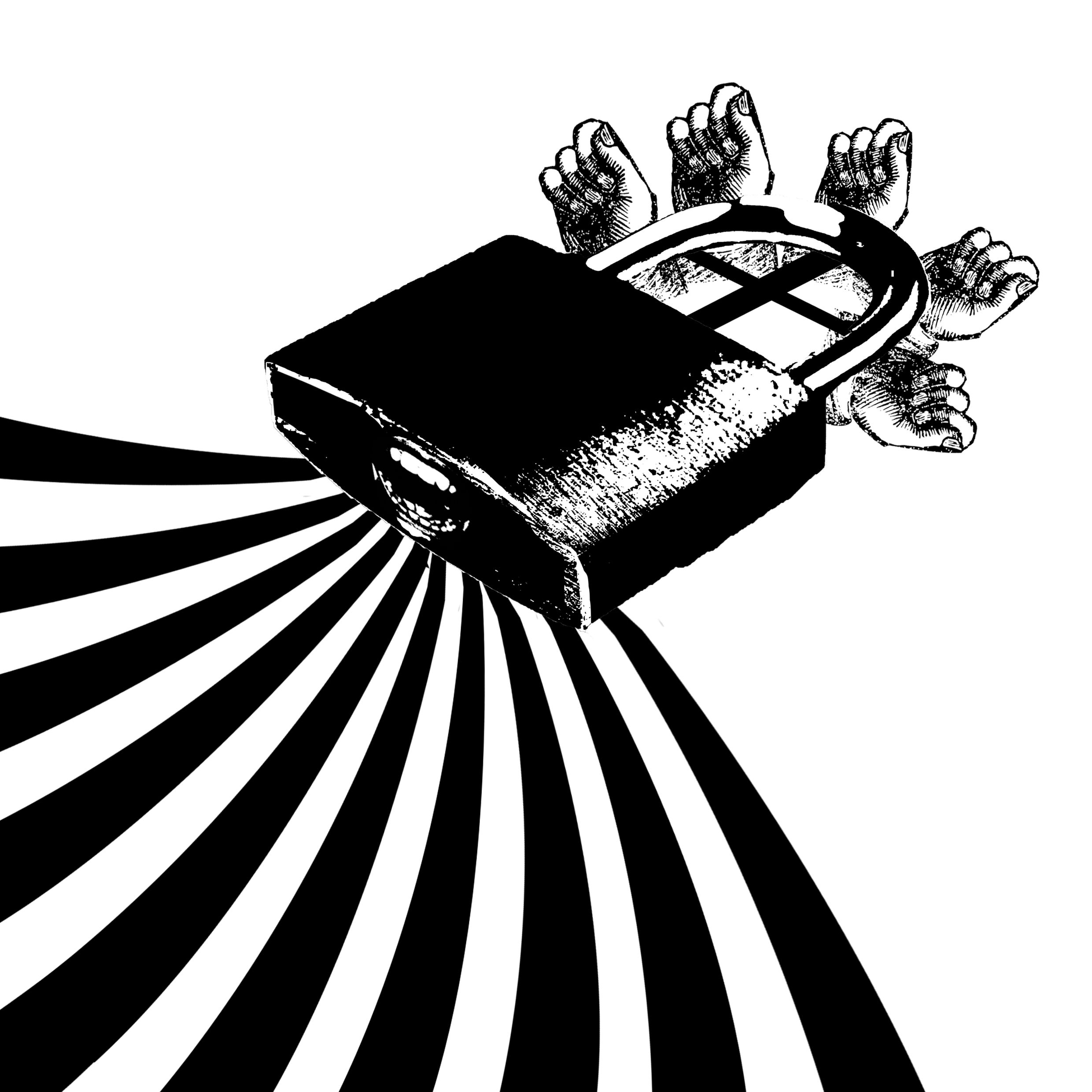
Think out of box
Cover
3D card

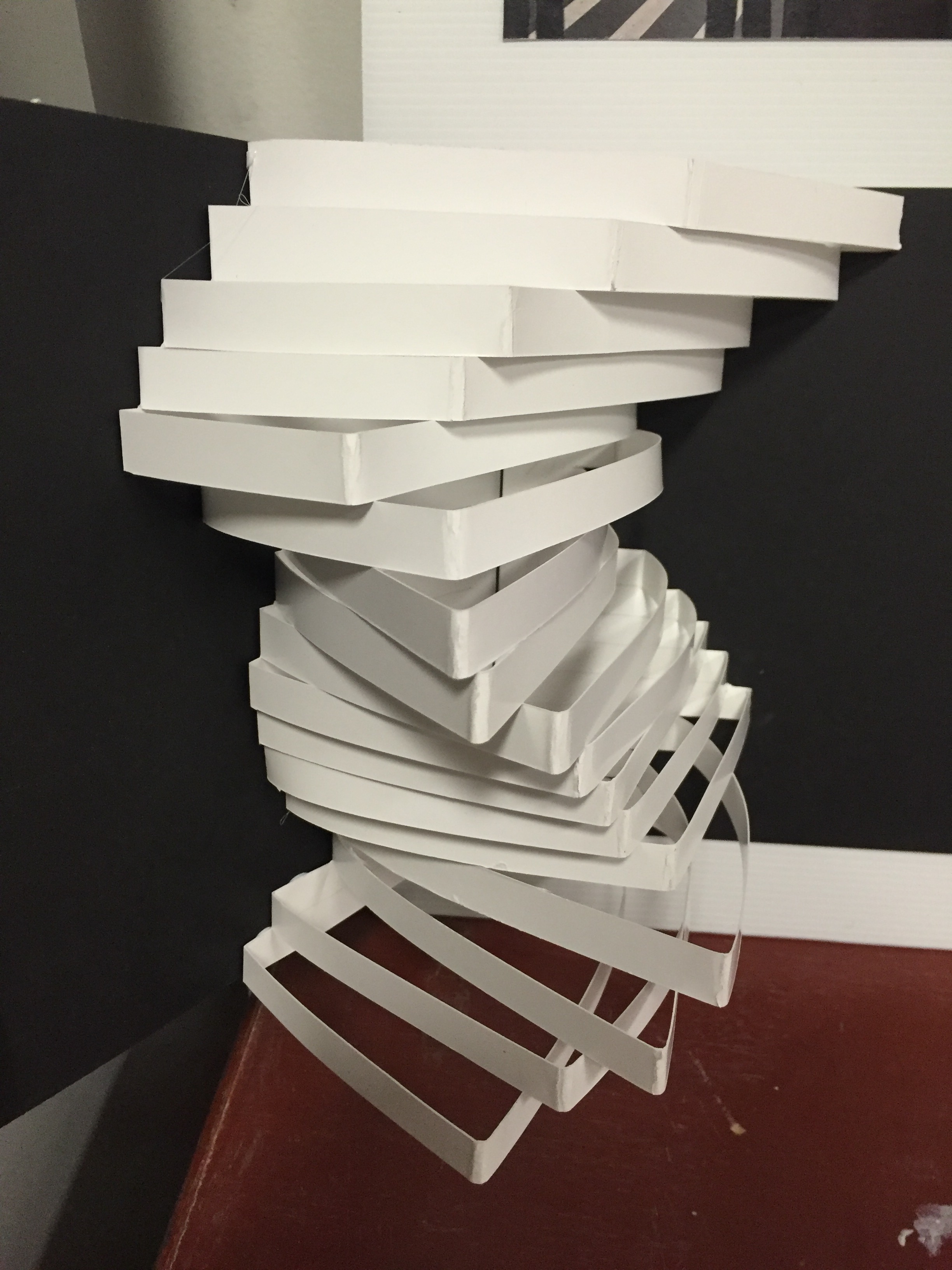
The idea behind this was to think, literally out of the box. The cover had the strips representing the lines inside the card. Once the card is opened, it is as if the strips come out of the box. like thinking out of the box.
References
Paper pop-up art

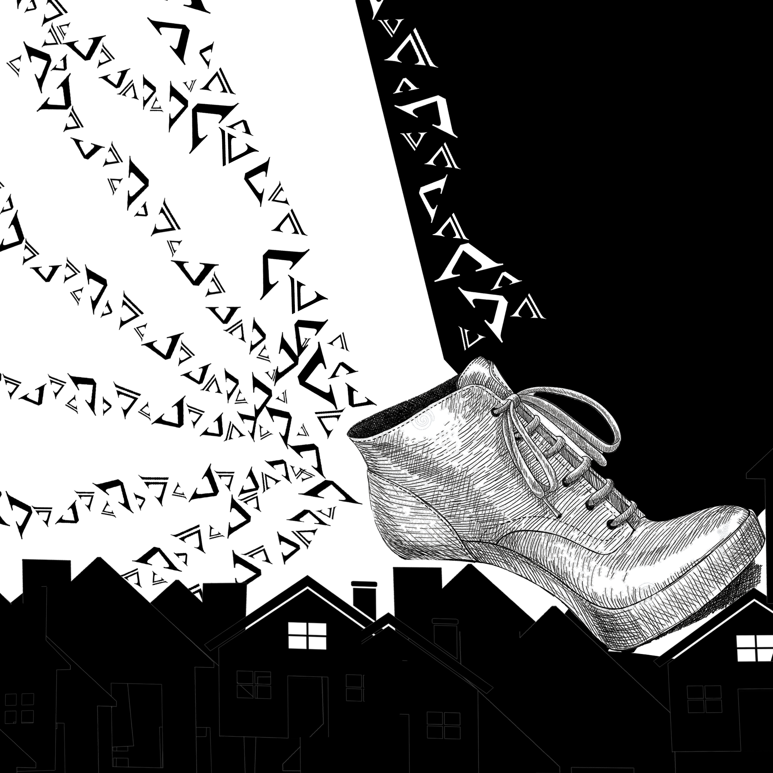
Dreamer
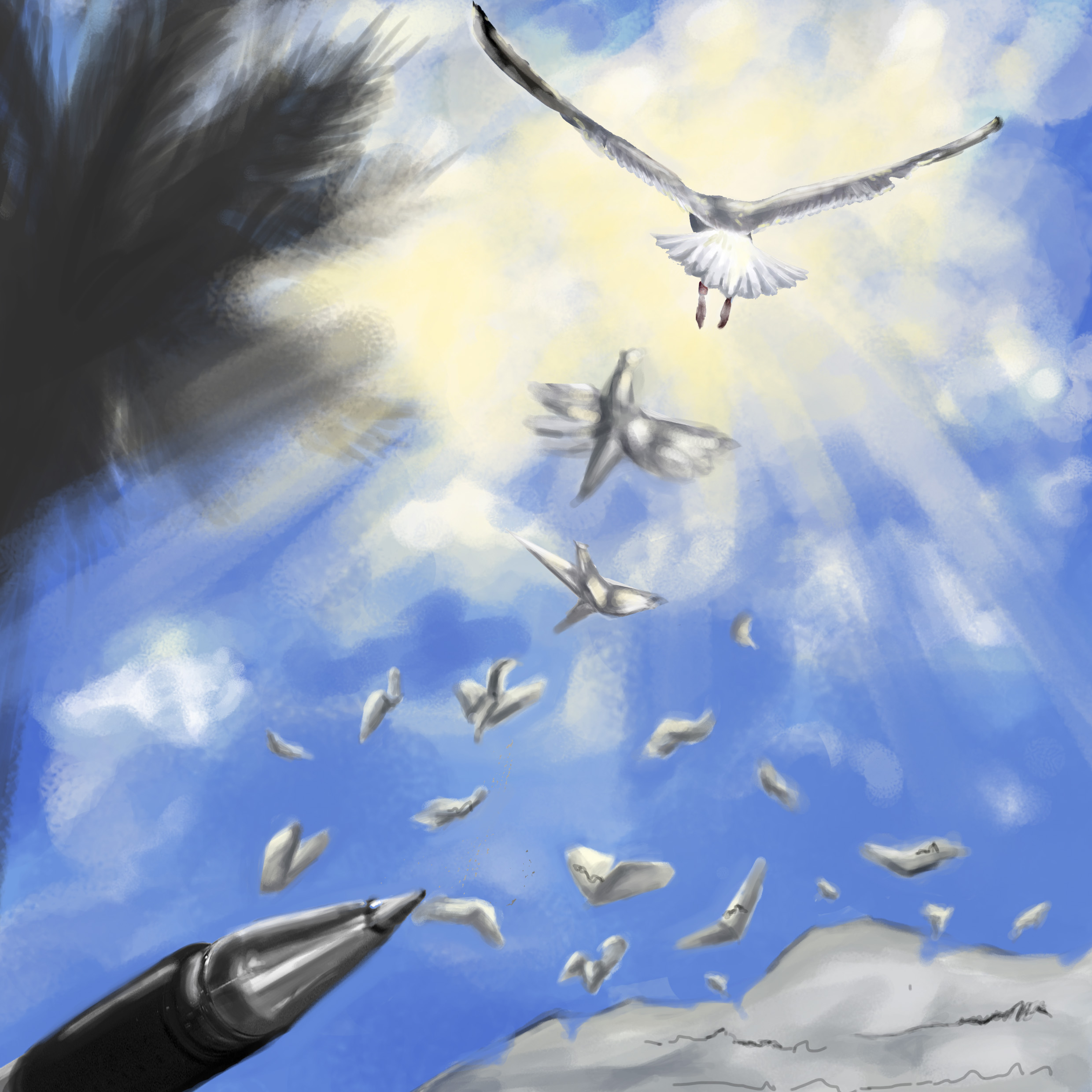 The paper pieces turning into the birds represent the manifestation of ideas/thoughts from thought to reality. Surrealism was referenced to once again, give a fantastical feeling to the work and create impossible situations that make the work more interesting. This represents transformation from dreams to reality, birds were used as symbols of flight and hope – thus ambitious dreams that come true.
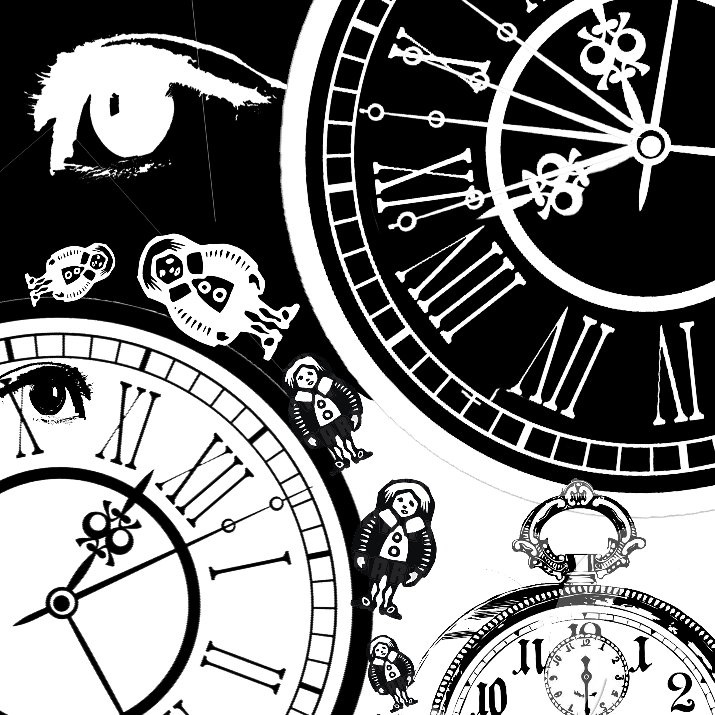
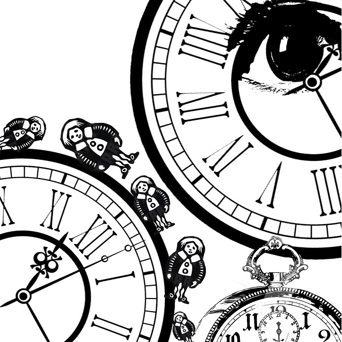
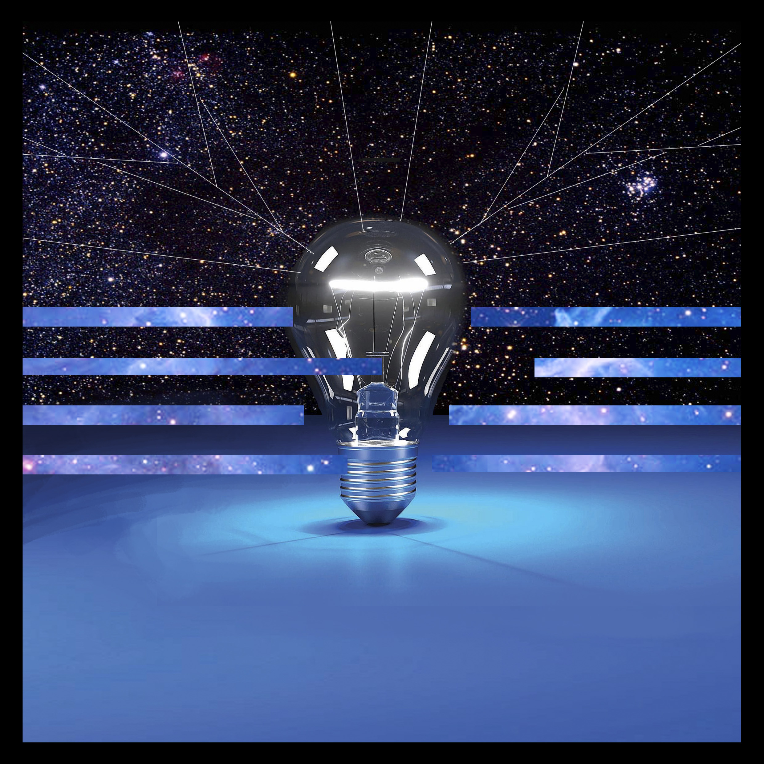
Me in 5 Years
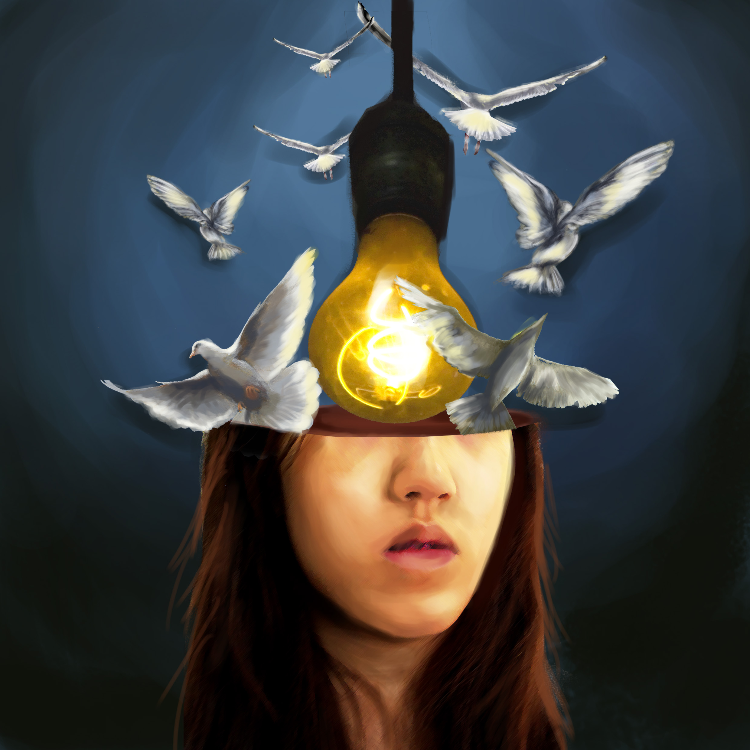
Combining both of the ideas of the birds as the realisation of dreams and light bulb as ideas, I decided to approach a surrealist style to this work too. The light bulb is like the idea generator and the birds are flying out of my head, once again literally out of the “box”.
References
Reflection
This assignment was very introspective and fun, allowing us to think what aspects of ourselves we would like to show. The challenge was coming up with visual ideas that would intrigue others and convey the idea well. It was a fulfilling assignment that really helped me to push myself in thinking creative ideas to communicate.