MID-TERM PROJECT – SPEEDY ECKY SMASHY (SES)

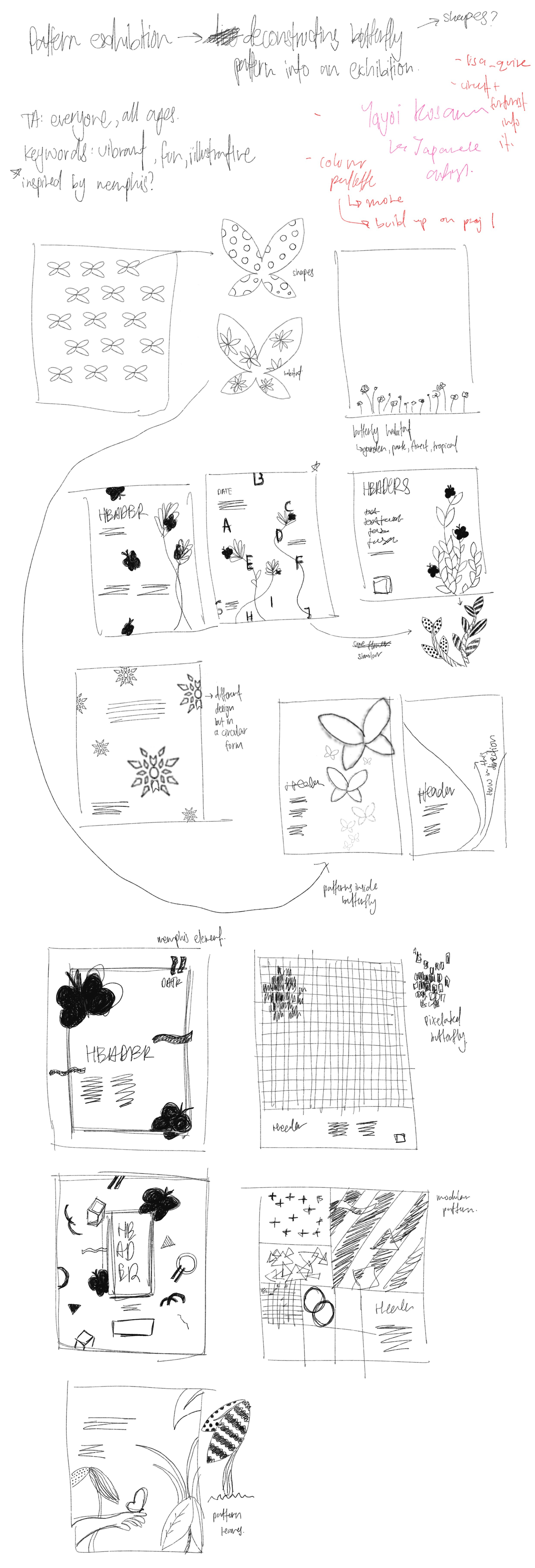
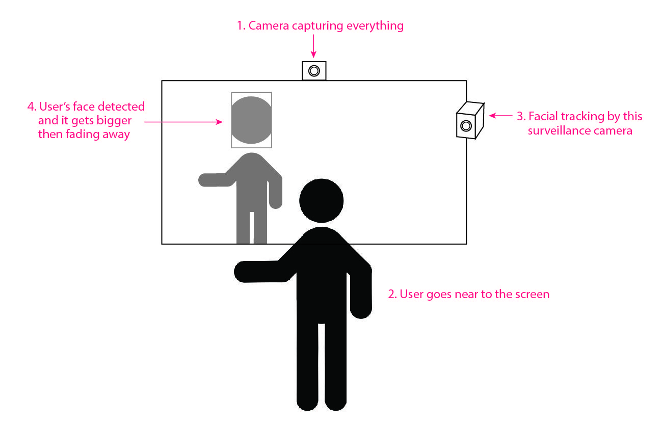
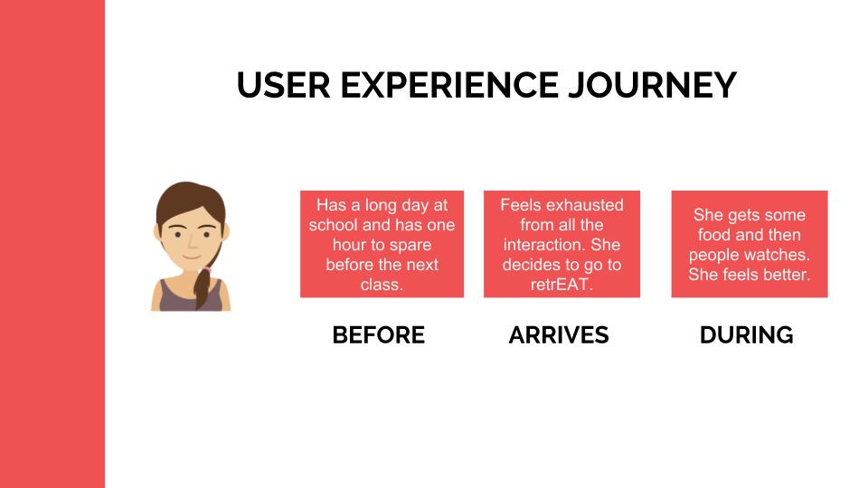
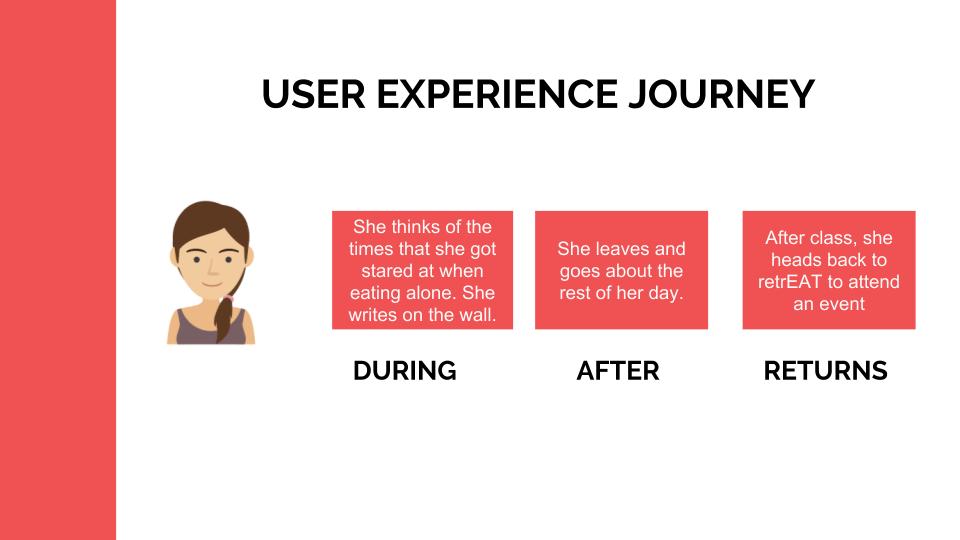
Initial Sketches and Ideas

Azizah’s initial sketch

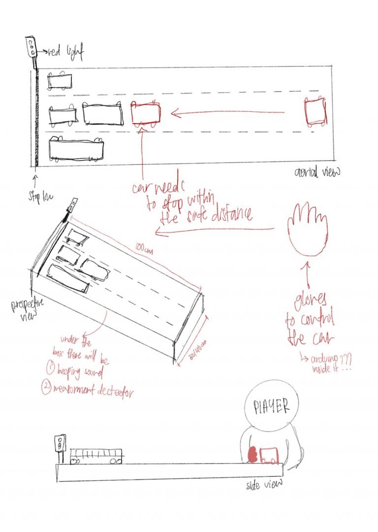
Azizah: My initial concept named Mind your Gaps was about keeping a safe distance before stopping. Player will wear a glove which control the movement of the car, and they will need to stop at a safe distance before hitting onto the car in front of it. I decided to scrap this concept as there was a lack of emotion, interactivity and take away in this interactivity.

Celine’s initial sketch

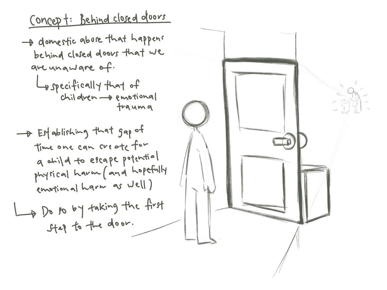
Celine: My initial idea was about child abuse behind closed doors. When presented, the idea of using a door had been already used so I decided to just not go with it. I felt that my concept was too niche and took a bit of explaining to convey to each and every person. While it was conceivable in the long run, I felt like it was better to just have it scrapped unless Azizah wanted to work with it, and we could just start thinking from a new and totally fresh perspective.

Speedy Ecky Smashy

Social class refers to a group of individuals who occupy a similar position in the economic system of production. Within that system, occupation is very important, because it provides financial rewards, stability and benefits like healthcare.

In Singapore, socio-economic status (SES) is divided into 2 parts: High socio-economic status and Low socio-economic status, according to Complete Guide To GCE O-Level Social Studies Volume 1. SES is a combination of social and economic statue to determine the social standing of a person in Singaporean society.

Intention of interaction
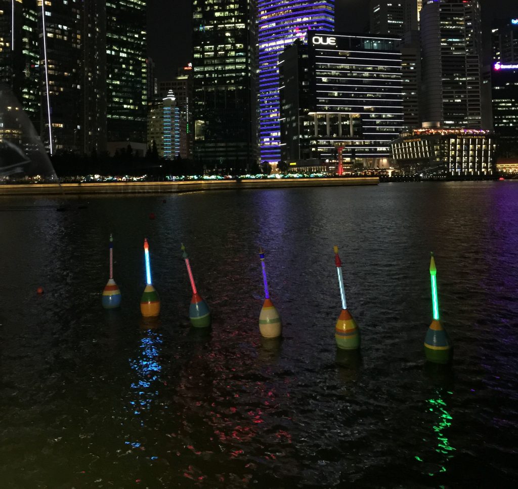
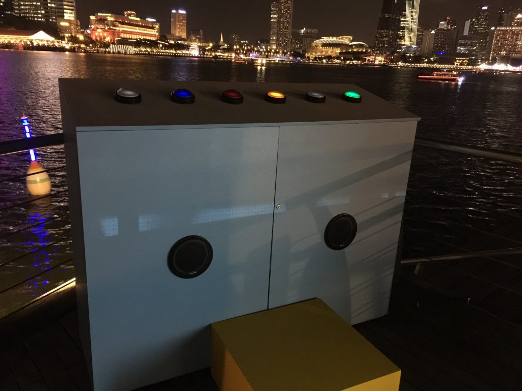
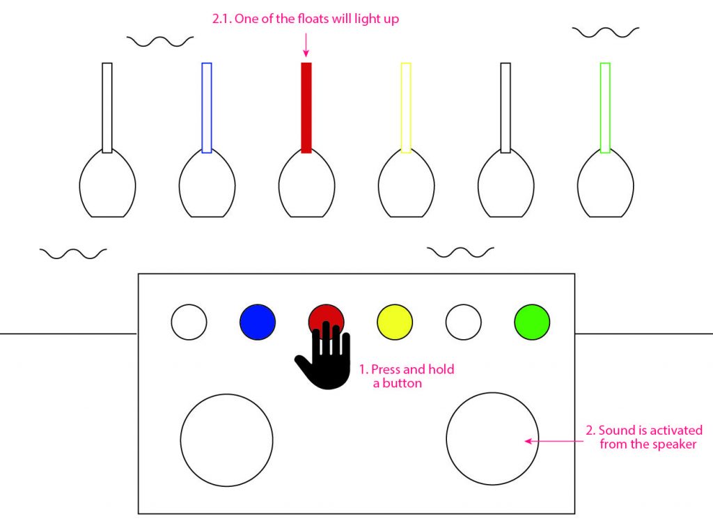
The audience will experience the interaction via button smashing, specifically as a competition. An example is Bishi Bashi Arcade. This game requires two players at a time.

Bishi Bashi Arcade
Sketch
Workflow

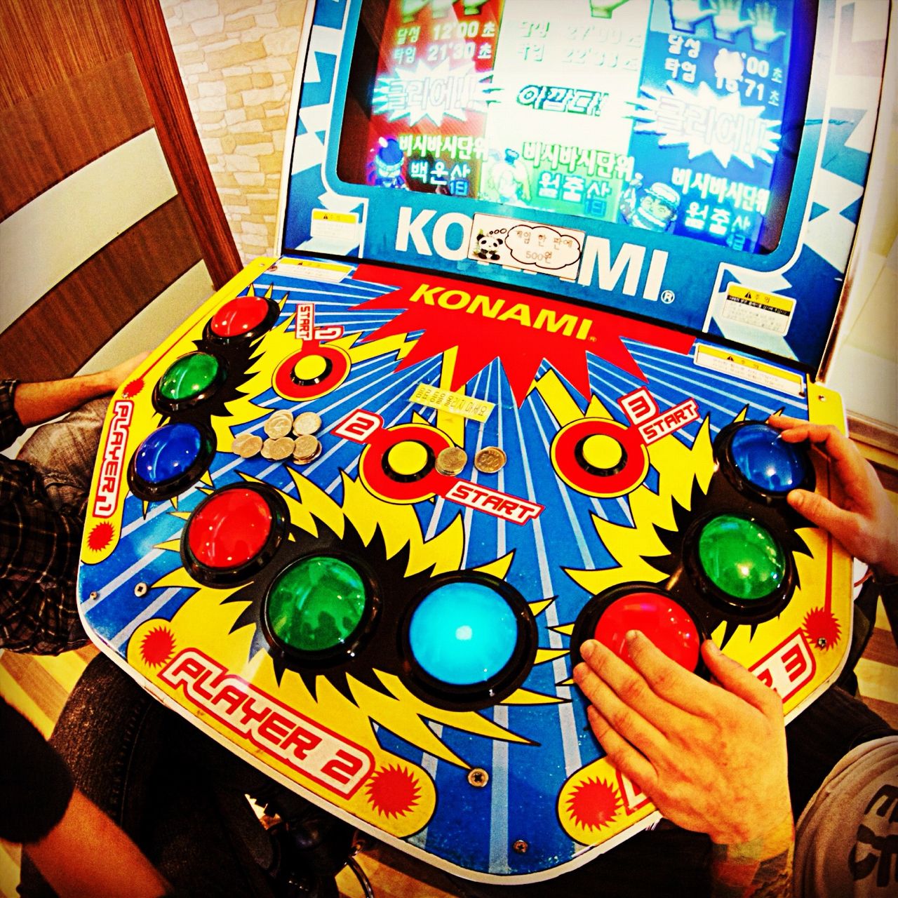
There are two buttons, one each for two players, and two scoreboards similar to that of a hammer-smashing arcade game. One button will be able to gain points at a faster rate than the other, even when both buttons are pressed repeatedly at the same rate.

This reflects the difference in efforts between people of a higher status to one of a lower status when it comes to working hard. Someone from a better socio-economic class might be able to reach a certain goal in their life (better salary, faster promotions, etc.) faster than someone of a lower socio-economic class, while sometimes the latter might not be able to reach that goal in life no matter how hard they try. Due to the huge gap in classes in today’s society, the latter is unable to move any higher and it shows the privilege the former class has in most situations.

The message that we are trying to send to the audience is that due to the huge gap between high SES and low SES, it might seem impossible for any of the lower class members to achieve anything without the right resources that the higher class is entitled to. Likewise, anyone who is not part of the high SES part of Singapore (the middle socio-economic class, specifically) are made to achieve goals similar to those of the higher class, while not enjoying the benefits that the higher class has.

Another point of interaction we wish to try is to be able to randomly decide which SES each player is before the game starts. This adds on a new layer that we do not get to choose what class we are born into.

Prototype

https://www.youtube.com/watch?v=8Wdoj4pqAcA&feature=youtu.be

Mid-terms Project Reflection

  1. What are the changes you have made to your project since your initial sketches?

Azizah: One of the majors changes we did was to change the whole concept to something that we both can relate to and also doable. A minor changes that we did for our mid-term was instead for using light bulb, we changed it to the LED bulb which was easier for us to manage it.

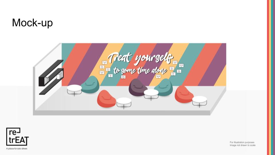
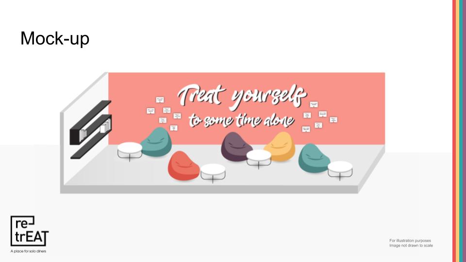
Celine: There were many changes, but one would be changing the concept entirely. We thought of many problems that were relatable in both of our lives, and eventually agreed on the gaps and unfair life between people with privilege and those without. Initially, there was the idea of using a hammer-smashing game to represent the current concept, but that would leave the interaction too short and unmemorable. I then decided to change it to a button-smashing game, which would make the participants work hard for the intended understanding of the interaction. There were also changes to the dimensions of the project. My initial idea was to create a huge life-size arcade game, but with general limitations (aka budget), we made it smaller and desk-sized.

2. What are some users feedback you have incorporated into the reiteration of your project from the body-storming and mid-term user testing session?

A: Previously from our body-storming lo-fi prototype, one of the main issue was that there was no emotions during the interactivity, hence no experience created for the participant and there was no take away from the interactivity. To tackle this issue, me & Celine decided to think through our concept and interactivity, making it easy and relevant for the participant to understand and have fun in the interactivity.

C: Most of the interaction during body-storming lacked purpose and was too short for any sort of experience to be taken away. It mostly made participants confused, and lacked a narrative for them to be immersed in. We decided to create a narrative based on our own experiences of unfairness in the societal system, by creating a rigged system that essentially evoked the emotions of “Hey, that’s not fair.” and was helpless in changing the situation. During our mid-term user testing, that was a common comment made, and I felt like we have partially done our job. We just had to strengthen the narrative now, to make sure that people understand the concept better.

3. Where do you think your interactive project will fall on the continuum of interactivity? Why do you think this is the most appropriate mode of interaction for your participants or audience?

A: I would say somewhere between 50-60% because both participants are having more fun competing against each other instead of smashing the button. Our button smashing game might be an appropriate mode of interaction, because there is a comparison going on in the game. However it needs more improve to link to our concept of SES, such as having some money related game into it.

C: On the continuum of interactivity, our project would be around the 60% range. As mentioned by Azizah, participants have to compete and that creates fun and competitive behaviour between the two participants. To press the button is interactivity, but to know that they have to press the button repeatedly for a long period of time AND to compete against another was perceived after they had started interacting with the button the first time, even without prompting from us. It is appropriate as there is an effort to fight the other in a quest to “win”, and by not receiving the imagined results from their efforts, they will feel a sense of disparity.

4. Apart from responding to the user, does your interactive piece include elements where the content change over the amount of time your user has been engaged?

A: Currently the only change that we have is the more number of button being pushed, more lights will light up and it will get higher.

C: The LED lights will light up in sequence depending on how many times the button is pressed. However, the button press counter for each machine is different, and one machine will only light up after it is pressed way more than the other.

5. Based the diagram above, which characteristics does your interactive project fall under? Explain why these characteristics can be used to describe your project.

A: User has a limited role → User can only smash the button observe their level of lights, and interact with their competitors. Constant element providing continuity → which is used in smashing the button then lighting up the lights.

C: User has limited role (can only smash button) → Intuitive selection/result relationship (intuitively decide its a competition, decide if they want to continue) → Constant elements providing continuity (smash more, more lights light up) → Linear selection; no variation permitted; routes defined (only two ends to this experience)


Project 2 – Sketches

Sketches

Keywords: Fun, Vibrant, Patterns, Illustrative, Playful

References – Inspired by Memphis & Yayoi Kusama

Audience: Everyone of all ages

Call to action: Invite audience to come to this exhibition

Visual Spectrum: Fun, Casual & Vibrant

Project 2 – Mindmap & Moodboard

Hello there!

For project 1, I picked butterfly to be my animal and I will continue using butterfly for project 2 too.

MINDMAP

Below is a mind map of things, traits and thoughts that linked to butterfly. There are 4 major topics: Patterns, Feminine, Growth and Butterfly effect. The ones that are circle in pink are topics or themes that I am interested to work on.

Mindmap of a Butterfly (images taken from Google.com)

MOODBOARD

The 5 keywords that describe my project are: Elegant, Vibrant, Illustrative, Simpe & Subtle. So overall, what I had in mind was the concept of females such as feminism, women empowerment or breast cancer. Hence I created 3 similar yet different moodboard, as I was unsure if I am able to change it in the later part of this project.

Moodboard 1

Above is my most favourite moodboard among all 3. It has the power vibe into it yet it is not striking because the pink and nude colours that help the red to tone down.

Moodboard 2
Moodboard 3

Moodboard 3 has this subtle, soft look to it yet edgy (maybe because most images are product or architecture). But if I were to pick now, most likely I will pick Moodboard 1.

Mind Your Gap (Azizah & Celine) – Project Development Body Storming


Take 1 starts from 0:03

Take 2 starts from 1:00

  • What did you learn from the process?

Due to the instructions being unclear on our part, the tester was unable to gauge how the car would be affected by them wearing the glove. There was no connection as we did not react fast enough in creating the right environment, but even then, the only result would be the car moving forward. It creates a lacklustre experience for the user, and they are mostly unclear of their purpose in this installation. There is no emotions evoked from this experience and there is nothing much to be taken away from it.


  • What surprised you while going through the process?

Firstly the comment given by the tester about using the gloves to control something, makes the tester  feel like a god which allows her to control the movement of the object just by moving her hand.

Secondly, not many people know the concept of tailgating, especially if this is an installation that is supposed to be meant for all ages to participate in, younger participants will not be able to understand the concept behind it.

Thirdly, when participants interact with the game, they might not find it engaging and immersive. This is due to the limitation of the interaction, which only requires the participant’s hand to move forward. In interactive media, one needs to be able to engage with the object/game/installation, making it fun or having a concept that is deep enough to be in engraved in people’s minds.


  • How can you apply what you have discovered to the designing of your installation?

Upon reflection, we have decided to think of a new concept that would be more clearer (in terms of instruction) and engaging from the participant point of view. We will also put in mind the intention of the interaction when developing our concept so that participants are able to understand the message that we want to convey.

Mind Your Gap – Ideation

Synonyms of Interstice are space, gap, interval etc. From my understanding, Interstice means an insignificant gap between two objects. Hence I relate it to the gaps between two cars. 

Concept:  

As a newbie driver, I often experience driver tailgating me or stopping their car closely to mine. And as a newbie driver, I tend to stick to the rules that was thought which is to keep a safe distance when driving or stopping.

Title: Mind your gap

Hence I wanted to put this experience of mine into a game. Where player will wear a glove which controls the movement/speed of the car. There will only be one player at a time. The scenario of this game will be at a traffic light junction, the red light is on, and there are vehicles stopping at the stop line.  

Ideation sketch

Player objective is to stop within a safe distance with the vehicle in front of it. They will wear a glove which has sensor that connect to the player’s car. This is to allow them to control the speed of the car. Players will get to choose their lanes and after one player have finish their turn, the next player gets to play. 

To measure the safe distance, there will be beeping sound. The nearer the player’s car is to the vehicle, the beeping sound will be louder and faster. So there will be sensor under the ‘road’ to track the how close is the player’s car to the vehicle in front of it. 

Reference: https://www.hackster.io/the-tactigon-team/arduino-powered-robot-controlled-with-the-tactigon-6af037

My initial idea was something to do with blinking, because blinking is consider an insignificant gap for our eyes to rest. Blinking is an involuntary action which I’m interested about. However blinking can also be considered as voluntary action, when we decide to control it. Hence, here is a rough sketch of my initial idea that I’m going to discard it away :( 

Research Critique 2 – iLight Singapore 2019

Facey Thing

Walking along Marina Bay waterfront promenade with my friend, we spotted a crowd of people standing in front of a huge screen. The kaypoh singaporean in us started to arises, so we joined in the crowd. It turn out that people were trying out the interactive installation titled Facey Thing.

Facey Thing is an interactive installation where the screen will capture all the passerby walking pass the screen. However, it will only detect faces that near the screen. In other words, as you come nearer to the screen, your face will get detected by the camera and your face will be blown up on the screen then it fades away. 

Our faces blown up on screen
Anatomy of an Interactive System for Facey Thing

Our experience: A big screen with people crowding around that area > Join in > Face was not detected > Gets nearer to the screen > Face gets detected = Happy Us! 

Facey Thing is a fun and satirical celebration of the coming together of selfie culture and universal surveillance to create hyperreal simulated images of ourselves through the art of play.” 

Through the description of the installation, it reflects our tech savvy world where selfie culture and universal surveillance are widely and commonly use. Most of us had taken selfie of ourselves or as a group (as known as wefie), then posting it on social media. To me, social media such as Facebook and Instagram is also a form of universal surveillance., other than CCTV. People from anywhere can observe us just by clicking into social media or even Google-ing our names. This can also be a link to stalking. 

But through the interactive installation, it does not show the negative part of universal surveillance, which is staking. Instead it uses it as a form of playfulness, where people come and have fun without thinking about the cons of universal surveillance. 

More information here: https://www.ilightsingapore.sg/Discover/Installations/Facey-Thing


The Floating Lighthouse 

As we walked down the Marina Bay waterfront promenade, we spotted another interactive installation titled The Floating Lighthouse. 

Floating objects

6 floating objects are places on the water. User will have to press and hold the button, at the control centre, to active the sound that complement with lights on the floating objects. Each button is connected to 1 float, by pressing and holding onto all 6 buttons it will create an overall symphony as one.

Control centre
Anatomy of an Interactive System for The Floating Lighthouse

The intention of this work is for the user to press the button to activate the sound. However different button has different sound. 

  • Press any 1 button: To activate the sound of one float 
  • Press any 2 to 5 buttons: User are able to create their our own symphony
  • Press all 6 buttons: There will be an overall symphony

More information here: https://www.ilightsingapore.sg/Discover/Festival-Map

Reflection  – As compare to both Facey Thing & The Floating Lighthouse, Facey thing is more interactive as it include audience into the work. For the The Floating Lighthouse, the music and lighting are all given which gives audience a limited choice to interact with. 

Research Critique 1 – Interactivity

Project: Facebook (2019)
Designer: Lim Si Ping (Handson)

“With the proliferation of social networks and data tracking, the wisdom of computer algorithms and surveillance mobs has been elevated over the locked-in immortality of individual.” – Handson

Facebook (2019), an interactive book that was designed by Lim Si Ping (aka Handson). As you browse through this interactive book for the first time, the camera uses facial recognition to pair your profile with data tracked through search engines. The book draws a back-end algorithm and fills in the blank of the narrative with your name, age, gender, location, and birth date. With a turn of each page, the story unfolds, making you the protagonist of this story. 

In previous lesson, we discussed that reading is a form of interactivity. However it is a low degree of interactivity in terms of participation, control, etc. As compare to Facebook (2019), this interactive book injects user into the narrative plot, allowing user to participate as a protagonist and creating a storyline based on their personal data that has been publicise online. Both the normal book and the interactive book has similar control such as flipping the book. However the outcomes are different. For a normal book, the outcome of the story has been guided by the narrative. But for the interactive book, the outcome changes depending on the user and data that has being gathered, creating their own unique narrative. Hence, for the interactive book, audience have control over the outcome of this interactive book, unlike the normal reading. 

In short, 

  1. Why do I find this artwork or project intriguing? Because each person who interact with Facebook (2019) will have their own narrative based on their personal data that has been publicise online. 
  2. What is the situation or interaction created for the viewer? Firstly, there will be a facial recognition to pair your profile and data tracking through search engines. Then user will start to flip the pages. As they flip a page, they will be reading about themselves.
  3. What is the intention of this interaction? Allowing user to be real-time protagonist of the story, and to see how their personal data can be found easily online. 
  4. What is the role of the viewer? Interact, read the book and find themselves as part of the story. 
  5. Who has control over the outcome of the artwork or project? Is it the creator / artist or the viewer/audience? Audience!

Project: Pulse Index
Designer: Rafael Lozano-Hemmer

“We live in an era where a fingerprint lets you into your country, or it lets you into your phone,” says Rafael Lozano-Hemmer “But how can we pervert that? How can we misuse these technologies of control to create connective, poetic or critical experiences? That’s what this show is about.” (refers to Pulse Room exhibition) 

Pulse Index, is a biometric installation which is part of the Pulse Room exhibition. In this installation, it records participants’ fingerprints and heart rates at the same time. The piece displays data for the last 10,925 participants, and it creates a spiral room of skin.

To participate, visitors will place their finger into a custom made sensor equipped with a digital microscope and a pulsimeter. Their fingerprint will then immediately appears on the largest cell of the display, pulsating to their heartbeat alongside the heartbeats and fingerprints of others. As more visitors try the piece, one’s own recording travels sideways and is reduced in size until it disappears altogether — a kind of memento mori. 

“We call it a memento mori, because it’s just a reminder that we’re here for just a little bit of time,” says the artist.


I find this project intriguing because of the concept behind it — Heartbeat as an involuntary action & Participation of audience. 

Heartbeat as an involuntary action

Rafael Lozano was inspired by the ultrasound of his twin babies during his wife pregnancy, and how it will sound when both babies heartbeat are heard at the same time. In one of his talk, he mention that heartbeat is something that we can’t control, it is these involuntary spasms that makes it beautiful. With this, my take away from his work is that interactive media project does not only applies to voluntary behaviours, such as raising your hand, walking near or away from it. It can also be something involuntary such as blinking and breathing.

Participation of audience

Lozano-Hemmer’s work depends on audience participation to exist. It is a crucial part in making the work interactive, and to encourage public to be part of the art and reflect on the unavoidable and playful technological experience. Since his earlier works, he has been incorporating audience and allowing them to contribute into his work. An example of his earlier work is Vectorial Elevation, 1999, which allows audience to design their own light sculptures and it will be executed real life in Mexico City. For Pulse Index, audience is needed to create a whole display which consist of fingerprints and the sound of our pulse. Each audience plays a role in activating and developing it to create memento mori effect. Without the participation of audience, the work would not exist and develop. Hence it would not be an interactive work. 

In short, 

  1. Why do you find this artwork or project intriguing? Because of the concept behind it Heartbeat as an involuntary action & Participation of audience
  2. What is the situation or interaction created for the viewer? A small device for audience to insert their thumbprint and it will record their heartbeat, the projecting it into a large screen with other people thumbprint and heartbeat.  
  3. What is the intention of this interaction? It is about the collaboration between audience 
  4. What is the role of the viewer? The role of the viewer is to make the work exist and develop from there. 
  5. Who has control over the outcome of the artwork or project? Is it the creator / artist or the viewer/audience? Audience, a lot of them! 

Questions:

  1. How are both projects differ from each other? 
  2. In Pulse Index, does memento mori serve as a limitation? 
references:

https://www.designboom.com/art/handson-facebook-interactive-facial-recognition-book-story-01-18-2019/

http://hellohandson.com/work/facebook/

https://www.designsingapore.org/modules/design-news/catching-up-with-designsingapore-scholar-lim-si-ping

https://www.straitstimes.com/singapore/designsingapore-scholarship-helping-singapore-develop-into-a-leading-hub-of-excellence

https://www.smithsonianmag.com/smithsonian-institution/this-art-show-is-taking-the-literal-pulse-america-180970738/

http://www.lozano-hemmer.com/pulse_index.php

https://hirshhorn.si.edu/exhibitions/rafael-lozano-hemmer-pulse/

http://manchesterartgallery.org/exhibitions-and-events/exhibition/recorders-rafael-lozano-hemmer/

https://www.thenational.ae/arts-culture/art/art-dubai-pulse-corniche-artist-is-back-with-another-pulse-related-art-work-1.84752

MANIFESTO

Background history

In the past few months, I realised that some of the projects that i did were to please my classmates and professor through the aesthetic of it. Sometimes I tried too hard and went over broad in creating something beautiful for their eyes. But I don’t feel the sense of enjoyment while doing it. Hence, I felt that my work does not represent who I am. 

Vision statement

Through this manifesto, it serve as a reminder for myself (as a designer) in what I truly believe in design. In short, my values as a designer. 

Manifesto of my values of a designer
  1. I will enjoy the process of my own creation. 
  2. The works that I’m doing must be something I’m passionate about. 
  3. Works online and offline serve as an inspiration for me, not to copy. 
  4. It’s ok when my work get rejected at some point of time, just redo it or bullshit throughout it.
  5. When nothing goes right with my design, I will turn left and take a break. 
  6. I will NEVER force myself in designing! (cause I make crappy things out of it)
  7. But sometimes, good ideas comes about when I force myself.
Manifesto of my call to action

Each individual are unique and they have their own values towards design. They might not be 100% agreeable with my values and I’m ok with that. But at some point of time, I hope that designers take some time and reflect upon themselves and their values. 

Why I use Memphis art movement?

“In the eyes of the memphis group members, modernism was lack of personality and individualism.”

This relate back to the background history of my manifesto where my work does not represents my personality. 

“They break the rule of modernism, free themselves and opened up to new experiment.”

In my manifesto, the last 2 lines are contradicting to one another. This shows that I have set certain rules for myself, but at the same I’m free to break, remove and add in more rules and value into my manifesto. As I grow as a designer, there will definitely be changes to my values

Group 4 | Test & Feedback

When we were testing our prototype and concept to our target audience (students), we started by introducing them what is introversion. So we started with this question: Have you ever felt a little tired by the company of your friends and the people around you? That’s the introvert in you!

Then we state our problem statement: NTU students with a degree of introversion need to be able to express their introversion without being disturbed when eating in school and without being judged by their peers. 

With the feedback given, we started to input some visuals into our prototype.

Above images shows the same layout with different designs. We couldn’t decide which design to go with, hence we decided to open our questions to the class. Most of them preferred the colourful background, but not lines and change of colours.

We also showed a 3D rendering of the space, done by Glenn. 

After our presentation, the main concern was dialogue behind our space and how we could create awareness about introversion to the extrovert students.