For our final project, we chose to create a provocative object to address the ethical issues in contraceptive justice.

IDEATION
The invention of the birth control pill was a significant milestone in the women’s rights movement. Since then, other long-acting, reversible contraceptives have been developed for women, and women now have a total of 11 methods to choose from, including barrier methods, hormonal methods, and reversible contraceptives. In contrast, men only have 2 options—male condom and vasectomy—and neither are hormonal methods or reversible contraceptives. The disparity between the number and types of female and male reversible contraceptives is problematic for at least two reasons: first, because it forces women to assume most of the financial, health-related, and other burdens of contraception, and, second, because men’s reproductive autonomy is diminished by ceding major responsibility for contraception to women.
Women currently bear most of the financial and health-related burdens of contraception. On the whole, female methods tend to be more expensive than male methods and female methods have more severe side effects than male methods, as well, in part because various contraceptive methods for women involve hormones, while no methods for men do. Beyond the health-related and financial considerations, there are also nontrivial inconveniences and burdens associated with contraceptive use: dedicating time and energy to contraception care, feeling stress and anxiety about the taking the pills, the possibility of unintended pregnancy, and facing the social repercussions of contraceptive decisions and the possible moral reproach for contraceptive failures.

Women bear the majority of contraception responsibility and the burdens it entails while men have limited reproductive autonomy. We decided to design a pill bag resembling the birth control pills blister packs calls the attention to reconceptualise the responsibility for contraception as shared between men and women.

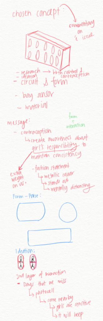
IDEATION DURING BRAINSTORMING
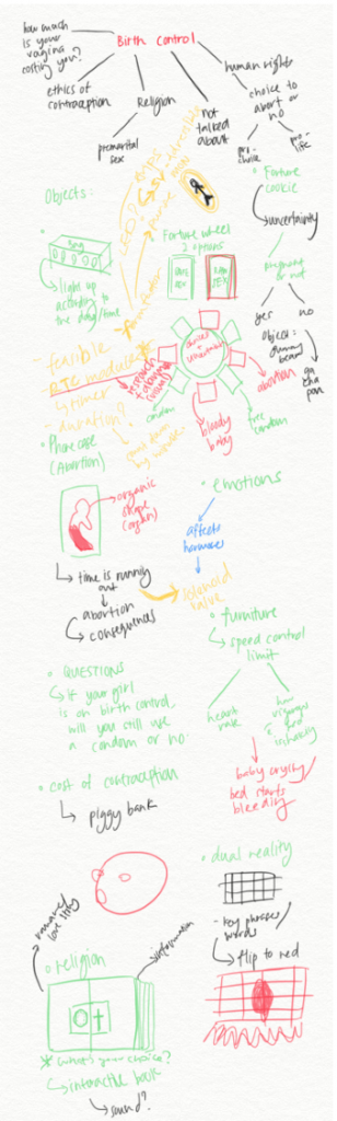
We developed 9 provocative object ideas address the ethical issues in contraceptive justice.
- Pill bag (Reminder bag for our users)
- Fortune Wheel (contemplating between between safe sex and raw sex)
- Fortune cookie
- Phone case of organ-like shape losing blood to show time is running out
- A piece of furniture that uses speed-control limit to remind people about the consequences of having sex
- Piggy Bank (Cost of contraception)
- Dual reality
- Interactive book (Religion vs. Contraceptive)
- Interactive artwork involving paint (Participants have to select which whether male or female should be responsible for taking contraceptive)
CHOSEN CONCEPT: PILL BAG (FIRST DEVELOPMENT)
How it works?
- Ring at 7am
- Alarm will be activated and LED light surrounding the pill on the embellishment will light up
- Alarm will stop once the pill pack is removed and placed back into the compartment. (Using photo cell)
- People who comes near the bag will trigger a beeping sound to show the sensitivity of our user taking the birth control pills (DECIDED TO OPT THIS FUNCTION OUT)
CHOSEN CONCEPT: PILL BAG (SECOND DEVELOPMENT)
How it works?
- The pill compartment will be placed at the back of the bag with LED lights surrounding it.
- At a certain timing, the compartment containing the pill will light up and sound off a beeping alarm. (Easier for the user to approach)
- Once, pill is placed back in the compartment, sound and light sensors will be off.
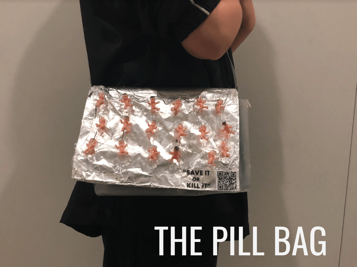
- The bag strap will be embellished with a hashtag highlight our issue
- The front of the bag will be embellished will pill containing babies.
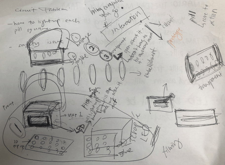
After body storming, we feel that the pill bag shares the same problem as the 79% clock, where the audience, the guys, the provocative objects do not affect them.
Thus we decided to incorporate a “barcode” feature in the bag. When the audience scans it, it will lead to a landing page on where talks about the pro and cons of birth control pills, facts about birth control, it serves as an educational purpose regarding on women’s struggles on the financial and health-related burdens of contraception.
We did more research and found out that many women will set the alarm on their phone that will vibrate, but not make a sound, so nobody knows you’re about to take your birth control pill. Because women feel embarrassed about taking their birth control pill. We think that there is no need for women to be ashamed when they are on the pills, women deserve to be in control of managing their sex lives in the same way they deserve to be in control of managing their health. So we decided to make the bag “transparent” by using clear plastic, to address that there is no need for embarrassed instead this bag should inspire you to feel less embarrassed when you take I, because you can inspire other women to explore less ashamed of their sexuality and their decision to delay motherhood, too.
Intention of this interaction:
Hence, the interaction is not only for the users to be reminded to take her pills but it’s also an interactive commentary that the public gets to participate and be informed about this issue after interacting with our object. The data we collected can be used to see how many people we reached out to and convey the message highlighting about our issue.
CHOSEN CONCEPT: PILL BAG (THIRD DEVELOPMENT)
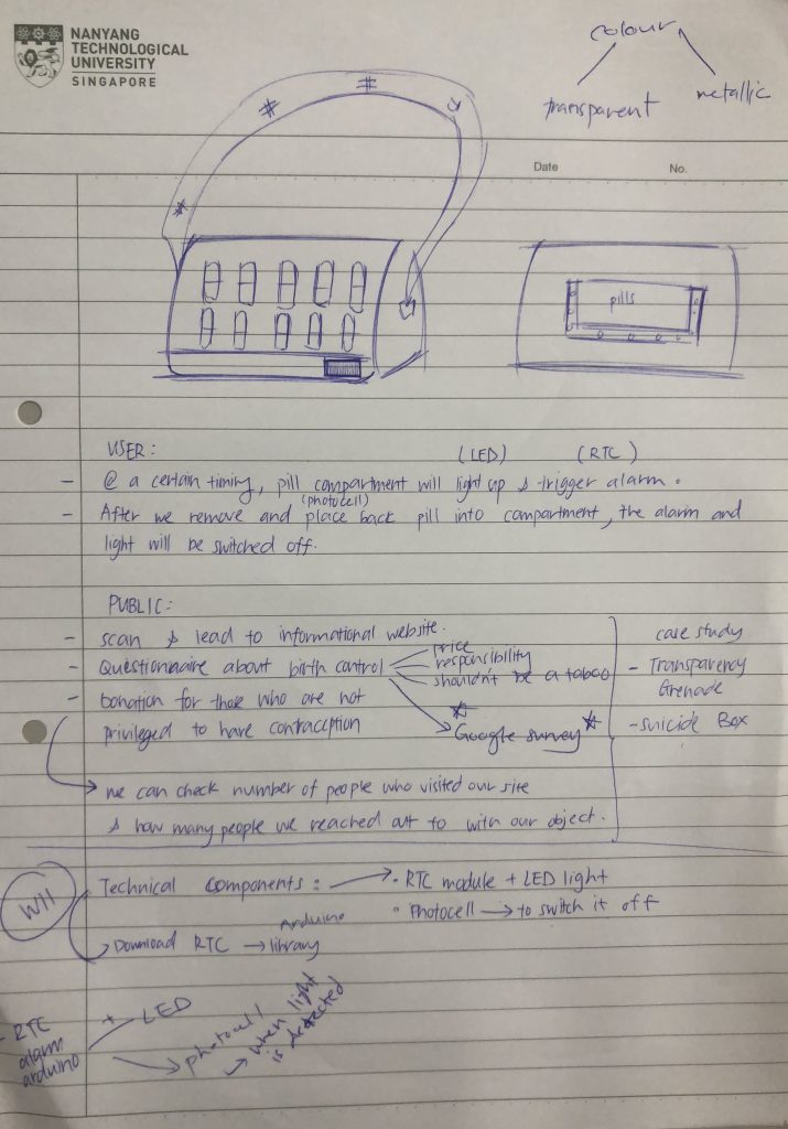
We’ve decided to add a second layer of interaction for the public to be involved in our movement.
Features:
- The pill compartment will be placed at the back of the bag with LED lights surrounding it.
- At a certain timing, the compartment containing the pill will light up and sound off a beeping alarm. (Easier for the user to approach)
- Once, pill is placed back in the compartment, sound and light sensors will be off.
- The bag strap will be embellished with a hashtag highlight our issue
- The front of the bag will be embellished will pill containing babies.
- *There will be a barcode at the front with a tagline which prompts the public to scan it. (Why barcode? → Price of contraceptive is a problem too)
- Second layer of interaction: Leads them to a page about our movement (information, questionnaire, maybe donation for people who don’t have access to conceptive)
- Data collected can be used to raise awareness and inform the public about how many people we managed to reach out using our object.


 The Pen ts’ao( 本草綱目)is a Chinese herbology volume written by Li Shizhen during the Ming dynasty;This book illustrated all the plants, animals, minerals, and other items that were believed to have medicinal properties. The text consists of 1,892 entries, each entry with its own name called a gang. The mu in the title refers to the synonyms of each name. The book has been translated into many different languages, and remains as the premier reference work for herbal medicine.


 VS
VS 


 Project Concept