|| F O R R E S T G U M P ||
Shortly after making marks, I’m making prints!!
For Project 2: “Forrest Gump”, I have to pick movie quotes, translate them into abstract visual language like symbols, pictograms, dingbats, icons and engravings and apply techniques such as hyperbole, metaphor, caricature, parody, anthropomorphism etc. to express the narrative quality of the quote. I also have to make use of design principles from the various class presentations to create my final design. (dots, lines, shapes, planes, value, texture, balance, gradation, symmetry, repetition, pattern, rhythm, unity, harmony, size, proportion, dimension, contrast etc.)
Personally, I realise that I have not watched a lot of mainstream Hollywood movies, but my taste and preference for movies lies a lot more in Disney/Pixar animated films, as well as Japanese movies and animated films, which have pretty memorable and unique quotes as well.
Below are some of my favourite quotes that I have gathered:
| Movie | Quote |
| *Paprika | “Don’t you think dreams and the Internet are similar? They are both areas where the repressed conscious mind vents. “ |
| Mulan | “The flower that blooms in adversity is the most rare and beautiful of all.” |
| Grave of the Fireflies | “Why do fireflies die so young?” |
| 1 Litre of Tears | “When I look up as I fall down, I see how limitless the azure sky above is as it smiles down upon me.” |
| * End of Evangelion | “If you wish for others to exist, the walls of their hearts will separate them again.” |
| *Sherlock (bam, the only mainstream series I watch) | “Anderson, don’t talk out loud. You lower the IQ of the whole street.” |
| *Peter Pan | “To live would be an awfully big adventure.” |
(* starred quotes are the four that I have chosen.)
Taking a pick out of this list was quite the feat, but I figured that was a wise decision not to pick quotes that were either too literal or too figurative because it leaves little room for imagination and abstraction.
===Quote 1:Paprika===
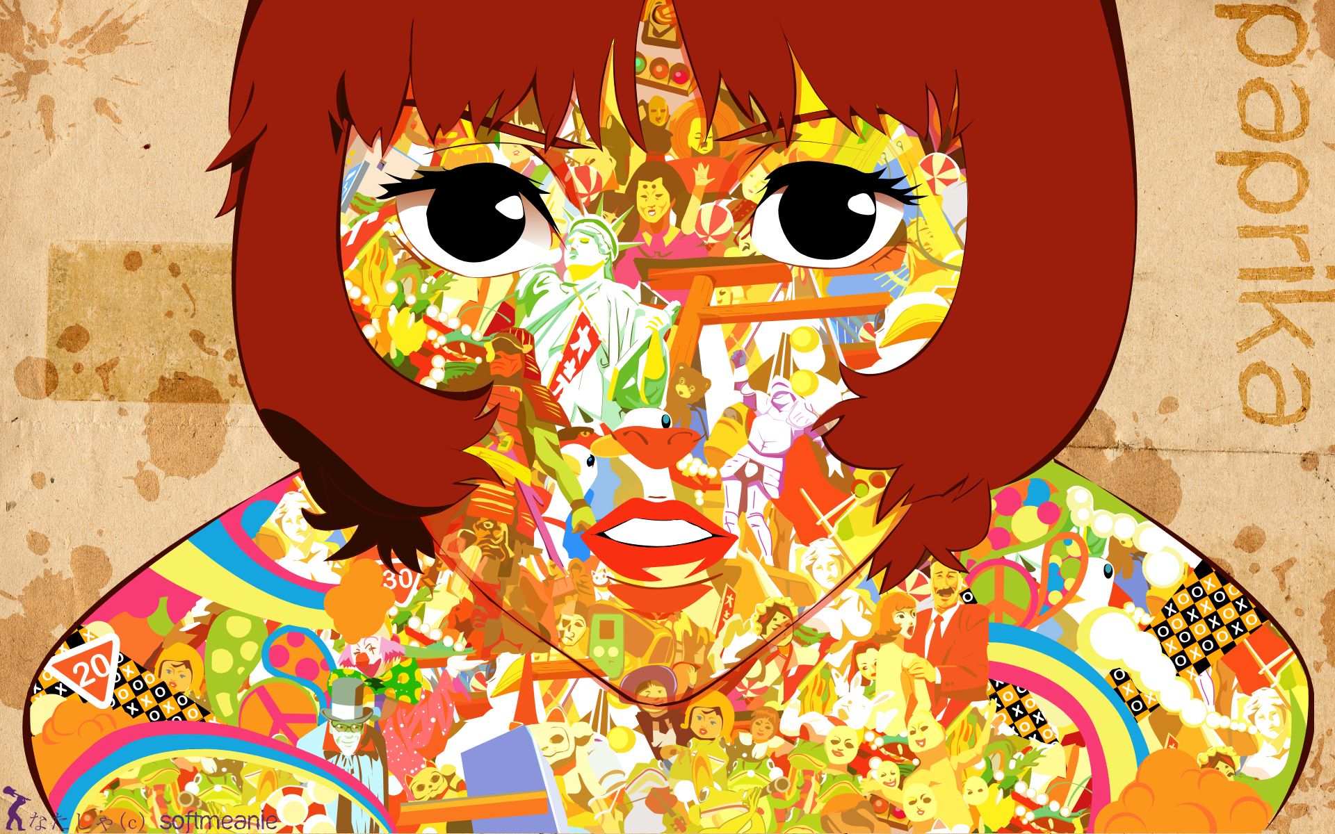
“Don’t you think dreams and the Internet are similar? They are both areas where the repressed conscious mind vents. “
Context in movie:
Paprika is a relatively contemporary, sci-fi Japanese animated movie that is in a futuristic, alternative universe and is about dreams and reality. To put it simply, an organisation creates a device that allows people to jump from reality into the dream world and that is used as a prototype for treatment at a hospital (later revealed to be malfunctional but I’m just going to stop here because this movie is a masterpiece and I don’t want to spoil it). Paprika is the name of the avatar of the main female protagonist. The quote is said by Paprika herself as she draws a comparison between the characteristics of dreams and the Internet.
Keywords: Dreams, Internet, similar, repressed conscious mind, vents
Imagery ideas:
-
Dreams
-Surreal alternate space that we transiently experience when we sleep. Normally has a lot of crazy, bizarre things going on that will almost never happen in real life.
-Has a sense of lightness since we have a lot more freedom to imagine what we want to in our dreams.
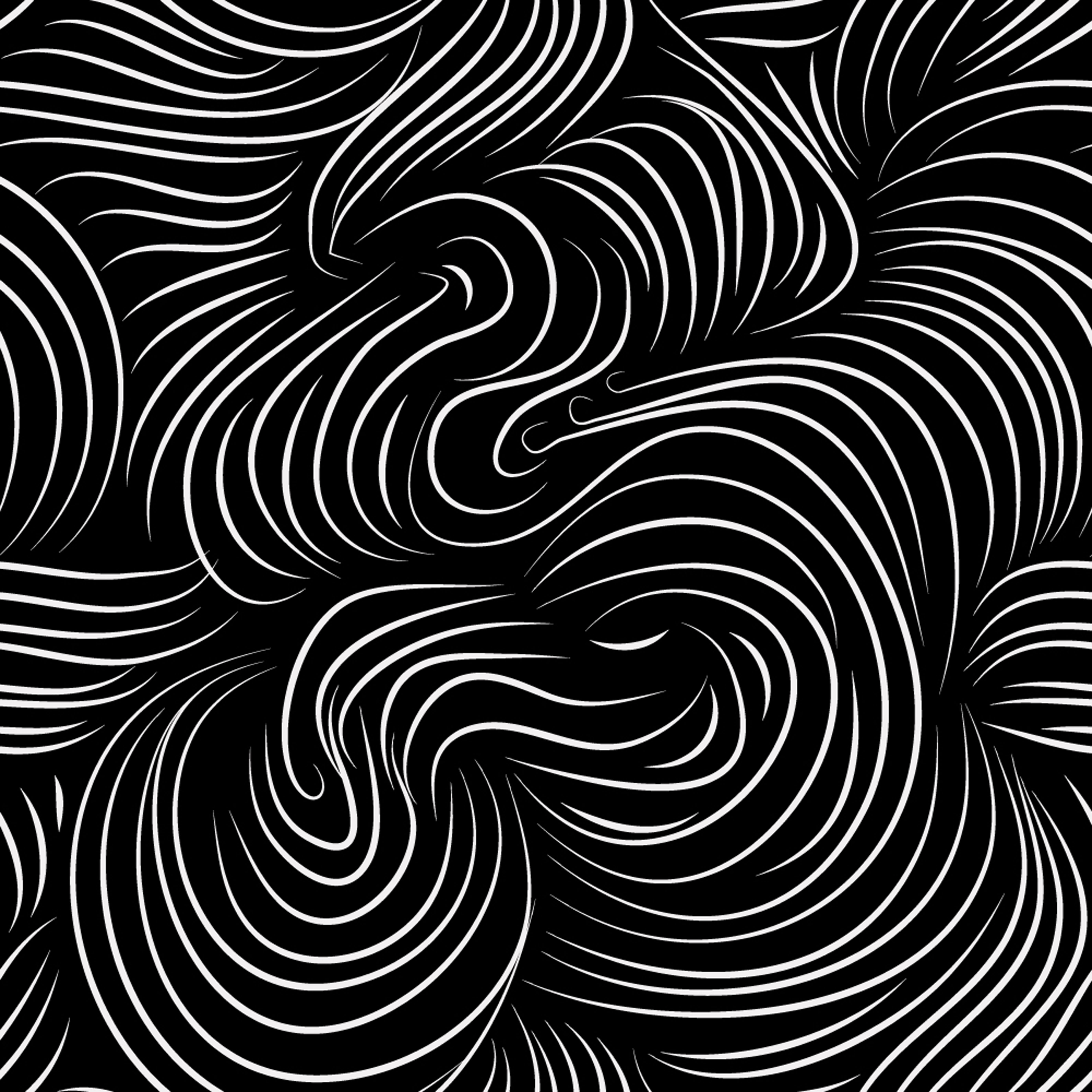
-A sense of movement can also be created as well since the scenes that we imagine are often overwhelming and hard to comprehend, leaving us in confusion (which, with reference to observations from the previous project, can be expressed with spirally lines radiating outwards)
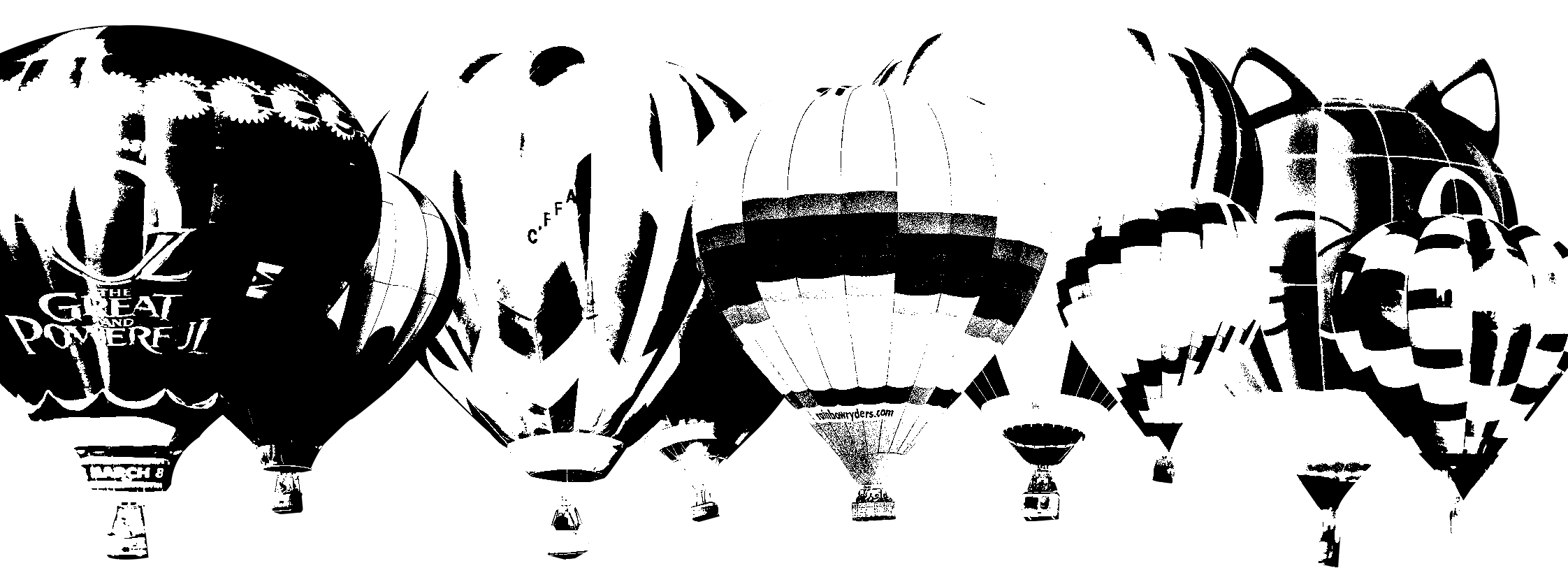
Possible imagery: hot air balloon, water, anything to do with space or distorted reality
-
Internet
-a global computer network providing a variety of information and communication facilities, consisting of interconnected networks using standardized communication protocols.
– cloud, data, wifi signal, hotspot, can be sea as well
-
similar
– show the contrast between dreams and the internet, yet feature the main similarity between them
-
repressed
– (form of restriction) treasure/Pandora’s box, lock, chain, handcuff, torn wing, cage
-
conscious mind
– burning flame, open eye (window to the soul)
-
vents
– (outpour) waterfall, volcano, soil erosion, avalanche, tsunami, some sort of a crack and spill situation
Composition idea #1a:
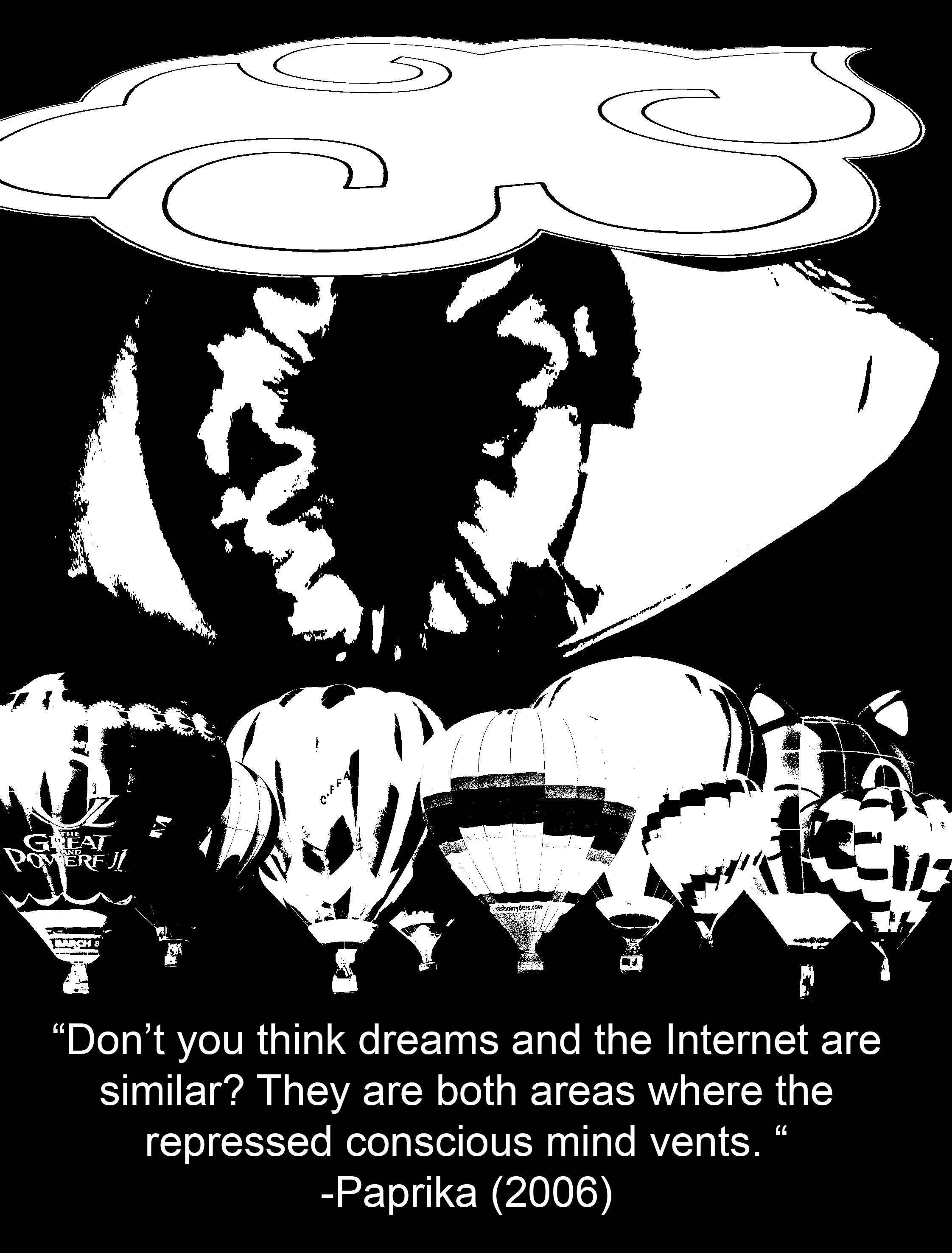
I’m going to use hot air balloons to represent ‘dreams’ since they are a means of transport to a place that is “high up”, as if almost going into another realm; just like how we are transported into dreams when we are asleep. A random variety of hot air balloon designs can help to depict how unpredictable dreams are. When put together, they create a very bizarre and surreal effect.

As for the ‘Internet’, I chose to use a relatively larger-scaled cloud icon. To me, the Internet is a vast space with many users, just like how the water droplets aggregate in the air to from one massive cloud.

I turned this cloud from coloured to black and white (some people may recognise this)
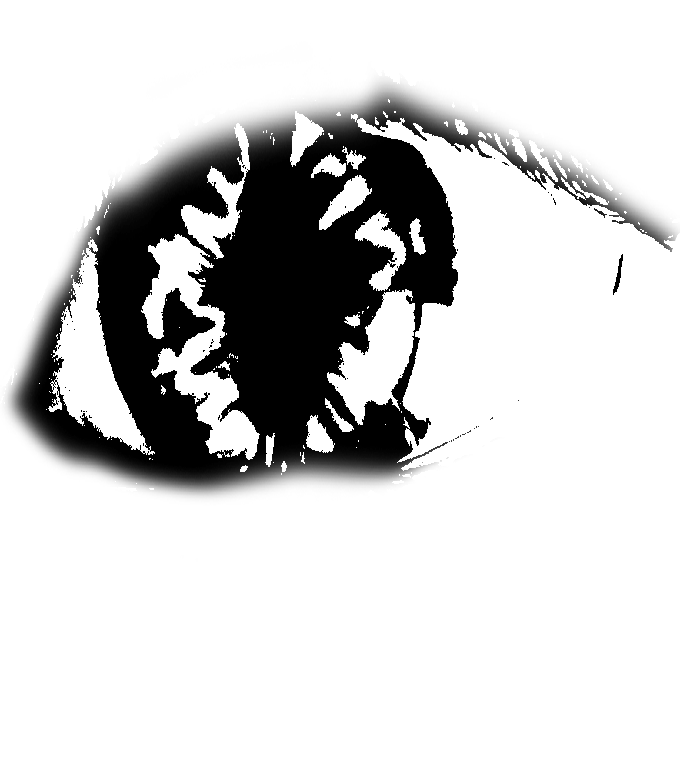
To represent the ‘conscious mind’, I’m using an open eye since it implies being awake and aware of your surroundings. After looking through icons and symbols, I decided that using a more realistic-looking eye was better since it gives a stronger sense of consciousness (“the eyes are the windows to your soul”). Using simple icons felt very dead.
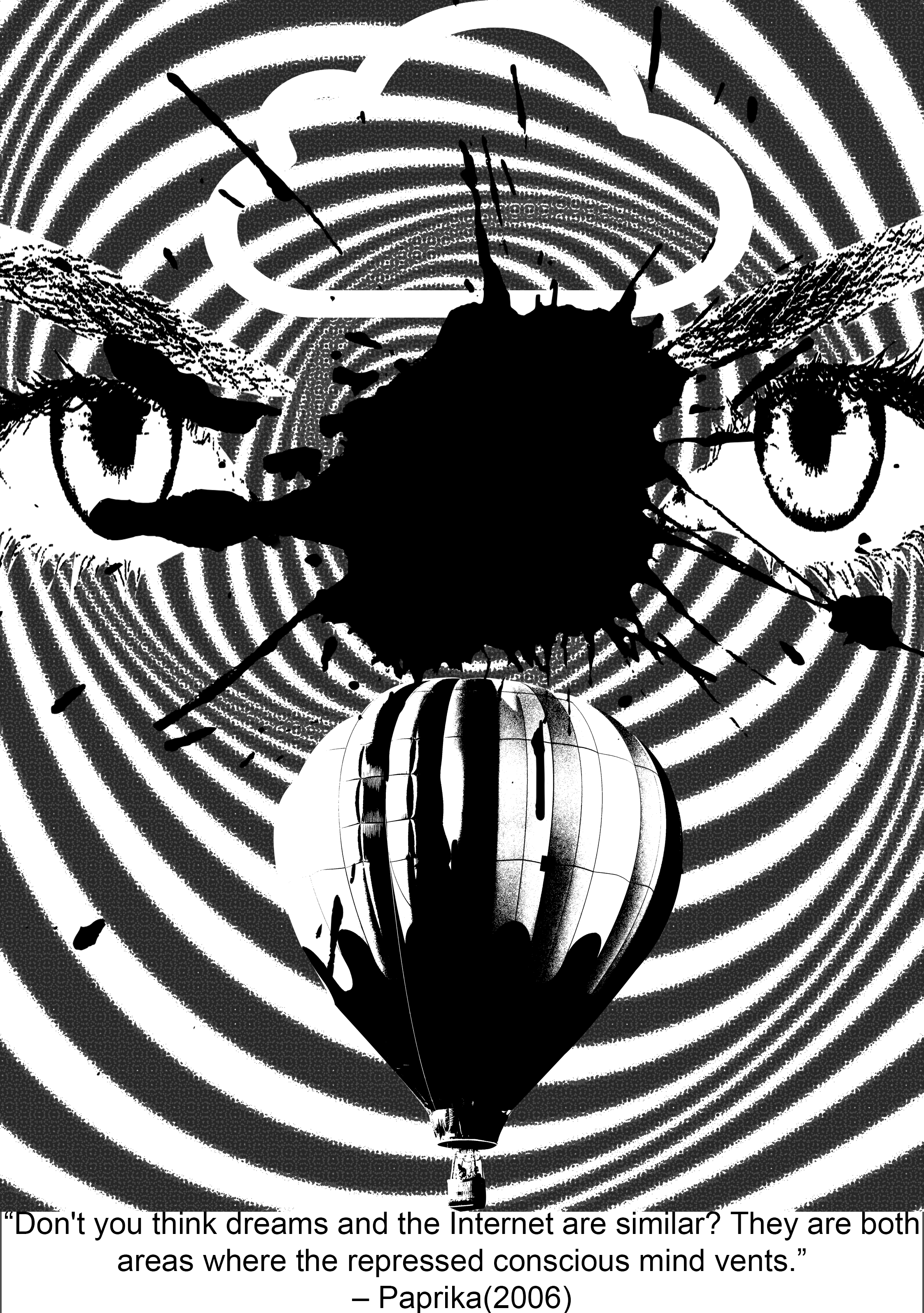
1st Draft:

I separated the singular massive cloud and the layer of hot air balloons into distinctive layers. I wanted to place eyeballs on all of the hot air balloons and the cloud, then have something come out of them (expressing ‘vent’) but I felt like it did not do a good job of conveying the quote since it did not make much sense for dreams and the Internet to have conscious minds of their own. Plus, I was also intending to put a broken chain on the eyes to represent ‘repressed’ (but no longer). However, after attempting to put chains on each of the eyeballs on the hot air balloons, it proved to be an editing disaster.
2nd Draft:
Now, instead of slapping eyeballs everywhere, I decided to put a picture of an eyeball that was relatively larger than the other elements to show that it was the dominant subject of the piece. However, it is still concealed behind the cloud to create a sense of depth (hiding behind the clouds, more subtle way of representing ‘repressed’), and the black background also enhances the feeling of a void which reminds me of the dark we see when sleeping; it is a strong contrast with the white parts of the eyeball which is supposed to symbolise consciousness and being awake.
To express the element of ‘venting’, I wanted to use rhythm to show an erupting action, sort of like lava from a volcano, or bubbles coming out from a underwater vent. The use of a variety of shapes was abstract enough to show the idea of “anything”, parallel to how we like to post anything on the Internet, and how we can literally dream up anything when we are asleep. Initially, I used a regular rhythm of shapes everywhere but it proved to be much too rigid. After some tweaking, I managed to come up with the design below:
In this version, I used progressive rhythm, where the shapes got bigger from the eyeball to the cloud and hot air balloons. The warp effect that I added also enhances the illusion of depth as we can sense that these shapes are in motion and travelling a distance from the eye to the cloud and hot air balloons. This is paralleled with how our thoughts are transferred from our minds to the Internet and our dreams.
3rd Draft:
 For my final-ish concept, I further enlarged the scale of the eyeball so that it was hidden under both the hot air balloons and the cloud to express how the conscious mind is being repressed. I added more shapes near the centre of the iris as well to show that the shapes are originating from the eyeball and moving outwards and as a result, their distribution becomes more sparse as they go outwards towards the clouds and the hot air balloons.
4th Draft:
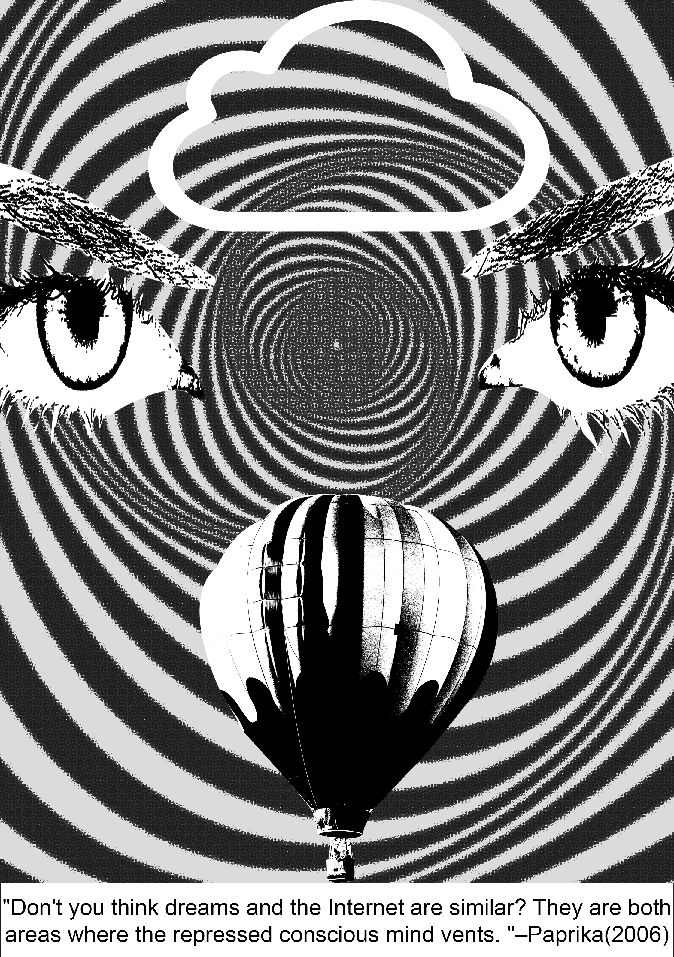
-With the cleaning up of my design, I realized that had unintentionally created some sort of a symmetry which was really effective since symmetry grabs people’s attention by instinct. It also makes my entire composition look like a face. (TvT)
This accompanied with the meaning of eyes as ‘windows to a soul’, plus the op-art background, this projects a hallucinatory effect on the viewer’s mind, which is a literal invasion of the consciousness, or inside of the mind, as I have interpreted for this quote.
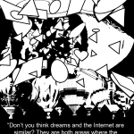
Final Draft:
==Quote 2: End of Evangelion==

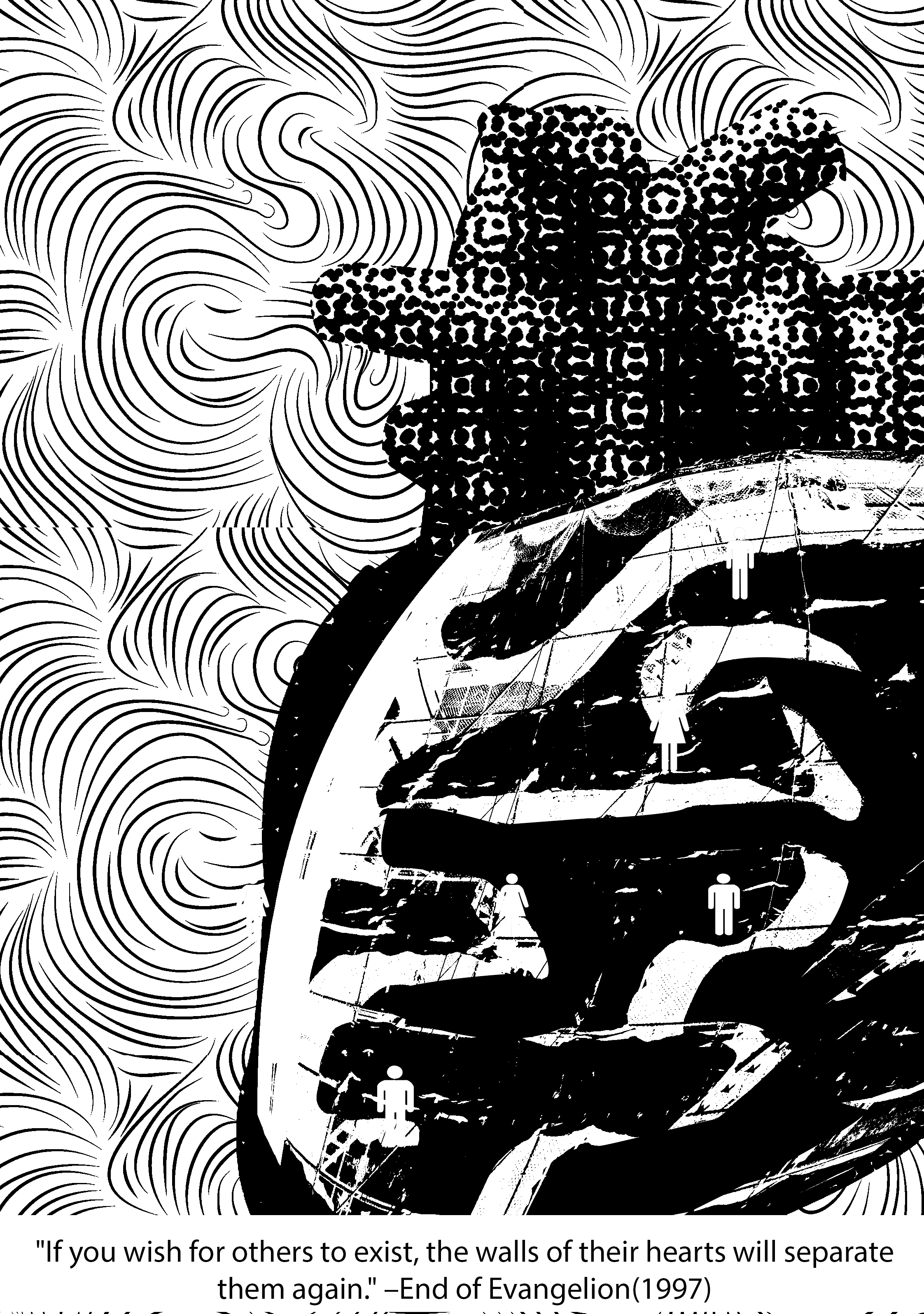
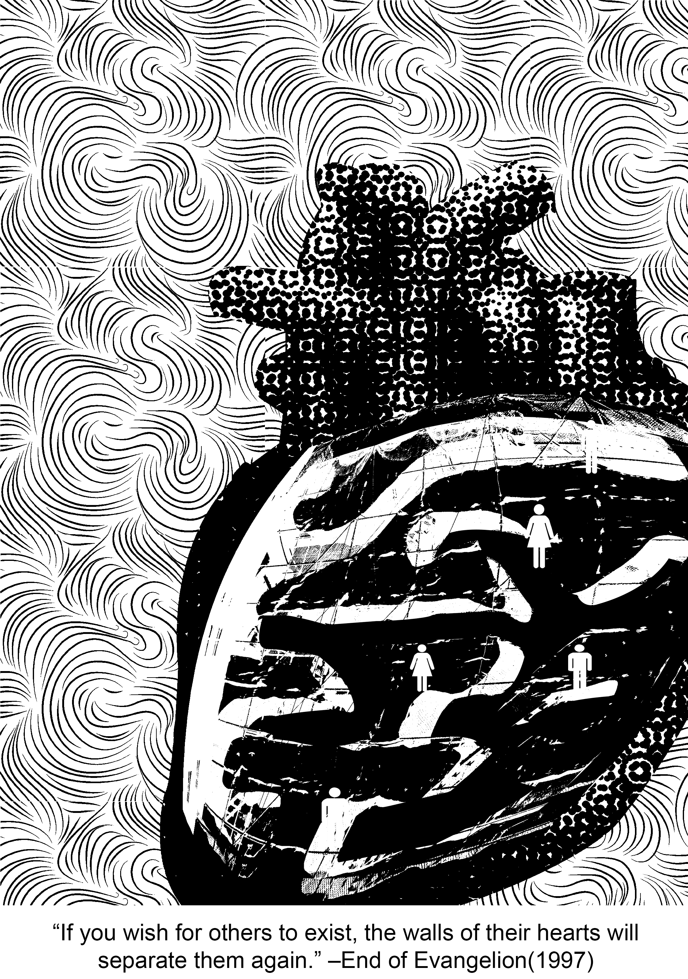
“If you wish for others to exist, the walls of their hearts will separate them again.”
Context in movie:
Evangelion is one of the most well-known and oldest Japanese animated films that is ever so enigmatic and philosophical. There is so much hidden symbolism in this movie that might just reveal themselves to you… if you rewatch the movie like 1093420384032 times and consciously try to catch them. At first, the Evangelion series just seems to be a normal Gundam (they call them Evas) action show, but it gets so exponentially complex towards the end that it is almost impossible to fully comprehend what is going on. The main philosophy that the End of Evangelion is trying to express is that humanity essentially belongs to a common pool of ‘primordial soup’ where all our souls linger even after death. There, we can be reborn again, but when we turn back into human form, there will undoubtedly be conflict and unhappiness, as compared to staying in primordial form where everyone lives in unity and there will be guaranteed peace (it’s almost like the philosophy for Buddhism). The main protagonist, Shinji has to make a choice between this two options, and this quote comes from Rei (another Eva pilot), who instigates Shinji to make a choice at the end of the movie. (One of my absolute favourite series ever)
Keywords: Others, exist, walls of their hearts, separate
Composition idea #2:
Imagery ideas:
Others– masses of people, masses of monsters/aliens, simple dots, faces (kaleidoscope effect)
(kaleidoscope tutorial – http://www.creativebloq.com/photoshop/kaleidoscopic-collage-effect-5132671/2)
walls – barricade, fence, brick wall, thorny bramble bush (inspired by Sleeping Beauty), clam shut tight
hearts– heart, differences (different colour), life, tree


1st draft:
Final Draft:
===Quote 3: Sherlock===
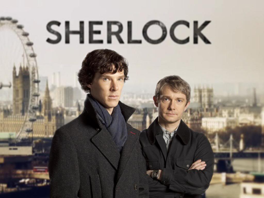
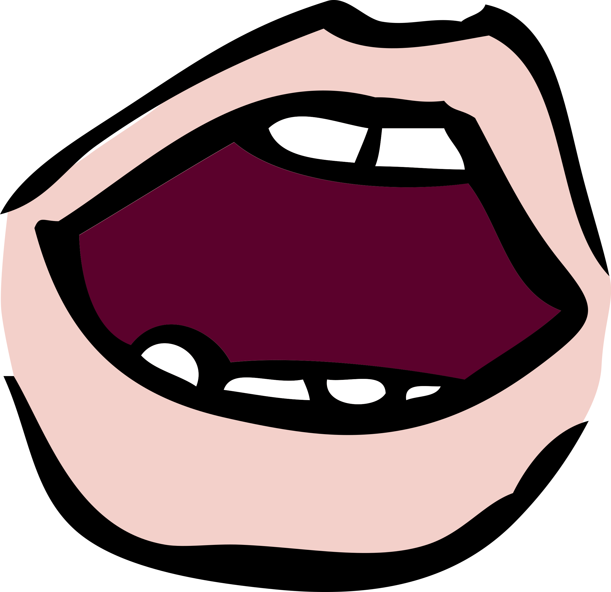
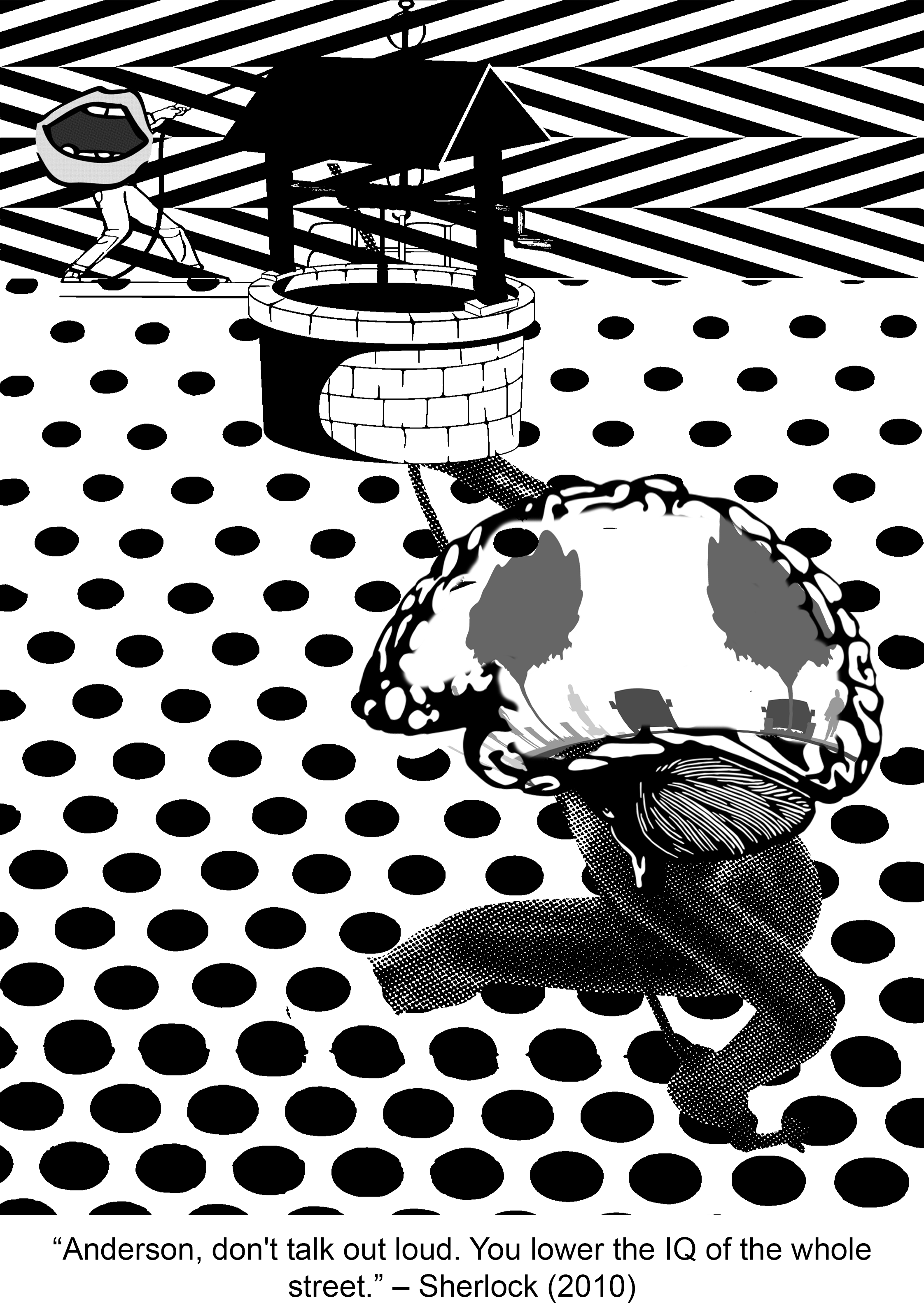
“Anderson, don’t talk out loud. You lower the IQ of the whole street.”
Context in movie:
I barely watch any mainstream film series but my friend insisted that I watched Sherlock and boyyy did I marathon this ENTIRE series (with no regrets). Sherlock is “not a psychopath, but a high-functioning sociopath” as he always reminds everyone and extremely intelligent. While on a case, Sherlock shows obvious disdain for the lowly intellectual likes of Inspector Lestrade who works for the official police team when he keeps trying to interrupt Sherlock’s inspection of the crime scene. Having the sharp tongue he does, Sherlock subtlely throws this insult (the quote) at Lestrade, essentially telling him to shut the hell up.
Keywords: don’t talk, loud, lower the IQ, whole street
Imagery ideas:
don’t talk – silence sign, mask covering up mouth, tape at mouth, zip at mouth
loud – megaphone, forte symbol
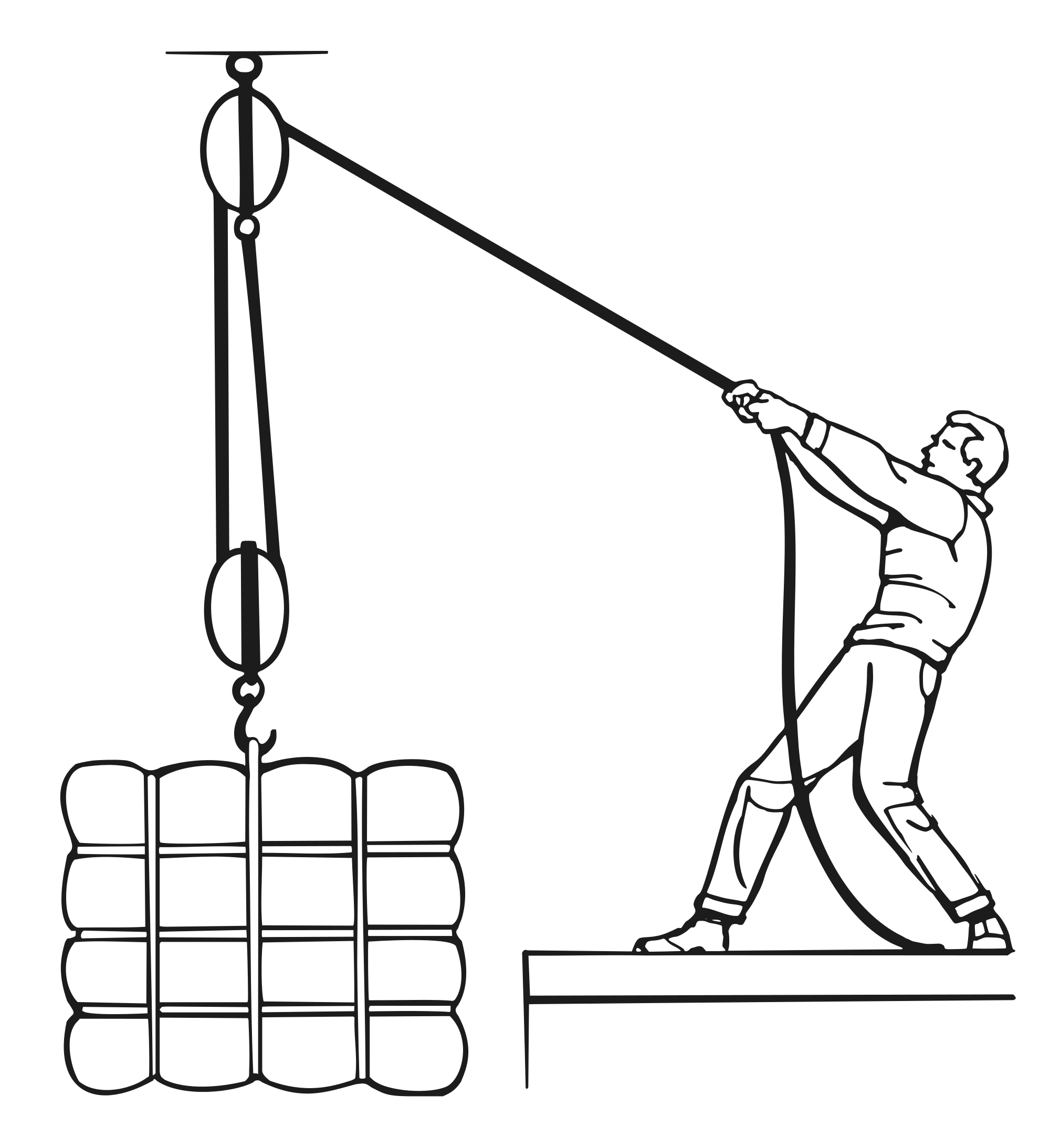
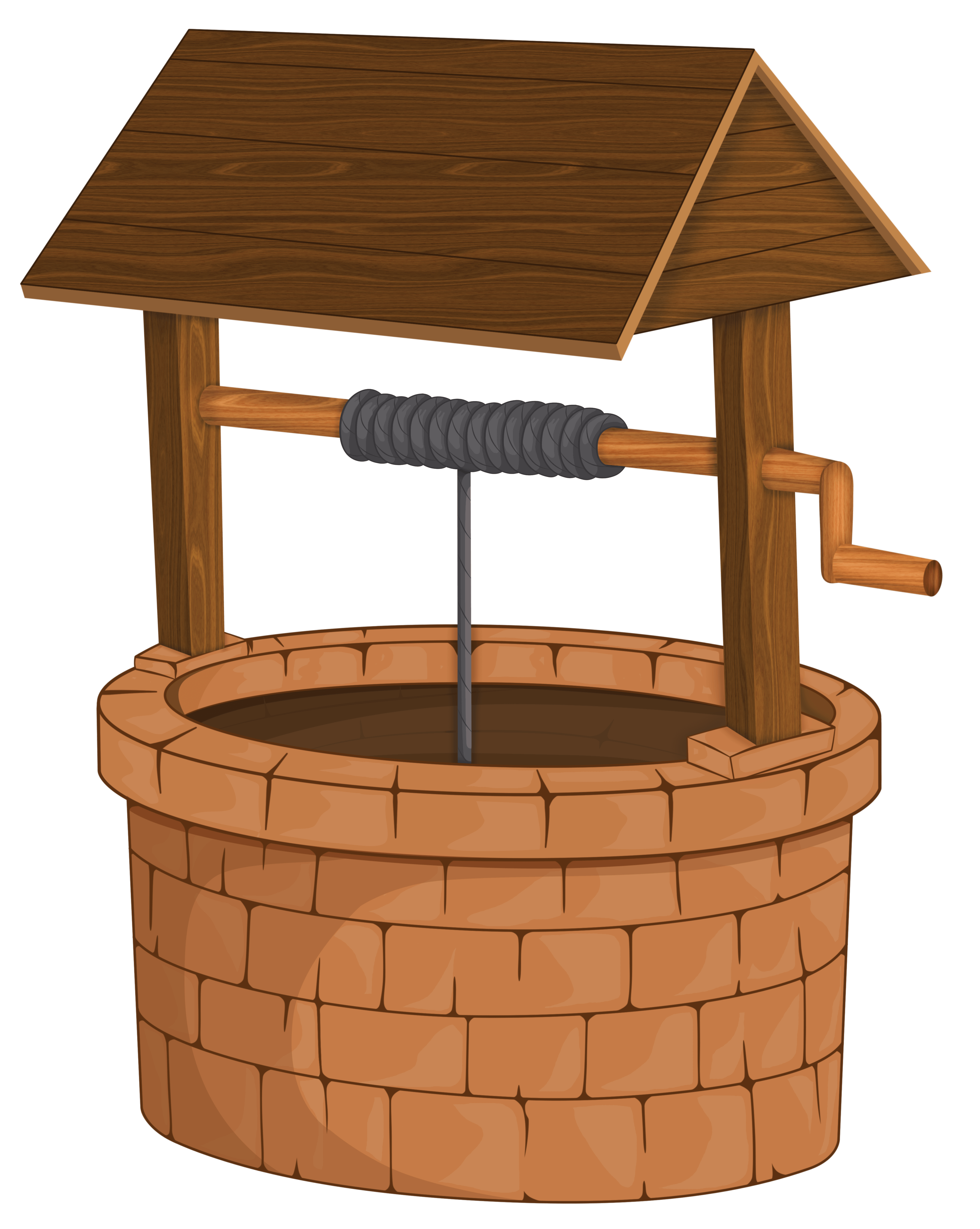
lower the IQ (kind of literal version) – lowering bucket into a well, pulley system (can use principles of design to express downward motion)
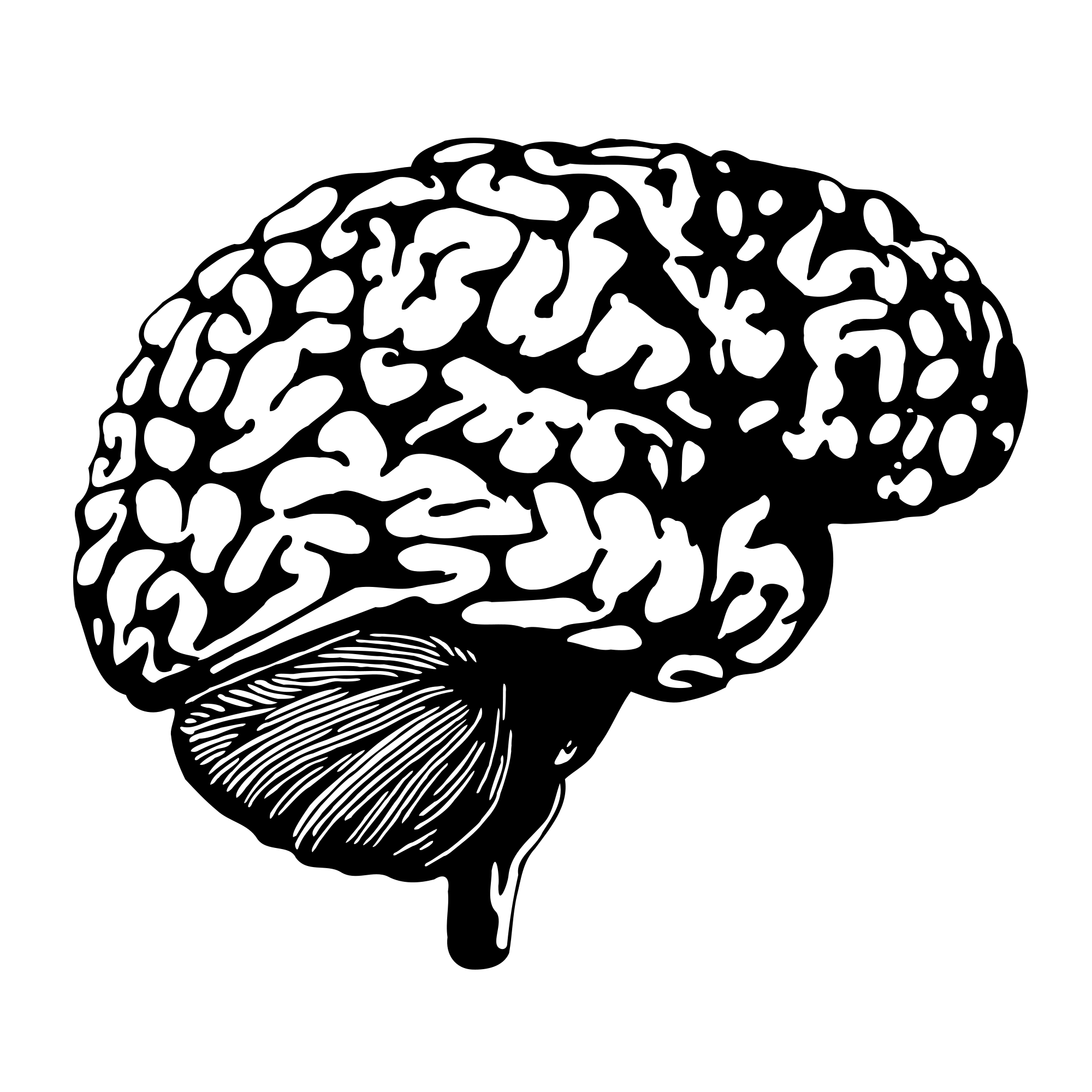
lower the IQ (essentially stupidity) – broken glasses, scarlet geranium, bag over head, skull (empty head)
whole street – streetlights, zebra crossing, junctions, crossroads, traffic lights, electricity poles, directions
Composition idea #3a:
Subject ideas:

1st Draft:

Final Draft:
=====Quote 4: Peter Pan=====
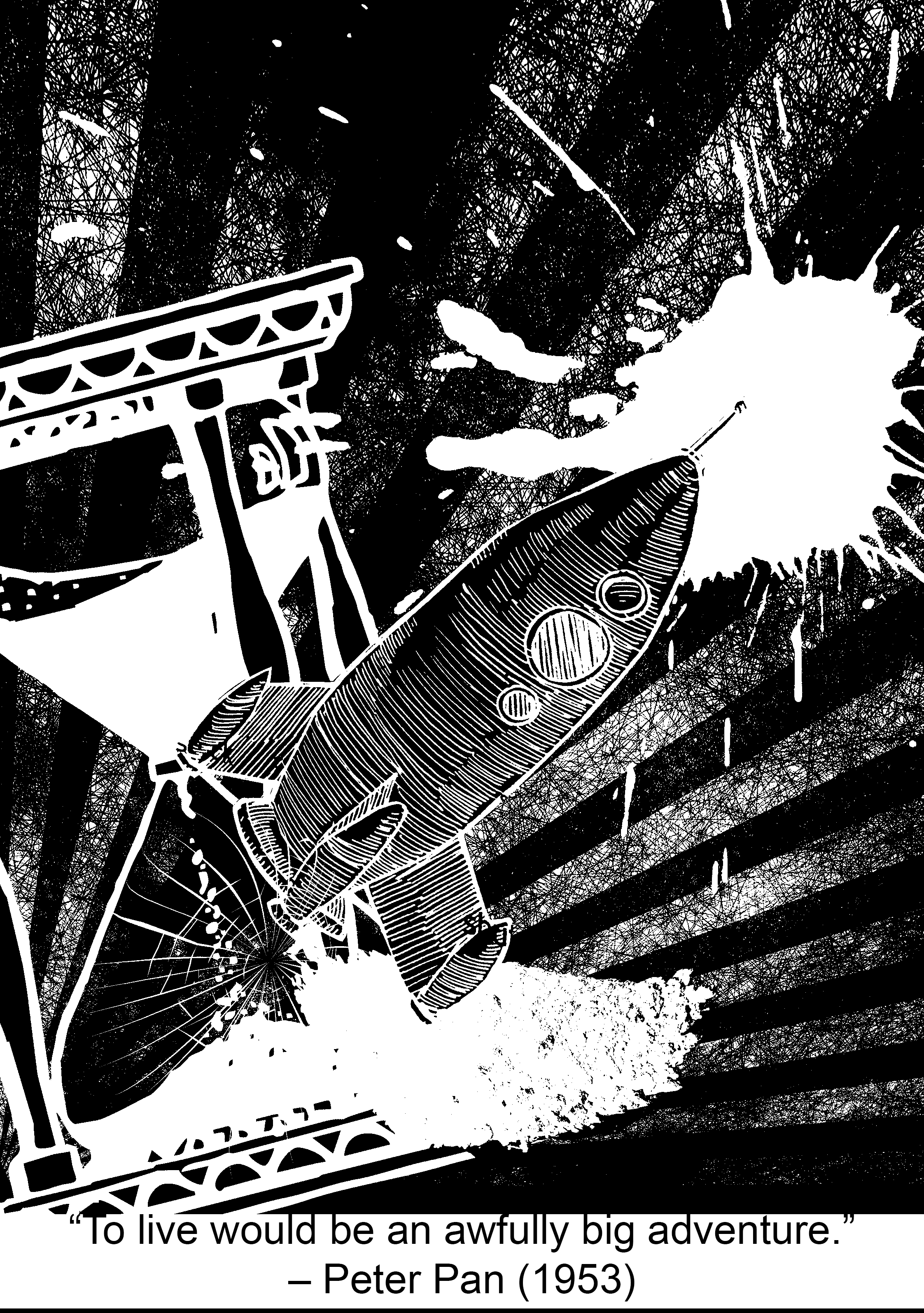
“To live would be an awfully big adventure.”
Context from movie:
Peter Pan has to be my favourite Disney movie (totally not because I was obsessed with Huggy Pan for a while (Billy Murray playing Peter Pan in Disneyland) (yes I will link you to a video because his sass needs to be shared). I love Peter Pan because of how relatable it is, with me being a teenager (YES I’M STILL 19) and the whole never-wanting-to-grow-up theme. This quote basically resounds this theme, with ‘to live’ being a metaphor for growing and maturing (in contrast to staying a child in Neverland), and ‘an awfully big adventure’ implying that growing up will be both a very foreign experience and a daunting feat for Peter Pan. (and you are RIGHT, Peter! Please take me to Neverland.)
Watch this from 0:21 8’DDD
P.S.: I <3 HUGGY PAN (he’s not working as Peter Pan anymore ;v;)
Keywords: Live, awfully big, adventure
Imagery ideas:
live (essentially growing up and maturing, not stuck in time) – clock, watch, hourglass
awfully big – blue whale, elephant, cosmos, magnifying lens (zoom in), infinite
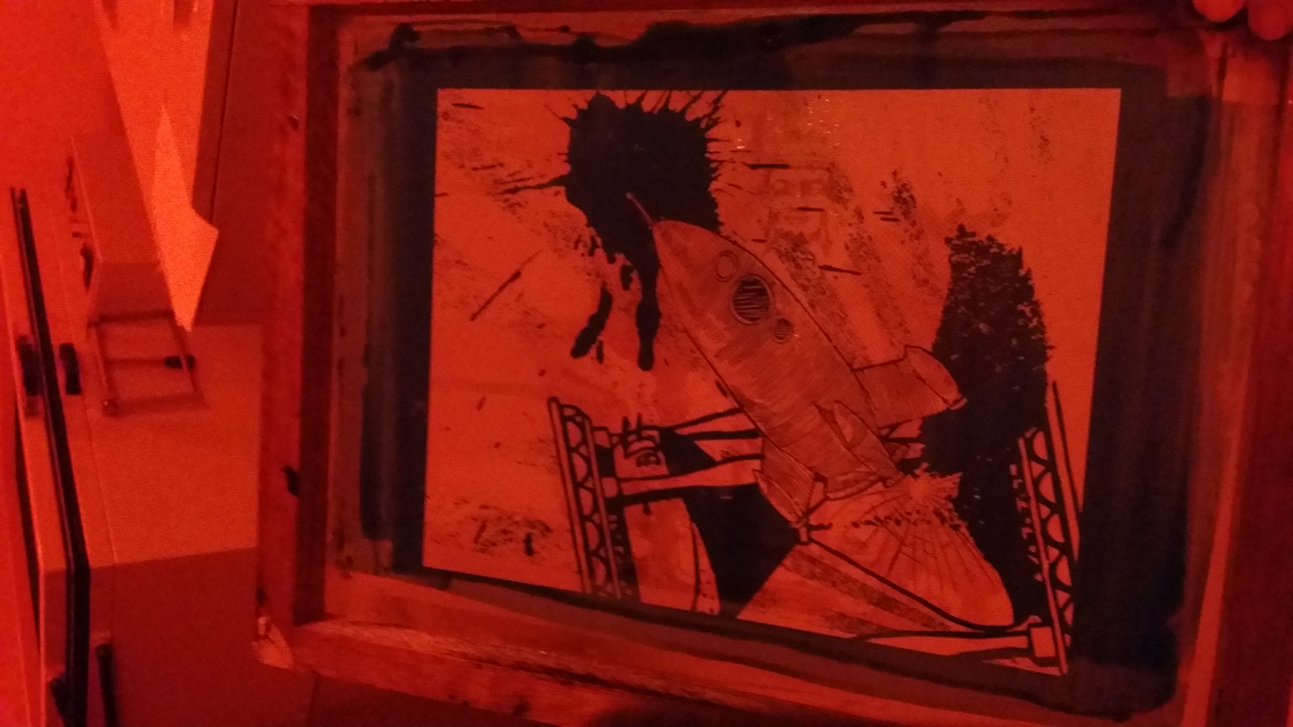
adventure – (travel) bag pack, ship, aeroplane, map, mountain, compass, parachuting, biking, car
Composition #4a:
Subject ideas:
The fun part: SILK-SCREEN PRINTING
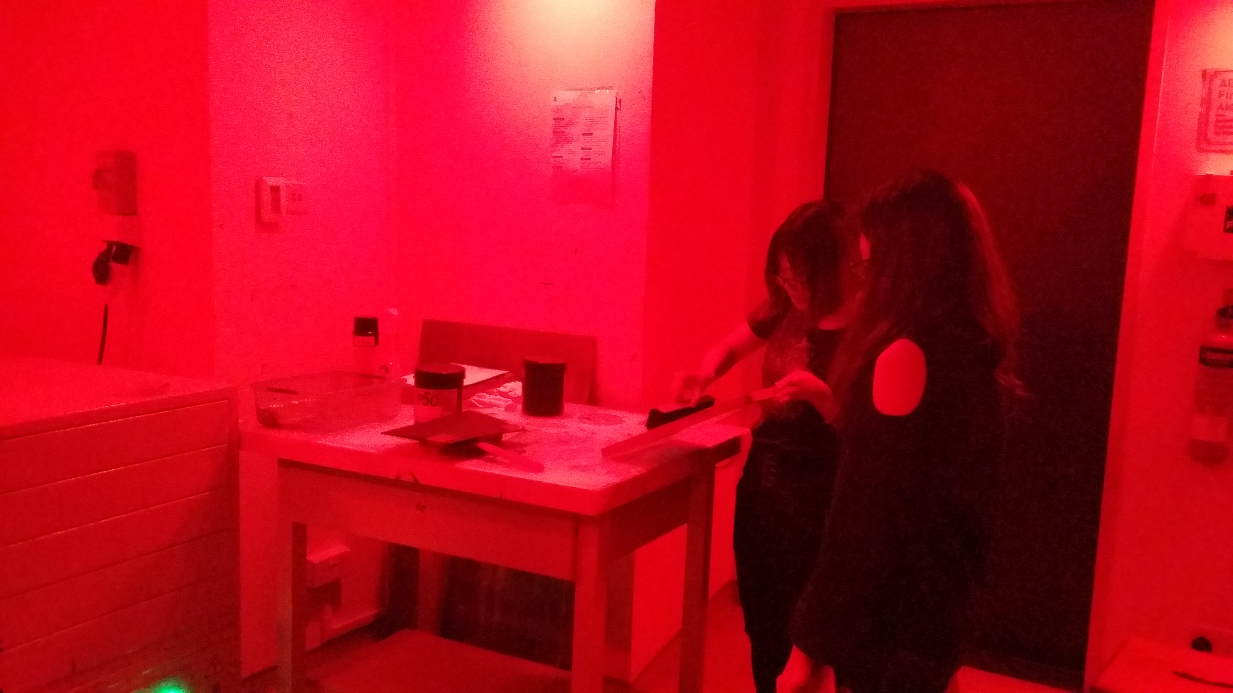
(didn’t document the printing part because I was busy working like a factory. Yes I sold shirts to my friends so I had to handprint around 10. If you want profits, think again! 8’D)
Reflections:
One difficulty that I faced with this project was when I was trying to edit the pictures (more on the technical side). When I added a colour invert filter to a layer, the ENTIRE composition inverted itself, and it was SUPERRR frustrating to work with, BUT!! I found out I could isolate the layer so that the filter only affects one layer :DDDD PS still does some wonky stuff once in a while but I have it under control now ;D
I think I’ve fulfilled the objectives of this project, which is to use symbolic images/subject matter to express a concept. I’ve learned how to expand my visual vocabulary; for example using hot-air balloon to represent dreams in my Paprika quote design.
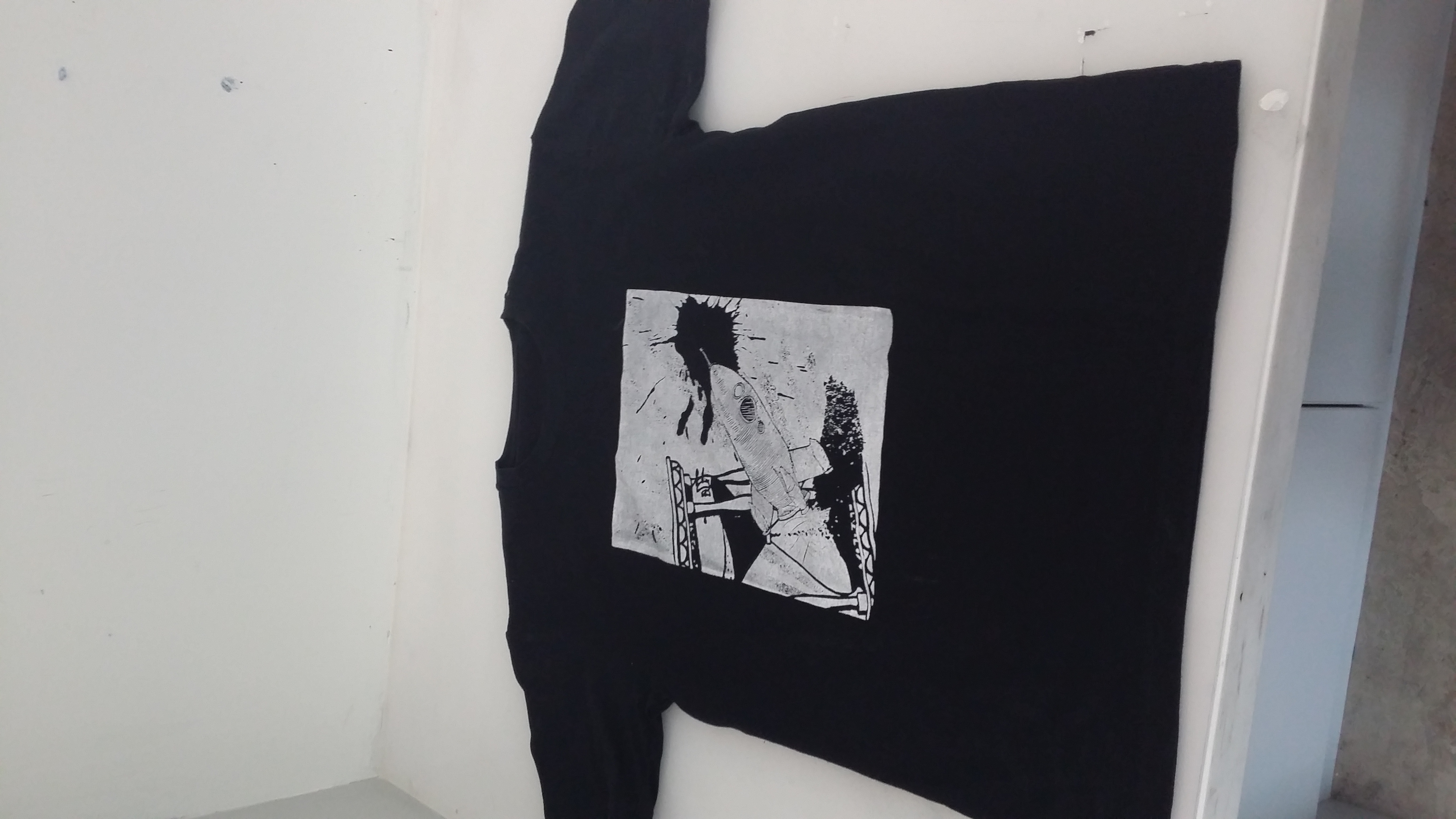
The way the representative subject matter is orientated in relation to the other subject matter should also be carefully considered! Their relationship is very important in conveying certain ideas that cannot just be condensed into one object itself, especially for movement; for example having the rocket oriented diagonally away from the hourglass and the radiating lines really helped to give a sense of movement in my Peter Pan design!
AND I really enjoyed doing this project because
- I didn’t have to gather so many materials because everything was digital kekekek
- FREE TOTEBAG
- Got to print T-SHIRTS too! (if anyone sees this you can venture into a mini shirt-printing business!! If you’re doing another colour other than black, you have to choose between price and quality ;v;) Might consider starting Youthful Printing & Co. in Malaysia or somewhere else where the startup and rental cost isn’t so high HAHAHHA (one can dream)
- I FINALLY found out how to use the pen tool on Photoshop!! For years, I had been wondering how the heck do you control it.
- I learned about the standards of a good quality print!
- I learned about how to use colour half-tone and threshold!
- I learned how to group my layers into a folder so my PS document won’t look like a complete mess!
- Editing is fun!!
- No colours to worry about… YET. (suspenseful foreshadowing of Project 3)
–Project 3 post incominggg den den dennnnn—