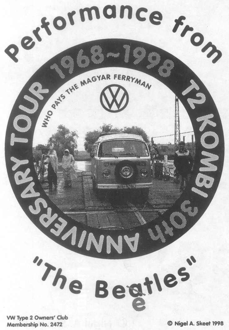
VAG Rounded is a typeface that was developed by Sedley Place in 1979 as part of the corporate branding for Volkswagen. The “VAG” stands for “Volkswagen Aktiengesellschaft” (which is German for “Volkswagen Incorporated”). Insiders at Volkswagen joked that V.A.G means Von Adolf Gegründet (“Founded by Adolf“). In 1989, the font was published for public use by Adobe. Its designers were David Bristow, Gerry Barney, Ian Hay, Kit Cooper, and Terence Griffin. Sedley Place was a branding and marketing company created by members of the VW marketing group and still exists today as a powerful force in the world of high-end marketing.
There was no easy way to combine the existing Audi/VW font identities with Audi using a full serif Times and VW using the 1927-designed Futura font. The art and creative director decided that a totally new typeface was required, thus the concept of a rounded-end typeface as a basis for their typographic branding was born. Originally rendered by hand, the VAG Rounded design was later perfected using a PDP-8 computer.The VAG Rounded typeface was subsequently used in all corporate and dealer publications of VW, Audi VAG Bank and VAG leasing until the late eighties, when VW began another round of re-branding. The VAG Rounded design remained in use by VW until as late as 1992.
VAG Rounded was designed to act as the corporate typeface for the German car manufacturer Volkswagen. To address the problem of worldwide users obtaining the font for work commissioned by the company, it was placed in the public domain.
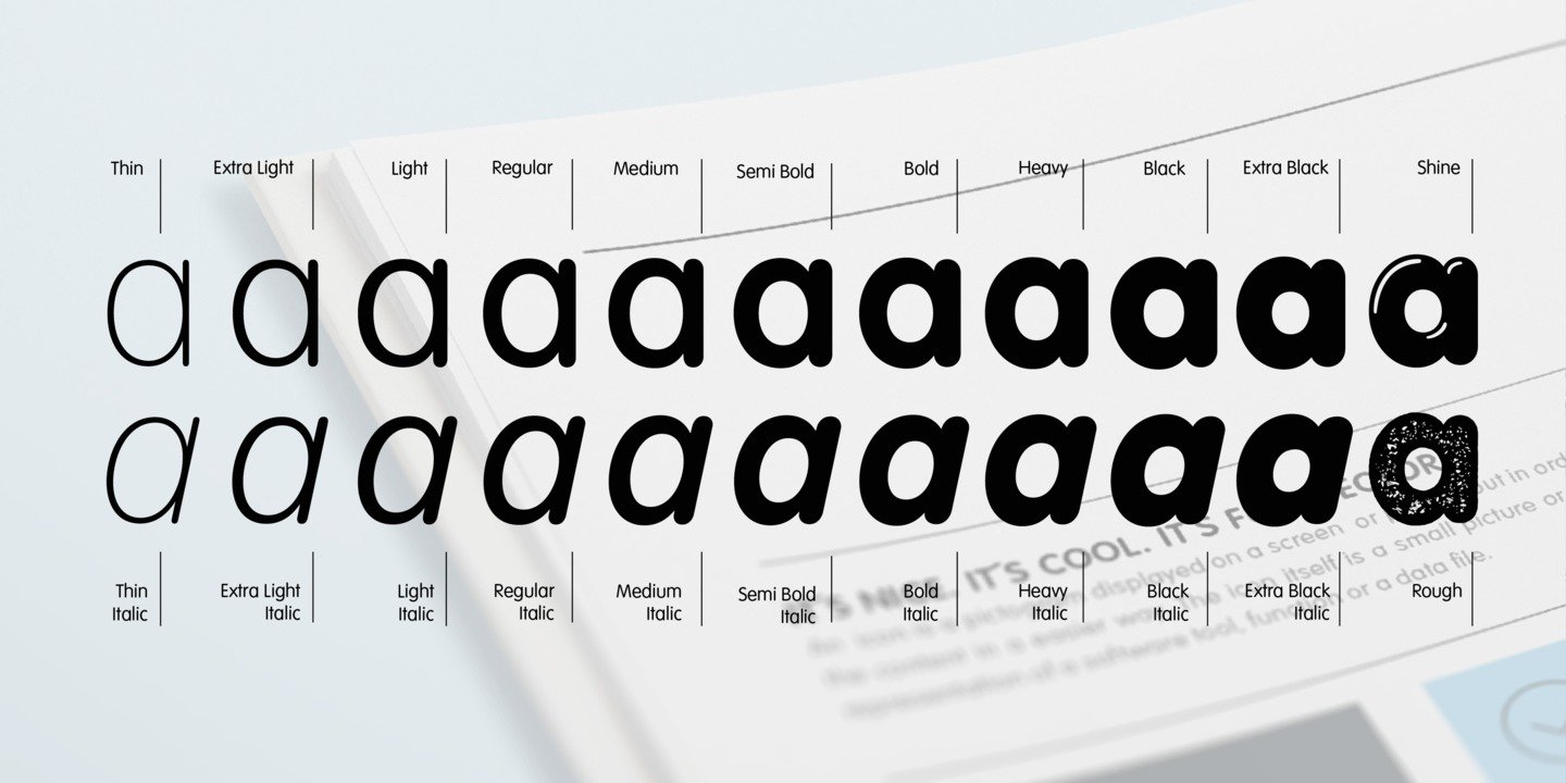
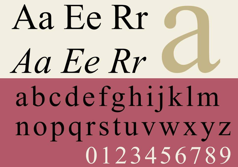
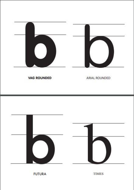
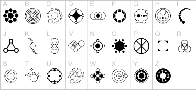
The anatomy of the VAG Rounded typeface has the following features:
Geometric San Serif
Originated in UK
19th century grotesque
First typeface with all Rounded terminals
Closed aperture (of letter e)
Even stroke weight
No italics
Circular bold strokes
Short ascenders
Moderate descenders
Long extenders
Many type weight variation
Monoline bold stroke
Circular tittle of ‘i’. Slightly wider than the stroke
Large x-height with low contrast
Rounded apex
There are many fonts variants developed under VAG Rounded.
Mainly because of the lack of hard and sharp edges being replaced by rounded and gentle curves, VAG Rounded presents a clever balance between a friendly appearance and a corporate seriousness.
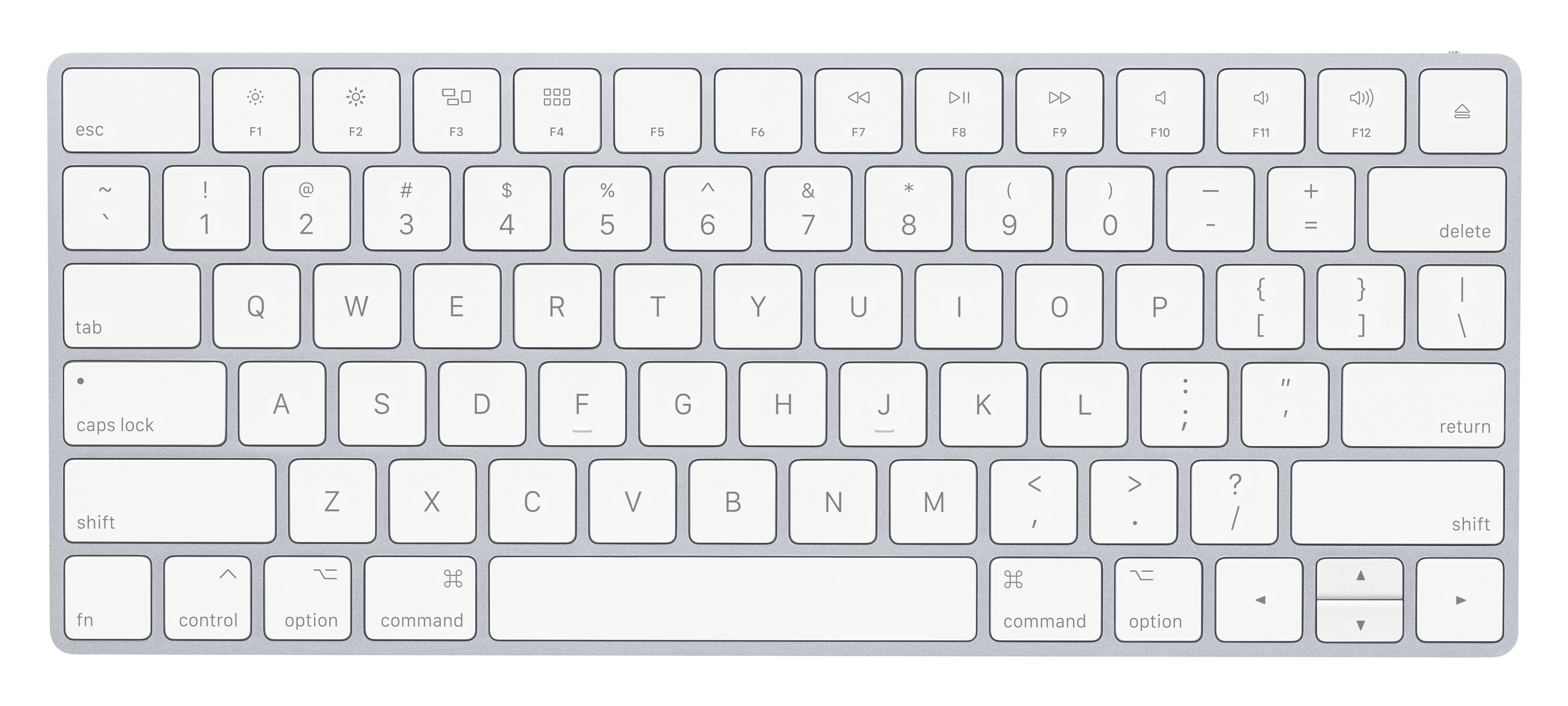
To date, Volkswagen no longer uses VAG Rounded, but instead uses a Futura derivative called ‘VW Utopia’. However, VAG rounded (or its derivatives) is/are still used in other contexts, such as the Skype logo, Jollibee logo, or Apple keyboard. There are also other alternatives to VAG Rounded such as Arial Rounded and Helvetica Rounded.
Presentation Structure
1. Skit segment about a Volkswagen car show
–
A ratchet handmade Volkswagen car will enter the scene in the context of a car show set in Germany in 1979 after Volkswagen has acquired Audi. Staff from Volkswagen are struggling to promote and sell their new car model but they are unable to get anyone to buy their cars. The staff hold a board meeting with designers (fictionally from Sedley Place) to discuss their branding strategies to raise sales.
2. Audience participation segment
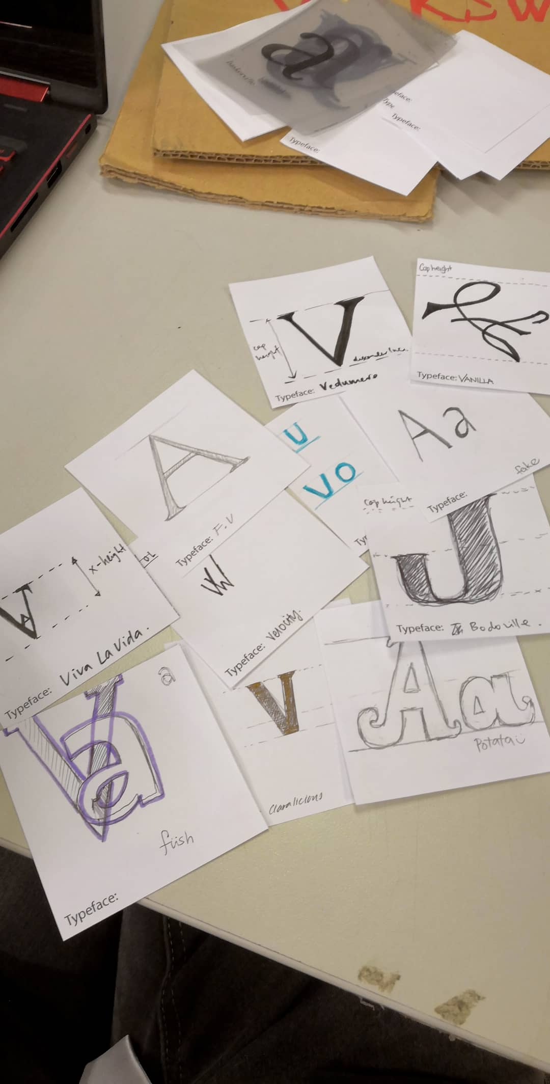
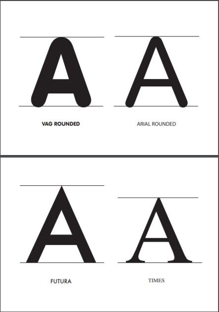
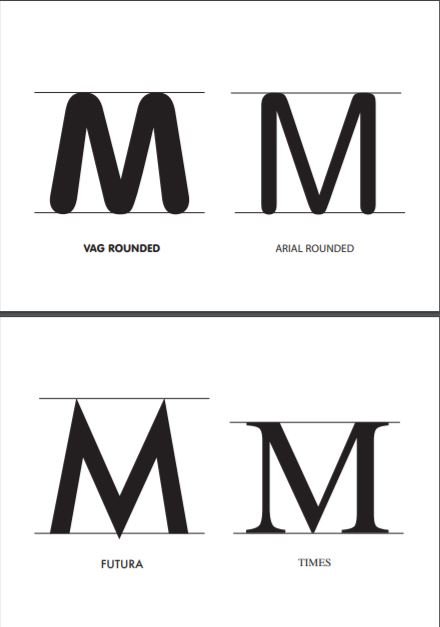
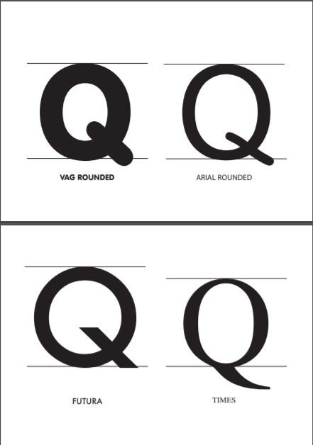
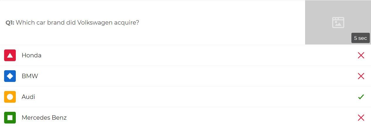
Audience members will get to put themselves in the shoes of the graphic designers. They will be presented with a chart of Futura for Volkswagen and Times for Audi and try to combine the both of them and come up with their own typeface (a few letters will be picked for them to save time) to solve the problem and help raise sales for Volkswagen.
3. Analysis of VAG Rounded typeface
It will then be revealed that the actual chosen typeface is VAG Rounded. We will then proceed to analyse the typeface anatomy of VAG Rounded in detail.
4. Mention of contemporary application of VAG Rounded
It will then be explained why VAG Rounded was chosen (how it’s a friendly, yet corporate typeface) and is still currently used for branding and advertising in current times to target certain target audience (namely children most of the time).
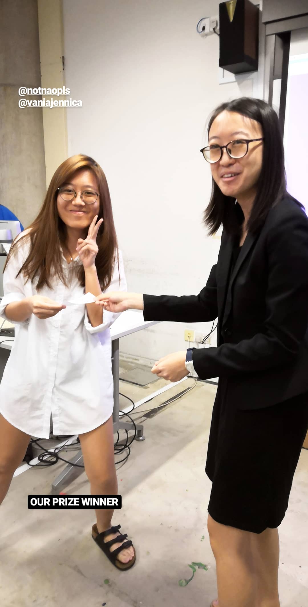
5. Kahoot segment + Prize presentation
We will then summarise the presentation with a Kahoot segment to consolidate the information about VAG Rounded. The highest scorer will get a prize of a Jolliibee drink cup with its typeface being analysed with markers. 😀
6. 5 min Q&A
We will then accept any inquiries from the audience.
The Actual Skit
Thank god for the existence of Google drive.
Our group discussed over Whatsapp and Google docs to get everything together.
We contextualised everything into the scene of a car show and a board meeting. Our audience participation segments consisted of getting the audience to design a letter of their own typeface by taking Futura (used by VW) and Times (used by Audi) into consideration. This helps them to put themselves into the shoes of Gerry Barney and his team at Sedley Place when they were tasked to design a new typeface for VW back in 1979.
VW: Futura
Audi: Times
Our lovely classmates’ responses!
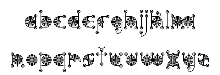
A few letters from the VAG rounded typeface were also selected to make closer comparisons between the type anatomies of VAG rounded, and the original typefaces of VW and Audi (Futura and Times). Arial Rounded was also chosen for comparison since it was another rounded typeface that was similar to VAG rounded.
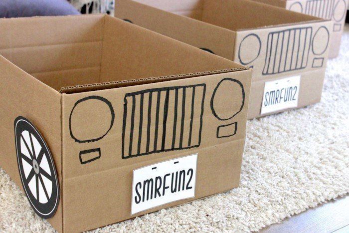
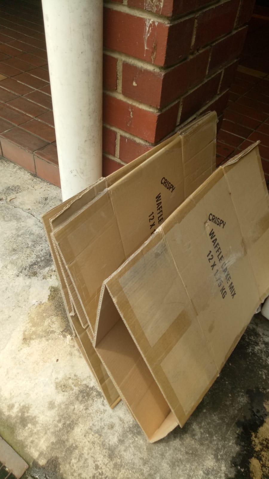
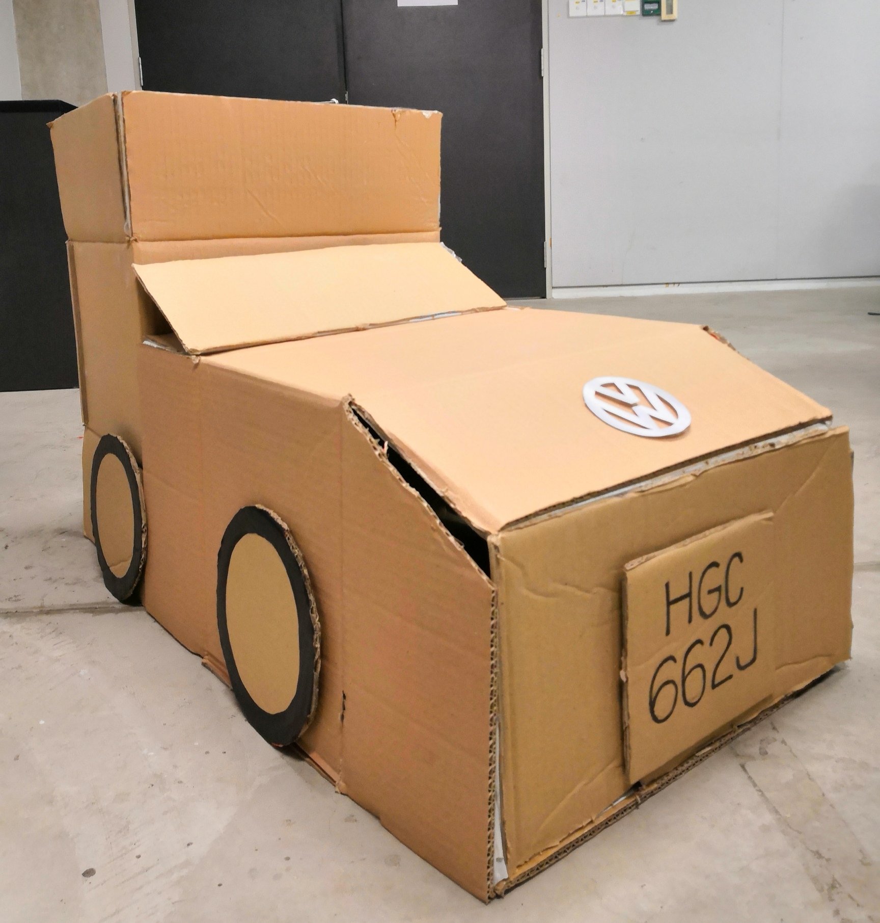
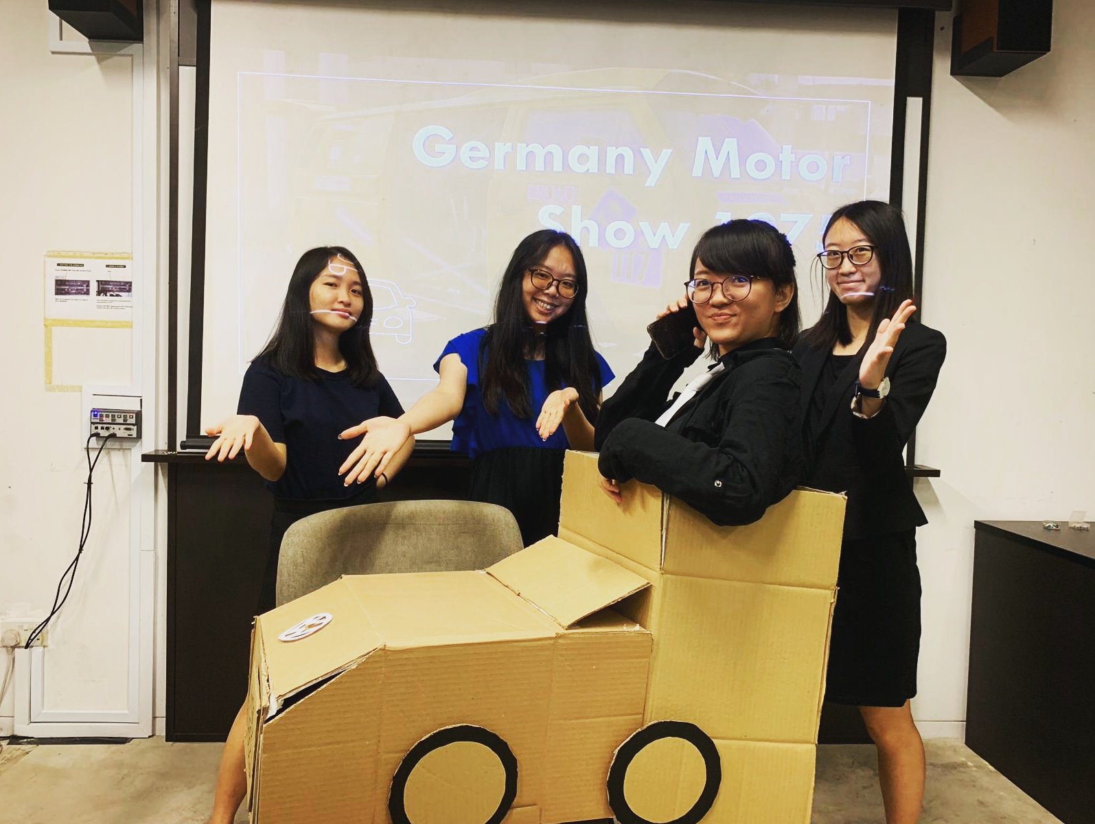
For our VW car prop, we picked up abandoned cardboard from Can 2 and transformed it over a night into a beautiful (and questionable) Volkswagen car. 😀
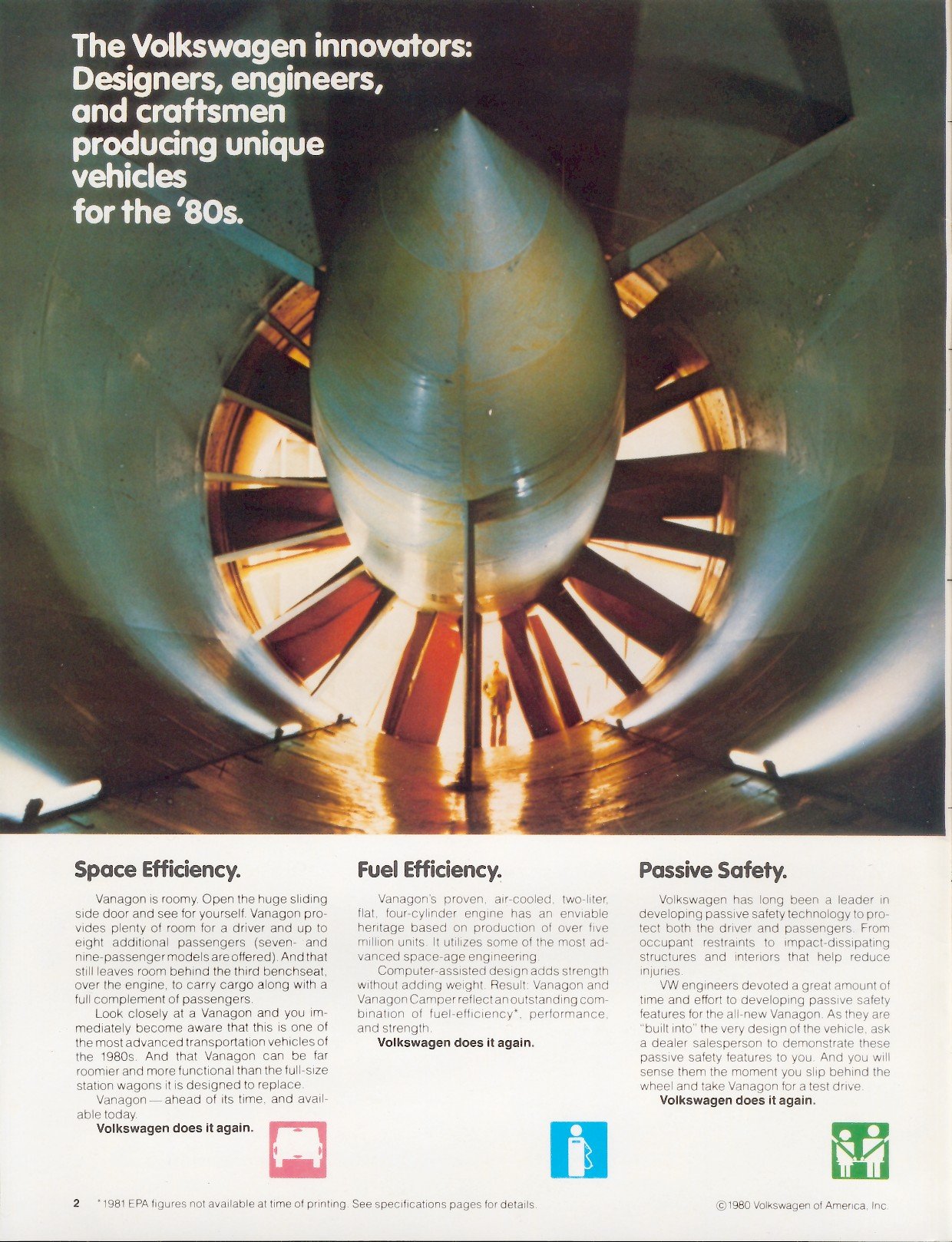
We dug the internet for examples of the original designs of advertising collateral from VW designed by Sedley Place back in 1980!
In addition to these old posters, we also emphasised how VAG Rounded is still currently used even in current times for brands/companies that are aiming for a convivial yet corporate vibe since VAG Rounded still has even stroke weight and very much follows the structure of basic shapes, unlike fonts like Arial Rounded (look at letter Q) or Comic Sans.
We also added in a Kahoot at the back to consolidate everyone’s knowledge about VAG Rounded!
Here are the Kahoot! questions:
Proof that we gave away an actual Jollibee voucher as promised! (Thanks Tiffany for going all the way to town to buy it!)
Group photo at the end of the presentation! 😀 Big thanks to everyone <3
xoxo
Personal reflections
Jasmine:
Through this project, I learnt a lot about the VAG Rounded font. Previously I was only aware of comic sans as a rounded font but after researching, I learnt the existence of different rounded fonts and how they vary as well. VAG Rounded also taught me how understanding the background of the typeface is crucial when applying it for different usage.
Vania:
This project taught me that there are more to consider when using typefaces—the context, the familiarity, the versatility, etc. It made me think that all typefaces have their own good and bad points—especially more with VAG Rounded, which I didn’t particularly like in the beginning. It made me want to break from just using the typefaces I like or I’m familiar with. Moreover, I also learnt that a group setting is beneficial for ideation and problem-solving, since not everyone will think the same way and that could be a good learning point for everyone.
Tiffany:
After researching about the development process of VAG Rounded typeface and how it portrays Volkswagen at that time, I feel that it is important to be aware of the trends and the characteristics of different type classifications and typefaces to better apply with the intended purpose of future projects. Preparation, time management and initiative in a team should be taken care for better presentations in the future.
Yue Ling:
This project taught me that sometimes using skits can really make presentations a lot more interesting (even though it’s harder on the presenters, but it’s worth it). Initially, there was not too much historical data to go on, but by contextualizing the presentation, more time is committed to making information more memorable through storytelling and audience engagement instead of rushing through a normal lecture-style presentation, and we even ended up slightly exceeding the 15 minute mark much to my surprise. I’ll definitely consider doing more crazy skits for my future presentations!
Seddon, T. (2015). The evolution of type: A graphic guide to 100 landmark typefaces. Richmond Hill: Firefly Books.
Dawson, P. (2013). The field guide to typography : typefaces in the urban landscape. London : Thames & Hudson, 2013. Retrieved from http://ezlibproxy1.ntu.edu.sg/login?url=http://search.ebscohost.com/login.aspx?direct=true&db=cat05206a&AN=ntu.1267666&site=eds-live&scope=site
In this first project for Graphic Form, we have to translate the essence of a job (that can be imaginary) into visual, typographic forms of our names using any sort of media.
Since the jobs we chose were not specified to be pragmatic/realistic, I started off by brainstorming up some ideas for imaginary jobs that are grounded in the essence of real jobs that exist in reality. I came up with a list of existing jobs and modified them by merging them with each other. This would not only help me come up with much more interesting outcomes, but also give me a wider range of job fields and their nature to explore. Thereafter, I searched up the jobscopes and items that are iconic to these jobs to make them easily identifiable.
Initial Shortlisted jobs:
Baby DJ
Pool Colourist
Professional Liar
Alien Communicator
——–
Baby DJ
Original job inspirations: DJ, Infant care nurses
Jobscopes
DJ: to play music at events entertain, mix beats to hype the crowd up. Has to be well-versed in different sorts of music. Usually playing loud music at social events to give enhance the lively mood/atmosphere.
Infant care nurses: Caring, patient, organised, responsible, nurturing, taking care of delicate babies
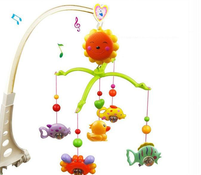
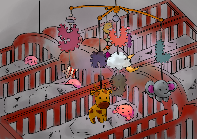
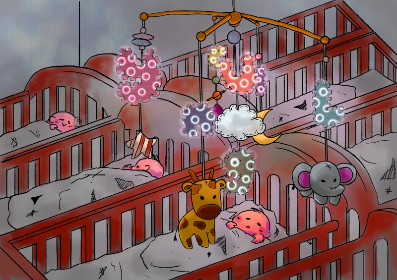
Objects related to babies. http://clipart-library.com/clipart/di4565nLT.htmBaby mobile toys that have the possibility of including multiple elements/toys into them.
Idea Generation:
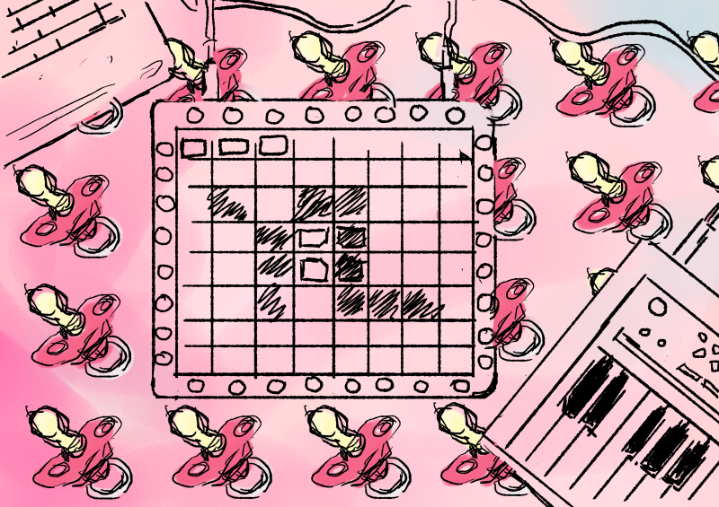
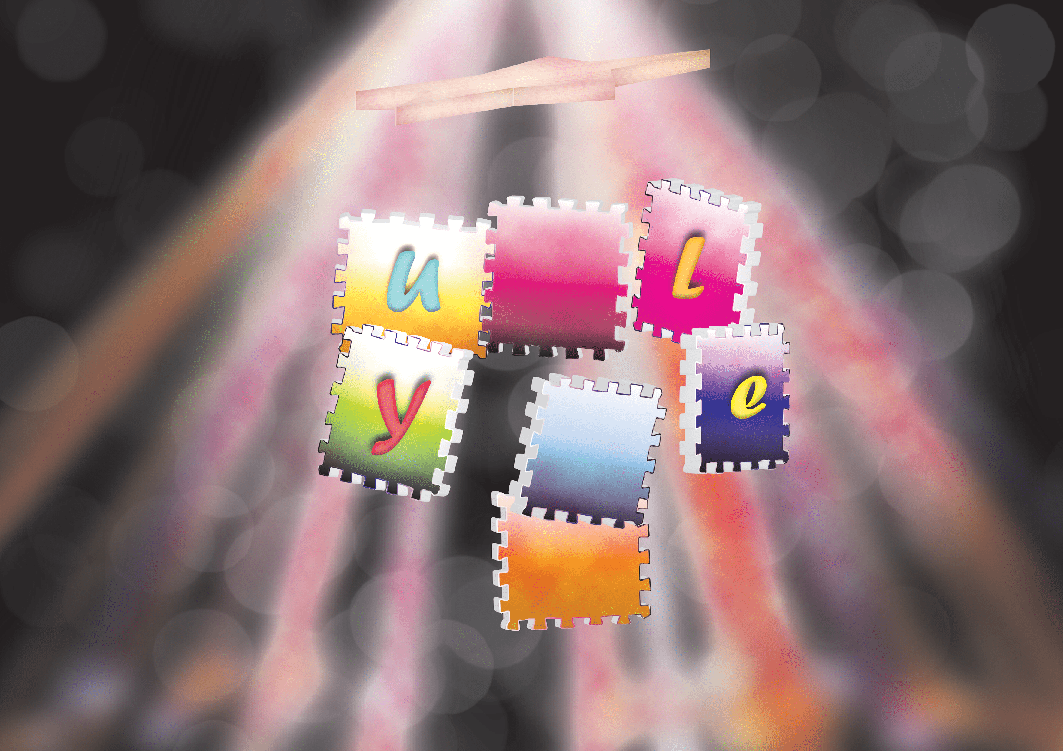
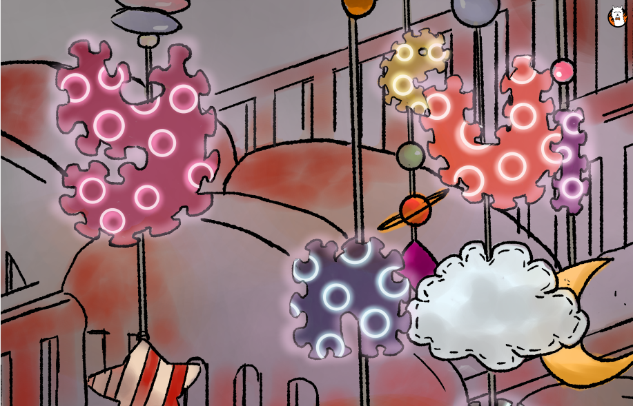
Marshmello – ALONE – [Launchpad Pro Light Show] https://www.youtube.com/watch?v=A0M0p7d1MTM This example of a Launchpad light show demonstrates that users are able to intentionally program the sequence of lights on their device to form different images.I decided to map my initials of YL onto a digital illustration of a Launchpad and make the buttons neon. The background ]would be repeated patterns of pacifiers and a pastel shade. Pastel shades are generally seen as more gentle colours that serve to convey a sense of innocence, purity, cleanliness that are seen of babies.
Words like “lightness” and “ease” come up a lot in conversations about pastels. Sallie Harrison, the designer and photographer in L.A., says that pastels evoke a sense of “calmness and balance.” Stewart points to light blue and its connection with spirituality and heaven; (Leatrice) Eiseman at one point related soft colors to infancy, when there was a sense of ease and safety because all of our needs were taken care of. These feelings can be connected to the social and political factors at work, as Eiseman pointed out while listing her considerations for color of the year.
(Leatrice Eiseman is an American color specialist, who assists companies in their color choice in a range of areas, including packaging, logos, and interior design. She is the executive director of the Pantone Color Institute, a division of Pantone, Inc.,[1] and the author of six books on color, one of which won an award from the Independent Publisher’s Association.)
However, this draft did not really display the elements of the job in the letters, rather, they put the letters into a context. When the letters are taken out of context, they do not effectively portray the essence of the job of a Baby DJ anymore.
Therefore, I embarked on a mission to try to integrate the essence of both a DJ and a infant care nurse together into my type.
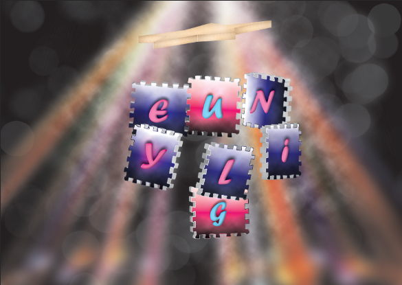
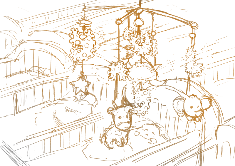
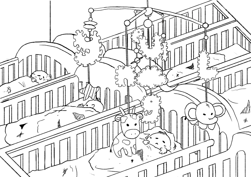
Brainstorming pt. 1 I tried to integrate the buttons of the DJ Launchpad into the letters, and find a way to include elements of babies into the font as well, such as the foam letter toys and letter cubes.Brainstorming pt. 2 I tried considering the context of the type as well by including the element of the mobile toy.
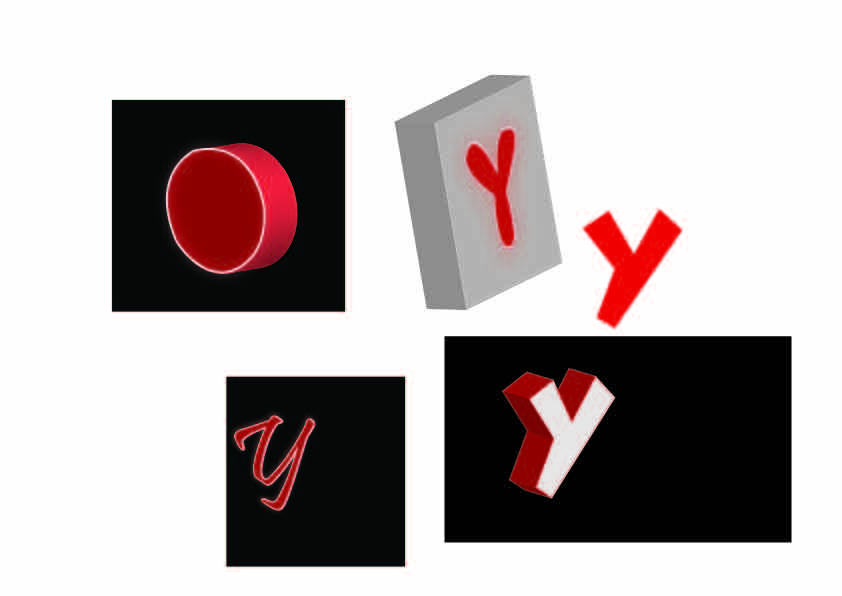
Exploration of button placement and lighting effects of buttons on the font in FireAlpaca.Attempt at recreating the neon effect in Illustrator on 3D font made by beveling and extruding the shapes and adding several layers of glow on the outer edges of the font.
It was really difficult trying to recreate the multiple button effect in Illustrator because the 3D extrusion function and art mapping was not exactly user friendly. It took a pretty long time trying to render every single 3D object as well. Thus, I tried only extruding the foam toy square, while leaving the neon letters on the square. In the draft below, I had mapped a wooden texture onto a star shape. I tried to map a foam texture onto the foam squares to recreate a more accurate foam effect as well but there were way too many surfaces, so I stuck with a gradient effect. The background has several layers of lighting effects as well to try to recreate that of a dance club.
Attempting to use highly contrasting neon pink and blue lights since these are colours are energetic and associated with clubs.In this draft, I tried out using different complementary colour pairs to get the foam pads looking like toys instead so that it would be more indicative of babies.
After relooking and consultation, I felt that the bokeh, strobe light and cloud effects were too strongly suggestive of a DJ instead of babies and did not convey my intentions accurately since I wanted to be a DJ that could put babies to sleep. Not make babies get up and dance. And so, I embarked on quite a different mission to change the composition to a more child-friendly one.
Final
With this draft, I switched from using Illustrator back to FireAlpaca because I am very much in love with this analogue brush that I downloaded and it makes everything look more organic and doodle-y rather than cold. Instead of putting the letters into the foam pads, I decided the incorporate the peripheral pattern of the foam pad into the letters instead, and leave in the circular neon shapes to indicate buttons on a Launchpad.
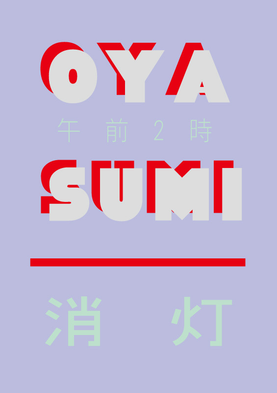
After finishing a rough sketch of the composition, I lined the artwork with thinner, black lines.Oyasumi (Goodnight) poster by Takashi Ueda. I happened to chance upon this poster which I thought was very interesting because of the use of contrasting colours that added energy, and yet was mellowed down by the use of dimmer colours to show that the lights are off and it’s time to sleep.
I wanted to use the colour schemes of artworks used for lo-fi hiphop videos on Youtube since they’re really pretty and also make me feel calm and relaxed looking at them. Usually, there are pastel, mellow, analogous and warm colours.
I tried my hand at recreating this colour scheme by using dull colours and mostly warm tones. Dull colours would also help to contrast the neon effects to come. I also added an atmospheric glow in the middle to indicate that the letters are glowing.Using my experience of creating the neon lighting effect, I lit up the periphery and added neon circular shapes into the foam letters.
I then found and added a foam texture onto the letters. This was so much easier to do on FireAlpaca than on Illustrator since I could adjust the opacity and edit the shape of the layer simply by erasing it.In the background, I added some bokeh lighting effects to show that the lights of the neon letters projected far out. It also added to the overall calm atmosphere of the composition.Anddd… here is the final composition! I think it was definitely a good move moving away from using Illustrator for this job.
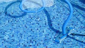
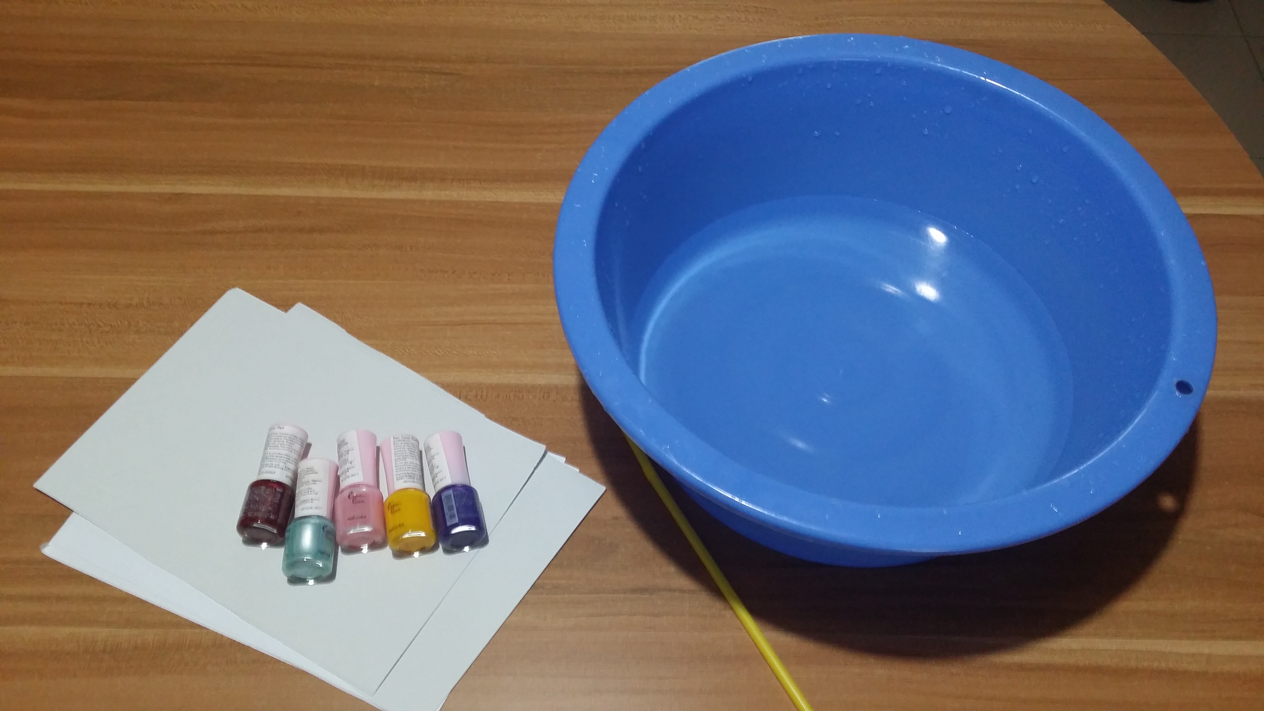
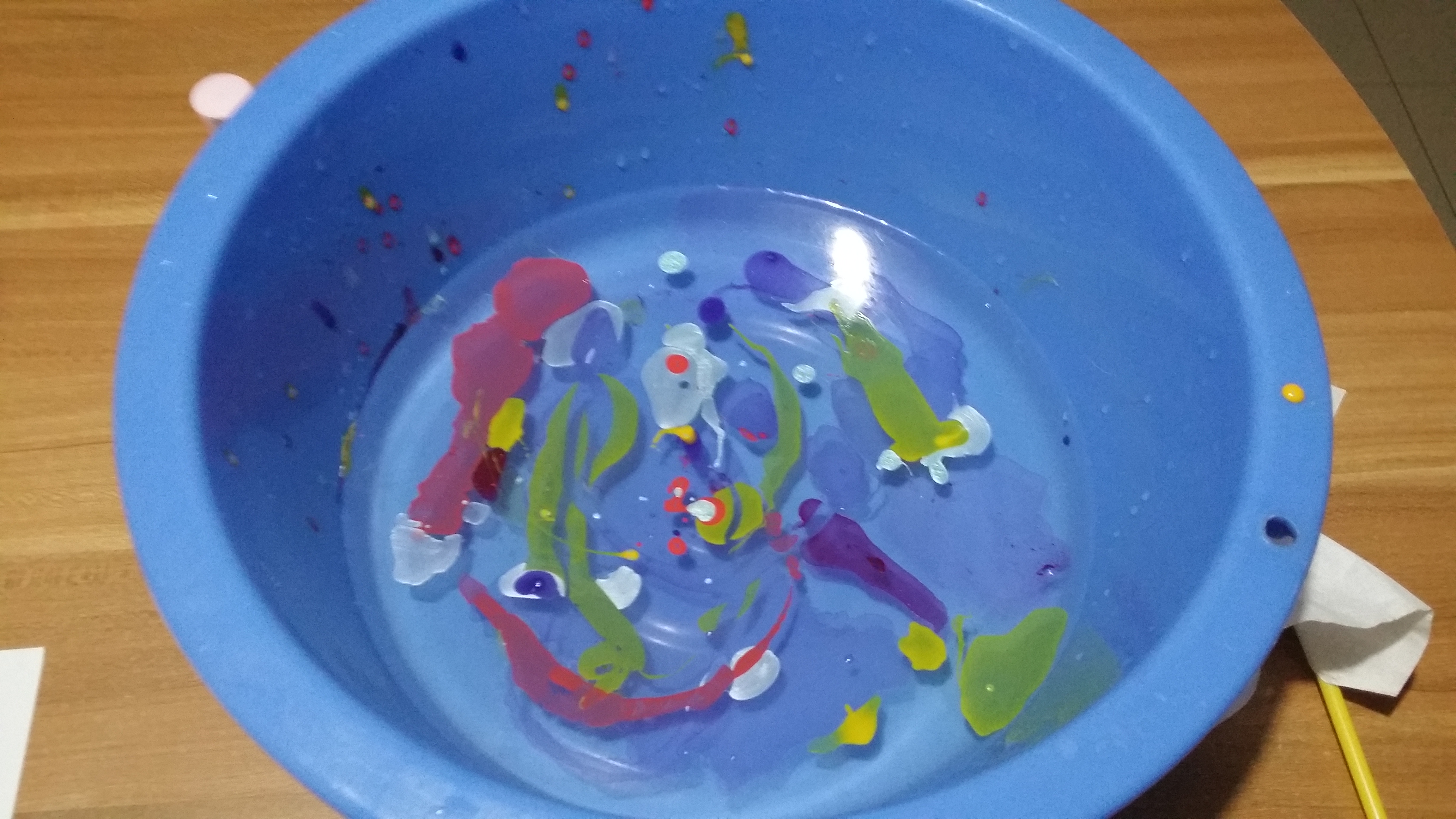
2. Pool Colourist (abandoned D:)
Original job inspirations: Pool maintainer, bath bomb makers
Jobscopes
Pool cleaner: Needs to be committed, works on a regular basis, cleans the pool by throwing chlorine in
Pool cleaning machine?
Bathbomb makers: Manufacture bathbombs by compacting colourful powdery compounds into spheres to be thrown into water and dissolved to colour the water in bathtubs
Objects
Pool cleaner: Water ripples, Pool tile patterns, pool cleaning machine, lifebuoy
Bath bomb makers: Bathbombs, rubberducks
Emphasis on the CHANGE of colour
Mediums for consideration:
Use marbling technique/ decalcomania] put something when pressing down to form letters
Investigator: Find out the truth about a situation by sieving through documents, going onsite to find clues for cases.
Compulsive liars: Can make up a tall story about anything at anytime. Might be useful in some situations to get away with something for the time being. Hiring someone that knows exactly what to say could be really useful. It’s definitely a dirty job.
Compulsive liar: words, speech, Pinnochio nose, Suprematist/De Stijl works to represent the truth
Ideas:
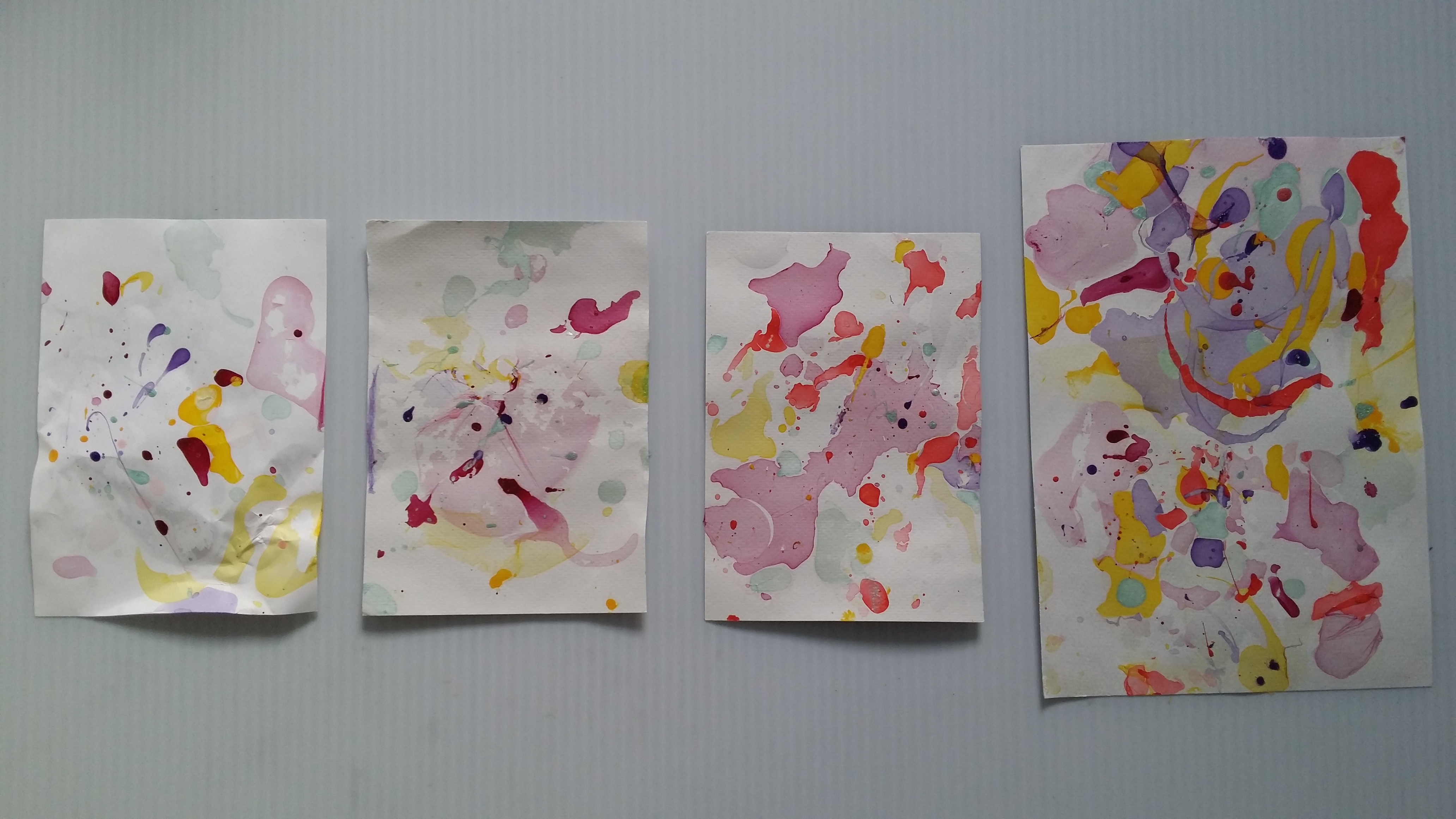
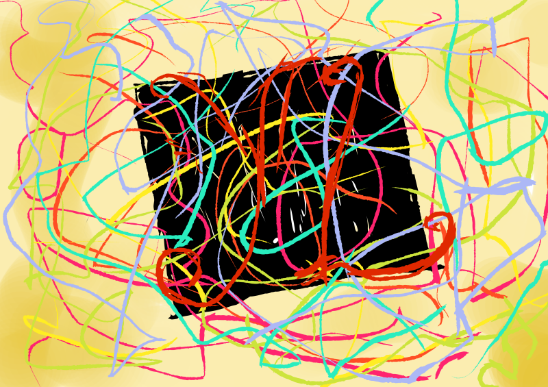
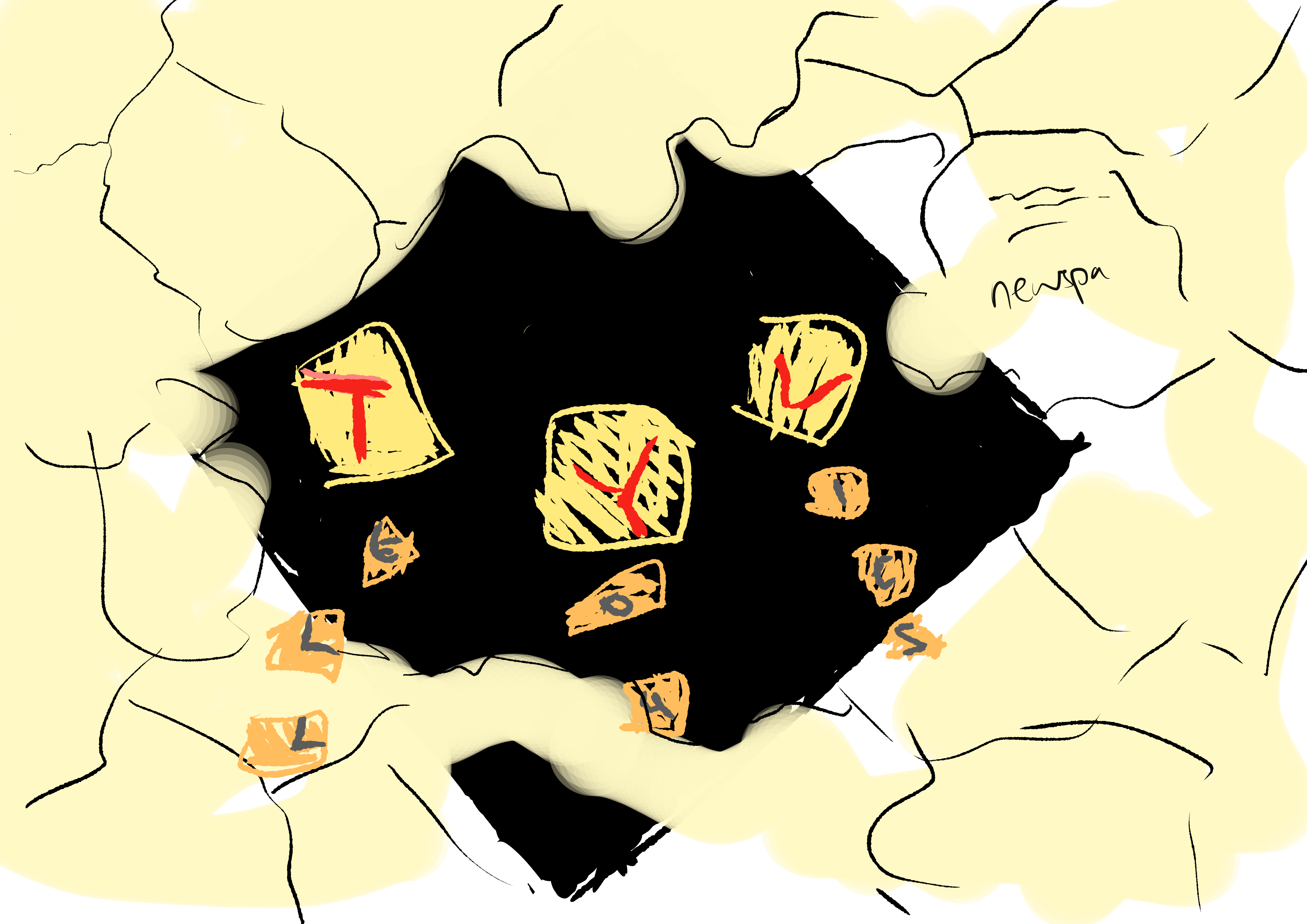
For this draft, I used Malevich’s Black Square to represent the simplistic truth. Lies would be represented by colourful strings to show how pleasant looking things can cover up the truth that is difficult to understand. The contrast between the sturdy black square and the wavy, flowing rhythm of lines would make the composition more dynamic.Some strings I bought from Daiso. I tried using them but they ended up being too thick.I happened to chance upon this paper cut composition which I thought was interesting because it looked like the paper was concealing the faces.And so, I also considered doing a newspaper collage which would partially conceal the black square, similar to how the media could sensationalise and cover up the truth of the matter. Here I am thinking of how to incorporate letters into the composition as well, most likely with a collage of letters.
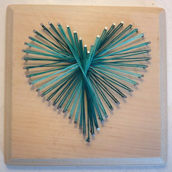
I came across this image of a heart created by winding thread around nails hammered into a wooden board. I was thinking of another way to recreate it so that it would not be too risky since with this method, tension in the strings is key and the moment something goes loose, the entire thing will come apart.
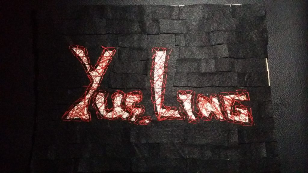
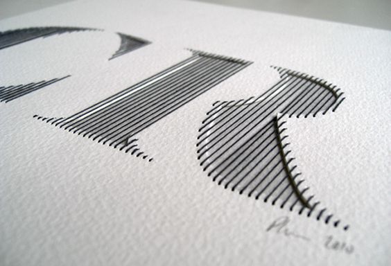
I wanted to explore a new medium which I didn’t get to try out last semester so I looked into sewing. I have some prior experience of patching up my own clothes and buttons so it wasn’t a monstrous task to overcome, so I decided to try this method out. I found this font type that used thinner thread to create neat, vertical strands that filled up the width of the letters, and bound several layers of paper together.
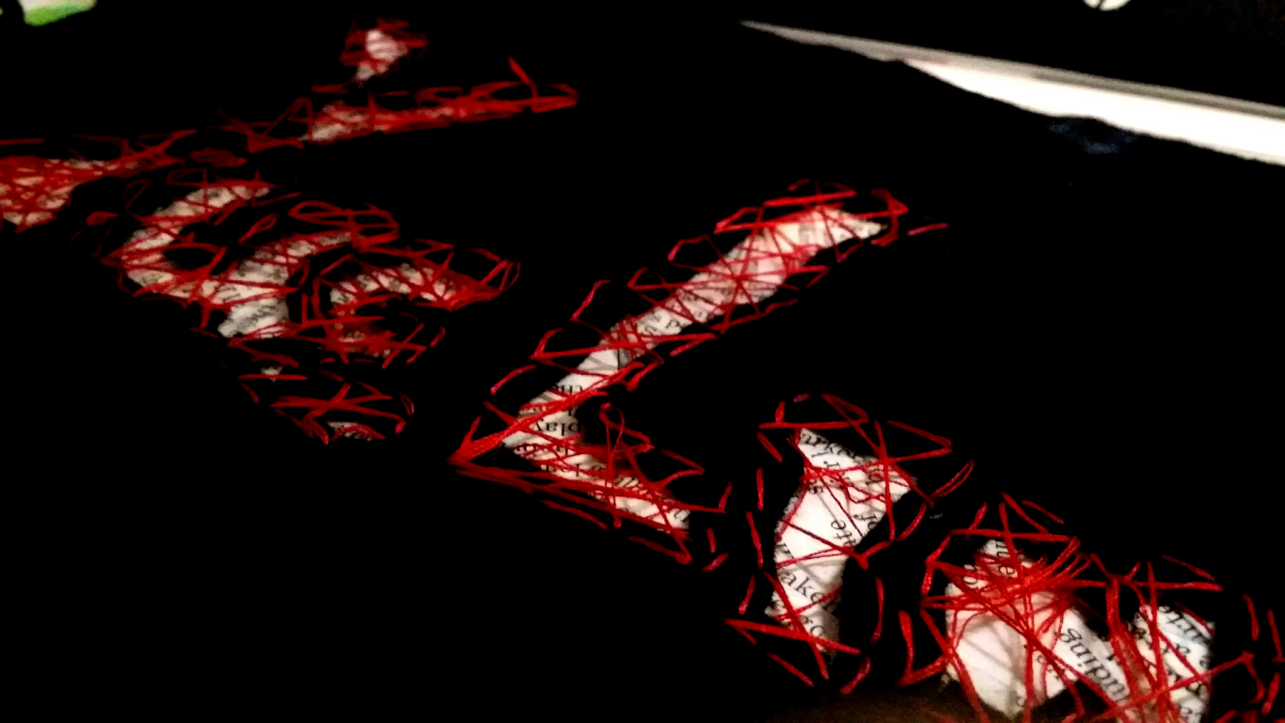
Idea sketch for the making of the composition. I decided to use black felt because it was much easier to sew with than paper, which was in comparison very thick. Underneath the felt, I would do a newspaper collage. In this case, newspapers would represent legitimate black and white documents, thus the “truth”, and the black felt would conceal most of it. I would then sew a random pattern over the with of the letters to create an interesting texture and at the same time make the letters see-through so people can see the words on the newspaper underneath. I used black felt and red thread to express the secretive and dangerous consequences of lying.
Medium: String, Paper, Newspaper
While testing out the sewing technique, I realised that just by sewing in the width of the letters would still make them a little unidentifiable. I chanced upon this image and it gave me the idea to sew around the periphery of the letters as well to make the letters stand out more.
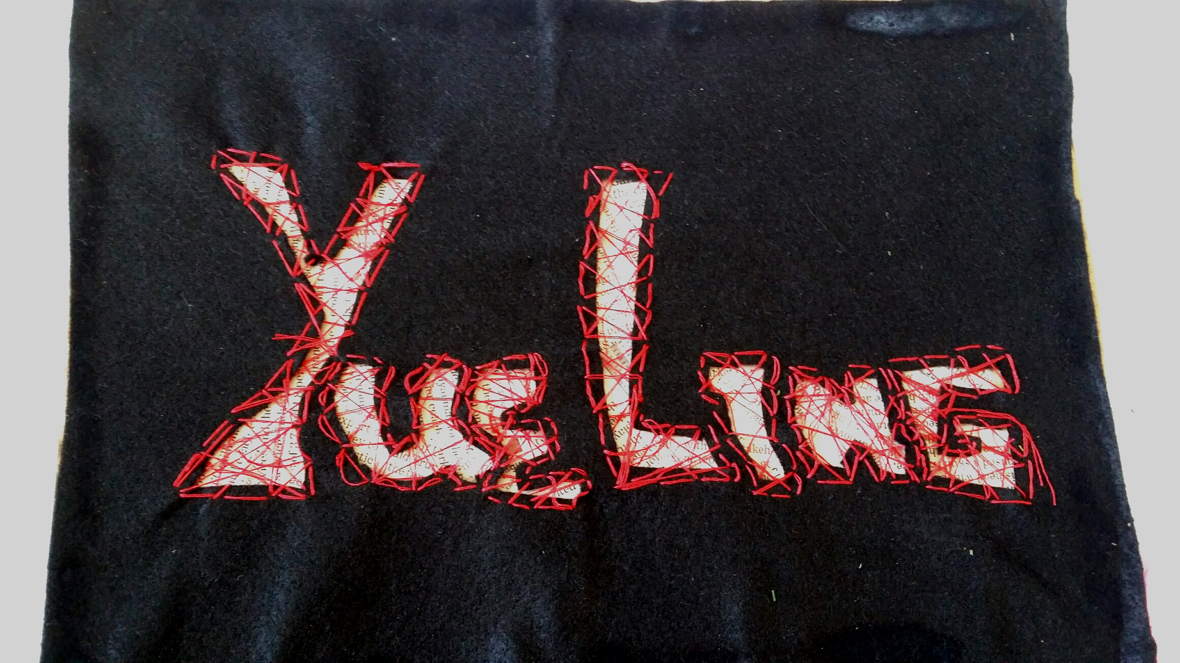
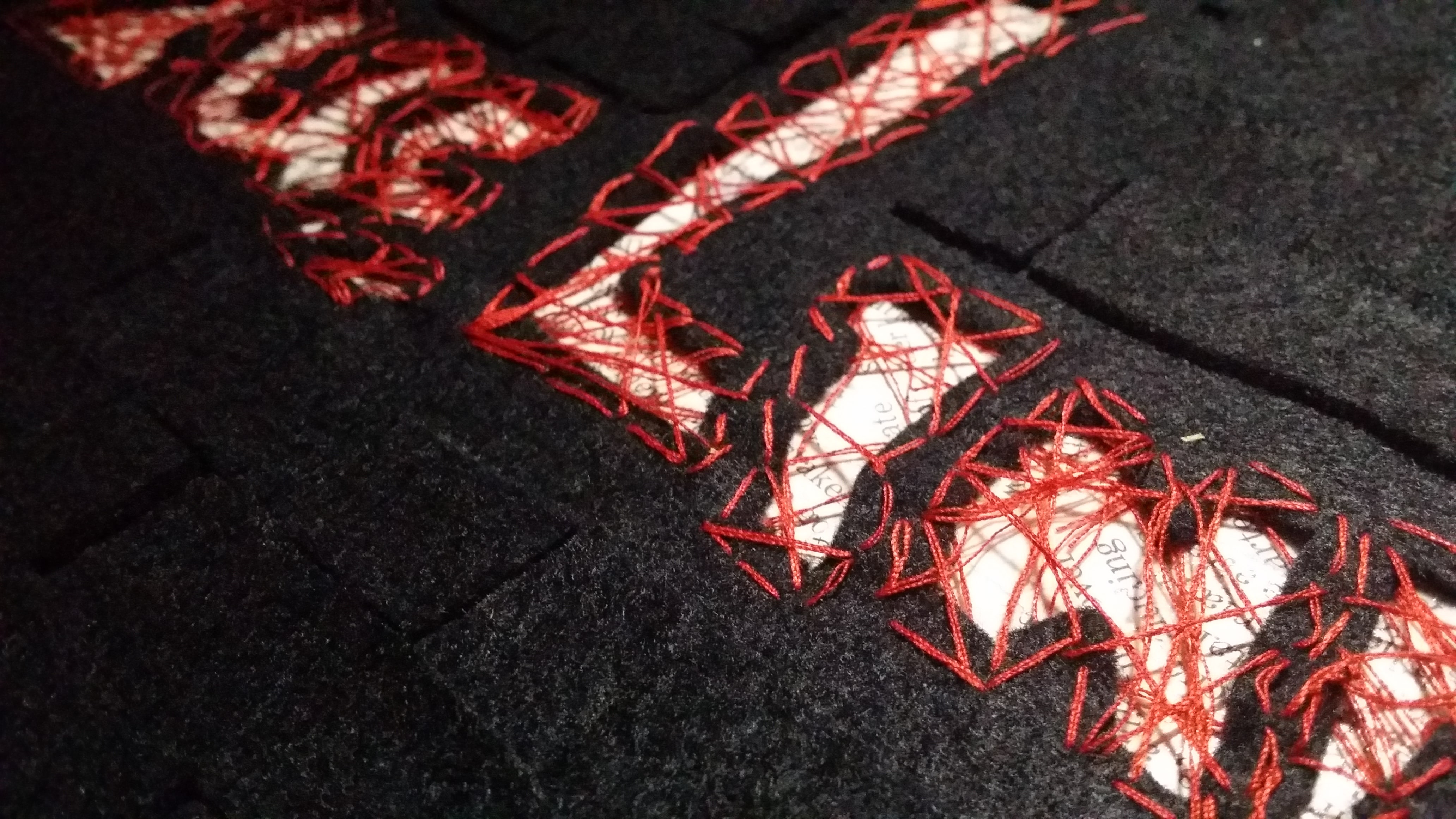
Here is the actualisation of my idea! I created a newspaper collage behind the widths of the letters, picking out the pieces with the most words. Then, I used a cardboard backing so that the felt could be supported. Also, if anyone wants to try this method out, PLEASE cut a bigger piece of felt because when you sew the letters together, it contracts the entire piece of felt.Peekaboo! You can see the newspapers inside~ Now, I used super glue (like the actually really strong kind) to glue the felt to the cardboard, so it did kind of have a chemical reaction and burned the felt. The burned area was really obvious. ;;;
Final
I covered up the burned marks using smaller patches of felt. I decided to use a regular tessellation pattern instead of creating a massive effect because I wanted to portray a professional liar with a calm nature that can lie with a straight face.Here’s a closeup of the texture! Overall, I think this piece has helped me to explore with more mediums that I’ve never really gotten to try and it produced a really tactile result!
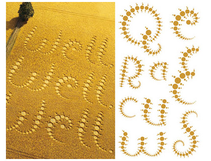
4. Alien Communicator
Inspired by: Astronomers, Crop circle artists
Jobscope:
Astronomers: To study outerspace; investigate the presence of life-forms on other planets.
Crop circle artists: Create geoglyphs on large expanses of crop fields to trick the public into thinking that aliens are real. Also to practice an impressive new art style.
Objects:
Astronomers: Satellites, space suits, rockets, shiny metallic objects, outerspace themes, solar system
After brainstorming, I settled for doing a crop circle artwork myself!
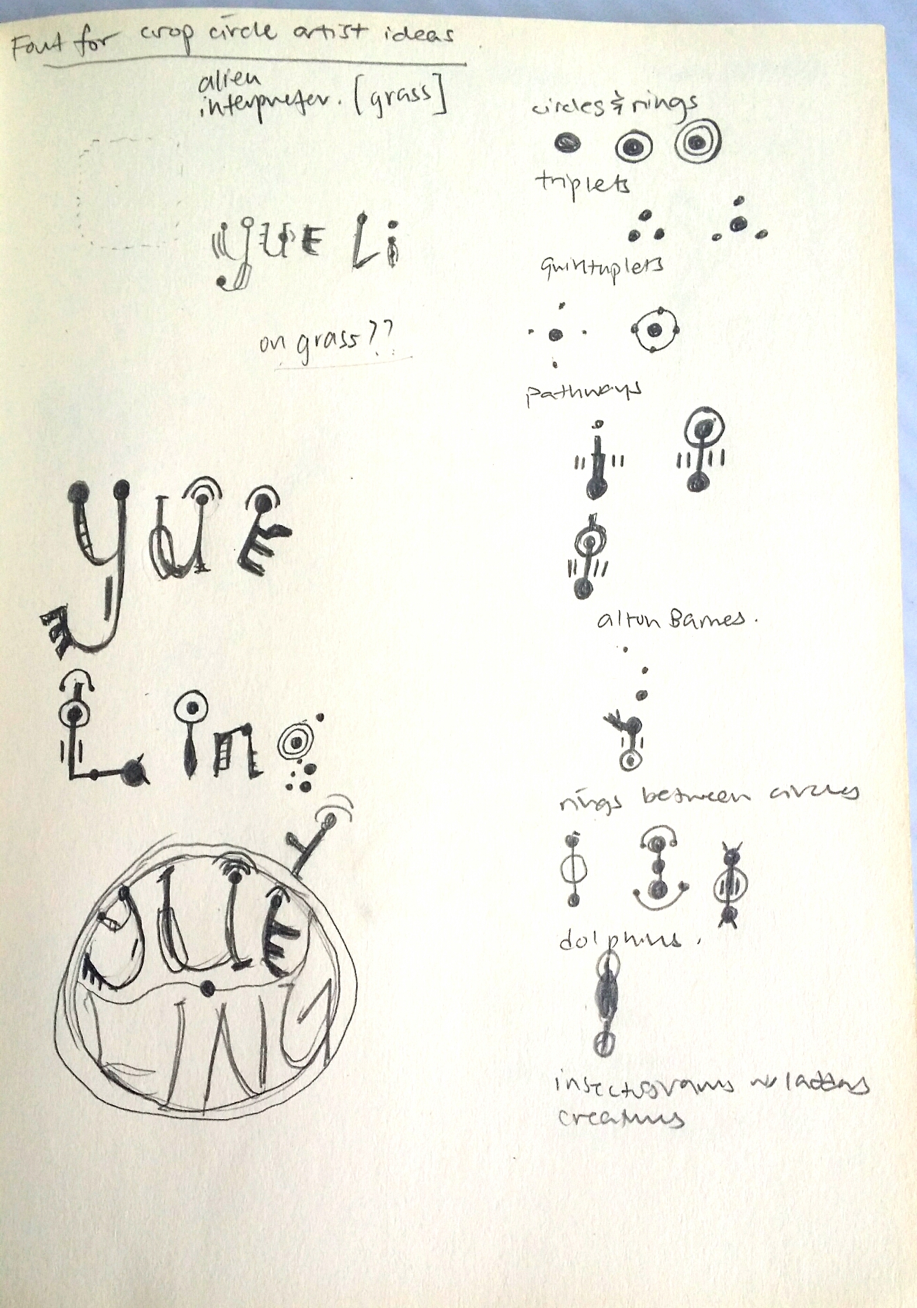
But first, I had to do some research on the patterns of crop circles. And so I did.
Crop Circle Fun Facts!
Crop circle art is a relatively new art form. In crop circle art, crop is bent and not harmed in any way. Most crop circles have either laterally symmetrical or radially symmetrical art. They could also be completely unsymmetrical and representative. The possibilities are endless.
The most telling feature of crop circles are their stunning geometric shapes and patterns that make it hard for people to believe that they were really created by human beings on such a large scale, and so a lot of people would rather believe that aliens did it.
I borrowed a book on crop circles by Michael Glickman to study the common features of crop circles:
others like -orbits,snowflakes, triangles and squares
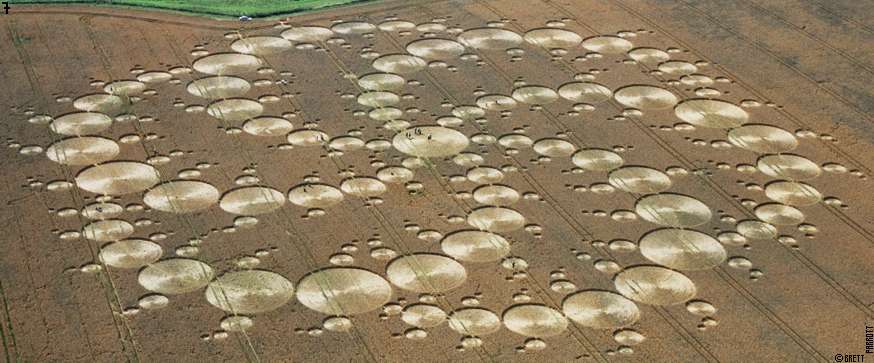
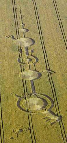
Radially symmetrical composition with tons of rings, almost resembling a whirlpool because of the swirl of the lines from the center outwards.Alton Barnes crop circle. Here we can observe bridges across rings, which is cool and all but the most iconic thing about this crop circle is the gear/crank looking protrusions coming out, giving a mechanical nature, and evoking a sense of modernity/technology.Laterally symmetrical representational composition of a jellyfish in a field in Oxfordshire.
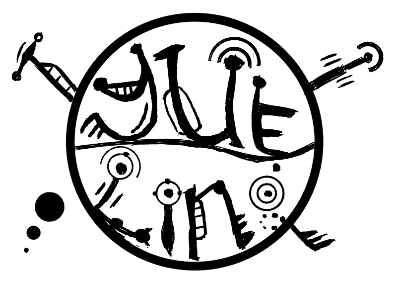
In this draft, I tried incorporating the different patterns that I had learned, as well as letters of my name. However, this did not include the essence of the job into the letters once they were extracted out. So I decided to look into crop circle font.Most of the search results that came up showed fonts like this that were ultimately… Alien webdings. Which is cool as a code and all, but no one will know how to read my name.I found this font which did utilise rings, bridges and insectogram feelers, but the patterns could be more diverse.And then I came across this one that used only rings, but at least it incorporated the pattern of the crop circle into the letters themselves. This inspired me to build on this concept, while including a larger variety of patterns.
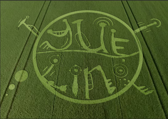
Here, I sketched out some of the above mentioned features of crop circles and found ways to incorporate them into the individual letters. I decided to put the letters into a circular shape as well since it would contribute to the overarching circular/geometric motif of crop circles.On FireAlpaca, I constructed a draft of the crop circle art. I was planning to use this as a stencil to cut out the letters on an actual fake grass patch from Daiso but… you’ll see later.Yeap, here is the grass patch I was planning to use, it was about 22cm by 22cm.I tried trimming down the grass on an extra bit of the grass patch to see how obvious it would look.Unfortunately, after trimming, the letters could not show up. I even used brown acrylic paint to try to bring out the letters but the paint couldn’t show up and the space was too small too. Much to my dismay, I had to abandon this medium. But not all hope was lost!I decided to turn to trusty digital imaging. Now I haven’t really done heavy editing before, so I was starting on a clean slate. Wrecking my brain over how to make the image as realistic as possible, I was blessed.
SOMEONE DID A TUTORIAL ON IT!!!
This tutorial was absolutely FANTASTIC. It was clear to follow and produced a really realistic effect. You can also use any stencil with a transparent background you have created, and following quite a long but comprehensible procedures of producing a screen, bevelling and embossing and tweaking lighting settings, you can create your own realistic digital crop circle artwork as well. By following this tutorial, I managed to play around with the blending effects a lot more, which I had always been quite unfamiliar and apprehensive about touching before this project.
Final
After many attempts and disappointment, I finally managed to achieve this super realistic crop circle effect that could convey the essence of my alien communicator job through the grass medium I had originally wanted to use, just digitally. I really have to thank the person who uploaded that tutorial!!
5) Local Pastry Chef
Inspired by: Chefs, Singaporean Hawkers
Jobscopes:
Chefs: Professional chefs that pay close attention to the process of cooking, as well as garnishing and presentation of food.
Singaporean hawkers: Specialise in catering to the Singaporean palate, making local cuisines like Chili Crab, Bak Kut Teh etc.
Objects:
Chefs: Chef hat, wok, spatula, frying pan, ingredients
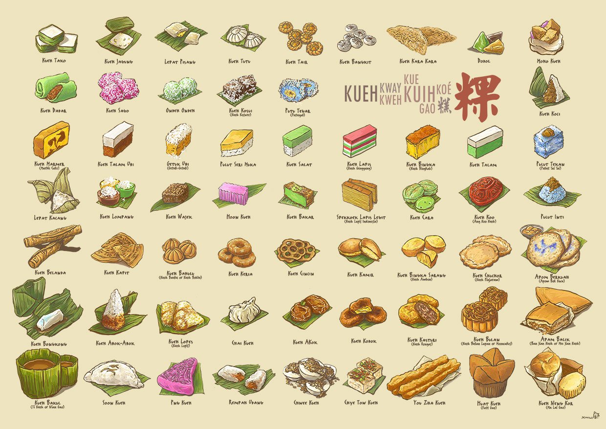
Singaporean hawkers: Chili crab, bak kut teh, kueh, fried rice, hokkien mee, yong tau foo
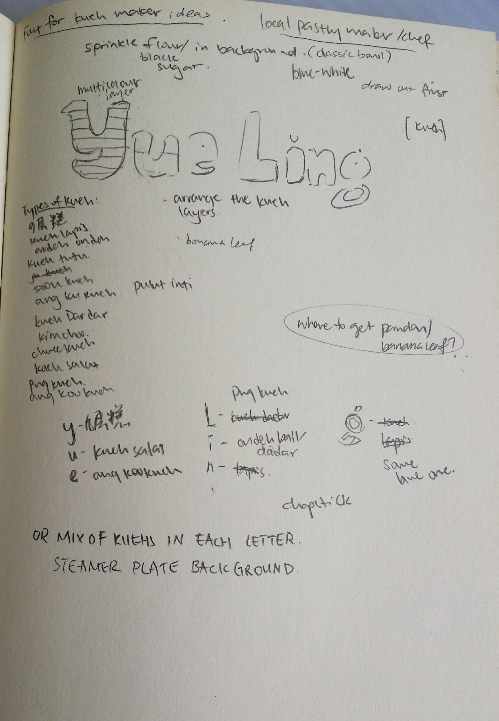
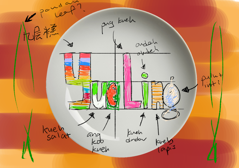
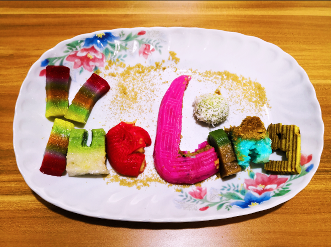
Kueh Compendium by Naiise It was decided that I was going to use kueh as a medium since there are so many different types and they are all really colourful (and tasty). Recalling that Naiise has a lot of products designed based on local pastries, I decided to search up references and low and behold, there was an entire catalogue of kuehs to choose from! I didn’t even know some of these kuehs existed. https://cdn.shopify.com/s/files/1/0175/9848/products/KuehUltimaxwithnamessm.jpg?v=1495785705Here, I drafted and started planning which type of kuehs to put into each letter. I tried to include as many types and colours as possible, and also considering the characteristics of each kueh and whether they could be molded into the shape of the letters. For e.g., for more complex forms, I tended towards kuehs that were layered so that the layers could be the characteristics incorporated into the letters. Also, for the long capital letter L, I used the correspondingly lengthy pink png kueh because it was suitable.In this draft, I tried to imagine how the colours would turn out based on the use of different kuehs. I was going for a more home-y feeling as well so I wanted the background to be of a wooden texture, and the plate to be either clean or the blue-white/flowery traditional ceramic types.
Medium: Kueh, Photography
After spending QUITE the amount on about more than 10 kuehs (but it was worth it because it was really fun making and eating them afterwards), I crafted out the letters of my name in kueh. I placed the kuehs in a flowery ceramic plate and sprinkled some brown sugar over to complete the garnishing. I edited the original picture by adding some filters which gave the photo a warmer and home-ier colour tint.
Kuehs used:
Y- Kueh lapis sagu (Jiu Ceng Gao in chinese)
U – Kueh salat
E – Ang Ku Kueh
L- Png Kueh
I – Ondeh ondeh and kueh talam
N – Pulut Inti
G – Kueh Lapis
Reflections:
This project was pretty challenging in the sense that we had to create letters that could easily communicate the essence of our jobs. Since I also decided to go with jobs that are inspired by at lease 2 traditional/existing jobs, it was tough trying to incorporate elements of both jobs to balance out the elements equally. However, through a rigorous process of refining my designs, I would like to think that I have managed to do so. ;;; XD
With this project I also wanted to explore the use of other mediums, which I think I managed to do successfully! Although it was not a smooth process throughout, with many failures and disappointments, I always recall the saying that artists should “Fail faster” so that we learn from mistakes faster and can get on with improving our projects. After failing with the intended mediums, I tried to find alternate options that could express my intentions on the same level, if not, surprisingly better.
Through this project, I was also able to get more comfortable with Photoshop blending modes that I have never ventured to touch before. Fiddling around with the settings for making the neon glow and crop circle really taught me the massive capacity Photoshop has for creating realistic illusions.
All in all, I really enjoyed this project and had fun trying out different mediums instead of just ink/paint. Looking forward to the next Zine project!