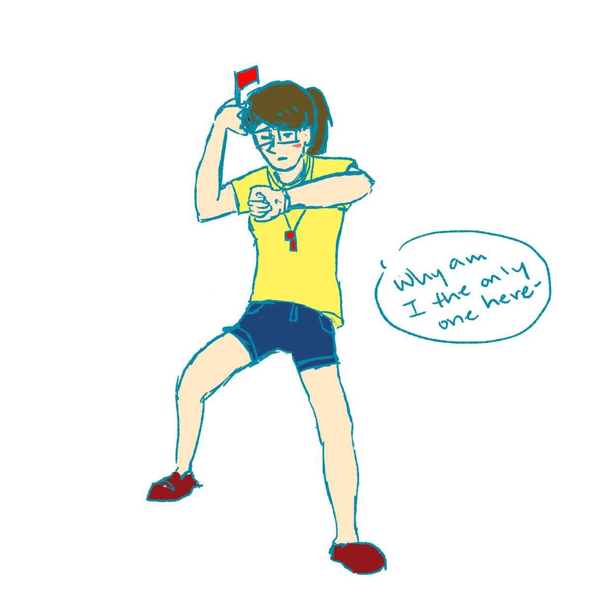
|| For this creative response assignment, we had to do a bauhaus-inspired design while putting the context of Singapore into consideration.
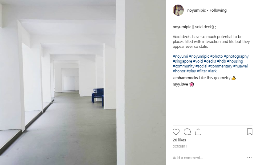
Something that is really iconic to Singapore is the void deck space. In the past, void decks used to be places where residents could gather and conduct social activities, but with the myriad of rules of placed on permitted activities and control of the usage of this space, most residents would not choose to spend their free time chilling in the void deck and bonding with their neighbours. Coincidentally, a while back I took a photo of a void deck at my house which reminded me of how barren and boring void decks are. Being a resident of the HDB high rise flats community, I have always wished for residents to be given a chance to exercise creative freedom in our own living spaces.
voiddeck(); photo by me
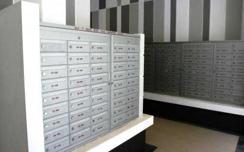
This led me to think about a potential place to start: l e t t e r b o x e s.
Uniform and made of cold aluminium (both figuratively and literally), their current design really does not do much but emphasise the desolation of the void decks. Some residents even choose to lock the slits of their letterboxes because they want to avoid spam advertisements from being shoved in. In my opinion, I think the saddest thing is that residents do not even send each other any greeting cards, or any forms of letters. :’D
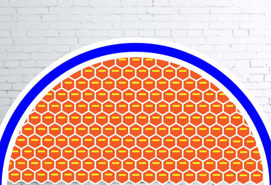
Inspired by the features of Bauhaus design, which is the consideration of functionality with form, geometrical shapes that are simple for mass production, I came up with a potential design for letter boxes in void decks (below)! The letterboxes are in hexagonal shapes, which not only are a really strong structure based on physics, but also resembles a beehive and represents how residents are living in a community like bees would. (hexagons would also make a lot more space for slightly thicker mail). The shapes are all relatively rounded off so that they appear more organic and less stiff, and the use of vibrant primary colours would give a splash of liveliness and congeniality to the entire void deck area.
Bauhaus-inspired letterbox design by me (Yue Ling)
I would be so incredibly happy if this sort of design were to be a reality in the future. *shamelessly hypothetically patents own design* :’D
Although a void deck literally means empty level, I really doubt it has to remain as a purely empty space. Something like a Bauhaus letterbox design would definitely do much to bring a sense of playfulness and conviviality within the living spaces of Singaporeans.
Universe of Water Particles on Au-delà des limites https://www.teamlab.art/images/pc-m/14757
For my Final Research Hyperessay, I am stoked to find out more about teamLab, an artist collaborative group based in Japan that currently is having one of their exhibitions Future World in Singapore! Since I’m taking Viscomm and Programming, I find their works really relevant and hope to learn more about their design philosophy.
|| Using the social broadcasting platform of Facebook live, my group decided to do an interactive project called ‘Experimental Fashun’ (‘Fashion’ stylised as ‘Fashun’). We split our group of four into pairs whereby one person will be the ‘interviewer’ and the other will the ‘model’. The model’s homework is to select 5 pieces of apparel for a number of sections, namely: tops, bottoms, dresses, accessories and shoes. She will then write down a vague adjective describing the clothing. The ‘interviewer’ will have to engage and collect responses from members of the public from different parts of Singapore to participate in our project. The audience member will have to help the ‘model’ to select pieces of clothing to form their own unique combination. Since the descriptors are rather vague, it mirrors the unpredictable quality of online shopping, whereby we trust frequently vague descriptors and pick from cheap websites like Lazada or Ezbuy. From the selected combinations, we will then photograph proper photos of the whole outfits, pair them in categories of the stereotypes of the different parts of Singapore, and post them on Instagram and add the #experimentalfashun so that users of Instagram can vote for their favourite combinations.
For this project, our interviewers Bala and Felicia headed down to the following places respectively:
Bala – Sim Lim Square, Bugis Street
Felicia: Bras Basah Shopping Complex, Nanyang Academy of Fine Arts (NAFA), Singapore Management University (SMU) and Lasalle College of the Arts
while Farzana and I were the models camping at home. We waited prepared sets of clothings to show the strangers that were interviewed what they looked like. After the outfits were chosen, we had to take pictures of the full outfit for the Instagram feed.
During the execution of the Facebook live with Bala, I initially tried to make the clothing in the list as crazy as possible so that the participants would have some pretty crazy descriptors to choose from. However, what we didn’t expect is for them to take the task so seriously! A lot of them were really squinting at the descriptors, trying to clarify and asking for more details so that they could make the most suitable outfit to go for an actual party. This was a lot more significant at Bugis Street where there more more fashionable young people hanging around on a Sunday evening.
“What’s ‘tea’?”
Also, we initially intended to put on the outfit immediately after the participant had chosen the outfit, but after we interviewed the first person in Sim Lim Square, we had an awkward moment where the person had to wait for me to change, which probably took about 2 minutes, but there was still a certain social tension that existed even over the Third Space, which was really interesting to observe.
Bala was frantically trying to occupy the stranger while temporarily went off-screen to change.
This project was influenced by Blast Theory’s principles of integrating the physical and virtual world together through the use of new technology and inviting audience participation that would influence the outcome of the project, with an element of an immersive narrative. In our project, we set our premise as a fashion showdown modelled after RuPaul’s Drag Race or Project Runway, but incorporating digital elements! Not only did we empower the random participants to be designers themselves, we also involved the Instagram public to pick their favourite outfit to win the fashion show by posting polls
Our Instagram feed!
Experimental Fashun was influenced by the concepts of the dynamics of social interaction over the Third Space through social broadcasting, DIWO, and Digital Identity.
Inspired by our Telestroll project, we utilised the medium of Facebook Live to carry out an interview-style social broadcast with members of the public. We explored the concept of DIWO by getting them to make our fashion decisions for us. This links to how we allow others to alter our Digital Identity as well, since clothes are probably the most representative subject of appearance, or how you present yourself to others. Personally, I felt like this project really got me out of my comfort zone as well because I usually do not post a lot of Outfit-of-the-day (OOTD) posts on Instagram or Facebook since I’m not really into fashion myself, and my usual style is super stay-home casual.
By putting on wacky outfits and posting them onto our public Instagram page, I felt like I was allowing my digital image to be altered, and it probably is easier to believe that I’m comfortable putting on weird clothing while I was actually really kind of anxious at the thought of wearing them out in public, especially when we had to shoot the photos of the OOTDs, but I thought that after this experience, I’ve gotten pretty numb to any judgement.
Interestingly enough, we also unintentionally experienced the glitches in human behaviour and technology that we learned would eventually surface when we trapped ourselves in the Third Space for long enough, through the works of Annie Abrahams. The main point is that things would never go the way we intended for them to, for example, with that long awkward waiting time I mentioned above, as well as moments when connection was bad as we moved to different locations so it impaired the communication of the interviewer and model during the Facebook live. In the aspect of human-technology relationships, we also explored the mismatch in expectations in online shopping where you might put your trust in a supplier who you have never bought before, purely based on the pictures and descriptions that they provide, and so the products that you purchase may not end up as what you expected, since you never once inspected the product physically beforehand.
Online shopping websites such as Ezbuy, Lazada and Wish often offer cheap clothing with clickbait product names (just look at the amount of adjectives in there). We don’t ever know if they actually will fit us, we just see if they look good on the models, and have our perceptions swayed by reviews by other people.
In conclusion, a lot of negotiation was needed to overcome issues, from the conceiving of the idea, to the execution of it, to dealing with unintended glitches. Our outcome for the project also divulged interesting results; we found out that the older demographic preferred brighter colours compared to the younger demographic, and that people in different parts of Singapore had different attitudes towards fashion. We had involved others into our project, be it as a designer who came up with all the wacky combinations, or fashion director who got to say ‘ay’ or ‘nay’ to the outfits, and successfully executed our online fashion project, Experimental Fashun!
Summarize by stating how your final project explored the idea of the social and how you designed an interactive experience that included both artist and viewers.
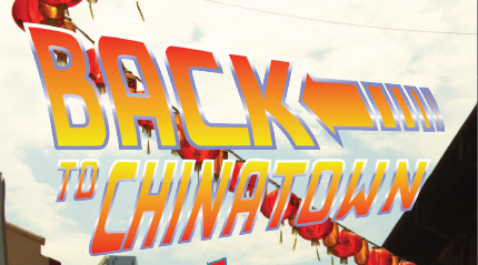
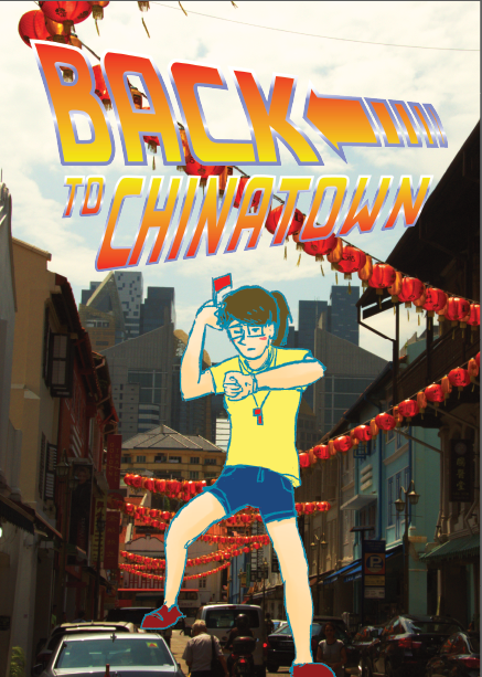
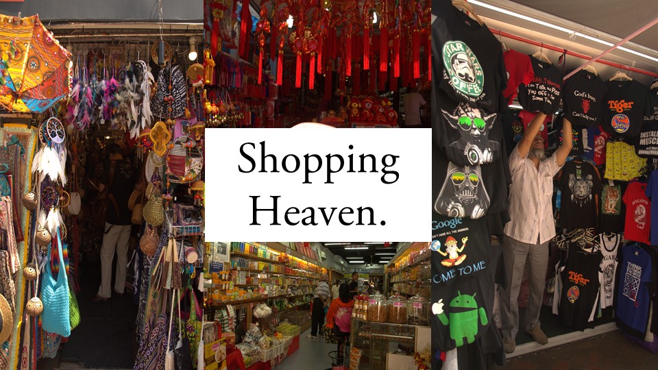
|| For my Zine: Locale project, I decided to pick the area of Chinatown since I’ve never really thoroughly explored the area before despite having been there on a few occasions during Chinese New Year. So I thought that this would be the perfect chance to get to have a nice adventure around the area on my own!
The slides below are a compilation of the primary and secondary research that I have done at the site:
—
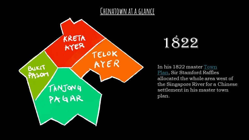
Chinatown was made into a social enclave for the ethnic Chinese immigrants in 1822 when Sir Stamford Raffles first founded Singapore.
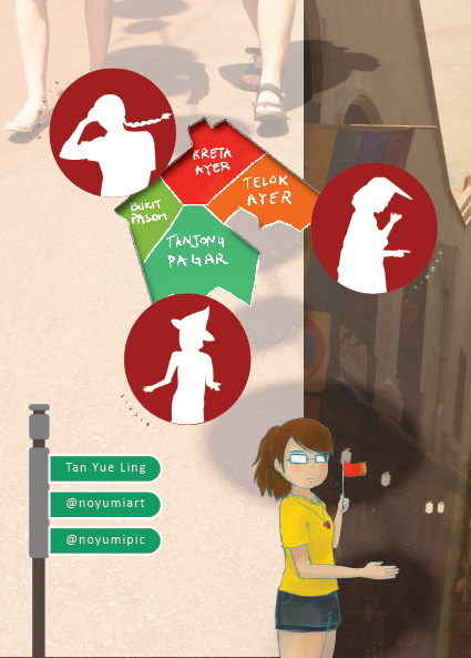
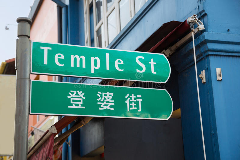
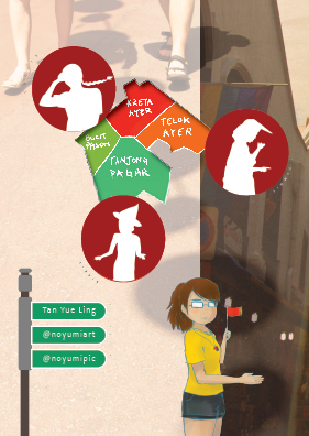
The general Chinatown area is actually split into 4 major areas, Kreta Ayer, Telok Ayer, Bukit Pasoh and Tanjong Pagar. The sites with more tourists and things to see are the Kreta Ayer and Telok Ayer region, where you can find all the souvenir stores and temples!
Kreta Ayer is named after the water carts that were pulled around in the past because accessible water was usually far from homes. This gives us insight into how Singapore used to be a not-so-well off place, compared to now.
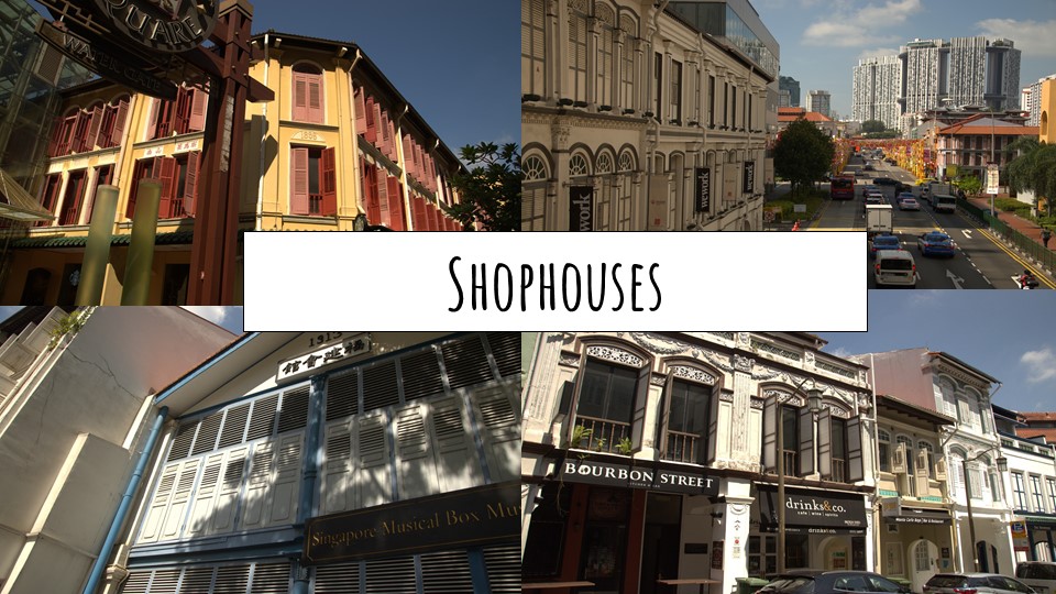
It would literally be impossible to miss these shophouse style architecture around Chinatown. There are different styles, as one can tell from the window decoration. They could be first, second or late transitional, or art deco style shop houses from the colonial times that are really iconic to the venue.
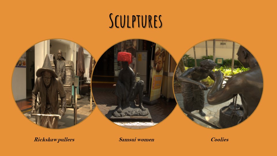
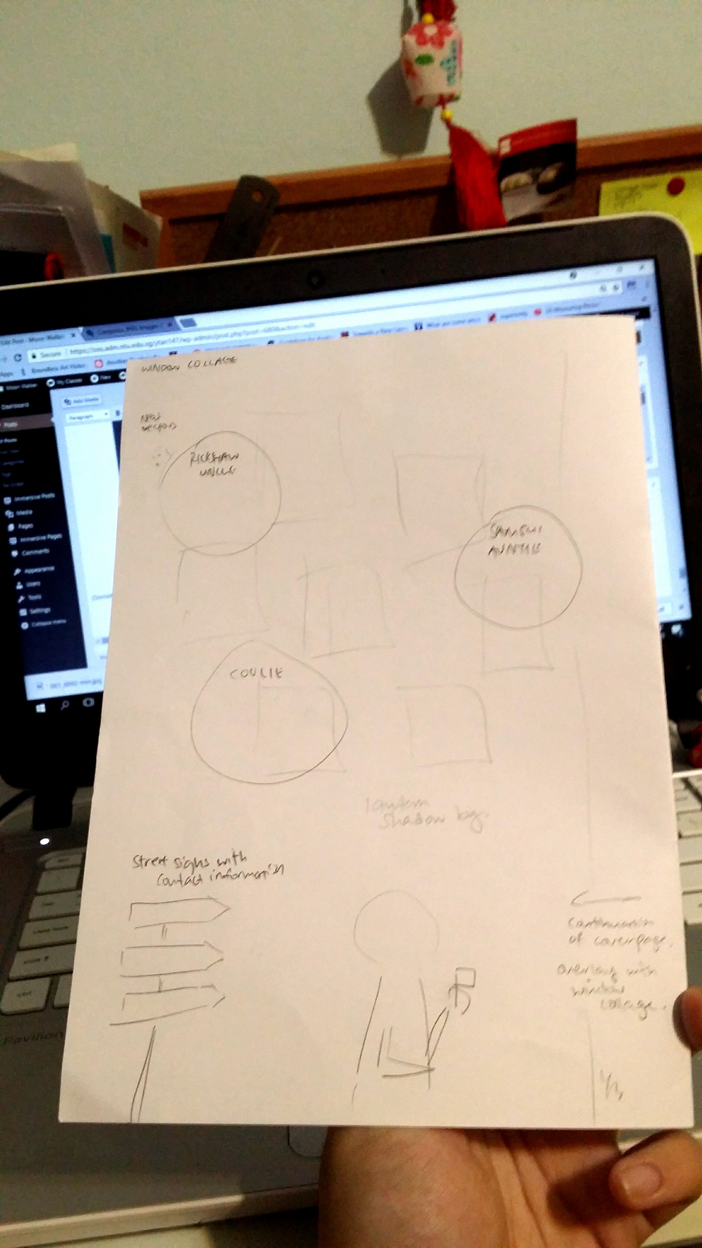
There are bronze sculptures littered around Chinatown of its inhabitants in the past such as Rickshaw Pullers, Samsui Women and Coolies that came from China to Singapore in hopes of better job opportunities. Many immigrants that came here toiled hard and worked tough jobs.
After reading a book called Kreta Ayer I borrowed from the library, I learned a lot more about the lifestyle back then. Samsui women, for example, “could be found in construction sites, digging ditches, scooping sand and cement, and carrying stones and bricks.” They also had a hair combing ritual called the Golden Orchid Pledge which they swore celibacy by. Areas used to have a more morbid past such as Sago Lane having death houses and opium dens while Keong Saik road was basically a red-light district with many brothels where pipa women would work to entertain men.
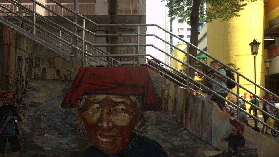
This giant mural near Maxwell Food Center was made by ACS students and is one of the most popular murals at Chinatown!
One of the iconic temples there was the Thian Hock Keng temple – Temple of Heavenly Happiness, which I happened to step into randomly (had no idea about it before reading Kreta Ayer). It is the oldest Chinese temple in Singapore and is dedicated to Mazu, the Goddess of the Sea that people would pray to before leaving for voyages at sea. When the 2nd World War came to Singapore in 1942, Chinatown suffered the brunt of Japan’s frequent air raids. There were no air shelters and with Chinatown being so crowded, casualties reached as many as 2,000 a day. During the Japanese Occupation, the loss of jobs caused thousands to turn to hawking on the streets.
Here is an audio recording I took while inside the temple:
You can hear the sound of a bell which I rung, out of multiple bells there that catered to different wishes!
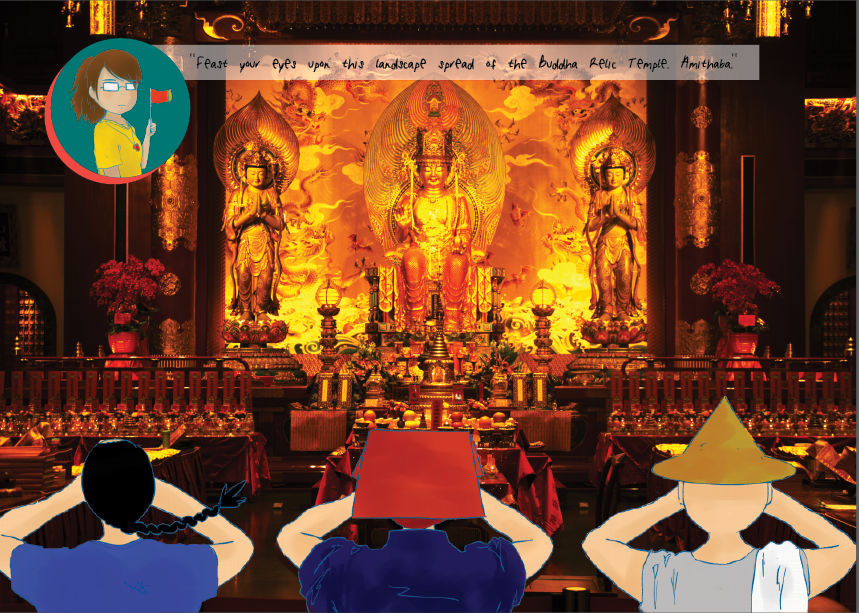
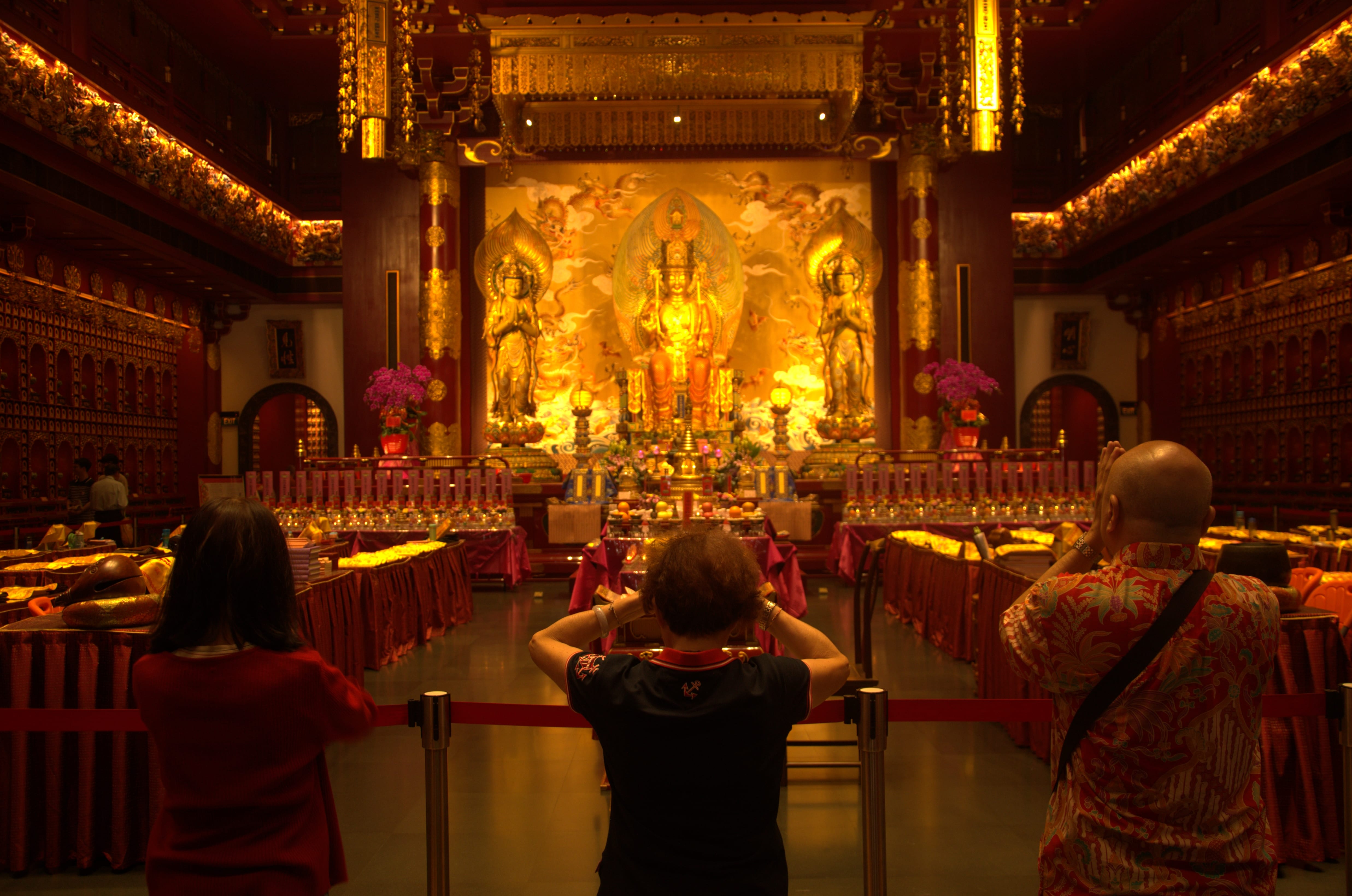
Of course, we really can’t miss the most iconic temple in Chinatown: the Buddha Tooth Relic Temple! It is said to contain the real Buddha’s tooth (which….I actually highly doubt so because my sister once told me she saw the relic on a tour and it was like… some sort of jewel?)
The prayer hall is really massive and sparkling golden and the moment I saw it I had already decided that it was a contender to be in my middle spread.
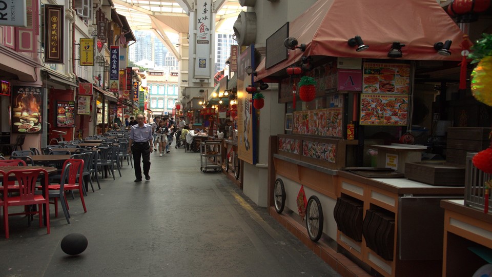
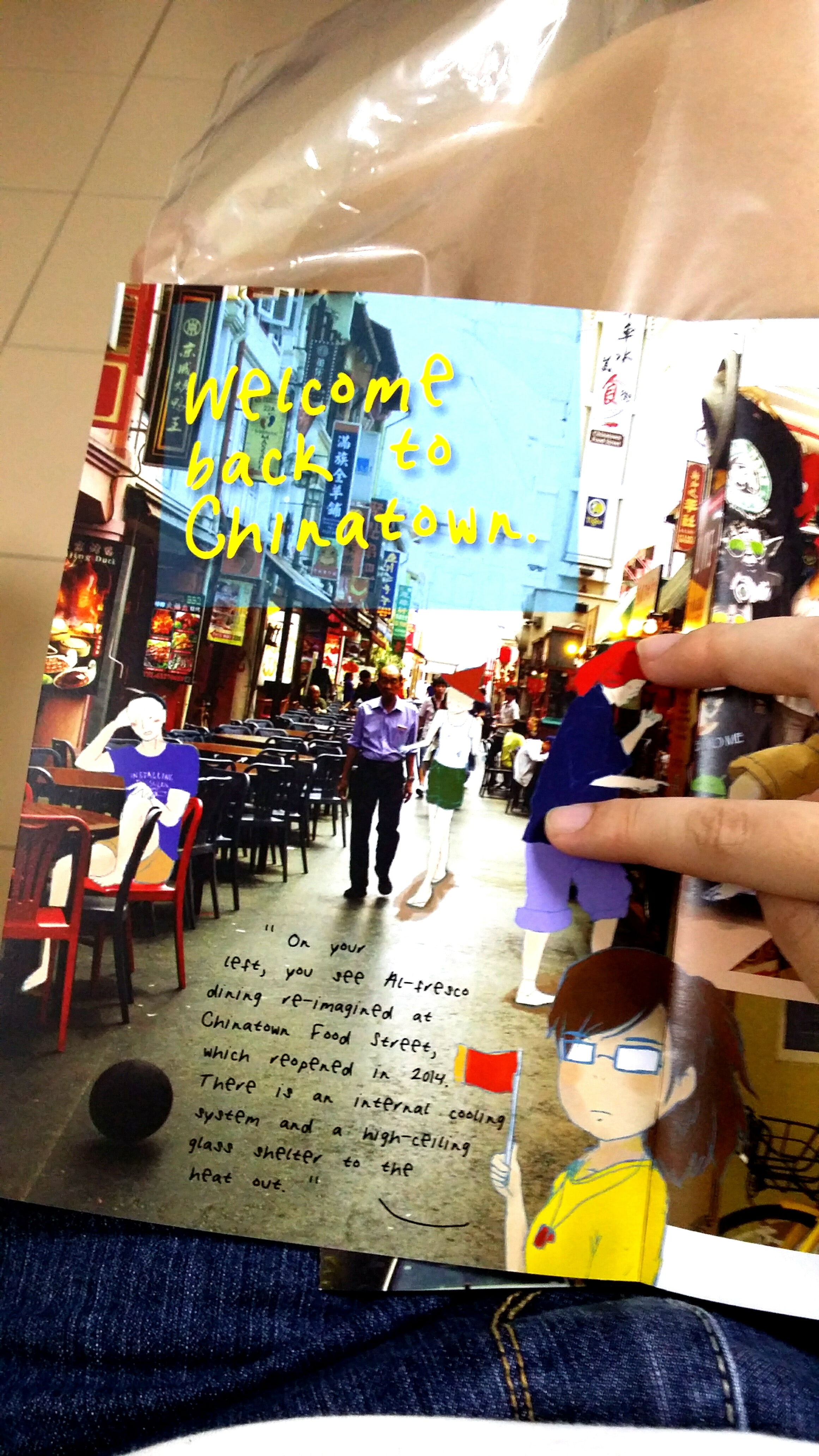
Here’s the Chinatown Food Complex! I’ve been here with my family once, the food is so expensive TvT As expected of tourist sites…
The complex is meant to revive the idea of al-fresco dining in a street setting. It re-opened in 2014 with an internal cooling system and high-ceiling glass shelter. The street hawkers, operating out of nostalgic mobile carts, recreate the good old days of open-air eating.
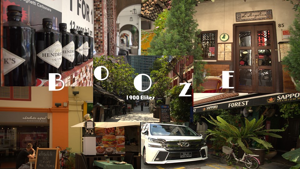
The area of Telok Ayer and Club Street is well-adorned with an abundance of pubs and bars.
Now, I don’t drink, so I can only imagine what kind of heaven this area of Chinatown is for alcoholics.
Here are where many of the shophouse architectures are as well, and is one of those spots artists like to go to to sketch.
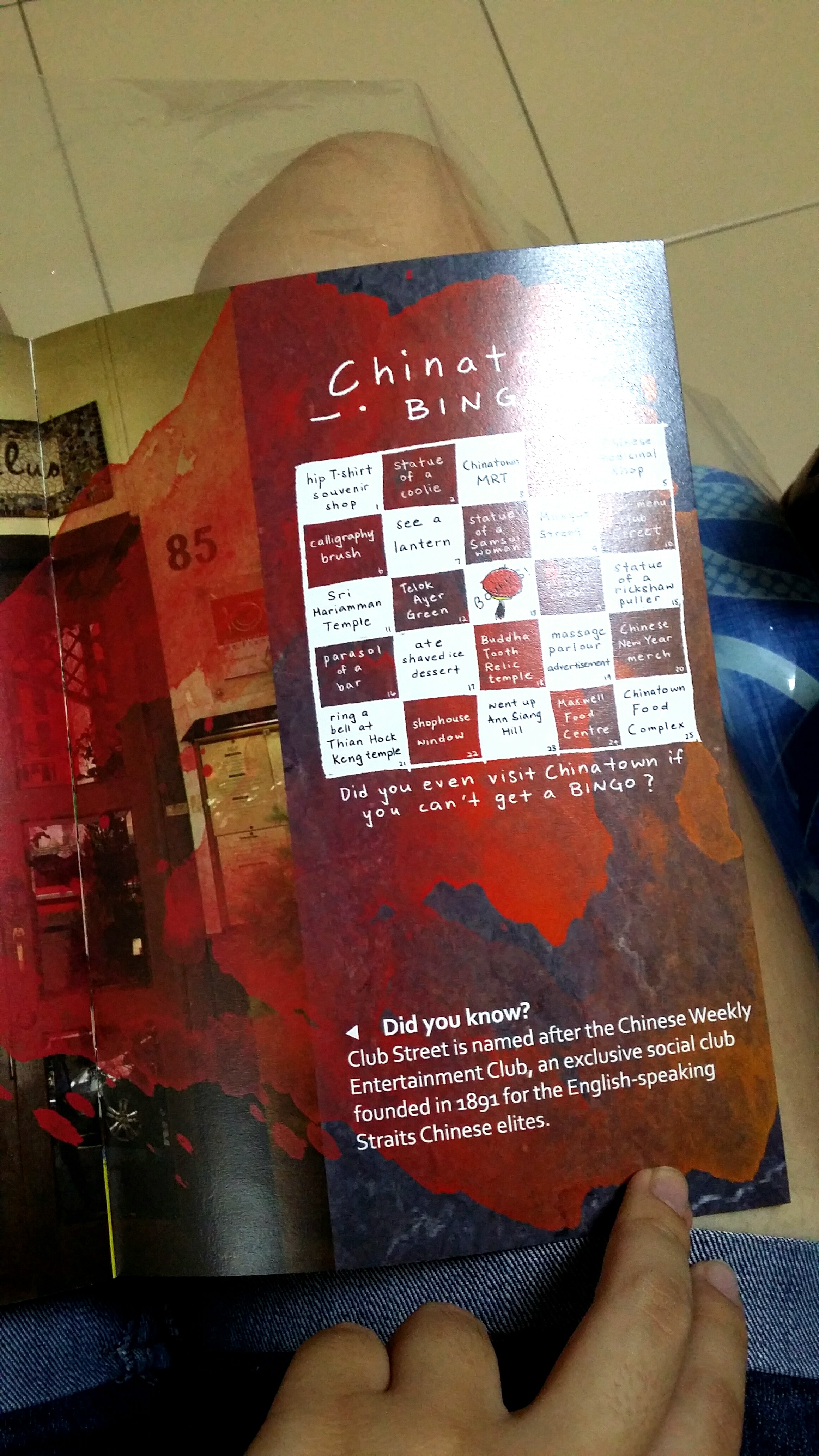
Club Street is named after the Chinese Weekly Entertainment Club, and exclusive social club founded in 1891 for the English-Speaking Straits Chinese elites.
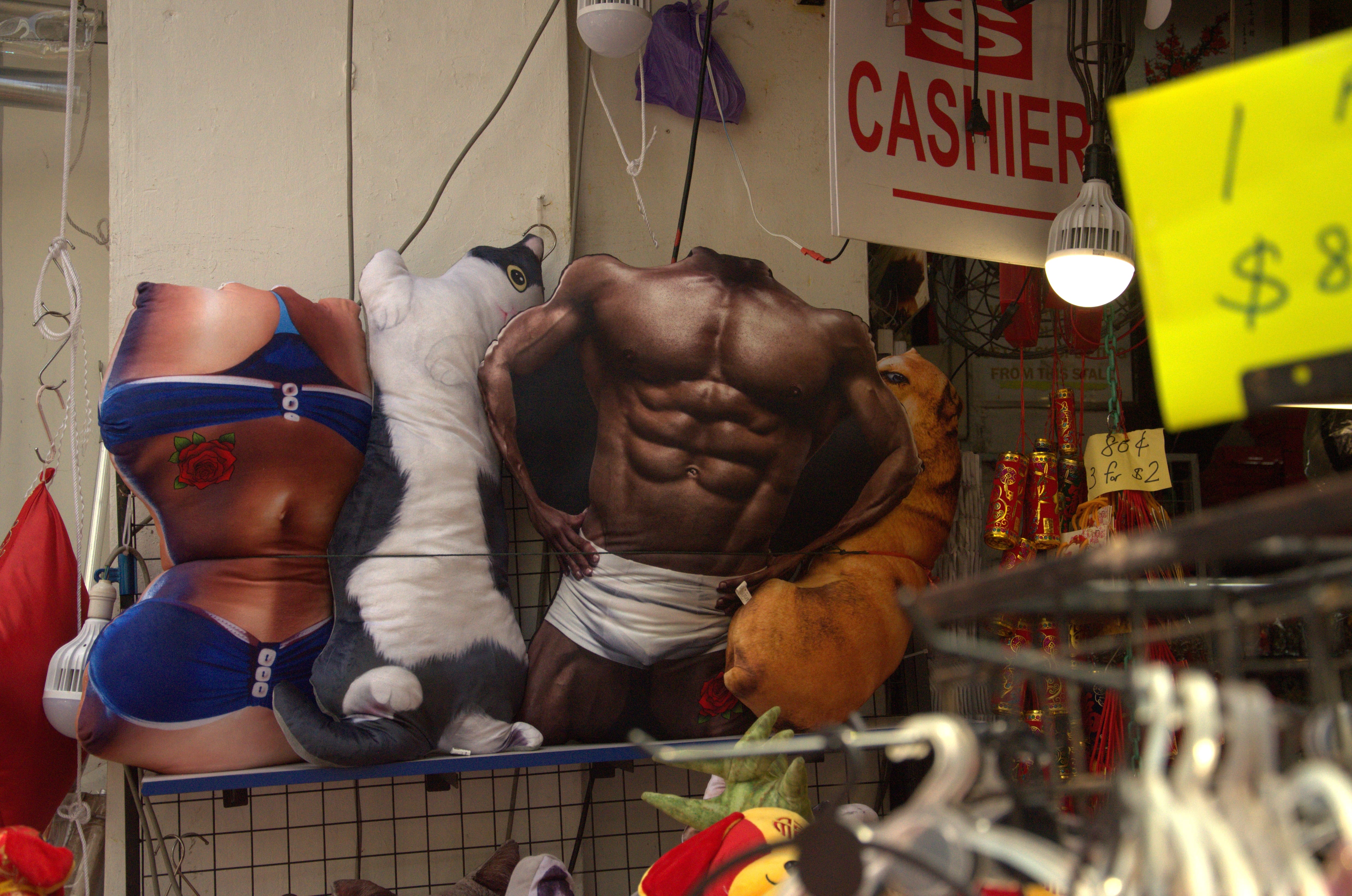
Needless to say, there are a ton of shops, especially along Pagoda Street, selling souvenirs ranging from hip shirts, to paintbrushes, to just… really weird stuff.
I found this quote in Urban Sketchers’ Chinatown book, and really relate with:
“Chinatown offers me neither a sense of identity nor belonging. Yet I take great pleasure in walking its streets, secretly revelling in its contrived nature, while seeking out the genuine connections people may have to the place.” Nursil
a, social worker.
Here is a video made up of a bunch of smaller clips of the things I saw and heard walking around Chinatown:
There are multiple juxtapositions of pop culture and old architecture.
– IDEA DEVELOPMENT –
Initially, I was looking through a few styles to come up with a style for my zine because I felted kind of daunted by the task of filling up 8 pages of a zine on my own.
How about an Alice in Wonderland style illustration book with me meeting mythical creatures in Chinatown?
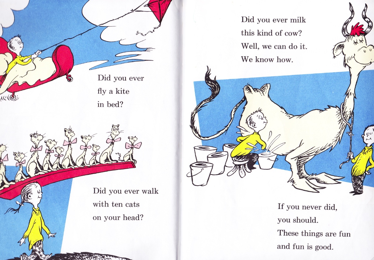
Perhaps I could do it like Dr Seuss books; spaced out compositions with some fun text?
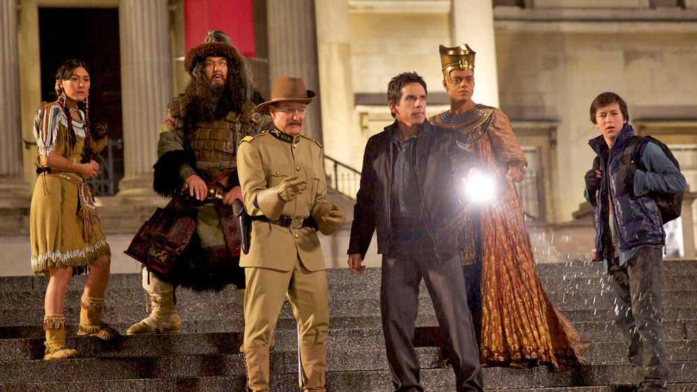
All this history talk also reminds me of Night at the Museum, perhaps I could bring historical figures alive?
The possibilities were endless with a zine.
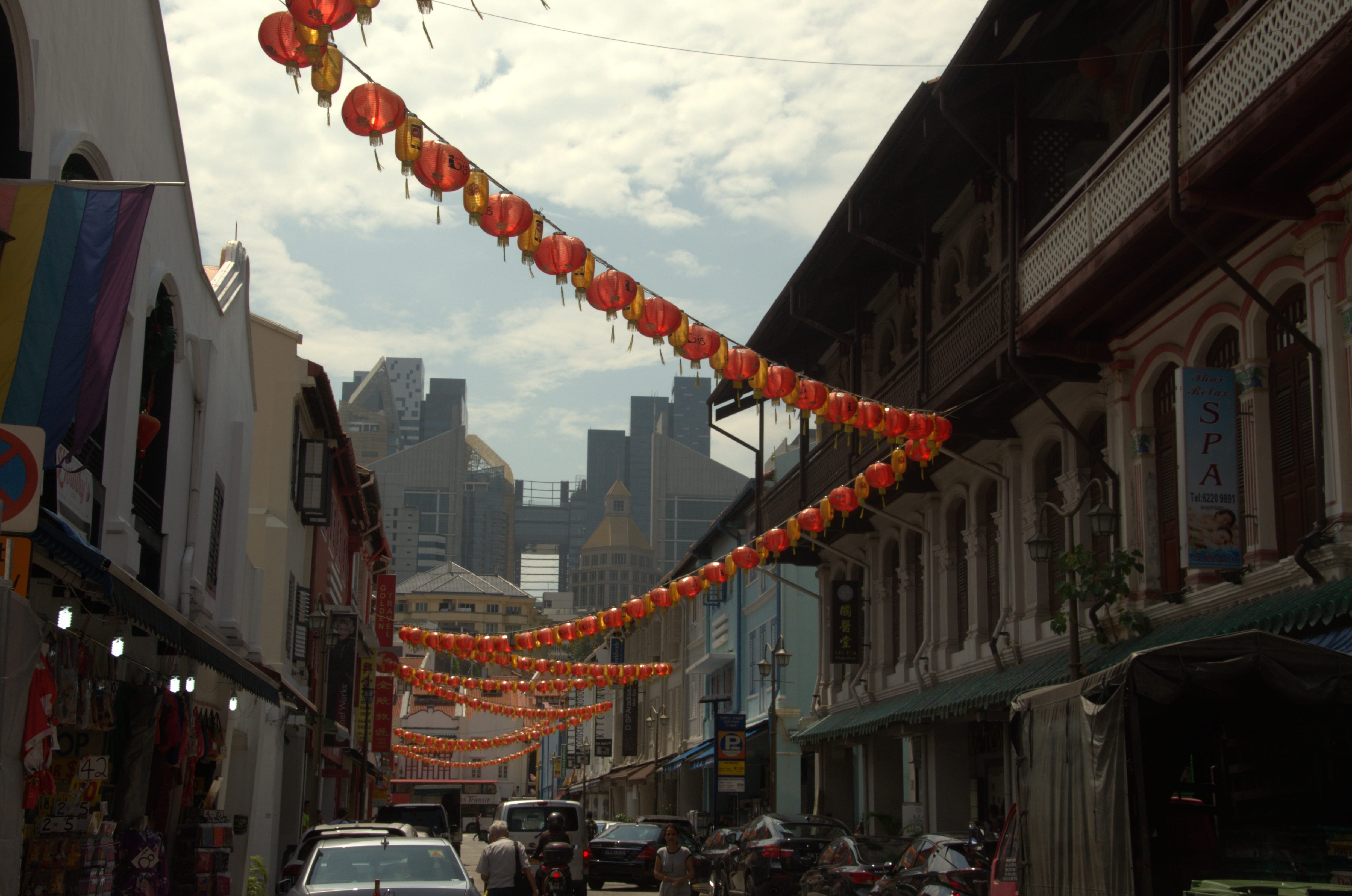
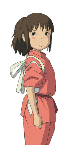
It wasn’t until I was chatting with a senior until I realised that Chinatown and the world of Ghibli’s Spirited Away had uncanny similarities, especially with the lanterns and all. I mean, this:
versus this?
At this point, I’m practically Chihiiro (the protagonist).
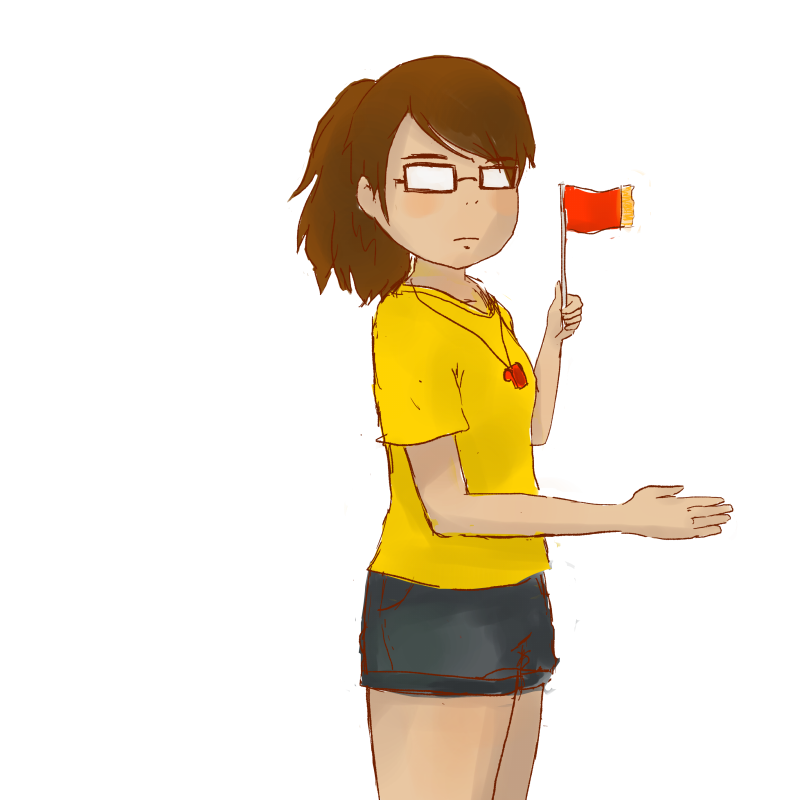
So I drew myself as her.
It gave me the idea of a tour.
And then it struck me: if it was so hard trying to imagine myself back in old Chinatown, why not bring people in the past back to modern Chinatown?
We could bring people like the rickshaw puller, coolie and samsui woman to present day Chinatown to witness the fruits of their labour and have fun while at it!
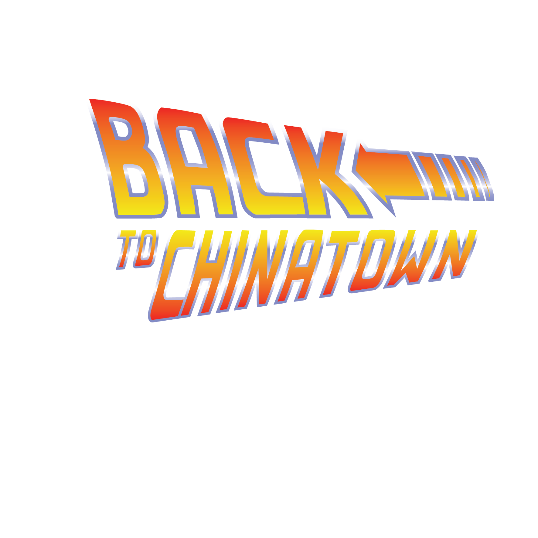
And so begin my humble project:
I spent a good hour learning how to make this font on Illustrator by following this tutorial:
Yay! Now I know how to install new fonts, control gradients and distort my text!
I thought hmm… I literally have over 260+ photographs. It would be a huge pity not to use any of it.
It would also be a huge pity to make them black and white (I toyed with the idea of viewing Chinatown in monochrome but someone did it already, plus Chinatown is so vibrant, that it would just be a waste.)
So I decided to make a photo compilation infused with digital illustrations that I really enjoy doing!
Below are some of the individual drawings I did on FireAlpaca programme:
—
I grew attached to the characters and decided to call them
Coolie (short for… uhh Coolie)
2. Rickie (short for Rickshaw puller)
3. and Sammie (short for Samsui woman)
I was thinking about my back cover where I had to include my contacts and there was no way I was going to miss the chance to but my name on a sign :)))
(Something like this)
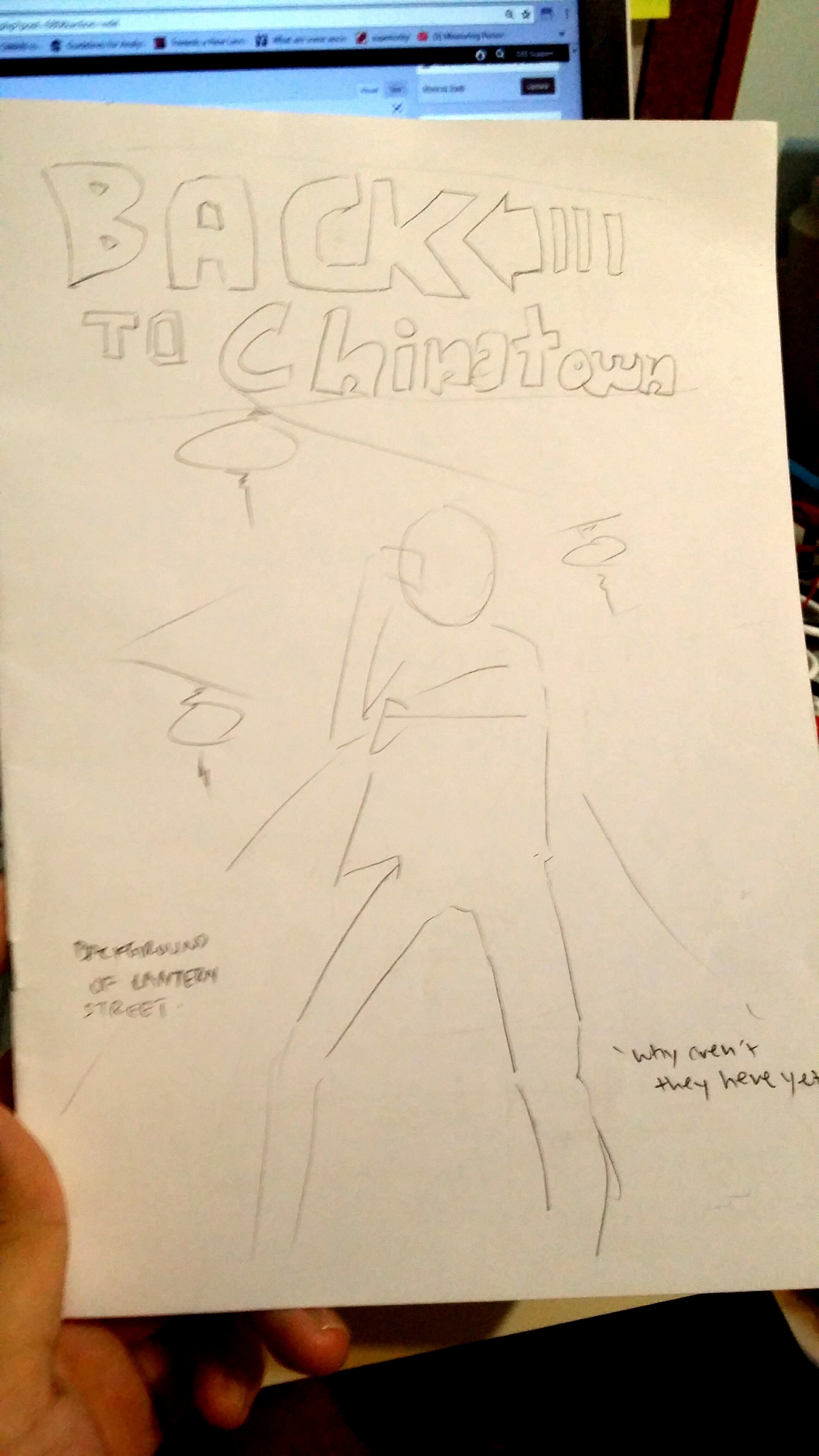
I also forgot to mention earlier that around the same time of doing the actual graphics, I did a sketch of the entire zine.
To plan the content of the zine, I listed out several ideas on Notepad first to filter out which photos mattered the most or told the most stories.
Then I proceeded to create a rough sketch by placing elements around the pages to see how they work out. There’s no other way than to just do it and trust your eyes.
After intense drawing and vector graphic making, here are the final pages!
– FINAL ZINE-
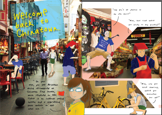
FC:
The title of the zine and illustration would be smack in the middle to focus all attention in the middle. The diagonal arrangement of the lanterns in the background and the logo makes the composition a lot more dynamic.
IFC:
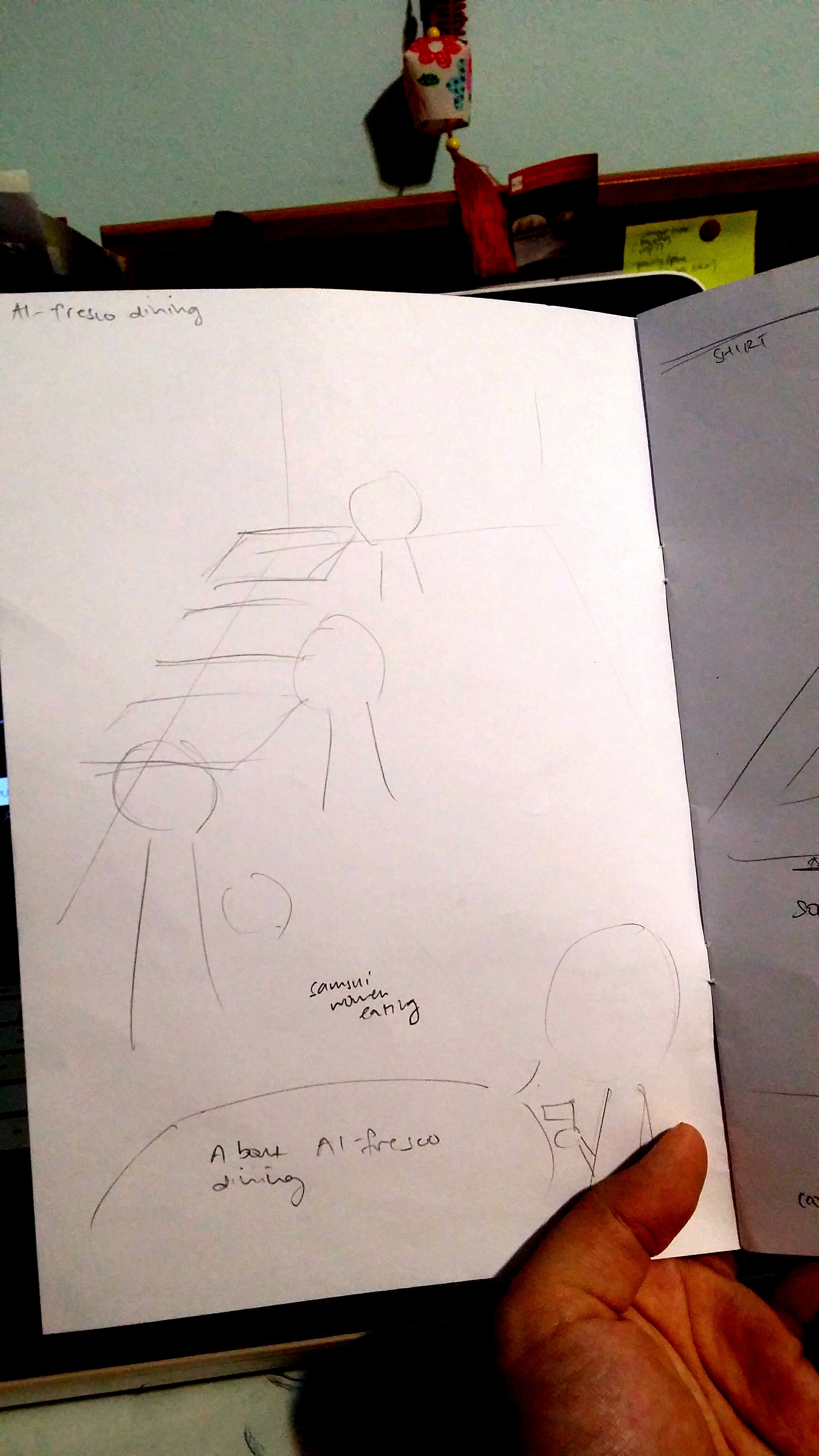
I drew the three musketeers (Coolie, Rickie and Sammie) hanging around Chinatown Food Complex ordering food and included the description on Al-fresco dining at the bottom! Shirley helped me to create the PERFECT header and I was honestly so amazed by how adding a simple rectangle with complementary colours in the title would work so well!!!! I have learned something new again. I placed myself in the middle of the two pages so that they would be seen as a group instead of being two separate pages.
Pg 1:
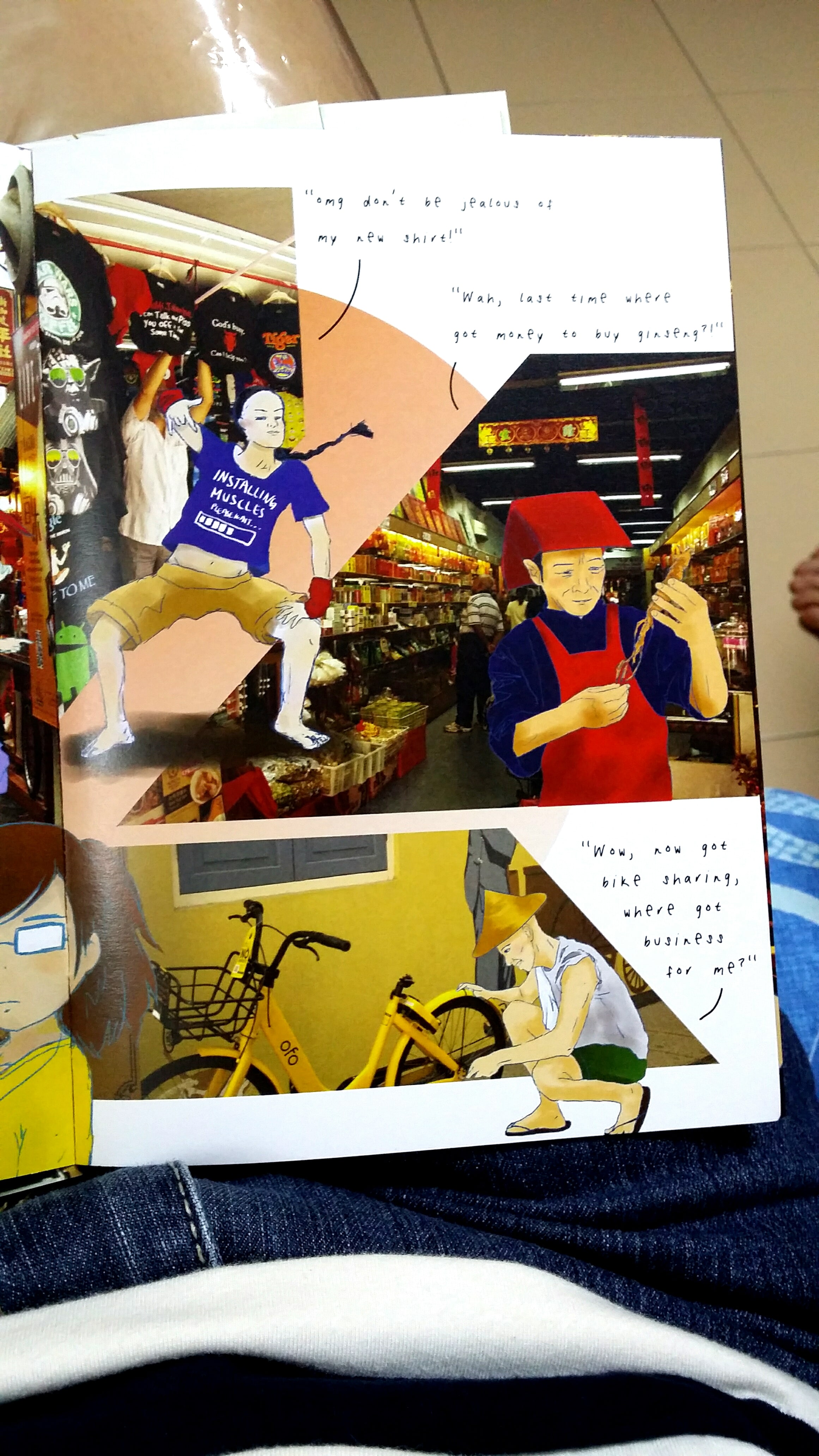
Here are the three musketeers again, having fun around the various kinds of shops in Chinatown. (Coolie in the clothing shop, Sammie in the medicinal hall, and Rickie having his fun jab at an Ofo-bike). I tried to mask the images into more dynamic shapes that also helped to create visual hierarchy.
Pg 4 & 5 spread: As promised, here is the majestic landscape spread of the interior of the Buddha Tooth Relic Temple and I think it looks as awesome as I had imagined.
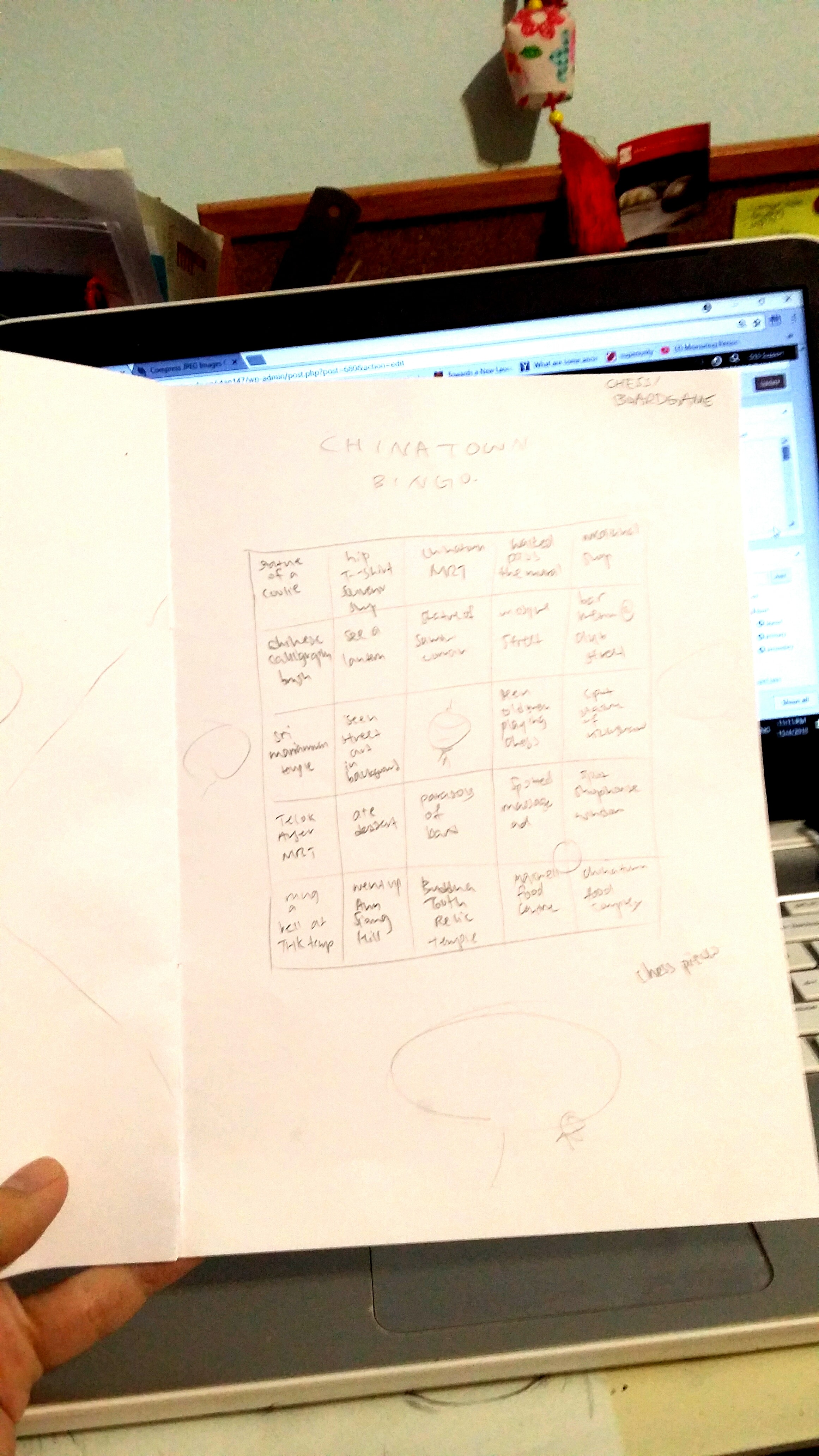
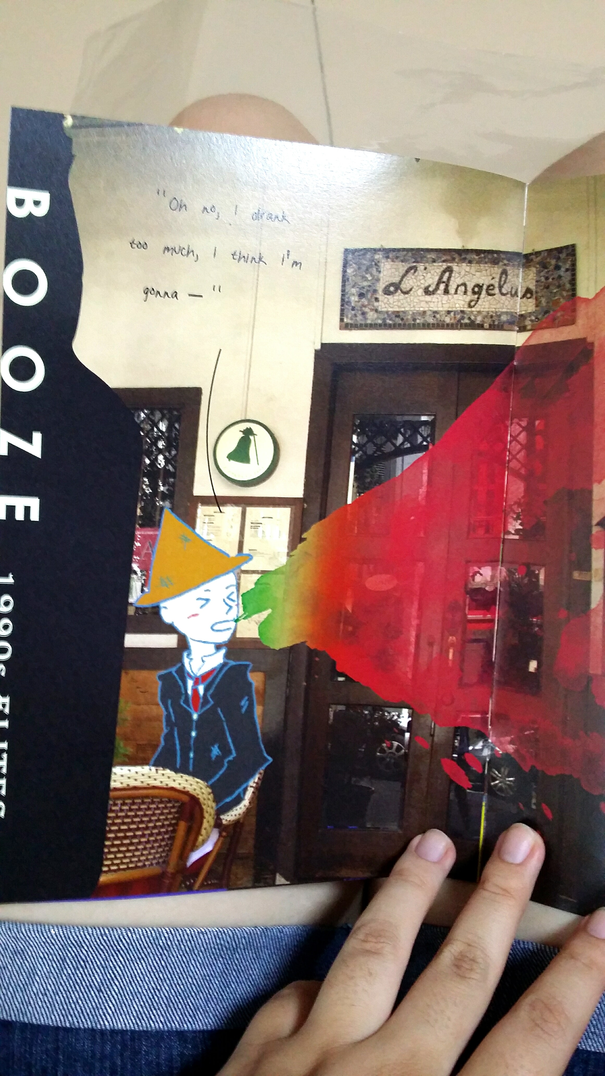
Pg 6 & IBC: On the left page, I added content about Club Street and booze. The colourful vomit in the middle (which is a warped watercolour mark with a gradient colour overlay) joins the 2/3 area to the 1/3 area of Chinatown Bingo! I decided to add in bingo since it was a really popular trend that was going on during this period and I figured it would be a fun way to make the zine interactive, as well as give suggestions for more areas of Chinatown to visit since I can’t fit all of its greatness into 8 pages only.
Back cover: Here I overlayed a continuation of the photo from the front cover on top of a photo of a couple strolling with shadows of lanterns on the floor.
I added an engraved effect to an illustration of a map I did for the presentation slides. And there it is! My name on a sign!
I also did some cool vector illustrations of the 3 musketeers.
– PHYSICAL ZINE –
I spent soooooo long trying to get the PDF exportation right because I didn’t have Acrobat 🙁 But using the school computer, I managed to do it by expanding my text and packaging the entire zine!
Here is my physical baby!
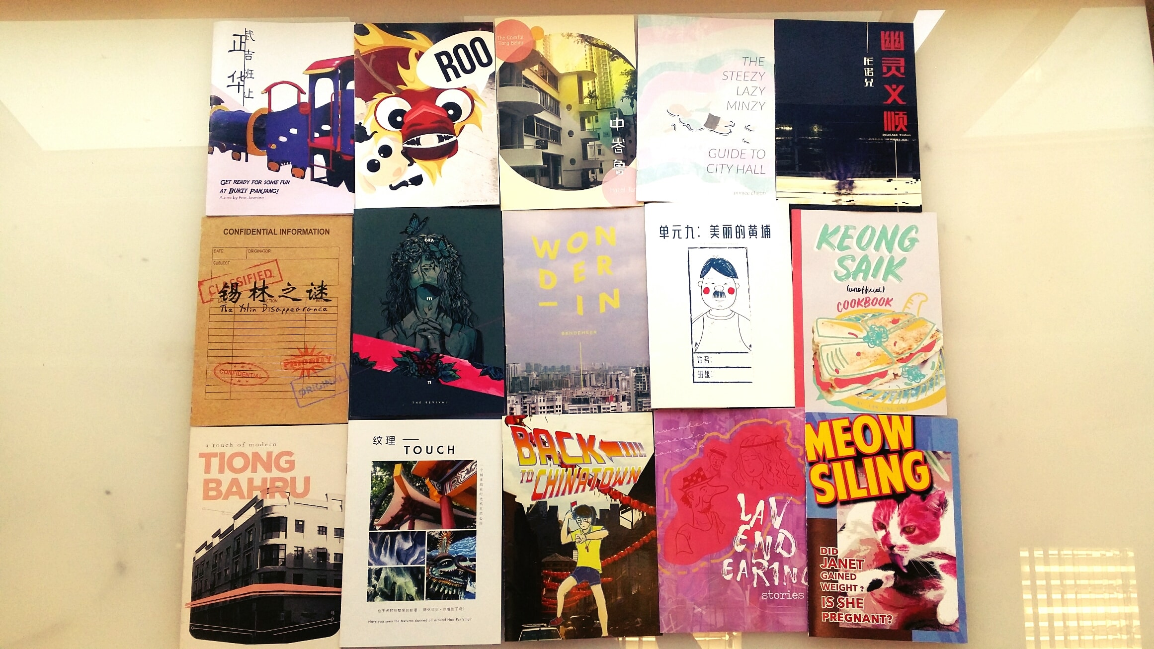
Class zine cover page grid!
– Reflections –
Some difficulties I faced and things I learned:
Facing the epic task of creating a layout for 8 pages of zine out of pure content researched by ourselves was pretty daunting. I was trying really hard to think of a style to follow, and I think it helps to talk to people about your idea, you never know what fresh ideas they have!
Creating hierarchy for the header. I was having a hard time thinking of a way to make it stand out more until Shirley just smacks on a blue box with yellow font and all of a sudden it gives my zine 20 times the amount of life it had compared to before. I think this taught me to be more daring with using elements such as shapes and colours in my design. Just because there are photos doesn’t mean your font has to hide!
How can I miss out learning how to use InDesign? At first, I was extremely not pleased with how confusing the blue and brown boxes were, but I gradually managed to get a hang of it after placing 1304910294 photos into InDesign for this project. I thought that InDesign was quite useful when it comes to layouts, and I also learned about how designers would use placeholder texts to gauge word limits. I thought that was pretty amusing since I always thought the number of words dictated the design, but I guess designers have the power too!!!
Exporting InDesign files as .pdfs for printing! Oh boy did this process take a long time for me, but now I know the importance of Adobe Acrobat!
I think another important takeaway is how to translate research findings into material for a zine. By going down to the sites to experience them first-hand, it really gives us the genuine motivation to want to create content about something and share it with others, as compared to if we were just to simply do some Googling online.