|| The Eternal Frame (1975) is a videotaped reenactment of the assassinated of John F. Kennedy’s assassination by Antfarm which seeks to draw attention to the power of the mediated image.
Antfarm is a collective of radical artists founded in San Francisco in 1968 by Chip Lord and Doug Michels (1943-2003) that sought to rebel against the conformative style of art in their time and build a community of artists that vigorously experimented with new forms of art.[1]
In an Interview with Chip Lord by Randall Packer over the Third Space Network stream, Chip Lord mentions that John F. Kennedy’s death was the first televised American tragedy ever, and Eternal Frame sought to explore the power of the media to immortalise such a historical moment and ingrain it into the minds of people by converting a real-life event into a processed memory via the media. [2]
In another interview about The Eternal Frame hosted by Constance Lewallen (2012), Doug Halls states that he resonates with Jean Jacque-Rousseau’s view that something cannot be true until it’s fictionalised, and the interpretation of a memory aberrates as it is constantly reappropriated throughout time, which is possible if an event is immortalised in a digital form. [3]
” I think that idea of you kind of grasping to it and extricated into your time, then in the act of doing that, certain truths disappear but other ones begin to emerge.”
– Doug Halls
Taking the achievements of past post-modern art movements like Constructivism and Futurism to a greater level, Antfarm’s fearless venture into different media and experimenting with different spatial contexts allowed them to successfully added new layers of meanings in their artworks that allowed them to make political and social statements.
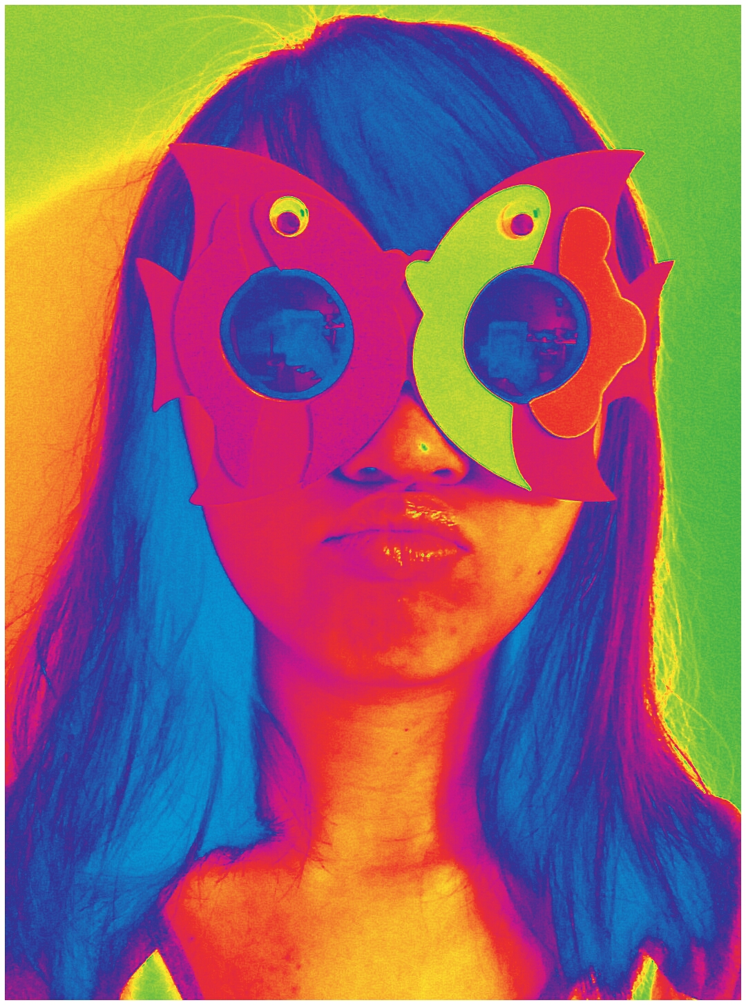
|| This week, we did a g̶̛̞͚̬͈̠͖̺͕͔͚̲̩̬͗͗̒̉̋͊͐̉̅̈́͝͝l̵̛͚̤͆̍̏̃̇̈́̕͝ị̶͇̰͓̘͚̤̹͒̄̈́̀̏̓̃̄̐͐̕͠ͅt̶̖̹͎̣̦̩̪̣͌̚͜ç̵̜̦̣̩̲̩̲̬͎͈͌̀͐̂̆͒̑̍̒̓͆̓̓h̵̢̢̟̬̲̼̦̬̰̰͊̊̑̍͂̽͂ project in class!! We selected a photo of ourselves from our previous Collective Body project and surrender them over to our groupmates to destroy them, essentially creating a g̶̡̛͔̬͍̼̻̞̩̳̲͚̯͔̱̟̐̏̀́̔̋̏̉̄͋̋̂̓ļ̷̙̫̭̙̠̦̖͚̞͑́͆̀̿͋̎̎͗̚ͅi̵̧̨̧̢̜̦̭̫͔̫̖̠̎̆̿͒͗̈͒̋̑͘̕͠͝͠ț̴̨͕̺̘̲̘͛́̀́͆͆̏̑́͝c̵̘̍̏́̋̂̀͗̾ḣ̷̨͓͎̦̱̯̦̲͚̅̂̈́̍ ̵̢̨̢̥̖̹̭̦̻͙͈͒̾̑̋̉̎͑̓͜m̸̛͉̱͔̤̞̱̩̠̫̍͂̈́͆̓̎͛̕͘͘̕ͅa̷͚̪͕̞̽̀̓̎͋͜s̴̛̠̙̦͇̪̯̻̠̭̞̞͑̆͛́̏͗͛͐̕͜͠t̴̨͔͇̞͇͖̦̟͇̦̭͚̥̯̓͐̋̈͋̈́̈́̚͜͠ẻ̷̞͕͖̖̖͉̄r̴̢͖͍͉̤͉͐̔̕p̸̛̱̥͇̲̗̤̼̹̝͋͛̔͆̏̀́͗́̎̊̔͐̕͜͜į̵̢̡̮̠̰͚̬̮̻̹̹́͌ḙ̵̡͙̳̥̩̠̝̓̈́͐̃̉̕͜c̶̢̛̘̦̬̜̾̾̒̍̋̐̆͠e̷͎̥̲̥̝͐̔̑̃͒̈́̎͌͌̔͋̚ 😀 This is what my friends made me into:
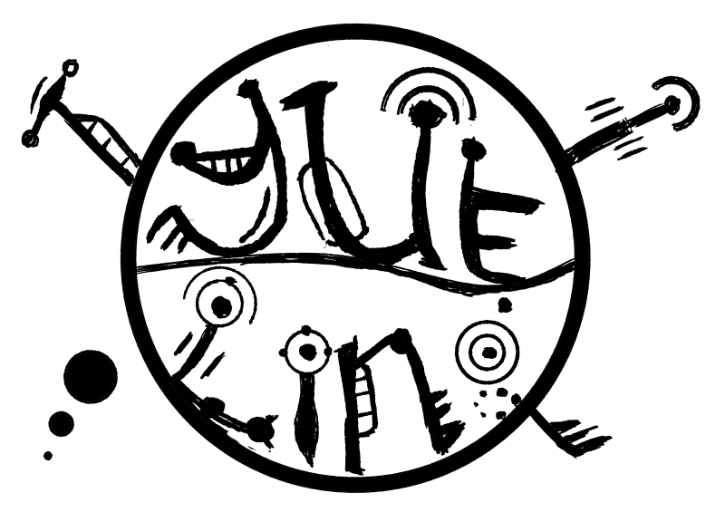
In this first project for Graphic Form, we have to translate the essence of a job (that can be imaginary) into visual, typographic forms of our names using any sort of media.
Since the jobs we chose were not specified to be pragmatic/realistic, I started off by brainstorming up some ideas for imaginary jobs that are grounded in the essence of real jobs that exist in reality. I came up with a list of existing jobs and modified them by merging them with each other. This would not only help me come up with much more interesting outcomes, but also give me a wider range of job fields and their nature to explore. Thereafter, I searched up the jobscopes and items that are iconic to these jobs to make them easily identifiable.
Initial Shortlisted jobs:
Baby DJ
Pool Colourist
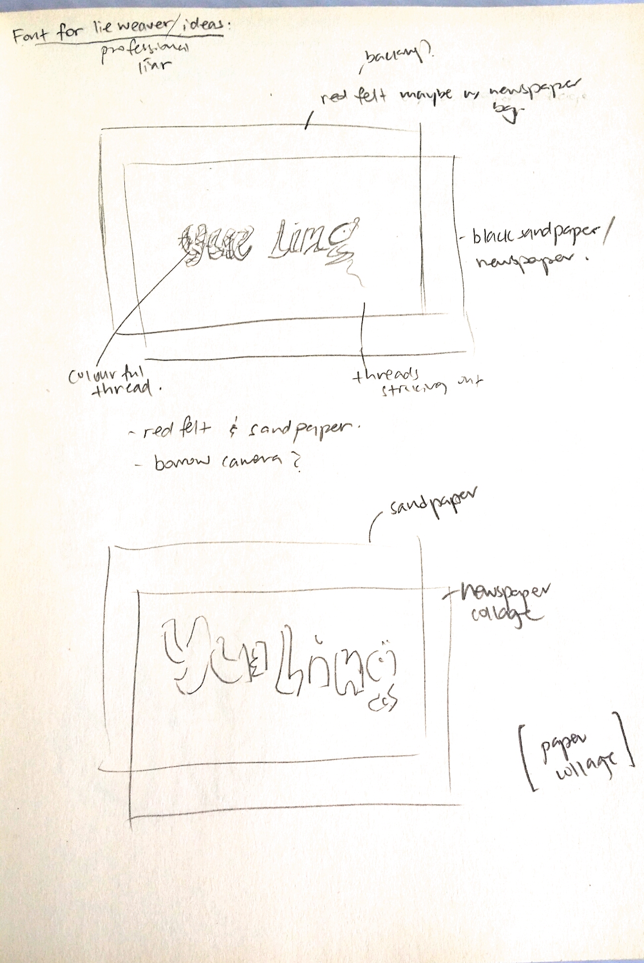
Professional Liar
Alien Communicator
——–
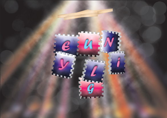
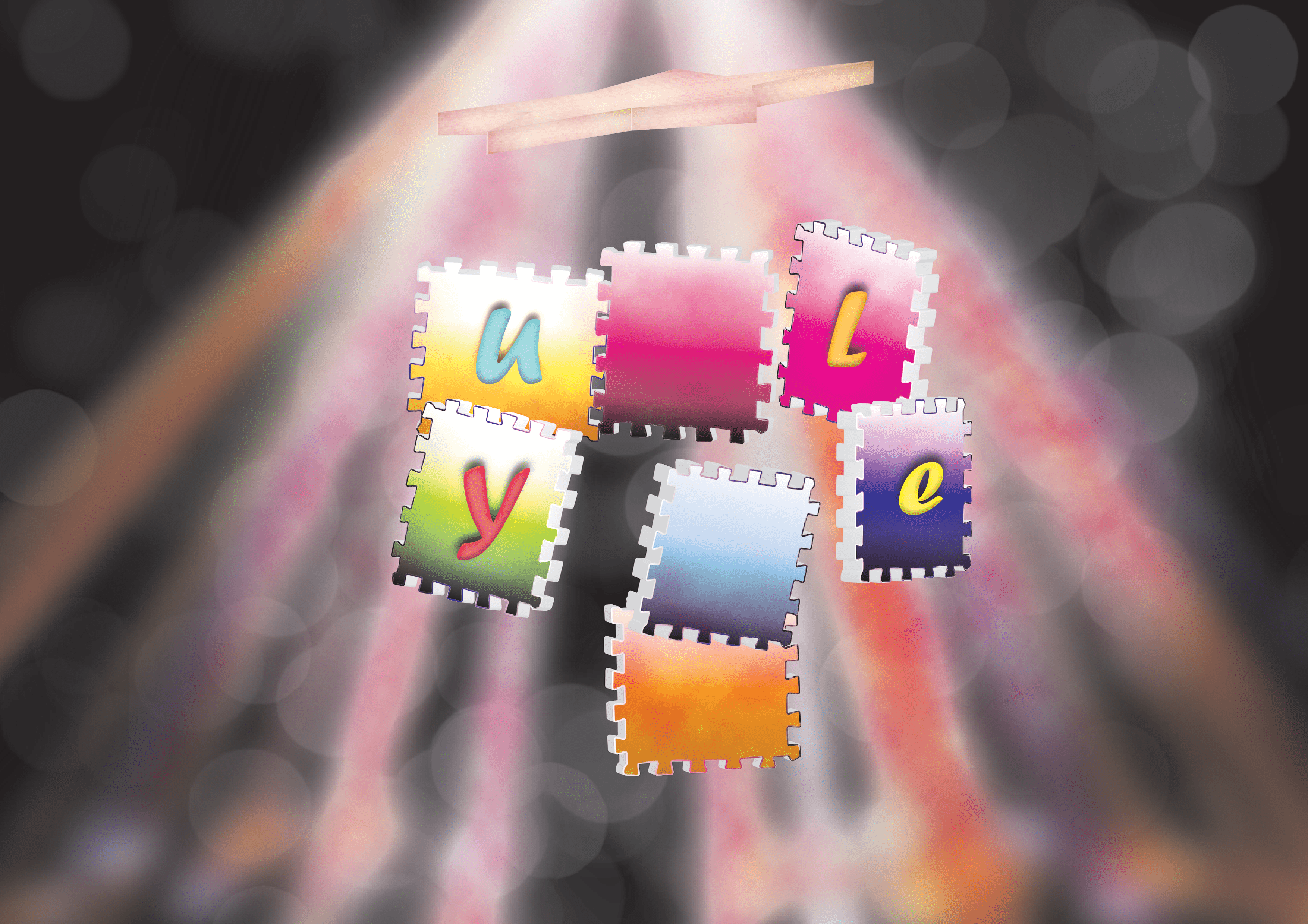
Baby DJ
Original job inspirations: DJ, Infant care nurses
Jobscopes
DJ: to play music at events entertain, mix beats to hype the crowd up. Has to be well-versed in different sorts of music. Usually playing loud music at social events to give enhance the lively mood/atmosphere.
Infant care nurses: Caring, patient, organised, responsible, nurturing, taking care of delicate babies
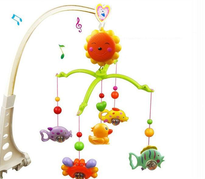
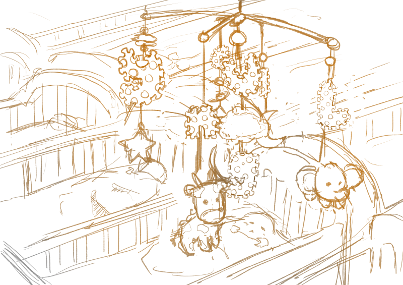
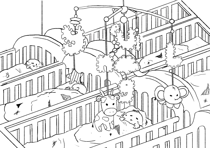
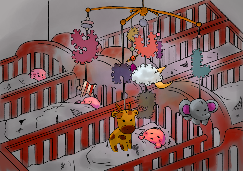
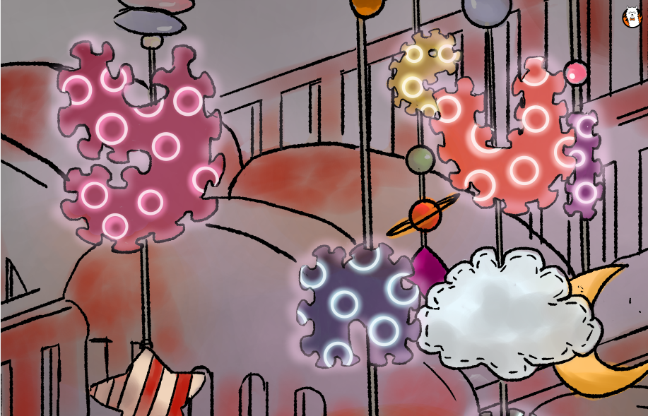
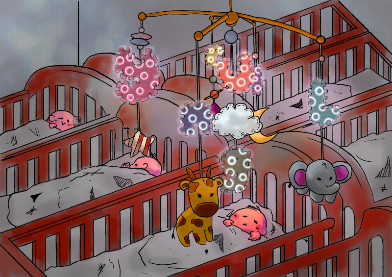
Objects related to babies. http://clipart-library.com/clipart/di4565nLT.htmBaby mobile toys that have the possibility of including multiple elements/toys into them.
Idea Generation:
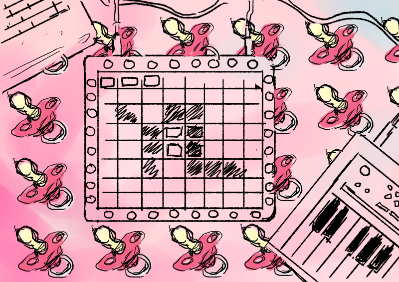
Marshmello – ALONE – [Launchpad Pro Light Show] https://www.youtube.com/watch?v=A0M0p7d1MTM This example of a Launchpad light show demonstrates that users are able to intentionally program the sequence of lights on their device to form different images.I decided to map my initials of YL onto a digital illustration of a Launchpad and make the buttons neon. The background ]would be repeated patterns of pacifiers and a pastel shade. Pastel shades are generally seen as more gentle colours that serve to convey a sense of innocence, purity, cleanliness that are seen of babies.
Words like “lightness” and “ease” come up a lot in conversations about pastels. Sallie Harrison, the designer and photographer in L.A., says that pastels evoke a sense of “calmness and balance.” Stewart points to light blue and its connection with spirituality and heaven; (Leatrice) Eiseman at one point related soft colors to infancy, when there was a sense of ease and safety because all of our needs were taken care of. These feelings can be connected to the social and political factors at work, as Eiseman pointed out while listing her considerations for color of the year.
(Leatrice Eiseman is an American color specialist, who assists companies in their color choice in a range of areas, including packaging, logos, and interior design. She is the executive director of the Pantone Color Institute, a division of Pantone, Inc.,[1] and the author of six books on color, one of which won an award from the Independent Publisher’s Association.)
However, this draft did not really display the elements of the job in the letters, rather, they put the letters into a context. When the letters are taken out of context, they do not effectively portray the essence of the job of a Baby DJ anymore.
Therefore, I embarked on a mission to try to integrate the essence of both a DJ and a infant care nurse together into my type.
Brainstorming pt. 1 I tried to integrate the buttons of the DJ Launchpad into the letters, and find a way to include elements of babies into the font as well, such as the foam letter toys and letter cubes.Brainstorming pt. 2 I tried considering the context of the type as well by including the element of the mobile toy.
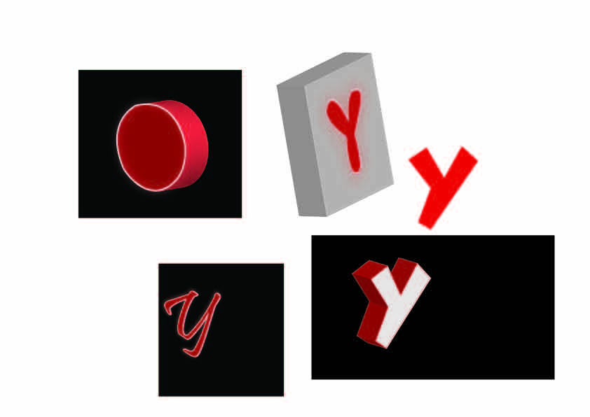
Exploration of button placement and lighting effects of buttons on the font in FireAlpaca.Attempt at recreating the neon effect in Illustrator on 3D font made by beveling and extruding the shapes and adding several layers of glow on the outer edges of the font.
It was really difficult trying to recreate the multiple button effect in Illustrator because the 3D extrusion function and art mapping was not exactly user friendly. It took a pretty long time trying to render every single 3D object as well. Thus, I tried only extruding the foam toy square, while leaving the neon letters on the square. In the draft below, I had mapped a wooden texture onto a star shape. I tried to map a foam texture onto the foam squares to recreate a more accurate foam effect as well but there were way too many surfaces, so I stuck with a gradient effect. The background has several layers of lighting effects as well to try to recreate that of a dance club.
Attempting to use highly contrasting neon pink and blue lights since these are colours are energetic and associated with clubs.In this draft, I tried out using different complementary colour pairs to get the foam pads looking like toys instead so that it would be more indicative of babies.
After relooking and consultation, I felt that the bokeh, strobe light and cloud effects were too strongly suggestive of a DJ instead of babies and did not convey my intentions accurately since I wanted to be a DJ that could put babies to sleep. Not make babies get up and dance. And so, I embarked on quite a different mission to change the composition to a more child-friendly one.
Final
With this draft, I switched from using Illustrator back to FireAlpaca because I am very much in love with this analogue brush that I downloaded and it makes everything look more organic and doodle-y rather than cold. Instead of putting the letters into the foam pads, I decided the incorporate the peripheral pattern of the foam pad into the letters instead, and leave in the circular neon shapes to indicate buttons on a Launchpad.
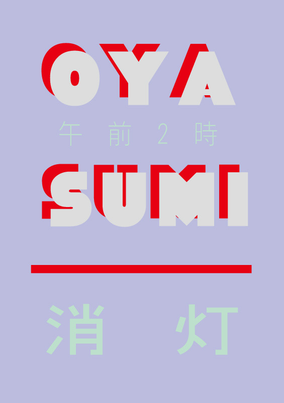
After finishing a rough sketch of the composition, I lined the artwork with thinner, black lines.Oyasumi (Goodnight) poster by Takashi Ueda. I happened to chance upon this poster which I thought was very interesting because of the use of contrasting colours that added energy, and yet was mellowed down by the use of dimmer colours to show that the lights are off and it’s time to sleep.
I wanted to use the colour schemes of artworks used for lo-fi hiphop videos on Youtube since they’re really pretty and also make me feel calm and relaxed looking at them. Usually, there are pastel, mellow, analogous and warm colours.
I tried my hand at recreating this colour scheme by using dull colours and mostly warm tones. Dull colours would also help to contrast the neon effects to come. I also added an atmospheric glow in the middle to indicate that the letters are glowing.Using my experience of creating the neon lighting effect, I lit up the periphery and added neon circular shapes into the foam letters.
I then found and added a foam texture onto the letters. This was so much easier to do on FireAlpaca than on Illustrator since I could adjust the opacity and edit the shape of the layer simply by erasing it.In the background, I added some bokeh lighting effects to show that the lights of the neon letters projected far out. It also added to the overall calm atmosphere of the composition.Anddd… here is the final composition! I think it was definitely a good move moving away from using Illustrator for this job.
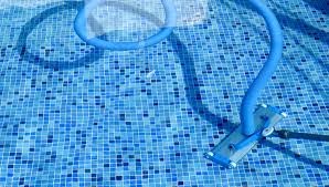
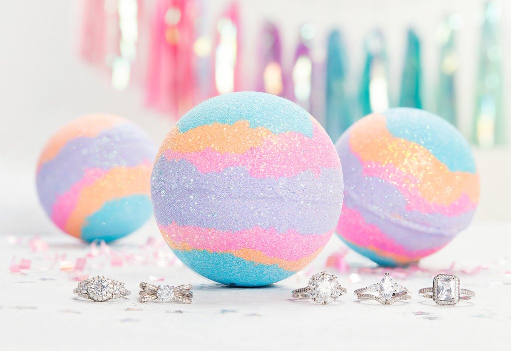
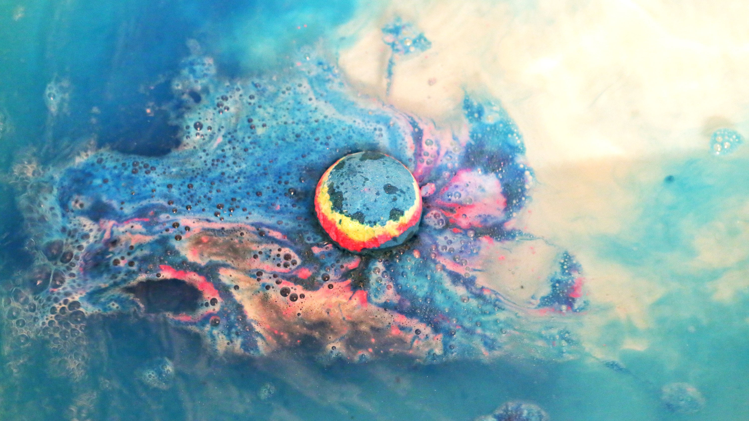
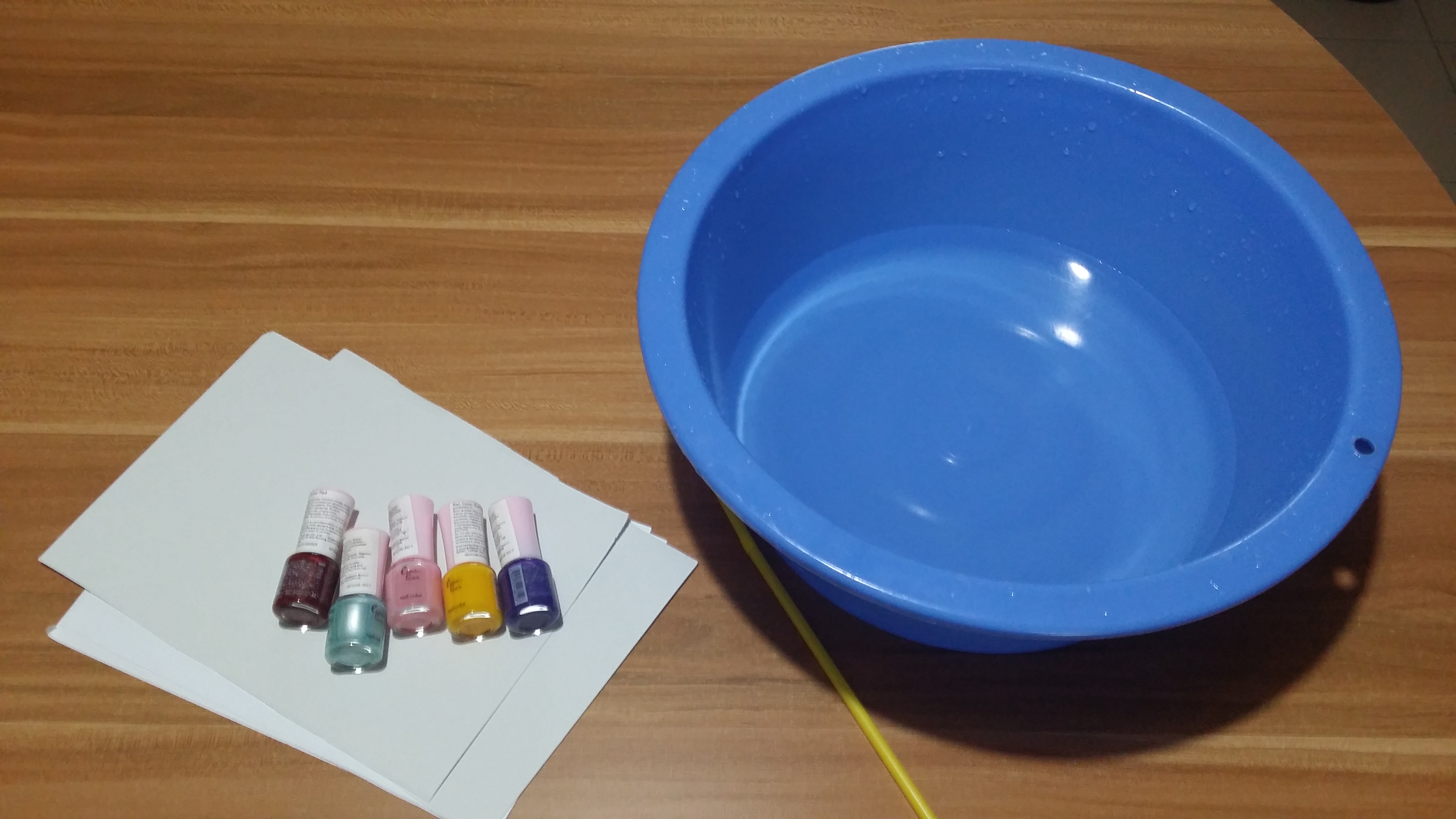
2. Pool Colourist (abandoned D:)
Original job inspirations: Pool maintainer, bath bomb makers
Jobscopes
Pool cleaner: Needs to be committed, works on a regular basis, cleans the pool by throwing chlorine in
Pool cleaning machine?
Bathbomb makers: Manufacture bathbombs by compacting colourful powdery compounds into spheres to be thrown into water and dissolved to colour the water in bathtubs
Objects
Pool cleaner: Water ripples, Pool tile patterns, pool cleaning machine, lifebuoy
Bath bomb makers: Bathbombs, rubberducks
Emphasis on the CHANGE of colour
Mediums for consideration:
Use marbling technique/ decalcomania] put something when pressing down to form letters
Investigator: Find out the truth about a situation by sieving through documents, going onsite to find clues for cases.
Compulsive liars: Can make up a tall story about anything at anytime. Might be useful in some situations to get away with something for the time being. Hiring someone that knows exactly what to say could be really useful. It’s definitely a dirty job.
Compulsive liar: words, speech, Pinnochio nose, Suprematist/De Stijl works to represent the truth
Ideas:
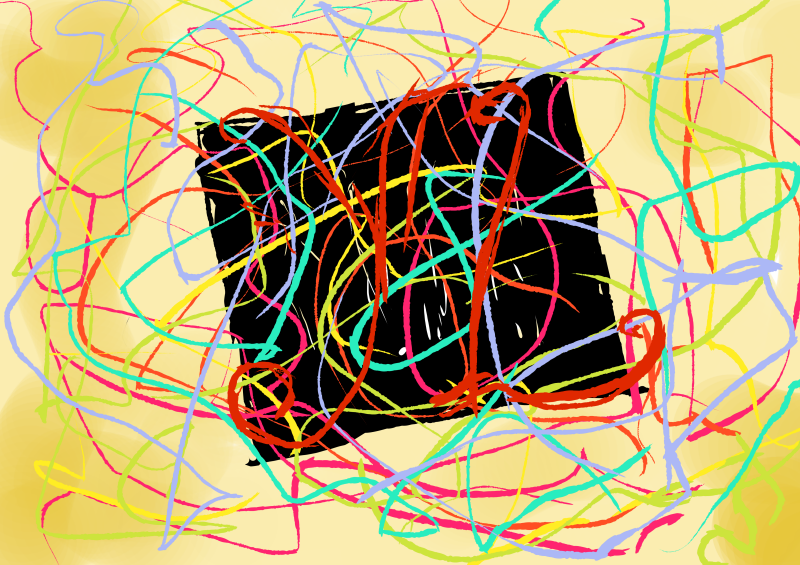
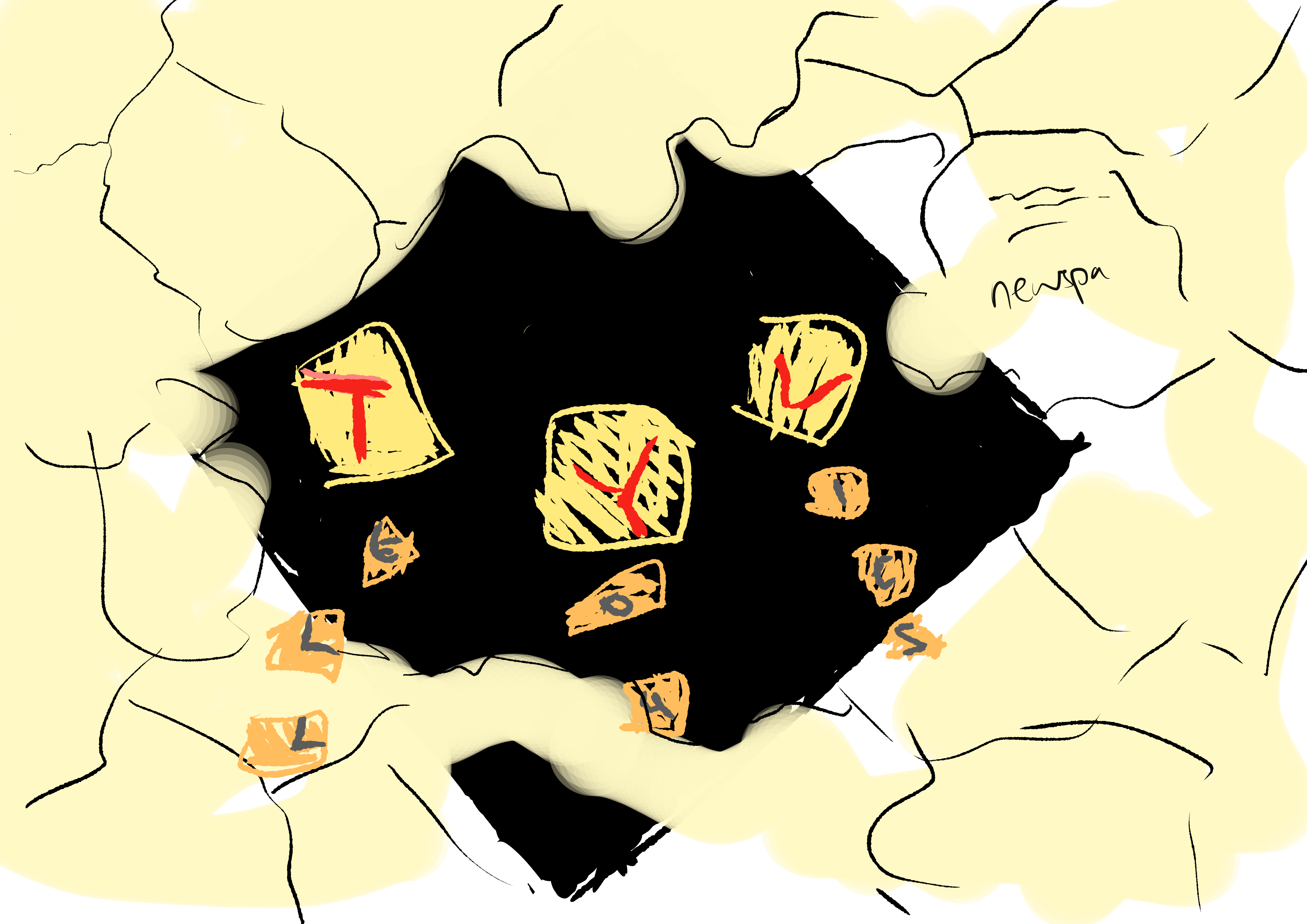
For this draft, I used Malevich’s Black Square to represent the simplistic truth. Lies would be represented by colourful strings to show how pleasant looking things can cover up the truth that is difficult to understand. The contrast between the sturdy black square and the wavy, flowing rhythm of lines would make the composition more dynamic.Some strings I bought from Daiso. I tried using them but they ended up being too thick.I happened to chance upon this paper cut composition which I thought was interesting because it looked like the paper was concealing the faces.And so, I also considered doing a newspaper collage which would partially conceal the black square, similar to how the media could sensationalise and cover up the truth of the matter. Here I am thinking of how to incorporate letters into the composition as well, most likely with a collage of letters.
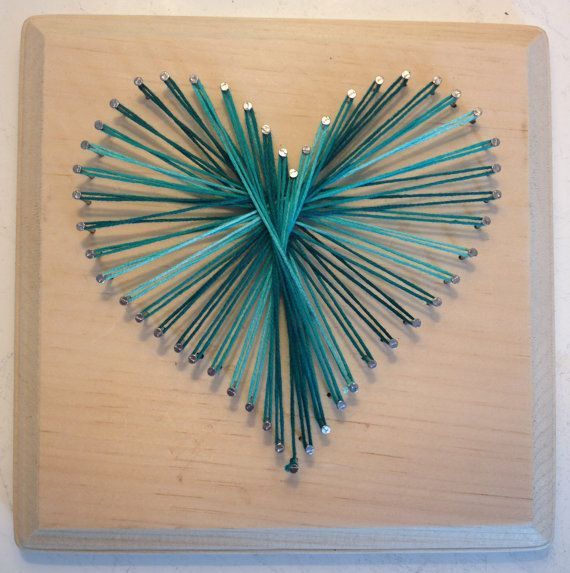
I came across this image of a heart created by winding thread around nails hammered into a wooden board. I was thinking of another way to recreate it so that it would not be too risky since with this method, tension in the strings is key and the moment something goes loose, the entire thing will come apart.
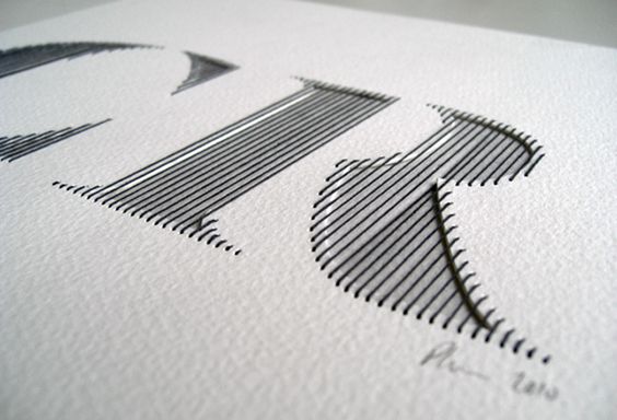
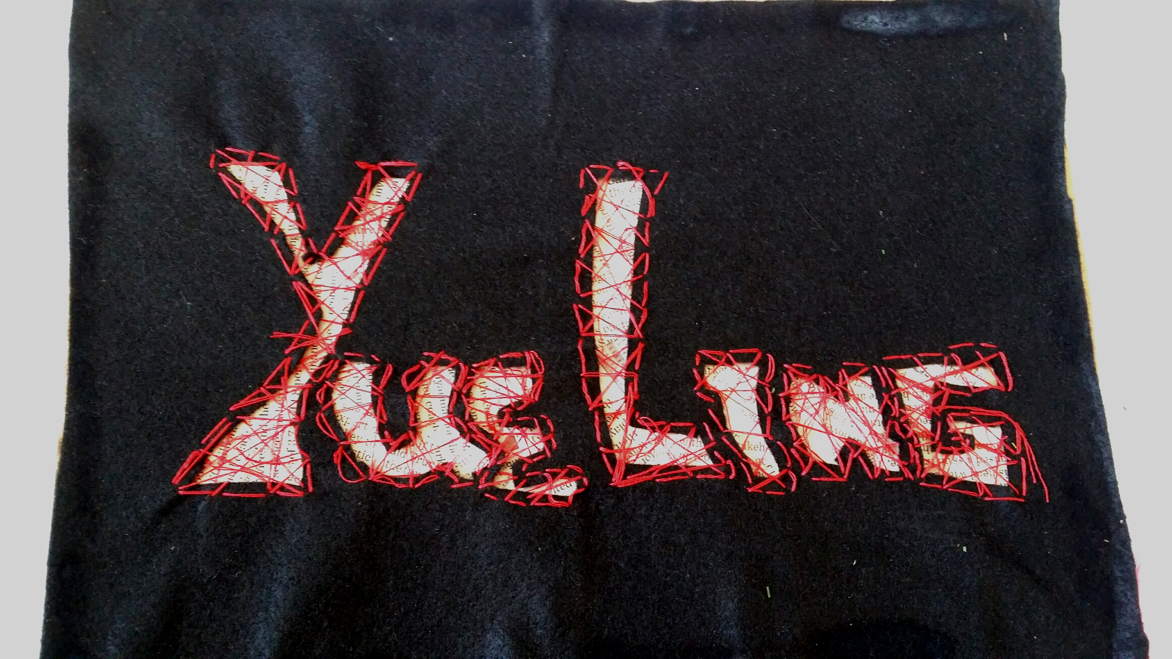
I wanted to explore a new medium which I didn’t get to try out last semester so I looked into sewing. I have some prior experience of patching up my own clothes and buttons so it wasn’t a monstrous task to overcome, so I decided to try this method out. I found this font type that used thinner thread to create neat, vertical strands that filled up the width of the letters, and bound several layers of paper together.
Idea sketch for the making of the composition. I decided to use black felt because it was much easier to sew with than paper, which was in comparison very thick. Underneath the felt, I would do a newspaper collage. In this case, newspapers would represent legitimate black and white documents, thus the “truth”, and the black felt would conceal most of it. I would then sew a random pattern over the with of the letters to create an interesting texture and at the same time make the letters see-through so people can see the words on the newspaper underneath. I used black felt and red thread to express the secretive and dangerous consequences of lying.
Medium: String, Paper, Newspaper
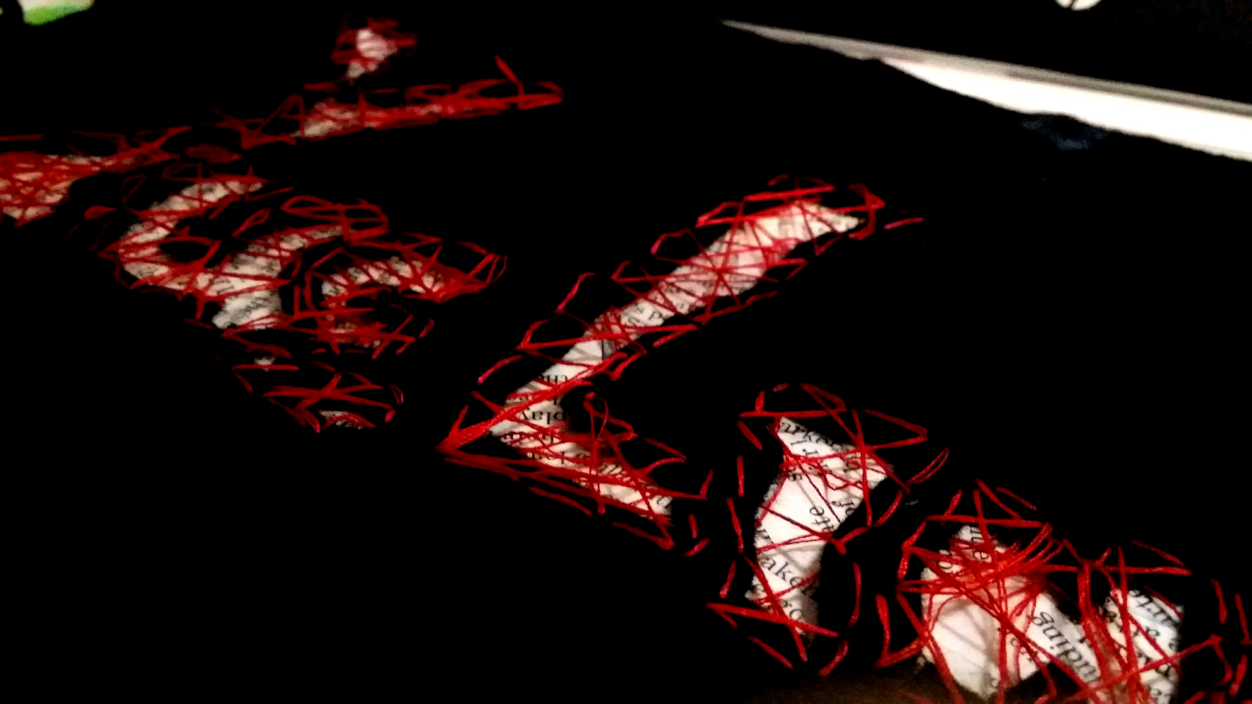
While testing out the sewing technique, I realised that just by sewing in the width of the letters would still make them a little unidentifiable. I chanced upon this image and it gave me the idea to sew around the periphery of the letters as well to make the letters stand out more.
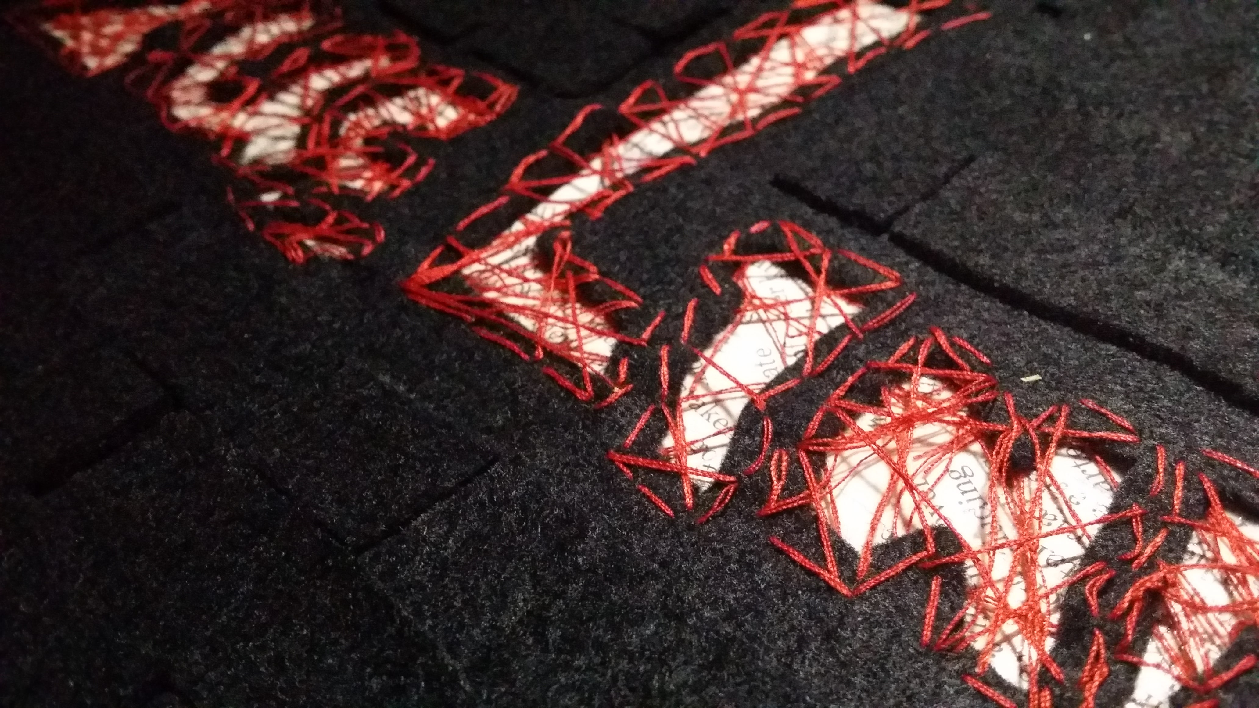
Here is the actualisation of my idea! I created a newspaper collage behind the widths of the letters, picking out the pieces with the most words. Then, I used a cardboard backing so that the felt could be supported. Also, if anyone wants to try this method out, PLEASE cut a bigger piece of felt because when you sew the letters together, it contracts the entire piece of felt.Peekaboo! You can see the newspapers inside~ Now, I used super glue (like the actually really strong kind) to glue the felt to the cardboard, so it did kind of have a chemical reaction and burned the felt. The burned area was really obvious. ;;;
Final
I covered up the burned marks using smaller patches of felt. I decided to use a regular tessellation pattern instead of creating a massive effect because I wanted to portray a professional liar with a calm nature that can lie with a straight face.Here’s a closeup of the texture! Overall, I think this piece has helped me to explore with more mediums that I’ve never really gotten to try and it produced a really tactile result!
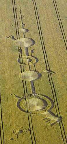
4. Alien Communicator
Inspired by: Astronomers, Crop circle artists
Jobscope:
Astronomers: To study outerspace; investigate the presence of life-forms on other planets.
Crop circle artists: Create geoglyphs on large expanses of crop fields to trick the public into thinking that aliens are real. Also to practice an impressive new art style.
Objects:
Astronomers: Satellites, space suits, rockets, shiny metallic objects, outerspace themes, solar system
After brainstorming, I settled for doing a crop circle artwork myself!
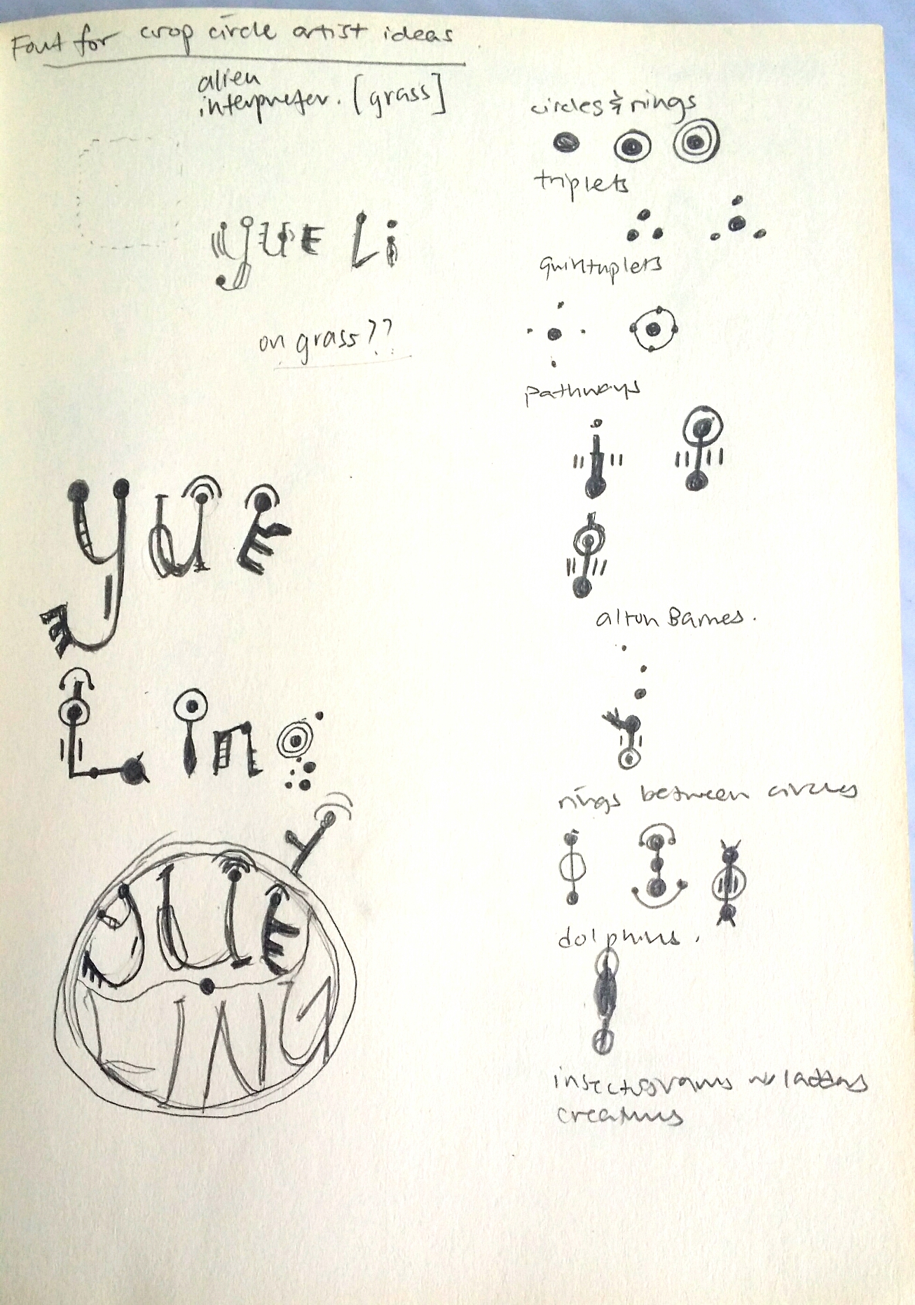
But first, I had to do some research on the patterns of crop circles. And so I did.
Crop Circle Fun Facts!
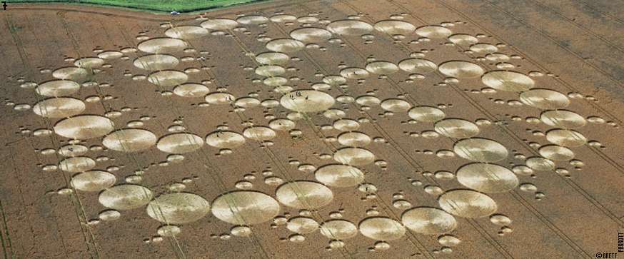
Crop circle art is a relatively new art form. In crop circle art, crop is bent and not harmed in any way. Most crop circles have either laterally symmetrical or radially symmetrical art. They could also be completely unsymmetrical and representative. The possibilities are endless.
The most telling feature of crop circles are their stunning geometric shapes and patterns that make it hard for people to believe that they were really created by human beings on such a large scale, and so a lot of people would rather believe that aliens did it.
I borrowed a book on crop circles by Michael Glickman to study the common features of crop circles:
others like -orbits,snowflakes, triangles and squares
Radially symmetrical composition with tons of rings, almost resembling a whirlpool because of the swirl of the lines from the center outwards.Alton Barnes crop circle. Here we can observe bridges across rings, which is cool and all but the most iconic thing about this crop circle is the gear/crank looking protrusions coming out, giving a mechanical nature, and evoking a sense of modernity/technology.Laterally symmetrical representational composition of a jellyfish in a field in Oxfordshire.
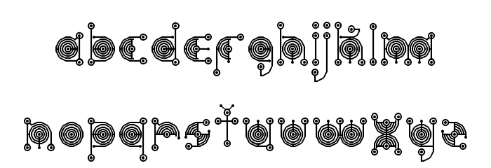
In this draft, I tried incorporating the different patterns that I had learned, as well as letters of my name. However, this did not include the essence of the job into the letters once they were extracted out. So I decided to look into crop circle font.Most of the search results that came up showed fonts like this that were ultimately… Alien webdings. Which is cool as a code and all, but no one will know how to read my name.I found this font which did utilise rings, bridges and insectogram feelers, but the patterns could be more diverse.And then I came across this one that used only rings, but at least it incorporated the pattern of the crop circle into the letters themselves. This inspired me to build on this concept, while including a larger variety of patterns.
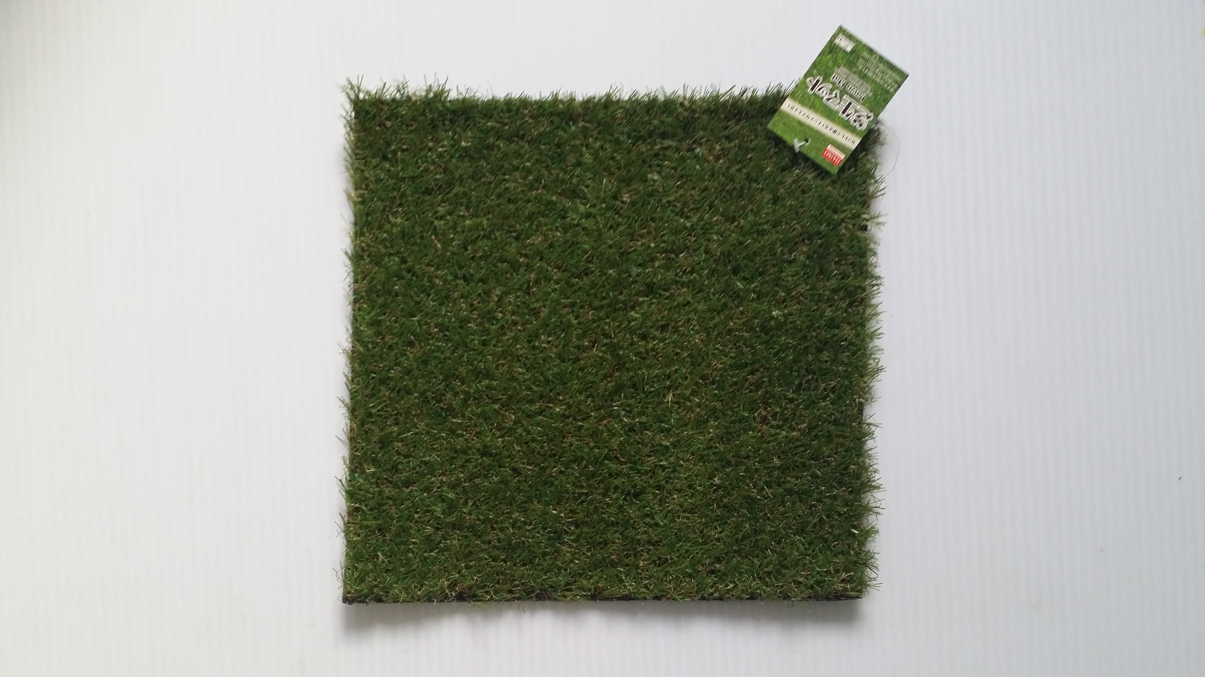
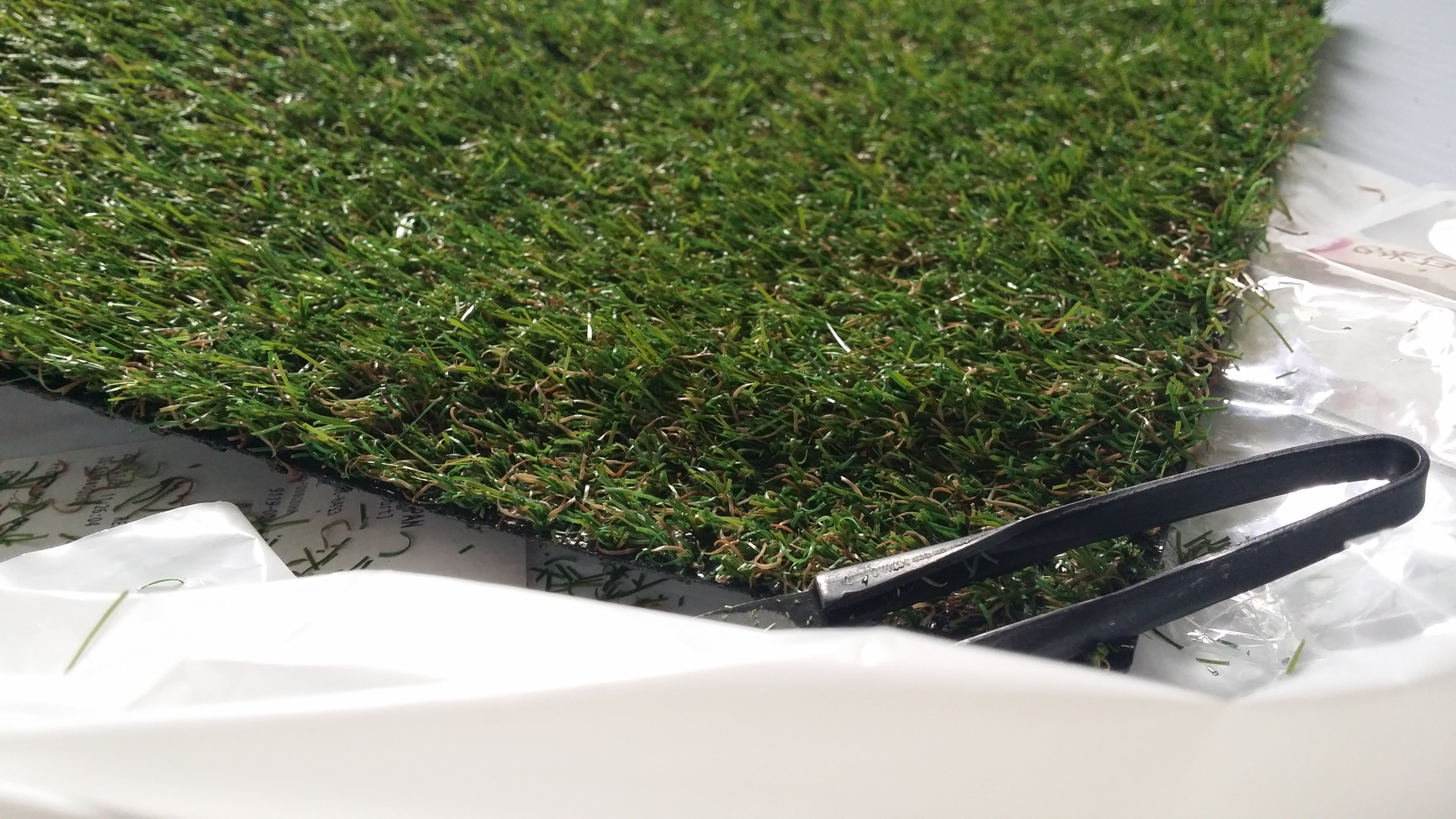
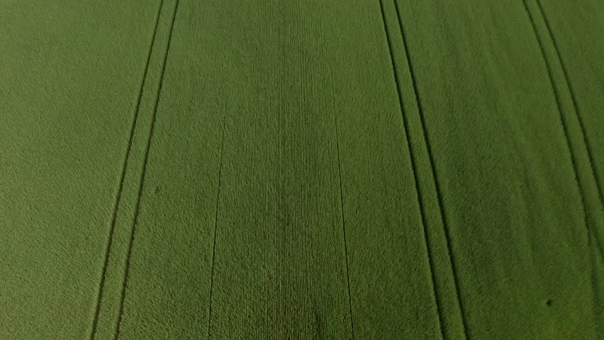
Here, I sketched out some of the above mentioned features of crop circles and found ways to incorporate them into the individual letters. I decided to put the letters into a circular shape as well since it would contribute to the overarching circular/geometric motif of crop circles.On FireAlpaca, I constructed a draft of the crop circle art. I was planning to use this as a stencil to cut out the letters on an actual fake grass patch from Daiso but… you’ll see later.Yeap, here is the grass patch I was planning to use, it was about 22cm by 22cm.I tried trimming down the grass on an extra bit of the grass patch to see how obvious it would look.Unfortunately, after trimming, the letters could not show up. I even used brown acrylic paint to try to bring out the letters but the paint couldn’t show up and the space was too small too. Much to my dismay, I had to abandon this medium. But not all hope was lost!I decided to turn to trusty digital imaging. Now I haven’t really done heavy editing before, so I was starting on a clean slate. Wrecking my brain over how to make the image as realistic as possible, I was blessed.
SOMEONE DID A TUTORIAL ON IT!!!
This tutorial was absolutely FANTASTIC. It was clear to follow and produced a really realistic effect. You can also use any stencil with a transparent background you have created, and following quite a long but comprehensible procedures of producing a screen, bevelling and embossing and tweaking lighting settings, you can create your own realistic digital crop circle artwork as well. By following this tutorial, I managed to play around with the blending effects a lot more, which I had always been quite unfamiliar and apprehensive about touching before this project.
Final
After many attempts and disappointment, I finally managed to achieve this super realistic crop circle effect that could convey the essence of my alien communicator job through the grass medium I had originally wanted to use, just digitally. I really have to thank the person who uploaded that tutorial!!
5) Local Pastry Chef
Inspired by: Chefs, Singaporean Hawkers
Jobscopes:
Chefs: Professional chefs that pay close attention to the process of cooking, as well as garnishing and presentation of food.
Singaporean hawkers: Specialise in catering to the Singaporean palate, making local cuisines like Chili Crab, Bak Kut Teh etc.
Objects:
Chefs: Chef hat, wok, spatula, frying pan, ingredients
Singaporean hawkers: Chili crab, bak kut teh, kueh, fried rice, hokkien mee, yong tau foo
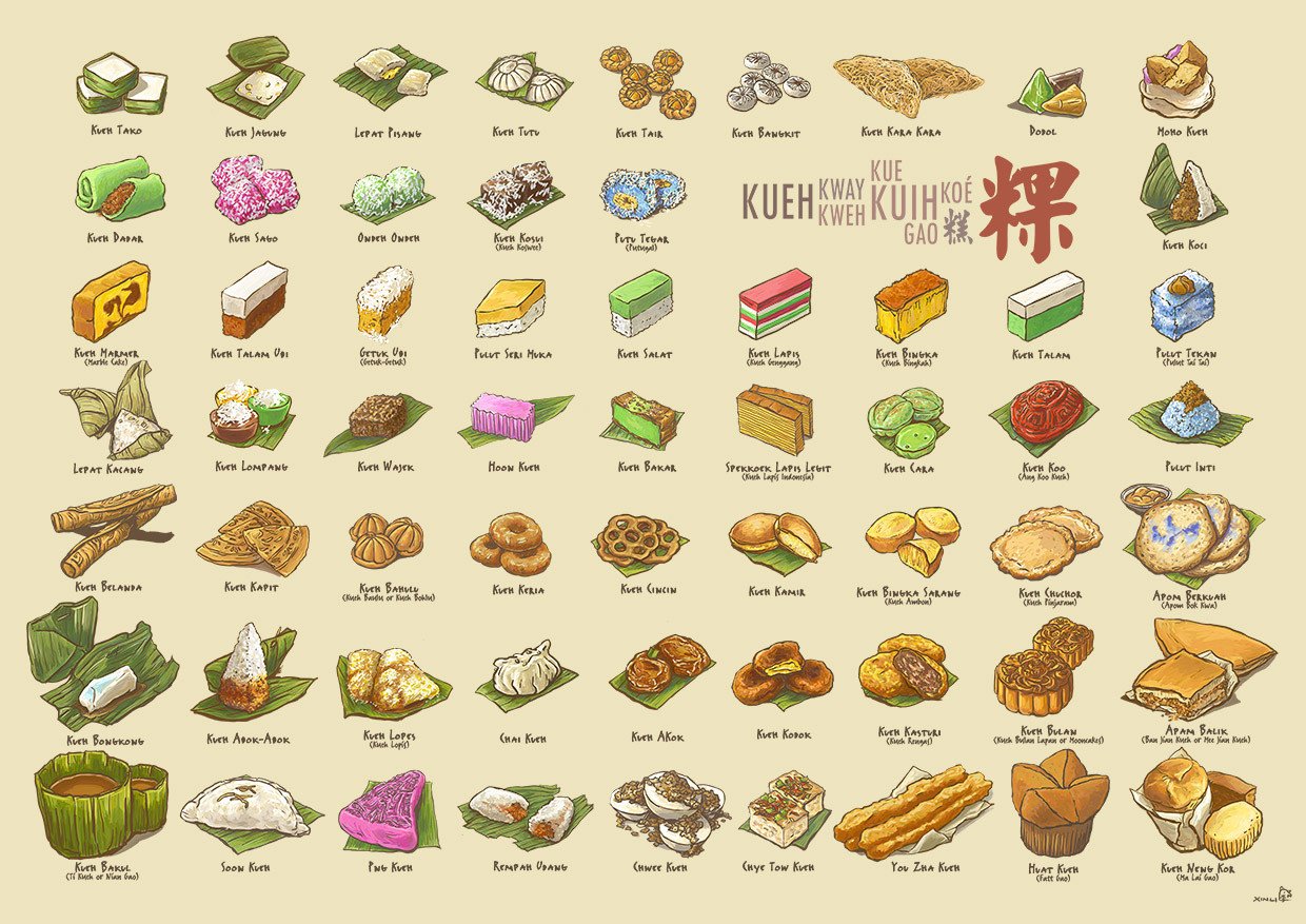
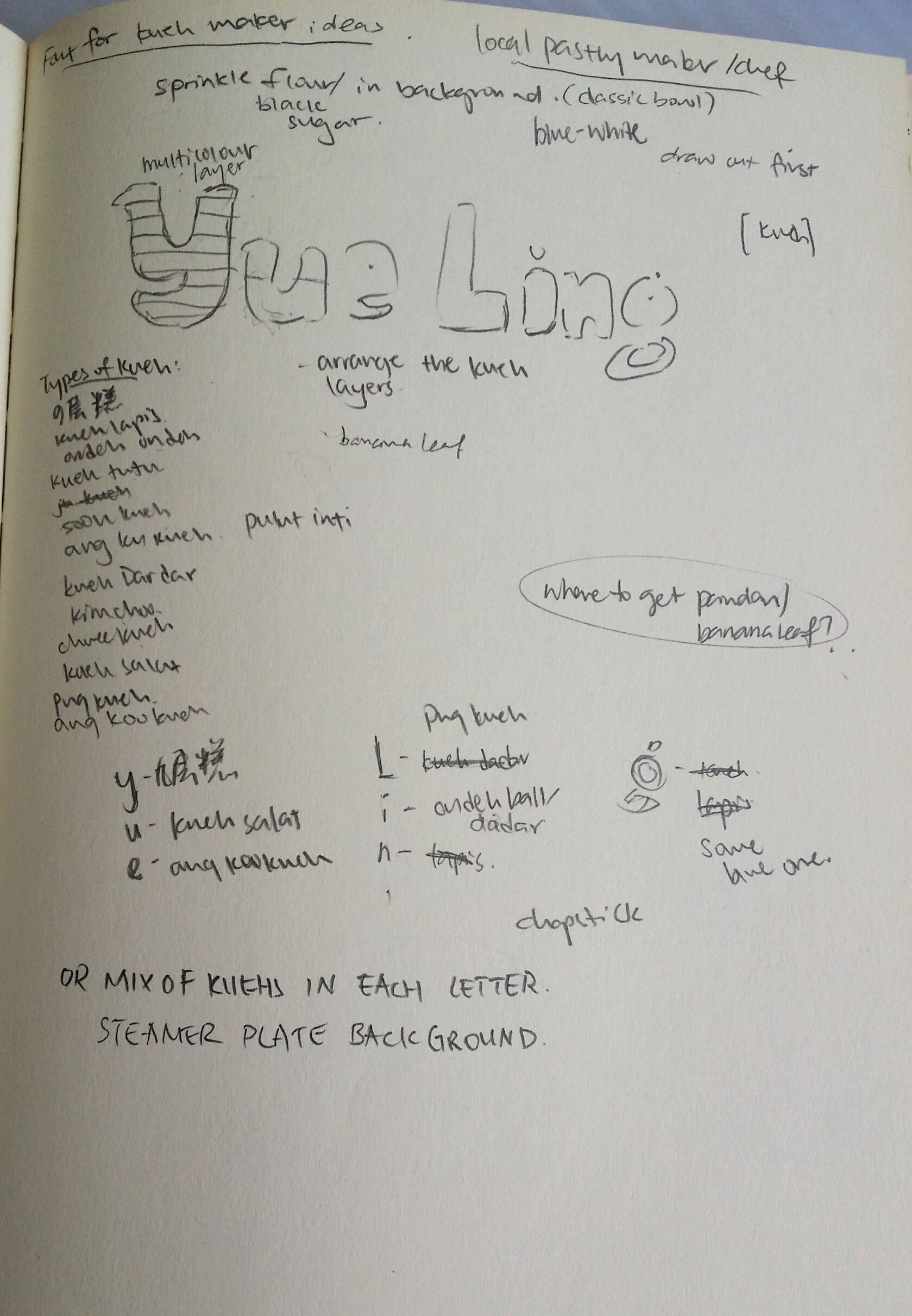
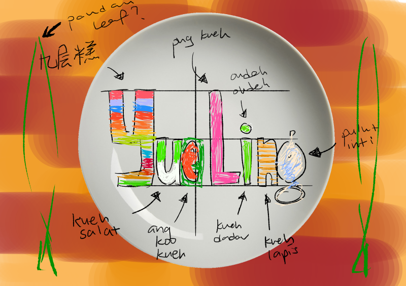
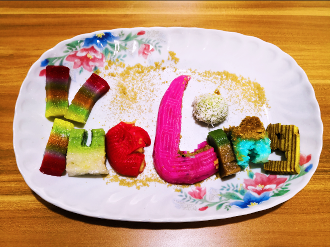
Kueh Compendium by Naiise It was decided that I was going to use kueh as a medium since there are so many different types and they are all really colourful (and tasty). Recalling that Naiise has a lot of products designed based on local pastries, I decided to search up references and low and behold, there was an entire catalogue of kuehs to choose from! I didn’t even know some of these kuehs existed. https://cdn.shopify.com/s/files/1/0175/9848/products/KuehUltimaxwithnamessm.jpg?v=1495785705Here, I drafted and started planning which type of kuehs to put into each letter. I tried to include as many types and colours as possible, and also considering the characteristics of each kueh and whether they could be molded into the shape of the letters. For e.g., for more complex forms, I tended towards kuehs that were layered so that the layers could be the characteristics incorporated into the letters. Also, for the long capital letter L, I used the correspondingly lengthy pink png kueh because it was suitable.In this draft, I tried to imagine how the colours would turn out based on the use of different kuehs. I was going for a more home-y feeling as well so I wanted the background to be of a wooden texture, and the plate to be either clean or the blue-white/flowery traditional ceramic types.
Medium: Kueh, Photography
After spending QUITE the amount on about more than 10 kuehs (but it was worth it because it was really fun making and eating them afterwards), I crafted out the letters of my name in kueh. I placed the kuehs in a flowery ceramic plate and sprinkled some brown sugar over to complete the garnishing. I edited the original picture by adding some filters which gave the photo a warmer and home-ier colour tint.
Kuehs used:
Y- Kueh lapis sagu (Jiu Ceng Gao in chinese)
U – Kueh salat
E – Ang Ku Kueh
L- Png Kueh
I – Ondeh ondeh and kueh talam
N – Pulut Inti
G – Kueh Lapis
Reflections:
This project was pretty challenging in the sense that we had to create letters that could easily communicate the essence of our jobs. Since I also decided to go with jobs that are inspired by at lease 2 traditional/existing jobs, it was tough trying to incorporate elements of both jobs to balance out the elements equally. However, through a rigorous process of refining my designs, I would like to think that I have managed to do so. ;;; XD
With this project I also wanted to explore the use of other mediums, which I think I managed to do successfully! Although it was not a smooth process throughout, with many failures and disappointments, I always recall the saying that artists should “Fail faster” so that we learn from mistakes faster and can get on with improving our projects. After failing with the intended mediums, I tried to find alternate options that could express my intentions on the same level, if not, surprisingly better.
Through this project, I was also able to get more comfortable with Photoshop blending modes that I have never ventured to touch before. Fiddling around with the settings for making the neon glow and crop circle really taught me the massive capacity Photoshop has for creating realistic illusions.
All in all, I really enjoyed this project and had fun trying out different mediums instead of just ink/paint. Looking forward to the next Zine project!
For our second project for Foundation 4D I: Story about a Thing, we are supposed to choose… well, a THING as a theme and create a visual narrative surrounding it using sequential images. In class, we also learned about narrative structure and story-telling techniques using images such as scene-to-scene and action-to-action closure to fill in the blood in the gutter.
My first task was to select a thing (as if it wasn’t the hardest task ever; sometimes the simplest briefs are the hardest). I decided to use something wacky and bizarre because solemn stories aren’t really my thing.
So, I chose a wig.
Yes, a wig.
My initial story plan was inspired by this game that I found on Kongregate.com a long time ago, The Visitor by James Ziebarth. It follows the storyline of this alien worm-looking creature that starts off really small, but goes around people’s houses devouring larger and larger prey until it grows to maximum size. The plan was a horror genre and I wanted to make my wig consume people, but I felt that the horror genre is a tad bit grotesque to do and doesn’t really have an interesting storyline to it, so I decided to change it to a comedic story instead.
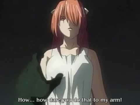
Instead of having a completely evil wig that murders people, I decided to change it into a yandere wig. ‘Yandere’ is a character archetype in a lot of Japanese animated films that are often girls that are so obsessed with a boy that they would kill for them, or just carry out violent acts in general that also endangers the lives of everyone around them.
Popular examples of ‘yandere’ girls:
Gasai Yuno from Mirai Nikki (Future Diary).Lucy from Elfen Lied.Kotonoha from School Days!
Yes, I wanted to make my wig an obsessive protagonist.
So here is my rough storyline using the monomyth structure:
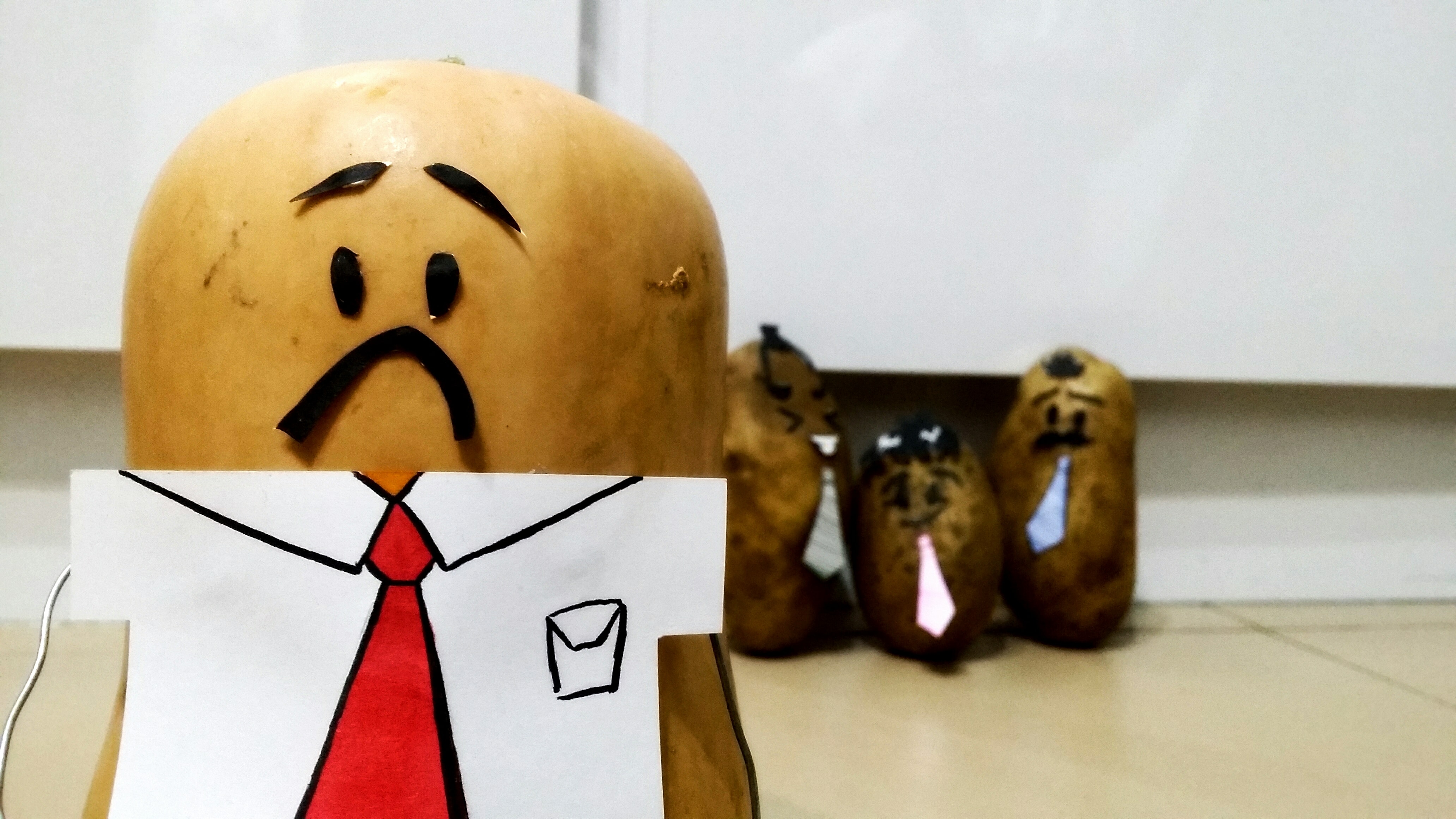
A CEO of a company who starts off with a head full of luscious thick hair starts to bald for unknown reasons (presumably stress or old age), and since maintaining his image and his dignity is really important to him, he thinks of the immediate solution of getting a toupee (as inspired by the Principal in Captain Underpants). He hesitates for a bit when he thinks that it might fall off and his colleagues would laugh at him, but he decides that his image is much more important so he goes to get the toupee anyway.
Little does he know, the toupee has a mind of its own and develops a liking for its owner. They spend time together as the protagonist goes about his days concealing his bald spot with his newly bought toupee.
One fine day, he sees an advertisement on the television for a hair growth cream and has an epiphany. He purchases the cream and successfully manages to grow back a full head of hair, much to the obsessed toupee’s dismay.
The now desperate toupee decides to take superglue and put it on …itself (?? shall not assume gender here) and awaits its master’s arrival.
When the protagonist puts the sticky toupee onto his head, he is appalled to find out that he can’t take it out again. Left with no other choice, he decides to shave off all his hair. The ending twist is that he buys another toupee which has a life of its own. And so the cycle continues.
————————————————————————————————-
Now I know what you’re thinking after you’ve just read this.
Wtf???
Good, that’s the intended effect.
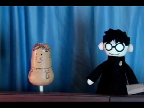
Now it was obviously a terribly hard task to find a bald man to act for me so I decided to substitute the human protagonist to a squash instead. I was inspired by PotterPuppetPal’s Neville Longbottom (below):
Neville the squash (vegetable) compared to a more human-like Harry Potter.
I supposed this would create a much more comical effect since the story itself is pretty silly.
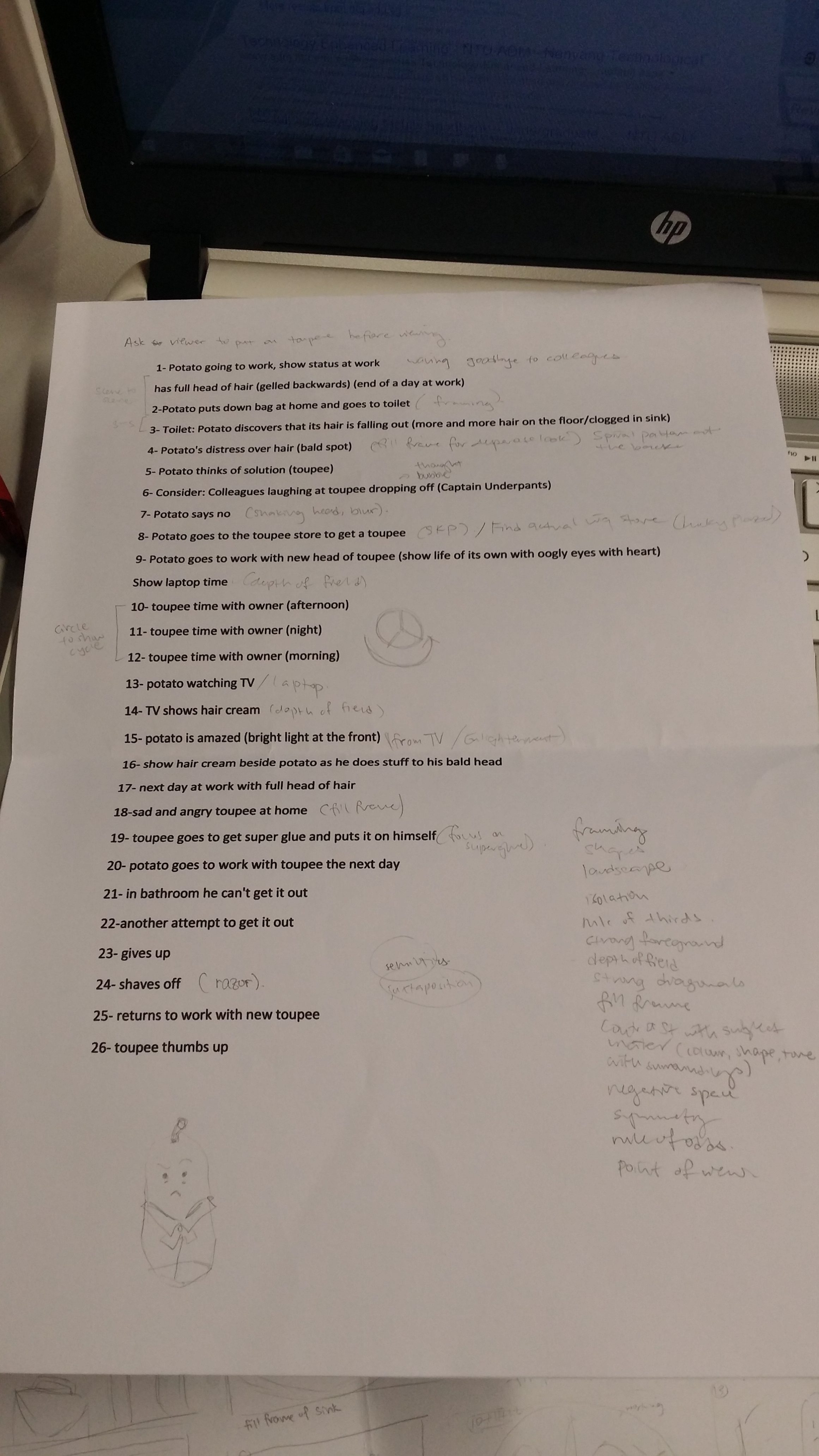
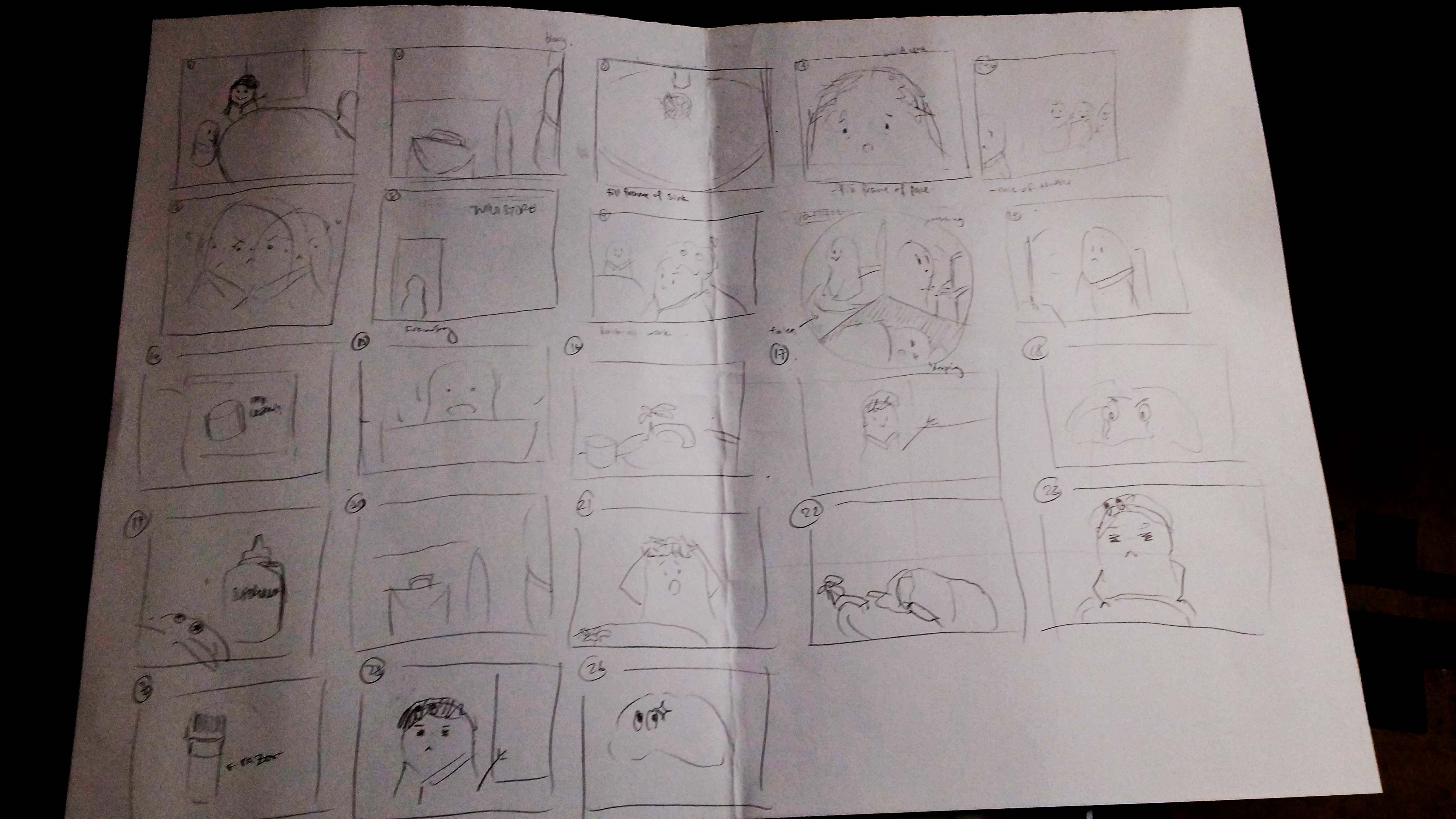
Below was my rough plan for the sequence of my images:
1- Potato going to work, show status at work
has full head of hair (gelled backwards) (end of a day at work)
2-Potato puts down bag at home and goes to toilet
3- Toilet: Potato discovers that its hair is falling out (more and more hair on the floor/clogged in sink)
4- Potato’s distress over hair (bald spot)
5- Potato thinks of solution (toupee)
6- Consider: Colleagues laughing at toupee dropping off (Captain Underpants)
7- Potato says no
8- Potato goes to the toupee store to get a toupee
9- Potato goes to work with new head of toupee (show life of its own with oogly eyes with heart)
Show laptop time
10- toupee time with owner (afternoon)
11- toupee time with owner (night)
12- toupee time with owner (morning)
13- potato watching TV
14- TV shows hair cream
15- potato is amazed (bright light at the front)
16- show hair cream beside potato as he does stuff to his bald head
17- next day at work with full head of hair
18- sad and angry toupee at home
19- toupee goes to get super glue and puts it on himself
20- potato goes to work with toupee the next day
21- in bathroom he can’t get it out
22-another attempt to get it out
23- gives up
24- shaves off
25- returns to work with new toupee
26- toupee thumbs up
Story plan:
Storyline plan
Storyboard plan (arrangement not confirmed yet)
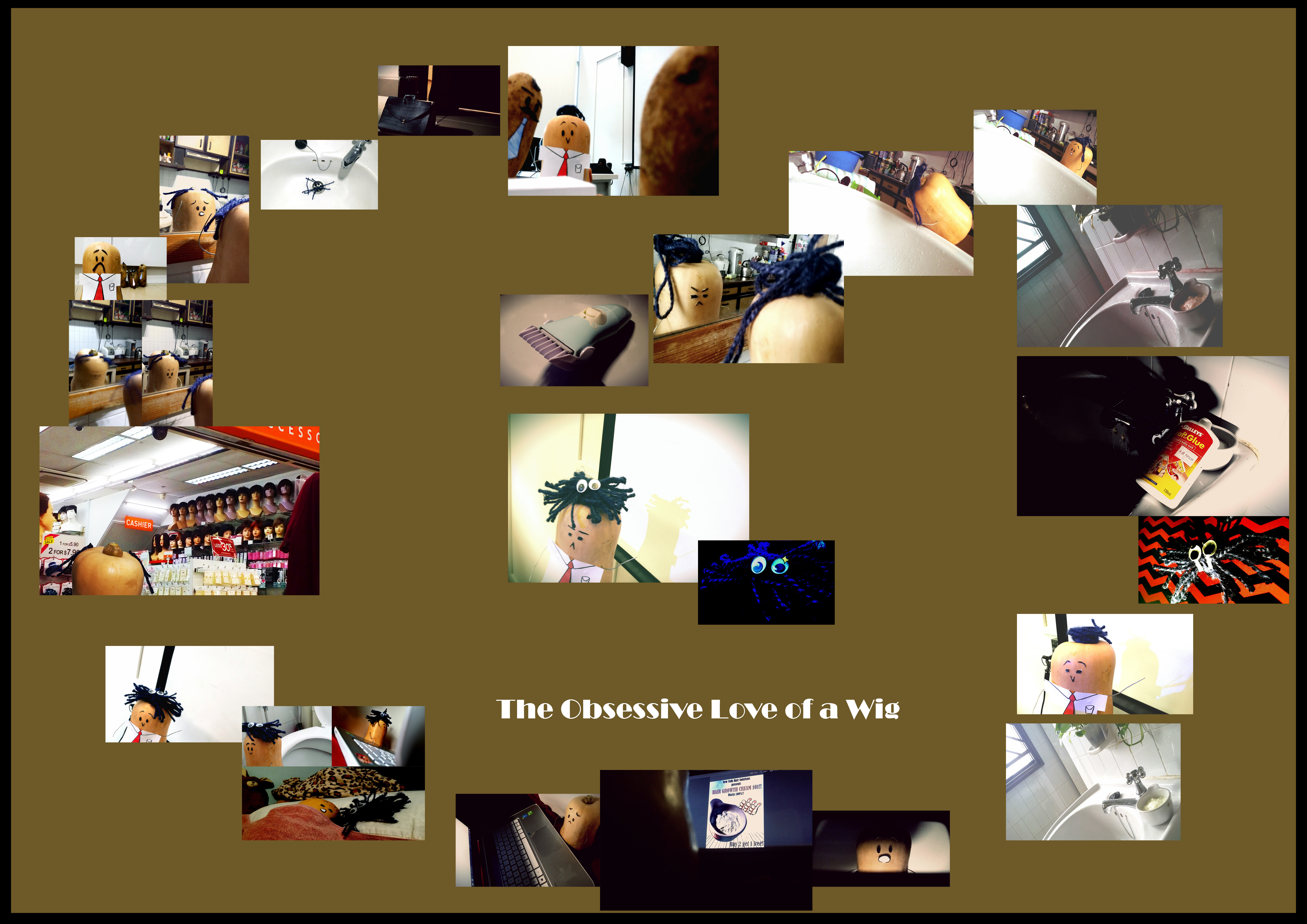
|| The Obsessive Love of a Wig || I made some tweaks to the storyline; instead of the wig superglue-ing itself to Philip (yes he has a name now, I’m overly attached) and forcing him into eternal baldness, the wig now switches the hair growth cream Philip bought for superglue (muahaha!) and forces him to wear a the evil wig forever. Initially, I wanted to try a circular arrangement to imply the structure of the hero’s monomyth, but then I saw an opportunity to arrange my photos in a heart-shape to echo the theme of the story (definitely romance, or at least one-sided)! They are also read in an anti-clockwise direction because it’s easier, reading clockwise sort of feels like you’re reading the story backwards. The file size uploaded here is pretty small so the images are probably pretty hard to see so I’ve added a link below to a .pdf file with much better quality!
For Project 2: “Forrest Gump”, I have to pick movie quotes, translate them into abstract visual language like symbols, pictograms, dingbats, icons and engravings and apply techniques such as hyperbole, metaphor, caricature, parody, anthropomorphism etc. to express the narrative quality of the quote. I also have to make use of design principles from the various class presentations to create my final design. (dots, lines, shapes, planes, value, texture, balance, gradation, symmetry, repetition, pattern, rhythm, unity, harmony, size, proportion, dimension, contrast etc.)
Personally, I realise that I have not watched a lot of mainstream Hollywood movies, but my taste and preference for movies lies a lot more in Disney/Pixar animated films, as well as Japanese movies and animated films, which have pretty memorable and unique quotes as well.
Below are some of my favourite quotes that I have gathered:
Movie
Quote
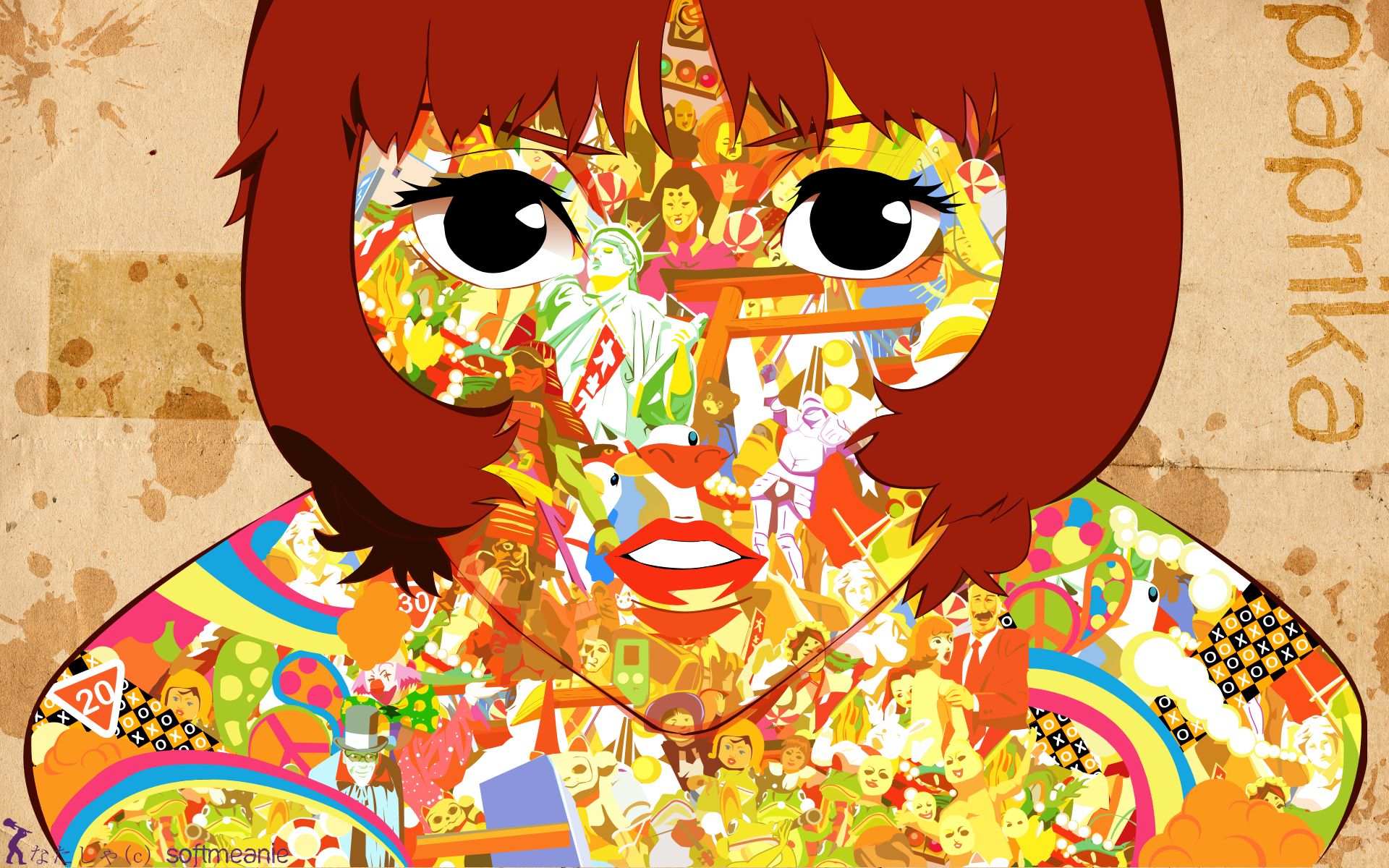
*Paprika
“Don’t you think dreams and the Internet are similar? They are both areas where the repressed conscious mind vents. “
Mulan
“The flower that blooms in adversity is the most rare and beautiful of all.”
Grave of the Fireflies
“Why do fireflies die so young?”
1 Litre of Tears
“When I look up as I fall down, I see how limitless the azure sky above is as it smiles down upon me.”
* End of Evangelion
“If you wish for others to exist, the walls of their hearts will separate them again.”
*Sherlock (bam, the only mainstream series I watch)
“Anderson, don’t talk out loud. You lower the IQ of the whole street.”
*Peter Pan
“To live would be an awfully big adventure.”
(* starred quotes are the four that I have chosen.)
Taking a pick out of this list was quite the feat, but I figured that was a wise decision not to pick quotes that were either too literal or too figurative because it leaves little room for imagination and abstraction.
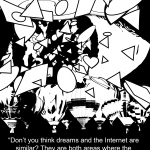
“Don’t you think dreams and the Internet are similar? They are both areas where the repressed conscious mind vents. “
Context in movie:
Paprika is a relatively contemporary, sci-fi Japanese animated movie that is in a futuristic, alternative universe and is about dreams and reality. To put it simply, an organisation creates a device that allows people to jump from reality into the dream world and that is used as a prototype for treatment at a hospital (later revealed to be malfunctional but I’m just going to stop here because this movie is a masterpiece and I don’t want to spoil it). Paprika is the name of the avatar of the main female protagonist. The quote is said by Paprika herself as she draws a comparison between the characteristics of dreams and the Internet.
– a series of thoughts, images, and sensations occurring in a person’s mind during sleep.
-Surreal alternate space that we transiently experience when we sleep. Normally has a lot of crazy, bizarre things going on that will almost never happen in real life.
-Has a sense of lightness since we have a lot more freedom to imagine what we want to in our dreams.
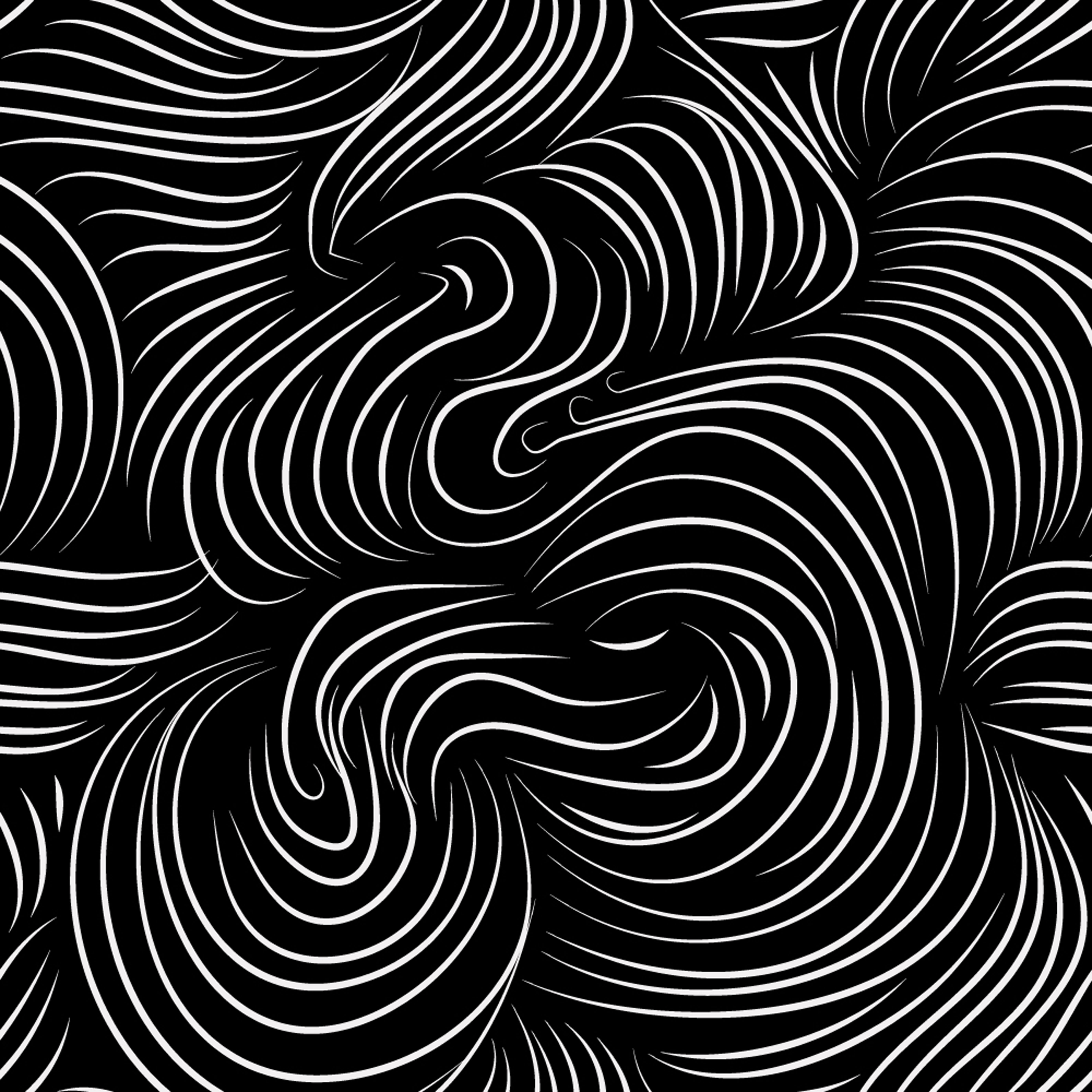
-A sense of movement can also be created as well since the scenes that we imagine are often overwhelming and hard to comprehend, leaving us in confusion (which, with reference to observations from the previous project, can be expressed with spirally lines radiating outwards)
Possible imagery: hot air balloon, water, anything to do with space or distorted reality
Internet
-a global computer network providing a variety of information and communication facilities, consisting of interconnected networks using standardized communication protocols.
– cloud, data, wifi signal, hotspot, can be sea as well
similar
– show the contrast between dreams and the internet, yet feature the main similarity between them
repressed
– (form of restriction) treasure/Pandora’s box, lock, chain, handcuff, torn wing, cage
conscious mind
– burning flame, open eye (window to the soul)
vents
– (outpour) waterfall, volcano, soil erosion, avalanche, tsunami, some sort of a crack and spill situation
Composition idea #1a:
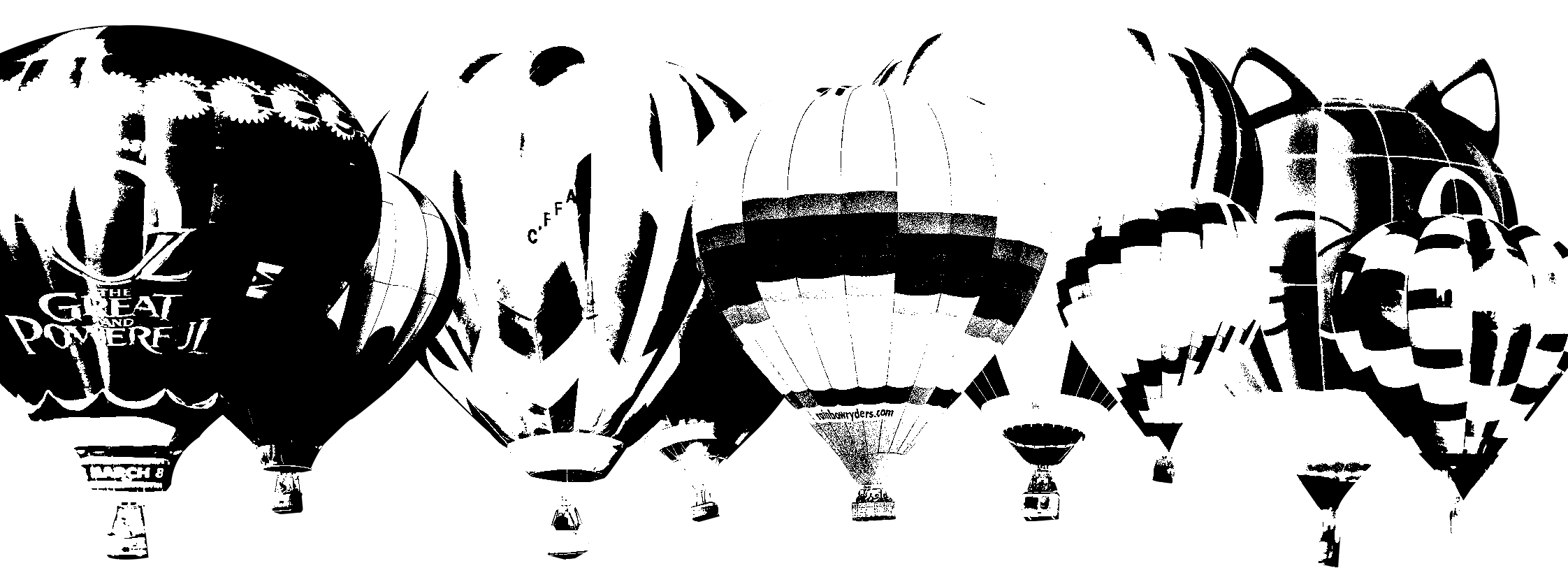
I’m going to use hot air balloons to represent ‘dreams’ since they are a means of transport to a place that is “high up”, as if almost going into another realm; just like how we are transported into dreams when we are asleep. A random variety of hot air balloon designs can help to depict how unpredictable dreams are. When put together, they create a very bizarre and surreal effect.
http://r.hswstatic.com/w_907/gif/podcasts/stuffyoushouldknow-podcasts-wp-content-uploads-sites-16-2015-08-hotairballoons600x350.jpgI made a black and white collage of small hot air balloons.
As for the ‘Internet’, I chose to use a relatively larger-scaled cloud icon. To me, the Internet is a vast space with many users, just like how the water droplets aggregate in the air to from one massive cloud.
https://orig00.deviantart.net/4b38/f/2013/141/0/2/akatsuki_cloud_by_sthef12-d6621a7.png I turned this cloud from coloured to black and white (some people may recognise this)
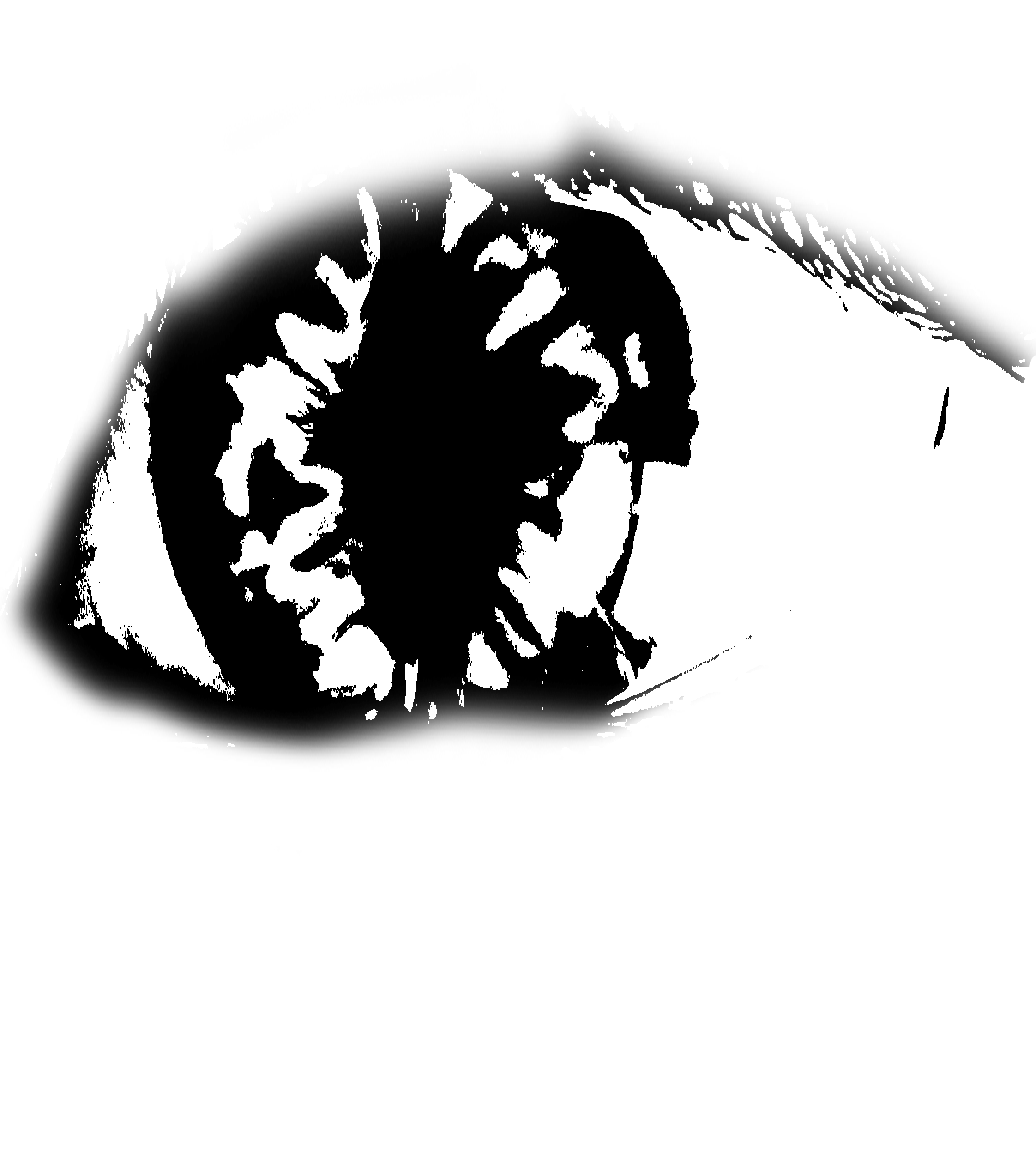
To represent the ‘conscious mind’, I’m using an open eye since it implies being awake and aware of your surroundings. After looking through icons and symbols, I decided that using a more realistic-looking eye was better since it gives a stronger sense of consciousness (“the eyes are the windows to your soul”). Using simple icons felt very dead.
I converted an image of someone’s actual eye and turned it black and white.
1st Draft:
My initial composition idea (Paprika)
I separated the singular massive cloud and the layer of hot air balloons into distinctive layers. I wanted to place eyeballs on all of the hot air balloons and the cloud, then have something come out of them (expressing ‘vent’) but I felt like it did not do a good job of conveying the quote since it did not make much sense for dreams and the Internet to have conscious minds of their own. Plus, I was also intending to put a broken chain on the eyes to represent ‘repressed’ (but no longer). However, after attempting to put chains on each of the eyeballs on the hot air balloons, it proved to be an editing disaster.
2nd Draft:
My new composition idea (Paprika).
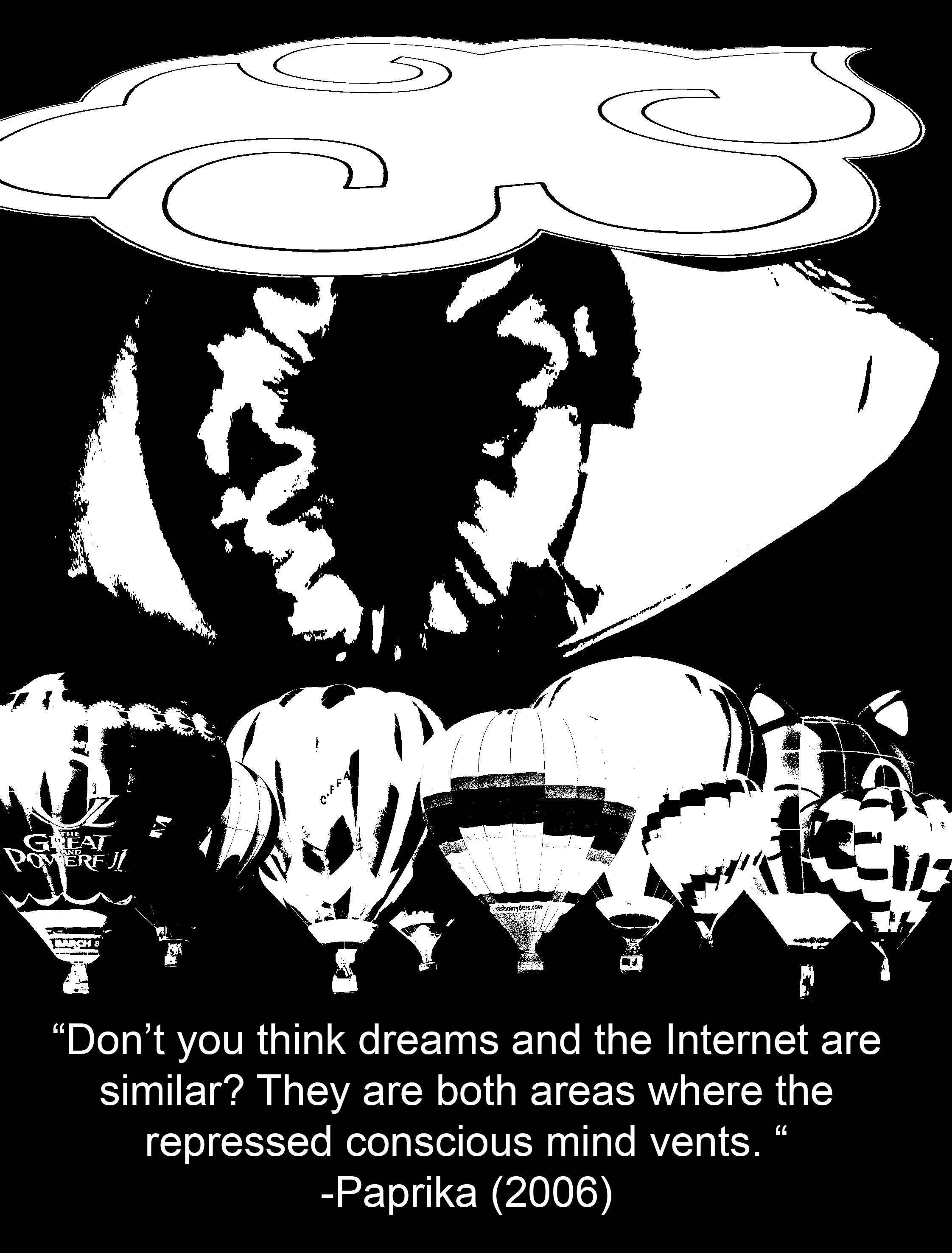
Now, instead of slapping eyeballs everywhere, I decided to put a picture of an eyeball that was relatively larger than the other elements to show that it was the dominant subject of the piece. However, it is still concealed behind the cloud to create a sense of depth (hiding behind the clouds, more subtle way of representing ‘repressed’), and the black background also enhances the feeling of a void which reminds me of the dark we see when sleeping; it is a strong contrast with the white parts of the eyeball which is supposed to symbolise consciousness and being awake.
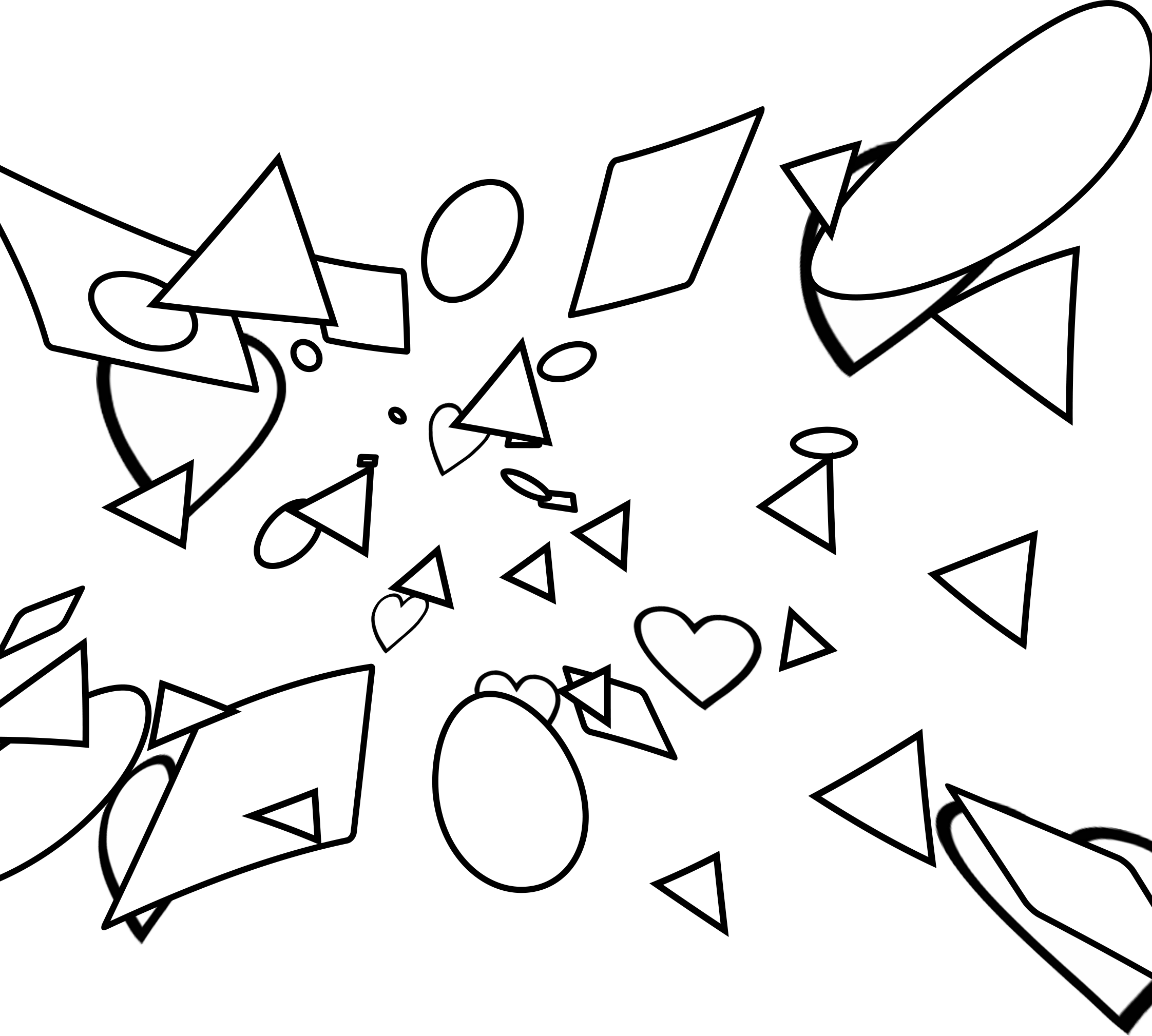
To express the element of ‘venting’, I wanted to use rhythm to show an erupting action, sort of like lava from a volcano, or bubbles coming out from a underwater vent. The use of a variety of shapes was abstract enough to show the idea of “anything”, parallel to how we like to post anything on the Internet, and how we can literally dream up anything when we are asleep. Initially, I used a regular rhythm of shapes everywhere but it proved to be much too rigid. After some tweaking, I managed to come up with the design below:
Distorted shapes
In this version, I used progressive rhythm, where the shapes got bigger from the eyeball to the cloud and hot air balloons. The warp effect that I added also enhances the illusion of depth as we can sense that these shapes are in motion and travelling a distance from the eye to the cloud and hot air balloons. This is paralleled with how our thoughts are transferred from our minds to the Internet and our dreams.
3rd Draft:
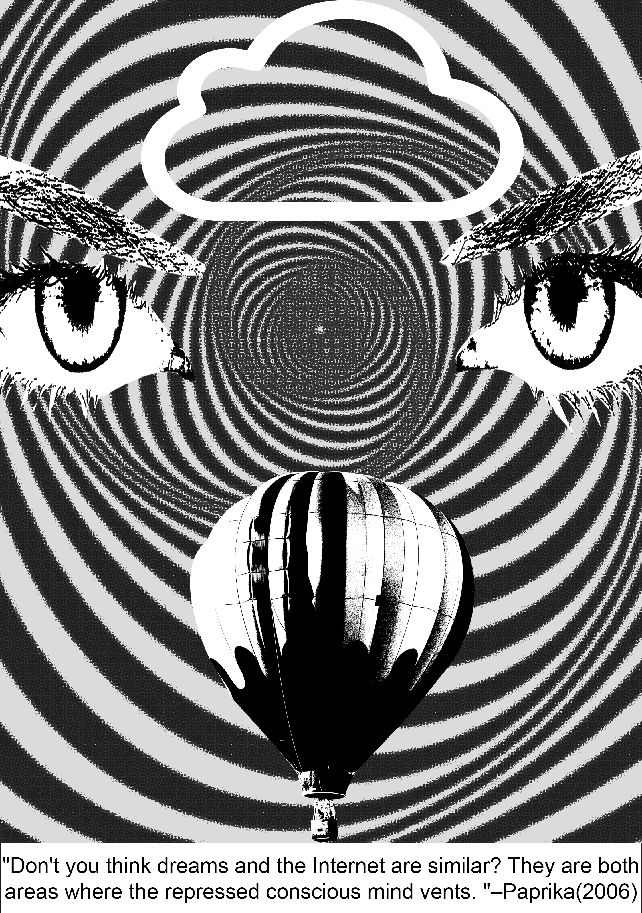
For my final-ish concept, I further enlarged the scale of the eyeball so that it was hidden under both the hot air balloons and the cloud to express how the conscious mind is being repressed. I added more shapes near the centre of the iris as well to show that the shapes are originating from the eyeball and moving outwards and as a result, their distribution becomes more sparse as they go outwards towards the clouds and the hot air balloons.
4th Draft:
For my 4th draft, I cleaned up the design a bit by replacing the single eye (representing the conscious mind) with two eyes for better clarity. I removed the shapes as well as it was too messy. Instead, I used a spiralling op-art background that indicates movement outwards, showing the action of ‘venting’. I replaced the “Chinese cloud” from the previous design with a clearer icon of a cloud, and the multiple hot air balloons with just one, respecting the internet and dreams respectively.
-With the cleaning up of my design, I realized that had unintentionally created some sort of a symmetry which was really effective since symmetry grabs people’s attention by instinct. It also makes my entire composition look like a face. (TvT)
This accompanied with the meaning of eyes as ‘windows to a soul’, plus the op-art background, this projects a hallucinatory effect on the viewer’s mind, which is a literal invasion of the consciousness, or inside of the mind, as I have interpreted for this quote.
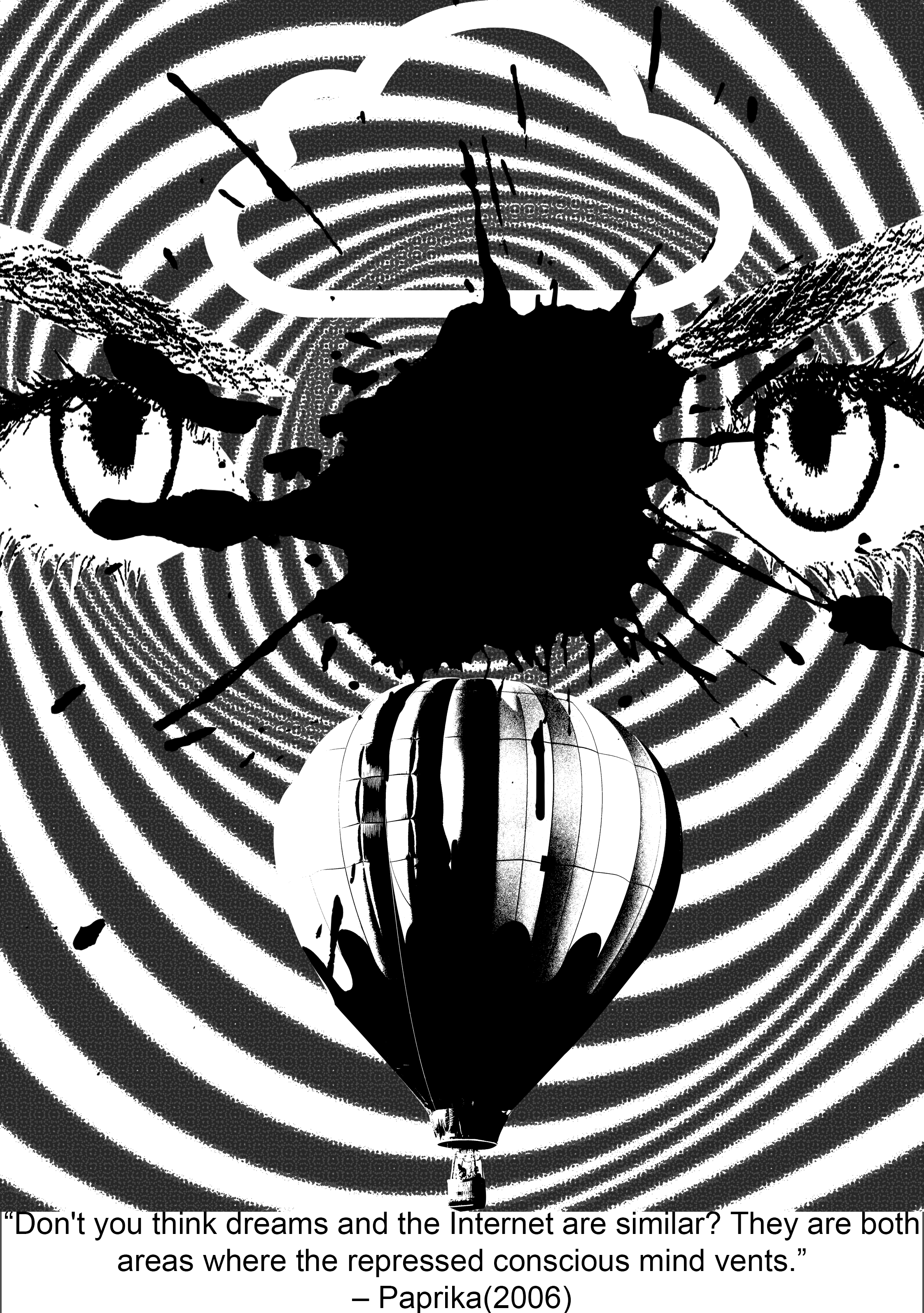
Final Draft:
For my final design, I decided to keep the background since it creates a hypnotic effect and feels like your own mind is being intruded into. The splat effect in the middle depicts a violent eruption/the act of venting. The cloud icon and hot air balloon take up the same amount of space since neither of them hold dominance over each other.
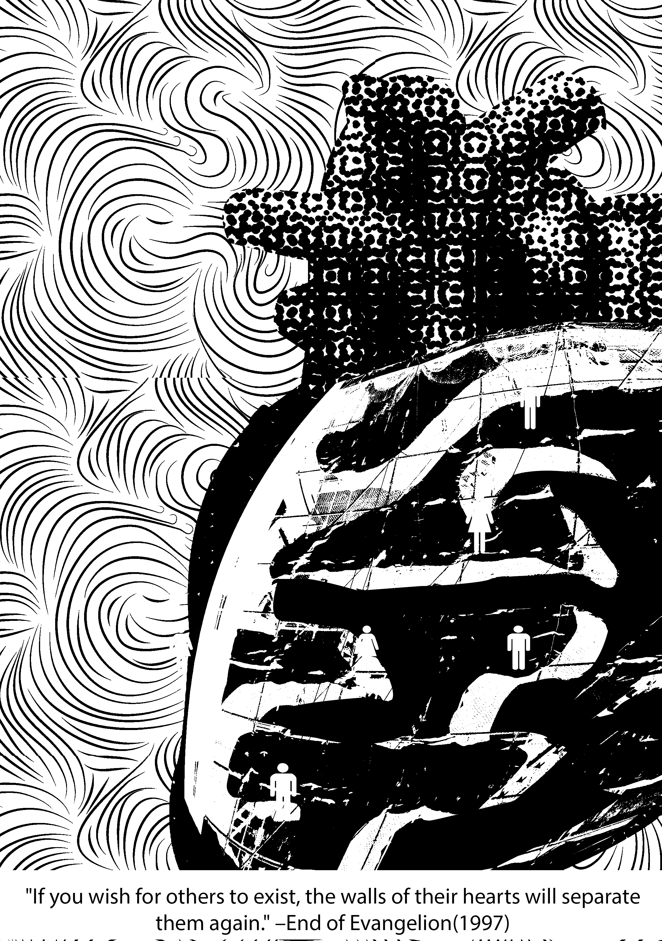
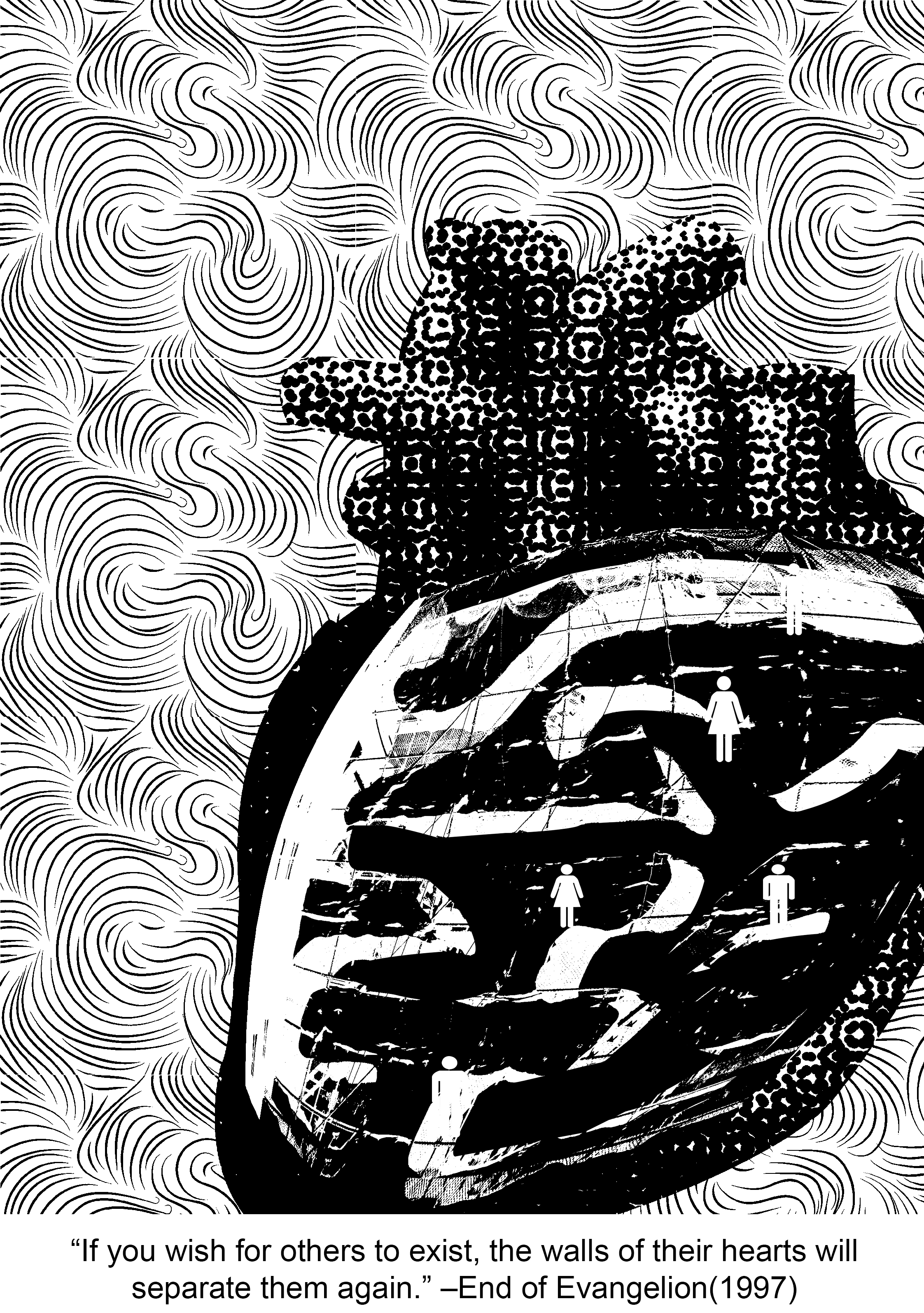
==Quote 2: End of Evangelion==
http://i.imgur.com/hkAax.jpg
“If you wish for others to exist, the walls of their hearts will separate them again.”
Context in movie:
Evangelion is one of the most well-known and oldest Japanese animated films that is ever so enigmatic and philosophical. There is so much hidden symbolism in this movie that might just reveal themselves to you… if you rewatch the movie like 1093420384032 times and consciously try to catch them. At first, the Evangelion series just seems to be a normal Gundam (they call them Evas) action show, but it gets so exponentially complex towards the end that it is almost impossible to fully comprehend what is going on. The main philosophy that the End of Evangelion is trying to express is that humanity essentially belongs to a common pool of ‘primordial soup’ where all our souls linger even after death. There, we can be reborn again, but when we turn back into human form, there will undoubtedly be conflict and unhappiness, as compared to staying in primordial form where everyone lives in unity and there will be guaranteed peace (it’s almost like the philosophy for Buddhism). The main protagonist, Shinji has to make a choice between this two options, and this quote comes from Rei (another Eva pilot), who instigates Shinji to make a choice at the end of the movie. (One of my absolute favourite series ever)
Keywords: Others, exist, walls of their hearts, separate
Composition idea #2:
Imagery ideas:
Others– masses of people, masses of monsters/aliens, simple dots, faces (kaleidoscope effect)
walls – barricade, fence, brick wall, thorny bramble bush (inspired by Sleeping Beauty), clam shut tight
hearts– heart, differences (different colour), life, tree
It was difficult trying to think of what could symbolise the heart, but I decided to make a collage in the shape of an heart instead so that it could be more comprehensible!
To represent segregation of humans from each other, I planned to put them into different segments and have them sparsely positioned away from each other. The idea of an ant farm came to mind when I found that human beings are sort of like ants, busy out and about doing their daily tasks, and living as a community.It was terribly hard trying to find a high quality image for a clear picture of the interior design of an ant farm, so I substituted the idea for a construction site that adapted a similar idea instead (and it looked clearer)!I warped the pattern of the construction site into the shape of the heart.A senior actually gave me the inspiration to use toilet signs to represent human beings 8’DAnd here I inverted the colours and painted black over some areas because there were too many visible details in the background and it was hard to see the human figures. I then turned the human figures from black to white.I decided to use a wavy pattern to convey motion and a sense of liquidity, as I would like to represent the souls of humans as ‘primordial soup’.
1st draft:
For initial composition, I had placed the heart smack in the middle and an enlarged background of the swirls in the background (which made for quite a boring composition). After receiving feedback from consultation, I decided to shift the heart shape to the bottom right side of the page and increase the number of swirls. The people are in different segments of the heart to depict the separation of human souls from the pool of primordial soup.
Final Draft:
For my final composition, I increased the intensity of the swirls and brought out the shape of the heart out a bit more for clarity. With a repeated pattern of swirls, and increase in repetition, it increases the uniformity of the background, and the flowing rhythm created essentially becomes a quicker motion. The difference in texture between the background and the heart also really contrasts and draws the heart out of the background despite the amount of swirling going on back there. The contrast in the interior of the heart and human symbols also draw out the human beings a lot more. The bottom right placement of the heart might also suggest an inflow downwards through the valves into the heart, rather than if the heart was placed smack in the middle or in the upper half of the design. Gestalt’s rule of similarity between repeated patterns in this composition also helps to give it a sense of unity.
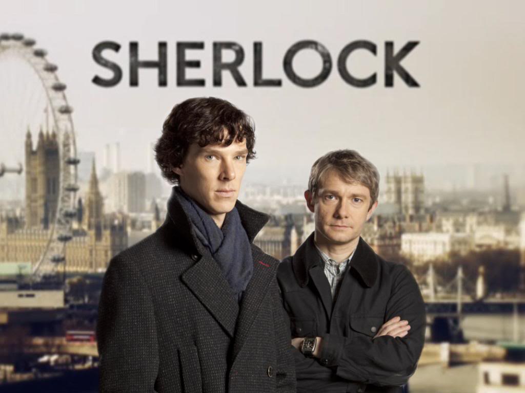
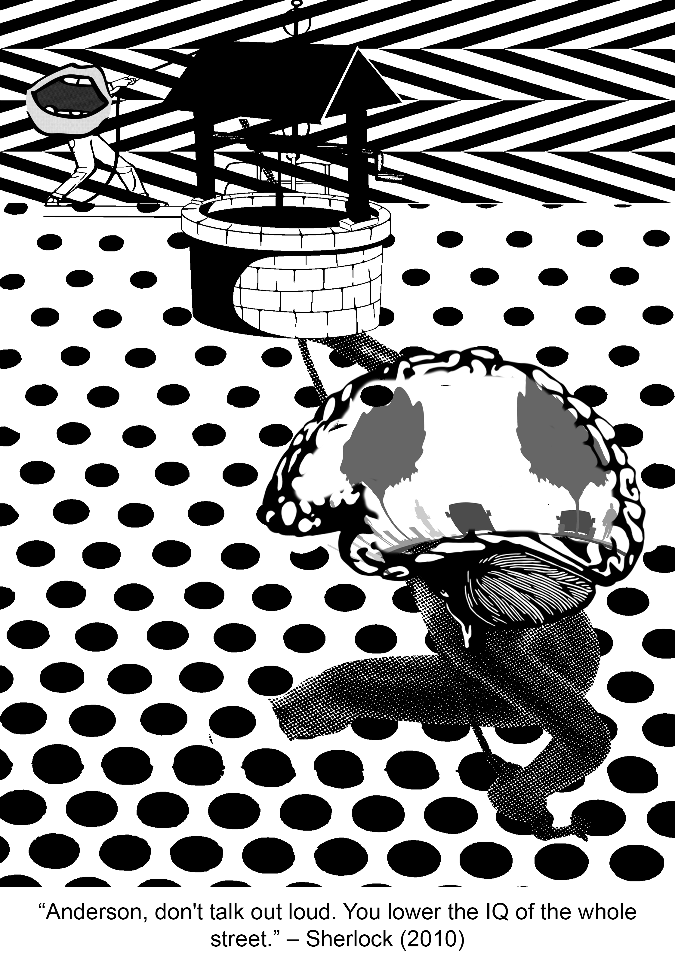
“Anderson, don’t talk out loud. You lower the IQ of the whole street.”
Context in movie:
I barely watch any mainstream film series but my friend insisted that I watched Sherlock and boyyy did I marathon this ENTIRE series (with no regrets). Sherlock is “not a psychopath, but a high-functioning sociopath” as he always reminds everyone and extremely intelligent. While on a case, Sherlock shows obvious disdain for the lowly intellectual likes of Inspector Lestrade who works for the official police team when he keeps trying to interrupt Sherlock’s inspection of the crime scene. Having the sharp tongue he does, Sherlock subtlely throws this insult (the quote) at Lestrade, essentially telling him to shut the hell up.
Keywords: don’t talk, loud, lower the IQ, whole street
Imagery ideas:
don’t talk – silence sign, mask covering up mouth, tape at mouth, zip at mouth
loud – megaphone, forte symbol
lower the IQ (kind of literal version) – lowering bucket into a well, pulley system (can use principles of design to express downward motion)
lower the IQ (essentially stupidity) – broken glasses, scarlet geranium, bag over head, skull (empty head)
I chose to use an open mouth to represent the act of speaking.To represent the action of ‘lowering’, I thought of using a person using a pulley system in a well to lower something. I ended up replacing this person’s head with a mouth.
This person was going to represent the subject matter being lowered (which in this case is the IQ of the street)…which I thought of representing as a brain because the source of intelligence is the brain!
1st Draft:
For my first draft, I decided to personify the characteristic of being talkative, and the IQ of the street. To represent someone who spouts a lot of nonsense, I put a gigantic open mouth onto a human’s body, and an alternating zigzag pattern at the back to show that what they’re saying might have a logic of its own but ultimately there’s no one point to what they’re saying. To represent the IQ of the street, I put a brain with a picture of a street onto the body of another human being which is being lowered from a well into water, which is depicted by polka dots. This represents the act of lowering and eventually drowning.
Final Draft:
For my final draft, I decreased the area of the alternating pattern and increased the area of the polka dots to create the effect of the Rule of Thirds so that it would look better in terms of composition. I also cropped off the leg of the human representing the IQ of the street to imply that he/she/it is sinking into water. There is also a slight play on perspective here since the top third is rather frontal while the bottom looks a lot more top-down. The increase of the size of the polka dots down the page also pull visual weight downwards and thus enhances the ‘lowering’ effect.
Peter Pan has to be my favourite Disney movie (totally not because I was obsessed with Huggy Pan for a while (Billy Murray playing Peter Pan in Disneyland) (yes I will link you to a video because his sass needs to be shared). I love Peter Pan because of how relatable it is, with me being a teenager (YES I’M STILL 19) and the whole never-wanting-to-grow-up theme. This quote basically resounds this theme, with ‘to live’ being a metaphor for growing and maturing (in contrast to staying a child in Neverland), and ‘an awfully big adventure’ implying that growing up will be both a very foreign experience and a daunting feat for Peter Pan. (and you are RIGHT, Peter! Please take me to Neverland.)
Watch this from 0:21 8’DDD
P.S.: I <3 HUGGY PAN (he’s not working as Peter Pan anymore ;v;)
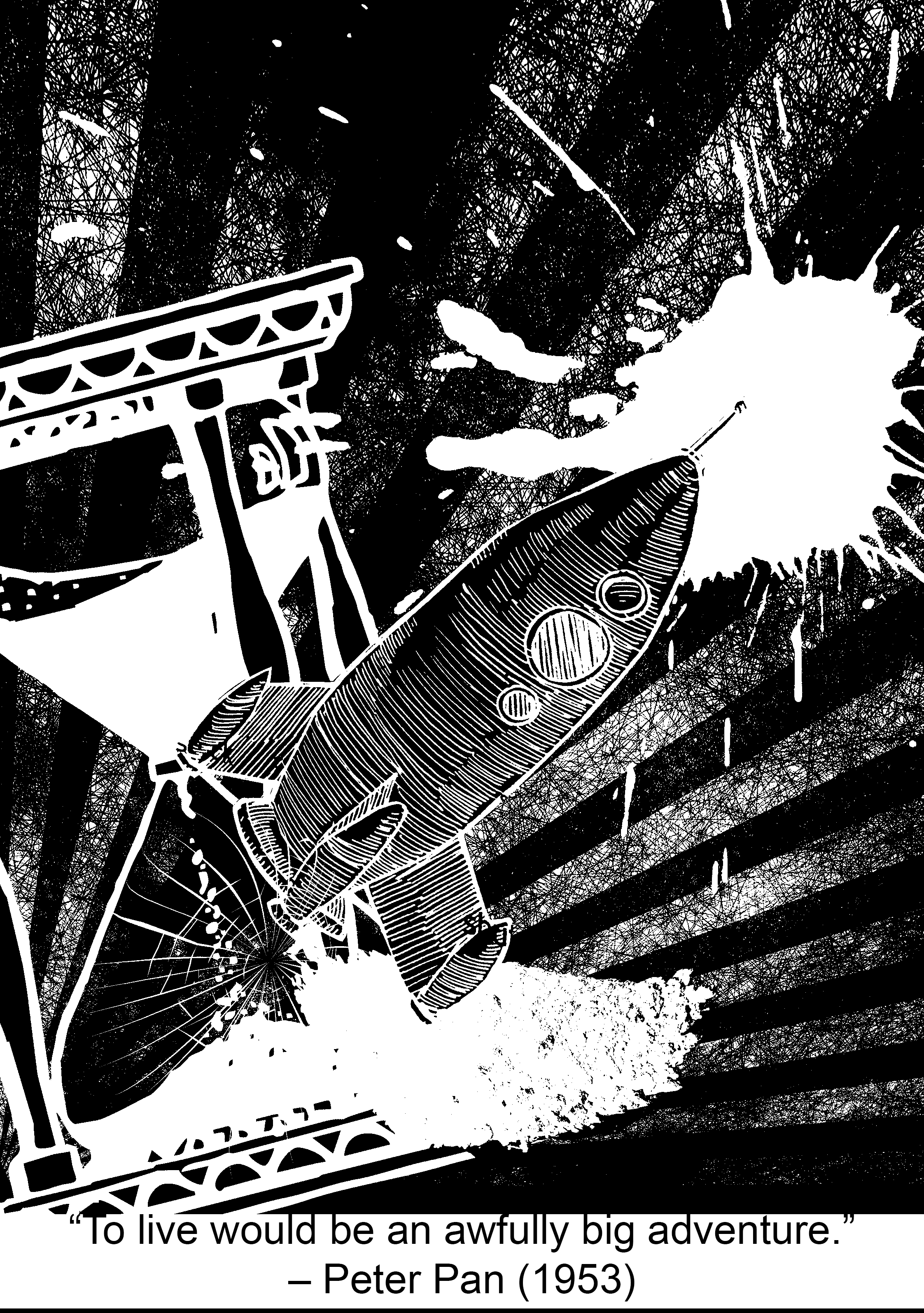
Keywords:Live, awfully big, adventure
Imagery ideas:
live (essentially growing up and maturing, not stuck in time) – clock, watch, hourglass
awfully big – blue whale, elephant, cosmos, magnifying lens (zoom in), infinite
adventure – (travel) bag pack, ship, aeroplane, map, mountain, compass, parachuting, biking, car
Composition #4a:
Subject ideas:
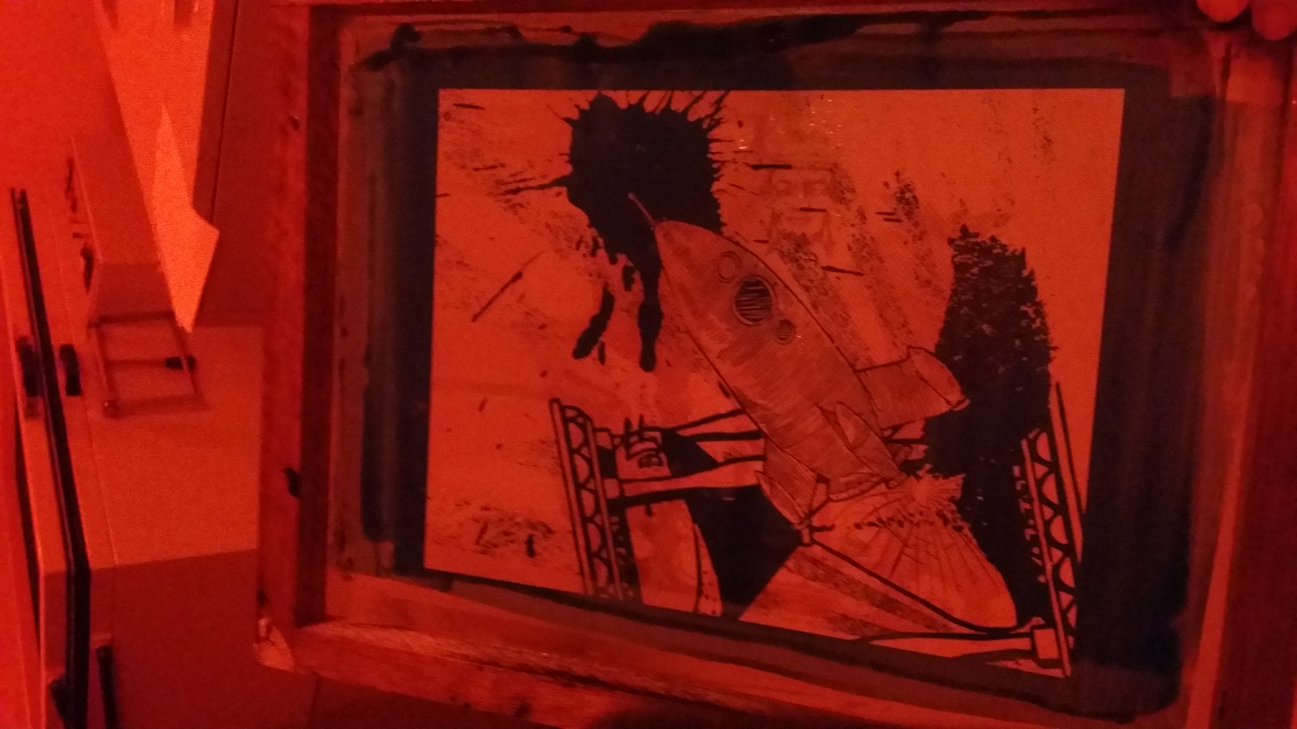
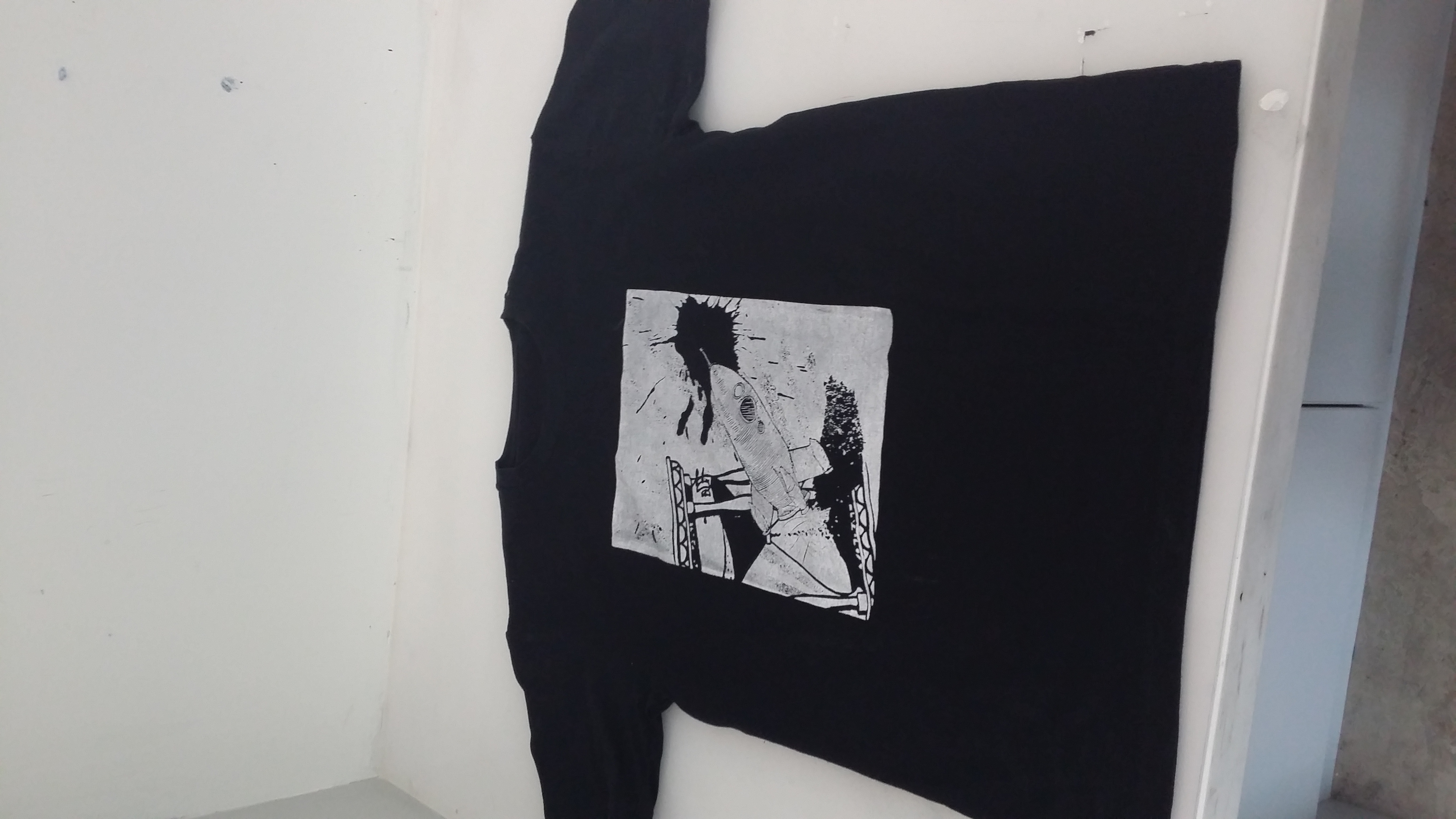
For my first and final composition, I tried to work with diagonals a lot more to create dynamism in the composition. The splat of paint creates an explosive effect, similar to when rockets take off. The radiating lines at the back also create an outward and energetic movement. The crack in the hourglass (which I had to edit in) shows that the rocket is breaking out of a contained space and ready to launch on an adventure! The high contrast between subject matter and background also draws out the foreground a lot more. The use of diagonals in this composition also helps to give a sense of movement and unity.
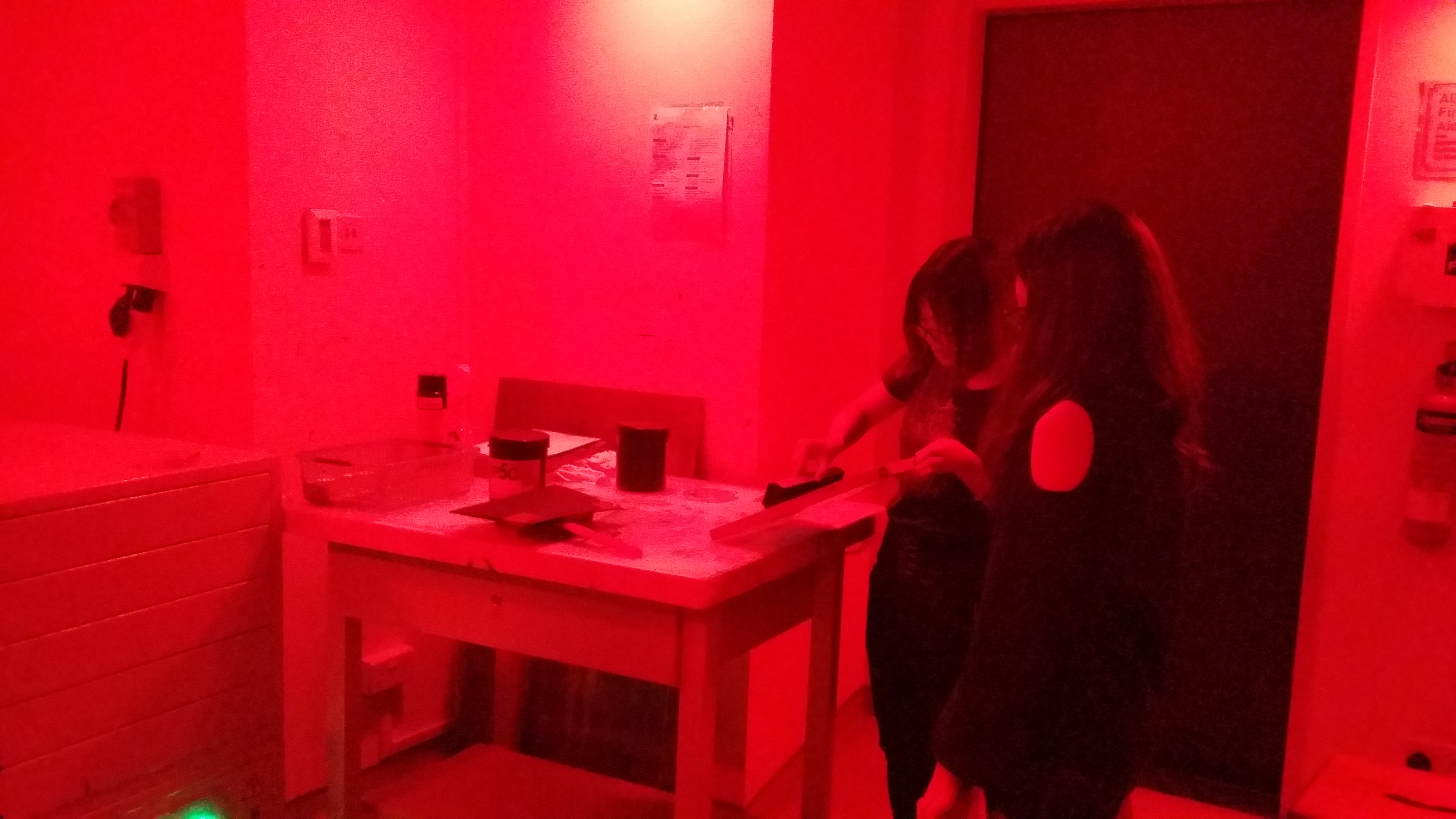
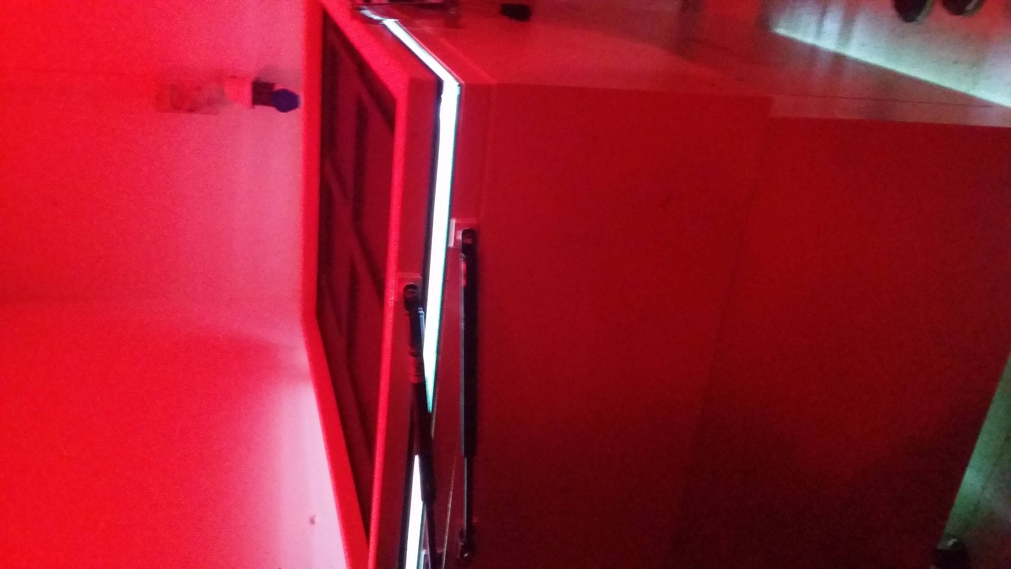
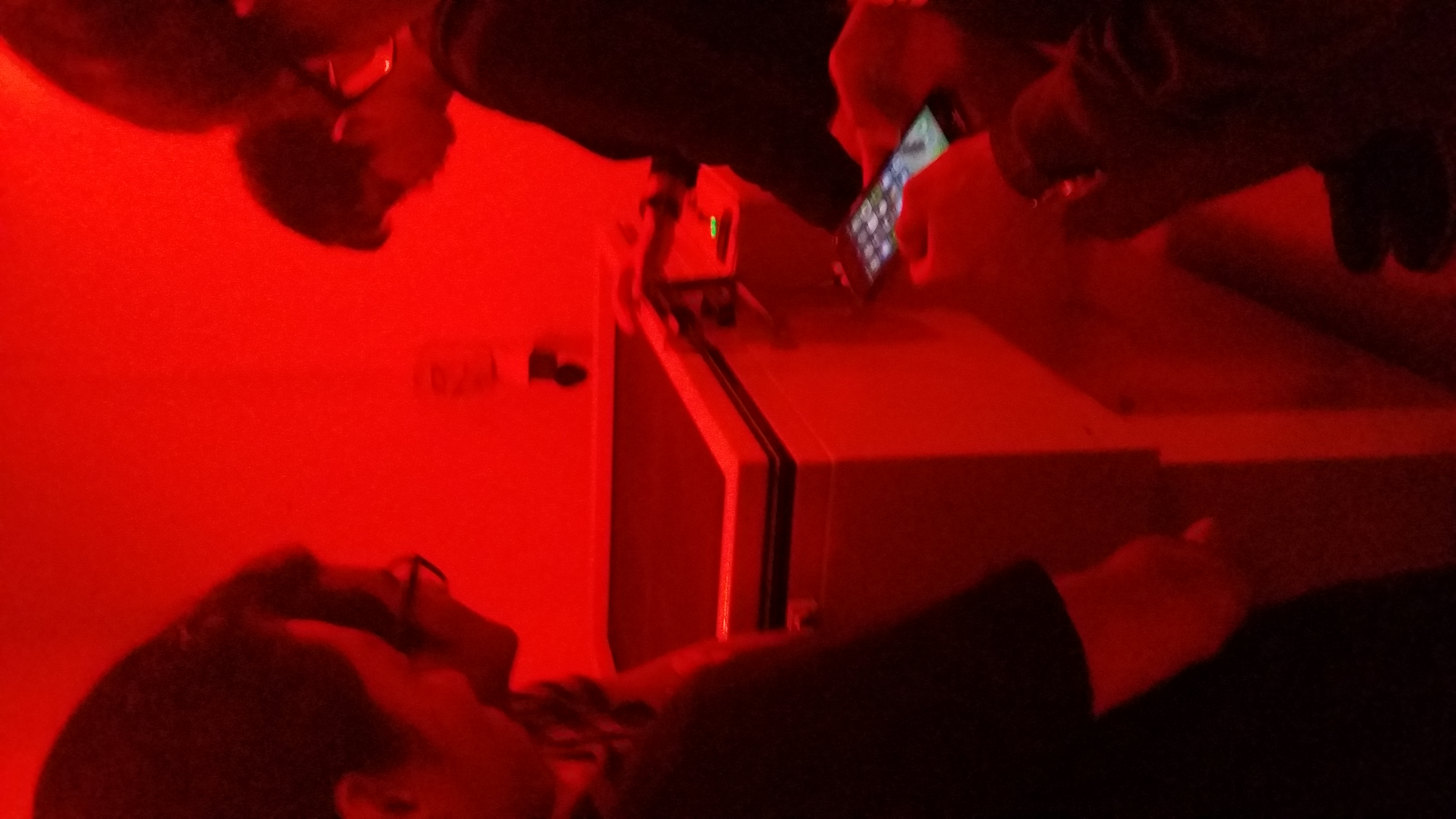
The fun part: SILK-SCREEN PRINTING
In the darkroom!!A blinding blast of light descends upon our framed transparencies and transfers their shade onto the emulsion on the silkscreen to be used as a stencil for printing 😀Exposing the silkscreen!Exposed silkscreen!
(didn’t document the printing part because I was busy working like a factory. Yes I sold shirts to my friends so I had to handprint around 10. If you want profits, think again! 8’D)
Here’s a white-on-black shirt that I printed using expensive ink ($5 for one small bottle) I used 3/4 of the bottle on ONE shirt. So if you’re mass producing for black shirts, think again! Eventually, I managed to get cheaper ink, $5 for sizeable jar of white, but the colour didn’t turn out as vibrant and defined. SO YOU CHOOSE THE LESSER EVIL–
Reflections:
One difficulty that I faced with this project was when I was trying to edit the pictures (more on the technical side). When I added a colour invert filter to a layer, the ENTIRE composition inverted itself, and it was SUPERRR frustrating to work with, BUT!! I found out I could isolate the layer so that the filter only affects one layer :DDDD PS still does some wonky stuff once in a while but I have it under control now ;D
I think I’ve fulfilled the objectives of this project, which is to use symbolic images/subject matter to express a concept. I’ve learned how to expand my visual vocabulary; for example using hot-air balloon to represent dreams in my Paprika quote design.
The way the representative subject matter is orientated in relation to the other subject matter should also be carefully considered! Their relationship is very important in conveying certain ideas that cannot just be condensed into one object itself, especially for movement; for example having the rocket oriented diagonally away from the hourglass and the radiating lines really helped to give a sense of movement in my Peter Pan design!
AND I really enjoyed doing this project because
I didn’t have to gather so many materials because everything was digital kekekek
FREE TOTEBAG
Got to print T-SHIRTS too! (if anyone sees this you can venture into a mini shirt-printing business!! If you’re doing another colour other than black, you have to choose between price and quality ;v;) Might consider starting Youthful Printing & Co. in Malaysia or somewhere else where the startup and rental cost isn’t so high HAHAHHA (one can dream)
I FINALLY found out how to use the pen tool on Photoshop!! For years, I had been wondering how the heck do you control it.
I learned about the standards of a good quality print!
I learned about how to use colour half-tone and threshold!
I learned how to group my layers into a folder so my PS document won’t look like a complete mess!
Editing is fun!!
No colours to worry about… YET. (suspenseful foreshadowing of Project 3)
If I suddenly disappeared while doing my everyday chores, what would the world look like without me in that instant?
What a peculiar (and slightly depressing) question to ponder about.
In this project, there were two main things to be taken care of:
Content
Composition
I decided that it was a wiser choice to start thinking about content first.
Content: What objects tell others about myself?
Recalling what we learned about semiotics in the first lesson, I decided to first scope some life themes and then do some research on symbolism and allegory for them.
The life themes that I found included:
–Family, friends, community, knowledge, nature, growth, time. solitude, and recreation.
Below are some symbolism/allegories that I have found for these themes:
Family- Tree (life, origin, family, nature)
Workload, responsibilities- bag pack
Knowledge – books, glasses
Time – clock, calendar, road (passage of time)
Growth/Youth- Tree, playground
I decided to mix these symbolic subjects up with subject matter that was both important and personal to me and below is the list of ideas that I came up with:
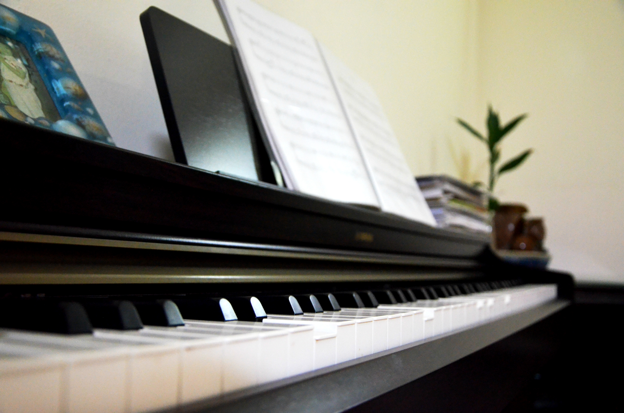
Music – piano, earpieces
My past (specifically band)
Every day things – lrt gantry
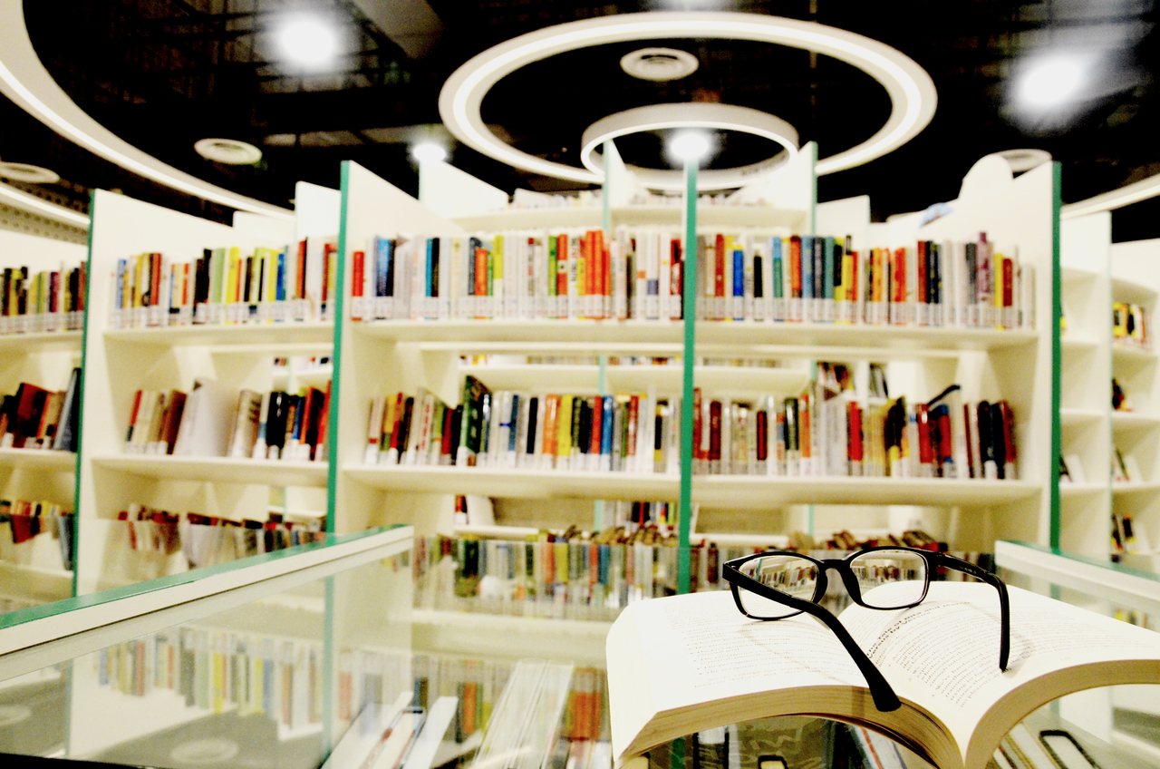
Knowledge – book at lib/ glasses
Love for nature – botanical gardens, community garden
Time – clock/calendar/road
My love for solitude/privacy/self-reflection – diary, room (yes, with the cluttered floor and everything), mirror
Creation – my 3D hw/tablet/sketchbook/bunch of drawings/art tools
Growth – Tree (family, origins),
Community, youth – playground
Losing my identity as I go through life (WTF SO DEEP b0SS)
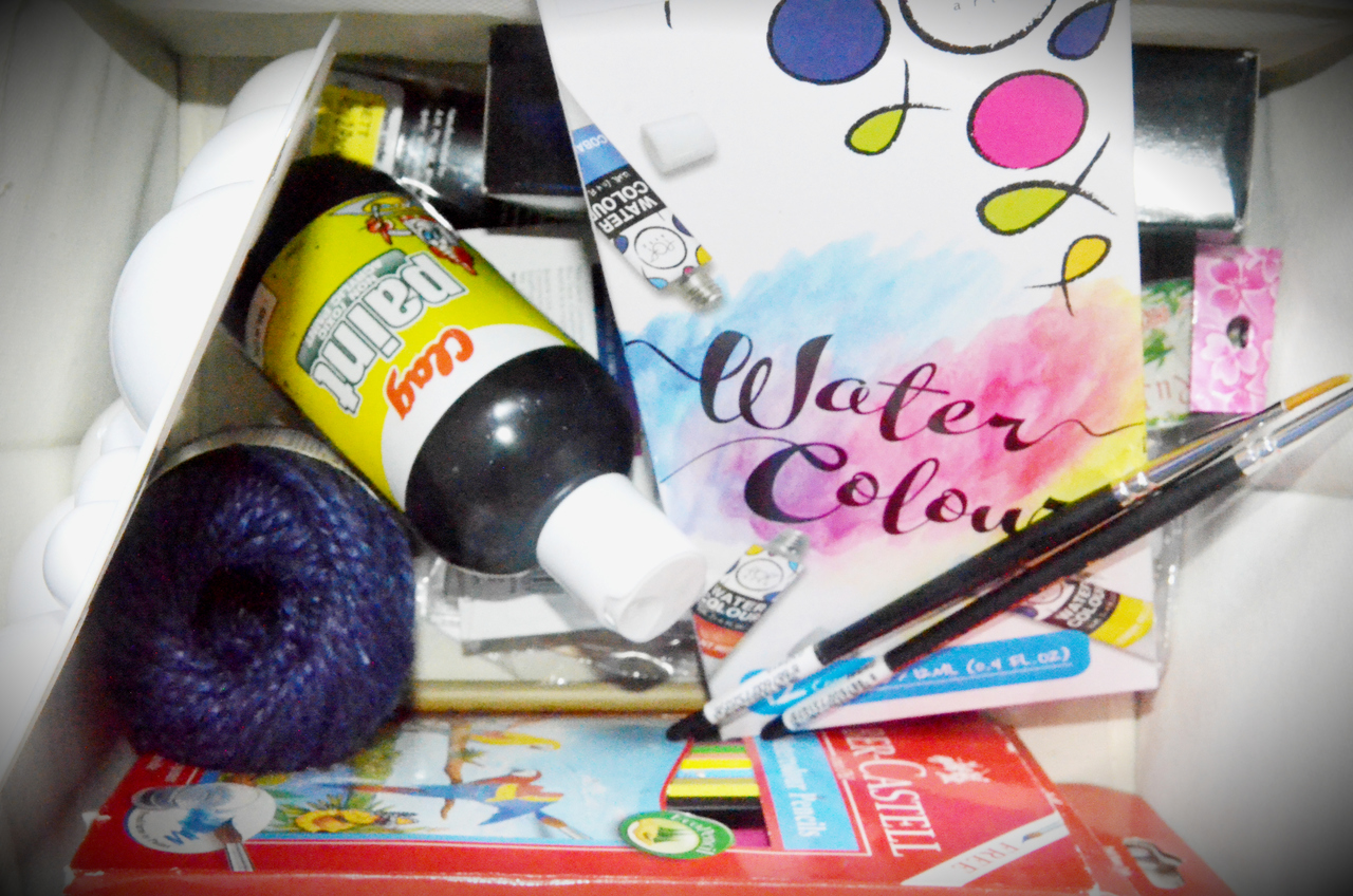
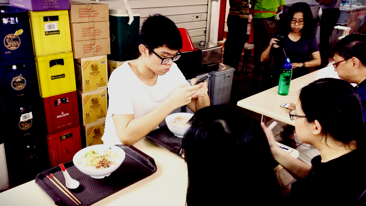
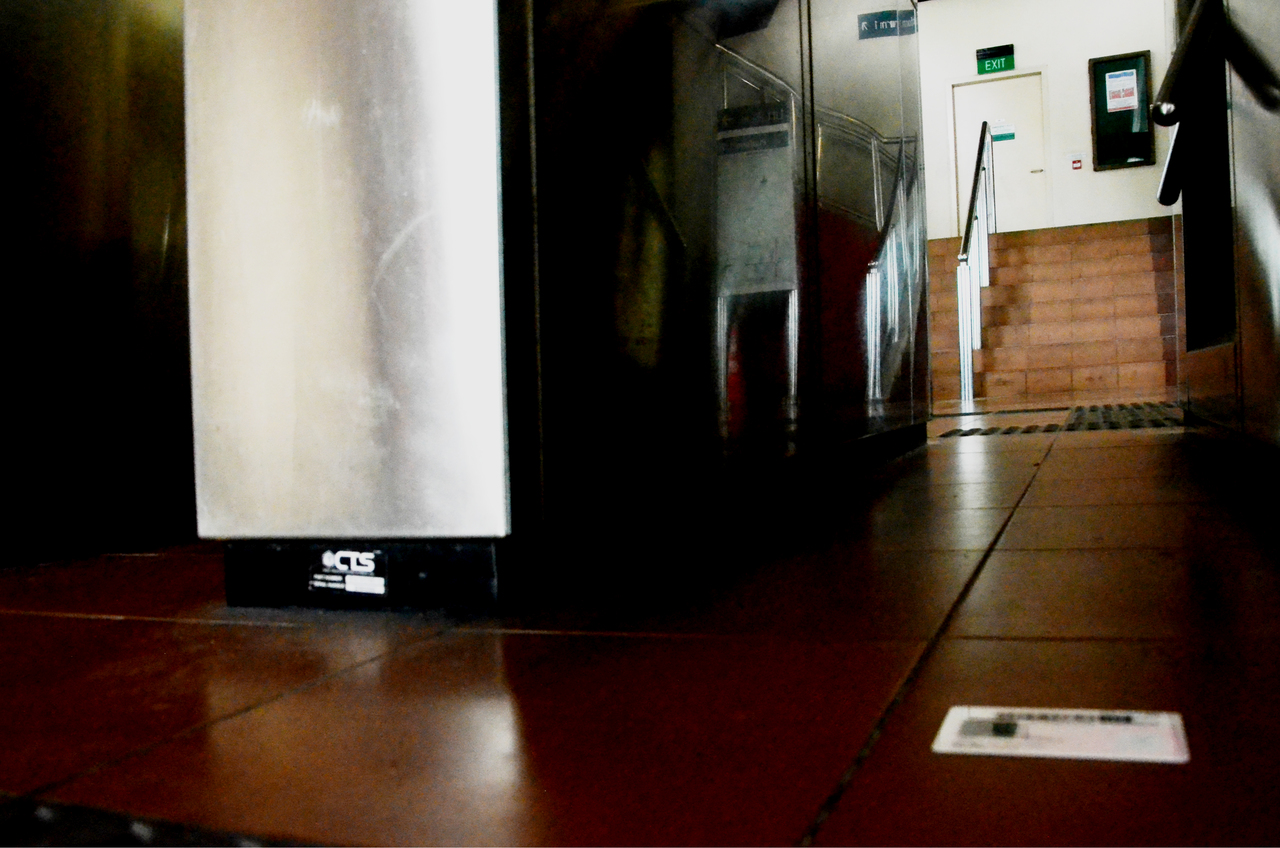
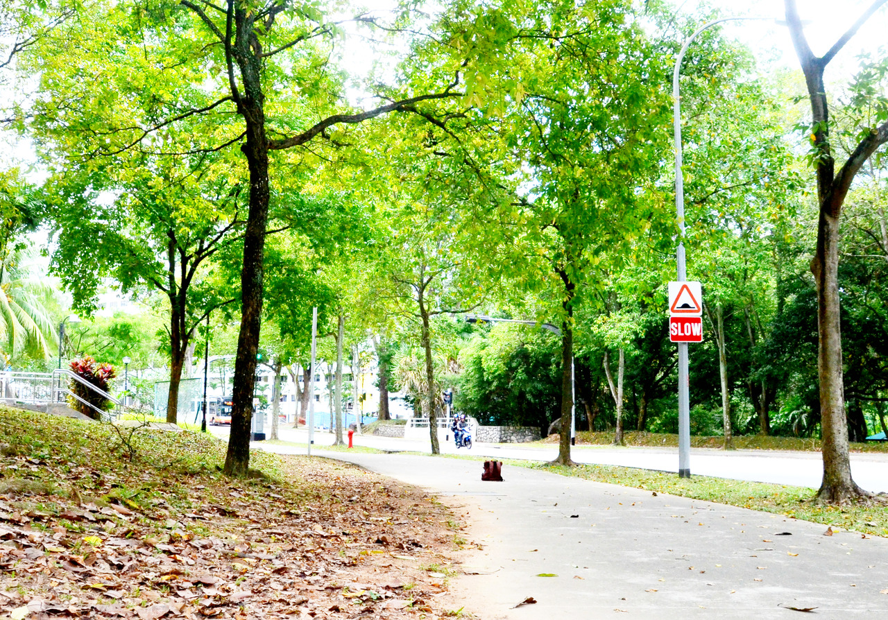
Theme of Art: Leaving art materials behind, indicative of my hobby of creating artworks. Attempted a fill-frame of the things in my box of art materials.Theme of Friendship: Disappearing in the midst of having a meal with my friends. Attempted using strong diagonals.Theme of Community: This garden is a community garden, where many residents contribute to the healthy plantation here as they similarly do to the vibrancy of the community.Theme of Identity: In the moment of disappearance, I drop my IC on the floor of the train station right at the gantry. The gantry is meant to represent a crossing into another place (presumably some other dimension after I disappear) and the IC is my identity.Theme of Knowledge: Books and glasses are symbols of knowledge. Since school has been a large part of my life, knowledge that I have gained throughout the years would be something that I would leave behind. I attempted using Depth of Field here.Theme of Music: Playing the piano has been one of my childhood hobbies (admittedly quite abandoned now) but in the moment of disappearance, the piano keys are still being pressed down. I attempted to use Depth of Field here.Theme of Youth: For me, the playground has been a very nostalgic place where I used to frequent when I was a child. I attempted to use a strong foreground here.Theme of Music: In my free time, I enjoy making covers of Japanese songs (or any songs that I liked at that time) in private.Theme of Growth: The path represents a journey, as I disappear on the journey, I leave my bagpack behind which represents the responsibilities that I carry with me. The trees around are a symbol of growth and nature. I attempted using leading lines but my subject matter was too small ;v;Theme of Growth
Those were cool and all, but they didn’t tell a story.
Why my pictures didn’t make the cut:
There was too much background such that the background of the photos became my subject.
There was too little subject matter. I only had a single subject for most of the photos.
It wasn’t until I consulted XM for help and after receiving my 2D Project 2 that I had an epiphany of what I could add into my photograph.
The advice I received about telling a story and juxtaposition. Focusing on the photo of me disappearing while making a cover, I could tell a more elaborate narrative about myself.
New narrative (this is really personal??):
(has to link back to the whole disappearing thing and what I left behind)
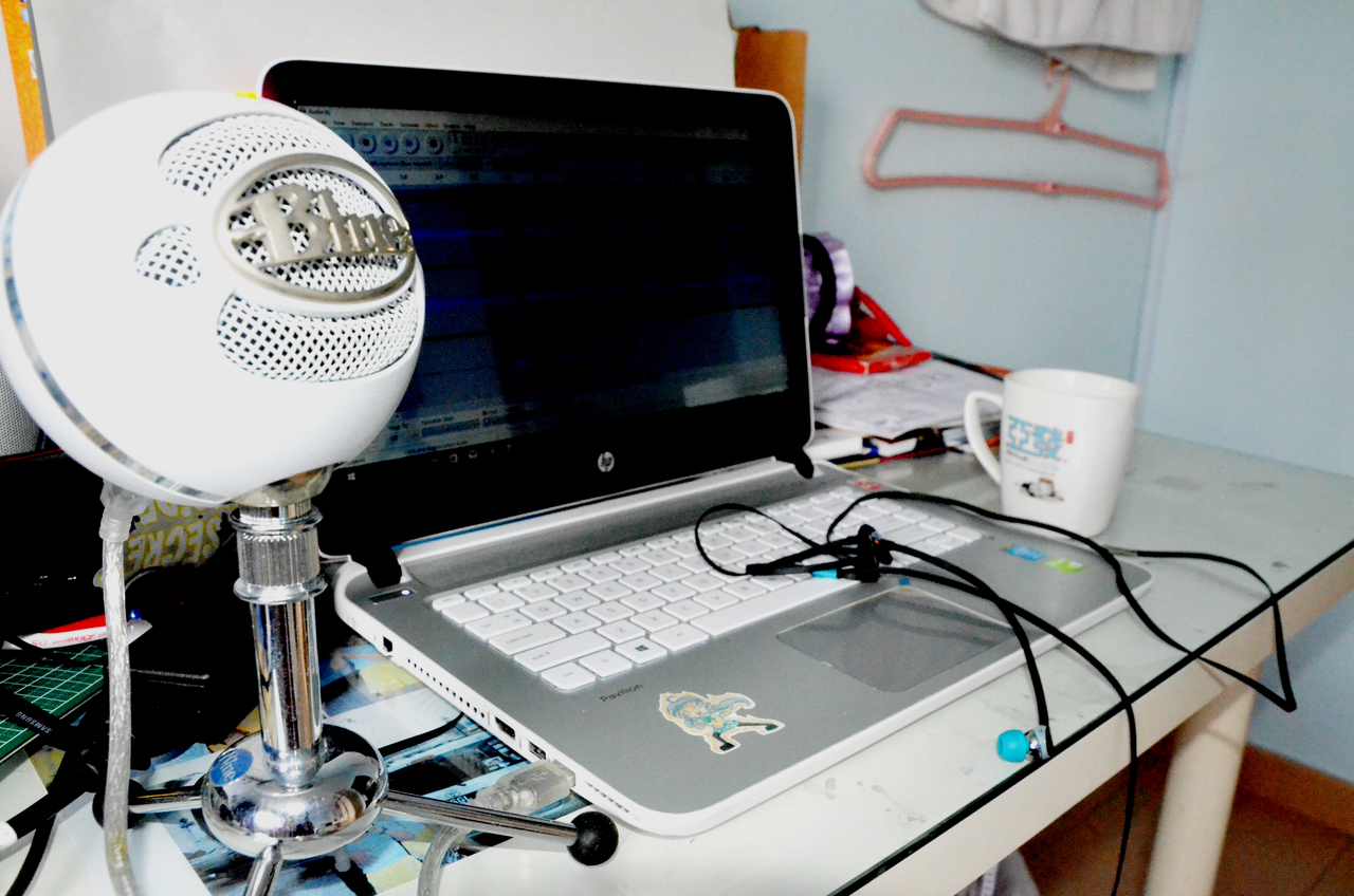
Ever since I was in primary school, I discovered anime (Japanese animated series) which really helped me to tide over a difficult period in my life (and has largely guided me on the path that I am on today). With each new series I watched, I enjoyed printing out the lyrics of the openings and endings of the new series and singing along to them. This hobby of mine developed even further when I discovered the vocaloid subculture in secondary school (yes, it’s all pretty complicated) whereby tons of creators from all around the globe could use these voice programmes to make their own songs, so you could imagine how massively huge my song collection got. I had begun learning how to make covers on my own of these songs using SUPER basic software and hardware such as Audacity and a simple Logitech microphone. I really enjoyed this hobby of mine but I never really had the audacity (oh no, unintended pun) to step out of my comfort zone and actually do singing (although I had band background). I’d watch my classmates go on school talent competitions in awe and admiration (even now).
SoOOOoO that was a pretty long but very personal story for me (even my parents don’t know 8’D). So I wanted to take a photo which conveyed a scene of me silently wanting to pursue this hobby further but always simply continuing to karaoke to myself, with myself in my bedroom, and never stepping outside of my comfort zone. When I disappear in the middle of my (almost daily) karaoke sessions, I leave behind all of these emotions behind as well.
Subject matter:
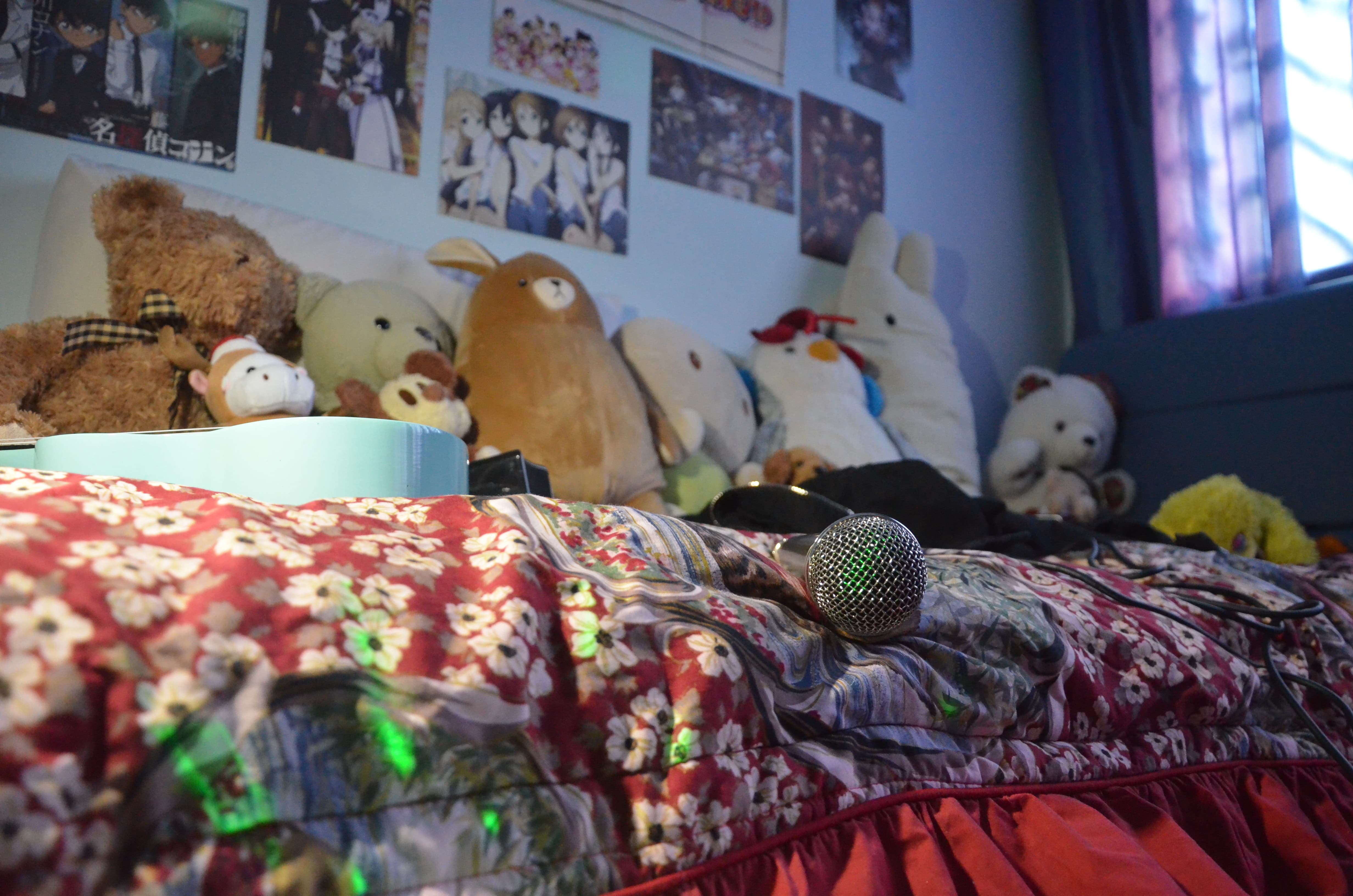
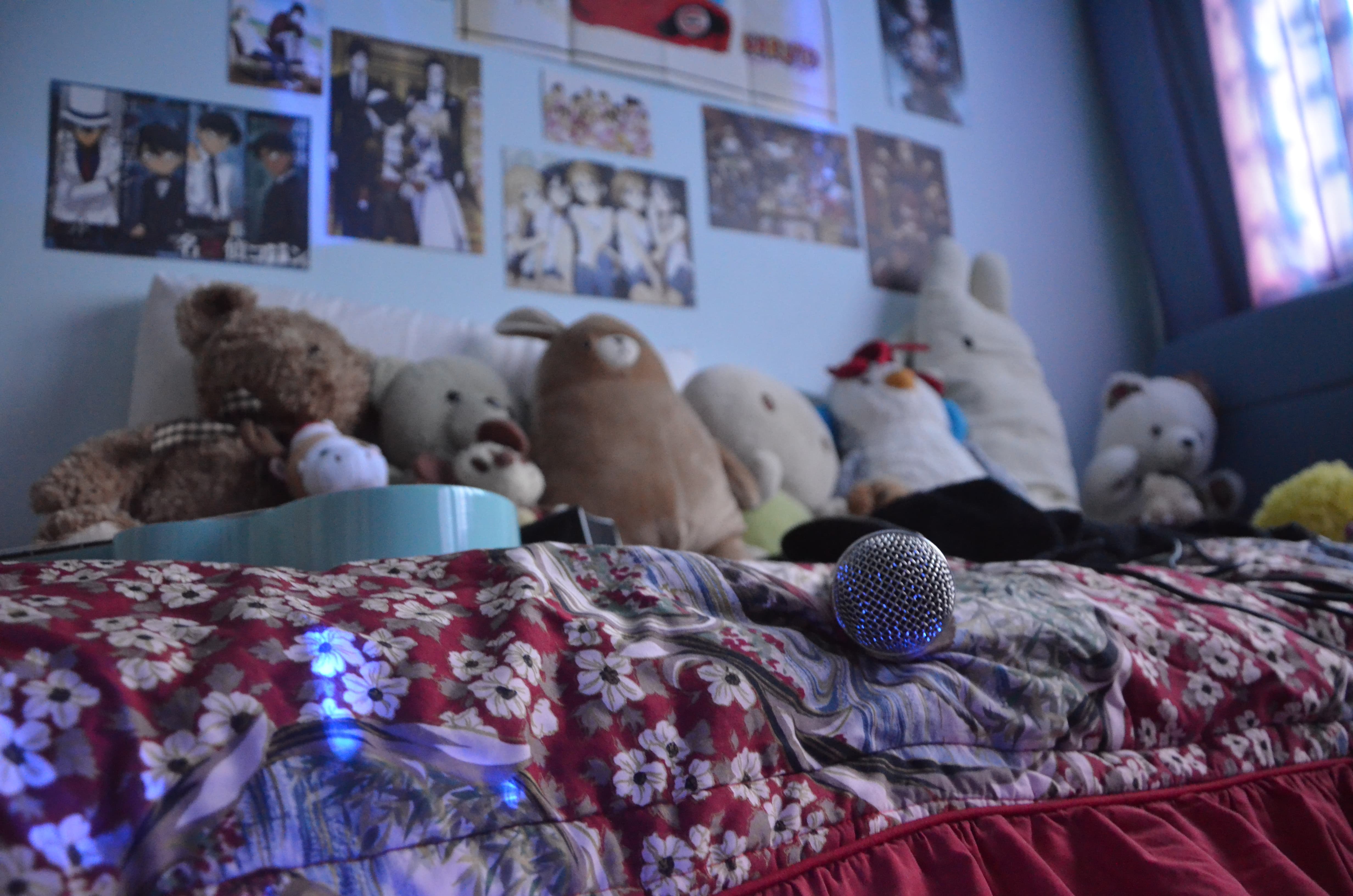
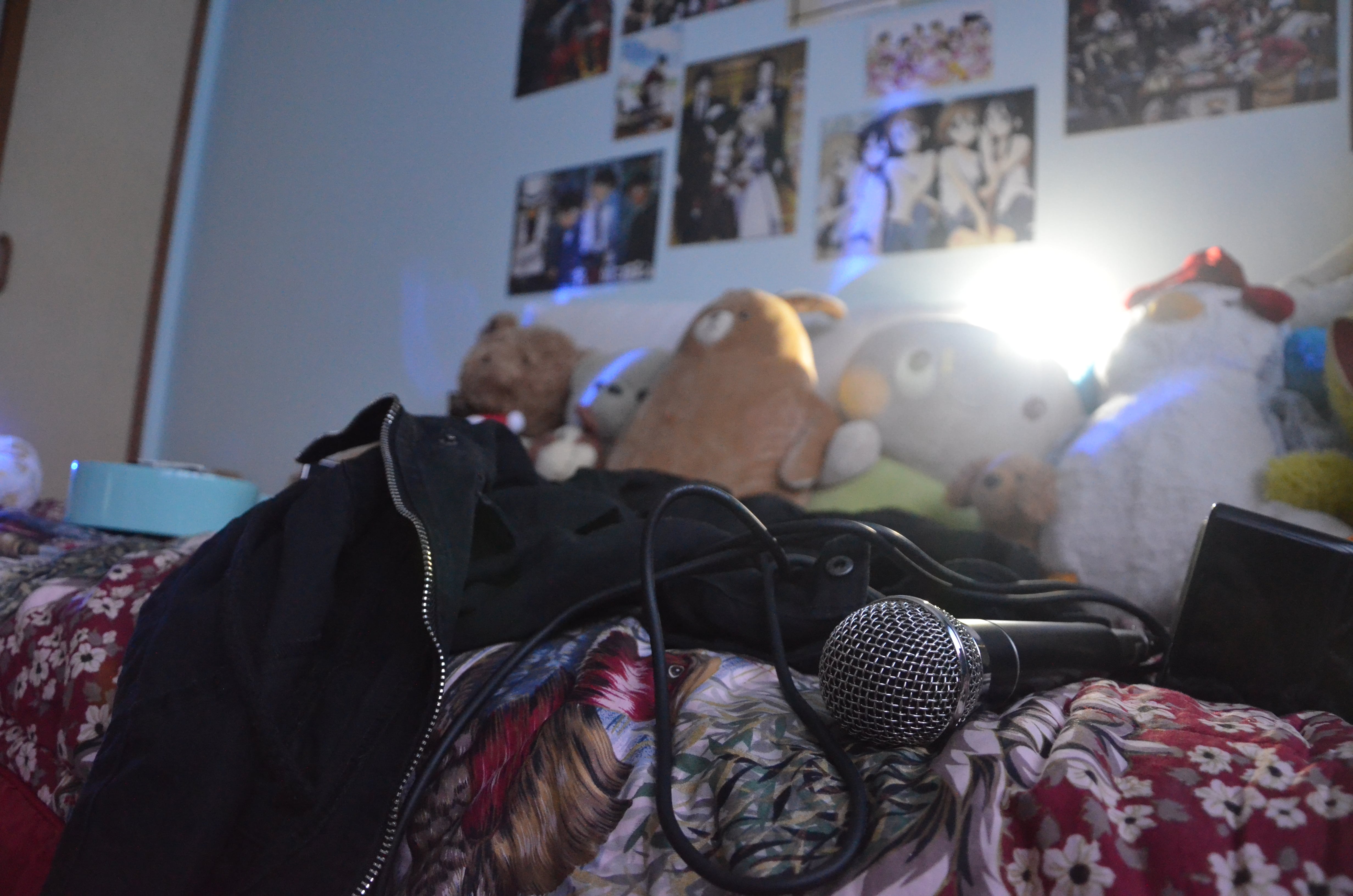
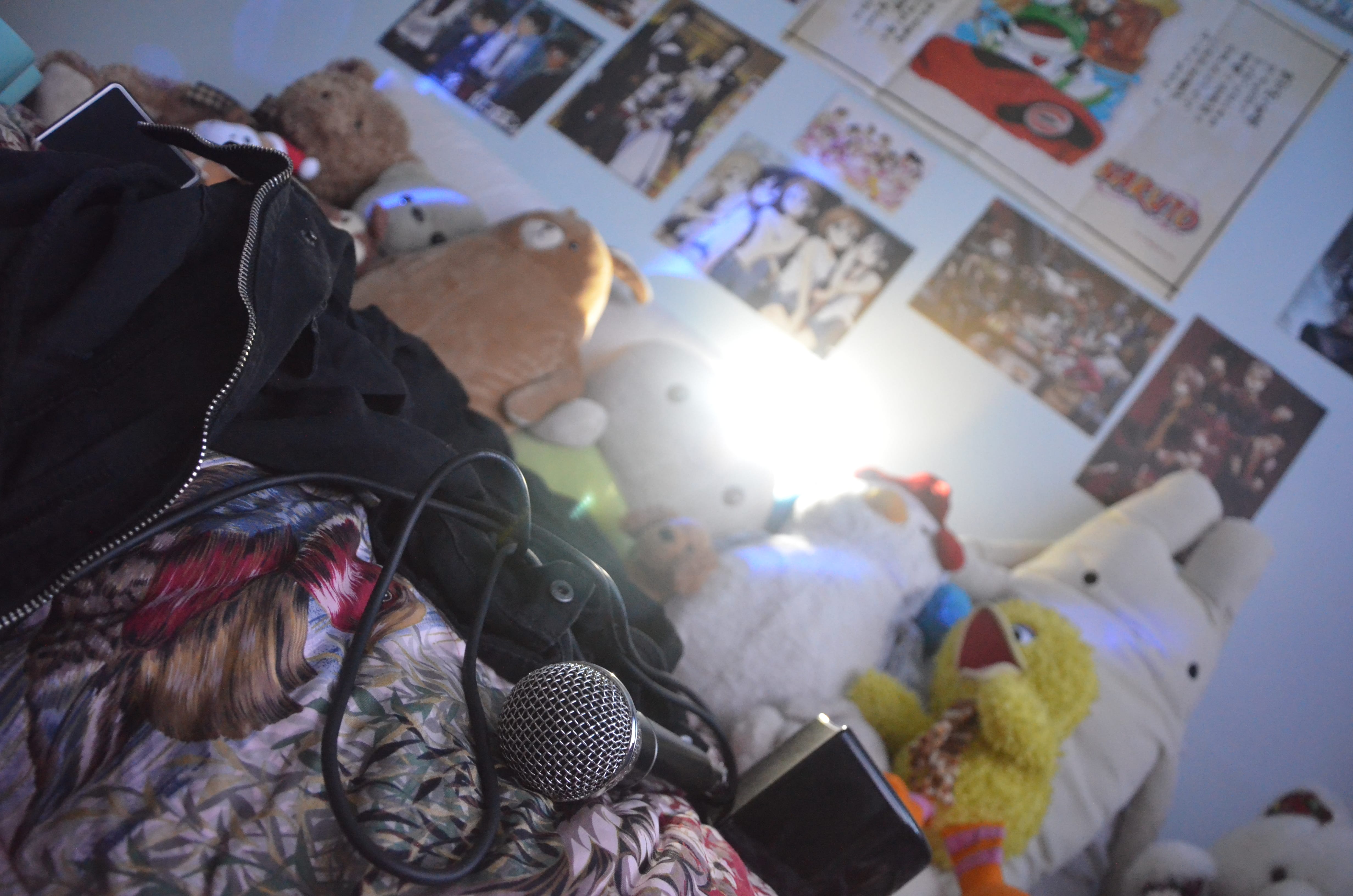
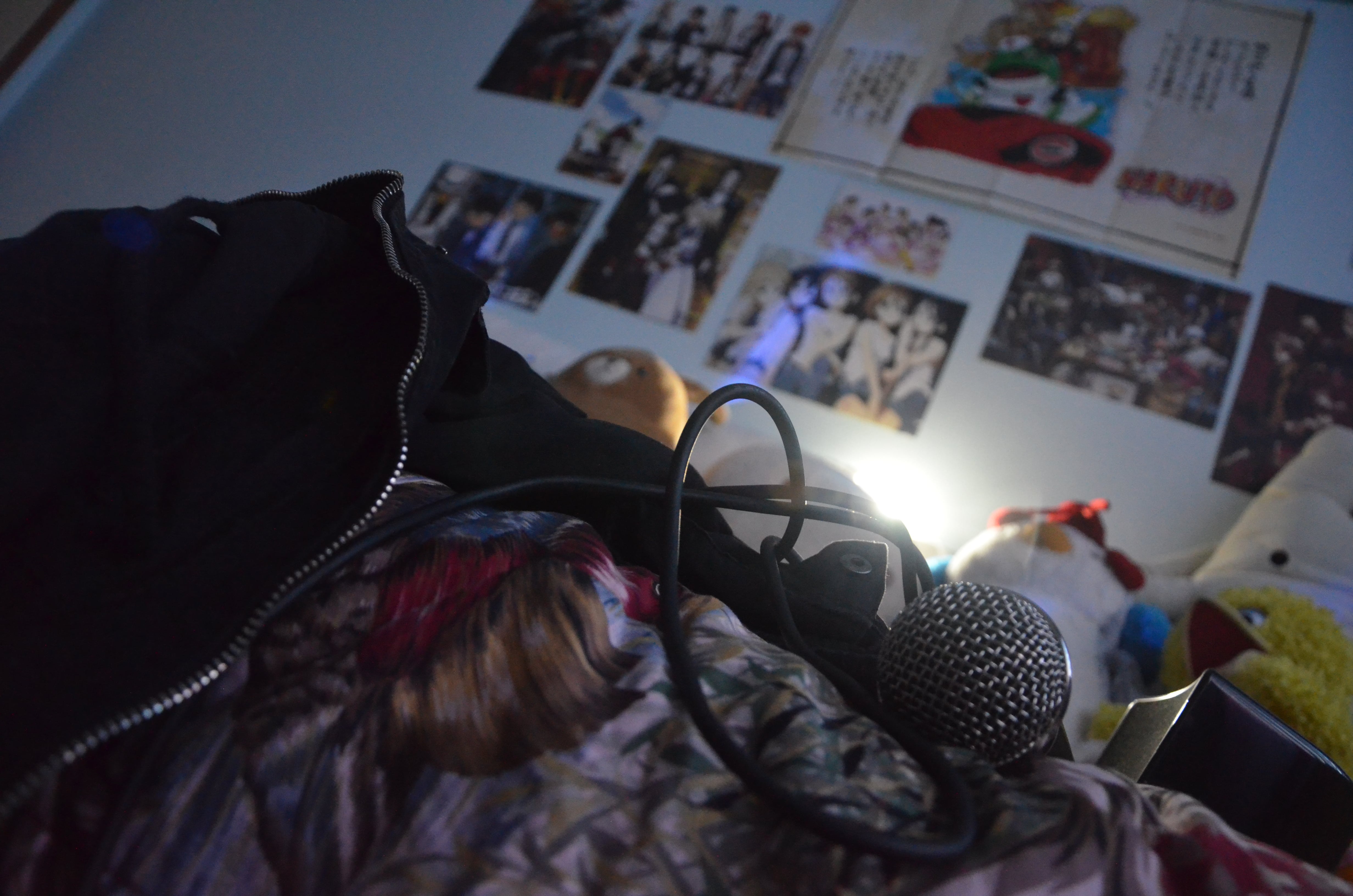
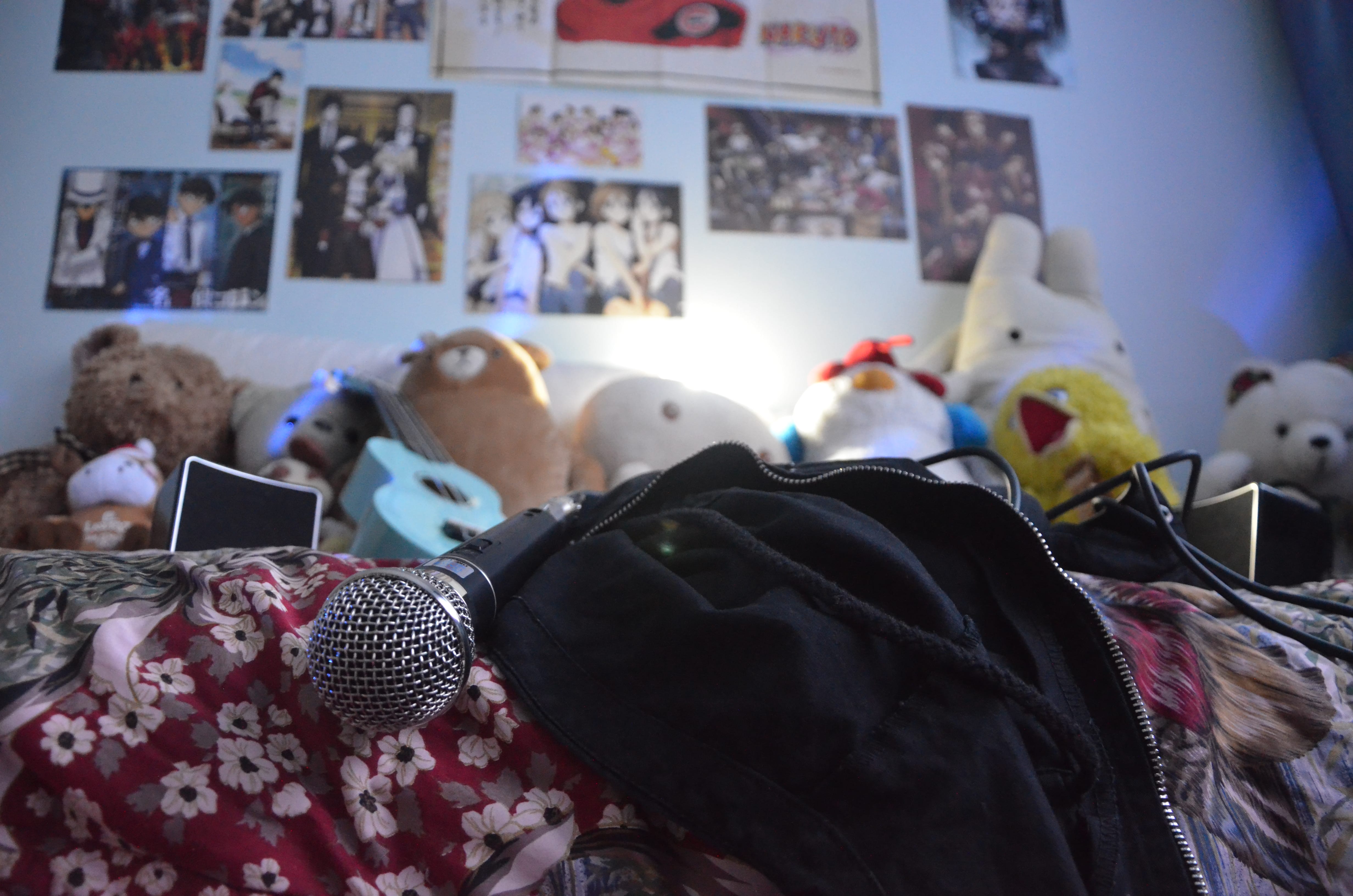
My aim is to juxtapose the razzle-dazzle of singing on stage and the contentment of singing in my bedroom.
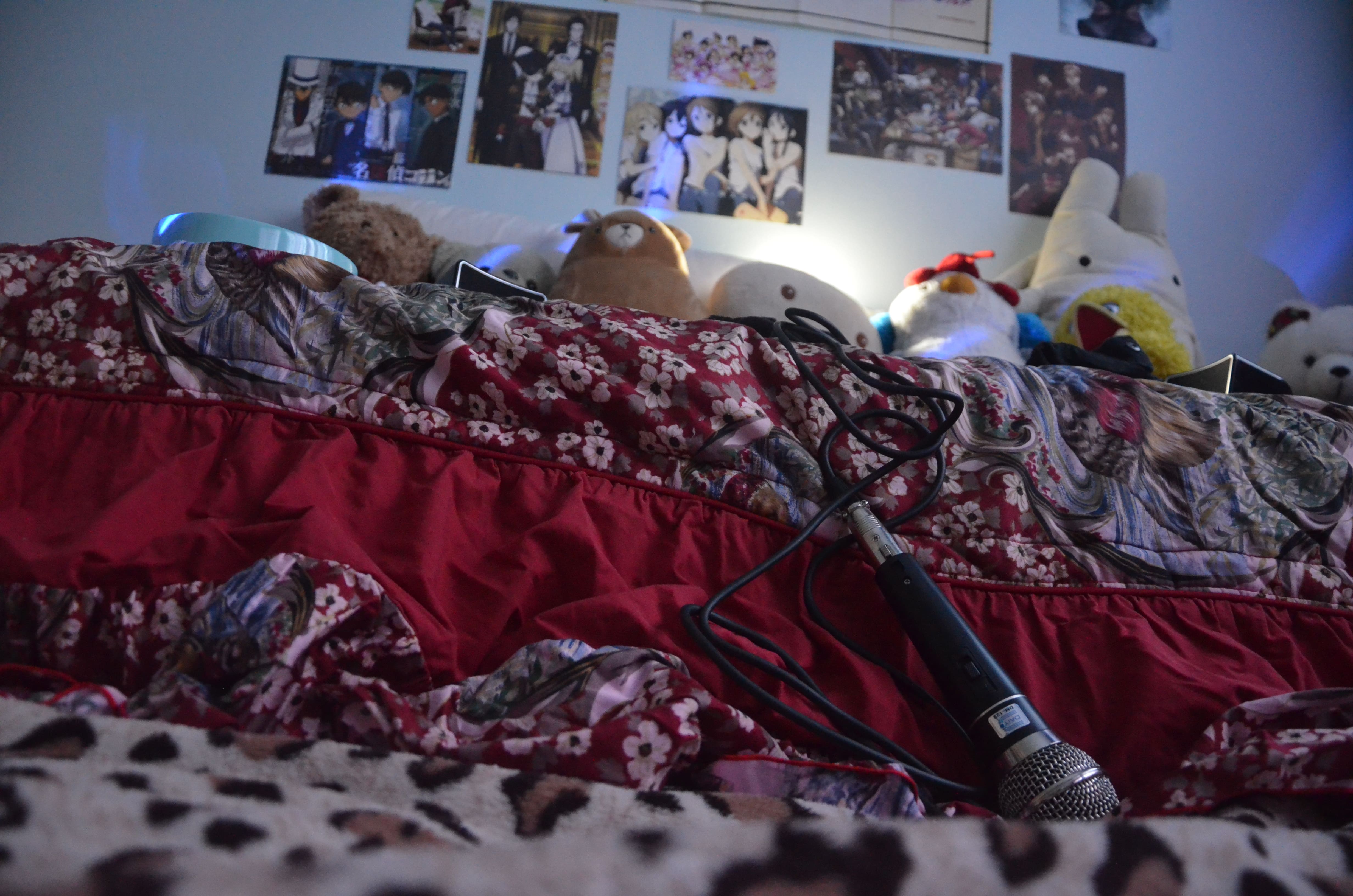
Instead of using the condenser mic in the previous photo I took, I decided to use a dynamic mic (that my family happens to have for some reason) because it is more commonly used by singers on stage, compared to condenser mics which are used in studios for recording, which implies a sense of isolation from everyone when singing. Also, it was a more easily identifiable symbol of the act of singing.
This is paired with red bed-sheets (to simulate the red curtains of a stage) and colourful lights so it could value-add to the whole flashy theatricality of singing on stage. I am also including a black jacket (which I presumably threw “on-stage” before I disappeared) because my favourite rock singer always wears a jacket/hoodie.
Pertaining to the contentment of singing with contentment in the comfort of my own bedroom, I am including my bed (of course), stuff toys as an imaginary audience, anime posters stuck on the wall to indicate my preferred music genre.
With these subject matter, I will be attempting to take shots using the various techniques of composition that I have learned.
I decided to use this photo as my final because I managed to capture most of my subject matter into the photo. I attempted to use a strong diagonal of my bed as well instead of a flat, horizontal stage which looks a bit boring. The blue lighting (projected from my little brother’s toy car and white lighting creates the mood of a concert (and a KTV room maybe). Big Bird also looks like he’s having the time of his life.


 For my final-ish concept, I further enlarged the scale of the eyeball so that it was hidden under both the hot air balloons and the cloud to express how the conscious mind is being repressed. I added more shapes near the centre of the iris as well to show that the shapes are originating from the eyeball and moving outwards and as a result, their distribution becomes more sparse as they go outwards towards the clouds and the hot air balloons.