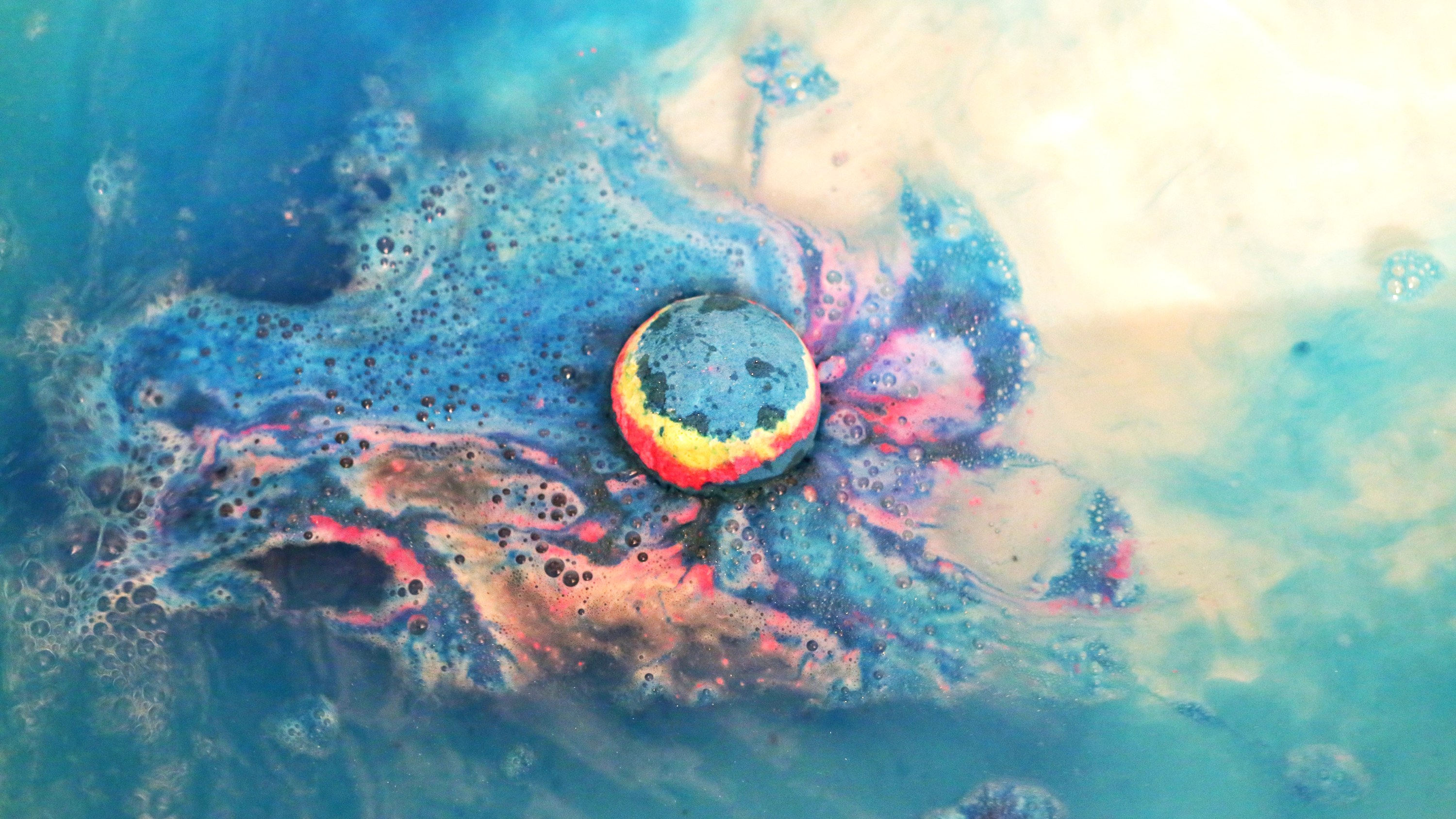
|| The Eternal Frame (1975) is a videotaped reenactment of the assassinated of John F. Kennedy’s assassination by Antfarm which seeks to draw attention to the power of the mediated image.
Antfarm is a collective of radical artists founded in San Francisco in 1968 by Chip Lord and Doug Michels (1943-2003) that sought to rebel against the conformative style of art in their time and build a community of artists that vigorously experimented with new forms of art.[1]
In an Interview with Chip Lord by Randall Packer over the Third Space Network stream, Chip Lord mentions that John F. Kennedy’s death was the first televised American tragedy ever, and Eternal Frame sought to explore the power of the media to immortalise such a historical moment and ingrain it into the minds of people by converting a real-life event into a processed memory via the media. [2]
In another interview about The Eternal Frame hosted by Constance Lewallen (2012), Doug Halls states that he resonates with Jean Jacque-Rousseau’s view that something cannot be true until it’s fictionalised, and the interpretation of a memory aberrates as it is constantly reappropriated throughout time, which is possible if an event is immortalised in a digital form. [3]
” I think that idea of you kind of grasping to it and extricated into your time, then in the act of doing that, certain truths disappear but other ones begin to emerge.”
– Doug Halls
Taking the achievements of past post-modern art movements like Constructivism and Futurism to a greater level, Antfarm’s fearless venture into different media and experimenting with different spatial contexts allowed them to successfully added new layers of meanings in their artworks that allowed them to make political and social statements.
In this first project for Graphic Form, we have to translate the essence of a job (that can be imaginary) into visual, typographic forms of our names using any sort of media.
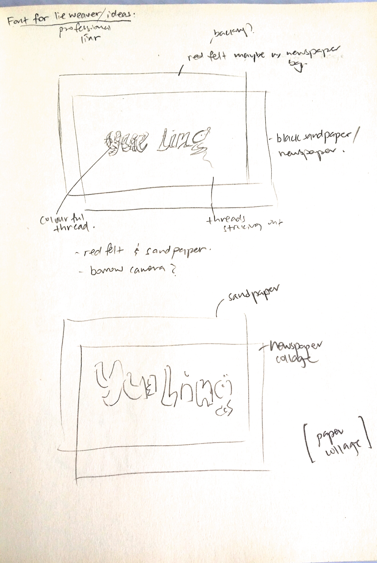
Since the jobs we chose were not specified to be pragmatic/realistic, I started off by brainstorming up some ideas for imaginary jobs that are grounded in the essence of real jobs that exist in reality. I came up with a list of existing jobs and modified them by merging them with each other. This would not only help me come up with much more interesting outcomes, but also give me a wider range of job fields and their nature to explore. Thereafter, I searched up the jobscopes and items that are iconic to these jobs to make them easily identifiable.
|| The noble venture by Furtherfield into establishing and investing in a common space that facilitates the sharing of ideas and execution of projects among artists has reaped the benefits of social practice in art.
Furtherfield – Finsbury Park, London https://www.furtherfield.org/wp-content/uploads/2017/04/Plan-your-visit-600×400.jpg
Before the proliferation of Open-Source culture, artists were seen as solitary creators who worked for their own gain, as in with the case of BritArt which led to a limited development in the field of art (mentioned in Ruth Catlow and Marc Garrett “Do it With Others (DIWO): Participatory Media in the Furtherfield Neighborhood,” 2007):
:
“It degraded and smothered artistic discourse by fueling a competitive and divisive attitude towards a shrinking public platform for their practice and the representation of their work.”
Furtherfield provided the opportunity for artists to start co-curation, such as in E-mail Art on Netbehaviour.
Mail box showing Netbehaviour contributions to DIWO Email Art project 2007 https://www.furtherfield.org/wp-content/uploads/2012/05/diwo_mailbox.png
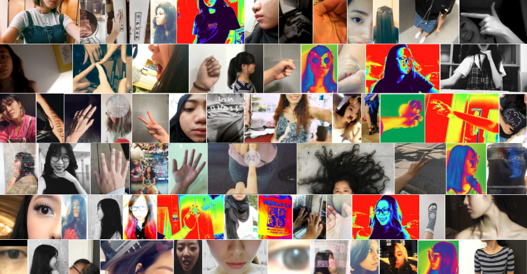
This tore down the notion of the artists having a mandatory role of curating the entire viewing experience themselves, rather, it involved viewers to take ownership as well. In class, we explored the act of co-curation with our Collective Body project, where each of us could determine the order of photo upload in order to create the artwork in its entirety.
Flickr – Collective Body microproject
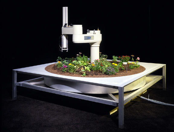
The exchange of ideas also led to technological experimentation as a new medium. Projects like Hole in Space by Kit Galloway and Sherrie Rabinowitz, and Telegarden by Ken Goldberg make use of real time technology to allow people to interact across a Third Space, and also give up ownership of the result of the artwork to the audience, making their outcomes inclusive, unpredictable and ultimately genuinely interesting.
Telegarden by Ken Goldberg
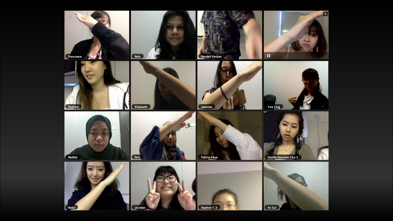
In class, we tried our hands at creating art via the Third Space in our Tele-stroll and Telematic Embrace projects. By negotiating and compromising, we are able to create a digital connection across screens.
Telestroll micro-project: Journey to the East/West done with Francesca. We had to collaborate off-screen to come up with a plan to execute before performing the piece on Facebook live.Telematic Embrace project: Onscreen Cross screenshot. Our class had to agree on who was going to be part of the cross, and if so, how were their hands going to be aligned on screen.
With a conducive space for conversation, Furtherfield artists took the liberty to create projects like Plantoid by Okhaos that utilises the Blockchain system and Harvest by Julian Oliver that explored technology as a medium to get viewers from the public to be conscious about nature and rethink our relationship with technology. These are issues that our generation faces and such artworks allow the current generation to ‘connect with issues in their time’, which, as mentioned by Marc Garrett in his lecture, is one of the strongest virtues of being an artist.
Plantoid (2015) by Okahos
Harvest by Julian Oliver. Making use of wind energy to power up graphics cards without burning up the ozone.
In conclusion, the concept of DIWO empowers artists with the capability to break the artist-viewer hierarchy, explore new mediums and better allow the public to connect with their work and the issues we face today.
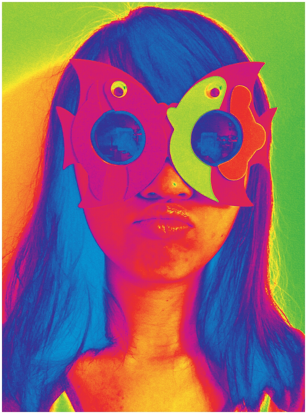
|| This week, we did a g̶̛̞͚̬͈̠͖̺͕͔͚̲̩̬͗͗̒̉̋͊͐̉̅̈́͝͝l̵̛͚̤͆̍̏̃̇̈́̕͝ị̶͇̰͓̘͚̤̹͒̄̈́̀̏̓̃̄̐͐̕͠ͅt̶̖̹͎̣̦̩̪̣͌̚͜ç̵̜̦̣̩̲̩̲̬͎͈͌̀͐̂̆͒̑̍̒̓͆̓̓h̵̢̢̟̬̲̼̦̬̰̰͊̊̑̍͂̽͂ project in class!! We selected a photo of ourselves from our previous Collective Body project and surrender them over to our groupmates to destroy them, essentially creating a g̶̡̛͔̬͍̼̻̞̩̳̲͚̯͔̱̟̐̏̀́̔̋̏̉̄͋̋̂̓ļ̷̙̫̭̙̠̦̖͚̞͑́͆̀̿͋̎̎͗̚ͅi̵̧̨̧̢̜̦̭̫͔̫̖̠̎̆̿͒͗̈͒̋̑͘̕͠͝͠ț̴̨͕̺̘̲̘͛́̀́͆͆̏̑́͝c̵̘̍̏́̋̂̀͗̾ḣ̷̨͓͎̦̱̯̦̲͚̅̂̈́̍ ̵̢̨̢̥̖̹̭̦̻͙͈͒̾̑̋̉̎͑̓͜m̸̛͉̱͔̤̞̱̩̠̫̍͂̈́͆̓̎͛̕͘͘̕ͅa̷͚̪͕̞̽̀̓̎͋͜s̴̛̠̙̦͇̪̯̻̠̭̞̞͑̆͛́̏͗͛͐̕͜͠t̴̨͔͇̞͇͖̦̟͇̦̭͚̥̯̓͐̋̈͋̈́̈́̚͜͠ẻ̷̞͕͖̖̖͉̄r̴̢͖͍͉̤͉͐̔̕p̸̛̱̥͇̲̗̤̼̹̝͋͛̔͆̏̀́͗́̎̊̔͐̕͜͜į̵̢̡̮̠̰͚̬̮̻̹̹́͌ḙ̵̡͙̳̥̩̠̝̓̈́͐̃̉̕͜c̶̢̛̘̦̬̜̾̾̒̍̋̐̆͠e̷͎̥̲̥̝͐̔̑̃͒̈́̎͌͌̔͋̚ 😀 This is what my friends made me into:
In this first project for Graphic Form, we have to translate the essence of a job (that can be imaginary) into visual, typographic forms of our names using any sort of media.
Since the jobs we chose were not specified to be pragmatic/realistic, I started off by brainstorming up some ideas for imaginary jobs that are grounded in the essence of real jobs that exist in reality. I came up with a list of existing jobs and modified them by merging them with each other. This would not only help me come up with much more interesting outcomes, but also give me a wider range of job fields and their nature to explore. Thereafter, I searched up the jobscopes and items that are iconic to these jobs to make them easily identifiable.
Initial Shortlisted jobs:
Baby DJ
Pool Colourist
Professional Liar
Alien Communicator
——–
Baby DJ
Original job inspirations: DJ, Infant care nurses
Jobscopes
DJ: to play music at events entertain, mix beats to hype the crowd up. Has to be well-versed in different sorts of music. Usually playing loud music at social events to give enhance the lively mood/atmosphere.
Infant care nurses: Caring, patient, organised, responsible, nurturing, taking care of delicate babies
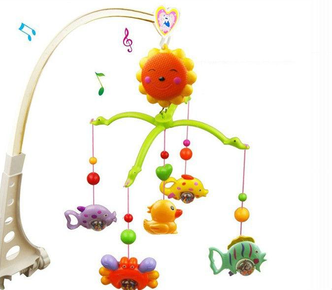
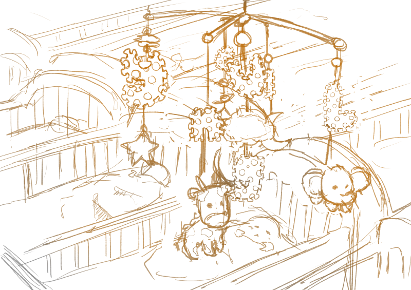
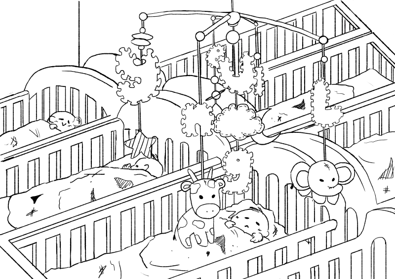
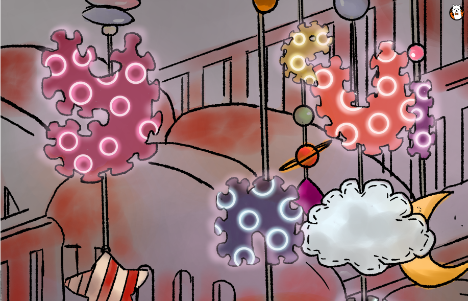
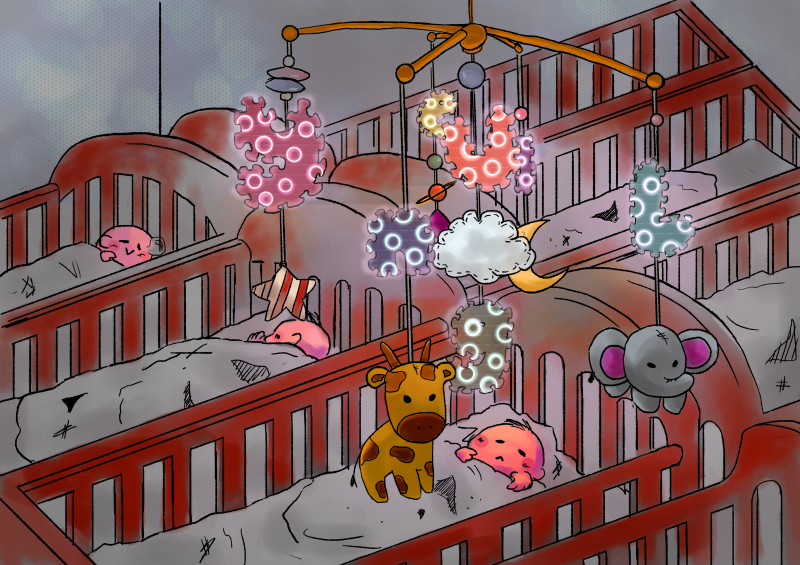
Objects related to babies. http://clipart-library.com/clipart/di4565nLT.htmBaby mobile toys that have the possibility of including multiple elements/toys into them.
Idea Generation:
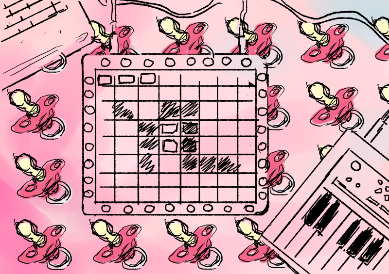
Marshmello – ALONE – [Launchpad Pro Light Show] https://www.youtube.com/watch?v=A0M0p7d1MTM This example of a Launchpad light show demonstrates that users are able to intentionally program the sequence of lights on their device to form different images.I decided to map my initials of YL onto a digital illustration of a Launchpad and make the buttons neon. The background ]would be repeated patterns of pacifiers and a pastel shade. Pastel shades are generally seen as more gentle colours that serve to convey a sense of innocence, purity, cleanliness that are seen of babies.
Words like “lightness” and “ease” come up a lot in conversations about pastels. Sallie Harrison, the designer and photographer in L.A., says that pastels evoke a sense of “calmness and balance.” Stewart points to light blue and its connection with spirituality and heaven; (Leatrice) Eiseman at one point related soft colors to infancy, when there was a sense of ease and safety because all of our needs were taken care of. These feelings can be connected to the social and political factors at work, as Eiseman pointed out while listing her considerations for color of the year.
(Leatrice Eiseman is an American color specialist, who assists companies in their color choice in a range of areas, including packaging, logos, and interior design. She is the executive director of the Pantone Color Institute, a division of Pantone, Inc.,[1] and the author of six books on color, one of which won an award from the Independent Publisher’s Association.)
However, this draft did not really display the elements of the job in the letters, rather, they put the letters into a context. When the letters are taken out of context, they do not effectively portray the essence of the job of a Baby DJ anymore.
Therefore, I embarked on a mission to try to integrate the essence of both a DJ and a infant care nurse together into my type.
Brainstorming pt. 1 I tried to integrate the buttons of the DJ Launchpad into the letters, and find a way to include elements of babies into the font as well, such as the foam letter toys and letter cubes.Brainstorming pt. 2 I tried considering the context of the type as well by including the element of the mobile toy.
Exploration of button placement and lighting effects of buttons on the font in FireAlpaca.Attempt at recreating the neon effect in Illustrator on 3D font made by beveling and extruding the shapes and adding several layers of glow on the outer edges of the font.
It was really difficult trying to recreate the multiple button effect in Illustrator because the 3D extrusion function and art mapping was not exactly user friendly. It took a pretty long time trying to render every single 3D object as well. Thus, I tried only extruding the foam toy square, while leaving the neon letters on the square. In the draft below, I had mapped a wooden texture onto a star shape. I tried to map a foam texture onto the foam squares to recreate a more accurate foam effect as well but there were way too many surfaces, so I stuck with a gradient effect. The background has several layers of lighting effects as well to try to recreate that of a dance club.
Attempting to use highly contrasting neon pink and blue lights since these are colours are energetic and associated with clubs.In this draft, I tried out using different complementary colour pairs to get the foam pads looking like toys instead so that it would be more indicative of babies.
After relooking and consultation, I felt that the bokeh, strobe light and cloud effects were too strongly suggestive of a DJ instead of babies and did not convey my intentions accurately since I wanted to be a DJ that could put babies to sleep. Not make babies get up and dance. And so, I embarked on quite a different mission to change the composition to a more child-friendly one.
Final
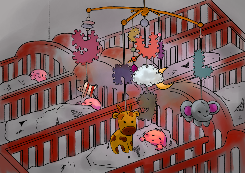
With this draft, I switched from using Illustrator back to FireAlpaca because I am very much in love with this analogue brush that I downloaded and it makes everything look more organic and doodle-y rather than cold. Instead of putting the letters into the foam pads, I decided the incorporate the peripheral pattern of the foam pad into the letters instead, and leave in the circular neon shapes to indicate buttons on a Launchpad.
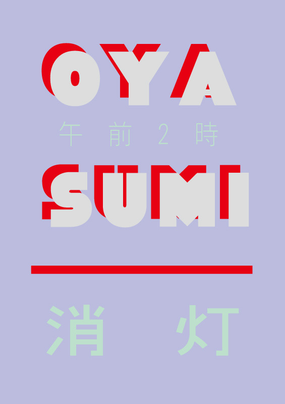
After finishing a rough sketch of the composition, I lined the artwork with thinner, black lines.Oyasumi (Goodnight) poster by Takashi Ueda. I happened to chance upon this poster which I thought was very interesting because of the use of contrasting colours that added energy, and yet was mellowed down by the use of dimmer colours to show that the lights are off and it’s time to sleep.
I wanted to use the colour schemes of artworks used for lo-fi hiphop videos on Youtube since they’re really pretty and also make me feel calm and relaxed looking at them. Usually, there are pastel, mellow, analogous and warm colours.
I tried my hand at recreating this colour scheme by using dull colours and mostly warm tones. Dull colours would also help to contrast the neon effects to come. I also added an atmospheric glow in the middle to indicate that the letters are glowing.Using my experience of creating the neon lighting effect, I lit up the periphery and added neon circular shapes into the foam letters.
I then found and added a foam texture onto the letters. This was so much easier to do on FireAlpaca than on Illustrator since I could adjust the opacity and edit the shape of the layer simply by erasing it.In the background, I added some bokeh lighting effects to show that the lights of the neon letters projected far out. It also added to the overall calm atmosphere of the composition.Anddd… here is the final composition! I think it was definitely a good move moving away from using Illustrator for this job.
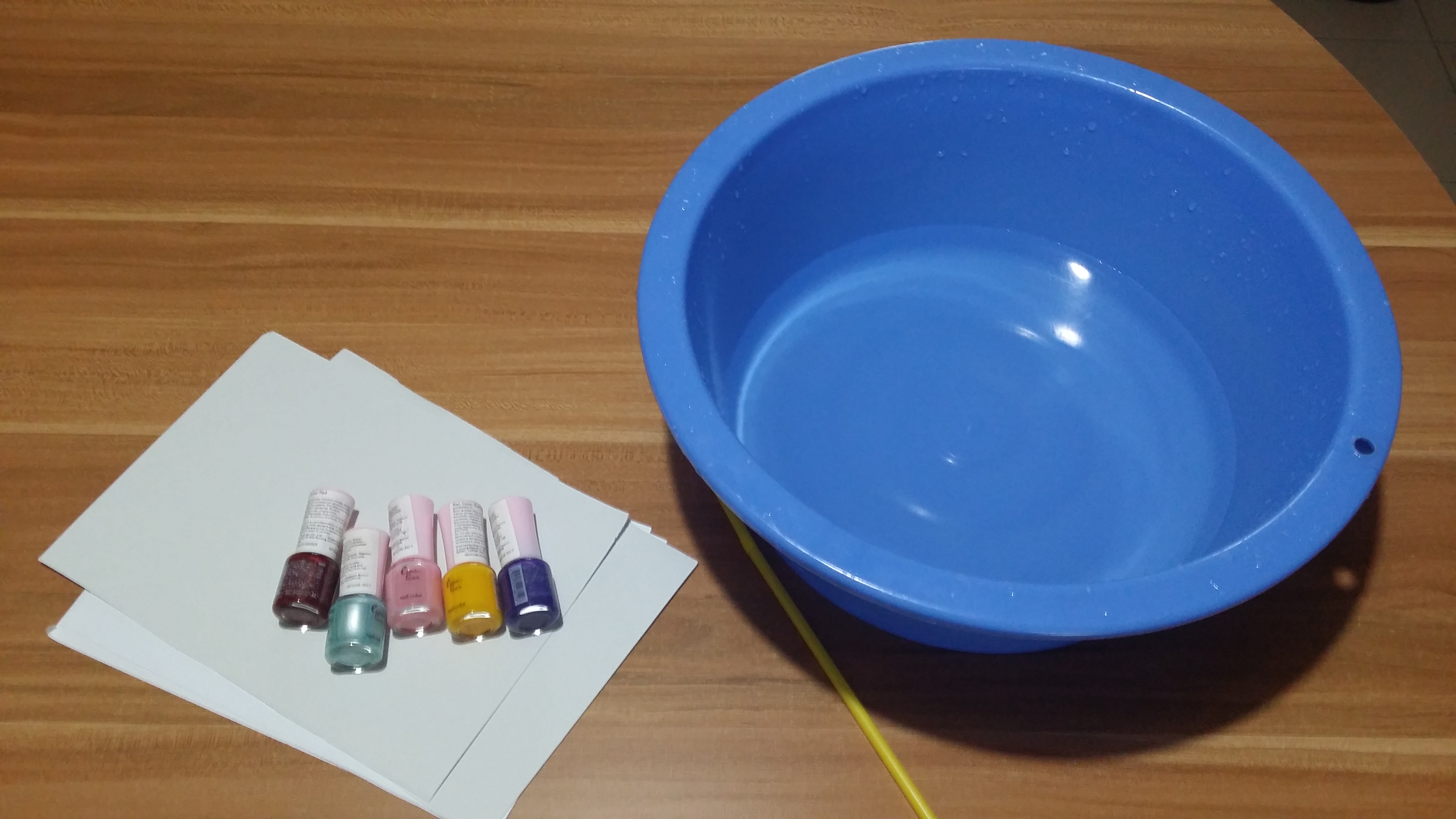
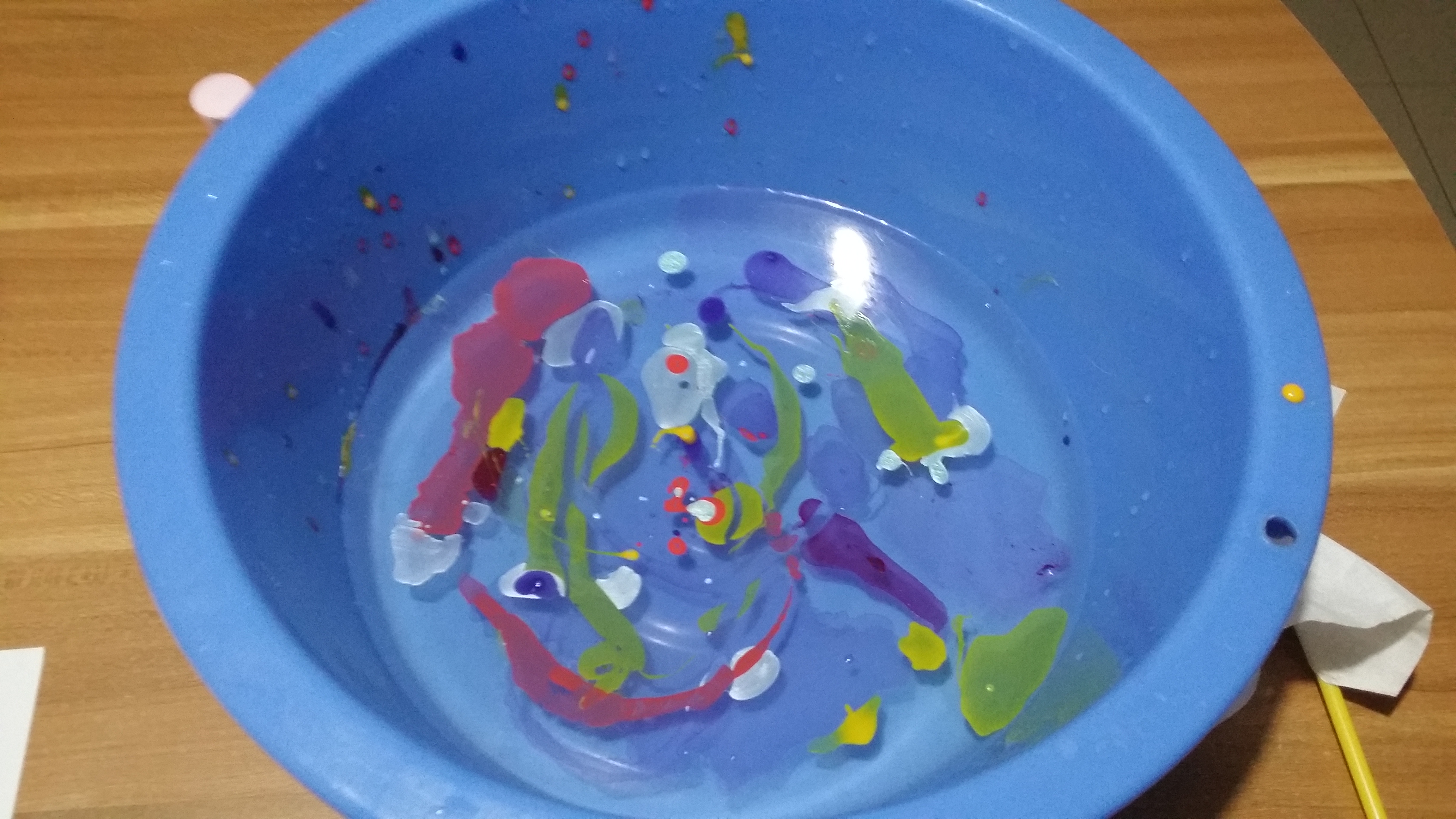
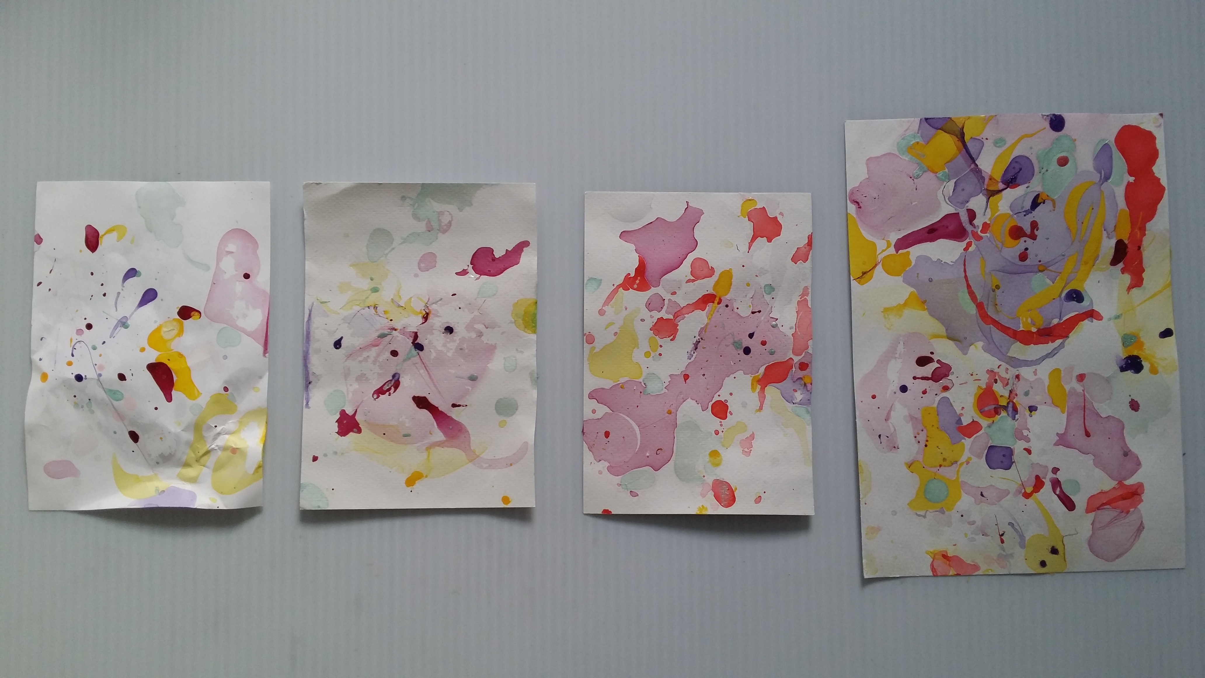
2. Pool Colourist (abandoned D:)
Original job inspirations: Pool maintainer, bath bomb makers
Jobscopes
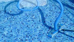
Pool cleaner: Needs to be committed, works on a regular basis, cleans the pool by throwing chlorine in
Pool cleaning machine?
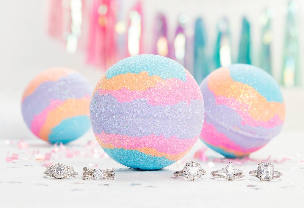
Bathbomb makers: Manufacture bathbombs by compacting colourful powdery compounds into spheres to be thrown into water and dissolved to colour the water in bathtubs
Objects
Pool cleaner: Water ripples, Pool tile patterns, pool cleaning machine, lifebuoy
Bath bomb makers: Bathbombs, rubberducks
Emphasis on the CHANGE of colour
Mediums for consideration:
Use marbling technique/ decalcomania] put something when pressing down to form letters
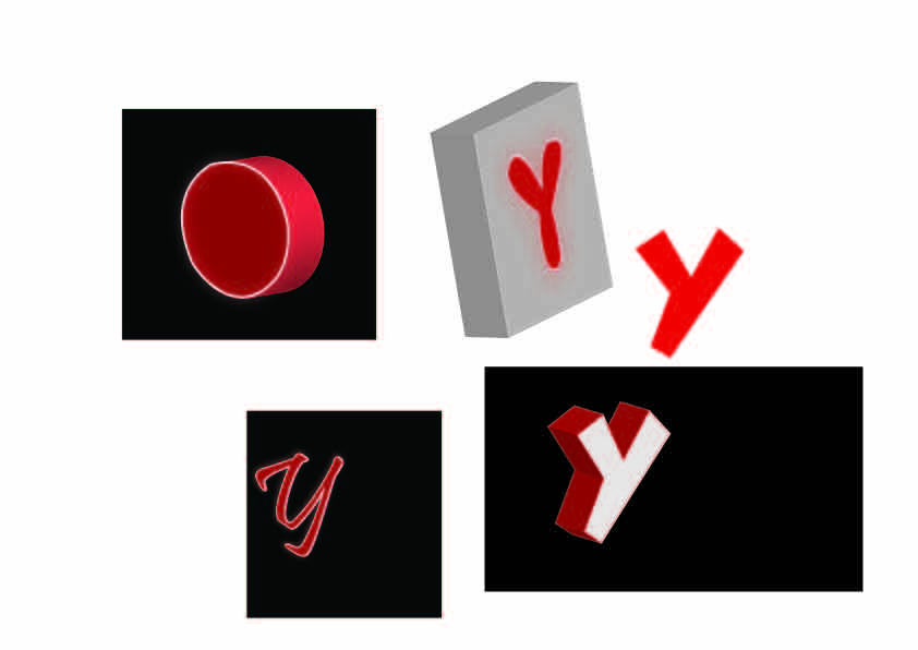
Investigator: Find out the truth about a situation by sieving through documents, going onsite to find clues for cases.
Compulsive liars: Can make up a tall story about anything at anytime. Might be useful in some situations to get away with something for the time being. Hiring someone that knows exactly what to say could be really useful. It’s definitely a dirty job.
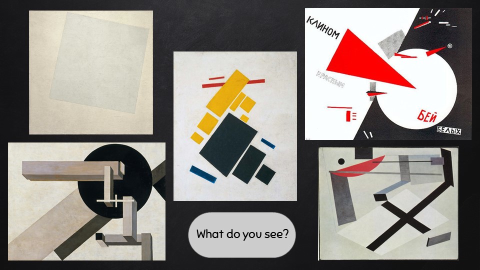
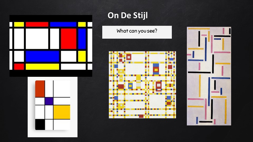
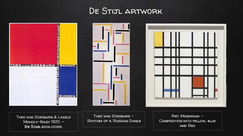
Compulsive liar: words, speech, Pinnochio nose, Suprematist/De Stijl works to represent the truth
Ideas:
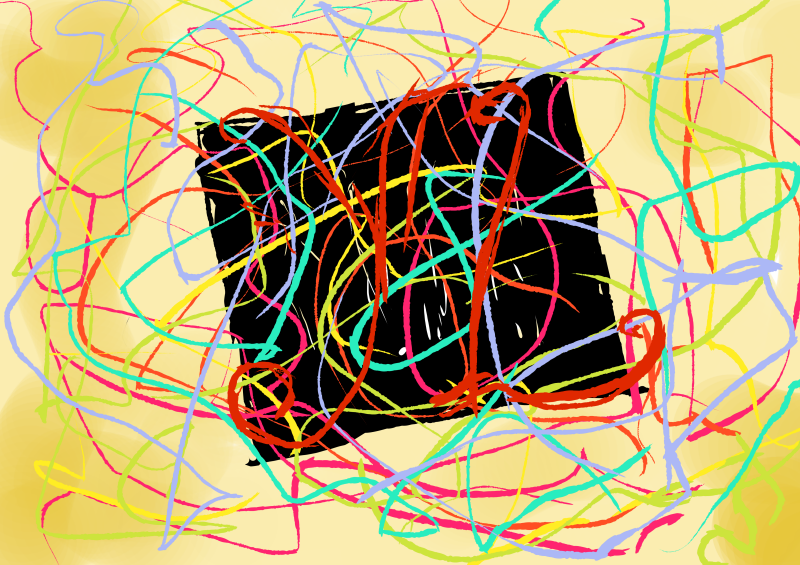
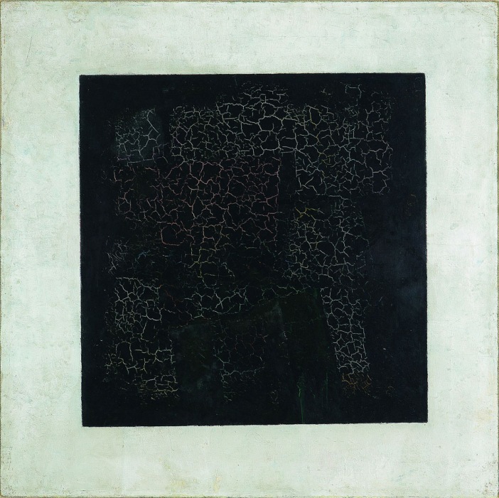
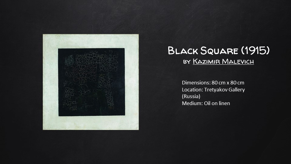
For this draft, I used Malevich’s Black Square to represent the simplistic truth. Lies would be represented by colourful strings to show how pleasant looking things can cover up the truth that is difficult to understand. The contrast between the sturdy black square and the wavy, flowing rhythm of lines would make the composition more dynamic.Some strings I bought from Daiso. I tried using them but they ended up being too thick.I happened to chance upon this paper cut composition which I thought was interesting because it looked like the paper was concealing the faces.And so, I also considered doing a newspaper collage which would partially conceal the black square, similar to how the media could sensationalise and cover up the truth of the matter. Here I am thinking of how to incorporate letters into the composition as well, most likely with a collage of letters.
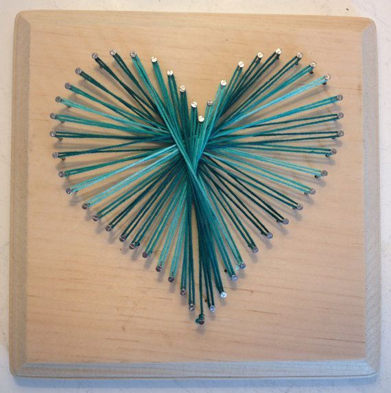
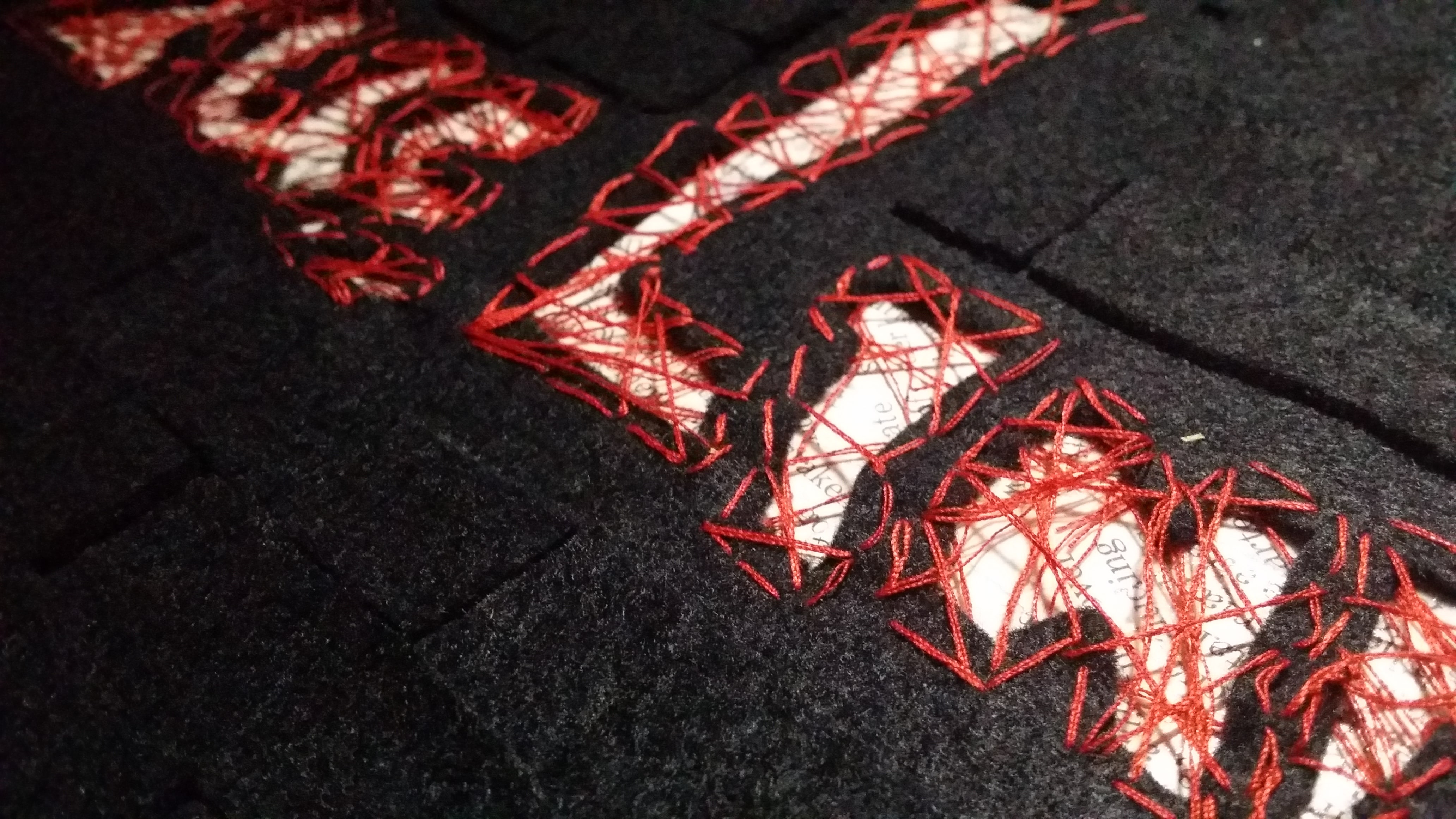
I came across this image of a heart created by winding thread around nails hammered into a wooden board. I was thinking of another way to recreate it so that it would not be too risky since with this method, tension in the strings is key and the moment something goes loose, the entire thing will come apart.
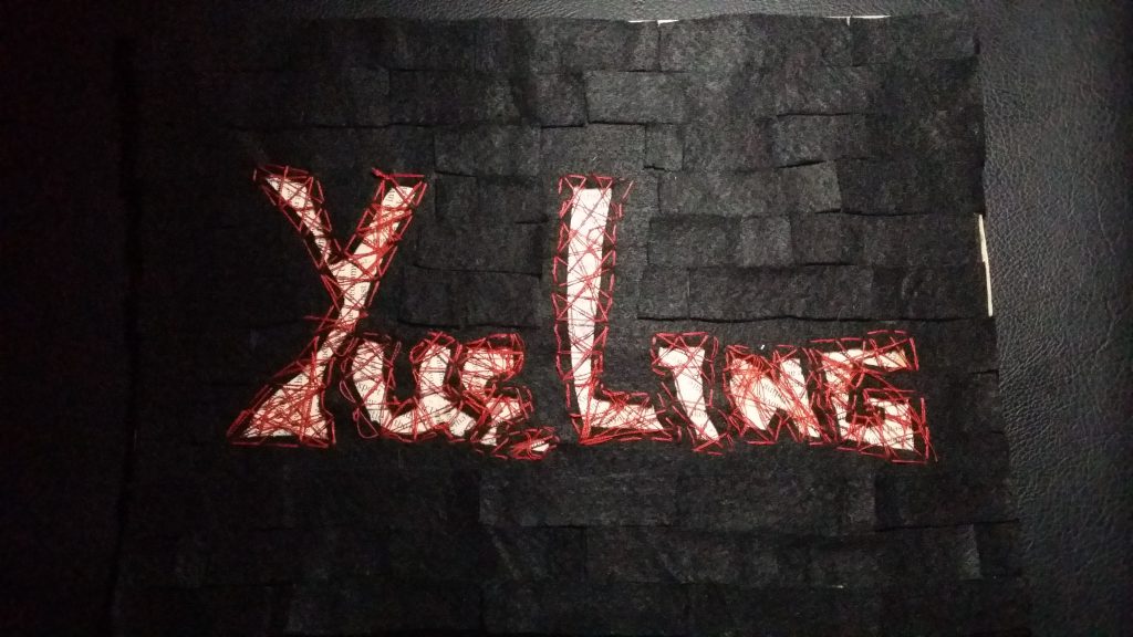
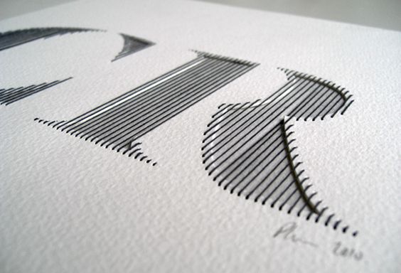
I wanted to explore a new medium which I didn’t get to try out last semester so I looked into sewing. I have some prior experience of patching up my own clothes and buttons so it wasn’t a monstrous task to overcome, so I decided to try this method out. I found this font type that used thinner thread to create neat, vertical strands that filled up the width of the letters, and bound several layers of paper together.
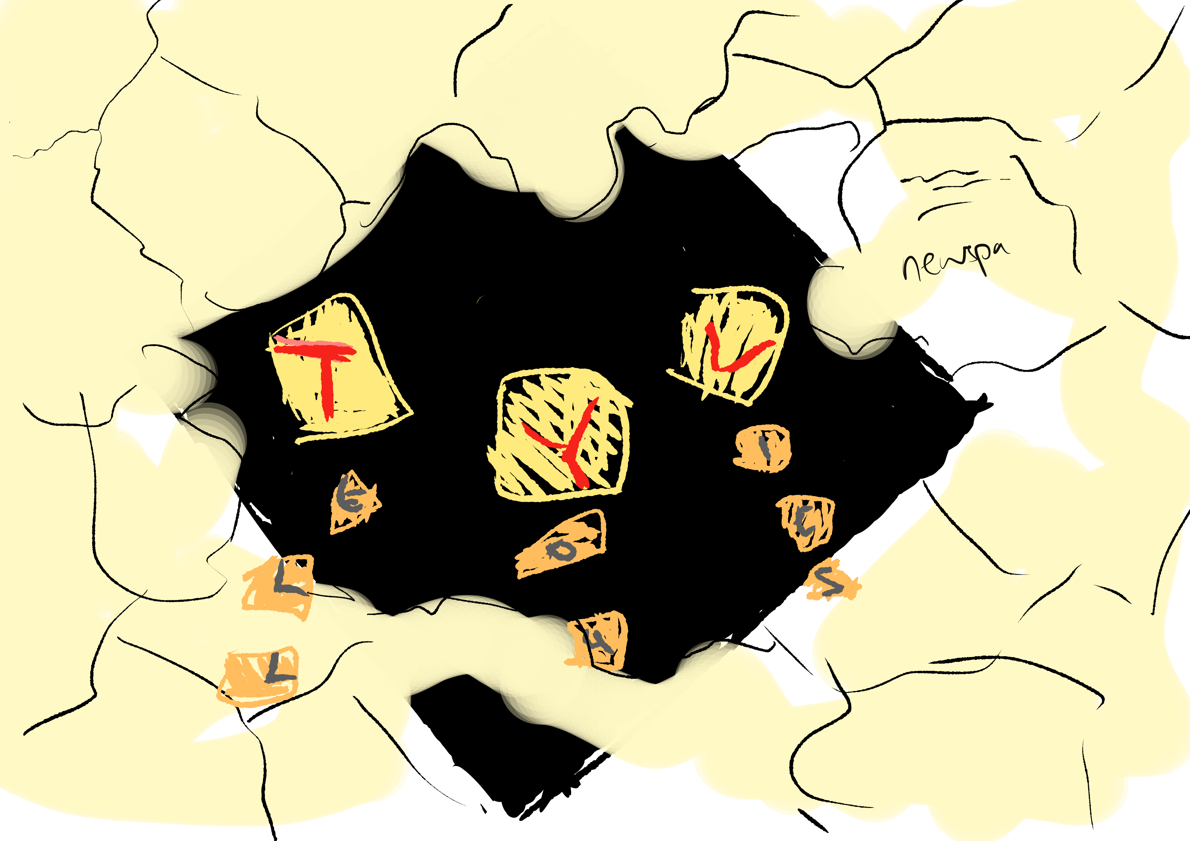
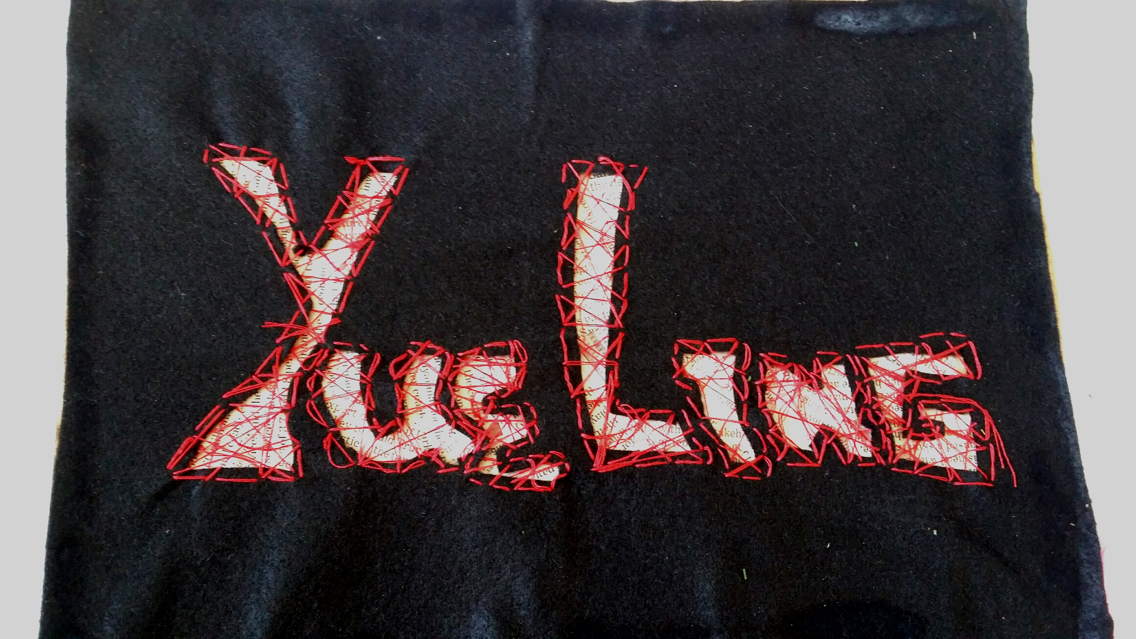
Idea sketch for the making of the composition. I decided to use black felt because it was much easier to sew with than paper, which was in comparison very thick. Underneath the felt, I would do a newspaper collage. In this case, newspapers would represent legitimate black and white documents, thus the “truth”, and the black felt would conceal most of it. I would then sew a random pattern over the with of the letters to create an interesting texture and at the same time make the letters see-through so people can see the words on the newspaper underneath. I used black felt and red thread to express the secretive and dangerous consequences of lying.
Medium: String, Paper, Newspaper
While testing out the sewing technique, I realised that just by sewing in the width of the letters would still make them a little unidentifiable. I chanced upon this image and it gave me the idea to sew around the periphery of the letters as well to make the letters stand out more.
Here is the actualisation of my idea! I created a newspaper collage behind the widths of the letters, picking out the pieces with the most words. Then, I used a cardboard backing so that the felt could be supported. Also, if anyone wants to try this method out, PLEASE cut a bigger piece of felt because when you sew the letters together, it contracts the entire piece of felt.Peekaboo! You can see the newspapers inside~ Now, I used super glue (like the actually really strong kind) to glue the felt to the cardboard, so it did kind of have a chemical reaction and burned the felt. The burned area was really obvious. ;;;
Final
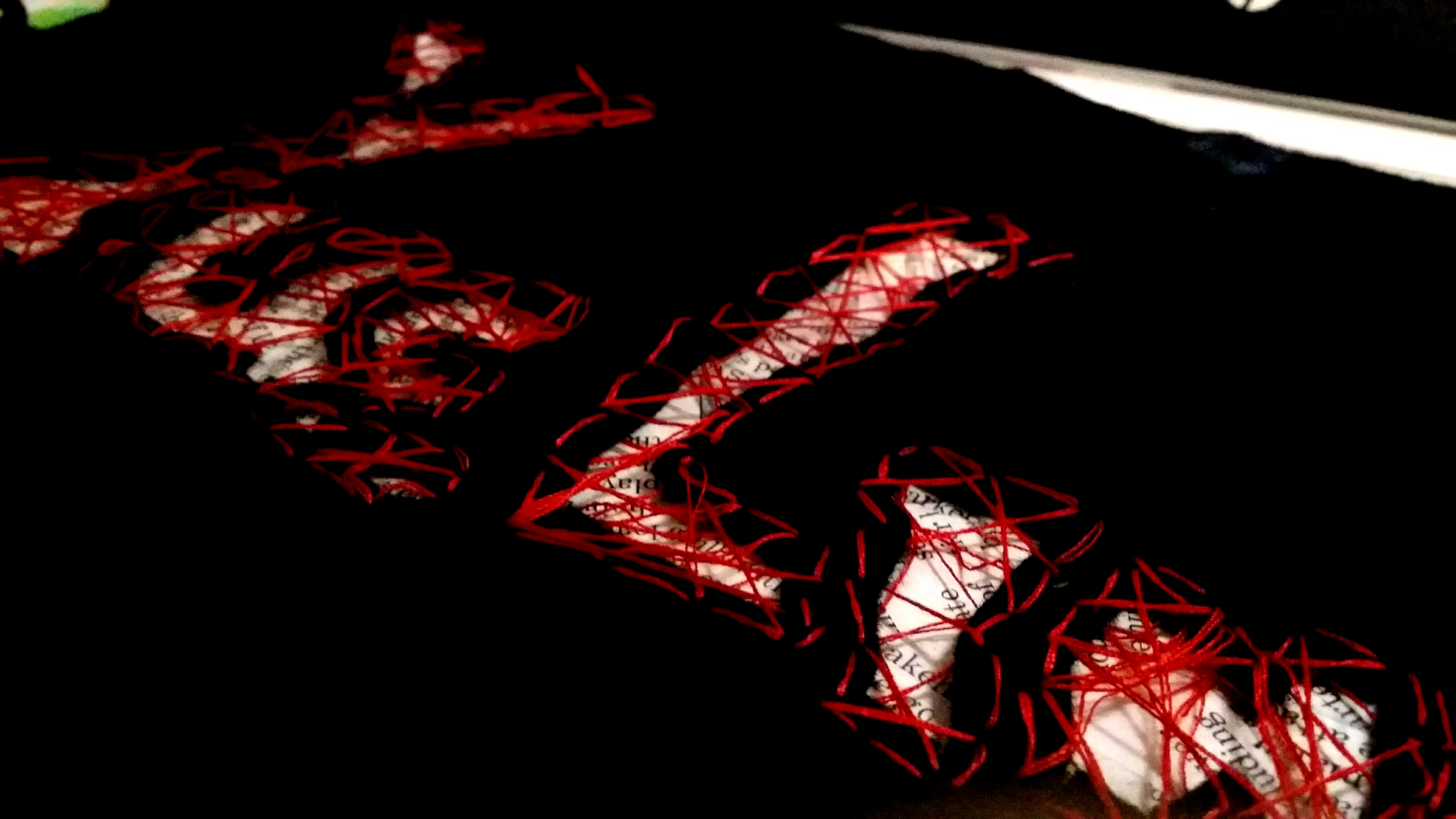
I covered up the burned marks using smaller patches of felt. I decided to use a regular tessellation pattern instead of creating a massive effect because I wanted to portray a professional liar with a calm nature that can lie with a straight face.Here’s a closeup of the texture! Overall, I think this piece has helped me to explore with more mediums that I’ve never really gotten to try and it produced a really tactile result!
4. Alien Communicator
Inspired by: Astronomers, Crop circle artists
Jobscope:
Astronomers: To study outerspace; investigate the presence of life-forms on other planets.
Crop circle artists: Create geoglyphs on large expanses of crop fields to trick the public into thinking that aliens are real. Also to practice an impressive new art style.
Objects:
Astronomers: Satellites, space suits, rockets, shiny metallic objects, outerspace themes, solar system
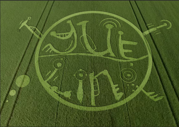
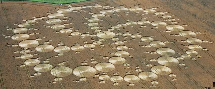
After brainstorming, I settled for doing a crop circle artwork myself!
But first, I had to do some research on the patterns of crop circles. And so I did.
Crop Circle Fun Facts!
Crop circle art is a relatively new art form. In crop circle art, crop is bent and not harmed in any way. Most crop circles have either laterally symmetrical or radially symmetrical art. They could also be completely unsymmetrical and representative. The possibilities are endless.
The most telling feature of crop circles are their stunning geometric shapes and patterns that make it hard for people to believe that they were really created by human beings on such a large scale, and so a lot of people would rather believe that aliens did it.
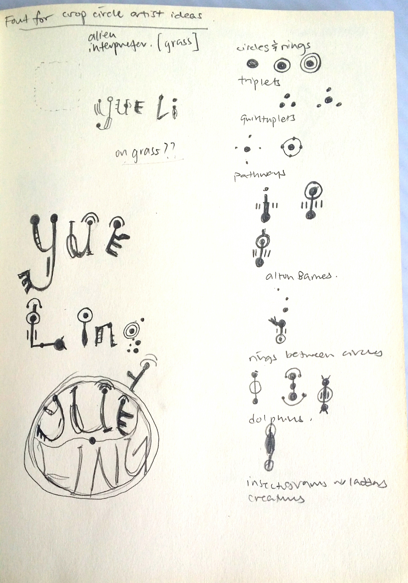
I borrowed a book on crop circles by Michael Glickman to study the common features of crop circles:
others like -orbits,snowflakes, triangles and squares
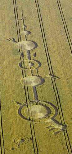
Radially symmetrical composition with tons of rings, almost resembling a whirlpool because of the swirl of the lines from the center outwards.Alton Barnes crop circle. Here we can observe bridges across rings, which is cool and all but the most iconic thing about this crop circle is the gear/crank looking protrusions coming out, giving a mechanical nature, and evoking a sense of modernity/technology.Laterally symmetrical representational composition of a jellyfish in a field in Oxfordshire.
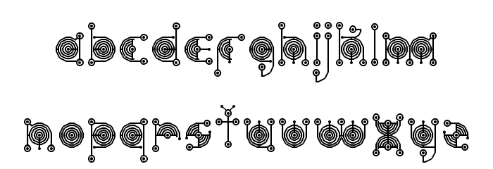
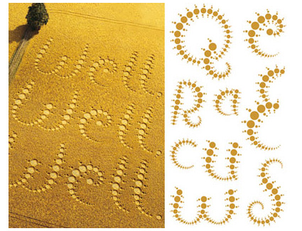
In this draft, I tried incorporating the different patterns that I had learned, as well as letters of my name. However, this did not include the essence of the job into the letters once they were extracted out. So I decided to look into crop circle font.Most of the search results that came up showed fonts like this that were ultimately… Alien webdings. Which is cool as a code and all, but no one will know how to read my name.I found this font which did utilise rings, bridges and insectogram feelers, but the patterns could be more diverse.And then I came across this one that used only rings, but at least it incorporated the pattern of the crop circle into the letters themselves. This inspired me to build on this concept, while including a larger variety of patterns.
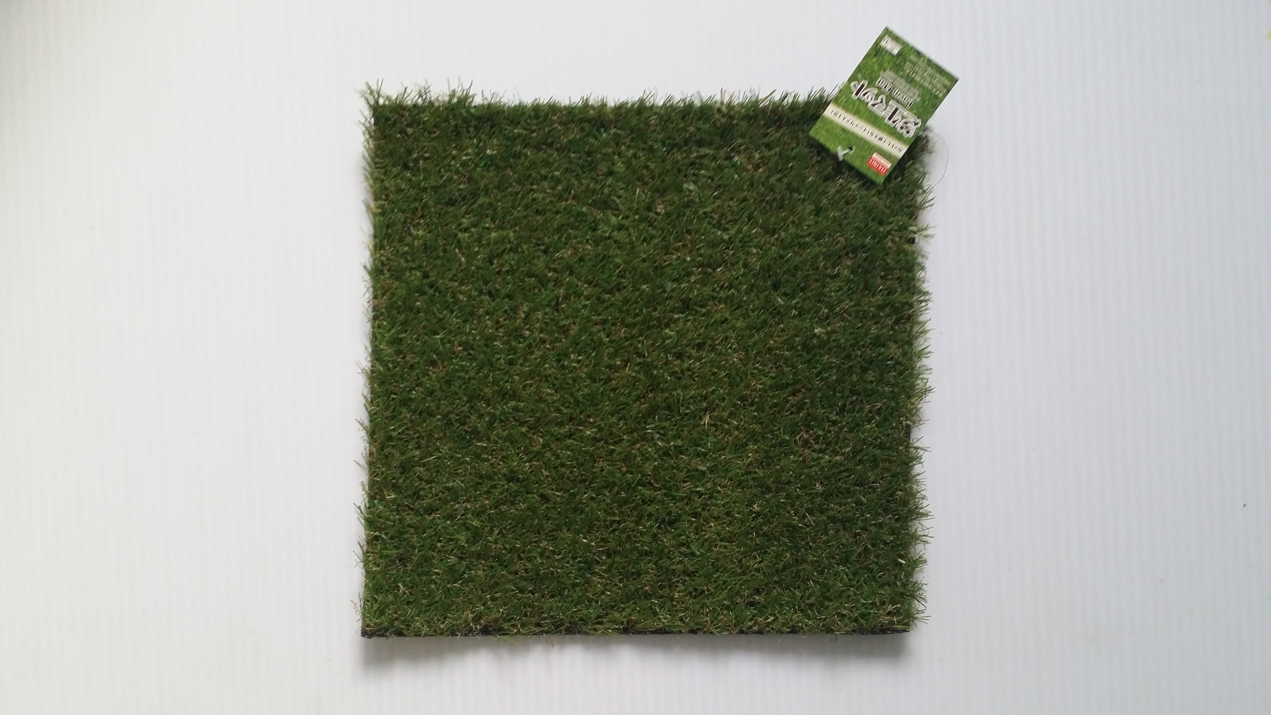
Here, I sketched out some of the above mentioned features of crop circles and found ways to incorporate them into the individual letters. I decided to put the letters into a circular shape as well since it would contribute to the overarching circular/geometric motif of crop circles.On FireAlpaca, I constructed a draft of the crop circle art. I was planning to use this as a stencil to cut out the letters on an actual fake grass patch from Daiso but… you’ll see later.Yeap, here is the grass patch I was planning to use, it was about 22cm by 22cm.I tried trimming down the grass on an extra bit of the grass patch to see how obvious it would look.Unfortunately, after trimming, the letters could not show up. I even used brown acrylic paint to try to bring out the letters but the paint couldn’t show up and the space was too small too. Much to my dismay, I had to abandon this medium. But not all hope was lost!I decided to turn to trusty digital imaging. Now I haven’t really done heavy editing before, so I was starting on a clean slate. Wrecking my brain over how to make the image as realistic as possible, I was blessed.
SOMEONE DID A TUTORIAL ON IT!!!
This tutorial was absolutely FANTASTIC. It was clear to follow and produced a really realistic effect. You can also use any stencil with a transparent background you have created, and following quite a long but comprehensible procedures of producing a screen, bevelling and embossing and tweaking lighting settings, you can create your own realistic digital crop circle artwork as well. By following this tutorial, I managed to play around with the blending effects a lot more, which I had always been quite unfamiliar and apprehensive about touching before this project.
Final
After many attempts and disappointment, I finally managed to achieve this super realistic crop circle effect that could convey the essence of my alien communicator job through the grass medium I had originally wanted to use, just digitally. I really have to thank the person who uploaded that tutorial!!
5) Local Pastry Chef
Inspired by: Chefs, Singaporean Hawkers
Jobscopes:
Chefs: Professional chefs that pay close attention to the process of cooking, as well as garnishing and presentation of food.
Singaporean hawkers: Specialise in catering to the Singaporean palate, making local cuisines like Chili Crab, Bak Kut Teh etc.
Objects:
Chefs: Chef hat, wok, spatula, frying pan, ingredients
Singaporean hawkers: Chili crab, bak kut teh, kueh, fried rice, hokkien mee, yong tau foo
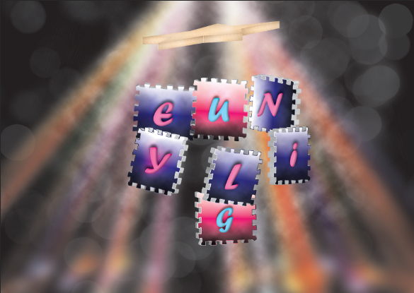
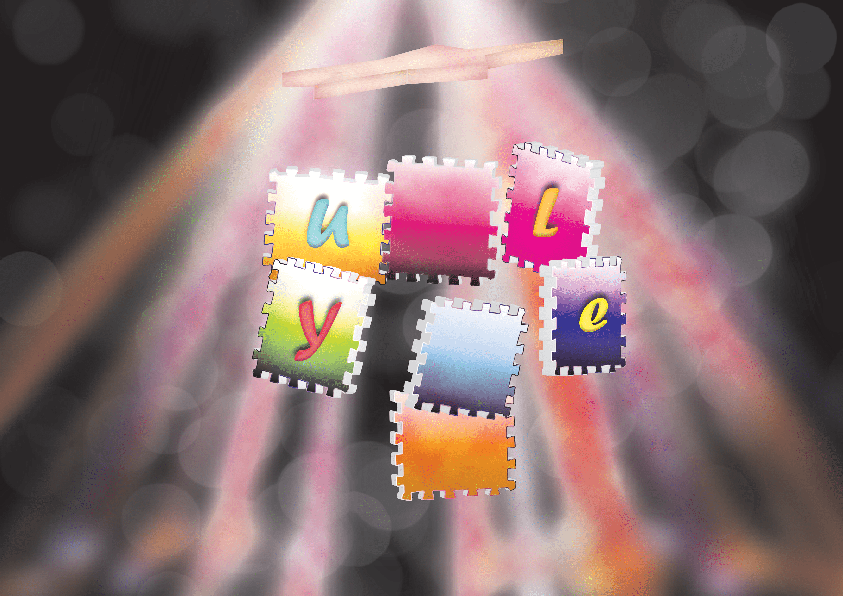
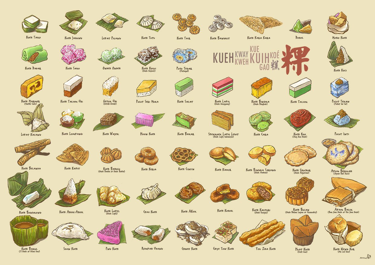
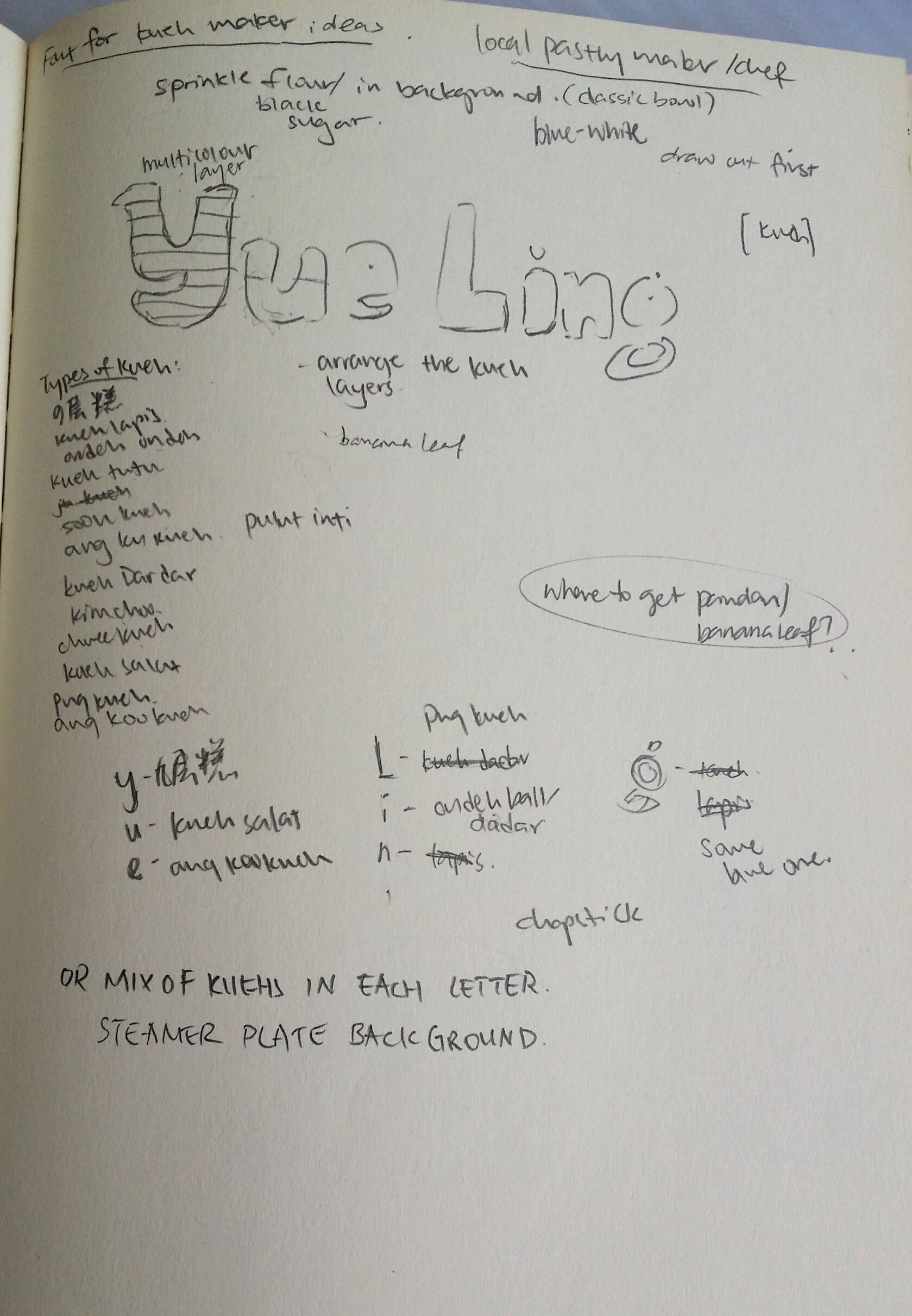
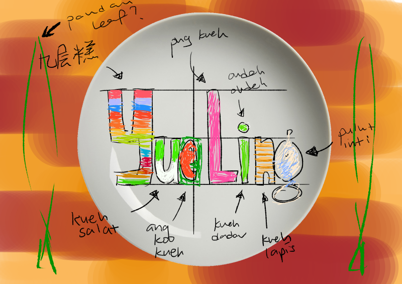
Kueh Compendium by Naiise It was decided that I was going to use kueh as a medium since there are so many different types and they are all really colourful (and tasty). Recalling that Naiise has a lot of products designed based on local pastries, I decided to search up references and low and behold, there was an entire catalogue of kuehs to choose from! I didn’t even know some of these kuehs existed. https://cdn.shopify.com/s/files/1/0175/9848/products/KuehUltimaxwithnamessm.jpg?v=1495785705Here, I drafted and started planning which type of kuehs to put into each letter. I tried to include as many types and colours as possible, and also considering the characteristics of each kueh and whether they could be molded into the shape of the letters. For e.g., for more complex forms, I tended towards kuehs that were layered so that the layers could be the characteristics incorporated into the letters. Also, for the long capital letter L, I used the correspondingly lengthy pink png kueh because it was suitable.In this draft, I tried to imagine how the colours would turn out based on the use of different kuehs. I was going for a more home-y feeling as well so I wanted the background to be of a wooden texture, and the plate to be either clean or the blue-white/flowery traditional ceramic types.
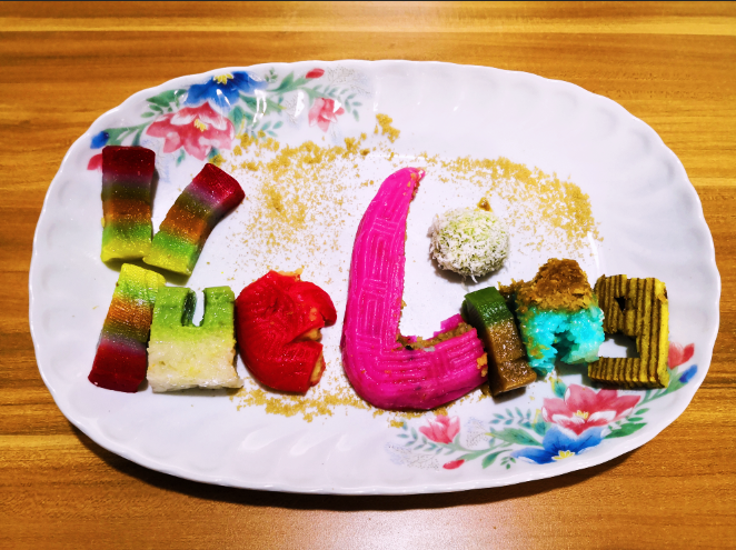
Medium: Kueh, Photography
After spending QUITE the amount on about more than 10 kuehs (but it was worth it because it was really fun making and eating them afterwards), I crafted out the letters of my name in kueh. I placed the kuehs in a flowery ceramic plate and sprinkled some brown sugar over to complete the garnishing. I edited the original picture by adding some filters which gave the photo a warmer and home-ier colour tint.
Kuehs used:
Y- Kueh lapis sagu (Jiu Ceng Gao in chinese)
U – Kueh salat
E – Ang Ku Kueh
L- Png Kueh
I – Ondeh ondeh and kueh talam
N – Pulut Inti
G – Kueh Lapis
Reflections:
This project was pretty challenging in the sense that we had to create letters that could easily communicate the essence of our jobs. Since I also decided to go with jobs that are inspired by at lease 2 traditional/existing jobs, it was tough trying to incorporate elements of both jobs to balance out the elements equally. However, through a rigorous process of refining my designs, I would like to think that I have managed to do so. ;;; XD
With this project I also wanted to explore the use of other mediums, which I think I managed to do successfully! Although it was not a smooth process throughout, with many failures and disappointments, I always recall the saying that artists should “Fail faster” so that we learn from mistakes faster and can get on with improving our projects. After failing with the intended mediums, I tried to find alternate options that could express my intentions on the same level, if not, surprisingly better.
Through this project, I was also able to get more comfortable with Photoshop blending modes that I have never ventured to touch before. Fiddling around with the settings for making the neon glow and crop circle really taught me the massive capacity Photoshop has for creating realistic illusions.
All in all, I really enjoyed this project and had fun trying out different mediums instead of just ink/paint. Looking forward to the next Zine project!
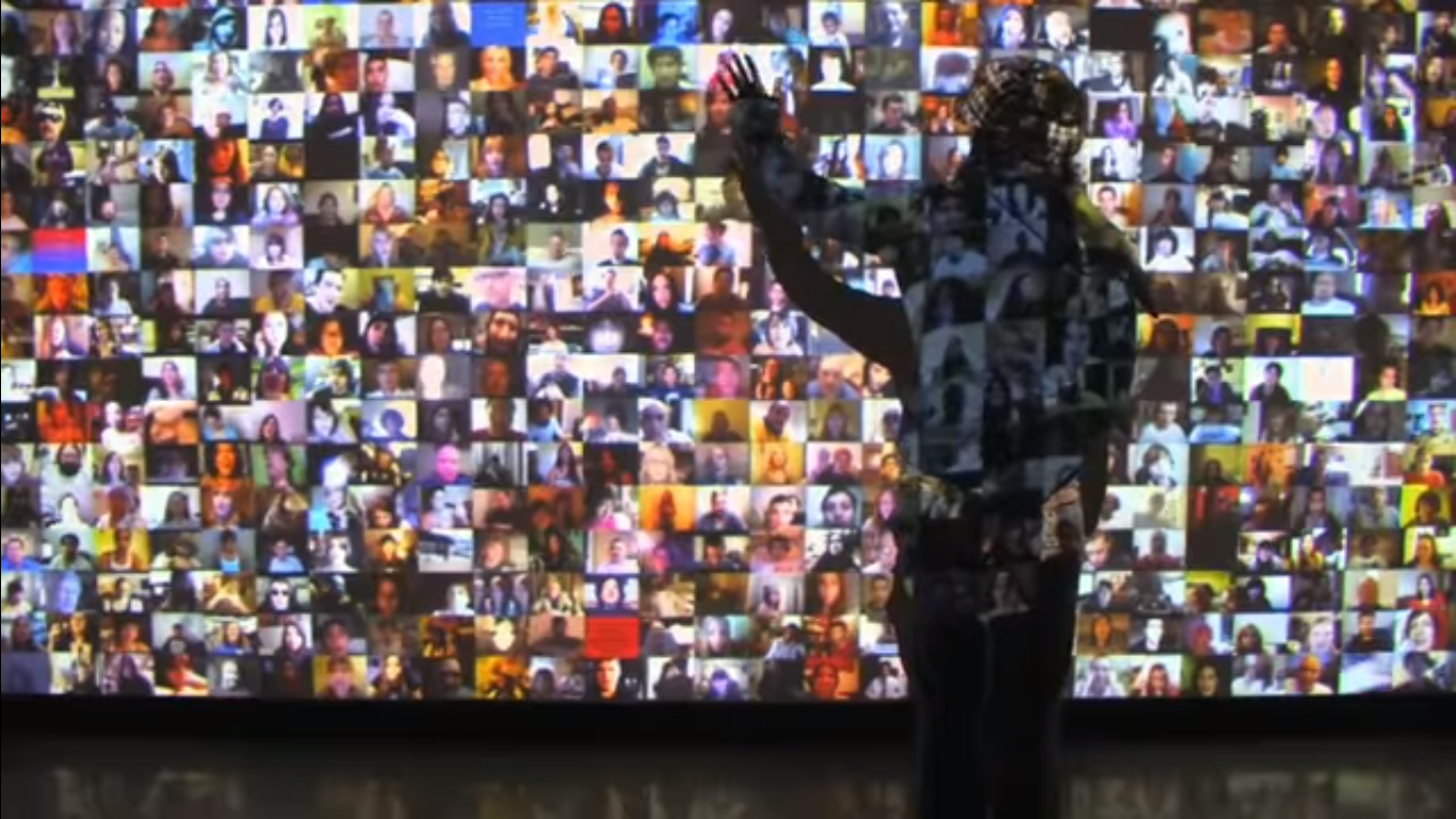
|| Hello World! (2008) by Christopher Baker is a audio-visual wall installation that comprises of over 5000 videos taken from social media websites like Youtube, Facebook and MySpace. Each of them are a personal video recording from an individual to an imaginary audience (vlogging = video + blogging). The collective motley of voices that results can either seem meditative or overwhelming to viewers who choose to dwell and immerse themselves in the experience.
Hello World! (2008) by Christopher Baker. URL: https://www.youtube.com/watch?v=J9mhAEMu7io
Since cameras have been incorporated into mobile devices, increased ownership of the latter would also mean an increase in possession of a camera. Coupled with the increased accessibility to the Internet, more individuals now have the power to participate in social sharing online.
“Some forms of computer-mediated communication can lower barriers to interaction and encourage more self-disclosure (Bargh, McKenna, & Fitzsimons, 2002; Tidwell & Walther, 2002); hence, these tools may enable connections and interactions that would not otherwise occur.”
– NB Ellison, The Benefits of Facebook “Friends”.
Hello World! fundamentally displays the innate need for social sharing in humans. This behavioural pattern can also be observed in Murmur Study, another work by Christopher Baker, which materialises the abundance of status updates which exist online which may not be directed to anyone in particular.
Christopher Baker laments that the experience of social sharing may not be totally reciprocal since people are not taught to be good listeners as well. If we manage to achieve a considerable balance, perhaps more beneficial collective actions can be born from online conversations.
Resources:
http://christopherbaker.net/projects/helloworld/
The Benefits of Facebook ‘‘Friends’’: Social Capital and College Students’ Use of Online Social Network Sites
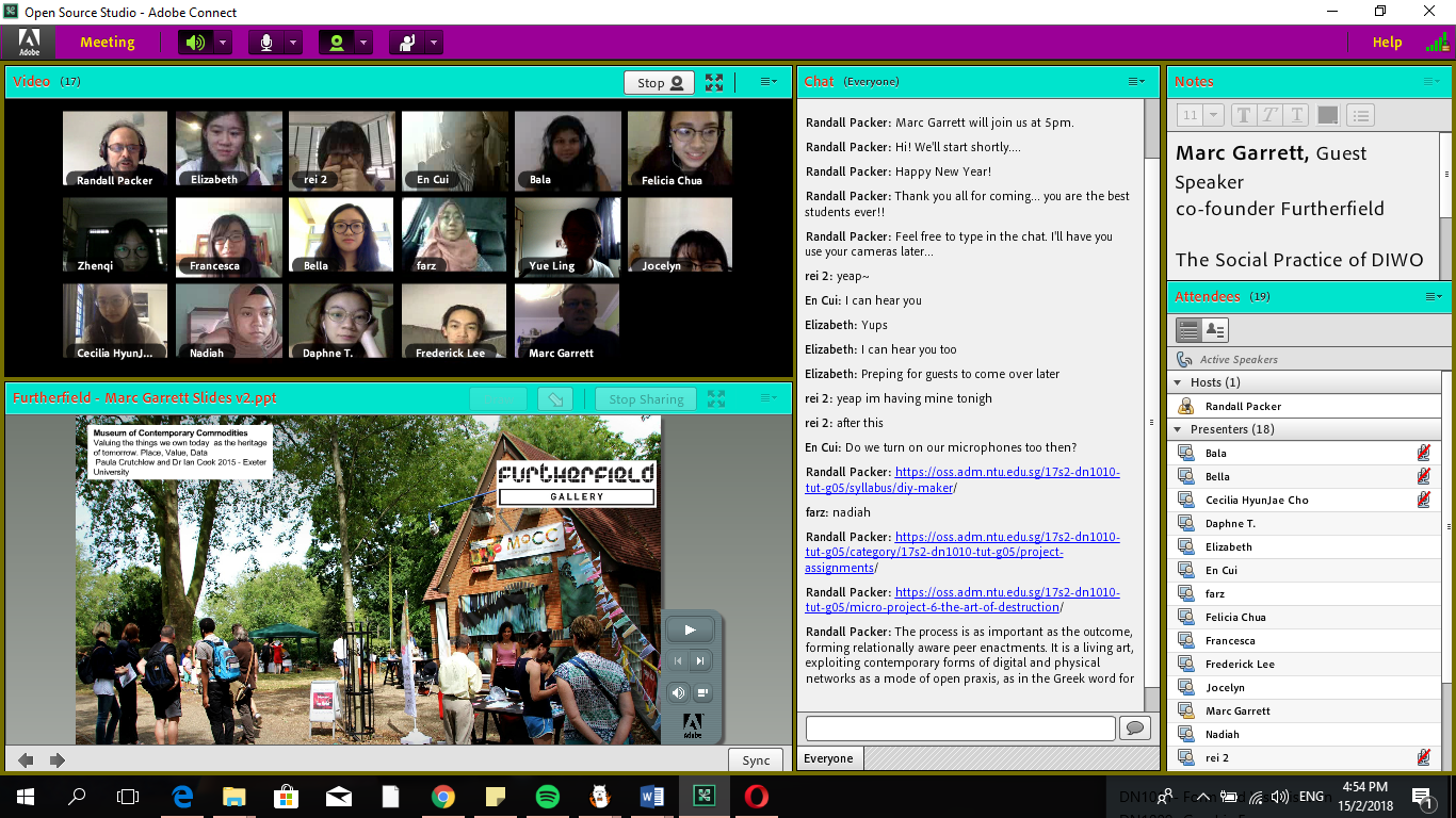
|| This week during class, we all got on Adobe Connect (it was my first time using this software ever), and immersed ourselves into the Third Space together.
We discussed about how the emotional bandwidth (the quality of emotional exchange between two individuals) of texting is significantly different from that of video calling or social broadcasting since we are able to view the voice and expression of the other party to fully gauge their responses, compared to simply communicating via words.
This experience was very new to me since previously we only broadcasted live together as a class but did not really attempt to make any interactions across screens (although this was attempted in the Telestroll microproject). As a class, we were present in both our local space (the first space), and the digitalised platform of Adobe Connect (the third space). Since we were all in the classroom, our remote spaces (second spaces) were all the same relative to each other. It was not possible to see everyone in the room at once in the physical world, but Adobe Connect sure made it much easier. It was also super cool to see how although we were in the same room at different positions, our minds were all in the same place.
We attempted to accomplish various collective tasks together, such as putting our fingers together with a partner beside us (not physically but onscreen), putting our faces really close to the camera and making a cross across the screen.
E.T. touch with our fellow classmates beside us on Adobe Connect. Photo credits: Randall PackerPen Alignment. Photo credits: Randall PackerOnscreen Cross. Photo credits: Randall Packer
For these tasks to be completed successfully, it was vital that we negotiated and compromised to achieve our goal. From the simplest initial task of getting a pen out, to aligning the positions/scale of our objects/hands, every part of the job required some form of give-and-take. Even with the Onscreen Cross, if we were not involved in making the actual cross with our arm, we needed to know our job and do it, even if it meant doing absolutely nothing with our arm, lest there be an extra stroke coming out of the cross.
While we see negotiation on a smaller scale here in a onscreen microproject, these skills are definitely applicable to real life whenever we need to communicate with others and get our ideas through in order to get a job done successfully.