IDS: Professional Creative Portfolio


Biography

Greetings, my name is Yue Ling and I am currently pursuing a degree in fine arts. Most of my works are graphic design and illustration projects and I work experience in both fields.

My passion lies in visualising abstract ideas so that a larger audience is able to comprehend and appreciate them.  I believe strongly in research and designing for a purpose. The relationship between humans and digital technology intrigue me and digital pop culture fuel many of my works. I am also a strong believer of adding a sprinkle of humour and fun into otherwise serious design.

Check out my personal, freelance and official projects here!

www.moonlinggraphics.wixsite.com/works

The works titles below are hyperlinked to their respective pages on my digital portfolio. Feel free to browse!

Portfolio Works

  1. Beamy Dictionary

    Beamy Dictionary

    Beamy Dictionary is a printed booklet, perfect-bound for my school project on ‘Geriatric Technophobia’ branded as ‘BEAMY’, a mascot developed to make the project appear more convivial towards elderly.

    This illustrated dictionary on social media iconography is based on the principles of simplicity and friendliness and aims to help elderly be able to identify social media icons on Facebook and other social media sites so that they are able to navigate basic user interfaces.

    In another post, a Floating BEAMY user interface is also featured. The Floating BEAMY user interface demonstrates how elderly would be able to access a digital database of information available in the BEAMY iconography dictionary on their mobile devices.

  2. BOT-ANY

BOT-ANY
BOT-ANY

BOT-ANY is a speculative exhibition and social commentary of a certain hypothetical future where the pervasiveness of plants are exploited for the assimilation of ‘cyborg plants’ into our everyday living environments, embracing the duality of two seeming opposing themes of ‘Nature’ and ‘Technology’.

BOT-ANY draws inspiration from Harpreet Sapreen’s (MIT) research paper “Cyborg Botany: Augmented Plants as Sensors, Displays and Actuators“ where the concept of ‘Cyborg Plants’ are discussed as sub-categories such as phytosensors/actuators, organic infographics, soft-robotic locomotion and artificial arbortecture.

Check out BOT-ANY’s website here!

3. meme almanac

Meme Almanac

Other deliverables

You may access my other deliverables (namecard, cover letter and resume here!


Creative Industry Report: Hello Monday

3 Reasons You’ll Love Hello Monday, You Won’t Believe No. 3!

Hello Monday – Just the perfect balance of fun and serious.

Hello Monday's Instagram
Hello Monday’s Instagram

When it comes to user interface/user experience (UI/UX) design, Hello Monday is sure to steal the hearts of many people. They are a creative studio specializing in digital branding, products and experiences. Named ‘Hello Monday’ because they aim to make Mondays better for everyone, they create delightful and explorative concepts to their clients though whimsical illustrations and micro-interactions that are sure to be only executed by meticulous professionals in their fields of web design and development.

Hello Monday currently has three offices in two countries (two in Aarhus and Copenhagen, Denmark and one in New York City, USA). Founded in 2006 by founding partners Rasmussen, Anders Jessen and Jeppe Aaen, Hello Monday is now made up of a team of 38 Mondayteers (Hello Monday’s employees) and boasts a total of 117 awards, including the Favourite Websites Award (FWA) and Global Association for Creative Advertising & Design (D&AD) awards. Its portfolio includes some of the clients include well-known organisations like Google, Youtube and MoMA.


Hello Monday Landing Page

01. Their deliver the whole package: experimental micro-interactions to explorative concepts.

Hello Monday projects include an incredible level of meticulousness from experimental micro-interactions to the larger design concepts.

One exemplary project is this project in collaboration with artist and performer Erika Senft Miller in which they designed a website to document her works. The concept of the site, free-exploration, is well-researched and actively mirrors the concept of Erika’s works as well.

Example: Erika Senft Miller's Portfolio Site
Example: Erika Senft Miller’s Portfolio Site

On the site, users would have to drag around the virtual space with their mouse, giving them the liberty to freely navigate the virtual space and explore the artist’s works. As you move around, the decorative lines in the background of the page make way for the cursor, creating an interesting interaction. The colours of the page would even change according to the day the project was held!

Early wireframing stage of Erika's portfolio site
Early wireframing stage of Erika’s portfolio site
Hello Monday's extensive process documentation
Hello Monday’s extensive process documentation

The best of it all is that Hello Monday documents their projects really well, from start to finish, including all their conceptualising and wireframing processes so visitors to the site are able to better appreciate the behind-the-scenes, and not just the final product.

For more projects with experimental digital interactions and experiences,  check these really cool ones out:

  1. Hollow – in collaboration with artist Kate Paterson
  2. Greenpeace – Into the Arctic
  3. Headbanger – An AI Experiment

02. They’re driven by passion and philanthropy.

Hello Monday also embarks on many meaningful and philanthropic projects such as Jeans for Refugees in collaboration with artist Johny Dar, where they created a website to showcase the jeans from celebrities which were artistically modified by the artist, meant to be auctioned off for a global charity fundraiser to help refugees worldwide.

Example: Jeans for Refugees
Example: Jeans for Refugees – in collaboration with Johny Dar

The micro-interactions of particles coming together to form the names of celebrity jeans donors mimic the hand-drawn art style of Johny Dar, and the way he artistically modifies the jeans.

Artistically modified jeans from celebrities by Johny Dar

For more projects with a philanthropic intention, check these ones out:

  1. One Day in my World – in collaboration with Witness Change
  2. Virunga National Park – Saving the gorillas of Congo

03. They have office mums!

Yes, they really do!

As if their top-notch quality work was not enough, Hello Monday is supported with a fantastic office culture. They have ‘office moms’ who act as “cultural coordinators”. They do not have to be female and they help to manage the office and prepare homemade lunch for the office. A glance through Hello Monday’s social media feed also shows how they frequently organise events for the whole team to get together and go on vacations. From the looks of it, Hello Monday is not just another digital agency, but more like a close-knitted family.

Hello Monday's screening event
Hello Monday’s screening event

Hello Monday’s website also features a comprehensive list of principles to which the Mondayteers align with, called their ‘Code of Honor‘.

Hello Monday's Code of Honour

Hello Monday's Code of Honour
Hello Monday’s Code of Honour

These are great principles not just for the Mondayteers, but for all designers to be aware of as well to strike a nice balance between being serious but also being able to have fun with their design work. With this amazing work culture, it is no wonder Hello Monday is constantly able to deliver great projects.

Conclusion

Hello Monday is a great inspiration to me as a designer as they are the perfect marriage between having fun and being serious at the same time. Their projects are proof that even serious topics can be made fun and memorable through intentional design. They also remind me to never stop exploring and experimenting. If anything, chancing upon Hello Monday has sure made my Mondays better. 😀

Find out more about Hello Monday here:
https://www.hellomonday.com/work

https://www.behance.net/hellomonday

https://medium.com/@mbuzzard/studio-profile-hello-monday-35db0644e92a

https://www.awwwards.com/sites/hello-monday

https://thefwa.com/profiles/hello-monday

https://thefwa.com/agency-spotlight/hello-monday

https://www.commarts.com/features/hello-monday

Typo 1 Assignment 2: Bedazzling Bodoni (Posters)

Draft 1 


Advice from Angeline:

Don’t put extra borders

Use complementary font for body copy

Delete redundant elements to make way more white space available to play with copy.

Try to fully utilise all the columns available. Don’t just flush everything to the right.


Draft 2


Draft 3


Draft 4


Draft 5


Typo 1 Assignment 1: VAG Rounded – Germany Motor Show

[Team Members: Jasmine, Tiffany, Yue Ling, Vania]

VAG ROUNDED

(a.k. a. VAG Rundschrift)


General Content

VAG Rounded is a typeface that was developed by Sedley Place in 1979 as part of the corporate branding for Volkswagen. The “VAG” stands for “Volkswagen Aktiengesellschaft” (which is German for “Volkswagen Incorporated”). Insiders at Volkswagen joked that V.A.G means Von Adolf Gegründet (“Founded by Adolf“). In 1989, the font was published for public use by Adobe. Its designers were David Bristow, Gerry Barney, Ian Hay, Kit Cooper, and Terence Griffin. Sedley Place was a branding and marketing company created by members of the VW marketing group and still exists today as a powerful force in the world of high-end marketing.


There was no easy way to combine the existing Audi/VW font identities with Audi using a full serif Times and VW using the 1927-designed Futura font. The art and creative director decided that a totally new typeface was required, thus the concept of a rounded-end typeface as a basis for their typographic branding was born. Originally rendered by hand, the VAG Rounded design was later perfected using a PDP-8 computer.The VAG Rounded typeface was subsequently used in all corporate and dealer publications of VW, Audi VAG Bank and VAG leasing until the late eighties, when VW began another round of re-branding. The VAG Rounded design remained in use by VW until as late as 1992.


VAG Rounded was designed to act as the corporate typeface for the German car manufacturer Volkswagen. To address the problem of worldwide users obtaining the font for work commissioned by the company, it was placed in the public domain.


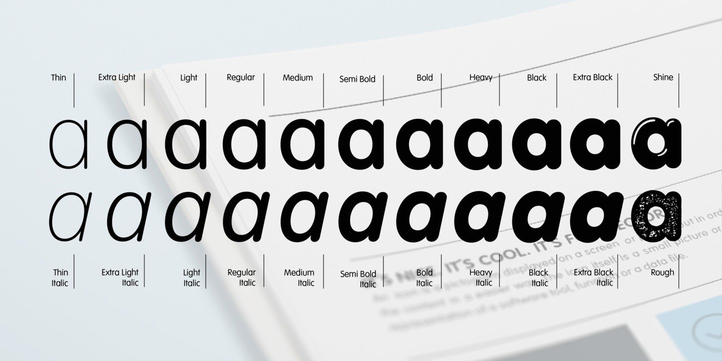
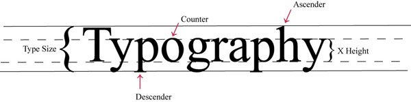
The anatomy of the VAG Rounded typeface has the following features:

  • Geometric San Serif
  • Originated in UK
  • 19th century grotesque
  • First typeface with all Rounded terminals
  • Closed aperture (of letter e)
  • Even stroke weight
  • No italics
  • Circular bold strokes
  • Short ascenders
  • Moderate descenders
  • Long extenders
  • Many type weight variation
  • Monoline bold stroke
  • Circular tittle of ‘i’. Slightly wider than the  stroke
  • Large x-height with low contrast
  • Rounded apex

There are many fonts variants developed under VAG Rounded.

Mainly because of the lack of hard and sharp edges being replaced by rounded and gentle curves, VAG Rounded presents a clever balance between a friendly appearance and a corporate seriousness.


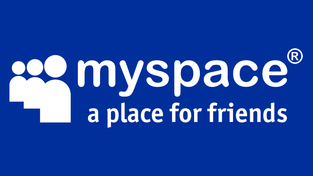
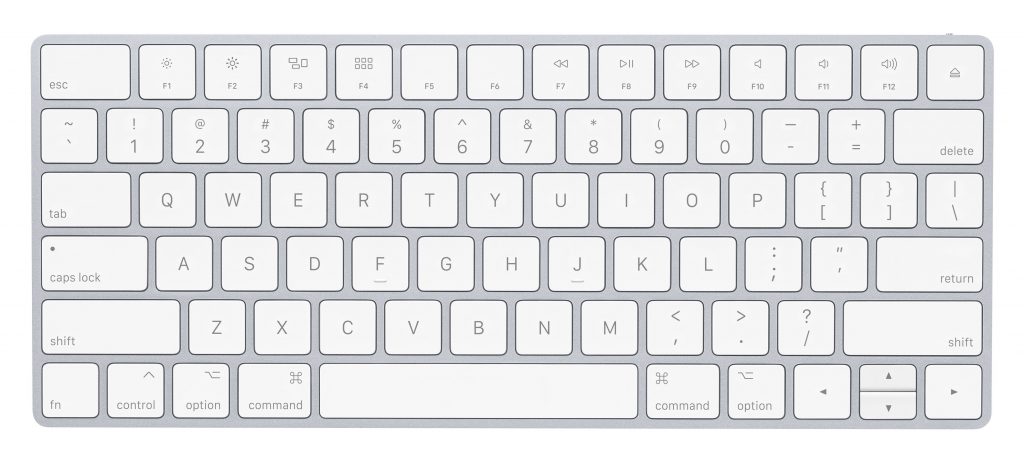
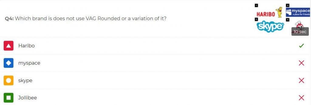
To date, Volkswagen no longer uses VAG Rounded, but instead uses a Futura derivative called ‘VW Utopia’. However, VAG rounded (or its derivatives) is/are still used in other contexts, such as the Skype logo, Jollibee logo, or Apple keyboard. There are also other alternatives to VAG Rounded such as Arial Rounded and Helvetica Rounded.


Presentation Structure

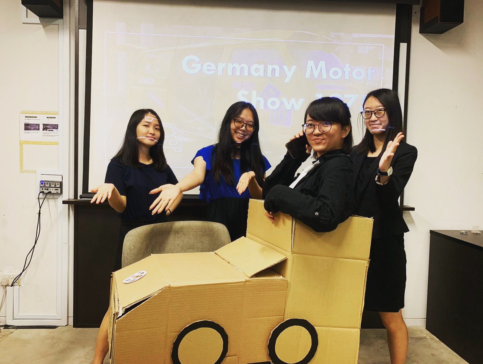
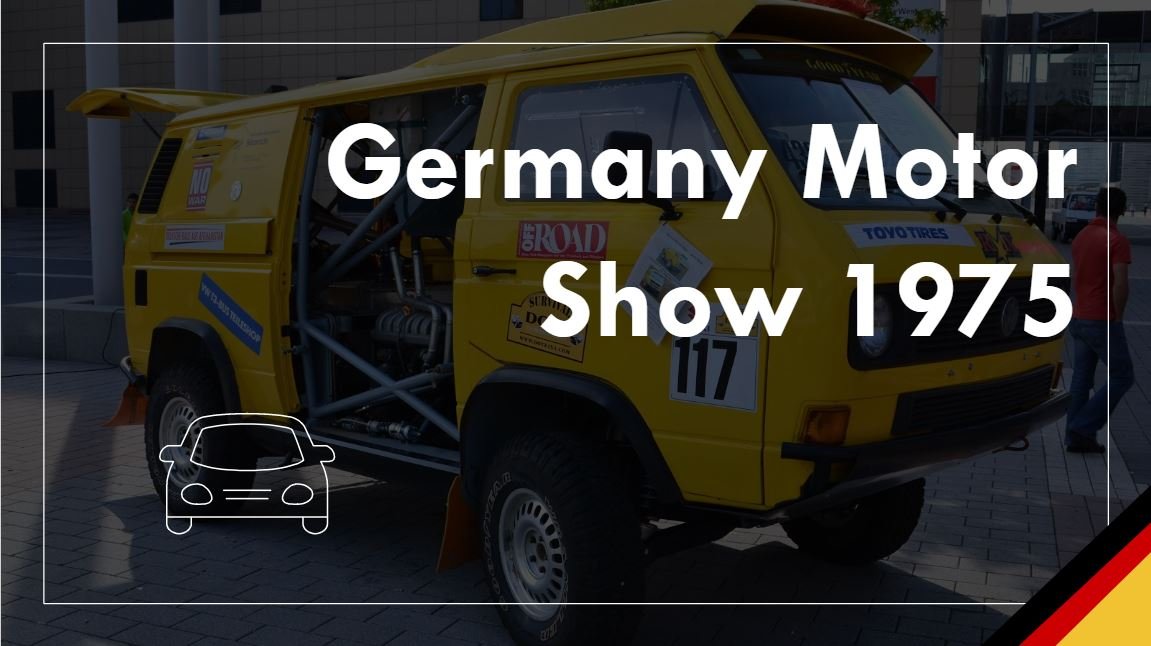
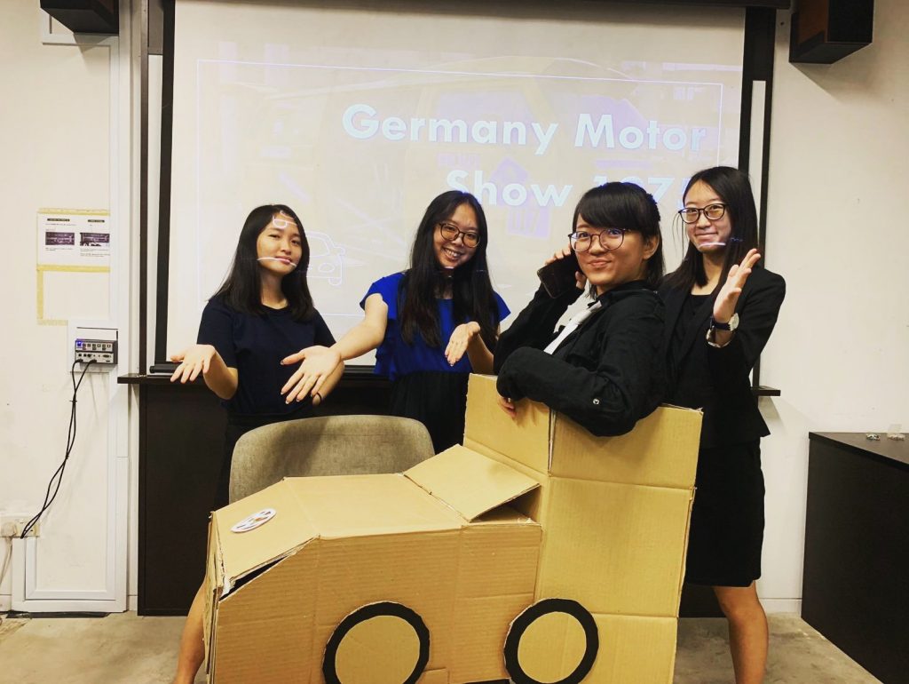
1. Skit segment about a Volkswagen car show

A ratchet handmade Volkswagen car will enter the scene in the context of a car show set in Germany in 1979 after Volkswagen has acquired Audi. Staff from Volkswagen are struggling to promote and sell their new car model but they are unable to get anyone to buy their cars. The staff hold a board meeting with designers (fictionally from Sedley Place) to discuss their branding strategies to raise sales.

2. Audience participation segment

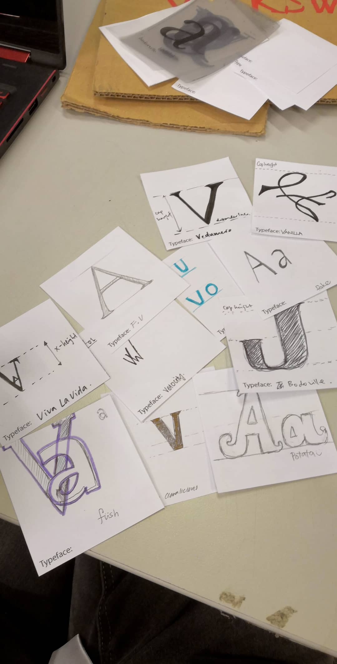
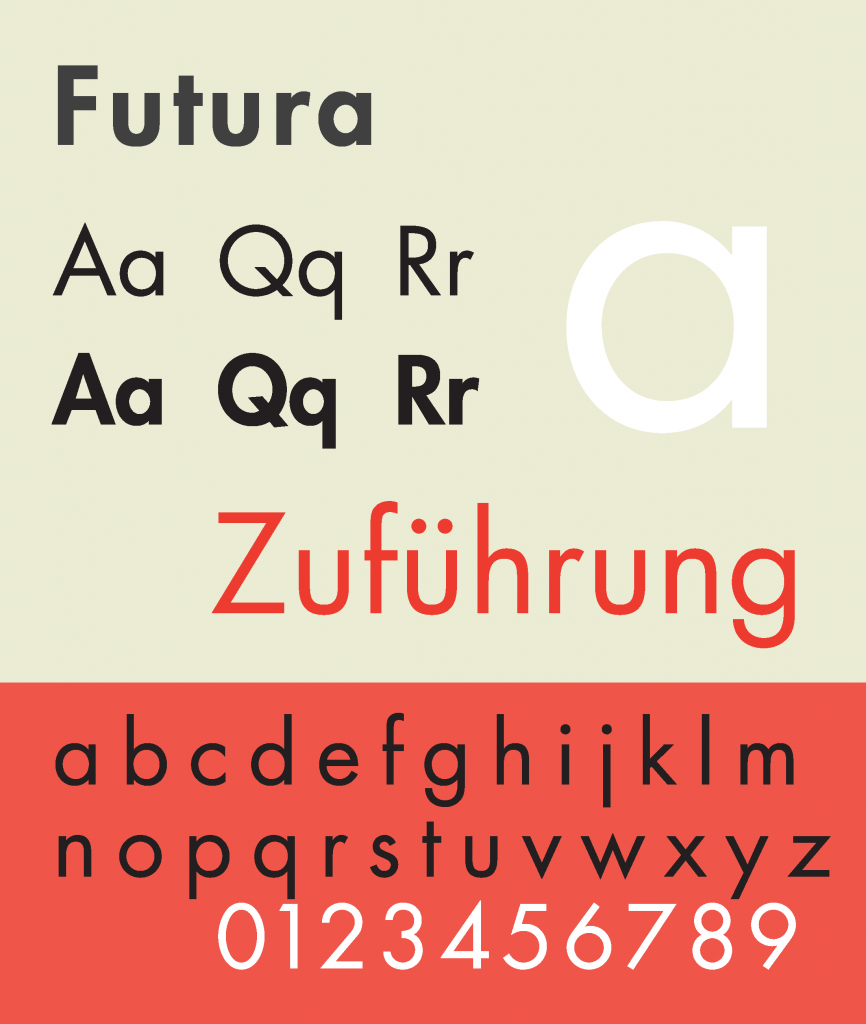
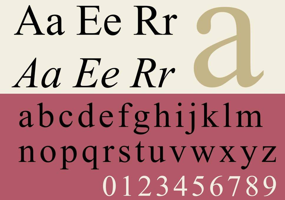
Audience members will get to put themselves in the shoes of the graphic designers. They will be presented with a chart of Futura for Volkswagen and Times for Audi and try to combine the both of them and come up with their own typeface (a few letters will be picked for them to save time) to solve the problem and help raise sales for Volkswagen.


3.  Analysis of VAG Rounded typeface

It will then be revealed that the actual chosen typeface is VAG Rounded. We will then proceed to analyse the typeface anatomy of VAG Rounded in detail.


4. Mention of contemporary application of VAG Rounded

It will then be explained why VAG Rounded was chosen (how it’s a friendly, yet corporate typeface) and is still currently used for branding and advertising in current times to target certain target audience (namely children most of the time).

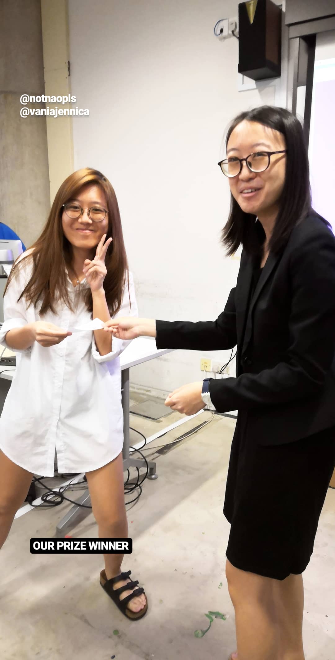
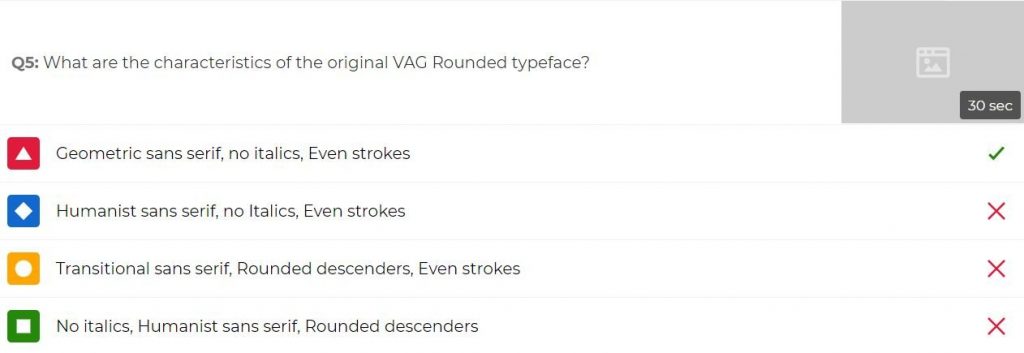
5. Kahoot segment + Prize presentation

We will then summarise the presentation with a Kahoot segment to consolidate the information about VAG Rounded. The highest scorer will get a prize of a Jolliibee drink cup with its typeface being analysed with markers. 😀

6. 5 min Q&A

We will then accept any inquiries from the audience.


The Actual Skit


Thank god for the existence of Google drive.


Our group discussed over Whatsapp and Google docs to get everything together.


Link to the planning Google doc:

https://docs.google.com/document/d/1srhyXJHbOD7V9-es_O0-y8IRlMml2iQhmoqJT0lfgTA/edit?usp=sharing


Link to our slides:

https://docs.google.com/presentation/d/1VBHPohVXDiI6cl6A3k1g5d61p0EnyV2kHdXfoc3SBxo/edit?usp=sharing


Slide from our presentation:


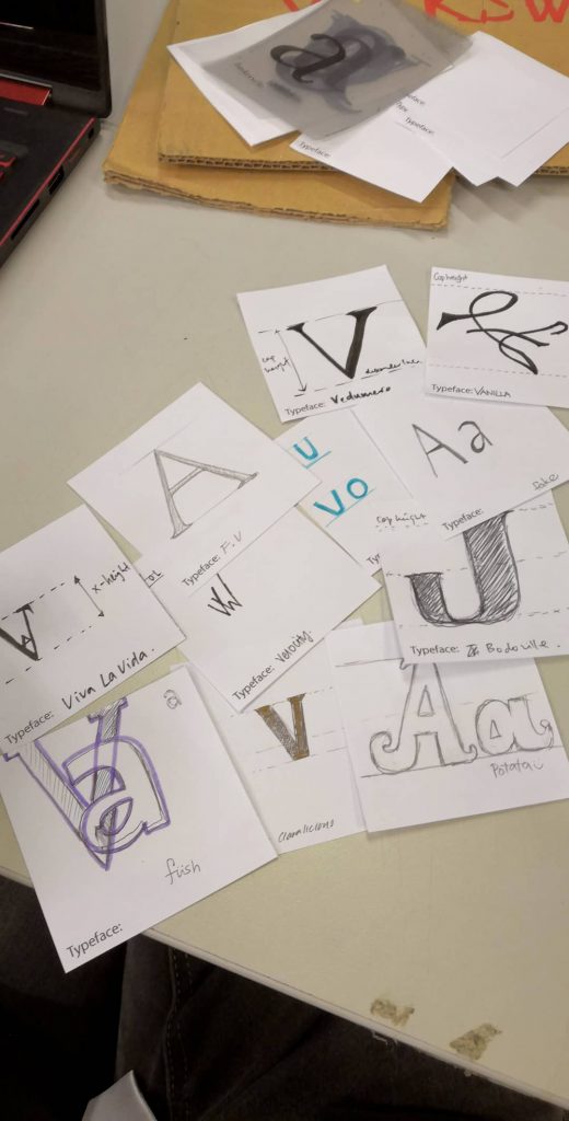
We contextualised everything into the scene of a car show and a board meeting. Our audience participation segments consisted of getting the audience to design a letter of their own typeface by taking Futura (used by VW) and Times (used by Audi) into consideration. This helps them to put themselves into the shoes of Gerry Barney and his team at Sedley Place when they were tasked to design a new typeface for VW back in 1979.


VW: Futura


Audi: Times


Our lovely classmates’ responses!


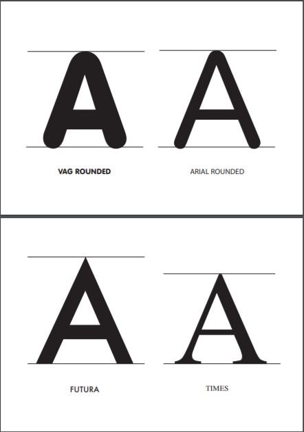
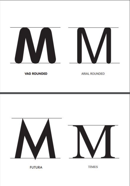
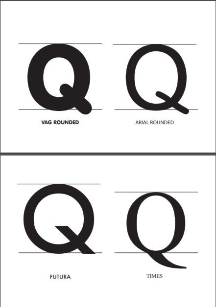
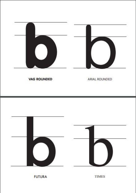
A few letters from the  VAG rounded typeface were also selected to make closer comparisons between the type anatomies of VAG rounded, and the original typefaces of VW and Audi (Futura and Times). Arial Rounded was also chosen for comparison since it was another rounded typeface that was similar to VAG rounded.


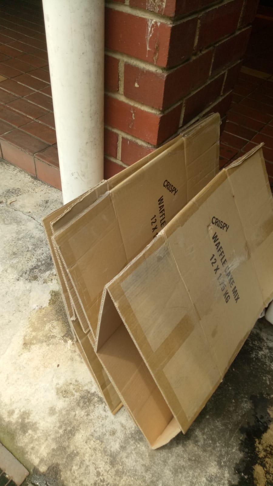
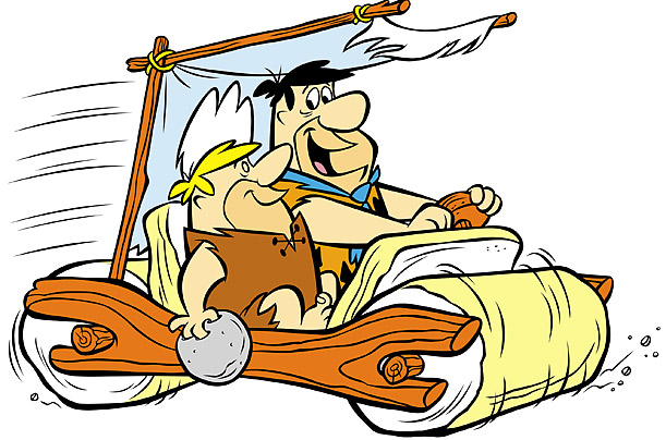
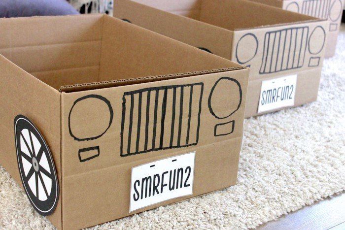
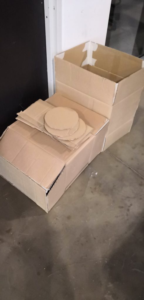
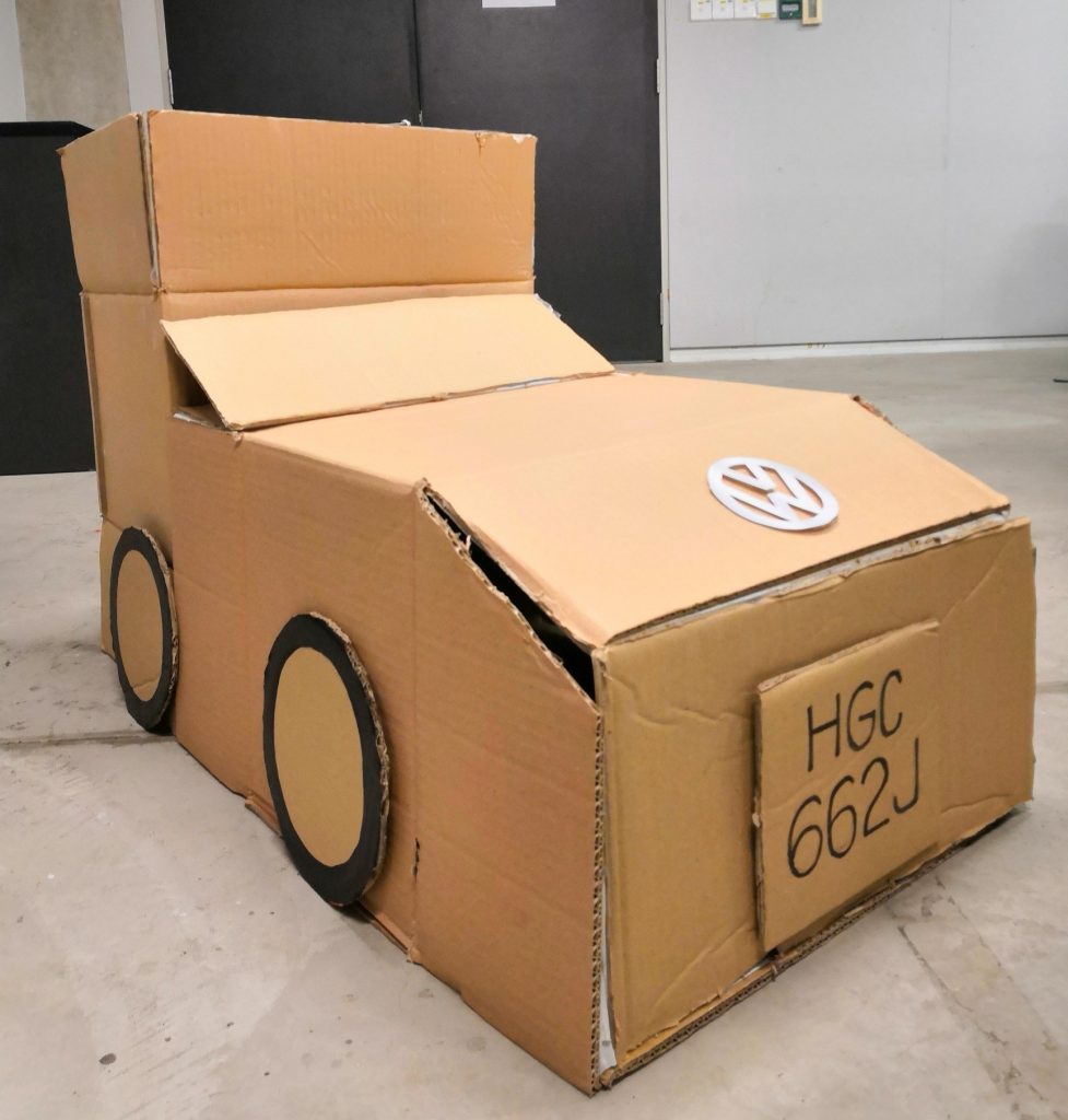
For our VW car prop, we picked up abandoned cardboard from Can 2 and transformed it over a night into a beautiful (and questionable) Volkswagen car. 😀


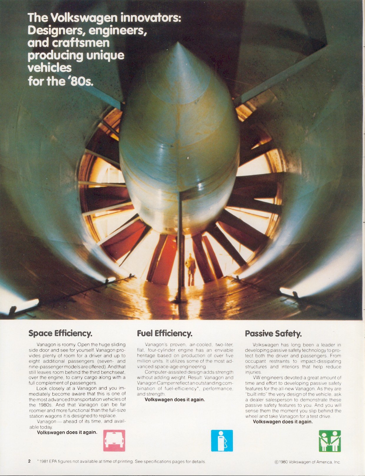
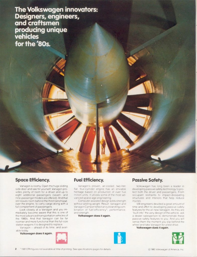
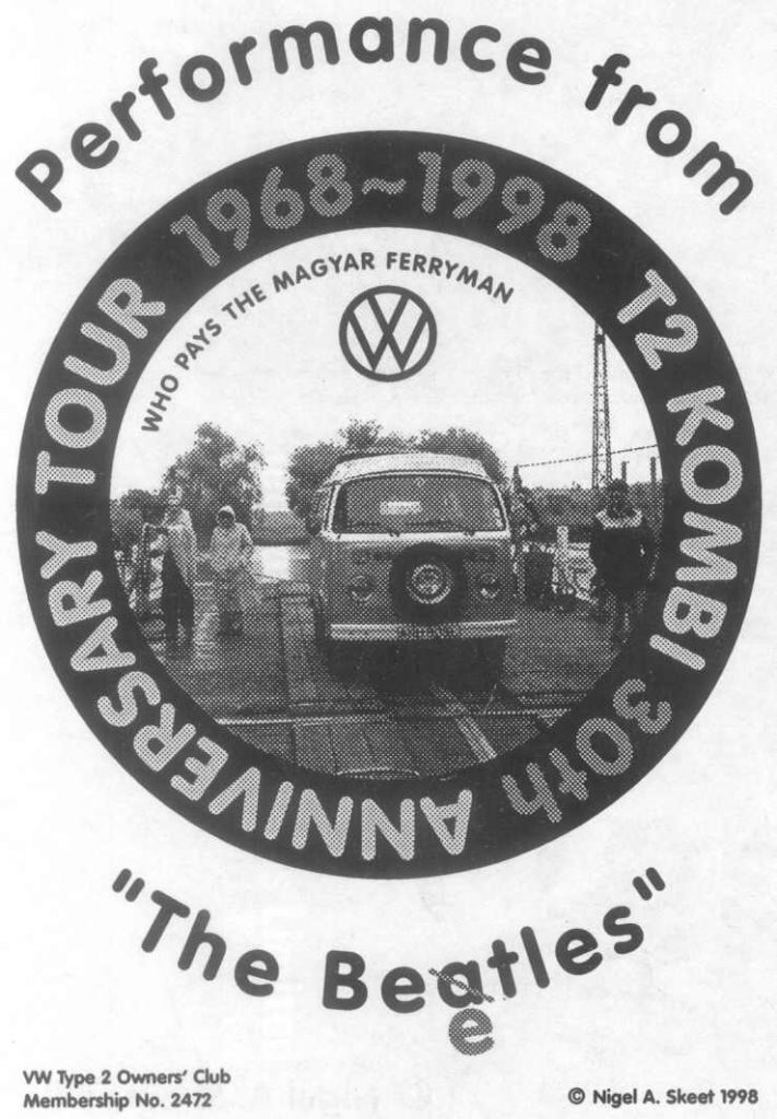
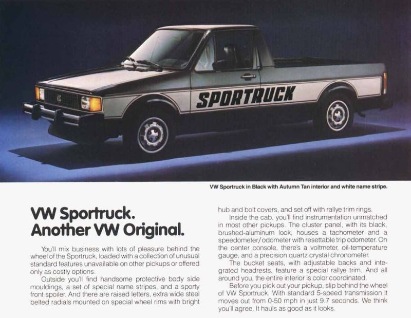
We dug the internet for examples of the original designs of advertising collateral from VW designed by Sedley Place back in 1980!

In addition to these old posters, we also emphasised how VAG Rounded is still currently used even in current times for brands/companies that are aiming for a convivial yet corporate vibe since VAG Rounded still has even stroke weight and very much follows the structure of basic shapes, unlike fonts like Arial Rounded (look at letter Q) or Comic Sans.


We also added in a Kahoot at the back to consolidate everyone’s knowledge about VAG Rounded!


Here are the Kahoot! questions:


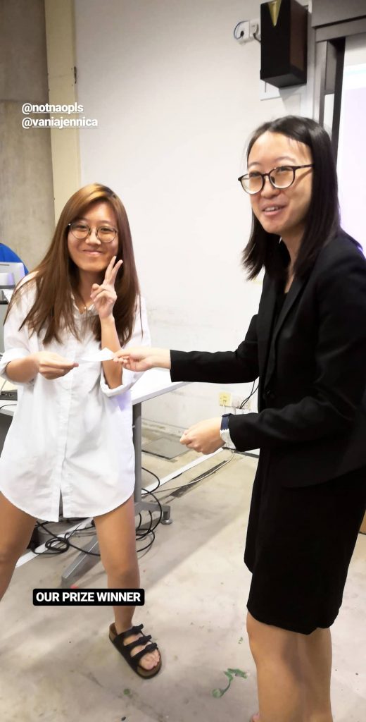
Proof that we gave away an actual Jollibee voucher as promised! (Thanks Tiffany for going all the way to town to buy it!)


Group photo at the end of the presentation! 😀 Big thanks to everyone <3


xoxo


Personal reflections


Jasmine:

Through this project, I learnt a lot about the VAG Rounded font. Previously I was only aware of comic sans as a rounded font but after researching, I learnt the existence of different rounded fonts and how they vary as well. VAG Rounded also taught me how understanding the background of the typeface is crucial when applying it for different usage.


Vania:

This project taught me that there are more to consider when using typefaces—the context, the familiarity, the versatility, etc. It made me think that all typefaces have their own good and bad points—especially more with VAG Rounded, which I didn’t particularly like in the beginning. It made me want to break from just using the typefaces I like or I’m familiar with. Moreover, I also learnt that a group setting is beneficial for ideation and problem-solving, since not everyone will think the same way and that could be a good learning point for everyone.


Tiffany:

After researching about the development process of VAG Rounded typeface and how it portrays Volkswagen at that time, I feel that it is important to be aware of the trends and the characteristics of different type classifications and typefaces to better apply with the intended purpose of future projects. Preparation, time management and initiative in a team should be taken care for better presentations in the future.


Yue Ling:


This project taught me that sometimes using skits can really make presentations a lot more interesting (even though it’s harder on the presenters, but it’s worth it). Initially, there was not too much historical data to go on, but by contextualizing the presentation, more time is committed to making information more memorable through storytelling and audience engagement instead of rushing through a normal lecture-style presentation, and we even ended up slightly exceeding the 15 minute mark much to my surprise. I’ll definitely consider doing more crazy skits for my future presentations!


Resources

https://www.fonts.com/font/linotype/vag-rounded/story

http://typedia.com/explore/typeface/vag-rounded/

https://www.linotype.com/1562935/vag-rounded-family.html

https://www.behance.net/gallery/47323669/Type-History-VAG-Rounded

https://andiehannan.myportfolio.com/typography

Seddon, T. (2015). The evolution of type: A graphic guide to 100 landmark typefaces. Richmond Hill: Firefly Books.

Dawson, P. (2013). The field guide to typography : typefaces in the urban landscape. London : Thames & Hudson, 2013. Retrieved from http://ezlibproxy1.ntu.edu.sg/login?url=http://search.ebscohost.com/login.aspx?direct=true&db=cat05206a&AN=ntu.1267666&site=eds-live&scope=site


STRÄNG

STRÄNG Final Installation by Brendan, Bryan and Yue Ling


End-of-Sem Project Proposal:


STRÄNG

(Time-Space Warp Simulation)


STRÄNG is a wordplay on Doctor Strange’s name (who bends space and time) which means ‘string’ in Swedish and is also coincidentally related to the string theory about how our reality is shaped.


A superpower simulation that mimics the bending of space and time. There will be a clock mimicked by a running LED strip with RGB bulbs. There will be a one way mirror layer in front of the LED to create an infinity mirror illusion. The mirror will have a circular hole cut in the middle so that people can move their hands inside, and be able to touch a sheet of felt material. The RGB lights will change from blue to red across the rainbow spectrum when they do so (will add sound if time permits), and the running lights will start running at a slower speed.

Aside from that, there will be a servo motor behind a larger sheet of the same felt material away from the mirror that responds to the action by moving the sheet, thus creating the illusion that the participant’s hands are moving the sheet without actually touching the sheet. Whenever the motor moves, the LED lights around the frame of the material sheet will light up as well. In this sense, participants can feel like they are bending both time and space.

Things needed:

  1. LED strip
  2. Wood material for the box (probably will be spray-painted)
  3. (Elastic) Felt material
  4. Frame to hold felt material
  5. Servo-motor (have to fix something on it)
  6. Diffuser frame (borrow from film store)
  7. Ultra-sonic sensors/touch sensors.
  8. Speakers (If time permits)


Stuff to code for:

  1. Code for LED running strip (colours and speed)
  2. Servo motor.
  3. Response between touch sensor in the box and the servo motor on the other side


In the end, we had 2 main codes and used 2 Arduino circuit boards. One was for linking the LEDs and ultrasonic sensor while the other was for linking the flex sensor and servo motors. We shared a lot of the coding workload so it’s hard to be definitive but if we really had to, it would be something like:

Bryan – LEDs

Brendan – Ultrasonic sensors

Me – Servo motors

Challenges faced in the form of advice for future programming students:


#1     Do not go shopping at Sim Lim Tower on a Sunday.

#2     Go to Continental Electronics Pte Ltd #B1-23/24/25 to get WS2811 LED strips which are programmable by Arduino. Those lights are pricey though, 1m for $18 but do it for the project!

#3     If you do not take IM 1 and are deprived of your free Arduino kit, do get wires. Lots of them. Get the male to female connectors too.

#4     Nope, you can’t laser cut glass. Only acrylic mirrors from Artfriend (one costs $26)!

#5     Example codes and libraries are your best friends! We tried coding the running light pattern by ourselves one evening for around 3 hours but still couldn’t figure it out but then I found an example code and it solved like 80% of our problems. Just trust open-source culture.

#6     Yes we have flex sensors that can be borrowed from the film store. If you get the one soldered down you need male to female connectors.

#7     Loose wires were a huge problem for us, we had yet to try hot glue but it’s worth the try! Getting longer wires would probably have helped!

#8     The fabric of the black flag borrowed from the film store is way too tough. We just used Bryan’s old shirt. (We really wanted to use a stretchy material like Spandex initially but that’s too expensive)


Future Developments:

This installation may be small (because we’re on a low budget) but imagine being in a room with a massive infinity mirror where you can change its lighting using gestures! When you raise your hand in, motors move the other side of the room! T r i p p y

On the day of presentation we didn’t include music, but when we set it up the day after in its proper orientation and played music, it really gave the installation the atmosphere it needed!! Really important element for immersion.

Also do give a proper preface to your viewers about your installation! A well-conveyed context isn’t only fluff!!! It gives the installation more meaning and affects the way the participant views the artwork!

It is probably worth the try to place the ultrasonic sensor behind the thin piece of fabric and propped up by some piece of foam instead of placing it directly at the end of the tube since it was easily accessible by the participants and they could have just pulled it out.

P.S.: I just named a picture of the LEDs “strang” + “led” but I realised it literally spells “strangled” oh god


PICS OR IT DIDN’T HAPPEN:


By default, the LED lights are a combination of warm hues. The light gradient is also rotating at a quick and steady pace.
As the participant’s hand reaches deeper into the tube, the distance sensed by the ultrasonic sensor decreases and this changes the hues of the light to cooler hues and slows down the pace of the light rotation.
When the participant’s hand reaches all the way to the end of the tube, the lights change completely to a bluish hue with purple light rotating.


Here is a video of a demonstration done by our participant Jacob in the video below!

As the participant’s hand reaches the end of the tube to touch the cloth material at the end of it, they can push even further to bend the flex sensor. This changes the resistance read by the sensor and thus triggers the 3 servo motors coded for in the same program.

The Start of Design

Design started back in the cavemen times. When society first began, design was born out of the need to get it to function and make it easier for people to carry out tasks. Be it for cooking and rituals, where pottery was needed, to transportation, where wheels were invented, to mysterious structures like the Stonehenge, people had to refine design decisions to get society functioning more efficiently.


Resource:

https://en.wikipedia.org/wiki/Neolithic_architecture


https://www.google.com.sg/url?sa=i&source=images&cd=&cad=rja&uact=8&ved=2ahUKEwi5-dOJwOncAhWJsY8KHdEFClEQjRx6BAgBEAU&url=http%3A%2F%2Fcontent.time.com%2Ftime%2Fspecials%2Fpackages%2Farticle%2F0%2C28804%2C1843821_1843820_1843808%2C00.html&psig=AOvVaw30QlLgW9yoDp2Xi5faRYjP&ust=1534231555003077

Experimental Fashun


– The Premise –  

———-

|| Using the social broadcasting platform of Facebook live, my group decided to do an interactive project called ‘Experimental Fashun’ (‘Fashion’ stylised as ‘Fashun’). We split our group of four into pairs whereby one person will be the ‘interviewer’ and the other will the ‘model’. The model’s homework is to select 5 pieces of apparel for a number of sections, namely: tops, bottoms, dresses, accessories and shoes. She will then write down a vague adjective describing the clothing. The ‘interviewer’ will have to engage and collect responses from members of the public from different parts of Singapore to participate in our project. The audience member will have to help the ‘model’ to select pieces of clothing to form their own unique combination. Since the descriptors are rather vague, it mirrors the unpredictable quality of online shopping, whereby we trust frequently vague descriptors and pick from cheap websites like Lazada or Ezbuy. From the selected combinations, we will then photograph proper photos of the whole outfits, pair them in categories of the stereotypes of the different parts of Singapore, and post them on Instagram and add the #experimentalfashun so that users of Instagram can vote for their favourite combinations.


Link to video: https://www.dropbox.com/s/dscw9ljl2ncnhpk/main_FINAL.mp4?dl=0


For this project, our interviewers Bala and Felicia headed down to the following places respectively:

Bala – Sim Lim Square, Bugis Street

Felicia: Bras Basah Shopping Complex, Nanyang Academy of Fine Arts (NAFA), Singapore Management University (SMU) and Lasalle College of the Arts

while Farzana and I were the models camping at home. We waited prepared sets of clothings to show the strangers that were interviewed what they looked like. After the outfits were chosen, we had to take pictures of the full outfit for the Instagram feed.


– Wardrobe Selections –

———-

Tops: cat, skeleton, checkered, tea, floral

Outerwear: thin (black), hipster weeb(the purple one), woolen, mint,thick
Dresses: checkered, CNY, pleated, floral, zebra
Accessories: Soft toy, ukelele, cap, beanie, glasses
Bottoms: navy (skirt), oriental, striped, PJs, oriental


– The Experience –

———-

During the execution of the Facebook live with Bala, I initially tried to make the clothing in the list as crazy as possible so that the participants would have some pretty crazy descriptors to choose from. However, what we didn’t expect is for them to take the task so seriously! A lot of them were really squinting at the descriptors, trying to clarify and asking for more details so that they could make the most suitable outfit to go for an actual party. This was a lot more significant at Bugis Street where there more more fashionable young people hanging around on a Sunday evening.

“What’s ‘tea’?”

Also, we initially intended to put on the outfit immediately after the participant had chosen the outfit, but after we interviewed the first person in Sim Lim Square, we had an awkward moment where the person had to wait for me to change, which probably took about 2 minutes, but there was still a certain social tension that existed even over the Third Space, which was really interesting to observe.

Bala was frantically trying to occupy the stranger while temporarily went off-screen to change.

This project was influenced by Blast Theory’s principles of integrating the physical and virtual world together through the use of new technology and inviting audience participation that would influence the outcome of the project, with an element of an immersive narrative. In our project, we set our premise as a fashion showdown modelled after RuPaul’s Drag Race or Project Runway, but incorporating digital elements! Not only did we empower the random participants to be designers themselves, we also involved the Instagram public to pick their favourite outfit to win the fashion show by posting polls

Our Instagram feed!

Experimental Fashun was influenced by the concepts of the dynamics of social interaction over the Third Space through social broadcasting, DIWO, and Digital Identity.

Inspired by our Telestroll project, we utilised the medium of Facebook Live to carry out an interview-style social broadcast with members of the public. We explored the concept of DIWO by getting them to make our fashion decisions for us. This links to how we allow others to alter our Digital Identity as well, since clothes are probably the most representative subject of appearance, or how you present yourself to others. Personally, I felt like this project really got me out of my comfort zone as well because I usually do not post a lot of Outfit-of-the-day (OOTD) posts on Instagram or Facebook since I’m not really into fashion myself, and my usual style is super stay-home casual.

By putting on wacky outfits and posting them onto our public Instagram page, I felt like I was allowing my digital image to be altered, and it probably is easier to believe that I’m comfortable putting on weird clothing while I was actually really kind of anxious at the thought of wearing them out in public, especially when we had to shoot the photos of the OOTDs, but I thought that after this experience, I’ve gotten pretty numb to any judgement.

Interestingly enough, we also unintentionally experienced the glitches in human behaviour and technology that we learned would eventually surface when we trapped ourselves in the Third Space for long enough, through the works of Annie Abrahams. The main point is that things would never go the way we intended for them to, for example, with that long awkward waiting time I mentioned above, as well as moments when connection was bad as we moved to different locations so it impaired the communication of the interviewer and model during the Facebook live. In the aspect of human-technology relationships, we also explored the mismatch in expectations in online shopping where you might put your trust in a supplier who you have never bought before, purely based on the pictures and descriptions that they provide, and so the products that you purchase may not end up as what you expected, since you never once inspected the product physically beforehand.


Online shopping websites such as Ezbuy, Lazada and Wish often offer cheap clothing with clickbait product names (just look at the amount of adjectives in there). We don’t ever know if they actually will fit us, we just see if they look good on the models, and have our perceptions swayed by reviews by other people.


In conclusion, a lot of negotiation was needed to overcome issues, from the conceiving of the idea, to the execution of it, to dealing with unintended glitches. Our outcome for the project also divulged interesting results; we found out that the older demographic preferred brighter colours compared to the younger demographic, and that people in different parts of Singapore had different attitudes towards fashion. We had involved others into our project, be it as a designer who came up with all the wacky combinations, or fashion director who got to say ‘ay’ or ‘nay’ to the outfits, and successfully executed our online fashion project, Experimental Fashun!


  • Summarize by stating how your final project explored the idea of the social and how you designed an interactive experience that included both artist and viewers.


Virtual Insanity

[On Social Broadcasting: A Communications Revolution]


|| During the Art of the Networked Practice 3-day (or night) symposium that took place from 29th-31st March 2018, I got to listen to very insightful speakers and witness before my very eyes how far art has grew simultaneously with technology. It is amazing to think how unfathomable all of these works would have been way back when the social broadcasting tools and platforms were just made available.

Groups like Videofreex were filming using the Sony Portapaks to create simple films, who would have thought how far this form of art could come?
https://videofreex.files.wordpress.com/2011/09/img_2520.jpg


Since then, social broadcasting has been used as a medium by artists to explore how communication and interaction between people can be altered through it. Annie Abrahams mentioned about how this change is not necessarily better or worse, but rather, just different. In her keynote speech, Maria Christochatzidolou (MariaX) questions the development of social broadcasting art by sharing a myriad of examples of works that use social broadcasting to push the boundaries of art even further.


MariaX giving her keynote speech on Telematic performances and the ways they have experimented with and changed the way people communicate.

For one, social broadcasting changes the way we perceive interactivity.

MariaX introduced the concept of the use of technology to bring people together into the same ‘Space-time continuum’, where people can transcend geographical boundaries and be brought together over the metaphysical ‘Third Space’ (coined by Randall Packer). This greatly enhances the opportunities for collaboration and allow more artists to practice the art of Do-It-With-Others (or DIWO), advocated by groups like Furtherfield and Blast Theory.

Throwback to our lesson about Furtherfield where we discussed how it hosts artists in a community that allows for the exchange of ideas between people of different expertise, producing fresh and creative ideas, a successful product of DIWO.

Together with DIWO came the concept of giving up the ownership of the performance partially, if not fully to audience members, such that they had the power to influence the outcome of it. One example of this is Kit Galloway’s and Sherrie Rabinowitz’s ‘Hole in Space’, which was part of their satellite art projects in collaboration with NASA. People from different cities were pulled together into the same metaphysical space through the ‘hole in time’ and the way they responded was completely unrehearsed, as with how some of them even started to organise meetings with their family or friends.

MariaX defined the interactivity of social broadcasting as ‘the performer being affected by the audience, and the audience affecting the performer’.Annie Abraham’s Entanglement Training performance was also a far cry from a passive delivery, rather, performers (some of which she has never met) were able to work alongside her.


Annie Abrahams and her co-performers whose actions were slightly rehearsed but nevertheless completely unpredictable and out of her control during the performance itself in Entanglement Training: Ensemble.

In the case of the symposium, I was participating in the act of DIWO literally just by typing in the chatroom. The performers were able to interact with the online audience and this allowed for a collaborative act of helping each other understand the works and the intentions behind them. Essentially, this flattens out the hierarchy between performers and audiences and changes the way we perceive artists to work and interact with their audiences (contrary to the idea that artists worked in isolation in their own studio space).


Next, social broadcasting has changed the expectations of human interaction as new dynamics are introduced with this new medium.

Social broadcasting nevertheless allows us to be hidden behind our screens in a safer environment that in real life where physical confrontation is a possibility. We discover this and over time, we find ourselves trying to paint the most ideal picture of ourselves online, trying to polish our ‘Digital Identity’, which is a re-imagination of ourselves, and our tele-presence projected into the ‘Third Space’.


xXxtra.Princesses’ use of Snapchat filters to paint an idealised picture of themselves as a digital entity.

In actual fact, the use of the Third Space encompasses the technical issues such as connection that come with it. To have the ‘Third Space’ in co-existence and seen in totality with the local and remote spaces would be to also accept the faults that comes with it, just like how we do not act in a perfectly rehearsed manner in real life, for that would be way too unnatural (the word in itself suggests that it is not characteristic of a living creature).


Arcangel Constantini also showcased one of his newest projects ‘bakteria.org’ that makes use of technical fault as a style, with the noise distortion soundscape and code glitch as a font type that gives rise to a unique and recognisable style. His little bacteria illustrations also represent how information is spread across the Third Space just like how bacteria spreads amongst people.


Annie Abraham’s works are quintessential to this very theme. In Entanglement Training – Ensemble, her co-performers followed her protocol to read out the latency in their connections, indicating how all of them are never really existing in the exact same moment in the Third Space, which may be a state which technology could ideally bring us to. However, she makes the latencies the very subject of her work and in turn explores the beauty of this imperfection of the medium to create a rhythmic, choreographic performance that really enchants the viewer.


“one millisecond”. “138”

“Excellent”

“Status”

“Connection status”


Annie Abrahams’ works are about the ‘sloppy’ side of people online and the intimacy between people. She likes to trap her co-performers in a state of ‘No Exit’ such that they are forced to expose their “messy and malleable” sides, prominent in her other works such as The Big Kiss and Angry Women. This shows how the digital medium is far from perfect and by making these faults the main subject of her works, we are continuous exposed to them and they are more normalised. In this way, we learn how to accept and embrace these imperfections more.

Annie Abraham’s work shops with our class!! We learned how it felt like to be following a protocol and it was surprisingly a lot harder than I thought because we could not rehearse any timings with our groupmates and we just had to give up control and let whatever happen happen naturally. This liberating effect was really enlightening and now I really appreciate Annie’s works even more than ever.


As the saying goes: ‘to err is human, to forgive is divine’. Then, following this train of thought, artists that work around the concept of the fault in human behaviour and technical glitches have already achieved a certain level of divinity. They have the power to change the way we anticipate the way our interactions online will proceed, and encourage us to embrace these imperfections as part of our newly established communication medium.


Last but not least, social broadcasting changes the way we want our new form of interaction to grow towards. 


After being aware of these faults and learning how to embrace them, where do we go from there?


With a new world comes new laws to maintain some sort of order. New morals and ethics will arise and they will definitely be different from that of the real, physical world. MariaX brings up the issue of “Telematic Abuse” experienced by a performer where although her physical body was not abused, the abuse was directed towards a fictional existence of her real corporal body. How will we define laws that resist this sort of acts? Can they even be counted as legitimate abuse? These are definitely new questions that will arise as we continue to develop in telematic arts.


During the symposium, the ethics of respect was questioned when audience members were conversing in the chatroom while the performance was ongoing and apparently some people thought it was rude was others did not. Whereas, it is expected that people stay silent when watching a performance in real life since they are occupying the same space and may affect the performance.


During the performance of
#exsanguination, the audience members were discussing about the significance of the leeches in the performances.


Social broadcasting also gives people the ability immortalise a moment, as seen in from works like Ant Farm’s Blast Theory. This can be wielded as a tool to call for action by the wider public. We can see this in The Pixelated Revolution 2012 by Rabih Mroue, where a victim continues to film a sniper who is hunting him down and eventually shoots him. The very fact that he does not stop filming shows that he believes that the recorded video will be able to serve as a form of evidence later on. The way that we use this form of evidence is even prevalent today in court legislation.

Telematic Dreaming by Paul Sermon allows the artist to interact with audience members within the intimacy of the bed space. Whether the same social norms and rules apply to this situation is still largely unexplored.


Station House Opera also staged At Home in Gaza and London (2016) which  also uses the technique of ‘dissolving’ to impose two images together to form a mutual performance space, where people could occupy each other’s’ homes, streets and social spaces, such that it focuses on the situation of people in Gaza, contrasting storytelling of Gaza versus theatre in America. This highlights the political isolation of people in Gaza and acts as a coping mechanism with the temporary relief of technology for them.


In conclusion, social broadcasting has revolutionised the way we communicate. It has changed our perception of interactivity, our expectations of interaction on this new medium and the direction where we want these new developments to head towards. Whether we like it or not, the ‘Third Space’ has already invaded and influenced our real world; whether we want to maintain its position as a partially isolated platform, separate entity, or continue to learn about it and embrace its faults to assimilate our physical world with the Third Space seamlessly is up to us to decide. We must continue to seriously consider the limitation of each form of interaction and find a way to strike a fine balance so that we can enjoy the best of all spaces.


Resources:

————–

Keynote Maria Chatzichristodoulou, artist Annie Abrahams, and artist Matt Adams/Blast Theory
 
Jon Cates / Chicago performance
 
Annie Abrahams performance
 
Keynote Matt Adams / Blast Theory
 
Social Broadcasting
 
The Symposium Website also has program information and participant bios
Bakteria.org by Arcangel Constantini: http://bakteria.org/
MariaX interviews Annie to gain insight to her work:

Annie Abrahams. Allergic To Utopias