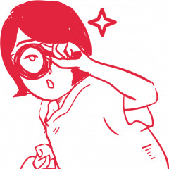
For my 1 minute video selfie, I decided to do one of those Take On Me video memes with the icon head turn at the start. The original music video by a-ha depicted two settings, one being real life and one being an sketchy, illustrated fictional setting. By applying this outline filter, I wanted to show that I like to be projected as an imaginary goofy persona online which I may not reflect upon first impression in real life.
Original video: https://www.youtube.com/watch?v=djV11Xbc914
Parodies:
I compounded another meme on top of it by intentionally playing the recorder horribly.
By using memes as a theme of popular culture, I am able to portray my own sense of humour that shapes my art style through this video, in the sense that I do not really adopt a neat, stylistic style of design, but rather one that is just ever so slightly self-derogatory and relatable to other people.
Also, I filmed this video right in front of the lift of my floor, the space right outside my house which is my space of comfort but yet not in a public space. This shows how I’m not really comfortable with completely exposing my weird side publicly, but I like to slightly step out of my comfort zone and take things slowly.
P.S.: I was intending to do some sort of a dance cover but then I realised I have no dancing skills… I guess I’m still not too ready to embrace my ‘sloppy’ side on the internet………….
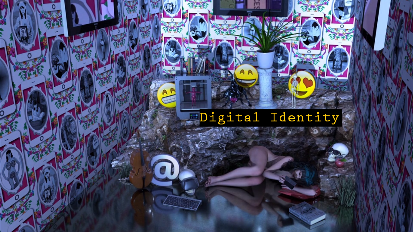
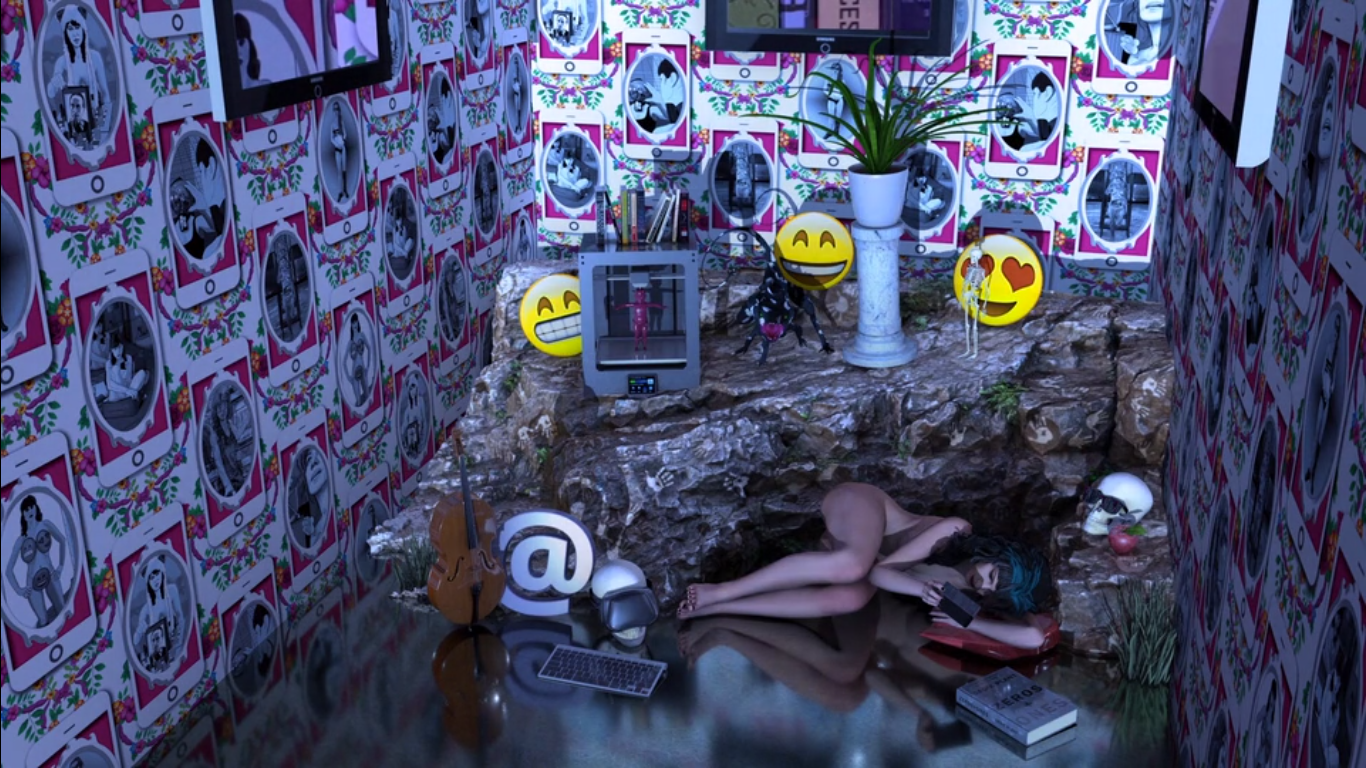
|| The term Digital Identity refers to the way that an individual chooses to present and depict themselves in online and digital communities (the Third Space). An individual’s digital identity is largely curated by themselves in order to portray themselves in a favourable manner.
In Eric Erikson’s fifth stage of psychosocial development individuals start to question their identity and personal values starting from adolescence, and henceforth embark on a life-long journey to resolve their ‘identity crisis’. The Internet allows individuals to experiment with self-identification in a virtual space, serving as a tool or platform for individuals to satisfy their innate curiosity. [1]
In his article in “Facebook and Philosophy”, Wittkower suggests similarly that:
“Facebook gives us the same richness of interaction because it, too, fails to determine the meaning of our relationships and communications.”
In other words, the customisability of online social media platforms gives people space for creativity to invent new meanings out of any content posted, thus creating new content identifiable with the self. All the seemingly meaningless things that we post onto our profiles contribute to our digital identity and shape this indefinitely aberrating form in different ways. [2] We are able to put up whatever we want to define ourselves, even if it is an idealised image.
Facebook offers users the opportunity to curate their digital identity by providing information about themselves, and using multimodality to accessorise their pages.
The absence of a social context also liberates us from shaping our output such that it conforms to a particular social situation; this gives us freedom to post whatever we want, whenever we want online.
In Carla Gannis’ solo exhibition “Until the End of the World”, she explores technology as a medium to depict herself in a virtual context as a character model. [3]
“Gannis’s process the work should be understood as a conscious interplay between portraitist, portrait and the camera itself. “
With the use of augmented reality in a virtual space, the possibilities for depicting the self visually are endless. This contrasts the mundanity of the image of self in real life in the sense that we are not able to portray what goes on in our minds, as part of our identity in totality. Others are only able to perceive what they see of you.
The idea of using the Internet as a tool to better express ourselves is also evident in the gaming realm, where the virtual re-embodiment of players through self-extension and self-aggregation allow them to build a whole new identity that is idealised, yet closely related to who they are in real life. [4]
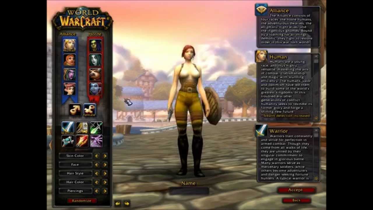
Massively Multiplayer Online Role-Playing Games (MMORPGs) like World of Warcraft (WOW) have character customisation screens that allow players to edit the features of their characters to their liking.
In conclusion, we utilise the Internet as a platform to explore the idea of self. Even though our potrayal of self online may be idealised, there is, to a certain extent, an inherent undeniable truth about who we are in real life, echoing the idea of how technology is an extension of ourselves in an online “global village” (McLuhan).
Resources:
[1] Images, Self-Images, and Idealized Identities in the Digital Networked World: Reconfigurations of Family Photography in a Web-Based Mode by Luc Pauwels (Universiteit Antwerpen, Belgium).
Pauwels, Luc. “Images, Self-Images, and Idealized Identities in the Digital Networked World: Reconfigurations of Family Photography in a Web-Based Mode.” In Digital Identity and Social Media, ed. Steven Warburton and Stylianos Hatzipanagos, 133-147 (2013), accessed March 04, 2018. doi:10.4018/978-1-4666-1915-9.ch010
[3] Until the End of the World, Carla Gannis. http://carlagannis.com/blog/prints/until-the-end-of-the-world/
[4] Onlineidentity construction: How gamers redefine their identity in experiential communities.
PINTO, DIEGO COSTA, et al. “Online identity construction: How gamers redefine their identity in experiential communities.” Journal Of Consumer Behaviour 14, no. 6 (November 2015): 399-409. Business Source Complete, EBSCOhost (accessed March 4, 2018).
[5] McLuhan, Marshall. Understanding Media: The Extensions of Man. Cambridge, MA: MIT Press, 1964.
|| The Eternal Frame (1975) is a videotaped reenactment of the assassinated of John F. Kennedy’s assassination by Antfarm which seeks to draw attention to the power of the mediated image.
Antfarm is a collective of radical artists founded in San Francisco in 1968 by Chip Lord and Doug Michels (1943-2003) that sought to rebel against the conformative style of art in their time and build a community of artists that vigorously experimented with new forms of art.[1]
In an Interview with Chip Lord by Randall Packer over the Third Space Network stream, Chip Lord mentions that John F. Kennedy’s death was the first televised American tragedy ever, and Eternal Frame sought to explore the power of the media to immortalise such a historical moment and ingrain it into the minds of people by converting a real-life event into a processed memory via the media. [2]
In another interview about The Eternal Frame hosted by Constance Lewallen (2012), Doug Halls states that he resonates with Jean Jacque-Rousseau’s view that something cannot be true until it’s fictionalised, and the interpretation of a memory aberrates as it is constantly reappropriated throughout time, which is possible if an event is immortalised in a digital form. [3]
” I think that idea of you kind of grasping to it and extricated into your time, then in the act of doing that, certain truths disappear but other ones begin to emerge.”
– Doug Halls
Taking the achievements of past post-modern art movements like Constructivism and Futurism to a greater level, Antfarm’s fearless venture into different media and experimenting with different spatial contexts allowed them to successfully added new layers of meanings in their artworks that allowed them to make political and social statements.
|| The noble venture by Furtherfield into establishing and investing in a common space that facilitates the sharing of ideas and execution of projects among artists has reaped the benefits of social practice in art.
Furtherfield – Finsbury Park, London https://www.furtherfield.org/wp-content/uploads/2017/04/Plan-your-visit-600×400.jpg
Before the proliferation of Open-Source culture, artists were seen as solitary creators who worked for their own gain, as in with the case of BritArt which led to a limited development in the field of art (mentioned in Ruth Catlow and Marc Garrett “Do it With Others (DIWO): Participatory Media in the Furtherfield Neighborhood,” 2007):
:
“It degraded and smothered artistic discourse by fueling a competitive and divisive attitude towards a shrinking public platform for their practice and the representation of their work.”
Furtherfield provided the opportunity for artists to start co-curation, such as in E-mail Art on Netbehaviour.
Mail box showing Netbehaviour contributions to DIWO Email Art project 2007 https://www.furtherfield.org/wp-content/uploads/2012/05/diwo_mailbox.png
This tore down the notion of the artists having a mandatory role of curating the entire viewing experience themselves, rather, it involved viewers to take ownership as well. In class, we explored the act of co-curation with our Collective Body project, where each of us could determine the order of photo upload in order to create the artwork in its entirety.
Flickr – Collective Body microproject
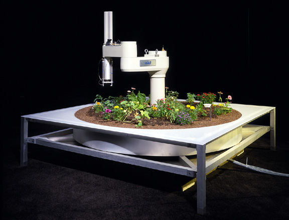
The exchange of ideas also led to technological experimentation as a new medium. Projects like Hole in Space by Kit Galloway and Sherrie Rabinowitz, and Telegarden by Ken Goldberg make use of real time technology to allow people to interact across a Third Space, and also give up ownership of the result of the artwork to the audience, making their outcomes inclusive, unpredictable and ultimately genuinely interesting.
Telegarden by Ken Goldberg
In class, we tried our hands at creating art via the Third Space in our Tele-stroll and Telematic Embrace projects. By negotiating and compromising, we are able to create a digital connection across screens.
Telestroll micro-project: Journey to the East/West done with Francesca. We had to collaborate off-screen to come up with a plan to execute before performing the piece on Facebook live.Telematic Embrace project: Onscreen Cross screenshot. Our class had to agree on who was going to be part of the cross, and if so, how were their hands going to be aligned on screen.
With a conducive space for conversation, Furtherfield artists took the liberty to create projects like Plantoid by Okhaos that utilises the Blockchain system and Harvest by Julian Oliver that explored technology as a medium to get viewers from the public to be conscious about nature and rethink our relationship with technology. These are issues that our generation faces and such artworks allow the current generation to ‘connect with issues in their time’, which, as mentioned by Marc Garrett in his lecture, is one of the strongest virtues of being an artist.
Plantoid (2015) by Okahos
Harvest by Julian Oliver. Making use of wind energy to power up graphics cards without burning up the ozone.
In conclusion, the concept of DIWO empowers artists with the capability to break the artist-viewer hierarchy, explore new mediums and better allow the public to connect with their work and the issues we face today.
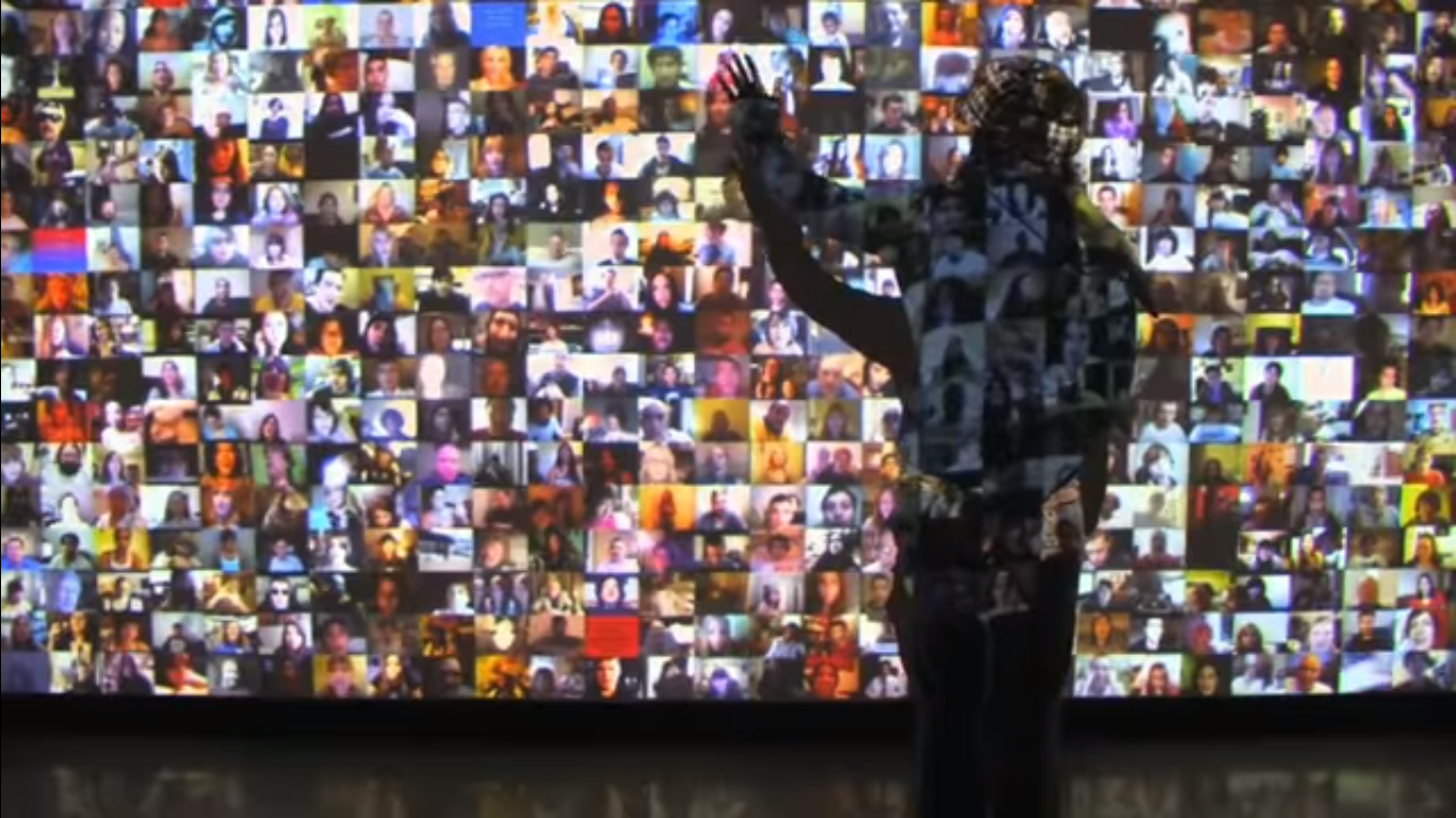
|| Hello World! (2008) by Christopher Baker is a audio-visual wall installation that comprises of over 5000 videos taken from social media websites like Youtube, Facebook and MySpace. Each of them are a personal video recording from an individual to an imaginary audience (vlogging = video + blogging). The collective motley of voices that results can either seem meditative or overwhelming to viewers who choose to dwell and immerse themselves in the experience.
Hello World! (2008) by Christopher Baker. URL: https://www.youtube.com/watch?v=J9mhAEMu7io
Since cameras have been incorporated into mobile devices, increased ownership of the latter would also mean an increase in possession of a camera. Coupled with the increased accessibility to the Internet, more individuals now have the power to participate in social sharing online.
“Some forms of computer-mediated communication can lower barriers to interaction and encourage more self-disclosure (Bargh, McKenna, & Fitzsimons, 2002; Tidwell & Walther, 2002); hence, these tools may enable connections and interactions that would not otherwise occur.”
– NB Ellison, The Benefits of Facebook “Friends”.
Hello World! fundamentally displays the innate need for social sharing in humans. This behavioural pattern can also be observed in Murmur Study, another work by Christopher Baker, which materialises the abundance of status updates which exist online which may not be directed to anyone in particular.
Christopher Baker laments that the experience of social sharing may not be totally reciprocal since people are not taught to be good listeners as well. If we manage to achieve a considerable balance, perhaps more beneficial collective actions can be born from online conversations.
Resources:
http://christopherbaker.net/projects/helloworld/
The Benefits of Facebook ‘‘Friends’’: Social Capital and College Students’ Use of Online Social Network Sites
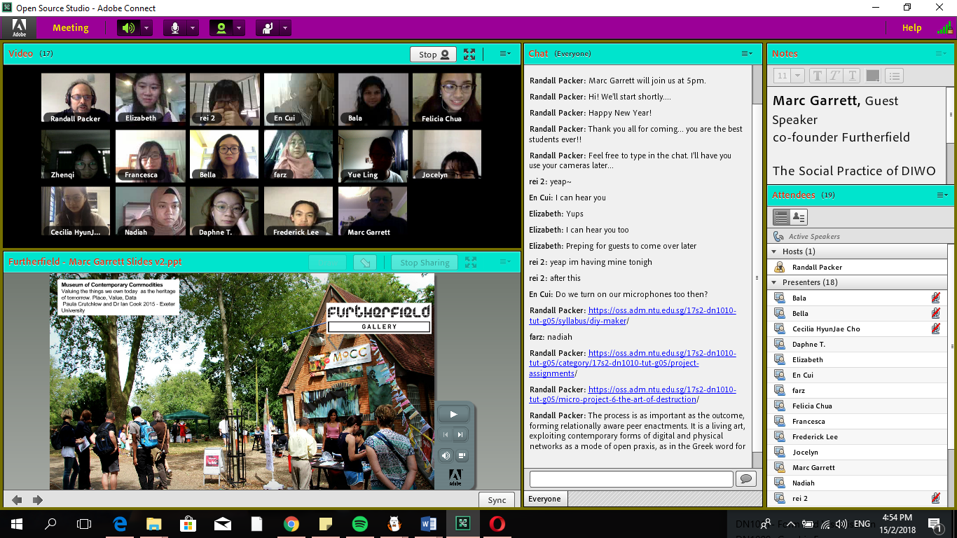
|| This week during class, we all got on Adobe Connect (it was my first time using this software ever), and immersed ourselves into the Third Space together.
We discussed about how the emotional bandwidth (the quality of emotional exchange between two individuals) of texting is significantly different from that of video calling or social broadcasting since we are able to view the voice and expression of the other party to fully gauge their responses, compared to simply communicating via words.
This experience was very new to me since previously we only broadcasted live together as a class but did not really attempt to make any interactions across screens (although this was attempted in the Telestroll microproject). As a class, we were present in both our local space (the first space), and the digitalised platform of Adobe Connect (the third space). Since we were all in the classroom, our remote spaces (second spaces) were all the same relative to each other. It was not possible to see everyone in the room at once in the physical world, but Adobe Connect sure made it much easier. It was also super cool to see how although we were in the same room at different positions, our minds were all in the same place.
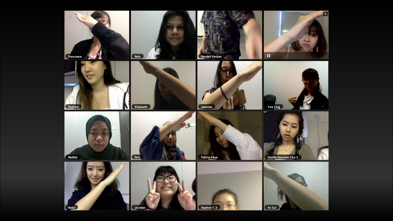
We attempted to accomplish various collective tasks together, such as putting our fingers together with a partner beside us (not physically but onscreen), putting our faces really close to the camera and making a cross across the screen.
E.T. touch with our fellow classmates beside us on Adobe Connect. Photo credits: Randall PackerPen Alignment. Photo credits: Randall PackerOnscreen Cross. Photo credits: Randall Packer
For these tasks to be completed successfully, it was vital that we negotiated and compromised to achieve our goal. From the simplest initial task of getting a pen out, to aligning the positions/scale of our objects/hands, every part of the job required some form of give-and-take. Even with the Onscreen Cross, if we were not involved in making the actual cross with our arm, we needed to know our job and do it, even if it meant doing absolutely nothing with our arm, lest there be an extra stroke coming out of the cross.
While we see negotiation on a smaller scale here in a onscreen microproject, these skills are definitely applicable to real life whenever we need to communicate with others and get our ideas through in order to get a job done successfully.
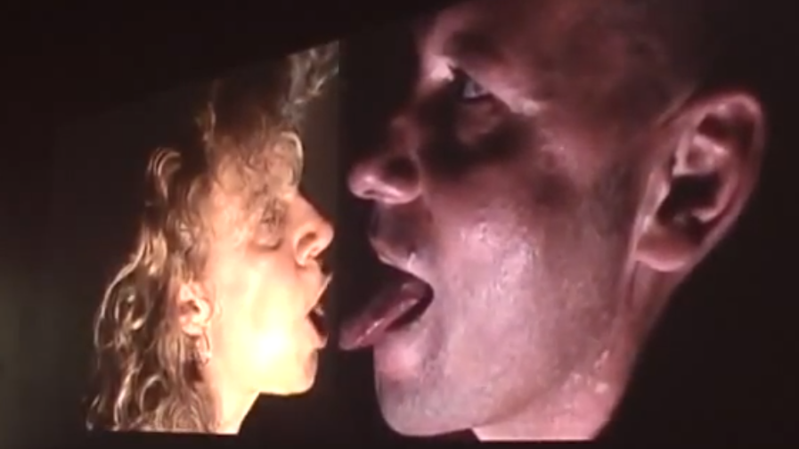
|| The Big Kiss (2008) is a 3 hour live webcam networked art piece by Dutch Performance artist Annie Abrahams, where Annie and her co-performer are physically separated from each other and have themselves perform the act of kissing recorded separately.
Annie Abrahams and her co-performer sitting separately, orientated in different directions while performing. The only space where they meet in on the split screen that hosts the live webcam feed simultaneously.
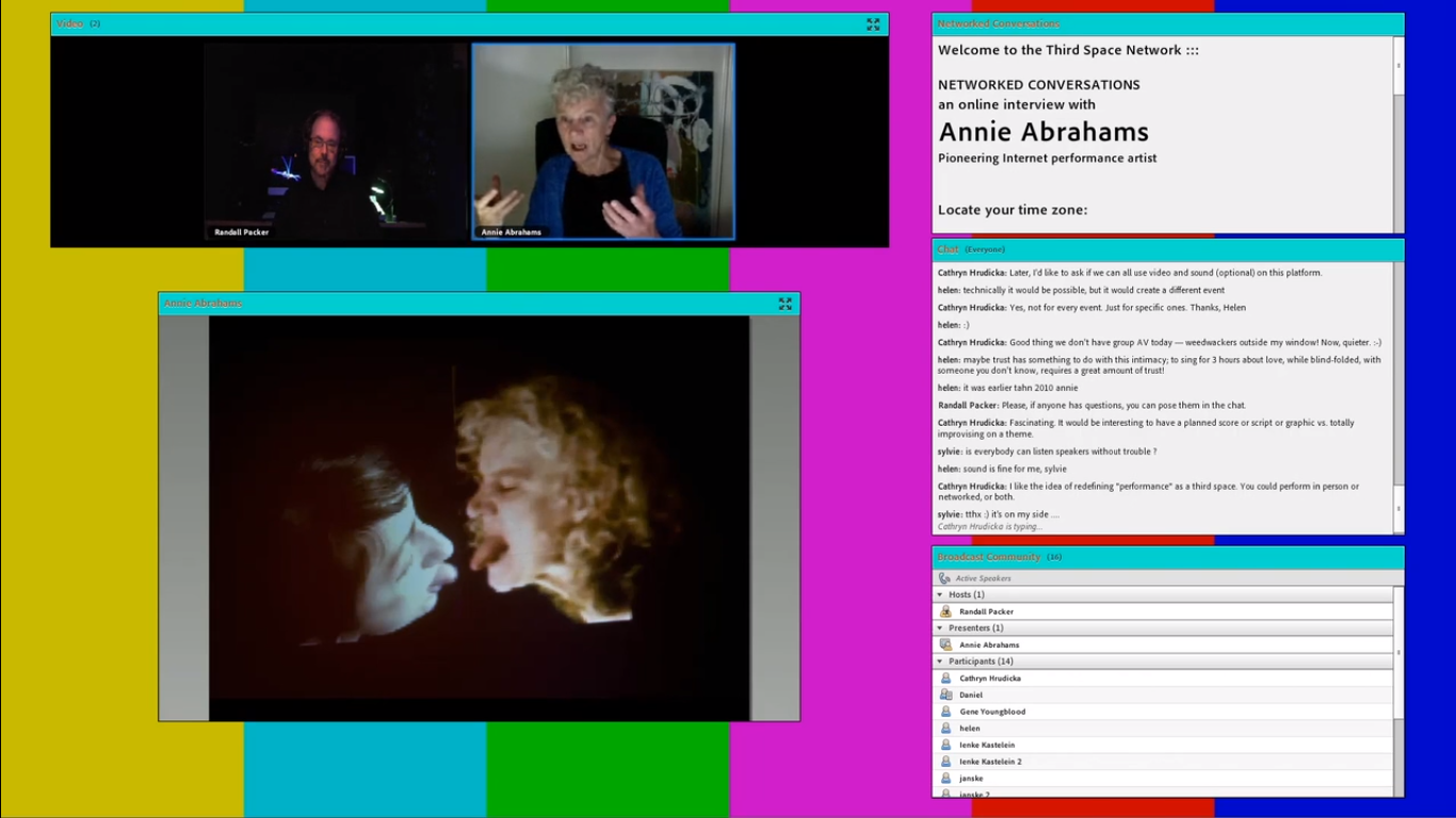
In a interview with Randall Packer on Third Space Network’s Networked Conversations, Annie Abrahams observes that there are two main reactions to the performance: either fascination by the eroticism that can be evoked without physical interaction, or awkwardness as a bystander who is witnessing this bizarre dissected makeout session of 2 strangers. She explains that the product of this artwork is not the live performance itself, but rather the meeting with her co-host (who was a completely stranger), and the process of discussing what to do in the performance. While performing The Big Kiss, both performers had to visualise pictures in their head and ‘draw’ it out with their tongues, mimicking the action of French kissing.
Randall Packer interviews Annie Abrahams and dicusses about her various artworks focused on human interaction and intimacy on a digitalised platform to experiment. https://thirdspacenetwork.com/annie-abrahams/ Big Kiss discussion around 42:30 mark
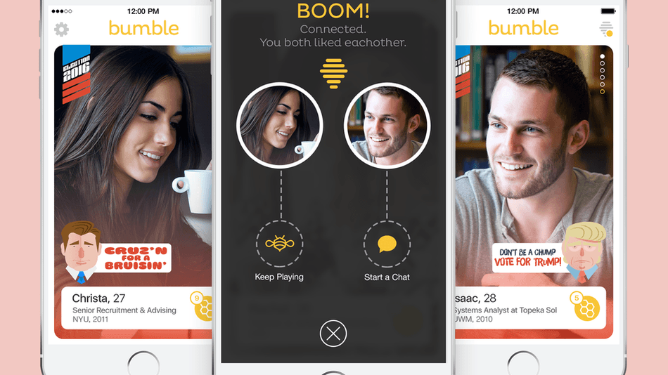
Annie Abraham’s attempt to expose the ‘sloppy side’ of people (or as we call ‘unglamorous side’) in spontaneous performances like this online juxtaposes the glossed image of online personas that we present to strangers who chance upon our profiles online. In the context of love and intimacy, there are dating applications that people turn to to find love, such as Tinder, Lively and Hinge.
Tinder is a dating platform whereby people attempt to find a partner by sieving through their online profiles and pictures. Tinder is said to entertain the idea of a Snapchat-style video function.
The limitations of these applications are that people can only form “parasocial relationships” (Internet and Emotions by Tova Benski, 2013) with others, since the only information they have is someone’s profile page, and the only people they interact with is the other party’s online persona. They are never in touch with each other’s true personality; rather they are attracted to the illusion that someone has created of themselves in this “egalitarian cyberspace” (Love Online by Aaron Ben-Ze’ev, 2004), with all the ‘unglamourous’ sides filtered out.
The Big Kiss effectively draws a parallel to this social situation and presents it in a compressed, physical performance that emphasises society’s simultaneous desire and fear when it comes to physical intimacy. Perhaps more could be done to thrust the the online world into reality so that people can begin to rediscover the experience of sharing physical space and touch again, rather than being enclosed in our own “magic circles” (Benski,2013).
Resources:
The Big Kiss (2008) by Annie Abrahams [5 minute version] https://vimeo.com/2070207
The metaphysical part of the mind that mediates between the conscious and the unconscious. An amalgamation of egos developed under different circumstances defines an individual’s personality and gives them a characteristic identity.
In psychology, the human psyche is divided into 3 parts, the id, ego, and superego. The id is what defines the choice of action a person takes based on natural, fundamental human needs and instincts. The superego defines the choice of action a person takes based on morals. And the ego is the in-the-middle of the two above that takes reality and its circumstances into play.
A social situation is a scenario in which individuals congregate and interact with each other in the way that they each have to tap in to their values and social roles in order to foster social cohesion and action. Disagreements may occur.
—————————————————–
For my final 2D project, I am supposed to dig deep into the abyss of my soul and materialize certain aspects of my personality into visual, metaphorical characters/objects that reflect how I am like in different situations. It could be how I portray myself to others (outward portrayal), or how I think I am like towards others (inward portrayal). By combining the character/object chosen and different social situations, I can combine the two to imagine an outcome.
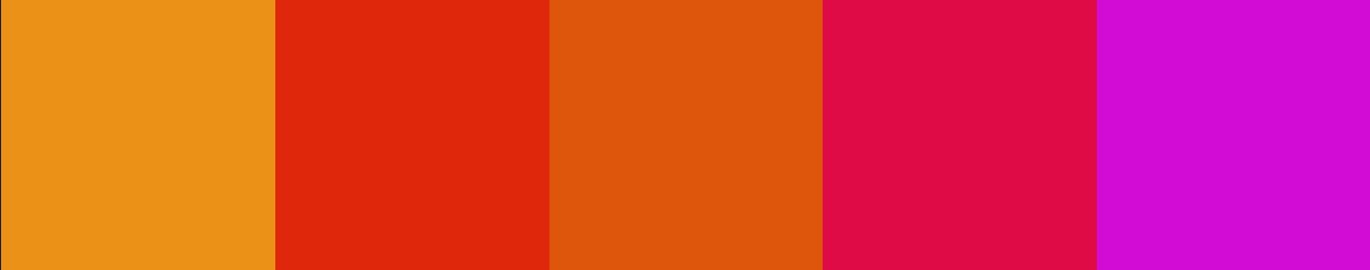
AH HAAA but there’s a catch, because in this project, COLOUR is IMPORTANT. In this project, we are only allowed to use the following colour palette (Just for easier illustration purposes, I shall use red to demonstrate the differences!)
Monochrome
(same colour but different saturation level)
2) Analogous (including colours on the side of the original colour in the colour wheel)
Analogous color schemes often mimic the color schemes found in our natural environment and can create a calm and relaxed feel when applied in design.
3) Complementary (colours on the opposite end of the colour wheel)
Opposing colors on the color wheel are dramatically different and because of this they will create a high impact jolt when paired together. Complementary colors are frequently used to draw attention and emphasis to a particular space within a design and can be quite effective when used in small doses.
4) Split complementary (colours on the opposite, but includes adjacent colours)
Using a split complementary color scheme as opposed to a complementary color scheme is less risky as the result of the three colors together is less harsh and not as loud as a complementary color scheme.
5) Triadic (draw a triangle on the colour wheel get the colours)
The three colors used in this scheme tend to sit well together and can be quite lively and harmonious.
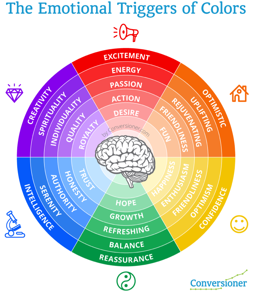
The reason for using colour palettes is that we are able to create colour harmony, which looks more aesthetically pleasing. Including different colours in the colour wheel can evoke different emotions that enhance the message of our chosen imagery.
Colour psychology as utilised by official major brands to cater to the appropriate target audience.Even different saturations of the same colour can evoke different emotions!Each colour can have evoke both a positive and negative vibe in different contexts.
Based on my findings, I came up with some visuals to depict my EGO in the format of
_(insert symbol of self)_ + _(situation)_ = _(outcome)_
Situation #1 (Draft 1):
-My struggle with the standard style of academics (especially in Junior College).
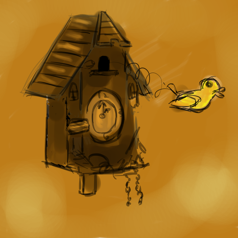
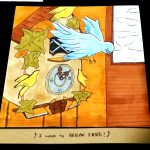
Trait: Free-spirited (trapped)
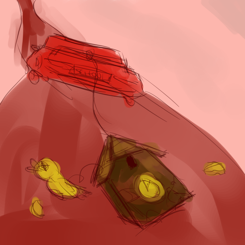
Thing: Cuckoo clock
-When asking around for what animal would represent me, my friends said a bird/butterfly. Some of my friends also said that I was free-spirited (You learn new things about yourself when you actually bother to ask other people what they think of you HAHA), so I thought something with wings would work since it represented flying away from your responsibilities to obtain freedom. I thought that a cuckoo bird was really apt since cuckoo birds are always trapped inside the clock and released at a fixed time every day. Sounds like SCHOOL?? 8’D So I’m a cuckoo bird that wants to be released but still restrained.
-I used a monochromatic brown palette for this picture since it represents dullness and the mundanity of school life. The bird, however is a light yellow-ish shade since I wanted to represent myself in my ideal element as a jovial, optimistic person.
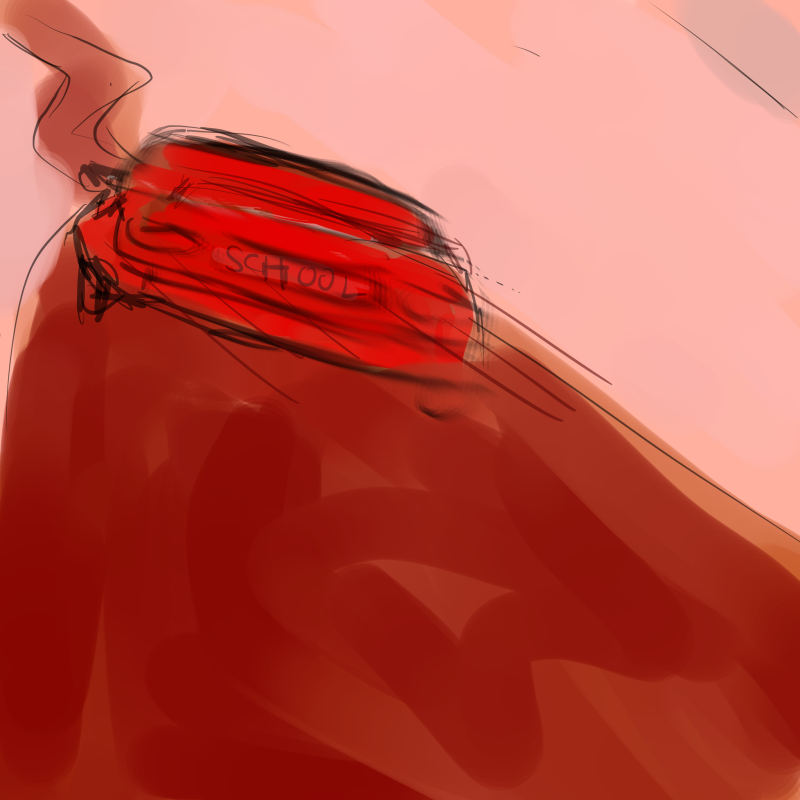
Social situation: School
Setting: Car on the road
-To me, school is a pretty mechanical system that keeps pushing students higher up the educational ladder. I used a car to represent school since cars are automobiles that are supposed to help us, drivers are usually very focused on moving forward.
-I used a monochromatic red colour palette since red is a very energetic colour and implies action. it could also imply danger.
Outcome:
Free spirit + School = Tortured soul
Cuckoo bird + Car = Cuckoo bird getting dragged along the ground
-For me, the higher up the educational ladder I climbed (with the exception of university), the more I struggled to keep up and the more unhappy I felt. With every bad grade I got for my exams, it really made me feel like I was getting increasingly abraded. It was tough being myself again; looking back at my social media posts and reflecting on my attitude towards my family, it made me realise that I really wasn’t myself at all, as if I’d gone dysfunctional and completely lost myself under the unrelenting stress of school, and I felt like everyone around me was oblivious to how much help I needed. I’m representing this with a cuckoo bird tied to the car and getting dragged along the road to destruction. (not depressing at all)
For the colour palette, I simply combined the two monochromatic colour palettes together to form an analagous red-yellow colour palette.
Medium of execution: Digital painting
1st row (Draft 1)
+=
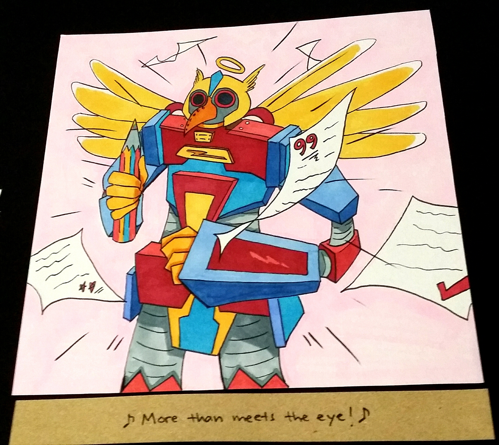
Situation #1 (Draft 2):
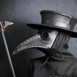
I decided to make the outcome less negative so I decided to portray me being empowered in school instead of being crippled by it!
Here are some inspirations!
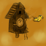
The car that represented something mechanical reminded me of Optimus Prime from Transformers. I really love the energetic red and blue contrast!The bird really reminded me of those plague doctor masks that we see in stereotypical radiation setting documentaries/movies. I thought it was super fitting because it represented resistance against something that seemingly would overwhelm you.Mercy from Overwatch has the perfect wings. If I merged it together with the colours on Optimus Prime, we have a triad colour harmony plus wings to add to the bird characteristic of my mecha bird. 😀 (Also, school please have /mercy/ on me)
So here I have a new outcome! Instead of being dragged along by school until I’m broken (which, by the way, was quite true to a large extent in JC), I am now empowered by what I have learned and now I have the conviction to aim for higher results!! I guess this now represents the present. The past me was really depressed– ok I shall stop ranting here.
Yay! So now I have my final results done traditionally with watercolour markers (Shinhan Twin Touch, not Copics because I’m poor like that), and black marker pen for outlines (OUTLINES SAVE WATERCOLOUR WORKS!!!).
The cuckoo bird is still desperate to break free (made it have a complementary colour harmony which was fitting since blue also represents freedom), I added papers with really bad grades flying around the school car (not bus), and now I am a MECHA BIRD THAT WANTS TO BE MORE POSITIVE 😀
Situation #2 (Draft 1):
-Me dealing with anyone visiting my house.
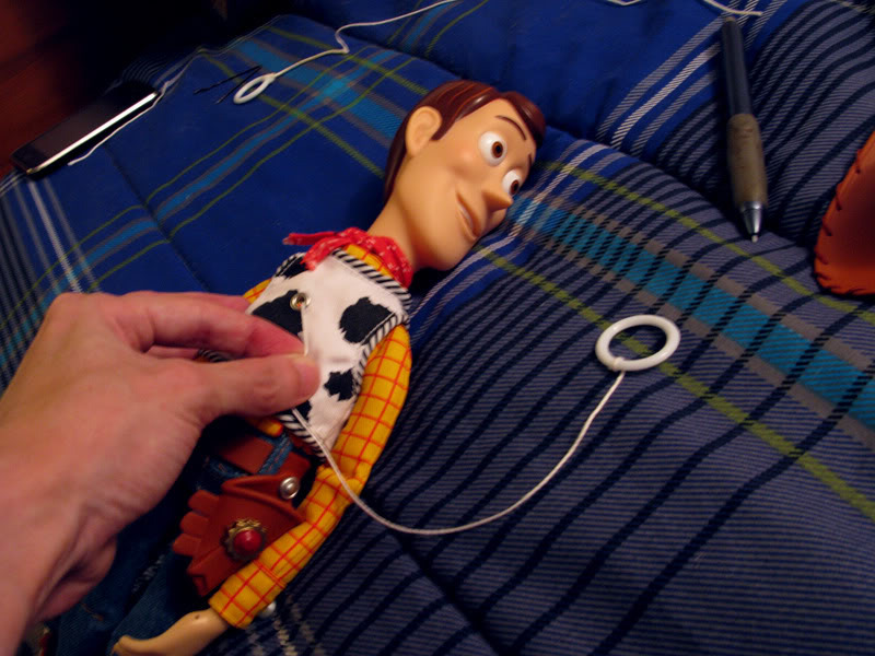
Trait: Introversion
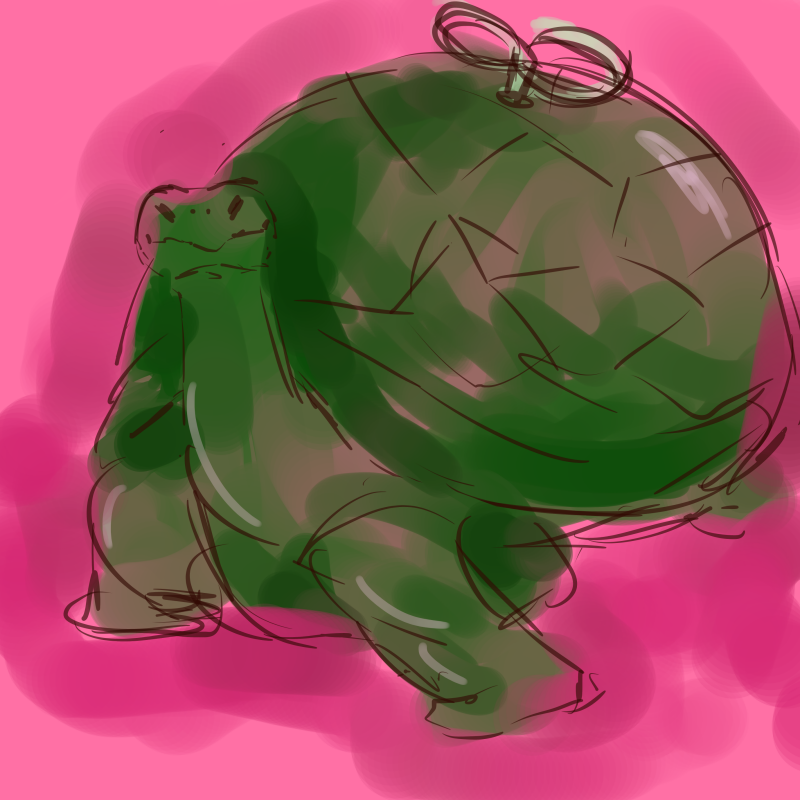
Thing: Tortoise
– Normally, I don’t like to put myself out there and be the centre of attraction. Speaking with confidence to strangers for a short while is okay, but if it drags on for too long, my mental energy gets drained thinking about what topics to bring up because I’m awkward and overly-conscious like that. And when it does, I like to stay in solitude to gather my thoughts and brace myself for meeting the next fellow human. I thought a tortoise was perfect for this trait since tortoises can retreat into the safety of their hard, protective shells. It would be pretty boring just having a tortoise so I made myself into a windup tortoise instead after drawing some inspiration from Toy Story’s Woody which as a pull string, which represents having a limited time of extroversion before feeling really down and keeping to myself again.
-I coloured the tortoise green with a pink background to depict my amiable personality (or at least I hope I am).
Social situation: Home visits from strangers
Setting: Ominous figure walking into a dark room
-I utilised the complementary colours of blue/purple with yellow to show a contrast in lighting. Anyone who invades my humble abode appear like towering dark figures to me. They threaten my bubble of privacy and I will use all means to defend it. 😀
Outcome:
Introversion + Home visits from strangers = Isolating myself from everyone else
Tortoise + Ominous figure = Tortoise retreating into shell and cowering away
-Here I used sort of an analogous and complementary colour scheme. The pink from the turtle is completely gone because I’ve run out of fuel to socialise and seeking refuge in my shell while the anonymous tall figure towers over me and daunts me.
+ =
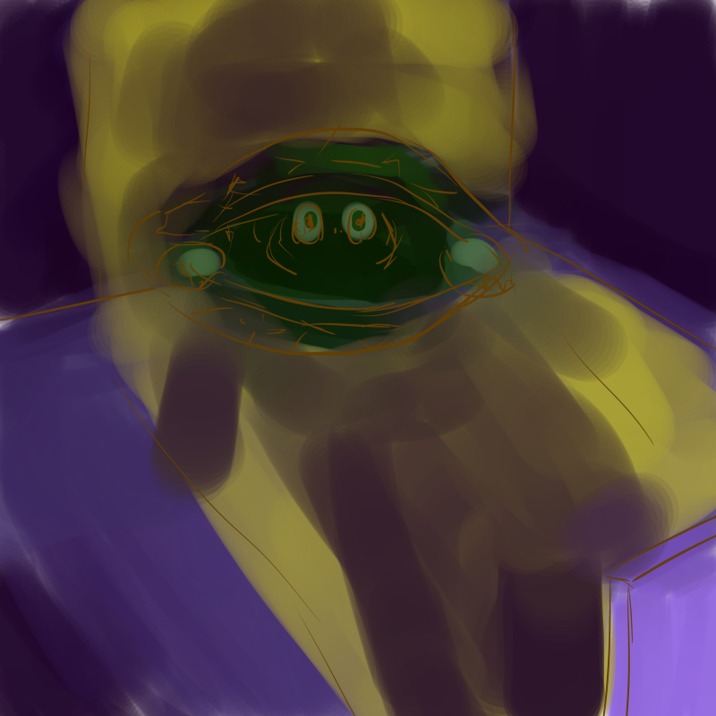
Situation #2 (Draft 2):
After receiving feedback from the first round of consultations, I got the idea of using rabbits to represent strangers (because according to the hare and tortoise folklore, they’re supposed to be enemies, also, rabbits are often representative of hyperactivity and face-paced action because of how much they can jump about).
Some inspirations!
The famous Mine Turtle from asdfmovie that blows up when you step on it even though it looks so cute and inviting.The tortoise shell looks like a grenade!Mention of having a projection out of the tortoise’s shell really reminded me of the Bat Signal from Batman.
+ =
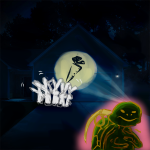
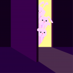
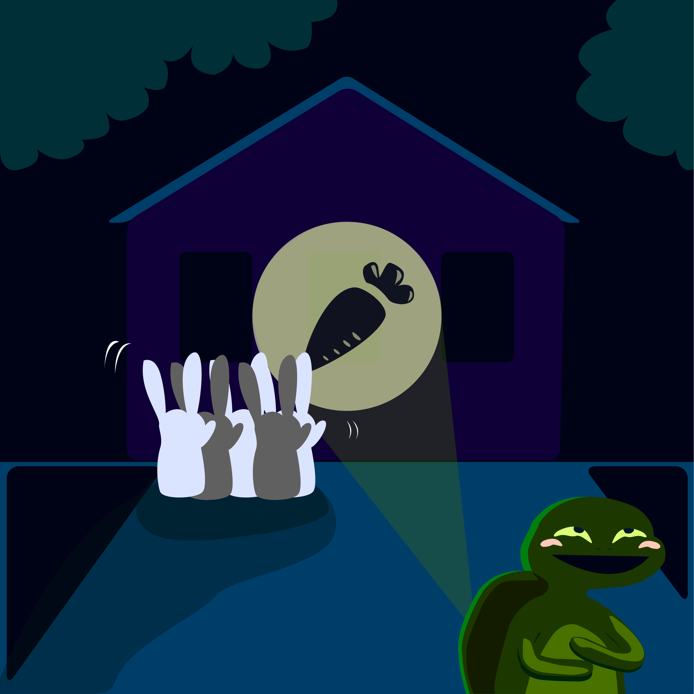
Situation #2 (Final Draft):
I never thought I would actually do it, but I PICKED UP ILLUSTRATOR WHOOPDEEDOO!!! It seemed like such a daunting task. I remember how shocked I was at the amount of potential it had after watching a Youtube tutorial video. Everything you put in Illustrator looks so legitimate!! But I’m so glad I did because now I have one more tool to carry around 😀 (but it does take quite a long time since every single shape has to be manually inserted and the number of layers drives me nuts.)
So I made my tortoise (without the pullstring thing because it kind of seemed redundant), have rabbits peer through the door instead of an anonymous stranger, and have me (as a tortoise) project a carrot, instead of a bat, to draw the rabbits’ attention elsewhere so that I am free to relax in solitary.
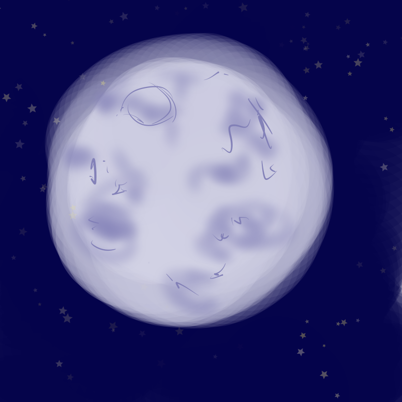
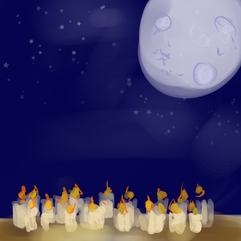
The moon is often seen as a feminine, nurturing, all-seeing symbol. All of which I am usually not (because I am one big giant kid), unless I am surrounded by kids around me. (Monochrome harmony)
Social situation: Taking care of kids
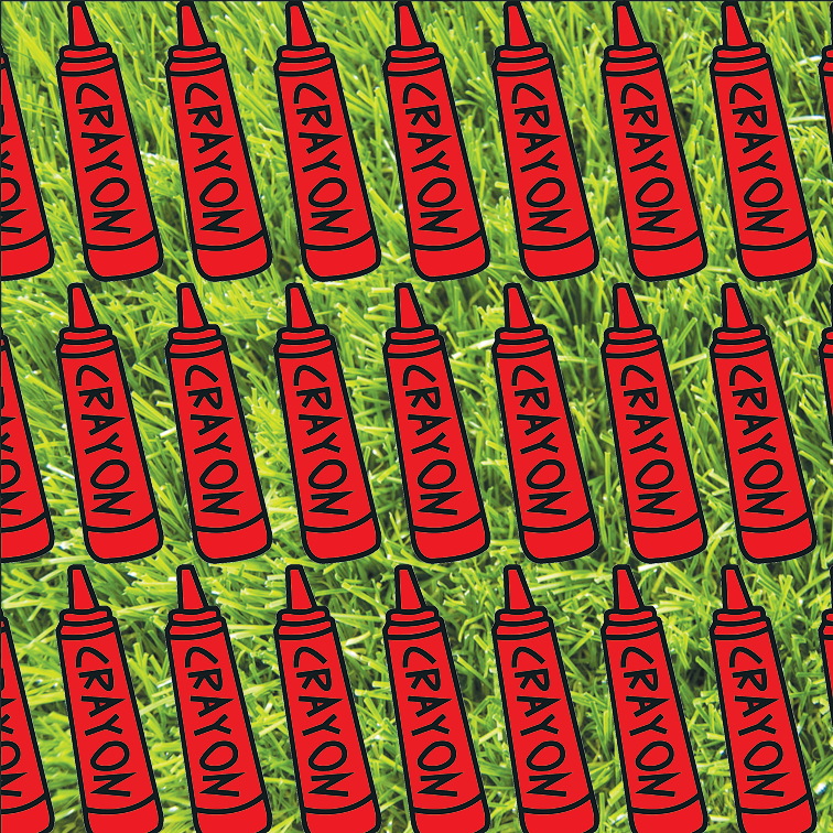
Setting: Crayons
-Crayons remind me of children because that one time I worked at a kindergarten, they literally did colouring with crayons for so much of their time there. Crayons are one of the first drawing tools that we are exposed to as children as well, so it usually suggests childhood. (Crayons are made of wax, so I thought maybe they would burn. What an odd idea 8’D)
Outcome:
Nurturing + Taking care of kids = Educating and enlightening them
Moon + Lit crayons = Crayons being lit up like candles
For some reason, there are lots of children in my life. My younger baby brother, and the kids that I met when I taught in the kindergarten. I only feel grown-up when I’m around them and feel like a responsible adult. The crayons being lit represents me enlightening them and showing the way.
Situation #3 (Draft 1):
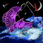
+ =
Situation #3 (Draft 2):
Some inspiration!
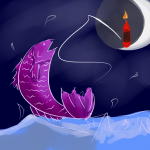
The DreamWorks logo was being mentioned during consultation and it made me think of the phrase ‘teaching someone to fish for themselves’. Which is exactly what I’m doing when i teach kids. (I hope).I was trying to decide what kind of moon to put in and after being inspired by the DreamWorks logo, I decided to go with a waxing crescent moon 😀Whenever fishing is concerned in anime, I knew it was hard for the authors to resist a good dramatic fishing moment. I really love the compositions of these scenes.
+ =
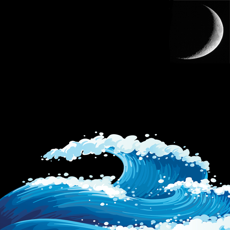
Situation #3 (Final Draft):
During consultation, I got the idea of how the tide changes as the moon waxes and wanes. I thought that was really fitting for the fishing theme, so I included it in my first square. In my second square I did a illustration of a crayon in illustrator, made a pattern out of it, and placed the pattern upon the background of green grass, The crayon is red to represent how energetic children are, and the green pasture represents how lively, pure and down to earth they are as well. In my final square, I adopted the dramatic fishing composition and also tried out a new brush to paint the sea and the fish in FireAlpaca. (analagous)
[digital painting]
+ =
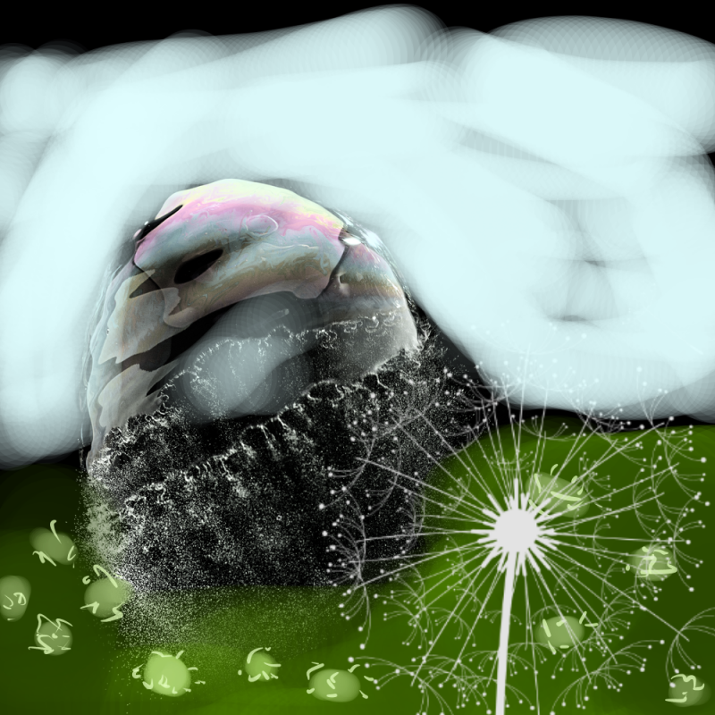
Situation #4 (Draft 1):
Trait: Calm demeanor but insecure
Thing: Bubble
-Many of my friends tell me that I am ‘chill’, but on the inside, I really am constantly on the verge of having a meltdown because I overthink about everything way too much. (it’s all internal)
Social situation: Being accompanied by my group of close friends
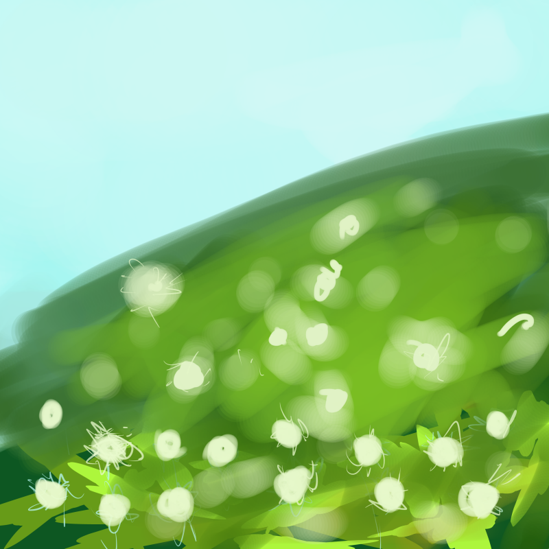
Setting: Dandelion field
Dandelions represent childhood, and the way they disperse their seeds are like how childhood friends eventually grow up along different life paths and grow apart from each other. But in my case, I have a close group of primary school friends who, even though have grown up to take on immensely different challenges, still stick close together like glue.
Outcome:
Calm and insecure + Accompanied by close friends = Being empowered by my friends
Bubble + Dandelion field = Bubble burst by dandelion
-Around this group of friends, I can really let out my insecurities and be comfortable around myself.
4th row (Draft 1):
+ =
Situation #4 (Draft 2):
So I scraped the previous idea entirely because it was way too cliche and predictable. (it was nice but way too subpar HAHA)
I kind of took the liberty to work backwards but I thought it actually works because I can have a rough concept of the outcome much earlier.
Instead, I thought up a new outcome first!!
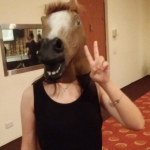
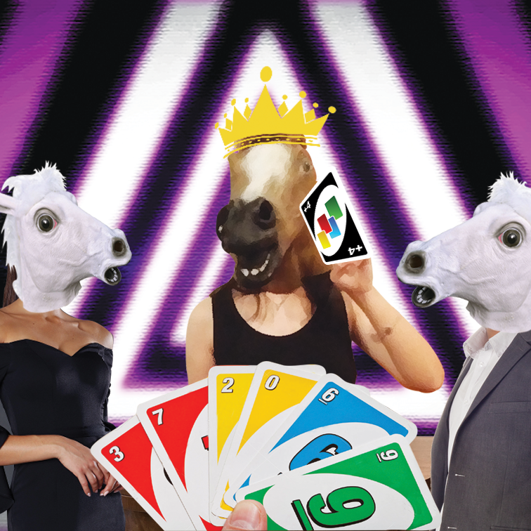
This is an actual photo of me during my secondary school prom. I borrowed the horse mask from my classmate. It was irresistable.
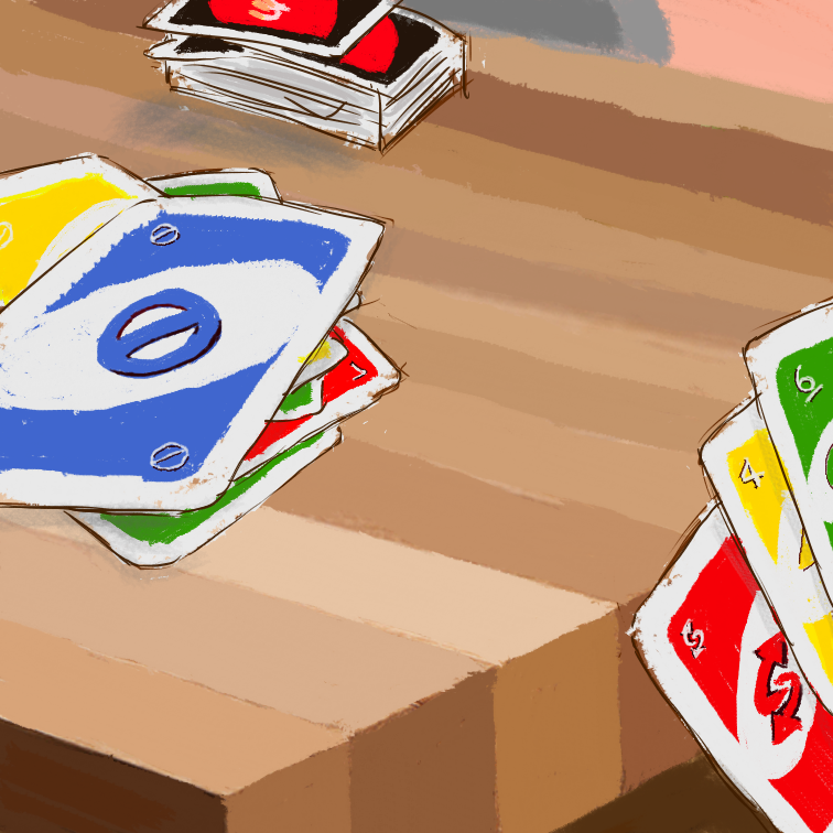
I thought of how the idiom ‘dark horse’ is used to represent someone who unexpectedly changes from underdog to the master of a game/competition. So to contrast this, I planned to put 2 white horses on the side of a table and have the 3 horses play a game of Uno. Because that’s probably the only competitive game I’m good at.
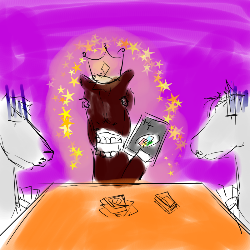
Situation #4 (Final Draft):
The first photo is me spouting out some trippy looking spirals out with an analogous colour scheme around the green/purple sideo of the colour wheel to represent nervousness and abhorrence towards competition. In the background you can see the typical game controller symbols to suggest gaming as a form of competitive activity.
In the second square, I digitally painted a game of Uno going on (it was so hard to find reference images that had the exact angle that I wanted). Uno represents something that I’m relatively better at and am willing to lay out my skills for all to see 😀
In the last square, I made a photo collage of the planned composition above. (Never thought I would get to use my prom photo like this but totally worth it). In the background, I used a luminous neon purple triangular hypnotic pattern to represent how ecstatic I am. Purple is also a royal colour and I have a crown on my head, so it suggests how big of a deal I assume myself to be when I get ever so slightly good at something. 😀
[Photo collage]
+ =
Reflections:
I’m actually really thankful that we got to do this project because
We literally have not touched colour at all in drawing class and we are finally free to use colour in this activity.
This project introduced different colour harmonies to me; I am now much more aware of different colour harmonies intentionally at play when I look at posters and advertisements in public.
I managed to pick up Illustrator!!! A little time consuming, but the vector style makes everything look so professional.
4. I would say one of the biggest difficulties I faced aside from the technical part of using Illustrator was figuring out me. I get existential and identity crisis from time to time and through this project (all the feedback from friends, online quizzes and tarot cards), I managed to figure out at least 4 different characteristics of myself. This project was really therapeutic and I would highly recommend it to the next batch of students. 😀
5. Through this project, I was also better able to exercise the use of visual language to get my point across. The regular consultations also really helped me to bring my ideas to further heights (and weird places as well) that I would never have thought of on my own. Sometimes, you need others to know who you are. 😀 Through identifying symbols/representations of my different facades and egos, I learned how to put them into a context and build a narrative within that new context that somehow parallels with the message I am trying to convey about my personality. All in all, it was a very enlightening experience. *shines*
For our second project for Foundation 4D I: Story about a Thing, we are supposed to choose… well, a THING as a theme and create a visual narrative surrounding it using sequential images. In class, we also learned about narrative structure and story-telling techniques using images such as scene-to-scene and action-to-action closure to fill in the blood in the gutter.
My first task was to select a thing (as if it wasn’t the hardest task ever; sometimes the simplest briefs are the hardest). I decided to use something wacky and bizarre because solemn stories aren’t really my thing.
So, I chose a wig.
Yes, a wig.
My initial story plan was inspired by this game that I found on Kongregate.com a long time ago, The Visitor by James Ziebarth. It follows the storyline of this alien worm-looking creature that starts off really small, but goes around people’s houses devouring larger and larger prey until it grows to maximum size. The plan was a horror genre and I wanted to make my wig consume people, but I felt that the horror genre is a tad bit grotesque to do and doesn’t really have an interesting storyline to it, so I decided to change it to a comedic story instead.
Instead of having a completely evil wig that murders people, I decided to change it into a yandere wig. ‘Yandere’ is a character archetype in a lot of Japanese animated films that are often girls that are so obsessed with a boy that they would kill for them, or just carry out violent acts in general that also endangers the lives of everyone around them.
Popular examples of ‘yandere’ girls:
Gasai Yuno from Mirai Nikki (Future Diary).Lucy from Elfen Lied.Kotonoha from School Days!
Yes, I wanted to make my wig an obsessive protagonist.
So here is my rough storyline using the monomyth structure:
A CEO of a company who starts off with a head full of luscious thick hair starts to bald for unknown reasons (presumably stress or old age), and since maintaining his image and his dignity is really important to him, he thinks of the immediate solution of getting a toupee (as inspired by the Principal in Captain Underpants). He hesitates for a bit when he thinks that it might fall off and his colleagues would laugh at him, but he decides that his image is much more important so he goes to get the toupee anyway.
Little does he know, the toupee has a mind of its own and develops a liking for its owner. They spend time together as the protagonist goes about his days concealing his bald spot with his newly bought toupee.
One fine day, he sees an advertisement on the television for a hair growth cream and has an epiphany. He purchases the cream and successfully manages to grow back a full head of hair, much to the obsessed toupee’s dismay.
The now desperate toupee decides to take superglue and put it on …itself (?? shall not assume gender here) and awaits its master’s arrival.
When the protagonist puts the sticky toupee onto his head, he is appalled to find out that he can’t take it out again. Left with no other choice, he decides to shave off all his hair. The ending twist is that he buys another toupee which has a life of its own. And so the cycle continues.
————————————————————————————————-
Now I know what you’re thinking after you’ve just read this.
Wtf???
Good, that’s the intended effect.
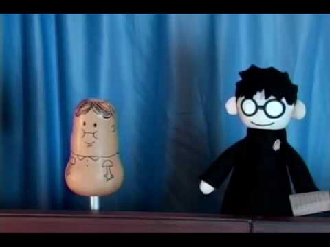
Now it was obviously a terribly hard task to find a bald man to act for me so I decided to substitute the human protagonist to a squash instead. I was inspired by PotterPuppetPal’s Neville Longbottom (below):
Neville the squash (vegetable) compared to a more human-like Harry Potter.
I supposed this would create a much more comical effect since the story itself is pretty silly.
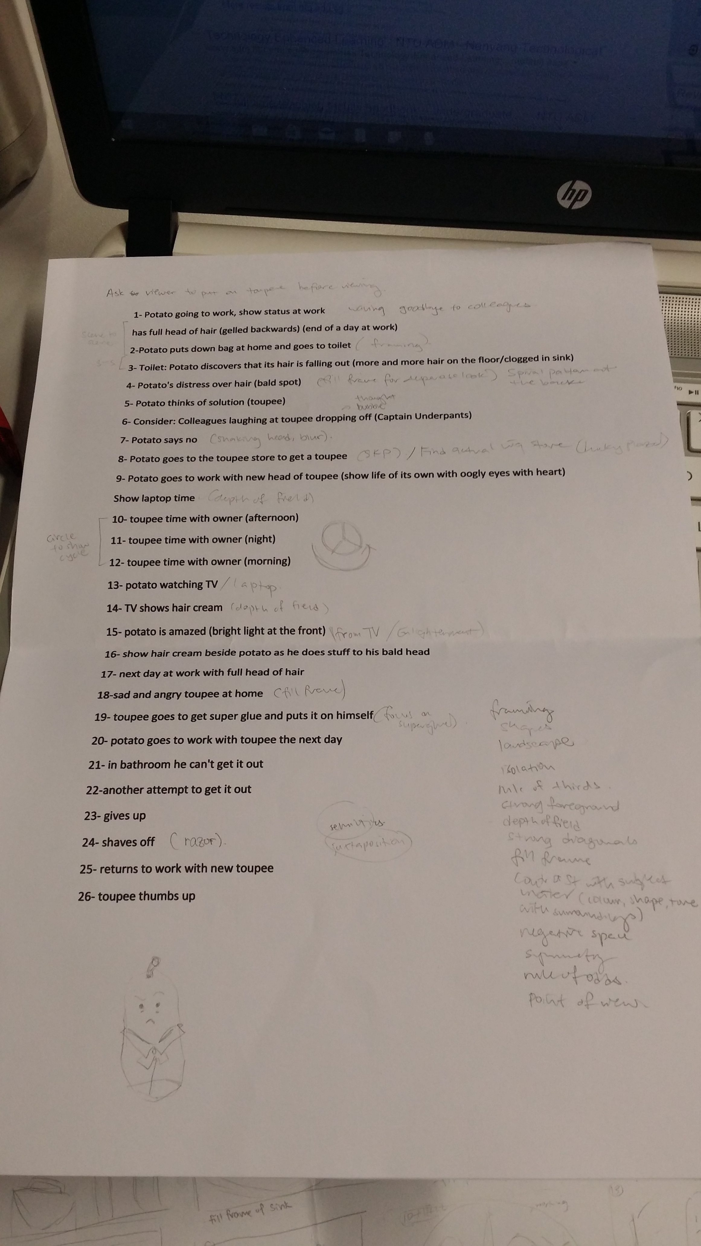
Below was my rough plan for the sequence of my images:
1- Potato going to work, show status at work
has full head of hair (gelled backwards) (end of a day at work)
2-Potato puts down bag at home and goes to toilet
3- Toilet: Potato discovers that its hair is falling out (more and more hair on the floor/clogged in sink)
4- Potato’s distress over hair (bald spot)
5- Potato thinks of solution (toupee)
6- Consider: Colleagues laughing at toupee dropping off (Captain Underpants)
7- Potato says no
8- Potato goes to the toupee store to get a toupee
9- Potato goes to work with new head of toupee (show life of its own with oogly eyes with heart)
Show laptop time
10- toupee time with owner (afternoon)
11- toupee time with owner (night)
12- toupee time with owner (morning)
13- potato watching TV
14- TV shows hair cream
15- potato is amazed (bright light at the front)
16- show hair cream beside potato as he does stuff to his bald head
17- next day at work with full head of hair
18- sad and angry toupee at home
19- toupee goes to get super glue and puts it on himself
20- potato goes to work with toupee the next day
21- in bathroom he can’t get it out
22-another attempt to get it out
23- gives up
24- shaves off
25- returns to work with new toupee
26- toupee thumbs up
Story plan:
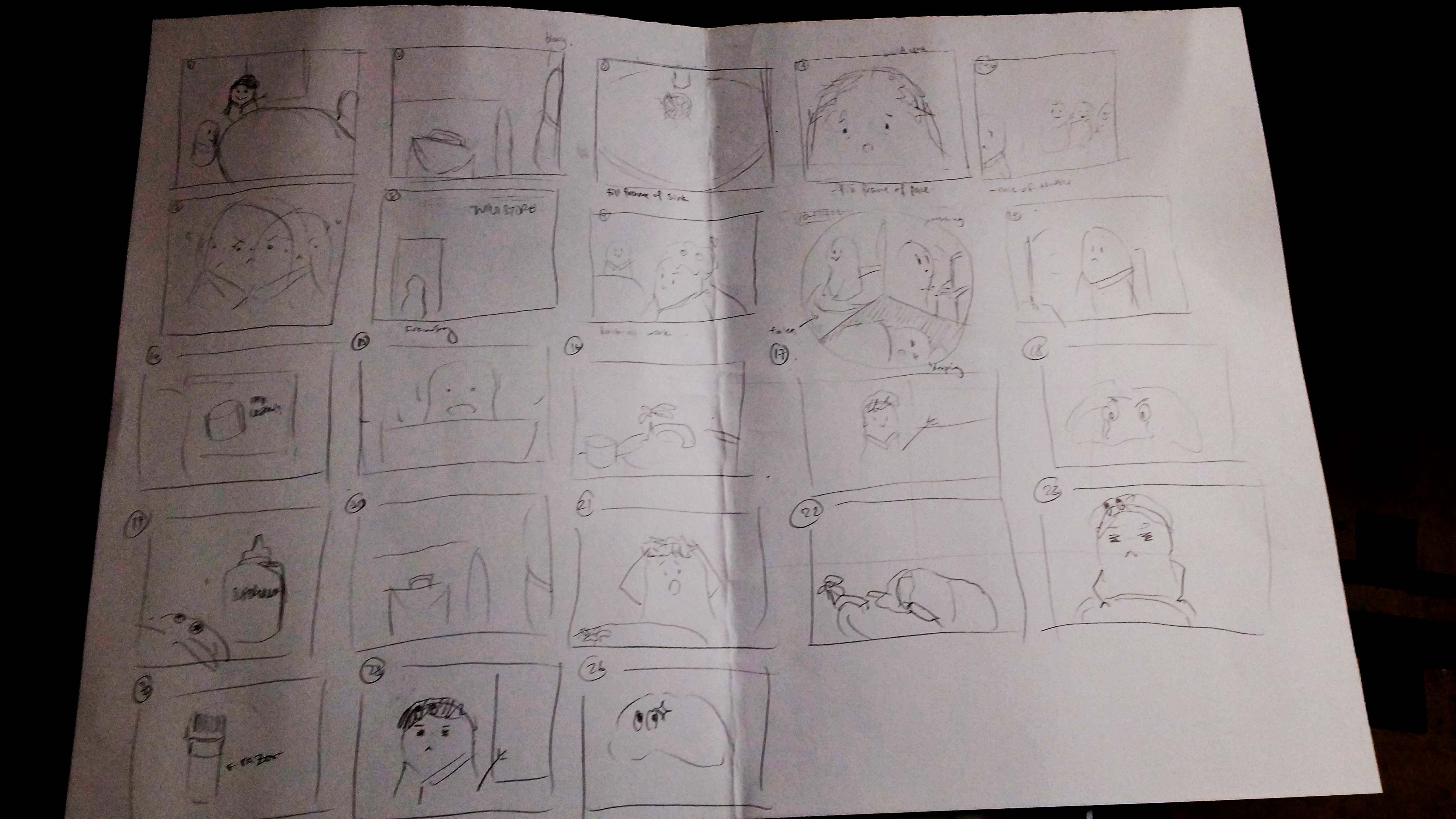
Storyline plan
Storyboard plan (arrangement not confirmed yet)
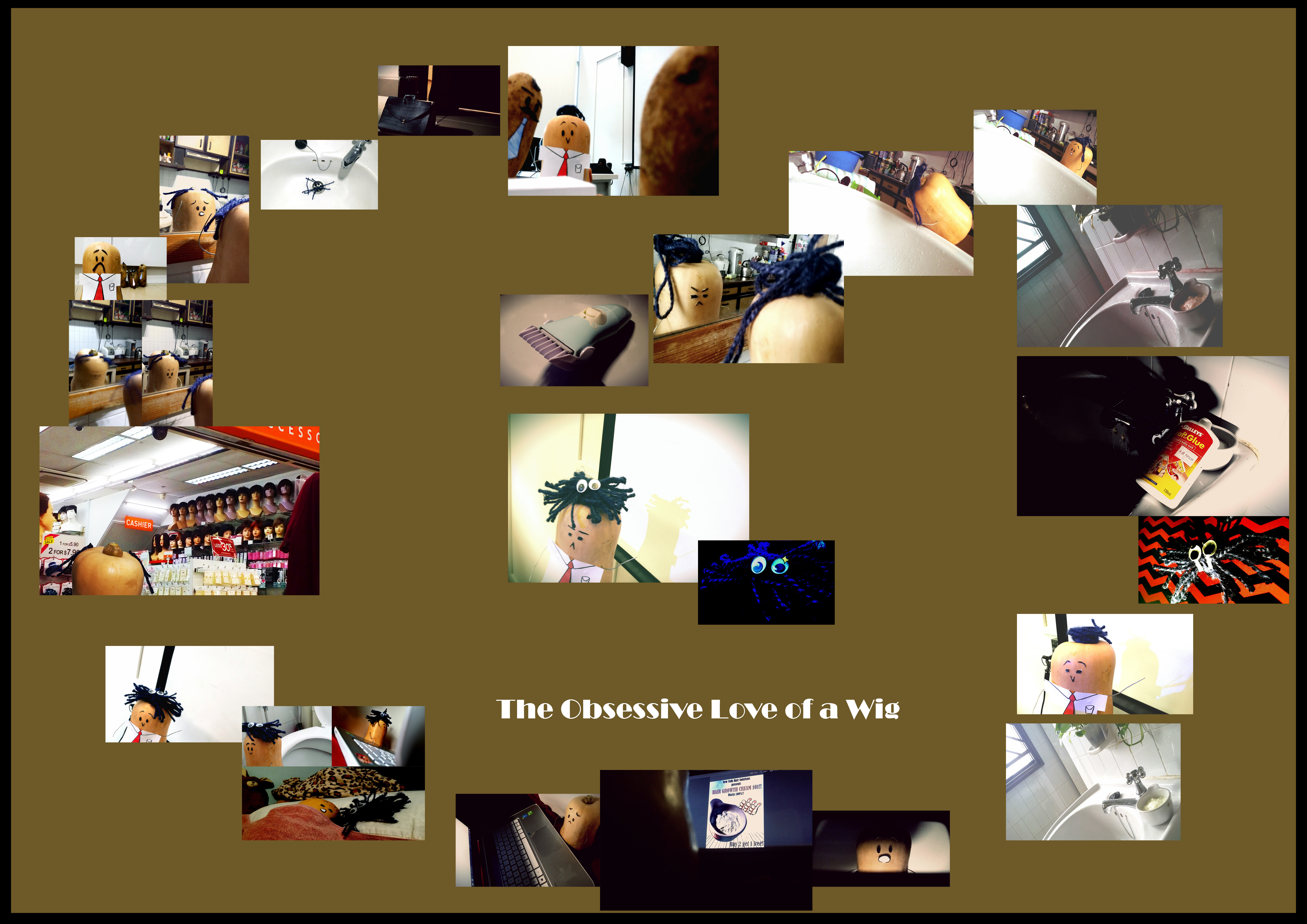
|| The Obsessive Love of a Wig || I made some tweaks to the storyline; instead of the wig superglue-ing itself to Philip (yes he has a name now, I’m overly attached) and forcing him into eternal baldness, the wig now switches the hair growth cream Philip bought for superglue (muahaha!) and forces him to wear a the evil wig forever. Initially, I wanted to try a circular arrangement to imply the structure of the hero’s monomyth, but then I saw an opportunity to arrange my photos in a heart-shape to echo the theme of the story (definitely romance, or at least one-sided)! They are also read in an anti-clockwise direction because it’s easier, reading clockwise sort of feels like you’re reading the story backwards. The file size uploaded here is pretty small so the images are probably pretty hard to see so I’ve added a link below to a .pdf file with much better quality!
Collation of my decent works from drawing class! 😀
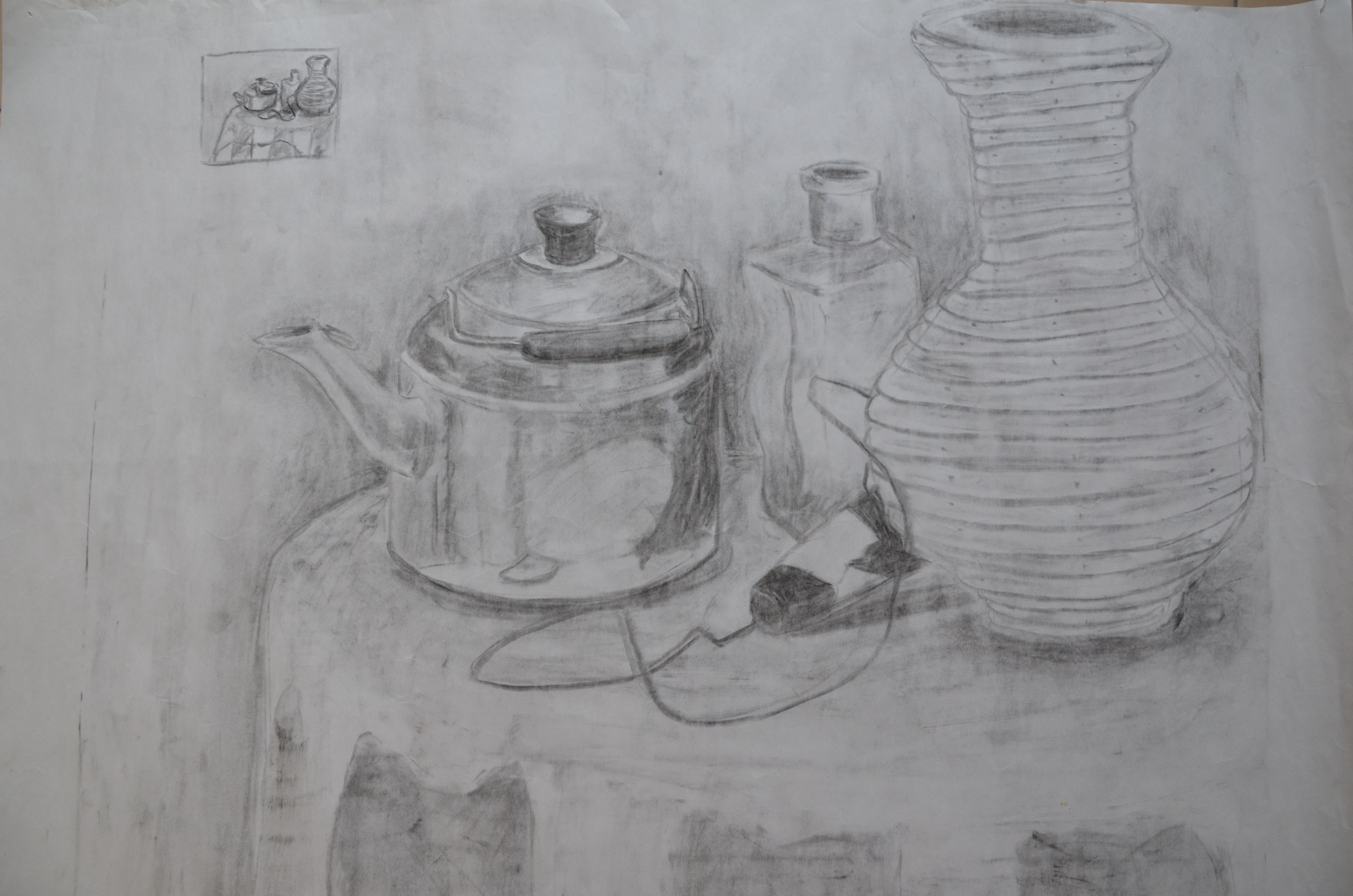
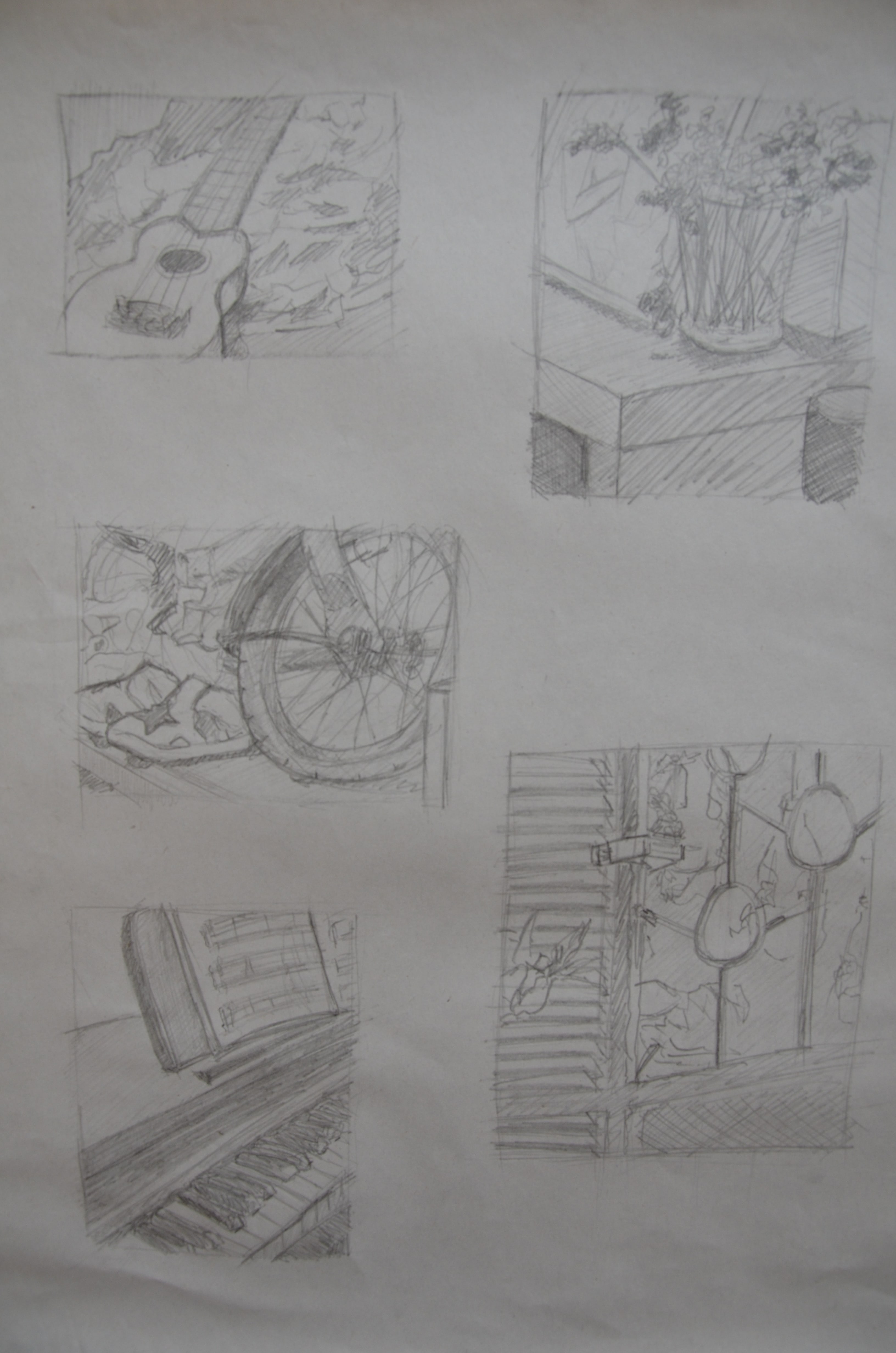
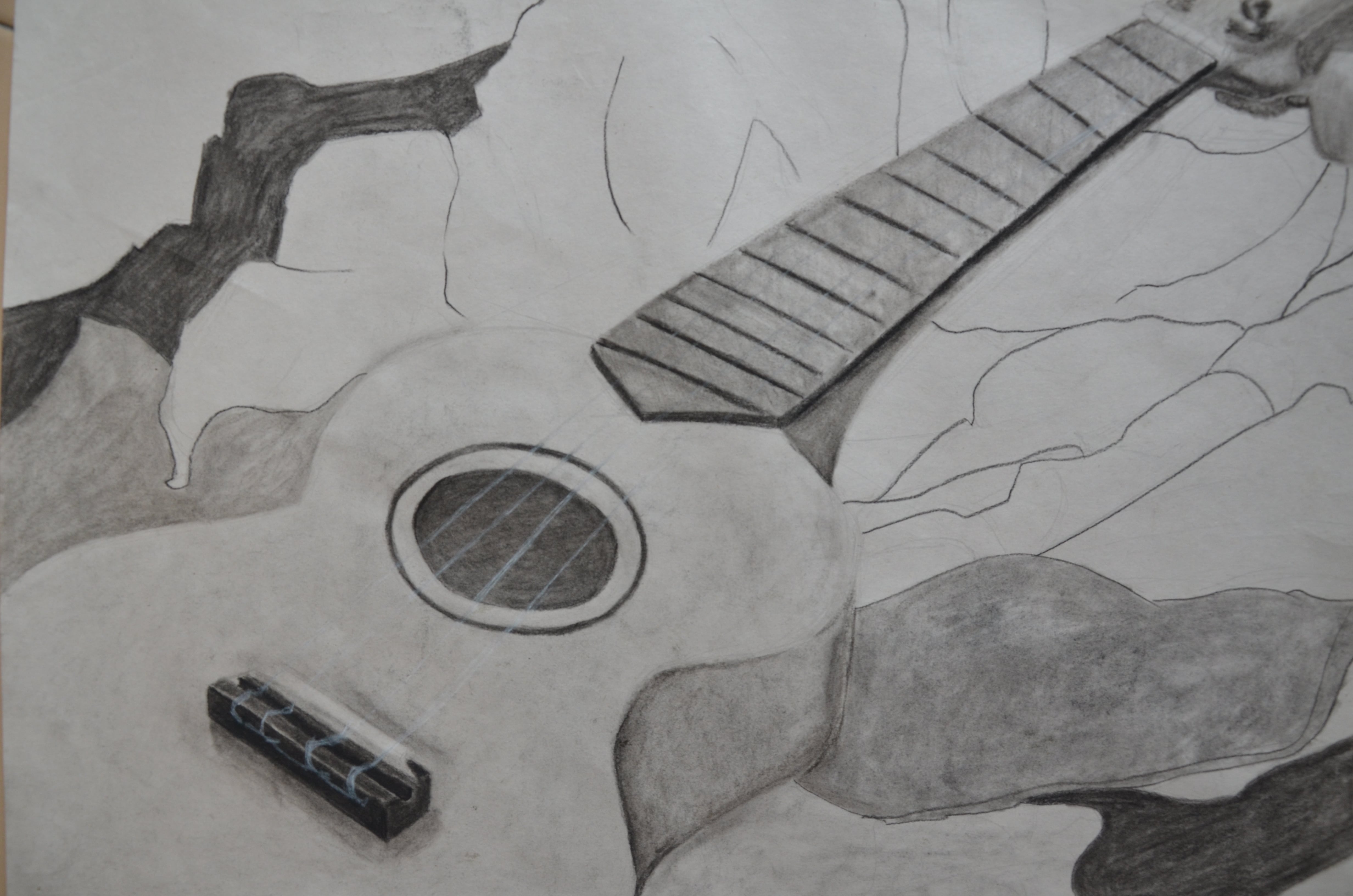
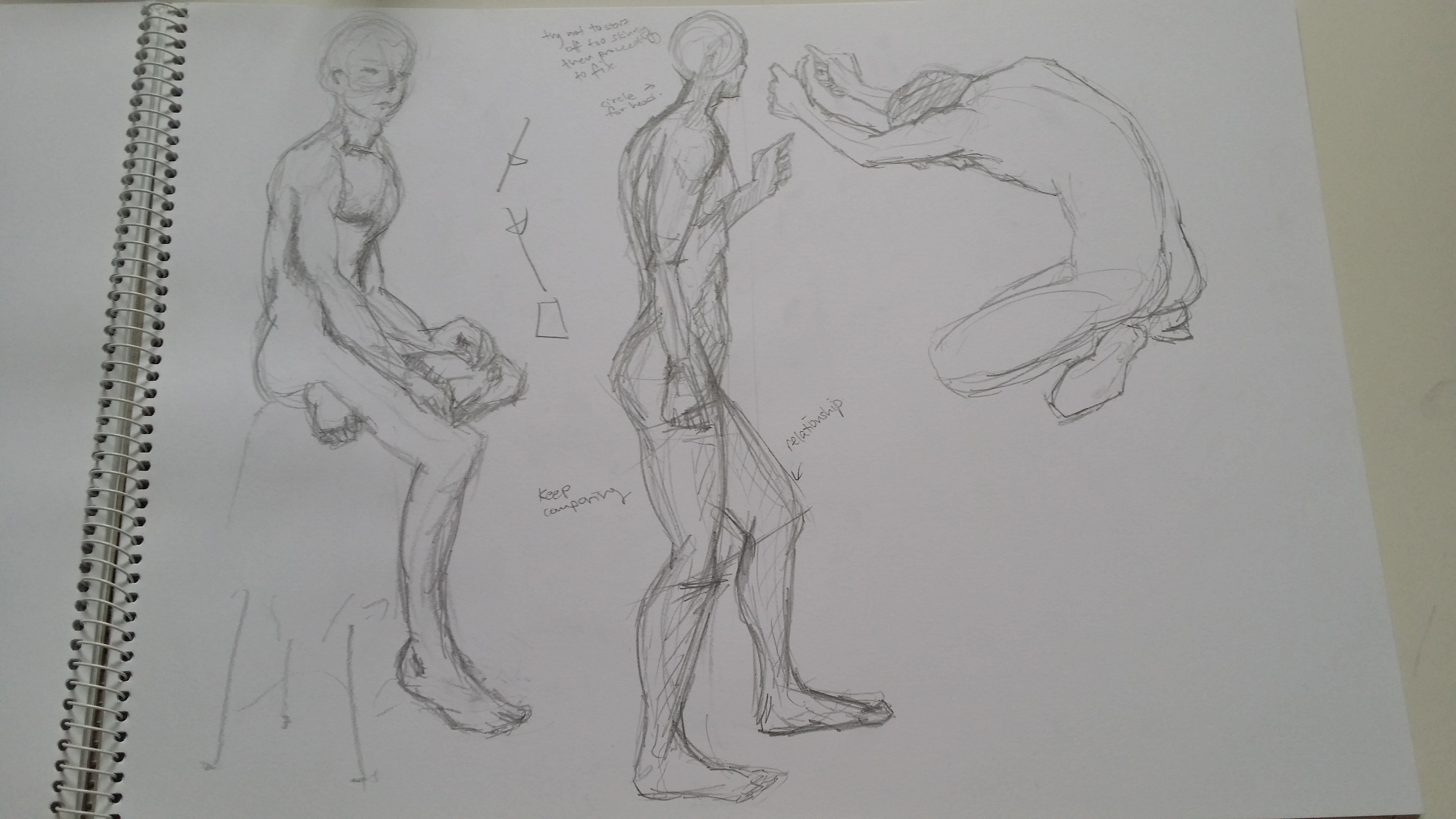
Still life from the first drawing lesson with Calvin! (Charcoal)Thumbnails for first piece of homework! (Graphite pencil)First assignment! (Charcoal, conte and white chalk)From live drawing session with Eddie! (Conte)
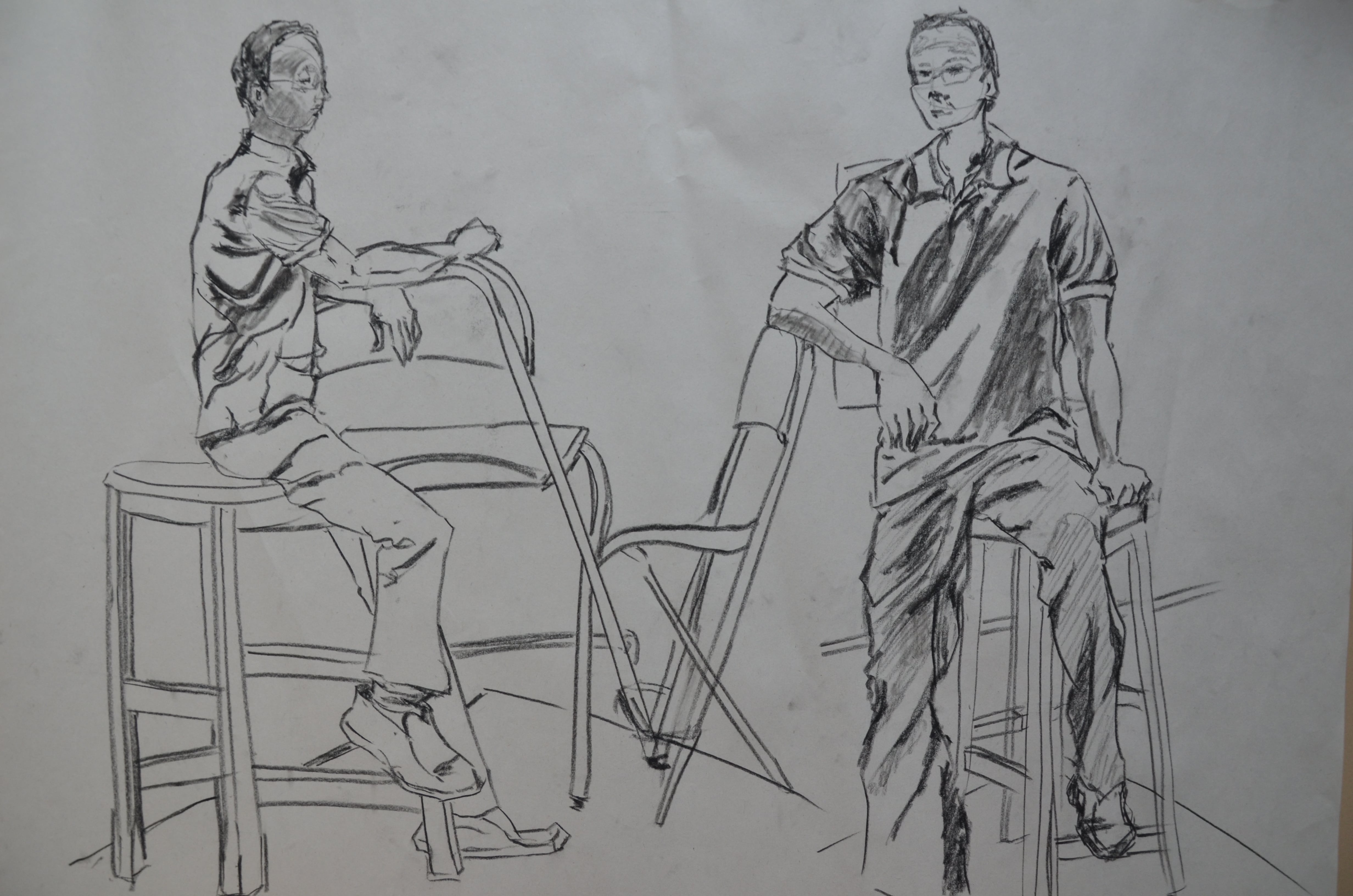
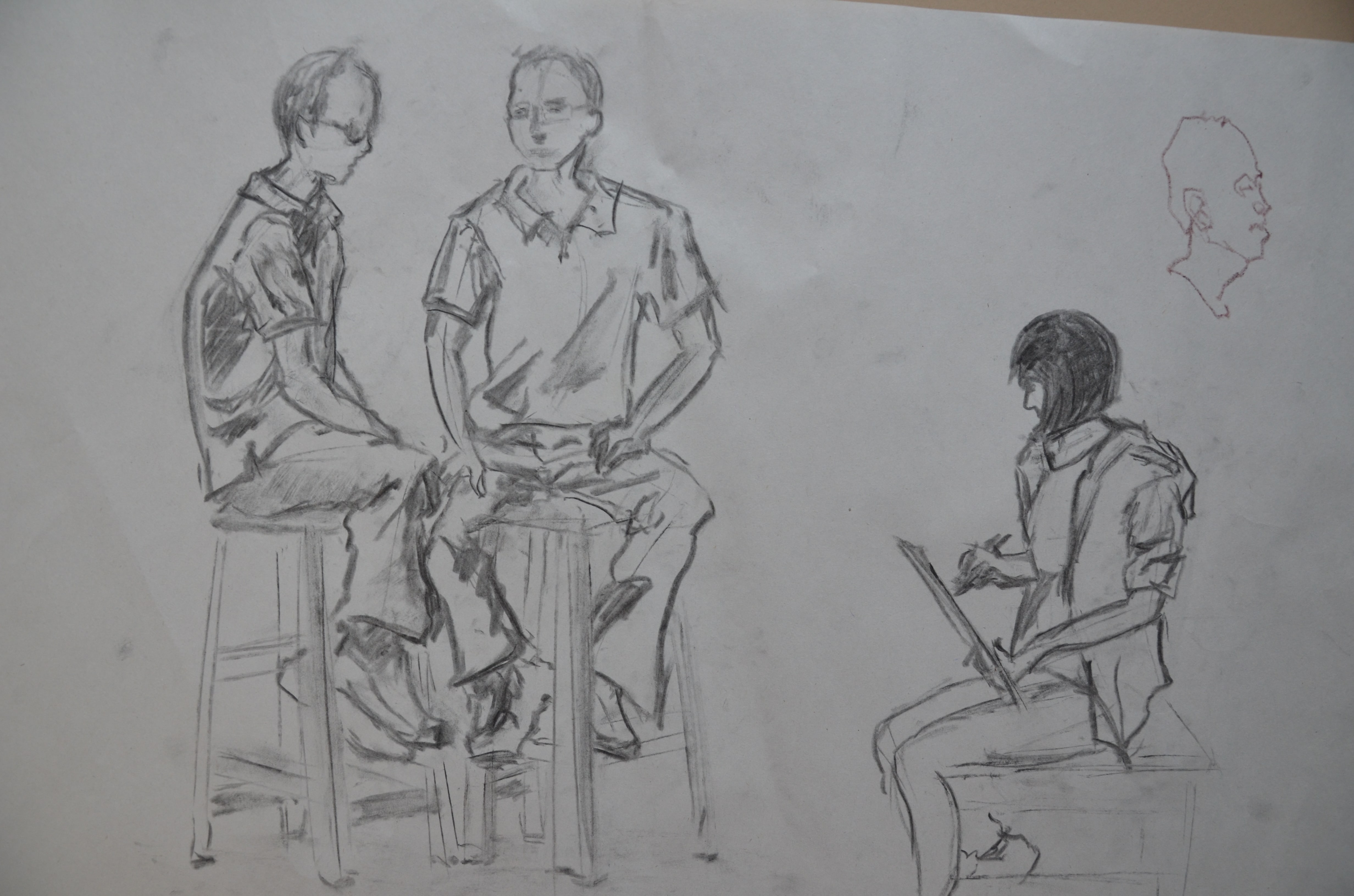
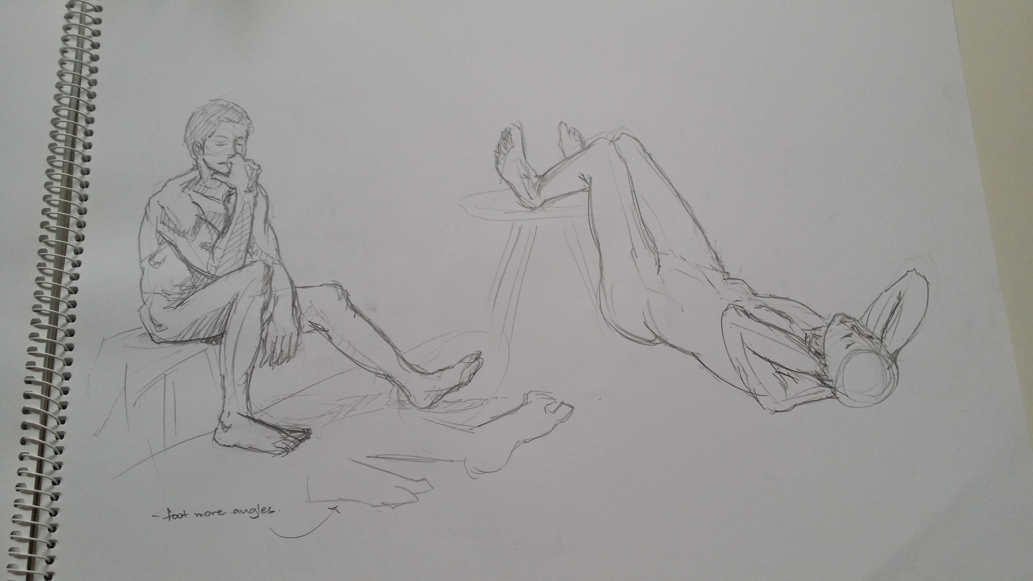
From live drawing session with Eddie! (Charcoal) [Long time no see.. myself?? + Sam drawing on an easel]From live drawing session with Eddie! (charcoal) [A consultation with… himself + Jiaqi drawing)From live drawing session with Eddie! (charcoal) [Mate why are you holding that pole?]
Thumbnails for second piece of homework! (graphite pencil)Second piece of homework! (conte + charcoal) [My dad’s bike in the carpark]
That one time I drew Steven [01]Steven [02]Steven [03]
Steven [04]
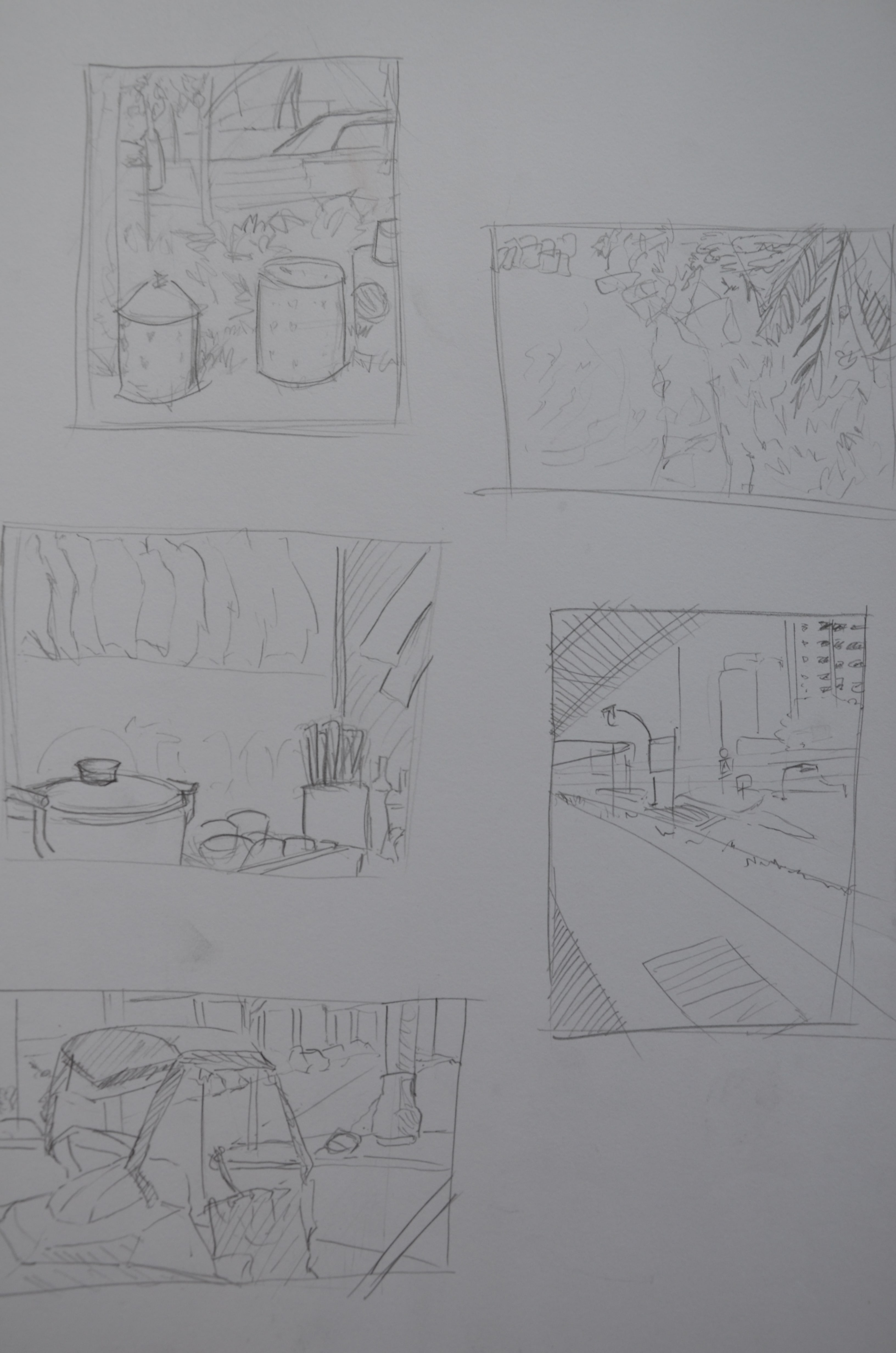
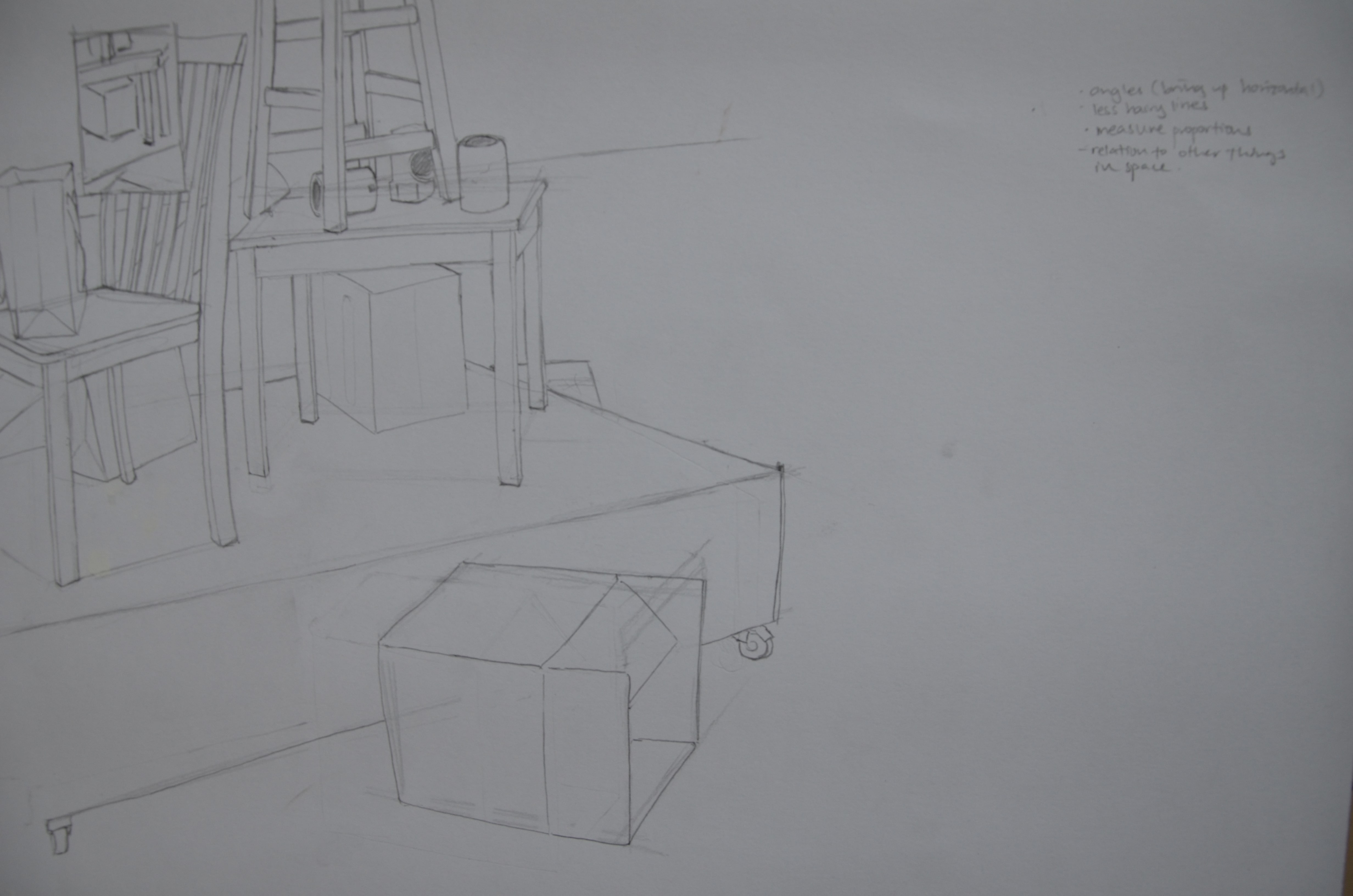
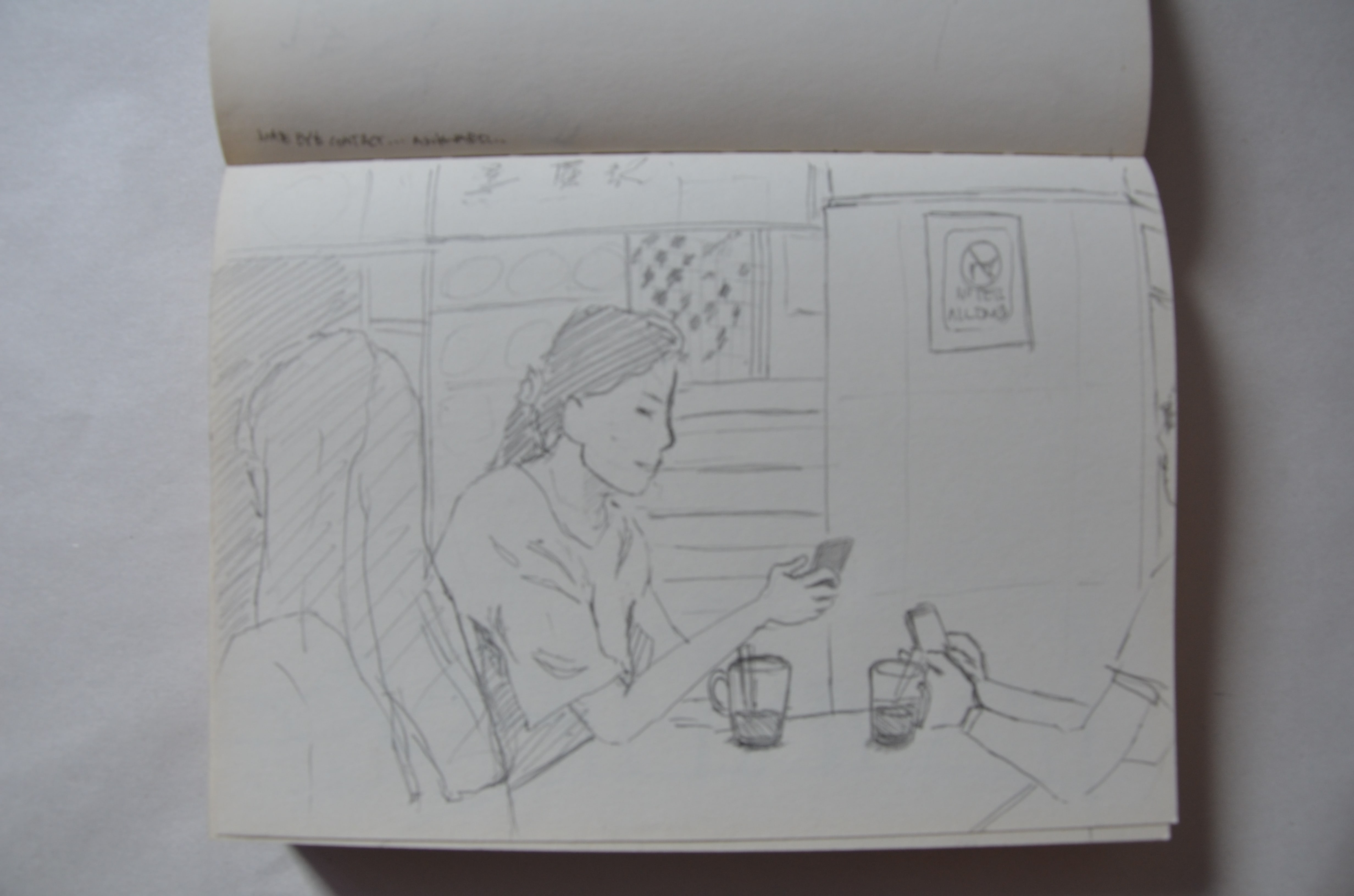
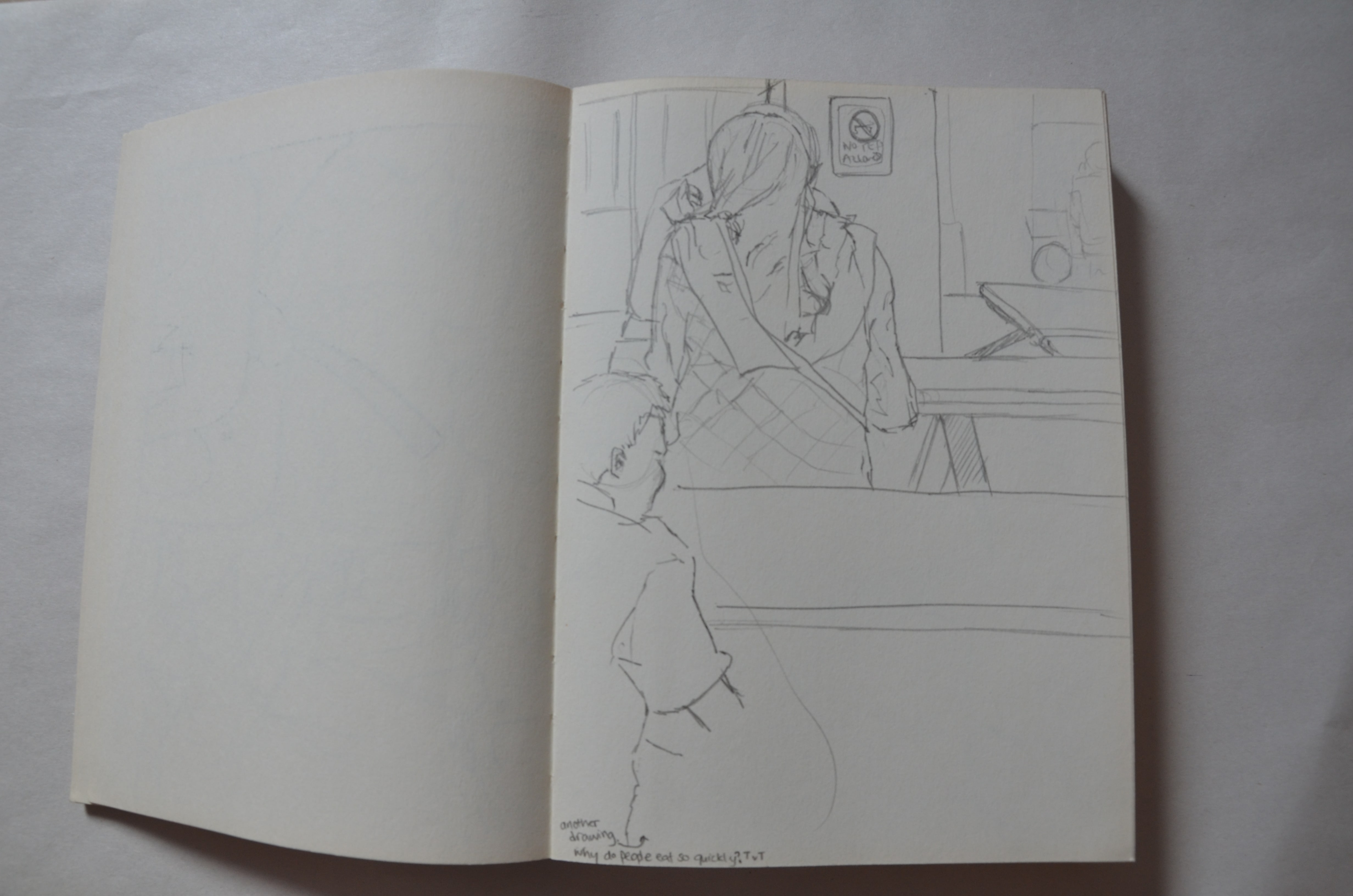
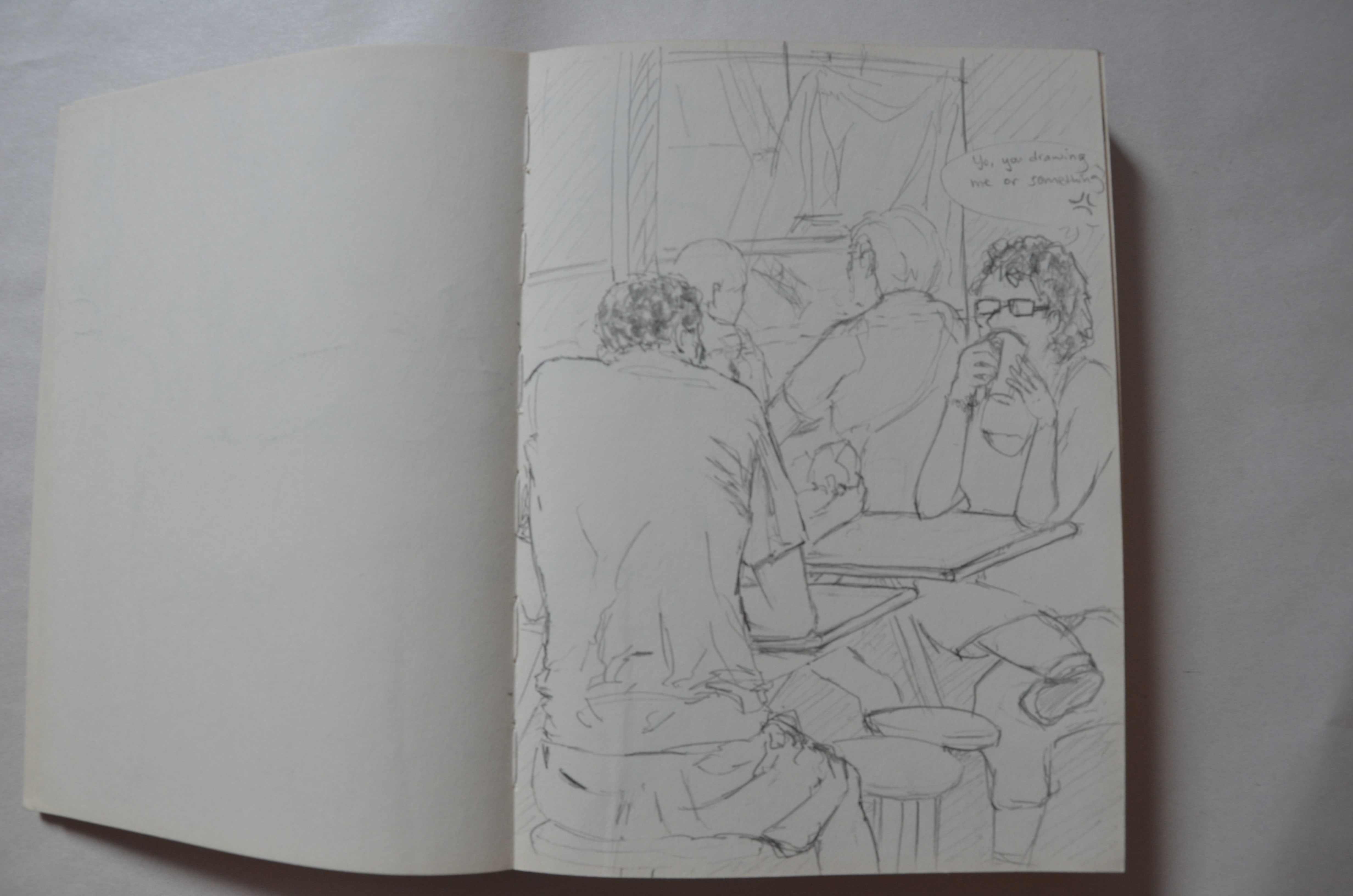
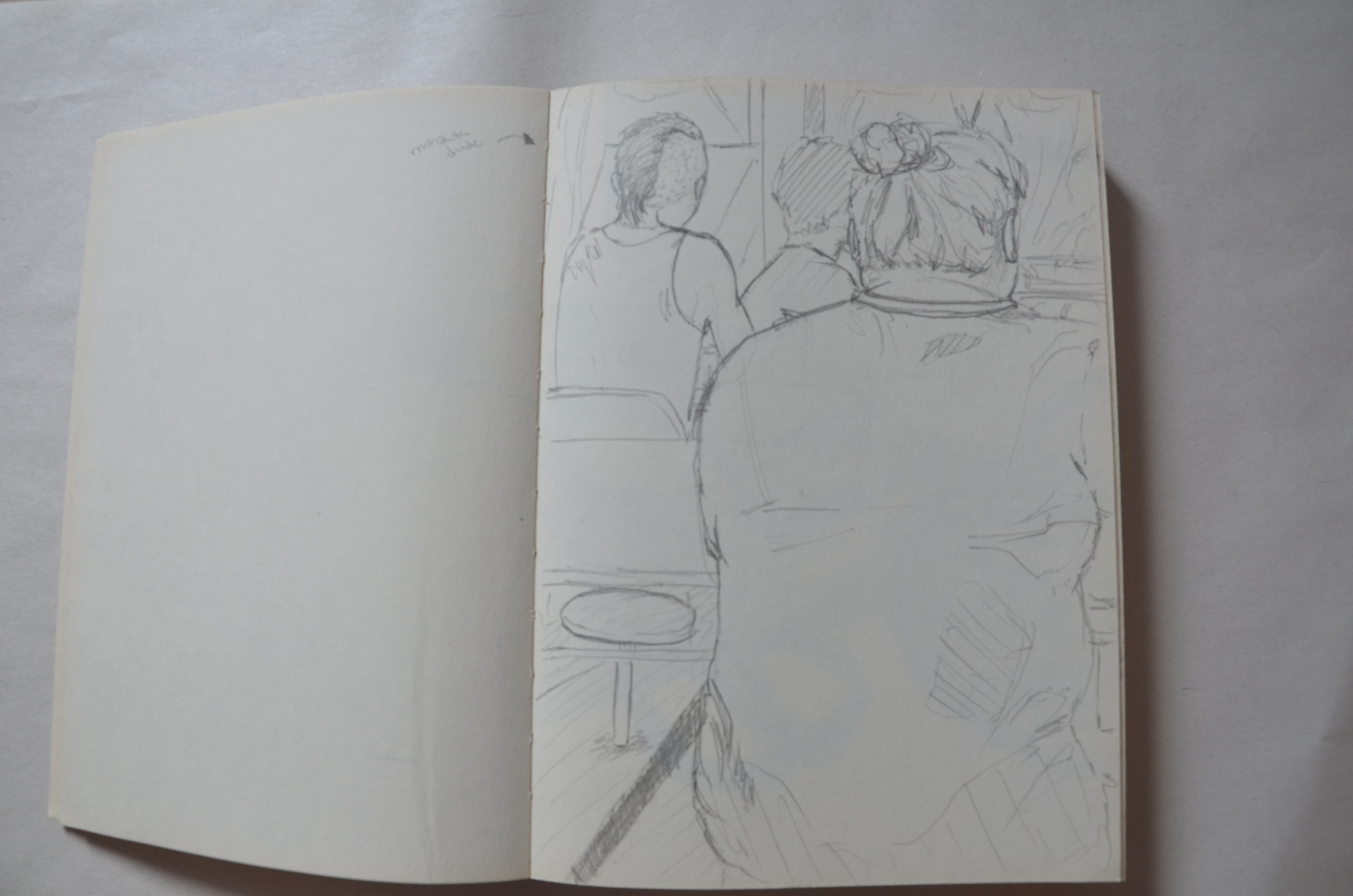
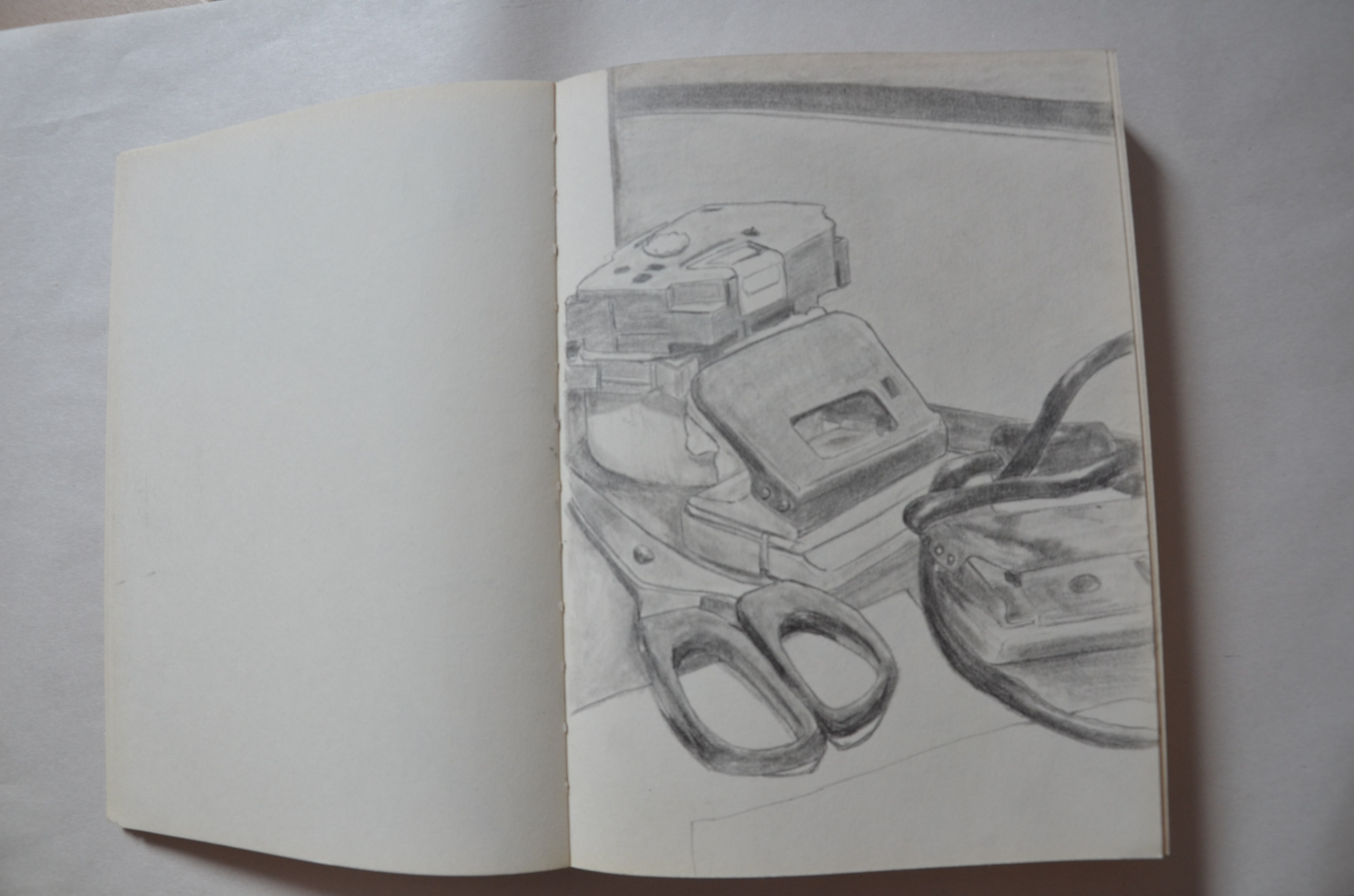
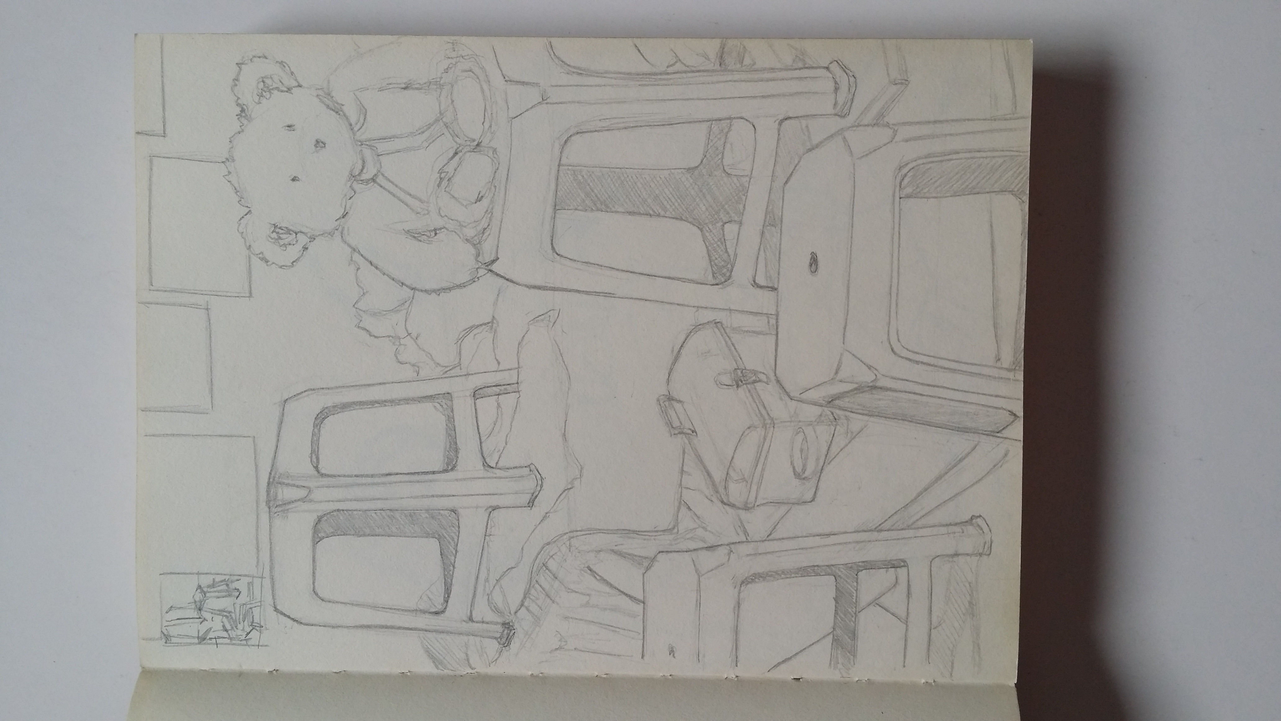
Hand training before drawing a bunch of stools! (graphite pencil) [Cross-hatching…but looks like some kind of abstract art]Planar and Proportion drawing with stools and a bunch of other things! (graphite pencil) [So difficult 8’D]NTI Foodcourt Adventure! (graphite pencil) [01] [on-site drawing @ NTI canteen]NTI Foodcourt Adventure! (graphite pencil) [02] [on-site drawing @ NTI canteen]NTI Foodcourt Adventure! (graphite pencil) [03] [on-site drawing @ NTI canteen]NTI Foodcourt Adventure! (graphite pencil) [04] [on-site drawing @ NTI canteen]NTI Foodcourt Adventure! (graphite pencil) [05] [on-site drawing @ NTI canteen]NTI Foodcourt Adventure! (graphite pencil) [06] [on-site drawing @ NTI canteen]NTI Foodcourt Adventure! (graphite pencil) [07] [on-site drawing @ NTI canteen]
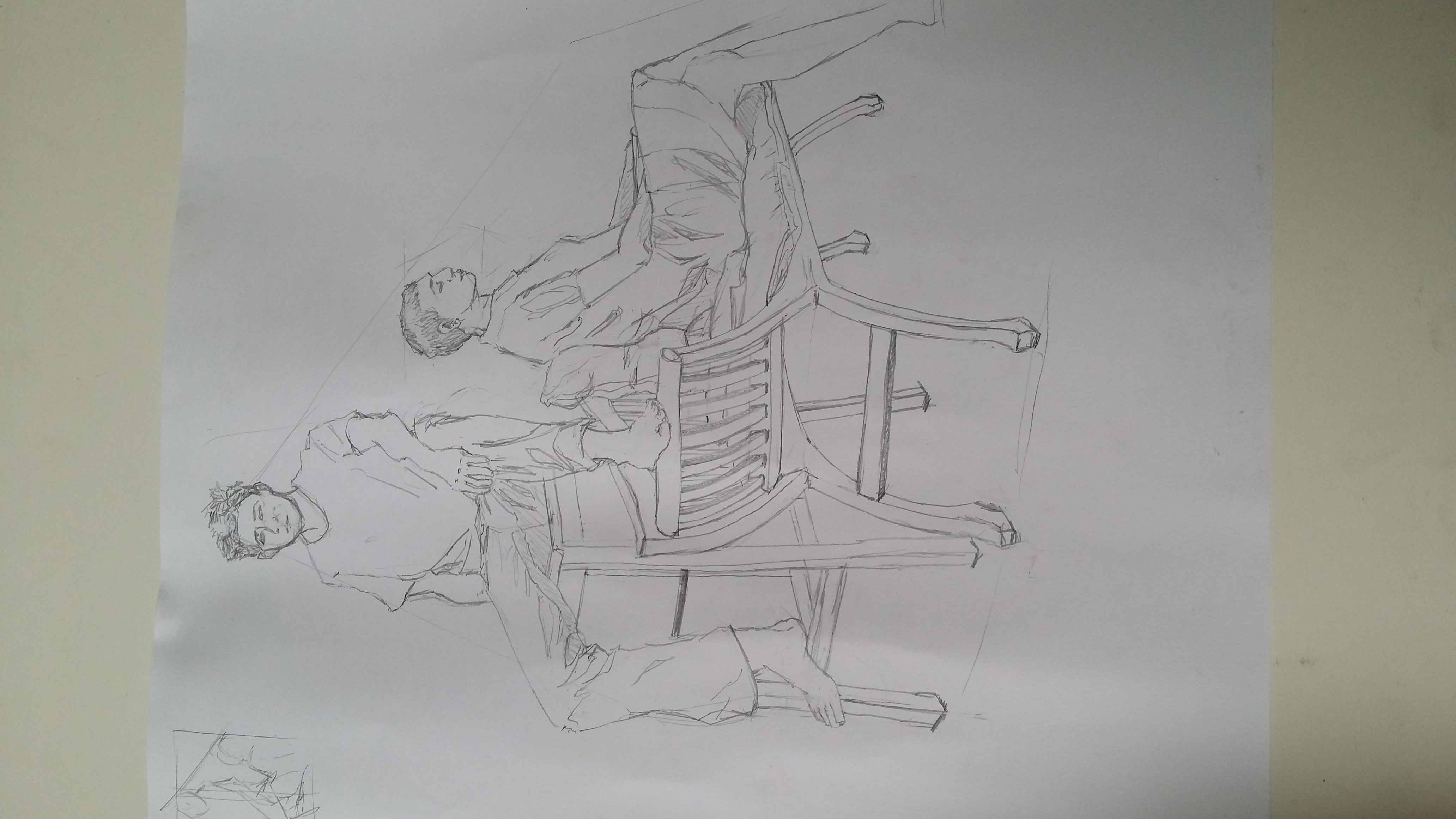
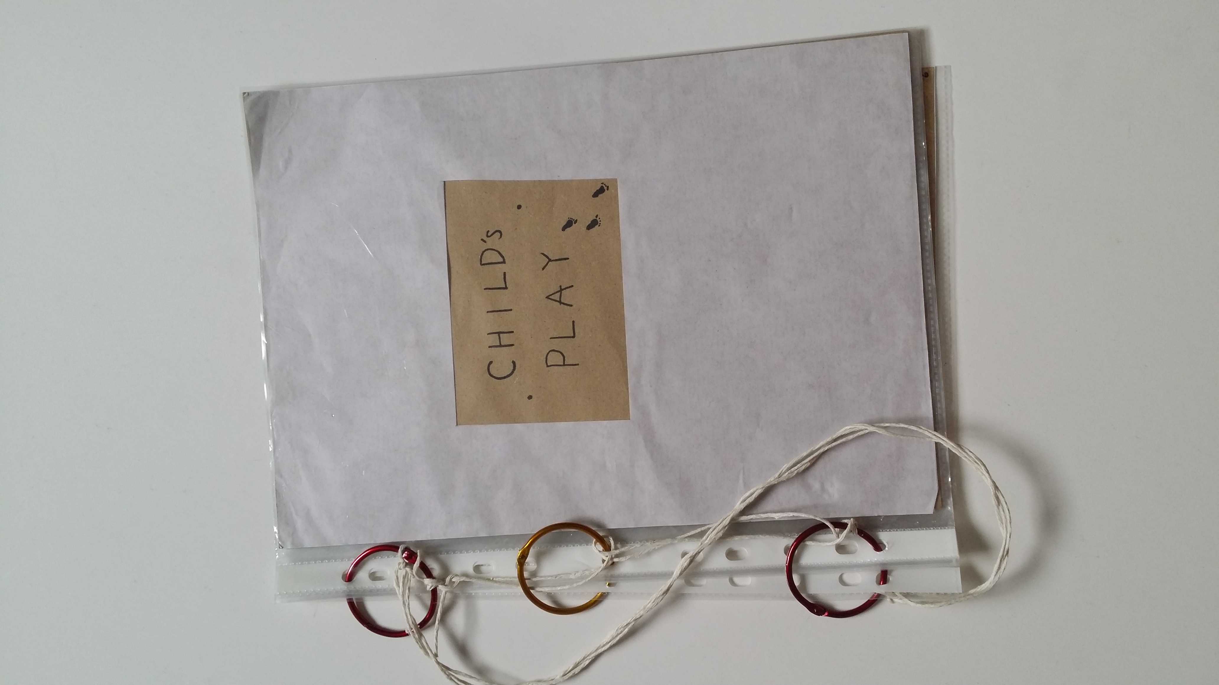
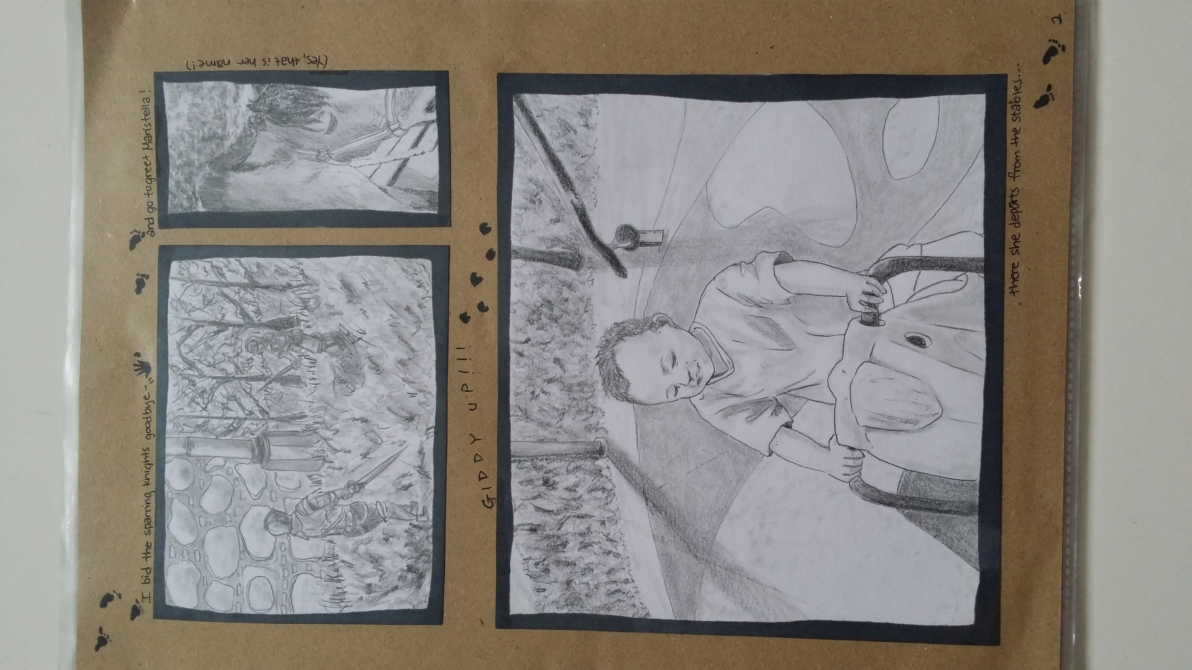
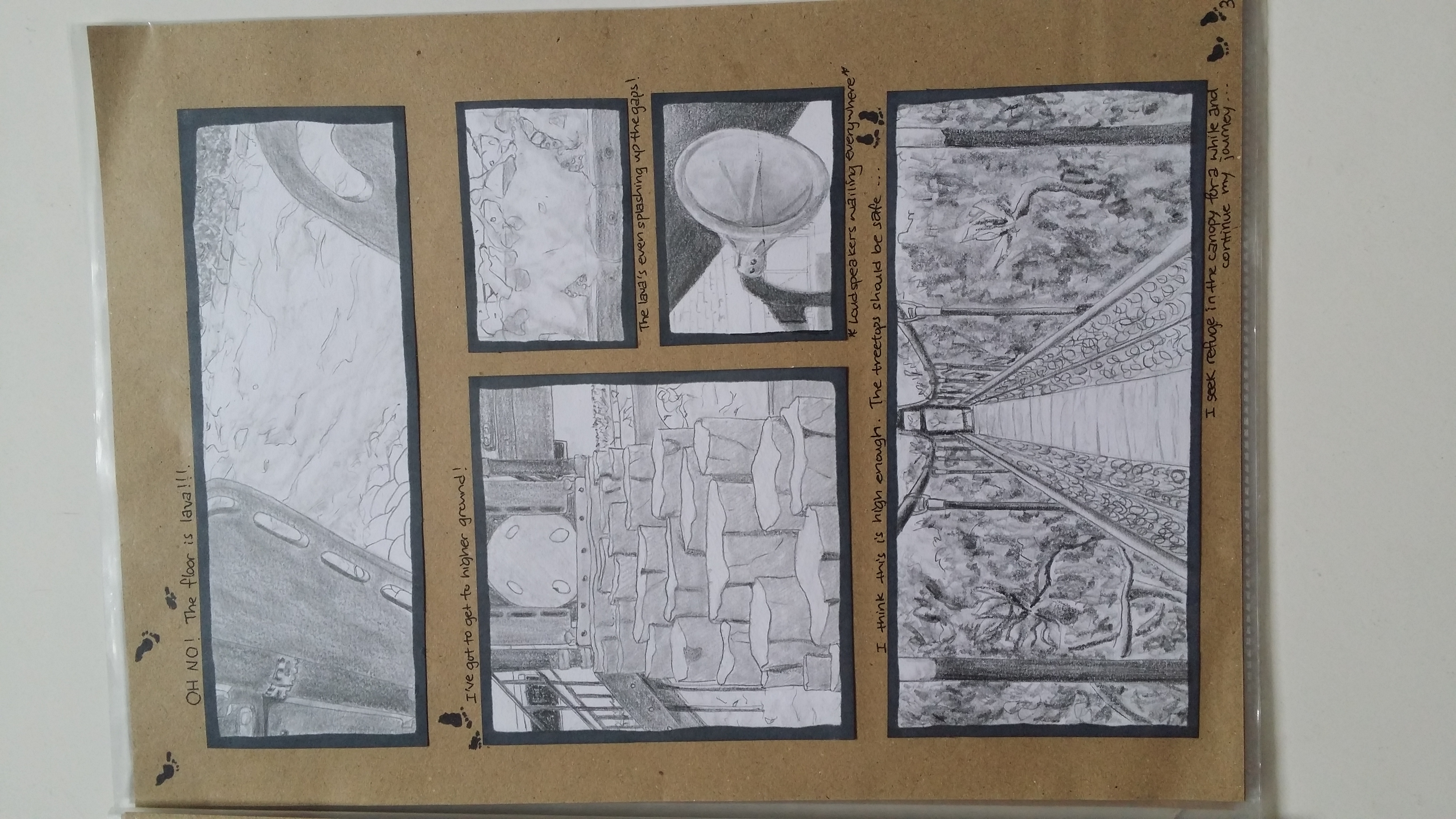
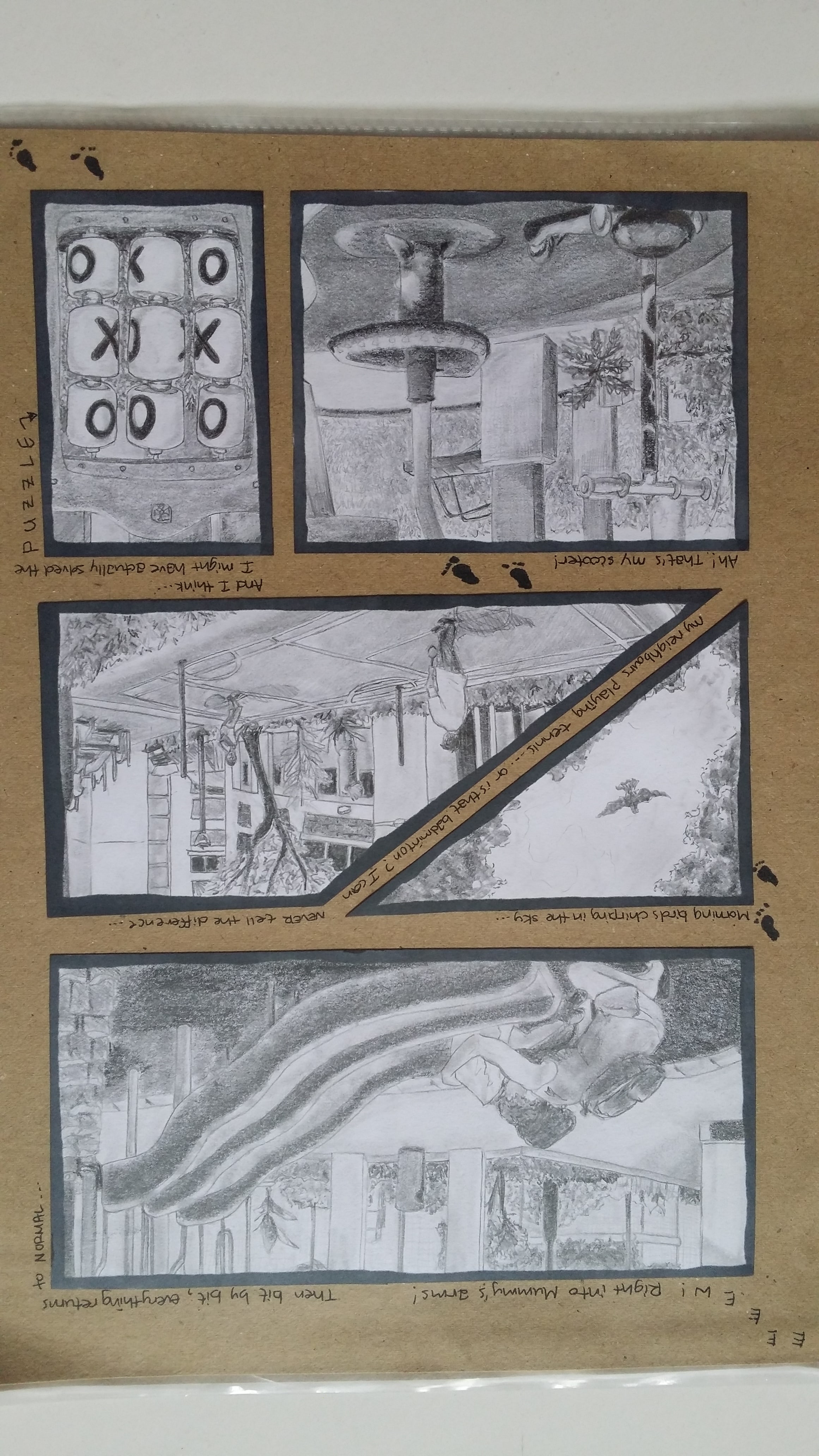
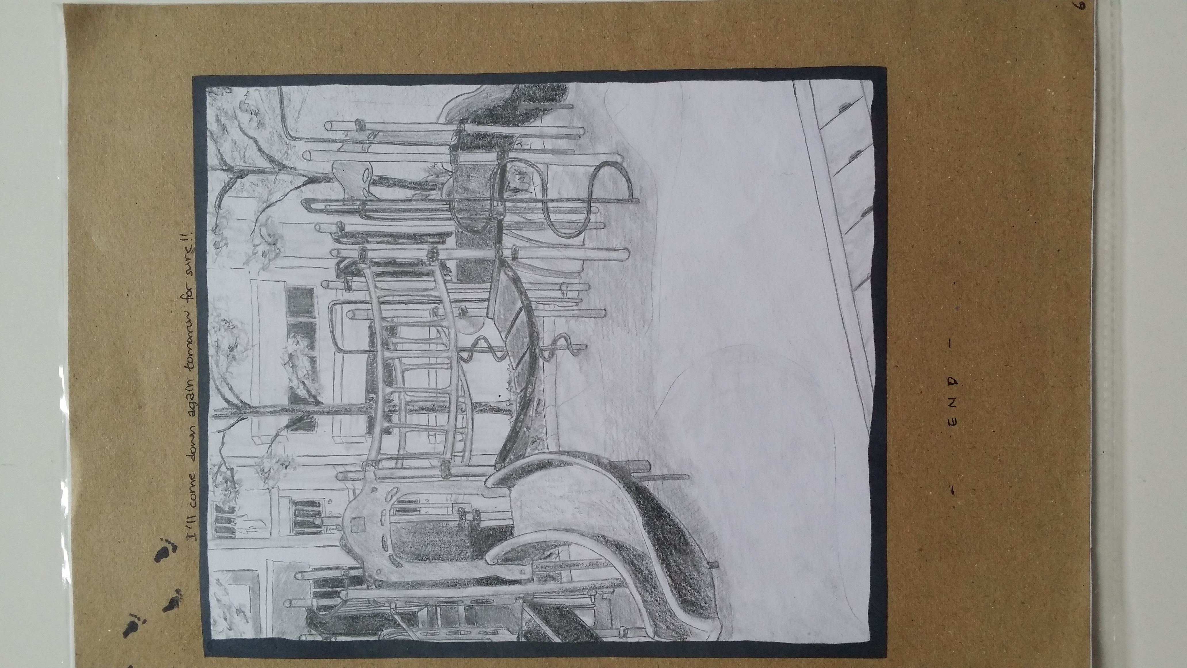
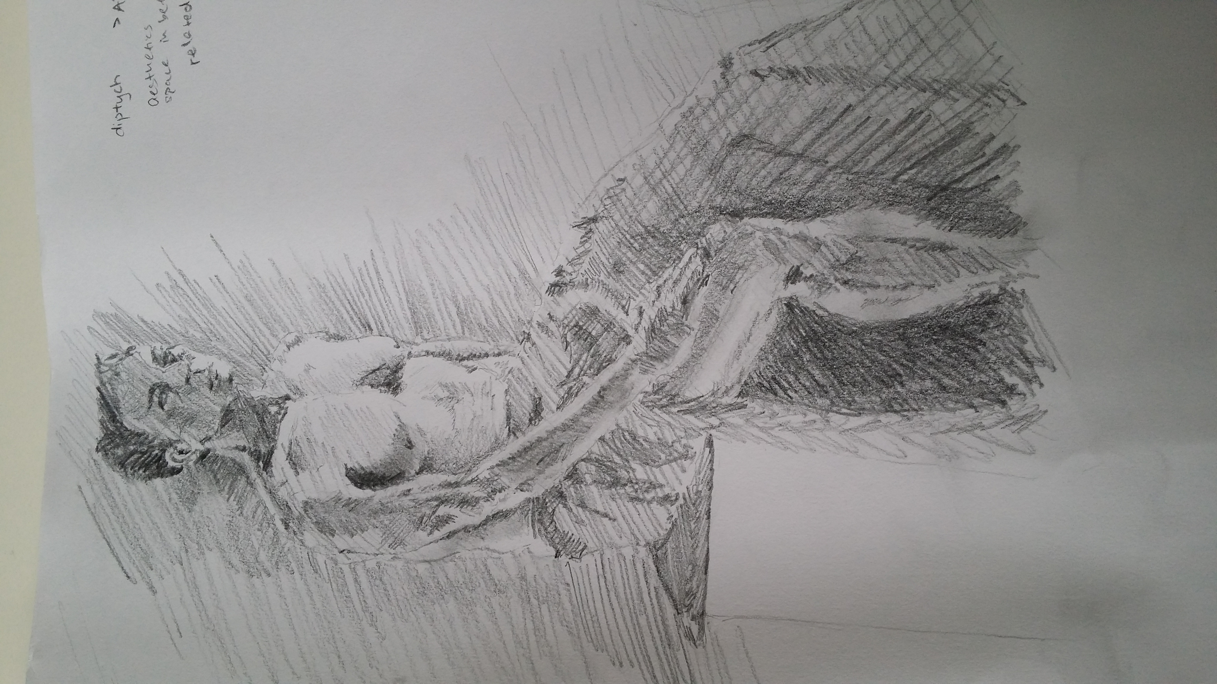
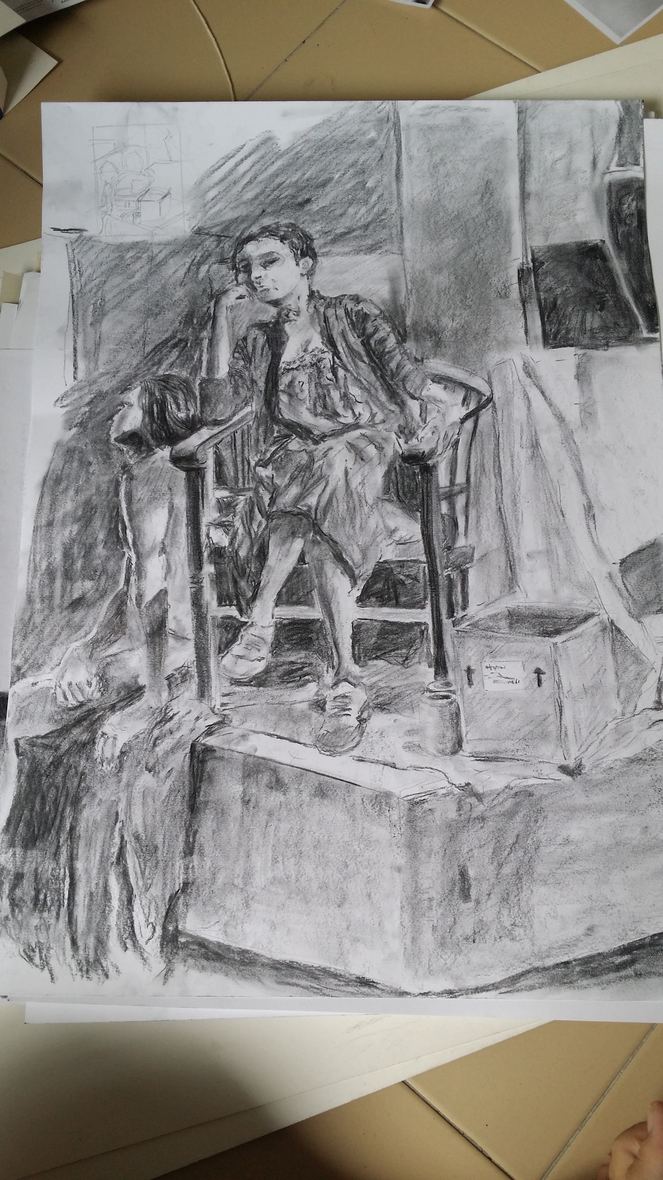
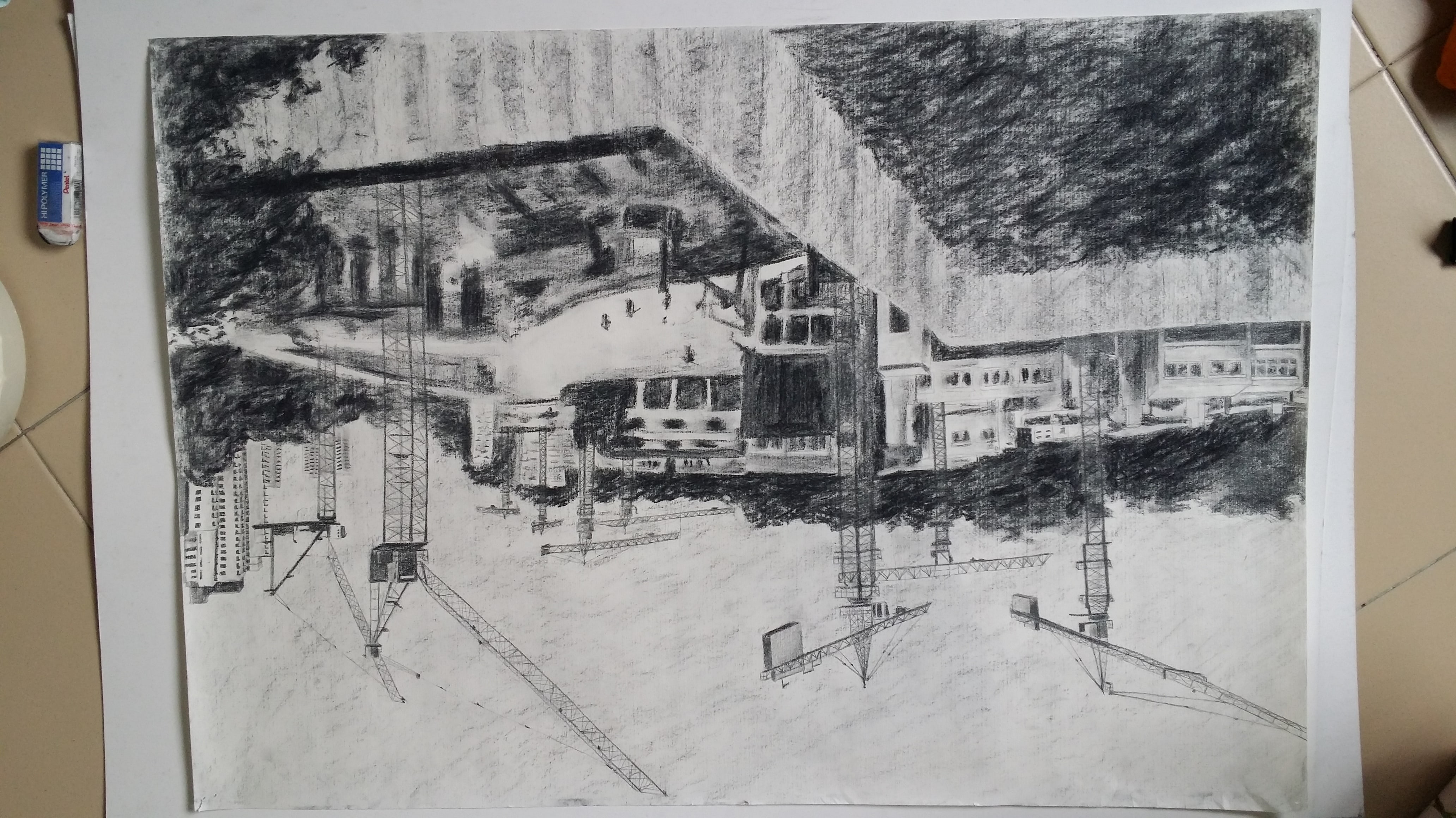
Jack soloJack and Nina compositional live drawingThe drawing I did after our intense stool drawing session where I actually put 4 stools in my room and drew themNarrative drawing assignment: CHILD’S PLAY pg. 1CHILD’S PLAY pg. 2CHILD’S PLAY pg. 3CHILD’S PLAY pg. 4CHILD’S PLAY pg. 5CHILD’S PLAY pg. 6CHILD’S PLAY pg. 7Drawing of Kim Tonal StudyCompositional drawing of Nina and Marla with tonal studyFinal A1 Diptych drawing 1: Construction site Ever-changingFinal A1 Diptych drawing 2: Horse statue in Grandma’s house Frozen in time.


 +
+ 

 +
+ 
 +
+  =
= 


 +
+  =
= 


 +
+


