
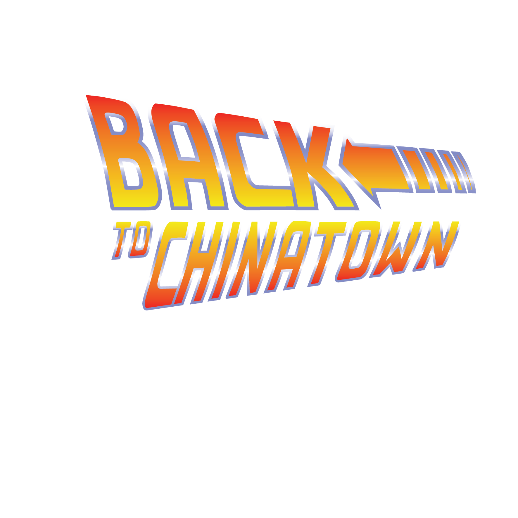
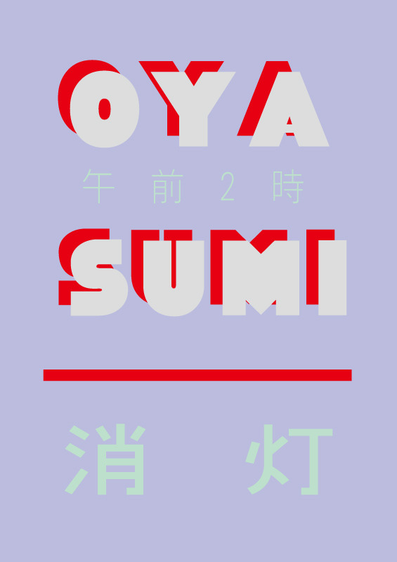
|| For my Zine: Locale project, I decided to pick the area of Chinatown since I’ve never really thoroughly explored the area before despite having been there on a few occasions during Chinese New Year. So I thought that this would be the perfect chance to get to have a nice adventure around the area on my own!
The slides below are a compilation of the primary and secondary research that I have done at the site:
—
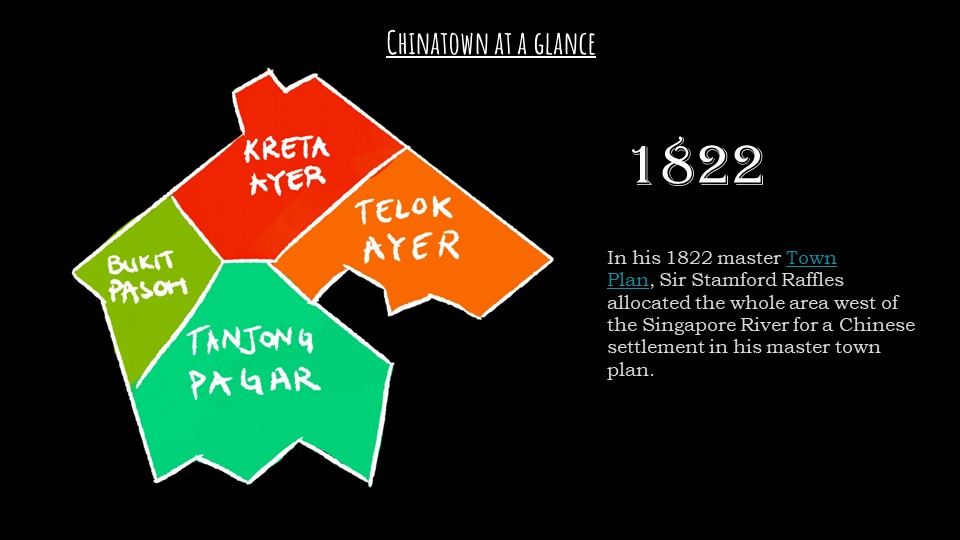
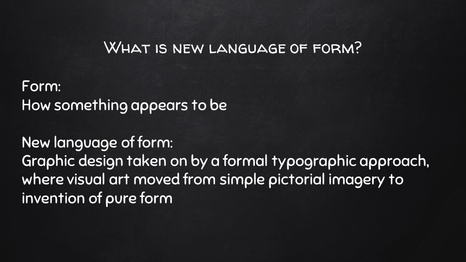
Chinatown was made into a social enclave for the ethnic Chinese immigrants in 1822 when Sir Stamford Raffles first founded Singapore.
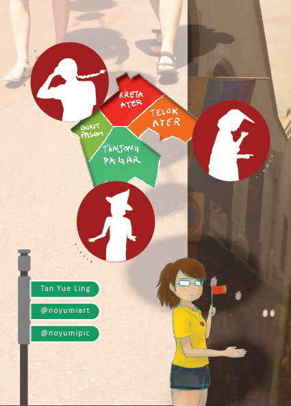
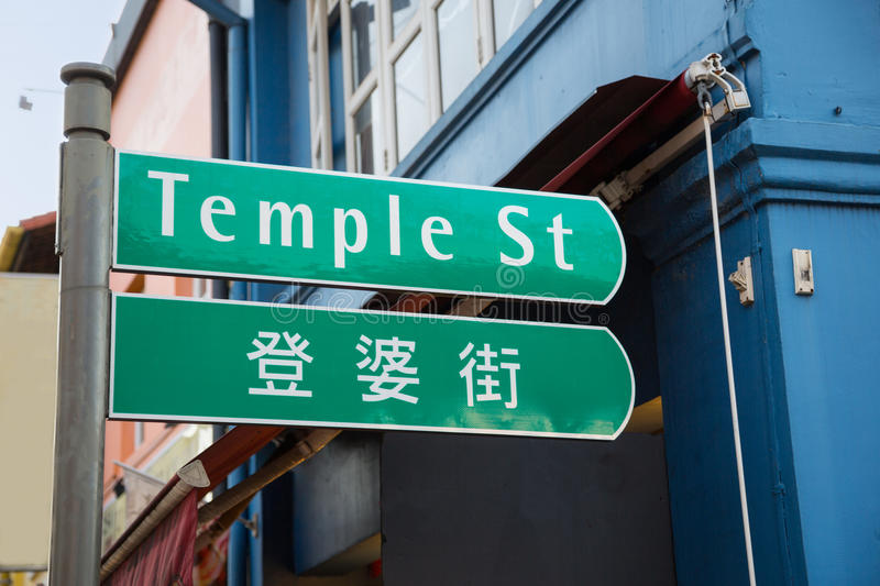
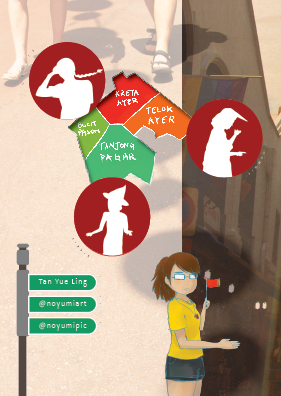
The general Chinatown area is actually split into 4 major areas, Kreta Ayer, Telok Ayer, Bukit Pasoh and Tanjong Pagar. The sites with more tourists and things to see are the Kreta Ayer and Telok Ayer region, where you can find all the souvenir stores and temples!
Kreta Ayer is named after the water carts that were pulled around in the past because accessible water was usually far from homes. This gives us insight into how Singapore used to be a not-so-well off place, compared to now.
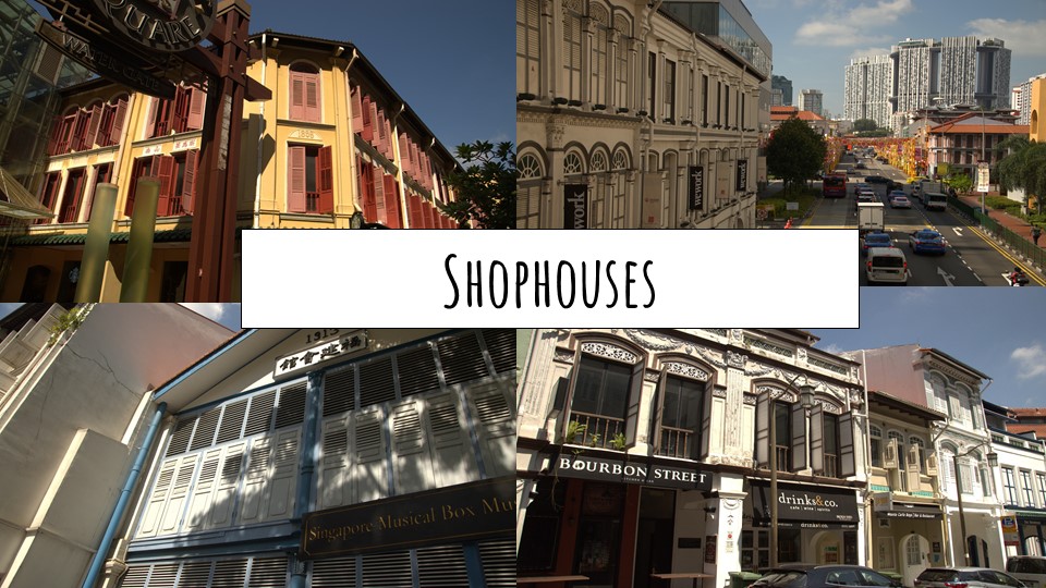
It would literally be impossible to miss these shophouse style architecture around Chinatown. There are different styles, as one can tell from the window decoration. They could be first, second or late transitional, or art deco style shop houses from the colonial times that are really iconic to the venue.
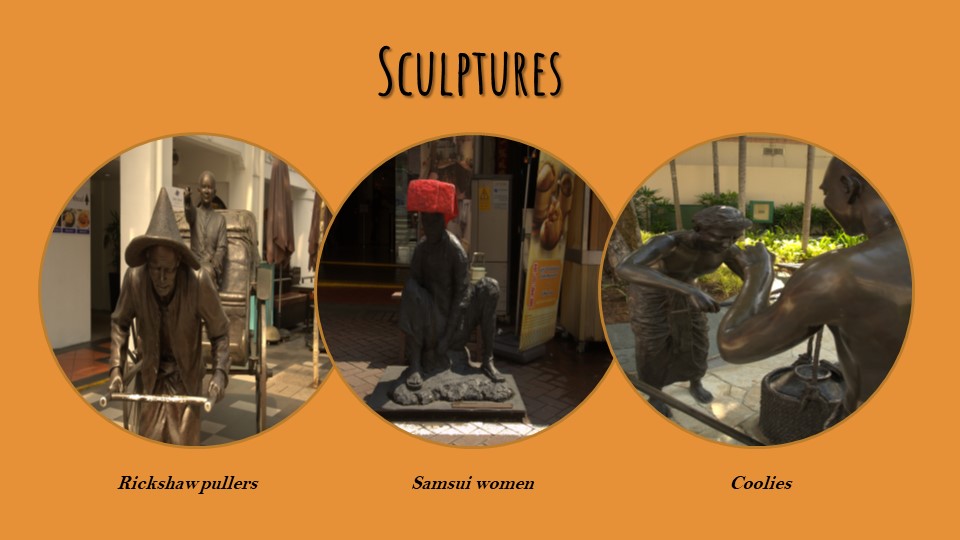
There are bronze sculptures littered around Chinatown of its inhabitants in the past such as Rickshaw Pullers, Samsui Women and Coolies that came from China to Singapore in hopes of better job opportunities. Many immigrants that came here toiled hard and worked tough jobs.
After reading a book called Kreta Ayer I borrowed from the library, I learned a lot more about the lifestyle back then. Samsui women, for example, “could be found in construction sites, digging ditches, scooping sand and cement, and carrying stones and bricks.” They also had a hair combing ritual called the Golden Orchid Pledge which they swore celibacy by. Areas used to have a more morbid past such as Sago Lane having death houses and opium dens while Keong Saik road was basically a red-light district with many brothels where pipa women would work to entertain men.
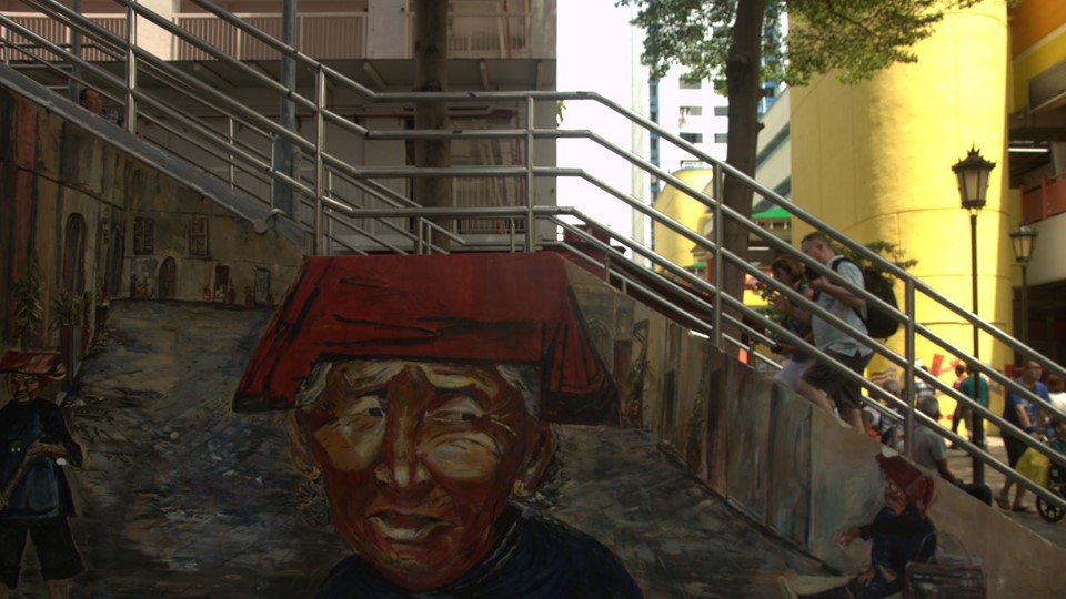
This giant mural near Maxwell Food Center was made by ACS students and is one of the most popular murals at Chinatown!

One of the iconic temples there was the Thian Hock Keng temple – Temple of Heavenly Happiness, which I happened to step into randomly (had no idea about it before reading Kreta Ayer). It is the oldest Chinese temple in Singapore and is dedicated to Mazu, the Goddess of the Sea that people would pray to before leaving for voyages at sea. When the 2nd World War came to Singapore in 1942, Chinatown suffered the brunt of Japan’s frequent air raids. There were no air shelters and with Chinatown being so crowded, casualties reached as many as 2,000 a day. During the Japanese Occupation, the loss of jobs caused thousands to turn to hawking on the streets.
Here is an audio recording I took while inside the temple:
https://soundcloud.com/l-ryuugahideki/chinatown-temple
You can hear the sound of a bell which I rung, out of multiple bells there that catered to different wishes!

Of course, we really can’t miss the most iconic temple in Chinatown: the Buddha Tooth Relic Temple! It is said to contain the real Buddha’s tooth (which….I actually highly doubt so because my sister once told me she saw the relic on a tour and it was like… some sort of jewel?)
The prayer hall is really massive and sparkling golden and the moment I saw it I had already decided that it was a contender to be in my middle spread.
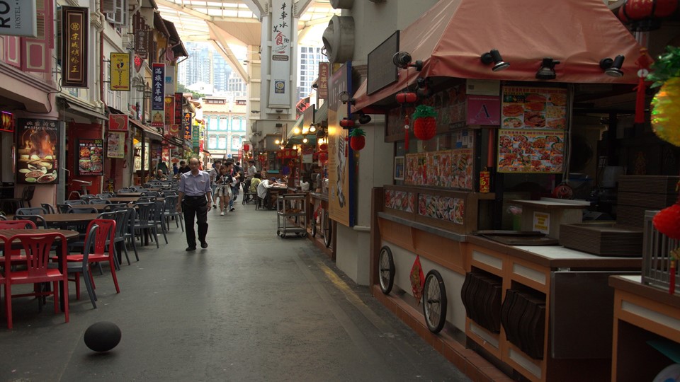
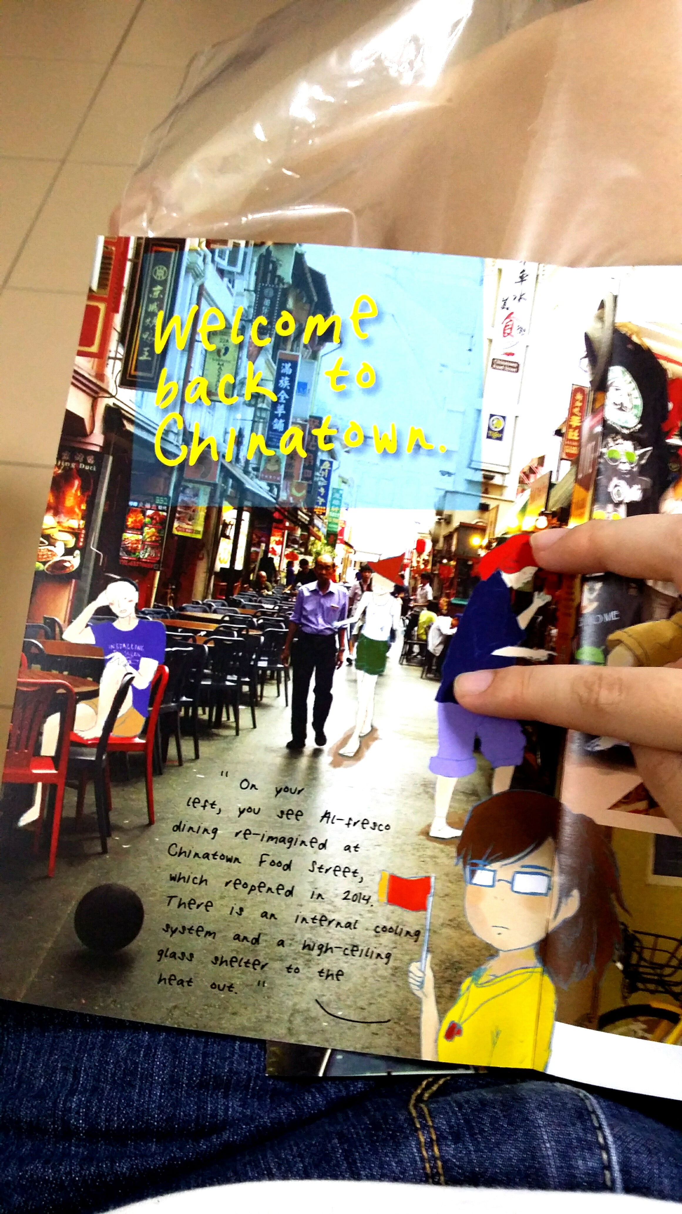
Here’s the Chinatown Food Complex! I’ve been here with my family once, the food is so expensive TvT As expected of tourist sites…
The complex is meant to revive the idea of al-fresco dining in a street setting. It re-opened in 2014 with an internal cooling system and high-ceiling glass shelter. The street hawkers, operating out of nostalgic mobile carts, recreate the good old days of open-air eating.
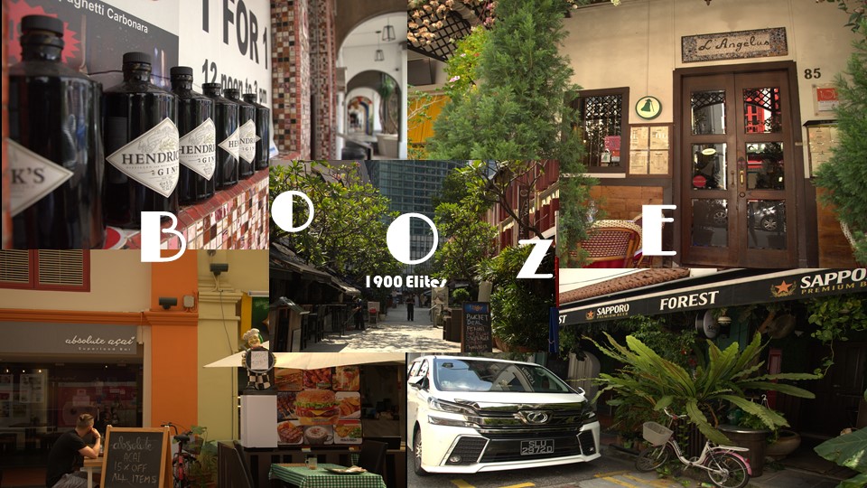
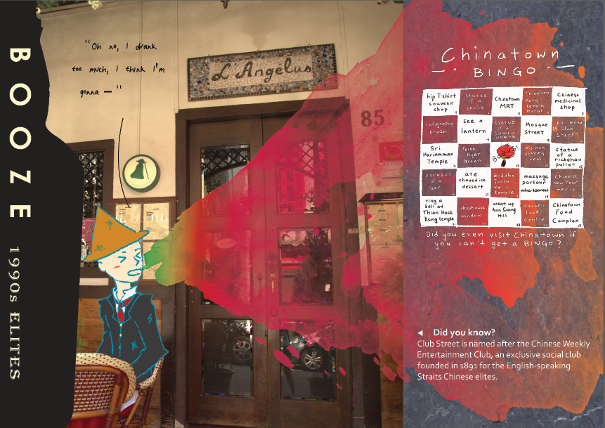
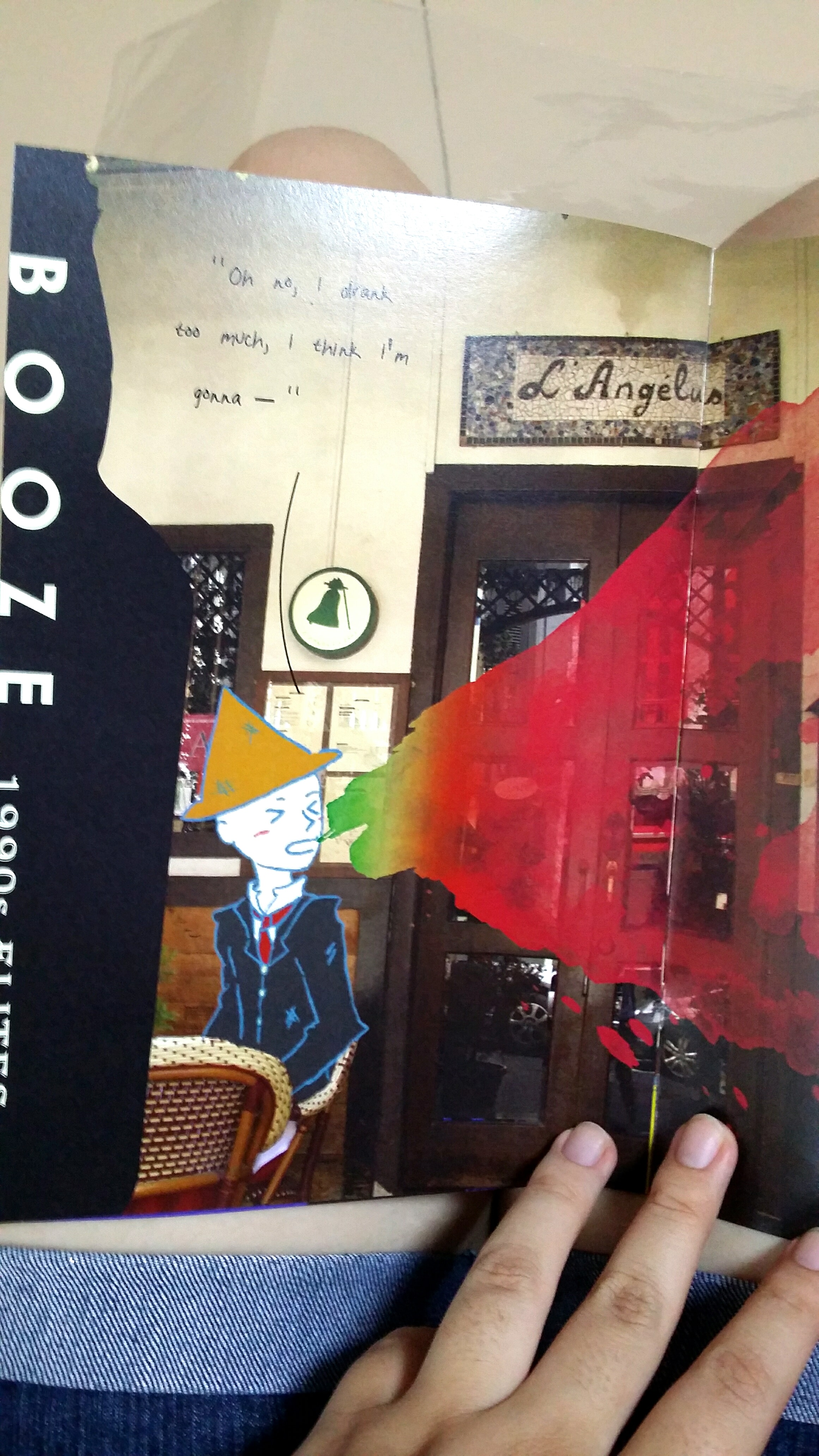
The area of Telok Ayer and Club Street is well-adorned with an abundance of pubs and bars.
Now, I don’t drink, so I can only imagine what kind of heaven this area of Chinatown is for alcoholics.
Here are where many of the shophouse architectures are as well, and is one of those spots artists like to go to to sketch.
Club Street is named after the Chinese Weekly Entertainment Club, and exclusive social club founded in 1891 for the English-Speaking Straits Chinese elites.
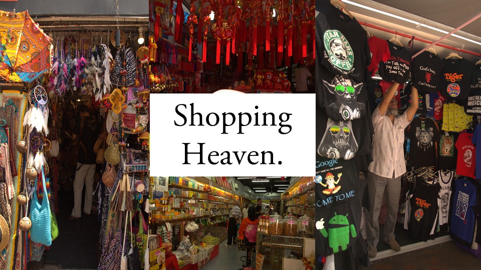
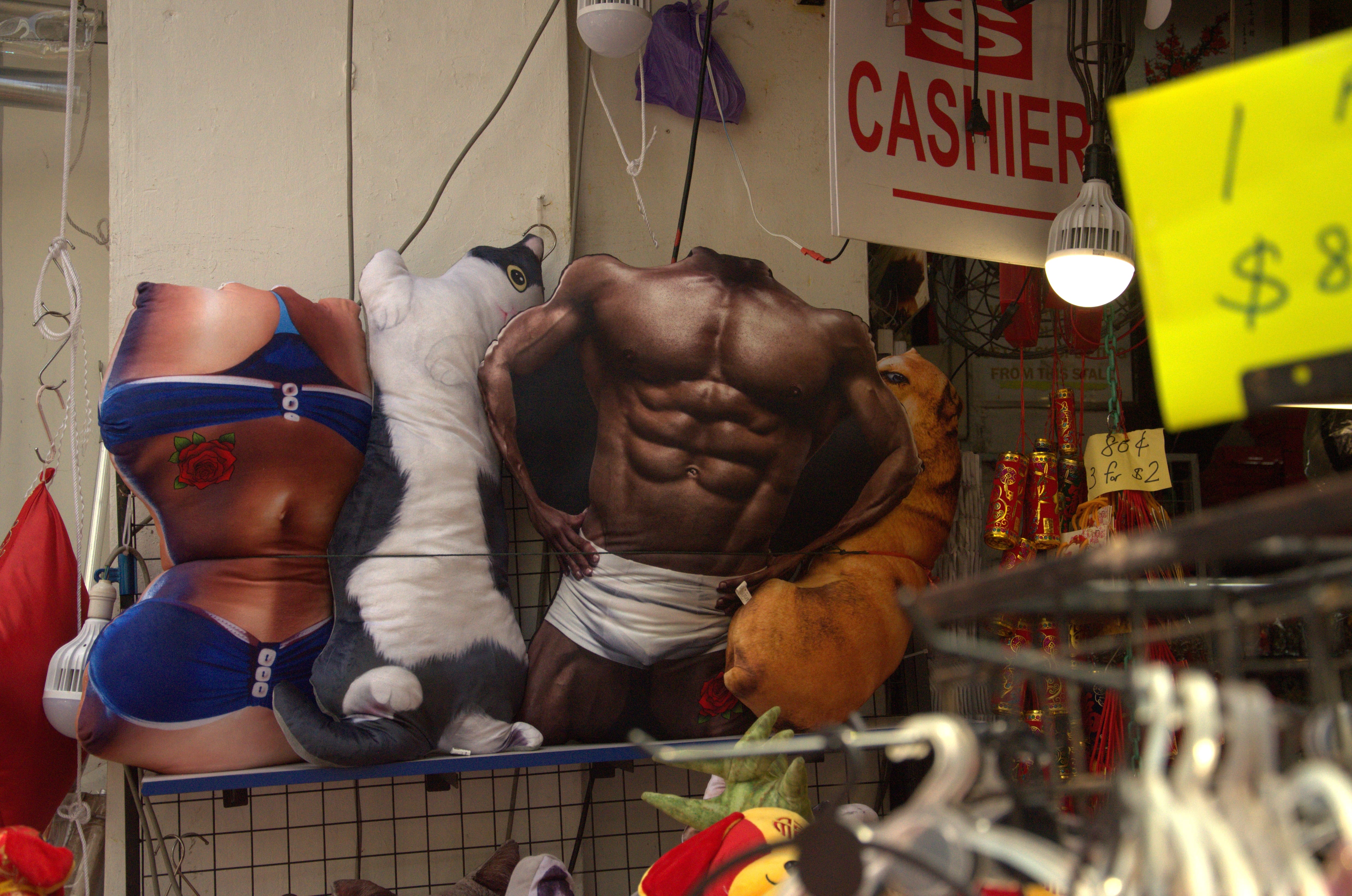
Needless to say, there are a ton of shops, especially along Pagoda Street, selling souvenirs ranging from hip shirts, to paintbrushes, to just… really weird stuff.
I found this quote in Urban Sketchers’ Chinatown book, and really relate with:
“Chinatown offers me neither a sense of identity nor belonging. Yet I take great pleasure in walking its streets, secretly revelling in its contrived nature, while seeking out the genuine connections people may have to the place.” Nursil
a, social worker.
Here is a video made up of a bunch of smaller clips of the things I saw and heard walking around Chinatown:
There are multiple juxtapositions of pop culture and old architecture.
Initially, I was looking through a few styles to come up with a style for my zine because I felted kind of daunted by the task of filling up 8 pages of a zine on my own.
How about an Alice in Wonderland style illustration book with me meeting mythical creatures in Chinatown?

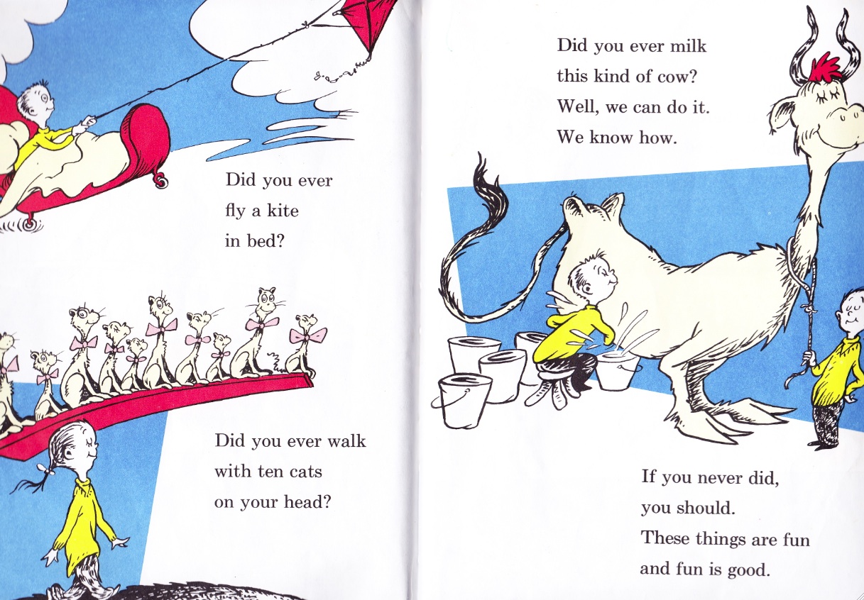
Perhaps I could do it like Dr Seuss books; spaced out compositions with some fun text?
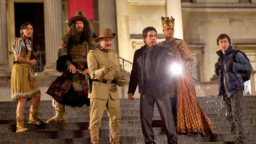
All this history talk also reminds me of Night at the Museum, perhaps I could bring historical figures alive?
The possibilities were endless with a zine.
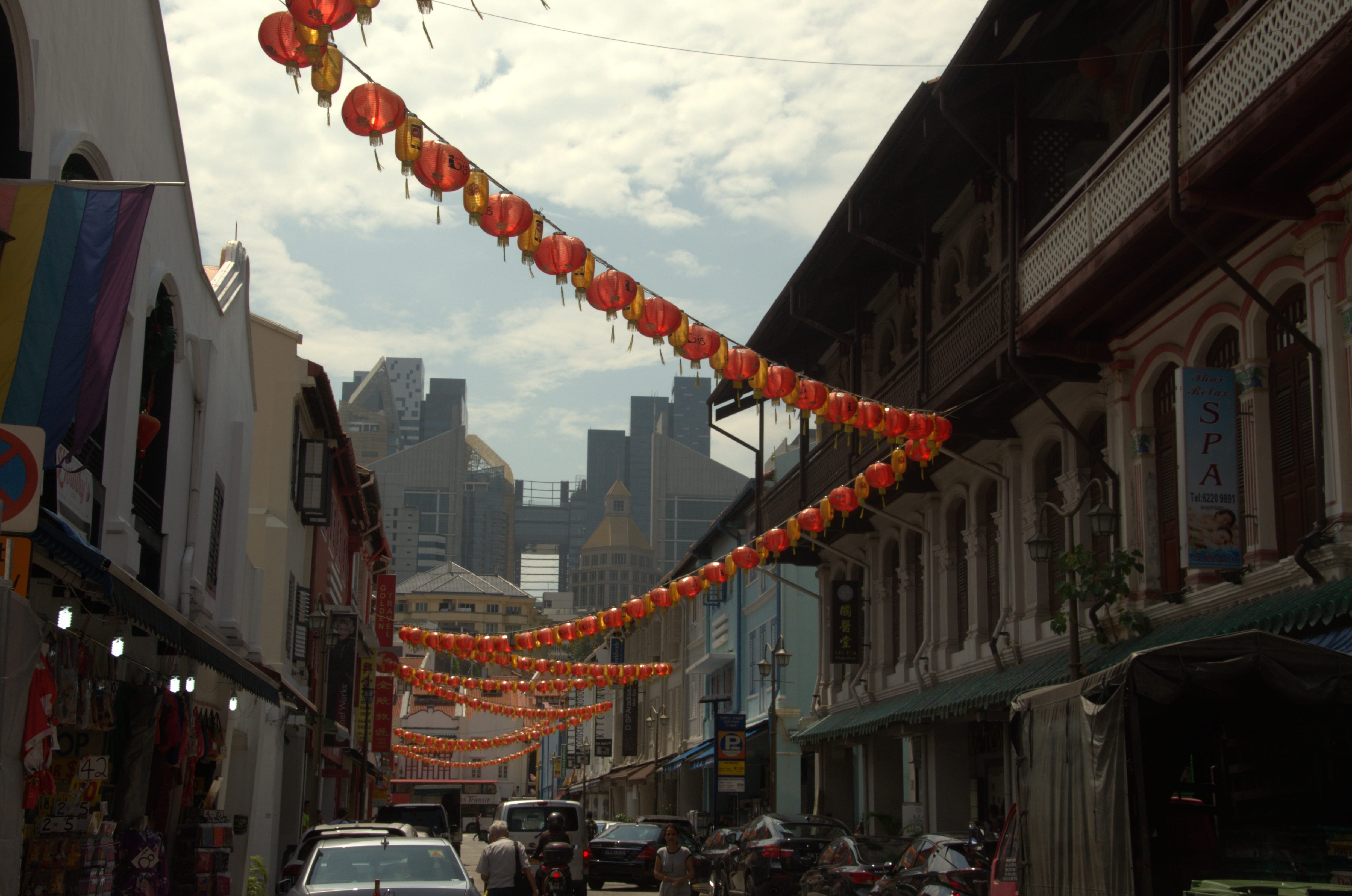
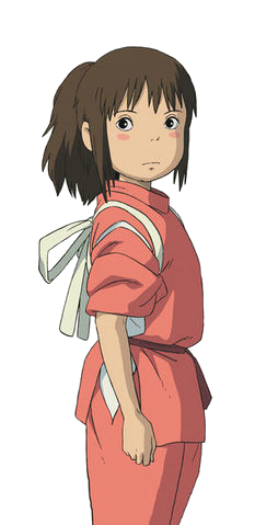
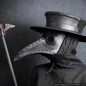
It wasn’t until I was chatting with a senior until I realised that Chinatown and the world of Ghibli’s Spirited Away had uncanny similarities, especially with the lanterns and all. I mean, this:

versus this?
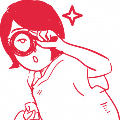
At this point, I’m practically Chihiiro (the protagonist).
So I drew myself as her.
It gave me the idea of a tour.
And then it struck me: if it was so hard trying to imagine myself back in old Chinatown, why not bring people in the past back to modern Chinatown?
We could bring people like the rickshaw puller, coolie and samsui woman to present day Chinatown to witness the fruits of their labour and have fun while at it!
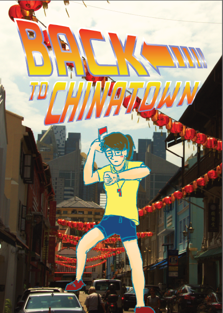
And so begin my humble project:
I spent a good hour learning how to make this font on Illustrator by following this tutorial:
Yay! Now I know how to install new fonts, control gradients and distort my text!
I thought hmm… I literally have over 260+ photographs. It would be a huge pity not to use any of it.
It would also be a huge pity to make them black and white (I toyed with the idea of viewing Chinatown in monochrome but someone did it already, plus Chinatown is so vibrant, that it would just be a waste.)
So I decided to make a photo compilation infused with digital illustrations that I really enjoy doing!
Below are some of the individual drawings I did on FireAlpaca programme:
—
I grew attached to the characters and decided to call them
2. Rickie (short for Rickshaw puller)
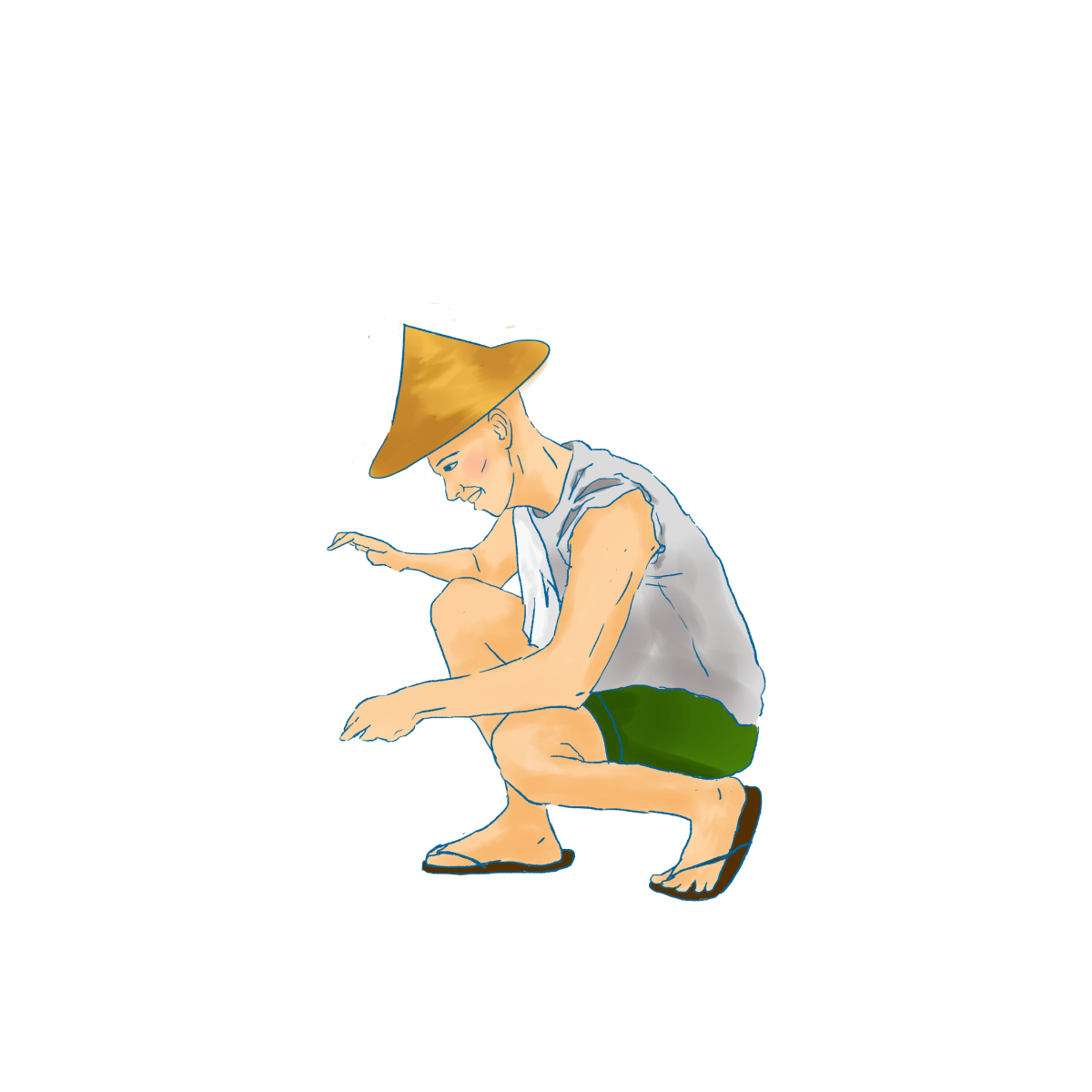
3. and Sammie (short for Samsui woman)
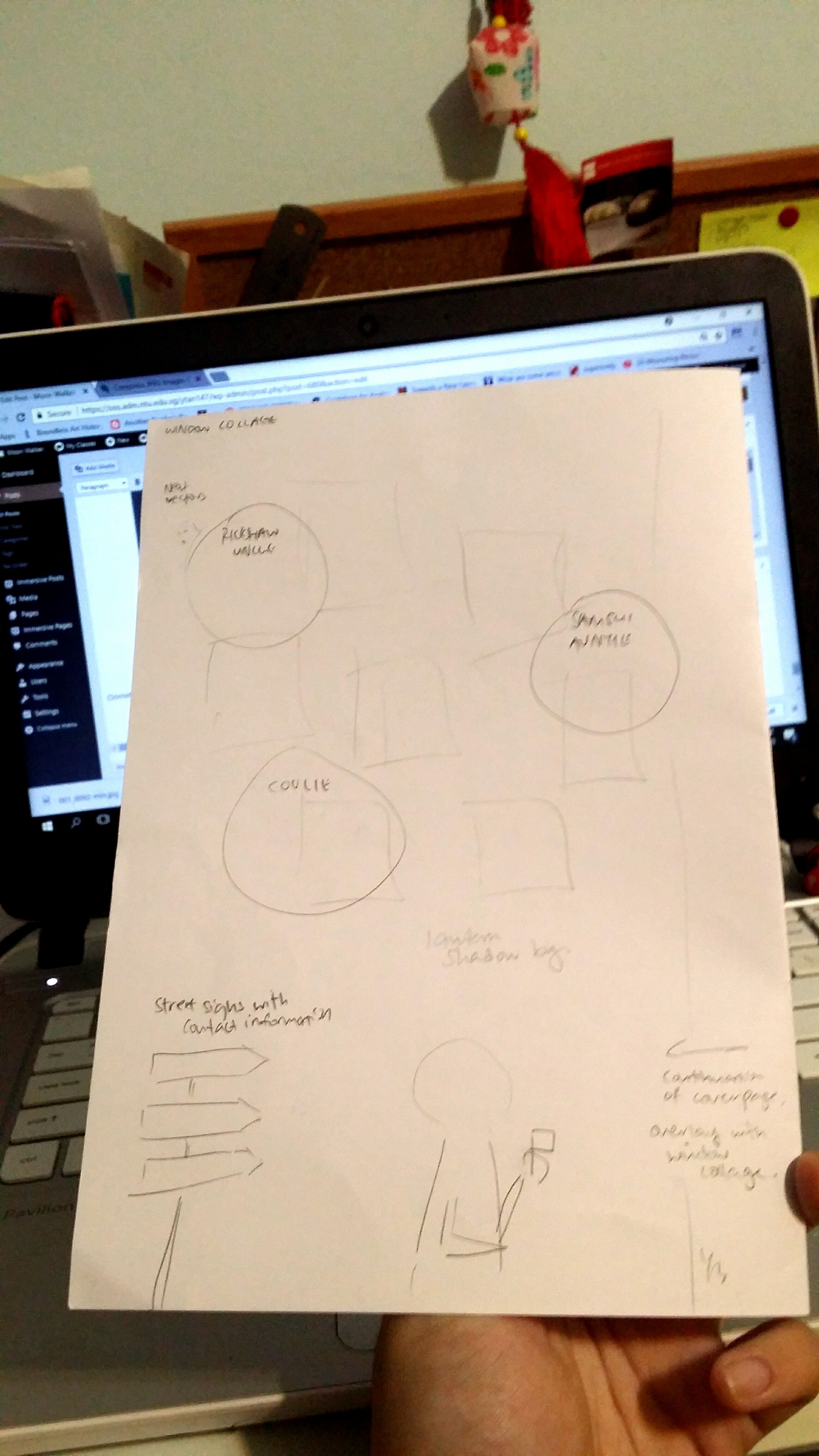
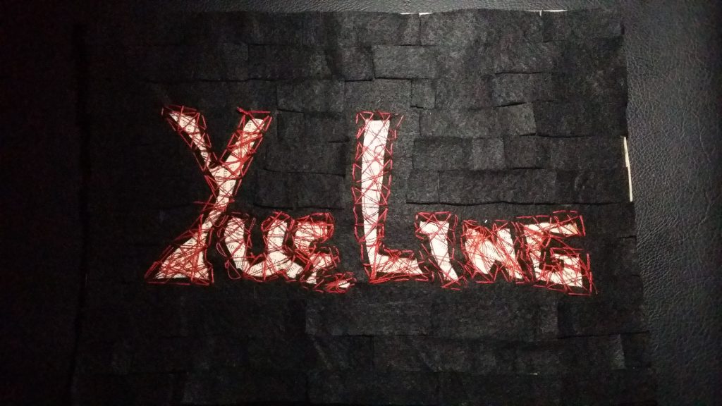
I was thinking about my back cover where I had to include my contacts and there was no way I was going to miss the chance to but my name on a sign :)))
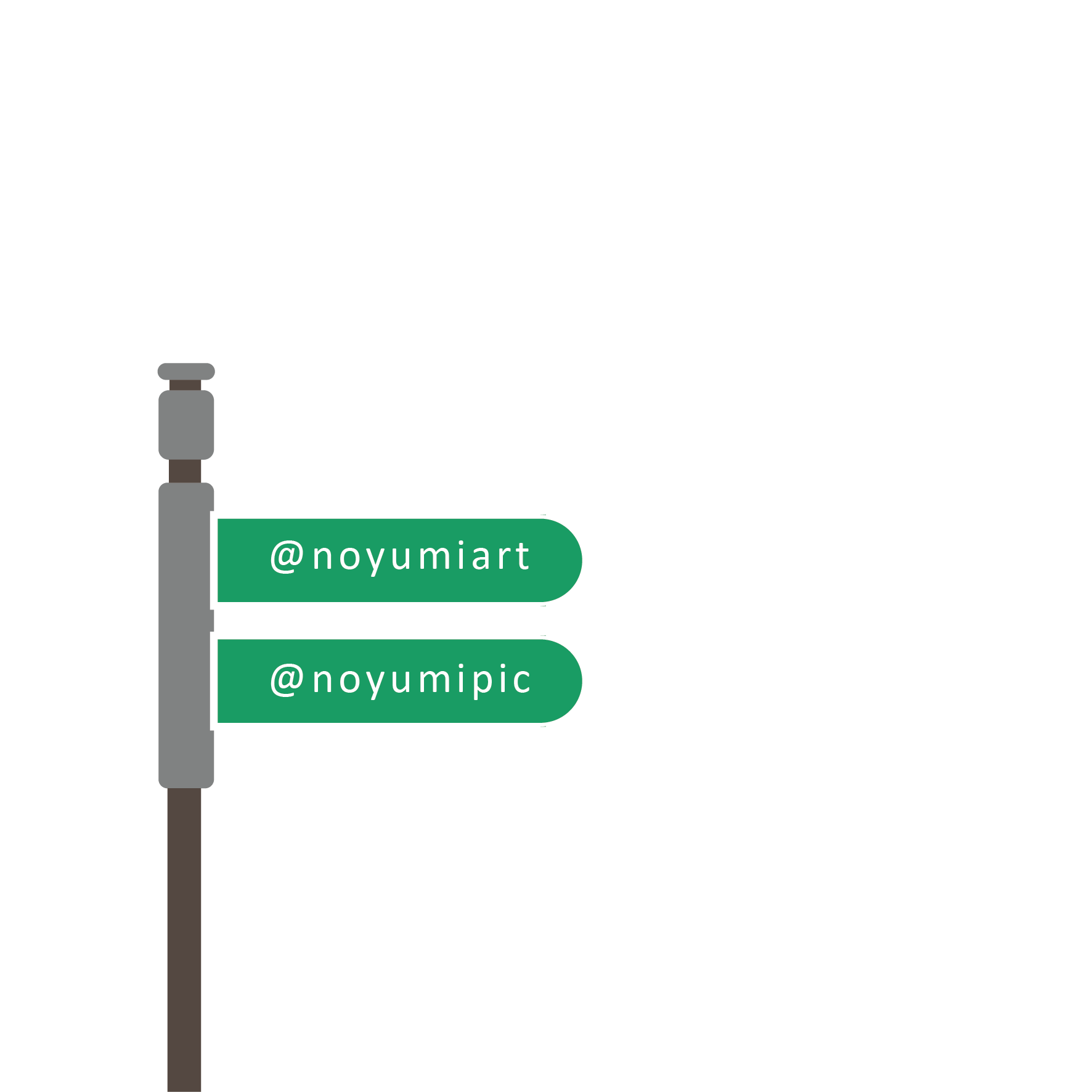
(Something like this)
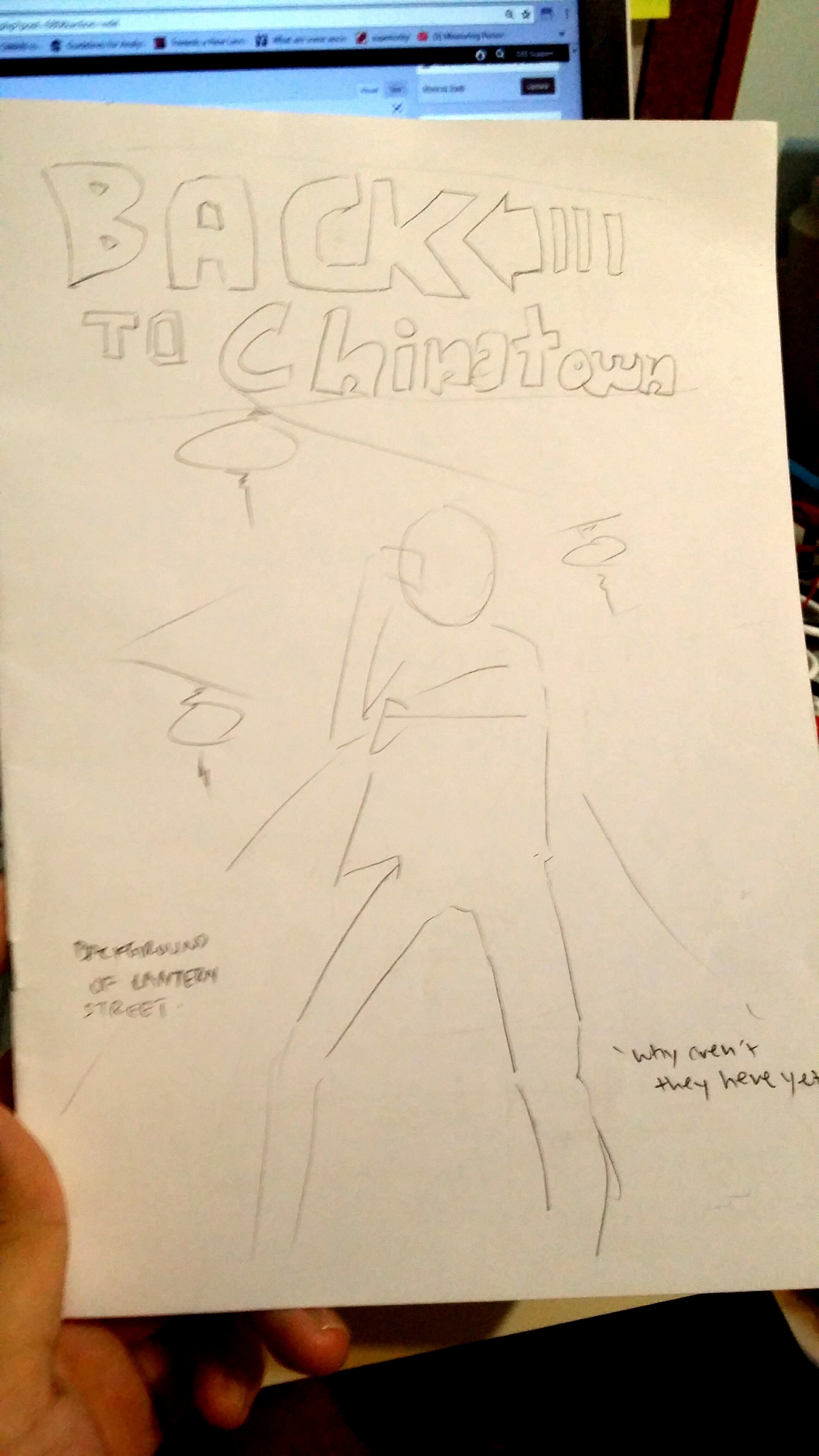
I also forgot to mention earlier that around the same time of doing the actual graphics, I did a sketch of the entire zine.
To plan the content of the zine, I listed out several ideas on Notepad first to filter out which photos mattered the most or told the most stories.
Then I proceeded to create a rough sketch by placing elements around the pages to see how they work out. There’s no other way than to just do it and trust your eyes.
After intense drawing and vector graphic making, here are the final pages!
FC:
The title of the zine and illustration would be smack in the middle to focus all attention in the middle. The diagonal arrangement of the lanterns in the background and the logo makes the composition a lot more dynamic.

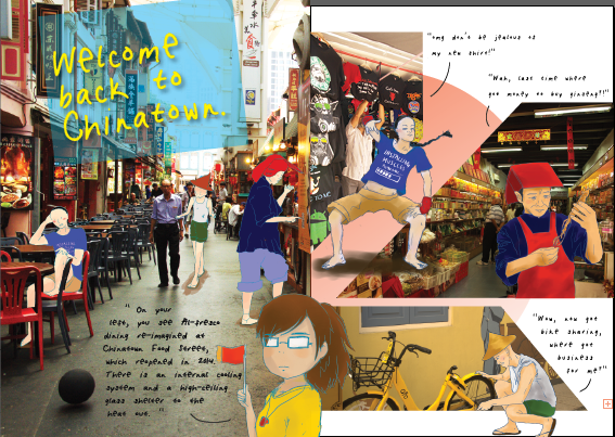
IFC:
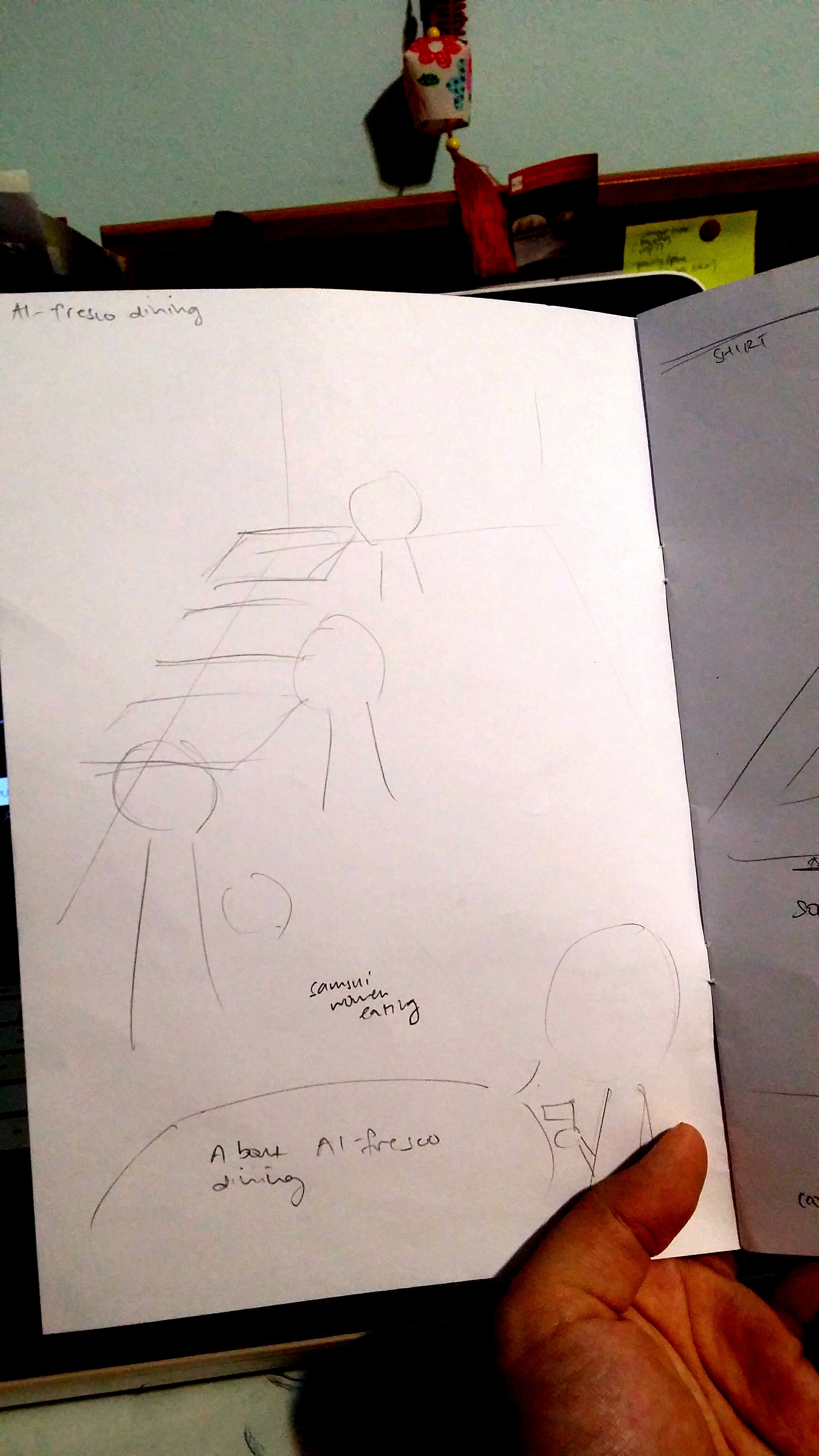
I drew the three musketeers (Coolie, Rickie and Sammie) hanging around Chinatown Food Complex ordering food and included the description on Al-fresco dining at the bottom! Shirley helped me to create the PERFECT header and I was honestly so amazed by how adding a simple rectangle with complementary colours in the title would work so well!!!! I have learned something new again. I placed myself in the middle of the two pages so that they would be seen as a group instead of being two separate pages.
Pg 1:
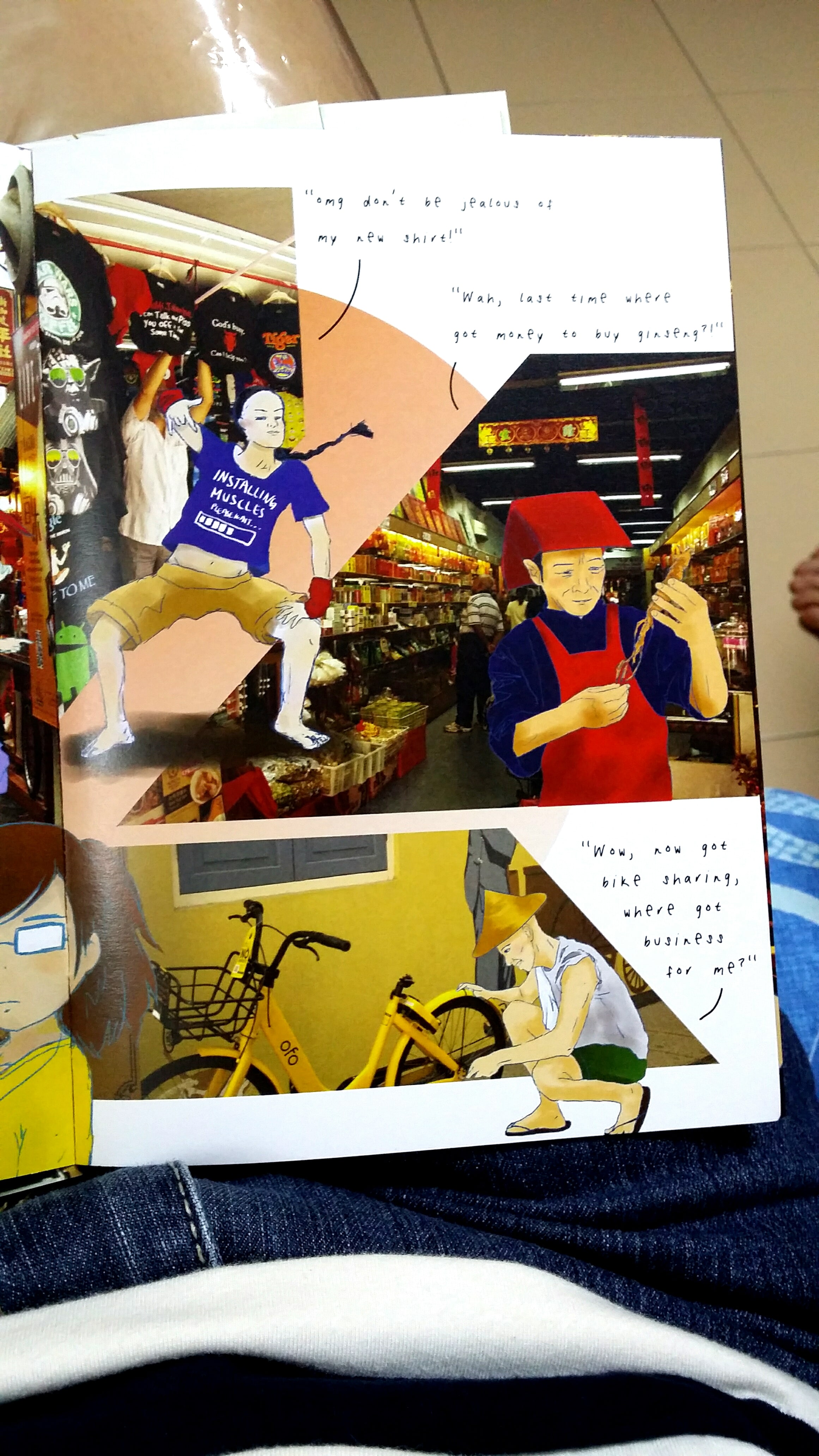
Here are the three musketeers again, having fun around the various kinds of shops in Chinatown. (Coolie in the clothing shop, Sammie in the medicinal hall, and Rickie having his fun jab at an Ofo-bike). I tried to mask the images into more dynamic shapes that also helped to create visual hierarchy.
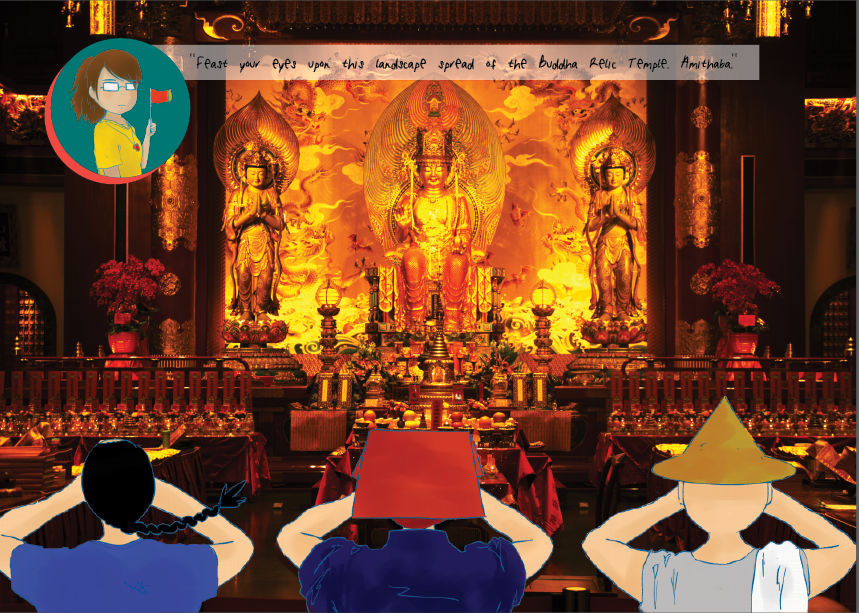
Pg 4 & 5 spread: As promised, here is the majestic landscape spread of the interior of the Buddha Tooth Relic Temple and I think it looks as awesome as I had imagined.

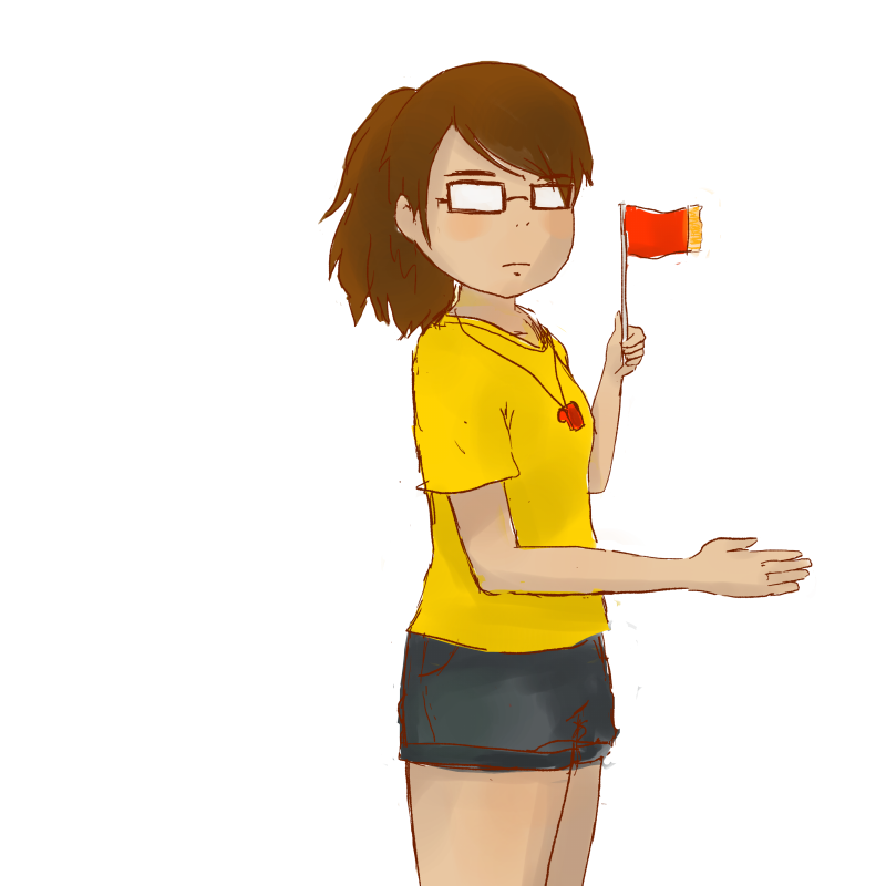
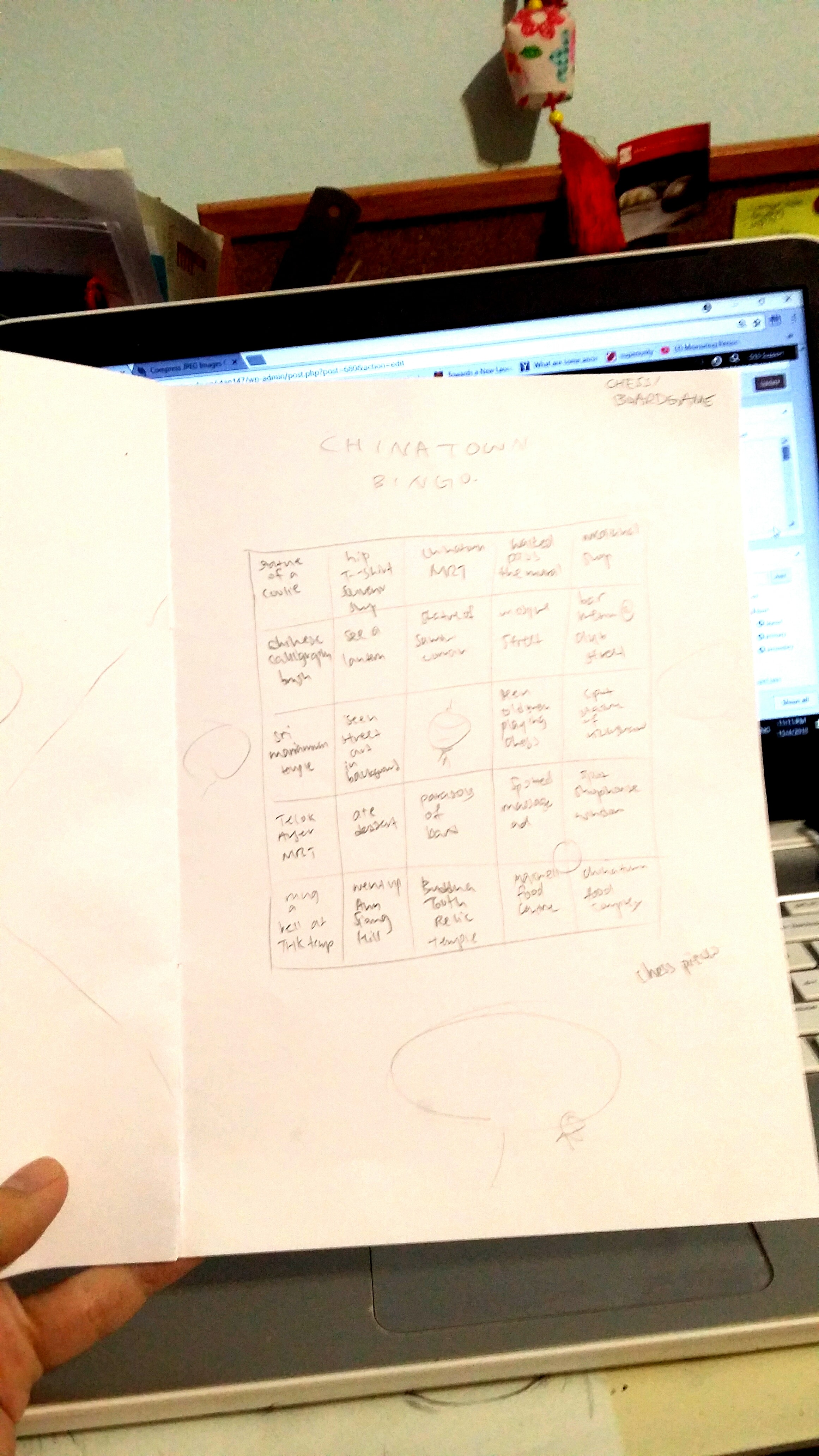
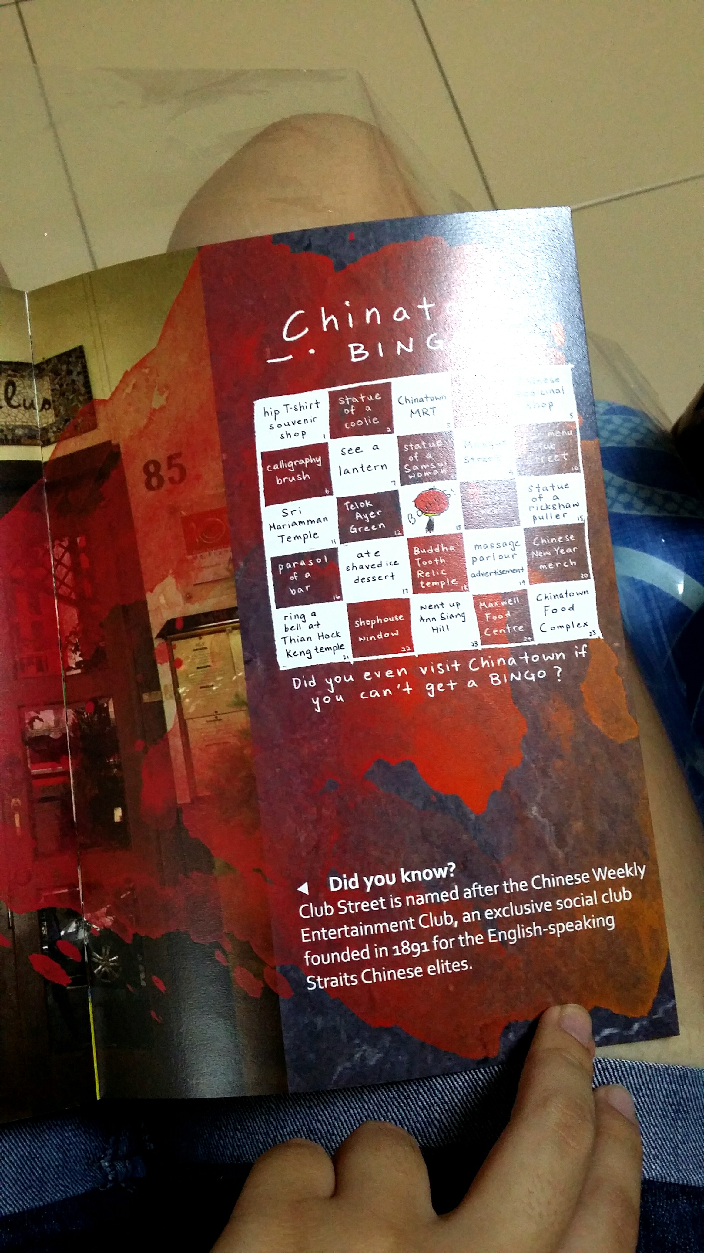
Pg 6 & IBC: On the left page, I added content about Club Street and booze. The colourful vomit in the middle (which is a warped watercolour mark with a gradient colour overlay) joins the 2/3 area to the 1/3 area of Chinatown Bingo! I decided to add in bingo since it was a really popular trend that was going on during this period and I figured it would be a fun way to make the zine interactive, as well as give suggestions for more areas of Chinatown to visit since I can’t fit all of its greatness into 8 pages only.

Back cover: Here I overlayed a continuation of the photo from the front cover on top of a photo of a couple strolling with shadows of lanterns on the floor.
I added an engraved effect to an illustration of a map I did for the presentation slides. And there it is! My name on a sign!
I also did some cool vector illustrations of the 3 musketeers.
I spent soooooo long trying to get the PDF exportation right because I didn’t have Acrobat 🙁 But using the school computer, I managed to do it by expanding my text and packaging the entire zine!
Here is my physical baby!
Some difficulties I faced and things I learned:
In this first project for Graphic Form, we have to translate the essence of a job (that can be imaginary) into visual, typographic forms of our names using any sort of media.
Since the jobs we chose were not specified to be pragmatic/realistic, I started off by brainstorming up some ideas for imaginary jobs that are grounded in the essence of real jobs that exist in reality. I came up with a list of existing jobs and modified them by merging them with each other. This would not only help me come up with much more interesting outcomes, but also give me a wider range of job fields and their nature to explore. Thereafter, I searched up the jobscopes and items that are iconic to these jobs to make them easily identifiable.
Initial Shortlisted jobs:
Click here for research and process post!

2.
3.
4.

In this first project for Graphic Form, we have to translate the essence of a job (that can be imaginary) into visual, typographic forms of our names using any sort of media.
Since the jobs we chose were not specified to be pragmatic/realistic, I started off by brainstorming up some ideas for imaginary jobs that are grounded in the essence of real jobs that exist in reality. I came up with a list of existing jobs and modified them by merging them with each other. This would not only help me come up with much more interesting outcomes, but also give me a wider range of job fields and their nature to explore. Thereafter, I searched up the jobscopes and items that are iconic to these jobs to make them easily identifiable.
Initial Shortlisted jobs:
——–
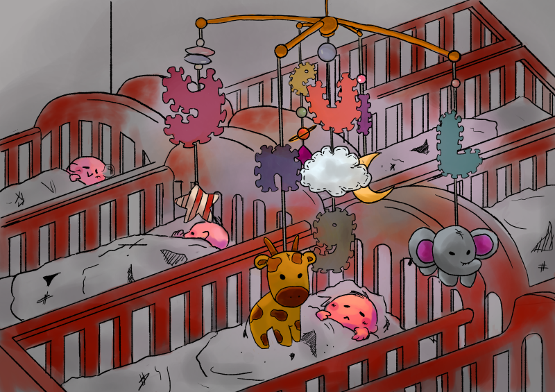
Original job inspirations: DJ, Infant care nurses
DJ: to play music at events entertain, mix beats to hype the crowd up. Has to be well-versed in different sorts of music. Usually playing loud music at social events to give enhance the lively mood/atmosphere.
Infant care nurses: Caring, patient, organised, responsible, nurturing, taking care of delicate babies
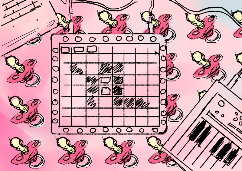
DJ:
Turn table, disco ball, headphones, vinyl records, MIDI keyboards, audio editing softwares, bright neon lights, Launchpad device

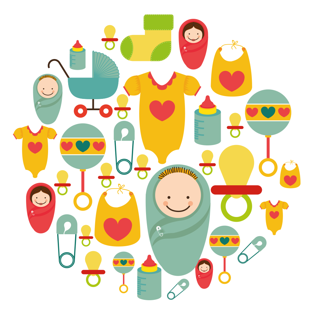
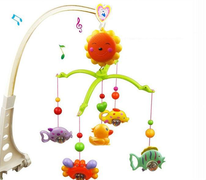
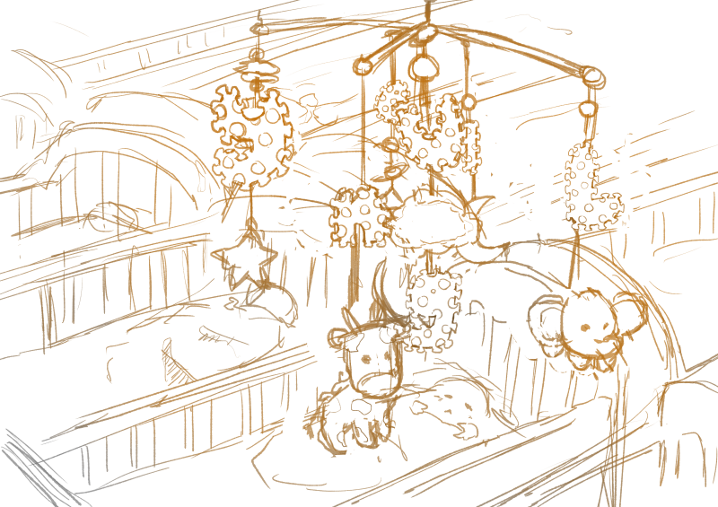
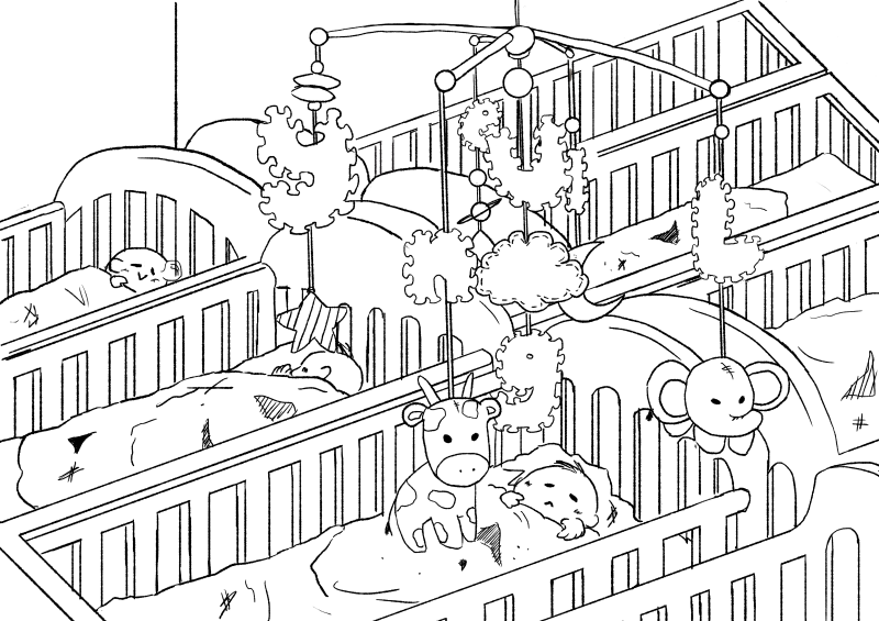
Infant care nurses:
Babies, cribs, cots, toys, wooden blocks, soft toys, pacifiers, mobile toys, diapers, blankets, nurse uniforms, needles, diapers

Words like “lightness” and “ease” come up a lot in conversations about pastels. Sallie Harrison, the designer and photographer in L.A., says that pastels evoke a sense of “calmness and balance.” Stewart points to light blue and its connection with spirituality and heaven; (Leatrice) Eiseman at one point related soft colors to infancy, when there was a sense of ease and safety because all of our needs were taken care of. These feelings can be connected to the social and political factors at work, as Eiseman pointed out while listing her considerations for color of the year.
(Leatrice Eiseman is an American color specialist, who assists companies in their color choice in a range of areas, including packaging, logos, and interior design. She is the executive director of the Pantone Color Institute, a division of Pantone, Inc.,[1] and the author of six books on color, one of which won an award from the Independent Publisher’s Association.)
https://www.fastcodesign.com/3063771/how-pastels-became-a-cultural-obsession
However, this draft did not really display the elements of the job in the letters, rather, they put the letters into a context. When the letters are taken out of context, they do not effectively portray the essence of the job of a Baby DJ anymore.
Therefore, I embarked on a mission to try to integrate the essence of both a DJ and a infant care nurse together into my type.


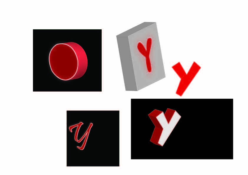
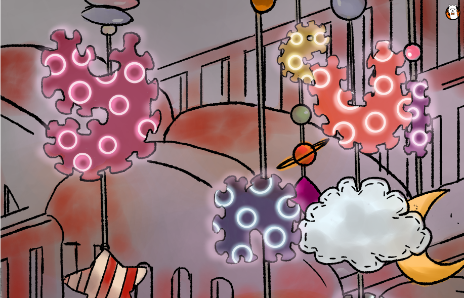
It was really difficult trying to recreate the multiple button effect in Illustrator because the 3D extrusion function and art mapping was not exactly user friendly. It took a pretty long time trying to render every single 3D object as well. Thus, I tried only extruding the foam toy square, while leaving the neon letters on the square. In the draft below, I had mapped a wooden texture onto a star shape. I tried to map a foam texture onto the foam squares to recreate a more accurate foam effect as well but there were way too many surfaces, so I stuck with a gradient effect. The background has several layers of lighting effects as well to try to recreate that of a dance club.
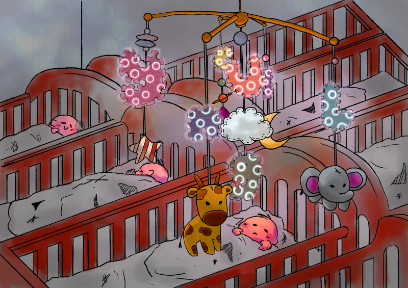
After relooking and consultation, I felt that the bokeh, strobe light and cloud effects were too strongly suggestive of a DJ instead of babies and did not convey my intentions accurately since I wanted to be a DJ that could put babies to sleep. Not make babies get up and dance. And so, I embarked on quite a different mission to change the composition to a more child-friendly one.
I wanted to use the colour schemes of artworks used for lo-fi hiphop videos on Youtube since they’re really pretty and also make me feel calm and relaxed looking at them. Usually, there are pastel, mellow, analogous and warm colours.
Art by: saree @sarlisart on Twitter
Art by: himmoon (https://virink.com/himmoon)
https://www.youtube.com/watch?v=_xF3pxNp0Do&t=1550s
Art by: Pierre Broissand (https://www.artstation.com/artwork/KWxJW)


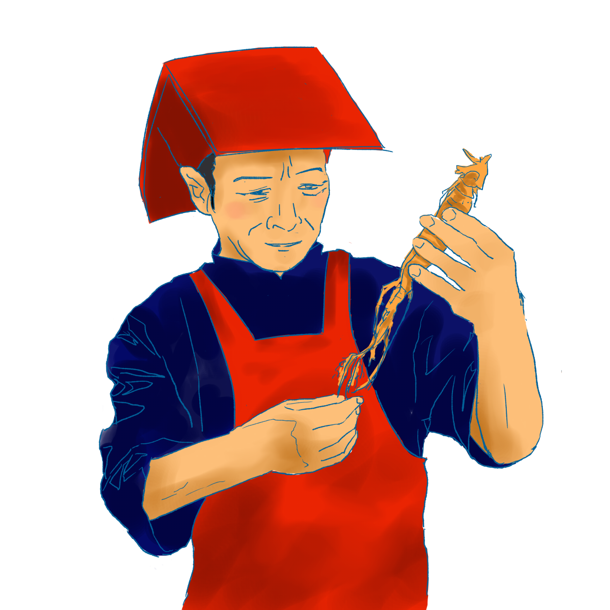
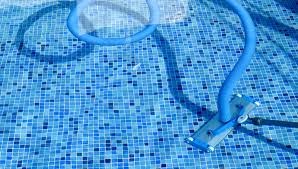
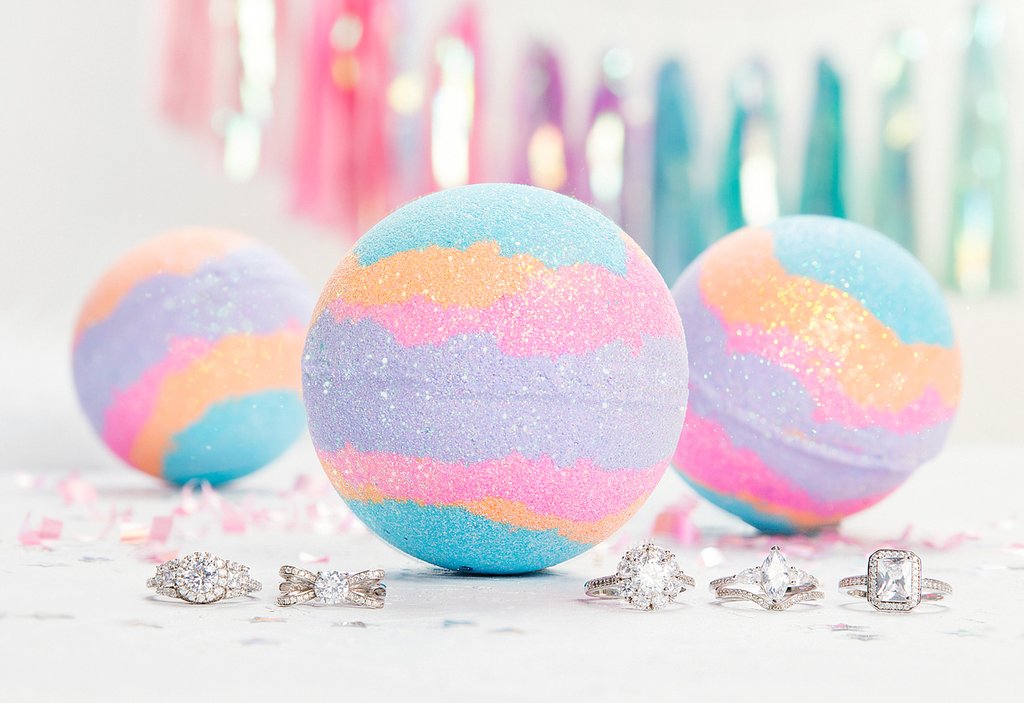
Original job inspirations: Pool maintainer, bath bomb makers
Pool cleaner: Needs to be committed, works on a regular basis, cleans the pool by throwing chlorine in
Pool cleaning machine?
Bathbomb makers: Manufacture bathbombs by compacting colourful powdery compounds into spheres to be thrown into water and dissolved to colour the water in bathtubs
Objects
Pool cleaner: Water ripples, Pool tile patterns, pool cleaning machine, lifebuoy

Bath bomb makers: Bathbombs, rubberducks
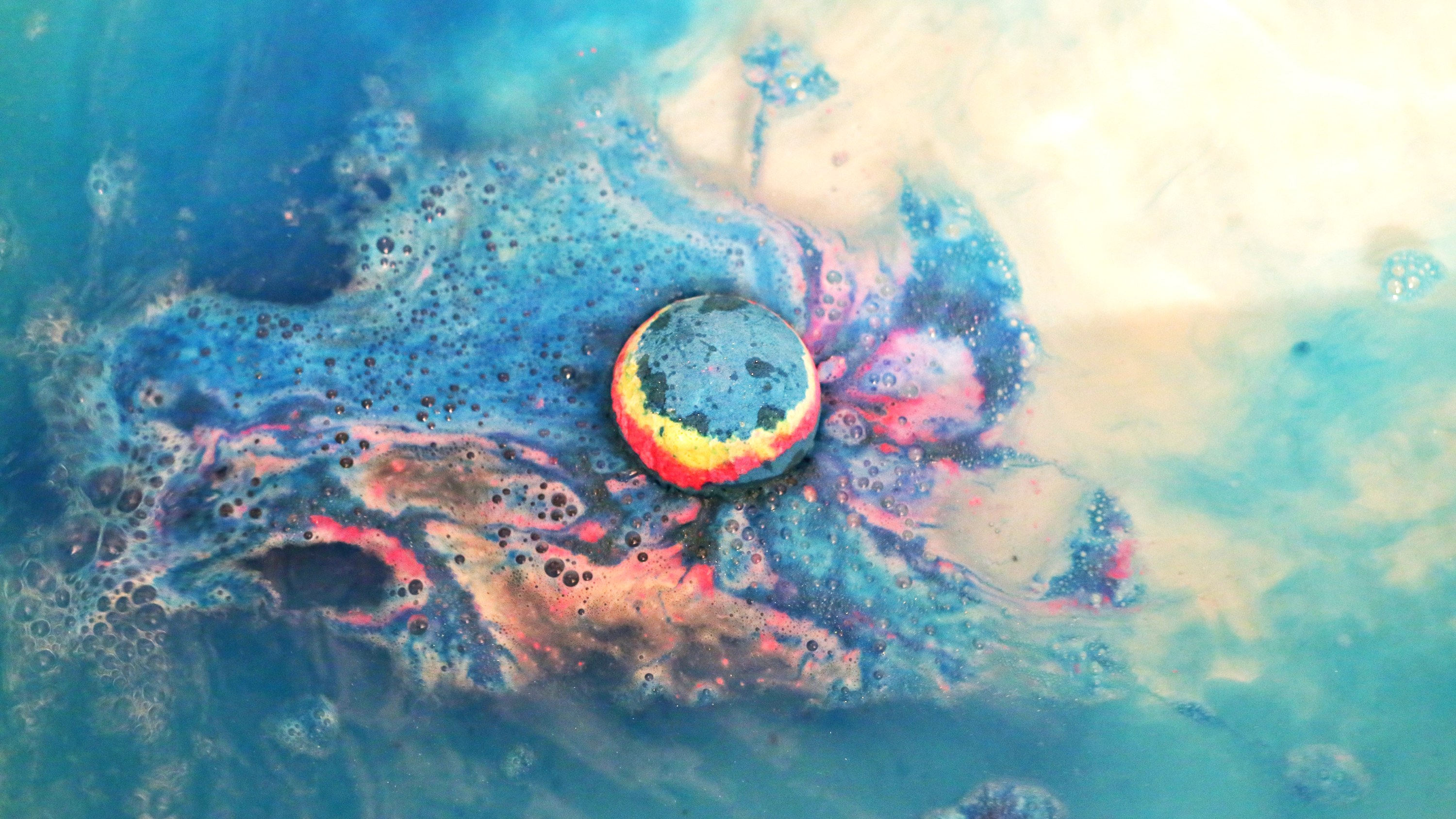
Emphasis on the CHANGE of colour
Mediums for consideration:
Use marbling technique/ decalcomania] put something when pressing down to form letters
(non-stick paint?)
Marbling plus splatter using wet on wet technique
Letters will be ripples
Test wet on wet
Dripping technique
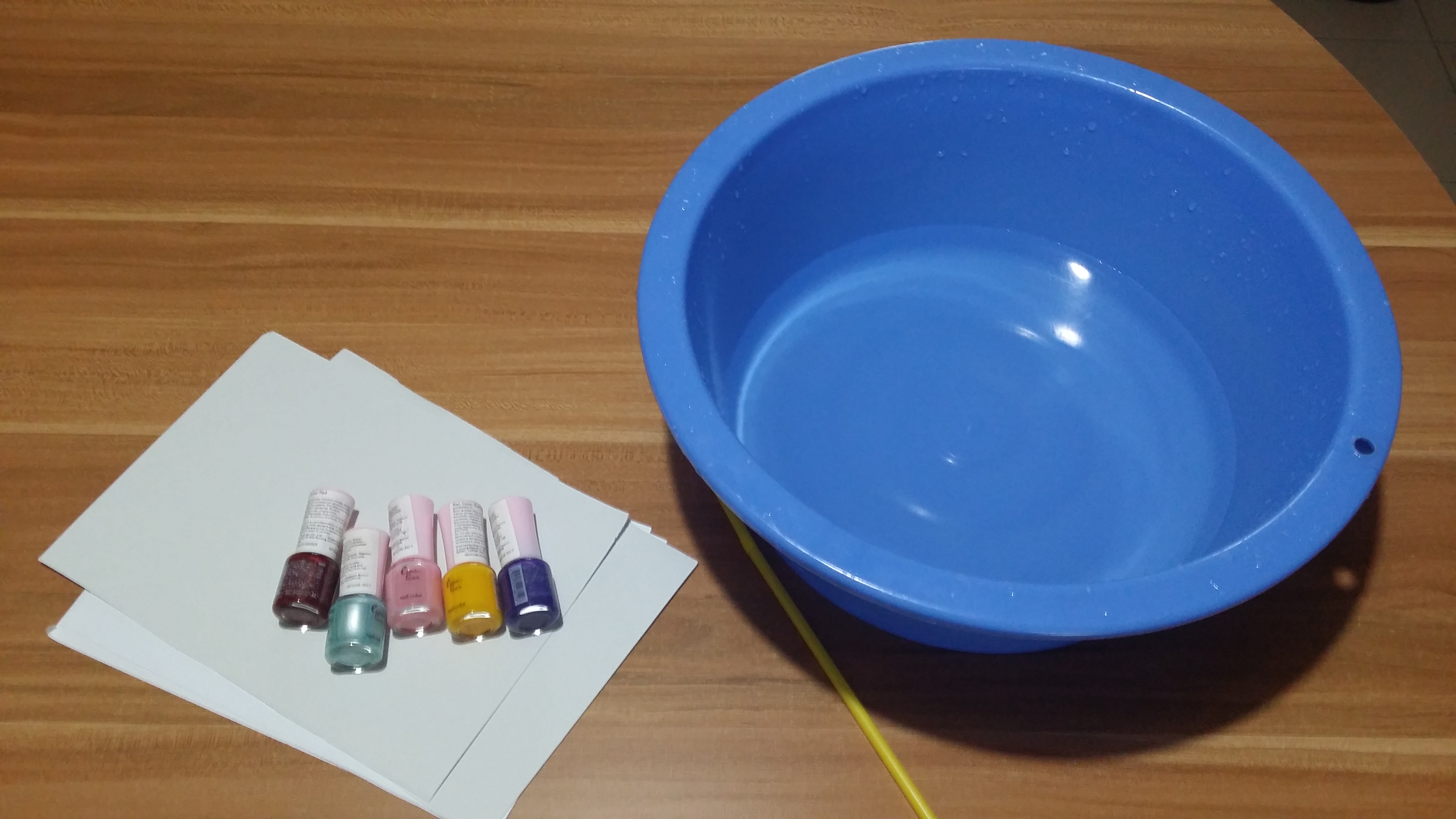
Medium: Nail Polish
Inspired by: Detectives, police officers, interrogators, investigators, compulsive liars
Jobscopes:
Investigator: Find out the truth about a situation by sieving through documents, going onsite to find clues for cases.
Compulsive liars: Can make up a tall story about anything at anytime. Might be useful in some situations to get away with something for the time being. Hiring someone that knows exactly what to say could be really useful. It’s definitely a dirty job.
Objects:
Investigator: Magnifying glass, newspapers, files, Sherlock fedora, briefcase, mugshots, interrogation table
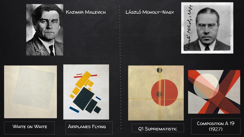
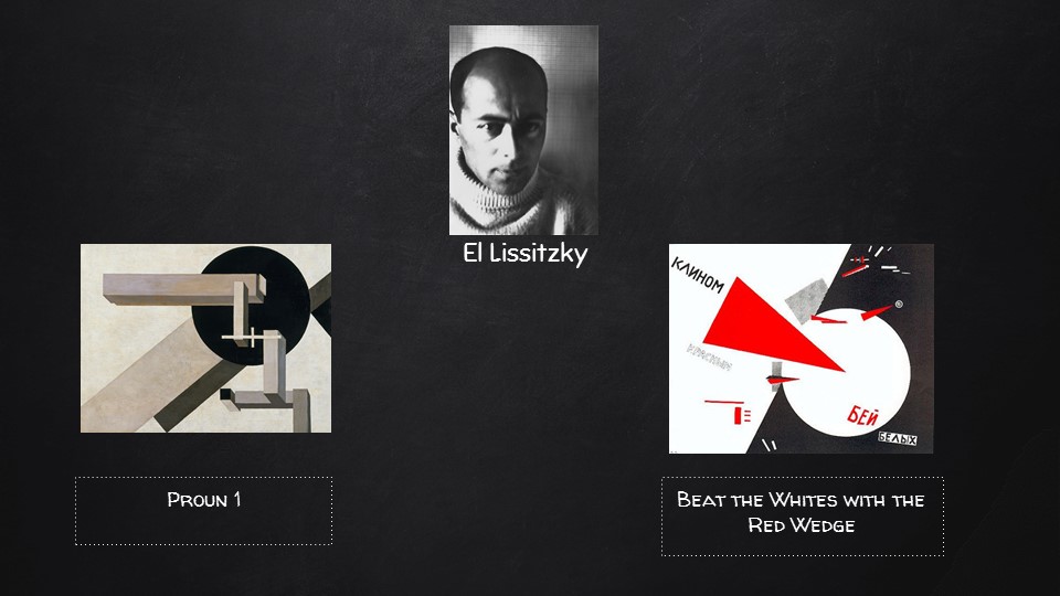
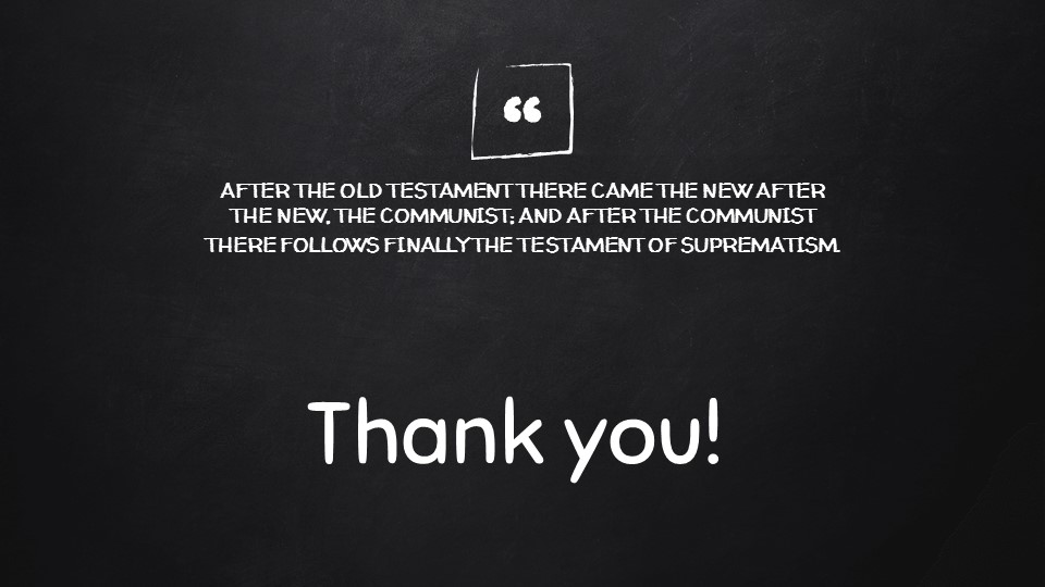
Compulsive liar: words, speech, Pinnochio nose, Suprematist/De Stijl works to represent the truth

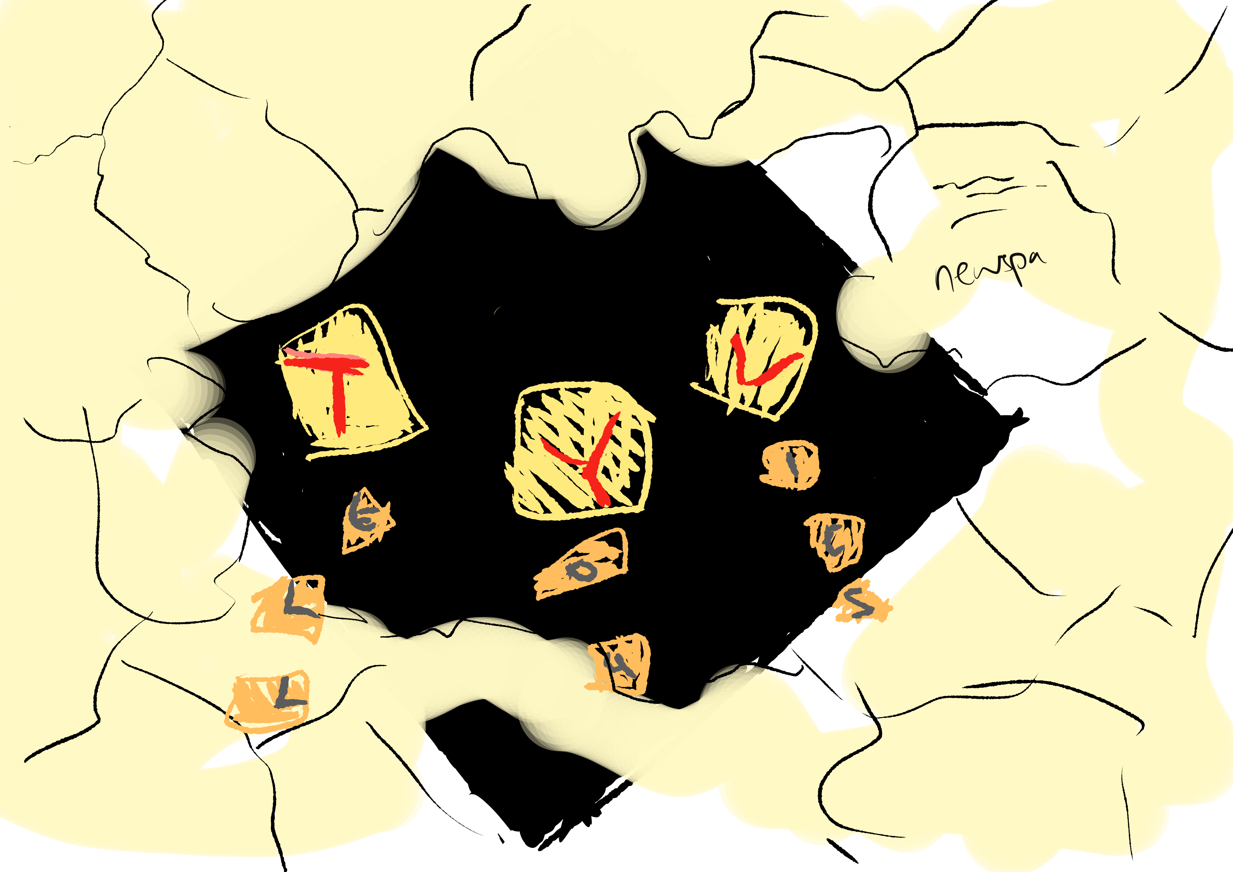
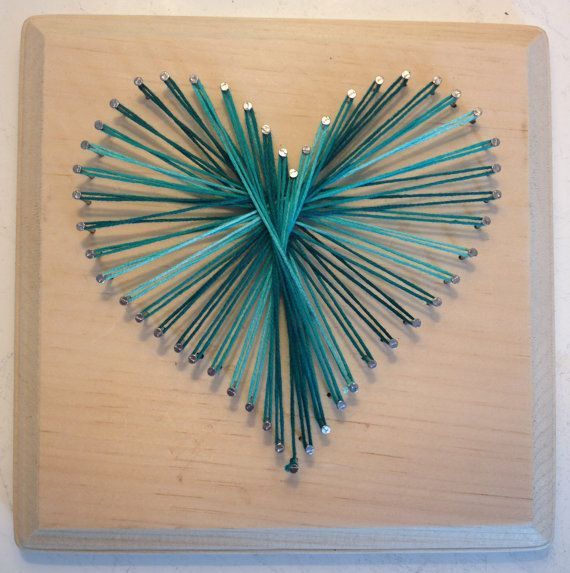
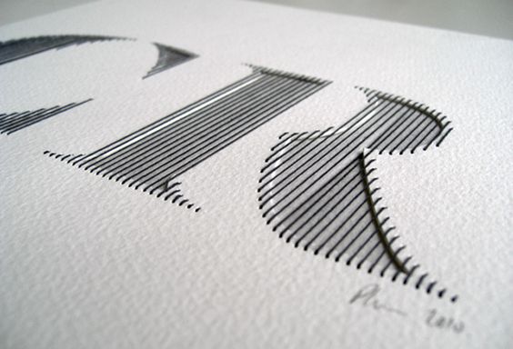
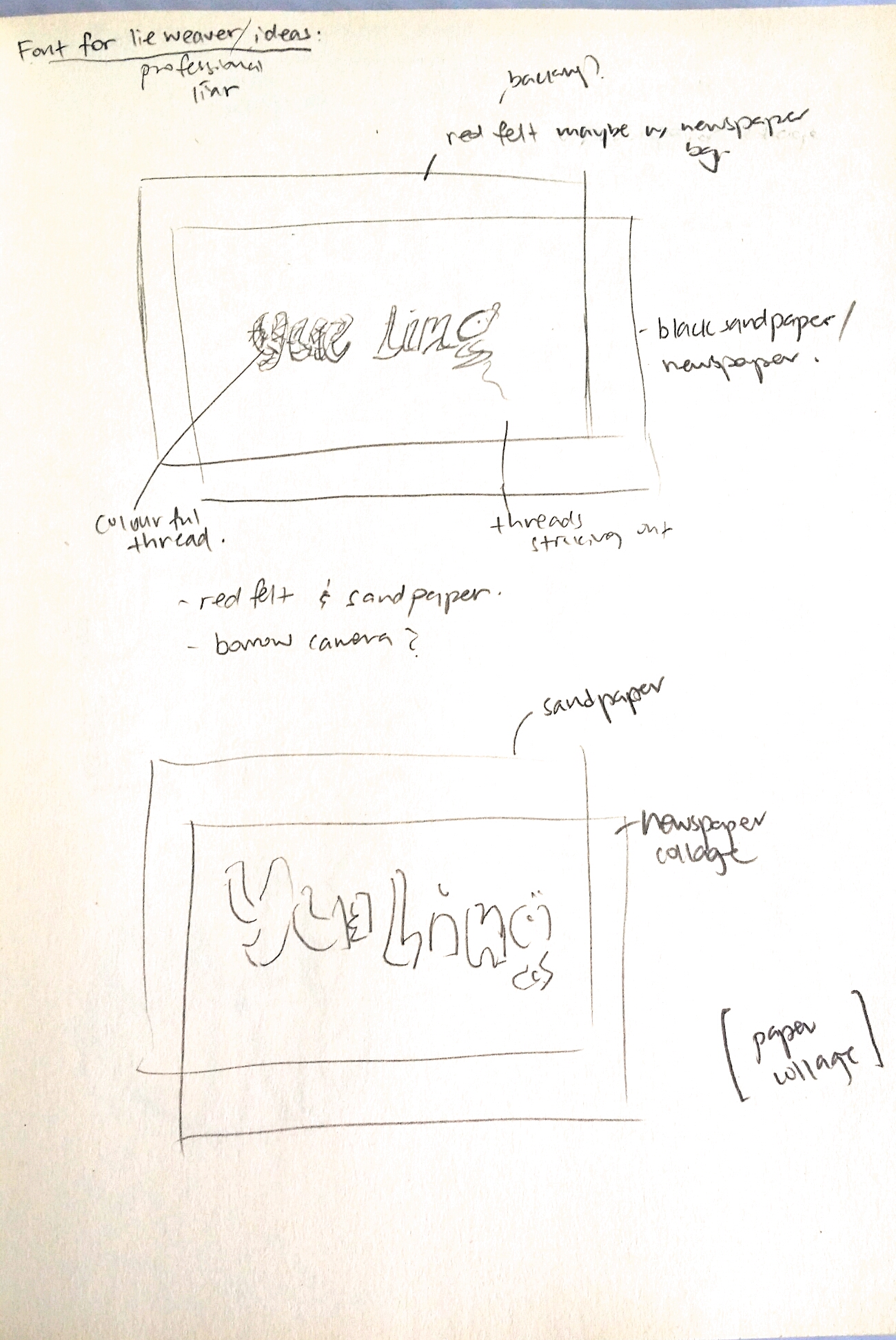
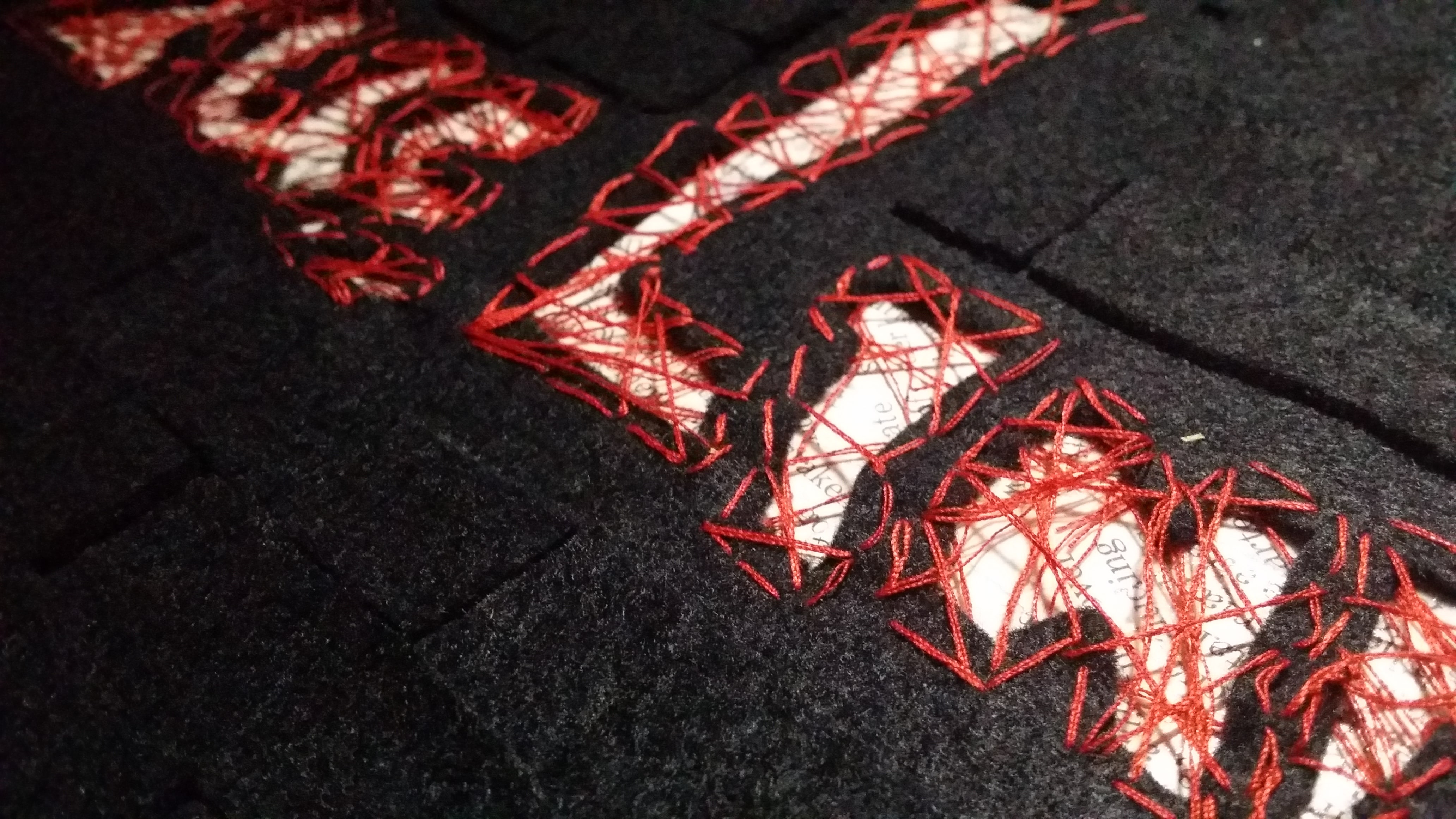
Medium: String, Paper, Newspaper

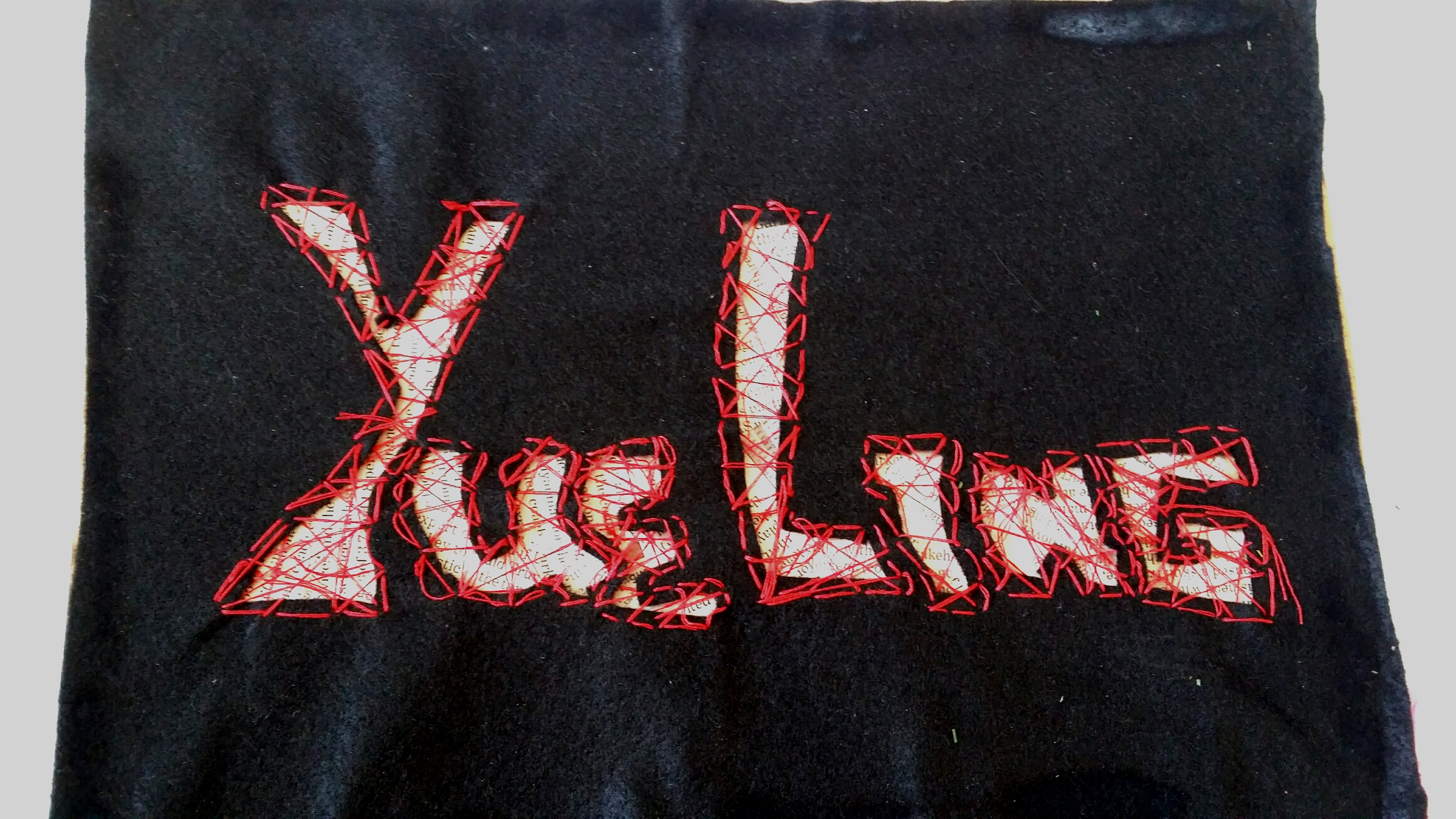
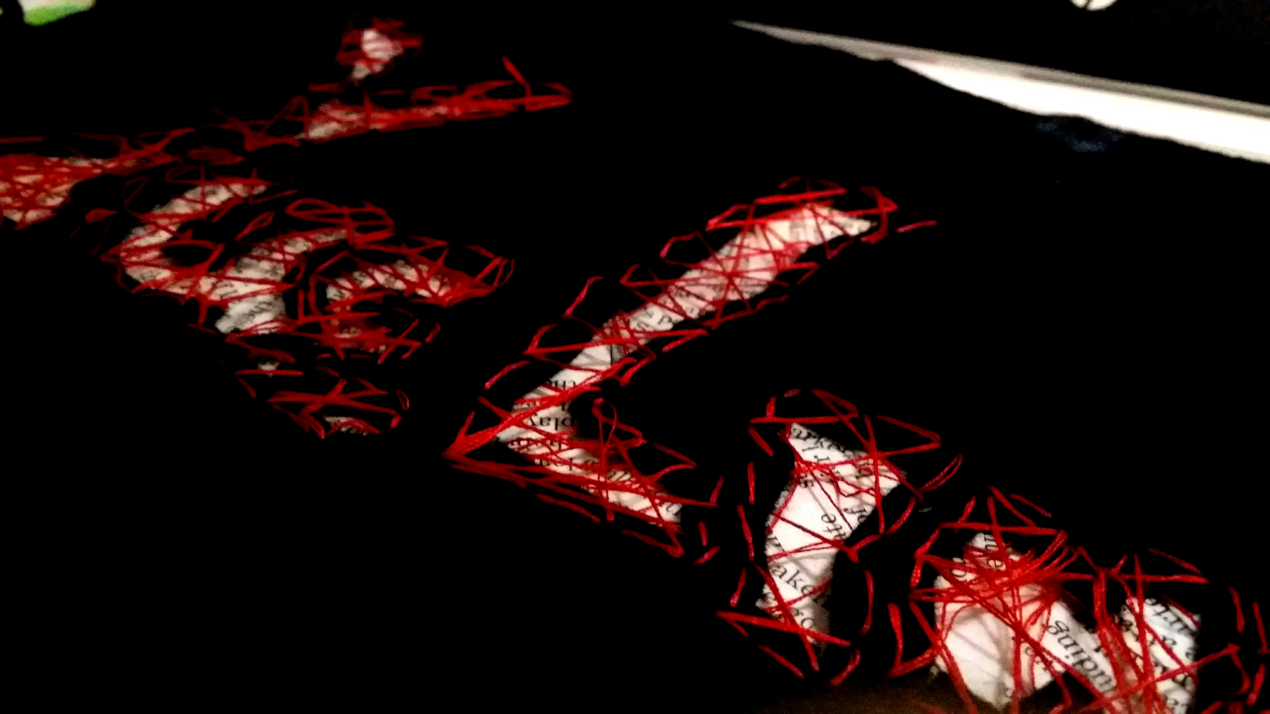
Final

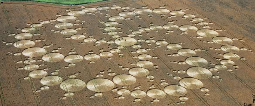
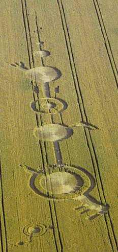
Inspired by: Astronomers, Crop circle artists
Jobscope:
Astronomers: To study outerspace; investigate the presence of life-forms on other planets.
Crop circle artists: Create geoglyphs on large expanses of crop fields to trick the public into thinking that aliens are real. Also to practice an impressive new art style.
Objects:
Astronomers: Satellites, space suits, rockets, shiny metallic objects, outerspace themes, solar system
Crop circle artists: Crop fields, lawn mower, felled grass, alien motifs
Some brainstorming thoughts for style/mediums:
Photography?
Very circular designs
Design in firealpaca first
Paper cuts?
Light shining down
Digital 8 bit style?
Sleek font
Minimalist
Wacky colours-futuristic
Metallic colours?
After brainstorming, I settled for doing a crop circle artwork myself!
But first, I had to do some research on the patterns of crop circles. And so I did.
Crop circle art is a relatively new art form. In crop circle art, crop is bent and not harmed in any way. Most crop circles have either laterally symmetrical or radially symmetrical art. They could also be completely unsymmetrical and representative. The possibilities are endless.
The most telling feature of crop circles are their stunning geometric shapes and patterns that make it hard for people to believe that they were really created by human beings on such a large scale, and so a lot of people would rather believe that aliens did it.
I borrowed a book on crop circles by Michael Glickman to study the common features of crop circles:
[Glickman, Michael. 2005. Crop circles. n.p.: Butleigh : Wooden, 2005., 2005. NTU Library Catalogue, EBSCOhost (accessed February 10, 2018).]
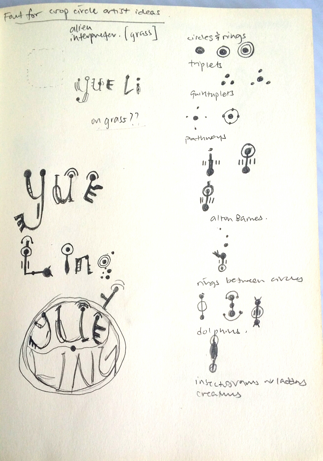
Common features of crop circles:
-Circles and rings
-Triplets
-Quintuplets
-Pathways
-Alton Barnes (enigmatic keys/claws)
-Rings Between Circles
-Dolphins
-Insectograms
-Creatures
-Whirlpools
others like -orbits,snowflakes, triangles and squares


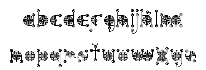
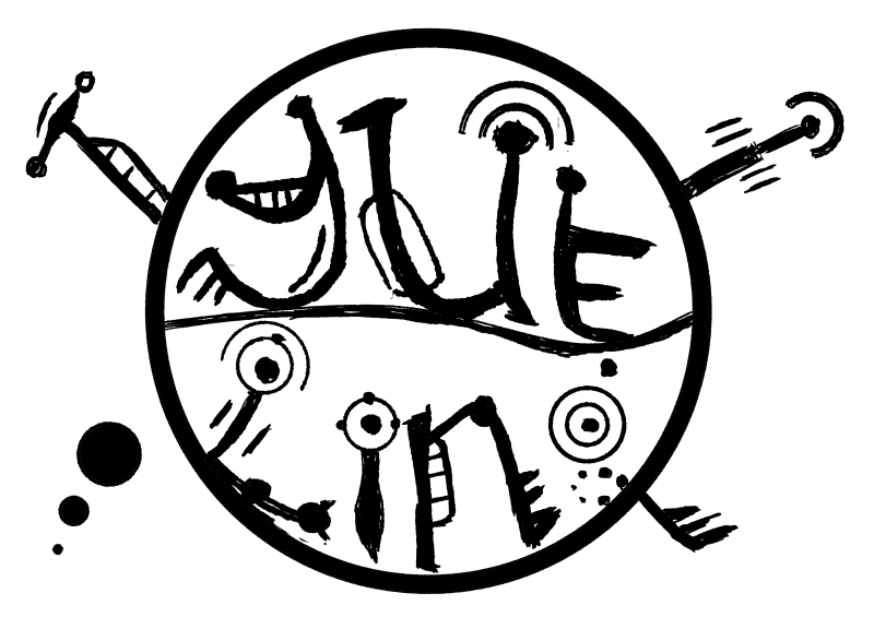

SOMEONE DID A TUTORIAL ON IT!!!
This tutorial was absolutely FANTASTIC. It was clear to follow and produced a really realistic effect. You can also use any stencil with a transparent background you have created, and following quite a long but comprehensible procedures of producing a screen, bevelling and embossing and tweaking lighting settings, you can create your own realistic digital crop circle artwork as well. By following this tutorial, I managed to play around with the blending effects a lot more, which I had always been quite unfamiliar and apprehensive about touching before this project.

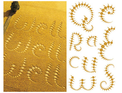
Inspired by: Chefs, Singaporean Hawkers
Jobscopes:
Chefs: Professional chefs that pay close attention to the process of cooking, as well as garnishing and presentation of food.
Singaporean hawkers: Specialise in catering to the Singaporean palate, making local cuisines like Chili Crab, Bak Kut Teh etc.
Objects:
Chefs: Chef hat, wok, spatula, frying pan, ingredients
Singaporean hawkers: Chili crab, bak kut teh, kueh, fried rice, hokkien mee, yong tau foo
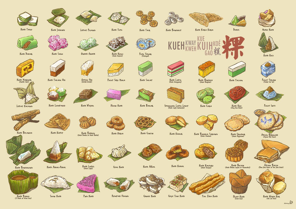
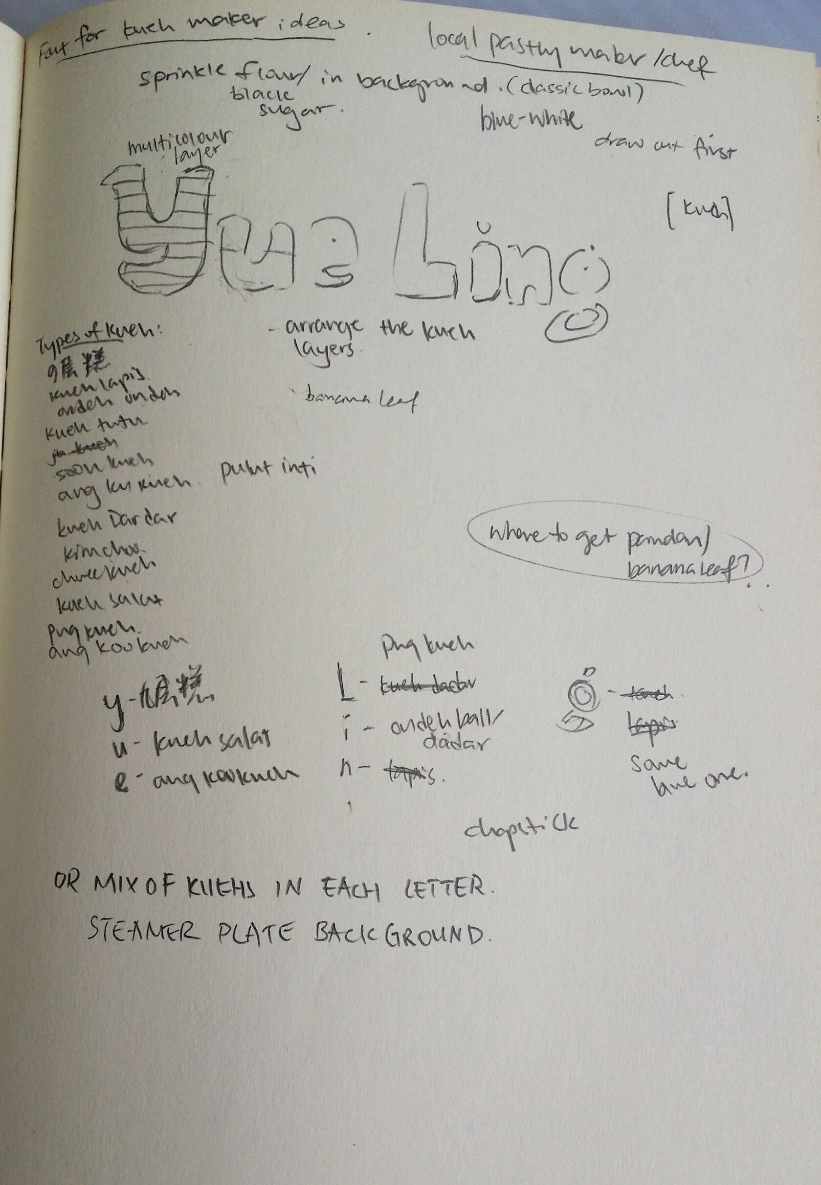
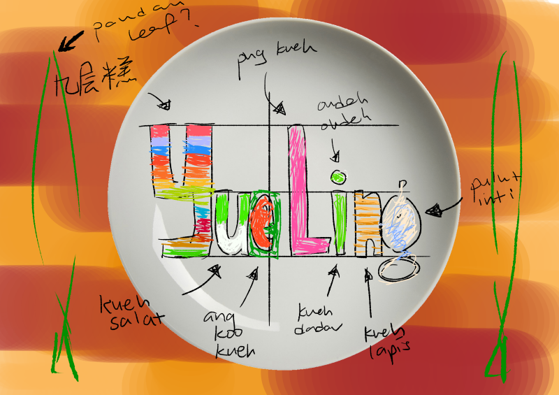
Medium: Kueh, Photography
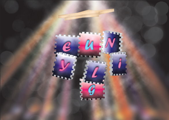
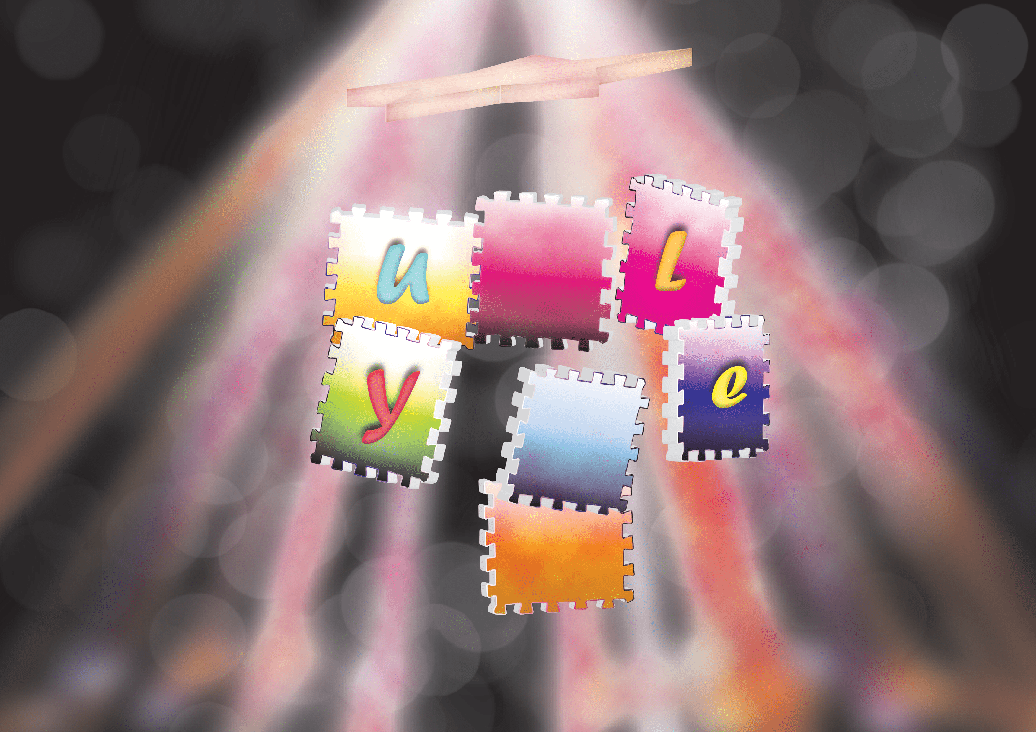
Kuehs used:
Y- Kueh lapis sagu (Jiu Ceng Gao in chinese)
U – Kueh salat
E – Ang Ku Kueh
L- Png Kueh
I – Ondeh ondeh and kueh talam
N – Pulut Inti
G – Kueh Lapis
This project was pretty challenging in the sense that we had to create letters that could easily communicate the essence of our jobs. Since I also decided to go with jobs that are inspired by at lease 2 traditional/existing jobs, it was tough trying to incorporate elements of both jobs to balance out the elements equally. However, through a rigorous process of refining my designs, I would like to think that I have managed to do so. ;;; XD
With this project I also wanted to explore the use of other mediums, which I think I managed to do successfully! Although it was not a smooth process throughout, with many failures and disappointments, I always recall the saying that artists should “Fail faster” so that we learn from mistakes faster and can get on with improving our projects. After failing with the intended mediums, I tried to find alternate options that could express my intentions on the same level, if not, surprisingly better.
Through this project, I was also able to get more comfortable with Photoshop blending modes that I have never ventured to touch before. Fiddling around with the settings for making the neon glow and crop circle really taught me the massive capacity Photoshop has for creating realistic illusions.
All in all, I really enjoyed this project and had fun trying out different mediums instead of just ink/paint. Looking forward to the next Zine project!


For my final 2D project, I am supposed to dig deep into the abyss of my soul and materialize certain aspects of my personality into visual, metaphorical characters/objects that reflect how I am like in different situations. It could be how I portray myself to others (outward portrayal), or how I think I am like towards others (inward portrayal). By combining the character/object chosen and different social situations, I can combine the two to imagine an outcome.
AH HAAA but there’s a catch, because in this project, COLOUR is IMPORTANT. In this project, we are only allowed to use the following colour palette (Just for easier illustration purposes, I shall use red to demonstrate the differences!)
(same colour but different saturation level)

Analogous color schemes often mimic the color schemes found in our natural environment and can create a calm and relaxed feel when applied in design.
Opposing colors on the color wheel are dramatically different and because of this they will create a high impact jolt when paired together. Complementary colors are frequently used to draw attention and emphasis to a particular space within a design and can be quite effective when used in small doses.

Using a split complementary color scheme as opposed to a complementary color scheme is less risky as the result of the three colors together is less harsh and not as loud as a complementary color scheme.

The three colors used in this scheme tend to sit well together and can be quite lively and harmonious.
The reason for using colour palettes is that we are able to create colour harmony, which looks more aesthetically pleasing. Including different colours in the colour wheel can evoke different emotions that enhance the message of our chosen imagery.

Based on my findings, I came up with some visuals to depict my EGO in the format of
-My struggle with the standard style of academics (especially in Junior College).
Trait: Free-spirited (trapped)
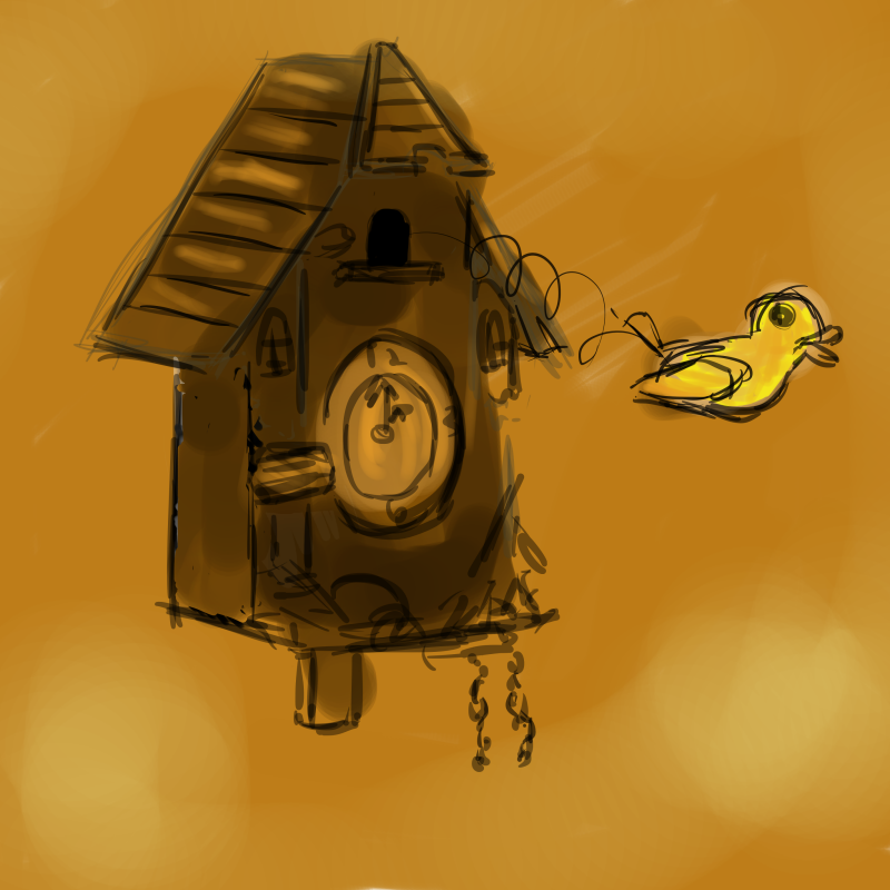
Thing: Cuckoo clock
-When asking around for what animal would represent me, my friends said a bird/butterfly. Some of my friends also said that I was free-spirited (You learn new things about yourself when you actually bother to ask other people what they think of you HAHA), so I thought something with wings would work since it represented flying away from your responsibilities to obtain freedom. I thought that a cuckoo bird was really apt since cuckoo birds are always trapped inside the clock and released at a fixed time every day. Sounds like SCHOOL?? 8’D So I’m a cuckoo bird that wants to be released but still restrained.
-I used a monochromatic brown palette for this picture since it represents dullness and the mundanity of school life. The bird, however is a light yellow-ish shade since I wanted to represent myself in my ideal element as a jovial, optimistic person.
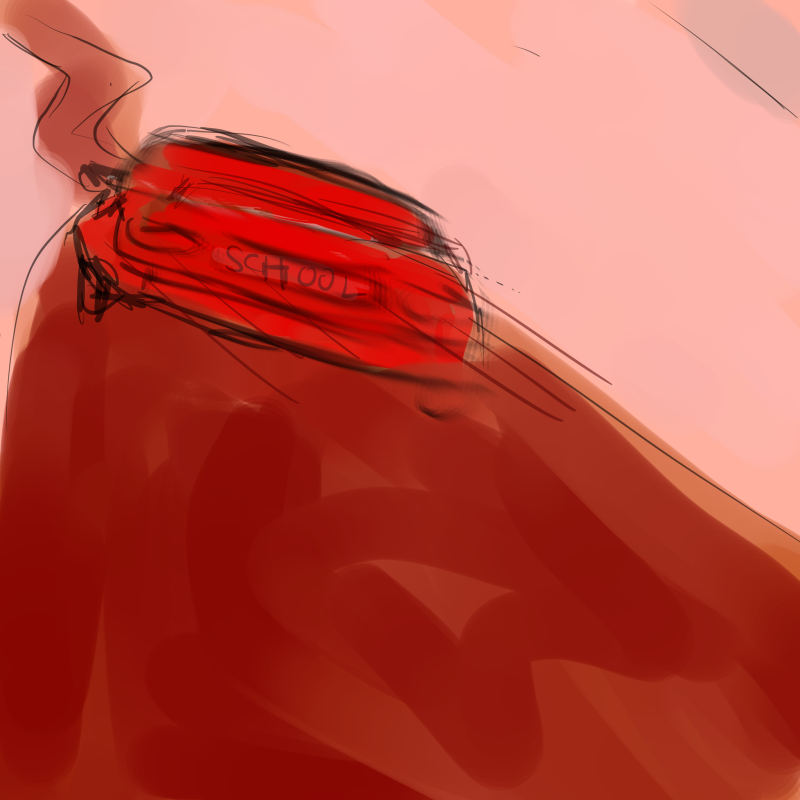
Social situation: School
Setting: Car on the road
-To me, school is a pretty mechanical system that keeps pushing students higher up the educational ladder. I used a car to represent school since cars are automobiles that are supposed to help us, drivers are usually very focused on moving forward.
-I used a monochromatic red colour palette since red is a very energetic colour and implies action. it could also imply danger.
Outcome:
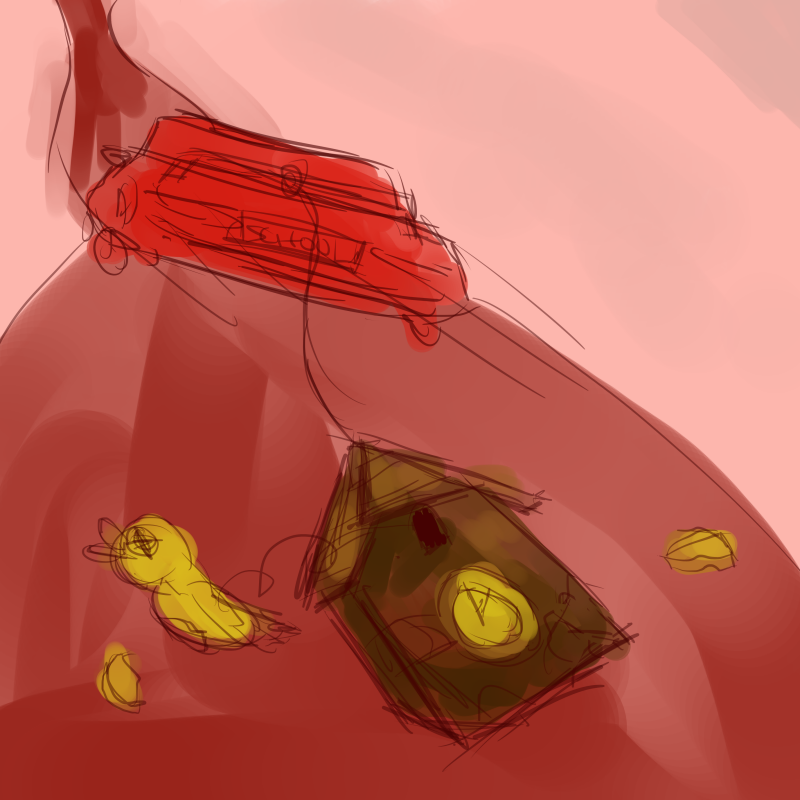
Free spirit + School = Tortured soul
Cuckoo bird + Car = Cuckoo bird getting dragged along the ground
-For me, the higher up the educational ladder I climbed (with the exception of university), the more I struggled to keep up and the more unhappy I felt. With every bad grade I got for my exams, it really made me feel like I was getting increasingly abraded. It was tough being myself again; looking back at my social media posts and reflecting on my attitude towards my family, it made me realise that I really wasn’t myself at all, as if I’d gone dysfunctional and completely lost myself under the unrelenting stress of school, and I felt like everyone around me was oblivious to how much help I needed. I’m representing this with a cuckoo bird tied to the car and getting dragged along the road to destruction. (not depressing at all)
For the colour palette, I simply combined the two monochromatic colour palettes together to form an analagous red-yellow colour palette.
Medium of execution: Digital painting
1st row (Draft 1)
 + =
+ =
I decided to make the outcome less negative so I decided to portray me being empowered in school instead of being crippled by it!


So here I have a new outcome! Instead of being dragged along by school until I’m broken (which, by the way, was quite true to a large extent in JC), I am now empowered by what I have learned and now I have the conviction to aim for higher results!! I guess this now represents the present. The past me was really depressed– ok I shall stop ranting here.
 + =
+ = 
Yay! So now I have my final results done traditionally with watercolour markers (Shinhan Twin Touch, not Copics because I’m poor like that), and black marker pen for outlines (OUTLINES SAVE WATERCOLOUR WORKS!!!).
[Traditional; Shinhan Twintouch watercolour markers]
 +
+  =
= 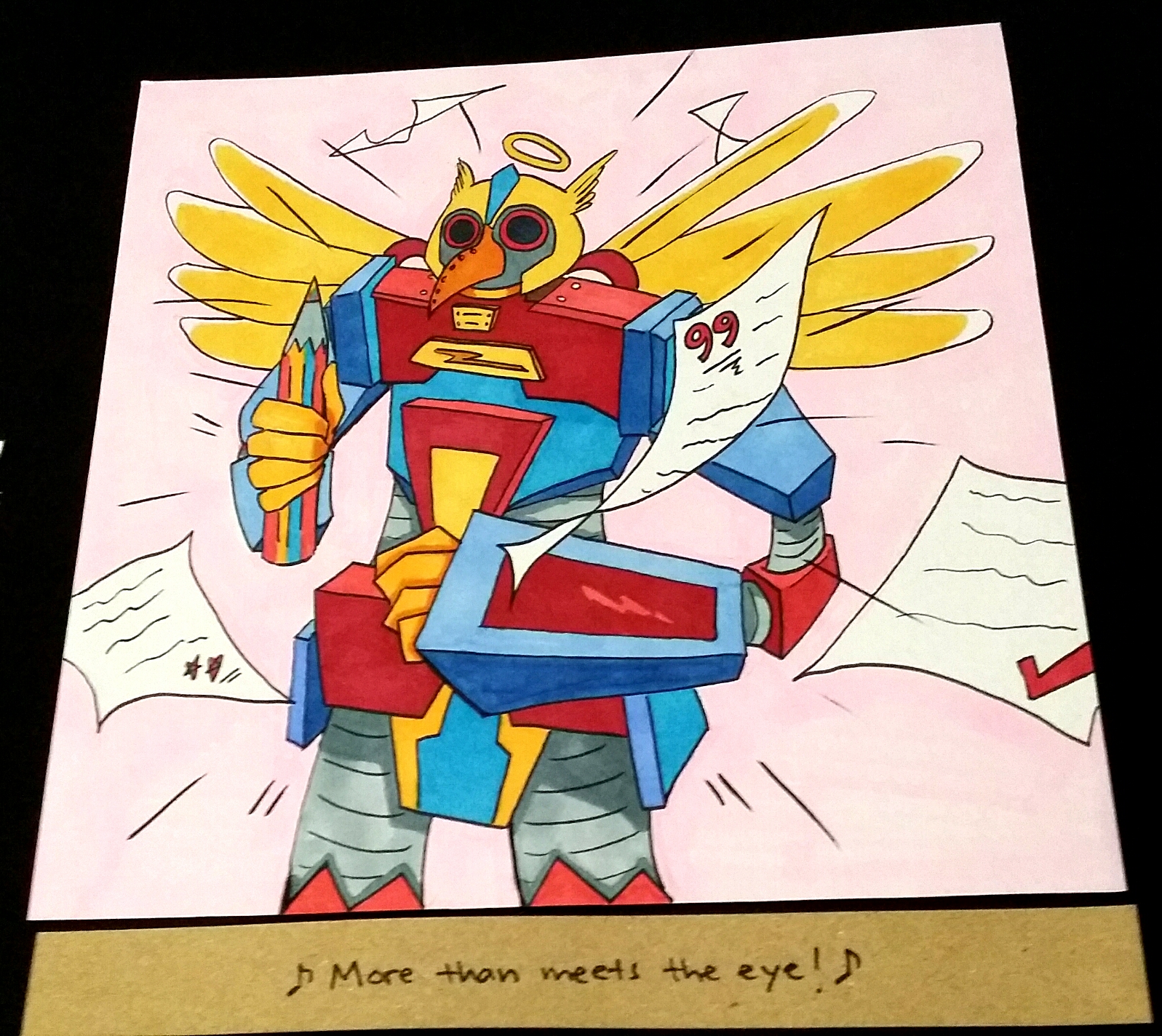
The cuckoo bird is still desperate to break free (made it have a complementary colour harmony which was fitting since blue also represents freedom), I added papers with really bad grades flying around the school car (not bus), and now I am a MECHA BIRD THAT WANTS TO BE MORE POSITIVE 😀
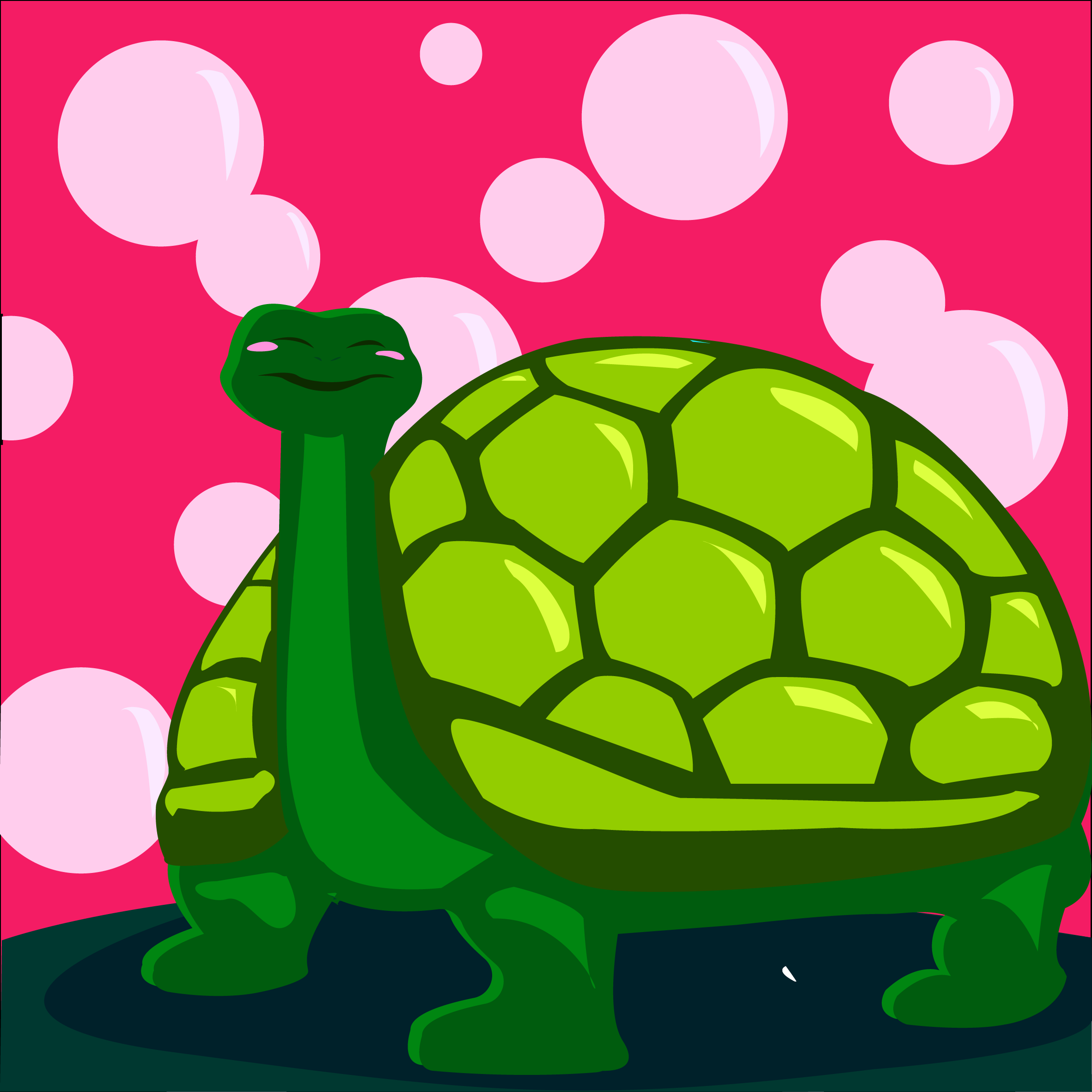
-Me dealing with anyone visiting my house.
Trait: Introversion
Thing: Tortoise
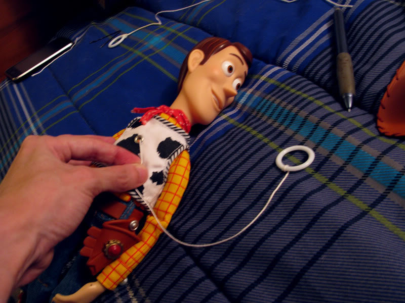
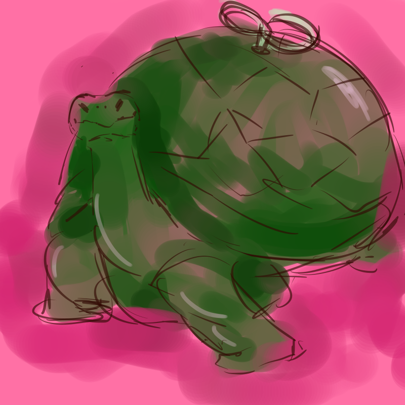
– Normally, I don’t like to put myself out there and be the centre of attraction. Speaking with confidence to strangers for a short while is okay, but if it drags on for too long, my mental energy gets drained thinking about what topics to bring up because I’m awkward and overly-conscious like that. And when it does, I like to stay in solitude to gather my thoughts and brace myself for meeting the next fellow human. I thought a tortoise was perfect for this trait since tortoises can retreat into the safety of their hard, protective shells. It would be pretty boring just having a tortoise so I made myself into a windup tortoise instead after drawing some inspiration from Toy Story’s Woody which as a pull string, which represents having a limited time of extroversion before feeling really down and keeping to myself again.
-I coloured the tortoise green with a pink background to depict my amiable personality (or at least I hope I am).
Social situation: Home visits from strangers
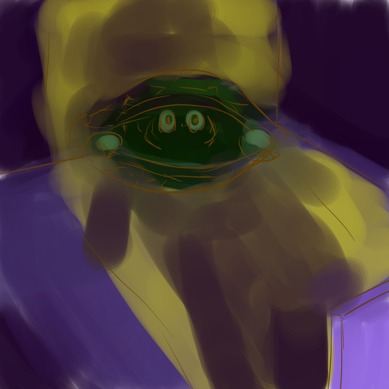
Setting: Ominous figure walking into a dark room
-I utilised the complementary colours of blue/purple with yellow to show a contrast in lighting. Anyone who invades my humble abode appear like towering dark figures to me. They threaten my bubble of privacy and I will use all means to defend it. 😀

Outcome:
Introversion + Home visits from strangers = Isolating myself from everyone else
Tortoise + Ominous figure = Tortoise retreating into shell and cowering away
-Here I used sort of an analogous and complementary colour scheme. The pink from the turtle is completely gone because I’ve run out of fuel to socialise and seeking refuge in my shell while the anonymous tall figure towers over me and daunts me.
+ =
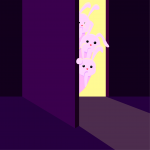
After receiving feedback from the first round of consultations, I got the idea of using rabbits to represent strangers (because according to the hare and tortoise folklore, they’re supposed to be enemies, also, rabbits are often representative of hyperactivity and face-paced action because of how much they can jump about).
Some inspirations!

+ = 
I never thought I would actually do it, but I PICKED UP ILLUSTRATOR WHOOPDEEDOO!!! It seemed like such a daunting task. I remember how shocked I was at the amount of potential it had after watching a Youtube tutorial video. Everything you put in Illustrator looks so legitimate!! But I’m so glad I did because now I have one more tool to carry around 😀 (but it does take quite a long time since every single shape has to be manually inserted and the number of layers drives me nuts.)
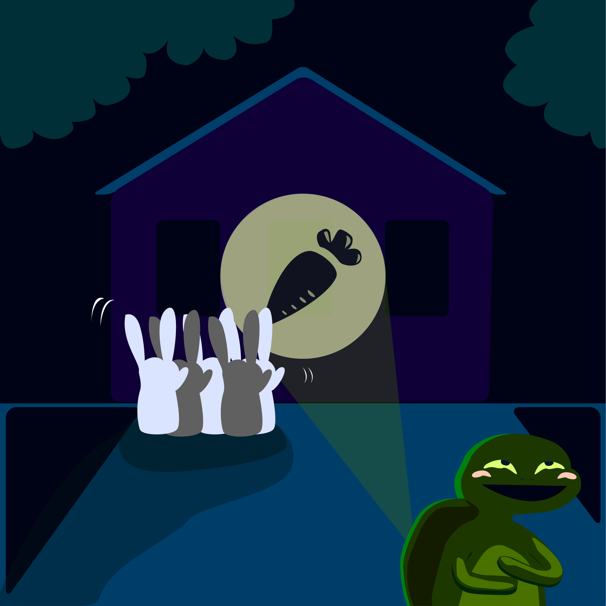
So I made my tortoise (without the pullstring thing because it kind of seemed redundant), have rabbits peer through the door instead of an anonymous stranger, and have me (as a tortoise) project a carrot, instead of a bat, to draw the rabbits’ attention elsewhere so that I am free to relax in solitary.
[Illustrator]
 +
+  =
= 
-Me dealing with anyone visiting my house.
Trait: Nurturing
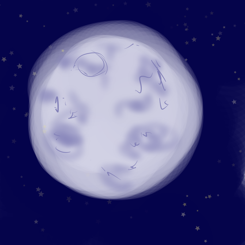
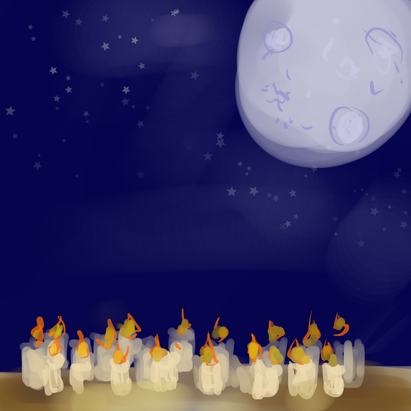
Thing: Moon
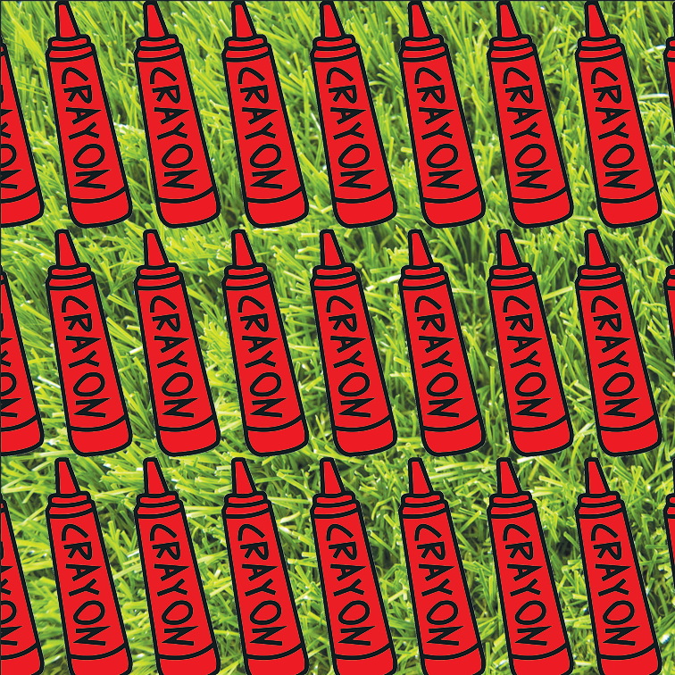
Social situation: Taking care of kids
Setting: Crayons
-Crayons remind me of children because that one time I worked at a kindergarten, they literally did colouring with crayons for so much of their time there. Crayons are one of the first drawing tools that we are exposed to as children as well, so it usually suggests childhood. (Crayons are made of wax, so I thought maybe they would burn. What an odd idea 8’D)

Outcome:
Nurturing + Taking care of kids = Educating and enlightening them
Moon + Lit crayons = Crayons being lit up like candles
For some reason, there are lots of children in my life. My younger baby brother, and the kids that I met when I taught in the kindergarten. I only feel grown-up when I’m around them and feel like a responsible adult. The crayons being lit represents me enlightening them and showing the way.
+ =
Some inspiration!


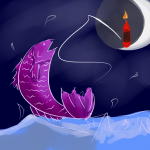
During consultation, I got the idea of how the tide changes as the moon waxes and wanes. I thought that was really fitting for the fishing theme, so I included it in my first square. In my second square I did a illustration of a crayon in illustrator, made a pattern out of it, and placed the pattern upon the background of green grass, The crayon is red to represent how energetic children are, and the green pasture represents how lively, pure and down to earth they are as well. In my final square, I adopted the dramatic fishing composition and also tried out a new brush to paint the sea and the fish in FireAlpaca. (analagous)
[digital painting]
 +
+ =
= 
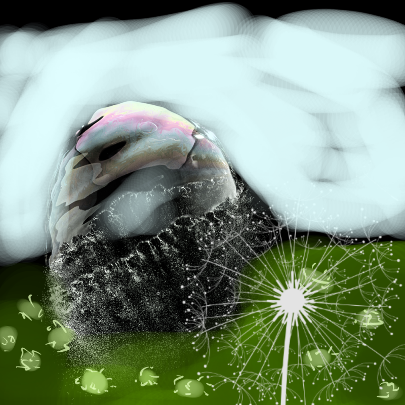
Trait: Calm demeanor but insecure
Thing: Bubble
-Many of my friends tell me that I am ‘chill’, but on the inside, I really am constantly on the verge of having a meltdown because I overthink about everything way too much. (it’s all internal)
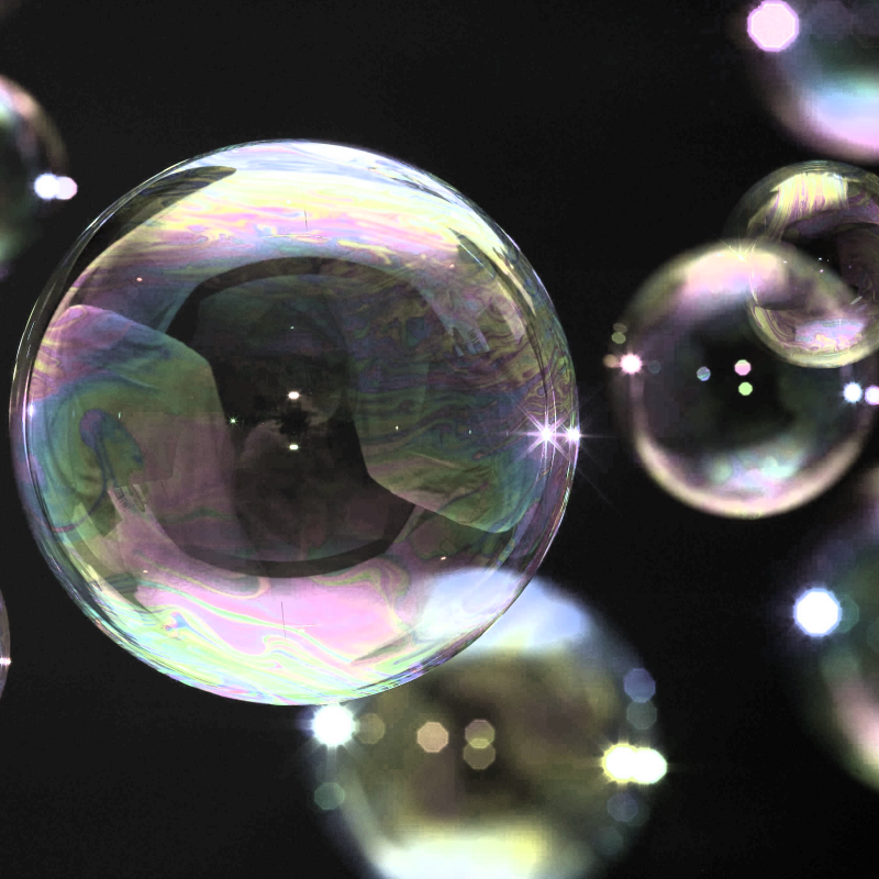
Social situation: Being accompanied by my group of close friends
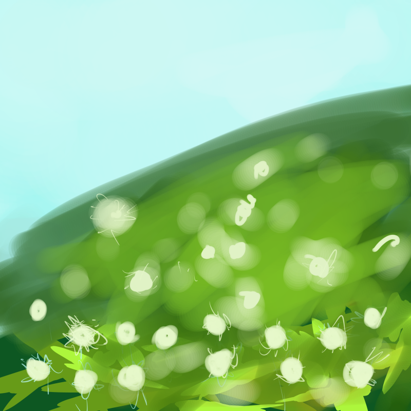
Setting: Dandelion field
Dandelions represent childhood, and the way they disperse their seeds are like how childhood friends eventually grow up along different life paths and grow apart from each other. But in my case, I have a close group of primary school friends who, even though have grown up to take on immensely different challenges, still stick close together like glue.
Outcome:
Calm and insecure + Accompanied by close friends = Being empowered by my friends
Bubble + Dandelion field = Bubble burst by dandelion
-Around this group of friends, I can really let out my insecurities and be comfortable around myself.
4th row (Draft 1):
+ =
So I scraped the previous idea entirely because it was way too cliche and predictable. (it was nice but way too subpar HAHA)
I kind of took the liberty to work backwards but I thought it actually works because I can have a rough concept of the outcome much earlier.
Instead, I thought up a new outcome first!!
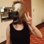
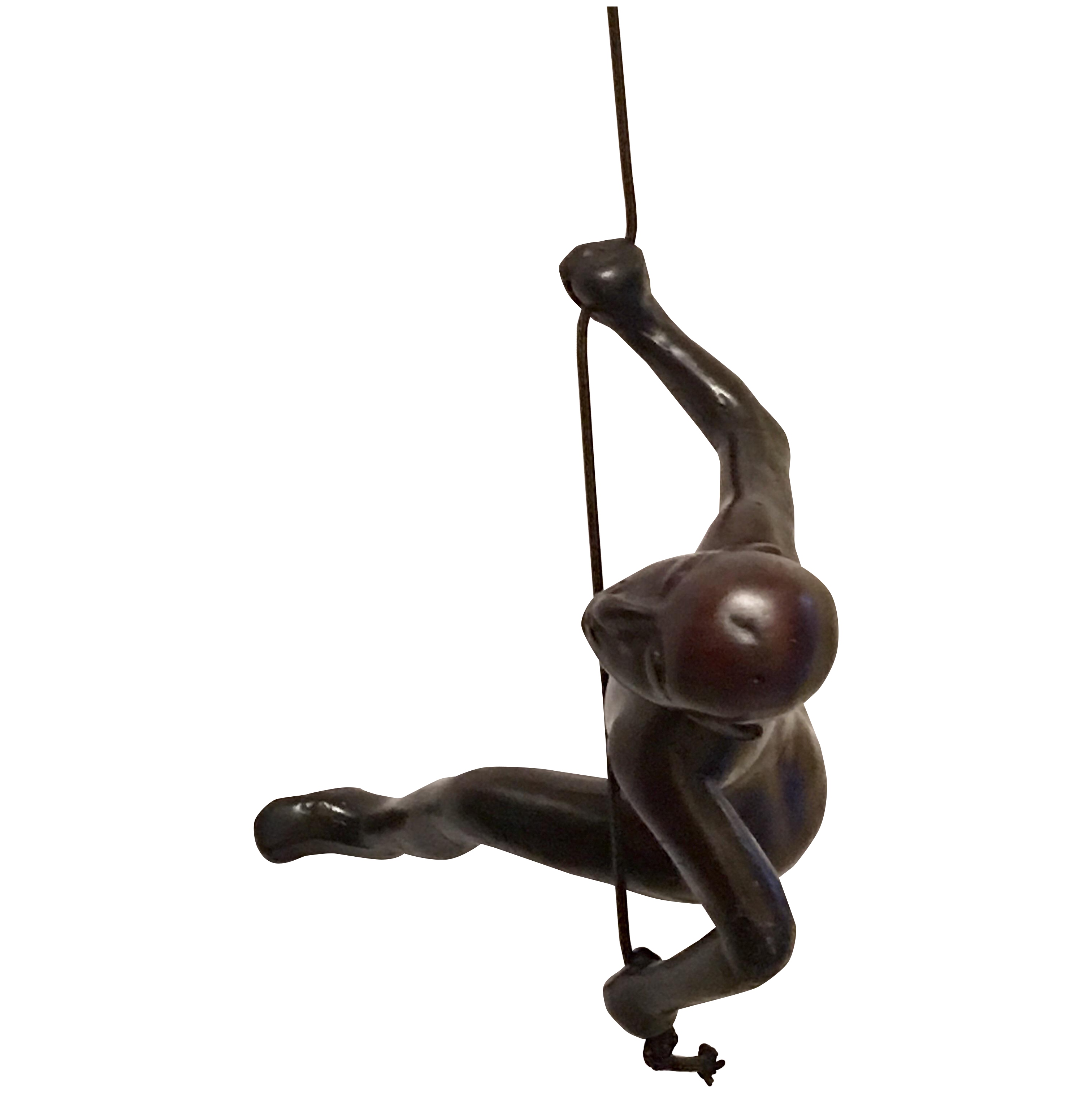
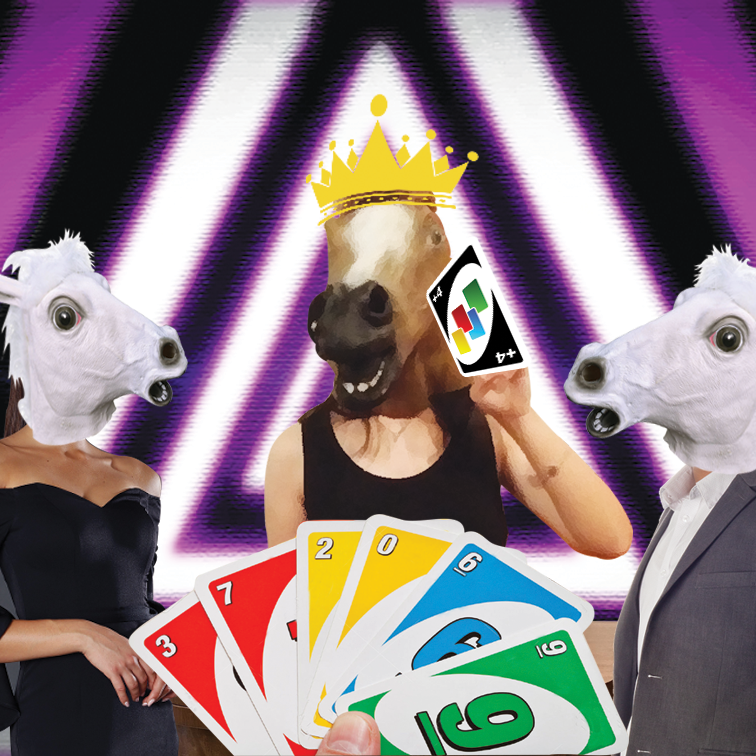
This is an actual photo of me during my secondary school prom. I borrowed the horse mask from my classmate. It was irresistable.
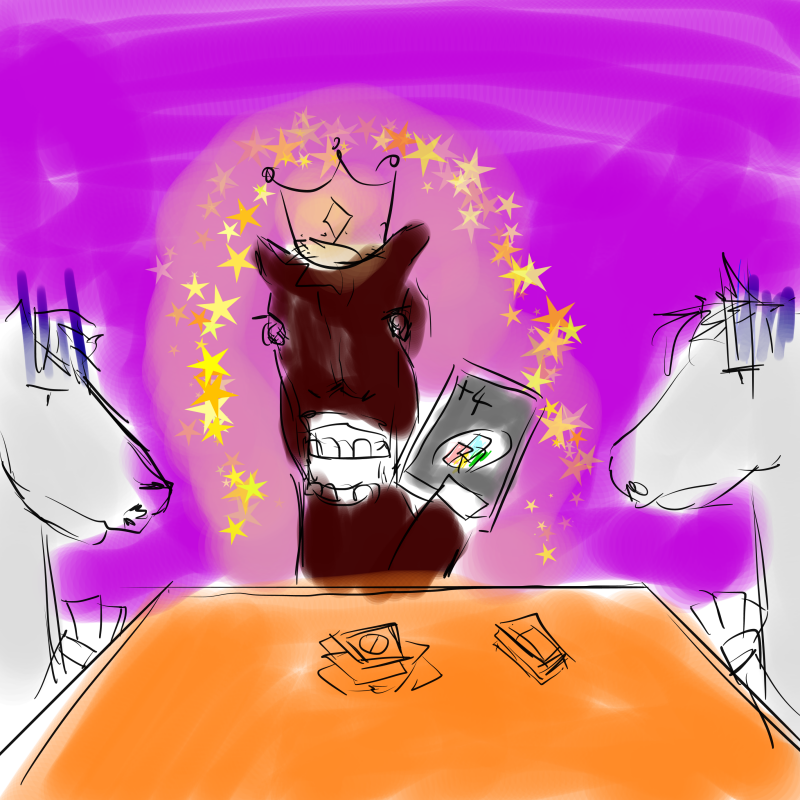
I thought of how the idiom ‘dark horse’ is used to represent someone who unexpectedly changes from underdog to the master of a game/competition. So to contrast this, I planned to put 2 white horses on the side of a table and have the 3 horses play a game of Uno. Because that’s probably the only competitive game I’m good at.
The first photo is me spouting out some trippy looking spirals out with an analogous colour scheme around the green/purple sideo of the colour wheel to represent nervousness and abhorrence towards competition. In the background you can see the typical game controller symbols to suggest gaming as a form of competitive activity.
In the second square, I digitally painted a game of Uno going on (it was so hard to find reference images that had the exact angle that I wanted). Uno represents something that I’m relatively better at and am willing to lay out my skills for all to see 😀
In the last square, I made a photo collage of the planned composition above. (Never thought I would get to use my prom photo like this but totally worth it). In the background, I used a luminous neon purple triangular hypnotic pattern to represent how ecstatic I am. Purple is also a royal colour and I have a crown on my head, so it suggests how big of a deal I assume myself to be when I get ever so slightly good at something. 😀
[Photo collage]
I’m actually really thankful that we got to do this project because
4. I would say one of the biggest difficulties I faced aside from the technical part of using Illustrator was figuring out me. I get existential and identity crisis from time to time and through this project (all the feedback from friends, online quizzes and tarot cards), I managed to figure out at least 4 different characteristics of myself. This project was really therapeutic and I would highly recommend it to the next batch of students. 😀
5. Through this project, I was also better able to exercise the use of visual language to get my point across. The regular consultations also really helped me to bring my ideas to further heights (and weird places as well) that I would never have thought of on my own. Sometimes, you need others to know who you are. 😀 Through identifying symbols/representations of my different facades and egos, I learned how to put them into a context and build a narrative within that new context that somehow parallels with the message I am trying to convey about my personality. All in all, it was a very enlightening experience. *shines*
Shortly after making marks, I’m making prints!!
For Project 2: “Forrest Gump”, I have to pick movie quotes, translate them into abstract visual language like symbols, pictograms, dingbats, icons and engravings and apply techniques such as hyperbole, metaphor, caricature, parody, anthropomorphism etc. to express the narrative quality of the quote. I also have to make use of design principles from the various class presentations to create my final design. (dots, lines, shapes, planes, value, texture, balance, gradation, symmetry, repetition, pattern, rhythm, unity, harmony, size, proportion, dimension, contrast etc.)
Personally, I realise that I have not watched a lot of mainstream Hollywood movies, but my taste and preference for movies lies a lot more in Disney/Pixar animated films, as well as Japanese movies and animated films, which have pretty memorable and unique quotes as well.
Below are some of my favourite quotes that I have gathered:
| Movie | Quote |
| *Paprika | “Don’t you think dreams and the Internet are similar? They are both areas where the repressed conscious mind vents. “ |
| Mulan | “The flower that blooms in adversity is the most rare and beautiful of all.” |
| Grave of the Fireflies | “Why do fireflies die so young?” |
| 1 Litre of Tears | “When I look up as I fall down, I see how limitless the azure sky above is as it smiles down upon me.” |
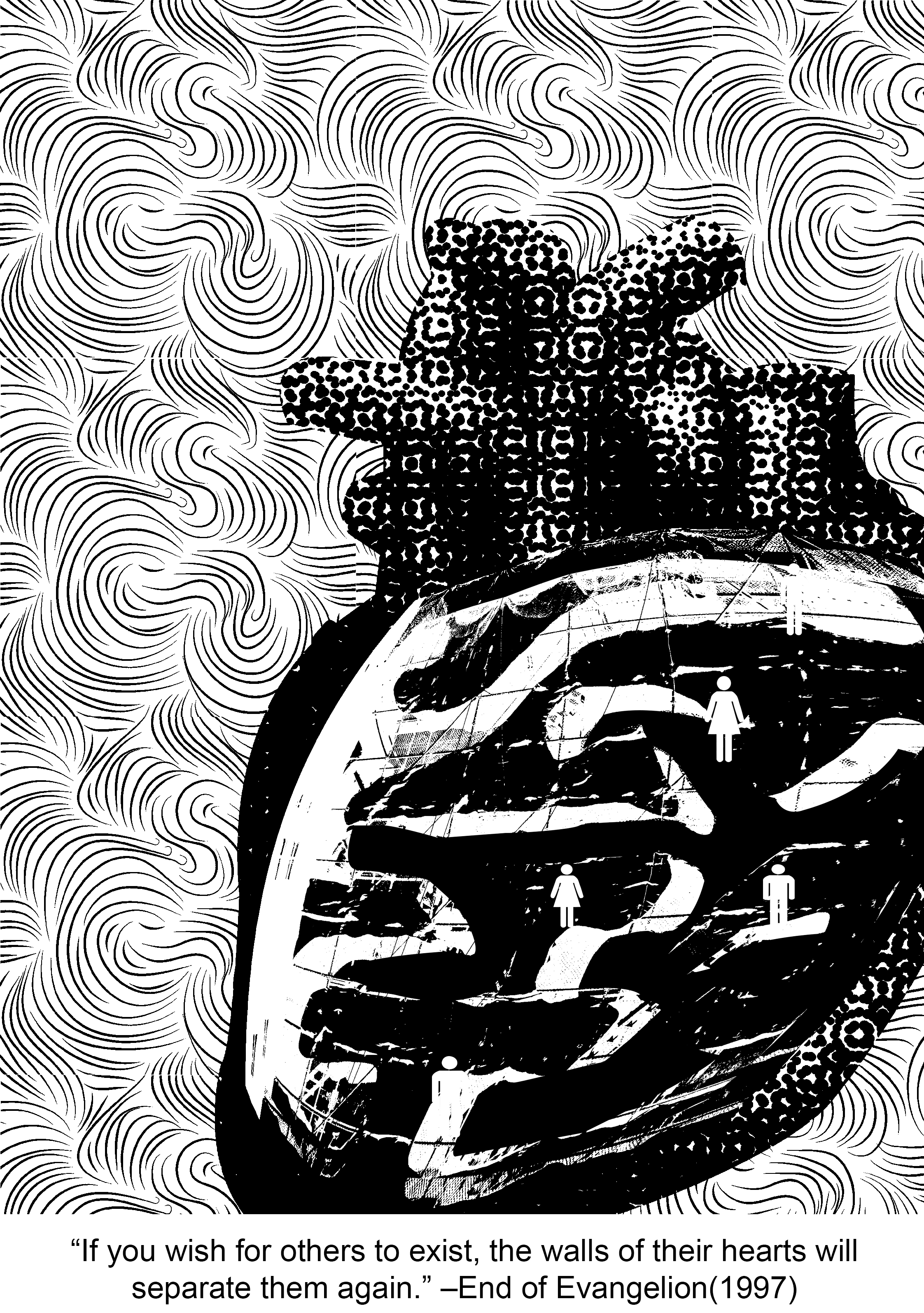
| * End of Evangelion | “If you wish for others to exist, the walls of their hearts will separate them again.” |
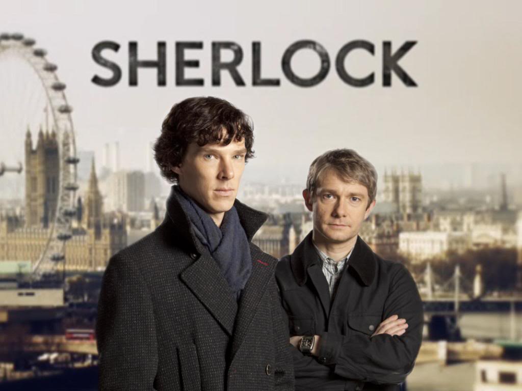
| *Sherlock (bam, the only mainstream series I watch) | “Anderson, don’t talk out loud. You lower the IQ of the whole street.” |
| *Peter Pan | “To live would be an awfully big adventure.” |
(* starred quotes are the four that I have chosen.)
Taking a pick out of this list was quite the feat, but I figured that was a wise decision not to pick quotes that were either too literal or too figurative because it leaves little room for imagination and abstraction.
Context in movie:
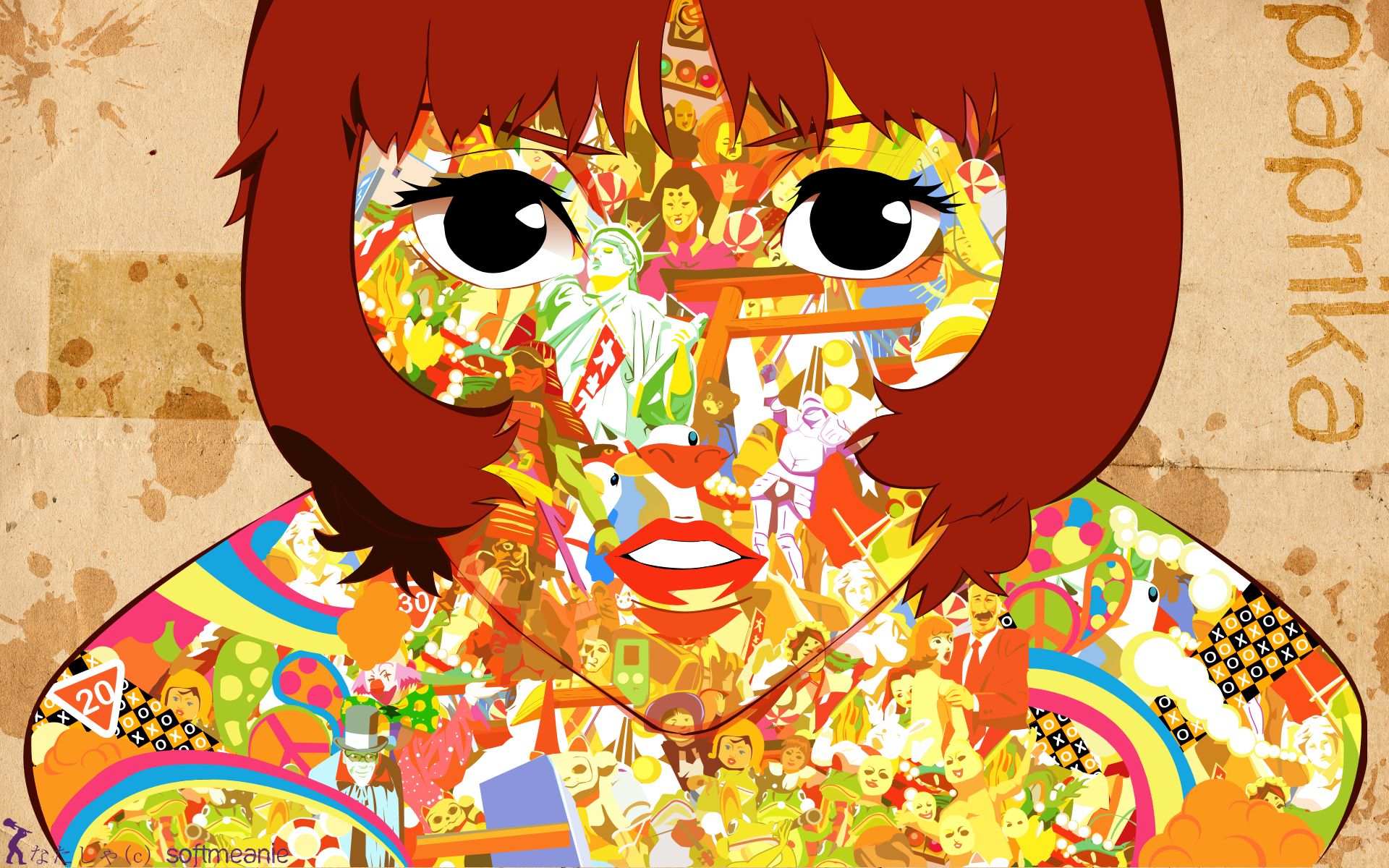
Paprika is a relatively contemporary, sci-fi Japanese animated movie that is in a futuristic, alternative universe and is about dreams and reality. To put it simply, an organisation creates a device that allows people to jump from reality into the dream world and that is used as a prototype for treatment at a hospital (later revealed to be malfunctional but I’m just going to stop here because this movie is a masterpiece and I don’t want to spoil it). Paprika is the name of the avatar of the main female protagonist. The quote is said by Paprika herself as she draws a comparison between the characteristics of dreams and the Internet.
Keywords: Dreams, Internet, similar, repressed conscious mind, vents
Imagery ideas:
-Surreal alternate space that we transiently experience when we sleep. Normally has a lot of crazy, bizarre things going on that will almost never happen in real life.
-Has a sense of lightness since we have a lot more freedom to imagine what we want to in our dreams.
-A sense of movement can also be created as well since the scenes that we imagine are often overwhelming and hard to comprehend, leaving us in confusion (which, with reference to observations from the previous project, can be expressed with spirally lines radiating outwards)
Possible imagery: hot air balloon, water, anything to do with space or distorted reality
-a global computer network providing a variety of information and communication facilities, consisting of interconnected networks using standardized communication protocols.
– cloud, data, wifi signal, hotspot, can be sea as well
– show the contrast between dreams and the internet, yet feature the main similarity between them
– (form of restriction) treasure/Pandora’s box, lock, chain, handcuff, torn wing, cage
– burning flame, open eye (window to the soul)
– (outpour) waterfall, volcano, soil erosion, avalanche, tsunami, some sort of a crack and spill situation

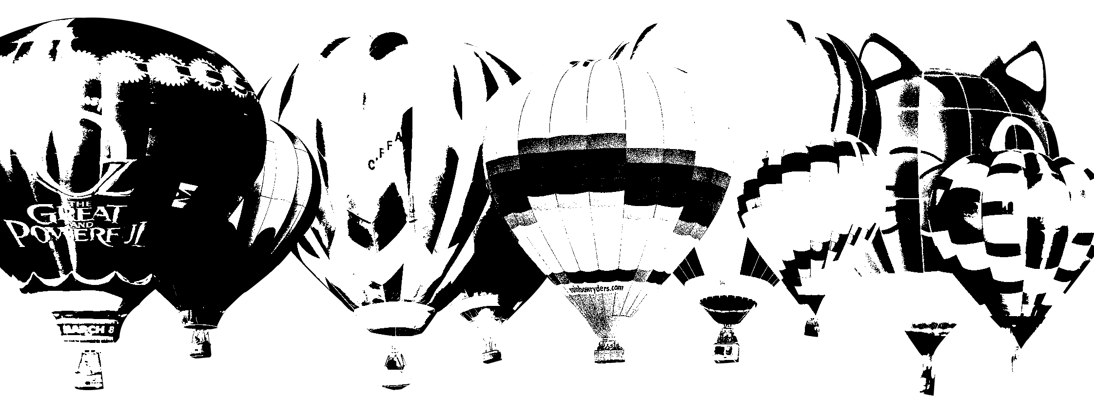
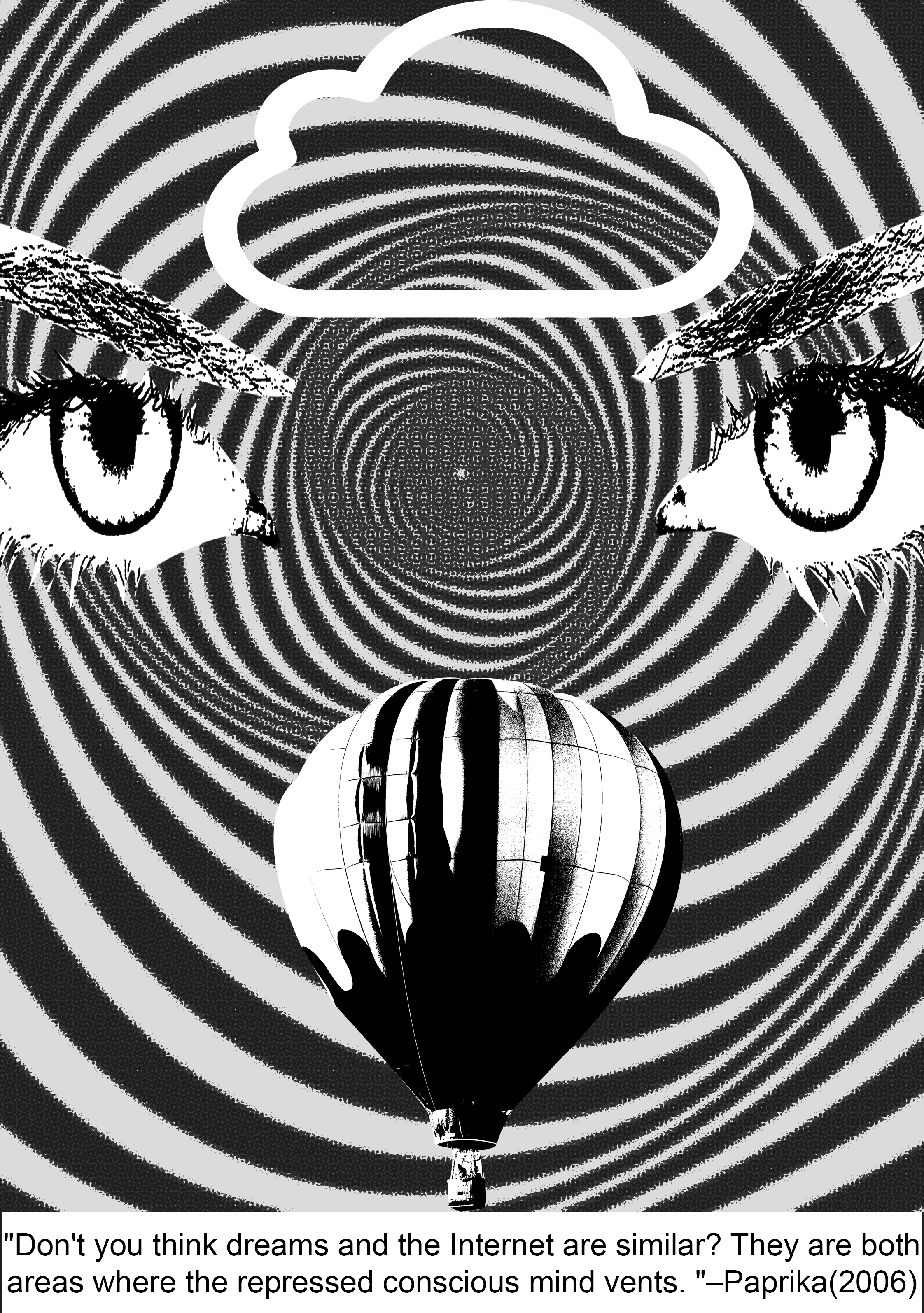
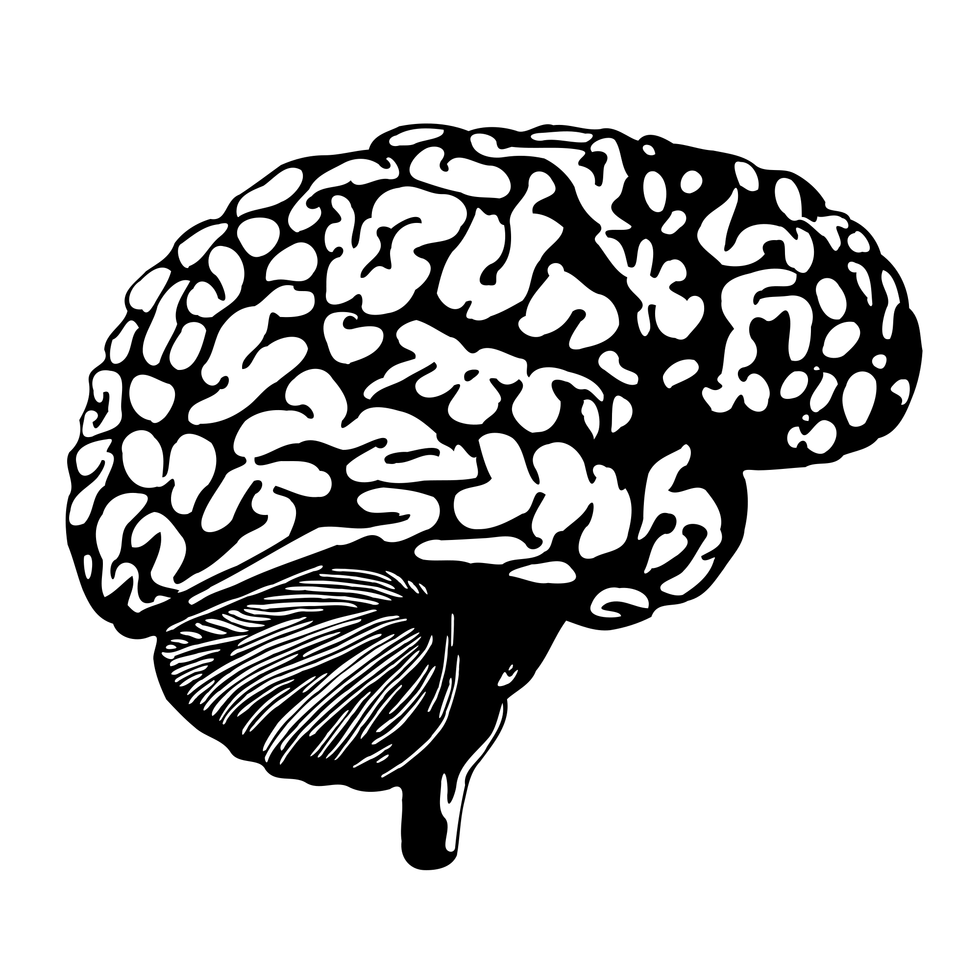
As for the ‘Internet’, I chose to use a relatively larger-scaled cloud icon. To me, the Internet is a vast space with many users, just like how the water droplets aggregate in the air to from one massive cloud.

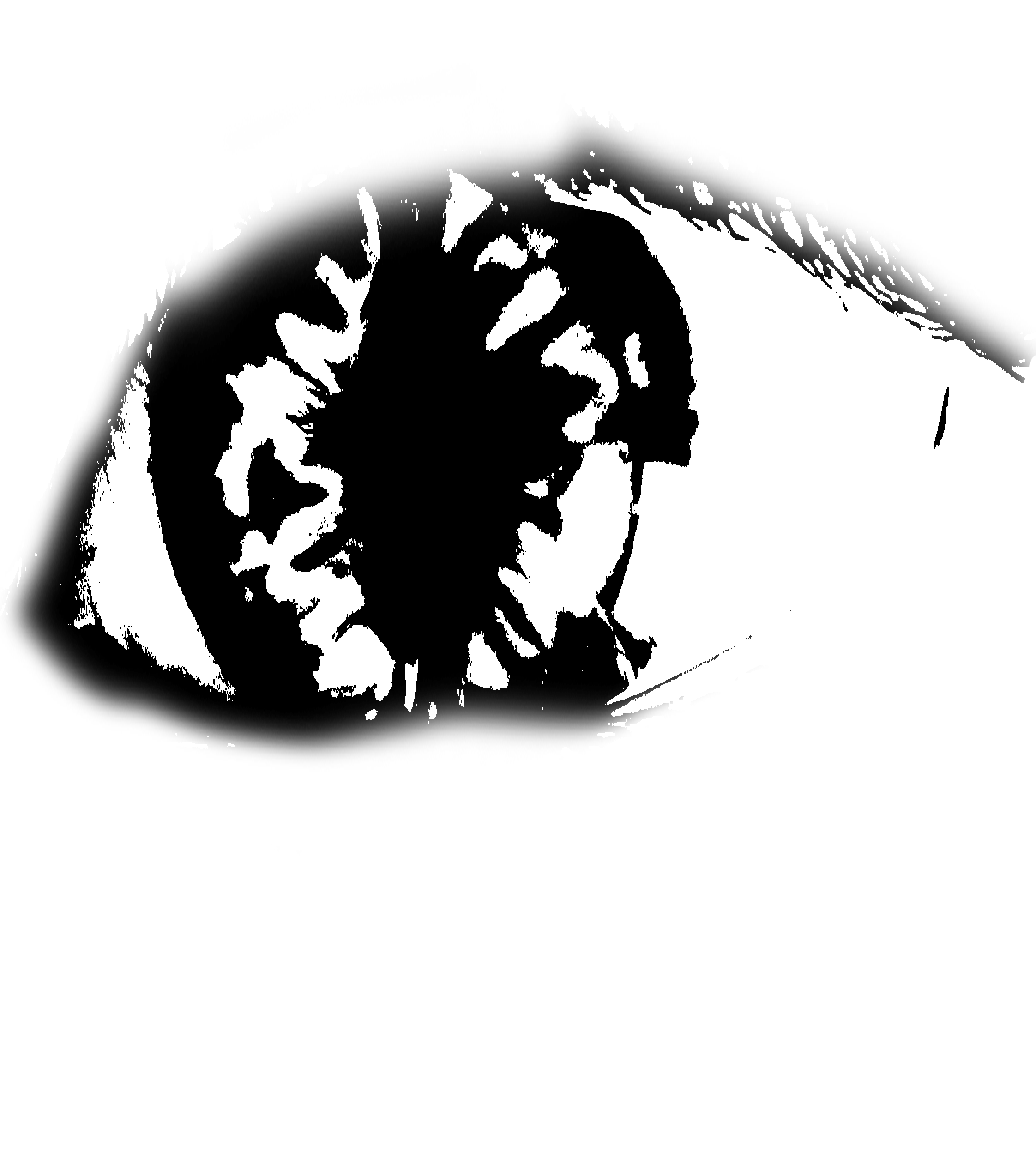
To represent the ‘conscious mind’, I’m using an open eye since it implies being awake and aware of your surroundings. After looking through icons and symbols, I decided that using a more realistic-looking eye was better since it gives a stronger sense of consciousness (“the eyes are the windows to your soul”). Using simple icons felt very dead.
1st Draft:

I separated the singular massive cloud and the layer of hot air balloons into distinctive layers. I wanted to place eyeballs on all of the hot air balloons and the cloud, then have something come out of them (expressing ‘vent’) but I felt like it did not do a good job of conveying the quote since it did not make much sense for dreams and the Internet to have conscious minds of their own. Plus, I was also intending to put a broken chain on the eyes to represent ‘repressed’ (but no longer). However, after attempting to put chains on each of the eyeballs on the hot air balloons, it proved to be an editing disaster.
2nd Draft:
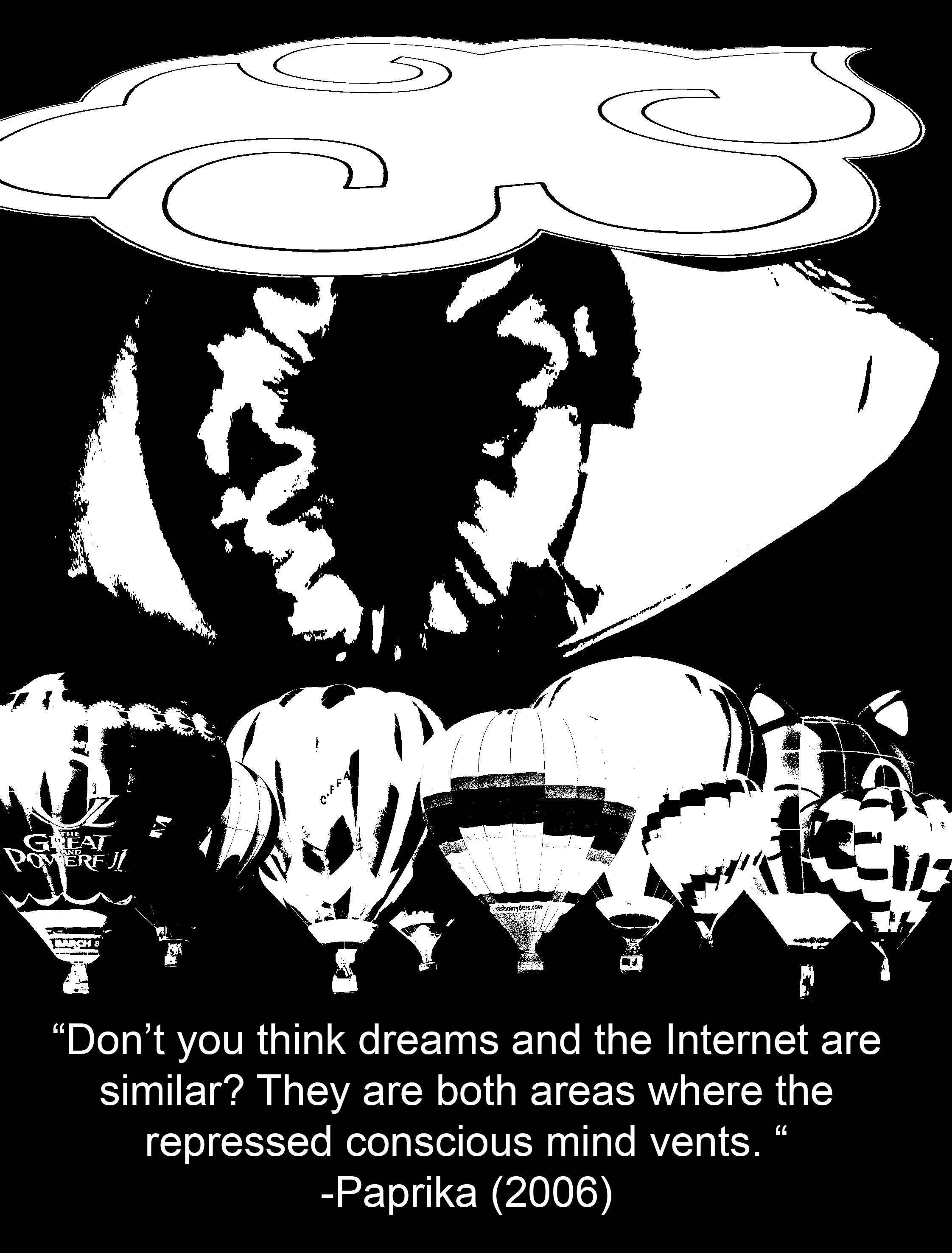
Now, instead of slapping eyeballs everywhere, I decided to put a picture of an eyeball that was relatively larger than the other elements to show that it was the dominant subject of the piece. However, it is still concealed behind the cloud to create a sense of depth (hiding behind the clouds, more subtle way of representing ‘repressed’), and the black background also enhances the feeling of a void which reminds me of the dark we see when sleeping; it is a strong contrast with the white parts of the eyeball which is supposed to symbolise consciousness and being awake.
To express the element of ‘venting’, I wanted to use rhythm to show an erupting action, sort of like lava from a volcano, or bubbles coming out from a underwater vent. The use of a variety of shapes was abstract enough to show the idea of “anything”, parallel to how we like to post anything on the Internet, and how we can literally dream up anything when we are asleep. Initially, I used a regular rhythm of shapes everywhere but it proved to be much too rigid. After some tweaking, I managed to come up with the design below:
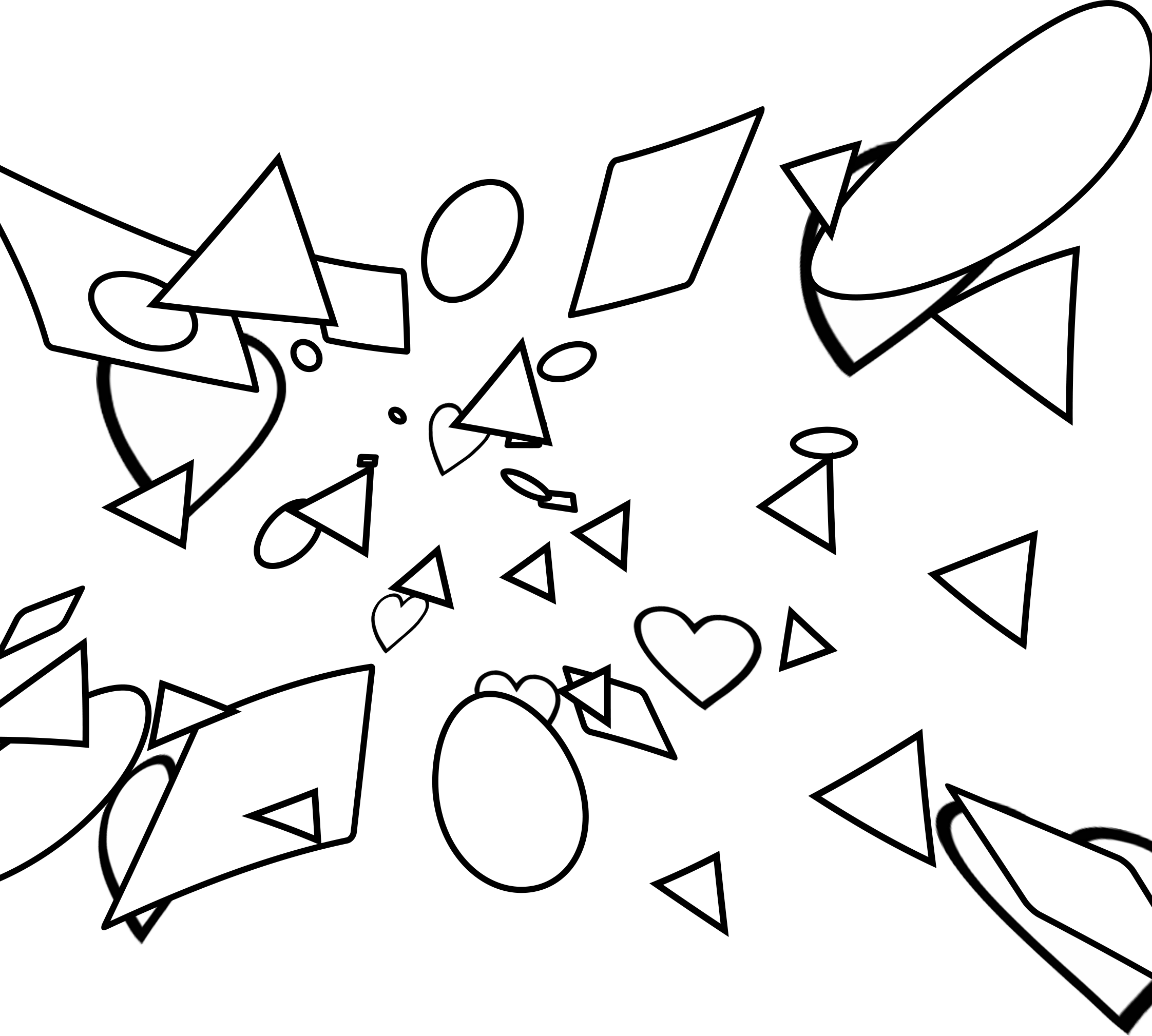
In this version, I used progressive rhythm, where the shapes got bigger from the eyeball to the cloud and hot air balloons. The warp effect that I added also enhances the illusion of depth as we can sense that these shapes are in motion and travelling a distance from the eye to the cloud and hot air balloons. This is paralleled with how our thoughts are transferred from our minds to the Internet and our dreams.
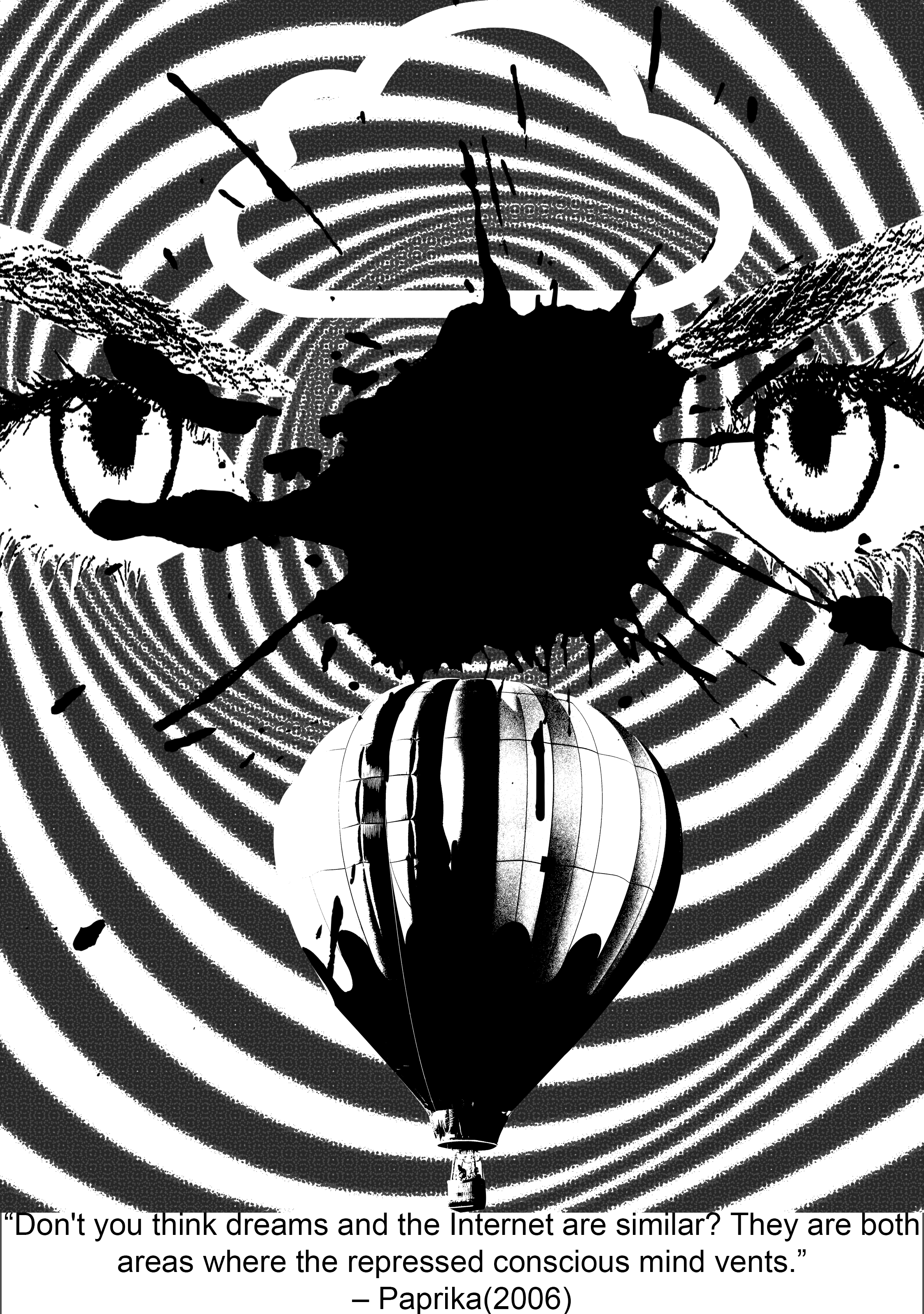
3rd Draft:
 For my final-ish concept, I further enlarged the scale of the eyeball so that it was hidden under both the hot air balloons and the cloud to express how the conscious mind is being repressed. I added more shapes near the centre of the iris as well to show that the shapes are originating from the eyeball and moving outwards and as a result, their distribution becomes more sparse as they go outwards towards the clouds and the hot air balloons.
4th Draft:
-With the cleaning up of my design, I realized that had unintentionally created some sort of a symmetry which was really effective since symmetry grabs people’s attention by instinct. It also makes my entire composition look like a face. (TvT)
This accompanied with the meaning of eyes as ‘windows to a soul’, plus the op-art background, this projects a hallucinatory effect on the viewer’s mind, which is a literal invasion of the consciousness, or inside of the mind, as I have interpreted for this quote.
Final Draft:

Context in movie:
Evangelion is one of the most well-known and oldest Japanese animated films that is ever so enigmatic and philosophical. There is so much hidden symbolism in this movie that might just reveal themselves to you… if you rewatch the movie like 1093420384032 times and consciously try to catch them. At first, the Evangelion series just seems to be a normal Gundam (they call them Evas) action show, but it gets so exponentially complex towards the end that it is almost impossible to fully comprehend what is going on. The main philosophy that the End of Evangelion is trying to express is that humanity essentially belongs to a common pool of ‘primordial soup’ where all our souls linger even after death. There, we can be reborn again, but when we turn back into human form, there will undoubtedly be conflict and unhappiness, as compared to staying in primordial form where everyone lives in unity and there will be guaranteed peace (it’s almost like the philosophy for Buddhism). The main protagonist, Shinji has to make a choice between this two options, and this quote comes from Rei (another Eva pilot), who instigates Shinji to make a choice at the end of the movie. (One of my absolute favourite series ever)
Keywords: Others, exist, walls of their hearts, separate
Imagery ideas:
Others– masses of people, masses of monsters/aliens, simple dots, faces (kaleidoscope effect)
(kaleidoscope tutorial – http://www.creativebloq.com/photoshop/kaleidoscopic-collage-effect-5132671/2)
walls – barricade, fence, brick wall, thorny bramble bush (inspired by Sleeping Beauty), clam shut tight
hearts– heart, differences (different colour), life, tree


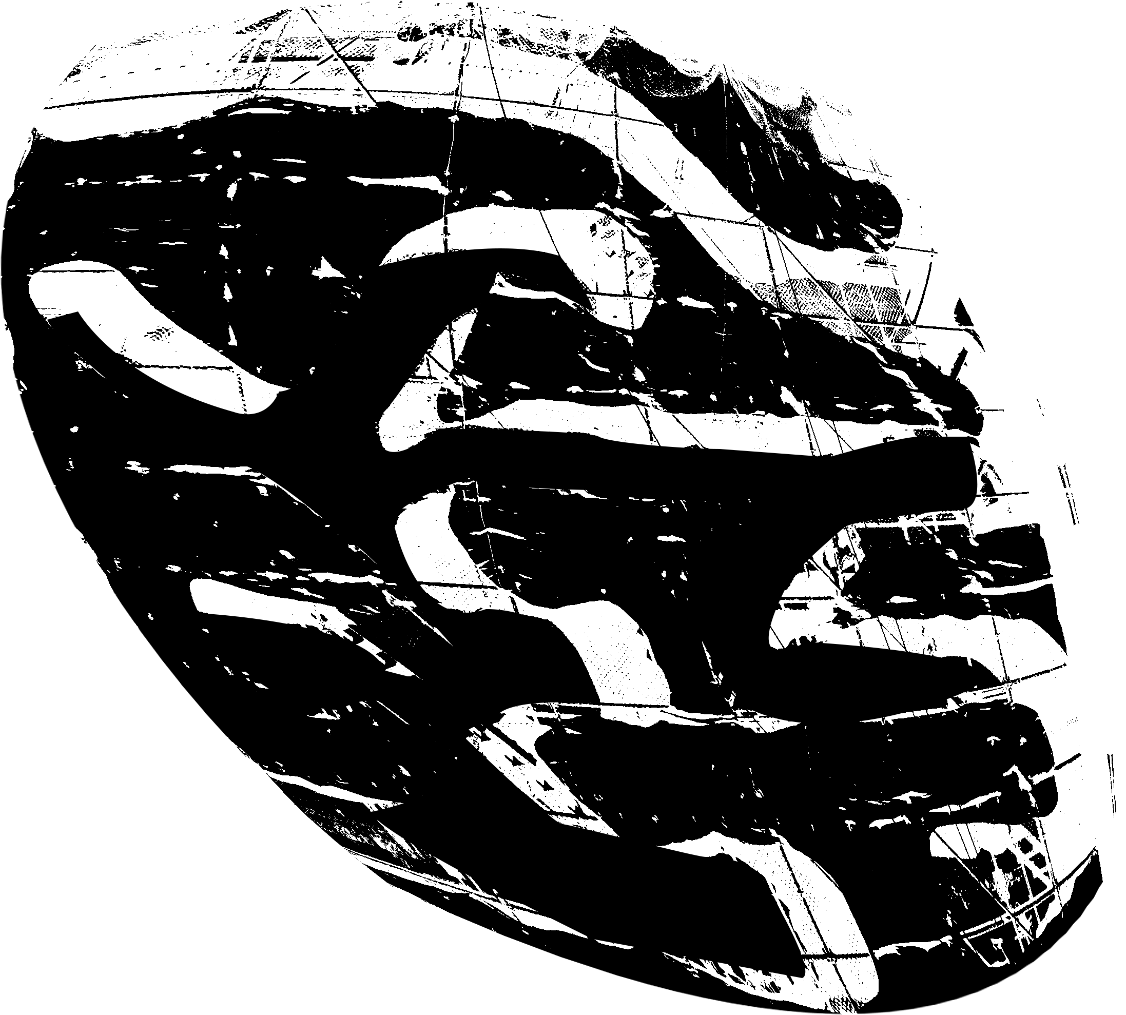
1st draft:
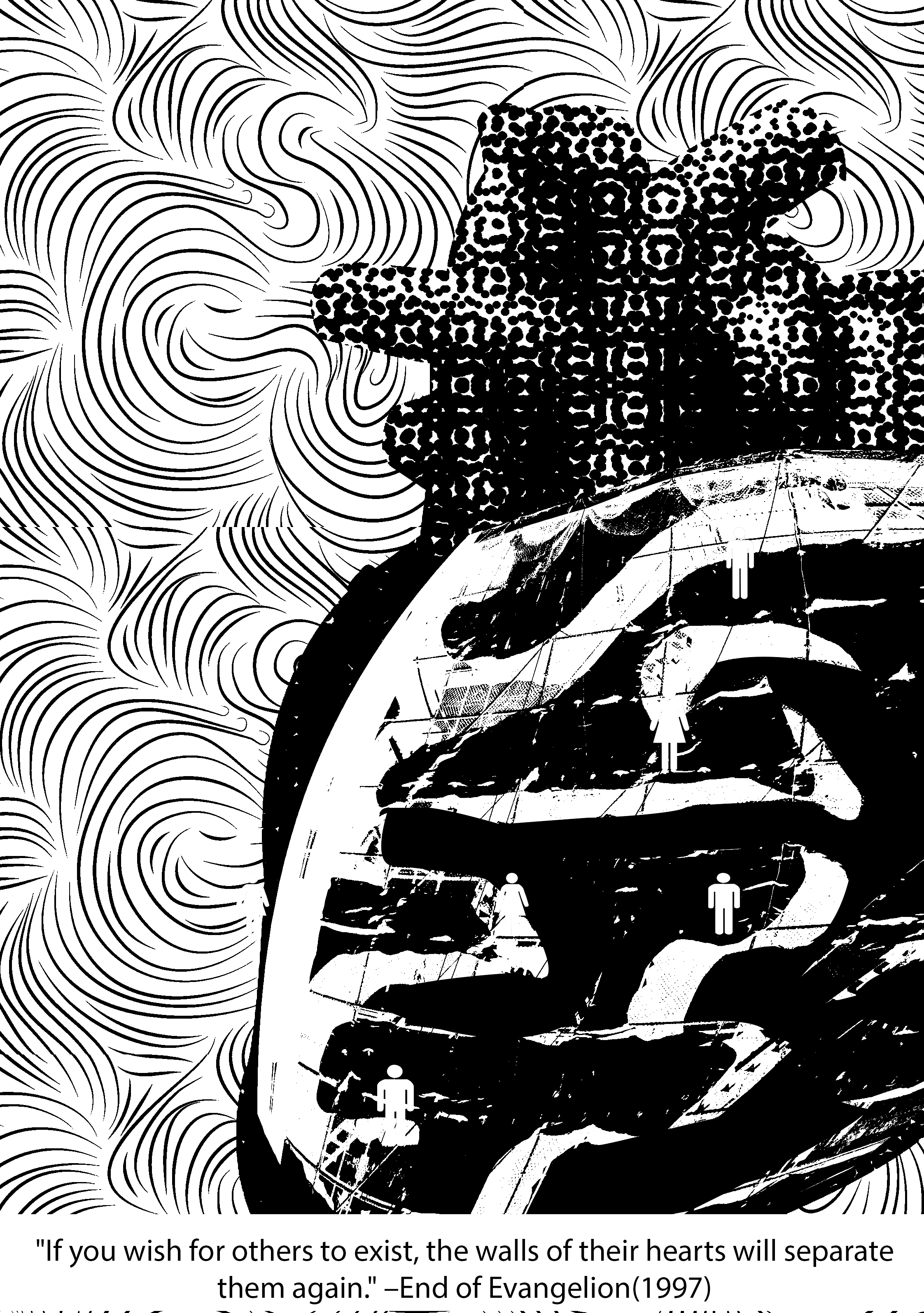
Final Draft:
Context in movie:
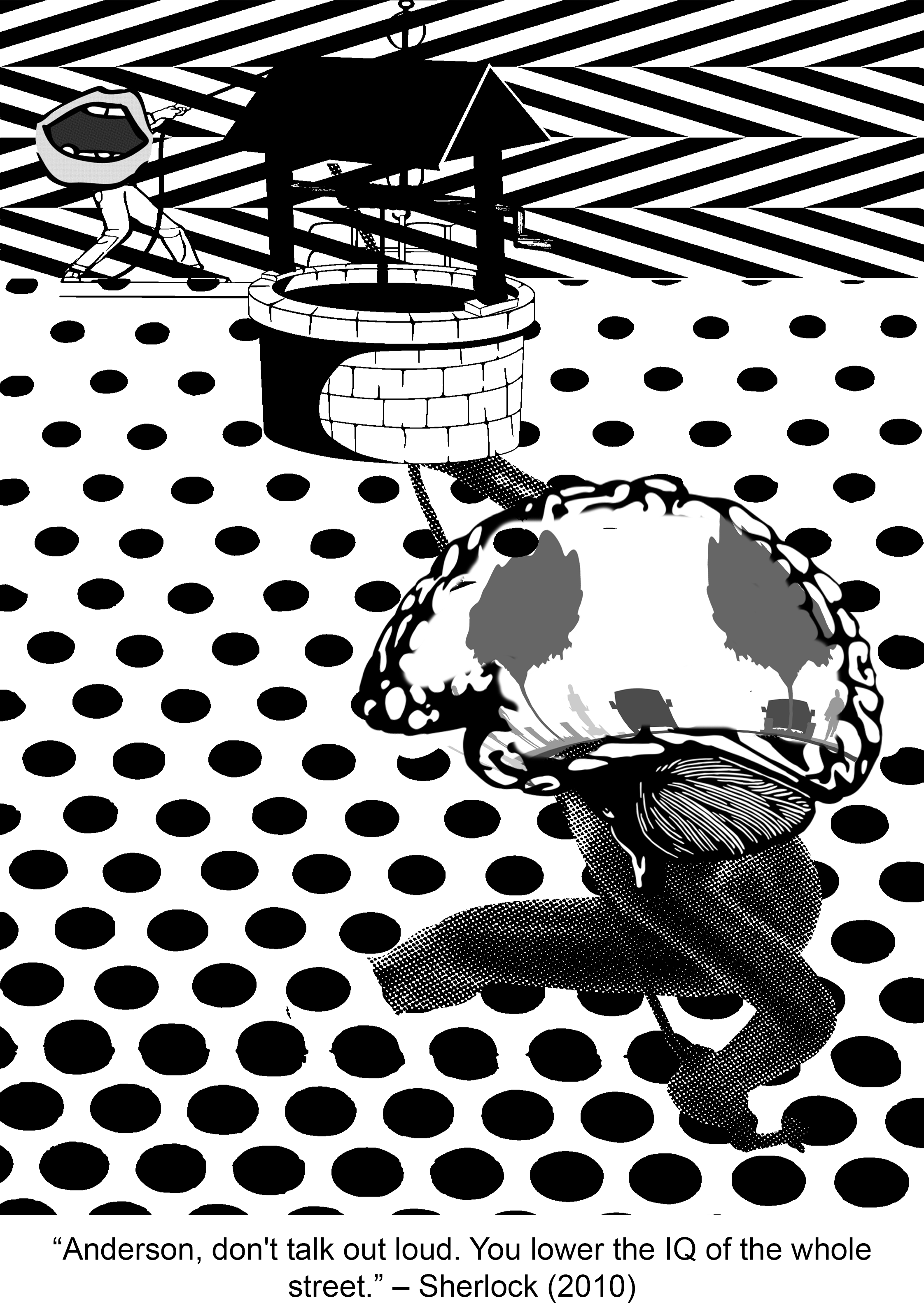
I barely watch any mainstream film series but my friend insisted that I watched Sherlock and boyyy did I marathon this ENTIRE series (with no regrets). Sherlock is “not a psychopath, but a high-functioning sociopath” as he always reminds everyone and extremely intelligent. While on a case, Sherlock shows obvious disdain for the lowly intellectual likes of Inspector Lestrade who works for the official police team when he keeps trying to interrupt Sherlock’s inspection of the crime scene. Having the sharp tongue he does, Sherlock subtlely throws this insult (the quote) at Lestrade, essentially telling him to shut the hell up.
Keywords: don’t talk, loud, lower the IQ, whole street
Imagery ideas:
don’t talk – silence sign, mask covering up mouth, tape at mouth, zip at mouth
loud – megaphone, forte symbol
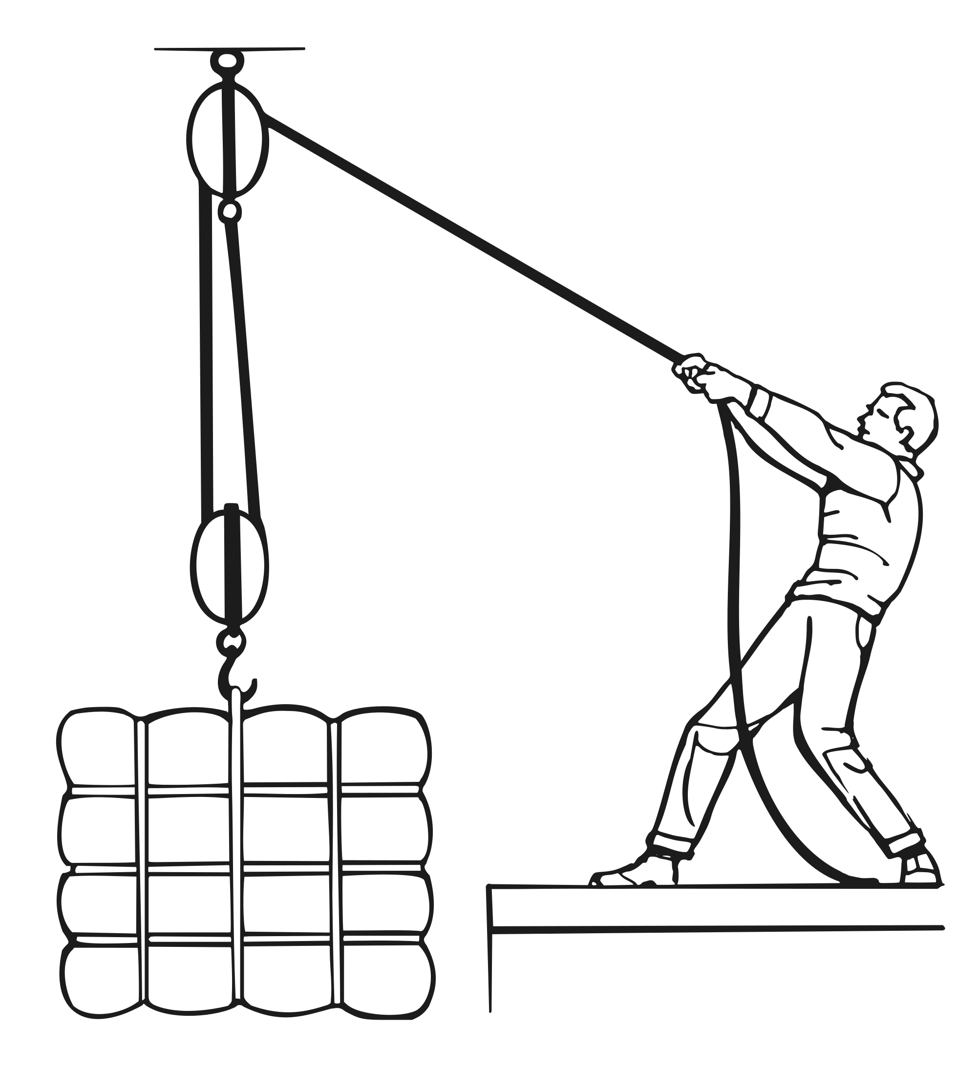
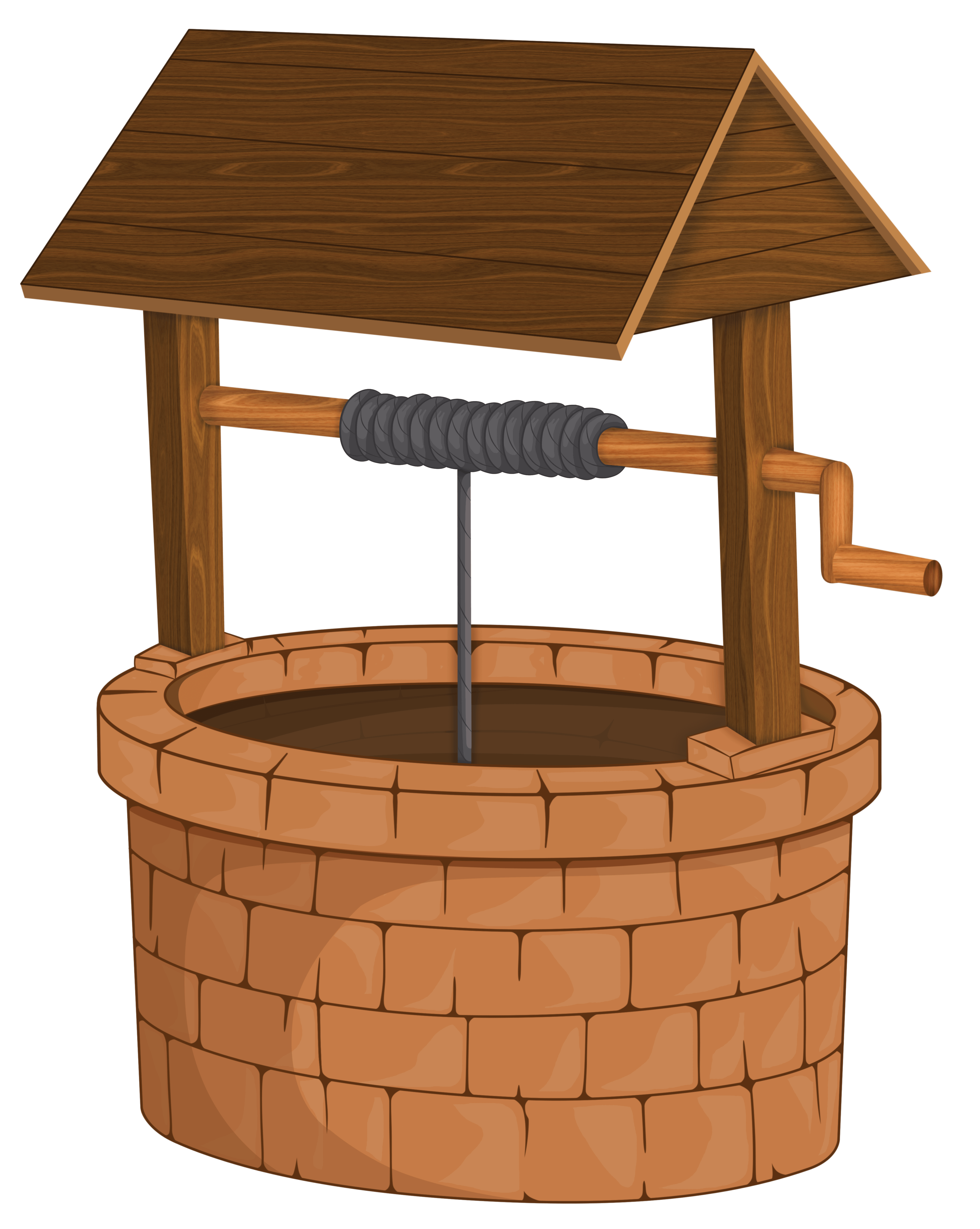
lower the IQ (kind of literal version) – lowering bucket into a well, pulley system (can use principles of design to express downward motion)
lower the IQ (essentially stupidity) – broken glasses, scarlet geranium, bag over head, skull (empty head)
whole street – streetlights, zebra crossing, junctions, crossroads, traffic lights, electricity poles, directions

1st Draft:

Final Draft:
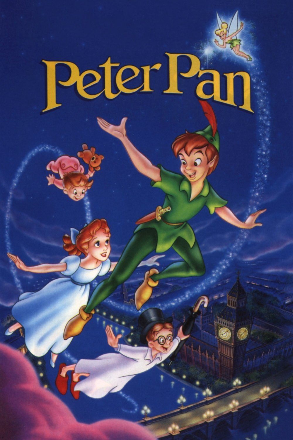
Context from movie:
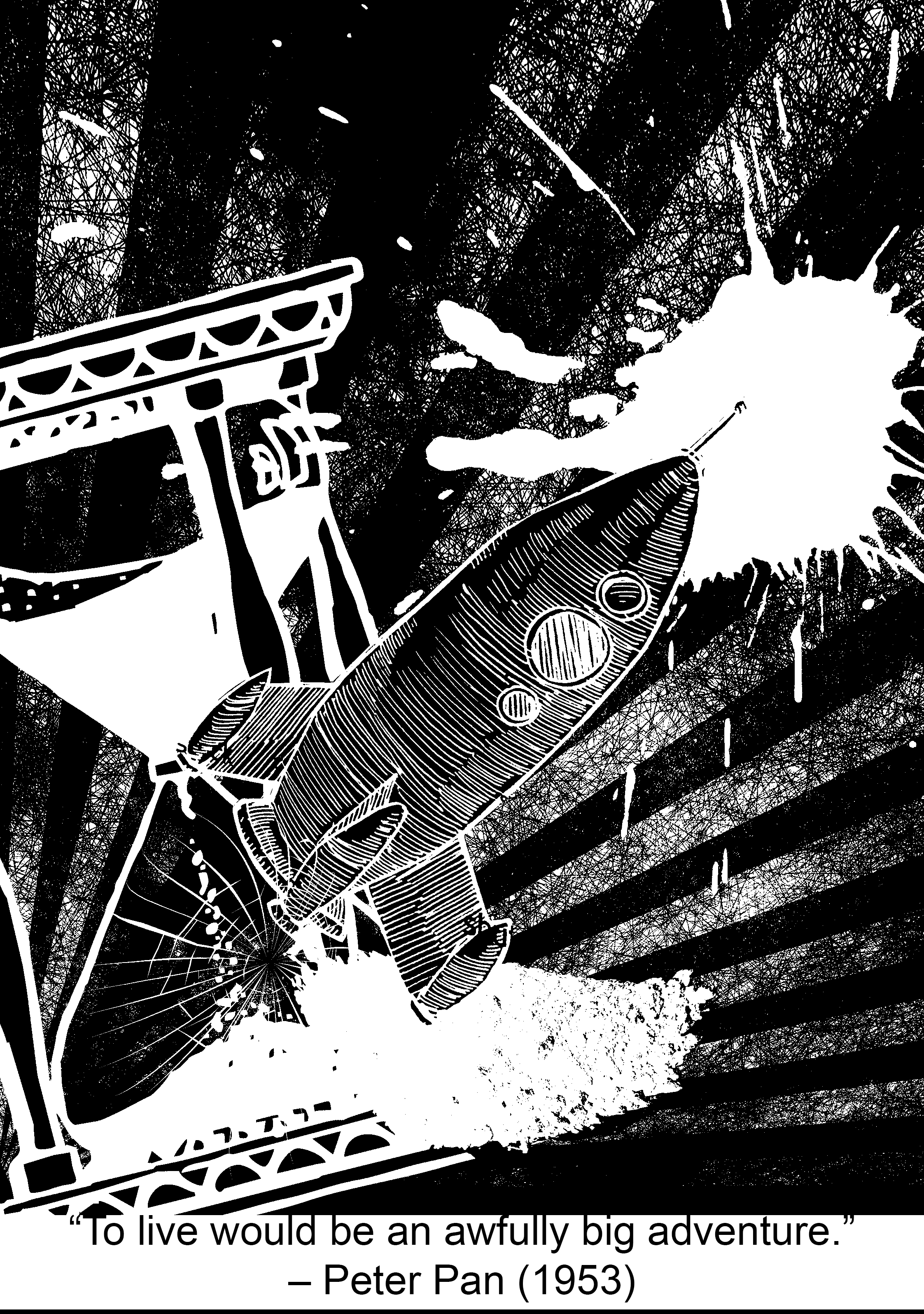
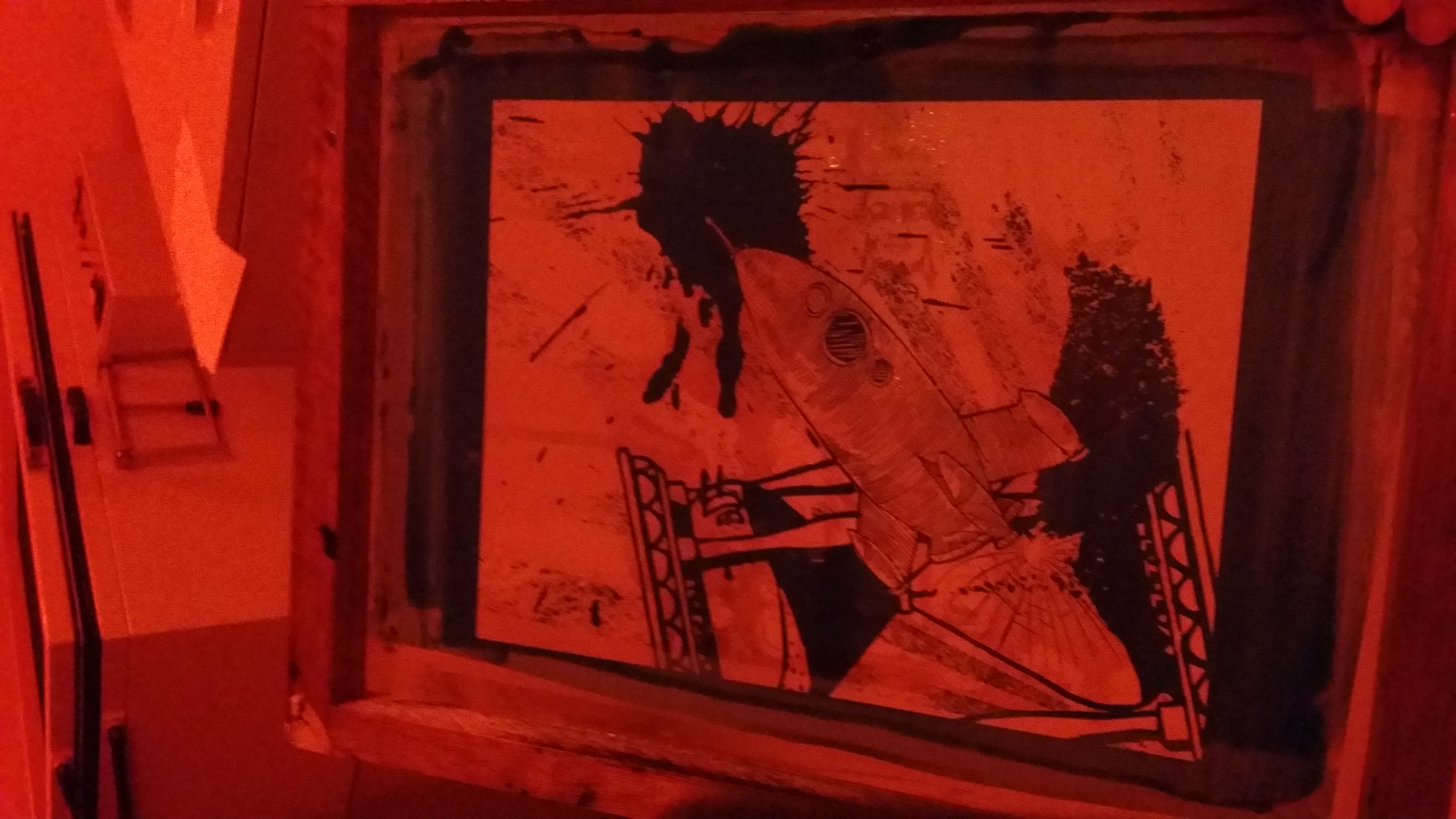
Peter Pan has to be my favourite Disney movie (totally not because I was obsessed with Huggy Pan for a while (Billy Murray playing Peter Pan in Disneyland) (yes I will link you to a video because his sass needs to be shared). I love Peter Pan because of how relatable it is, with me being a teenager (YES I’M STILL 19) and the whole never-wanting-to-grow-up theme. This quote basically resounds this theme, with ‘to live’ being a metaphor for growing and maturing (in contrast to staying a child in Neverland), and ‘an awfully big adventure’ implying that growing up will be both a very foreign experience and a daunting feat for Peter Pan. (and you are RIGHT, Peter! Please take me to Neverland.)
Watch this from 0:21 8’DDD
P.S.: I <3 HUGGY PAN (he’s not working as Peter Pan anymore ;v;)
Keywords: Live, awfully big, adventure
Imagery ideas:
live (essentially growing up and maturing, not stuck in time) – clock, watch, hourglass
awfully big – blue whale, elephant, cosmos, magnifying lens (zoom in), infinite
adventure – (travel) bag pack, ship, aeroplane, map, mountain, compass, parachuting, biking, car
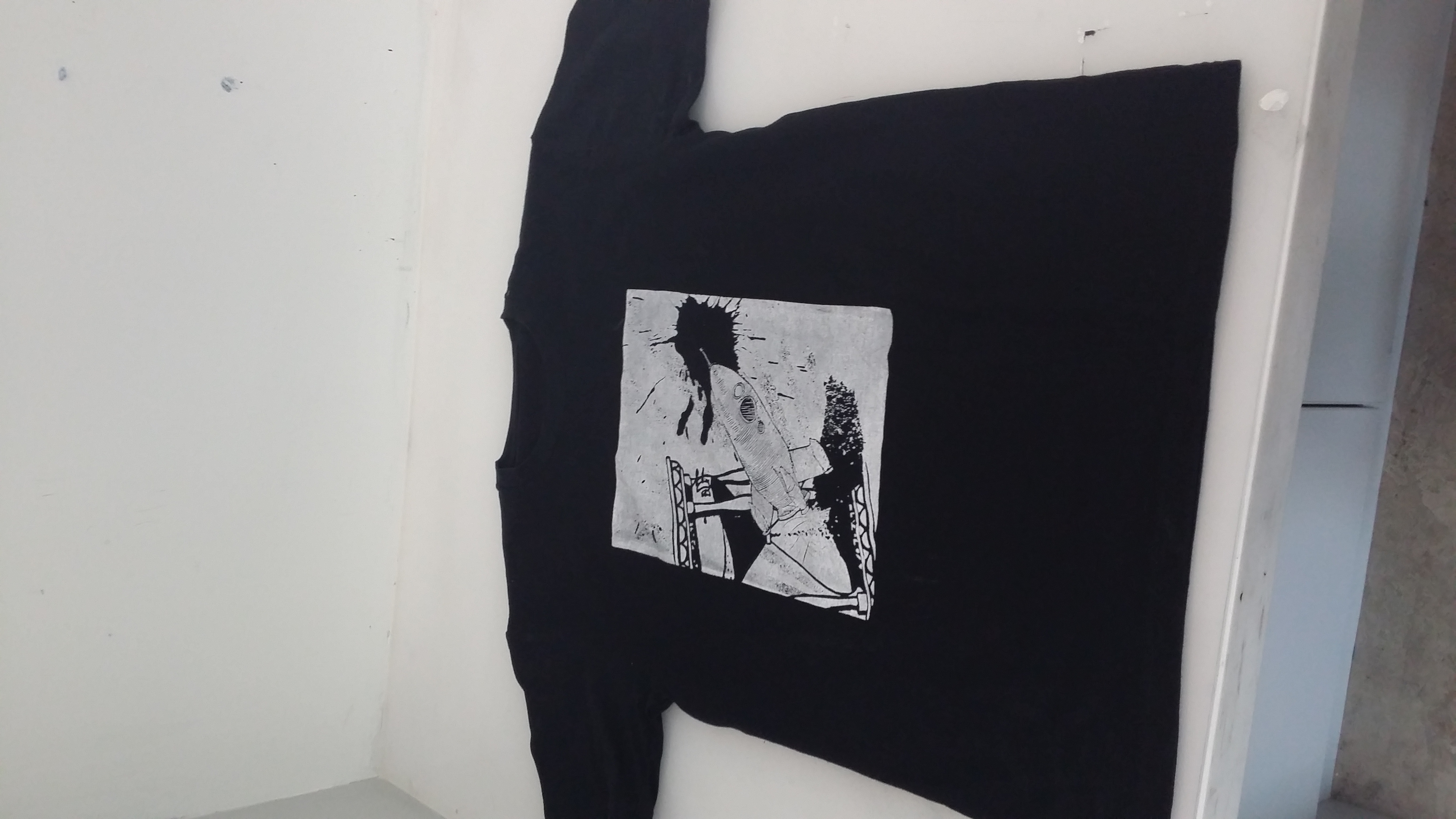
The fun part: SILK-SCREEN PRINTING
(didn’t document the printing part because I was busy working like a factory. Yes I sold shirts to my friends so I had to handprint around 10. If you want profits, think again! 8’D)
Reflections:
One difficulty that I faced with this project was when I was trying to edit the pictures (more on the technical side). When I added a colour invert filter to a layer, the ENTIRE composition inverted itself, and it was SUPERRR frustrating to work with, BUT!! I found out I could isolate the layer so that the filter only affects one layer :DDDD PS still does some wonky stuff once in a while but I have it under control now ;D
I think I’ve fulfilled the objectives of this project, which is to use symbolic images/subject matter to express a concept. I’ve learned how to expand my visual vocabulary; for example using hot-air balloon to represent dreams in my Paprika quote design.
The way the representative subject matter is orientated in relation to the other subject matter should also be carefully considered! Their relationship is very important in conveying certain ideas that cannot just be condensed into one object itself, especially for movement; for example having the rocket oriented diagonally away from the hourglass and the radiating lines really helped to give a sense of movement in my Peter Pan design!
AND I really enjoyed doing this project because
–Project 3 post incominggg den den dennnnn—
 +
+
